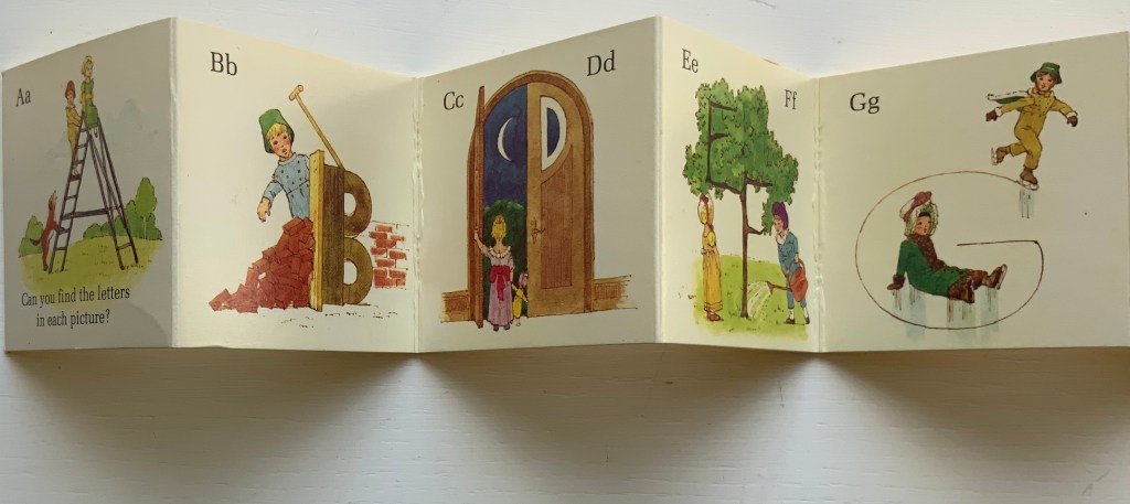
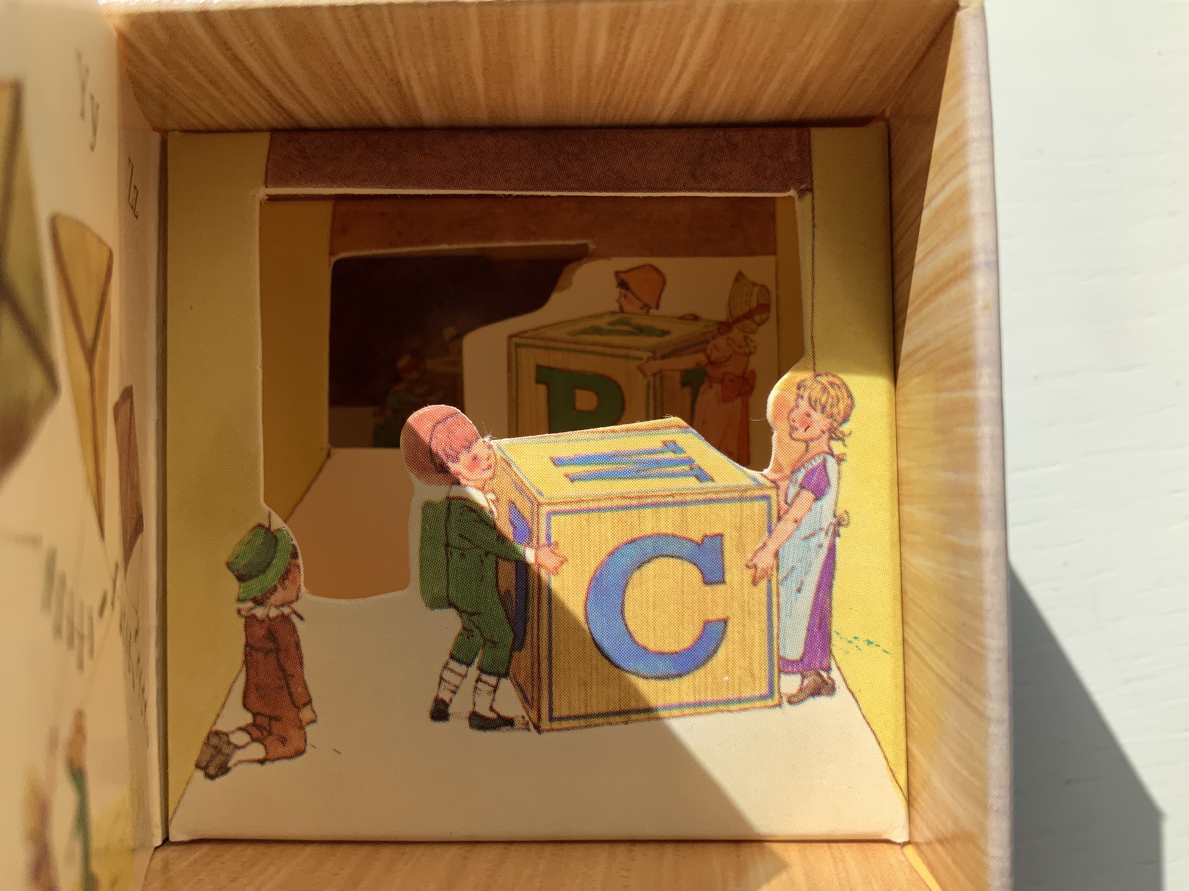
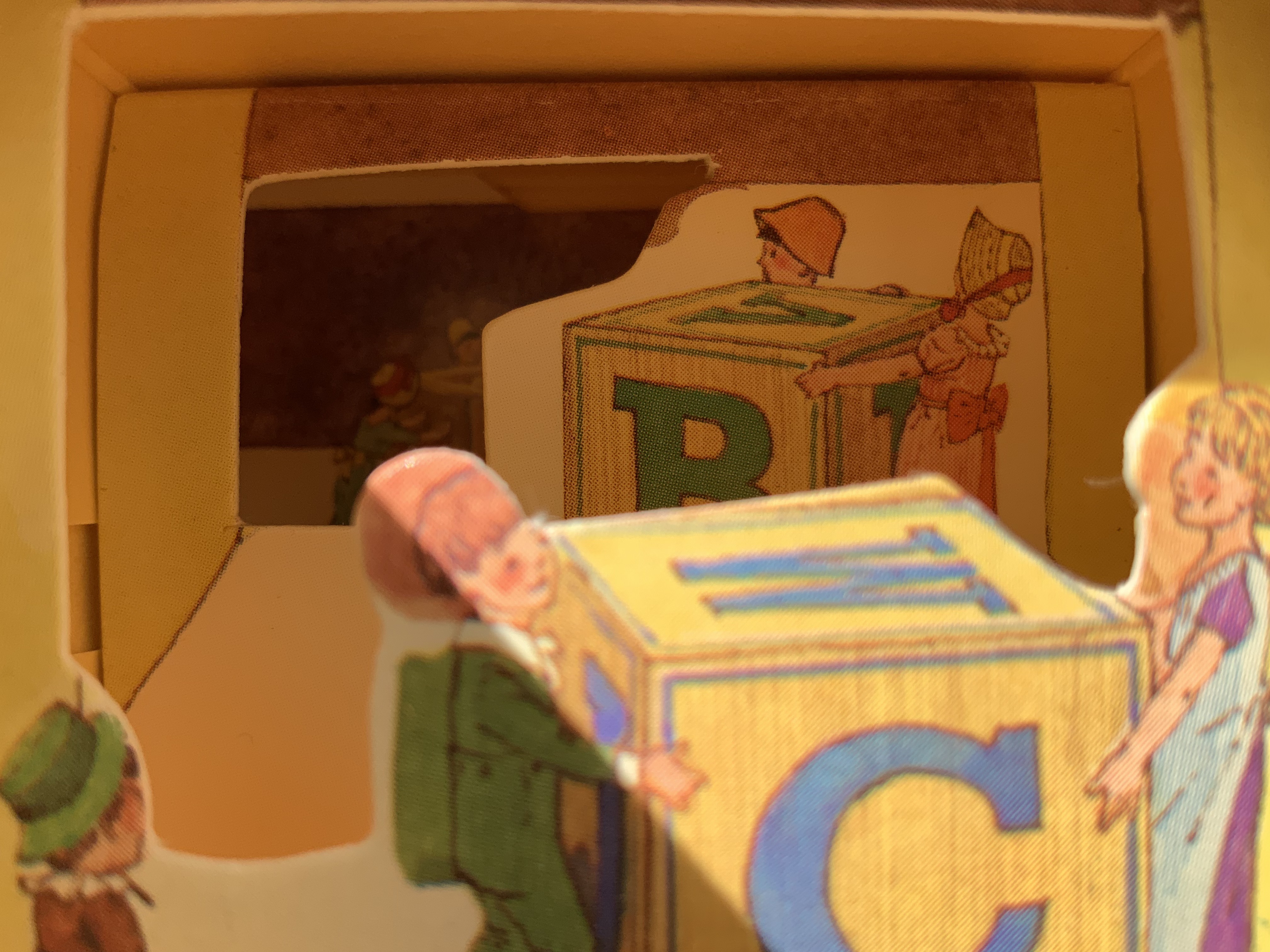
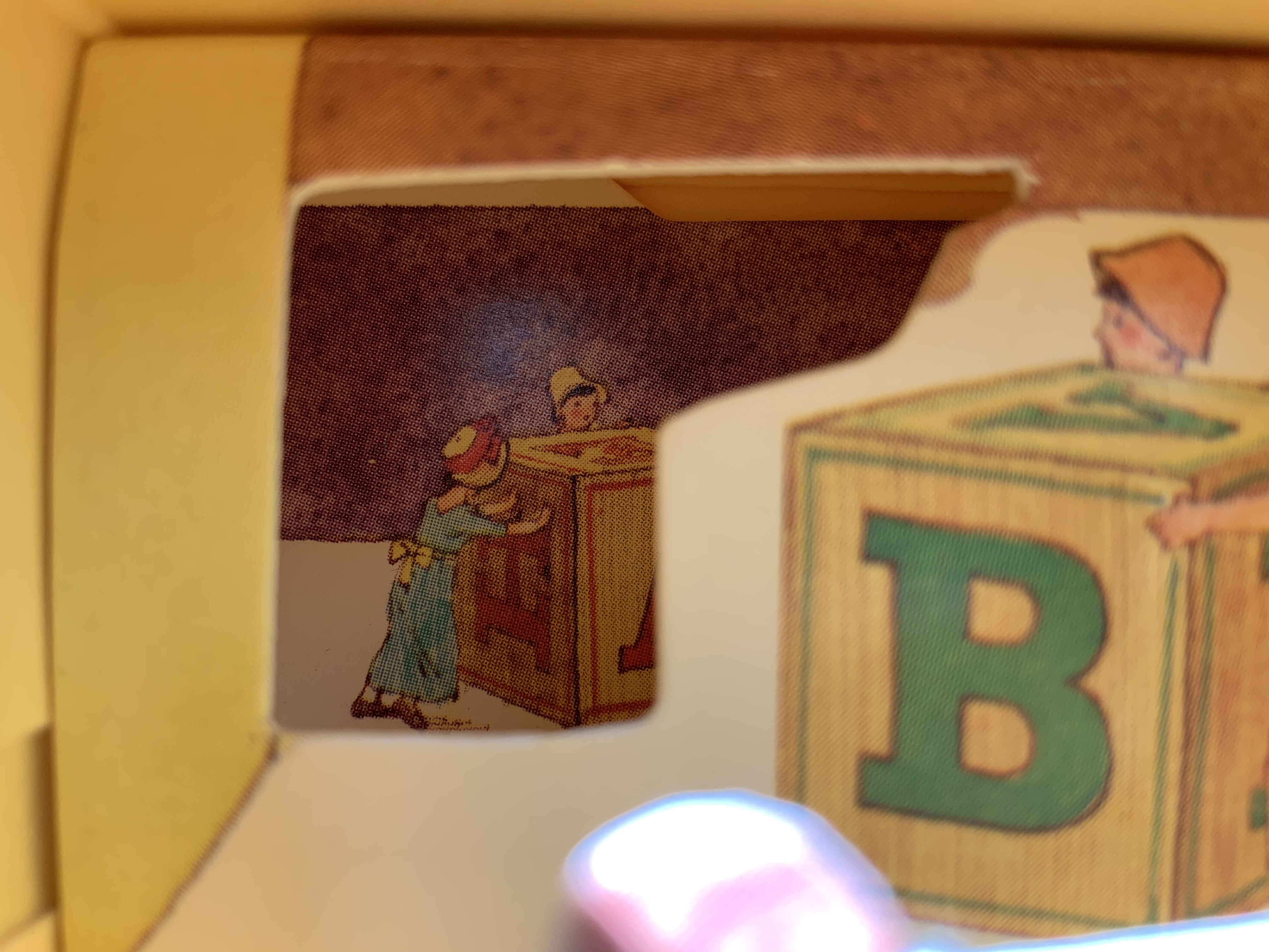
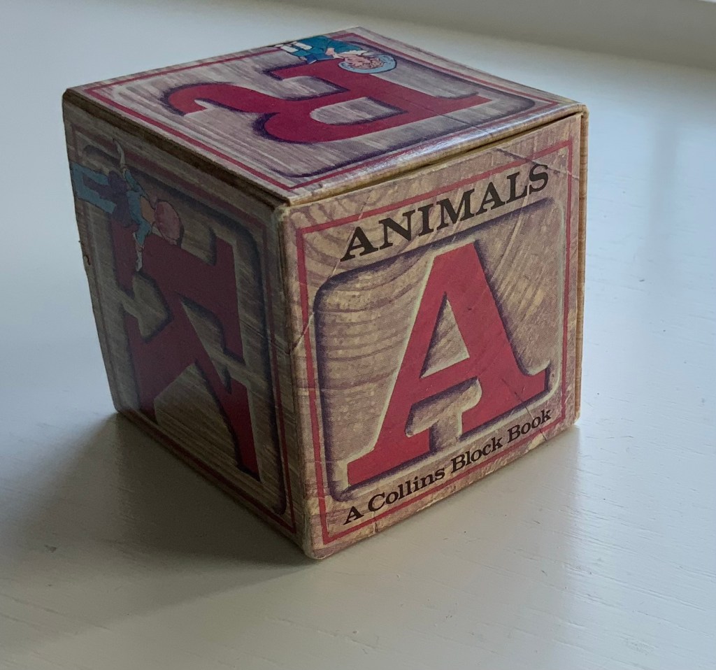
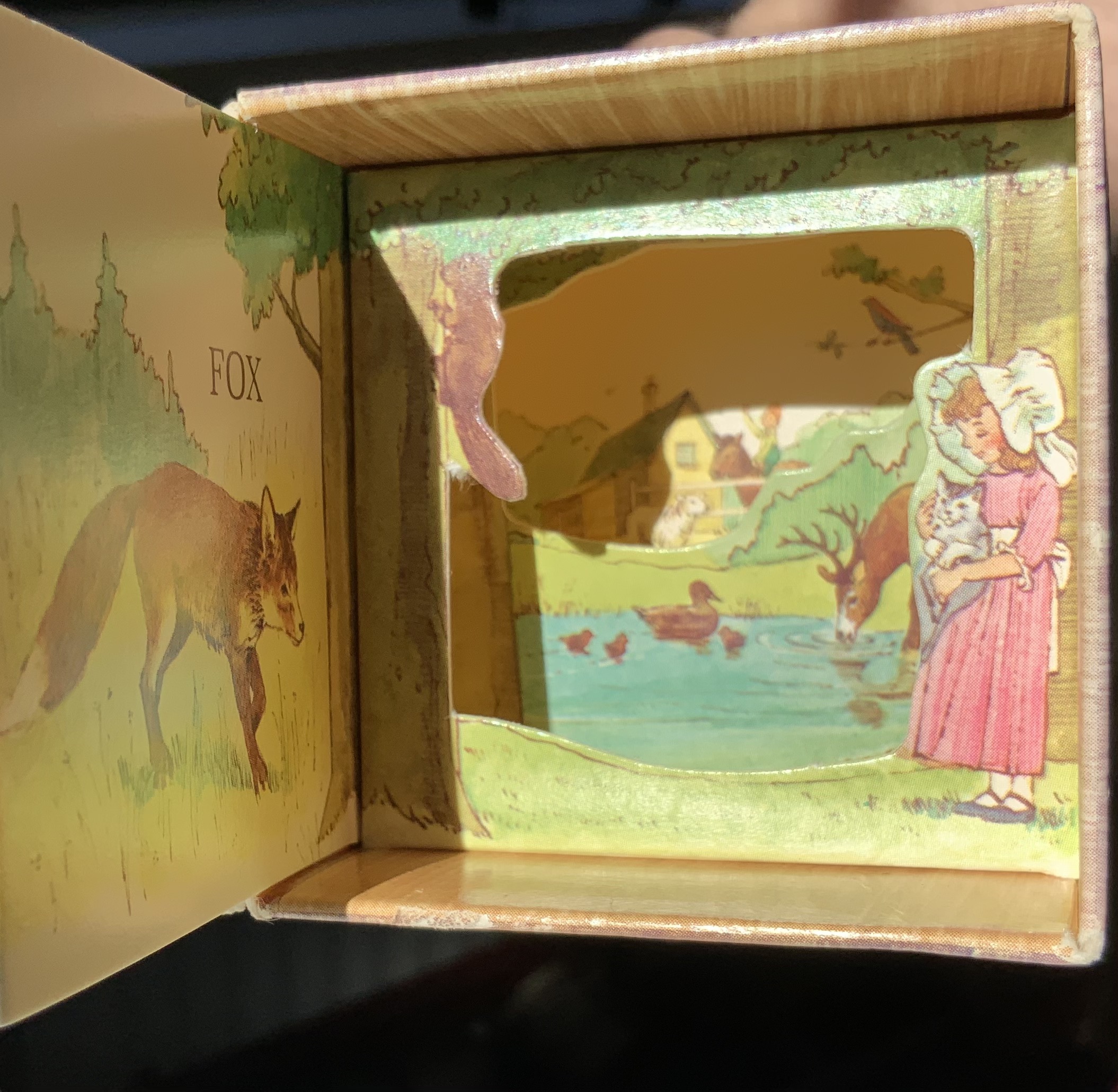
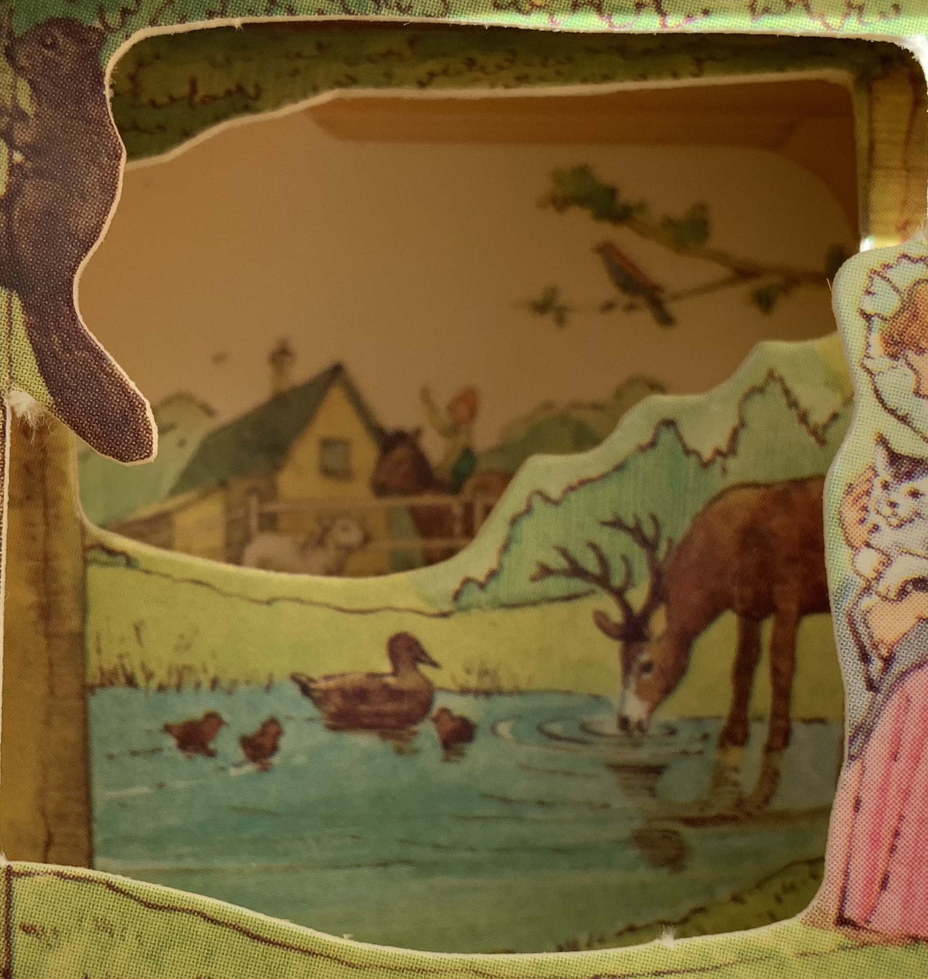
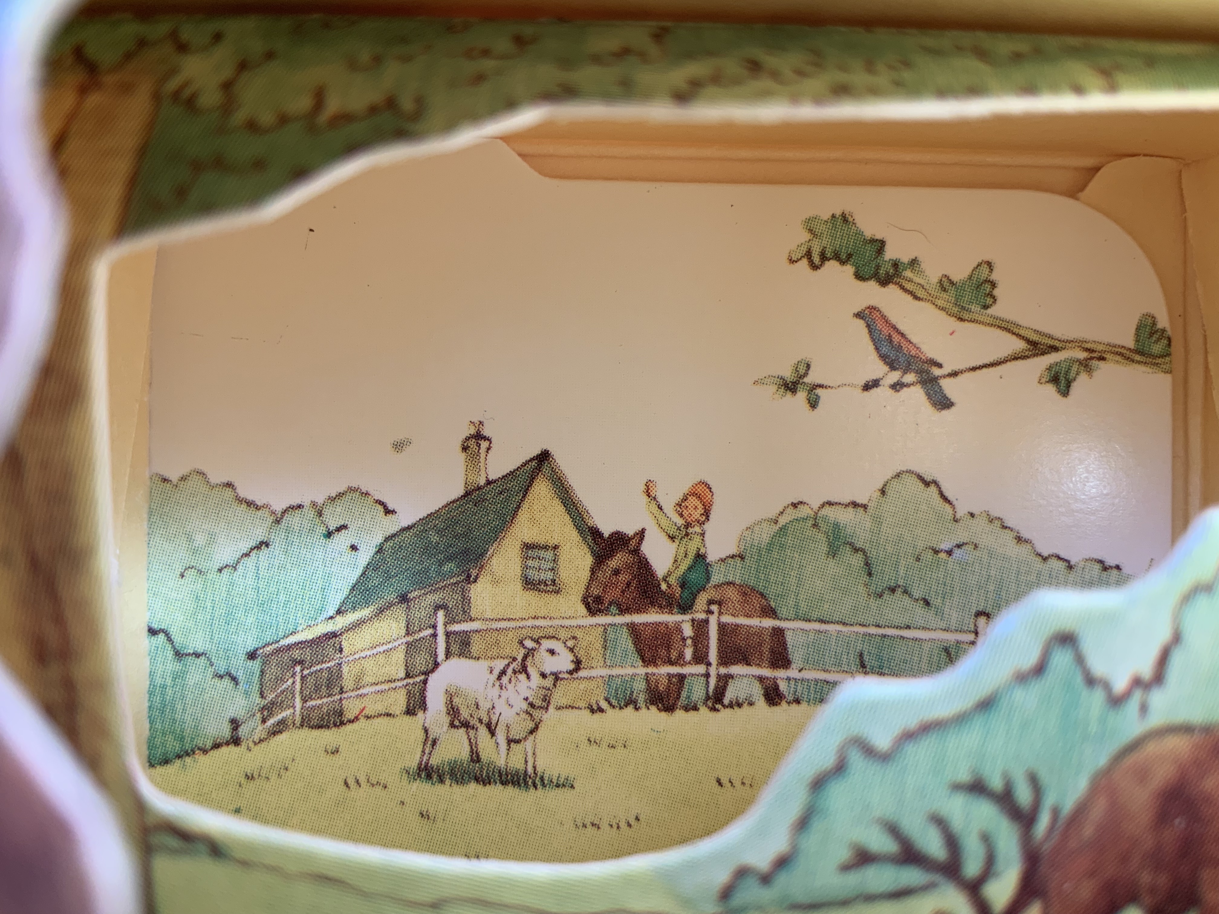
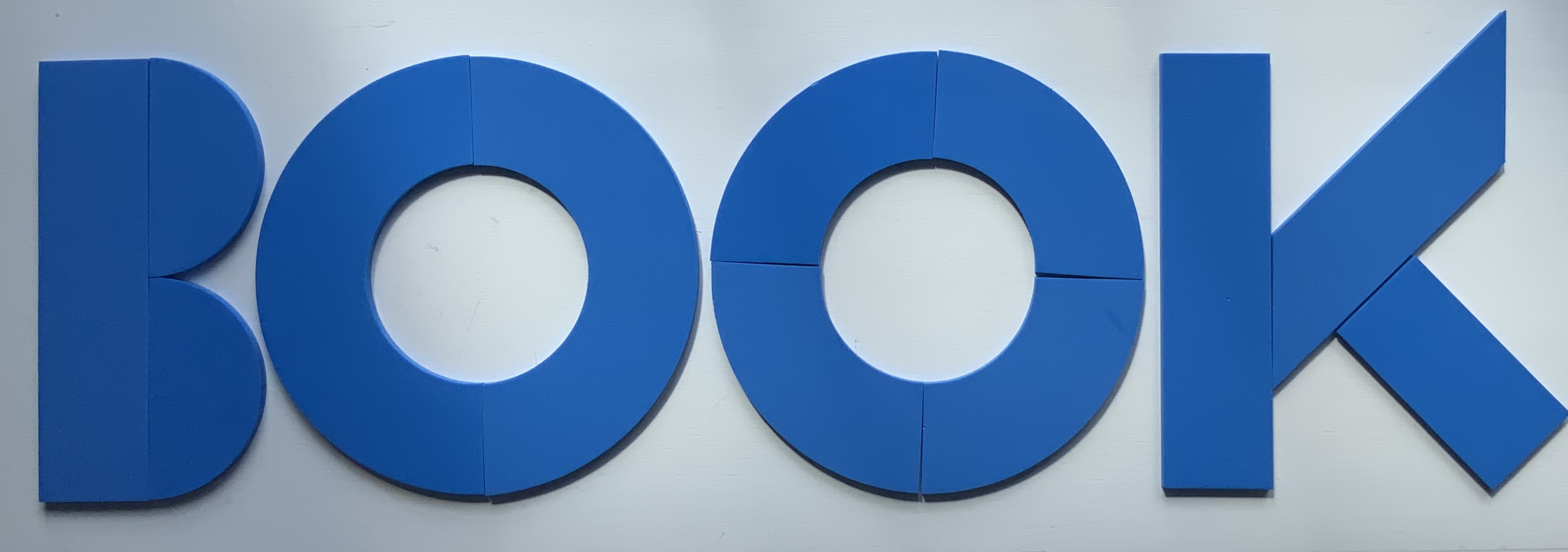
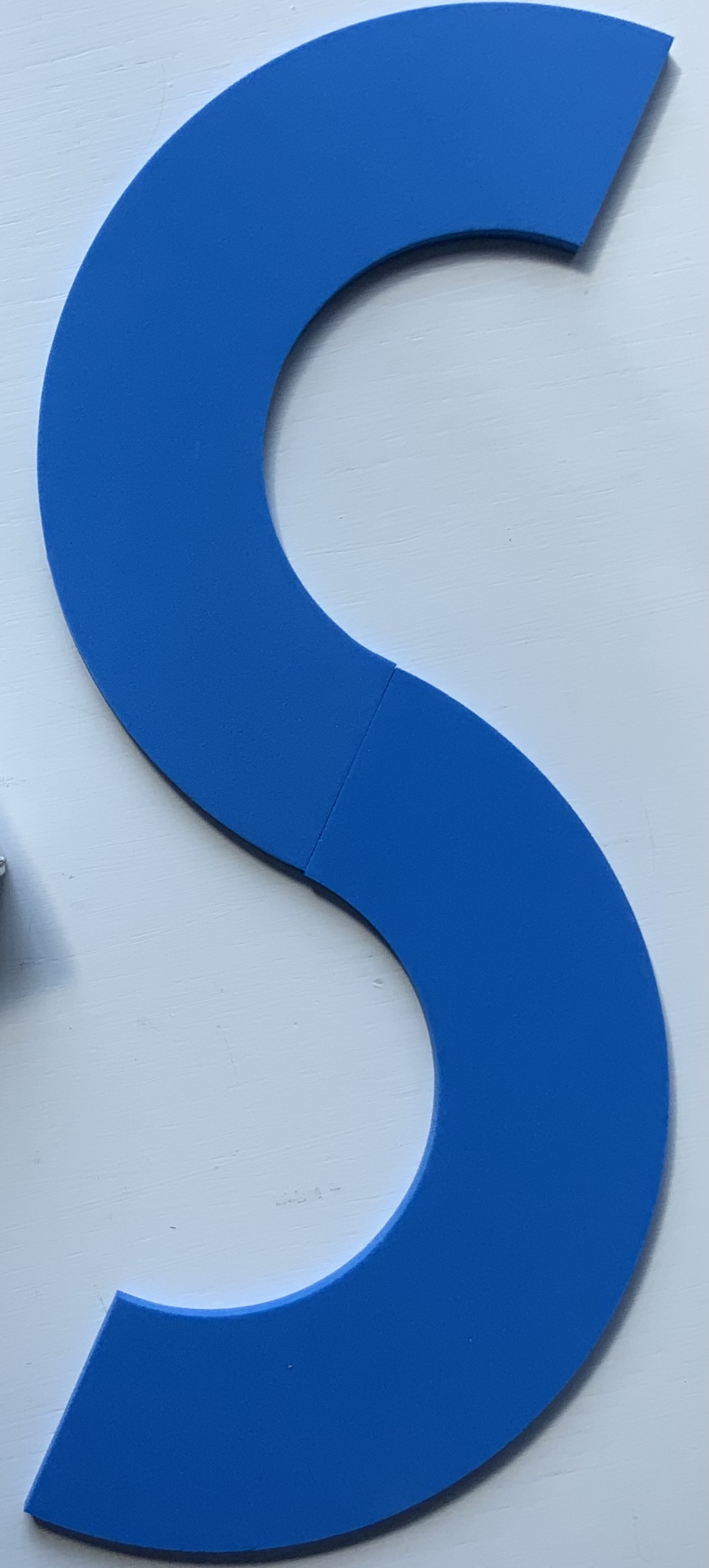
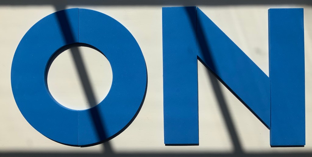
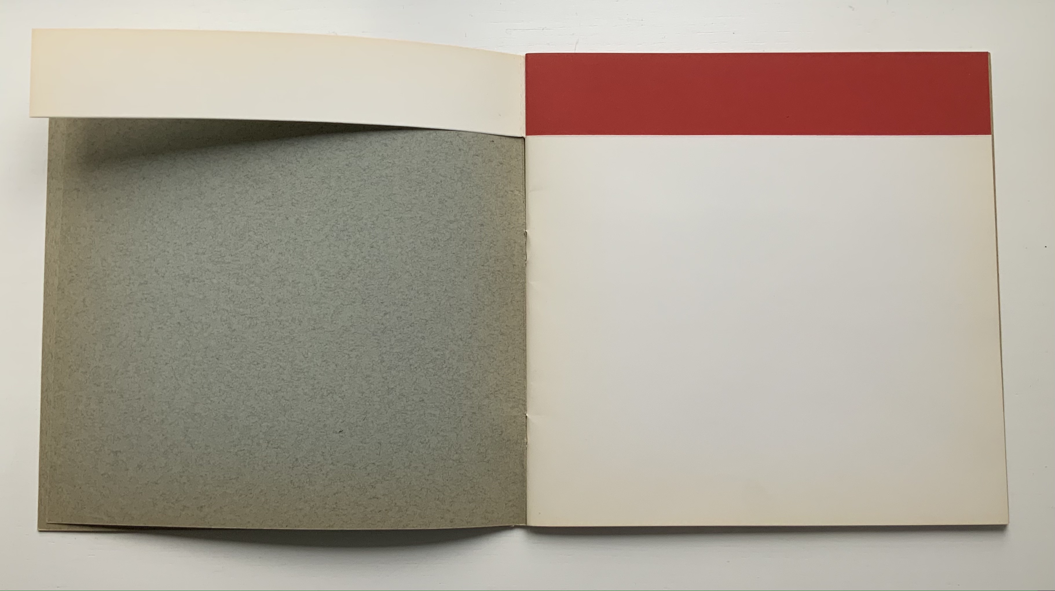
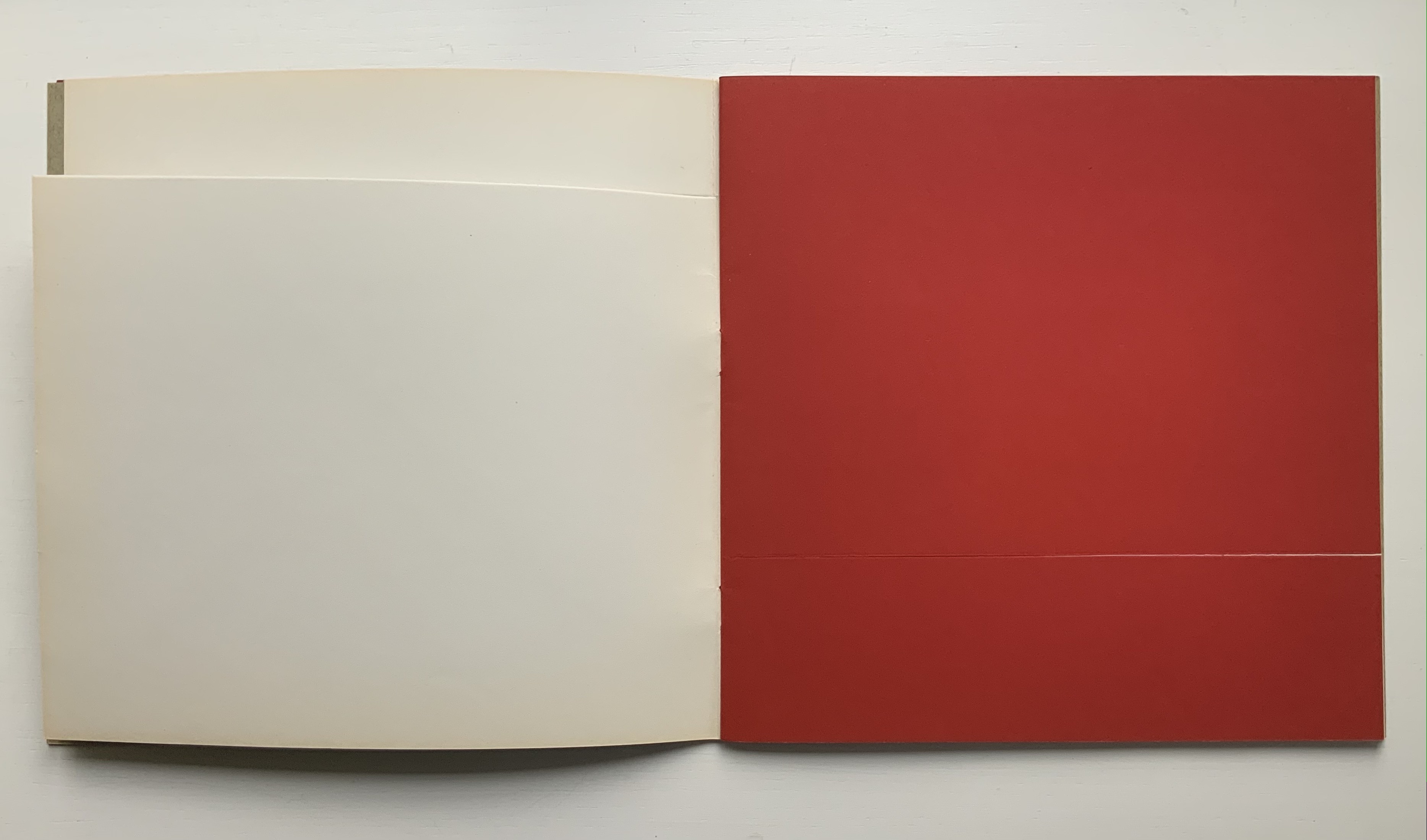
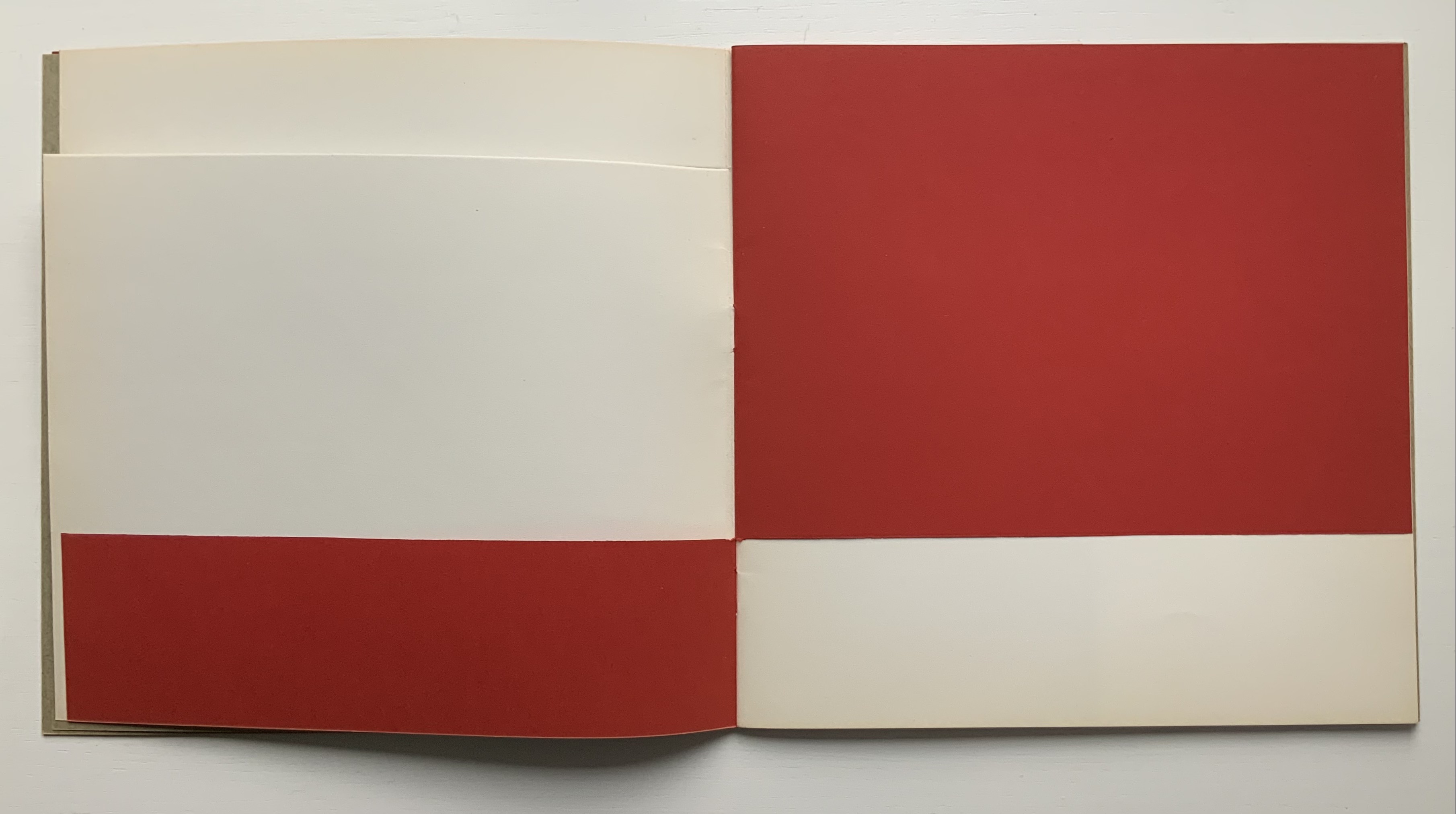
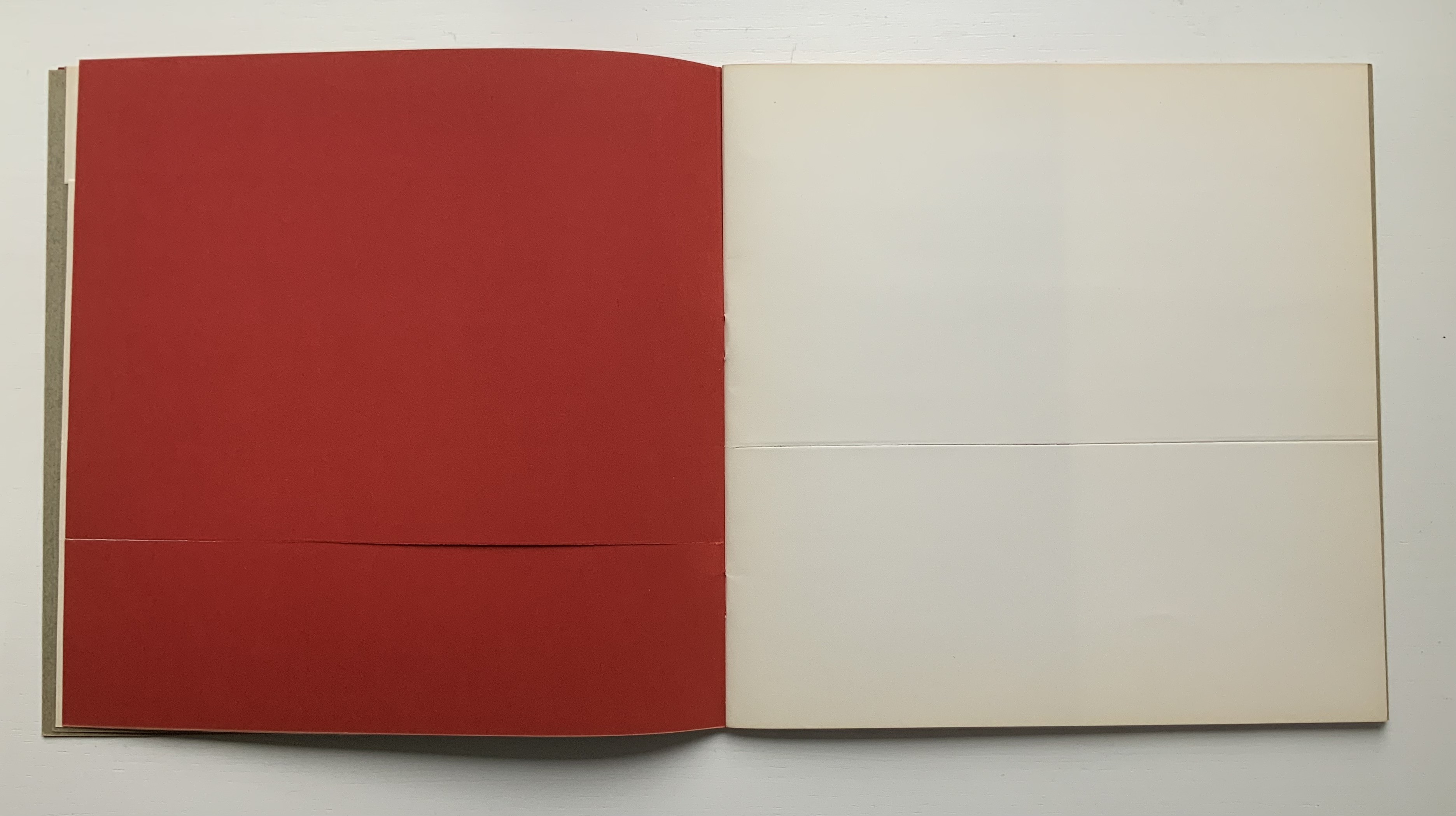
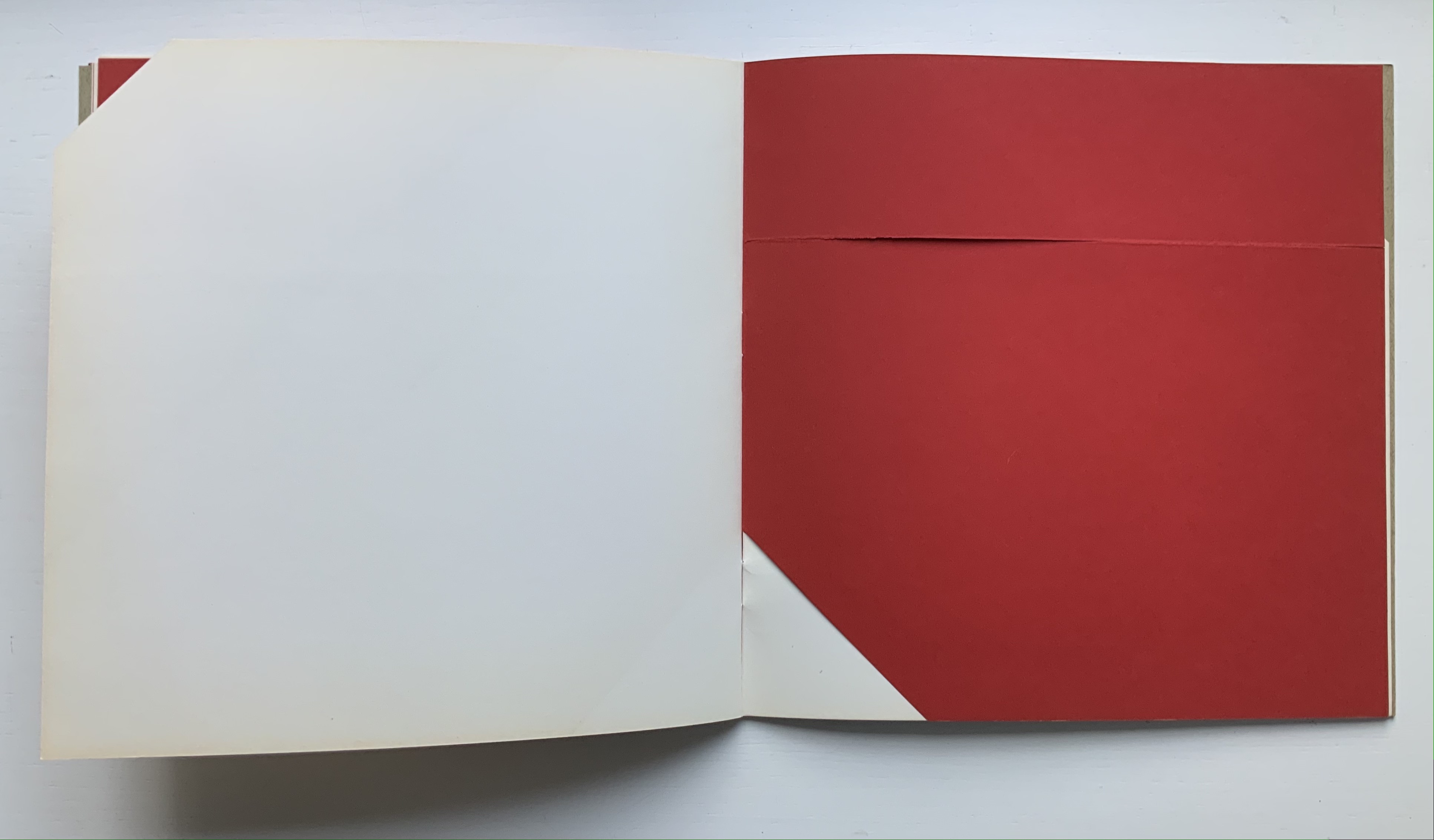
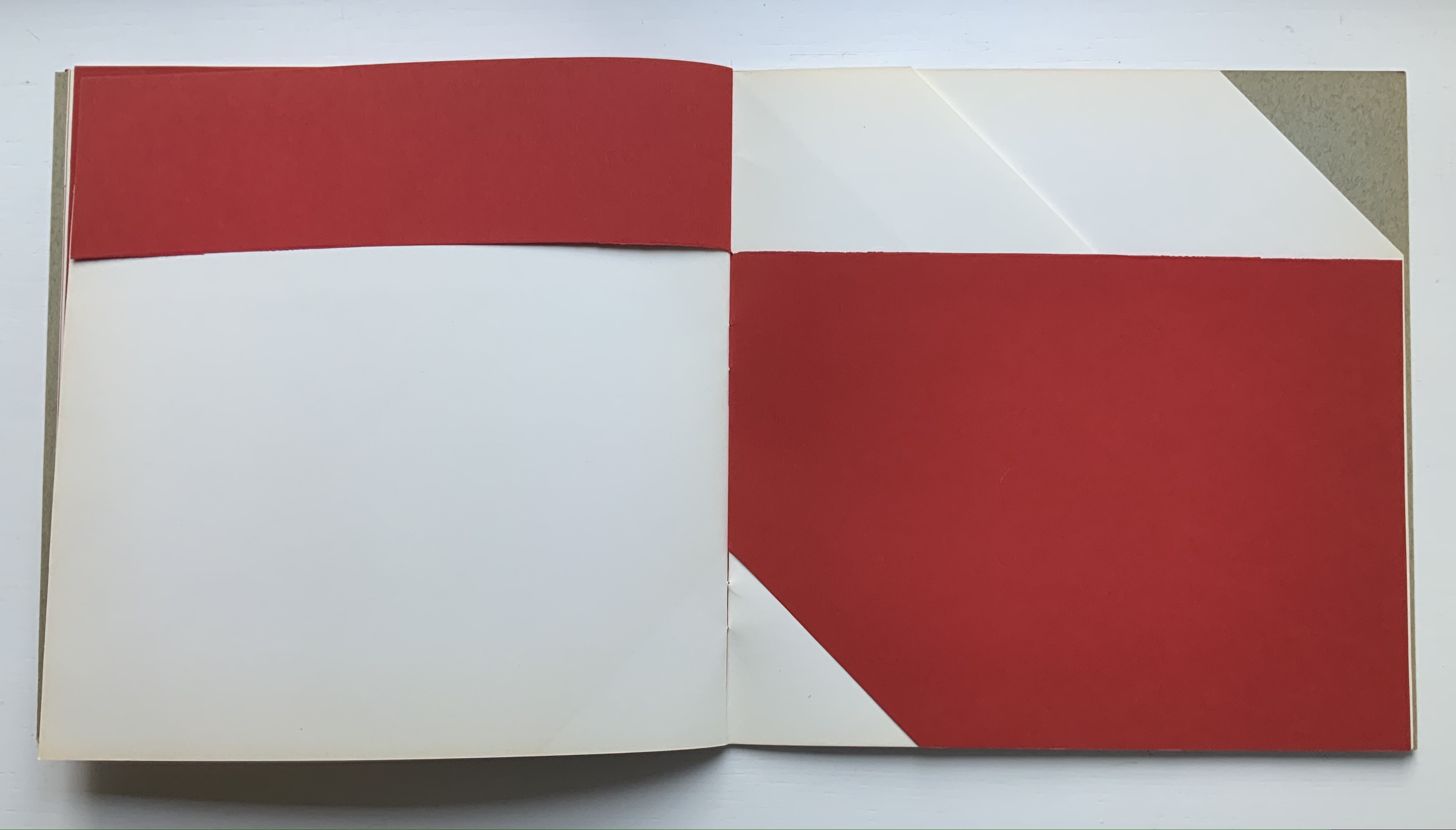
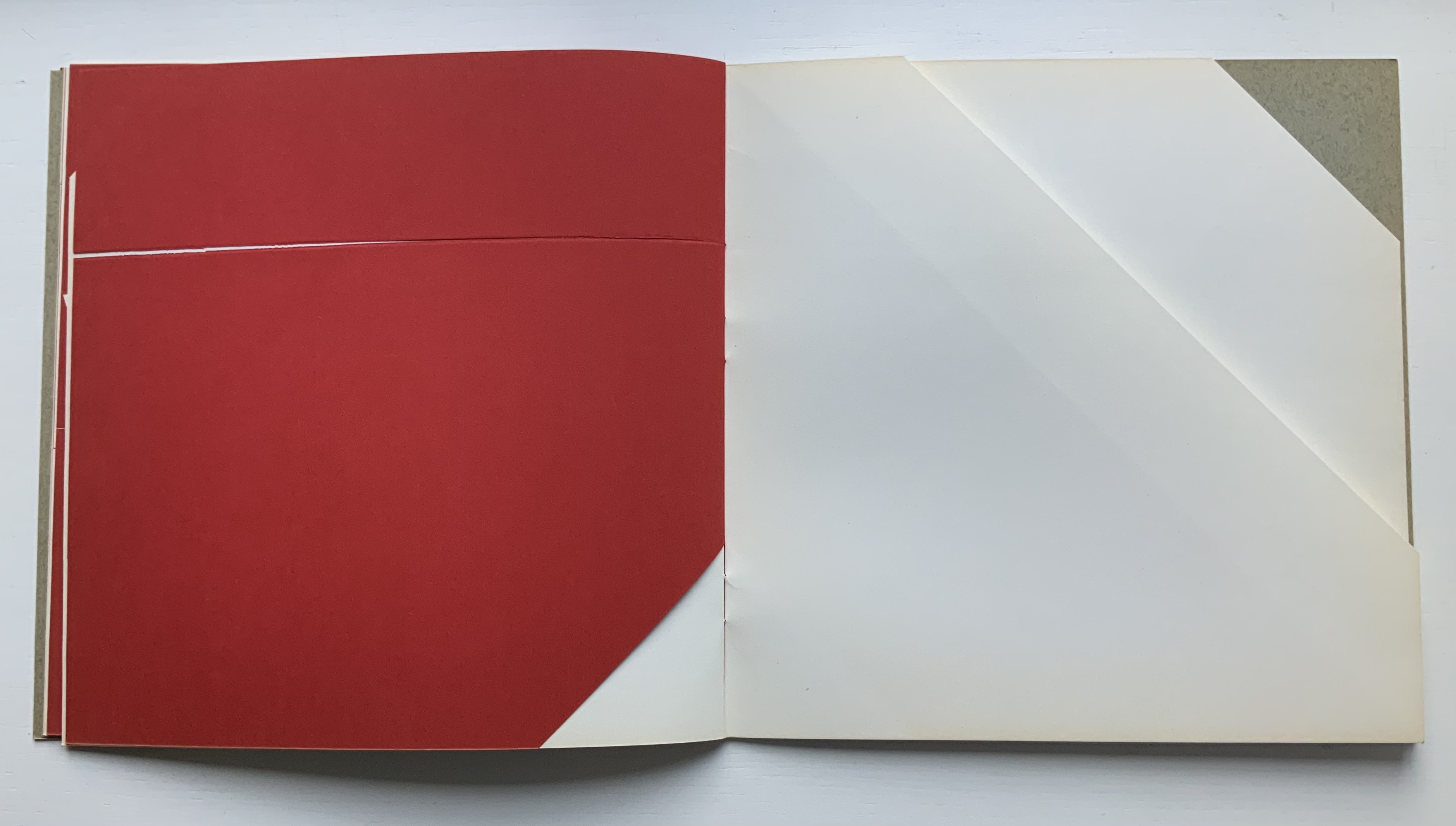
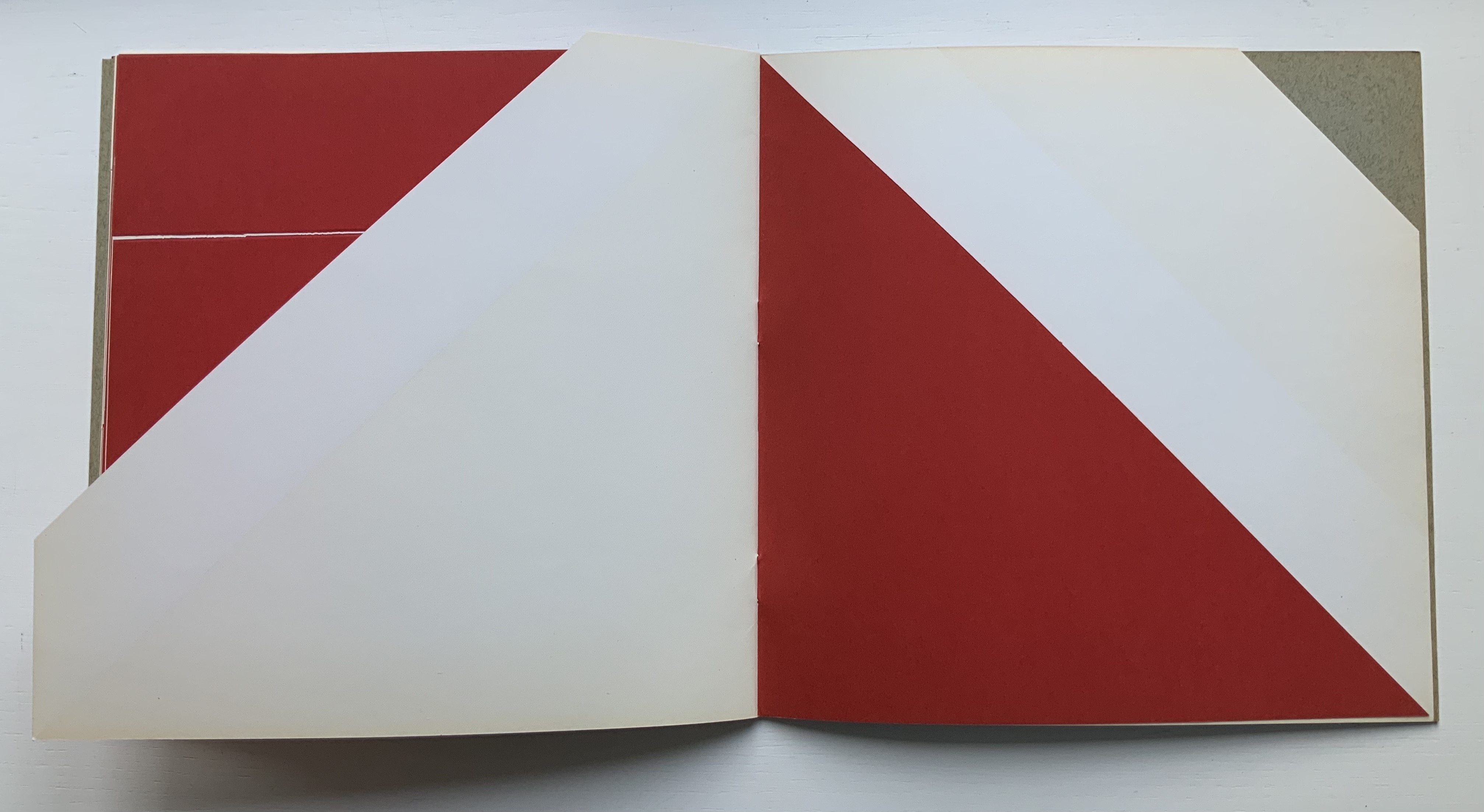
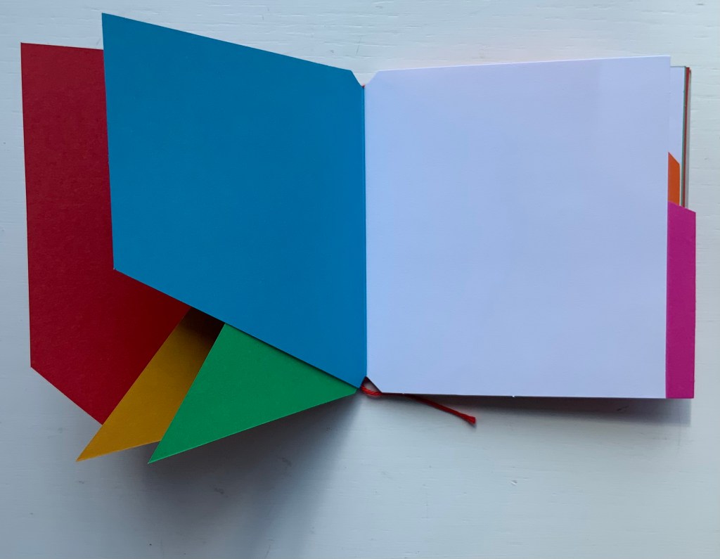
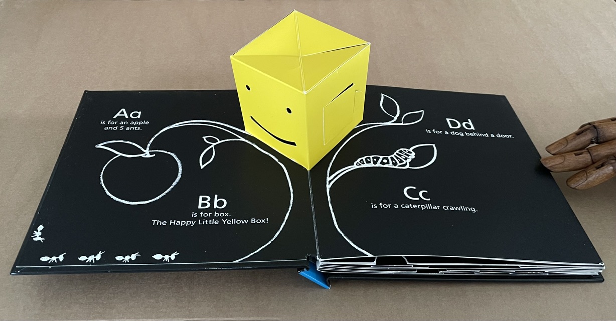
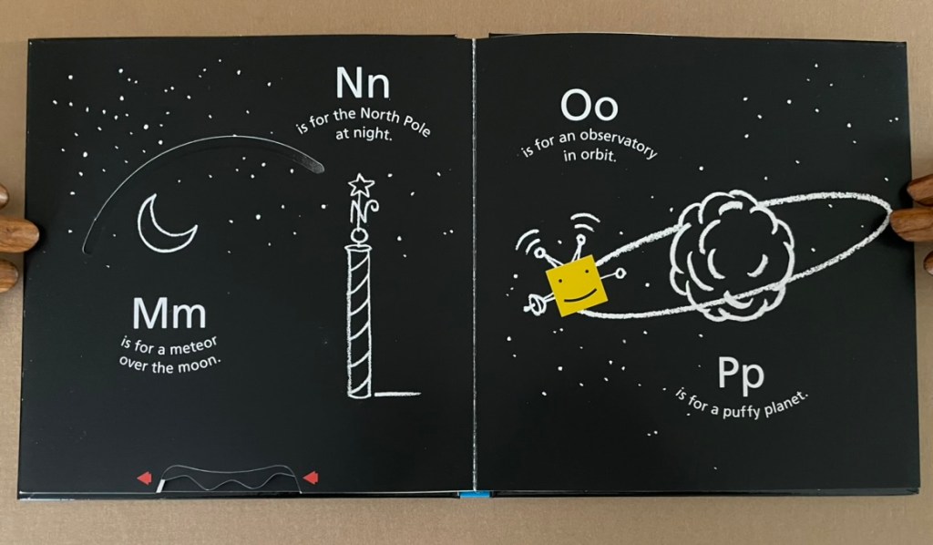
B is for Box (2014)
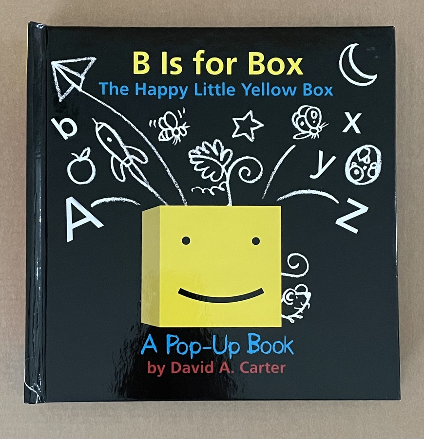
B is for Box (2014)
David A. Carter
Pop-up book, printed paper over boards. H187 x W184 x D28 mm. [14] pages. Acquired from Type Punch Matrix, 17 September 2024.
Photos: Books On Books Collection.
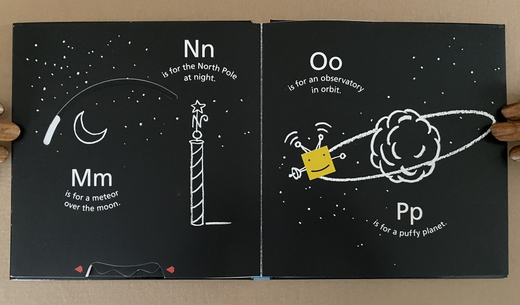
“The Happy Little Yellow Box” was first introduced in a pop-up book of opposites by that name in 2012. For the Books On Books Collection, the box’s return in this pop-up alphabet makes it the one to add to all the other abecedaries here. The box is also a happy reminder of the items under Further Reading (below).
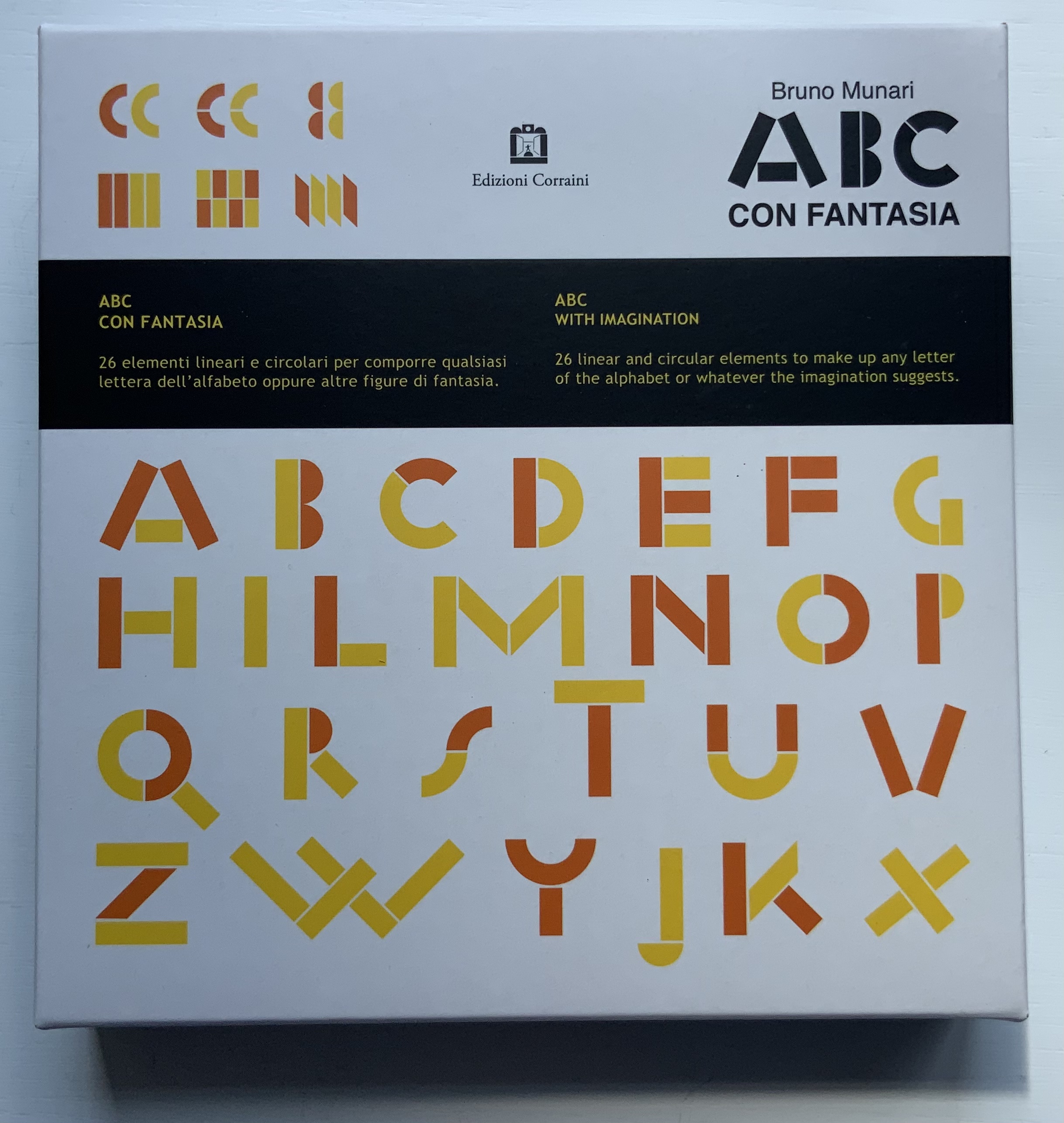
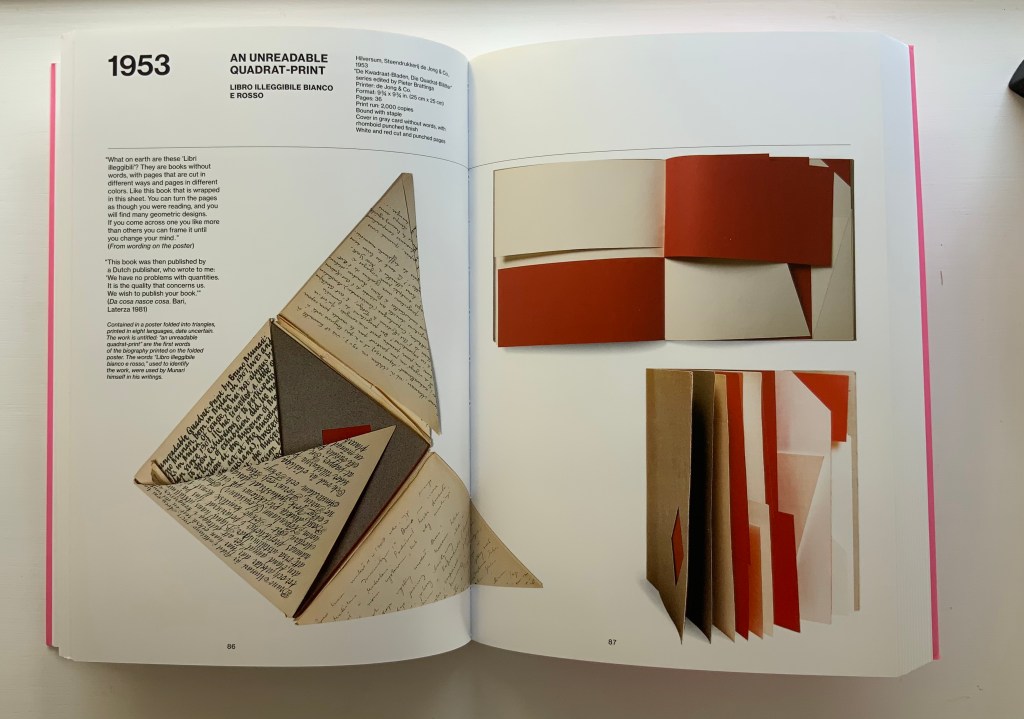
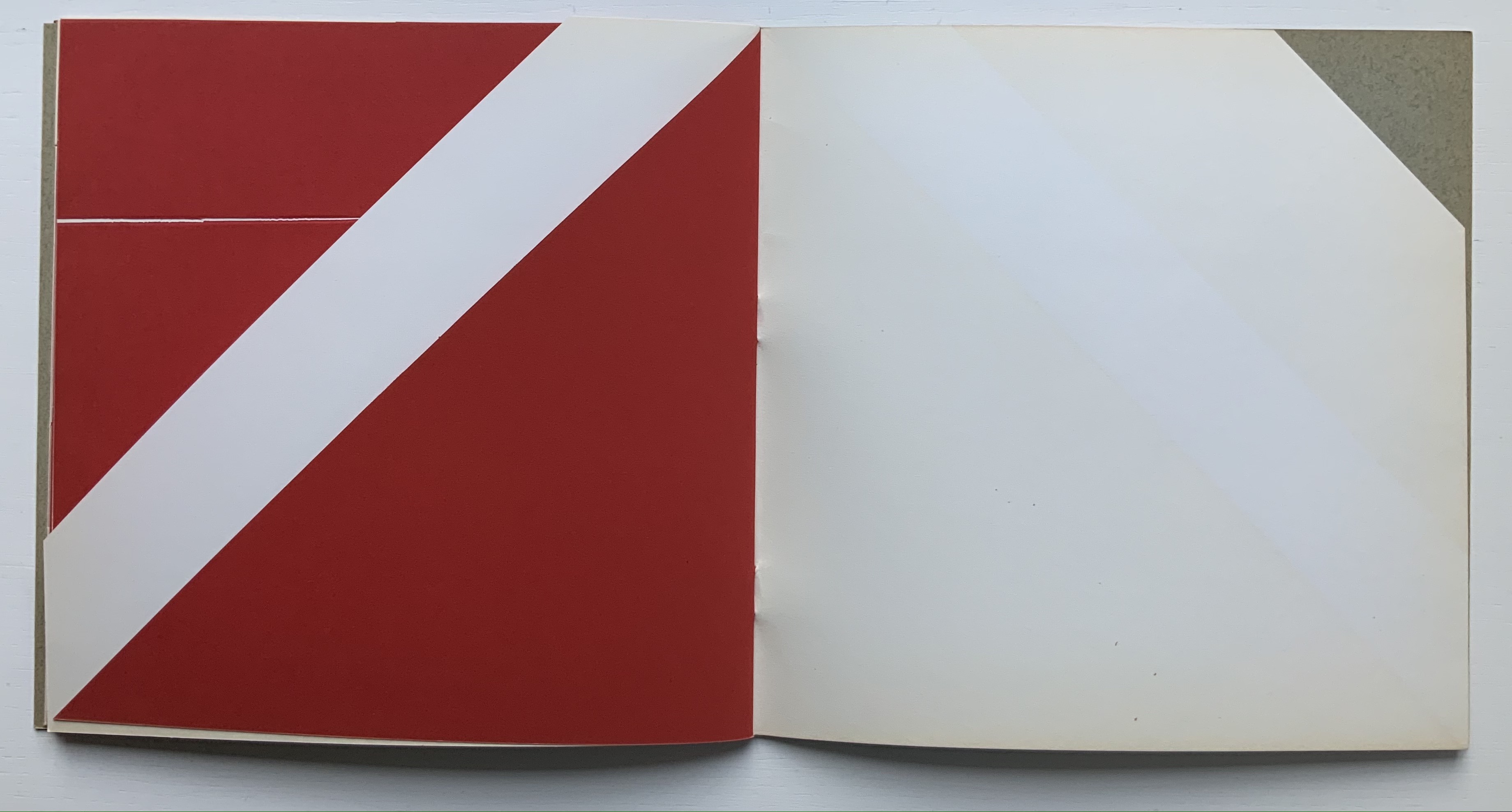
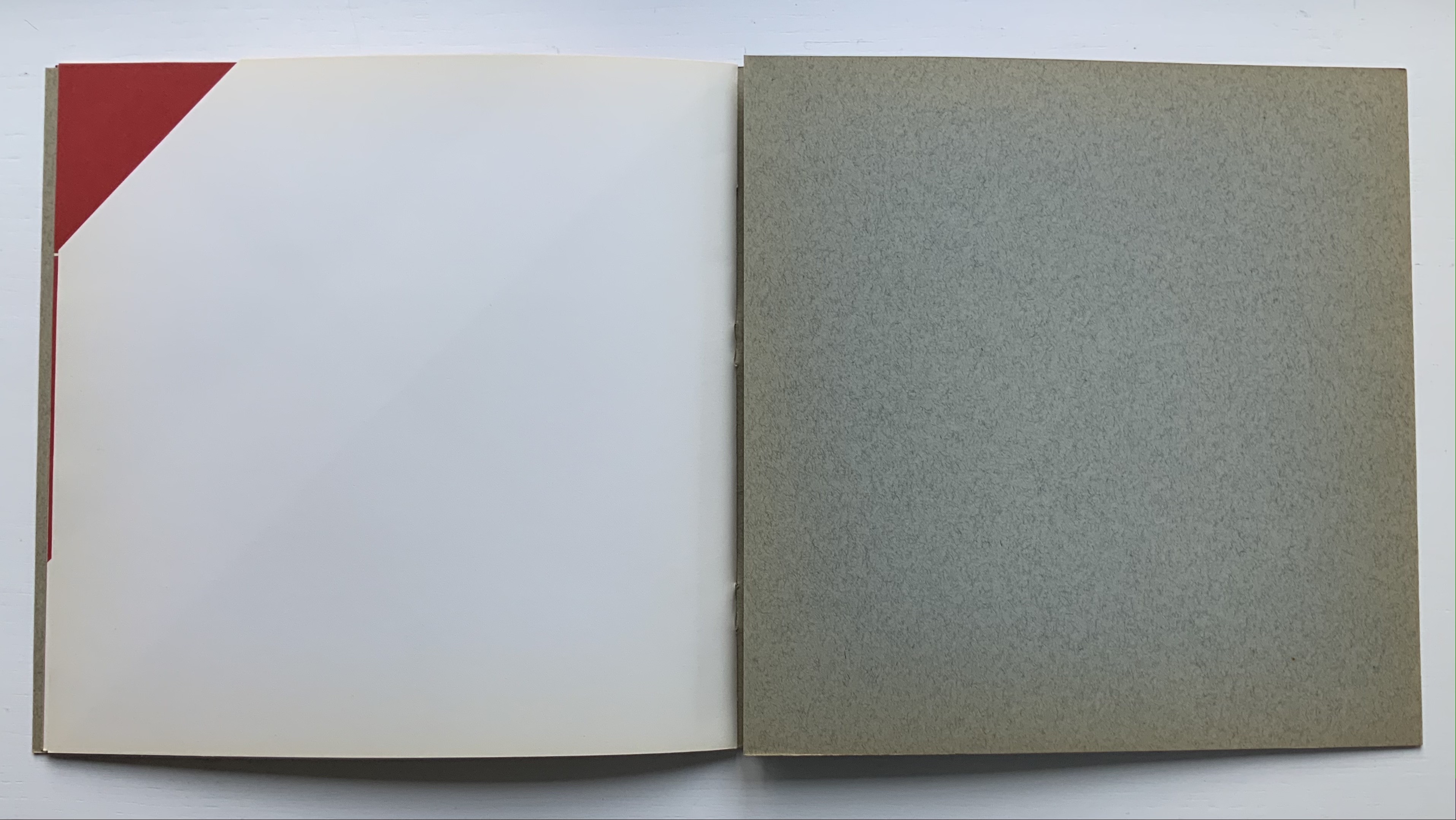
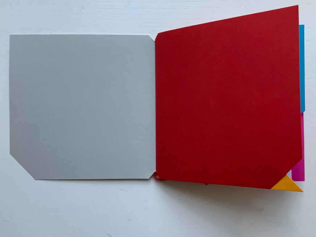
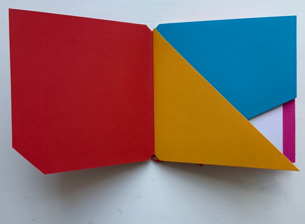
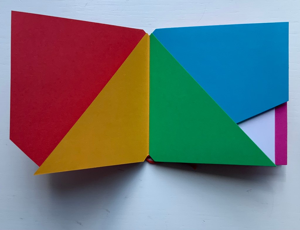
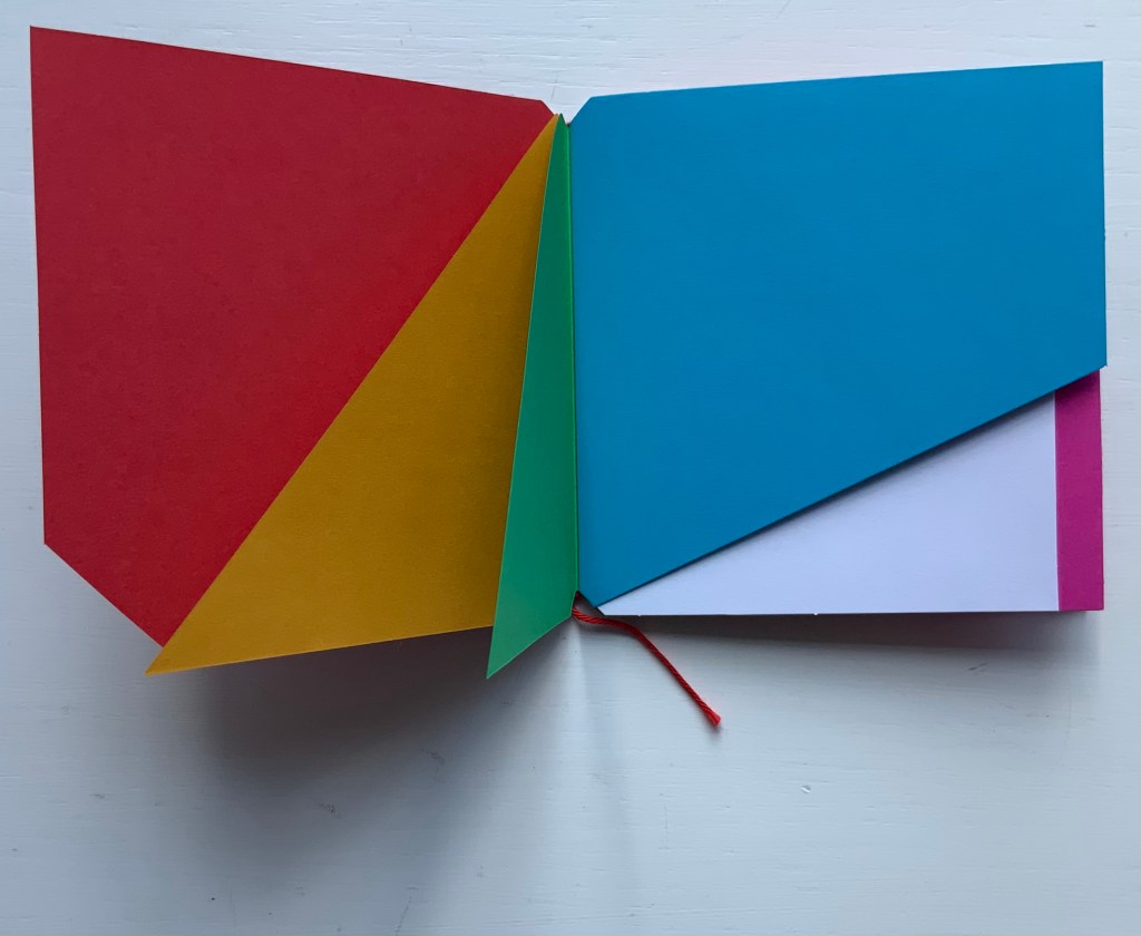
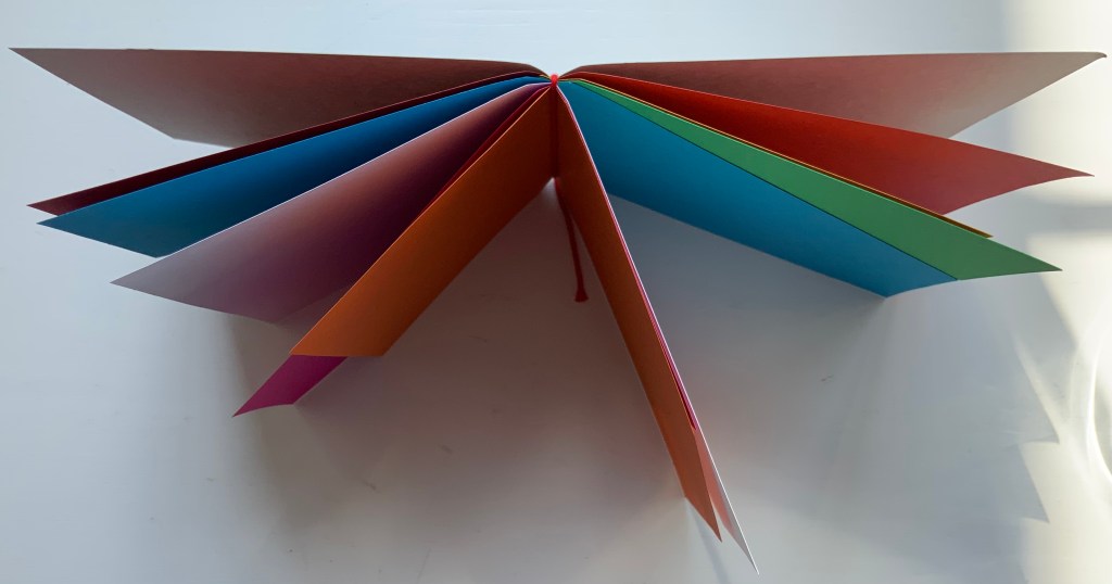
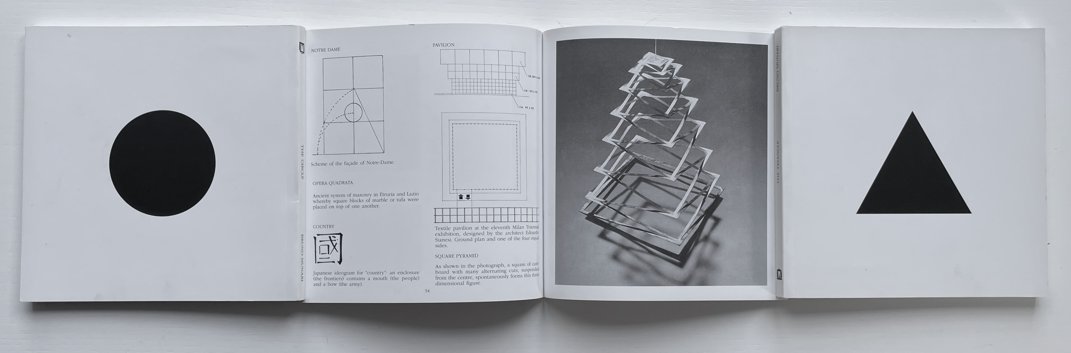
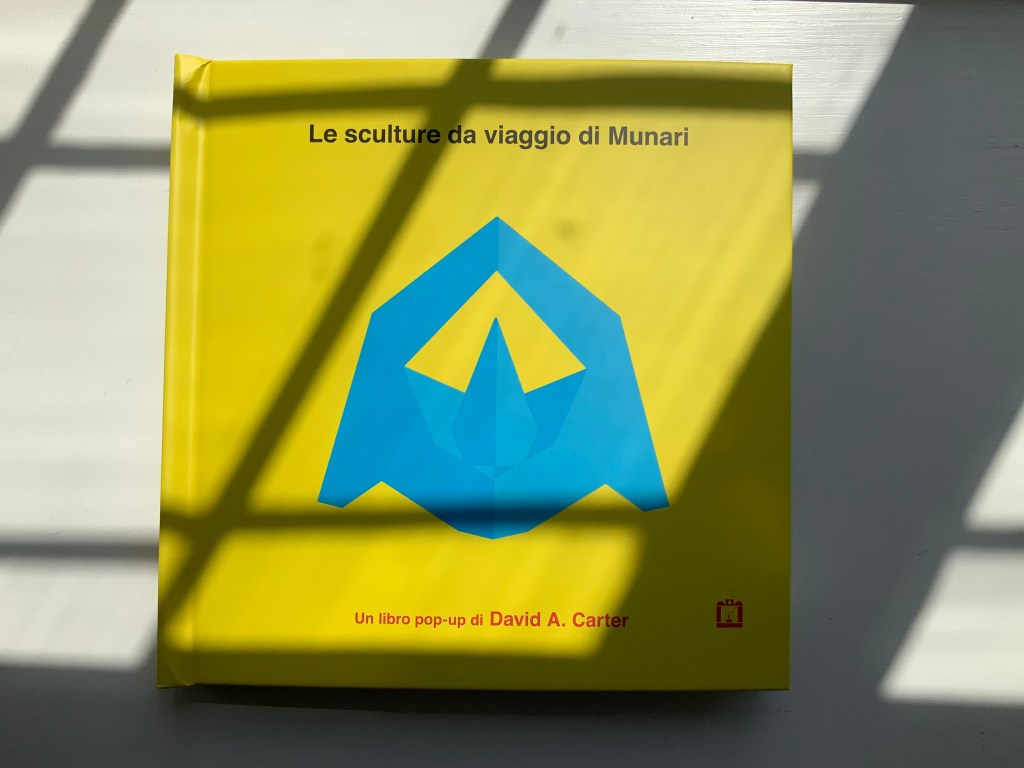
Le sculture da viaggio di Munari (2019)
Carter’s Le sculture da viaggio di Munari brings the spirit of Munari’s “travel sculptures” into the collection. His homage carries the blessing of Corraini Edizioni, further justifying its inclusion.
Le sculture da viaggio di Munari (2019)
David A. Carter
Pop-up book. H210 x W210, 10 constructions over 5 spreads, 2 with fold-out leaves. Acquired from Corraini, 4 August 2020.
Photos of the work: Books On Books Collection. Displayed with permission of Corraini Edizioni. © Bruno Munari. All rights reserved to Maurizio Corraini s.r.l.
Travel sculptures started off as small sculptures (some even pocket-sized) to carry with you, so you could take part of your own culture to an anonymous hotel room. Later they were turned into ‘travel sculptures’, five or six metres tall and made of steel. One of these was seen for a few months in Cesenatico, another one in Naples. Others are sleeping among huge trees in the Alto Adige region.’ This is how Italian designer Bruno Munari (1907-1998) described his ‘travel sculptures’, which in turn inspired American illustrator and designer David A. Carter for this pop-up book. –Corraini Edizioni website. Accessed 3 August 2021.
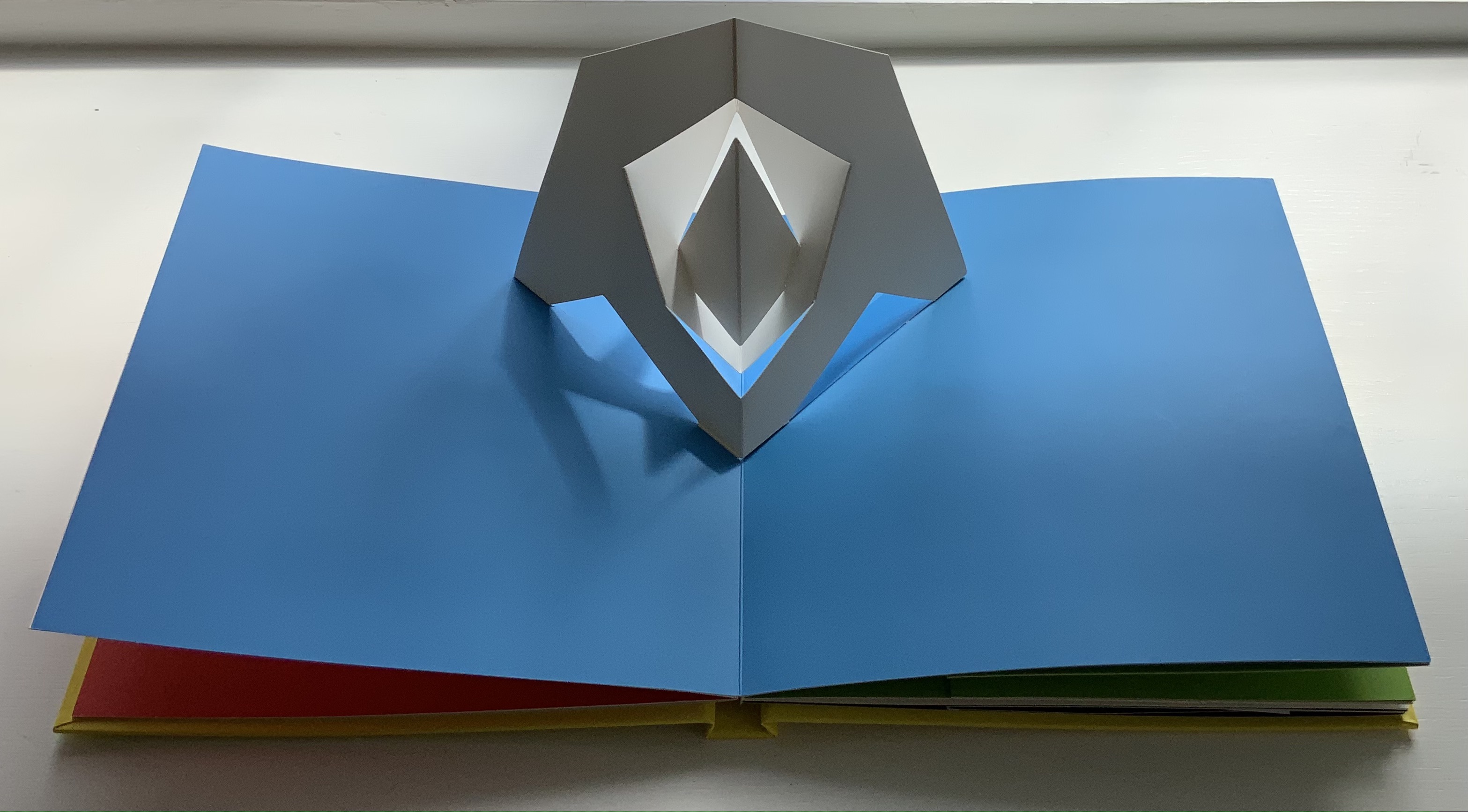
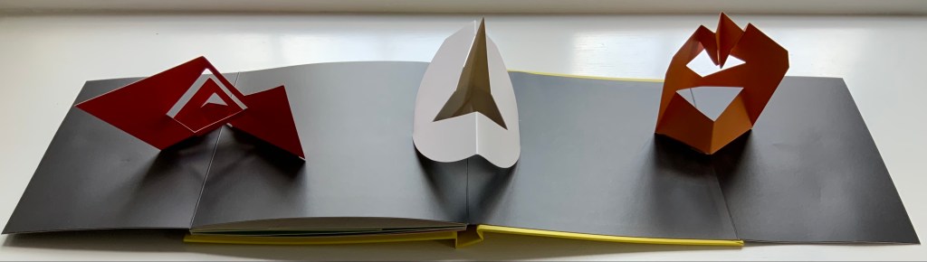
Munari’s travel sculptures also recall works in the collection like Cumer’s scultura da viaggio dipinta n.2 (2017), Komagata’s「Ichigu」(2015) and, albeit less portable, Ioana Stoian’s Nous Sommes (2015).
Further Reading
“A to Z: Marvels in Paper Engineering“. 29 March 2020. Books On Books Collection.
“Alphabets Alive! – The ABCs of Form and Structure“. 19 July 2023. Books On Books Collection.
“Ed Hutchins“. 20 September 2018. Books On Books Collection.
“Katsumi Komagata (I)“. 22 March 2020. Books On Books Collection.
“Movables Now and Then“. 31 August 2024. Books On Books Collection.
“Bruno Munari“. 19 August 2021. Books On Books Collection.
“Ioanna Stoian“. 27 April 2020. Books On Books Collection.
“Borje Svensson & James Diaz“. 9 September 2021. Books On Books Collection.
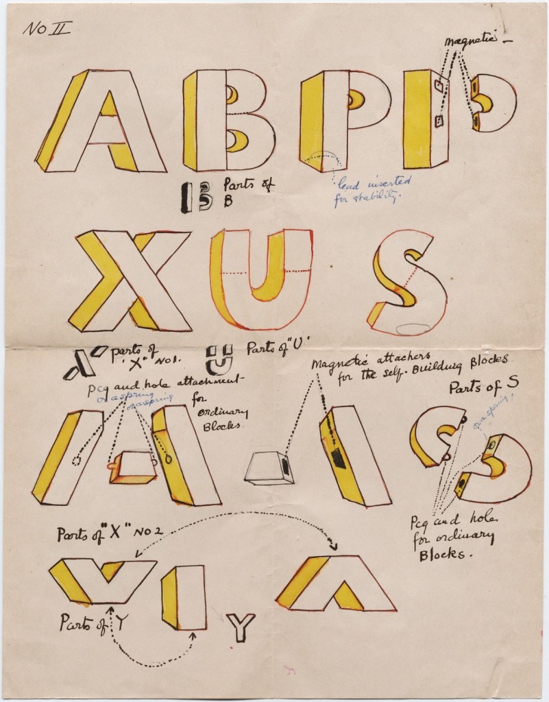
Carter, David A., and James Diaz. 1999. The Elements of Pop-Up, A Pop-Up Book for Aspiring Paper Engineers. New York: Little Simon.
Carter, David A., and James Diaz. 2021. The Complexities of Pop-up : A Pop-up Book for Aspiring Paper Engineers. [Allen, TX], [Westminster, CO]: Blossom Books ; Poposition Press.
Haining, Peter. 1979. Movable Books : An Illustrated History. London: New English Library.
Library of Congress. 2014. Origins & Variety of Movable Structures in the Book Format.
The Newberry Collection. n.d. Movable Books.
Reid-Walsh, Jacqueline. 2014. “What are Movable Books?” in Learning as Play: An Animated, Interactive Archive of 17th- to 19th- Century Narrative Media for and by Children. Philadelphia, PA: University of Pennsylvania.
Rubin, Ellen. 2019. Ellen Rubin – The Popuplady. For her definition of the “spider web” form of pop up (Within a circle, a spiral is cut either by hand or laser. A ribbon or pull is attached to the center area. When pulled up, a ‘spider web’ pop-up is created.), Rubin illustrates it with an example from Carter.
Schmidt, Suzanne Karr. 2024. Movable Mayhem: Pop-up Books through the Ages.Seattle, WA: Book Club of Washington.