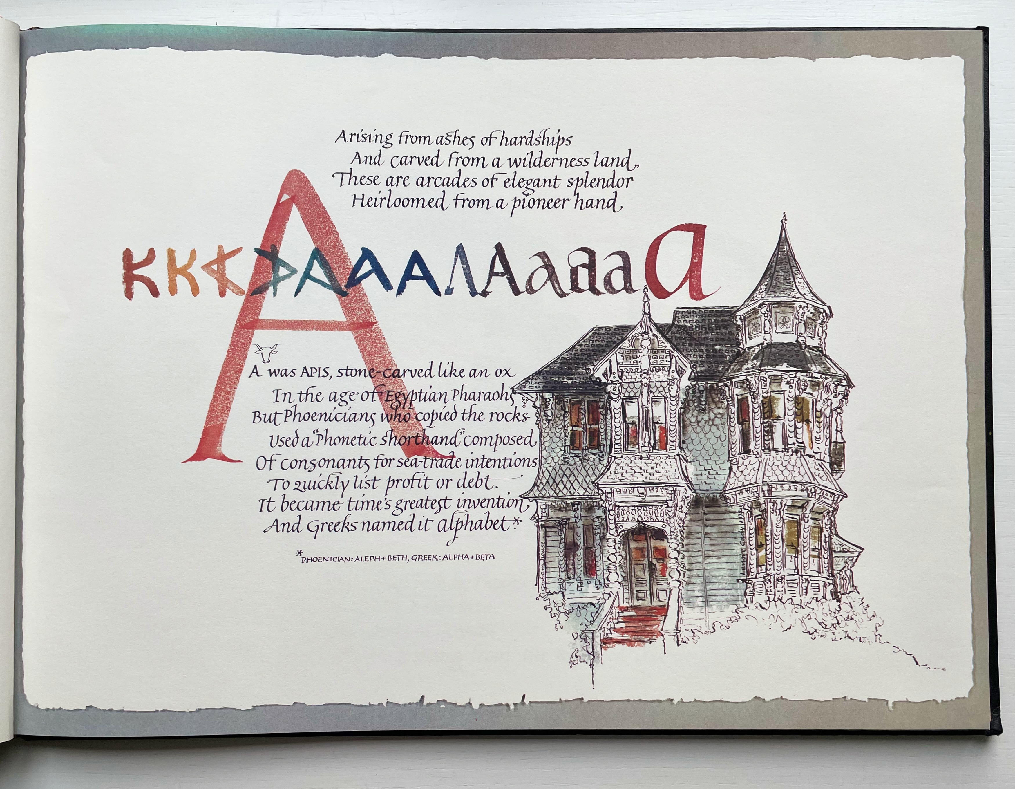
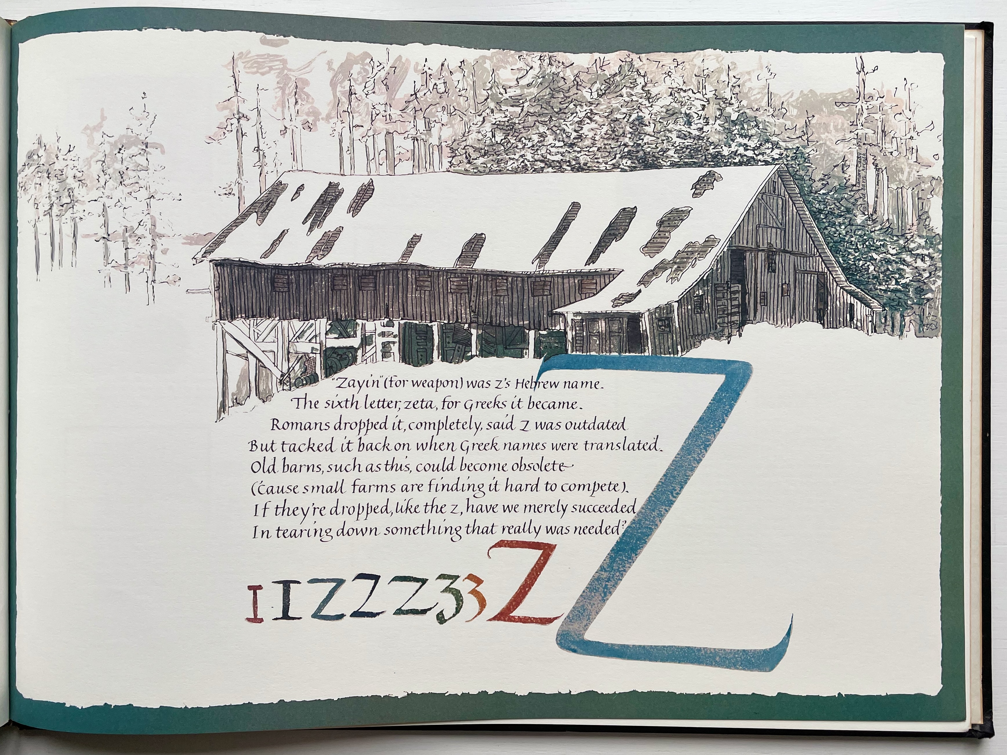
ABCing: Seeing the Alphabet Differently Colleen (Ellis) Comerford (2010) Board book, illustrated paper-on-board cover. H160 x W160 mm. 66 pages. Acquired from Powell’s Bookstore, 29 June 2023. Photos: Books On Books Collection. Displayed with artist’s permission.
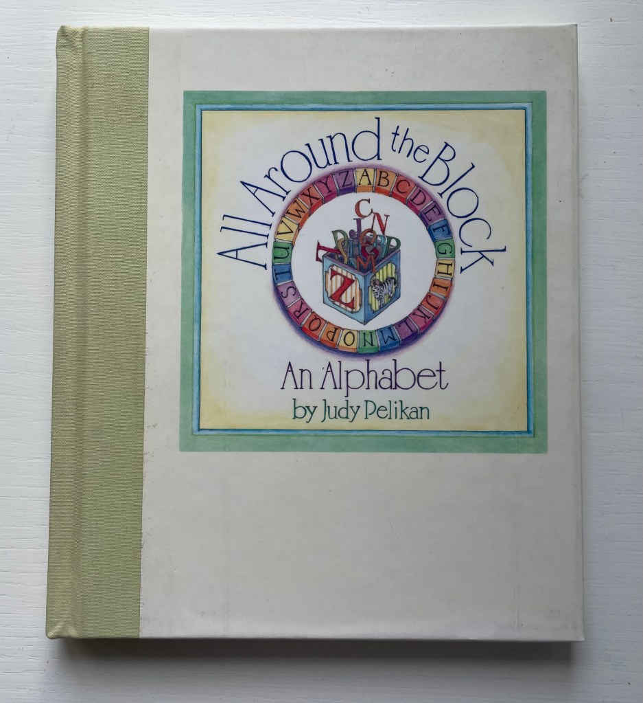
All Around the Block: An Alphabet (2008) Judy Pelikan Hardcover H168 x W145 mm. 56 pages. Acquired from Amazon, 24 September 2022. Photos: Books On Books Collection. Displayed with permission of the artist.
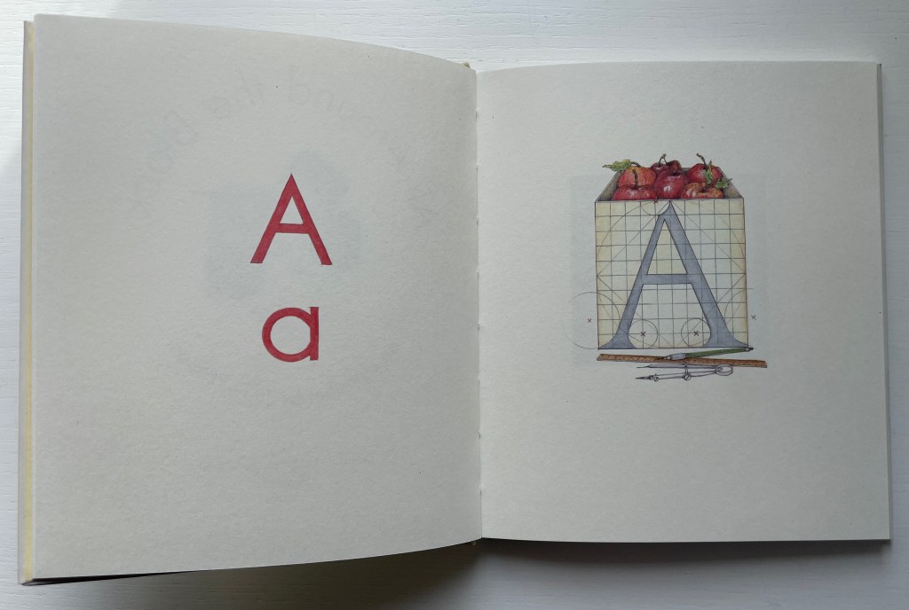
From the cover to the last letter, Judy Pelikan’s book is an extended visual pun with more puns in between. Some of the resulting images (like that for the letter A) are deeply clever; others (like that for the letter Z) are surreal. Obviously A is for a box of apples, but the uppercase serif A on yellowed grid paper with drawn guidelines recalls the early designers of geometrically created letters such as Feliciano, Pacioli, Durer, Tory and others. Driving home the recollection, the artist has laid out the tools for such typographical design: compass, straightline and pen. Here, “all around the block” is all about the square.
Most of the visual puns are simple like B for books and blocks; others are straightforward but dense like C for crate, cloud, curl, cup, coffee and castle (that’s six for all sides of the block!); others are strange. For the letter Z, we have the surreality of a zebra and her foal grazing on top of the block on whose front panel a zebra moth or butterfly hovers by a ziggurat behind an old-fashioned console (Zenith?) with a third zebra peering from its screen.
All Around the Block warrants a closer look on each page as well as favorable comparison and contrast with any of the works noted below.
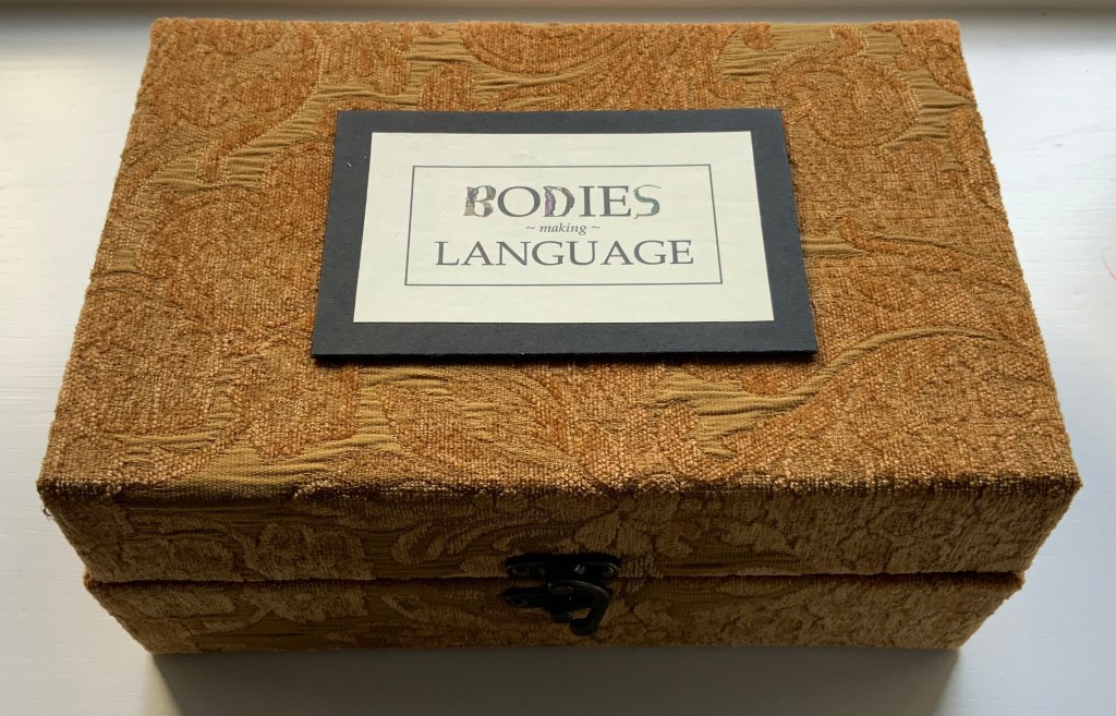
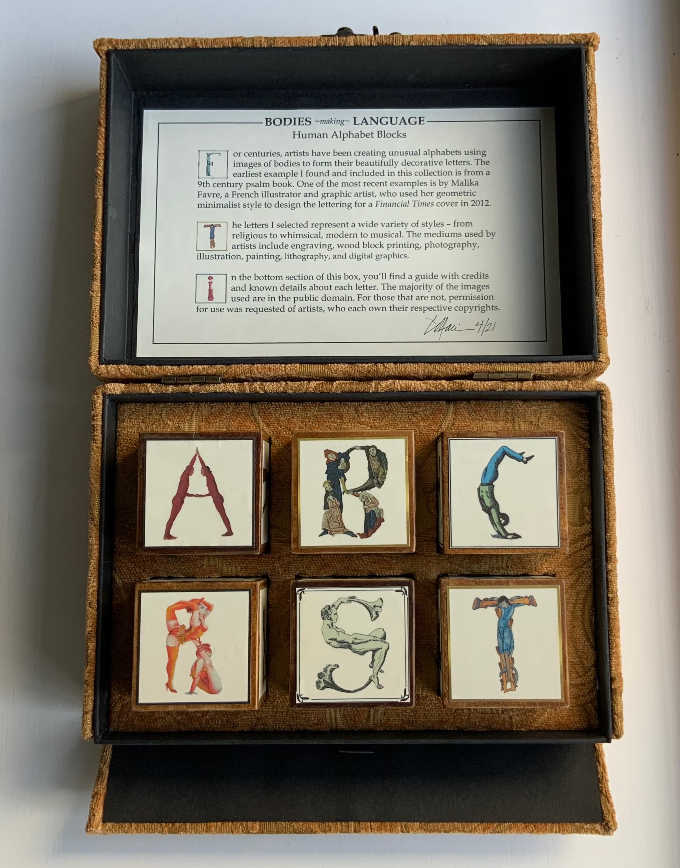
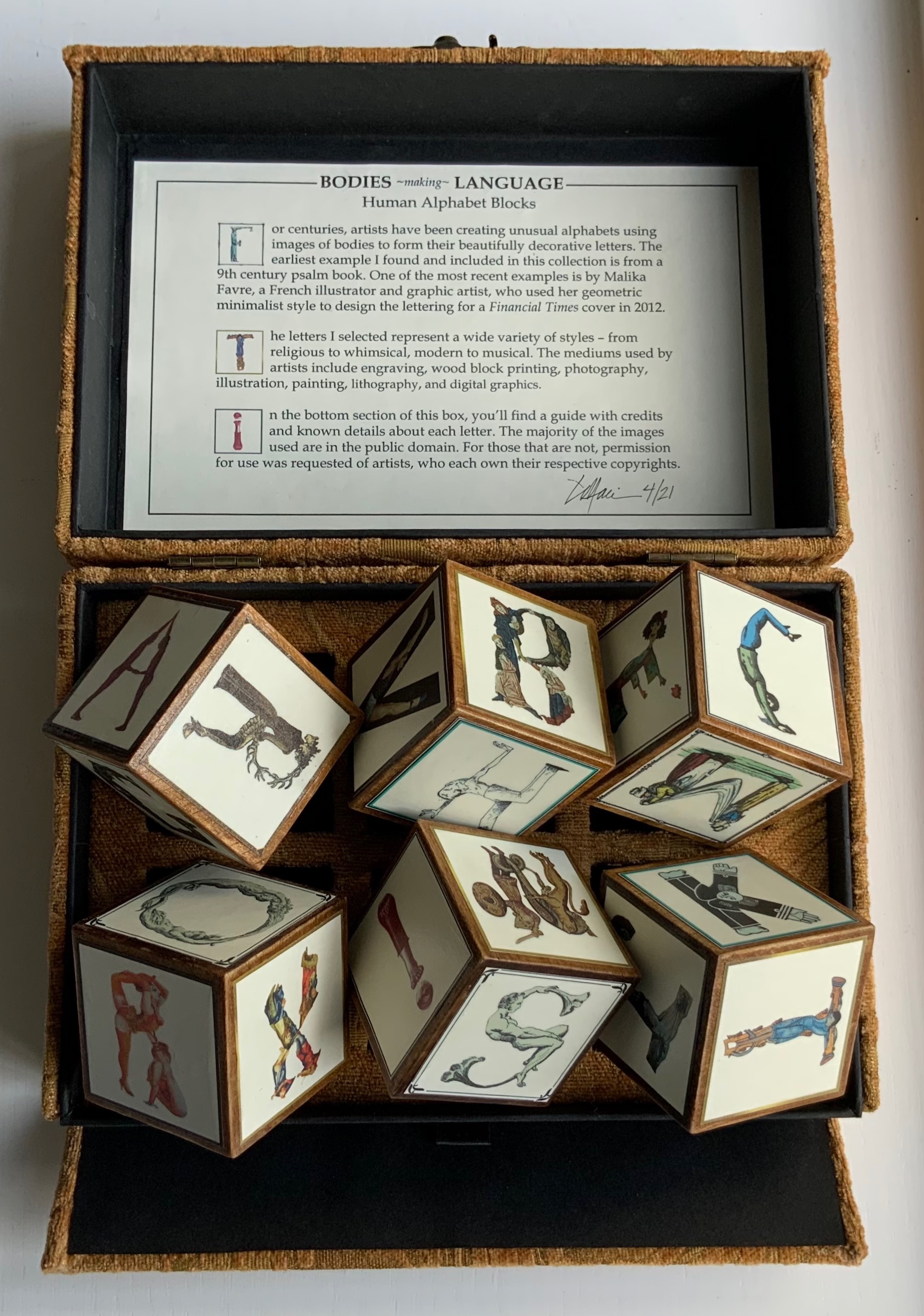
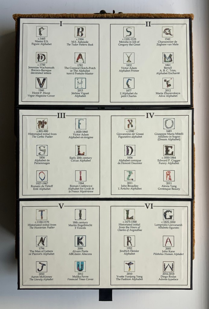
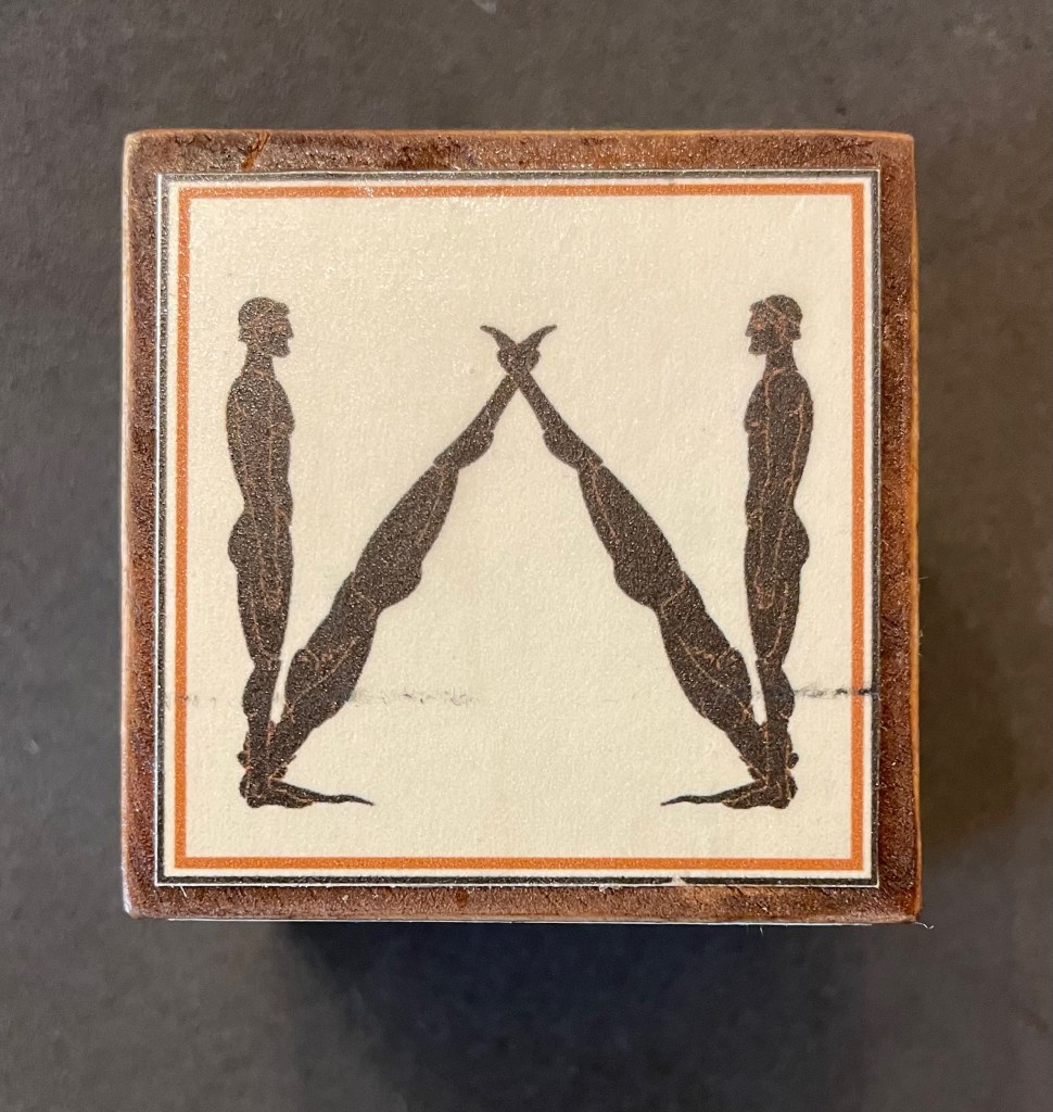
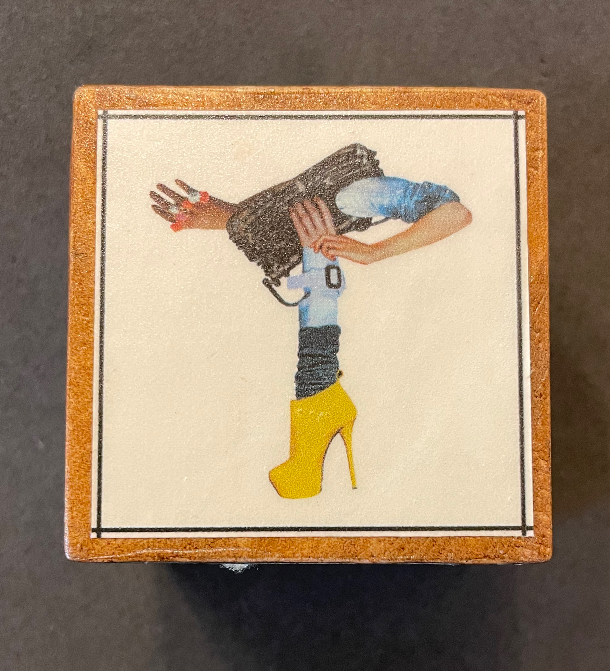
Bodies Making Language (2021) Lisa Merkin Brocade-covered box containing six blocks and compartment with three cards. Box: H95 x W225 x D155 mm. Blocks: cube 50 mm. Cards: H105 x W205 mm. Unique work. Acquired from the artist, 20 September 2021. Photos: Books On Books Collection. Displayed with permission of artist.
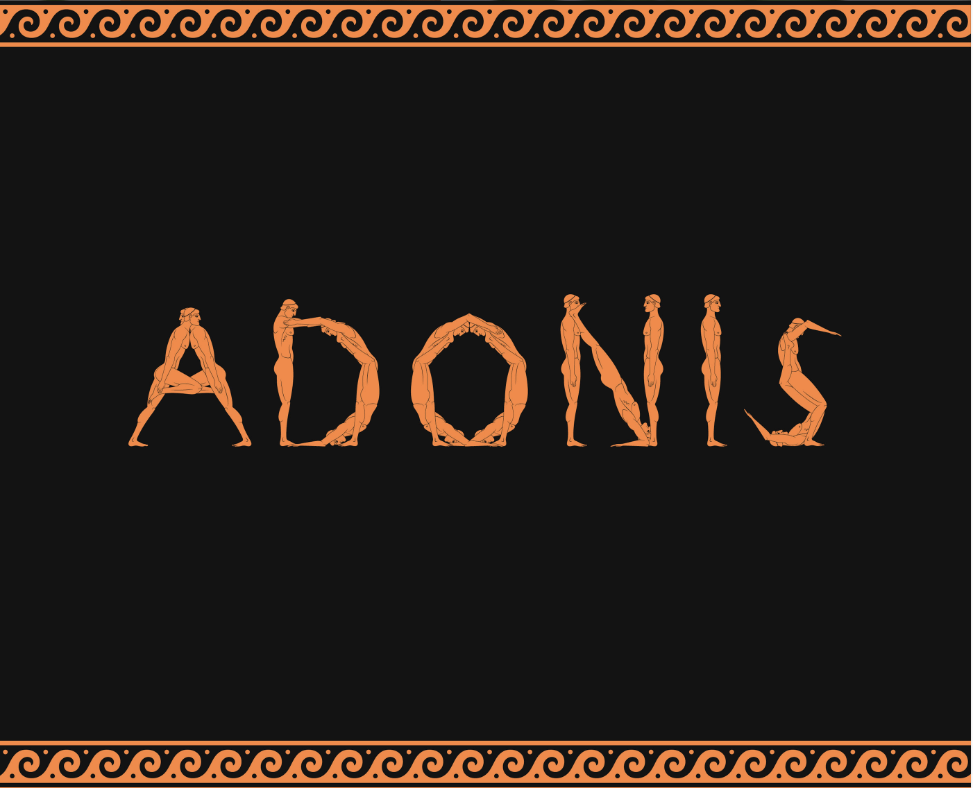
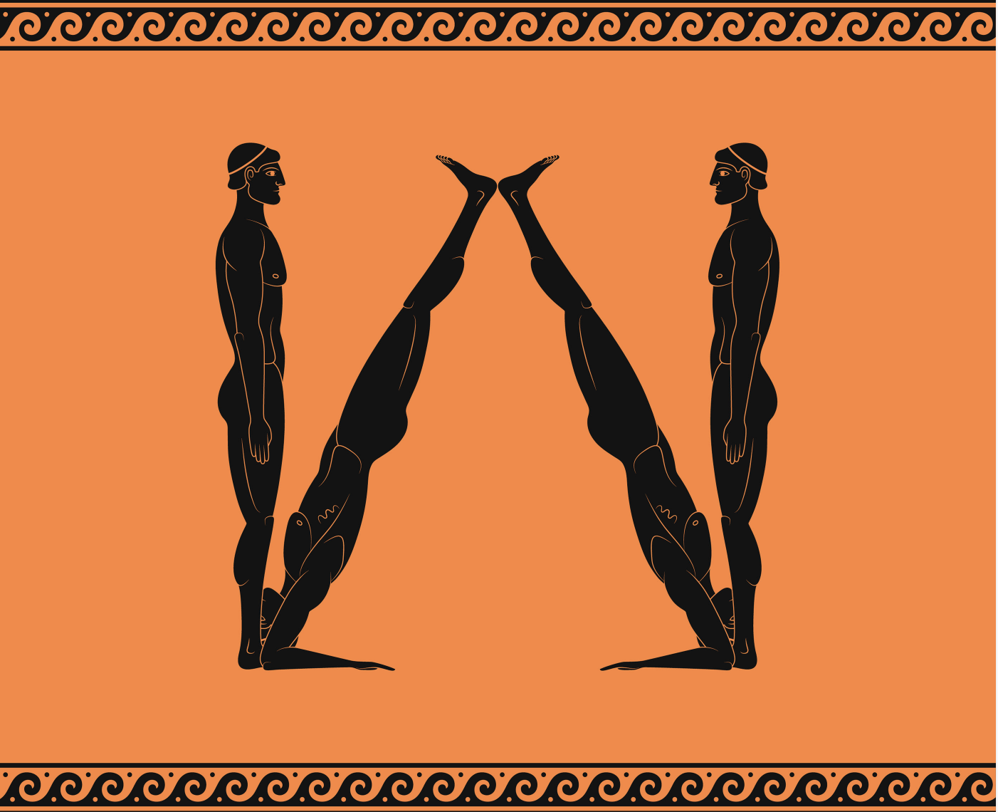
In a play known from fragments as the Alphabet Tragedy (although it sounds more of a comedy), the ancient Greek playwright Kallias had his chorus and actors mime and dance the letters of alphabet. Lisa Merkin’s book of blocks in a box shows that bending bodies to make letters has never grown old. Appropriately, her most recent image comes from Diego Rodas Feroni’s typeface Adonis (2018), which seems to recall the Greek playwright’s actors. Also in the Books On Books Collection, Vítězslav Nezval & Karl Teige’s Abeceda (1926), Pilobolus Dance Company’s Human Alphabet (2010) and Marie Lancelin, Gestes Alphabétiques (2014) have carried on the tradition of the alphabet dance.
Block 6: During his studies at UFRJ Universidade Federal do Rio de Janeiro, Diego Rodas Feroni designed the Greek God figurine typeface Adonis (2017).
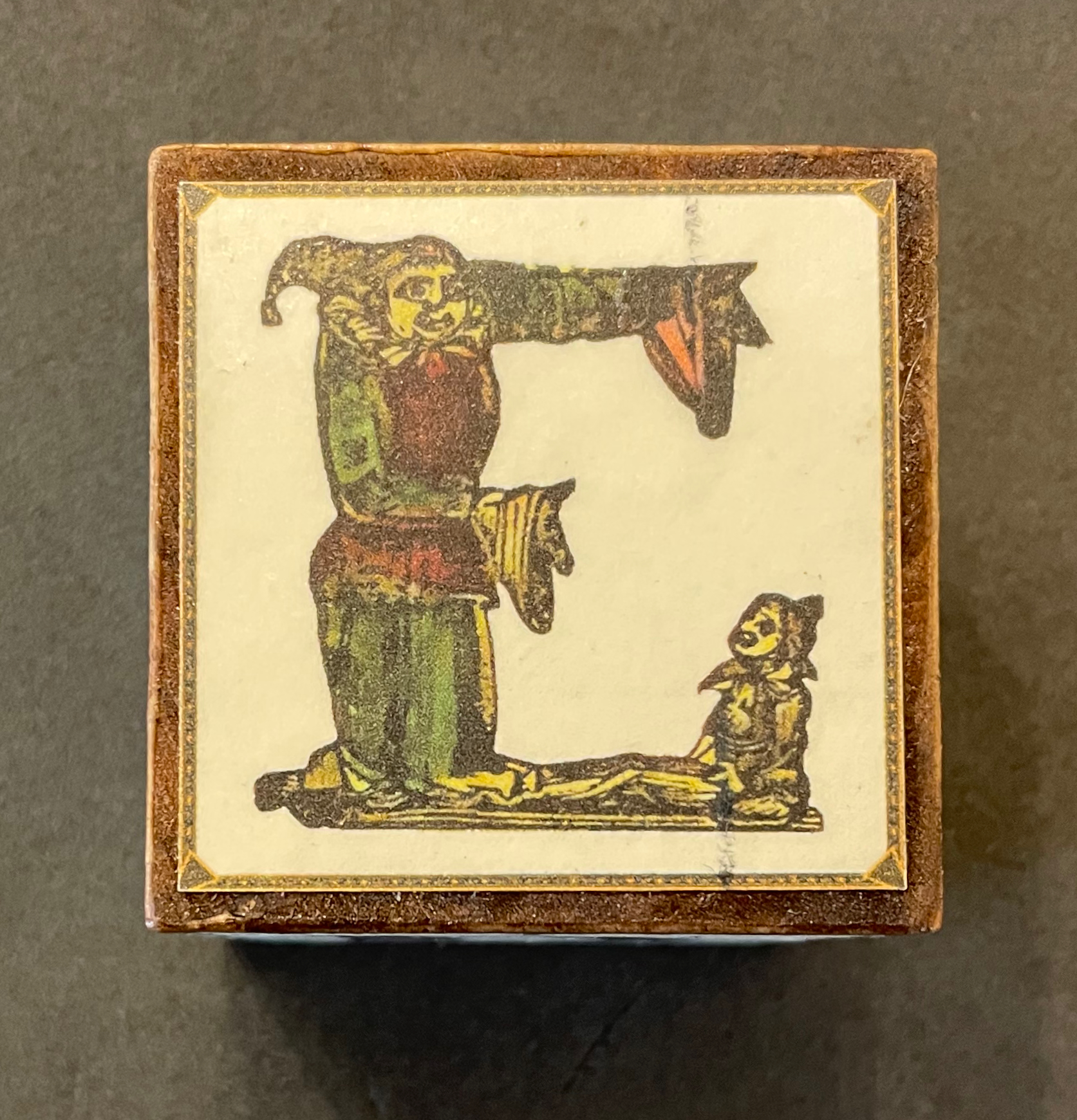
Many of Merkin’s choices celebrate the more comic aspects of anthropomorphic letters: Carington Bowles’ The Comical Hotch-Potch (1782), Bowles & Carver’s The Man of Letters, or Pierrot’s Alphabet (1794), Honoré Daumier’s Alphabet comique (1836), Edward P. Cogger’s Funny Alphabet (c. 1850-64), Aaron McKinney’s The Unruly Alphabet (2010) and Jérôme Viguet’s caricatures Alphabet (2013).
Block 4: Funny Alphabet (c.1850 – 1864) by illustrator and engraver Edward P. Cogger. McLoughlin Brothers Publishing, NY. Block 5: The Unruly Alphabet is a “lively and haunting abecedary“ book created in 2010 by the English illustrator Aaron McKinney, who sets the alphabet against a backdrop of rebellious behavior showcasing human nature.
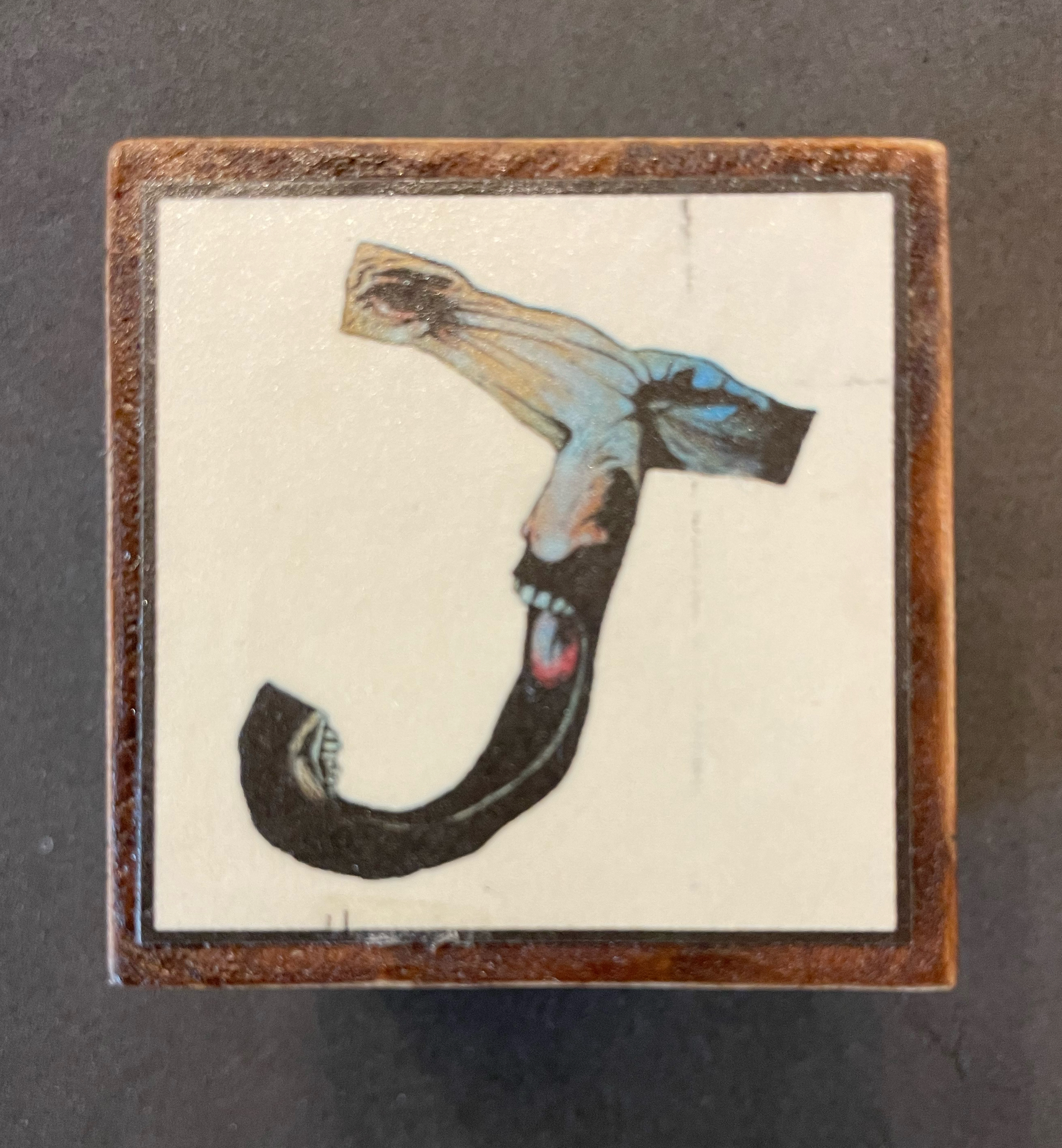
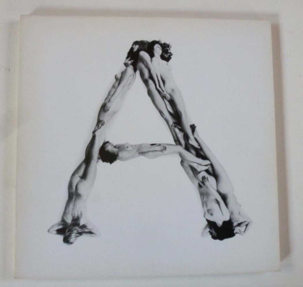
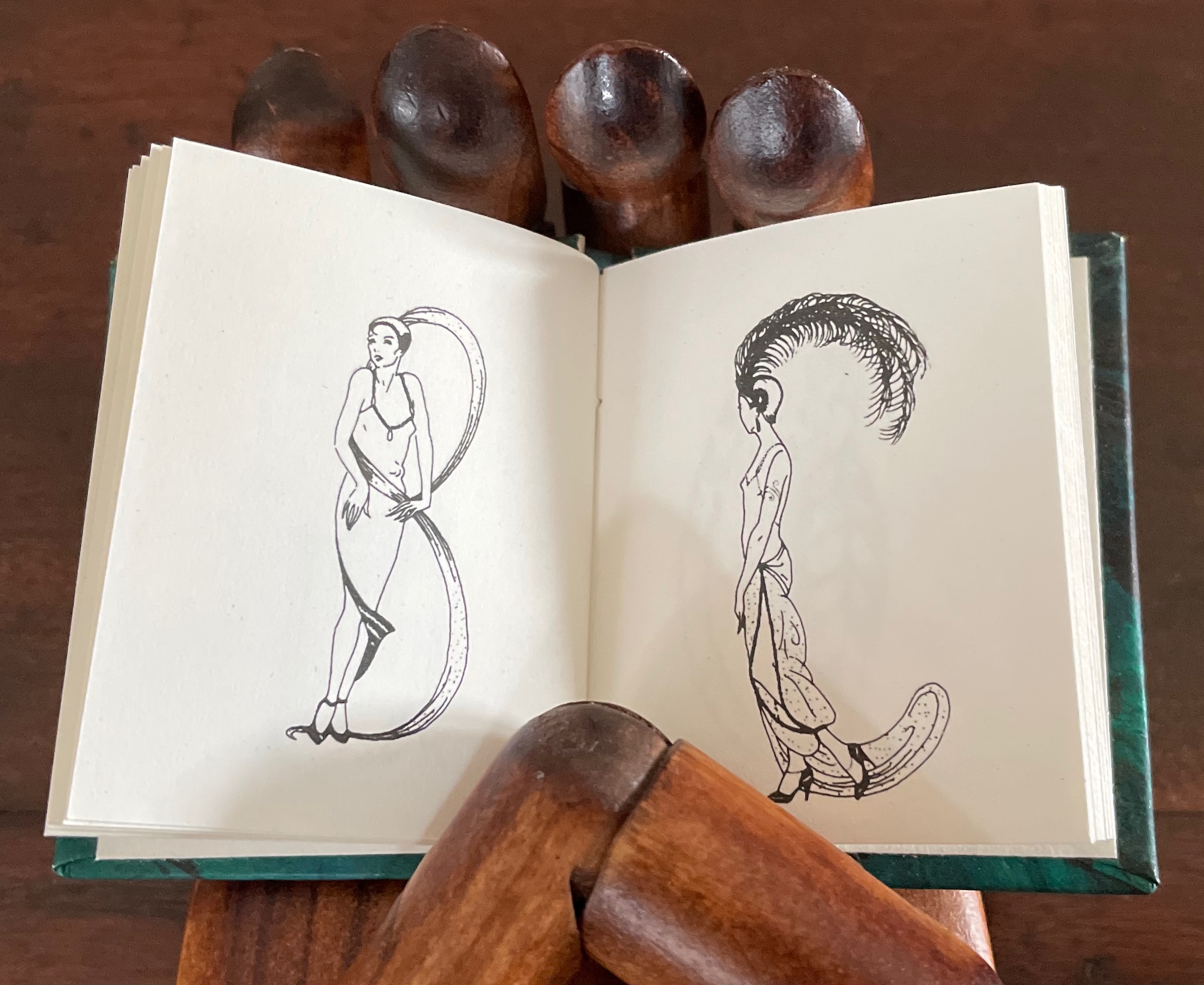
Maybe the human body and the perfect letter have something in common. Geofroy Tory (1529) and Anthon Beeke (1970) certainly thought so — the former in a neo-Platonic, religious way and the latter in a more secular way. Although Beeke is not represented among Merkin’s blocks, she does not neglect celebrations of the female form. Most of them come from the realm of fashion: Erté’s Alphabet (1927-67), Horst P. Horst’s Vogue cover (1940), Yvette Yang’s The Fashion Alphabet (2010) and Alexia Yang’s Grotesque Beauty (2011). From the collection, Rebecca Bingham’s miniature Lady Letters (1986) could qualify for the catwalk.
Block 6: The Fashion Alphabet by Korean-born, Dutch-educated, and Paris-based artist, Yvette Yang. In 2007, Yang began creating her font fashion series with bits and pieces from the runways and magazines. This T is from her interpretation of Spring/Summer 2010. Lady Letters (1986) by June Sidwell and Rebecca Bingham. The miniature book captures Sidwell’s designs and poses.
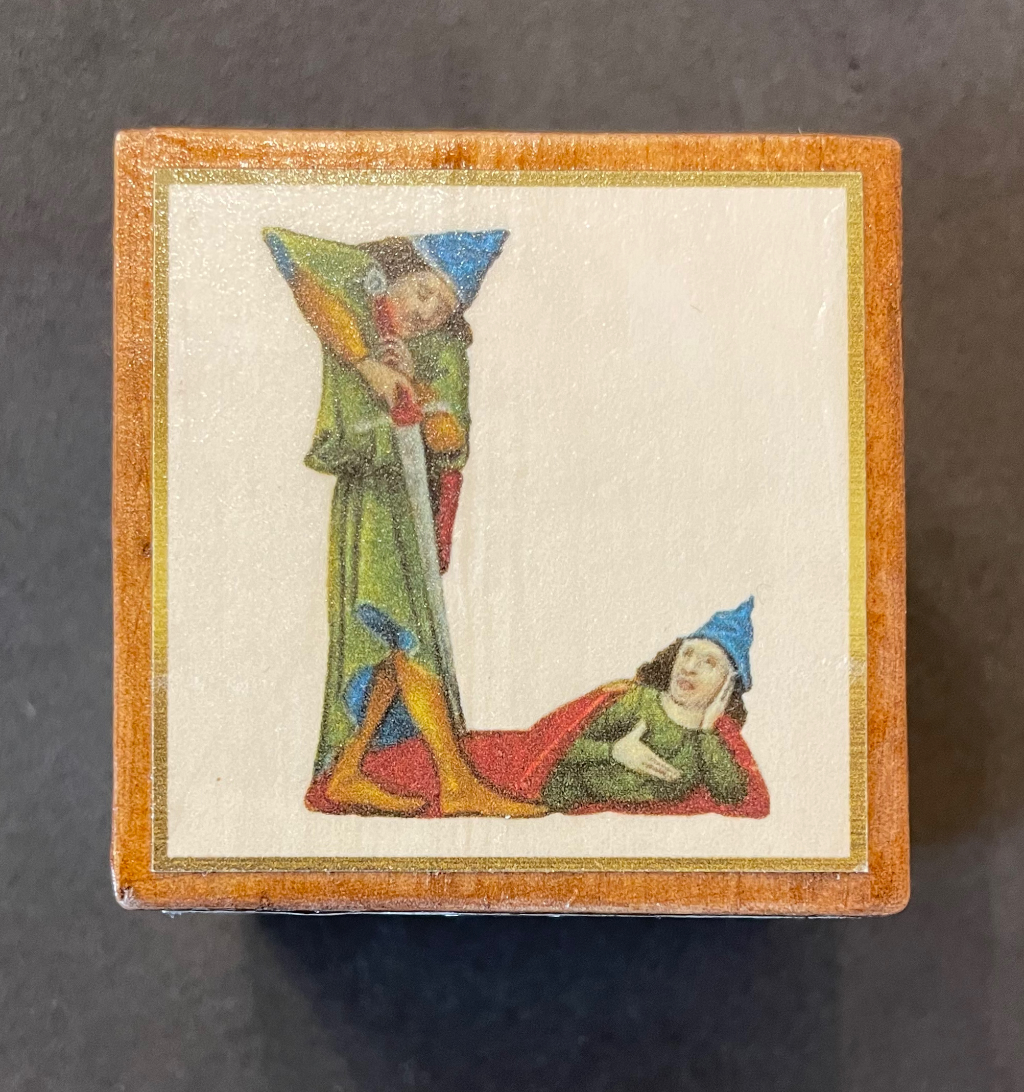
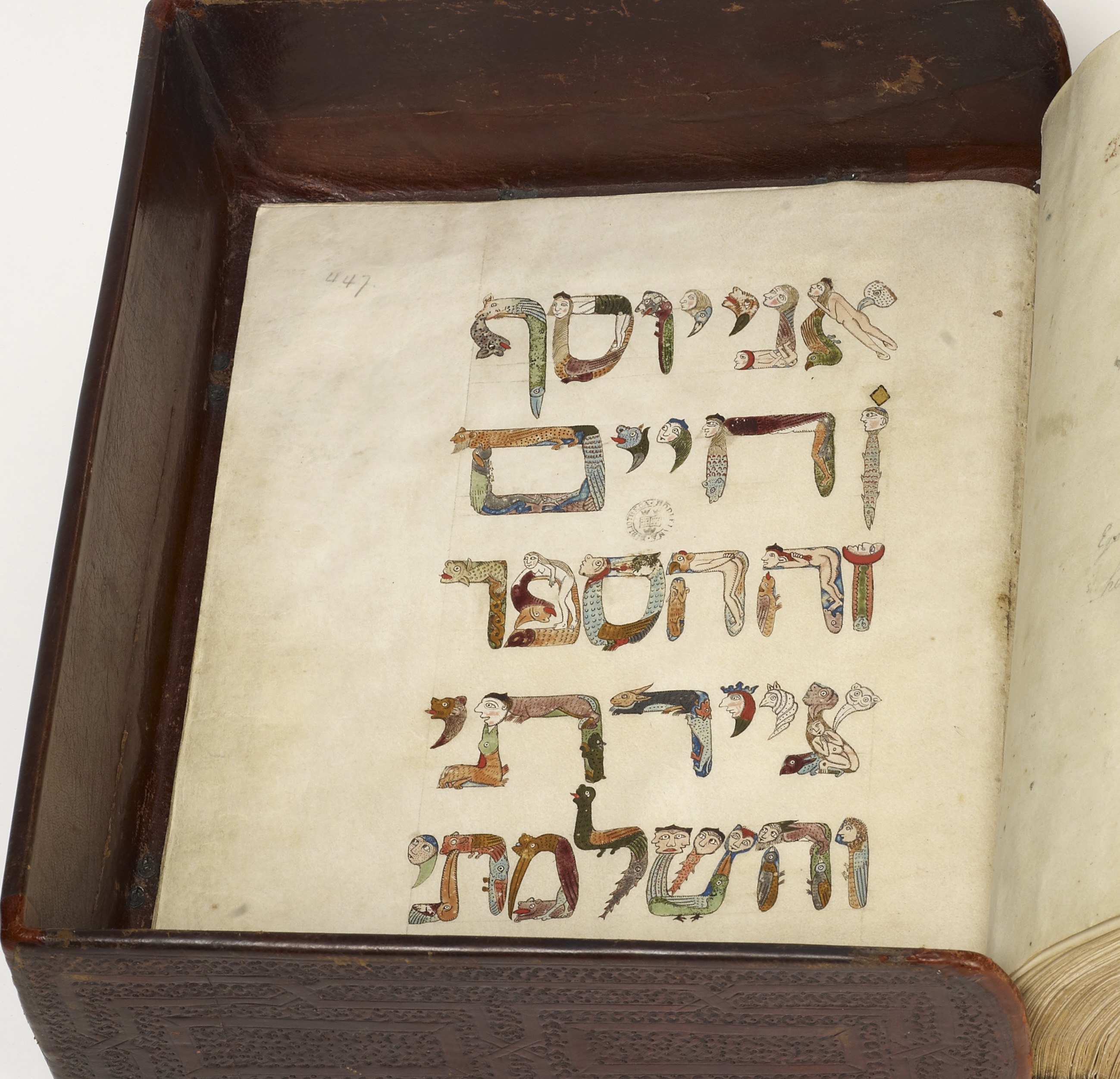
Historiated and figurative letters from the 6th to 15th centuries so well represent the Latin alphabet in Merkin’s box of blocks it would be greedy and thematically problematic to wish for one of the Hebrew letters from the Kennicott Bible. If there is ever a second Merkin volume to celebrate anthropomorphic letters, though, another range of languages beckons. For Ukrainian, there are the letters of Tatyana Mavrina. For Arabic, there are Mahmoud Tammam’s inventions, but then the volume would have to admit the zoomorphic, which suggests perhaps a third Merkin volume of animal alphabets.
Block 6: Horae ad usum Parisiensem (Hours of Charles of Angoulême) (ca. 1475-1500) by the French illuminator and painter Robinet Testard (fl. 1470–1531). Bibliothèque nationale de France, Paris. Block 2: Moralia in Job by Pope Gregory the Great (590-604). The Abbaye Notre-Dame, Cîteaux, France.
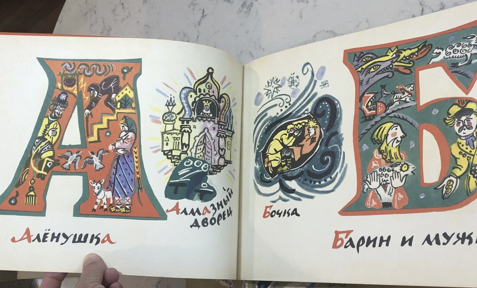
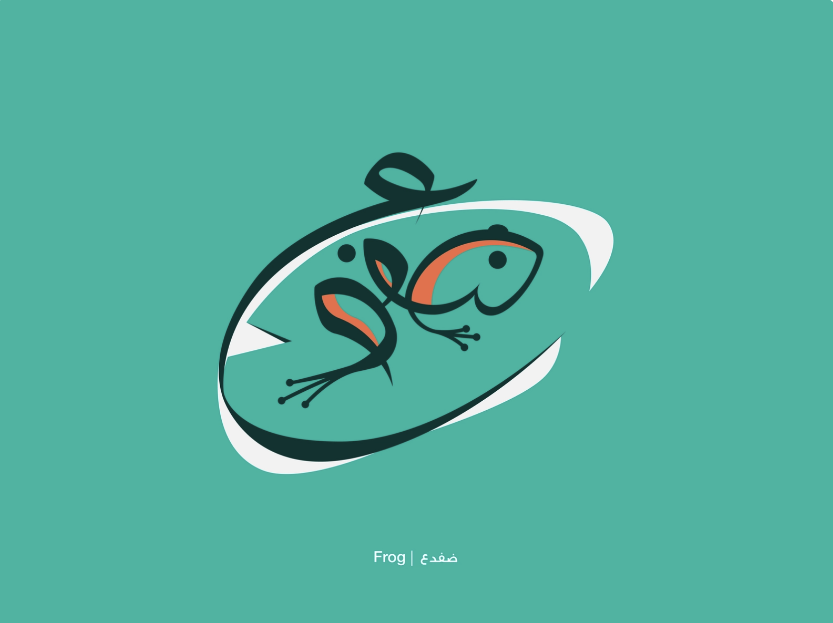
Hebrew Bible with David Kimhi’s Sefer Mikhlol (“Kennicott Bible“) (1476). Neubauer 2322. Bodleian Libraries, Oxford. Сказочная Азбука / Skazochnaia Azbuka / A Fairy Tale Alphabet (1969) by Tatyana Mavrina. In his Arabic letters project, Mahmoud Tammam manipulates the Arabic script ضفدع meaning “frog” to illustrate its meaning.
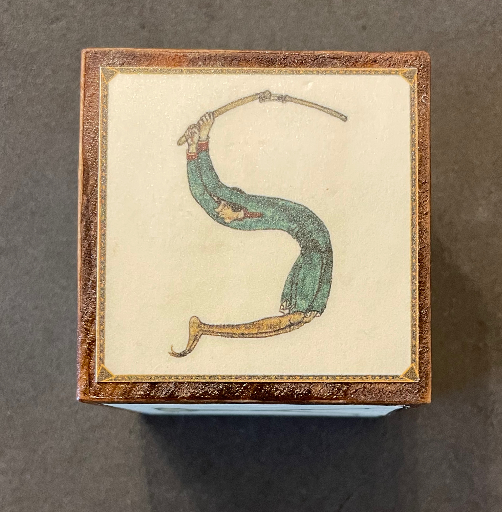
As shown with the Adonis letter W, Merkin’s blocks remind us of the influence of past art on the alphabets of 20th- and 21st-century designers and artists. Among the modern alphabetic variants, Dada and Surrealism make a strong showing of influence on Yvette Yang’s letter T (above) and Roman Cieślewicz’s letter i (below), and who knows, perhaps Giuseppe Maria Mitelli’s letter O influenced the Dadaists and Surrealists themselves. More than a strong showing, these styles highlight something fundamental about the alphabet and art. Both the alphabet and art ask, Are we discovering meaning or making meaning?
Block 4: Alfabeto in Sogno (1683), etchings by Giuseppe Maria Mitelli (1634-1718). Block 3: From the fantastical alphabet created by Roman Cieślewicz (1930 -1996) for Guide de la France Mystérieuse” (1964).
Every history of letters or script begins with the figuratively pictographic. Someone somewhere at some time scrawled a shape tied to a sound tied to an object — A is for Ox — and some other(s) in the same place and time recognized and accepted the discovery that this handmade shape could conjure up that object in the mind. It would have seemed magical, and they imagined that somehow meaning and reality inhered in that shape or sound waiting to be discovered.
Yet, the shapes of characters — whether Latin or Chinese or Arabic or any language — and their relationship to the sound or meaning they represent is arbitrary, a prehistorical and historical function of social convention, a collective making by individuals. That arbitrariness provides the opening for artists to use the alphabet to question our meaning-seeking behavior and our assumptions about reality, and modern artists’ anthropomorphizing the alphabet pokes fun at that behavior and those assumptions. Perhaps a fourth Merkin box — one for bodies making “asemic alphabets”?
Clodd, Edward. 1913. The Story of the Alphabet. London: Hodder and Stoughton. 1913. Superseded by several later works, but is freely available online with line illustrations and some black and white photos.
Diringer, David, and Reinhold Regensburger. 1968. The alphabet: a key to the history of mankind. London: Hutchinson. A standard, beginning to be challenged by late 20th and early 21st century archaeological findings and palaeographical studies.
Dukes, Hunter. 27 April 2023. “Punctuation Personified (1824)“. The Public Domain Review. Not only could letters be formed with the human body, so could quotation marks and square brackets.
Gagné, Renaud. 2013. “Dancing Letters: The Alphabetic Tragedy of Kallias”. In Choral Mediations in Greek Tragedy, ed. R. Gagné and M. Hopman, Cambridge University Press 282-307.
Goetz, Sair. 11 June 2020. “Letterforms / Humanforms“. Letterform Archive News. Accessed 30 January 2022.
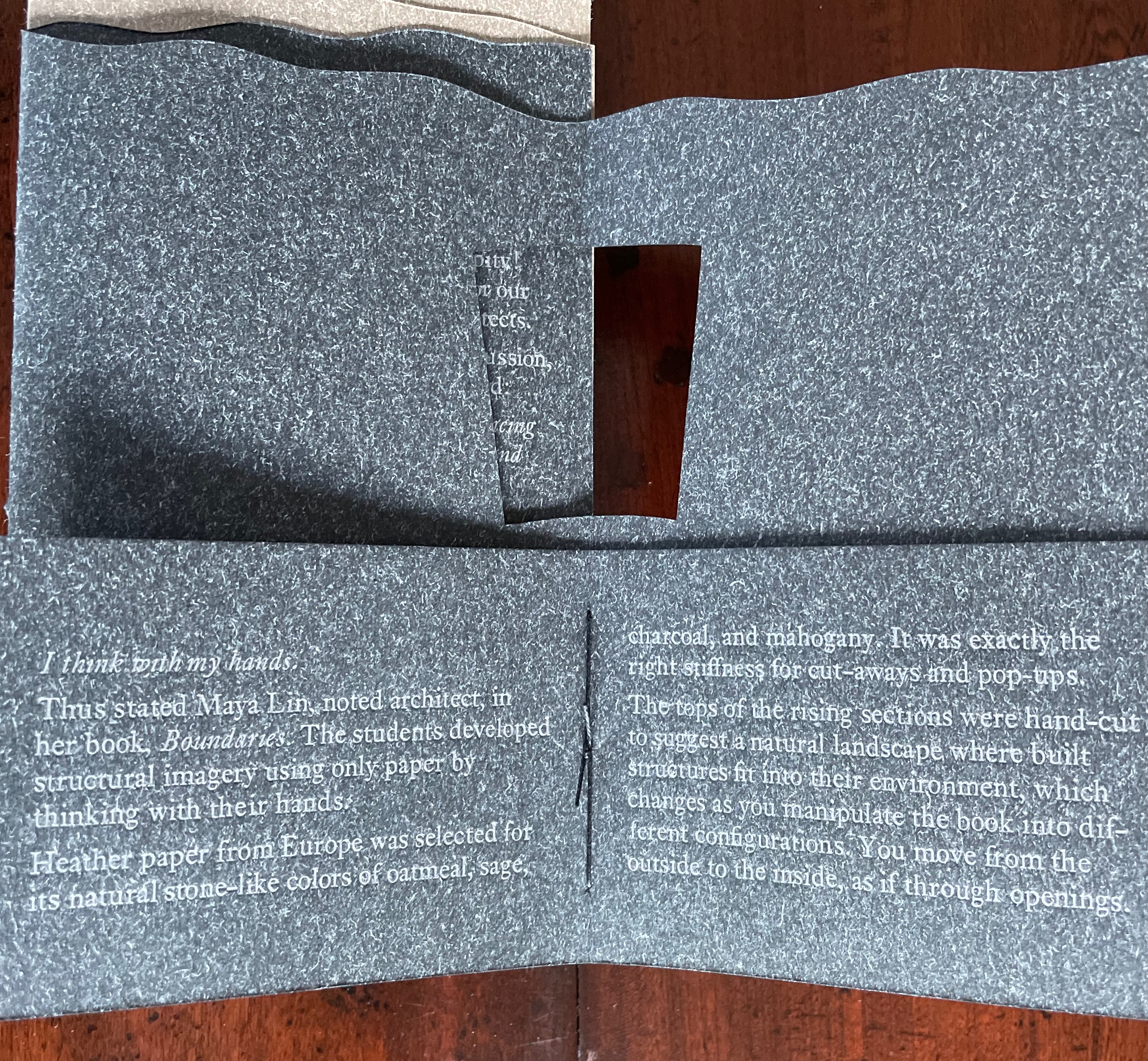
What is it about artists’ books and architecture that they intersect so often? Architectural interiors and exteriors, ideas, themes, styles, landmark dwellings and edifices have found their metaphorical expression and embodiment in book art with such regularity that they make up a genre within the genre. Perhaps it is that, as Victor Hugo expresses it in Nôtre Dame de Paris (1831/1902),
… the human race has two books, two registers, two testaments: masonry and printing; the Bible of stone and the Bible of paper. … The past must be reread upon these pages of marble. This book, written by architecture, must be admired and perused incessantly; but the grandeur of the edifice which printing erects in its turn must not be denied. (Book V, Chapter 2, p. 187)
Or perhaps it is even more fundamental. As Hugo asserts in his posthumous The Alps and the Pyrenees (1890/1895):
All letters were signs at first, and all signs were images at first…. Human society, the world, man as a whole, is in the alphabet….A is the roof, the gable with its cross-beam, the arch, arx; … Z is the lightning, it is God. (pp. 64-65)
Beneath the mysticism and pareidolia, Hugo is on to something. Maybe the affinity of books and architecture lies in the origin of the raw material of books — the alphabet — whose second letter comes from a mark signifying shelter or house.
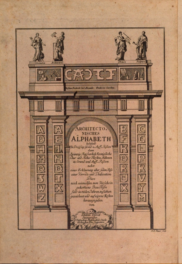
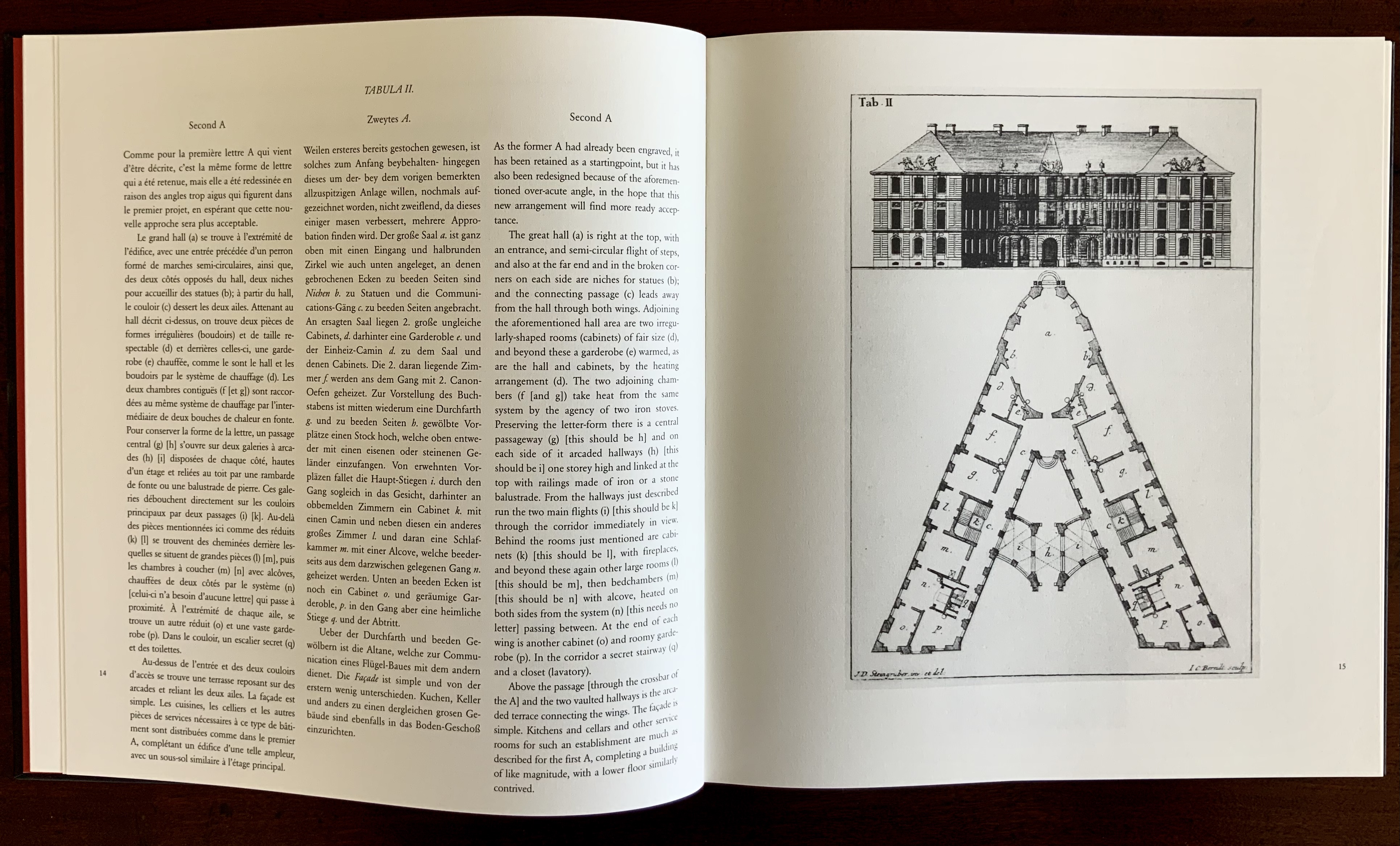
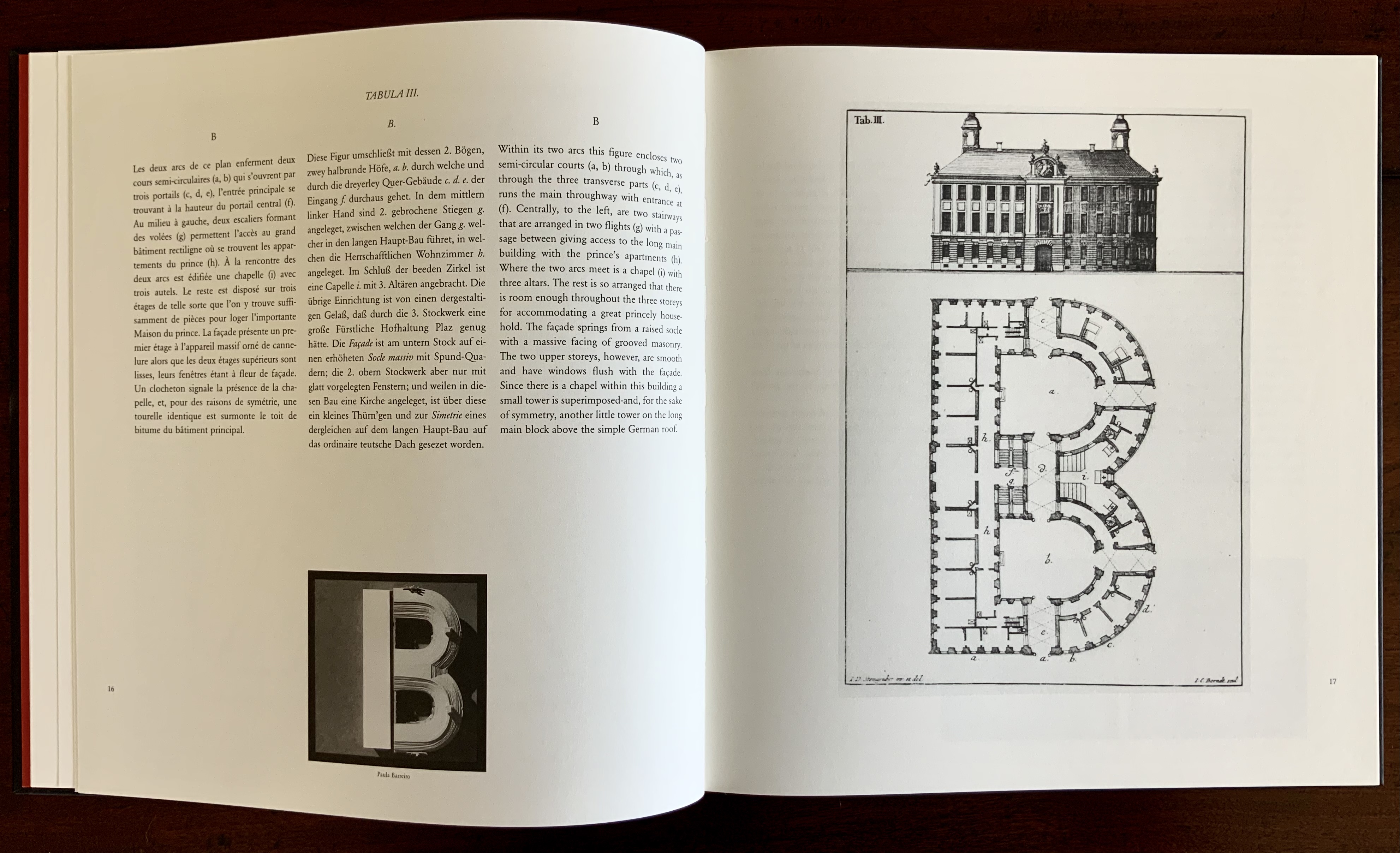
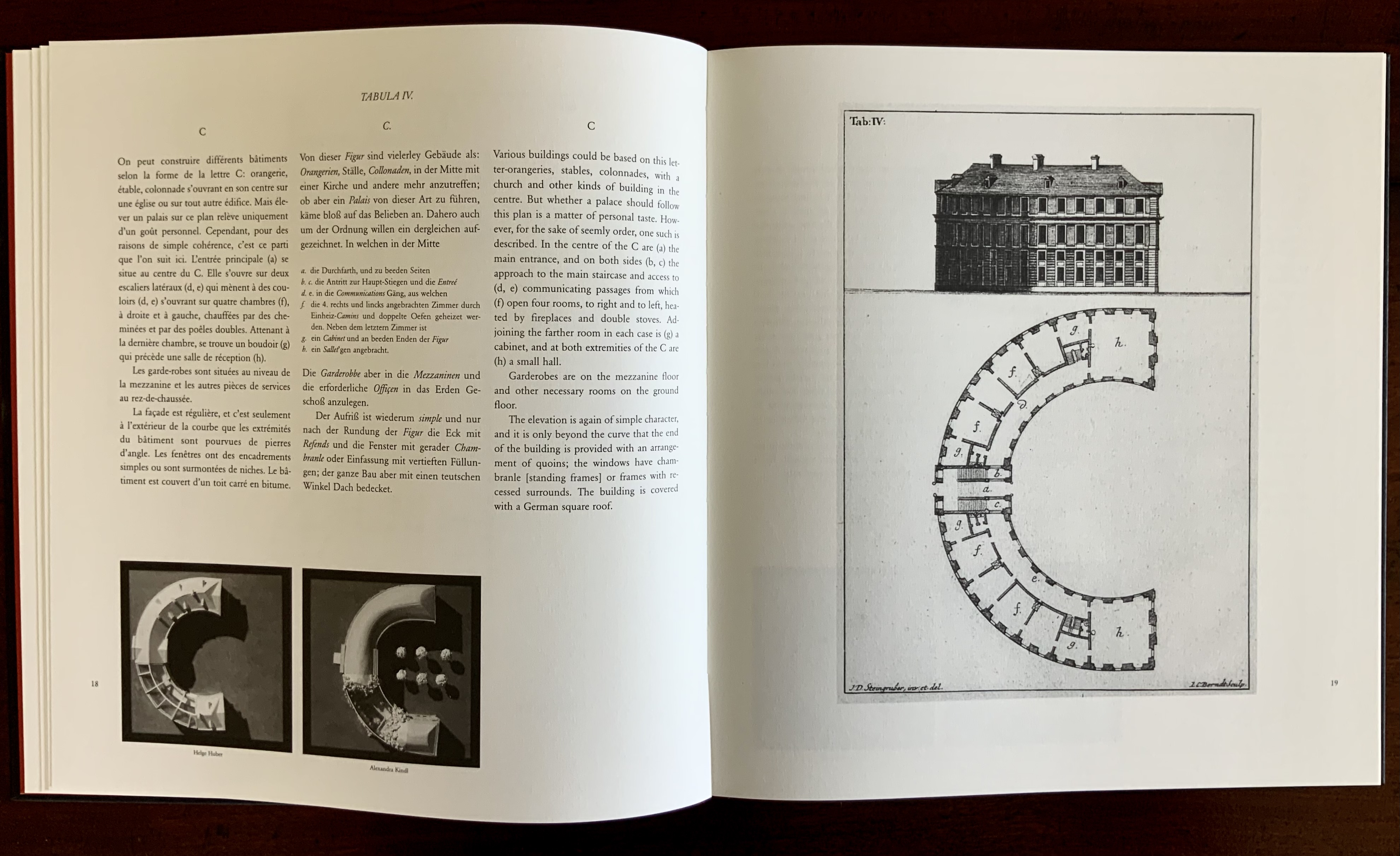
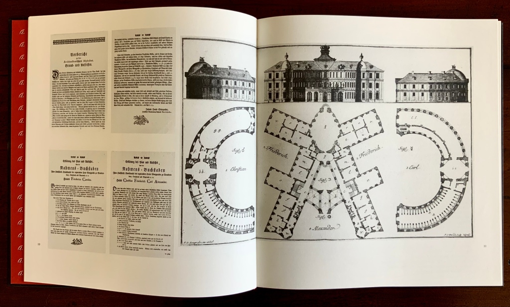
This wondering and wandering about the intersection of architecture and the artist’s book is prompted by the 250th anniversary of the publication of Johann David Steingruber’s Architectonisches Alphabeth(1773). This postcard-famous volume of print folios depicts architectural elevations and plans for residences in the shape of the letters of the alphabet. It is dedicated to Christian Friedrich Carl Alexander, Margrave of Brandenburg-Ansbach, not to be confused with the paying dedicatee of Bach’s Brandenburg Concertos, the Margrave of Brandenburg-Schwedt. By a baroque coincidence, however, the first Brandenburg concertos, the ones composed by Giuseppe Torelli and influencing Bach, are dedicated to the Margrave of Brandenburg-Ansbach, then George Friedrich II, Alexander’s great-uncle who employed Torelli as court composer. Unlike Bach, however, Torelli received no direct payment for his composition. Steingruber too had to be satisfied with his payment as an appointee (court and public surveyor, and later principal architect of the board of works).
Steingruber may have felt he had good reason to be miffed. After all he had published the volume in installments at his own expense and made sure that the Margrave’s monogram (and that of Carolina Frederica, his wife) in building form appeared in the span above the roman arch on the title page. His elevations and plans draw attention to the heating, kitchen, toilet and servants’ arrangements as if conferring with a prospective client ready to commission one of these typographic palaces. Perhaps he was thinking, Who would not want a serif with a view? Or conduct guests on a tour of the bowl, capline, crossbar, stem, stroke and tail of the property? In a flourish that illustrates the intersection of book and architecture, the title page presents the title and subtitle inside an arch and serves double duty as a Table of Contents with thumbnail images of the letter-shaped buildings to come inscribed on the columns.
Munich, Bavarian State Library
To celebrate the Architectural Alphabet‘s 250th anniversary, this online essay/exhibition explores sixteen propositions about the affinity of architecture and artists’ books. Examples supporting each proposition include works from within and without the Books On Books Collection, and each example includes a link or links for additional views of the work. Every effort has been made to provide bibliographical (or webliographical?) links from WorldCat and the Internet Archive. The former will allow the reader to find local libraries that hold a copy of the exhibited work to be viewed in person; the latter will partly address the problem of broken links. Where broken links (or factual errors) do appear, readers are encouraged to alert the curator in the Comments section at the end of the essay/exhibition.
Proposition #1: The affinity of architecture and artists’ books lies in the alphabet.
Architectonisches Alphabeth (1773/1995) Prepared by Joseph Kiermeier-Debre and Fritz Franz Vogel for Ravensburger Verlag.
Of course the first exhibit would be Steingruber’s Architectural Alphabet, but related works — before and after, published or built — will clamor for admission: Geofroy Tory’s Champ Fleury (1529/1927/1998), Antonio Basoli’sAlfabeto Pittorico(1839/1998), Giovanni Battista de Pian’s Alphabetto Pittoresque (1842), and Daniel Libeskind’s Contemporary Jewish Museum (2000), whose form within the walls of a former power substation is composed of two Hebrew letters — the Yud and the Chet — which make up the word Chai (“Life”).
Left to right: Tory/Rogers, Basoli, Battista de Pian (Photos by Books On Books Collection), Libeskind (The Yud Gallery, Photo by Paul Dyer).
Lanore Cady’s Houses & Letters(1977) is another work supporting the proposition, in this case with calligraphy, watercolor and verse.
More than the novel inventions and historical associations above, though, the space within and around a letter, a building and the artist’s book suggests the real root of the affinity. As cultural historian Fiona MacCarthy put it: “‘the Italians knew by instinct what we are slowly grasping, that the meaning of the city is not so much a matter of the buildings as the spaces in between.’” To which John Ryder added: “‘This is exactly how typography works.’” (From David Esslemont’s Inside the Book, 2002). And it is exactly how book art works.
Proposition #2: The affinity of architecture and artists’ books lies in telling stories.
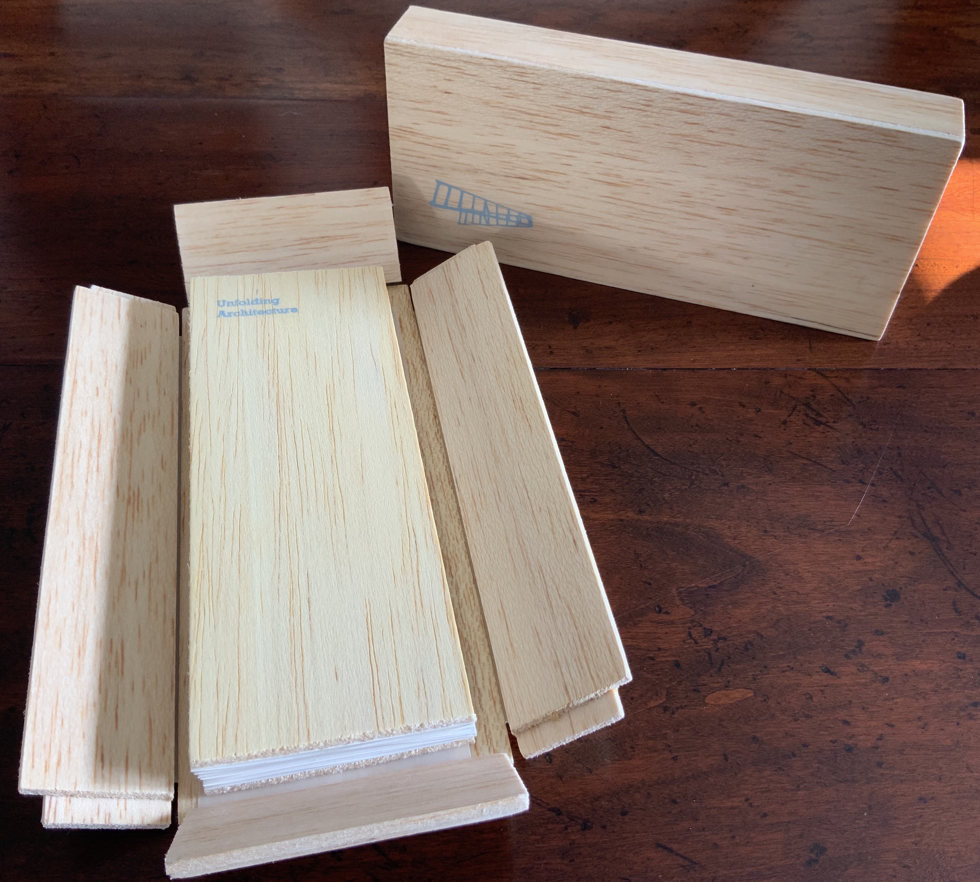
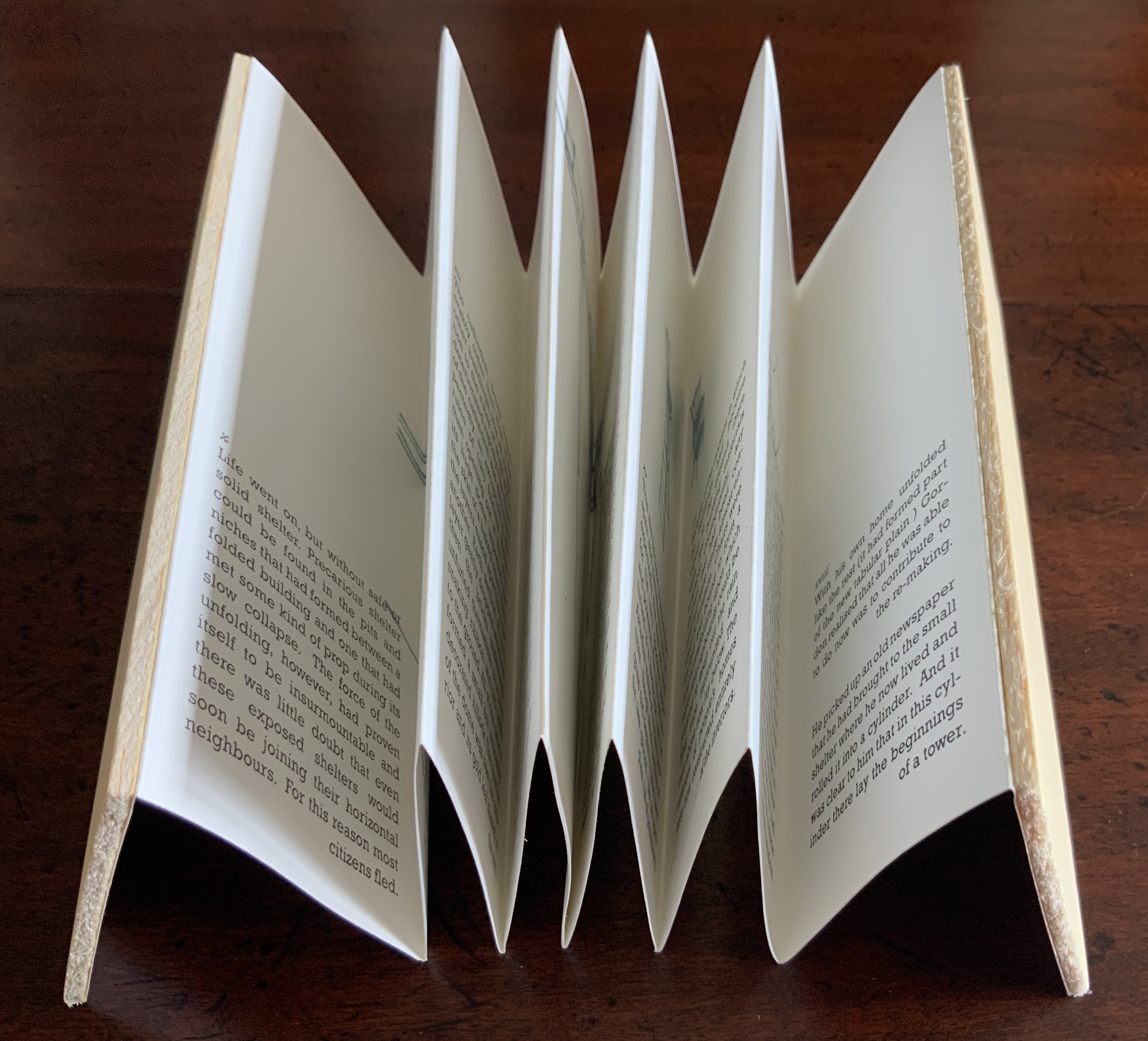
As Daniel Libeskind has said, “For me, a building is a medium to tell a story.” Emily Speed’s Unfolding Architecture (2007) tells the tale of Gordon, a city dweller who witnesses the collapse of public buildings and, ultimately, his own home as the urban fabric begins to unfold around him — a story replicated by the housing’s structure and the book’s accordion fold.
But Ulises Carrión denied that books are about narrative. Instead they are about space and time, which leads to the next proposition.
Proposition #3: The affinity of architecture and artists’ books lies in space and time.
Olafur Eliasson’s Your House (2006) is a laser-cut model of his residence in Copenhagen at a scale of 1:85, which means that each page equates to a 220 mm section of the actual house. In the film Russian Ark (2003), Aleksandr Sokurov made cinematic history with his one continuous shot in 90 minutes, depicting a 17th century time traveller moving through different periods of history as he moves through the rooms of St. Petersburg’s Winter Palace. The film inspired Johan Hybschmann’sBook of Space (2009).
How do you read works like this? The size, weight and delicacy of Eliasson’s book and the fragility of Hybschmann’s book and its need for an armature to freeze-frame it defy a simple turning of pages. They must be turned slowly and carefully. Both works heed the task of the arts as posed by architect Juhani Pallasmaa for our age of speed: to defend the comprehensibility of time, its experiential plasticity, tactility and slowness (The Embodied Image, p. 78).
Proposition #4: The affinity of architecture and artists’ books lies in process.
A trained architect and book artist, Marian Macken articulates and illustrates in her book Binding Space why and how the artist’s book can serve as an important tool for design, documentation and critique of architecture. Macken’s perceptive descriptions show how to observe materiality and its functioning and understand how they contribute to the making of art.
Investigating bookness results in the book becoming a highly productive intervening medium with which one can imagine, investigate, analyze, represent and exhibit particular qualities — haptically, and with narrative and ambiguity — of a built environment and the design process. Through the book, we read spatial practice anew (p. 163).
Reading Macken’s book will sharpen the ability of any reader or viewer to appreciate book art, especially her Ise Jingū: Beginning Repeated. Ise Jingū is a Shinto shrine complex in the Mie Prefecture, Japan. “Once every 20 years, since … the seventh century, every fence and building is completely rebuilt on an identical adjoining site, a practice of transposition known as shikinen-zōkan” (Binding Space, p. 101). For Macken, this ritualistic rebuilding poses architecture as performative process rather than as inert object; it “manifests the replication of a beginning, of a process” (p. 100).
Macken’s artwork consists of 61 loose sheets with a watermarked image within each, the number reflecting the 61 iterations of the shrine up until the making of this work of book art. The watermark is a perspective image based on Yoshio Watanabe’s photograph of the Inner Shrine, taken in 1953 on the occasion of the 59th rebuilding. The contrast of the watermark in kozo and the movement of its placement from one sheet to the next entice reflection on the phenomenon of representation and the architectural process of shikinen-zōkan.
Proposition #5: The affinity of architecture and artists’ books lies in phenomenology.
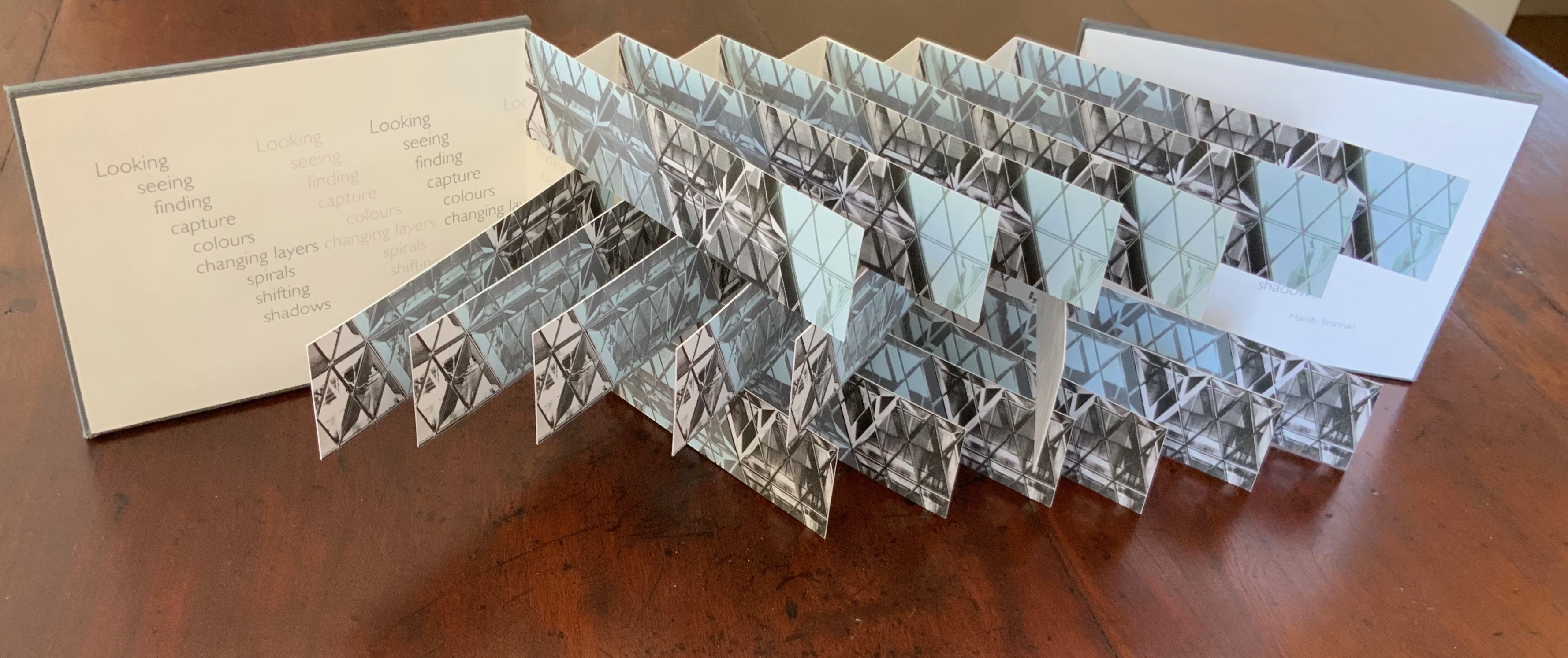
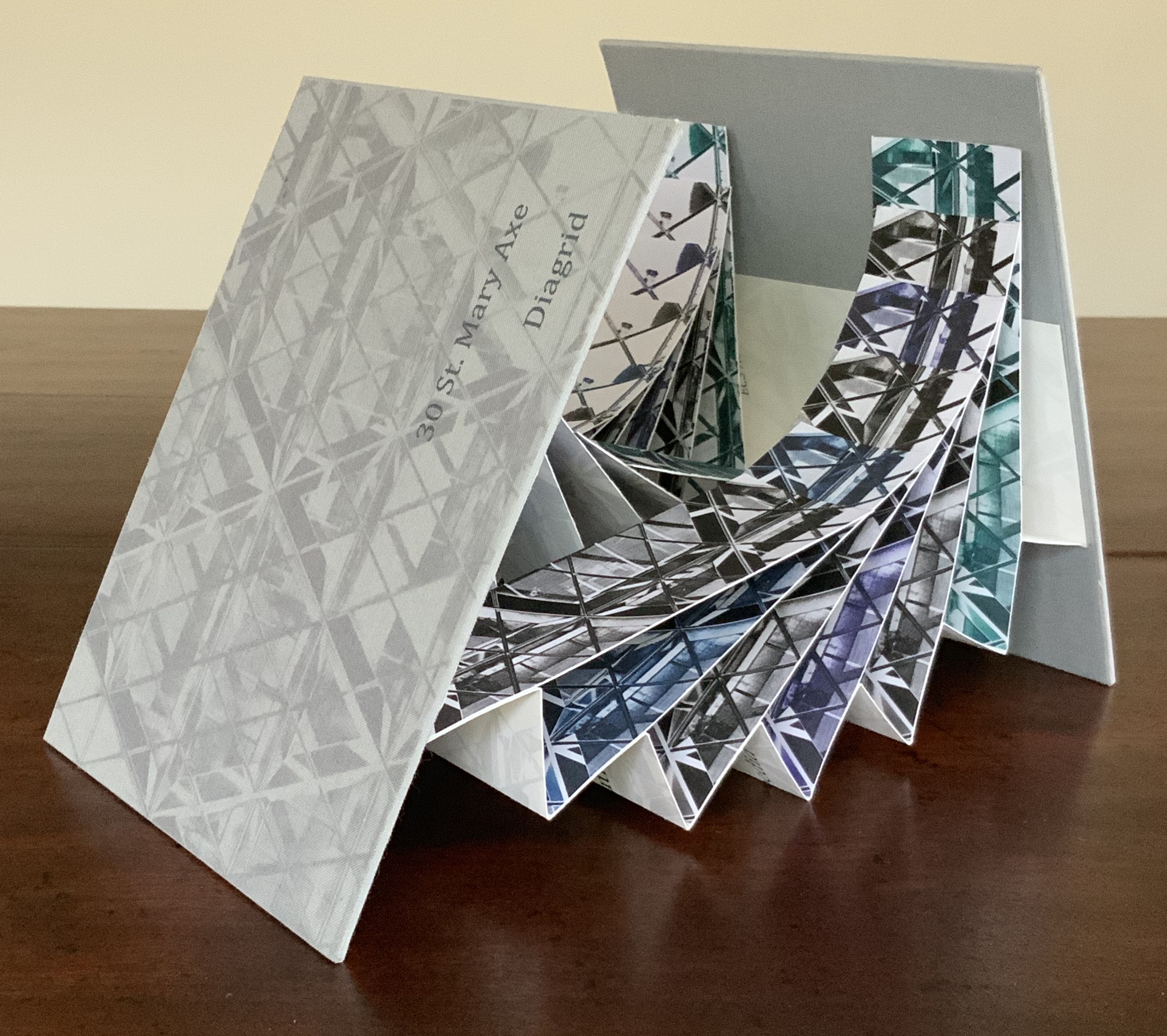
Architects such as Alfredo Muñoz and his firm ABIBOO, Juhani Pallasmaa and Peter Zumthor are among those often associated with architectural phenomenology, concerned with perception psychology, focused on the primacy of sensory and experiential qualities. Norman Foster and phenomenology are not so often yoked, but 30 St Mary Axe: Diagrid (2009) and 30 St. Mary Axe: Cladding(2009)– Mandy Brannan’s treatments of his iconic London office tower (aka “the Gherkin”) that refocus the perception and experience of it — might prompt reconsideration.
Proposition #6: The affinity of architecture and artists’ books lies in geometry.
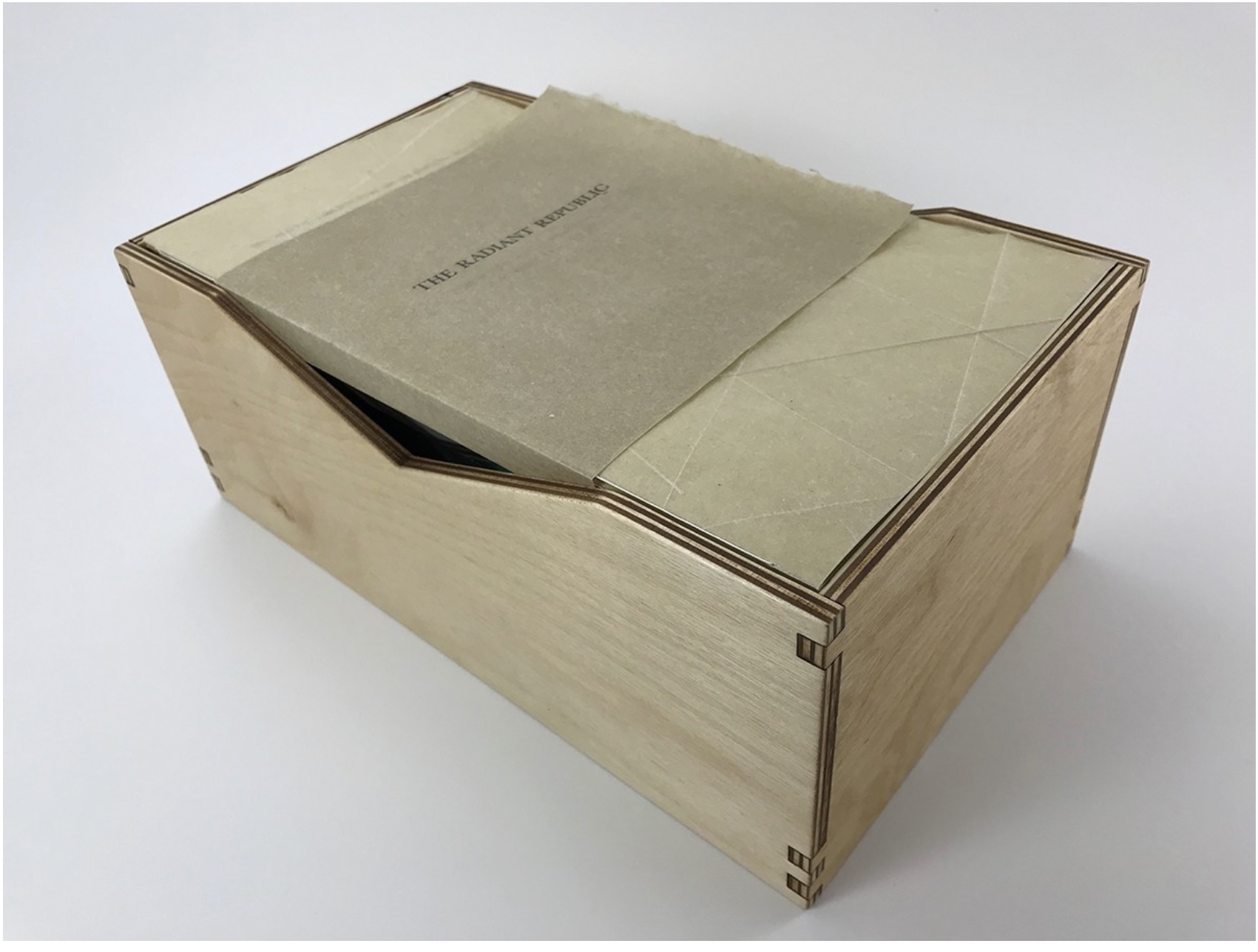
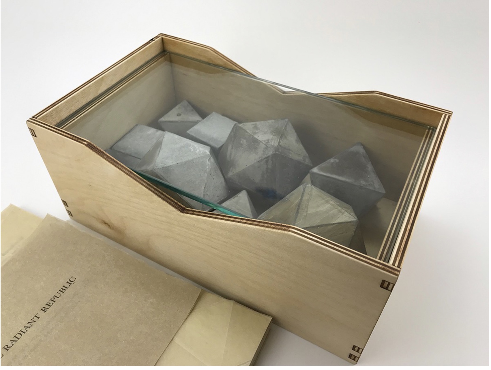
Sarah Bryant’s The Radiant Republic(2019) insightfully integrates Plato’s and Le Corbusier’s texts and ideas. The very physicality of the blond wood, linen cover, glass window, concrete representations of Platonic solids, embossed type and sewn papers could easily be a response to Juhani Pallasmaa’s comment: “The current overemphasis on the intellectual and conceptual dimensions of architecture contributes to the disappearance of its physical, sensual and embodied essence” (The Eyes of the Skin, p. 35).
Proposition #7: The affinity of architecture and artists’ books lies in modelling.
Helen Malone’s Ten Books of Architecture (2017) takes a broad historical and, most important, haptic view of architecture from Vitruvius to Hadid. Each of the ten books is a bookwork that models its architectural subject.
Proposition #8: The affinity of architecture and artists’ books lies in folding.
At the end of the 20th century, architects like Peter Eisenman, Jeffrey Kipnis and Greg Lynn latched on to computer-aided design and Gilles Deleuze’s Le pli: Leibniz et le baroque (1988) / The Fold: Leibniz and the Baroque (1993). This led to real constructions such as Eisenman’s Rebstock Park in Frankfurt as well as to the seminal books Folding in Architecture (1993), edited by Lynn, and Folding Architecture 92003) by Sophia Vyzoviti.
Folded book pages rarely generate a work that rises above mere craft. Heather Hunter’s Observer Series: Architecture(2009) achieves the necessary height. It combines the altered book with an accordion book that incorporates a found poem composed of the words excised and folded outwards from the folded pages of The Observer’s Book of Architecture.
Proposition #9: The affinity of architecture and artists’ books lies in light.
Marlene MacCallum’sTheme and Permutation(2012) is a response to the permutations and variations over time in five houses built to a common plan in Townsite area of Corner Brook, Newfoundland. MacCallum used digital tools to translate the original film source of eight different window images from the houses. A tritone image of a single Townsite window under translucent pages opens the book. As the pages turn, new window images appear and layer over each other, darkening up to the book’s mid-point. In the center spread, two text blocks appear speaking to the history, architectural permutations and economic shifts of the Townsite area. The tonality begins to lighten over the ensuing new combinations of window layers. A third text block of personal narrative is introduced, and a tritone image of one of the Townsite windows in its original condition concludes the work.
Proposition #10: The affinity of architecture and artists’ books lies in perspective.
Cees Nagelkerke’s Piranesian Window (1996) resides in the Vedute Foundation’s collection of “spatial manuscripts”, invited works that must conform to the dimensions of the Gutenberg Bible. Piranesian Window‘s form and title capture multiple meanings of vedute (“views”). Views are things seen — which this spatial manuscript is. Views are prospects from which to see — which a window offers. Views are perspectives — for which Giambattista Piranesi’s etchings are famous. Views are thoughts held — which “Piranesian” implies (the work’s title could be that of a manuscript on art history and philosophy). Piranesi’s mid-eighteenth century etchings Vedute di Roma(“Views of Rome”) and Carceri d’invenzione (“Imaginary Prisons”) are the obvious sources of inspiration, but Nagelkerke provides an interview describing the dream source of the work:
– … Please, continue relating your dream … – I wandered through vast ruins … along wrecked bridges … feeling remarkably at ease. – How did you find the window in this windowless world? – When a cool breeze wafted inside, I suddenly saw it. It showed a landscape, within the distance a city. There was complete tranquillity and harmony there, like in a painting by Piero della Francesca … I stood there for some considerable time and I became increasingly saddened, because I discovered that I was looking at something that had vanished forever. – But how did you manage to take the window? – I wanted to touch it … as a result, I immediately fell down. The gap left in the wall closed by itself … I picked it up and continued on my way, meeting people who spoke to me saying that I should leave the Carceri. I was taken to a gateway. No one looked at, or said anything about, the window… In the square where I found myself, there was an intense, chaotic commotion. The window still reflected something of the vast space I had left. The exterior showed traces of the wall in which it had been mounted. I looked through it and saw everyday life …
Proposition #11: The affinity of architecture and artists’ books lies in archaeology.
Mill: A journey around Cromford Mill, Derbyshire (2006) by Salt + Shaw (Paul Salt and Susan Shaw) is the result of the artists’ exploration of Cromford Mill in Derbyshire, the first water-powered, cotton-spinning mill developed by Richard Arkwright in 1771. Bound in a cover of recycled wooden library shelves, three plaster cast blocks and seven calico pocket pages containing hidden texts imply the hidden archaeological history to be found. The forensic-like casts are taken from interior surfaces, and the texts walk the reader step by step through each area of the mill.
Proposition #12: The affinity of architecture and artists’ books lies in assemblage and collage.
Based on an architectural installation at the Minnesota College for Art and Design and drawing on her photos of Ayvalik, Amsterdam, Florence, Istanbul, New York City, Rome, San Diego and Venice, Karen Wirth’sPaper Architecture (2017) certainly prompts a revisit to MoMA’s “Cut ’n’ Paste: From Architectural Assemblage to Collage City“, 10 July 2013 – 5 January 2015, to prove this proposition.
Proposition #13: The affinity of architecture and artists’ books lies in luxe.
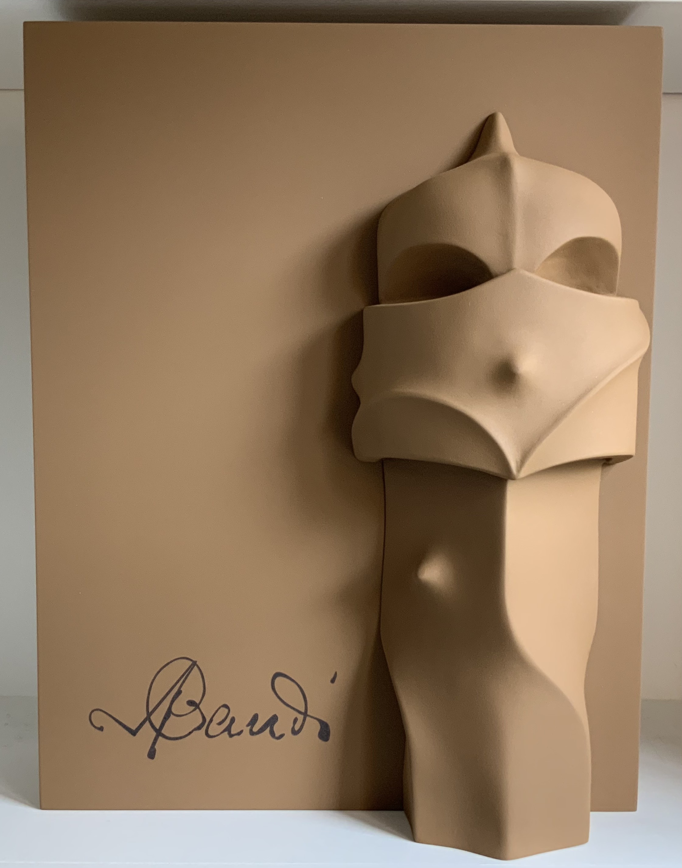
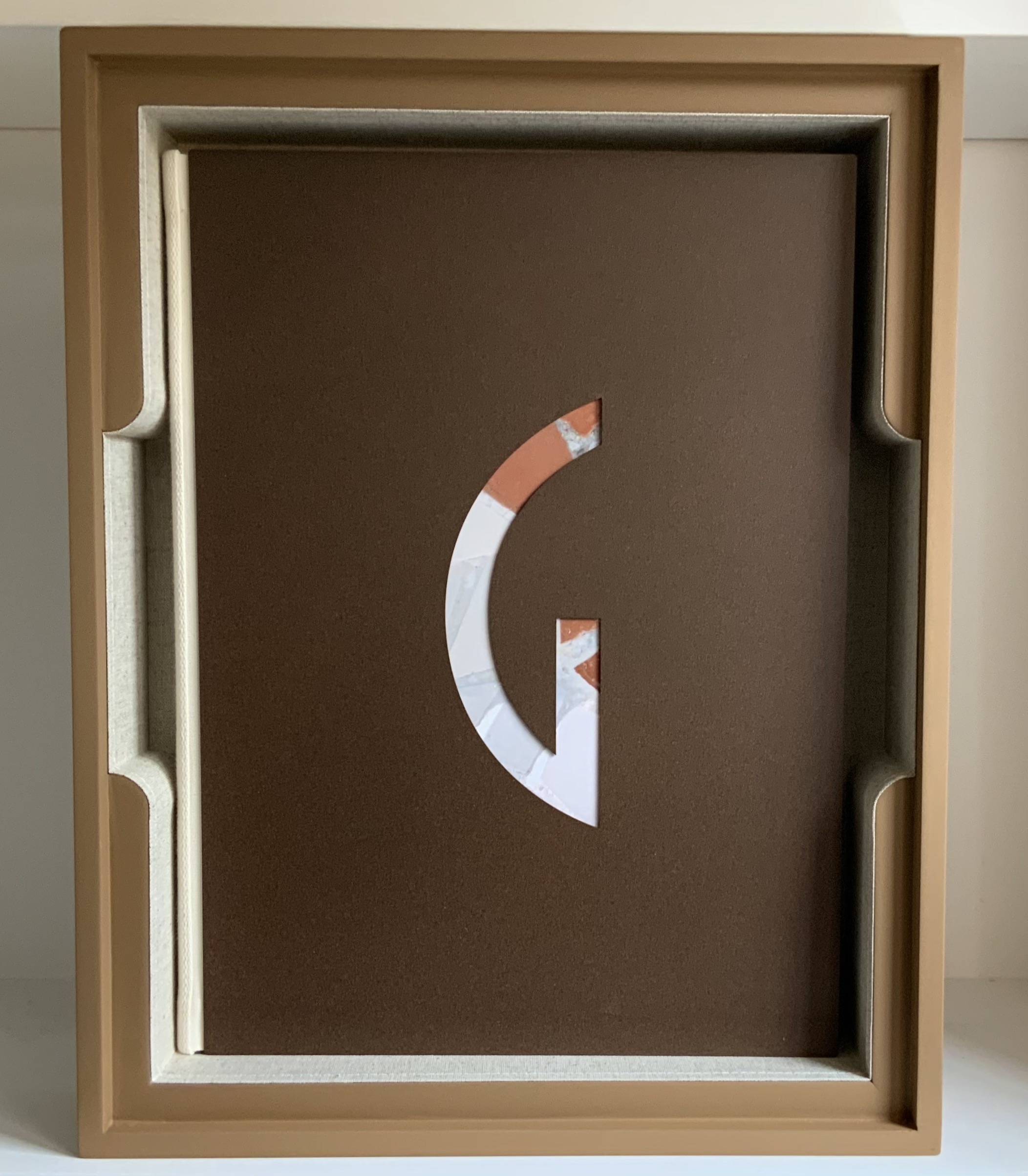
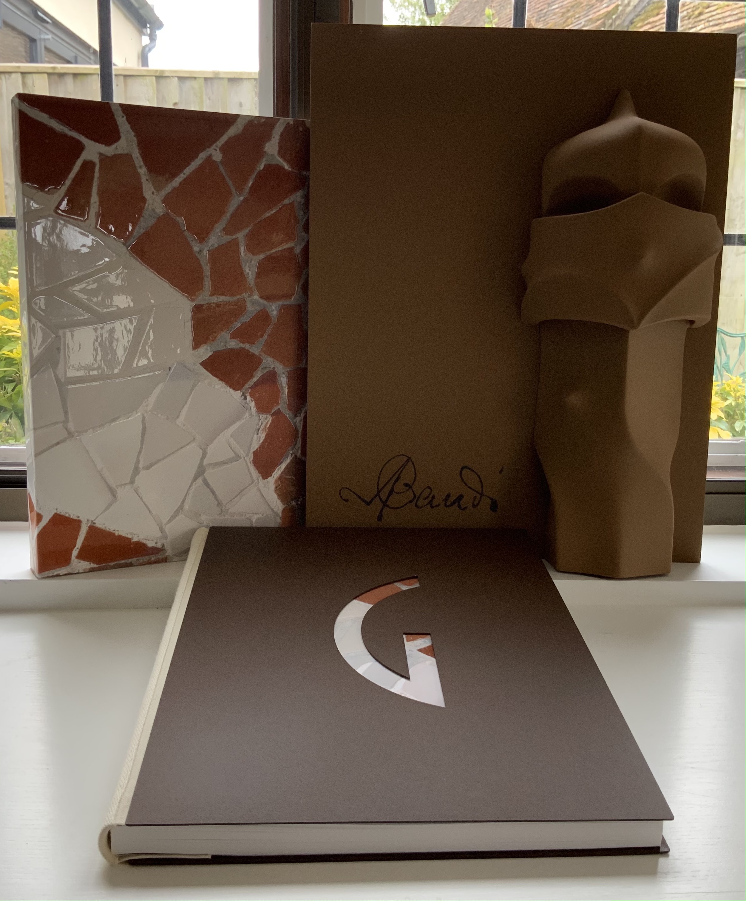
Early theorists, critics and artists of book art expended great effort to exclude livres d’artiste and deluxe productions from the definition of a form of art that struggled to find a name: artist’s book, artists’ books, bookworks, book art, etc. The spectrum from objects of conspicuous consumption to democratic multiples characterizes both architecture and book art. Antoni Gaudí’s architectural efforts easily span that spectrum — from his Casa Milà to his tiles found underfoot in Barcelona’s Passeig de Gràcia. Under the guidance of Juan José Lahuerta (chief curator at the National Museum of Art of Catalonia), the publisher Artika produced Gaudí Up Close(2020), enclosed in a wooden case with marble sculpture finished in paint, cement powder and anti-graffiti varnishes and lined with Naturlinnen fabric.
Gaudí Up Close(2020) Published by Artika. Photos: Books On Books Collection.
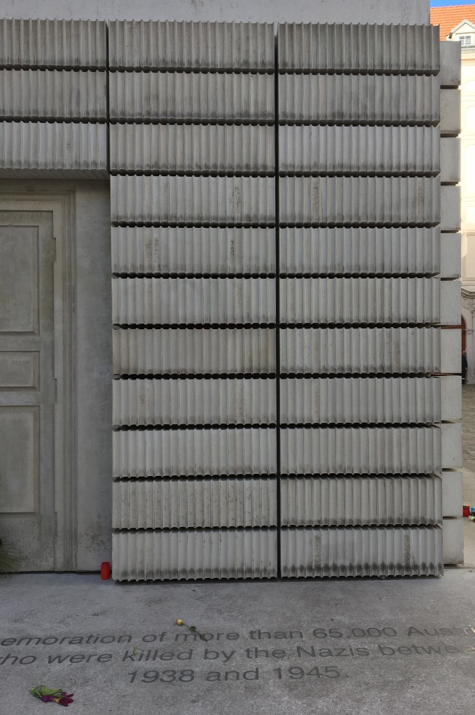
Proposition #14: The affinity of architecture and artists’ books lies in the memorial.
As you turn the corner into Judenplatz in Vienna, Rachel Whiteread’s great cube appears showing only the fore edge of book after book. As you hold J. Meejin Yoon’s small white brick of paper and turn its thick pages, a small pinhole appears on the page. Then two larger square holes emerge, one of which falls over the pinhole. Page after page, the two square holes repeat, creating two small dark wells in the field of white, until on the last page they take their place in the cut-out schematic footprint of the city blocks and buildings surrounding the Twin Towers. Whiteread’sNameless Library (2000) and Yoon’sAbsence (2004) surely underscore this proposition of memorial.
Proposition #15: The affinity of architecture and artists’ books lies in the sacred.
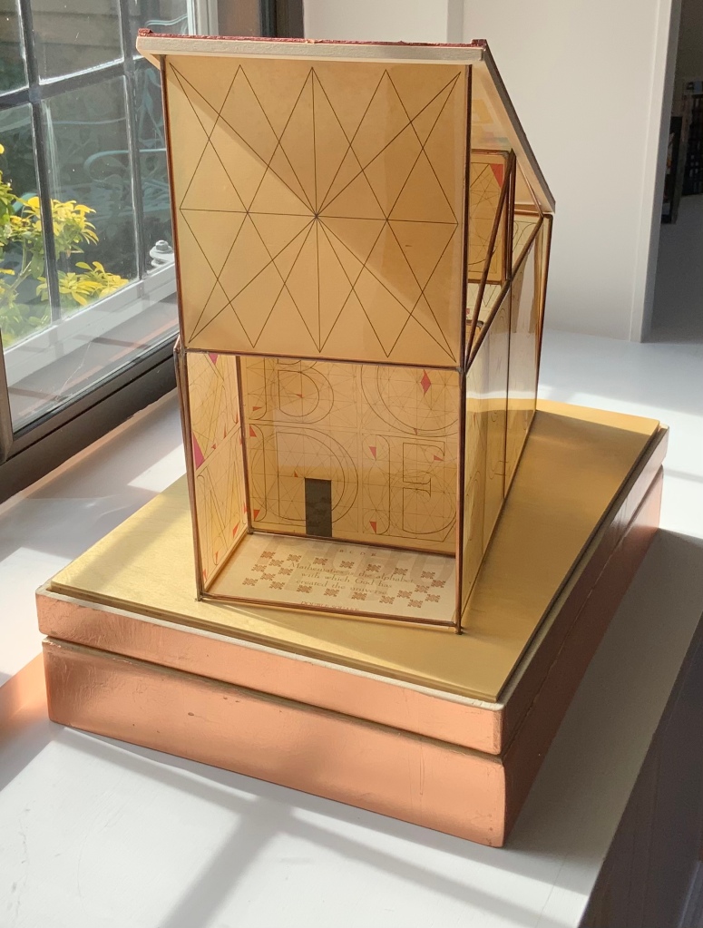
Jeffrey Morin and Steven Ferlauto’s Sacred Space (2003) is an intimate monument of book art. Made intimate by the content and texture of its book, made more intimate by the viewer’s having to construct the chapel. Made monumental by the echo of typographic history, made more monumental in Galileo Galilei’s echo from its floor: Mathematics is the alphabet with which God has created the universe.
Proposition #16: The affinity of architecture and artists’ books lies in collaboration.
In Victor Hugo’s Nôtre-Dame de Paris (1831), Archdeacon Claude Frollo points to the book in his hand and then to the cathedral and says, “This will kill that”. It is ironic that Hugo’s book (popularly known now by its English title The Hunchback of Nôtre-Dame) was written in large part to save the then-decaying cathedral (post-Revolution, it served as a warehouse), and it succeeded. It is also ironic that, while the fictional character’s metaphor has a point about the book’s permanence of replicability outlasting the building’s permanence of stone, it misses the collaborative foundations of both.
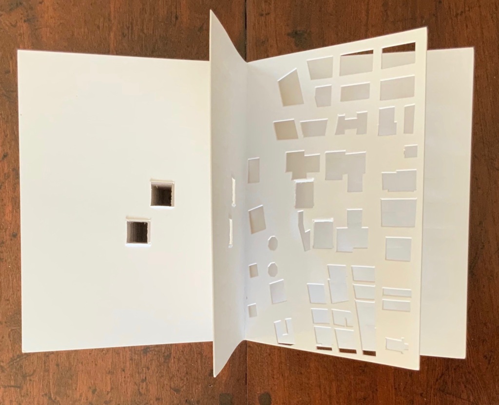
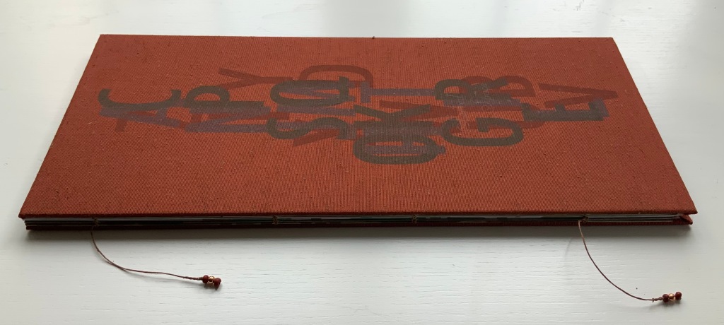
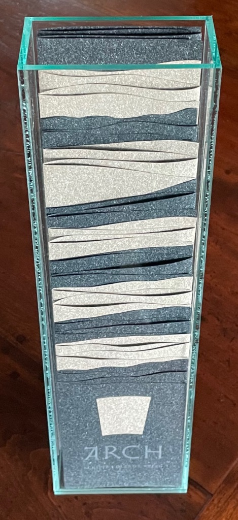
Created by ten students at Scripps College under the direction of Kitty Maryatt, Arch (2010) reminds us that the creation of a book — even a work of book art — is a collaborative effort.
Arch (2010) Kitty Maryatt, Jenny Karin Morrill, Ali Standish, Alycia Lang, Jennifer Wineke, Mandesha Marcus, Catherine Wang, Kathryn Hunt, Ilse Wogau, Jennifer Cohen, Winnie Ding Photos: Books On Books Collection
Maryatt’s preface to Arch is entitled “Blueprint” and is brief enough to warrant citing in full:
Books are inherently architectonic. Studying architecture would naturally be profitable to students building their own books.
On January 17, 2010, just days before class was to start, the Los Angeles Times published a fascinating article on contemporary women architects, highlighting a striking building by Jeannie Gang.
Earlier this year, the brand-new President of Scripps College chose The Genius of Women as her inaugural theme. What serendipity! This gave us the perfect inspiration for our artist book: the genius of women architects.
After extensive research and class discussion, a mission statement for the book evolved:
Architecture, like books, is a delicate balancing act between stability and motion, interior and exterior, aesthetic values and structural practicalities.
Books, like building, are fundamentally inhabited spaces. They are incomplete without human interaction.
The first portals were built of post and lintel construction. A curved arch is more difficult: the keystone is needed at the apex to lock the other pieces into position. Building a book is a similarly difficult feat. — Professor Kitty Maryatt
Conclusion: The affinity of architecture and artists’ books lies in our attraction to the beauty of form.
No doubt the proximity of the need for shelter and the need for oral and written language have played some gravitational role of mutual attraction for architecture and books (and latterly artists’ books). But equally, both architecture and artists’ books speak to our attraction to the beauty of form. All of the examples above are re-offered here in support of this proposition. Look at them again.
“Architecture”, “art” and “the book” are all fluid concepts. So it should be no surprise that we arrive at the equally fluid similes: architecture is like book art, book art is like architecture.
An earlier version of this essay appeared in The Blue Notebook, Volume 16 No 2, Spring – Summer 2022.
Further Reading
“Architecture“. 12 November 2018. Bookmarking Book Art.
Lynn, Greg. 2004. Folding in Architecture Rev. ed. Chichester, West Sussex: Wiley-Academy. See for references to Mario Carpo, Gilles Deleuze and Peter Eisenman.
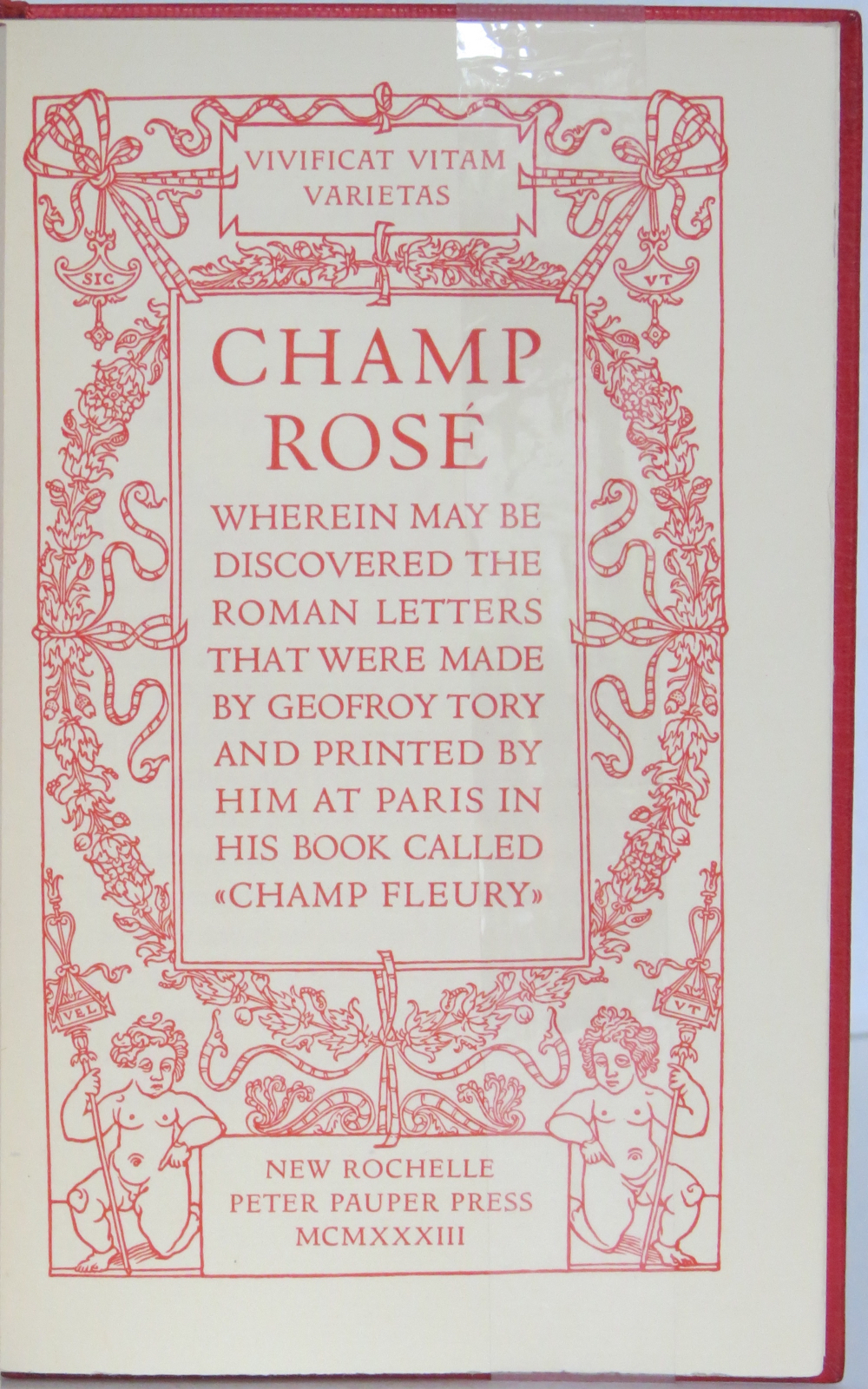
The art of the alphabet seems to be a rite of passage for graphic artists. Perhaps it is that art and the alphabet find common ground in the urge to make sense of the world. Perhaps it’s that the alphabet’s invention, development and artistic treatment present a rich tradition for artists to follow or challenge. Perhaps it’s that letterforms and the alphabet offer raw material, subject and organizing principle all in one. Semic or asemic. Calligraphic, typographic or even plastic. Representational or abstract. All are options. But most often, something bookish results. From Islam Aly’s 28 Letters(2013) to Ludwig Zeller’s Alphacollage (1979), a significant part of the Books On Books Collection is taken up with artists’ books based on the ABCs and letterforms. The Collection’s two facsimiles of Geofroy Tory’s Champ Fleury provide a useful historical backdrop that throws into relief several of the Collection’s works and their performance of this rite of passage.
It should be no surprise that Geofroy Tory de Bourges (c.1480-1533) serves up such an exemplar. In her Playful Letters, Erika Boeckler writes
An accomplished designer, typographer, printer, poet, author, translator, calligrapher, illustrator, woodcutter, and engraver, he received his education in Italy and ultimately settled in Paris, setting up a bookstore, writing his own works, running a press, and collaborating with or working for Simone de Colines, director of one of the most influential and experimental fine publishing houses of the time. Personally writing the text, designing the woodcuts, and cutting some of them, organizing the layout, perhaps even setting the type, Tory created Champ Fleury as what we might call today an artist’s book. (p. 29)
Tory straddles the letters of the late Middle Ages and Renaissance. Appointed by François I in 1530 as his printer, Tory operated on the Petit Pont under the sign of le Pot cassé (“the broken pot”) and was known for his workshop’s handwritten Book of Hours (1524). Rooted in the horae tradition reaching back to the 13th century, Tory’s Book of Hours is an early-to-mid-Renaissance version of its predecessors. As beautiful as his Book of Hours is, Champ Fleury (1529) became his best known work. Authored and designed by Tory, it was produced by hand typesetting and letterpress printing in Paris with Giles Gourmont. Printed less than 100 years after Gutenberg’s innovation, Champ Fleury represents the printed book toddling out of its incunabula period.
Book of Hours Geofroy Tory (1524) Bound in the 18th century, 113 leaves of vellum. Lessing J. Rosenwald Collection (Library of Congress). Accessed 30 May 2021.
According to Jeremy Norman’sHistory of Informationsite, the first separate printed title page appeared in 1463. Subject indices date back to the 13th century, originating at the University of Paris, and the first printed indices, to 1470. Champ Fleury‘s front matter boasts a title page, two prefaces to the reader, a statement of the King’s Privilege awarded for the book for ten years (a forerunner to the copyright page), a name index without location references and a subject index with folio references. Champ Fleury’s back matter consists of a colophon preceded by a lengthy appendix illustrating various forms of the alphabet (Hebrew, Greek, Latin, etc.).
Tory’s placement of the indices in the front matter rather than the back matter reflects the gradual development of the anatomy of the book towards the structure that would ultimately be codified in reference works like the Chicago Manual of Style. Paratextual elements like the title page, table of contents, page numbers, etc., did not spring up overnight. If, as Eric Havelock and others assert, society, the arts and culture are a superstructure erected on the foundation of the alphabet (see below), Champ Fleury and its “letterology” make for a particularly fitting exemplar of the book as an element of the superstructure arising from the alphabet.
Perhaps book artists sense this, which again leads to that alphabet art rite of passage and the elaborate variations on it. The illustration of various forms of the alphabet in the appendix also draws on another developing tradition: the typesetter/printer’s sample book advertising the firm’s fonts. Abecedaries and artist books have sprung from that tradition, too.
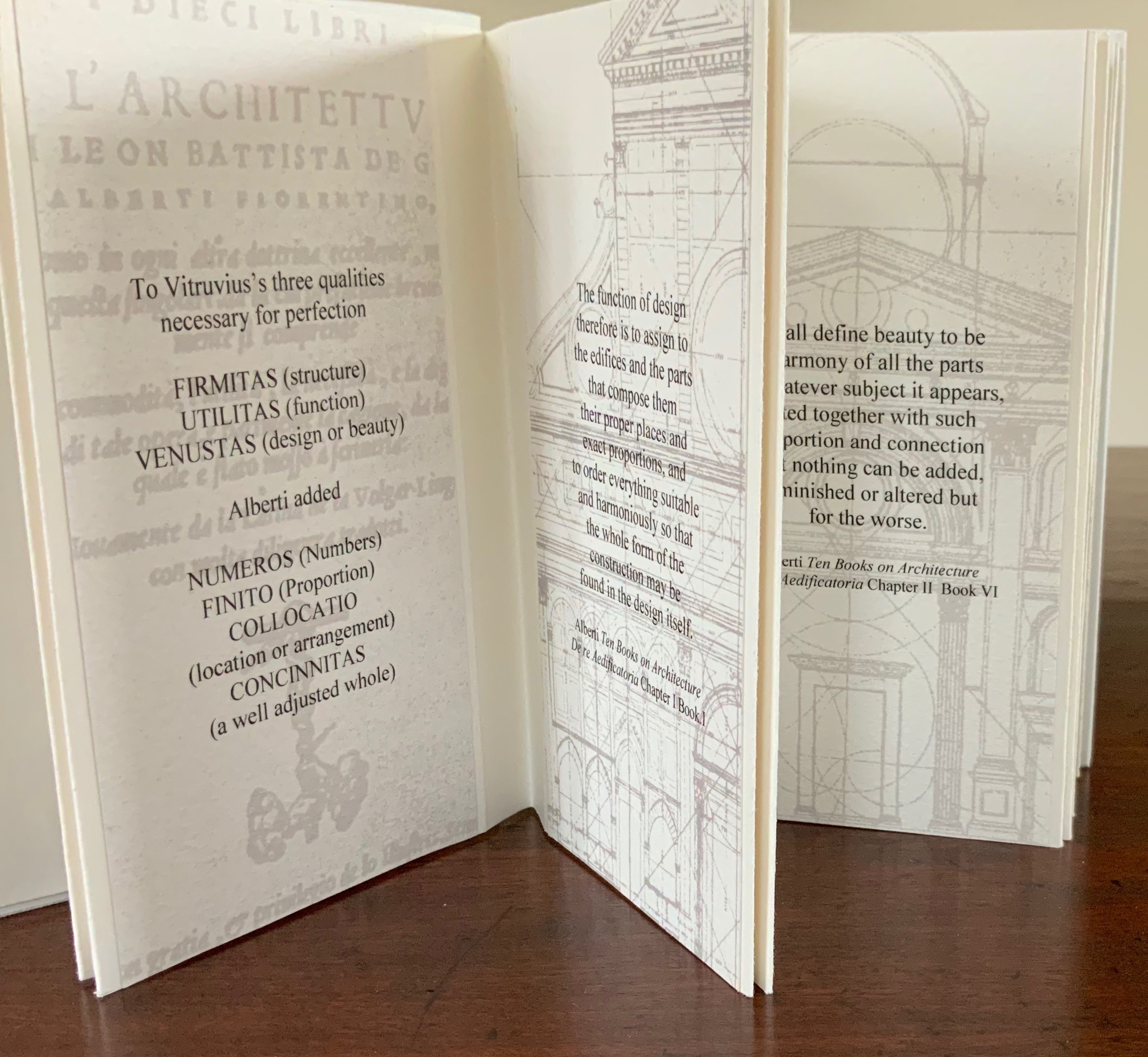
Tory was not the first to propose an art and science behind the letterforms of the alphabet. Predating his efforts were Giovanninno de’ Grassi (1390-1405), Felice Feliciano (1463), the Anonymous Chicagoensis and Anonymous Monachensis (1468?), Damianus Moyllus (1480), Fra Luca Pacioli (1509), Sigismondo Fanti (1514), Francesco Torniello (1517), Ludovico Arrighi (1522), Albrecht Dürer (1525) and Giovanni Battista Verini (1527). Leading up to Champ Fleury, these earlier efforts track the development of humanism. Arguably, Tory’s effort is a capstone, combining myth, allegory, metaphysics, geometry, linguistics, calligraphy, typography and cryptography.
Book One, concerned with the mythical origins of the French language, also addresses the fabled origins of the alphabet: the story of Jove, Io and Mercury behind the letters I and O and their claim to being the first letters and also the tale of Apollo’s accidental murder of Hyacinth explaining the letters A and Y and their similar claim. Two works in the Collection built on alphabet origin stories are Francisca Prieto’s Printed Matter series (2002-2008) William Joyce’s The Numberlys (2014), but many more follow in Champ Fleury’s art and science footsteps.
Tory’s late medieval/early Renaissance perspective gives way to 20th and 21st century poetics and phenomenology in most works of the Collection. Aaron Cohick’s The New Manifesto of the NewLights Press (third iteration) (2017) offers a good example. Another — closer to Tory’s moral and geometric perspective but of a more modern spirituality — is Jeffrey Morin and Steven Ferlauto’s Sacred Space (2003).
Compile all the abecedaries ever created and it would approximate the result of Adam and Eve’s task of naming all the creatures and things of the world. Leonard Baskin echoes that innocence in Hosie’s Alphabet(1972) with its words and animals supplied by his children. If Adam and Eve had had an alphabet, they might have been tempted into pareidolia, which is represented in the Collection by VUES/LUES: Un Abécédaire de Marion Bataille (2018) and Typographic Universe (2014) by Steven Heller and Gail Anderson. Heller and Anderson’s compendium extends to letters formed of natural and drawn objects from the real world, which Champ Fleury’s appendix foreshadows with its floral and fantastic alphabets.
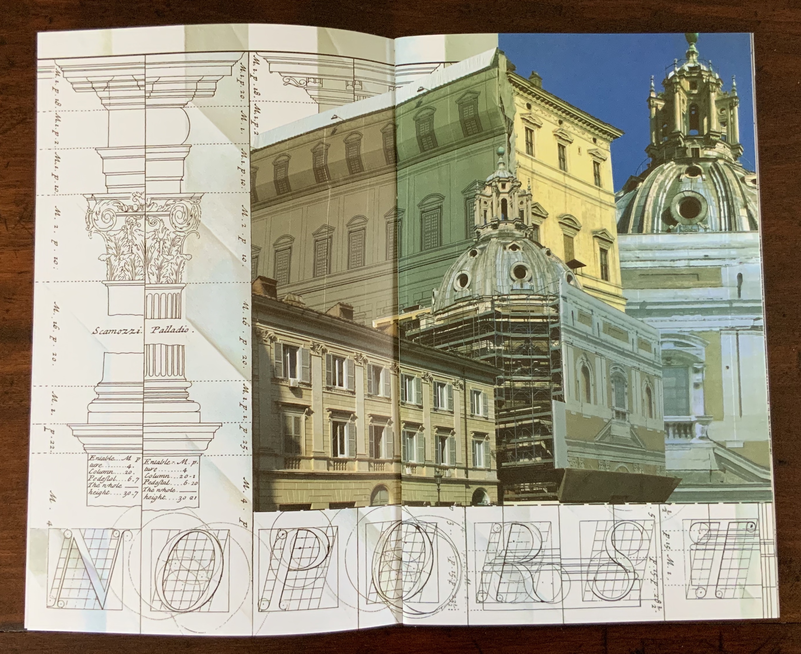
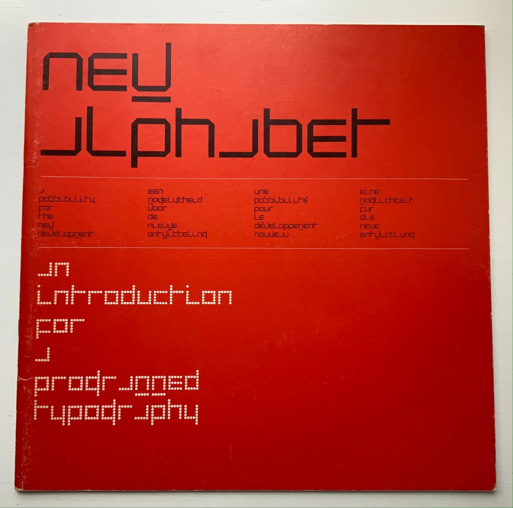
Of course, Tory’s work is not an abecedary. In Books Two and Three, it develops into a full-blown treatise on letterforms whose meaning and appearance are explained allegorically and driven by the compass, rule and geometry expressed within a 10x10x10 cell cube. It would overstate the case to call it “typographic design”. As drawn, Tory’s diagrams would serve poorly for cutting and forming punches or matrices (although it has been done). Nevertheless, his geometric approach foreshadows the grids and algorithms of Wim Crouwel’s New Alphabet (1967), Timothy Epps and Christopher Evans’ Alphabet(1970) and Ji Lee’s Univers Revolved: A Three-Dimensional Alphabet (2004).
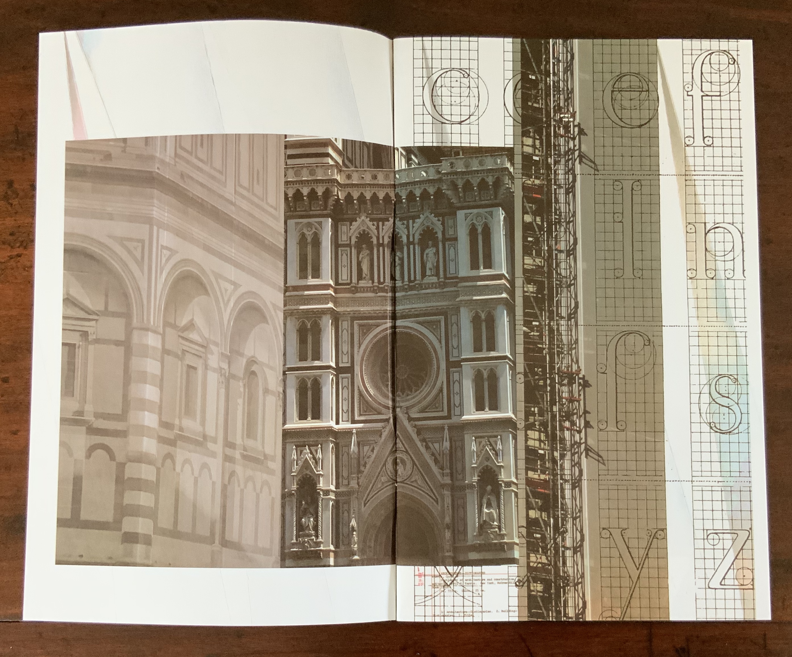
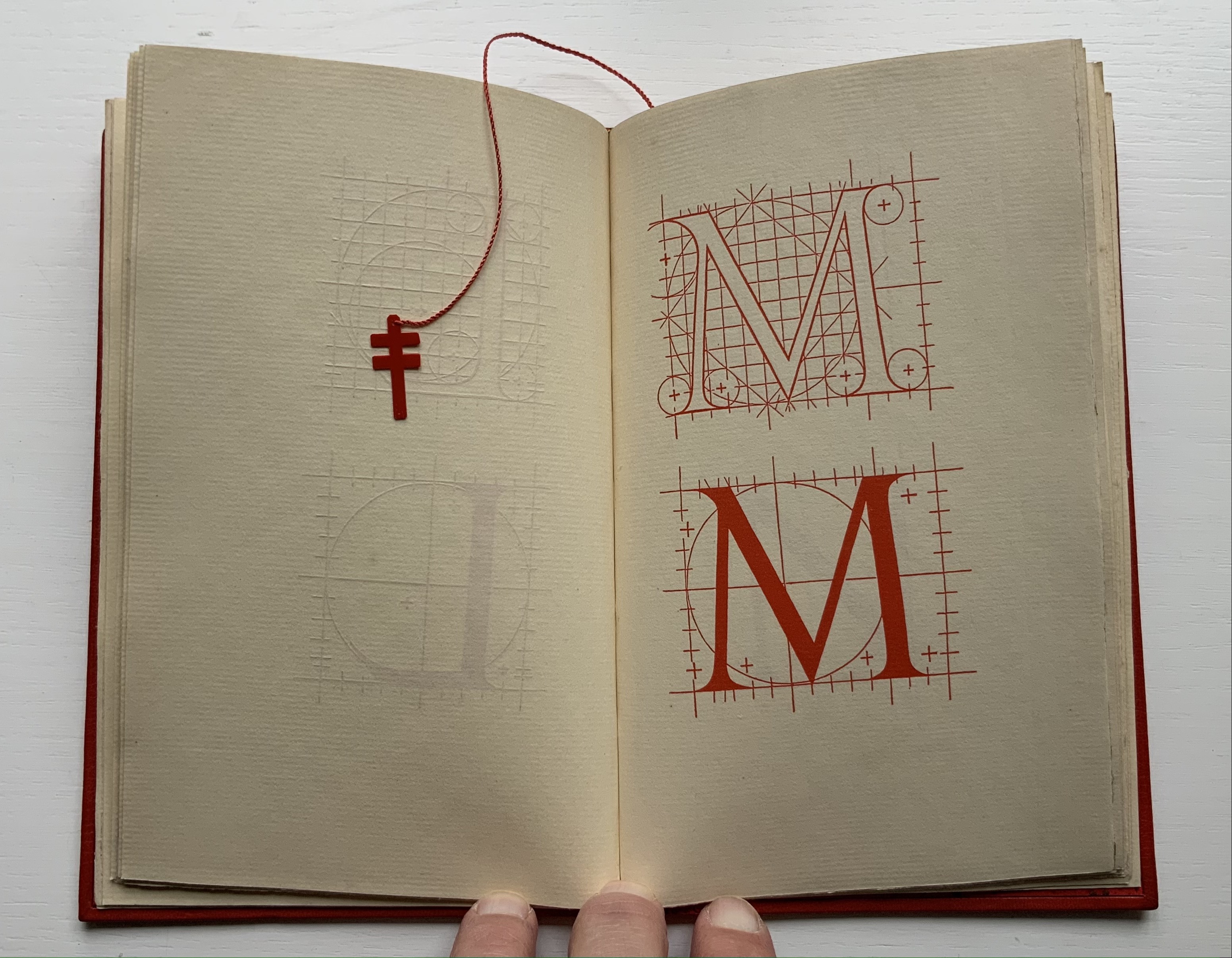
Before the age of computers and algorithms, though, the artist and designer Bruce Rogers did bring typographic design to bear on Champ Fleury. The Grolier Club sponsored the printing of George B. Ives’ English translation. Rogers’ design “translates” Champ Fleury just as much as Ives does, perhaps more so. The Grolier Club edition is one of only ten books to be set completely in the Centaur typeface designed by Rogers.
Of course, the translation entails a complete resetting of the text, and Centaur naturally delivers crisper letters. Also, in redesigning with Centaur, Rogers alters the original’s layout and, therefore, the reader’s experience of it. Notice in the OAHK pages above and in the three double-page spreads below how Rogers changes Tory’s flow or jumpiness to something fixed or stately. Attention to the page and its layout offers book artists as well as book designers yet another creative avenue. For proof of that, compare the Collection’s entries for Angel, Baskin and de Cumptich.
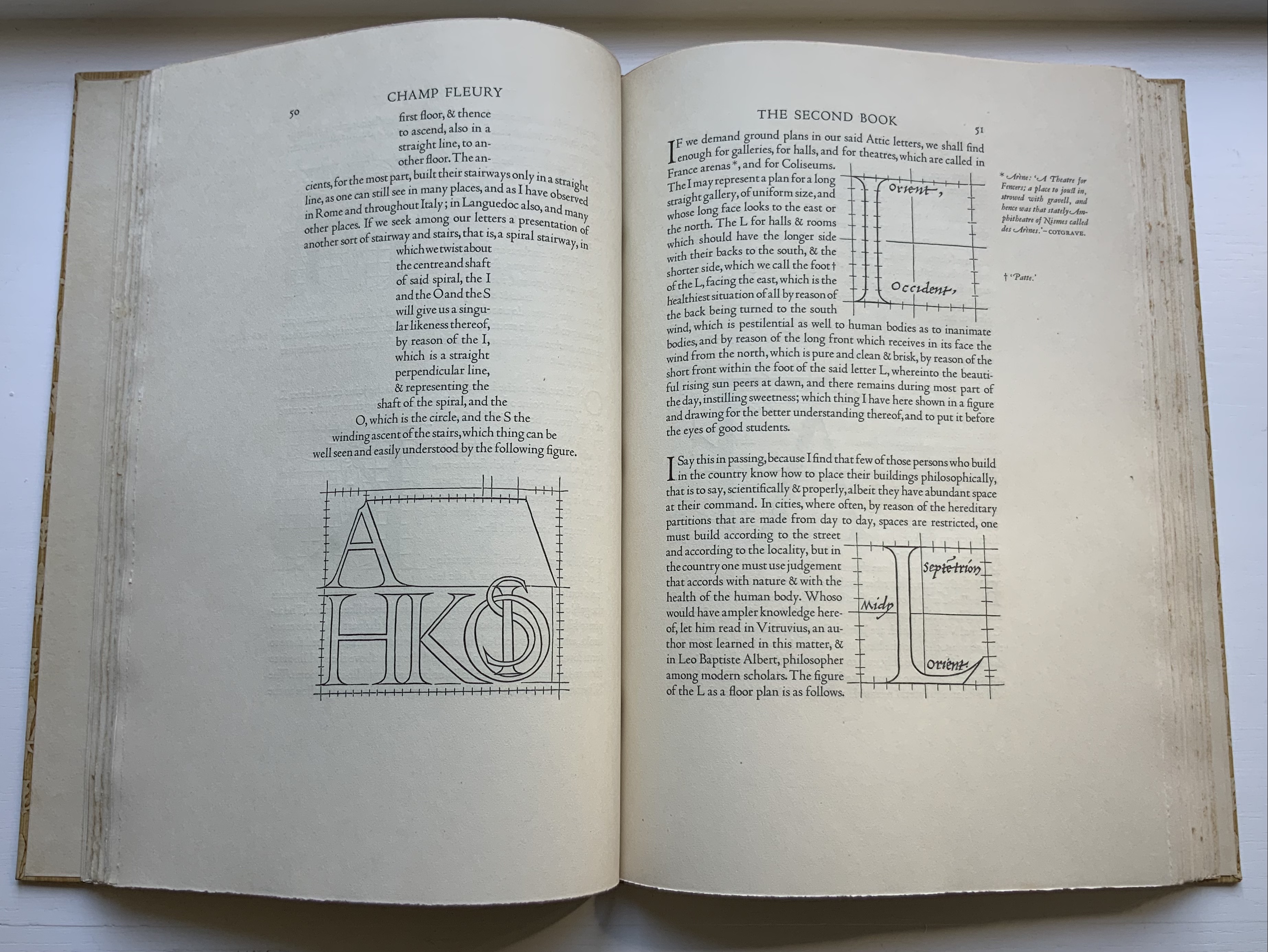
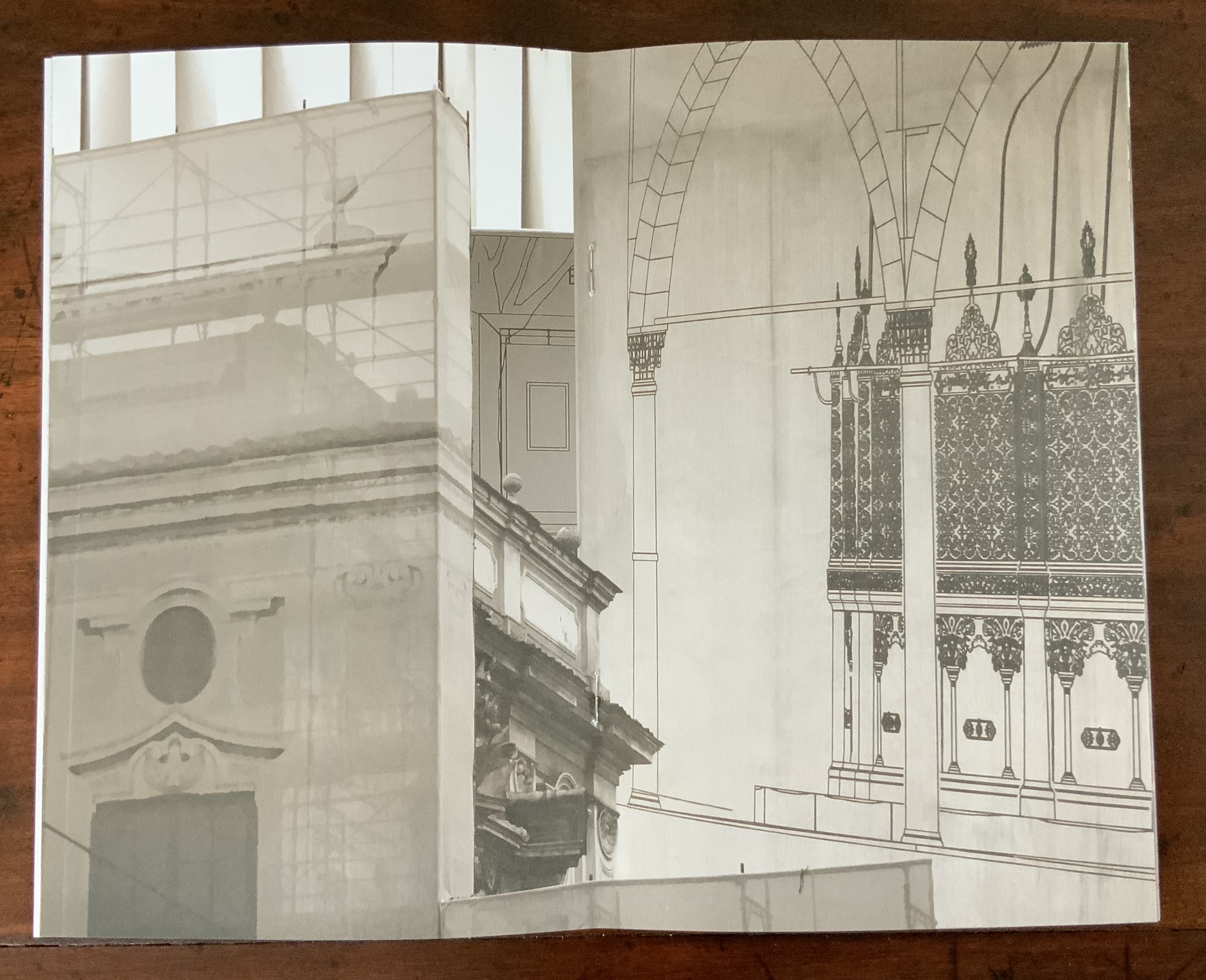
Architecture is another of Tory’s well-developed analogies and explanations of the ancients’ thinking behind the letterforms. In his drawings below, he aligns the letters AHKOIS with the parts of a building and letters IL with floor plans. He connects the circularity of the Coliseum’s exterior and the ovalness of its arena with the proper shape of the letter O. In the Collection, the analogy reappears fantastically in Johann David Steingruber’s Architectural Alphabet (1773/1972), Antonio Basoli’s Alfabeto Pittorico (1839/1998) Antonio and Giovanni Battista de Pian’s efforts in 1839 and 1842.
The architectural analogy provides Tory with his segue from plane to solid geometry in aligning the shapes of letters with human anatomy and virtues. His three-dimensional analysis of letterforms also finds contemporary analogues in two of Pieter Brattinga’s Kwadraat Blad series: Crouwel’s, mentioned above, and Anthon Beeke’s Alphabet (1970). Tory’s three-dimensional letterforms foreshadow Crouwel’s investigation of units based on the assembly of organic cells and his later musings on a laser-generated four-dimensional typography (Elliman, 62). And it is hard to evoke anything more humanoid and three-dimensional — albeit far less analytical or prudish — than Beeke’s alphabet formed with naked female models. (Tory comments that in a correctly drawn A, the crossbar will virtuously cover the genitals of Vitruvian man inscribed in the 10×10 grid. Modesty seems to extend to H as well but not so much to O and K.)
The calligraphic impulse that underlies Champ Fleury‘s typographic representations shows itself clearest in the woodcuts for the Cadeaulx alphabet in the appendix. The Books On Books Collection has its share of calligraphic abecedaries such as Marie Angel’s An Animated Alphabet (1996) and Andrew Zega and Bernd Dam’s An Architectural Alphabet (2008) as well as more purely calligraphic alphabets such as Islam Aly’s, mentioned above, and Suzanne Moore’s A Blind Alphabet (1986) .
Two artists whose abecedaries blend the calligraphic and typographic are Robert de Vicq de Cumptich and Cathryn Miller. In de Cumptich’s Bembo’s Zoo (2000), letters and punctuation marks from the Bembo typeface form calligraphic animal shapes. Miller’s L is for Lettering(2011) joins up the alphabetic rite of passage, calligraphy and typography by allying each of her hand-drawn letters with the name of a typeface from “A is for Arial” to “Z is for Zapfino”.
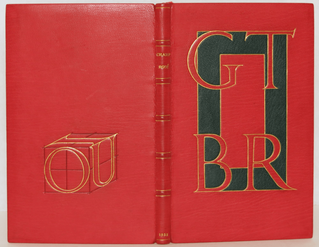
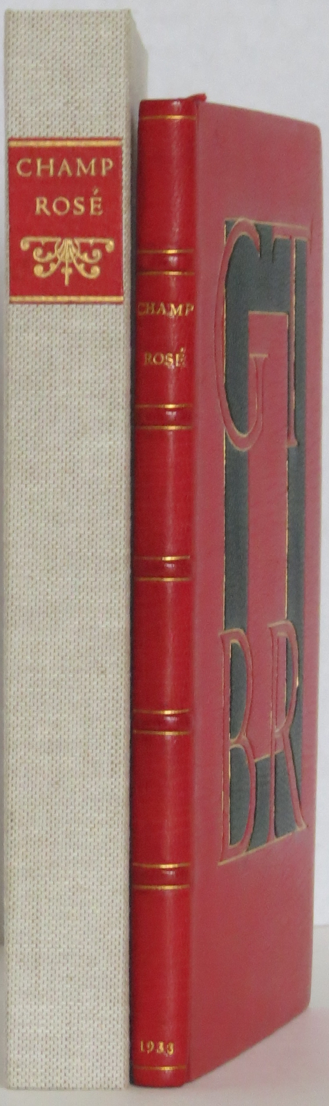
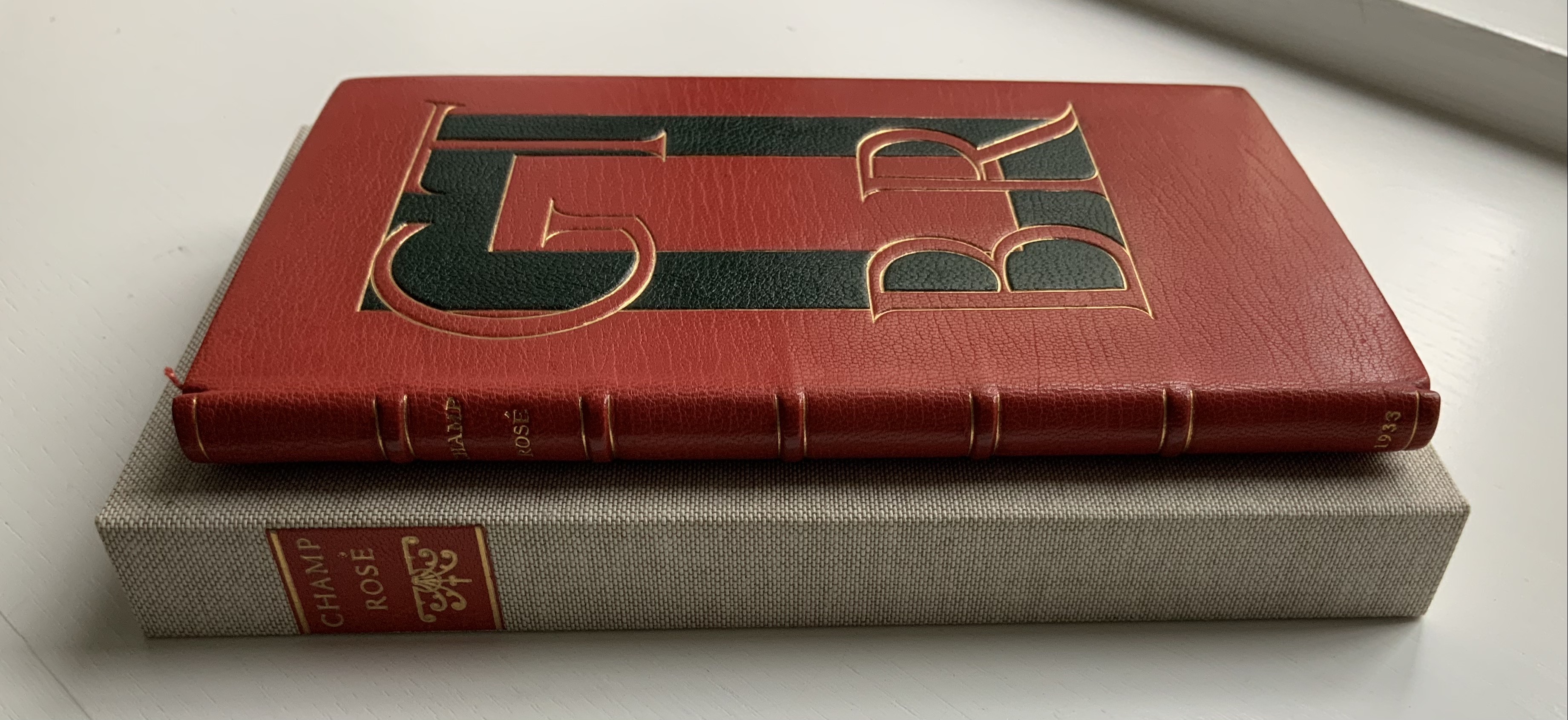
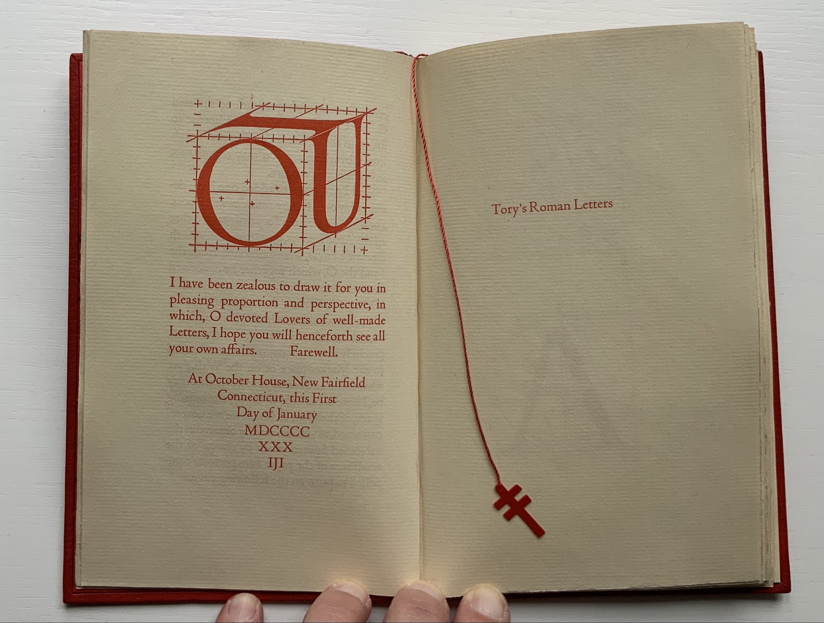
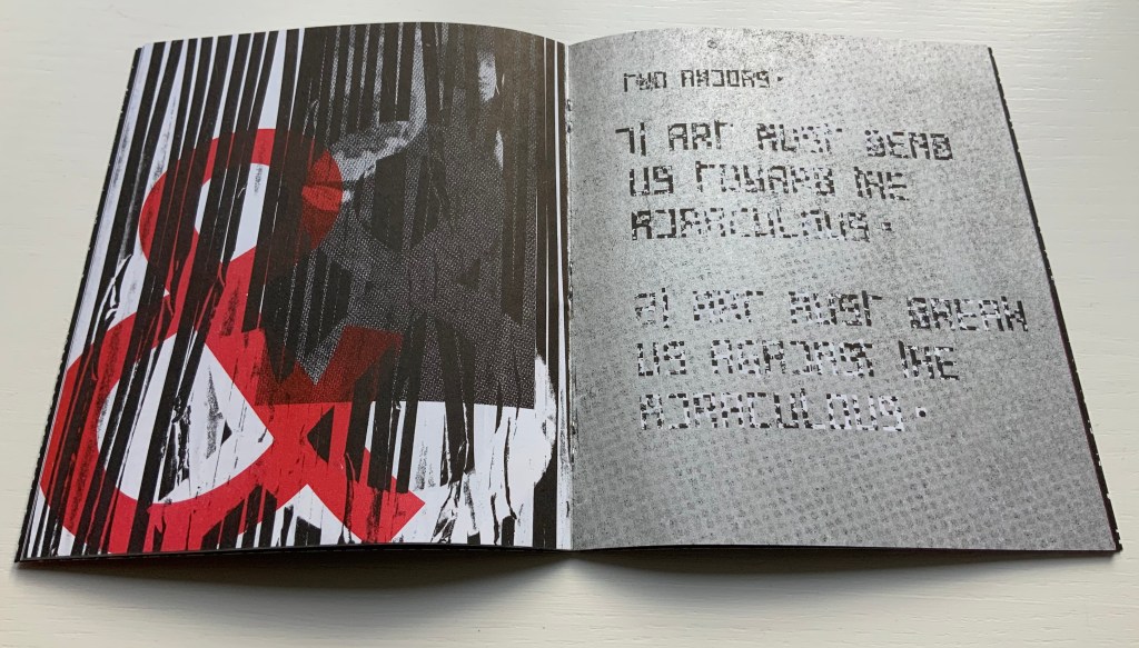
The last page of Tory’s illustration of additional alphabets is not the end of his work. The colophon plays that role. Curiously, Tory misses out the character that plays that role for the alphabet itself: the ampersand. “Curiously” because the character & appears throughout Champ Fleury — even at the end of the colophon’s fourth line in French — and it is after all the most flowery of the alphabet’s characters. Perhaps some book artist will follow Bruce Rogers’ example in his joking Depression-era homage to Tory on the back of Champ Rosé and create an homage to Tory and Rogers of three-dimensional ampersands.
Gelb, Ignace J. 1974. A Study of Writing. Chicago: University of Chicago Press.
Golec, Michael. 2015. “Champ Fleury in the Machine Age”, lecture at the School of Visual Arts, NYC. Uploaded 4 June 2015. Accessed 12 May 2021. Good slides and a comparative look at Tory’s original and Rogers’ resetting.
Rogers constructed the IOU device in a joking Depression-era homage to Tory. Referencing the mythological tale about Jupiter, Juno and poor IO who was turned into a cow, Tory maintained in Champ Fleury that all the Roman letters were fashioned from the “I” and the “O.” By placing Roger’s IOU on the back cover, binder Peter Geraty doubles Rogers’ pun on the debt to Tory’s “letterology”. Both Geraty and Rogers are acknowledging a debt to Tory as a book designer.
Adding to his joke, Rogers printed the whole of Champ Rosé in red, which Geraty follows. Rogers explained the red ink in his poor man’s Champ Fleury “as in these aforesaid days of hardship & depression much Book-Keeping is being written down in red…perhaps it would be better for Book-Selling too if Printing were done in that cheerful colour.…”
Geraty’s binding was part of the 1989 Guild of Book Workers exhibition.
Photos: The Veatchs.
Photos: Books On Books Collection.
The Books On Books Collection also holds a copy of George B. Ives translation of Champ Fleury, designed, typeset at printed by Rogers.
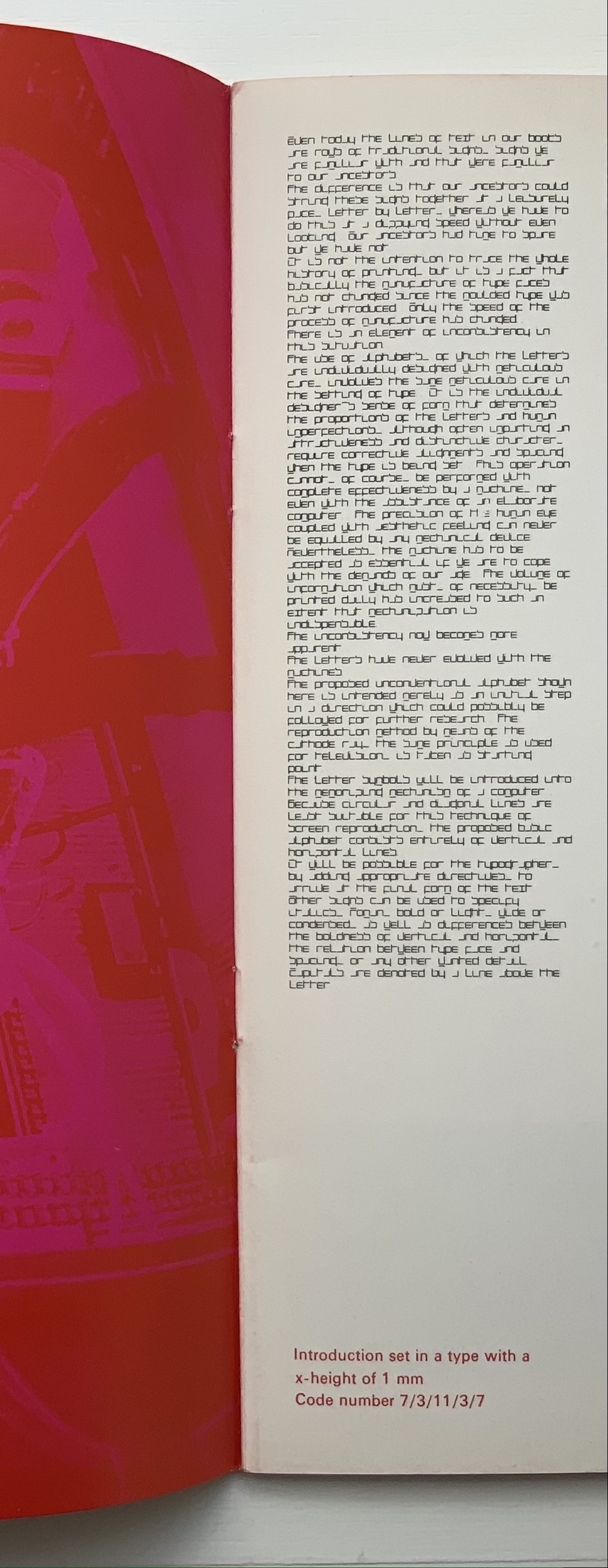
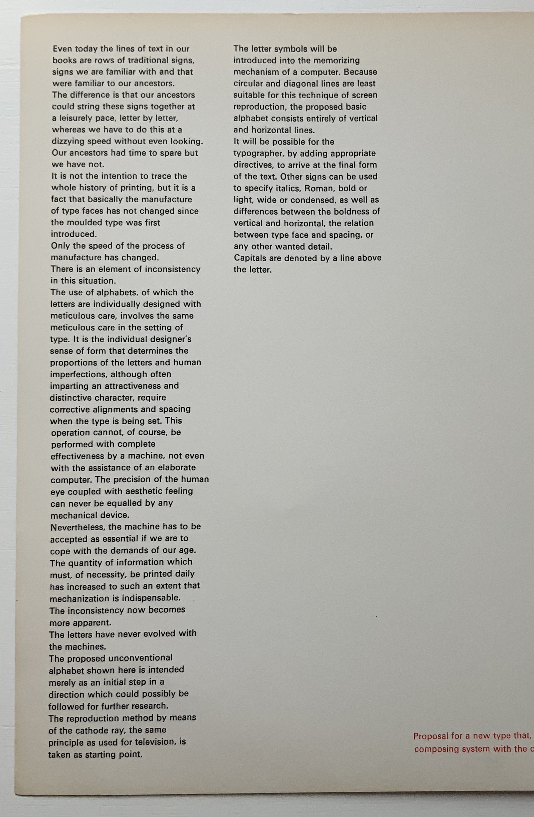
Shocked by the very low resolution output of electronic type-setting machines and sparked by the challenge to define a type that, more than traditional types, would be suited for the speed of machine output (particularly composing systems with CRT — cathode-ray tubes) and still be readable by humans, Crouwel came up with the New Alphabet.
On the left, Crouwel’s introduction in New Alphabet; on the right, in Univers.
A double-page spread (not shown) explains the variables and rules for coding and resizing the letters. Clearly, from the side-by-side view of Crouwel’s introduction (above), humans would need to learn some new conventions (e.g., majuscules are designated by bars over miniscules) for the font to be readable. Some letters, such as “a” (below), would require recognition of an utterly different shape. Despite — or because of — that, the font appealed to album and magazine cover designers in the digital ’80s.
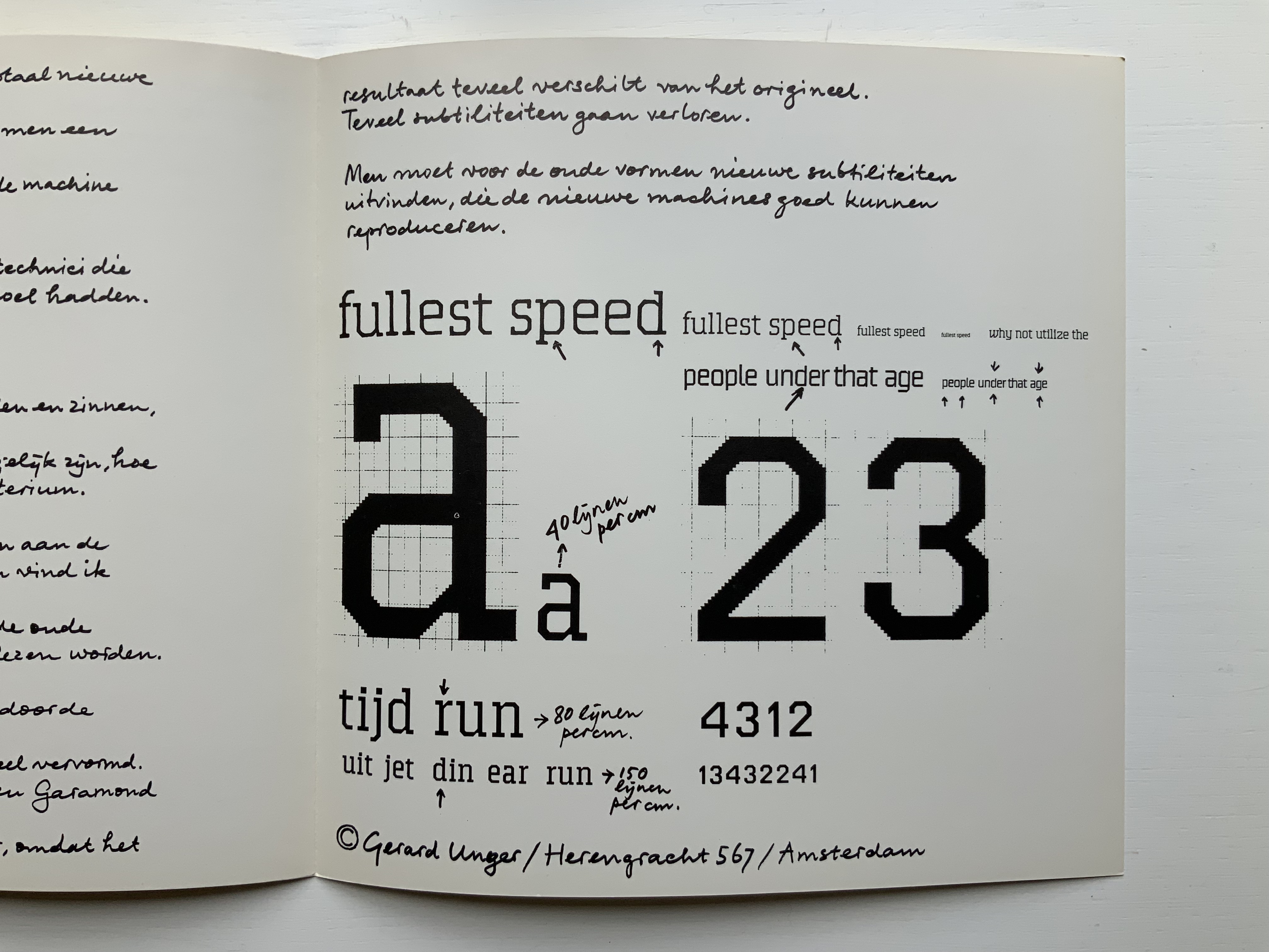
Disturbed by letting machines take precedence over the human eye, Gerard Unger, one of Crouwel’s colleagues, submitted a “counter proposal” — tellingly in handwriting. Juxtaposition of their lowercase “a’s” with Geofroy Tory’s majestic majuscules offers a counter-counter historic perspective on the art of the alphabet.
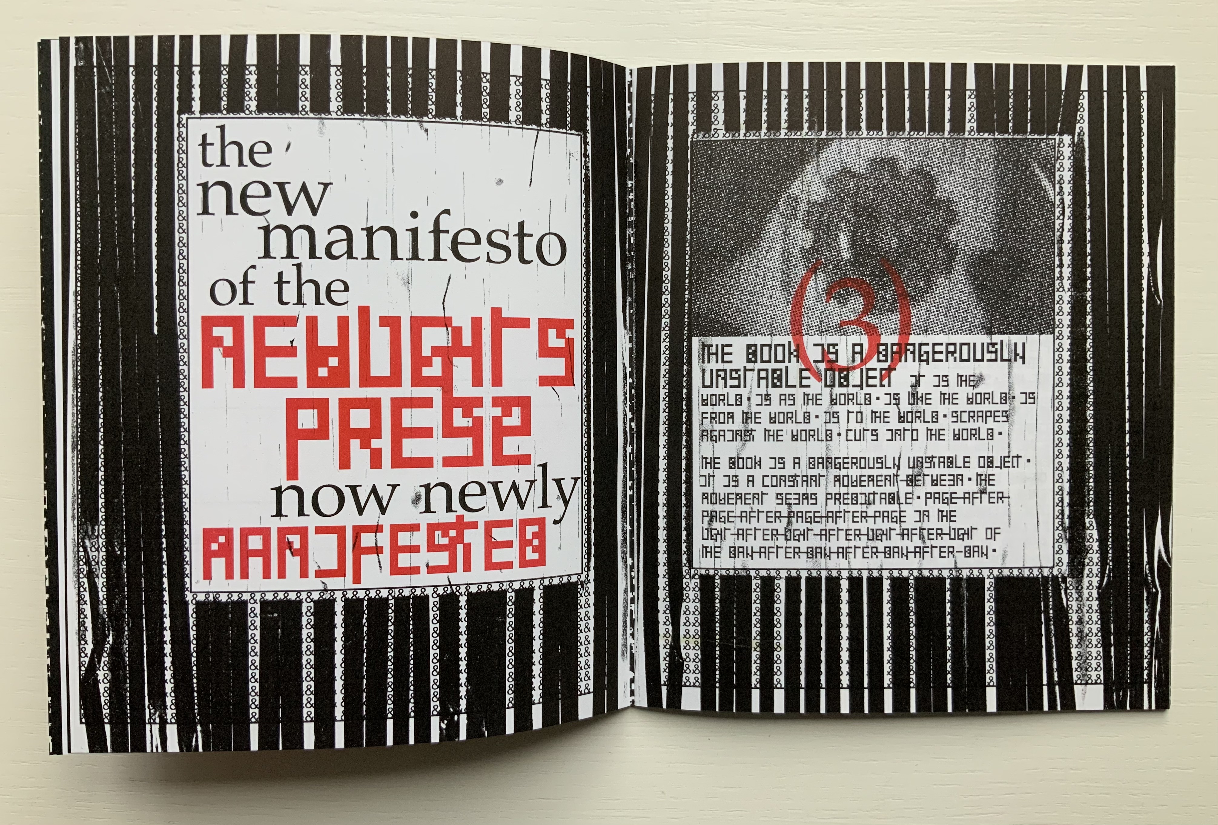
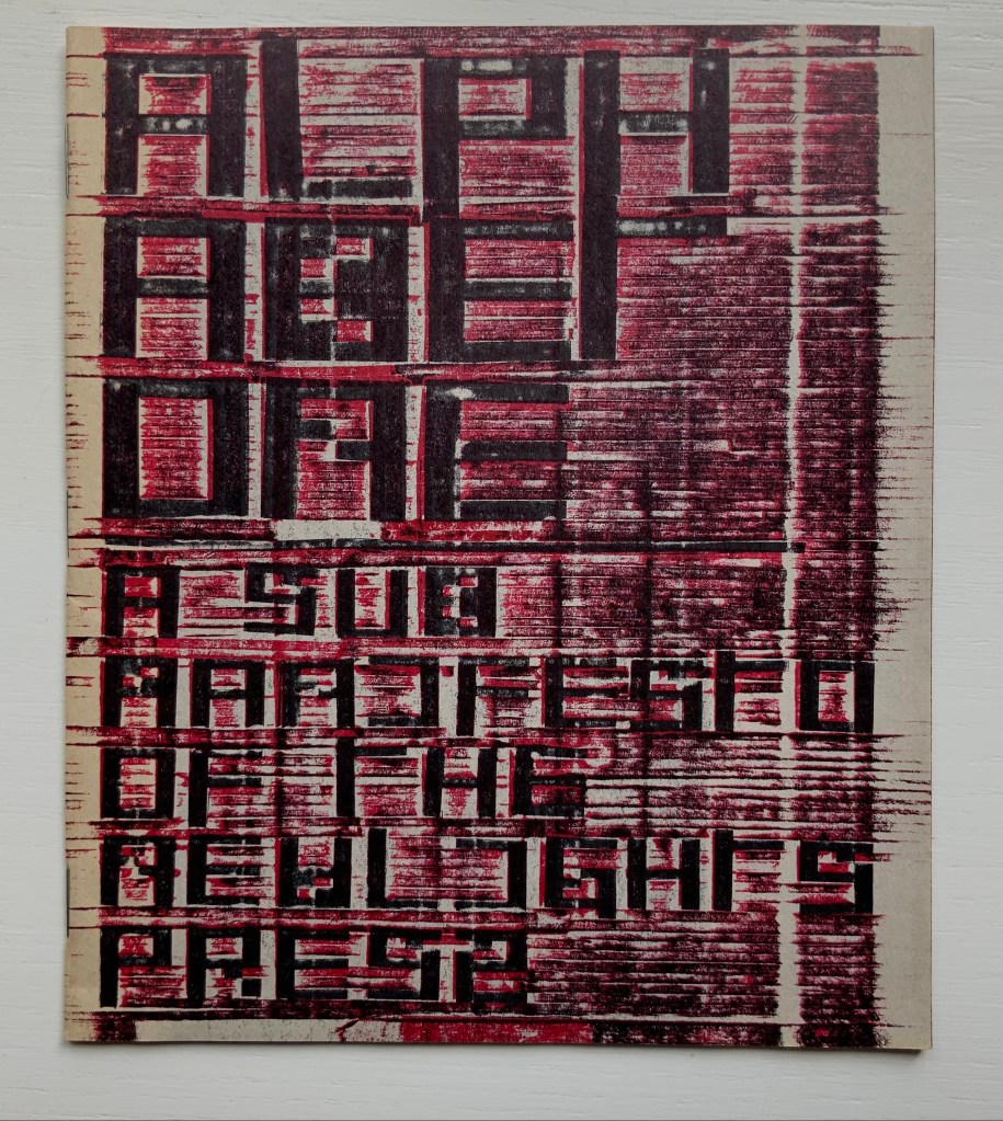
The New Manifesto of the NewLights Press (third iteration) (2017)
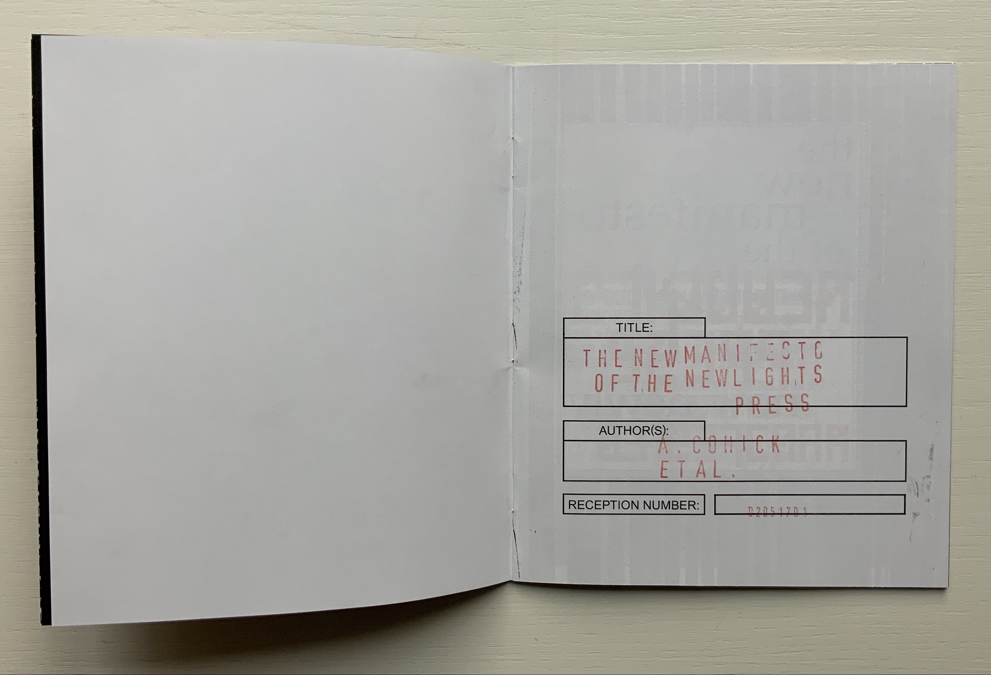
The New Manifesto of the NewLights Press (third iteration) (2017) Aaron Cohick Booklet, saddle-stapled, risograph, letterpress/collagraph, and hand painting. H165.1 x W139.7 mm (closed), 20 pages. #000611, unlimited, iterative edition. Acquired from New Lights Press, 11 December 2020. Photos: Books On Books Collection. Displayed with permission of the artist.
The New Manifesto of the NewLights Press (third iteration) has multiple starting points. Even in its first iteration, we have
The book is a dangerously unstable object, always between, continuously opening. It is interstitial, occupying many planes at once.
Digital technology has killed the book, finally.
The book is an impossible thing — comprised entirely of edges and full of holes. It moves. It happens in between.
Readers move through authors and books. Books move through readers and authors. Authors move through books and readers. They exist between each other’s pages. They only exist in between.
The form of the book, the history of the book, and the processes involved in its production provide a foundation for rethinking and re-evaluating the dominant discourse(s) of contemporary art.
The book … exemplifies a model that expands beyond form and content…. It is a field, whose axis points [form, content, production and reception] are always held in tension. In this model a piece or practice is a “zone of activity.”
Moreover, there are ten refinements on these starting points, touching on Julia Kristeva’s “intertextuality”, Roland Barthes’ “death of the author”, Michel Foucault’s “death of the book” and much more in the same vein. Each iteration even has diagram and footnotes, underscoring the academic nature of the starting points.
By its third iteration, The New Manifesto‘s words been further refined as a combination of announcement, exposition, lyric and prayer. It soars beyond literary theories and finds birds of a closer feather among Ulises Carrión and Michalis Pichler.
The book is a dangerously unstable object // It is a series of edges // Once clustered and knotted // Now open and spreading // Now cutting and bending // Mostly // The book betrays // Mostly // The book howls // The book falls apart in the face of our anguish // In the face of our quiet // In the silence of our slipping // Mostly // It will also always be something else // That we did not // Can not yet // See // The book is a remarkable technology // It is a shimmering substance // It is a noise of the hands and thought // The book is perhaps now a dead thing // In the hands of the dead // So be it // We never mattered much anyway // Beyond our capacity to consume // Our capacity to labor // We are fuel // So be it // We remain in the dark // With these books // The original autonomous window technology that is us looking through // At // In // Against // With care // The book returns our labor to us //
If a new edition of Publishing Manifestos is ever issued, Cohick’s hortatory words should be considered. The words, however, cannot be considered alone. Over the three iterations, The New Manifesto — the only one in the collection and, therefore, the only one tangible for the visitor — has “participated more & more in the world of visual art”. Cohick’s use of the collagraphic technique increases. It adds painterliness to the booklets as well as a sense of depth and spatial play within the page, across the gutter and from recto to verso pages. In a series of online essays for the College Book Art Association, Cohick confirms the pleasure and intent here:
Collagraph is a well-known technique and is usually taught as part of introductory letterpress courses. It has an immediacy and fidelity that is very exciting—you can stick a leaf or other flat object to a block, print it, and get a decent image of that object. Unfortunately it usually stops there. Those flat objects are hard to push beyond that initial single-color print. Linoleum, photopolymer, wood and metal type, and to some extent woodcut are all made to be “neutral” printing surfaces—flat and smooth. Trying to get collagraph to be flat and smooth begs the question: why use collagraph at all? In collagraph the material that makes the plate is not neutral—the material is exactly the point. That embrace of material and its many, varied effects and marks is what moves collagraph closer to the direct markmaking of drawing/painting. It makes all of those “unacceptable” (or abject?) marks readily available. Relief collagraph printed with letterpress equipment can be a method of painting or drawing in multiple, with control as good as—if not better than, but also different from—the hand. “You’re doing it all wrong (Part 2)“
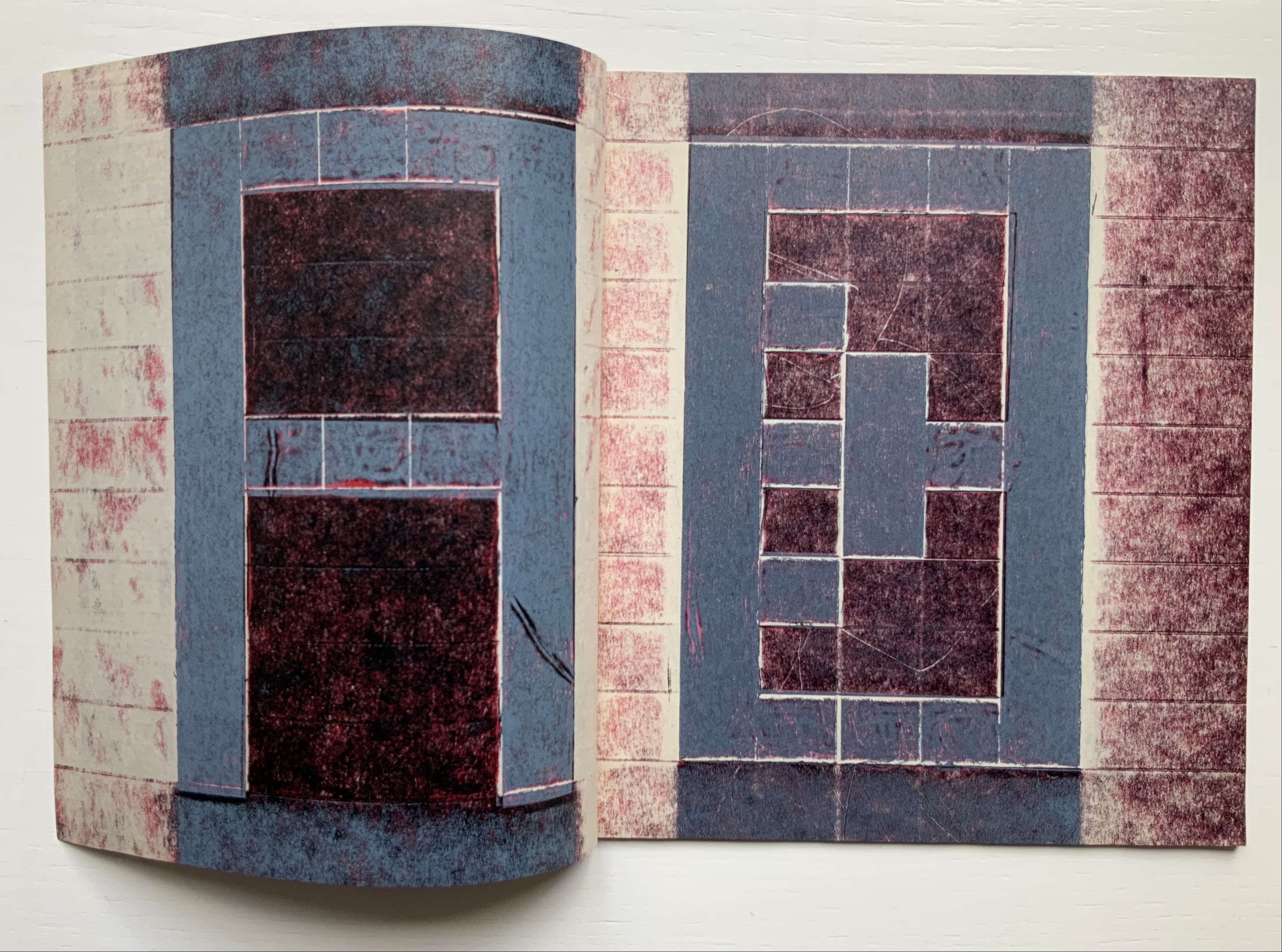
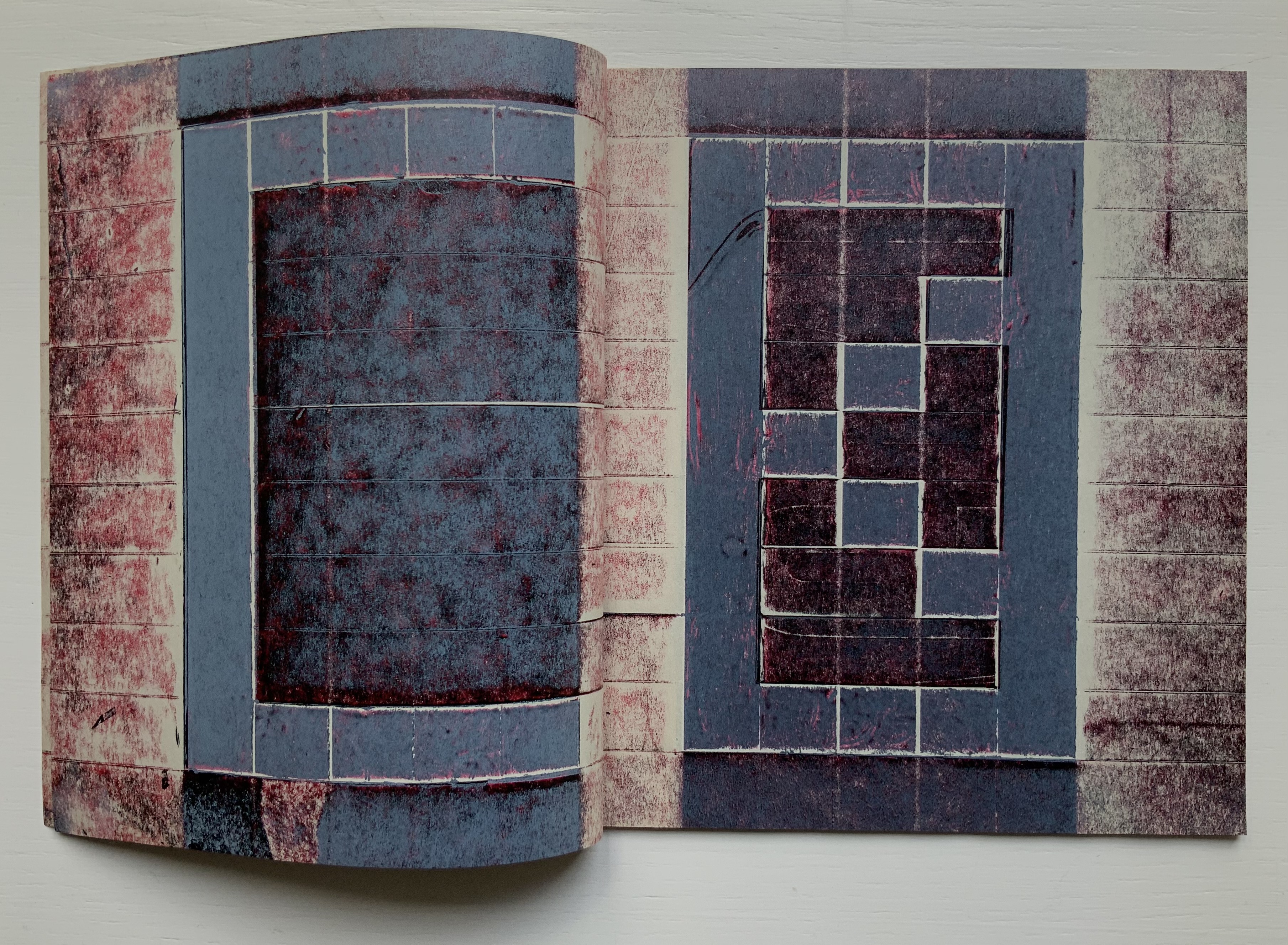
From the first iteration of the manifesto, black & white details of Jan Van Eyck’s The Arnolfini Marriage appear and are manipulated on the cover and throughout. Although they recede in the second iteration, they move strikingly to the fore in the third. Constantly alongside the Arnolfini details has been the ampersand, enlarged, reversed, in different colors, and present — almost ornamentally — within the text line. The increased visuality of the third iteration announces itself on the booklet’s cover and inside with the grainy enlarged detail of the mirror from The Arnolfini Marriage. What do the Arnolfini details signify? Although Van Eyck’s original itself is straightforwardly representational, its meanings are not always any clearer than that of its use in Cohick’s collage. With his slices of black (“a series of edges”) obscuring the image of the groom, perhaps Cohick is compounding obscurities to present “something else // That we did not // Can not yet // See”.
And what about the large overlapping ampersands in red and gray, systematically reversed and alternating in color? Are they emphasizing the “and so on and so on” of tradition in Cohick’s painterly printing technique? Are they alluding to the joining of hands in the marriage? Are they alluding to, and performing, a marriage of the book and visual art? On a verso page in the manifesto’s first iteration, he writes, “The form of the book, the history of the book, and the processes involved in its production provide a foundation for rethinking and re-evaluating the dominant discourse(s) of contemporary art.” On the facing recto page, the Arnolfini bride in reverse from the original extends her hand to a reversed ampersand.
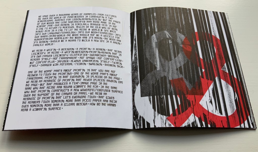
In perhaps the most important enhancement of the third iteration’s visuality, Cohick’s full-blown typographic redesign of the alphabet occupies the visual foreground, middle ground and background. It is as if Cohick sets out to demonstrate Mallarmé’s proposition that the book is the “total expansion of the letter”. The first iteration’s completely legible Palatino, Arial and Placard Condensed typefaces used in the text line have yielded to what Cohick calls a “dislegible” font, which he often reverses, lays out as occasional “running sides” rather than “running heads”, and subjects increasingly to collagraphic layering. In his “You’re doing it all wrong” series, Cohick explains:
If “legible” and “illegible” are binary opposites, then the term “dislegible” is about looking at the space between those two poles. Dislegibility displaces, dislocates, deforms, and/or disrupts the process of reading, with the ultimate goal of making that process of reading (dis)legible to the reader. The dislegible can be read, but it resists closure or certainty. “You’re doing it all wrong (Part 1)“
Also contributing to dislegibility is the reversal of images, the ampersand and letters. More than that, the reversal reminds us of what is involved in letterpress production — the inked relief surface and its reversed image or letter to be transferred to paper. Always in tension with form, content and reception, production makes up the open field from which the artist’s book emerges. The third iteration exudes production’s physicality. A black saturated endleaf bleeds over onto a stark white sheet that faces a stamped title page, intensifying a feel of mechanical working. Letterforms behave as so much raw material — as if they were oil, acrylic, brick or mortar — to be re-seen from different angles, noted for more than one function and their text read for more than one meaning.
According to Cohick, “For art to thrive, form and content must be in a dynamic relationship… It must contain enough disruptions, ambiguities, and peculiarities to resist the deadly state of stable signification.” The iterations of The New Manifesto enact that statement.
Alphabet One: A Submanifesto of the NewLights Press (2017)
Alphabet One: A Submanifesto of the NewLights Press (2017) Aaron Cohick Booklet, center-stapled. Letterpress printed from woven collagraph blocks on newsprint. H165 x W140 mm, 28 pages. Acquired from the artist, 11 December 2020. Edition of 250, unnumbered. Photos: Books On Books Collection, displayed with permission of the artist.
Alphabet One, “companion book to the third iteration of The New Manifesto of the NewLights Press”, presents Cohick’s “complete ‘noise’ alphabet, in order, in condensed and full form”. In The New Manifesto, Cohick has described the book as “a noise of the hands and thought”. Well then, being a book, Alphabet One demonstrates that the manifesto is the alphabet, and the alphabet is the manifesto, and “woven collagraph blocks” could hardly be less “a noise of hands and thought”. Lest those inferences seem strained, continue reading the passage Cohick reproduces from The New Manifesto immediately after the reference to the “complete ‘noise’ alphabet”:
This is not a utopian program // This is not an alphabet for saving the world // Such a thing is a dangerous lie // This is one possibility // Not a tool // But a movement-between // An object-between // A growing // Changing thing // Meant to do just that // It is about attention and its revitalization // It is about structure and our being in it //
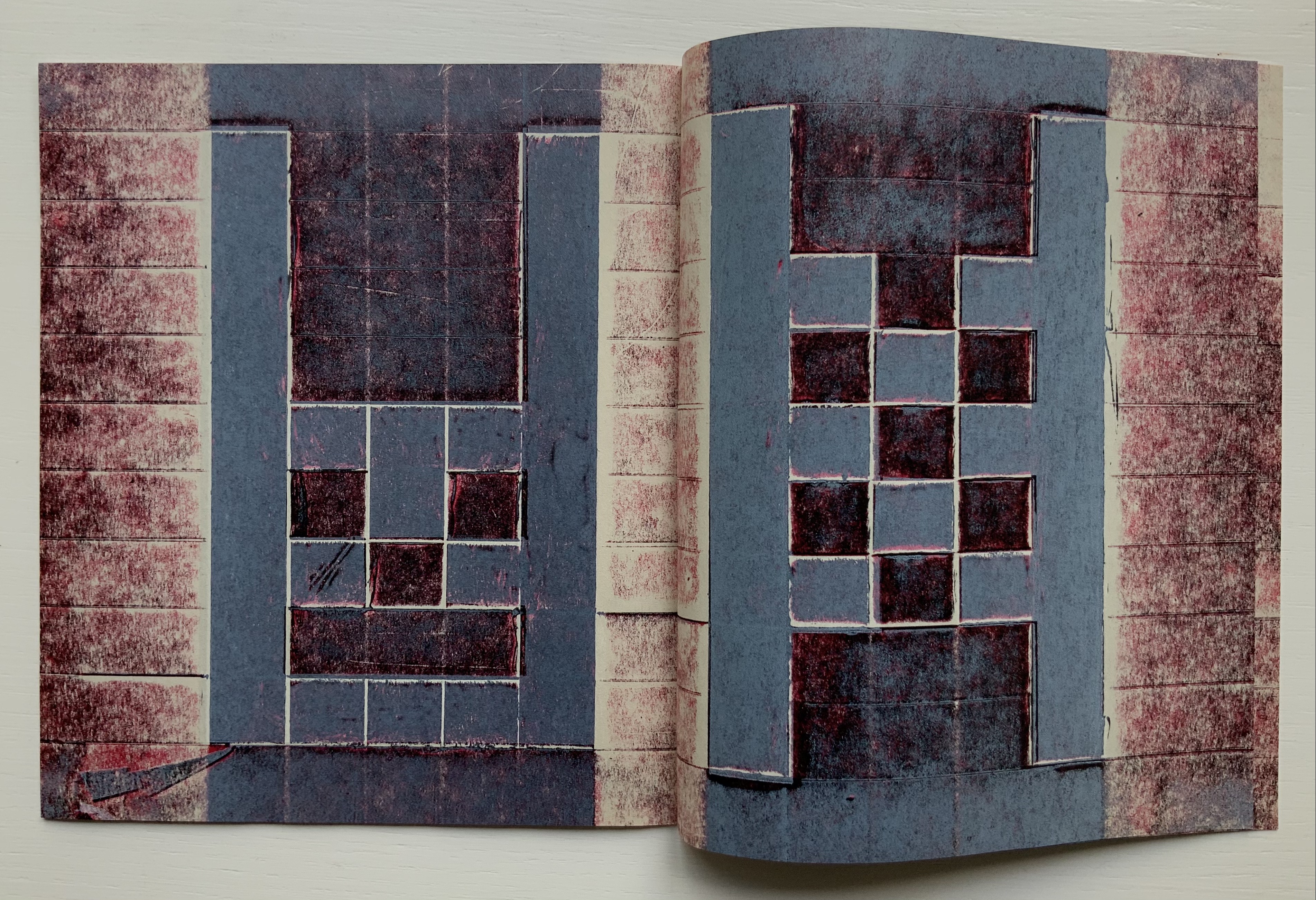
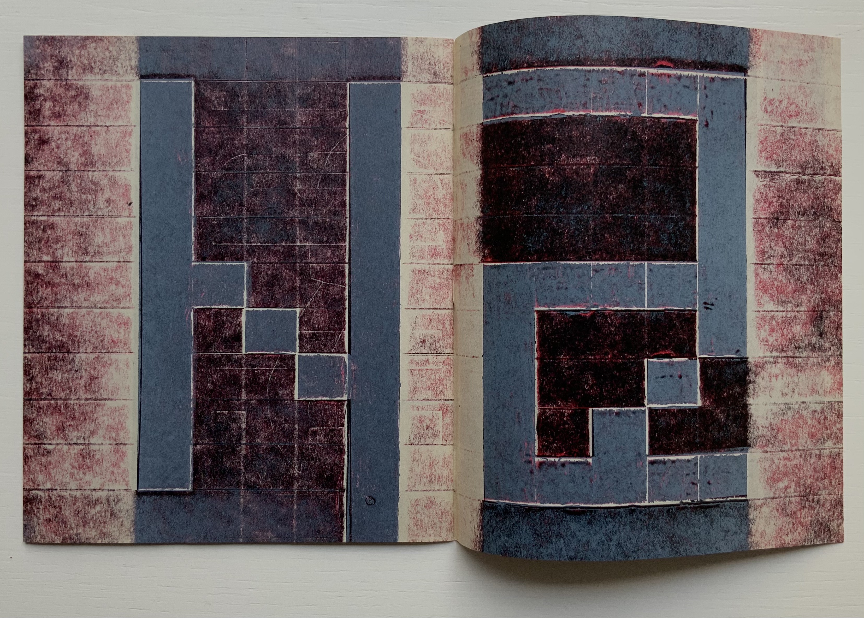
A, B, C, D. Photos: Books On Books Collection.
W, X, Y, Z. Photos: Books On Books Collection.
It cannot be an accident that the “noise” alphabet’s letterforms arise from varyingly shaded bricks: rose, gray, reddish gray and reddish black. To left and right of each letter, the rose color dominates. A reddish gray bar tops and tails each letter. The color gray forms the “strokes” of each letter. Reddish black fills the counters. Extracting the signal from the noise of the alphabet or books does not come easily. This is intentional. Just as The New Manifesto says,
With these books // The original autonomous window technology that is us looking through // At // In // Against // With care //The book returns our labor to us //
Days Open Air (2016)
Days Open Air(2016) Aaron Cohick Booklet, center-stapled, H203 x W152, 12 pages. Edition of 100, of which this is #40. Acquired from the artist, 11 December 2020. Photos: Books On Books Collection, displayed with artist’s permission.
Days Open Air is one of those books returning our labor to us that The New Manifesto announces. Cohick call it “an artists’ book/poem thing … an experiment: with our new Risograph, with the alphabet, with writing, with random numbers, and with noise.” Letterforms stretch. Words run sideways, they break in the middle across lines, even across pages.
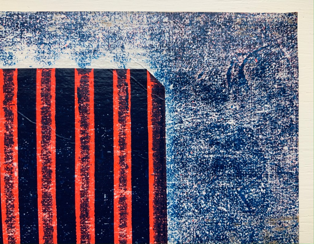
Look-See (REAED) (2014)
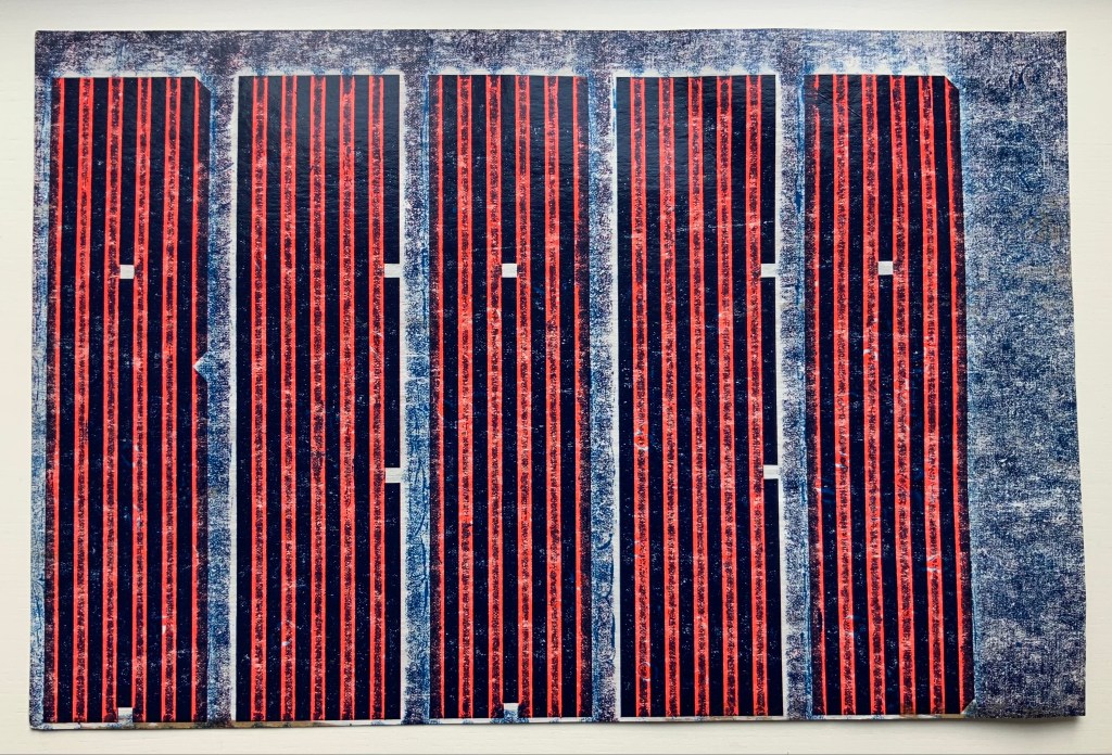
Look-See (REAED) (2014) Aaron Cohick Print. H300 x W456 mm. Photos: Books On Books Collection, displayed with artist’s permission.
More evocative of barcode stripes than bricks, the letterform strokes in this poem-print-poster stretch even more than in Days Open Air. Printed on a Vandercook 219 from vinyl and gesso collagraph blocks, the letterforms challenge us to “look” and “see”. An angle at the top right, two angles midway on the right and two counters condensed to small squares suffice to define the first letter — R. The letters E and A are more efficient, requiring only the placement of two counters each. Note how the textural effect of the gesso and letterpress printed collagraph on chipboard joins The New Manifesto‘s celebration of the physicality and noise of production.
In Cohick’s world, the book and art make, and should be perceived as, a “strange” continuity. His vision and embrace of the collagraph suggest a 21st century version of William Blake. He names his nearer contemporaries as Ken Campbell, Walter Hamady, Amos P. Kennedy, Jr., Karen Kunc, Emily McVarish, Dieter Roth and Nancy Spero. In the Books On Books Collection, those far and near can also be found in Eleonora Cumer, Raffaella della Olga and Geofroy Tory.