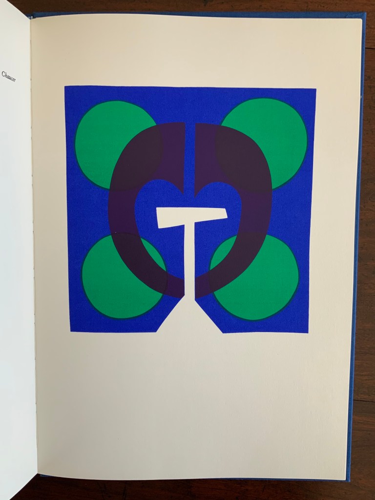
The Burning of the Books (2009)


The Burning of the Books (2009)
George Szirtes (poems) and Ron King (prints)
Slipcase with sewn hardback, duotone letterpress reproduction of the 2008 artist book version. H220 x W160 mm, 66 unnumbered pages. Edition of 1000, the first 100 signed and numbered by the author and artist and presented in a specially designed slipcase. Acquired from the artist, 28 January 2021. Photos of the work: Books On Books Collection.

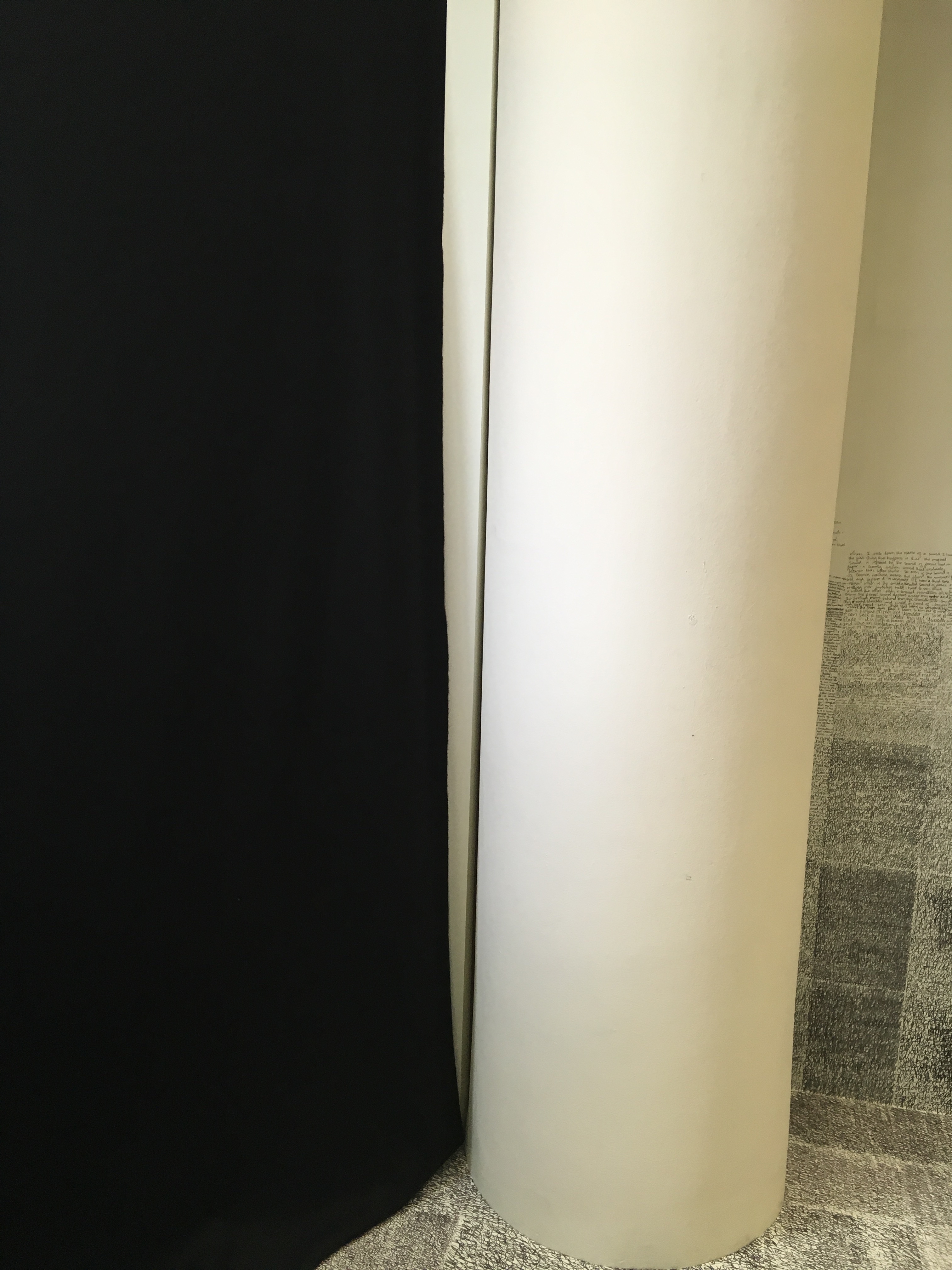
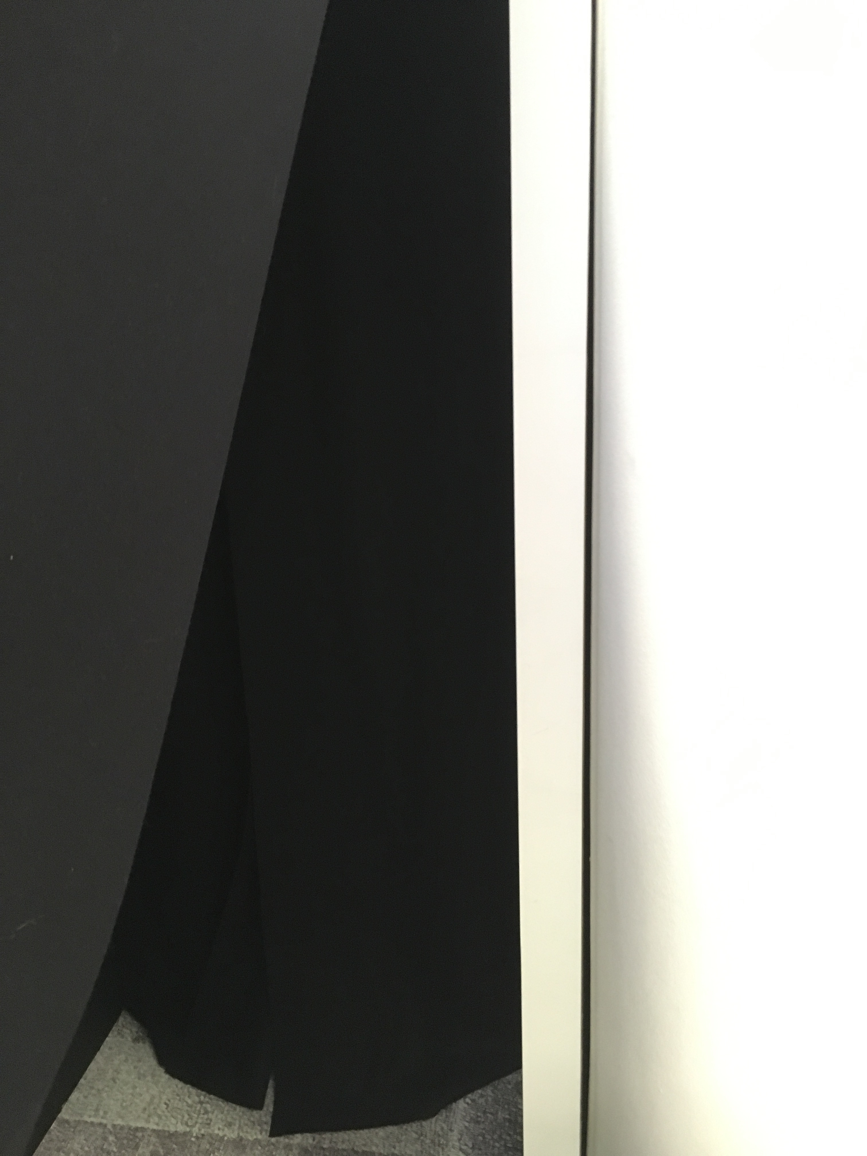
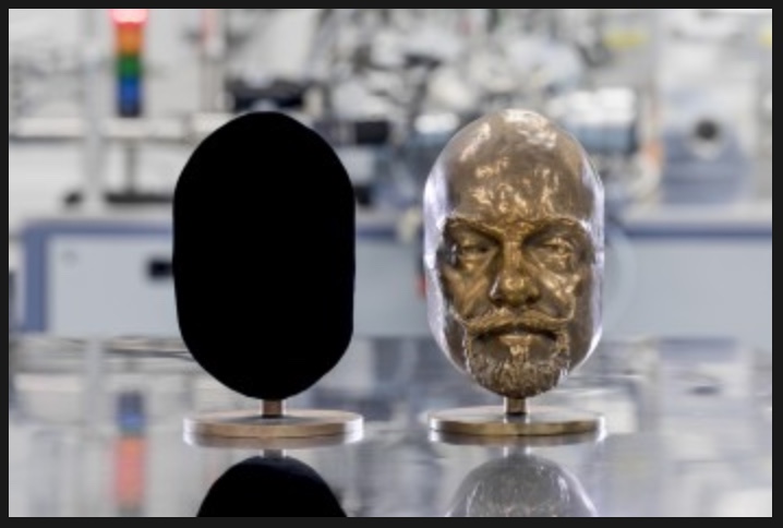
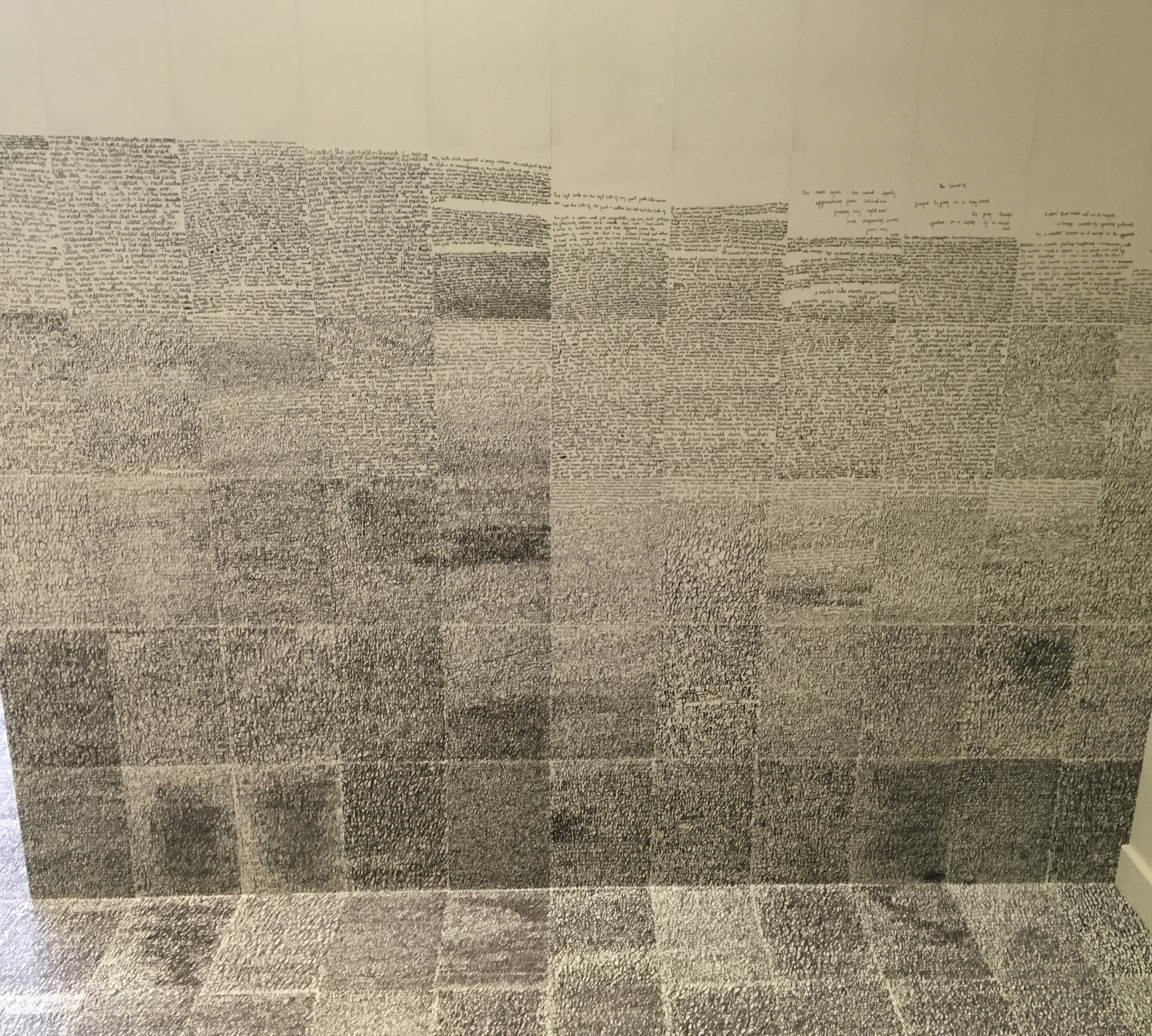
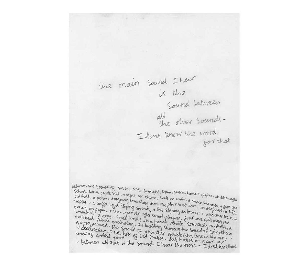
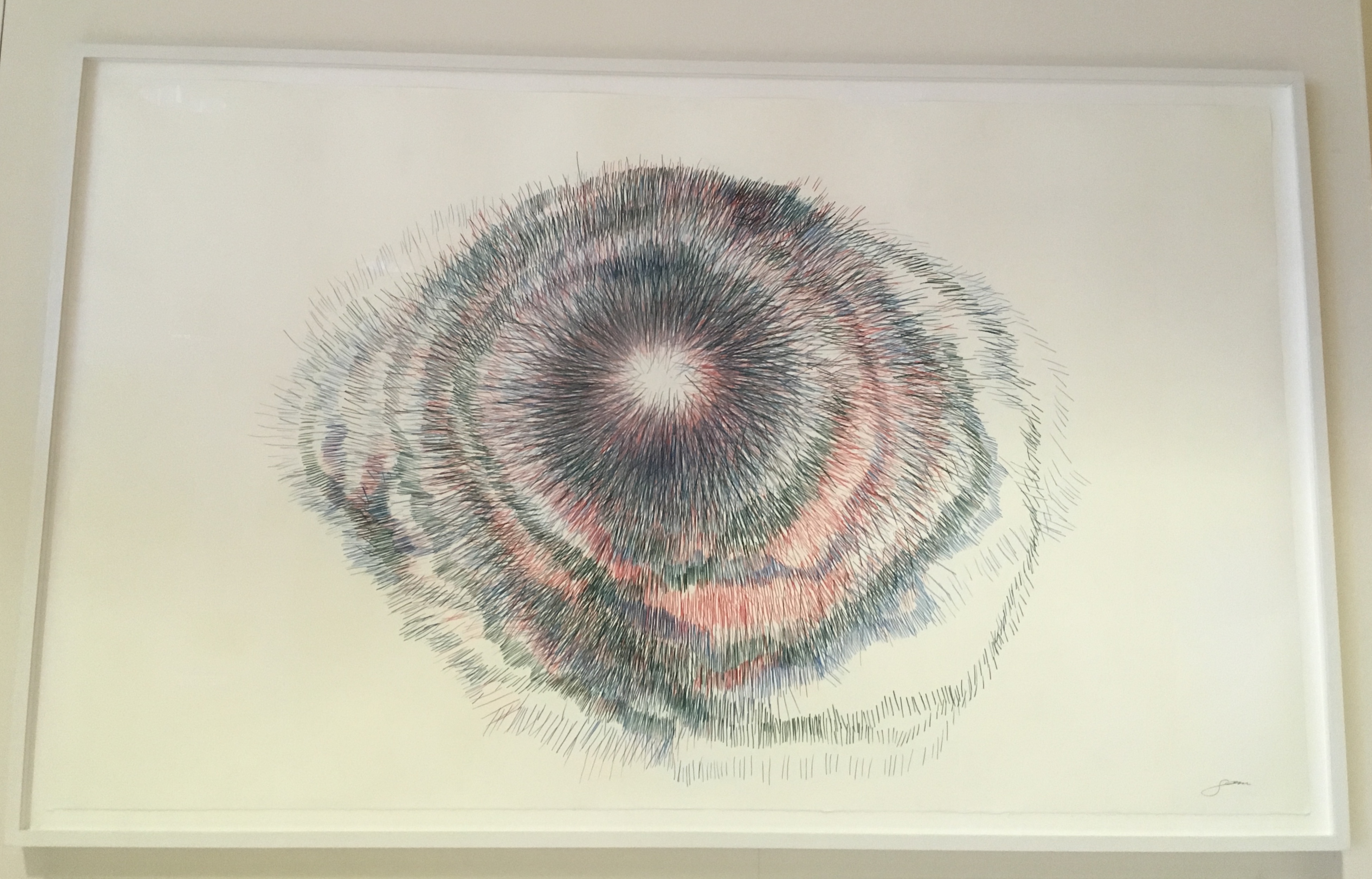
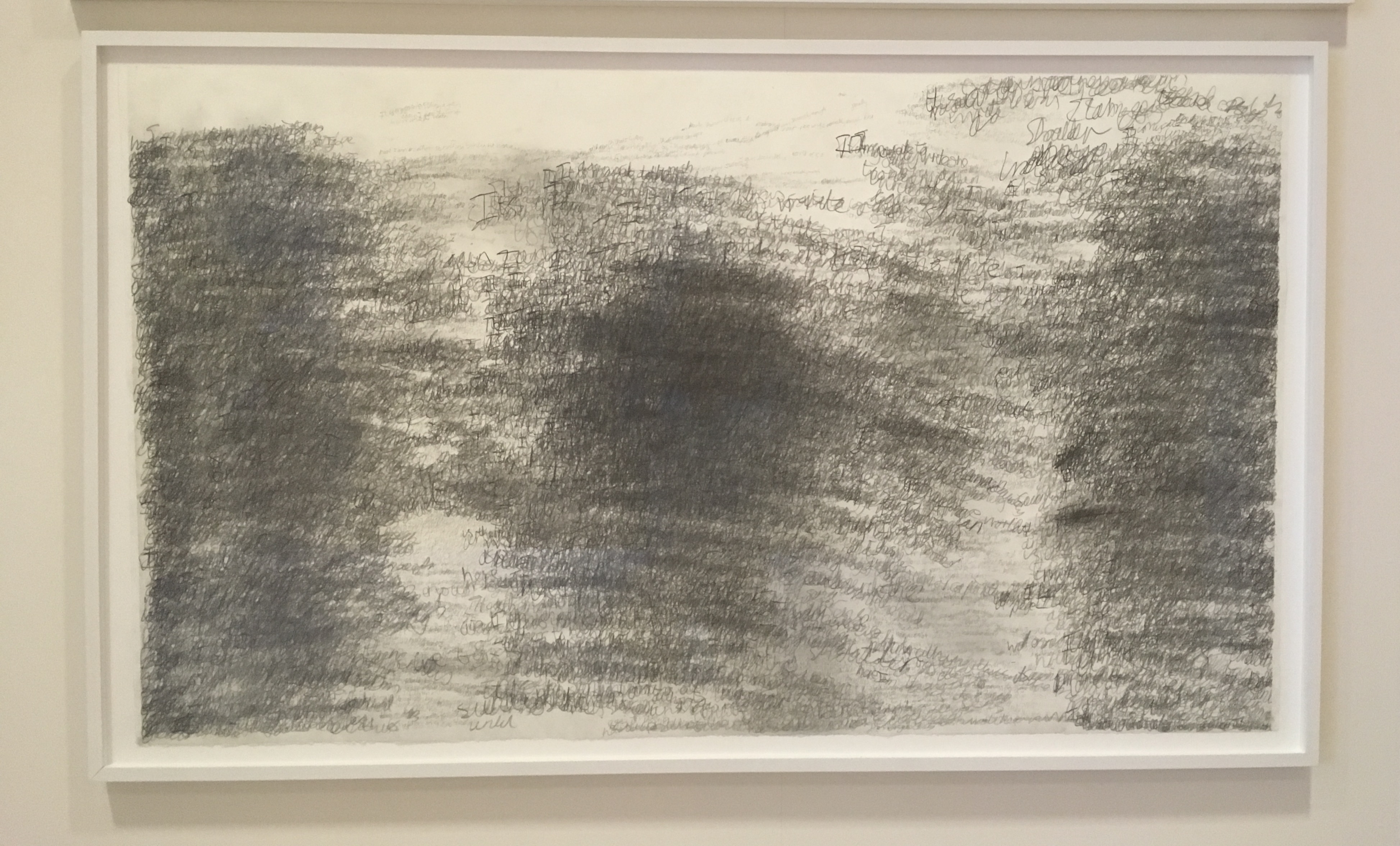
The Burning of the Books is the harshest of Ron King’s work in the Books On Books Collection. According to the artist, this work’s genesis was his long fascination with Elias Canetti’s Auto da Fe (1946). King commissioned Szirtes to respond to Canetti’s work with a text to accompany the etchings that King had been holding in abeyance. The result in 2008 was a large format artist book, of which this work is a reproduction.
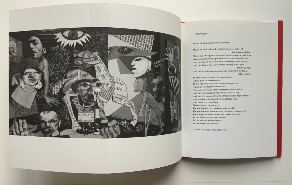
With its photo-collages of a Guernica-like fold-out, newspaper clippings of shamed collaborators, fists and human limbs, The Burning of the Books delivers a visual indictment of the 20th century that creeps into the 21st century with the added images of celebrity police ID photos and Euro currency notes. Szirtes’ take on King’s take on Canetti’s take on his main character’s solipsistic slip from obsession into madness in a world of alienating -isms is the work of art with which we — sadly, more than a decade later — keep catching up.
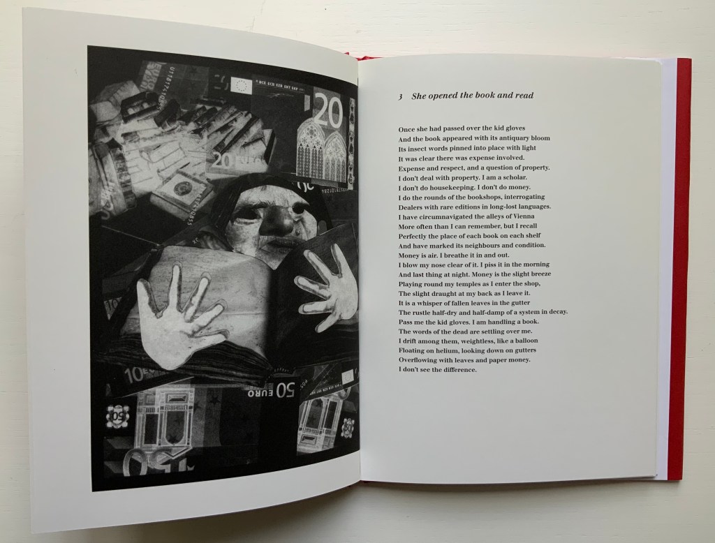
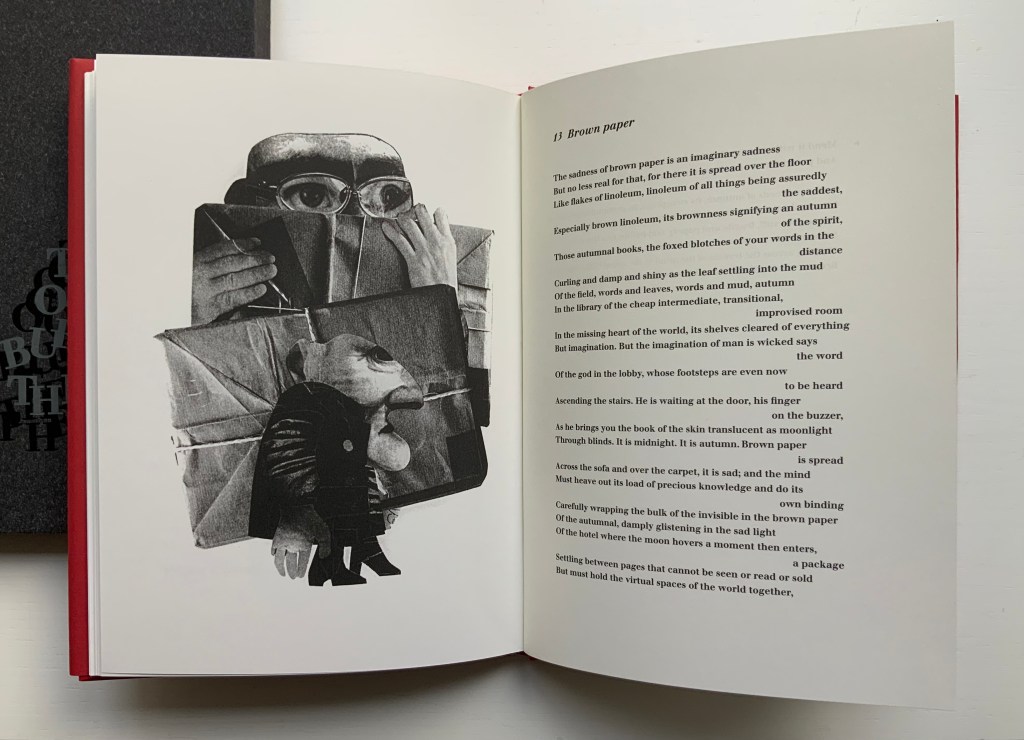
This work’s fascination with horrors may have its roots in a childhood experience in Brazil — seeing a photograph of a bandit gang’s mass beheading — but, more often than not, King’s works emphasize a humor in blackness (as does this work in its recurrent image of Mr. Punch-like figures). Most often, though, a sheer joy of making and material prevails.
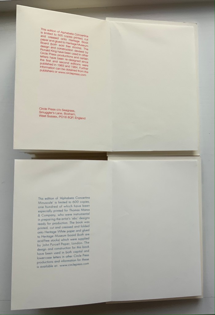
Alphabeta Concertina and alphabeta concertina (2007)
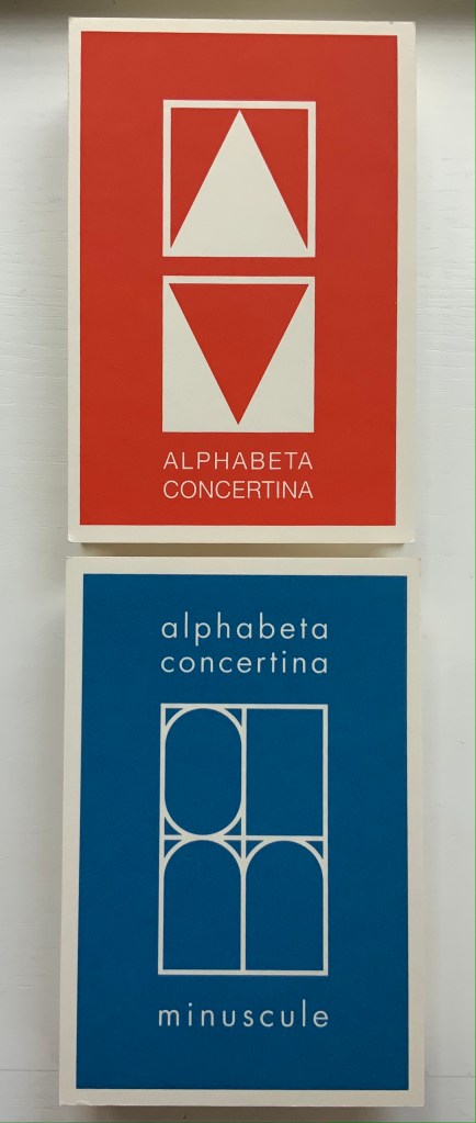
Alphabeta Concertina and alphabeta concertina miniscule (2007)
Ron King
Printed, cut and creased onto Heritage paper and glued to Heritage Museum board. H170 x W110 x D30 mm,stretching to 3 meters. Edition of 600. Majuscule acquired from the artist, 24 July 2021; miniscule acquired from Sophie Schneideman Rare Books and Prints, 27 November 2020.
Photos: Books On Books Collection.

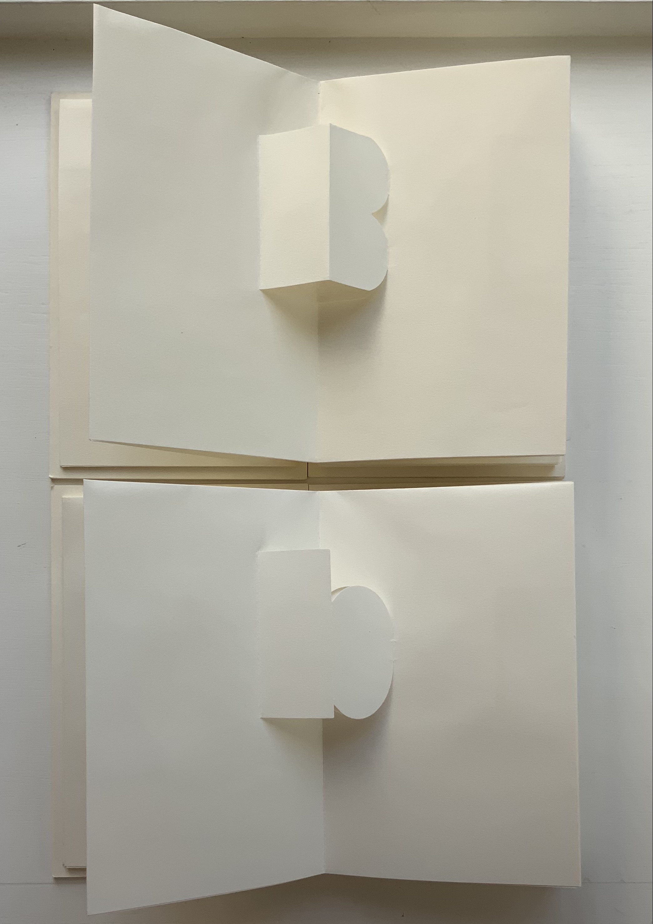

The “abc” series displays the restrained, minimalist side of King’s inventiveness. With more than one of these works to hand, his enjoyment and humor come through — especially in the subtle and not-so-subtle variations. Take alphabeta concertina miniscule as an example. It arrived like a long awaited chuckle after the majuscule version — Alphabeta Concertina (1983) — which had been expanded into the poster versions Alphabet I and Alphabet II (below). Size and surprise seem to matter in King’s sense of humor. For size, see the large-scale steel version of the alphabet in 2016. For surprise, consider his catalogue raisonné Cooking the Books or this set of paperweights.
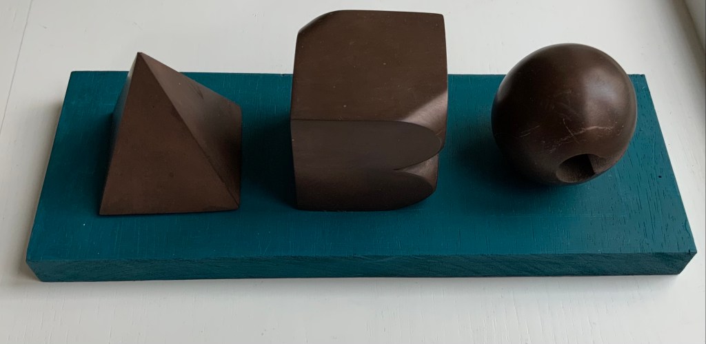
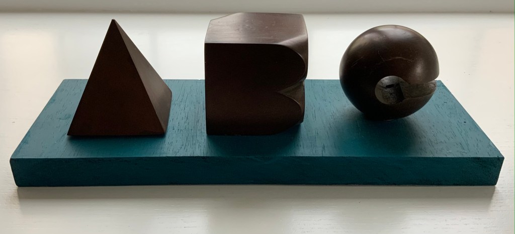
ABC [nd]
Ron King
Resin sculptures on painted wooden board Acquired from the artist, 24 July 2021.
Photos: Books On Books Collection.
Further down are Alphabet II (1999) and The White Alphabet (1984). Compare their uppercase letter C with that above to see how King developed his sculpting over time.
Cooking the Books (2002)

Cooking the Books: Ron King and the Circle Press (2002)
Ron King, Andrew Lambirth
Paperback with end flaps, sewn with headbands. Pop-up and metallic paper inserts. H225 x W165 x D20 mm, 180 pages. Acquired from the artist, 24 December 2020. Photo: Books On Books Collection.
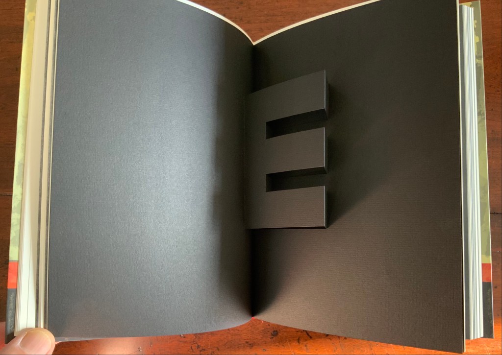
King’s catalogue raisonné does not merely illustrate his work, it illustrates it. Inserts of mirror paper, wax paper and a pop-up letter E transform what appears to be a simple codex into a treasure chest.
Alphabet II (1999)
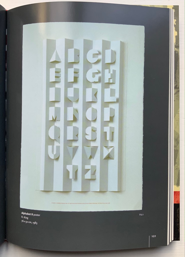
Alphabet II (1999)
Ron King
Pop-up poster. H760 x W500 mm. The letters have been cut onto a 190lb Waterford paper and mounted onto a heavier version of the same stock. Edition of 200 signed. Acquired from Circle Press, 26 June 2015. Photo of Cooking the Books, p. 101: Books On Books Collection.
The collection’s framed poster interferes with photography, but Cooking the Books provides the alternative.
Matisse’s Model (1996)
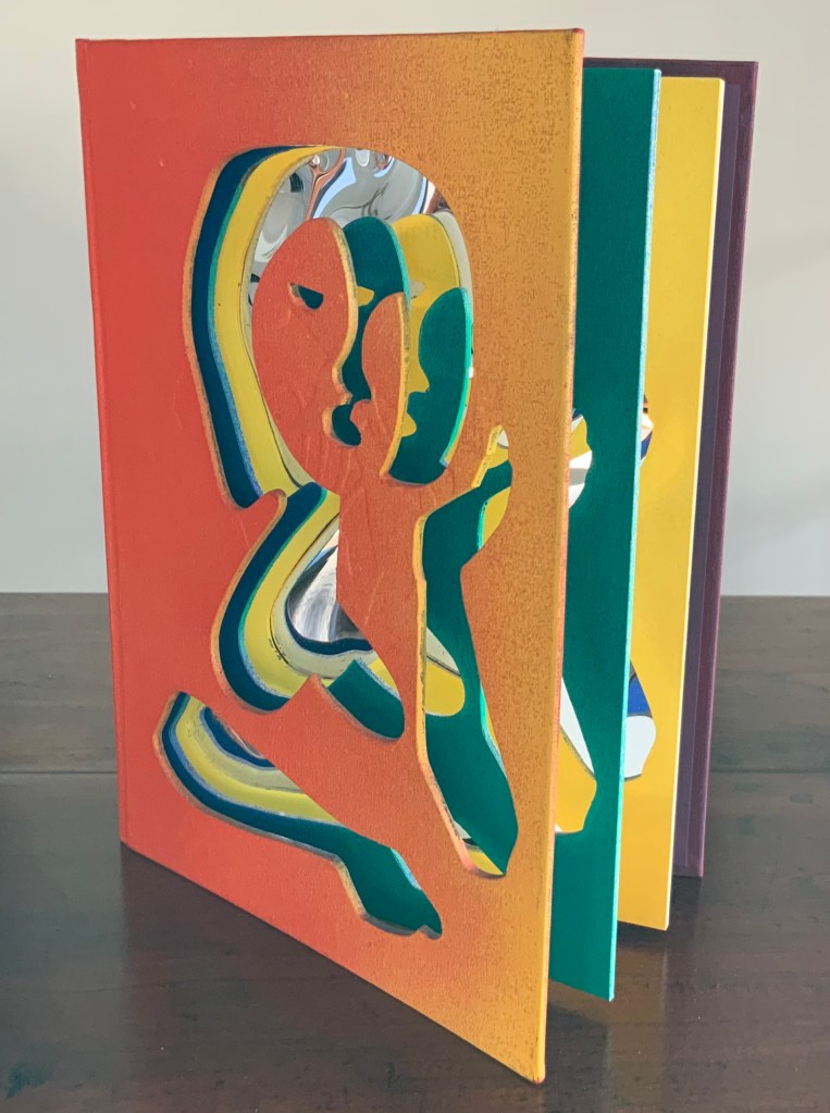
Matisse’s Model (1996)
Ron King
An edition of 50 signed book-works made by the same process as Acrobats. 23 x 17 cm with mirror-foil, sprayed pages, and a removable freestanding figure in collaged cardboard box. Photos: Books On Books Collection.

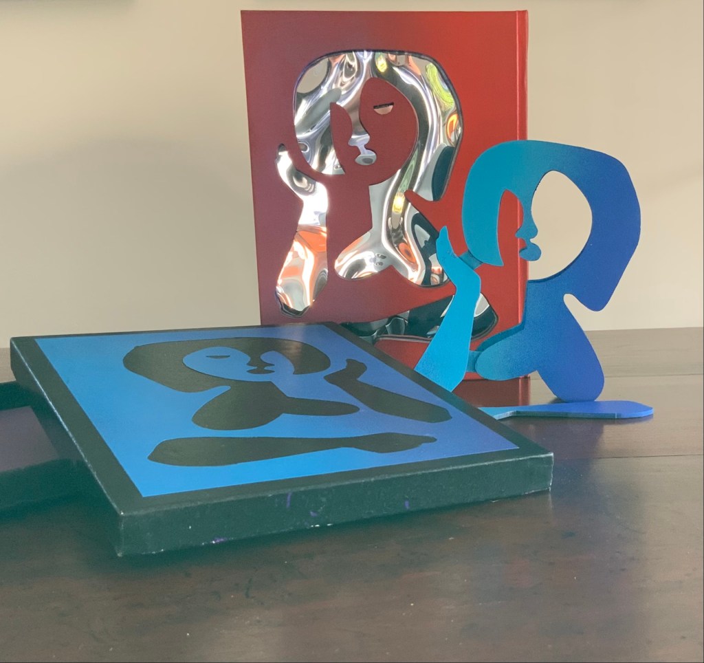
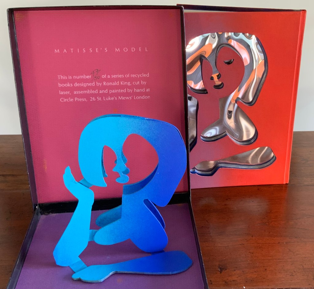
The sculptural element toward which King’s work has always turned is on display in the title and forms of Matisse’s Model. The mirror paper appears as it must for any attractive model.
The Looking Book (1996)
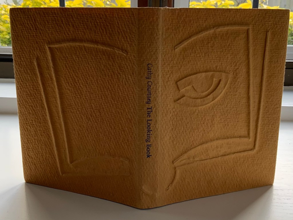
The Looking Book: A Pocket History of Circle Press, 1967-96 (1996)
Cathy Courtney
Casebound in wire print paper. H160 x W120 xD20 mm Edition of 1000, of which this #67 and initialled by Ron King. Acquired from Peter J. Hadley Bookseller ABA ILAB, 25 June 2015. Photos: Books On Books Collection
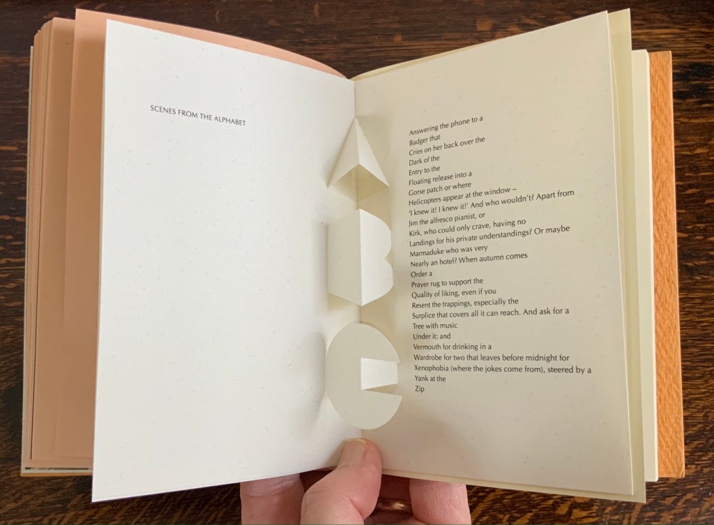
Pop-up insert of “Scenes from the Alphabet” by Roy Fisher. Photo: Books On Books Collection.
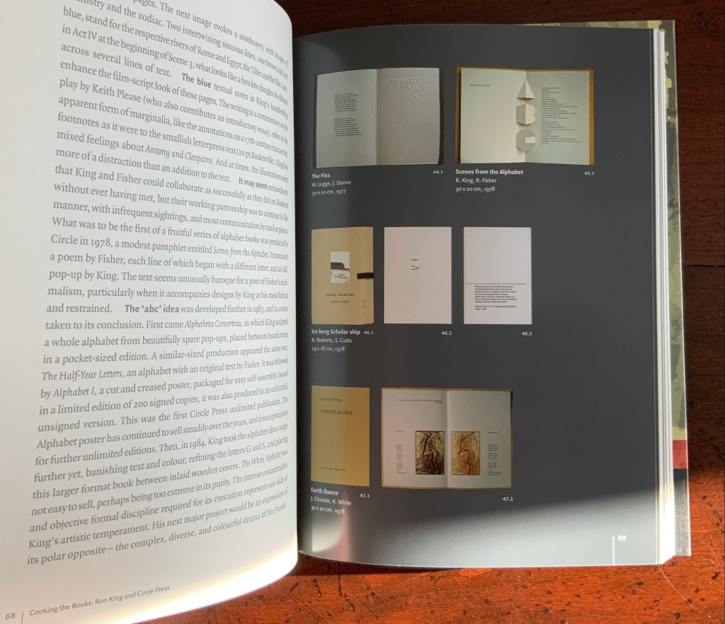
As with Cooking the Books, this catalogue raisonné, prepared by Cathy Courtney, provides samples of the artist’s work. They appear in the wire debossed cover and this centrepiece of “Scenes from the Alphabet” done with Roy Fisher, which led to a full-scale alphabet book at Fisher’s suggestion.
Turn Over Darling (1994)

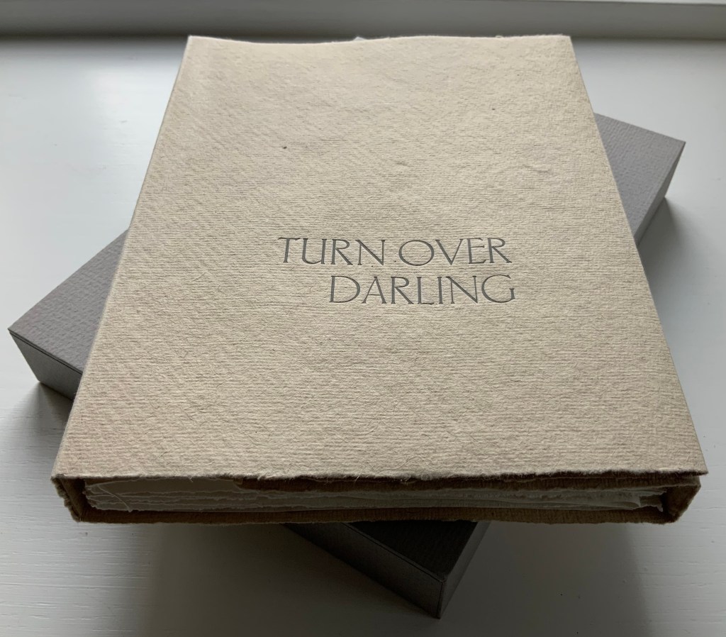
Turn Over Darling (1994)
Ron King
Slipcase (H204 x W153 x D28 mm) containing a light brown paper portfolio (H195 x W150 x D24) into which are hand-sewn six sheets (H190 x W282) of J. Green RWS hand-made paper, folded in half, bearing embossed and debossed images of a female figure. A signed copy from the limited edition of 75. Acquired from the artist, 1 December 2020. Photos: Books On Books Collection, displayed with artist’s permission.
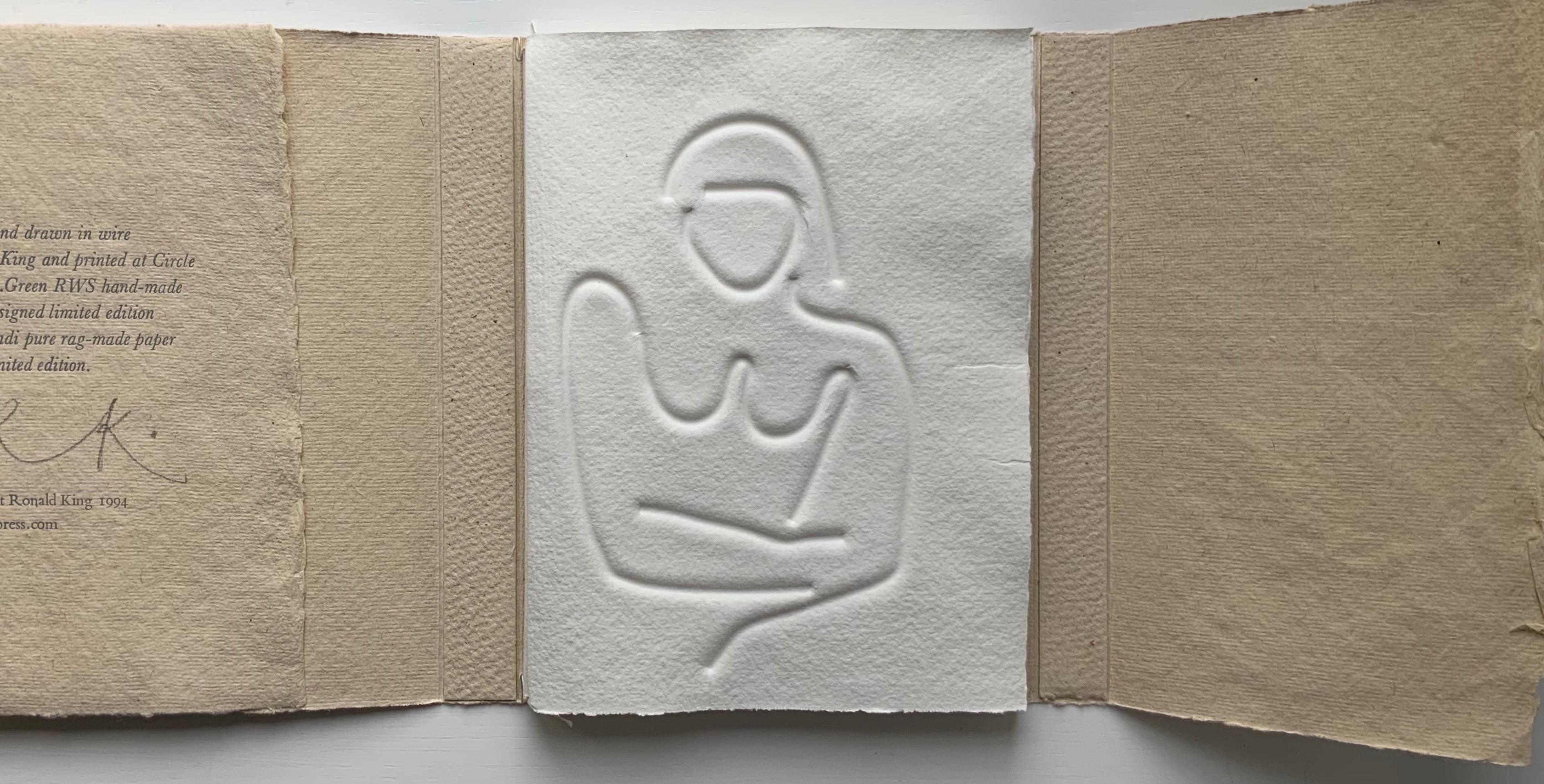
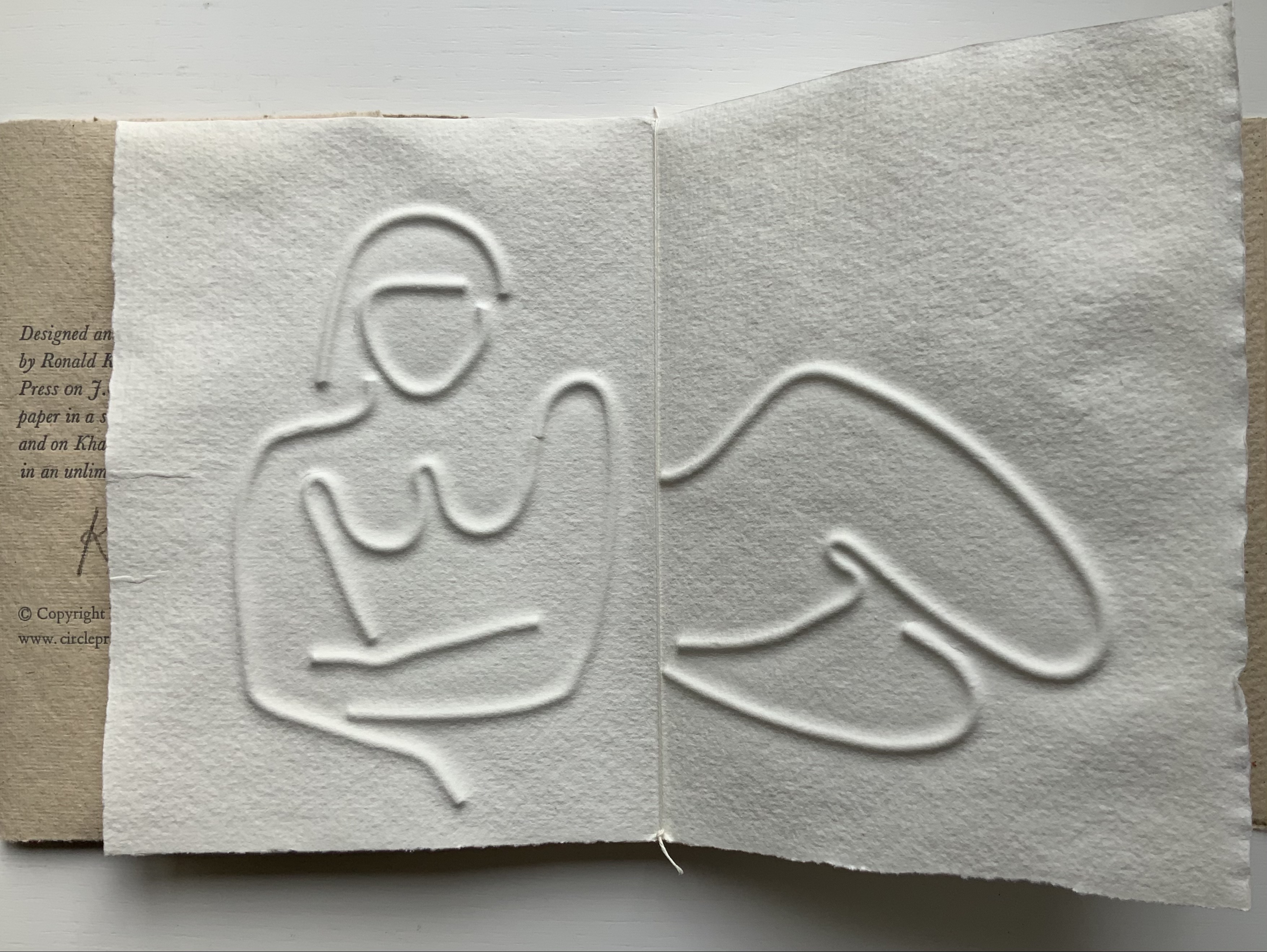
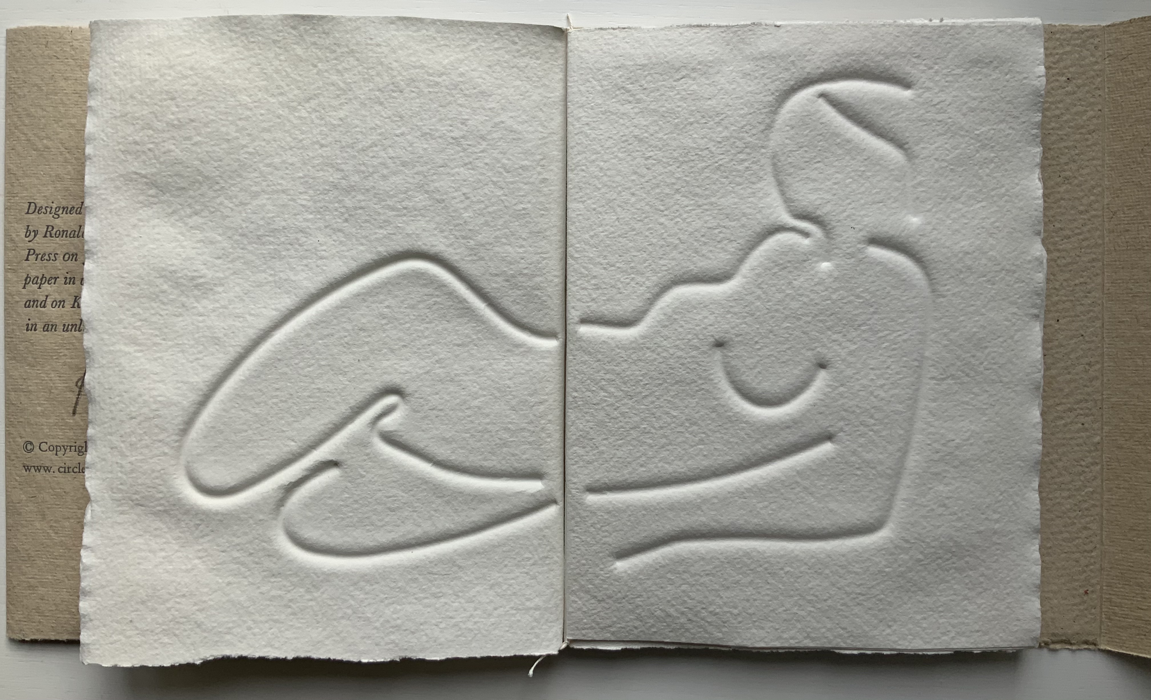
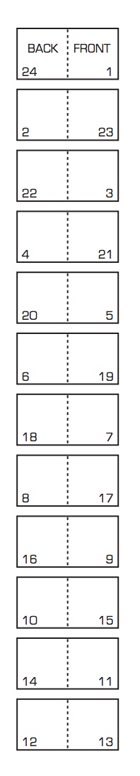
The six embossed and debossed drawings were created from wire forms pressed into dampened sheets of paper. Turn Over Darling elegantly combines King’s sculptural skills with his printer’s skills. When folded and juxtaposed in sequence, they make for eleven reclining female nude images that change position from front to back view as the pages turn. Determining the folds and sequence is a form of imposition, although quite different from the usual imposition for a single sheet with twelve pages on either side as shown below. Again, here is a work that evokes a joy in the material and in its handling.

JBG 1984 watermark in J. Green RWS paper
The White Alphabet (1984)
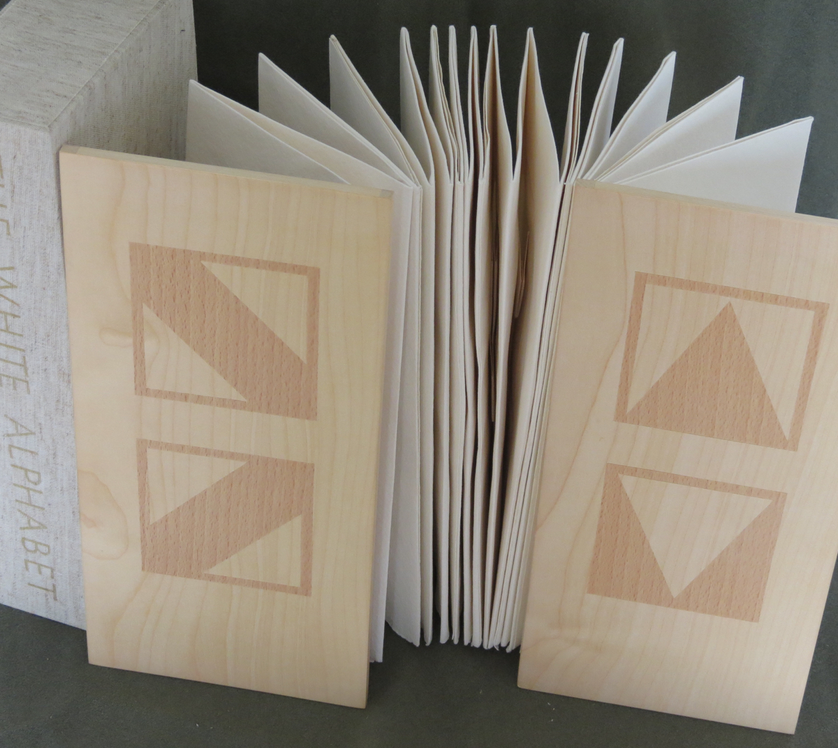
The White Alphabet (1984)
Ron King
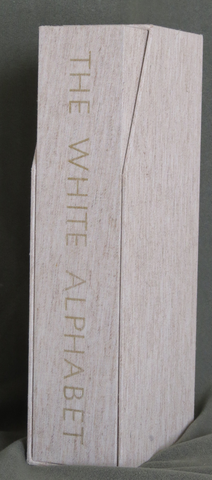
Box made of two slipcases, one inside the other. Gilt lettering on spine of inner slipcase. Back-to-back leporellos with wooden front and back covers. Outer slipcase: H305 x W140 x D70 mm. Leoprello: H290 x W135 mm. Edition of 150, of which this is #99. Acquired from Veatch’s, 11 June 2021.
Photos: Books On Books Collection.

Earth Birds (1981)
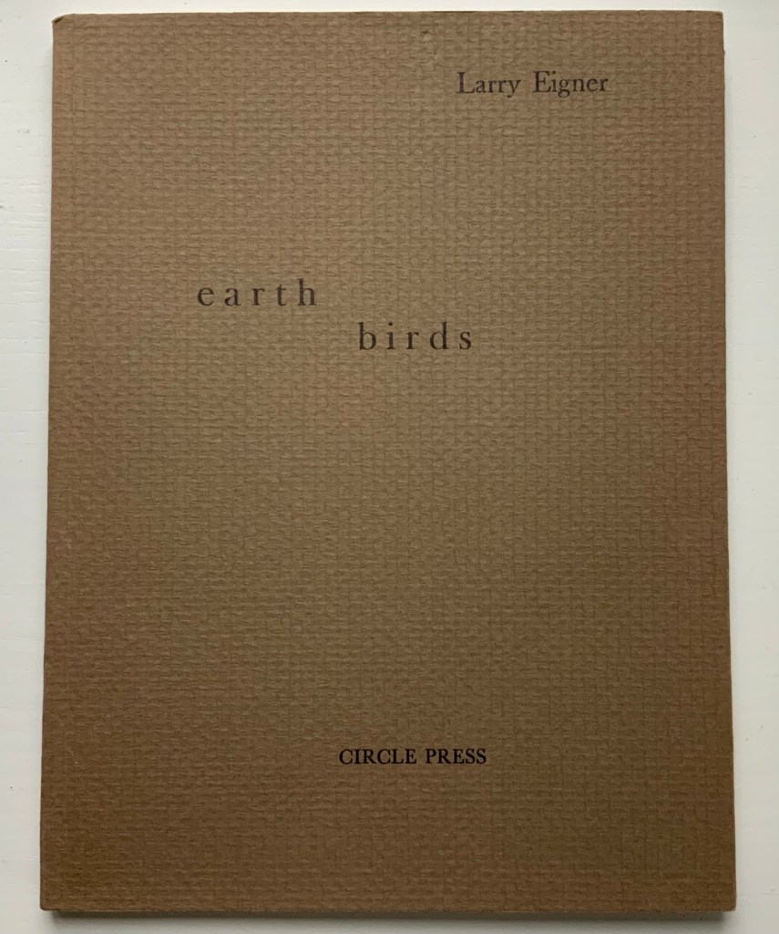
Earth Birds: forty six poems written between May 1964 and June 1972 (1981)
Larry Eigner (poems) and Ron King (plates)
Fifty hard-bound copies, I-L, printed on pure rag-made paper with six plates printed blind intaglio and one hundred and fifty copies, 51-200, printed on Glastonbury Book stock with the same plates printed relief, in one color. Photos: Books On Books Collection.
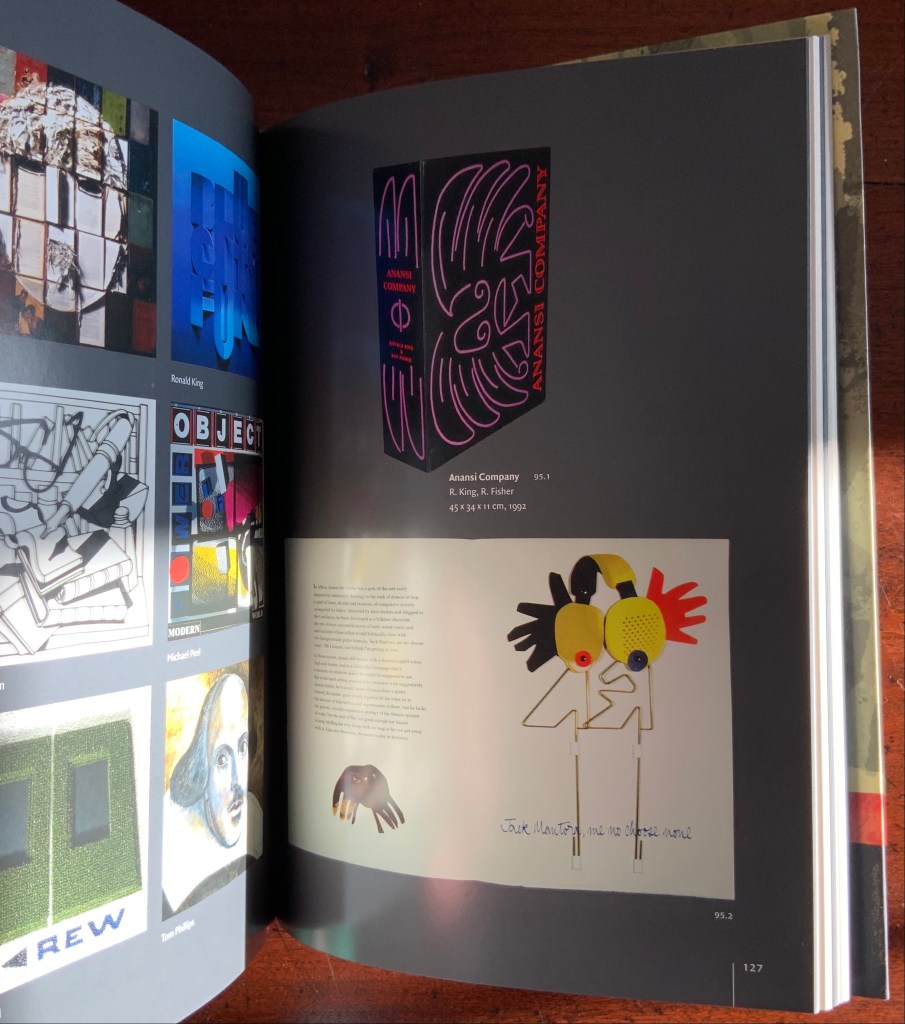
As with George Szirtes, King has collaborated more than once with Larry Eigner. Looks like nothing, the shadow through air (1972) was the earlier joint effort. Compared to Earth Birds, later works like The Burning of the Books (2008) and Anansi Company (1992) with Roy Fisher show King’s development toward more deeply collaborative efforts.

Earth Birds does recall the wide range of similar works by others at Circle Press that King made possible: Hadrian’s Dream (1990) by Asa Benveniste and Ken Campbell and Machines (1986) by Michael Donaghy and Barbara Tetenbaum.
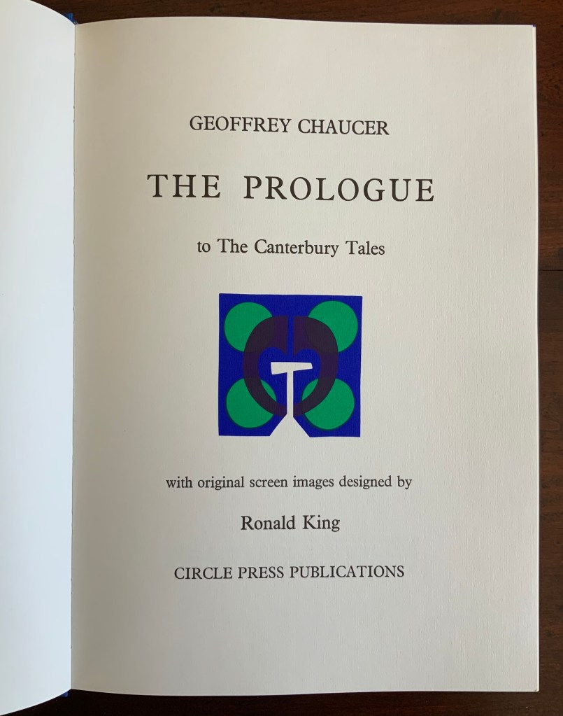
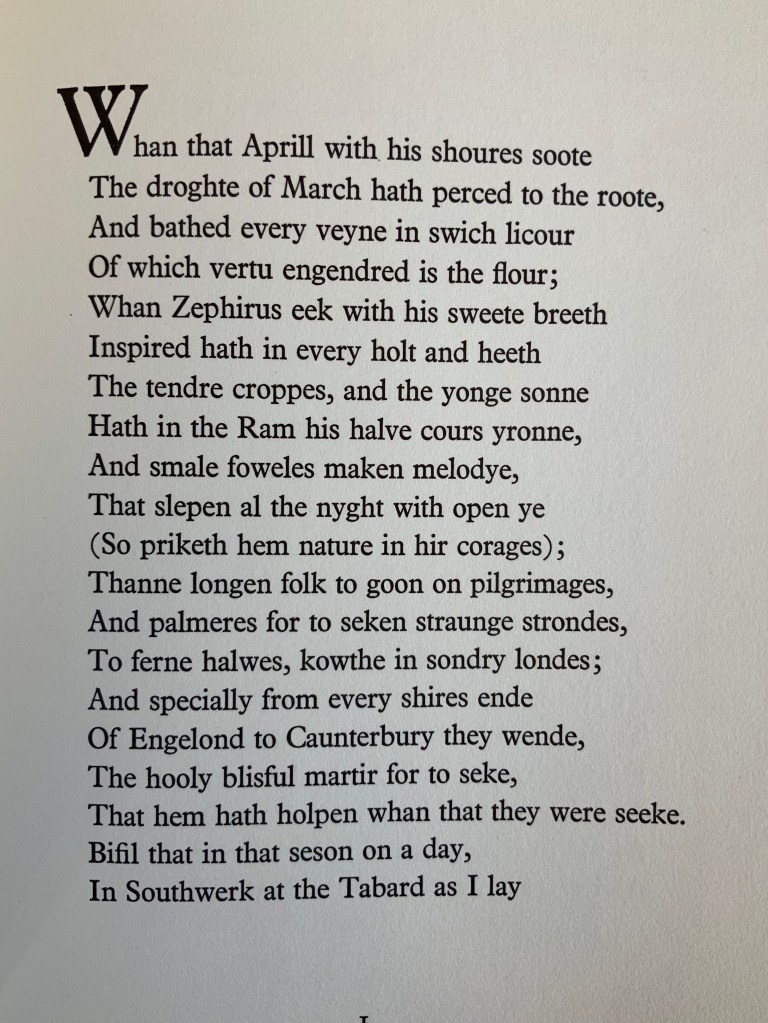
Chaucer’s The Prologue, 2nd Edition (1978)
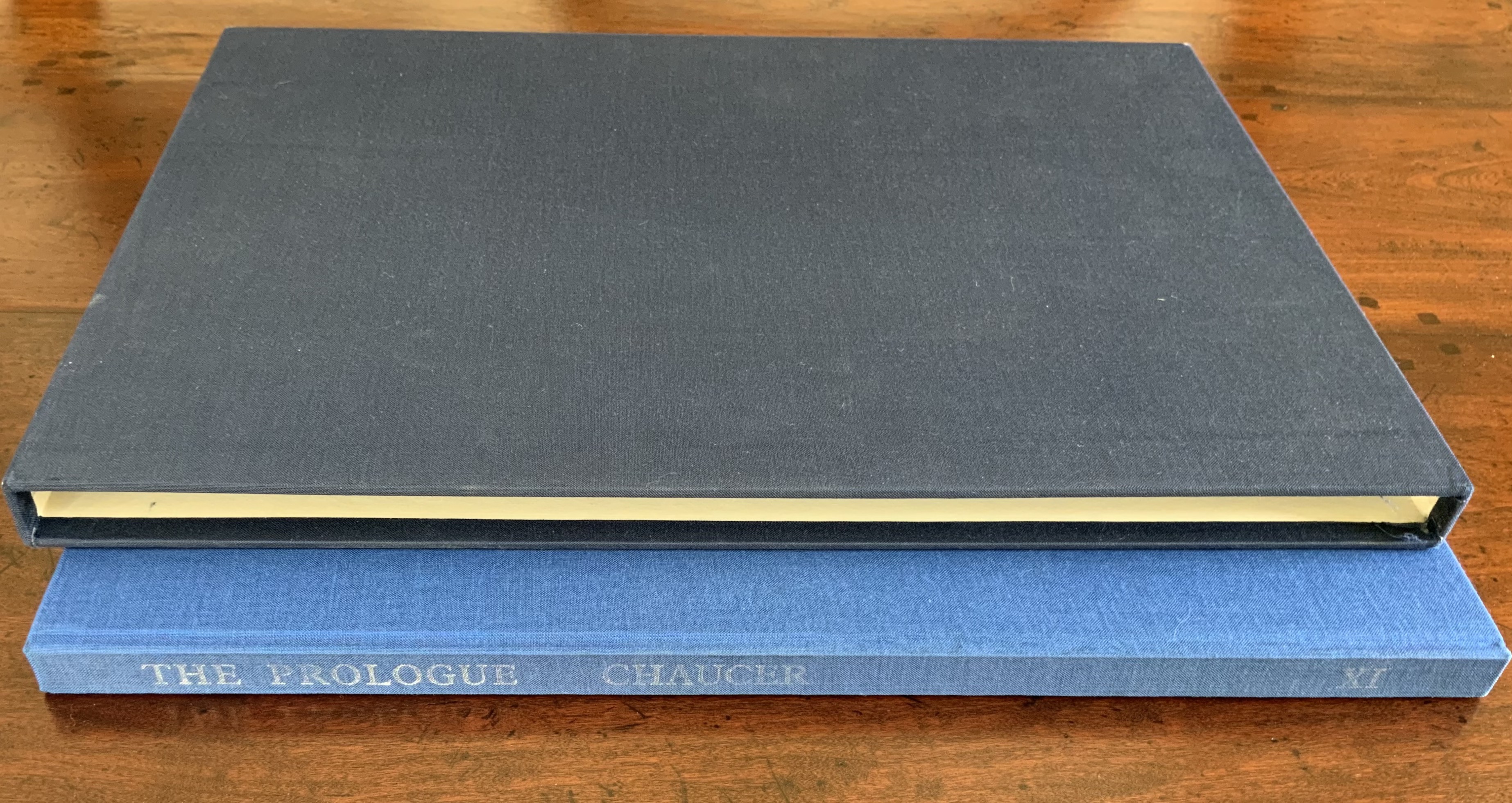
Chaucer’s The Prologue, 2nd Edition (1978)
Ron King
Casebound sewn, letterpress printed on 190 gsm Queen Anne Antique White. Hand-set in Monotype Plantin series 110. H405 x W281 mm, 72 pages. Edition of twenty separate versions I-XX each of 250 copies, of which this is XI, #131, and includes a folder of Buckler Light Grey Plain with a poem by Roy Fisher and screen-print on 190 gsm Bockingfordby Ron King entitled “Webbe”. Acquired from private seller, 27 February 2021. Photos of work: Books On Books Collection. Displayed with permission of artist.
King originally prepared The Prologue for Editions Electo in 1966, then published a limited edition of 125 copies in 1967 under the Circle Press imprint. In this collection, the work represents King’s straightforward fine press work and a successful livre d’artiste. The screenprints of Chaucer’s characters and Chaucer himself are based on African and Brazilian masks as well as heraldic symbols. King’s inspiration to match these richly colored masks to the personae captures the pageantry and individuals within the social hierarchy of Chaucer’s Canterbury Tales. Opening this oversized fine press edition, turning its stiff, creamy pages with their 18 pt Plantin type and confronting these human-sized masks are reminders of the monumentality that this human-scale work of literature has achieved.
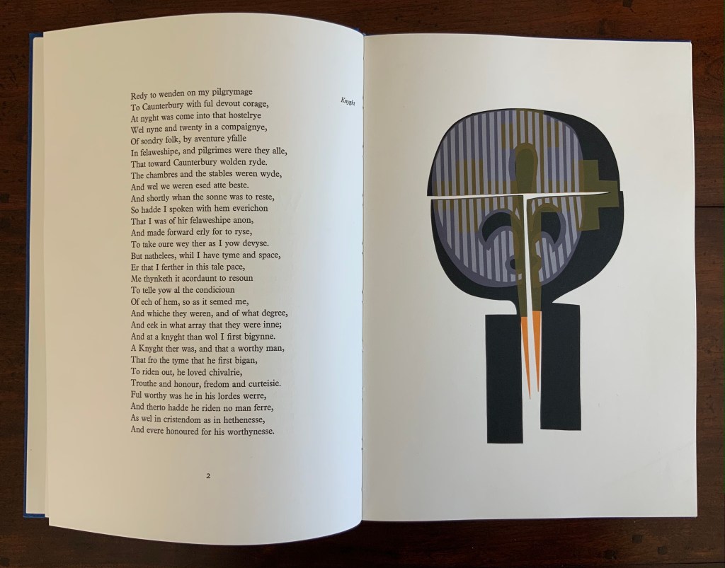
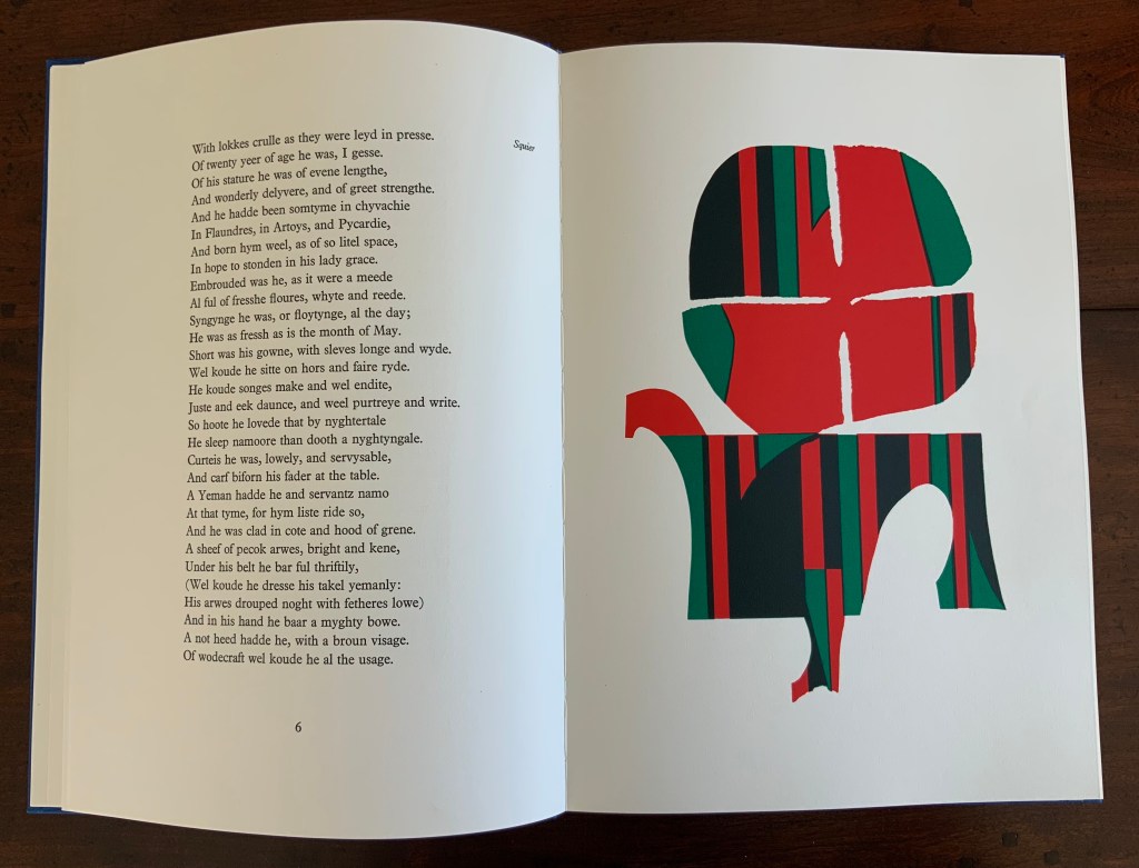
Knight and Squire masks
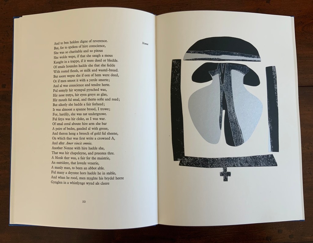
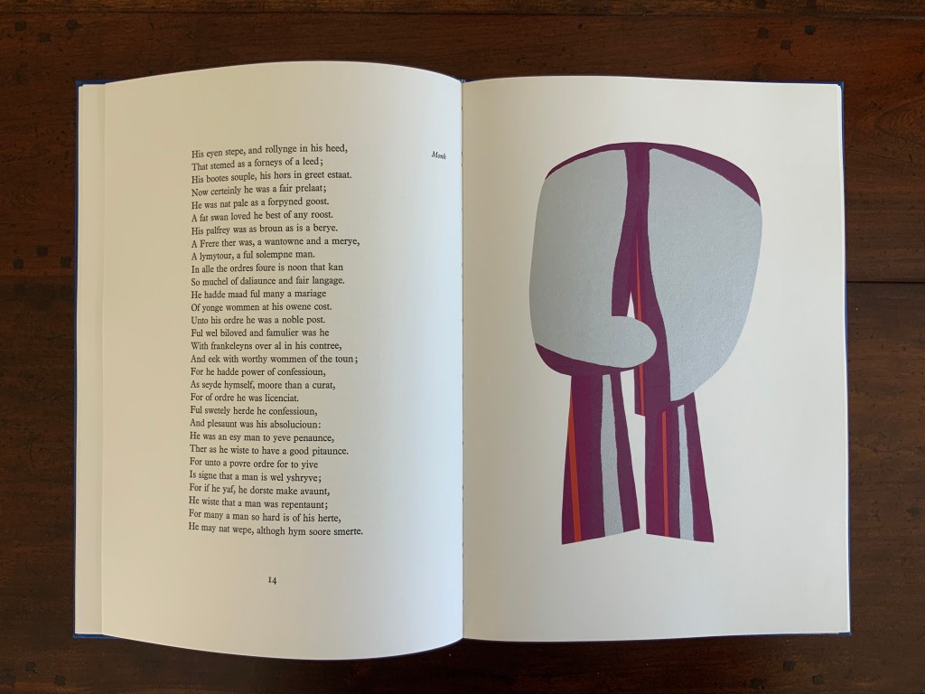
Nun and Monk masks
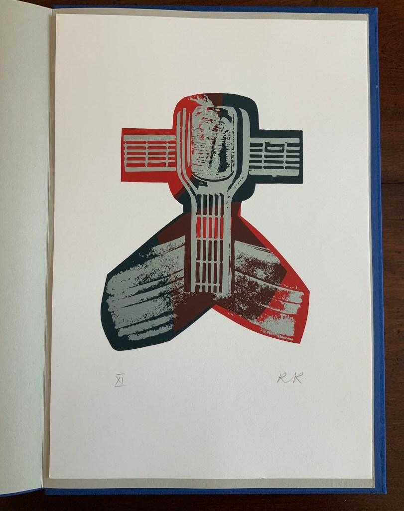
Chaucer’s mask and King’s original print “Webbe”
Ephemera
Almost always, small gifts of ephemera arrive with purchases from the Ron King Studio. They illustrate how King marshals his artistry even in marketing his art and that of those he has published.
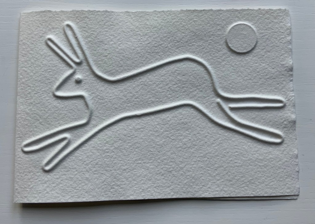
Hare (single-fold card, H125 x W180 mm), blind-embossed. 2021.
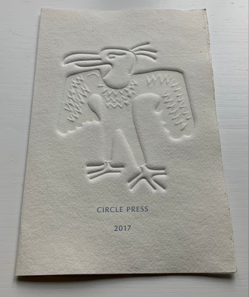
Announcement (single-fold card, H216 x W140 mm) with blind embossed image of a fulmar. Describes artist book Sednar and the Fulmar with Richard Price’s poems. 2017.
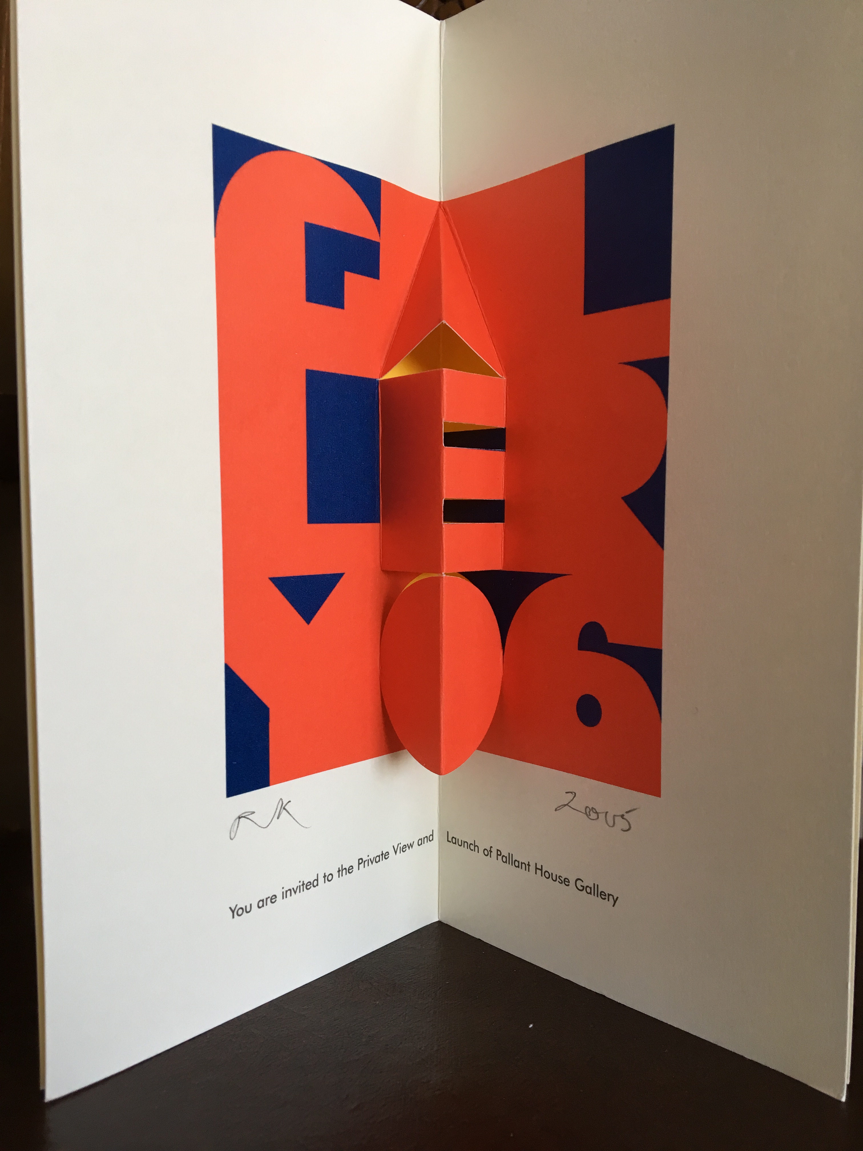
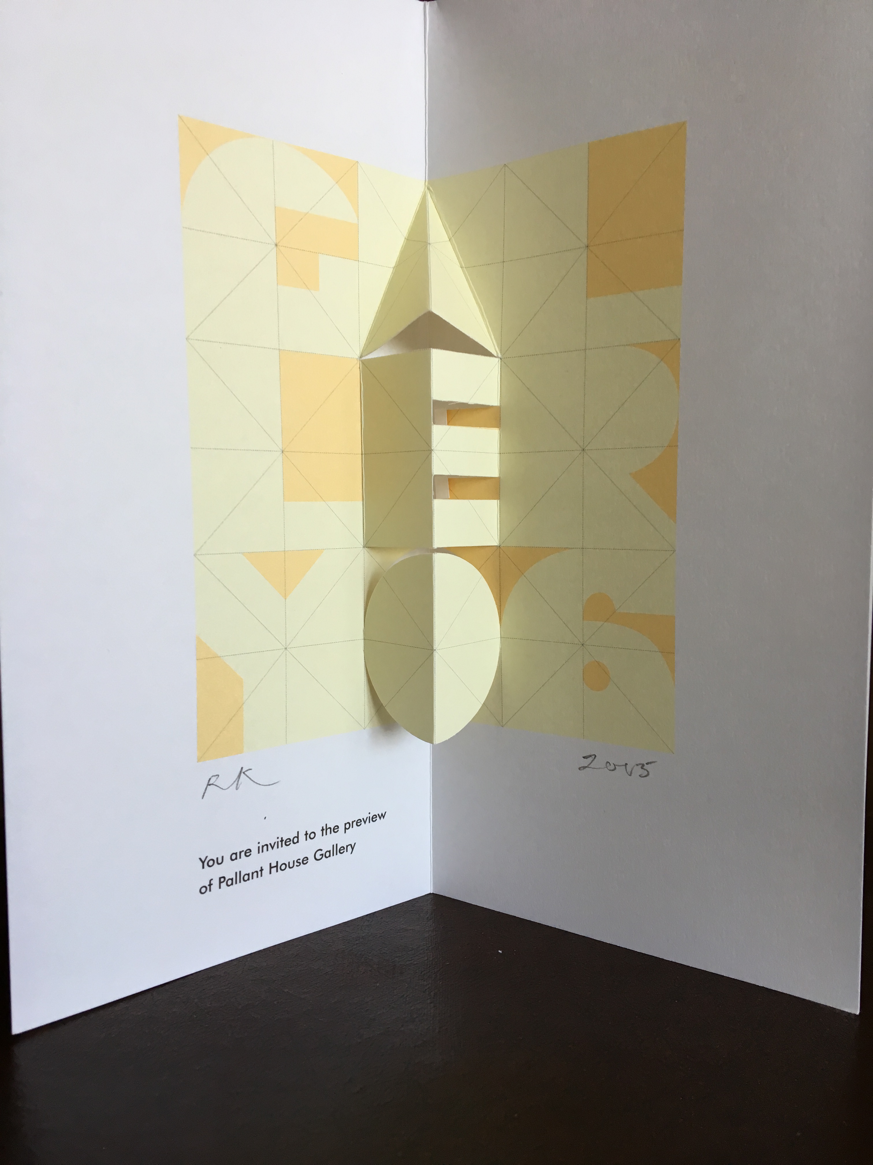
Invitations (four-fold pop-up cards) to Pallant House Gallery opening preview. 2005.
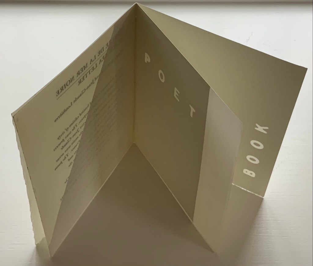
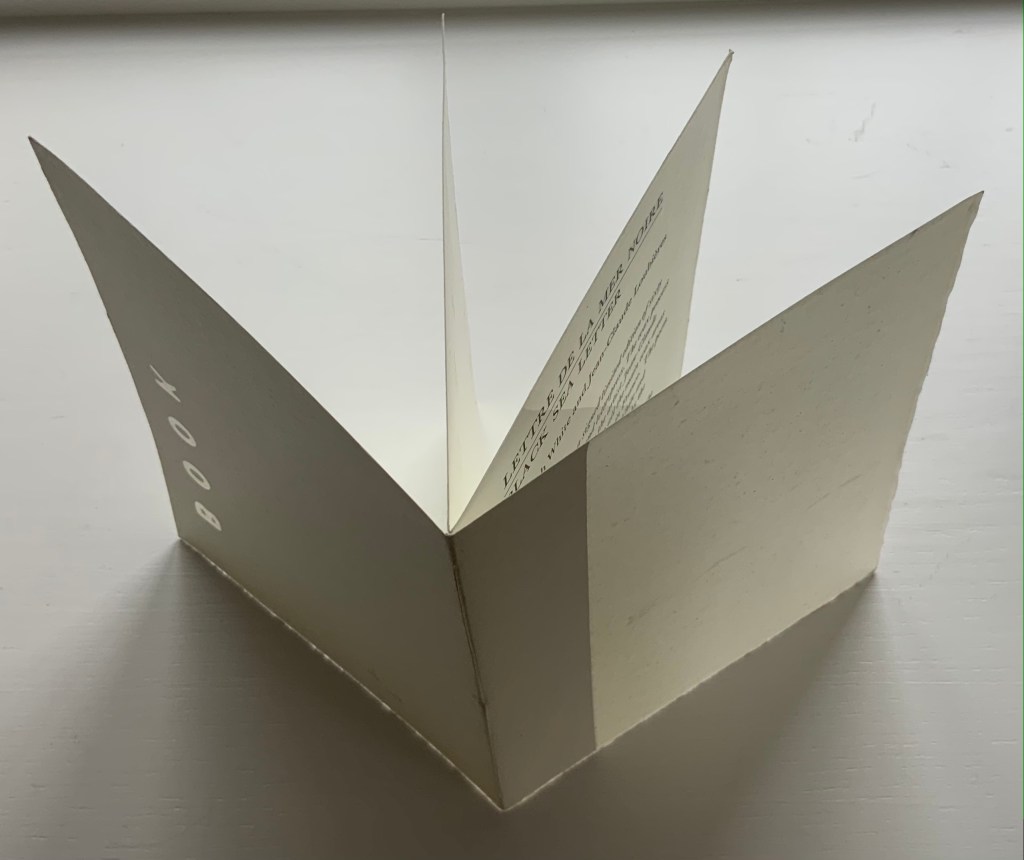
Announcement (wax and paper pamphlet, H174 x W134 mm) of Lettre de la Mer Noire/Black Sea Letter by Kenneth White (poem) and Jean-Claude Loubières (images and wax dipping). 1997.
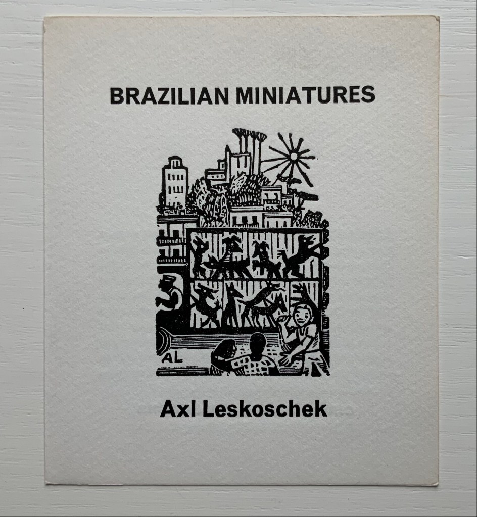
Announcement (card, line block reproduction, H150 x W125 mm) of the 200 portfolios of fifty-one woodcut designs reproduced from the only remaining proofs of Brazilian Miniatures, an unpublished book with a bilingual introduction; printed in two versions. 1973?
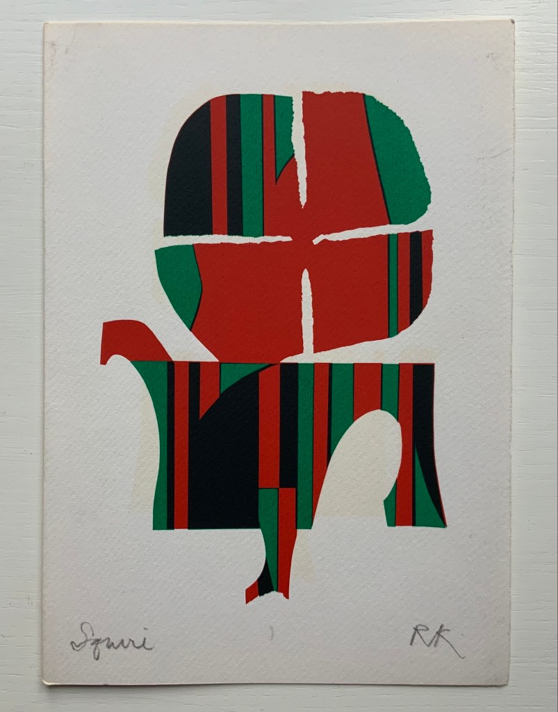
“Squire” (single-fold card, H235 x W165 mm) with hand-printed serigraph from Chaucer’s “Prologue” to The Canterbury Tales. 1969?
Further Reading
“Abecedaries I (in progress)”, Books On Books Collection, 31 March 2020.
“Willow Legge“, Books On Books Collection, 14 February 2021.
Bury, Stephen. “Ron King and the Circle Press.” Print Quarterly 20, no. 4 (2003): 434-37. Accessed February 7, 2021.
Courtney, Cathy. 1999. Speaking of book art: interviews with British and American book artists. Los Altos Hills, Calif: Anderson-Lovelace.
Goldmark Gallery. 2019. Alphabets, Bandits & Collaborations: Ron King Documentary. Uppingham, UK. Video
Hill, Emma. “Artists’ Books and Circle Press”, Pallant House Gallery Magazine, No. 8, June 2006, pp. 66-68. Accessed 22 March 2020.
Lambirth, Andrew. 2019. Ron King : Alphabets, Bandits & Collaborations. Oakham: Goldmark Gallery. Exhibition catalogue.