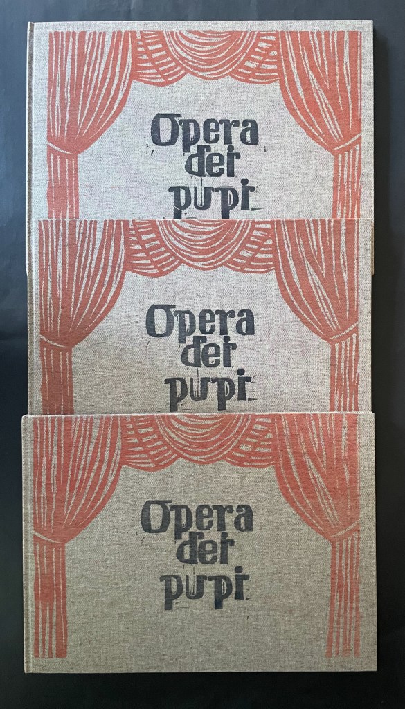
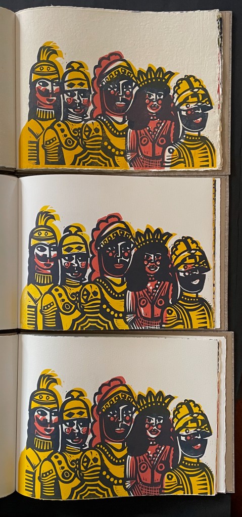
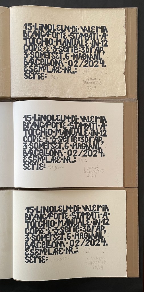
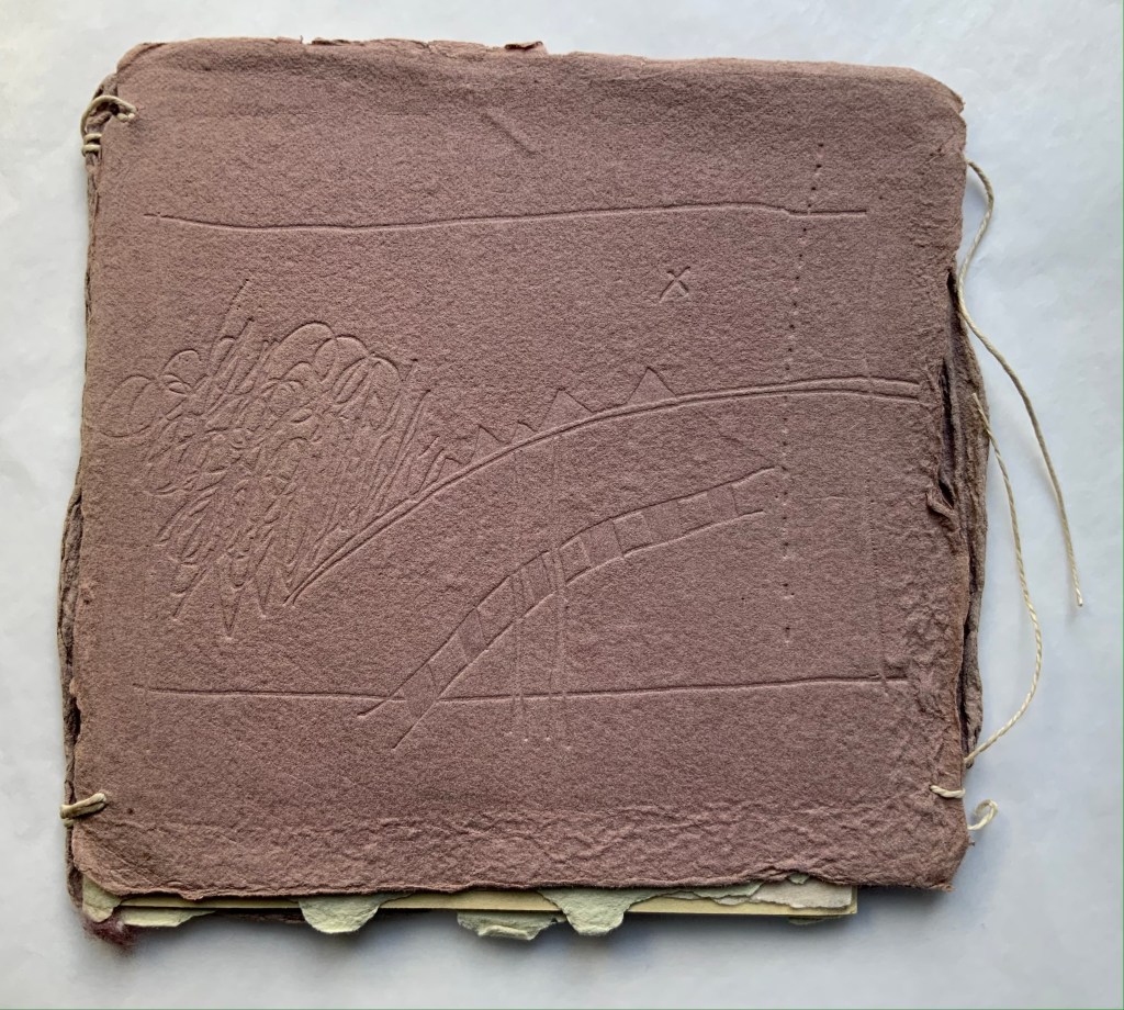
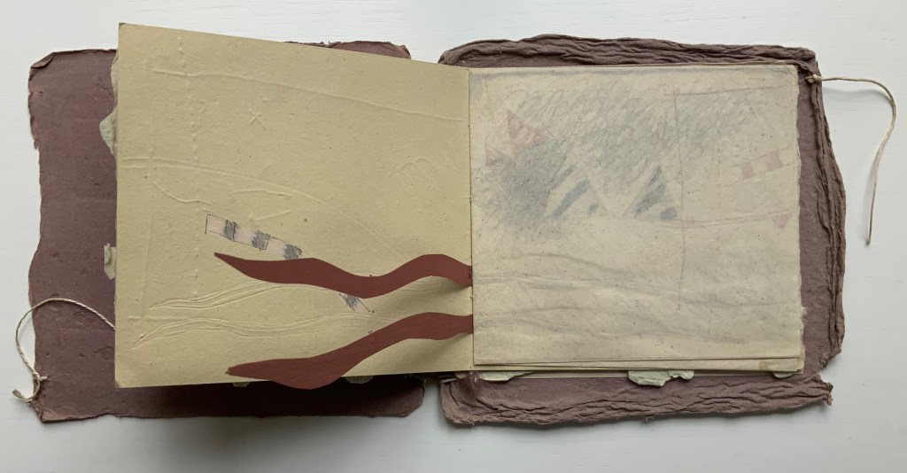
Opera dei Pupi (2024) Valeria Brancaforte Casebound hardback, cloth over boards, print on front cover. Plain brown doublures. Three variants based on trim and paper. A: H272 x W368 mm; Drap, Catalan hand-made paper. B: H261 x W360 mm; Italian Magnani Incisione. C: H265 x W362 mm; Somerset Velvet White 250gsm. [20] pages with 14 prints. Each in an edition of 12, of which A is #11, B is #5, and C is #1. Acquired from the artist, 14 November 2025 and 7 February 2026. Photos: Books On Books Collection. Displayed with permission of the artist.
Puppets and marionettes have figured in more than a few artists’ books. Ron King and Roy Fisher’s The Left-handed Punch (1986) and Anansi Company (1992) are perhaps the best known. Others include Ann Kresge’s Shadow Play (1998), Antonio Nocera’s La Valigia di Pinocchio (2015), Emily Martin’s Funny Peculiar Funny Ha Ha (2017), Hormazd Narielwalla’s Paper Dolls(2018) Erminia De Luca’s Now it’s up to you (2023), and Rachel Simmons’ Dream of the Golden Empress (2023). Valeria Brancaforte’s recent addition to the cavalcade brings to it a new cultural tradition and a welcome chance to compare how variation in paper can play into appreciation of an artist’s book.
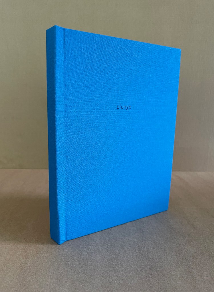
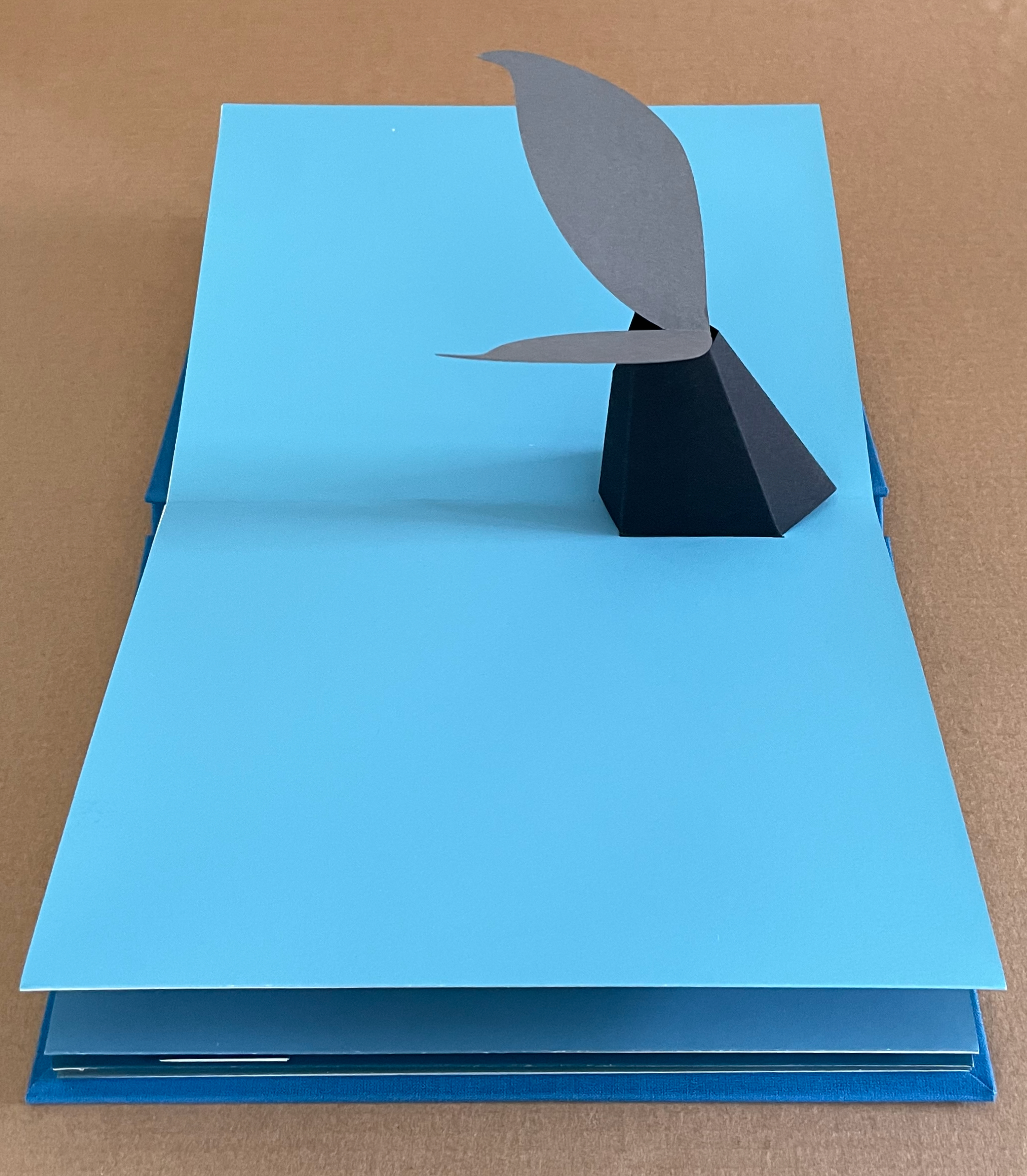
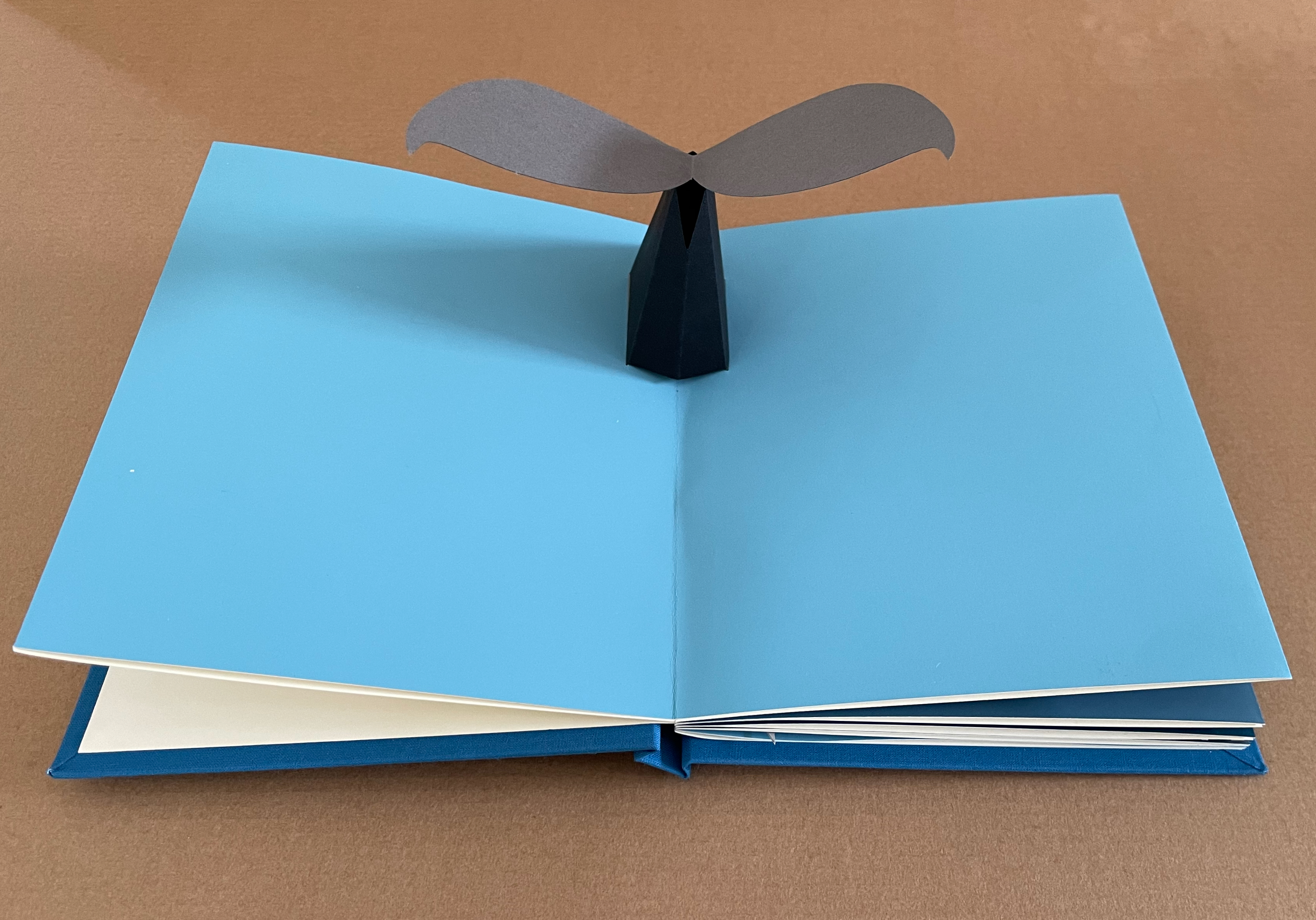
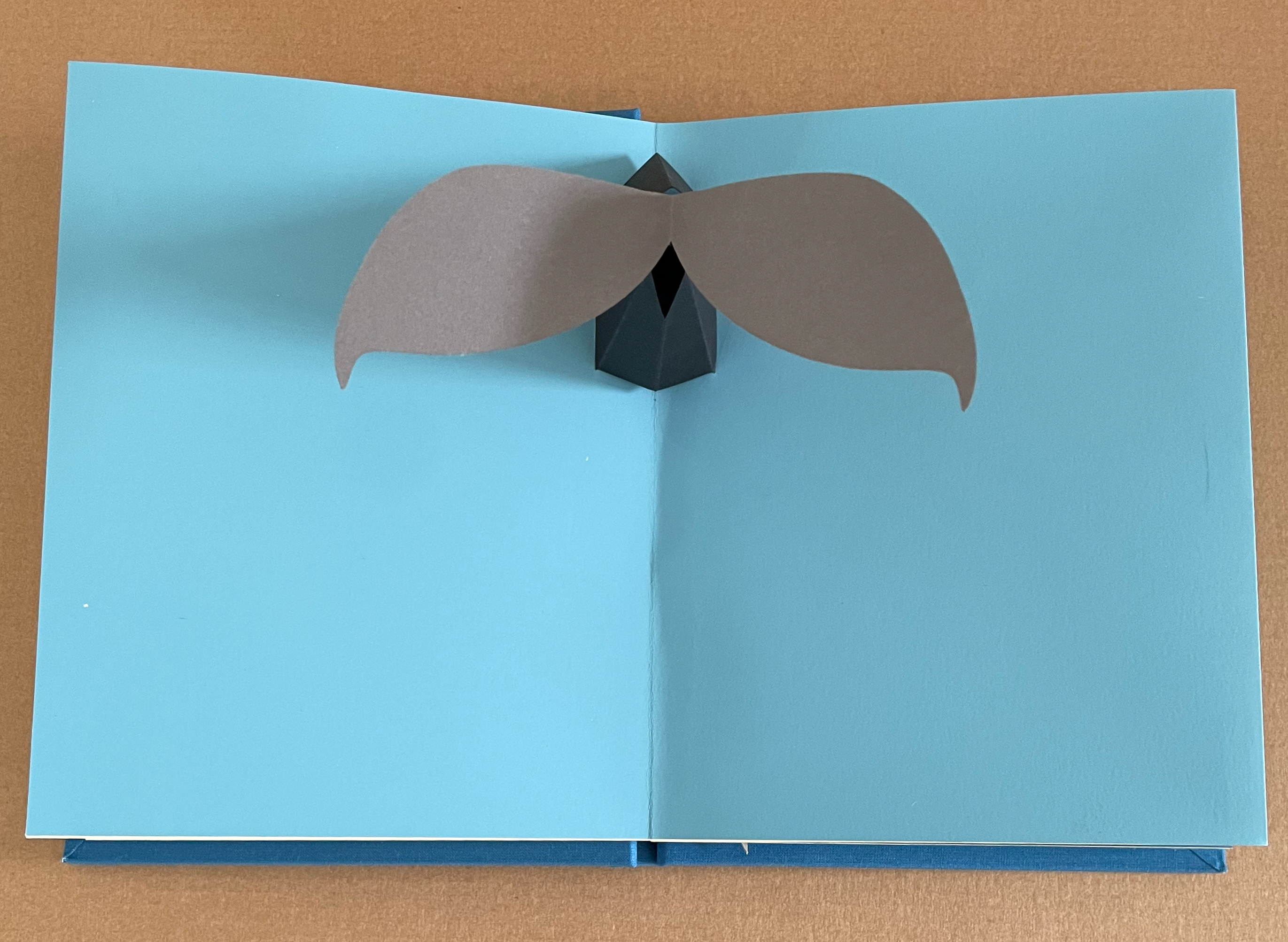
Plunge (2010) Chisato Tamabayashi Casebound, cloth over boards. Pop-up book. H193 x W152 mm. [12] pages. Collinge & Clark, 6 August 2024. Photos: Books On Books Collection. Displayed with permission from Chisato Tamabayashi.
“This book begins with a dive into the sea, down into the deep and back again, encountering various creatures on the way. The pages are designed to be held and angled in different ways so that the reader can explore the depths and the two sides of the sea’s surface.”–Artist’s statement
It is a pleasure to touch and turn the pages forming the surface and bed of the sea on which the pop-ups and movable elements rise, fall and move. The screen printing with TW graphics ink (pigment ink) enrich the book’s freshness and vibrancy. These photos and very brief video further below do little justice to Plunge and only hint at the sheer fun of manipulating it.
Pages: Simili Japon paper 225gsm. Pop-ups, hand cut by scalpel from Murano pastel paper 160gsm and Colorplan paper 175gsm.
As the double-page spread below shows, Tamabayashi thinks and crafts “in the round” to position his paper sculpture to suggest a sea turtle’s motion through the water.
Erwin Huebner is a professor at the University of Manitoba engaged in research and teaching cell and developmental biology. He is also a book artist and miniaturist. Following his work, the Books On Books Collection has started small and hopes to grow into his larger works. At both ends of the spectrum, Huebner’s themes resonate with the integration of art and science, a recurrent focus of the collection (see Further Reading below).
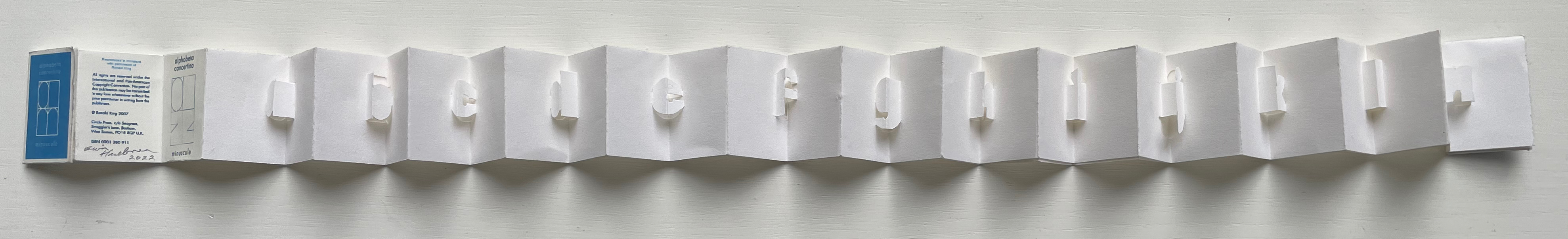
Alphabeta Concertina Majuscule (2015)
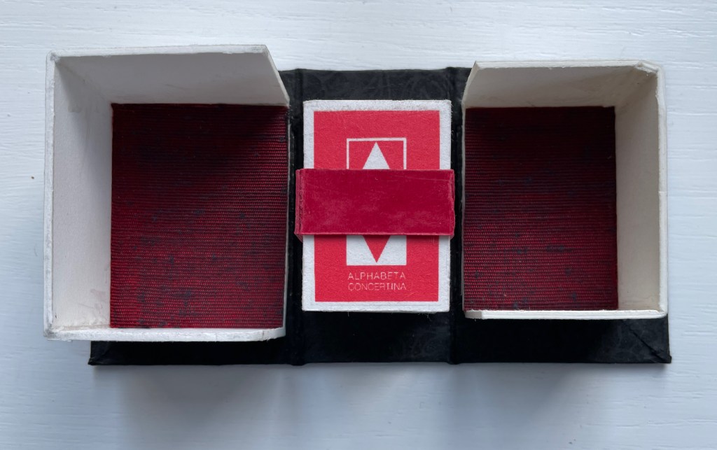
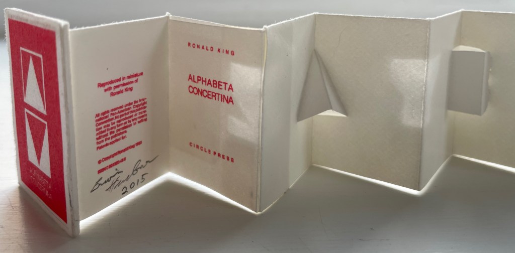
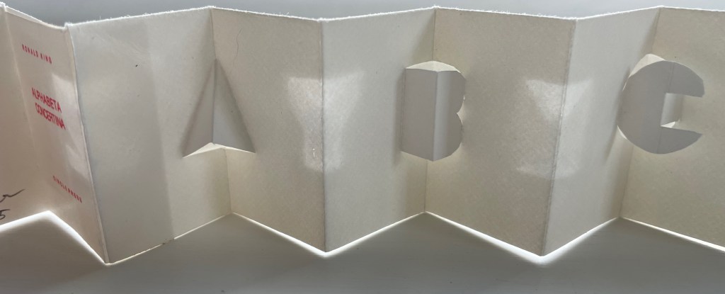
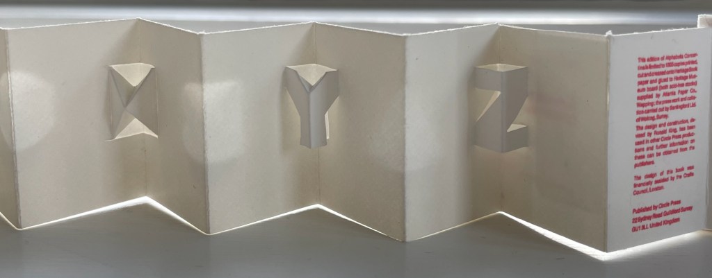
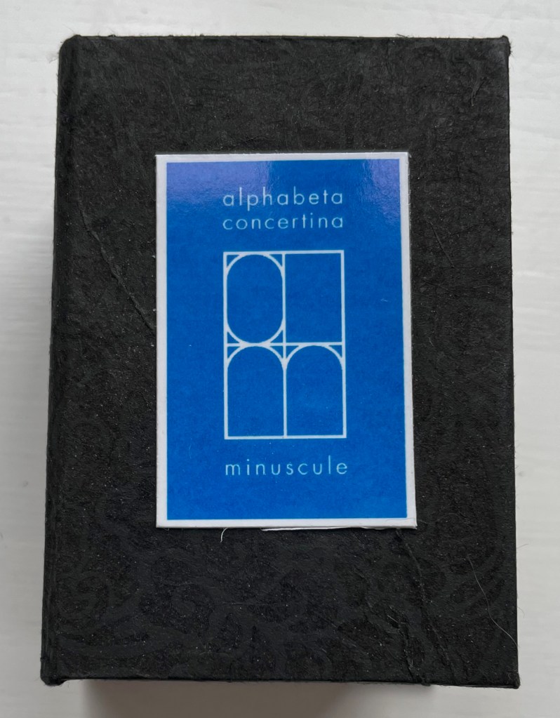
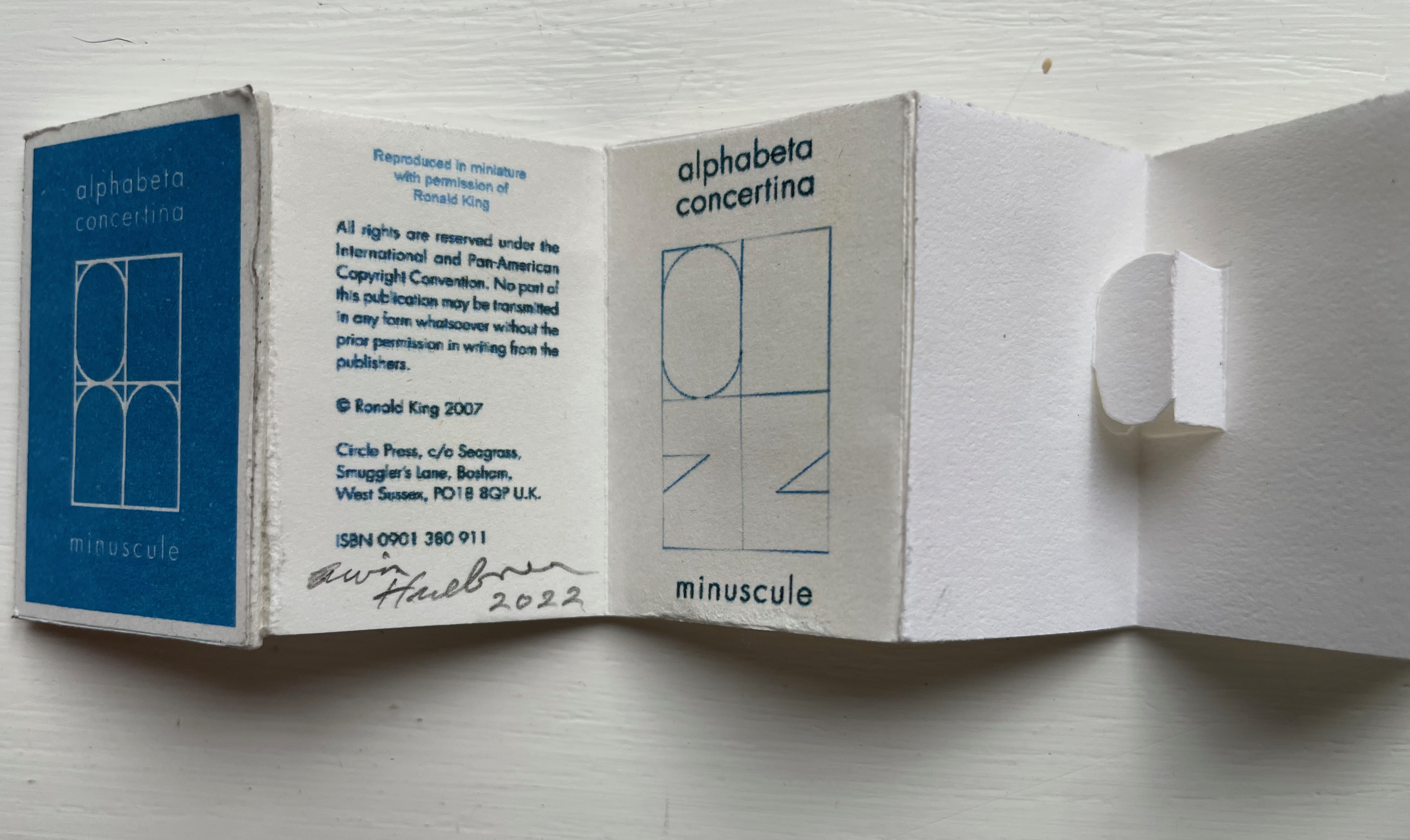
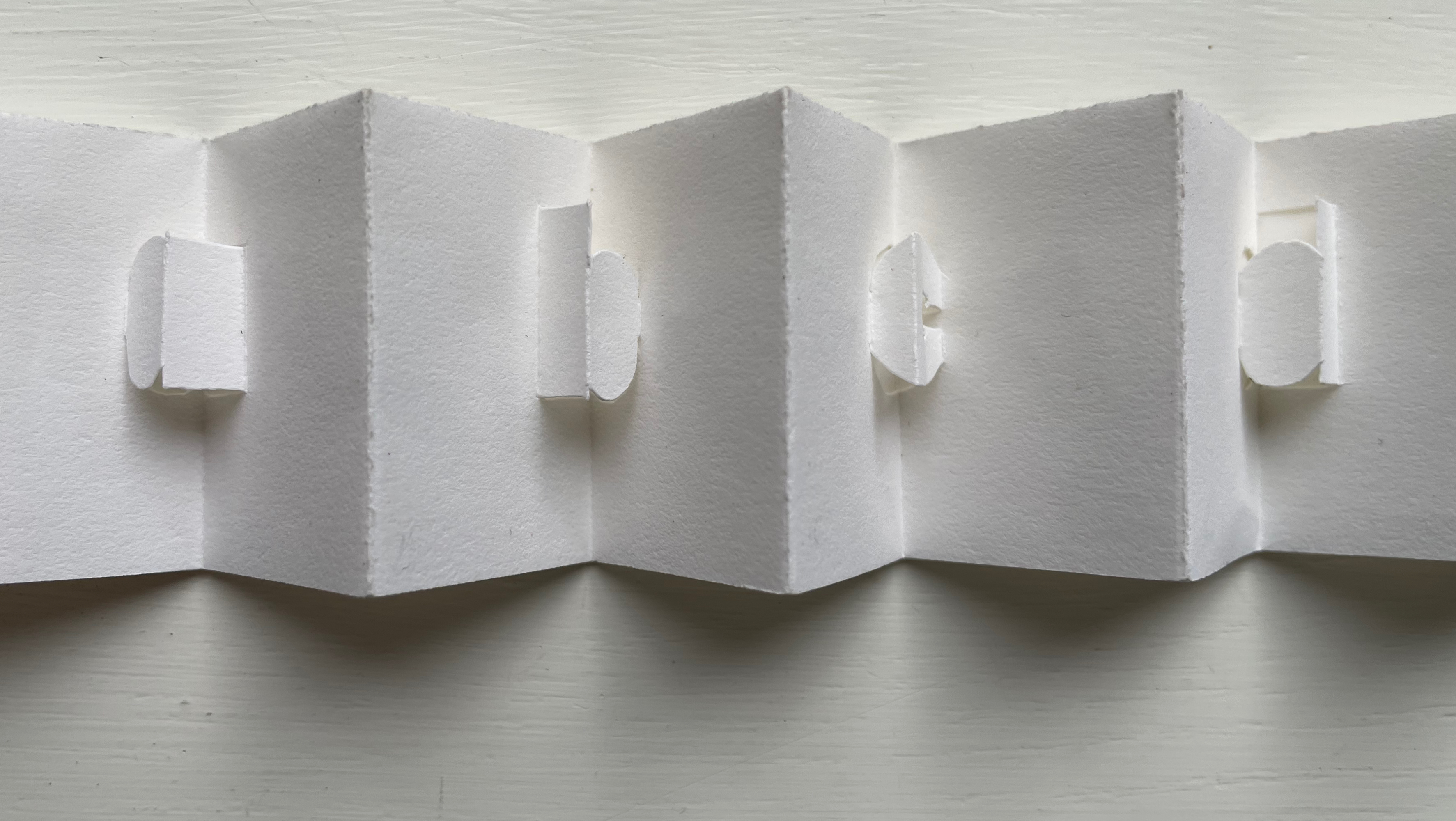
Alphabeta Concertina (2015) Erwin Huebner (with permission of Ron King) Miniature double-sided leporello. H 1.5 x W 1.0 x D 0.75 in. Edition of 4. Acquired from Erwin Huebner, 20 January 2023. Photos: Books On Books Collection.
The geometry and invention of Ron King’s work must have appealed to a kindred spirit in Erwin Huebner. The classificatory nature of the alphabet must also have spoken to Huebner’s inner Linnaeus. As 2023 is the 270th anniversary of Linnaeus’ Species Plantarum, which introduced his classification system, it is an auspicious moment for Huebner’s miniature versions of King’s alphabet concertinas to join the Books On Books Collection and be included works in the Bodleian exhibition “Alphabets Alive!” (19 July 2023 to 24 January 2024, Weston Library, Oxford).
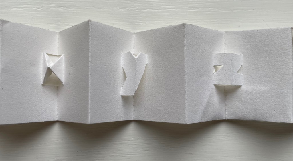
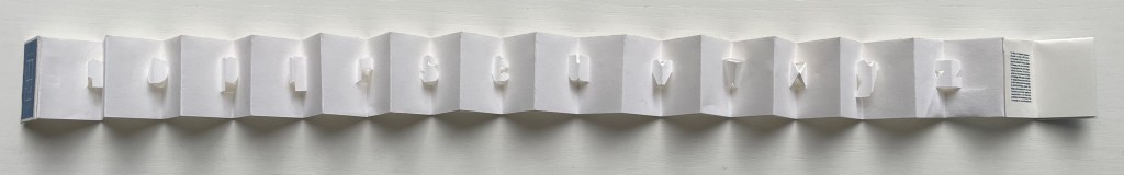
alphabet concertina miniscule (2022)
alphabet concertina miniscule (2022) Erwin Huebner (with permission of Ron King) Miniature double-sided leporello. H 1.5 x W 1.0 x D 0.75 in. Acquired from Erwin Huebner, 20 January 2023. Photos: Books On Books Collection.
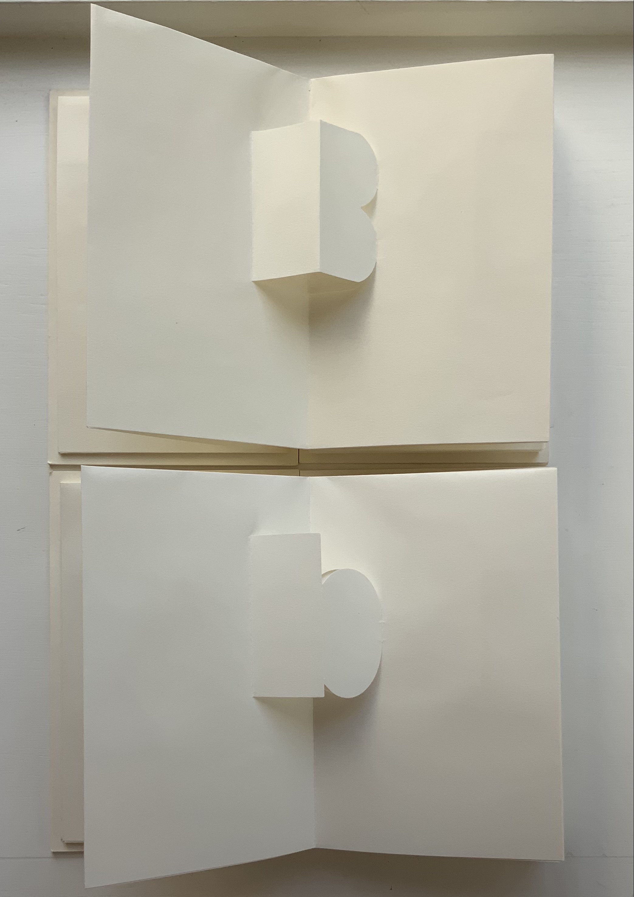
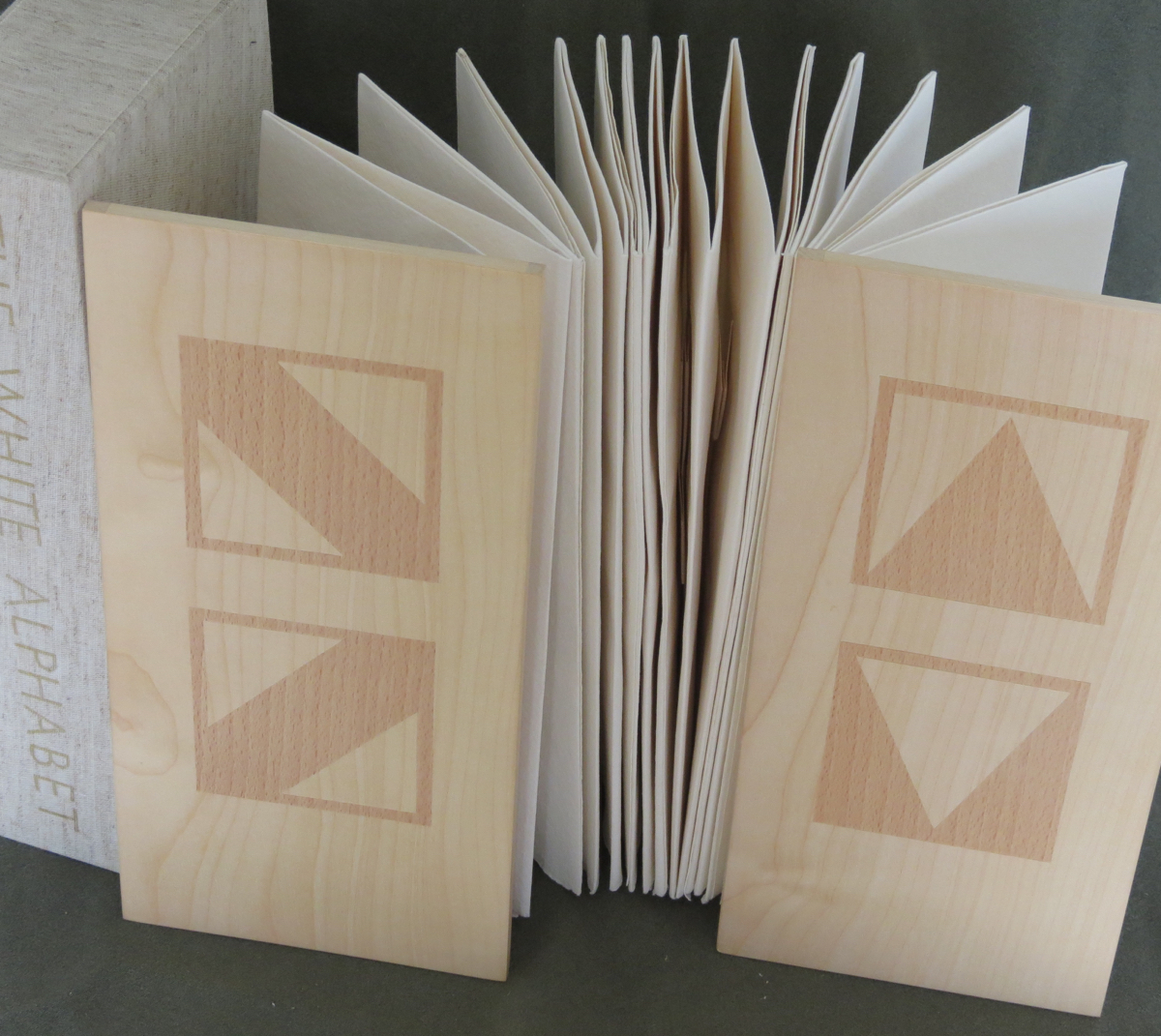
Both the majuscule and miniscule concertinas are double-sided with half the alphabet on one side and half on the other just as King designed from the first with The White Alphabet and the majuscule concertina in 1984 and subsequently 2007 with the miniscule.
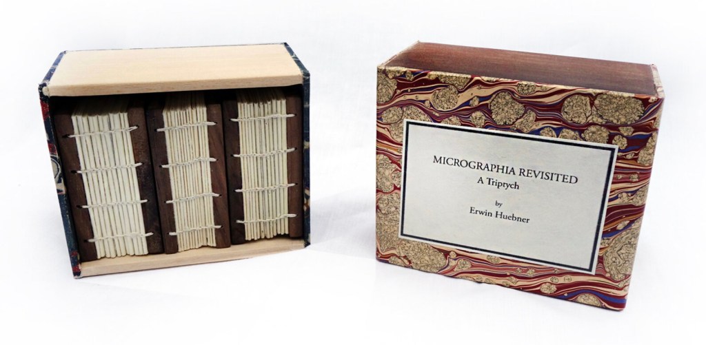
Micrographia Revisited (2017)
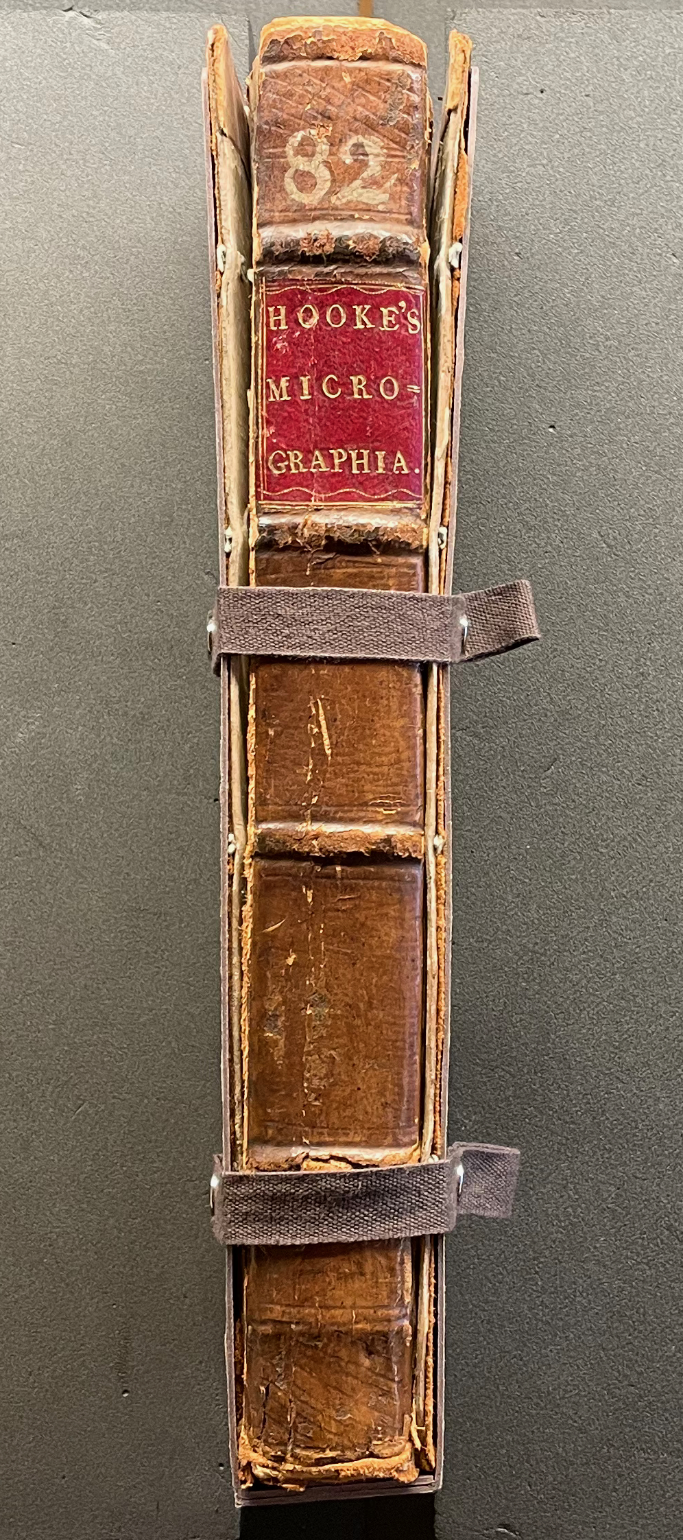
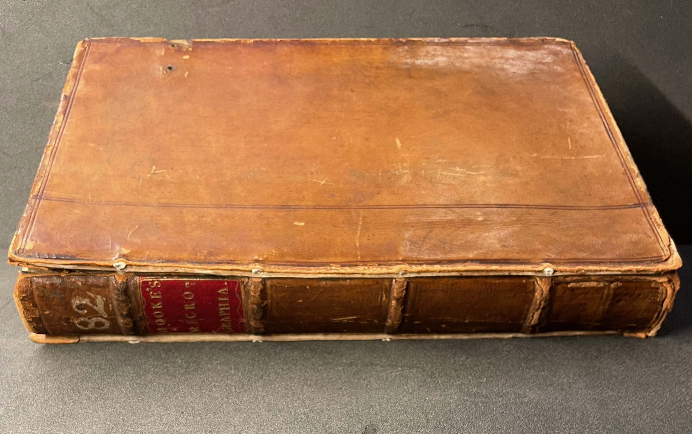
Micrographia Revisited: A Triptych (2017) Erwin Huebner Box with 3 Coptic-bound volumes, each H 2.625 x W 1.875 x variable depth. Edition of 3. Acquired from Erwin Huebner, 20 January 2023. Photos: Courtesy of the artist.
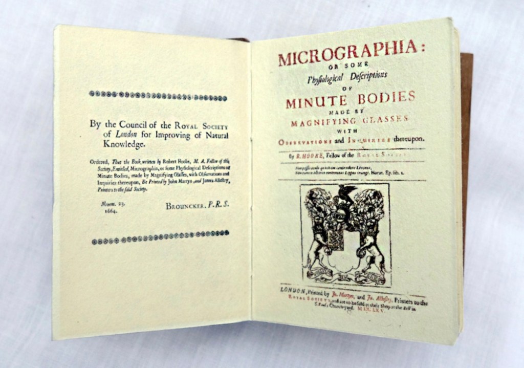
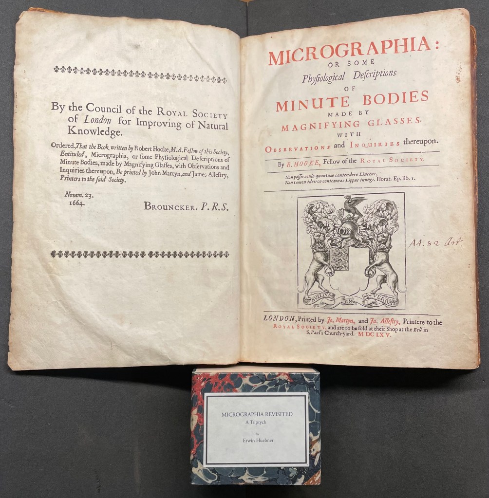
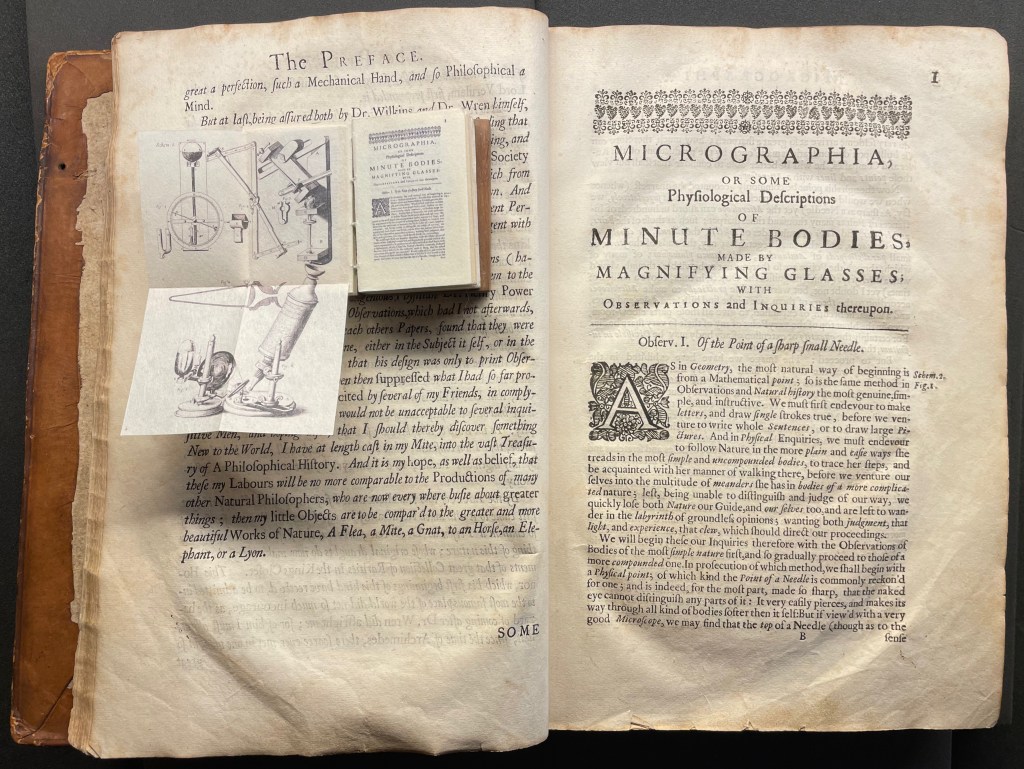
Despite Francesco Stelluti’s Melissographia (1625), Robert Hooke’s Micrographia: Or Some Physiological Descriptions of Minute Bodies Made by Magnifying Glasses with Observations and Inquiries Thereupon (1665) was long thought to be the first publication with illustrations drawn from observation with a microscope. Given Huebner’s scientific and artistic careers, it would seem impossible for him to resist paying homage to this work. Indeed, in his larger artist’s books, he has incorporated entire microscopes, but here, he exploits the technological advances of photography and electron microscopy and joins them with the craft of bookbinding to produce just as wondrous a work. Using Scanning Electron Microscopy (SEM), Huebner has created images of the same or similar objects to those Robert Hooke observed in the 1600’s. One of the volumes in the triptych presents these photographic results, and the other two present a reprint of Micrographia.
The coptic binding to black walnut covers, the wooden case covered in marbled paper and the subtitle create a suitable medieval/Renaissance air for this homage.
Living in a village near Oxford and having access to the Bodleian Libraries, I took Micrographia Revisited on a pilgrimage to compare it with a copy of the original not far from Hooke’s alma mater Wadham College.
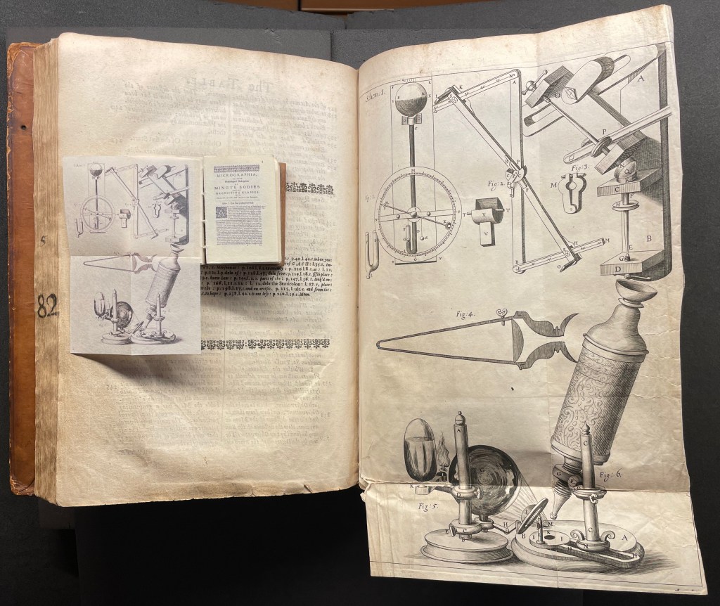
Among the many outstanding features of Huebner’s homage is his use and placement of fold-outs to capture the larger plates in Hooke’s original, all of which were placed in an appendix and some of which were also printed as fold-outs. In the juxtapositions below, note how Huebner has placed Hooke’s illustration of his equipment at the end of the Preface.
Sitting atop the double-page spread showing the end of the Preface and page 1 of Hooke’s original is Micrographia Revisited, open to Huebner’s fold-out of Hooke’s illustration of his equipment. Hooke’s same fold-out illustration from the appendix is juxtaposed below with Huebner’s.
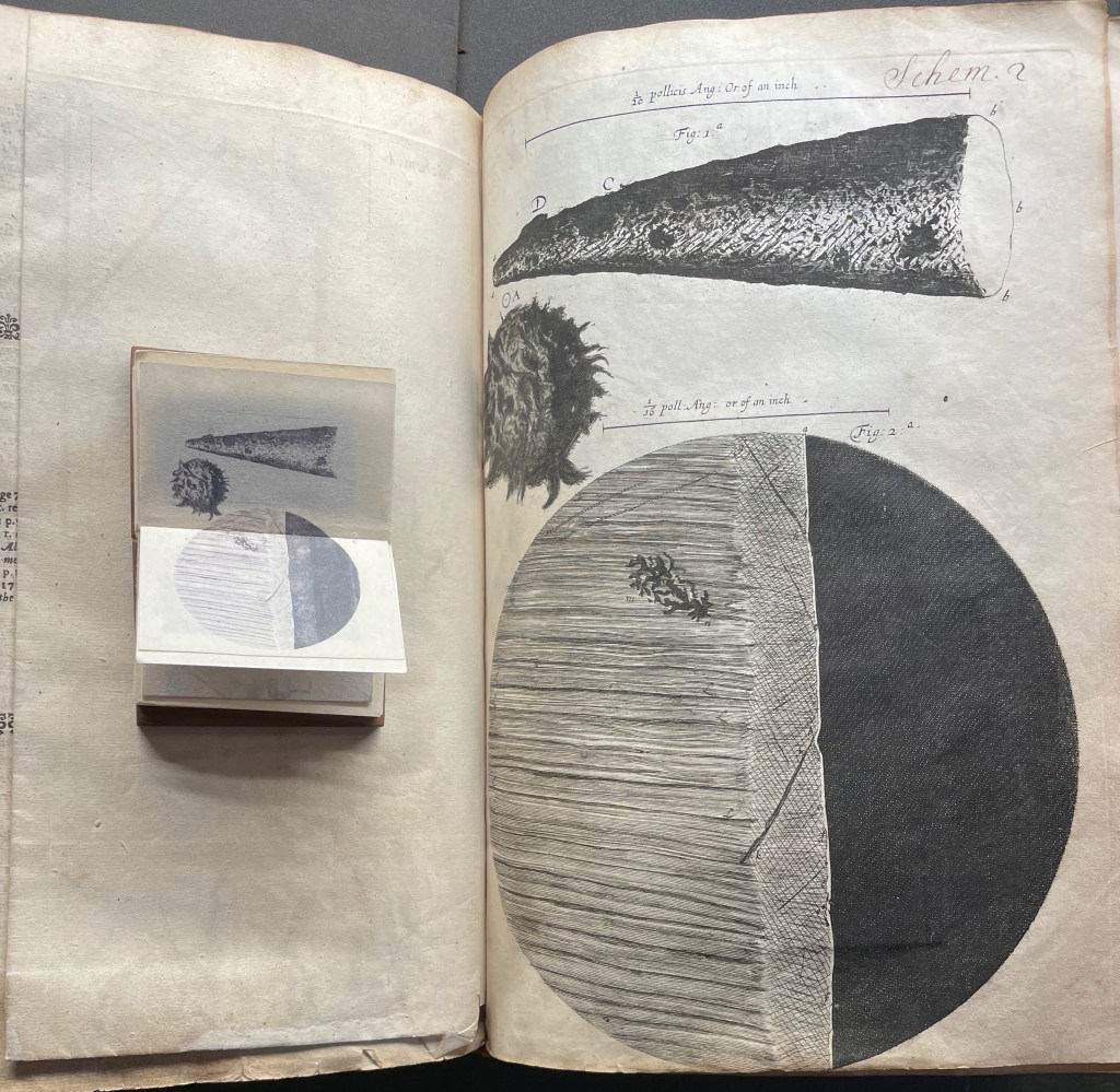
Hooke’s first two objects under the microscope Hooke are the point of a needle (described on pages 1-3) and the edge of a razor (described on pages 4-5). Huebner transforms Hooke’s single-page plate illustrating what he describes into a double-page spread between pages 2 and 3 of Micrographia Revisited.
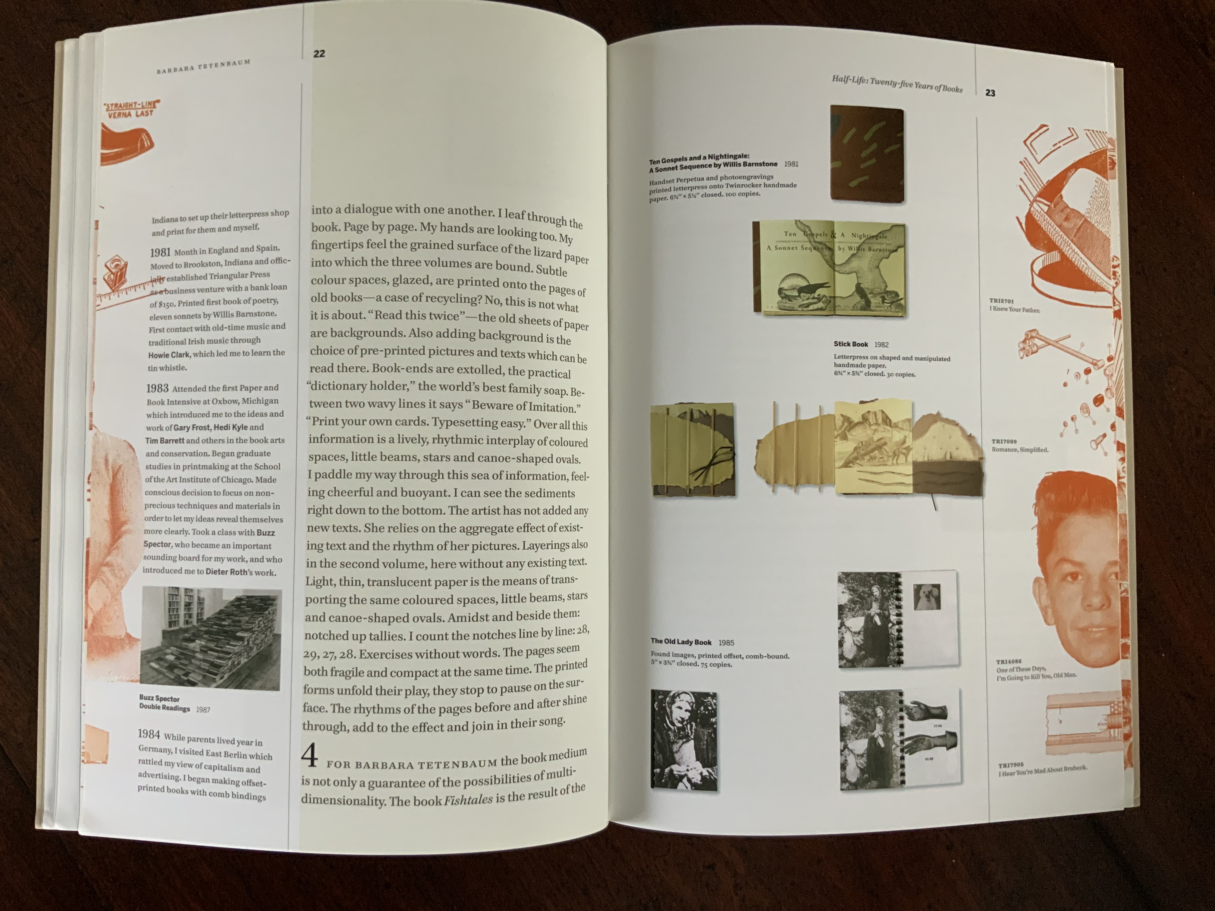
Juxtaposing Huebner’s double-page presentation of Hooke’s drawings of a needle point and edge a razor with Hooke’s single-page presentation.
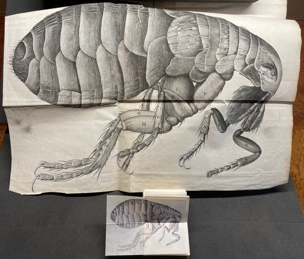
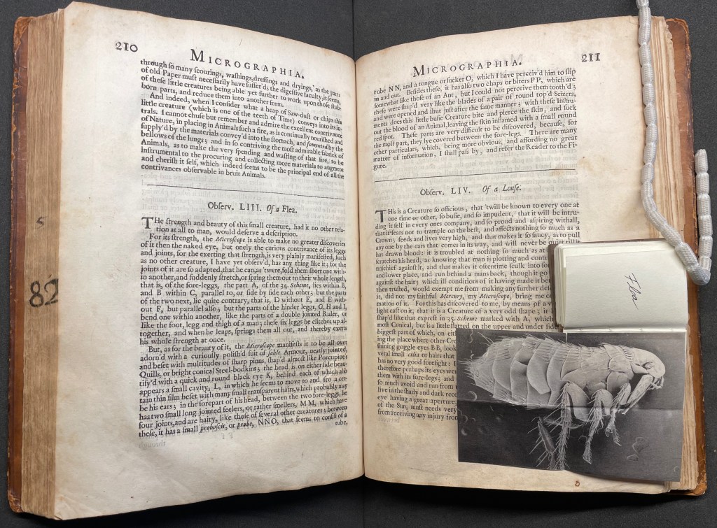
Hooke’s large fold-out of his flea may display the most impressive drawing in the book. The description appears on page 210, and the fold-out is in the appendix. Huebner’s double-fold fold-out of the illustration falls between pages 210 and 211.
The flea from Micrographia juxtaposed with that from Micrographia Revisited.
But most impressive of all is Huebner’s SEM image of a flea and its testament to Hooke’s powers of observation and skills as a draughtsman.
In the spirit of “standing on the shouders of giants”.
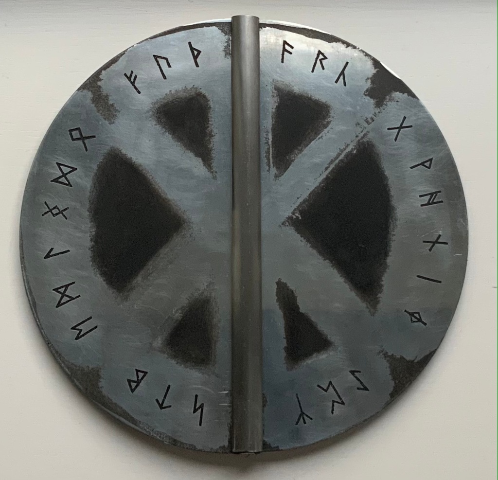
Fuþorc (1992) Brynja Baldursdottír Casebound in brushed and inked 1.6 mm zinc plate cover. Decorated doublures. Closed: H290 x W160 mm. Open: 320 mm. 32 folios. Edition of 144, of which this is #98. Acquired from the artist, 15 November 2021. Photos of the work: Books On Books Collection. Displayed with permission of the artist.
Fuþorc, the name of Brynja Baldursdottír’s artist’s book, is the word made from the first six runes of the Runic alphabet, much as alphabet derives from the first two Greek letters alpha and beta. The shield-like covers, laid face down, display all twenty-four runes of the fuþorc. Over time and geography, the runes have changed in number, spelling and meaning, reflected in the explanatory and interpretive Norwegian, Icelandic and Anglo-Saxon versions of the “Rune Poem”. Baldursdottír’s version is “The Old English Rune Poem”, translated by Marijane Osborn and Stella Longland, which is we have the Old English fuþorc rather than the Scandinavian fuþark.
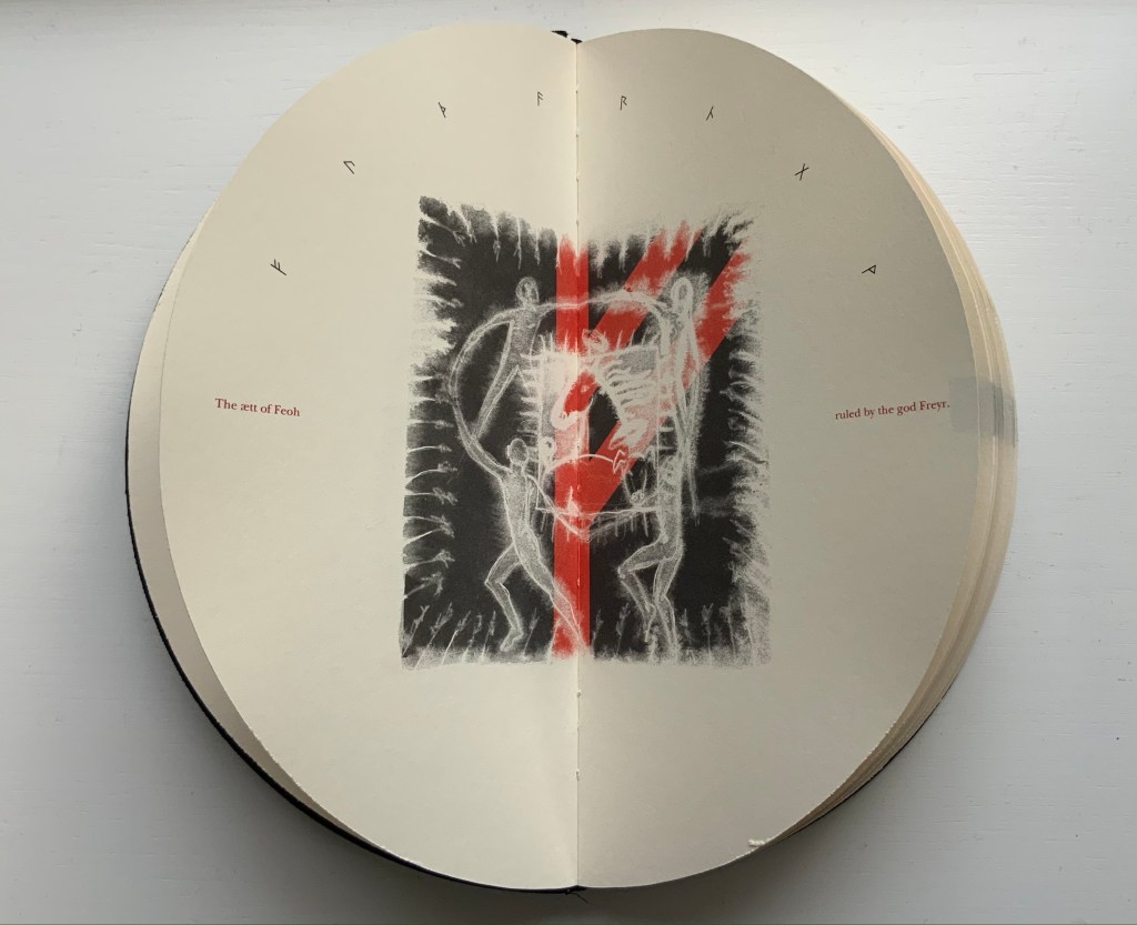
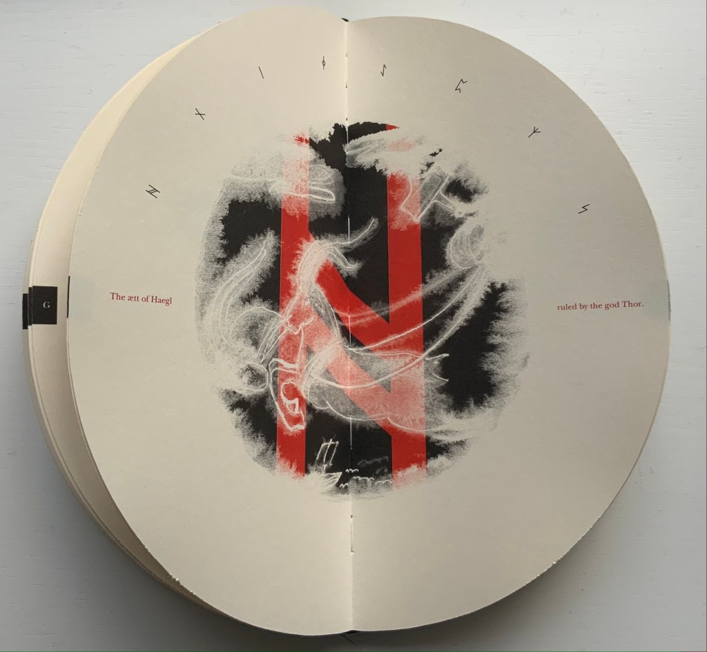
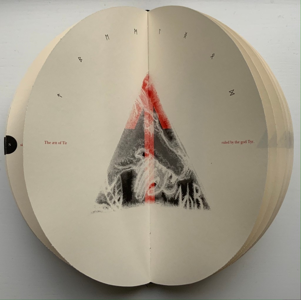
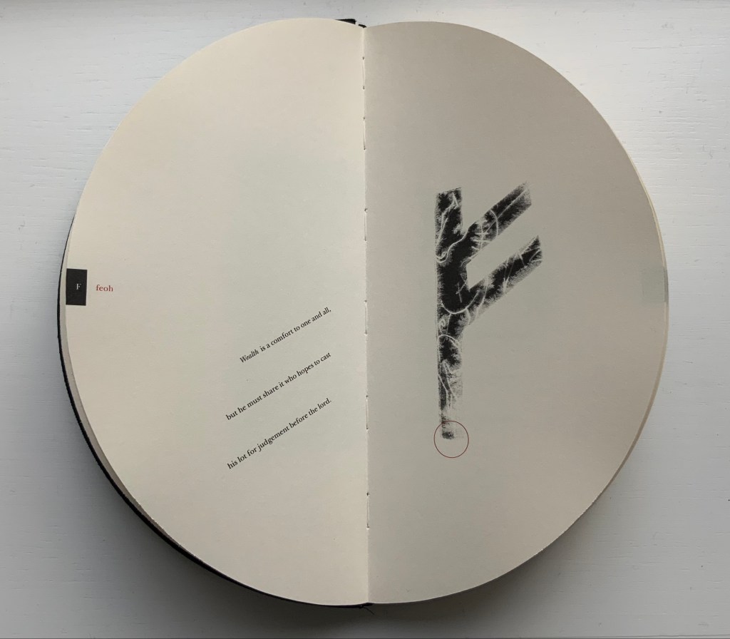
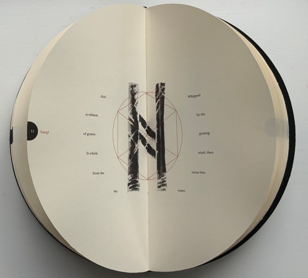
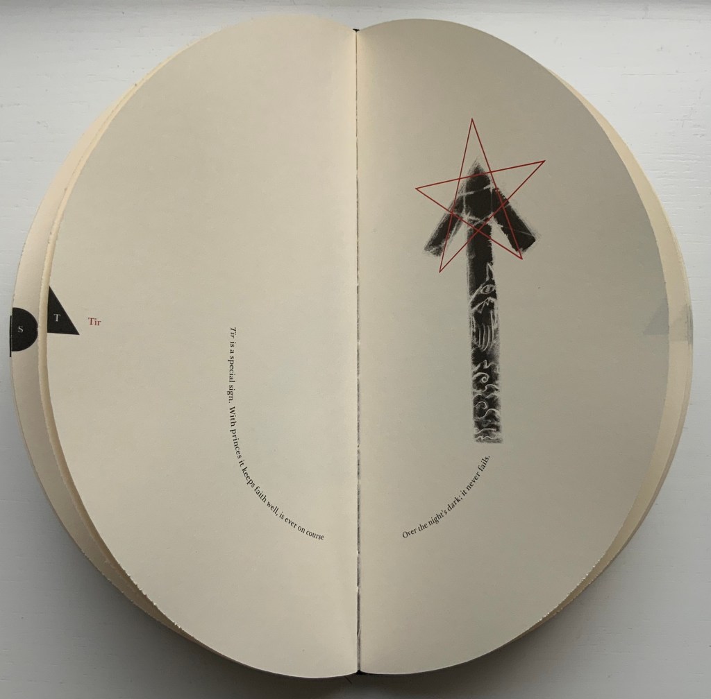
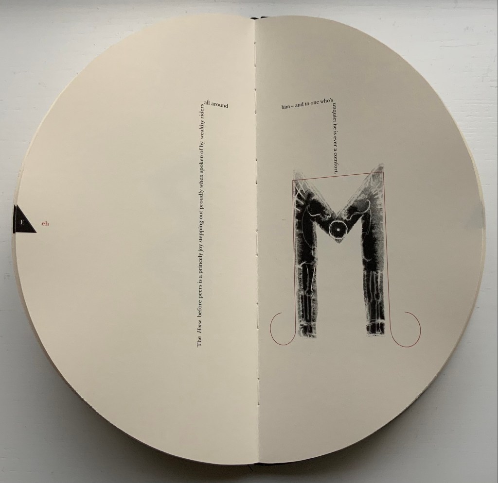
The Runic alphabet divides into three equal parts or ættir (pl. of ætt). In Fuþorc, Baldursdottír signals the beginning of each ætt with a double-page spread in which the eight runes of the ætt arc over a central image containing the ætt’s first letter. Different attributes attach to the ættir and each of the runes they embrace. Using layout of the text and imagery embedded in or surrounding the rune, Baldursdottír has evoked these attributes.
So, for the Ætt of Feoh, figures dance around the Maypole-like rune feoh, which is the first letter of Freyr and Freya who rule over this ætt associating it with agriculture, fertility and sexuality. Although Baldursdottír has Thor ruling over the Ætt of Haegl, it is the Watcher god and goddess Heimdall and Mordgud who rule over it. The seacliff-dwelling goat refers to Heimdall’s usual watch post. The snake to the left of the goat may be Jörmungandr, for which Thor goes fishing in the Prose Edda, which explains the presence of Thor’s hammer in the upper right of the image. Haegl means “hail”, and Heimdall is associated with the kind of disruptive weather threatening the ship at the foot of the image. For the Ætt of Tir, the arrowhead or spear shape of the rune evokes Tyr, the god of war, who rules over this ætt. By shaping each ætt with one of the fundamental geometric shapes of square, circle and triangle, Baldursdottír highlights the elemental nature of the Runic alphabet.
Ætt of Feoh, Ætt of Haegl, Ætt of Tir
In displaying each rune, it is as if Baldursdottír invites the viewer to peer through a rune-shaped stencil to that other world of associated attributes, but as with most divination, the images are partial and ambiguous. Is that a horse or a dragon behind feoh? Hail descending and melting behind haegl? A warship’s prow behind tir?
The runes feoh, haegl and tir
No doubt, more familiarity with the lore of runes would increase the reward of close attention to each image. But many are easily accessible. The image of horses shows well enough through the rune eh (or ehwaz), which means horse, horses or transport, but if there is any doubt, the explanatory text is laid out like reins and a bridle.
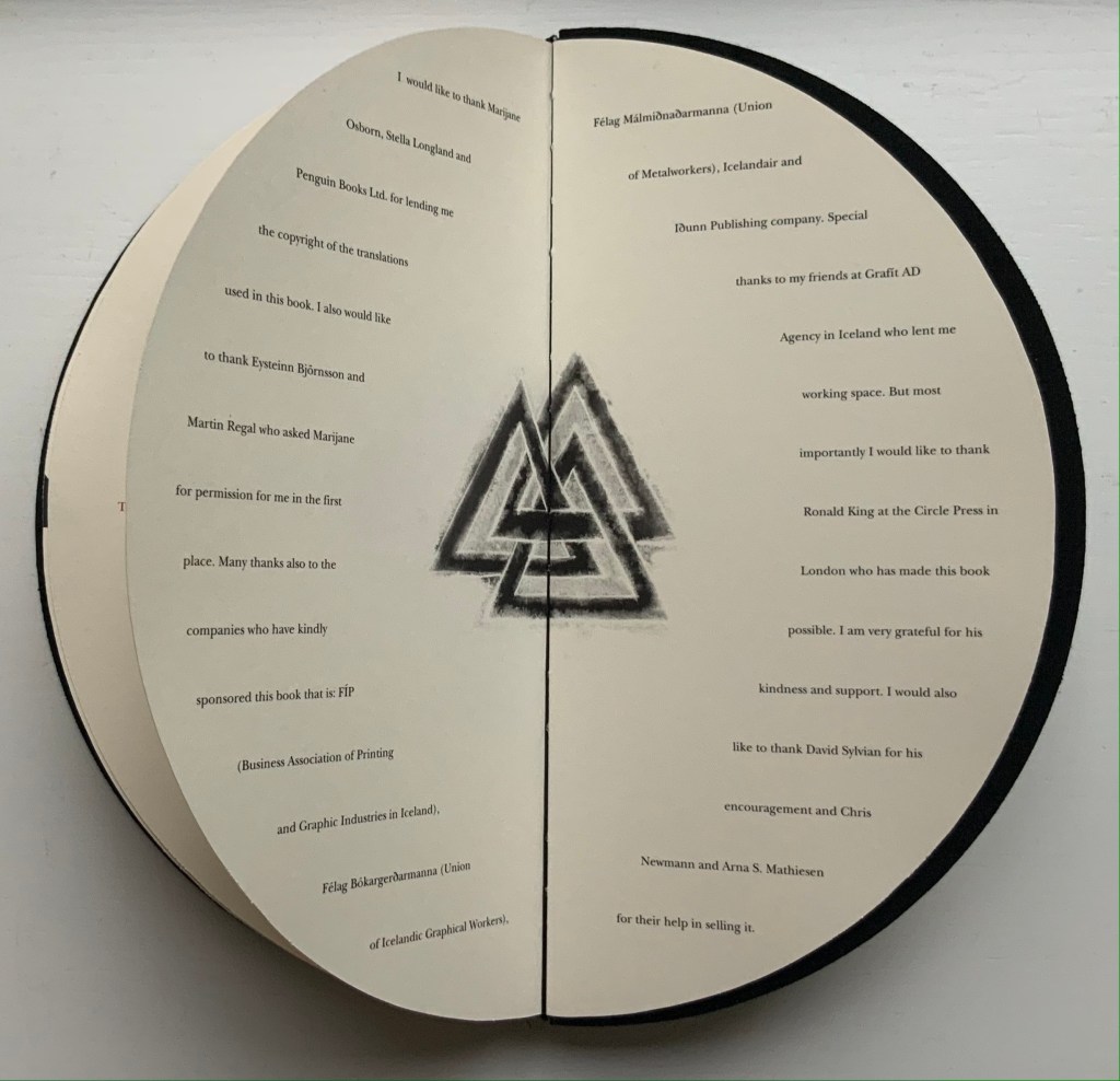
The book closes with the Valknut, sometimes called Odin’s knot, at the center of the Acknowledgments. Although runes and symbols such as this may be susceptible to misappropriation, the Acknowlegments themselves serve the Books On Books Collection as a welcome reminder that Fuþorc was first seen among other treasures at Ron King’s home.
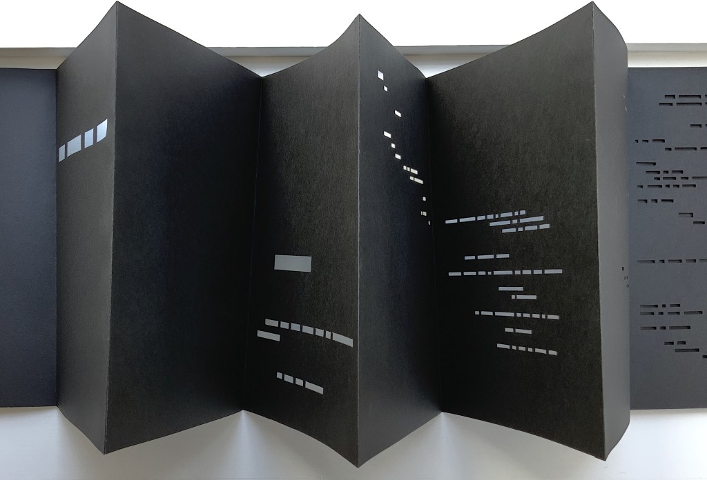
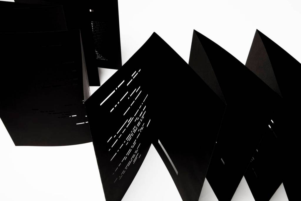
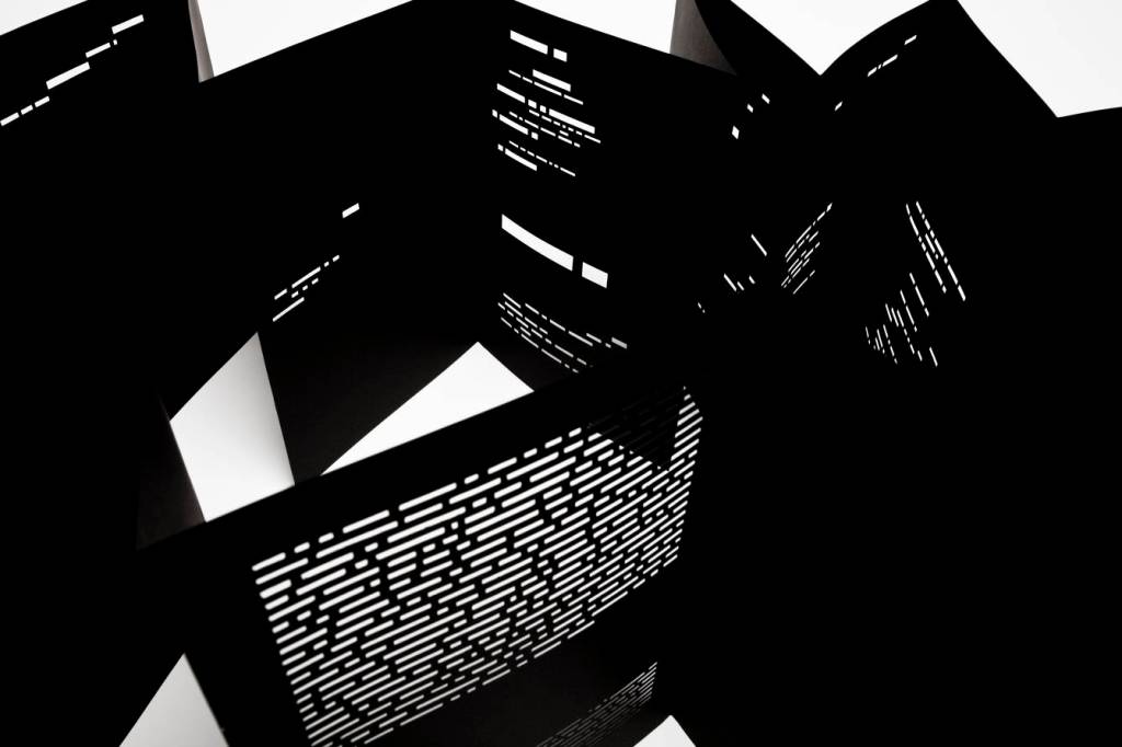
UN COUP DE DÉS JAMAIS N’ABOLIRA LE HASARD — ESPACE (2012)
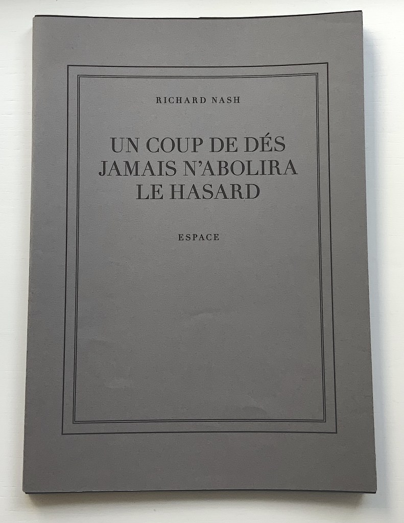
UN COUP DE DÉS JAMAIS N’ABOLIRA LE HASARD — ESPACE (2012) Richard Nash Hand-cut concertina with inkjet printed turn-in cover. Closed: H286 x W204 mm; Open: W 11.2m. Unique. Acquired from the artist for donation to the Bodleian Library, 2 April 2022. Photos: Courtesy of Richard Nash; Books On Books Collection. Permission to display from the artist.
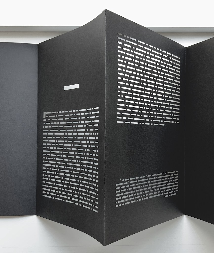
Credit goes to Rafaella della Olga’s Constellation (2009) for being the first homage to Un Coup de Dés to remind us that constellations appear against the blackness of space, not the whiteness of paper. But the first to apply this reminder in 180gsm Jet Black Canford paper to a double homage to Mallarmé’s poem and Marcel Broodthaers‘ version is Richard Nash’s Un Coup de Dés Jamais N’Abolira le Hasard — Espace(2012).
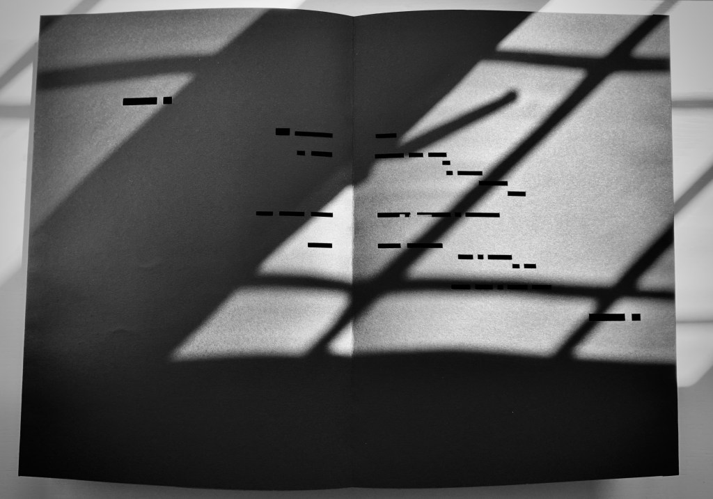
The preface
The opening pages
COMME SI … COMME SI spread
Additional photos courtesy of Richard Nash.
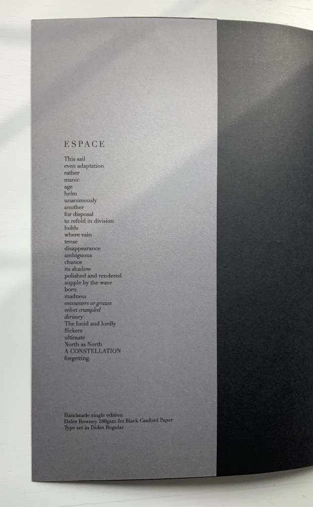
On the flyleaf, Nash has added his own verse entitled “Espace”, which set in Didot Regular is equally a typographic and poetic . Espace has a monumentality to it that encourages imagining it at a larger scale in different material; for example, a sculpture of cut steel painted black, installed along a seaside strand and backlit at night. In that evocative physical characteristic, Nash’s homage evokes the oracular and vatic tone of
RIEN / N’AURA EU LIEU / QUE LE LIEU / EXCEPTÉ / PEUT-ÊTRE / UNE CONSTELLATION (“Nothing will have taken place but the place except perhaps a constellation”)
and
Toute pensée émet un Coup de Dés (“All thought emits a throw of the dice”).
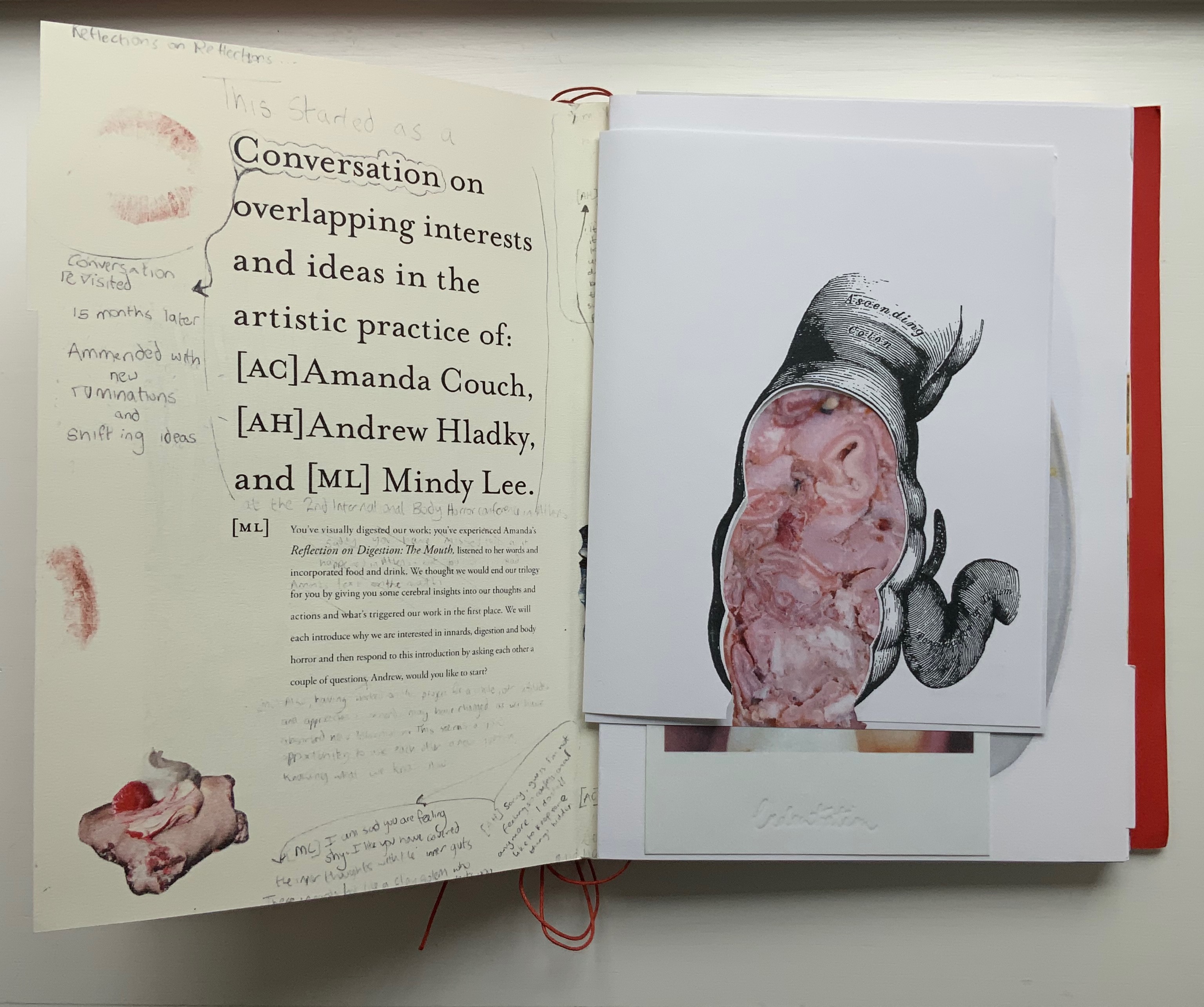
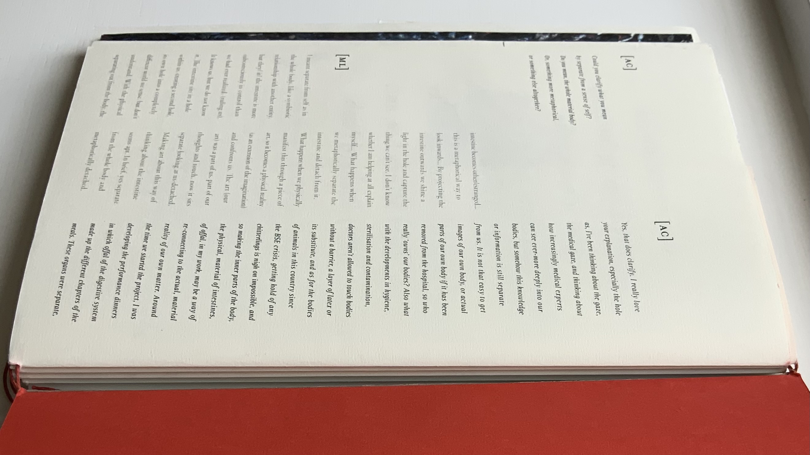
On Innards (2015)
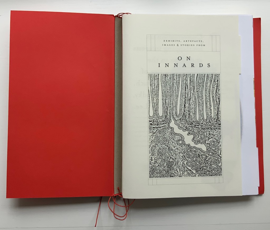
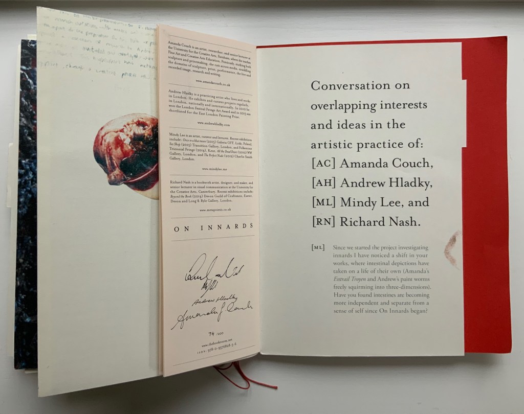
On Innards (2015) Amanda Couch, Mindy Lee, Andrew Hladky and Richard Nash Limited edition publication individually stamped and numbered, digitally printed and cut, folded, bound and finished by hand. H260 x W205 mm, 200 pages of various intersecting formats and custom binding. Limited edition of 200, of which this is #74. Acquired from Richard Nash, 2 April 2022. Photos: Courtesy of Richard Nash; Books On Books Collection. Permission to display from Richard Nash.
On Innards began as a multidisciplinary project to explore how the way we think of guts and digestion has changed, how that might drive the creative process, and how it affects our sense of self. Book art and the human body (interior and exterior) are no strangers. Carolee Schneemann’s Parts of a Body House Book (1972/2020), Ron King’s Turn Over Darling (1994) and Matisse’s Model (1996), Joyce Cutler Shaw’s The Anatomy Lesson: Unveiling the Fasciculus Medicinae (2004) and Casey Gardner’s Body of Inquiry: A Triptych Opening to a Corporeal Codex (2011) among others come to mind. On Innards introduces a very different level of intimacy though — one not for the squeamish or scatologically averse.
Artists Amanda Couch, Mindy Lee and Andrew Hladky initiated the the project and presented initial results in a panel held at the interdisciplinary conference “Body Horror” in Athens, in 2013. Subsequently, Richard Nash joined the project to curate an exhibition and event in 2014, which included text by Carlo Comanducci, Giskin Day, Dr. Simon Gabe, Nathaniel Storey, and Jamie Sutcliffe; performance by Kerry Gallagher; and illustration by Jenny Pengilly. Drawing together the output and record of the project, Nash created this hybrid research journal and artists’ book, launched at the Whitechapel London Art Book Fair in 2015.
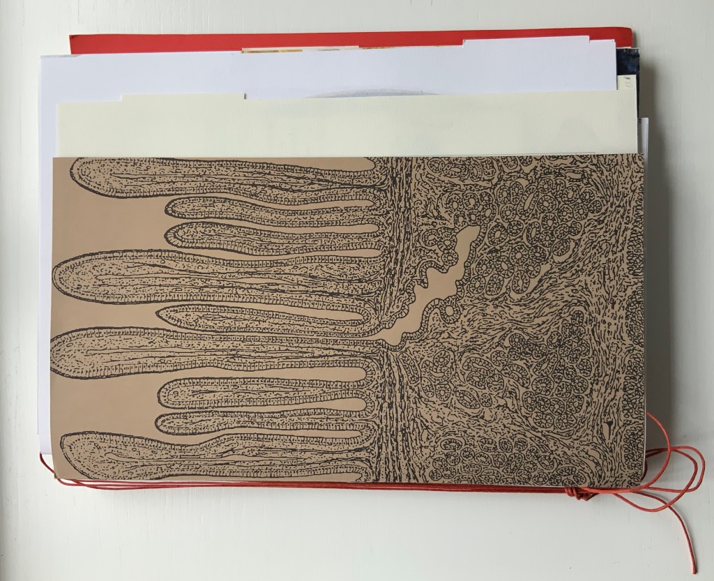
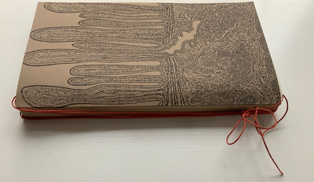
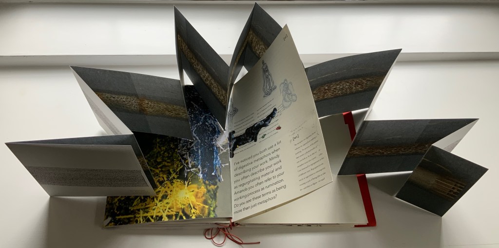
Like Espace, this work displays Nash’s sculptural approach to text, graphics, ideas and the book as raw material for an artistic creation. The bookwork interweaves, concertinas, folds out, pops up, gate-folds, roll-folds and unwinds. Used to reveal reflections on the project, recalled events, artefacts, images, and stories from the conference, these various “book innards” become an embodiment of digestion. It also somewhat resembles an expandable file folder, its contents secured by a long looping slip-knotted red thread sewn through a heavy card spine pasted to red endpapers that are pasted to brown cover papers. Despite the resemblance to a landscape portfolio, the contents proceed in portrait codex fashion with the tabbed half-title “page” below. The half-title, however, is the first panel of a double-sided accordion that extends from that tabbed half-title page all the way to the last (also tabbed) page of the book (also below). When the half-title turns, it reveals a description of the contents (also below) printed on the double-sided accordion.
Landscape view of the spine and external thread binding.
Portfolio view of endpaper and half-title page. Note the glimpse in the center of the spine’s interior.
Left: The verso page or panel gives a description of the contents of the double-sided accordion. Right: last panel of the double-sided accordion.
The valleys of the double-sided accordion hold the various other parts of the book, some of which are secured in their valleys by the red thread’s looping over and down their centers, and some of which are secured by being folded around or over the thread-secured parts. The dimensions of those parts vary, and other parts lie loose. This can lead to the guts of the book spilling out, surely not an accident! Nor is it necessarily a bad thing, for reading the other side of the accordion requires removing all of the contents from the binding.
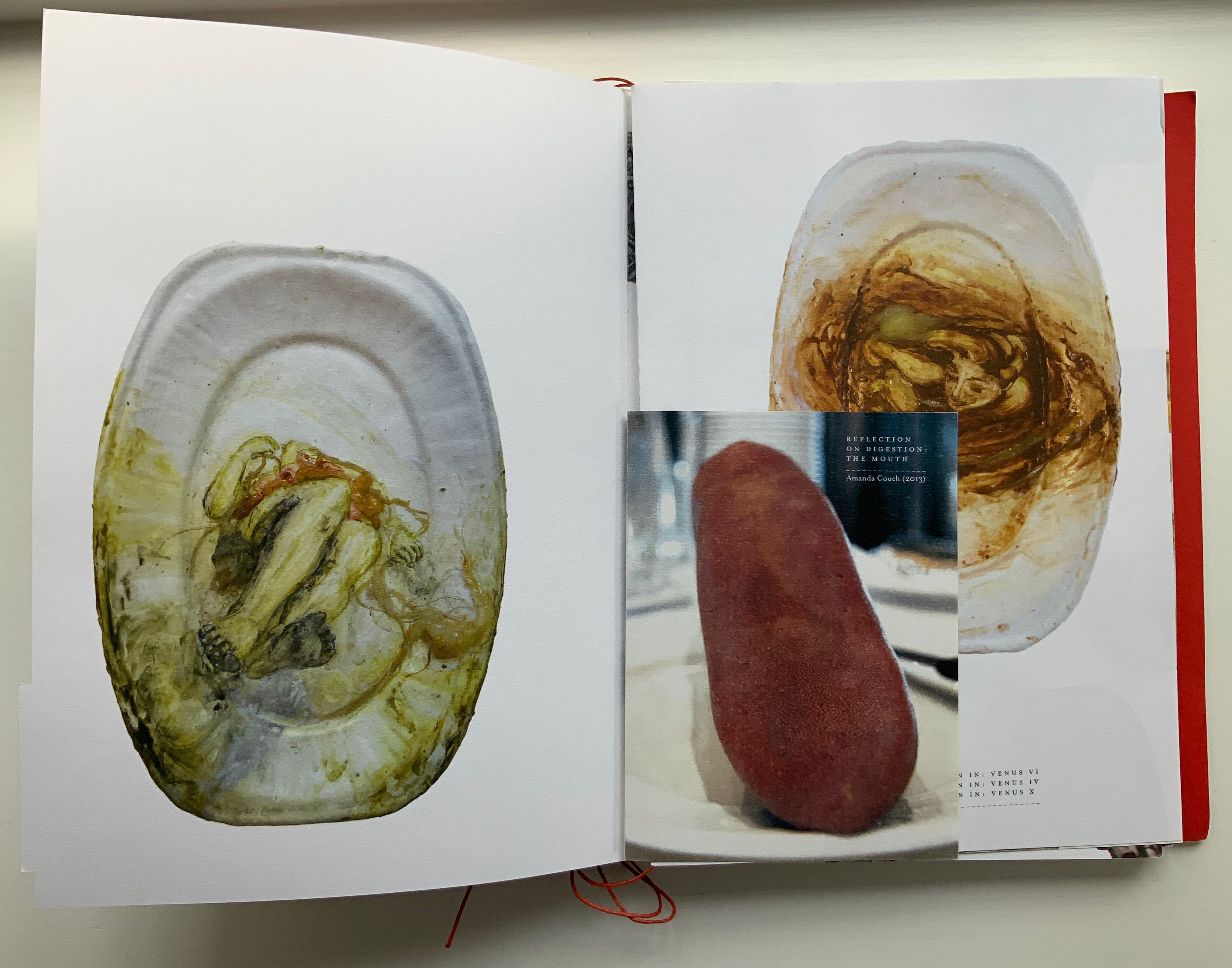
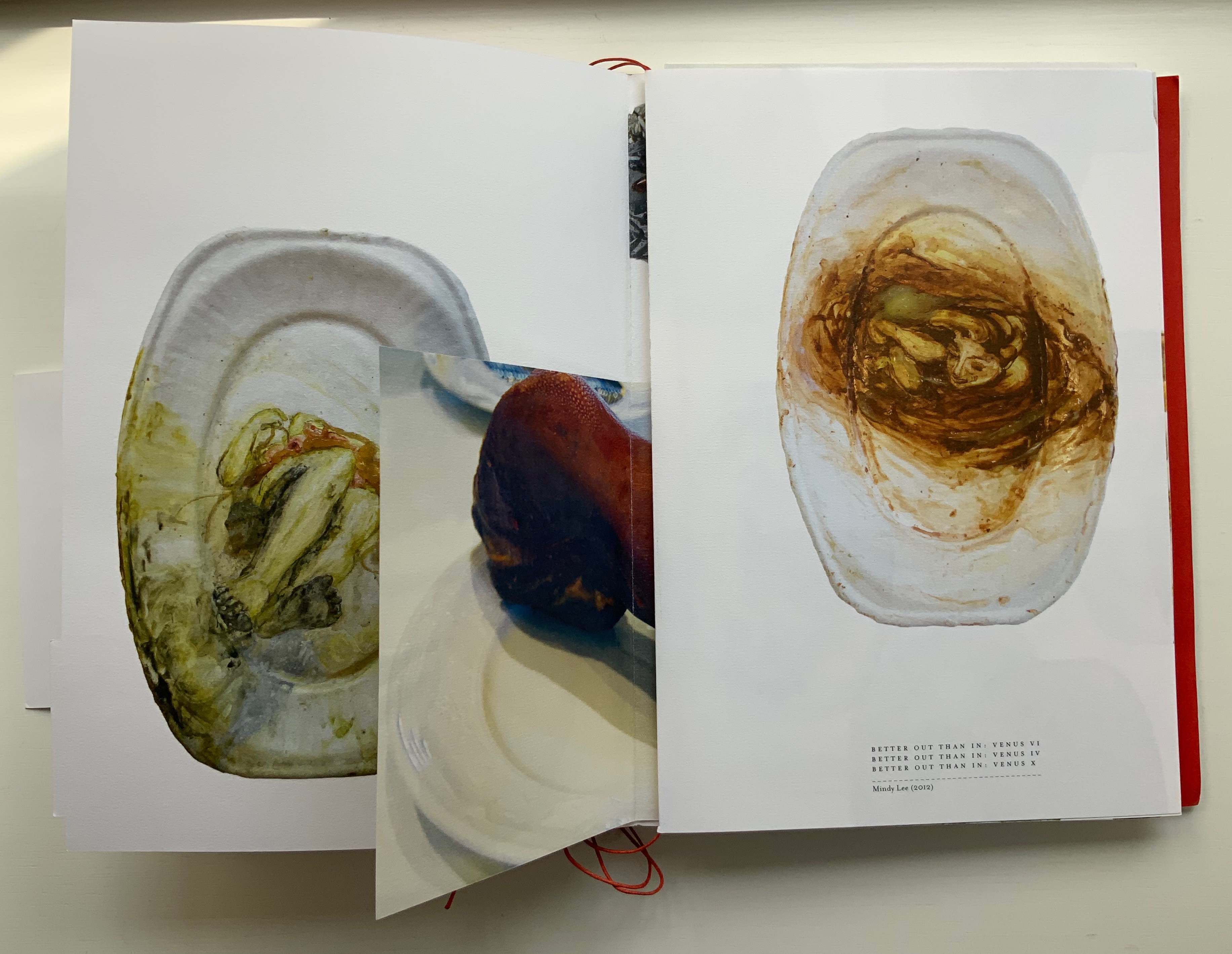
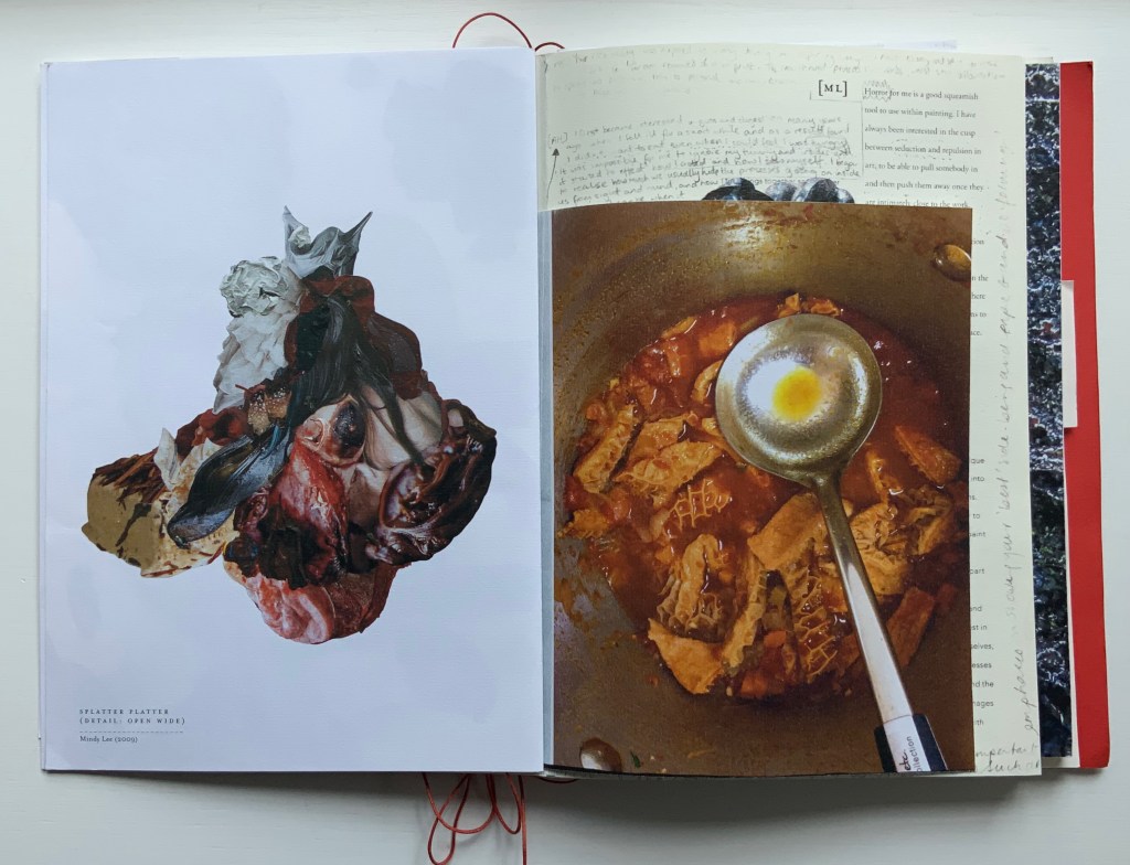
The first interleaved artefacts and images come from Amanda Couch and Mindy Lee. Couch’s first item is a passe-partout construction displaying at the start “Organ-Offal Caecum Andouillette” (2015) and at the end “Organ-Offal Stomach-Tripe” (2015). The passe-partouts combine black-and-white photos of anatomical engravings with color photos of the gut (see above), and between them is a photo of an annotated recipe for beginner’s tripe or chitterlings. Her second item (see below) is a pamphlet entitled “Reflection on Digestion: The Mouth” (2013), recounting and illustrating a presentation/performance/tasting of a serving of tongue that Couch gave during the “Body Horror” conference.
Lee’s contributions appear (also below) on the larger pages embraced by and interleaved with Couch’s two items. The images display photographs of works entitled Better Out than In: Venus VI, IV & X (2012) and Splatter Platter (2009). In Better Out, Lee’s “canvasses” are paper plates, but the perspective from which Venus is perceived suggests the underside of a closed, soiled toilet seat.
Couch’s “Reflection on Digestion” pamphlet interleaved with photos of Lee’s Better Out than In series.
Detail from photo of Lee’s Splatter-Platter; enclosing page from Couch’s annotated and illustrated recipe for tripe.
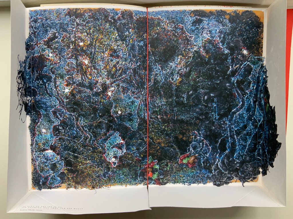
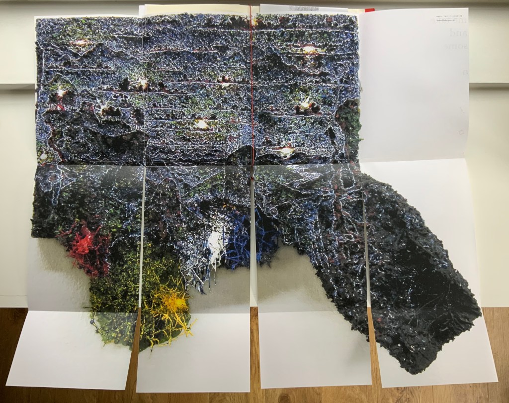
Andrew Hladky’s contributions are prints of three-dimensional works made of oil and bamboo sticks on wood panels ranging from 3 inches to 10 inches in depth. To capture this, On Innards delivers the print of It ain’t us yet its in us. Its looking out thru our eye hoals (2015) as a pop-up box (see below), and the prints of Well, This is Goodbye (2007-15) and The Clearing (2011-14) are cut and folded such that they spill out well beyond the trim size of the portfolio (also below).
Hladky’s It ain’t us yet its in us. Its looking out thru our eye hoals (original work 12 x 18 x 10 inches). The other side of this box also bears a print of a detail view of the work.
Haldky’s Well, This is Goodbye (original work 8.5 x 10.5 x 3 inches)
Hladky’s The Clearing unfolded (original work 61.5 x 43.5 x 6.5 inches), with Giskin Day’s “End Notes” interleaved.
As mentioned, some works are loose inserts, but some of the loose inserts are folded over a panel of the core double-sided accordion. Nash uses that structural feature to emphasize one of the hallmarks of book art: self-reflexivity. Below, straddling a mountain fold in the core double-sided accordion is another double-sided accordion. On one side, there is a photo of Couch’s Entrail Troyen (2014), a three-dimensional tube knitted from leftover cured saucisson sec shredded into ribbon-like thread. The title is derived from the French sausage Andouillette de Troyes, which harks back to the pamphlet “Reflection on Digestion: The Mouth” (2013) and its andouillette and chitterlings.
In case the reader misses the connection to the earlier item, the other side of this double-sided accordion presents a condensed photo of Couch’s nine-meter long accordion book entitled Reflection on Digestion (2012), a continuous line of handwriting looping back and coiling like the villi of intestines (see the cover of On Innards), relief printed from photo polymer plates on 410 gsm white Somerset satin paper. Couch uses this work in her reading performances of the same name. (Did I mention self-reflexivity?)
Loose double-sided accordion fold item displaying Couch’s Entrail Troyen on one side and Reflection on Digestion on the other.
Continued commentary on and illustration of this addition to the Books On Books Collection would be to regurgitate the whole work, which is certainly the opposite direction the work takes and which would be unfair to the work’s artists and contributors. After all, On Innards is a limited edition, and as many copies as possible should be ingested by as many institutions possible that are intent on improving their clientele’s digestion of book art.
Signature page concluding the “bibliographical” brochure summarizing the project, sponsors, conference, Blyth Gallery event and the artists’ book in hand, providing its colophon and listing sources and works displayed; penultimate page of the core double-sided accordion.
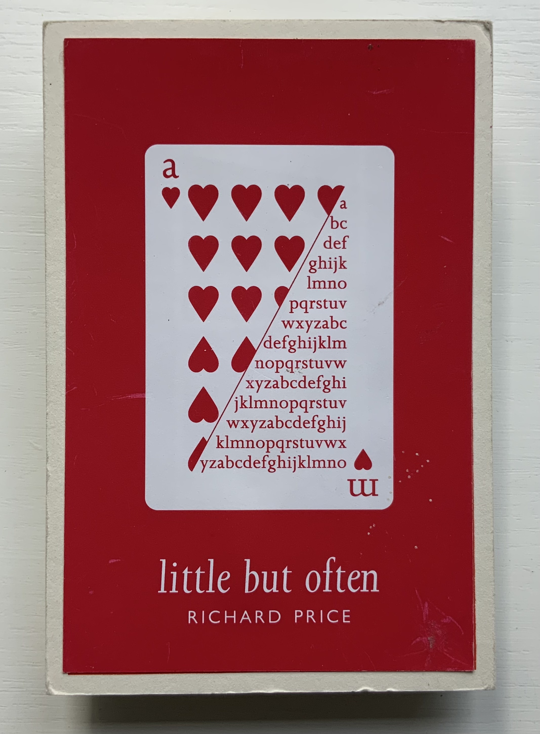
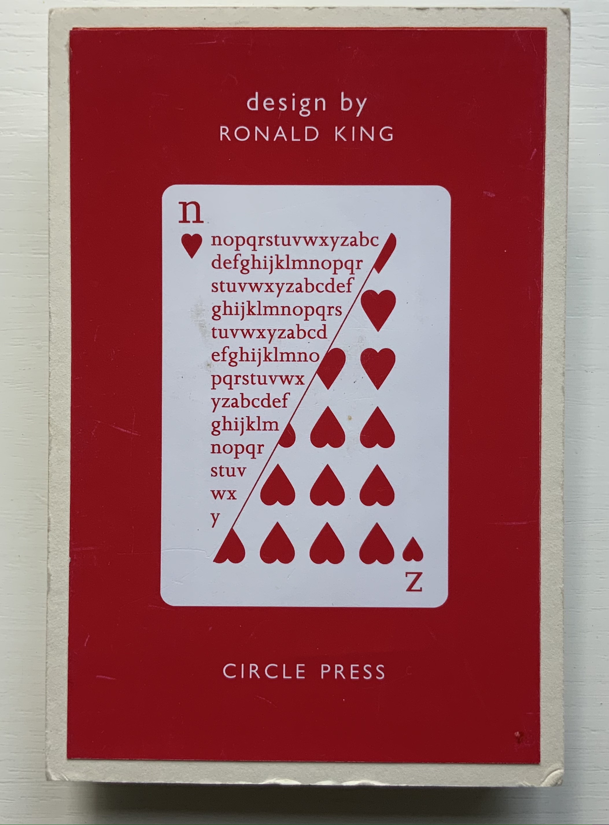
Richard Price’s lines recall the inventiveness of Emily Dickinson‘s and compression of Samuel Menashe‘s. For Dickinson, we have the artistry of Jen Bervin; for Menashe, we have that of Julie Johnstone; and for Price, we have his full-on collaboration with Ron King.
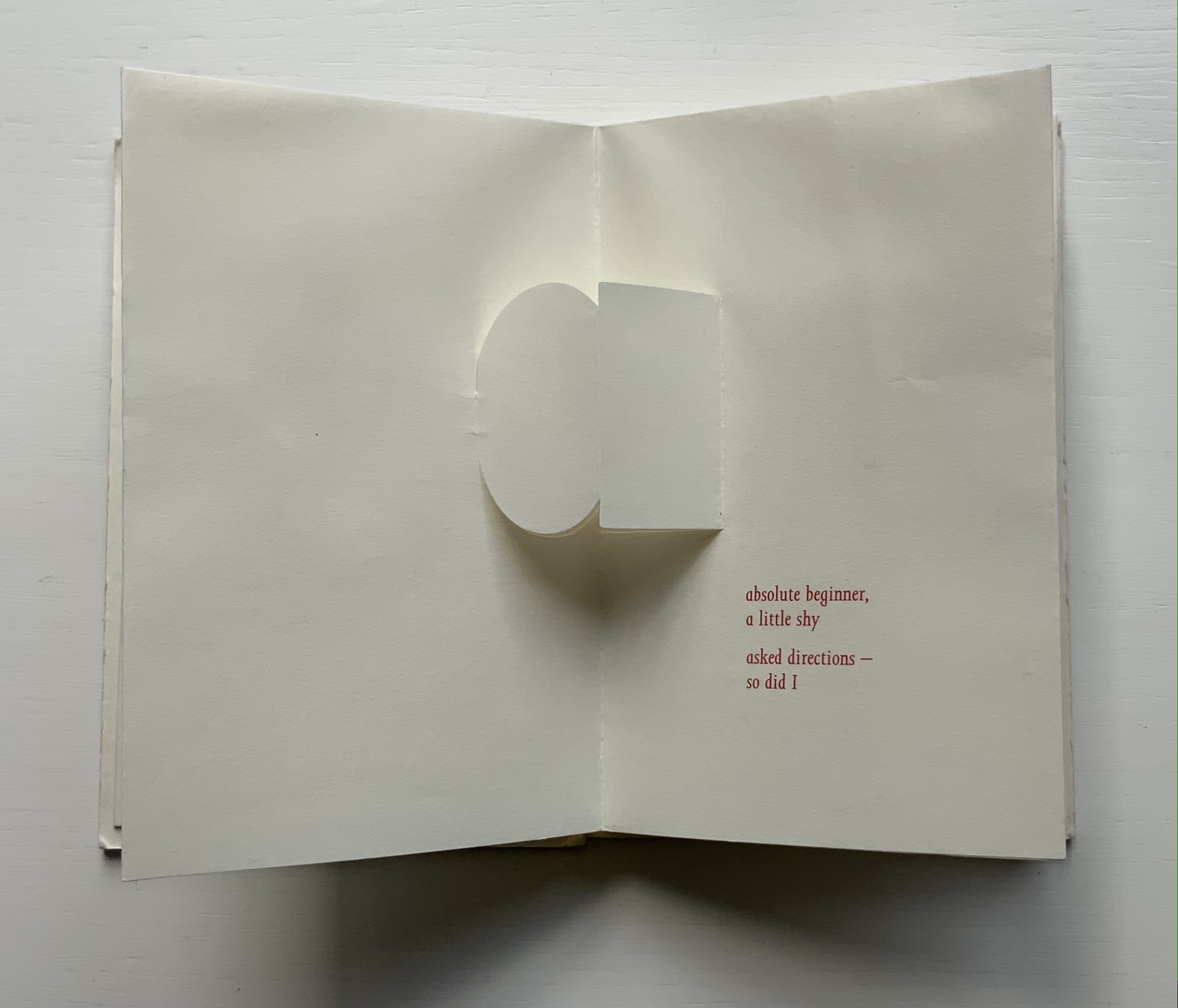
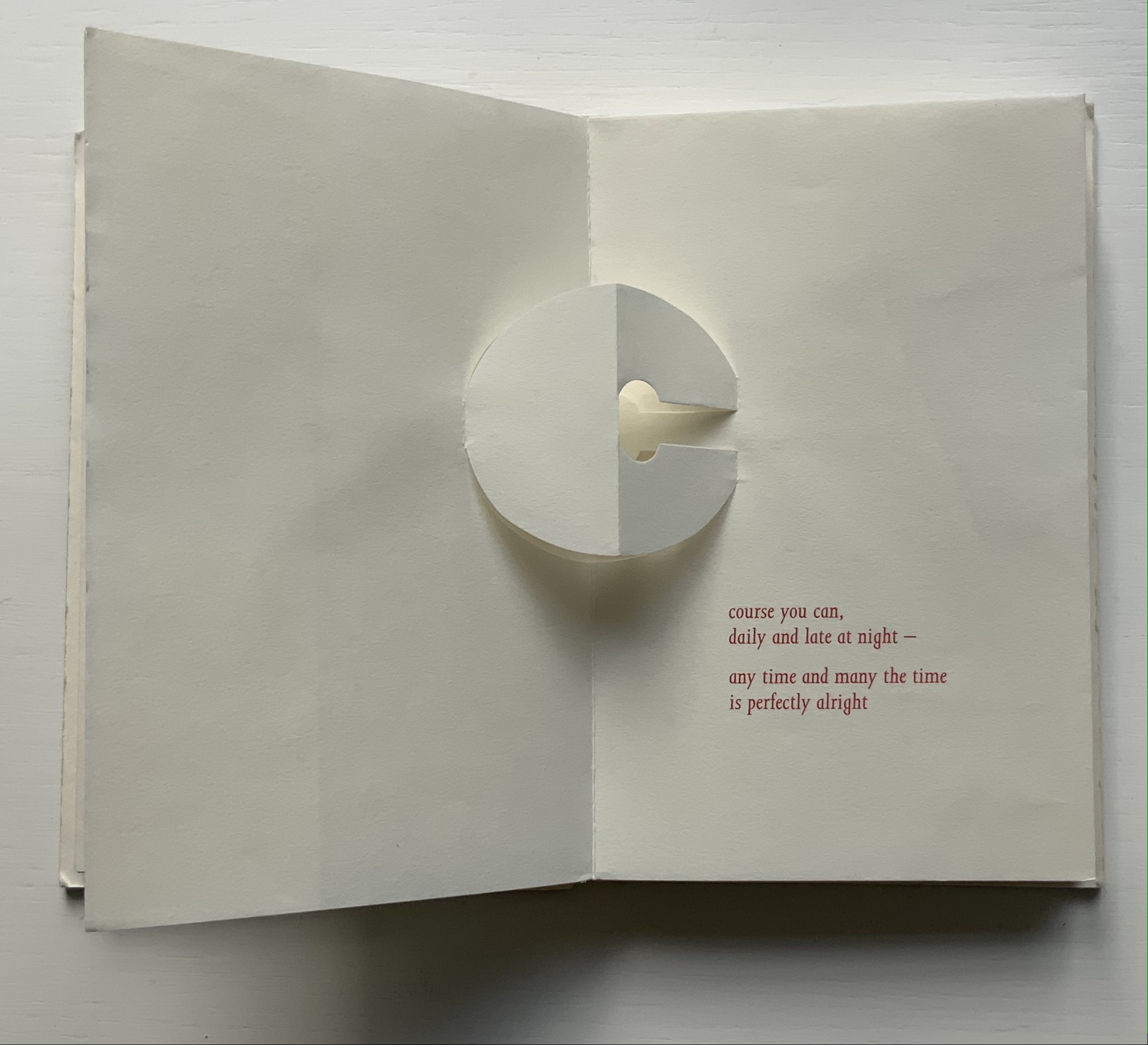
Harking back to The Half-Year Letters (1983), little but often pairs King’s lowercase pop-up alphabet with Price’s verses, just as its predecessor paired the uppercase with Roy Fisher‘s alphabet-inspired evocations of the 26 weeks from April through September. Also like its predecessor, little but often plays on the 52 weeks of the year, this time with its front and back covers illustrated with a playing-card suit of hearts, “numbered” a-m and n-z, and with two pages allotted to each week, each letter and each brief poem — as the title says, little but often. While The Half-Year Letters explores the forward movement of the letters alongside the movement of the year, this is love poetry in a book of back and forth. Text and design converse — and not merely by the letter.
The last letter and lines in the book exemplify this to perfection.
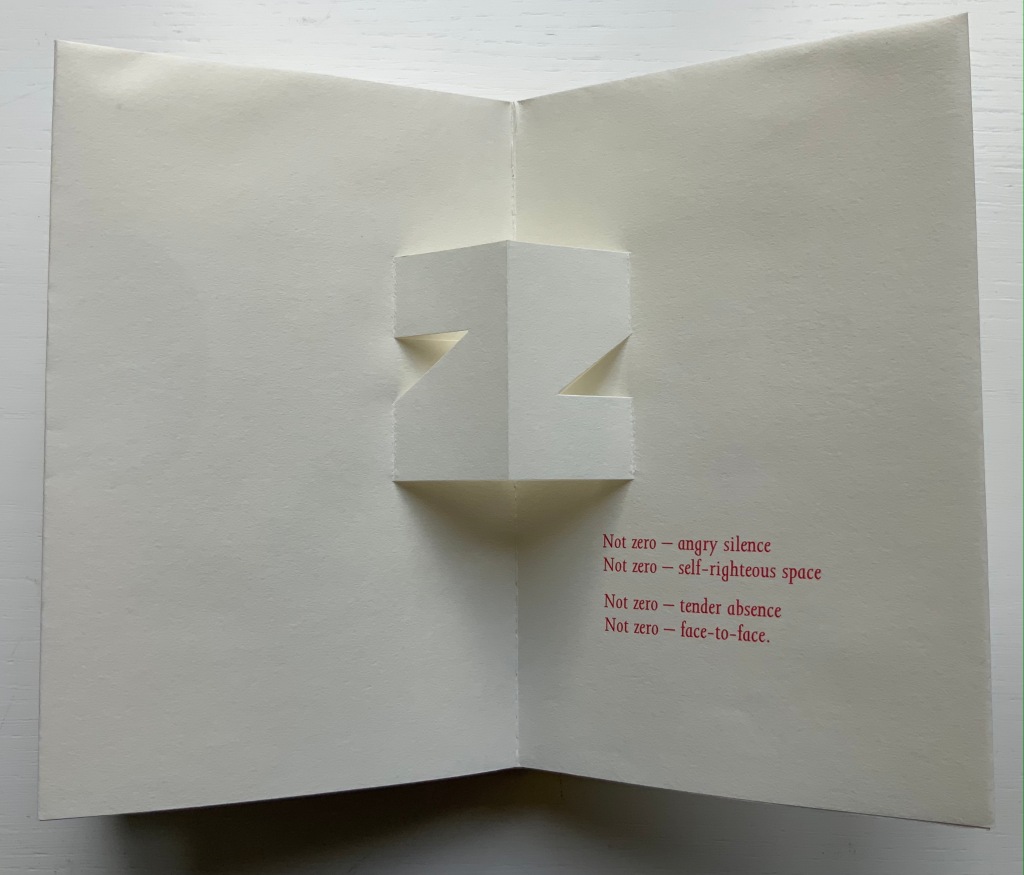
Of the few other pairs of couplets in the book, none is as back and forth as the letter z’s. Paired against one another, rhyming abab, each line beginning alike with its N-z phrase, the two couplets echo the back-to-backness and balance of the dos-à-dos structure. The phrases self-righteous space and tender absence can be read as allusions to the cut-out space around the letters. Or vice versa. Again, back and forth. “Angry” and “tender” bat each other back and forth, just as the final phrase turns the dos-à-dos sweetly back on itself.
Together, Price and King make the concertina book “smile brighter”.†
“Ronald King“. 1 March 2021. Books On Books Collection.
Clark, Caroline. 23 January 2013. “Clark on Price“. Eyewear, the blog.
†Dante Alighieri. 1320. Purgatorio (Canto XI, 82). Hollander, Robert, Stephen Campbell, and Simone Marchesi. 1988. Dartmouth Dante project. When Dante meets and praises the illuminator Oderisi da Gubbio in purgatory, Oderisi directs the praise to his pupil Franco Bolognese as the one who really made “the pages smile brighter”.
Price, Richard. 2018. Digital. Essence Press. Collaboration with Julie Johnstone.
___________. 2008. folded. Essence Press. Collaboration with Julie Johnstone.
The art of the alphabet seems to be a rite of passage for graphic artists. Perhaps it is that art and the alphabet find common ground in the urge to make sense of the world. Perhaps it’s that the alphabet’s invention, development and artistic treatment present a rich tradition for artists to follow or challenge. Perhaps it’s that letterforms and the alphabet offer raw material, subject and organizing principle all in one. Semic or asemic. Calligraphic, typographic or even plastic. Representational or abstract. All are options. But most often, something bookish results. From Islam Aly’s 28 Letters(2013) to Ludwig Zeller’s Alphacollage (1979), a significant part of the Books On Books Collection is taken up with artists’ books based on the ABCs and letterforms. The Collection’s two facsimiles of Geofroy Tory’s Champ Fleury provide a useful historical backdrop that throws into relief several of the Collection’s works and their performance of this rite of passage.
It should be no surprise that Geofroy Tory de Bourges (c.1480-1533) serves up such an exemplar. In her Playful Letters, Erika Boeckler writes
An accomplished designer, typographer, printer, poet, author, translator, calligrapher, illustrator, woodcutter, and engraver, he received his education in Italy and ultimately settled in Paris, setting up a bookstore, writing his own works, running a press, and collaborating with or working for Simone de Colines, director of one of the most influential and experimental fine publishing houses of the time. Personally writing the text, designing the woodcuts, and cutting some of them, organizing the layout, perhaps even setting the type, Tory created Champ Fleury as what we might call today an artist’s book. (p. 29)
Tory straddles the letters of the late Middle Ages and Renaissance. Appointed by François I in 1530 as his printer, Tory operated on the Petit Pont under the sign of le Pot cassé (“the broken pot”) and was known for his workshop’s handwritten Book of Hours (1524). Rooted in the horae tradition reaching back to the 13th century, Tory’s Book of Hours is an early-to-mid-Renaissance version of its predecessors. As beautiful as his Book of Hours is, Champ Fleury (1529) became his best known work. Authored and designed by Tory, it was produced by hand typesetting and letterpress printing in Paris with Giles Gourmont. Printed less than 100 years after Gutenberg’s innovation, Champ Fleury represents the printed book toddling out of its incunabula period.
Book of Hours Geofroy Tory (1524) Bound in the 18th century, 113 leaves of vellum. Lessing J. Rosenwald Collection (Library of Congress). Accessed 30 May 2021.
According to Jeremy Norman’sHistory of Informationsite, the first separate printed title page appeared in 1463. Subject indices date back to the 13th century, originating at the University of Paris, and the first printed indices, to 1470. Champ Fleury‘s front matter boasts a title page, two prefaces to the reader, a statement of the King’s Privilege awarded for the book for ten years (a forerunner to the copyright page), a name index without location references and a subject index with folio references. Champ Fleury’s back matter consists of a colophon preceded by a lengthy appendix illustrating various forms of the alphabet (Hebrew, Greek, Latin, etc.).
Tory’s placement of the indices in the front matter rather than the back matter reflects the gradual development of the anatomy of the book towards the structure that would ultimately be codified in reference works like the Chicago Manual of Style. Paratextual elements like the title page, table of contents, page numbers, etc., did not spring up overnight. If, as Eric Havelock and others assert, society, the arts and culture are a superstructure erected on the foundation of the alphabet (see below), Champ Fleury and its “letterology” make for a particularly fitting exemplar of the book as an element of the superstructure arising from the alphabet.
Perhaps book artists sense this, which again leads to that alphabet art rite of passage and the elaborate variations on it. The illustration of various forms of the alphabet in the appendix also draws on another developing tradition: the typesetter/printer’s sample book advertising the firm’s fonts. Abecedaries and artist books have sprung from that tradition, too.
Tory was not the first to propose an art and science behind the letterforms of the alphabet. Predating his efforts were Giovanninno de’ Grassi (1390-1405), Felice Feliciano (1463), the Anonymous Chicagoensis and Anonymous Monachensis (1468?), Damianus Moyllus (1480), Fra Luca Pacioli (1509), Sigismondo Fanti (1514), Francesco Torniello (1517), Ludovico Arrighi (1522), Albrecht Dürer (1525) and Giovanni Battista Verini (1527). Leading up to Champ Fleury, these earlier efforts track the development of humanism. Arguably, Tory’s effort is a capstone, combining myth, allegory, metaphysics, geometry, linguistics, calligraphy, typography and cryptography.
Book One, concerned with the mythical origins of the French language, also addresses the fabled origins of the alphabet: the story of Jove, Io and Mercury behind the letters I and O and their claim to being the first letters and also the tale of Apollo’s accidental murder of Hyacinth explaining the letters A and Y and their similar claim. Two works in the Collection built on alphabet origin stories are Francisca Prieto’s Printed Matter series (2002-2008) William Joyce’s The Numberlys (2014), but many more follow in Champ Fleury’s art and science footsteps.
Tory’s late medieval/early Renaissance perspective gives way to 20th and 21st century poetics and phenomenology in most works of the Collection. Aaron Cohick’s The New Manifesto of the NewLights Press (third iteration) (2017) offers a good example. Another — closer to Tory’s moral and geometric perspective but of a more modern spirituality — is Jeffrey Morin and Steven Ferlauto’s Sacred Space (2003).
Compile all the abecedaries ever created and it would approximate the result of Adam and Eve’s task of naming all the creatures and things of the world. Leonard Baskin echoes that innocence in Hosie’s Alphabet(1972) with its words and animals supplied by his children. If Adam and Eve had had an alphabet, they might have been tempted into pareidolia, which is represented in the Collection by VUES/LUES: Un Abécédaire de Marion Bataille (2018) and Typographic Universe (2014) by Steven Heller and Gail Anderson. Heller and Anderson’s compendium extends to letters formed of natural and drawn objects from the real world, which Champ Fleury’s appendix foreshadows with its floral and fantastic alphabets.
Of course, Tory’s work is not an abecedary. In Books Two and Three, it develops into a full-blown treatise on letterforms whose meaning and appearance are explained allegorically and driven by the compass, rule and geometry expressed within a 10x10x10 cell cube. It would overstate the case to call it “typographic design”. As drawn, Tory’s diagrams would serve poorly for cutting and forming punches or matrices (although it has been done). Nevertheless, his geometric approach foreshadows the grids and algorithms of Wim Crouwel’s New Alphabet (1967), Timothy Epps and Christopher Evans’ Alphabet(1970) and Ji Lee’s Univers Revolved: A Three-Dimensional Alphabet (2004).
Before the age of computers and algorithms, though, the artist and designer Bruce Rogers did bring typographic design to bear on Champ Fleury. The Grolier Club sponsored the printing of George B. Ives’ English translation. Rogers’ design “translates” Champ Fleury just as much as Ives does, perhaps more so. The Grolier Club edition is one of only ten books to be set completely in the Centaur typeface designed by Rogers.
Of course, the translation entails a complete resetting of the text, and Centaur naturally delivers crisper letters. Also, in redesigning with Centaur, Rogers alters the original’s layout and, therefore, the reader’s experience of it. Notice in the OAHK pages above and in the three double-page spreads below how Rogers changes Tory’s flow or jumpiness to something fixed or stately. Attention to the page and its layout offers book artists as well as book designers yet another creative avenue. For proof of that, compare the Collection’s entries for Angel, Baskin and de Cumptich.
Architecture is another of Tory’s well-developed analogies and explanations of the ancients’ thinking behind the letterforms. In his drawings below, he aligns the letters AHKOIS with the parts of a building and letters IL with floor plans. He connects the circularity of the Coliseum’s exterior and the ovalness of its arena with the proper shape of the letter O. In the Collection, the analogy reappears fantastically in Johann David Steingruber’s Architectural Alphabet (1773/1972), Antonio Basoli’s Alfabeto Pittorico (1839/1998) Antonio and Giovanni Battista de Pian’s efforts in 1839 and 1842.
The architectural analogy provides Tory with his segue from plane to solid geometry in aligning the shapes of letters with human anatomy and virtues. His three-dimensional analysis of letterforms also finds contemporary analogues in two of Pieter Brattinga’s Kwadraat Blad series: Crouwel’s, mentioned above, and Anthon Beeke’s Alphabet (1970). Tory’s three-dimensional letterforms foreshadow Crouwel’s investigation of units based on the assembly of organic cells and his later musings on a laser-generated four-dimensional typography (Elliman, 62). And it is hard to evoke anything more humanoid and three-dimensional — albeit far less analytical or prudish — than Beeke’s alphabet formed with naked female models. (Tory comments that in a correctly drawn A, the crossbar will virtuously cover the genitals of Vitruvian man inscribed in the 10×10 grid. Modesty seems to extend to H as well but not so much to O and K.)
The calligraphic impulse that underlies Champ Fleury‘s typographic representations shows itself clearest in the woodcuts for the Cadeaulx alphabet in the appendix. The Books On Books Collection has its share of calligraphic abecedaries such as Marie Angel’s An Animated Alphabet (1996) and Andrew Zega and Bernd Dam’s An Architectural Alphabet (2008) as well as more purely calligraphic alphabets such as Islam Aly’s, mentioned above, and Suzanne Moore’s A Blind Alphabet (1986) .
Two artists whose abecedaries blend the calligraphic and typographic are Robert de Vicq de Cumptich and Cathryn Miller. In de Cumptich’s Bembo’s Zoo (2000), letters and punctuation marks from the Bembo typeface form calligraphic animal shapes. Miller’s L is for Lettering(2011) joins up the alphabetic rite of passage, calligraphy and typography by allying each of her hand-drawn letters with the name of a typeface from “A is for Arial” to “Z is for Zapfino”.
The last page of Tory’s illustration of additional alphabets is not the end of his work. The colophon plays that role. Curiously, Tory misses out the character that plays that role for the alphabet itself: the ampersand. “Curiously” because the character & appears throughout Champ Fleury — even at the end of the colophon’s fourth line in French — and it is after all the most flowery of the alphabet’s characters. Perhaps some book artist will follow Bruce Rogers’ example in his joking Depression-era homage to Tory on the back of Champ Rosé and create an homage to Tory and Rogers of three-dimensional ampersands.
Gelb, Ignace J. 1974. A Study of Writing. Chicago: University of Chicago Press.
Golec, Michael. 2015. “Champ Fleury in the Machine Age”, lecture at the School of Visual Arts, NYC. Uploaded 4 June 2015. Accessed 12 May 2021. Good slides and a comparative look at Tory’s original and Rogers’ resetting.
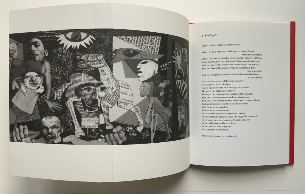
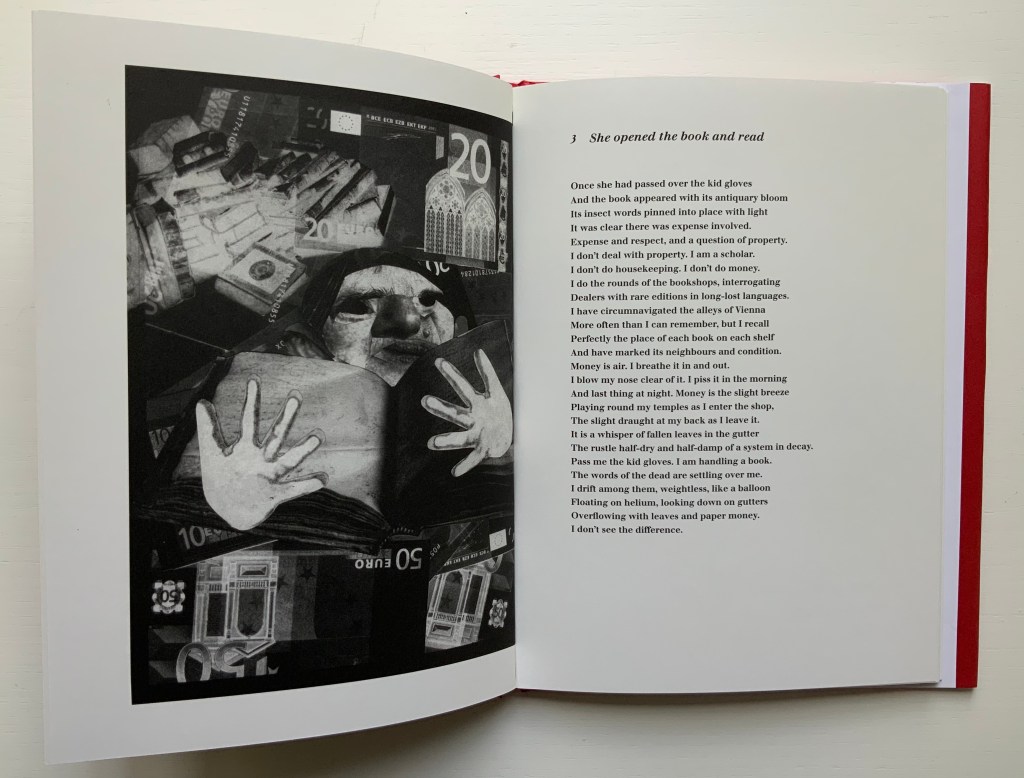
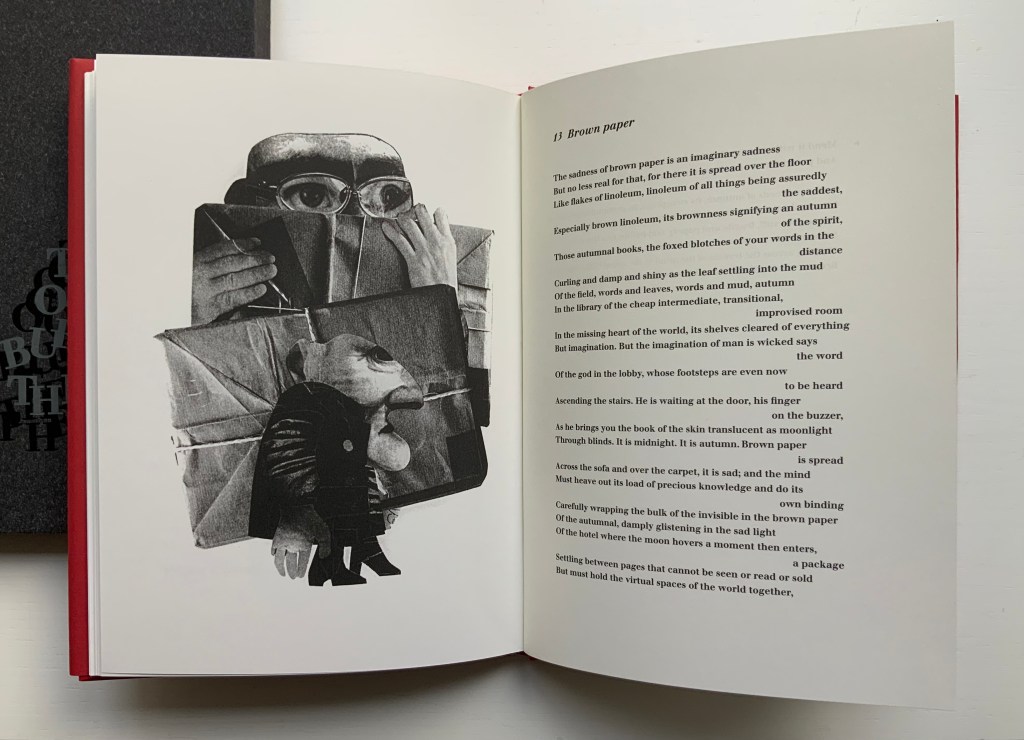
The Burning of the Books(2009) George Szirtes (poems) and Ron King (prints) Slipcase with sewn hardback, duotone letterpress reproduction of the 2008 artist book version. H220 x W160 mm, 66 unnumbered pages. Edition of 1000, the first 100 signed and numbered by the author and artist and presented in a specially designed slipcase. Acquired from the artist, 28 January 2021. Photos of the work: Books On Books Collection.
The Burning of the Books is the harshest of Ron King’s work in the Books On Books Collection. According to the artist, this work’s genesis was his long fascination with Elias Canetti’s Auto da Fe (1946). King commissioned Szirtes to respond to Canetti’s work with a text to accompany the etchings that King had been holding in abeyance. The result in 2008 was a large format artist book, of which this work is a reproduction.
With its photo-collages of a Guernica-like fold-out, newspaper clippings of shamed collaborators, fists and human limbs, The Burning of the Books delivers a visual indictment of the 20th century that creeps into the 21st century with the added images of celebrity police ID photos and Euro currency notes. Szirtes’ take on King’s take on Canetti’s take on his main character’s solipsistic slip from obsession into madness in a world of alienating -isms is the work of art with which we — sadly, more than a decade later — keep catching up.
This work’s fascination with horrors may have its roots in a childhood experience in Brazil — seeing a photograph of a bandit gang’s mass beheading — but, more often than not, King’s works emphasize a humor in blackness (as does this work in its recurrent image of Mr. Punch-like figures). Most often, though, a sheer joy of making and material prevails.
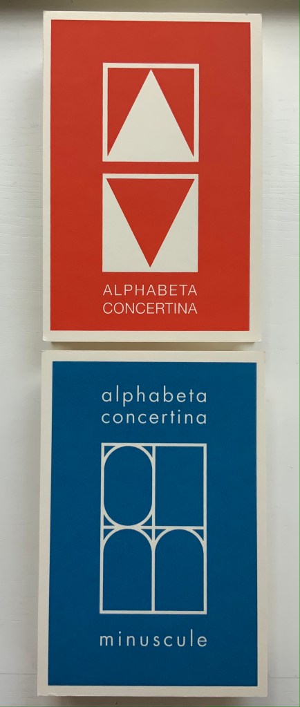
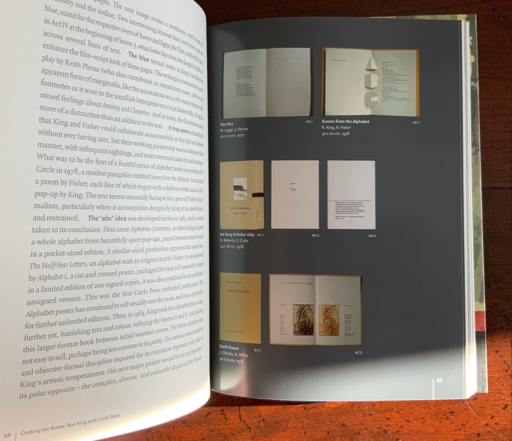
Alphabeta Concertina and alphabeta concertina (2007)
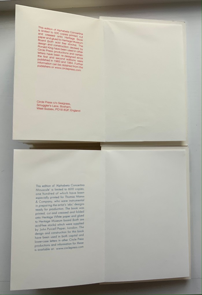
Alphabeta Concertina and alphabeta concertina miniscule (2007) Ron King Printed, cut and creased onto Heritage paper and glued to Heritage Museum board. H170 x W110 x D30 mm,stretching to 3 meters. Edition of 600. Majuscule acquired from the artist, 24 July 2021; miniscule acquired from Sophie Schneideman Rare Books and Prints, 27 November 2020. Photos: Books On Books Collection.
The “abc” series displays the restrained, minimalist side of King’s inventiveness. With more than one of these works to hand, his enjoyment and humor come through — especially in the subtle and not-so-subtle variations. Take alphabeta concertina miniscule as an example. It arrived like a long awaited chuckle after the majuscule version — Alphabeta Concertina (1983) — which had been expanded into the poster versions Alphabet I and Alphabet II (below). Size and surprise seem to matter in King’s sense of humor. For size, see the large-scale steel version of the alphabet in 2016. For surprise, consider his catalogue raisonné Cooking the Books or this set of paperweights.
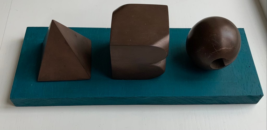
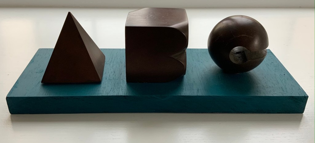
ABC[nd] Ron King Resin sculptures on painted wooden board Acquired from the artist, 24 July 2021. Photos: Books On Books Collection.
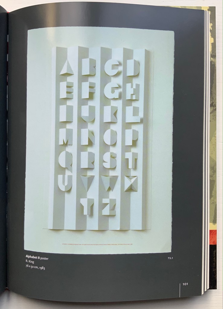
Further down are Alphabet II (1999) and The White Alphabet (1984). Compare their uppercase letter C with that above to see how King developed his sculpting over time.
Cooking the Books (2002)
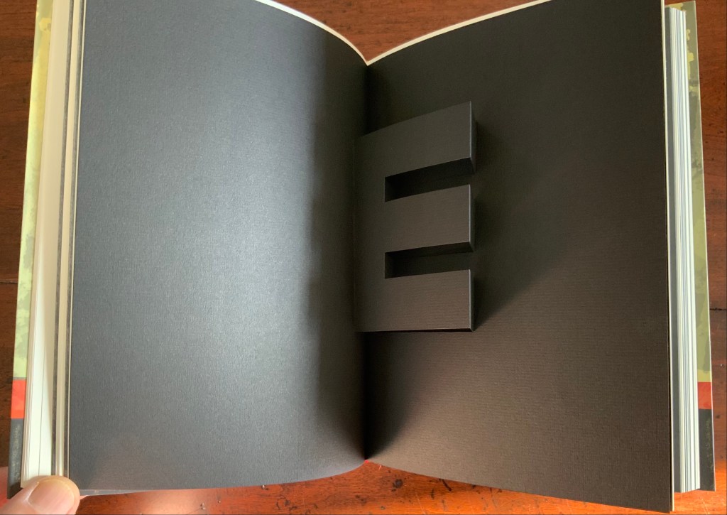
Cooking the Books: Ron King and the Circle Press (2002) Ron King, Andrew Lambirth Paperback with end flaps, sewn with headbands. Pop-up and metallic paper inserts. H225 x W165 x D20 mm, 180 pages. Acquired from the artist, 24 December 2020. Photo: Books On Books Collection.
King’s catalogue raisonné does not merely illustrate his work, it illustrates it. Inserts of mirror paper, wax paper and a pop-up letter E transform what appears to be a simple codex into a treasure chest.
Alphabet II (1999)
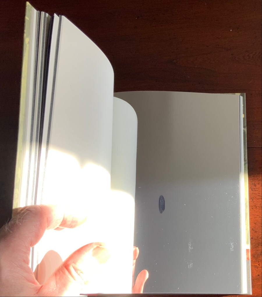
Alphabet II (1999) Ron King Pop-up poster. H760 x W500 mm. The letters have been cut onto a 190lb Waterford paper and mounted onto a heavier version of the same stock. Edition of 200 signed. Acquired from Circle Press, 26 June 2015. Photo of Cooking the Books, p. 101: Books On Books Collection.
The collection’s framed poster interferes with photography, but Cooking the Books provides the alternative.
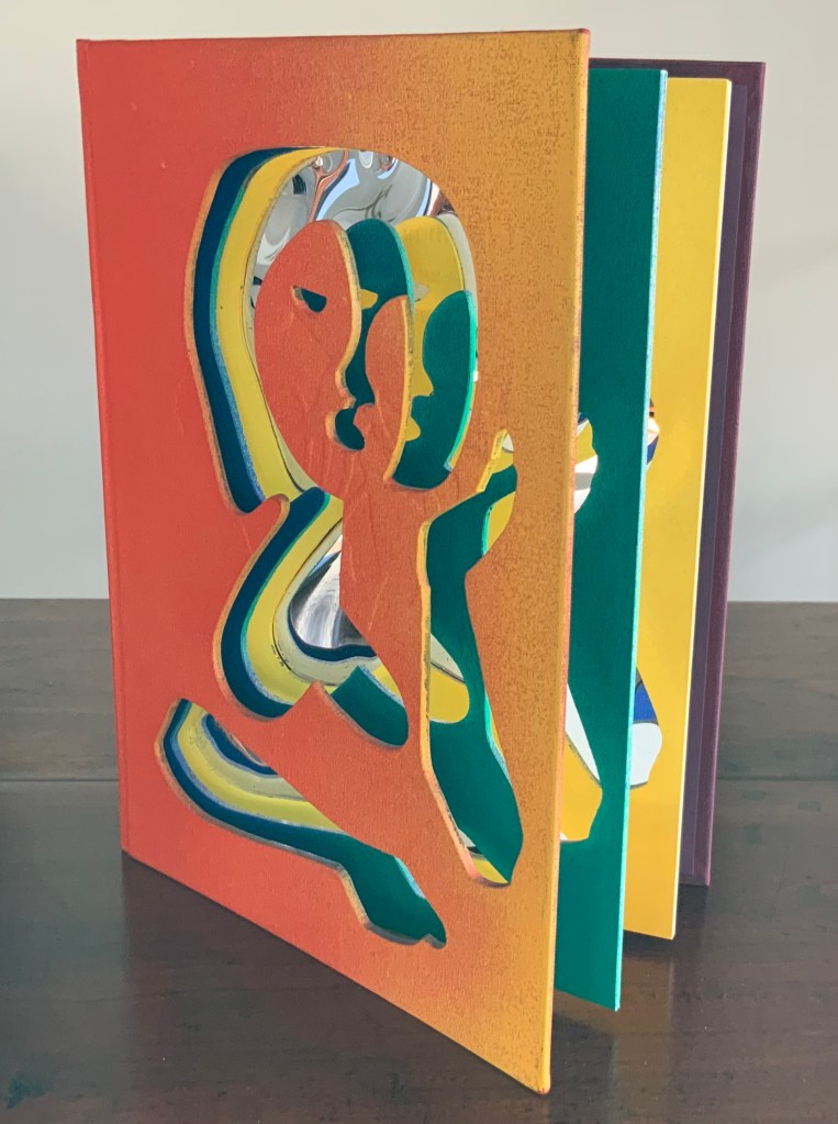
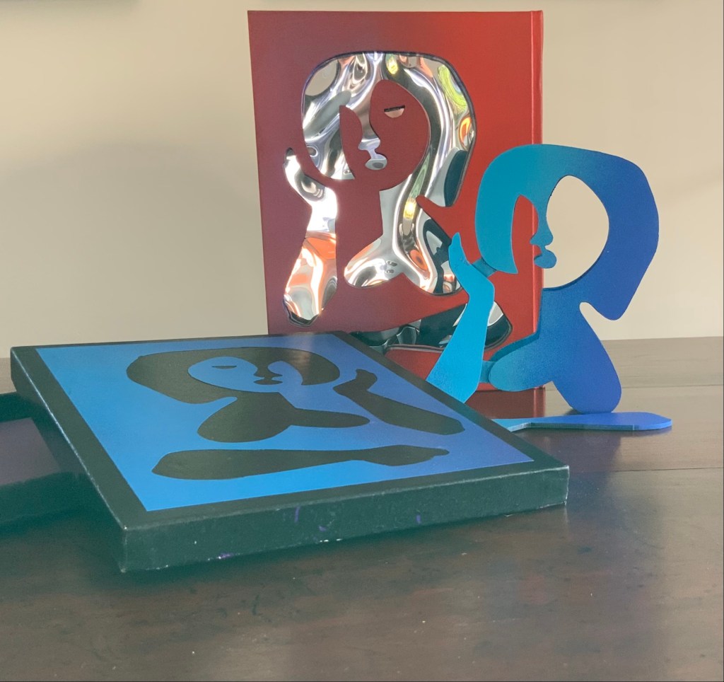
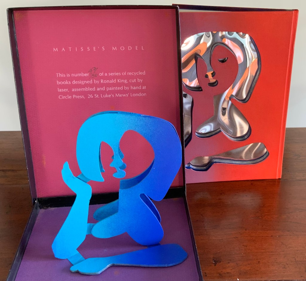
Matisse’s Model (1996)
Matisse’s Model (1996) Ron King An edition of 50 signed book-works made by the same process as Acrobats. 23 x 17 cm with mirror-foil, sprayed pages, and a removable freestanding figure in collaged cardboard box. Photos: Books On Books Collection.
The sculptural element toward which King’s work has always turned is on display in the title and forms of Matisse’s Model. The mirror paper appears as it must for any attractive model.
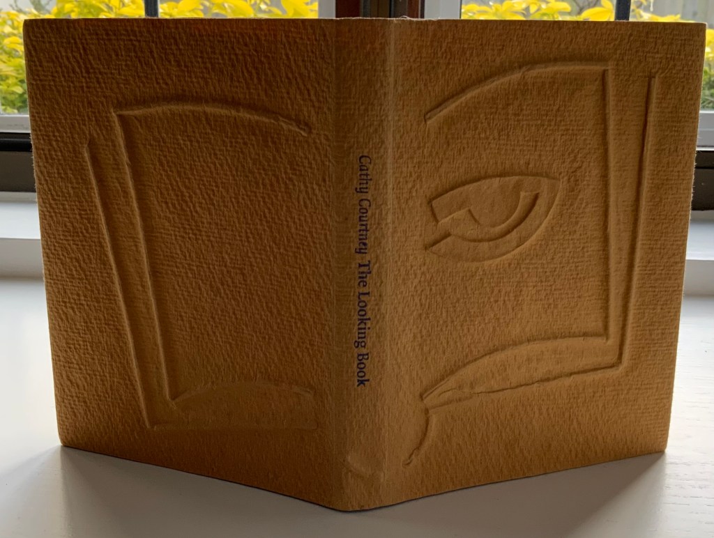
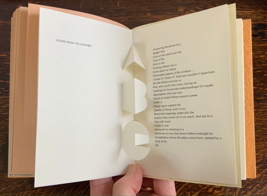
The Looking Book (1996)
The Looking Book: A Pocket History of Circle Press, 1967-96 (1996) Cathy Courtney Casebound in wire print paper. H160 x W120 xD20 mm Edition of 1000, of which this #67 and initialled by Ron King. Acquired from Peter J. Hadley Bookseller ABA ILAB, 25 June 2015. Photos: Books On Books Collection
Pop-up insert of “Scenes from the Alphabet” by Roy Fisher. Photo: Books On Books Collection.
As with Cooking the Books, this catalogue raisonné, prepared by Cathy Courtney, provides samples of the artist’s work. They appear in the wire debossed cover and this centrepiece of “Scenes from the Alphabet” done with Roy Fisher, which led to a full-scale alphabet book at Fisher’s suggestion.
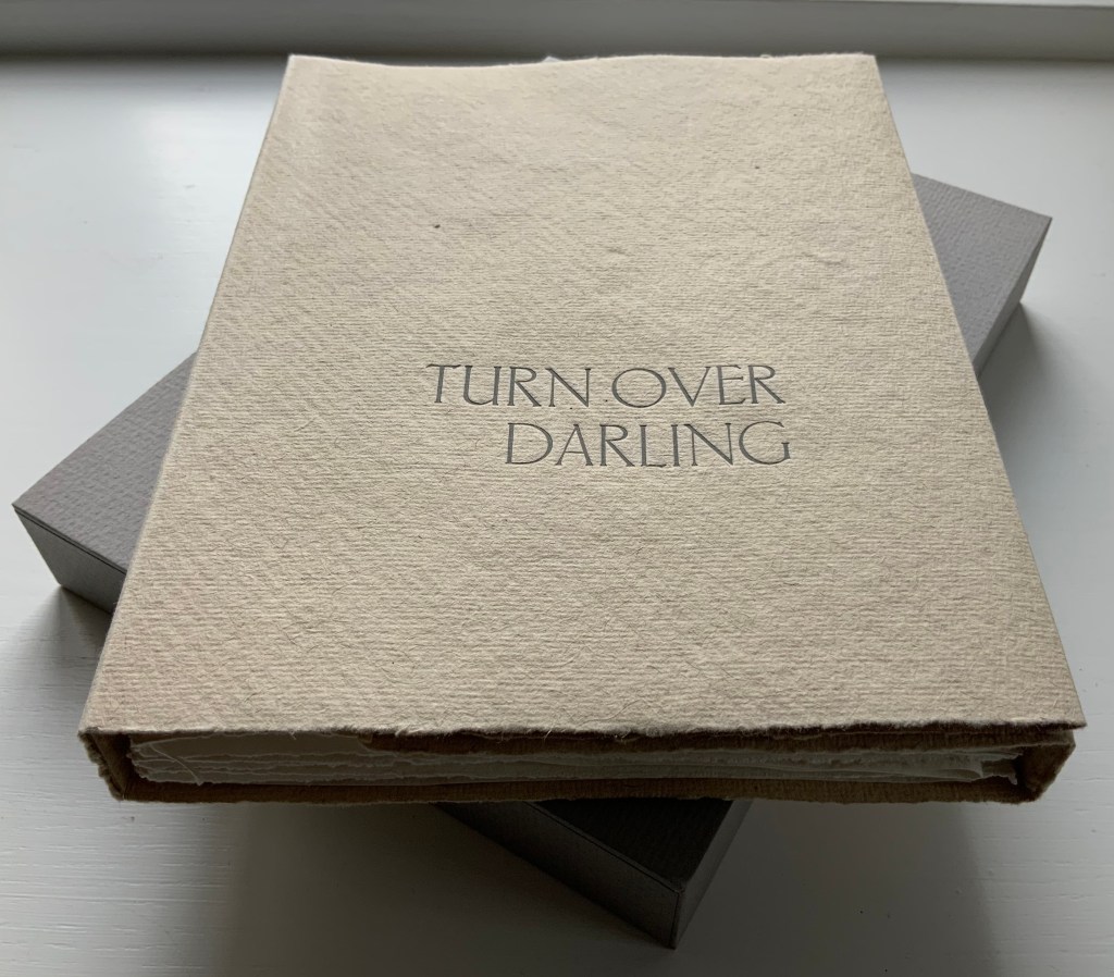
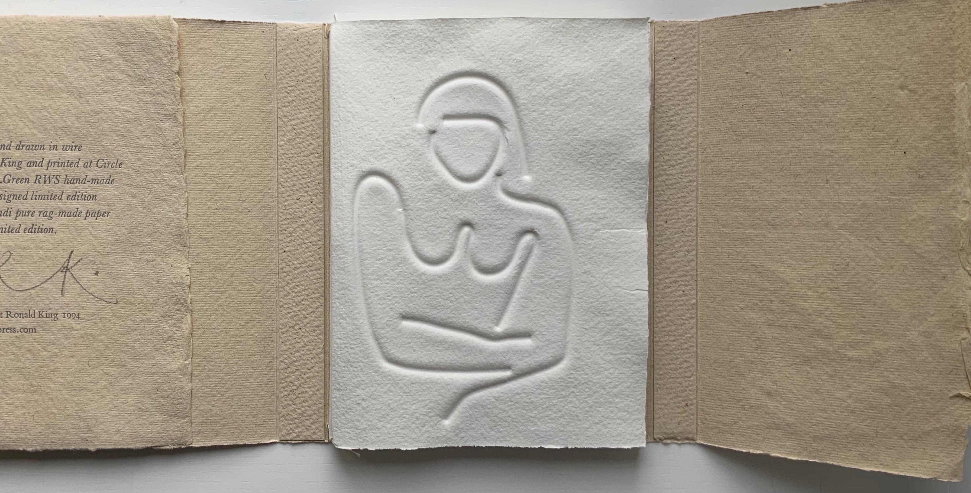
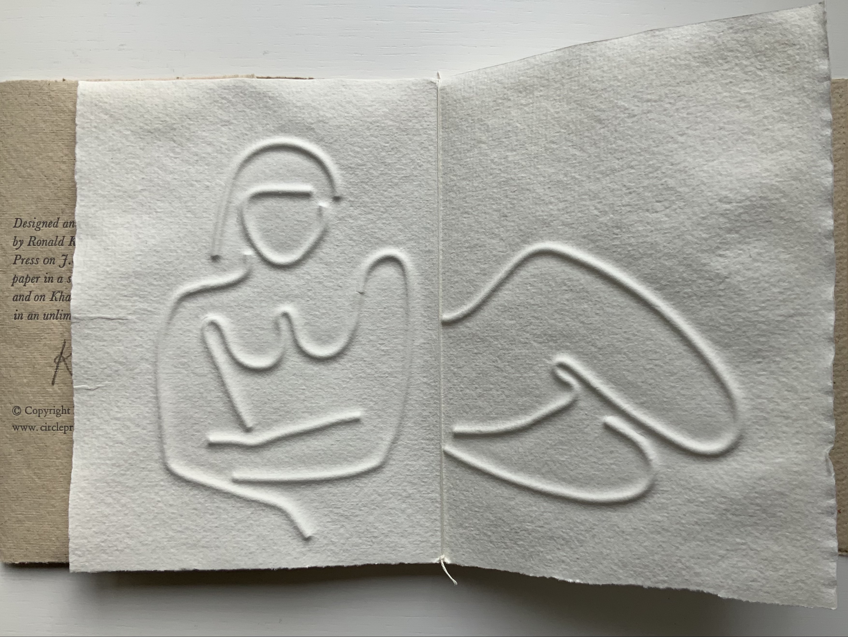
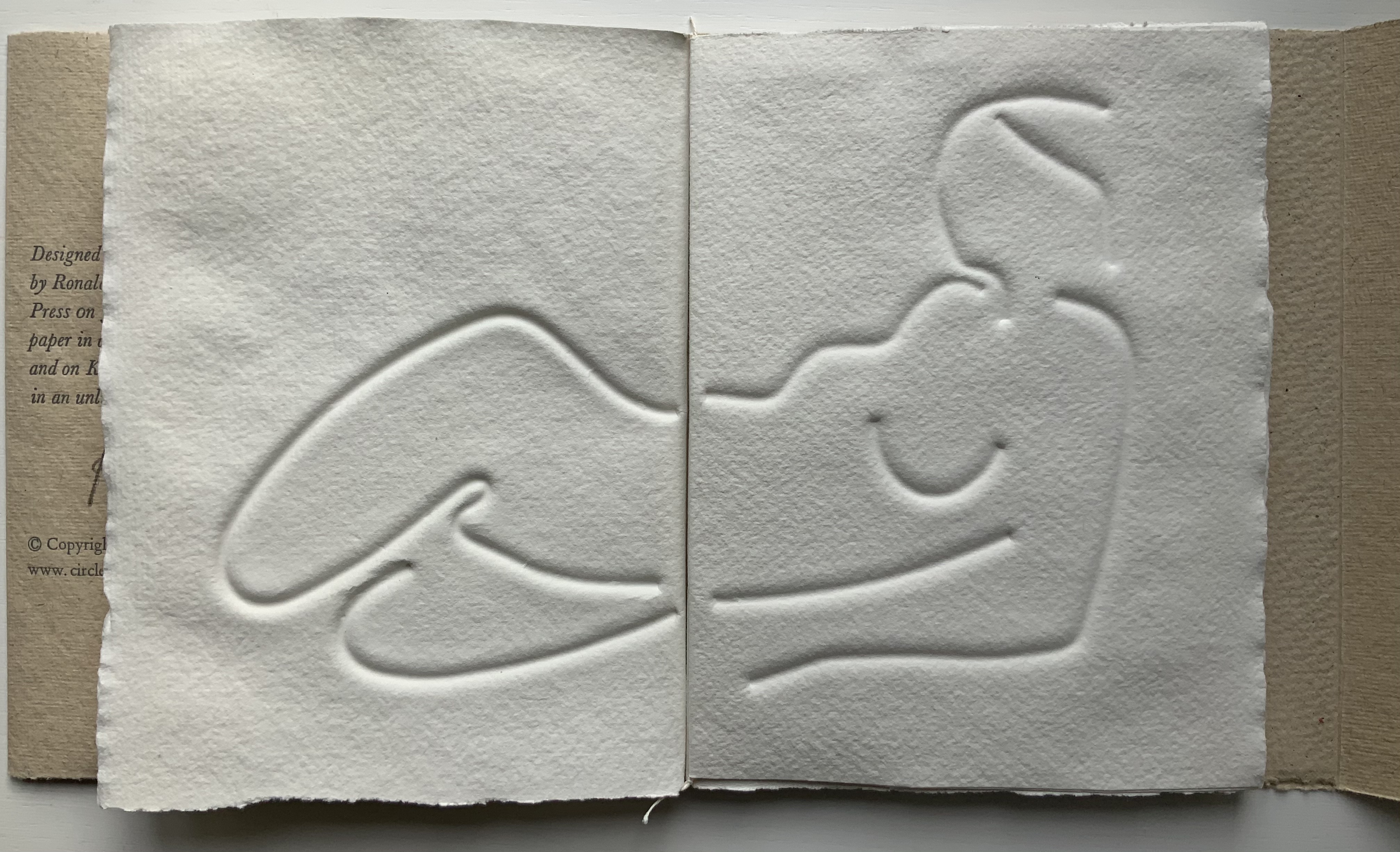
Turn Over Darling (1994)
Turn Over Darling (1994) Ron King Slipcase (H204 x W153 x D28 mm) containing a light brown paper portfolio (H195 x W150 x D24) into which are hand-sewn six sheets (H190 x W282) of J. Green RWS hand-made paper, folded in half, bearing embossed and debossed images of a female figure. A signed copy from the limited edition of 75. Acquired from the artist, 1 December 2020. Photos: Books On Books Collection, displayed with artist’s permission.
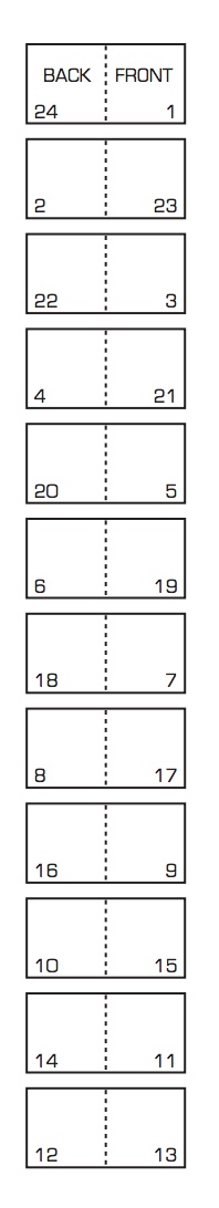
The six embossed and debossed drawings were created from wire forms pressed into dampened sheets of paper. Turn Over Darling elegantly combines King’s sculptural skills with his printer’s skills. When folded and juxtaposed in sequence, they make for eleven reclining female nude images that change position from front to back view as the pages turn. Determining the folds and sequence is a form of imposition, although quite different from the usual imposition for a single sheet with twelve pages on either side as shown below. Again, here is a work that evokes a joy in the material and in its handling.
JBG 1984 watermark in J. Green RWS paper
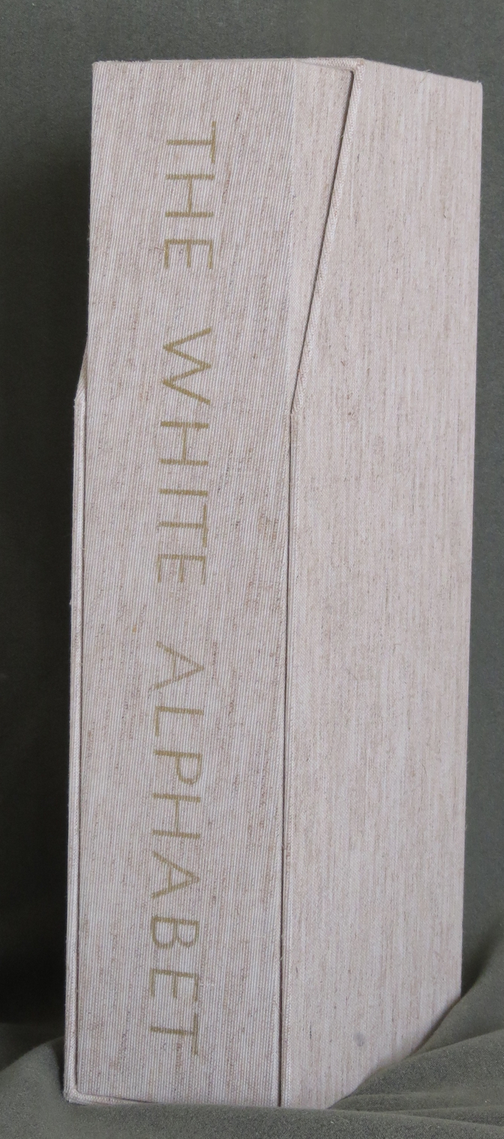
The White Alphabet (1984)
The White Alphabet (1984) Ron King Box made of two slipcases, one inside the other. Gilt lettering on spine of inner slipcase. Back-to-back leporellos with wooden front and back covers. Outer slipcase: H305 x W140 x D70 mm. Leoprello: H290 x W135 mm. Edition of 150, of which this is #99. Acquired from Veatch’s, 11 June 2021. Photos: Books On Books Collection.
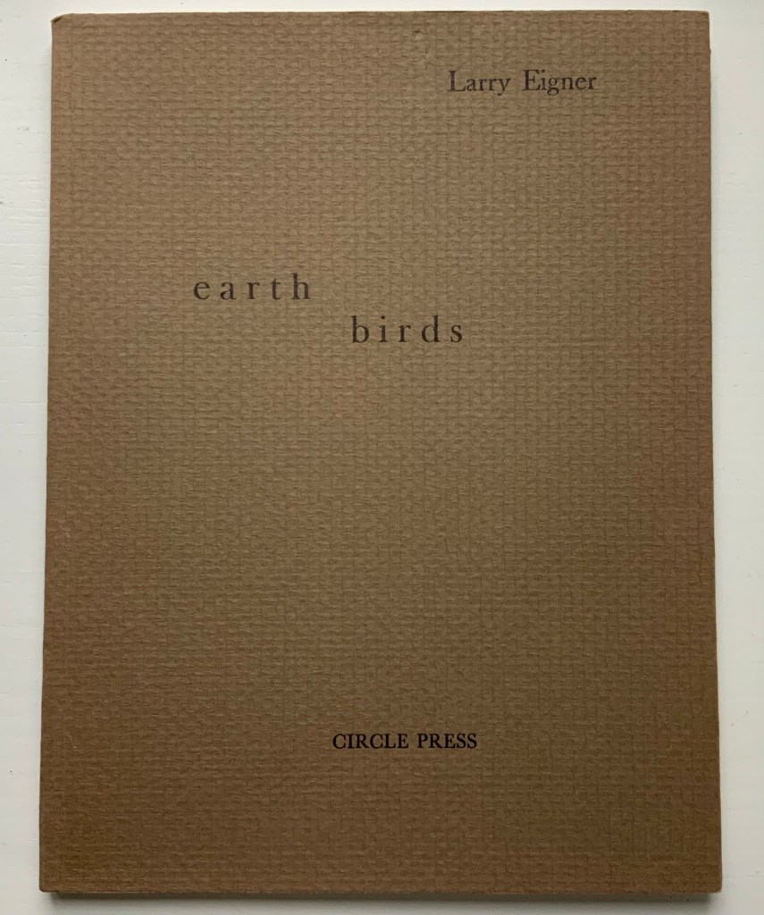
Earth Birds (1981)
Earth Birds: forty six poems written between May 1964 and June 1972 (1981) Larry Eigner (poems) and Ron King (plates) Fifty hard-bound copies, I-L, printed on pure rag-made paper with six plates printed blind intaglio and one hundred and fifty copies, 51-200, printed on Glastonbury Book stock with the same plates printed relief, in one color. Photos: Books On Books Collection.
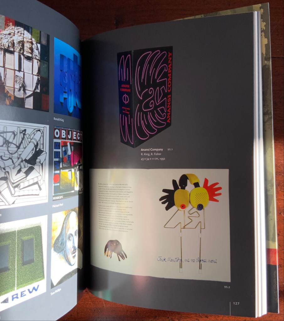
As with George Szirtes, King has collaborated more than once with Larry Eigner. Looks like nothing, the shadow through air (1972) was the earlier joint effort. Compared to Earth Birds, later works like The Burning of the Books (2008) and Anansi Company(1992) with Roy Fisher show King’s development toward more deeply collaborative efforts.
Earth Birds does recall the wide range of similar works by others at Circle Press that King made possible: Hadrian’s Dream (1990) by Asa Benveniste and Ken Campbell and Machines (1986) by Michael Donaghy and Barbara Tetenbaum.
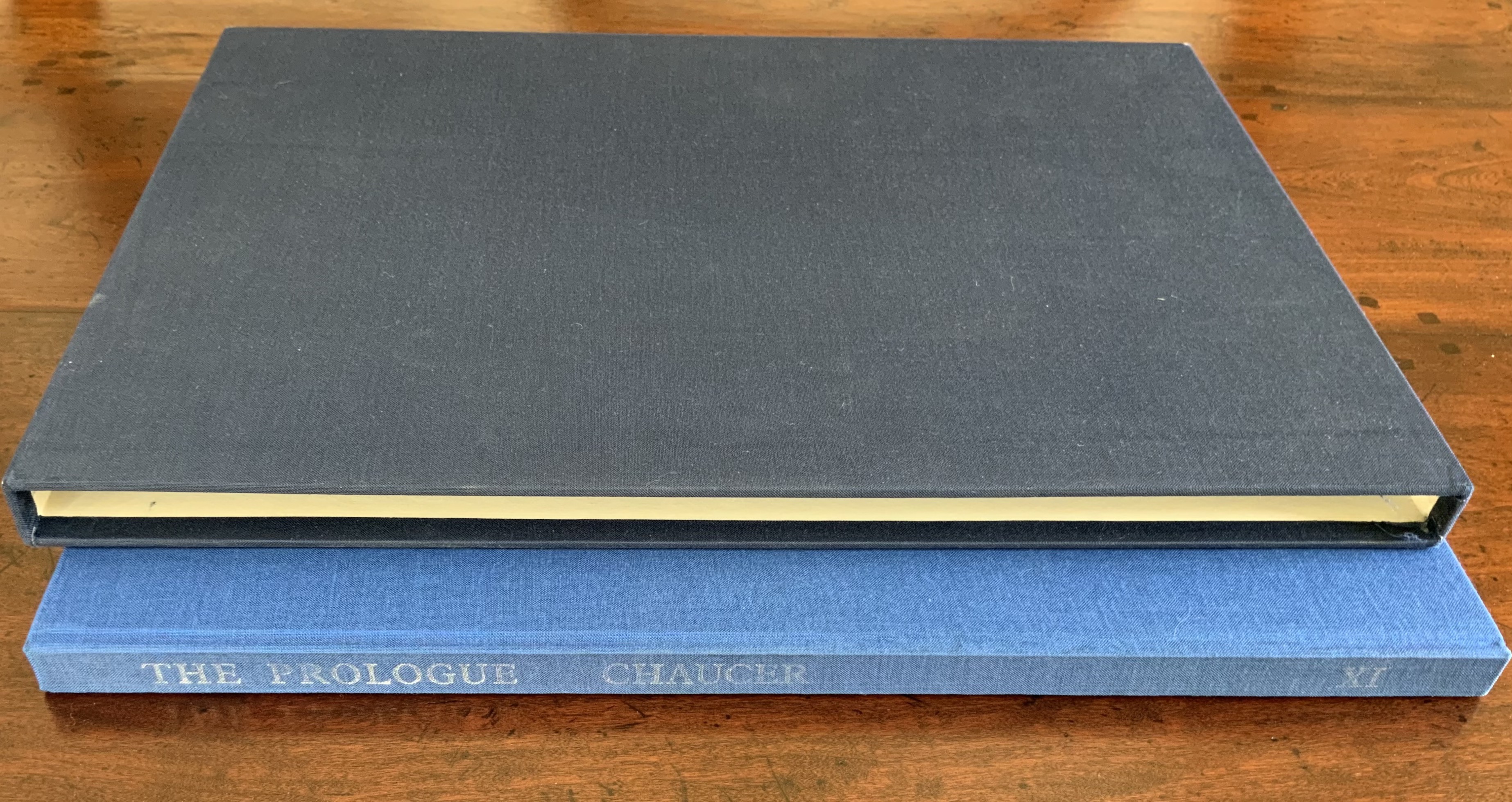
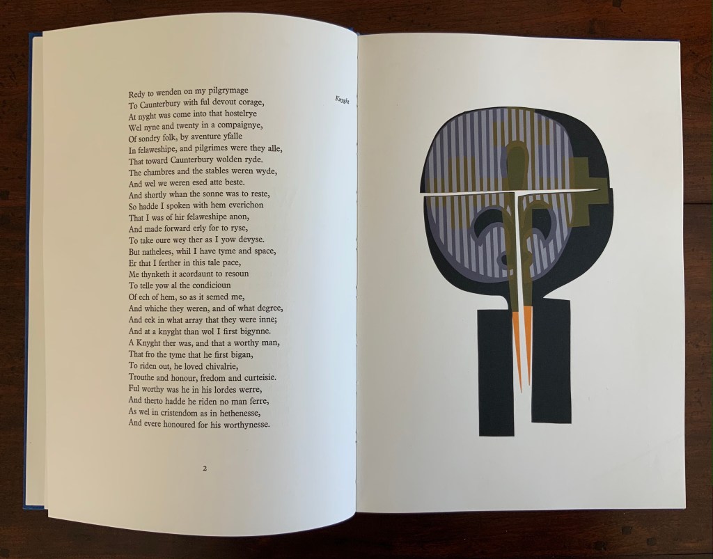
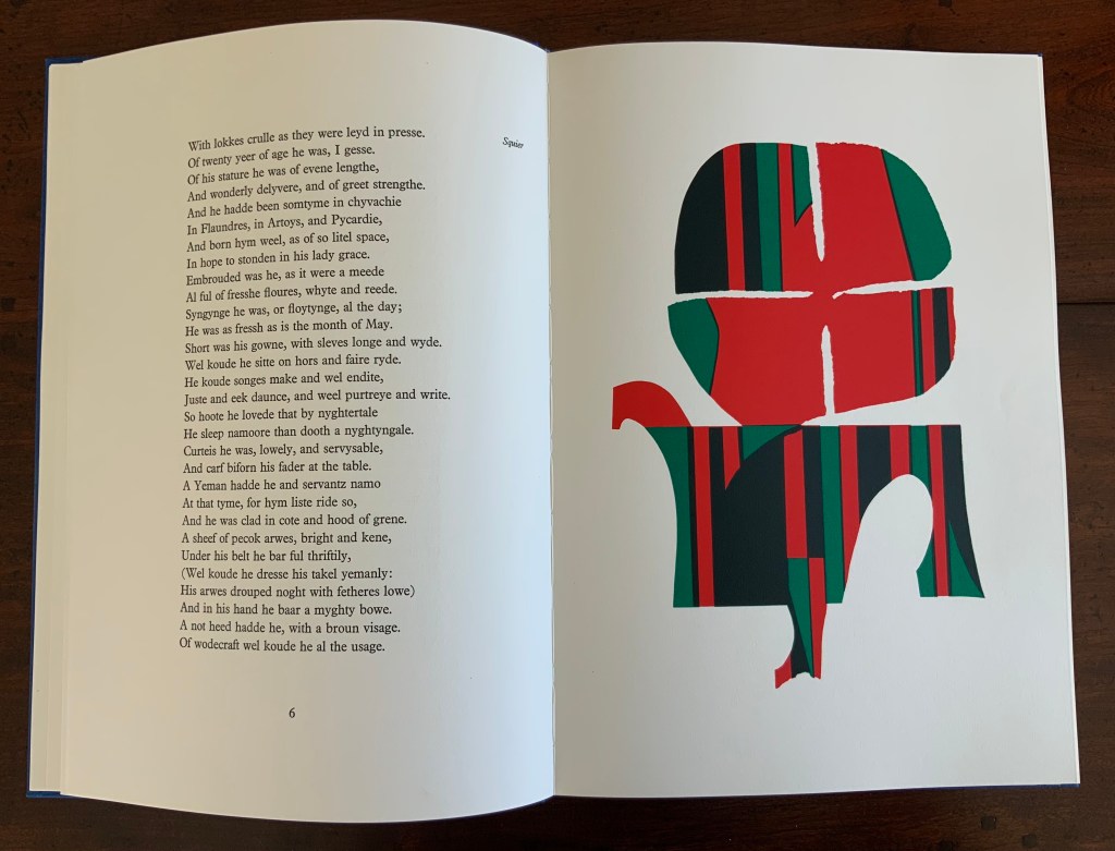
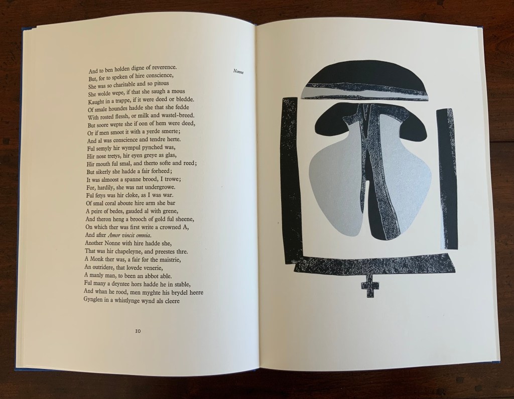
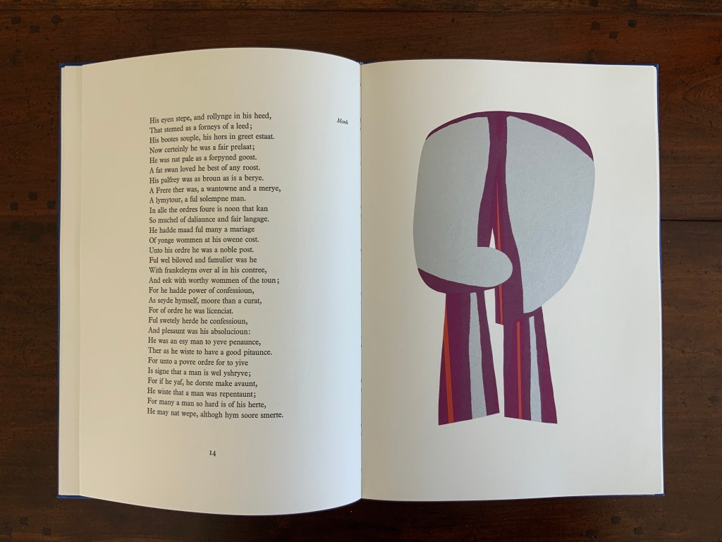
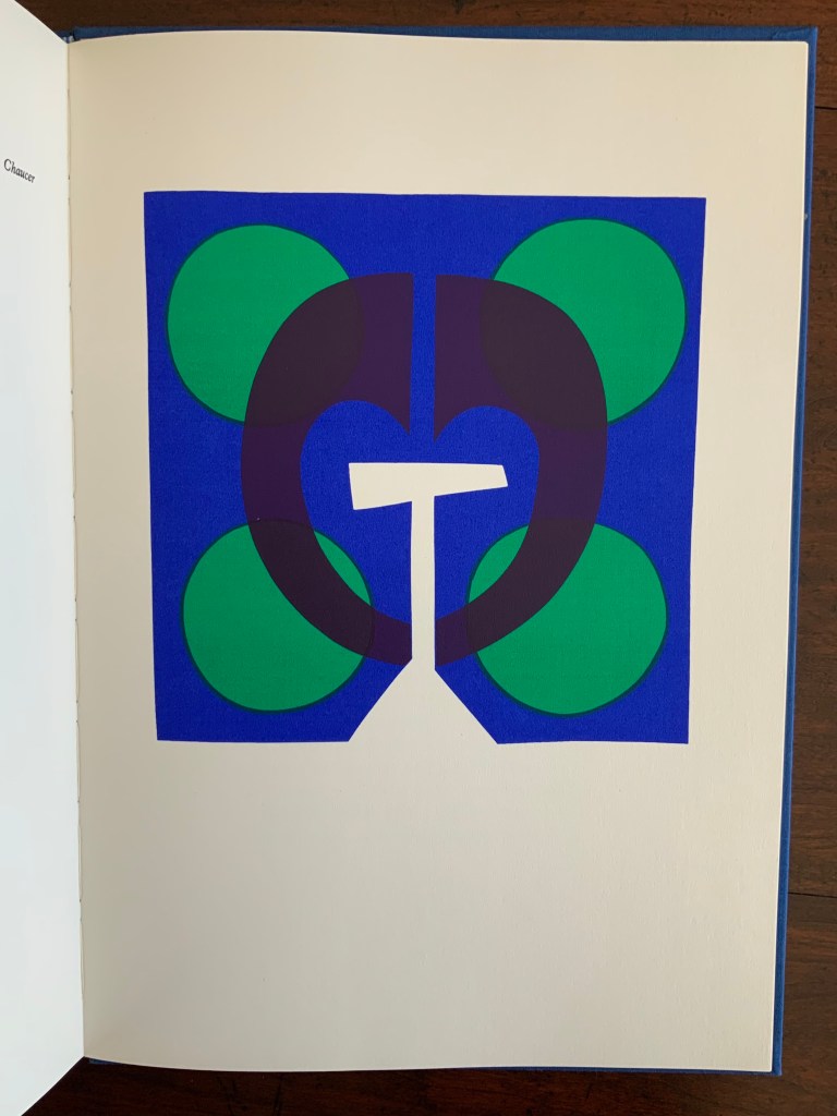
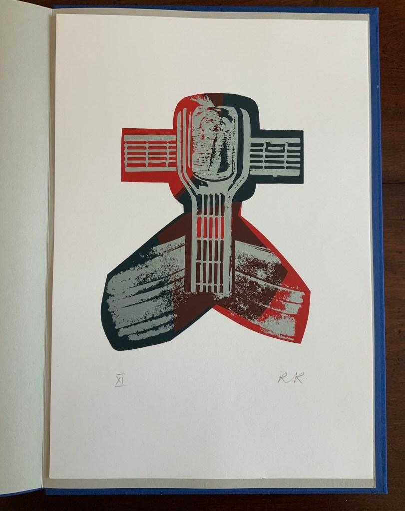
Chaucer’s The Prologue, 2nd Edition (1978)
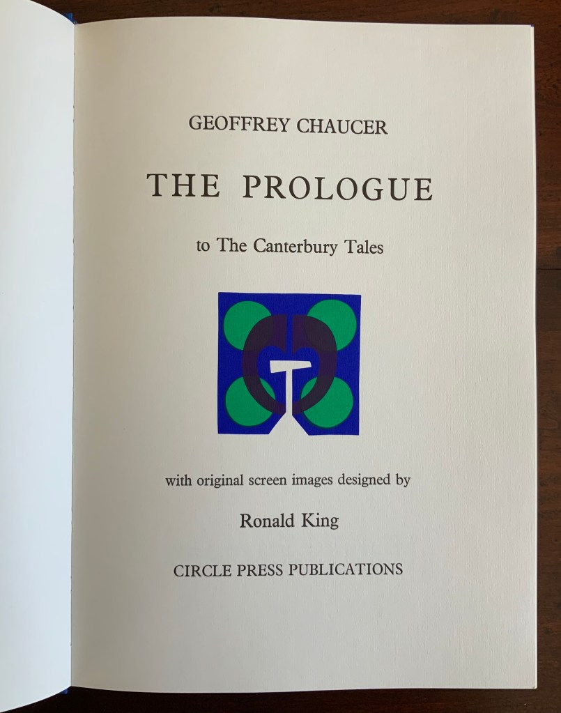
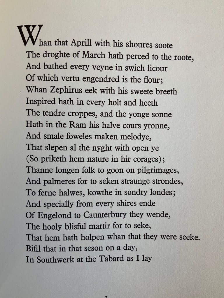
Chaucer’s The Prologue, 2nd Edition (1978) Ron King Casebound sewn, letterpress printed on 190 gsm Queen Anne Antique White. Hand-set in Monotype Plantin series 110. H405 x W281 mm, 72 pages. Edition of twenty separate versions I-XX each of 250 copies, of which this is XI, #131, and includes a folder of Buckler Light Grey Plain with a poem by Roy Fisher and screen-print on 190 gsm Bockingfordby Ron King entitled “Webbe”. Acquired from private seller, 27 February 2021. Photos of work: Books On Books Collection. Displayed with permission of artist.
King originally prepared The Prologue for Editions Electo in 1966, then published a limited edition of 125 copies in 1967 under the Circle Press imprint. In this collection, the work represents King’s straightforward fine press work and a successful livre d’artiste. The screenprints of Chaucer’s characters and Chaucer himself are based on African and Brazilian masks as well as heraldic symbols. King’s inspiration to match these richly colored masks to the personae captures the pageantry and individuals within the social hierarchy of Chaucer’s Canterbury Tales. Opening this oversized fine press edition, turning its stiff, creamy pages with their 18 pt Plantin type and confronting these human-sized masks are reminders of the monumentality that this human-scale work of literature has achieved.
Knight and Squire masks
Nun and Monk masks
Chaucer’s mask and King’s original print “Webbe”
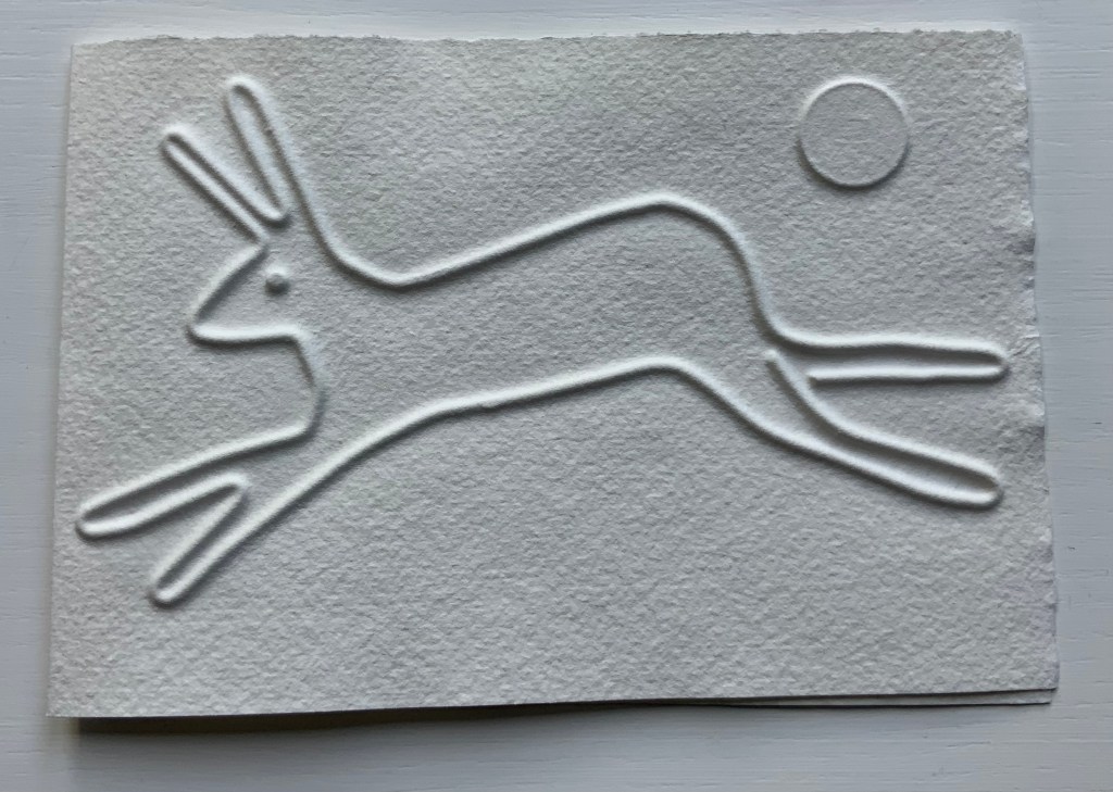
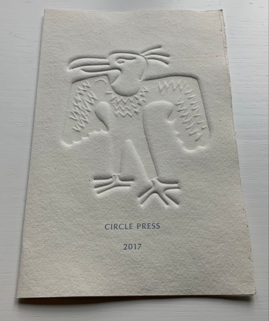
Ephemera
Almost always, small gifts of ephemera arrive with purchases from the Ron King Studio. They illustrate how King marshals his artistry even in marketing his art and that of those he has published.
Hare (single-fold card, H125 x W180 mm), blind-embossed. 2021.
Announcement (single-fold card, H216 x W140 mm) with blind embossed image of a fulmar. Describes artist book Sednar and the Fulmar with Richard Price’s poems. 2017.
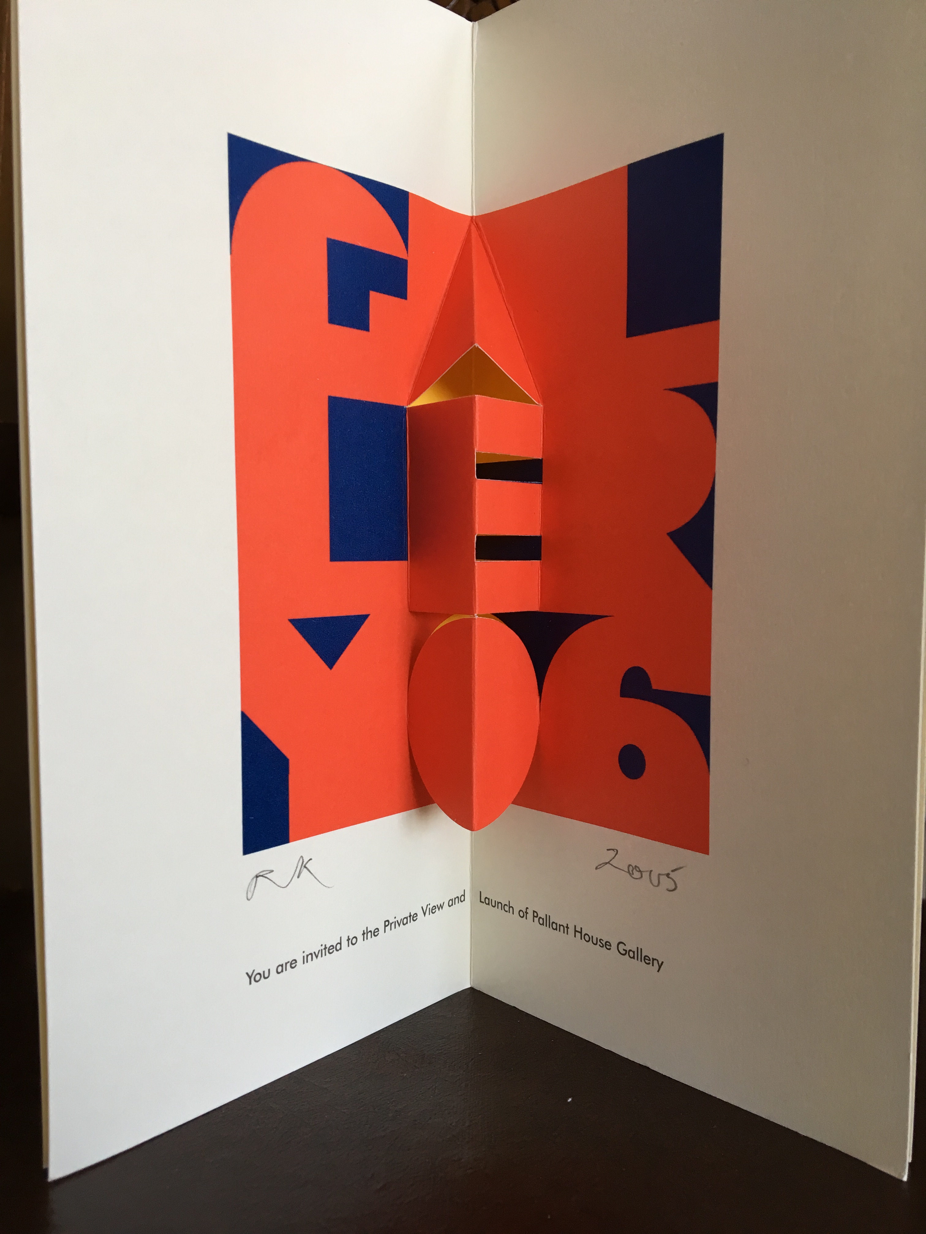
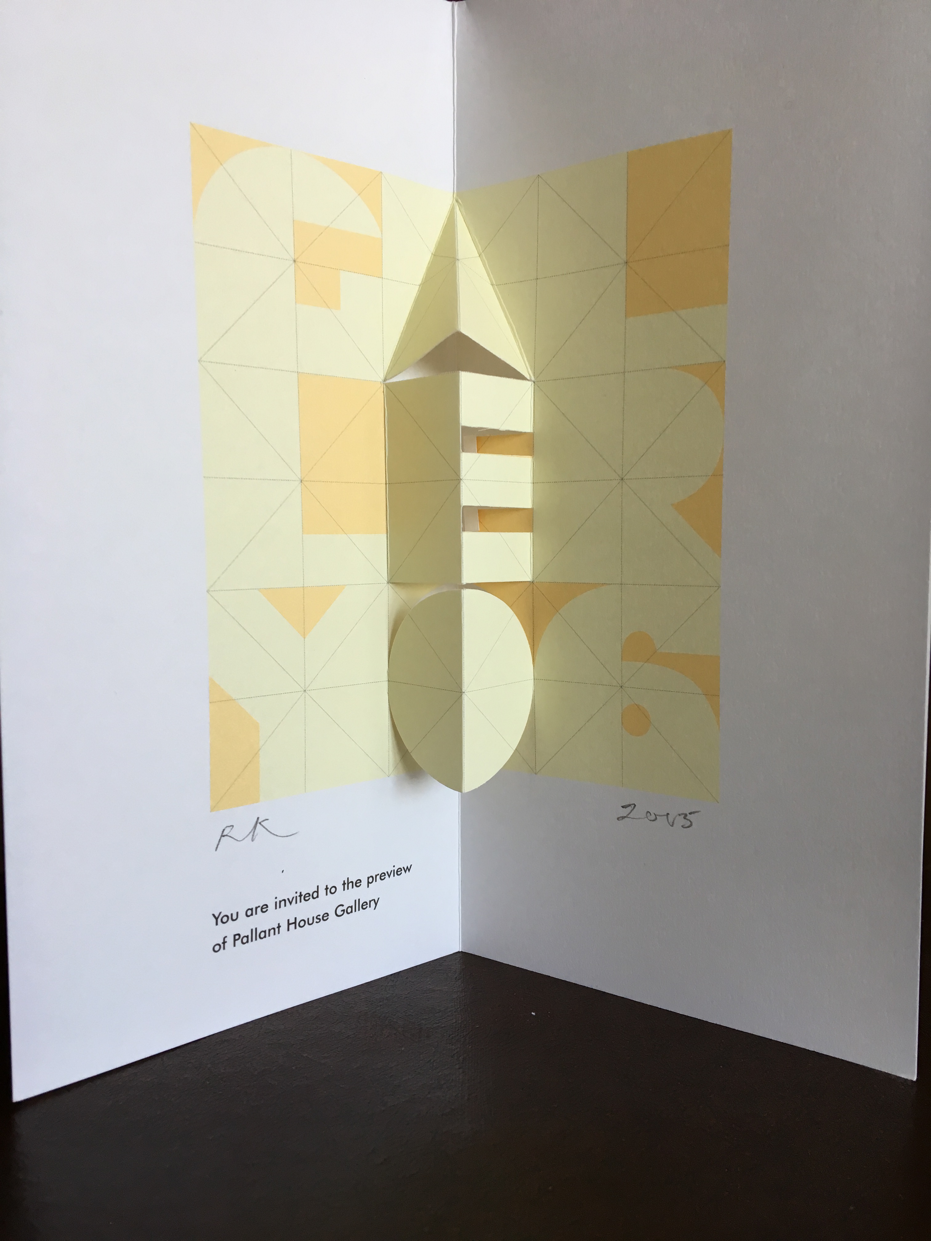
Invitations (four-fold pop-up cards) to Pallant House Gallery opening preview. 2005.
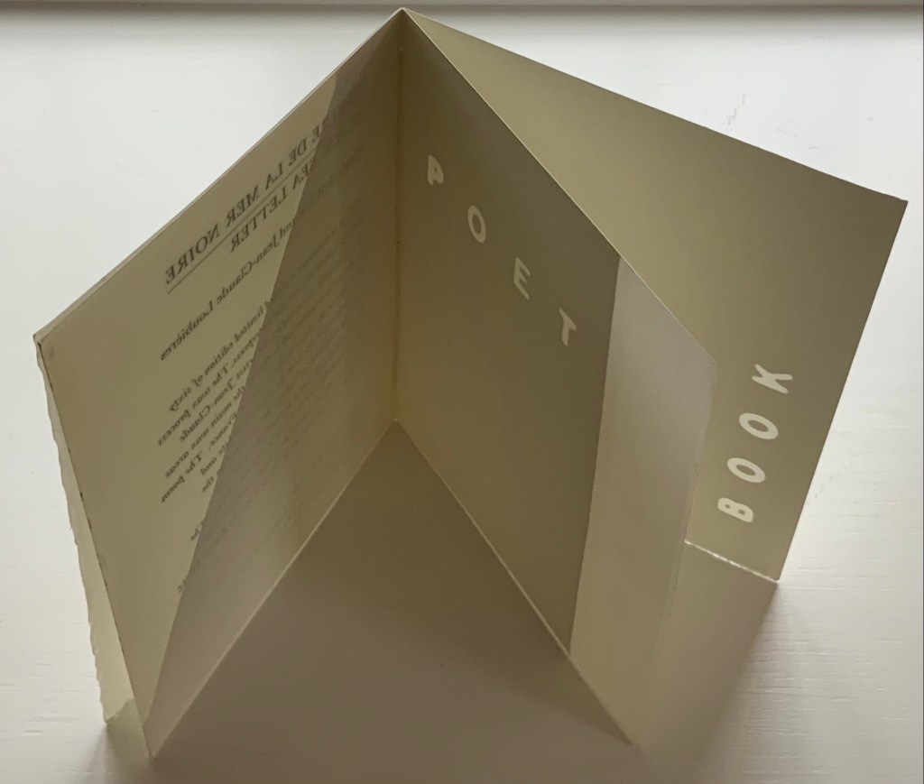
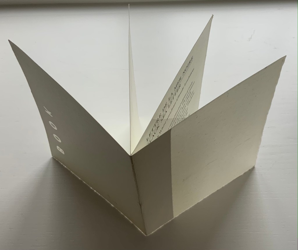
Announcement (wax and paper pamphlet, H174 x W134 mm) of Lettre de la Mer Noire/Black Sea Letter by Kenneth White (poem) and Jean-Claude Loubières (images and wax dipping). 1997.
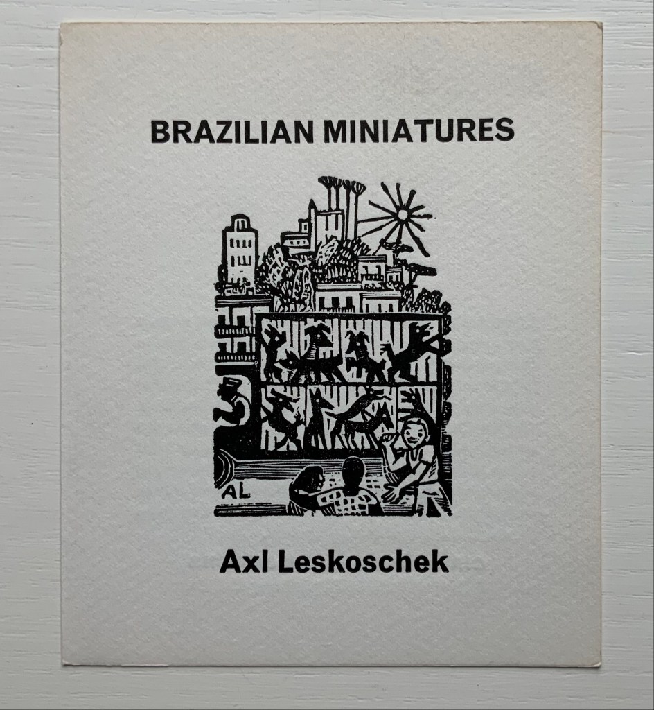
Announcement (card, line block reproduction, H150 x W125 mm) of the 200 portfolios of fifty-one woodcut designs reproduced from the only remaining proofs of Brazilian Miniatures, an unpublished book with a bilingual introduction; printed in two versions. 1973?
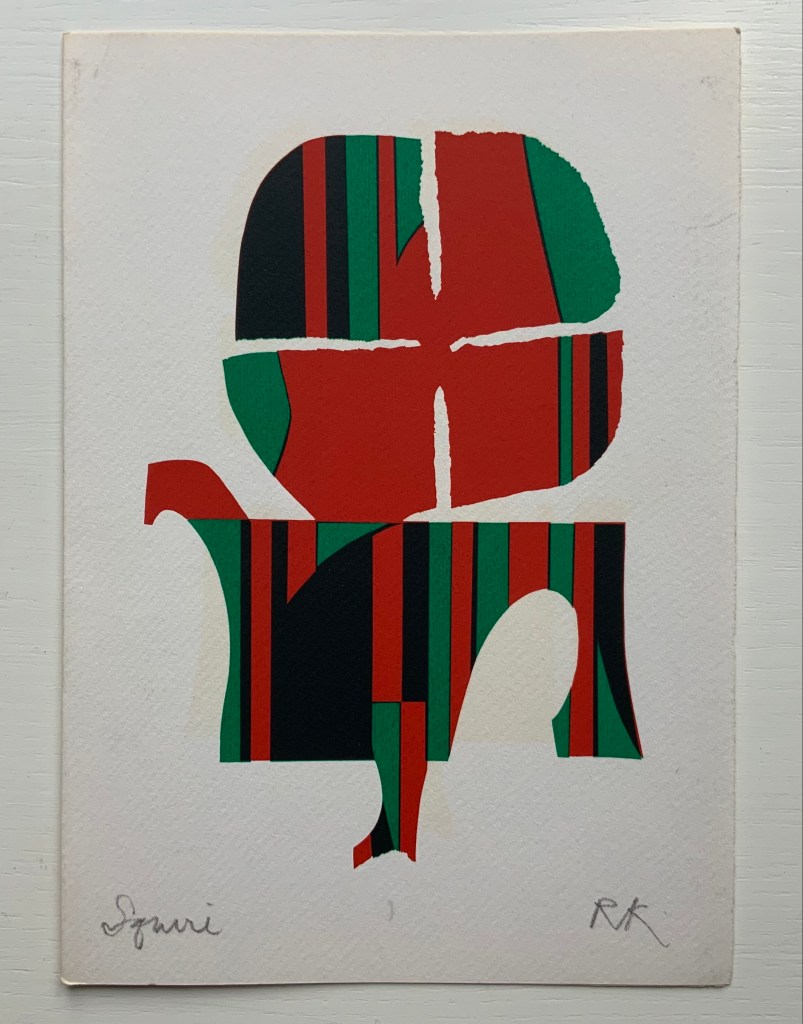
“Squire” (single-fold card, H235 x W165 mm) with hand-printed serigraph from Chaucer’s “Prologue” to The Canterbury Tales. 1969?
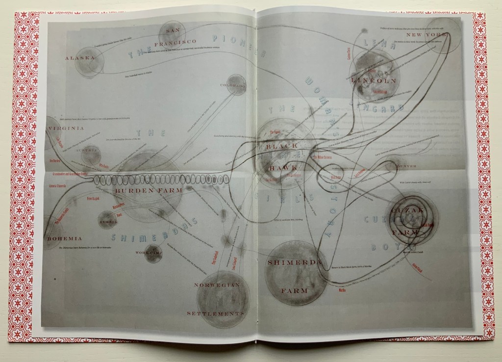
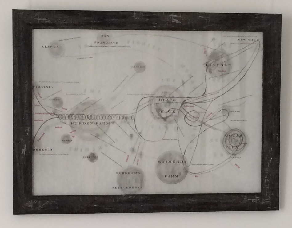
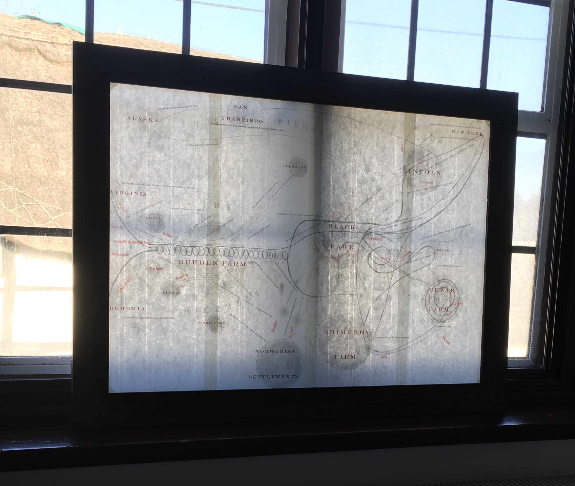
Image of map of My Ántonia reproduced in A Close Read: The Cather Projects (2012) Barbara Tetenbaum and Jennifer Viviano Photos: Books On Books Collection, displayed with permission of the artist.
For the Books On Books Collection, Barbara Tetenbaum’s works have offered a map for exploring the different ways that text, image, structure and material bring about enjoyment and meaning in book art and bookmaking. Broadsides, chapbooks, a codex, a sculpture and, yes, a map have joined the collection over time.
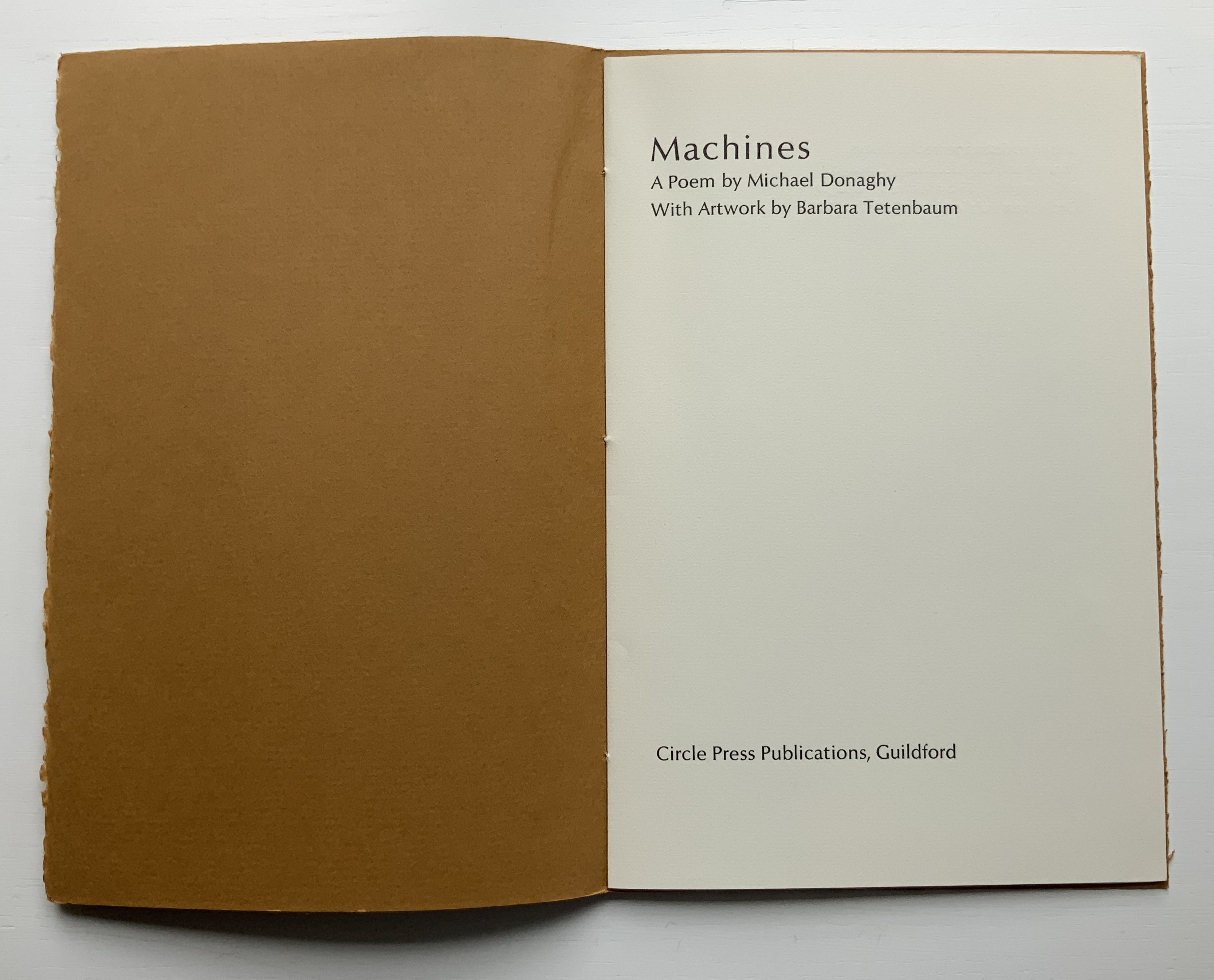
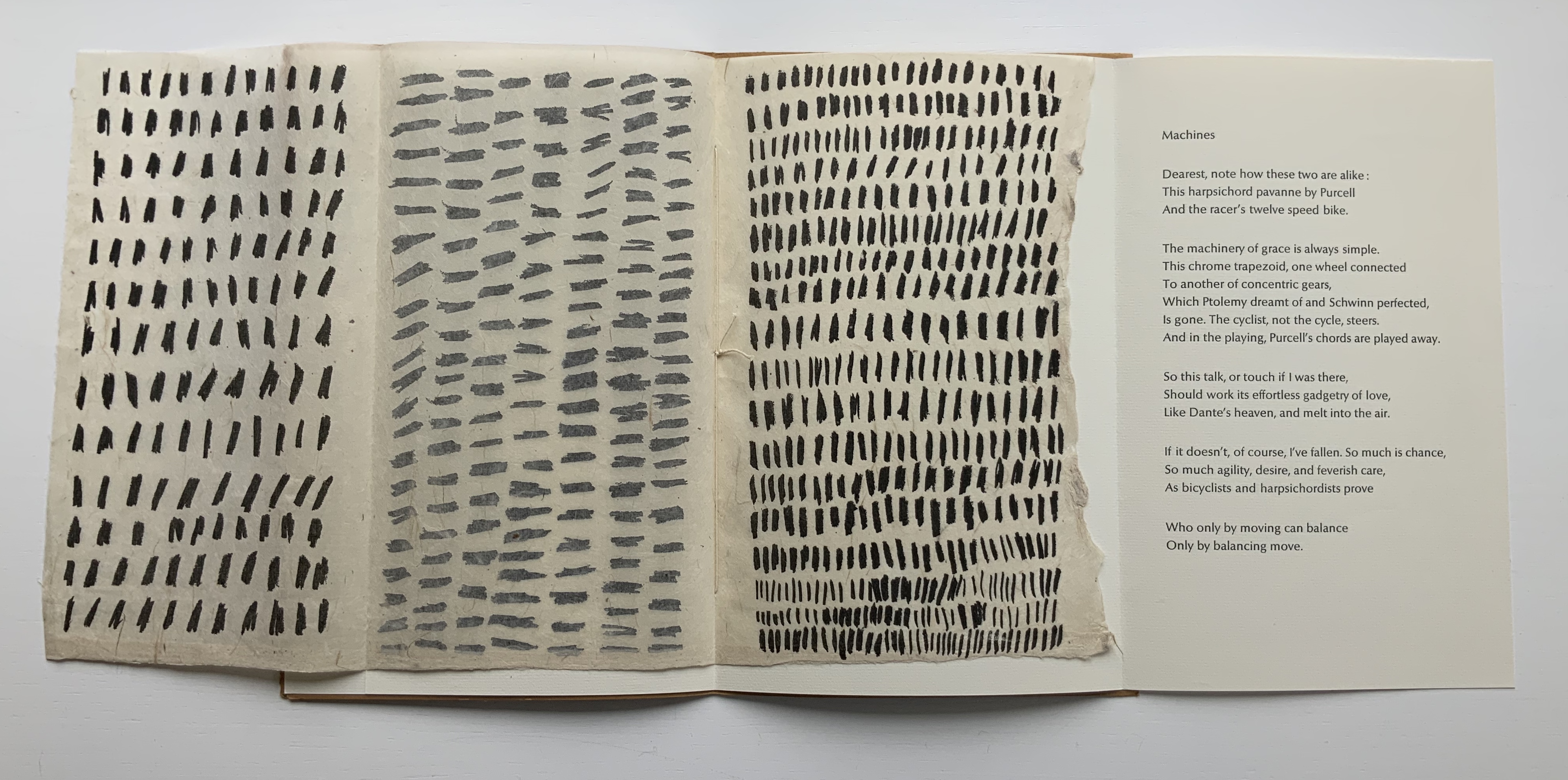
The broadside and chapbook forms seem to be both a rite of passage and a pastime of pleasure for book artists. For Tetenbaum, it has been both of these and a rite of remembrance of friendship. During Tetenbaum’s time at Circle Press, founded and run by UK artist Ron King, she reconnected with Chicago friends poet Michael Donaghy and his wife Maddy Paxman, who had moved earlier to London. Understandably taken with his poetry, she chose his “Machines” when King offered her the chance to set and print anything she liked while King and his wife were away on vacation.
The earliest of Tetenbaum’s work in this collection, the chapbook Machines (1986) pairs Donaghy’s neo-metaphysical poem with the asemic markings that Tetenbaum had begun to pursue as a technique in 1985. Taken on their own, the markings do not call to mind any particular image or metaphor in the poem. Considered more closely as a physical response to the poem, though, they do share in the poem’s building rhythm and density (see further commentary here).
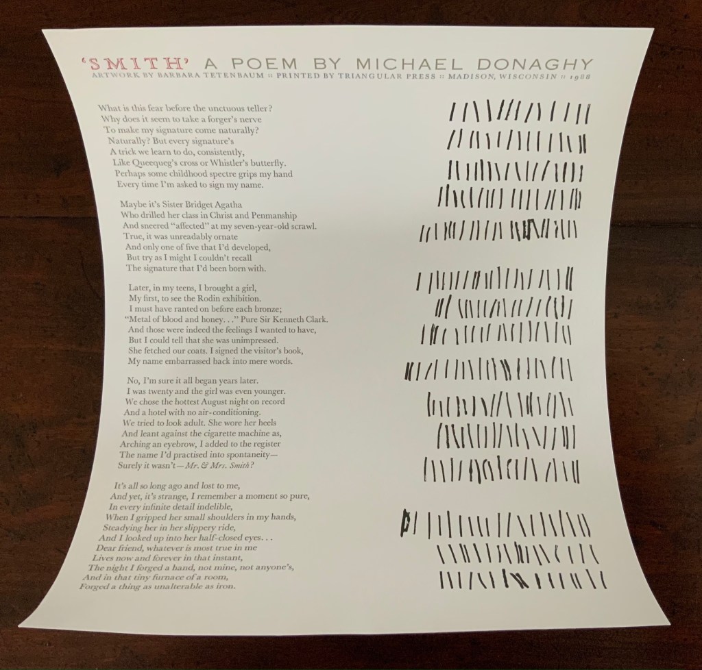
Back in the US, the artist continued with the marks and Donaghy’s words. The broadside below was the result. This time, technique, form and subject cannot avoid similarity — like a reflection in a mirror. ‘Smith’ has a regularity but looseness often found in Donaghy’s poems, something essential to their charm. The iambic pentameter is not always iambic or ten-syllabled, and the length of stanzas vary. Flush right to Donaghy’s flush left, Tetenbaum’s lines of marking mirror the poem’s ragged right and variable counts — but not precisely.
A love poem that takes off from the act of trying to remember forging a name in a hotel register for an assignation that forged something true and lasting, ‘Smith’ is about making one’s mark as artist and responding, intimately, one human to another. To transfer her marks made in response to the poem, Tetenbaum used
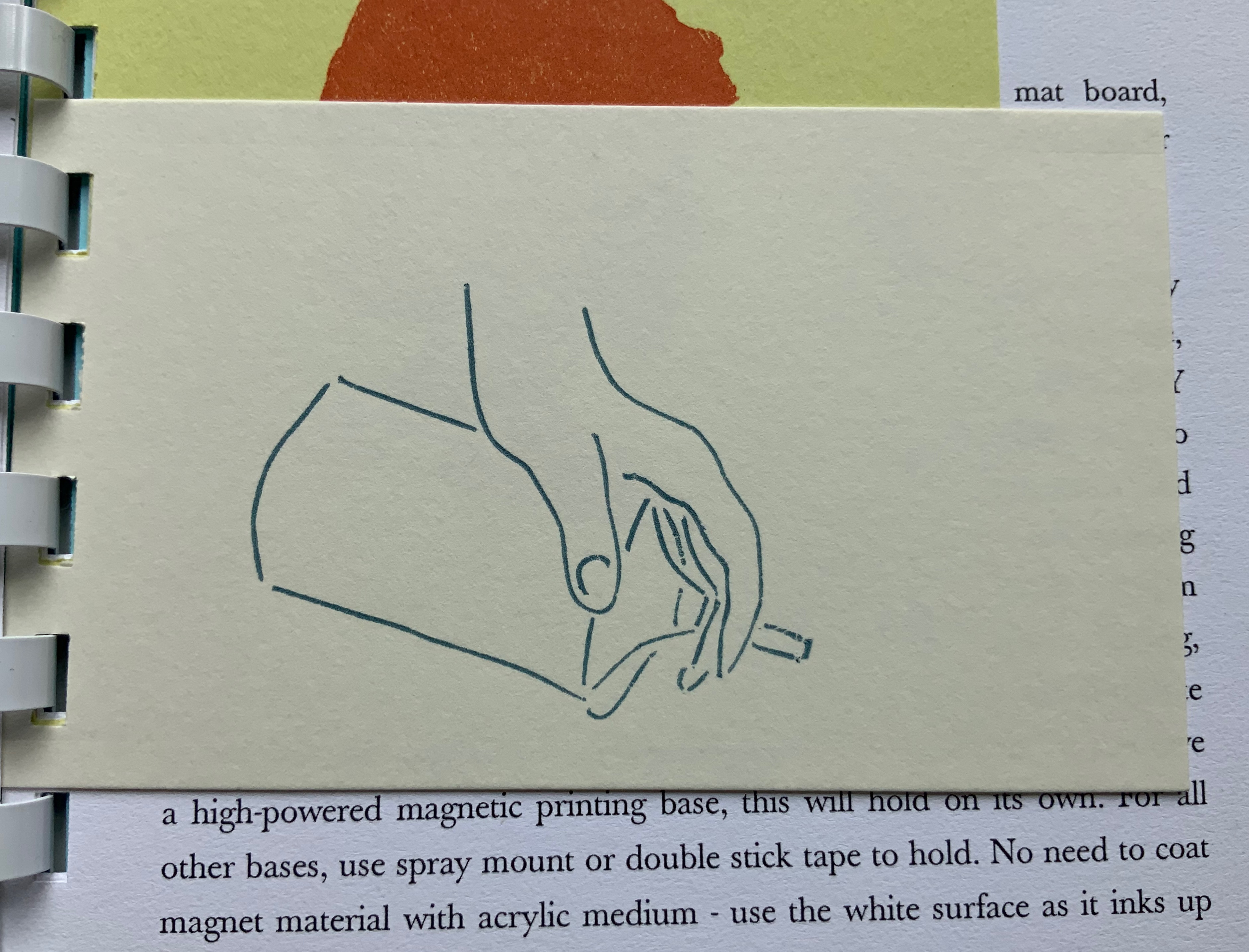
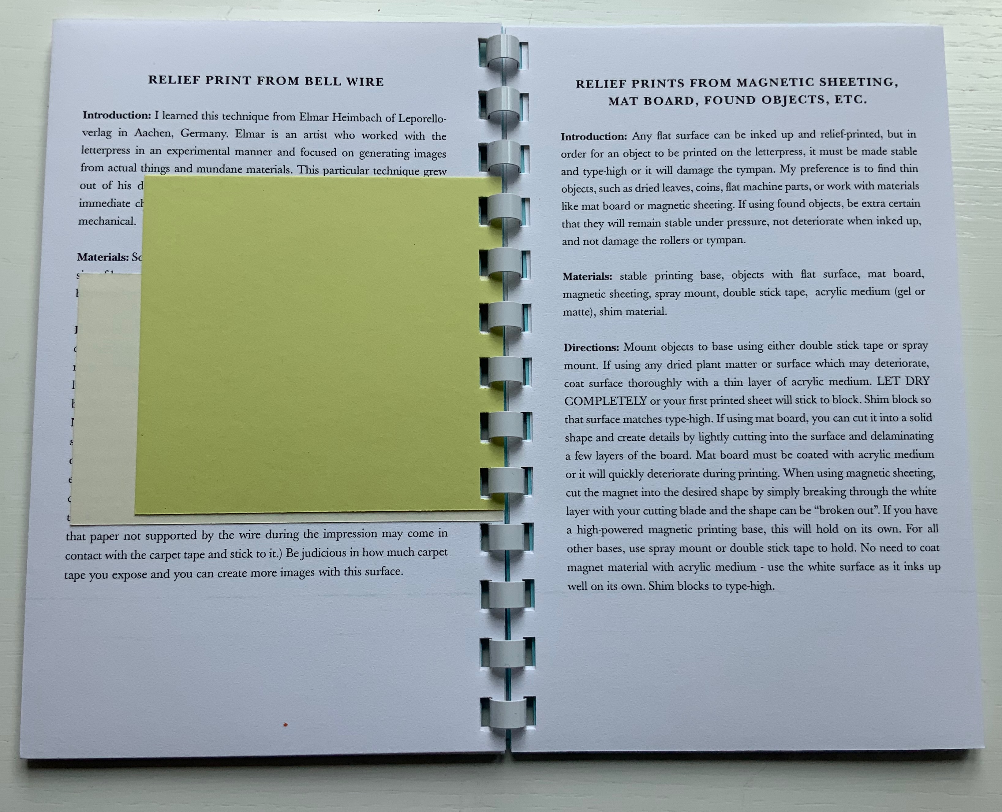
coated wire (bell wire) brought to type high on a piece of MDF covered in carpet tape to hold them in place. This is a technique I learned from Elmar Heimbach and used in a bit of the illustration in O’Ryan’s Belt. (Correspondence with artist, 21 November 2020. Link added.)
Another of Tetenbaum’s earliest chapbooks, Donaghy’s O’Ryan’s Belt (1991) foreshadows her move toward work that responds with a growing independent relationship to the text.
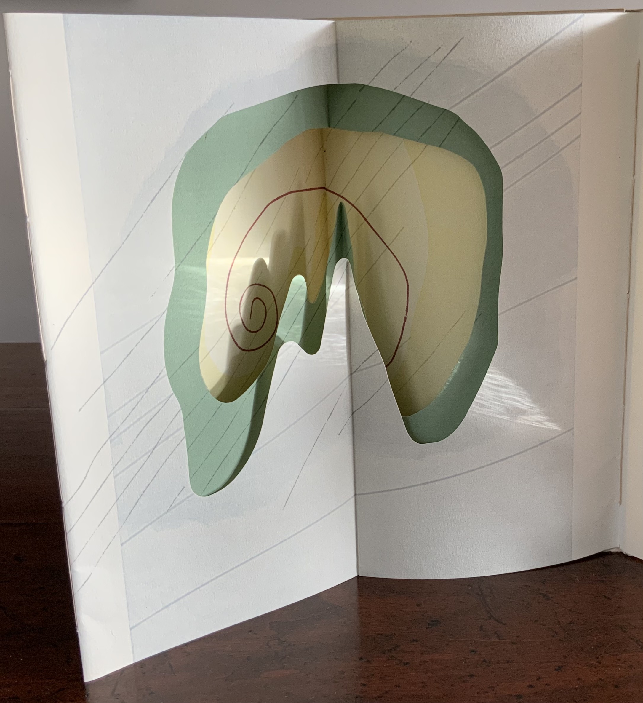
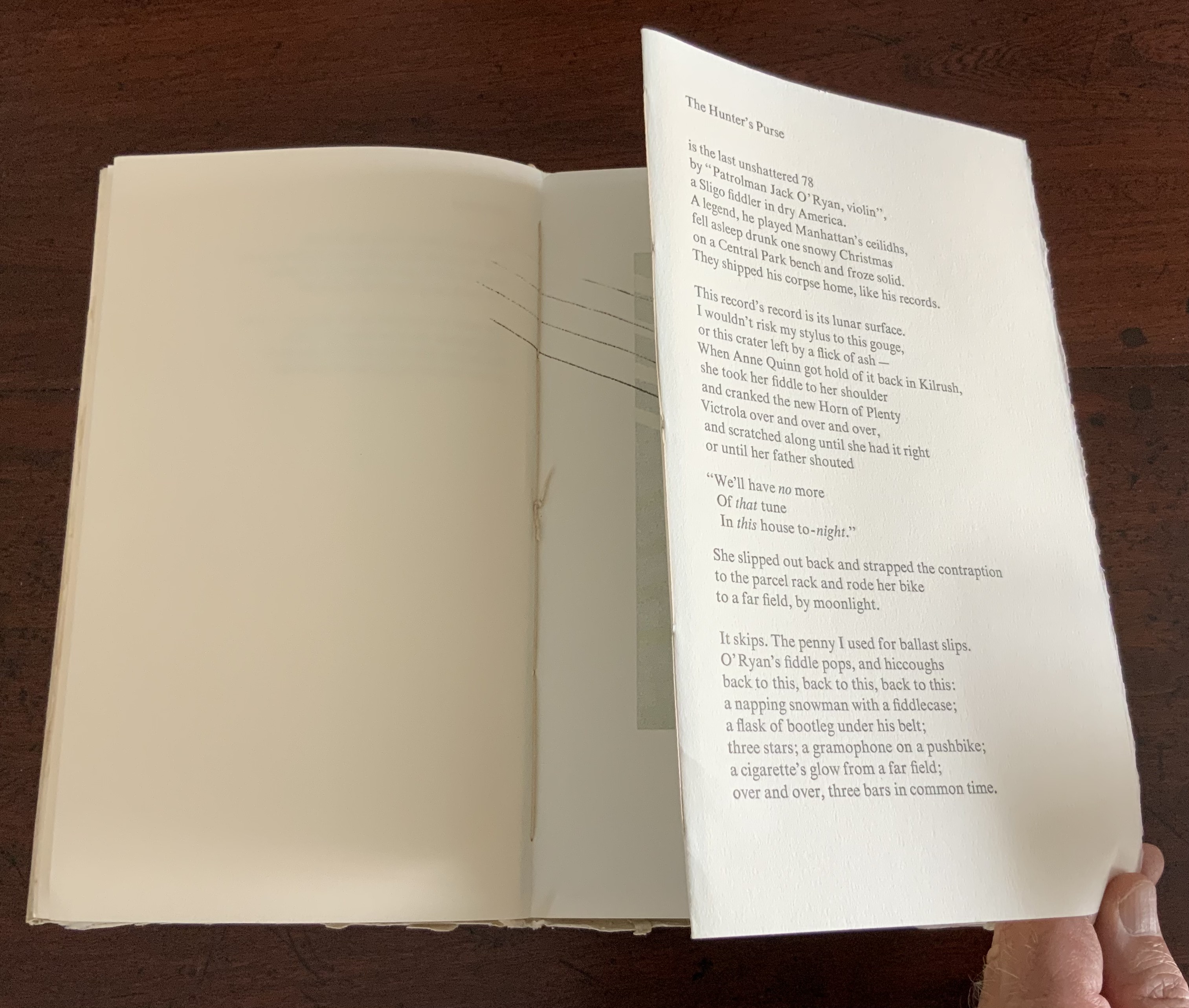
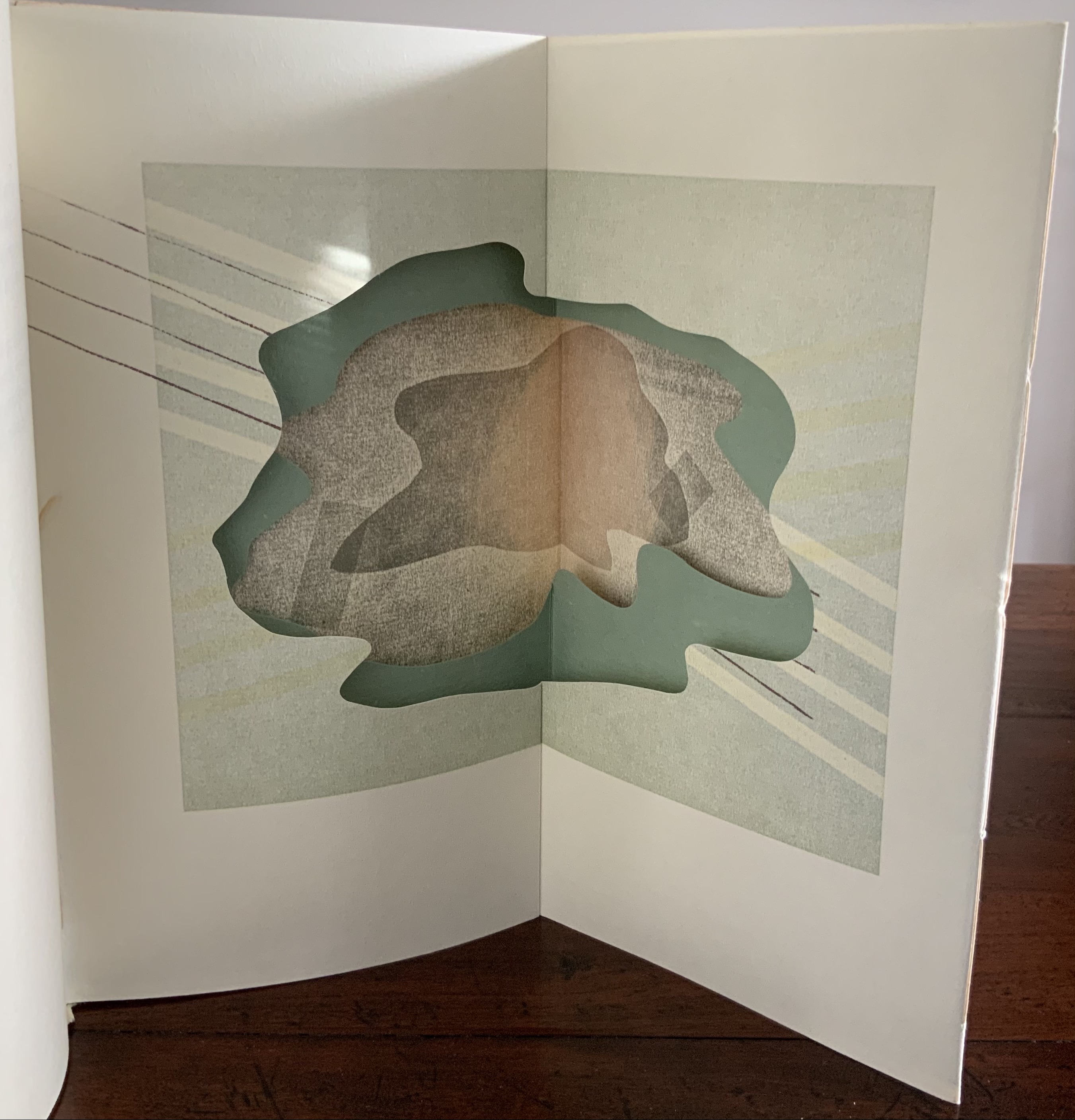
The spine of O’Ryan’s Belt consists of a small fold. Inside, on either side of it, is a gathering of folios. The two sets of folios are sewn (belted?) together through the small fold. Each set includes a tunnel-book-like artwork of three layers. The first sits adjacent to the poem “A Spectacle”, and the second, to “The Hunter’s Purse”, a line from which the chapbook takes its name.
View of the “internal spine”, an inward fold of the cover creating a tab to which signatures on either side are sewn.
View of the tunnel-book image adjacent to “A Spectacle”
The colophon explains that stencils, string and other found objects were used to print the illustrations. Note how the artworks’ lines cross the pages but not into the space of their adjacent poems. It’s as if the artwork is asserting a claim — this is a part of, but apart from; or this is apart from, but a part of. The images created by the artwork seem more related to “A Spectacle” than “The Hunter’s Purse”. Both artworks capture the idea of the image started by the lines “The shape of man, a shadow on the ground,/ Returns a mirror image from pondwater.” As the poem proceeds, we see through the shadow/mirror image to the objects and gravel at the bottom of the pool. Hinting at stalactites or stalagmites as well as the layers reflected on and beneath the water, the first paper sculpture makes sure we recognize the poet’s shadow boxing here with Plato’s cave.
So snugly fitted to the structure, the artwork seems to be waiting to surprise the reader.
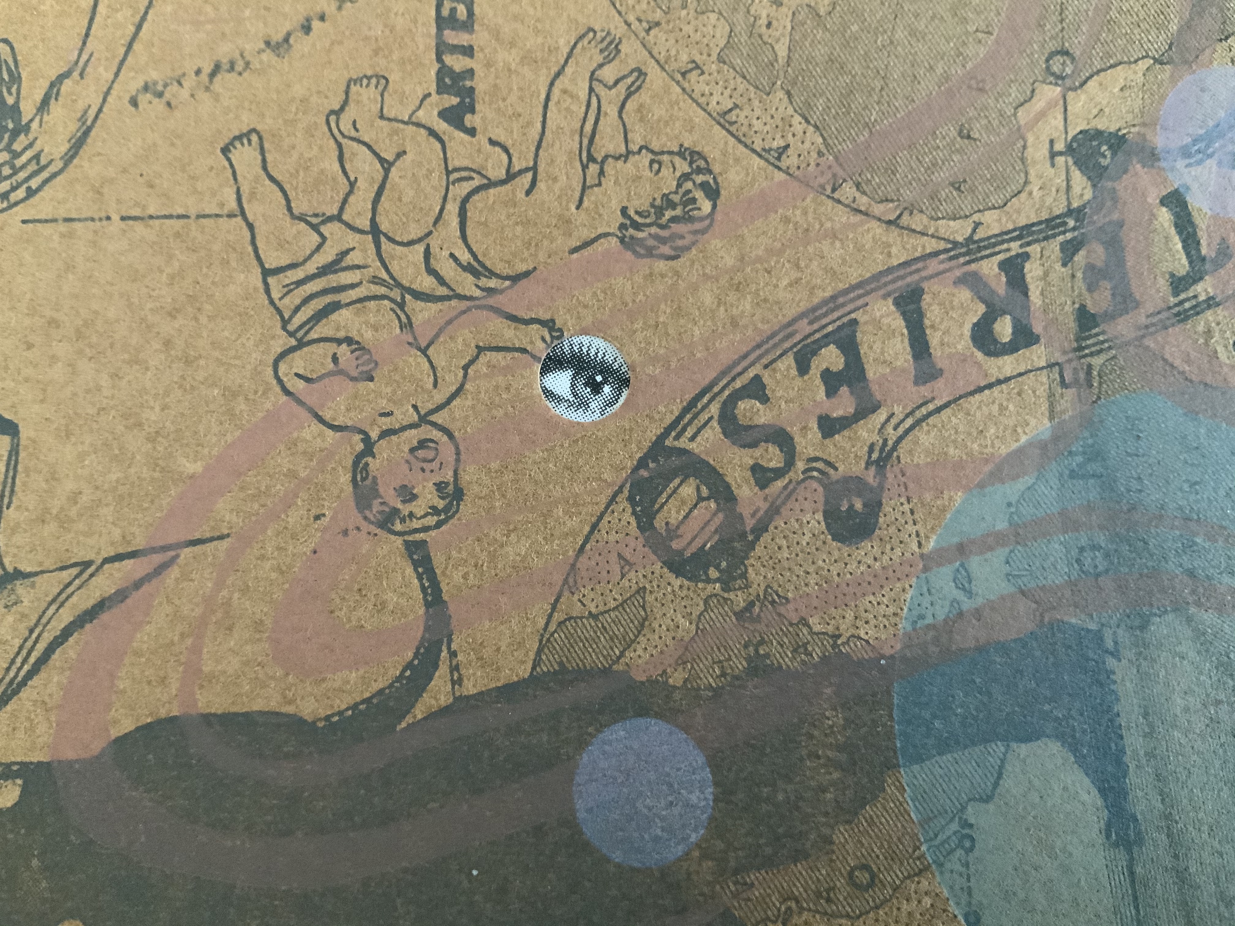
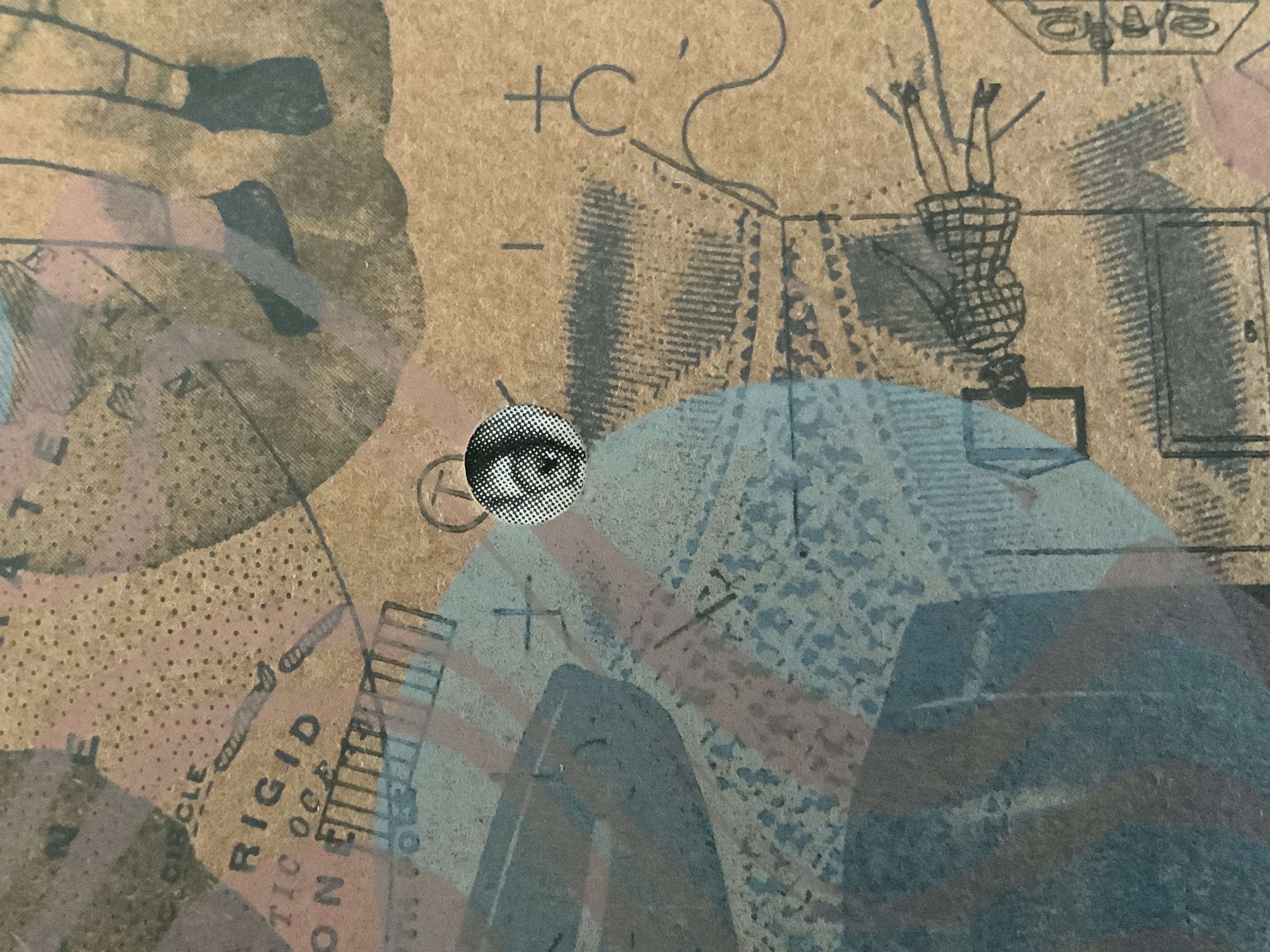
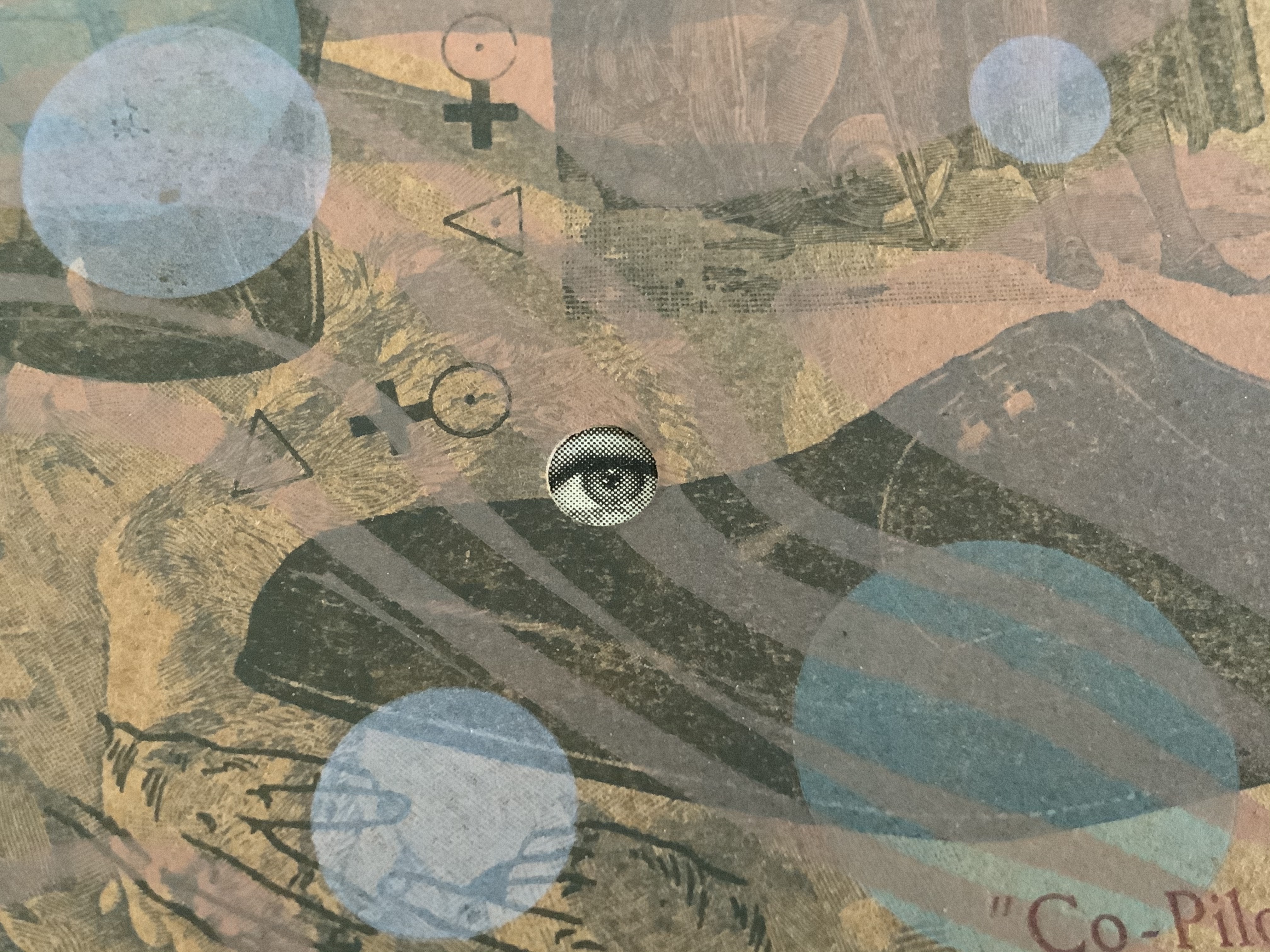
The broadside Co-Pilot extends this structurally interpretive technique. The poem “Co Pilot” (no hyphen in the original) hilariously turns the speaker’s conscience into a parrot on his shoulder, “a tiny Charlton Heston” squawking the Ten Commandments. But there is no parrot, no Charlton Heston, no Ten Commandments in the broadside’s artwork beneath the typeset poem.
There is, however, an eye peeking from four holes scattered among bubble-like transparent circles printed over a collage of images and texts from newspapers, health and housekeeping guides (from the Fifties?), history books, clothing ads and prayer cards. Are the eyes the conscience in bubbles beneath the surface of a clear punch bowl? Are those images the compromised and socially mundane background noise of the party?
The collage comes from a large photoengraved block, originally made for a tiny book, Collage Book #3 (see below). This may explain the viewer’s urge to turn the broadside upside down to examine the image: it’s an imposition of the unfolded, uncut pages of that book (correspondence with the artist, 21 November 2020).
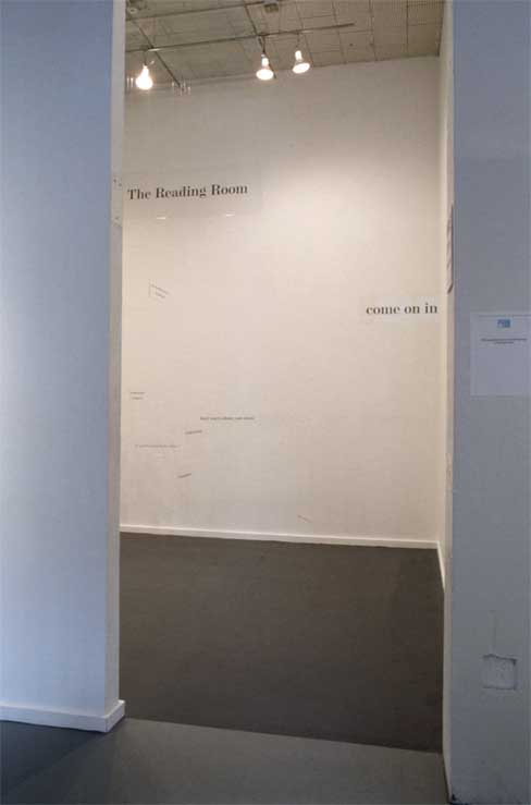
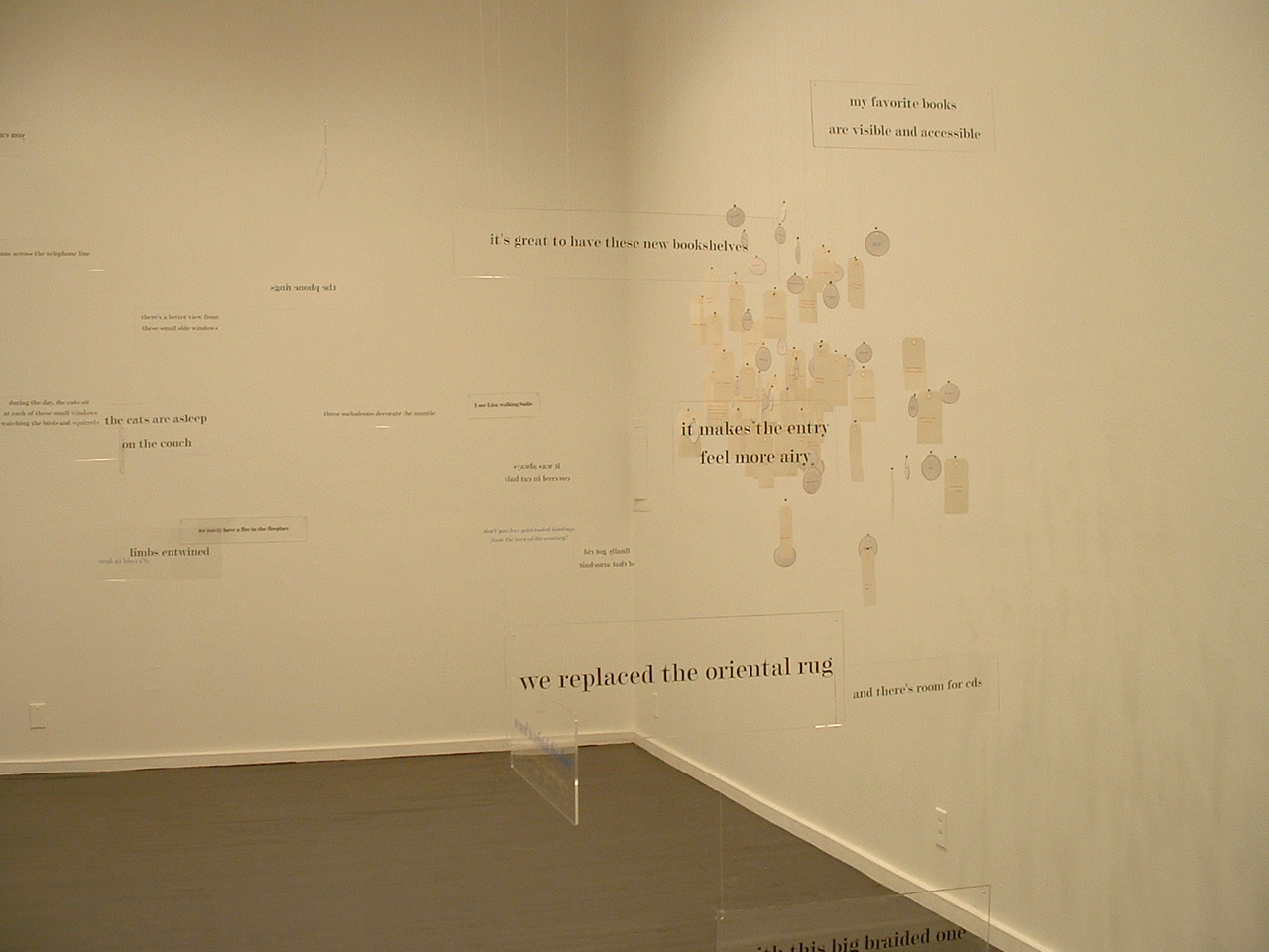
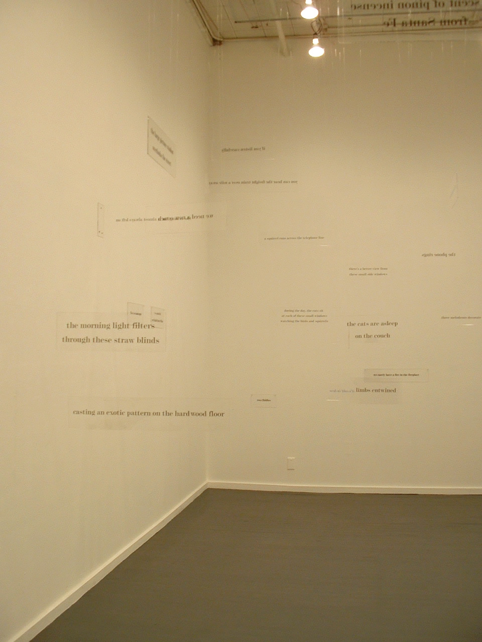
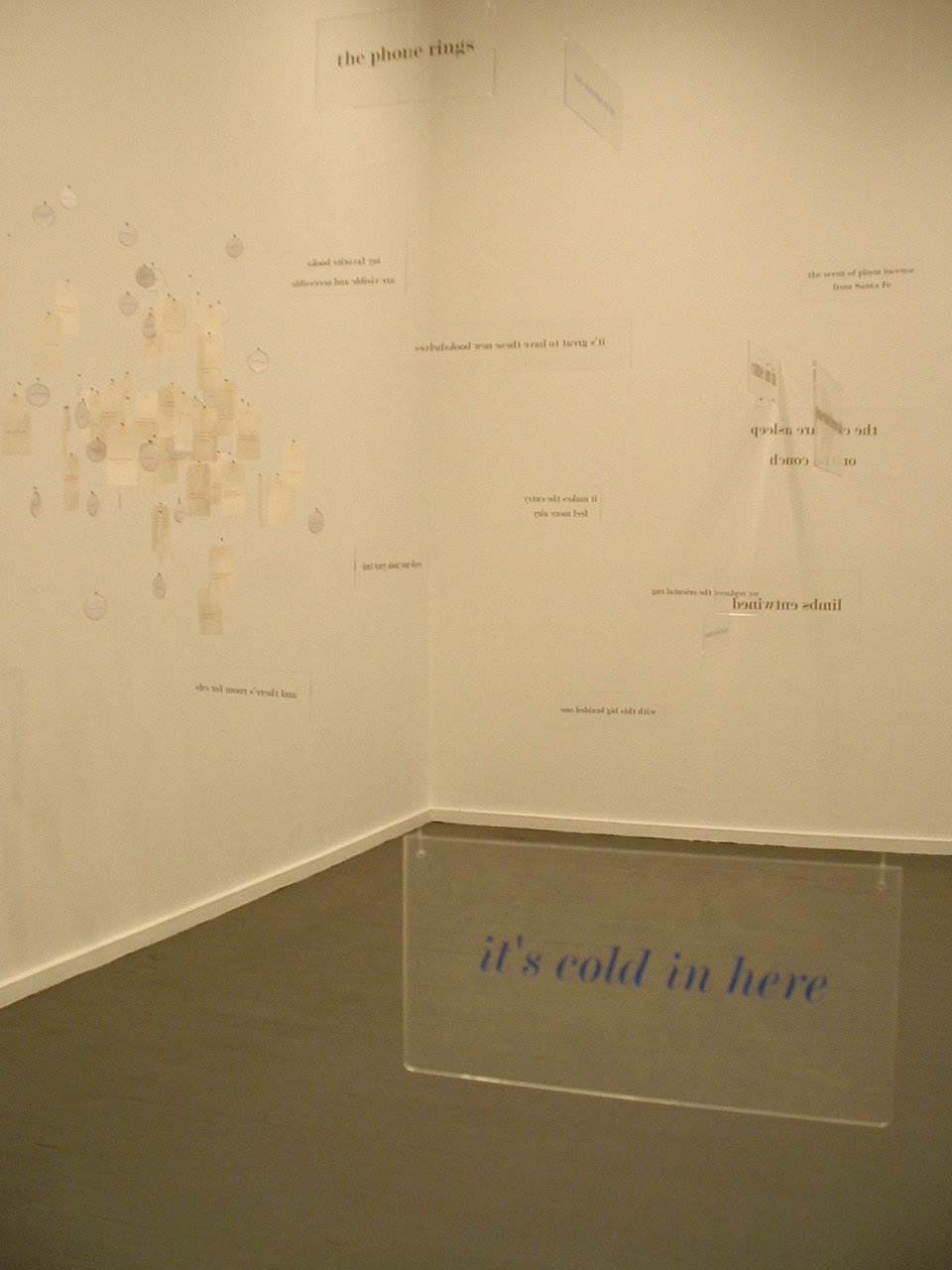
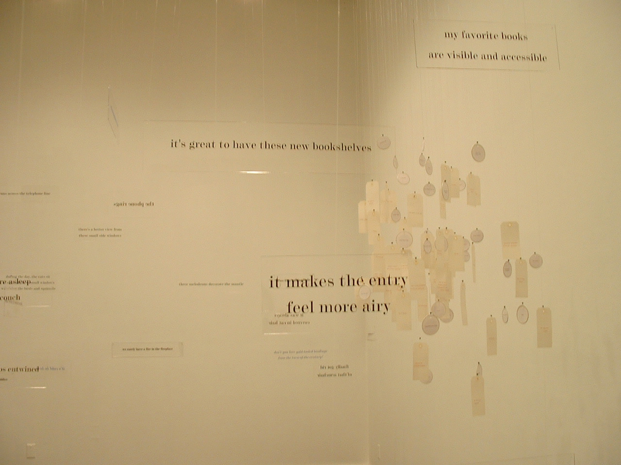
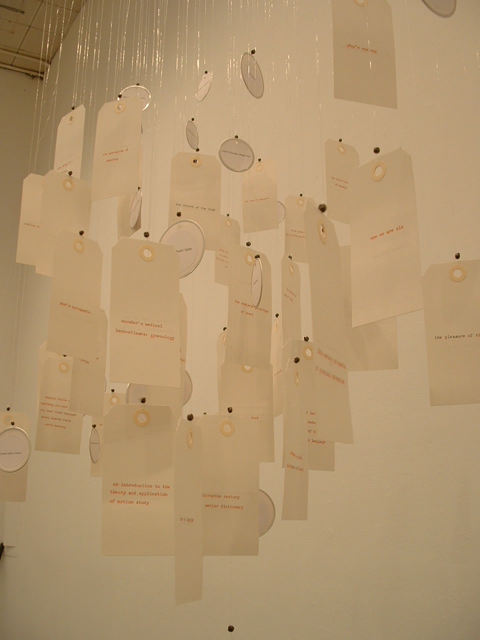
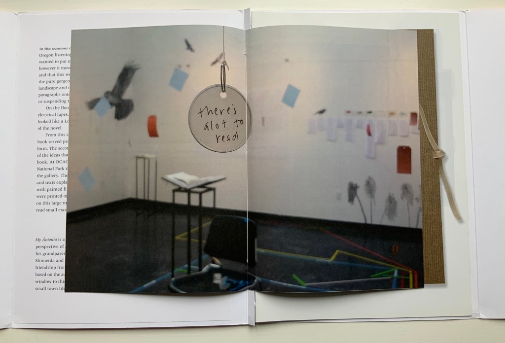
Not strictly a work in the collection, the installation The Reading Room (2002) should be mentioned here — not merely because it occurred the same year as Co-Pilot but also because it is a reminder of a constant theme and a harbinger of other installations to come. Thin slabs of plexiglas bearing text in black serif type hang at angles to one another from clear fishing line. The words, phrases and sentences suspended in air are drawn from a short story composed by Tetenbaum; they are what make The Reading Room a room for reading. That’s almost all there is to do in it. If, as Anthony Powell’s character Lindsay Bagshaw says, “Books do furnish a room”, Tetenbaum’s installation proves, “Words do furnish a room”. What reading is, can or might be is that constant theme in the artist’s works — whether evoked by asemic markings, a walk through the words of a story, a “map of reading” or a “diagram of wind”.
The Reading Room (2002) Barbara Tetenbaum Installation at Nine Gallery, Portland, OR, December 2002. Photos: Courtesy of the artist.
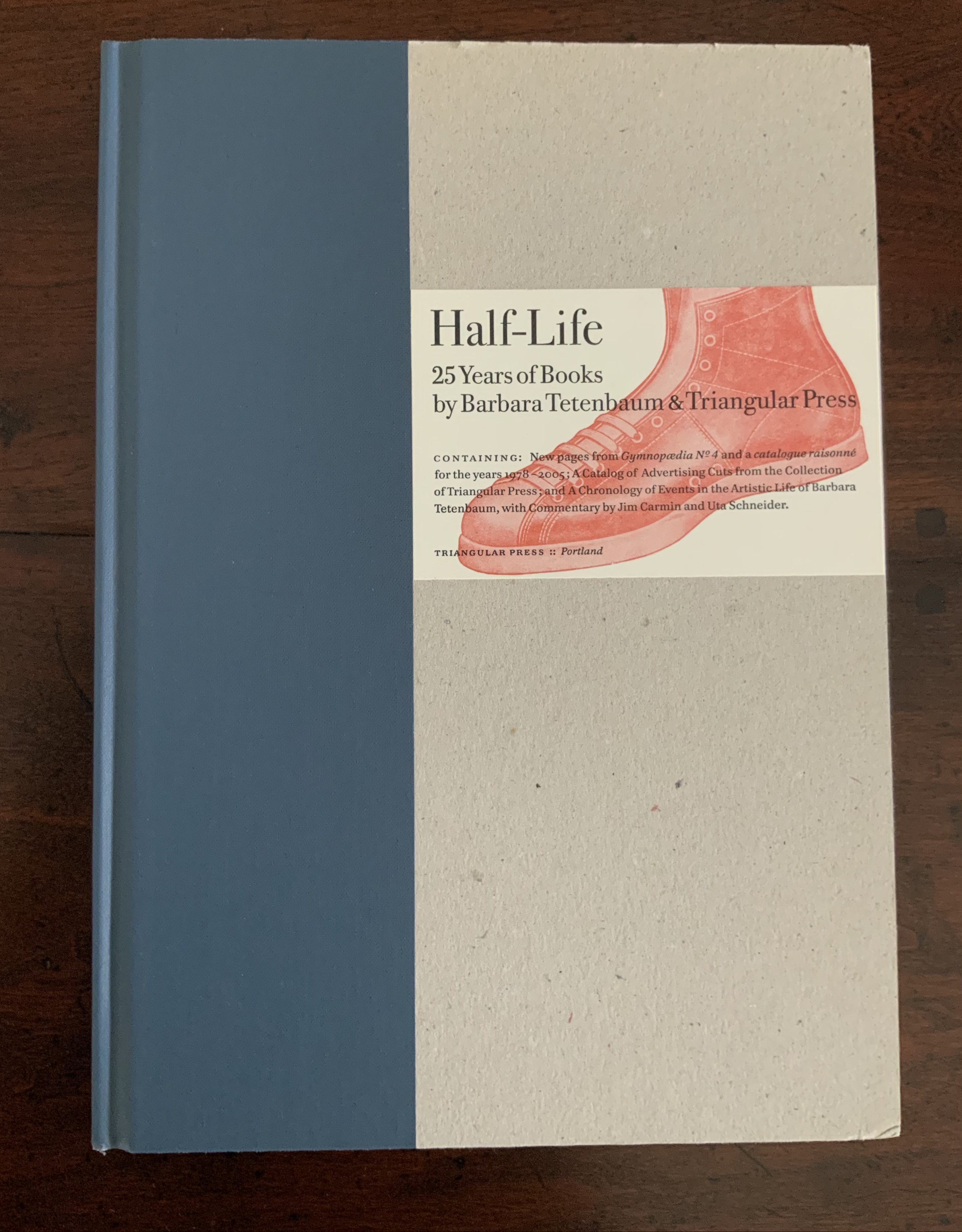
Half-Life (2005) is the collection’s representative codex by Tetenbaum. A catalogue raisonné for works between 1978 and 2005, with a chronology of the artist’s life and an appreciation of her work from Uta Schneider, the book reveals several of the influences on Tetenbaum’s development, including Ron King (as noted above) and Walter Hamady (evident particularly in the Co-Pilot broadside). Tetenbaum is generous in her collaborations and acknowledgments. Although closer to a fine press edition than anything produced by Dick Higgins, Half-Life notes in its colophon the influence of his FOEW&OMBWHNW (New York: Something Else Press, 1969).
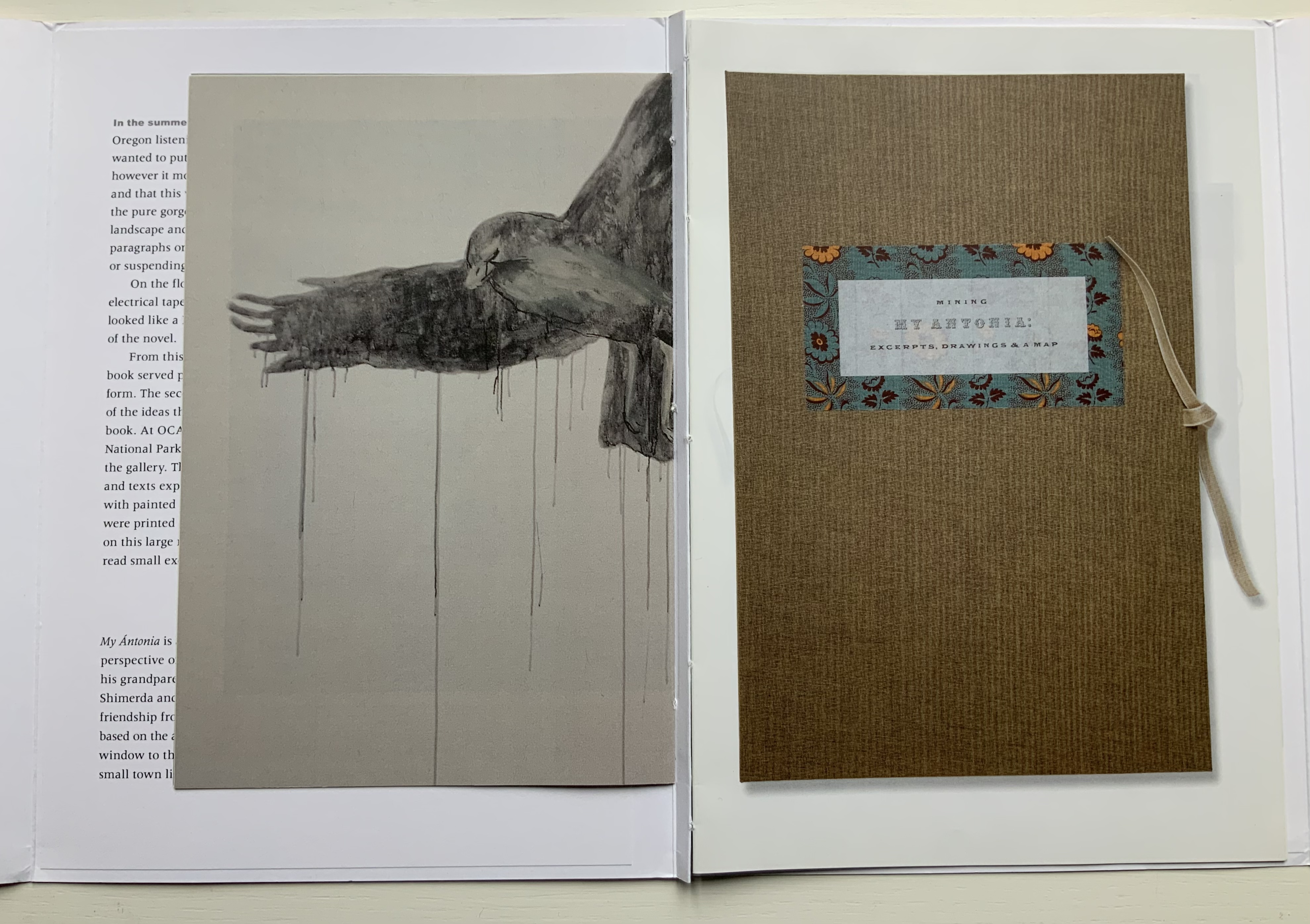
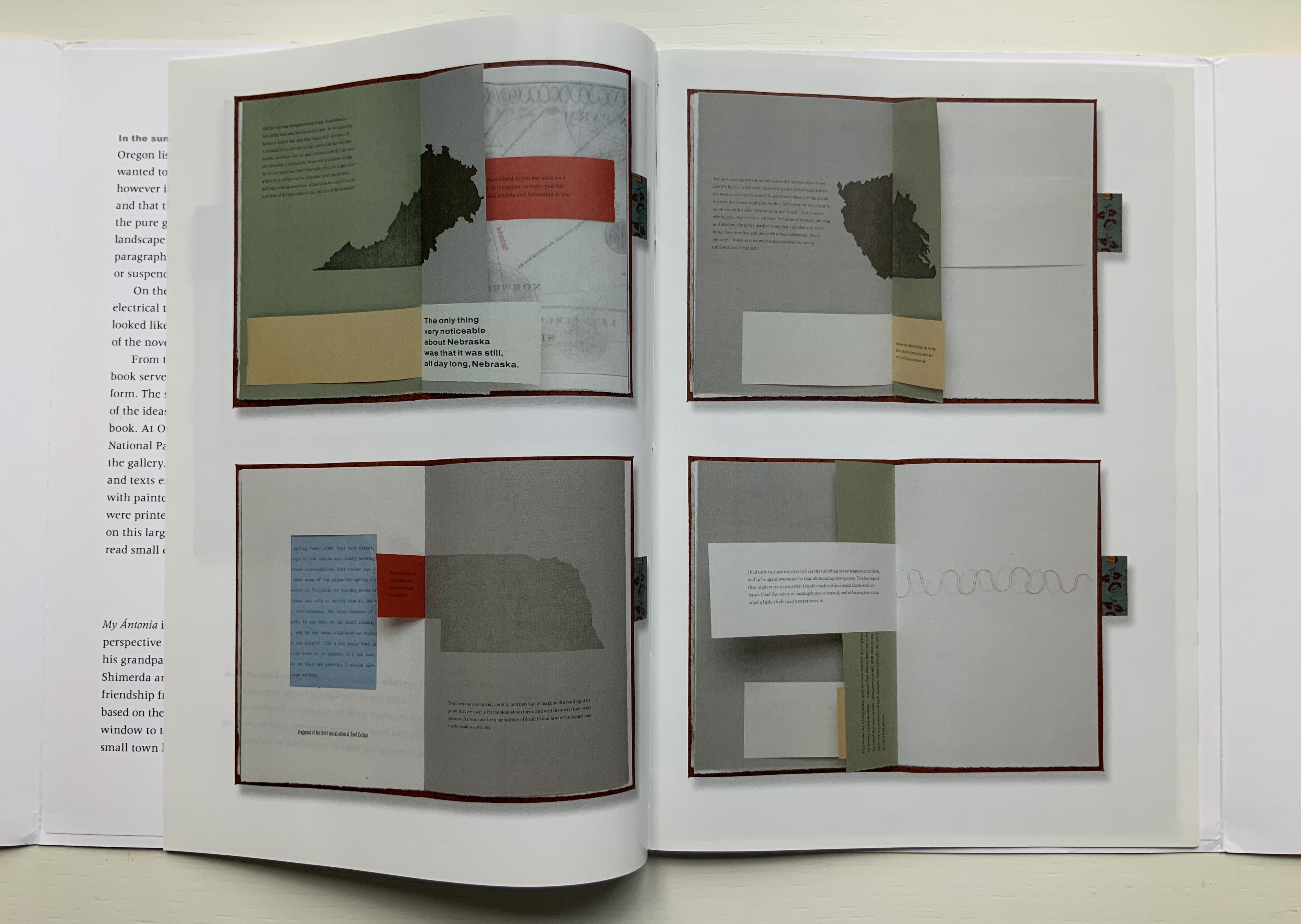
For a body of work realized after Half-Life, Tetenbaum spent a month in a gallery listening to a recording of Willa Cather’s 1918 novel, My Ántonia. The result was two installations and two publications: a catalogue called A Close Read: My Ántonia (2010) and an “artist’s book” or “bookwork” called Mining My Ántonia: Excerpts, Drawings, and a Map (2012). The collection currently includes only the map and the catalogue. Some work in this category of “response to literary material” can be primarily craftwork — as in those well-known narrative scenes sculpted from the pages of the book in question. Other responses to books — including altered books — stand as works of art yielding depths of meaning and aesthetic response on their own.
Of course, the antecedent to this in literature is called ekphrasis. W.H. Auden’s ekphrastic poem Musée des Beaux Arts stands on its own — though with — Breughel’s Landscape with the Fall of Icarus. Even more so Keats’ Ode on a Grecian Urn stands on its own; the urn described is unknown. Tetenbaum’s direction of ekphrasis is inverse to that of Auden and Keats. The artwork comes after the literary expression. Nevertheless, her inversely ekphrastic artwork Mining My Ántonia stands on its own — though with — Cather’s My Ántonia.
A Close Read: The Cather Projects (2012) Barbara Tetenbaum and Jennifer Viviano Catalogue with three inserts sewn to folded card, published by Oregon Arts Commission. Photos: Books On Books Collection, displayed with permission of the artist.
For the collection, the map has been framed between two sheets of glass to make enjoyment of its translucent paper a daily possibility. Each time the catalogue is opened, its binding harks back to O’Ryan’s Belt (see above). Three inserts of different trim sizes are sewn into the central inwardly folded tab.
The first insert provides details from the 2010 installation; the double-page spread below recalls the dangling tags from The Reading Room (2002). The second insert shows images of the artist book Mining My Ántonia and details from the second installation in the Hoffman Gallery at Oregon College of Art and Craft (2012); an image of the map from Mining My Ántonia: Excerpts, Drawings, and a Map is shown at the start of this entry. The third insert is a 14-page pamphlet from Nathalia King, Professor of English and Humanities at Reed College where the first installation occurred.
Put aside — difficult as it may be — the play of craft and art so plainly suffusing the print, paper and binding of the catalog and artist book, what are their relation to the text that drove them? Is it like making a “movie of the book”? Are we looking at some new form of literary/artistic criticism? As Nathalia King’s essay walks us through the installation, she points out how it teaches the viewer to read My Ántonia in multiple ways. To what degree, though, can we appreciate Tetenbaum’s book art or installations without having read My Ántonia? They certainly inspire the reader/viewer to read or re-read the work. But inevitably this reader/viewer is drawn back to enjoying Tetenbaum’s “making the novel her own” (as in the pun on mining). As with all book art, the more informed we are about the “material” of which it is made, the greater the enjoyment. We want to make such a work our own — to mine it — which may send us back to multiple quarries from which the artist drew her material. Cather’s novel is not the only material of which Mining My Ántonia is made. It is made of the artist’s experience of the novel in print, the novel as read aloud and the exterior/interior space in which that occurred. It is made of various papers, tabs, reveals and media. The artist book offers a solitary way of ”material reading”, but with the catalogue, it also offers a glimpse at the ambulatory and perhaps social way of reading offered in the installations.
Willa Cather’s Prairie, Nebraska (Photo credit: Ross Griff)
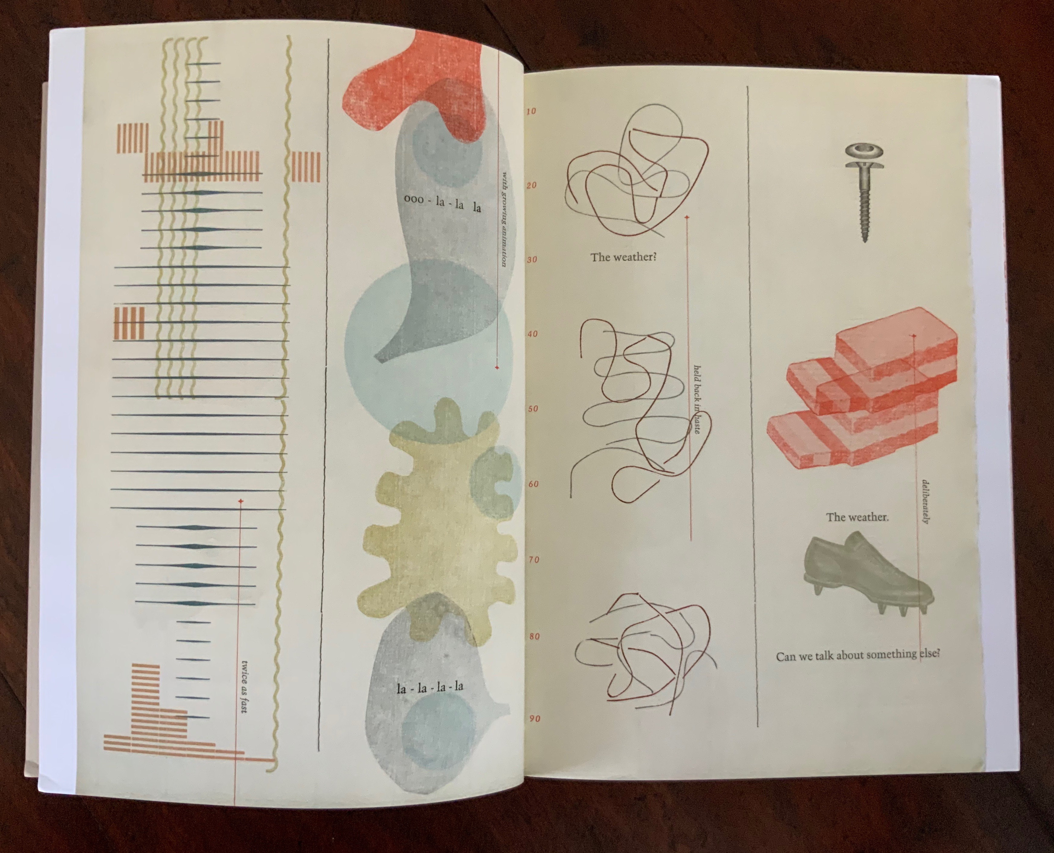
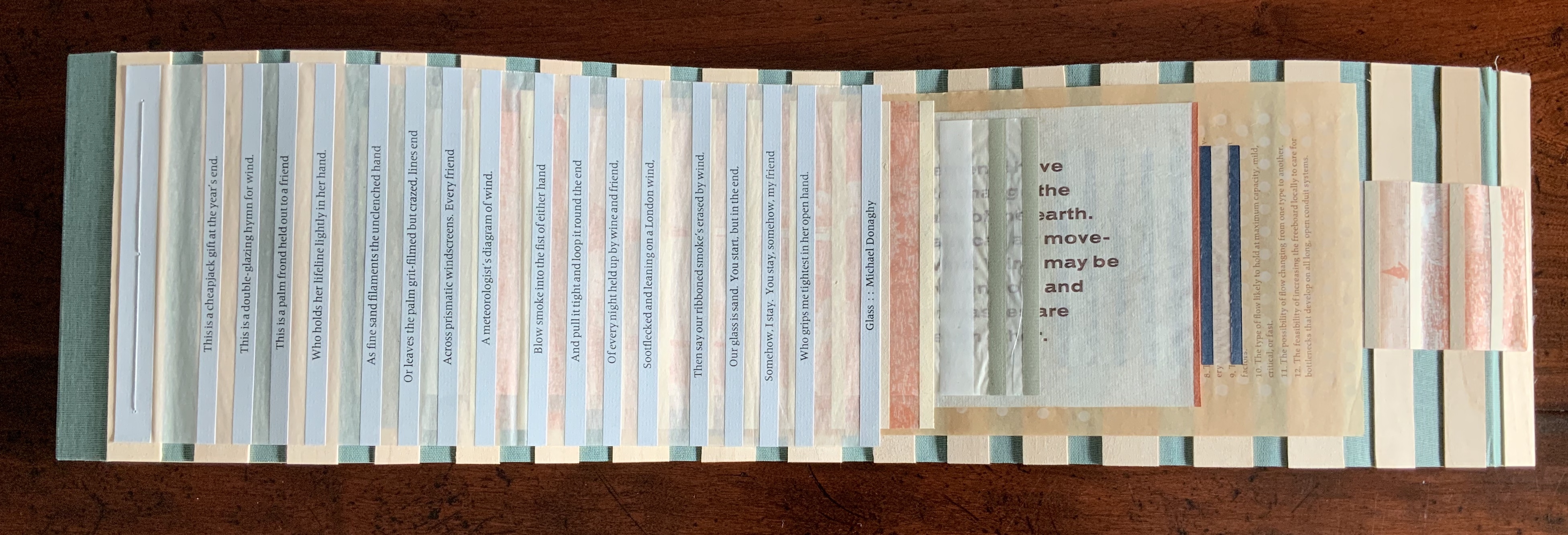
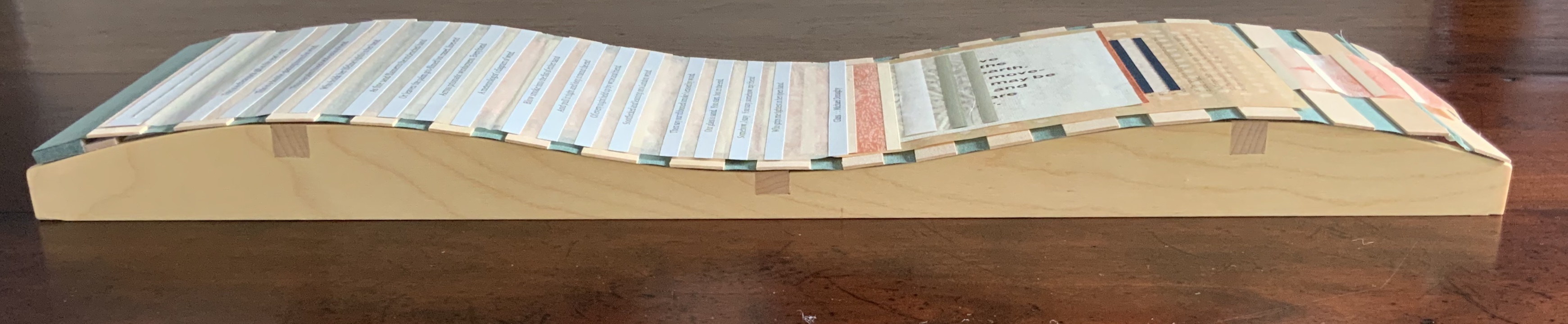
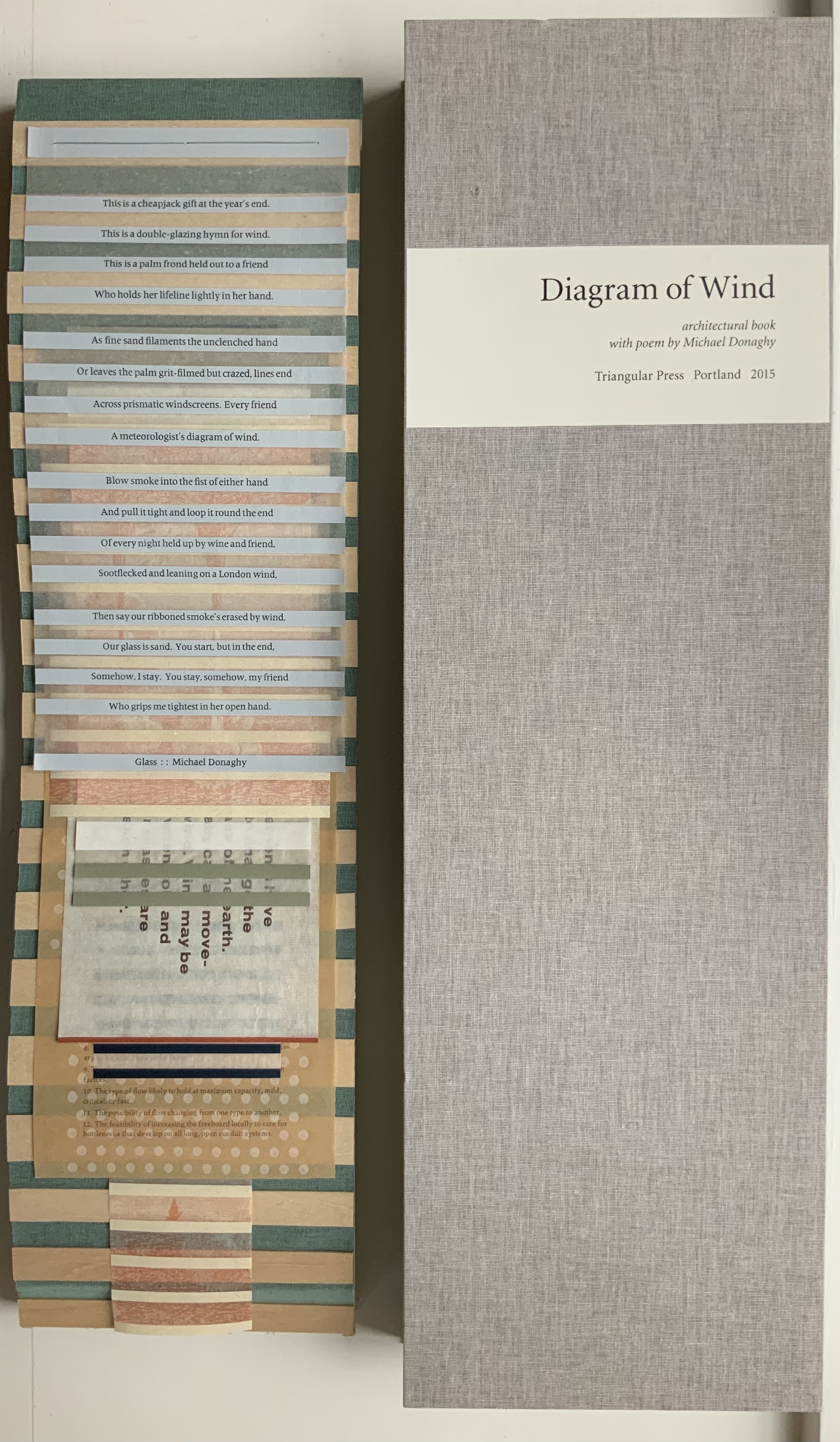
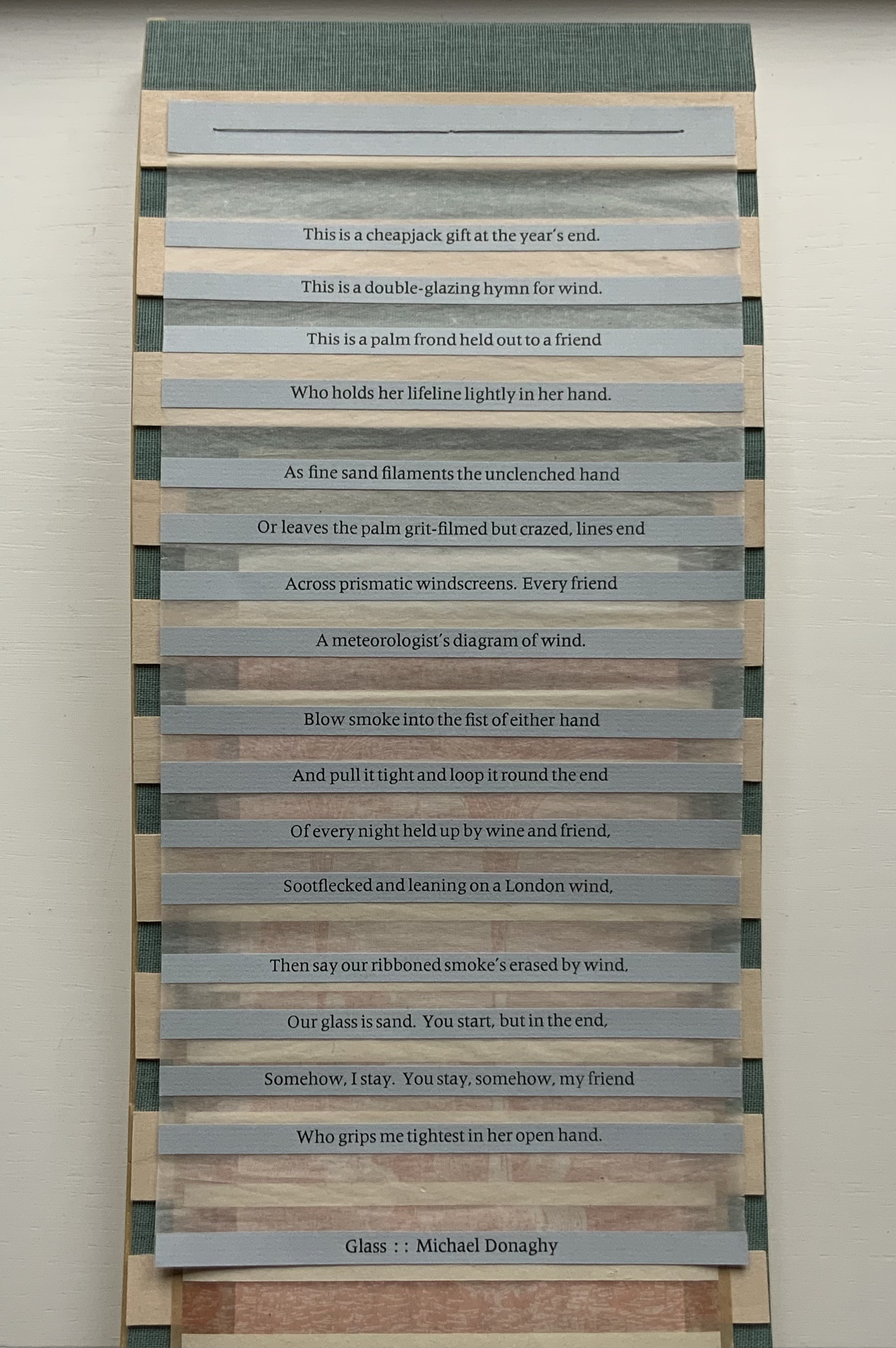
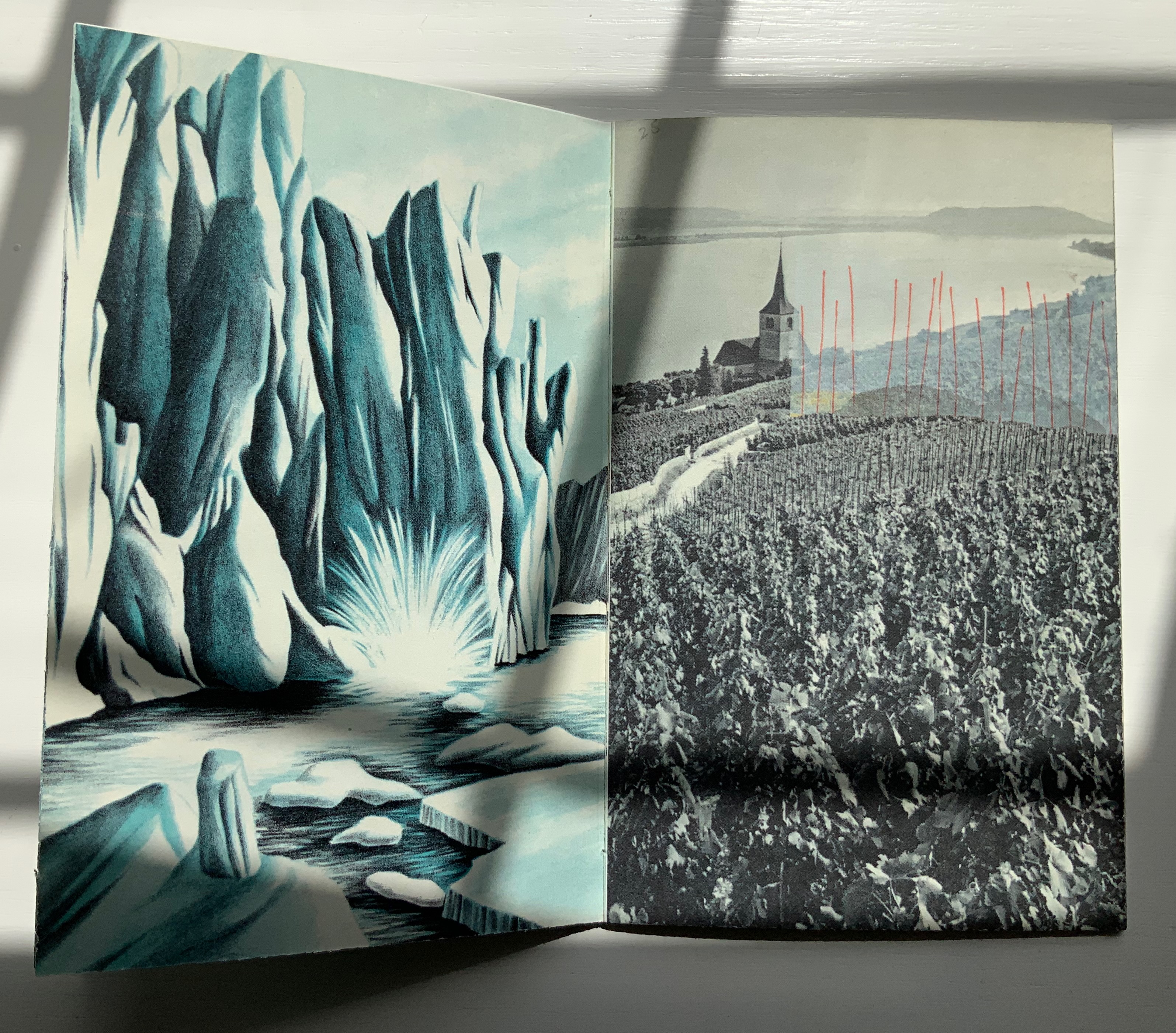
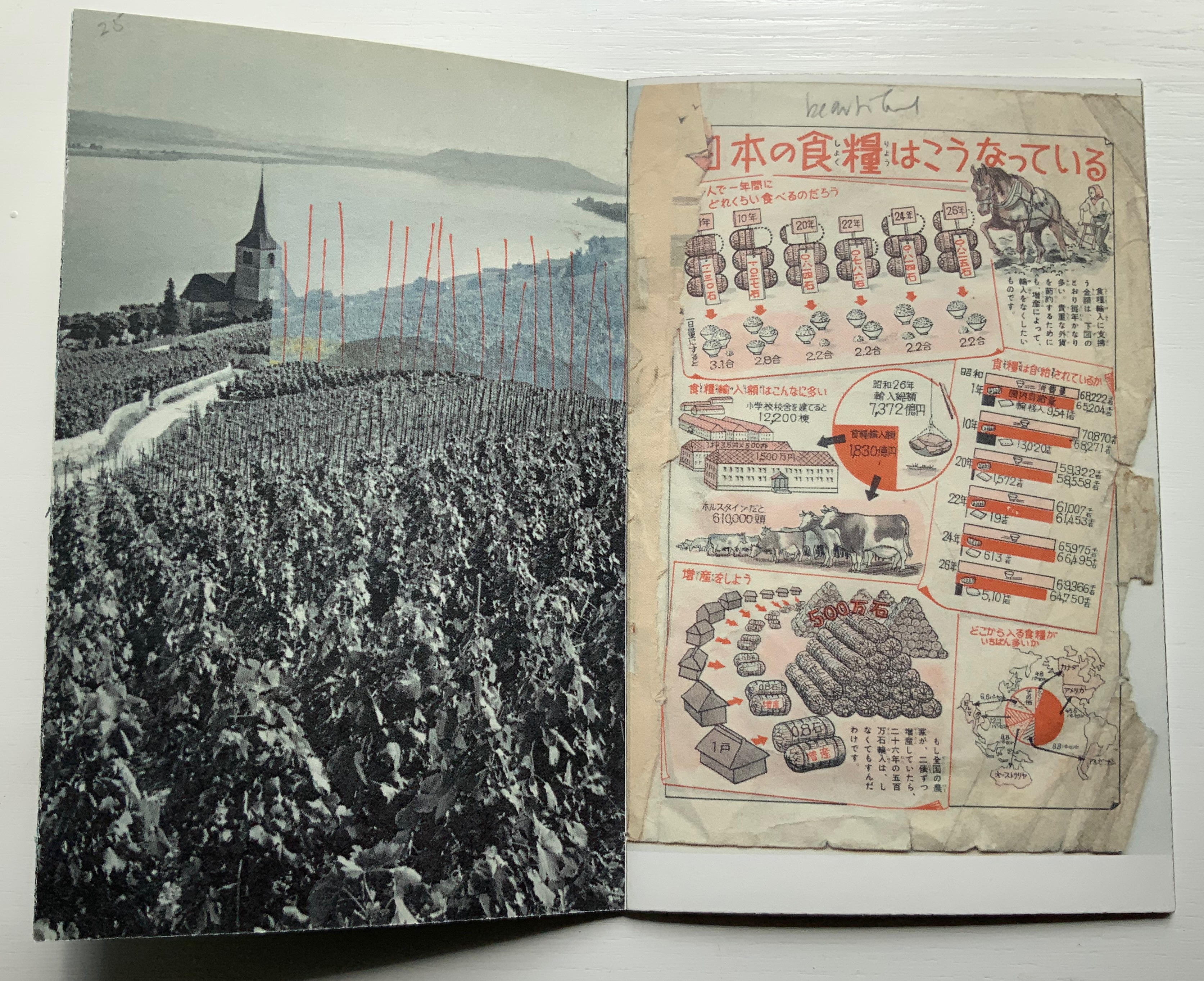
Also offering a different way of reading, Diagram of Wind (2015) pulls further away from its responding point than Mining My Ántonia. A line in Donaghy’s poem “Glass” provides the title for this sculptural work, and the work’s structure draws on the poem’s sestina form in its undulating, layering structure. Yet Diagram of Wind goes far beyond that.
There are seven “pages” to this work, each sewn to green book cloth panelled with wooden slats and backed with gampi. The first page carries Donaghy’s sestina, each line letterpress printed on a strip of paper pasted to gampi paper. Less wide than the sestina page and shorter than the third, the second page shows an etching image of waterspouts rising from a body of water with mountains in the background. Less wide than the second page and shorter than the fourth, the third page consists of narrow, evenly sized white strips of paper pasted on gampi. The fourth page, slightly wider than the preceding page but still shorter than the following, offers the school-book-like statements:
Air movements have
helped to change the
whole face of the earth.
We usually call air move-
ments wind. Wind may be
started when cold and
warm air masses are
next to each other.
Suddenly much less wide than the fourth page but still shorter than the sixth, the fifth page presents narrow dark panels or strips that narrow in themselves and narrow the space between them as they descend the page. Much wider than the preceding page, shorter than the seventh and printed with blue and white dots reminiscent of Co Pilot (above), the sixth page gives guidance on determining the amount of space to leave between the top of a flume (an engineering structure for measuring water flow) and the height of the water moving through it. The narrowest page of all and ending flush with the slatted backing, the seventh page shows a print similar to that on page two, but here between the evenly spaced paper strips, there is a small ship in the distance and the subsiding whirlpool and withdrawing upper part of a waterspout in the foreground.
The poem that inspired this work uses images of the natural world — sand, smoke, wind — to build its metaphor of love’s paradox (its holding fast with an open hand). Humanity is in the foreground, nature in the background. Tetenbaum’s Diagram of Wind reverses that. Nature with its air movements and waterspouts move into the foreground. Then humanity with its controlling and measuring flume comes into the middle ground. And finally it ends with humanity’s ship on the horizon and nature’s dissipating waterspout in the foreground. Even though by virtue of its page one position the poem is in the foreground, it has become as much “material” for the artwork as the paper, ink, wood, cloth, earthy colors and physical structure are. The artist has transformed the poem’s sestina shape, its use of nature and its paradox into “material” for Diagram of Wind. In this instance of inverse ekphrasis, Tetenbaum has created a work that stands independently of, and in dependence on, its literary inspiration.
An early guidebook and two of Tetenbaum’s non-ekphrastic works, one early and one late, are in the collection: Paper Art, the third publication under her Triangular Press imprint, and Collage Book #6.
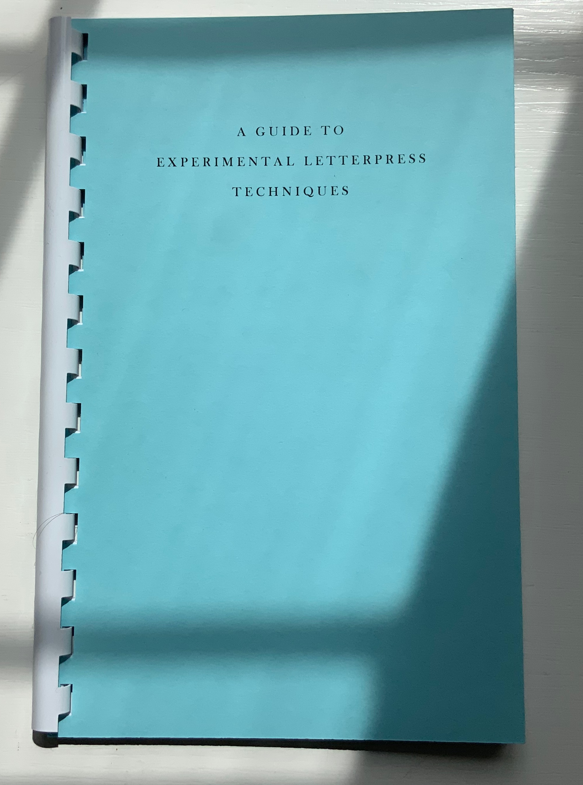
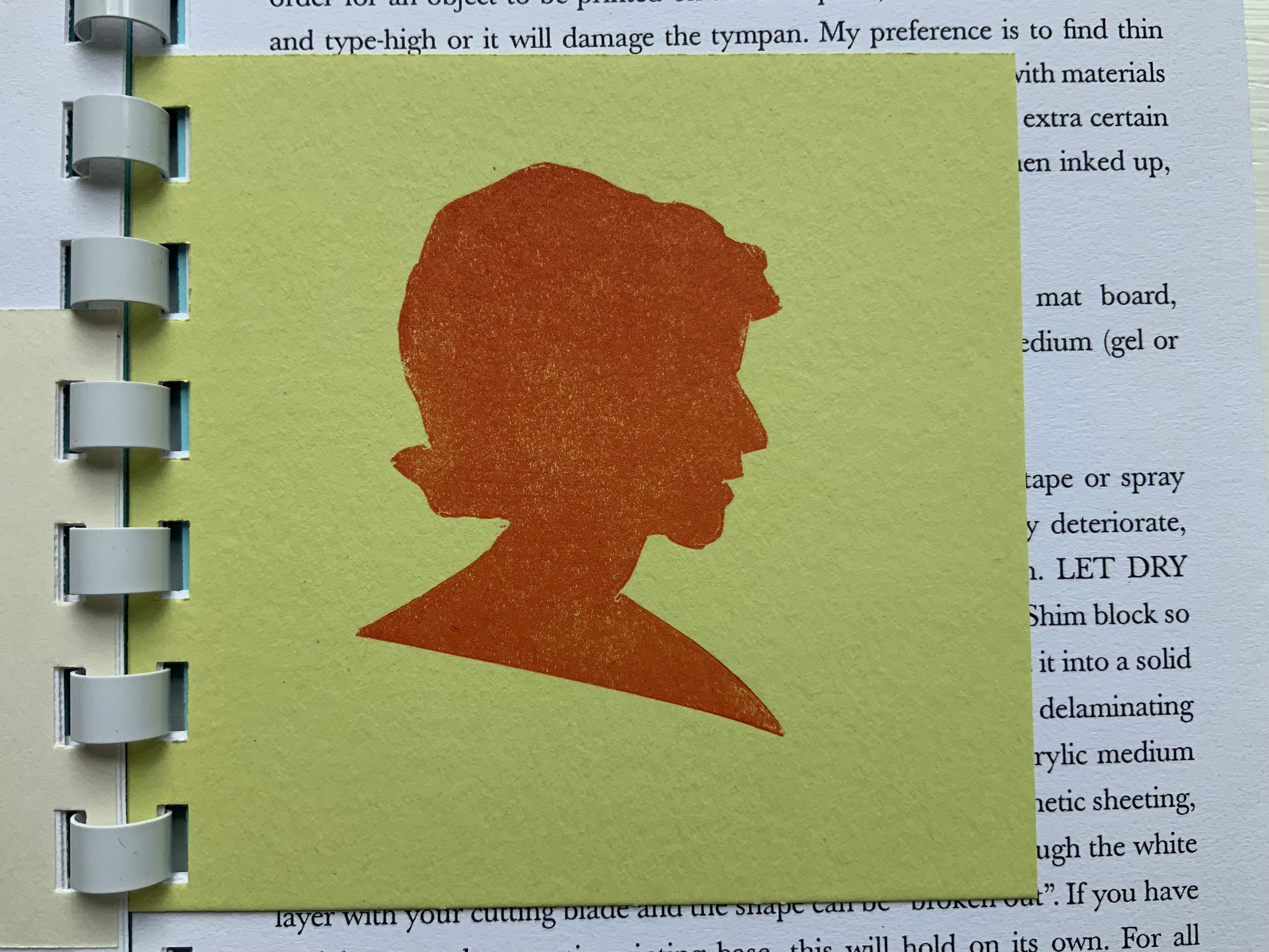
A Guide to Experimental Letterpress Techniques (2004)
A Guide to Experimental Letterpress Techniques (2004) Barbara Tetenbaum Spiral-bound. H190 X W123 mm, 16 unnumbered pages, Chinese fold. Acquired from the artist, 11 April 2022. Photos: Books On Books Collection.
For a non-practitioner, instruction books like this encourage closer examination of artwork and an appreciation of the act of thinking with one’s hands.
Paper Art (1980)
Paper Art(1980) Barbara Tetenbaum “Sequential picture plane / book-like object”. String-bound container: 165 x 165 mm; Object: H135 x W145 mm, 16 unnumbered pages and one fold-out leaf. Edition of 42. Acquired from Versand-Antiquariat Konrad von Agris, 22 January 2022. Photos: Books On Books Collection. Permission to display from the artist.
“Sequential picture plane / book-like object” is the artist’s description of this work. The images come from cut paper and collage, relief printing, pen and ink, and washes. A narrative-like sequence develops involving two triangles and a community of triangles in a sort of landscape with a scribbled wilderness, parallel rivers or tracks, stars above, and moving to a boundaried community of triangles beneath a brownish wash and concluding with a double-page spread of the river or track images migrating to a final blank page.
Just as important are the binding, paper, folds and container. In its three-hole sewn deckle-edged cover, four more different kinds of paper make up the object and its images. The fold-out leaf, composed of the work’s most fragile paper, encloses the central four pages, which have the most intense concentration of images. The cutout paper rivers or tracks are attached with brown thread on either side of this fold-out leaf, which further cues us to be aware of parallel scenes. The range of papers from dense and thick to sheer and thin reminds us that parallels can present opposites: the couple and the collective, conflict and resolution, lost and found.
The container consists of the densest and darkest paper and, at one time, had a box-like shape held closed by string at its four corners. There is a barely perceptible hole in the upper left corner of the container’s cover.
The contrast between the sturdiness of the paper and the flimsiness of the string closure echoes the cut-out rivers or tracks, loosely attached by brown thread and embracing the central fold-out leaf enclosing the densest body of images. All of these material aspects suggest looking for the paradoxical in this “sequential picture plane / book-like object”.
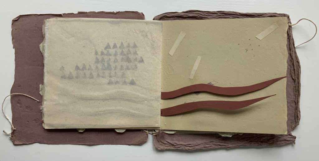
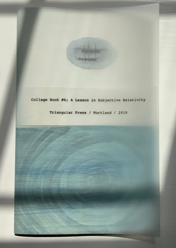
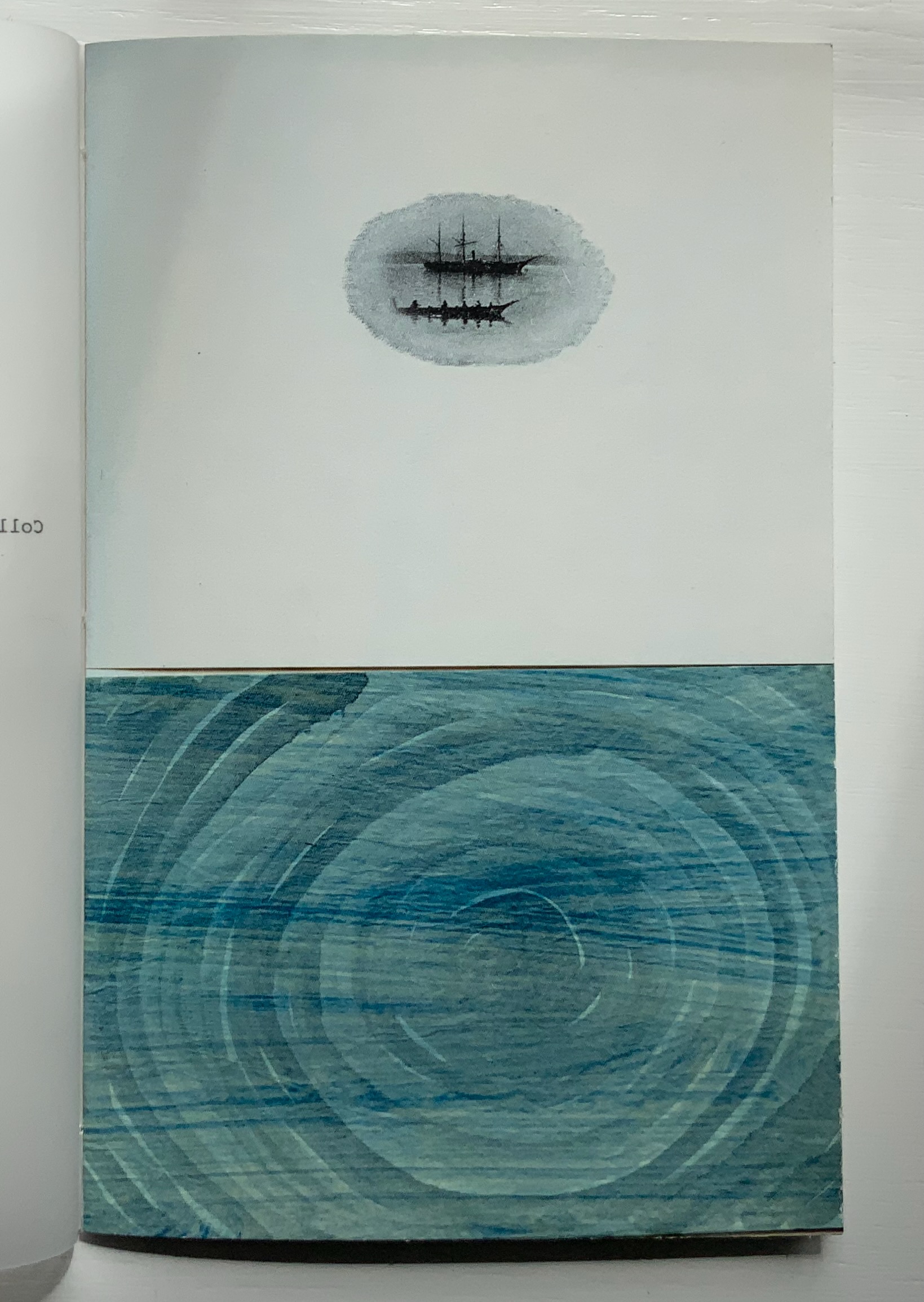
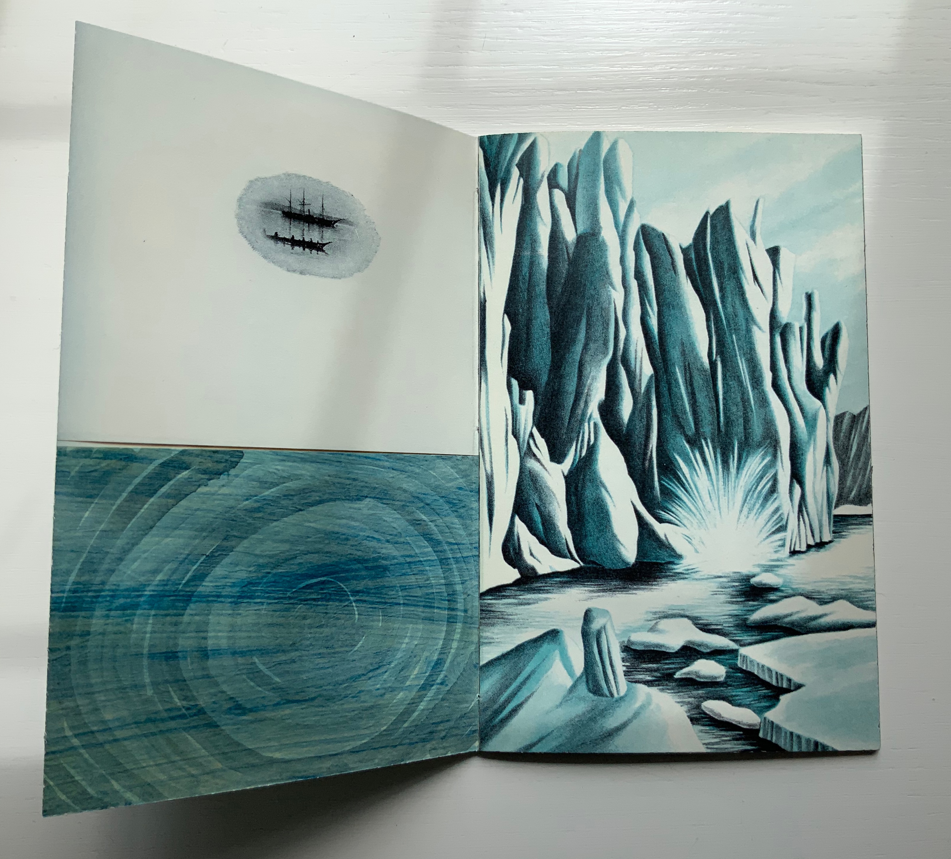
Collage Book #6: A Lesson in Subjective Relativity (2019)
Collage Book #6: A Lesson in Subjective Relativity (2019) Barbara Tetenbaum H190 x W120 mm, 32 unnumbered pages. Acquired from the artist, 11 April 2022. Photos: Books On Books Collection.
Collage Book #6 also consists of sequential picture planes, but the sequence is not narrative. Rather it is one of visual association. In an oval shape, a three-masted schooner and longboat hover over a swirling blue abyss. The image is repeated on the following verso page, which faces a full-page bleed depicting a calving iceberg or glacier in blue and white. Again, the image is repeated on the following verso page, which faces an overdrawn black-and-white image of crops along a winding road leading to a steepled building at the edge of a lake. This image, too, repeats on the verso page, and its reddish-orange overdrawn lines or stakes echo the color in the facing photo of a textbook graphic representing exports. And on it goes until the final image on the back cover echoes the initial image on the front cover (see below).
The booklet’s structure recalls that of O’Ryan’s Belt: Eleven Poems: 1990-1991 by Michael Donaghy (see above). The spine consists of inward folds of the front and back covers. Internally (see below) two sets of signatures are sewn together through the inward-folded tabs.
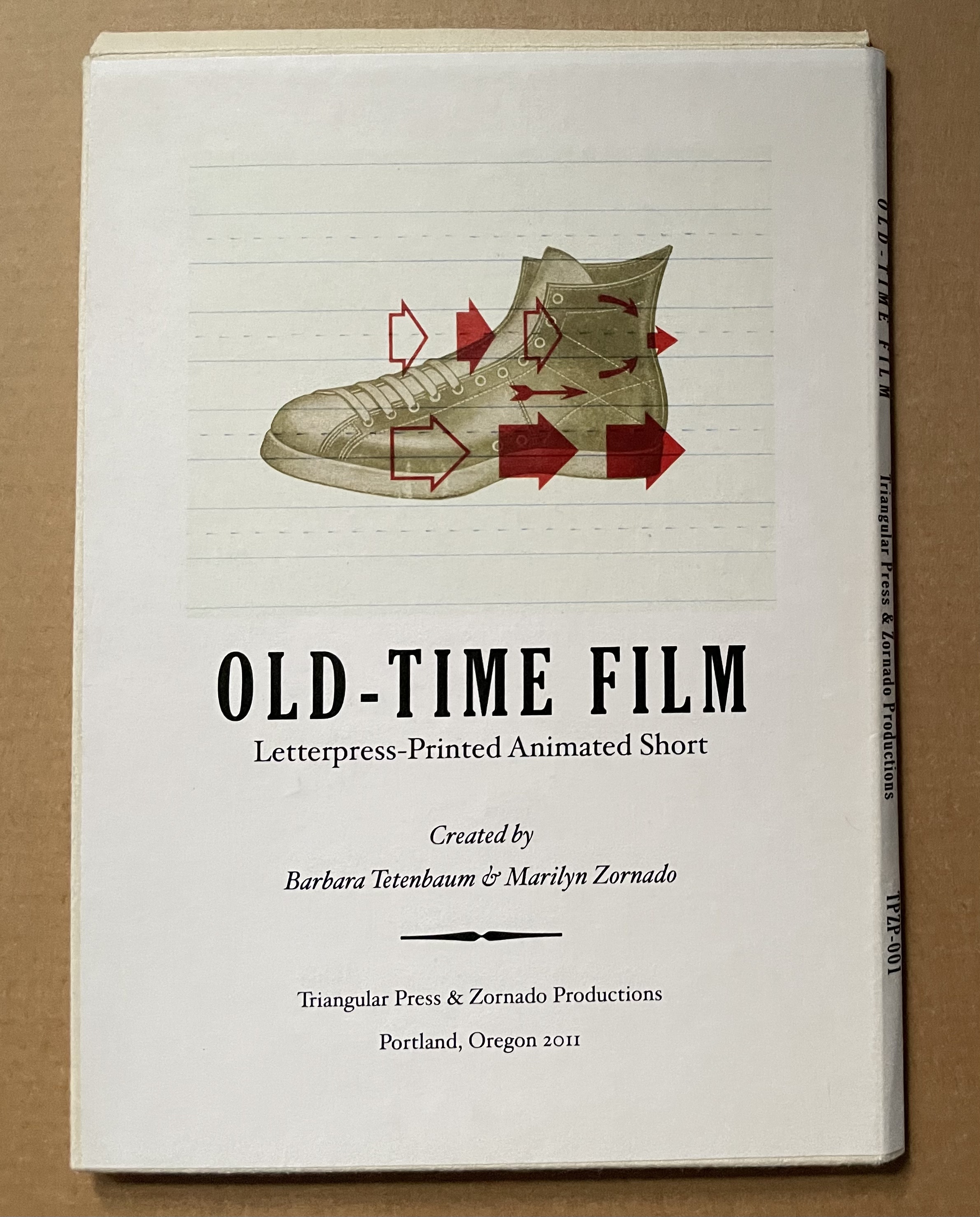
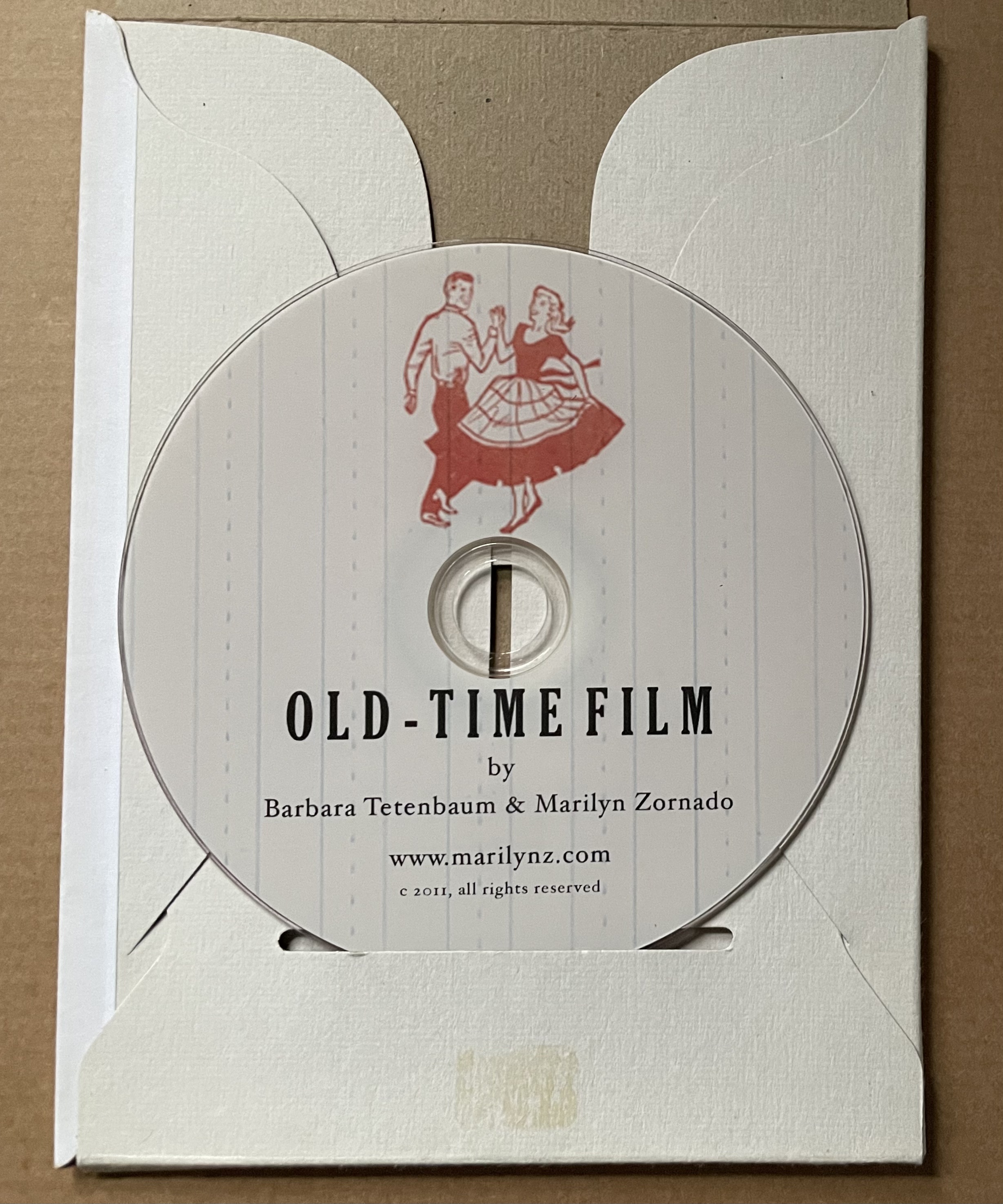
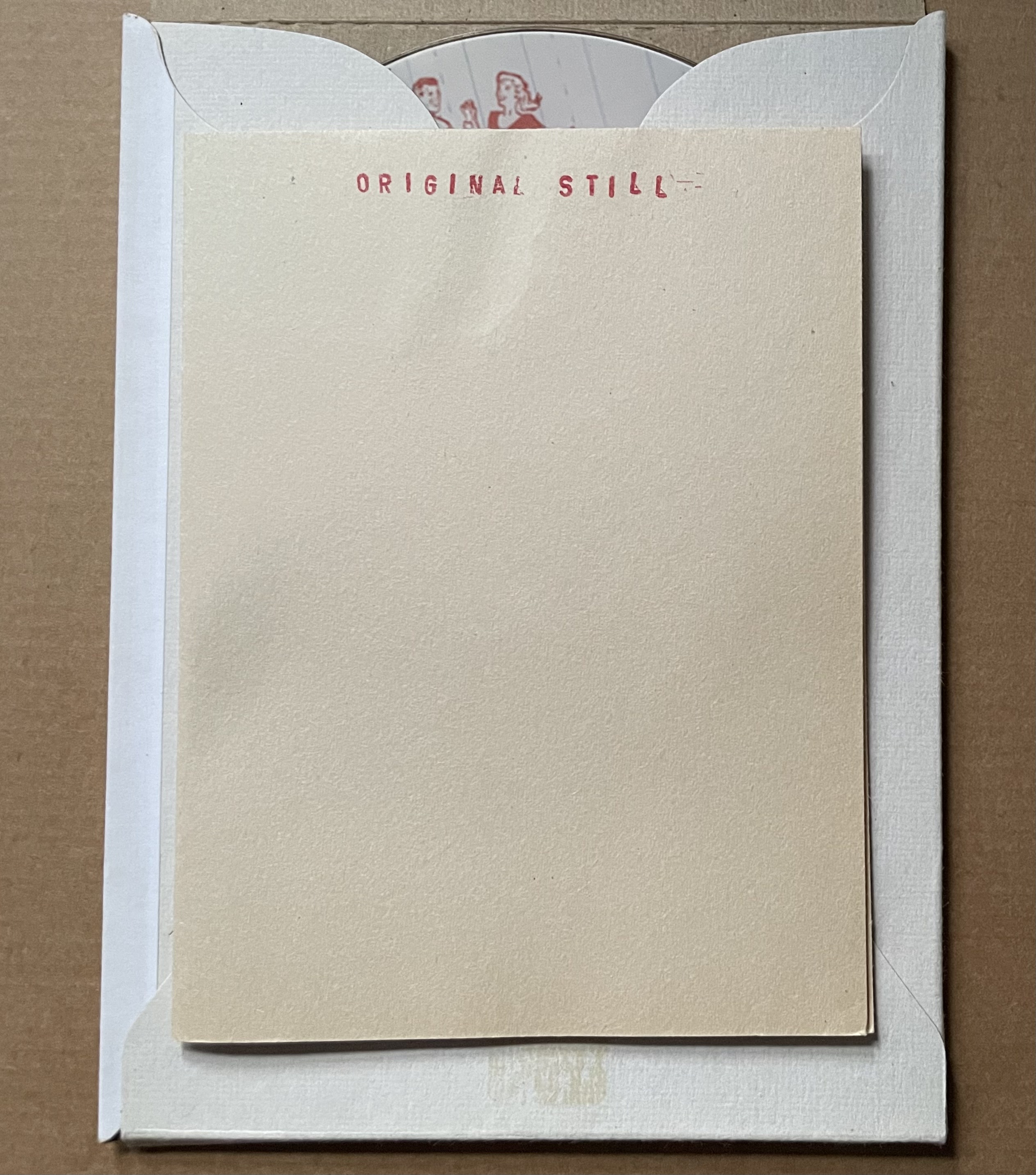
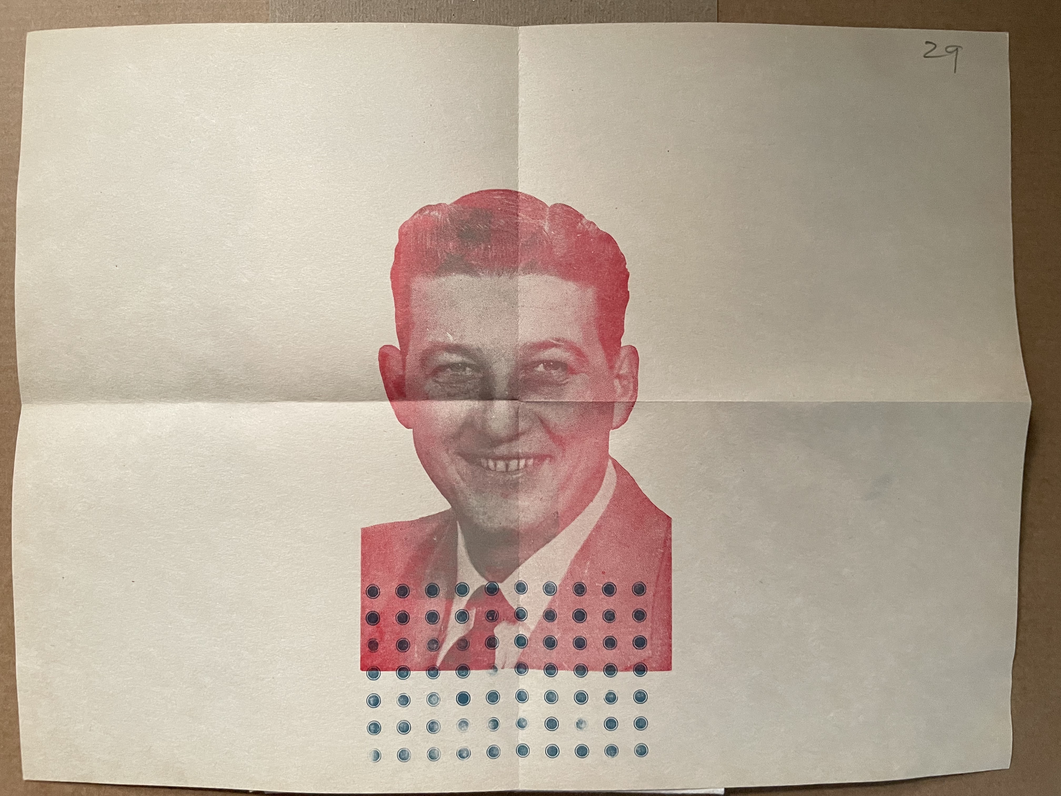
Old-Time Film (2011)
Old-Time Film: Letterpress-printed Animated Short (2011) Barbara Tetenbaum and Marilyn Zornado Slotted cardboard envelope containing DVD and print. Acquired from Barbara Tetenbaum, 12 July 2019. Photos: Books On Books Collection.
Artists’ description: DVD contents: Old-Time Film (2min, 58 sec) and “Behind-the-scenes” (2m, 48 sec). ; “Hand-set type, printer’s ornaments, and antique engravings come to life in this animated short created entirely through letterpress printing. Includes behind-the scenes showing the letterpress animation techniques on the Vandercook. Tetenbaum and Zornado have dubbed their process of combining letterpress techniques and animation ‘Vander-Mation.’ In this production using Vander-Mation shoes tap, sheep jump an ornamental enclosure, and words expand and contract in time with the music.
Postscript
Tetenbaum has provided another way to experience the Cather Projects: The Slow Read (2018). Take a wander through that site, composed of an introductory page to “a public literary and fine art project conceived and produced by Barbara Tetenbaum honoring the centenary of the publication of Willa Cather’s novel My Ántonia“, a set of seventy-four links to the daily scheduled readings, a blog section, a “concordance” that is more an unfolding of the installation and artist’s book than a listing of words and phrases against page references, and finally a portfolio of artwork by Tetenbaum.
Michaelis, Catherine Alice. 20 March 2021. “Elemental Impressions“. Artist’s Books Unshelved. Bainbridge Island Museum of Art. Accessed 22 March 2021. Video presentation and discussion of Diagram of Wind.
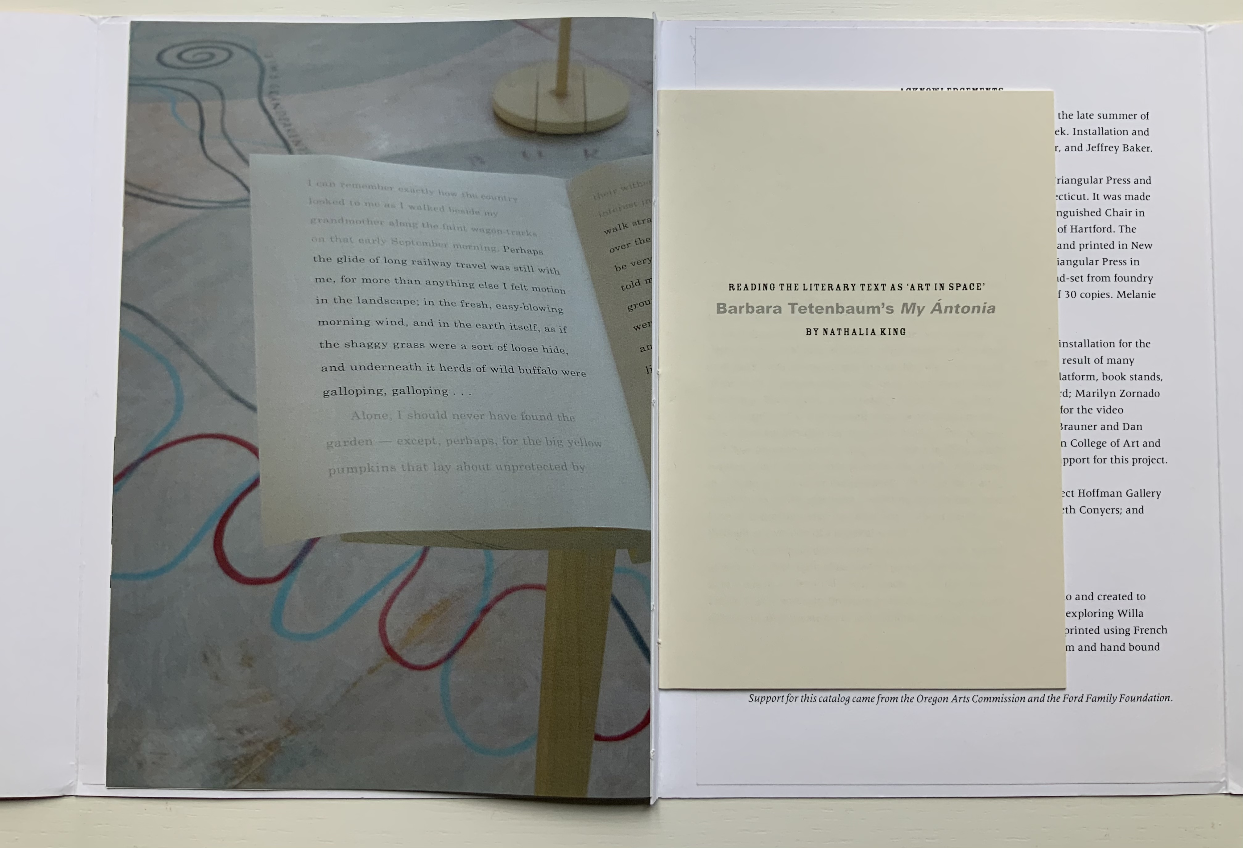
King, Nathalie. “Reading the Literary Text as ‘Art in Space’: Barbara Tetenbaum’s My Ántonia,” The Artist’s Yearbook, 2014-2015. Bristol: Impact Press, pp. 95-99.
Schneider, Uta. “Turning the Page”, pp. 18-28 in Tetenbaum, Barbara, James Carmin, and Uta Schneider. 2005. Half-life: 25 years of books by Barbara Tetenbaum & Triangular Press. Portland, OR: Triangular Press. Three key works not in the collection are described in Half-Life. The first would be an edition from the Gymnopaedia series, based on the artist’s response to Erik Satie’s musical compositions of the same name. The second would be Tetenbaum’s collaboration with Julie Chen that resulted in a powerfully moving work: Ode to a Grand Staircase (for Four Hands) (2001). The third key work returns to Donaghy’s poetry with the clear aim to incorporate sound in book art: Black Ice and Rain: Psalms 6.6 (2002). In the absence of the work itself, Uta Schneider’s description of it in Half-Life is as close as one can come to experiencing it.
Tetenbaum, Barbara. 14 June 2021. “My Ántonia at Six Pages a Day: The Slow ReadProject”, presentation for the panel “Willa Cather and Her Readers”, organized by the Willa Cather Foundation for the American Literature Association Virtual Panel. Accessed 19 July 2021.
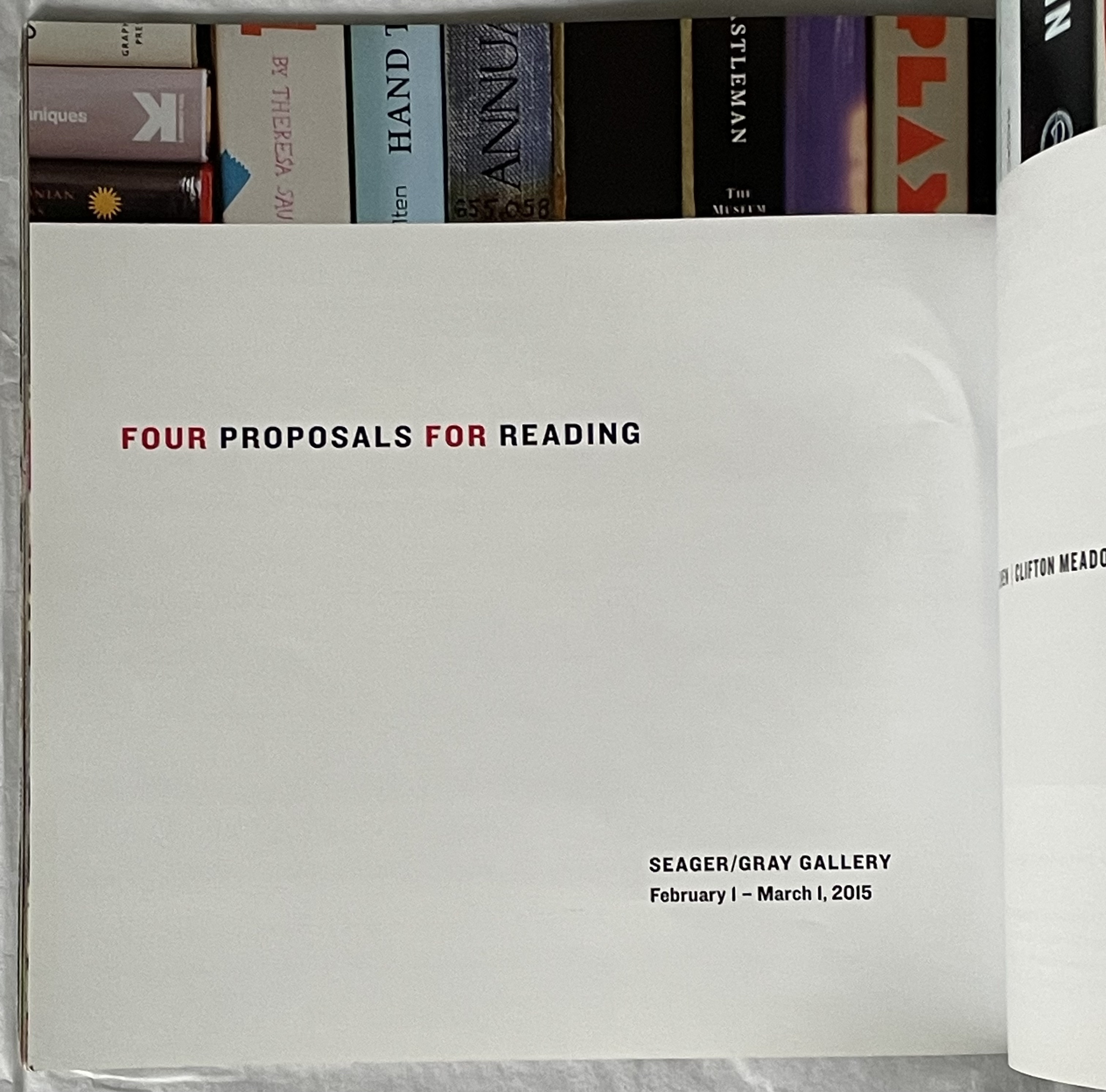
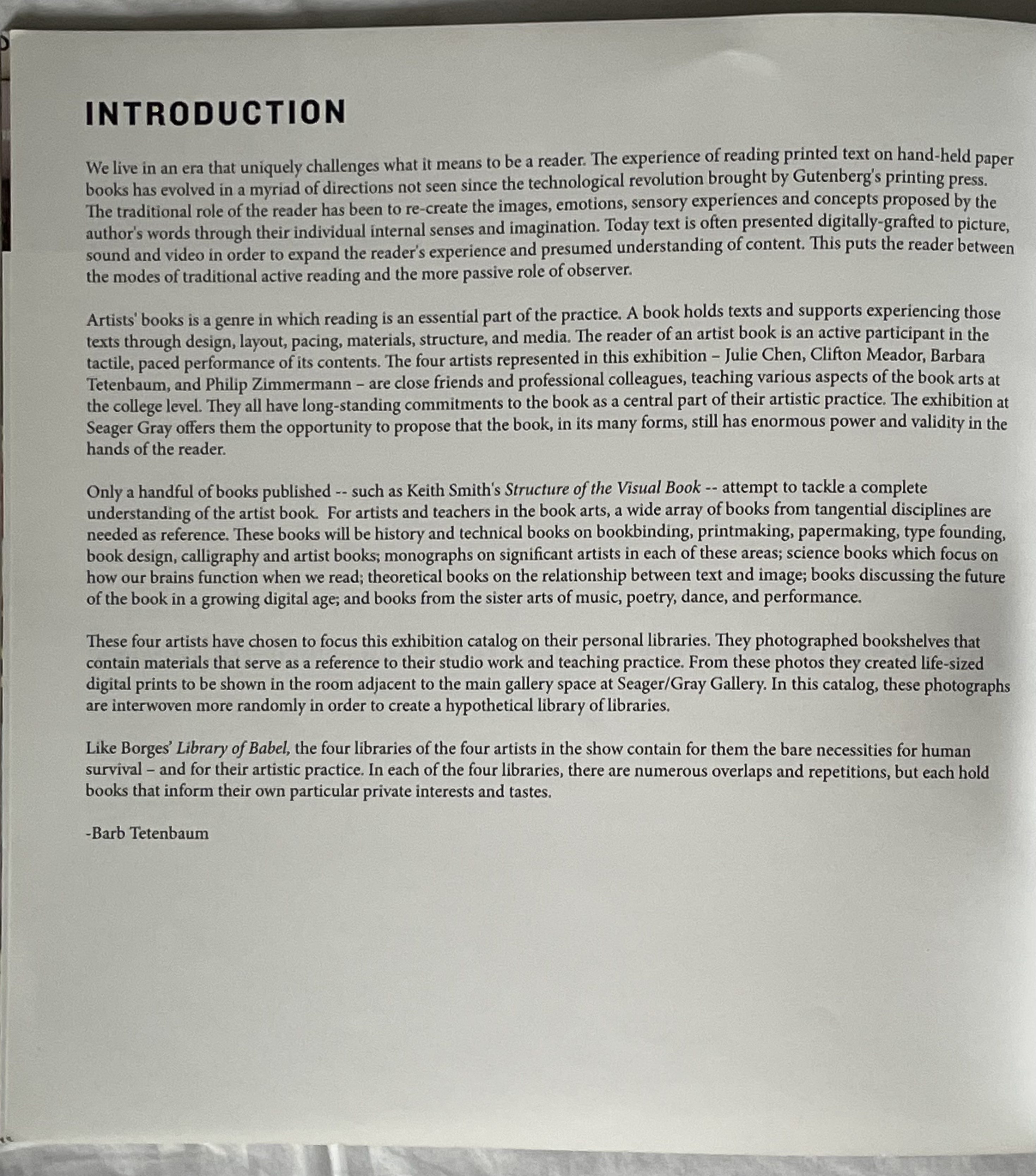
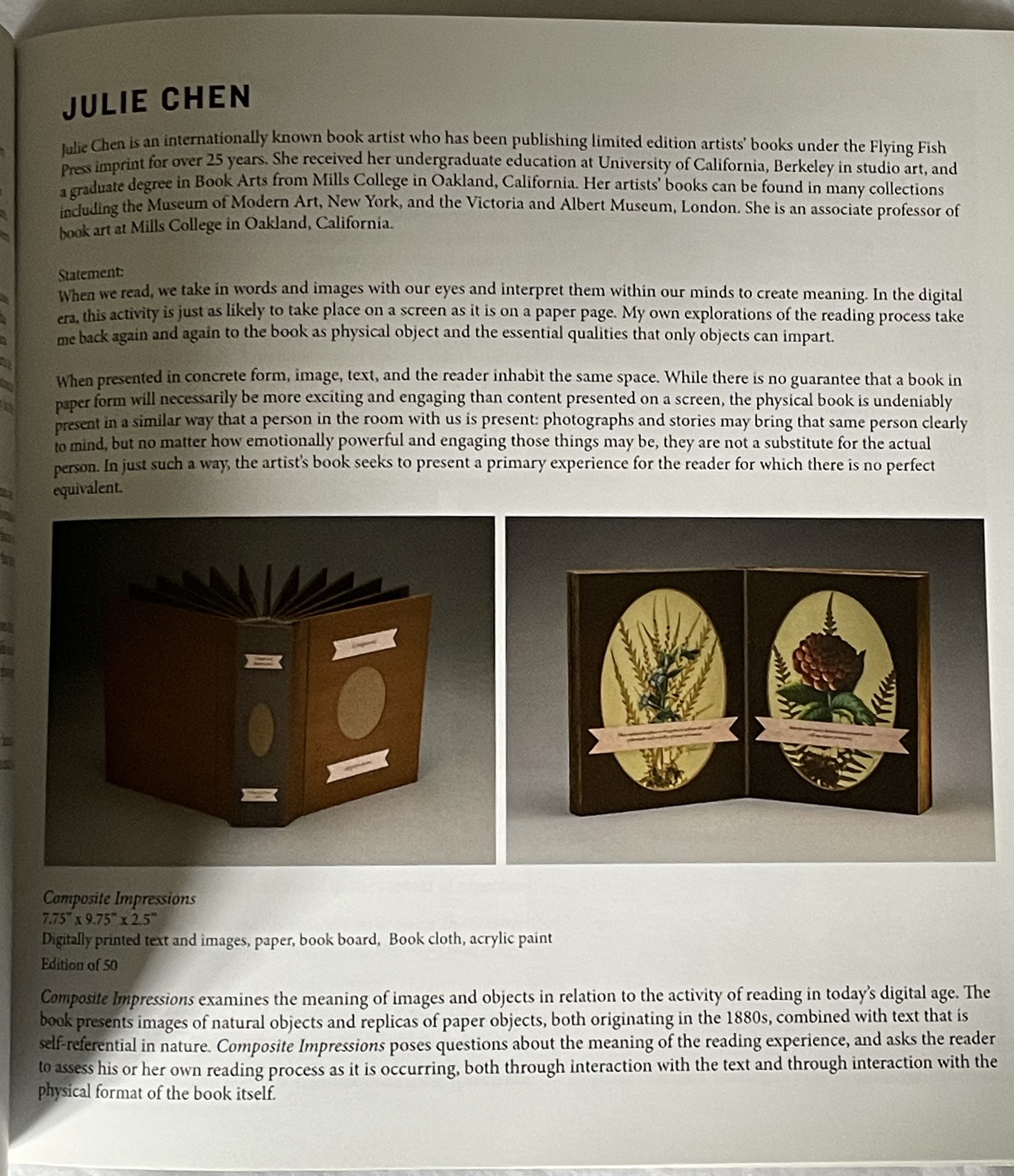
Four Proposals for Reading (2015)
Four Proposals for Reading (2015) Seager Gray Gallery and Barb Tetenbaum (ed.) Perfect bound book. 203 x 203 mm. [44] pages. Acquired from Barb Tetenbaum, 2019. Photos: Books On Books Collection.