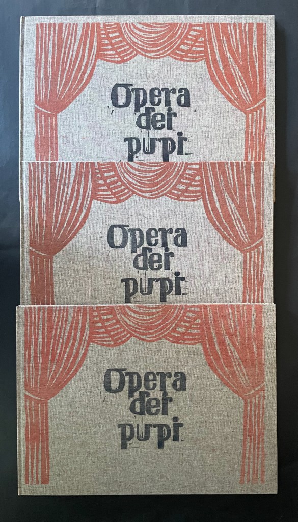
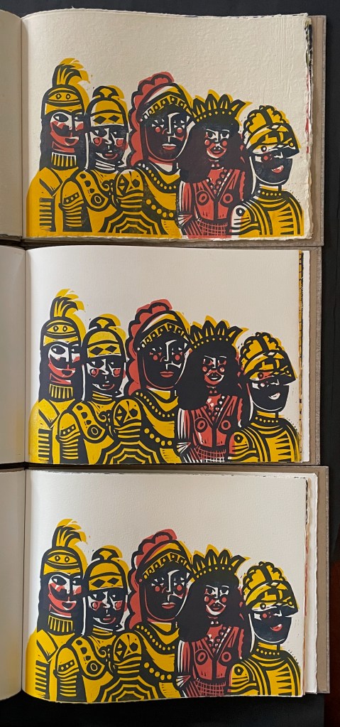
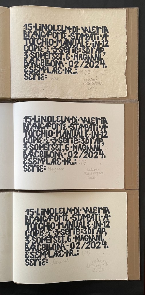
Opera dei Pupi (2024) Valeria Brancaforte Casebound hardback, cloth over boards, print on front cover. Plain brown doublures. Three variants based on trim and paper. A: H272 x W368 mm; Drap, Catalan hand-made paper. B: H261 x W360 mm; Italian Magnani Incisione. C: H265 x W362 mm; Somerset Velvet White 250gsm. [20] pages with 14 prints. Each in an edition of 12, of which A is #11, B is #5, and C is #1. Acquired from the artist, 14 November 2025 and 7 February 2026. Photos: Books On Books Collection. Displayed with permission of the artist.
Puppets and marionettes have figured in more than a few artists’ books. Ron King and Roy Fisher’s The Left-handed Punch (1986) and Anansi Company (1992) are perhaps the best known. Others include Ann Kresge’s Shadow Play (1998), Antonio Nocera’s La Valigia di Pinocchio (2015), Emily Martin’s Funny Peculiar Funny Ha Ha (2017), Hormazd Narielwalla’s Paper Dolls(2018) Erminia De Luca’s Now it’s up to you (2023), and Rachel Simmons’ Dream of the Golden Empress (2023). Valeria Brancaforte’s recent addition to the cavalcade brings to it a new cultural tradition and a welcome chance to compare how variation in paper can play into appreciation of an artist’s book.
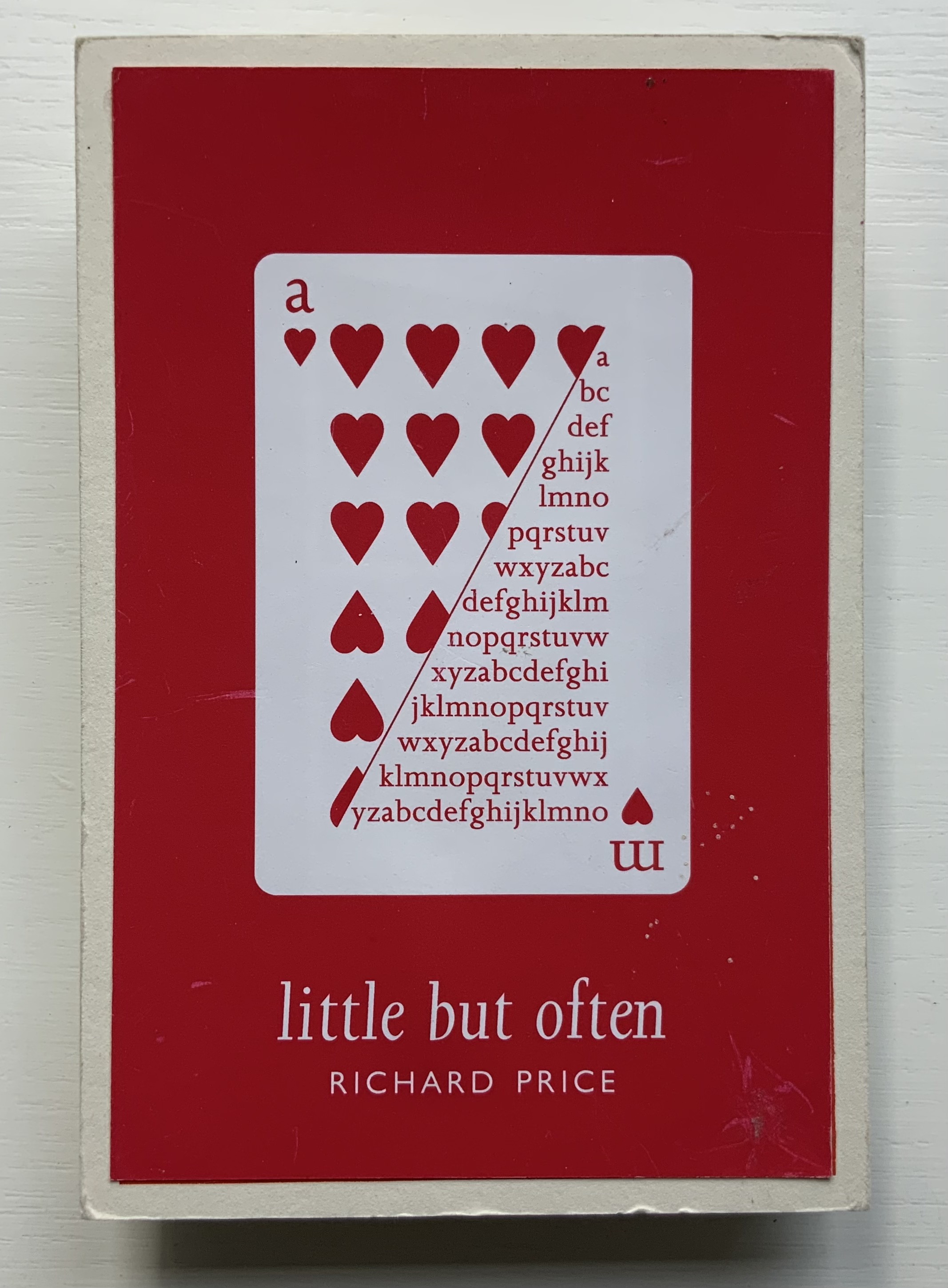
Richard Price’s lines recall the inventiveness of Emily Dickinson‘s and compression of Samuel Menashe‘s. For Dickinson, we have the artistry of Jen Bervin; for Menashe, we have that of Julie Johnstone; and for Price, we have his full-on collaboration with Ron King.
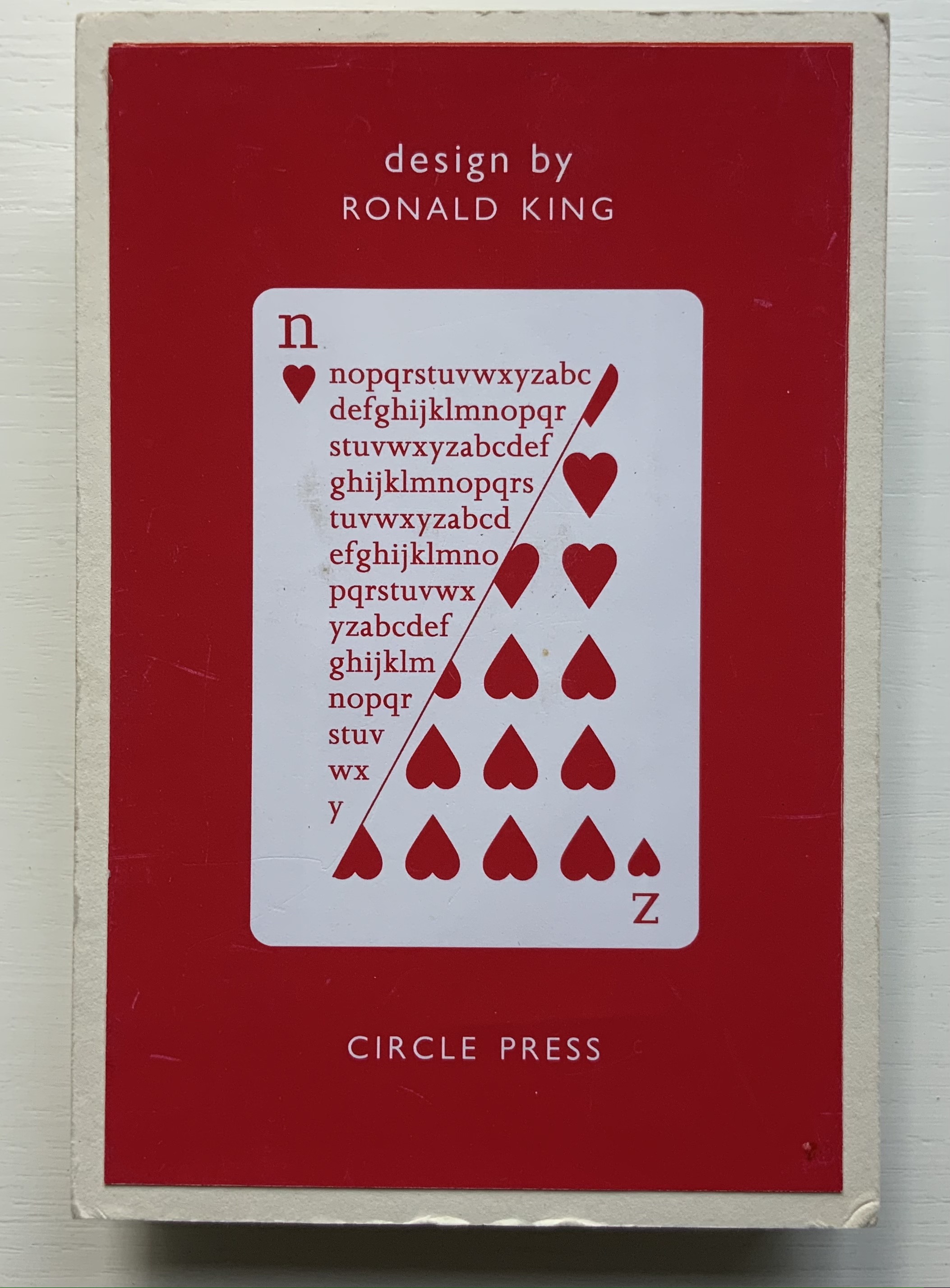
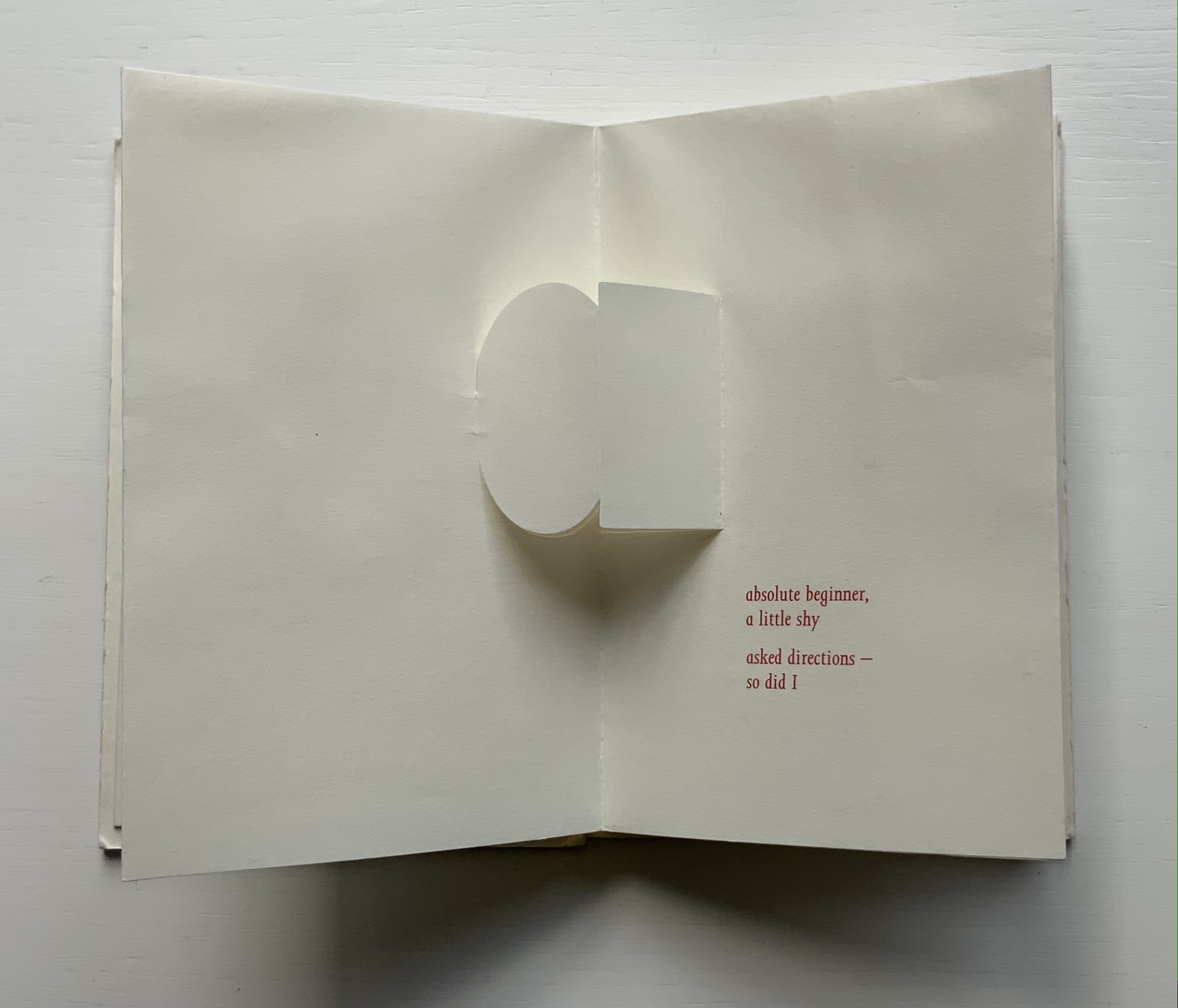
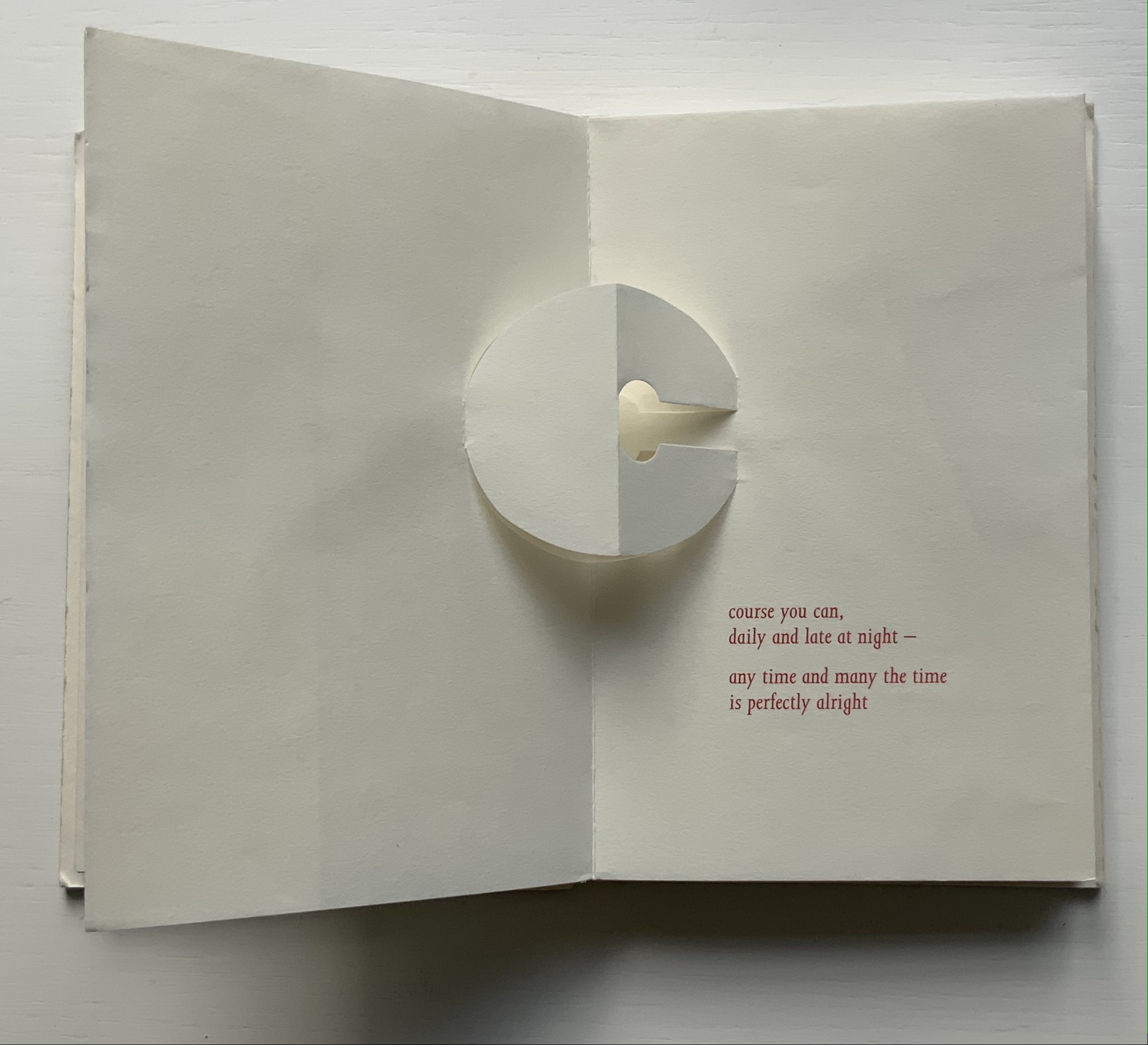
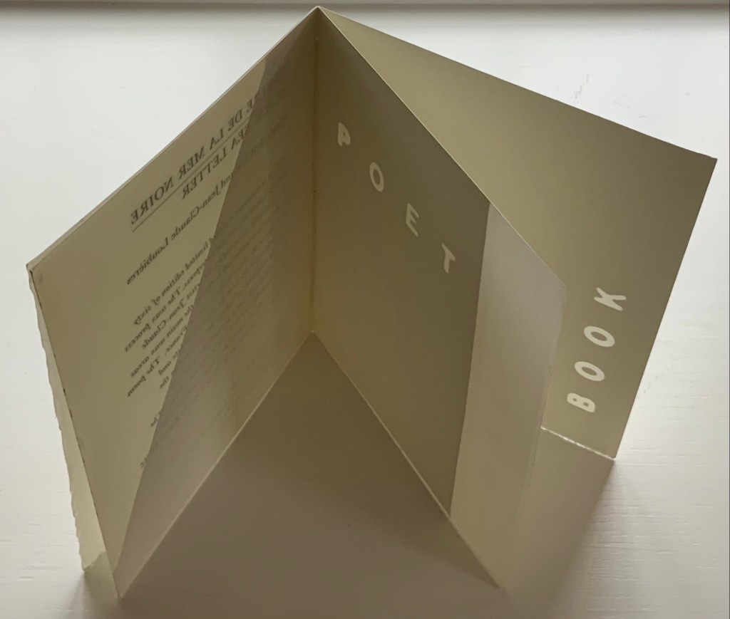
Harking back to The Half-Year Letters (1983), little but often pairs King’s lowercase pop-up alphabet with Price’s verses, just as its predecessor paired the uppercase with Roy Fisher‘s alphabet-inspired evocations of the 26 weeks from April through September. Also like its predecessor, little but often plays on the 52 weeks of the year, this time with its front and back covers illustrated with a playing-card suit of hearts, “numbered” a-m and n-z, and with two pages allotted to each week, each letter and each brief poem — as the title says, little but often. While The Half-Year Letters explores the forward movement of the letters alongside the movement of the year, this is love poetry in a book of back and forth. Text and design converse — and not merely by the letter.
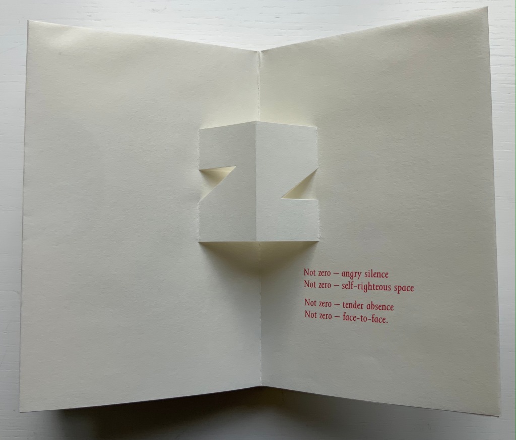
The last letter and lines in the book exemplify this to perfection.
Of the few other pairs of couplets in the book, none is as back and forth as the letter z’s. Paired against one another, rhyming abab, each line beginning alike with its N-z phrase, the two couplets echo the back-to-backness and balance of the dos-à-dos structure. The phrases self-righteous space and tender absence can be read as allusions to the cut-out space around the letters. Or vice versa. Again, back and forth. “Angry” and “tender” bat each other back and forth, just as the final phrase turns the dos-à-dos sweetly back on itself.
Together, Price and King make the concertina book “smile brighter”.†
“Ronald King“. 1 March 2021. Books On Books Collection.
Clark, Caroline. 23 January 2013. “Clark on Price“. Eyewear, the blog.
†Dante Alighieri. 1320. Purgatorio (Canto XI, 82). Hollander, Robert, Stephen Campbell, and Simone Marchesi. 1988. Dartmouth Dante project. When Dante meets and praises the illuminator Oderisi da Gubbio in purgatory, Oderisi directs the praise to his pupil Franco Bolognese as the one who really made “the pages smile brighter”.
Price, Richard. 2018. Digital. Essence Press. Collaboration with Julie Johnstone.
___________. 2008. folded. Essence Press. Collaboration with Julie Johnstone.
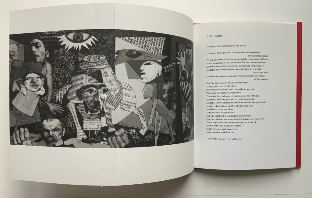
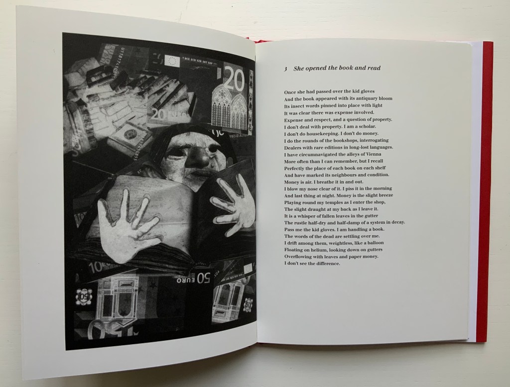
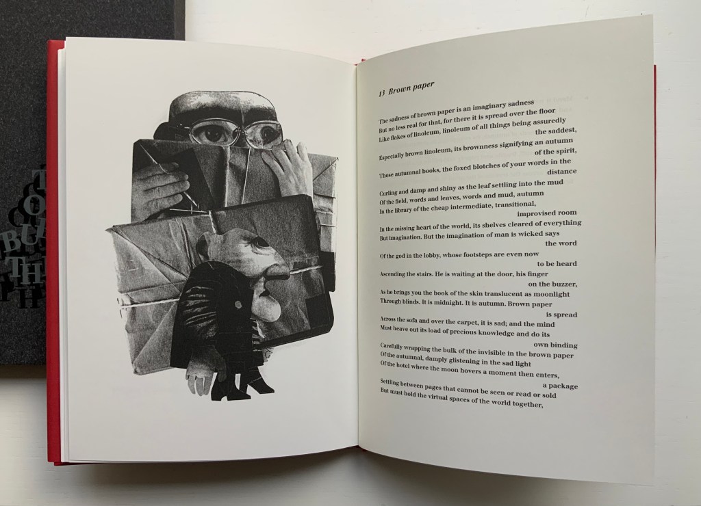
The Burning of the Books(2009) George Szirtes (poems) and Ron King (prints) Slipcase with sewn hardback, duotone letterpress reproduction of the 2008 artist book version. H220 x W160 mm, 66 unnumbered pages. Edition of 1000, the first 100 signed and numbered by the author and artist and presented in a specially designed slipcase. Acquired from the artist, 28 January 2021. Photos of the work: Books On Books Collection.
The Burning of the Books is the harshest of Ron King’s work in the Books On Books Collection. According to the artist, this work’s genesis was his long fascination with Elias Canetti’s Auto da Fe (1946). King commissioned Szirtes to respond to Canetti’s work with a text to accompany the etchings that King had been holding in abeyance. The result in 2008 was a large format artist book, of which this work is a reproduction.
With its photo-collages of a Guernica-like fold-out, newspaper clippings of shamed collaborators, fists and human limbs, The Burning of the Books delivers a visual indictment of the 20th century that creeps into the 21st century with the added images of celebrity police ID photos and Euro currency notes. Szirtes’ take on King’s take on Canetti’s take on his main character’s solipsistic slip from obsession into madness in a world of alienating -isms is the work of art with which we — sadly, more than a decade later — keep catching up.
This work’s fascination with horrors may have its roots in a childhood experience in Brazil — seeing a photograph of a bandit gang’s mass beheading — but, more often than not, King’s works emphasize a humor in blackness (as does this work in its recurrent image of Mr. Punch-like figures). Most often, though, a sheer joy of making and material prevails.
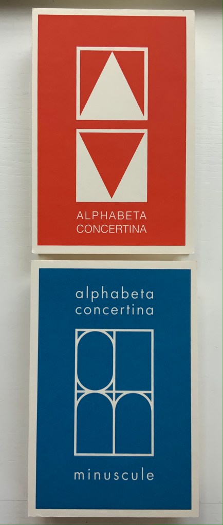
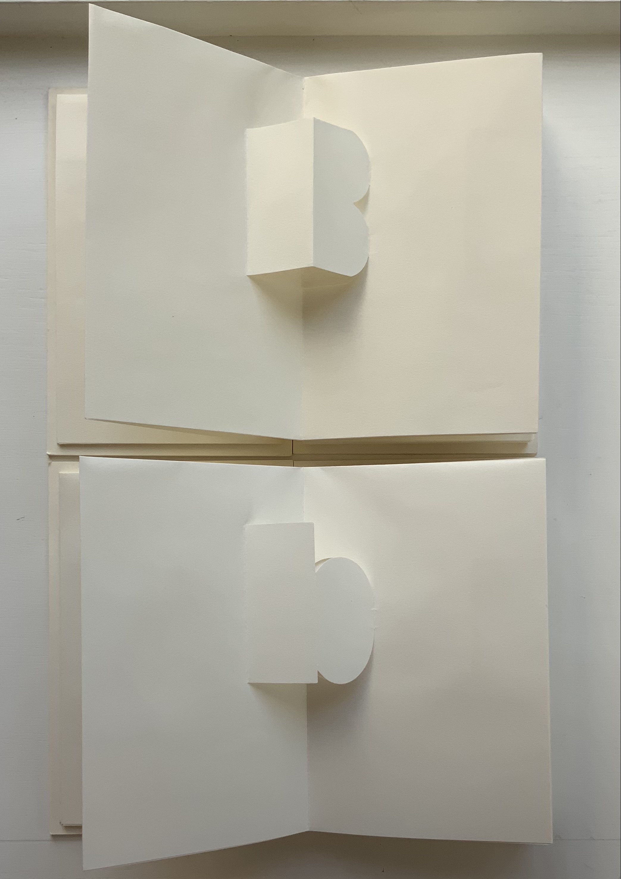
Alphabeta Concertina and alphabeta concertina (2007)
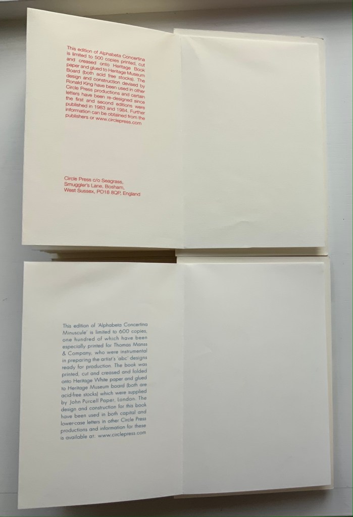
Alphabeta Concertina and alphabeta concertina miniscule (2007) Ron King Printed, cut and creased onto Heritage paper and glued to Heritage Museum board. H170 x W110 x D30 mm,stretching to 3 meters. Edition of 600. Majuscule acquired from the artist, 24 July 2021; miniscule acquired from Sophie Schneideman Rare Books and Prints, 27 November 2020. Photos: Books On Books Collection.
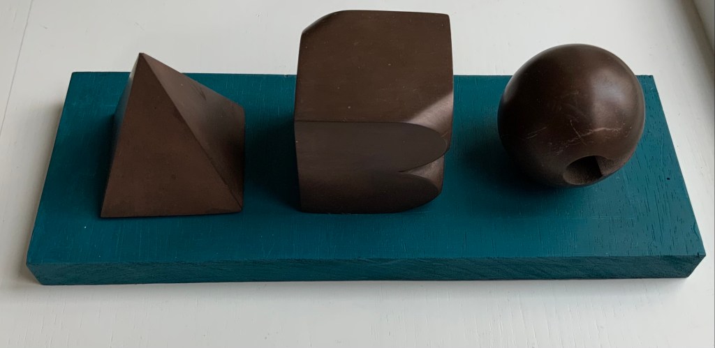
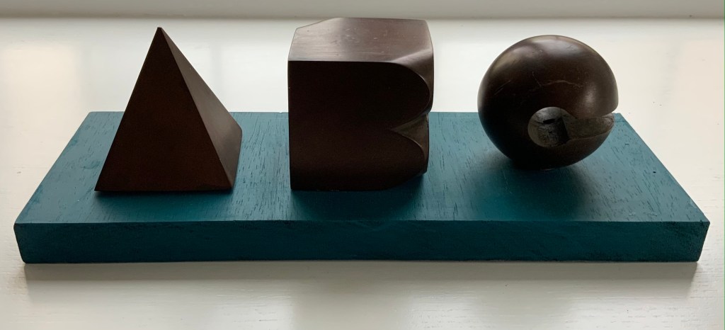
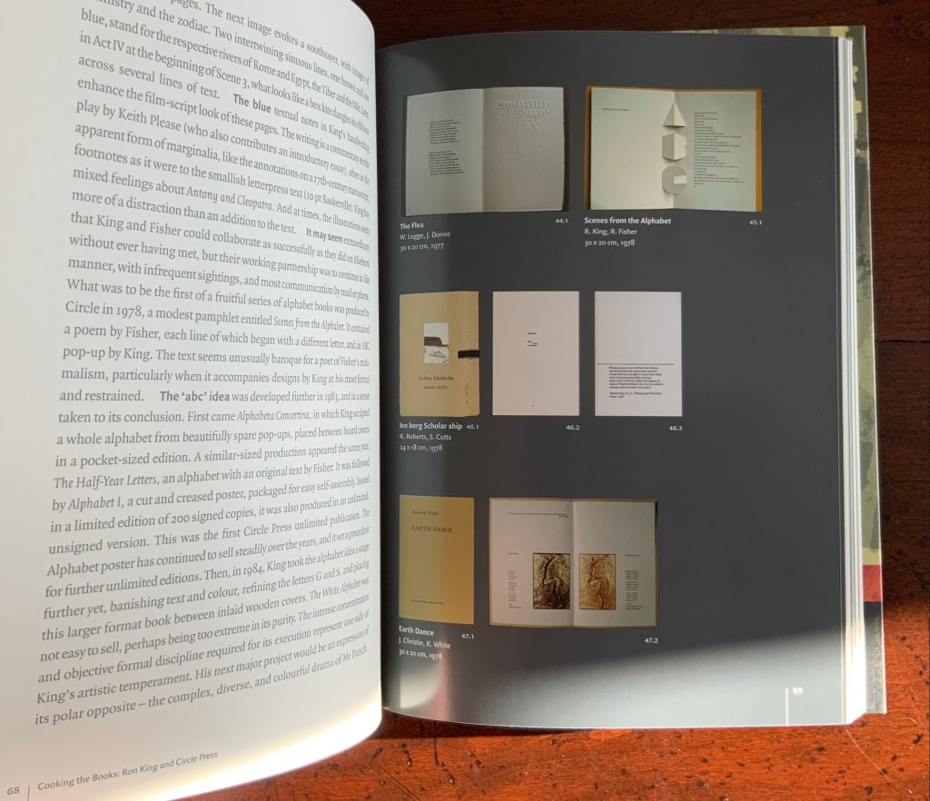
The “abc” series displays the restrained, minimalist side of King’s inventiveness. With more than one of these works to hand, his enjoyment and humor come through — especially in the subtle and not-so-subtle variations. Take alphabeta concertina miniscule as an example. It arrived like a long awaited chuckle after the majuscule version — Alphabeta Concertina (1983) — which had been expanded into the poster versions Alphabet I and Alphabet II (below). Size and surprise seem to matter in King’s sense of humor. For size, see the large-scale steel version of the alphabet in 2016. For surprise, consider his catalogue raisonné Cooking the Books or this set of paperweights.
ABC[nd] Ron King Resin sculptures on painted wooden board Acquired from the artist, 24 July 2021. Photos: Books On Books Collection.
Further down are Alphabet II (1999) and The White Alphabet (1984). Compare their uppercase letter C with that above to see how King developed his sculpting over time.
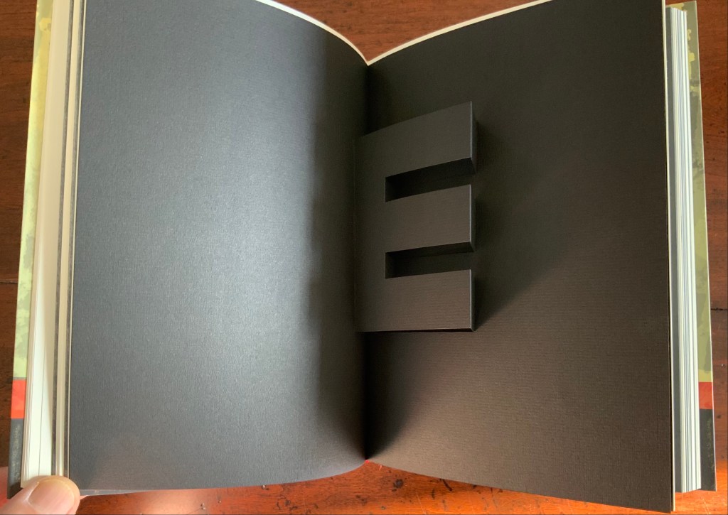
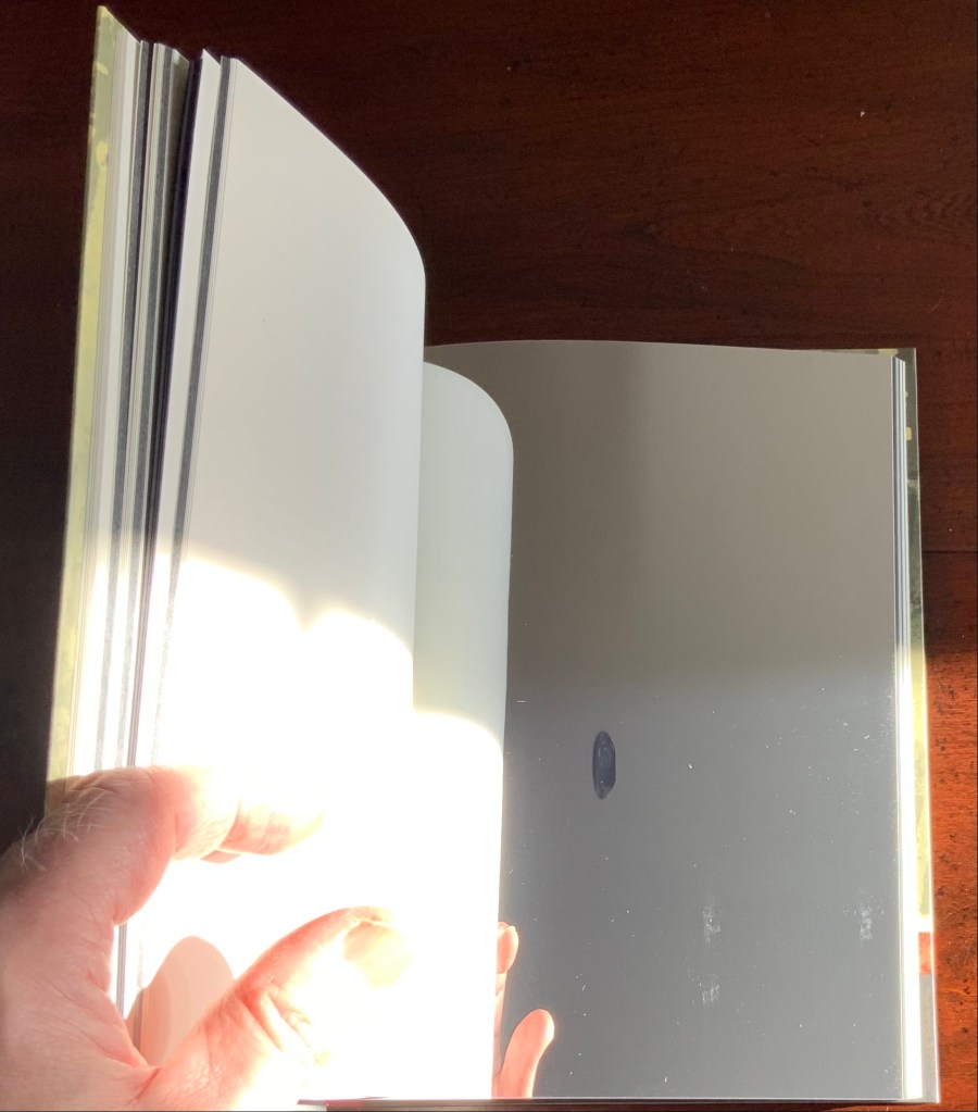
Cooking the Books (2002)
Cooking the Books: Ron King and the Circle Press (2002) Ron King, Andrew Lambirth Paperback with end flaps, sewn with headbands. Pop-up and metallic paper inserts. H225 x W165 x D20 mm, 180 pages. Acquired from the artist, 24 December 2020. Photo: Books On Books Collection.
King’s catalogue raisonné does not merely illustrate his work, it illustrates it. Inserts of mirror paper, wax paper and a pop-up letter E transform what appears to be a simple codex into a treasure chest.
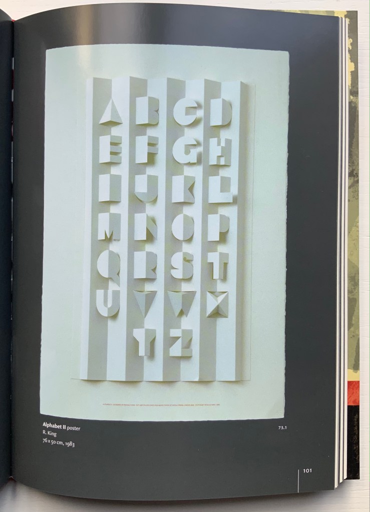
Alphabet II (1999)
Alphabet II (1999) Ron King Pop-up poster. H760 x W500 mm. The letters have been cut onto a 190lb Waterford paper and mounted onto a heavier version of the same stock. Edition of 200 signed. Acquired from Circle Press, 26 June 2015. Photo of Cooking the Books, p. 101: Books On Books Collection.
The collection’s framed poster interferes with photography, but Cooking the Books provides the alternative.
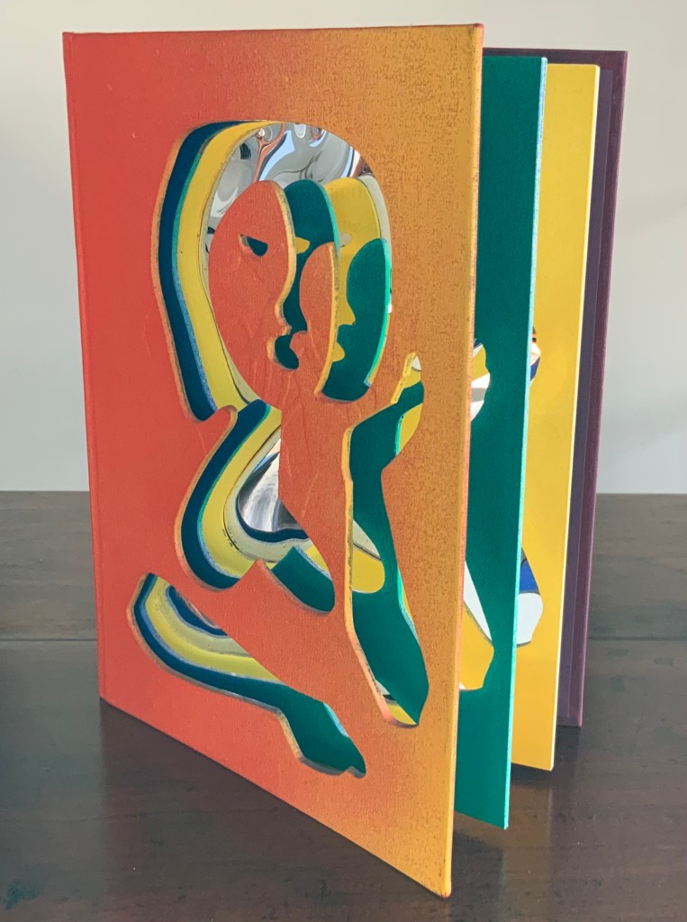
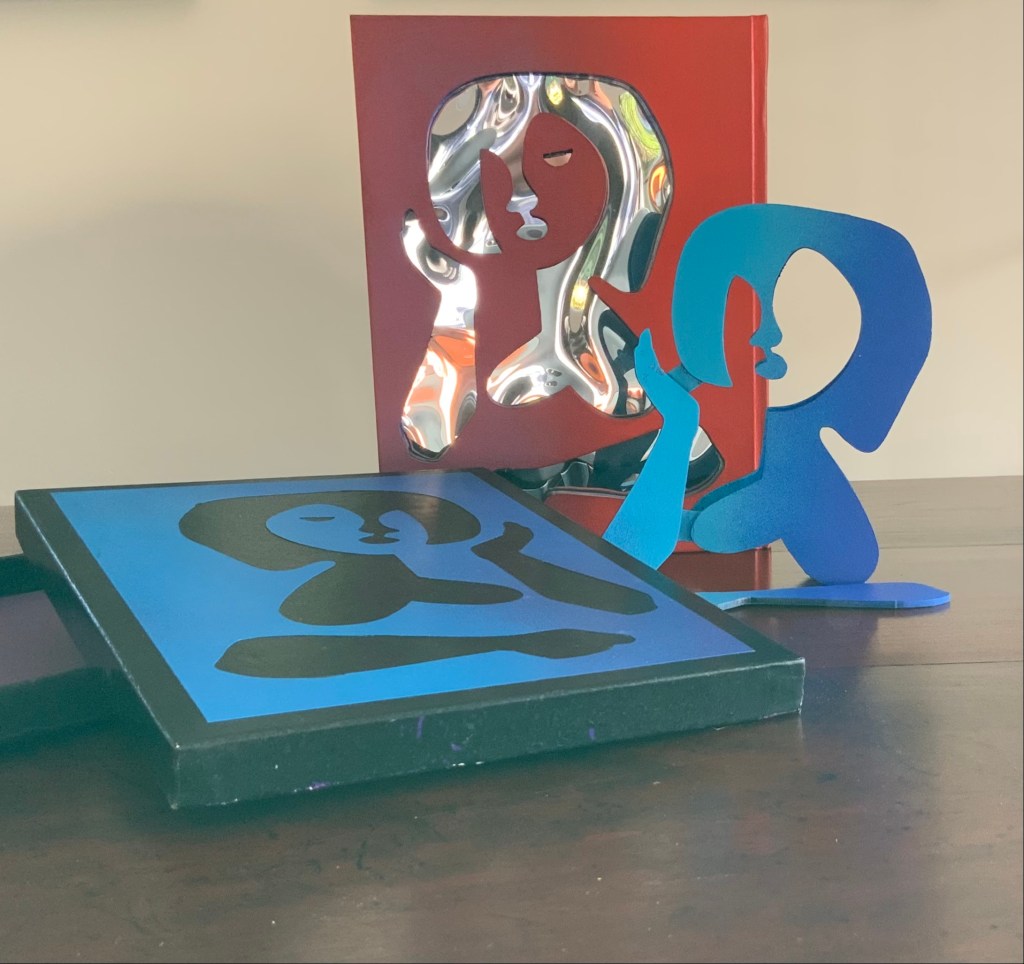
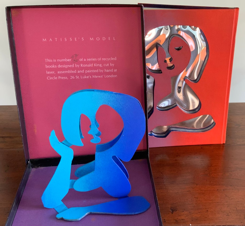
Matisse’s Model (1996)
Matisse’s Model (1996) Ron King An edition of 50 signed book-works made by the same process as Acrobats. 23 x 17 cm with mirror-foil, sprayed pages, and a removable freestanding figure in collaged cardboard box. Photos: Books On Books Collection.
The sculptural element toward which King’s work has always turned is on display in the title and forms of Matisse’s Model. The mirror paper appears as it must for any attractive model.
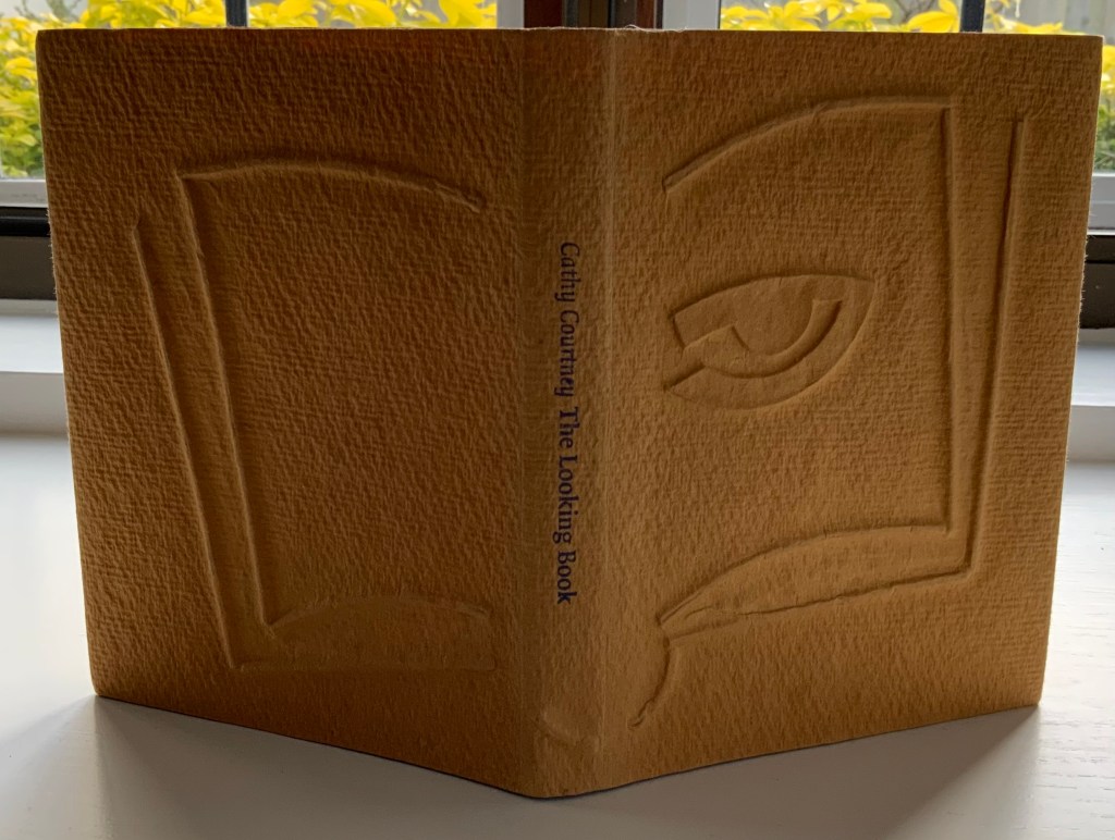
The Looking Book (1996)
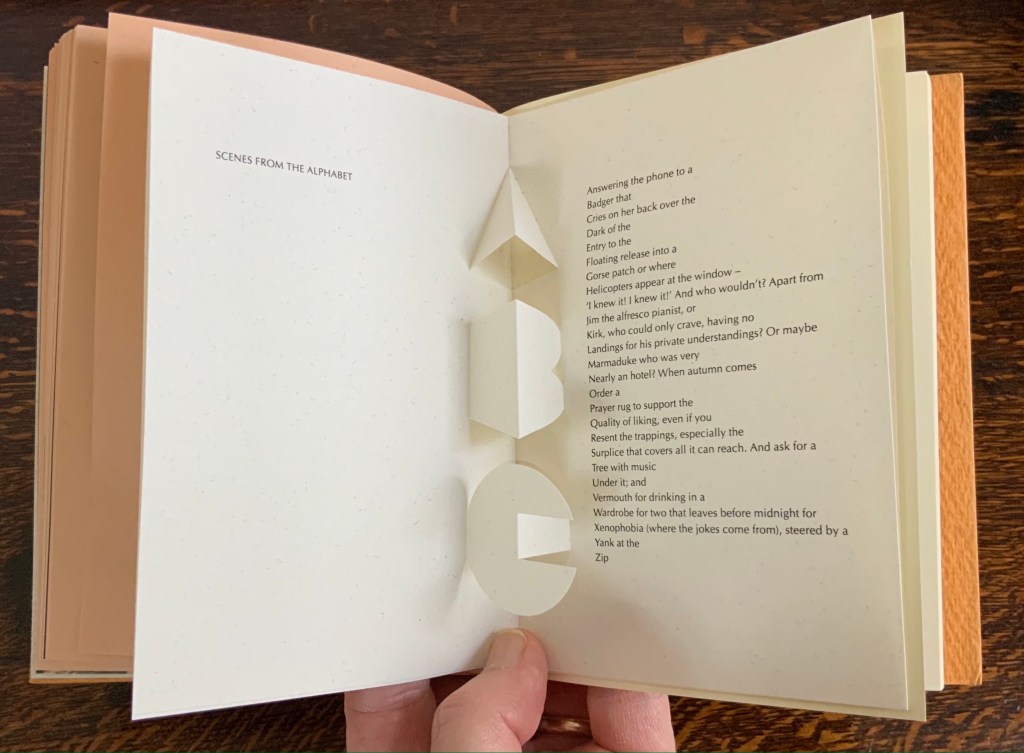
The Looking Book: A Pocket History of Circle Press, 1967-96 (1996) Cathy Courtney Casebound in wire print paper. H160 x W120 xD20 mm Edition of 1000, of which this #67 and initialled by Ron King. Acquired from Peter J. Hadley Bookseller ABA ILAB, 25 June 2015. Photos: Books On Books Collection
Pop-up insert of “Scenes from the Alphabet” by Roy Fisher. Photo: Books On Books Collection.
As with Cooking the Books, this catalogue raisonné, prepared by Cathy Courtney, provides samples of the artist’s work. They appear in the wire debossed cover and this centrepiece of “Scenes from the Alphabet” done with Roy Fisher, which led to a full-scale alphabet book at Fisher’s suggestion.
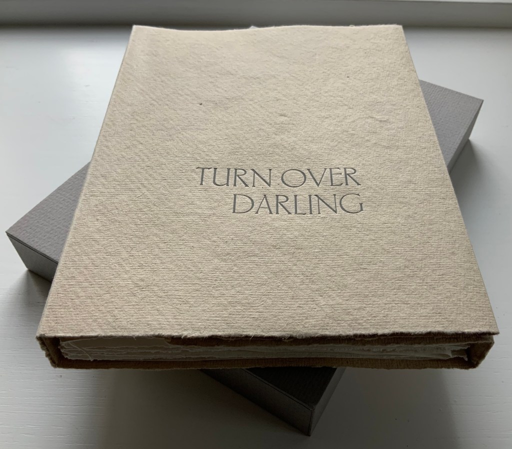
Turn Over Darling (1994)
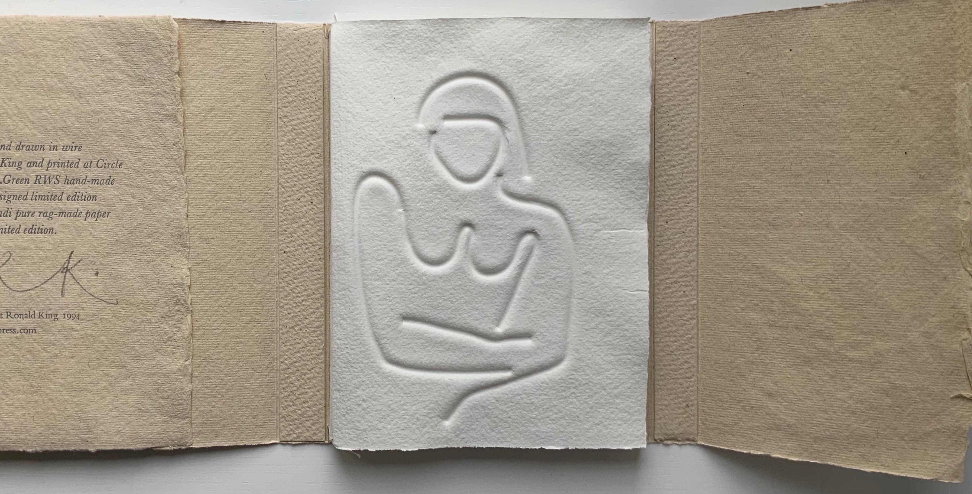
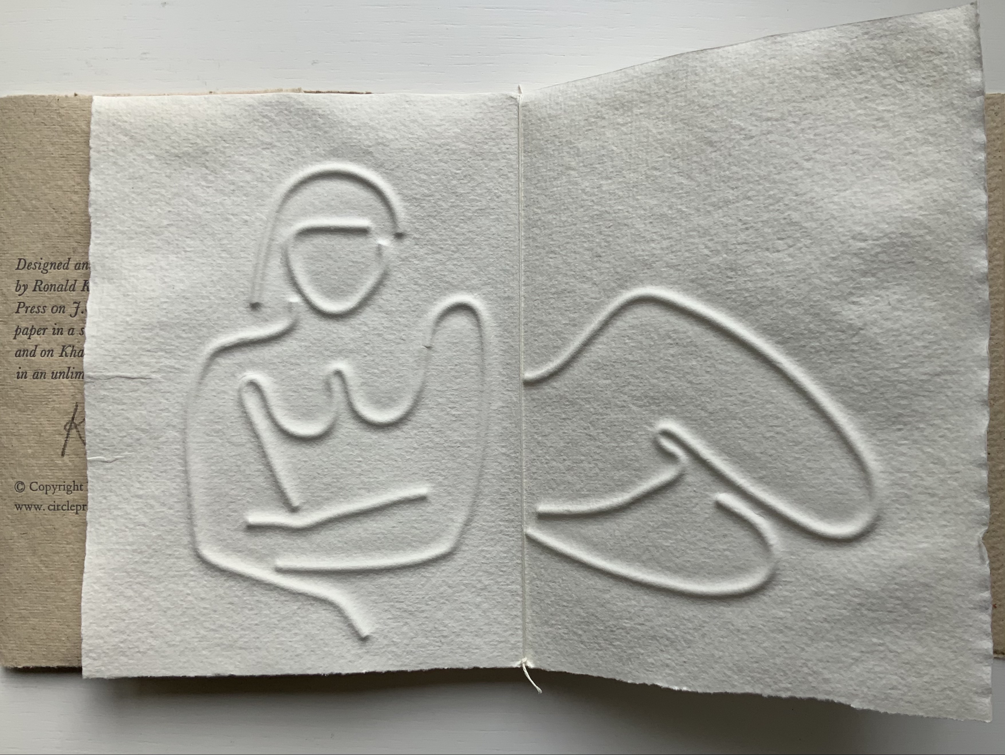
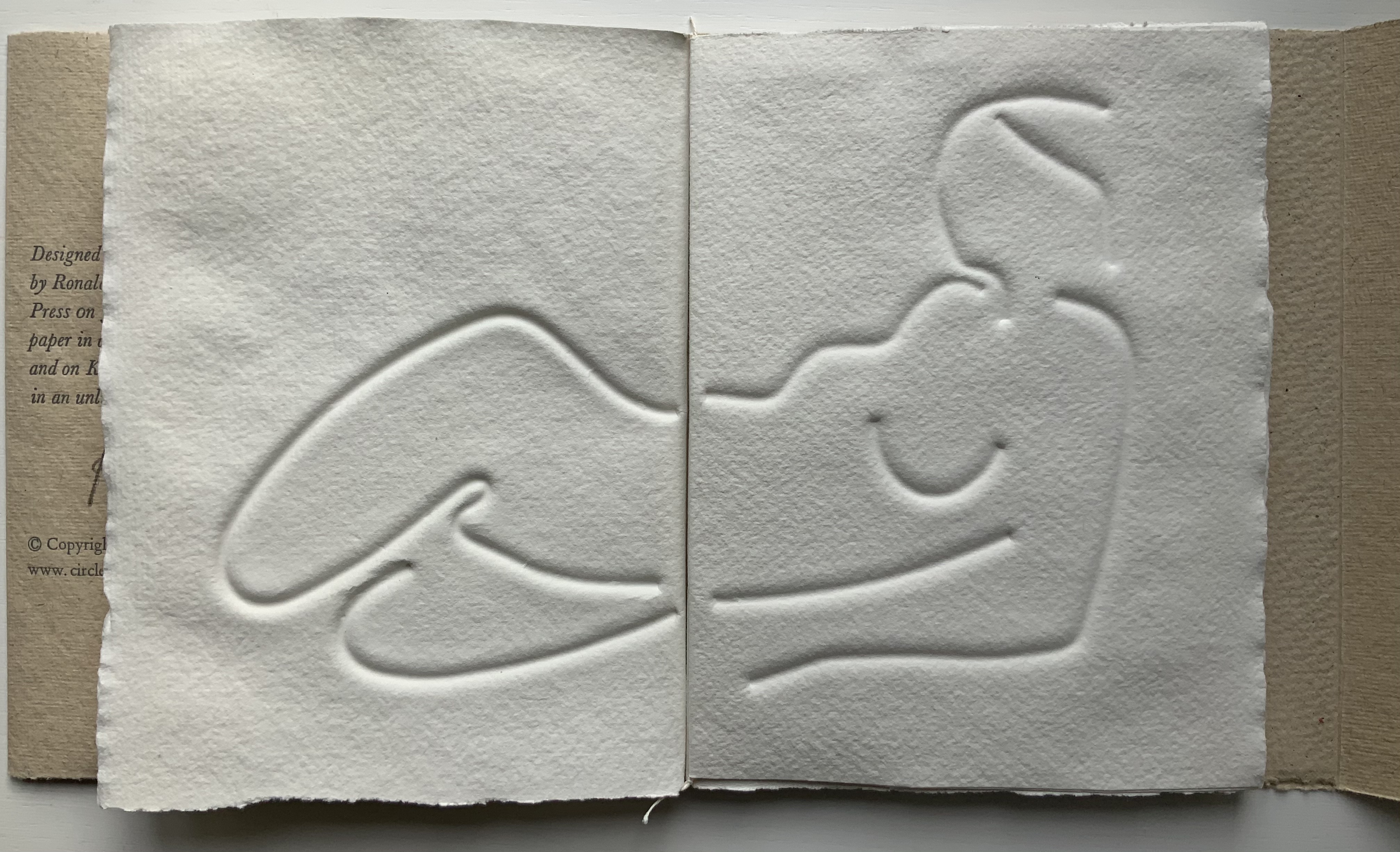
Turn Over Darling (1994) Ron King Slipcase (H204 x W153 x D28 mm) containing a light brown paper portfolio (H195 x W150 x D24) into which are hand-sewn six sheets (H190 x W282) of J. Green RWS hand-made paper, folded in half, bearing embossed and debossed images of a female figure. A signed copy from the limited edition of 75. Acquired from the artist, 1 December 2020. Photos: Books On Books Collection, displayed with artist’s permission.
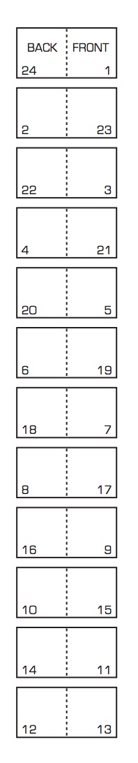
The six embossed and debossed drawings were created from wire forms pressed into dampened sheets of paper. Turn Over Darling elegantly combines King’s sculptural skills with his printer’s skills. When folded and juxtaposed in sequence, they make for eleven reclining female nude images that change position from front to back view as the pages turn. Determining the folds and sequence is a form of imposition, although quite different from the usual imposition for a single sheet with twelve pages on either side as shown below. Again, here is a work that evokes a joy in the material and in its handling.
JBG 1984 watermark in J. Green RWS paper
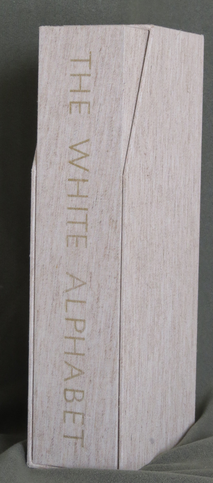
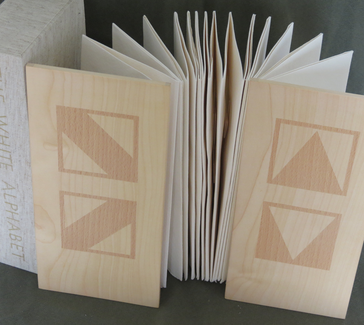
The White Alphabet (1984)
The White Alphabet (1984) Ron King Box made of two slipcases, one inside the other. Gilt lettering on spine of inner slipcase. Back-to-back leporellos with wooden front and back covers. Outer slipcase: H305 x W140 x D70 mm. Leoprello: H290 x W135 mm. Edition of 150, of which this is #99. Acquired from Veatch’s, 11 June 2021. Photos: Books On Books Collection.
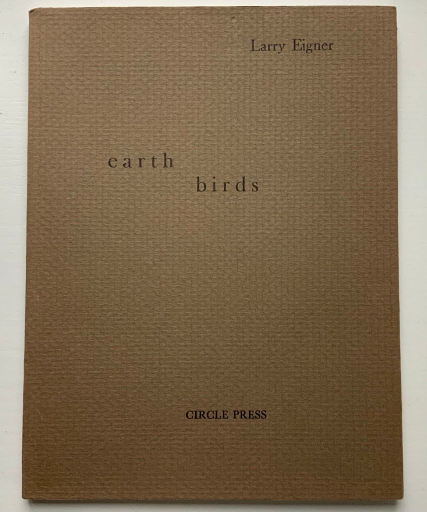
Earth Birds (1981)
Earth Birds: forty six poems written between May 1964 and June 1972 (1981) Larry Eigner (poems) and Ron King (plates) Fifty hard-bound copies, I-L, printed on pure rag-made paper with six plates printed blind intaglio and one hundred and fifty copies, 51-200, printed on Glastonbury Book stock with the same plates printed relief, in one color. Photos: Books On Books Collection.
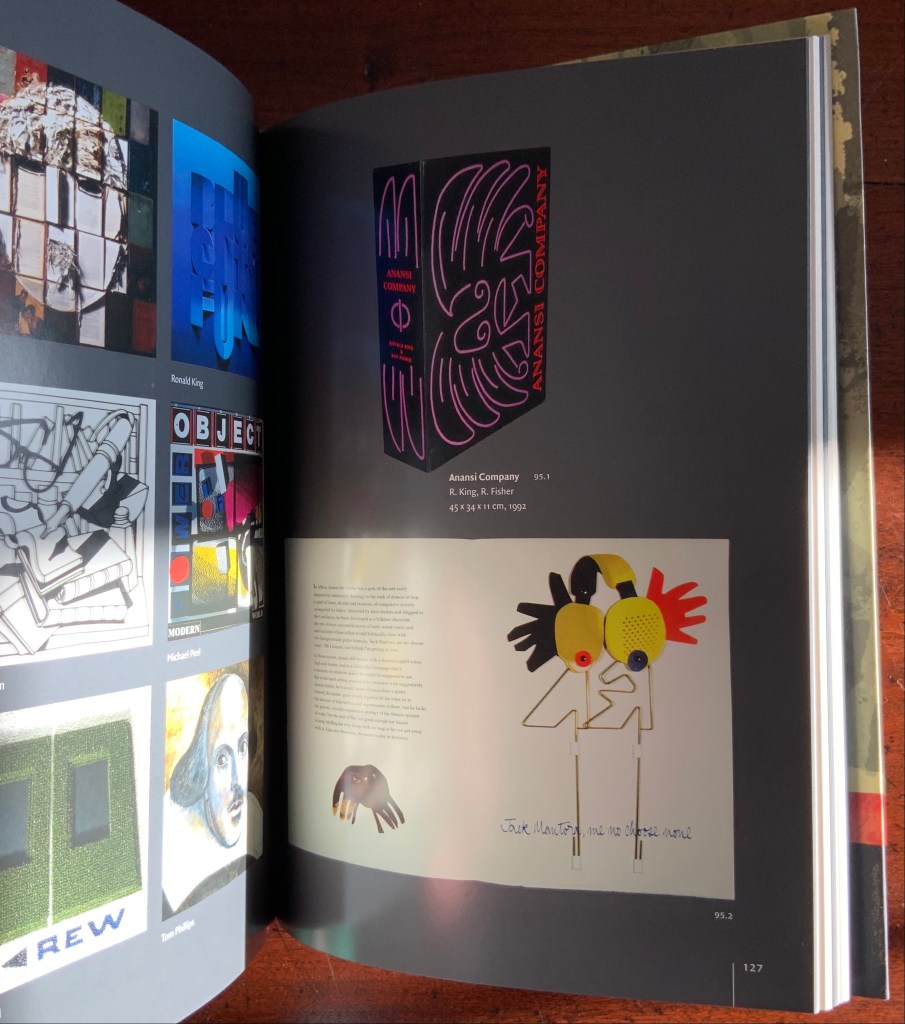
As with George Szirtes, King has collaborated more than once with Larry Eigner. Looks like nothing, the shadow through air (1972) was the earlier joint effort. Compared to Earth Birds, later works like The Burning of the Books (2008) and Anansi Company(1992) with Roy Fisher show King’s development toward more deeply collaborative efforts.
Earth Birds does recall the wide range of similar works by others at Circle Press that King made possible: Hadrian’s Dream (1990) by Asa Benveniste and Ken Campbell and Machines (1986) by Michael Donaghy and Barbara Tetenbaum.
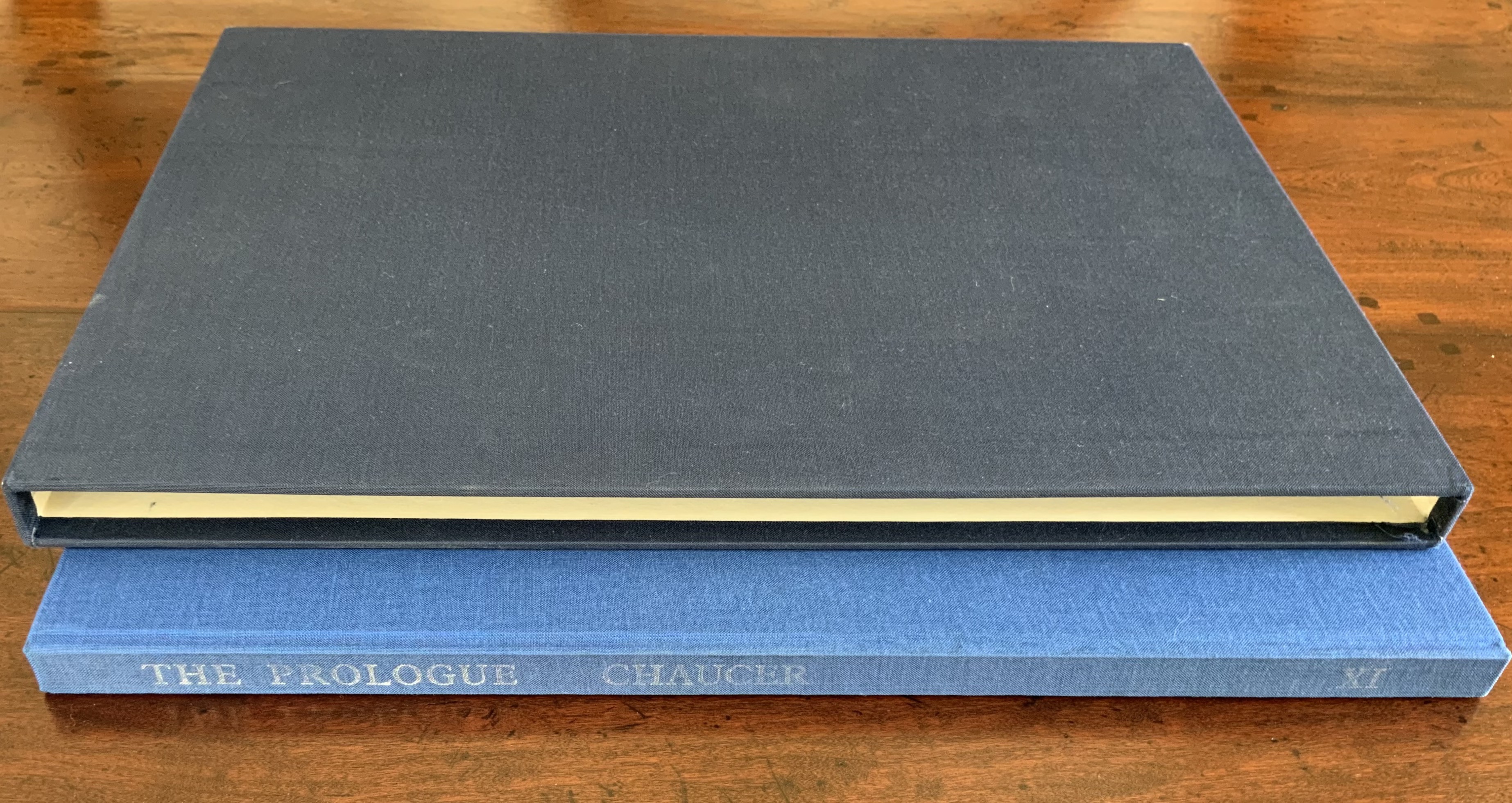
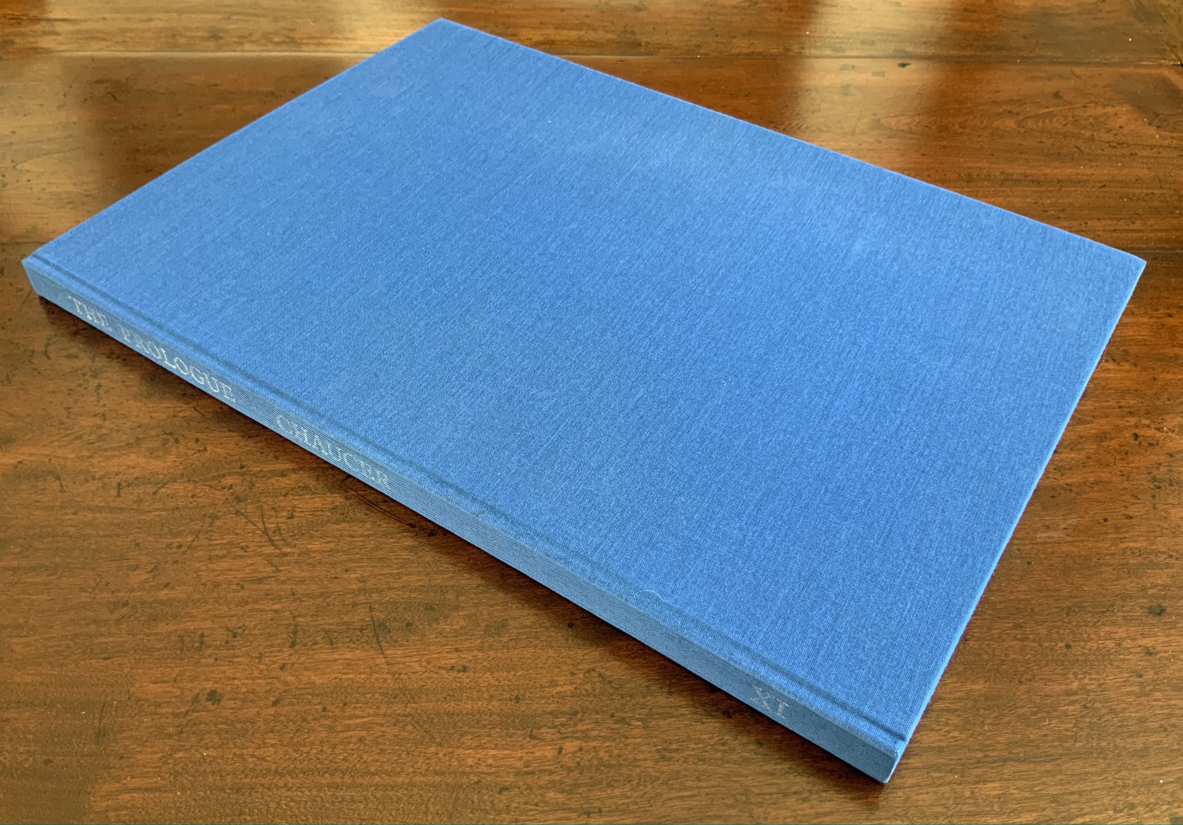
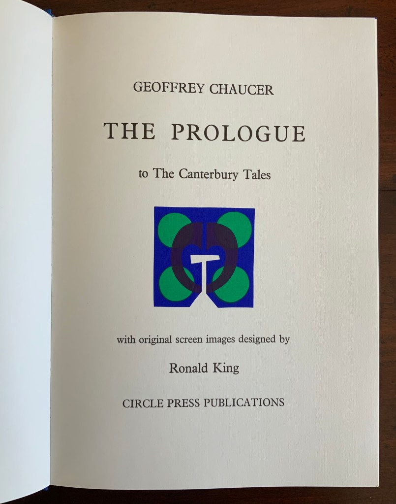
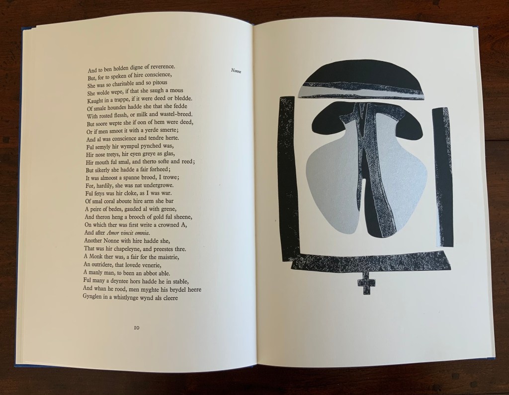
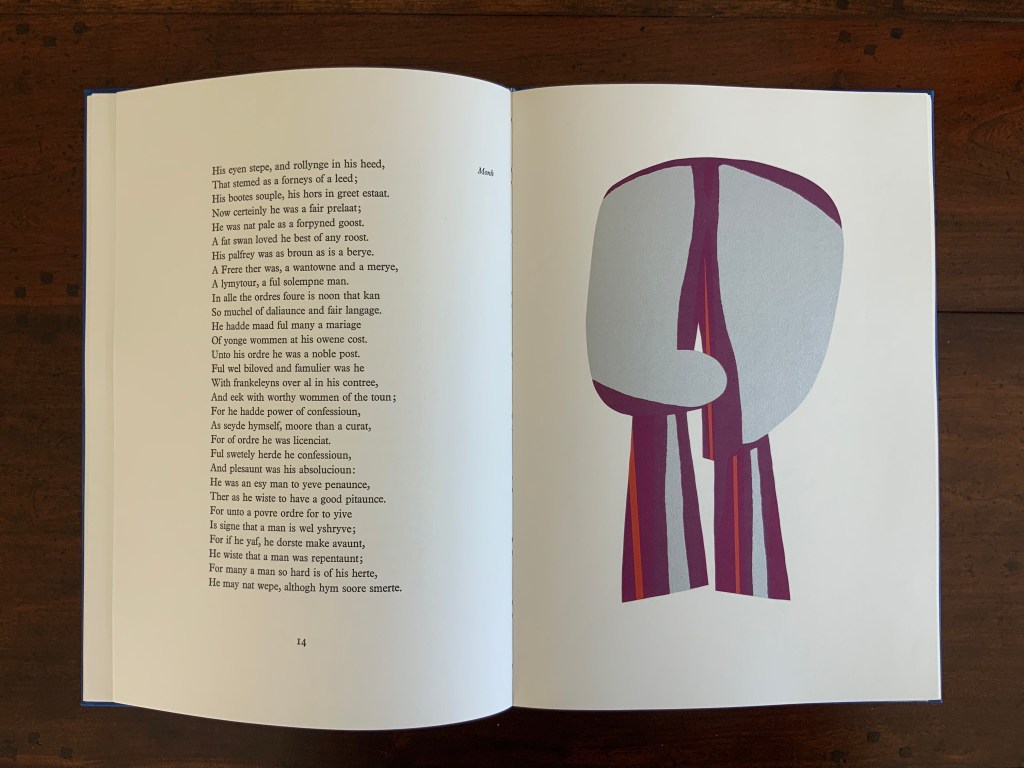
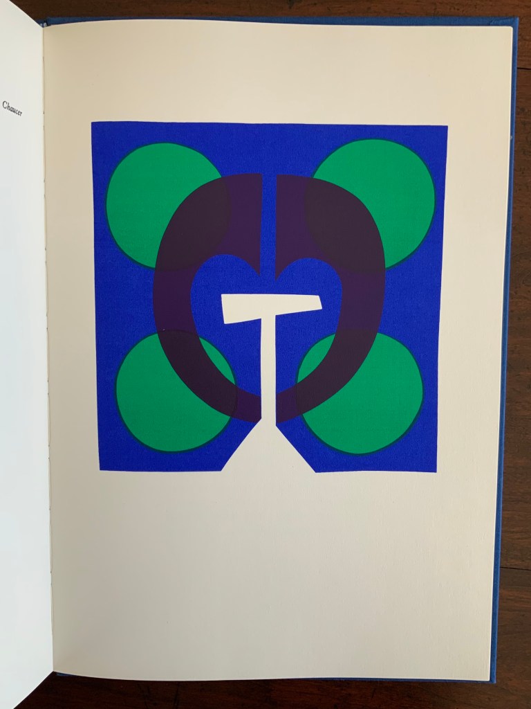
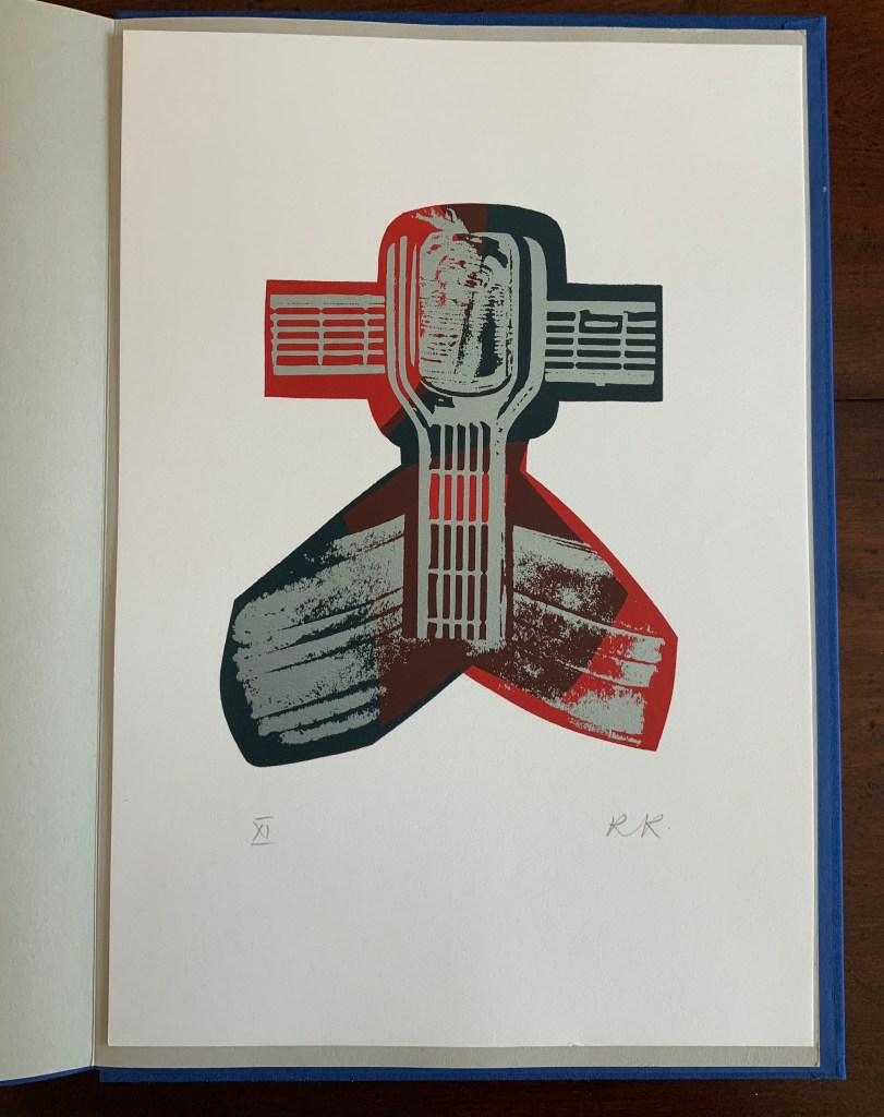
Chaucer’s The Prologue, 2nd Edition (1978)
Chaucer’s The Prologue, 2nd Edition (1978) Ron King Casebound sewn, letterpress printed on 190 gsm Queen Anne Antique White. Hand-set in Monotype Plantin series 110. H405 x W281 mm, 72 pages. Edition of twenty separate versions I-XX each of 250 copies, of which this is XI, #131, and includes a folder of Buckler Light Grey Plain with a poem by Roy Fisher and screen-print on 190 gsm Bockingfordby Ron King entitled “Webbe”. Acquired from private seller, 27 February 2021. Photos of work: Books On Books Collection. Displayed with permission of artist.
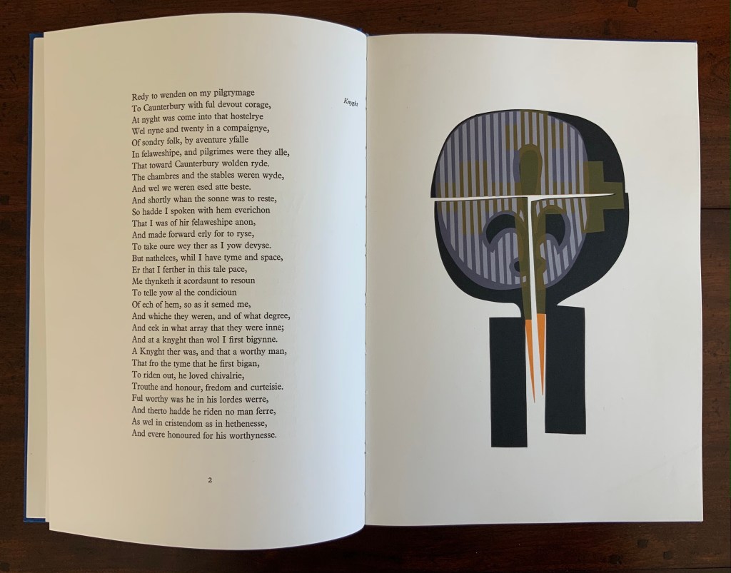
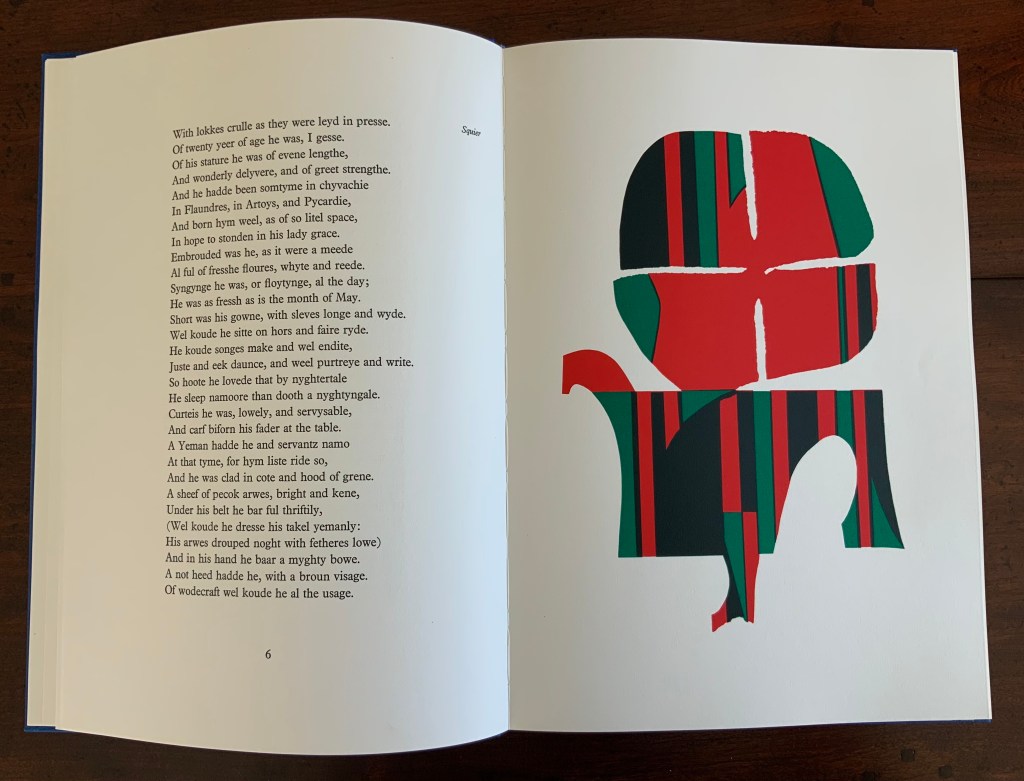
King originally prepared The Prologue for Editions Electo in 1966, then published a limited edition of 125 copies in 1967 under the Circle Press imprint. In this collection, the work represents King’s straightforward fine press work and a successful livre d’artiste. The screenprints of Chaucer’s characters and Chaucer himself are based on African and Brazilian masks as well as heraldic symbols. King’s inspiration to match these richly colored masks to the personae captures the pageantry and individuals within the social hierarchy of Chaucer’s Canterbury Tales. Opening this oversized fine press edition, turning its stiff, creamy pages with their 18 pt Plantin type and confronting these human-sized masks are reminders of the monumentality that this human-scale work of literature has achieved.
Knight and Squire masks
Nun and Monk masks
Chaucer’s mask and King’s original print “Webbe”
Ephemera
Almost always, small gifts of ephemera arrive with purchases from the Ron King Studio. They illustrate how King marshals his artistry even in marketing his art and that of those he has published.
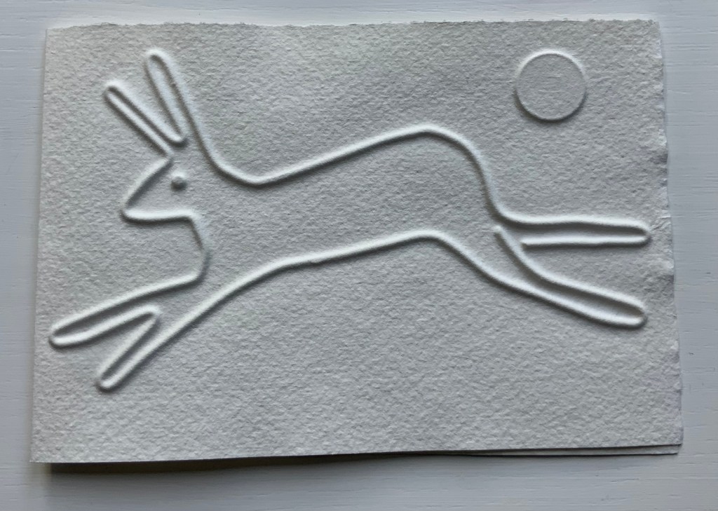
Hare (single-fold card, H125 x W180 mm), blind-embossed. 2021.
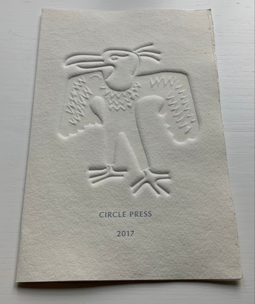
Announcement (single-fold card, H216 x W140 mm) with blind embossed image of a fulmar. Describes artist book Sednar and the Fulmar with Richard Price’s poems. 2017.
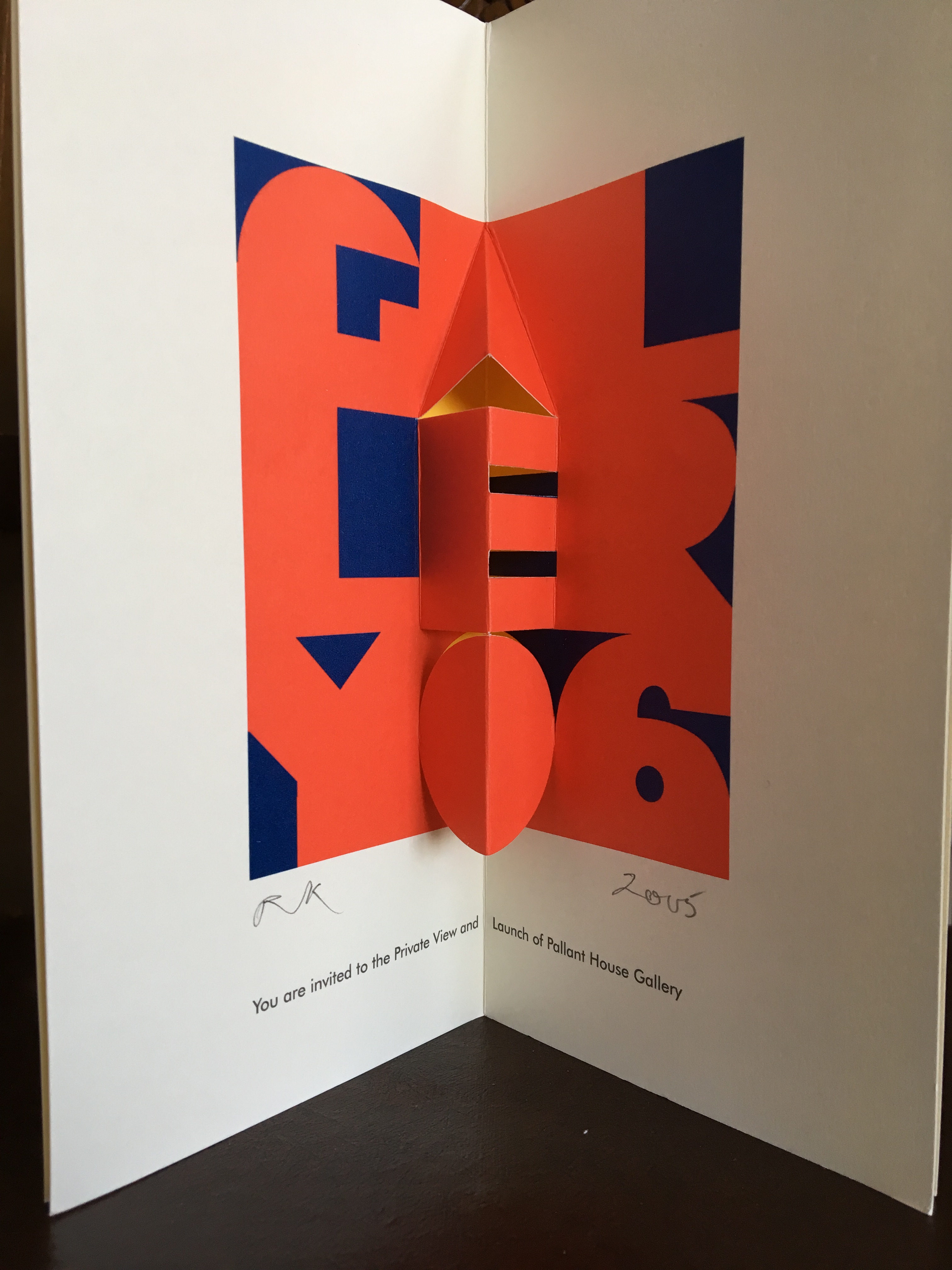
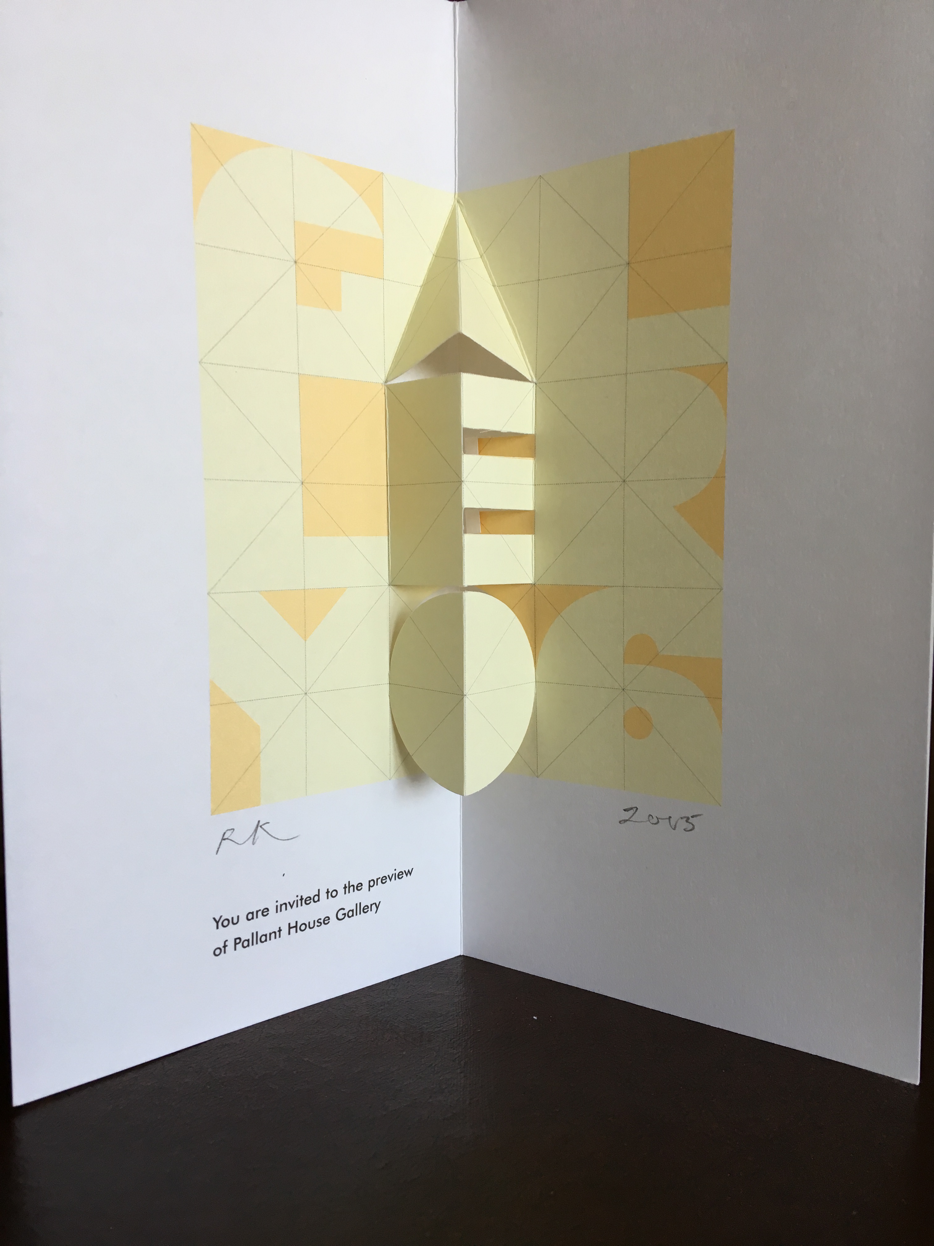
Invitations (four-fold pop-up cards) to Pallant House Gallery opening preview. 2005.
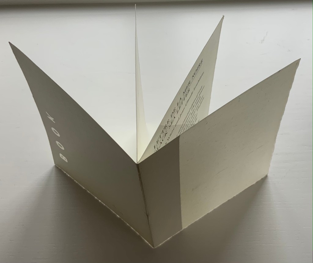
Announcement (wax and paper pamphlet, H174 x W134 mm) of Lettre de la Mer Noire/Black Sea Letter by Kenneth White (poem) and Jean-Claude Loubières (images and wax dipping). 1997.
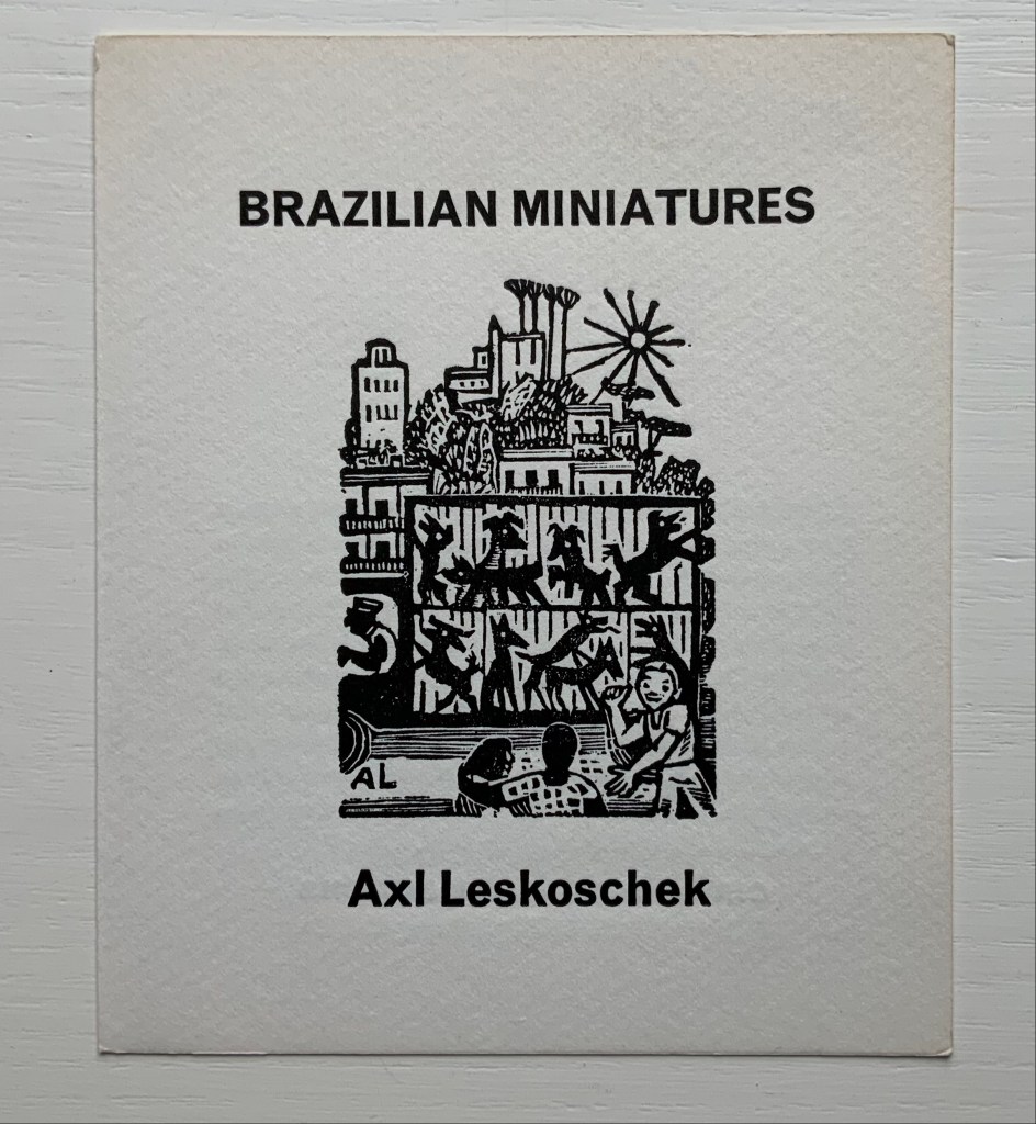
Announcement (card, line block reproduction, H150 x W125 mm) of the 200 portfolios of fifty-one woodcut designs reproduced from the only remaining proofs of Brazilian Miniatures, an unpublished book with a bilingual introduction; printed in two versions. 1973?
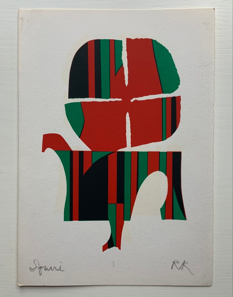
“Squire” (single-fold card, H235 x W165 mm) with hand-printed serigraph from Chaucer’s “Prologue” to The Canterbury Tales. 1969?
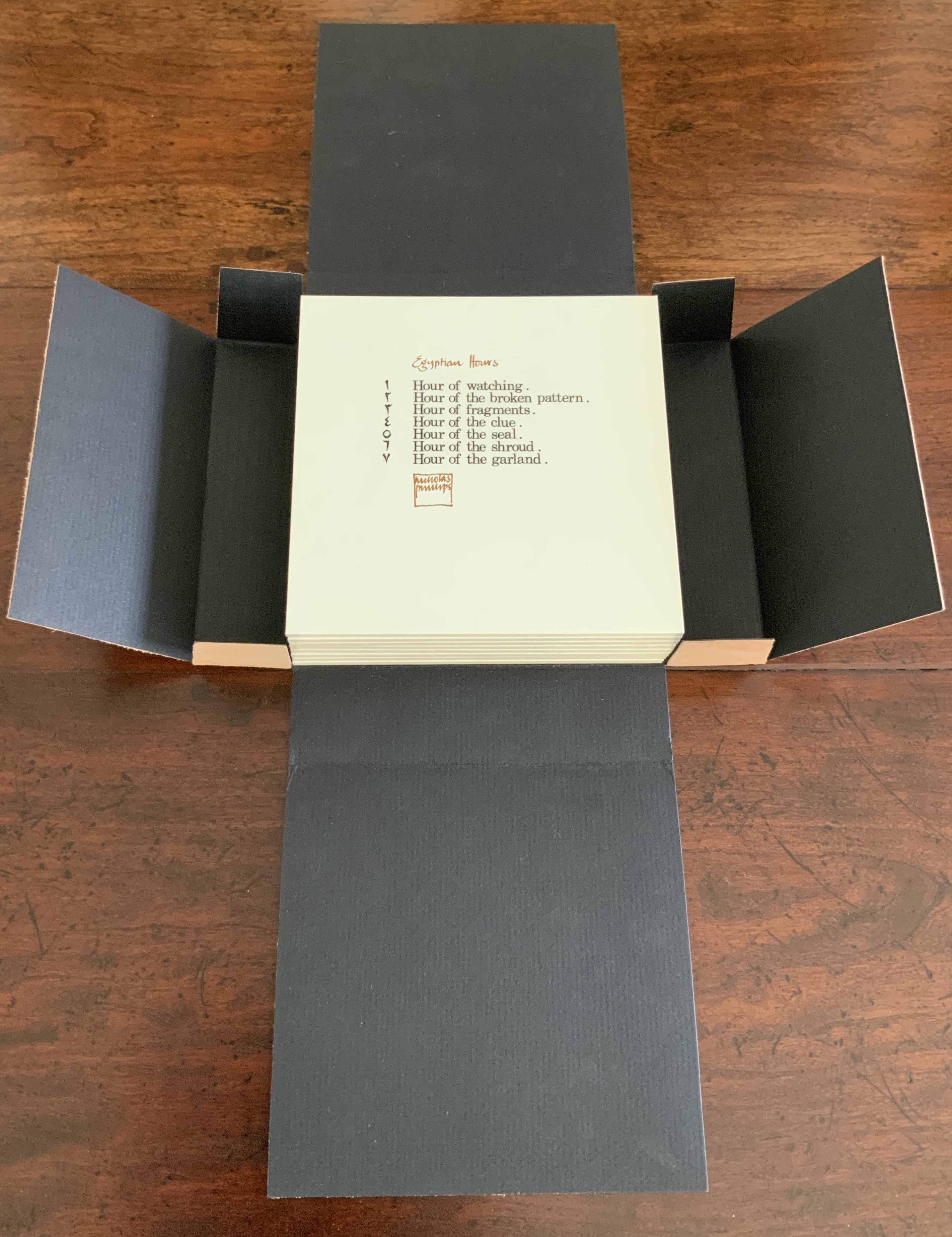
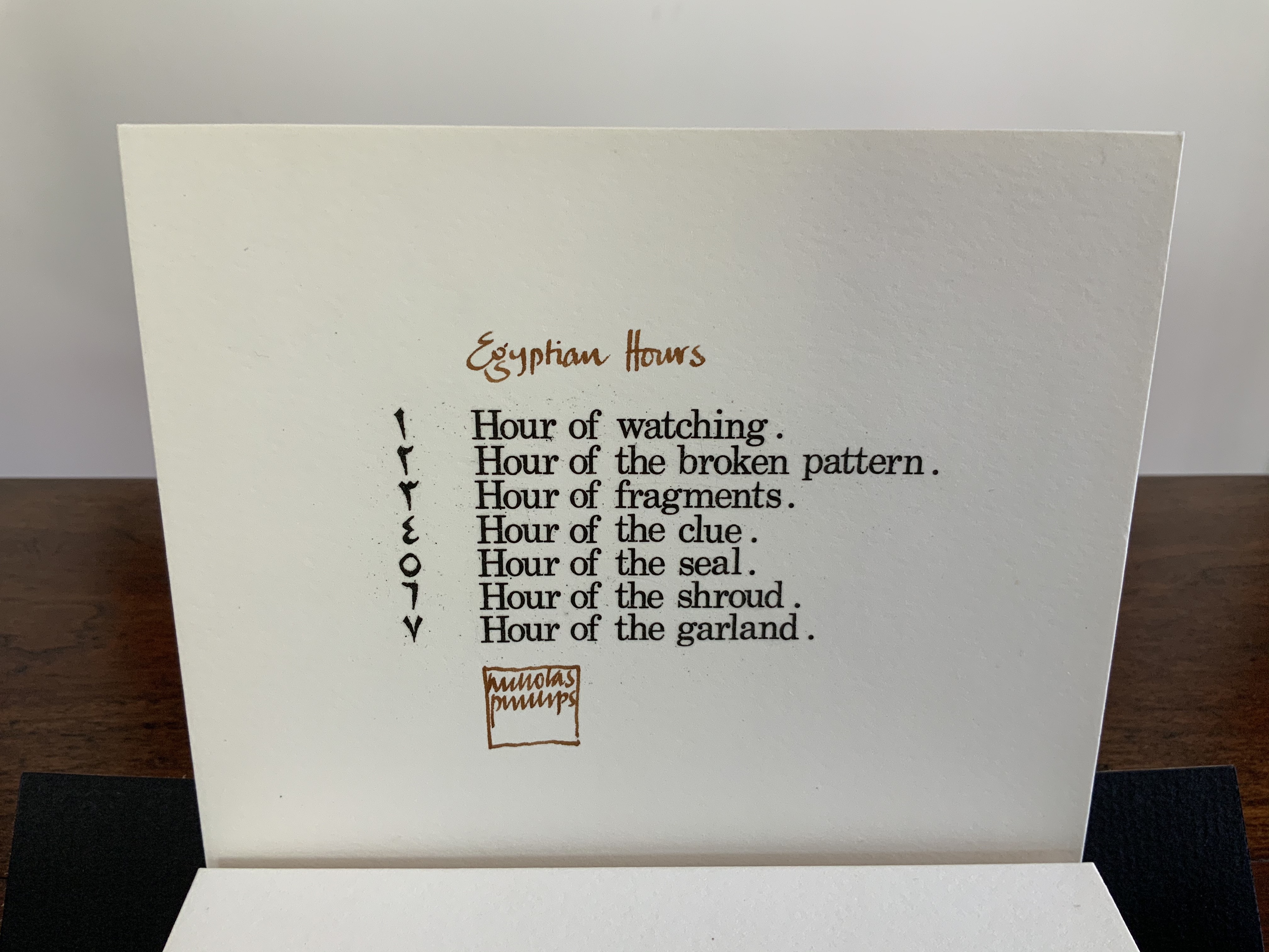
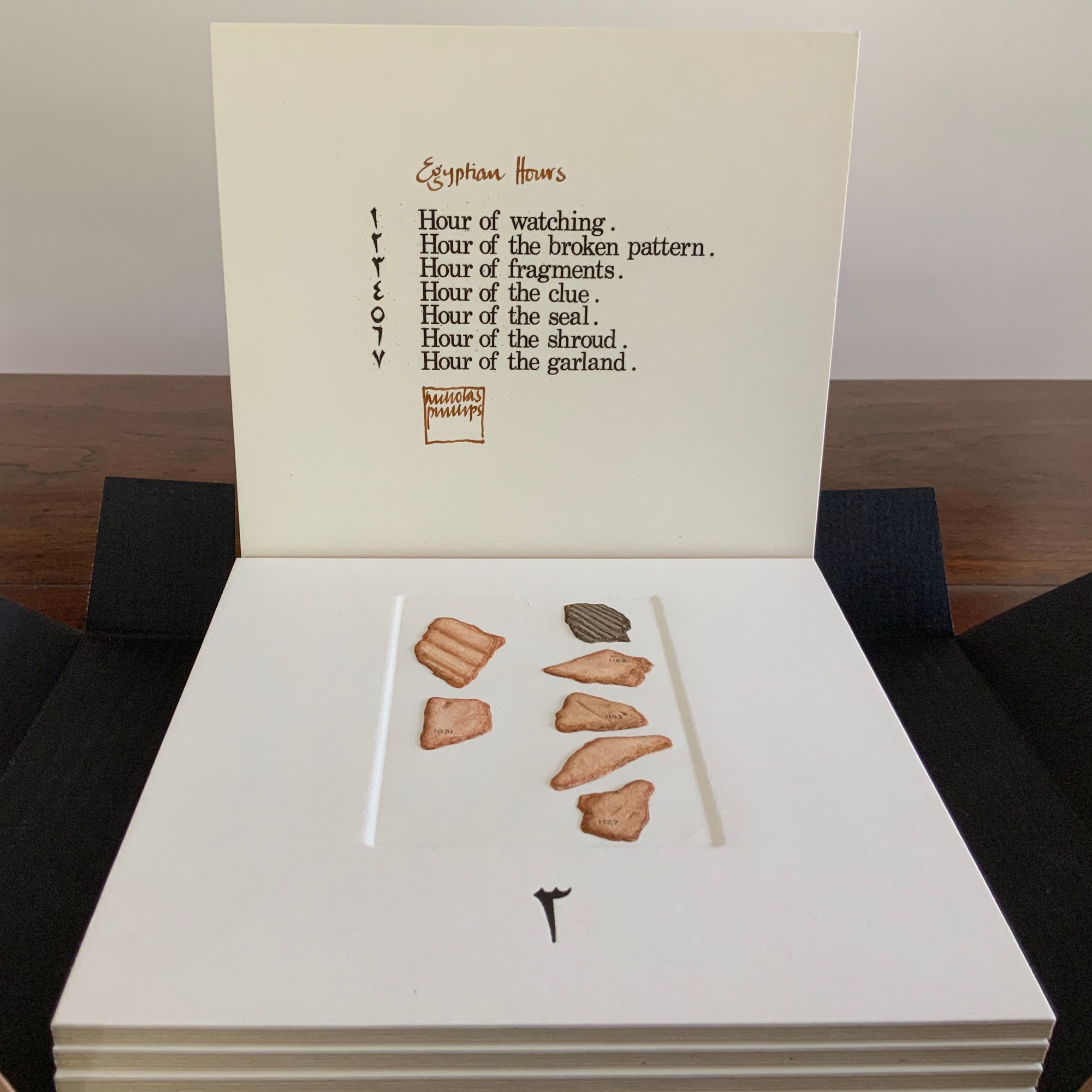
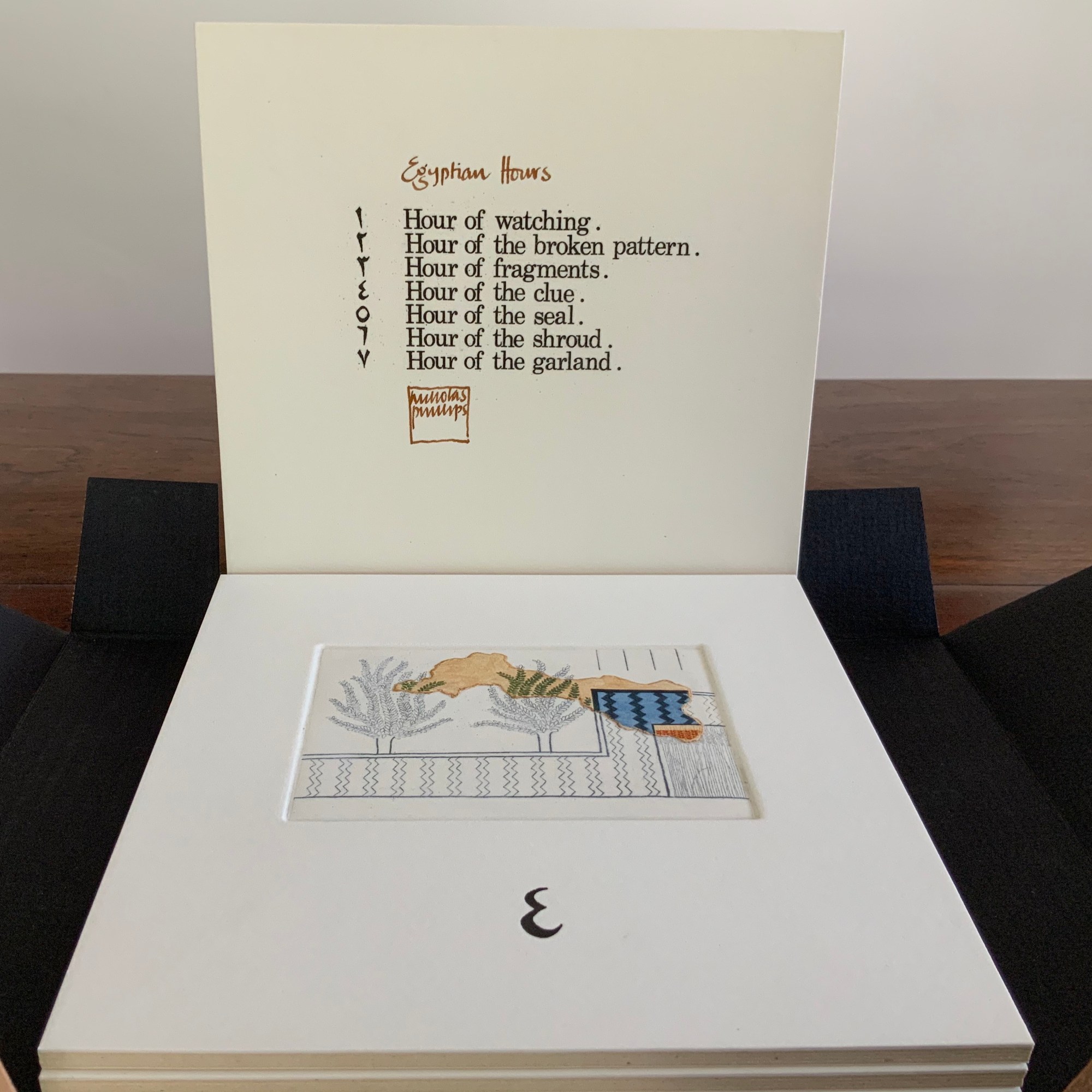
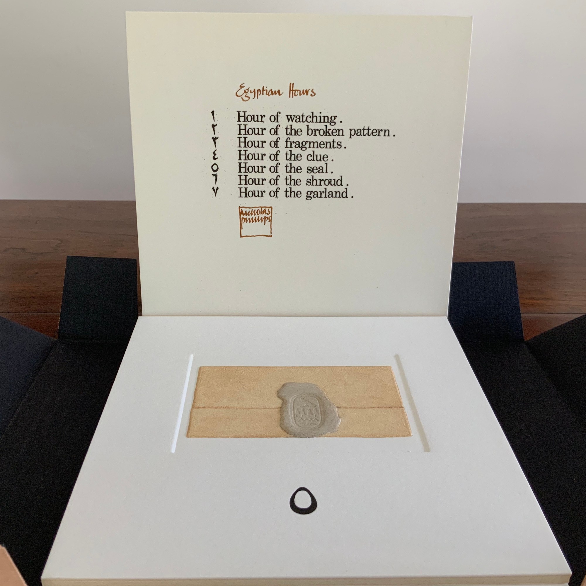
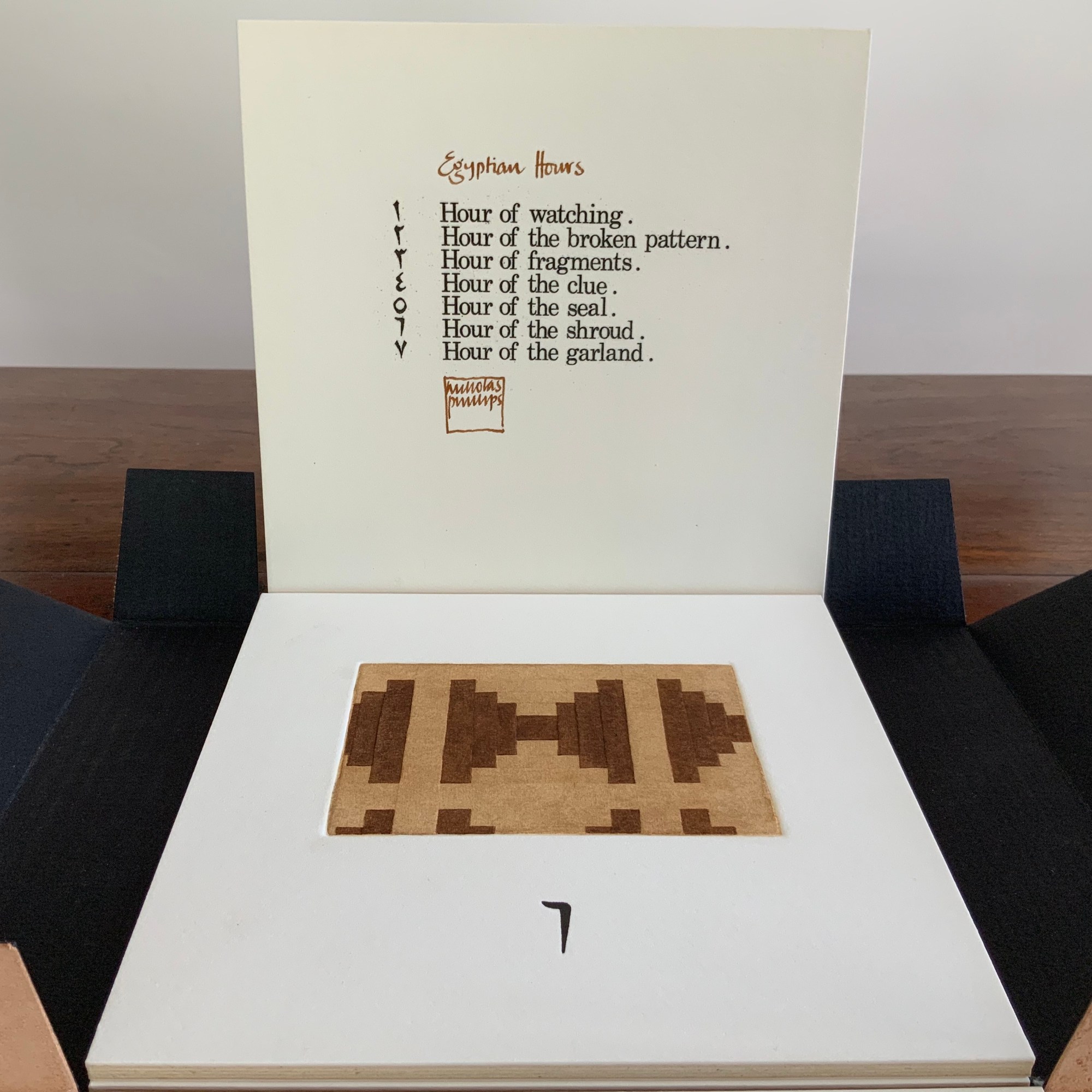
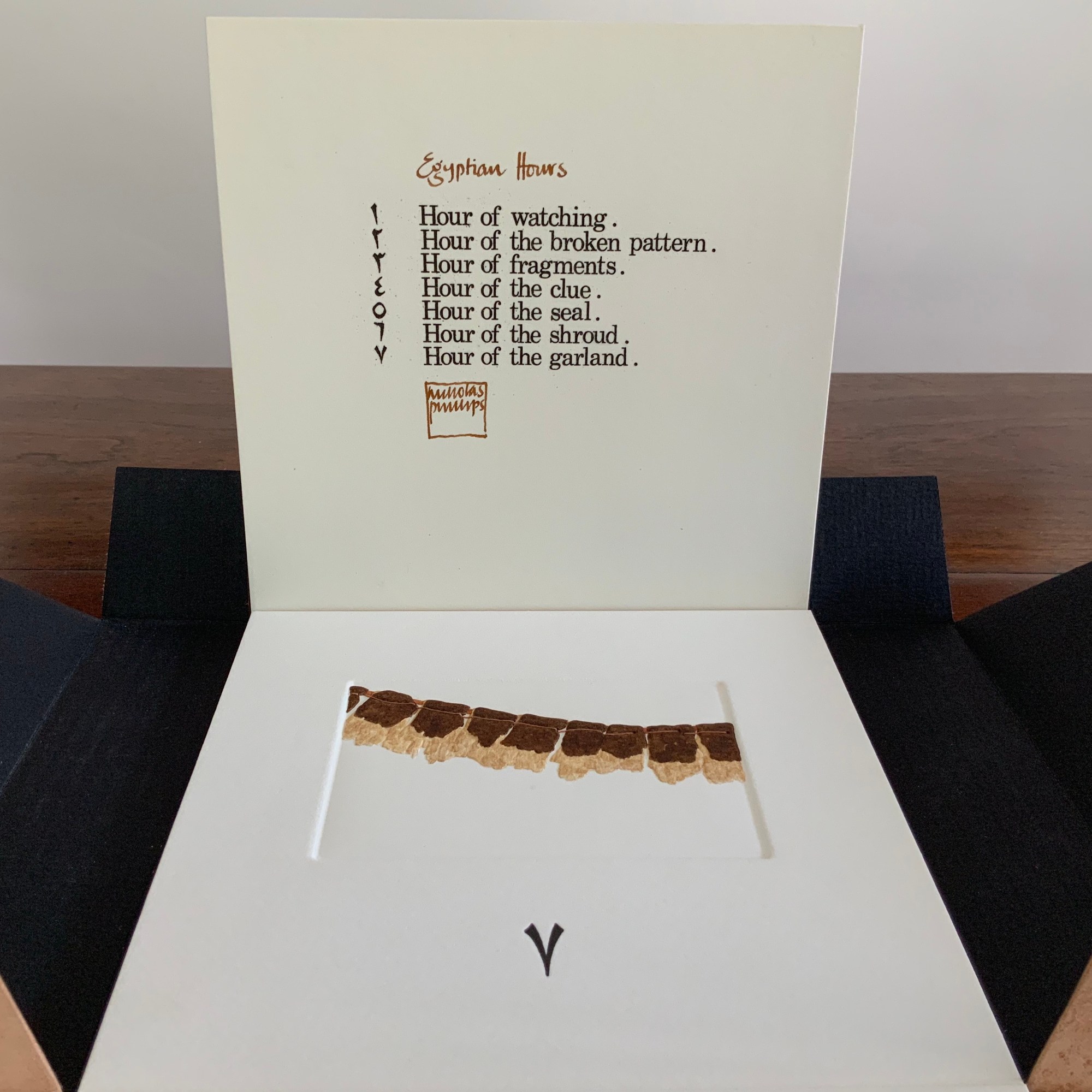
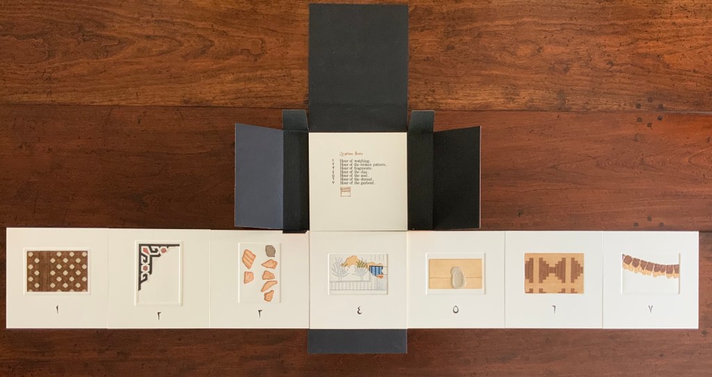
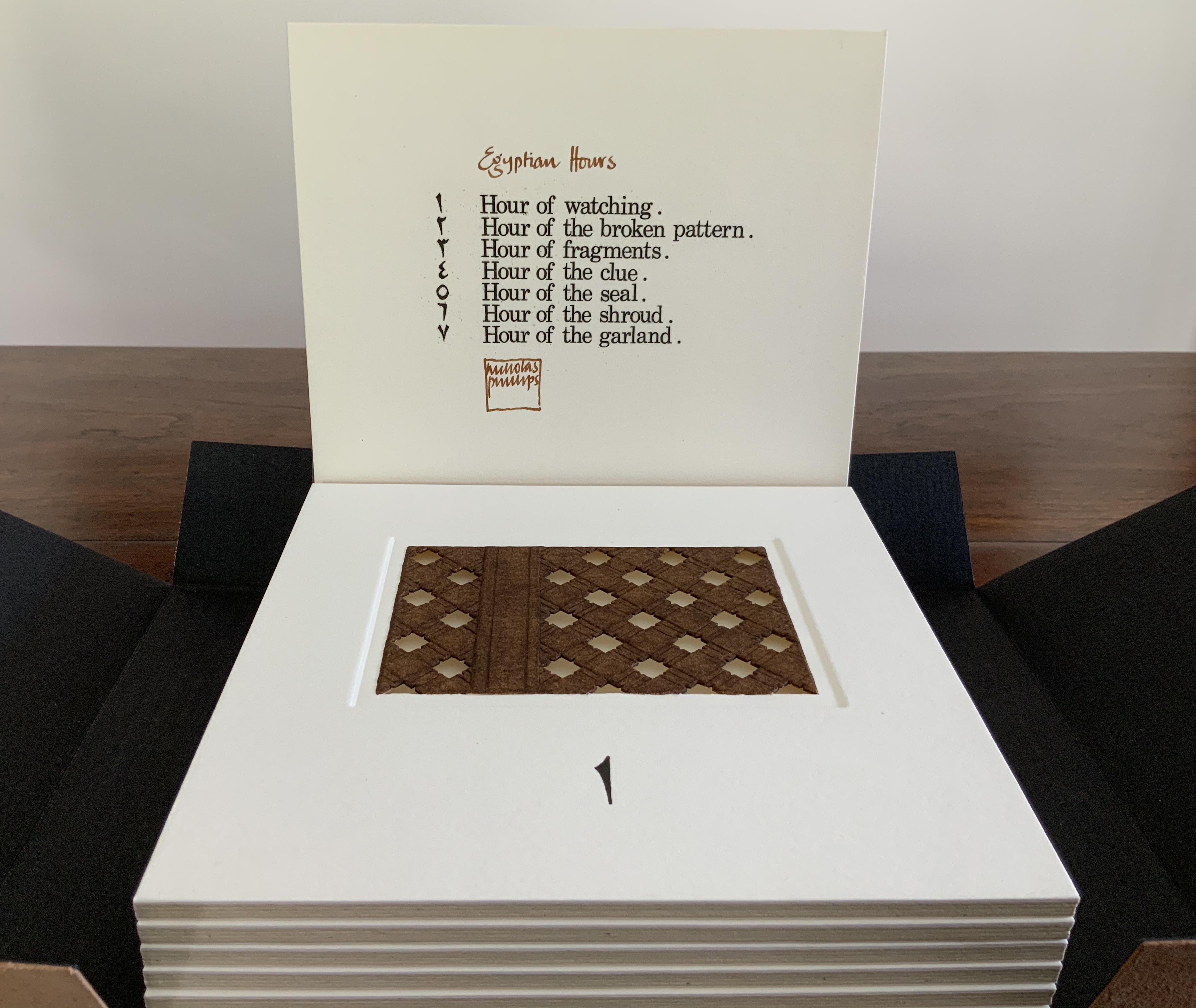
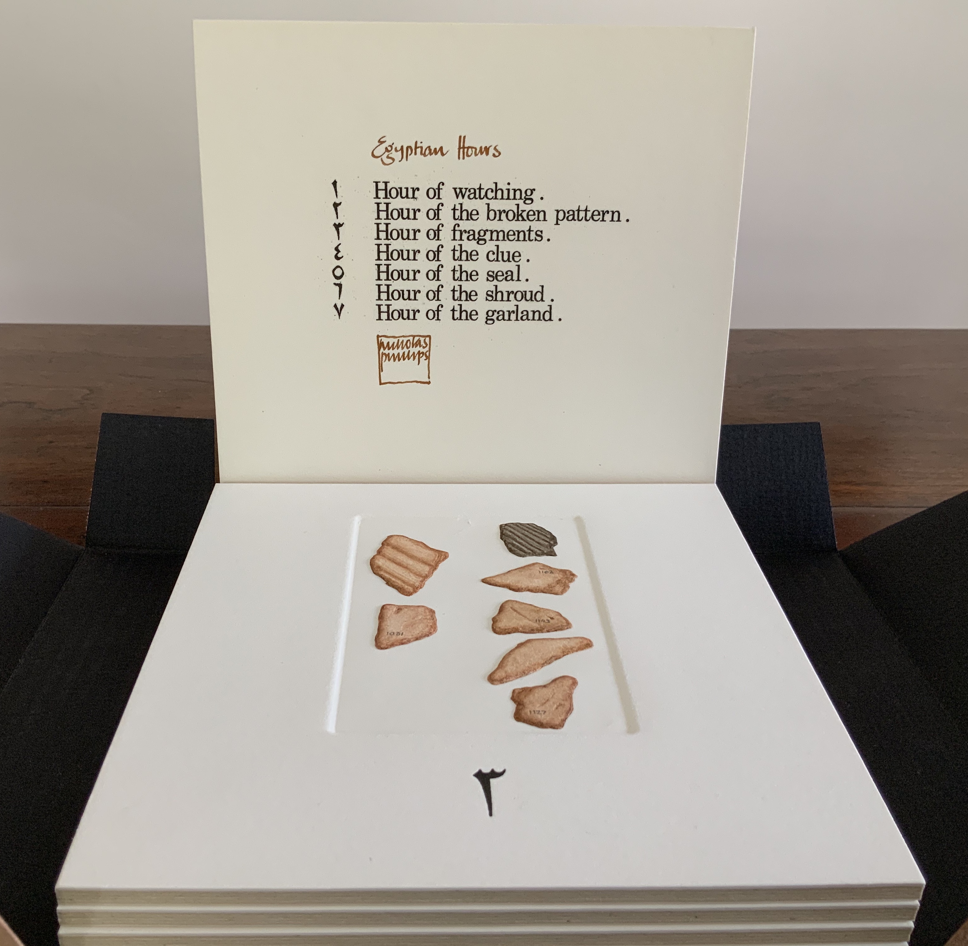
Bound in a leather folding case, a set of 7 hand-colored and variously collaged / cut / embossed etchings, plus title page, on Hot Pressed Saunders paper. H160 x W160 x D40 mm. Edition of XXXIX signed copies in existence, of which this is #XXXVII. Acquired from the artist, 6 August 2020. Photos: Books On Books Collection.
Egyptian Hours falls somewhere between book and portfolio box. Somewhat like photos and captions in a photobook, text and relief images play off one another, but only somewhat: at a distance the table of contents names and orders the hours; only the Arabic number glyphs from the “table of contents” mediate the named hours. If the table of contents is held apart as in the photos, the distance shortens.
In the western tradition, the named hours suggest the medieval book of hours, another signal that this is more than a portfolio of prints. There is pleasure in trying to remember the name of the hours from their numbers or guessing it from the evocative images — the image of a window lattice through which to watch, an image of a tile fragment — but the name of the fourth implies a mystery narrative at which to guess.
Who is watching from the window? What does the broken pattern of tiles mean to the watcher? Were the numbered shards found beneath the tiles? What clue do the images of papyrus plants give, or the overlying image of a plot of land (?) bringing the plants into green, the diagonal pattern into blue and black, and the sheet of papyrus into burnt umber? Whose seal holds the folded sheet closed? Whose shroud? Whose garland or necklace with its thread weaving in and out of the intaglio?
The watcher could spend hours turning or spreading the panels out and guessing — and just contemplating this artwork as an evocation of ancient time and time passing.
Exhibited at the Book Works, London, 2 April 2 – 9 May 1987, with Ken Campbell, . “All the artists in this exhibition have had a close and consistent relationship with Book Works since its inauguration. Some collaborate on projects as well as exhibit regularly at the gallery. The Founders of Book Works consider the Center for Book Arts inspirational in their conception and development of the organization, and this connection adds to the importance of our presentation of this work at the Book Arts Gallery.” Exhibition checklist here.
Egyptian Hours — Addenda
This comparative view of the un-colored embossed prints — especially for the “Hour of Watching” and “Hour of Fragments” — enhances an appreciation of Phillips’ artistry.
Set of 7 blind embossed etching prints, plus 1 intaglio title page. Letterpress numerals. Unnumbered copies. 160 x 160 mm each. Acquired from the artist, 6 August 2020. Photos: top row, Books On Books Collection and, bottom, courtesy of the artist.
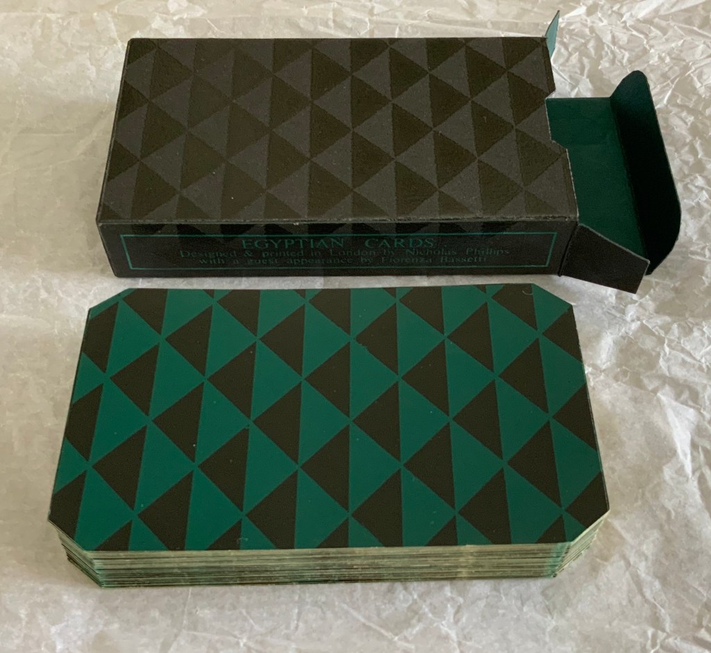
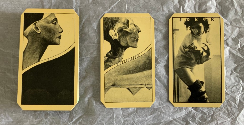
Pack of magic playing cards. Offset litho, silkscreen, die cut and held in a silkscreened box. H110 x W62.5 x D22.5 mm. Edition of 10, of which this is #2. Acquired from the artist, 6 August 2020. Photos and video: Books On Books Collection.
Egyptian Cards may be the joker in the pack for the Books On Books Collection. A deck of cards? A magic trick? A dos-à-dos flip book? Without doubt, it is another evocation of different frames of time passing. In one time frame, Nefertiti becomes a mummy.
In another time frame, day dawns on the Pyramids.
And in a third and fourth time frame — the time of the artists’ collaboration and that of a magic trick — a joker (a self-portrait of Fiorenza Bassetti) appears.
Phillips, who has turned to watercolors of a photographic intensity yet pastel texture, continues to layer time in ways that lead the viewer as much into meditation as appreciation. Fitting, then, that these two early works strike that lasting chord.
Henry, David J. Beyond Words: The Art of the Book (Rochester, NY: Memorial Art Gallery of the University of Rochester, 1986). Catalogue for the exhibition held 31 January – 30 March 1986. Catalogue designed by Scott McCarney.
Phillips, Nicholas, and Salma Nasution Khoo. Best Foreign Language (London: Jonathan Cooper Park Walk Gallery, 2011). Catalogue for exhibition, 17 November – 3 December 2011.
Rolo, Jane, and Jennifer Walwin. Book Works(Bracknell, UK: South Hill Park Arts Centre, 1981). Catalogue for the touring exhibition 28 March 1981 – 4 April 1982. Title page designed by Ron King.
Renée Riese Hubert and Judd D. Hubert’s The Cutting Edge of Reading: Artists’ Books (Granary Books, 1999) is a signal work of appreciation and analysis of book art. Nearly twenty years on, it can be read and appreciated itself more vibrantly with a web browser open alongside it.
To facilitate that for others, here follows a linked version of the bibliography in The Cutting Edge of Reading — a “webliography”. Because web links do break, multiple, alternative links per entry and permanent links from libraries, repositories and collections have been used wherever possible. These appear in the captions as well as the text entries. Also included are links to videos relating to the works or the artists. At the end of the webliography, links for finding copies of The Cutting Edge (now out of print) are provided.