Books On Books Collection – Bernadette O’Toole

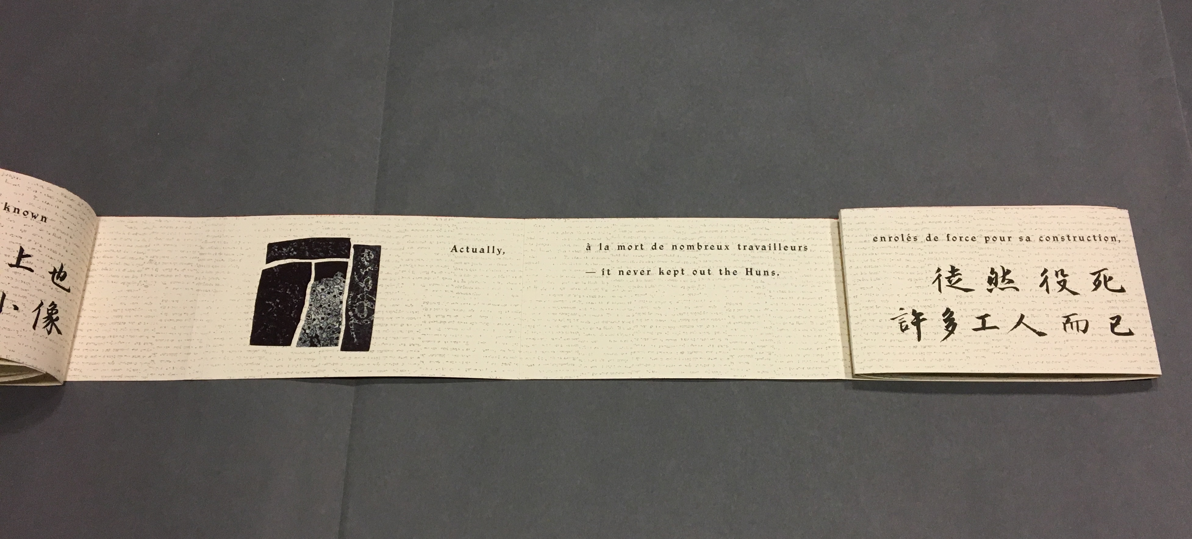
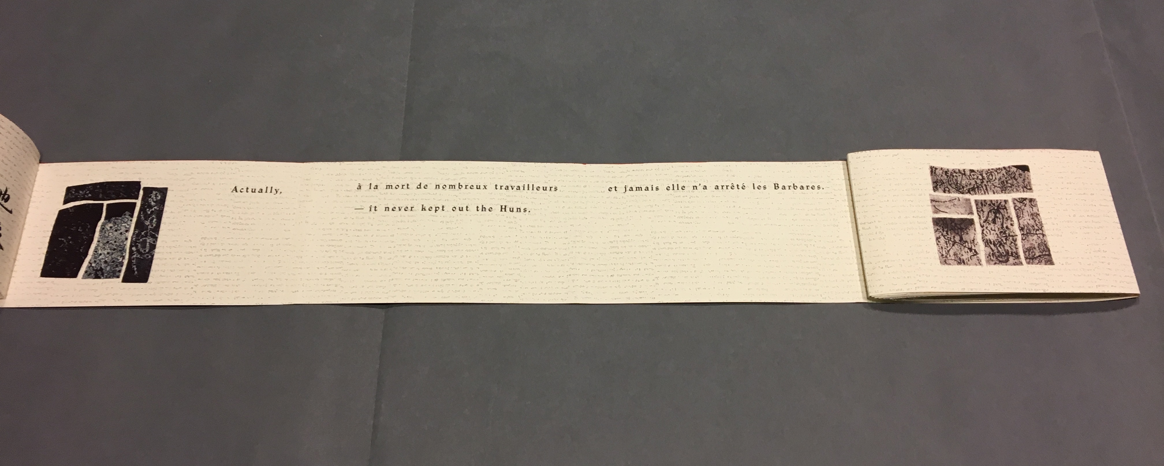
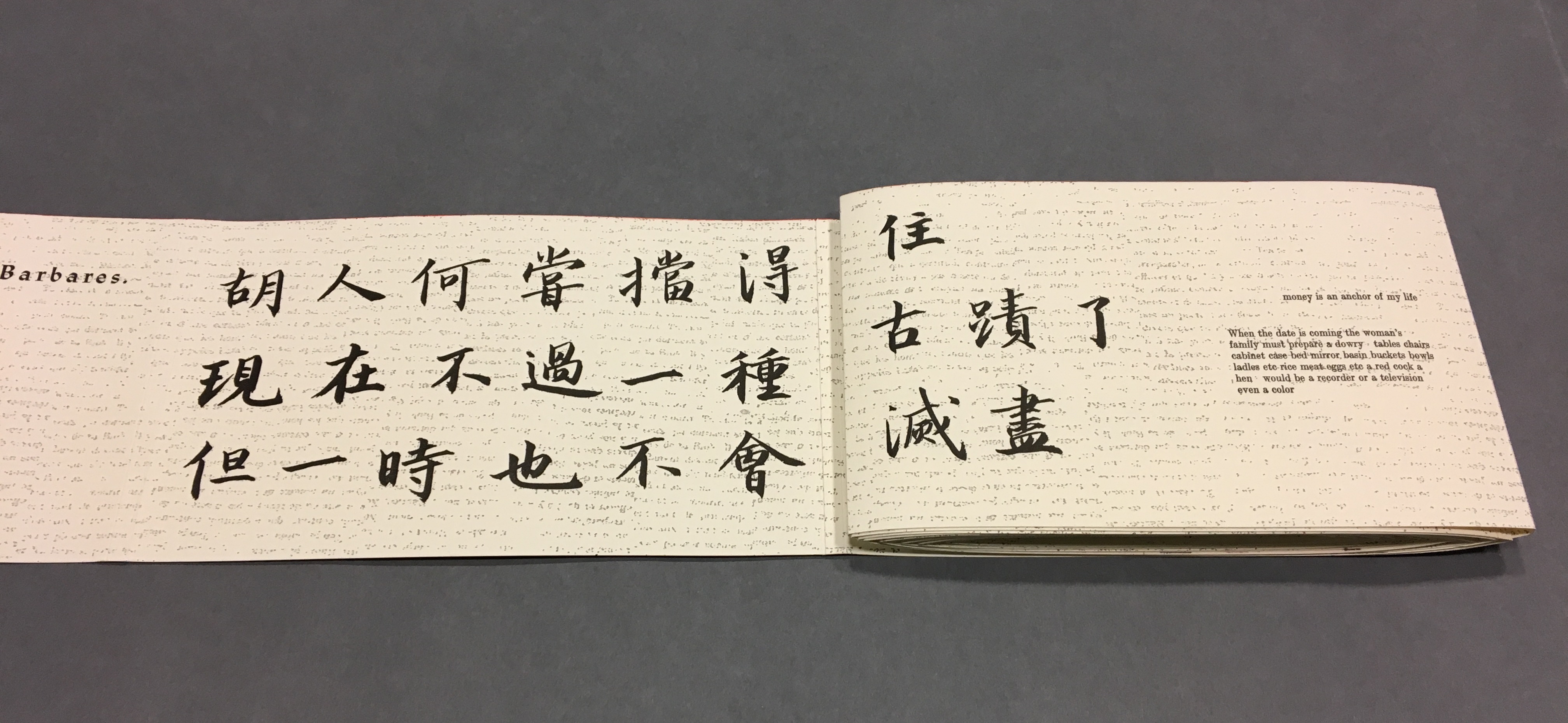
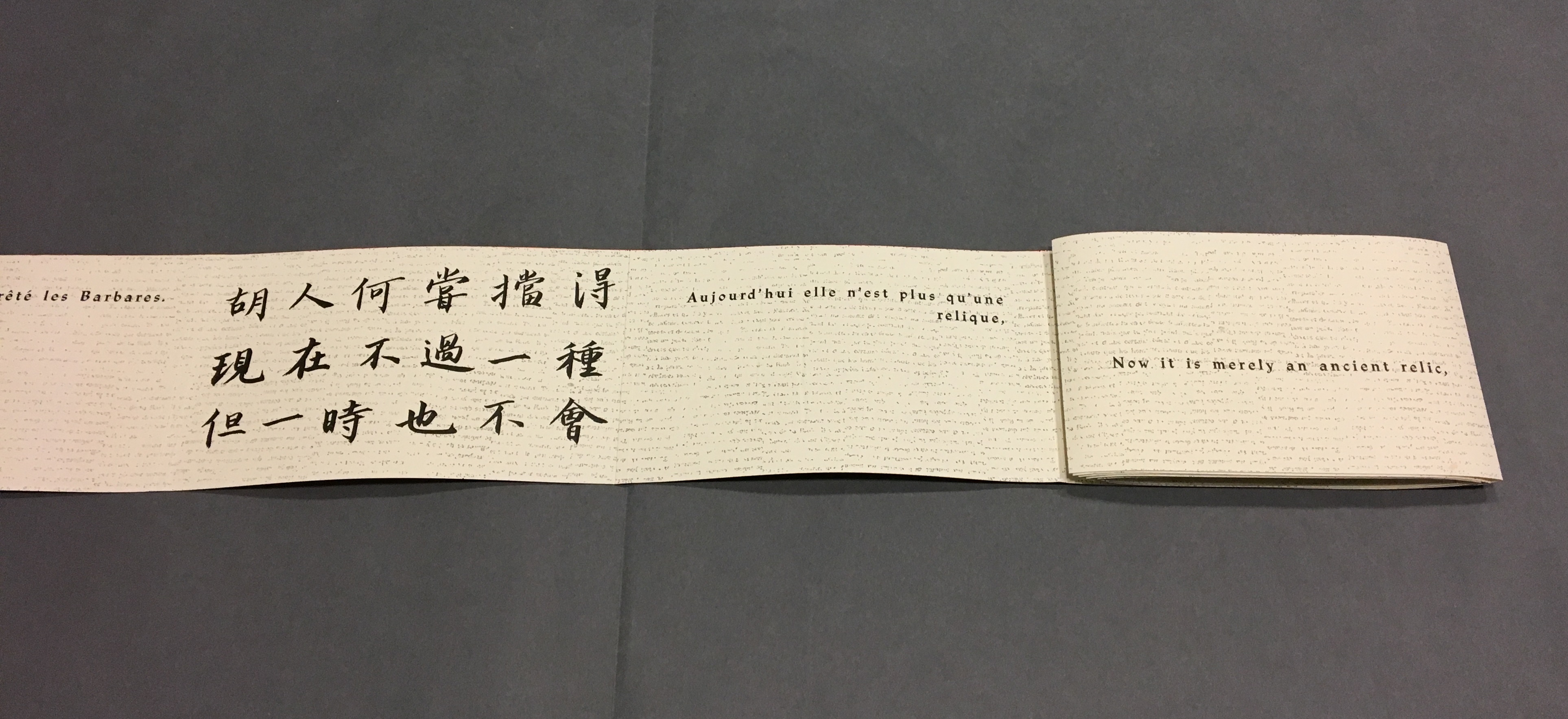
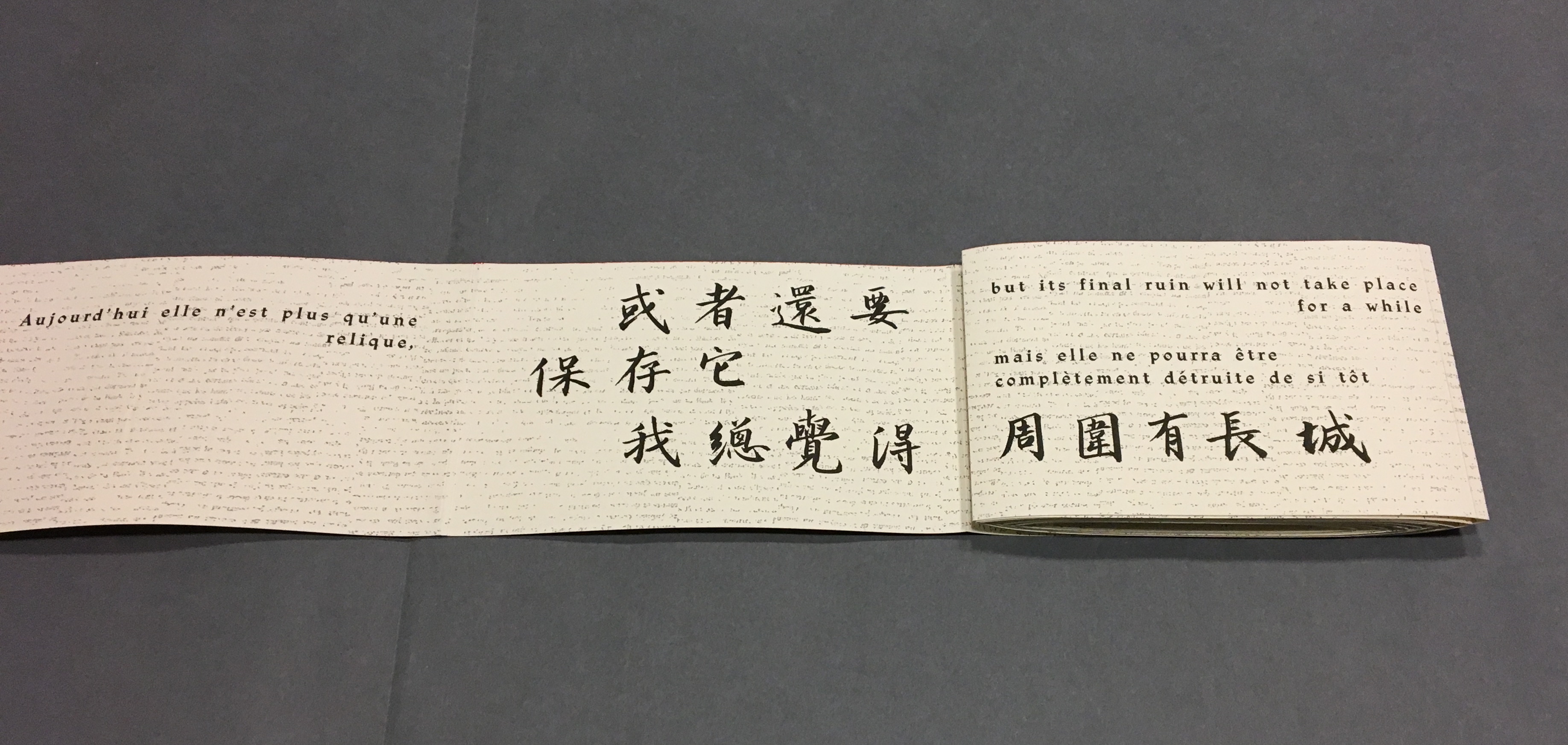
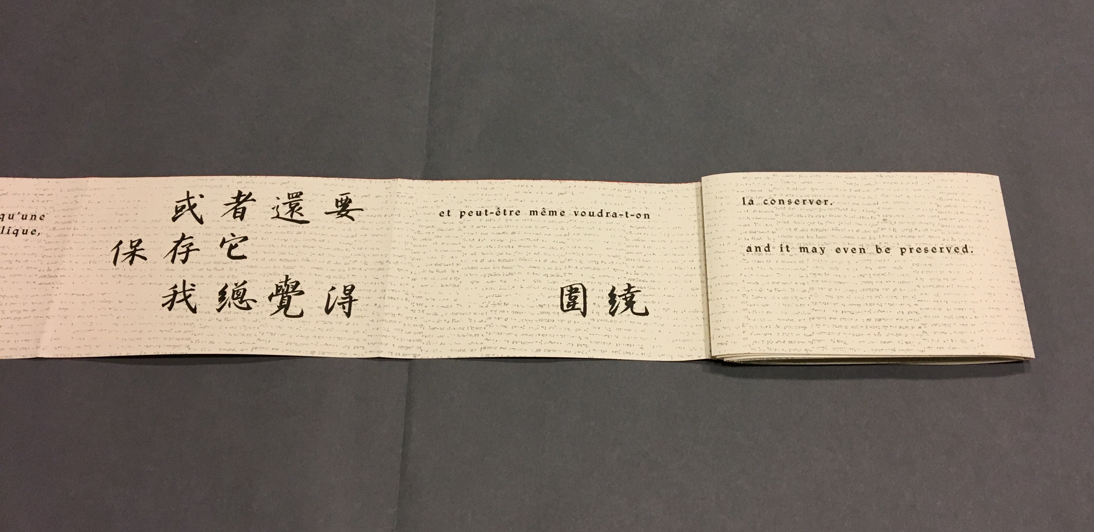
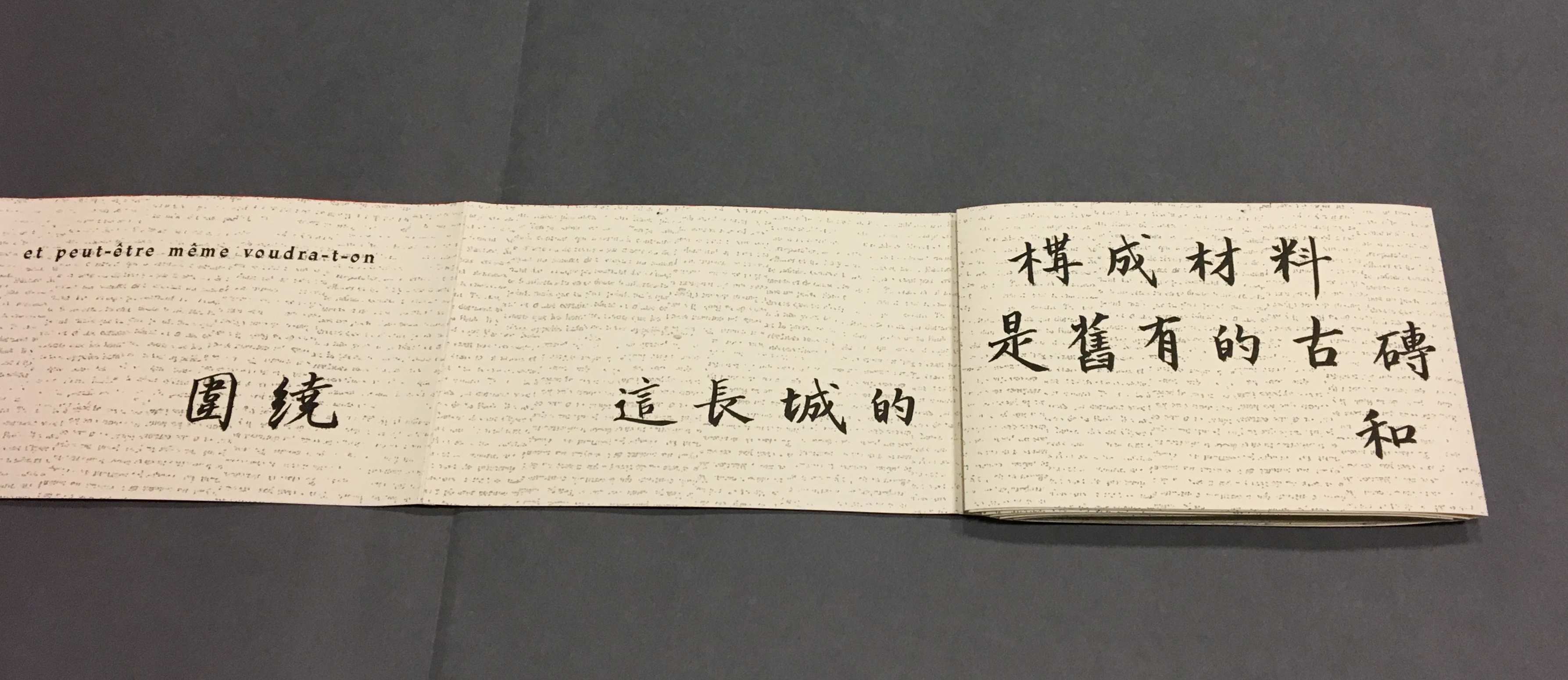
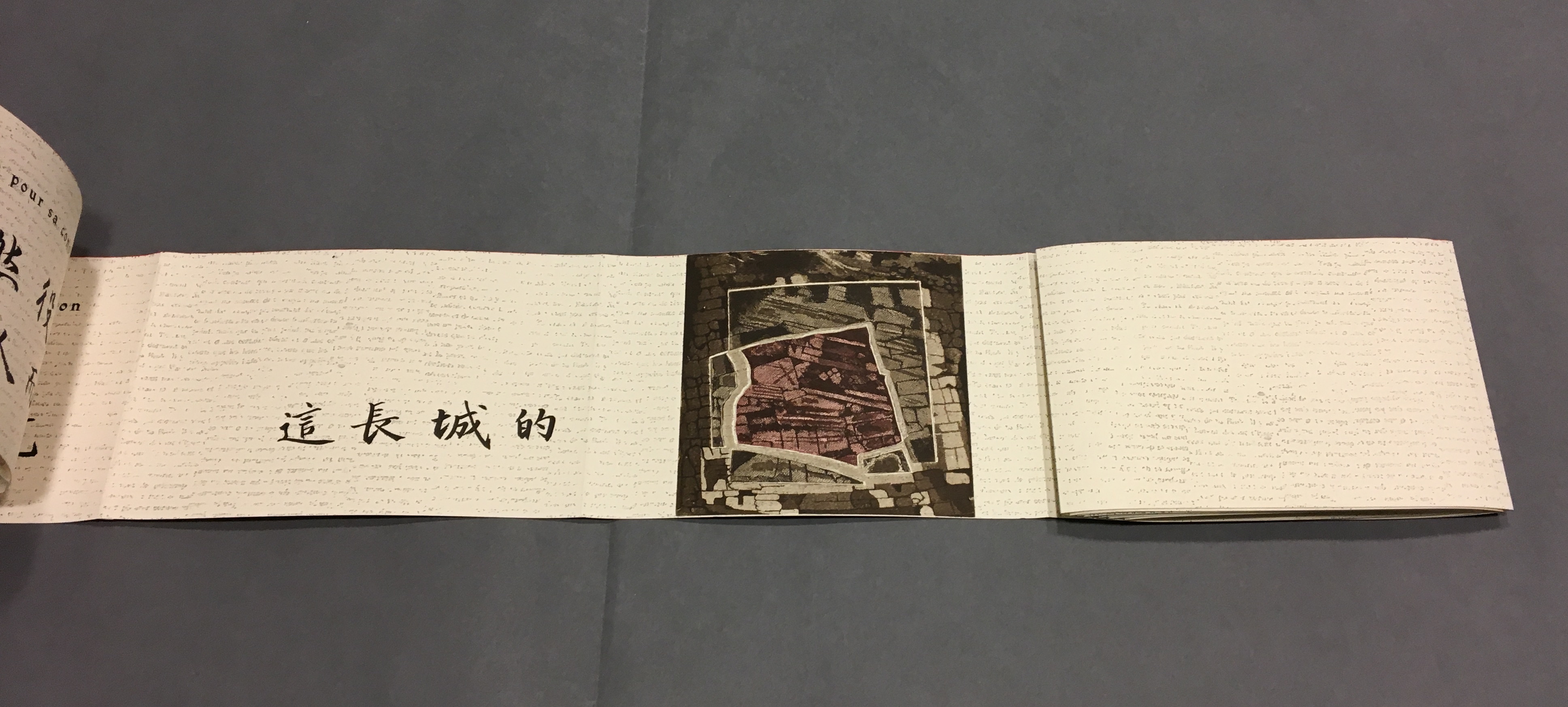
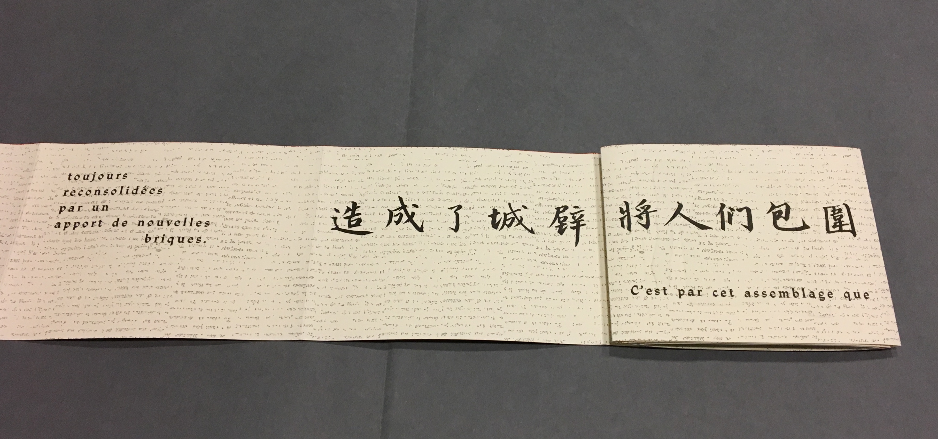
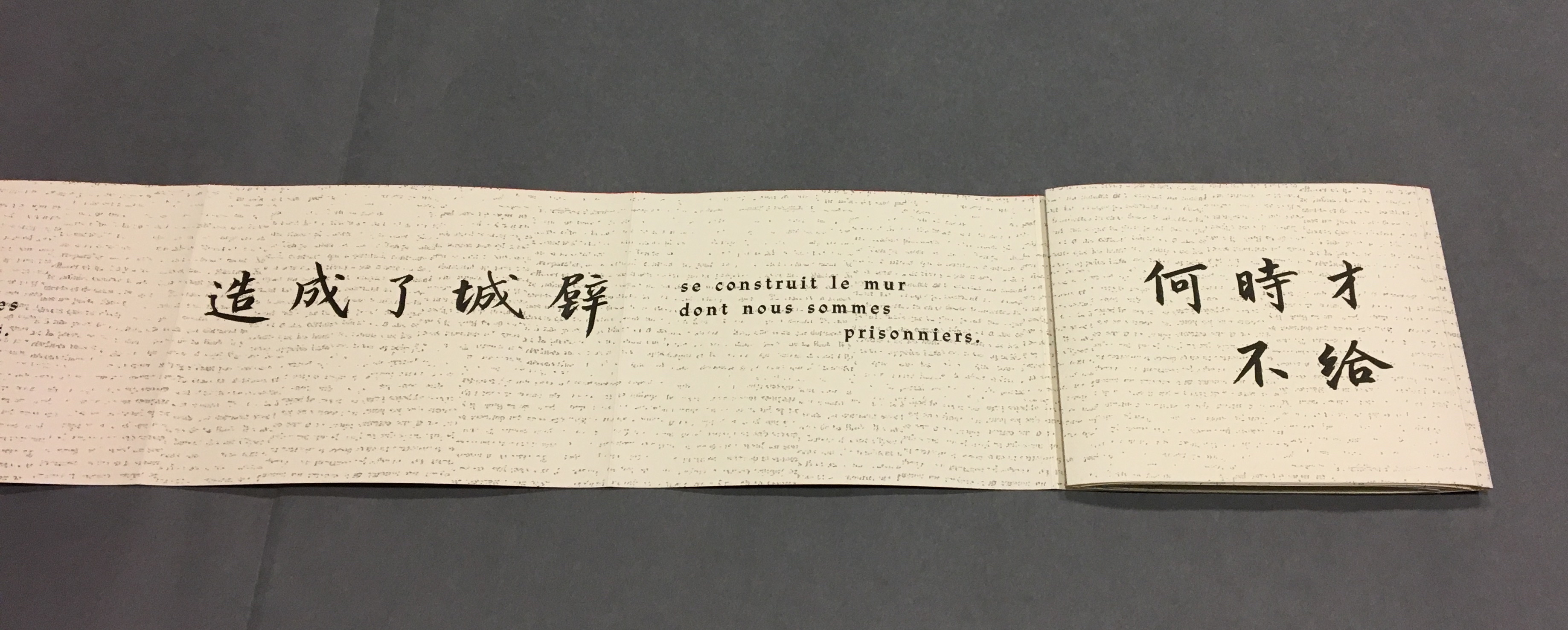
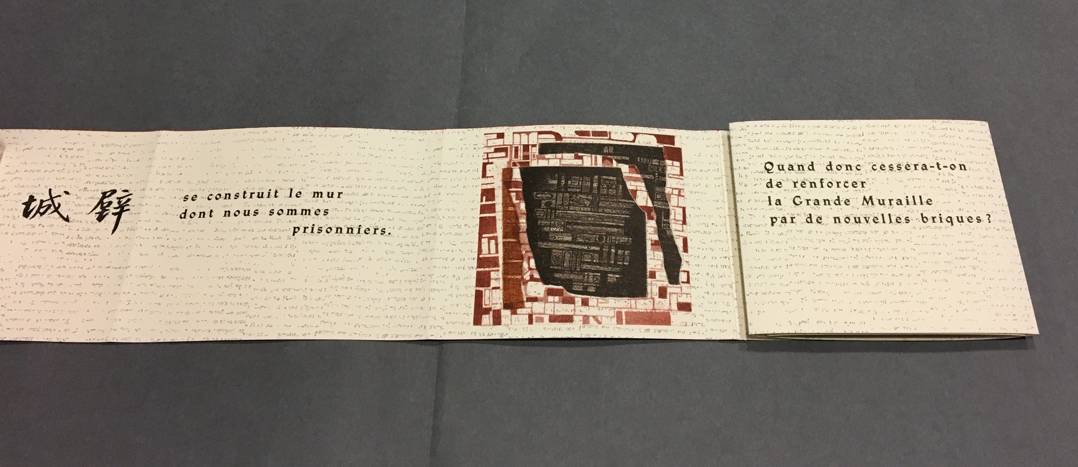
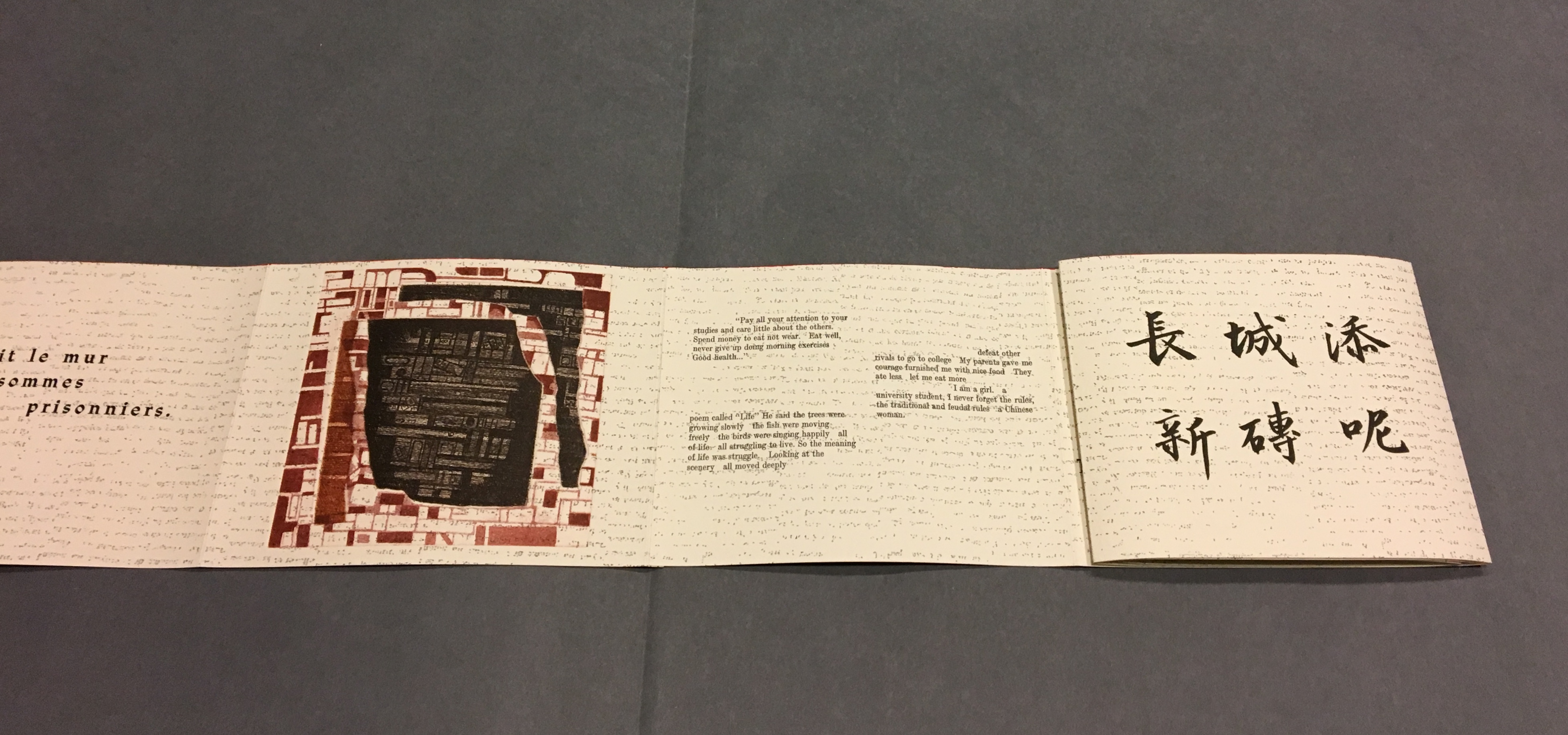
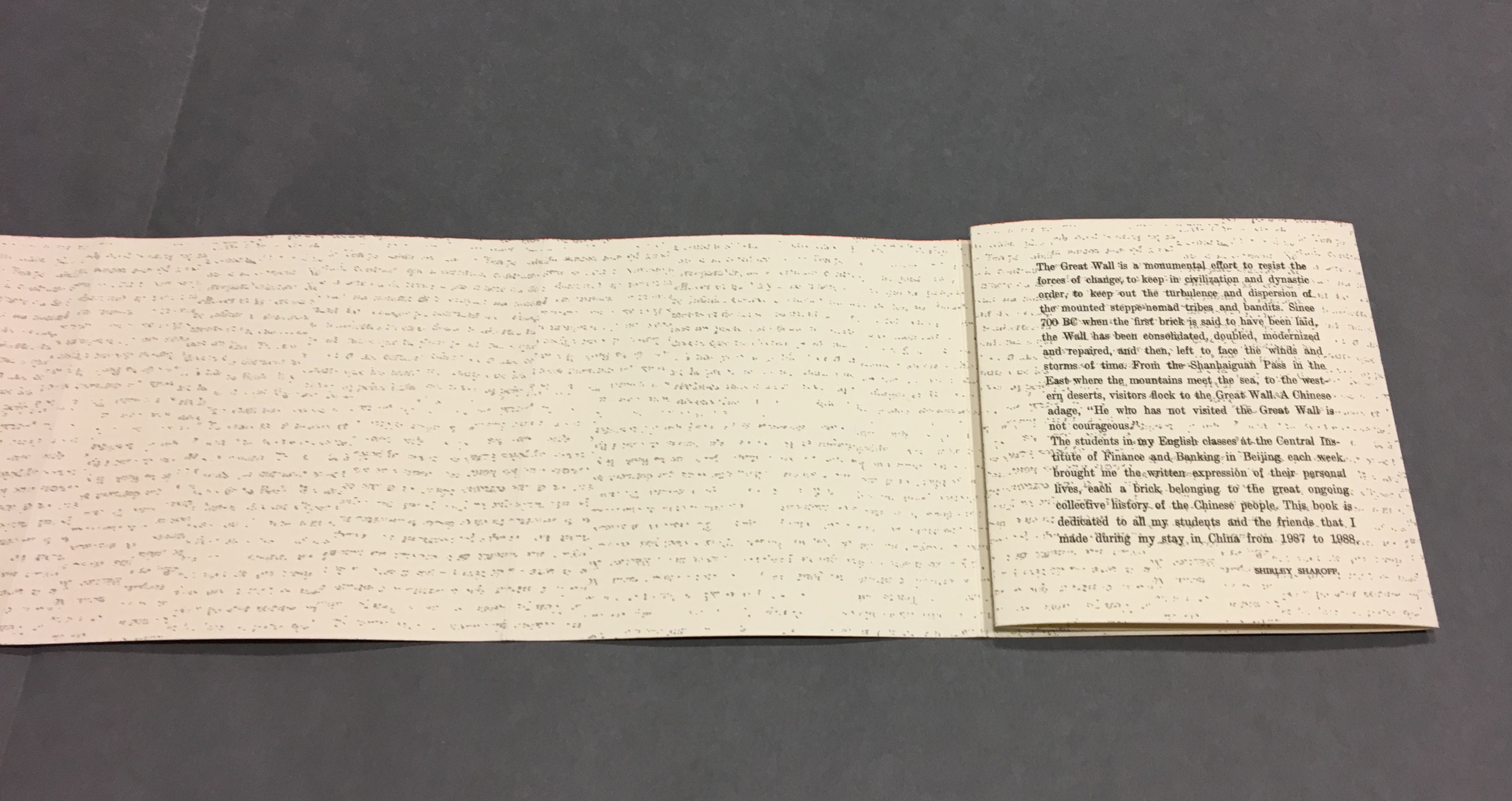
Bernadette O’Toole follows in a long line of distinguished “serial hommageurs”: Ian Wallace, Jérémie Bennequin, Marcel Broodthaers, Kathy Bruce, Marine Hugonnier, Jorge Méndez Blake, Alastair Noble, Michalis Pichler, Raffaella della Olga and Joëlle Tuerlinckx. Like many of them, she extends her work across multiple media. Like all of them, she is driven by the metaphysics and motifs expressed in Un Coup de Dés.

Variant Sail (2015); As If (2016)

Variant Sail (2015) and As If (2016)
Bernadette O’Toole
Presentation box. H240 x W172 mm. Acquired from the artist, 1 April 2022.
Photos: Books On Books Collection. Displayed with permission of the artist.

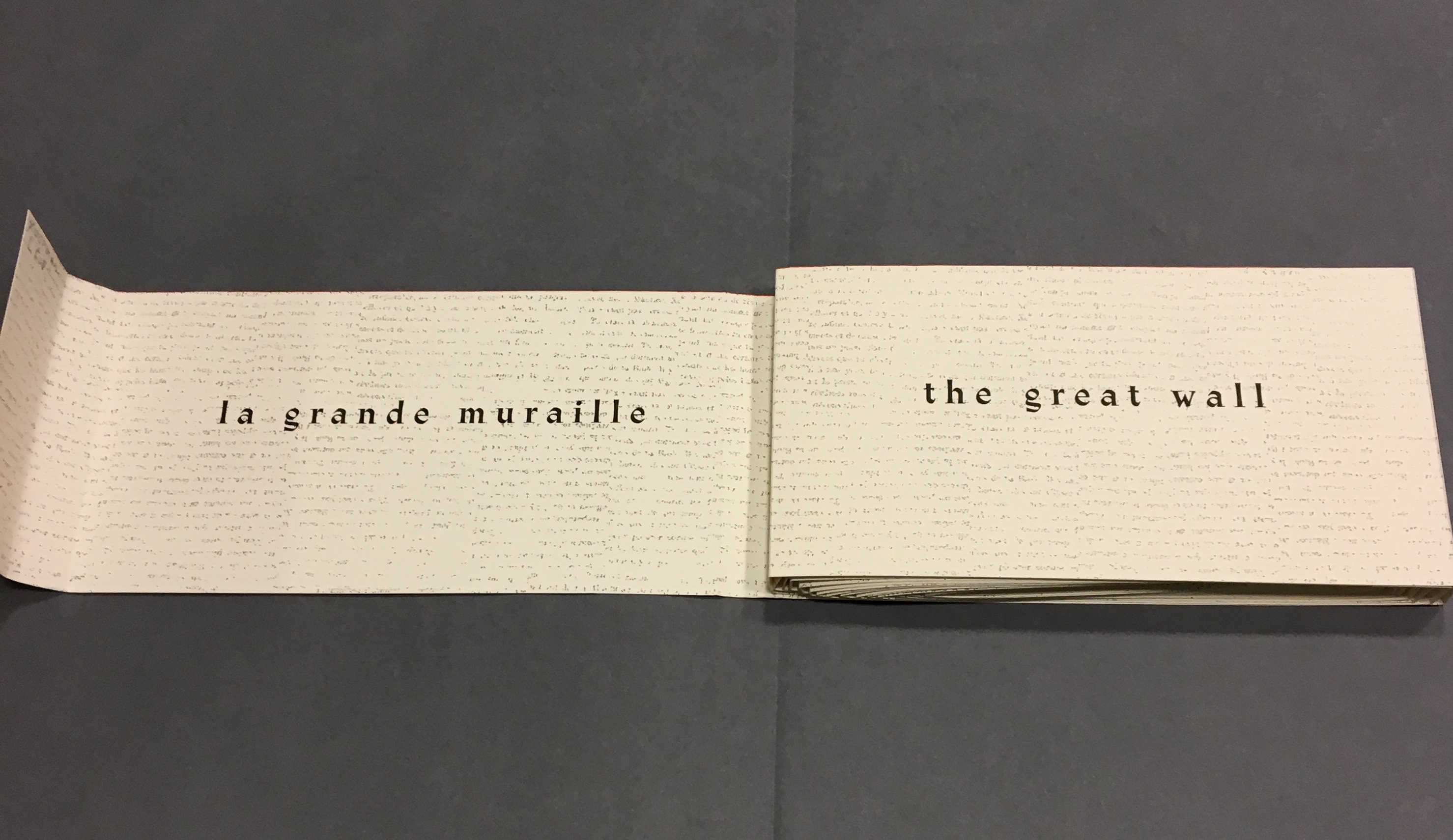
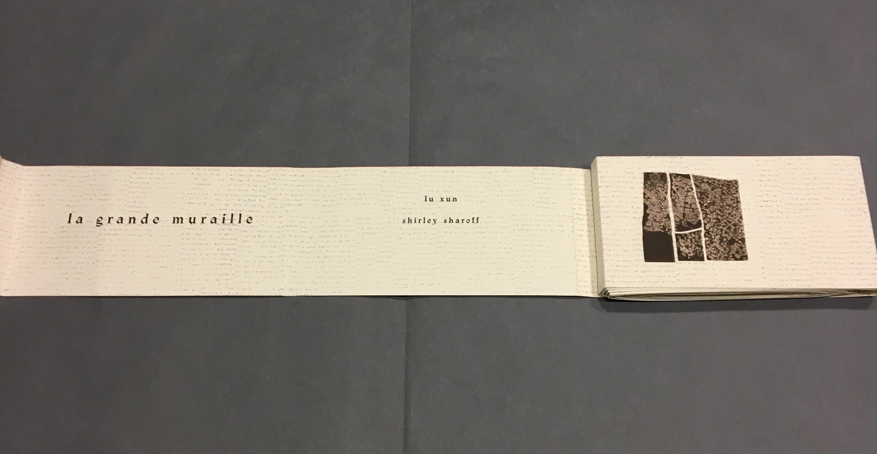
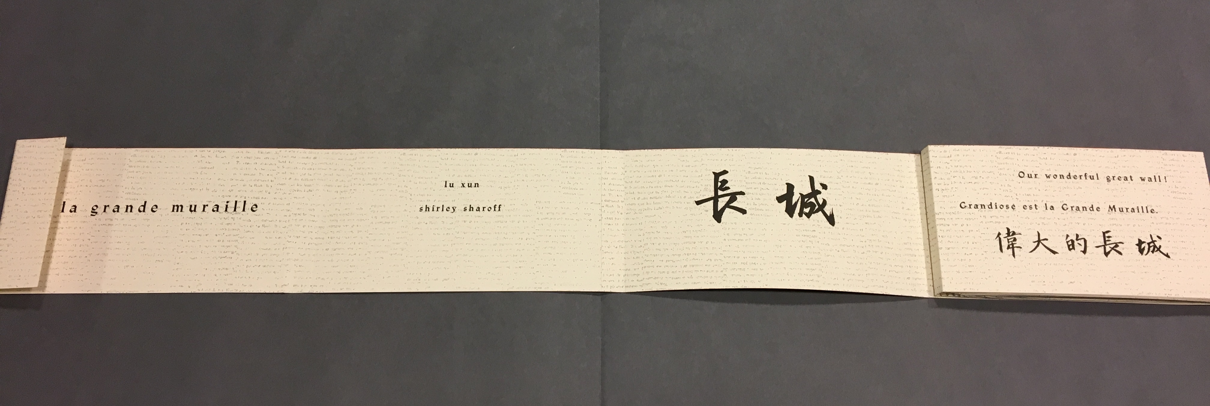
Bernadette O’Toole’s two small booklets first appeared in Sharon Kivland’s MA Bibliothèque and are now out of print. The presentation case in which they arrived conveys her recurrent practice or technique of recontextualizing. A copy or copies from an edition may be re-presented so as to create a new work or works. Variant Sail and As If constitute a case in point.

Variant Sail (2015)

Variant Sail (2015)
Bernadette O’Toole
Booklet, two-staple saddle-stitch. H190 x W130 mm, 24 pages. Edition of 25, of which this is #6.
Photos: Courtesy of Bernadette O’Toole. Books On Books Collection. Displayed with permission of artist.

The booklet Variant Sail contains reproductions of twelve digital prints (H38 x W57 cm). The prints were created by scanning and digitally manipulating each of the double-page spreads of Un Coup de Dés in Photoshop, producing twelve variants with each one foregrounding the gutter in a different way. The manipulation has made Mallarmé’s text faintly detectable but indecipherable and rendered the double-page spreads as entire blancs — variants, as it were, of the white spaces (les blancs) to which Mallarmé refers in his poem’s preface.

[From the NRF/Gallimard 1914 edition]

The ‘blanks’ indeed take on importance, at first glance; the versification demands them, as a surrounding silence, to the extent that a fragment, lyrical or of a few beats, occupies, in its midst, a third of the space of paper: I do not transgress the measure, only disperse it. The paper intervenes each time as an image, of itself, ends or begins once more, accepting a succession of others, and, since, as ever, it does nothing, of regular sonorous lines or verse – rather prismatic subdivisions of the Idea, the instant they appear, and as long as they last, in some precise intellectual performance, that is in variable positions, nearer to or further from the implicit guiding thread, because of the verisimilitude the text imposes. 

[A.S. Kline, “Mallarmé’s Preface of 1897“]

From Mallarmé’s marked-up proofs for his planned deluxe edition, we know that he viewed the double-page spread, not the single page, as the poem’s primary structural unit. Each of O’Toole’s blank double-page spreads can be seen as a voile alternative (“variant sail”), a phrase appearing on the NRF/Gallimard edition’s second double-page spread. With a different foregrounding of the gutter in each of her double-page spreads, O’Toole underscores both the variance within her Variant Sail and the important constancy of the double-page spread in the poem to which she is paying homage.

A bit more esoterically, the double-page spread suggests the quantity 2, an allusion to the result of thrown dice, their two faces up. It may also allude to the poem’s revolutionary versification, challenging French poetry’s Alexandrine, the traditional measure of 12 syllables usually divided into two hemistichs. It seem no accident that O’Toole has chosen a pattern of two-word titles for her booklets.

As If (2016)

As If (2016)
Bernadette O’Toole Booklet, two-staple saddle stitch. H205 x W140 mm, 16 pages. Edition of 25, of which this is #6.
Photo: Courtesy of Bernadette O’Toole; Books On Books Collection. Displayed with permission of artist.

The prints for Variant Sail in turn inspired paintings (same dimensions) that are reproduced in the second booklet As If, which takes its two-word title from the poem’s central double-page spread, the one beginning and ending COMME SI (“as if”). Mallarmé’s words are no longer detectable. What is detectable instead is each brushstroke on the painted surfaces. It is as if the work As If appropriates the work Variant Sail, just as Variant Sail appropriates Un Coup de Dés.

“Appropriation” may not be the right characterization. Re-contextualizing, re-purposing or re-cycling perhaps. Consider where O’Toole goes next with these two other works not in the Books On Books Collection at the moment.

Variant Sail II (2016)

For Variant Sail (II), O’Toole incorporates an inventive sculptural work that she calls a “gesture”. In a black presentation box, a translation of Un Coup de Dés rests beside a small painted gesture, oil on plaster. Here is her description of the process by which a gesture is created:

The process of making the work involved tracing my brush-stroke into a bed of clay, pushing into the surface which proved resistant at first. Plaster was poured into the indent, casting the absent gesture [brush-mark]. Once the form had set, I separated it from the bed of clay and took hold of the object. The absent gesture [brush-mark] had become embodied. The form was simultaneously liberated from the mould, and from the limitation of the painting surface. It was cast out, recalling the Japanese practice known as, ‘flung-ink’, which Norman Bryson observes is ‘thrown’ as one throws dice. — [Interview with Josie Jenkins, 22 November 2020]

Variant Sail II has appropriated, re-cycled, re-purposed or re-contextualized the works Variant Sail and As If in several ways — by transforming the surface brushstroke into a three-dimensional object, by juxtaposing those two works (through the gesture) with the translation

A Rare State (2018)

A Rare State consists of 12 booklets (H38 x W57 cm), each with its own cover and title. Each encloses 12 loose interchangeable folios. Each captures images from different performative readings (by the artist) of Un Coup de Dés or from animated patterns of marks and numbers appearing and disappearing. Some of the patterns occupy the positions of Mallarmé’s text on his double-page spreads. Others appear in sequences of 1-6 within a square or diamond suggesting the face of a die.

False Mansion~1 and Towards this Ultimate Conjunction with Probability~1 from A Rare State © Bernadette O’Toole. Images and permission to display, courtesy of Bernadette O’Toole.

A Rare State expands on the idea of a numerical or mathematical principle at play — be it 1-6 on the face of a die, the 12 syllables of the Alexandrine that the poem explodes, the 2 of the double-page spread, or the 4 triangles constituting the face of a die across the double-page spread. This expansion is also an expansion of O’Toole’s technique of appropriation, re-cycling, re-purposing or re-contextualizing to create new artwork. It is as if her every thought emits a throw of the dice.

Variant Sail, Ex Libris Gallery, 2016. © Bernadette O’Toole. Image and permission to display, courtesy of Bernadette O’Toole.

Further Reading

Jérémie Bennequin“. 15 December 2020. Books On Books Collection.

Kathy Bruce“. 23 December 2021. Books On Books Collection.

Marine Hugonnier“. 8 April 2022. Books On Books Collection.

Jorge Méndez Blake“. 16 September 2020. Bookmarking Book Art.

Michalis Pichler“. 19 August 2020. Books On Books Collection.

Raffaella della Olga“. 8 December 2020. Books On Books Collection.

Cohn, Robert G. 1966. Mallarme’s Masterwork: New Findings. The Hague: Mouton. Contains the photographs that inspired Neil Crawford’s typographic translation.

Cohn, Robert Greer. 1965. Toward the poems of Mallarmé. Berkeley: University of California Press. See in particular for his analysis of the relationship between Un Coup de Dé and the sonnet À la Nue Accablante Tu (pp. 229-36).

Davies, Gardner. 1992. Vers une Explication Rationelle du “Coup de Dés”. Paris: Corti.

Kline, A.S., trans. 2007. “Stéphane Mallarmé, Un coup de dés jamais n’abolira le hasard (A throw of the dice will never abolish chance). Poetry in Translation. © Copyright 2007 All Rights Reserved.

Meillassoux, Quentin, and Robin Mackay. 2012. The Number and the Siren: A Decipherment of Mallarmé’s Coup de Dés. Falmouth: Urbanomic.

Books On Books Collection – Ernest Fraenkel

Les Dessins Trans-conscients de Stéphane Mallarmé
à propos de la Typographie de Un Coup de Dés (1960)

Les Dessins Trans-conscients de Stéphane Mallarmé, à propos de la Typographie de Un Coup de Dés (1960)
Ernest Fraenkel
Paperback, stapled to fold-in sleeve. , 44 pages bound with 68 pages on 8.5 uncut folded and gathered sheets. Acquired from À la Page, 12 October 2021.
Photos: Books On Books Collection.

Ernest Fraenkel should have left it at visually mapping Un Coup de Dés and offered it up as simply an artistic response to the poem. Even if it is a mapping of the condensed single-paged Cosmopolis (1897) version of the poem, think of the various renderings in handset chapbook form printed on letterpress or as lithographs, or etchings on glass, or even sculptures. It could have been the “Prometheus bound” to the “Prometheus unbound” of those who paid homage by appropriating the more expansive double-page spread book version (1914) that Mallarmé intended. Instead, it lies tucked away with 44 pages de l’explication. Professor David W. Seaman (Georgia Southern University), who has engaged with Fraenkel’s analysis, puts it well:

It must be said in [Fraenkel’s] defense that the idea is tempting: to make wordless patterns of the pages of the poem in order to see the ideogrammatic shapes more clearly. In addition, Fraenkel has contributed some worthwhile insights into the use of space and text in the poem, … However, there are three major objections to his project. First, he used, for most of his research, the text of the Cosmopolis edition of the poem, an edition which nearly everyone agrees is far from the author’s intentions, especially insofar as the ideograms are concerned; the preface to that edition gives ample warning of this. … / The second objection is that Fraenkel strays too far from the text, preferring to keep in mind a general idea of the meaning of the poem, and then go off according to the feelings the designs give him. … In fact,  sometimes Fraenkel recommends turning the design on its side or upside-down to see what image may present itself! / The third objection is that these designs are then used more or less like Rohrschach ink blots. (Seaman, pp. 142-43)

In his nine sets of single-sided uncut sheets, Fraenkel offers seven different diagrammatic approaches to the poem as it appeared in Cosmopolis, whose editors could not allow the poem’s lines to cross over the gutter to the next page as Mallarmé imagined the layout. The opening pages of Fraenkel’s seven approaches are laid out below in sunlight and paired with the textual opening page.

Seven different diagrammatic renderings. The one at the lower right shows Fraenkel’s sideways view.

The first rendering (above, upper left) is closest to what Mario Diacono and Marcel Broodthaers would create later in the decade.

Left: a METRICA n’aboolira (1968) by Mario Diacono (1968). Right: Image: Un coup de dés jamais n’abolira le hasard (1969) by Marcel Broodthaers (1969).

Fraenkel’s nine sets of sheets break down into eight of 8 pages and one of 4 pages. Below is the first set opened out.

The first set of eight pages

Compared with Diacono’s, Broodthaers’ and all the other works of homage to date, Fraenkel’s renderings retain a distinction and suggest other new directions not yet taken physically or digitally. Given the sculptural interpretations by Geraldo de Barros, Jorge Méndez Blake and Kathy Bruce, doesn’t Fraenkel’s first rendering call for a three-dimensional cantilevered homage constructed of slabs of blackened flotsam connected with brushed steel rods?

From the series Jogos de Dados (1986)
Geraldo de Barros
Photo: Julia Parpulov. Permission from Fabiana de Barros.

Biblioteca Mallarmé/Mallarmé Library (2011)
Jorge Méndez Blake
Photo: Courtesy of the artist.

Navigating the Abyss (2014)
Kathy Bruce
Photo: Courtesy of the artist.

Given the video created by Giulio Maffei transforming the 1914 book version into Broodthaers’ and the digital legerdemain of Karen ann Donnachie and Andy Simionato and Tayyib Yavuz, why not an animated digital transformation of the Cosmopolis version into the 1914 book version?

Le Vite dei Libri 26 – Un coup de dés jamais n’abolira le hasard (2016)
Giulio Maffei
Permission from the artist.


Mallarmé’s Self-replicating Machine: A Throw of the Dice Will Never Abolish Chance” (2018)
Karen ann Donnachie and Andy Simionato
Permission from the artists.

Experiment Book: “Un Coup de Dés”
Tayyib Yavuz
Permission from the artist.

And Professor Jed Rasula (University of Georgia), who has also explored Fraenkel’s work, suggests yet another medium:

Fraenkel’s sixty-eight seismographic and astral diagrams (or “stylizations”) practice a truly graphic mode of literary analysis. It was Fraenkel’s conviction that “a plastic text rests hidden in the extra-conscious layers of the poet, paralleling the verbal text of the poem” (9). … In their accentuation of the visual character of Un Coup de dés, Fraenkel’s designs are like watching a movie with the sound turned off, forced to rely on gesture rather than dialogue in order to follow the action.”

Except for the sound part, that could describe Man Ray’s Les Mystères du Château de Dés (1929).

Further Reading

Derek Beaulieu“. Books On Books Collection. 19 June 2020.

Raffaella della Olga“. Books On Books Collection. 8 December 2020.

Klaus Detjen“. Books On Books Collection. 9 September 2020.

Sammy Engramer“. Books On Books Collection. 1 June 2020.

Michalis Pichler“. Books On Books Collection. 19 August 2020.

Cerith Wyn Evans“. Books On Books Collection. 16 April 2020.

Eric Zboya“. Books On Books Collection. 1 June 2020.

Donnachie, Karen Ann, and Andy Siminiato. “Mallarmé’s Self-replicating Machine: A Throw of the Dice Will Never Abolish Chance”. MATLIT: Materialities of Literature, [S.l.], v. 6, n. 1, p. 37-49, Aug. 2018. Date accessed: 23 March 2019.

Rasula, Jed. Modernism and Poetic Inspiration: The Shadow Mouth (London: Palgrave, 2009). Accessed via Electronic Poetry Center, University of Pennsylvania, n.d. Accessed 14 June 2020.

Samson, Anna, and Serge Chamchinov. 2022. “Les Dessins trans-conscients de Stéphane Mallarmé par Ernest Fraenkel : une méthode originale“. Continent Manuscrits. No. 18. Accessed 10 June 2022. A superb analysis of Fraenkel’s book and method.

Seaman, David W.  Concrete poetry in France (Ann Arbor: Umi Research Press, 1981).

Bookmarking Book Art – Jorge Méndez Blake

Mallarmé’s Library (2011)

Biblioteca Mallarmé (2011)

Jorge Méndez Blake

Metal, wood, mirror, resin, plexiglass + drawing. 95x180x150 cm (table) 50×70 cm (drawing). Photos: Courtesy of Estudio Jorge Méndez Blake.

Silvia Ortiz, founder of the gallery Travesía Cuatro in Madrid, writes

In this exhibition entitled Biblioteca Mallarmé, the artist establishes once again the link between his artwork, literature and architecture. On this occasion Jorge Méndez Blake reformulates the concept of library, this time to a library-shipwreck, a library stranded on the coast, as a wreck. 4 November 2011 – 1is 6 February 2012. Accessed 4 September 2020.

Photo: Courtesy of Estudio Jorge Méndez Blake.

Photo: Courtesy of Estudio Jorge Méndez Blake.

All of the works making up the exhibition pay homage to Un Coup de Dés. In keeping with the sub-genre of the homage to an homage, though, this work eponymous with the exhibition draws on Marcel Broodthaers’ homage to the same poem. With its colorfulness, it might also be drawing on Mario Diacono’s JCT 1, a MeTrica n’ABOOlira (1968), Ian Wallace’s Image/Text (1979) or Klaus Detjen’s Ein Würfelwurf niemals tilgt den Zufall (1995). With its three-dimensionality, also perhaps on Geraldo de Barros’s Jogos de Dados (1980s), Albert Dupont’s Désir-Hasard-Dés (2000), or Kathy Bruce’s Navigating the Abyss (2008). Probably not, but this gathering of artists attests to how much Mallarmé’s poem has permeated the genre of book art and its permutations.

Méndez Blake’s originality here arrives in the juxtaposition of the poem’s shipwreck in the form of resinous burnt detritus on the table and flotsam in the print on the wall with the mixed-media blocks on the table recalling books on library display as well as Broodthaers’ rectangular black redactions in his homage or appropriation. Appropriation is very much a theme in this work and the exhibition.

Exhibition view, Travesía Cuatro, Madrid, Spain.

Du fond d’un naufrage (2011)

Du fond d’un naufrage (2011)

Jorge Méndez Blake

Bricks and book. 1.61×1.20×1.06 cm. Photo: Courtesy of Estudio Jorge Méndez Blake.

Another work in the exhibition, Du fond d’un naufrage (2011), differs in material and shape from any previous homage to the poem. The work’s title (“from the bottom of a shipwreck”) comes from a line in Mallarmé’s poem, and cheekily, the volume at the bottom of the gap between the bricks is Mallarmé’s Collected Poems and Other Verse (Oxford University Press).

Toute Pensée Émet un Coup de Dés (2012-2019)

Toute Pensée Émet un Coup de Dés (2012-2019)

Jorge Méndez Blake

Photo: Courtesy of Estudio Jorge Méndez Blake.

Not in the exhibition but continuing the association with Un Coup de Dés and the theme of appropriation, Toute Pensée Émet un Coup de Dés (2012-2019) is a series of nine drawings that

reproduces classic shipwreck paintings using colored pencil. Classic painters used often the strategy of bending the mast, as a way to show the instability of the ship in the storm. These drawings go through an editing process, in which an image of the original painting is cropped and rotated X degrees to achieve the mast verticality and to make the scene look as if the ships were avoiding the fatal destiny. But by “fixing” the mast, the whole landscape loses its horizontality. Correspondence, Estudio Jorge Méndez Blake, 4 August 2020.

Further Reading

Large-Scale Installations (Updated 3 August 2020)”, Bookmarking Book Art, 3 August 2020.

Peden, Georgia. “Denver’s MCA exhibits adapted literary illustrations”, DU Clarion 9 October 2017. Accessed 23 August 2020.

Bookmarking Book Art – Learning to read Shirley Sharoff’s “La grande muraille”

La grande muraille/The Great Wall (1991), Shirley Sharoff
All Books On Books photos are reproduced here with permission of the artist.
Detail, La grande muraille/The Great Wall (1991)
Typeface: Athenaeum, designed by Alessandro Butti and Aldo Novarese in 1945

The National Library of the Netherlands advises, “for [Shirley Sharoff’s La grande muraille/The Great Wall (1991)] to be read, the book first must be rolled out”.  And that is what I did, using the large table in the Special Collection’s seminar room. 

Enjoyable as that was, enjoying it again with the video afterward, something seemed awry. As the Chinese poem by Lu Xun, its French and English translations and text from Sharoff’s language students unrolled, interpersed with her prints, the text seemed to have gaps, or so I thought. So I returned a second time. Perhaps if I re-shot the video. Perhaps if I took more stills and close-ups. Perhaps if I shot the rolling up as well as the unrolling.

No doubt, the second effort added to the pleasure. Looking at the videos and stills, I can again feel between my fingers the Arches paper and engravings’ impressions on it. But still I detected gaps, seeming mismatches between the French and English. I wondered to what degree they

followed the Chinese text or whether some of Lu’s text had been omitted.  So, I returned a third time, and then came my “ah hah” moment. Unrolled, La grande muraille looks like a double-sided leporello or accordion book like this one: In Mexico by Helen Douglas.

In Mexico: in the garden of Edward James (2014)
Helen Douglas
La grande muraille/The Great Wall (1991)
Shirley Sharoff
Photo credit: © Koopman Collection. National Library of the Netherlands/Jos Uljee

To read La grande muraille as the double-sided leporello it appears to be, however, is to overlook the multi-page spreads that Sharoff conceived with François Da Ros (her typography and print collaborator) in putting together this forme en escargot (snail-shell form as she calls it). The snail-shell form, its multi-page spreads and the text demand that you read La grande muraille as you unroll it, or rather, as you unfold it.

With the book laid flat, the “page spreads” are easier to recognize, the text is easier to read, and the forethought needed for the “imposition” of text and images to deliver the sequential text, easier to marvel at. As each recto page is turned to the right, two new pages appear to the right. This unfolding approach to reading the book offers several intriguing “double- and multi-page spreads” and an experience of the texts and eight prints in the sequence driven by the text. When you have finished reading in this sequence, you will have read both sides of the scroll. 

Reading the text

Front cover
La grande muraille/The Great Wall (1991), Shirley Sharoff
“Pages 1 and 2”
As “page 2” is turned to the right and the English title of the work disappears, “pages 3 and 4” come into view.
“Pages 1, 3 and 4”
“Page 3” displays the authors names, and “page 4” displays the first of eight prints in the book. As “page 4” is turned to the right and disappears, “pages 5 and 6” appear.
“Pages 1, 3, 5 and 6”
“Page 5” gives the title of the book in Chinese calligraphy. On “page 6”,  the opening line of Lu Xun’s text appears in English, French and Chinese.
Turning “page 1” to the right will cover the authors’ names on “page 3”, and turning “page 6” to the right will yield the next four-page view.
“Back cover, pages 5, 7 -8”
The next lines of Lu Xun’s disquisition run in English, French and Chinese across “pages 7-8”.
Detail, “Pages 7 and 8”.
Notice how the English text on “page 7” runs across to “page 8”, but the French text disappears under “page 8”, effectively running on to what will be revealed as “page 9” in the next view.
“Pages 2, 9-11”
This view results from two page turns inward on the left and two outward on the right. “Page 2” has come back into view on the left.  The English text on pages 9-10 completes the sentence interrupted on “page 8”. The French text on “pages 9 and 10” completes the sentence that began on “page 7” and ran behind “page 8”.
Pages 9-10, 12-13
Pages 6, 12, 14-15
Pages 12, 14, 16-17
Pages 16, 18-19
Pages 16, 18, 20-21
Pages 20, 22-23
Pages 20, 22, 24-25
Pages 24, 26-27
Pages 24, 26, 28-29
Pages 28, 30-31
Pages 30, 32-33
Pages 32, 34-35
Pages 32, 34, 36-37
Pages 34, 38-39
Pages 38, 40-41
Pages 40, 42-43
Pages 42, 44-45
Pages 44, 46-47
Pages 44, 46, 48-49
Pages 46, 48, 50-51
Pages 48, 50, 52-53
Pages 50, 54-55
Pages 54, 56-57, the latter displaying the last ten characters of Lu Xun’s text.

這偉大而可詛咒的長城)

Pages 56, 58-59
Pages 58, 60-61
Pages 60, 62-63
Pages 62, 64-65
pages 64, 66-67

Now that the so-called gaps in the English and French texts were resolved, I wanted to understand how the English and French matched up to the Chinese text. For that, I asked help from two acquaintances in The Hague: Bee Leng Bee and Yingxian Song.  They obtained a copy of Lu Xun’s text, traced it through the photos I had taken and found that the three languages run almost in parallel as the work unfolds.

“Almost” because the order of the languages is not alway the same. On pages one and two, we see the French and English titles but must wait until page five before the Chinese title appears. Then, on page six the order changes: English first, then French, then the corresponding ten Chinese characters. On pages seven and eight, this order is maintained. Later, with the turning of page fifteen, the French comes before the English and Chinese; the first Chinese character aligning to the French and English (其) appears on page seventeen. Then, as page seventeen is turned to the right, the order changes back to French then English on page eighteen, but on page nineteen, it moves to French first then Chinese. The book’s textual conclusion on pages fifty-six through fifty-nine runs Chinese, English, then French. 

The juxtaposition and weaving of the three languages often seems painterly as if intended to evoke the layering of the bricks and the intertwining vines and foliage along stretches of The Great Wall. Here is the uninterrupted Chinese text:

偉大的長城!

這工程,雖在地圖上也還有它的小像,凡是世界上稍有知識的人們,大概都知道的罷。

其實,從來不過徒然役死許多工人而已,胡人何嘗擋得住。現在不過一種古跡了,但一時也不會滅盡,或者還要保存它。

我總覺得周圍有長城圍繞。這長城的構成材料,是舊有的古磚和補添的新磚。兩種東西聯為一氣造成了城壁,將人們包圍。

何時才不給長城添新磚呢?

這偉大而可詛咒的長城!

Reading the images

Even though following the forme en escargot results in having reading both sides of the scroll in the end, Sharoff also uses it to play with the notion of intended sequence. Completely unrolled and standing on its edge, the work echoes the Great Wall.  The tint of red along the top edge recalls the blood spilled in the Great Wall’s construction. The prints echo the Great Wall’s bricks, the vegetation in its crumbling gaps, even the gates. The completely unrolled work is an intended sequence, also — an invitation to walk the wall. Coming upon each of the eight copperplate engravings in the unfolding sequence is a different experience than walking up and down the “outer wall” and then the “inner wall” to see them. Five are on the outer wall, three on the inner.

The print first to be seen as the book unfolds, but one of the three on the “inner wall” with the book unrolled.

The second print comes into view on “page 14”, the second of Lu Xun’s statements begins in French on “page 15”,
and with the rolling up on the left, “page 4” has reappeared.
With the turning of “page 15”, the third print comes into view on “page 16”, and the sentence begun with “Actually” on “page 16” continues on “page 17” above the Chinese.
“Pages 16, 18-19”
The French at the top of “pages 18-19” is continuing the sentence from “page 15”, and the English beneath on “page 18” is continuing the sentence from “page 17”.
With this spread — “pages 16, 18, 20-21” — the fourth print comes into view on the right, and the French and English sentences conclude together in the middle.
“Pages 30, 32-33” and the fifth print comes into view.
“Pages 38, 40-41” and the sixth print comes into view.
“Pages 44, 46, 48-49” and the seventh print comes into view.
Pages 50, 54-55 and the eighth and final print comes into view.

Reading the form “in time”

As the force of the snail-shell binding resists the unscrolling and pulls the standing pages inward, the work has another echo: the eroding maze in the Ancient Summer Palace (Yuan Ming Yuan) outside Beijing. The faint markings on the paper, created by printing the results of repeated photocopies of a manuscript, amplify the echo.

La grande muraille/The Great Wall (1991)
Shirley Sharoff
Photo credit: © Koopman Collection. National Library of the Netherlands/Jos Uljee
Arches paper printed with the results of multiple photocopies of a manuscript.

Although Lu’s text does not mention the maze, Sharoff introduces contemporary text that, alongside the interweaving Chinese, English and French of Lu’s text, evokes a maze-like, time-travelling effect. The autobiographical texts from the English-language students she taught at the Central Institute of Finance and Banking (1987-88) reflect on their childhood and adolescence in the Maoist era and their recollection of representations of  foreigners in books and television. These “new bricks” in their modernness and fracturedness interrupt the flow of Lu’s prose praising and cursing the Great Wall.  Yet, in their segmentation and placement, they also physically echo the prints and reinforce Lu’s expression of the paradox in the construction, fragmentation, reconstruction and erosion of the real Wall.

“Pages 32, 34-35”

Sharoff’s La grande muraille is a treasure that rewards repeated visits and contemplation: not only for itself but also as a parallel or forerunner.

La grande muraille’s physical impetus (The Great Wall), the seemingly decipherable/indecipherable characters on the Arches paper, the wry paradox of Lu Xun’s observations, the socio-political-cultural implications of the “new bricks”, the work’s innovative form and the pulling of past and present together parallels the work of Xu Bing and his play with language across East and West. His Book from the Sky first appeared in 1988.

Sharoff’s use of Lu’s contemplation on The Great Wall also foreshadows Jorge Méndez Blake‘s Capítulo XXXVIII: Un mensaje del emperador / A Message from the Emperor (2017?). The title refers to an anecdote in the story “The Great Wall of China” by Franz Kafka, a contemporary of Lu Xun.  The narrator tells the reader how the emperor has dispatched from his deathbed a message to the reader, entrusted to a herald who, struggling as he might, cannot escape from the confines of the palace to deliver the message — yet which we the reader await hopelessly and with hope.

What more should we expect from art?

____________________________

*For help and permissions, thanks to Paul van Capelleveen and the staff at Koninklijke Bibliotheek, Den Haag, and Shirley Sharoff, Paris. For help with the Chinese and calligraphy, thanks to Bee Leng Bee and Yingxian Song.