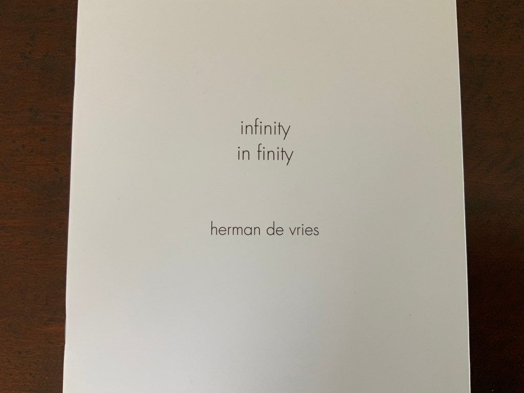
Blank. Raw. Illegible… Artists’ Books as Statements, 1960-2022 (2023)
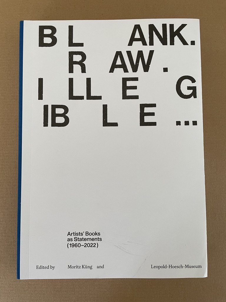
Blank. Raw. Illegible… Artists’ Books as Statements, 1960-2022 (2023)
Leopold-Hoesch-Museum and Moritz Küng (ed.)
Softcover with flaps, reversed “Fälzel” stitch bound. H280 x W200 mm. 272 pages. Edition of 1100. Acquired from Walther & Franz Verlag, 10 May 2023.
Photos: Books On Books Collection.
Published on the occasion of the exhibition by the same name at the Leopold-Hoesch-Museum in Düren, Germany, this tome is far more than an exhibition catalogue. With its thematic structure being a form of commentary on and insight into 259 individual works of 200 book artists, Blank. Raw. Illegible becomes one of the more important reference works on book art to have appeared in the last five years. And this is despite its singular focus on artists’ books blank (most of them), inacessible, or illegible.
The opening spreads for its fifteen thematic sections are shown below.
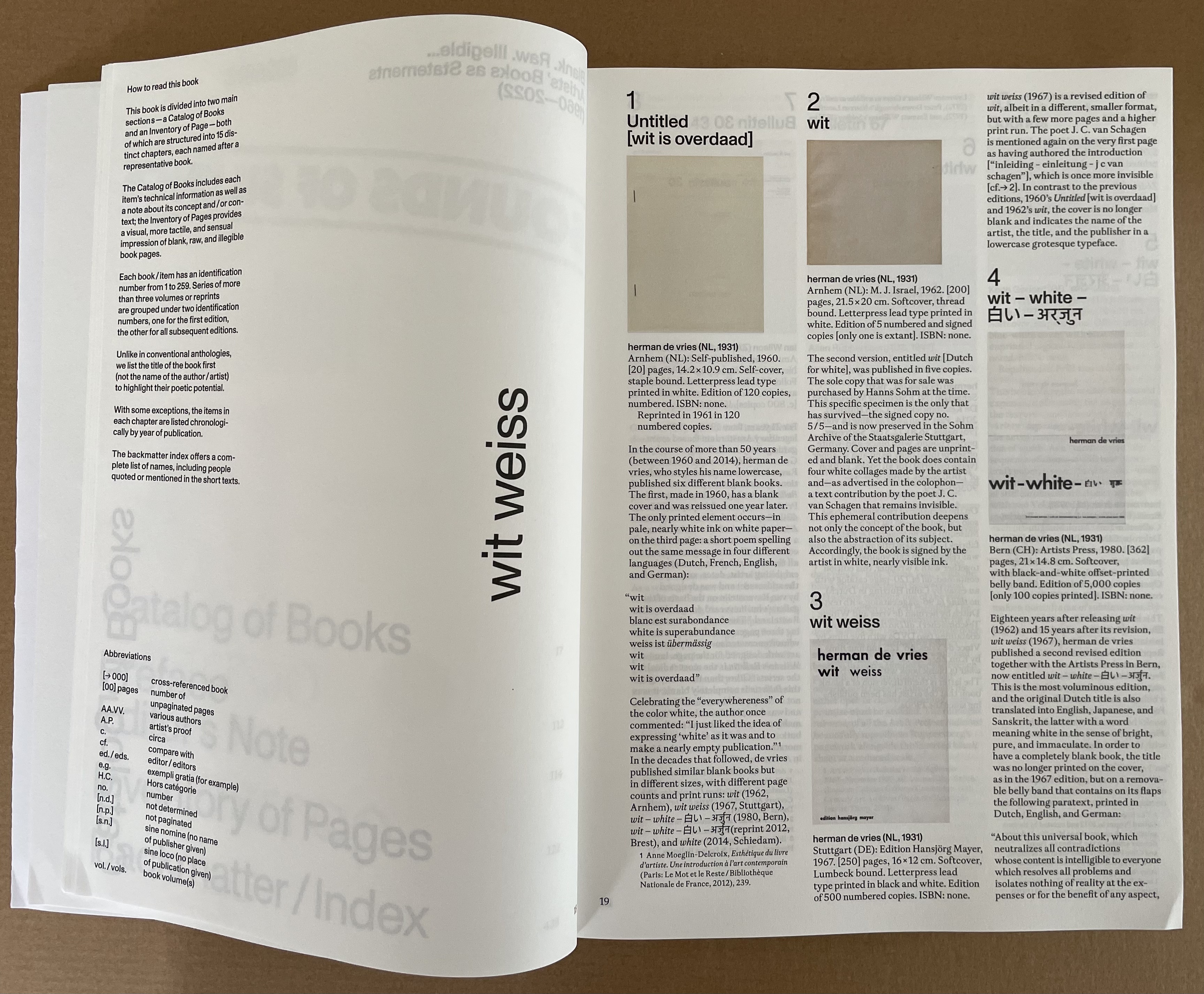
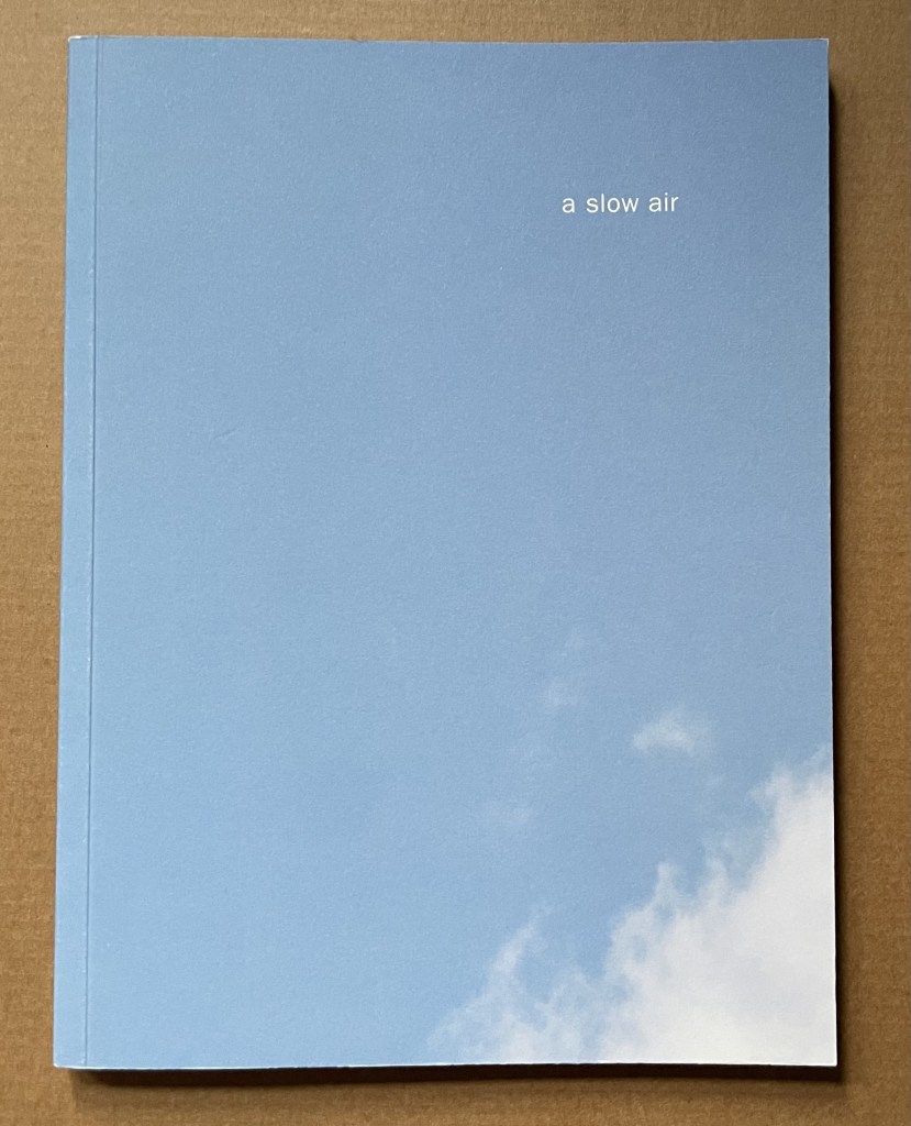
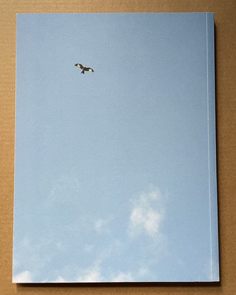
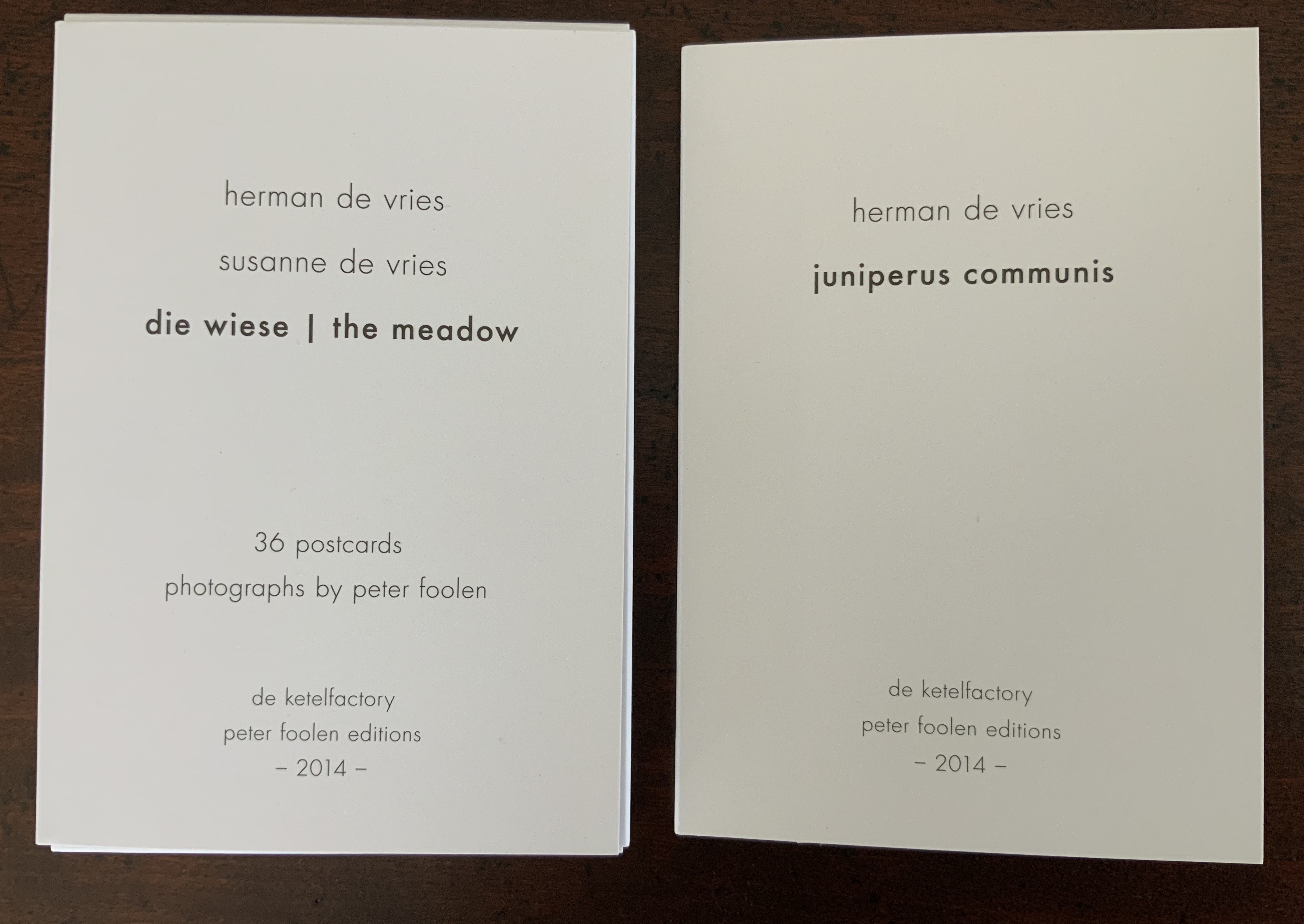
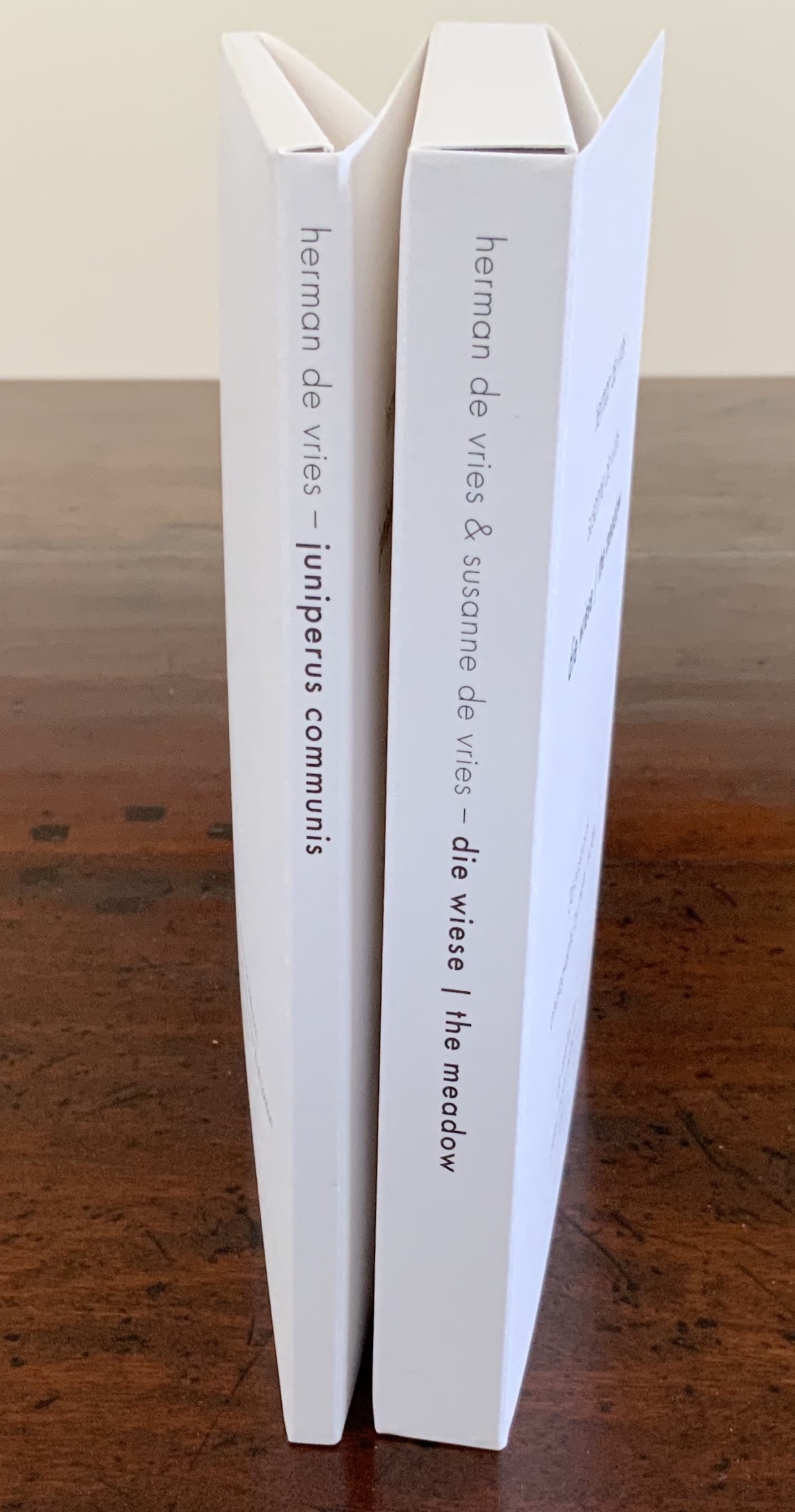
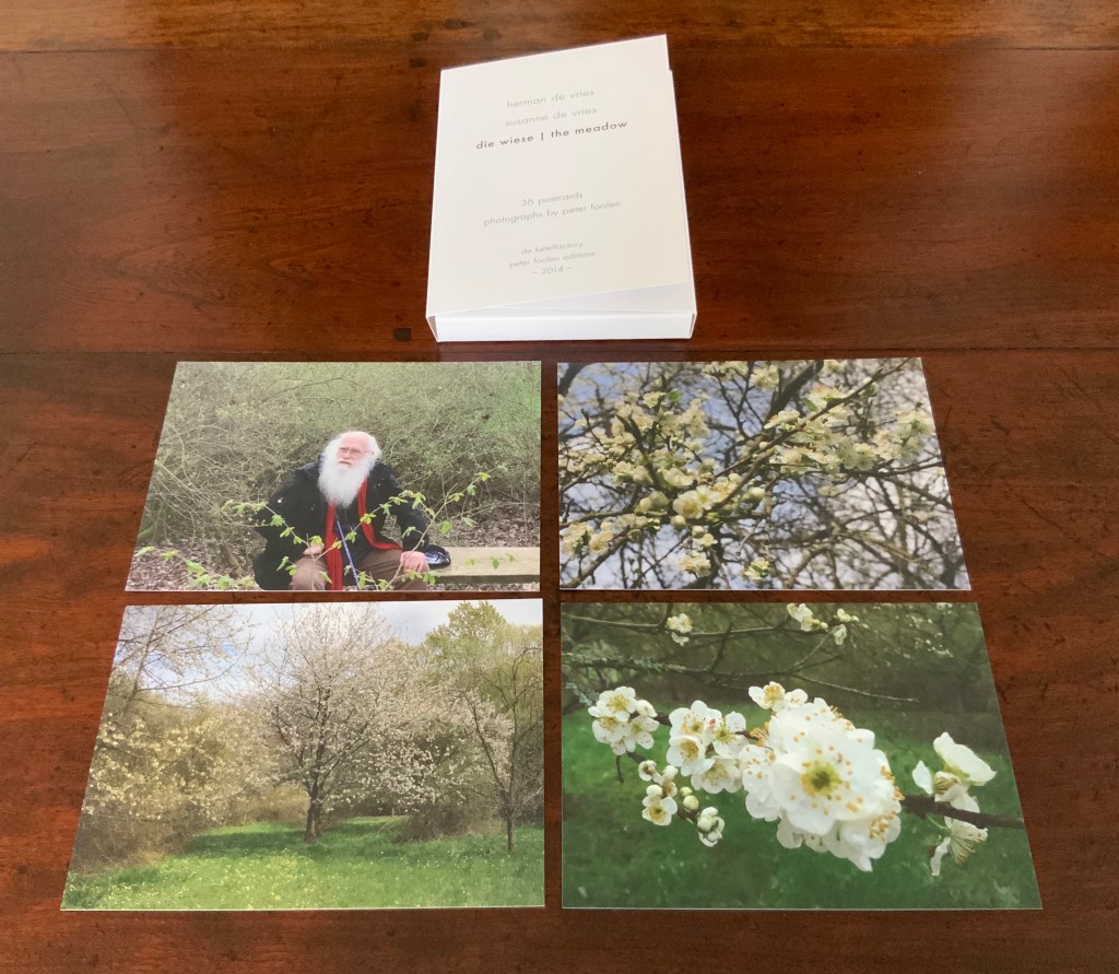
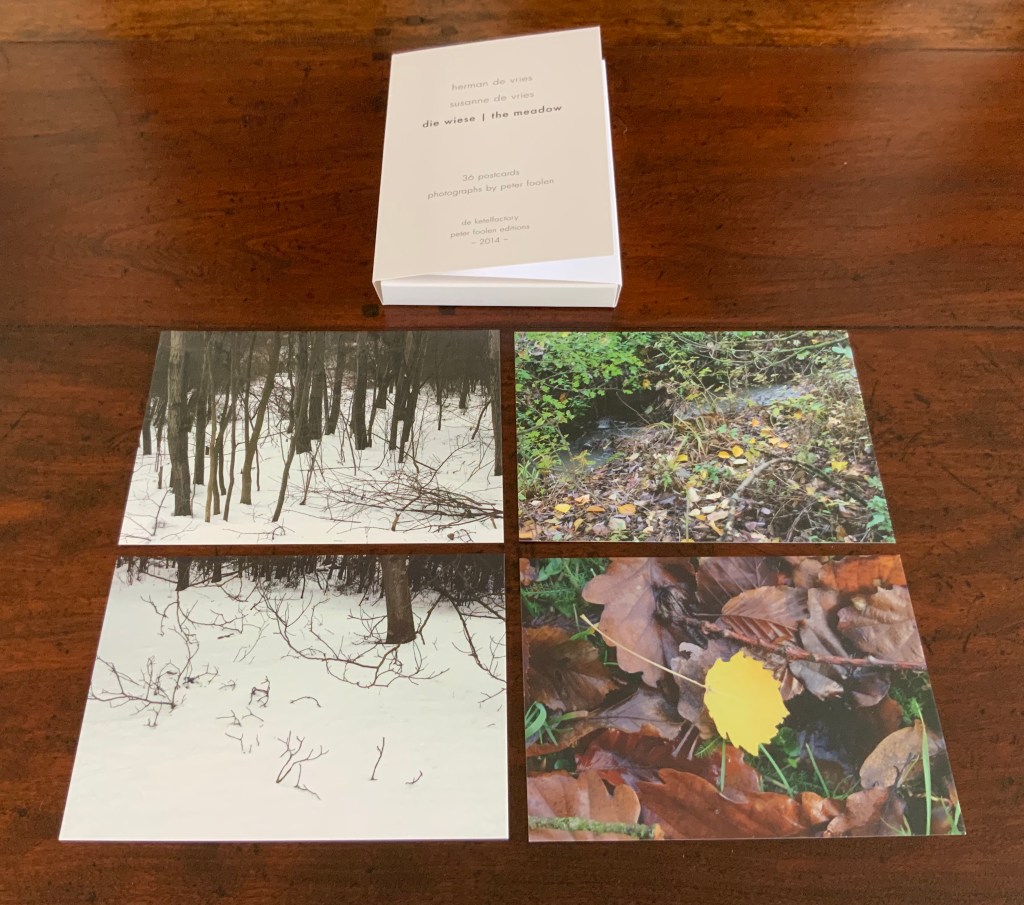
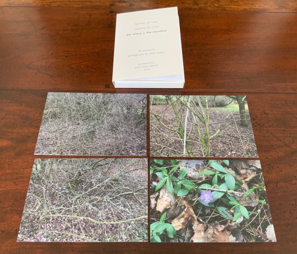
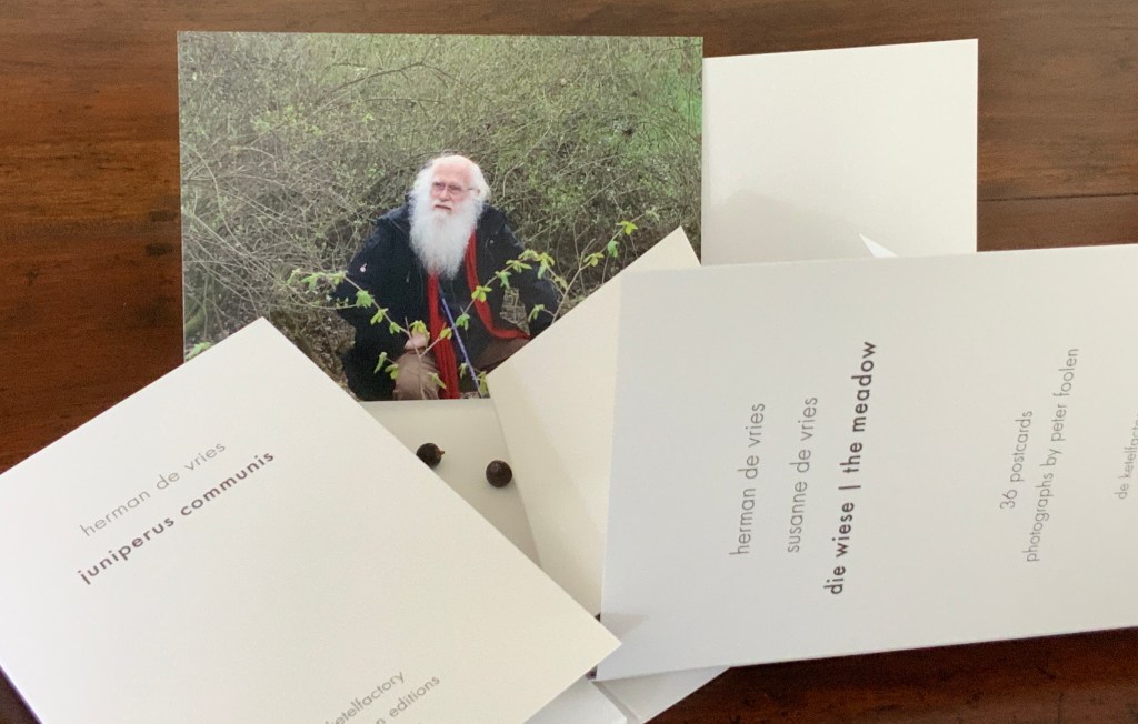
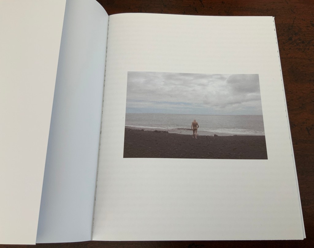
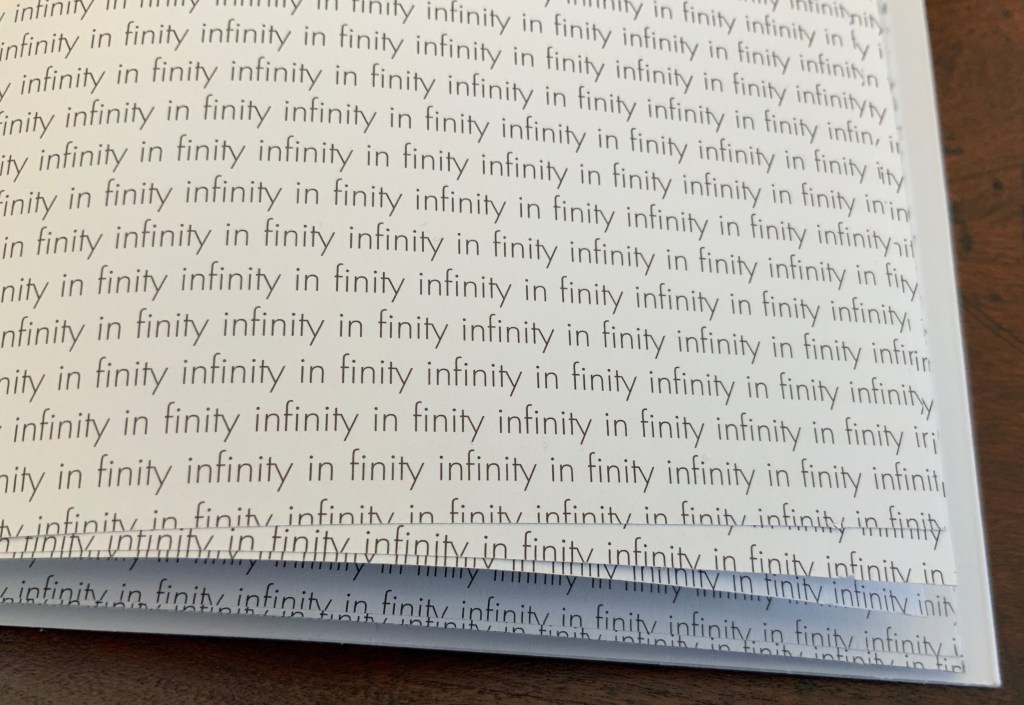
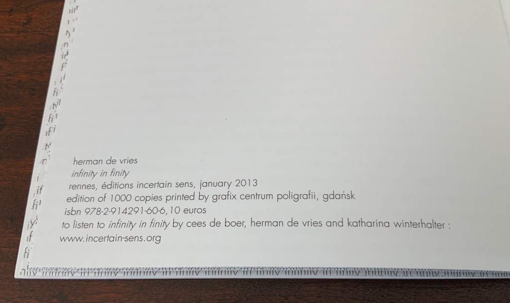
“wit weiss” takes its title from the third of six blank-page works by herman de vries. In addition to cataloging the other five, the section presents sixteen other variations on the theme, including Christiaan Wikkerink’s Conceptual Art for Dummies (1968, 1977, 2010).
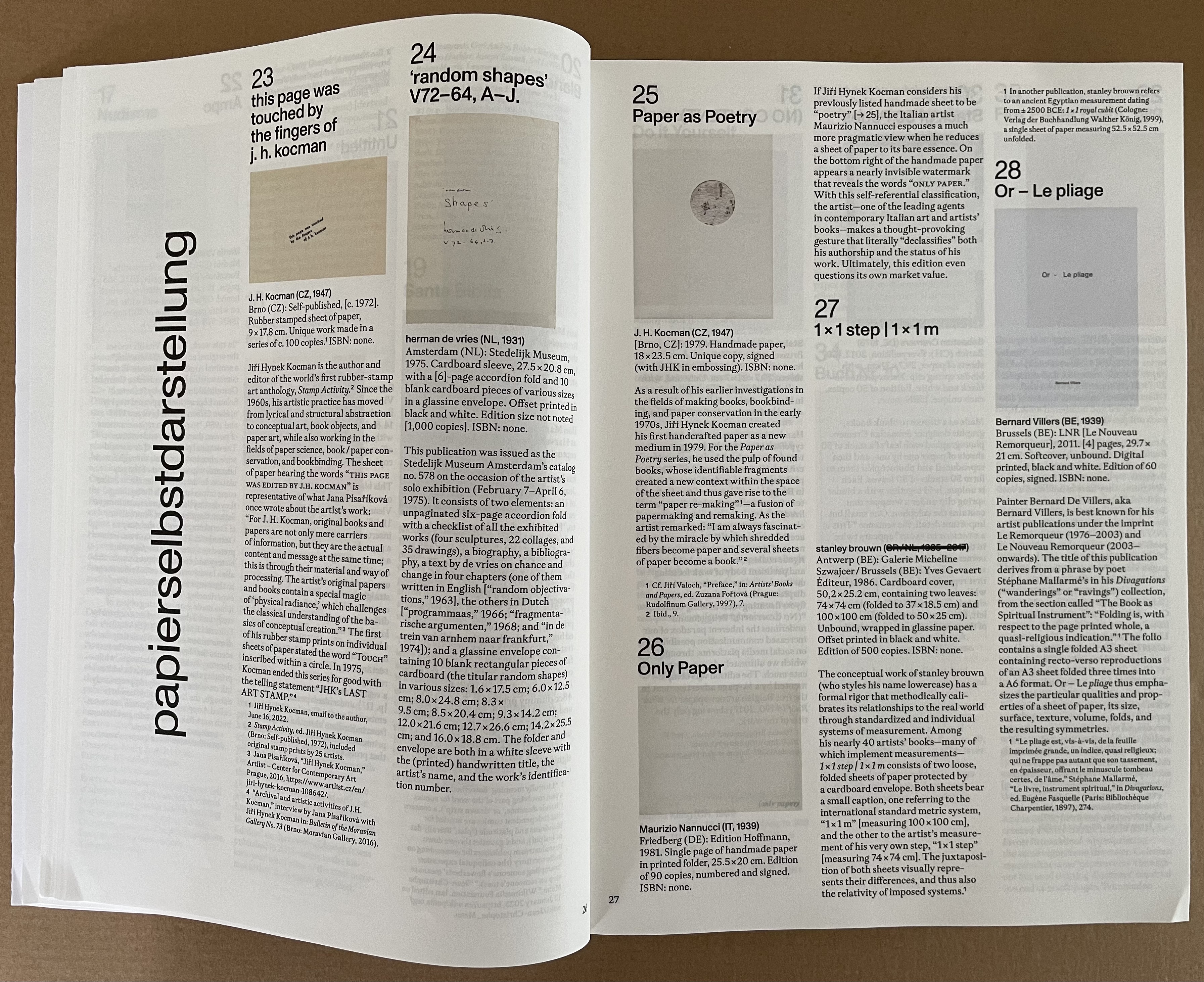
“papierselbstdarstellung” presents us with thirty-three works of “paper self-portrait”. Blank or not, paper takes the conceptual and physical center stage in this section. It’s a pleasure to see the two rare works from the 1970s by J.H. Kocman introducing this group that includes another of herman de vries’ works, one of Bernard Villers’ Mallarméan pieces, some of the output of the prolific polymath Julien Nédélec, a unique piece from Paul Heimbach, Richard Long’s dipped River Avon Book, and more paper-allusive papierselbstdarstellungen.
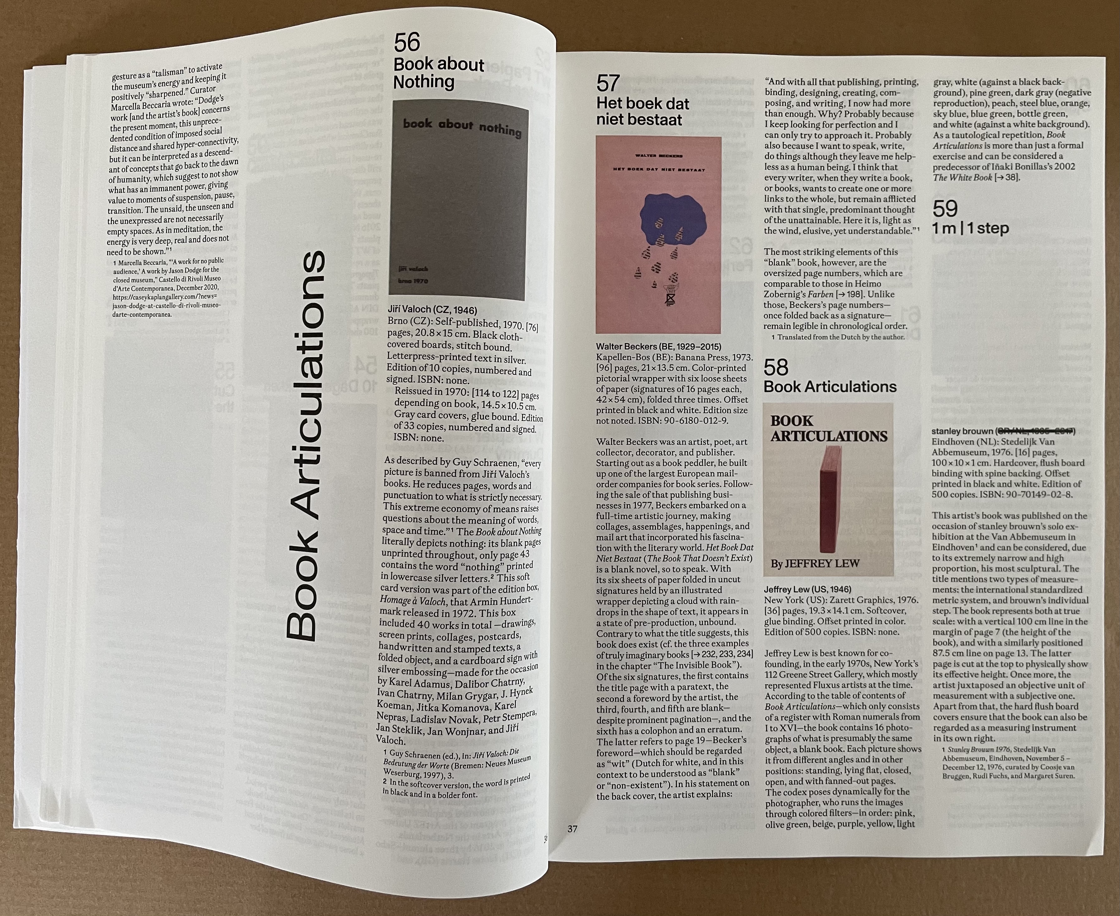
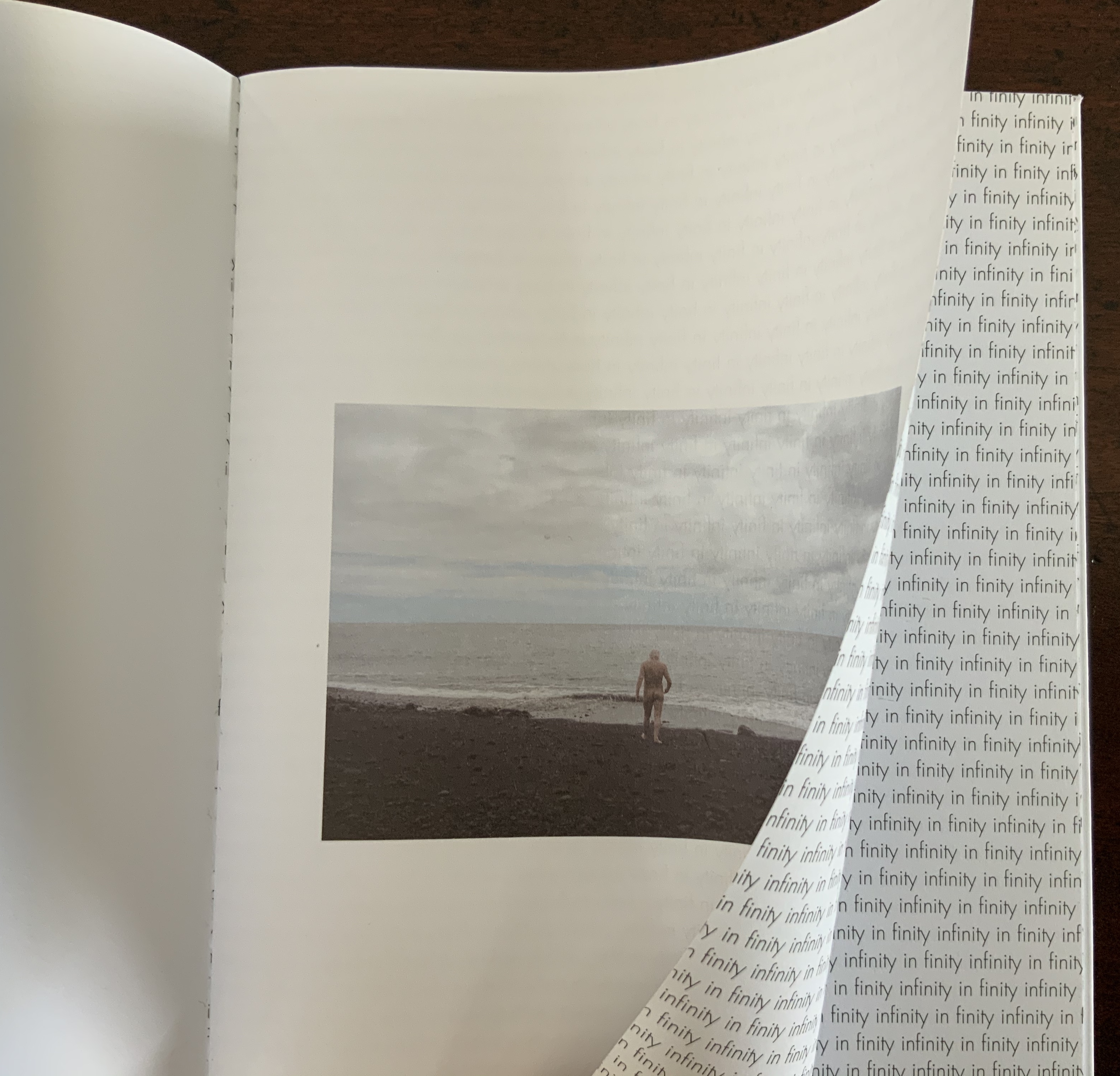
“Book Articulations” takes its title from the work by Jeffrey Lew, which “articulates” the codex through various poses and color filters, but the fourteen other works included explore other forms of “articulation”. The Oxford English Dictionary gives nineteen definitions. Some of those are obsolete, but we can give Küng the benefit of the doubt that this section’s fifteen works exemplify the ones still active.
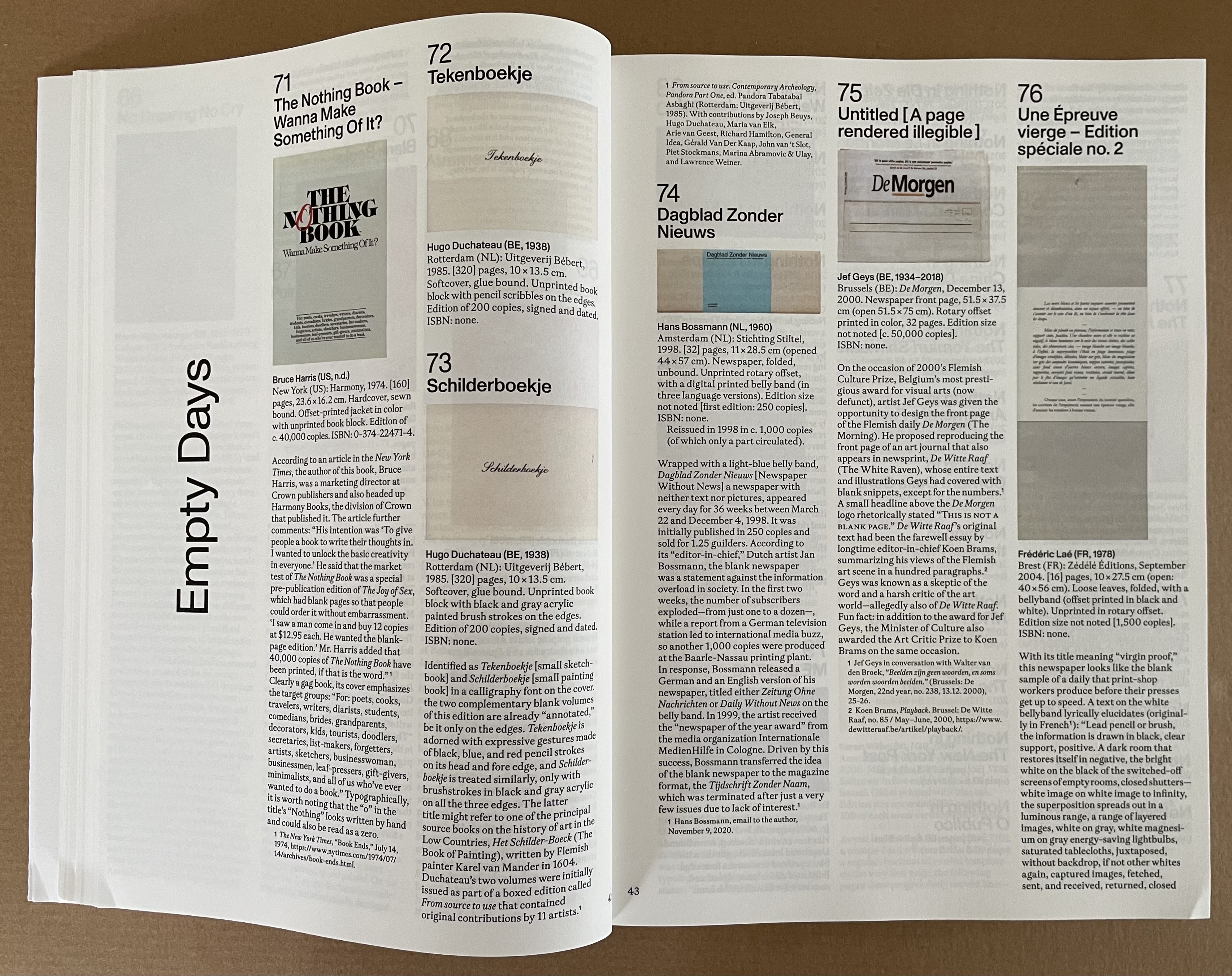
“Empty Days” takes its title from the last work in the section, a volume offered as an annual planner whose pages are blank, its months distinguished by different makes of paper, and its bookmarker printed on both sides with reminders of the names of the days and months. Leading with Bruce Harris’ gag book The Nothing Book, the section follows applications of the blank joke to newspapers, notebooks, exercise books, chronicles, and advice books.

The blank books of “life and work” demonstrate subtleties ranging from Paul Heimbach’s careful inclusion of 273 clear sheets to allude to the 273 seconds of John Cage’s 4’33” (1972) to Arnaud Desjardin’s Why I am no longer an artist.
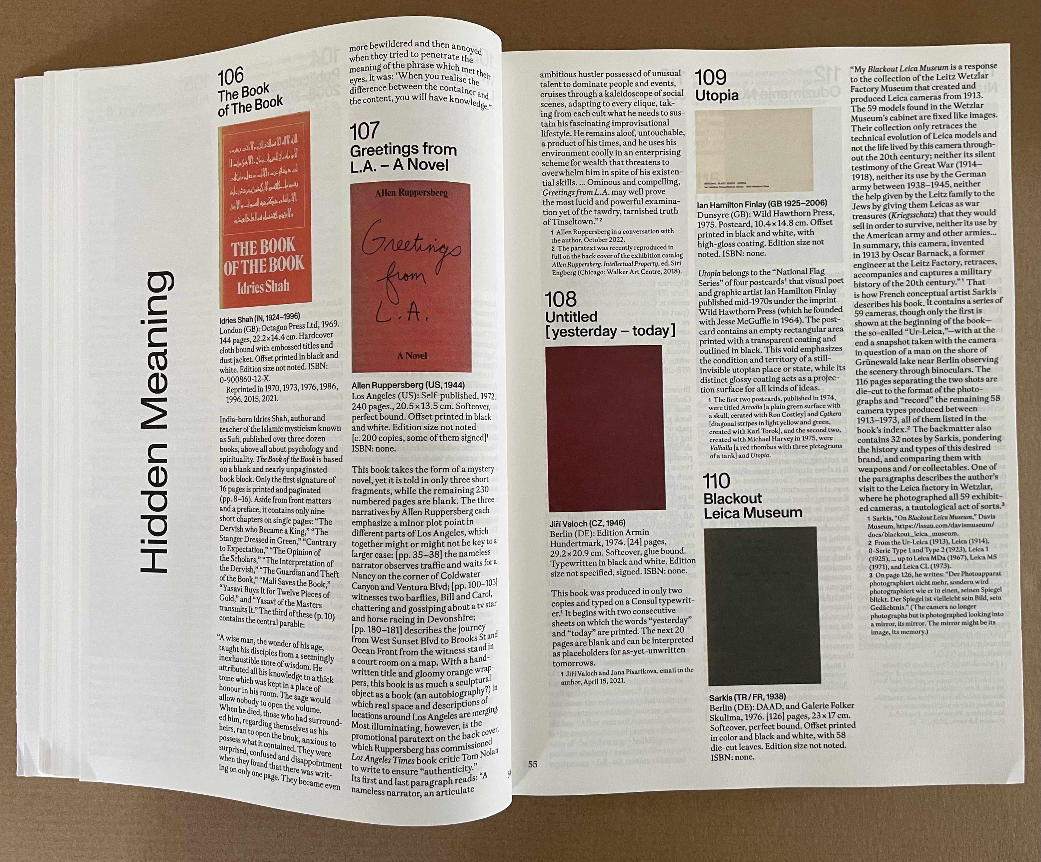
Some of the blank works in “Hidden Meaning” play the joke of being the answer to the title, such as Reasons to Vote for Republicans (2017), a plagiaristic response to Michaels Knowles’ Reasons to Vote for Democrats (2017), published one month before. Other require the reader to uncover the hidden meaning (as in Christian Boltanski’s 2002 Scratch, which reveals images of atrocities when the surfaces of its silvered pages are scratched off) or to hide meaning (as in Russell Weeke’s 2016 blank postcard Hidden Meaning, which has only those words printed in the block where the stamp goes.
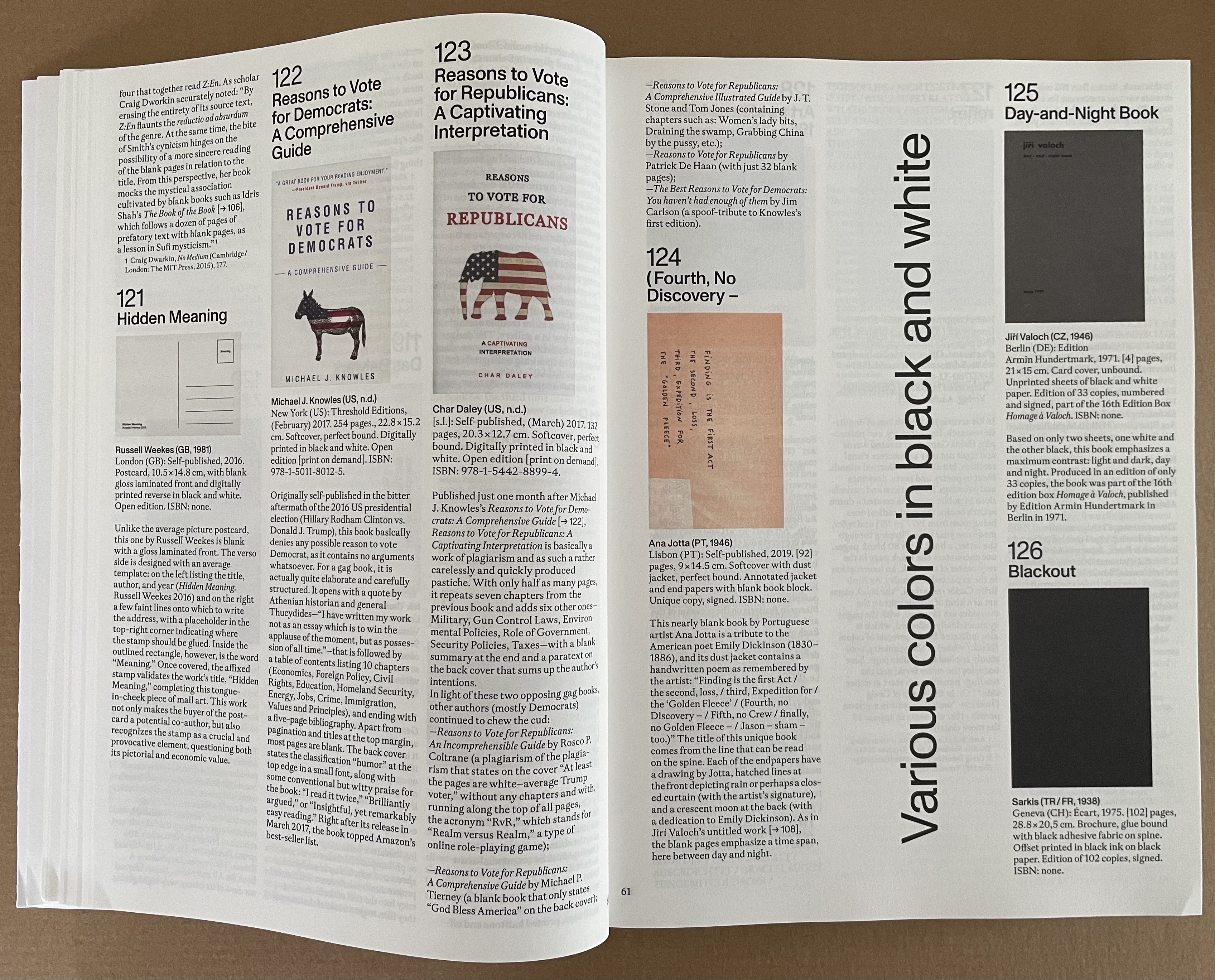
The thirty-one works in this section remind us that for book artists, black and white are also colors on the palette and tools in the book artist’s conceptual tool box. “Various colors in black and white” comes from the title of Pierre Bismuth’s 2005 book with onestar press. Onestar boasts that its artists’ books are “strictly unedited by the publisher”, but there is a cost-control constraint: no color inside the books. So Bismuth demanded a different color for each letter of his name and reproduced 139 monochromatic Pantone colors in black and white, representing a variety of hues in shades of gray.
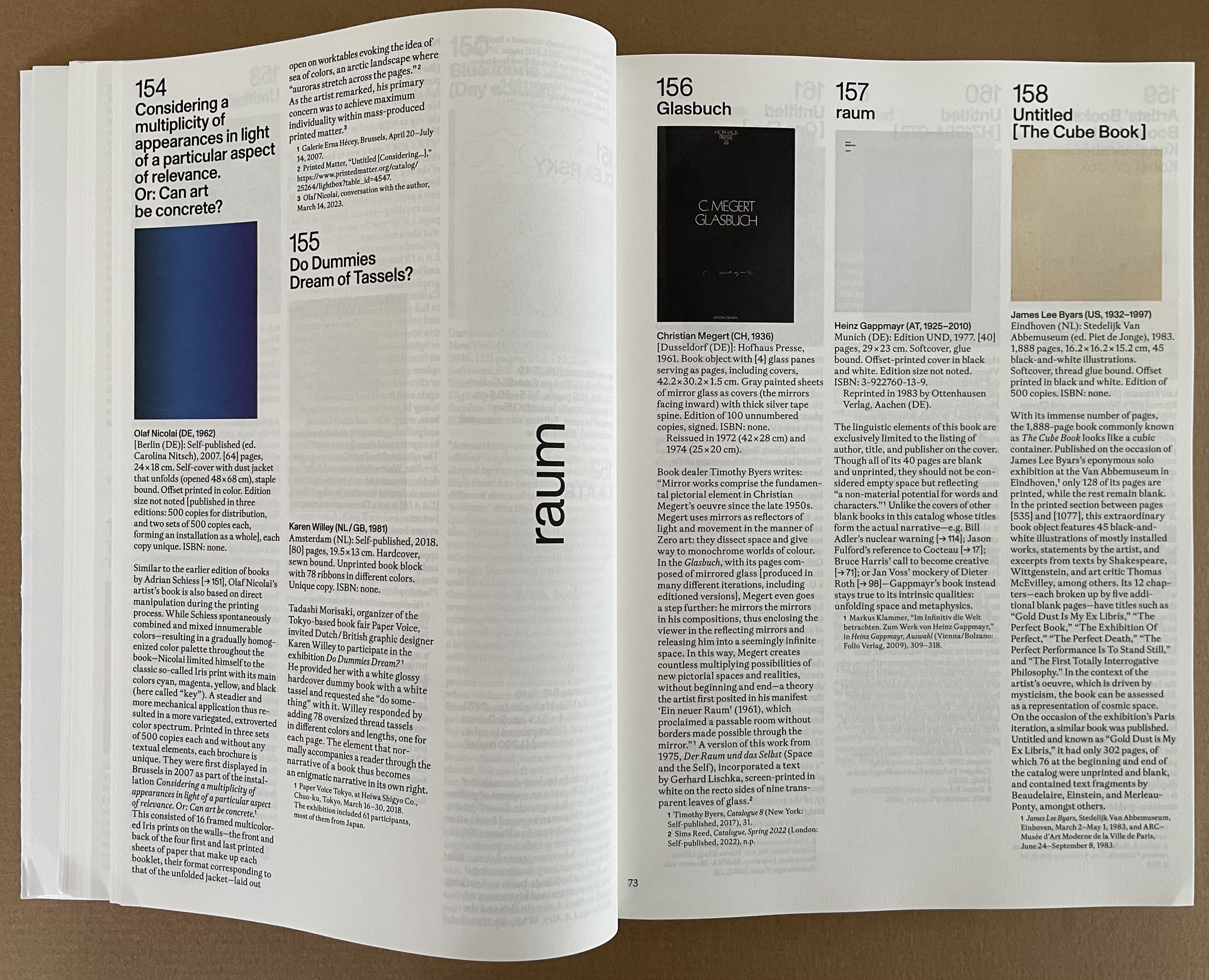
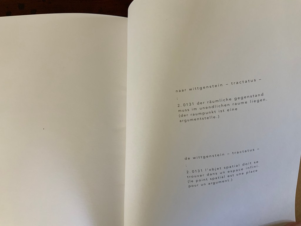
raum means “space, room” in German and is the title of Heinz Gappmayr’s physically and metaphysically blank book. In this section, the other eight blank books take on a more sculptural aspect than others in the exhibition. There’s the massive Your House (2006) by Olafur Eliasson and the slim A Cloud (2007) by Katsumi Komagata, both examples of die cut leaves.
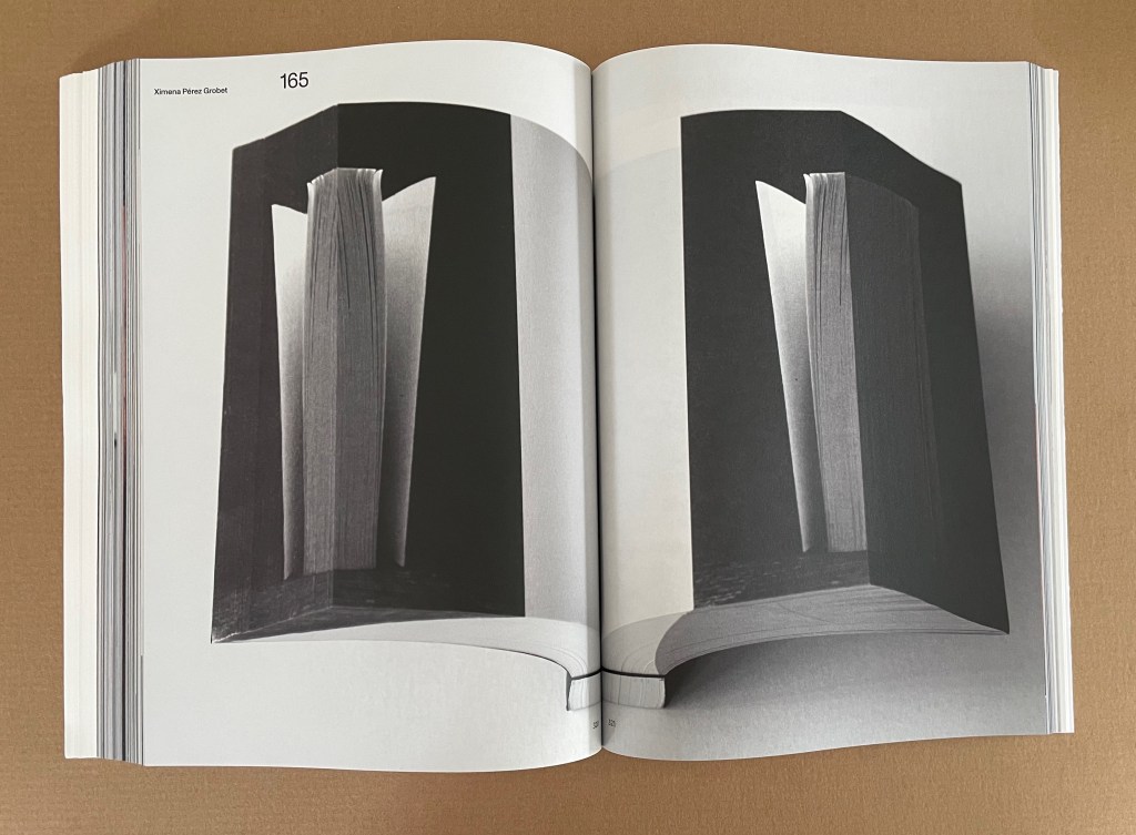
Ximena Pérez Grobet’s Around the Corner (2020) is an extraodinary example of flip-book and fore-edge printing combined. This spread represents the 312 pages of full-page samples of all 259 works in the exhibition.
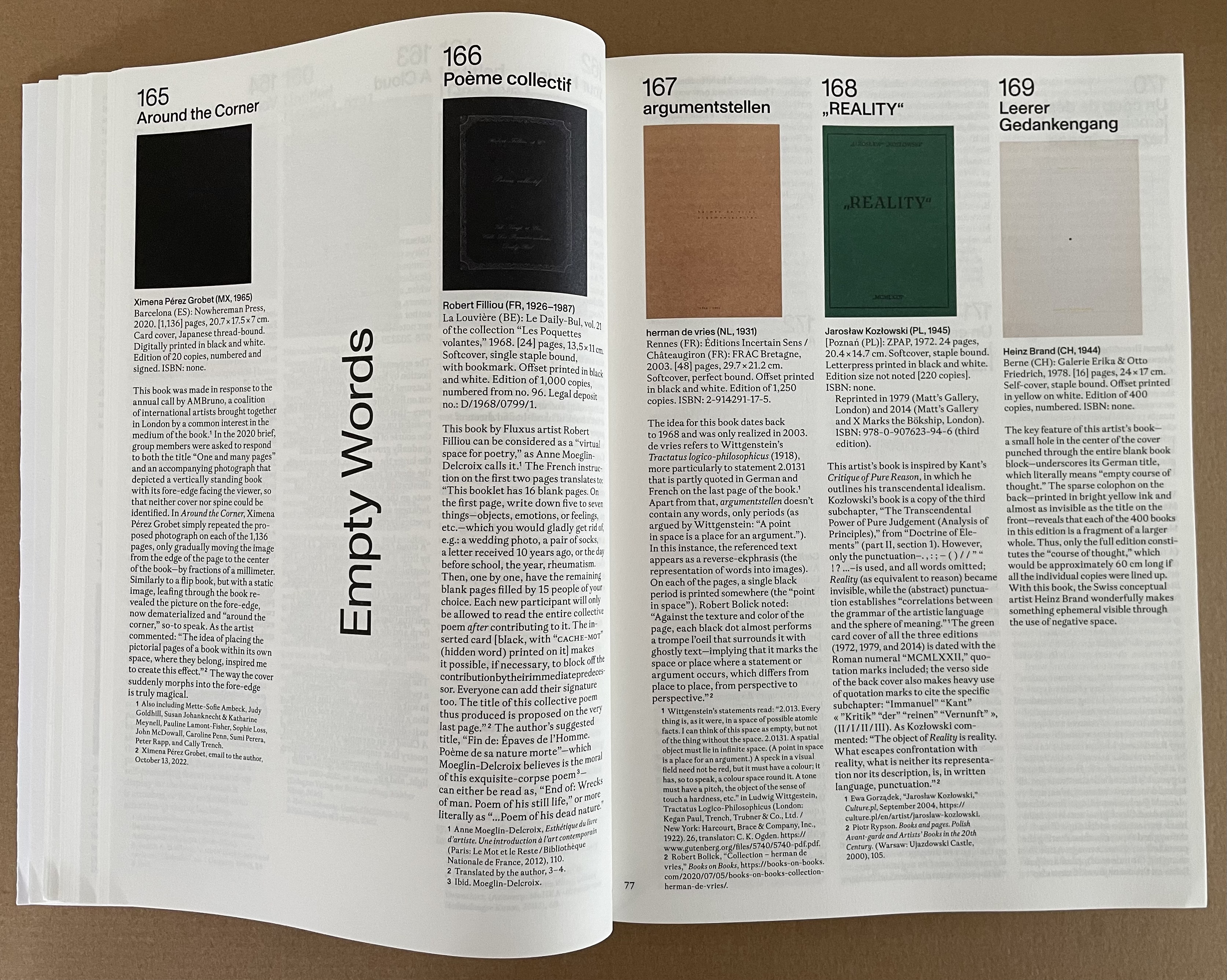
Redaction, excision, erasure , and substitution are the only four “point blank” methods of making empty words in this section. The rest “verb” the word “empty” and go with pages emptied of words to meet the curator’s criterion for inclusion in “Empty Words”. Two exceptions: Roberto Equisoain’s gradual removal of word spaces and merging of the remaining letters into one in La lectura rápida … (2014) and Jürg Lehni and Alex Rich’s hole-punching of letters in their book naturally entitled Empty Words (2011).
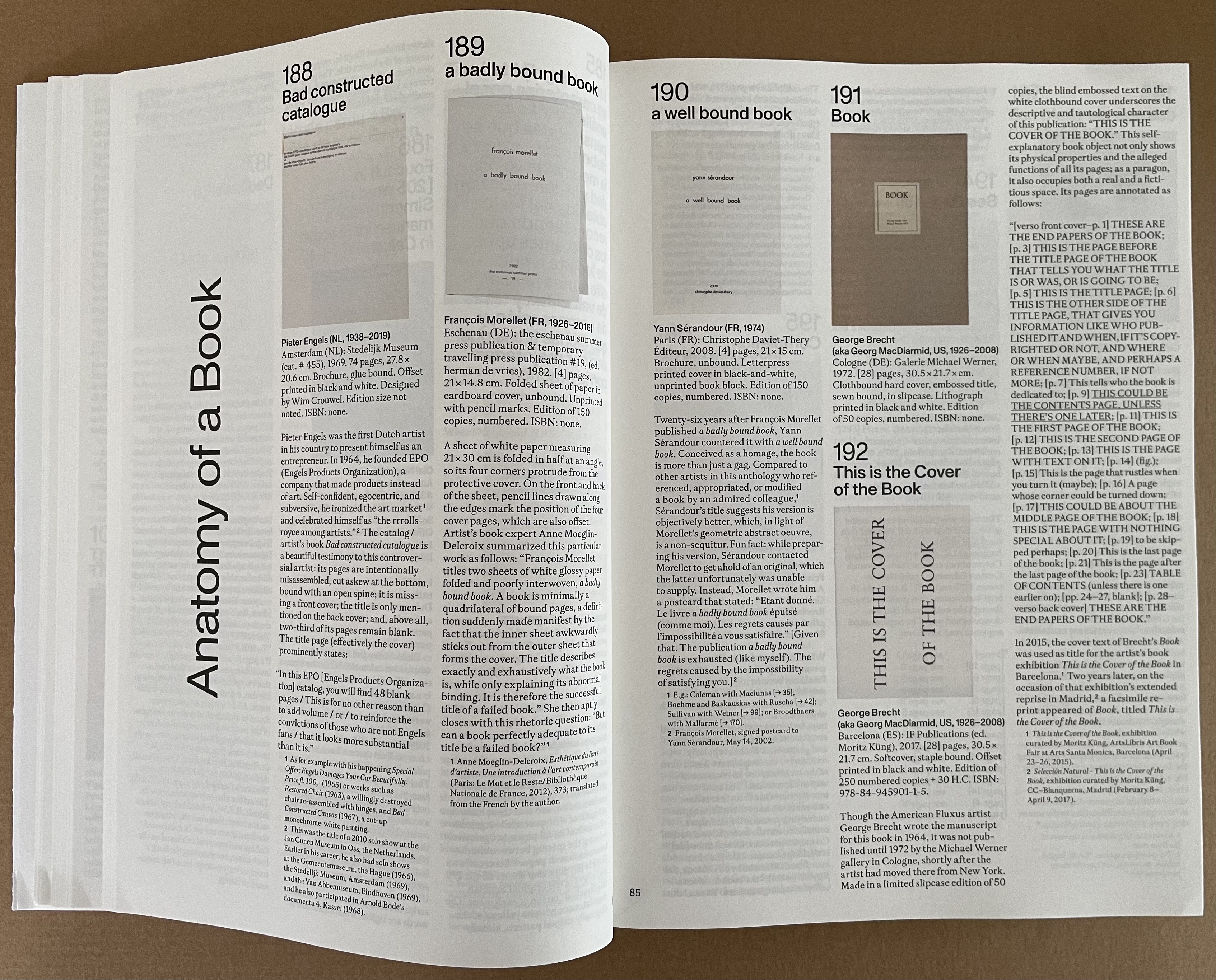
“Anatomy of a Book”, whose title comes from the 2010 unique work by Fiona Banner (aka The Vanity Press), reminds us of how book artists can create works of art by focusing attention on individual parts of the book or simply naming its parts as George Brecht did with This is the Cover of the Book (1972).
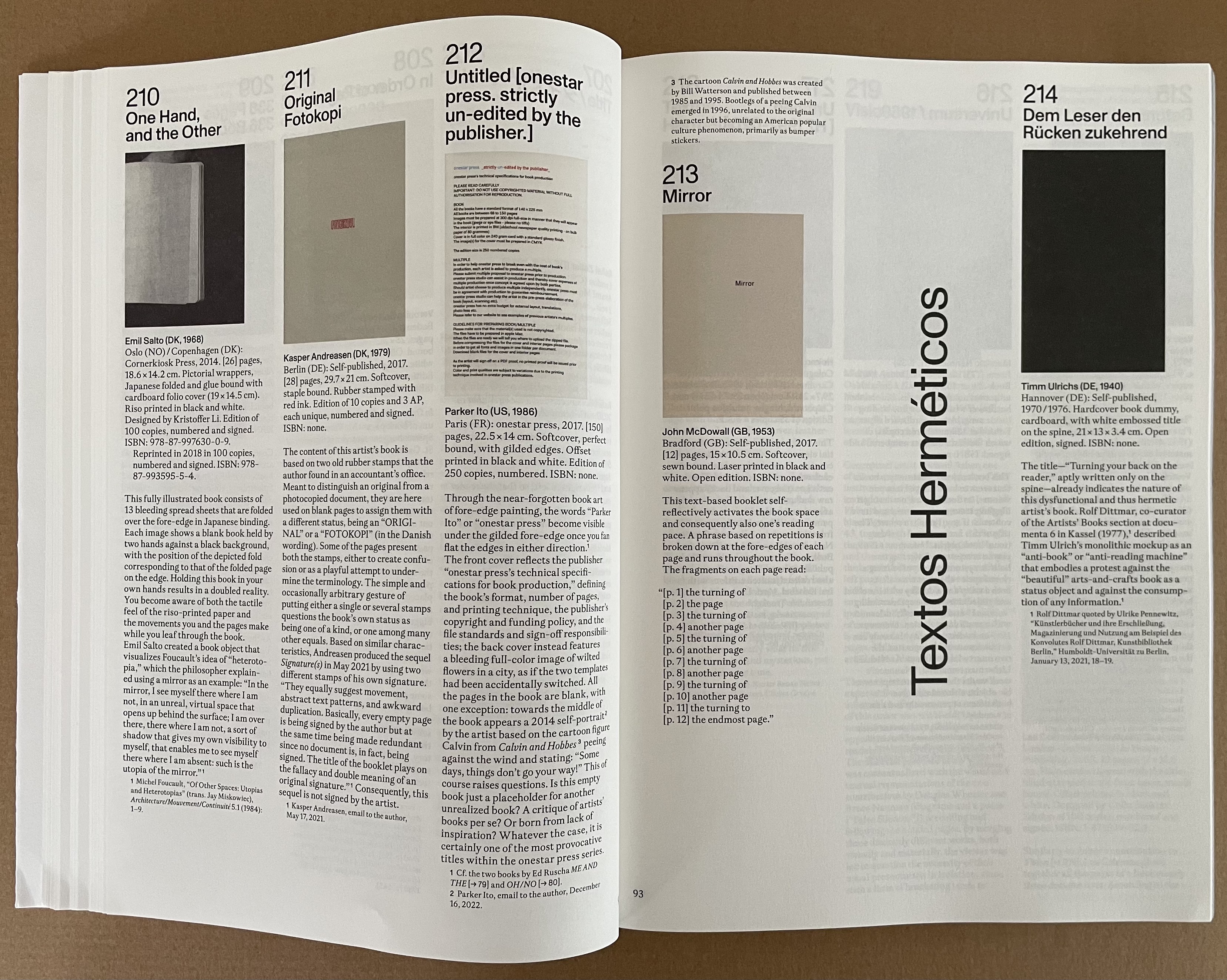
The word hermetic means “sealed”. So naturally, “Textos Herméticos” presents ten examples of artists’ books that physically cannot be opened.
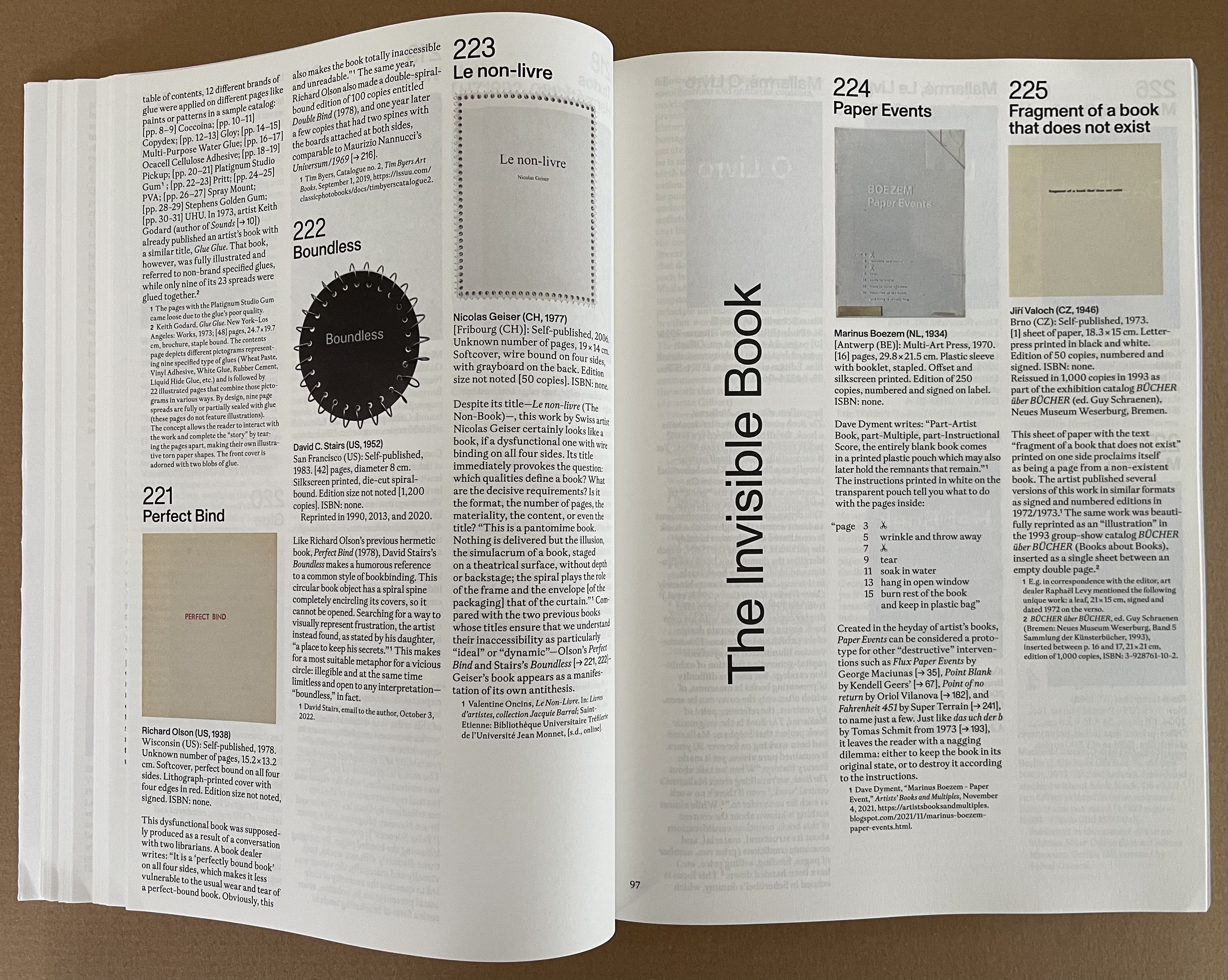
Elizabeth Tonnard’s entry The Invisible Book (2012) entitles this section of thirteen works. It was advertised on the artist’s website in an edition of 100, unnumbered and unsigned at the price of €0.00. After Joachim Schmid scarfed up all 100, Tonnard issued a second edition with a limit of one “copy” per customer. It, too, is now “out of print”. The catalogue’s full-page illustration for it is naturally blank, as is that for Enric Farrés Duran’s Para aprender a encontrar, primero hay que saber esconder (which was offered in a physical store for €20, resulting in only a receipt with the artist’s email address so that the buyer could arrange a face-to-face meeting to have the book explained verbally). Likewise Paul Elliman’s Ariel (the aptly named invisible and non-material typeface used, according to the inventor’s correspondence with Küng, to record extinct human and animal languages as well as sounds obsolete machines) is represented by a blank page.

The three invisible books “displayed”! Photo: Courtesy of Moritz Küng, photo by Peter Hinschläger.

There are seven works in this section “Fahrenheit 451”, although one of Dora Garcia’s is not numbered. None of them are blank, raw, or completely illegible. Nevertheless, their appropriateness for the exhibition is particularly underlined by the blackened pages of #241, which can be read if burned (see below).
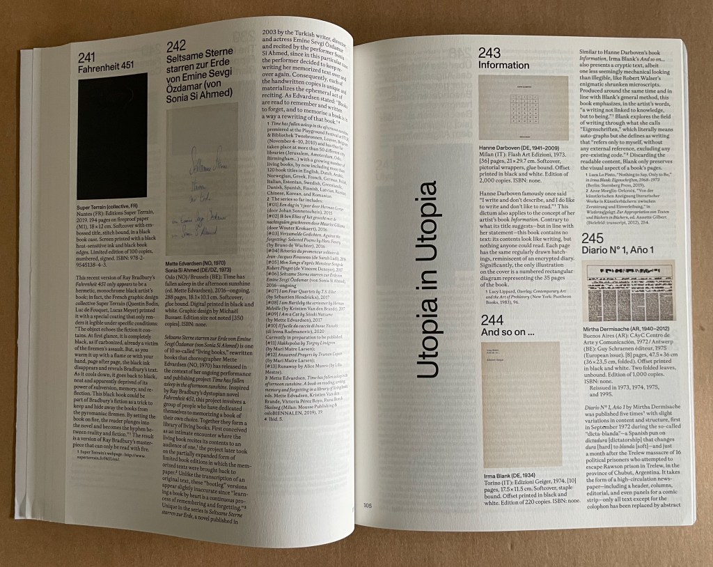
“Utopia in Utopia” pays homage to Thomas More’s satire Utopia (1516) with sixteen works of varying illegibility, several engendered with invented fonts arising from More’s invention of an alphabet for the Utopians. No blank pages, unless you count Irma Blank’s entry (but we’ve had that pun in an earlier section).
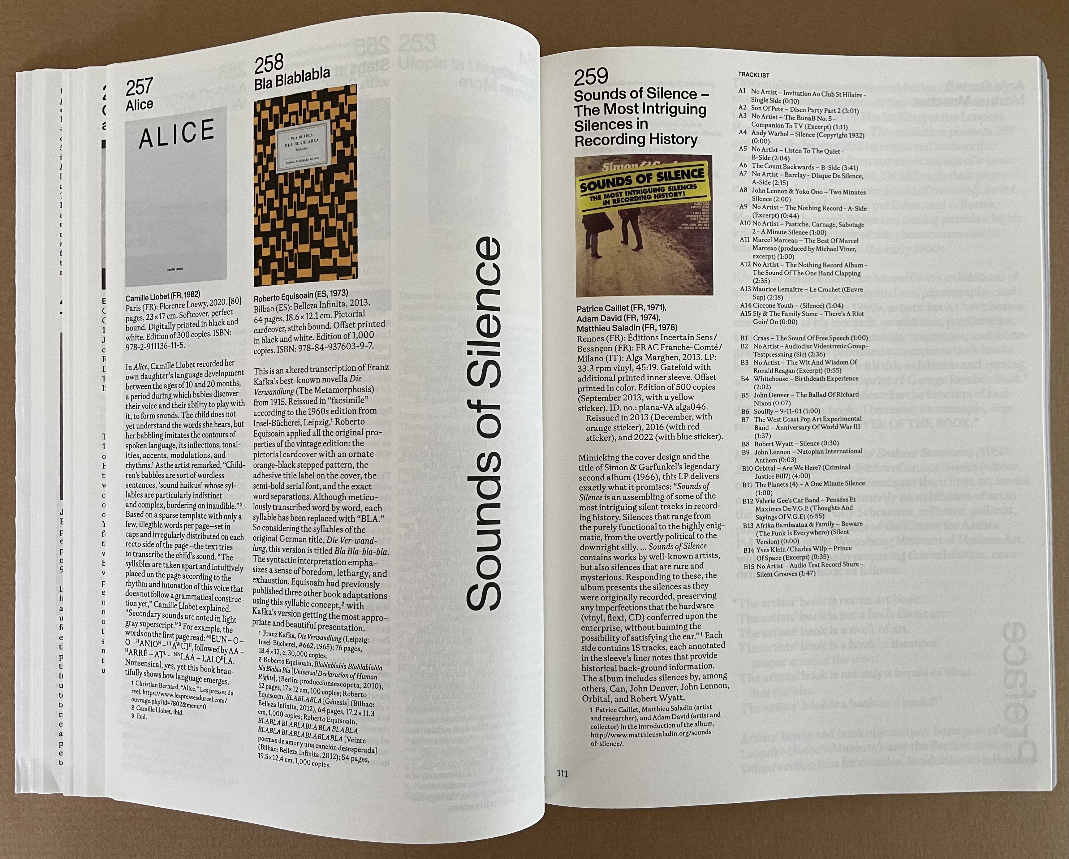
The last section “Sounds of Silence” has only the one entry, and it is a vinyl LP album, not a book. To add to that quibble, there’s oddly no recording of John Cage’s 4″33″ among the tracks of this platter. But as the final entry in the exhibition, it extends the enterprise beyond blankness, rawness, and illegibility to inaudibility!

200 artists, 259 works.
Like Megan Liberty’s exhibition in the same year, Craft & Conceptual Art : Reshaping the Legacy of Artists’ Books, it also demonstrates that the factions of the dematerialized and conceptual works, the democratic multiples, the limited editions and the unique finely or rawly crafted works were not so walled off from one another as implied in polemics, manifestos and critical essays so concerned with defining the “artist’s book”, the existence or placement of its apostrophe and securing its role in the larger history of art. With its captions, numerous full-page images, and curation by Moritz Küng, Blank. Raw. Illegible. joins the list of significant exhibitions documenting the evolving history of the artist’s book that David Senior identified in his contribution to Liberty’s catalogue:
- Germano Celant’s Book as Artwork 1960/1972 (1972)
- Dianne Perry Vanderlip’s Artists Books (1973)
- Daniel Fendrick’s The Book as Art (1976)
- Manfred Schneckburger’s dOCUMENTA 6 (1977)
- Barbara London’s Bookworks (1977)
- Penelope Suess’ Women and the Printing Arts (1977)
- Jacki Apple’s Notebooks, Workbooks, Scripts, and Scores (1977)
- Judith Hoffberg and Joan Hugo’s Artwords and Bookworks (1978)
- Martha Wilson and Peter Frank’s Artists’ Books USA (1978)
- Rose Slivka’s Book Makers (1979)
- Horace Brockington’s Dialects: Diverse Bookworks by Black and Hispanic Artists (1980)
- Norman Colp’s Entrapped: The Book as Container (1981)
- Walker Art Center’s Artists’ Books Introduction (1981)
- Clive Phillpot’s Collaborations (1982)
- Norman Colp’s From Coast to Coast (1983)
- Center for Book Arts’ The First Decade (1984)
- Center for Book Arts’ Book Artists in Residence: 5 Programs (1985)
- Betty Bright’s Midwest Contemporary Book Art (1985)
- Steve Woodall’s Out West (1998)
Others that could be added include
- Susi Bloch’s The Book Stripped Bare : A Survey of Books by 20th Century Artists and Writers (1973)
- Clive Phillpot’s Artist’s Books : From the Traditional to the Avantgarde (1982)
- Klaus Groh and Harmann Havekost’s Artists’ Books / Künstlerbücher Buchobjekte / Livres d’Artistes / Libri Oggetti (1986)
- David J. Henry’s 1986. Beyond Words: The Art of the Book (1986)
- Jeffrey Abt and Buzz Spector’s The Book Made Art (1986)
- Todd Alden’s The Library of Babel (1991)
- Carol Barton and Diane Shaw’s Science and the Artist’s Book (1995)
- Cornelia Lauf and Clive Phillpot’s Artist/author : contemporary artists’ books (1998)
- Mary Austin’s Exploding the Codex : The Theater of the Book (2012)
- Laura J. Hoptman’s Ecstatic Alphabets (2012)
- Marcia Reed and Glenn Phillips’ Artists and Their Books : Books and Their Artists (2018)
- Venetia Porter’s Artists Making Books : Poetry to Politics (2023)
- Stefan Soltek’s Unbound (2023)
- Kestutis Vasiliunas’ 1st International Artist‘s Book Triennial Vilnius (1997) to the “10th International Artist’s Book Triennial Vilnius (2024)
and Guy Schraenen’s boxed set of 25 catalogues of exhibitions organized by him and representing the archive donated to Neues Museum Weserburg in Bremen, Germany.
Above all, Blank. Raw. Illegible. … Artists’ Books as Statements (2023) demonstrates that the book constitutes a medium for, and genre of, Art. No library or collection that aims to represent book art or Art should be without it.
Further Reading
Bury, Stephen. 2015. Artists’ Books : The Book as a Work of Art 1963-2000. London: Bernard Quaritch Ltd.
Desjardins, Arnaud. 2013. The Book on Books on Artists’ Books. 2nd exp. ed. London: The Everyday Press.
Drucker, Johanna. 2007. The Century of Artists’ Books. New York City: Granary Books.
Hampton, Michael. 2015. Unshelfmarked : Reconceiving the Artists’ Book. Devon: Uniformbooks.
Jury, David, and Peter Rutledge Koch. 2008. Book Art Object. Berkeley, California: Codex Foundation.
Jury, David, and Peter Rutledge Koch. 2013. Book Art Object 2 : Second Catalogue of the Codex Foundation Biennial International Book Exhibition and Symposium, Berkeley, 2011. Berkeley, CA, Stanford: Codex Foundation ; Stanford University Libraries.
Klima, Stefan. 1998. Artists Books : A Critical Survey of the Literature. New York: Granary Books.
Liberty, Megan N., ed. 2023. Craft & Conceptual Art : Reshaping the Legacy of Artists’ Books. First edition. New York: Center for Book Arts.
Lyons, Joan, ed. 1985. Artists’ Books : A Critical Anthology and Sourcebook. Rochester, New York: Visual Studies Workshop Press.
Moeglin-Delcroix, Anne. 2012. Esthétique Du Livre d’Artiste, 1960-1980 Une Introduction À L’art Contemporain. Nouvelle édition revue et augmentée. [S.l.], [Paris]: Le Mot et le reste ; Bibliothèque nationale de France.
Moeglin-Delcroix, Anne. 2004. Guardare, Raccontare, Pensare, Conservare : Quattro Percorsi Del Libro d’Artista Dagli Anni ’60 Ad Oggi. [Mantova]: Casa del Mantegna : Corraini.
Roth, Andrew, Philip Aarons, and Claire Lehmann (eds.). 2017. Artists Who Make Books. London: Phaidon.
Salamony, Sandra, and Peter & Donna Thomas (Firm). 2012. 1000 Artists’ Books : Exploring the Book as Art. Beverly, MA: Quarry Books.
Schraenen, Guy, and Neues Museum Weserburg Bremen. 2011. Ein Museum in Einem Museum = A Museum within a Museum. Bremen: Neues Museum Weserburg Bremen.