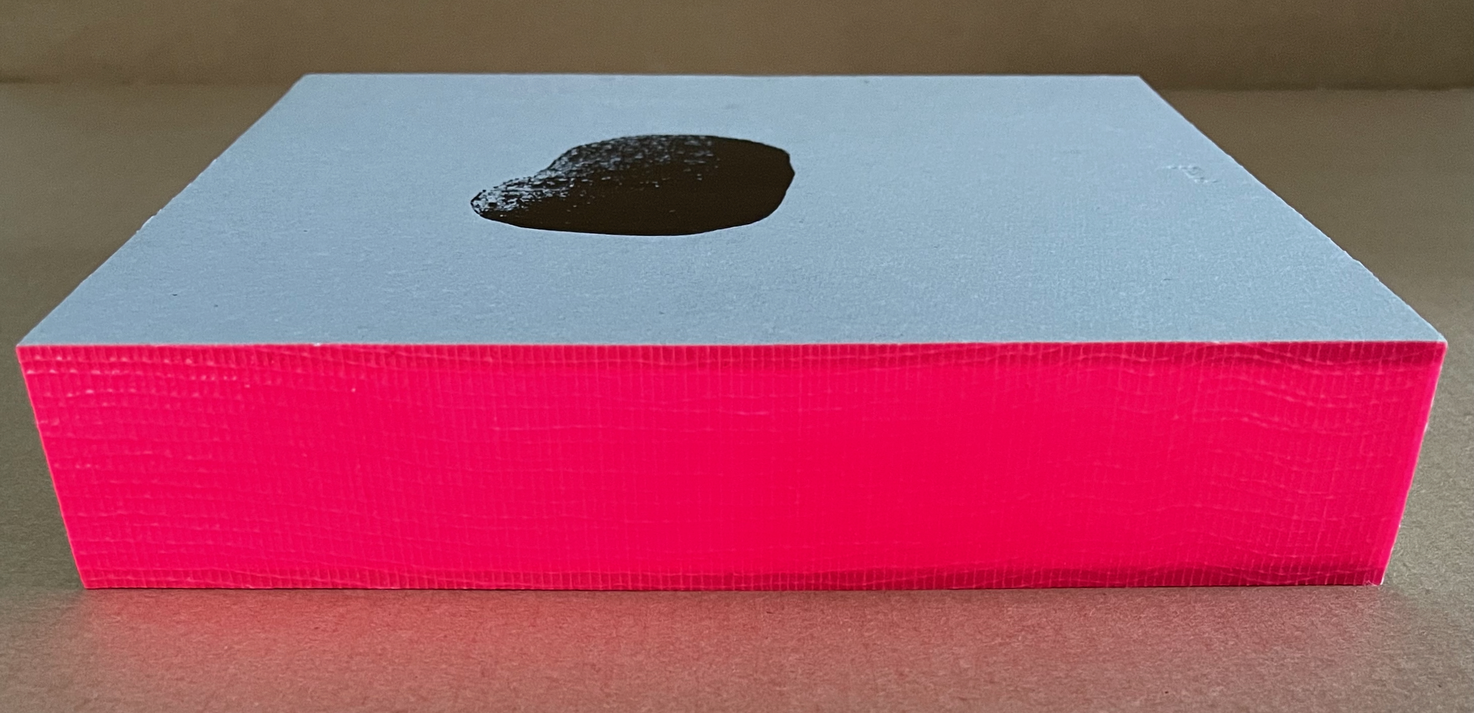
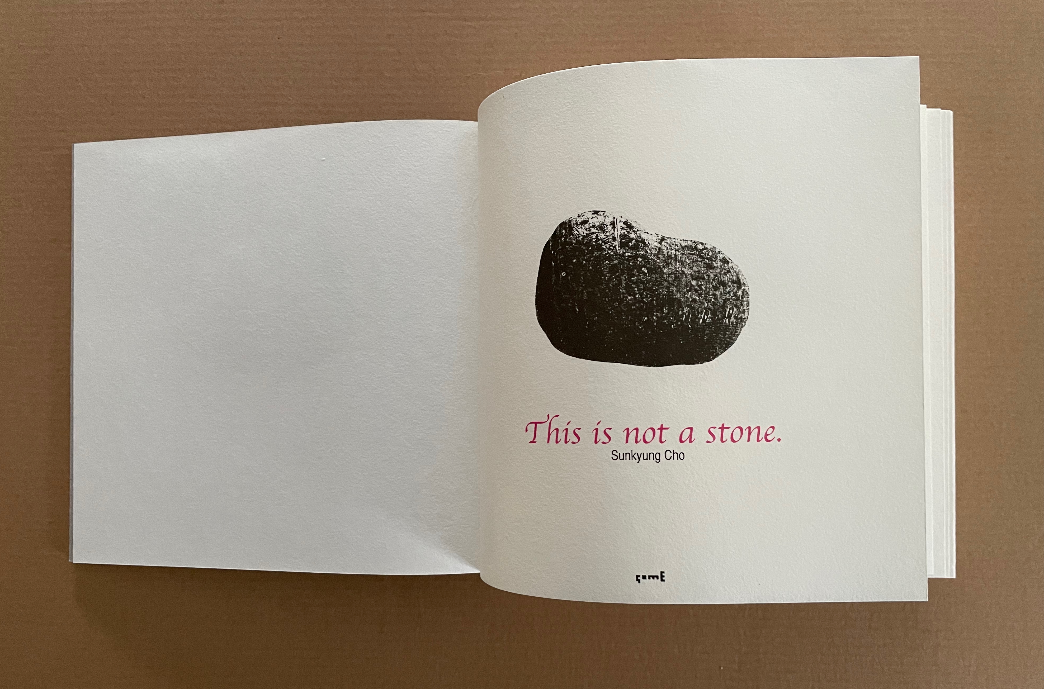
This is not a stone (2017) Sunkyung Cho Exposed spine binding with cross weave filament tape, board-covered. 170 x 170 mm. Acquired from SpazioB**K, 6 April 2025. Photos: Books On Books Collection.
Just as you think this will be another two-dimensional riff on René Magritte’s The Treachery of Images (aka Ceci n’est pas une pipe), the Chinese fold title page turns to reveal a cutout well with a stone at the bottom.
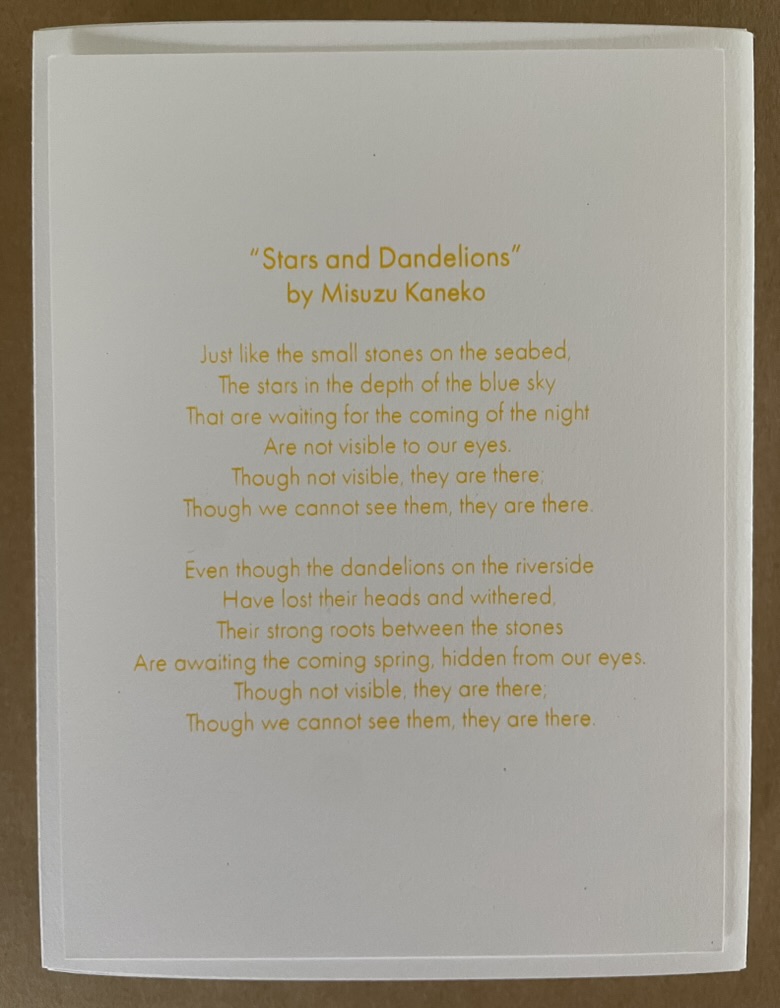
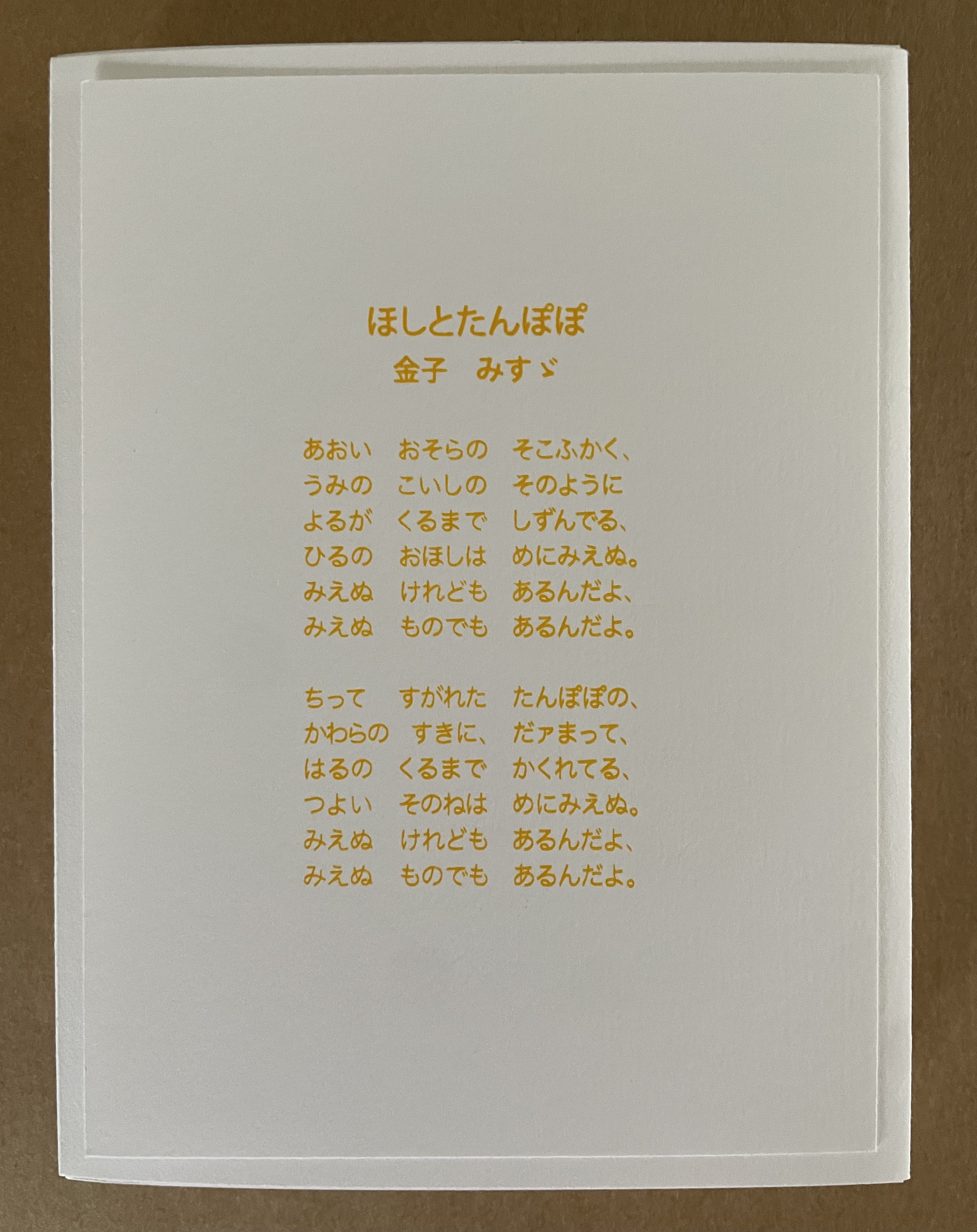
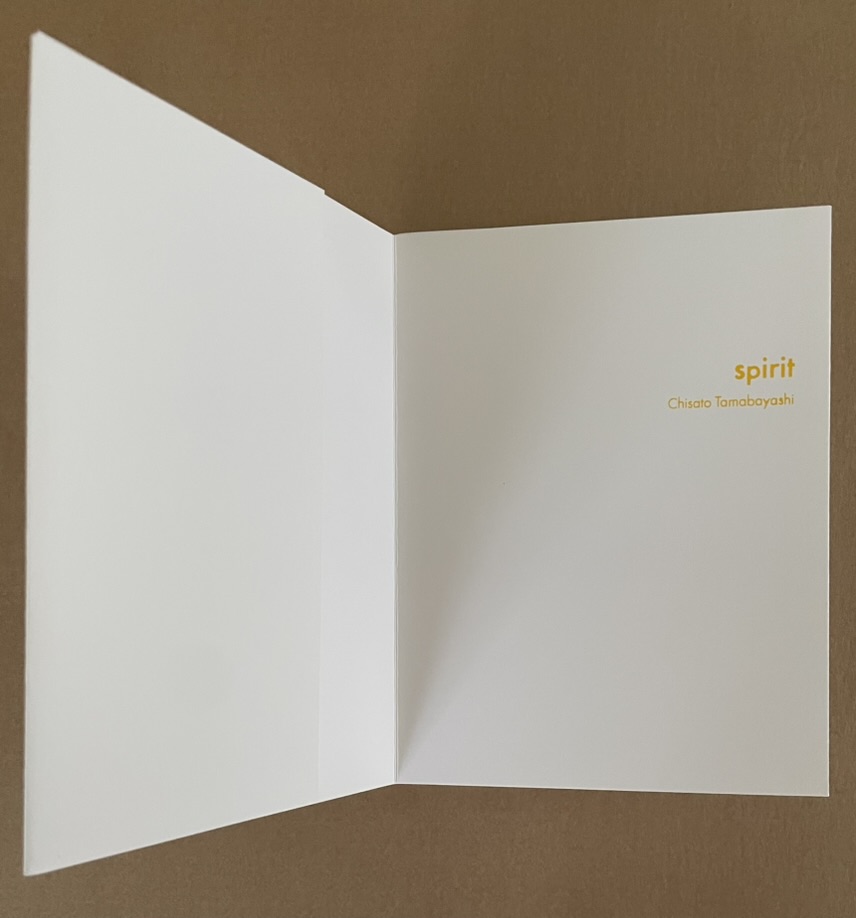
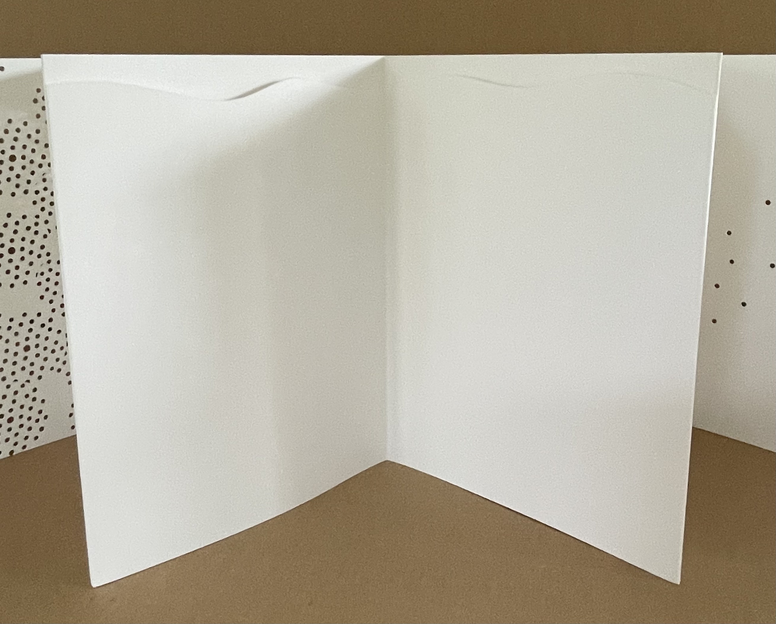
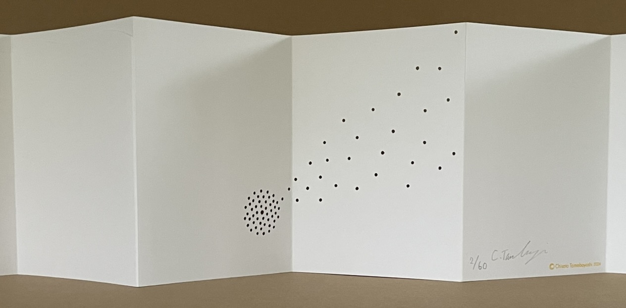
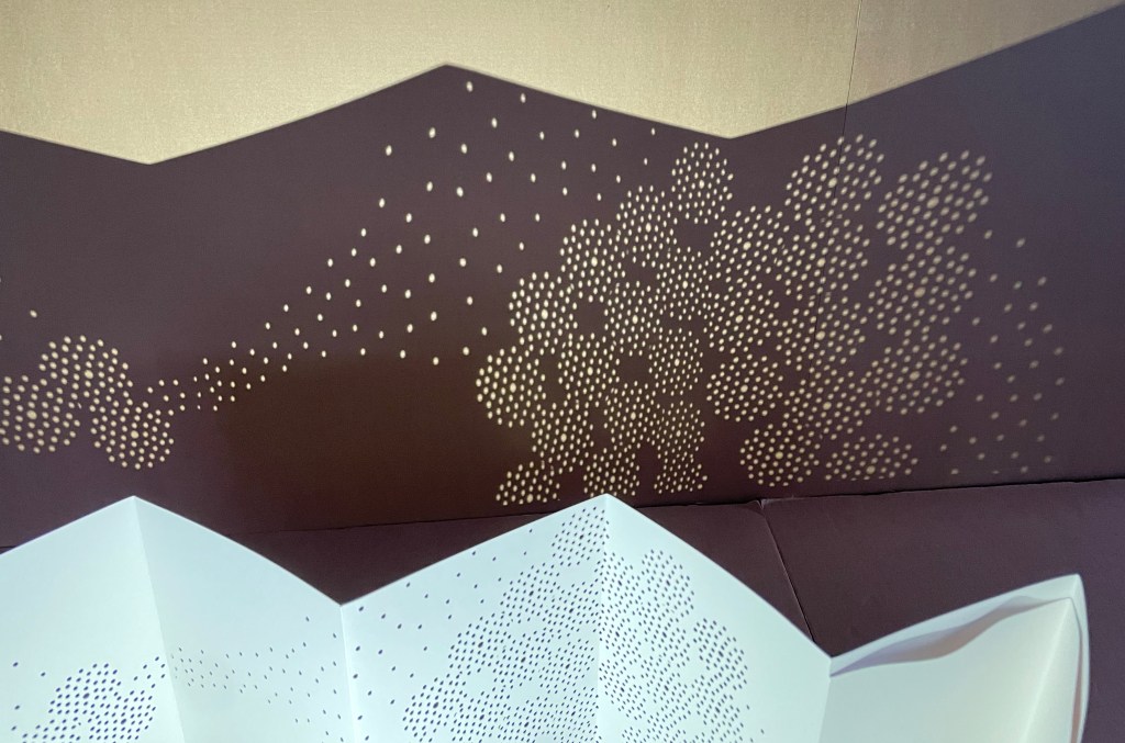
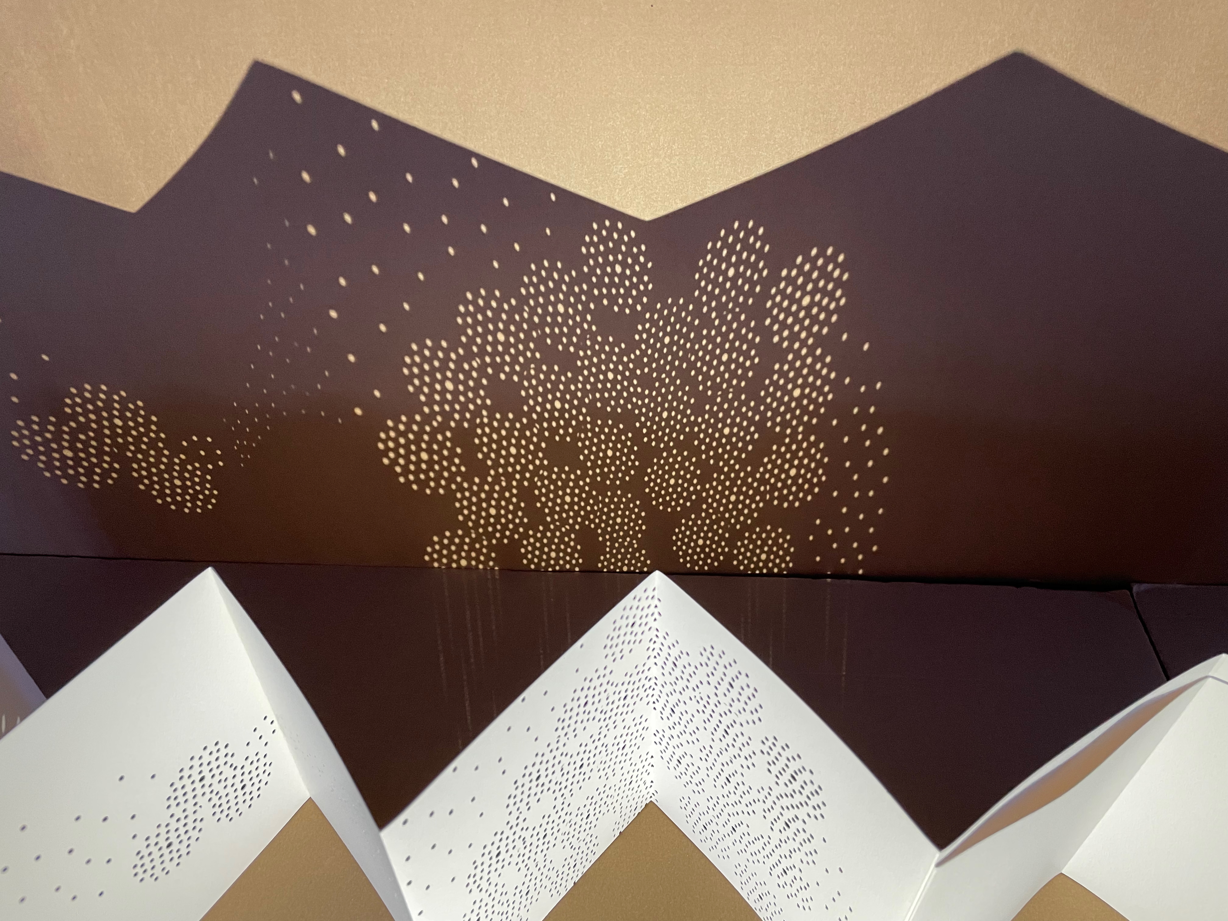
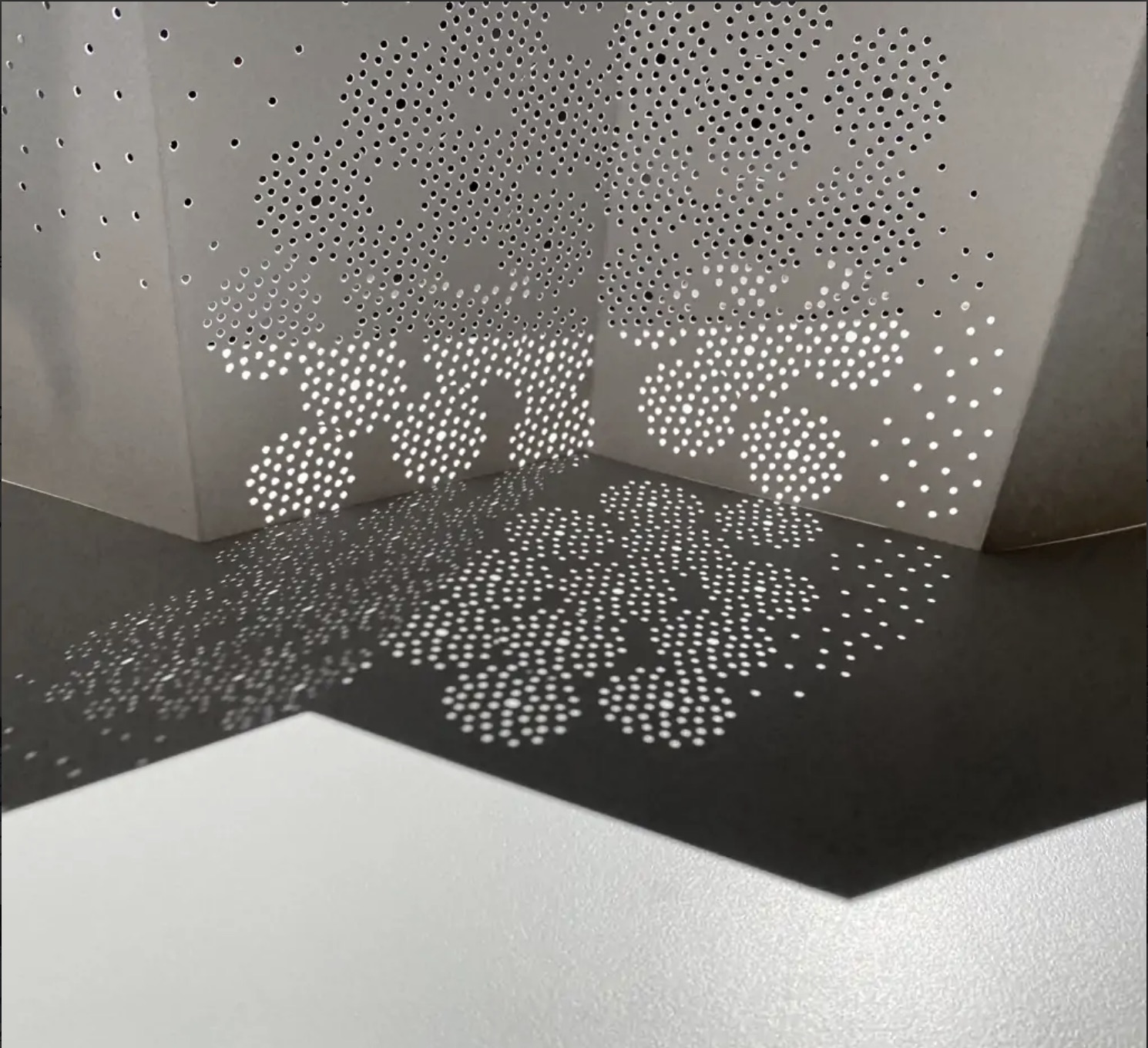
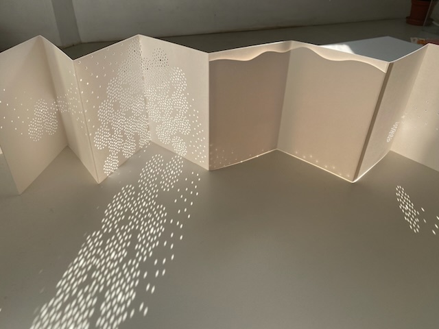
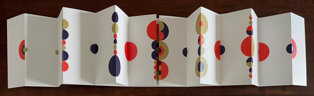
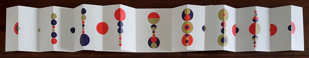
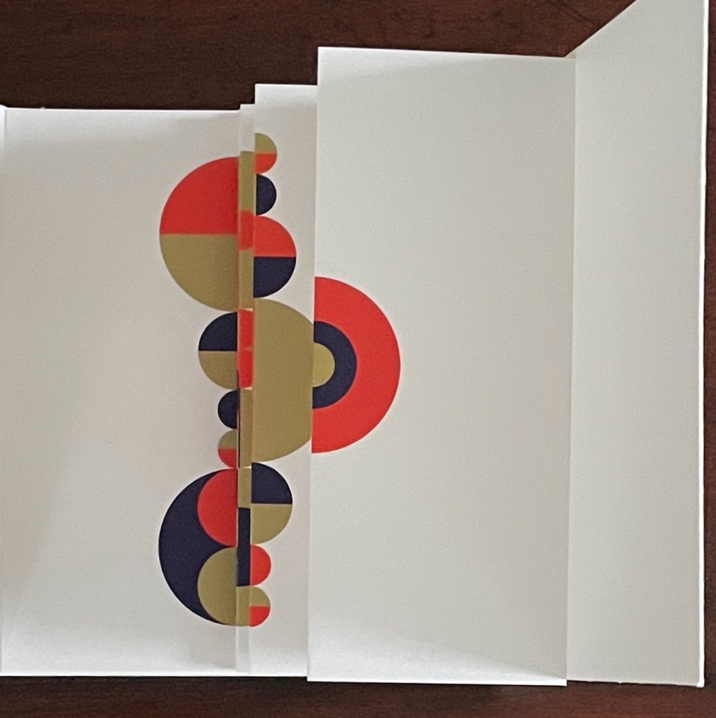
Spirit (2024) Chisato Tamabayashi Yellow cloth-covered slipcase. Leporello of 8 panels and enclosing cover. Slipcase: H168 x W129 x D24 mm. Book: H160 x W120 mm (closed); W2100 mm. 16 panels (excluding enclosing cover). Edition of 60, of which this is #2. Acquired from Chisato Tamabayashi, 5 November 2024. Photos: Books On Books Collection.
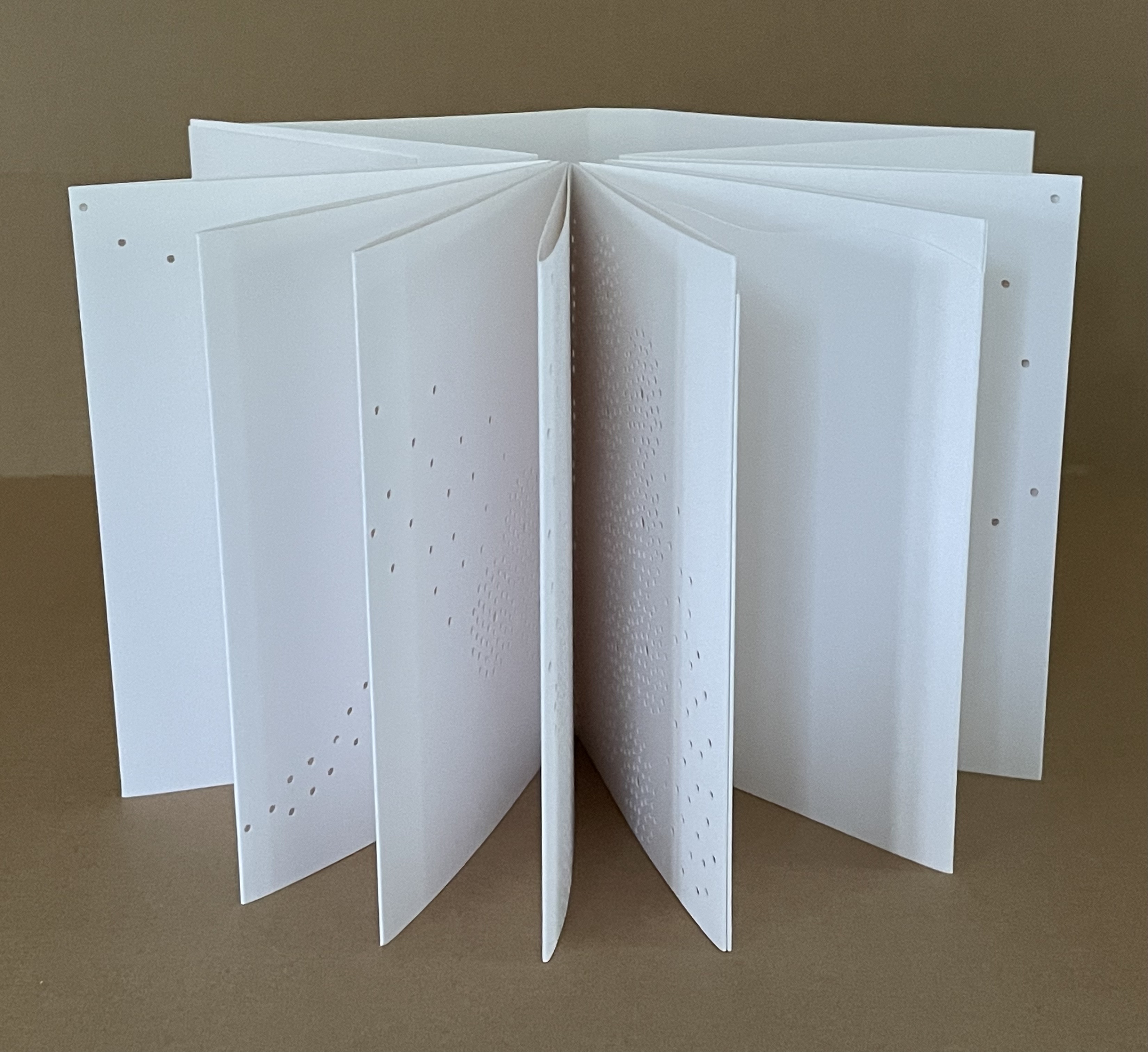
Chisato Tamabayashi’s leporello Spirit departs from her usual paper-engineering techniques. It relies on hole punching, paper sculpture, and display with light. Her crossover in techniques will remind close observers of Katsumi Komagata’s movement from Little Tree/Petit arbre (2008) to「Ichigu」(2015).
Spirit is accompanied by the 20th century poet Misuzu Kaneko‘s poem “Stars and Dandelions” (in English and Japanese) from which Tamabayashi has taken her inspiration.
Viewed standing or lying flat, the leporello’s arranged holes echo the seeds leaving the dandelion heads bare in the second stanza of the poem.
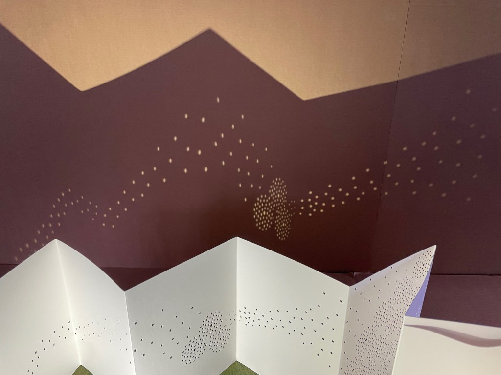
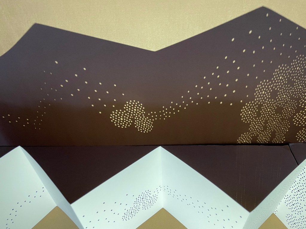
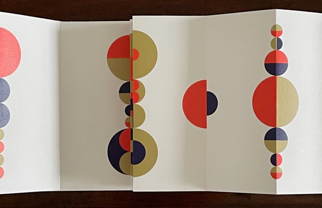
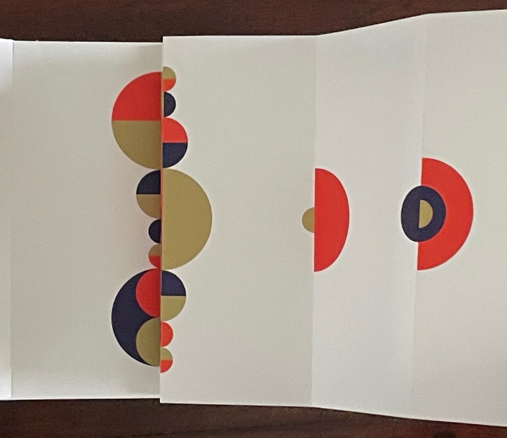
Just before the last spread of imagery, the upper edge takes on the shape of the ocean surface beneath which the stones mentioned in the first stanza lie.
A projection to the background echoes the stars from the first stanza of the poem.
A projection to the foreground echoes the stones on the seabed from first stanza of the poem. Photos: Courtesy of the artist.
Like Misuzu Kaneko’s poetry, Chisato Tamabayashi’s artwork appeals to children and adults, underscoring the link between children’s books and artists’ books explored so well by the Huberts in The Cutting Edge of Reading, Johanna Drucker in “Artists’ Books and Picture Books”, and Sandra Beckett in Crossover Picturebooks.
Tamabayashi’s and Komagata’s handling of holes, paper engineering, and display with light should be considered alongside the efforts of the book and paper artists’ explored in the second issue of Inscription as well as those of Eleonora Cumer and Jenny Smith.
Drucker, Johanna. 2017. “Artists’ Books and Picture Books: Generative Dialogues” in The Routledge Companion to Picturebooks, edited by Bettina Kümmerling-Meibauer. London: Taylor & Francis Group.
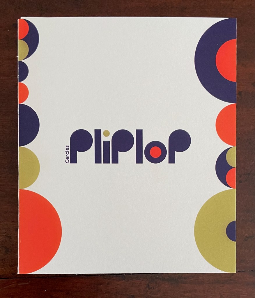
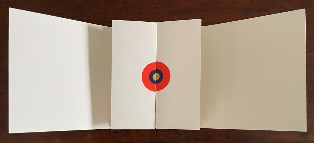
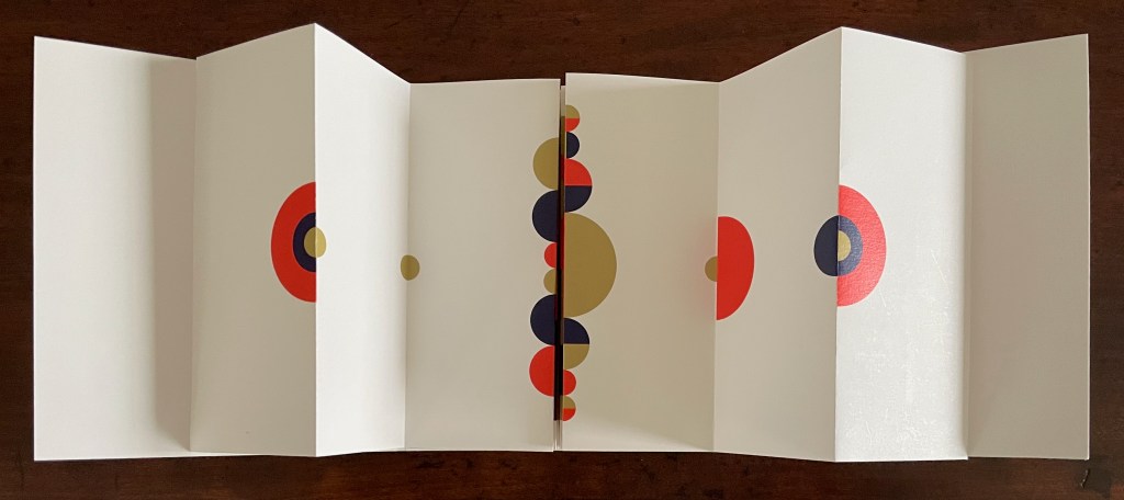
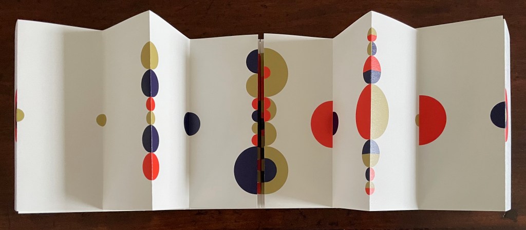
Pliplop (2020) iOiOStudio Trifold cover, side-by-side leoporellos. H120 x W105 (closed), W895 mm (open). 16 half-panels, 1 full center panel. Acquired from StudioiOiO, 6 November 2025. Photos: Books On Books Collection.d from StudioiOiO, 6 November 2025. Photos: Books On Books Collection.
Based in Montélimar, France, and Seoul, South Korea, iOiO Studio produced this ingenious micro-edition leporello that invites its audience to behold and play. The folds and registration of images allow the viewer to find and create new shapes and color combinations. Its shapes and colors might remind viewers of Heinz Edelmann’s art for The Yellow Submarine. In its appeal to the child in the adult, it will remind book art enthusiasts of the works of Katsumi Komagata, Warja Lavater, Bruno Munari, and Peter and Donna Thomas. In its sophistication, it might remind them of the contributions to LL’Éditions leporello series. Many other connections can be found in Stephen Perkins site Accordion Publications, where Pliplop first came to my attention.
Two works that explore the curious but natural connection between children’s books and artists’ books are Johanna Drucker’s contribution to The Routledge Companion to Picturebooks and Sandra Beckett’s Crossover Picturebooks.
Drucker, Johanna. 2017. “Artists’ Books and Picture Books: Generative Dialogues” in The Routledge Companion to Picturebooks, edited by Bettina Kümmerling-Meibauer, Taylor & Francis Group..
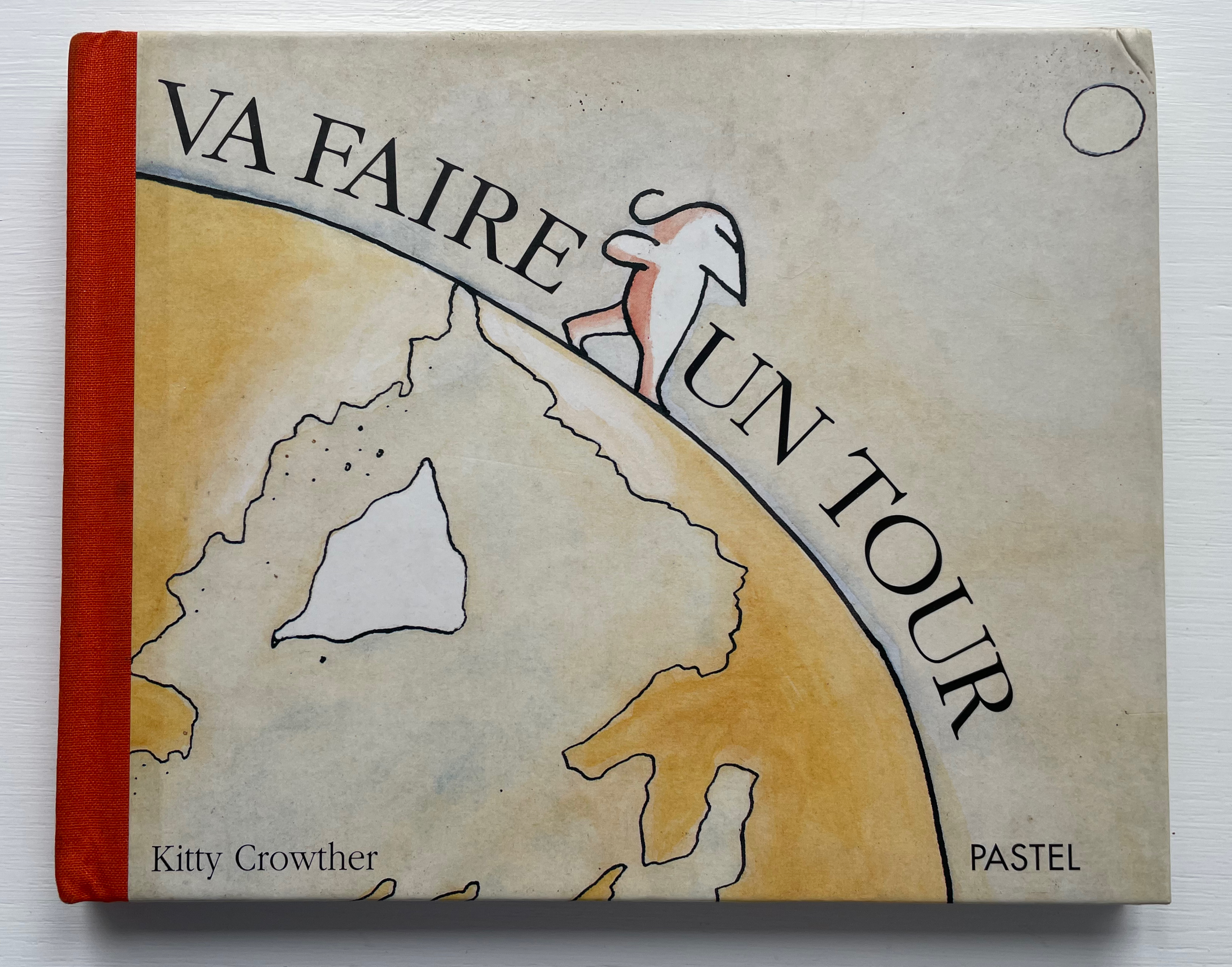
From the first wordless illustration onwards in Kitty Crowther’s Va faire un tour, you don’t have to know French to know that the book’s title means imperatively “take a walk” — or maybe even “take a hike” — in English. There is no mistaking the tone of Maman’s character nor the reaction of her little one stomping along, circling the globe, even under bodies of water, oblivious to characteristic scenery and inhabitants.
Die Scheuche Märchen(1925, 1965) [The Scare-Crow Fairy Tale] Kurt Schwitters,Kate Steinitzand Theo van Doesberg. English translation by Robert Haas (enclosed, loose). Miniature reprint of the 1925 edition. H123 x W154 mm. 12 pages. Acquired from Plain Tales Books, 12 July 2023. Photos: Books On Books Collection.
The Schwitters-Steinitz Collection held at the National Gallery of Art Library identifies this work as a miniature reprint published in 1965 by Stockholm’s Gallery Samlaaren, owned by Agnes Widlund. The original, measuring H250 x W210 and also in red and blue on light brown paper, was published by Kurt Schwitters, Kate Steinitz and Theo van Doesberg under the imprint APOSS, which is a nonsense word, derived from “A for Active; P for Paradox; OS for Oppose Sentiment; and S for Sensitive” (Paley, p. 267). There have been several other editions, but this one is particularly satisfying for its inclusion of the loose typewritten translation by Robert Haas, who also translated Steinitz’s memoir/biography of Schwitters.