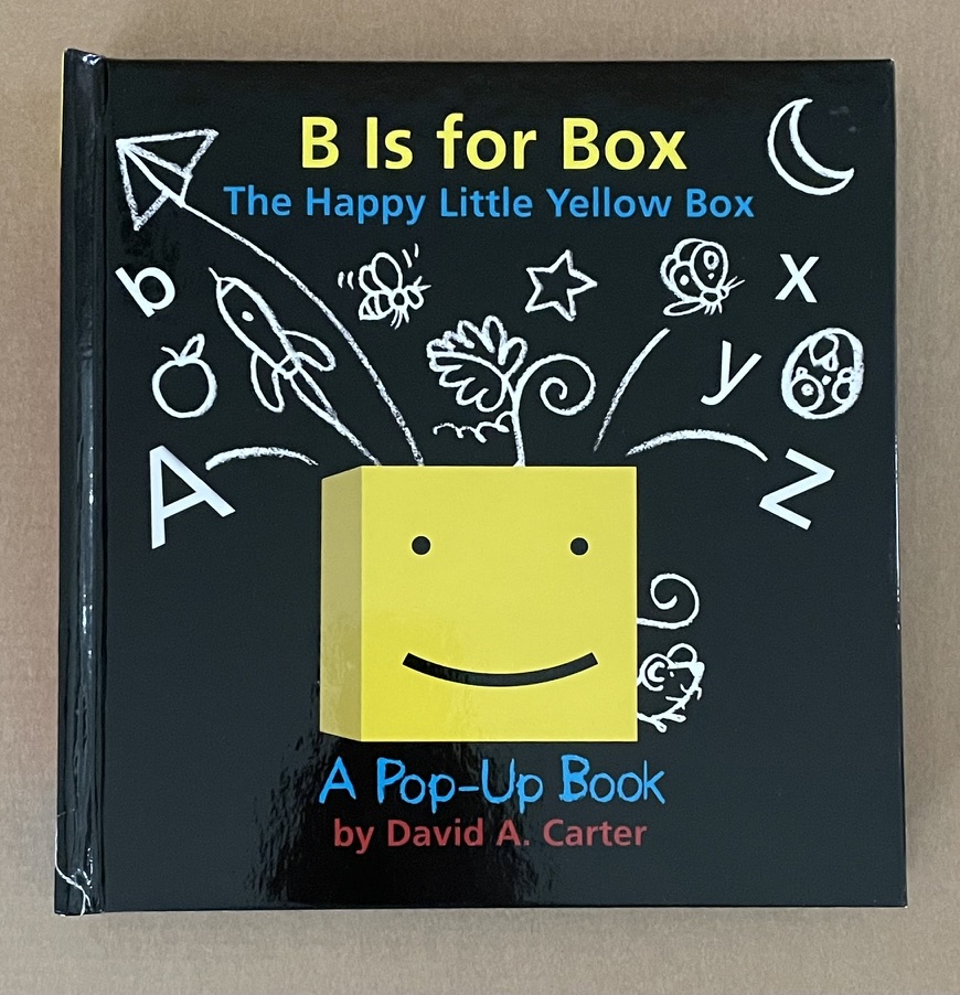
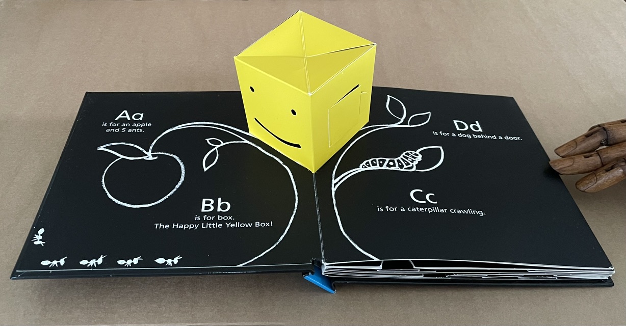
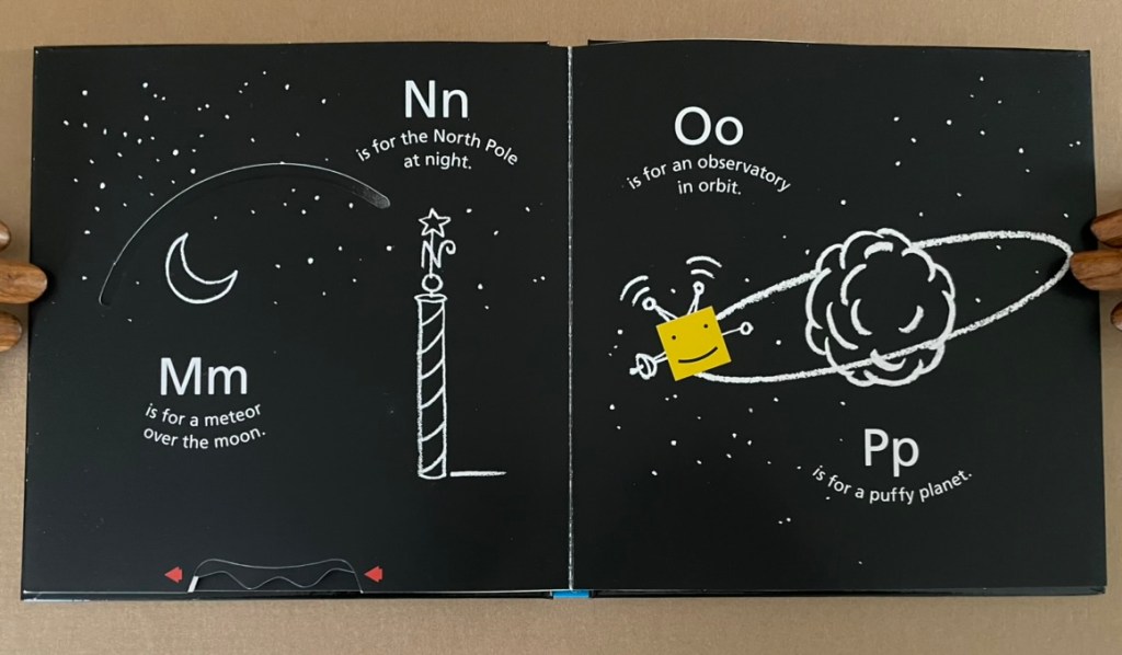
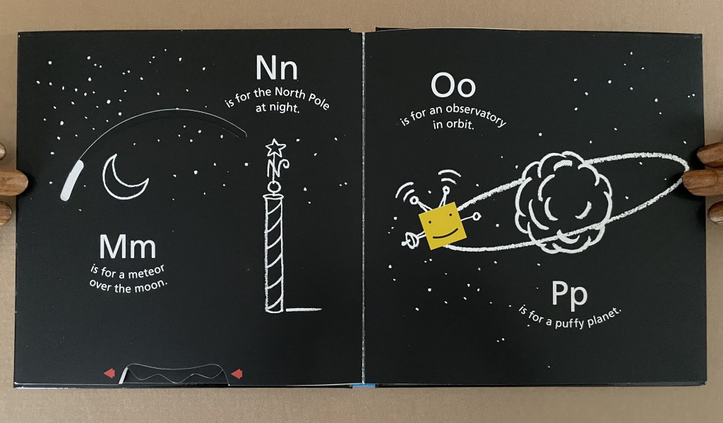
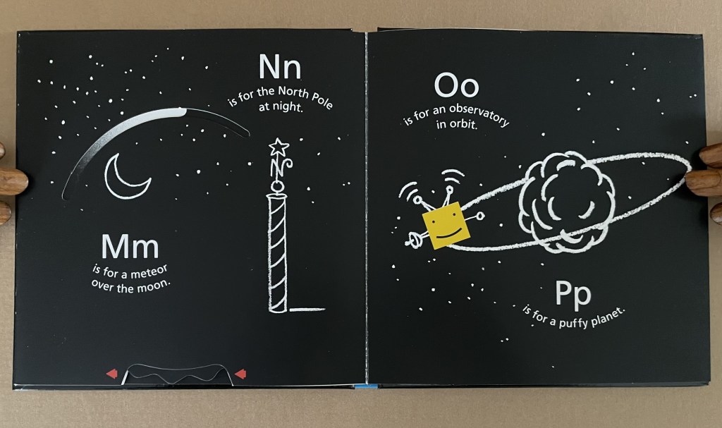
B is for Box (2014) David A. Carter Pop-up book, printed paper over boards. H187 x W184 x D28 mm. [14] pages. Acquired from Type Punch Matrix, 17 September 2024. Photos: Books On Books Collection.
“The Happy Little Yellow Box” was first introduced in a pop-up book of opposites by that name in 2012. For the Books On Books Collection, the box’s return in this pop-up alphabet makes it the one to add to all the other abecedaries here. The box is also a happy reminder of the items under Further Reading (below).
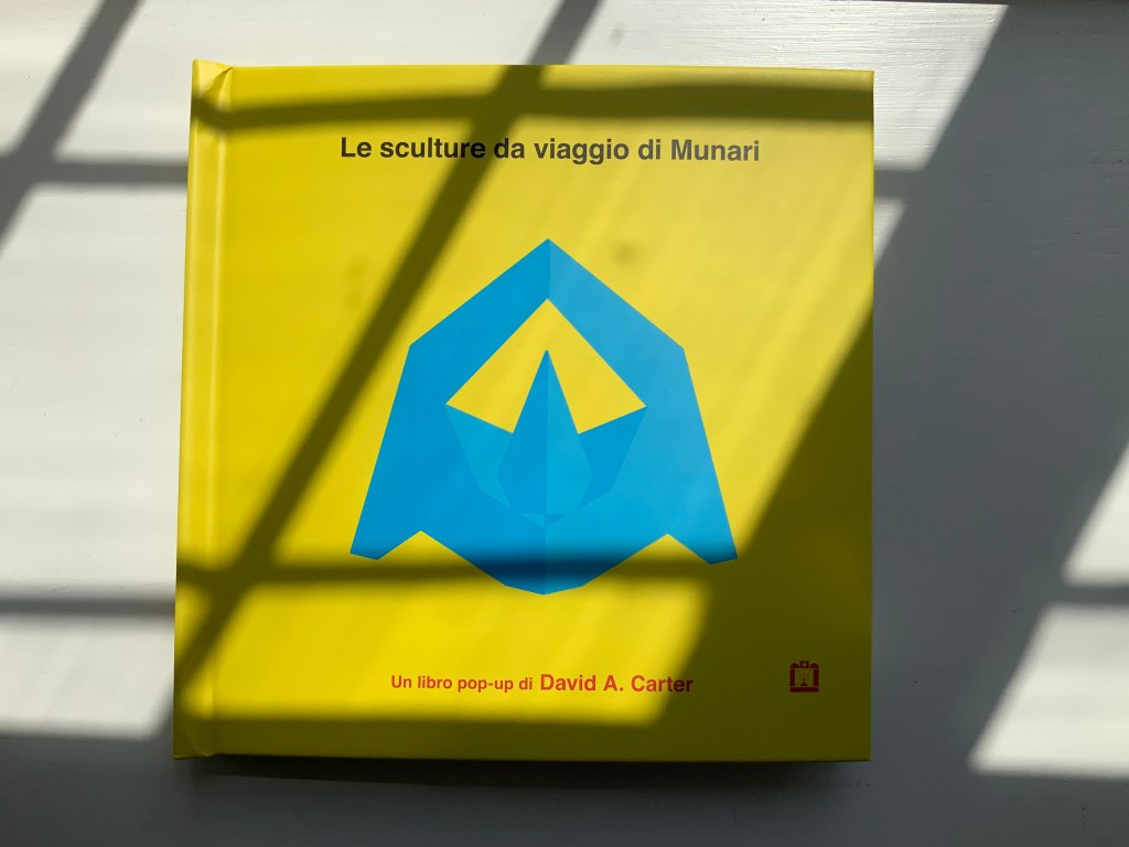
Le sculture da viaggio di Munari (2019)
Carter’s Le sculture da viaggio di Munari brings the spirit of Munari’s “travel sculptures” into the collection. His homage carries the blessing of Corraini Edizioni, further justifying its inclusion.
Travel sculptures started off as small sculptures (some even pocket-sized) to carry with you, so you could take part of your own culture to an anonymous hotel room. Later they were turned into ‘travel sculptures’, five or six metres tall and made of steel. One of these was seen for a few months in Cesenatico, another one in Naples. Others are sleeping among huge trees in the Alto Adige region.’ This is how Italian designer Bruno Munari (1907-1998) described his ‘travel sculptures’, which in turn inspired American illustrator and designer David A. Carter for this pop-up book. –Corraini Edizioni website. Accessed 3 August 2021.
Munari’s travel sculptures also recall works in the collection like Cumer’s scultura da viaggio dipinta n.2(2017), Komagata’s「Ichigu」(2015) and, albeit less portable, Ioana Stoian’s Nous Sommes (2015).
Rubin, Ellen. 2019. Ellen Rubin – The Popuplady. For her definition of the “spider web” form of pop up (Within a circle, a spiral is cut either by hand or laser. A ribbon or pull is attached to the center area. When pulled up, a ‘spider web’ pop-up is created.), Rubin illustrates it with an example from Carter.
Ruston’s art celebrates the natural world and human spirit, inviting viewers “to follow, to unravel secrets, and to pay close attention to the world around them”.
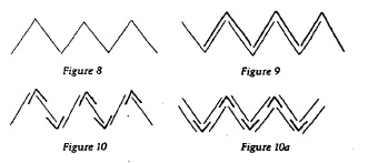
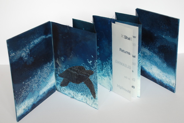
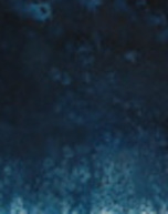
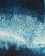
Chris Ruston She Returns (2011) 23.5cm x 18.5cm, Edition of 2
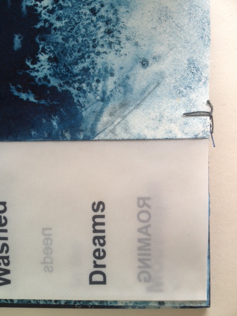
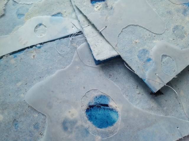
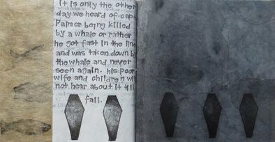
Part of a series called Ocean Blue, the book She Returns uses a double concertina fold and ink on Fabriano watercolor paper to invite us to follow the image of a leatherback turtle making its way through the deep, which fluctuates between the depth of blue-black and the shallows of blue-white. The text reads
SheReturns BLACK and GLEAMING
in the Moonlight
her Primordial needs Roaming WaveWashedDreams.
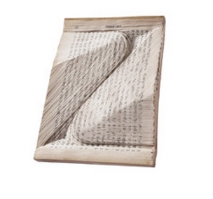
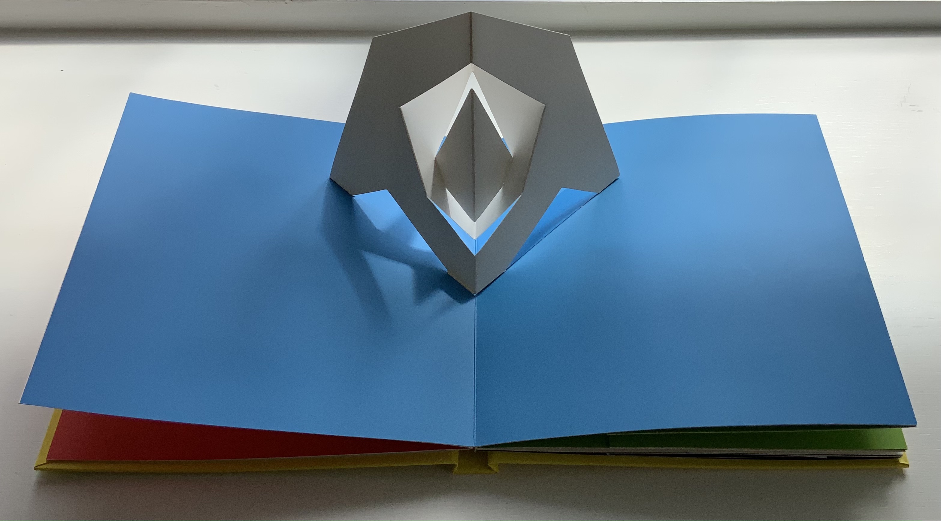
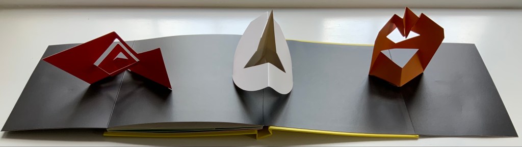
Originating from the Tang dynasty (A.D. 618-908) in China as the Orihon, the concertina fold is also called the accordion fold and sometimes the leporello*. For “She Returns”, Ruston employs a variant of the binding approach in Figure 9. It is
from Hedi Kyle, “Orihon’s Triumph: Origin and Adaptations of the Concertina Fold”, The Ampersand, Vol. 3, No. 2, December 1982.
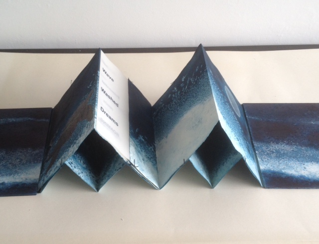
essentially two pages folded together into a concertina fold, but in origami terms, the “mountain” fold of one page is inverted to a “valley” fold, which creates “small boxes” between the pages when the concertina is opened as seen below. The single signature of transparent paper with text is sewn into the centre page. It is bound by a simple stitch top and bottom of each fold.
Painted board covers were then attached.”The stitches at the top and bottom of the page work well as it allows some small movement of the two concertina folds. As I saturate it with water and ink it needs to be a bit more robust but this means it can be bulky when put together.”
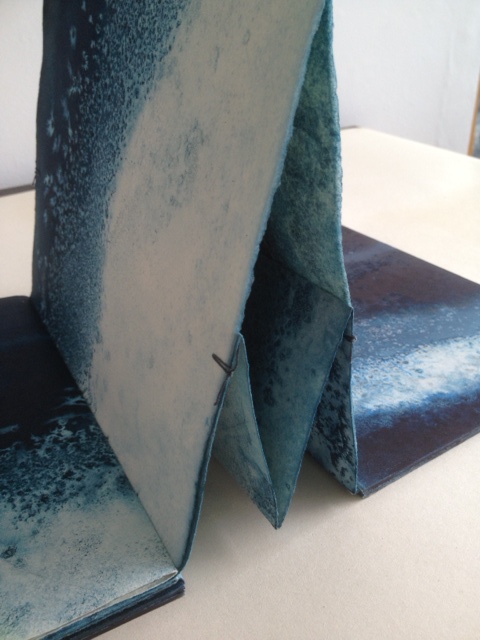
Binding detail of She Returns
Binding detail of She Returns
Binding detail of She Returns
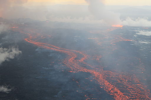
The Holuhraun lava field, on 4 September 2014, during the 2014 eruption
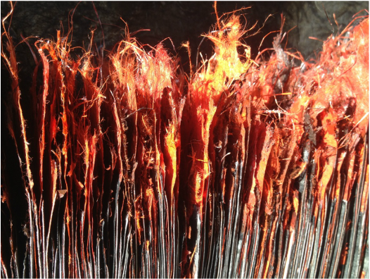
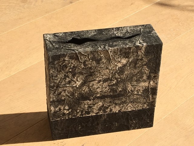
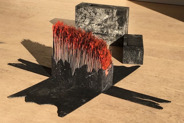
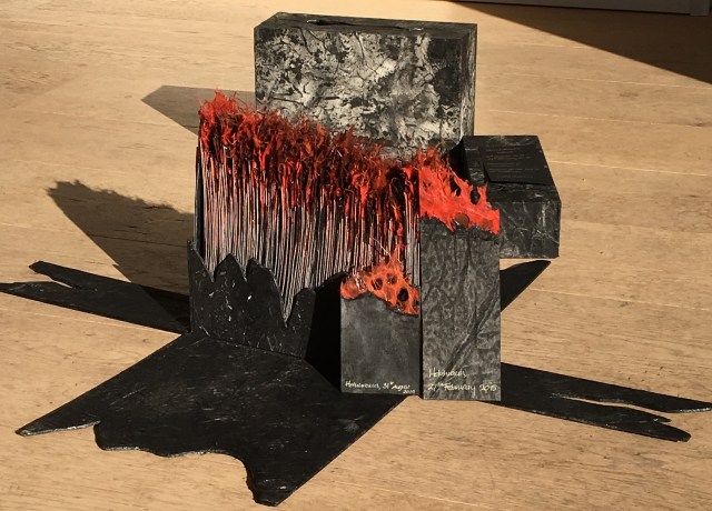
The Bárðarbunga volcano in Holuhraun, Iceland, is active. From August 2014 to February 2015, it erupted for 181 days.
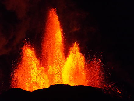
Lava fountains of the fissure eruption in Holuhraun on 13th September 2014 around 21:20.
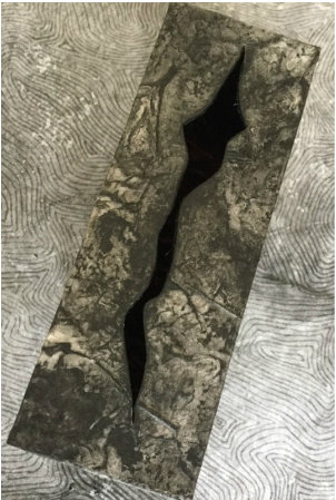
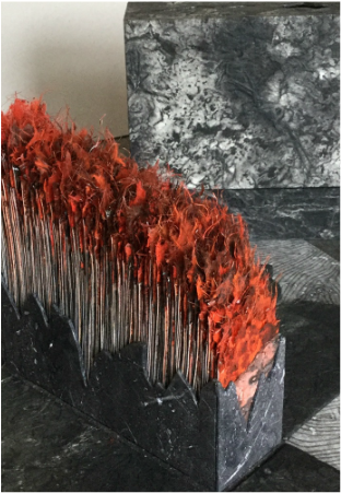
Ruston responded to that natural event with the work Holuhraun, 2014-2015.
Ruston’s Holuhraun reflects that duality of nature’s destructive creation and creative destruction. The sides of the box falling away mimic the volcano’s production of new land. But the work is more subtle than that; it implicates the viewers in that duality. In taking apart the closed object, we “create” or, at least, reveal another object of art.
Ice is the countervailing passion in Ruston’s art.
What a sight to wake up to on a cold winter’s morning – a blanket of thick frost over everything. Armed with camera, and a thick warm coat, I couldn’t resist taking a detour on my way to the studio. The air was still, the grasses and branches coated with ice crystals, all bathed in a soft gentle light. I spent a pleasant hour surrounded by the gentle rustle of ice crystals softly falling to the ground. (12/12/2012)
In response to her natural surroundings, as well as powerful films such as James Balog’s Chasing Ice (PBS, Nova, 2102) and installations like Olafur Eliasson’s Your Waste of Time (MoMA, New York, 2013), Ruston created Are We Listening?, a work of small pieces of handmade paper into which random text is incorporated and overlaid with transparent paper. Human time and earth time, destruction and creation, recurrently emerge as central themes in Ruston’s art whether touched by fire or ice.
Chris Ruston Are We Listening? (2013) Handmade paper, ink, transparent paper 15cm x 10cm
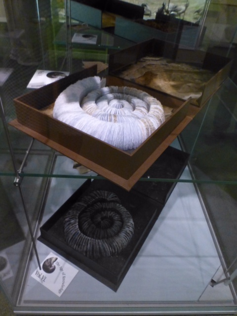
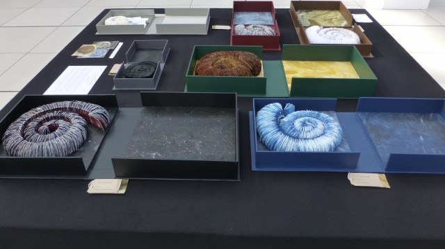
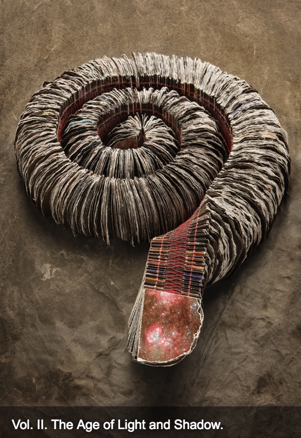
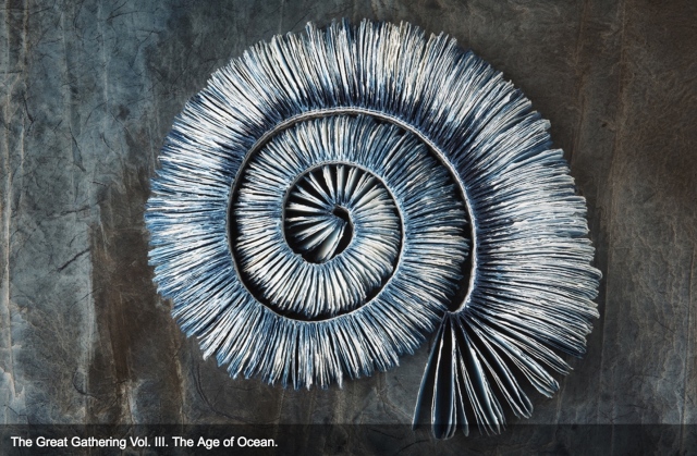
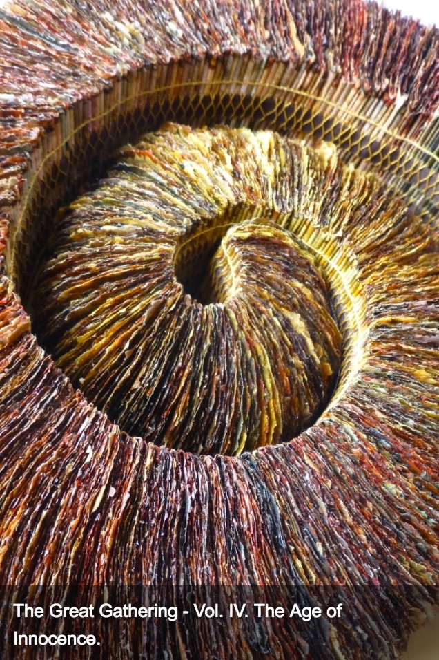
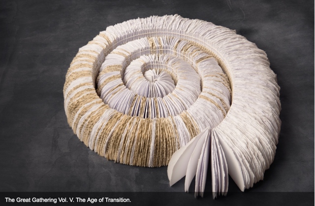
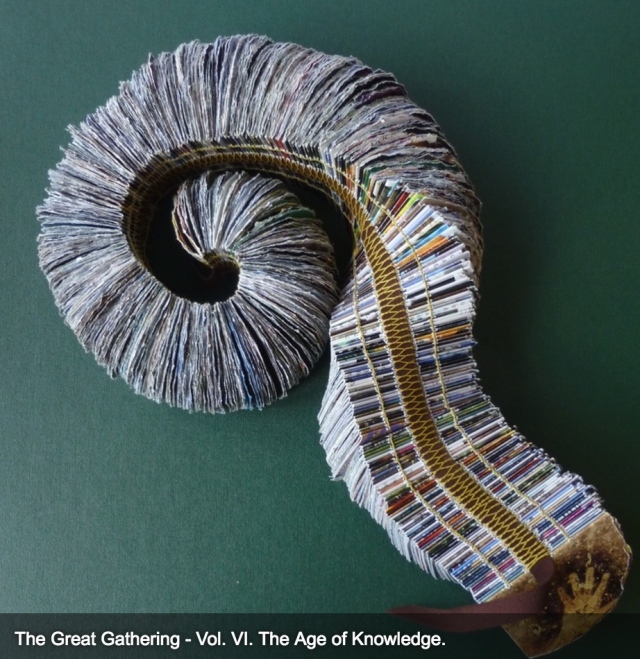
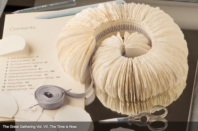
In capturing these themes, The Great Gathering (2015) may be Ruston’s masterpiece — so far — in making visible how the world touches us, and how we touch the world. In this work, she has drawn her inspiration from ammonite fossils on display in the Sedgwick Museum of Earth Sciences, Cambridge, and the Colchester Natural History Museum. The Great Gathering first appeared as an installation at the Colchester Natural History Museum, which is housed fittingly — especially for this work — in a deconsecrated church.
The Great Gathering, Seven books, seven moments in time (2015) Natural History Museum, Colchester, Essex, England Photo credit: Chris Ruston
Chris Ruston The Great Gathering, Seven books, seven moments in time (2015) On display at Turn the Page, Norwich, England, May 2016 Photo credit: Chris Ruston
Ruston writes:
Using the ammonites spiral shape as a starting point, these books represent the unfolding story of evolution. The humble ammonite is an abundant index fossil, easily recognised, and a regular feature in museum collections. Often associated with journeys, symbolically these particular fossils are believed to have absorbed the knowledge of the Universe from across the centuries.
Science and art are the presiding geniuses over many works of book art.
In The sciences of the artificial (1969), Herbert Simon emphasized: “The natural sciences are concerned with the way things are” and engineering, with the way things ought to be to attain goals. Like the scientist, the artist, too, is concerned with the way things are. They are the raw material with which the artist works or to which he or she responds. But like the engineer or the designer, the artist is concerned with the way things ought to be to make visible “the way things are”:
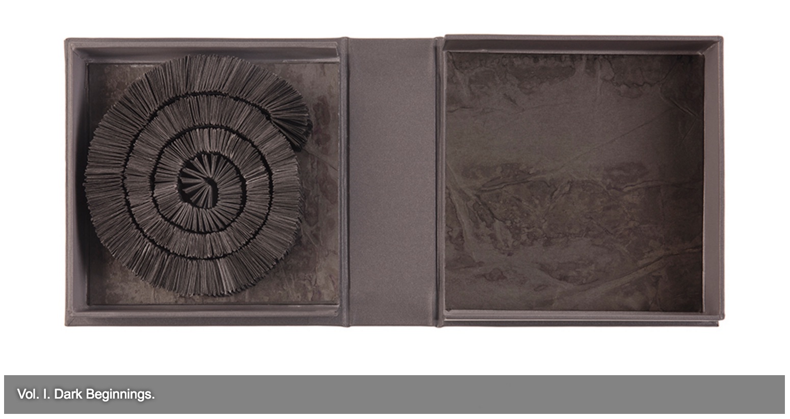
The Great Gathering (2016) Chris Ruston Photo credit: Chris Matthews
how a solander box ought to be constructed to operate with the work and, in enclosing it, be “the work”;
The Great Gathering (2016) Chris Ruston Photo credit: Chris Matthews
what materials (photos from the Hubble telescope) ought to be used to reflect a moment in time;
The Great Gathering (2016) Chris Ruston Photo credit: Chris Matthews
how thread, tape and stitch ought to be to hold together a spine that will flex and spiral into the shape of a fossil;
The Great Gathering (2016) Chris Ruston Photo credit: Chris Matthews
how the color of the material ought to be juxtaposed with the material’s altered shape to carry meaning;
The Great Gathering (2016) Chris Ruston Photo credit: Chris Matthews
how the shift from content to blankness ought to be juxtaposed with the material’s altered shape to carry meaning;
The Great Gathering (2016) Chris Ruston Photo credit: Chris Matthews
how the selection and alteration of text ought to be made to show the fixity and flux of knowledge and ourselves;
The Great Gathering (2016) Chris Ruston Photo credit: Chris Matthews
and how our reflection in the mirror in Volume VII under the maker’s tools and the made thing ought to implicate us — a theme echoed above by Holuhraun, 2014-2015 — in an ongoing process of making and remaking.
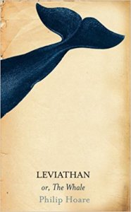
For her next invitation to the viewer to follow, unravel secrets and attend closely, Ruston is returning to the ocean.
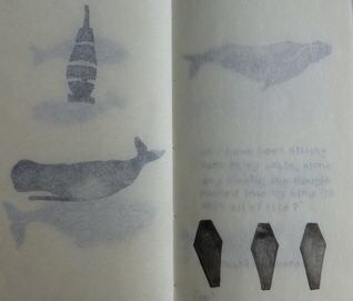
Inspired by Philip Hoare’s Leviathan and his fascination with Melville’s Moby Dick, Ruston recently began research into whales and whaling logs for her next work. Like evolution, here is a subject of grandeur, expanse and time, even fire and ice. The sketchbook pages below tantalize. How will the artist, this time, make visible how the world touches us?
*In Mozart’s opera Don Giovanni, the main character’s manservant is Leporello, who, when singing the Catalogue Aria, produces a book that endlessly unfolds the list of Don Giovanni’s conquests.
Oratorical Type A by Nerhol (Ryuta Iida and Yoshihisa Tanaka)
Oratorical Type Z by Nerhol (Ryuta Iida and Yoshihisa Tanaka)
The Japanese artists and partners Ryuta Iida and Yoshihisa Tanaka are known as NERHOL. Interviewed by Rebecca Fulleylove in the online magazine It’s Nice That, they explain the name:
We met at one of Iida’s exhibition and realised we had so much in common in regards to experience, design and taste. Gradually, we began working together. Our very first piece, Oratorical Type, used books as the theme, after sculpting them by carefully carving out certain sections of each page, it resulted in interesting dimensions. At that time, we still hadn’t decided on our name but soon came up with “NERHOL”, a mash-up of two words, “neru” to plan ideas and “holu” to sculpt and carve.
“To plan ideas” and “to sculpt and carve” those ideas in air, time, stone, wood or paper is that not a poem, a book, a building, a city — the work of art? That these two artists chose the letters of the alphabet as their first work together, that the alphabet and each of its letters came into being by collective human art and craft, marking our passage from orality to literacy, and that the alphabet, type and book are tools by which we have strived to evolve — how could they not be named Nerhol and their first work of art not be called Oratorical Type?
 She Returns