Derek Beaulieu (No Press) first published Sam Sampson’s homage to Un Coup de Dés as a handsewn pamphlet in 2020. To celebrate the 125th anniversary of Mallarmé’s initial publication of “the poem that made us modern”, Sampson enlisted Jacinda Torrance of Verso Visual Communications for design, the firm Centurion for printing, and Louise James of The Binding Studio for hand binding to produce this deluxe edition.
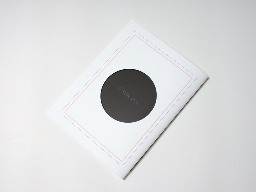
UN COUP DE DÉS JAMAIS N’ABOLIRA LE HASARD (((SUN-O))) (2022)
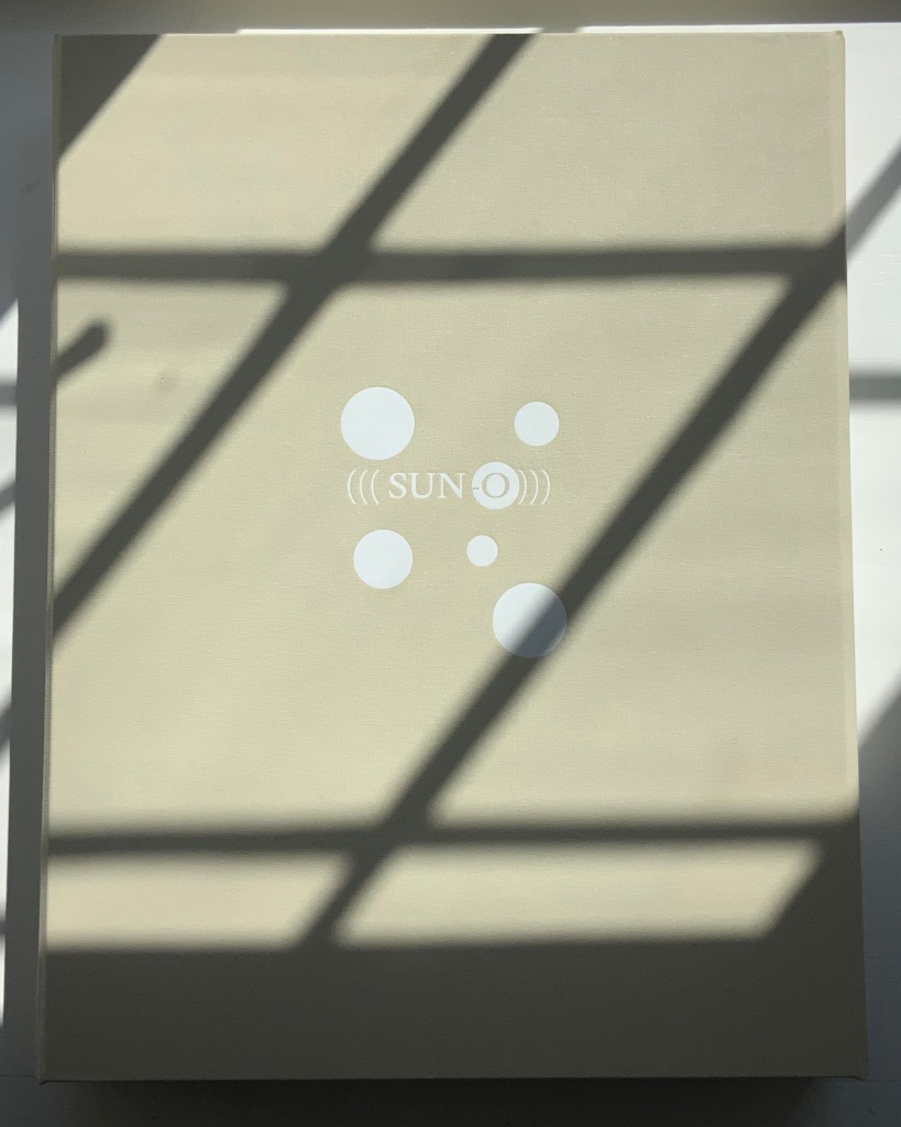
Un Coup de Dés Jamais N’Abolira le Hasard ((( Sun-O ))) (2022)
Sam Sampson
Handsewn book, H300 x W225 mm, 28 unnumbered pages. Edition of 20 (10, each enclosed in a hinged-lid box with magnetic flap; 10 unboxed), of which this is boxed # 2. Acquired from the artist, 7 April 2022.
Photos: Books On Books Collection. Displayed with permission of the artist.
As with most creative works, (((Sun-O))) had multiple points of inception. One of them was an essay Sam Sampson read by Susan Howe and Cole Swensen. They quote Mallarmé’s preface to the poem (“nothing new except a certain distribution of space made within the reading” and speak of his aim to fuse sequential and simultaneous perception, to fully engage the eye and ear, as a result pushing poetry in two directions – toward visual art and toward musical performance. This resonated with a series of poems Sampson was writing and manifests itself in (((Sun-O))):
The physical design and analogy in my rendition is aligned with what I would call the ‘O Poems’. ‘O’ Zero, being the sound that runs through these poems, but I’ve also been interested in the numerical concept of zero: the beginning point, but also the point of departure, the ‘O’ as an ideogram, giving the text a pictorial as well as vocalised movement. [Correspondence with Books On Books Collection, 29 March 2022]
Another of the “O Poems” is Zeroth. Sampson reads it here:
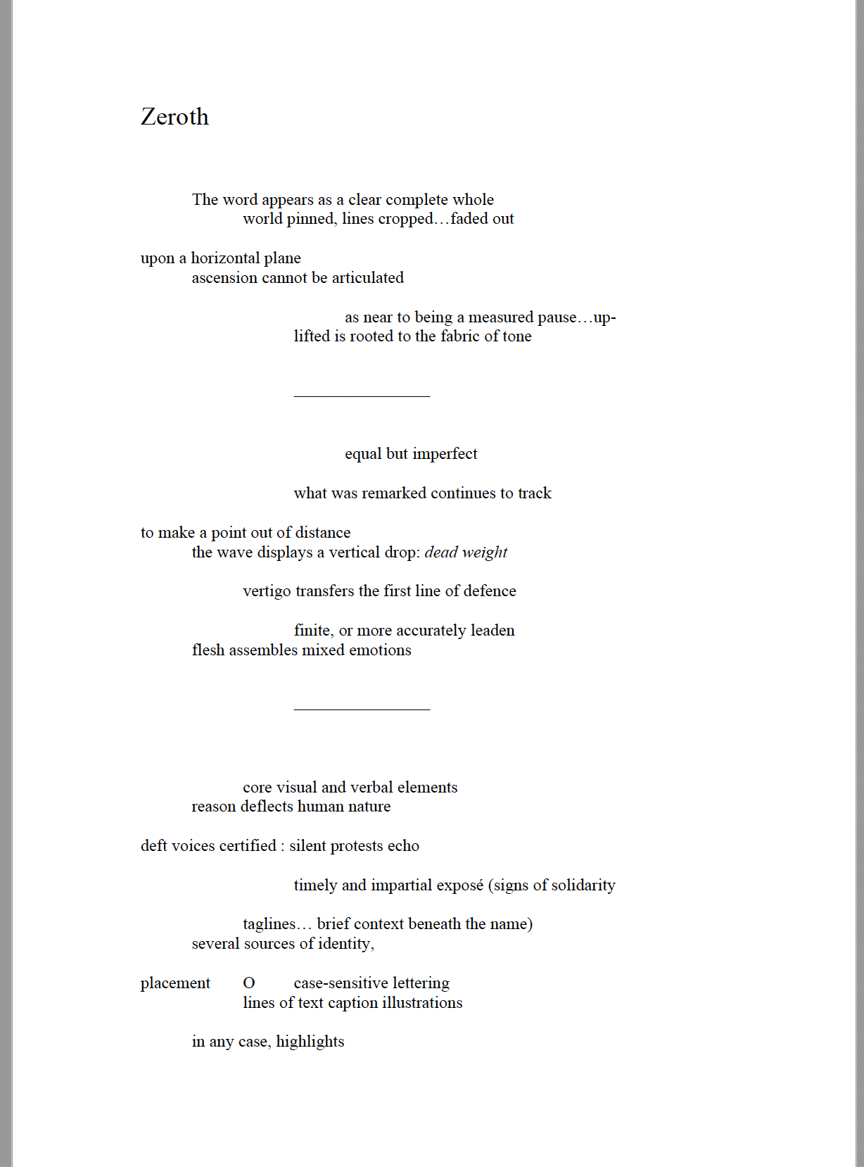
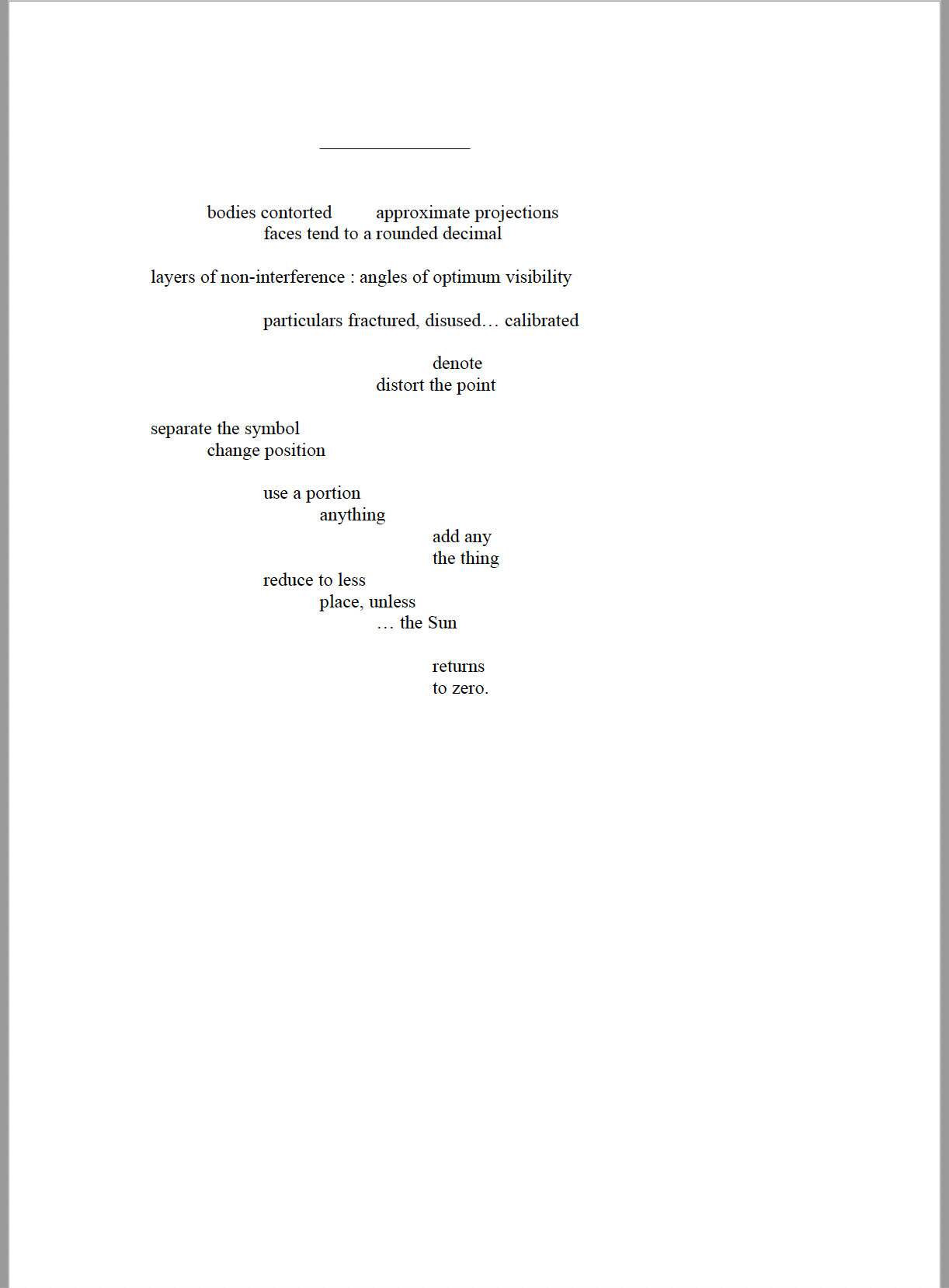
© Sam Sampson. Reprinted with permission of the author.
Zeroth leads to another point of inception: a conversation with Roger Horrocks, a New Zealand poet, writer, film-maker, educator and cultural activist, to whom (((Sun-O))) is dedicated. After reading Zeroth, Horrocks told Sampson that it reminded him of his favorite Seattle experimental metal band at the time – Sunn O))). Sampson describes their sound as slow, heavy, blending diverse genres including “drone, black metal, dark ambient and noise rock”. Sampson’s mulling over the very sound of the band’s name led to free associations with the secondary meanings of drone (surveillance, panopticon). Mulling over the name’s compression of word and the letter O led to his hybridized subtitle (((Sun-O))) “with its parentheses radiating out but never closing”. A potent visual and textual image for a poem touching on, if not touching, the sun, the abyss and the human.
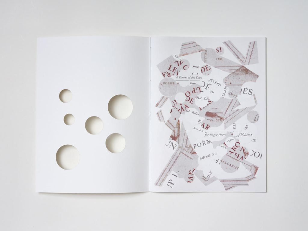
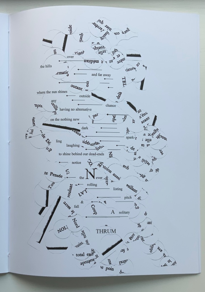
But, of course, the zero point of inception is Un Coup de Dés. On a visually material level, (((Sun-O))) has a scaffolding of bullet-pointed rules, whose lengths are based on measuring each of Mallarmé’s lines, whose weights approximate the variable font sizes, and whose placement matches that in Un Coup de Dés. This lattice serves as the physical structure for the collage of words and O’s that Sampson layers like paint or screenprint onto the page. Some words and lines are upside down like the detritus of a shipwreck. Some words curve and drape between the lines like torn sails. Appropriately, some come from the precisely corresponding pages in Mallarmé’s poem. Faint lines of the circumferences of O’s leap across and down between the lines almost like musical notations.
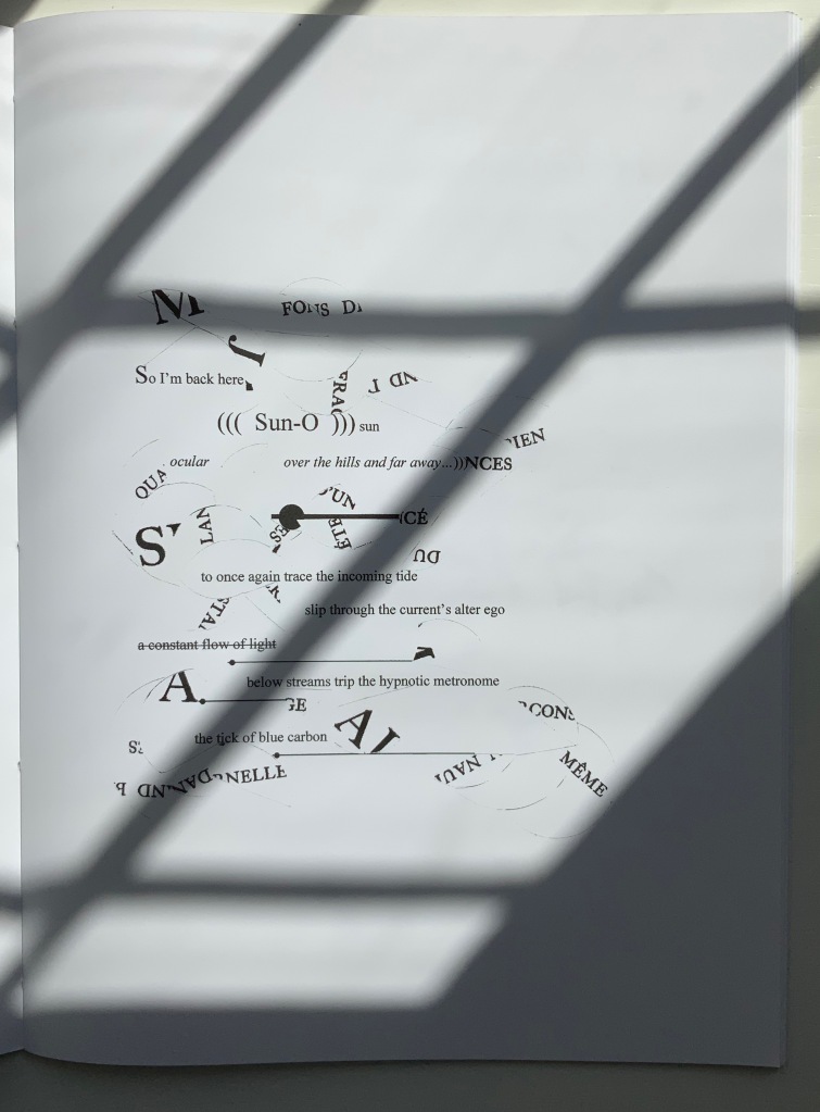
Within this tangle, Sampson’s own elusive and allusive text plays. Some of its phrases come from traditional song; some fix the geographical location (“blue carbon” places the speaker in a coastal community); some “un-fix” the location (“over the hills and far away”); some are struck through, alerting the reader to be ready to discard and start again; some set the technological time frame (the reference to operating systems like Suse, Symbian and, of course, Solaris). As in Un Coup de Dés, the text’s syntax and placement on the page encourage reading in fits and starts, back and forth. As Sampson puts it:
I wanted [my] poem to somehow capture, as Mallarmé had described it, “the invitation of the great white space”, and the successive, incessant, back-and-forth motions of our eyes travelling from one line to the next, and beginning all over again. [Correspondence with Books On Books Collection, 29 March 2022]
Indeed, before writing Un Coup de Dés, Mallarmé foreshadowed more expansively this phenomenon toward which Sampson strives:
Pourquoi — un jet de grandeur, de pensée ou d’émoi, considérable, phrase poursuivie, en gros caractère, une ligne par page à emplacement gradué, ne maintiendrait-il le lecteur en haleine, la durée du livre, avec appel à sa puissance d’enthousiasme: autour, menus, des groupes, secondairement d’après leur importance, explicatifs ou dérivés — un semis de fioritures. [Oeuvres Complètes, 2, 227]
“Why — couldn’t a considerable burst of greatness of thought or emotion, carried in a sentence in large typeface, gradually placed with one line per page, hold the reader’s bated breath throughout the entire book by appealing to his or her power of enthusiasm: around this [burst], smaller groups of secondary importance, explicating or deriving from the primary phrase — a scattering of flourishes.” [Arnar, 234]
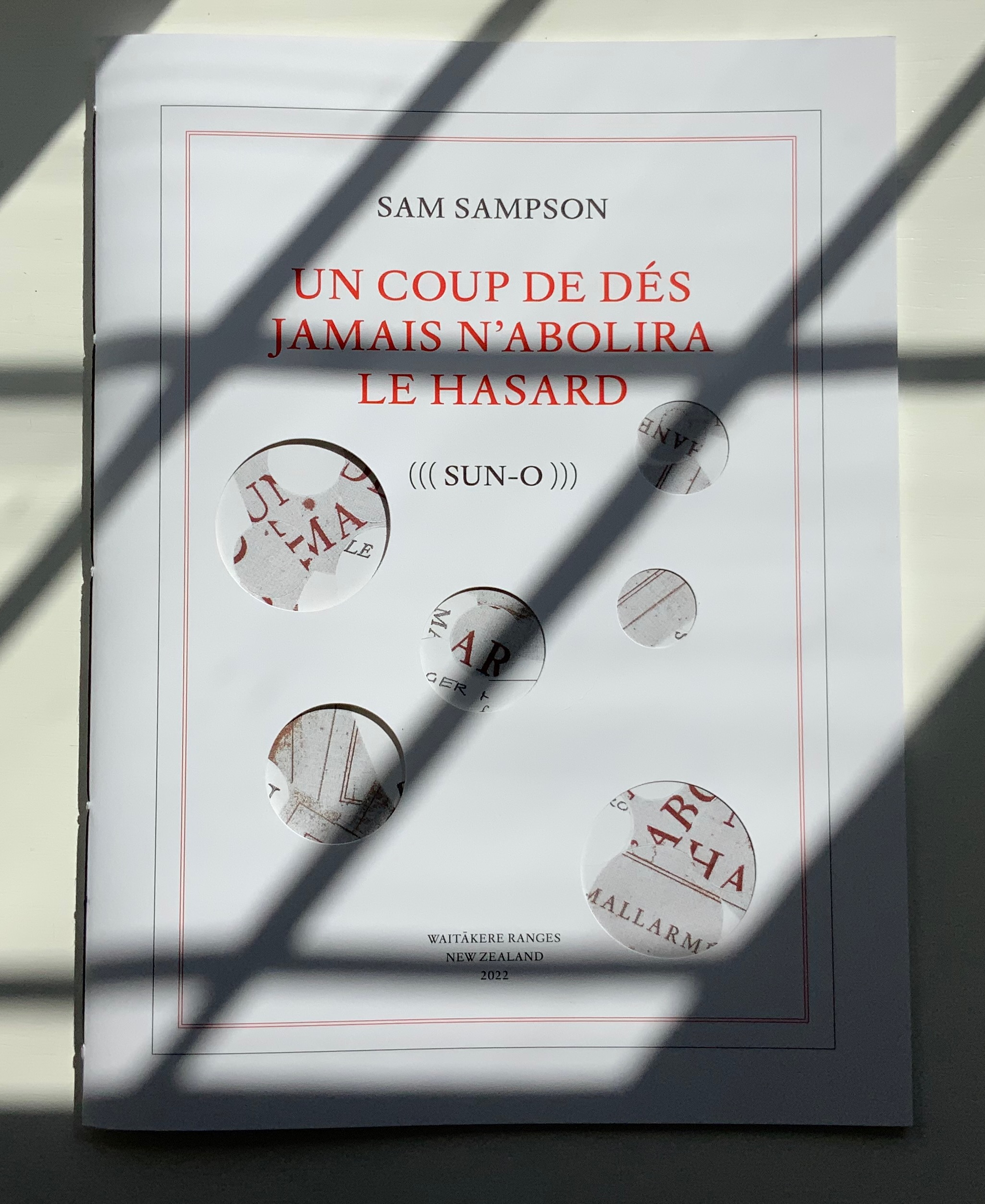
Whereas in Mallarmé’s poem there is a primary sentence in large typeface (“UN COUP DE DÉS JAMAIS N’ABOLIRA LE HASARD”) off which the secondary groups of phrases and sentences play, (((Sun-O)))‘s primary foil is the combination of two things: the collage made from shards of Mallarmé’s poem and that strange, enjambed subtitle (((Sun-O))). After all, the full title of Sampson’s work is UN COUP DE DÉS JAMAIS N’ABOLIRA LE HASARD (((SUN-O))).
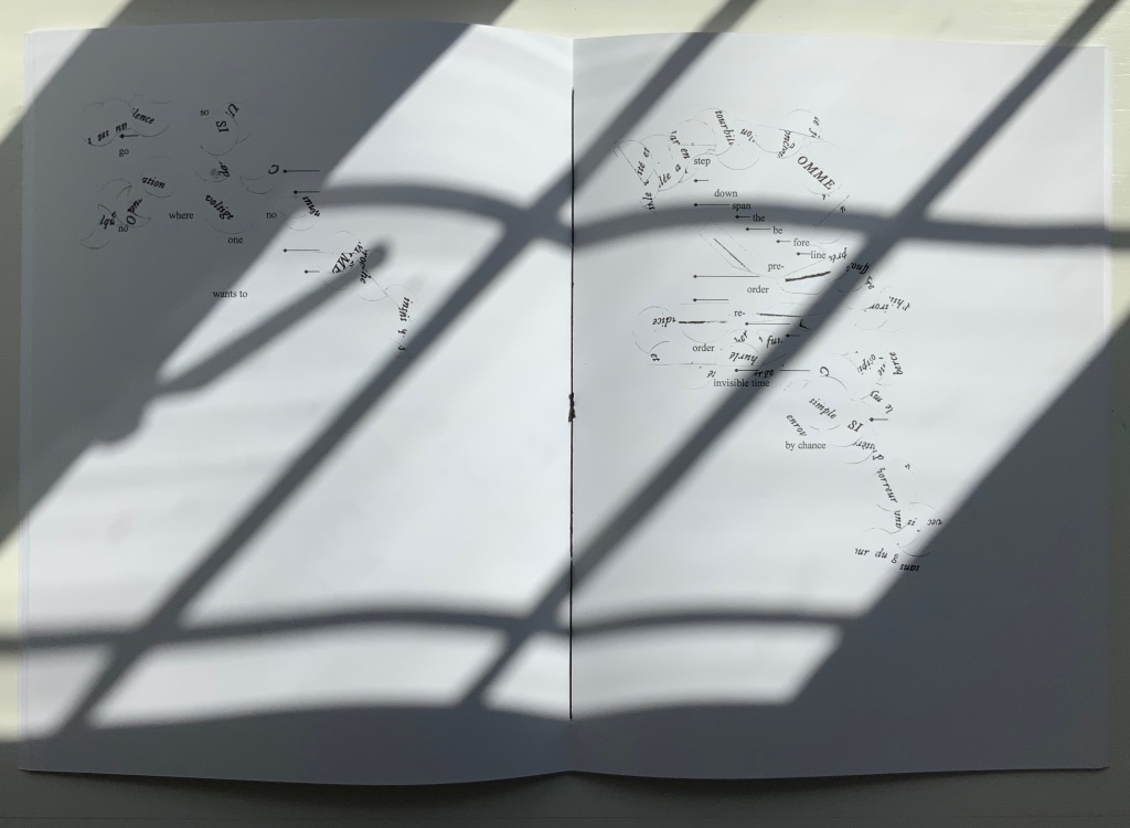
The “Comme si … Comme si” center double-page spread.
Sampson calls Mallarmé’s poem a form of metaphysical gambling, reproducing the sensation of being both in and outside time. Being both in and outside of time — that could be the defining state of human consciousness. Unlike the abstract representation of humanity in Un Coup de Dés, however, (((Sun-O)))‘s representation is concretely personal. The traditional song “Over the Hills and Far Away“, which Sampson cites at the start of (((Sun-O))), can be read as a reference to Horrocks’ departure from New Zealand for the United States in the 1960s. At one point, the speaker addresses Horrocks directly: “Roger / what of these / parallels of blue / sea shanties / masquerading mind-sets / …”. Sampson takes the image of Roger Horrocks’ signature from Horrocks’ copy of an edition of Un Coup de Dés, fragments it and reproduces it on the pages of (((Sun-O))). Did Sampson have in mind the story of René Magritte’s loaning his copy of Un Coup de Dés to Marcel Broodthaers, which led to Broodthaers’ Image version of Mallarmé’s poem? (See Marine Hugonnier’s retelling of the tale here.) The scaffolding of bulleted-pointed lines certainly pays homage to Broodthaers and other “hommageurs by redaction” such as Michalis Pichler, Sammy Engramer and others. (((Sun-O))) is a work of many conversations on many levels across time and time zones.
One of the main topics in (((Sun-O))), however, naturally seems to defy the bridging of the personal and abstract: climate crisis. It is hard to miss the allusions to the global shipwreck that is the climate crisis, engendering rising ocean levels and spastic efforts towards zero carbon emissions based on a computational chaos of competing environmental models and competing economic and political systems. It is clearly of personal concern to the speaker, but that does not take the issue from the abstract to the concretely personal in the way that Horrocks’s signature in a copy of Un Coup de Dés does. Making the climate crisis personal could, of course, run the risk of descending into small talk about the weather.
The references to music and the poem’s demonstration of musicality throughout are also hard to miss, and given its zero point of inception, the poem would be seriously remiss without them. The aim for union of text, sound and graphic image is as central to Sampson’s poem as the manipulation of syntax and les blancs is to Mallarmé’s. The aim’s importance in Sampson’s poem even has the last note and oversized word in the poem:
... the Never / rolling / listing / pitch / & / fall / A solitary / THRUM
The frequency of achieved union may be what puts Sampson’s homage in the front rank.
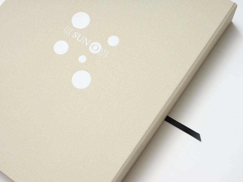
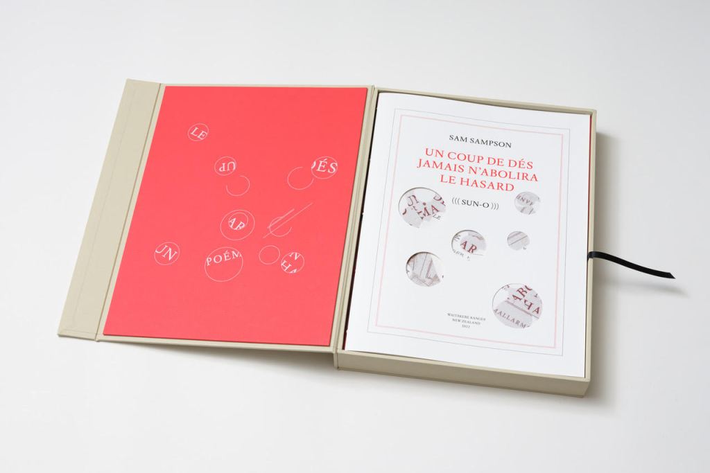
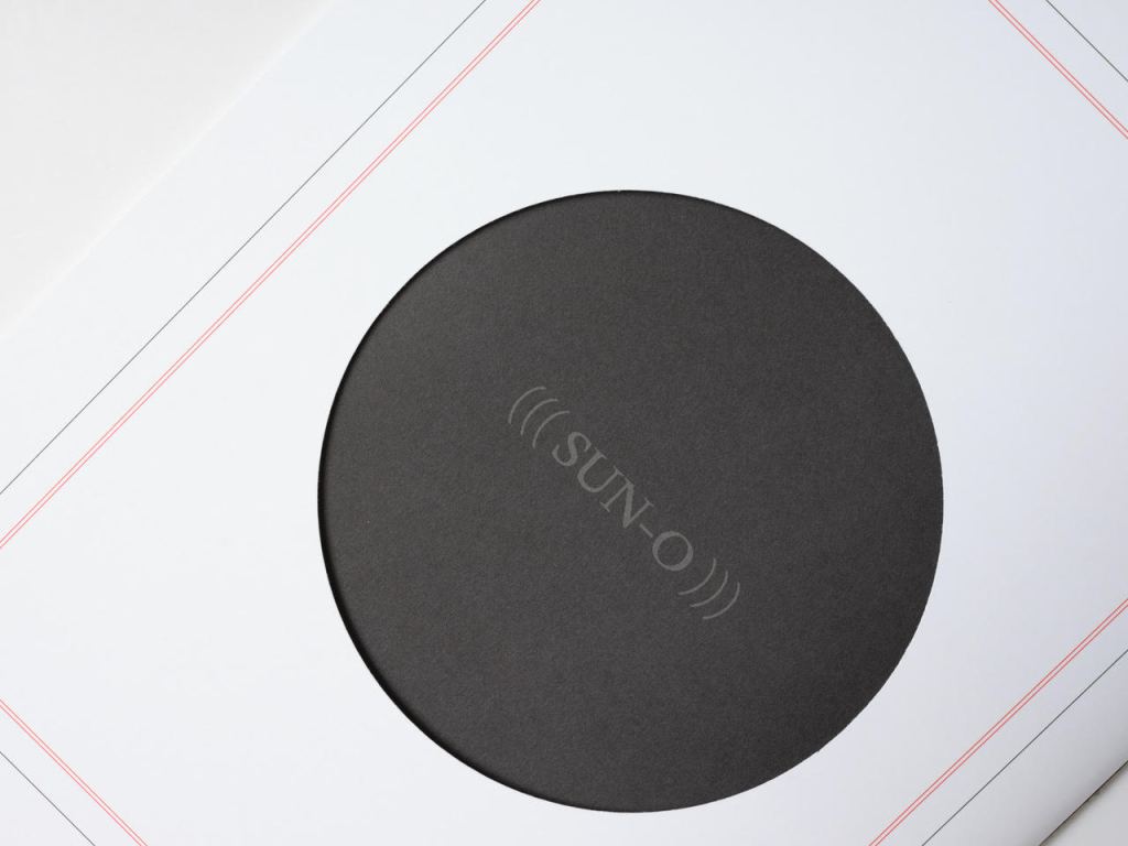
The special edition of (((Sun-O))) enhances that union in material ways. The design and materials play off Sampson’s cutting into and out of, sticking on and sticking through Un Coup de Dés. Six circles foiled in white on the front cover of the box turn the subtitle into an emblem — a mark maker. On the box’s inside lining, a design of circles and broken circles echoing the collage of O’s in the poem (even hinting at musical notation) is used to designate the number of the copy in the edition of 10. For this copy (#2), straight lines cut through 2 of the circles.
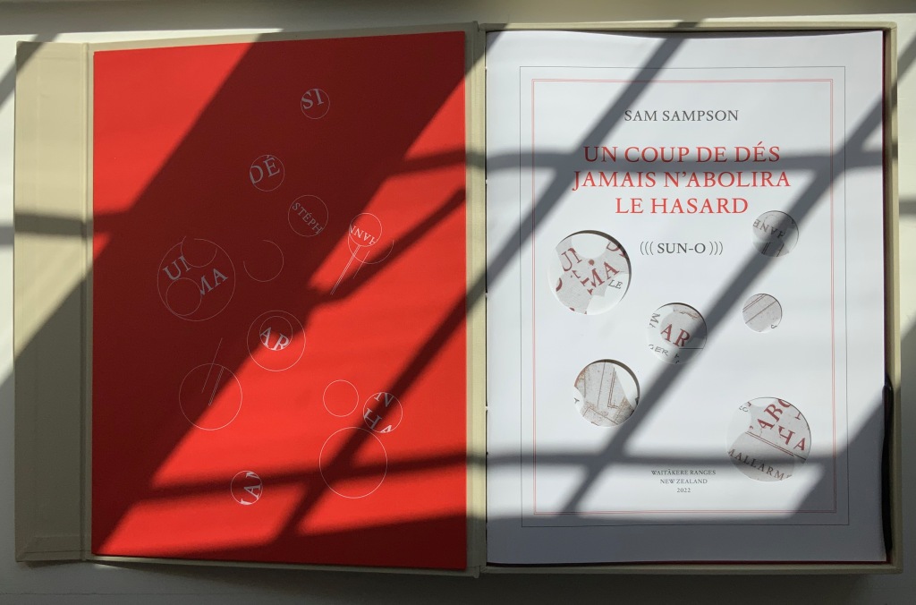
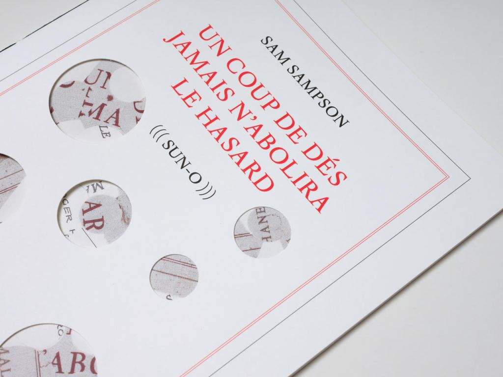
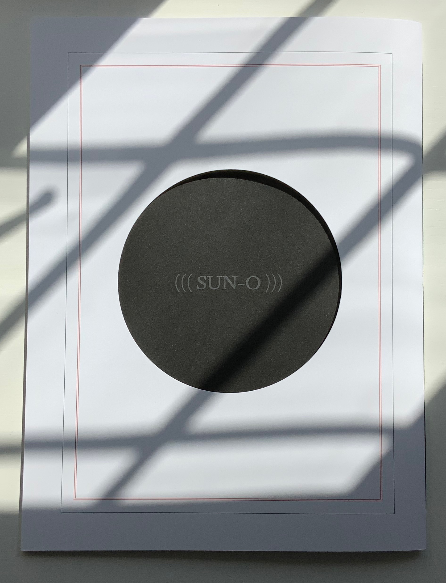
Like the white circles, six die-cut circles on the book’s front cover correspond to the six parentheses of the subtitle and likewise one face of a die. They also recall the hemistich of French poetry’s twelve-syllable Alexandrine, which Un Coup de Dés shattered. An image peeks through the die cuts and, as the cover turns, reveals itself as a collage of the cut-up cover of Horrocks’ copy of the poem and pages of (((Sun-O))). On the back cover, a single large die-cut circle centers on a black-hole sun with a faint, almost invisible ((( Sun-O ))) disappearing into blank/blackness.
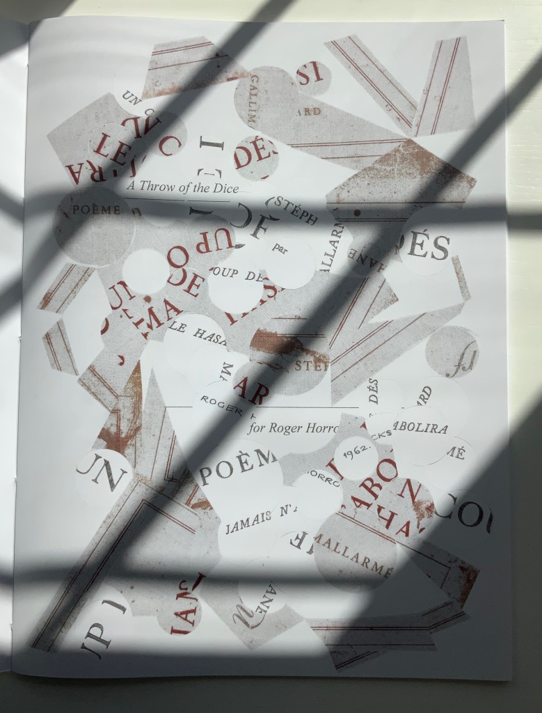
By chance or by sly humor, the typeface used is DTL Elzevir. (((Sun-O))) is obviously not in the hunt for absolute fidelity to the edition planned by Mallarmé and Ambroise Vollard in 1896-97, which collapsed with the poet’s death. When Mallarmé’s son-in-law Dr. Edmond Bonniot issued an edition with Gallimard/NRF in 1914, the typeface was Elzevir, allegedly a face that Mallarmé detested. With this special edition of (((Sun-O))), Sampson is in the hunt on his own terms for his own more personal Mallarméan prism, constellation or radiant (((Sun-O))) that syntactically, auditorily, visually and physically scatters and focuses his response to the human condition.
UN COUP DE DÉS JAMAIS N’ABOLIRA LE HASARD (((SUN-O))) (2020)
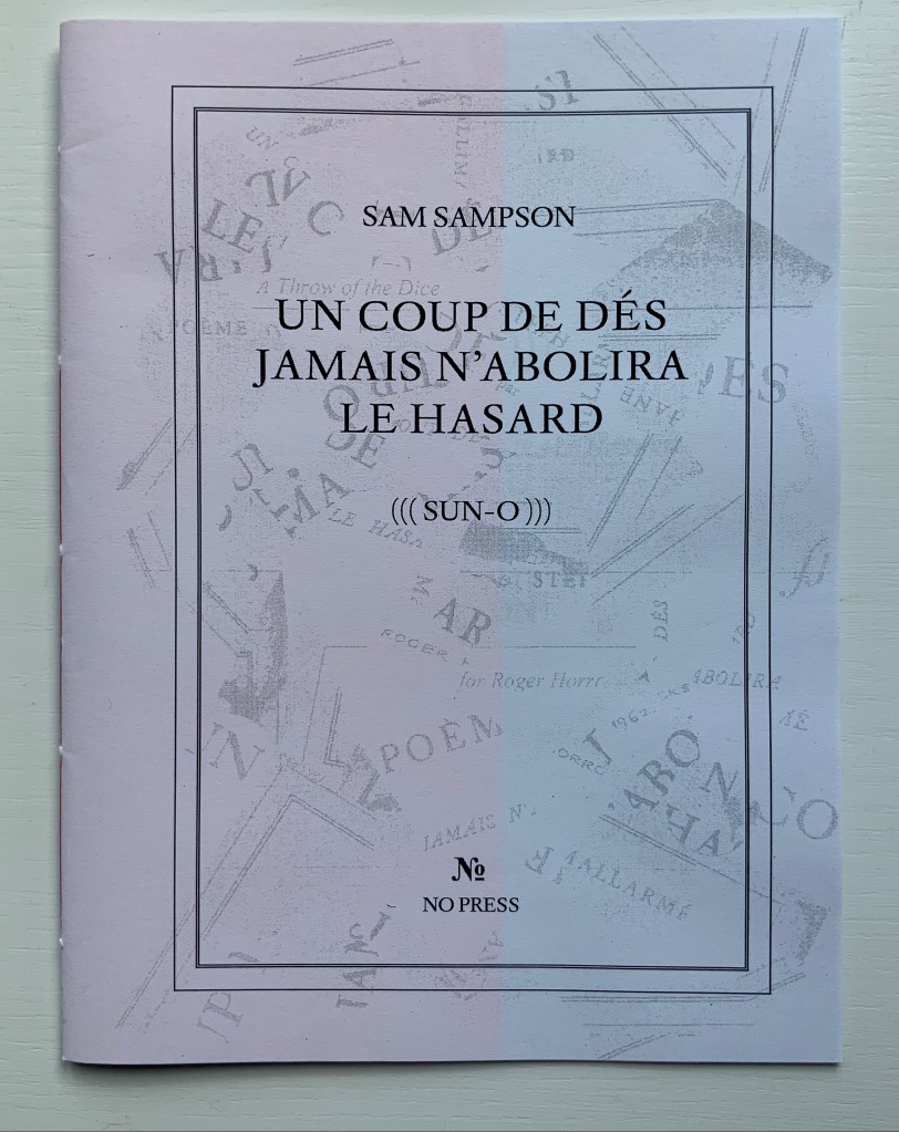
Un Coup de Dés Jamais N’abolira le Hasard: (((Sun-O))) (2020)
Sam Sampson
Handsewn pamphlet. H255 x W190 mm, 24 pages. Edition of 60. Acquired from No Press, 4 January 2021.
Photo of the work: Books On Books Collection. Displayed with permission of the artist.
[Mallarmé’s] work is a constellation and trying to unpack and explicate what went into my response hopefully doesn’t remove the joy of just jumping in. I like what John Ashbery said about his own work: “my work is accessible, if you take the time to access it.” [Sampson in correspondence with Books On Books Collection, 29 March 2022]
Further Reading & Listening
“Derek Beaulieu“. 19 June 2020. Books On Books Collection.
Arnar, Anna Sgrídur. 2011. The Book as Instrument: Stéphane Mallarmé, the Artist’s Book and the Transformation of Print Culture. Chicago: University of Chicago Press.
Bloch, R. Howard. 2017. One toss of the dice: the incredible story of how a poem made us modern. New York: Liveright Publishing Corporation, a division of W.W. Norton & Company.
Davenport, Philip. 27 March 2020. “‘France’, or… we are circles of cancelled stars’“, Synapse International: An international visual poetry gathering. Started by Karl Kempton and Davenport in February 2018, Synapse International quickly attracted online works of homage to Un Coup de Dés, including an early appearance in March 2018 of Eric Zboya‘s Translations and later a visually adapted essay by David W. Seaman and as well as an “ADVERTISEMENT” from Derek Beaulieu that links to his 3D rendering of Un Coup de Dés.
Howe, S., & Swensen, C. 2000. “A Dialogue“. Conjunctions, 35, 374–387.
Marchal, Bertrand. March 2015. “Petite Histoire du Coup de Dés“. Transversalités: Revue de l’Institut Catholique de Paris, 134, 109-113.
Sampson, Sam. 1 July 2015. “Six Pack Sound: Sam Sampson“. New Zealand Electronic Poetry Center. Accessed 8 April 2022.
Stark, Trevor. 2020. Total Expansion of the Letter: Avant-Garde Art and Language after Mallarmé. Cambridge, MA: MIT Press.
Additional photos of the 2022 edition
Credit: Sam Hartnett.
Courtesy and permission to display: Sam Sampson