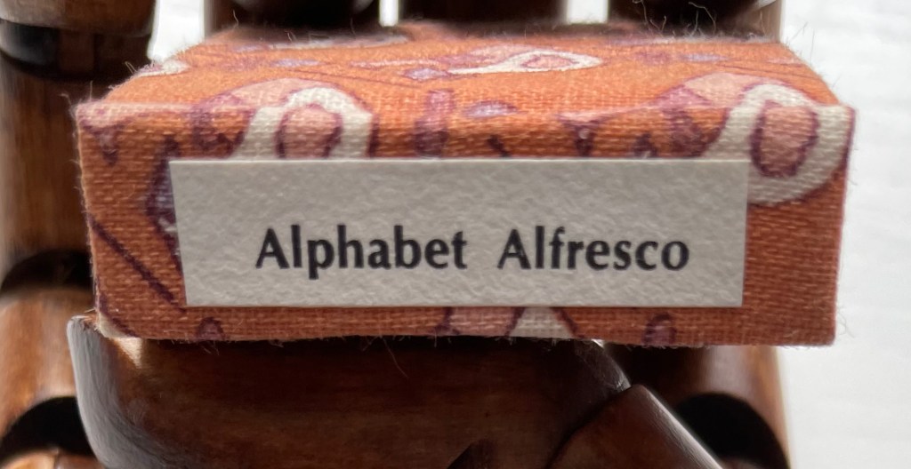
A Surrealist Alphabet (2014)

Leonard Brett
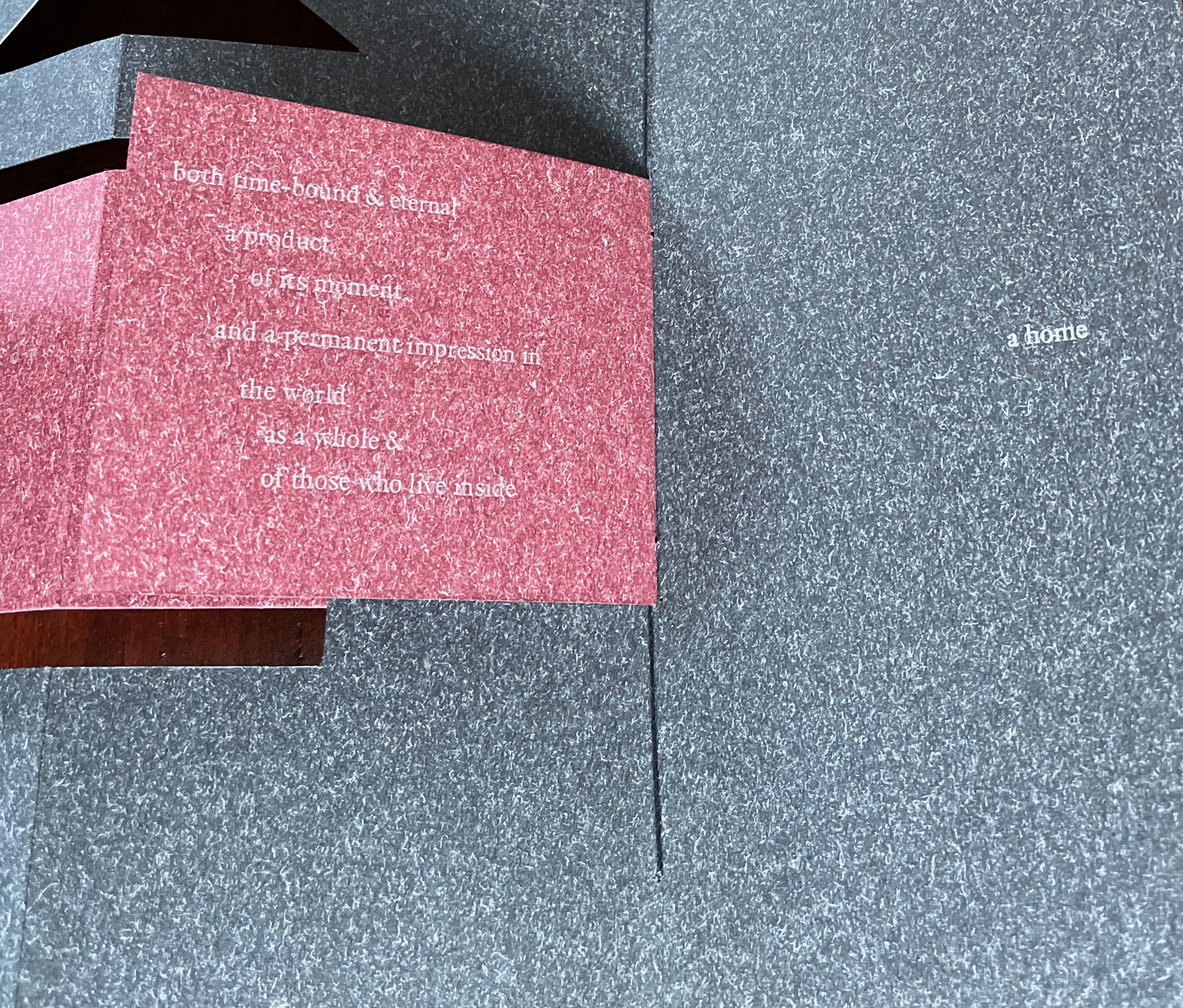
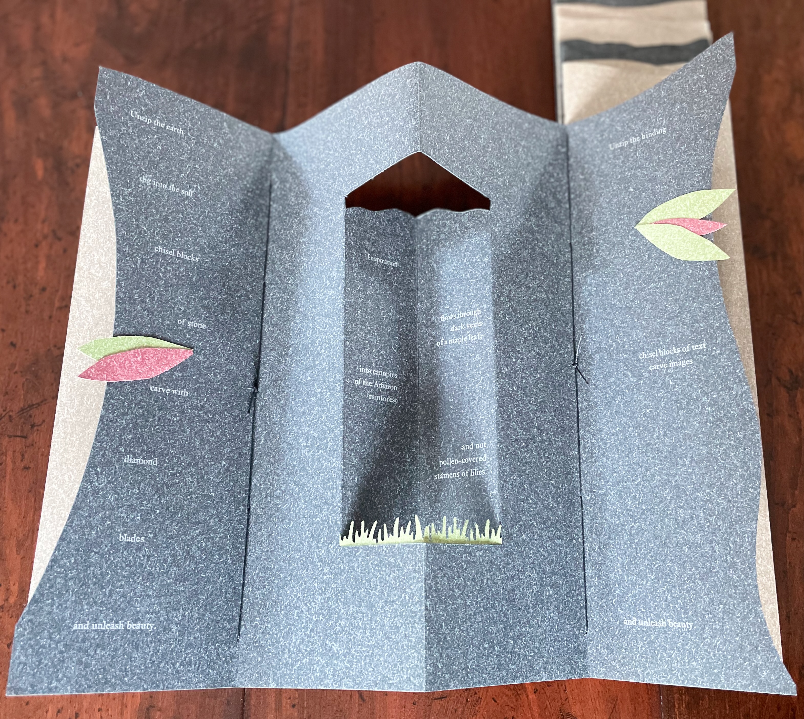
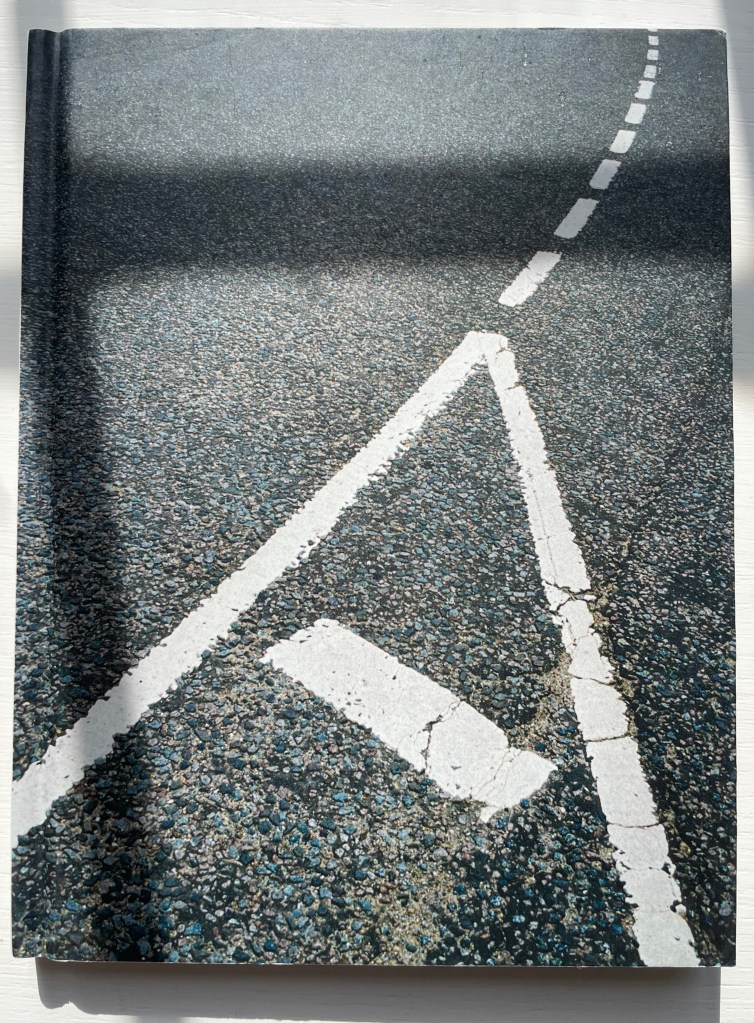
Perfect bound paperback. 216 x 280 mm. 120 pages. Acquired from Amazon.fr, 10 February 2023.
Photos: Books On Books Collection. Displayed with permission of the artist.
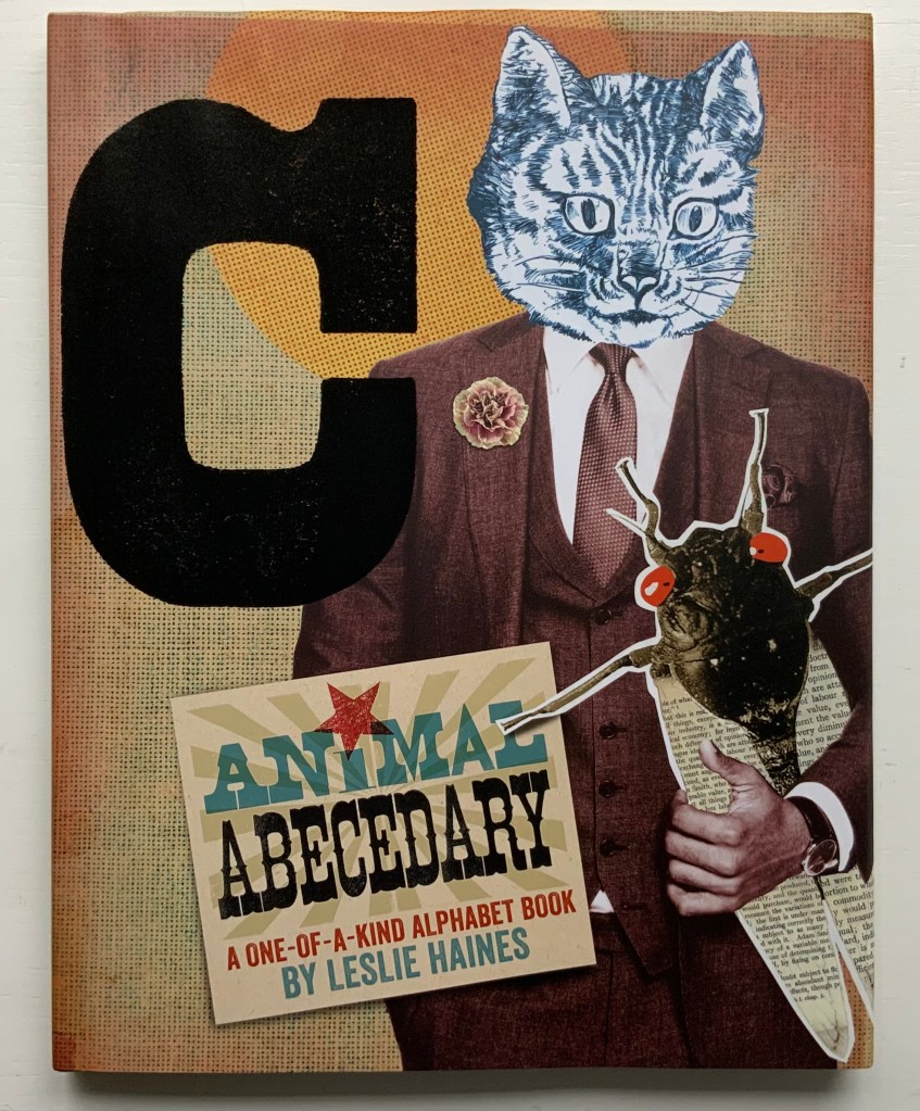
To stand out and secure a place among the several other surrealist abecedaries and alphabet books out there — such as those by Jim Avignon & Anja Lutz, Roman Cieślewicz, Jason D’Aquino, Lisa Haines, Lynn Hatzius, Peter Hutchinson, Peter Malutzki, Clément Meriguet, Paul Noble, Judy Pelikan, Rose Sanderson, Zazie Sazonoff, Paul Thurlby and Ludwig Zeller — takes considerable talent and effort. Leonard Brett’s A Surrealist Alphabet displays just that.
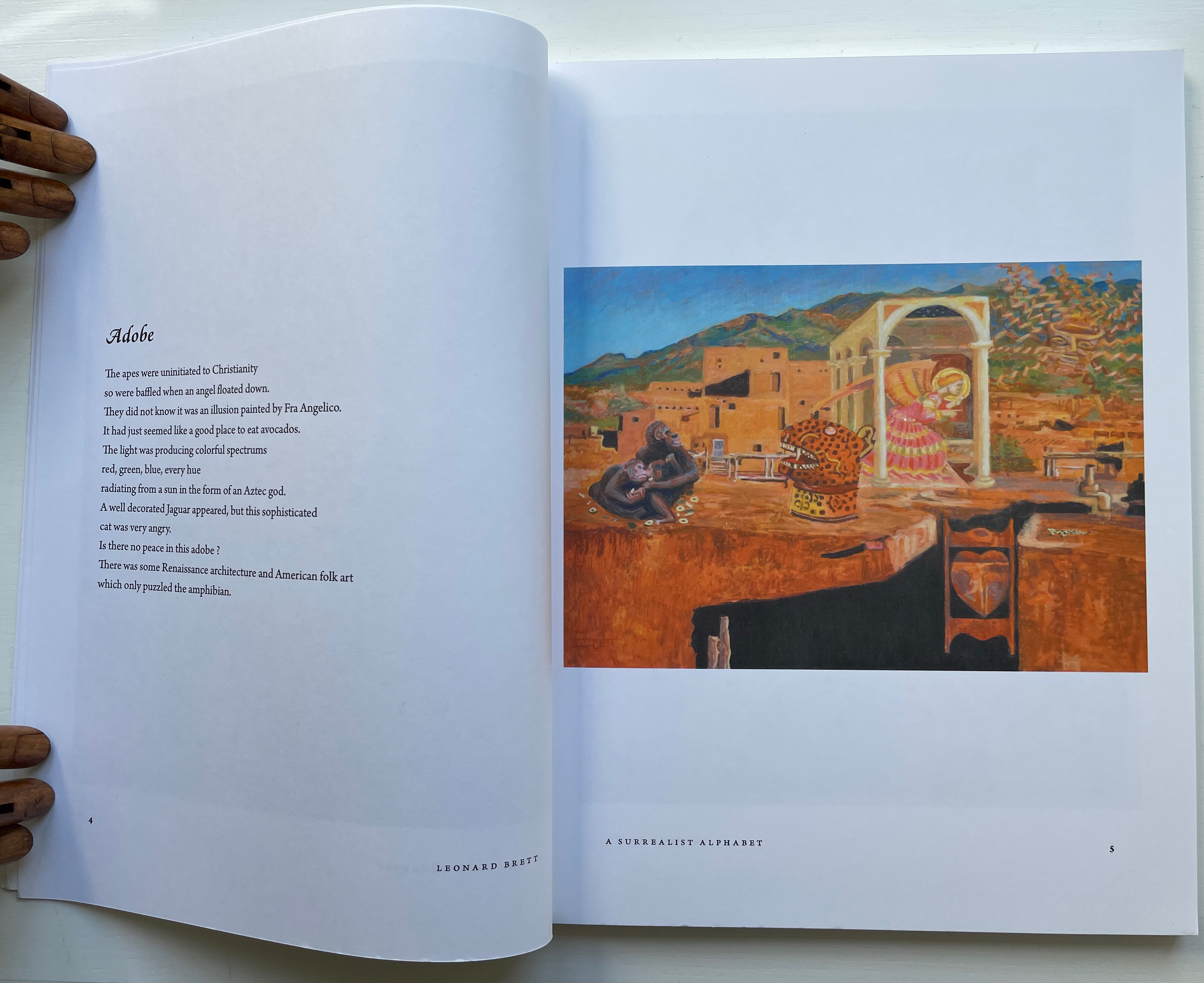
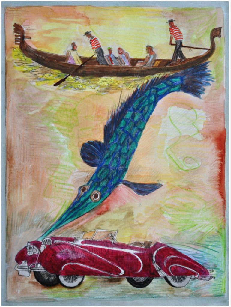
Per the artist’s statement, an interest in the aesthetics of script as visual symbol led him to the Louvre and British Museum for studies of ancient scripts — Sumerian, Egyptian, and Chinese — and to Bali, Egypt and Istanbul for inspection of contemporary scripts and sources of inspiration. Juxtaposition of that with images and text alluding to baseball teams (the Blue Jays and Orioles ), celebrities (Elvis and Marilyn Monroe), Renaissance painters (Raphael and Pisanello among others), movies and TV shows (Casablanca and X-Men) and much more leads to one of the densest and most frenetic of alphabet artists’ books in the Books On Books Collection.
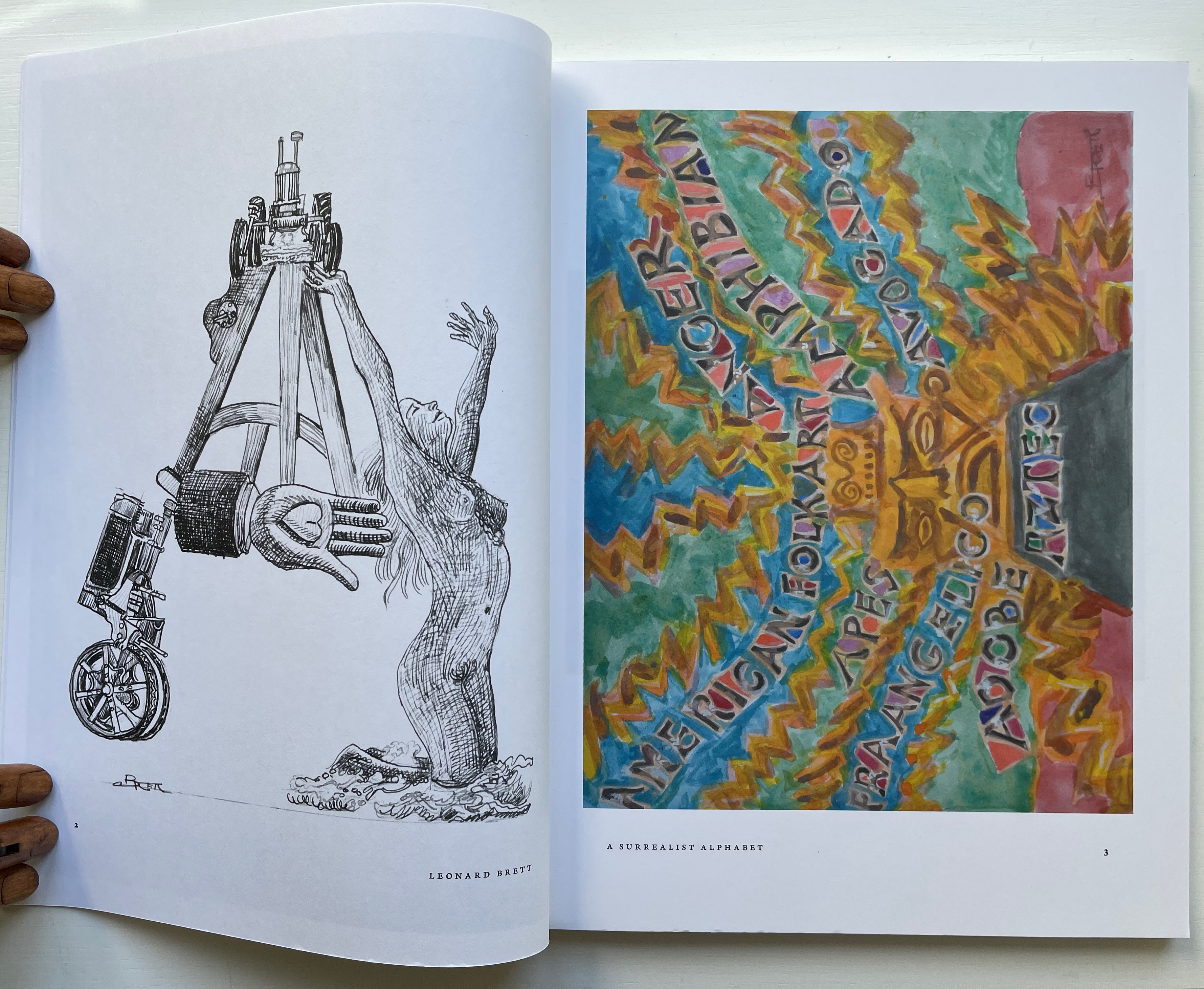
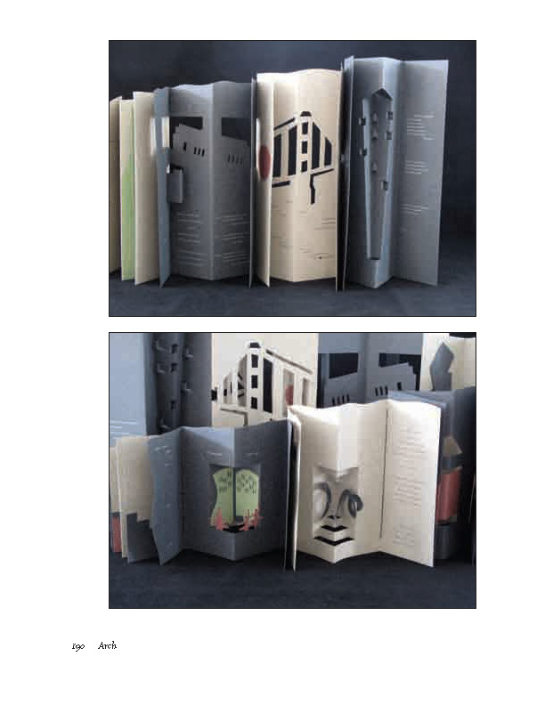
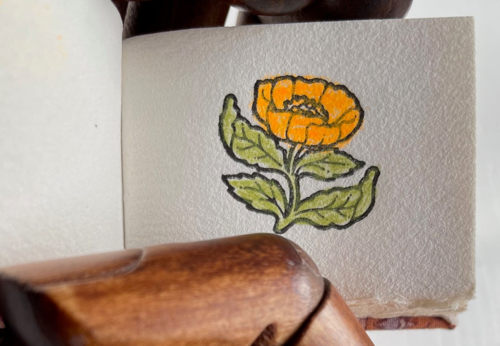
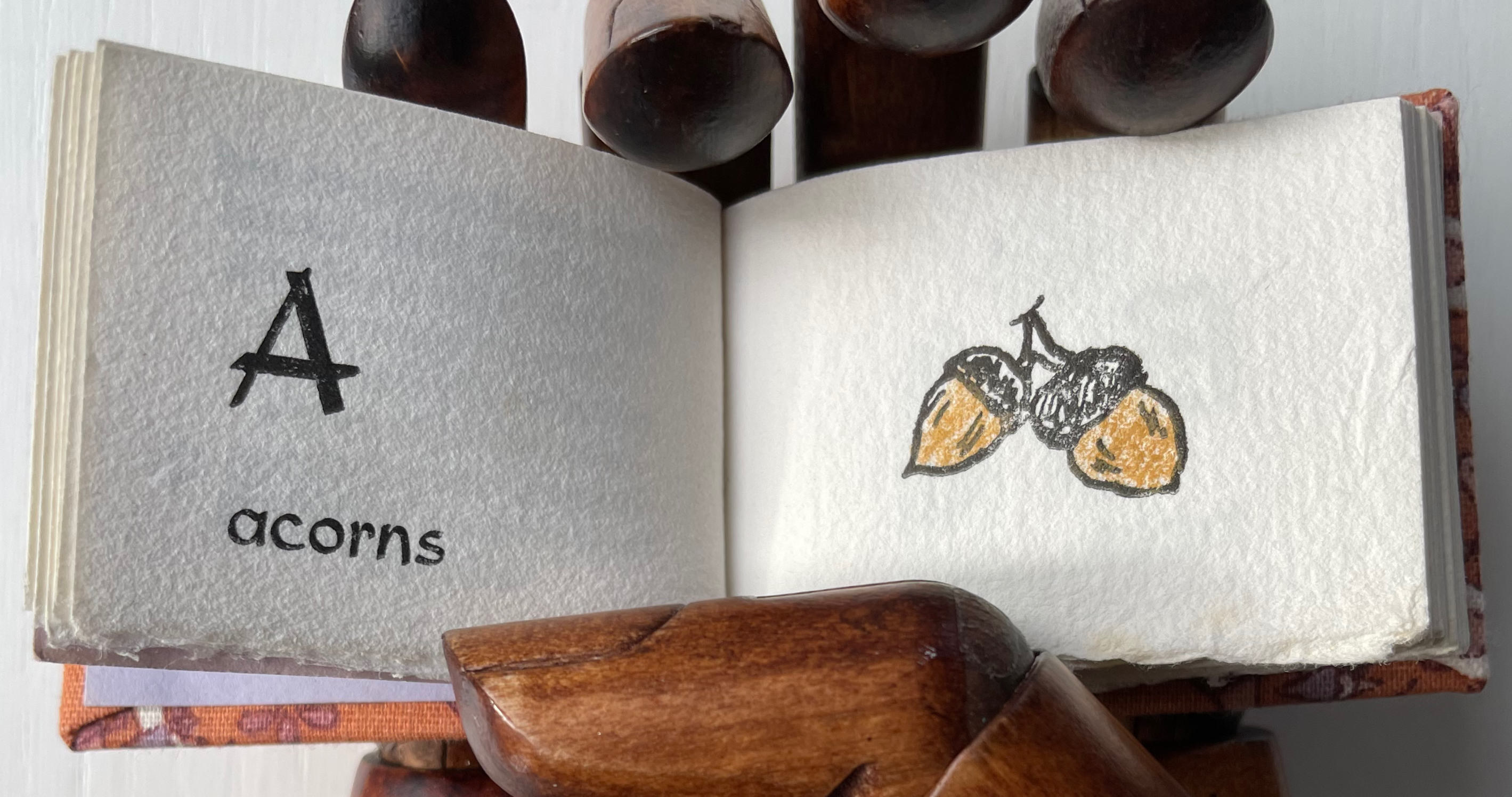
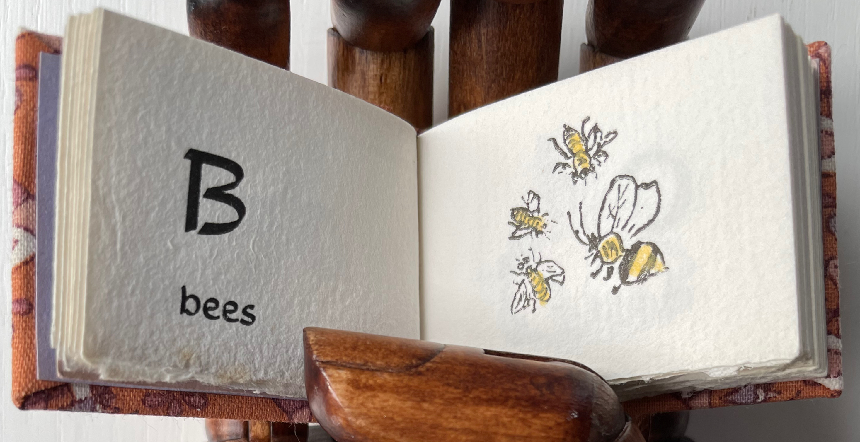
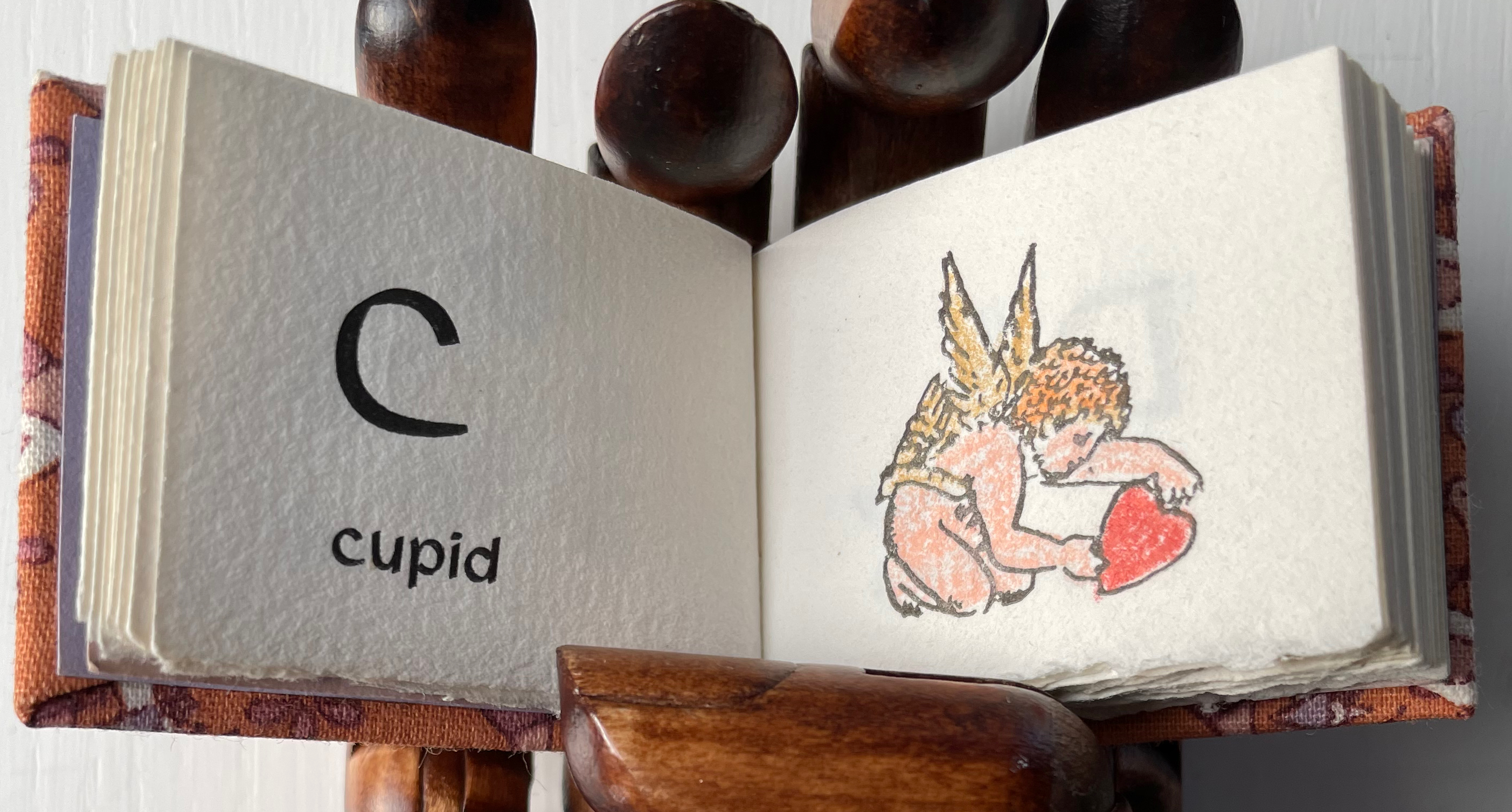
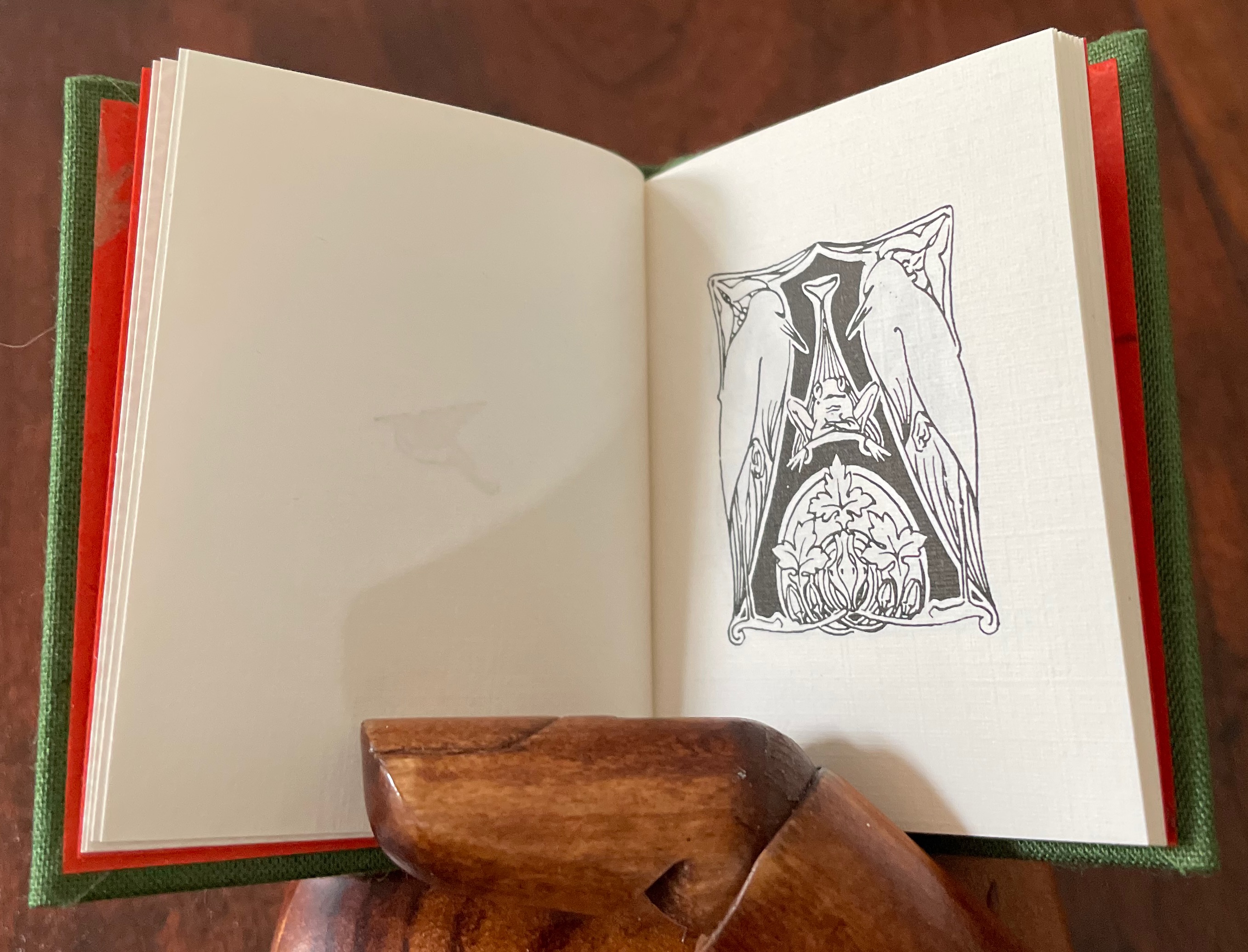
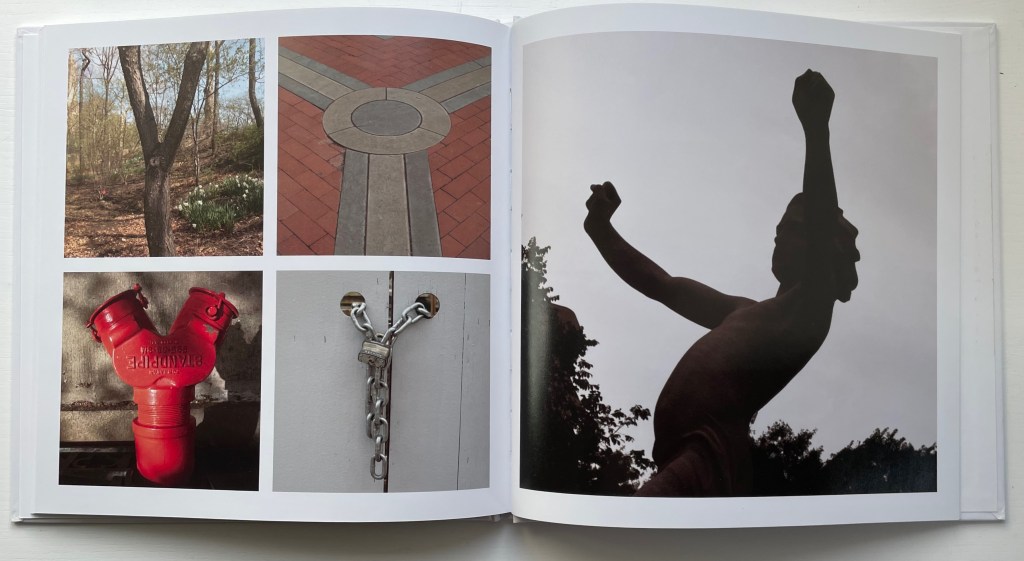
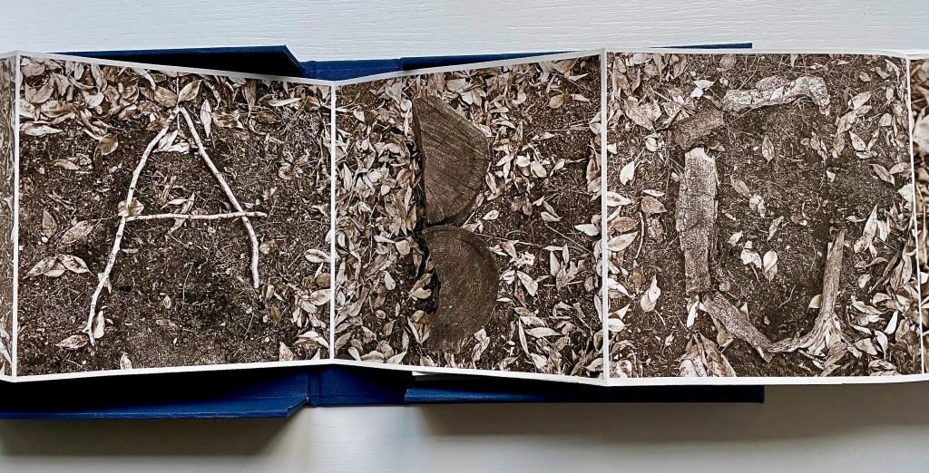
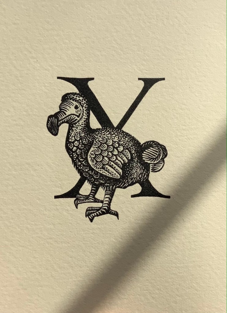
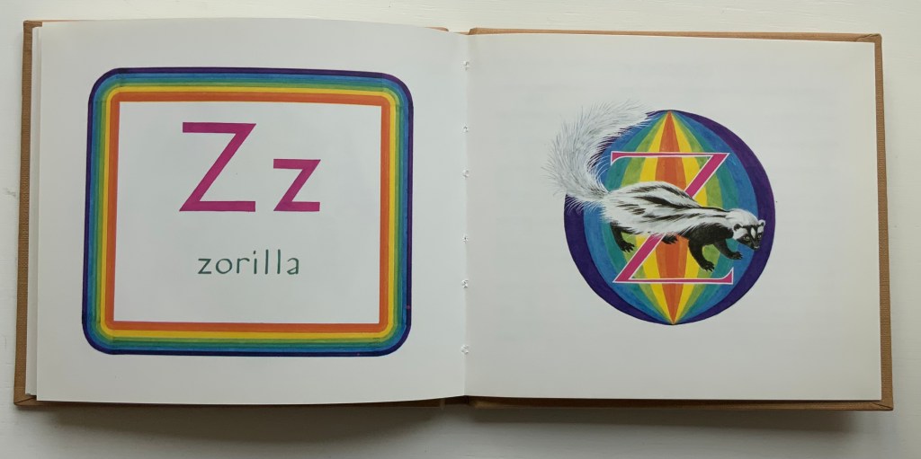
Each letter receives two double-page spreads. The first is a diptych, consisting of a black-and-white etching forming a composite letter across from a color image that may come from a watercolor or a host of other media; the second, a poem and another color image (again varying as to media) playing off the poem. The etchings and original color artwork were in an exhibition sponsored by the Sunshine Coast Arts Council in Sechelt BC, Canada,1-26 March 2017. According to the exhibition’s description, “The drawings in the book were used as a reference to produce the engravings shown in this exhibition. The engravings are done in the traditional manner using a burin to cut the plate, there is no acid used. They are inked and printed the same way as an etching on damp rag paper.”
The color treatments of A and Z suffice to show how the artworks in exhibition complemented and differed from the book. Just these letters’ two double-page spreads, however, come nowhere near the effect of unrelenting variety and creativity delivered by the volume as a whole.
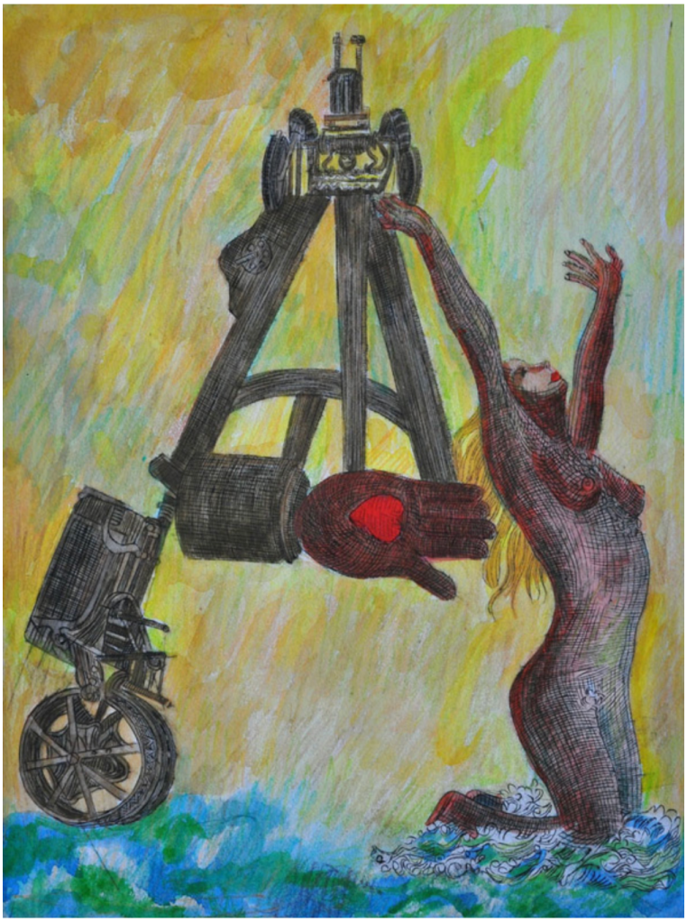
Displayed in exhibition

Displayed in exhibition
Further Reading
“Abecedaries I (in progress)“. Books On Books Collection.
“ABCs: Bookmarking Book Art”. 29 November 2015. Books On Books.
Ernst, Max, Robert Rainwater, Anne Hyde Greet, Evan M. Maurer and Vartan Gregorian. . 1986. Max Ernst : Beyond Surrealism : A Retrospective of the Artist’s Books and Prints. New York: New York Public Library : Oxford University Press.
Sunshine Coast Arts Council, 1-26 March 2017. “‘A Surrealist Alphabet’ – Leonard Brett“. Accessed 25 May 2023.


")