Ruston’s art celebrates the natural world and human spirit, inviting viewers “to follow, to unravel secrets, and to pay close attention to the world around them”.
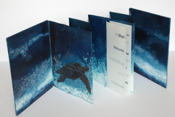
Chris Ruston She Returns (2011) 23.5cm x 18.5cm, Edition of 2
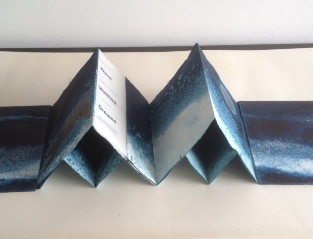
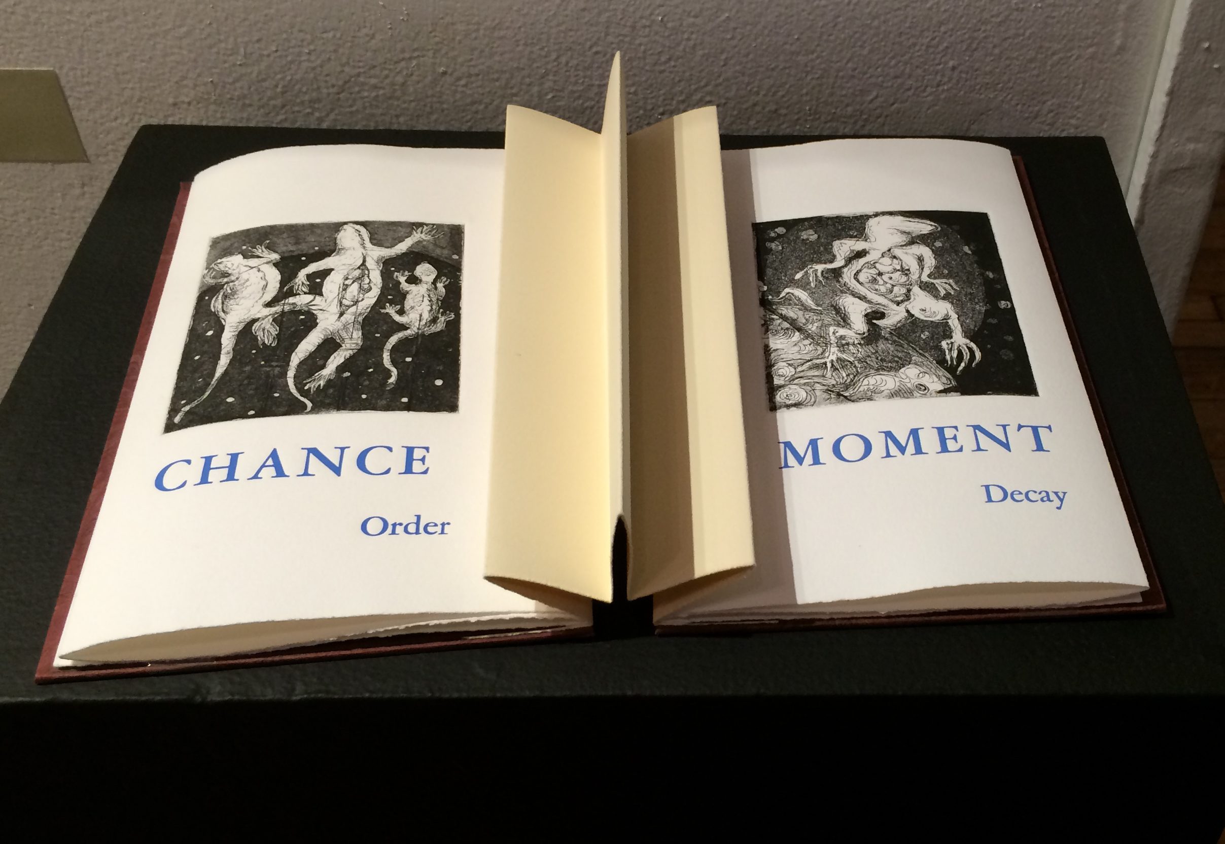
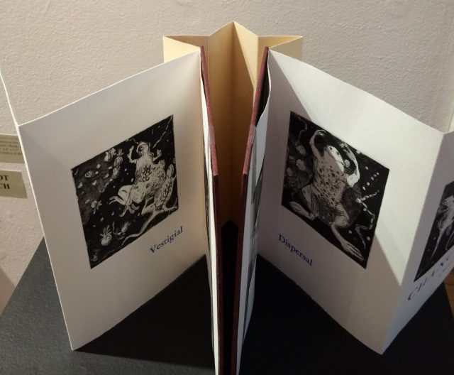
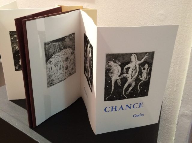
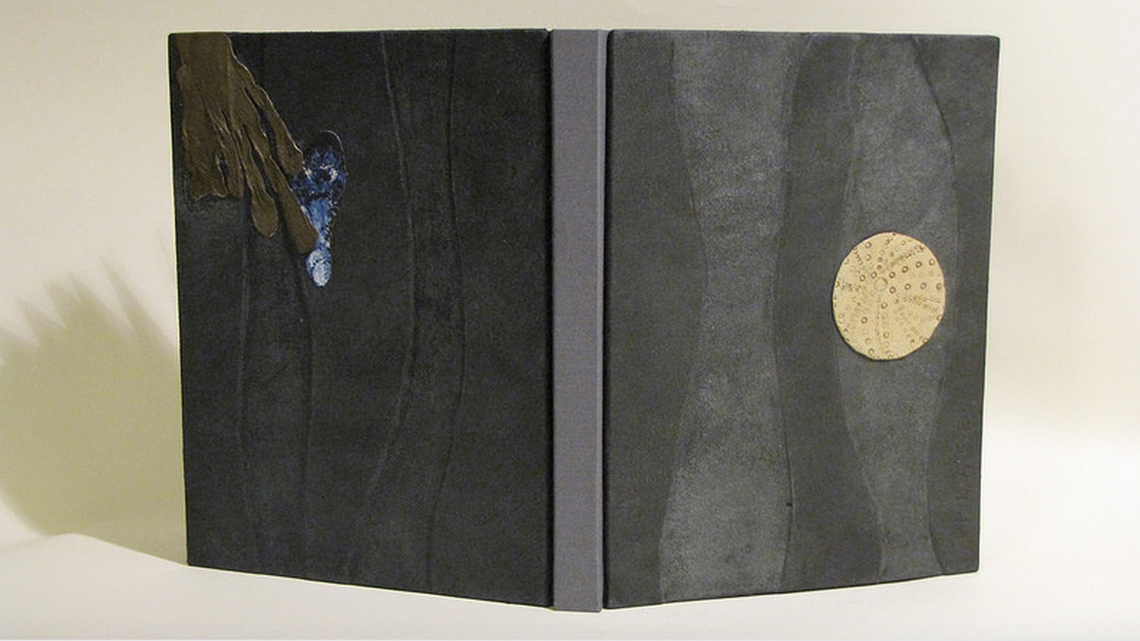
Part of a series called Ocean Blue, the book She Returns uses a double concertina fold and ink on Fabriano watercolor paper to invite us to follow the image of a leatherback turtle making its way through the deep, which fluctuates between the depth of blue-black and the shallows of blue-white. The text reads
SheReturns BLACK and GLEAMING
in the Moonlight
her Primordial needs Roaming WaveWashedDreams.
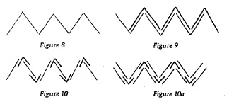
Originating from the Tang dynasty (A.D. 618-908) in China as the Orihon, the concertina fold is also called the accordion fold and sometimes the leporello*. For “She Returns”, Ruston employs a variant of the binding approach in Figure 9. It is
from Hedi Kyle, “Orihon’s Triumph: Origin and Adaptations of the Concertina Fold”, The Ampersand, Vol. 3, No. 2, December 1982.
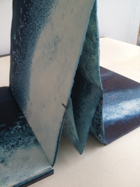
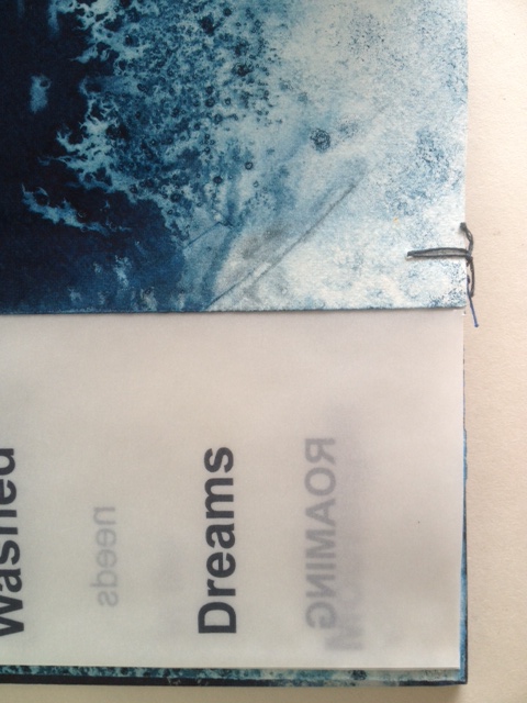
essentially two pages folded together into a concertina fold, but in origami terms, the “mountain” fold of one page is inverted to a “valley” fold, which creates “small boxes” between the pages when the concertina is opened as seen below. The single signature of transparent paper with text is sewn into the centre page. It is bound by a simple stitch top and bottom of each fold.
Painted board covers were then attached.”The stitches at the top and bottom of the page work well as it allows some small movement of the two concertina folds. As I saturate it with water and ink it needs to be a bit more robust but this means it can be bulky when put together.”
Binding detail of She ReturnsBinding detail of She ReturnsBinding detail of She Returns
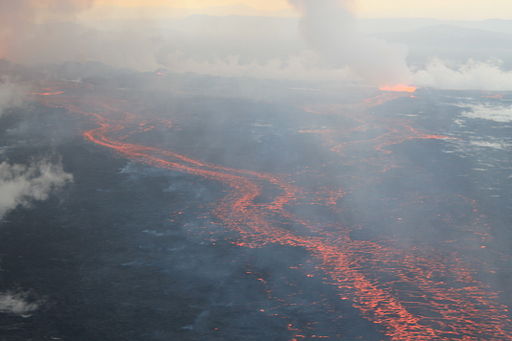
The Holuhraun lava field, on 4 September 2014, during the 2014 eruption
The Bárðarbunga volcano in Holuhraun, Iceland, is active. From August 2014 to February 2015, it erupted for 181 days.
Lava fountains of the fissure eruption in Holuhraun on 13th September 2014 around 21:20.
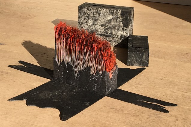
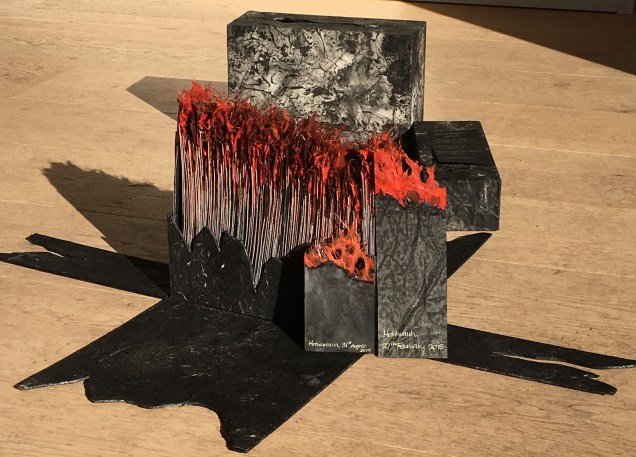
Ruston responded to that natural event with the work Holuhraun, 2014-2015.
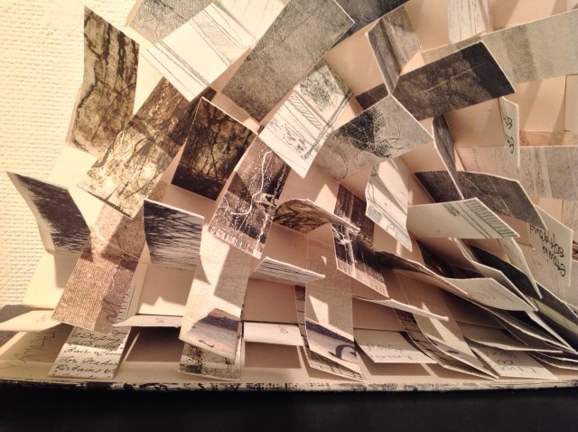
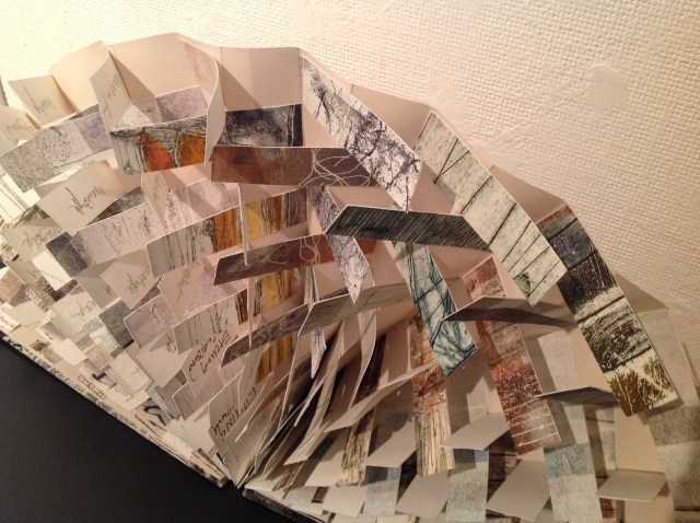
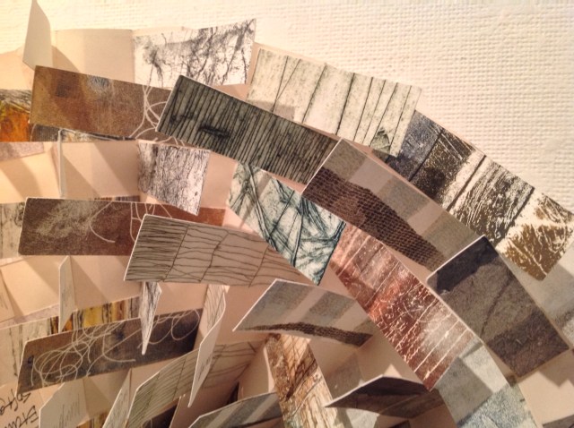
Holuhraun, 2014-2015 “The pages are contained within an exploding box structure where the sides collapse as the lid is removed.”
The box contains “181 individually painted pages, signed and dated for each day the volcano erupted producing ‘new land’.”
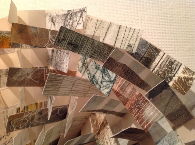
Holuhraun, 2014-2015 View of the pagesHoluhraun 2014-2015 Chris RustonHoluhraun 2014-2015 Chris RustonHoluhraun 2014-2015 Chris Ruston
Ruston’s Holuhraun reflects that duality of nature’s destructive creation and creative destruction. The sides of the box falling away mimic the volcano’s production of new land. But the work is more subtle than that; it implicates the viewers in that duality. In taking apart the closed object, we “create” or, at least, reveal another object of art.
Ice is the countervailing passion in Ruston’s art.
What a sight to wake up to on a cold winter’s morning – a blanket of thick frost over everything. Armed with camera, and a thick warm coat, I couldn’t resist taking a detour on my way to the studio. The air was still, the grasses and branches coated with ice crystals, all bathed in a soft gentle light. I spent a pleasant hour surrounded by the gentle rustle of ice crystals softly falling to the ground. (12/12/2012)
In response to her natural surroundings, as well as powerful films such as James Balog’s Chasing Ice (PBS, Nova, 2102) and installations like Olafur Eliasson’s Your Waste of Time (MoMA, New York, 2013), Ruston created Are We Listening?, a work of small pieces of handmade paper into which random text is incorporated and overlaid with transparent paper. Human time and earth time, destruction and creation, recurrently emerge as central themes in Ruston’s art whether touched by fire or ice.
Chris Ruston Are We Listening? (2013) Handmade paper, ink, transparent paper 15cm x 10cm
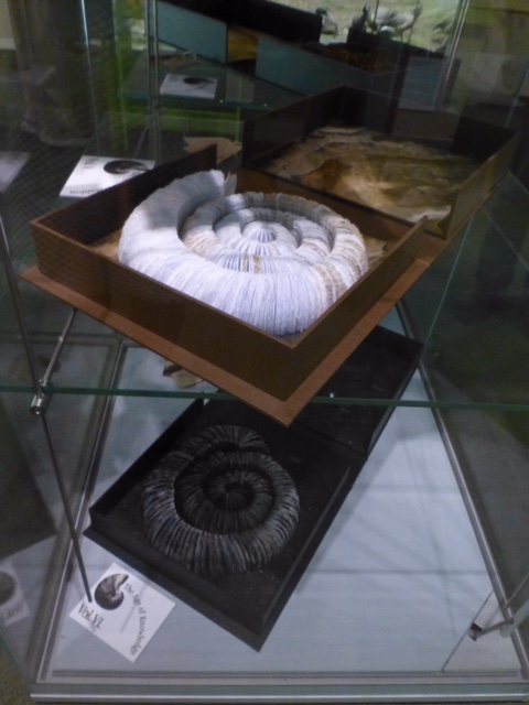
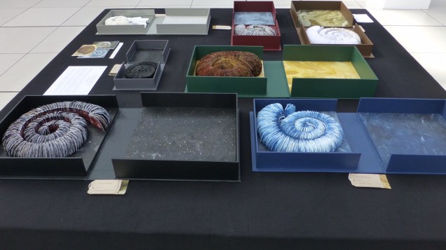
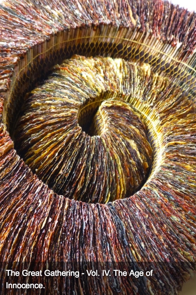
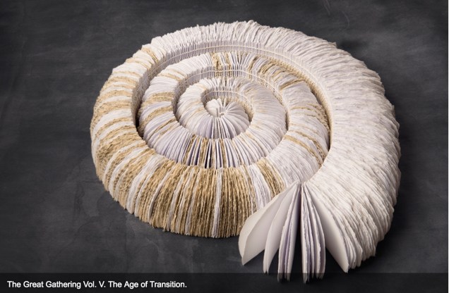
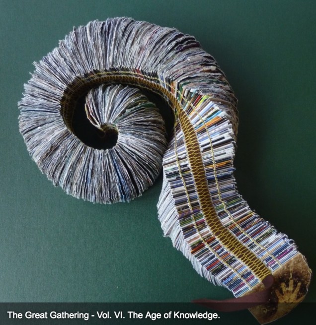
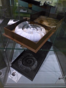
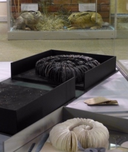
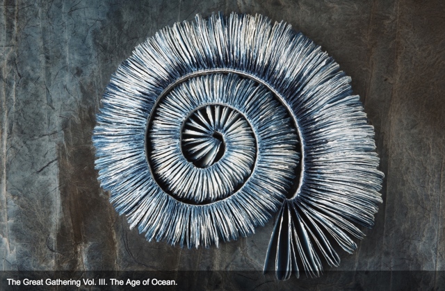
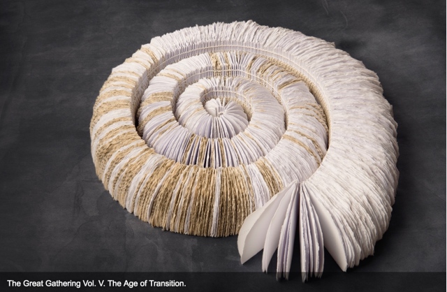
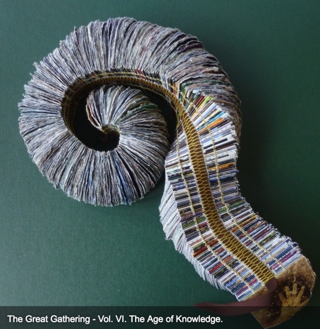
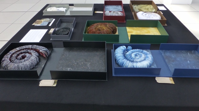
In capturing these themes, The Great Gathering (2015) may be Ruston’s masterpiece — so far — in making visible how the world touches us, and how we touch the world. In this work, she has drawn her inspiration from ammonite fossils on display in the Sedgwick Museum of Earth Sciences, Cambridge, and the Colchester Natural History Museum. The Great Gathering first appeared as an installation at the Colchester Natural History Museum, which is housed fittingly — especially for this work — in a deconsecrated church.
The Great Gathering, Seven books, seven moments in time (2015) Natural History Museum, Colchester, Essex, England Photo credit: Chris RustonChris Ruston The Great Gathering, Seven books, seven moments in time (2015) On display at Turn the Page, Norwich, England, May 2016 Photo credit: Chris Ruston
Ruston writes:
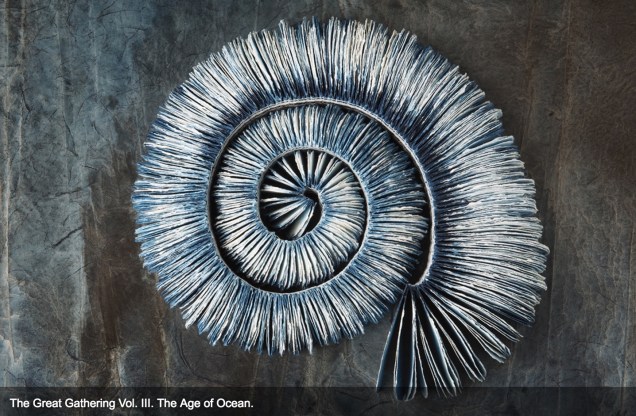
Using the ammonites spiral shape as a starting point, these books represent the unfolding story of evolution. The humble ammonite is an abundant index fossil, easily recognised, and a regular feature in museum collections. Often associated with journeys, symbolically these particular fossils are believed to have absorbed the knowledge of the Universe from across the centuries.
Science and art are the presiding geniuses over many works of book art.
In The sciences of the artificial (1969), Herbert Simon emphasized: “The natural sciences are concerned with the way things are” and engineering, with the way things ought to be to attain goals. Like the scientist, the artist, too, is concerned with the way things are. They are the raw material with which the artist works or to which he or she responds. But like the engineer or the designer, the artist is concerned with the way things ought to be to make visible “the way things are”:
The Great Gathering (2016) Chris Ruston Photo credit: Chris Matthews
how a solander box ought to be constructed to operate with the work and, in enclosing it, be “the work”;
The Great Gathering (2016) Chris Ruston Photo credit: Chris Matthews
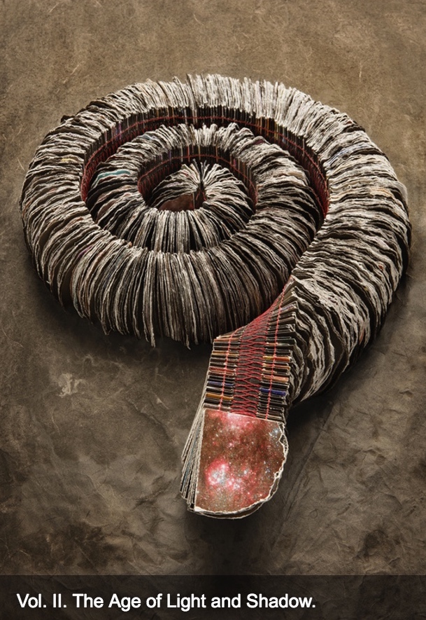
what materials (photos from the Hubble telescope) ought to be used to reflect a moment in time;
The Great Gathering (2016) Chris Ruston Photo credit: Chris Matthews
how thread, tape and stitch ought to be to hold together a spine that will flex and spiral into the shape of a fossil;
The Great Gathering (2016) Chris Ruston Photo credit: Chris Matthews
how the color of the material ought to be juxtaposed with the material’s altered shape to carry meaning;
The Great Gathering (2016) Chris Ruston Photo credit: Chris Matthews
how the shift from content to blankness ought to be juxtaposed with the material’s altered shape to carry meaning;
The Great Gathering (2016) Chris Ruston Photo credit: Chris Matthews
how the selection and alteration of text ought to be made to show the fixity and flux of knowledge and ourselves;
The Great Gathering (2016) Chris Ruston Photo credit: Chris Matthews
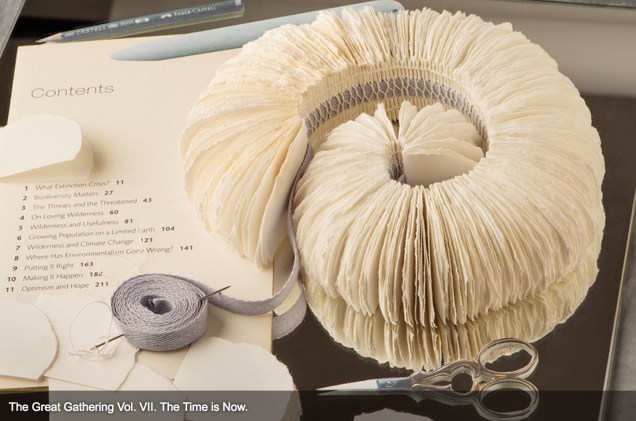
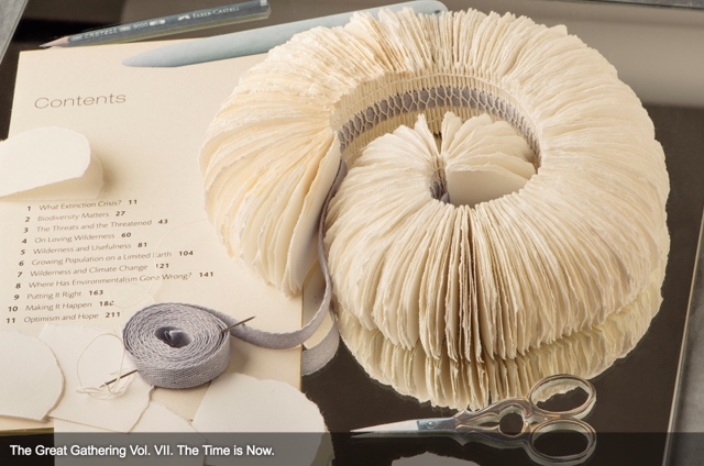
and how our reflection in the mirror in Volume VII under the maker’s tools and the made thing ought to implicate us — a theme echoed above by Holuhraun, 2014-2015 — in an ongoing process of making and remaking.
For her next invitation to the viewer to follow, unravel secrets and attend closely, Ruston is returning to the ocean.
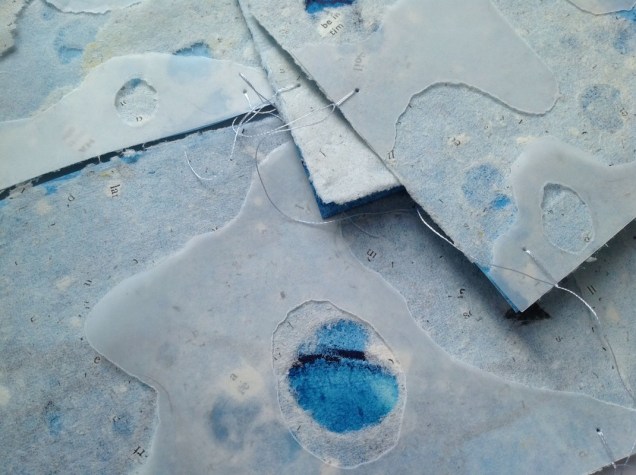
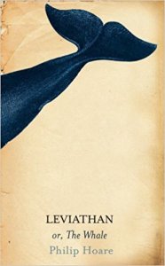
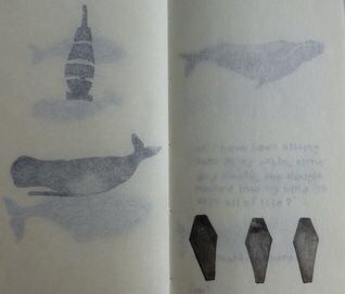
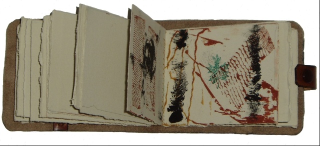
Inspired by Philip Hoare’s Leviathan and his fascination with Melville’s Moby Dick, Ruston recently began research into whales and whaling logs for her next work. Like evolution, here is a subject of grandeur, expanse and time, even fire and ice. The sketchbook pages below tantalize. How will the artist, this time, make visible how the world touches us?
*In Mozart’s opera Don Giovanni, the main character’s manservant is Leporello, who, when singing the Catalogue Aria, produces a book that endlessly unfolds the list of Don Giovanni’s conquests.
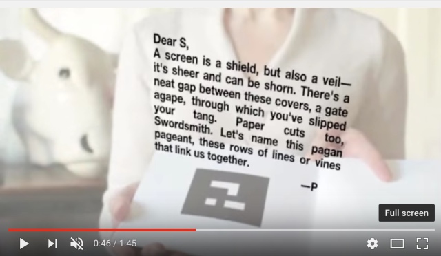
Between Page and Screen (2012) Amaranth Borsuk and Brad Bouse Website: Accessed 16 May 2014. Book: Perfect bound, H178 x W179 mm, 44 pages. Acquired 16 May 2014.
Between Page and Screen chronicles a love affair between the characters, P and S…. The book has no words, only inscrutable black and white geometric patterns that — when seen by a webcam — conjure the written word. Reflected on screen, the reader sees himself with open book in hand, language springing alive and shape-shifting with each turn of the page. The story unfolds through a playful and cryptic exchange of letters between P and S as they struggle to define their relationship. Rich with innuendo, anagrams, etymological and sonic affinities between words, Between Page and Screen revels in language and the act of reading.Publisher’s description.
The finitude of a bound codex quite literally defines its limits in analogue form. Even … gesturing outward to the world of lived and imagined phenomena that comprise a shared realm of cultural knowledge, the book’s dimensions remain linked to its physical form. But where is such a book located in the spatial-temporal realms of networked environments? And when is a work produced? … Borsuk and Bouse’s depends on a linked connection between quick response (QR) codes on pages and files stored online. The capacity to conjure stored material that projects itself in augmented screens onto the perceived world further erodes the boundaries of interior/exterior edge and periphery that were traditionally defining features of an aesthetic work.
Between Page and Screen has been displayed in exhibitions such as “The Art of Reading (18 November 2017 — 4 March 2018)” held at the Meermanno Museum in The Hague. Unusually, at that exhibition, the art was not simply on display. Touching was allowed. Paul van Capelleveen, one of the curators organizing the show, insisted that each work be touchable. As a curator at the Dutch national library and advisor to the Meermanno, he felt strongly that the challenges of multimodal literacy cannot be understood “under glass”. Apparently, the market agrees: Between Page and Screen is now in its second edition.
Further Reading
Created for the November 2016 issue of The Bellingham Review, “Abra: The Kinetic Page” is a polymorphic tour de force – online prose poem, video, review of and homage to an installation at the Henry Art Gallery in Seattle, WA, in 2014 and a promotion of the artists’ book Abra: The Living Bookby Kate Durbin, Amaranth Borsuk and Ian Hatcher, published in 2014.
From where did such work spring? From a project called “Expanded Artists’ Books: Envisioning the Future of the Book”. Inspired by the advent of the iPad in 2009 and a symposium held in 2011 with Bob Stein, Director of the Institute for the Future of the Book, Steve Woodall, then Director of Columbia College’s Center for Book and Paper Arts, secured funding for that project from the National Endowment for the Arts in 2012. Woodall later explained the intent of the project in that same workshop where Johanna Drucker drew attention to Between Page and Screen:
In its first phase, our project takes existing artist books and creates iPad applications that both represent and contextualise them. The apps will be made available as free downloads. With the many millions of portable devices running on the iOS platform, the reasoning goes that an under-distributed and too-obscure art form can gain wider reach and achieve greater public awareness. We will soon expand to include Android and other platforms, but we expect to stay within the ‘walled garden’ world of the app, as opposed to the open range of a purely browser-based platform – we feel that the smoother functionality and higher-quality user experience of the app work well with the expanded practices of authorship and craft engagement that define artist books.
In the project’s second phase we shall commission media artists to create born-digital artist book/apps, which will then be reverse engineered as physical books, or created in parallel with them. Owing to the creative countercharge it represents, we find this to be an extremely interesting phase of the project from a research standpoint.
…
It is the dialogue between the physical books and their digital avatars that provides a great part of the value of this project. … it is in the artist’s studio, whether that be an electronic workstation or a more traditional book art studio, where the dialogue will play out in the creative process. Artists will explore ways in which expression can take both virtual and physical manifestations, examining the advantages of each and how the interplay between the two can be leveraged to provide a comprehensive and powerful expression. Woodall, “Artists, Writers and the Future of the Book“.
Abra was funded by a grant from this project, and with Abra, Borsuk, Durbin and Hatcher have manifestly “embodied” the sponsor’s intent as will become clear as you read. But pause first on Borsuk’s Bellingham Review piece.
Borsuk is an inspired writer, a gifted conceptual and haptic artist. “Abra: The Kinetic Page” starts as a reflection on experiencing Ann Hamilton’s installation the common SENSE with its exploration and celebration of “touch”:
As I walked through the upper galleries, where newsprint images of the undersides of birds and small animals fluttered in the HVAC breeze, I thought about the way the exhibit invited us to read space. Hamilton’s juxtapositions, like the lines of a poem, rely on the visitor to bridge the between with their body. We provide the spark that leaps across the enjambed line where the tale of Cock Robin meets a downy hide.
○
I’ve strayed from what I wanted to tell you because Hamilton’s work requires it. It is, as she says, a form of attention she seeks to share with her audience—she creates installations as spaces animated by the viewer. She sets up the conditions for an experience or interaction, and then withdraws, trusting the reader / viewer / visitor to make meaning. To limn the contours of the work with their own gentle touch.
○ [Now note here how she pivots to experiencing Abra.]
As I trace my finger along Abra’s cover, whose title is also the incipit, silently voiced by the reader, which activates the text, I’m invoking not only the magic word that brings things to pass as they are spoken, I’m invoking Hamilton, whose “handseeing” videos of the late 90s and early 2000s turn the fingertip into an eye, uniting reading and writing in a gesture that links dactyl and stylus, through the digital that fits like pen in glove.
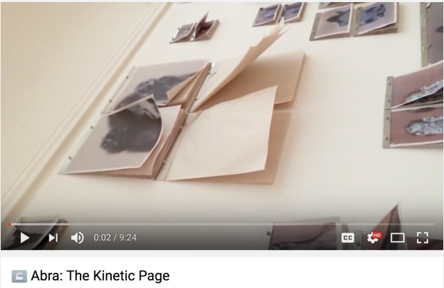
Whether read on screen or heard in the video, Borsuk’s words and sentences are tactile. Listen:
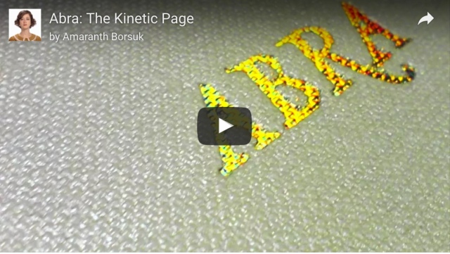
Click on the image above for the video “Abra: The Kinetic Page” by Amaranth Borsuk
“Abra: The Kinetic Page” explores and celebrates the “fundamental relationship between the eye, the brain, and, critically, the hand” as Woodall hoped. It is a work of art as much as Abra itself.
If its artistry were not enough, The Bellingham Review piece takes things a bit further than might have been expected from the “Expanded Artists’ Book” project. Interestingly, The Bellingham Review piece also addresses changes in the value chain that hybrid books and hybrid book art must confront. As originally set out by Harvard’s Michael Porter, the value chain is the “set of activities that a firm operating in a specific industry performs in order to deliver a valuable product or service for the market.” Marketing is one of those key activities in the set. In The Bellingham Review, an online and print literary magazine, Borsuk has found not only a platform for marketing Abra, but a platform from which to offer a complementary work of art in the form of a video. An example of “art for art’s sake” that finally makes sense to the business school.
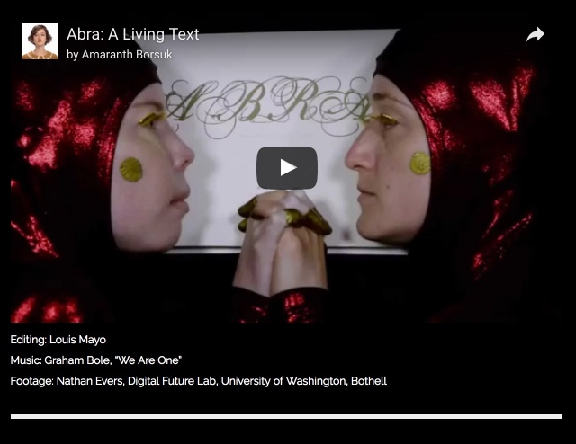
The example does not end there. Reflecting in the Tate Britain workshop on the “Expanded Artist Book” project, Woodall remarked on “digitally trained designers … being drawn back to the fundamental relationship between the eye, the brain, and, critically, the hand, … photographers … combining digital processes with nineteenth-century ‘alternative’ techniques. … [and] … the enthusiasm most contemporary graphic designers have for letterpress printing.” Web skills, videographics and the YouTube/Vimeo channels are just as remarkably important, which is clear not only from the Abrasite, The Bellingham Review piece but from this shorter directly promotional video:
Abra: A Living Text Video editing by Louis Mayo Shot by Nathan Evers at the Digital Future Lab, University of Washington, Bothell Music: Graham Bole, “We Are One”
Woodall did wonder whether the project’s prompting a dialogue of the physical and digital would have implications for practical matters such as distribution. While Abra has a paperback version as an entry in the traditional channels to market, that offers little insight into such implications — not like the insight realized by the combination of website, promotional video and The Bellingham Review piece.
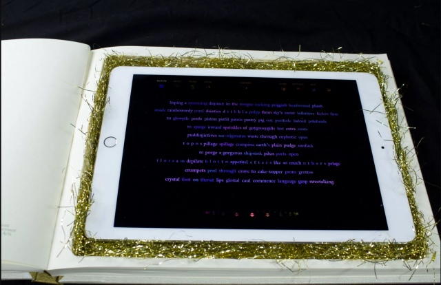
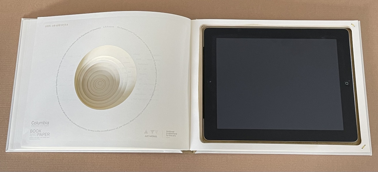
In fact, from a perspective of craft and product, the experience promised by the videos and website is completely available only if you download the app and have a copy of the limited edition of the artists’ book. Constructed by Amy Rabas, the artists’ book allows you to insert an iPad in the back of the book creating a continuous touch-screen interface. This interactivity with the reader is one more aspect of the work that realizes perhaps more than was expected from the “Expanded Artists’ Book” project.
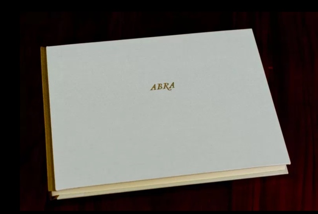
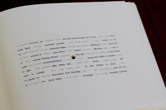
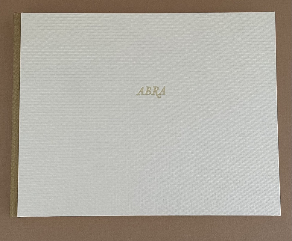
The book’s simple, mysterious foil-stamped cover. Created by book artist Amy Rabas. Courtesy of the artists.
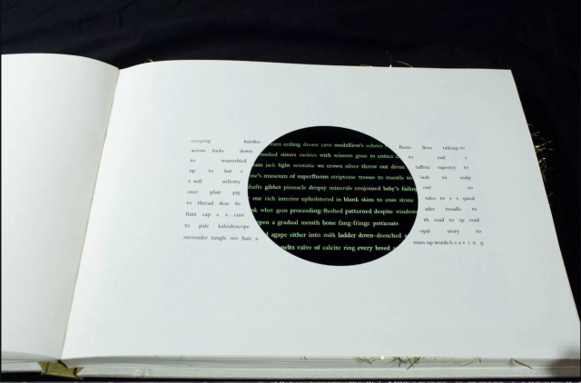
The laser-cut openings coalesce into a pinhole that begins to reveal the iPad below. Courtesy of the artists.
Readers can begin to interact with the iPad, on which the book’s text is mutating on its own. Courtesy of the artists.
At the end of the book, the iPad is revealed, and the reader can make Abra their own using the menu at the top of the screen to “Mutate,” “Erase,” “Graft,” “Prune,” and cast an unpredictable “Cadabra” spell. Courtesy of the artists.
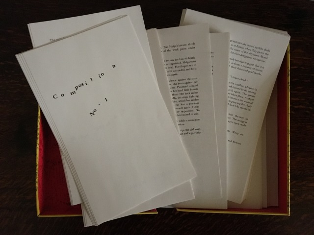
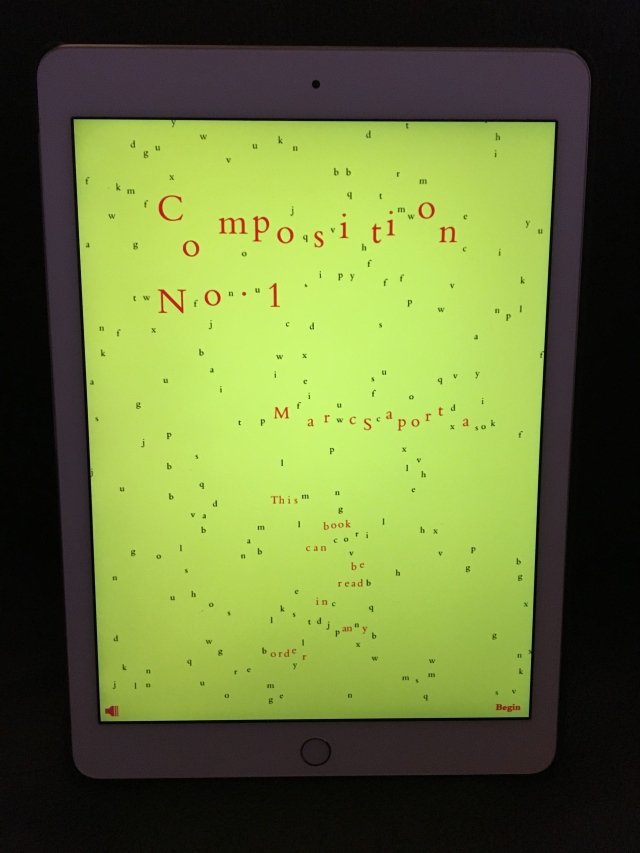
With its poems mutating on the iPad screen, Abra challenges the play with boundedness beyond the effect Drucker explained when describing Between Page and Screen in 2012. In its digital challenge to boundedness, Abra has much in common with Visual Editions’ reimagining of Marc Saporta’s Composition No. 1 in an app format. The original work was published by Le Seuil in 1962 and translated by Richard Howard for Simon & Schuster the next year.
Marc Saporta Composition No. 1 Translated by Richard Howard Redesigned and reissued by Visual Editions (2011). Photo: Books On Books Collection.
Composition No. 1 (the app) Marc Saporta, Composition No. 1 Diagrams by Salvador Plascencia, Designed by Universal Everything (2011). Photo: Books On Books Collection.
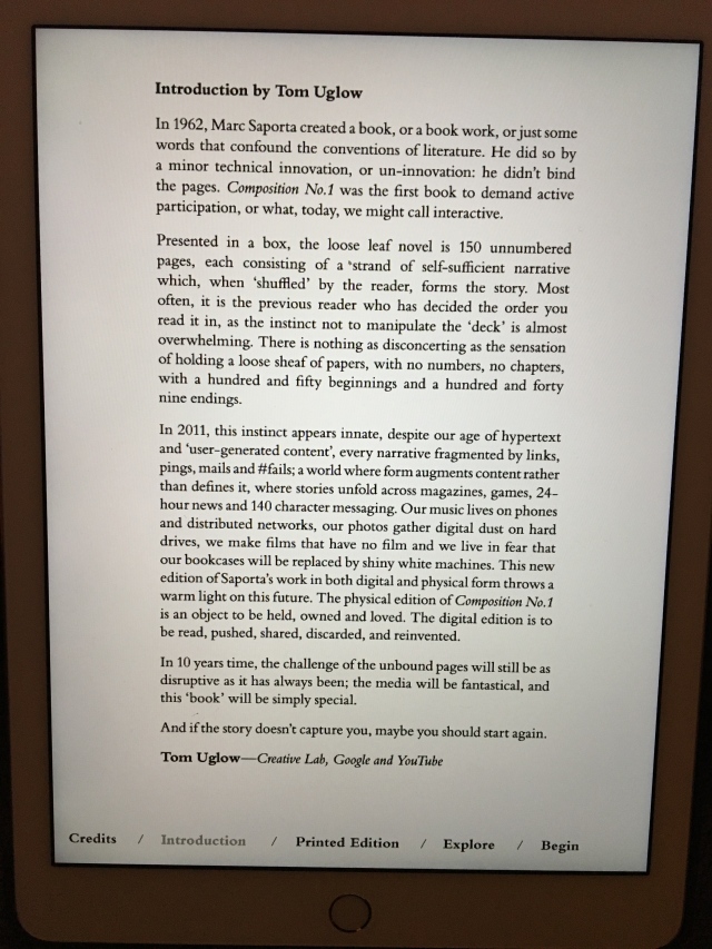
Introduction by T.L. Uglow, Google Creative Lab and YouTube (2011). Photo: Books On Books Collection.
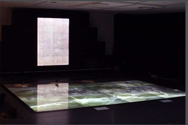
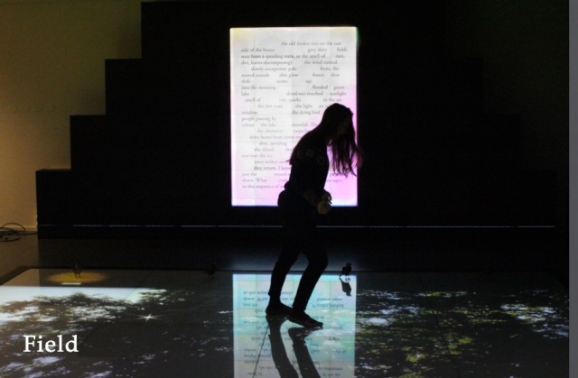
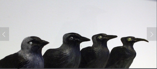
The unboundedness of Abra also has echoes in Field, the book, visual art and installation all in one produced by Johannes Heldén about the same time as Abra and The Bellingham Review piece. Field‘s interactivity, however, relies on a floor touchscreen of 20 square meters, one effect of which is to remove words from pages projected on a screen and another to animate a series of sculptural mutations of the Eurasian Jackdaw. The ephemerality of an installation combined with the effective of personal interactivity intensifies the challenge and play of unboundedness.
Johannes Heldén Field (2015) Produced and premiered at HUMlab, Umeå University. Screenshot: Courtesy of the artist.
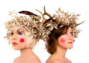
Which brings us full circle to the installation-inspired “Abra: The Kinetic Page” and the last aspect of Abra: The Living Text that carries it beyond the expectations of the “Expanded Artists’ Book”. The work began as a collaborative book-length poem between Borsuk and Durbin. Writing separately using a series of constraints, then weaving their words together and editing them side by side, the authors found a new voice emerging from the conjoined poem, that of ABRA herself. To give a body to that voice, they created a series of conjoined costumes, each an avatar reflecting various aspects of the poems.
Abra Woodnymph Courtesy of the artists.
When I hear sad tales of “The End of Books“, I think of these artists and authors and the distances between them – Borsuk in Washington State, Durbin in southern California, Hatcher in New York, Hamilton in Ohio, Rabas and Woodall in Illinois and Heldén in Sweden. Then I look at the distance between my finger and screen, between my hand and the copy of Borsuk’s Between Page and Screen lying on the table here. Those sad tales fade before the palpable vibrancy of book art and the transformative effect of the digital.
Abra features in Anne Royston’s piece on the media-bending of book art today at the College Book Art Association’s site.
See also Borsuk’s “Books and Bodies“, Cuaderno Waldhuter, August 2020. Accessed 25 September 2020.
And finally, see Borsuk’s The Book (MIT Press, 2018).
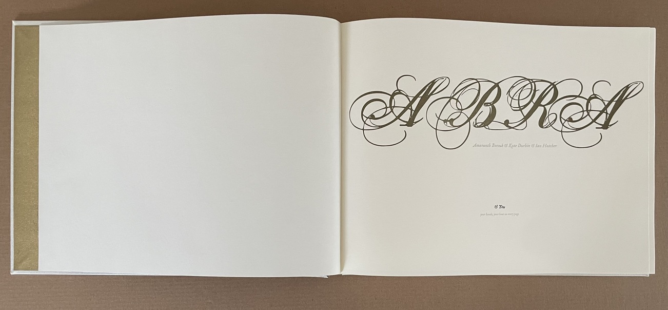
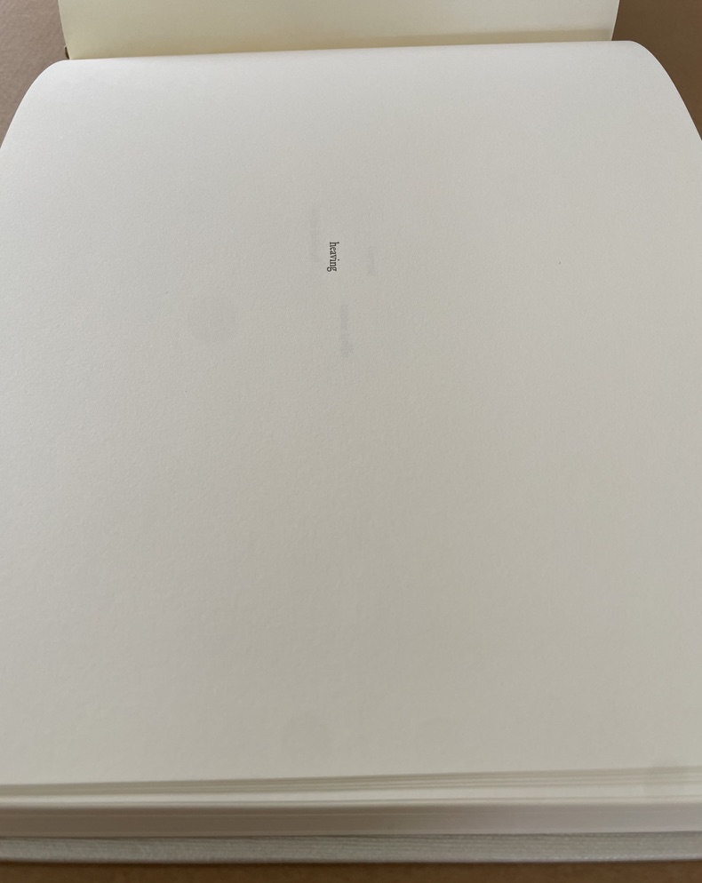
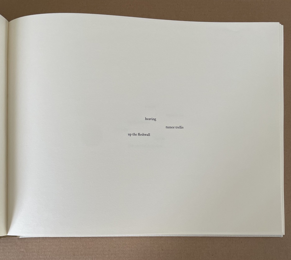
Images of ABRA from Books On Books Collection (not including iPad app)
Among the several artists displaying works at The Riverside Gallery was Pauline Rafal.
Inspired by poetry and literature, and influenced by the tangible qualities of paper and print, my work focuses on linocuts, and pen and ink illustrations displayed either as individual artworks, or as artist’s books. The artist’s books vary in form, ranging from simple concertina folds to more sculptural pieces, with the aim of creating a journey for the reader, and encouraging a more intimate relationship with the words.
The experience of touching, folding, and opening a book plays an important role in my work – letterpress and linocut techniques matched with materials such as fine papers, Japanese tissue, or leather support the portrayed stories through their individual tactile characteristics.
Key themes that reappear throughout my work include reflections on the creative practice and artistic processes, the artist’s relationship with their creation, and memories and experiences of change.
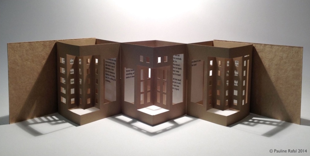
In 2015, Rafal created a book art installation to accompany a piano recital by Annie Yim, an event that illustrates an unusual integration of literature, book art and music. (More here.) The year before, inspired by the prose poem “Windows” by Baudelaire, Rafal demonstrated yet another unusual bridging of artistic media and technique.
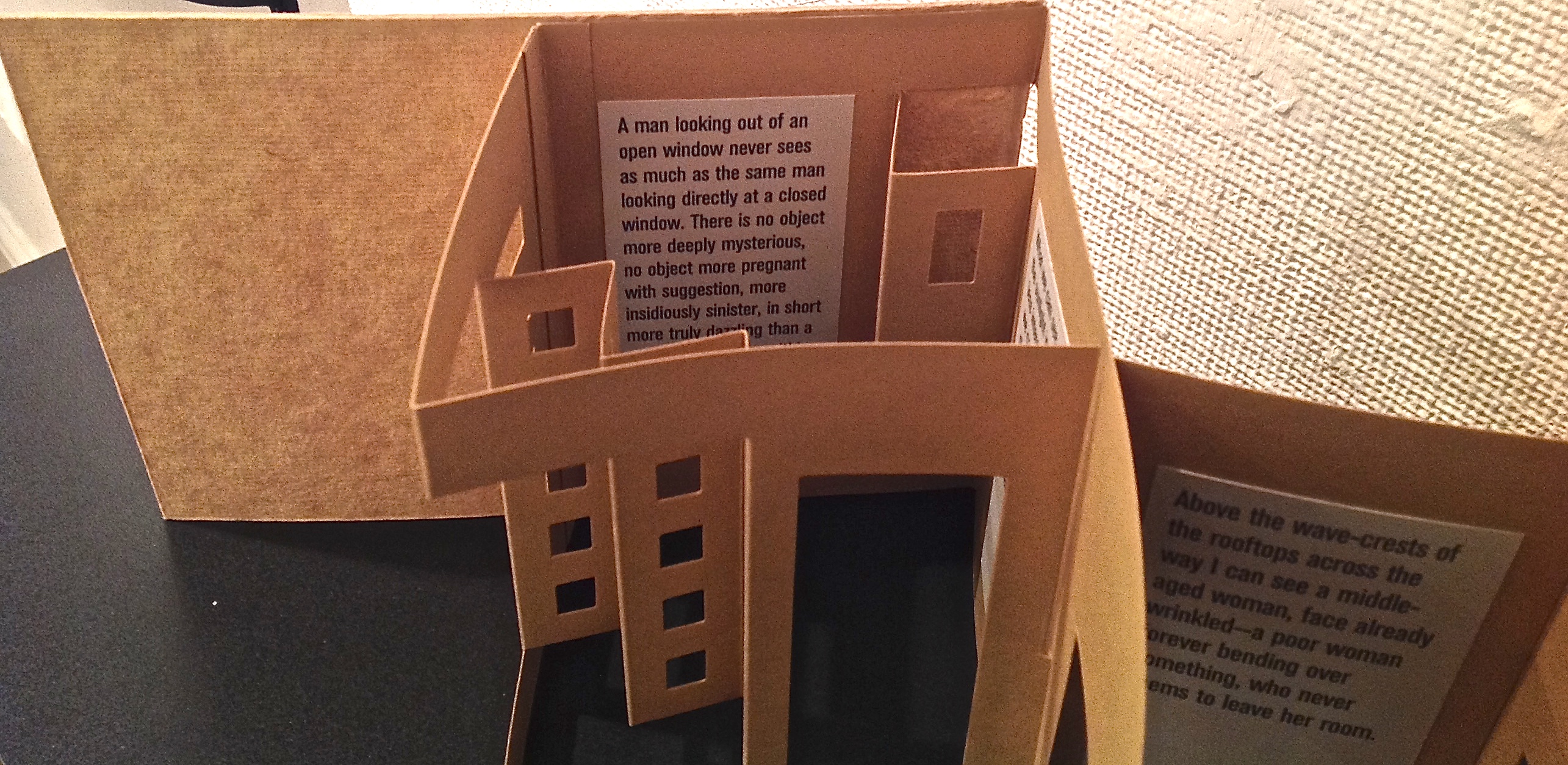
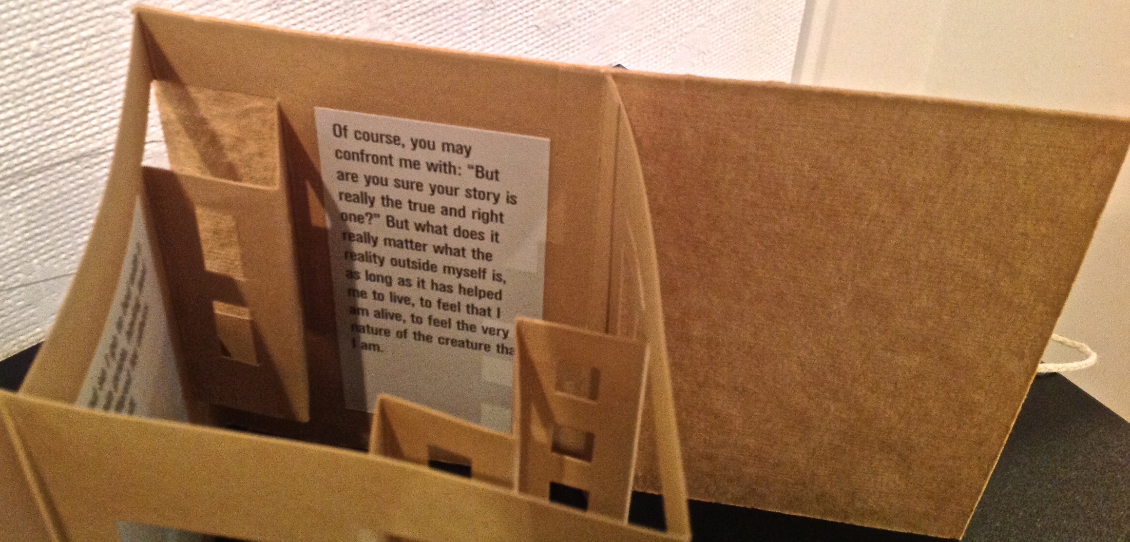
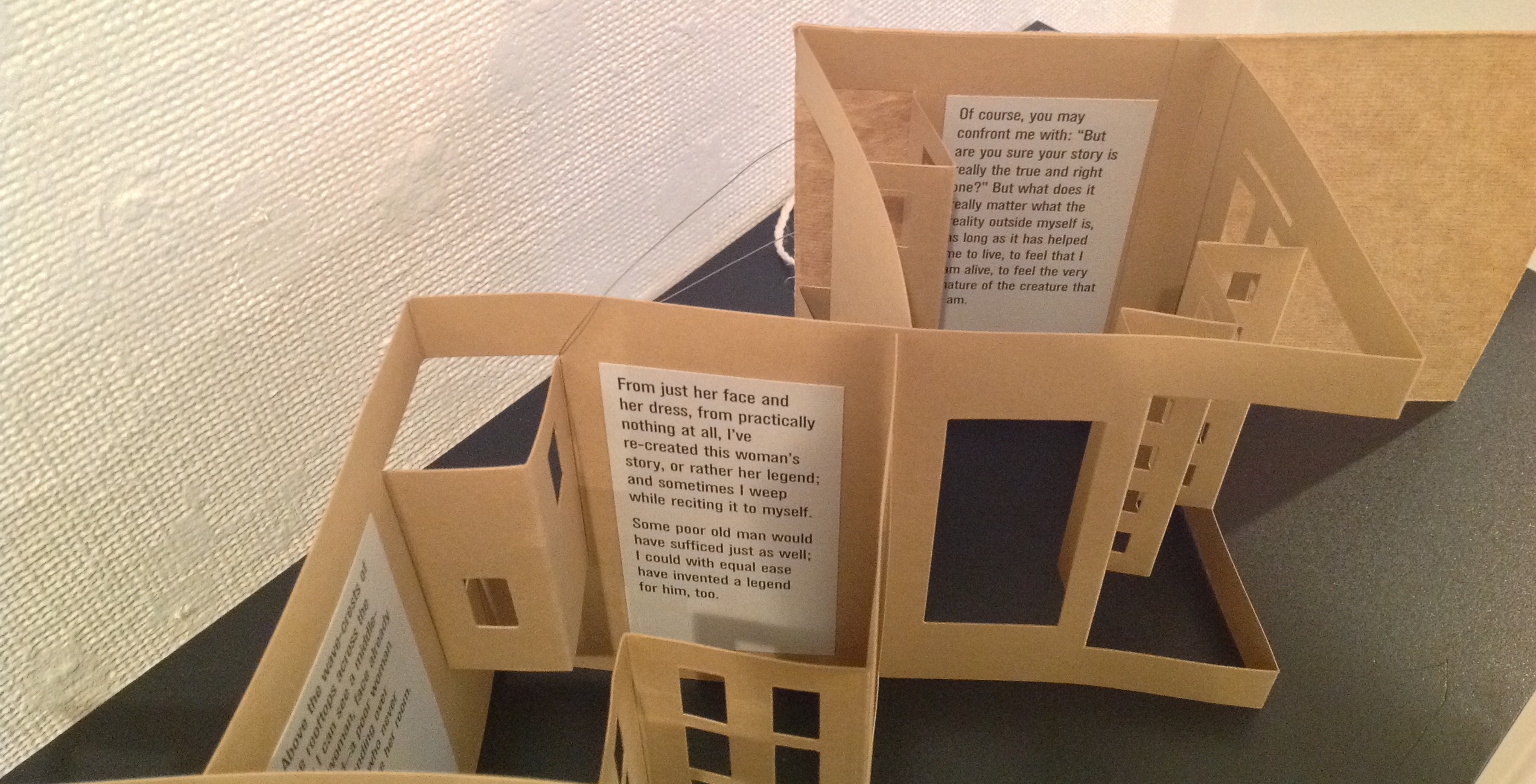
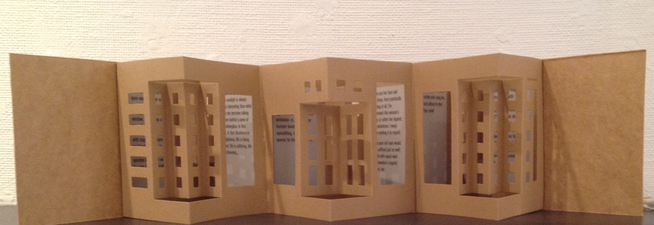
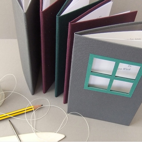
When closed, this accordion book appears as a non-descript brown parcel tied with string.
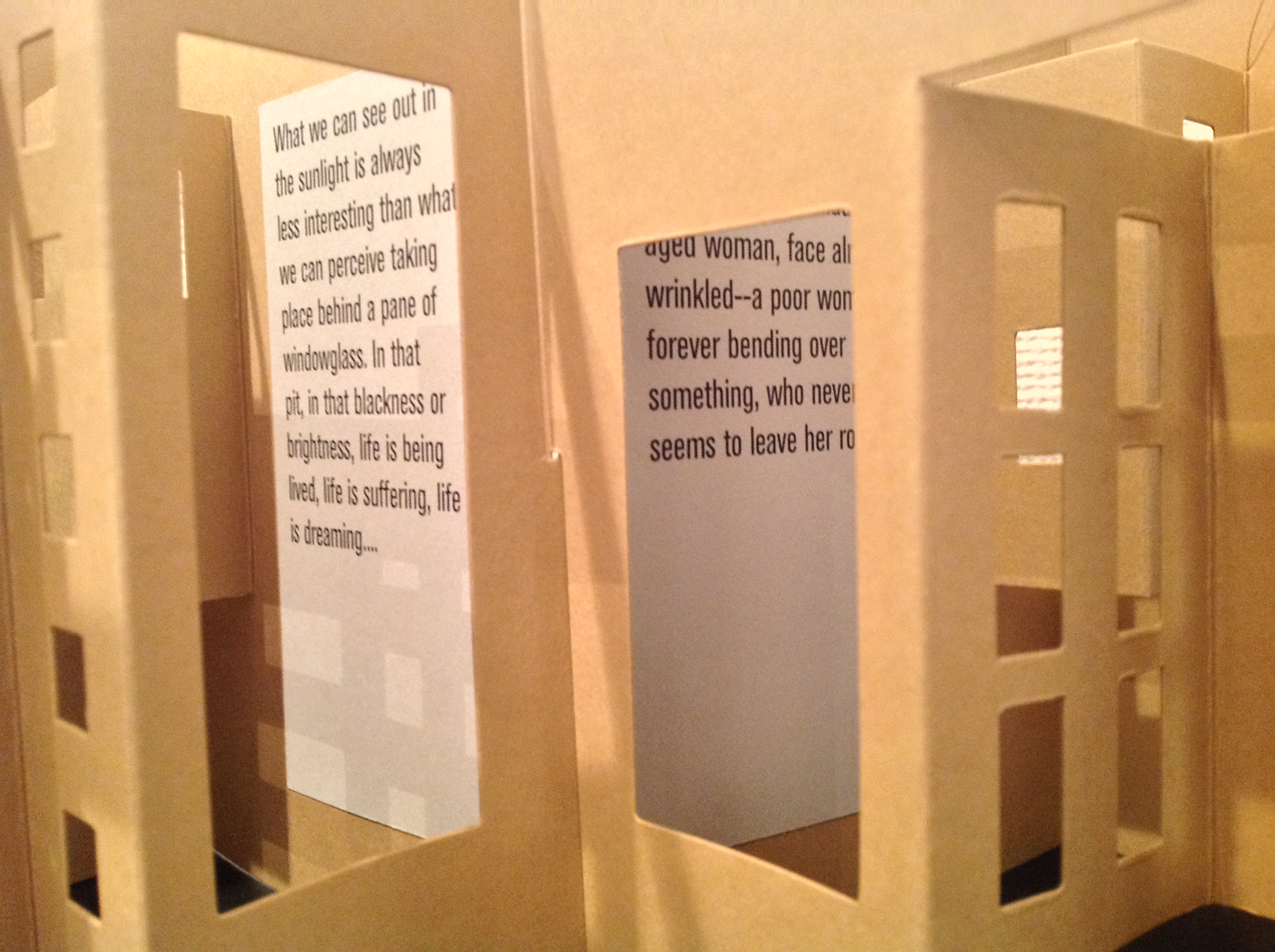
As it is opened, the parcel becomes a streetscape with buildings through whose “windows” Baudelaire’s text reveals itself.
The form of the book has been altered best to display the imagined flâneur’s prose narrative.
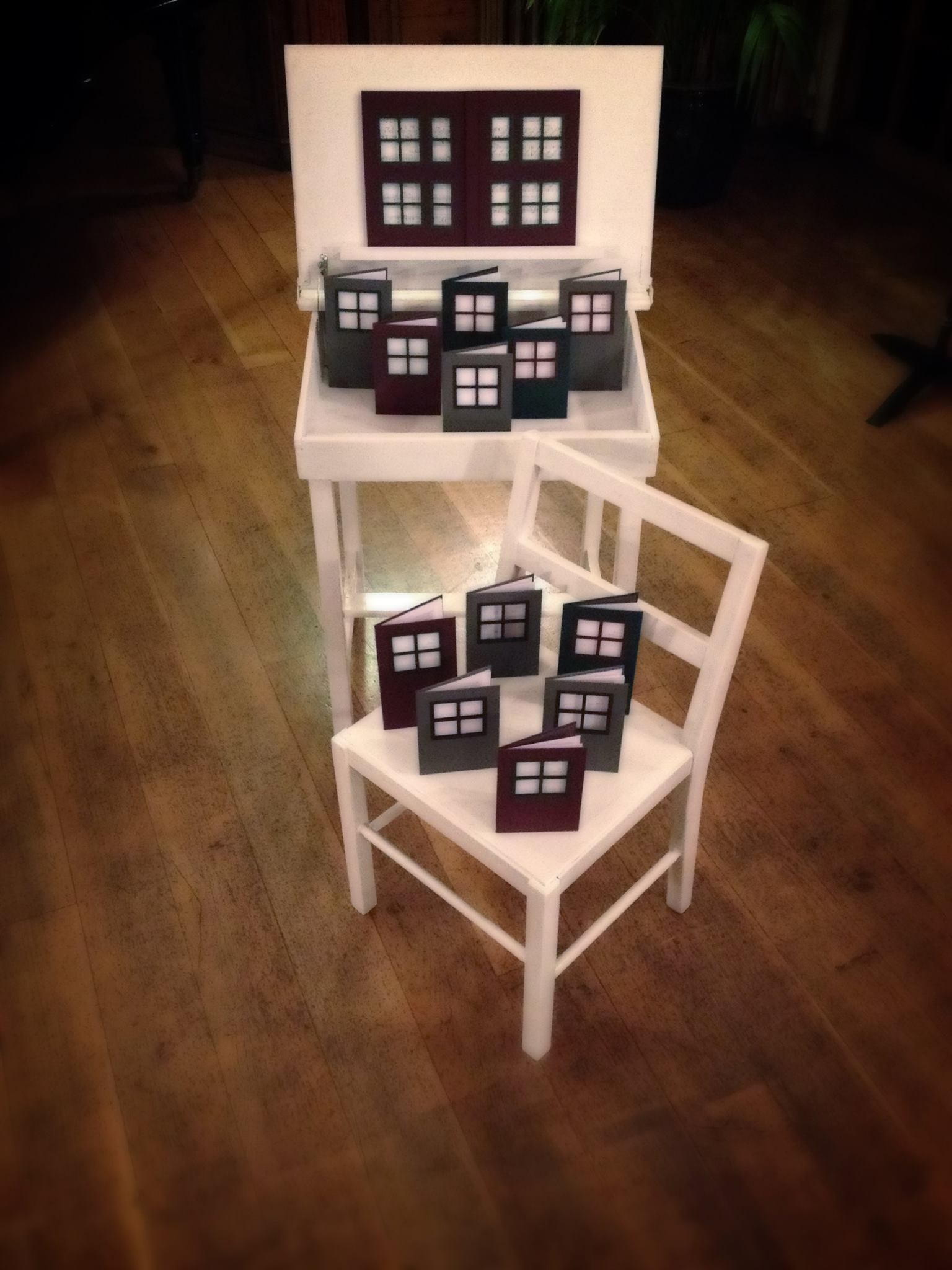
Another of Rafal’s works is “The legends of Robert Schumann: A Piano Recital and Book Art Installation”, reimagining scenes from childhood in Robert Schumann’s piano masterpiece Kinderszenen (1838). The concert occurred at Burgh House and Hampstead Museum. As Rafal describes the work:
You open the desk and you see there’s a surprise inside – a book installation…When you read these books you realize that there’s more to the story than just childhood – it’s a real-life story that happened between two people [Robert and Clara Schumann] and which resulted in these amazing music compositions.” – Pauline Rafal, book artist
Set of 13 ‘book houses’ displayed in a miniature desk, each book displaying a letter written between Robert Schumann and his fiancee Clara Wieck at the time when ‘Scenes from Childhood’ was composed.
For more of Pauline Rafal’s work, see her website and Facebook page.
It is interesting to contemplate an entangled bank, clothed with many plants of many kinds, with birds singing on the bushes, with various insects flitting about, and with worms crawling through the damp earth, and to reflect that these elaborately constructed forms, so different from each other, and dependent on each other in so complex a manner, have all been produced by laws acting around us…. There is grandeur in this view of life, with its several powers, having been originally breathed into a few forms or into one; and that, whilst this planet has gone cycling on according to the fixed law of gravity, from so simple a beginning endless forms most beautiful and most wonderful have been, and are being, evolved.
– On the Origin of Species, 1869, the final paragraph.
In disparate “entangled banks” and micro-climates around the world, book artists and Charles Darwin have evolved a symbiotic relationship. By date and place, here are some bookmarks on that evolution.
1995, Washington, D.C., USA
Carol Barton and Diane Shaw organized the exhibition “Science and the Artist’s Book” for the Smithsonian Institution Libraries and the Washington Project for the Arts. Barton and Shaw invited book artists to respond to works in the Heralds of Science collection in the Smithsonian’s Dibner Library. Among twenty-one other pairings, George Gessert was invited to respond to Charles Robert Darwin’s On the Origin of Species by Means of Natural Selection, London, 1859.
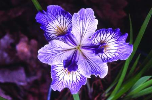
Gessert’s response wasNatural Selection(1994), an artist’s book consisting of computer-printed handwriting and Cibachrome prints of the results of Gessert’s own experiments in hybridizing irises. Citing Darwin’s description of the breeding of pigeons for their ornamental characteristics, Gessert contends “that Darwin also recognized aesthetics as an evolutionary factor”. Since the 1980s, Gessert’s work and writings have focused on the way human aesthetics can affect evolution and the aesthetic, ethical and social implications. His work and that of artists/theorists such as Suzanne Anker, Eduardo Kac, Marta De Menezes, the Harrisons and Sonya Rapoport have constituted the bio art and eco art movements. A collection of his essays appeared as Green Light: Toward an Art of Evolution in the Leonardo Book Series, published by The MIT Press in 2010.
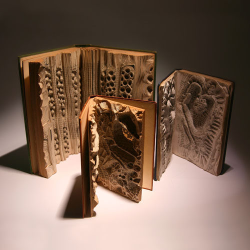
Emma Lloyd Evolution Triptych (2004) Part 1 – 10 x 7.5 x 1, Part 2 – 12 x 9 x 2, Part 3 – 8.5 x 6.5 x 1
Inspired by Darwin’s The Descent of Man, Part I, and cell structures in biology texts, Emma Lloyd‘s Evolution Triptych sparks thoughts of fossils, woodcarved altarpieces or the tooled cover of the St Cuthbert Gospel, the code of life embedded in DNA structure and the code of information embedded in the codex.
The artistic technique here – carving the book as artifact – is prevalent in book art; see the work of Doug Beube, Brian Dettmer and Guy Laramée, for example. Lloyd’s treatment of the Darwin volume is the only one of its type in this collection of bookmarks. Given the influence of On the Origin of Species, though, it would be unusual if other “book surgeons” have not been similarly inspired by it.
2009, London, UK
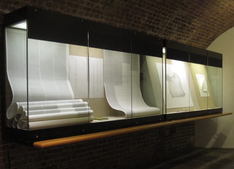
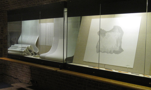
Storyteller and book artist Sam Winston set about categorizing the words in On the Origin of Species and poet Ruth Padel’s Darwin, A Life in Poems (Chatto & Windus, 2009). He sorted them by nouns, verbs, adjectives and “other”. As Winston puts it, he “wanted to present a visual map of how a scientist and a poet use language – a look at how much each author used real world names (Nouns) and more abstract terminology (Verb, Adjective and Other) in their writings.”
To do that, he categorized the 153,535 words in On the Origin – a dot with a 4H pencil for the 50,567 words categorized as “Other”, a 2H pencil for the 38,266 categorized as “Noun”, an HB pencil for the 26,435 categorized as “Verb” and a 4B pencil for the 38,266 categorized as “Adjective”. The result – Darwin, a series of visual “frequency poems” on display at Le Gun Studio in London – is a book altered through the DNA-like pattern of its own words into a completely “other” scroll and into a topographical map of itself – guided by the artist’s hand and mind.
Sam Winston Darwin (2009)
Right view. Sam Winston, Darwin (2009) Le Gun Studio, 19 Warburton Road, London, E8 3RT, UK
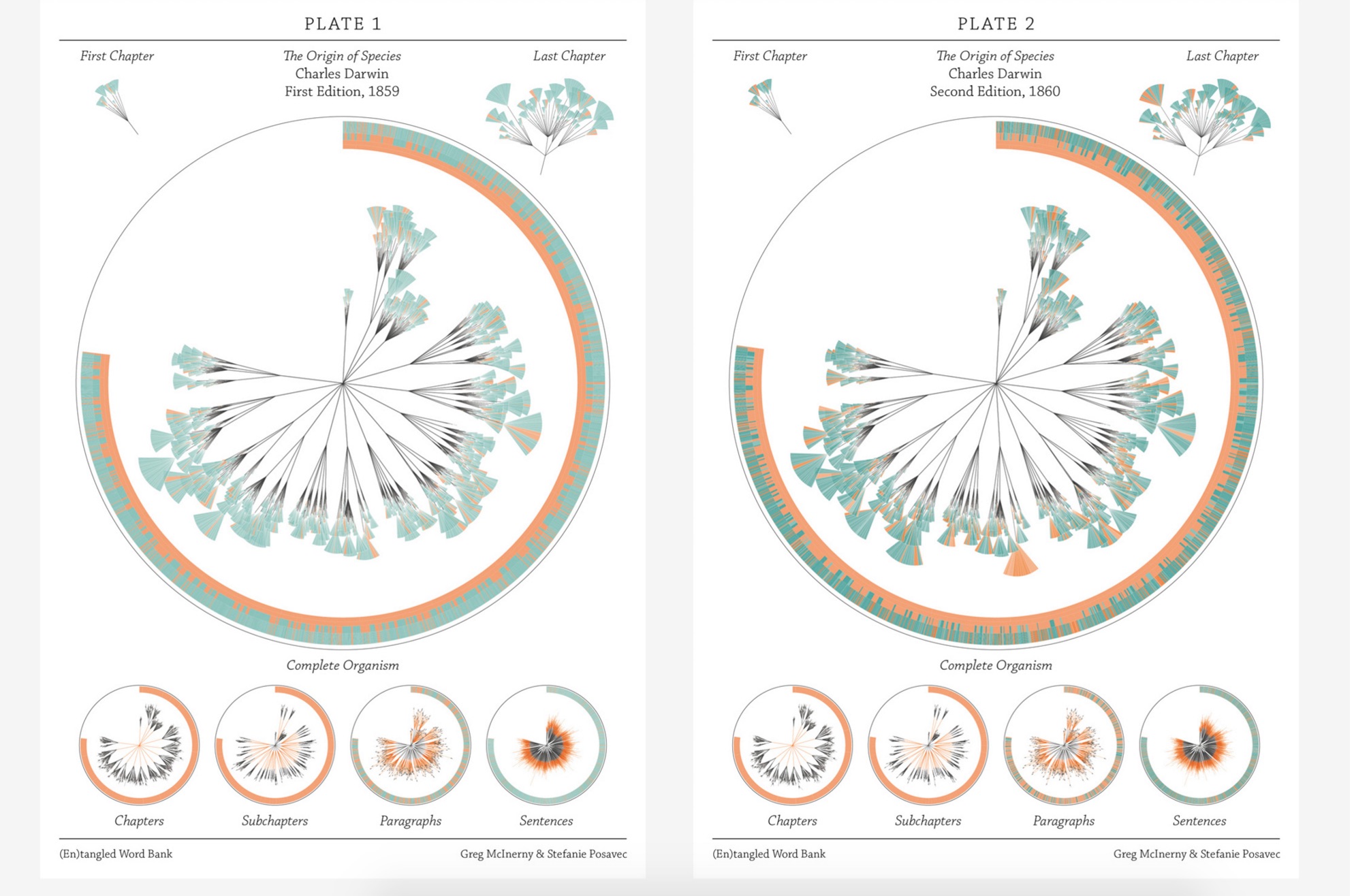
In the same sesquicentennial year, in the same city, Stefanie Posavec collaborated with Greg McInerny to issue (En)tangled Word Bank, a series of diagrams, each representing an edition of On the Origin of Species, and the work’s title alluding to Darwin’s “entangled bank” passage presented above.The pressed-dandelion-shaped chapters and subchapters are divided into paragraph ‘leaves’ with wedge-shaped ‘leaflets’ representing their sentences.
The sentences forming the ‘leaflets’ of the organism are of orange, senescent tones when they will be deleted in following editions. The green, growth tones are applied to those sentences that have life in the following edition. The tone of each colour is determined by its age, in editions, to that point. Through these differences in colouration the simplicity in structure in the early stages of the organism’s life develops into a complex form, showing when the structures developed to its changing environment. Around the organisms the textual code is provided, showing the changes in the size of the organism, and where the senescence and growth is derived in that code. A series of re-arrangements of the organism focus on changes at each level of organisation.
This is “structural infographic” as art.
Stefanie Posavec and Greg McInerny for Microsoft Research, Cambridge (En)tangled Word Bank (2009)
2009, Boston, MA, USA
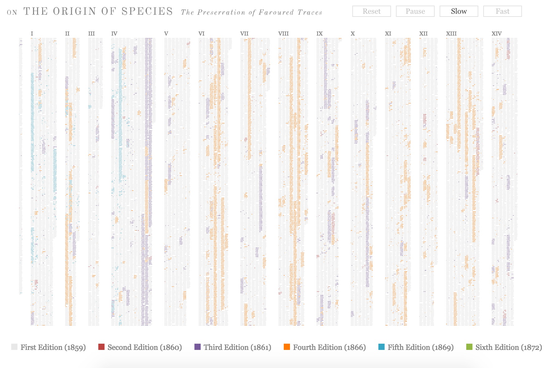
Across the Atlantic, Ben Fry, author of Visualizing Data (O’Reilly, 2007), created a similar work of art called The Preservation of Favoured Traces. Fry color-coded each word of Darwin’s final text by the edition in which it first appeared and used the data to build an interactive display at fathom.com demonstrating the changes at the macro level and word-by-word. Fry went on to produce a poster version and print-on-demand book version.
Ben Fry The Preservation of Favoured Traces (2009)
2009, Vancouver, Canada
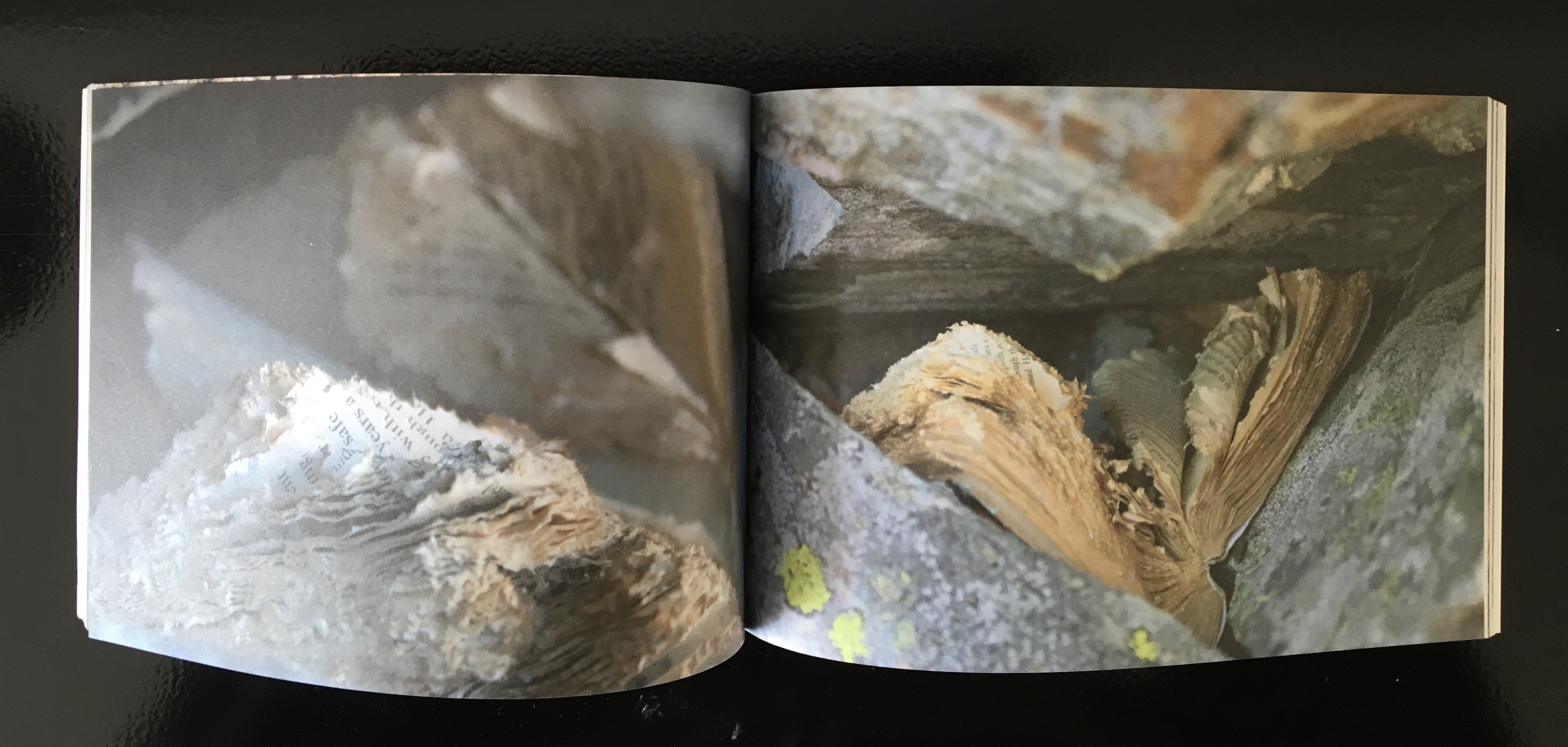
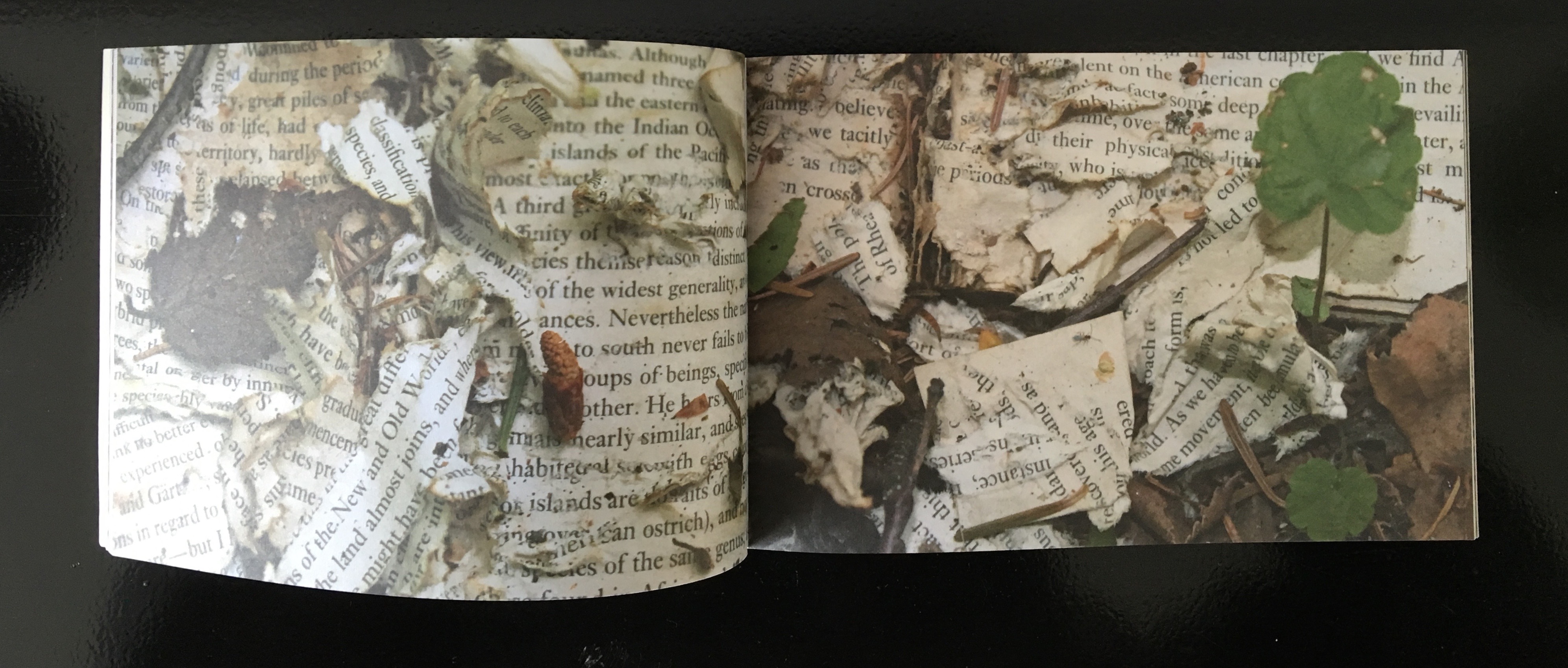
Three thousand miles away that summer, Canadian poets Stephen Collis and Jordan Scott placed multiple copies of On the Origin of Species in various outdoor locations “not … to put the natural into the text, [but] … to put the text out into the natural world and see what happens to it” (p. 2). After a year, Collis and Scott photographed the results in situ and collected and used the some of the still decipherable words as found text for their volume Decomp (Coach House Press, 2013).
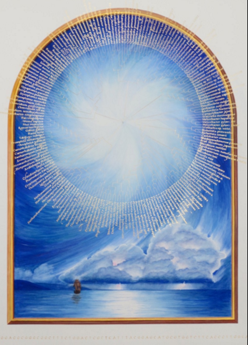
Former science teacher and now botanical artist and bookmaker, Kelly Houle embarked on a 10-year plan to create an illuminated and scribed copy of the first edition of On the Origin. Where medieval scribes and rubricators had abbots to preside over them and their book art, Houle has University of Chicago Professor Emeritus Jerry A. Coyne and several other academics. As she notes about her process, the past techniques have also yielded to present concerns:
Kelly M. Houle The Illuminated Origin (2009 – ) Watercolor, gouache, interference watercolor, gold foil, shell gold on Fabriano Artistico, 22 x 30 inches
Today many artists still practice the tradition of illumination using medieval and renaissance-era materials and techniques. While many of these have stood the test of time, there are more earth-friendly materials than those used in the past….
Detail of frontispiece Courtesy of the artist
The Illuminated Origin of Species will be written on hot-pressed Fabriano Artistico paper made in Italy. It is the best paper in the world for both calligraphy and botanical art. These are extremely smooth, beautiful, and durable papers. They are chlorine-free, acid-free, and 100% cotton. No animal by-products are used in the sizing. Combined with Winsor and Newton watercolors and gouache, this paper will be perfect for the demands of The Illuminated Origin.
Detail of frontispiece Courtesy of the artist
To mimic the play of light on various shiny and iridescent surfaces in nature, I am using 23k gold foil, shell gold, and interference watercolors, which contain small flecks of mica to produce an iridescent effect. These metals will distinguish The Illuminated Origin as a truly “illuminated” manuscript. — Kelly M. Houle, “The Making of a Modern Illuminated Manuscript“
Houle aims to complete her work in 2019,On the Origin‘s 160th anniversary.
2009, Farnham, Surrey, UK
Between its hardback covers lined in marbled papers, Angela Thames’ Darwin’s Poetic Words has distilled the often liturgical, poetic passages of On the Origin of Species.
Angela Thames Darwin’s Poetic Words (2009) Hardbound, 12 pages, 12 x 8 cm, 8 linocuts, Somerset paper
Between 2009 and 2013, Thames created four more artist’s books besides Darwin’s Poetic Words, based on excerpts from On the Origin of Species. In this focus and technique, Thames takes and interprets portions rather than the whole of the source as do Houle, Collis and Scott, Fry, McInerny and Posavec, Winston, and Lloyd in their differing ways.
Angela Thames Evident Evolution (2009-13) Collagraph images of bone structures and text, 8 pages, Silkscreen covers, Spiral bound edition
Angela Thames A Grain in the Balance (2009-13) Collagraph images with rubber-stamped text, 8x10cm, 15 pages, Somerset beige paper
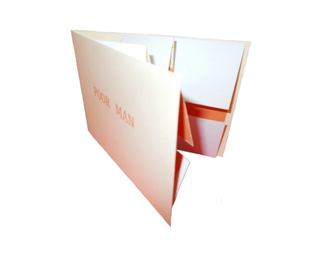
Angela Thames Poor Man (2009-13) Folded card with pop up flower, Words spoken by his gardener, Silkscreen, wood-stamped text, Open edition
Poor Man (2009-13) is the only exhibit in this survey that demonstrates the pop-up technique in book artistry, but as evolutionary biology and fossil-hunting have shown, who knows what undiscovered forms are out there.
2012, New York, NY, USA
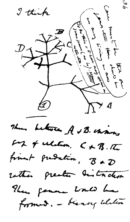
Following in their tradition since 1984, Tim Rollins and K.O.S. (“Kids of Survival”) seized on Darwin’s “Tree of Life” diagram
Darwin’s notebook sketch of an evolutionary tree. Charles Robert Darwin, Transmutation of Species, 1837
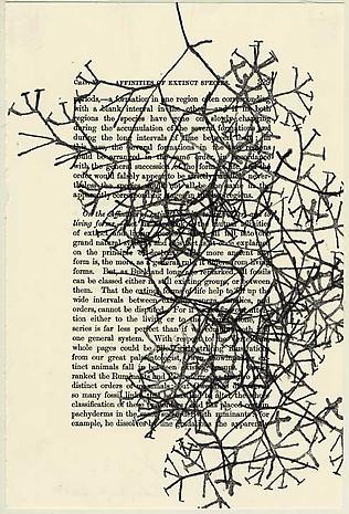
and “jammed” to produce a series of paintings and preliminary works in ink and watercolor on pages of the book to create ON THE ORIGIN OF SPECIES (after Darwin). Eighteen students, aged 13 to 16, worked with Rollins on the preliminary studies, one of which appears below, that preceded the 2013 exhibition of paintings at the Lehmann Maupin Gallery.
Tim Rollins and K.O.S. Studies for ON THE ORIGIN OF SPECIES (after Darwin) (2014) Ink and watercolor on book page, 22.9 x 15.2 cm Photo credit: Lehmann Maupin Gallery
The large-scale paintings consist of almost all of the 360 pages of On the Origin fixed to canvas and ink-stamped over and over with the “Tree of Life” image, which had been cut into 60 handstamps. Rollins described the concept of the works in an interview for Brooklyn Rail:
The whole book is 360 pages but we don’t ever want to be literal so it’s not all of the pages. They’re there to inspire. It’s like an opera. The libretto inspires the music. You can watch an opera in a language you don’t know, without reading. It’s the same with our work. It’s about a visual correspondence with the text. The work is not about something. That’s why you can’t get hung up on interpretation. That’s a big issue, especially with so much politically engaged art. We want to create a situation, learning machines, so everyone is learning in the process of making and then hopefully the audience will be inspired too. Maybe they will pick up Darwin or continue with the idea. These are catalysts for action.
In a video interview with ArtNet, Rollins also refers to the K.O.S. jamming process -reading aloud from the book in a studio setting, discussing it with students and seeking inspiration from the text – not as a school lesson or classroom exercise but as a kind of séance, an assertion that touches the essence of “reverse ekphrasis” in book art. Rather than the literary work or book capturing the spirit of a work of art, the work of art captures the spirit of the book.
2013/14, Oxford, OH, USA
At the University of Puget Sound (2013) and Center for Book Art in New York (2014), Diane Stemper exhibited her Darwin-inspired book art that explores “the intersection between the natural world, daily living, science and the collective and individual experience of landscape”.
Diane Stemper Universal Sample (2014) Edition of 4, Intaglio and letterpress on Arches
Diane Stemper Universal Sample (2014) Edition of 4, Intaglio and letterpress on Arches
Diane Stemper Universal Sample (2014) Edition of 4, Intaglio and letterpress on Arches
Hand bound, printed and produced in her Plat 21 Studio, in Oxford, her Galapagos Map (2013), Darwin’s Atlantic Sea (2014) and Universal Sample (2014), these works have an eerie physical presence. At the Center for Book Art, I have seen and, with the kind permission of Alex Campos, the curator there, touched the works. The intaglio printing and richly textured creamy paper still communicate themselves even across the digital divide.
2014, Amsterdam, The Netherlands, and London, UK
Simon Phillipson completed a variorum edition of On the Origin of Species, in which every verso page is the evolved or amended text and the recto page is the final text from the the Sixth edition.
Charles Robert Darwin, On the Origin of Species, variorum edition designed by Simon Phillipson, 2014. Printed in the Netherlands on special 60gsm bible paper and finished with a special metallic bronze ink
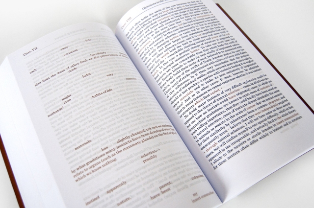
The verso pages are completely printed in a special metallic bronze ink. The recto is printed in a combination of black and bronze ink. The bronze highlighted words in the recto correspond to the evolving or amending text in the verso. Very reminiscent of, but distinct from, Ben Fry’s The Preservation of Favoured Traces (see above).
2014, Minneapolis, MN
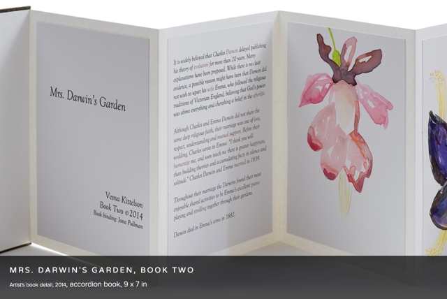
Vesna Kittelson, Mrs. Darwin’s Garden, Book Two (2014) Accordion book, 9 x 7 in
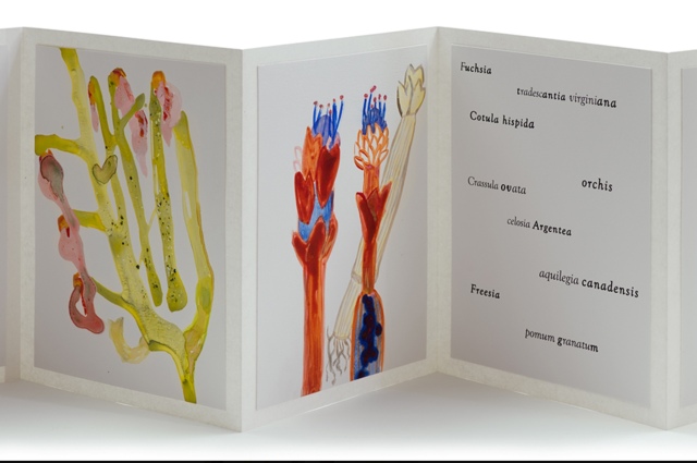
Vesna Kittelson is an American-Croatian artist based in Minneapolis. Her résumé cites public collections ranging from Tate Britain and Minnesota Museum of American Art to Cafesjian Center for the Arts in Armenia and the Modern Museum of Art in Croatia. In 2009, she spent time at Churchill College, Cambridge University, where she learned about the life and marriage of Charles Darwin and Emma Wedgwood. Subsequently she created four artist books titled Mrs. Darwin’s Garden depicting primitive-seeming plants imagined as flora that Darwin might have seen from the deck of the Beagle. The names of the plants are made-up Latin names or variations on those of contemporary plants.
Vesna Kittelson, Mrs. Darwin’s Garden, Book Two, 2014 Accordion book, 9 x 7 in
These abstract images are imagined plants for Mrs. Darwin’s garden. They are illustrations of named floral specimens that never existed in reality. In Mrs. Darwin’s Garden they are presented as if they correspond to data derived from Darwin’s experimentation in his greenhouse. In this book I replaced the 19th C methods of botanical drawing with pouring paints to incorporate the contemporary notion of valuing an accident, followed by drawing with brushes and pencils to gain control and give the images a place and time in the 21st C.
2014, Grasswood, Saskatchewan, Canada
Jonathan Skinner (Warwick University) wrote in his preface to Decomp (see above):
Writing rots, meaning flees. … Yet the book is written to locate (some) meaning here. Would it make any difference to leave Decomp itself in the wilderness? Probably not.
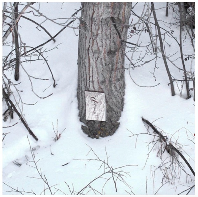
Book artist, papermaker and co-founder with her husband David Miller of Byopia Press, Cathryn Miller reviewed Decomp in 2013. If not prompted by Skinner’s preface, Miller must have felt how appropriately evolutionary it would be to attempt to replicate the Decomp experiment by substituting the result of that experiment for the subject of the replicating experiment. Thus, in January 2014, Miller nailed to a tree “a book based on letting brand new copies of On the Origin of Species rot in various locations”.
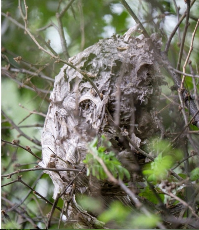
Cathryn Miller Recomp (2014) Copy of Decomp, Collis and Scott (2013) nailed to a tree Photo credit: David G. Miller
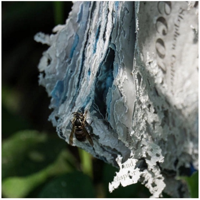
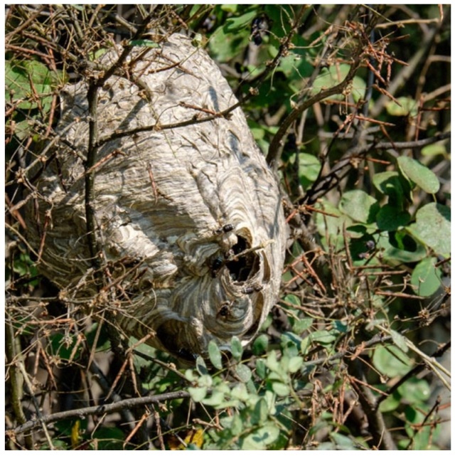
For over twenty months, Miller monitored and husband David photographed the book’s weathering. That, however, was not the transformation that would result in an altered book and possibly a work of book art. Nature had some ironic appropriateness in store for Miller, Skinner, Collis, Scott and all of us. The blown pages were visited by Bald-faced Hornets, who digested them á la John Latham and his students but regurgitated them as cellulose with which to build a large nest.
Cathryn Miller Recomp (2015) Photo credit: David G. Miller
Cathryn Miller and Bald-faced Hornets Recomp (2015) Nest composed of pages from Decomp, Collis and Scott (2013) Photo credit: David G. Miller
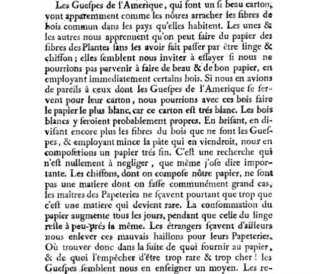
In the context of book art, the nest offers a curiously serendipitous digression. In 1719, the French naturalist René Antoine Ferchault de Réaumur published an essay to the Royal Academy of Sciences on the natural history of wasps. In the passage below, he hypothesizes how their natural papermaking industry could be adopted by man.
In 2015, Miller presented the results as Recomp in her blog at Byopia Press. In September that year, however, critics (raccoons, the artist thinks) visited the work and deconstructed it.
Recomp vandalized, 2015 Photo credit: David G. Miller
Might this prove that, to paraphrase the last paragraph of On the Origin, “by laws acting around us…. from the war of nature, from famine and death, the most exalted object which we are capable of conceiving, namely, the production of the higher animals [and their art], directly follows”? If so, that makes raccoons and critics equal laws of nature.
2015, Umeå, Sweden
Johannes Heldén’s work Field is book, visual art and installation all in one. Heldén’s is perhaps the darkest variant on Darwin’s theme here.
It consists of interactive landscape animations on a floor touchscreen of 20 sqm,
Johannes Heldén Field (2015) Produced, and premiered, at HUMlab, Umeå University
a series of sculptural mutations of the Eurasian Jackdaw*,
Johannes Heldén Field (2015) Produced, and premiered, at HUMlab, Umeå University
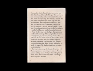
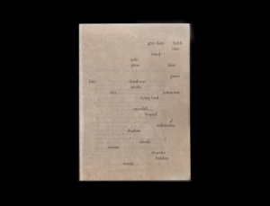
an ever-changing soundscape and an interactive screen wall with a text responding to the changing DNA of the bird
Johannes Heldén Field (2015) Produced, and premiered, at HUMlab, Umeå University
– as the ”code” of todays species is slowly lost, so is the code and context of language. The gaps in the text correspond to the shift in the DNA sequence, prose turns into dark poetry, connections and meaning changing for each iteration.
Johannes Heldén Field (2015) Produced, and premiered, at HUMlab, Umeå University
Johannes Heldén Field (2015) Produced, and premiered, at HUMlab, Umeå University
All these pieces are connected: as you explore the landscape and trigger the glowing touch points with your body, time is rapidly speeding up (clouds move over the scene, trees wither away, a flood is coming), one by one the four bird sculptures in the installation will be ”activated” with light and sound, spiraling the species further down into mutations. At the end of the piece, no lights remain in the landscape, the sound is immense, all mutations have occurred, the last poetry dissolves into entropy. Then all fades to black.
Since Darwin’s theory encompassed extinction, perhaps Heldén’s vision is not so much a variant on Darwin as it is a pessimistic appreciation and warning about the impact of our interaction with the entangled bank.
2016, Guildford, Surrey, UK
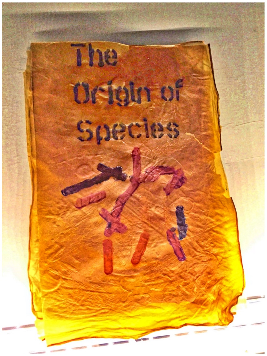
Cathryn Miller’s “bio-book-art” and that of Collis and Scott stand at the collaboration end of the bio art spectrum, where the artist yields considerable control to nature in the creative process. At the coordination end of the spectrum – closer to domestication of species – stands Dr. Simon F. Park’s bio-book-art – The Origin of Species – perhaps “the first book to be grown and produced using just bacteria”. Presented at the Edinburgh International Science Festival, the small book has pages made of bacterial cellulose, produced by the bacterium Gluconoacetobacter xylinus (GXCELL). Its cover is even printed with naturally pigmented bacteria.
Dr. Simon F Park The Origin of Species “The small book shown here was grown from and made entirely from bacteria. Not only is the fabric of its pages (GXCELL) produced by bacteria, but the book is also printed and illustrated with naturally pigmented bacteria. ” Posted 27 March 2016 Photo credit: Dr. Simon F. Park
Although Park’s science-driven process for paper manufacturing and printing echoes the speculations of French naturalist René Antoine Ferchault de Réaumur (see above), it seems to have much in common with the painstaking craft of handmade paper and hand letterpress printing. The first sheet of Park’s micro-organically grown paper took a little under two weeks to be generated and stencilled with his bacterial ink.
2016, Colchester, Essex, UK
It seems chronologically backwards to move from bio-book-art’s live media to Chris Ruston’s ammonites of The Great Gathering. As should be evident by now, however, the evolution of the symbiotic relationship between book artists and Darwin has been anything but a straight line. It has curved, circled and recursed.
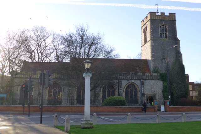
Tim Rollins + K.O.S may have had their séance 30-50 feet away from Darwin’s lodgings in Edinburgh, but Chris Ruston brought her Darwin-inspired book art to an even more fitting venue: a church converted into Colchester’s Natural History Museum.
Natural History Museum Colchester, Essex, England Photo credit: Chris Ruston
As the artist comments at her site:
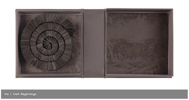
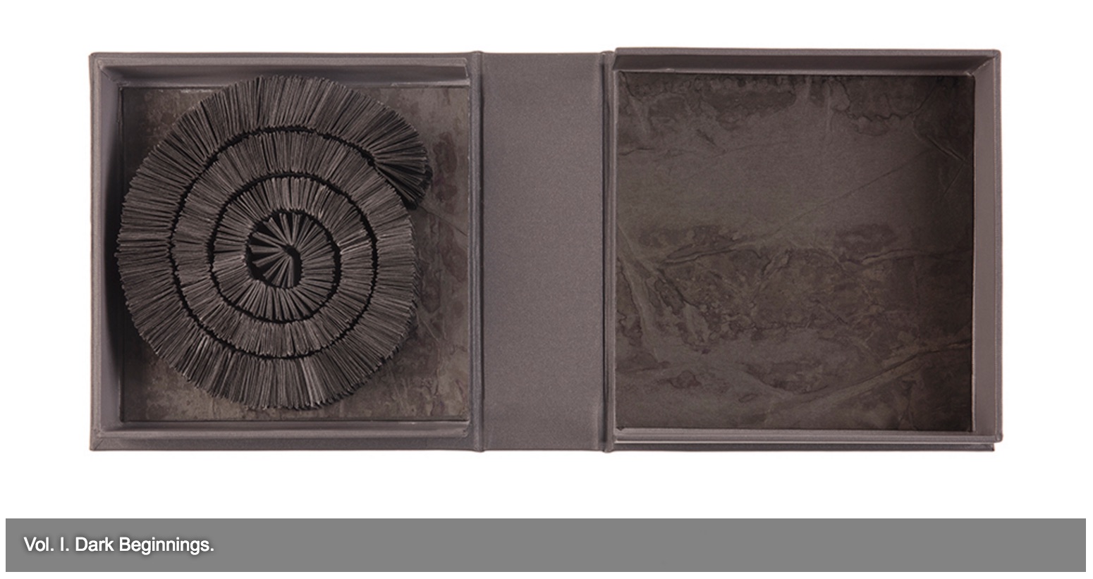
The Great Gathering refers to our continued exploration of where we have come from, and where we are going. Combined the seven volumes tell an amazing story spanning 650 million years. Sculptural in form, each book reflects a moment of this journey. From black holes and dark beginnings, through ocean and sediment layers, Darwin’s On the Origin of Species, and recycled National Geographic magazines the work charts the inevitability of change.
View of exhibition of The Great Gathering Natural History Museum, Colchester Photo credit: Chris Ruston
They are a response to visiting Museum collections, in particular the Natural History Museum, Colchester and the Sedgwick Museum of Earth Sciences Cambridge. Fossils have enabled us to unlock the story of our Origins – from the largest creatures to the smallest organisms. The 19th century saw an explosion of knowledge and understanding, culminating in Darwin’s publication of On the Origin of Species. By piecing together the riddle of the fossil record, Darwin and his contemporaries began asking revolutionary and challenging questions, the results of which are still felt today.
View of exhibition of The Great Gathering Natural History Museum Photo credit: Chris Ruston
Science and art are the presiding geniuses over The Great Gathering. In The sciences of the artificial (1969), Herbert Simon emphasized: “The natural sciences are concerned with the way things are” and engineering, with the way things ought to be to attain goals. Like the scientist, the artist, too, is concerned with the way things are. They are the raw material with which the artist works or to which he or she responds. But like the engineer or the designer, the artist is concerned with the way things ought to be:
Chris Ruston The Great Gathering, 2016 Photo credit: Chris Matthews
how a solander box ought to be constructed to operate with the work and, in enclosing it, be “the work”;
Chris Ruston The Great Gathering (2016) Photo credit: Chris Matthews
what materials (photos from the Hubble telescope) ought to be used to reflect a moment in time;
Chris Ruston The Great Gathering (2016) Photo credit: Chris Matthews
how thread, tape and stitch ought to be to hold together a spine that will flex and spiral into the shape of a fossil;
Chris Ruston The Great Gathering (2016) Photo credit: Chris Matthews
how the color of the material ought to be juxtaposed with the material’s altered shape to carry meaning;
Chris Ruston The Great Gathering (2016) Photo credit: Chris Matthews
how the shift from content to blankness ought to be juxtaposed with the material’s altered shape to carry meaning;
Chris Ruston The Great Gathering (2016) Photo credit: Chris Matthews
how the selection and alteration of text ought to be made to show the fixity and flux of knowledge and ourselves;
Chris Ruston The Great Gathering (2016) Photo credit: Chris Matthews
and how our reflection in the mirror in Volume VII under the maker’s tools and the made thing ought to implicate us — the viewer here and now – in an ongoing process of making and remaking.
On display at “Turn the Page”, Norwich, England (2016) Photo credit: Chris Ruston
If you have come this far with these bookmarks on the evolution of book artists’ symbiosis with Darwin, note that today and every 12th of February is Darwin Day, marking international celebrations of the birth of Charles Darwin and his contributions to science. From today’s engagements and all those to come with the concepts of On the Origin of Species and (I hope) with these bookmarks, perhaps new discoveries and new creations of book art will emerge.
Update
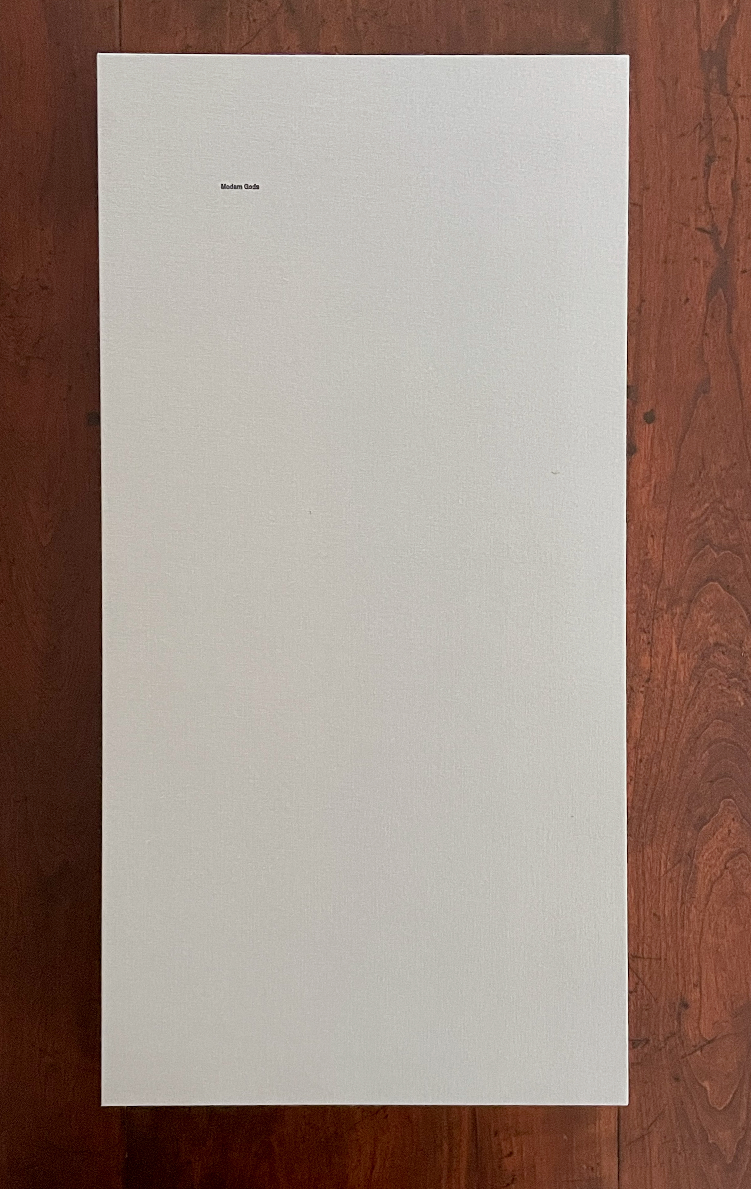
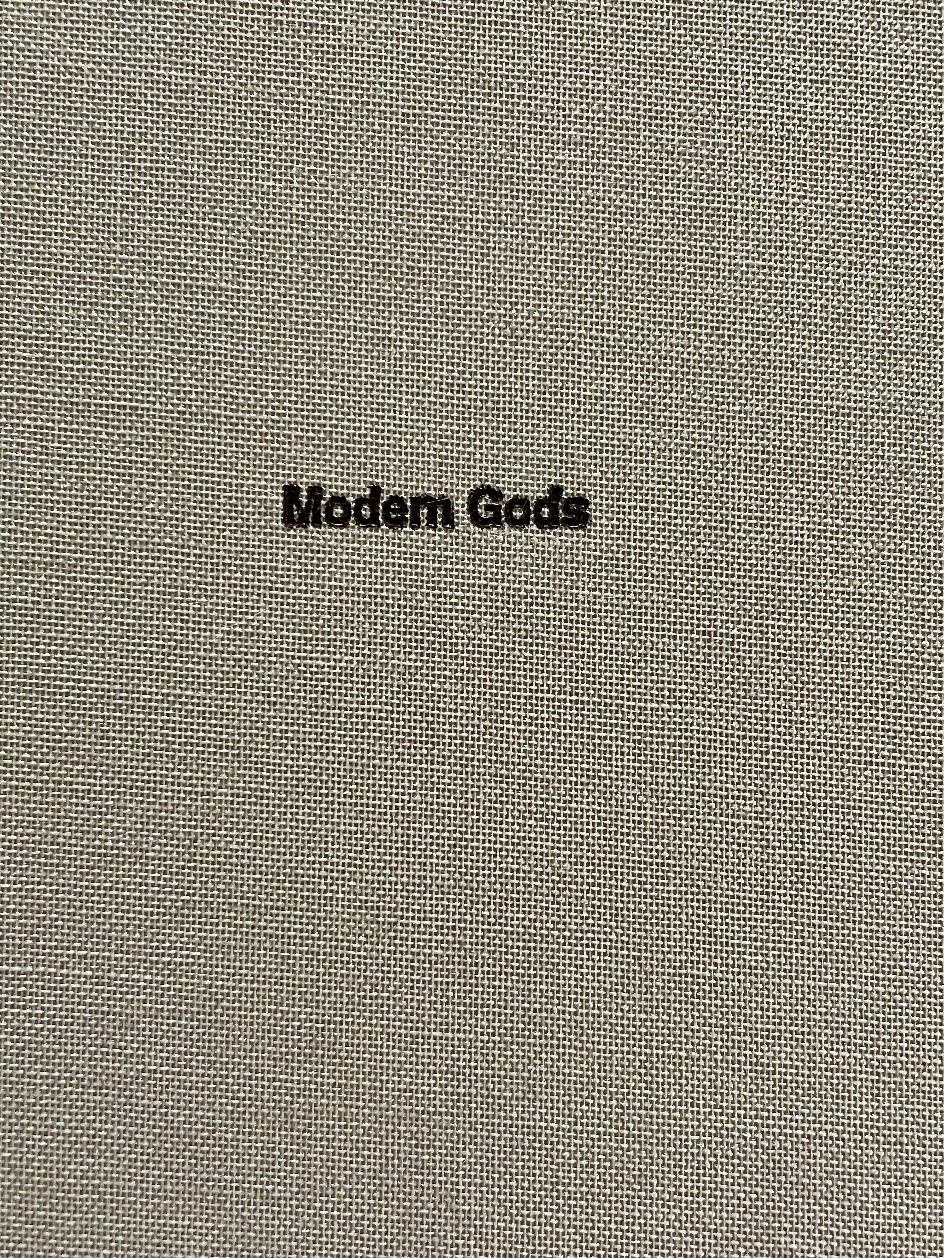
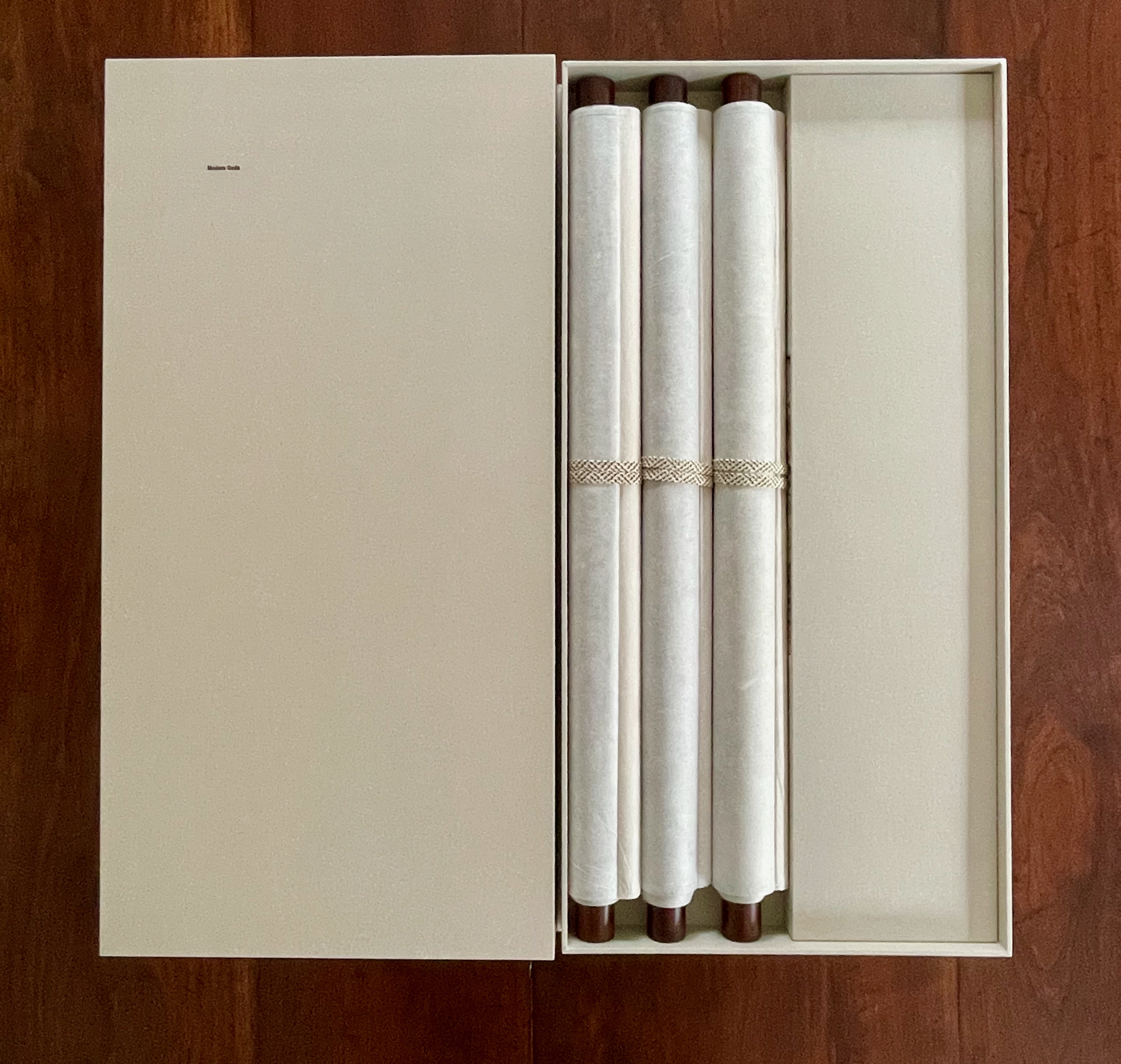
Sam Winston Modern Gods (2013) Photo: Books On Books Collection
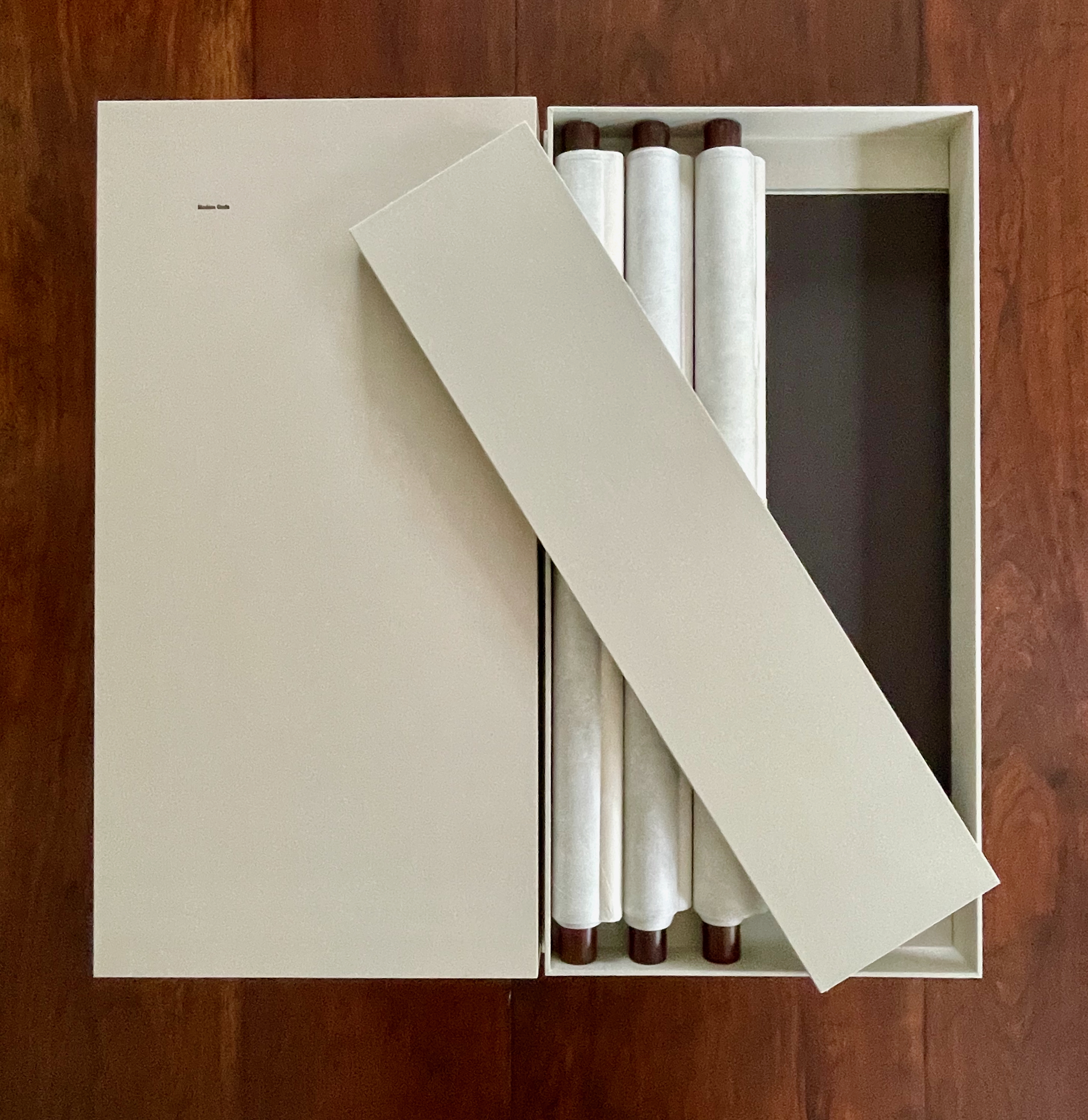
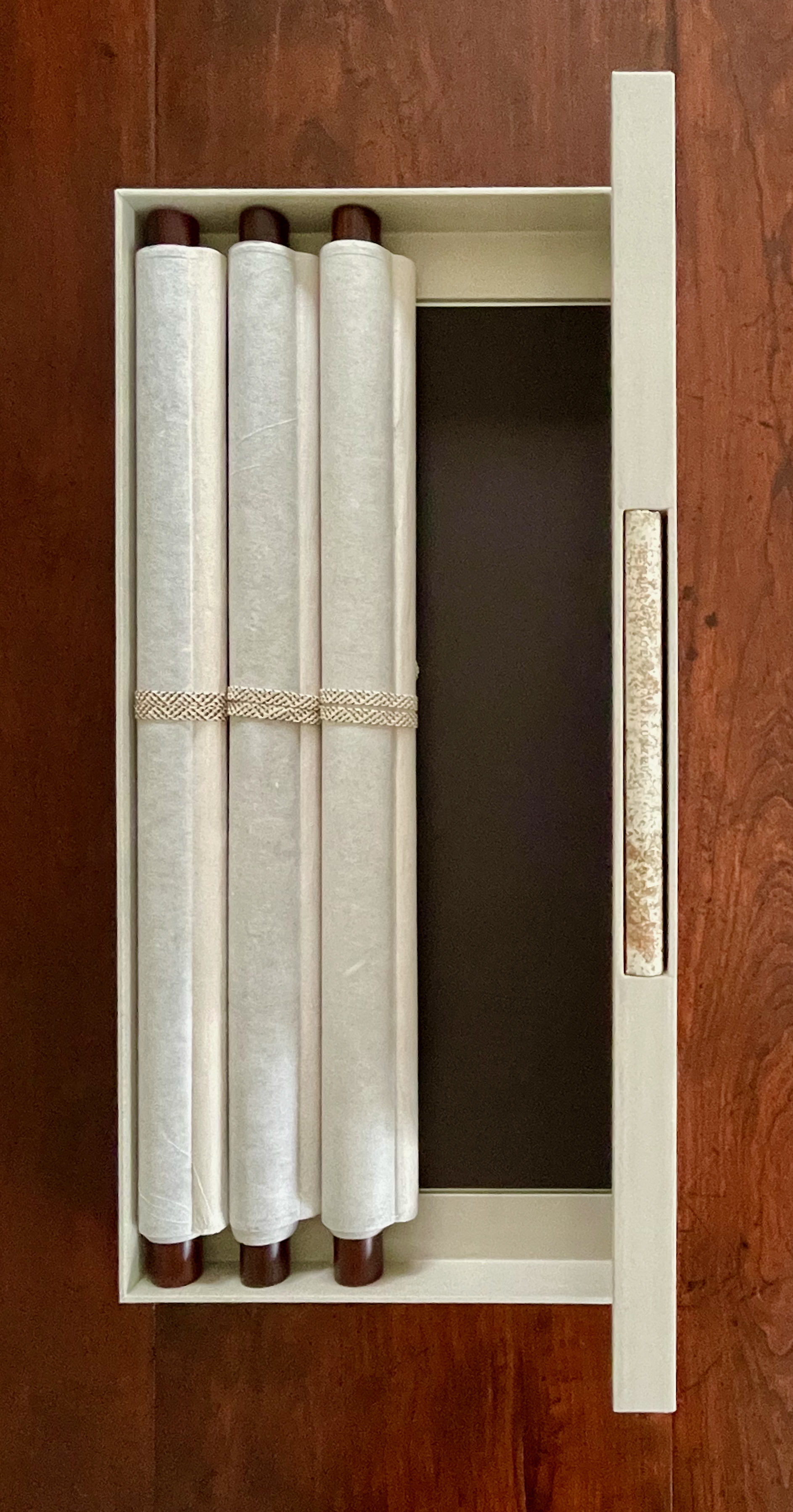
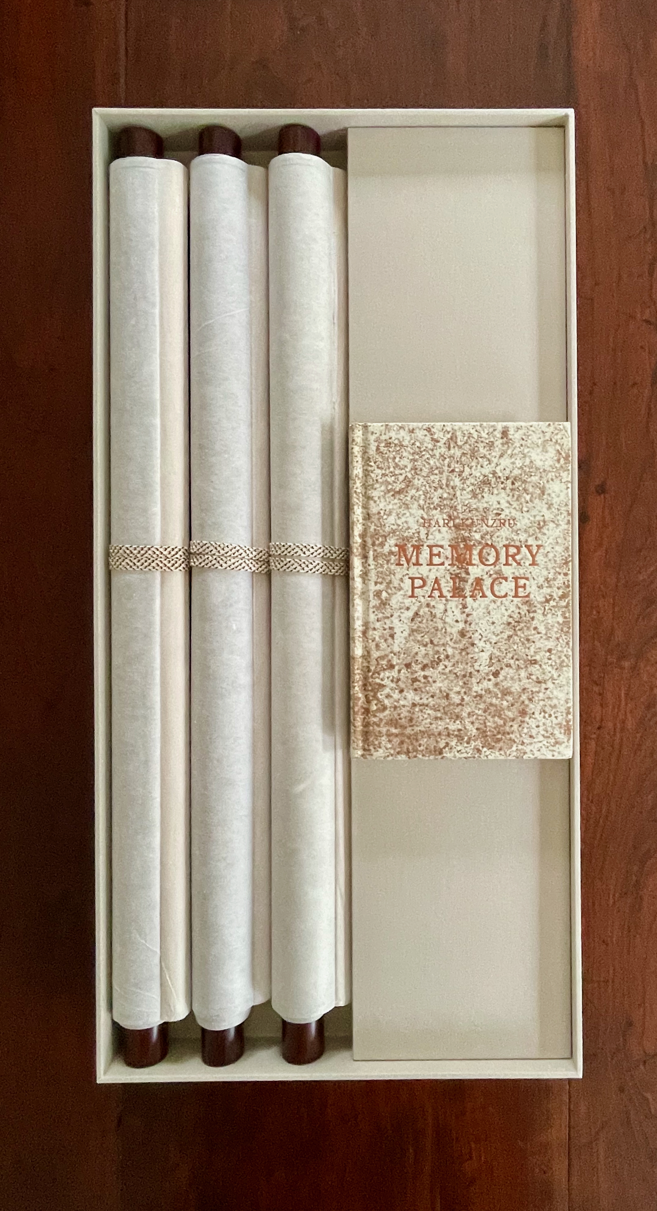
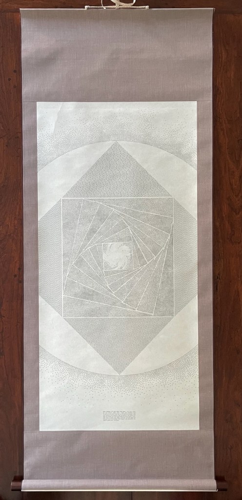
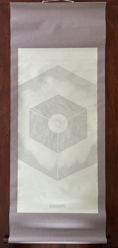
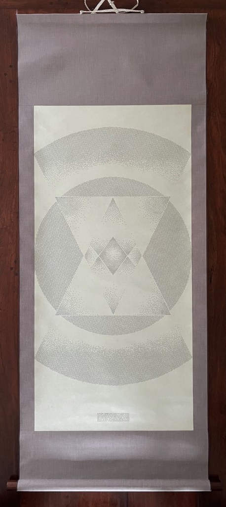
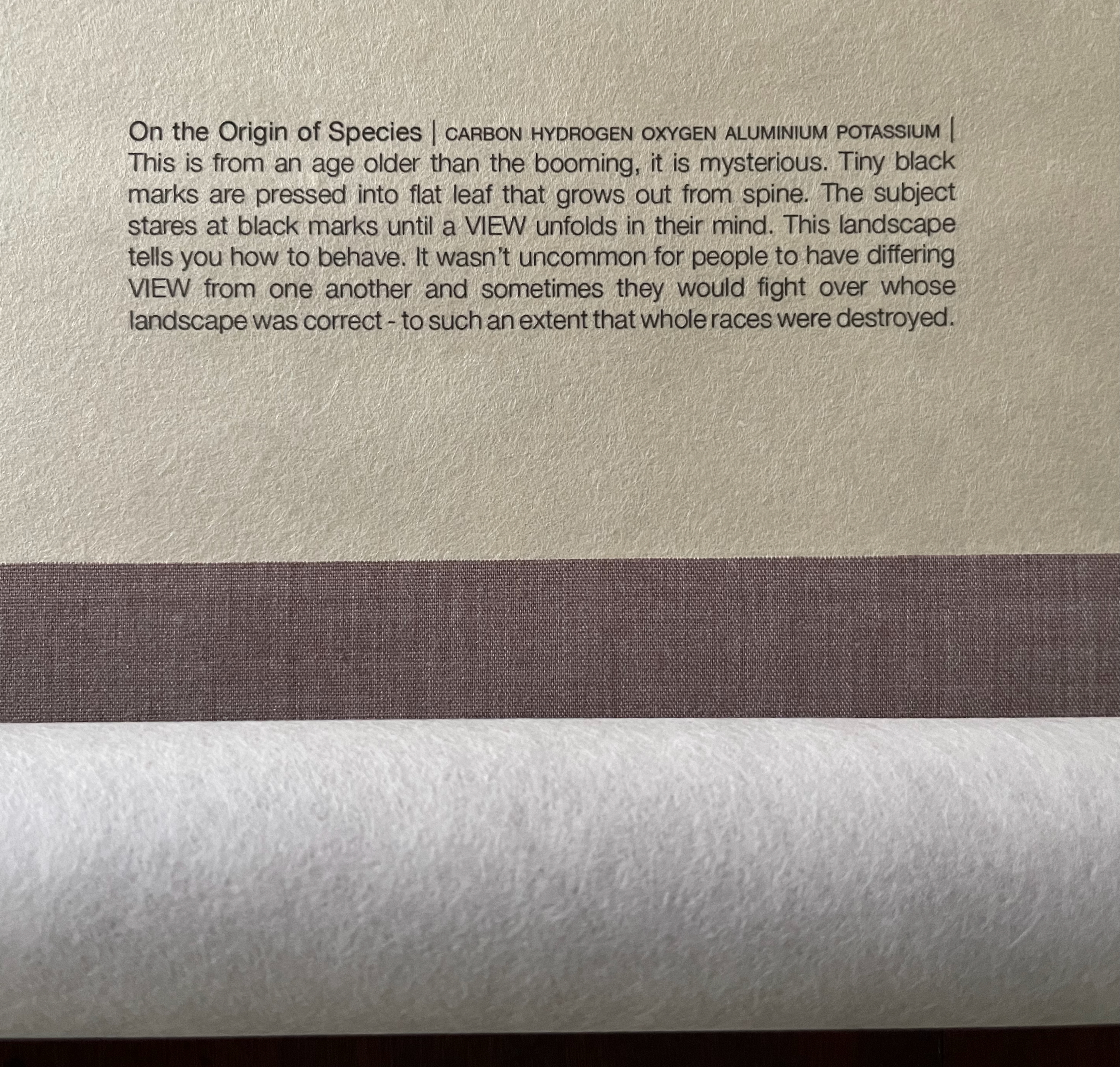
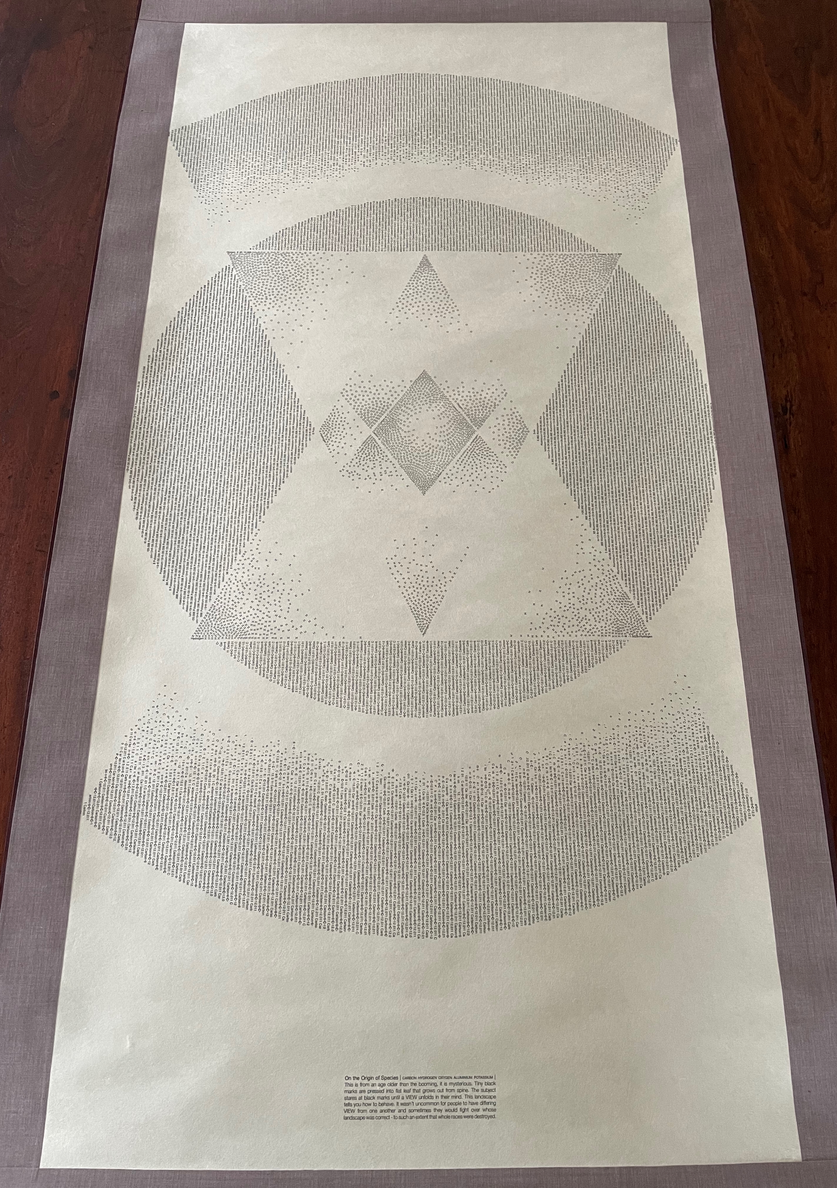
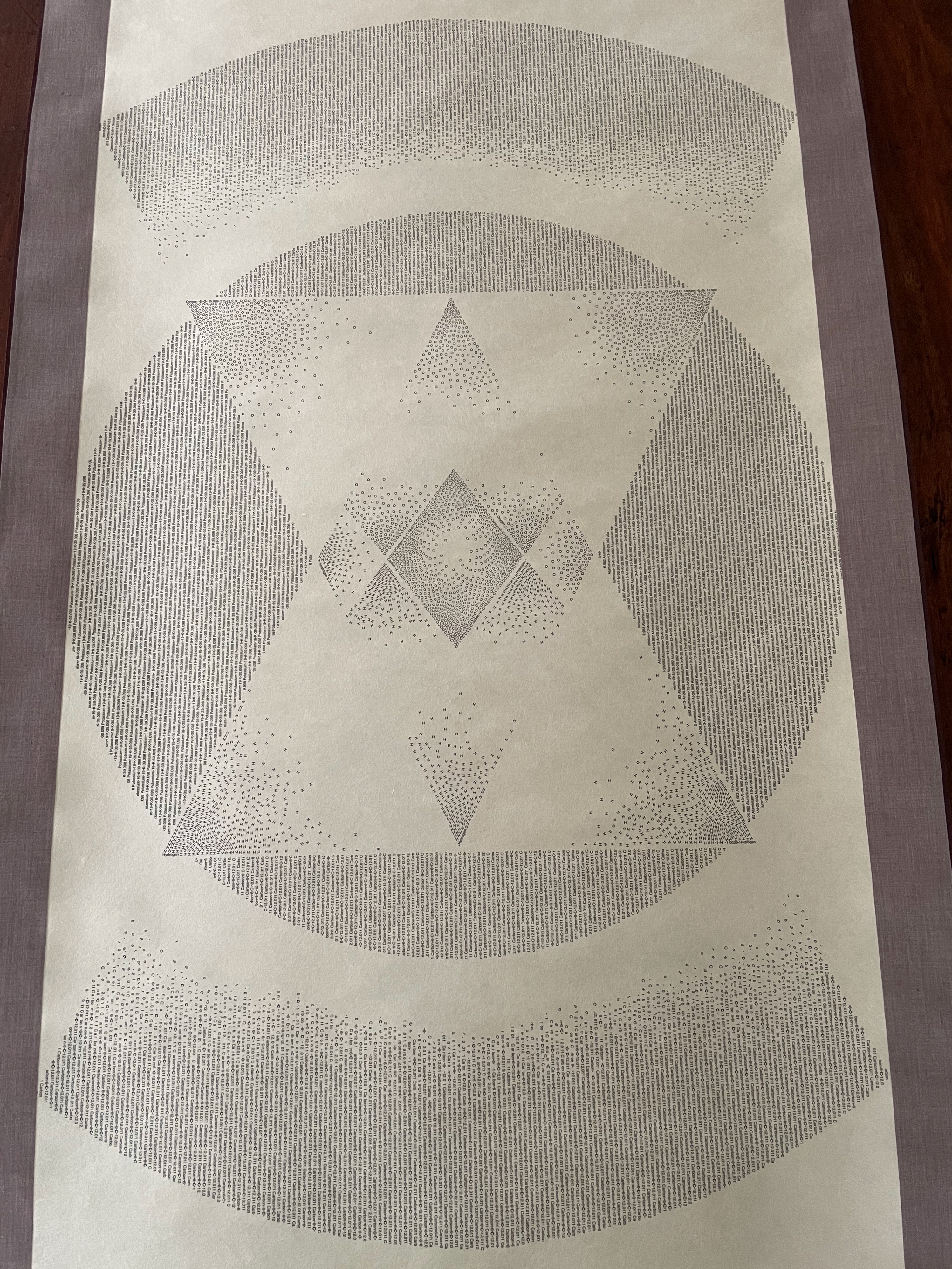
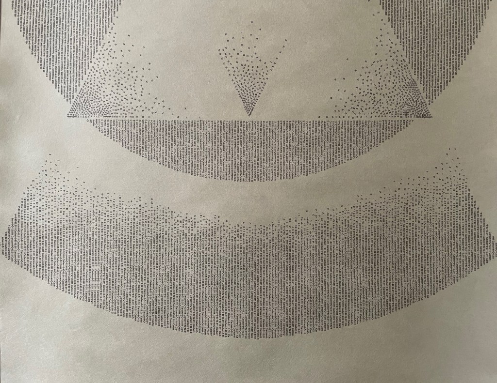
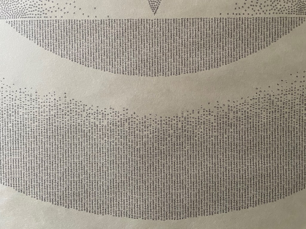
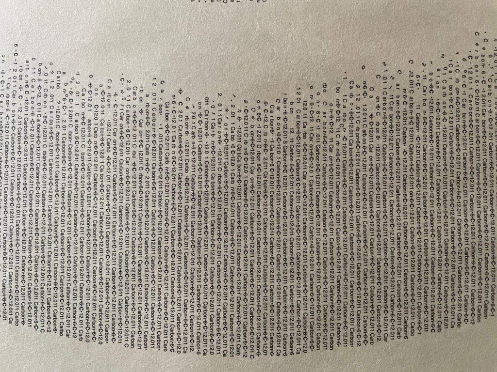
Modern Gods follows on from Winston’s Darwin (2009) and consists of three “sacred” scrolls, each bearing a mandala formed by the names and symbols in type of the chemical elements that compose the modern god the scroll represents: the Rolex President watch, the pay-as-you-go SIM card, and Darwin’s On the Origin of Species.
Modern Gods is partially an example of inverse ekphrasis — where a visual artwork aims to re-present something already presented by a written text. Not the same thing as an illustrated book or livre d’artiste.
Rolex, SIM, On the Origin of Species
Like the works displayed above, Winston’s third scroll offers an example of visual and textual representation of Darwin’s On the Origin of Species, which adds to the unusually lengthy list of works inspired by Darwin’s book. (Perhaps no surprise, but the Memory Palace project also commissioned Stephanie Posavec, whose earlier work also appears above).
Modern Gods was commissioned by Victoria & Albert Publishing as a response to a new piece of fiction it had commissioned from novelist Hari Kunzru along with 19 other visual works in response. As the V&A curators put it, Kunzru’s Memory Palace (2013) and the original commissions from the 20 graphic designers and illustrators would form the basis of an “exhibition that can be read. … [to explore] what happens when a story leaves the pages of a book and enters the gallery space.” Modern Gods stands on its own as an extraordinary fusion of type, word, image, material, and structure.
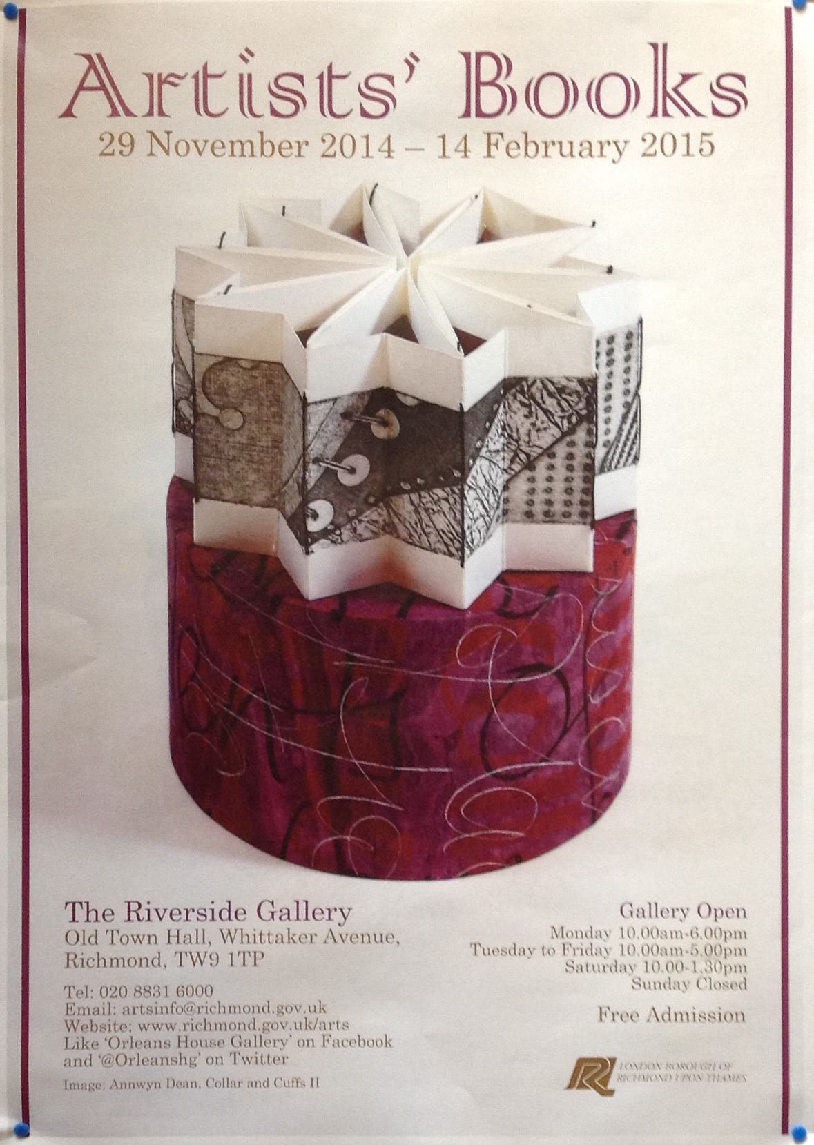
Printmaker, photographer and book artist, Frances Kiernan is based in Richmond, UK. I first saw her work in The Riverside Gallery exhibition (29 November 2014 – 14 February 2015).
… made from the discarded prints during 2010. Rather than destroy them I liked the idea of creating a new piece of work out of damaged and unwanted prints.
The book also serves as a reference to the different processes in printmaking. (Kiernan)
All the Prints I Have Made, 2010 From “Artists’ Books” exhibition at The Riverside Gallery, Richmond, UK 29 November 2014 – 14 February 2015
All the Prints I Have Made, 2010 From “Artists’ Books” exhibition at The Riverside Gallery, Richmond, UK 29 November 2014 – 14 February 2015
All the Prints I Have Made, 2010 From “Artists’ Books” exhibition at The Riverside Gallery, Richmond, UK 29 November 2014 – 14 February 2015
Like this flag book shown, her “Princess Caroline” series vaults over mere craftwork into indelible book art. Her work can be found in collections at the V&A, Kensington and Kew Palaces and the Sanskriti Foundation in New Delhi.
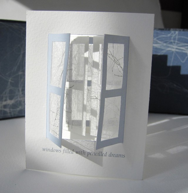
Beyond the Window windows filled with pencilled dreams Princess Caroline was a forward thinking woman with interests in politics, the arts and science. This book represents Caroline’s longing to go out into the world. We imagine her dreaming of a world beyond the window looking out to reach the marvels of the universe. The book was placed in a compartment in the Cabinet of Curiosities. The compartment was lined with mirrors so that the windows appear to be never ending and to help convey how her dreams could never be attained. She contented herself with collecting curiosities that the men brought back from their travels. The windows of this concertina book are handcut. The window panes are covered with Matsuo kozo paper that have been screenprinted from pencil drawings to reflect her dreams. The ‘Maru-chitsu’ wraparound case is screen printed onto bookcloth and can be closed with a Japanese bone clasp. Book commission for the Enchanted Palace Exhibition at Kensington Palace 2010/11.
Leilei Guo is an artist from Beijing. A few years ago, I had the good fortune to meet her at the Frankfurt Book Fair, where she was standing among her works.
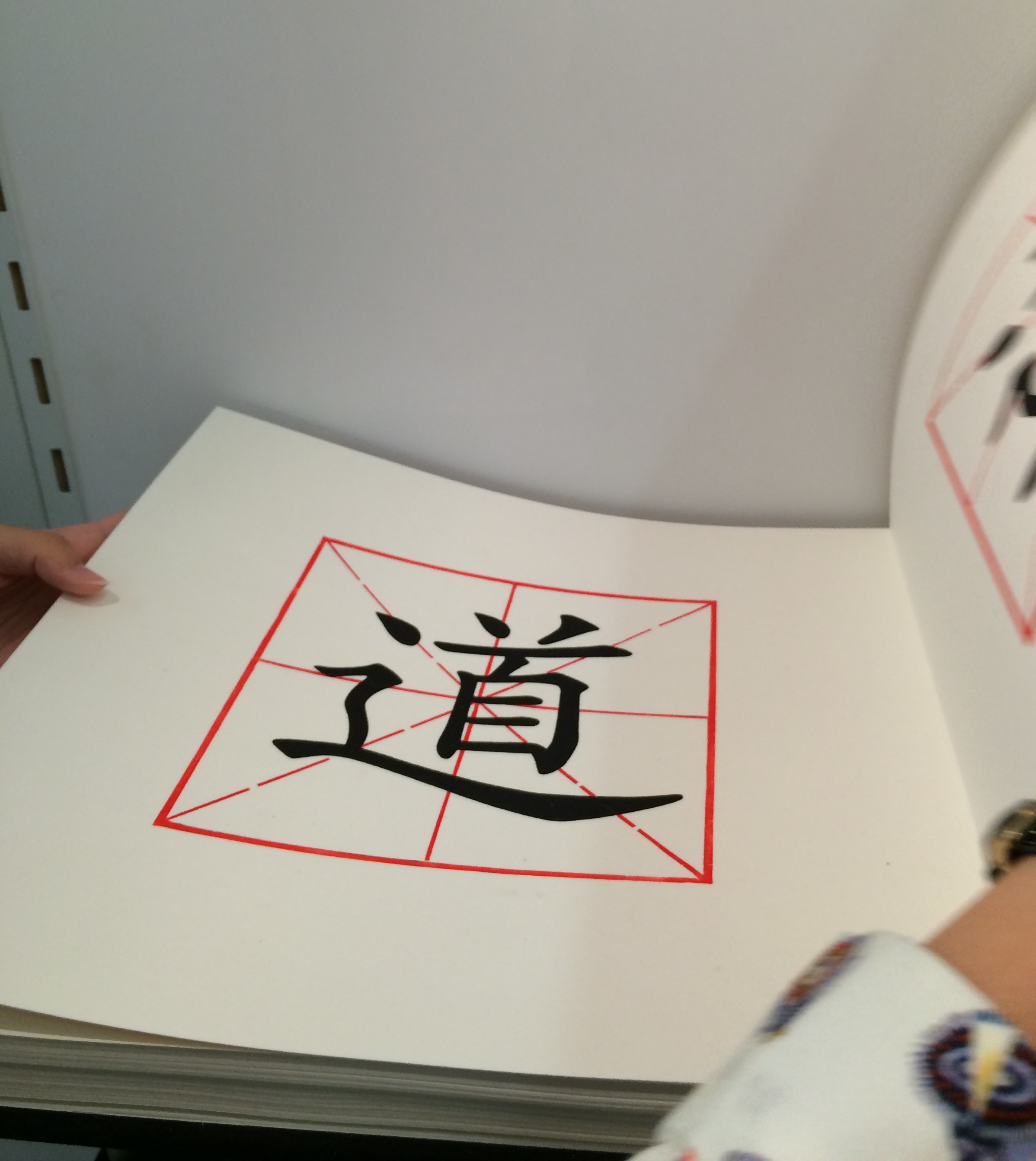
She drew my attention to The Way, a large volume open to a double-page spread on a shelf in the corner of the stand.
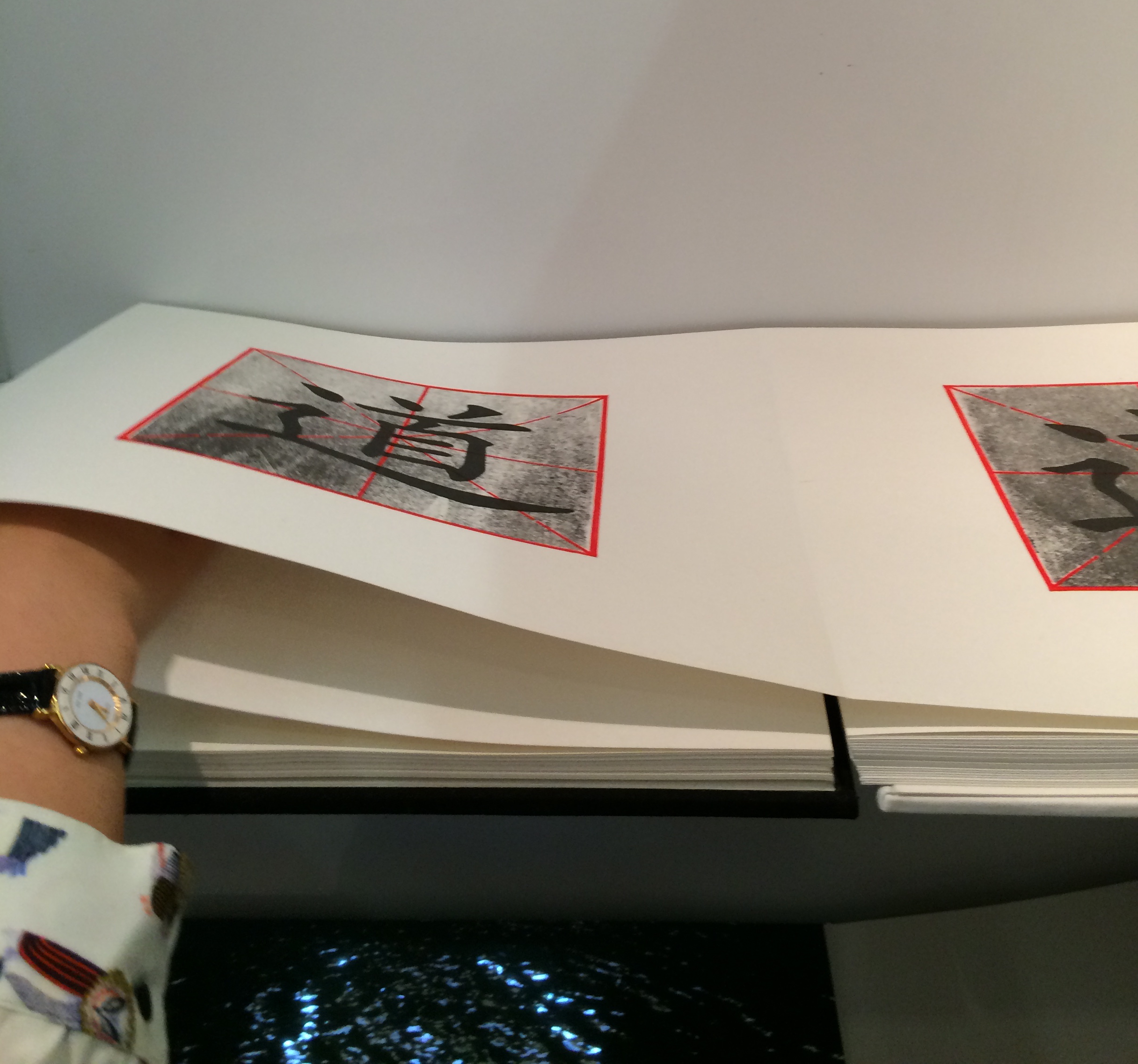
On each page of The Way is a square woodblock print, consisting of the Chinese character for Tao superimposed on a red figure. As the reader moves forward in the book, a darkening silkscreened wash gradually blots out the character.
Artist: Leilei Guo Work: The Way, 2008 Dimensions: 13.625 x 12.75″; 88 pages Material: Woodcut and silkscreen on rice paper. Concertina structure. Bound in cloth, front board in white, back board in black.
Artist: Leilei Guo Work: The Way, 2008 Dimensions: 13.625 x 12.75″; 88 pages Material: Woodcut and silkscreen on rice paper. Concertina structure. Bound in cloth, front board in white, back board in black.
She stepped aside to let me look closer. After I had turned a few pages in the usual way, I commented on the heft of what seemed to be uncut pages. Laid flat in its double-page spread with the sharpness of the fold and weight of the paper apparently sinking into its spine, the book did not immediately betray its leporello structure. She gently moved my hands away and inserted her hand in the fold between the two pages.
Artist: Leilei Guo Work: The Way, 2008 Dimensions: 13.625 x 12.75″; 88 pages Material: Woodcut and silkscreen on rice paper. Concertina structure. Bound in cloth, front board in white, back board in black.
Then, performing a traditional gesture of Tai Chi, she moved her hand to and fro without removing it from between the fold, and the pages turned or rather flowed and folded, each over the next, as if of their own accord. Gesturing from one side to the other and then back, again and again, she moved the print toward its opacity or clarity, depending on the direction. When she closed the volume, I could see that the board on one side was white, the board on the other, black.
According to the Vamp&Tramp’s website, which handled the work’s sale, the book embodies the artist’s vision of two strands of Chinese philosophy — Tao, or The Way, and Yin Yang. For me, that embodiment was in that moment in Frankfurt where another kind of printed book had its origin. Hand, movement, pages, ink, binding, the art were one.
For more of Leilei Guo’s art, visit the Vamp&Tramp site or the artist’s site.
On the occasion of the fortieth anniversary of Weproductions, Brandon Graham interviewed by Helen Douglas in 2011. The podcast provided by Bookbinding Now is available here and is a companion piece to Journal of Artist Books, No. 30.
Douglas’s comments on the concertina or leporello form reveal the impact of Proust and Chinese scrolls on her use of it, which is particularly evident in the two-sided concertina In Mexico: in the Garden of Edward James, discussed here.
Helen Douglas, In Mexico: in the garden of Edward James, 2014 (reviewed in Der Tagesspeigel)
At 6 minutes in, there is a wonderful riff on the book as elemental cultural artifact, being able to stand for each of the four elements. Here are links to the images to which Spector refers – so much more enjoyable to see as well as hear!
There is a related brief note about Spector’s “The Rise and Fall of Books” here. Spector’s works — especially his collages with found poems drawn from book jackets — strike deeply. With them, book art goes beyond the read artifact into the relationship of writing and reading.
For 2014-15, the New England Guild of Book Workers have organized a traveling exhibition: Geographies: New England Book Work, its itinerary covering each of the 6 New England states. Last year, the Rhode Island School of Design (RISD), the Wishcamper Center at the University of Southern Maine and the Bailey Howe Library at the University of Vermont hosted it. This year, the show has appeared at Williams College Library and is scheduled for Dartmouth College Library and the Creative Arts Workshop in New Haven, CT. Criss-crossing geographical boundaries as well as those of book art and the book arts, Geographies calls to mind the last line of Elizabeth Bishop’s “The Map“:
More delicate than the historians’ are the map-makers’ colors.
Or, in this case:
More delicate than the historians’ are the [book-artists’] colors.
Although born in Nova Scotia, Elizabeth Bishop grew up as a New Englander in Massachusetts with her paternal grandparents. As a far-traveller and visual artist as well as poet, she would have enjoyed this exhibition and found it fitting if it had included a broadside of “The Map”.
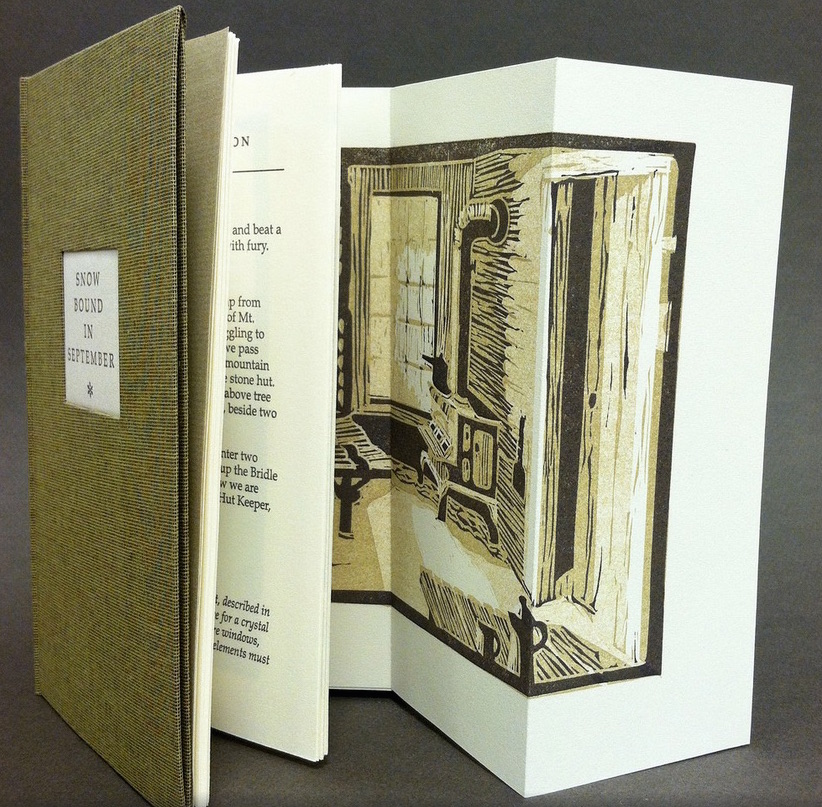
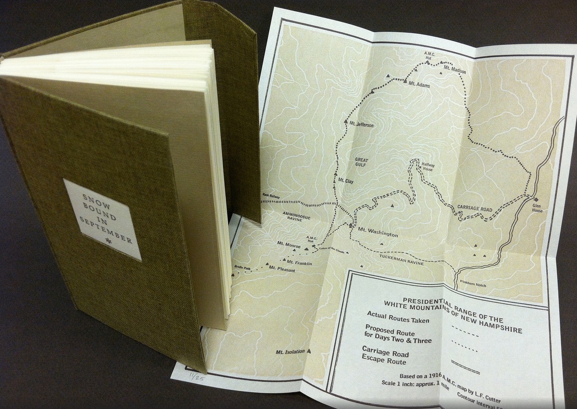
Nevertheless, what a range of “colors” from all the New England states and beyond – from historic to modern, from fine and design bindings to traditional and creative bookbinding, from artist books to calligraphic manuscripts, from masters to apprentices and from object to narrative. The latter finds a wintry exemplar in Snow Bound in September: A Re-Imagining by Laurie Whitehill Chong, retired Special Collections librarian and curator of Artists’ Books at RISD.
The artist made this book the same size as her grandfather’s Appalachian Mountain Club hiking guide. Snow Bound is an invented ancestral narrative, in which the artist uses a surviving photograph and her grandfather’s notes about being stranded with his wife for five days on Mount Washington by a hurricane-driven snowstorm in September 1915 to re-imagine the ordeal from her grandmother’s perspective. Note the slotted front cover into which the flap extending from the back cover fits to keep the book closed, snug against the elements.
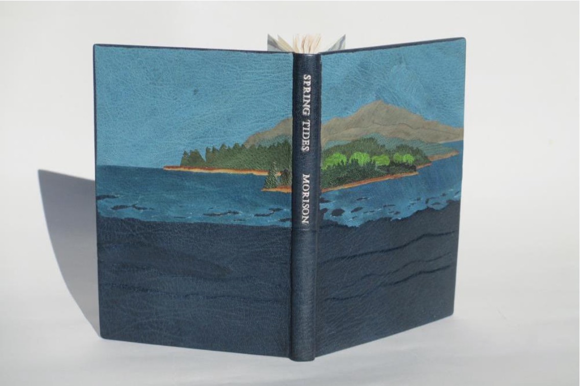
Julie B. Stackpole’s creative re-binding of Samuel Eliot Morison’s Spring Tides takes us from the New England mountains to the shore as can be seen from the layered binding.
Spring Tides by Samuel Eliot Morison Boston: Houghton-Mifflin Co., 1965. Julia B. Stackpole, Design binding 21.8 x1 5.0 x 1.6 cm January 2014
In Stackpole’s words:
The traditional tight-joint binding is covered in navy blue Niger goatskin with waves in the lower parts created by paring before covering. Cut-outs in the onlays of the lighter blue leather of the water help it transition from the dark of the navy to the sky’s azure. Onlays of other leathers create the forested landscape of the shoreline and hills. These blues were chosen because the only blue leather in a large enough piece to cover the whole binding was the dark navy, while I only had scraps of the water and sky’s blue. The endpapers are a Cockerell marbled paper over-painted with blue, with leather hinges.
Pictures of the works in the catalog (and others not) can also be found at the Williams College Flickr site (for now). I say “for now” because they will be pushed downstream inevitably in the way of today’s digital flow. They may even disappear; although as Matthew Kirschenbaum has explained in Mechanisms, something digitally forensic will remain. That boundary of the tangible and the digital, the haptic and the virtual, is only lightly but evocatively touched in this collection.
When Julia Stackpole writes in the online catalog about that Cockerell marbled paper that it “felt to me like the waves and the shoals and ledges of Maine waters”, you long to lay hands on the Spring Tide. Anne McClain’s Place includes photographs taken digitally of places on Maine’s midcoast that have been special to her her “entire life and will continue to be a constant as other things change and move on”. What is captured digitally is reproduced physically to fix those places that will “continue to be a constant”. But places do change.
Anne McClain, Place Drum Leaf Binding 19 x 15 x 1.8 cm February 2014
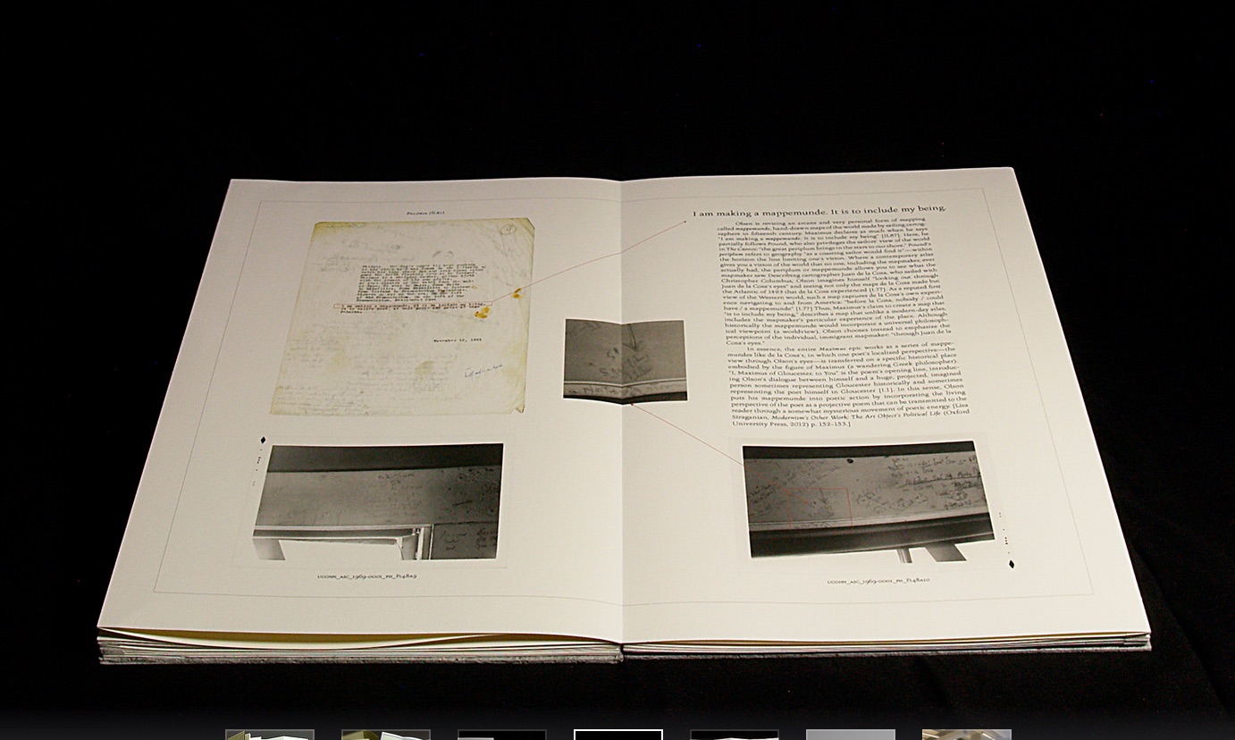
Rutherford Witthus’ contribution touches the boundary between the digital and physical most directly. His artist’s book is entitled 28 Fort Square: What Charles Olson wrote on the window casings of his apartment in Gloucester, Massachusetts, of which there are eleven copies.
Rutherford Witthus, 28 Fort Square: What Charles Olson wrote on the window casings of his apartment in Gloucester, Massachusetts, 2014
In these 11 copies, Witthus digitally reconstructs the windows of Charles Olson’s apartment at 28 Fort Square where he wrote his main work, The Maximus Poems, and covered the window casings with meteorological data. The artist book “presents for the first time all of the images of the window casings”.
Rutherford Witthus 28 Fort Square: What Charles Olson wrote on the window casings of his apartment in Gloucester, Massachusetts Artist book 42 x 28 x 2.5 cm 2014 Edition of 11
Athena Moore, chapter secretary of The New England Guild of Bookworkers, produced the catalog for this itinerant exhibition organized by Stephanie Wolff, Exhibitions Coordinator and Todd Pattison, Chapter Chair. If you have the chance to see the exhibition in its next venue, take it.
Just as Elizabeth Bishop questioned the depiction of the boundary between land and water on her map – “Shadows or are they shallows at its edges …”, you will find the juxtaposition of these works reminds you that the boundary between book art and the book arts can be shadowy or shallow indeed.
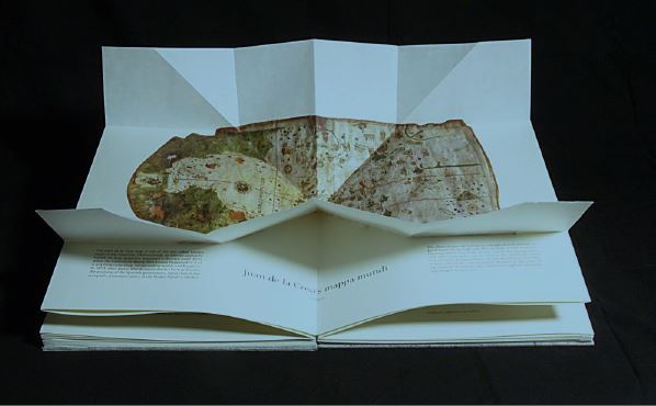
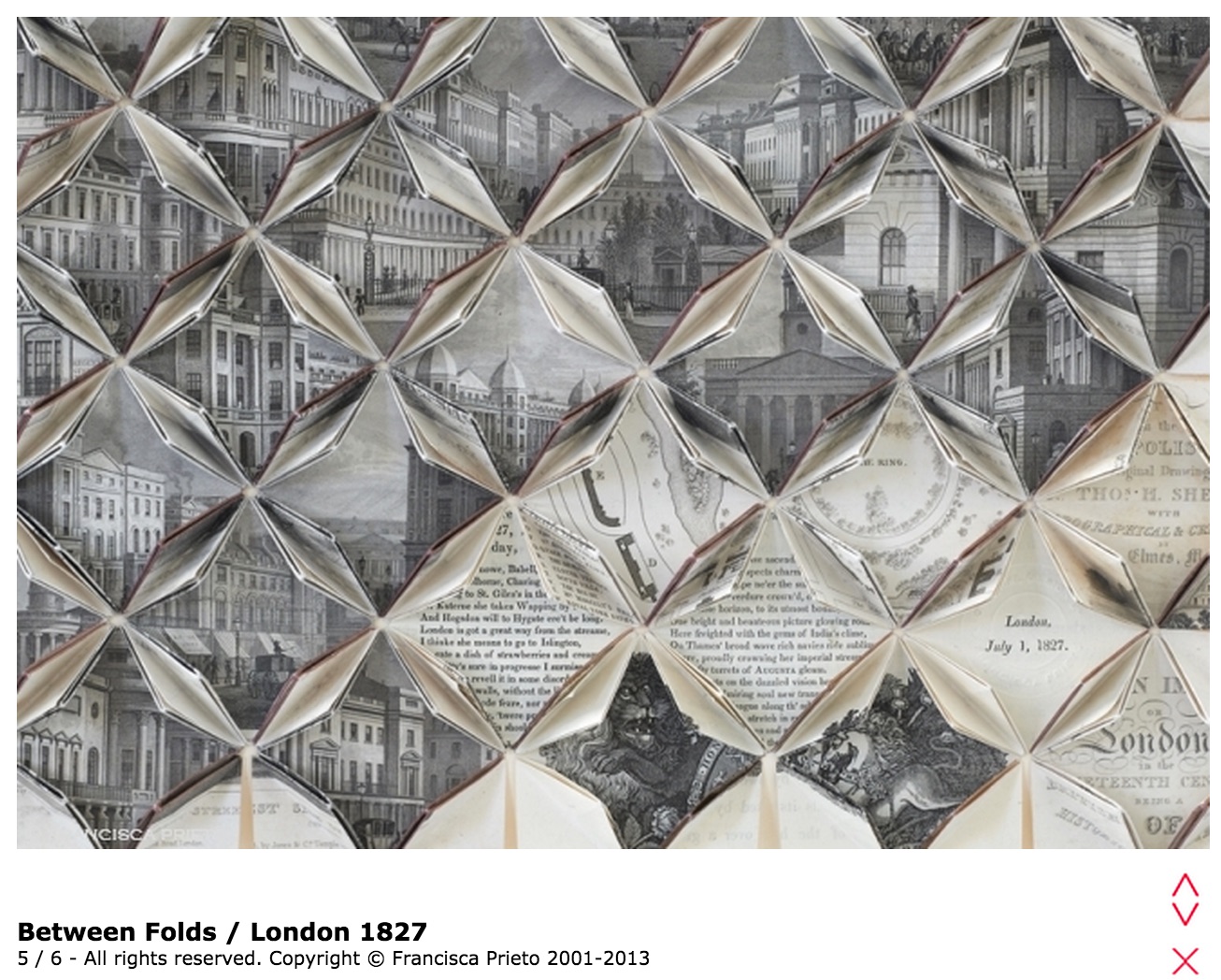
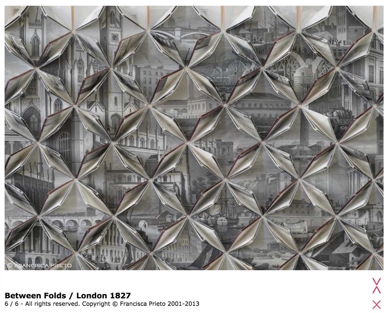
London 1827 takes us back in time, unfolding the nineteenth-century city before us. In a fluttering of pages we are cast among the grand stone of new buildings, under bridges, along the paths of Regents Park, up to a long-forgotten skyline – an elegant rising of church spires. — Francisca Prieto,Between Folds
In August 1827, William Blake’s family walked along these London streets in the cool of the buildings’ shadows to the site of an unmarked grave in Bunhill Fields in the Borough of Islington. If the mind’s eye lets the spectator step into those shadows, the metallic edging of the folds in this work recalls Blake’s invention of relief etching on copper plate to enable the “Illuminated Printing” of his “Illuminated Books”. Where the eye passes Lincoln’s Inn Fields, Blake’s apprenticeship springs to mind — for 50 guineas to an architectural prints engraver (James Basire, 1730–1802) for the tasks of polishing the plates, sharpening the gravers, preparing the surfaces for the acid, guiding the graver’s bite through the copper and, eventually, creating the sketches for the plates in Richard Gough’s Sepulchral Monuments in Great Britain.
Gradually becoming aware of Prieto’s painstaking mathematical precision and calculation to expose between the folds just the right text and illustrations from London and its Environs in the Nineteenth Century by Thomas H. Shepherd, published the month before Blake’s death, the flâneur of London 1827 might wonder whether Blake would have cast Prieto’s lot in with those of Newton, Locke and Bacon, his sterile scientific materialists. But no, Blake praised the unity of art and science:
“What is the Life of Man but Art & Science?” (Jerusalem, plate 77)
“Art & Science cannot exist but in minutely organized Particulars, and not in generalizing Demonstrations of the Rational Power.” (Jerusalem plate 55: line 62).
Prieto’s works consist of these “minutely organized Particulars” and, being so, they bring the viewer to “Life” and assert their place in the tradition of book art.
She Returns

 For her next invitation to the viewer to follow, unravel secrets and attend closely, Ruston is returning to the ocean.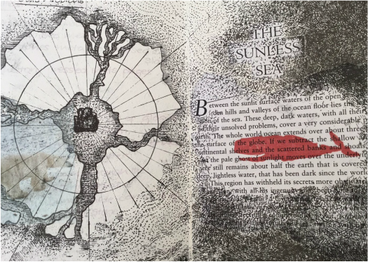













 Books On Books