Anakatabase: en hommage au Sacré d’avant le Temps du Signe et du Verbe (1991)
Anakatabase: en hommage au Sacré d’avant le Temps du Signe et du Verbe (1991)
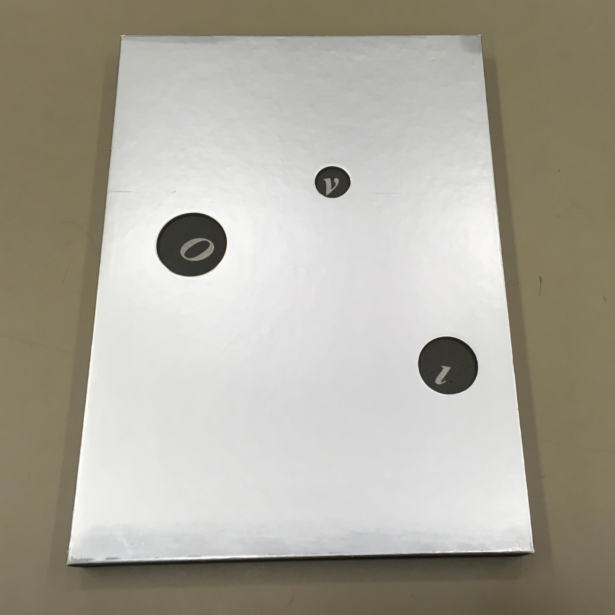
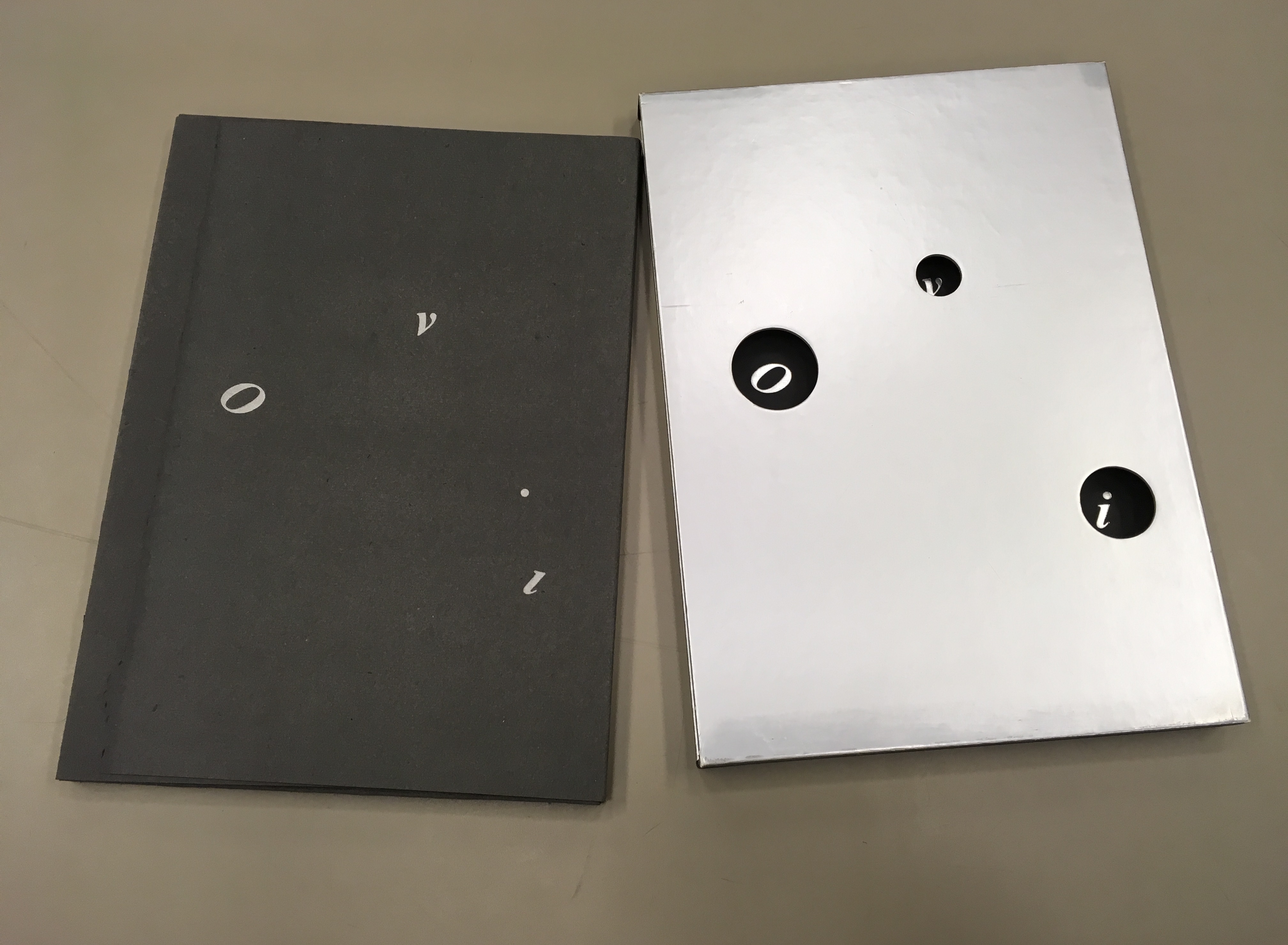
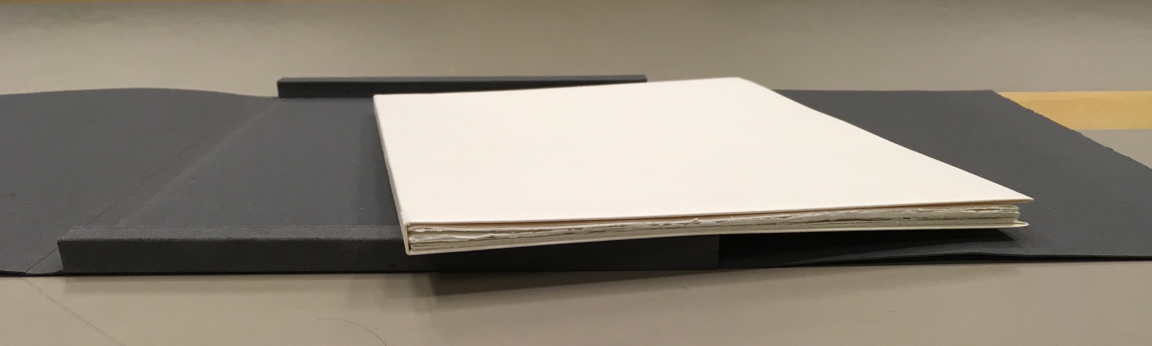
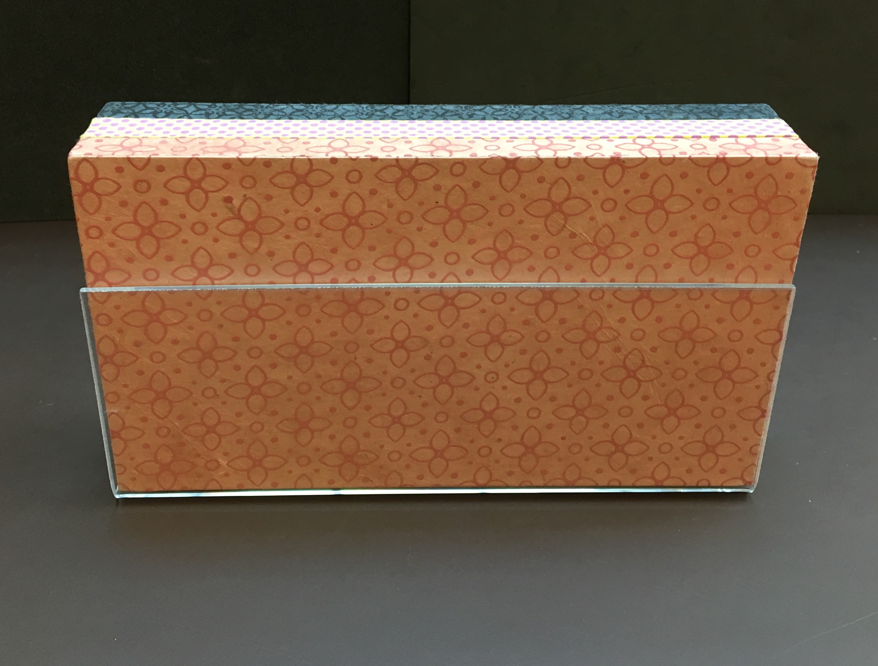
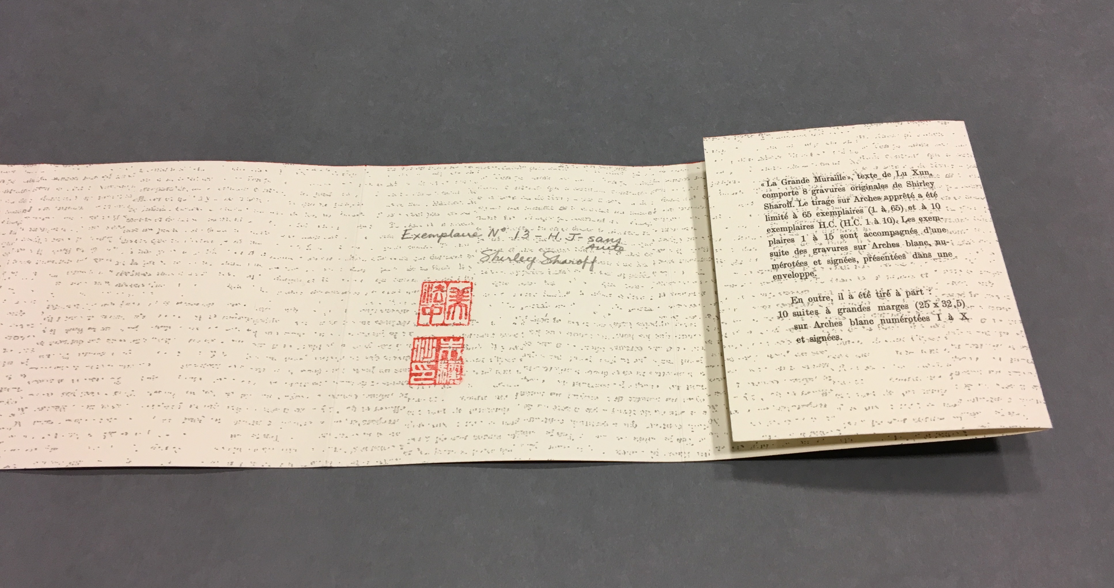
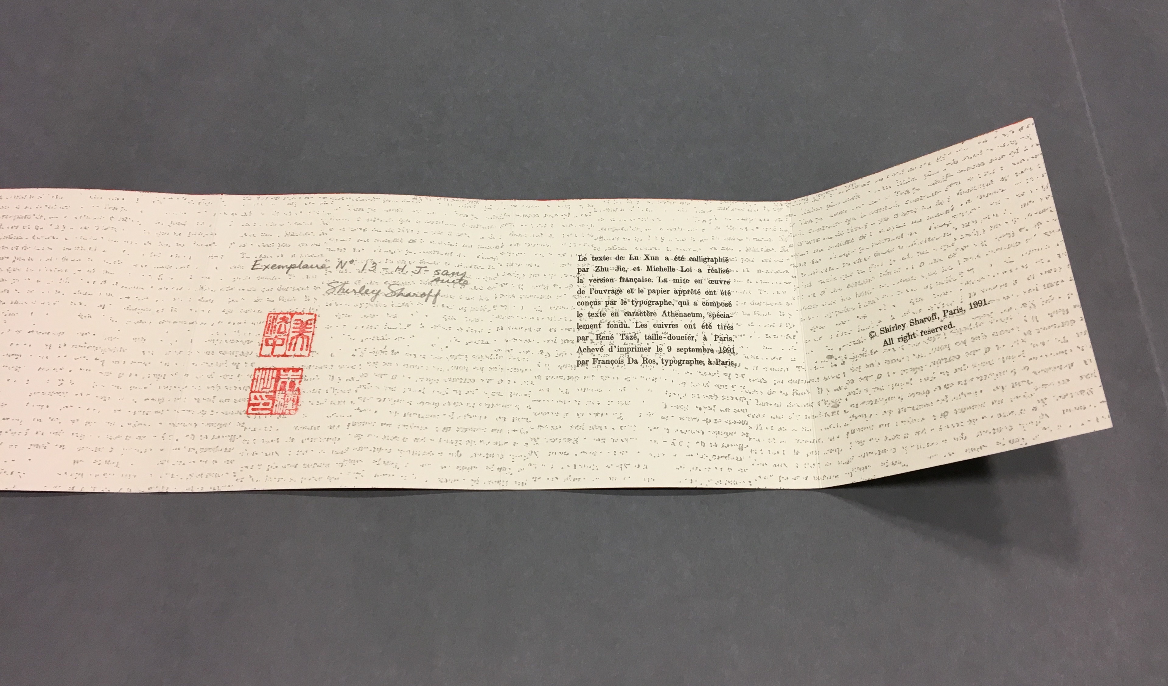
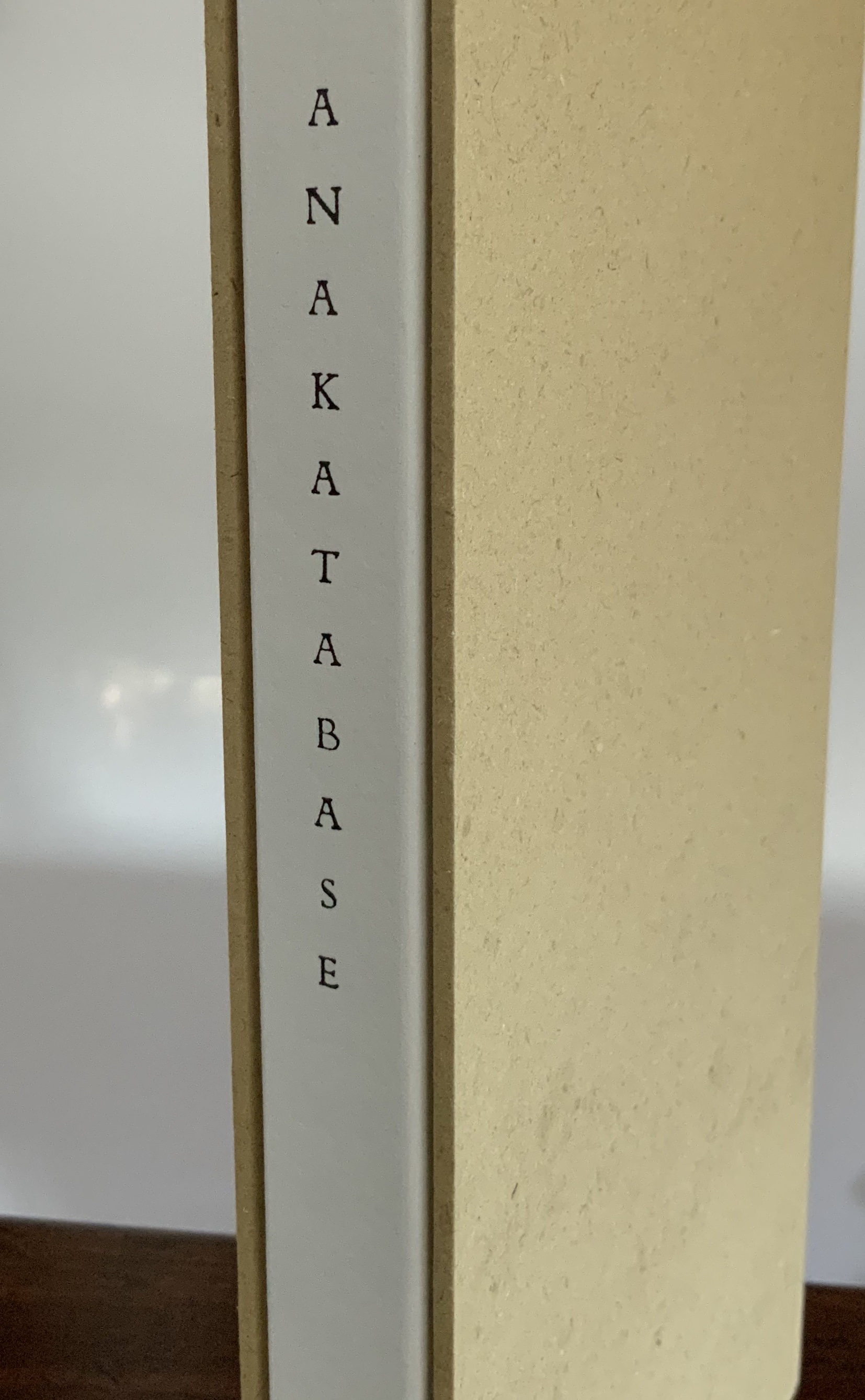
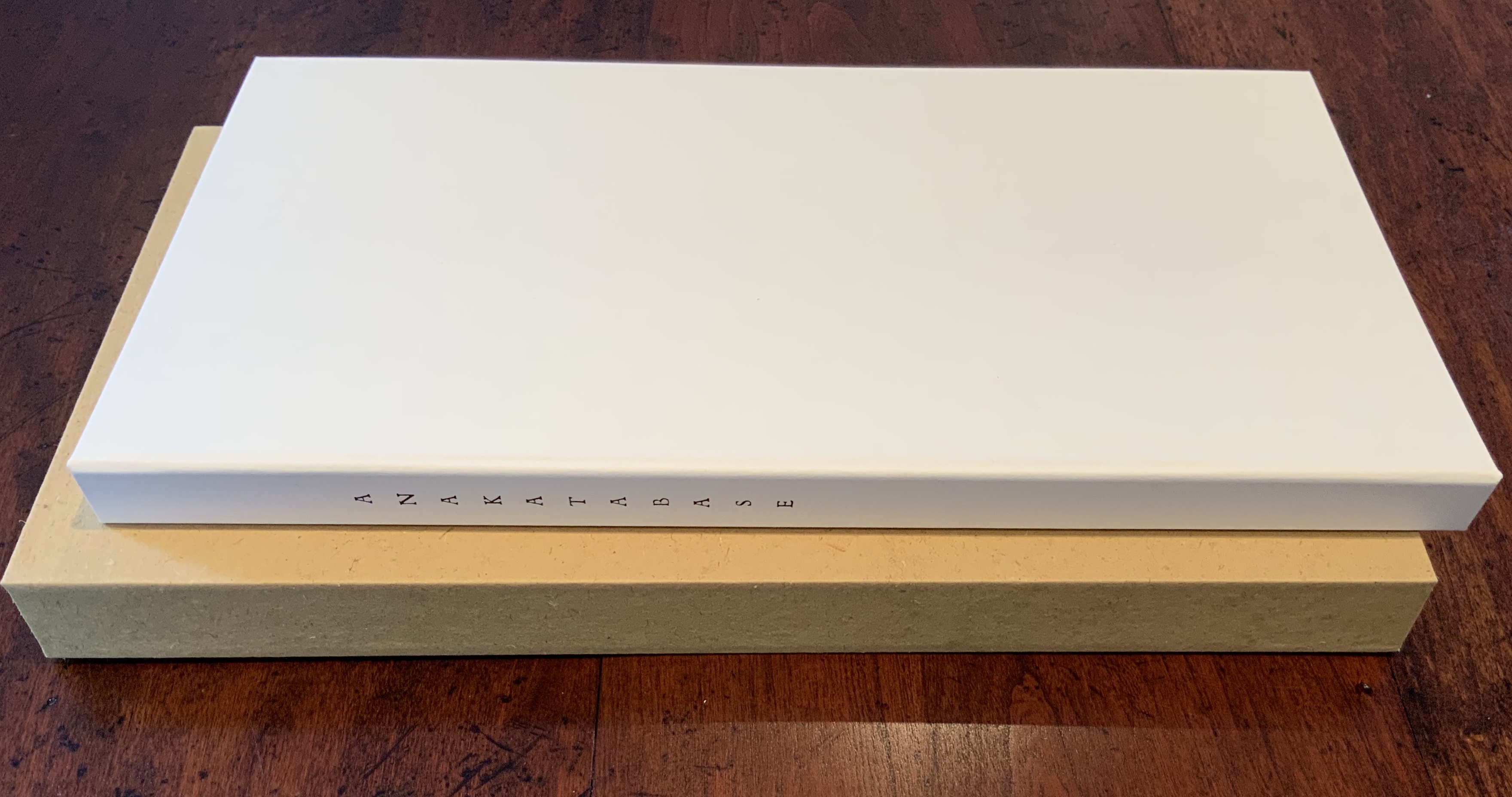
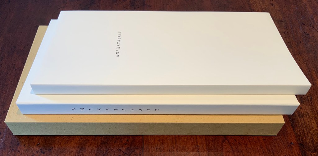
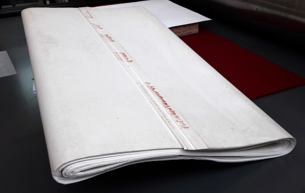
Slipcase: H331 x W179 mm. Board case: H323 x W177 mm. Paper case: H319 x W169 mm. Loose folios (9): H315 x W164 mm. Leporello: H312 x W168 mm (closed) and W3024 mm (open). Acquired from the artist, 19 August 2020. Edition of 63, of which this is #7 signed by the artist and engraver. Photos: Books On Books Collection. Displayed with permission of the artist.
In the Petit Sèminaire de Flavigny-sur-Ozerain, where François Da Ros was enrolled in 1953, a metal staircase led from the playground to the chapel. From an onomatopoeic word game, passed down through generations of classical Greek students ascending (ana) and descending (kata) those steps (base), it came to be known as ana-kata-base. The word game followed Da Ros in his choice of typography and printing over religious orders, with Anakatabase becoming the name of the typesetting/publishing house, founded with Martine Rassineux in 1991.
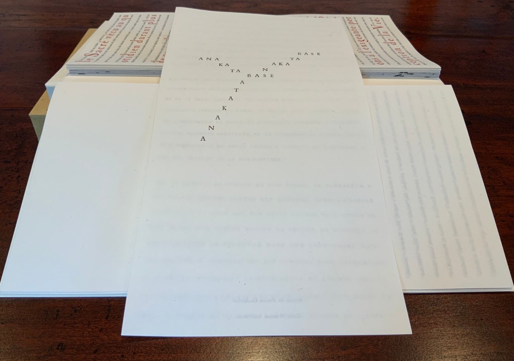
Photo: Books On Books Collection.
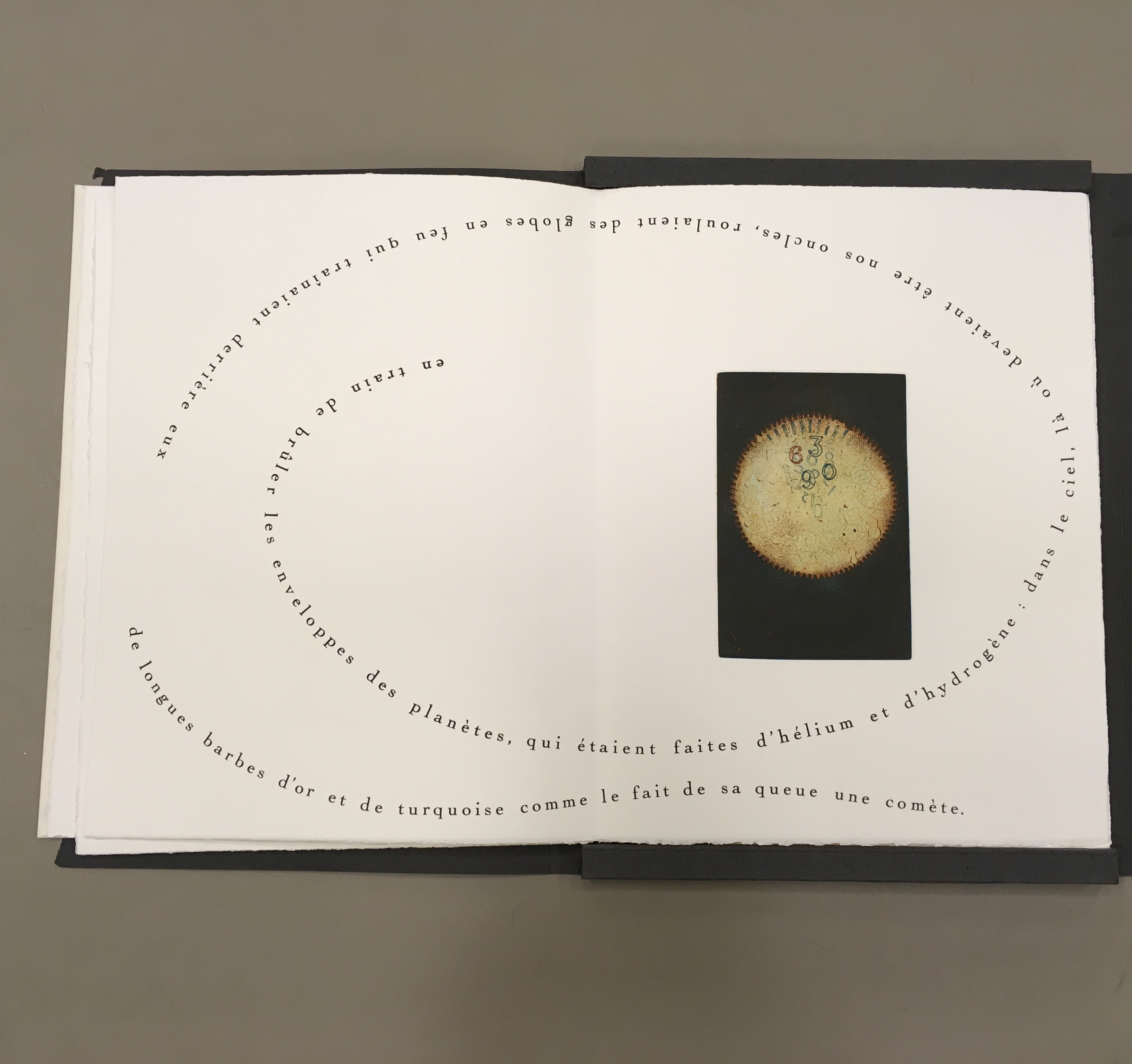
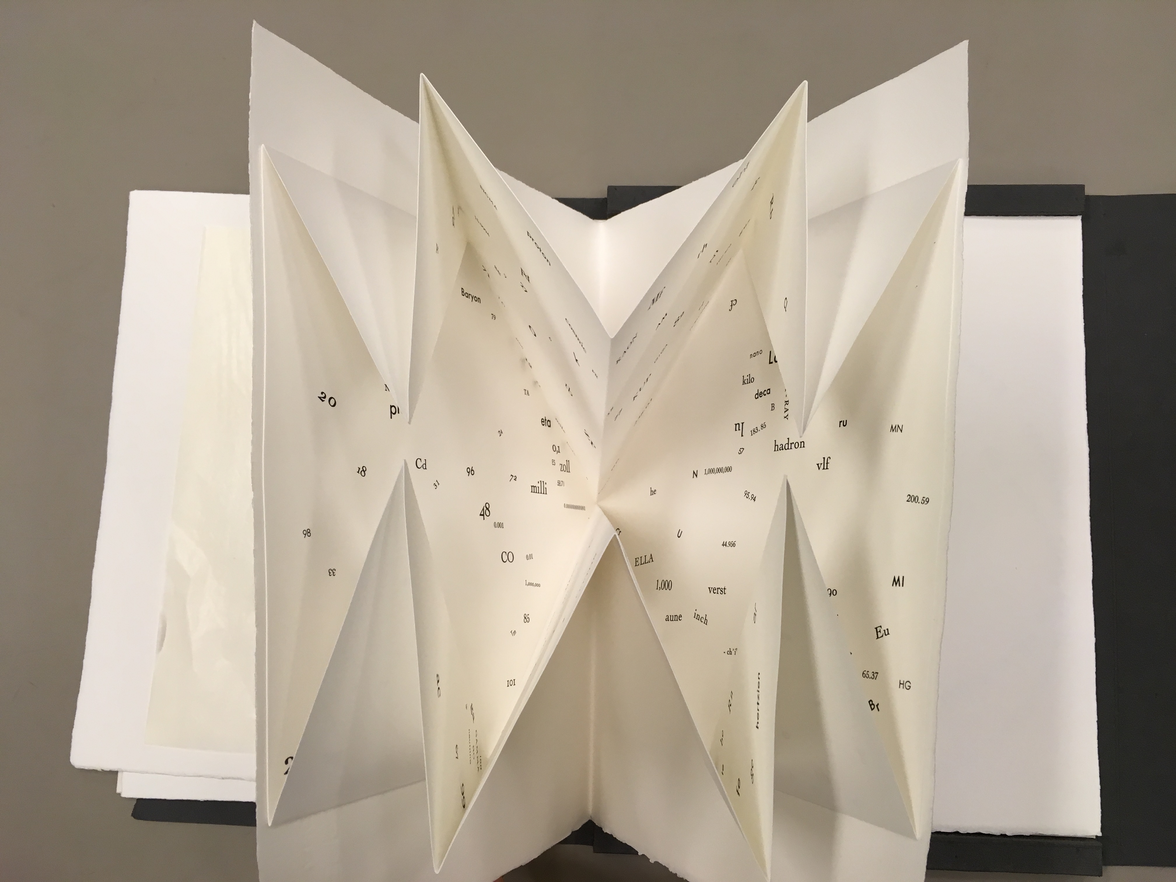
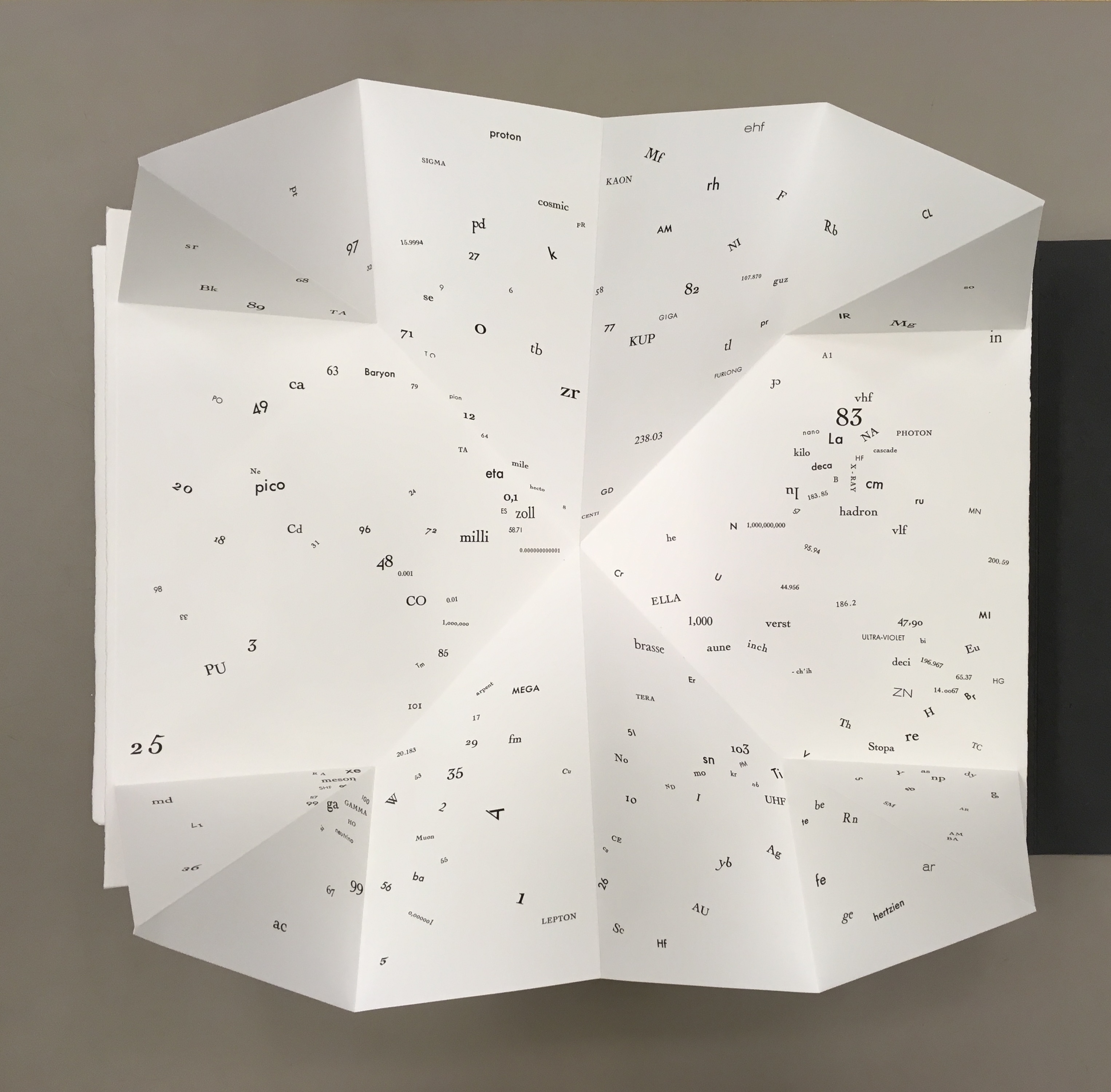
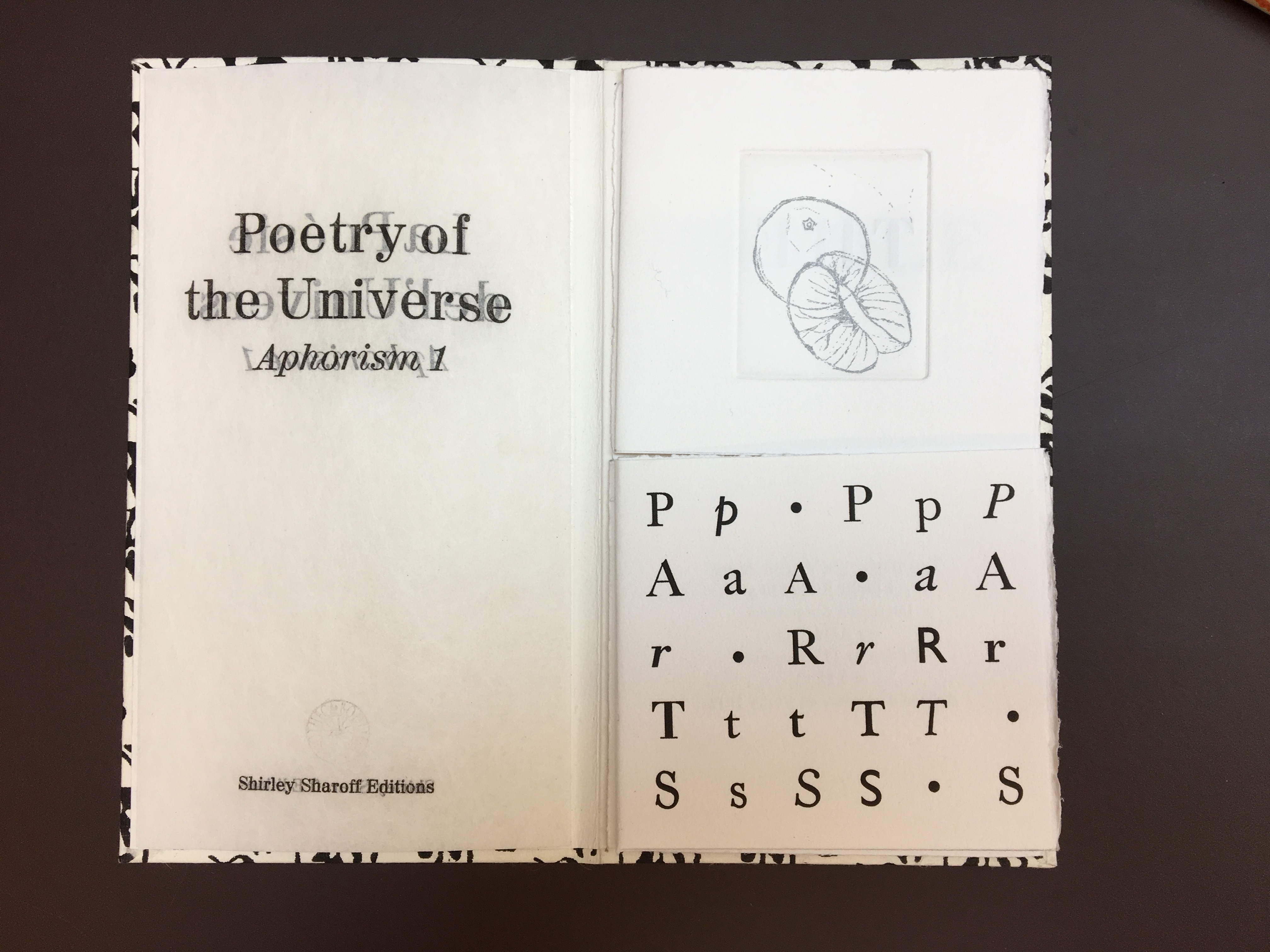
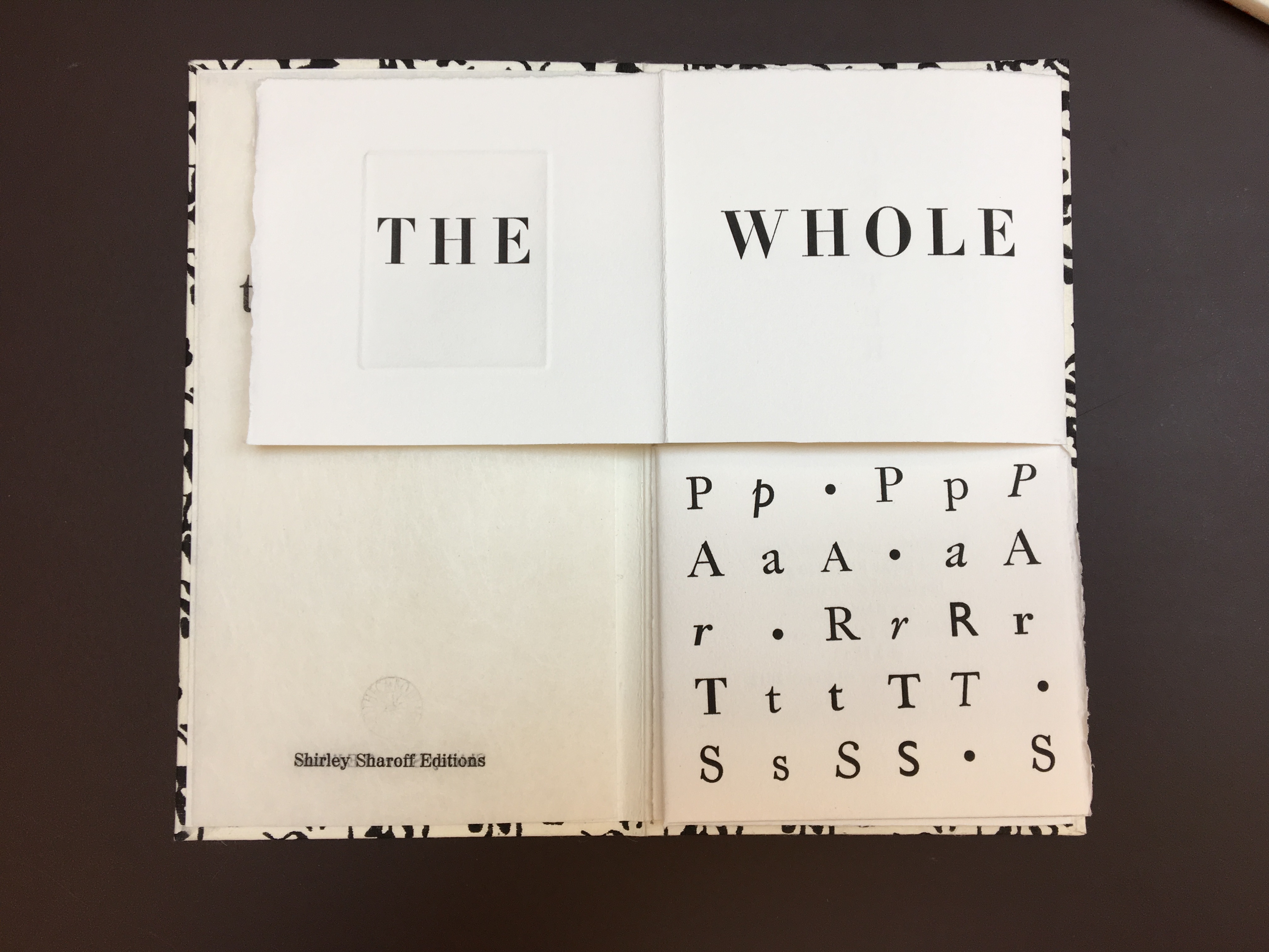
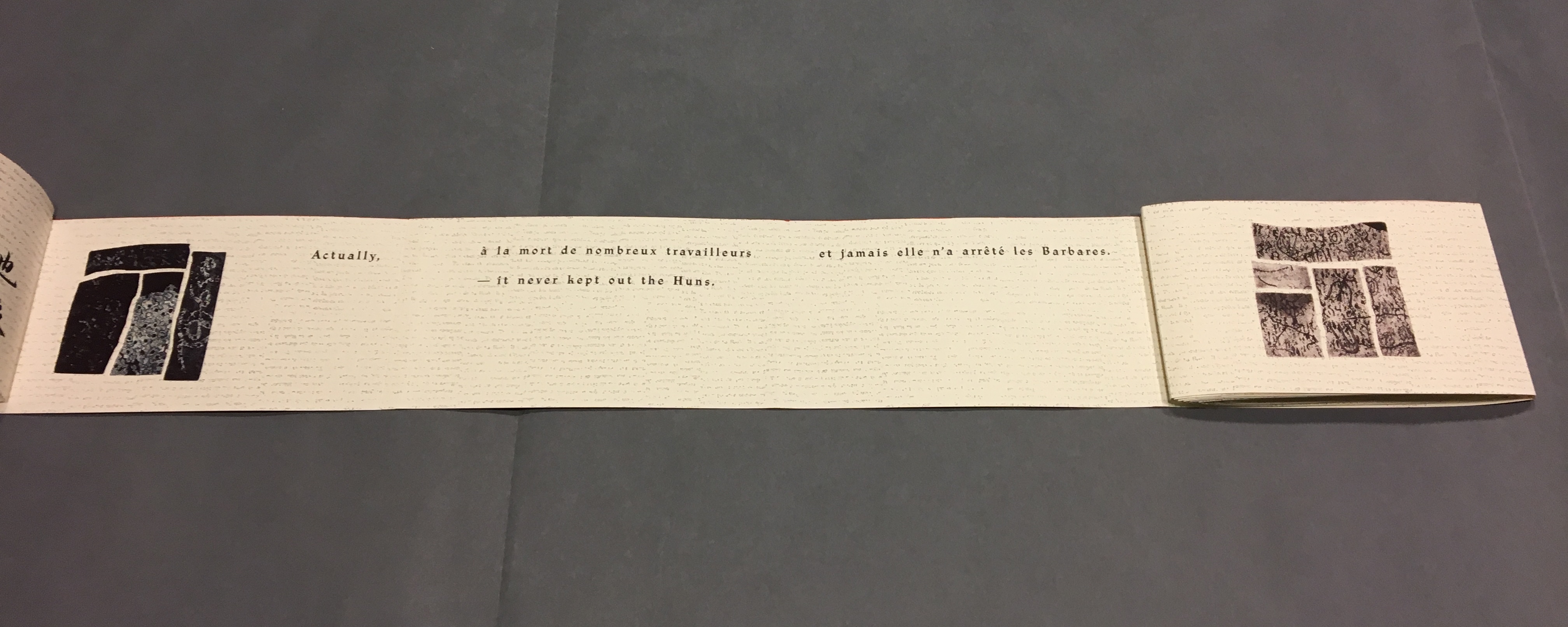
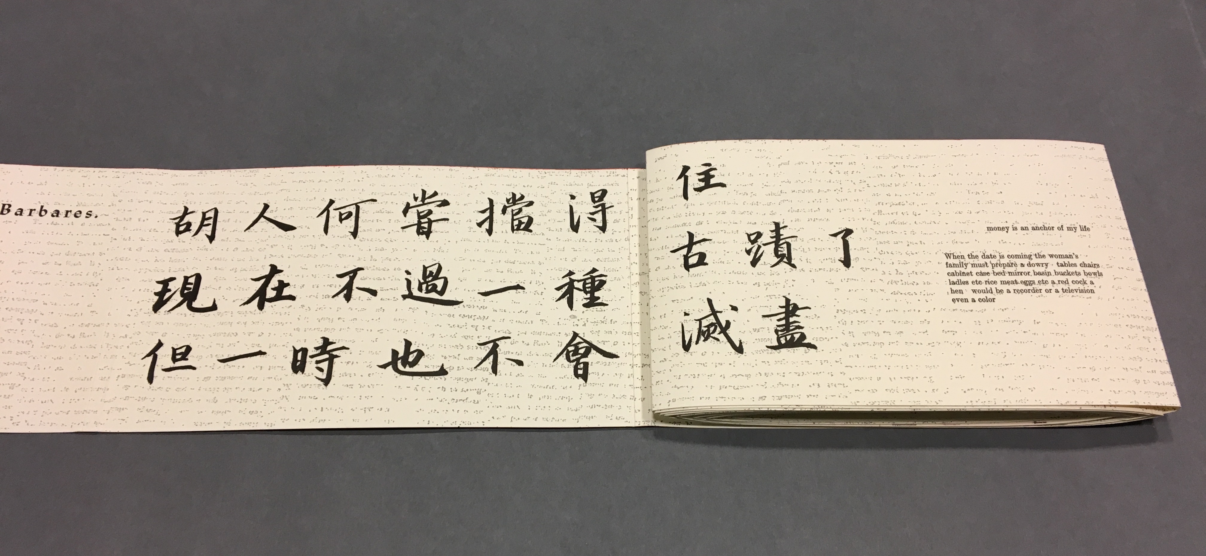
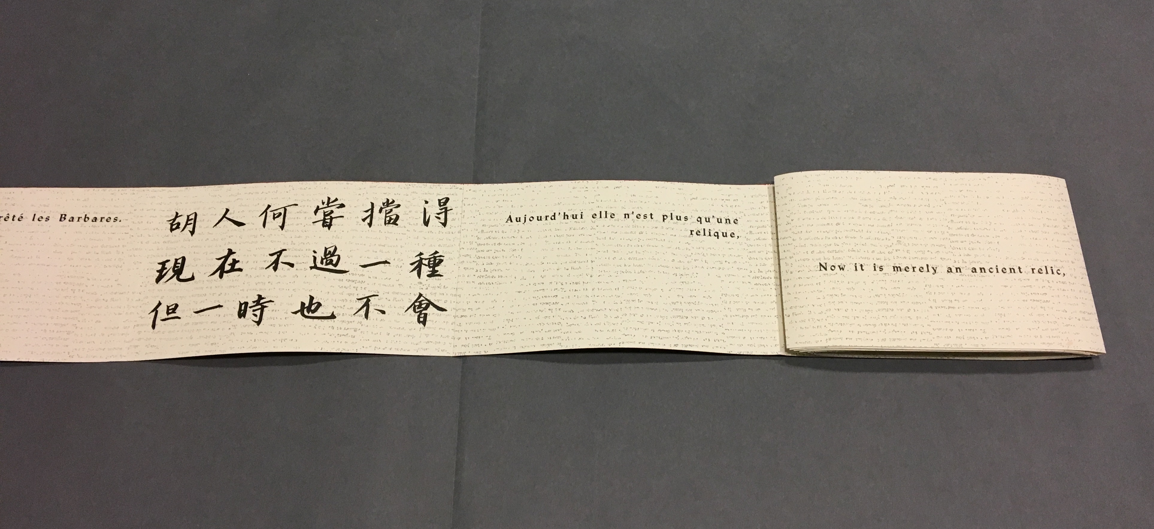
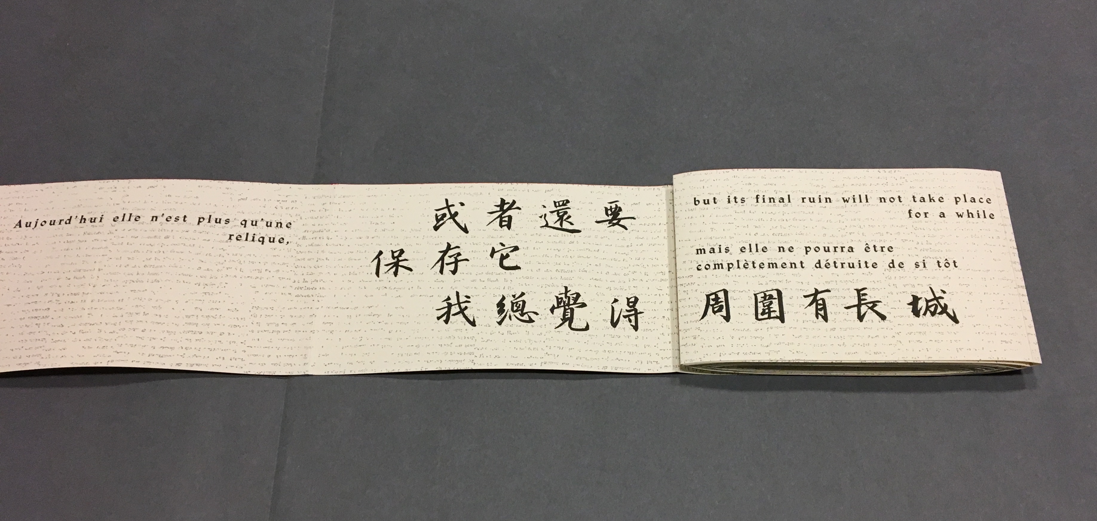
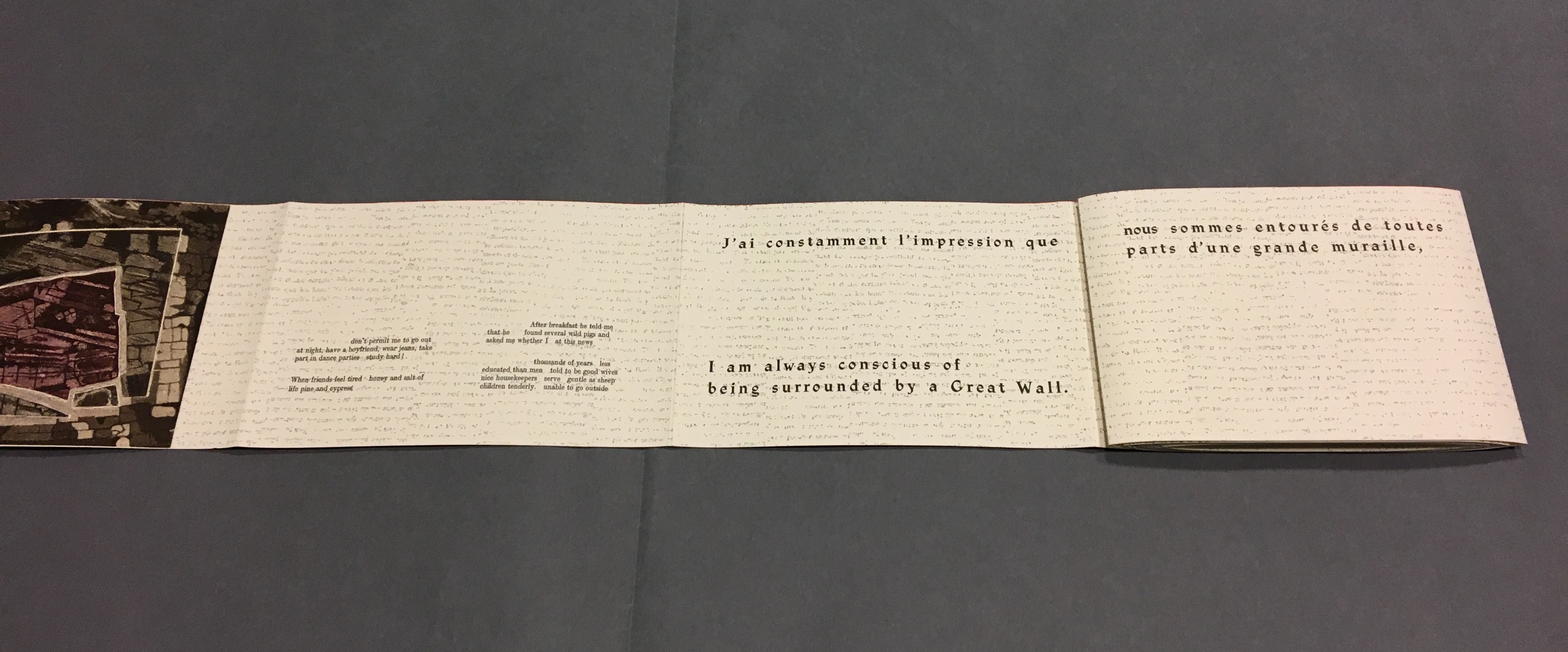
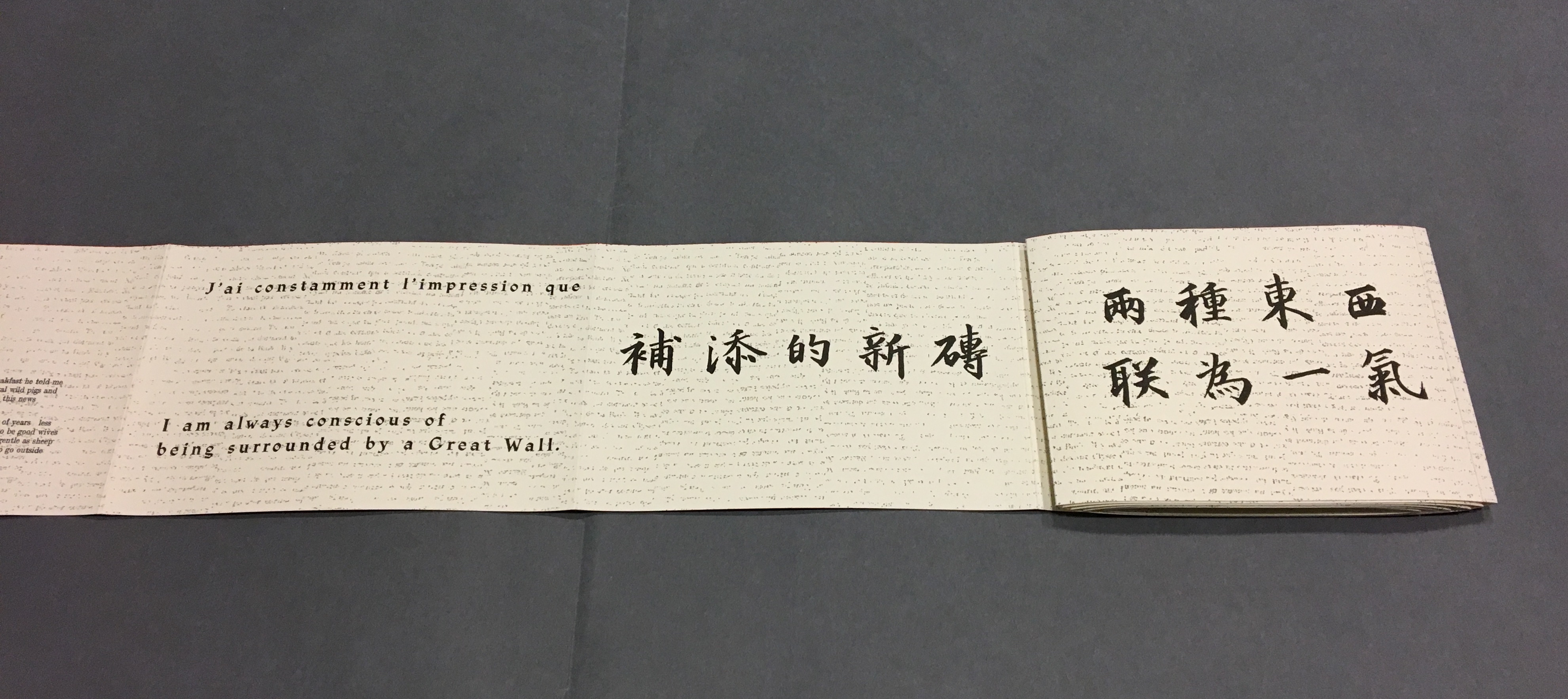
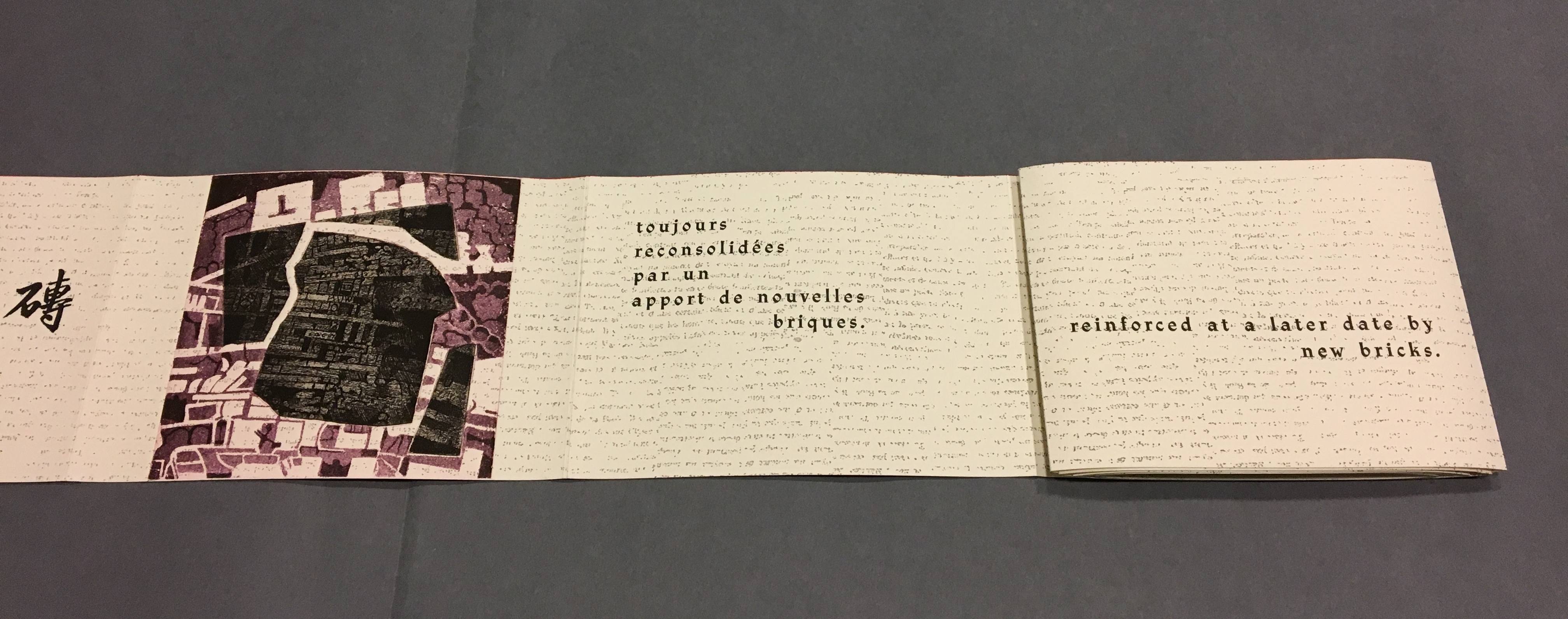
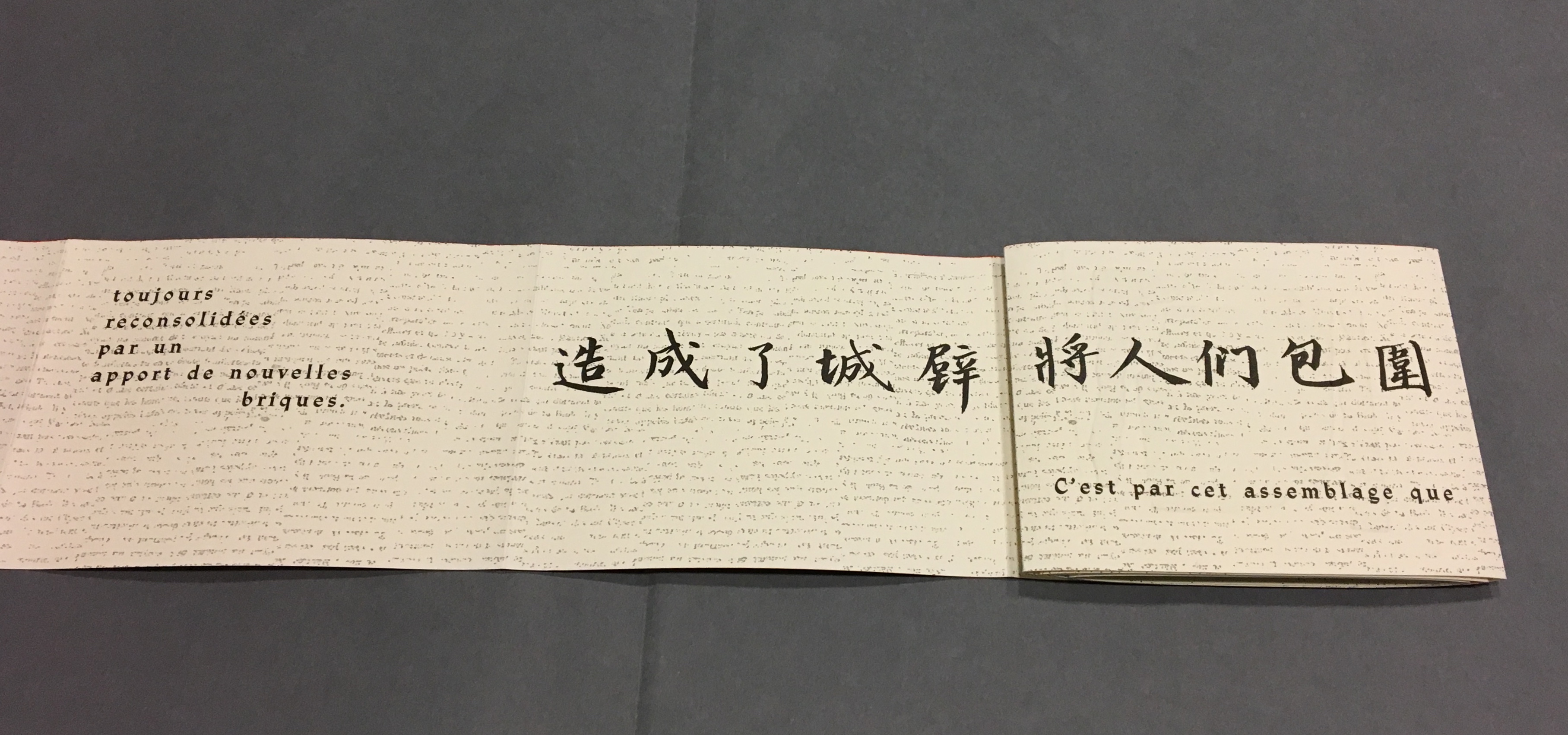
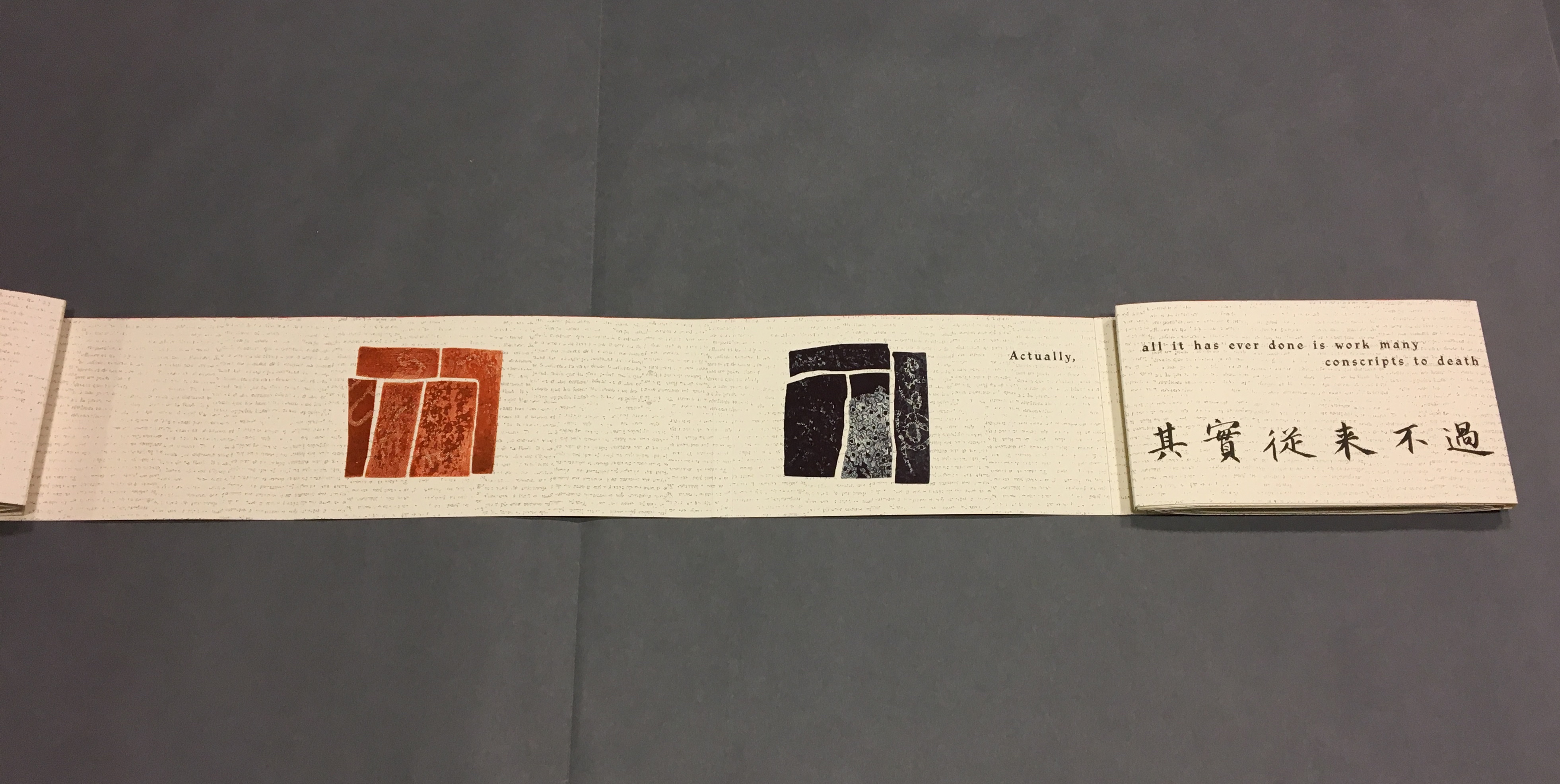
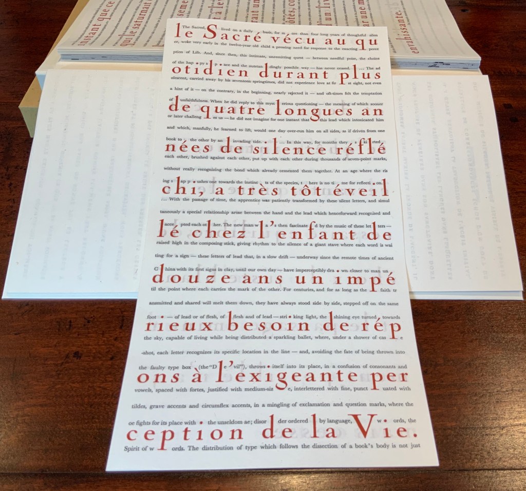
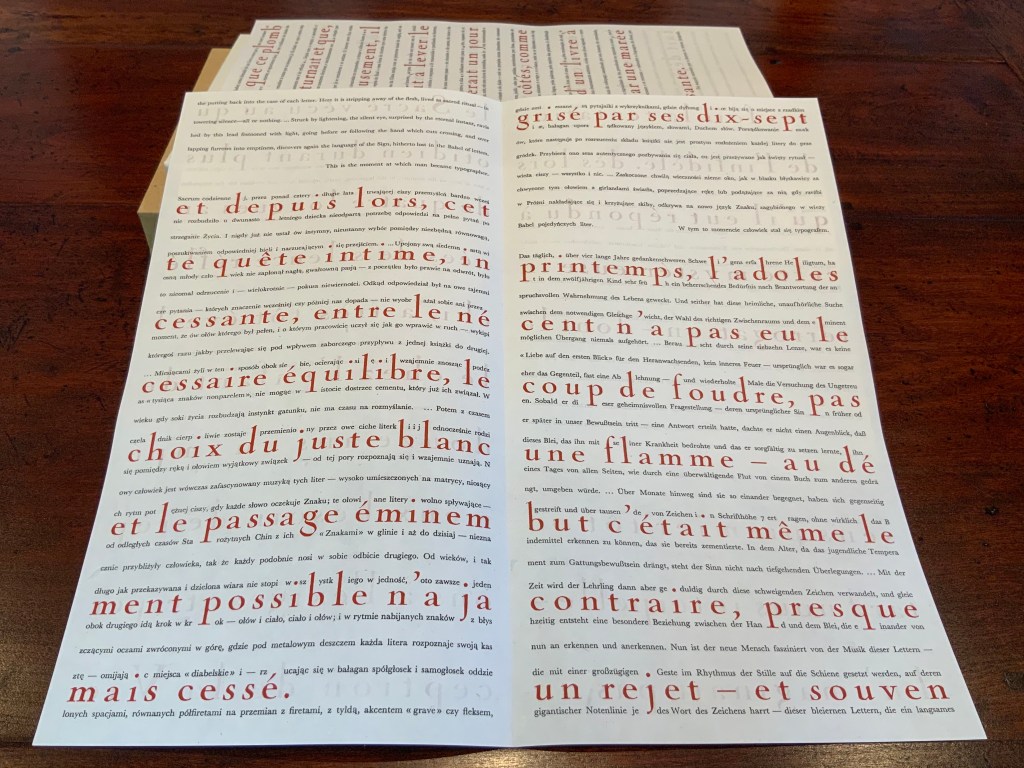
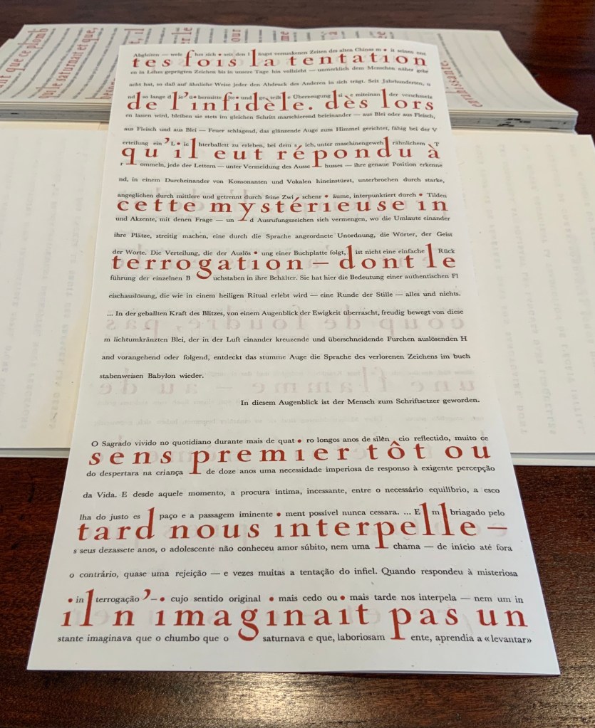
Anakatabase celebrates the alphabet as the root of its maker’s art. Indeed, it presents an entirely invented alphabet. It displays the artist’s manifesto in anakatabasien and twenty other languages. In its play with the letter, languages as well as the structural, functional and material elements of the book, this work of art gives life to Mallarmé’s cryptic pronouncement: Le livre, expansion totale de la lettre, doit d’elle tirer, directement, une mobilité et spacieux, par correspondances, instituer un jeu, on ne sait, qui confirme la fiction (“The book, total expansion of the letter, must directly depict a mobility and spaciousness that — by analogy — constructs an unknown game that confirms the fiction”).
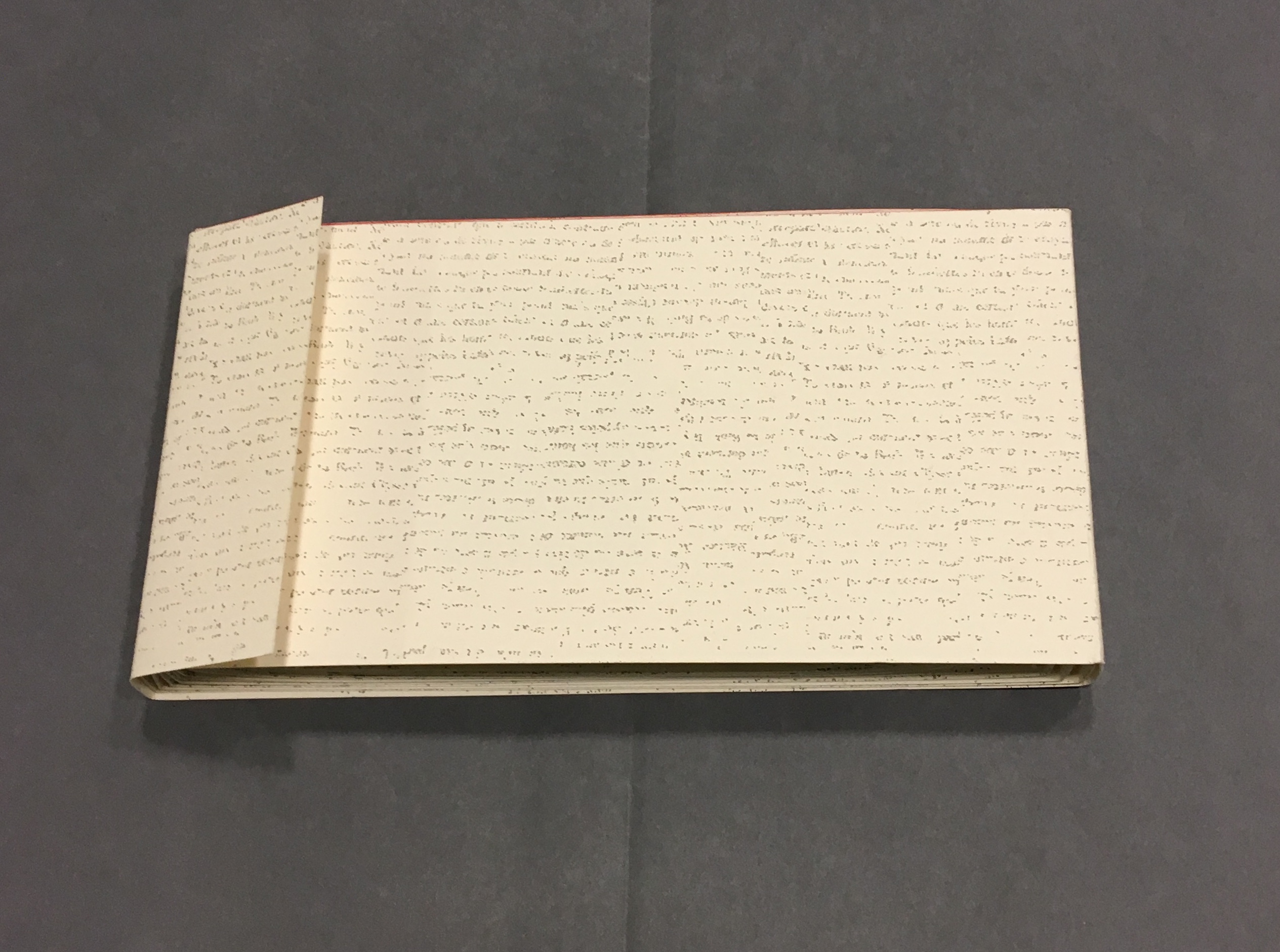
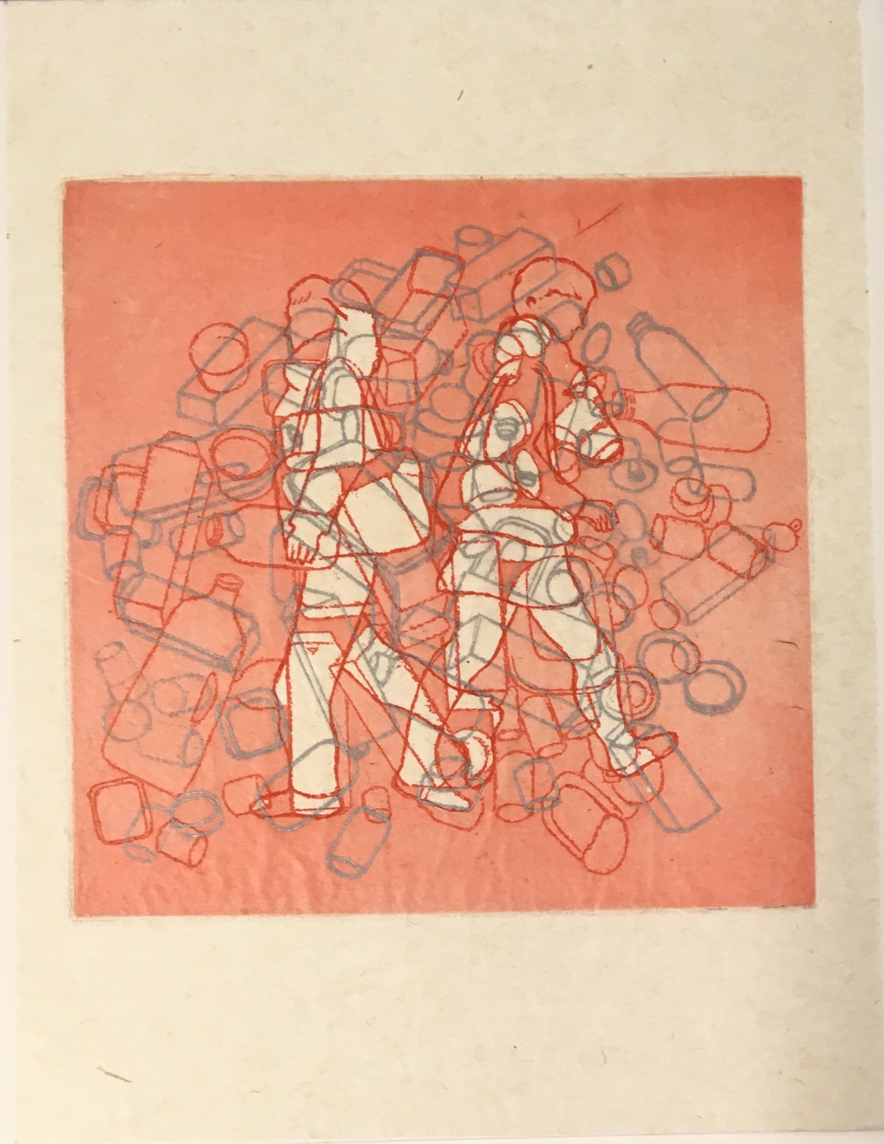
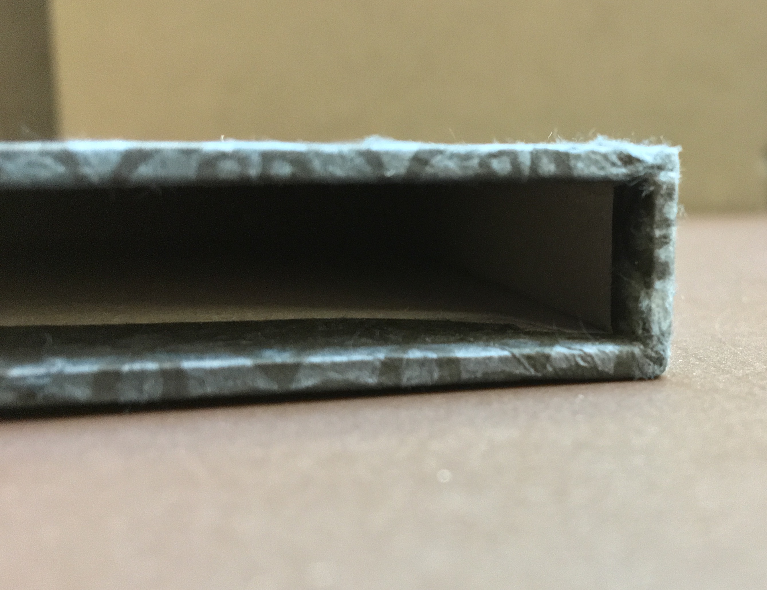
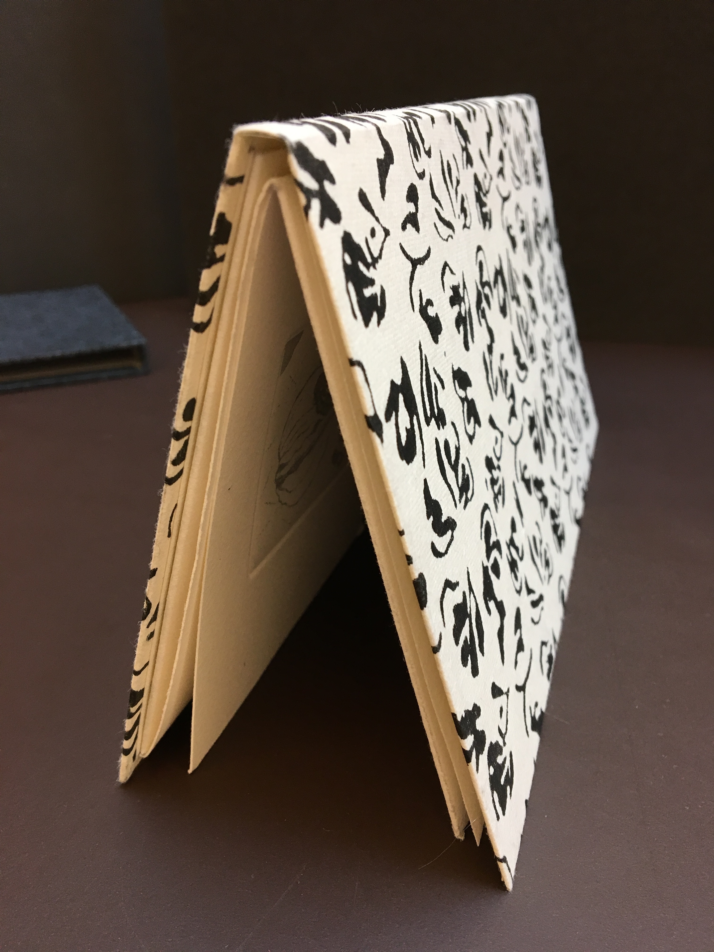
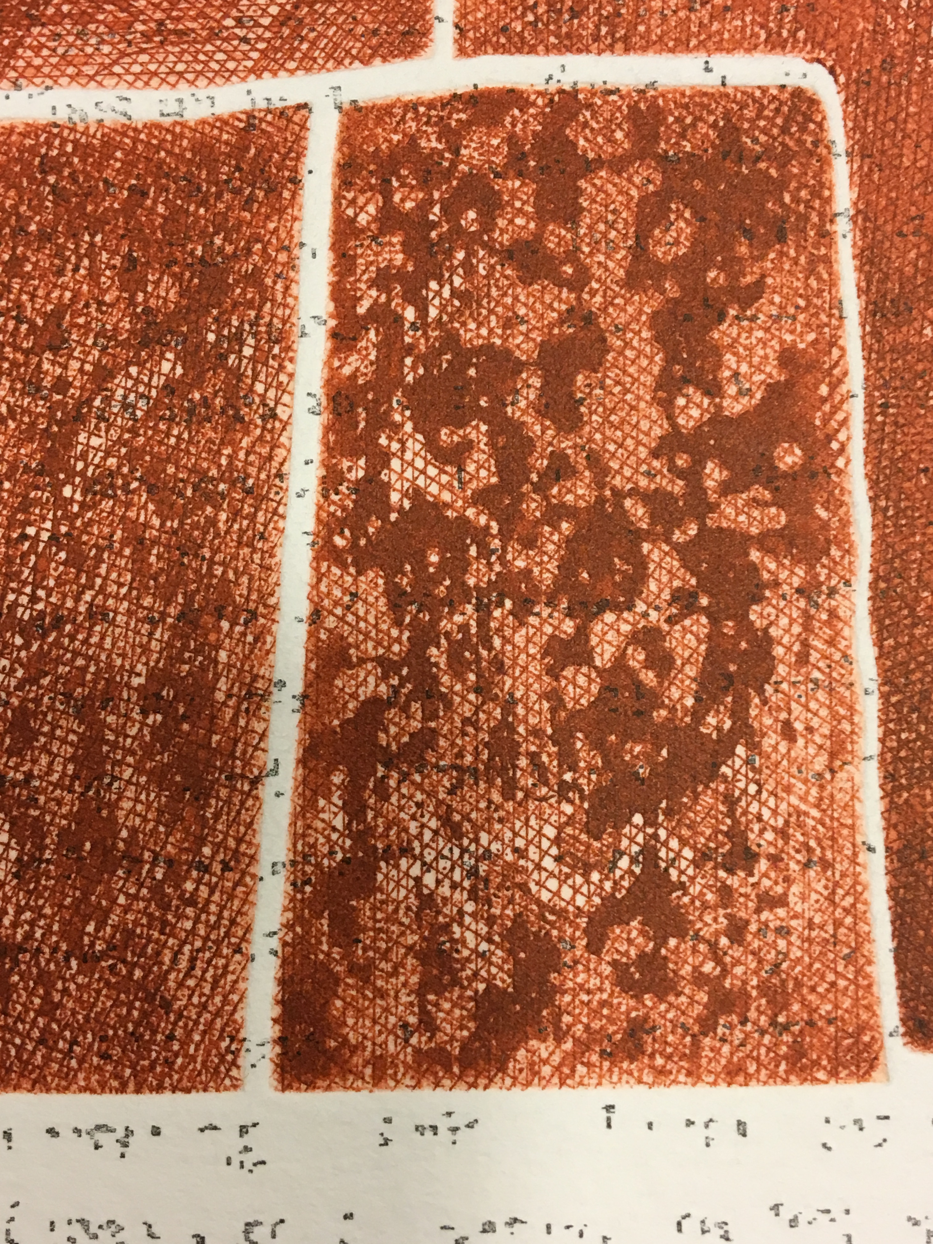
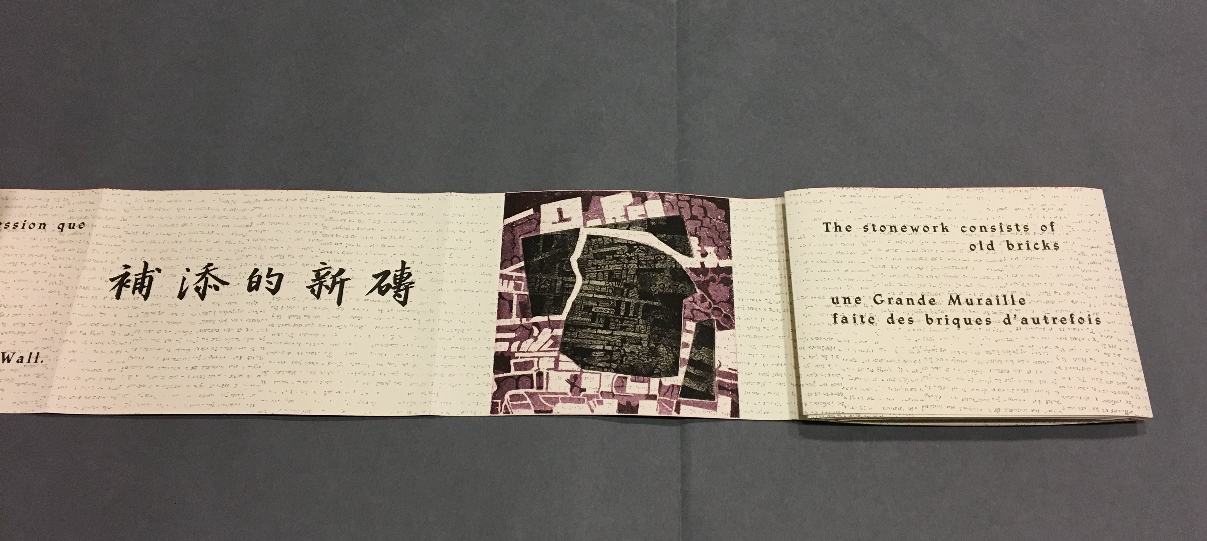
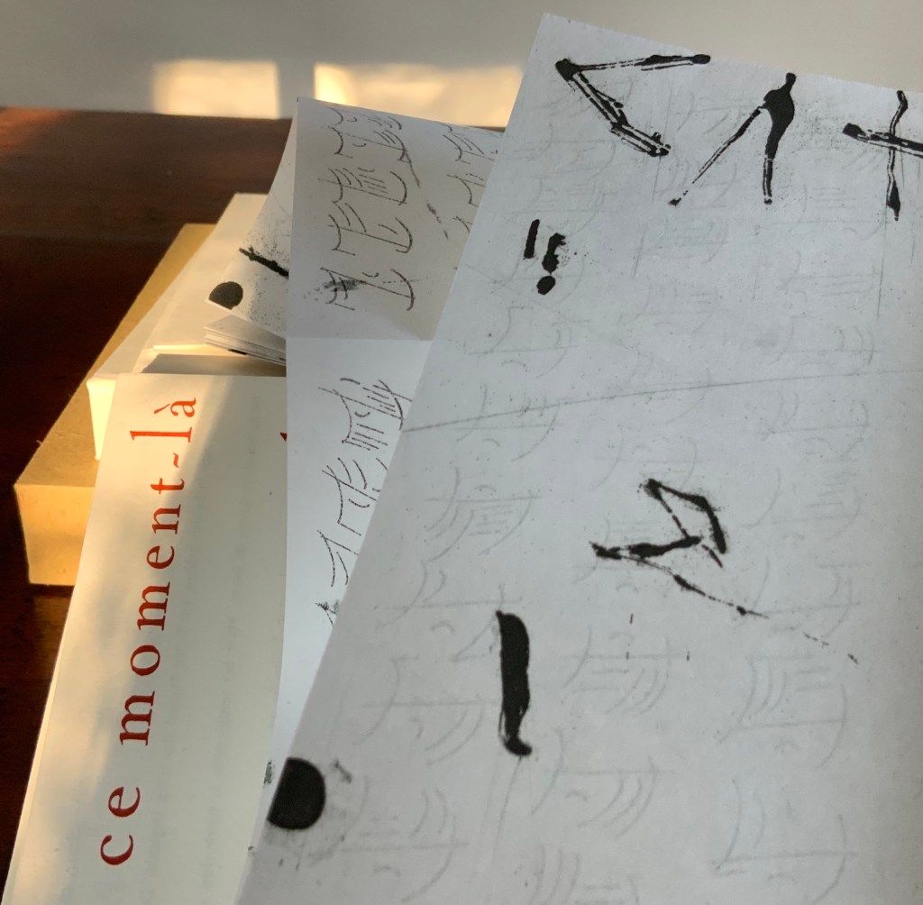
Consider first the structural, functional and material elements. If judged by its cover (or rather, covers), Anakatabase has depths, a roughness and smoothness, a stiffness and suppleness, yet harmonious in its contrasts and variety. A tightly turned-in slipcase, covered in rough papier de paille (a paper made of straw, traditionally for packaging sugar), holds a case of board. In turn, the board case — with the book’s title set vertically in Nicolas Cochin (36pt) on smoother almost parchment-like paper covering the neatly chamfered spine, front and back boards — holds a paper case. Not attached to the board case, the paper case made of Lana Pur Fil folds around a single sheet of Arches Velin 160 gsm, which rests between the paper case and the loose endpapers. The loose endpapers are handmade papier de Chine au liseré rouge (60 or 65 gsm). It is the same paper used for the nine loose single-fold folios. For the leporello making up the last “gathering” in the “book block”, the artist and engraver selected a Japanese paper more commonly used to make interior walls.
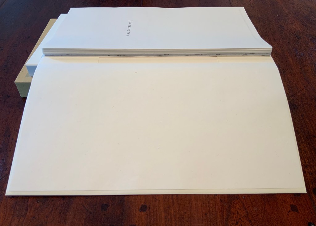
Left: supply of papier de Chine au liseré rouge. Photo: Courtesy of the artist. Right: paper case open to show of “book block” of nine loose folios and leporello. Photo: Books On Books Collection.
These multiple papers of differing weights, finish, opacity, drape or stiffness, rattle and color work together loosely yet harmoniously to cover and uncover (or dis-cover) the artist’s statement.
Like many artist’s statements, Anakatabase is also a philosophical statement. It is also as much an ode to a lifelong coming of age as typographer, printer and master of the book — even, as much, a love letter to “the language of the Sign”. As a work of book art, it lovingly enacts the letter.
The Sacred, lived on a daily basis, for more than four long years of thoughtful silence, woke very early in the twelve-year old child a pressing need for response to the exacting perception of Life. And, since then, this intimate, unremitting quest — between needful poise, the choice of the happy space and the outstandingly possible way — has never ceased. …The adolescent, carried away by his seventeen springtime’s, did not experience love at first sight, not even a hint of it — on the contrary, in the beginning, nearly rejected it — and oft-times felt the temptation of unfaithfulness. When he did reply to this mysterious questioning — the meaning of which sooner or later challenges us — he did not imagine for one instant that this lead which intoxicated him and which, manfully, he learned to lift, would one day over-run him on all sides, as if driven from one book to the other by an invading tide. …In this way, for months they skirted each other, brushed against each other, put up with each other during thousands of seven-point marks, without really recognizing the bond which already cemented them together. At an age where the rising sap pushes one towards the instinct of the species, there is no time for reflection. … With the passage of time, the apprentice was patiently transformed by these silent letters, and simultaneously a special relationship arose between the hand and the lead which henceforward recognized and accepted each other. The new man was then fascinated by the music of these letters — raised high in the composing stick, giving rhythm to the silence of a giant stave where each word is waiting for a sign — these letters of lead that, in a slow drift — underway since the remote times of ancient China with its first signs in clay, until our own day — have imperceptibly drawn closer to man until the point where each carries the mark of the other. For centuries, and for as long as the faith transmitted and shared will melt them down, they have always stood side by side, stepped off on the same foot — of lead or flesh, flesh and of lead — striking light, the shining eye turned towards the sky, capable of living while being distributed a sparkling ballet, where, under a shower of caseshot, each letter recognizes its specific location in the line — and, avoiding the fate of being thrown into the faulty type box (the “Devil”), throws itself into its place, in a confusion of consonants and vowels, spaced with fortes, justified with medium-size, interlettered with fine, punctuated with tildes, grave accents and circumflex accents, in a mingling of exclamation and question marks, where the oe fights for its place with the unseldom ae; disorder ordered by language, words, the Spirit of words. The distribution of type which follows the dissection of as book’s body is not just the putting back into the case of each letter. Here it is stripping away of the flash, lived as sacred ritual — in towering silence — all or nothing. …Struck by lightning, the silent eye, surprised by the eternal instant, ravished by this lead festooned with light, going before or following the hand which cuts crossing, and overlapping furrows into emptiness, discovers again the language of the Sign, hitherto lost in the Babel of letters. This is the moment at which man became typographer. Trans. John Gaynard.
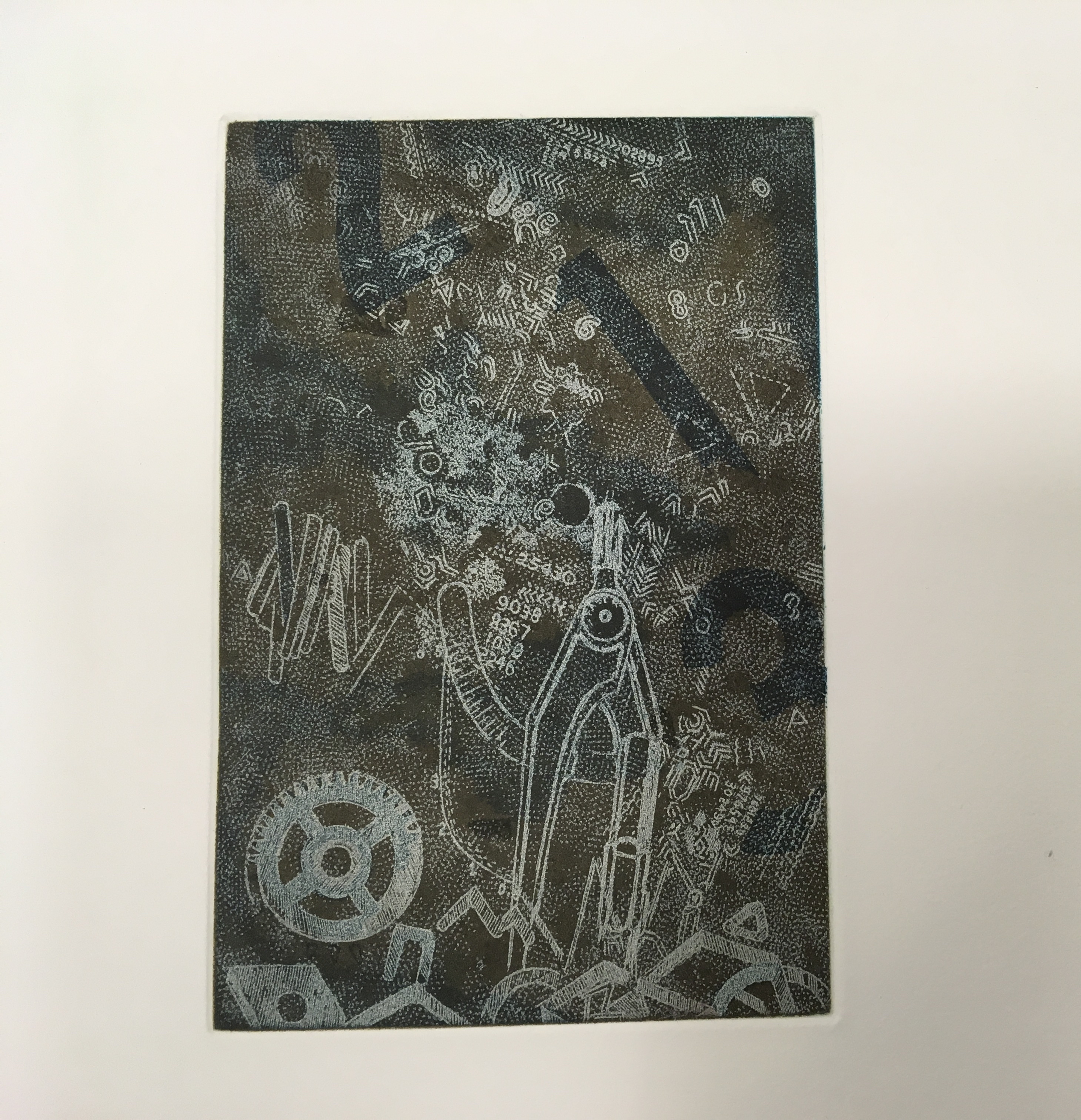
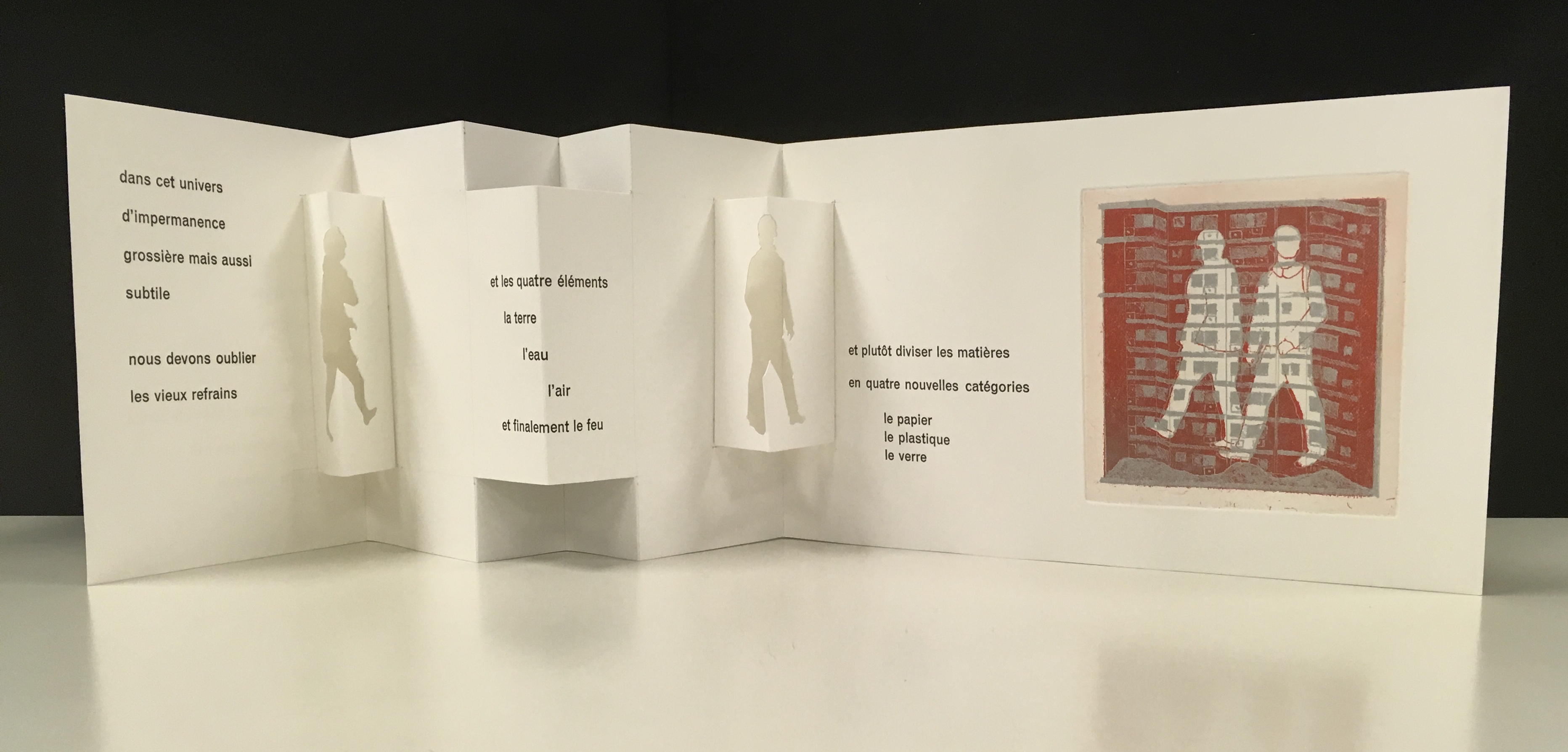
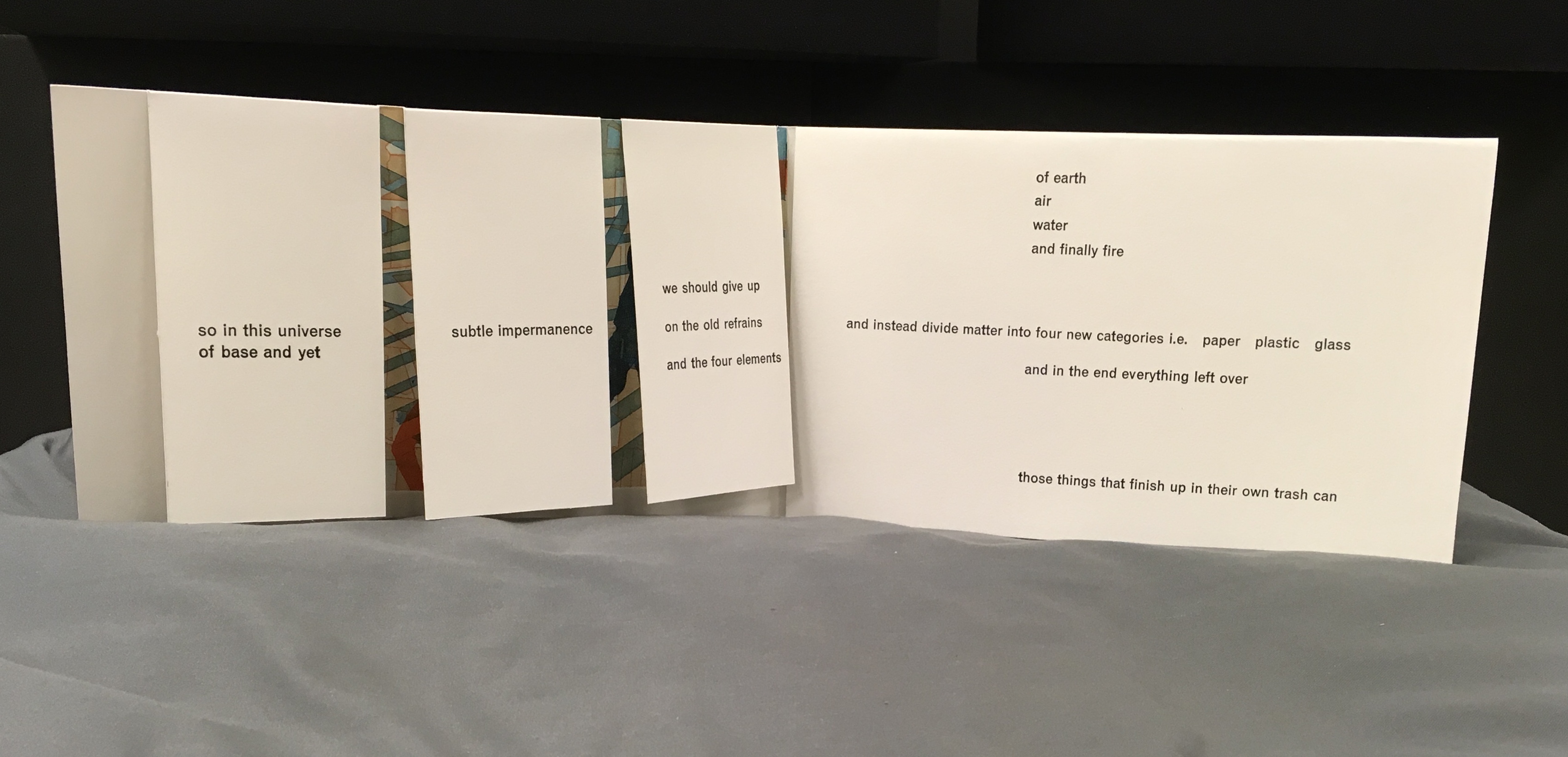
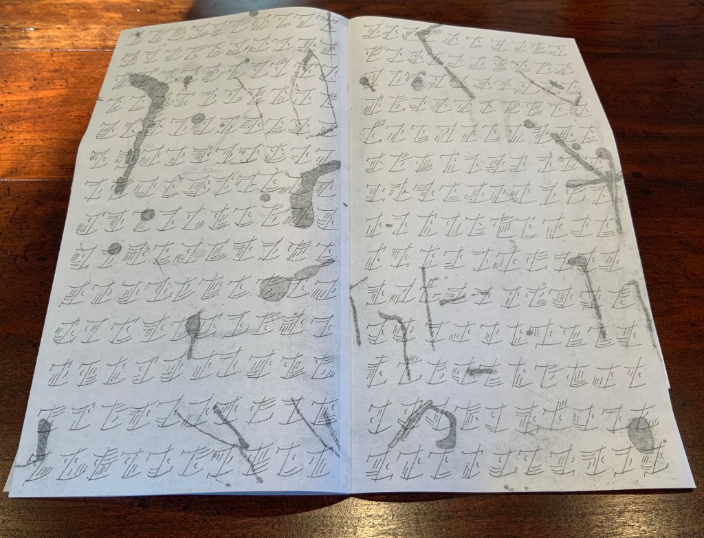
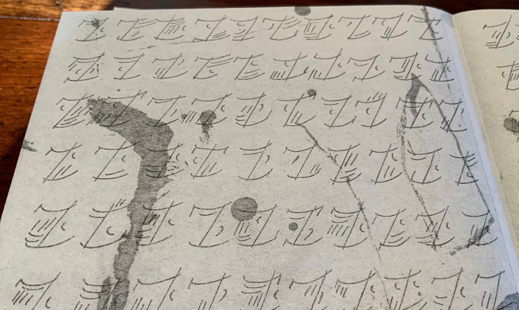
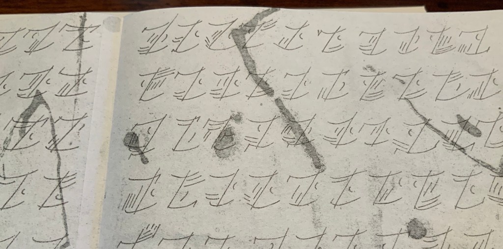
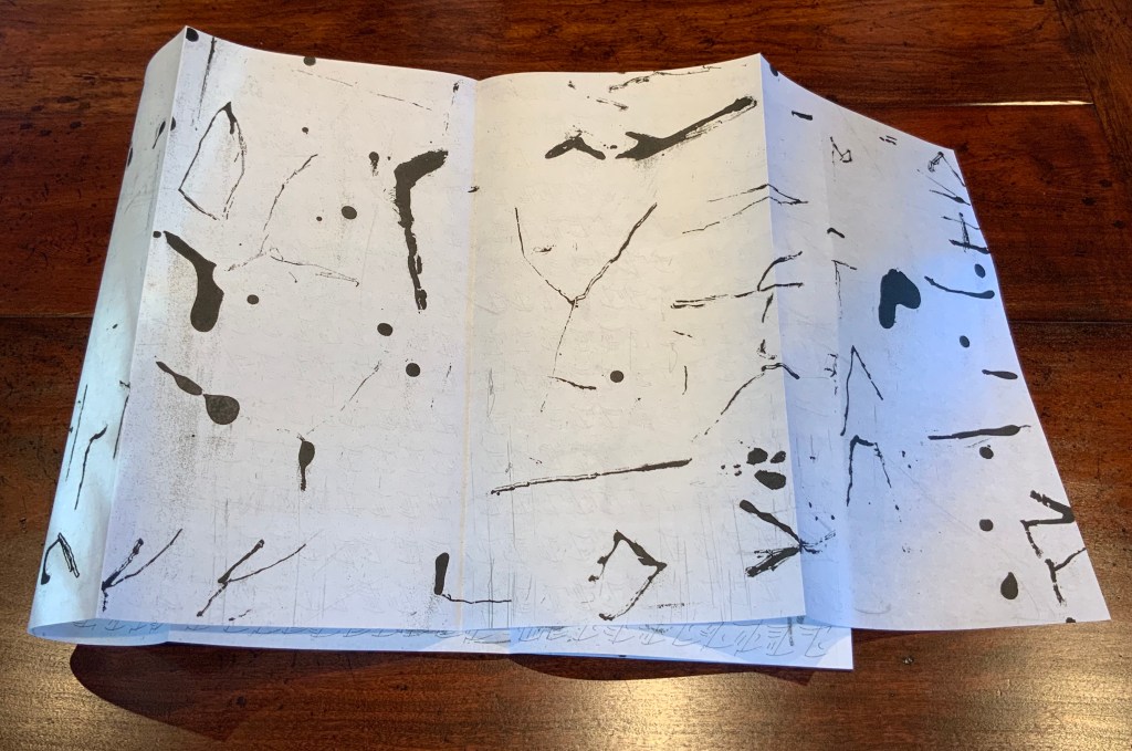
Spaced out across six folios, the statement’s French version appears in large display type and carmine ink. It also appears in nineteen other languages in smaller type in black ink between the lines of the French, their words broken up by the red characters’ ascenders and descenders. At the end of measures, words break without hyphens. This is “the Babel of letters” in Baskerville type. The more ancient leporello form presents the statement in the calligraphy-like anakatabasien face and language. For the reverse of the leporello, Rassineux used the technique of gravure au sucre (“sugar lift”) on her etching plates. The effect’s appearance is suminagashi-like. Underlying the characters on the front of the leporello, those hand-drawn elements on the reverse side evoke the strokes and marks that precede the anakatabasien characters or perhaps all letters.
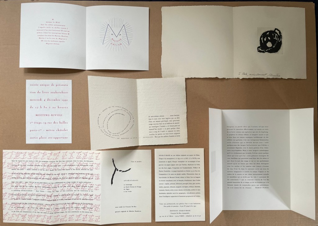
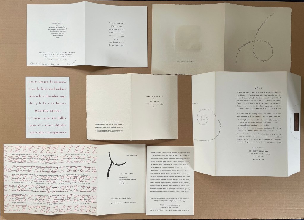
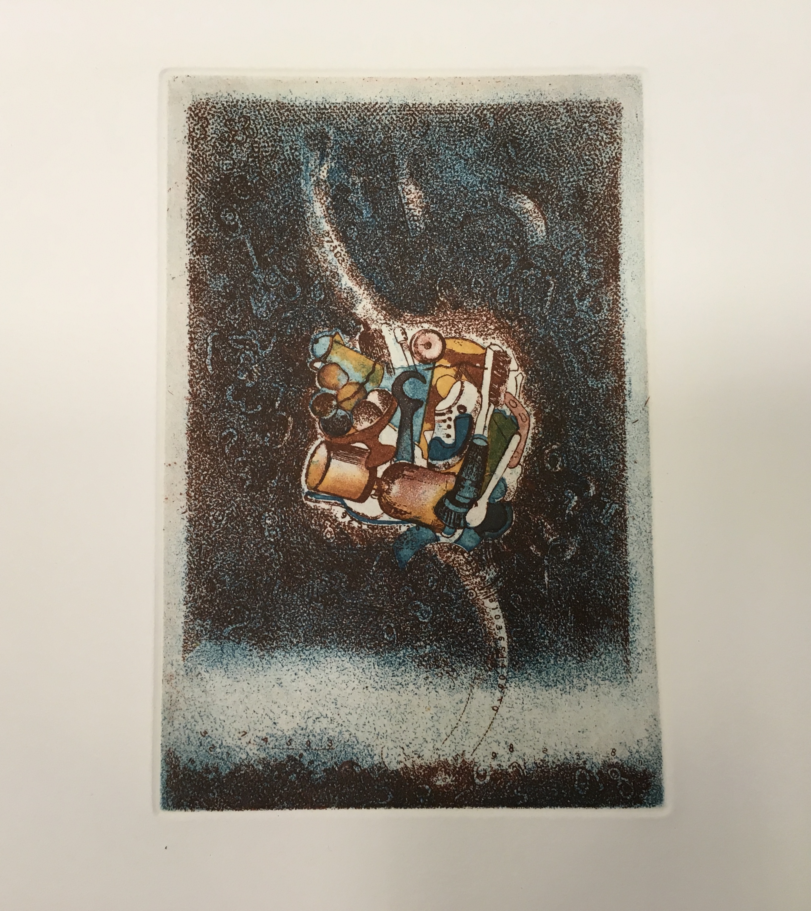
The artist and engraver (his wife and co-founder of Éditions Anakatabase, Martine Rassineux) kindly provided much-appreciated ephemera for the Books On Books Collection. In addition to the 1991 announcement of Anakatabase, they include items that show a characteristic of Da Ros’s craft that is otherwise hidden away in the linearity of Anakatabase — the magic he performs with the “furniture” of letterpress typesetting.


Photos: Books On Books Collection. Shown with permission of the artist.
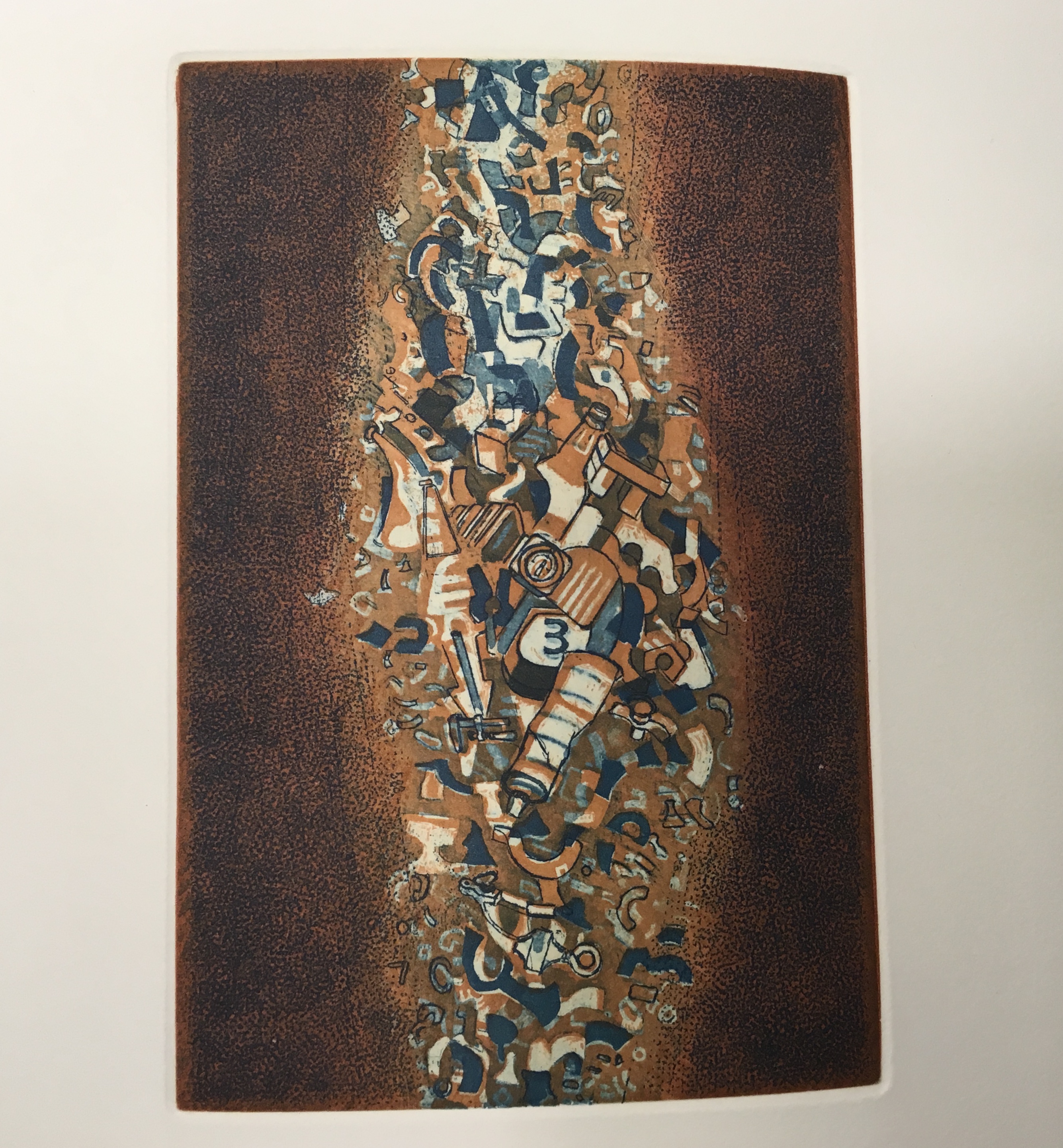
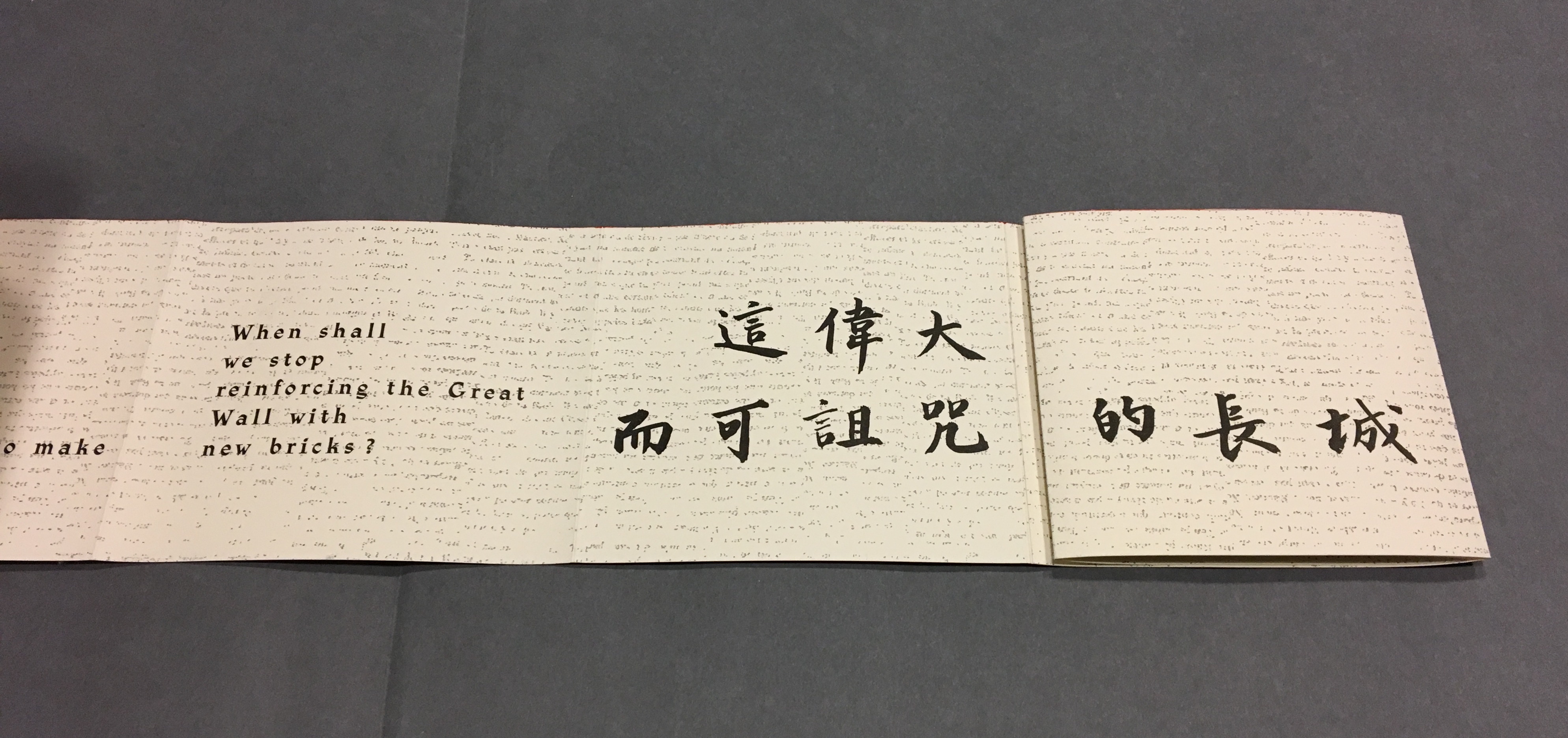
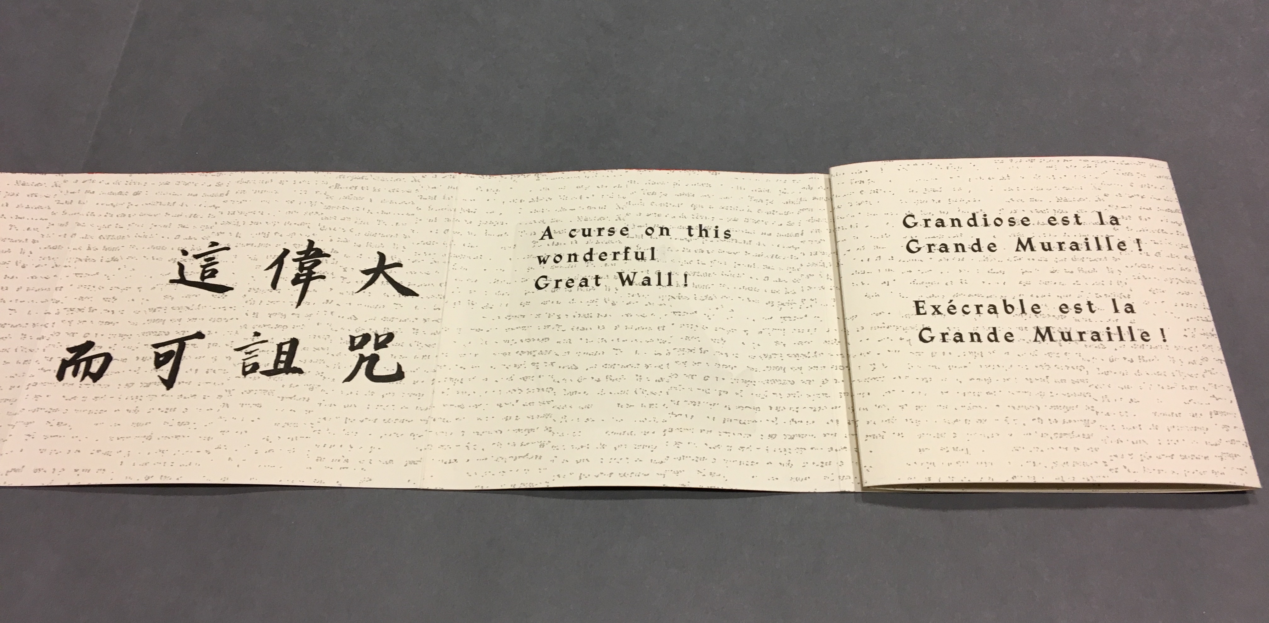
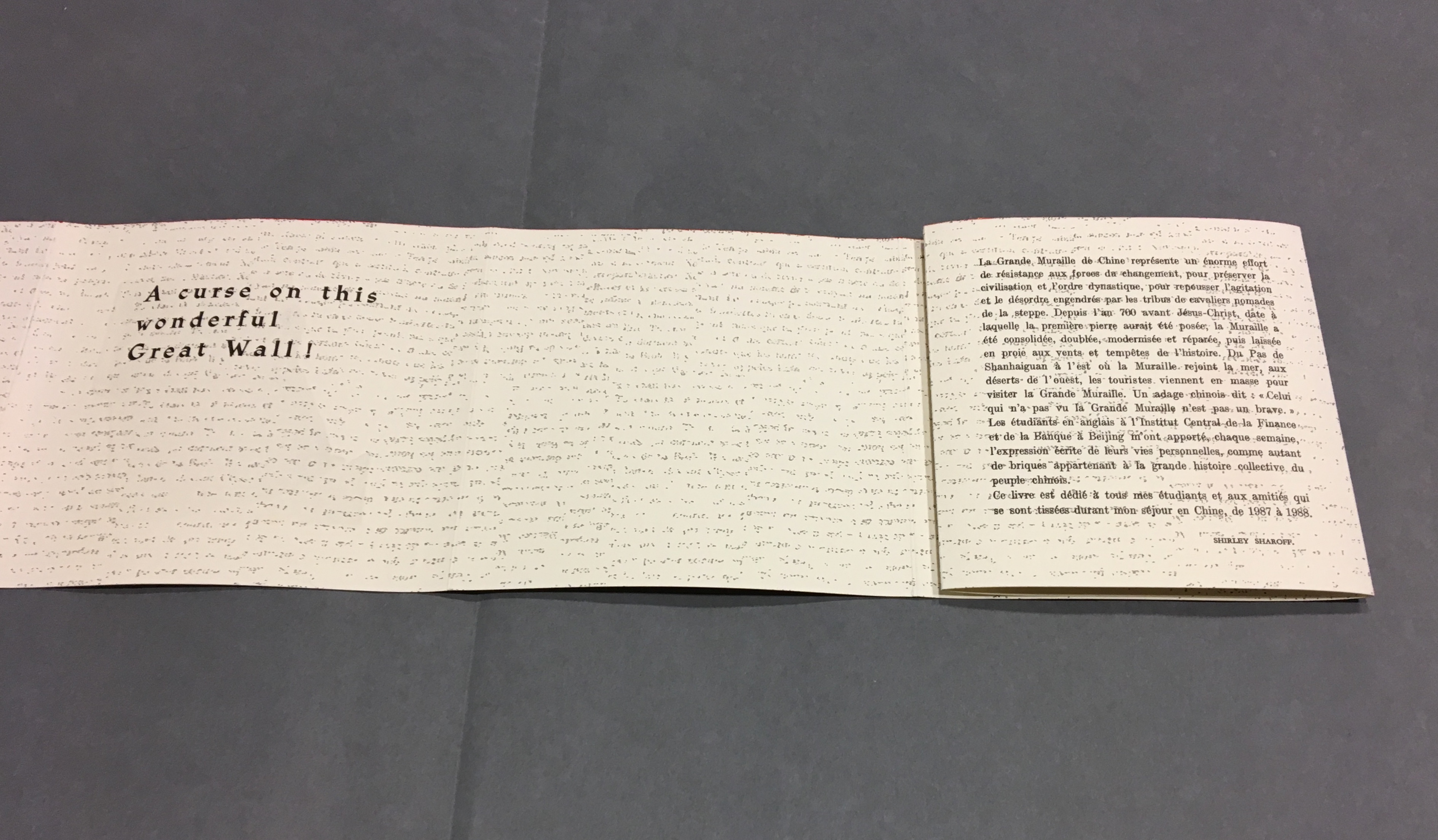
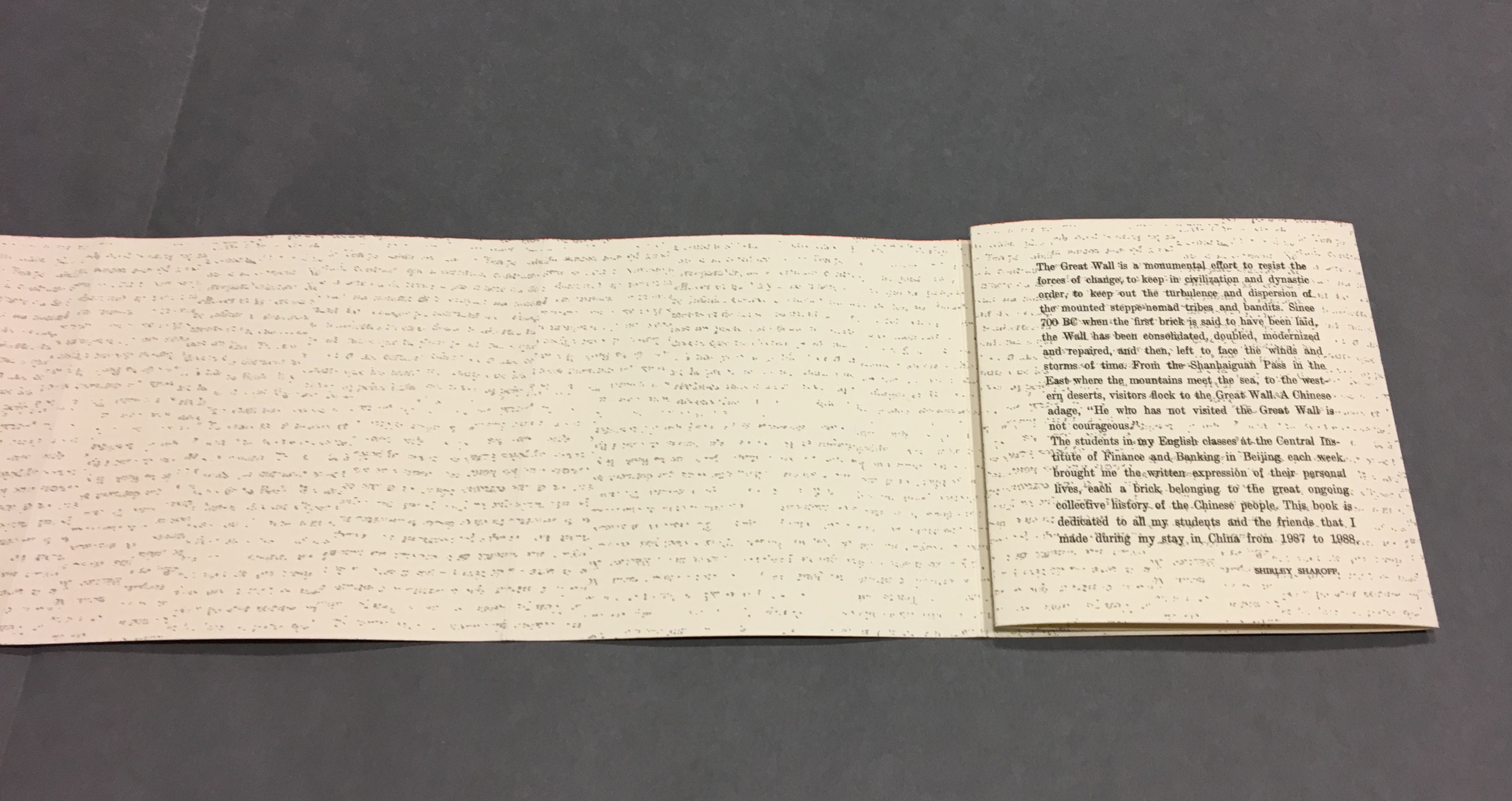
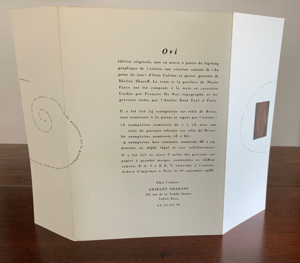
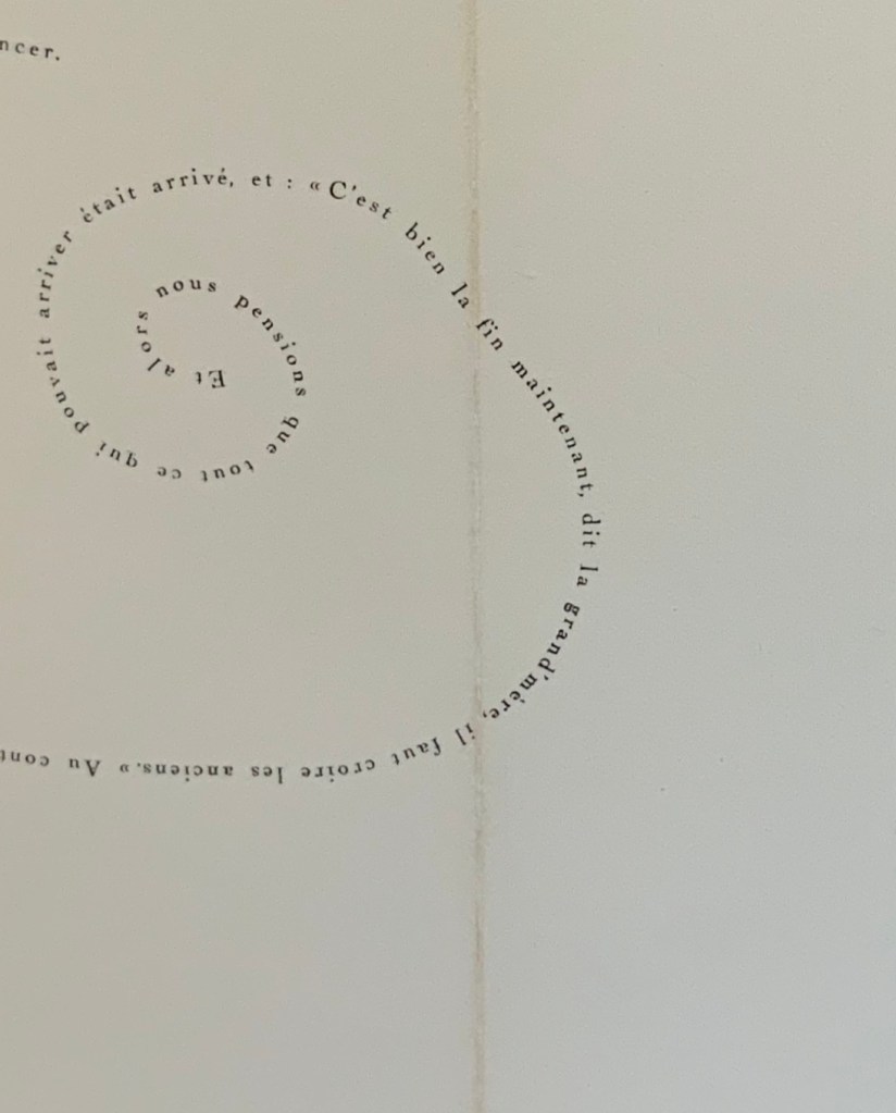
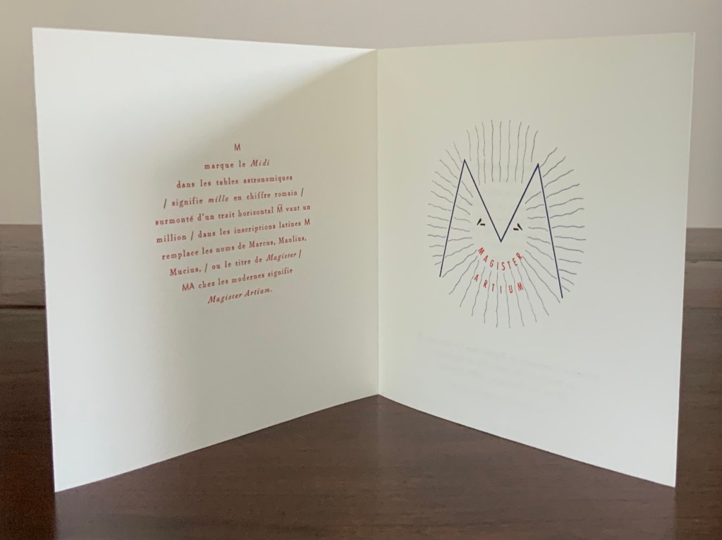
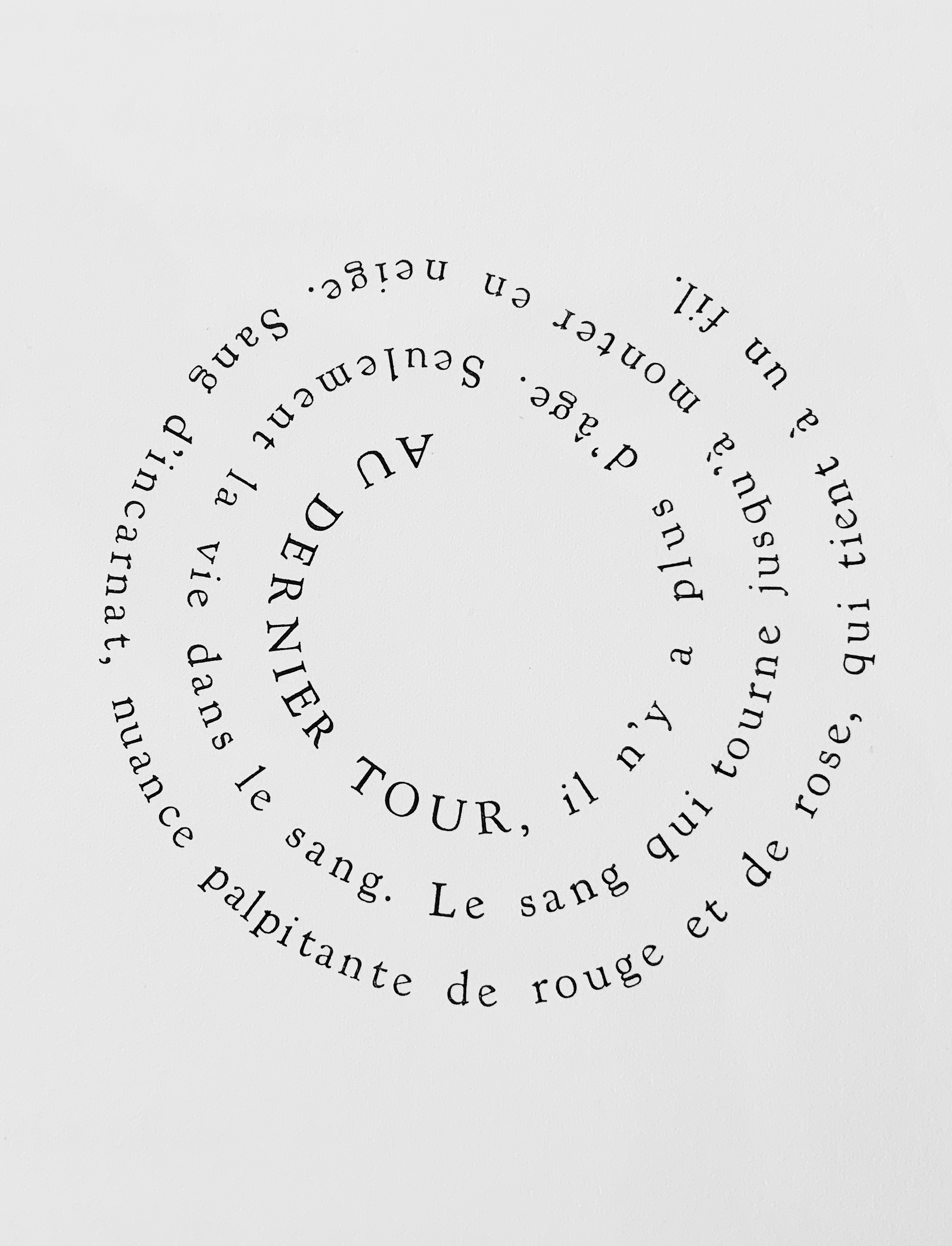
The outward-spiralling sentence in the announcement above of Ovi (1988) by Shirley Sharoff exemplifies this legerdemain, as does the open Christmas card celebrating the designation Magister Artium awarded to François Da Ros in 1998. Another example of the mastery of furniture behind the scenes can be seen in the following photo sent by Martine Rassineux of type prepared for a page in Ilinx, also in the Books On Books Collection.
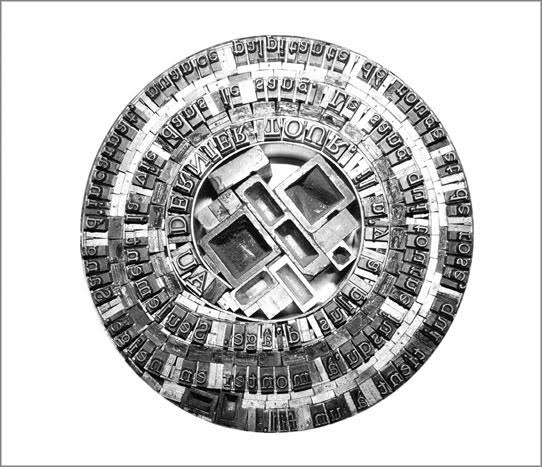
Type preparation; Ilinx (2010)
Régine Detambel (original text), Martine Rassineux (original etchings), François Da Ros (typography). Photos: Courtesy of Martine Rassineux.
For the Books On Books Collection, Anakatabase is at once a work of fine art and an unusual fusion of the collection’s themes of interest in the alphabet, the multilingual, typography, the structural and material elements of the book, and aesthetic enquiry into the very nature of the book.
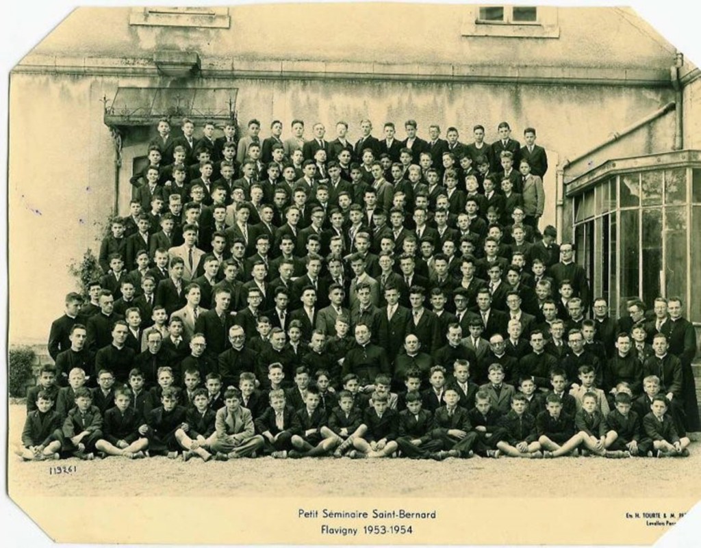
François Da Ros is third in the second row from the right, in a light jacket and tie. Photo: Courtesy and permission of the artist.
Further Reading
Birchem, Nathalie. “François Da Ros, poète du plomb“, La Croix, 16 July 2007. Accessed 1 September 2017.
Capelleveen, Paul Van; Sophie Ham; Jordy Joubij. Voices and Visions: The Koopman Collection and the Art of the French Book (Zwolle: Wanders, 2009) , pp. 196-98.
Capelleveen, Paul Van. Artist & Others: The Imaginative French book in the 21st century (Nijmegen: Vantilt, 2016), pp. 30-37.
Da Ros, François. “Le Mystère du Livre“, Éditions Anakatabase, 2000. Accessed 12 September 2020.
Da Ros, François. “La lettre de plomb mobile“, Éditions Anakatabase, 2001. Accessed 12 September 2020.
Mallarmé, Stéphane. “Le livre, instrument spirituelle”. Trans. Barbara Johnson. Divagations (Cambridge, MA: Harvard University Press, 2009).
Ephemera