La Poésie de l’univers/Poetry of the Universe (2012)
La Poésie de l’univers/Poetry of the Universe (2012)
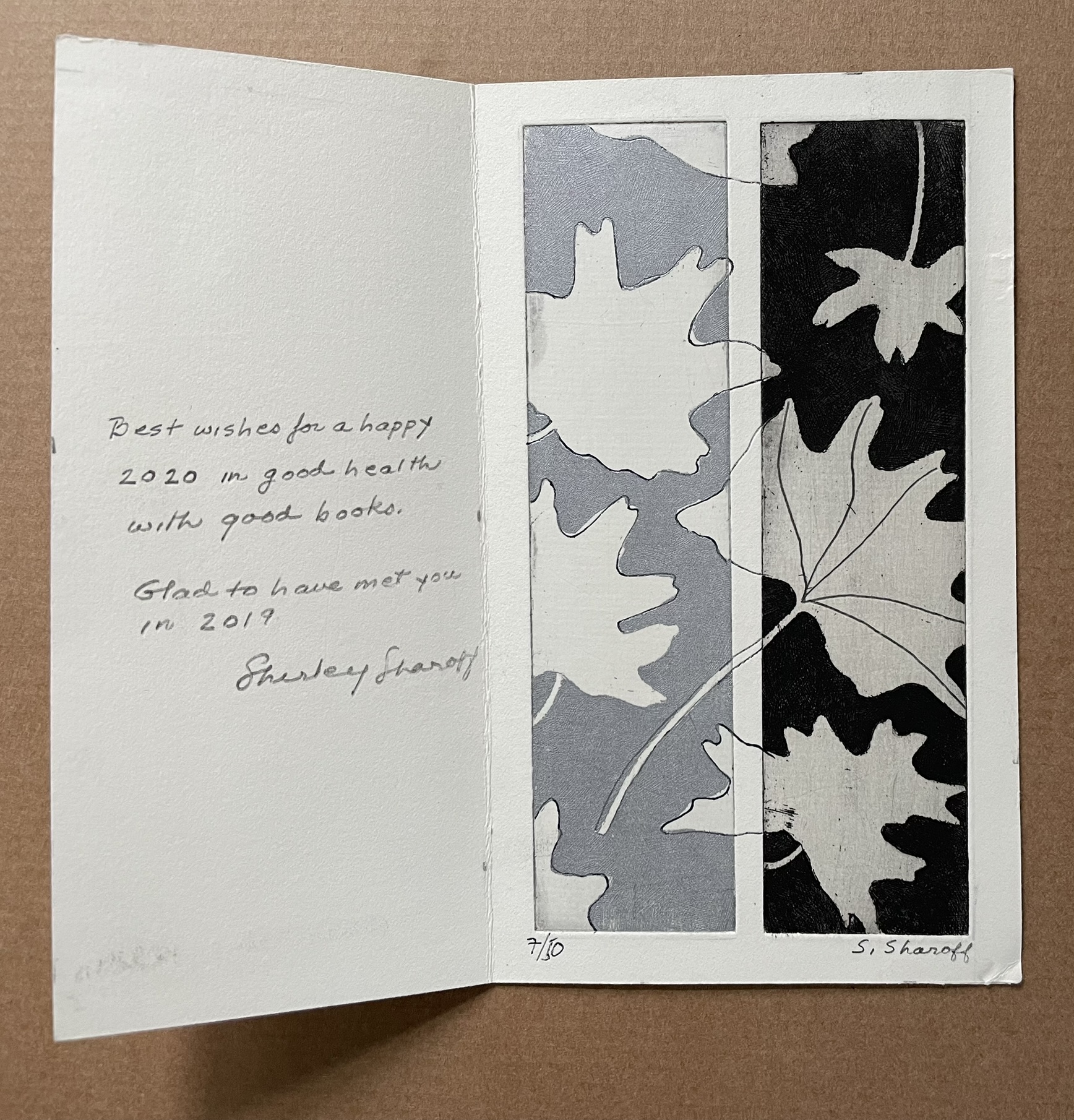
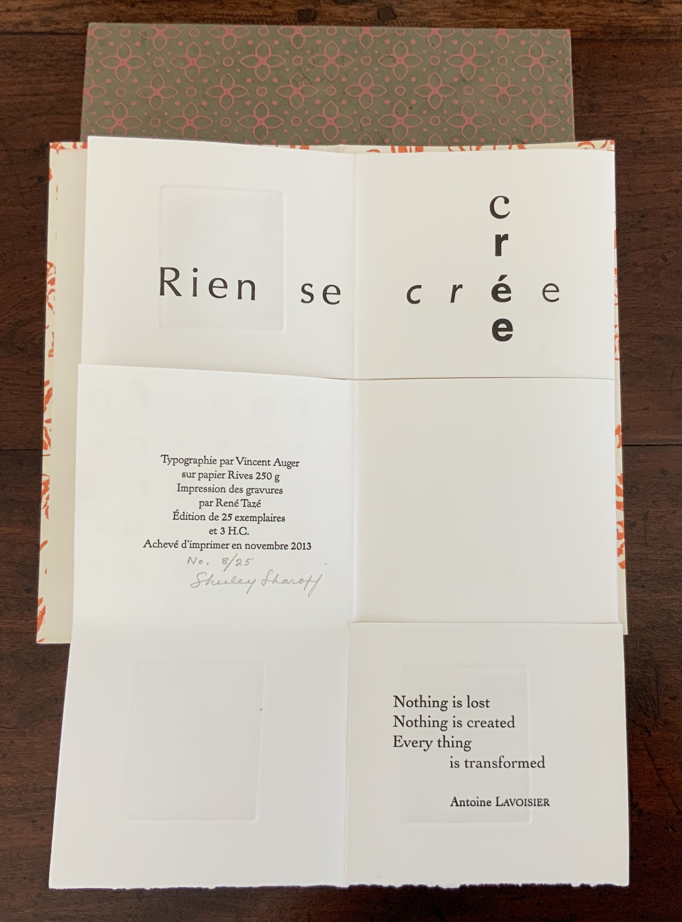
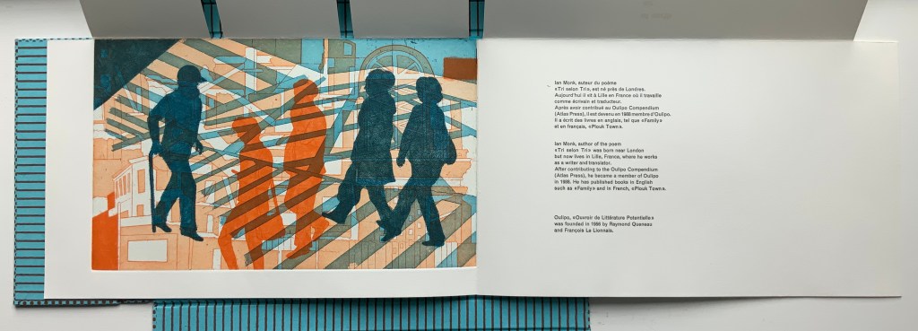
Shirley Sharoff
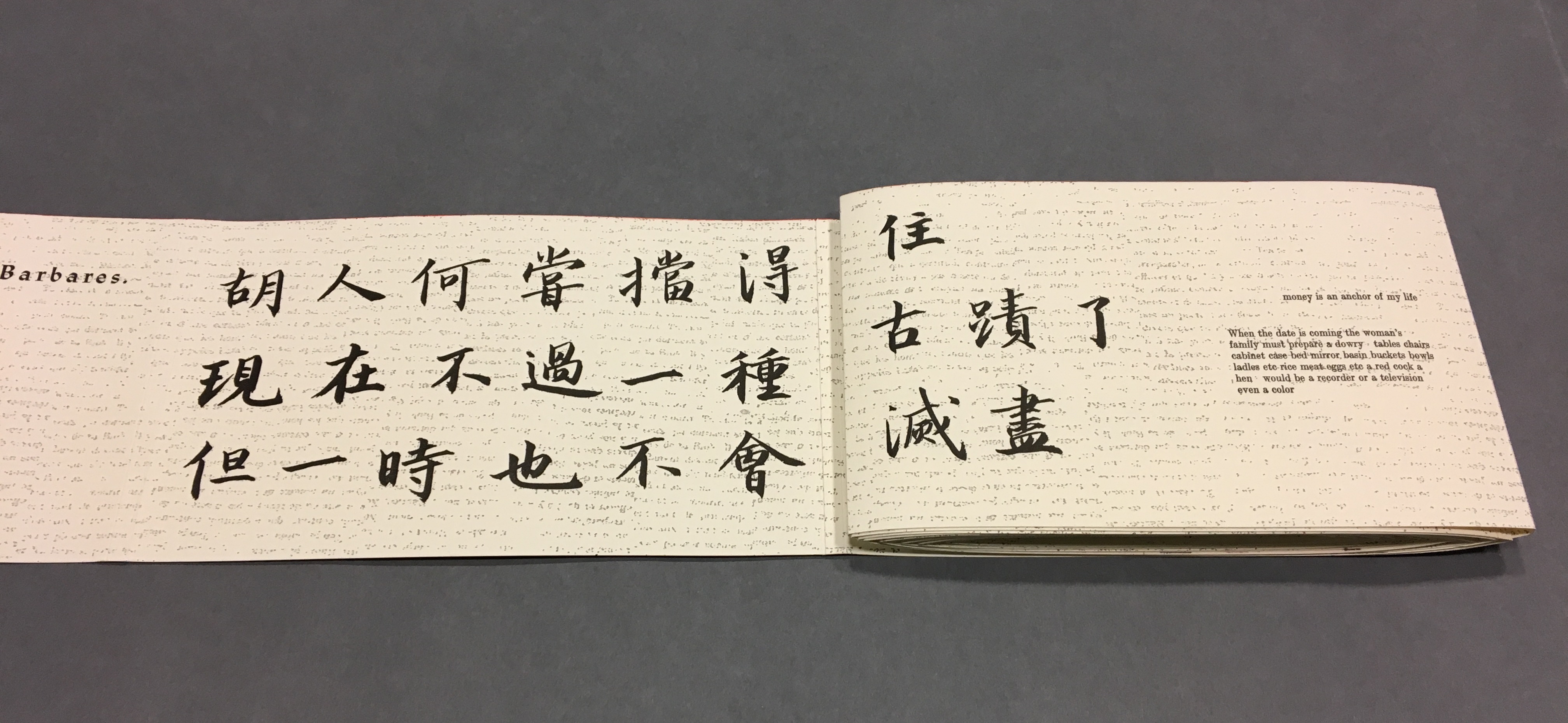
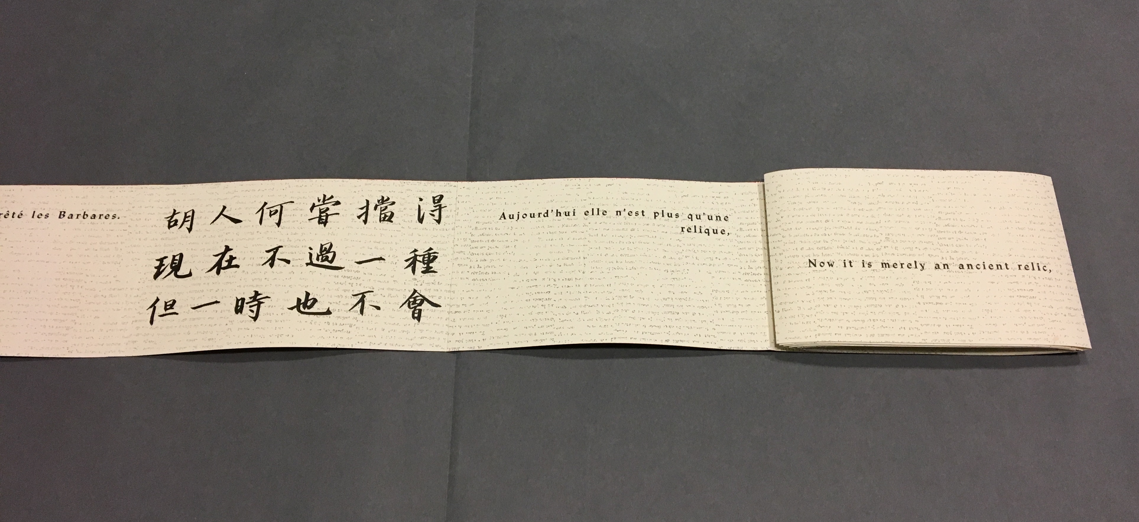
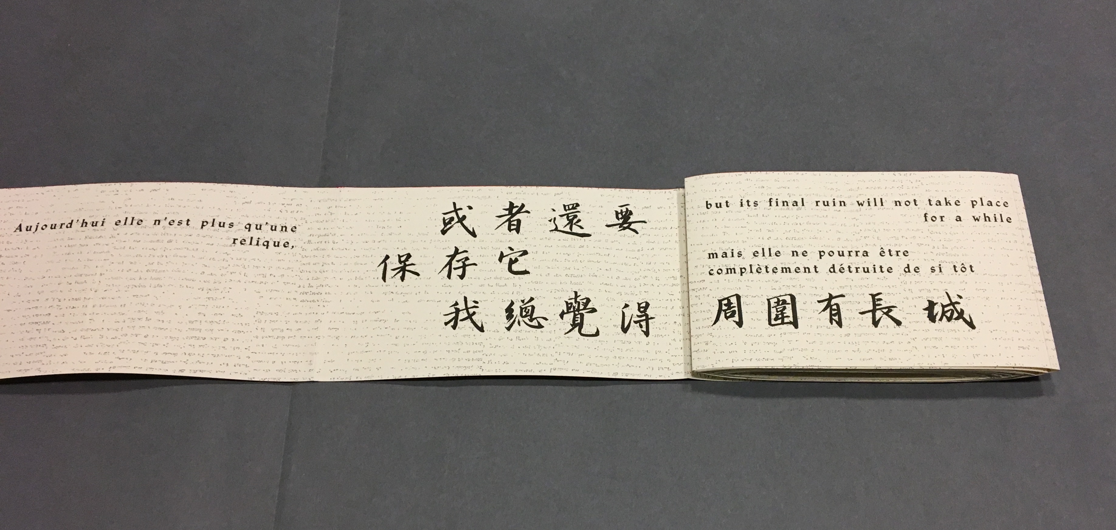
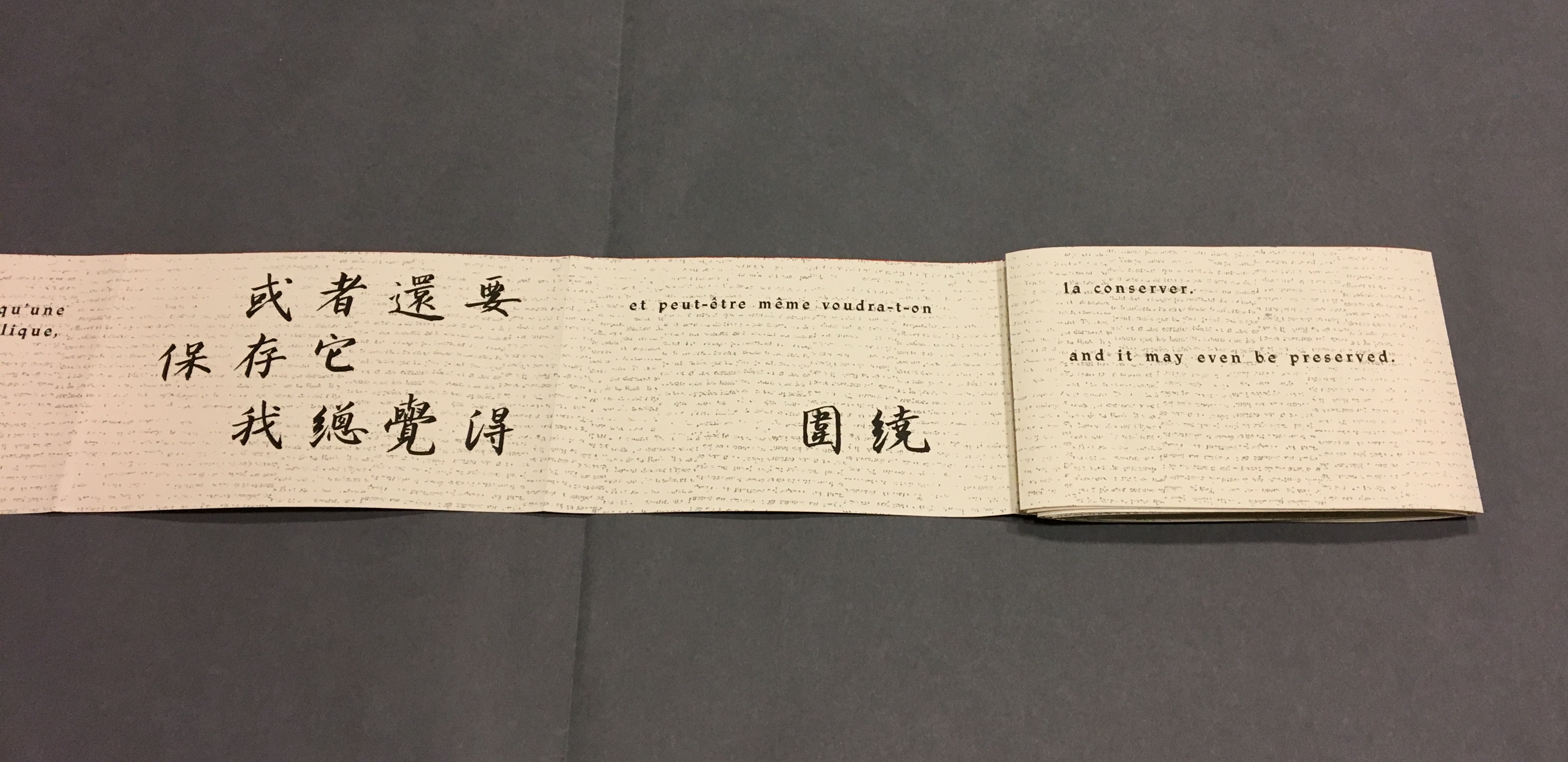
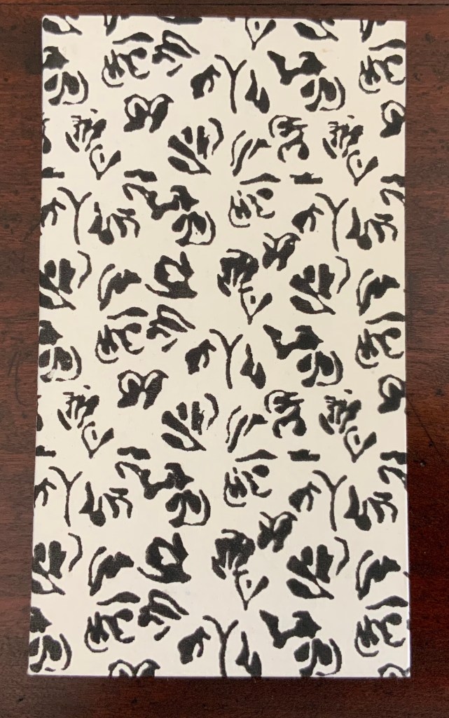
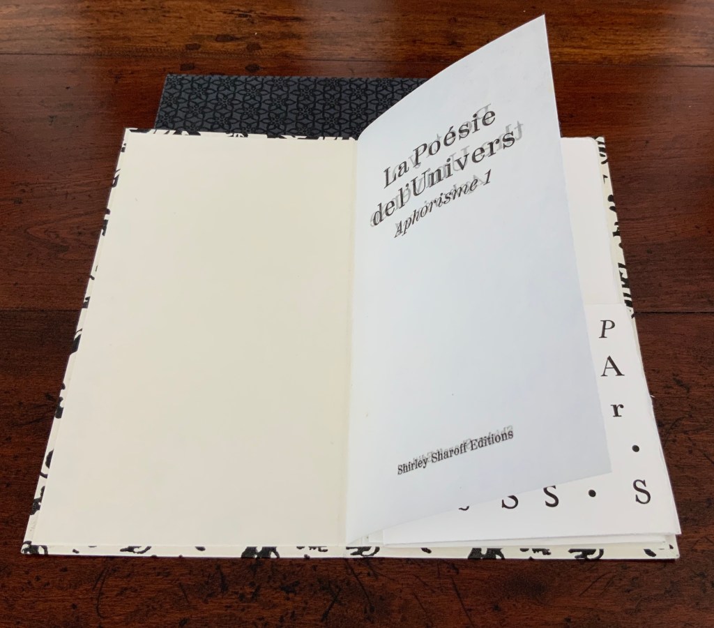
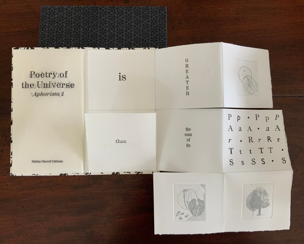
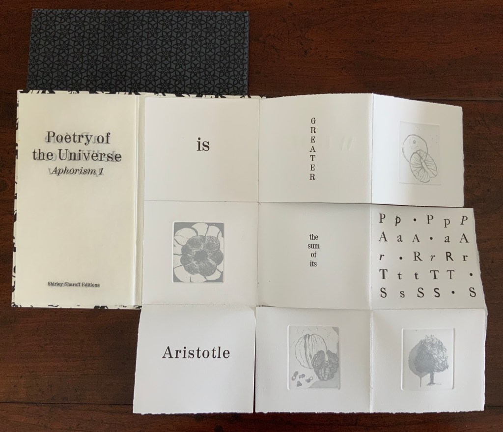
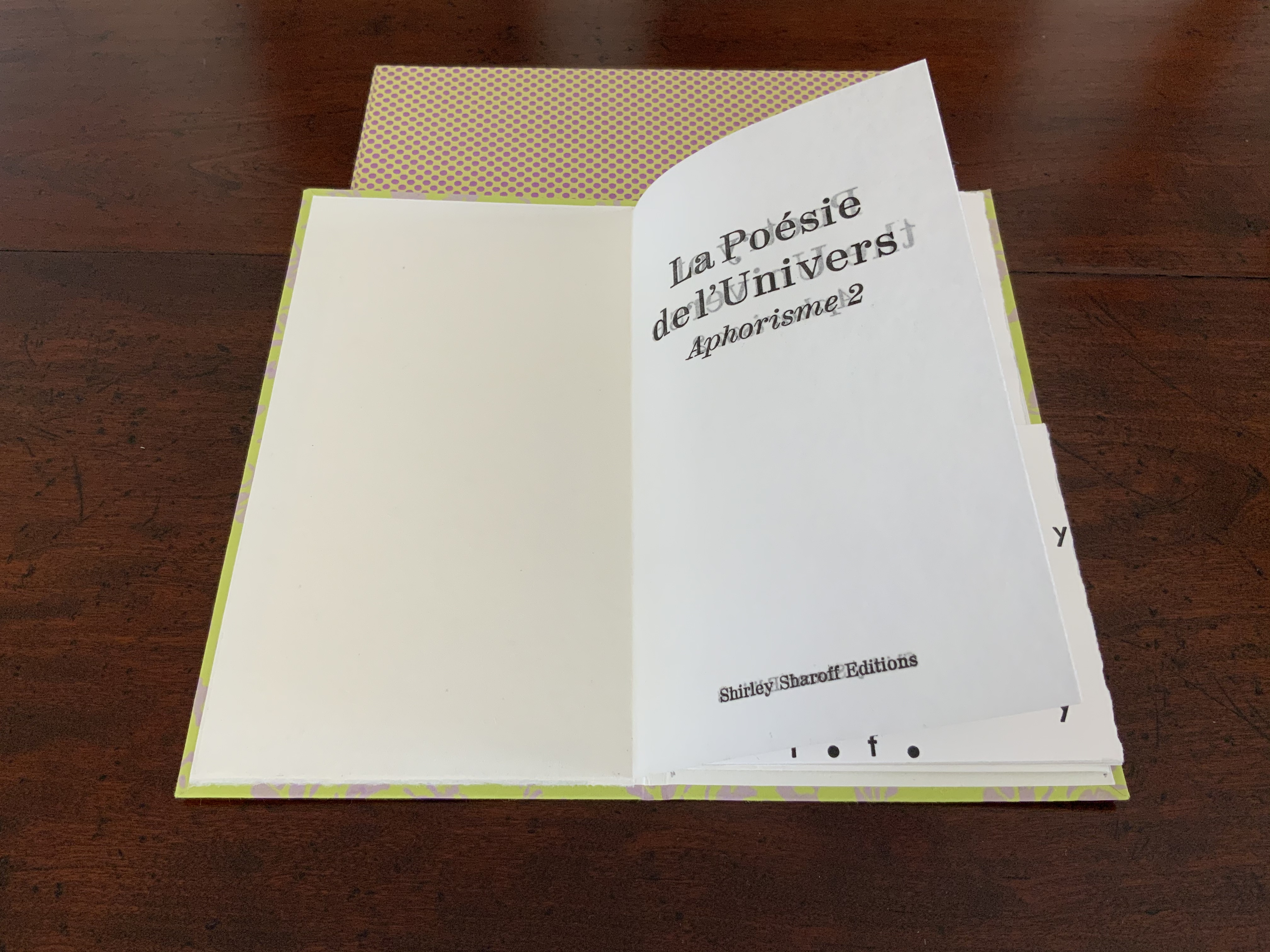
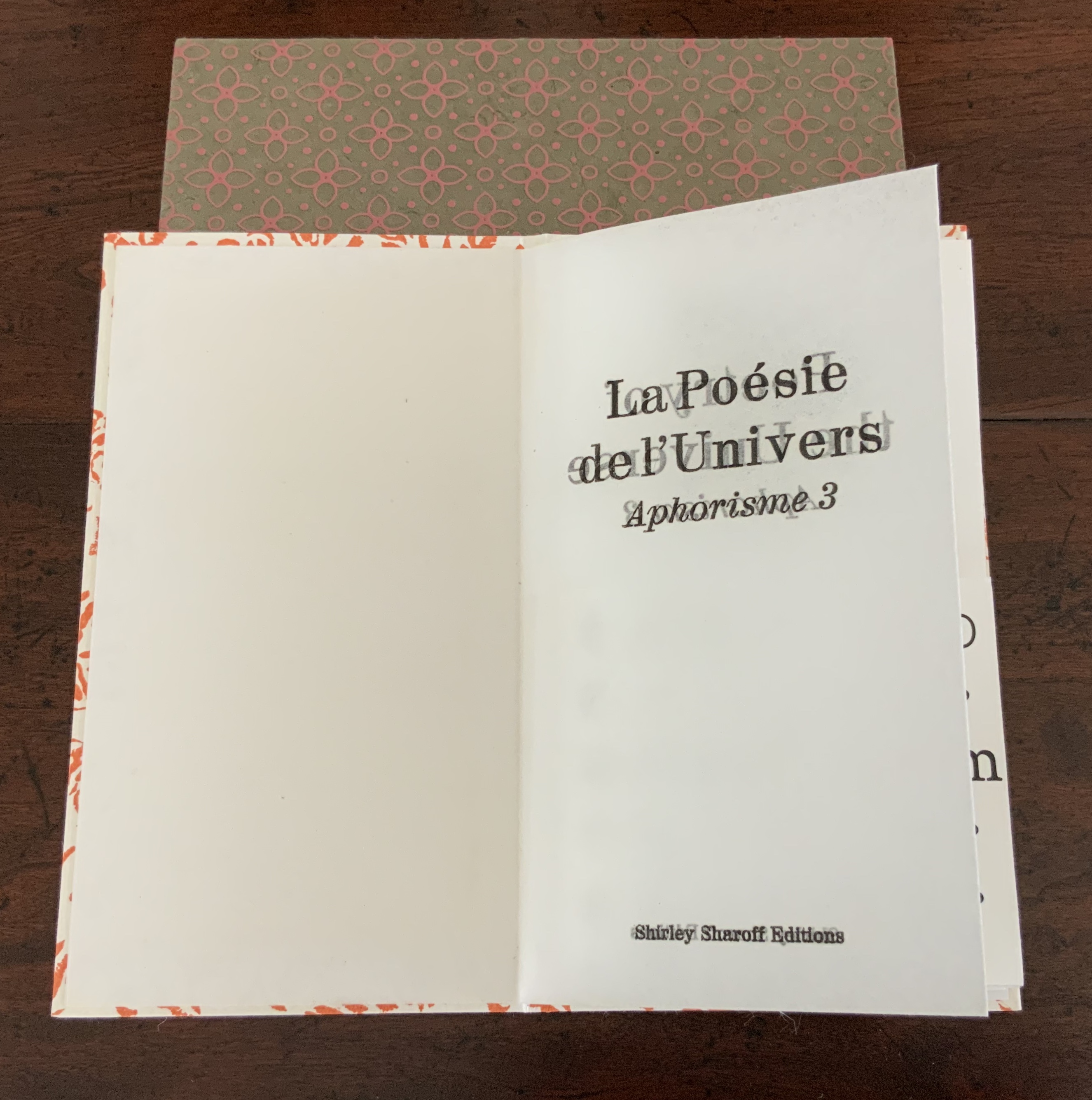
Three small volumes with aphorisms by Aristotle, Euclid, and Antoine Lavoisier (one per volume, respectively, in both English and French); each printed letterpress in various fonts and typographical arrangements along with four intaglio prints on one sheet of paper. The paper is cut along some of the folds so that folding and unfolding reveals different combinations of the text and images. Typography by Vincent Auger on Rives 250 GSM. Engravings printed by René Tazé. Edition of 25 and 3 casebound. H215 x W120 mm. Acquired from the artist, 5 February 2019. Photos: Books On Books Collection.
According to Shirley Sharoff (Books On Books interview, 5 February 2019), the fold and form of these three books were inspired by Katsumi Komagata’s work, and “Making each one was like a different game I was playing or puzzle I was solving”. Although the fold and form of each book is the same, the effect differs in each because of the placement of text and image. The result is three works of book art teasing the reader/viewer into playing with the artwork or solving the puzzle of reading/viewing it — and appreciating how the text from Aristotle, Euclid or Lavoisier fuses with the fold, form, typography and prints in each book.
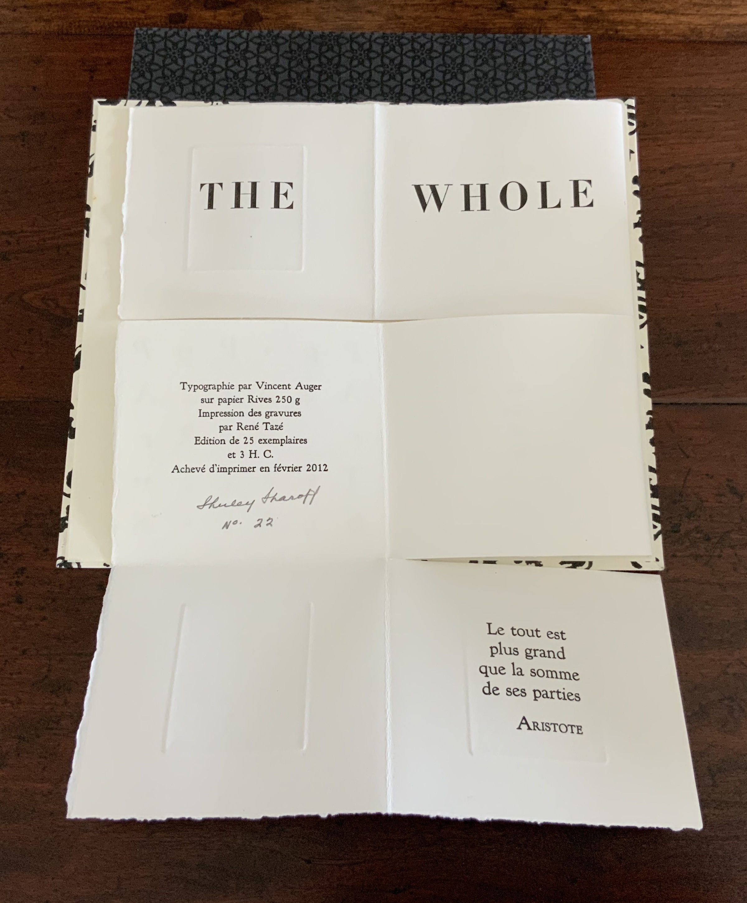
The game or puzzle of finding the order of unfolding the books has several interlocking levels. On one level, there are origami “mountain” and “valley” folds, there are kirigami cuts, and vertical and horizontal openings. As these present themselves, the process of discovering or reading the text — what it is and how its syntactic order suggests the direction and order of unfolding — emerges as another level in the game. In parallel are the dual levels of deciphering the order (if any) of the intaglio prints’ appearance and relating the images to the text. And then there is the level of the relation of French to English and vice versa.
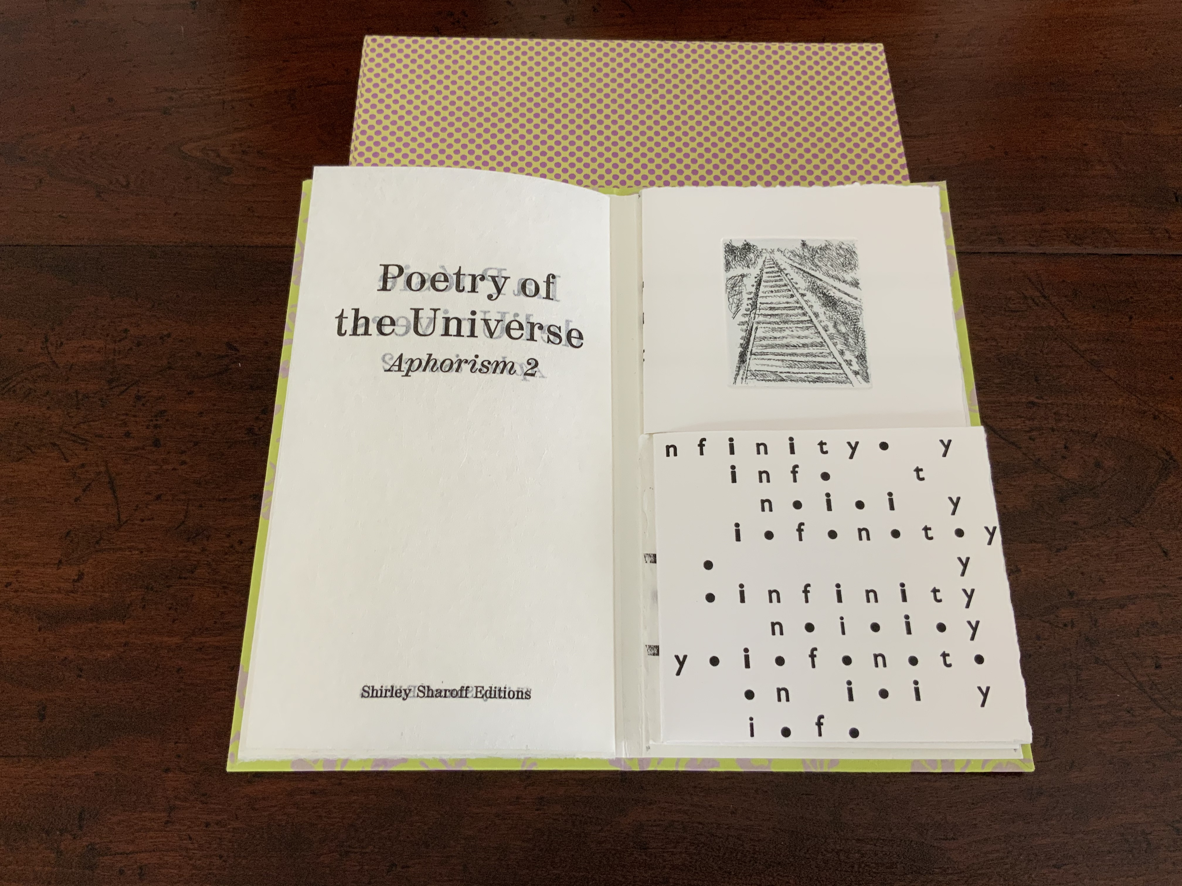
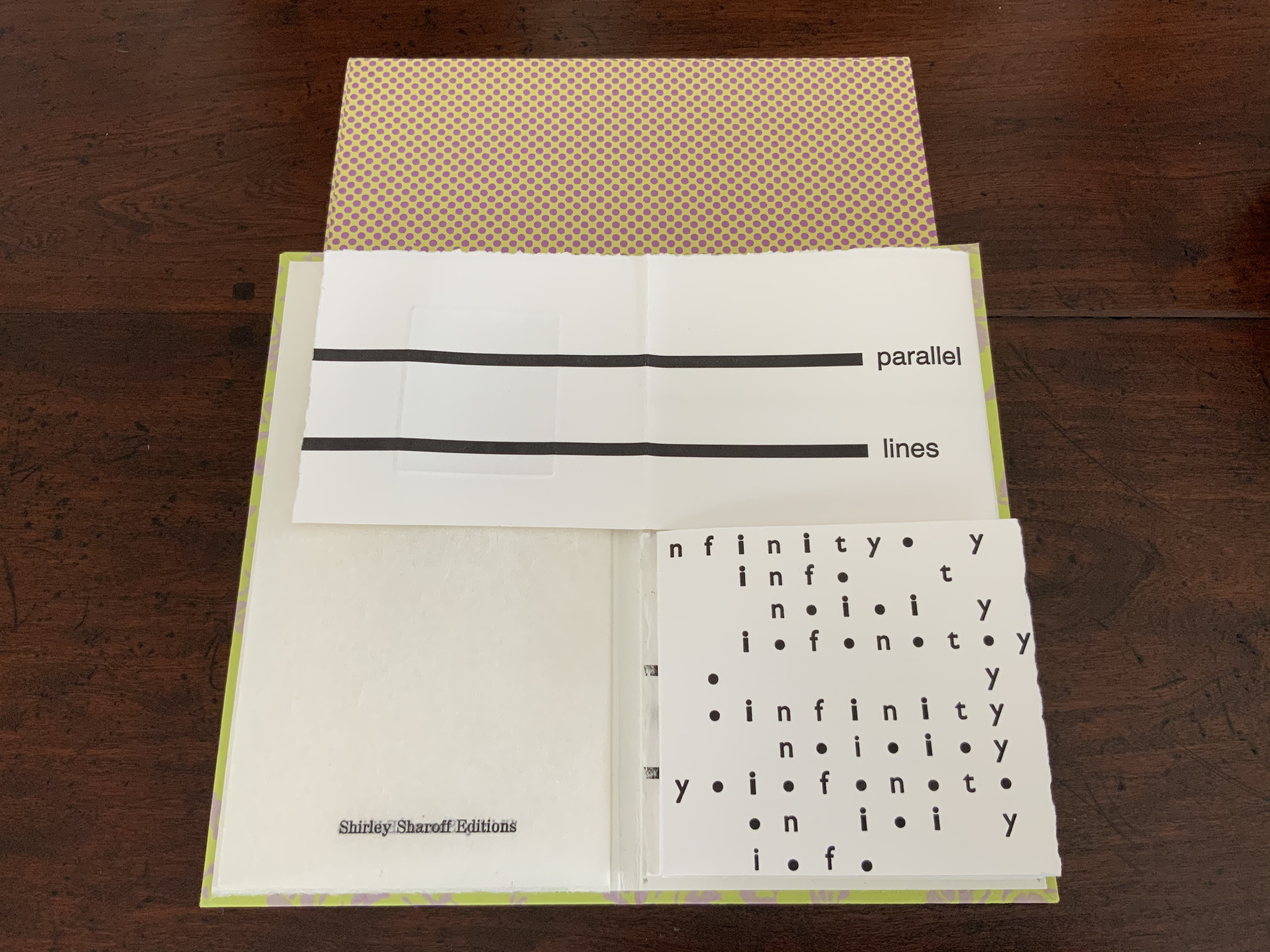
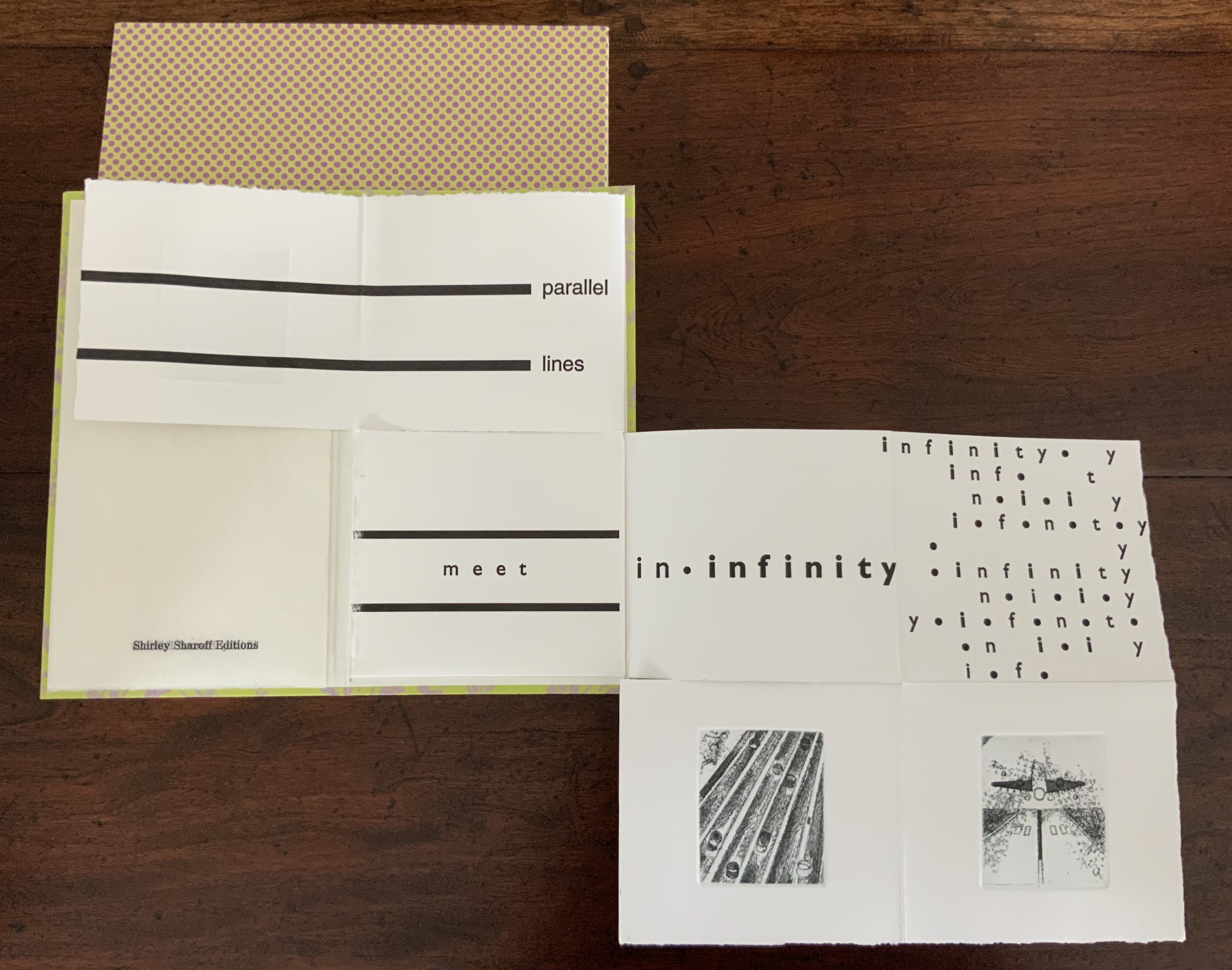
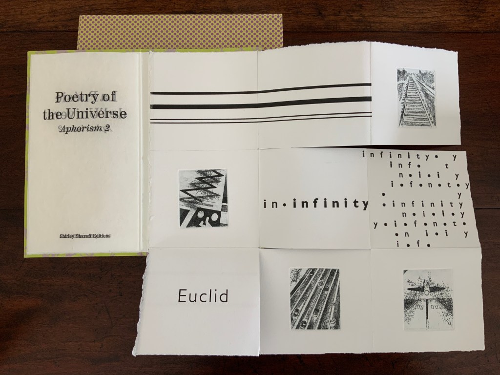
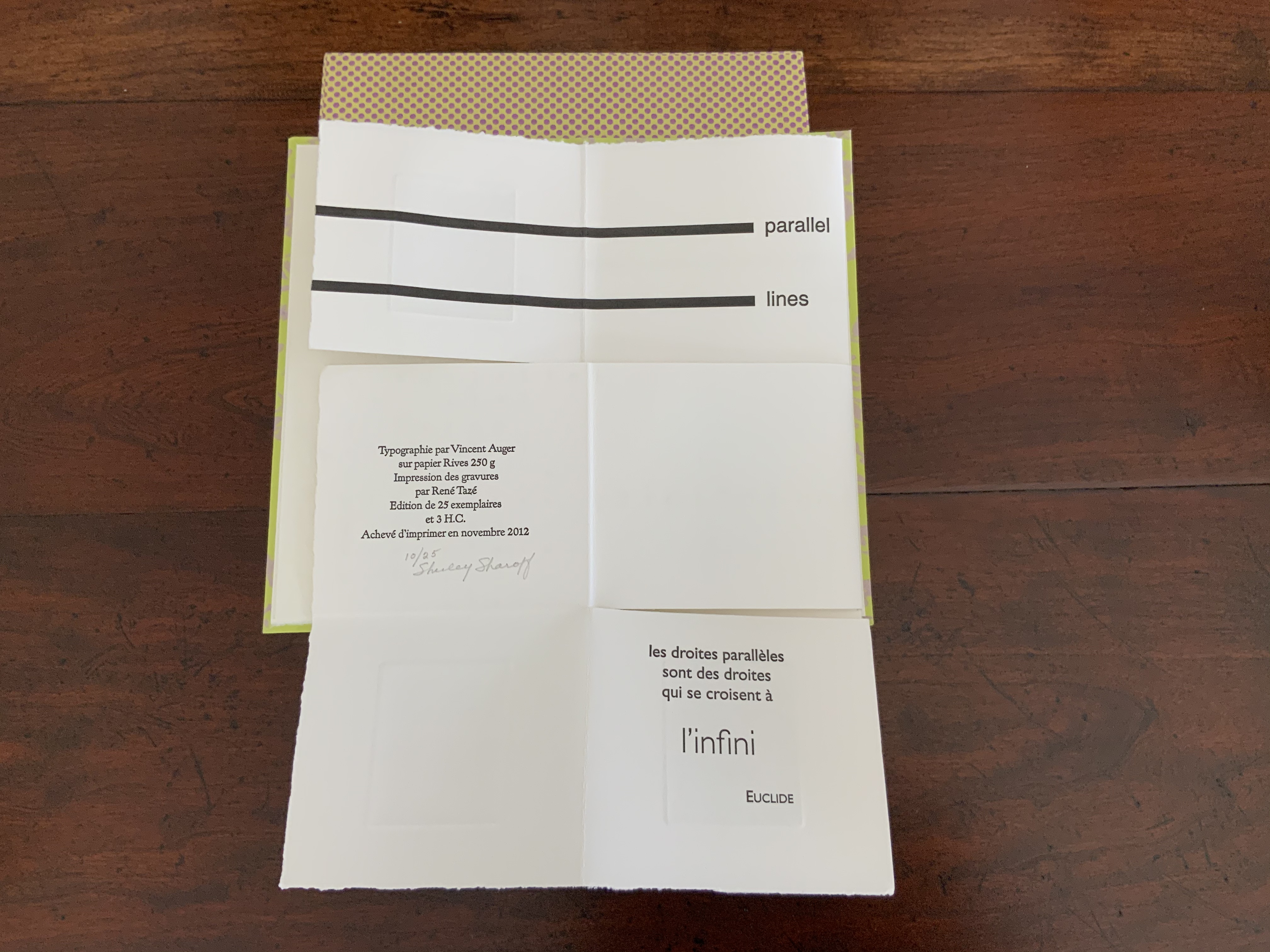
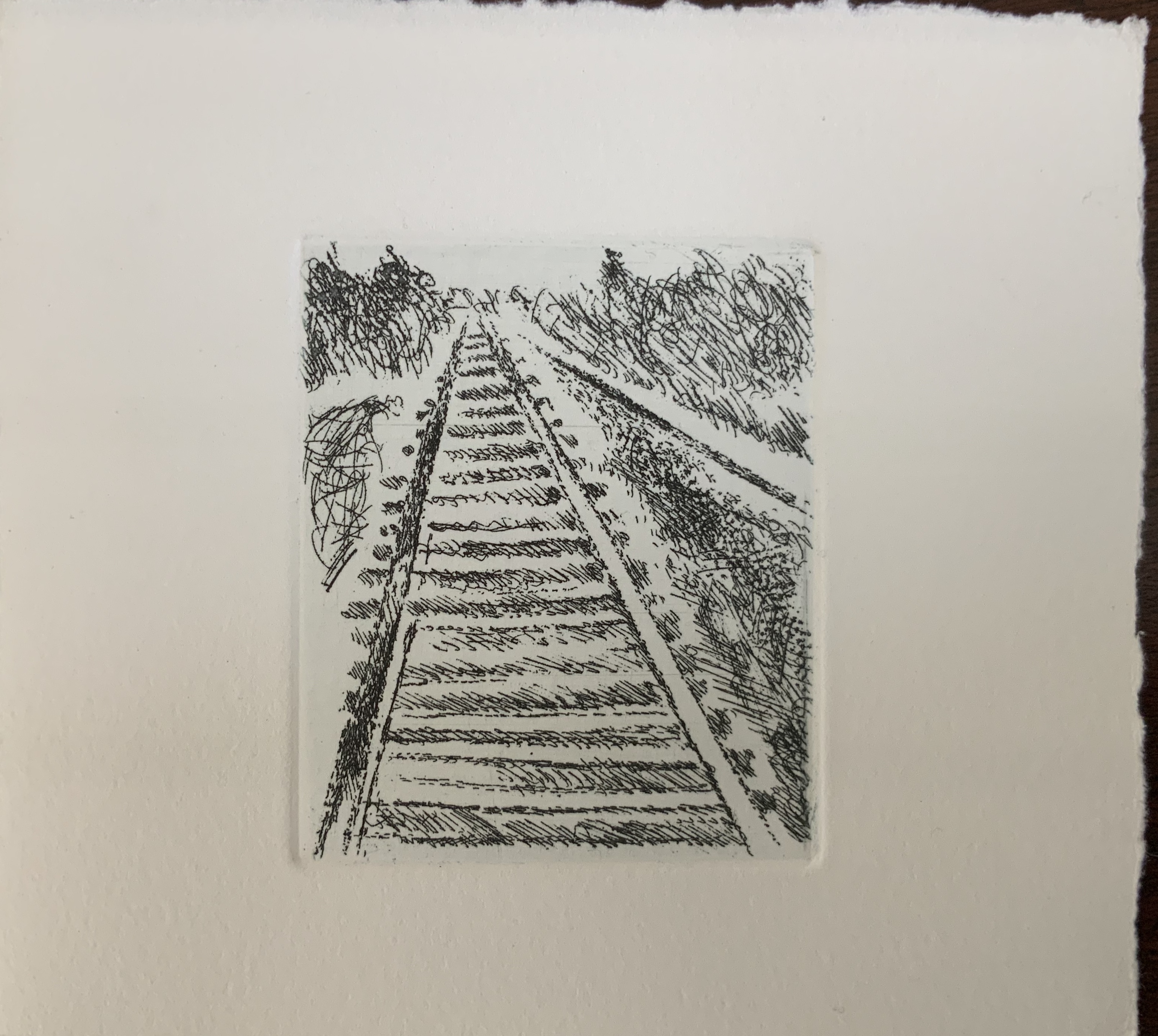
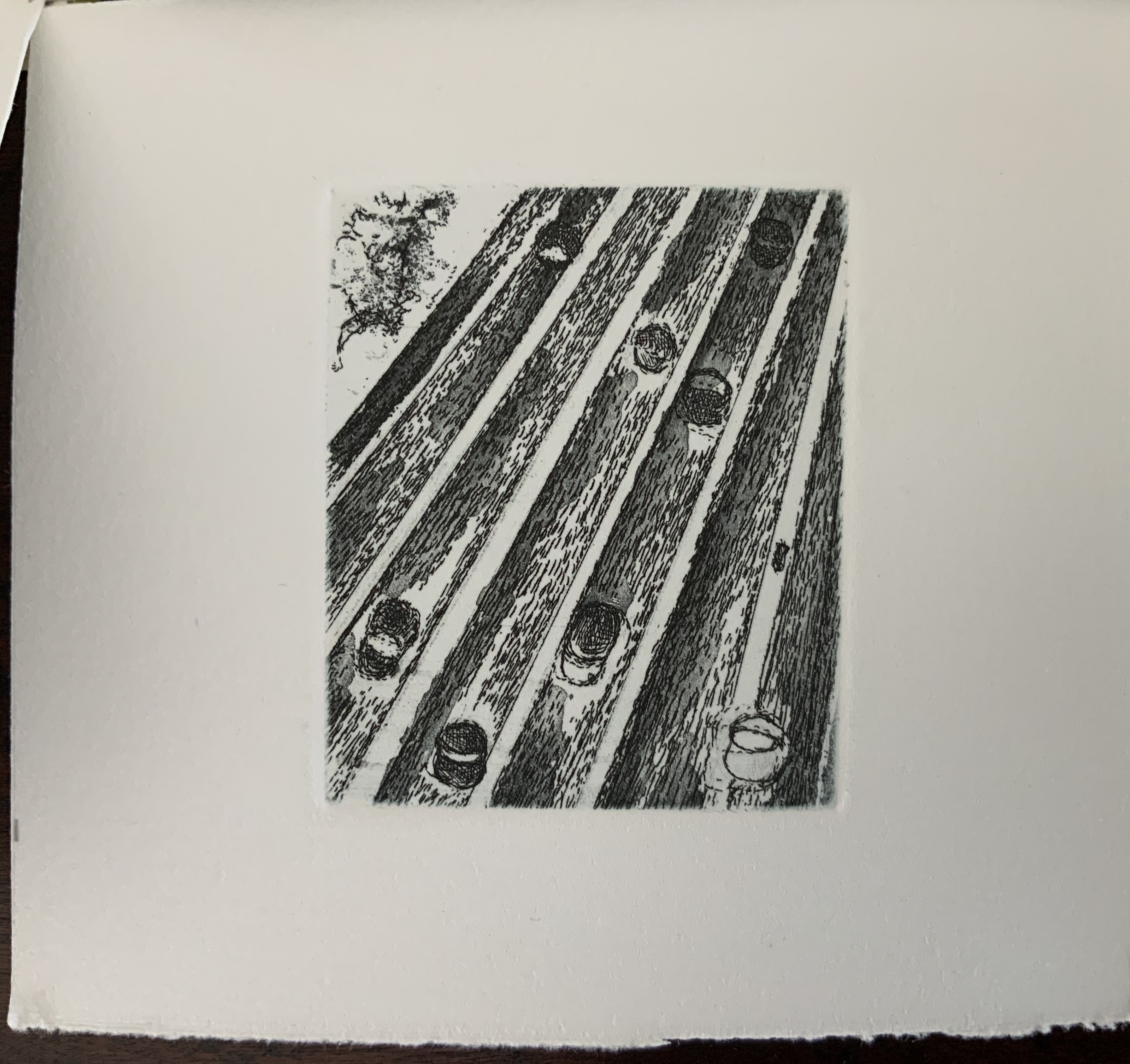
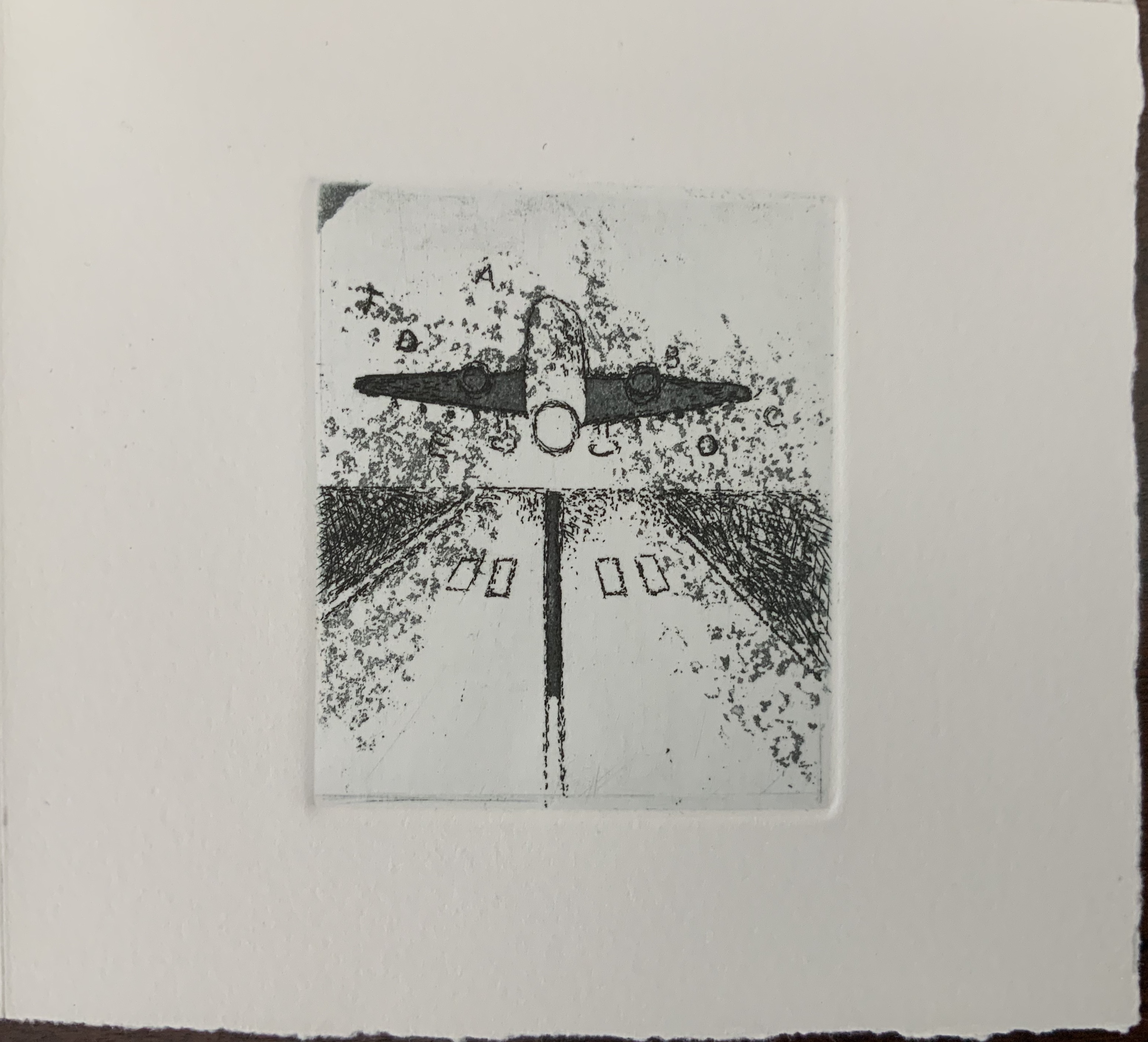
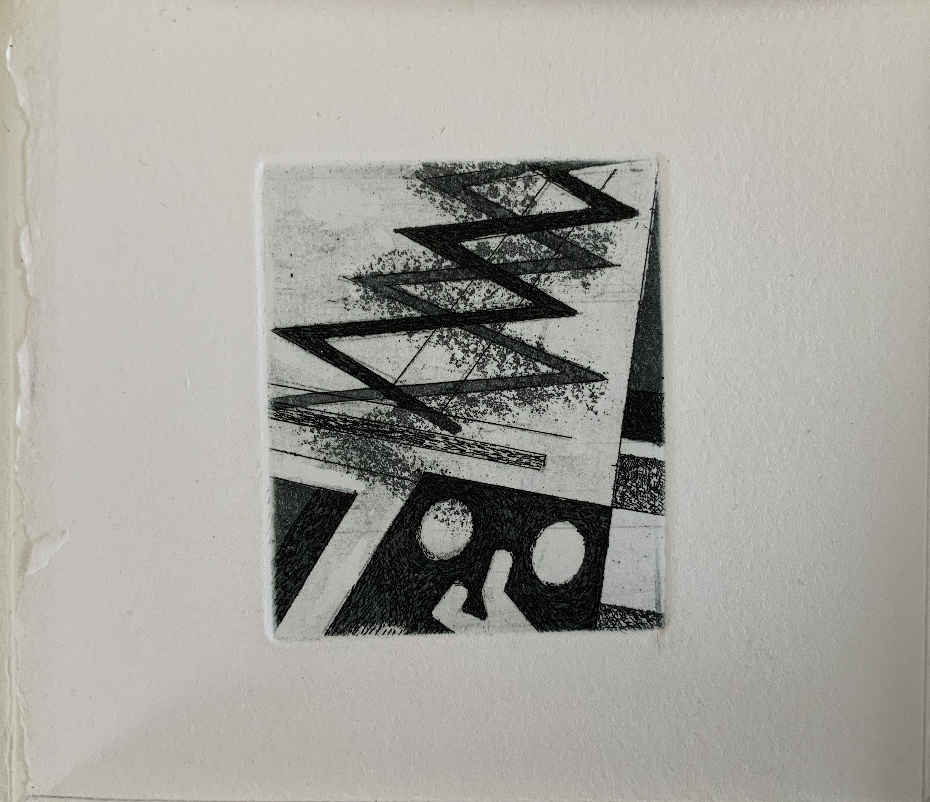
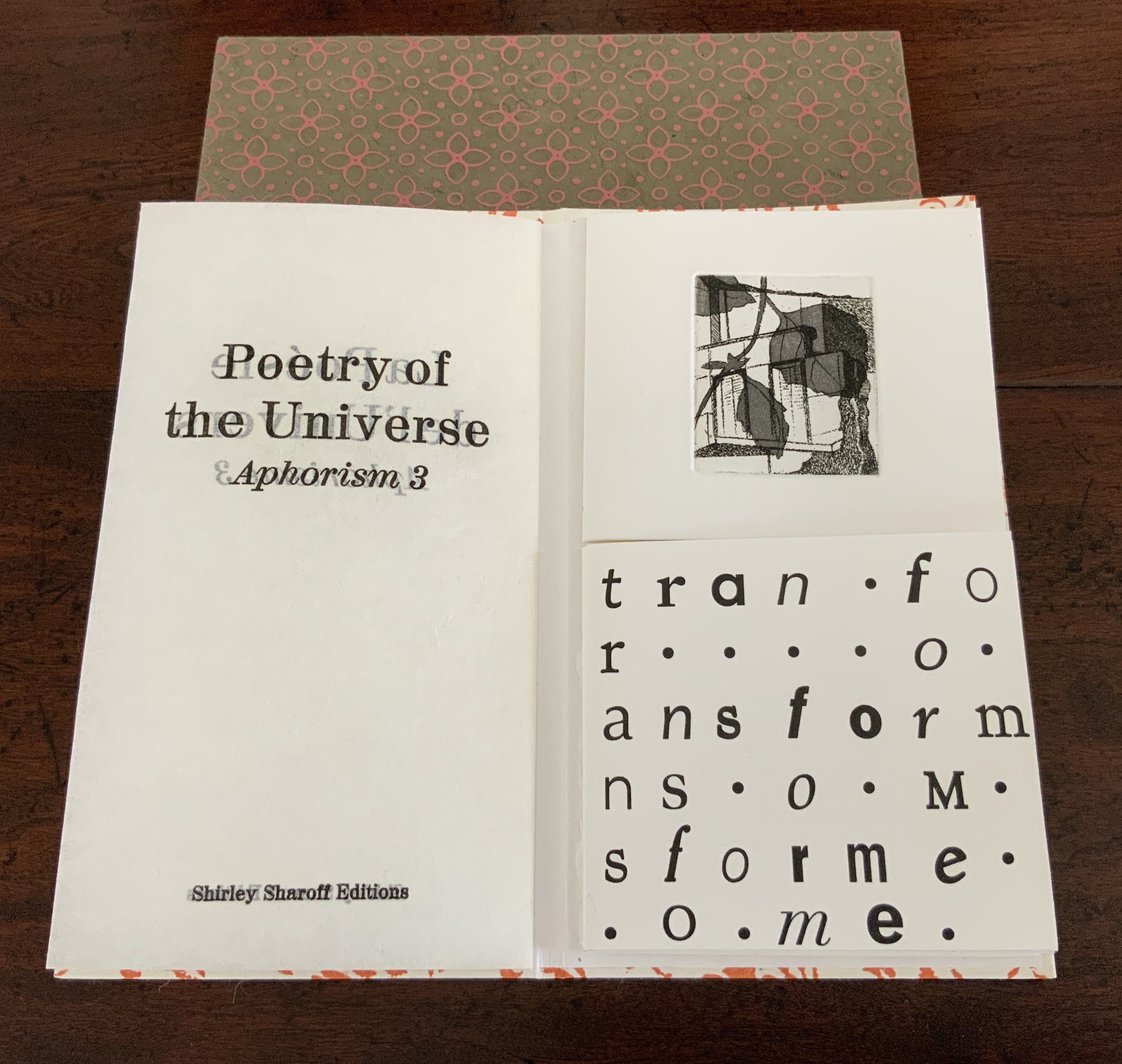
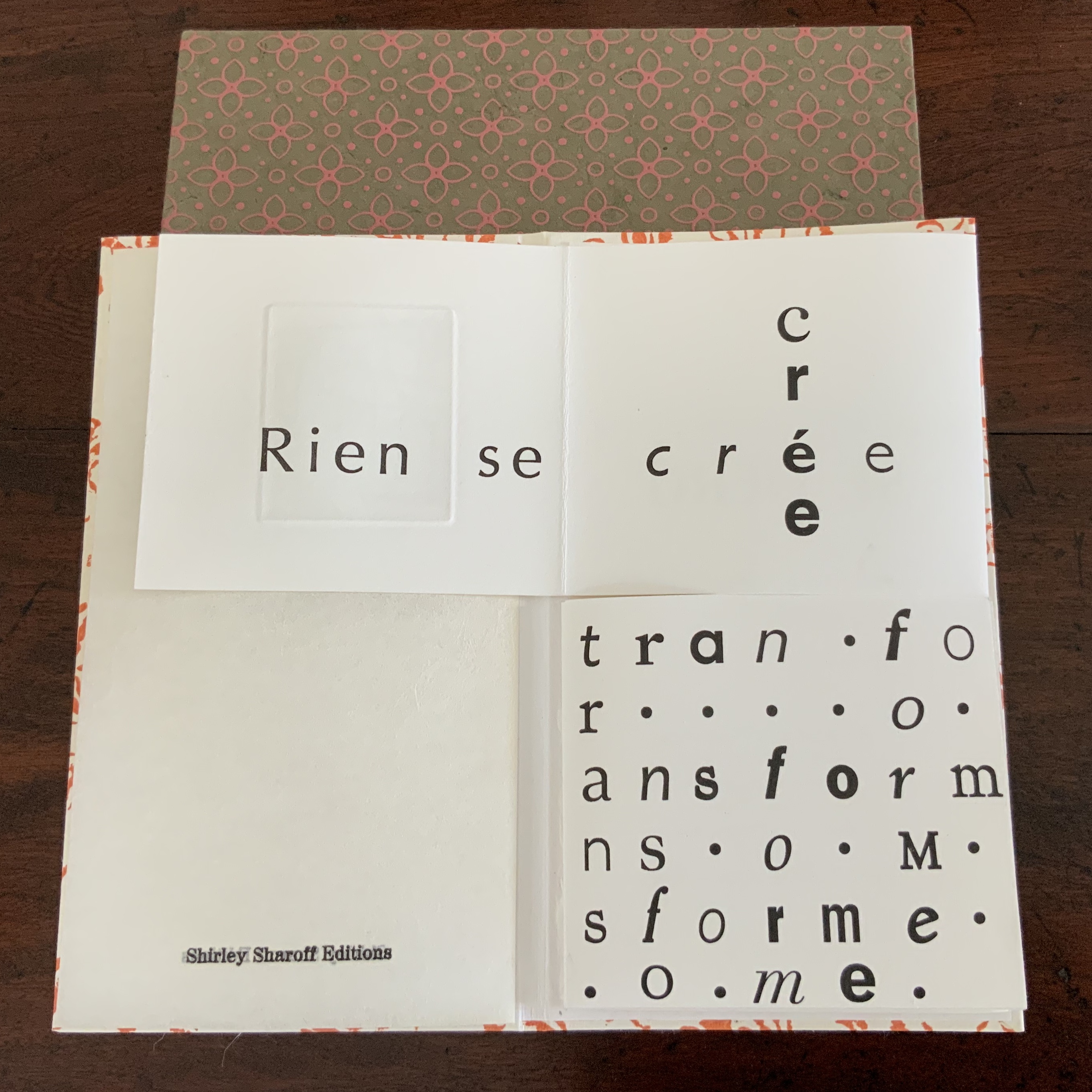
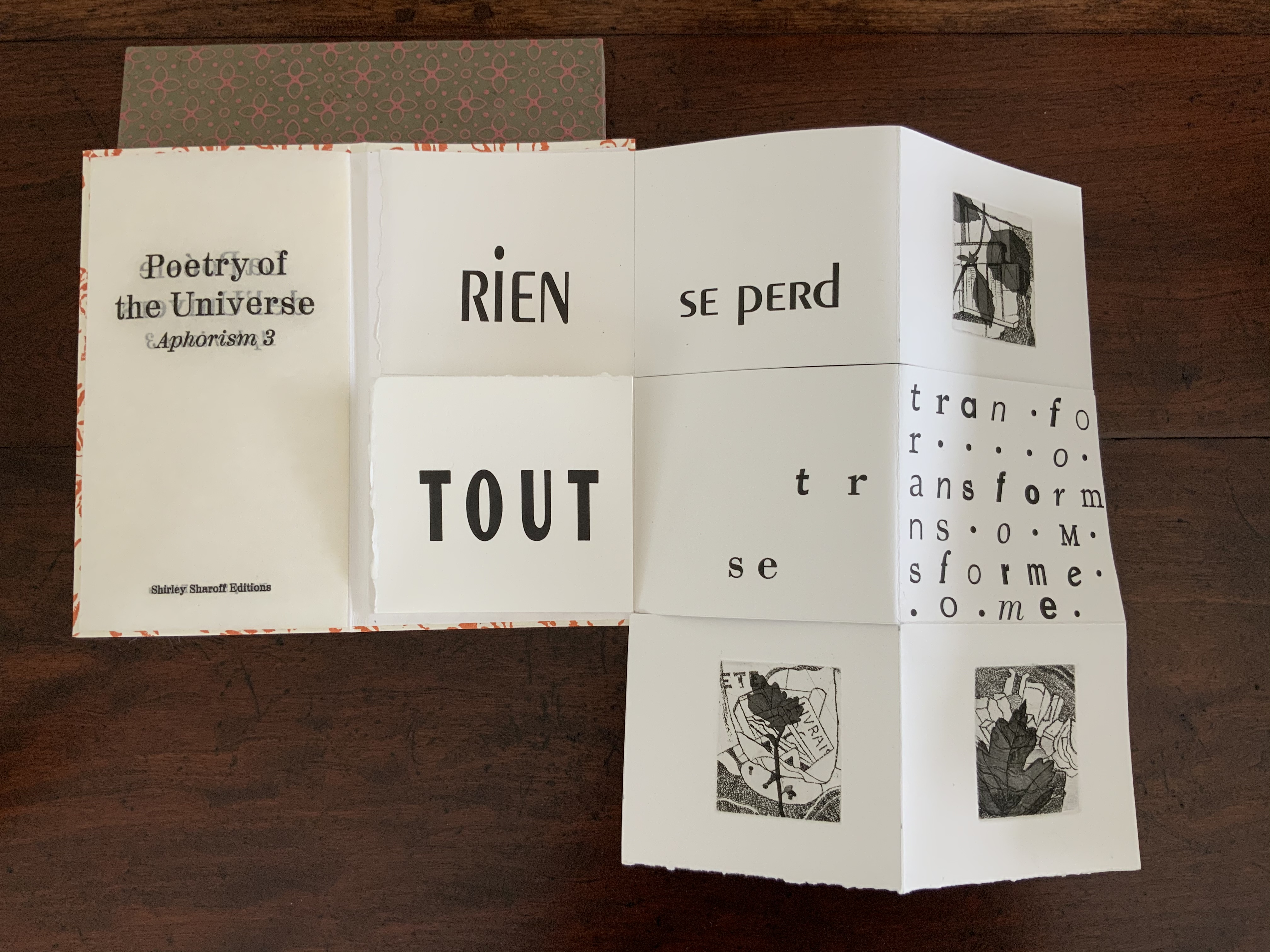
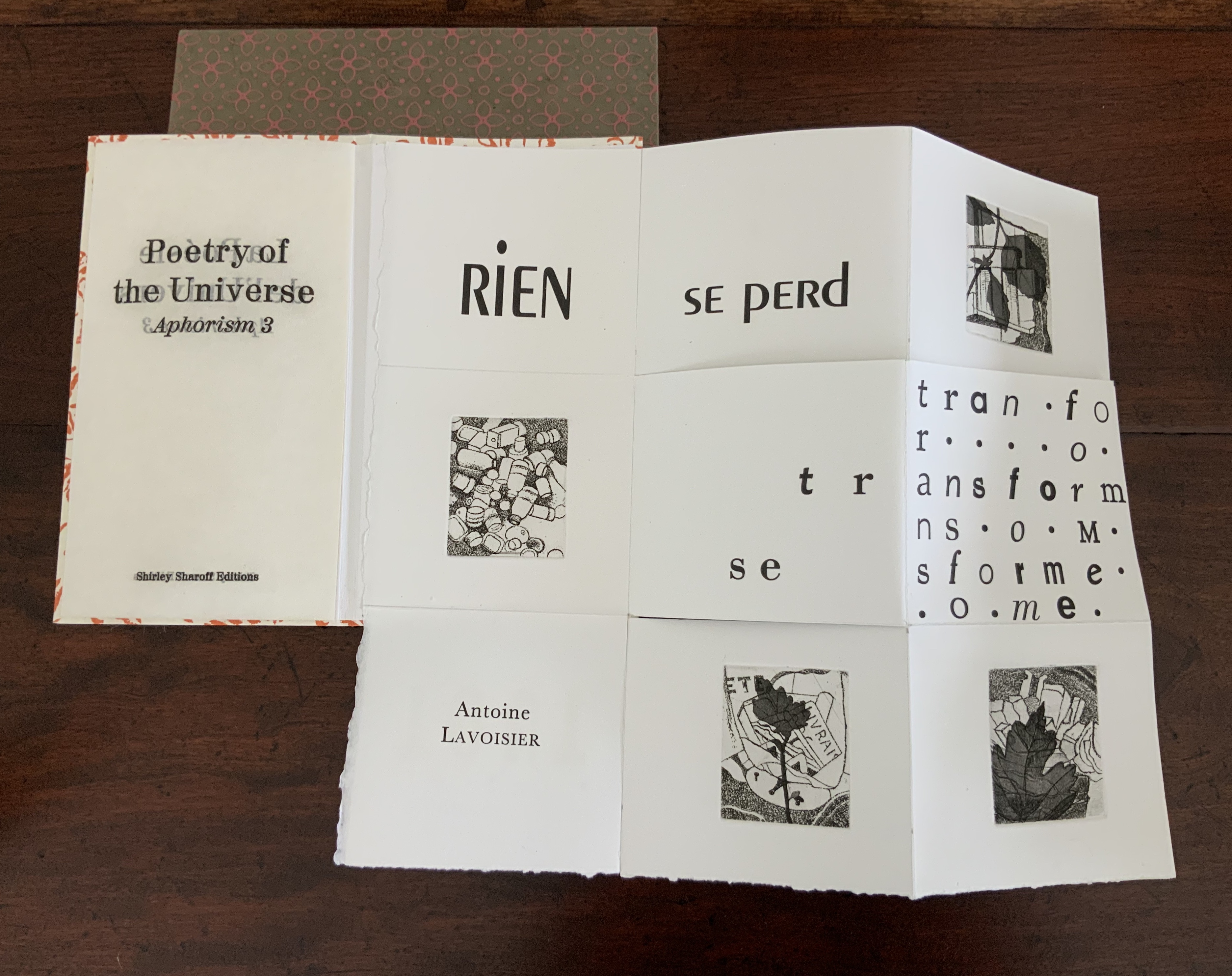
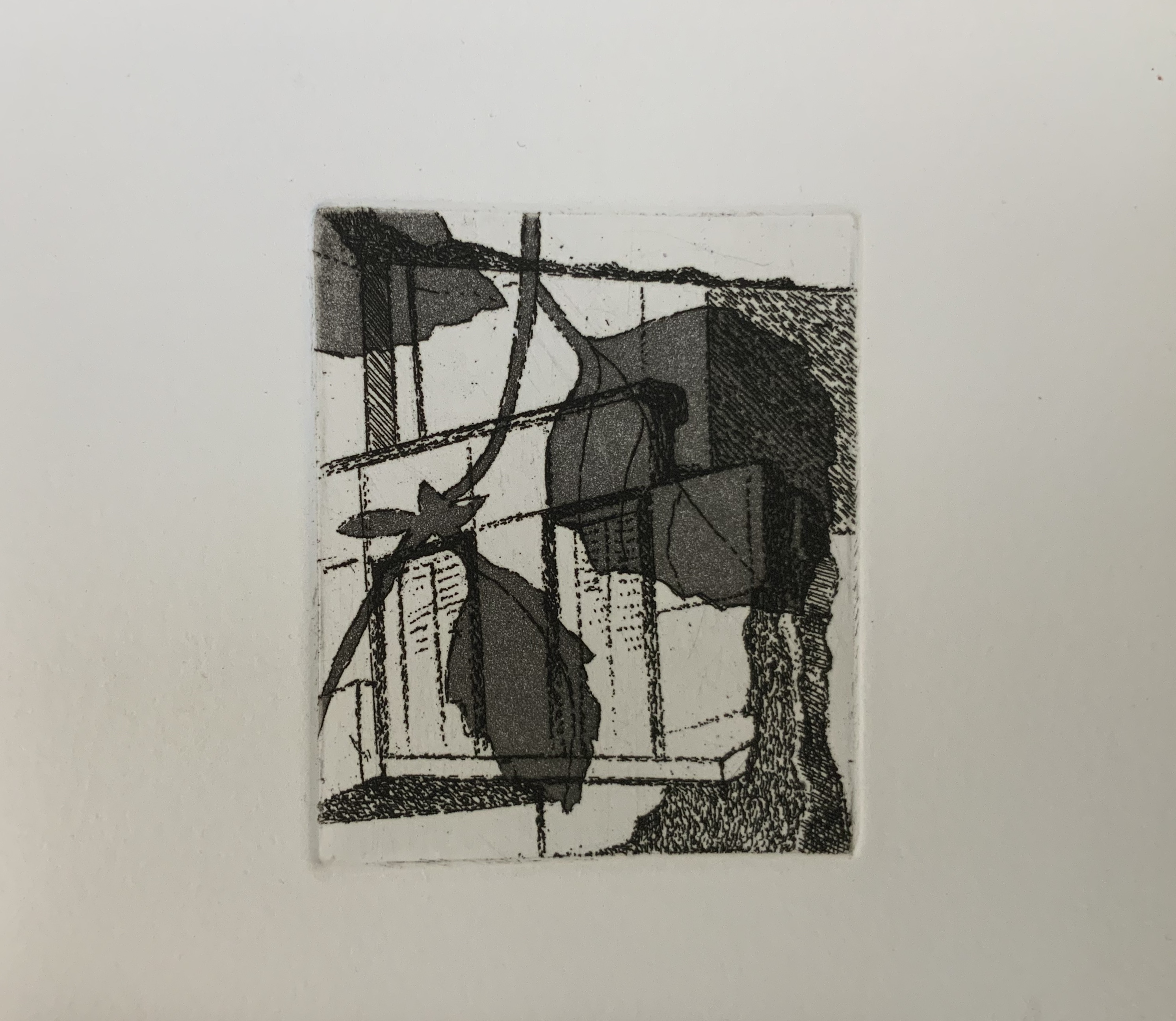
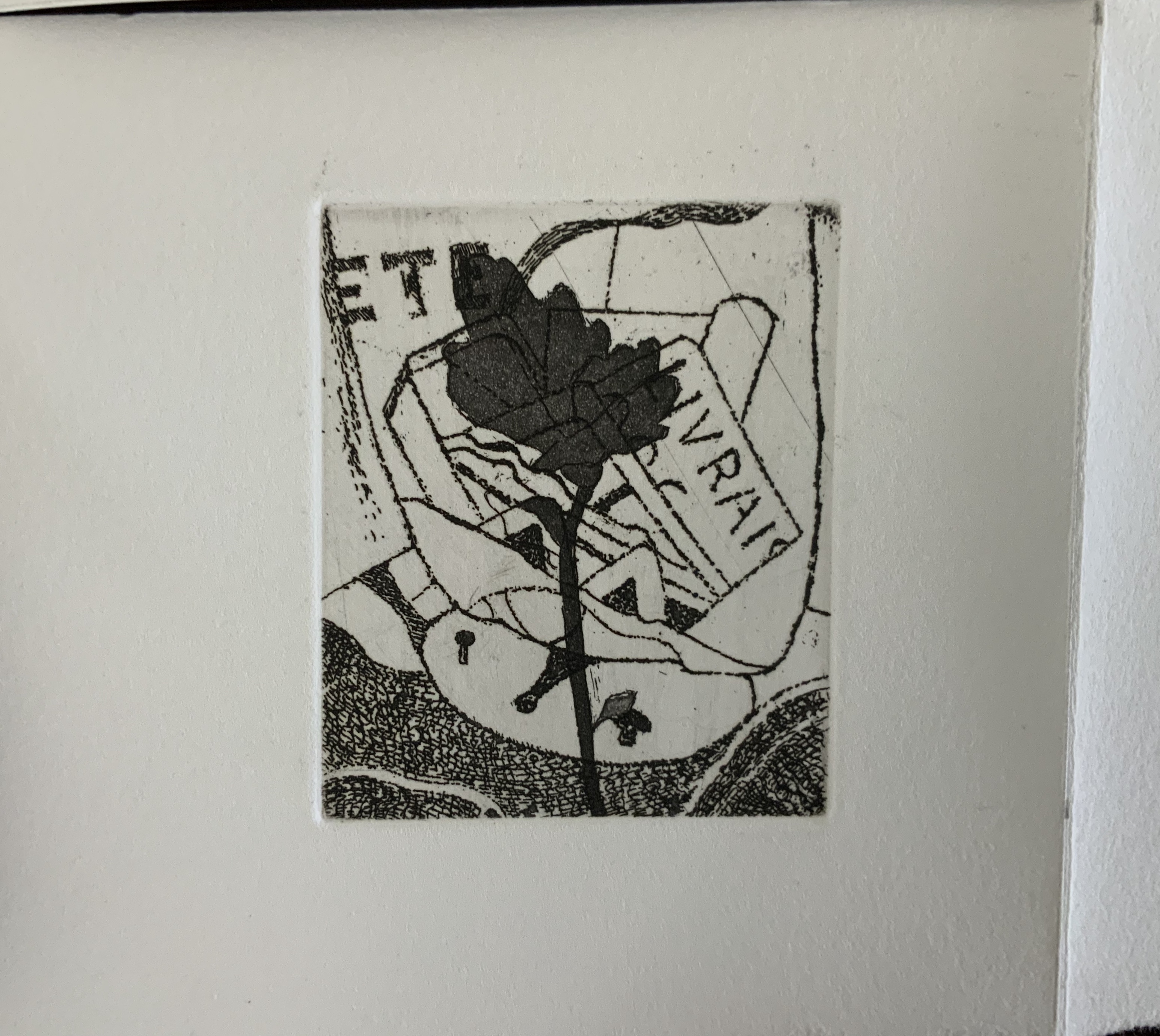
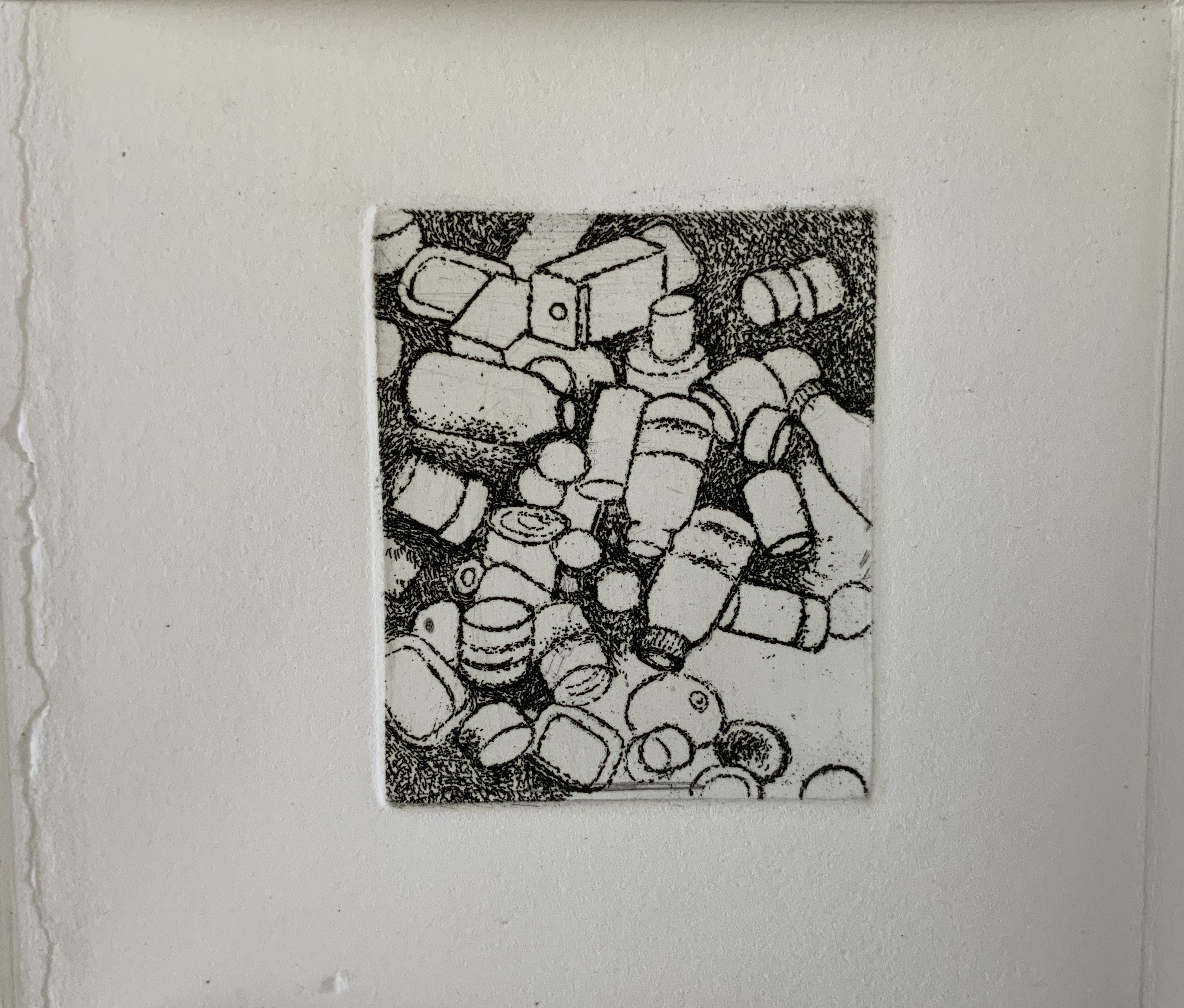
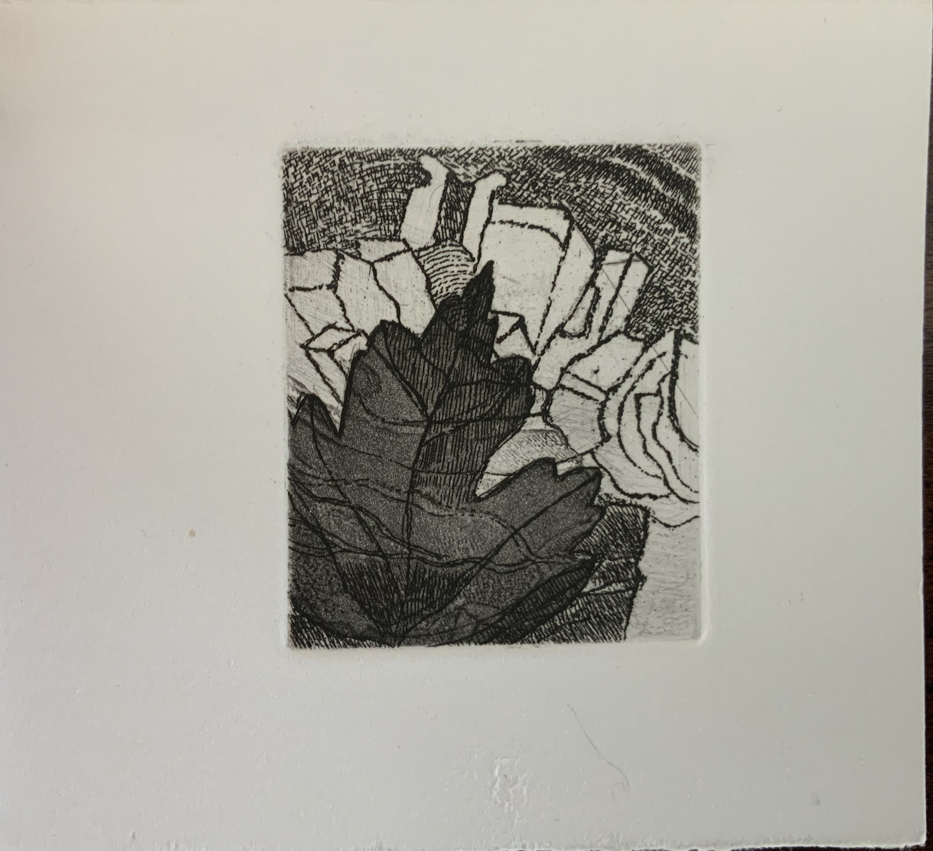
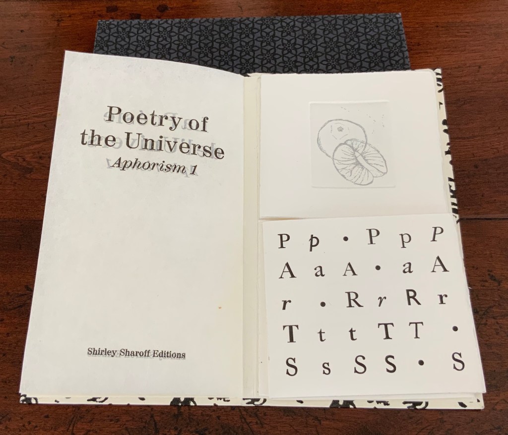
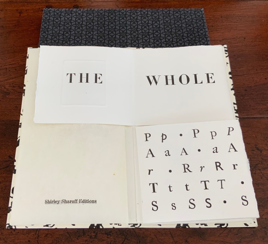
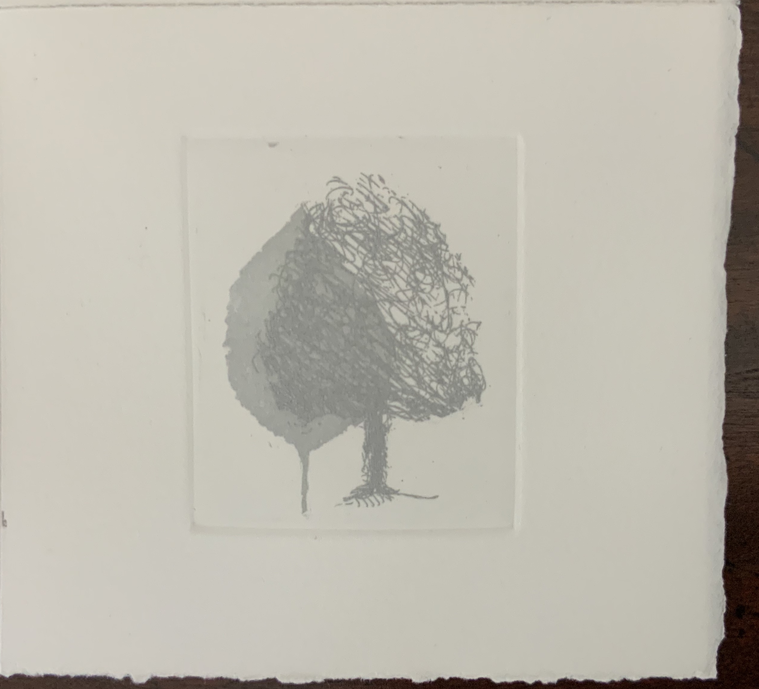
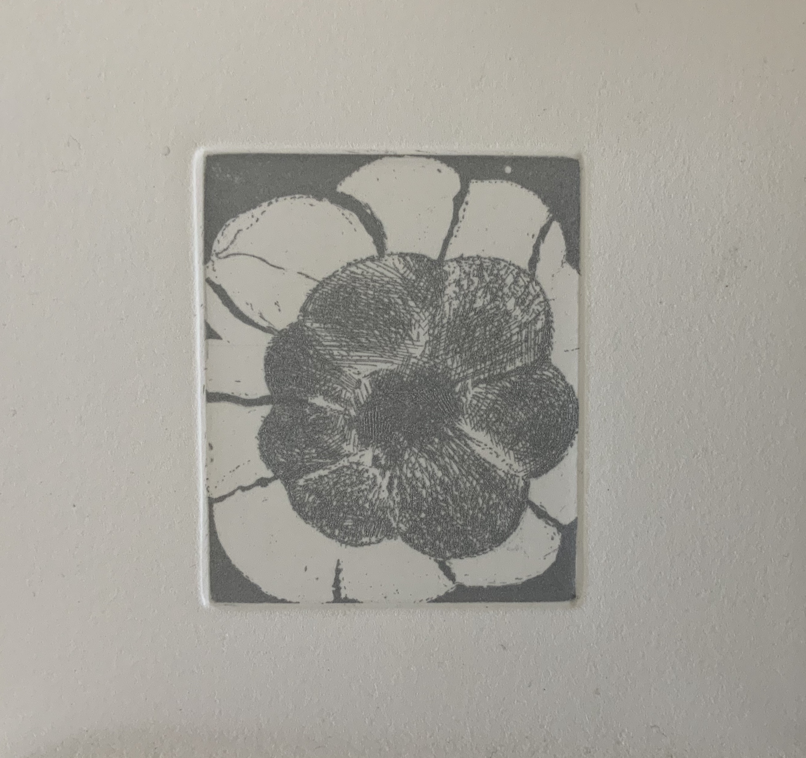
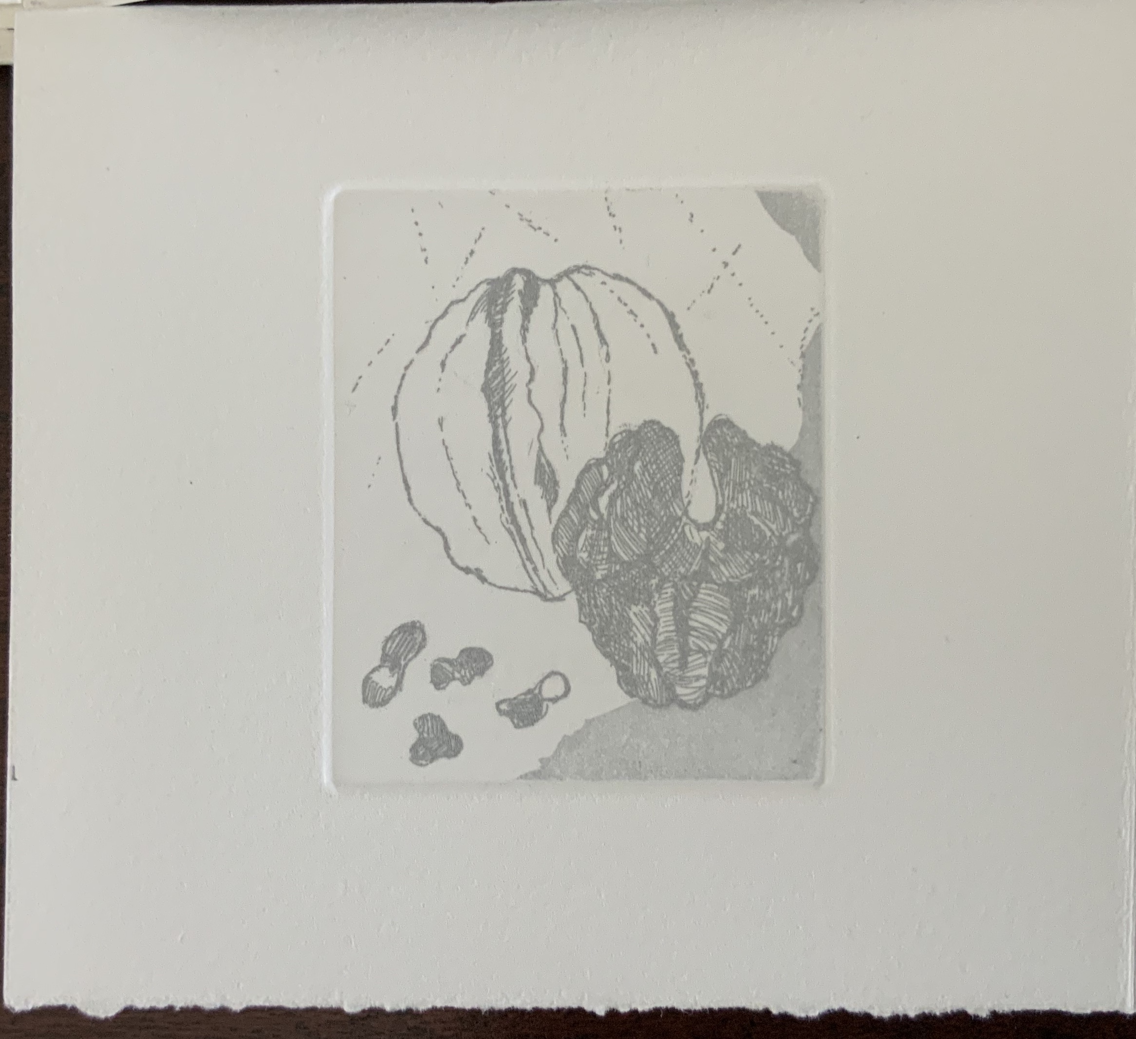
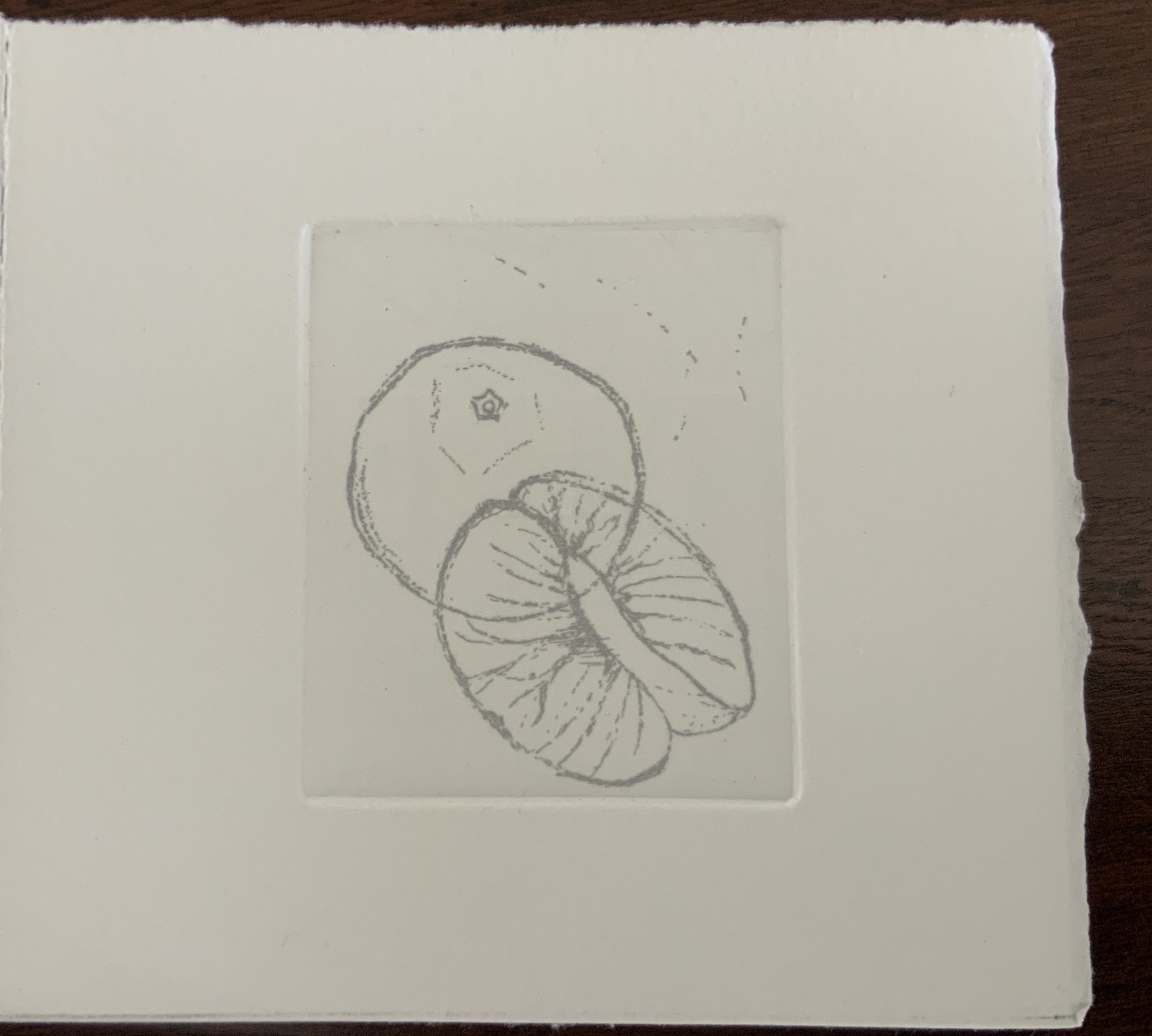
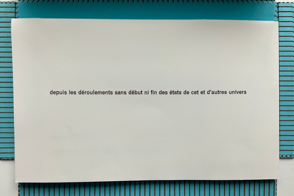
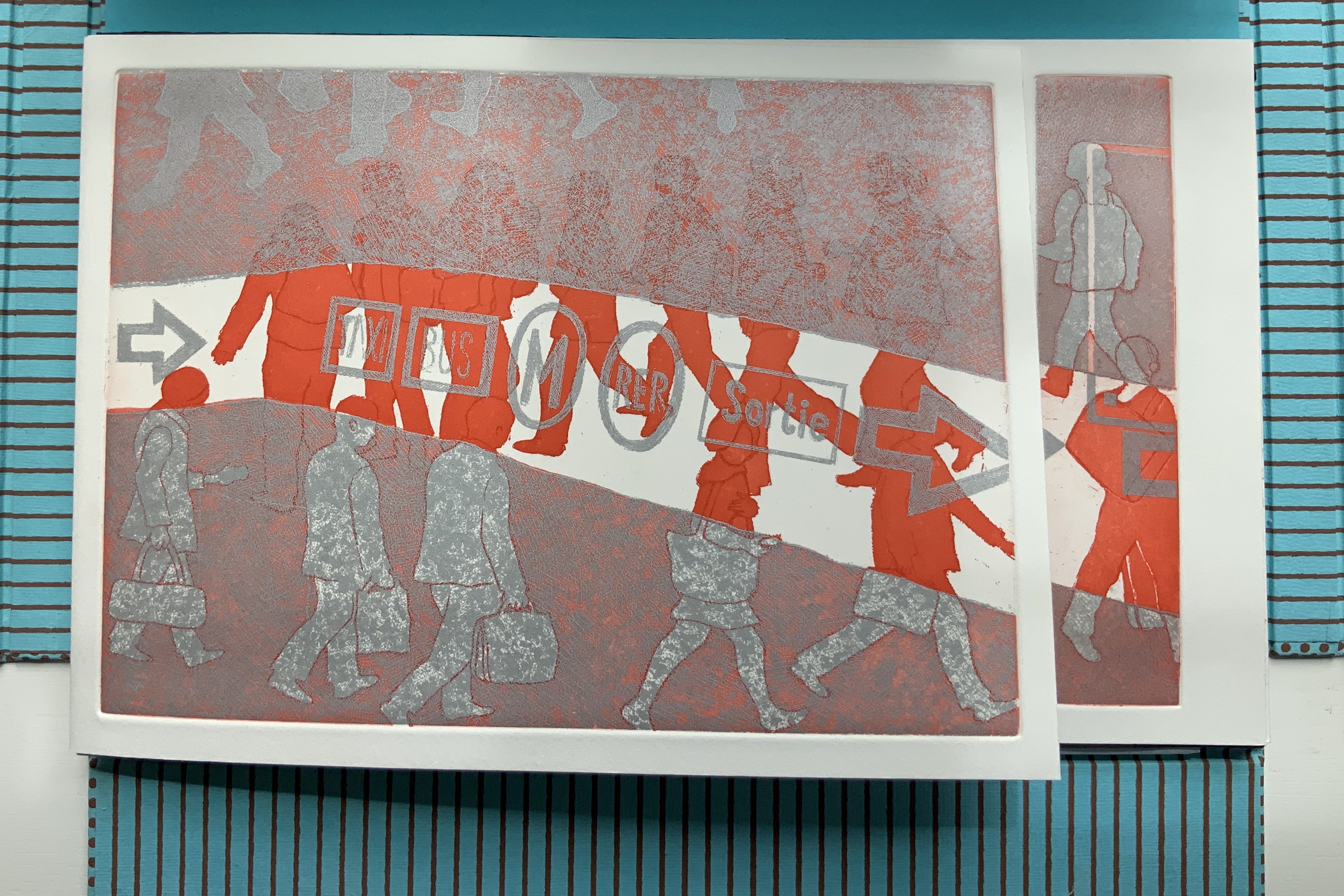
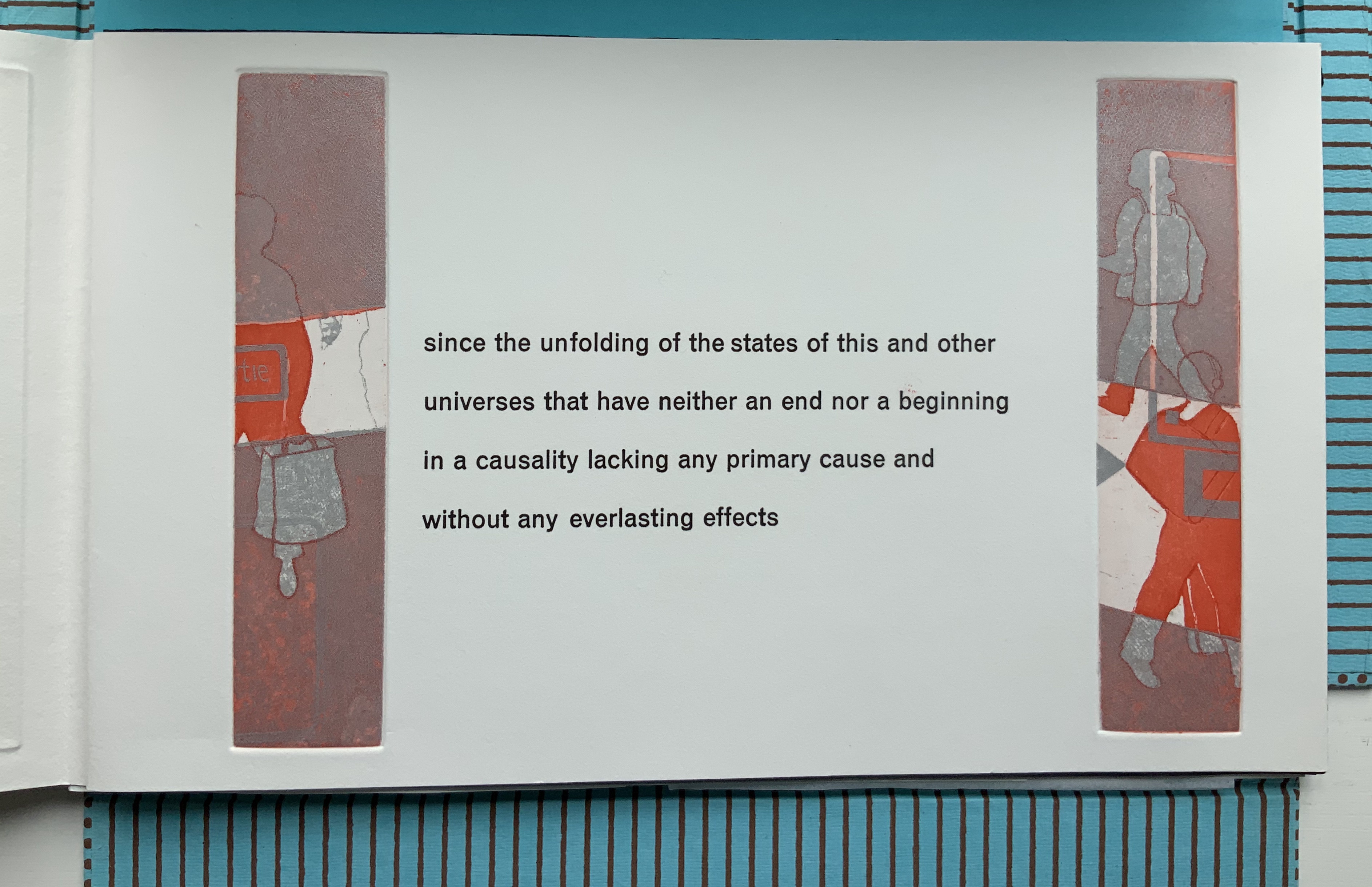
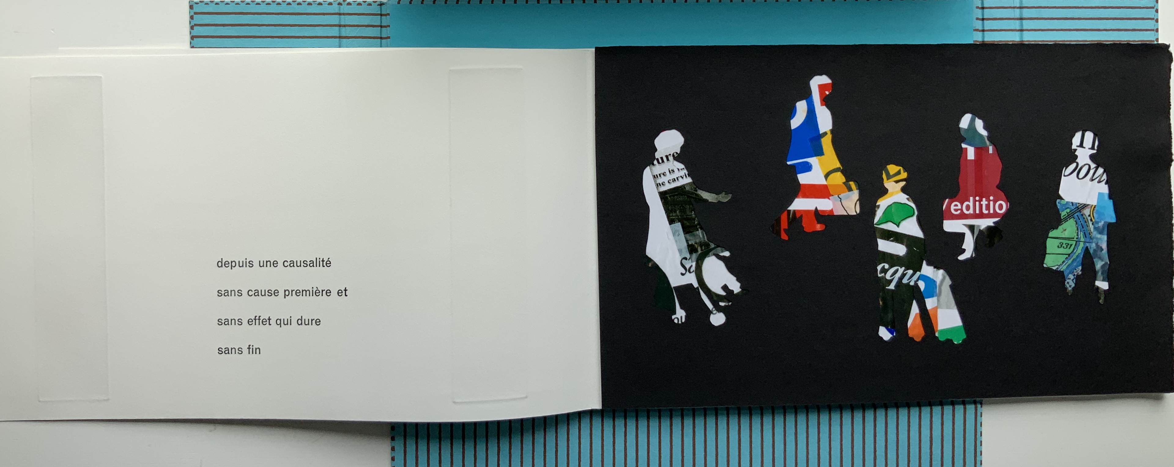
While the sets of four prints occupy the same position in each of the three single sheets, they “illustrate” their texts in different ways. In Aphorism 1, the whole tree occupies the “concluding” position of the lower right-hand corner, making a whole that is greater than the sum of the parts depicted in the other prints. In Aphorism 2, the images of transportation — train, car, plane, feet — follow from the abstract image of parallel lines. And in Aphorism 3, the two images of leaves overlapping human creations — buildings and litter — are bracketed by a central image of nothing but litter and a lower right-hand image of nature and the human-made landing atop a protruding pair of legs and feet like those of the Wicked Witch under the house in the Land of Oz.
In their variety of relationship to the structure and text, the three sets of images feel a bit secondary. Not so the presence of two languages. From the start, the French title page backed by an English title page on translucent paper suggests some sort of centrality for this bilingual feature. The only variation among the three volumes is that in Aphorism 1 and Aphorism 2, the complete French expression appears in a single panel, whereas in Aphorism 3, the English expression takes up that position. Why the bilingualism at all? The breaking up the expressions across the folds and cuts, the interspersing of images among the phrases, and the summary panels (two in English, one in French) suggest a halting, fragmented relation of each language to the other. Despite the title pages’ implication, the bilingual expressions do not exist simultaneously in parallel in any one of the single sheet books. By extension, is the relationship of language-image-thought to reality (whether metaphysical, geometrical or chemical) similarly fraught?
Impermanence subtile/Subtle Impermanence (2013)
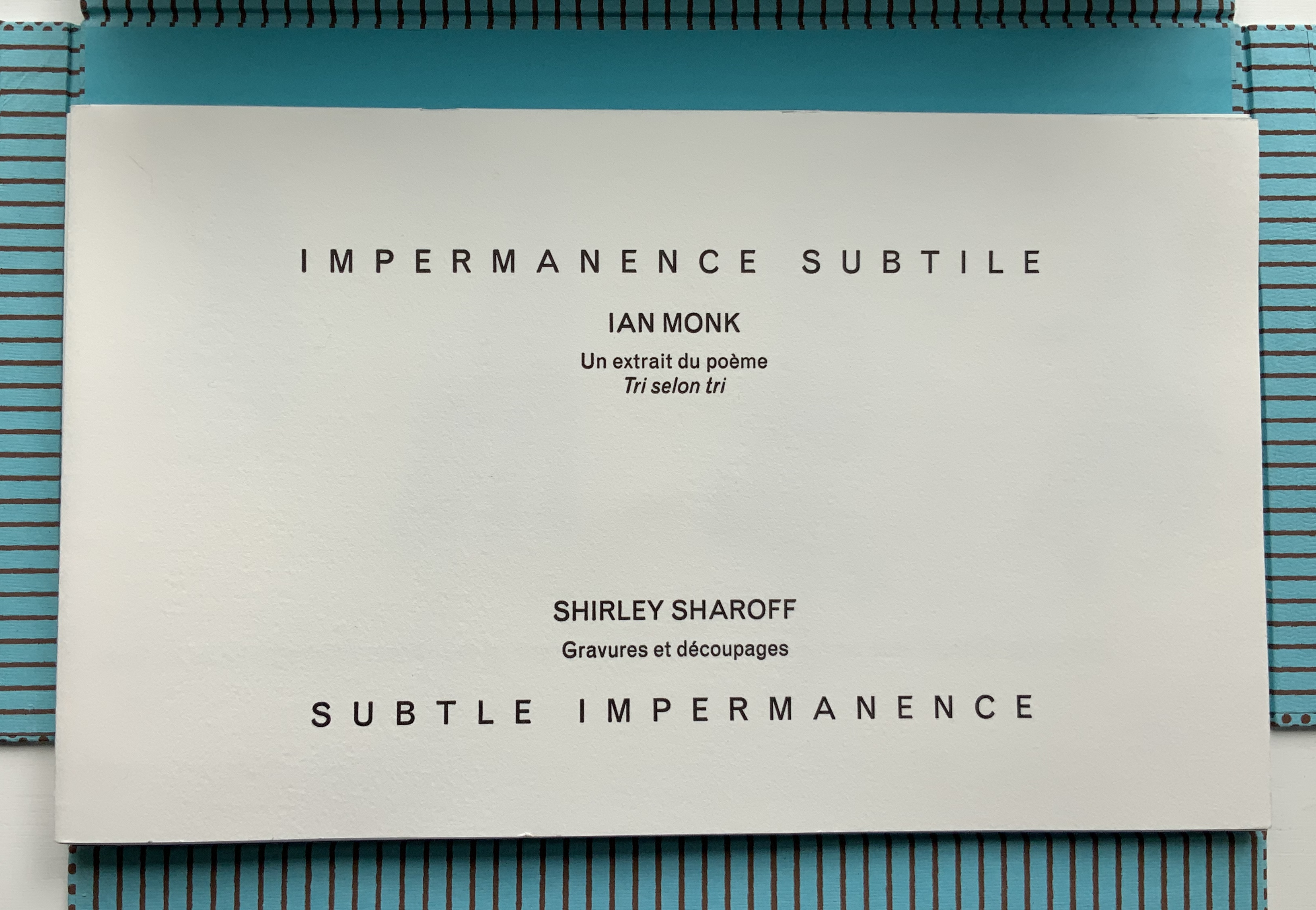
Impermanence subtile/Subtle Impermanence (2013)
Shirley Sharoff
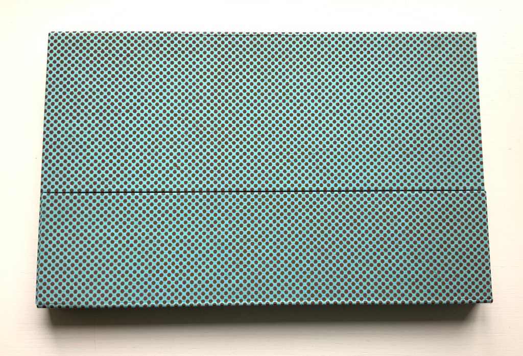
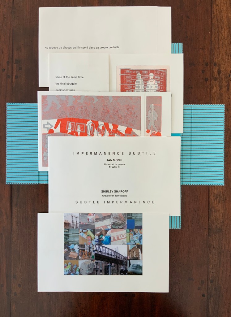
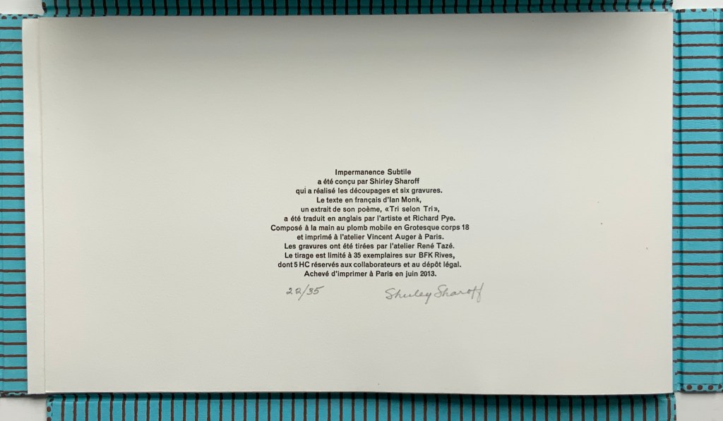
Portfolio box with four hinged flaps; five gatherings of folios bearing seven prints, collages, photos and cut paper. Text in English and French. Portfolio box: H212 x W340 x D24 mm; Folios: H200 x W330 mm, closed; variable width open, maximum W780 mm. Edition of 35, of which this is #22. Acquired from the artist, 5 February 2019. Photos: Books On Books Collection.
In Impermanence subtile/Subtle Impermanence, Sharoff’s bilingual perception of the world displays itself as more parallel, simultaneous and integrated — more subtle — than in La Poésie de l’univers/Poetry of the Universe. Where Poetry of the Universe explores this perception through dual forms (single-sheet origami/kirigami and book), Subtle Impermanence uses a multiplicity of forms (portfolio, flap book and pop-up book).
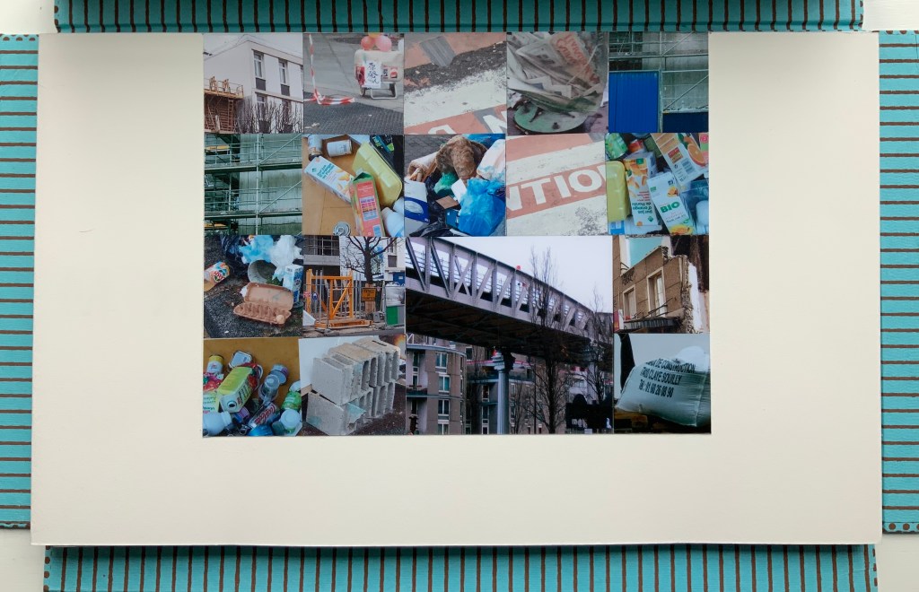
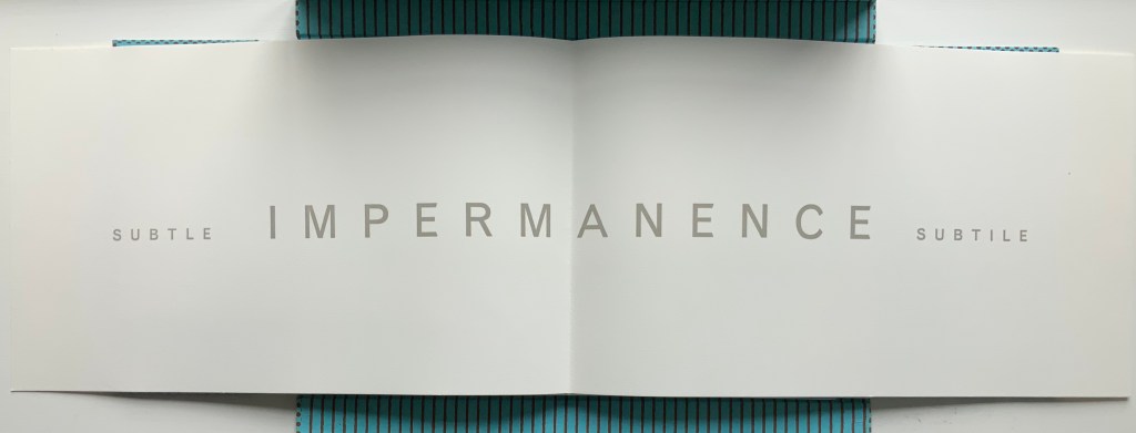
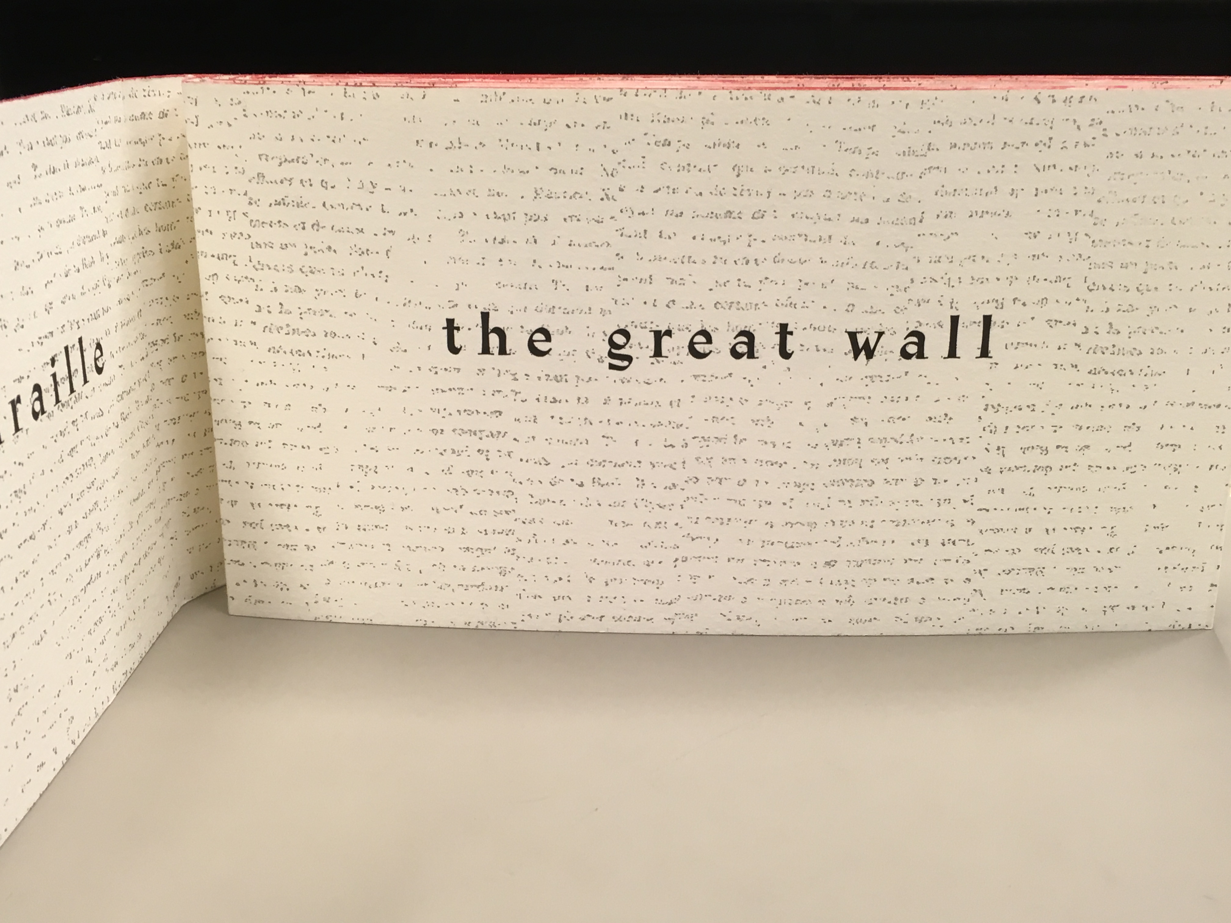
The first gathering — a single-fold folio whose first page presents the photo-collage of litter, demolition, construction and warning signs and tape — opens to a double-page spread that performs the book’s half-title function and also announces the work’s bilingual theme with the English adjective leading and the French adjective following the noun equivalent in both languages: IMPERMANENCE.
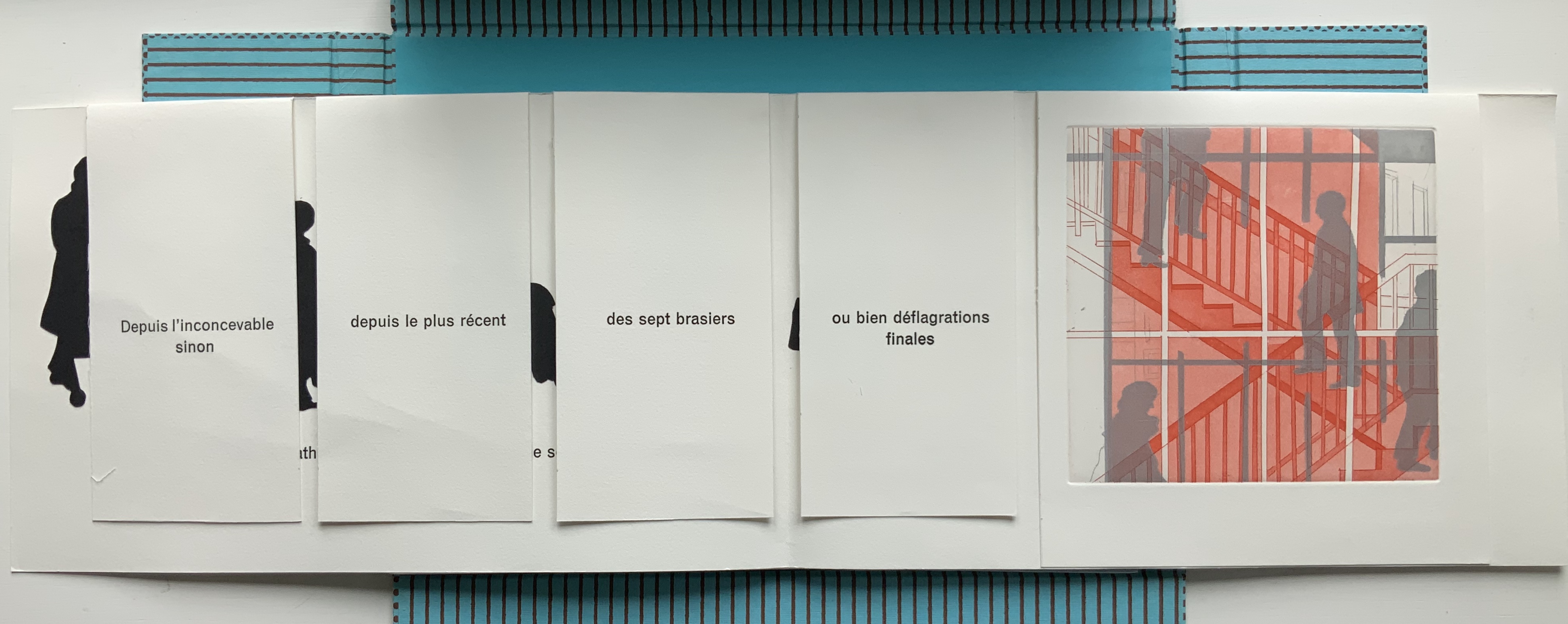
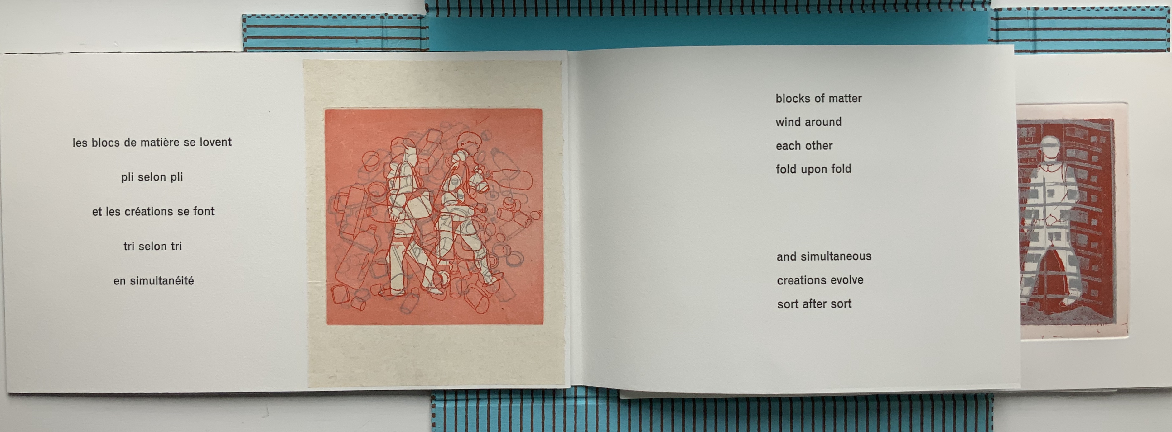
The first page of the second gathering performs the “title page” function of the book. When it opens, the first flap-book feature appears, the French text initially covering the English and, then, revealing a more parallel existence of the English and French. This is subtlety layered on subtlety. The text that appears and disappears under the flaps, and unfolds across the gathered folios, proceeds syntactically in a similar way, unrolling its qualifying dependent clauses one after another seemingly without beginning or end. As if mentally preparing a translation, the reader has to hold in mind each qualifier until what is being qualified can be reached.
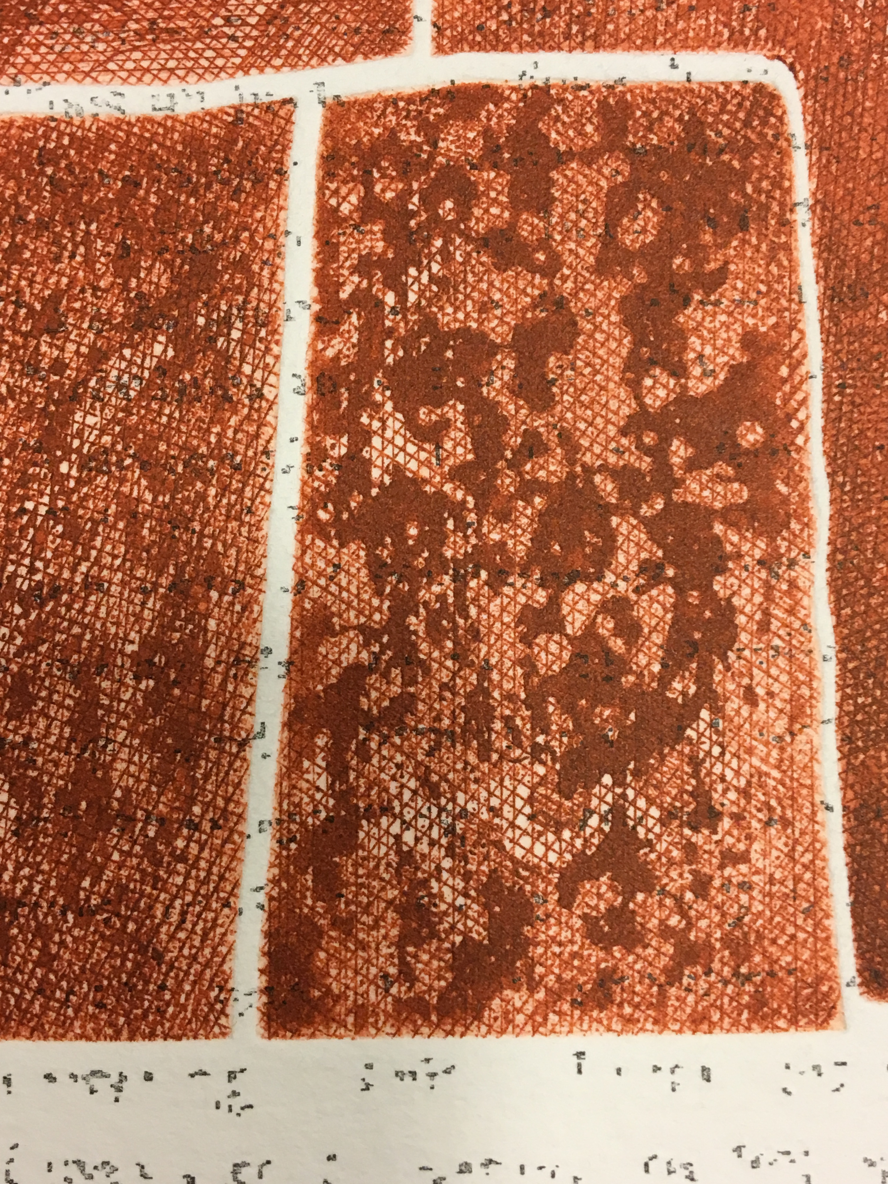
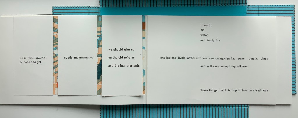
Those 5 flaps signal yet another subtlety. The text comes from the opening of Ian Monk’s Tri selon Tri (“sort by sort”), a concrete poem in the Oulipo tradition of Raymond Queneau, Italo Calvino and Georges Perec. Following this tradition means creating a literary work that adheres to some rule or constraint — like those in a game. In its original presentation, the poem works within a structural constraint consisting of 5 blocks of text, each 37 characters wide with the first and last blocks being 25 lines deep and the three middle blocks each being 22 lines deep. In self reference to its main theme that humanity is replacing the 4 elements (earth, air, fire and water) with categories of human detritus, the poem calls the first and last blocks poubelles (“trash cans”) and the three middle blocks “dumpsters” (bennes). In each middle block, a blank space — 7 characters wide by 3 lines deep — appears, mimicking the side openings of trash sorting bins. Sharoff’s subtle sculptural nod is 5 flaps (as well as 5 gatherings) for the 5 receptacles.
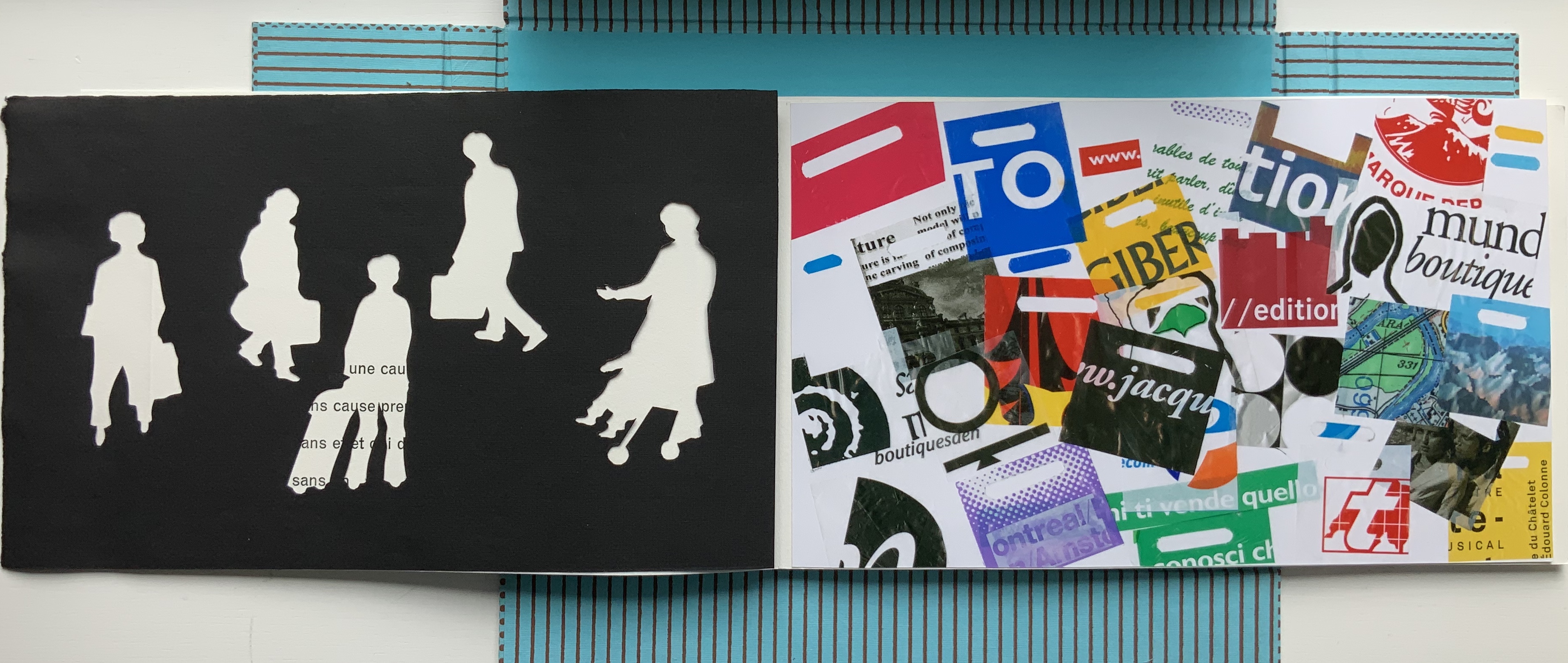
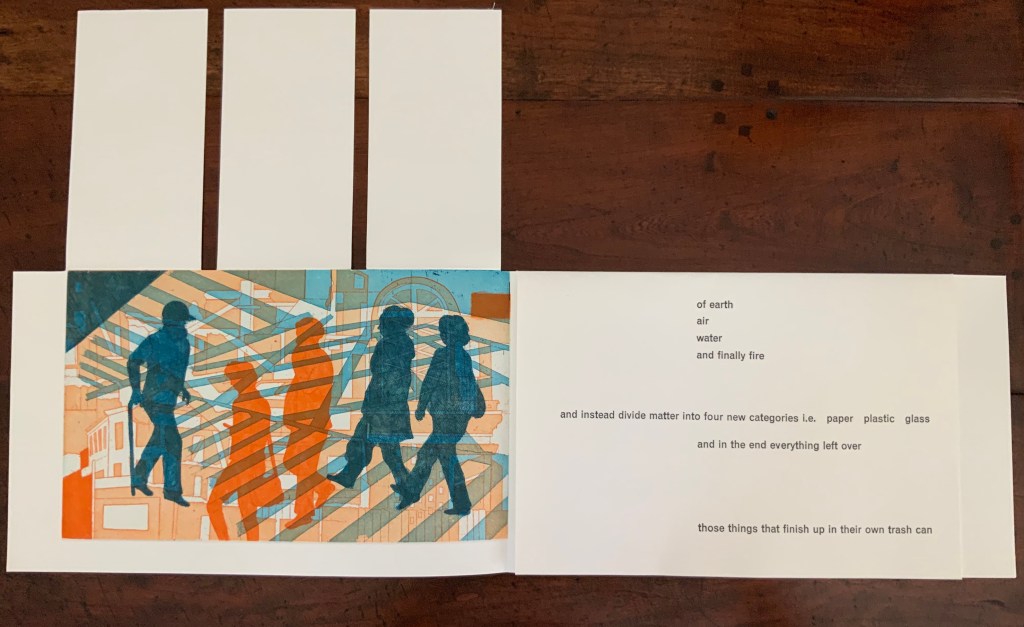
The third gathering above consists of a shortened single-fold sheet bearing the large print of commuters and shoppers and embracing a larger single-fold sheet divided by a loose black paper stencil. With its cutout human figures, the stencil overlaying another photo-collage of litter foreshadows the extract’s concluding metaphor: that, after the first three new elements of paper, plastic and glass comes the fourth new element — those things that finish up in their own trash can, i.e., humanity itself.
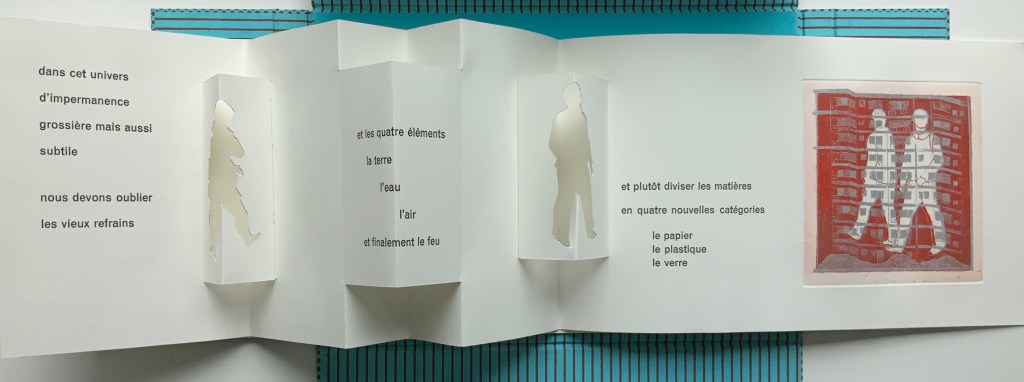
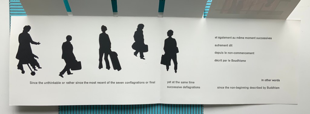
The fourth gathering above delivers yet another hint in the form of a pop-up feature: three receptacles, two of which have human-figure cutouts. These human figures have been appearing throughout in the intaglio prints, and in their over- (or under-?) printing of litter and construction, they too have been delivering the same hint.
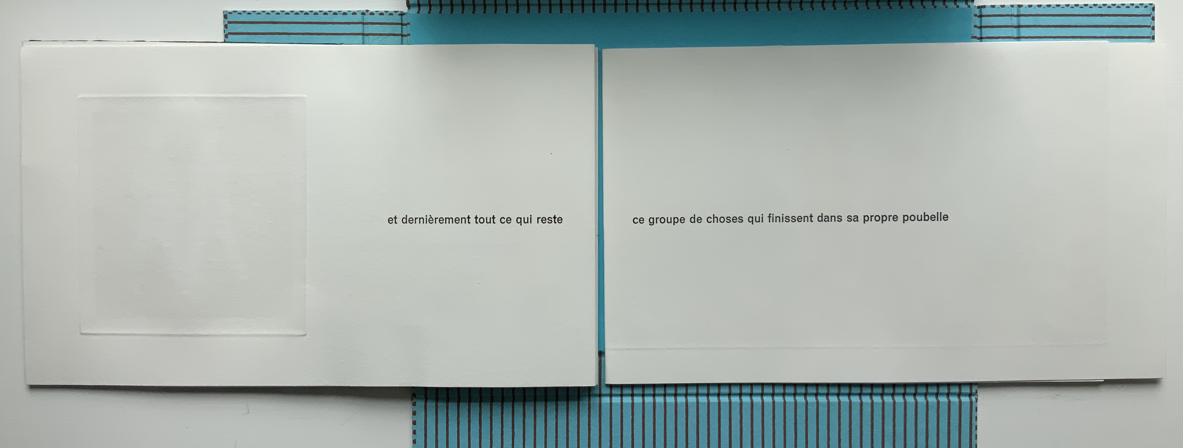
Just as the first gathering’s closed flaps display French only, the fifth and final gathering’s closed flaps display English only. The three flaps on the left rise to reveal the final print showing human figures entangled in their fully constructed world and undercut by the fourth flap’s articulation of the metaphor and implicit identification of them as “those things that finish up in their own trash can”.
Beneath that fourth flap, the artist concludes in French and English, leaving the colophon to appear on the last page — oddly — in French only.
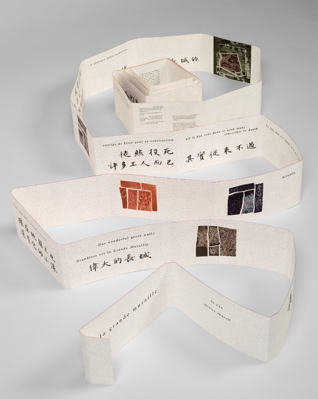
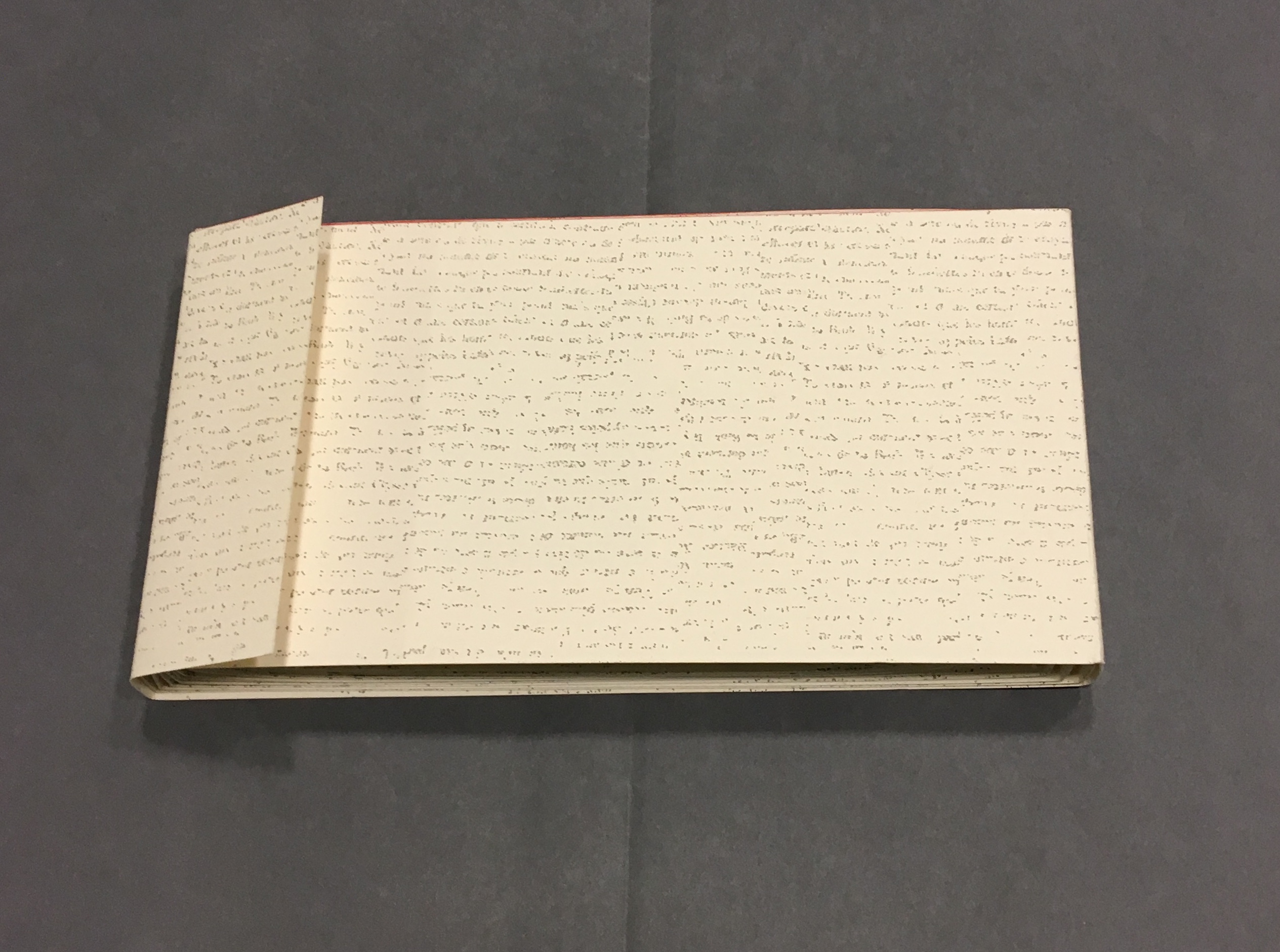
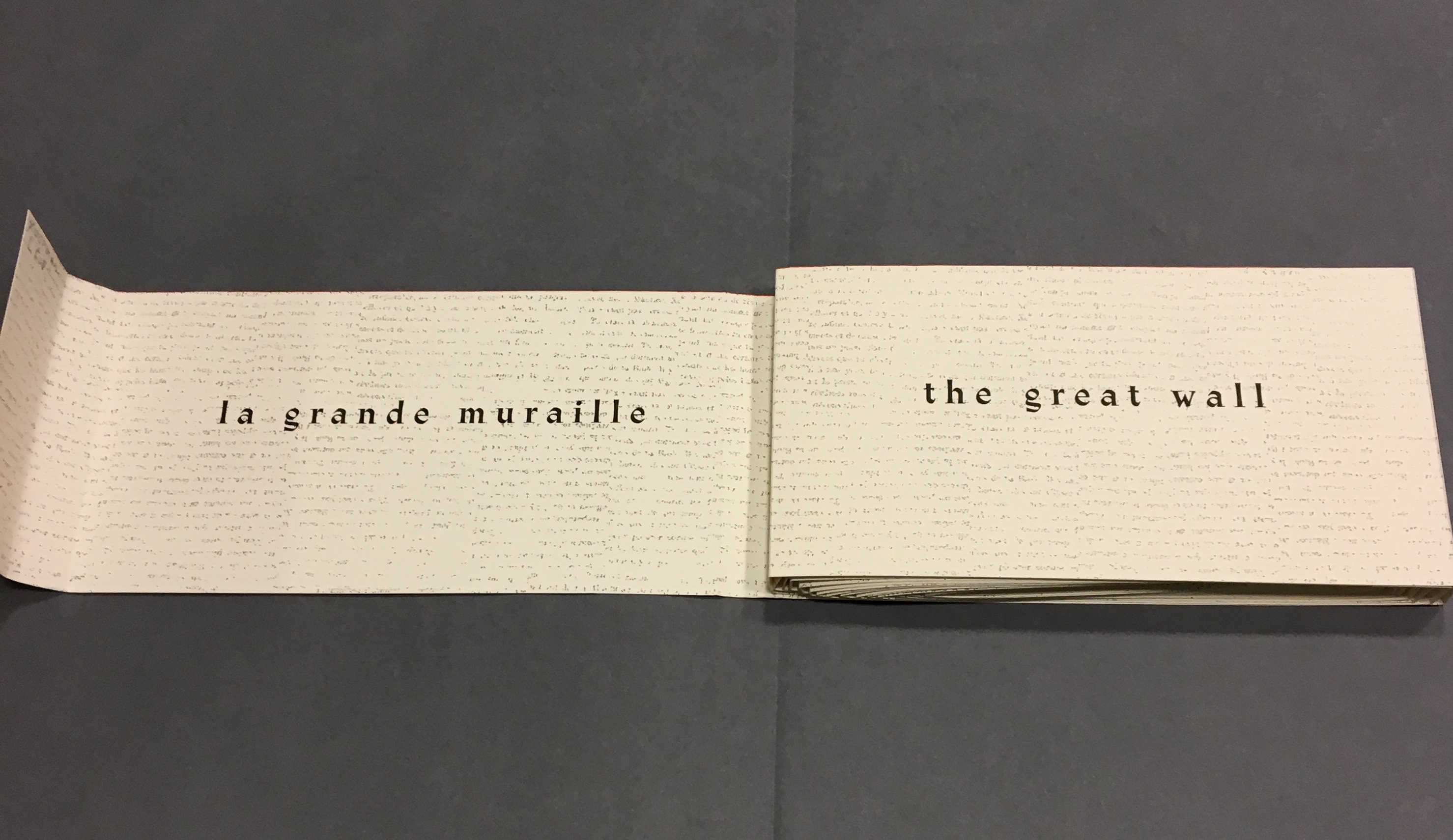
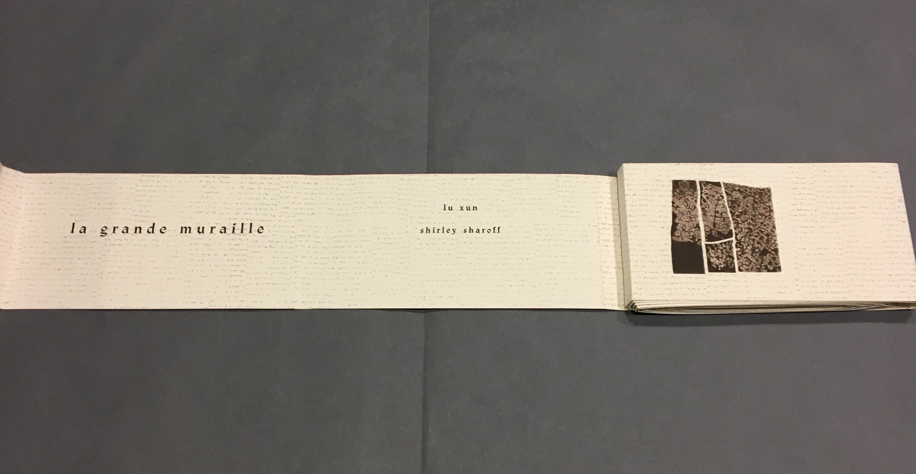
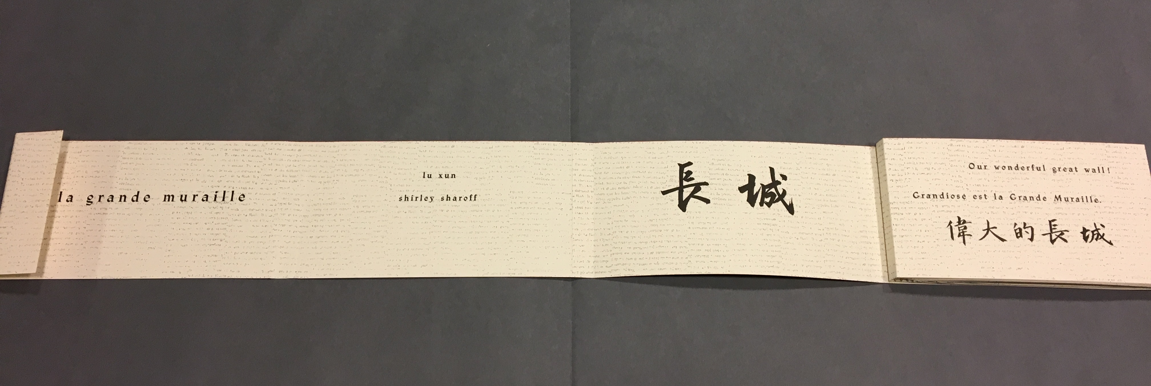
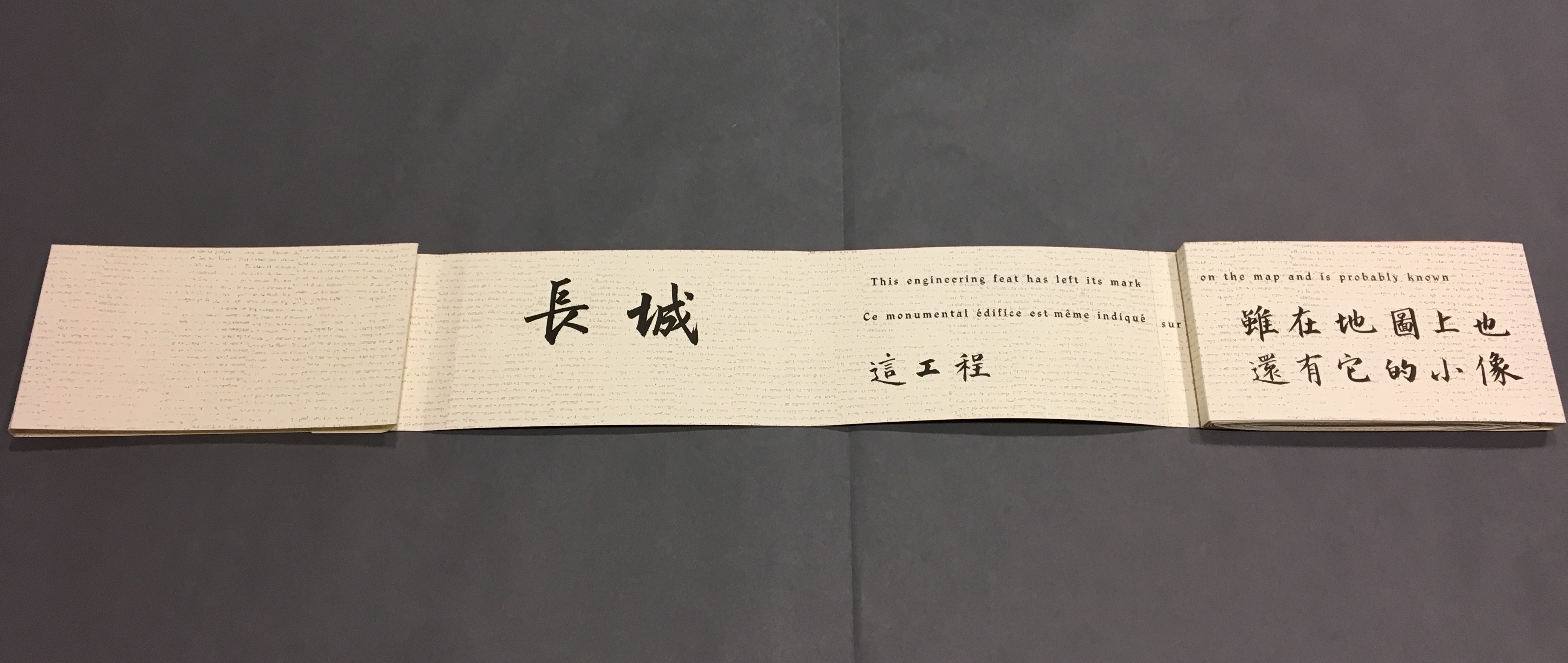
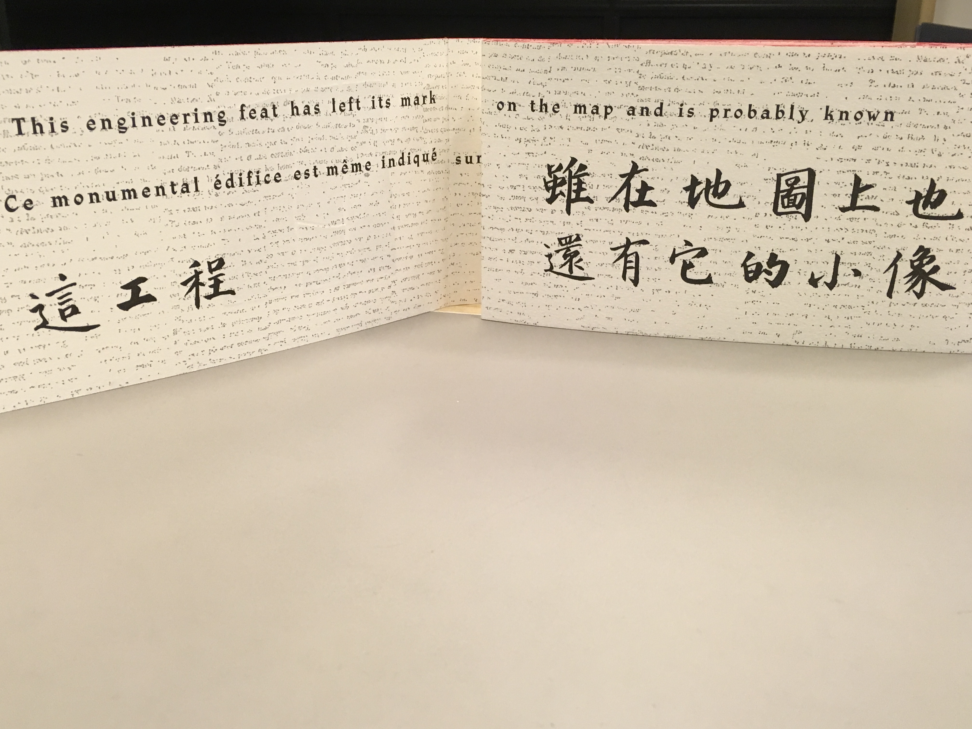
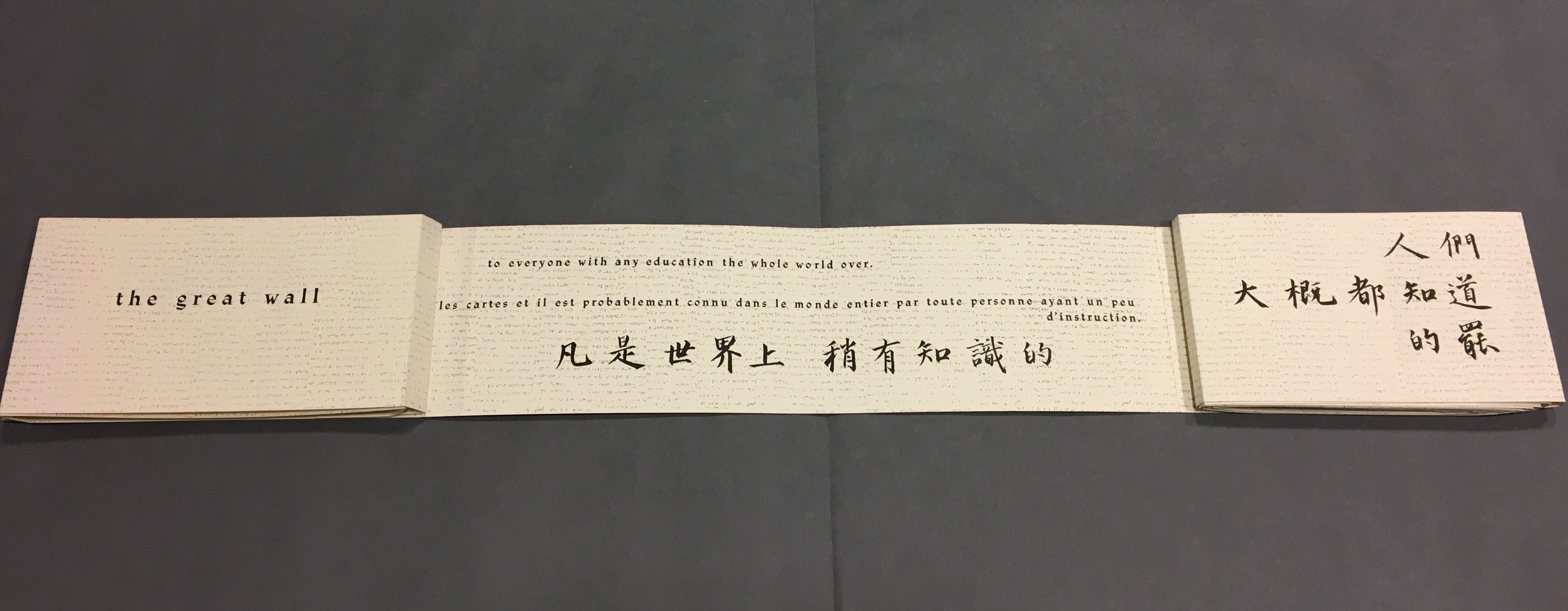
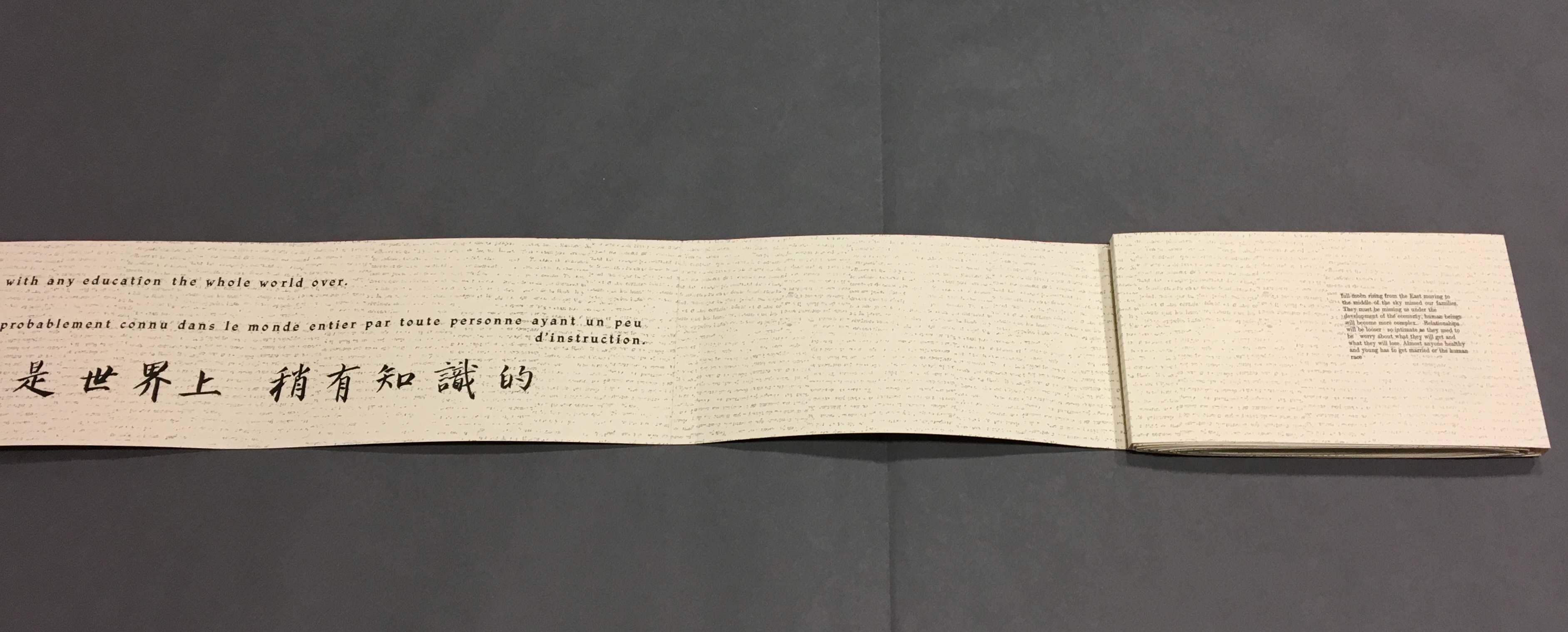
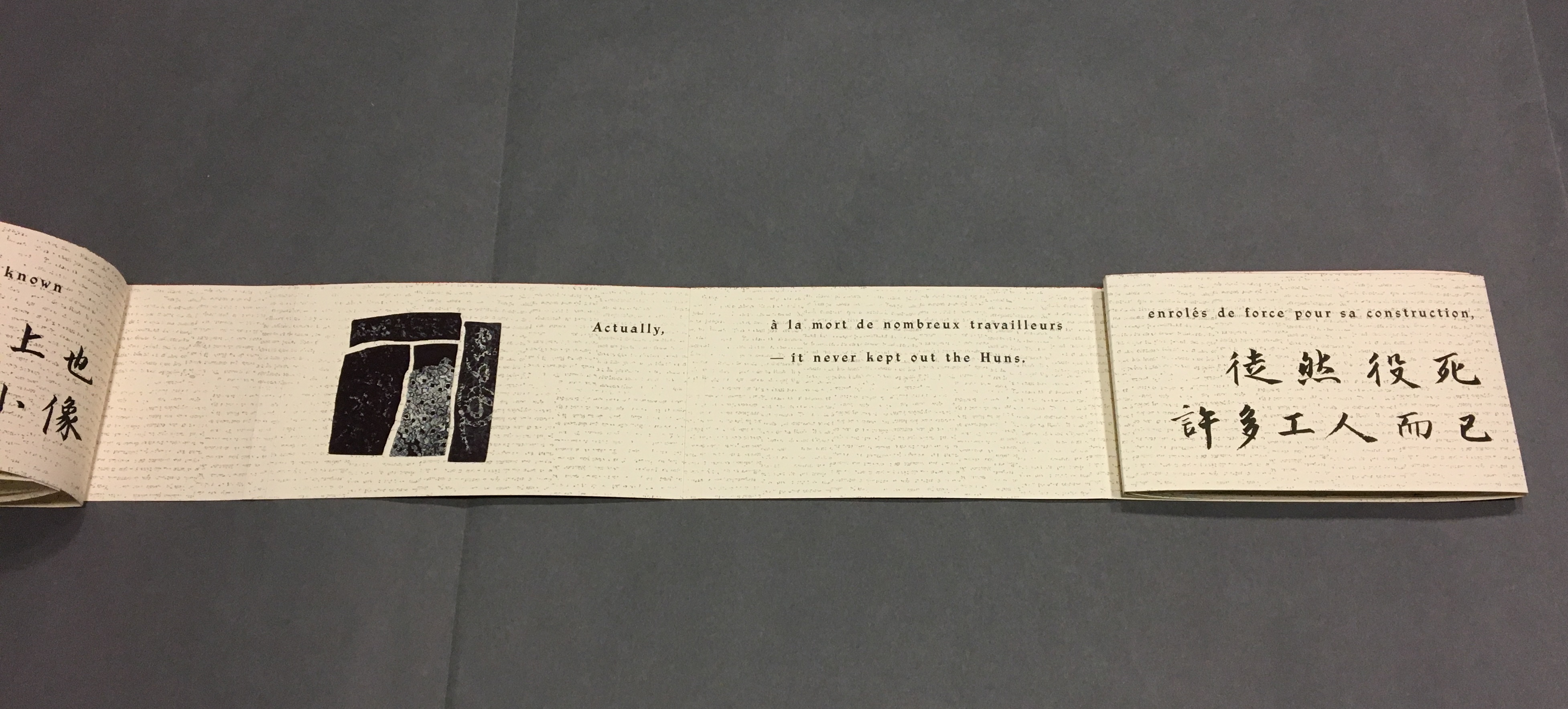
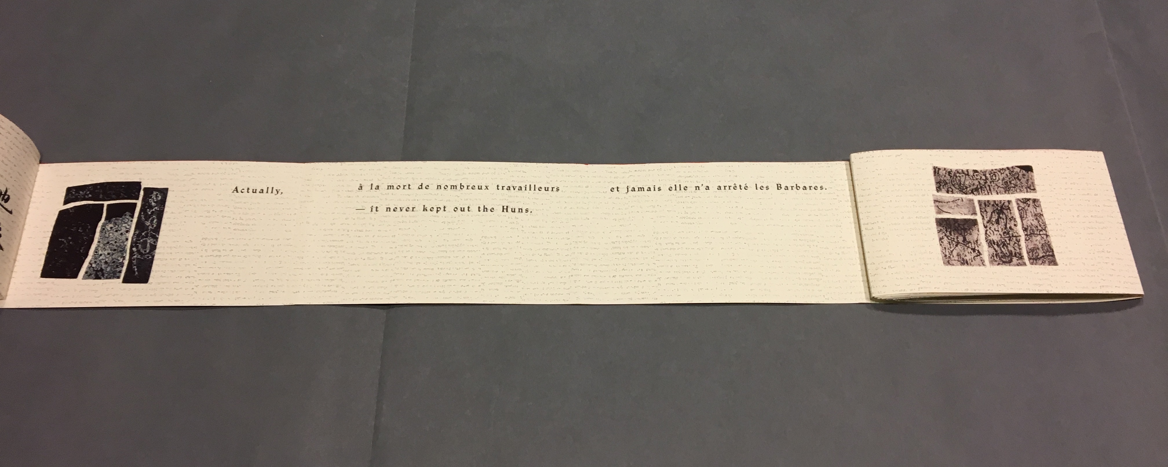
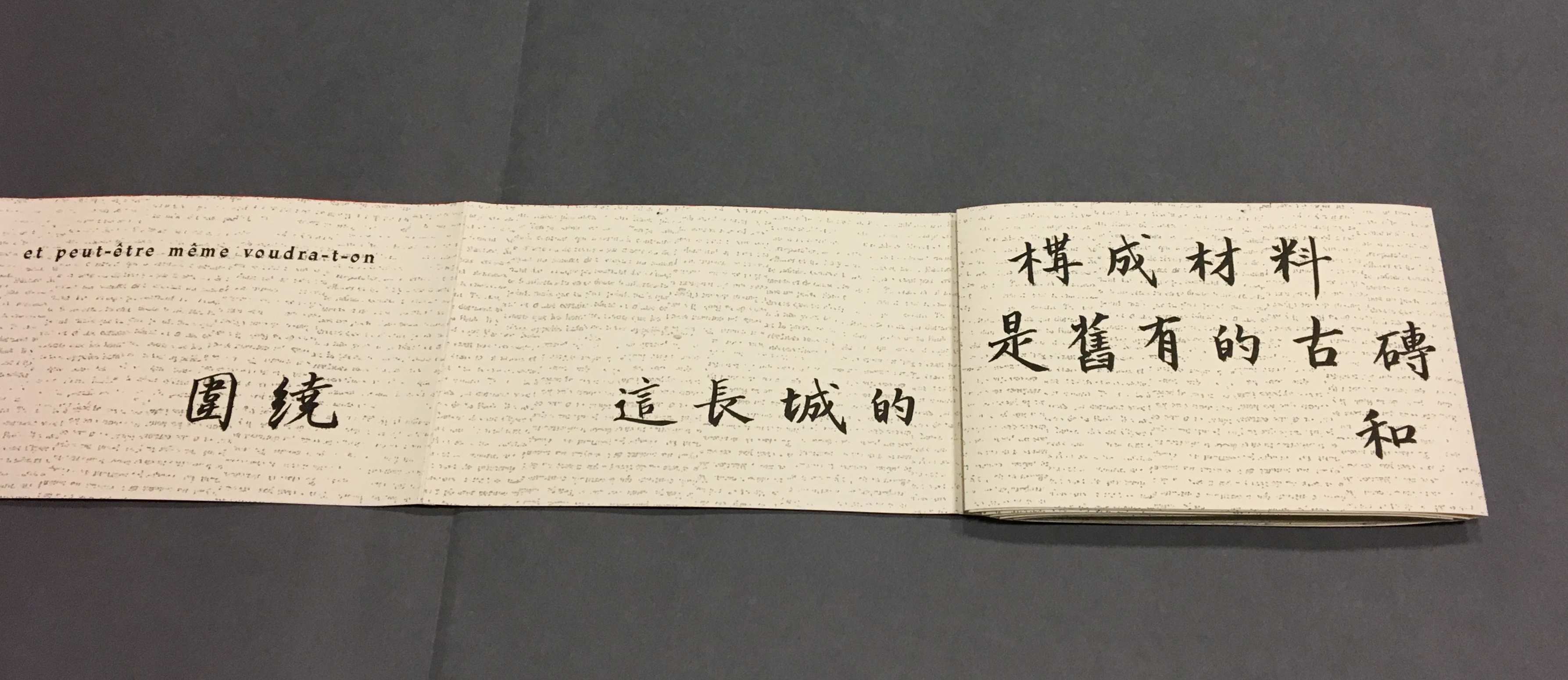
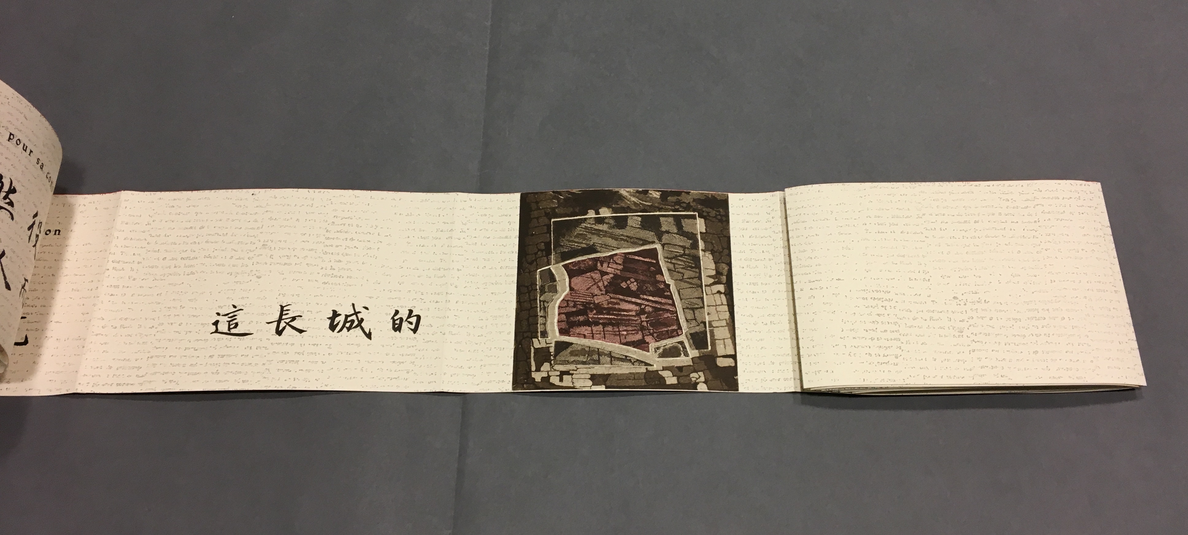
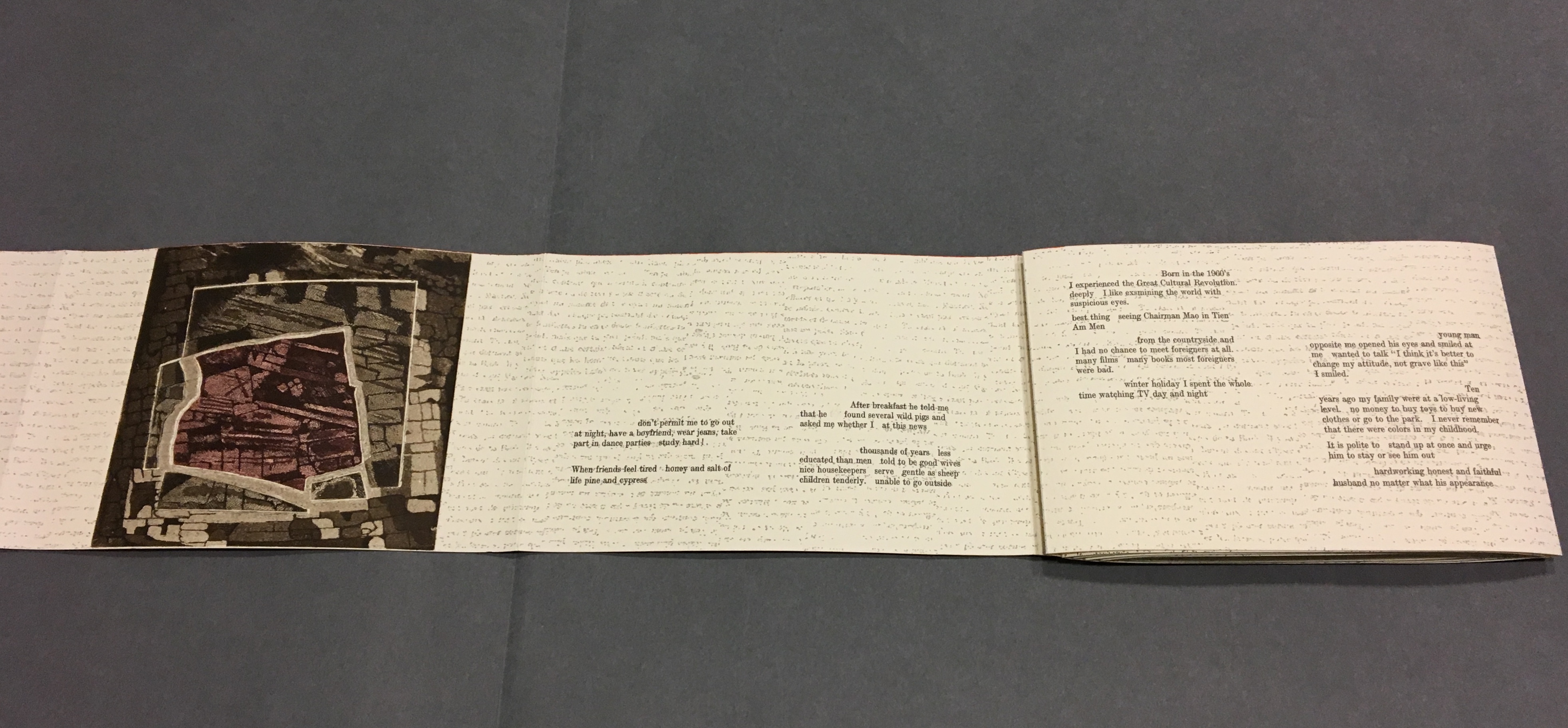
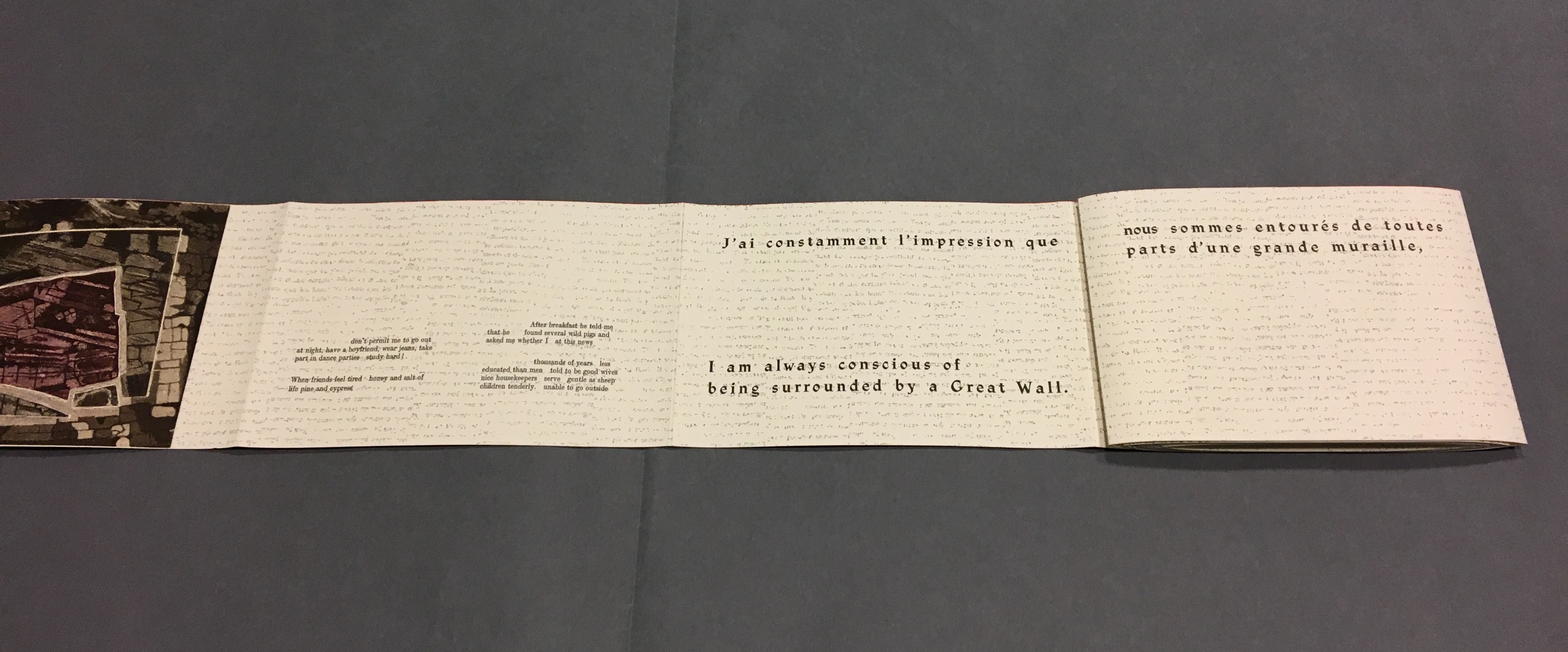
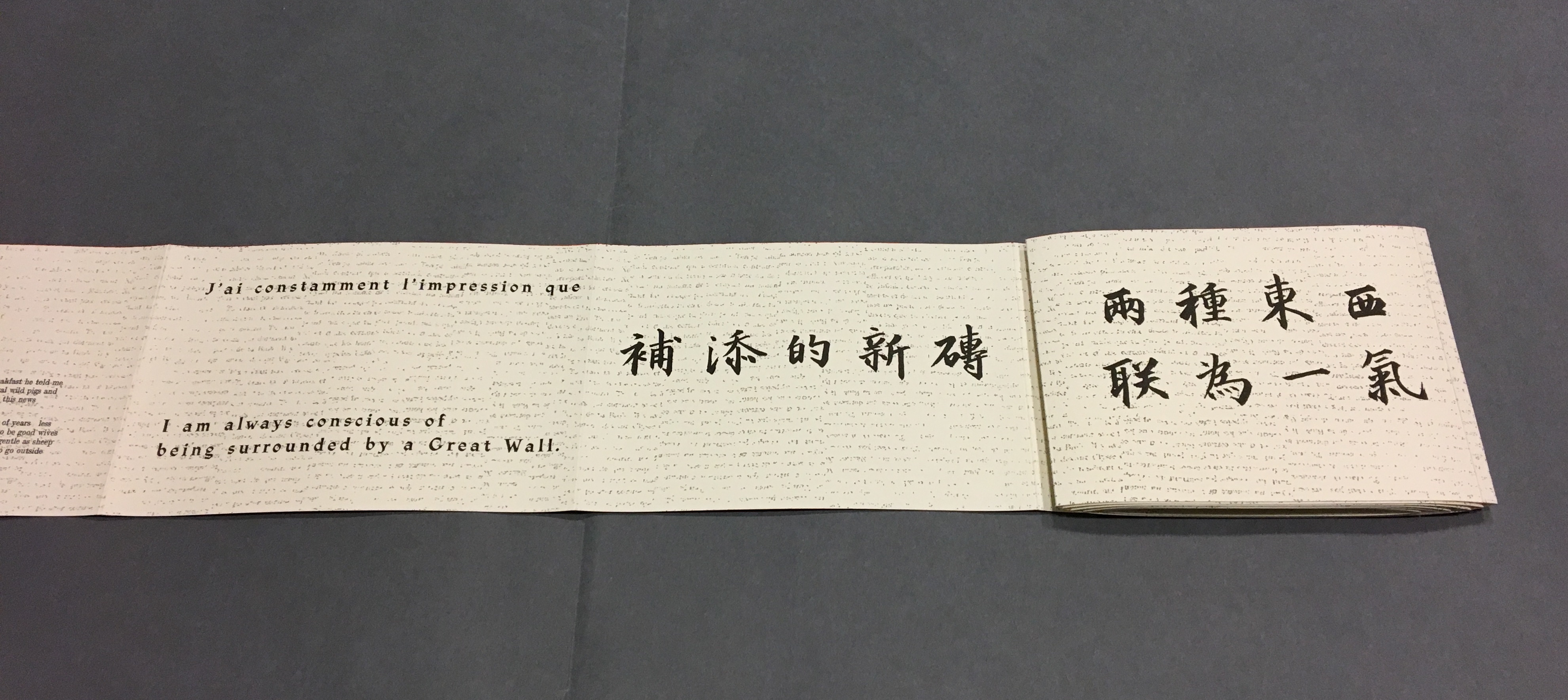
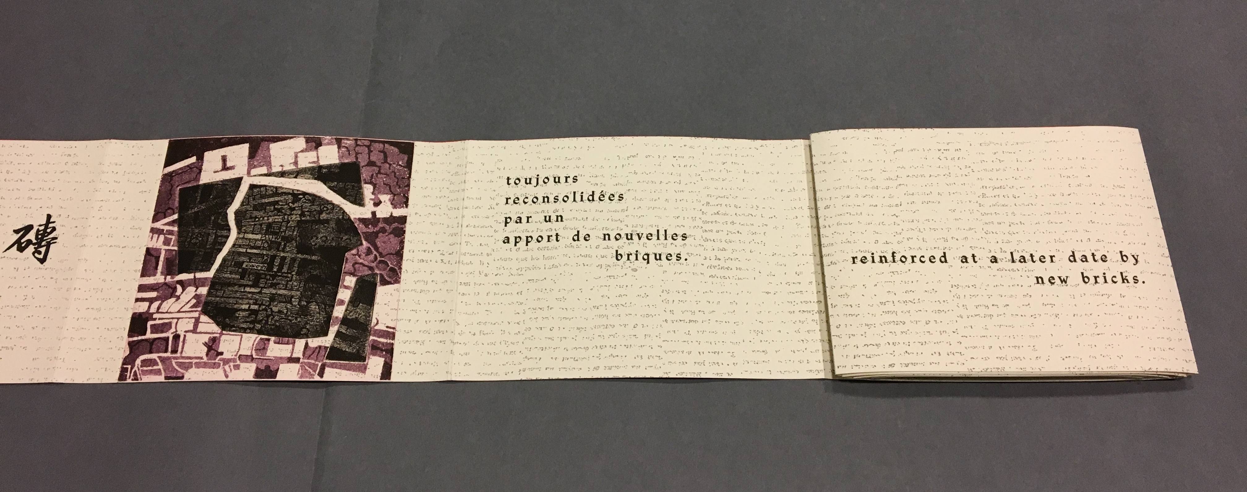
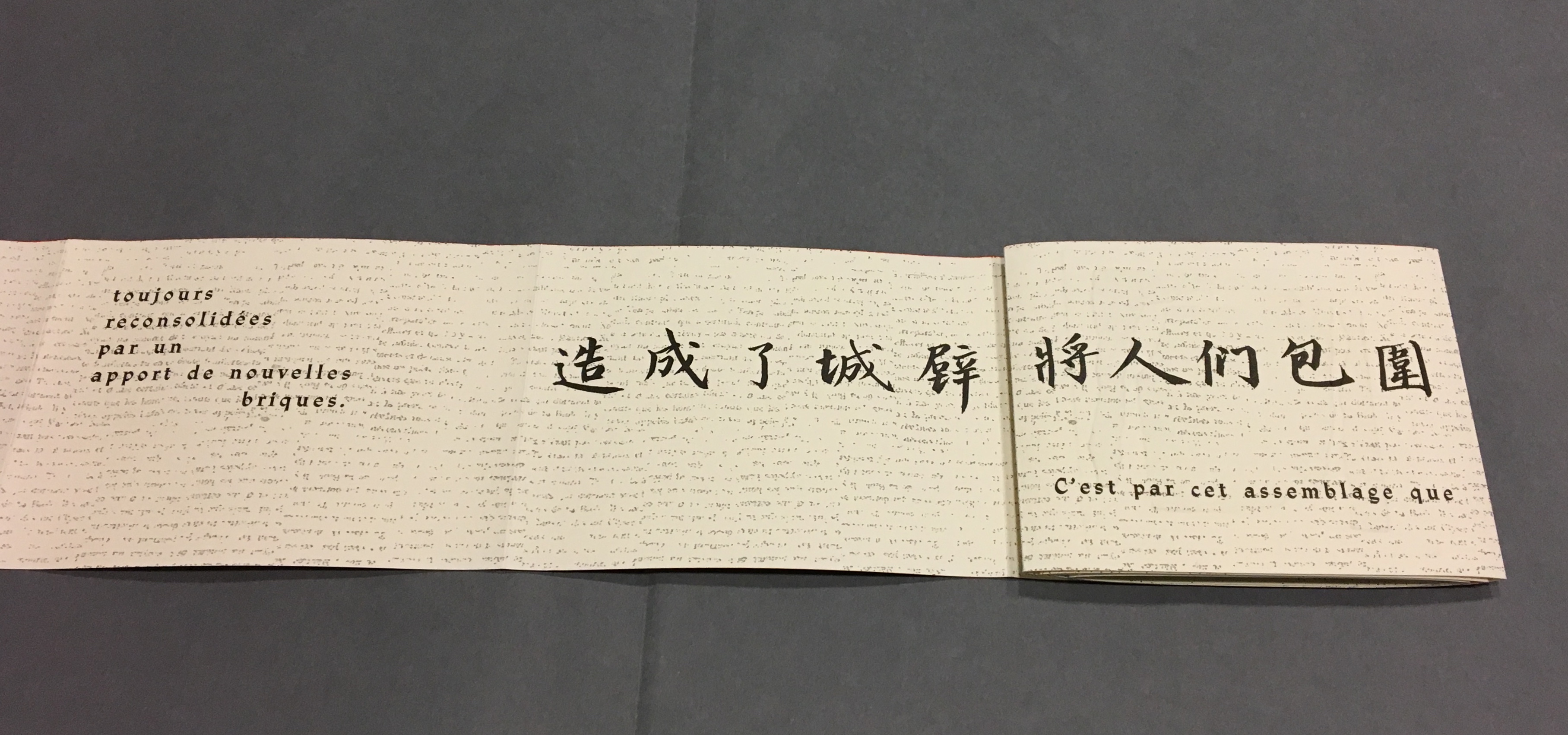
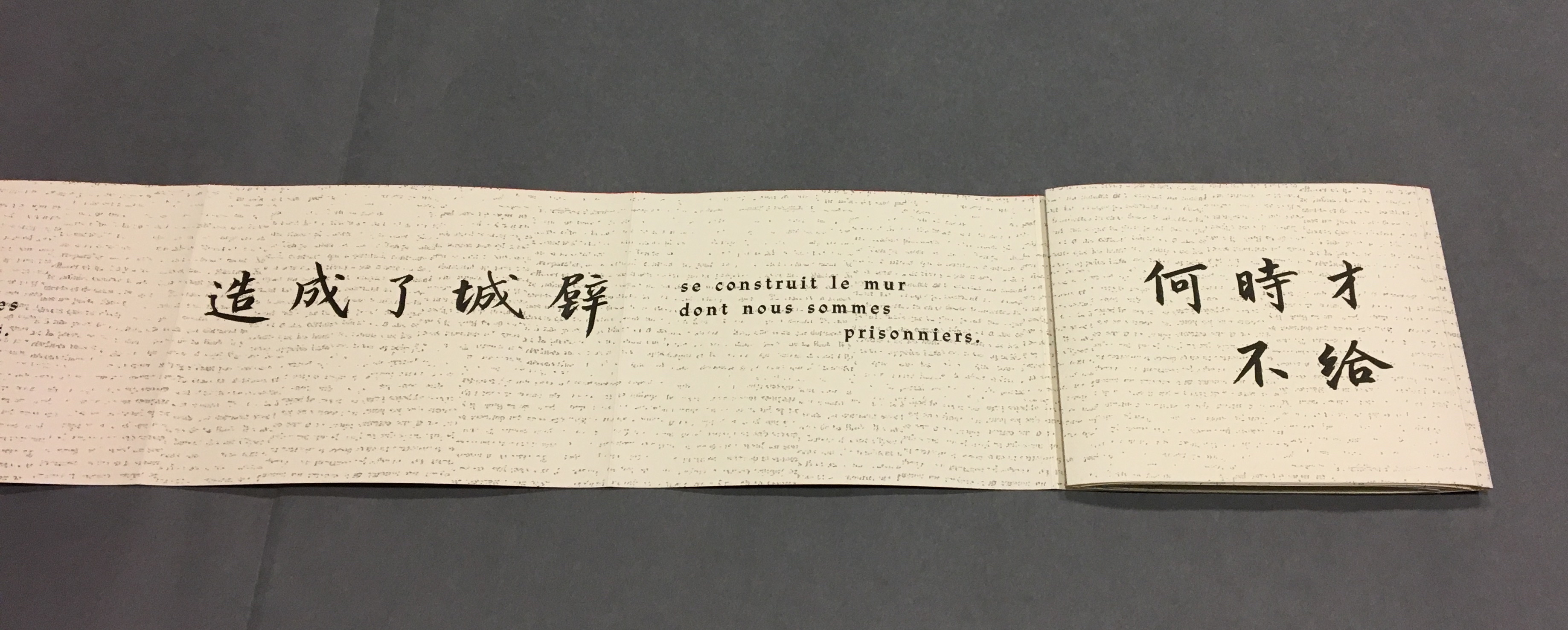
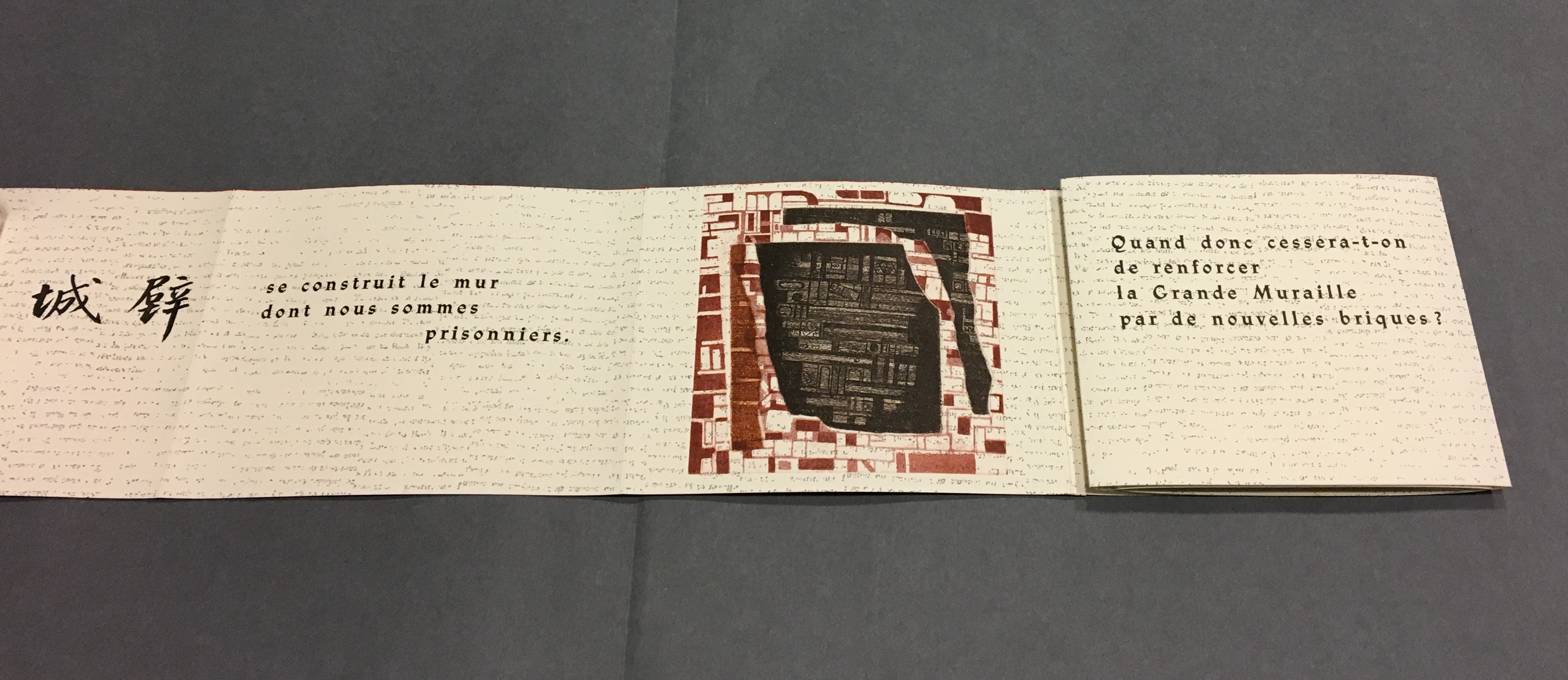
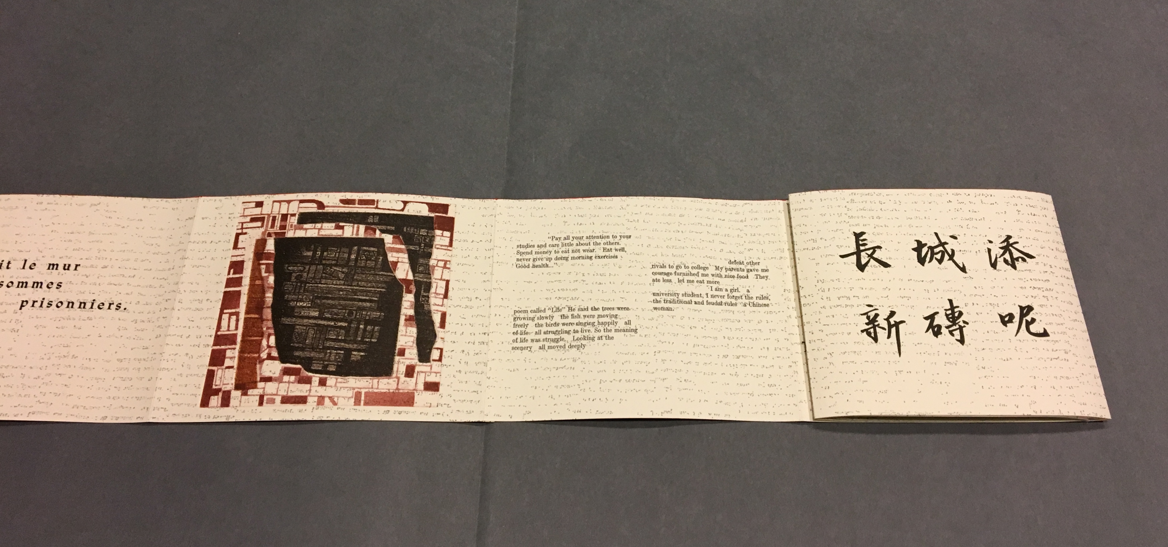
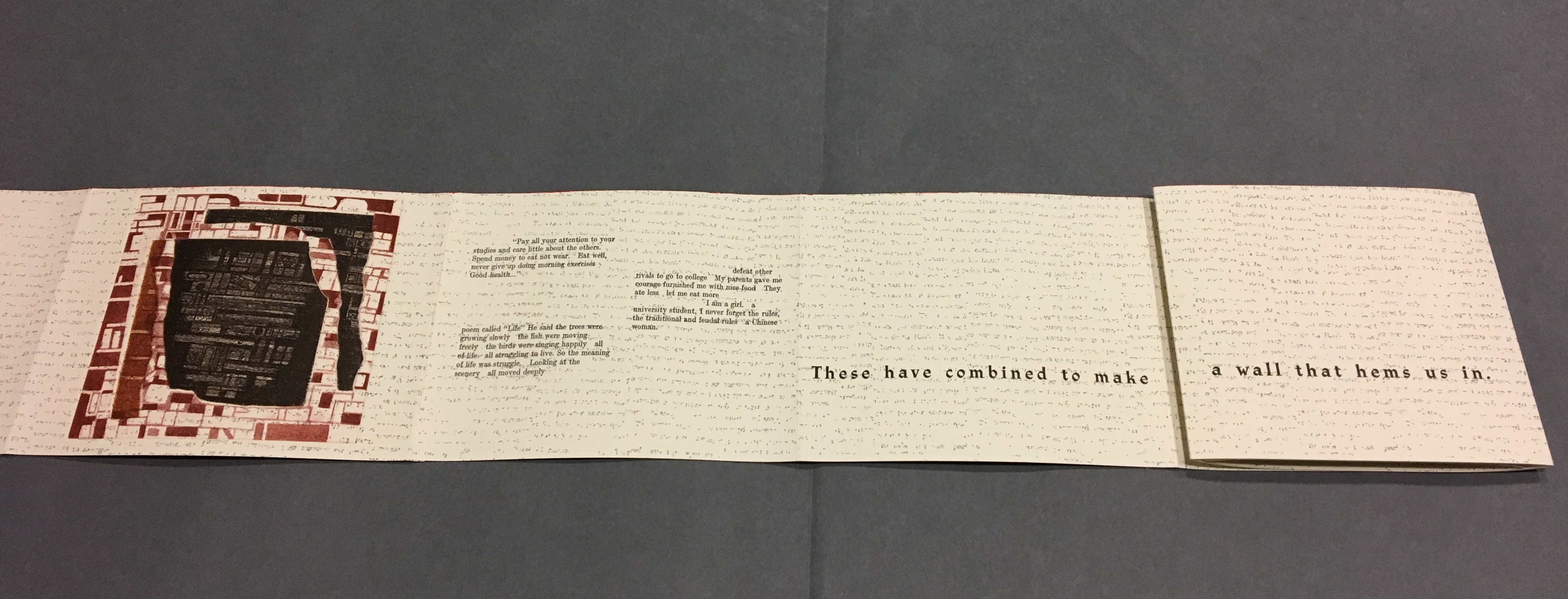
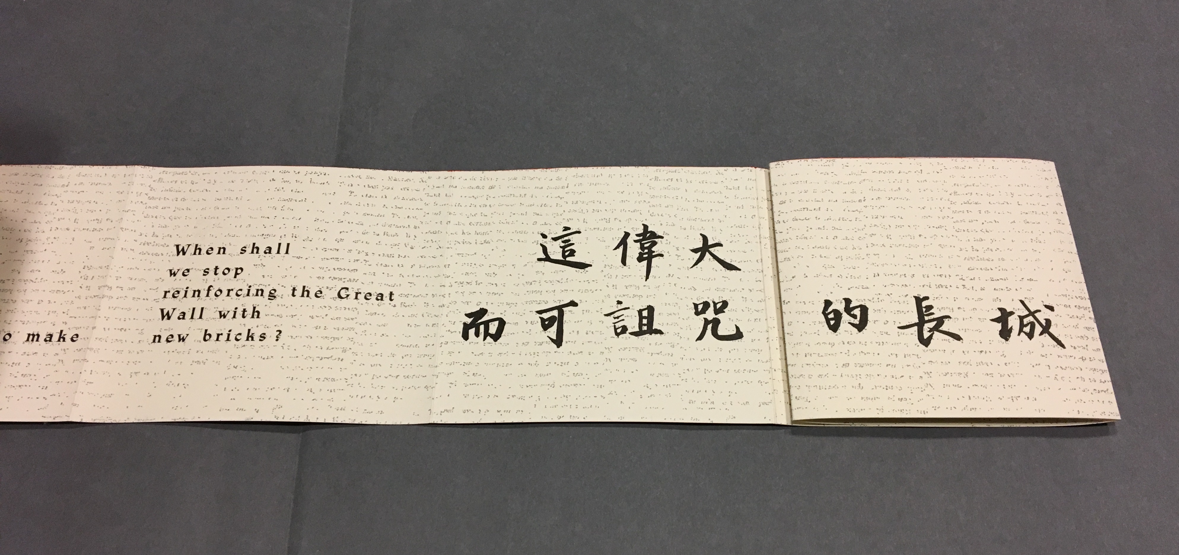
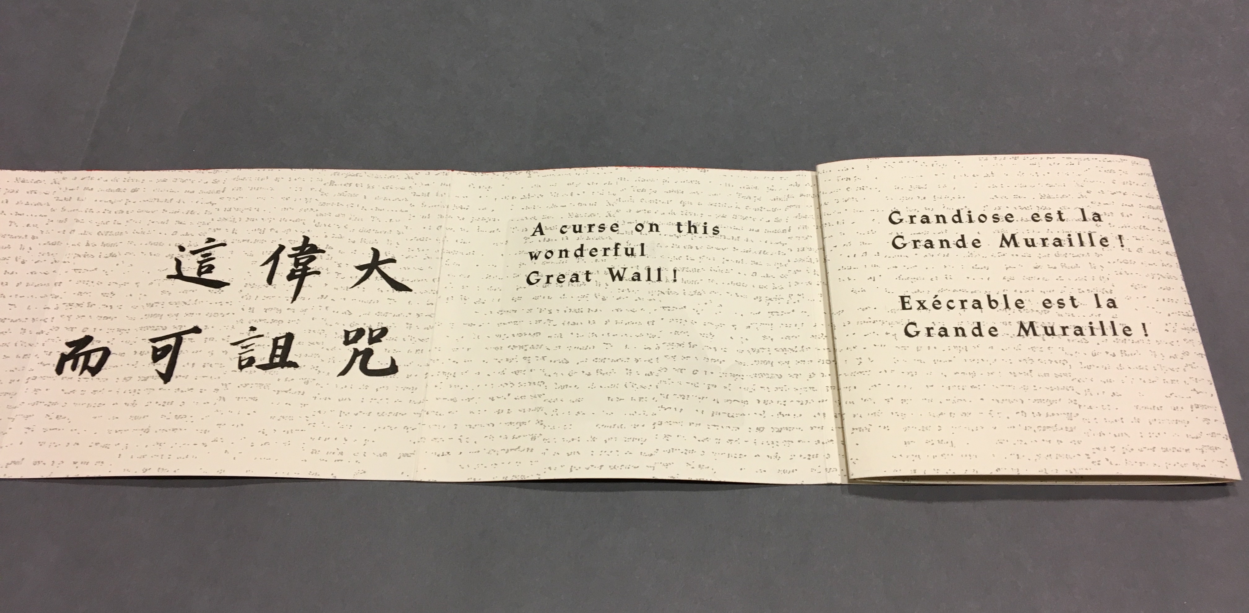
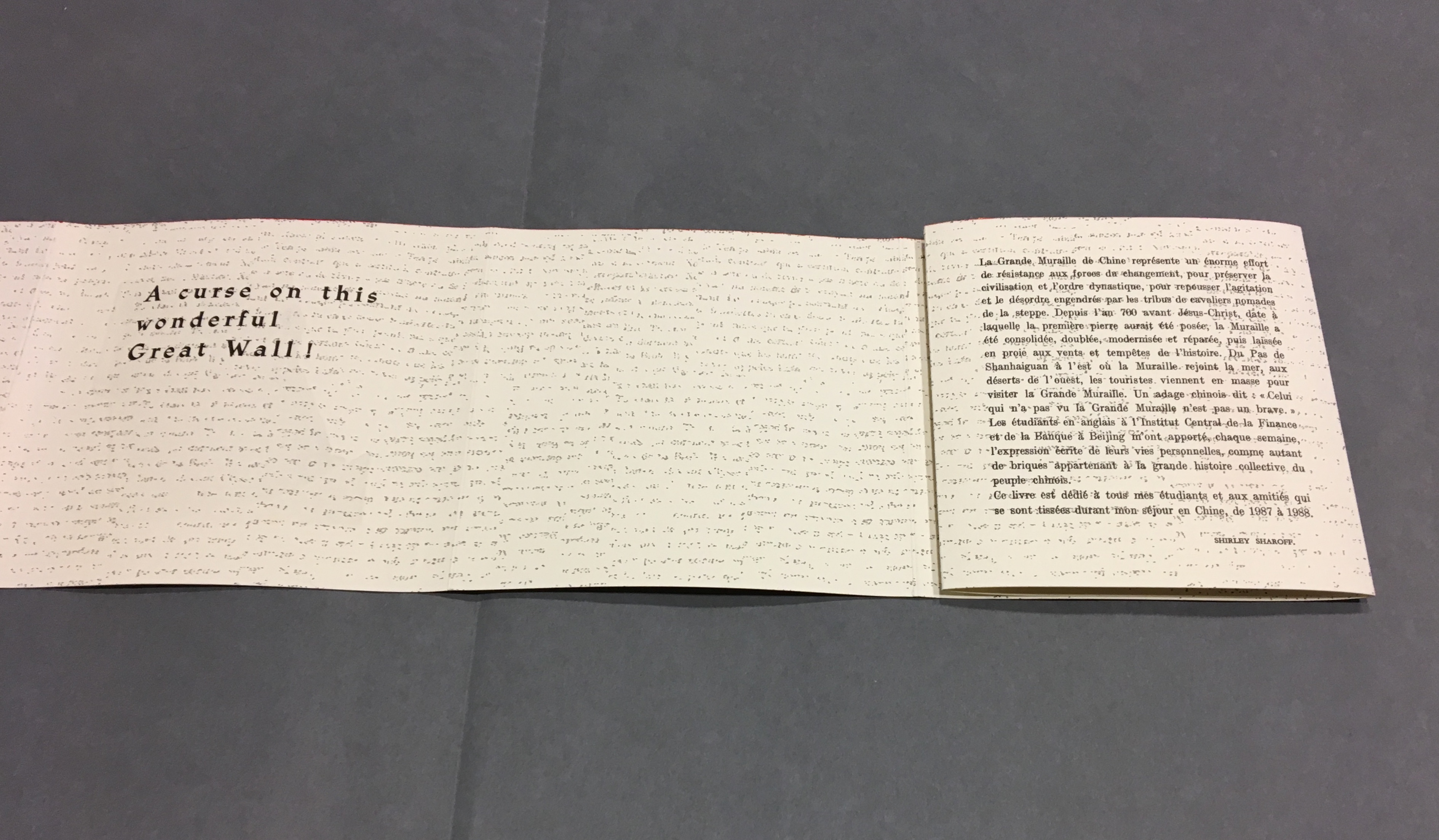
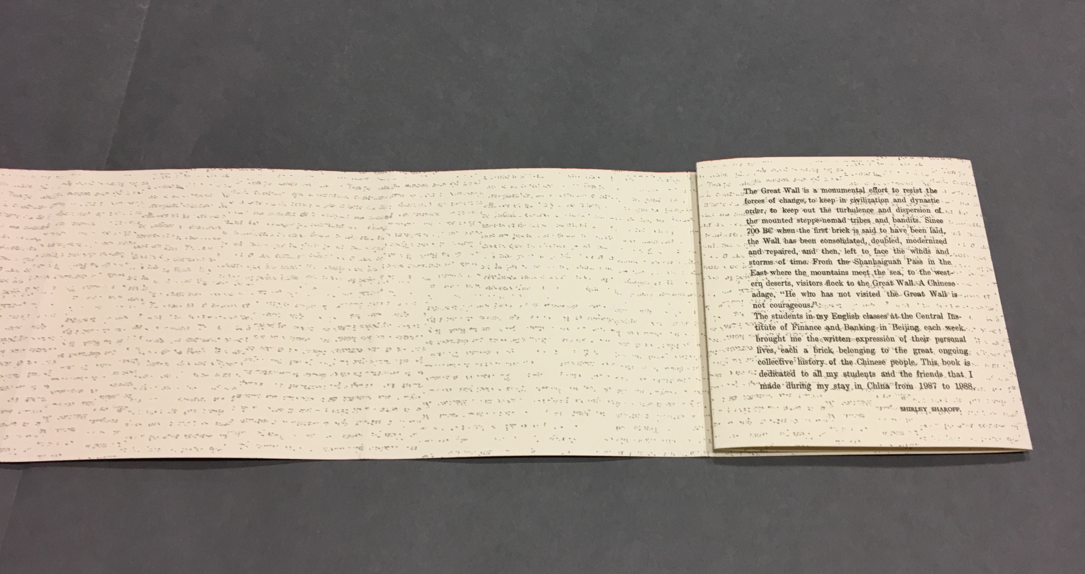
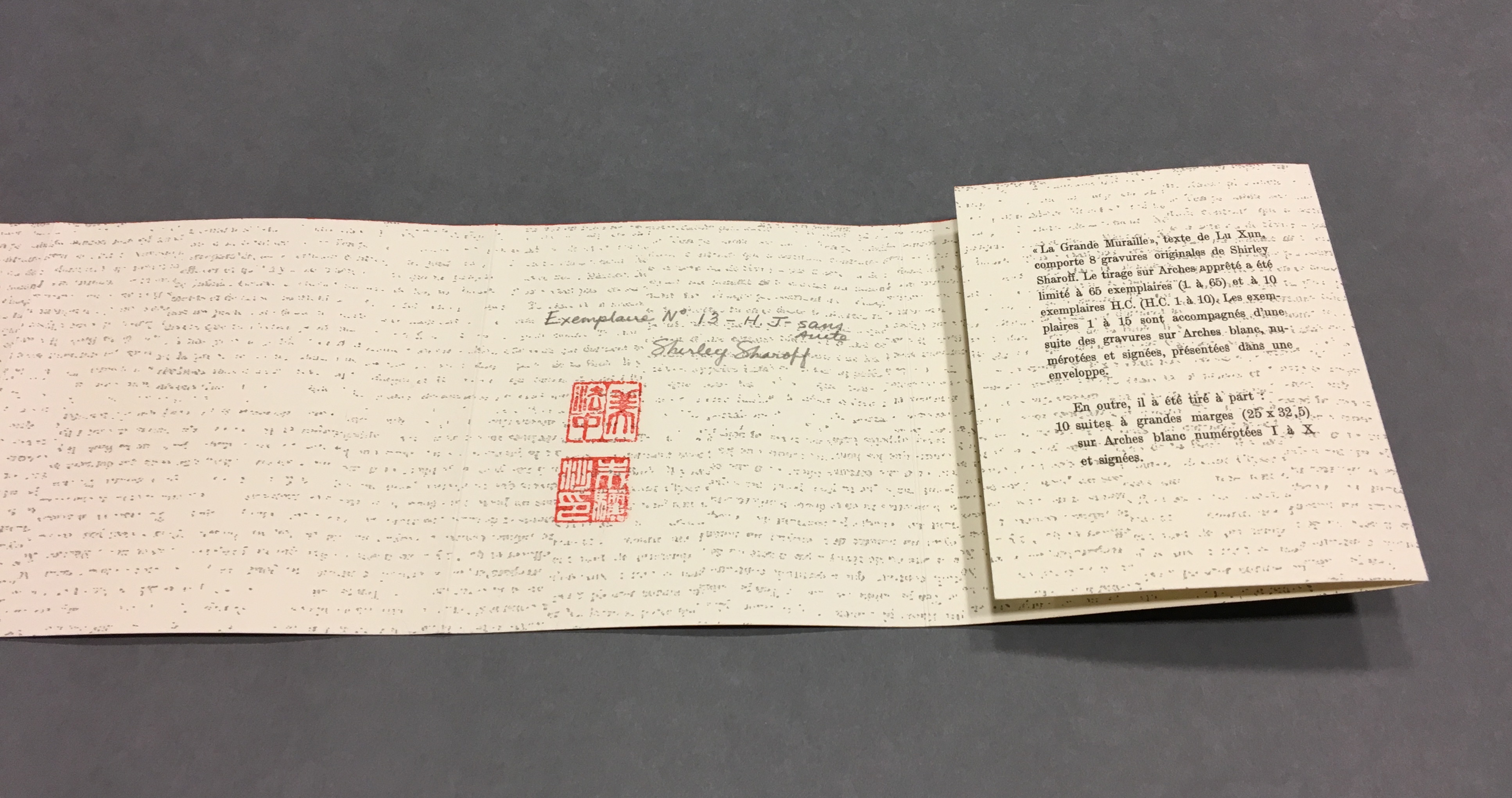
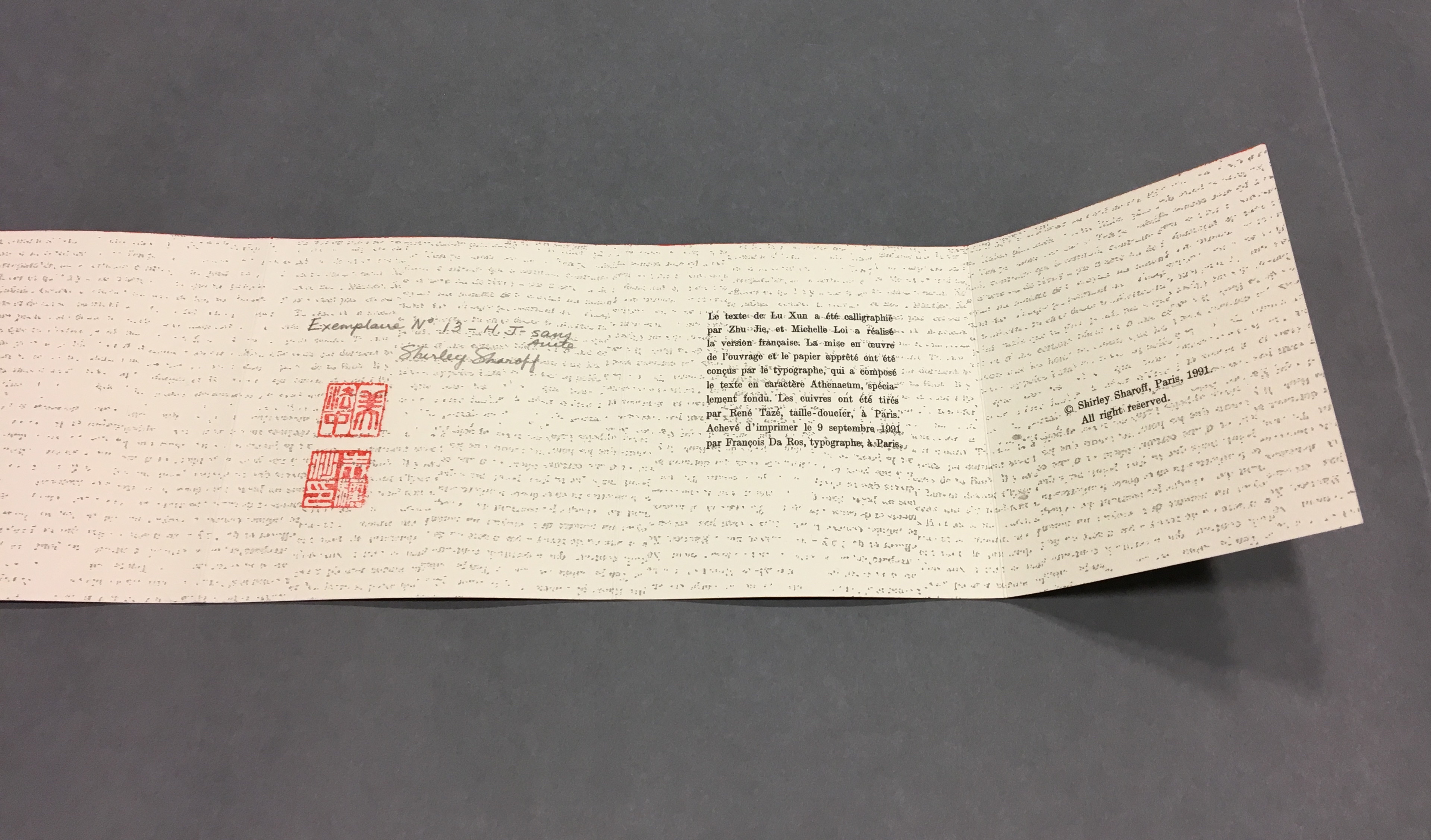
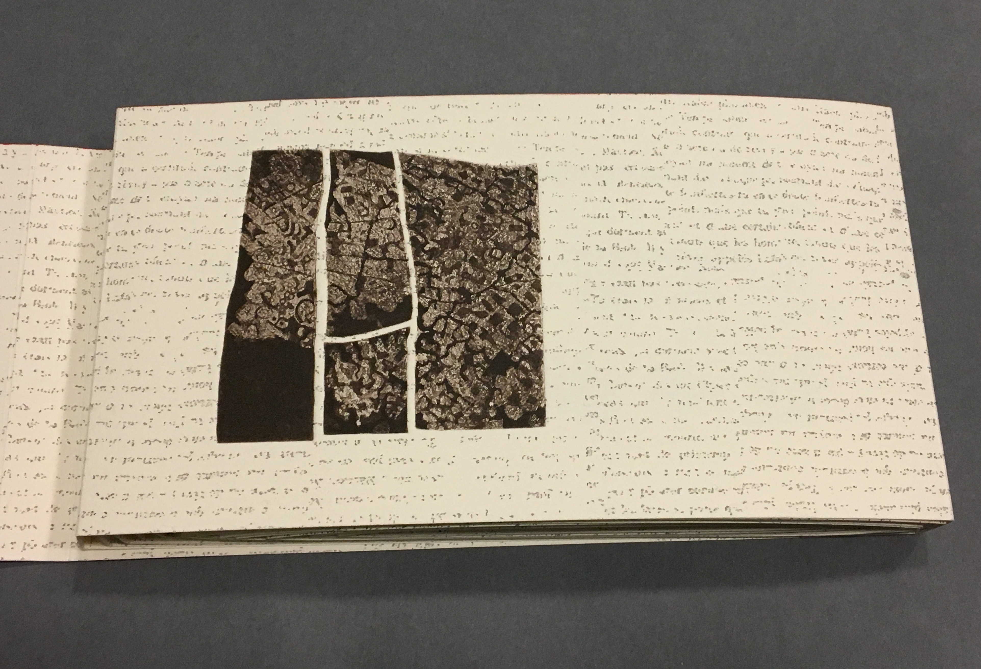
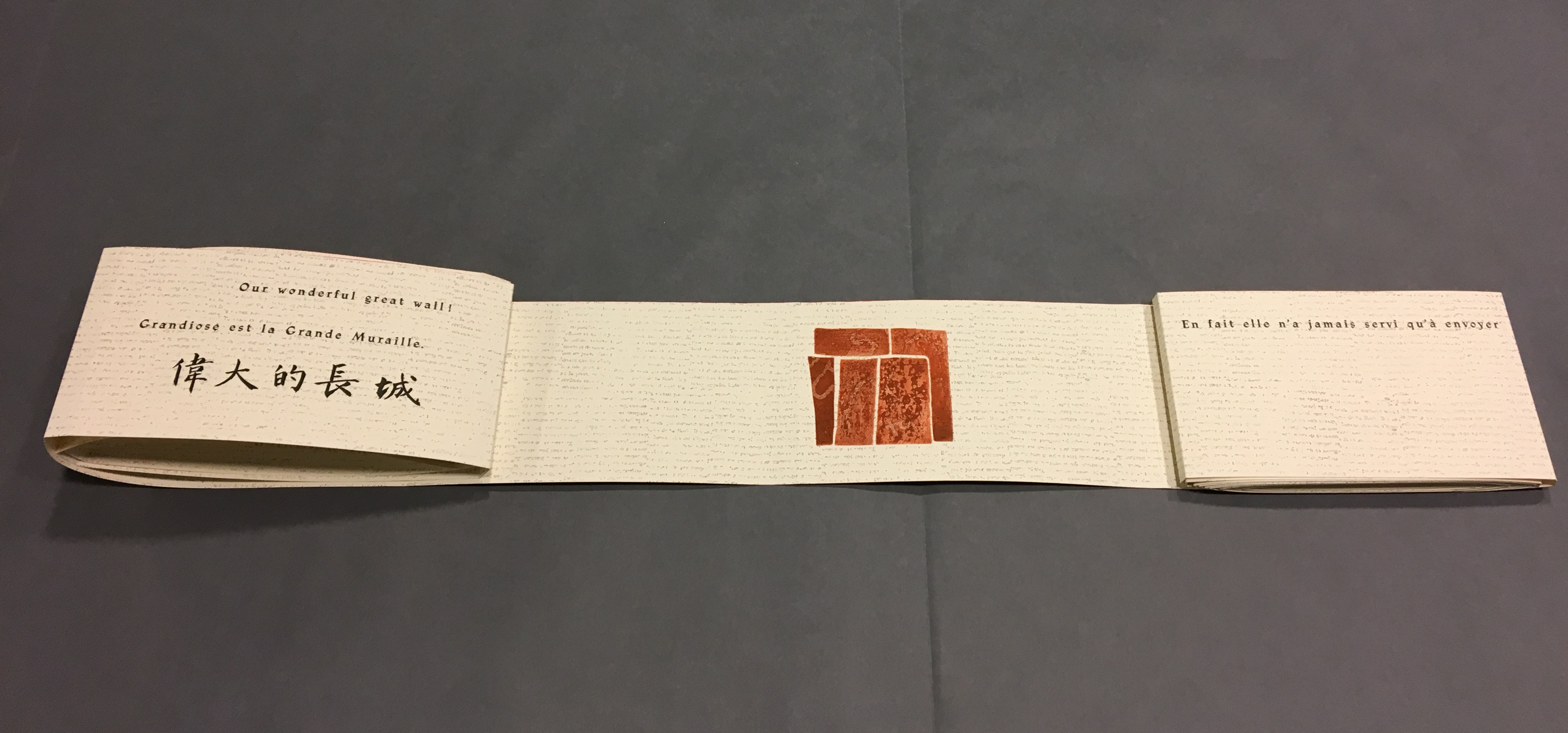
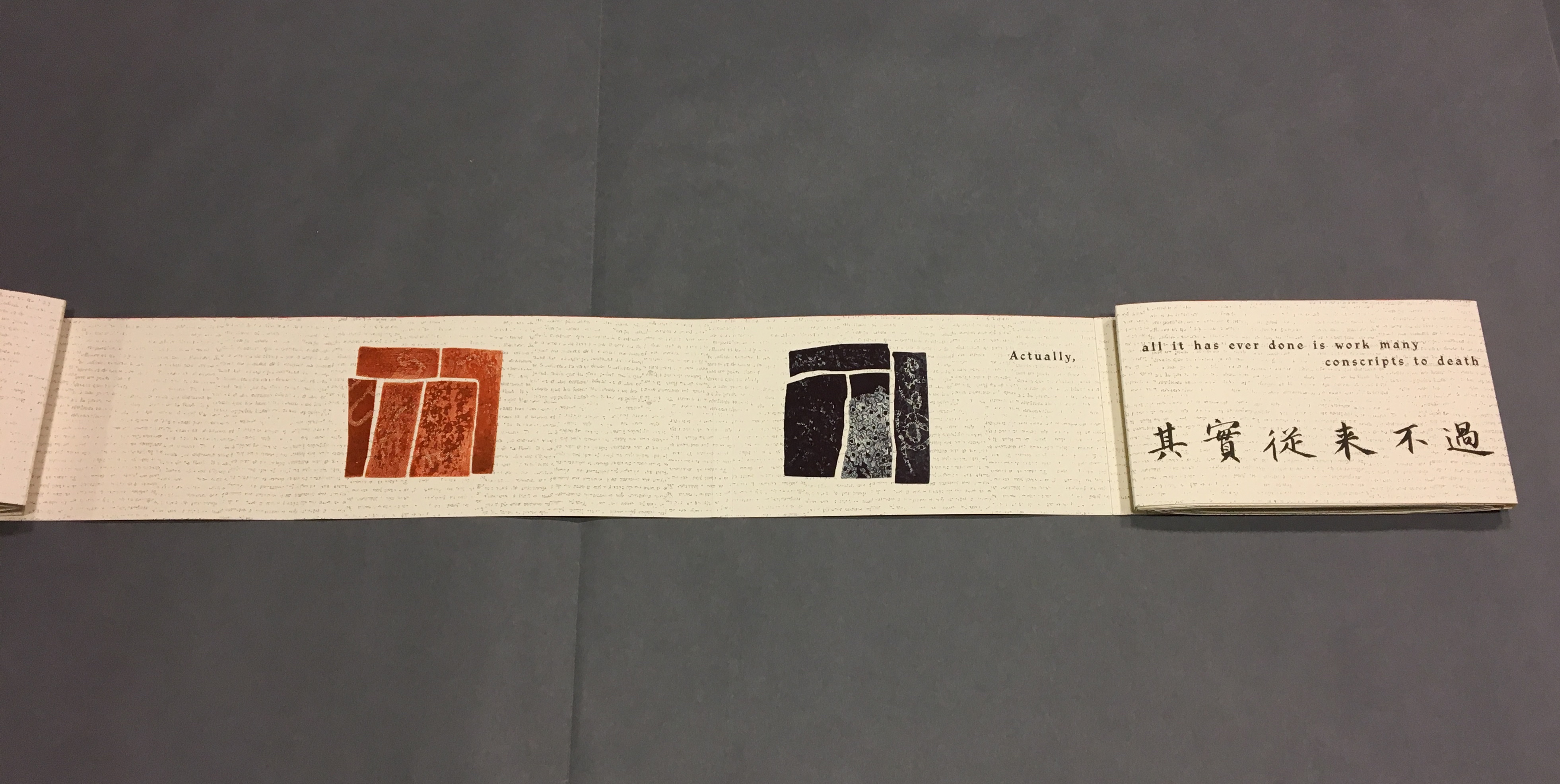
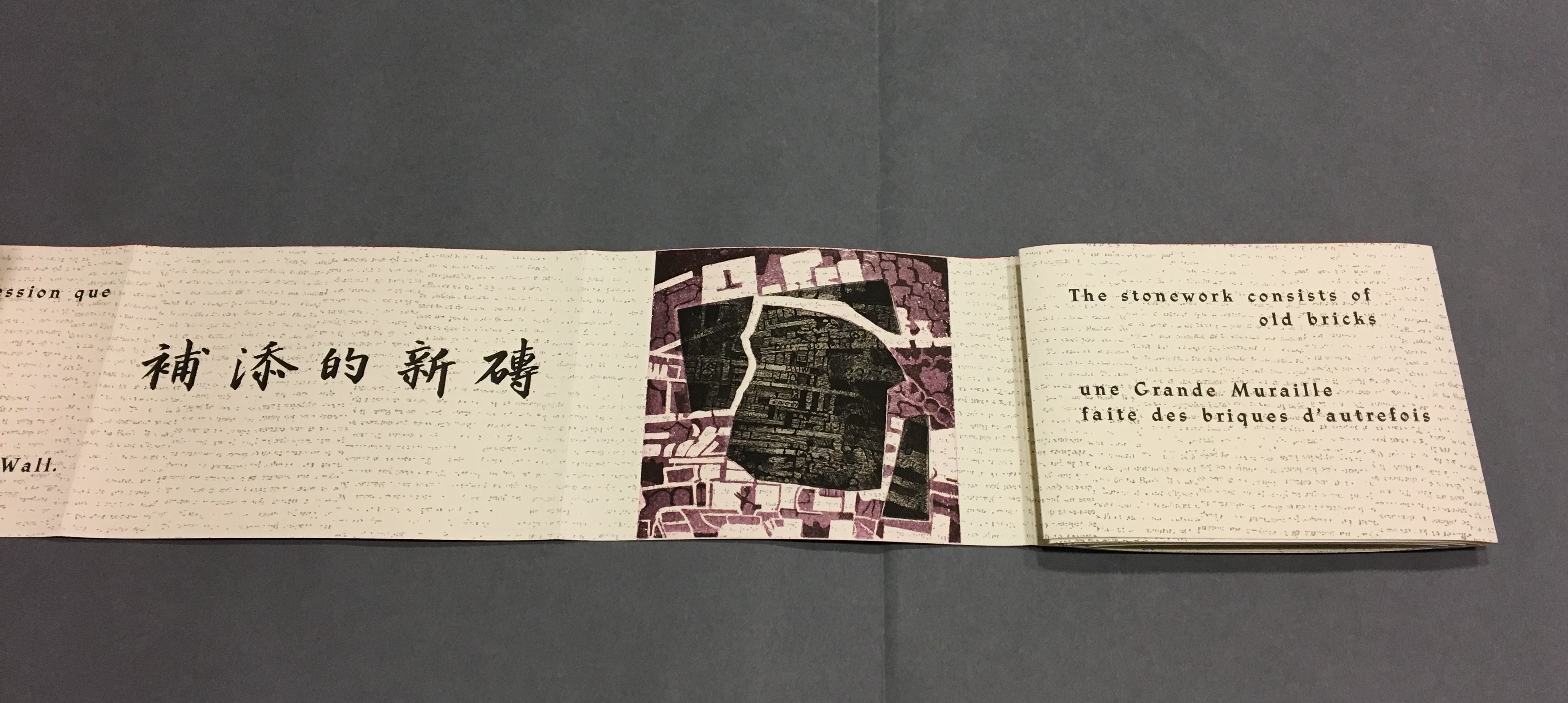
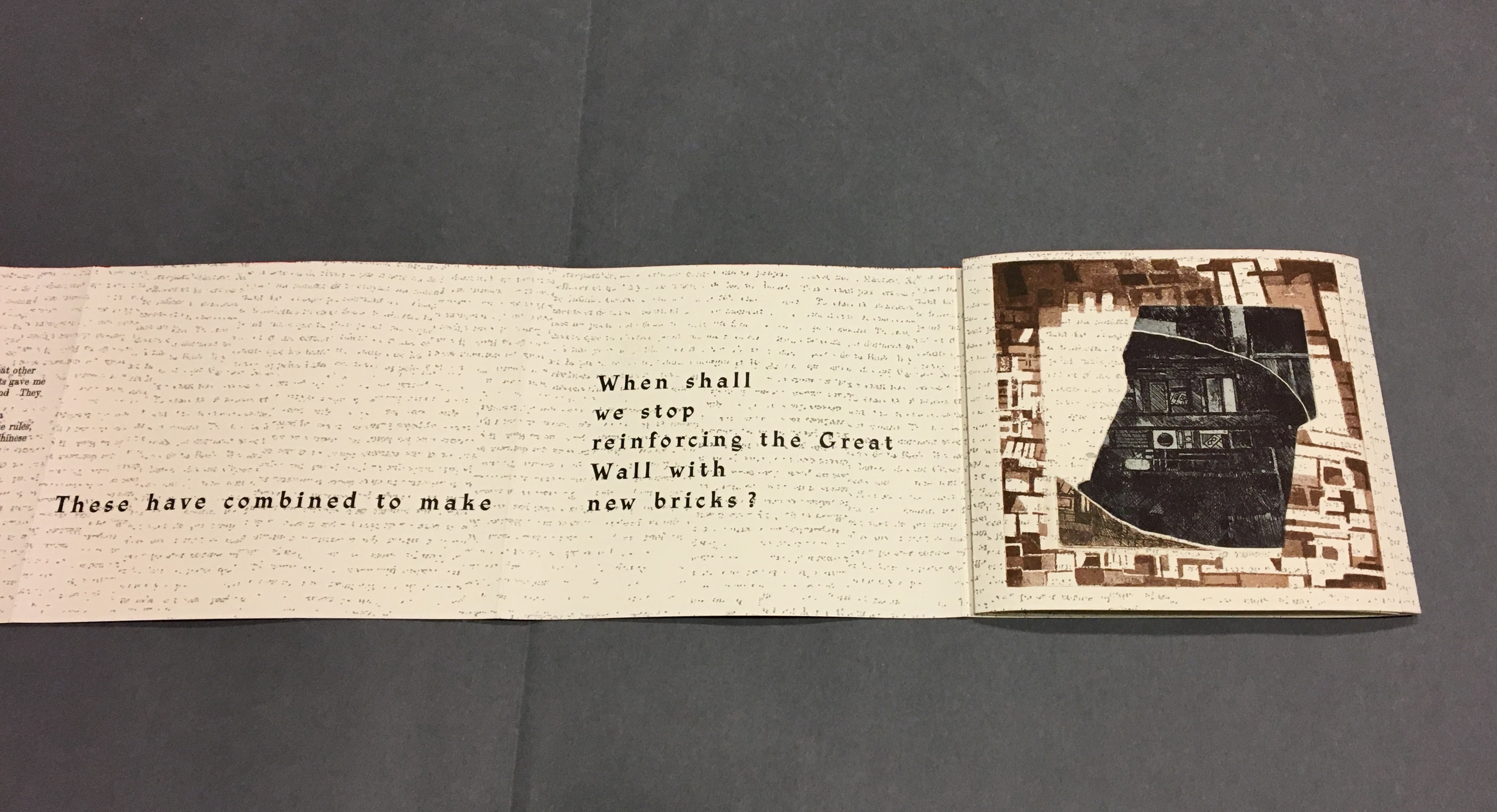
These two works by Sharoff are perhaps bettered only by two others not in the Books On Books Collection: Ovi (1988) and La grande muraille/The Great Wall (1991). It is interesting that, while the former reflects her preoccupation with the Oulipo circle (Ovi draws on Calvino’s work), it sticks to one language (French); whereas La grande muraille engages with three languages (French, English and Chinese) yet draws on the text of a Chinese modernist (Lu Xun), not the Oulipo circle. Both, however, reflect the same ingenuity of juxtaposition and integration of language, image and forms to be found in La Poésie de l’Univers/Poetry of the Universe and Impermanence Subtile/Subtle Impermanence, which makes them defining works in the Books On Books Collection.
Further Reading
Christophe Comentale’s essay captures the delight of exploration and discovery in the encounter with Sharoff’s art.
Shirley Sharoff, entre France et Etats-Unis, présente une pluralité d’inspiration consommée entre l’estampe et le livre devenu un média, entre unique et multiple. […] Magicienne des formes et des couleurs, Shirley Sharoff ne cesse de remettre en cause, par besoin autant que par défi personnel, tout ce qui pourrait ressembler au début d’un système de lecture, de vision, figé et donc clos. L’impossibilité de savoir -qui vaut aussi pour elle- de quoi sa prochaine oeuvre-livre-manuscrit-tableau-dépliant, ou tout cela à la fois, sera fait est assez excitant. La présence de textes sentis par affinités sensorielles, personnelles, avec des écrivains non encore classiques, autant de raisons d’apprécier de pénétrer dans cet univers où le conformisme est inexistant.
Christophe Comentale, “Shirley Sharoff, des livres a tenir debout et des estampes a voir aussi”, Art & Métiers du Livre, n°231 (Aout-Septembre 2002), p.63.
Ephemera