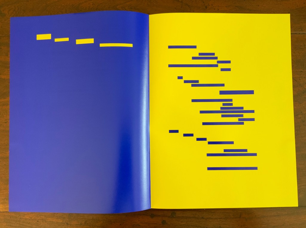
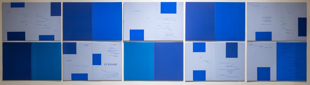
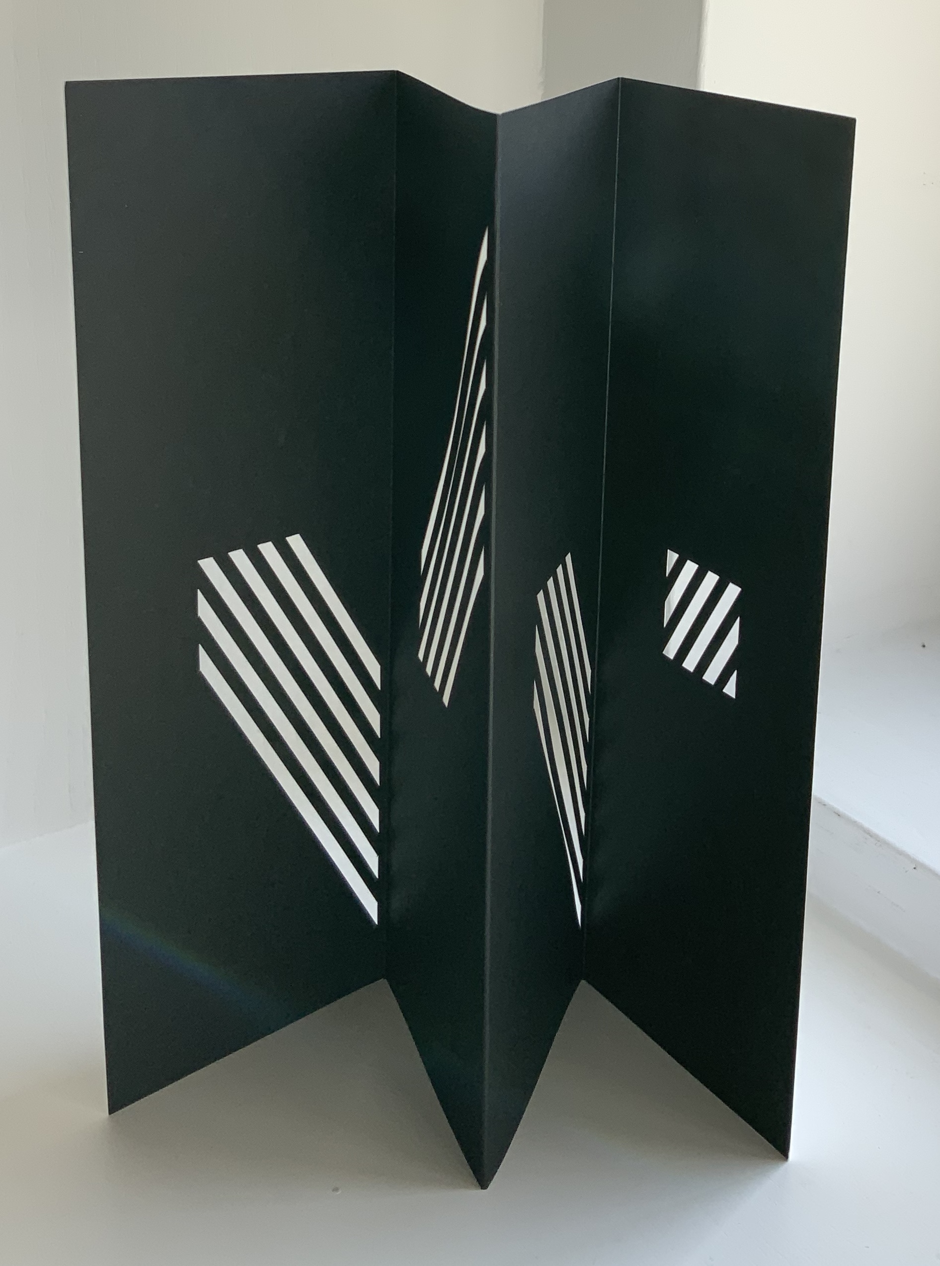
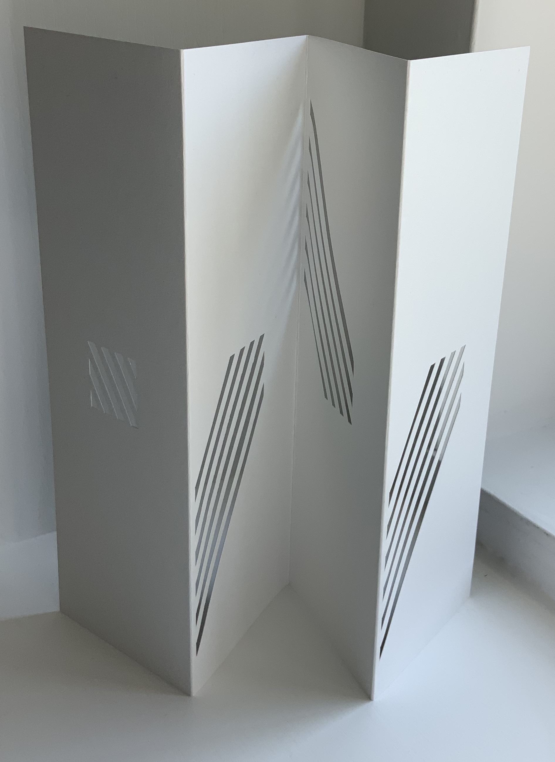
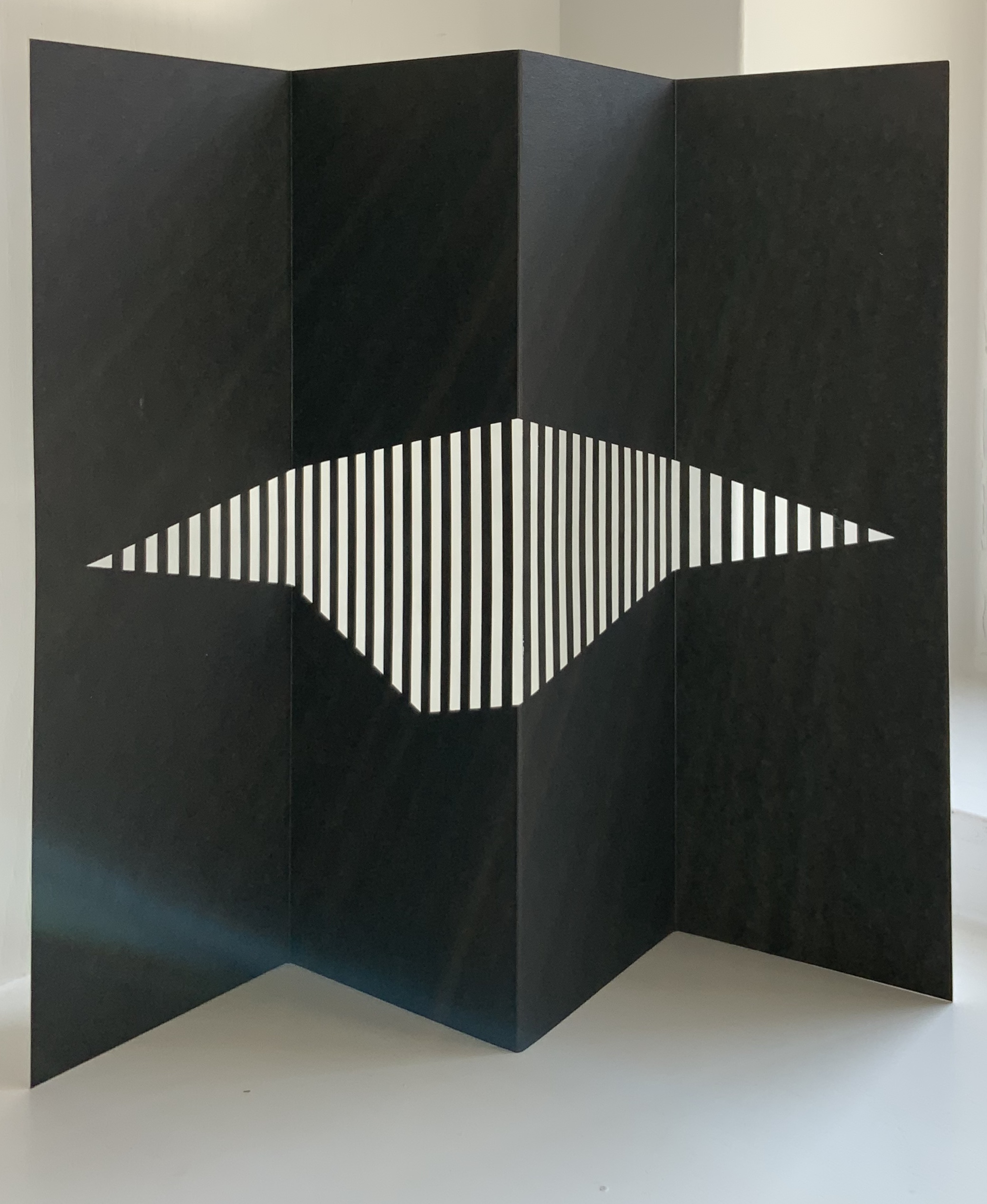
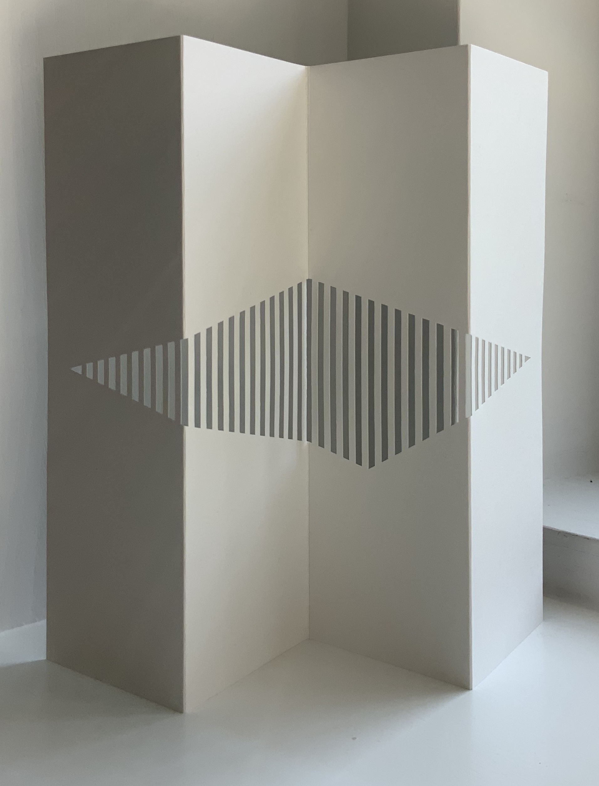
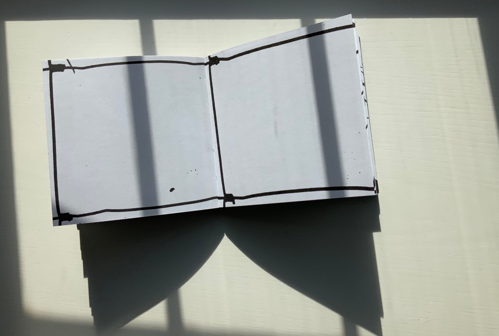
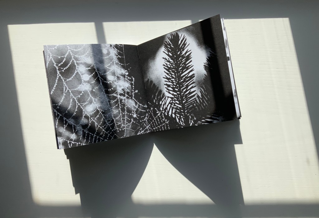
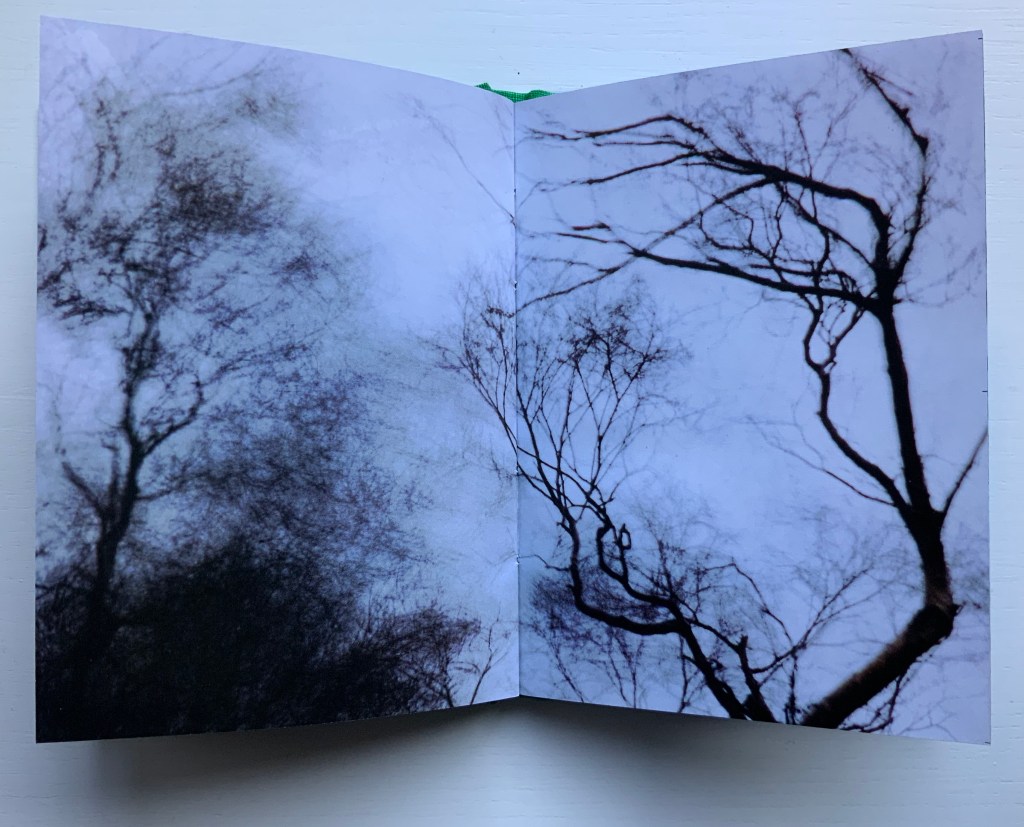
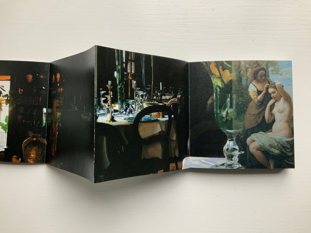
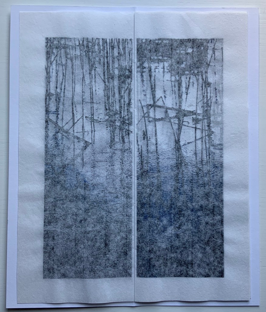
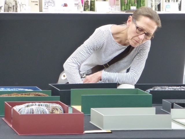
In the first three minutes of this extract from the film Molinari: la couleur chante (2005), Molinari walks through an exhibition of Équivalence, discussing it with Roald Nasgaard and commenting on Un coup de Dés, its visual musicality and his transformation of it into his colourful geometric abstractions. The opportunity to see all of the poem ranged along one wall and all of Molinari’s abstractions along a facing wall is a pleasure. A pleasure enhanced by leafing through the portfolio and juxtaposing each double-page spread of the poem with Molinari’s “equivalent” abstraction.
Update
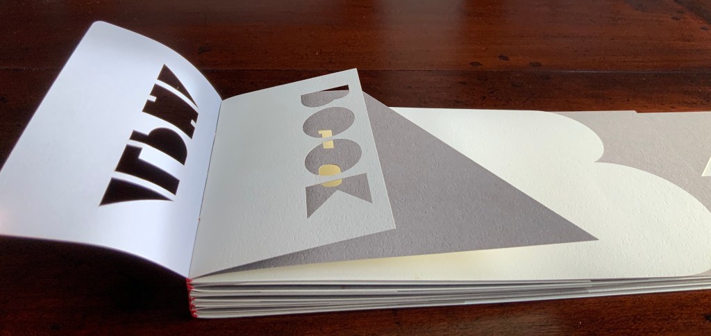
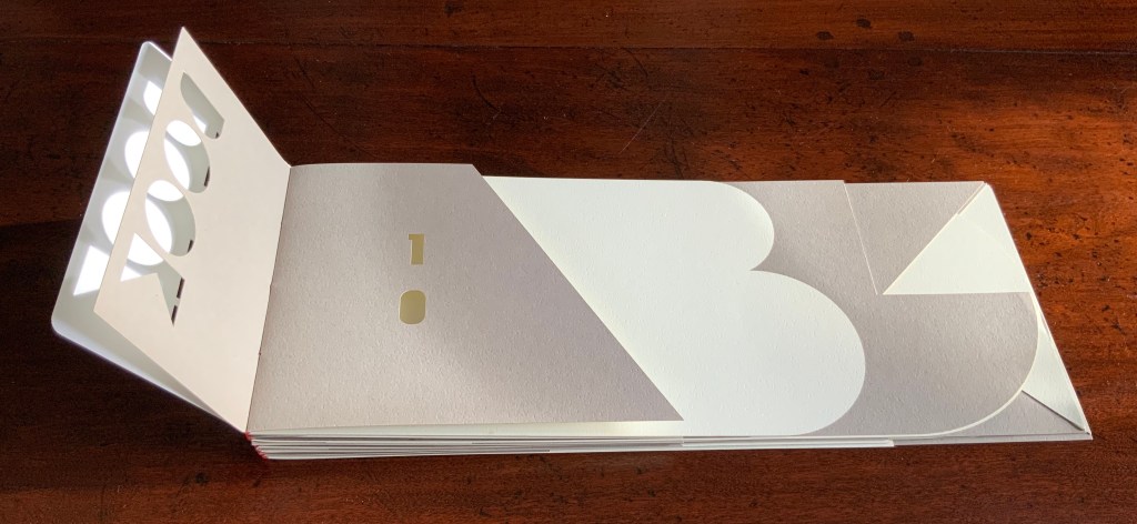
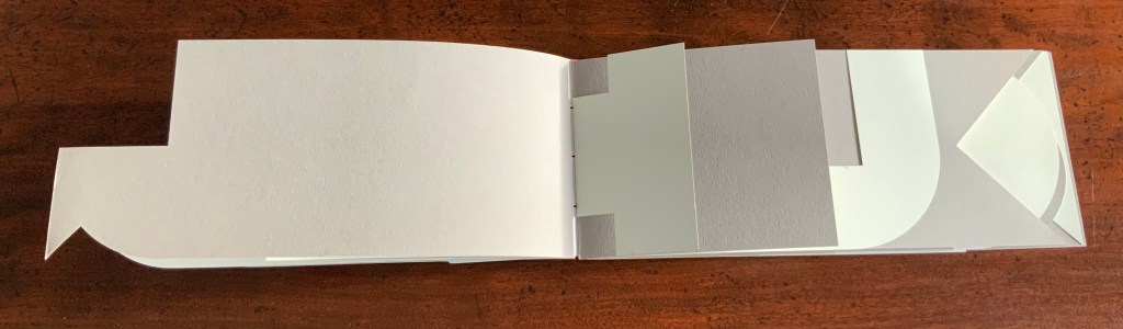
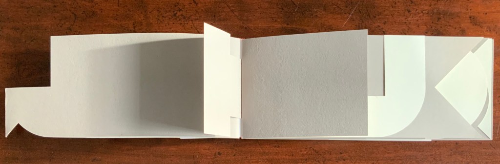
At the Guido Molinari Foundation’s exhibition Sophie Lanctôt, Mallarmé, Molinari: Mots Croisés (6 June – 25 August 2024), a previously undiscovered artist’s book by Molinari appeared for the first time in thirty years:
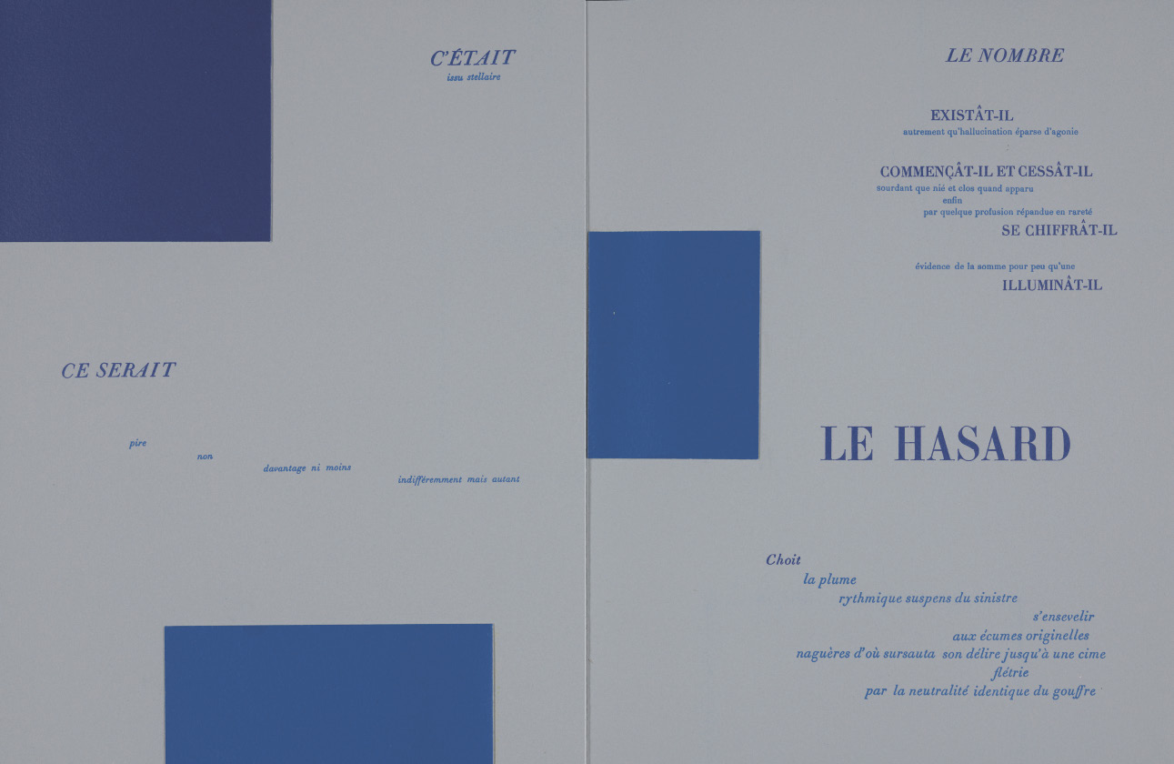
Continuum pour Mallarmé (1994)
Images courtesy of Fondation Guido Molinari. Photos: Michael Patten. Especial thanks to artist Sophie Lanctôt and curator Monic Robillard.
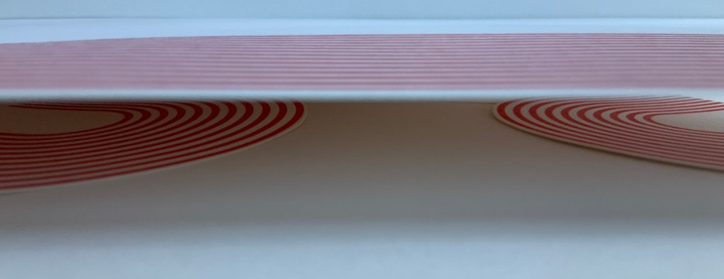
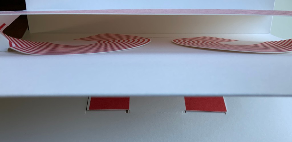
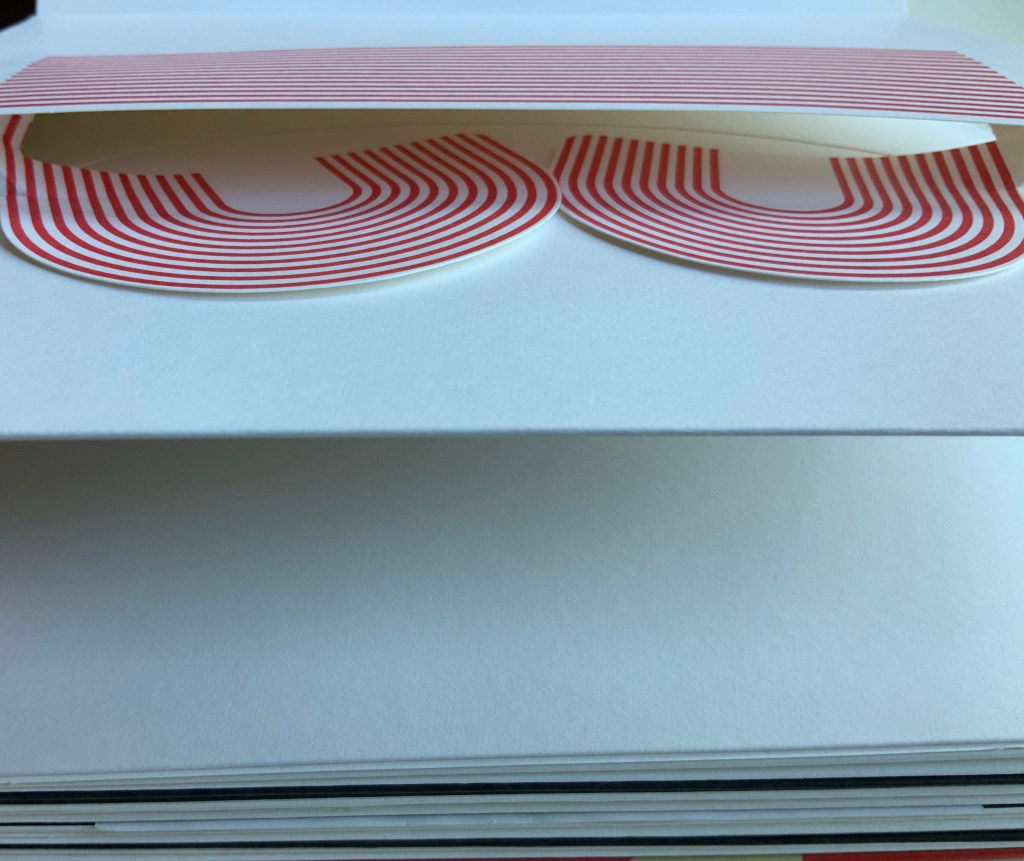
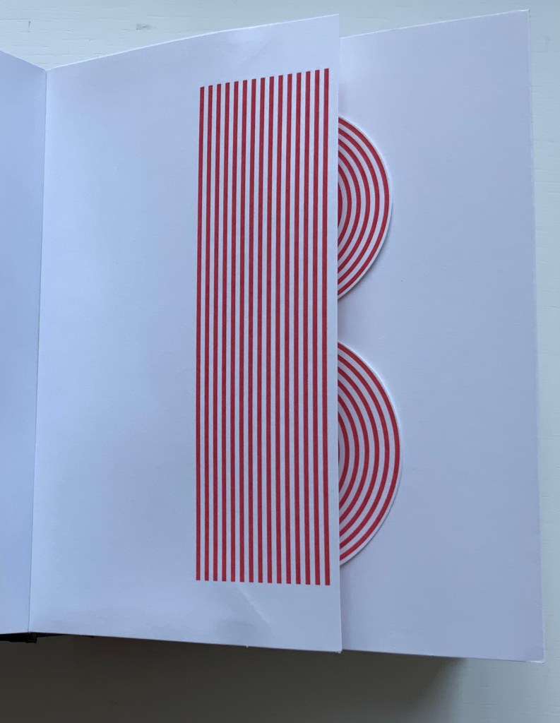
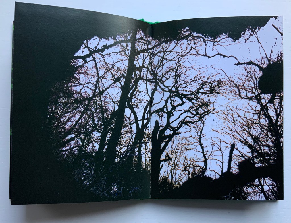
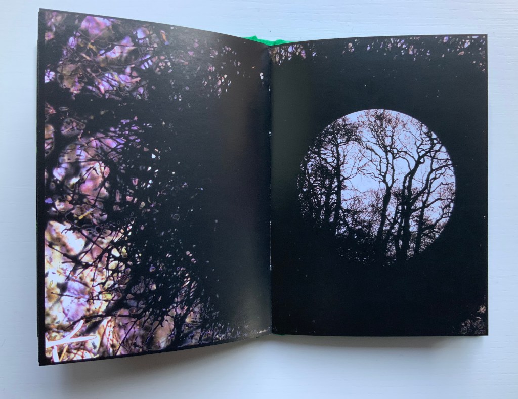
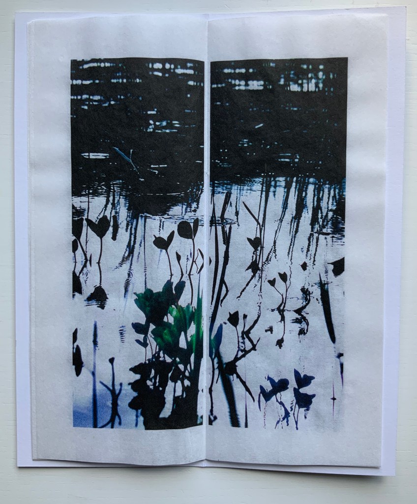
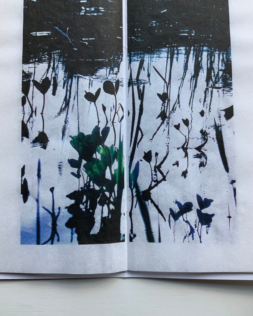
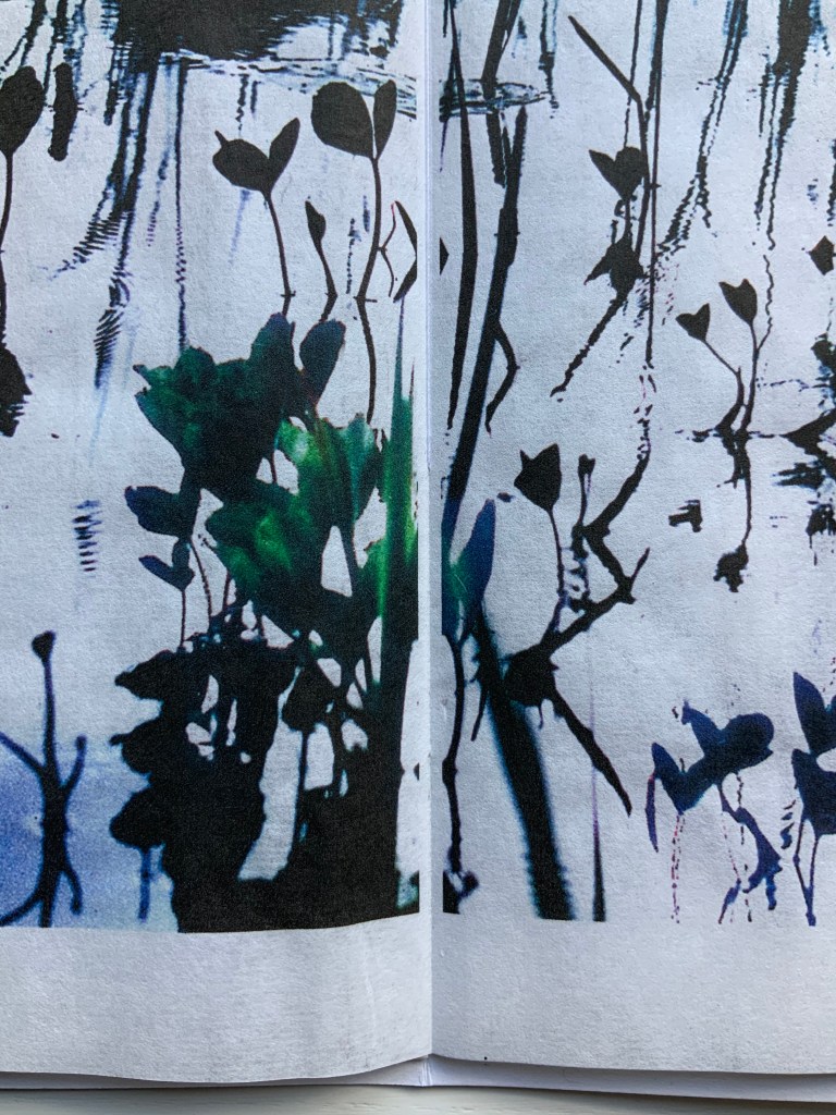
Note in this earlier work how the text is integrated with artwork, omitting the later work’s intermediate homage to Broodthaers.
Continuum pour Mallarmé was created for a group show of 47 books by renowned artists such as Louise Robert, Michel Goulet, Irene F. Whittome and Rober Racine, presented at AXENÉO-7 in Gatineau from March 27 to April 24, 1994, under the title De causis et tractatibus. Each artist was free to choose his or her subject. Molinari chose Mallarmé’s poem.
“The idea of a fictional encyclopedic project arose during a conversation between Marie-Jeanne Musiol and Richard Gagnier about the creation of artist’s books. Each of the artists received an identically crafted book with a closed dimension of 33.8 x 26.5 x 1.4 cm (13 ¼ x 10 ½ x ½ in.). The interior consists of six sheets of white BFK Reeves paper folded in quarters and sewn together. (…) The title of the encyclopedia and the volume’s serial number, in Roman numerals, are pressed into the cover and repeated in the same way on the inside title page,” writes Richard Gagnier in 3 manières d’instruire l’inventaire, published by Le Sabord in 1998. Continuum pour Mallarmé by Guido Molinari is number 44. — Exhibition notes provided by Monic Robillard.
Further Reading
Molinari, Guido, Gilles Daigneault, Patrick Lafontaine. Nul mot: les livres d’artiste de Guido Molinari (Montréal, Québec: Éditions du Noroît, 2017).
Nasgaard, Roald. Abstract Painting in Canada (D&M Publishers Inc., 2008).
Tien-Min Liao, Handmade Type. Compare/contrast with Tauba Auerbach’s Stacking (2007), which is covered in How to Spell the Alphabet (see above).
Poul Webb, “Alphabet Books — Parts 1-8” on Art & Artists. Google has designated this site “A Blog of Note”, well deserved for its historical breadth in examples, clarity of images and insight.
List of contributors from Movable Books Society site.
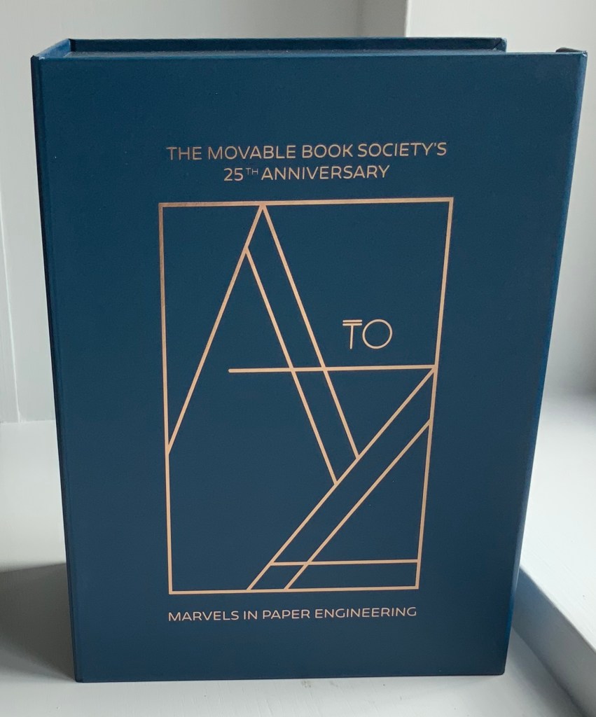
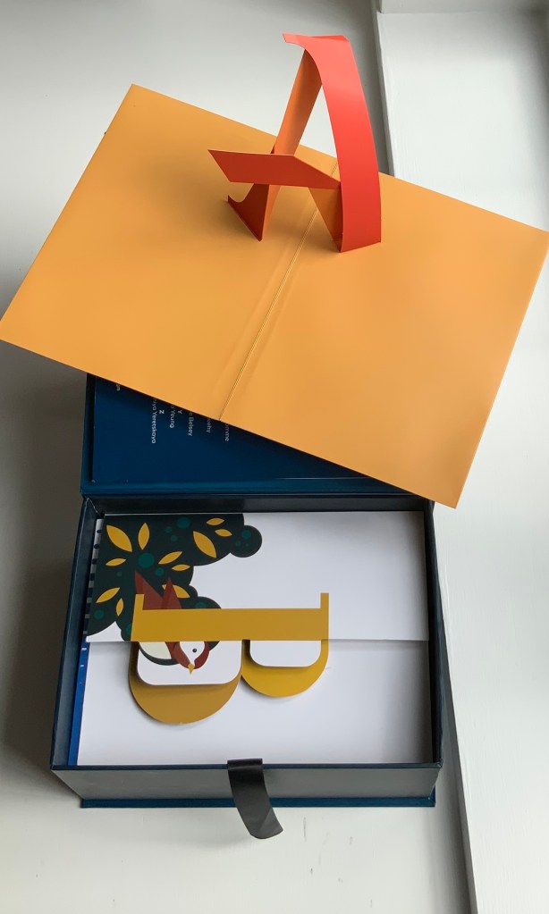
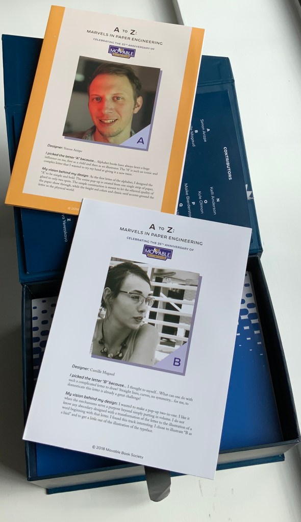
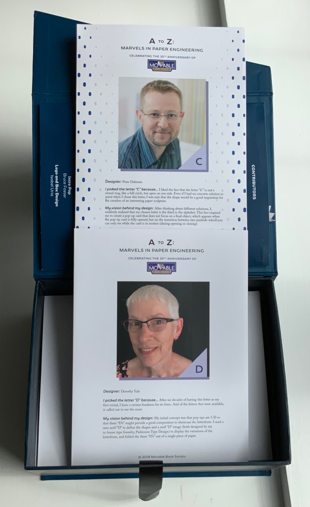
Published to commemorate the Movable Books Society’s 25th anniversary, A to Z: Marvels in Paper Engineering is aptly subtitled. A video created by Christopher Helkey gives 26 brief cameos to the artists above in which they demonstrate those marvels.
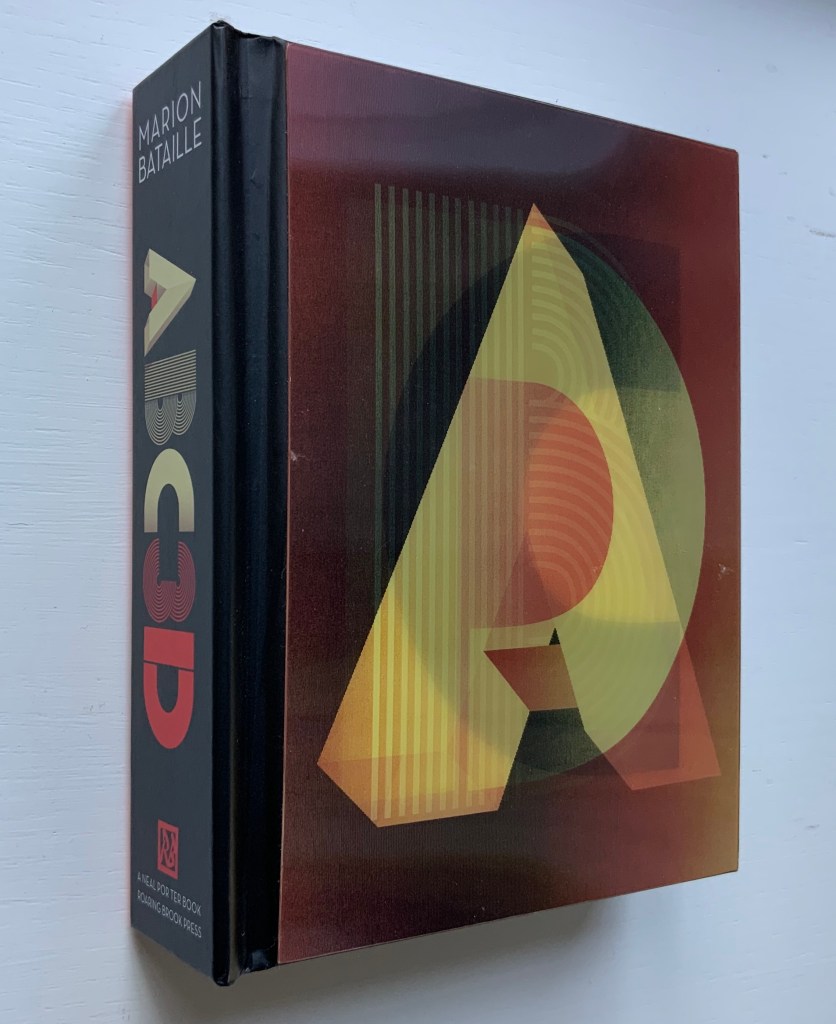
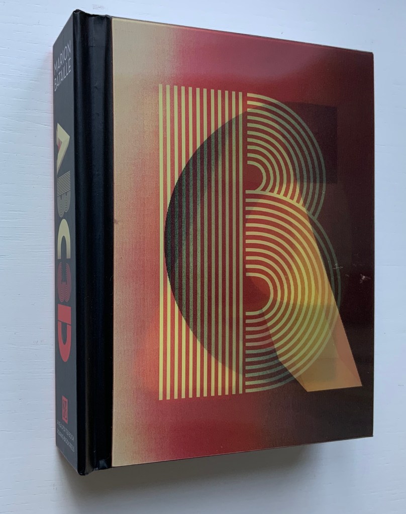
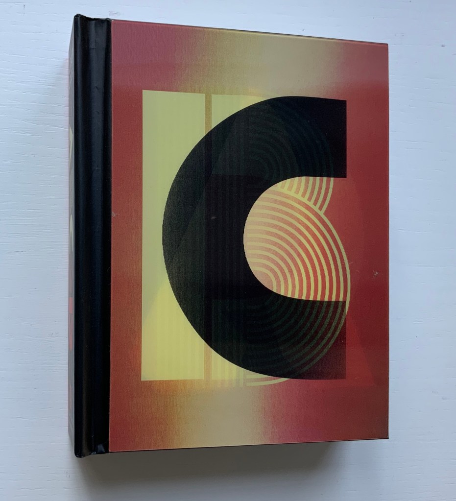
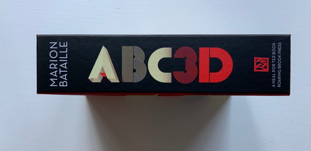
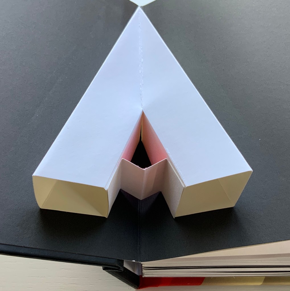
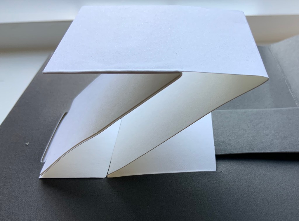
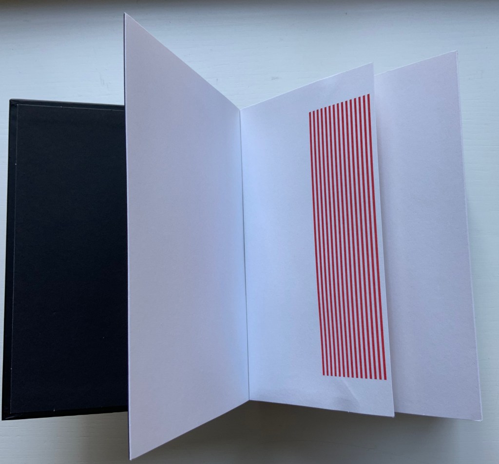
ABC3D (2008) Marion Bataille Hardcover, paper on board, with holograph on front cover; H187 x W147 x D44 mm; 36 pop-up or movable pages. Acquired from Amazon.de, 31 May 2018.
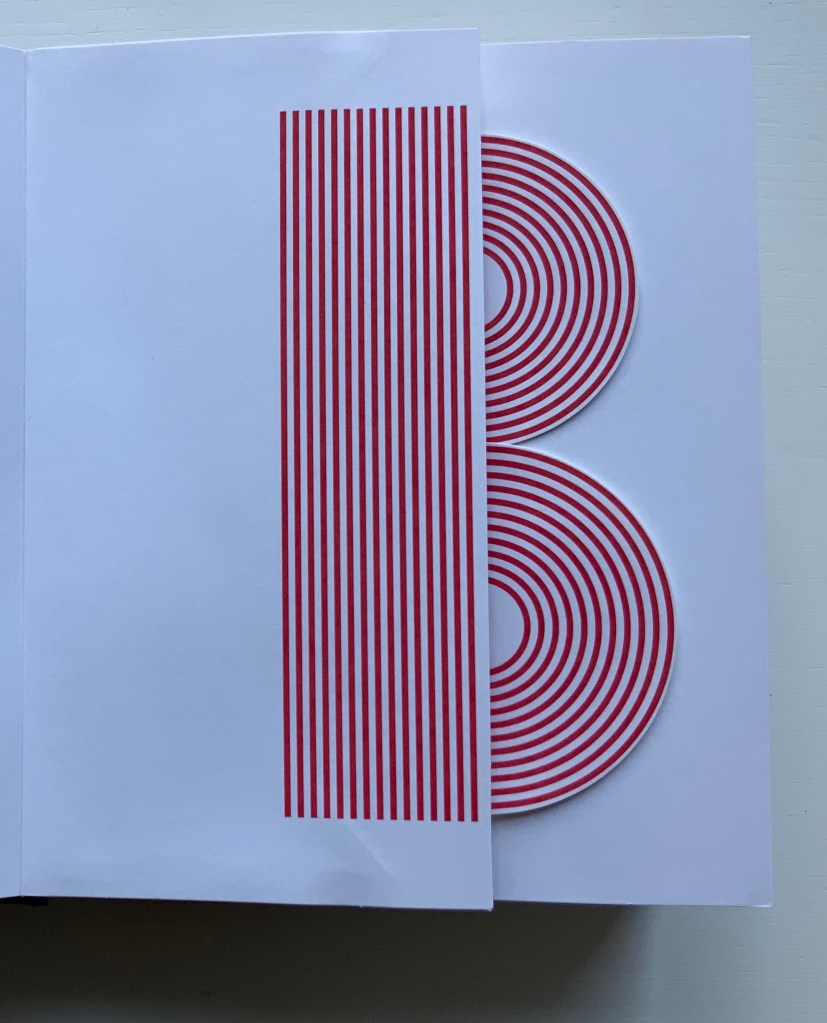
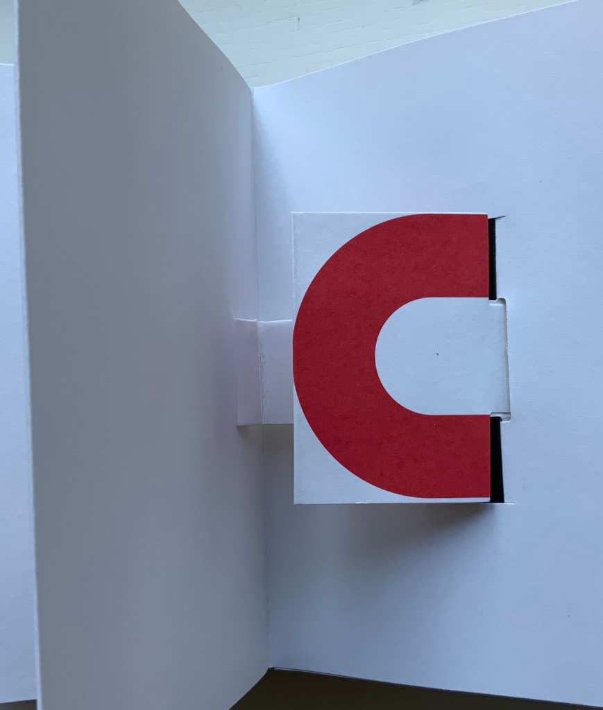
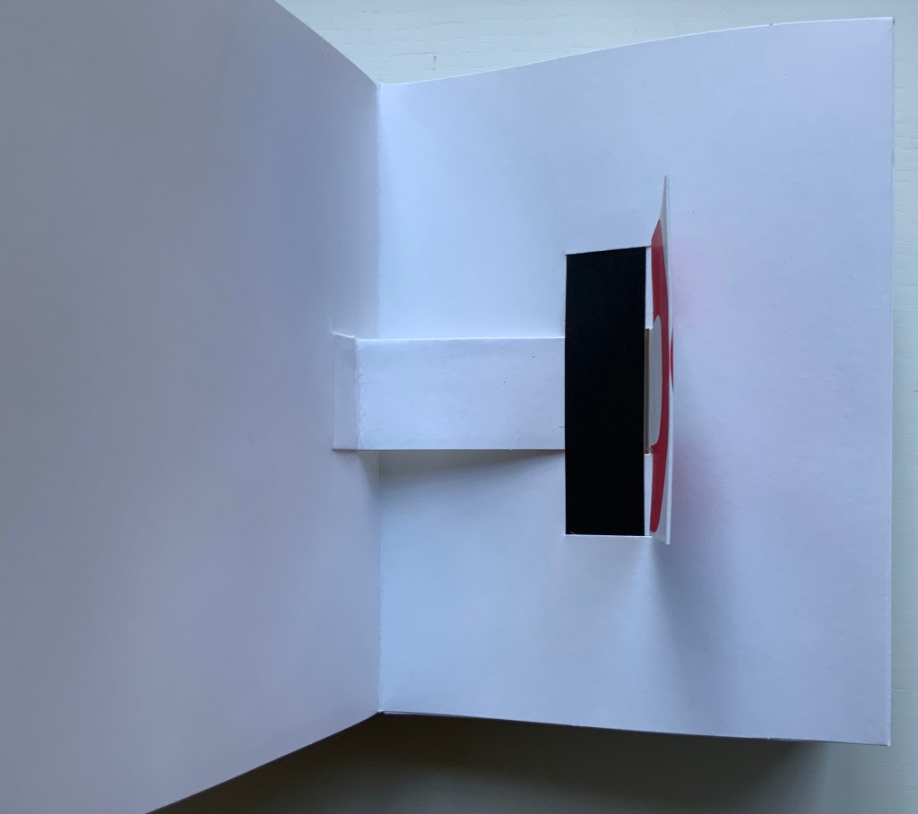
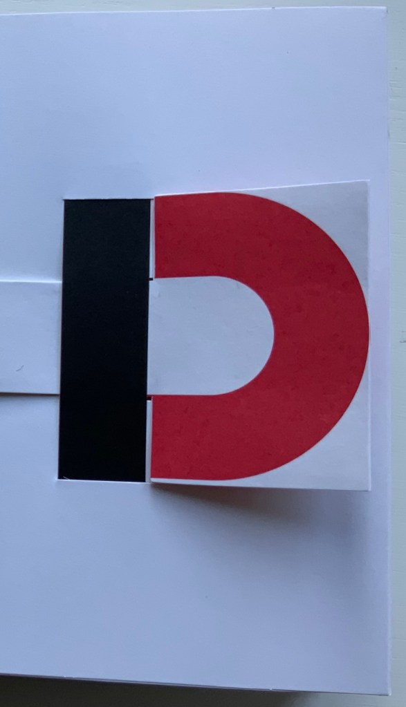
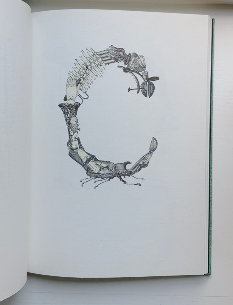
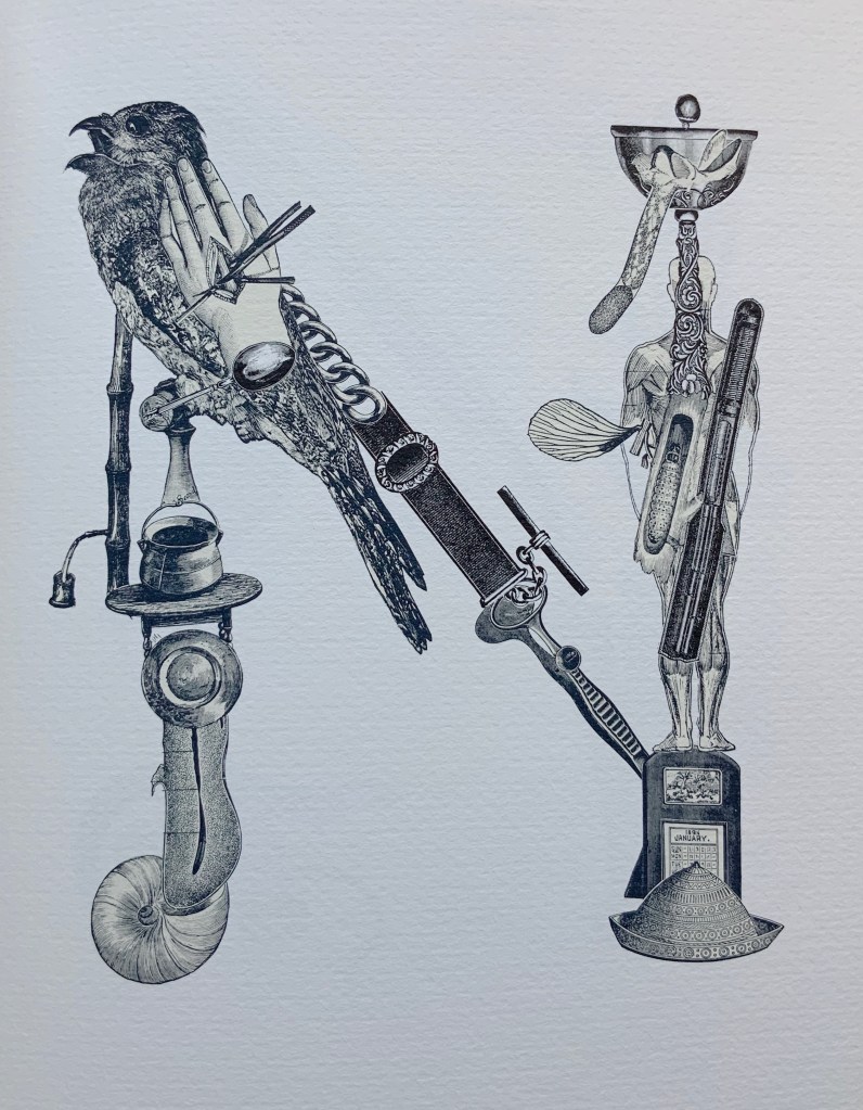
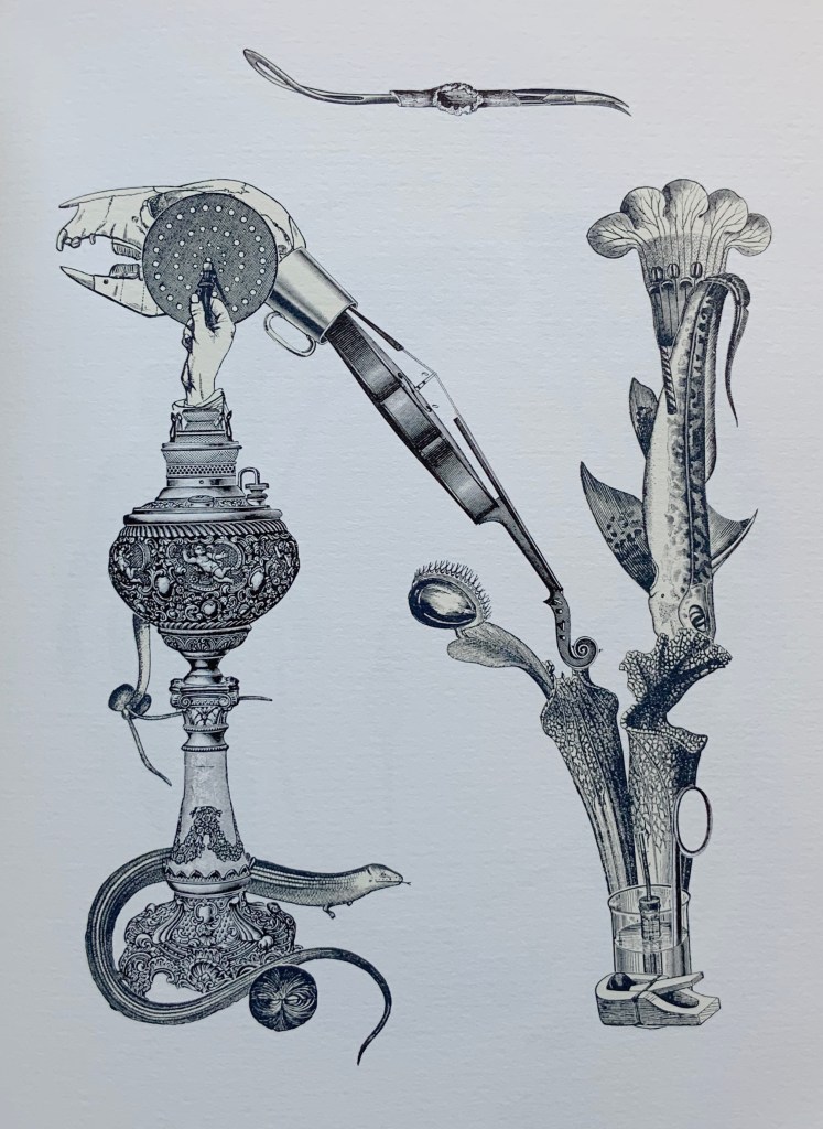
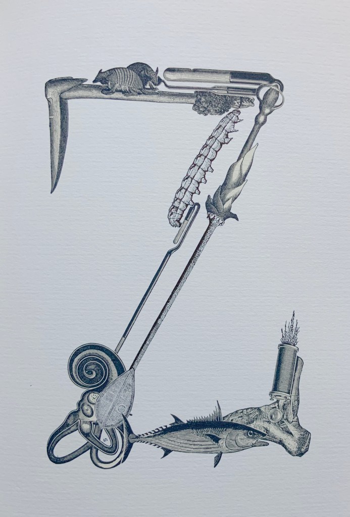
“A” to “Z”
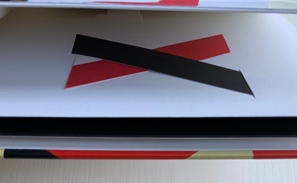
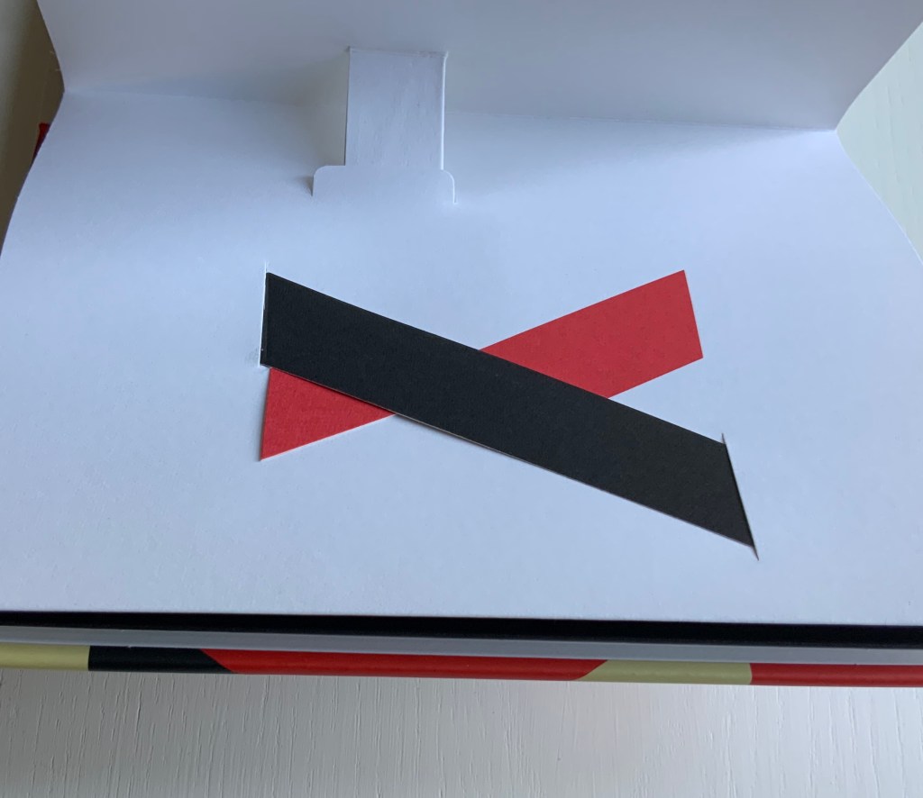
Becoming a “B”
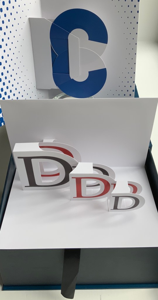
“C” revealing a “D”
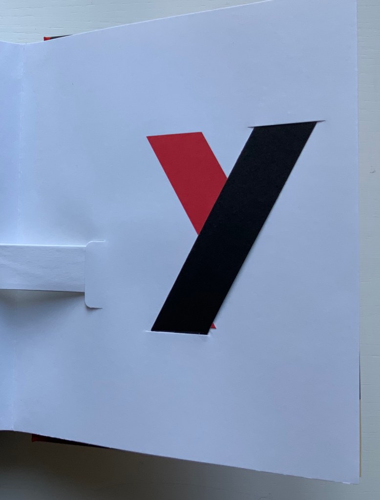
“X” sliding to “Y”
Although this book is available at retail, it is a delicate work. With small removable protective slips of paper inserted at points of friction, it is not a work to pull off the shelf, flip through and replace casually. “Flipping through” misses too much anyway. These are pages to tease apart, peer between, draw taut with fingers and thumbs holding the opposite edges tight, and work back and forth gently to appreciate the engineering.
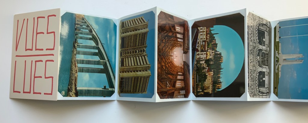
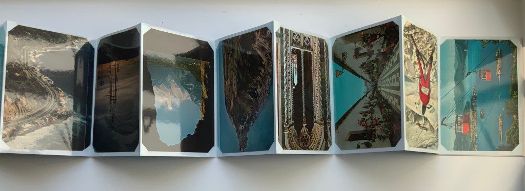
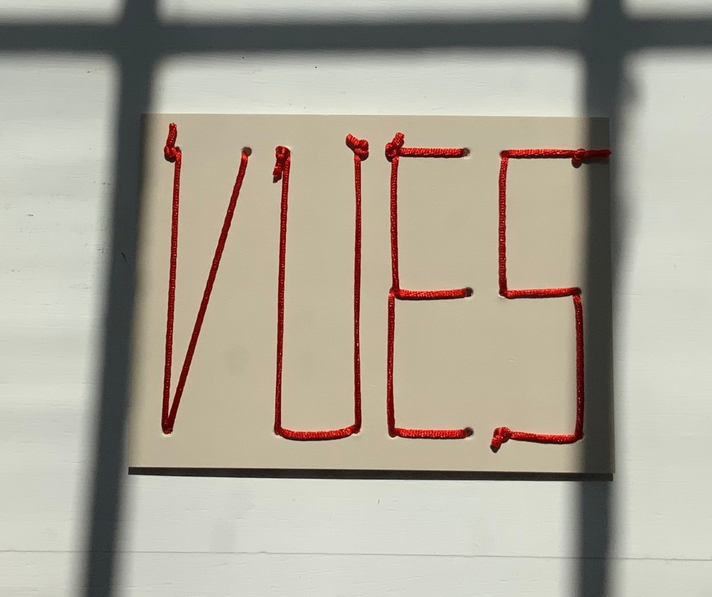
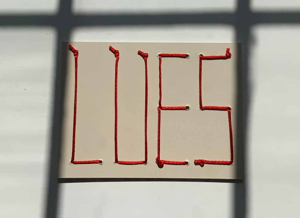
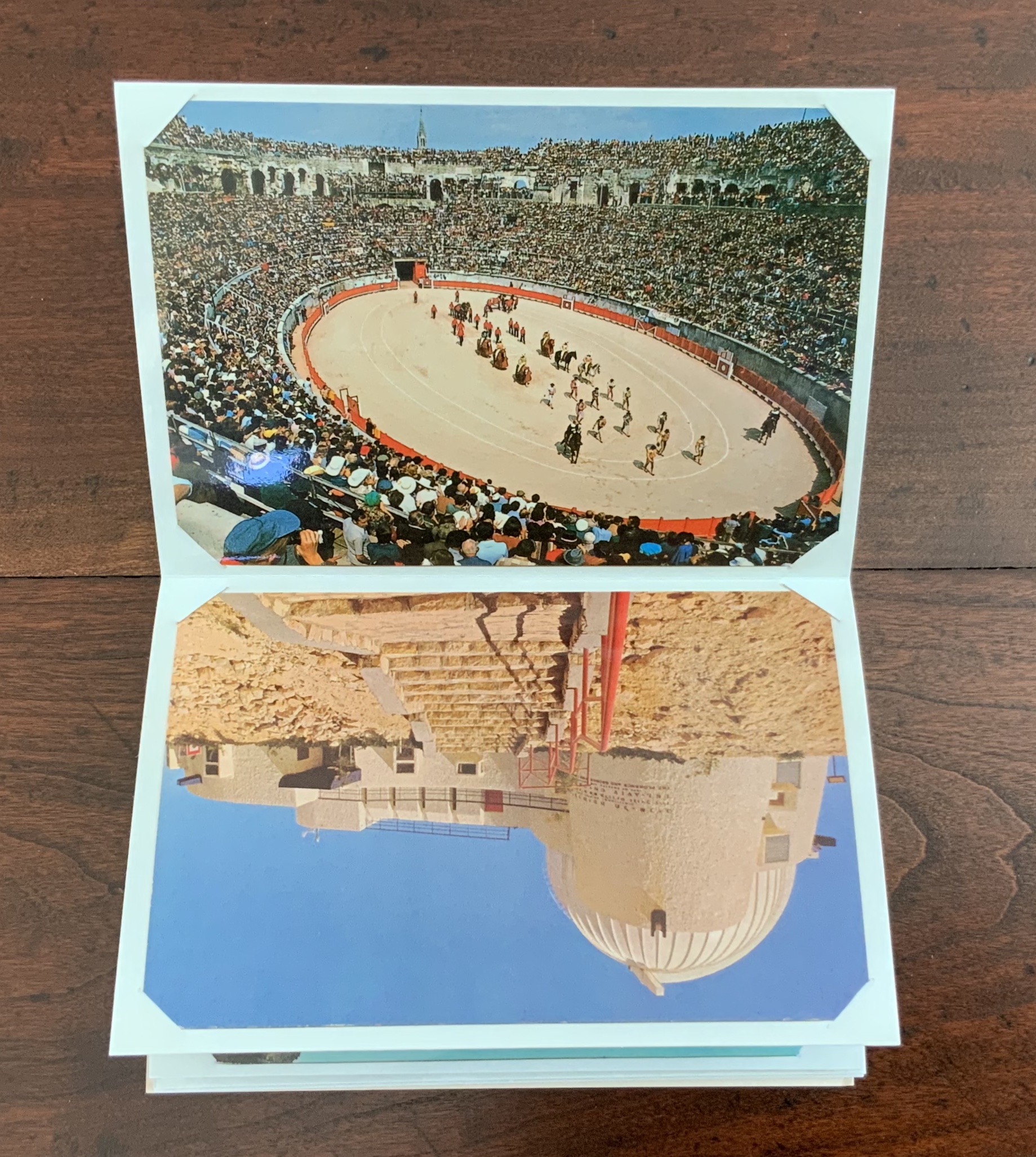
VUES/LUES: Un Abécédaire de Marion Bataille (2018)
VUES/LUES (2018) Marion Bataille Leporello: H150 × W110 mm. Stitched card: H:110 x W250 mm. Acquired from Éditions ~zeug, 13 April 2020.
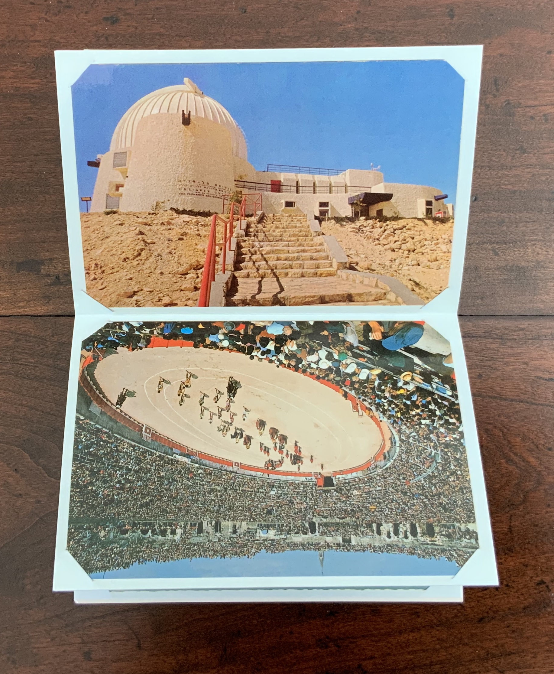
Vue means “view, sight, vision/eyesight or outlook”. “Picture postcard views” in French would be vues de carte postale. Lues is the past participle of the verb lire (“to read”) in the feminine plural. So, to say in French “Marion’s picture postcard views can be easily read as an abecedary” would be “Les vues de cartes postale de Marion peuvent être lues facilement comme une abécédaire“.
Facilement (“easily”), of course, depends on reading this leporello laterally in book fashion, not laterally in landscape postcard fashion. But is it “O” for bull ring or bull ring for “O”?
Alphacollage (1979) Ludwig Zeller Casebound in Holliston Sailcloth with foil stamping on the front and the spine, printed in two colours on Strathmore Grandee, composed in VIP Trump Medieval, in an edition of 200, of which this is #93. H316 x W230 x D15 mm. Acquired from Atticus Books, 9 January 2020.
In 1980, Alphacollage received a certificate of merit from the Art Directors’ Club of New York. Its publishers (Tim and Elke Inkster of The Porcupine’s Quill) were invited to New York to accept the award. The tale of that event (as told by Tim Inkster) along with an introduction to Zeller and his work is as amusing (if not as surreal) as Alphacollage itself.
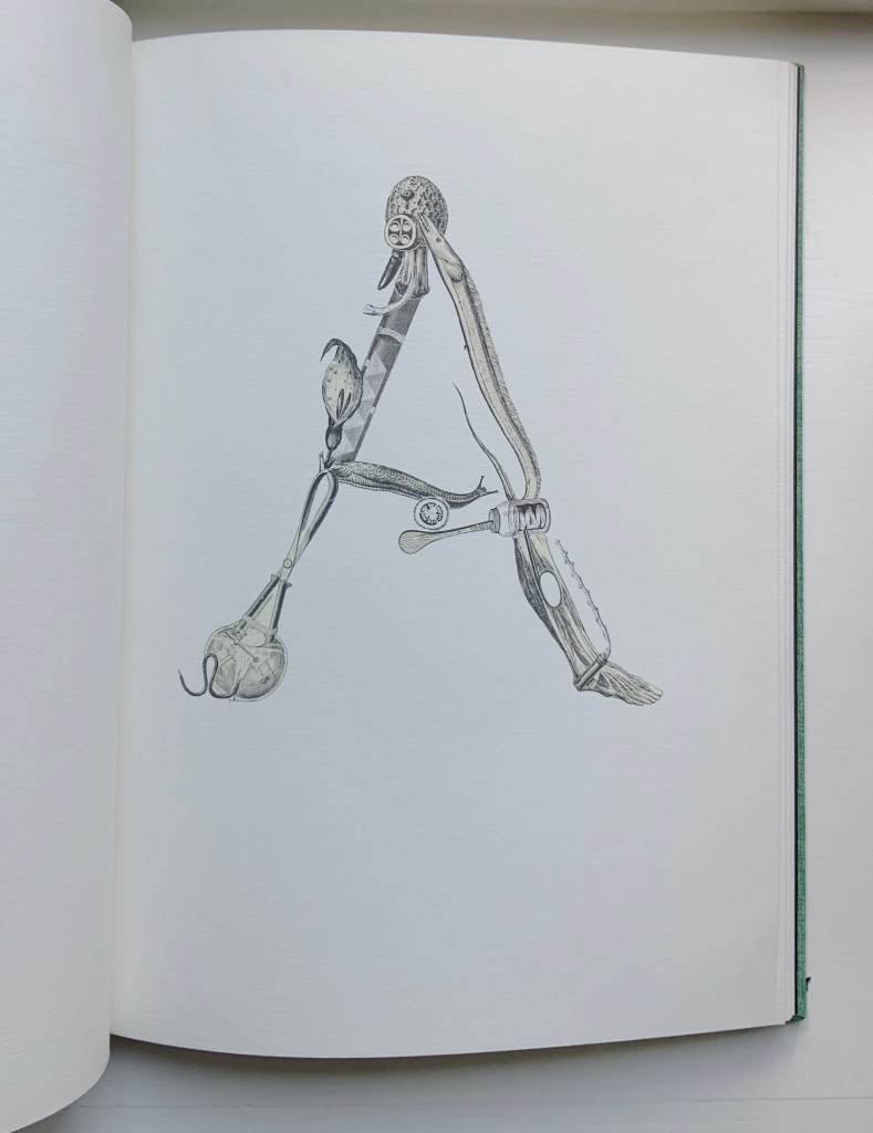
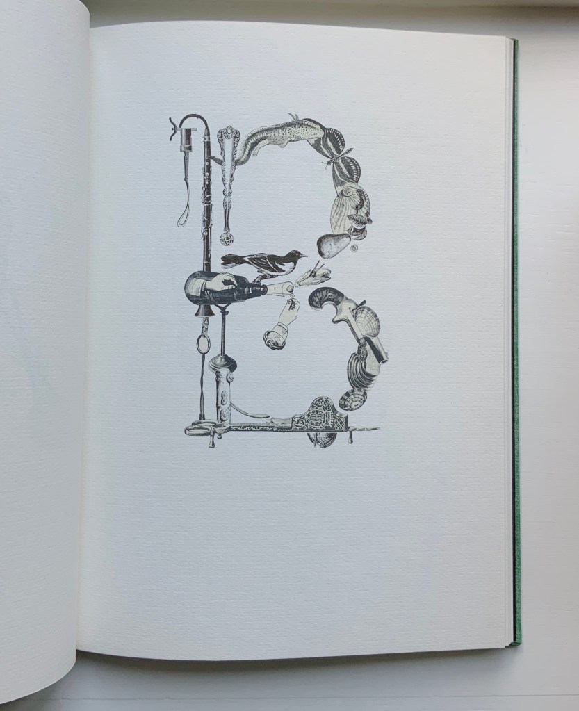
In his preface to the work, Zeller calls the inspiring vision that inspired Alphacollage an “alphabestiary [that] surrounds me”. In it, he sees
a unique alphabet in which the flute and the letter F prolong into an unending melody, … Botanical remnants, electrical apparati or bones, tools from catalogues or exotic customs are coupled with animals till they take on all the shapes of the metamorphosis and clamour for their place here, like beasts in heat. Ludwig Zeller, “Cutting Letters Out Means …”
Born in the desert of Atacama in the north of Chile, Zeller had an alphabet of 27 characters, including Ñ. Even this and Zeller’s lack of any English were not the chief challenge that the Inksters faced.
The main production difficulty encountered with the book was that some of Zeller’s raw material, his collection of nineteenth-century steel engravings, had been printed on coated stock, while others were originally printed on matte paper which had yellowed with age. The challenge (with the encouragement of Stan Bevington of Coach House) would be to colour-separate the two, which of course, could be achieved by no known photo-mechanical process. I spent the better part of three weeks during the summer of 1979, artwork in front of me, hunched over Elke’s negatives at the light table, cutting, with an X-acto knife, elaborate and intricate rubylith overlays. Tim Inkster, “Chapter Two: Stars and Stripes“, The Porcupine’s Quill. Posted on 27 September 2010. Accessed 12 January 2020.
All of the images except one appear on a recto page. The sole image appearing on a verso page — in fact, the last page of the book — is the image above, which is also the first to appear in the book. Not surprising, given the penultimate sentence of Zeller’s preface: “The circular edge of these images has twenty-seven eyes to decipher the name that contains within itself all the names of the universe.” In Spanish, the word for eye is ojo.
“Paul Noble“. 20 April 2021. Books On Books Collection.
“Judy Pelikan“. 2 June 2023. Books On Books Collection.
“Rose Sanderson“. 30 May 2023. Books On Books Collection.
“Pat Sweet“. 18 January 2023. Books On Books Collection.
Balakian, Anna. “The surrealist optic of Ludwig Zeller“, Review: Literature and Arts of the Americas, 1977, Volume 11, Issue 21-22, pp. 161-66. Published online, 11 May 2012. Accessed 23 March 2020.
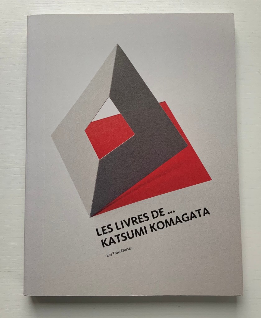
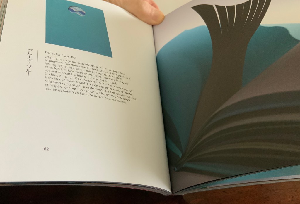
Les Livres de … Katsumi Komagata (2013) Jean Widmer Paperback, 170 x 225 mm, 176 pages. Paris: Les Trois Ourses, 2013. Photos: Books On Books Collection.
A catalog raisonné from Komagata’s early employer. Its photography captures the subtle layers and shadows of Komagata’s cutouts and his brilliant handling of colours and typography. Given the ongoing output of Komagata’s firm One Stroke, another catalogue will be needed in a few more years.
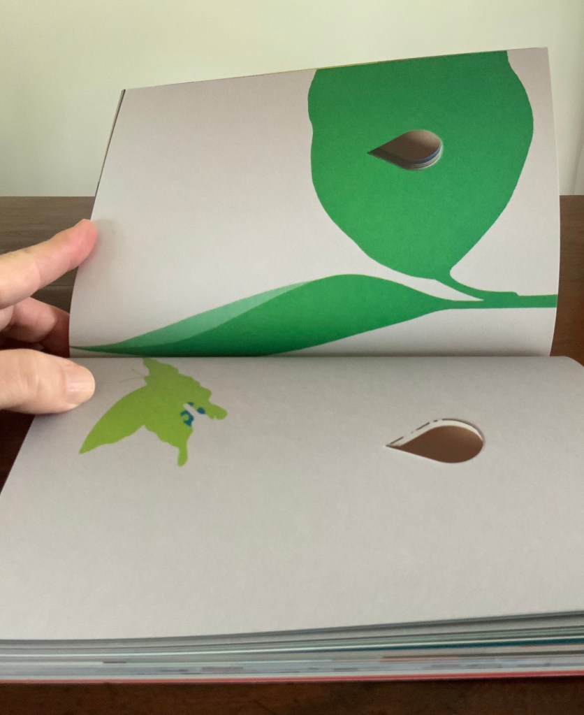
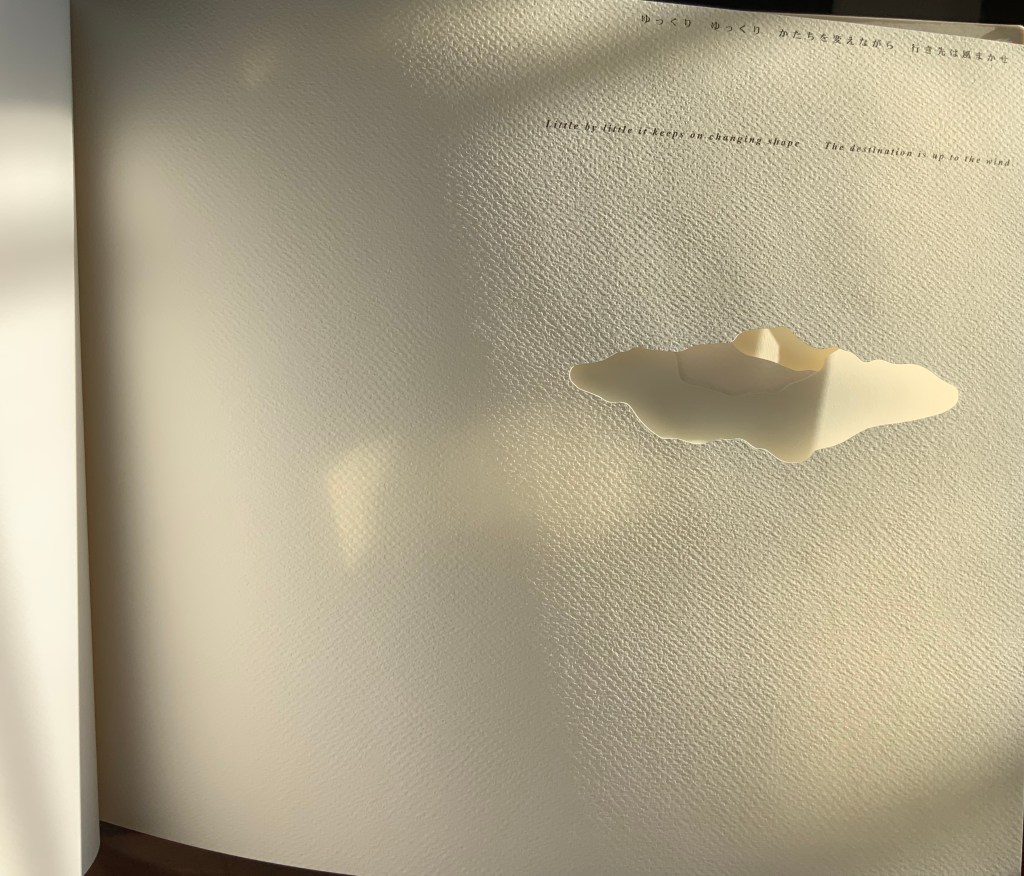
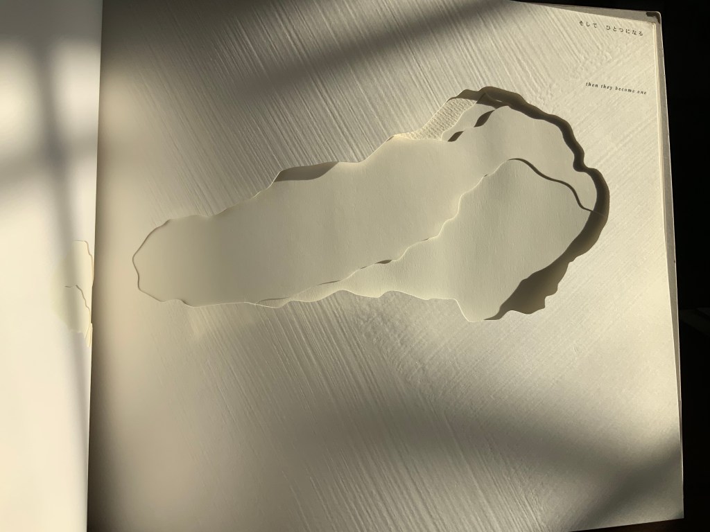
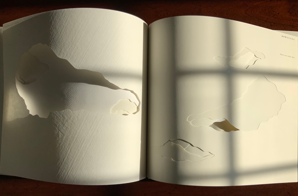
A Cloud (2007)
A Cloud (2007) Katsumi Komagata Perfect bound within hinged whiteboard; H250 x W310 mm; 26 pages. Tokyo: One Stroke, 2007. Photos: Books On Books Collection.
Komagata presents both a narrative and a cloudscape by combining a choice of different papers for each page with carefully placed die cuts of cloud shapes to match the French, English and Japanese texts.
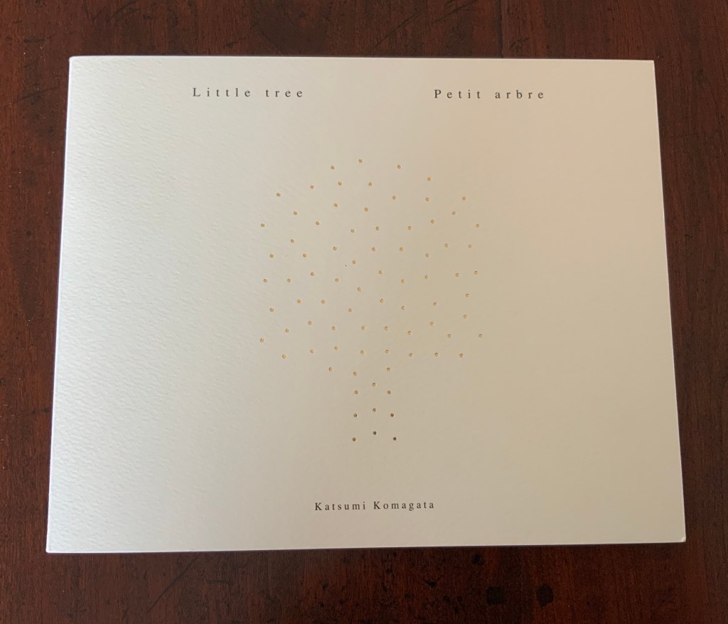
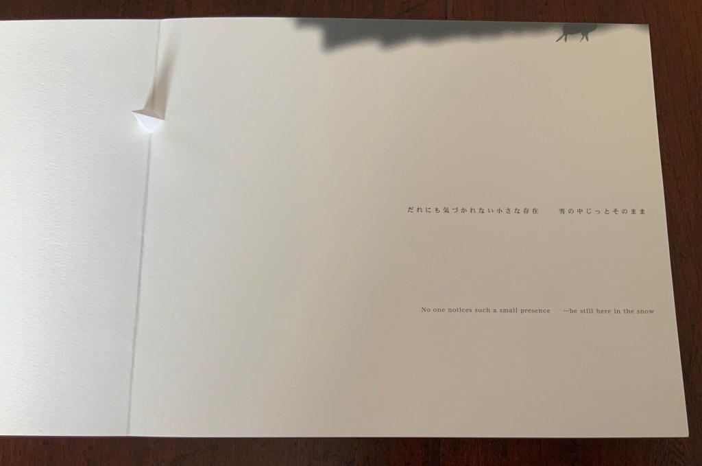
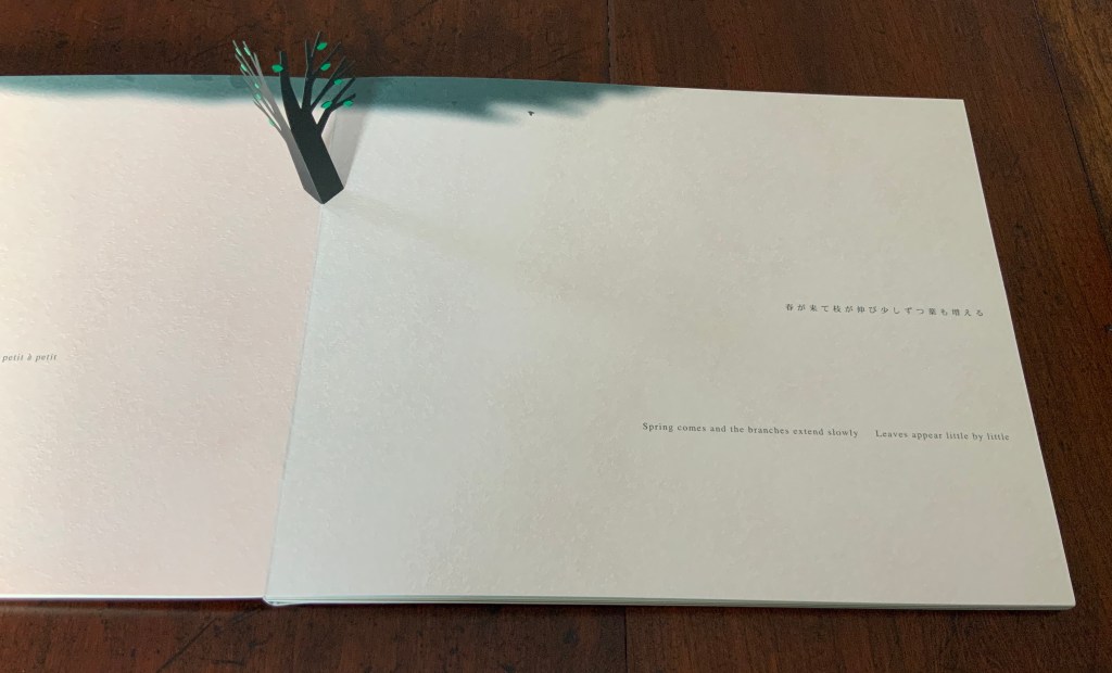
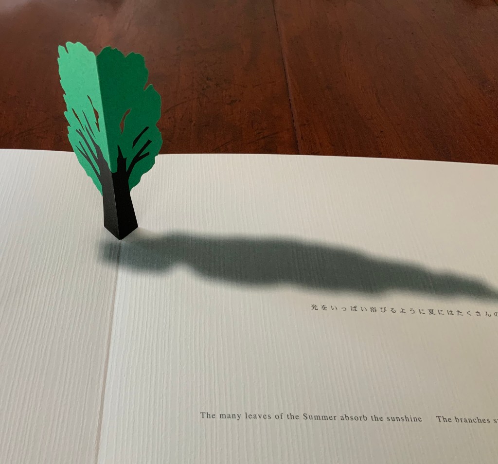
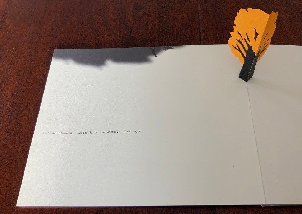
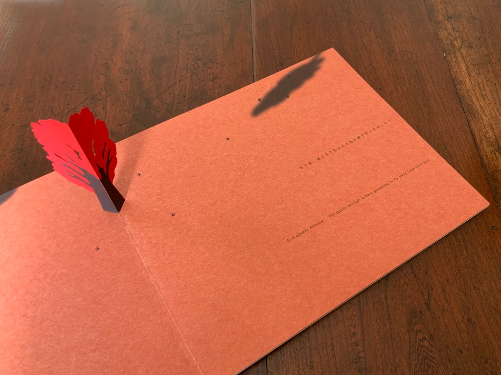
Little tree/petit arbre (2008)
Little Tree/Petit arbre (2008) Katsumi Komagata Perfect bound in greyboard covers, gold-colored ink within hole-punched tree shape on front cover; card paper in various colours and textures; H210 x W210 mm; 28 pages. Tokyo: One Stroke, 2008. Photos: Books On Books Collection.
The pop-up is a key part of Komagata’s signature techniques, which include the masterful use of different coloured and textured papers, ink and typography. While this video and the collection photos here may provide a balanced view of those elements, they do not convey the integral trilingual text that is far more than a narrative of this little tree’s appearance and disappearance.
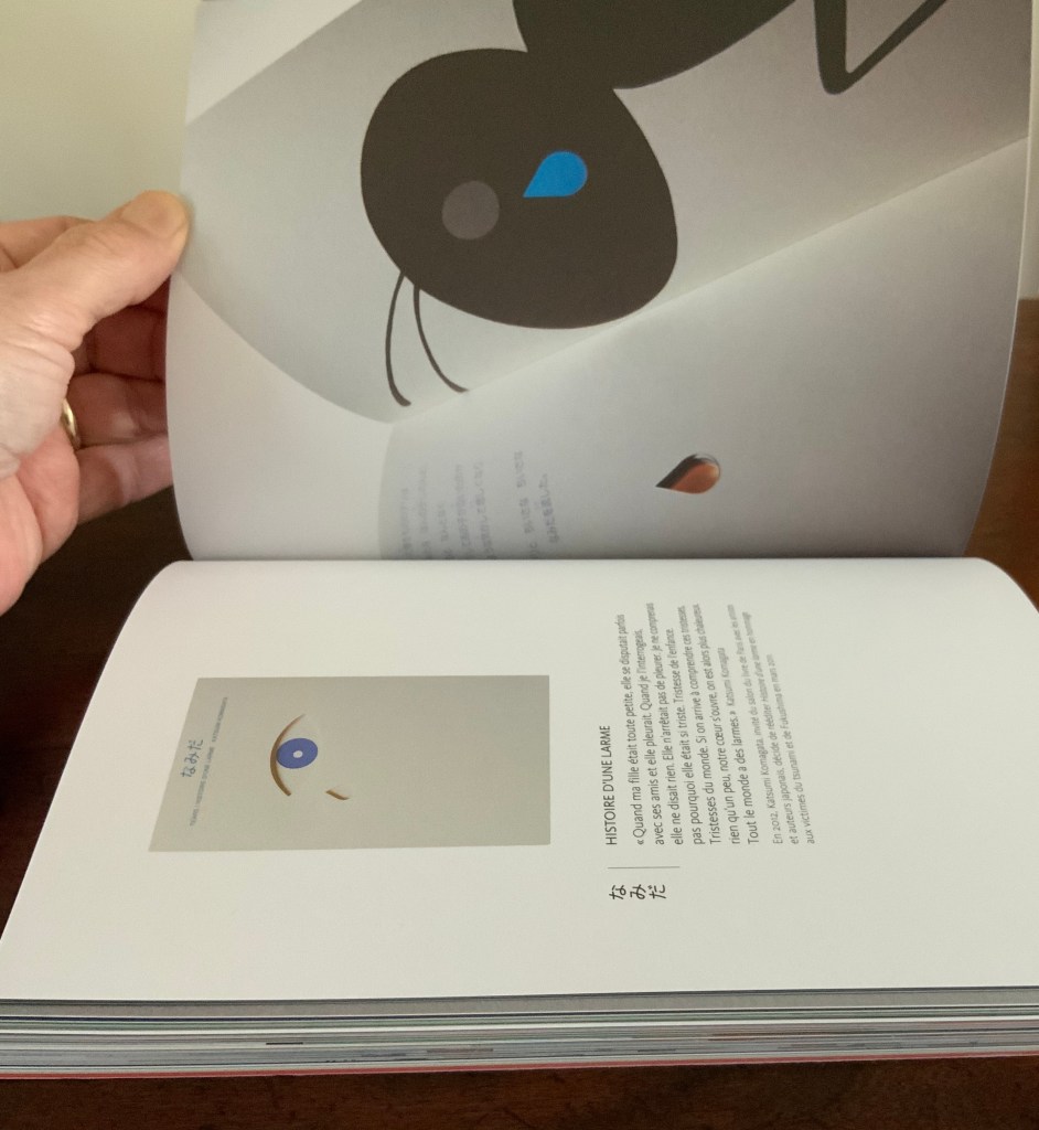
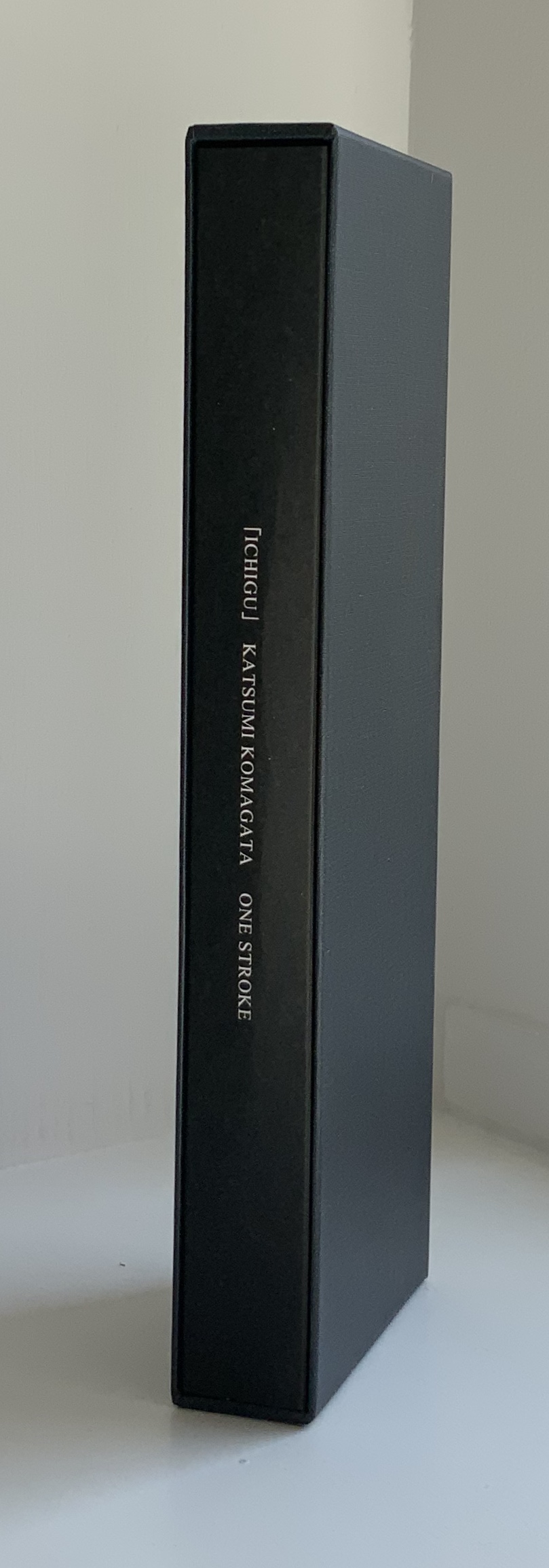
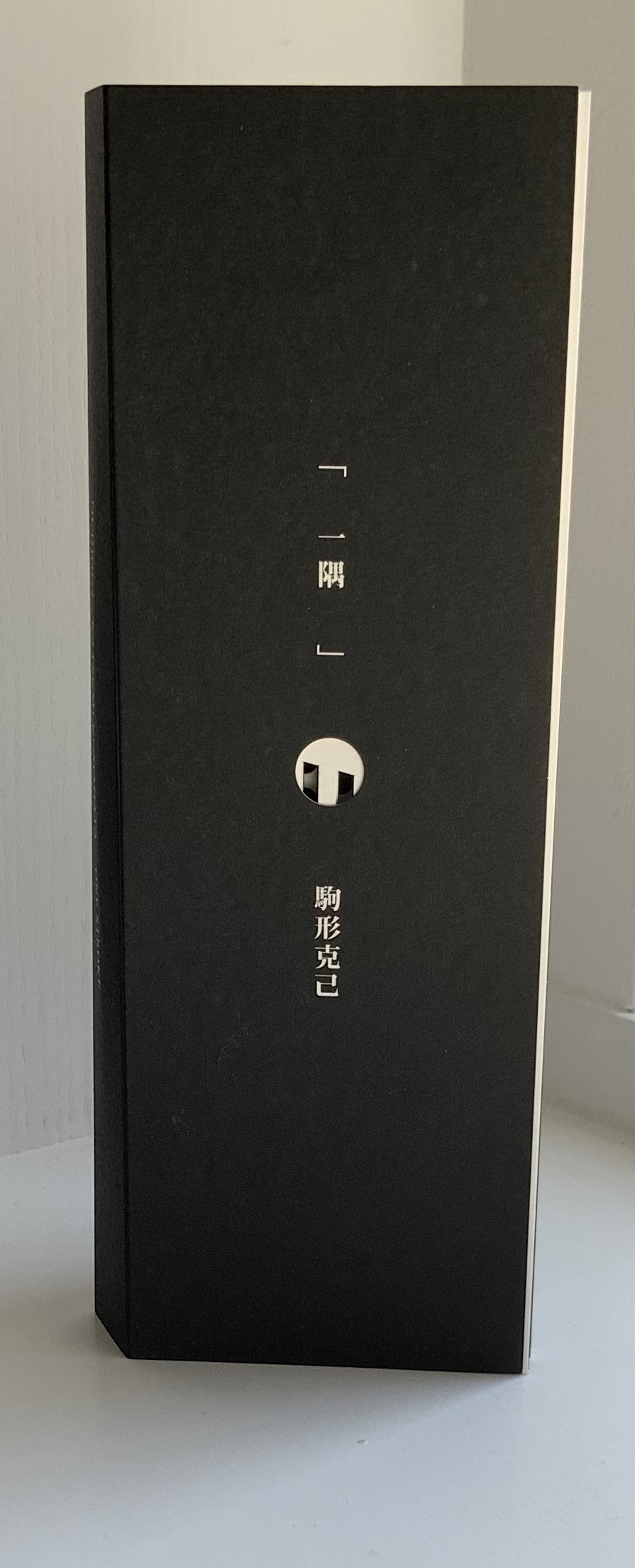
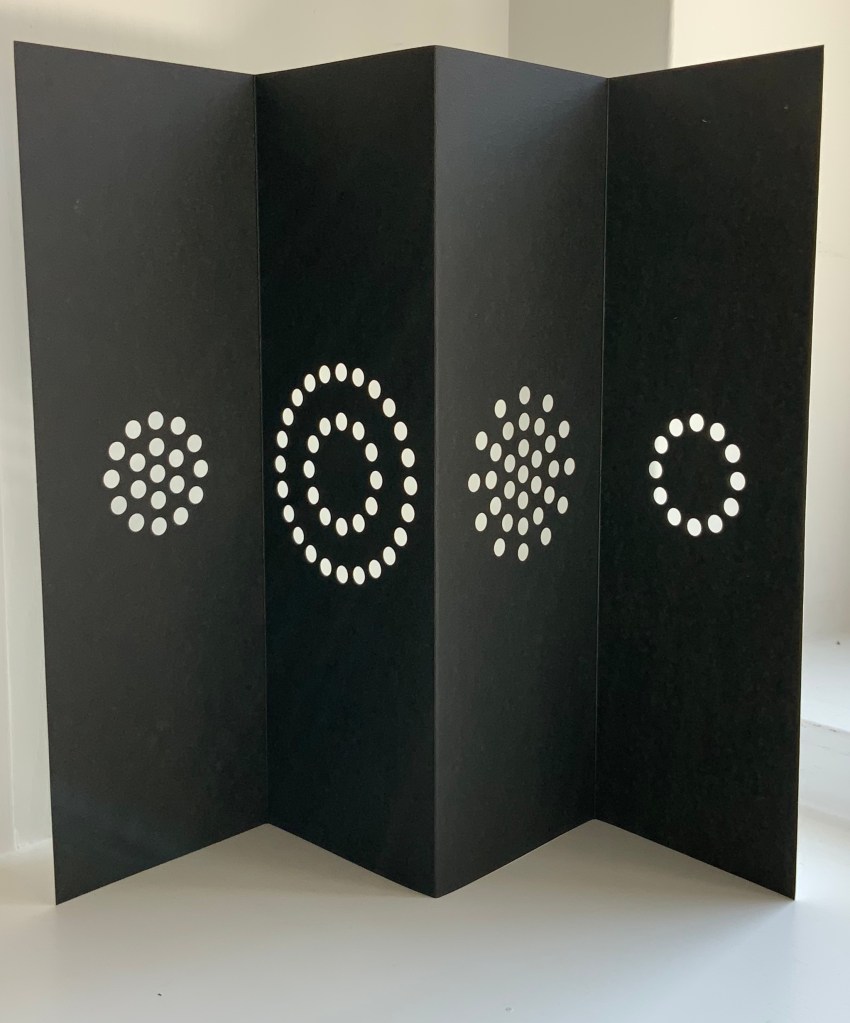
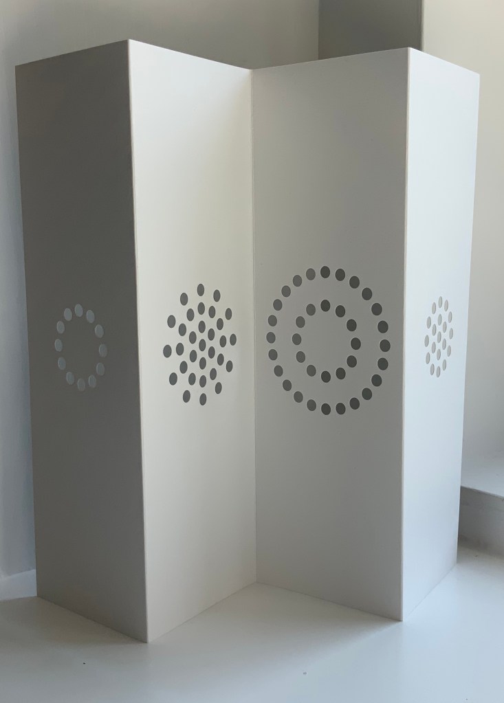
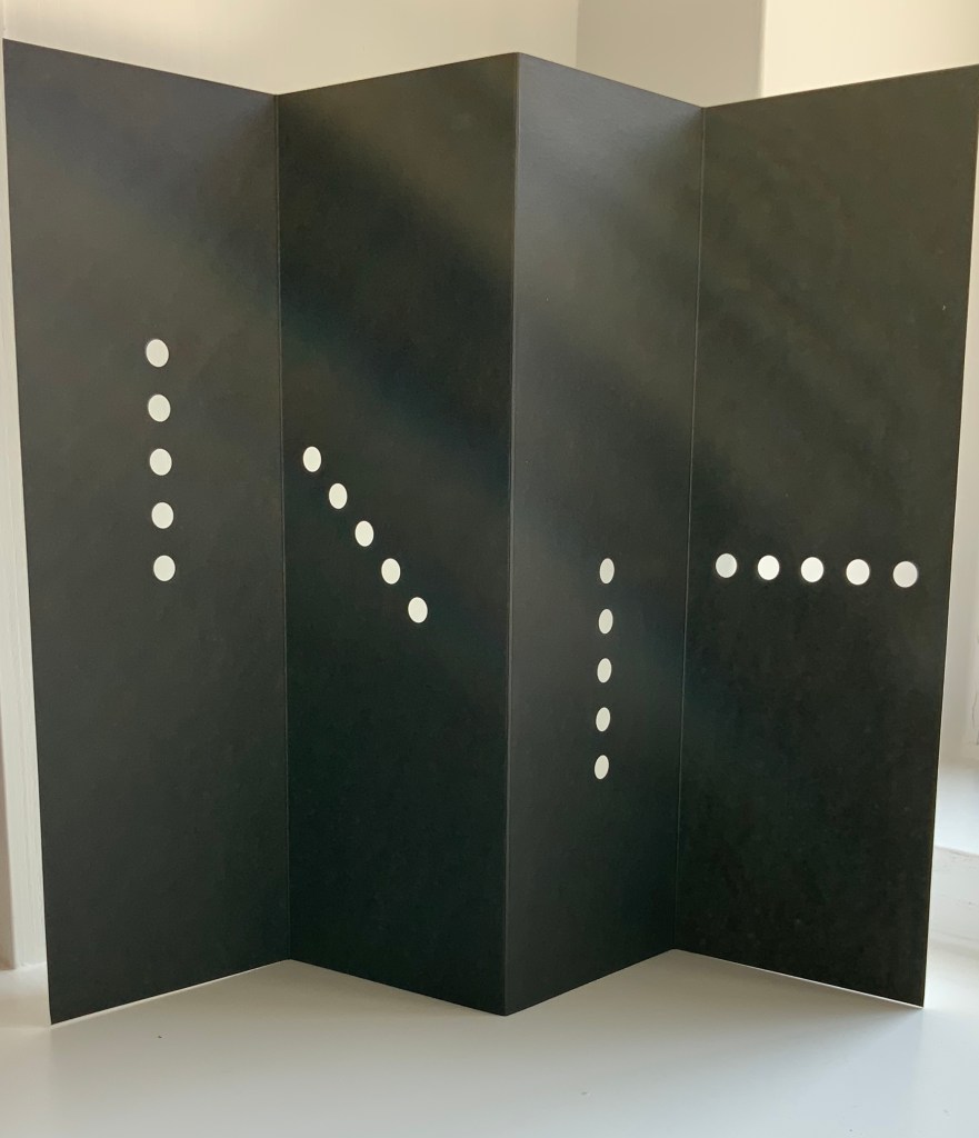
「Ichigu」(2015)
「Ichigu」(2015) Katsumi Komagata Eight 4-panel cards in a box. H235 x 77 x 28 mm. Acquired from One Stroke, 26 March 2020. Photo: Books On Books Collection.
In Buddhism, the word Ichigu is associated with a particular saying from the monk Saicho (767-822): 隅を照らす Ichigu wo terasu, which means “Light up one corner”. The word can also denote “landscape”.
One side of each card is screen printed black; the other remains white. The cards offer a wealth of views — individually and combined — landscapes that change with the light and from one juxtaposition to another. Komagata’s works have a philosophical and emotional profundity that makes them cherished and frequently revisited items in this collection.
Kember, Pamela, Ed. “Katsumi Komagata“, Benezit Dictionary of Asian Artists. Oxford: Oxford University Press, 2013. Accessed 22 March 2020.
Komagata, Katsumi. “Los libros nacieron” / “The books were born“, at Ilustratour 2014. Accessed 22 March 2020. (Komagata reads A Cloud at mark 7’02” and comments on Little Tree at mark 9’19”.)
Komagata, Katsumi. 26 April 2016. “When the Sun Rises.” Entry at Picturebook Makers. Ed. Pictus. Accessed 30 July 2023.
Abecedaries have a long lineage among calligraphers, typographers, children’s book authors and designers (including those of online books), fine press impresarios and book artists. From the world of libraries and museums, we have had abecedary lists and exhibitions such as Favorite Alphabets, (Library of Congress), Primers, etc. Post-1850 (Bodleian), Artists’ Alphabets and Ecstatic Alphabets/Heaps of Language (New York MoMA).
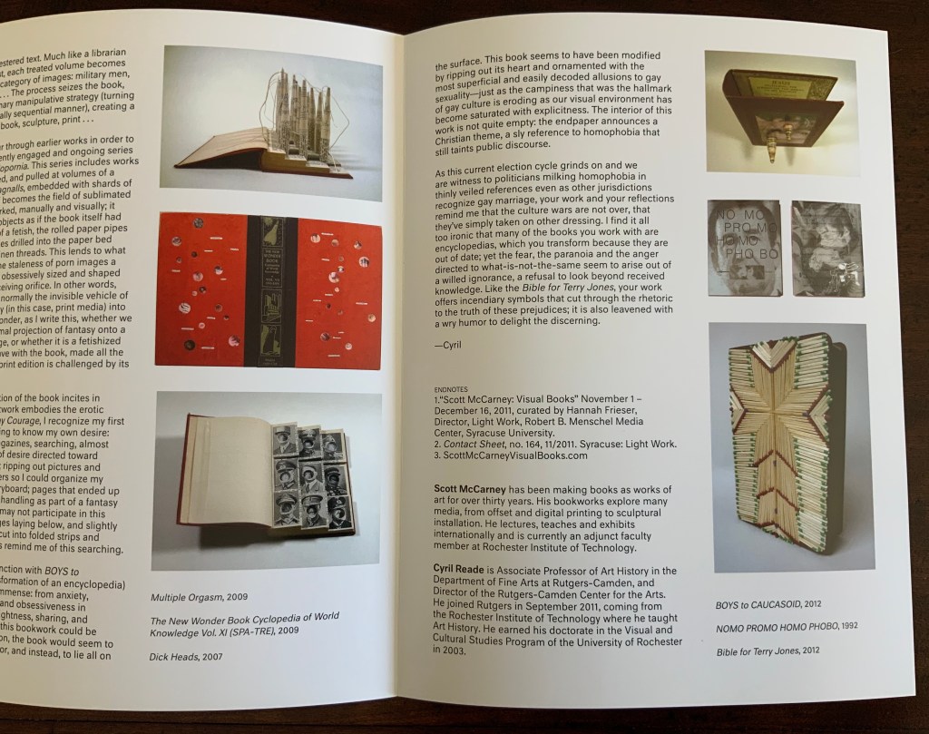
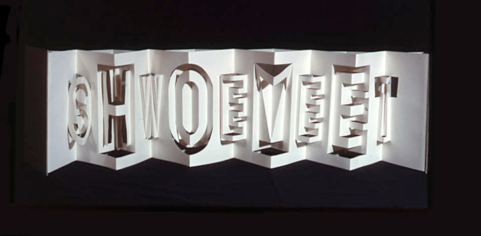
Since 1981, Scott McCarney has diligently extended the lineage through a series of alphabets designed in book form, where the letterforms depend upon the materiality of the book. The limits and possibilities of the book — its material, form and processes by which both can be handled — have inspired McCarney’s Alphabook series. According to the artist, all the Alphabooks (with the exception of numbers 3, 10 and 13) “are one-of-a-kind, and have not been shown much (if at all), so I’m not aware of them being illustrated anywhere“. Fortunately, Alphabook 1 (1981) appears in The Penland Book of Handmade Books: Master Classes in Bookmaking Techniques (2004), p.134, and Alphabook 9 (1985), which McCarney produced as a one-of-a-kind book of photograms in a residency at Light Work in 1985, appears in the Light Work Collection. McCarney describes his inspired manipulation of material, form and process in creating Alphabook 9:
I folded pop-up letterforms with unexposed photo paper in the darkroom and exposed it to directional light then developed, fixed, dried and flattened the prints. I made a book for Light Work for their collection that spelled out “LIGHTWORK” in the photogram alphabet, which can be seen in their database here: Light Work Collection / Artwork / Photogram Letter book [1133]. — Correspondence with Books On Books, 7 February 2020.
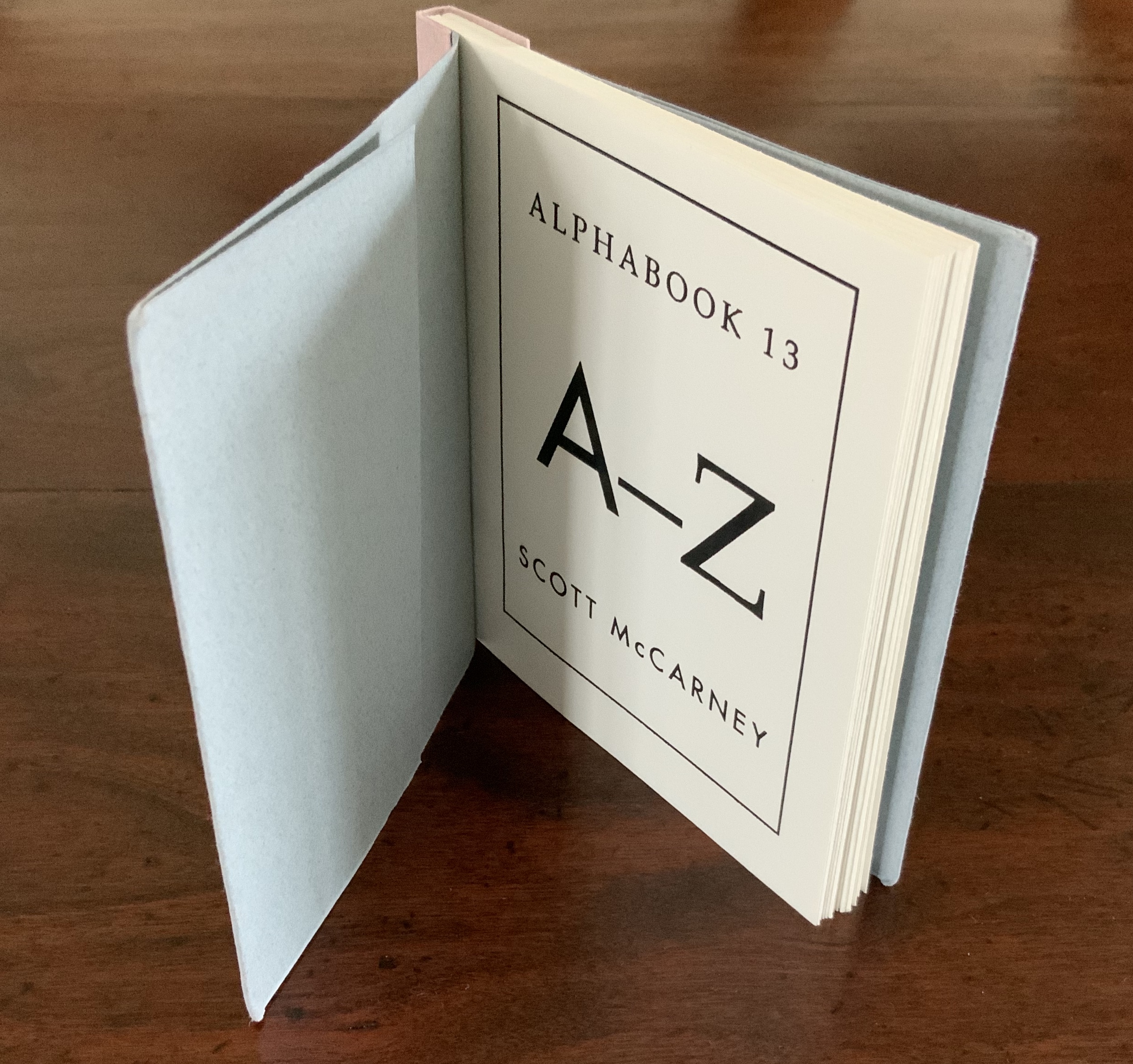
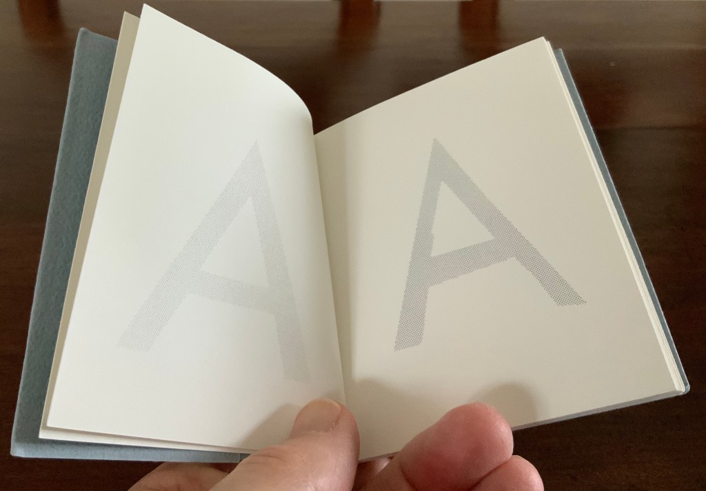
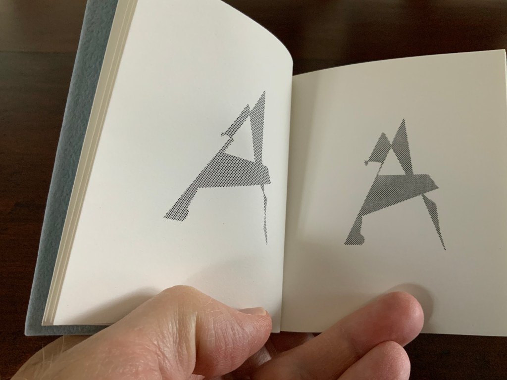
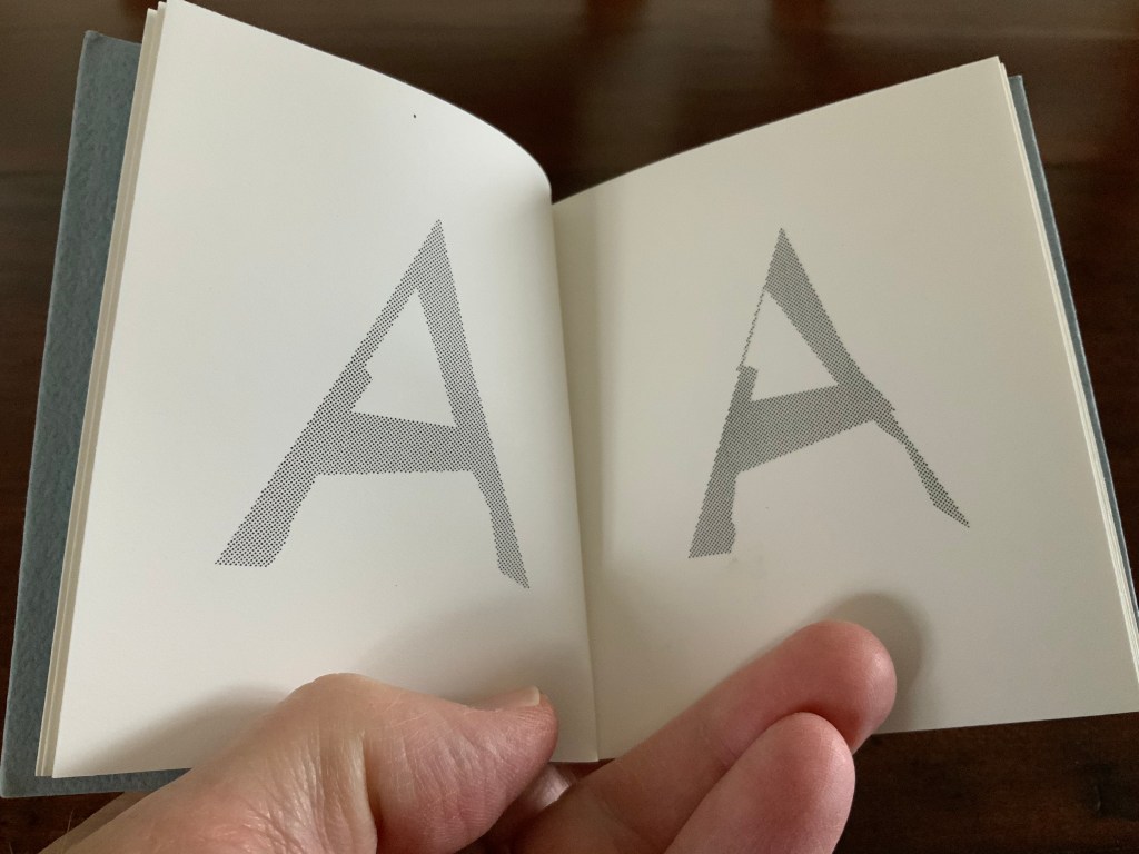
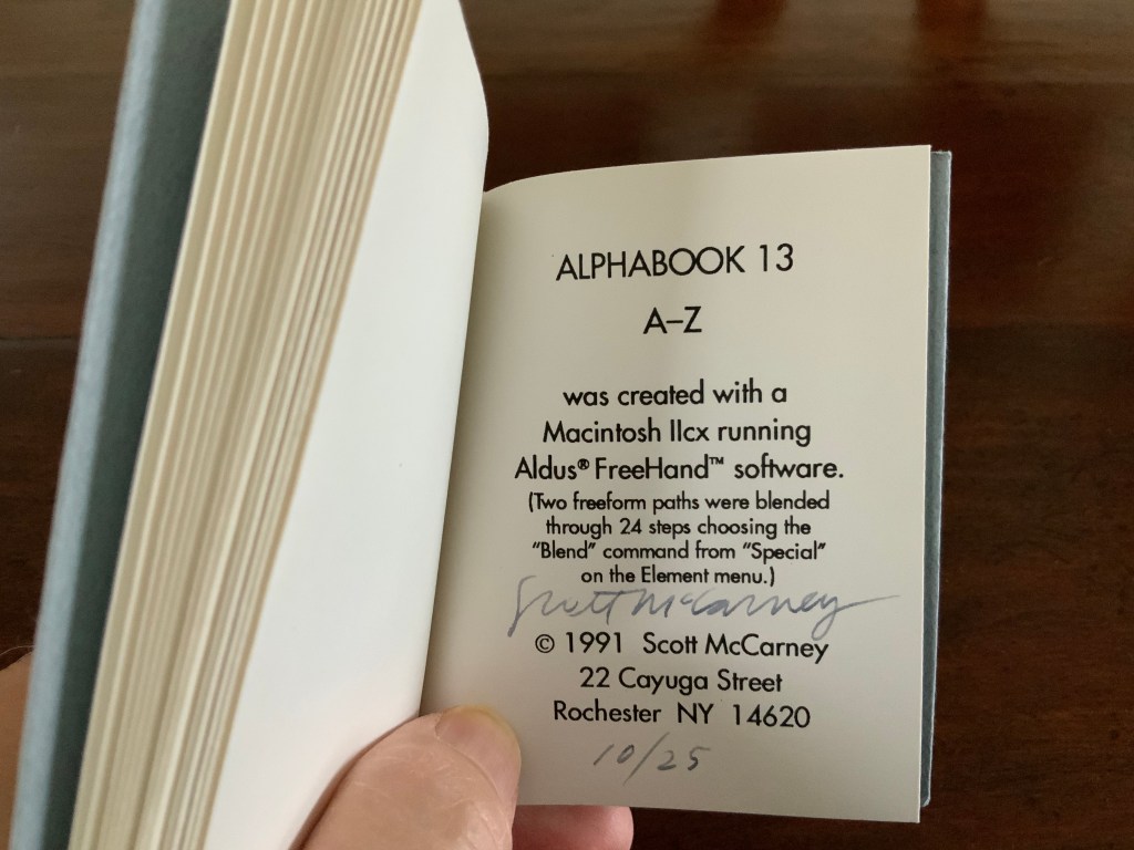
And WorldCat shows that Alphabook 13 (1991) can be found in at least three institutions. It was produced in an edition of 25 and consists of one volume (110 x 100 mm) in which the letter A gradually morphs into the letter Z.
With three of the series works now in the Books On Books Collection, the lack of illustration can be somewhat remedied.
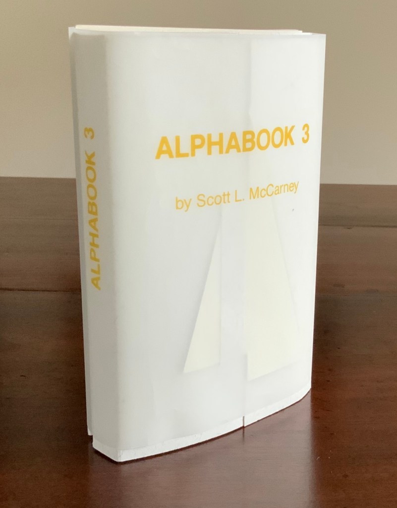
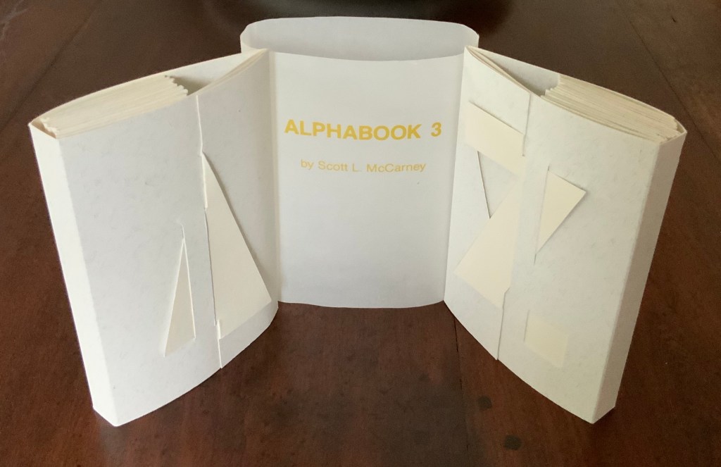
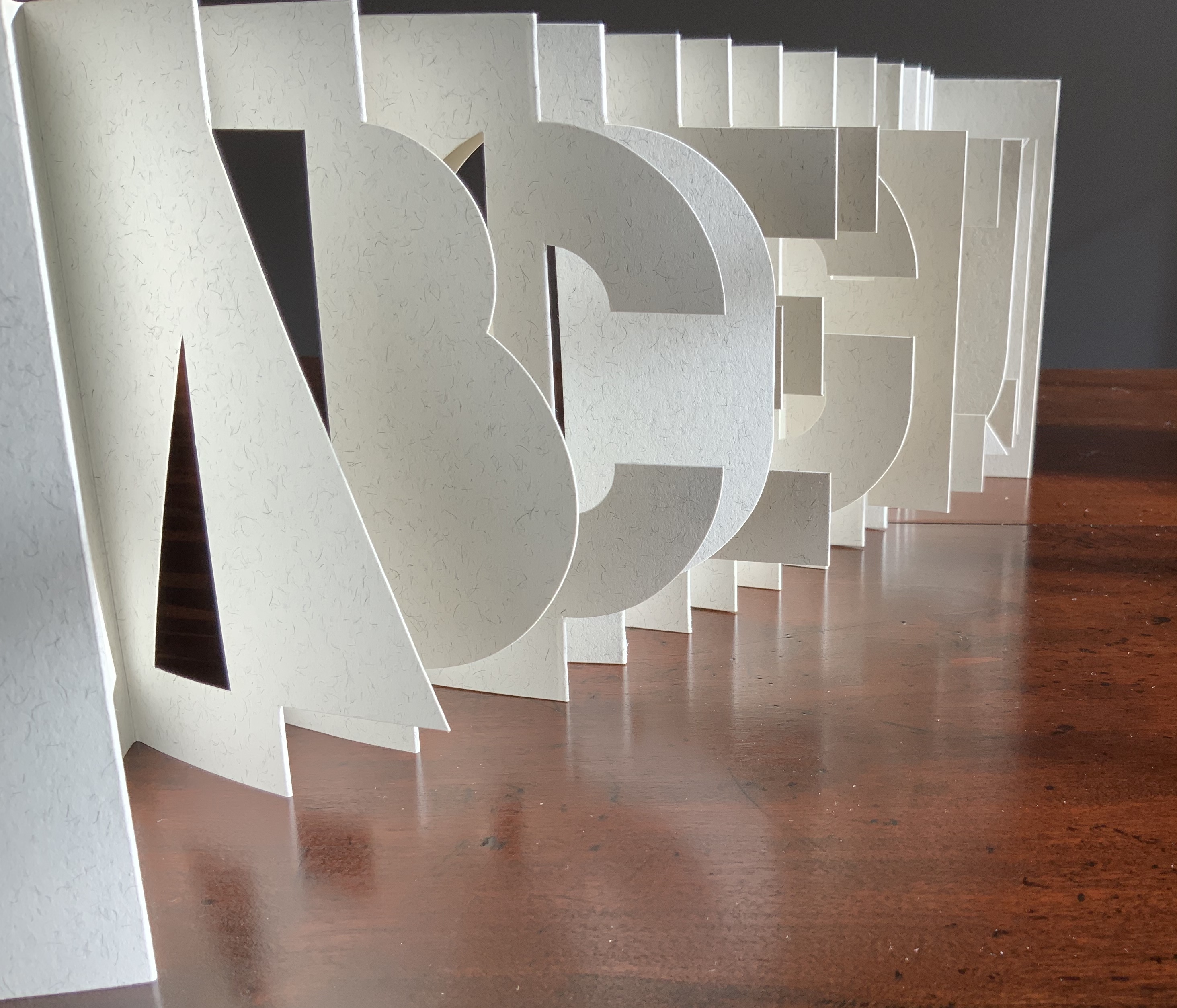
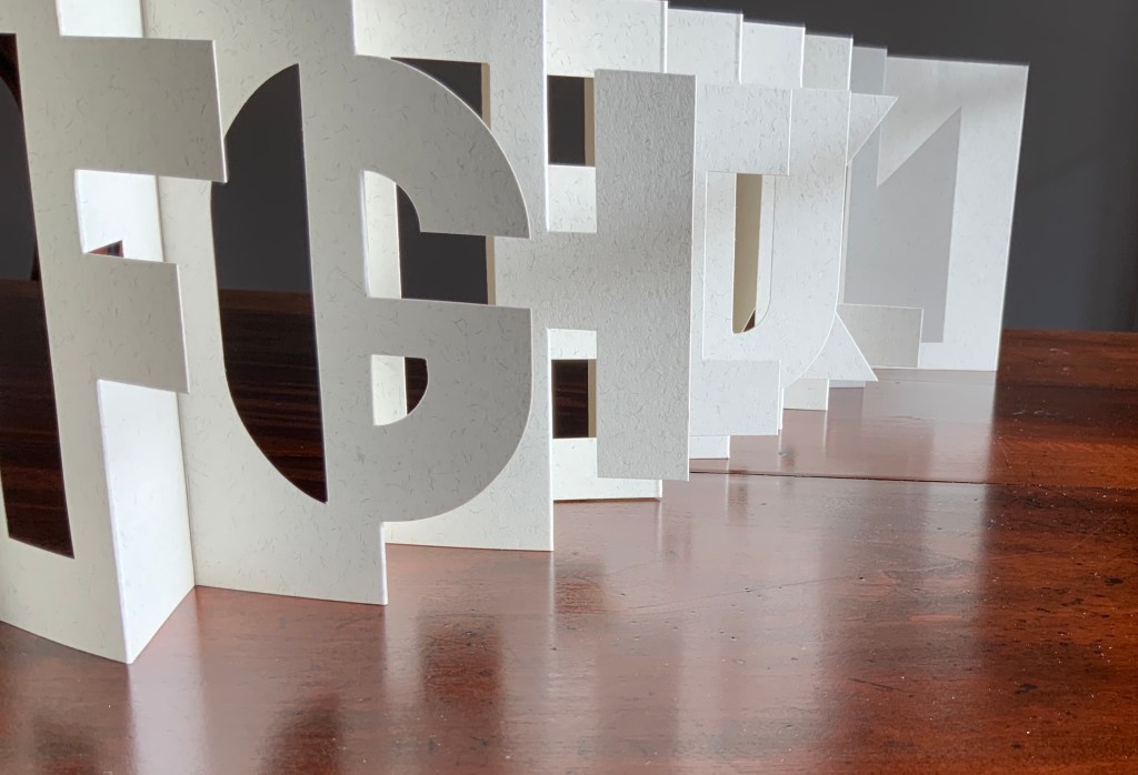
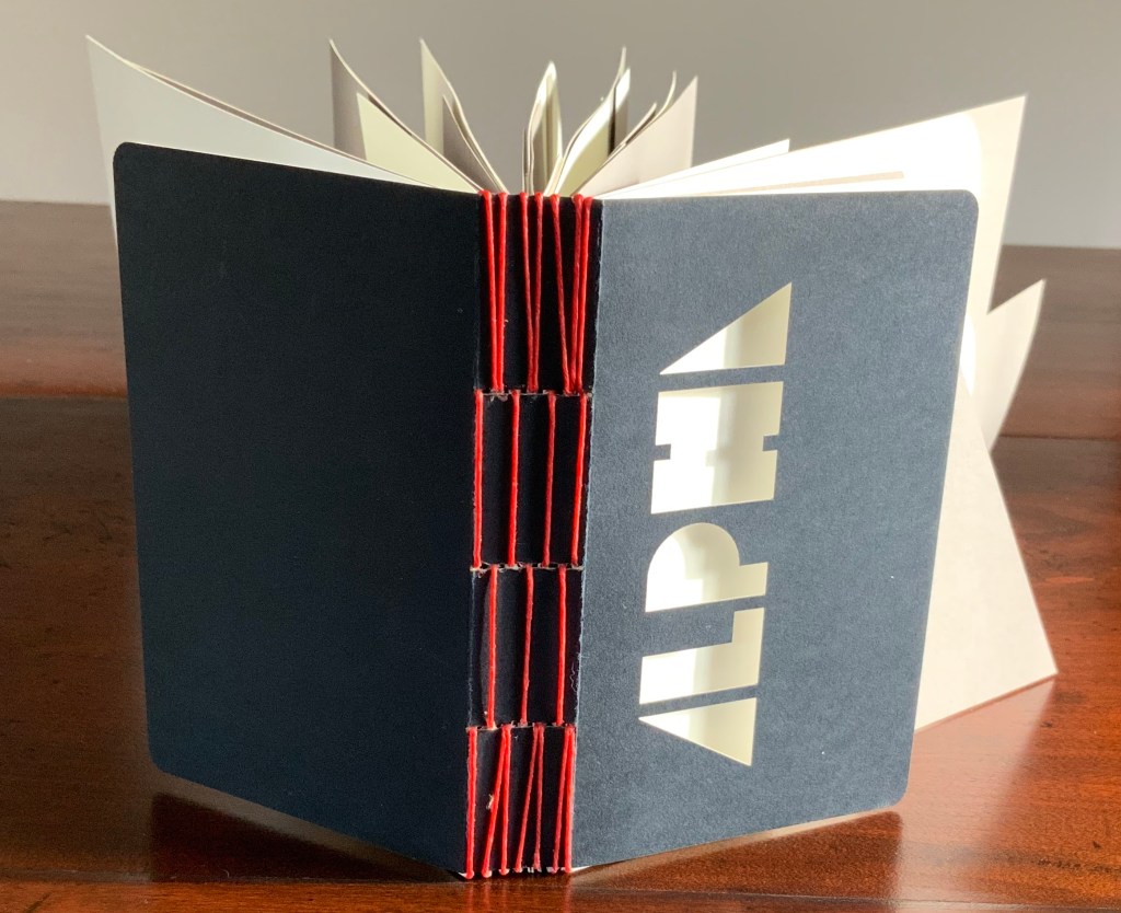
Alphabook 3 (1986)
Alphabook 3 (1986) Scott McCarney Two volumes, each of 26 unnumbered die-cut pages and wrapped in translucent belly band. Edition of 300, signed but not numbered. Each volume, closed: H151 x W104 mm; open: H151 x W2195. Acquired from the artist, 14 August 2017. Photos: Books On Books.
Photos: Books On Books.
Unlike most others in the series, Alphabook 3 is a multiple of 300 copies.
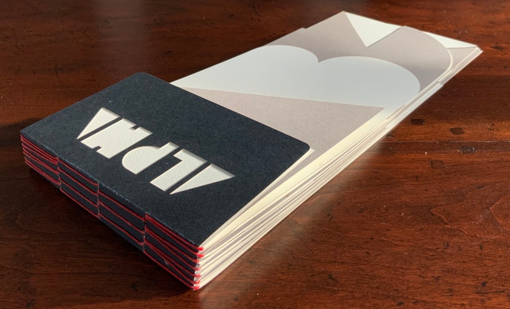
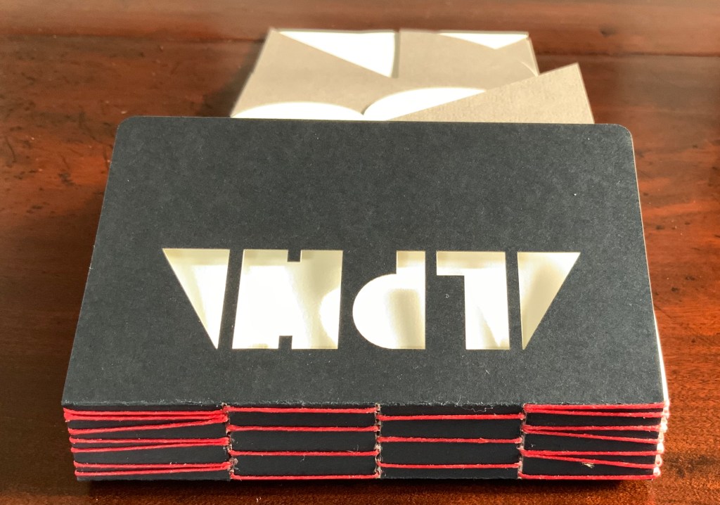
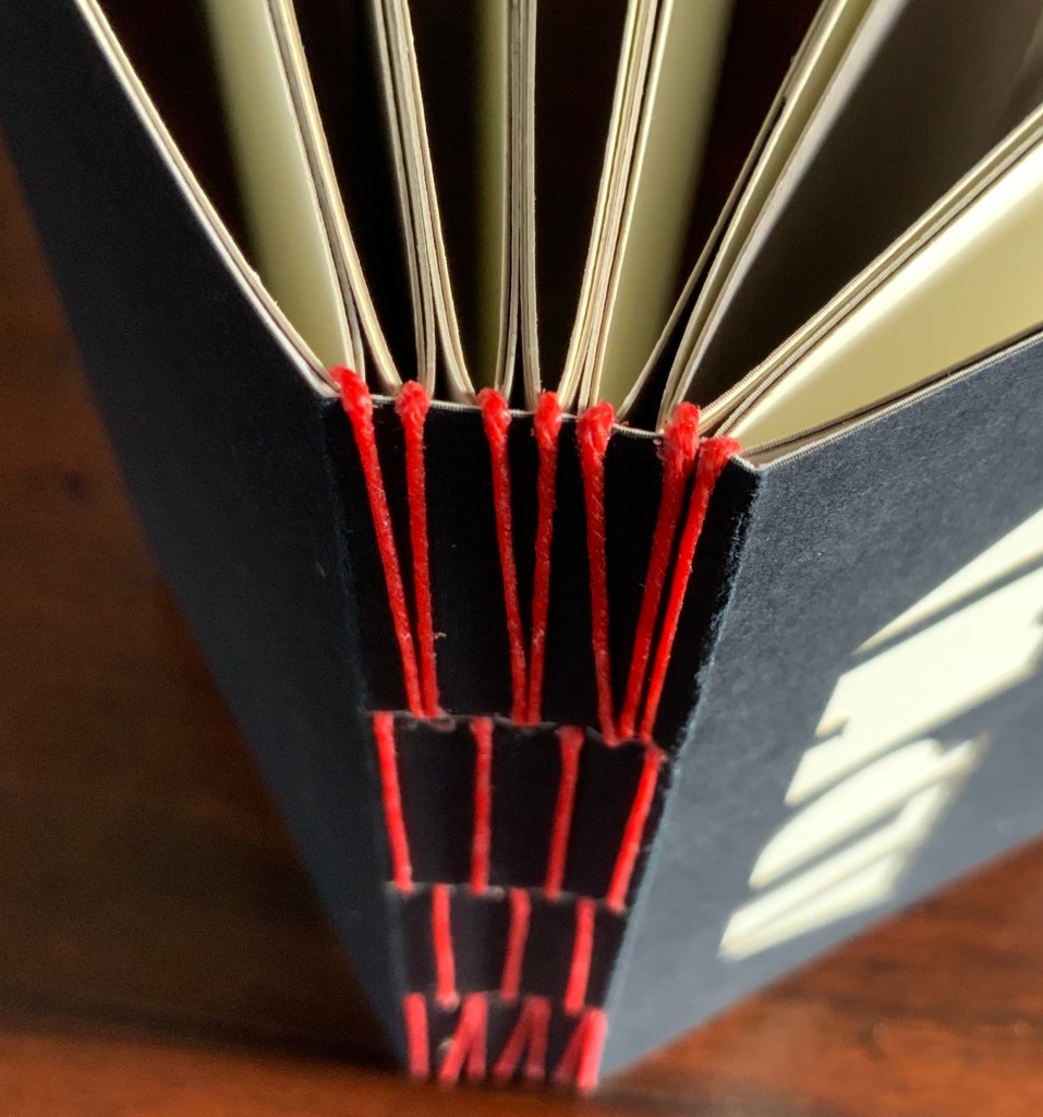
Alphabook 10 (2015)
Alphabook 10 (2015) Scott McCarney Laser cut duplex papers hand bound with long stitch through slotted cover; housed in archival box. 56 unnumbered pages. 130 x 310 mm; in box 140 x 310 x 30 mm. Edition of 14, of which this is #11. Acquired from the artist, 23 January 2020. Photos: Courtesy of the artist
The codex form receives McCarney’s playfulness in Alphabook 10. The artist writes:
… The fore edge of each page is cut into geometric forms from black, white and cream toned duplex stock (two sheets of different colored paper laminated together). … Produced during a residency at The Institute for Electronic Arts, a high technology research studio facility within the School of Art and Design, NYSCC, Alfred University, New York, committed to developing cultural interactions spurred by technological experimentation and artistic investigations.
Scott McCarney, Visual Books. Accessed 9 February 2020.
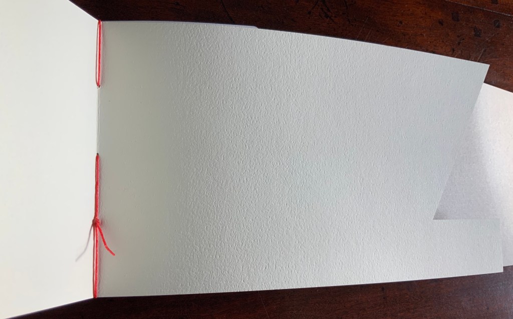
The handling of the cover and first page draw attention to the role that empty space, light and stock color will play throughout the book.
Photos: Books On Books.
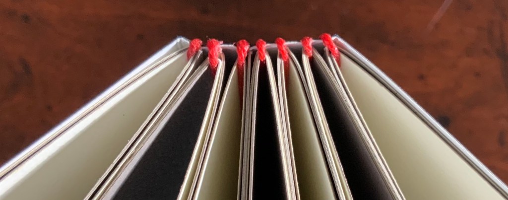
The binding warrants a closer look as well. Outside and inside, the red thread, its pattern and function stand out.
Photos: Books On Books.
And notice how the thread calls out the textured surface of the paper.
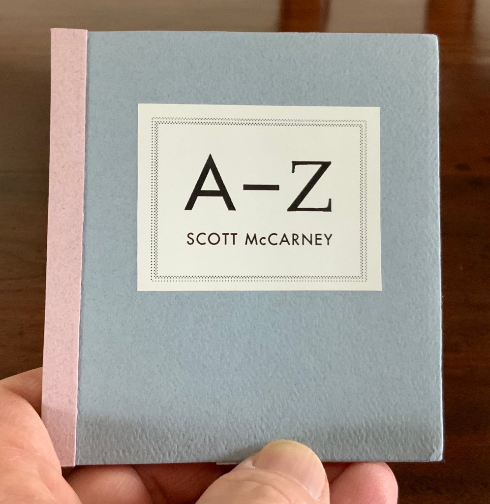
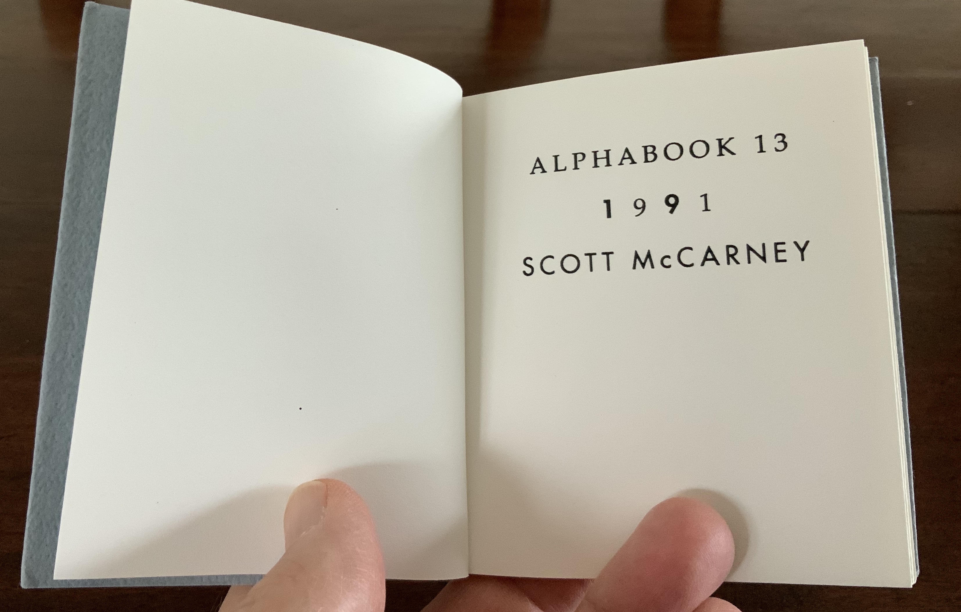
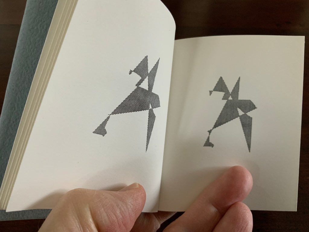
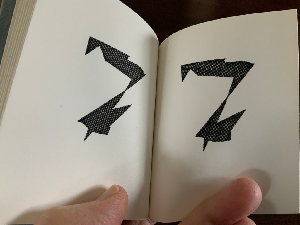
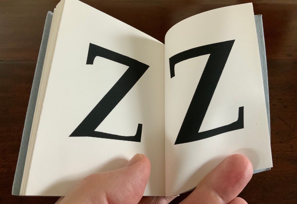
Alphabook 13 (1991)
Alphabook 13 (1991) Scott McCarney Flipbook, created with a Macintosh IIcx running Aldus® FreeHand™️ software. H100 x W92 mm. 32 pages. Acquired from the artist, 15 February 2020. Photo: Books On Books Collection.
Photos: Books On Books Collection.
Photo: Books On Books Collection.
In correspondence with Books On Books, McCarney explains that the Alphabooks’ mismatch of numbering and chronology stems from discrepancies between dates of conception and opportunities to execute. This little flipbook was conceived and executed as a photocopy edition of 25 in 1991; of more importance here though is the coming together of computer-based typesetting, book structure and pun. As we know, the shortest distance between A and Z is not B to Y, but the points in A reconfigured into Z across 24 flipping pages. It is interesting to compare this transformation with Claude Closky’s calligraphic version De A à Z (1991).
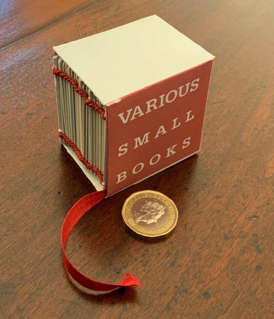
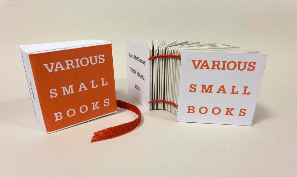
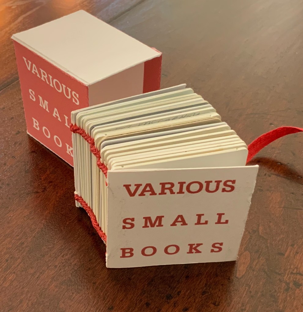
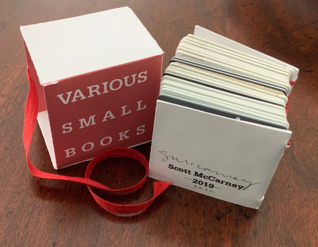
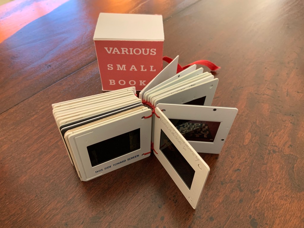
Various Small Books (2019/20)
Various Small Books (2019/20) Scott McCarney Photo: Books On Books.
Various Small Books (2019) Scott McCarney Photo: Courtesy of the artist.
The 2019 edition was conceived for a fundraising exhibition at Artspace in Richmond, VA. Both the 2019 and 2019/20 editions consist of 35mm slides documenting various of McCarney’s bookworks. Consisting of different slides, the two editions of Various Small Books are unique, and since the slides are bound together and cannot be projected, the images of the books appear small indeed.
Various Small Books (2019/20) Scott McCarney Photo: Books On Books
Courtesy of the artist, the inclusion in Various Small Books (2019/20) of slides documenting Alphabook 4, Alphabook 6 and Alphabook 10 makes the 2019/20 edition particularly apropos for the Books On Books Collection.
“Scott McCarney, Special Edition”, Contact Sheet, No. 164 (Syracuse, NY: Light Work, 2011). Exhibition catalog, which kicked off the conference “Photographers + Publishing”, 3-5 November 2011, Light Work and Syracuse University.
Home Sweet Home (1985)
Home Sweet Home (1985) [Not in collection] Scott McCarney Paper in accordion binding with decorative and marbled paper-covered boards and paper-covered slip case. 11 5/8” x 9 1/2” x 1 3/4”
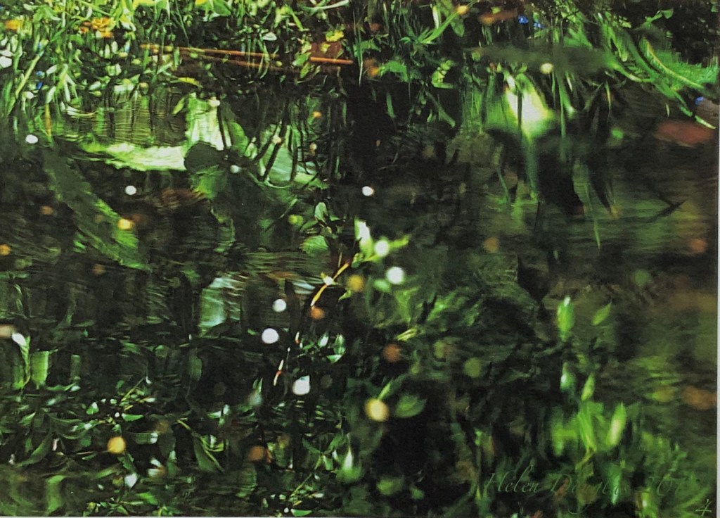
The Pond at Deuchar (2011) Helen Douglas Hand scroll, printed on Chinese Xuan paper, ultra chrome inks. Silk ribbon edged. 14 metres x 270 mm. Edition of 4. Photos: Weproductions.
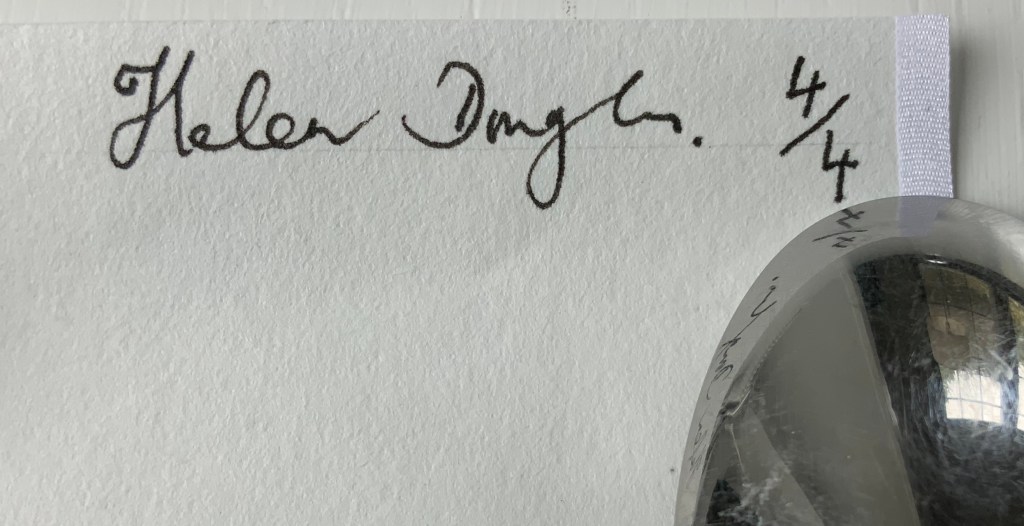
Details from end of The Pond at Deuchar (2011) Edition of 4, of which this is #4. Acquired from the artist, 18 February 2019. Photos: Books On Books.
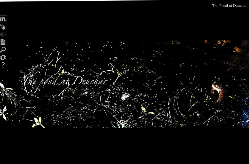
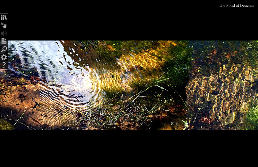
The Pond at Deuchar (2013) Helen Douglas Online version produced by Armadillo Systems. Screen captures: Books On Books.
Shortly after orchestrating the series of workshops Transforming Artist Books (2012), during which Helen Douglas created the digital version of The Pond at Deuchar (2011), art historian Beth Williamson marvelled at how the gestures of digital reading affect “our thinking as our (digital) hand navigates around the screen and thinks through the work”. That phrase “as our hand thinks” is magic in its aptness for all of Helen Douglas’s works. Helen Douglas is a book artist who makes our hands think. But what does that mean? Consider these three excerpts:
[t]he hand does not only grasp and catch, or push and pull. The hand reaches and extends, receives and welcomes — and not just things: the hand extends itself, and receives its own welcome in the hands of others. The hand holds. The hand carries … [e]very motion of the hand in every one of its works carries itself through the element of thinking, every bearing of the hand bears itself in that element. All the work of the hand is rooted in thinking.
Martin Heidegger, What Is Called Thinking? trans. J. Glenn Gray (New York: Harper Perennial, 19 68). P. 16.
… the digital hand is […] a version of what the artist’s hand, the craftsman’s hand, the poet or scholar’s hand, and the lover’s hand has always been: a means of marking, touching, selecting, interacting, molding, expressing, and refusing that remains essential to human thinking, even when that thought takes place increasingly in an immaterial environment ….
When talking about her art and the “breadth” or ”span” of the spreads and their “flow” — as she did at the London Book Fair in 2013 and the British Library in 2020 — Douglas gestures in ways that evoke those words of Heidegger, Miller and Diconson. When experiencing The Pond at Deuchar — whether in its scroll edition or its digital version — the reader/viewer makes similar gestures — spreading arms wide, sweeping with the hands; or tapping, pointing, pinching, spreading and swiping with the fingers.
In its scroll edition and its digital version, The Pond at Deuchar draws the reader/viewer into two different literacies but with a continuity between them that does not yet exist between reading a print book and reading its ebook version. Are hand and eye more allied when processing the visual whether on paper or screen than when processing words? Is The Pond at Deuchar a special case because unrolling a scroll and scrolling across a screen are more gesturally similar than turning pages in a codex format and tapping a screen?
Douglas’s own description of the next work Between the Two (1997) brings this question about visual and textual literacies front and center.
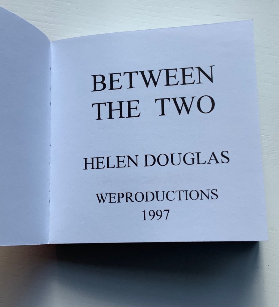
Between the Two (1997)
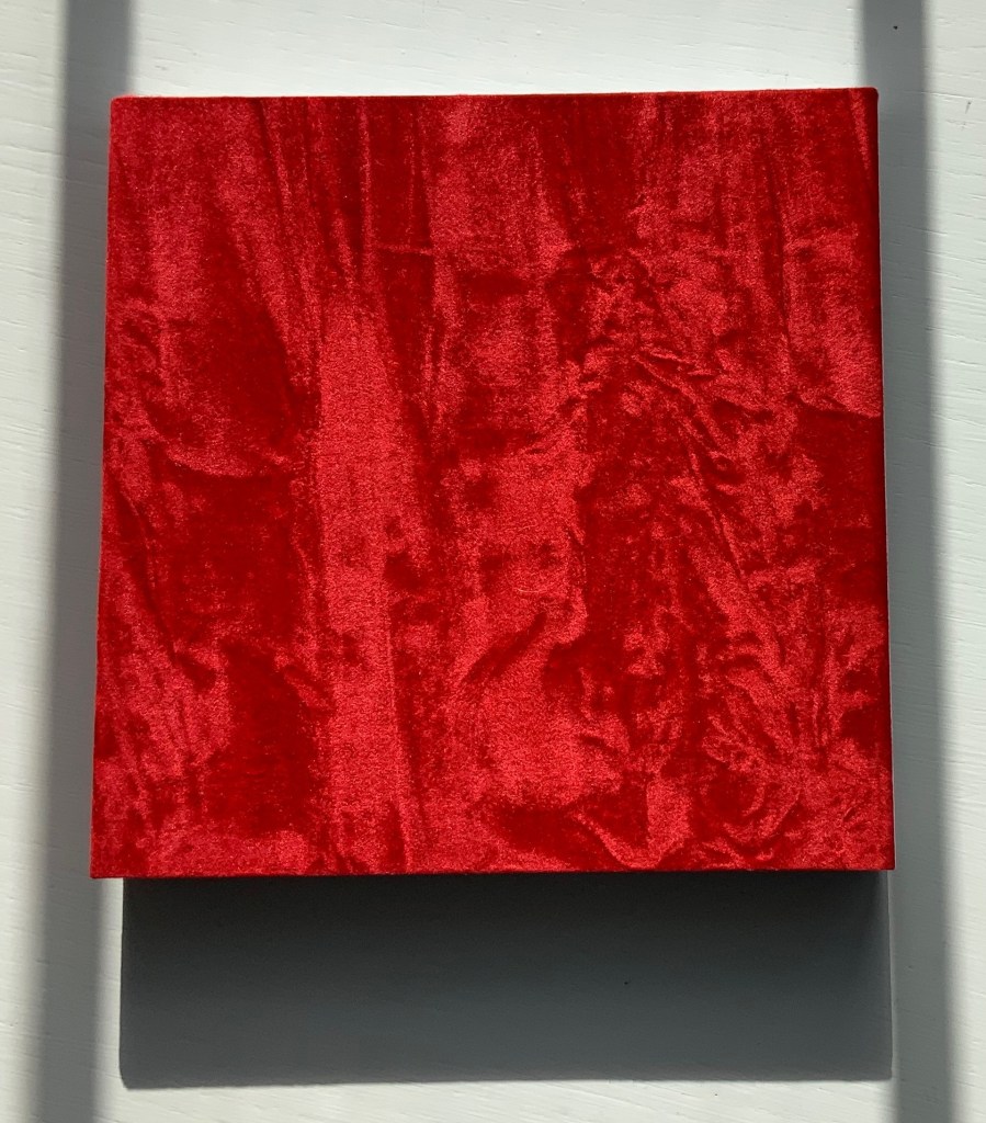
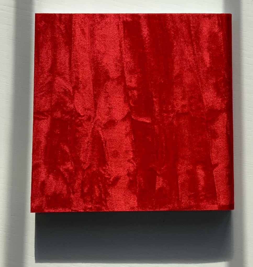
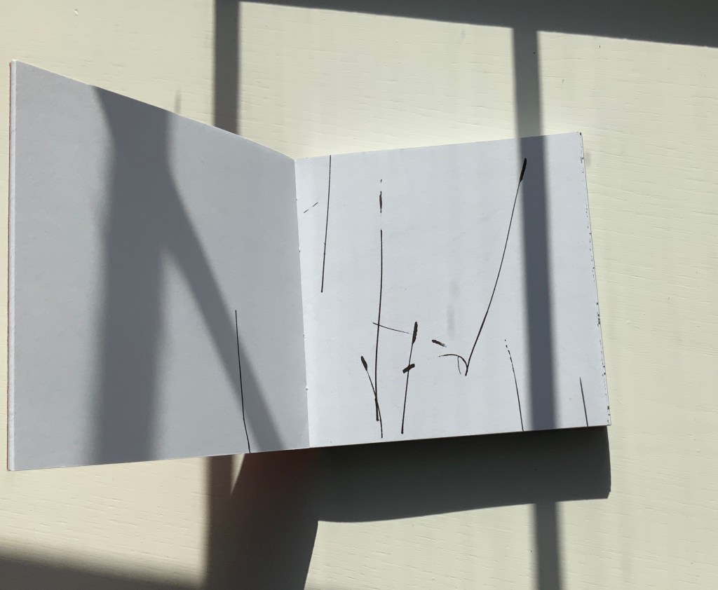
This bookwork is constructed to unravel across the open spread and around the edge of the page to express one continuous visual narrative. It begins with sparse photographic renderings of grasses as black line on white, progresses into a softer tonal sequence embodying flight and finally, in the latter part of the book, develops an arabesque dance of tendrical peas, as light on dark, leading to a flowering of the book. Black and white throughout, the book is bound in scarlet crushed velvet.
Between the Two (1997) Helen Douglas Offset, 130 x 130 mm, 168pp. Acquired from the artist, 29 November 2018.
Reading “around the edge of the page” in Between the Two is a “hard read”. Most turns from recto to verso effect a sense of continuity with stalks, fence, tendrils, etc., wrapping over the edge into the verso page; others do not. The codex format inherently presents this challenge. The edge of the page is a scant plane, although the earlier work Water on the Border (1994) exploits it well (see below). There are other visual strategies that work. Think of Michael Snow’s Cover to Cover (1975) and consider the following work from the same year.
Chinese Whispers (1975)
Douglas has created numerous visual narratives in the codex format, but none of them have been reproduced in a digital format. If Chinese Whispers — one of her first books in partnership with Telfer Stokes — were delivered in a “tap-to-turn-the-page” digital format, would a sense of continuity between the different literacies occur or diminish? The tightness of the binding of Chinese Whispers makes full appreciation of the spreads and flow difficult, but on the other hand, the meeting in the gutter of the two photos on each double-page spread is essential. Say that two copies of the book were unbound, the “freed” double-page spreads would have to be displayed somehow in a way that still captures that meeting in the gutter. On a gallery wall? As Clive Phillpot has pointed out, to do so with Douglas’s work is to destroy what is going on in moving across and turning from one double-page spread to the next. A digital version would need to be fiendishly quirky in its own way to find a parallel semantic and artistic solution to its codex counterpart’s effects.
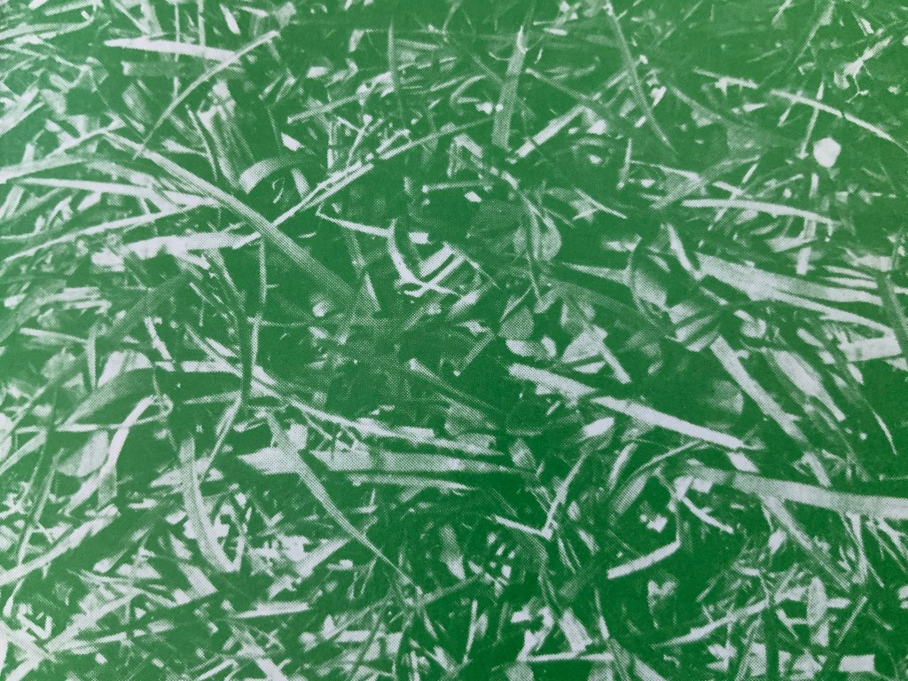
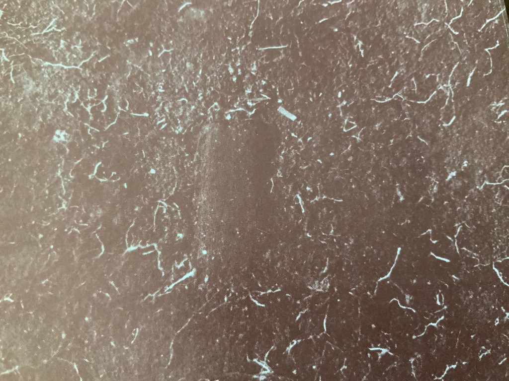
The front cover of Chinese Whispers (1975) shows lush green grass in a photo that bleeds to all four edges. Flip the book over and find another edge-to-edge photo showing the dirt and roots beneath the front cover’s patch of grass.
Chinese Whispers(1975) Helen Douglas and Telfer Stokes Offset, 110 x 180 mm, 176pp. Acquired from the artist, 29 November 2018. Photos: Books On Books.
Doing this is a bit like jumping to the end of a detective story; it is literally jumping to the end of the game of visual Chinese Whispers to which the book invites us. Decades after the book’s appearance, Brandon S. Graham revealed some of the behind-the-scenes process, driving home the filmic character of the book. In correspondence with Books On Books, Douglas confirms the “absolutely continuous narrative” of Chinese Whispers, emphasising how the artists would “come up with a concept and starting point together and then … would go backwards and forwards“ (20 March 2020).
Like the give and take of a word game, this book was scripted, planned page by page and section by section. Stokes would suggest a starting point and a concept, Douglas would interpret the idea slightly differently, add to it and relay it back to Stokes. Stokes would run with the evolved idea and it would start again. In this way the book evolved as an honest representation of the collaborative process that yielded it. The photography began once they had the whole object planned. … For the cover image, Douglas and Stokes used a spade to cut a rectangle of sod to the exact dimensions of the finished book and took a photo.
Brandon S. Graham, “Chinese Whispers“, Fiction Doldrums, 26 July 2011. Accessed 9 December 2018.
The visual narrative takes us from trimming the overgrowth from the outside of a derelict cottage, entering it and starting the process of building a corner cupboard, populating its shelves with a breadbox, a coffee pot and many other objects that lead from one element of the narrative to the next. Packets of seeds lead to a cabbage and pea pod. A bunch of berries leads to jam in a jar. Toward the end, a pair of scissors and sheet of paper lead to a cut-out butterfly whose wings gradually close along with the two “wings” of the corner cupboard, leaving us in the dark with a double-spread of black pages. Below are close-ups of the front and back covers. Notice the impression in the dirt-side photo? It looks like a rectangle the trim size of the book; whether it is or not, Chinese Whispers is a bookwork of continuous page-turning inside (and outside) jokes.
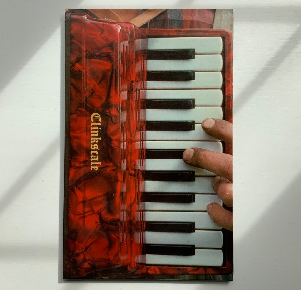
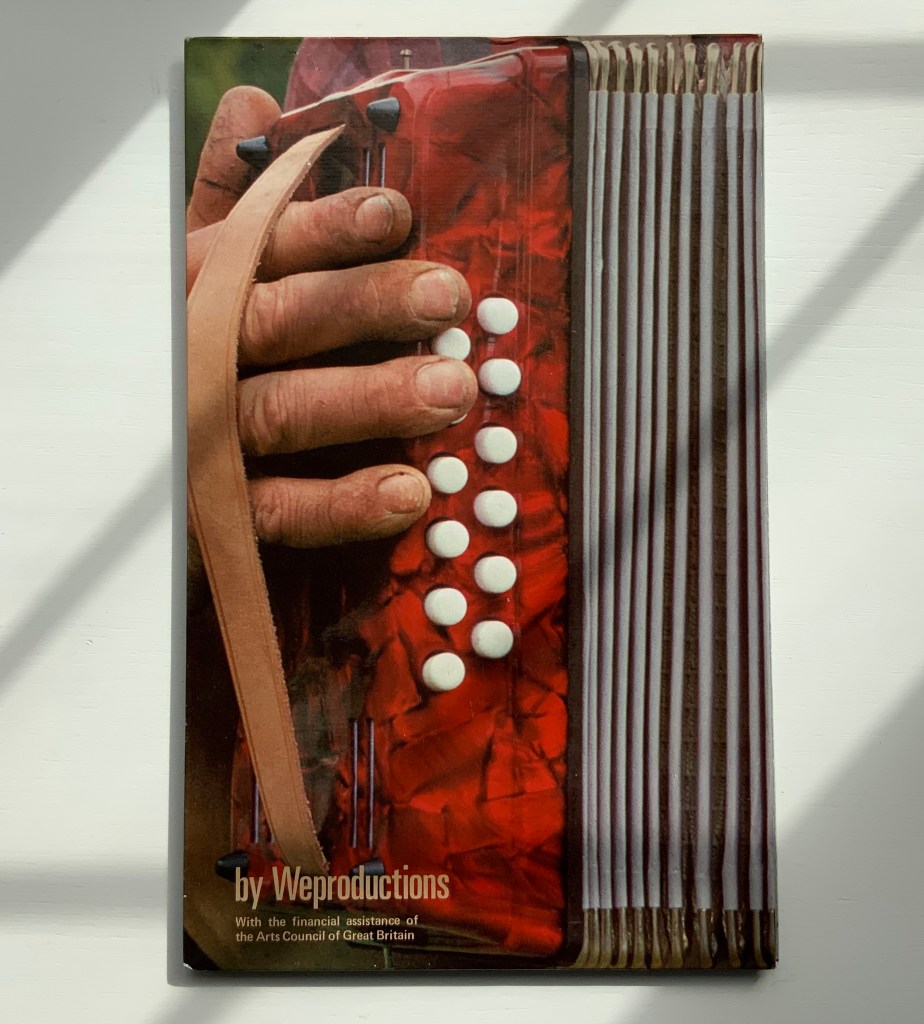
Clinkscale (1977)
“Clinkscale” is the name of a company that specialised in the musical instrument photographed by Douglas for the bookwork of the same name. Perhaps every book art collection has a one-note joke. Clinkscale is almost that for the Books On Book Collection. Brandon S. Graham defended the work against the characterisation years ago:
It would be easy to dismiss this as a clever one liner: accordion with an accordion fold format. But on closer examination there is more going on. Over top of the accordion body a band of atmospheric and biographical information can be observed: the blue sky, the green of the field, the bright spring sunlight, the work shirt and threadbare work coat. When one looks closely at Telfer’s hands and nails, particularly the thumb on the back cover, one can see a criss-cross of the shallow cuts that have been stained with dirt. All of these details speak of a place and a time and a situation. They are a record of standing in a field in rural Scotland on a crisp spring day, a record of the work that Telfer’s hands are performing on the Mill. These details ground the work and tie the work to a person at a moment in time. It is a record, a document.
Taken in this context there is another layer of meaning evident in Clinkscale: the idea of breath, air, anticipation, rejuvenation and renewal. As a viewer holds the book with the bellows closed the viewer sees Telfer’s fingers poised. This builds anticipation of a motion and perhaps a sound. As the book is opened the accordion inhales, the bellows expand and the rush of air stirs the spring grass. The hands are those of a workman. The workman is standing in a field with an accordion, taking a break; taking a breather. The sea of green spring grass is symbolic of rejuvenation and renewal.
Brandon S. Graham, “Telfer Stokes”, FictionDoldrums, 8 April 2011. Accessed.17 March 2020.
Clinkscale (1977) Helen Douglas and Telfer Stokes Accordion binding, two hardboards joined by a single leaf; full colour photograph commercially printed. H278 x W174 mm (closed), W1708 mm (open). Acquired from Douglas, 29 November 2018.
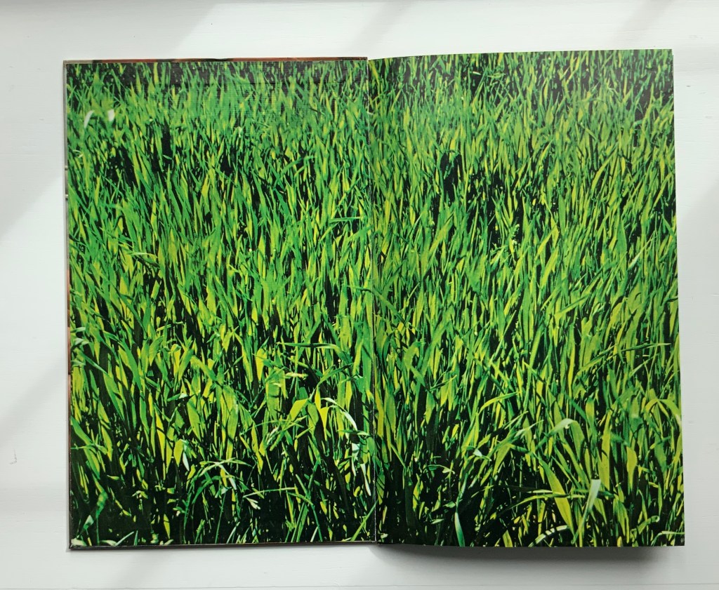
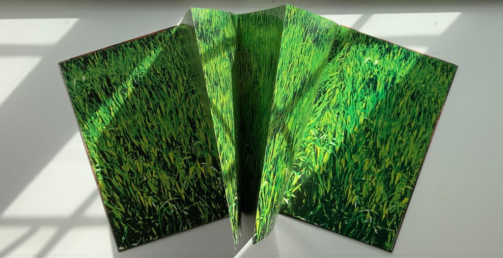
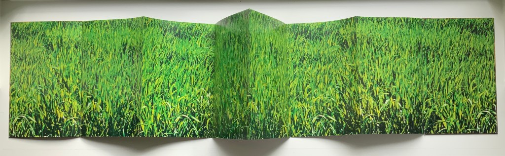
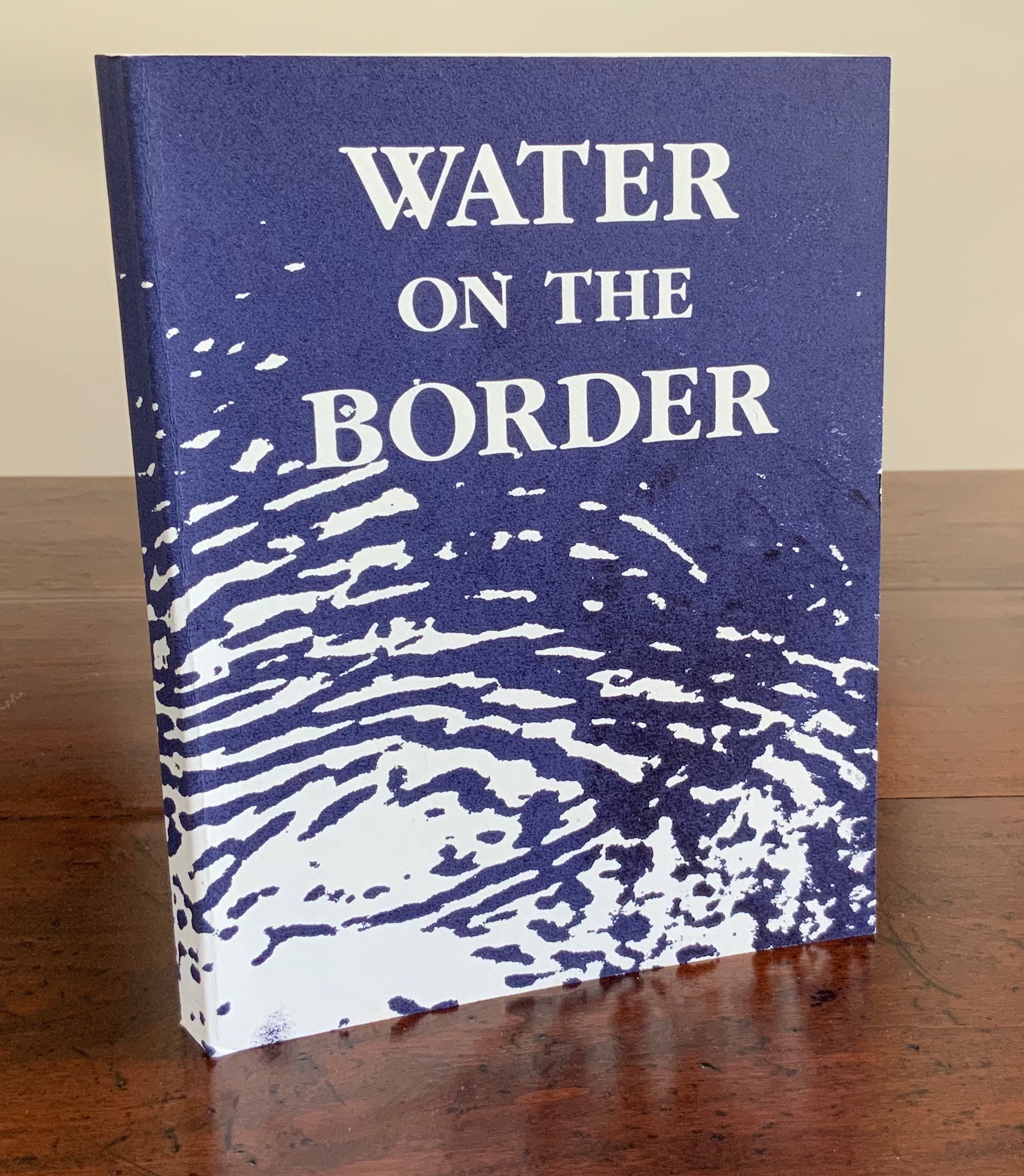
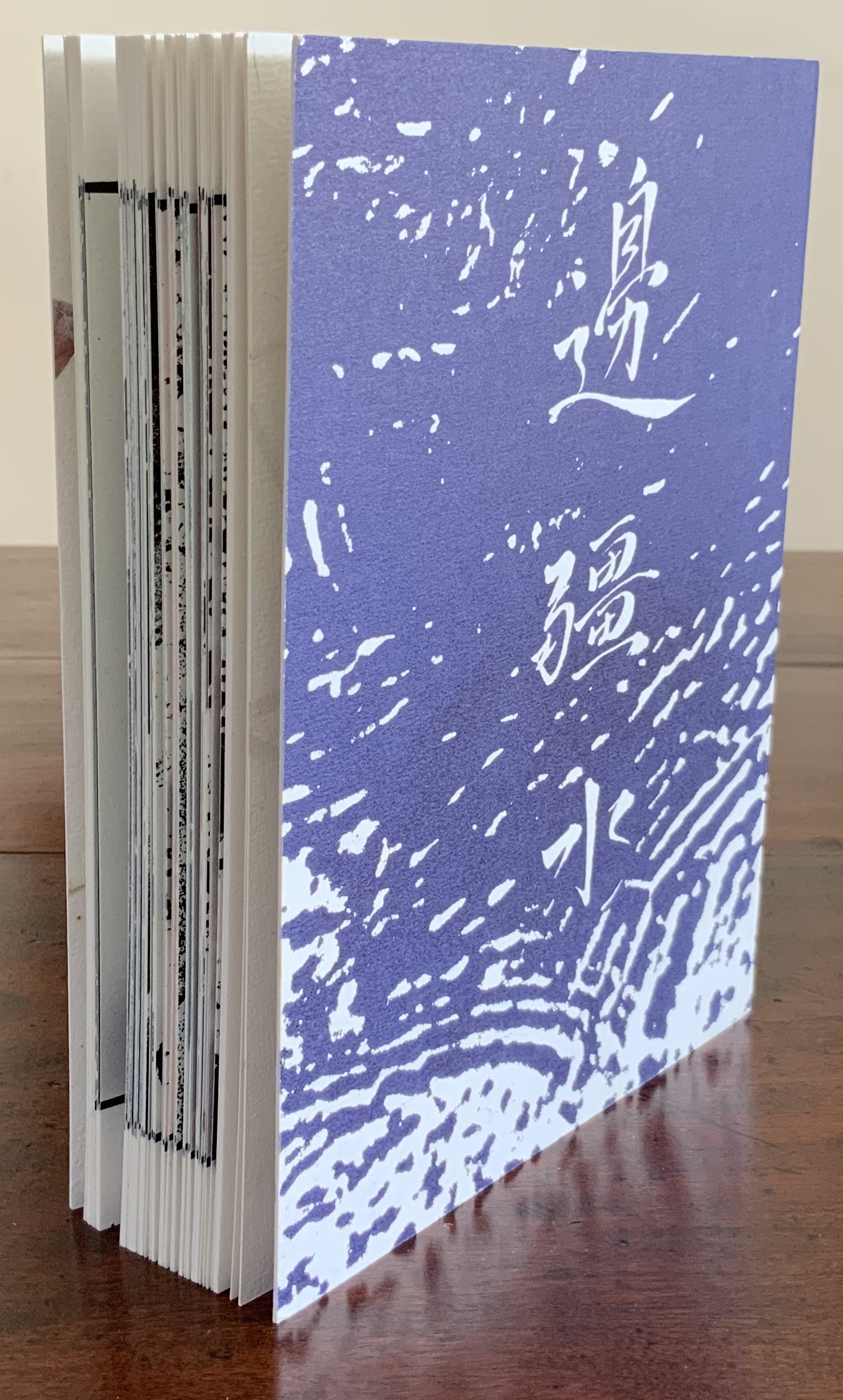
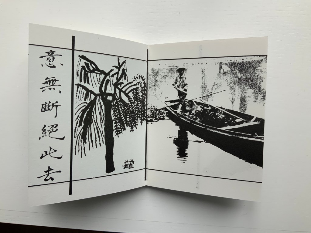
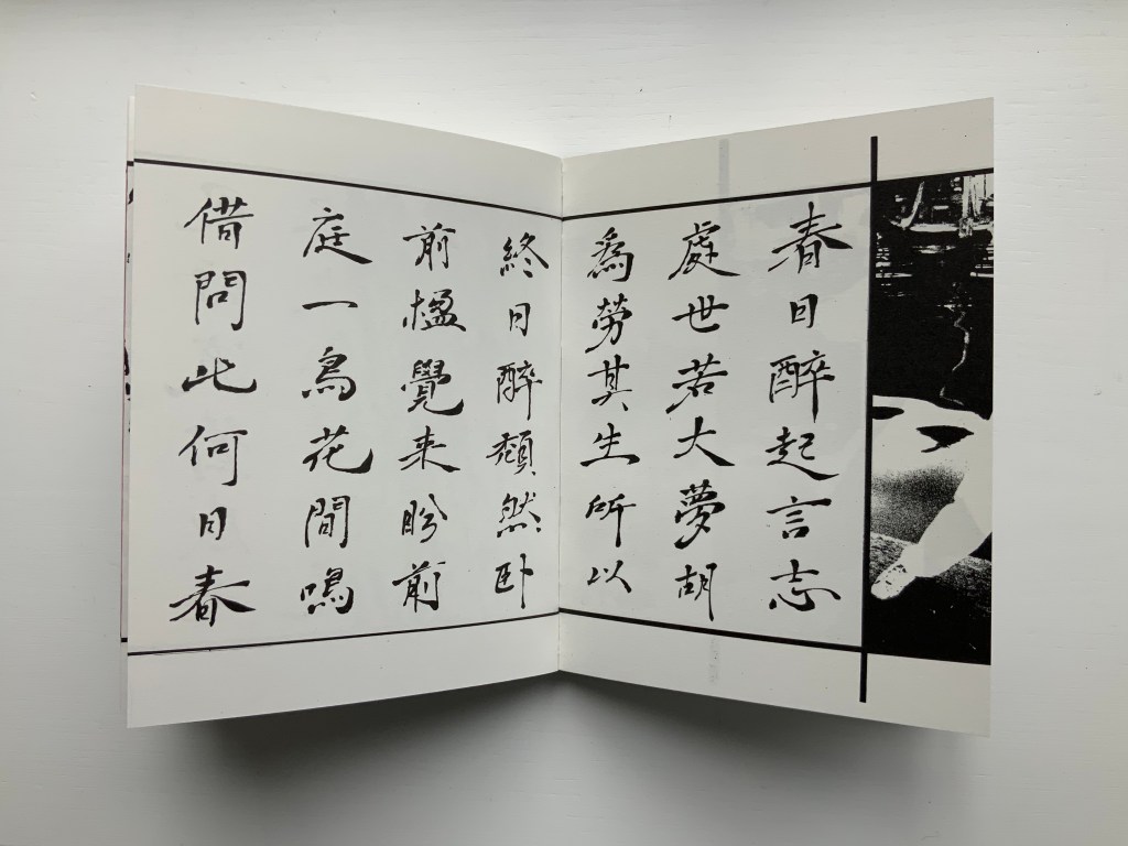
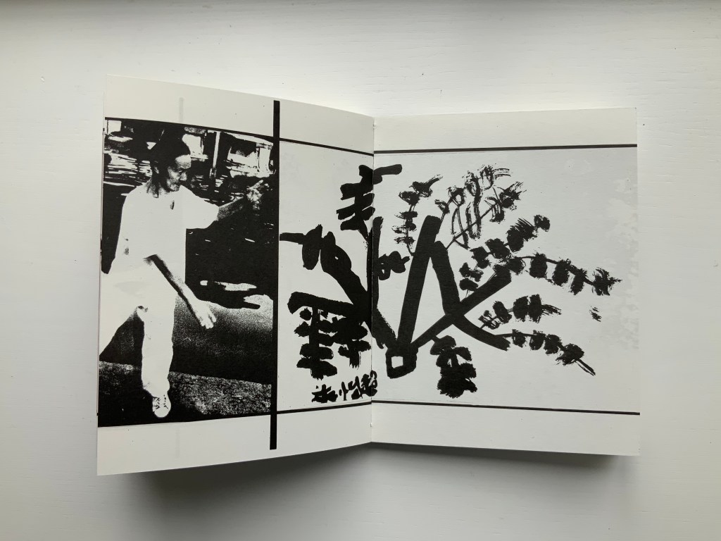
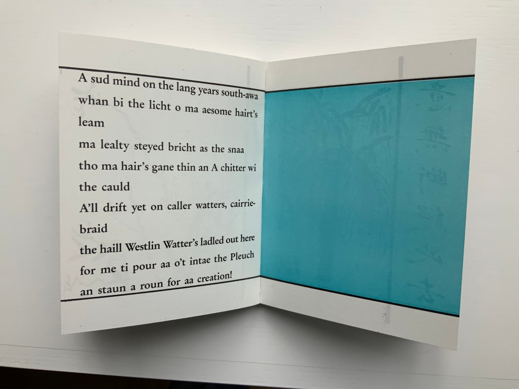
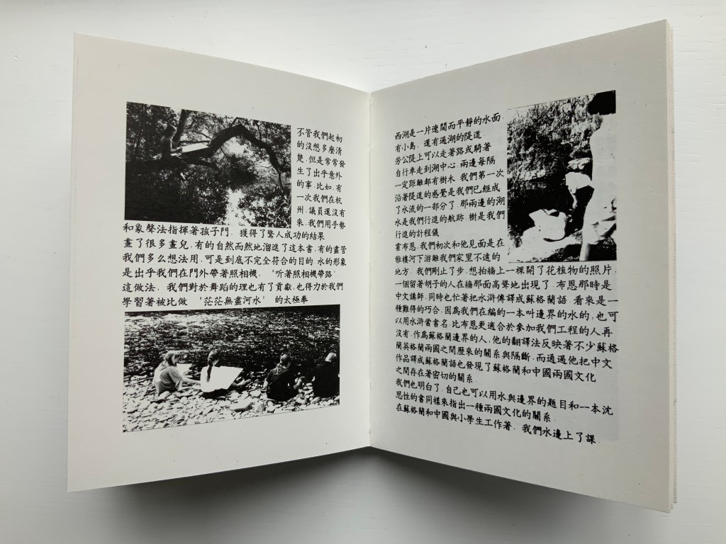
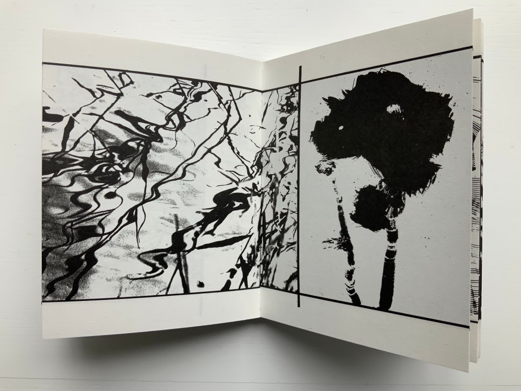
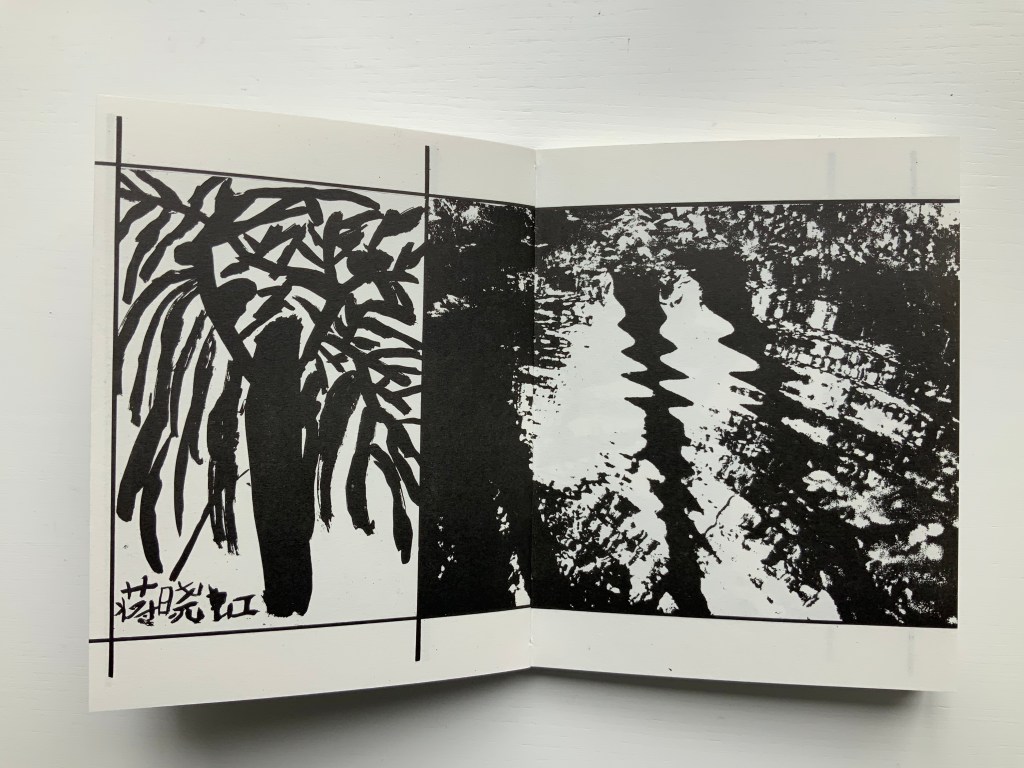
Water on the Border (1994)
Water on the Border (1994) Helen Douglas Offset, 150 x 190 mm, 124pp. Acquired from the artist, 29 November 2018. Photos: Books On Books.
The two pairs of double-page spreads below demonstrate the artist’s success in taking the reader/viewer “around the edge of the page”. In the first pair, after the boat‘s prow disappears at the edge of the recto page and reappears from the verso’s, the artist introduces a vertical border at the tip of the prow. On the other side of the border is a photographic tracing of a building’s reflection in water. It is not necessarily the same stretch of water on either side of the border, but it feels that it is.
In the second pair, the seven columns of characters of a Chinese poem precede the picture of the lower part of a right leg that wraps around the edge of the recto page into the image of a man performing T‘ai Chi. As above, the verso page of that double-page spread is divided by a vertical border, which is followed by a child’s ink drawing that falls across the verso and recto pages. As with the continuity of water above, there is a continuity of the man’s pose on one side of the border and the lines of the drawing on the other side.
Water on the Border engages sides of multiple borders. Six Chinese poems rendered in calligraphy balance against Brian Holton’s transcriptions into Scots (first image, top row, below). Children from Scotland and China provided the drawings (second and third images, top row, and fourth image, below). The reflective images photographically traced come from the water surfaces of Yarrow Water Scotland and West Lake, Hangzhou.
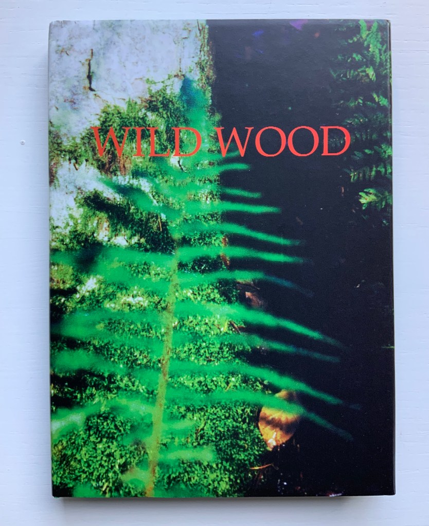
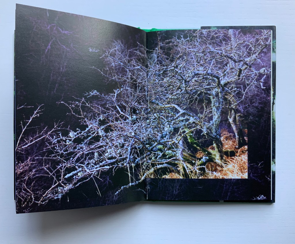
Wild Wood: A Border Ballad (1999)
Wild Wood: A Border Ballad(1999) Helen Douglas Offset, 116 x 160 mm, 144pp. Acquired from the artist, 29 November 2018. Photos: Books On Books.
Wild Wood has been conceived as a Border Ballad and takes as its inspiration the Carrifran Wildwood project and the ancient woods at Deuchar and Tinnis Stiel in Yarrow. In 2000 Wild Wood won The Nexus Press Atlanta Book Prize. Opening the book and turning the pages is analogous to entering and exploring the Wild Wood where different moods and feelings move the viewer through the visual narrative.
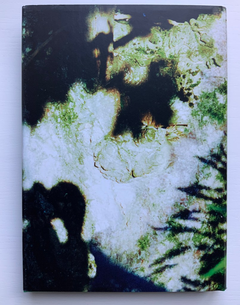
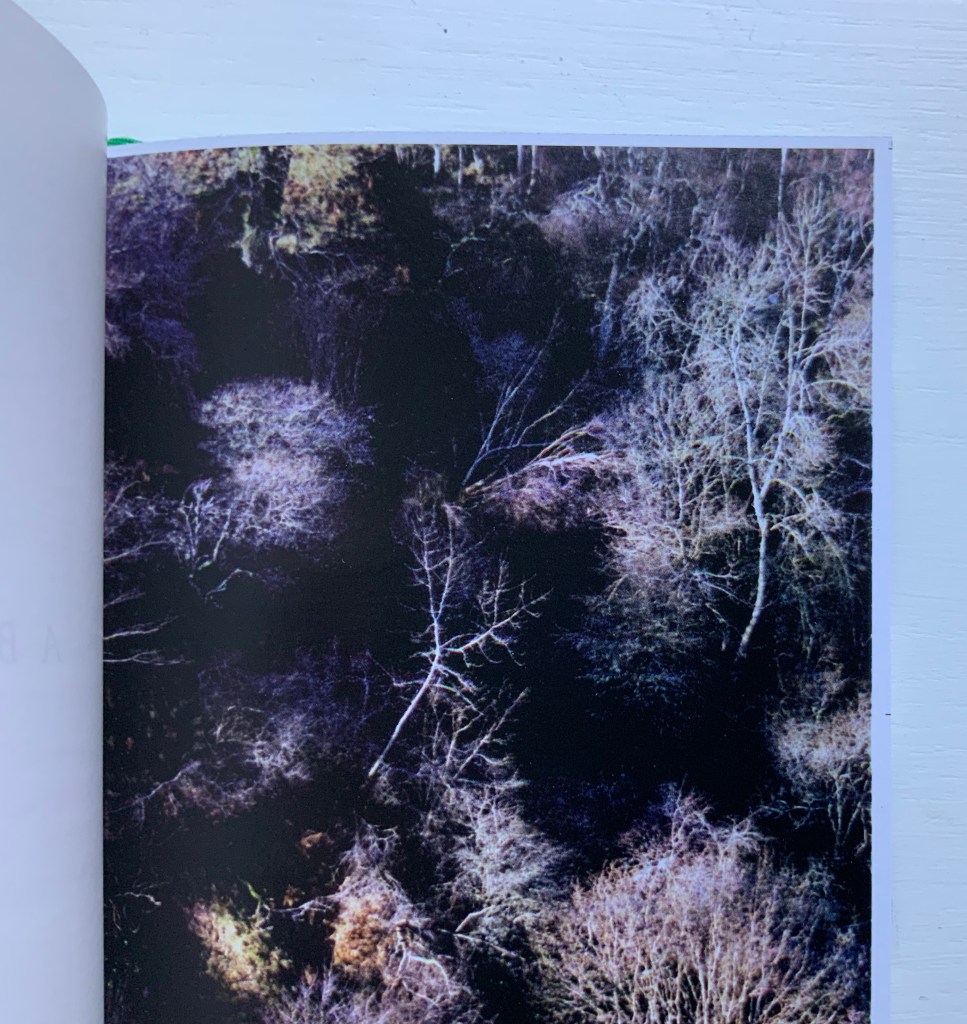
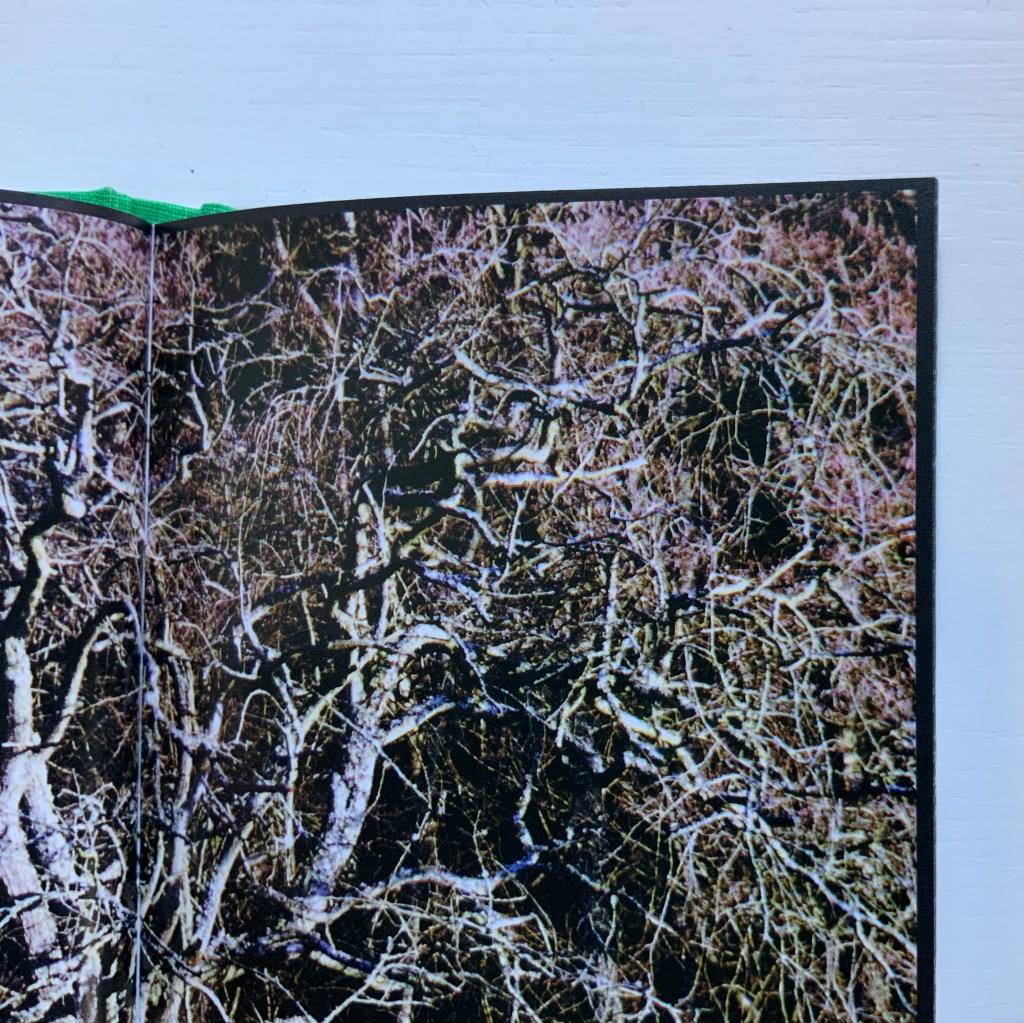
A fair enough and fair description of this bookwork, but what astounds is the manipulation of borders and the framing of photos within photos. Below, on the left, a thin white border around a recto page; on the right, a thin black border encircling a double-page spread (notice also the precision of alignment from verso to recto.
Borders yield to full-page bleeds (first spread below), and full-page bleeds are manipulated to create frames of images (second spread below).
Strange roundel vignettes of the forest appear within close-ups of a tree.
Photos of the wood create a border for other photos of the wood, and some burst wildly beyond those borders.
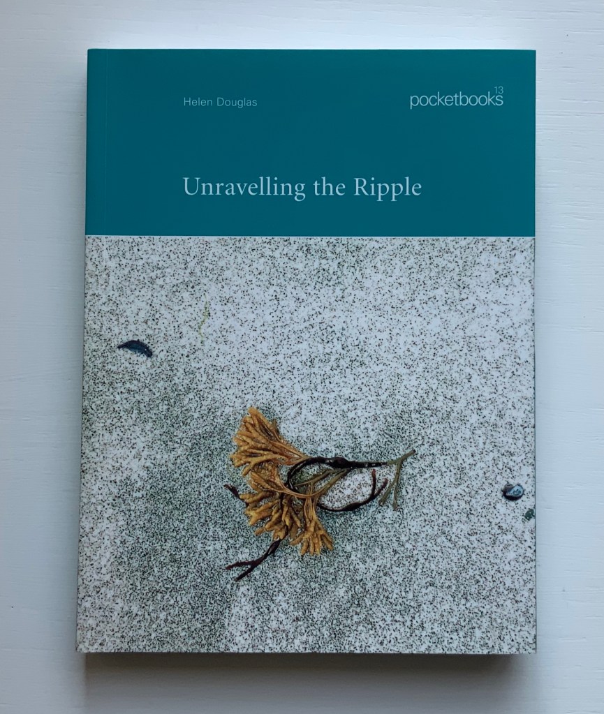
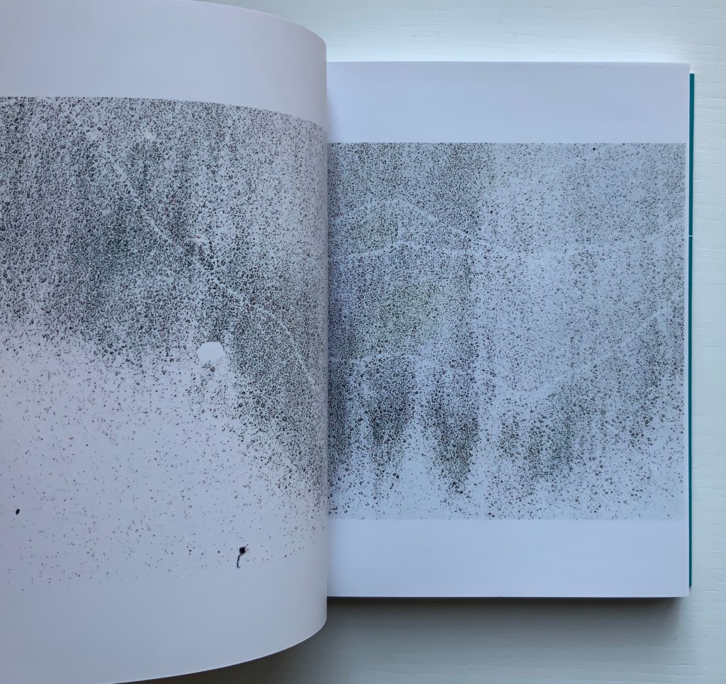
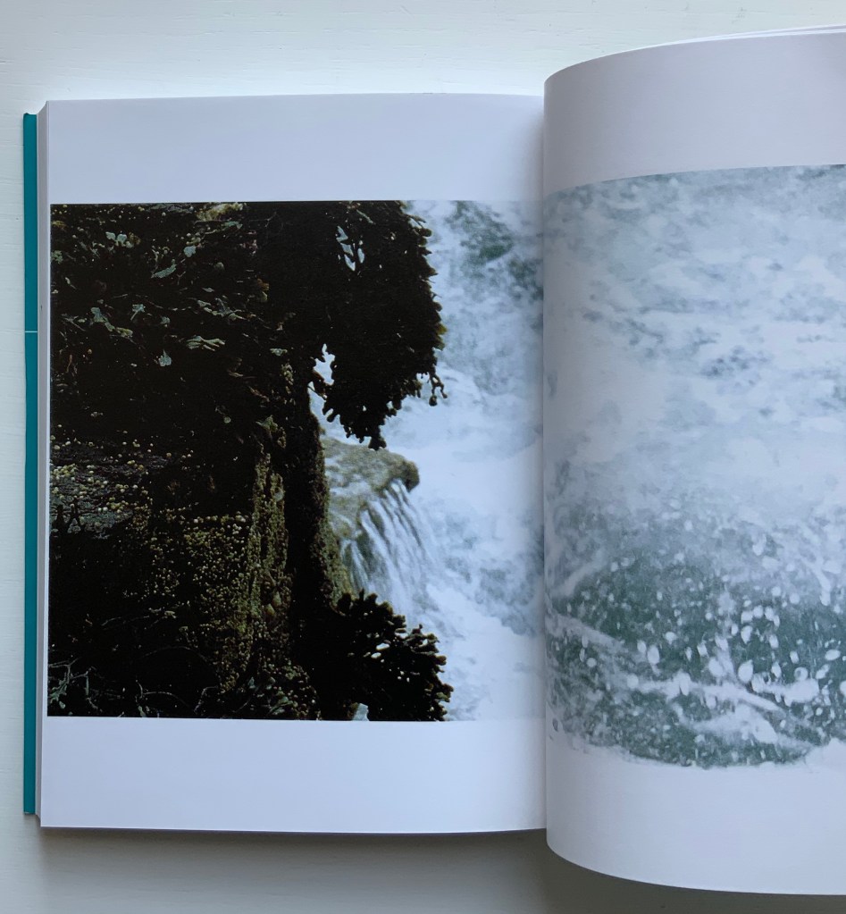
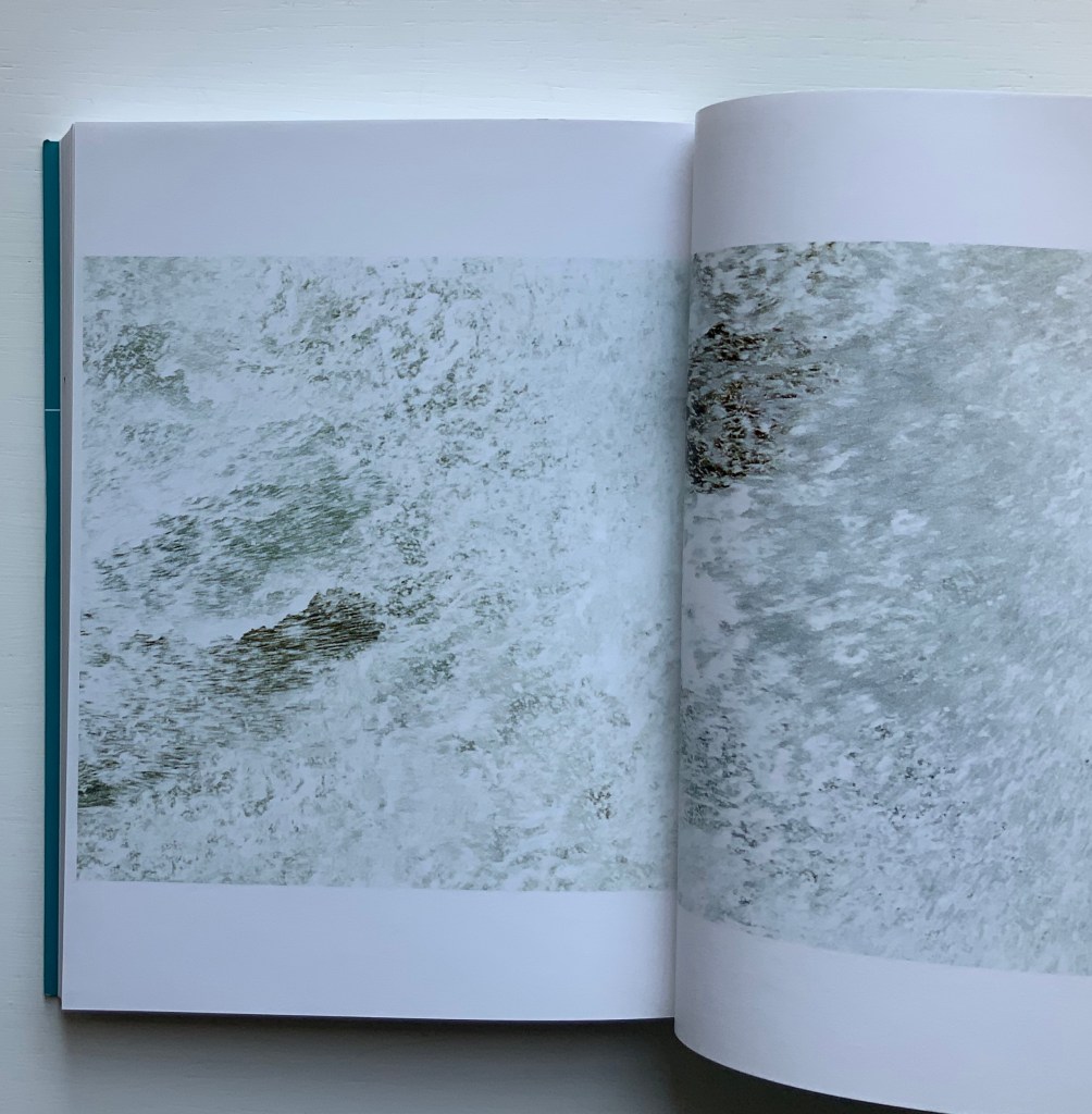
Unravelling the Ripple (2001)
Unravelling the Ripple (2001) Helen Douglas, Rebecca Solnit Offset, 170 x 127 mm, 76pp. Perfect bound. Acquired from retail, 15 November 2019.
The opening and close of Unravelling the Ripple. Photos: Books On Books.
Like three of the following works — Illiers Combray, A Venetian Brocade and In Mexico — Unravelling the Ripple takes the reader/viewer on a journey away from the Scottish Borders to one along the coastline of a Hebridean island. Among the book’s many striking features is the precision of alignment across the double-page spreads. Slowly opening, then closing, then opening each spread is as much a pleasure as the sensation of peering through clear water at the sea wrack, urchins and shells. Moving the view from tidal pool to crashing waves and moving from greys to full colour then back to greys, the bookwork delivers on the back cover’s assertions. The assertion that “the book could be bound in a circle”, however, begs for an answer to the question “what if it were bound in a circle?” A variety of more sculptural solutions are possible: one of Hedi Kyle’s “blizzard book” variations or the Chinese dragon-scale binding. Without the codex structure, though, that pleasure of the double-page spreads would be lost. So the work must depend on the reader/viewer’s memory and perception to recognise the beginning in the end.
While Solnit’s essay is lyrically in keeping with the body of the bookwork, it stands apart. Where the livre d’artiste most often begins with the text and follows with the art, Unravelling the Ripple clearly starts with the art.
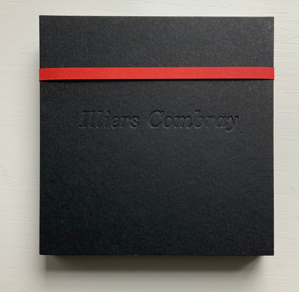
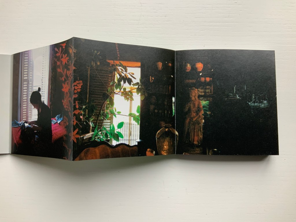
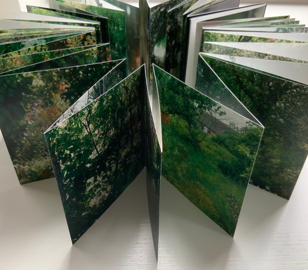
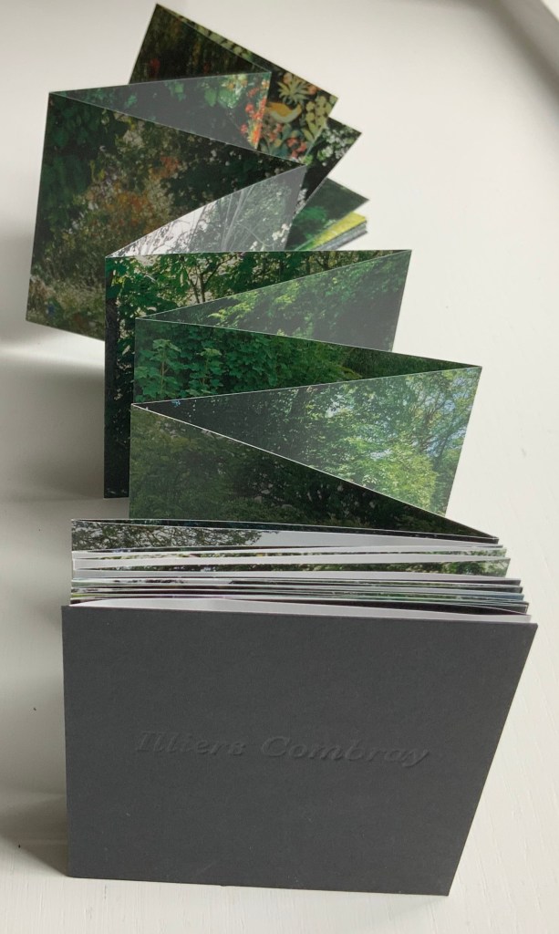
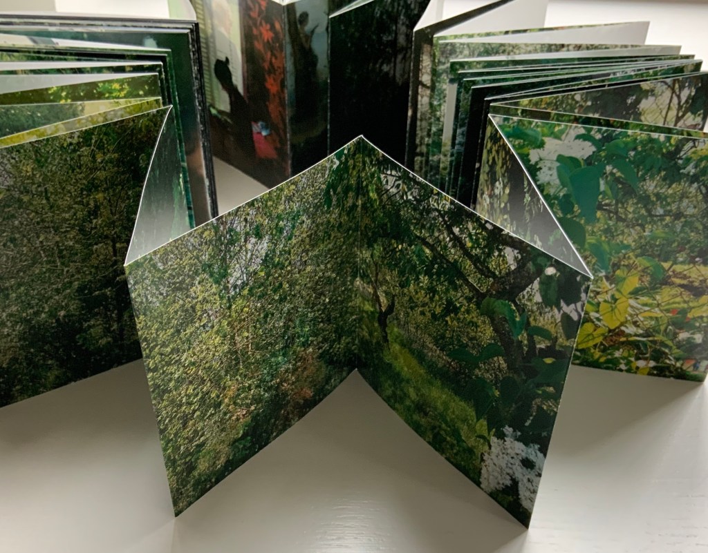
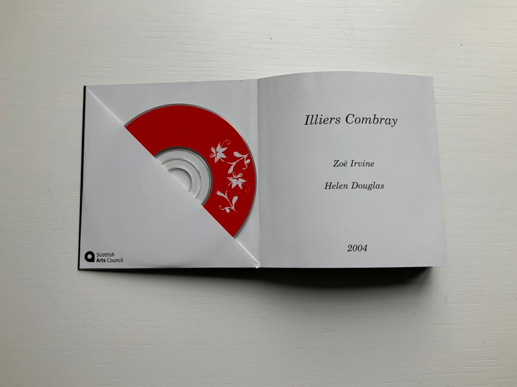
Illiers Combray (2004)
Illiers Combray (2004) Helen Douglas and Zoë Irvine Offset, four colour, 92 x 92 mm, 120 pages; two mini audio CDs, (18 mins each) placed in end pockets on board covering the two-sided accordion book; embossed title, red fastening band. Acquired from the artist, 29 November 2018. Photos: Books On Books Collection.
The journey to this small French town immortalised by Proust‘s In Search of Lost Time intensifies a recurrent feature or element of Helen Douglas’s art: the surreal weaving of images (drawn or photographed, present or past) into the photographed townscape and its environs — where the warp of the townscape/environs meets a weft of images taken from paintings, still-life arrangement of objects, poppy-coloured stitches, and words or ornaments that run like strings from panel to panel.
Sound artist Zoë Irvine and visual artist Helen Douglas collaborate to create a richly textured, multi layered soundscape composition (2 CDs: Irvine) and ornately interwoven visual narrative (2 sided concertina book: Douglas), exploring a sense of memory and place. Inspired in the month of May by a week long visit to Illiers Combray, the small town immortalized by Marcel Proust in his epic novel In Search of Lost Time, Irvine and Douglas weave together their own distinct mythologies and reveries; their subjective responses elliptically united by their shared sense of place. This book won the Birgit Skiöld Memorial Trust Award LAB 04 and the Seoul International Book Arts Award 2005.
In their obsolescence and presence in the front and back covers, the two mini-CDs bracket a gap that the artists’ collaborative effort could perhaps only close in performance or an installation. Irvine’s soundscape is available online, which, as long as the link lasts, overcomes the obsolescence of the mini-CDs but not necessarily the gap. Perhaps the technology of augmented reality could close the gap if Douglas integrated NFC (near field communication) tags in a new edition of Illiers Combray.
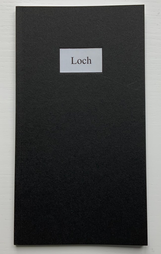
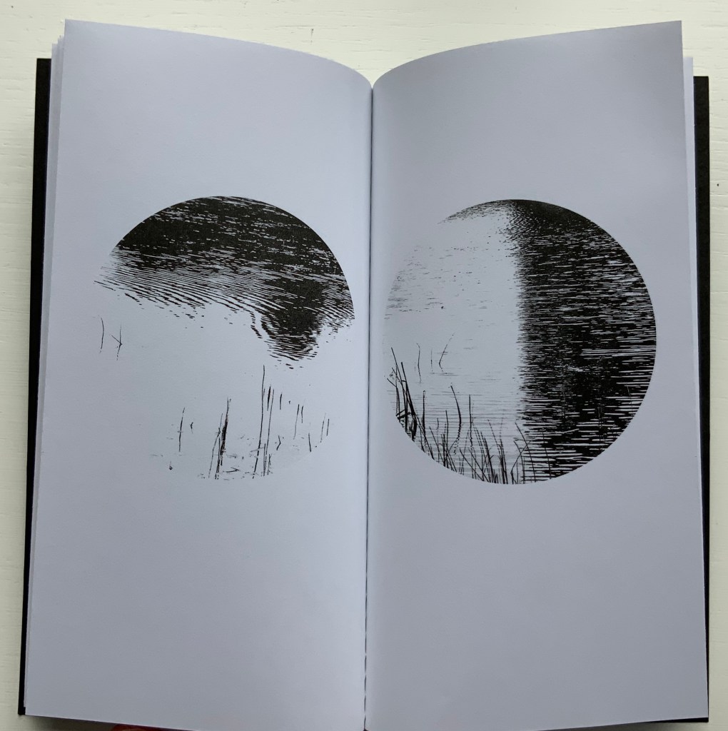
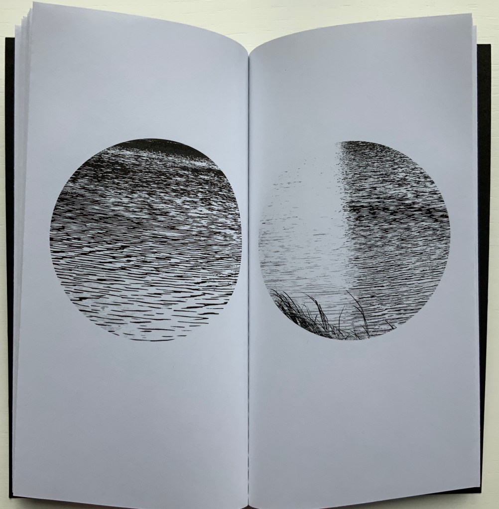
Loch (2005)
Loch (2005) Helen Douglas Offset b&w, french folds, 195 x 105mm, 28 pages; black cover with inset title. Acquired from the artist, 29 November 2018.
Loch consists of twenty images facing each other across eleven uncut leaves. The roundel vignettes capture a sense of wind and light moving across the loch’s surface. These roundels standing in their white space naturally differ from those in Wild Wood. They are more similar to those in a work unfortunately not in the Books On Books Collection: Winter: Celestial Mountain (2015).
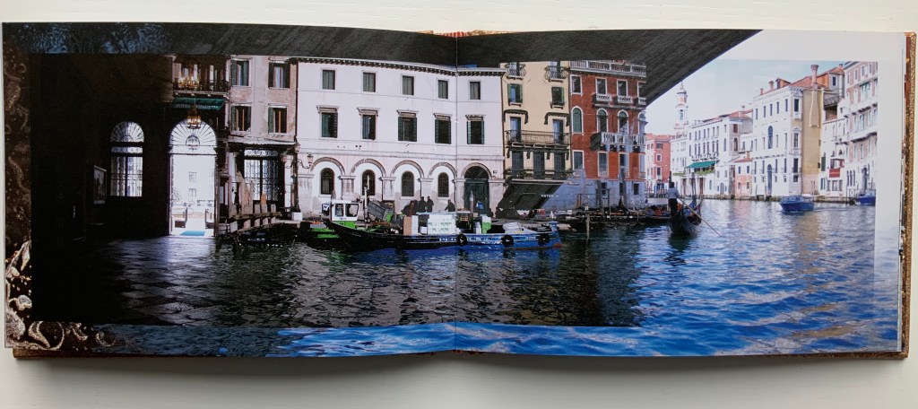
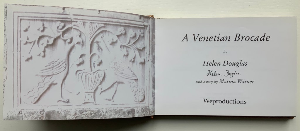
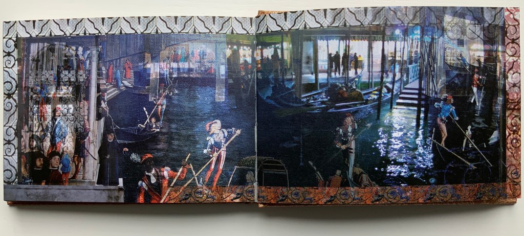
A Venetian Brocade (2010)
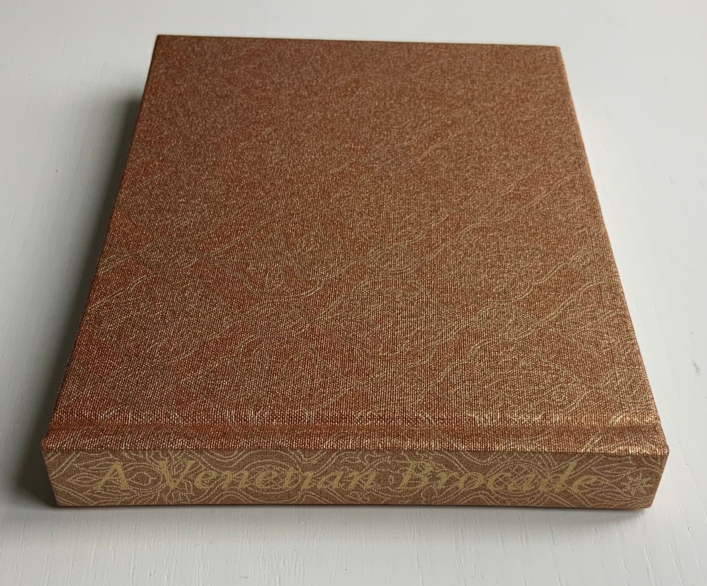
A Venetian Brocade (2010) Helen Douglas, Marina Warner Case bound in Ratchfords Inspiration with foil blocking. Offset, four-colour, on Hello Extra Matt 130gsm. 128×180 mm, 180 pages. Acquired from the artist, 6 September 2014.
The journey here crosses space (the cityscape of Venice) and time (present and historic figures). The warp-and-weft technique from Illiers Combray blends with the bordering technique from Wild Wood. But what Douglas does with the double-sided accordion format of Illiers Combray and the codex format of A Venetian Brocade attests to her ambidextrous mastery of both.
From Tommaso Mocenigo’s tomb – its great curtain drawn back – the city of Venice unfolds in the hands of Douglas’ rich visual narrative, delighting in textural contrast and intricate layerings. As oneiric zone that Venice embodies, stone, brick, water, inside and out, near, far, night, day, east, west, past in present are juxtaposed and woven as one continuous brocade. Within each landscape-format spread an inner page is floated and embellished at its edge. Borders of brick dissolve as sky, images shift, merge and overlay, water laps and floods, whilst reflective glimmerings morph into mosaic and golden threads. As masterful threading within this Venetian Brocade – at its fore, Marina Warner contributes a dexterous story of unique, wondrous wide-eyed looking from East to West.
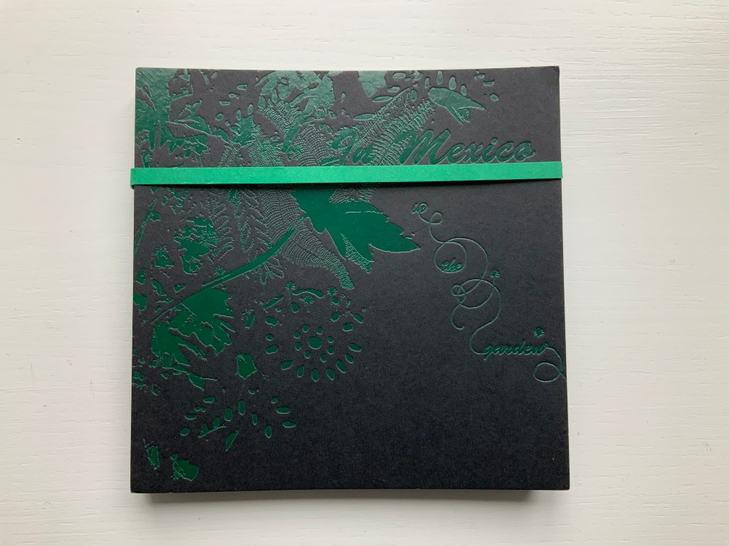
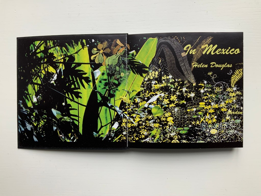
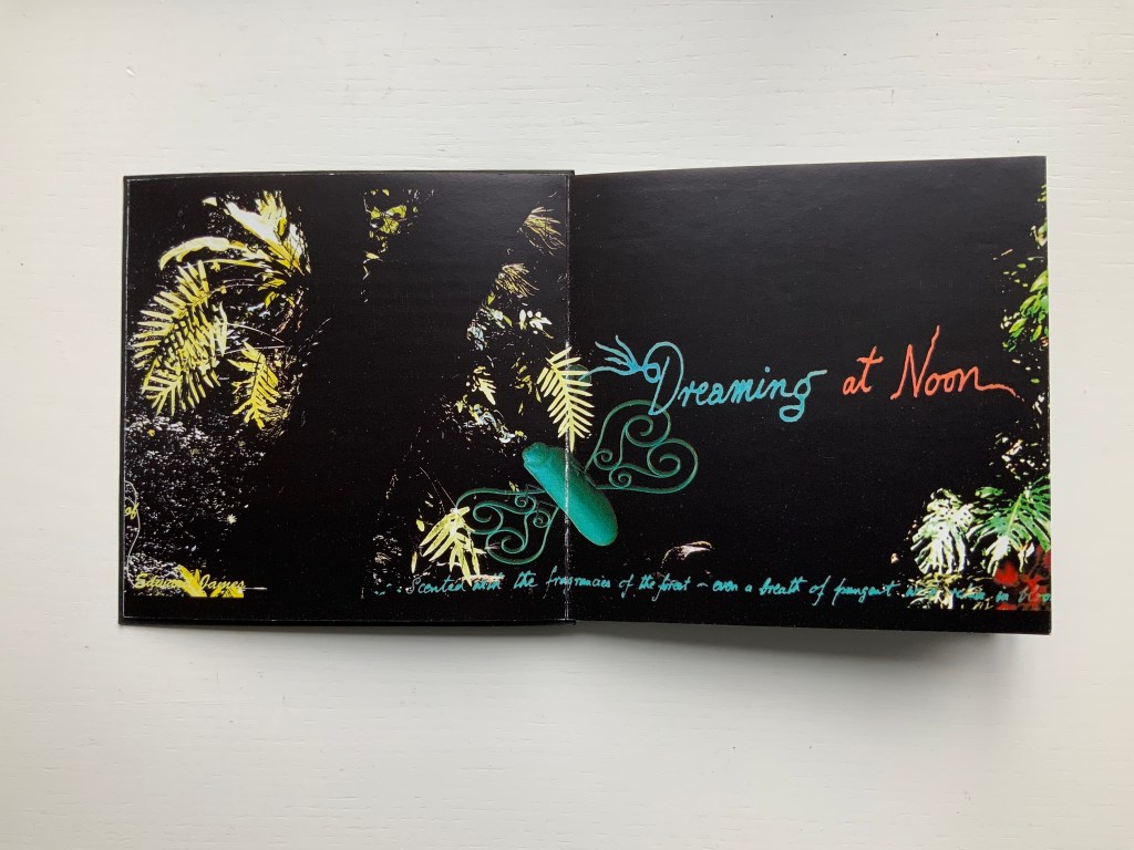
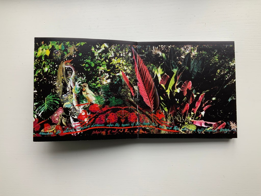
This concertina opens in vibrant colour to reveal in progressive spreads of two, four and six pages a rich sensory exploration of Edward James’ surreal jungle garden Las Posaz, in Mexico. Lush vegetation intertwines with the constructed buildings and staircases of James’ imagination and with Douglas’ own, in experiencing this garden and the rich culture of Mexico. Within the book the abundant garden is interwoven on the page with decorative threads from Mexican embroidery and feather work. Patterns of leaves are echoed by cut paper craft whilst the delicate encrustation of flora and fauna is enriched with ancient Indian beadwork. With the unfolding pages, from ground to tree tops, the viewer can ascend with the staircases and flit with the butterflies of the garden, suspending gravity and disbelief, venturing through gates and windows to boughs and fern vaults in the sky. And in so doing experience, within the small intimacy of book, something of the unfolding immensity of the garden and its timeless fusion of earth and paradise, real and surreal.
In Mexico (2014) Helen Douglas Offset, four-colour, 145 x 145 mm, 92 pages; green paper band around green foiled card covers, enclosing double-sided concertina. Acquired from the artist, 10 February 2015.
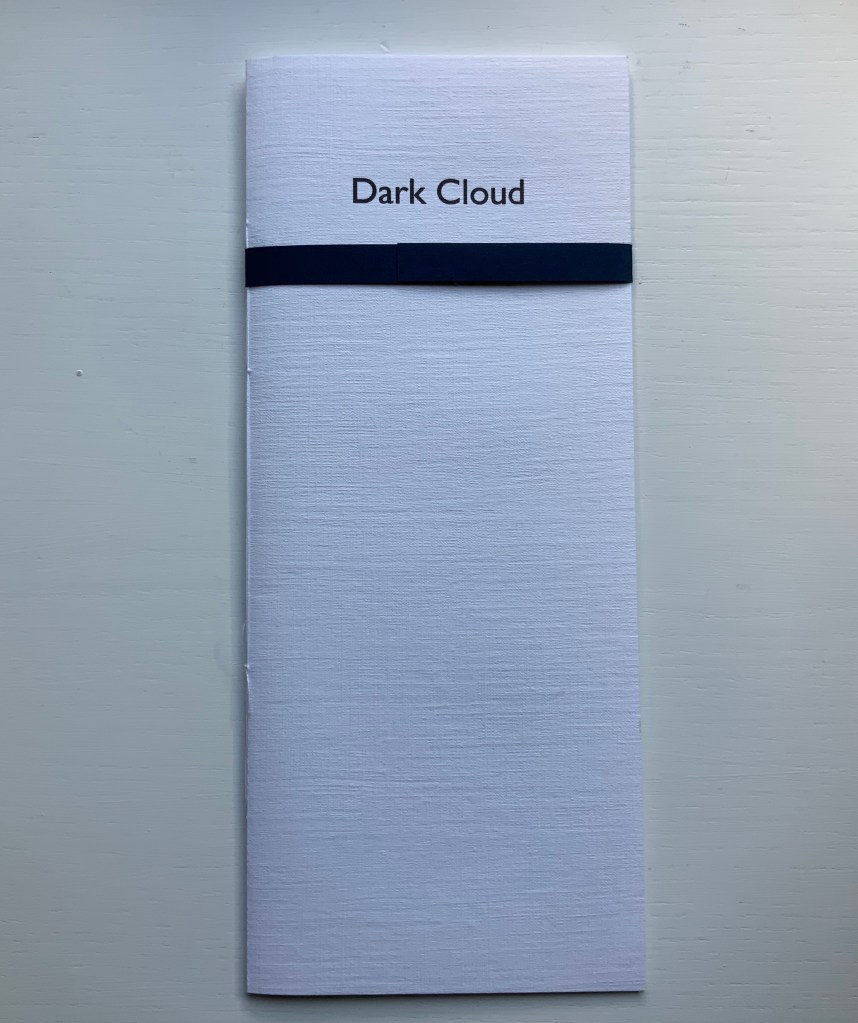
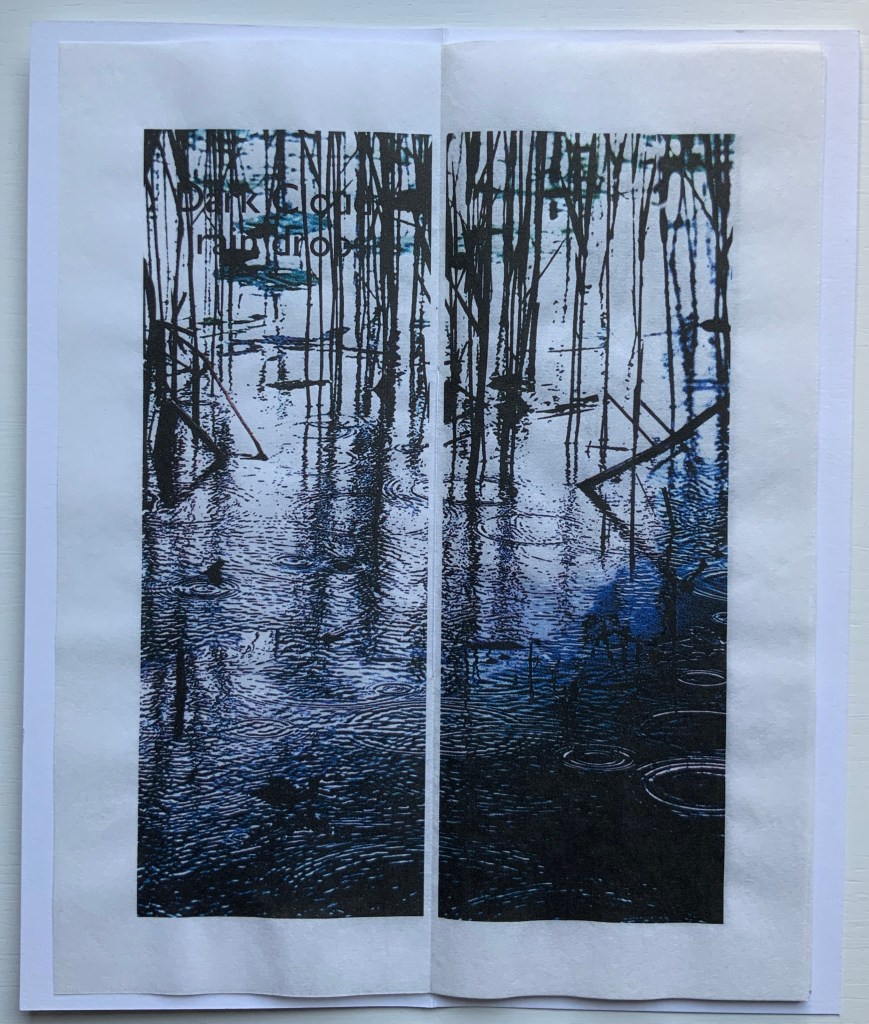
Dark Cloud (2015)
Dark Cloud (2015) Helen Douglas Printed on Toshu paper with ultra chrome inks, 105 x 250 mm, 24 pages; blue fastening paper band around card cover over 6 folded leaves hand stitched. Acquired from the artist, 29 November 2018.
The images, colours and texture’s appearance create an expectation that the paper will feel wet to the touch. The double spreads of the unprinted side of the leaves create a surface mist or cloud across the images.
Odd to say, but the physical sensation — of fingers trailing in the water — created by the digital version of The Pond at Deuchar is best replicated by Dark Cloud and the next work.
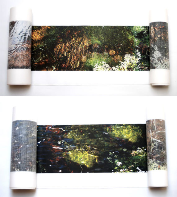
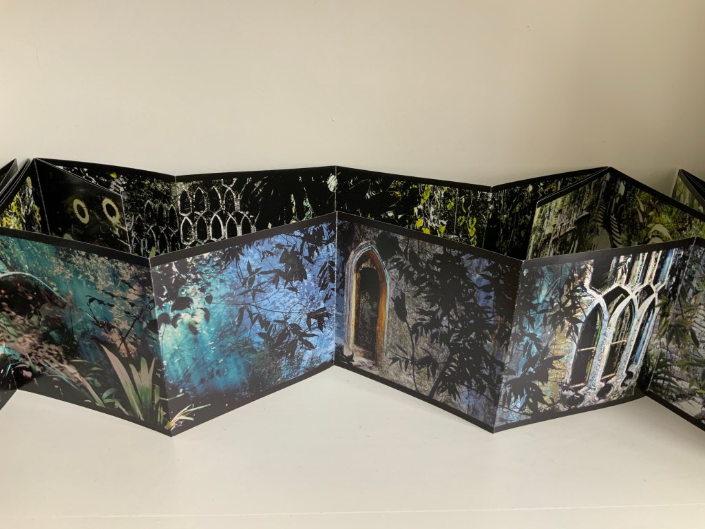
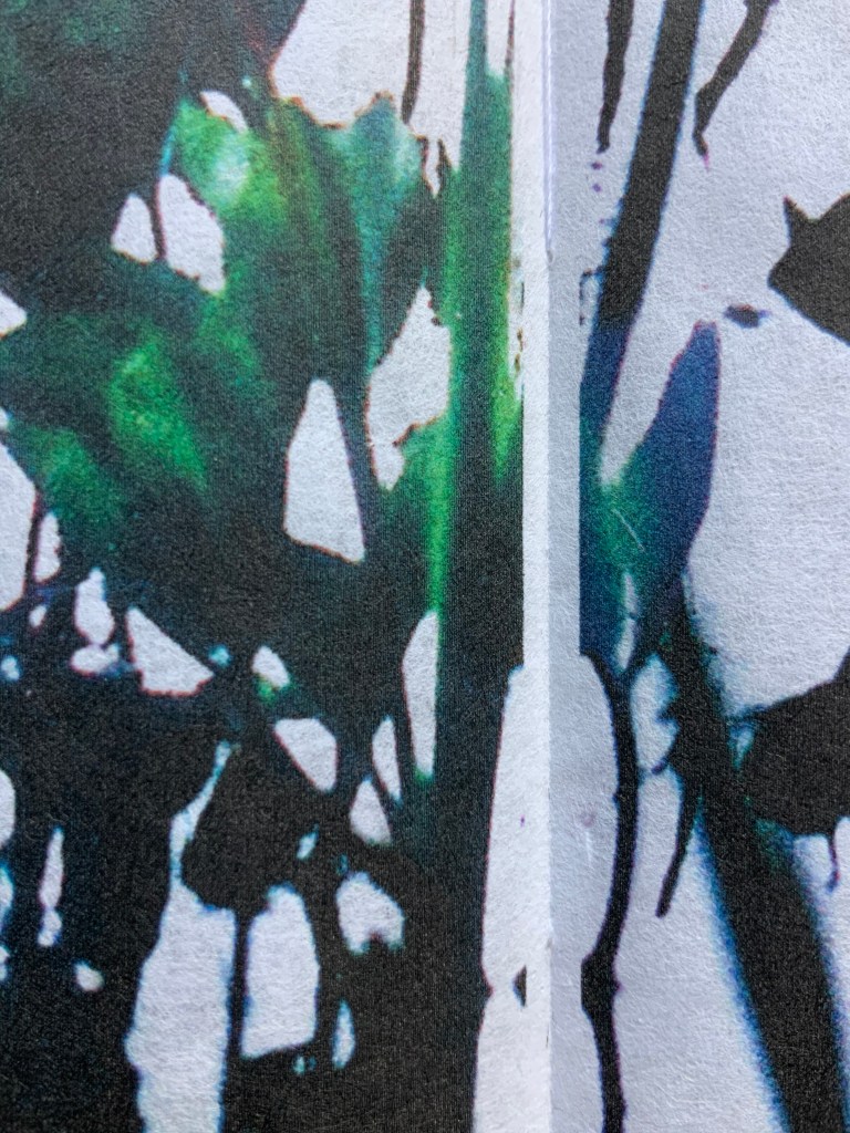
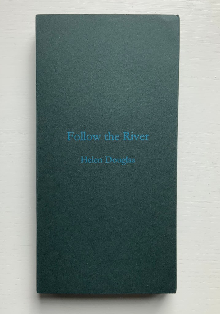
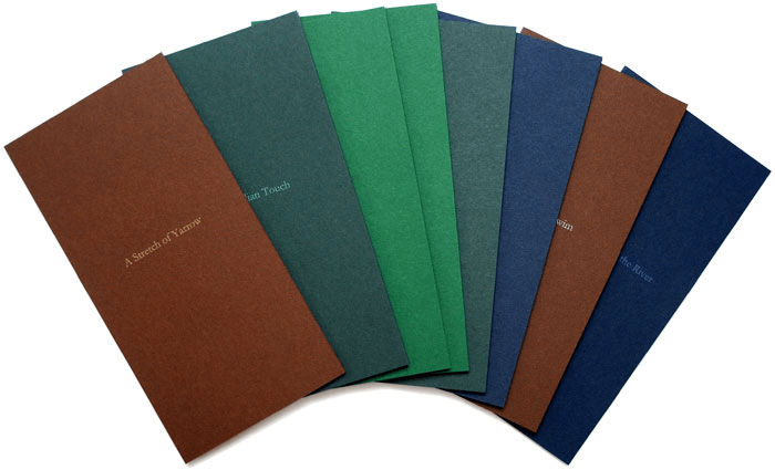
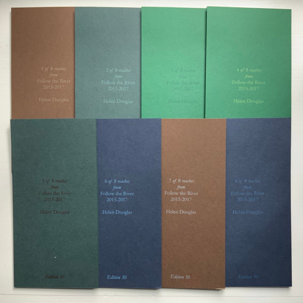
Follow the River (2015-17)
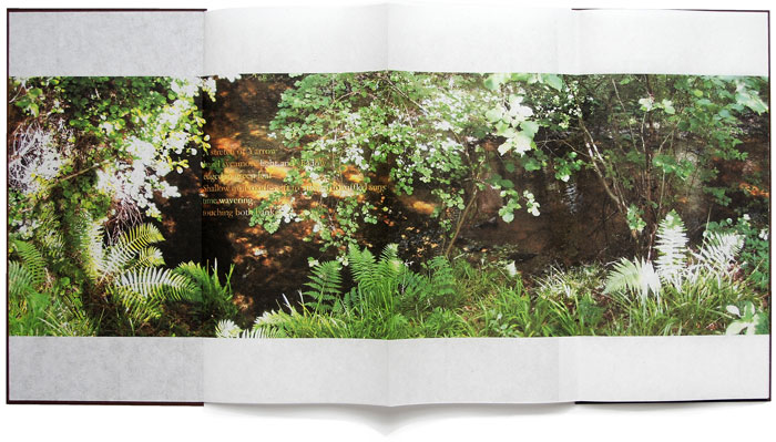
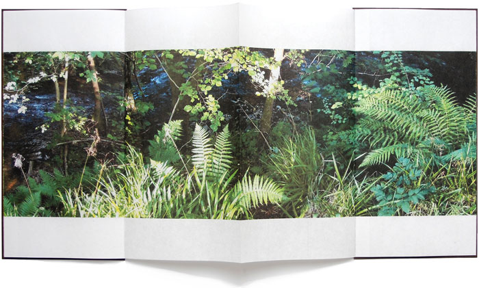
Follow the River (2105-17) Helen Douglas A set of 8 books, 930 x 183 mm; concertina binding; varying from 12 to 14 to 16 pages; printed on Chinese Paper, with Surecolour Inks; colour card end covers, letterpress title with back cover information of set number, date and edition; edition of 30, of which 25 sets are encased in a protective card sleeve produced in 4 different colours with the title Follow the River. Acquired from the artist, 29 November 2018.
Follow the River (2017) takes the river’s stretches, bordering vegetation, and its seasonal changes as “narrative structure”, yet the eight pamphlets lend themselves to separate viewings and to composite views arranged vertically or horizontally. But this is the wrong way for the reader to seek structure.
Douglas provides a phrase that redirects the quest when she describes “the concertina form as unfolding arm’s breadths, each one with a distinct theme of light, colour and mood” (Weproductions). This returns to the gestures associated with The Pond at Deuchar.
Douglas continues:
Each open spread can be viewed individually, or in runs of 4, 6, 8 or more pages. The first spread contains a text poem, which, integral to the reach of the river draws the eye into the book and a close reading of its pages. Leaves, grasses, ferns, flowers and trees form part of following the river, at its edge. In light and shadow they frame and are interwoven with the water’s movement: its flow, light and shade, and reflective colour, taking in its nuanced surroundings, as one contemplative whole.
Be it scroll, codex or accordion — Douglas’s structural goal would seem to be arrival at that contemplative whole. By leading our hands to think, Douglas takes us with her.
“Ellen Lanyon“. 25 June 2024. Books On Books Collection. For comparison of Chinese Whispers with Transformations I (1977).
Admin, studiesinphotography.com. 24 March 2020. “Photography and the Artist’s Book: Helen Douglas in Conversation With Alex Hamilton“. News & Reviews, Studies in Photography. Accessed 15 June 2025. Re Water on the Border: “… with our own press and smaller sheet size we were able to work with many more papers, and to explore the textural relationship between photographic image, print and surface. With the book Mim, an exploration of mimicry in surface pattern and texture of clothing and architecture, we used different textured papers including wallpapers, throughout as an integral part of the visual and tactile reading of the book. We spliced photographic images together at the film stage to build the pages of the book. Flip-flopping images between positive and negative, we were able to drop tone, gain contrast and create negative backing for positive text. This was also possible with Water on the Border (1994), a book made in Scotland and China where line drawings by children were butted up next to photographic images of water and reflections. The latter were screened with a mezzotint half-tone screen which gave a beautiful velvety touch to the image and stroked the paper. The scaffolding armature of horizontals and verticals was made from offcuts of exposed film. Our artwork for the book was no longer layouts of continuous tone bromides but layouts of half-tone film.”
CDLA (Le Centre des livres d’artistes). “Helen Douglas — Telfer Stokes”, le cdla: Expositions publications et collection de livres d’artistes, 26 February 2020. Accessed 26 February 2020. A “catalog raisonné”-like listing of 30 works by Douglas, 9 of which are co-creations with Telfer Stokes.
Douglas, Helen. Video of talk on The Pond, given at Winchester School of Art, University of Southampton on 20 March 2013.
Graham, Brandon S. “Telfer Stokes”, FictionDoldrums, 8 April 2011. Accessed.17 March 2020. Commentary on Chinese Whispers.
Williamson, Beth. “What Does It Mean Not to Touch a Book?” in Code—X, edited by Danny Alfred and Emmanuel Wackerlé (London: bookRoom, 2015), pp. 01:53-2:06.
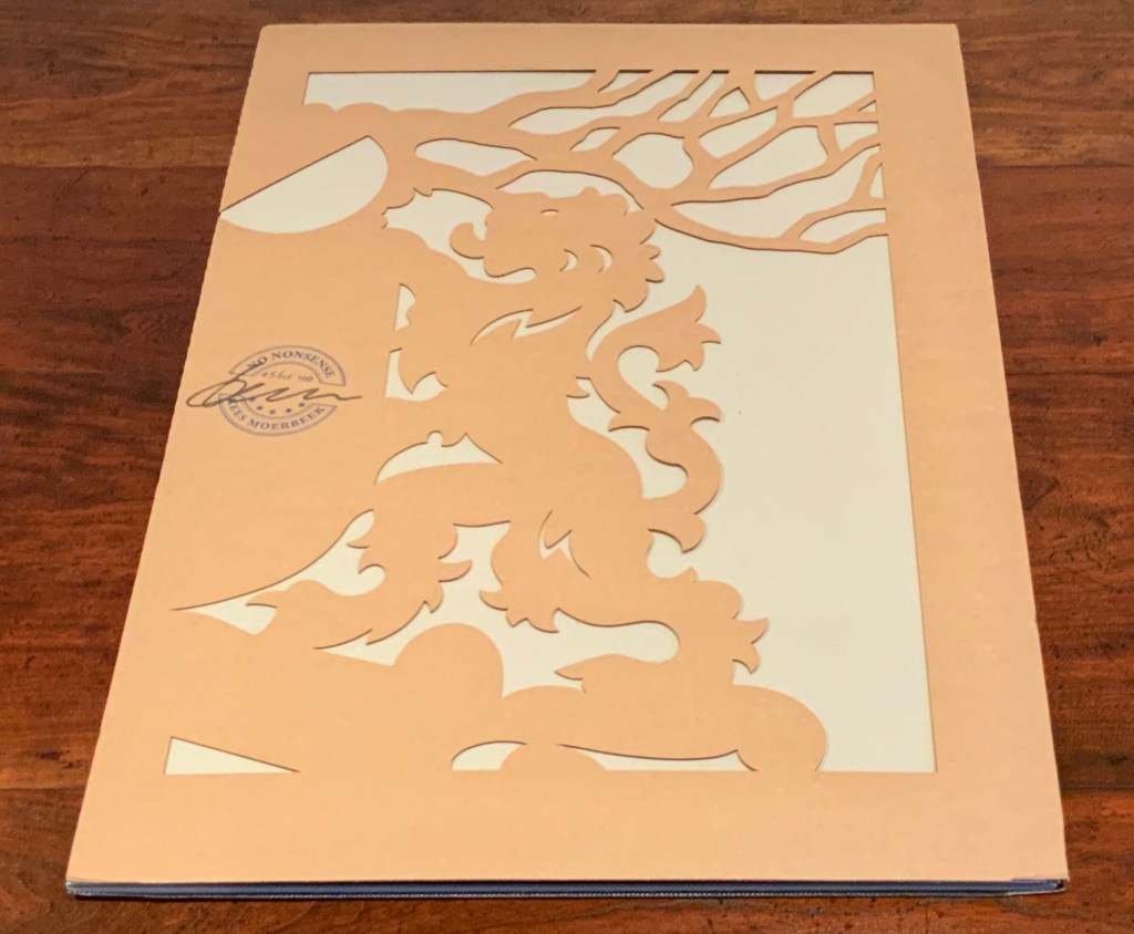
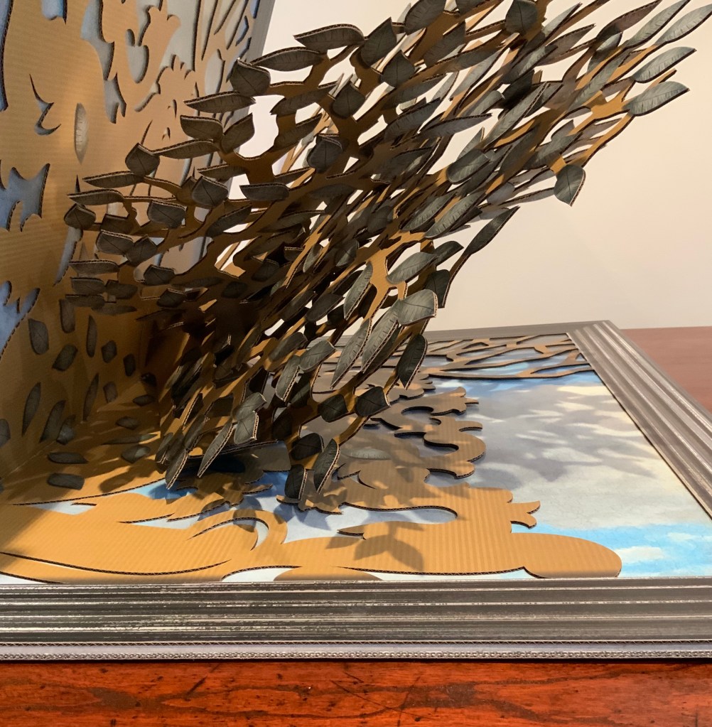
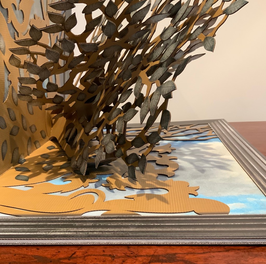
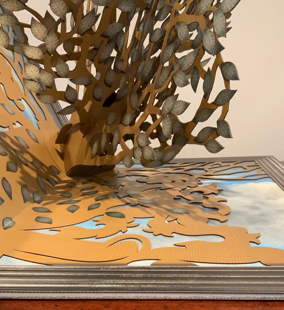
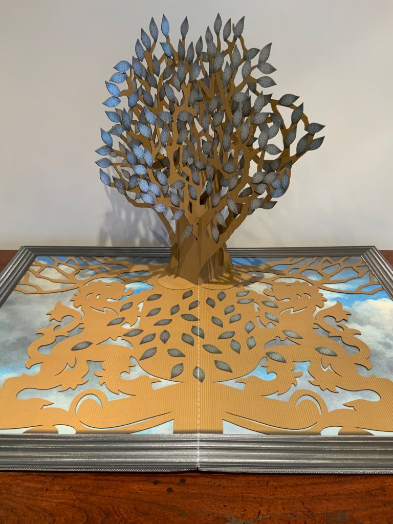
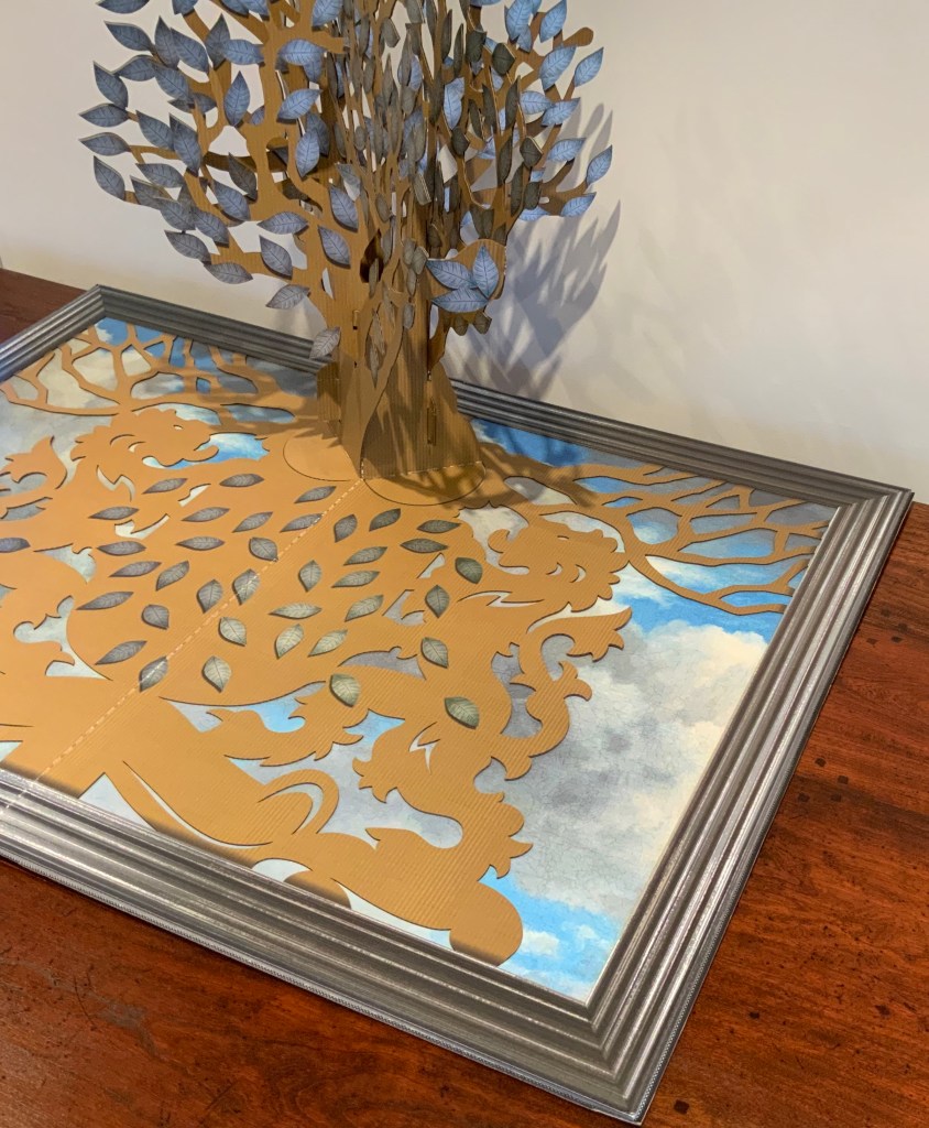
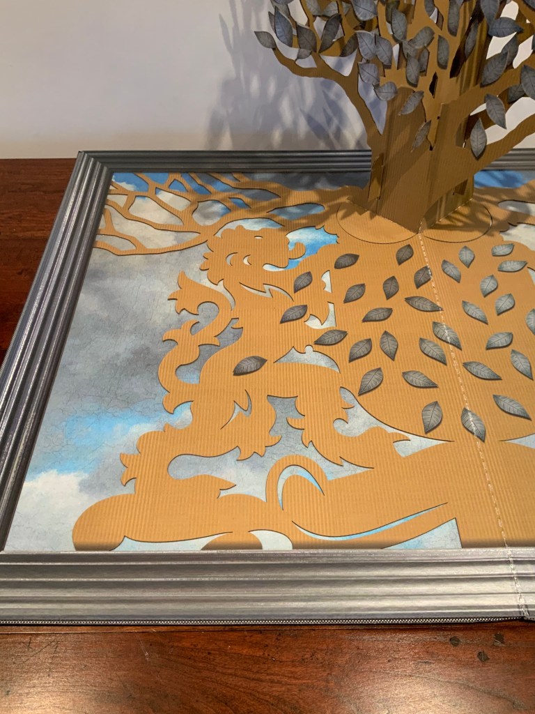
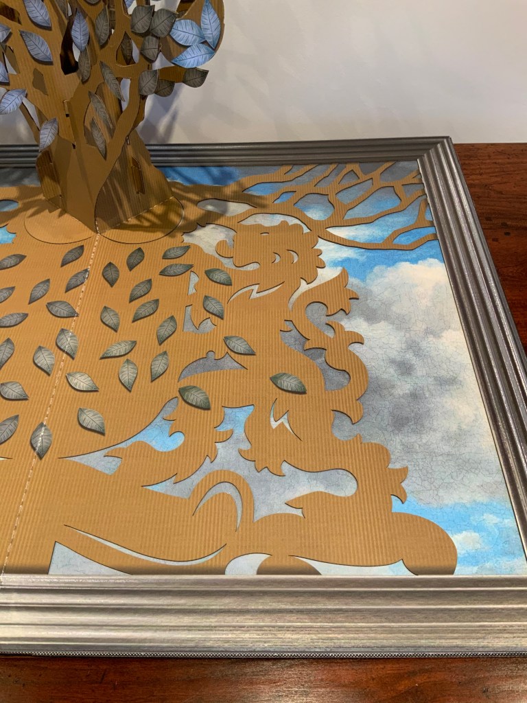
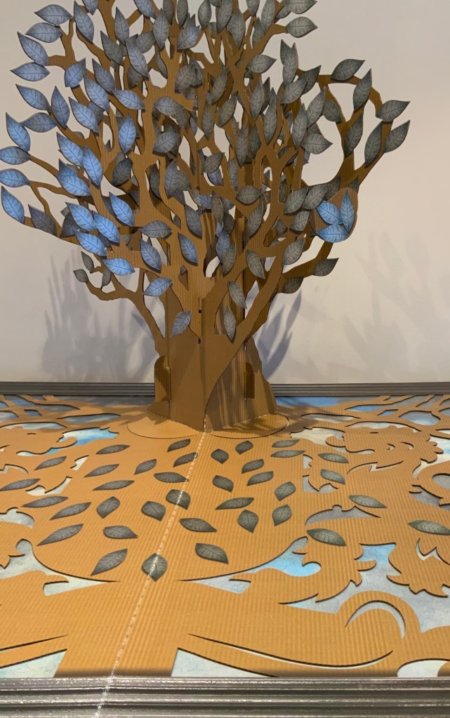
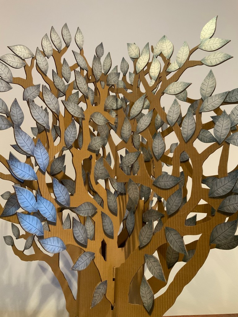
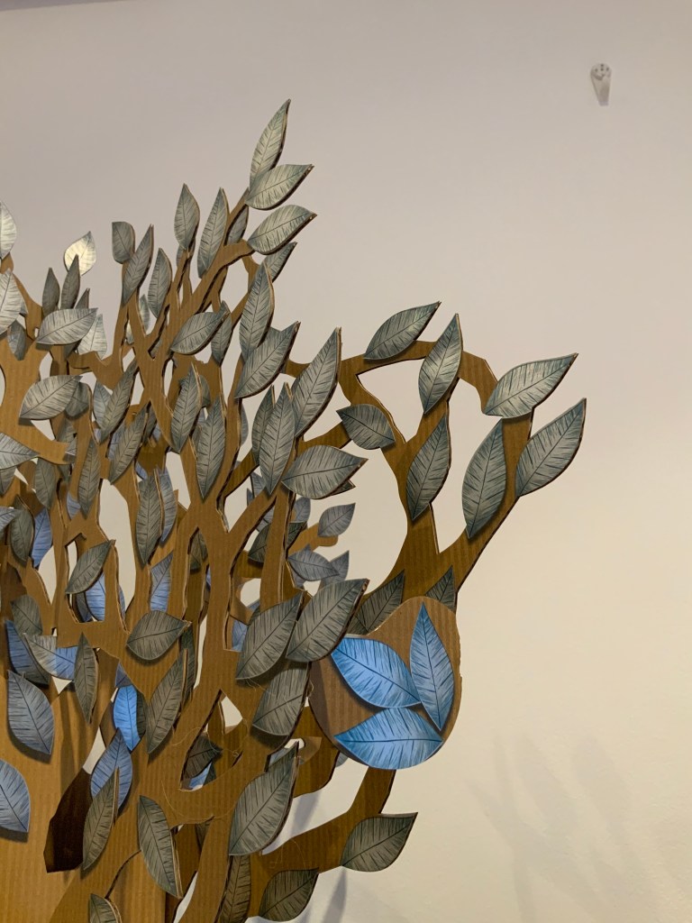
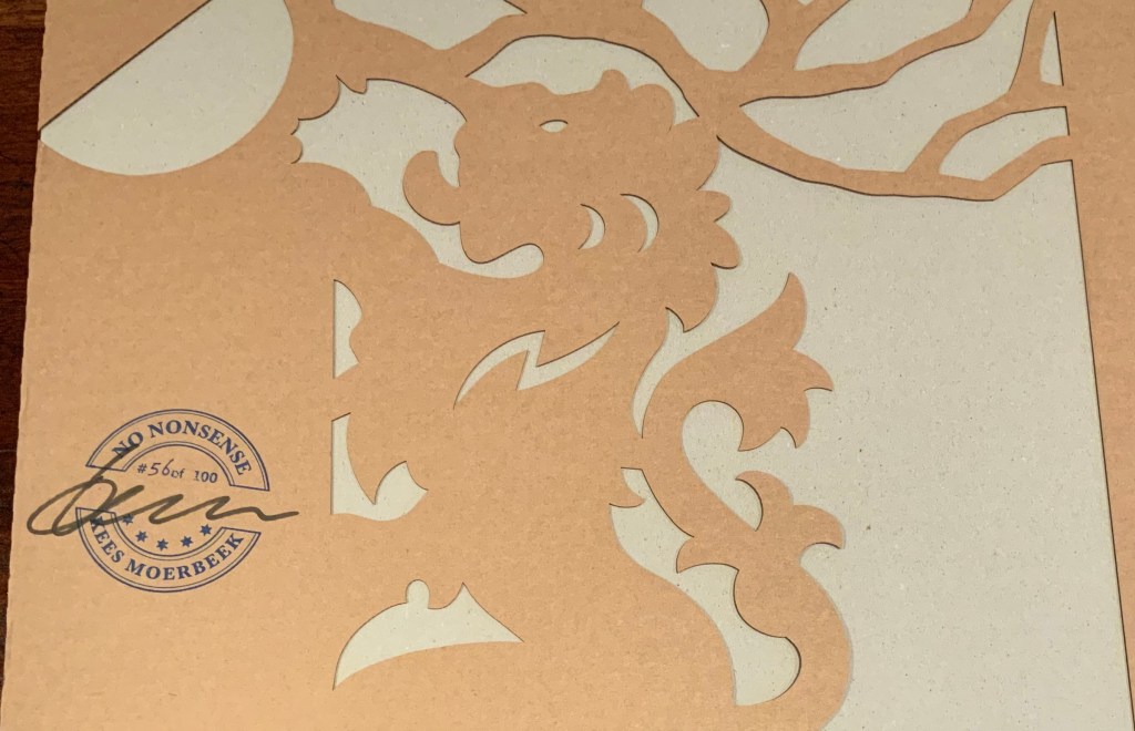
No Nonsense (2020) Kees Moerbeek Pop-up construction: corrugated cardboard, 1.5 mm thick; printed four-color/four-color with an additional print with silver Coldfoil. Cover: Greyboard four-color/no-color, 3 mm, with an additional layer of unprinted and laser cut courrugated cardboard 1.5 mm thick. Closed: H700 x W500 x D20 mm. Open: H700 x W1000 x D560 mm. Published by OptArt in an edition of 100, of which this is #56. Acquired from OptArt, 20 January 2020.
Artist’s description: The two lions holding the coat of arms function as a connecting hinge for the two separate base plates.
From the place where the crown belongs, a impressive tree arises, with roots, branches and countless shiny leaves.…
The base for this entire construction is a simple corrugated cardboard, an unpretentious material that reflects the typical no-nonsense mentality of the Dutch.
The tree trunk, branches and its roots represent the cultural values of all of Dutch people and the silver leaves symbolize the true assets of the Netherlands: the Dutch people. All parts of this artwork are interlocked representing the fact that all elements in a society are also interconnected. The cloudy sky visible through the base of the pop-up represents fantasy and the unreachable….
The silver printing on the cardboard is a cold-foil printing technique and in combination with the oversized dimensions, this pop-up can be considered as a one-of-a-kind publication.
This is the largest pop-up in the Books On Books Collection.
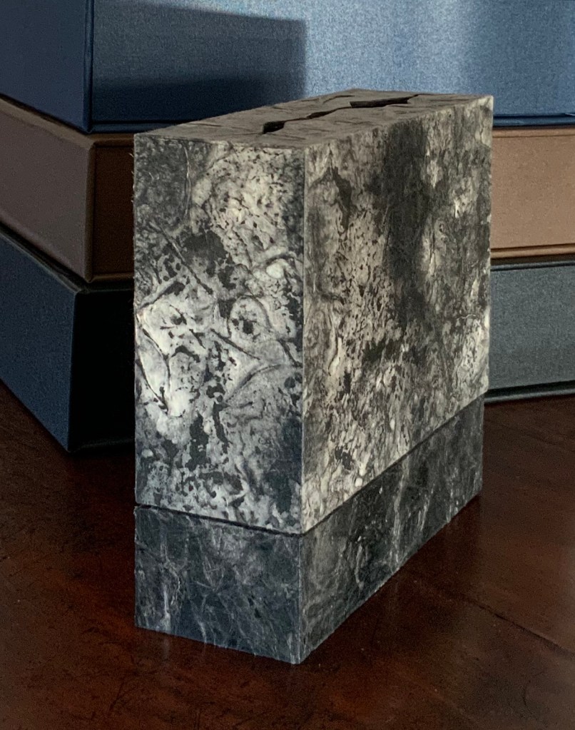
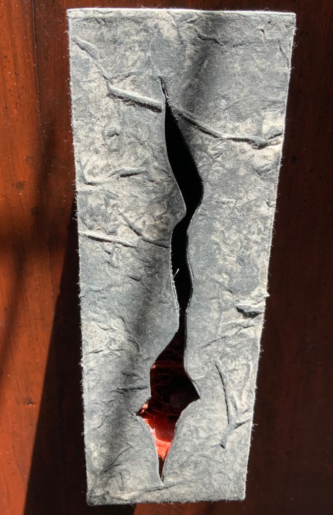
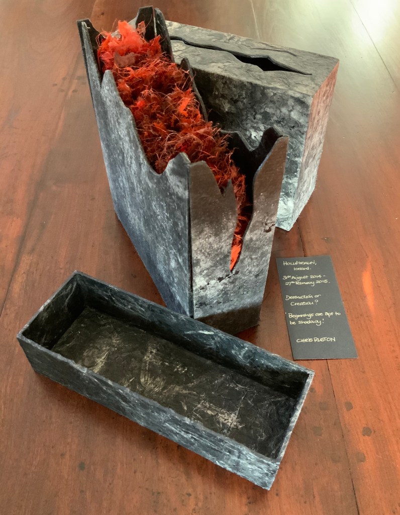
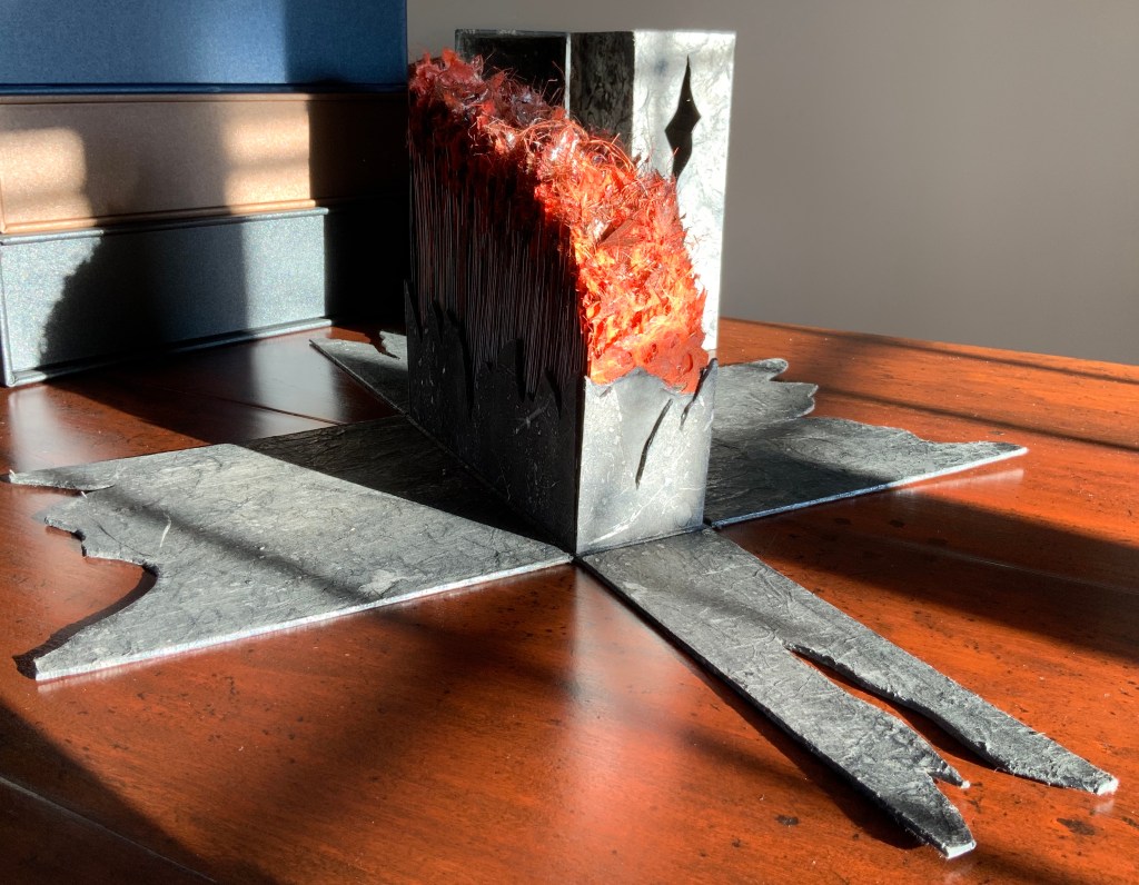
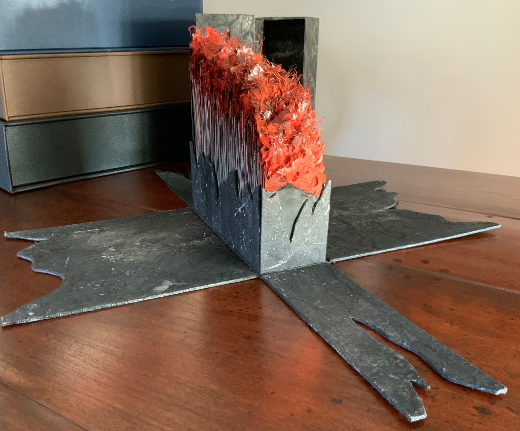
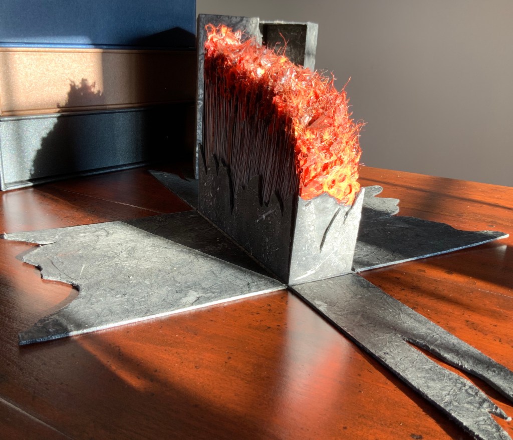
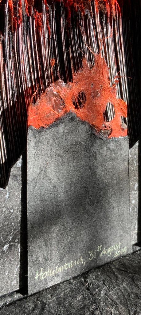
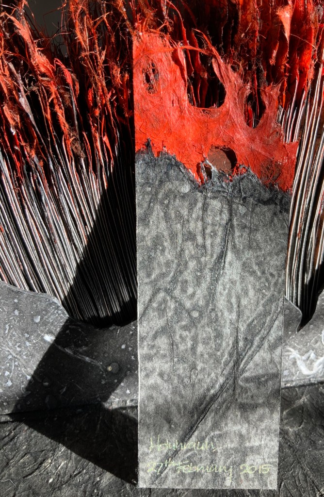
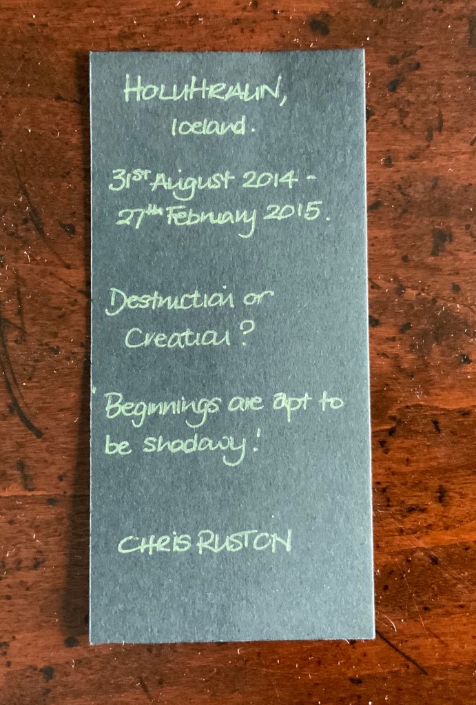
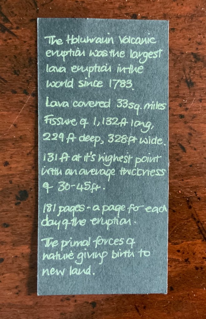
Holuhraun (2015) Chris Ruston Box: Exterior – Greyboard covered with Nepalese Lokta paper painted with Indian ink; Interior – Greyboard covered with Washi paper with fibre inclusions and painted with Indian ink. Closed: H215 x WW224 x 78 mm. Open: H110-210 x W484 x D625. Acquired from the artist, 9 March 2017. Photo: Books On Books
On 31 August 2014, the active Bárðarbunga volcano in Holuhraun, Iceland erupted. On 27 February 2015 — 181 days later — it ceased.
Chris Ruston’s artwork inspired by this event sits monolithically when closed, a flicker of orange-red barely visible through the jagged crack across its top. When the top and bottom of the box are removed, the color wells up more clearly through four sides of the upright fissure.
Free of its enclosures, Holuhraun “erupts”, the four flaps of black “basalt” falling away and displaying the full burst of “lava”. The flames come alive with any change of light or viewpoint.
The shallow tray of Lokta-covered greyboard contains 181 individual ”pages” documenting each day of the eruption. Each page consists of two torn pieces of Canson Black glued together and tipped with a “flame” of Japanese Ogura Lace paper made from Manila Hemp fibres and torn into various shapes. The Canson Black and Ogura Lace have been painted with Rohrer & Klingner Traditional Drawing Indian Inks. Here are the first and last days’ pages, followed by the work’s colophon.
The destructive and regenerative nature of geological phenomena is but one of several muses driving Ruston’s imagination as is evident from these other works in the collection.
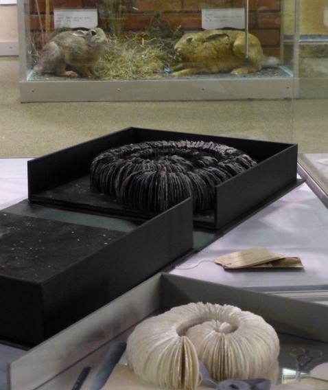
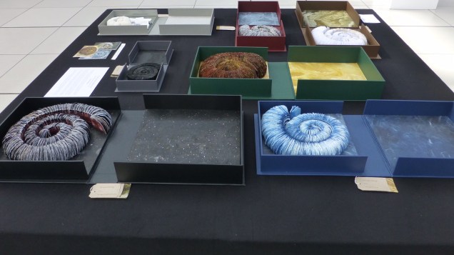
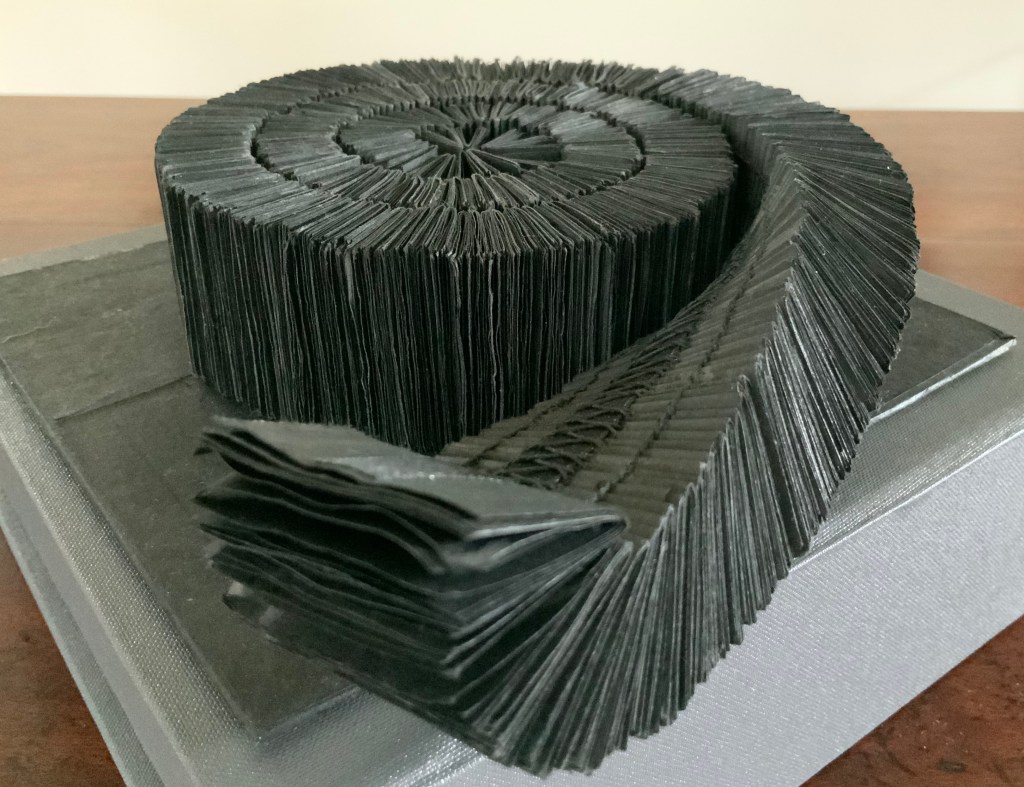
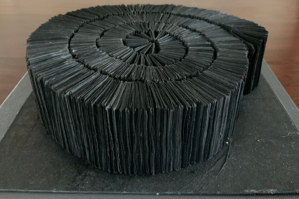
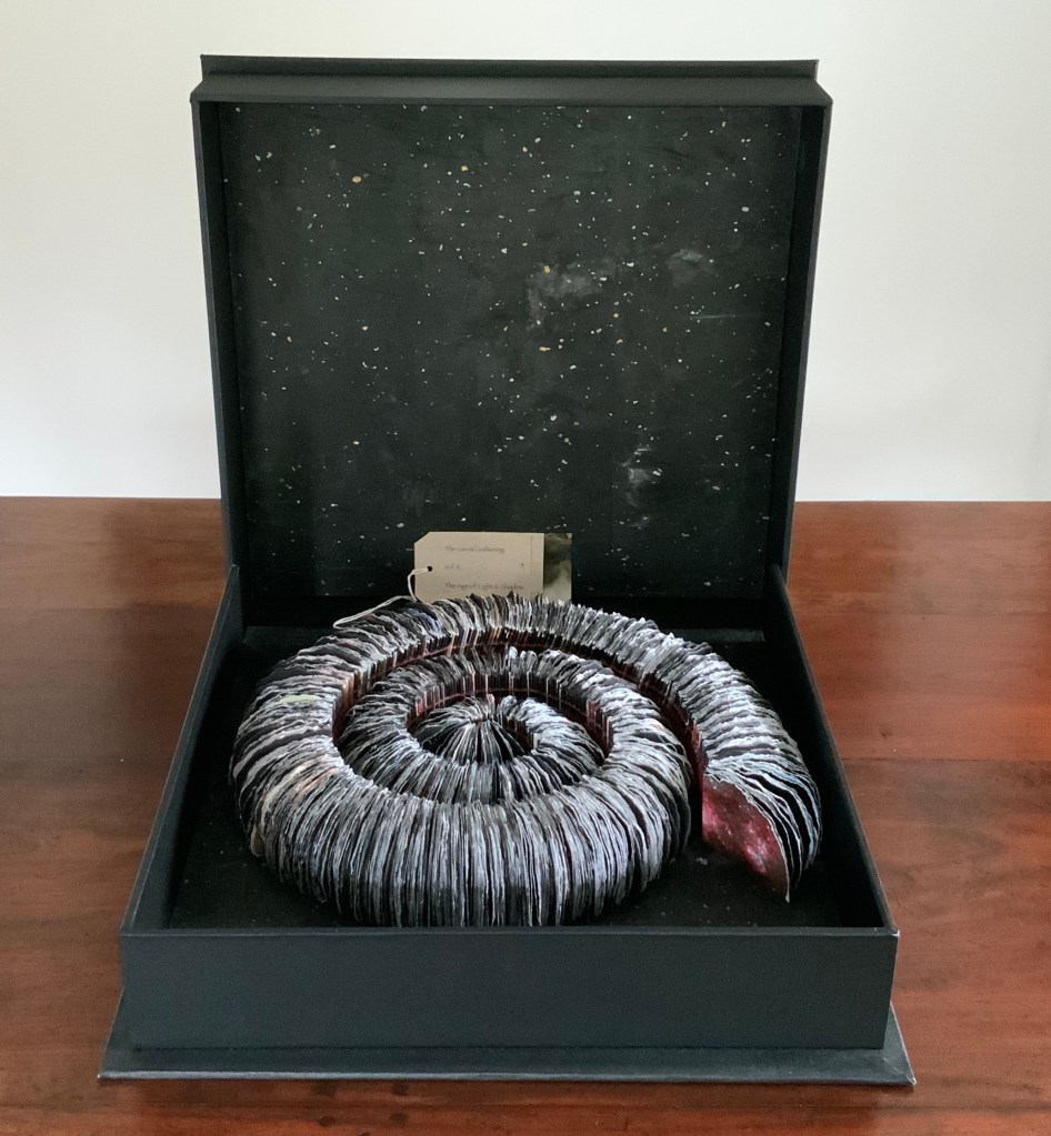
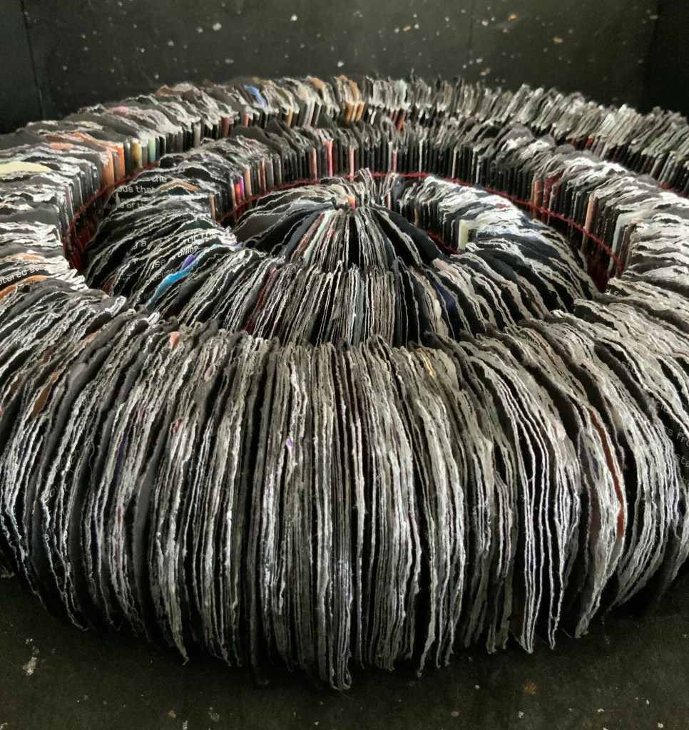
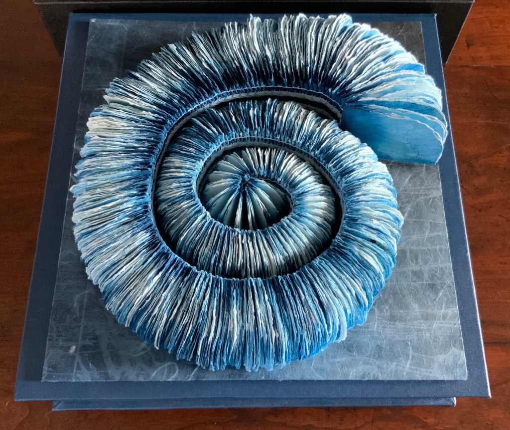
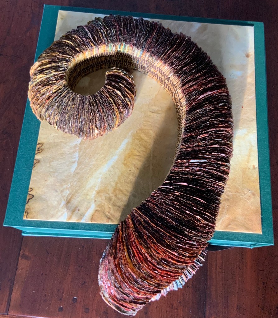
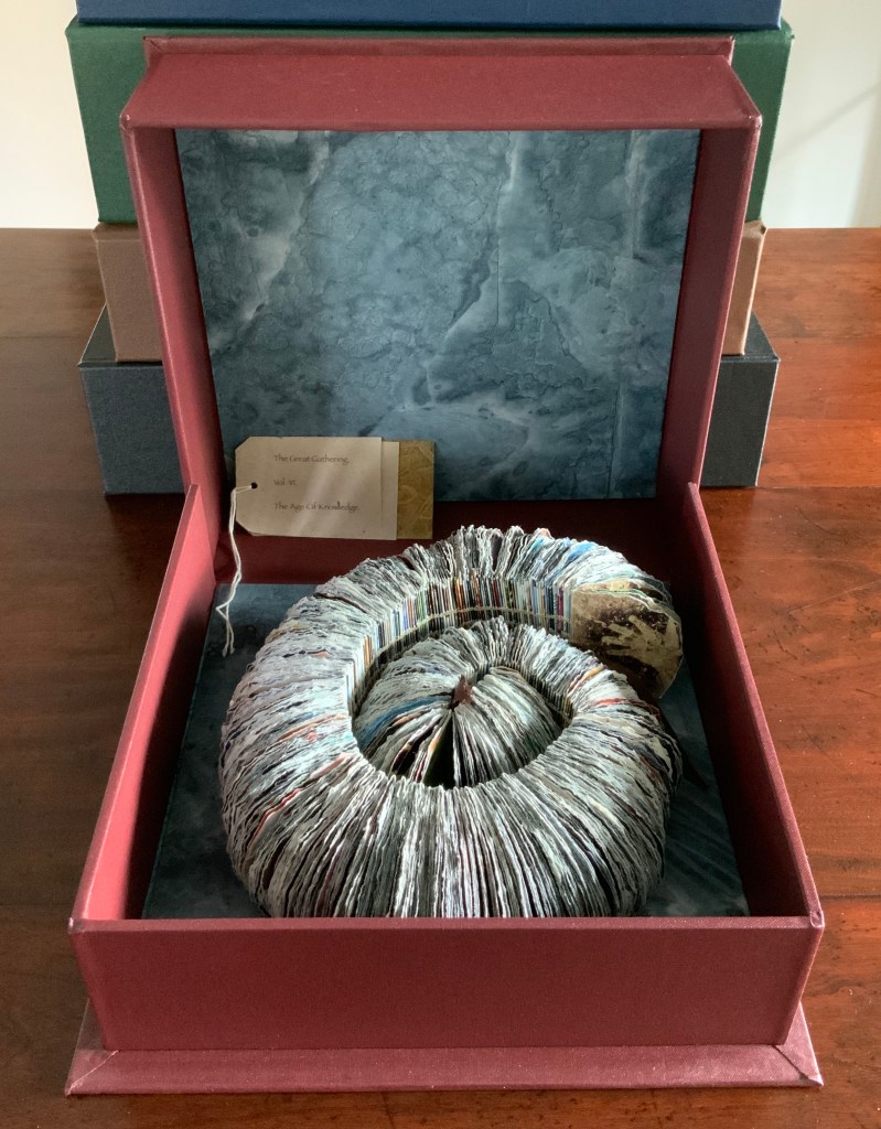
The Great Gathering Seven Books, Seven Moments in Time (2015)
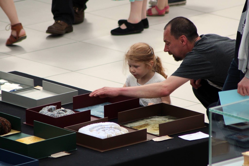
The seven volumes of The Great Gathering (or “the ammonite books”) first appeared as an installation at the Natural History Museum in Colchester from March through May 2016. They then moved to “Turn the Page“ in Norwich, where attendees and visitors awarded the work First Prize in the show.
The Great Gathering, Seven Books, Seven Moments in Time (2015) Chris Ruston Detail of the display at the Natural History Museum, Colchester, Essex. A nicely ironic touch for this seven-fold artwork, the museum is housed in a de-consecrated church. Photo credit: Chris Ruston Acquired from the artist, 27 June 2016.
The Great Gathering, Seven Books, Seven Moments in Time (2015) Chris Ruston Awarded First Prize, on display at “Turn the Page”, Norwich, England, May 2016 Photo credit: Chris Ruston
The Great Gathering reaches beyond the event of one volcanic eruption and introduces human knowing of such events and the associated shadowiness of beginnings and change. Combining traditional techniques of the book arts, painting and sculpture with the biblioclastic techniques of book art, the artist charts our perceptions of the mysteries of cosmic origin (Volumes I and II), the sedimentary earth and the ocean (Volumes III and IV), natural history and human geography (Volumes V and VI) and our creative future (Volume VII).
In using the form of the ammonite fossil as a unifying thread, Ruston reflects the influence of her recurring visits to natural history museums, in particular the Natural History Museum in Colchester and the Sedgwick Museum of Earth Sciences in Cambridge. The use of the ammonite form for the pre-fossil periods of Vol. I Dark Beginnings and Volume II The Age of Light & Shadow might seem odd, but it symbolically underscores the anthropocentric lens through which we naturally explore the origins of the universe and this world in it.
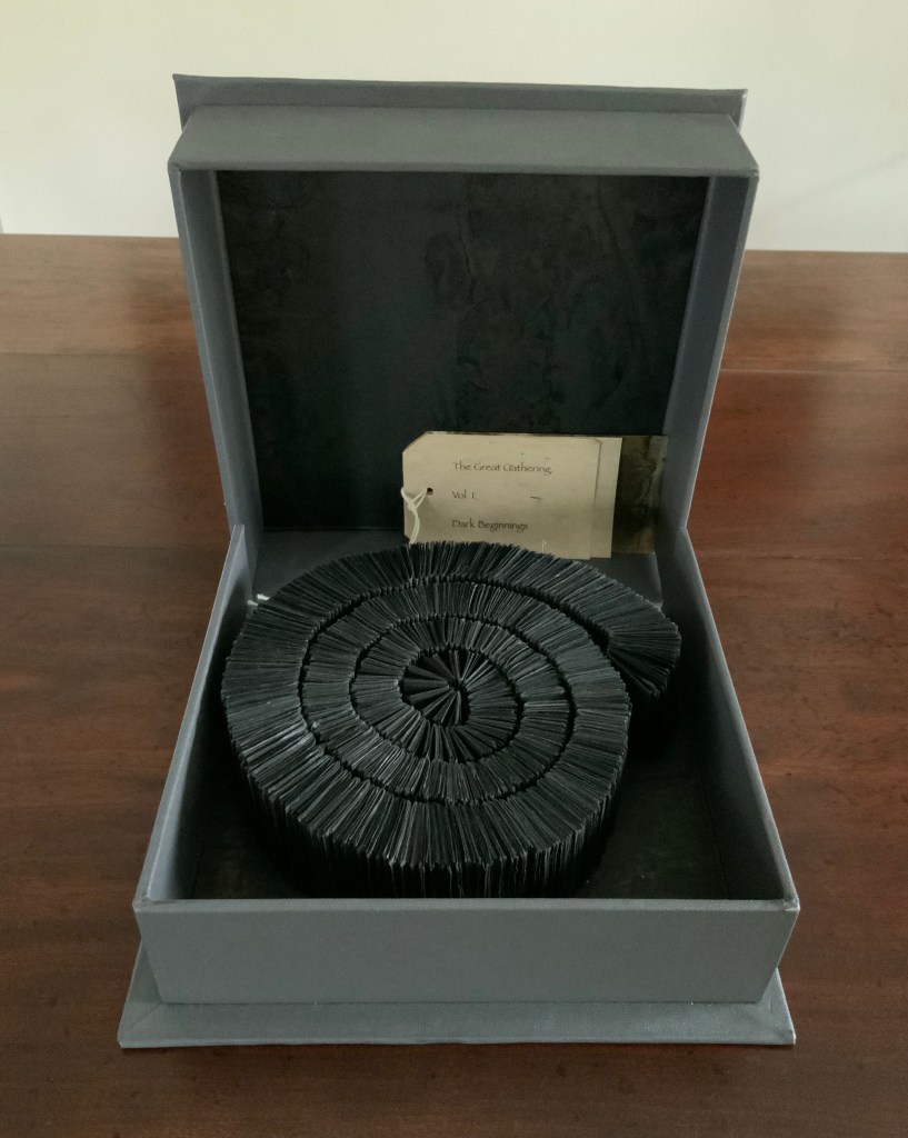
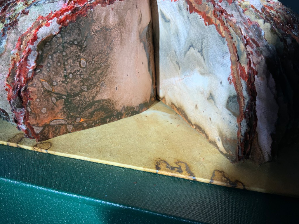
Vol. I Dark Beginnings Box: Greyboard glued in several layers and covered in Buckram Bookbinding cloth. W210 x L210 x D60 mm Lining: Shoji Gami Kozo paper soaked in Sennelier Indian Ink. Pages: Shoji Gami Kozo paper, soaked in Sennelier Indian Ink and then cut to size. Binding: Black Gutterman Thread sewn over tapes.
Fittingly, the first and smallest box contains the only untorn set of pages. All black, the first volume stands against the last volume’s all-white blank pages.
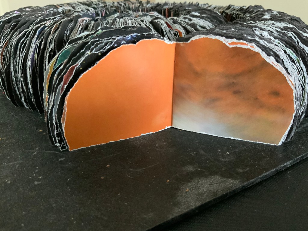
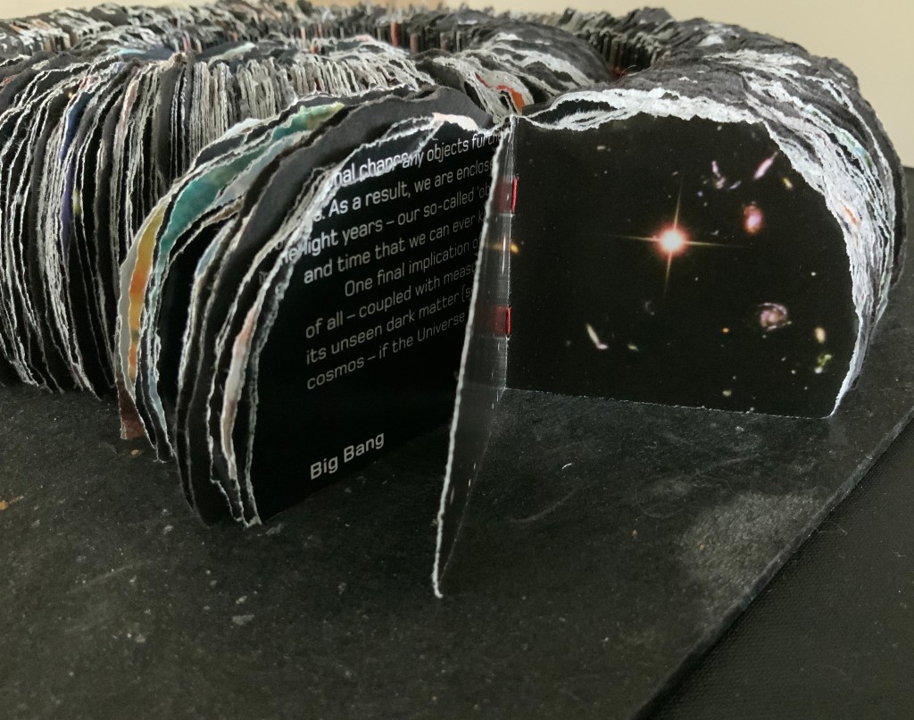
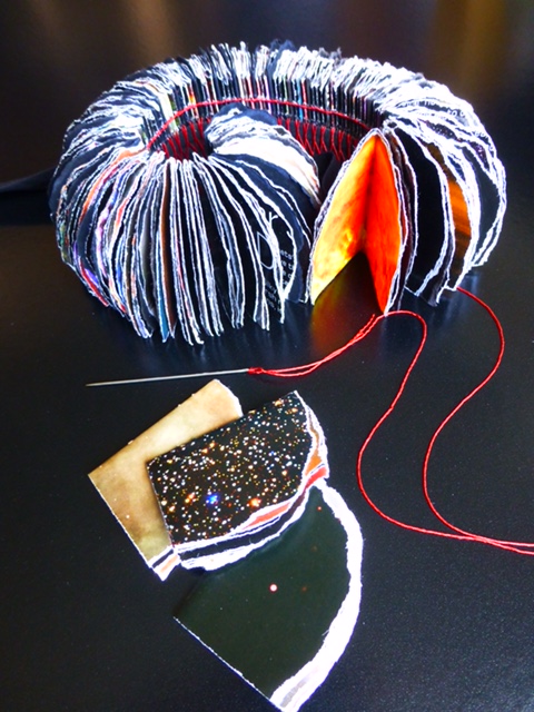
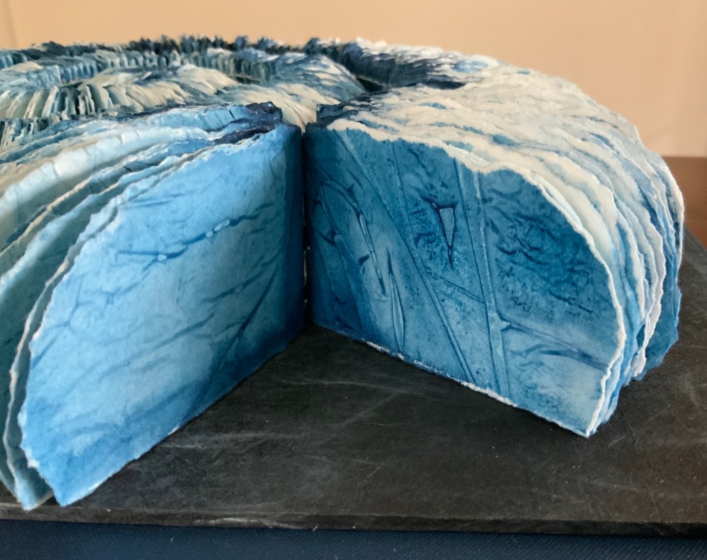
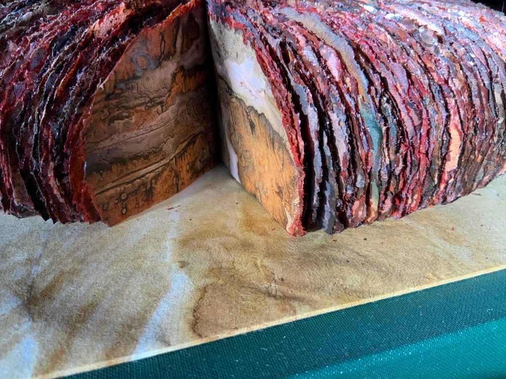
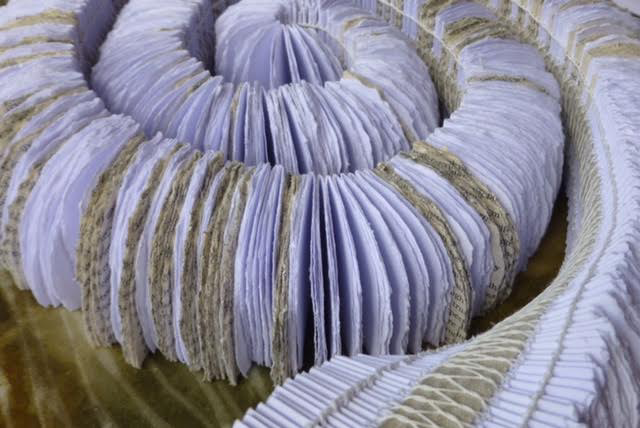
Vol. II The Age of Light & Shadow Box: Box: Greyboard glued in several layers and covered in Buckram Bookbinding cloth. W420 x L410 x D95 mm Lining: Unryu laid over Shoji Gami Kozo paper, painted with various Rohrers Inks. Pages: Torn book pages. Binding: Red Gutterman Thread pamphlet-sewn and sewn over a single tape.
The book from which Volume II’s pages are made is Hubble: Window on the Universe by Giles Sparrow (Quercus Publishing, 2010). The painstaking effort with which the pages have been shaped across the length of the volume and then sewn together leaps out from the finished work and the following work-in-progress photo.
Work in progress: Vol. II The Age of Light and Shadow Photo: Courtesy of the artist.
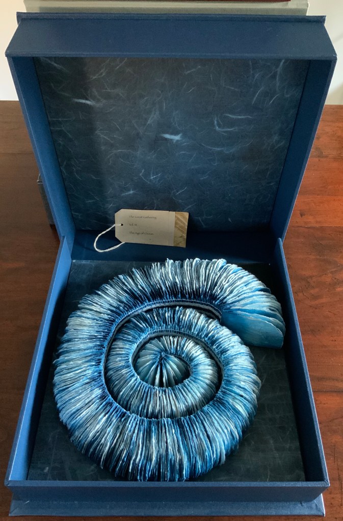
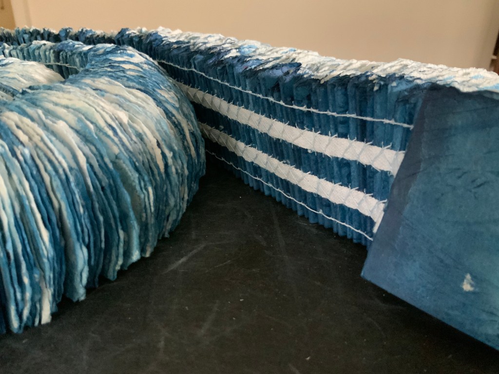
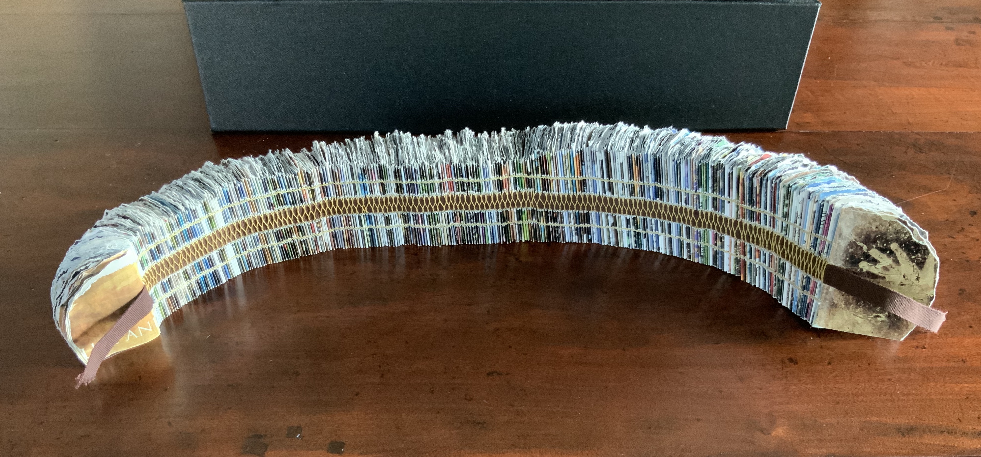
Vol. III The Age of Ocean Box: Greyboard glued in several layers and covered in Buckram Bookbinding cloth. W350 x L360 x H90 mm Lining: Shoji Gami Kozo paper painted with Rohrers Inks. Pages: Fabriano Artistico Watercolour Paper painted with Rohrers Inks. Binding: White Gutterman thread pamphlet-sewn and sewn over two white tapes.
The colours and patterns of all the lining papers and of the pages in Volumes III and IV are so remarkable they are best explained by the artist: “The marks are created by laying the paper on a plastic sheet over a variety of other textured papers. A wash of water is applied carefully with a large soft brush followed by a wash of various Rohrers inks. Once the paper has throughly dried the pages are ‘peeled off’ the plastic. It is similar to a monoprint technique but using watercolour process rather than traditional printing inks.”
Vol. IV The Age of Innocence Box: Greyboard glued in several layers and covered in Buckram Bookbinding cloth. W370 x L480 x D105 mm Lining: Shoji Gami Kozo paper painted with Rohrers Inks. Pages: Fine Rice paper painted with Rohrers inks. Binding: Yellow Gutterman thread pamphlet-stitch and sewn over two brown tapes.
Although the painting technique applied to Volumes III and IV is the same, the visual and tactile effects are as different as sheets of ice on the one hand and sheets of sediment and mineral on the other.
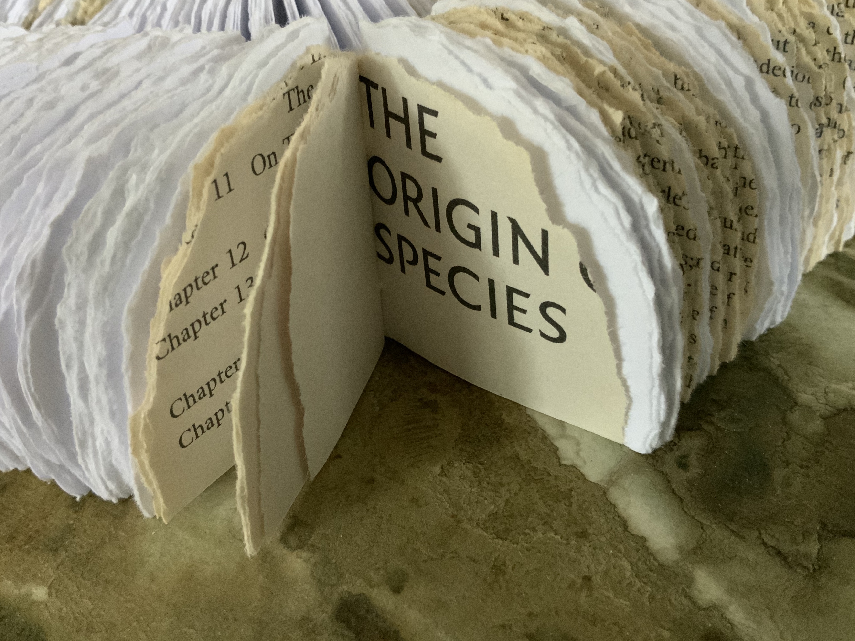
Vol. V The Age of Transition Box: Greyboard glued in several layers and covered in Buckram Bookbinding cloth. W380 x L360 cm x D85 mm Lining: Unryu paper laid over Shoji Gami Kozo paper with Rohrers Ink Pages: Windsor and Newton Smooth Cartridge Paper 220 gsm and torn book pages. Binding: White Gutterman Thread pamphlet-stitch and sewn over a single beige tape.
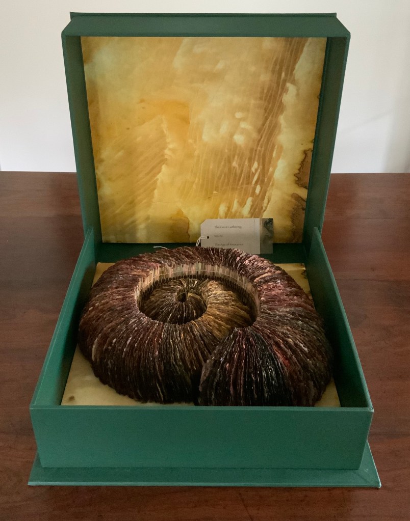
Volume V blends torn pieces of blank white paper with pages torn from a copy of On the Origin of Species. Volume VI draws on pages from National Geographic magazines. While the titles and “contents” of the two volumes suggest a forward, evolutionary movement in human knowledge, the juxtaposition of the sewn binding, carefully torn pages and 30,000-year-old red ochre hand prints and stencils from the Chauvet caves in France evokes a different view of human creativity across time. It is a variant of the suite‘s “ammonite” paradox of the entanglement of constancy and change.
Vol. VI The Age of Knowledge Box: Greyboard glued in several layers and covered in Buckram Bookbinding cloth. W280 x L290 x 100 mm Lining: Shoji Gami Kozo paper painted with Rohrers Inks. Pages: Torn magazine pages. Binding: Yellow Gutterman thread pamphlet-stitch sewn over a single brown tape.
Photos: Books On Books and Courtesy of artist, respectively
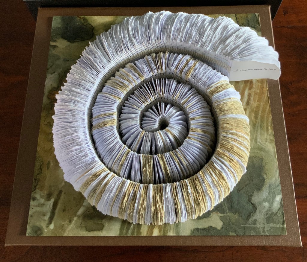
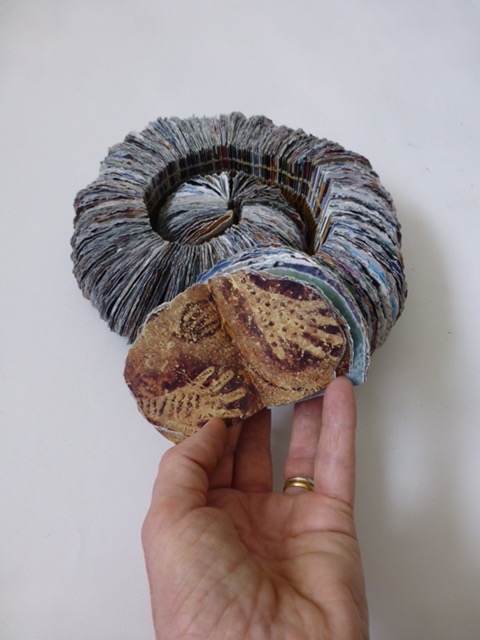
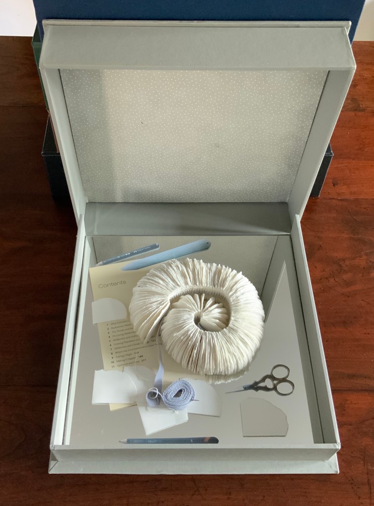
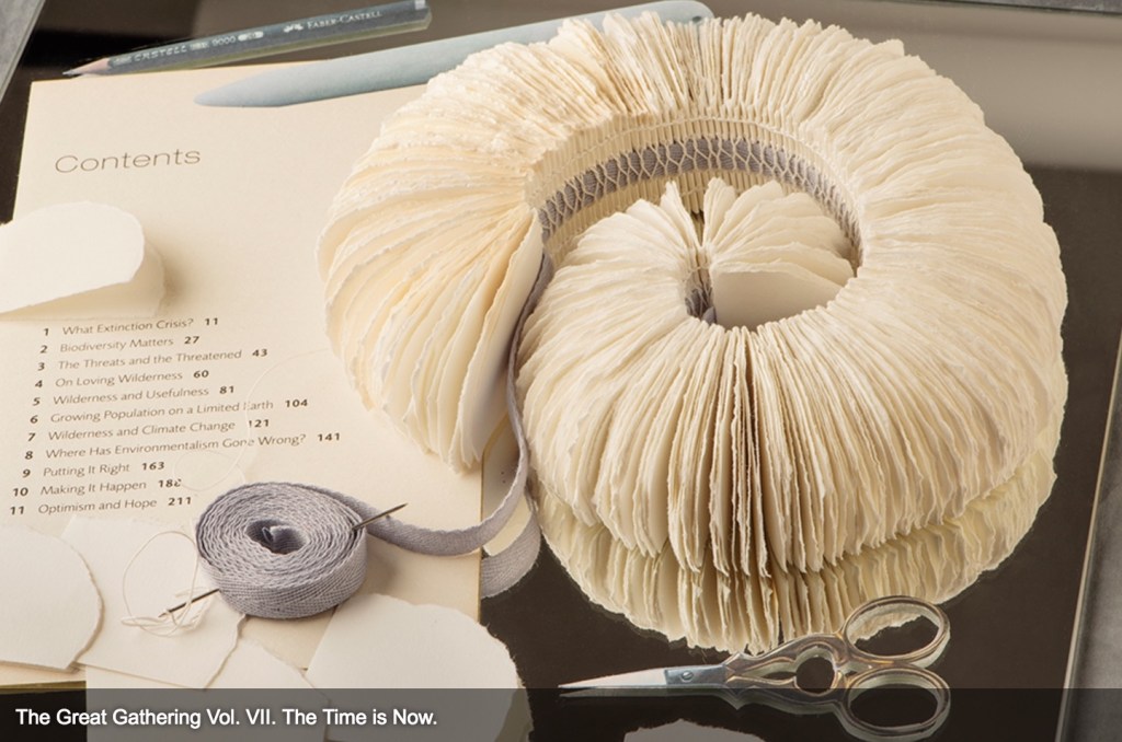
Vol. VII The Time is Now Box: Greyboard glued in several layers and covered in Buckram Bookbinding cloth. W330 x 330 x D75 mm Lining: Nepalese Decorative paper made with Lokta fibres – Little Dot – Pale Grey. Assemblage of pages of Blank Windsor and Newton Smooth Cartridge Paper 220 gsm pamphlet-stitch sewn with white Gutterman Thread over a single grey tape, among cut photos of objects and Contents page from Planet earth – the future: what the experts say by Fergus Beeley, Mary Colwell and Joanne Stevens (BBC Books, 2006) pasted to a mirror.
The seventh and concluding volume offers a sort of boxed performative installation platformed on a mirror that implicates any viewer who leans over to take a closer look. A reminder that, whether from a scientific perspective or that of modern aesthetic theory, observation affects and effects results. And a closer look at the table of contents pasted to the mirror offers another reminder: that all of us in the present anthropocene era are implicated in the planet’s future.
In progress Photo: Courtesy of the artist
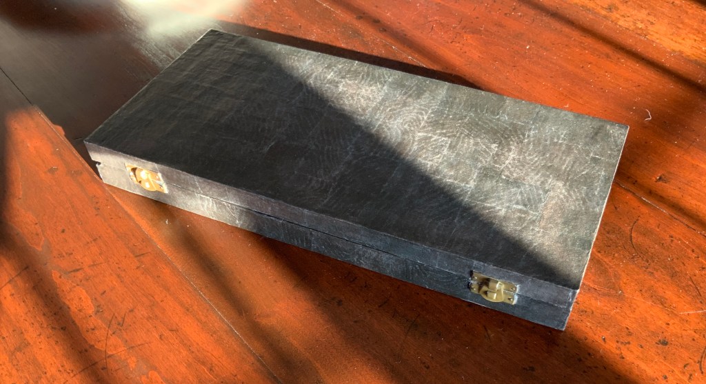
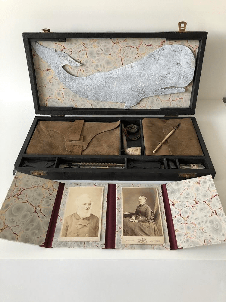
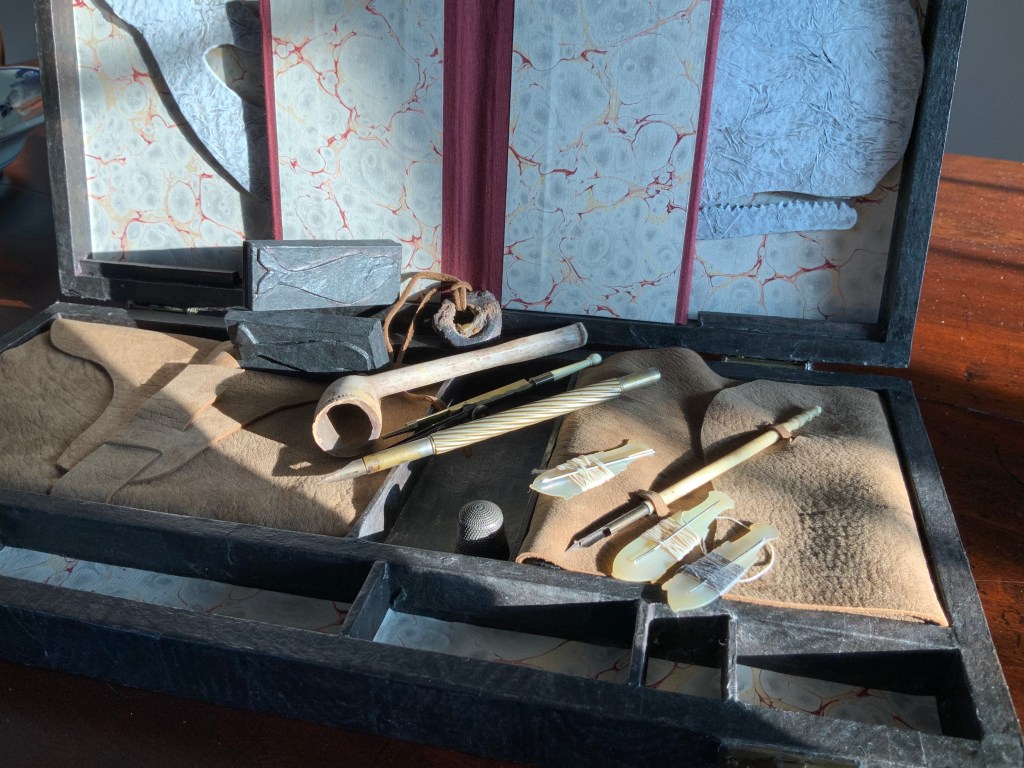
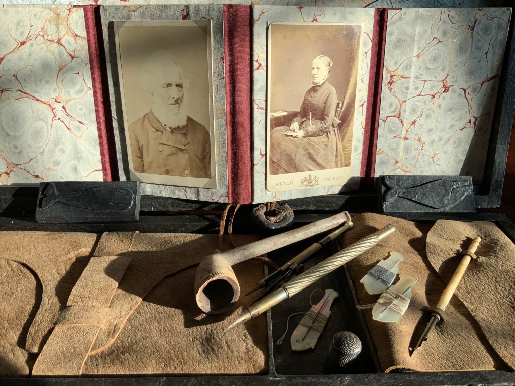
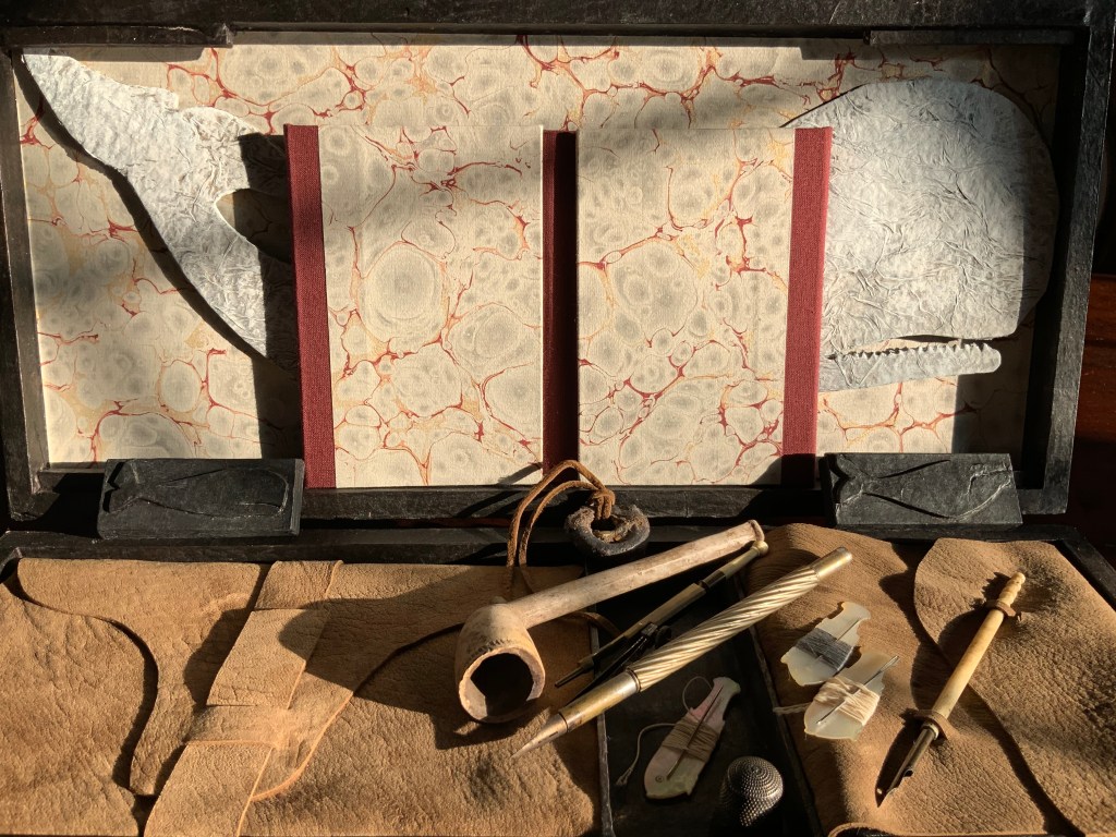
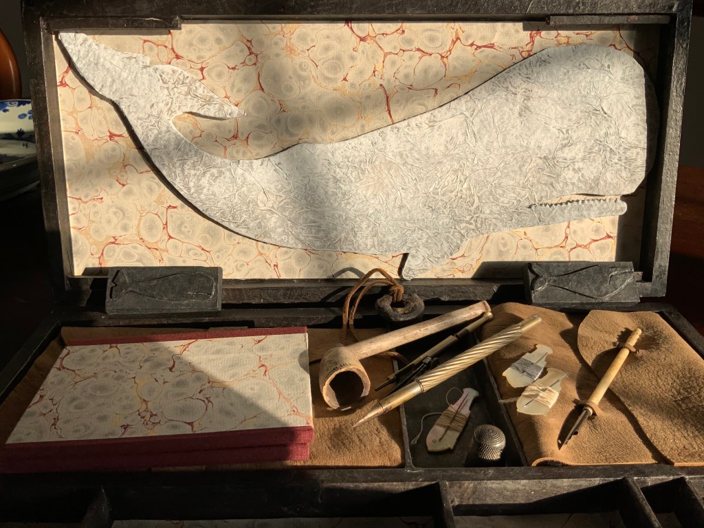
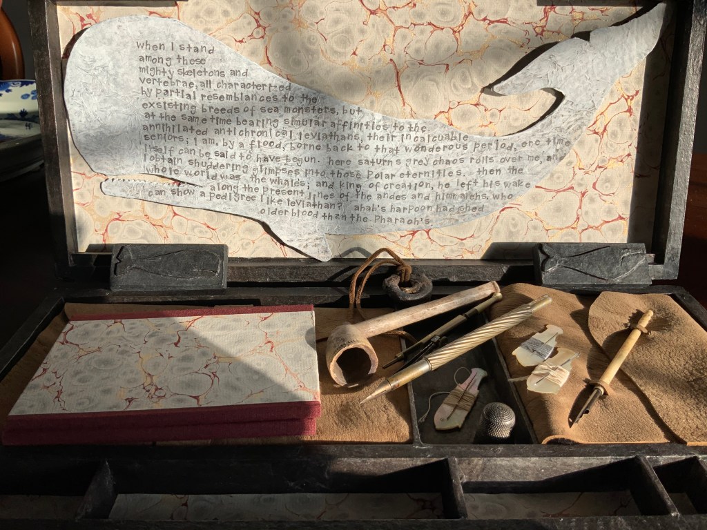
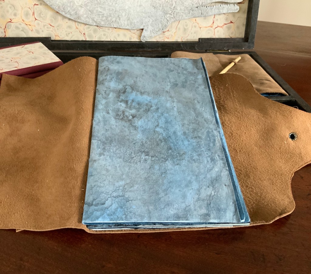
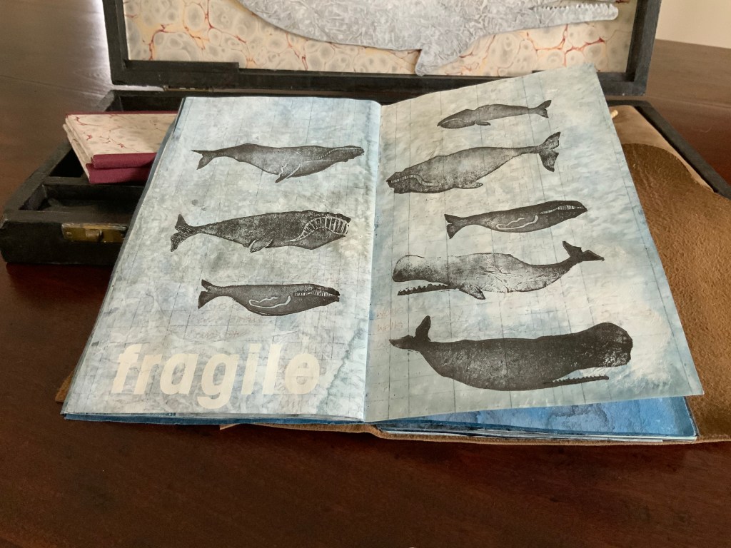
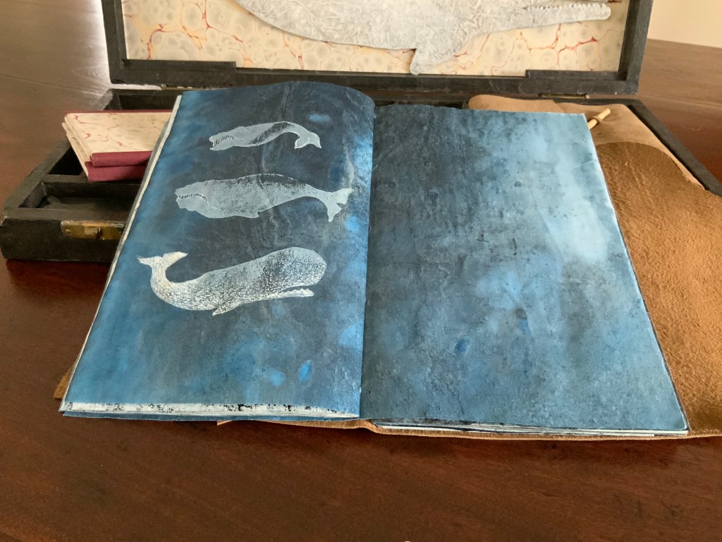
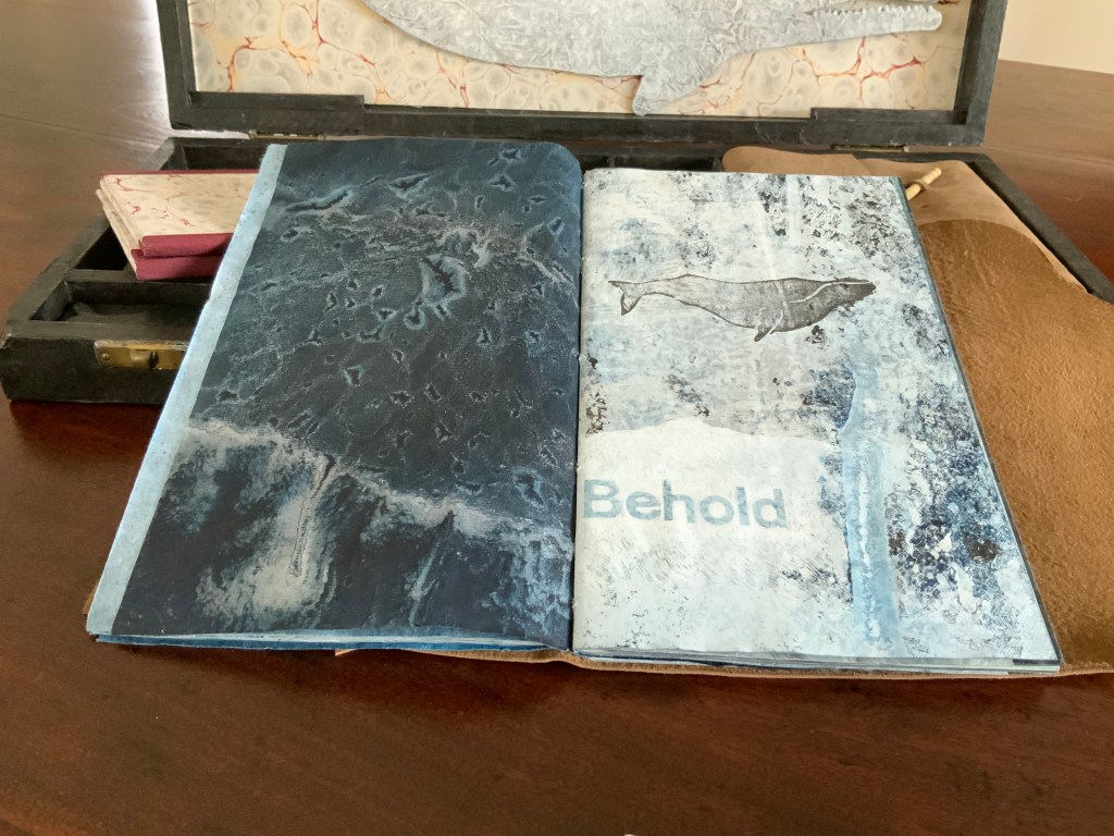
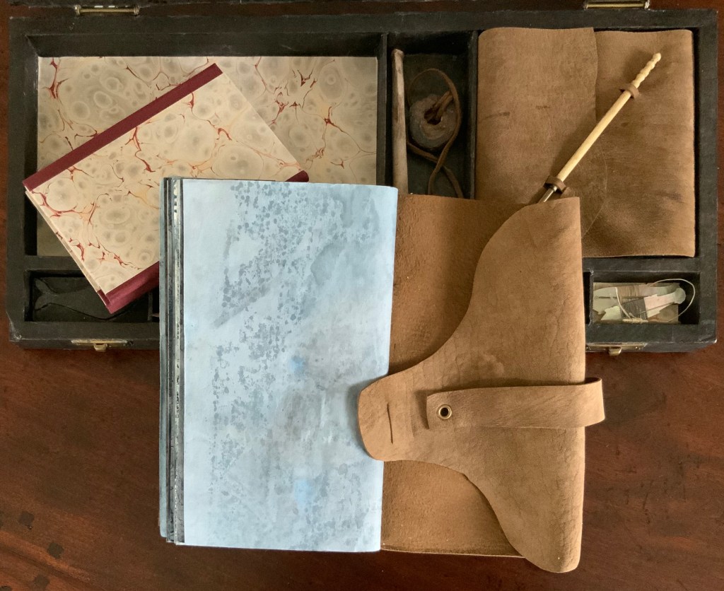
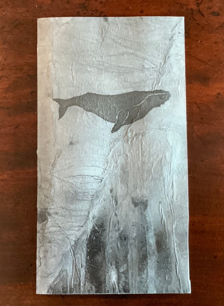
Lost Voices Artist’s Books The Captain’s “Ditty Box” (2017)
The Great Gathering has an optimistic innocence to it. It moves from The Age of Transition to The Age of Knowledge. By openly alluding to the diligence in the series‘ creation, Volume VII suggests an art- and science-based path to the future. Even the last chapter of the pasted-down Contents page is “Optimism and Hope”. But Ruston’s more recent works leaven that with a lament for what has been and is still being lost.
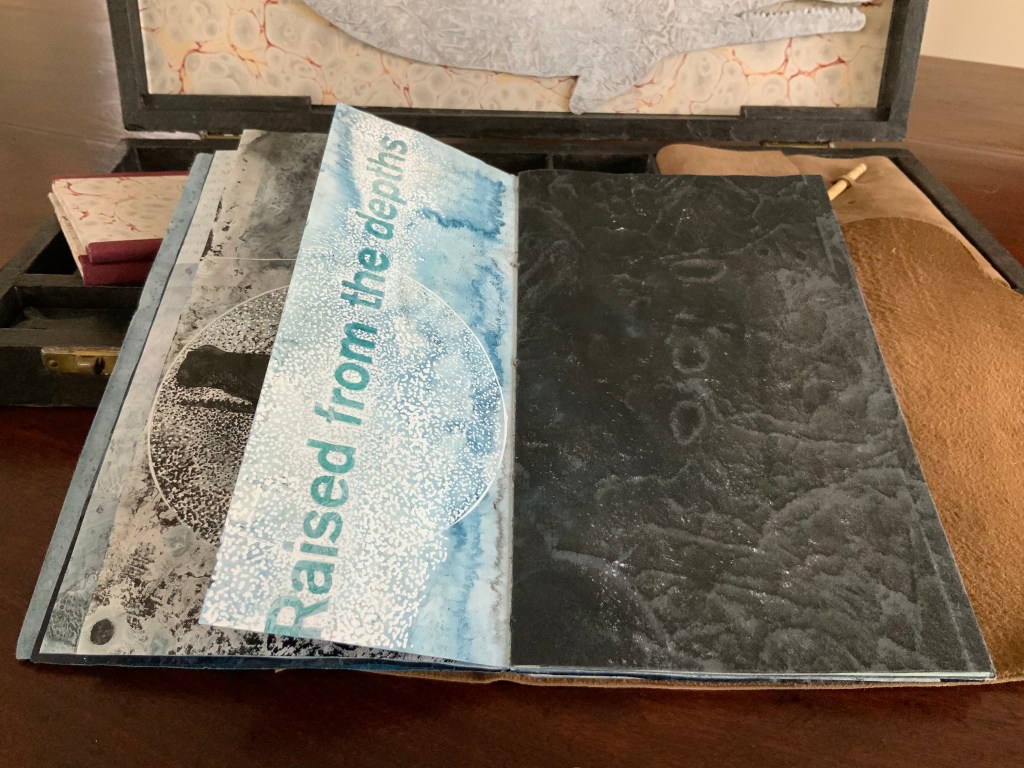
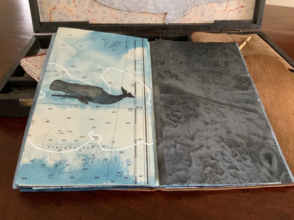
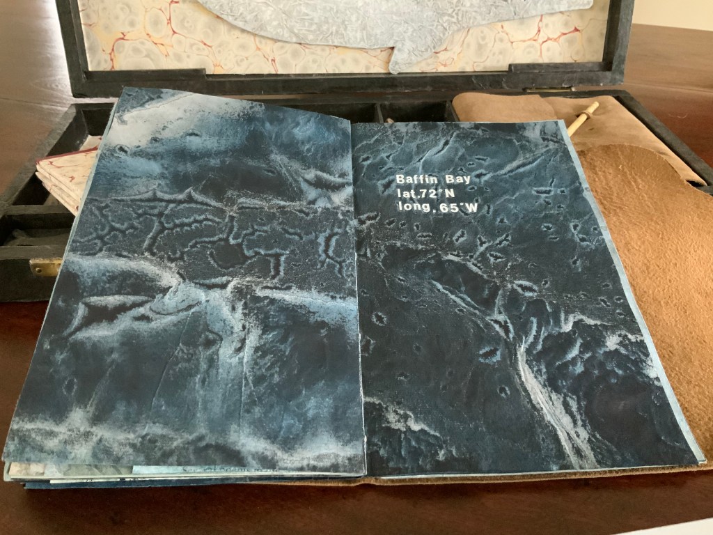
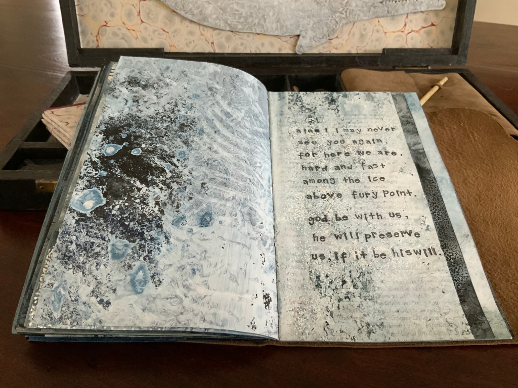
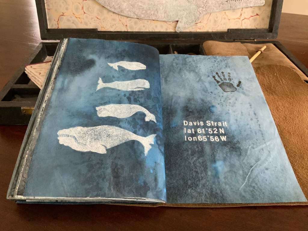
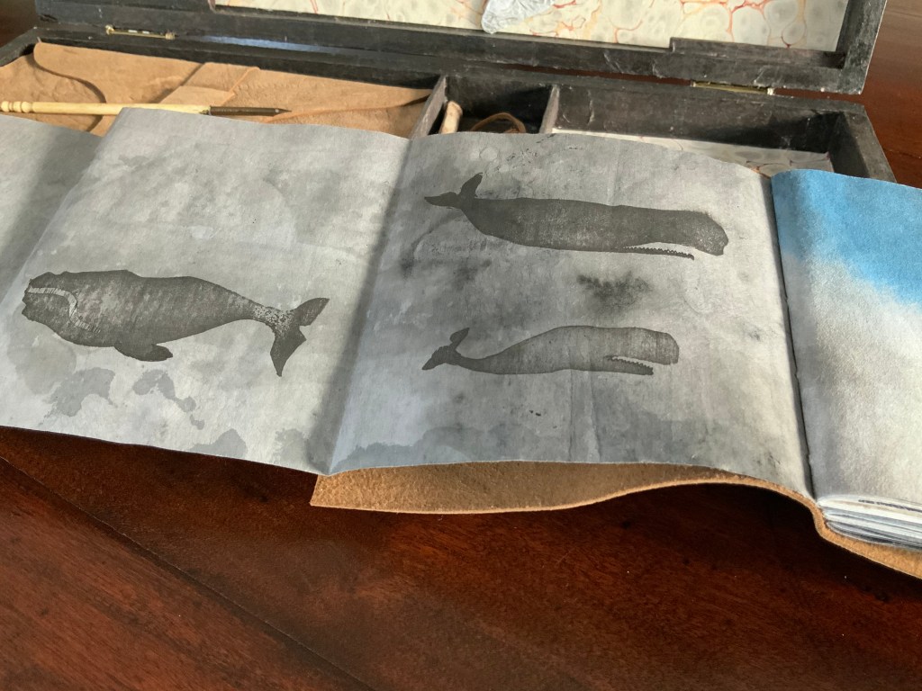
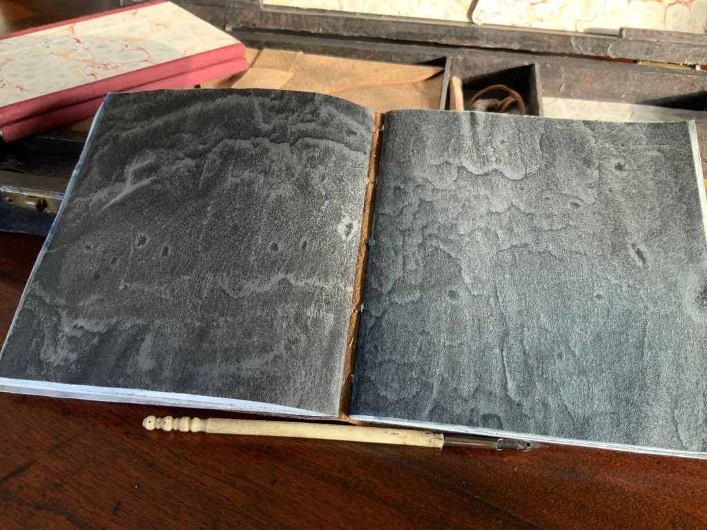
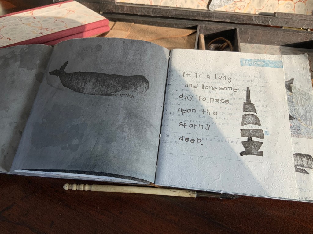
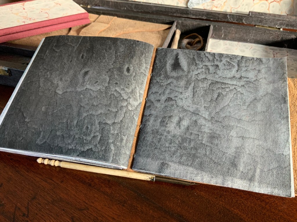
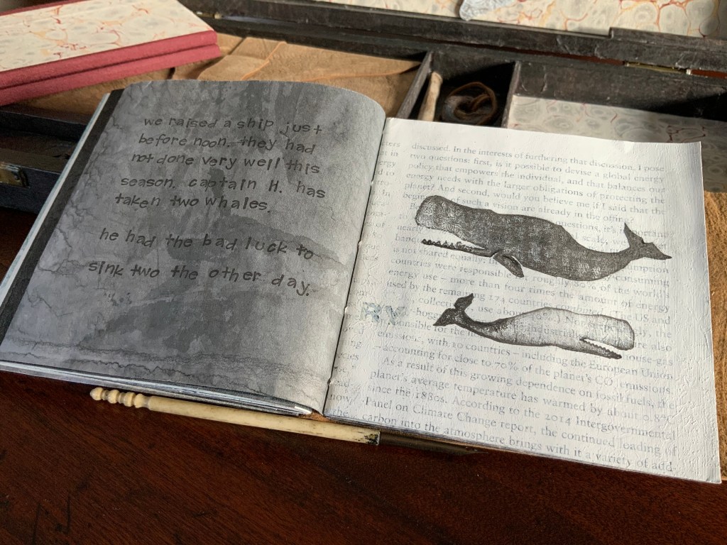
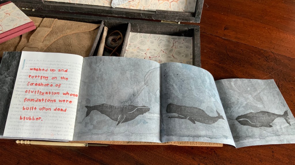
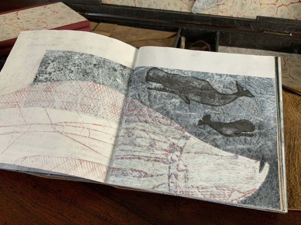
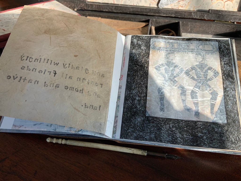
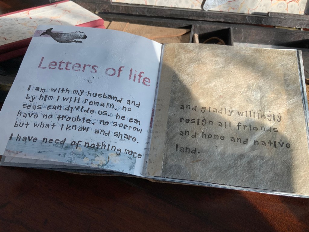
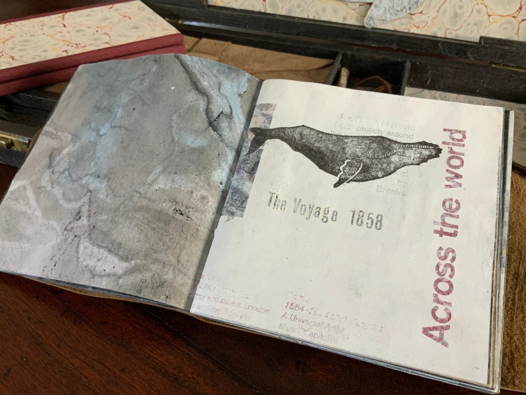
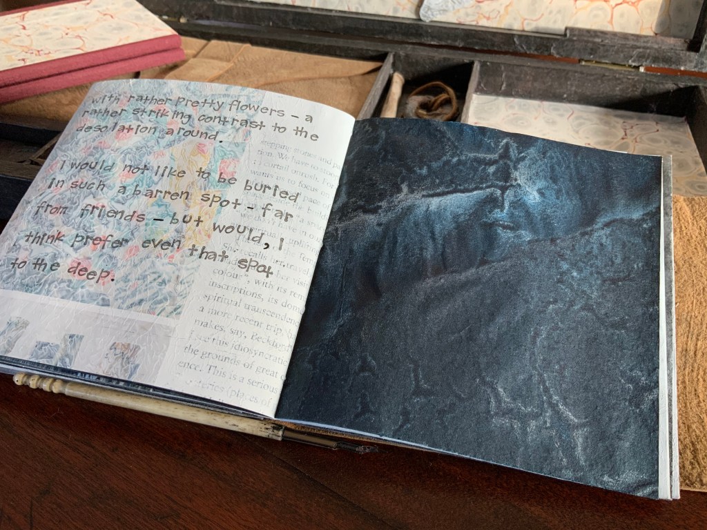
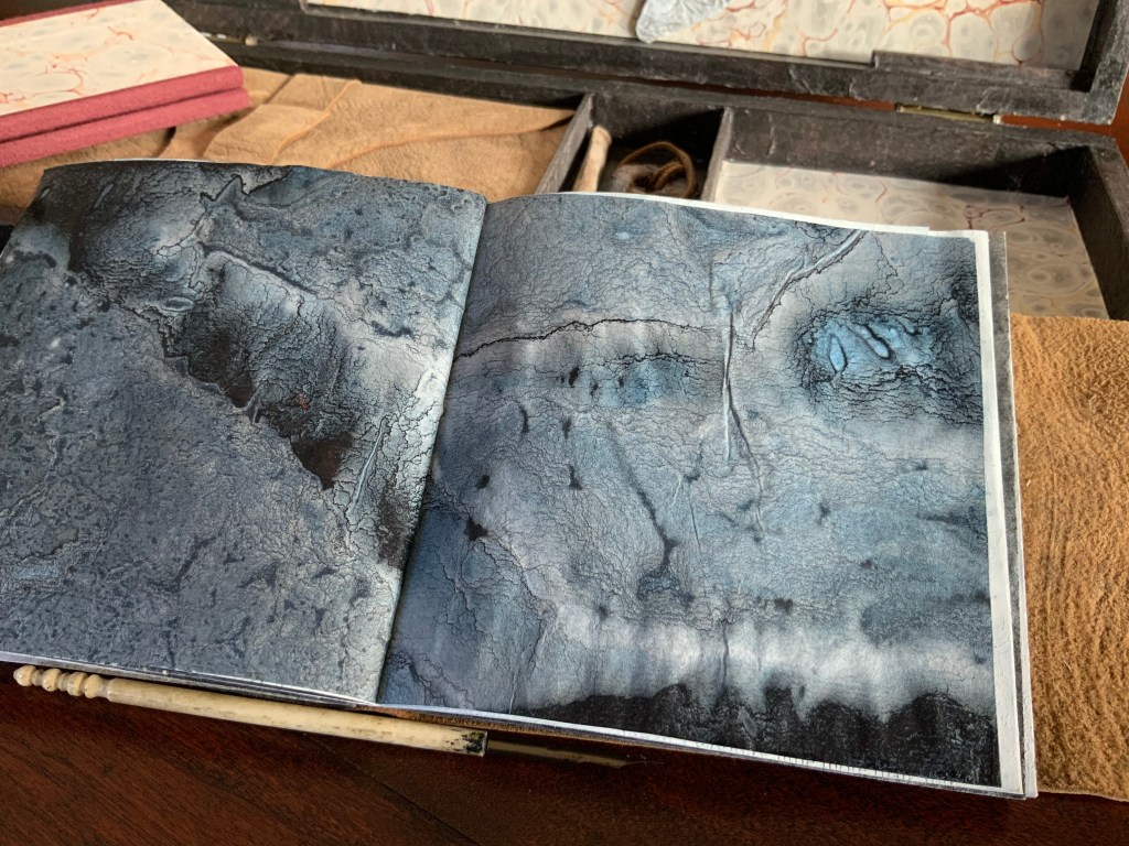
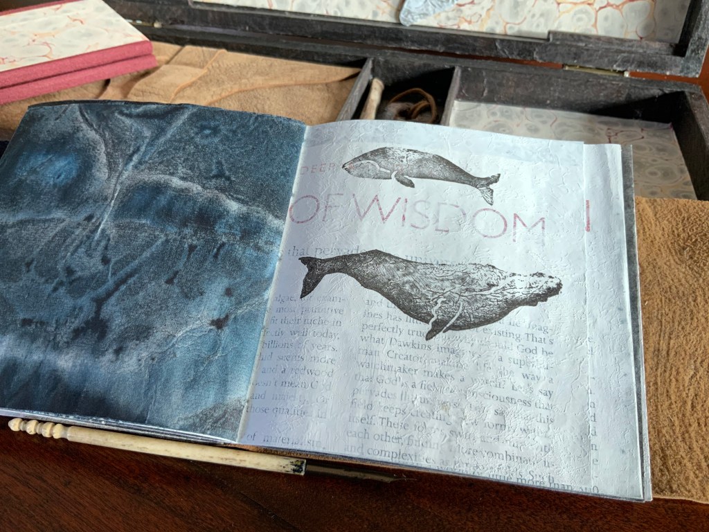
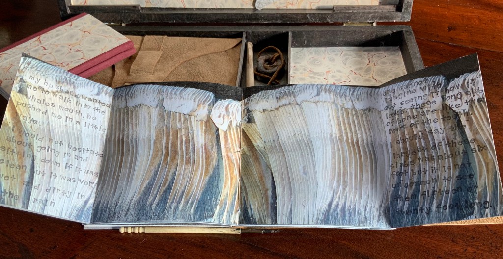
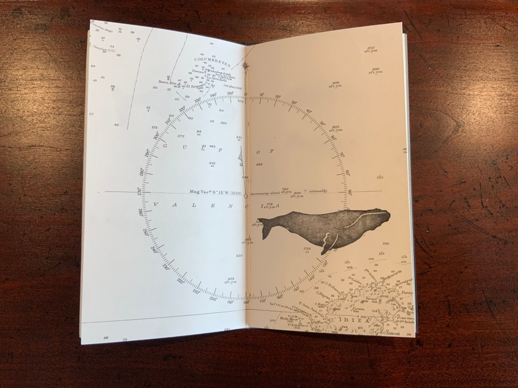
Lost Voices Artist’s Books The Captain’s “Ditty Box” (2017) Chris Ruston Repurposed wooden box: H150 x W325 x D40 mm, containing two unique palimpsest journals and various objects. The text in both journals — The Captain’s Log Book and his Wife’s Journal — is hand printed with rubber stamps or hand written. The images are drawn, hand printed with rubber stamps or painted. The papers consist of Gampi, Kozo, Fabriano and Resurgence Magazine pages; the latter are coated in gesso to submerge the text. The fold-out page in the Wife’s Journal is a photo of whale’s baleen (taken in the Natural History Museum, London) backed with a darker inked sheet. The bindings for the log book and journal are limp leather. Sources of text: Moby-Dick, or The Whale by Herman Melville (Harper and Bros, 1851); One Whaling Family by Harold Williams, ed. (Houghton Mifflin Co, 1964); Whale Nation by Heathcote Williams (Jonathan Cape, 1988); The Hull Whaling Trade: An Arctic Enterprise by Arthur G. Credland (The Hutton Press Ltd, 1995); Heroines and Harlots, Women at Sea in the Age of Sail by David Cordingly (Random House, 2001); and Resurgence Magazine. Acquired from the artist, 1 December 2019.
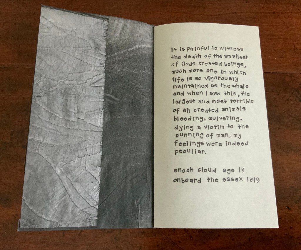
Here is a work of art that invites the very acts required by a keepsake box: unpacking, manipulation, rearrangement, regarding and repacking. Only by responding to the invitation do discoveries within discoveries come. On one level is the discovery (or recovery) of the lost voices of a whaling captain, his wife and child, his crew and the creatures they hunt. On another level are voices from other times that underlay and overlay the mid-nineteenth century voices in a time-twisting palimpsest that leaves the reader/viewer in a limbo of pasts, presents and futures. On yet another level are the found objects (pens, a clay pipe) from the past that rest alongside objects clearly made by the artist in the present (the sperm whale cutout and coloured lining papers).
The white cutout of a sperm whale and the inscription from Moby-Dick on its reverse reflects one of several inspirations for this assemblage. Others came from the artist’s wide reading (noted in the opening caption above), trips to Hull and visits to museums as with The Great Gathering, but perhaps most important is the one that came from the creative process:
I love the process of building a history onto the page – things can be ‘hidden’ leaving just a trace, or revealed in part fragments. During this period of whaling it wasn’t unusual that journals and ledgers were reused due to the cost of paper. This was the inspiration and starting point in making these journals. Correspondence with Books On Books,
The Captain’s Log Book
In every respect except the captain’s and his wife’s own words, the log and journal are artifice. Not even all the words belong to them. By letting the words from elsewhere and other times bleed through or overlay their words, by painting and ink stamping over the words, Ruston is stealing the phenomenon of palimpsest from the realm of artefact for that of artistic technique.
Pages overdrawn or ink-stamped, watercolor printing, use of mixed papers, manipulation of spread layouts and fold outs, hand stitching — so many of the techniques of book art and the book arts are brought to bear in the log and journal that they echo the assemblage that The Captain’s Ditty Box is.
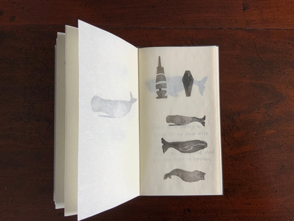
The Wife’s Journal
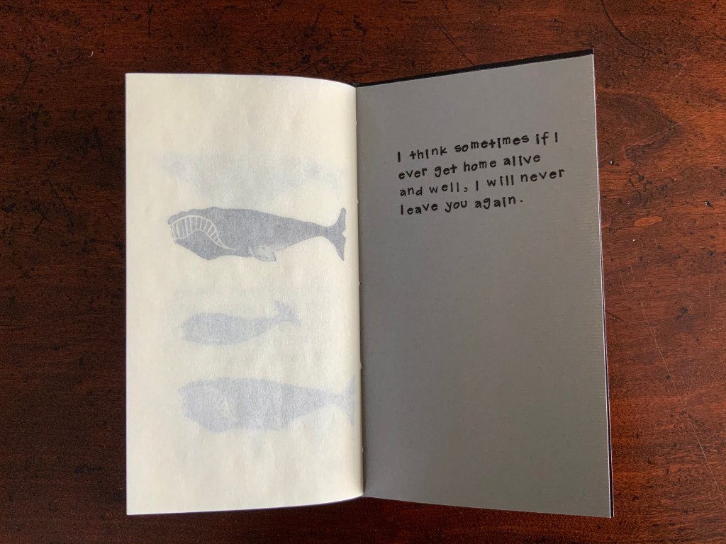
The inclusion of The Wife’s Journal underlines the artist’s embrace of the surprising fact that women and their children did ship on the whalers. Physically, the Journal is as “muscular” as the Log. The use of gesso to ‘knock back’ the text on the printed sheets changes their texture and makes them feel stiffer and heavier. Turning the stiffened pages and the pages made of translucent Gampi and Kozo gives a tactile imitation of the visual palimpsest.
With its reference to the baby, the Journal has its tendernesses. But even with these and her moment of fastidiousness about entering the mouth of a beached whale, the captain’s wife has the air of a natural historian and seafaring field biologist.
Through its keepsake-box metaphor, The Captain’s Ditty Box is an immersion in time. Through the artist’s choice of assemblage and palimpsest as technique, it is an immersion in natural and human consequences.
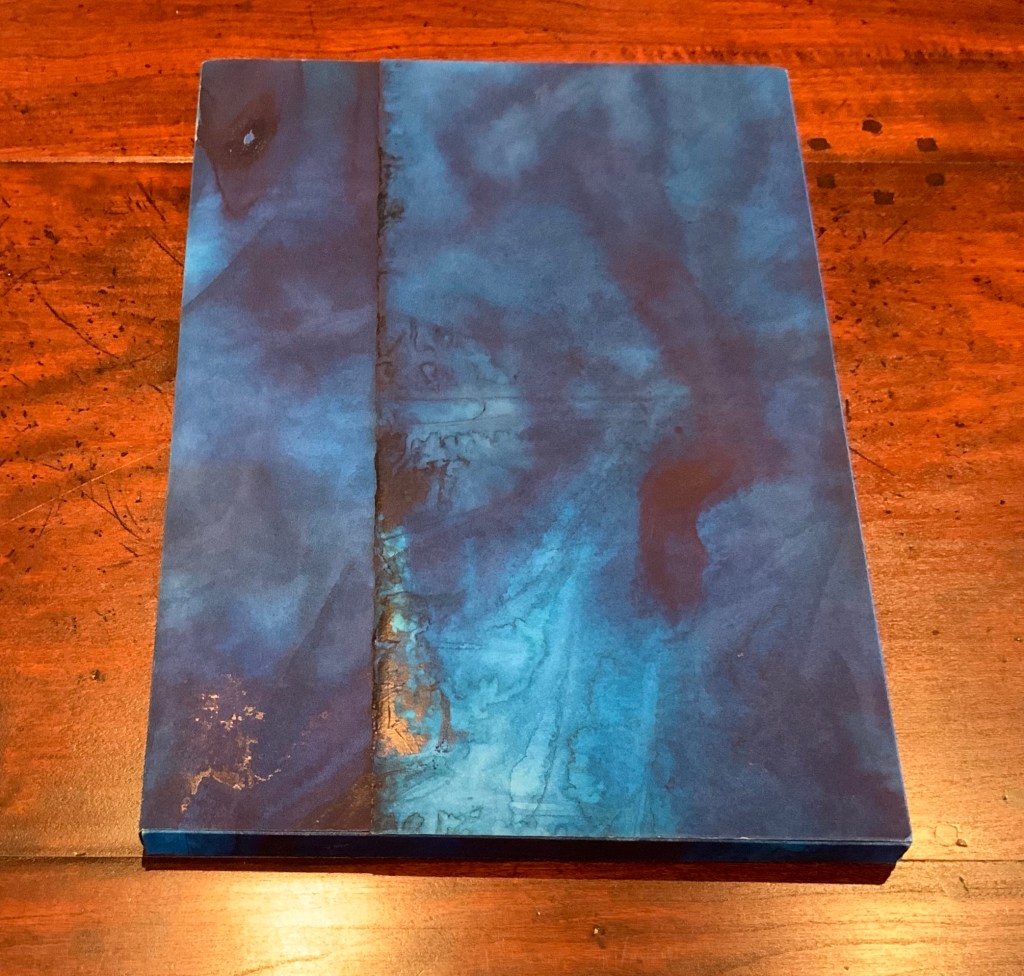
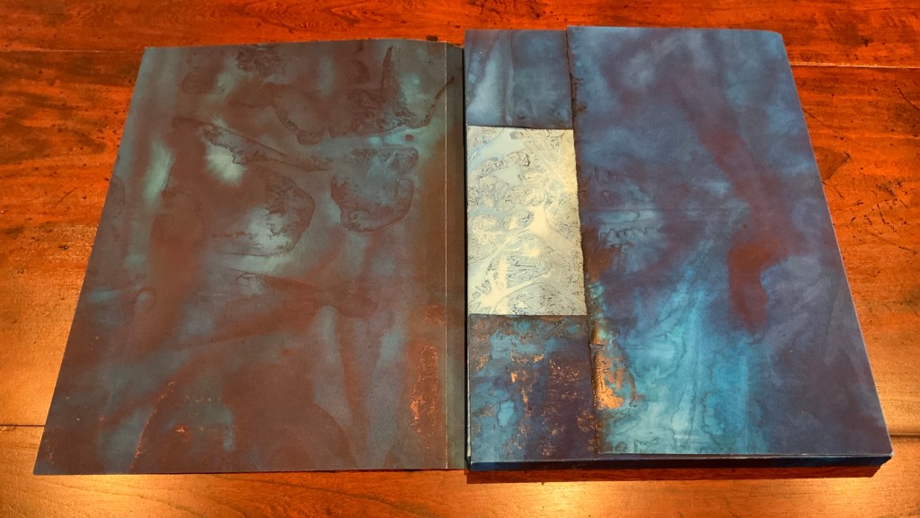
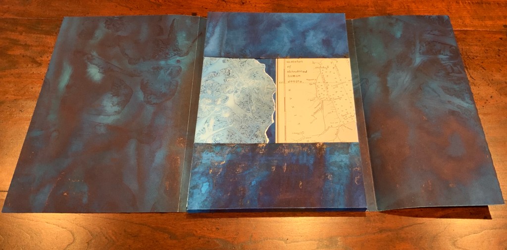
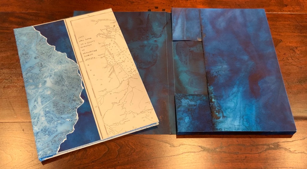
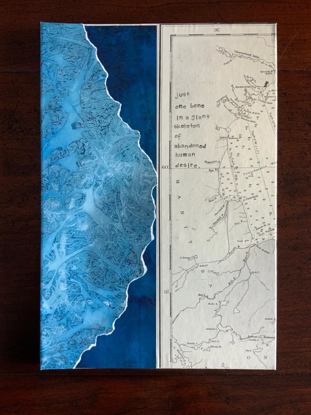
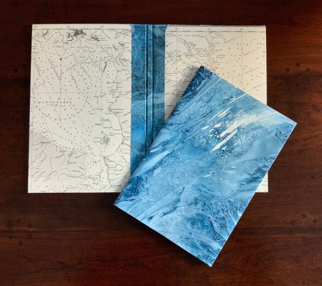
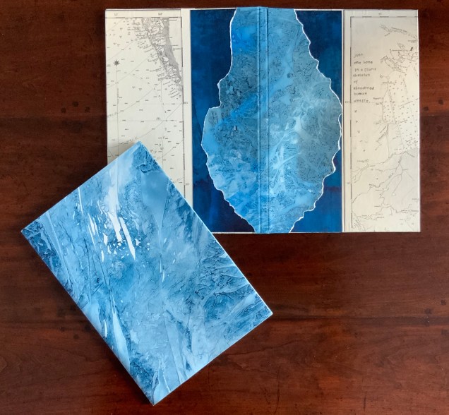
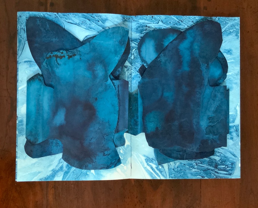
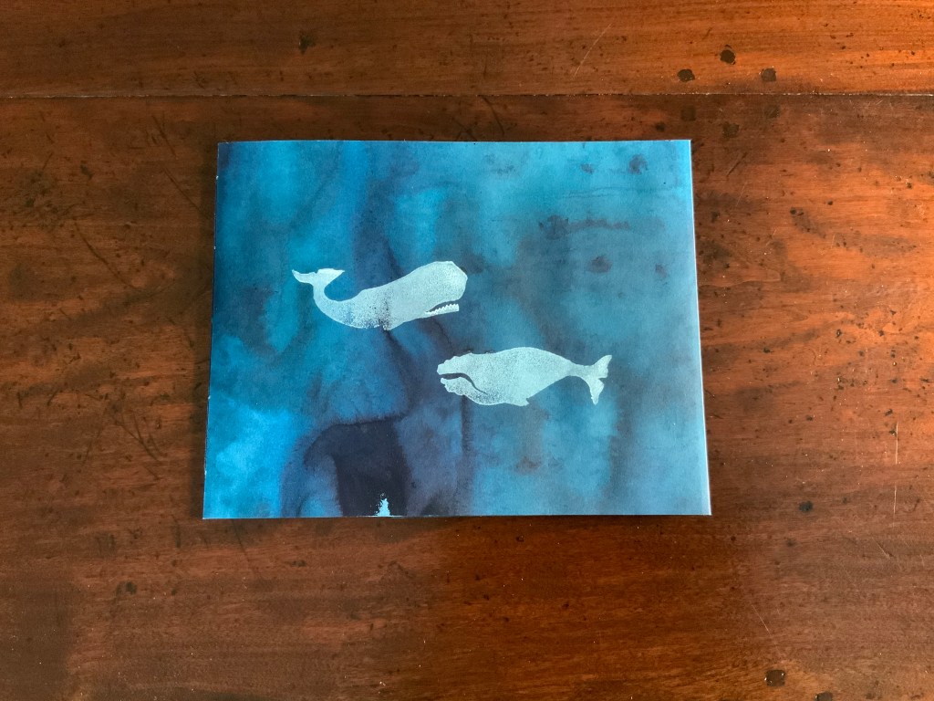
Lost Voices Artist’s Books Just One Bone… (2017)
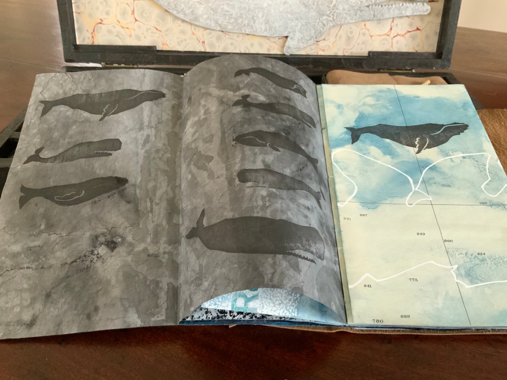
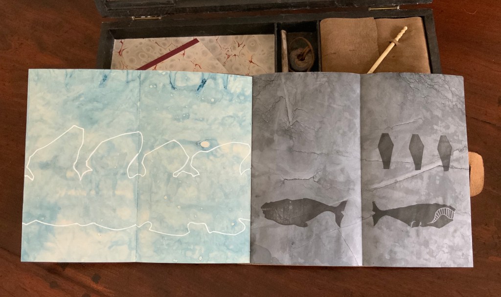
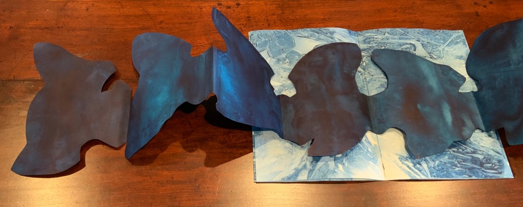
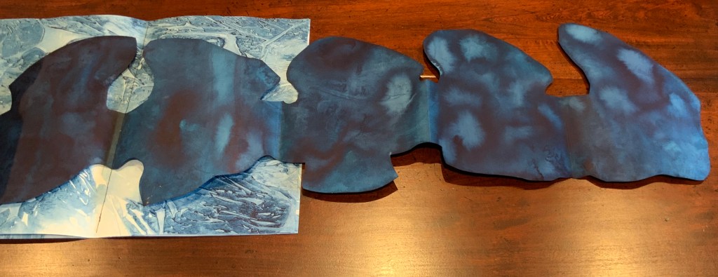
Lost Voices Artist’s Books Just One Bone… (2017) Chris Ruston Fabriano Artistico Watercolour Paper. Double gate fold, with a fold out central page. Sewn together with pamphlet stitch. Board cover consisting of collaged vintage sea chart, and hand painted paper. Painted paper envelope wraps around the book. Text: Moby -Dick ,’The Whale’ by Herman Melville (Harper and Brothers, 1851) and The PowerBook by Jeanette Winterson (Jonathan Cape, 2000). H340 x W215 x D150 mm. Acquired from the artist, 1 December 2019.
Just One Bone is a different kind of assemblage, yet with similarities and ultimately the same aim. The multiple folders or enclosures reprise those of the “ditty box”, and as with the log book’s and journal’s palimpsest pages, there are layers on layers here.
The double gate-fold silhouette of a whale’s vertebrae below echoes the multi-page white outline in The Captain’s Log above.
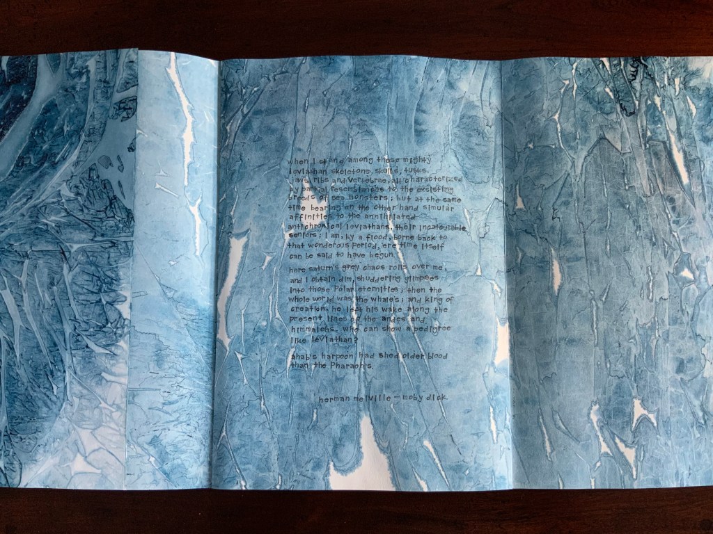
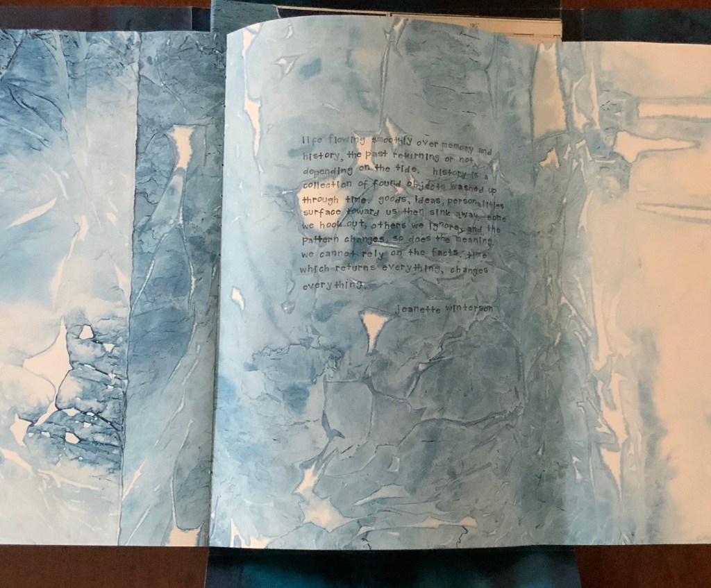
Just One Bone may begin with the same handwritten quotation from Melville that appears on the cutout in The Captain’s “Ditty Box”, but it concludes with lines from Jeannette Winterson clearly articulating the aim underlying both works.
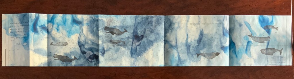
Whaling Logbook (2017)
Whaling Logbook (2017) Chris Ruston Soft cover, Pamphlet Stitched pages Various papers including Ingres paper and Translucent paper. Hand carved stamps and text printed using rubber stamps. Inks. H190 x W110 mm. Acquired from the artist, 1 December 2019.
Compared to Lost Voices, The Whaling Log Book and Moby Dick (below) are small. They may be works preparatory to, or left over from, The Captain’s Ditty Box and Just One Bone. Although less wide-ranging, they each deliver.
The Whaling Log Book celebrates those handstamps used on whaling ships to document sightings and, at the same time, strikes dual notes of lament and loneliness.
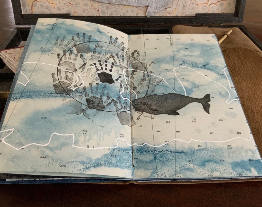
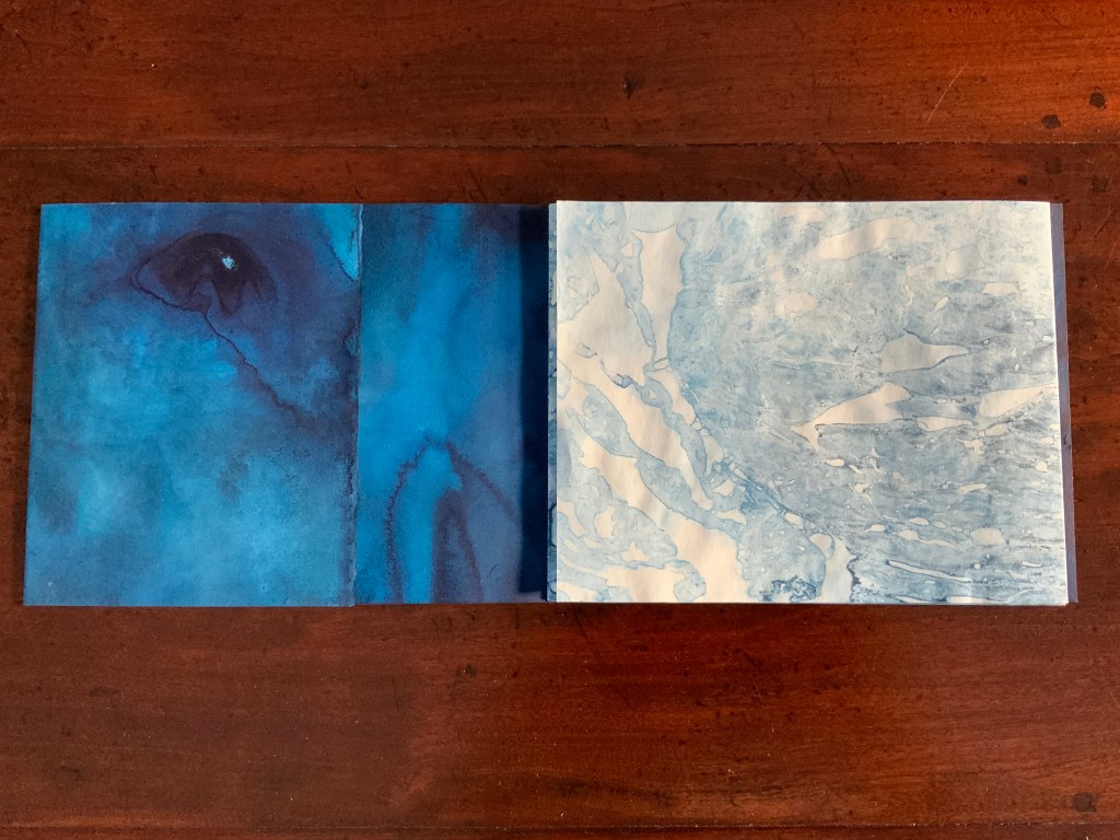
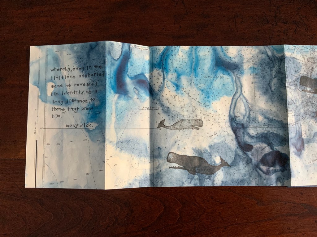
Moby Dick (2017)
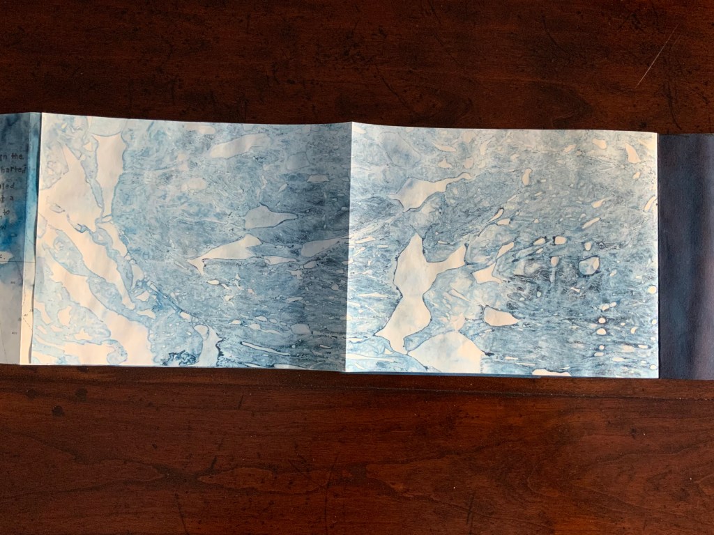
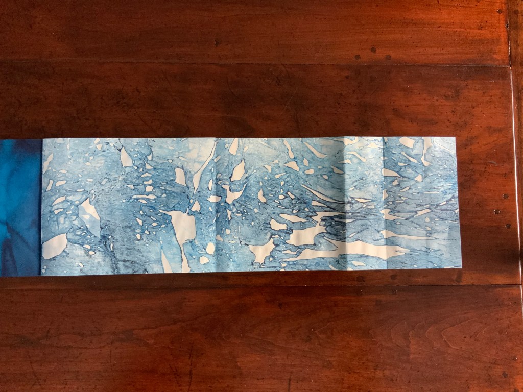
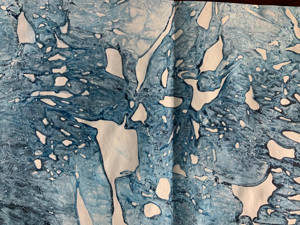
Moby Dick (2017) Chris Ruston Soft cover, concertina fold sea chart on Fabriano Artistic Watercolour paper. Inks. Images from hand carved whale stamps, Text from rubber stamps. Quotation from Moby-Dick by Herman Melville (Harper and Brothers, 1851). H185 x W235 mm. Acquired from the artist, 1 December 2019.
Although the handstamps make an appearance in Moby Dick, the main celebration here is how the printing gives the viewer’s eye and imagination freedom to fare and find as they will. In the upper left, a whale’s eye seems to emerge from the pattern. In the upper center, a diving right whale. In the upper right, ocean depths in the underlying chart. Across the lower row’s fold outs, ice floes break up on the sea’s surface.
Further Reading
“Chris Ruston”. 10 June 2017.Bookmarking Book Art.