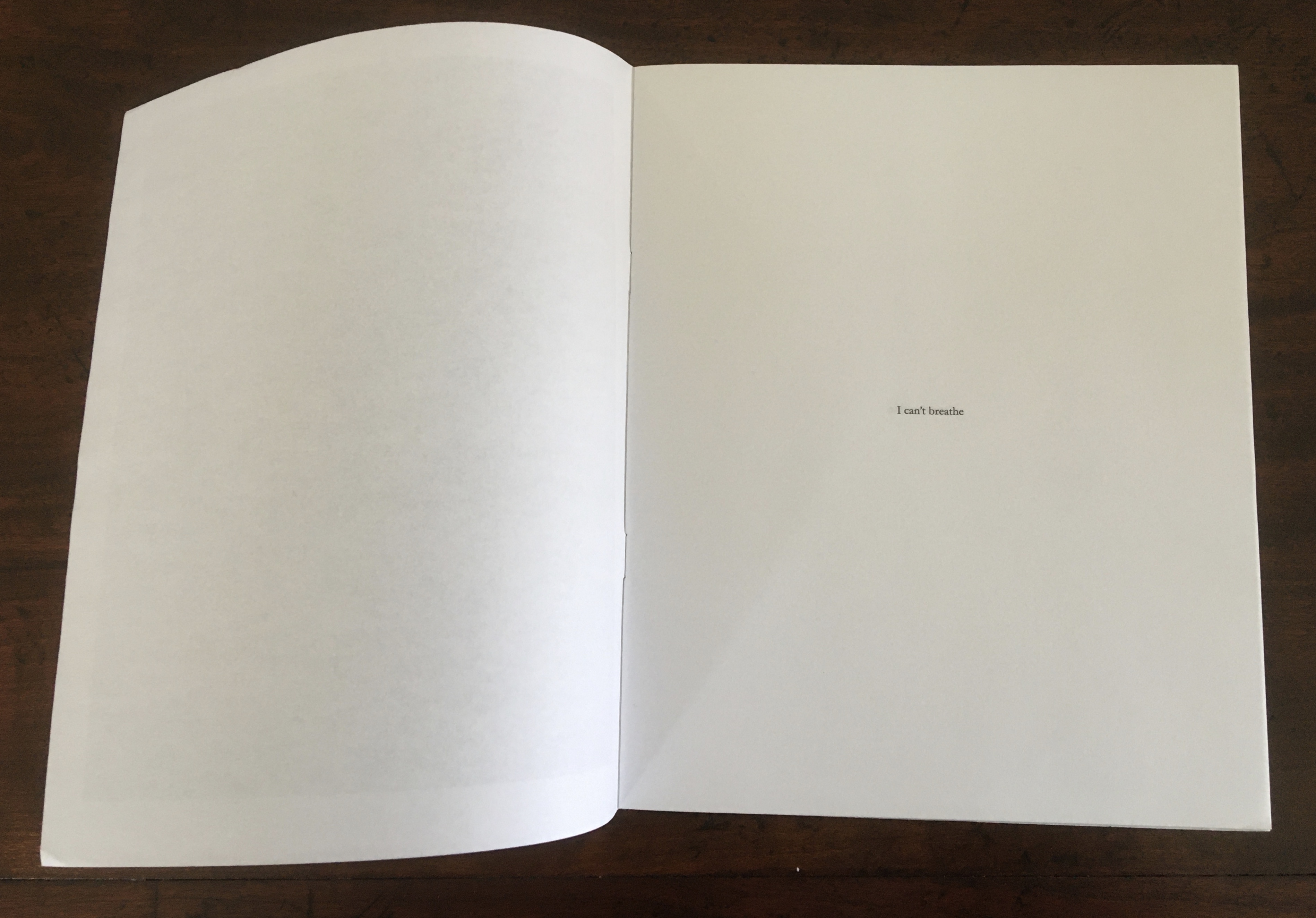
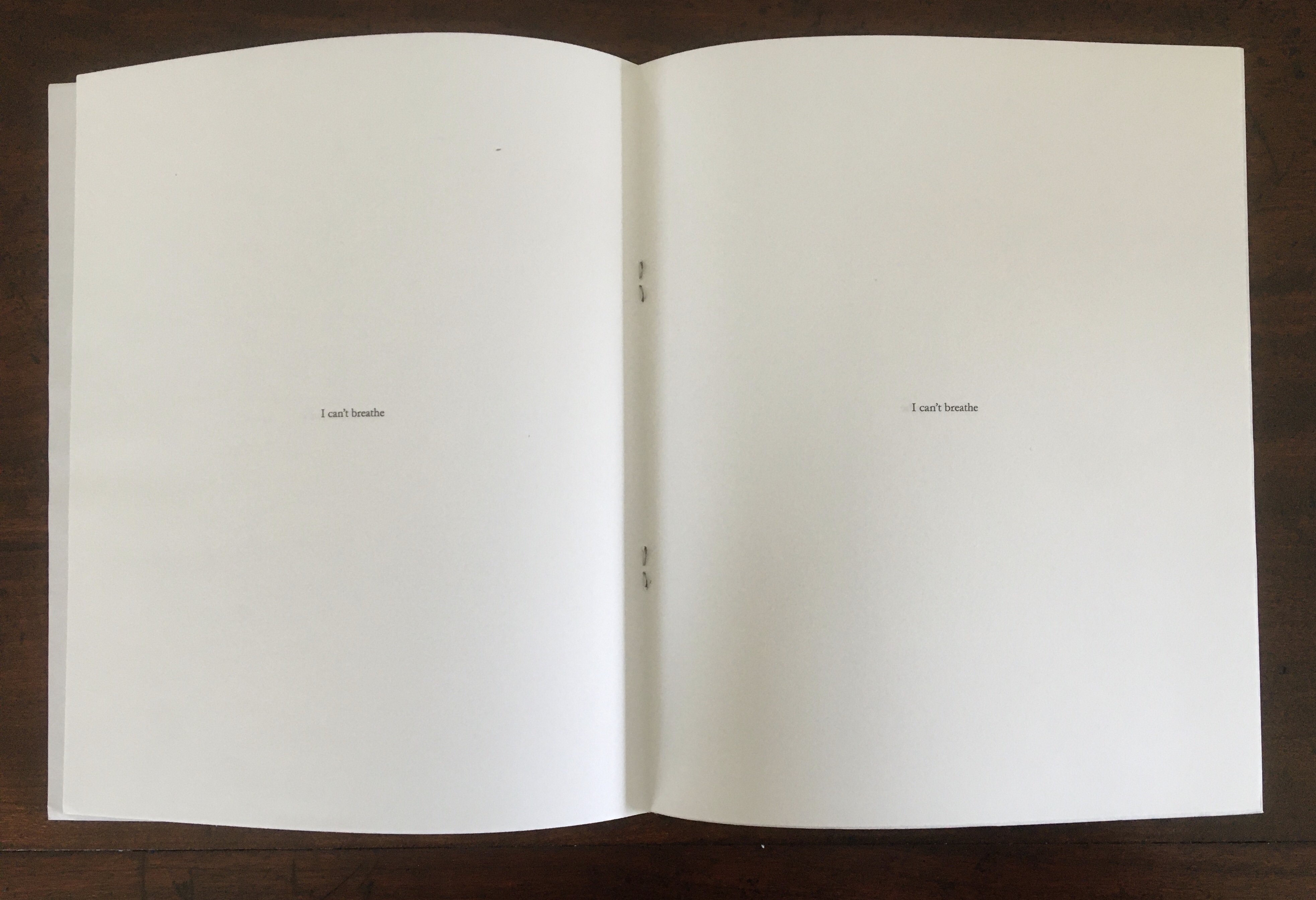
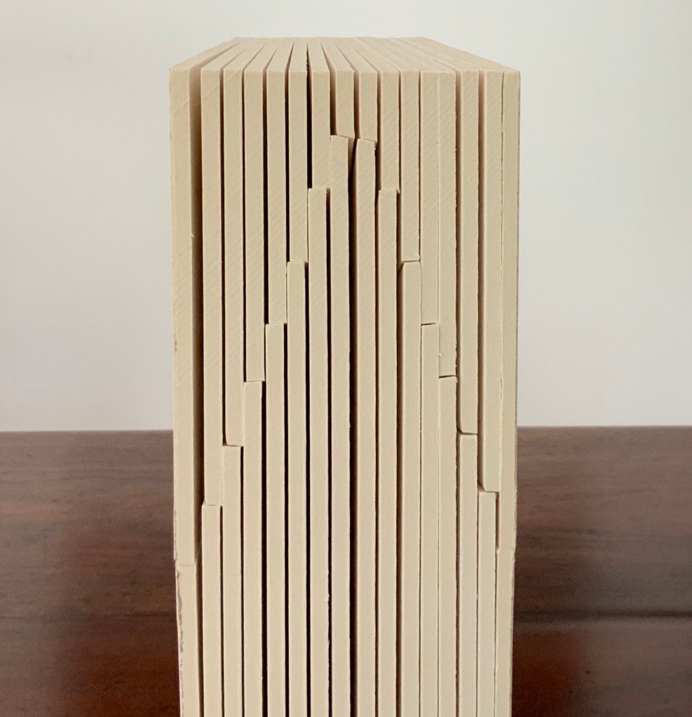
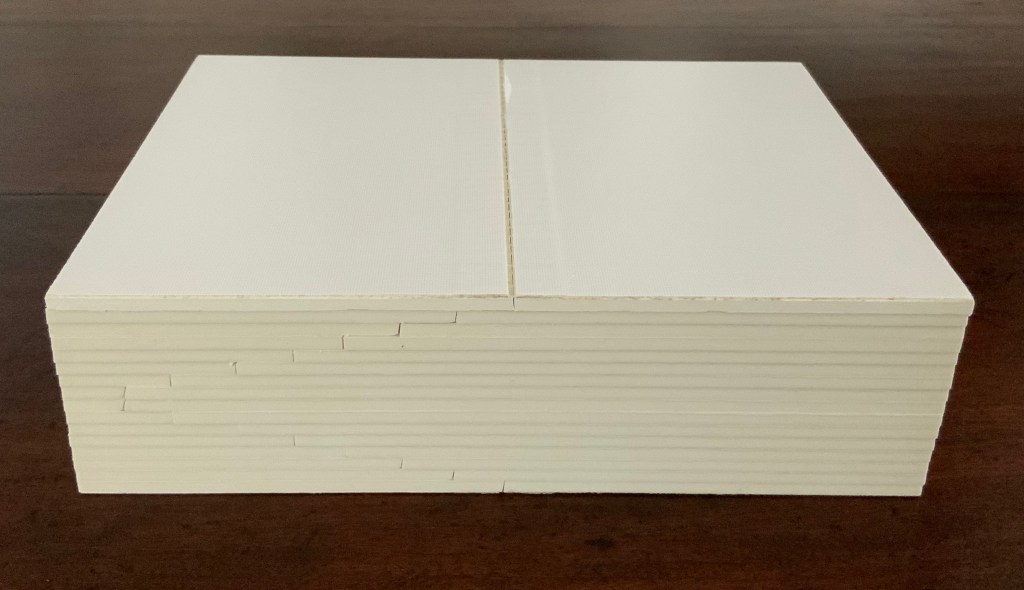
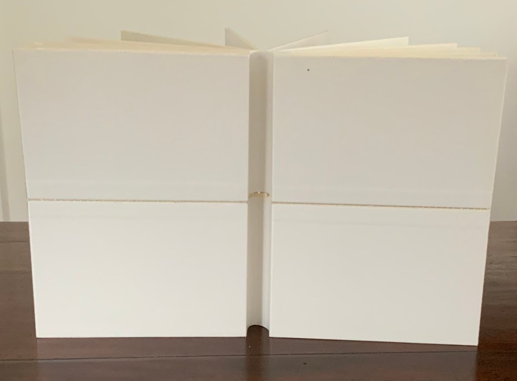
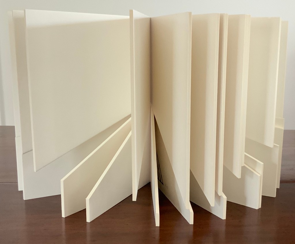
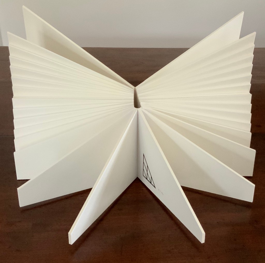
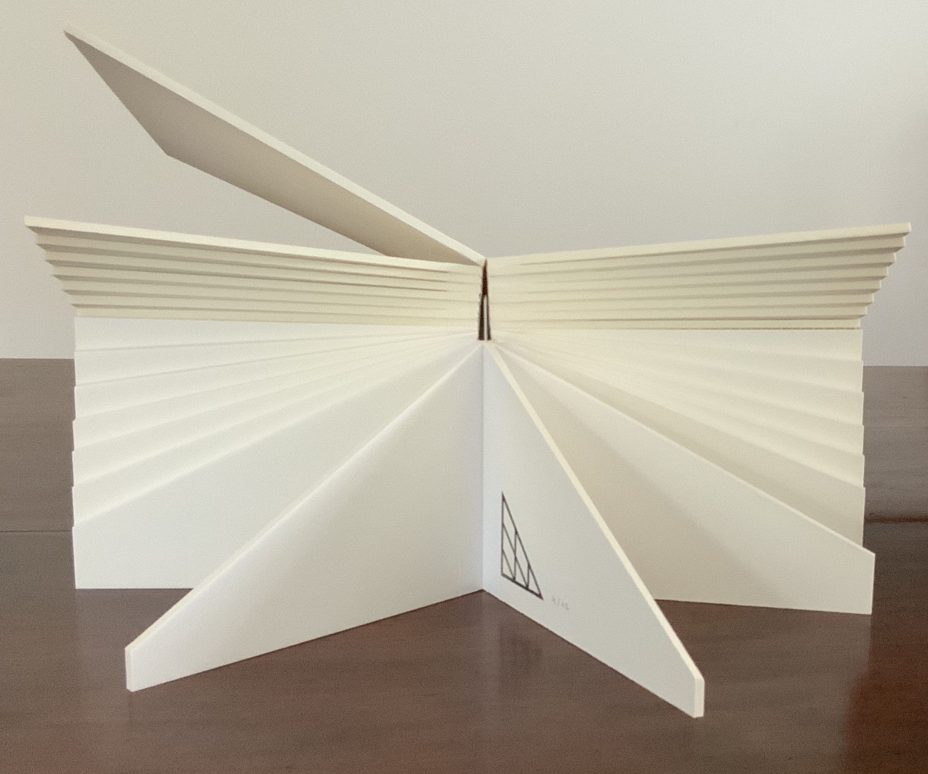
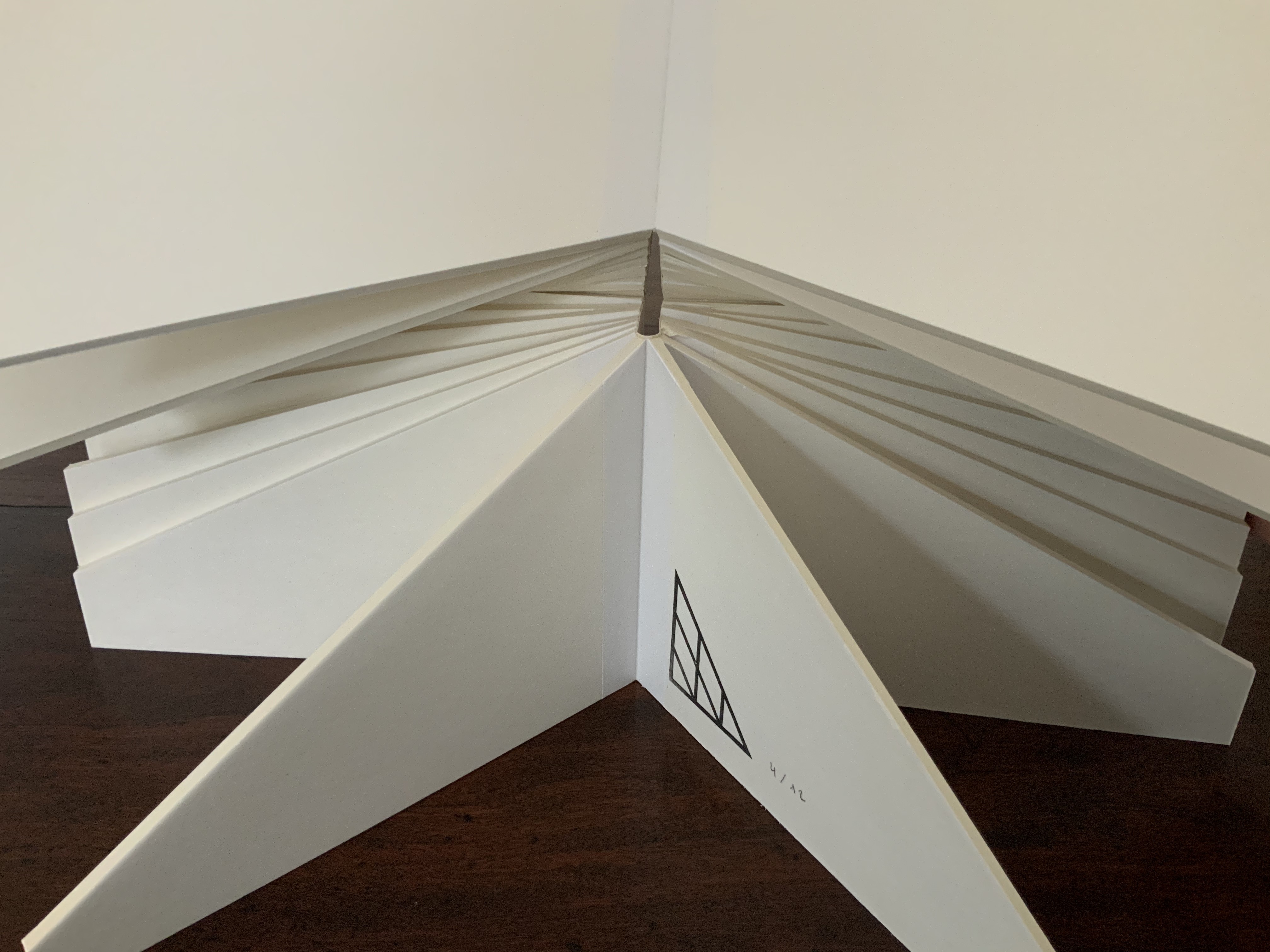
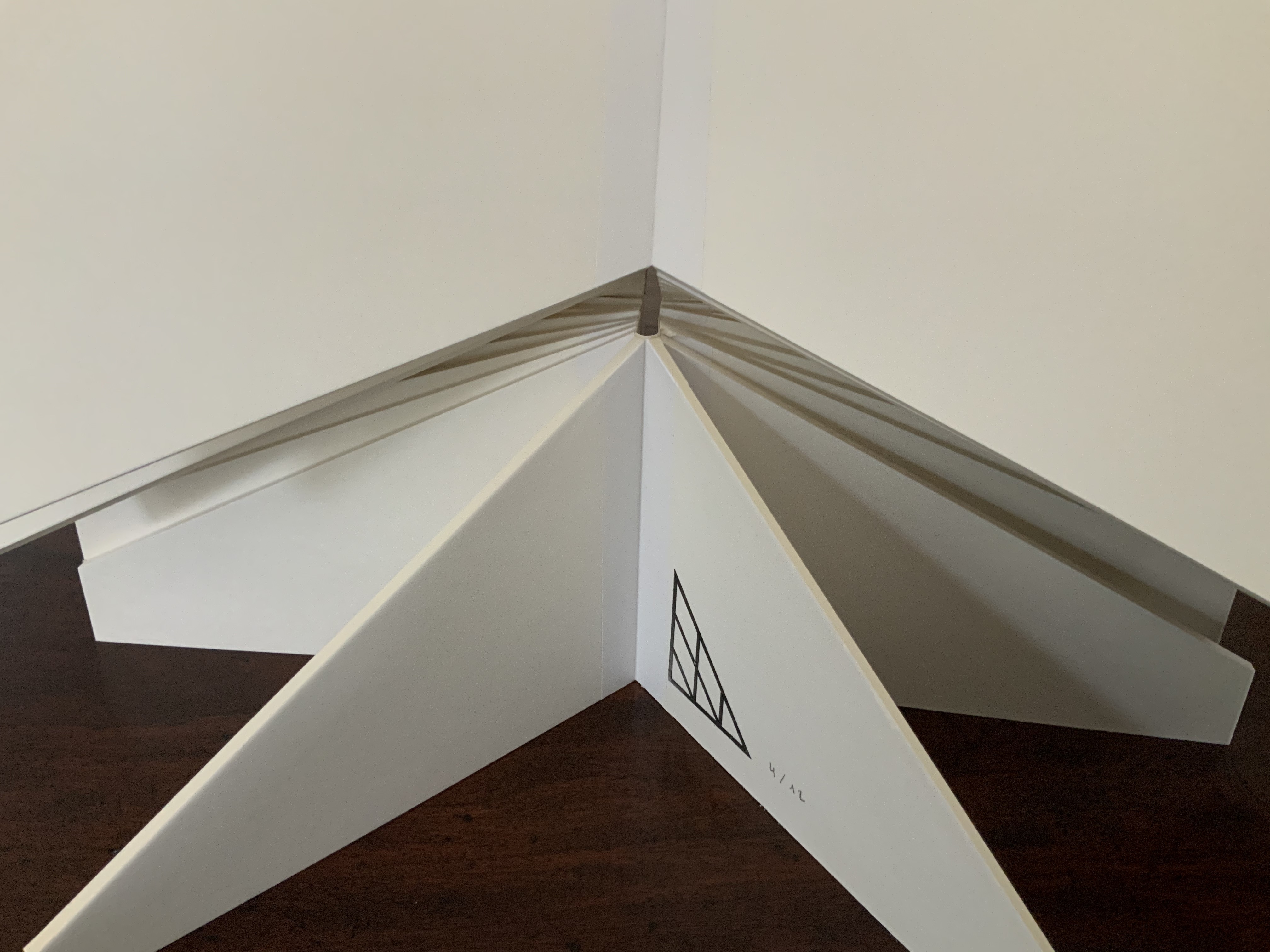
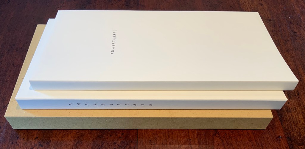
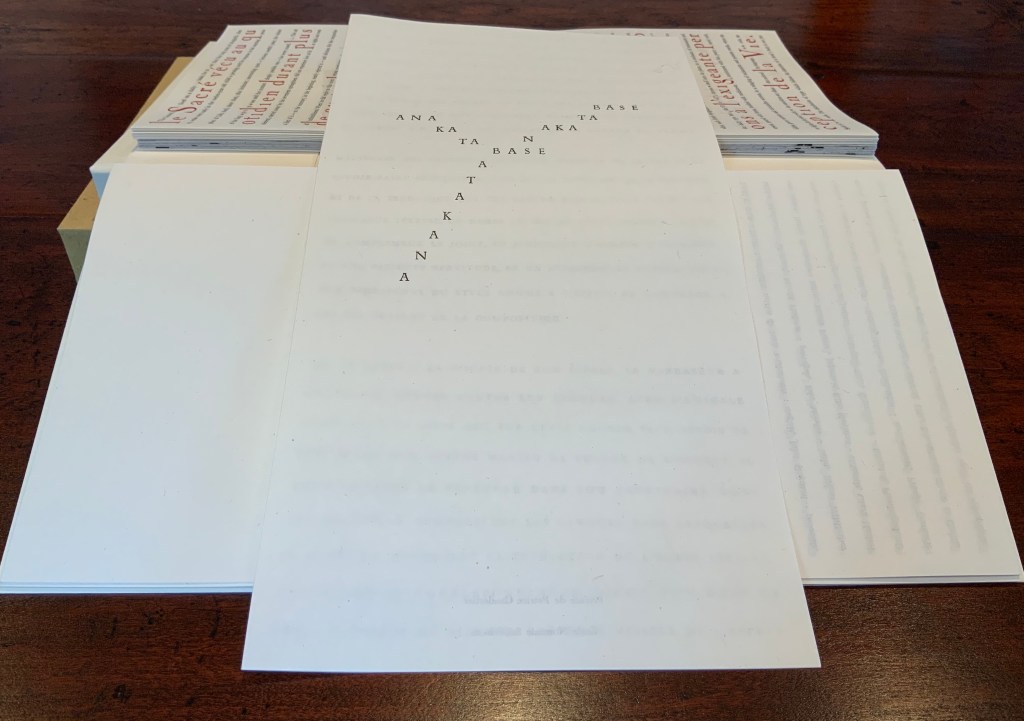
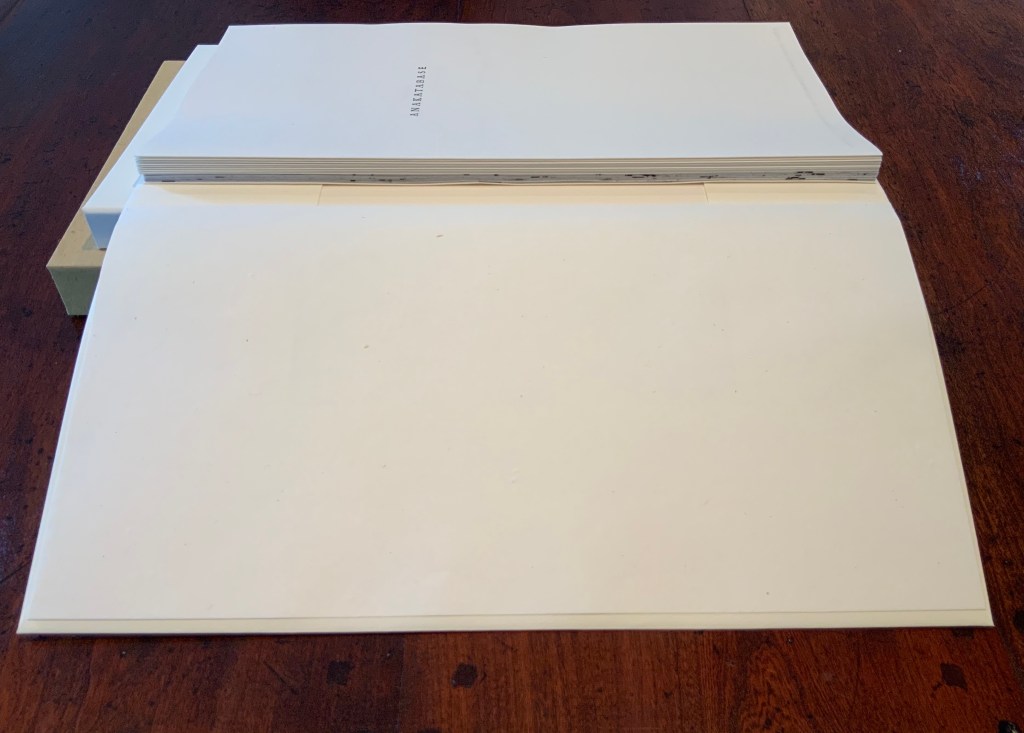
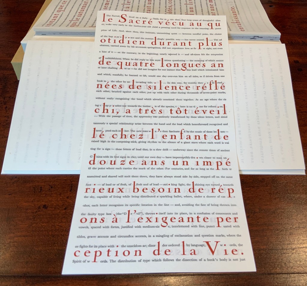
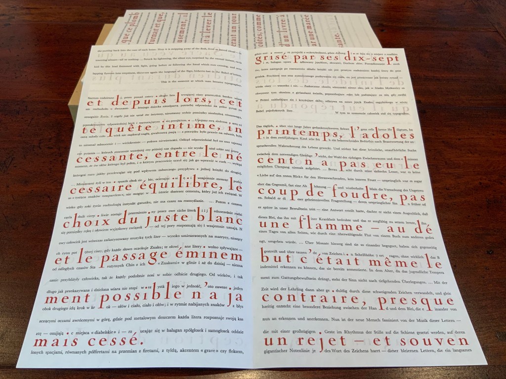
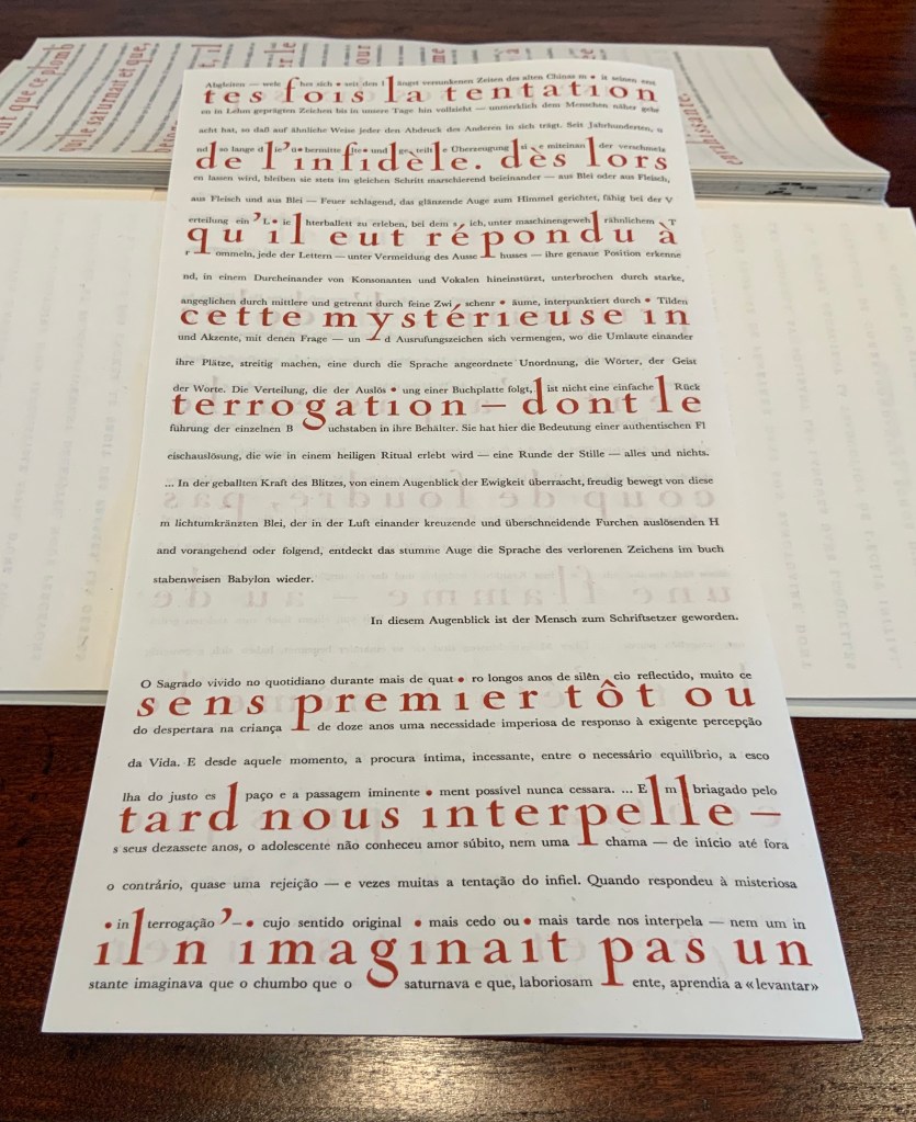
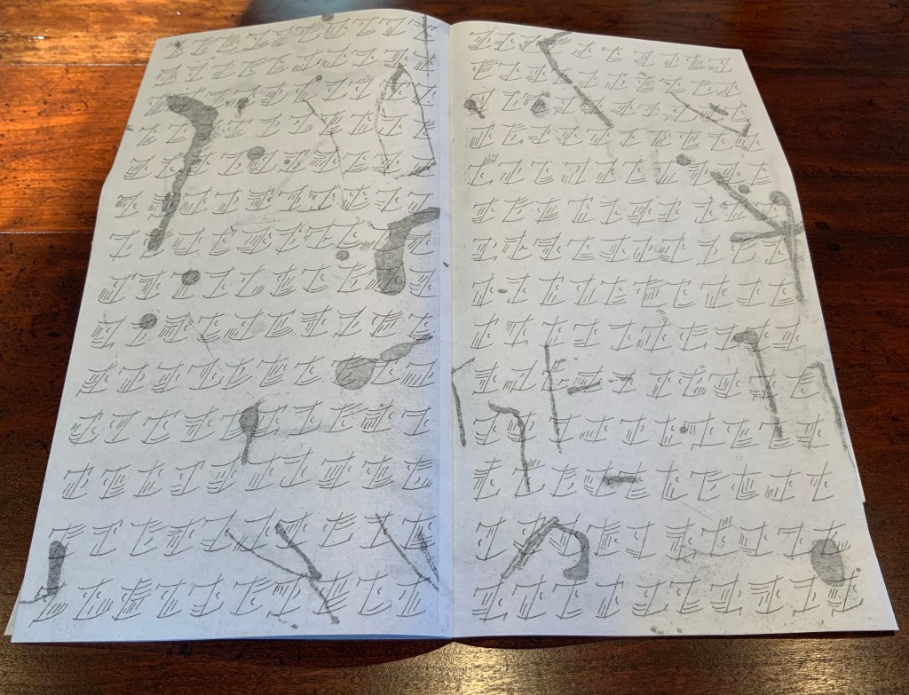
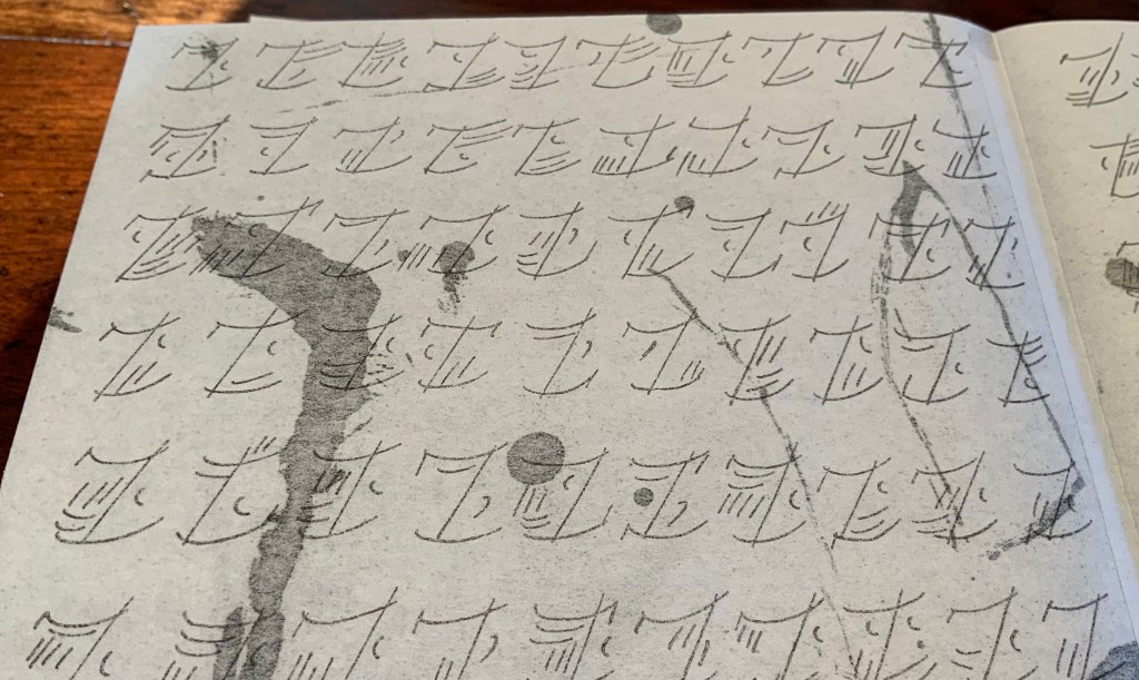
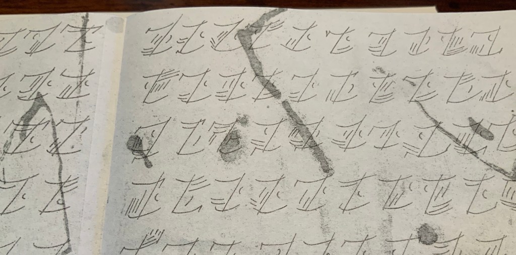
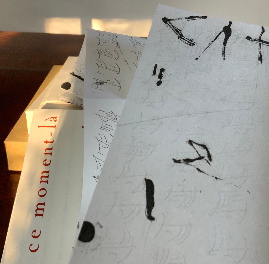
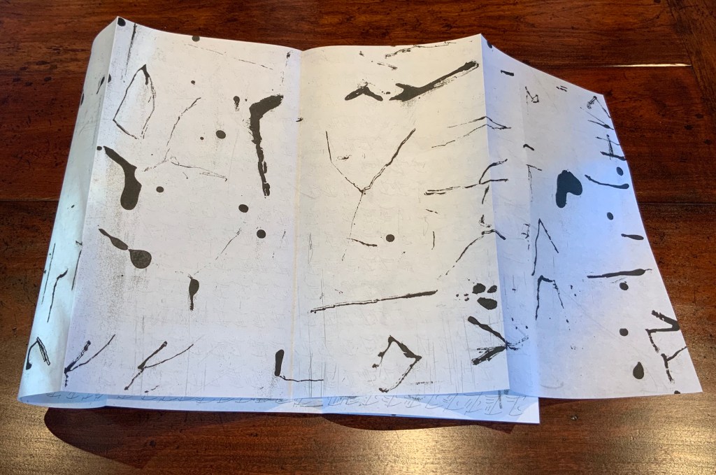
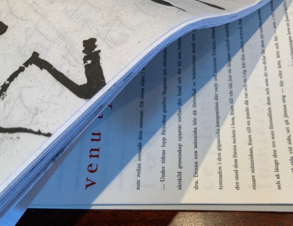
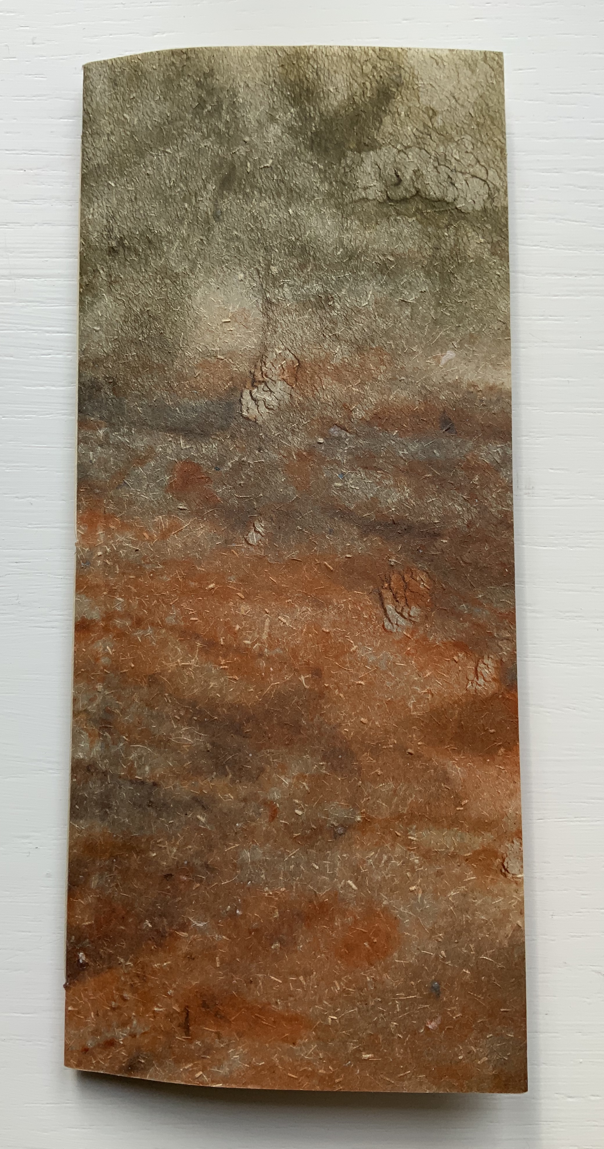
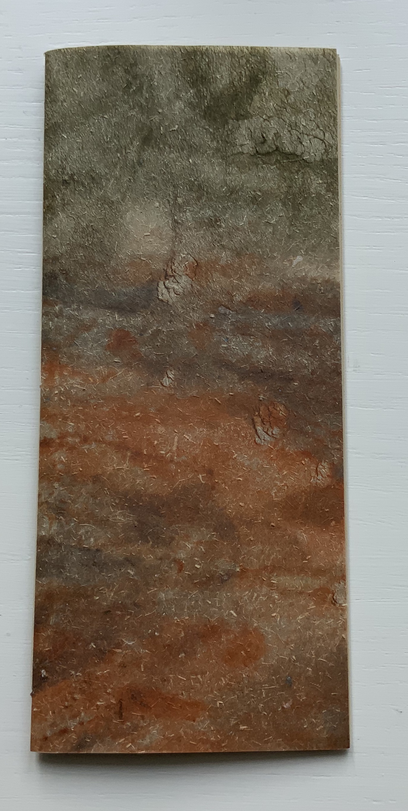
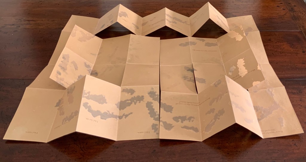
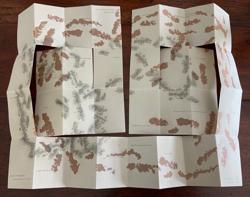
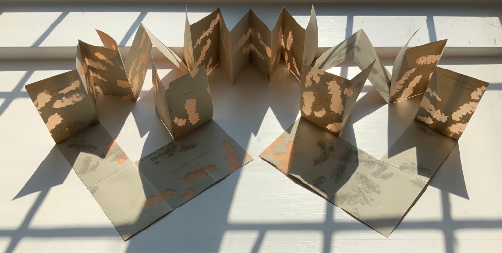
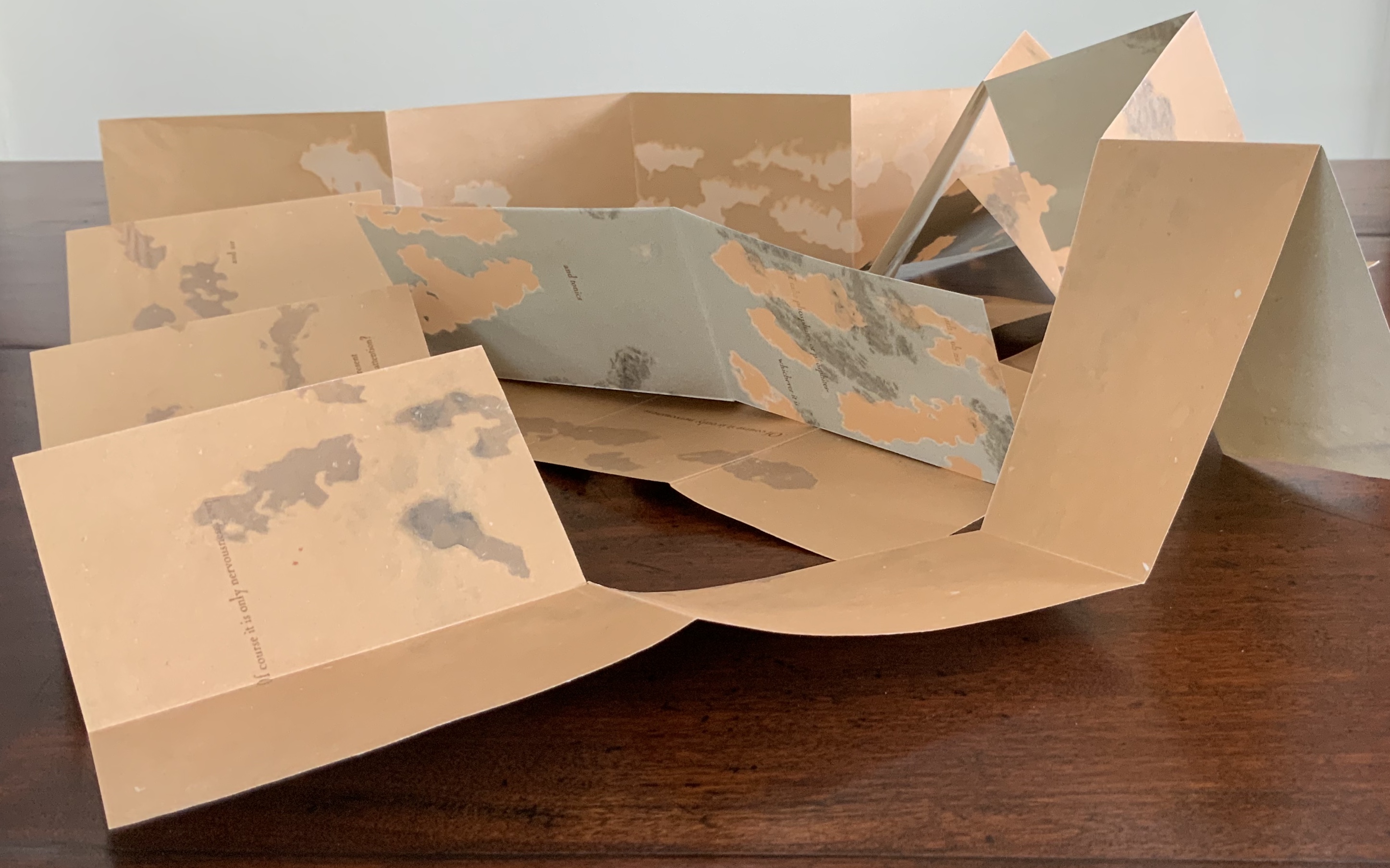
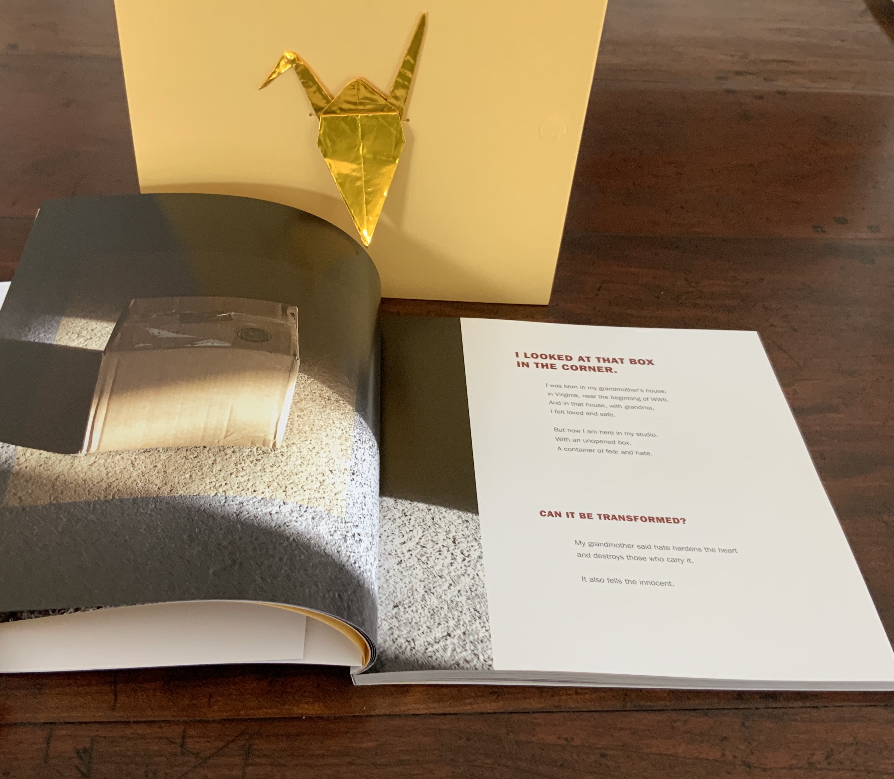
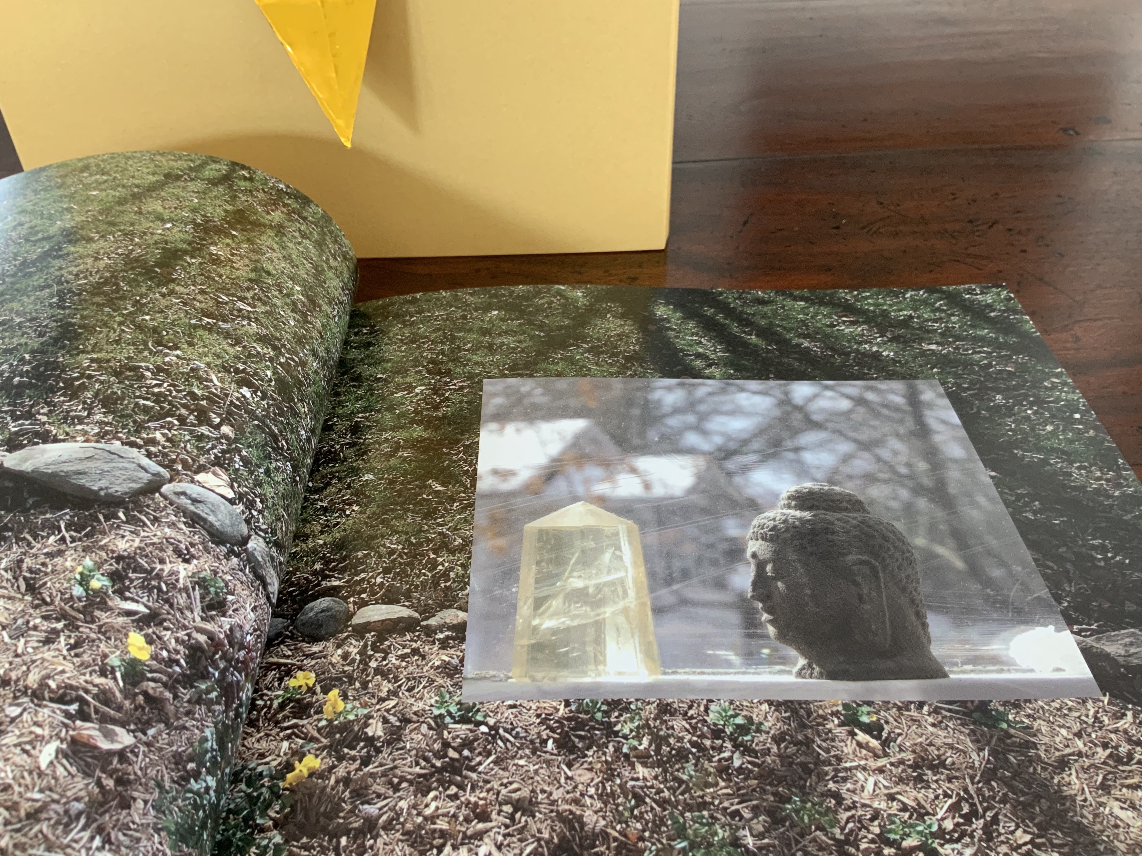
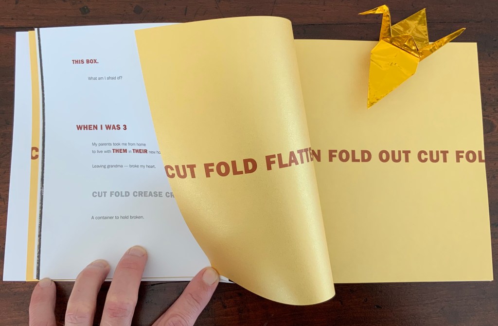
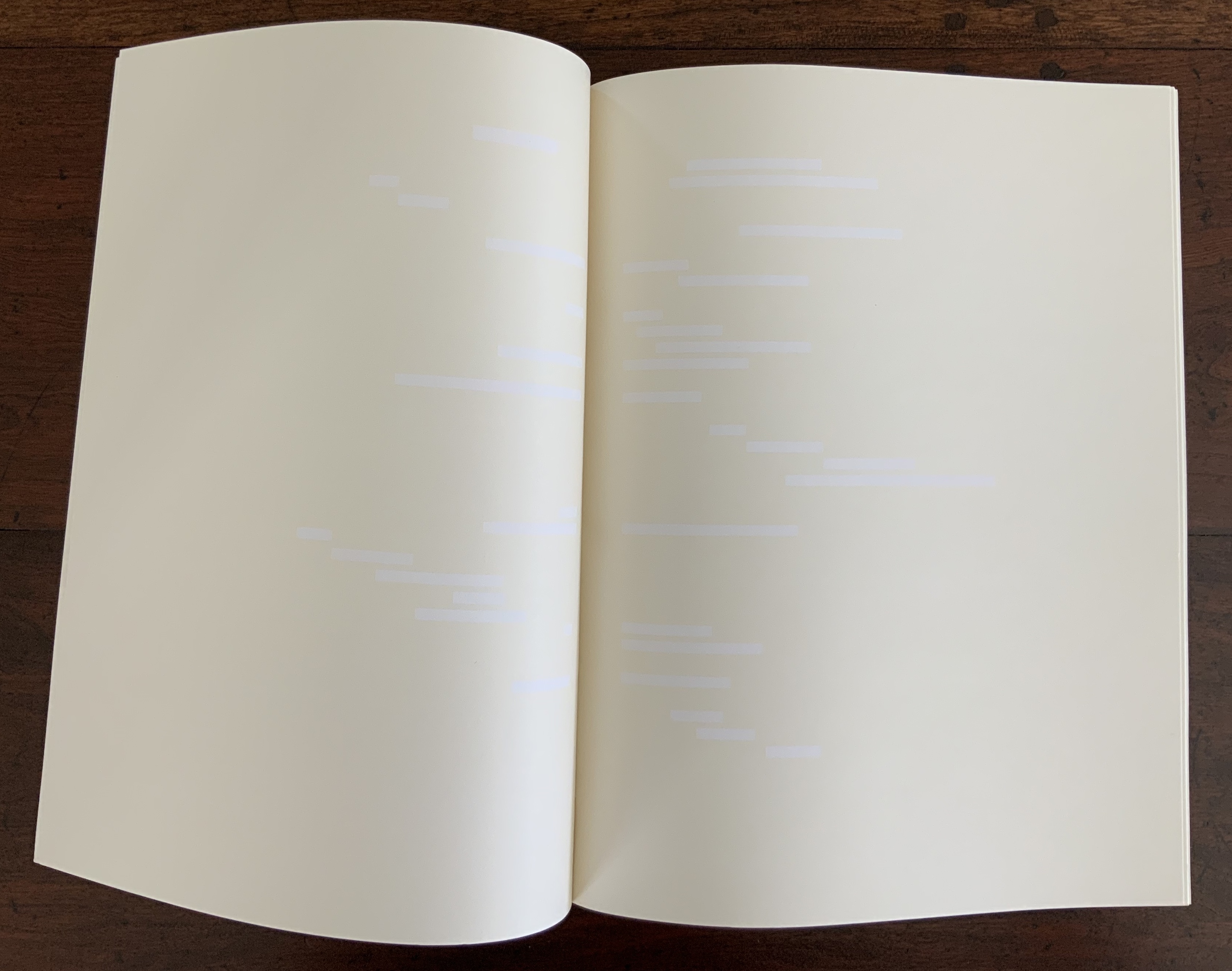
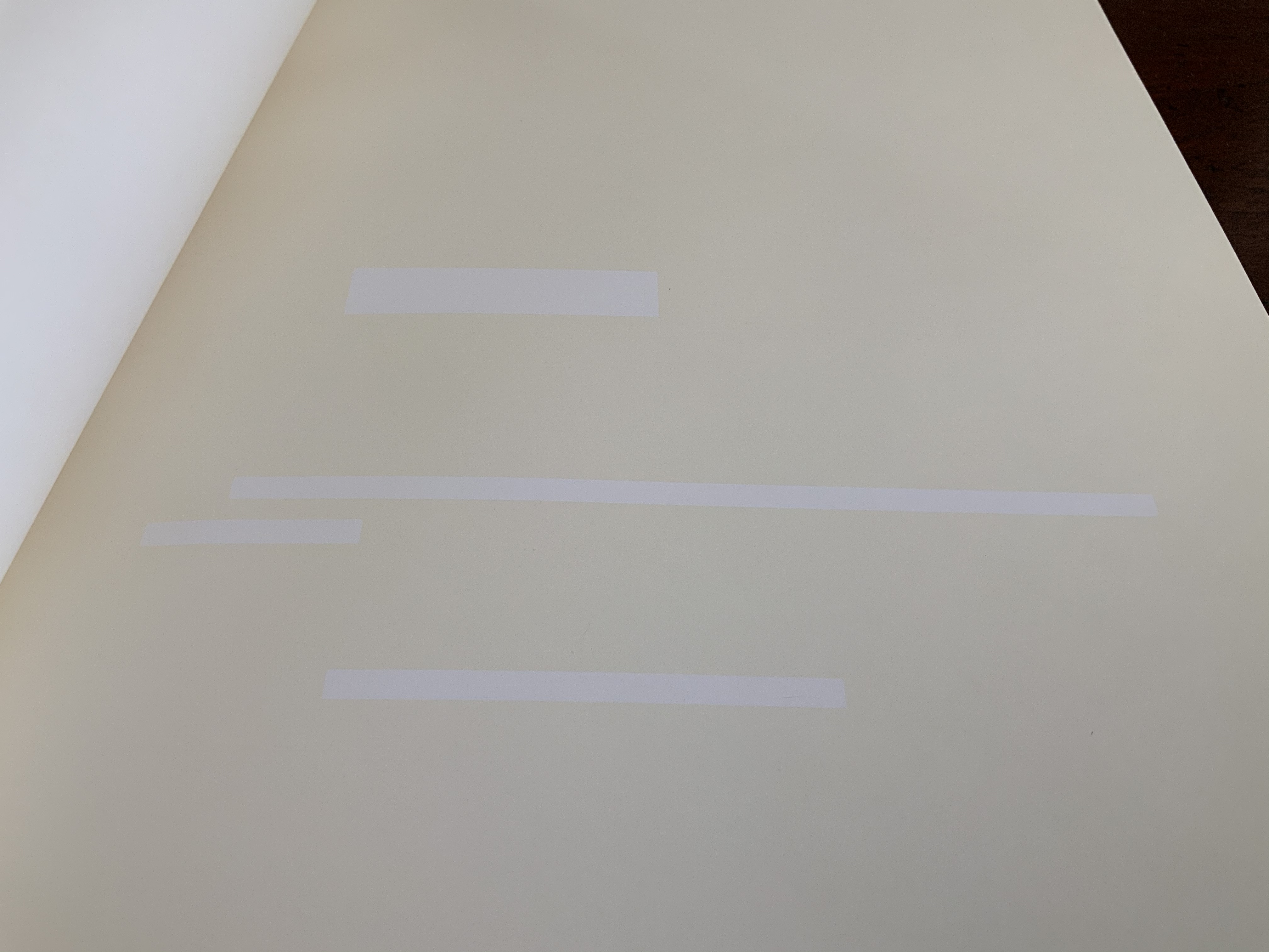
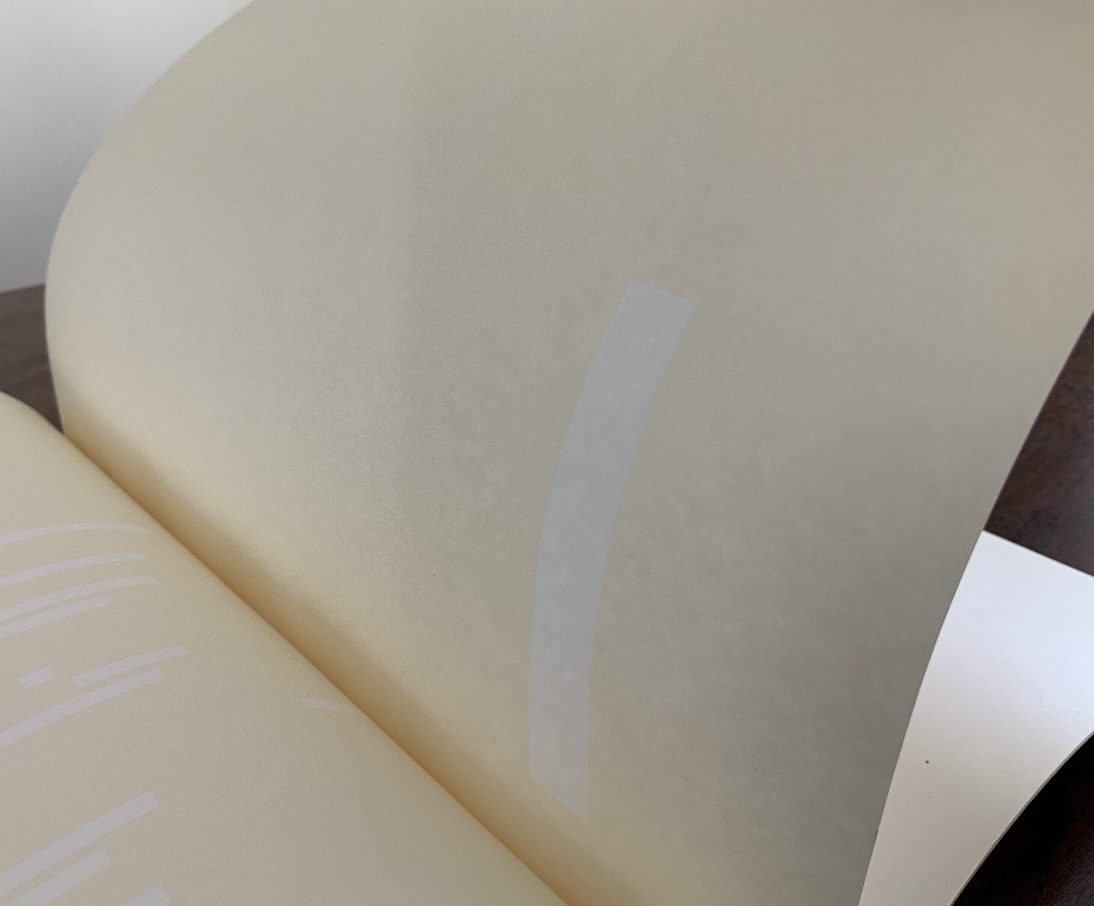
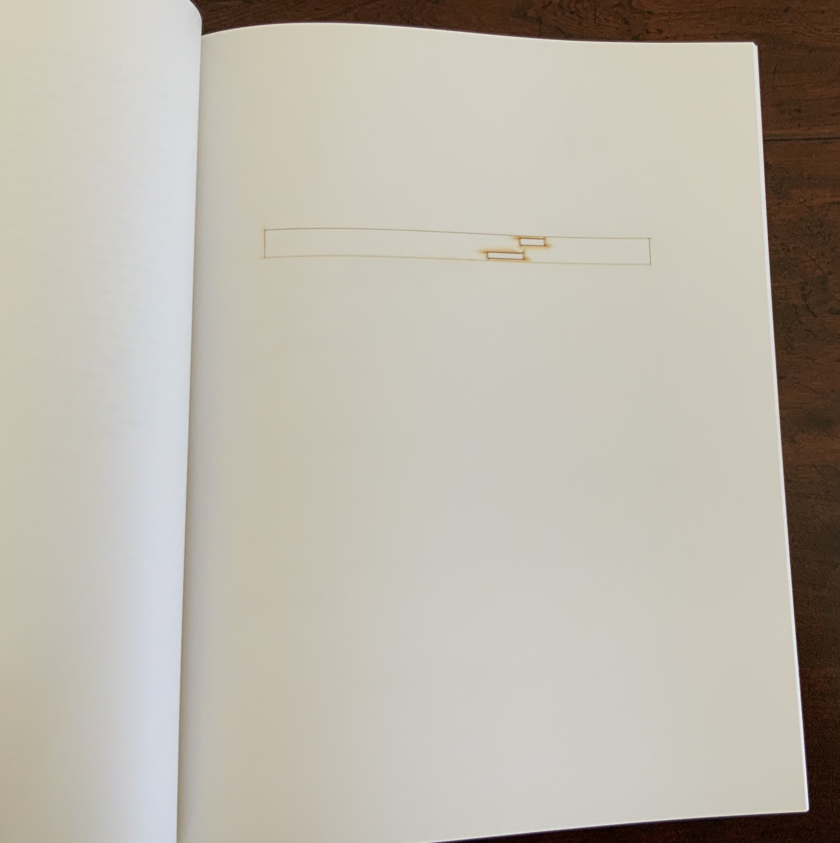
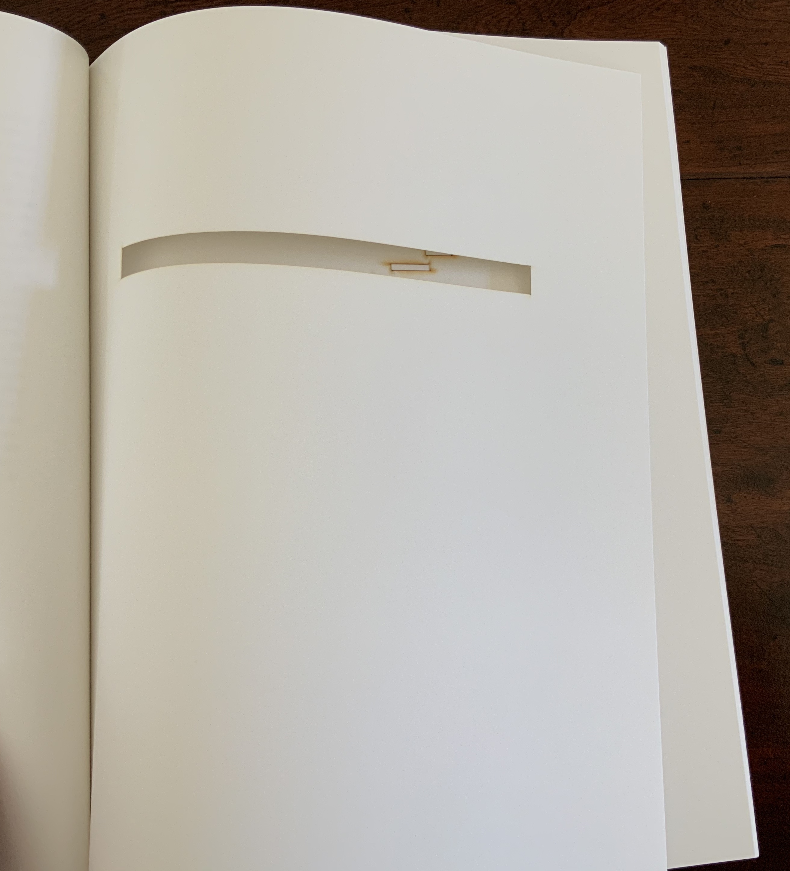
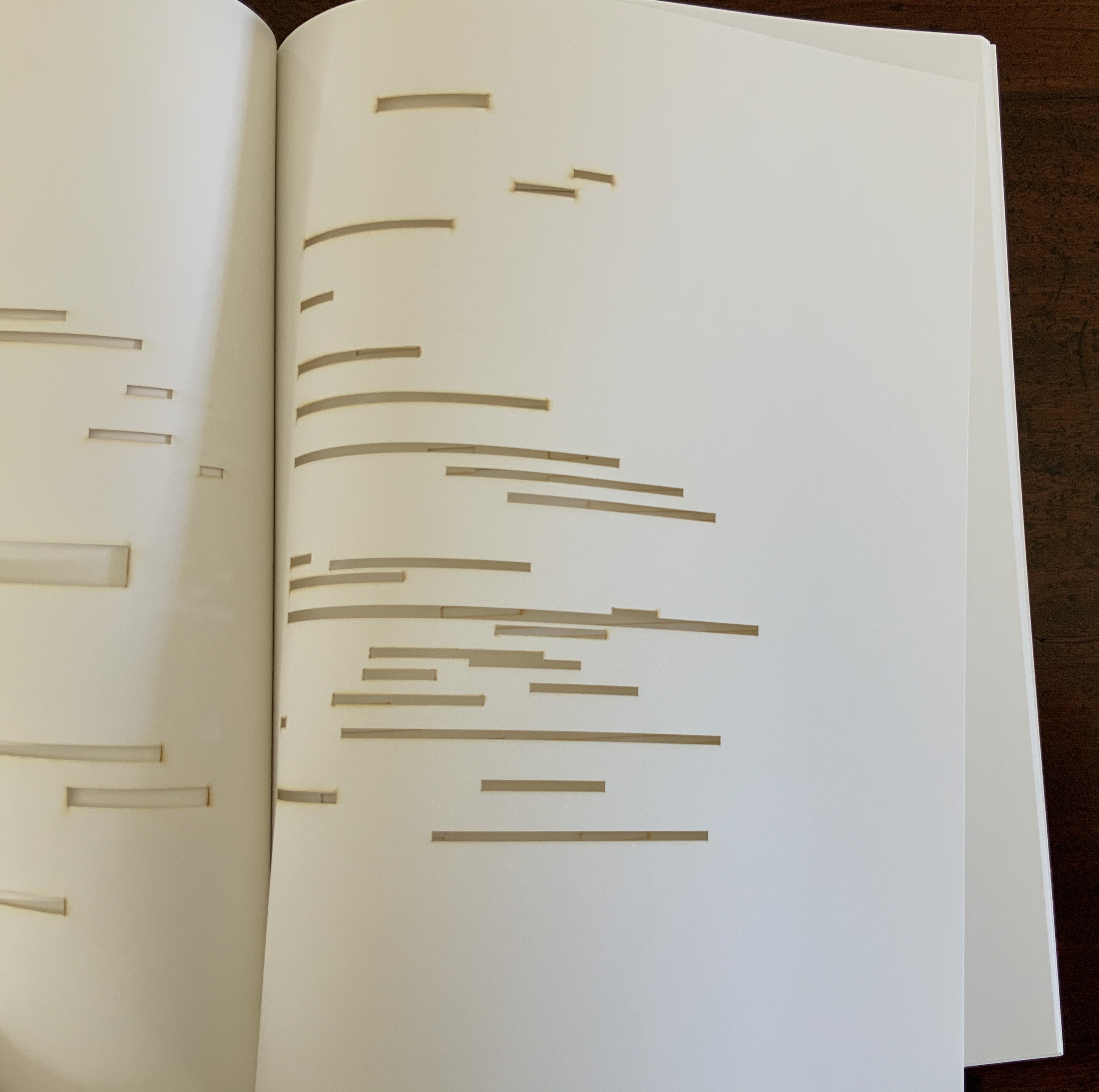
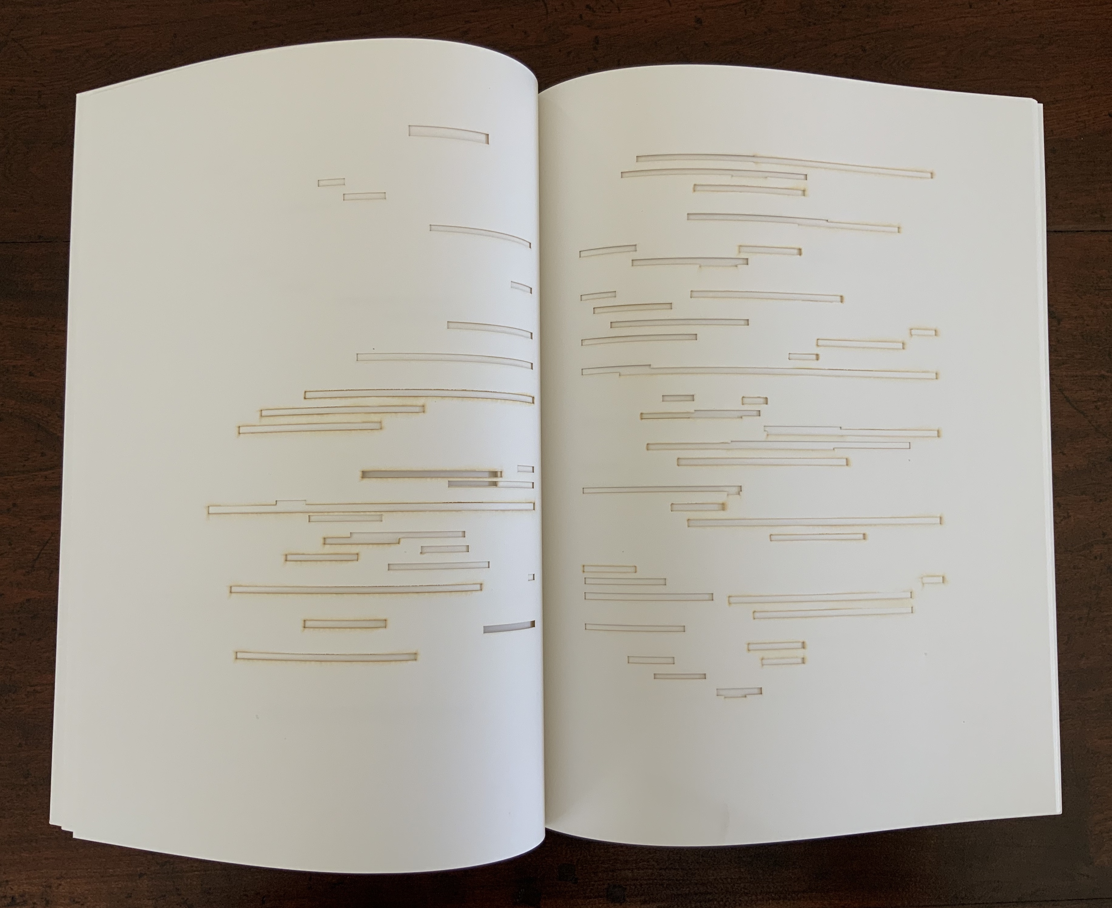
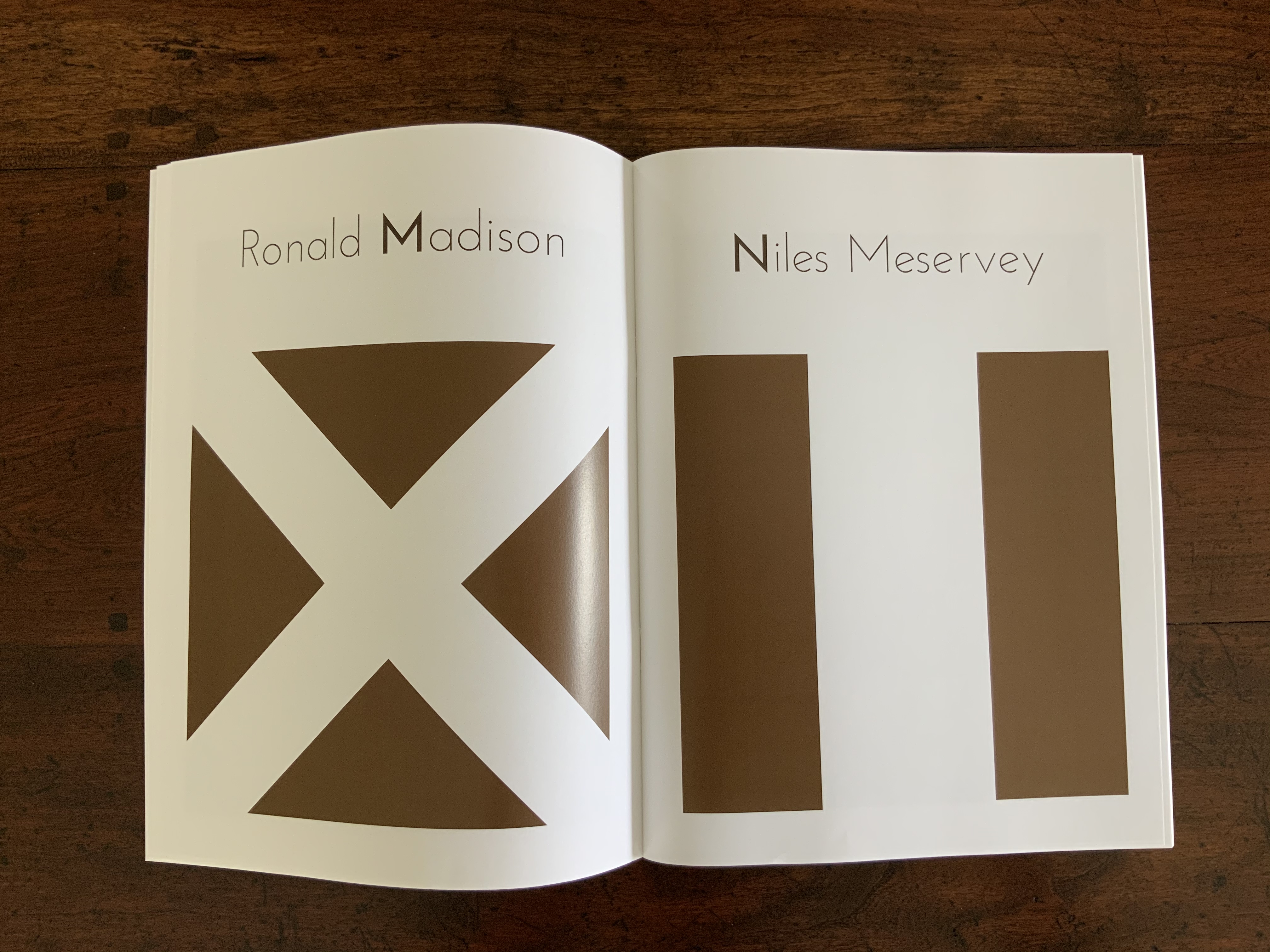
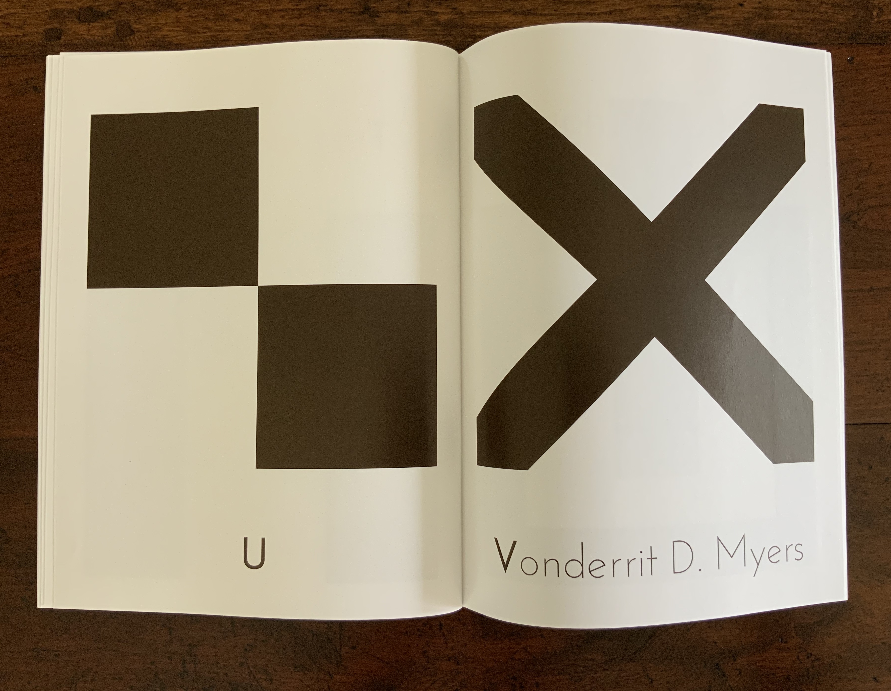
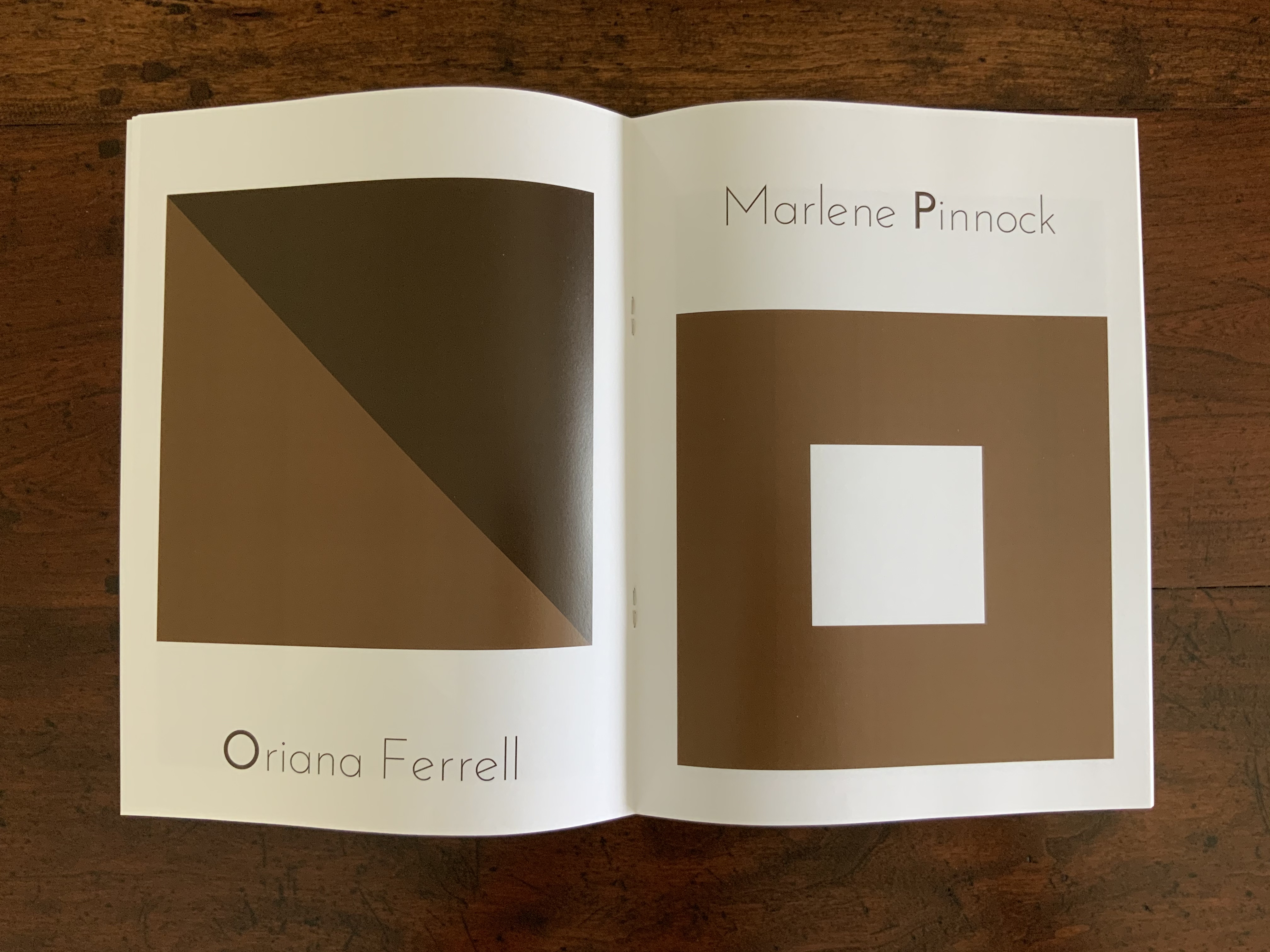
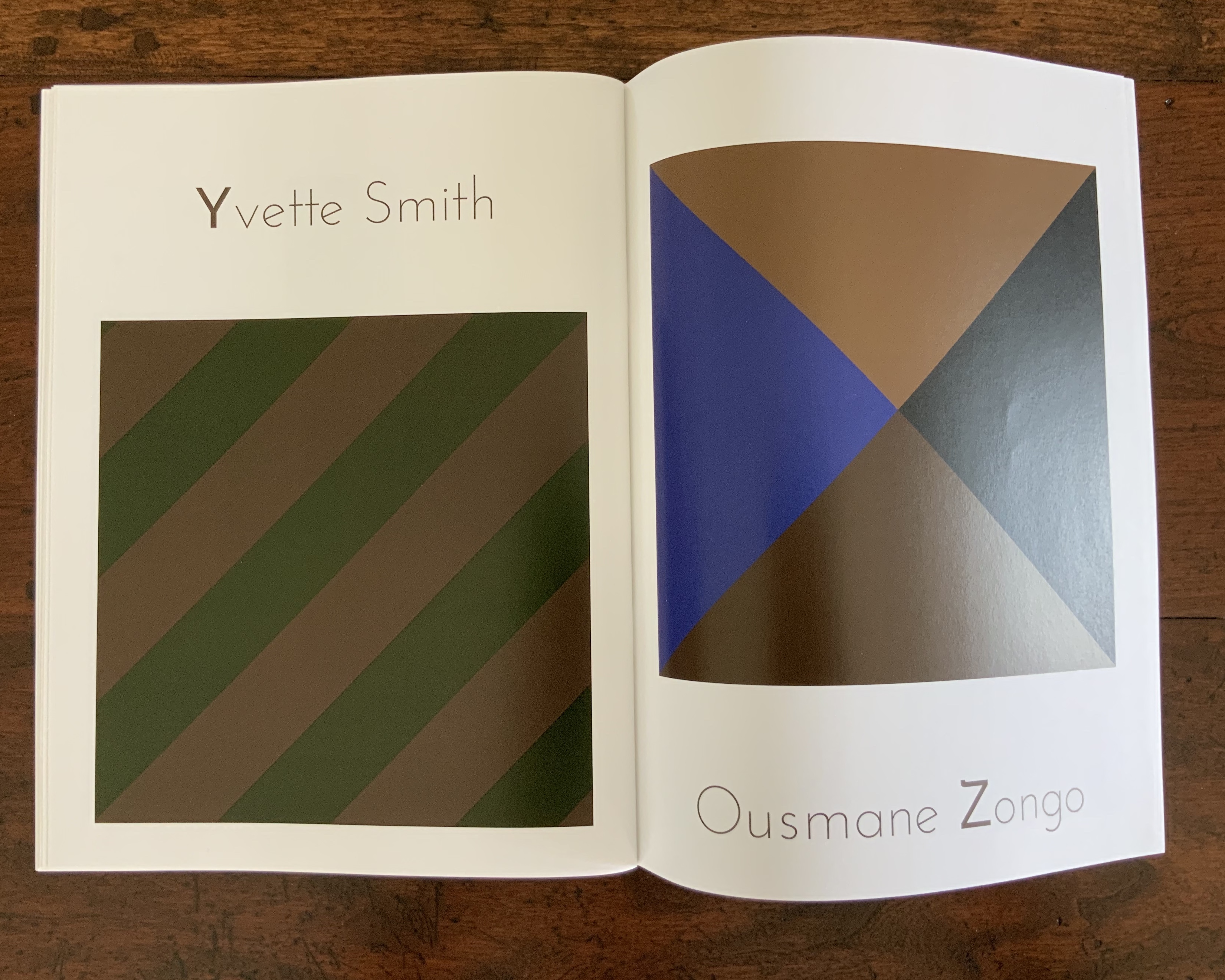
Standen (2014) Caroline Penn Altered book, overprinted digitally, cut with a scalpel and rebound with thread. H210 x W140. Acquired from the artist, 9 June 2020. Photos: Books On Books Collection.
The William Morris wallpapers in Standen House, an Arts & Crafts home in Sussex, and the memory of Charlotte Perkins Gilman’s story “The Yellow Wallpaper” inspired the creation of this altered book. The work altered is a 1979 National Trust publication on Standen House. In Gilman’s story, the main character, who has a mental breakdown from being forced into domestic seclusion, gradually claws away the yellow wallpaper in the room where she is locked away. In correspondence, Penn writes that she unbound the original booklet, ran the pages through a digital printer, performed the cutting and then rebound it. In a clever reversal, by the end, the wallpaper print and its excision have taken over the walls of the book of Standen House.
Photo: Courtesy of the artist.
By coincidence, American book artist Harriet Bart co-curated an intriguing exhibition called “Wallpaper“. Bart’s entry, too, was inspired by the Gilman story.
fieldwork (2017)
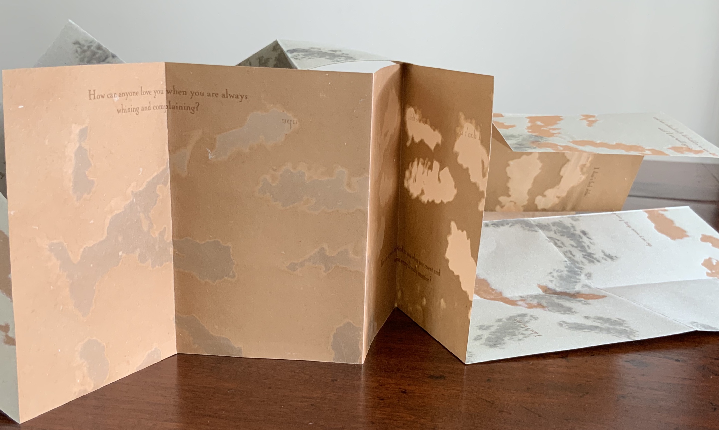
fieldwork (2017) Caroline Penn Digitally printed concertina. Cover: H126 x W90 mm; pages, H125 x W88 mm. Edition of 20, of which this is #8. Acquired from the artist, 6 February 2020. Photos: Books On Books Collection.
A book within a book, fieldwork offers an entrancing visual narrative. A small white book unfolds from nothing to small pebbles, larger pebbles, more pebbles to fewer, and finally to one pebble in the center. Is it the reverse of the process of erosion? Is it categorization by the human eye and hand striving with nature’s agglomeration?
The artist has embedded the visual narrative here in an innovation on the framing device to be found in Helen Douglas’s Wild Woodand A Venetian Brocade. As with the latter works, fieldwork encourages us to touch with our eyes. It is a stunning piece of trompe l’oeil. On glimpsing any double-page spread, the reader/viewer is tempted to pick up one of the pebbles apparently resting on that white piece of paper open on a photo of a shingle beach. Visitors to Kettle’s Yard will recognise the temptation.
Project C: Destination Unknown (2020)
Organised by Pauline Lamont-Fisher, Project C is the result of a collaborative effort among 14 artists:
This project is about intersemiotic translation between images to words and from words to images and the paths that form between them. Roman Jakobson in Linguistic Aspects of Translation suggests the idea of intersemiotic translation as the translation from one sign system to another: i.e. interpretation of verbal signs by means of signs of non-verbal sign systems. So every novel adaptation into film, constitutes a translation. The illustrations in a book act as translations of text into images. Every time you watch Tchaikovsky’s Nutcracker, you watch an intersemiotic translation from narrated story into ballet.
The artists were given a set of anonymised covers of Italy Calvino’s If on a winter’s night a traveler and asked to choose one and, keeping in mind Jakobson’s notions of intersemiotic translation, produce a folio or pamphlet in response. Caroline Penn’s contribution uses text, typography, structure, choice of paper, density of ink and a pattern of hole punches to translate or evoke not only the image below but the substance of Calvino’s novella — or at least a key element of the substance susceptible to translation to an artist’s book of translucent Bible paper and pergamenata.
Project C: Destination Unknown (2019) Caroline Penn Digitally printed on Offenbach bible paper stitched to pergamenata. Concertina, H186 x W130 mm. Edition of 30. Acquired from whnicPRESS, 7 March 2020. Photos: Books On Books Collection.
The contrasting whites of the Bible paper and the translucent paper that comes uncannily close to animal parchment mirror the different colors of snow in the cover.
The dispersed positioning of the letters of the word “vapour” mimic the falling snow. The series of darker inked phrases set below, separated from each other by hyphens and staggered downwards across the panels echoes the rail track and cars in the cover.
The body of light gray likewise sloping down from left to right recalls the declining mountain gap crossed by those train tracks.
Across the foot of the page, the holes punched in a lowercase letter “o” and separated by two unpunched uppercase “O’s” also evoke the rail tracks and cars. In a nod to the Oulipo pattern-driven nature of Calvino’s work, the noughts of the “O’s” are answered in the crosses of the “X’s” supporting the text that crawls across the panels, finally turns the corner of the last panel and fades into the gray word “invisibility” on the reverse of the last panel.
A tour de force of book art — making text, image, ink, papers, layout, structure and impression work, mean and become a thing independent of the inspiring constraint.
One of the most literary and conceptualist of book artists, Elisabeth Tonnard fuses the textual and visual in ways that consistently demand and reward close attention and even meditation. The works so far in the collection do not yet represent the breadth of her techniques (missing, for example, is the digest of 15 literary works through Microsoft’s auto-summary function to create Speak! eyes — En zie!), but in their individual ways, they do represent all of her works’ ability to make constraints yield surprise.
In this Dark Wood (2008)
In this Dark Wood (2008) Elisabeth Tonnard, perfect bound, 196 pages, 90 halftones on recto pages. Acquired from the artist, 5 March 2018.
Tonnard pairs images of 90 solitary people walking alone in nighttime city streets with 90 different English translations of the first lines of Dante’s Inferno. The images come from the Joseph Selle collection at the Visual Studies Workshop, which contains over a million negatives from a company of street photographers working in San Francisco from the 40’s to the 70’s. Male or female, Caucasian or Asian or African-American or Latino, the images are, as she puts it, “re-expressions of each other”. Likewise, the various translations are re-expressions of “Nel mezzo del cammin di nostra vita mi ritrovai per una selva oscura ché la diritta via era smarrita.”
In this video, Tonnard speaks of the work at the 21’25” mark.
The double-page spreads blur after a while of gazing on each face and reading the translation facing it. At the very start, though, the image has no facing text on the verso, and at the end, the last page of text has no facing image on the recto. Faced with this exception to the constraint of the double-page spread, the audience is torn between being reader/gazer and gazer/reader — precisely the thrust of Tonnard’s book artistry.
The Library (2015)
The Library (2015) Elisabeth Tonnard, exposed sewing, digital print, 56 pages. H105 x W148 mm. Edition of 150 copies. Acquired from the artist, 5 March 2018.
In the days before and after the end of World War II (May 1945), two fires in a flak tower broke out, destroying most of the Kaiser-Friedrich-Museum’s Gemäldegalerie artwork stored there. Starting in 1995, a multi-volume catalogue Dokumentation der Verluste recorded and illustrated as many of the losses as possible. The website of the National Gallery of Art in Washington, DC, has drawn from its pre-war images collection and posted authenticated images of over 100 of the more than 700 works lost. Tonnard’s work of book art memorializes the loss in a different way.
In the colophon, she calls her little book of images “a library”. The images are details from paintings, and each displays one or more books — sitting on a shelf, held in a hand or lying on a lap — and indecipherable. The illustrations from which Tonnard has taken the details are those of the paintings lost in the fires. Her book’s colophon ends: “Out of the smoke we think up this library of unknown books.”
Tonnard has also created a series of eight prints in archival ink of the details. More images from the book can be found here, and an image of the prints, here.
A Dialogue in Useful Phrases (2010)
A Dialogue in Useful Phrases(2010) Elisabeth Tonnard, softcover with blind embossing, 7.25 x 7.25 inches, digital print, 178 pages. Edition of 250, of which this is #94. Acquired from the artist, 5 March 2018.
“They had no conversation properly speaking. They made use of the spoken word in much the same way as the guard of a train makes use of his flags, or of his lantern.” Samuel Beckett, Malone Dies
Whether by Microsoft’s adjustable auto-summary function, by juxtaposition of photos and text or by compiling a library of lost indecipherable volumes, Tonnard probes at the nature of making and making meaning. A Dialogue in Useful Phrases probes both by generating text and structure under several constraints. One constraint restricts the author to “conversational phrases” found in Grenville Kleiser’s Fifteen Thousand Useful Phrases (1917), or “felicitous expressions for enriching the vocabulary.” A second constraint comes with the dialogic structure of “I” then “You”. The third constraint comes from alphabetizing the utterances of “I” down the verso pages.
By title and comment, Tonnard emphasizes that we are following “a” dialogue, not a series of dialogues: “A dialogue is formed from the random meetings of these phrases. It is a dialogue in the purest sense, a dialogue that expresses nothing other than itself.” Likewise, with a prefatory quotation from Malone Dies and the book’s “empty-room” square format, Tonnard pointedly places “I” and “You” in the tradition of Samuel Beckett’s dramatic dialogues. Going a step further in that direction, she has put together Project Gutenberg’s anonymous volunteers’ recordings of Kleiser’s book and staged audio installations in venues such as the Meermanno Museum in The Hague and the Sheffield International Artist’s Book Fair 2011. In this video, she speaks of the work at the 9’10” mark.
Partington, Gill. “What is Reading?“, London Review of Books, 11 December 2017. Accessed 3 June 2020.
Other works by Elisabeth Tonnard:
Recounted : after Edward Ruscha (1968). This was made as part of the ABCED project realized by ABC Artists’ Books Cooperative in celebration of Ed Ruscha’s 75th birthday in 2012. It was available for one year only, until December 2013, when Ed Ruscha turned 76. It “recounts Nine Swimming Pools and a Broken Glass by Edward Ruscha in textual snapshots. The snapshots are taken from modern American literature predating 1968 (they may even be imagined to have influenced Ruscha). They can be read but they can also be looked at: the words are objects in disguise”. — Artist’s website. Accessed 13 July 2021.
a book of tears (2006) Julie Johnstone Handbound with black linen thread, 5 sheets torn at both ends, card cover printed inkjet. Acquired from the artist, 12 December 2015. Photos: Courtesy of the artist.
a book of tears, Material | Immaterial and Point of View were the first of three Julie Johnstone bookworks in the Books On Books Collection. Like much book art, they depend on the interaction of verbal and visual puns.
Material | Immaterial (2012)
Material | Immaterial(2012) Julie Johnstone Handbound with linen thread, 12 pages, including cover. Eleven images, photographs of the shadows of trees and shrubs on city paving taken during the summer of 2012 and printed inkjet on Bockingford watercolour paper 300gsm. H130mm x w175mm. Acquired from the artist, 12 December 2015. Photos: Courtesy of the artist.
Johnstone’s tint-based works (see further below) evoke a half-tone world so much that it is strange that Material | Immaterial was one of her few (only?) photograph-based bookworks up until 2020 when the series Marks on a Surfacearrives.
Point of View: skyline tideline (2012)
Point of View: skyline tideline (2012) Julie Johnstone Single folded book designed to be read forwards and then upside down and backwards; made from two pieces of card, inner sheet of card torn to create wavy line. skyline: front cover title in cyan blue; tideline: back cover title in cyan blue. Printed inkjet on Bockingford watercolour paper 300gsm. Closed: H120 x W190 mm; open: H120 x W380 mm. Edition of 35, of which this is #35. Acquired from the artist, 12 December 2015. Photos: Courtesy of the artist.
The shadows cast by the meticulous tears recall the larger-scale works to be found in the Rijswijk Papier Biënnale and Coda Apeldoorn. What happens with and within the physical space of this small book form is the meeting of metaphor and material, which is art.
1-16% (2013)
1-16% (2013) Julie Johnstone Handbound with linen thread, 16 pages, including cover; each page printed to edge with a tint of black, starting on the front cover with 1% and increasing by 1% with each page, through to 16% on the back cover; Bockingford watercolor paper 300gsm. H160 x W170 mm. Edition of 16, of which this is #10. Acquired from the artist, 26 September 2017. Photos: Books On Books Collection.
In the collection, this is the first work to use progression of tint, Johnstone’s signature technique. The space allocated to the tint remains constant. So that nothing distracts from this, a larger single-fold sheet is used as a loose jacket and for the colophon.
10%|15% (2013)
10%|15%(2013) Julie Johnstone Created for the AMBruno Lines project on the occasion of the Whitechapel Art Book Fair 2013. Handbound with linen thread, 12 pages, including covers; each facing page, including cover, printed to edge with two blocks of a tint of black, one 10% and the other 15%. The size of blocks changes progressively as the pages turn, moving the unprinted ‘line’ up the page in 2.5 cm increments. Printed inkjet on Bockingford watercolor paper 300gsm. H190 x W180 mm. Edition of 25, of which this is #20. Acquired from the artist, 26 September 2017. Photos: Books On Books Collection.
In this work, the tints hold steady, and the technique of progression shifts to changing the print area. The unprinted line that rises up the page recalls Bodil Rosenberg’s Vandstand (2019), where the water level in acrylic rises page after page. Vandstand and 10%|15% display well together.
2-20%|20-2CM (2014)
2-20%|20-2CM (2014) Julie Johnstone Handbound with linen thread, 20 pages, including the cover; printed inkjet on Bockingford watercolor paper 300gsm. H240 x W280 mm. Edition of 10, of which this is #5. Acquired from the artist, 26 September 2017. Photos: Books On Books Collection.
With this work, the technique becomes one of dual progression — both tint and printing area. Starting with the front cover, the tint is 2% black in a block of 20cm height. With each recto page, the tint increases by 2%, and the height reduces by 2cm. On the last recto page, the block of 2% black is 2cm in height.
With each new work varying tint and/or print space, Johnstone recalls the creative approaches of the OuLiPo movement. Its authors such as Italo Calvino, Raymond Queneau and Georges Perec set themselves strange writing constraints, such as write a novel without the letter “e”. Johnstone may rightly claim the visual artist’s crown in the movement (still ongoing) with this next work.
3% [1-5] (2015)
3% [1-5] (2015) Julie Johnstone Set of 5 booklets in folder; each booklet handbound with linen thread, 16 pages including cover, printed inkjet on Hahnemuhle Sumi-e paper 80gsm. H150 x W120 mm. Edition of 20, of which this is #10. Acquired from the artist, 26 September 2017. Photos: Books On Books Collection.
As noted above, this work recalls the “simple complexity” of the wordplay in Samuel Menashe’s short poem. Just as the pouring pot “fulfills” its spout, so Johnstone’s working of tint and semi-transparent paper fills and fools the hungry eye.
3% [1] Photos: Books On Books Collection
Booklet [1] serves as the baseline for the other four booklets. Each facing page (excluding cover and next page) is printed with a 3% black tinted rectangle (90 x 60 mm). As the semi-transparent page turns, the tint seems to vary. The precision of registration and sureness of touch across the pages amazes.
3% [1] The effect changes with the light. Photos: Books On Books Collection
At first, Booklet [2] seems not to vary from [1], encouraging careful reading and looking to discover that every other page is blank in Booklet [2]. The choice of paper and tint as well as the “persistence of vision” combine to create the illusion that pages are printed when they are not.
3% [2] Photos: Books On Books Collection
Booklet [3] extends the play of book [2] with an empty 3pt frame printed in 3% black on every other page to create the illusion that the next page’s block appears to fill it. Booklet [4] also extends the play of book [2] with a half block printed in 3% black on every other page to create the illusion of a darker or lighter block next to it due to show-through. This play within the boundary of the 90 x 60 mm rectangle takes a leap in Booklet [5].
3% [5] The slight curving in the rectangles is due to how the booklet is being held. Photos: Books On Books.
Here in Booklet [5], the 3% block appears once on each facing page but shifts diagonally by 1cm either to the top and left or to the bottom and right. Now the eye is fooled into perceiving two differently tinted blocks printed off center one over the other. The pleasure in these works of book art lies in contemplating each page and the movement from page to page, back and forth.
Field (2014)
Field (2014) Julie Johnstone Handbound with linen thread, 16 pages, including cover, printed inkjet on Bockingford watercolor paper 300gsm. H160 x W160 mm. Edition of 25, of which this is #14. Acquired from the artist, 26 September 2017. Photos: Books On Books Collection.
Like 10%|15% and 2-20%|20-2CM, this work proceeds by dual progression, but the print area changes horizontally rather than vertically. Each facing page (including cover) is printed with a tint of black in a block flush along its fore-edge. The tint begins on the cover at 2% in a 2cm block. On each page after, the tint increases by 2% and the block by 2cm. The final page presents a 16% tint and 16cm block.
red (2015)
red(2015) Julie Johnstone Created for the AMBruno RED project. Handbound with linen thread, two sheets printed with three images (including cover image); printed inkjet on Bockingford inkjet watercolor paper 190gsm. H190 x W180 mm. Acquired from the artist, 26 September 2017. Photos: Books On Books Collection.
In most of Johnstone’s work, the color blue appears most frequently as the alternative to tints of black. This work, created for an AMBruno project, proves the exception, albeit continuing with the technique of dual progression — here, around the still point of a vertical red bar. The barely perceptible tint of black on the cover deepens on the first facing page to such an extent that the red bar seems to shorten (it doesn’t). Then on the next facing page, the tint remains the same, but the blocks turn perpendicular to the red bar and do truncate it.
LIFE (2018)
LIFE (2018) Julie Johnstone (after Kierkegaard) Handsewn booklet; cover in Bockingford watercolor paper 300gsm. H60 x W140 mm, 12 pages. Acquired from Essence Press, 10 April 2021. Photos: Books On Books Collection.
This small work is another elegant demonstration of Johnstone’s artistic play with imposition and the act of reading, touching, looking and thinking.
This is Johnstone’s response to the AM Bruno 2021 call for works on the theme volume that capture “one, or a combination of these definitions: (i) a book forming part of a work or series; (ii) the amount of space that a substance or object occupies; and (iii) the quantity or power of sound'” (from the brief by John McDowall).
Johnstone calls Less “a minimalist and minimal journal”. Her un-improvable selection of Samuel Menashe to inaugurate her Less series in 2009 made that work a required item for the Books On Books Collection. Samuel Menashe was unmistakeable — in speech and on the page. Having heard his recorded poems, I knew the voice from the sofa behind me at the West Chester conference in 2006 was his. I can hear that voice every time these white, black, black-threaded, and black on white pages open.
The wordplay in Menashe’s poem is more complex than it seems at first glance — something which may have influenced Johnstone’s later visual play with tints, for example, 3% (2015).
The eighth issue in the first series is Richard Price’s eight-line poem. The stanzas have the kind of interesting arithmetical progression that Johnstone’s own works pursue by non-verbal means: two lines, then two plus one, then one line, then one plus one.
Little torn-offs, kept, gummed, and a bill window: large small change in matt grey and bronze. “Are these your medals, Dad?”
A list of do-it-ourselves in feet and inches. Half-hollow plastic letters, red red, blue blue. They won’t, can’t, endure an open word. Grr — consonant consensus.
A single staple, not yet folded, in self-assembly dust.
Up beyond the children this old drawer, laden (can stick). Easy with it. Extract and show.
Essence Press
Less [1] ran from 2009 to 2012. Less [2] begins in 2022. Where the first series applied a single format to all 12 issues, the second aims to arrive at formats through collaboration. The long gap underlines Johnstone’s characterization of the journal as an occasional series, but it belies the continuity of collaboration in her creativity and publishing. She has worked with numerous artists and poets outside the series but still under the Essence Press imprint. With Johnstone, collaboration rises to the levels of role model and even artform.
Digital (2018)
Digital (2018) Richard Price Booklet with rounded corners in Bockingford watercolour paper 300gsm. H150 x w W75mm, 36 pages. Acquired from Essence Press, 22 October 2021. Photo: Books On Books Collection.
The urge to add this work and 8: Richard Price to the Books On Books Collection stemmed not only from the subversiveness of the former and the evocativeness of the latter but also from Price’s collaborative appearance with Ron King in the collection.
Alphabet Book | Alphabet Week (2010)
Alphabet Book | Alphabet Week (2010) Maria White Two hand-bound booklets; covers in Bockingford watercolor paper 300gsm. H140 x W70 mm, 5 unnumbered leaves; H70 xW70 mm, 7 unnumbered leaves. Acquired from Essence Press, 19 March 2022. Photos: Courtesy of Essence Press.
The alphabet and artists’ books constitute a recurrent theme in the Books On Books Collection. Alphabet Book and Alphabet Week are playful reminders of the arbitrariness of the alphabet and every other means we pursue to bring order to our worlds.
Two Leaves (2018)
Two Leaves(2018) Maria White (leaf drawing, Laurie Clark) Handsewn booklet; cover in Bockingford watercolor paper 300gsm. H100 x W80 mm, 4 pages (2 leaves). Acquired from Essence Press, 10 April 2021. Photos: Books On Books Collection.
This last (for now) little book in the collection underscores Johnstone’s celebration of collaboration and highlights her own production values. It is all well and good that Maria White describes herself as a librarian. So much of “bookness” is packed into this small space: word, image, page, leaf/folio and word/image/play.
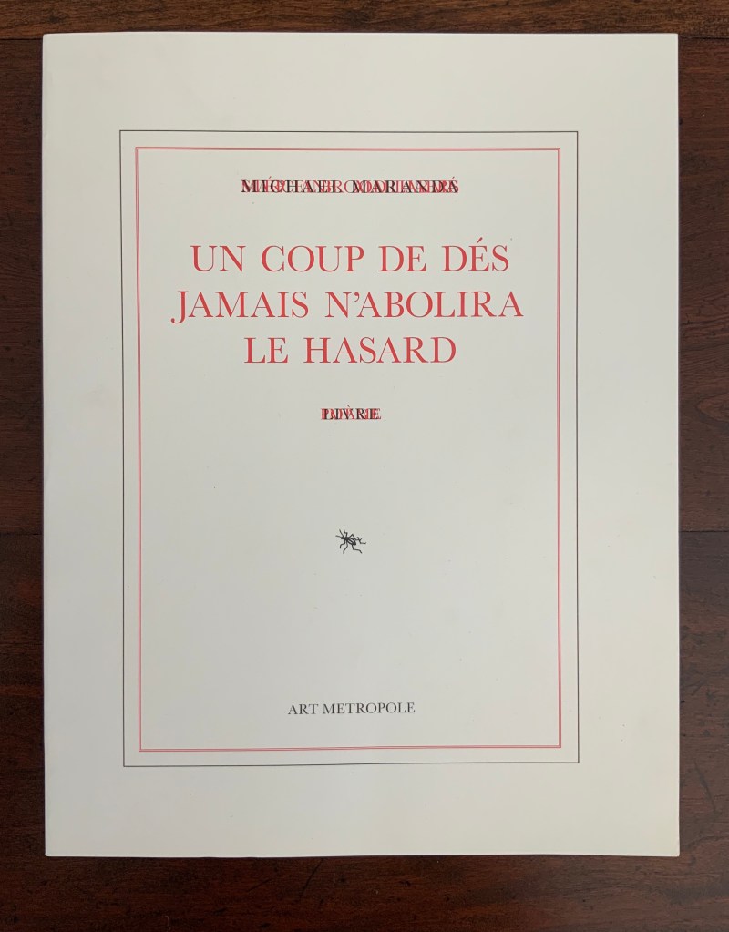
Eric Zboya is poet, writer and artist. Years before this book, he wrote for Ubu Web about the dialogues between Mallarmé’s groundbreaking poem and artists such as Marcel Broodthaers, Guido Molinari and Michalis Pichler, who explore “the higher-dimensional characteristics of the poem”. Broodthaers’ and Molinari’s solid-colored horizontal blocks take the place of lines of text and, reflecting its typographic size, deliver the poem’s page-oriented image(s) without its words. Pichler goes a sculptural step further and excises the lines altogether.
In one sense, Zboya returns to the traditional “collaborative” livre d’artiste, where the artist’s images illustrate the author’s text. But Zboya’s process for generating the images and his handling of the text are anything but traditional.
Just as Mario Diacono runs parallel to Broodthaers, so too do Didier Mutel (2003) and Sammy Engramer (2009) to Zboya. His Ubu Web essay appeared in 2011. While similar, the three artists’ approaches to images differ far more from one another than those of Diacono and Broodthaers differ. Mutel’s sonographs come from recordings of three different speeches. Engramer’s come from the recording of his reading of Un Coup de Dés. Although Zboya’s images come from the translated text of Un Coup de Dés, they do not come from sound recordings.
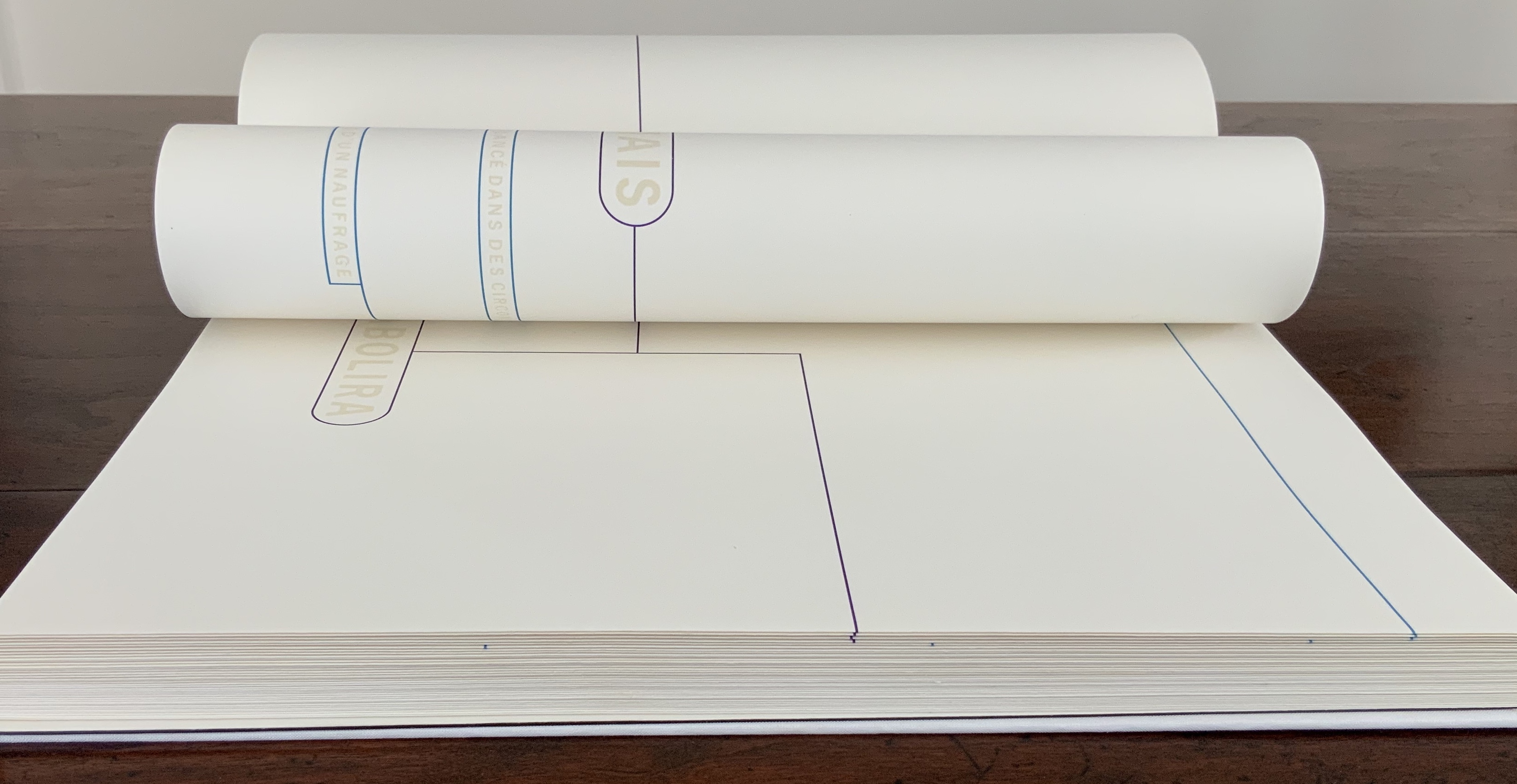
Un Coup de Dés Jamais N’Abolira le Hasard: Poème (2005) Didier Mutel Consists of three volumes: the first entitled “2003 — may god bless america — 4 speeches by George Walker Bush”; the second, “2003 — 4 speeches by Tony Blair”; the third, “Un coup de dés jamais n’abolira le hasard”. Each engraved in drypoint on steel and printed on Velin Arches 300 gsm.
Un Coup de Dés Jamais N’Abolira le Hasard: Wave (2009) Sammy Engramer H340 x W240 mm, 32 pages. Recording his own reading aloud of the poem, Engramer then ran the recording through sonographic equipment. The rendering of each line’s soundwave became his graphic substitute for Mallarmé’s line of verse and, by extension, each black block that Broodthaers used to displace Mallarmé’s text.
Zboya uses graphic imaging software to transform each letter, mark of punctuation and pixel into an abstract image based upon the original topographical placement of the type on the space of the page. Text mutates into a graphic, nonlinear entity. Zboya calls this Algorithmic Translation.Due to a randomization function, the program never yields the same image from the same input. In keeping both with the title (Un Coup de Dés Jamais N’Abolira le Hasard) and the poem’s last line (Toute pensée émet un Coup de Dés), no run of the program ever abolishes chance, and every input (thought) generates a roll of the dice.
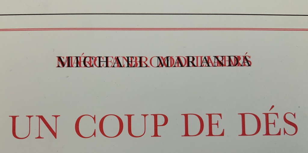
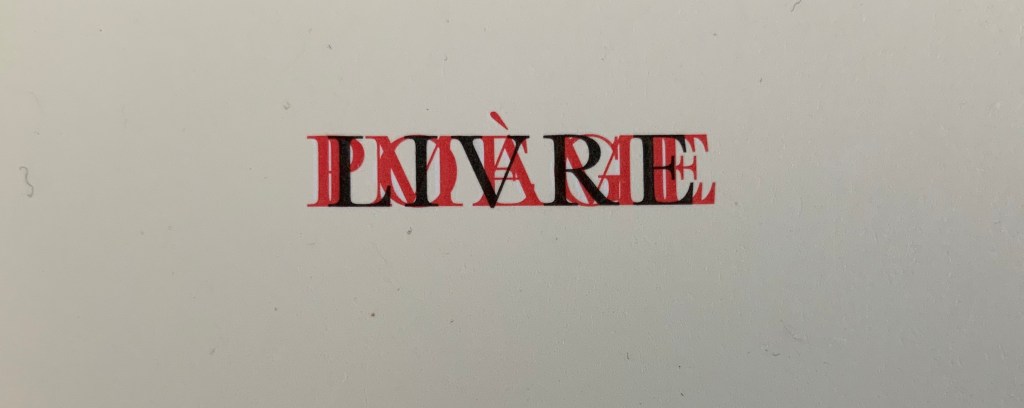
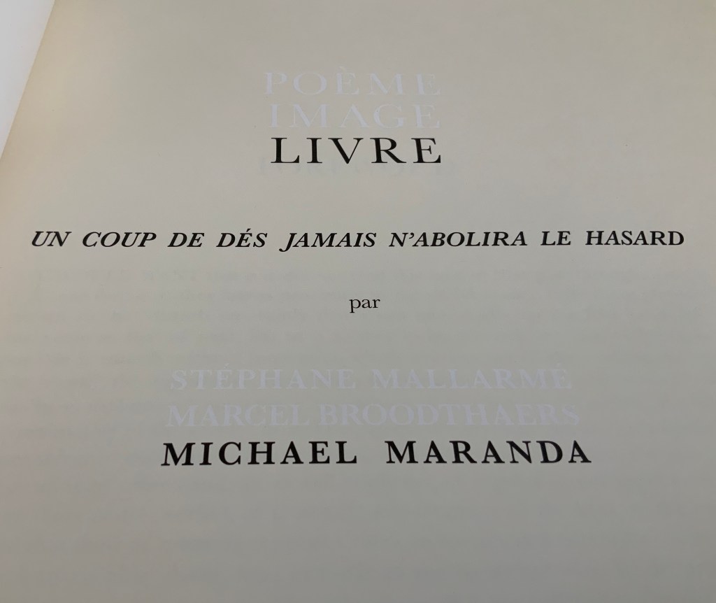
Zboya’s artist book presents more than these graphic, constellation-like translations of the text. Literally shadowing the right-reading English translation of the title is the French text set in reverse. Drawing the reader closer to the synaesthesia promoted by Mallarmé, Valéry and, before them, Baudelaire, the contrast of black (English) and gray (hcnerF) echoes the tonality of the algorithmically translated images; the reversed letters of the French emphasize the physical reversing that occurs when printing text; and the movement from the original hcnerF to the translated English urges the “mind’s ear” to play along with the mind’s eye. The choice to print everything on the same highly textured Rives Design, Brilliant White, enlists hand and eye in support of a synaesthetic equation of text, page and image.
Just as important in another dimension is Zboya’s creative manipulation of the poem’s English translation by Basil Cleveland and preface by Charles Bernstein. The preface is the first clue. Only words selected by Zboya appear in black, left in their original position on the page and creating an envoi to Zboya’s book:
This Note beyond the space of the page vanishes. Narrative is avoided. Intonation falls. Courageous Poem, open a few eyes to this unforeseen symphony.
Zboya has done the same with the text of the translated poem. He erases certain lines and leaves those not erased in their topographical position as close to Mallarmé’s intention as interpreted by Zboya’s numerous predecessors (Broodthaers in 1969, Pichler in 2008, Meillassoux in 2012, Bononno and Clark in 2015, Bloch in 2017 among others). In this way, Zboya’s appropriation occurs across multiple dimensions.
By “erasing” text to select text that syntactically creates new content, Zboya is also following in the footsteps of Tom Phillips (A Humument, 1966-2016), but the effect and result of doing so differs distinctively from Phillips’ work, which is decidedly narrative. The concept of translation in Zboya’s book is closer to Ezra Pound’s approach in Personae (1926). The fragments and sentences created by the “translated” words are close but not the same as those in the source. In Pound’s case, not the same sentences as those of the troubadours. In Zboya’s case, not the same as Mallarmé’s, Cleveland’s, Bernstein’s, etc. The appropriation/translations make something new.
Occurring in its several dimensions, Zboya’s manipulation of text, image and surface recalls Valéry’s description of reading and looking at the worksheets for the book version of Un Coup de Dés:
It seemed to me that I was looking at the form and pattern of a thought, placed for the first time in a finite space. Here space itself truly spoke, dreamed, and gave birth to temporal forms. Expectancy, doubt, concentration, all were visible things. With my own eye I could see silences that had assumed bodily shapes. Inappreciable instants became clearly visible: the fraction of a second during which an idea flashes into being and dies away; atoms of time that serve as the germs of infinite consequences lasting through psychological centuries — at last these appeared as beings, each surrounded with a palpable emptiness…. there in the same void with them, like some new form of matter arranged in systems or masses or trailing lines, coexisted the Word! — Paul Valéry, Collected Works of Paul Valery, Volume 8: Leonardo, Poe, Mallarmé (1972).
That is the effect of reading and looking at Zboya’s work of book art.
Un Coup de Dés Jamais N’abolira le Hasard: Onde/Wave (2009)
Mallarmé’s strange poem, first published in the London-based journal Cosmopolis in 1897, had to wait until 1914 before appearing in a format close to the one Stéphane Mallarmé envisioned with the gallerist and publisher Ambroise Vollard.
Taking the poem’s self-referential line about its words appearing as a constellation, first Ernest Fraenkel, then Mario Diacono and Marcel Broodthaers transformed the poem into a series of images by substituting solid blocks of ink in place of the poem’s lines of verse.
Subsequently, dual homages to Mallarmé and Broodthaers arose. One of them is Engramer’s. Where Fraenkel, Diacono and Broodthaers focused on layout, size and space to generate their visual translations, Engramer added a sonic element, albeit by visual display. Recording his own reading aloud of the poem, Engramer then ran the recording through sonographic equipment. The rendering of each line’s soundwave became his graphic substitute for Mallarmé’s line of verse and, by extension, each black block that Broodthaers used to displace Mallarmé’s text.
In 2010, Engramer took his inspiration one step further and put together an exhibition called “JAMAIS”. As soon as the idea or sensation of visualizing the sound of a poem is mooted, the choice of ink, type, brush, paint, surface, chisel, mold, material, camera, computer and, again, surface opens up. In JAMAIS, Engramer chooses a multiplicity of tools and media (or they choose him): sound recording, computer output, ink, printed book, mold and plastic, camera and animation.
In the video below, pages of the book undulate in a wave along the wall to which they are loosely attached. Alongside them are eighteen 3D PVC renderings of the sonograms. At the end of the hall, a large screen shows a 3D animation of a rolling die whose dots spell out hasard in Braille. The juxtaposition of fluttering pages of sonographs, the physical instantiation of the sonograms and the animated Braille die that cannot be read by touch generates a confounding conundrum for the senses. Text has become sound, sound has become image, and image has become object and animation.
Video: Courtesy of the artist.
Since, according to the artist, his recording of the poem was not played in the exhibition, the conundrum focuses on perception of sound through the eyes. Whether listening/hearing can be performed by seeing a visual or physical representation of what has been listened to/or heard (or is being listened to/or heard) is a neurological question. Rendered in ink and plastic, Engramer’s sonographic images and objects are metaphoric assertions: “hear with your eyes the words no longer printed or carved before you, hear through your eyes the decibels increasing or attenuating according to an unheard recording of those words spoken”.
Further Reading
“Eric Zboya“, Books On Books Collection, 1 June 2020.
This exhibition showcases a selection of Xu Bing’s most important works including Art For the People, Book from the Sky, Book from the Ground, Square Word Calligraphy, Background Story, and The Character of Characters. Xu also wrote a new piece of Square Word Calligraphy of an ancient Valencian poem El bon poble. As the curator Marta Millet Moreno says, “Xu’s interest in language and texts originates from his personal background and he transports these experiences to his art, where traditional art and conceptual art, Eastern and Western cultures, are intrinsically connected.” — Marta Millet Moreno, Centre del Carm
At least two days should be allowed to visit this kind of exhibition. The videos shown below are merely clips; the photos shown are but a handful of those taken. Not every room has been covered here; missing are the Square Word Calligraphy practice room and the room of Xu Bing-related publications. For the latter, a visit to the Xu Bing website page does not substitute for the experience of sitting down with the books, many of which are out of print and for which there are no online images. The lengthy amount of time needed to enjoy this abbreviated version of the 2018 largest Xu Bing (Beijing) exhibition is due to looking from every angle allowed, thinking, comparing and contrasting from one room to the next, watching all the videos, taking instruction in Square Word Calligraphy, leafing through the books, going back to the beginning, interrupting that flow to compare/contrast one room with another outside the sequence and, again, thinking.
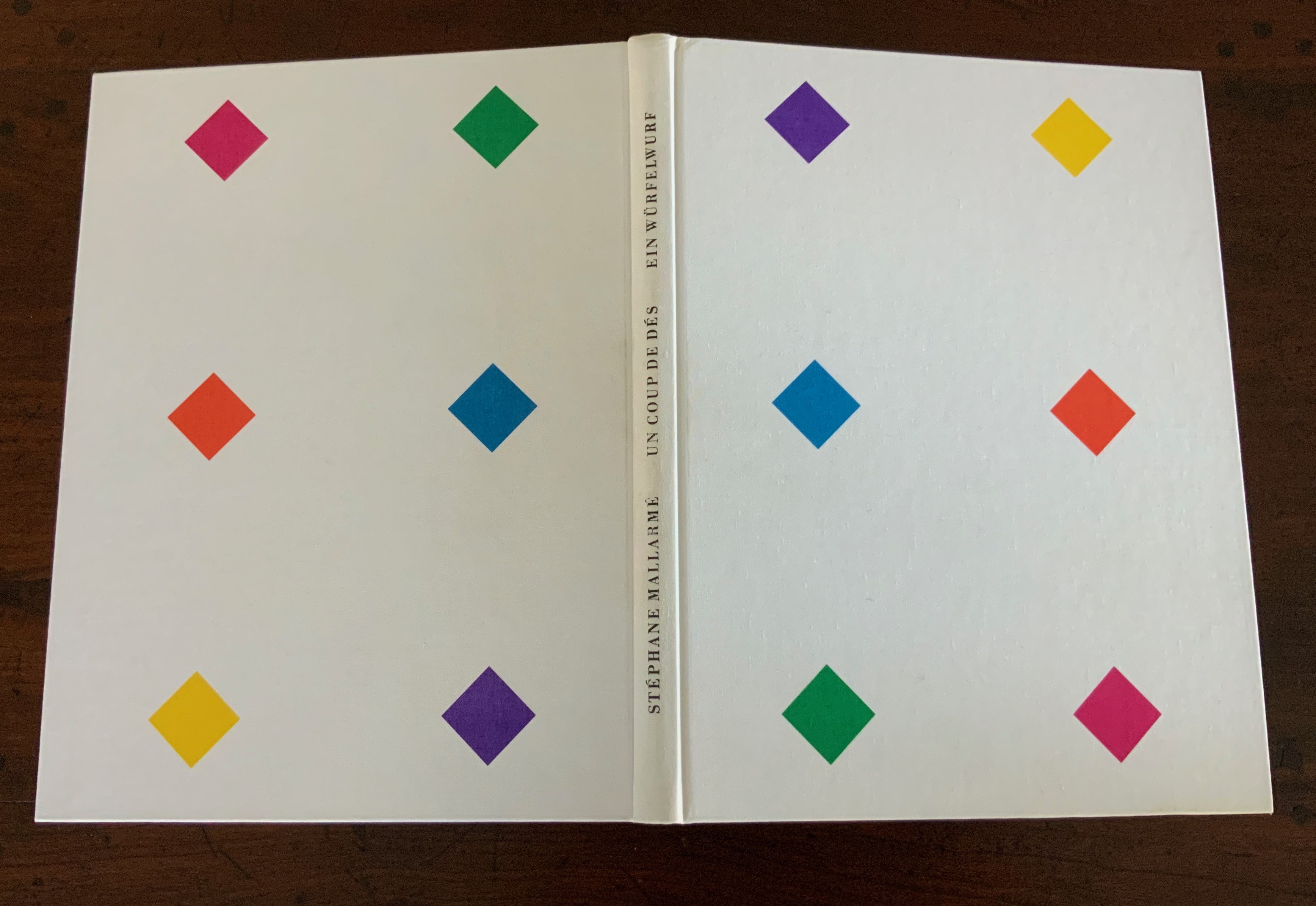
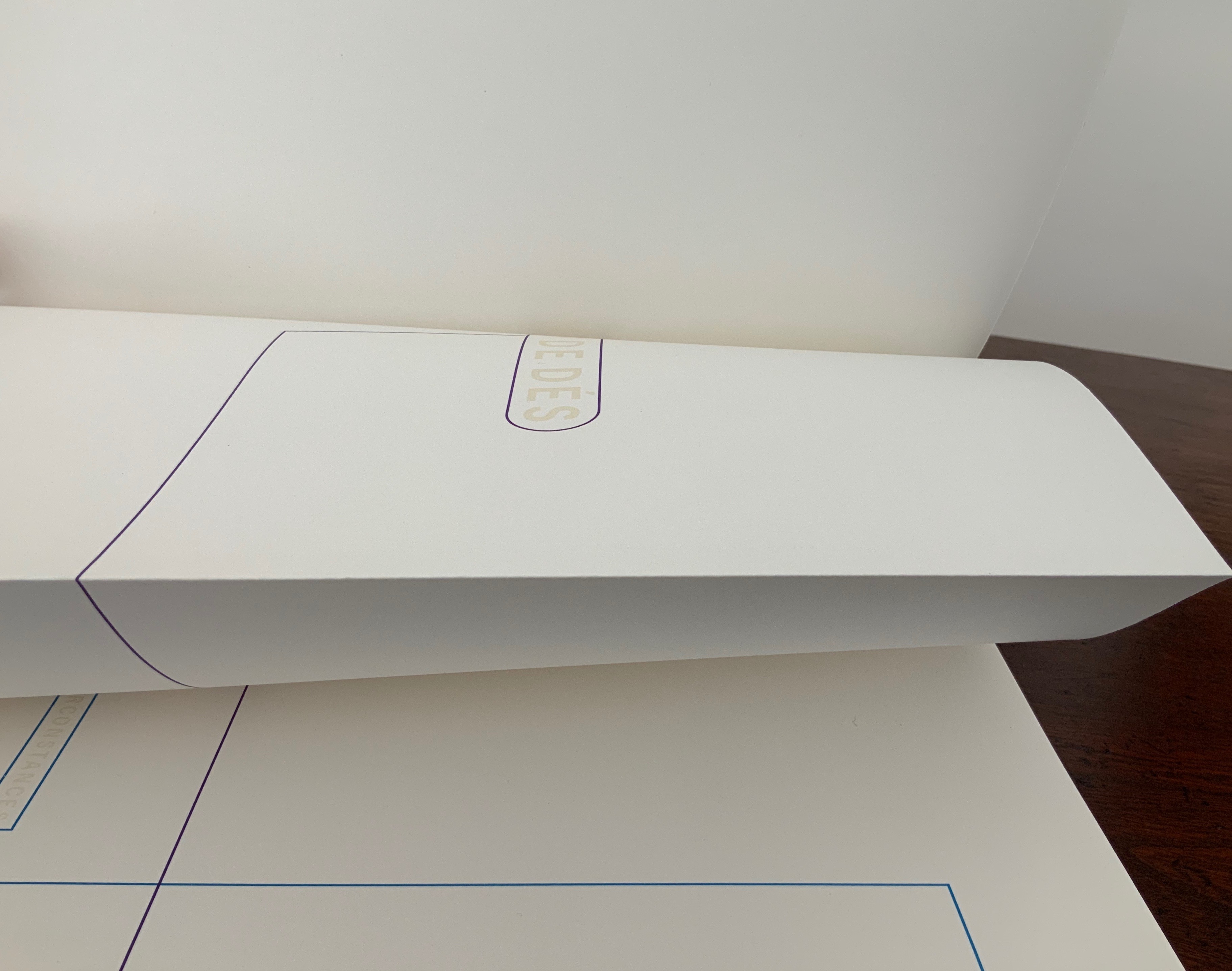
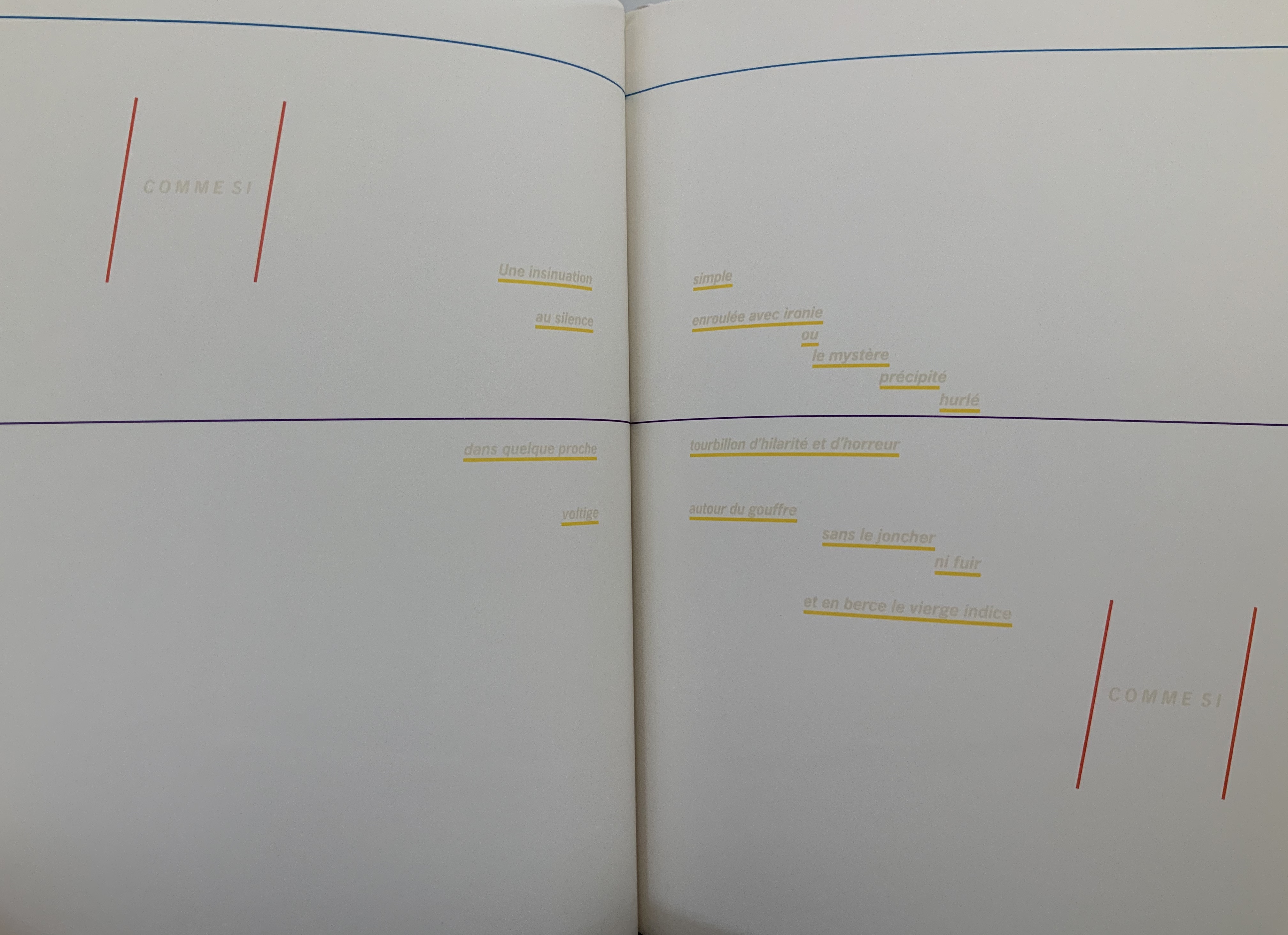
POÉME: UN COUP DE DÉS JAMAIS N’ABOLIRA LE HASARD par STÉPHANE MALLARMÉ (2019)
Poème: Un coup dés jamais n’abolira le hasard(2019) Nicolas Guyot Unique cover with silver bromide printed image on Wenzhou paper mounted on handcrafted canvas. H150 x W200 mm, 16 leaves, 11 pages of text with silver bromide printed images on 160 gm drawing paper. Edition of 76, of which this is #16 and signed by the artist.
Guyot’s livre d’artiste sits self-assuredly in a long line of works inspired by Stéphane Mallarmé’s seminal 1897 poem Un Coup de Dés. Unlike Ellsworth Kelly (1992) but like Christiane Vielle (1989) and others, Guyot integrates his images with the text. In print technique, his silver bromide echoes the silver gelatine of Ian Wallace(1979), but Guyot’s unique cover prints and hand binding distinguish his work from any other in the long line. His technique and layout evoke a feeling of the late 19th century, the contemporary images respond creatively to the original poem’s own cryptic imagery, and altogether the effect is a simultaneity across time, poet and artist.
Guyot writes that Alain Badiou’s Petit manuel d’inethéstique (Éditions du Seuil, 1998) and Quentin Mellaissoux’s Le nombre et la siréne (Éditions Fayard, 2014) were particularly inspiring for this work (correspondence, 21 April 2020). In addition to the artist’s book, Guyot created several paintings (H39 x W65 cm) inspired by the poem and these philosophical reflections.
I first came across the artist Moussa Kone after subscribing to Harpune Verlag’s Moby-Dick “Filets”. Each filet is a section or chapter of Herman Melville’s Moby-Dick, The Whale (1851), which has been assigned to, or claimed by, an artist for illustration. About the time the subscription package arrived, the Bodleian Bibliographical Press announced the upcoming exhibition “Very Like a Whale”, for which artists were invited to create a print work in response to one of the eighty quotations making up the section “Extracts” prefacing Moby-Dick (1851). The Moby-Dick ”Filets” piqued the nearby Bodleian curators’ curiosity, so a loan was offered before I had opened and sorted through the catch. Moussa Kone’s handling of “Etymology”, which happens to precede “Extracts” in the novel, was selected and displayed prominently. And that is how I discovered this catch within the catch.
“Etymology”, Moby-Dick “Filets” (2012)
“Etymology”, Moby-Dick ”Filets” (Harpune Verlag, 2012) Illustrated by Moussa Kone Leporello in an edition of 460 numbered copies. Special edition of 40, of which this is #27, signed by the artist and including parts of the original drawing. Closed: H200 x W150 mm; open: H200 x W710 mm; 16 panels. Acquired from the artist, 11 December 2019.
Note the reflections of the whaler Pequod, Ahab’s chase boat, Ahab himself and the descending harpoon all caught in the corner of the whale’s eye. Being on the front cover, they are the most prominent of several telling details, two others being the selection of ocean-blue ink for the etymological terms through which the whale swims and the whale’s length extending over both sides of the leporello. The inventiveness to which the accordion, concertina or leporello structure lends itself seems endless.
The Abecedarium of the Artist’s Death: 26 Dangers for Your Career (2014)
The Abecedarium of the Artist’s Death: 26 Dangers for Your Career (Verlag für moderne Kunst, 2014) Moussa Kone Hardcover, thread-bound, register-cut; layout by Martin Wunderer; 56 pages, 26 illustrations by Moussa Kone. H145 x W170 mm. Acquired from the artist, 11 December 2019.
An abecedary seems to be de rigueur for book artists. The usual accompanying humor and puns of book art manifest themselves here not only in the illustrations paying homage to Edward Gorey’s The Gashlycrumb Tinies but also in the structure of the little black address book and its alphabetic tabs.
Nowhere Land (2017)
Nowhere Land (2017) Moussa Kone Map, offset printed on both sides. H152 x W112 cm. Acquired from the artist, 11 December 2019.
Nowhere Land follows on from The Abecedarium deeper into the realm of the outré. It was shown in the group exhibition Constructing Paradise, curated by Dieter Buchhart and Mathias Kessler at the Austrian Cultural Forum in New York (ACFNY), 31 January – 24 April 2017. The ACFNY’s announcement reads:
Constructing Paradiseexhibits contemporary reinterpretations of notions of the “exotic” by artists based in Austria or the United States. Taking iconic artworks such as Paul Gauguin’s Noa Noa and Oskar Kokoschka’s Tiger Cat as starting points, the show assembles a diverse range of work from early contemporary to more recent artistic responses to the modernist imprint of desire and fantasy on contemporary culture. Particularly when juxtaposed with hyperbolized images of modern-day advertising, the exhibition explores the psychological impacts of the modernist image on image culture and the Western psyche.
Photo: Courtesy of the artist.
Moussa Kone’s entry took the form of a Panoramic Map for tourists and was distributed among the exhibition visitors. The artist’s description is too arch and funny to paraphrase:
A nautical chart leads the reader to an island, where art historic images of the Brazilian Tupi people are combined with stills from 1980s Italian cannibal movies. It was the poet Oswald de Andrade, who declared in 1928 in his famous “Manifesto Antropófago” (Cannibal Manifest) a strategy of getting rid of the colonizer’s culture in Brazil through an exotic practice that was long attributed to the indigenous people.
Left: Image of the Brazilian coastline from Maranhão to the Rio de Prata, from the “Miller Atlas,” created in 1519 and currently in the French National Library in Paris. — Brazil: Five Centuries of Change (Brown University, 2010~). Accessed 14 May 2020. Center: Oswald de Andrade, “Manifesto Antropófago”, Revista de Antropofagia, 1928, p. 3. Accessed 17 May 2020. Right: cover, Revista de Antropofagia, Ubuweb. Accessed 17 May 2020.
The map‘s exuberance shares more with the satire of De Andrade and Swift than with the gratuitous violence of Ruggero Deodato’s cannibal films or that of their 21st century offspring.
Eine Naht aus Licht und Schwarz (2018)
Eine Naht aus Licht und Schwarz (Sonderzahl Verlagsgesellschaft, 2018) Moussa Kone, illustrations; Walter Pamminger, concept; Bastian Schneider, text; Wolfgang Homola, graphic design. Hardcover, sewn; 96 pages, 176 illustrations. H303 x W235 mm. Acquired from the artist, 11 December 2019.
Although the creation of Eine Naht aus Licht und Schwarz (“A Seam of Light and Black”) was a collaborative effort, it originates in Kone’s experience working at the Albertina Museum in Vienna. He writes:
I was working there mainly at night and responsible for events, which took place in the rented Habsburg State Rooms and the exhibition halls. The entire book concept with its order of the drawings in this form was developed by Walter Pamminger, the texts are written by author Bastian Schneider.Image 1 to image 176 show a typical closing tour through the museum at 3 a.m. After all the party people, the catering staff and guards were gone, I had to make my final round through the empty building. Lights were turned off partly, and I was alone in the Viennese palace, with the art, and the history of the spot. That’s the story of the book: a view on the Albertina museum, which started as a private collection of drawings; a view from the worker’s perspective, the lowest one in the hierarchy of the institution, and the unseen labour, which is a hidden part of the art world. — Moussa Kone, correspondence, 18 December 2019.
But Eine Naht is more than that.
Text and image are arranged in a fluid grid of panels. The recto page above displays the starting pattern that appears and changes across the novel’s subsequent double-page spreads, challenging us in classic book-art fashion to re-learn how to read a book.
Panels 1-4 follow the opening diagram; four panels of text on the verso, with four panels of images correspondingly numbered on the recto.
On the verso, panels 5 and 6 shift to text then image; on the recto, the image in panel 5 corresponds to the text in panel 5 on the verso, and likewise the text in panel 6 on the recto corresponds to the image in panel 6 on the verso. Panels 7 and 8 follow the same pattern.
Here on the verso, panels 9 and 10 show text then image; on the recto, their corresponding panels run image then text. But panels 11 and 12 on the verso are both text; their corresponding panels of images appear across the gutter on the recto.
Again the pattern changes, with panels 13 and 14 both containing images, 15 and 16 containing text, and their matching panels of text and images mirrored on the recto.
The strong tendency to read a single page from left to right and downwards relents after a few sets of double-page spreads, but the change-ability of the back-and-forth between verso and recto requires a longer adjustment. Completely fluent adjustment would be hard to credit, but disorientation and the effort to concentrate, look harder and dwell on the relation between image and text becomes part of the atmosphere of the book. A partial translation into English exists online, which conveys the effect.
Kone’s range — from the intricacy of “Etymology” to the slapstick of The Abecedarium and Nowhere Land to a blend of conceptualism, self-reflexive book art and a twilight melancholy atmosphere in Eine Naht — makes his work an welcome addition to the collection.
Kone, Moussa and Walter Pamminger and Bastian Schneider. Trans. Verena Aschbacher. “A Seam of Light and Black“, Words Without Borders: An Online Magazine for International Literature, February 2020. Accessed 17 May 2020.
If we were looking for a “Banksy” version of Rachid Koraïchi, we need look no further than eL Seed.
Perception, 2016 Manshiyat Nasr in Cairo, viewed from Moqattam Mountain
In my new project ‘Perception’ I am questioning the level of judgment and misconception society can unconsciously have upon a community based on their differences.
In the neighborhood of Manshiyat Nasr in Cairo, the Coptic community of Zaraeeb collects the trash of the city for decades and developed the most efficient and highly profitable recycling system on a global level. Still, the place is perceived as dirty, marginalized and segregated.
To bring light on this community, with my team and the help of the local community, I created an anamorphic piece that covers almost 50 buildings only visible from a certain point of the Moqattam Mountain. The piece of art uses the words of Saint Athanasius of Alexandria, a Coptic Bishop from the 3rd century …. el Seed
The words of Saint Athanasius referred to above are
‘إن أراد أحد أن يبصر نور الشمس، فإن عليه أن يمسح عينيه’
“Anyone who wants to see the sunlight clearly needs to wipe his eye first.”
As with Camus, Algerian sunlight is strong in eL Seed’s work. As it also is in Koraïchi’s Lettres d’ Argile (Letters of Clay) and other ceramic works and arguably in the copperplates for Les Sept Dormants. As with Koraïchi’s work, humanism, poetry and bridging cultures are strong in eL Seed’s work.
The pseudonymous artist has created more “straightforward” street art installations in Tunisia, New York, Rio de Janeiro and Paris, all marked by the curvilinear linking of word and image that so often characterizes inspired book art. This reverse ekphrasis that book art frequently plays upon literature is heightened by calligraphy’s tight binding of art and craft to text. Perception‘s anamorphic enhancement of this binding is brilliant.
The relationship between word and image is “antagonistic sympathy”, according to the English book artist Telfer Stokes (“The Why and How I Make Books“, JAB 3, Spring 1995). In the hands and eyes of Koraïchi and eL Seed, the relationship — if it is a struggle, an agon — becomes more that of sunlight on water, or wind through a wheat field.
In addition to the installations and his book Lost Walls chronicling his painting of 24 walls in 4 weeks during a journey through Tunisia, eL Seed has produced a colorful body of lithographs and sculpture.
In this sculptural work inspired by a poem from Nizar Qabbani, el Seed says his intention is to invite the viewer to walk through a “conversation between the poem, the language, the form and me”. This may remind you of the influence that northern Africa had on the Finnish architect Juhani Pallasmaa, and how it led to his meditative exhortation to architects in The Eyes of the Skin to pursue a visual experience that offers a tactile and haptic quality, that also appeals to the realms of hearing, smell and taste and yet does not neglect the conceptual and rational. That, too, characterizes inspired book art.
Likewise it is interesting how this lithograph and the “calligraffiti” appearing on those broken walls and buildings touch eloquently on another theme characteristic of much book art — how the passage of time touches us, how we try to touch the passage of time.
typo bilder buch (2012) Romano Hänni Printing: Letterpress on hand-proofing press. Binding: paper over cardboard glued to end papers glued to handsewn book block. Pages: 54. H268 x W237 x D30 mm. Edition of 65, of which this is #62. Acquired from the artist, 26 February 2020.
Appearance vs reality — one of the ancient standbys for philosophical conversation and disputation. But also for stimulating art. Romano Hänni’s typo bilder buch (2012) is a case in point.
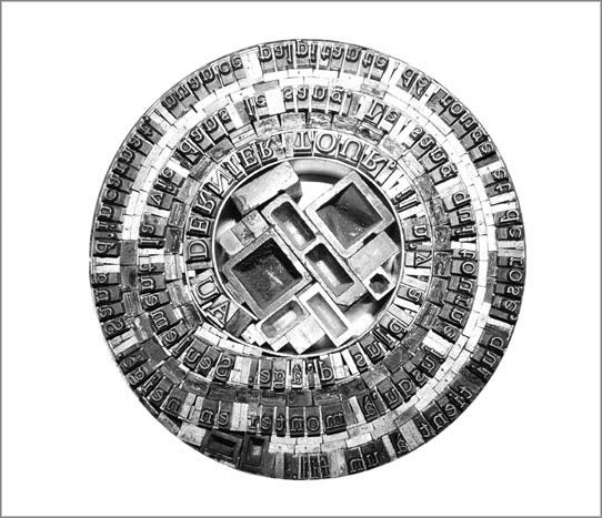
Tightly encased in its banderole, typo bilder buch deceives. Large and thick, it appears weighty, hefty, but is light. Too snug to slide off, the banderole requires breaking a perforated edge. Appearance must be penetrated to get at reality. The cover, made of stiff heavyweight paper, is precisely creased around the front and back boards, made of waffled cardboard, not the usual dense binders boards. The text on the flyleaves is scrambled, the letters in reverse and sometimes in the wrong order (deliberately), sometimes inverted, the uppercase sometimes aligned to drop below the line, the lowercase sometimes aligned to rise above the line. Reconstituted from its mirror appearance (and translated), the text declares:
Appearance and Riately
Since the invention of script and the printed word, we have lost access to pictorial statements: we have become character devout. Nonetheless, we still read images. … However, when reading images, signs and symbols, we seem to struggle, even though they also represent a source of information with a simultaneous effect on various levels. Initially, our visual perception looks for symmetry and a human face.
The book block’s first image: a small face in a white sea of embossed diagonals running from left to right, or is it from right to left, or downwards or upwards?
The book’s title and even its endpapers (the papers glued to the boards and attached to the book block) declare that typo bilder buch (“typo picture book”) will address this split between script and printed words (or letters) on the one hand and images on the other. On the pastedown is a bright orange lowercase alphabet; on the free endpaper are twenty-five signs, ornaments and images arranged in five rows and five columns. The alphabet’s twenty-six letters arrange themselves to match the five-by-five square of images by squeezing j and i together. Yes, in that order because the alphabet is set boustrophedon style (“as the ox plows”), which is at least the third or fourth clue that typo bilder buch wants us to play with our notions of books, reading and, as Hänni puts it, “appearance and riately”.
Spacing and layout are not the only toys at work here. To paraphrase Ellen Lupton: “Spacing, framing, punctuation, type style, layout, and other non-phonetic marks of difference [as well as the surface on or in which they appear] constitute the material interface of writing.” When any book opens, the fingers expect a firm block of pages for turning, but with typo bilder buch, the thumb on the free end paper sinks into the book block. All the leaves beneath the end paper, like the one with the tiny image of a human face, are two sheets of paper towel. These pages, this paper, are not merely a surface on which to print; the ink is not merely a medium. They play a physical and intellectual role in the composition of the work.
Through colorful, neighborhood mazes in a world Mondrian would love, small solid- and multi-colored geometric characters run or pose. Bosch would love the characters that look like human stick figures with birds’ heads, the figures with heads and legs but no bodies and the strange stick-figure animals. “Mr. Black” of The Book from the Ground (2014) by Xu Bing would recognize and sympathize with this cast of characters, although he would struggle to make narrative sense of it. His creator would smile, of course, over this book’s concluding pages:
Der Sinn dieses Buches ist seine Sinnlosigkeit — oberflächlich betrachtet. (”The meaning of this book is its meaninglessness — superficially considered.”).
Some of the mazes could be the analogue version of a computer arcade game. Some seem to represent an arcane version of checkers or Chinese checkers combined with “magic squares” (they are not the traditional form of magic squares where the sum of any column, row or diagonal is equal to any other).
Reading typo bilder buch elicits, challenges and heightens pattern-seeking behavior. Expected patterns turn themselves on their heads. In the page above, the tilted numbers in the “magic squares” urge turning the book’s landscape orientation by 90º to the right into a portrait orientation. Notice how the numbers’ progression by 2 reads boustrophedon-style upwards from the lower right corner. Or perhaps the start lies with 56, decreasing by 2, which means reading upwards from the lower left corner then down and up and so on. Return the book to its landscape orientation, and the numerical plowing proceeds from right to left to right and so on. In either orientation, the numerical progression or regression challenges the notion of the “proper” direction for reading.
While trying to read typo bilder buch might lead from image to image, the realization often arrives that a larger subsuming image or pattern is in play, or vice versa. For instance, in the page above, the letters p and q declare their mirror image of each other from the upper left and right corners, but then so do the letters p and b from the upper and lower left corners, and so do the letters q and d from the upper and lower right corners, and likewise the b and d from the lower left and right corners, and likewise diagonally. But step further back, and the juggler in the middle may be laughing at this logic-chopping of “if p, then q; if q, then d; if d, then b; therefore, b, then q, and p, then d”. He laughs as if to ask, “I’m just juggling these four clubs; what are you doing?”
Ludic is the operative word for this book — even in the process by which it was created:
The page layout was deliberately not prepared. The design and sequence of the pages were intended to develop during the work process. The first printing forms were blue lines and linear frameworks at the bottom of the pages. New ideas developed during the unrolling and tearing off of double pages of paper towel as well as during composition, setup, printing and removing of the type. — Hänni, “Pictorial Supplement with Translation in American English”.
Photos: Books On Books.
So, implicit in every pattern and change of pattern, in every modulation of color and evenness of inking that heightens or depresses the surface, is the excitement of creative play. The book is rich in information about its material and making, which offers added ways to follow that excitement. Consider, for instance, Hänni’s description of the type area within which he worked — and, separately, his samples of grid plans:
The type area is 40×40 Cicero (18×18 cm) = 4 squares comprising of 20×20 Cicero (9×9 cm) each or 400 squares comprising of 2×2 Cicero (9×9 mm). The top margin is 3,5 cm, the bottom margin is 4,5 cm (to the middle of the blue line), the outside margin is 1,5 cm, the inside margin is 3,5 cm. — Hänni, “Pictorial Supplement with Translation in American English”.
By his detail about this European unit of measure in typography, Hänni grounds typo bilder buch deeply in the tradition of bookmaking. The “Cicero” obtained its name from its first use by the printers in the 15th century. It may have been Peter Schöffer, who printed an edition of Marcus Tullius Cicero’s speeches in a similar font size in 1465. It may have been Arnold Pannartz and Konrad Sweynheim in Rome for their 1467/68 edition of Cicero’s Letters to Friends. Or it may have been for the typeface cutter Ulrich Hans Cicero, who created a 12-point typeface in Rome. As can be seen from his 2011 catalogue, tradition matters as a source of discipline and creativity for Hänni.
Although an admirer of Jan Tschichold, another adherent to tradition, Hänni does not hold with perfection or a mechanical application of the Golden Ratio. The blue cicero sits at the page’s optical center — eyeballed, not mechanically determined, according to the artist. Like Tschichold, though, he values precision in craft, tools and material, and he seeks an ethics and morality through his craft and art. Consider these technical details from the book’s introductory essay:
The page format was determined by the paper : Paper towels, maxi roll; composition: 100 % oxygen-bleached pulp (54 g/m2 ± 5 %), wet strength additives, agents; roll length: 62.1 m ± 2 %, sheet size: 23×26 cm, ±2%, paper from responsible sources, FSC® C017535.
Note the point about responsible sourcing. One important departure from Tschichold’s views on discipline, craft and artistry is Hänni’s theme of “making do” and more openness to creativity “on the fly”:
The printing workshop represents the available raw materials: Lead characters, synthetics and wood, brass lines and signs, typographic signs and lead symbols. The typo pictures were composed from individual parts and printed on the hand proofing press; some of them were superimposed in several printing cycles. They are intended to mutually influence and merge into each other and to display an inner connection. The body of the book was bound by hand with thread. Overall production time was approx. 600 hours.
Photos: Courtesy of the artist.
Hänni strikes a similar but different balance than Tschichold among craft, discipline, tools and material, imagination and artistry, and ethics. Despite their engineering appearance, the samples imply a drive toward artistry in that centered cicero eyeballed, not calculated. In its technical detail, the paper’s responsible sourcing weighs on the side of nature. The restriction to the printing material at hand weighs for a balance of discipline and creativity. The workings and hours weigh in for the human hand’s striving for connectedness.
Four years after typo bilder buch’s appearance, the New York Times Interactive published “Reading in a ‘Post-Text Future’“, which posed that text is succumbing to the sound and blurry of podcasts, YouTube, talking assistants, Netflix, face-reading phones, Instagram and augmented reality. As if humanity is passing through an internet portal turning the evolution from orality to literacy in on itself — where “text recedes to the background, and sounds and images become the universal language”.
For Hänni, this would simply confirm what he avers: “An increasing amount of images, including moving ones, are crashing in on us. … Proven and irreplaceable things are sacrificed for supposedly new things. Progress destroys our memory….”. His essay and typo bilder buch in itself argue for a different outcome:
Reality, that is to say nature, teaches us something different: Everything is connected, interdependent and mutually influences one another. No part can be changed without affecting the whole. The most important and most valuable things, such as the air that we breathe or love, are invisible. Variety is the name of the game, not perfect reproduction. Our ever-changing reality remains intangible. This chaos is creative and lively…. The world is a contradiction. It is also the result of individual ways of thinking. A way of thinking that should be under constant change and development through a lifelong absorption of new impressions and experiences induced by reflection.
Examples of “random” regimentation; the size of the edition and number of this copy. Photos: Books On Books.
Pages of regimentation, such as those above, tease at the theme of appearance and reality by inviting a search for underlying patterns that make up that regimentation only to yield discovery of breaks in the ranks. Even the means by which the book’s number and edition are presented on one of its last pages performs this invitation in typically tongue-in-cheek fashion: Dieses Buch trägt die Nummer: (“This book carries the number:”). What that number is must be discovered “as the ox plows”. To the end, typo bilder buch celebrates the “irregular, the special, the different, the rare” by the book.
Glyphen aus der Steinzeit: [entdeckt in der Höhle von Lascaux, Dordogne/Frankreich] (1989)
Handbound, paper cover around accordion fold attached to board, 20 panels, letterpress and handset. Special edition of VI, of which this is III. Acquired from Kelmscott Book Shop, 2 July 2020. Photos: Books On Books Collection.