Books On Books Collection – Menena Cottin

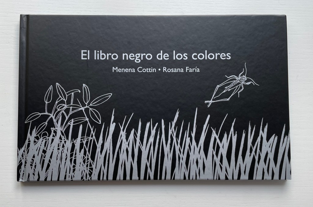
El libro negro de los colores (2006)
The Black Book of Colors (2009)
Menena Cottin and Rosana Faría
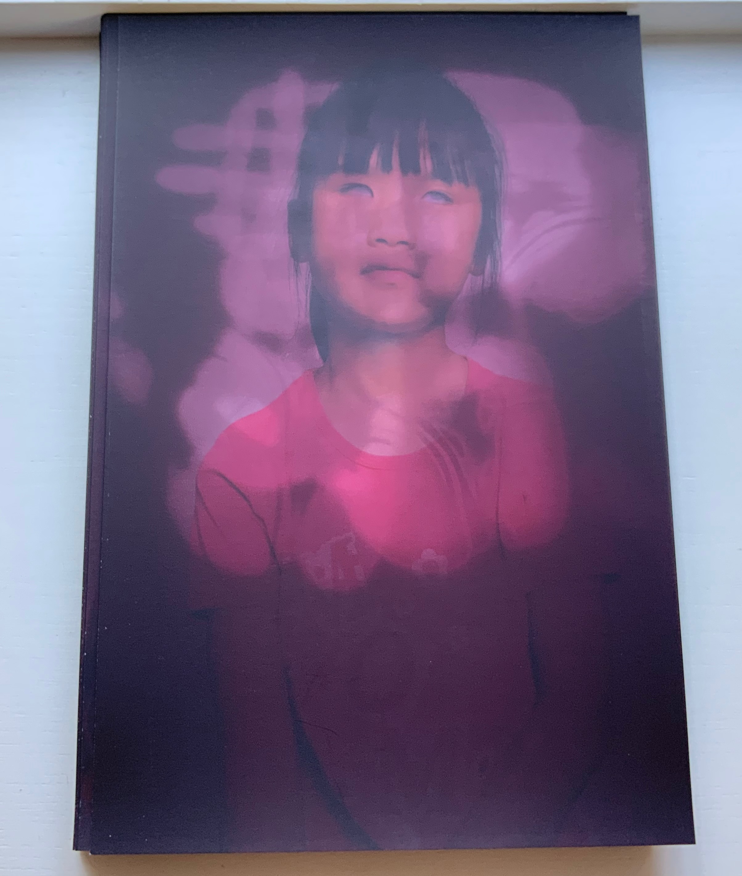
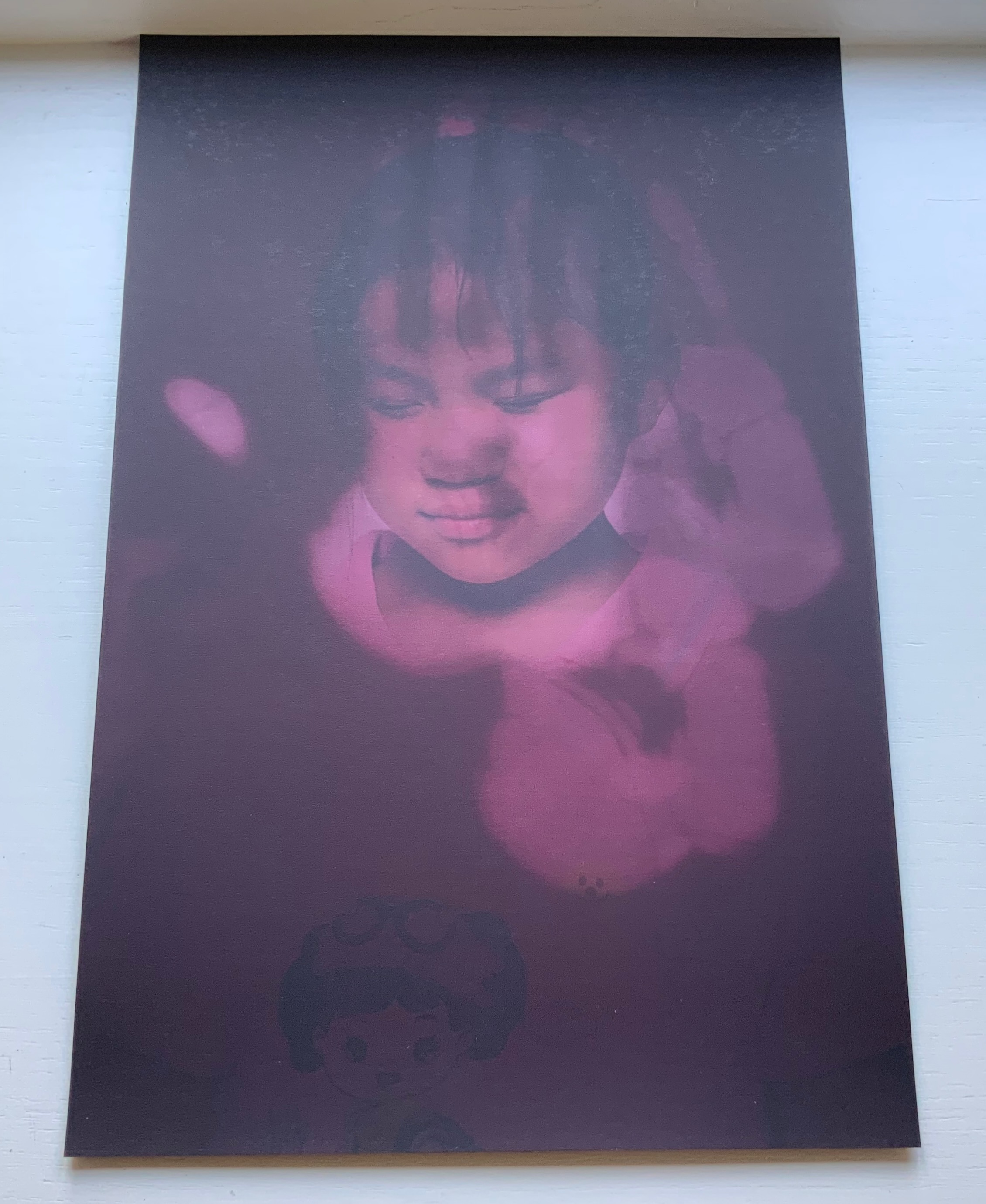
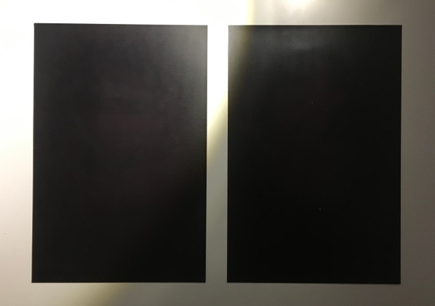
Dustjacket, casebound, black doublures, sewn. H180 x W290, 24 unnumbered pages. Acquired 17 October 2017.
Photos: Books On Books Collection. Displayed with author’s permission.

Menena Cottin refers to her works as “concept books”, and there are multiple concepts at work in The Black Book of Colors. Generically, it is a children’s book introducing the reader to colors — but by the absence of color. In white on black, it addresses sighted readers. In Braille, it addresses unsighted readers. With Thomas, who “likes all the colors because he can hear them and smell them and touch and taste them”, the book introduces to sighted and unsighted readers who are not synesthetic the concept of synesthesia and, through it, a new sense of empathy and imagination. The sighted encounter someone with a sensory anomaly, not a disadvantage. In the company of their imagined unsighted co-readers, the sighted may come to empathize with those with sensory differences. The unsighted encounter someone whose sensory anomaly is an advantage. especially as the book favors their own heightened sense of touch.

Thomas says that yellow tastes like mustard, but is as soft as a baby chick’s feathers.
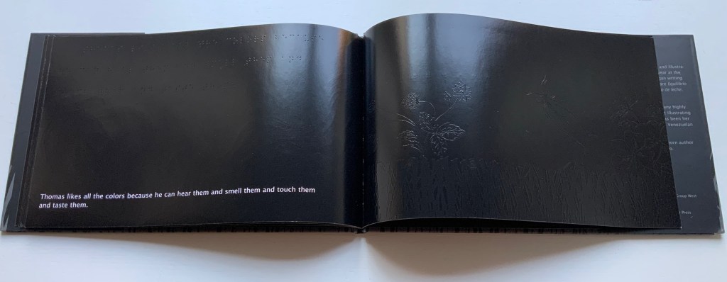
Thomas likes all the colors because he can hear them and smell them and touch and taste them.

Breaking boundaries in ways similar to those employed by book artists, Cottin manipulates character and narration, also the picturebook’s genres of color recognition and letter recognition (Braille in this case) as well as some of the basic elements of the book (layout, printing in reverse-out and debossed printing). In one of the most sophisticated examples of this, double-page spreads fuse concepts by turning a rainbow into a gathering of raised images of the synaesthetic objects with which colors have already been associated in the book (chick’s feathers, strawberries, leaves).

And when the sun peeks through the falling water, all the colors come out, and that’s a rainbow.

The Black Book uses synesthesia to go beyond the color recognition genre to introduce more complex concepts: the nature of light and water’s lack of color, taste and smell. This stepping outside the genre is another example of the boundary-breaking that artists’ books often perform.
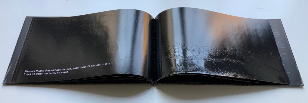
Thomas thinks that without the sun, water doesn’t amount to much. It has no color, no taste, no smell.

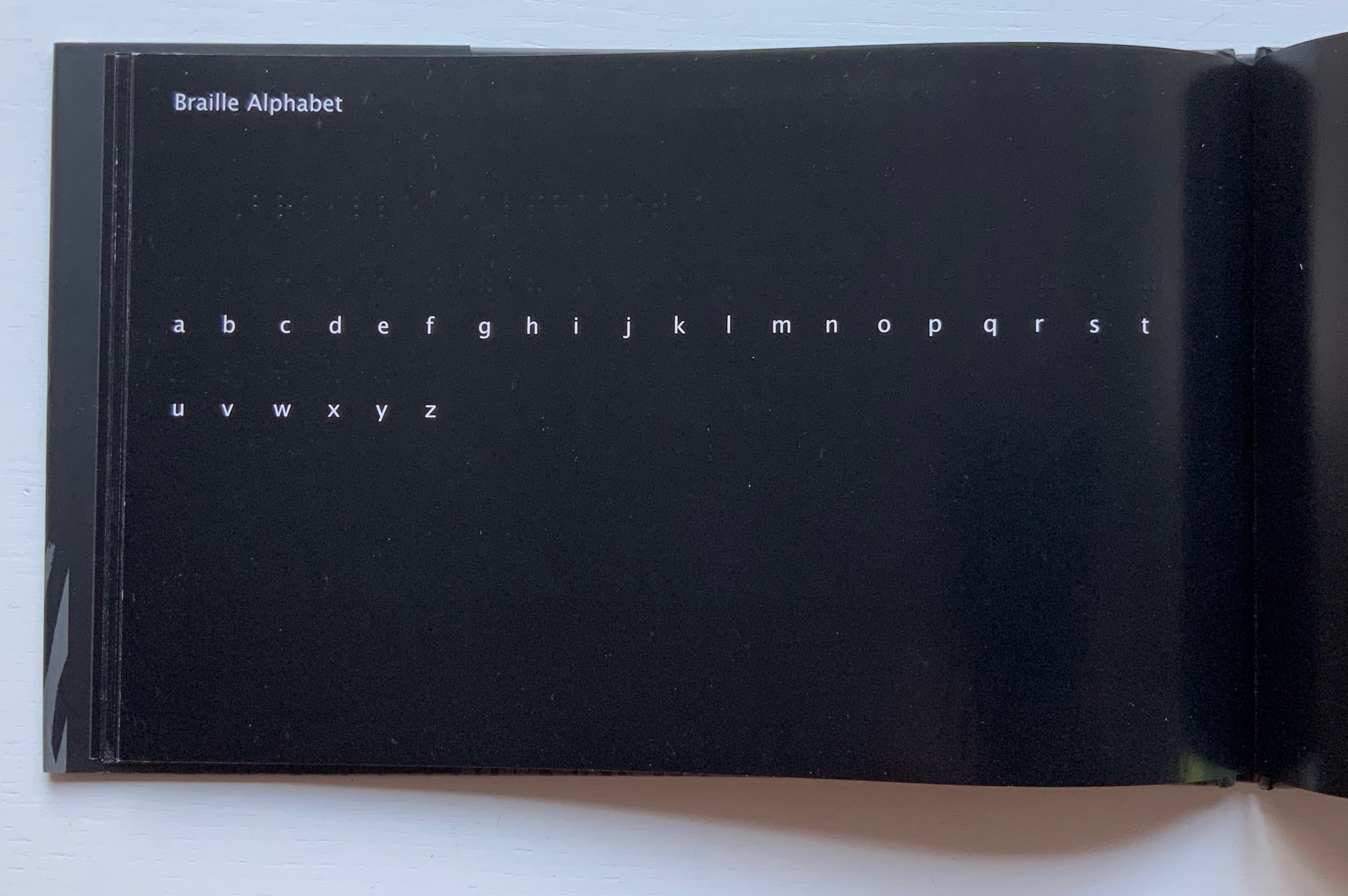
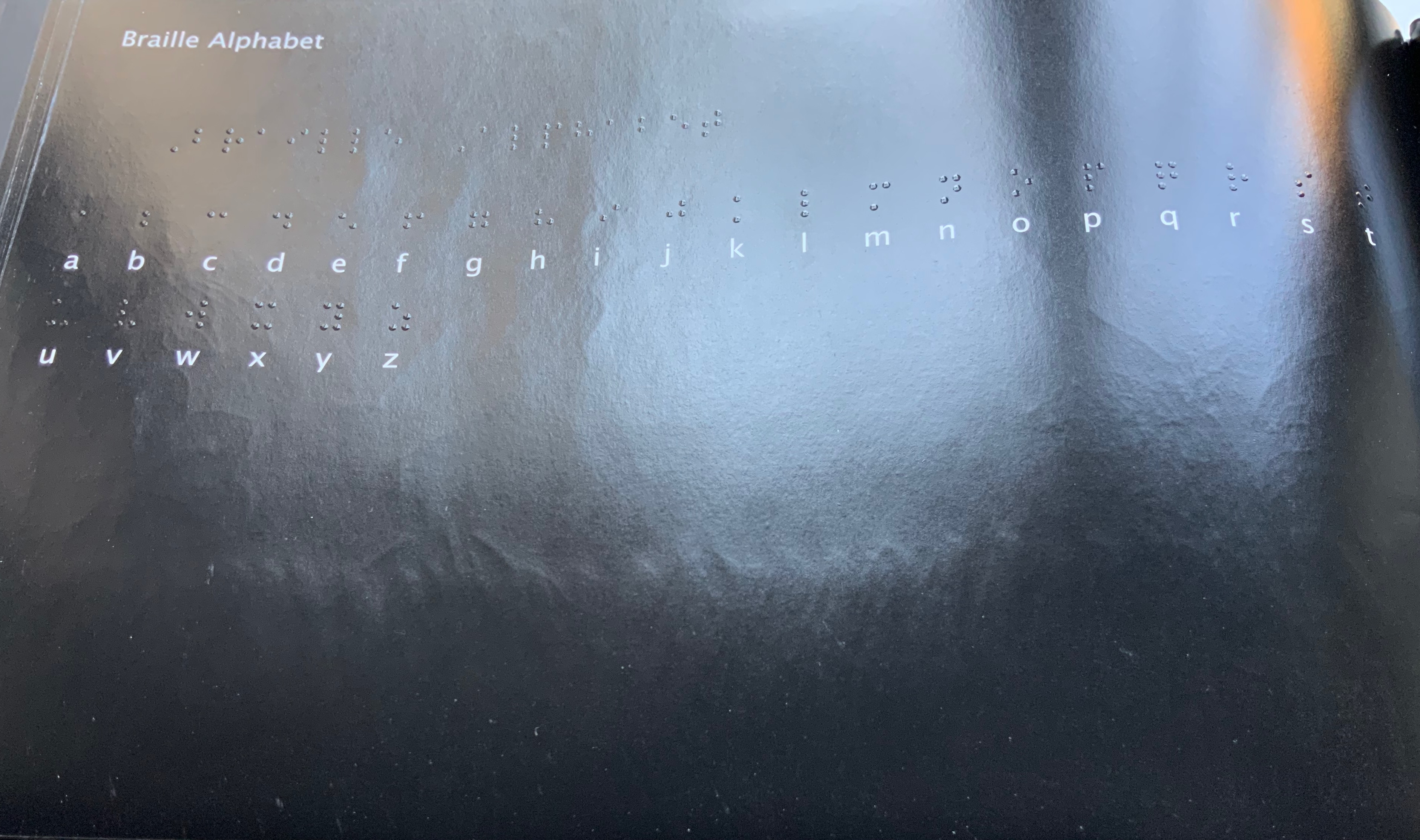
The book ends by asserting its membership in the alphabet book genre by presenting the alphabet in lowercase white on black and in Braille. Across from this verso page, there is no set of raised images on the recto page as there has been so far throughout the book. Knowing from touch that this is the end of the book and noting the absence of any image, sighted and unsighted readers might find this coda a prompt to return to the beginning and “re-read” the images with a greater reliance on touch.
Other books in the Books On Books Collection worth comparing with The Black Book of Colors are

Like a Pearl in My Hand (2016) Carina Hesper

Vladimir Nabokov: AlphaBet in Color (2005) Jean Holabird

Blindness (2020) Masoumeh Mohtadi

Voyelles (2012) Arthur Rimbaud/Le Cadratin

Darkness Visible (2017) Sam Winston

The Blind Men and the Elephant (2019) Xiao Long Hua

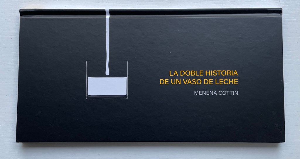
La Doble Historia de un Vaso de Leche (2019)
La Doble Historia de un Vaso de Leche (2019)
Menena Cottin
Casebound landscape, paper over boards, with orange-yellow doublures, sewn. H160 x W310 mm. 24 unnumbered pages. Acquired from the artist, 2022.
Photos: Books On Books Collection.

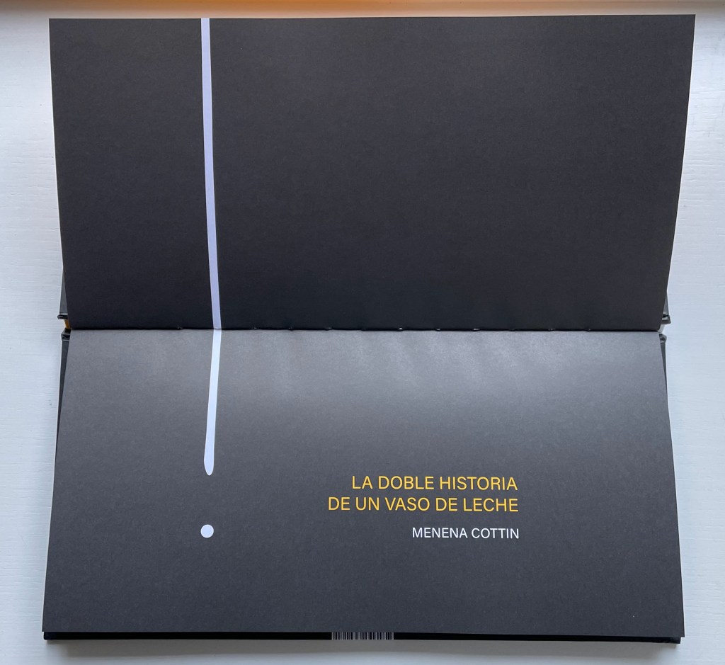
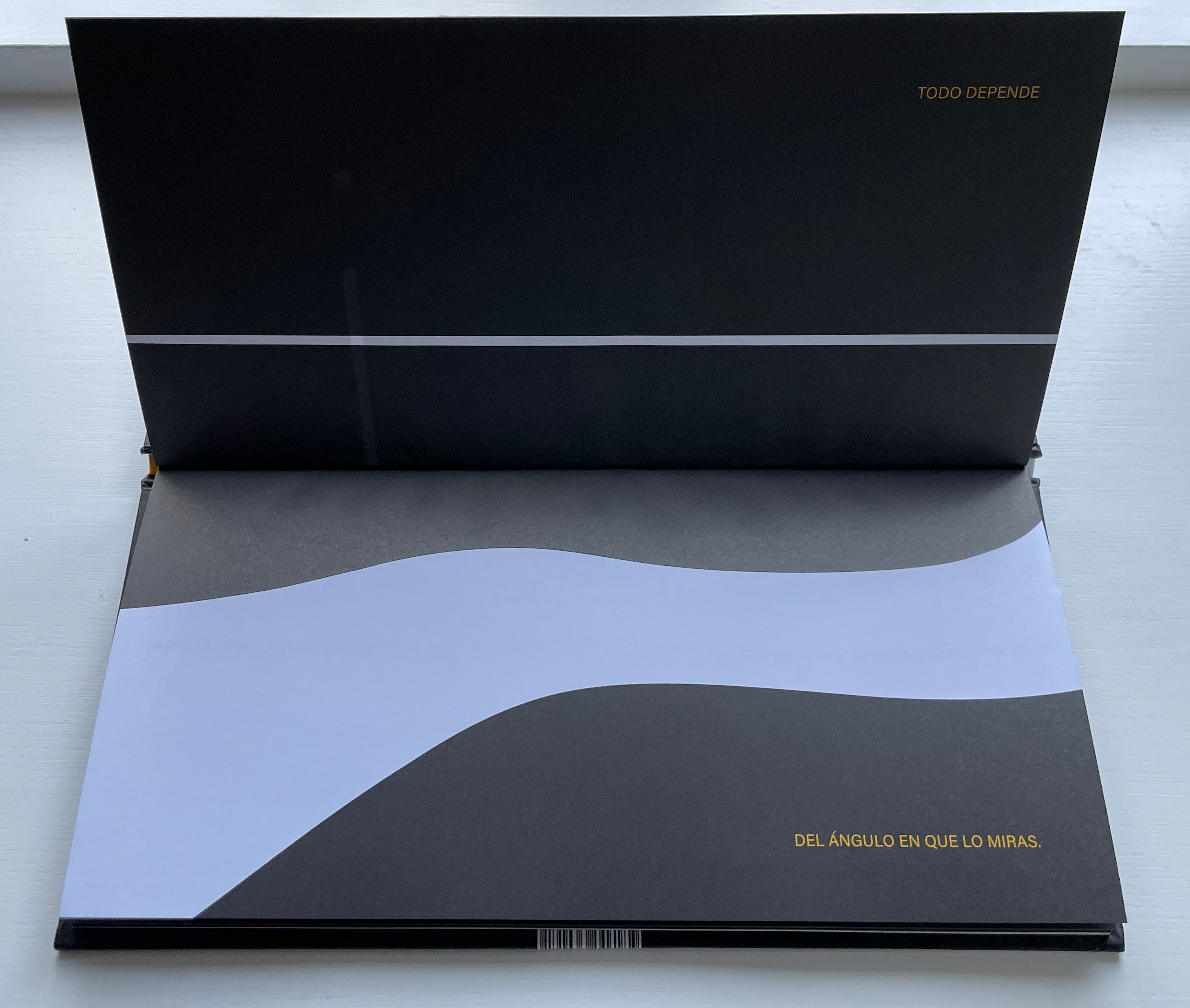
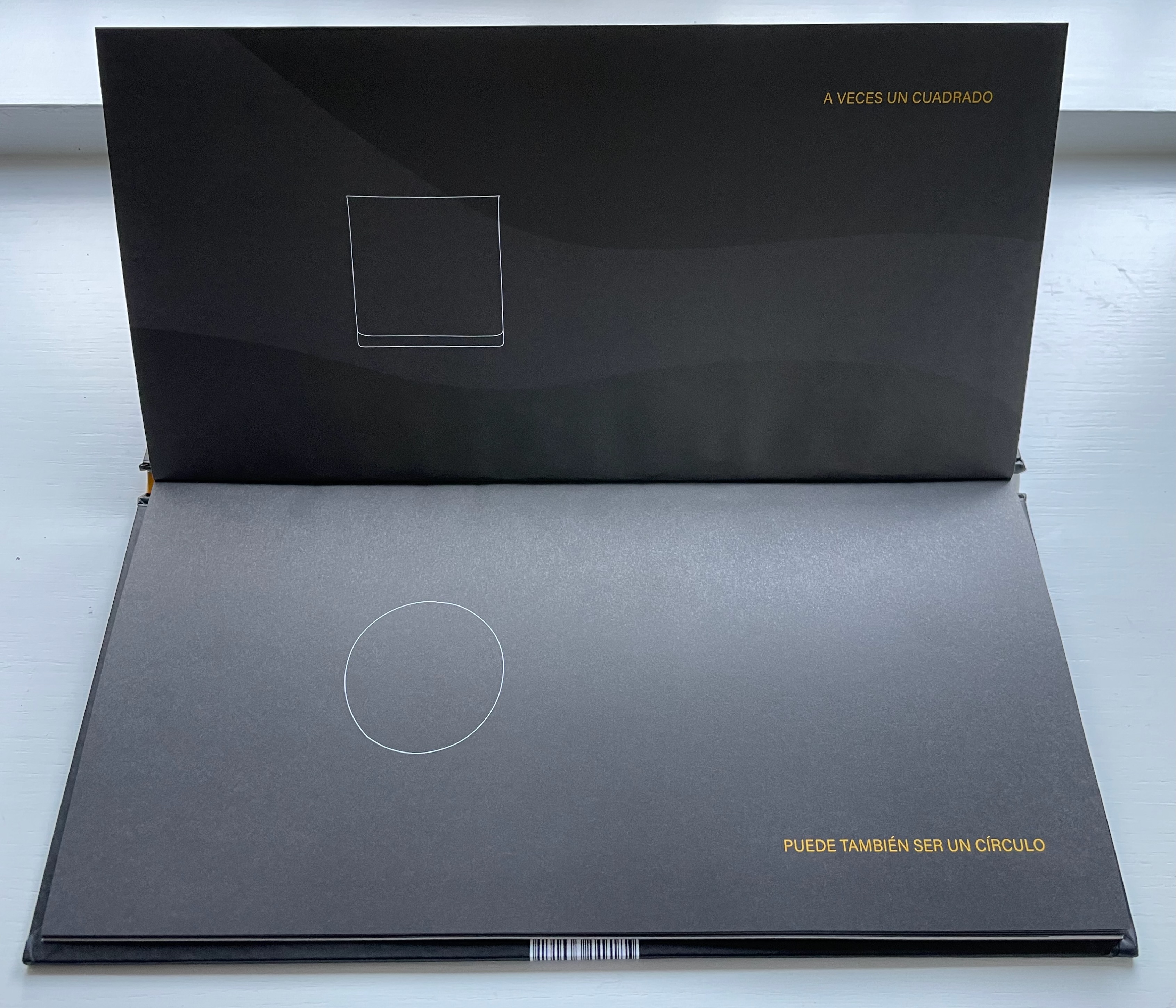
The Double Story of a Glass of Milk opens and closes with a line that echoes the start of William Carlos Williams’ “The Red Wheelbarrow” but is at once more straightforward and just as surprising — as the visual story spills out.

Todo depende del ángulo en que lo miras. A veces un cuadrado puede también ser un circulo y una larga linéa luce como un punto y algo que está solo a medias parece que está lleno. Un mismo cuerpo tiene diferentes caras per a veces te confunde mostrándote una misma forma. Solo si miras a su alrededor descubres que … eso que de frente parece tan discreto desde arriba luce muy escandaloso. Todo depende del ángulo en que lo miras.

“Everything depends on the angle from which you look at it. Sometimes a square can also be a circle and a long line looks like a dot and something only half full looks full. The same body has different faces but sometimes it confuses you by showing you a different shape. Only if you look you discover that … what from the side looks so innocent looks shocking from above. Everything depends on the angle from which you look at it.”
Equilibrio (2019)
Equilibrio (2019)
Menena Cottin
Casebound landscape, paper over boards, with red doublures, sewn. H160 x W310 mm. 25 unnumbered pages, last page on inside of flyleaf. Acquired from the artist, 23 August 2022.
Photos: Books On Books Collection. Displayed with the author’s permission.

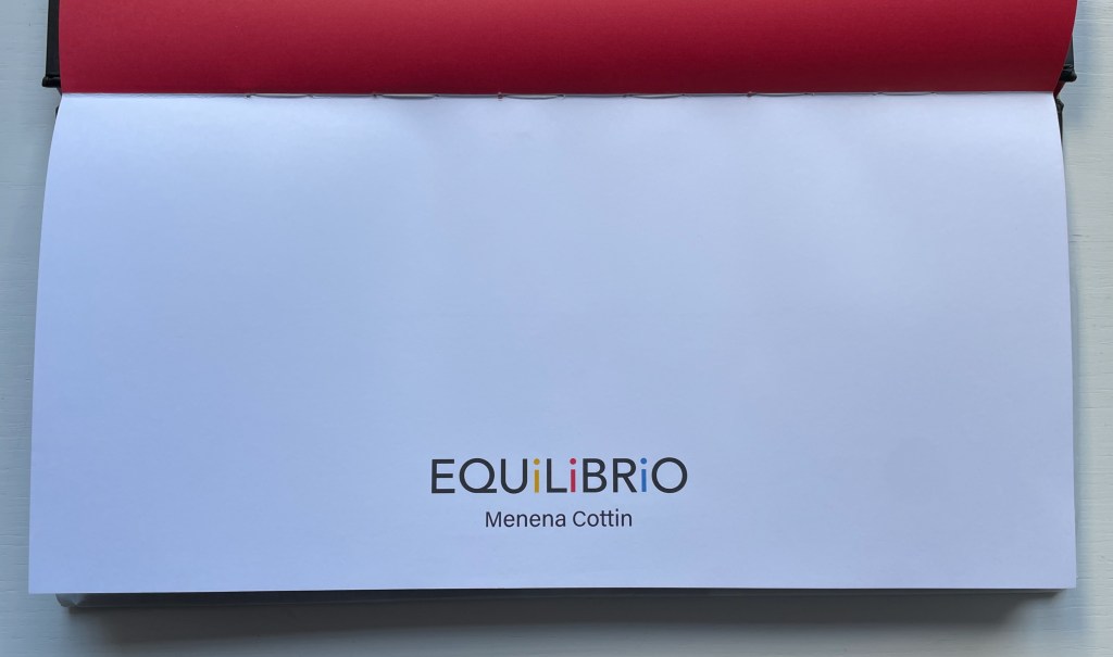
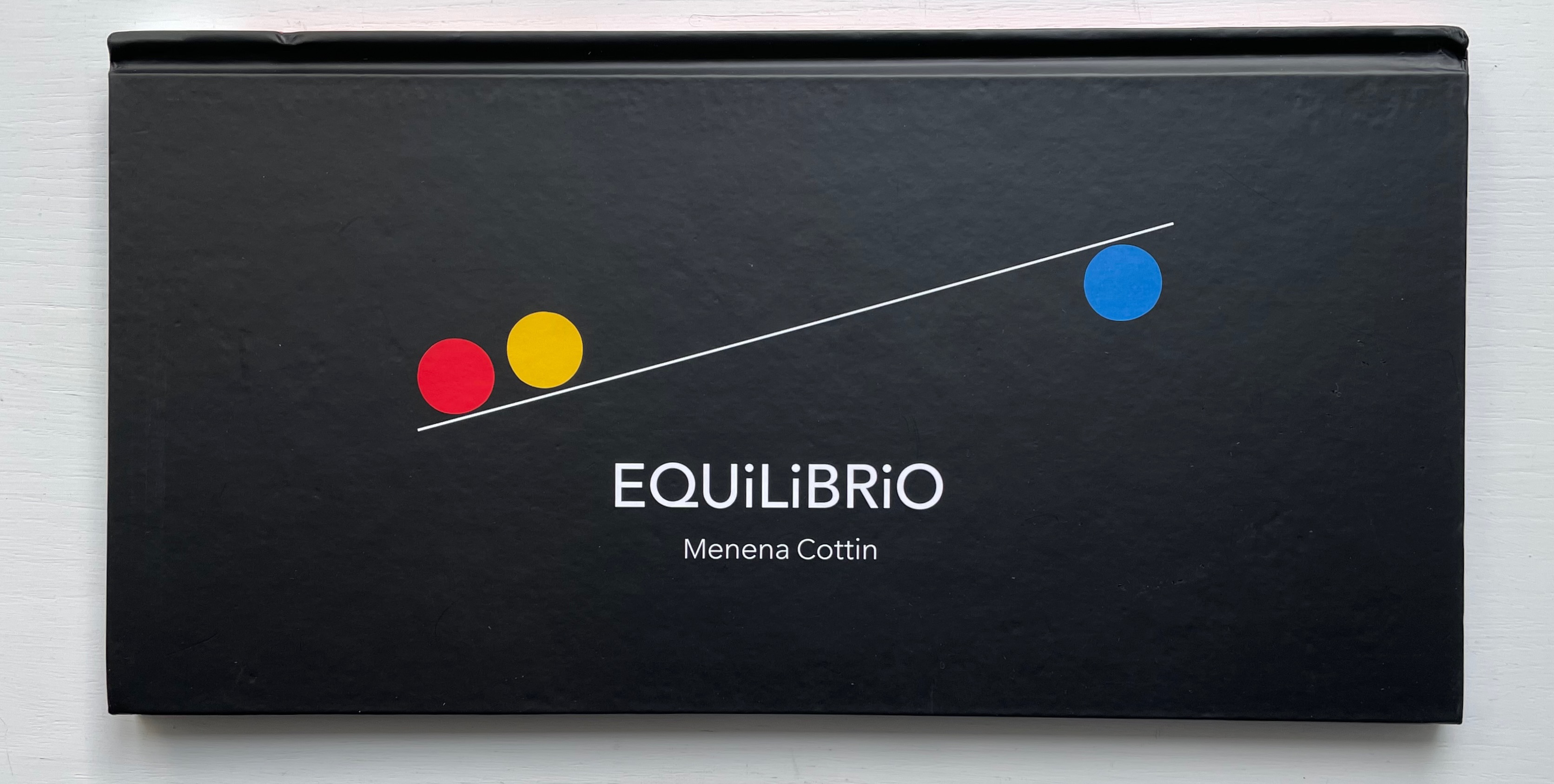
The three colored balls on the cover give their colors to the three i’s in Equilibrio on the title page, announcing the statement to come: El equilibrio es cuestión de balance (“Equilibrium is a question of balance”).

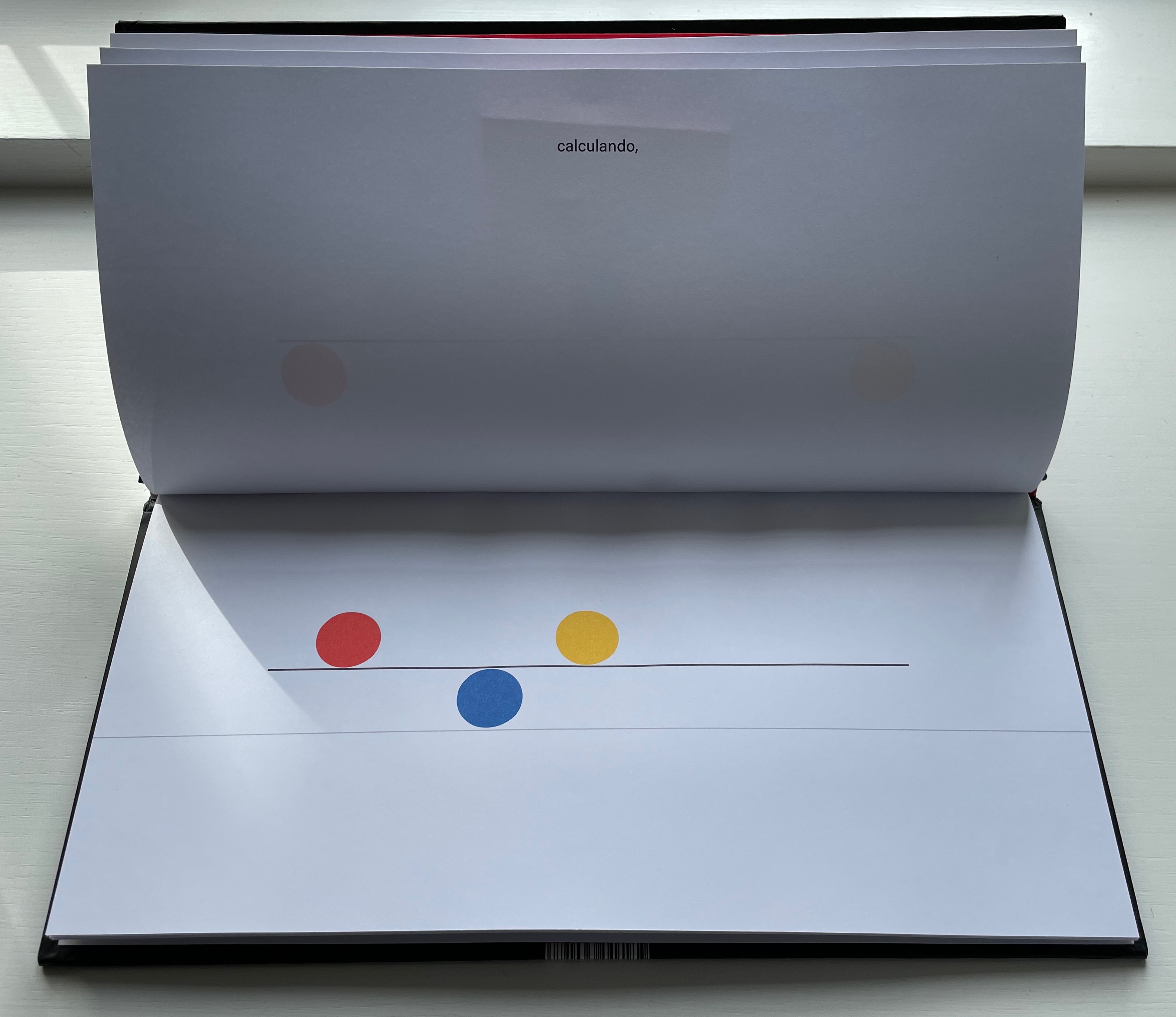
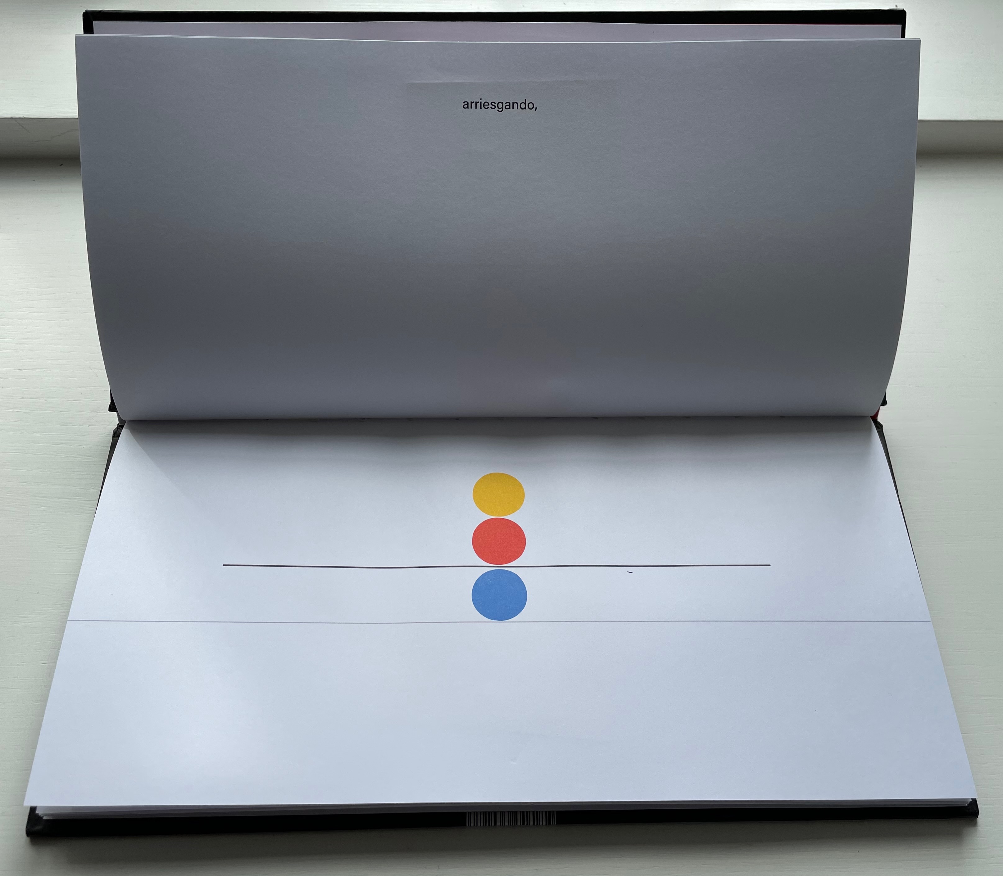
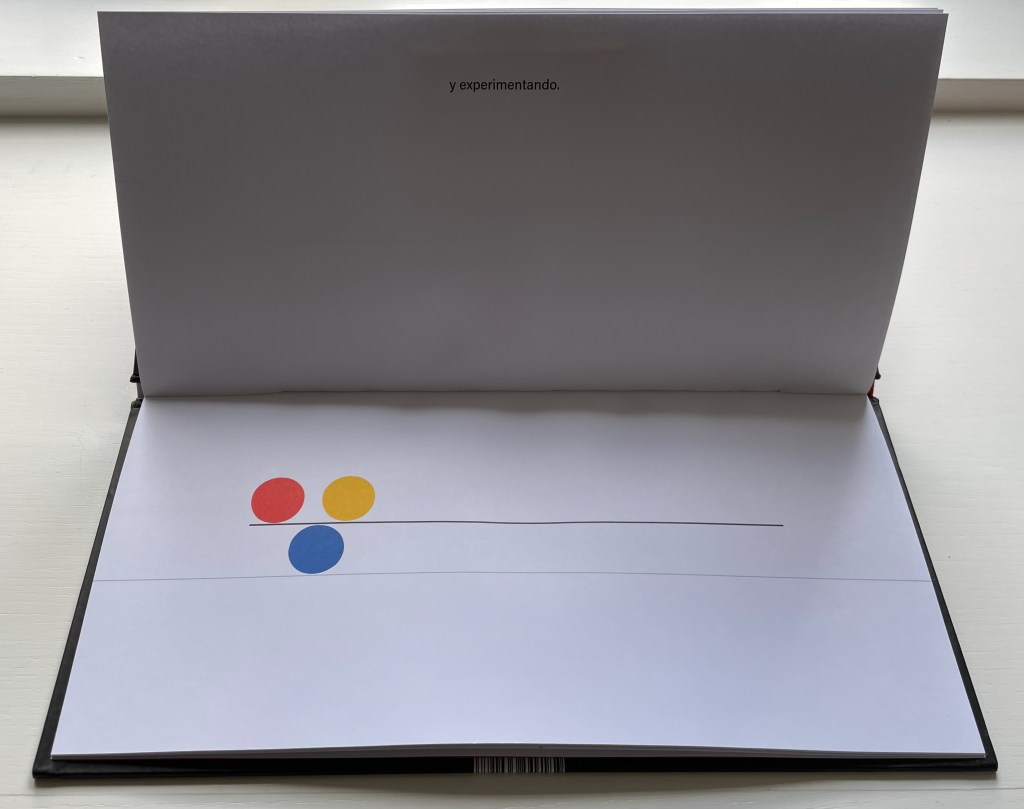
El equilibrio es cuestión de balance. De tomar siempre en cuenta el movimiento del otro y reaccionar para mantenerlo, calculando, arriesgando, y experimentado. Algunos se ponen a jugar sin pensar en las consecuencias entonces se rompe el equilibrio y cada quien hace lo que quiere … pero luego sienten deseos de regresar y cada quien busca su lugar.

“Equilbrium is a question of balance. Of always taking into account the movement of the other and reacting to maintain it, calculating, risking, and experimenting. Some people start to play without thinking about the consequences, then the balance is broken and everyone does what they want … but then they feel the desire to return and everyone looks for their place.”.
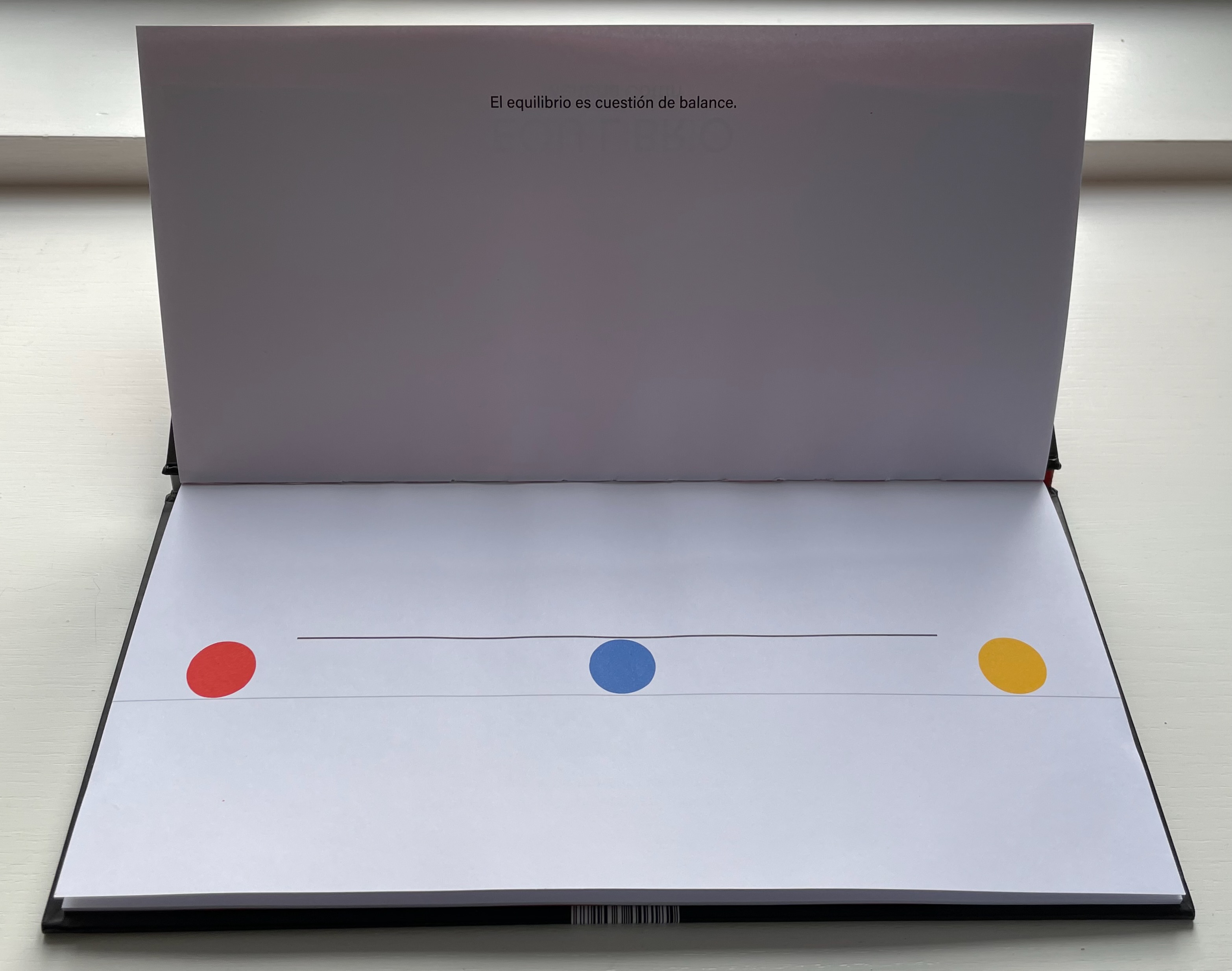
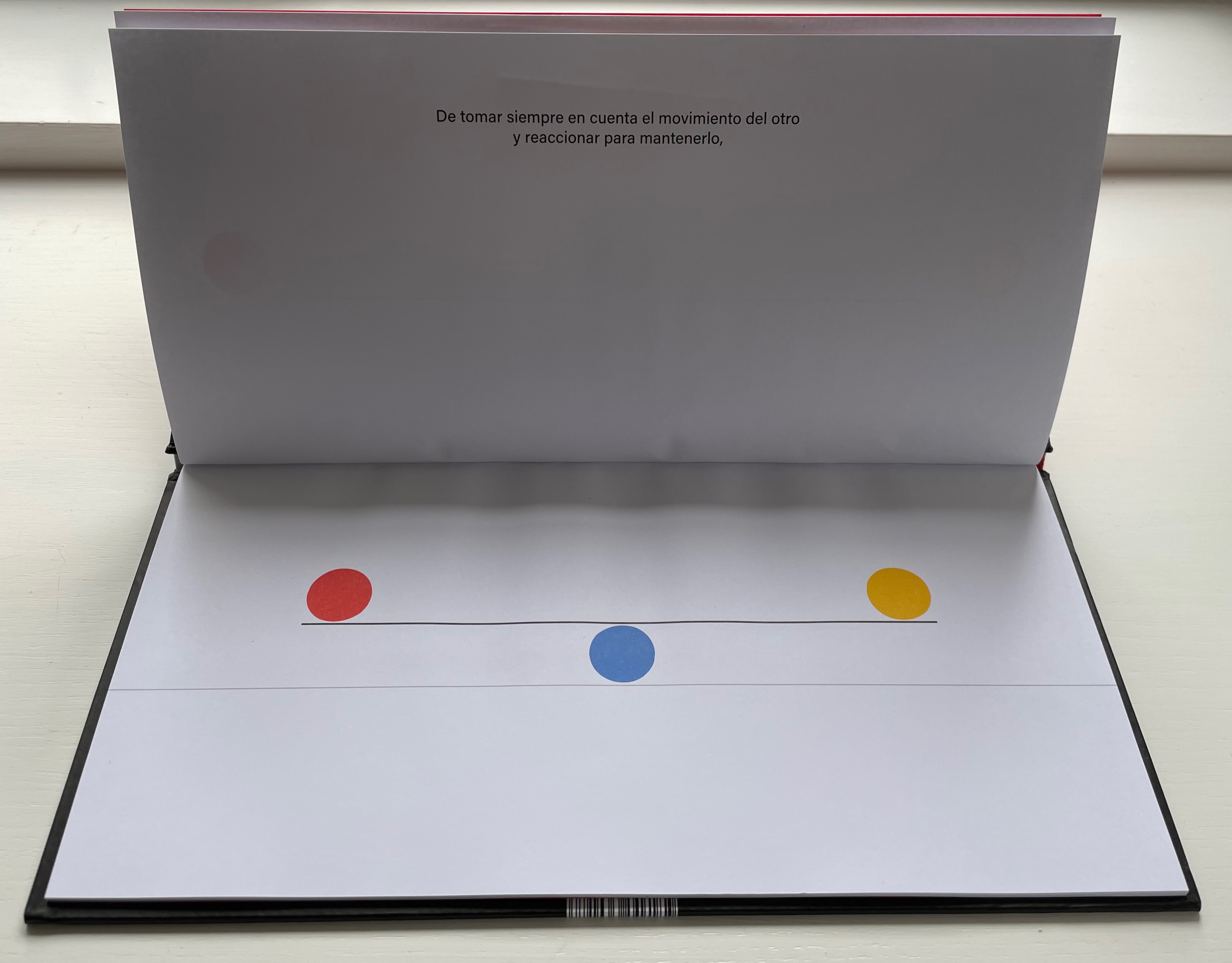
As in The Black Book of Colors, there is more than one concept at play, the lesson of equilibrium coming with lessons in community and relationships.

El Tiempo (2018)
El Tiempo (2018)
Menena Cottin
Casebound portrait, paper over boards, with orange-yellow doublure at front, orange-yellow/black at back, sewn. H310 x W160 mm. 24 unnumbered pages. Acquired from the artist, 23 August 2022.
Photos: Books On Books Collection. Displayed with author’s permission.

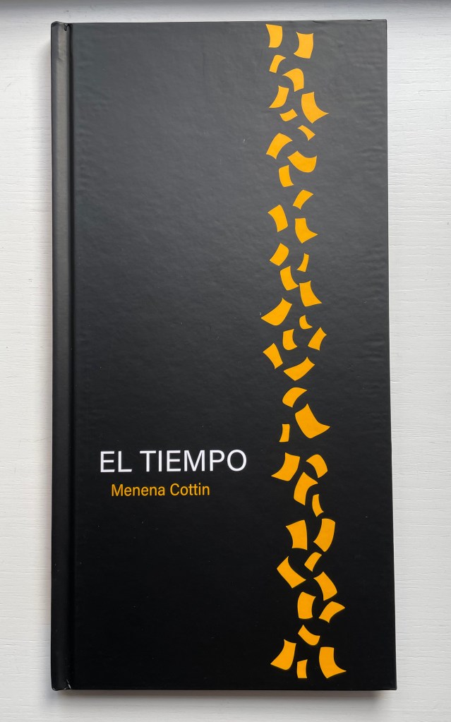
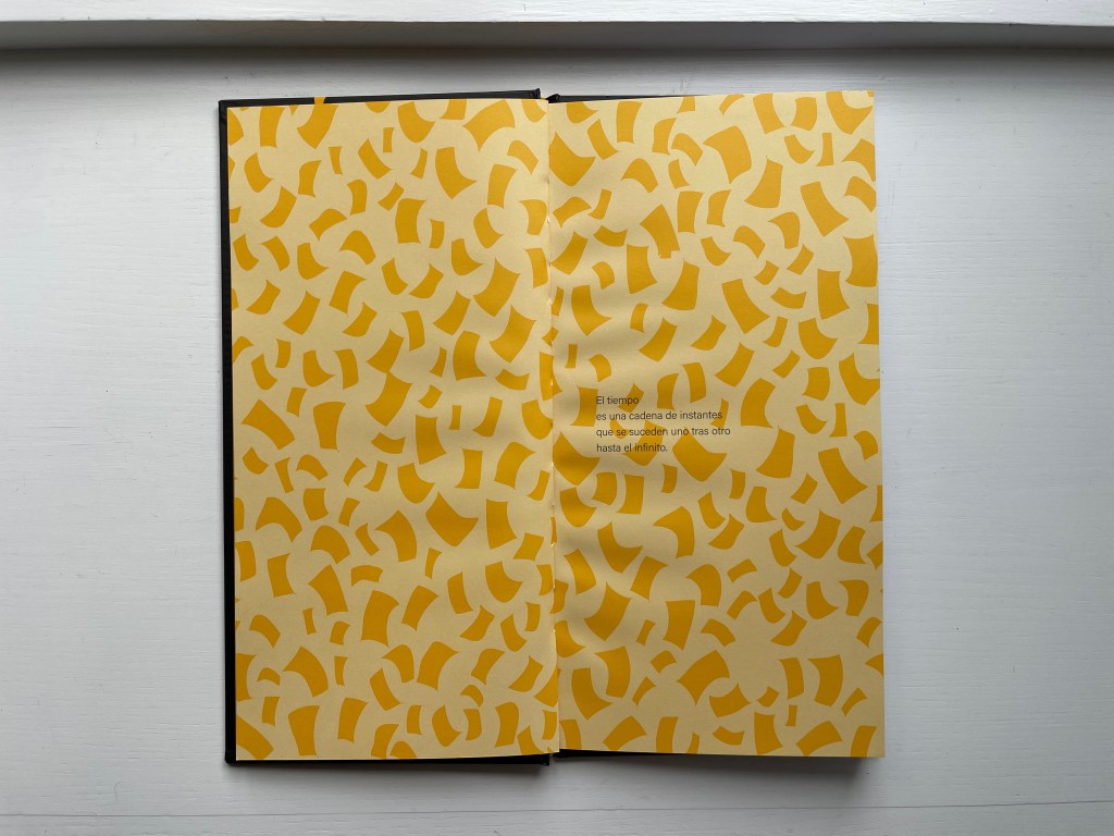
Cottin introduces the concept of Time with two metaphors — one verbal, one visual.

Verbally: El tiempo es una cadena de instantes que se suceden uno tras otro hasta el infinito. [Time is a chain of instants one following another until infinity.] Visually: Instants of time are like pages, pages from a diary.
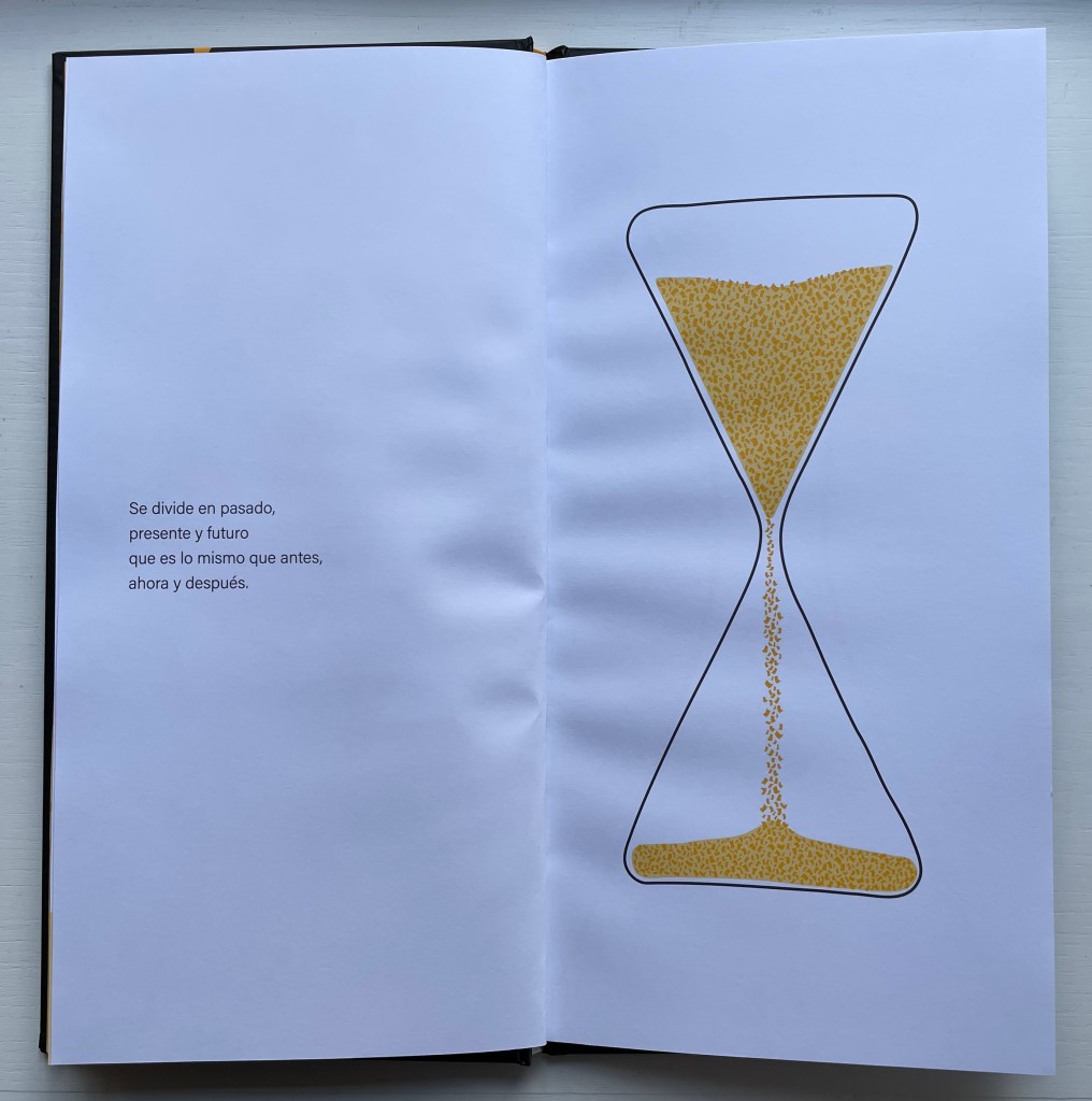
Even in an hour glass, the instants of time are golden pages — Se divide en pasado, presente y futuro que es lo mismo que antes, ahora y después. — [dividing the past, present and future which is the same as before, now and after].
When the future runs out, that is of course when the pages run out, visually and tactilely.

Ana con A, Otto con O (2015)

Ana con A, Otto con O (2015) [Ana with an A, Otto with an O]
Menena Cottin
Bradel binding with cloth spine, paper over boards, yellow doublures, leaves in Chinese fold. H85 x W260 mm. 42 unnumbered pages. Acquired from the artist, 23 August 2022.
Photos: Books On Books Collection. Displayed with author’s permission.

With this little book, Menena Cottin has secured a place among the Oulipians. Where Georges Perec wrote a novel without the letter E, Cottin has written and created an artist’s book in which the characters have a somewhat opposite challenge.

Ana es una muchacha adorable, pero tiene un problema: habla español solamente con A. Otto es un muchacho encantado, pero tiene un problema: habla español solamente con O. Un domingo por la mañana, en isla de Margarita, Ana sale a caminar por la playa. Otto sale a caminar por la playa. De repente, Ana se tropieza con alguien …
–Aah!
–Oh!

[Ana is a lovely girl, but she has a problem: she speaks Spanish only with words that have an A. Otto is a lovely boy, but he has a problem: he speaks Spanish only with words that have an O. One Sunday morning, on Margarita Island, Ana goes for a walk on the beach. Otto goes for a walk on the beach. Suddenly, Ana bumps into someone …
–Aah!
–Oh!]

When they make small talk about the weather, Ana says, Clara mañana [Clear tomorrow] with which Otto agrees, Con sol [With sun]. Ana tries again with a leading Gran playa, la mar calmada … agradar andar acá. [Great beach, calm sea… it’s nice to walk here.], but Otto can only come up with ¡Como, no! [Of course!].

Eventually Otto catches on and proposes they go for a swim. After, as they walk along the beach being serenaded by a guitar-playing singer whose nonsense refrain is with syllables that have only U, Otto invites Ana to lunch at the beachside restaurant El Pez [The Fish]. There they meet the friendly waiter Pepe, who likewise has a problem: he speaks Spanish only with words that have an E. When their meal ends and Otto sees the bill, he grows pale, suspiciously throws himself to the ground, cries out he’s been poisoned, and then runs off with Pepe in pursuit of payment. Poor Ana wanders back down the beach, but bumps into another character, more handsomely drawn and simpatico: Allan with an A. Colorín colorado, as the Spanish say [And that’s the end of this story], but not until the last page where the character who has been lounging in a beach chair all along now stands, revealing her name on her chair — Iris — and holding a sign that reads Fin.

The rule-abiding dialogue strings the reader along as effectively as the horizon line that runs from page to page over the Chinese folded folios from the beginning to the end. It is a design feature that will be much easier to reproduce than will a translation into English or any other non-Romance language that is as delightful as — or as “consonant” with — Ana, Pepe, Iris, Otto and the singer singing

Las Letras (2008/2018)
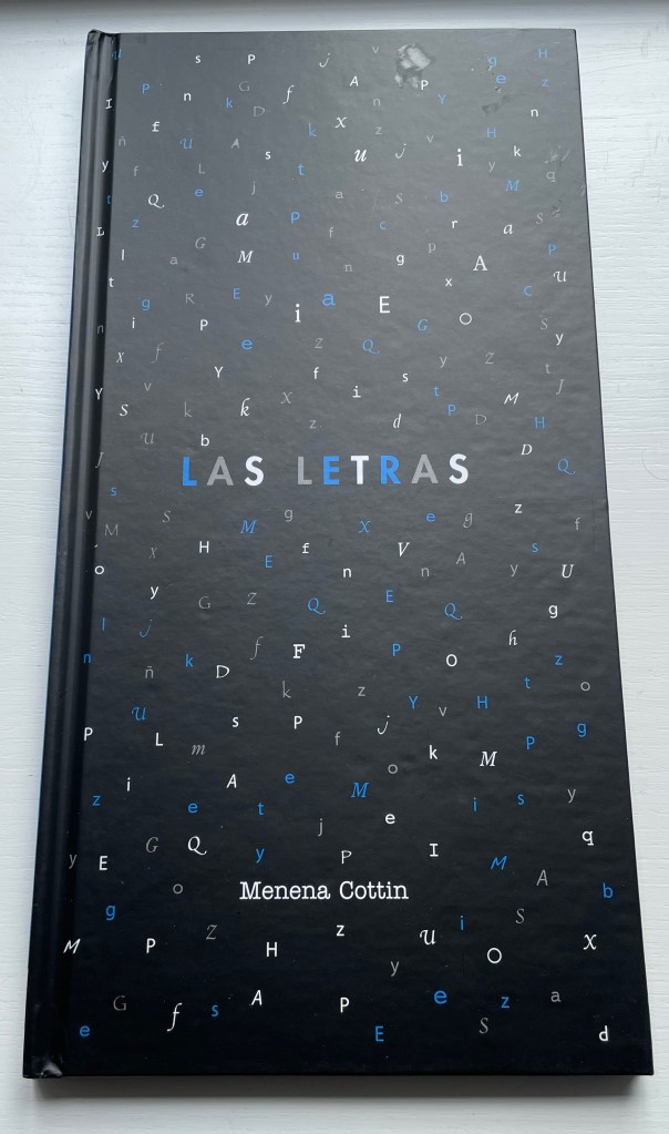
Las Letras (2018) [Letters]
Menena Cottin
Casebound portrait, illustrated paper over boards, endpapers. H200 x W205 mm. 24 unnumbered. Acquired from the artist, 23 August 2022.
Photos: Books On Books Collection. Displayed with author’s permission.

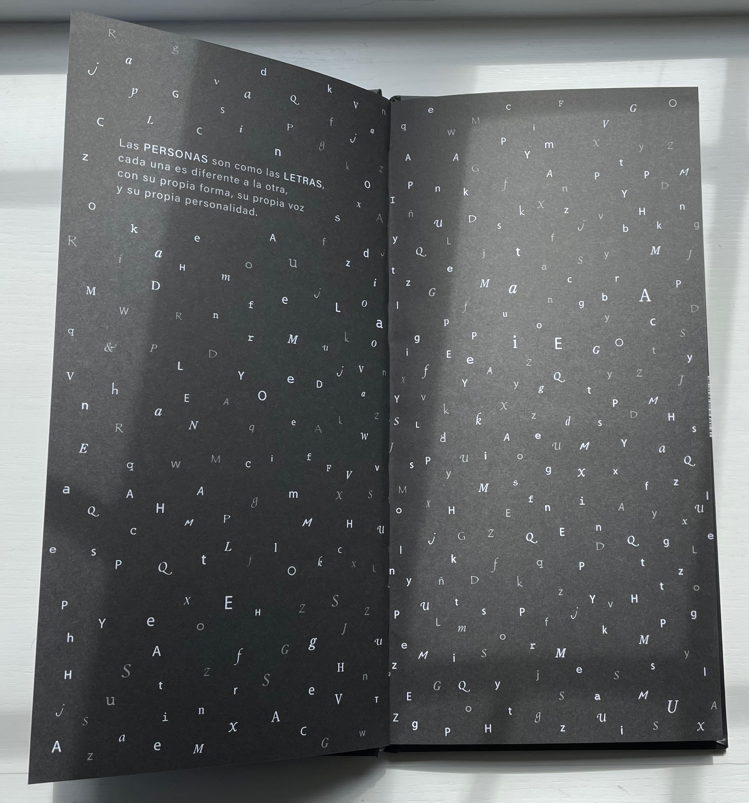
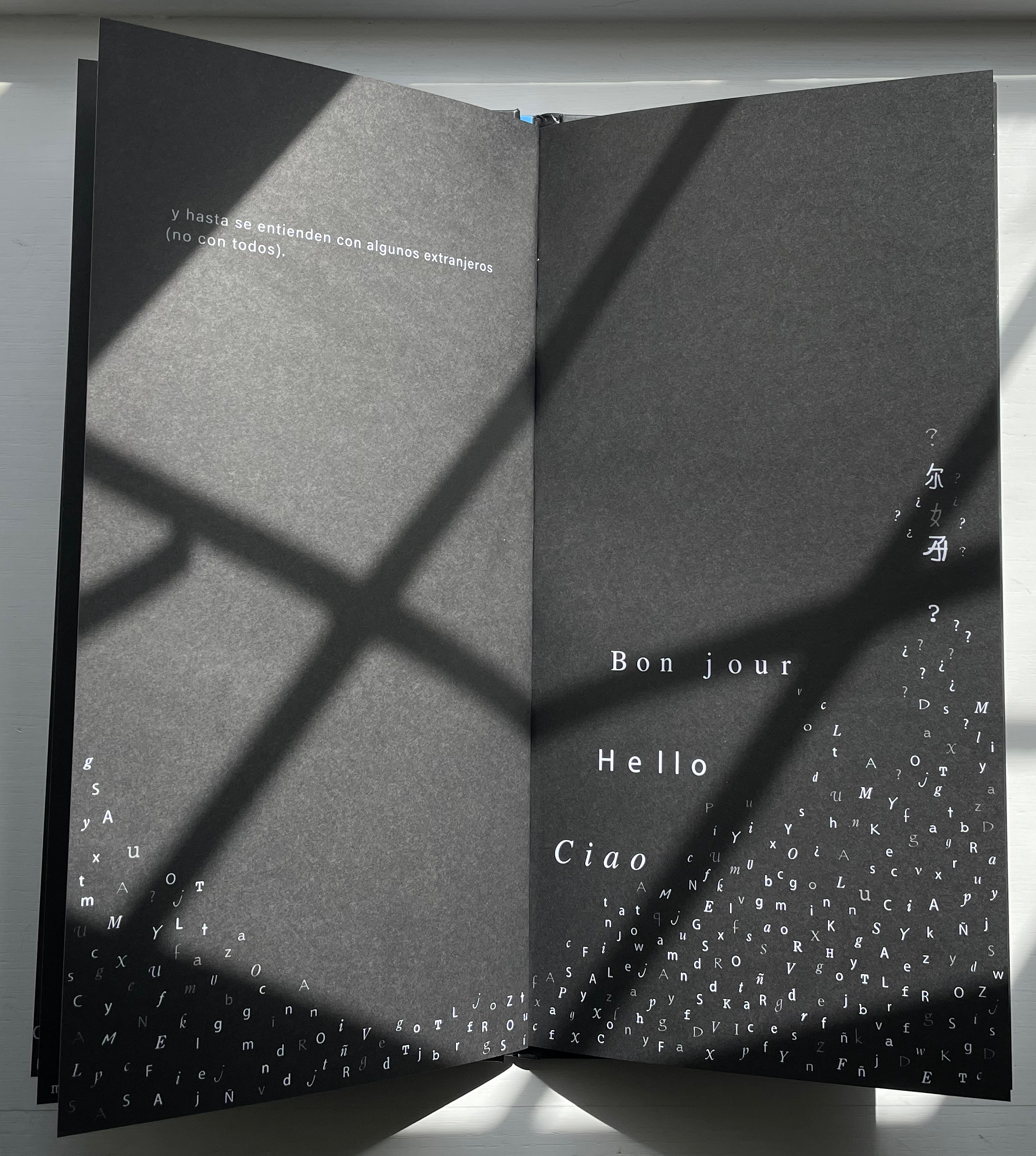
Las Letras has appeared in two editions (2008 and 2018). There are slight grammatical differences, but the meaning remains unchanged. As in Equilbrio, where Cottin finds in an abstract concept a metaphor for interdependence in human relationships, in Las Letras Cottin finds a metaphor for tolerance and communication in the alphabet. Even letters themselves celebrate our differences.

Las personas son como las letras, cada una es diferente a la otra, con su propia forma, su propia forma, su propia voz y su personalidad. Pueden ser gordas, flacas, sencillas o complicados. Algunas son muy populares y se les ve por todas partes, en cambio, a las más tímidas les gusta salir poco.

[People are like letters, each one is different from the other, with its own form, its own shape, its own voice and its own personality. They can be fat, skinny, simple or complicated. Some are very popular and are seen everywhere, while the shyer ones don’t like to go out much. …]
Other children’s/artists’ books in the Books On Books Collection worth comparing with Las Letras are:

Dessine-moi une lettre (2004) Anne Bertier

A is for Bee (2022) Ellen Heck

One & Everything (2022) Sam Winston

Further Reading

Abecedaries I (in progress)“. Books On Books Collection.

Beckett Sandra L. 2013. Crossover Picturebooks : A Genre for All Ages. London: Routledge.

Cave Roderick and Sara Ayad. 2017. A History of Children’s Books in 100 Books. London: British Library Publishing Division, pp. 26-27.

Nikolajeva, Maria, and Carole Scott. 2007. How picturebooks work. New York: Routledge Taylor & Francis Group.

Outlaw, Christopher. 17 April 2017. “FILBo 2017“. The Bogotá Post. Accessed 30 October 2011.

Scott, Carole. 2014. “Artists’ books, Altered books, and Picturebooks”. In: B. Kümmerling‐Meibauer, ed., Picturebooks: Representation and Narration. London, New York: Routledge.

Books On Books Collection – Carina Hesper

Like a Pearl in My Hand (2016)

Like a Pearl in My Hand (2016)
Carina Hesper
Boxed folios. Box: H388 x W278 x D35. Folios: H330 x W220, 32 loose folios. Edition of 250, of which this is #221. Acquired from the artist, 19 December 2021.
Photos of the work: Books On Books Collection.

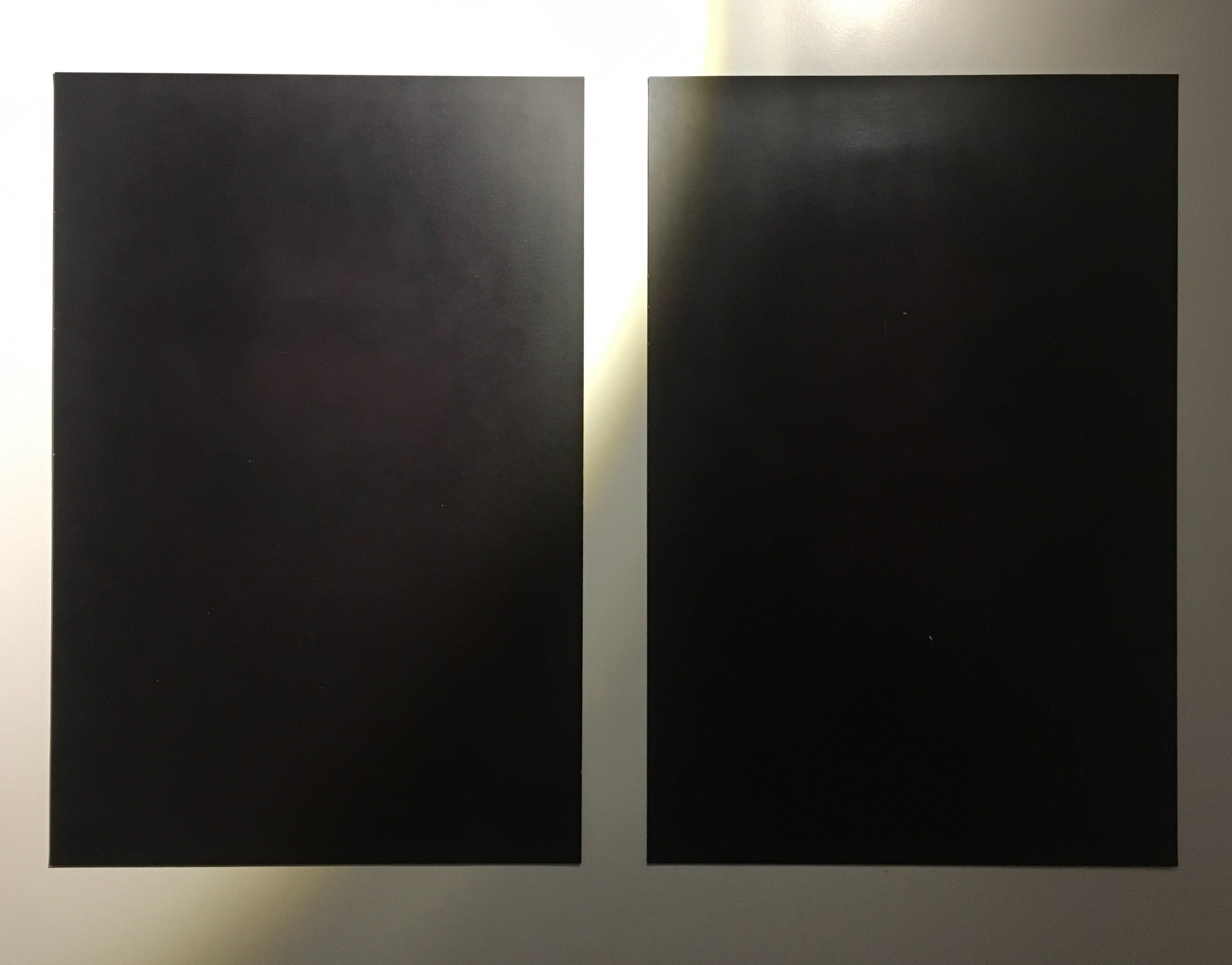
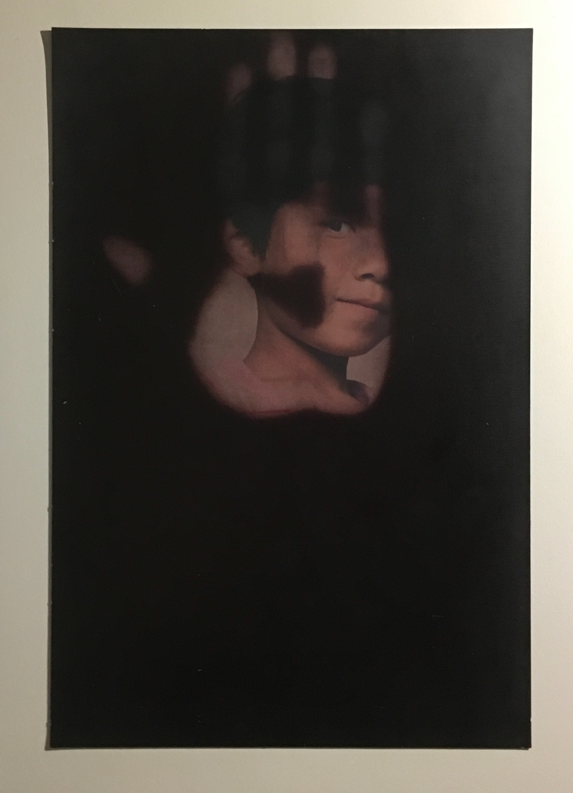
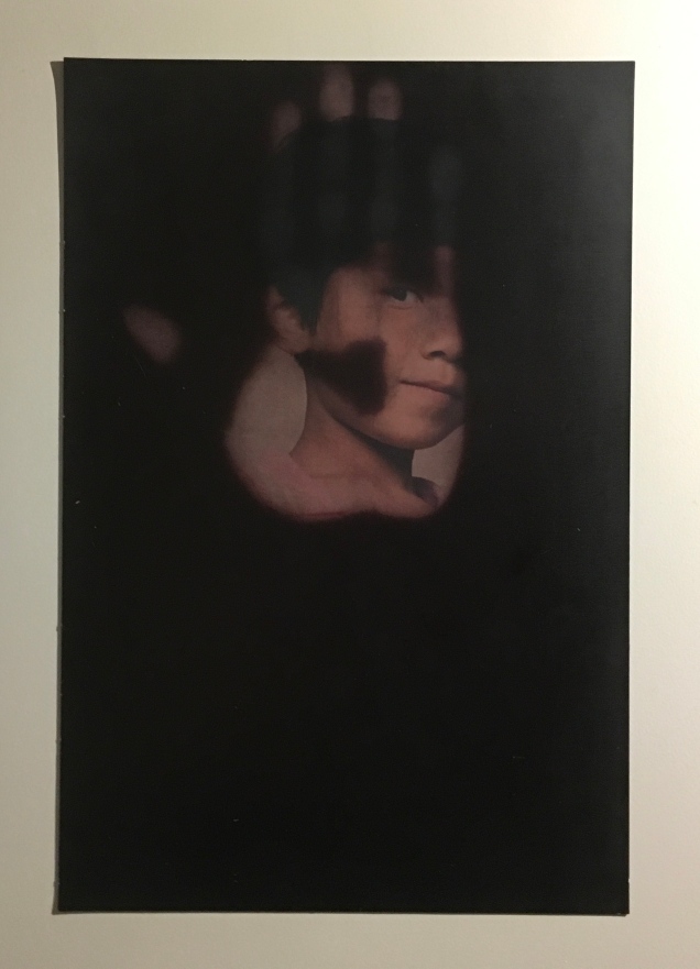
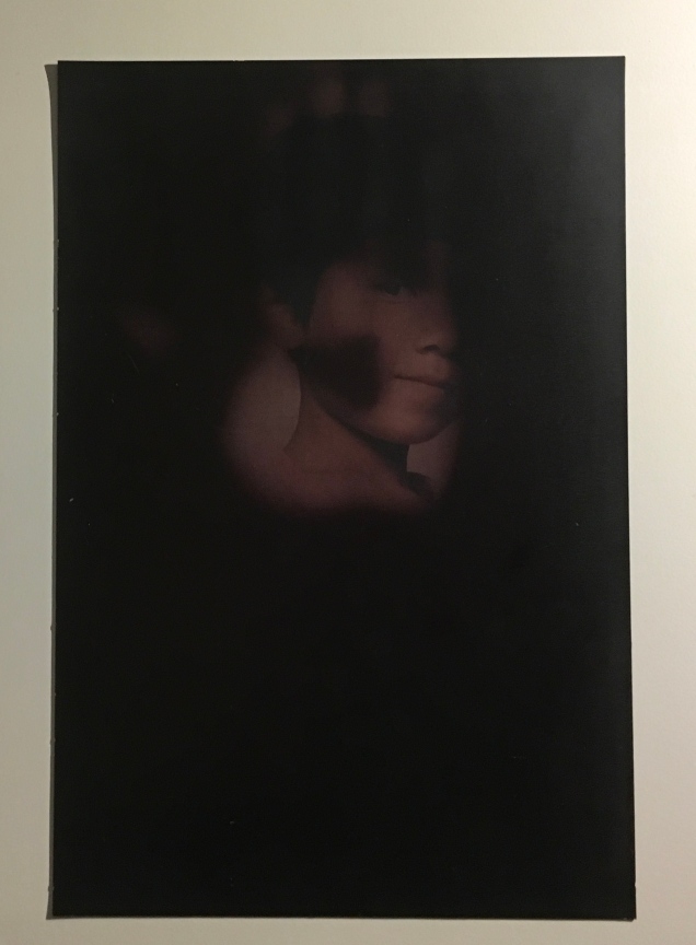
Carina Hesper’s Like a Pearl in my Hand came to the collection after its appearance in the exhibition “The Art of Reading”, 18 November 2017 to 4 March 2018, at the Meermanno Museum in The Hague, Netherlands. It was an exhibition whose curator insisted that none of the works could be under glass. They had to be touchable. Like a Pearl in my Hand is a boxed set of 32 photographic portraits, each coated in black thermochromatic ink. Only by touching the prints can you see the underlying portraits.

Photos: Books On Books Collection. Taken at the Meermanno Museum in 2017.

Each portait is of a child, congenitally blind, whom Carina Hesper met through the Bethnal China orphanage between 2012 and 2016. A folded sheet (8 unnumbered pages) includes two essays and the colophon for the work. In one essay, Bettine Vriesekoop provides background on Hesper’s visit to the orphanage Bethel China as well as social and historical observations about the position of the congenitally blind in China. In the other essay, Hannes Wallrafen, once a photographer, now blind, delivers a perceptive review of what he calls the “book with black pages on my lap”. Explaining his situation, he addresses his task by explaining “how the blind see” by touch, memory and imagination. For his review, he also has the advantage of an app, TapTapSee, which enables him to take photographs before and after touching each folio and listen to an automated description of each. A quick trial will reveal the app’s limitation vis-à-vis Like a Pearl in My Hand and underscore the poignancy of Wallrafen’s concluding comment:

For anyone who does not dare pick up the book or only gently touches the pages, this book remains what it seems at first sight: a collection of black pages.

The best artists’ books engage the reader/viewer in a multisensory experience. Even so, usually sight comes first and touch, second among the senses in the experience. Like a Pearl in My Hand challenges this by making the subject of the unsighted accessible to the sighted only through the warmth of touch.

Other works in the Books On Books Collection to compare with Like a Pearl in My Hand include

The Black Book of Colors (2008) Menena Cottin

Vladimir Nabokov: AlphaBet in Color (2005) Jean Holabird

Blindness (2020) Masoumeh Mohtadi

Voyelles (2012) Arthur Rimbaud/Le Cadratin

Reading Closed Books (2019) Sam Winston

The Blind Men and the Elephant (2019 Xiao Long Hua

Further Reading

The Art of Reading in a ‘Post-Text Future’“. 21 February 2018. Bookmarking Book Art.

Books On Books Collection – Xiao Long Hua

The Blind Men and the Elephant (2019)

The Blind Men and the Elephant (2019)
Xiao Long Hua
Sleeved paperback, exposed sewn spine. Sleeve: 305 x 305 mm. Book: H303 x W305 mm. 52 pages. Edition of 500, of which this is #178. Acquired from Northing, 18 May 2022.
Photos: Books On Books Collection.

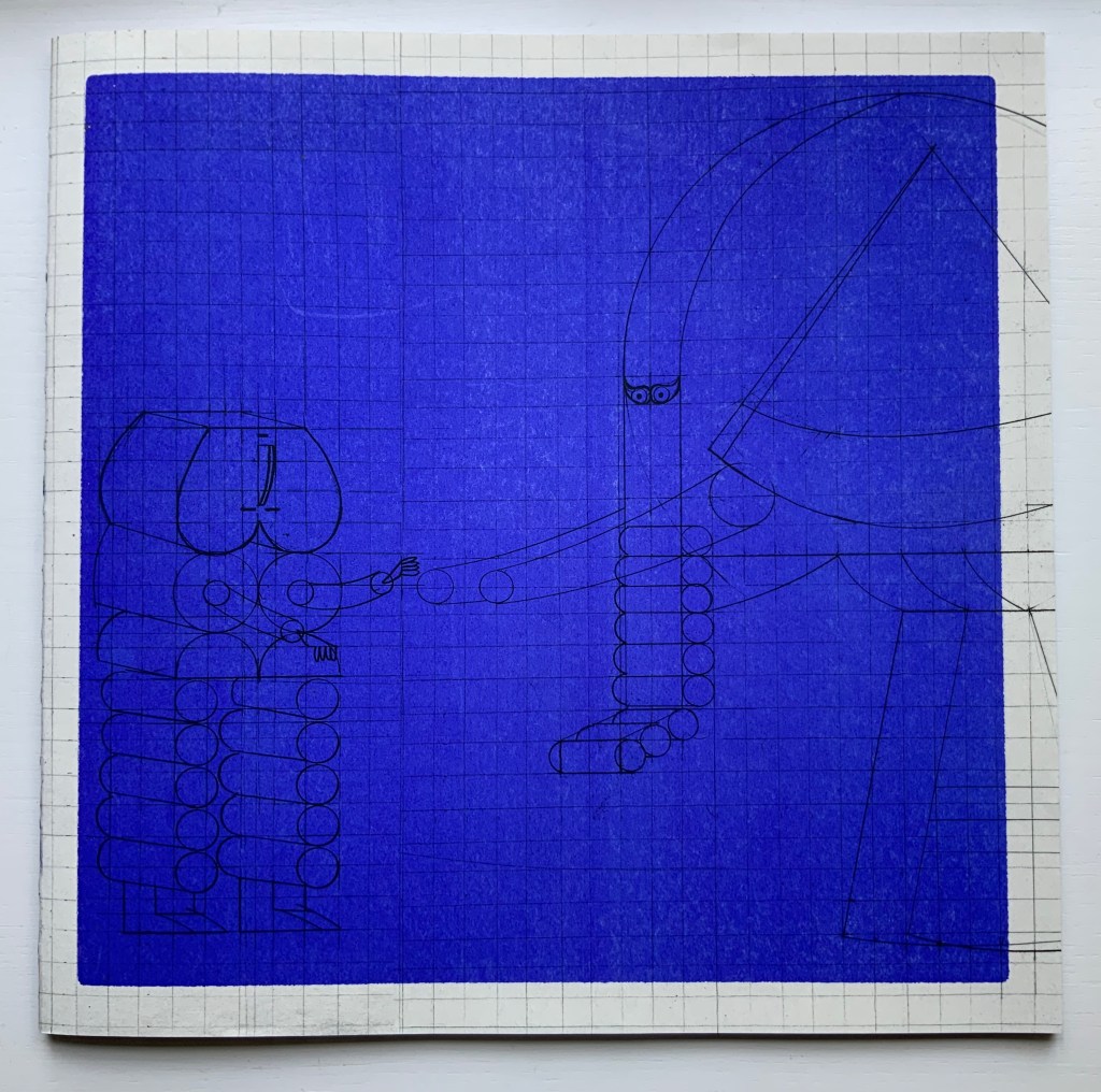
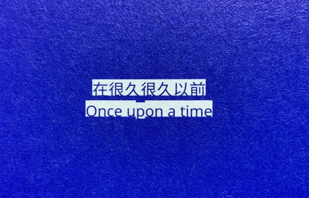
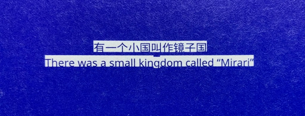
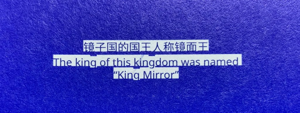
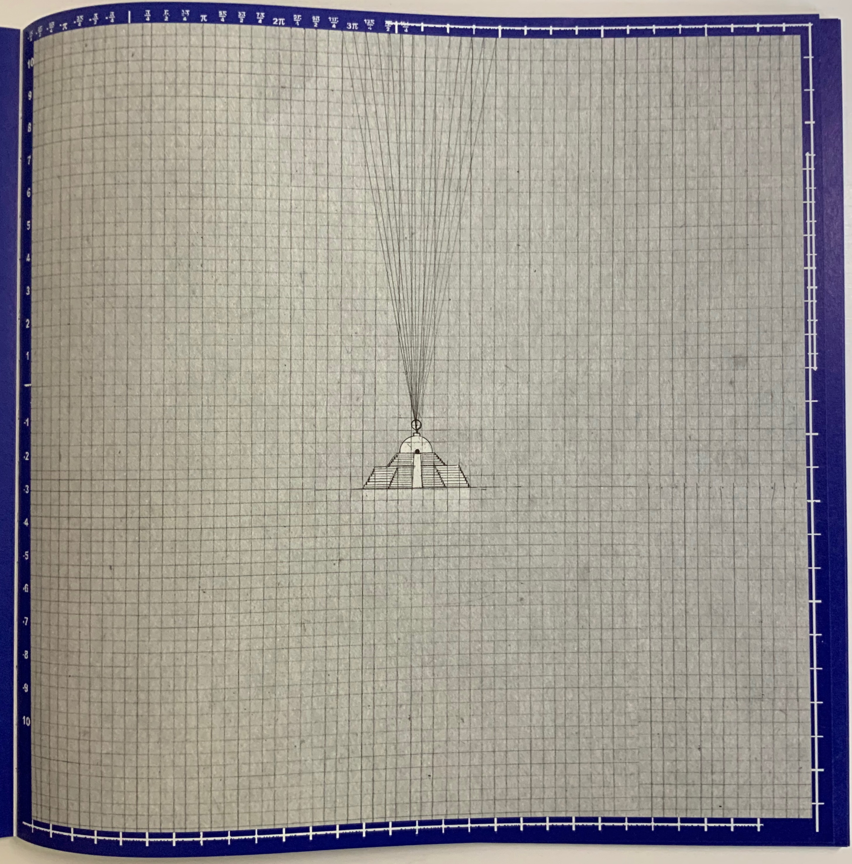
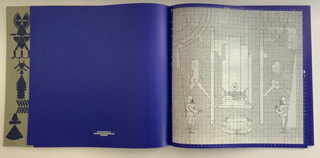
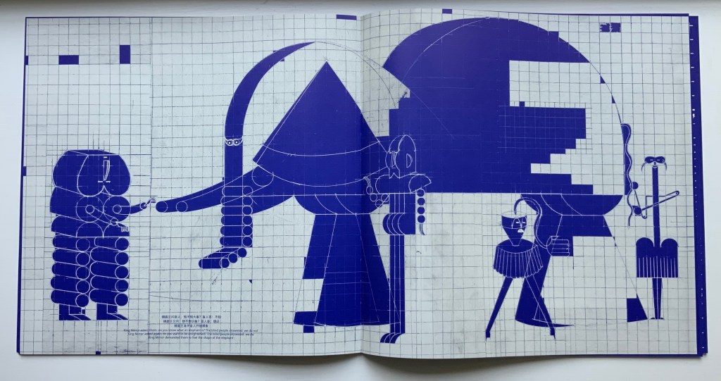
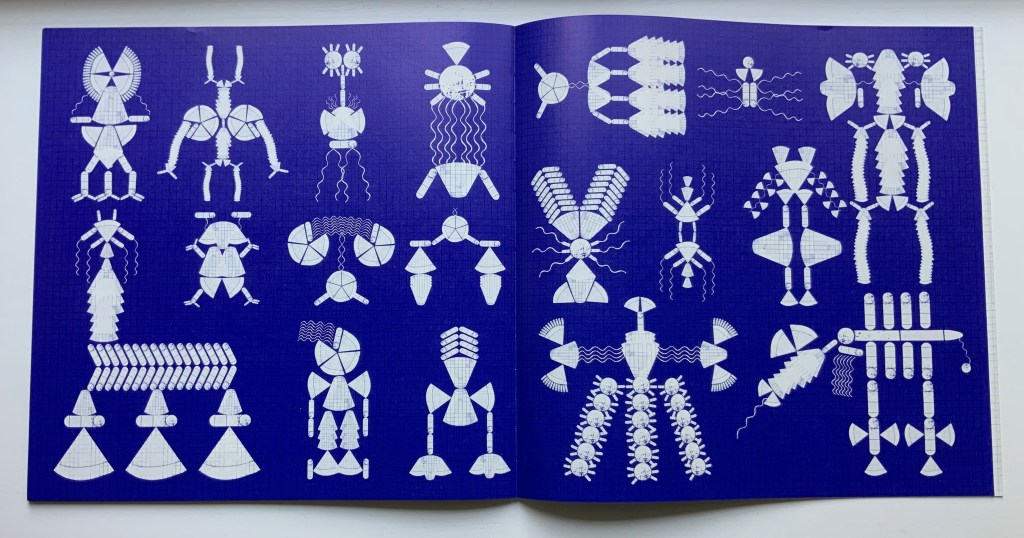
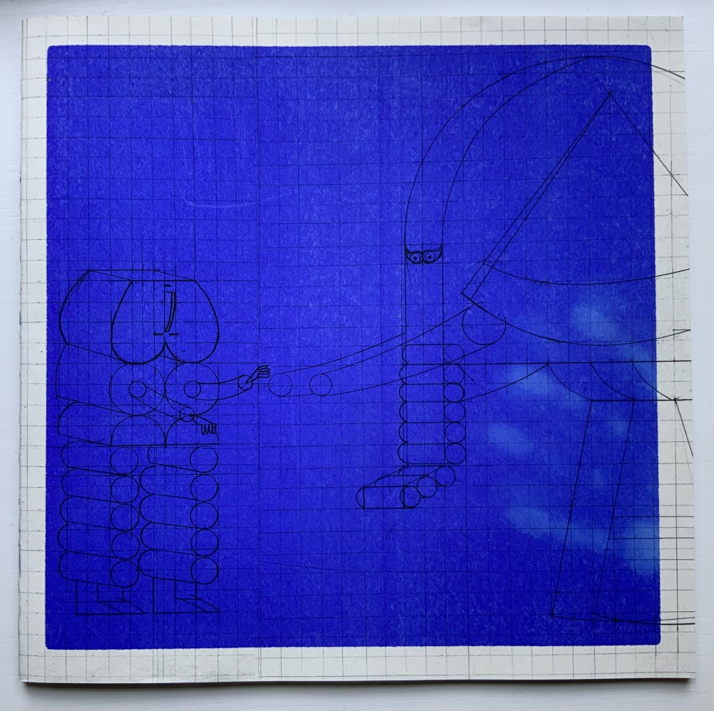
Working with binding designer Zhong Yu and tbook designer Lu Min of the “One and One Half Atelier”, Shanghai-based Xiao Long Hua has found a sympathetic outlet and form for his creative vision. His first work with them is The Blind Men and the Elephant, a variation on the parable in the Buddhist sutra Tittha Sutta. It takes place in the kingdom “Mirari”, ruled by King Mirror.

Selection from One and One Half Atelier. Photos: Books On Books Collection.

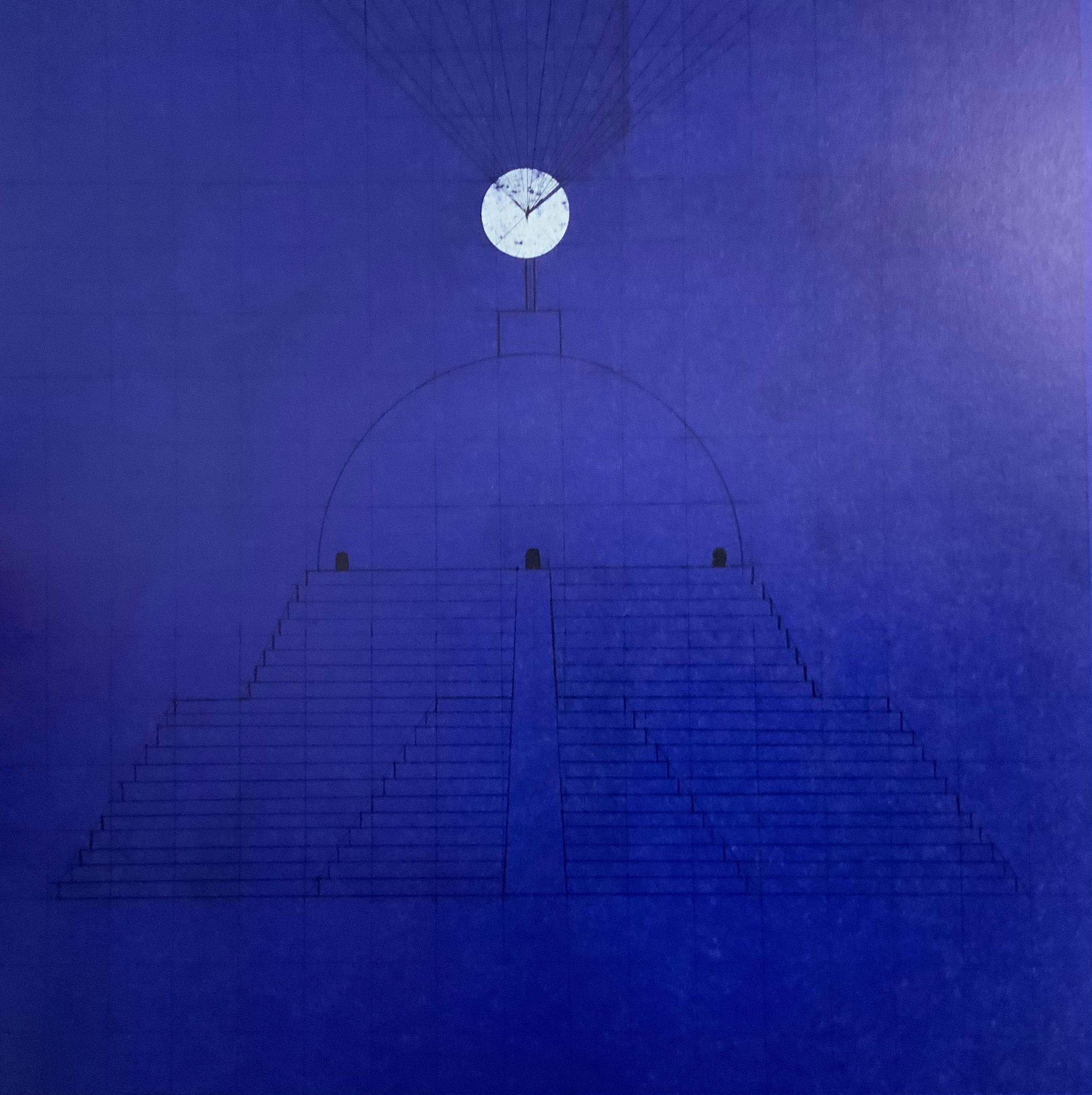
As in the more traditional version, the blind men report the elephant to be of different shapes, but in this version, those shapes reflect those of the blind men themselves. Throughout the book, a blueprint grid in the background of the dark blue and light gray page serves to emphasize the geometric shapes of the characters and images and to reflect, with its reductiveness, each blind man’s rigid view of the elephant’s nature. And up to this point of the blind men’s report, the grid has been bounded intermittently by coordinate markers, some numerical, some in letters and some in Chinese characters.

Xiao Long Hua places the different shapes the blind men perceive into the mind of the king, where they become a butterfly and then transform endlessly and kaleidoscopically into other figures represented across a series of pages printed dark blue. This variation on the theme comes from the Miao (Hmong) creation song Butterfly Mother or Mother Butterfly.

The final colorless two pages consist of cut-outs inviting the readers’ hands to create more strange figures along with the king’s mind. This element of touch recurs on the cover, which on closing the reader will find is covered in fingerprints. The cover’s ink is thermochromatic, fading away under the warmth of touch, returning as it cools and waiting for our next blind touch.

Selection from One and One Half Atelier edition. Photos: Books On Books Collection.

The publishing house Qianxun Neverend has issued a shorter trade edition of The Blind Men and the Elephant. Although a thermochromatic cover proved to be too expensive, an equally interesting design feature animates the cover’s image of the butterfly transforming into the multiple figures in the king’s mind.

Cover of Qianxun Neverend edition.
© Qianxun Neverend 2022.

Prior to The Blind Men and the Elephant, Xiao Long Hua engaged primarily in illustrations, scroll painting, installation works and sculpture, some of which can be seen on his Tumblr blog. For his latest work with the One and One Half Atelier, The Great Migration, the Atelier’s site announced a multimedia installation. A comment about this work sheds light on The Blind Men and the Elephant as well; he writes, “…I want to paint a magnificent picture of the Great Migration to express those spaces and memories that are fading away, I try to blur the forms between people, animals and objects. “

Other works in the Books On Books Collection to compare with The Blind Men and the Elephant include

The Black Book of Colors (2008) Menena Cottin

Like a Pearl in My Hand (2016) Carina Hesper

Vladimir Nabokov: AlphaBet in Color (2005) Jean Holabird

Blindness (2020) Masoumeh Mohtadi

Voyelles (2012) Arthur Rimbaud/Le Cadratin

Reading Closed Books (2019) Sam Winston

Further Reading

Miao Intangible Cultural Heritage — Embroidery“. Google Arts and Culture. Accessed 18 July 2022.

Zuo Shu. 2022. “After finishing this book, I have a new understanding of ‘picture book‘”. iNews (Culture). Accessed 18 July 2022.

Bookmarking Book Art – The Art of Reading in a “Post-Text Future”

Did you read on New York Times Interactive how text is succumbing to the sound and blurry of podcasts, YouTube, talking assistants, Netflix, face-reading phones, Instagram and augmented reality? We are passing through an internet portal turning our evolution from orality to literacy in on itself — where “text recedes to the background, and sounds and images become the universal language”.

Welcome to the post-text future.

The seemingly unintentional irony of delivering the welcome by text rather than by podcast or tweeted looping video meme undermines the hyperventilation a bit. But we should not roll our eyes and move on. The NYTI journalists are reminding us to pay attention.

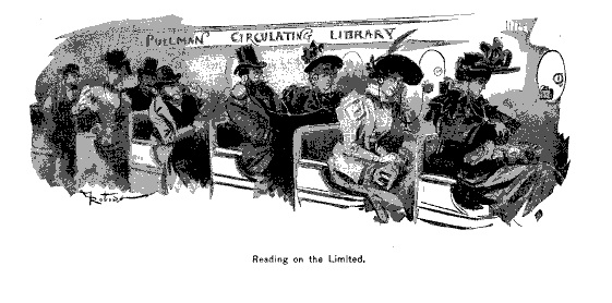
Our literacy has always been multimodal (read and hear the orality in the opening text of Genesis in the The Douay Version). With each new medium it rapidly becomes more multimodal.  In Ringing the Changes on “The End of Books”, there’s the tongue-in-cheek evidence from 1894.

“The End of Books”, Scribner’s Magazine (August 1894)
Louis Octave Uzanne

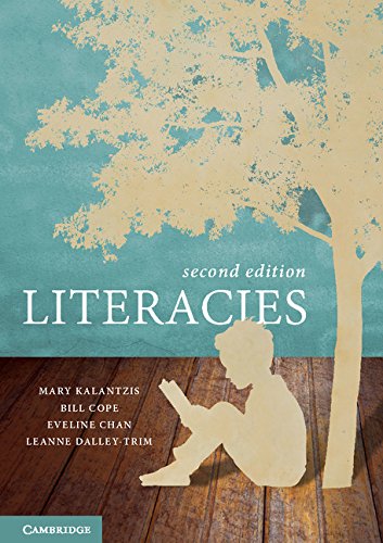
In Literacies, Mary Kalantzis and Bill Cope at the University of Illinois, Urbana-Champaign, trace its occurrence back to the mid-twentieth century age of radio and television.  And not that long ago (2012), Amazon released Immersion Reading, enabling audio in sync with ebook reading.Leaving aside the apocalyptic speculation on the fate of letters, we should take the point: our literacies are entangled and evolve together. Putting the more scholarly view of differences between orality and text alongside the post-text Futurists’ observations about tweets, memes and other social media, we can see why we would benefit from closer attention to that entanglement and evolution.

Here is Walter J. Ong:

Oral folk prefer, especially in formal discourse, not the soldier, but the brave soldier; not the princess, but the beautiful princess; not the oak, but the sturdy oak. Oral expression thus carries a load of epithets and other formulary baggage which high literacy rejects as cumbersome and tiresomely redundant because of its aggregative weight … (Orality and Literacy: The Technologizing of the Word. London: Methuen, 1982, pp.31, 37-49).

Here is the post-text future:

An information system dominated by pictures and sounds prizes emotion over rationality. It’s a world where slogans and memes have more sticking power than arguments. — Farhad Manjoo

Here is Ong:

Writing fosters abstractions that disengage knowledge from the arena where human beings struggle with one another. It separates the knower from the known. By keeping knowledge embedded in the human lifeworld, orality situates knowledge within a context of struggle.

Here is the post-text future:

Doyle Canning, who wrote a book on using memes for political movements and co-founded the Center for Story-Based Strategy, said people have now realized memes are replacing nuanced political debate.

“People in 2016 declined to take seriously the impact of the memes and clung to this narrative that rational policy discourse would triumph, … And it didn’t.”

“Now politics,” she said, is just “a battle of the memes.” Nellie Bowles

These comparisons/contrasts underscore Kalantzis’ and Cope’s educational earnestness about the importance of teaching to these entangled and evolving literacies as perhaps the only systematic means we have of offering children social equity and a chance at social equality. Imbuing their literacies with critical thinking skills is paramount. The art of living depends on the art of reading.

At the Museum Meermanno in The Hague, you can step into this increasingly busy intersection of literacies at an exhibition called The Art of Reading.  The exhibition is divided into six rooms labeled “Reading is Turning the Page”, “Reading is Seeing”, Reading is Touching”, “Reading is Remembering”, “Reading is Concentrating” and “Reading is Reacting”. Unusually the art is not simply on display. Touching is allowed. Paul van Capelleveen, one of the curators organizing the show, insisted that each work be touchable. As a curator at the Dutch national library and advisor to the Museum Meermanno (The House of the Book), he felt strongly that the challenges of multimodal literacy cannot be understood “under glass”.

2nd Hand Reading (2014)
William Kentridge

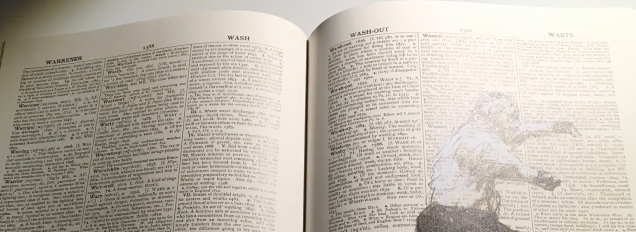
Physicality or the haptic is an affordance that print literacy lords over digital literacy. We know where we are in a print book because we can feel as well as see where we are. Welcome then to the first room “Reading is Turning the Page”, where William Kentridge turns the tables on that claim. As you watch the “film of the book” across the room, you can try your hand at flipping the pages of the physical copy like a flipbook to mimic the video. Look closely though. The page numbers are not sequential.

2nd Hand Reading (2014)
Page 2388 then 2390?

And the entries are not in alphabetical order.

2nd Hand Reading (2014)
“Inquest” before “Heterogenesis”?

When the order of text, numerals, narrative and images collide, we are left with the literacy of art — be it digital or physical. Which brings you to the next room: “Reading is Touching”.

The Lost Men Project (2006)
Paul Emmanuel
The Lost Men Project (2006)
Paul Emmanuel

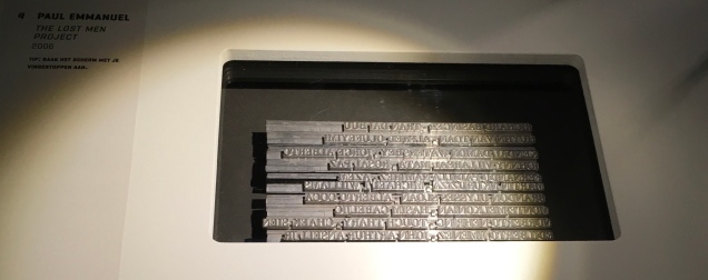
The names of South African soldiers, both black and white, killed in the First World War, are set in hot metal type then impressed without ink on flesh. Photographed and filmed, the names fade away. In the exhibition, a voice from the touchscreen device repeats, “Touch me, touch me”. Each touch upon the screen — on the skin before you —  advances the work running as a video on the touchscreen. Touching is the only way to read all of the names of the dead as they fade away. This work is but one of several that make up The Lost Men Project

Like a Pearl in My Hand (2017)
Carina Hesper

In this room of touch, you move from sorrow to sorrow. Glass and ink do not separate you from them very much.

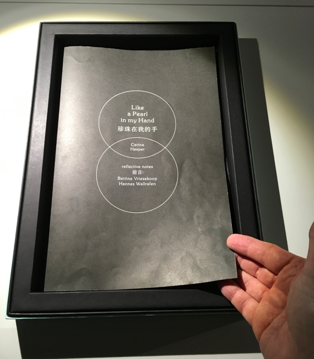
Two pages from Like a Pearl in My Hand

To read the pages of Like a Pearl in My Hand, you must rest your hands on them then lift your hands away.

The face revealed on each page is the face of a blind or visually impaired child in a Chinese orphanage. As you read the page, the face fades into blackness.
The artist’s book is associated with Bethel China, a charity for the visually impaired. Click on the image above to visit the charity’s site.
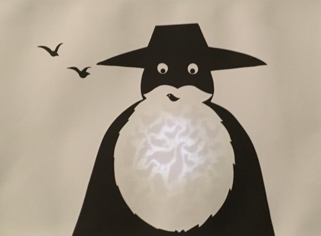
The next room is “Reading is Seeing”.
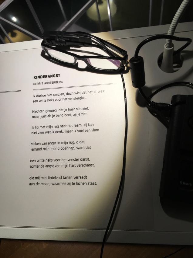
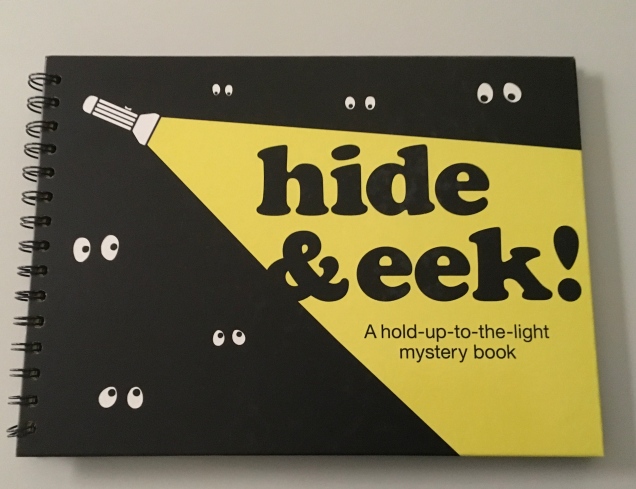
Were the curators being tone deaf with this juxtaposition?  No, it is the bluntness and earnestness of recognition that literacies and our sensibilities are jumbled up.  The literacy of art does that. It can move us from somberness to whimsy and back. The first work in this room of sight is a children’s flashlight (or torch) book; the next, a device for the visually impaired; the next, an augmented reality app on iPads.

Hide & Eek! (2013)
Rebecca Sutherland
OrCam MyEye 2.0 (2017)
Amnon Shashua and Ziv Aviram
An artificial vision device with a lightweight smart camera that instantly reads text aloud –in this case, a poem by Gerrit Achterberg (Kinderangst or Childhood Fear).

The curators deftly paced the impact of these rooms. Something from the one before lingers with you in the next, or something in the next reminds you of the one before.

“Reading is Remembering” is the next room. Here the artists play with re-membering text vs dis-membering text, recalling vs forgetting, excavating vs filling in, deconstructing to reconstruct, destroying to create.

A Excavation, A Reading (2013)
Rick Myers

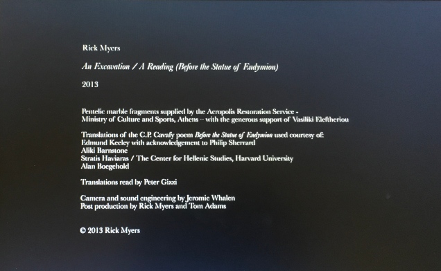
Rick Myers was commissioned by the Onassis Cultural Center to commemorate the Greek poet Constantine Cavafy. The work he proposed required permission to obtain Pentelic marble fragments (quarrying is restricted for the purpose of restoring the Acropolis) and grinding them into dust. He then sourced four different translations of Cavafy’s poem “Before the Statue of Endymion”, arranged a reading and recording of each, and, for each, cut a stencil. The chronologically first translation’s stencil was positioned on stretched plastic film suspended over speakers.  The marble dust was sifted onto the black plastic through the stencil, leaving the legible white text on the black background with which the video starts after the credits above. As the recording of the chronologically second translation plays, the sound’s vibration obliterates the  marble dust words of the first translation. Then comes the turn of the second stenciled translation to be obliterated by the third’s recorded reading. And so on.

An instant from “An Excavation, A Reading” (2013)
Rick Myers

Here, then, is a work of art that simultaneously endorses and refutes the premise that text recedes in favor of some new universal language of sound and image. It is a textual palimpsest in motion where sound dissipates the text of the past, making way for the next version of the text to be dissipated by the sound of the third and the text of the third to be dissipated by the sound of the fourth. A moment of the work is captured in Victoria Bean and Chris McCabe’s The New Concrete (see below). The work runs a little over three minutes, excerpts can be found here, but the experience under the exhibition room’s banner provides an unsurpassable frame for the work.

An Excavation, A Reading (2013)
Rick Myers
From The New Concrete: Visual Poetry in the 21st Century, Edited by Victoria Bean and Chris McCabe. London: Hayward Publishing, 2015

Inspired by The Royal Road Test by Ed Ruscha, Mason Williams and Patrick Blackwell (the crew that filmed a Royal typewriter being thrown out of a Buick travelling at 90mph), Simon Morris had seventy-eight students cut out all of the words from Freud’s The Interpretation of Dreams.  On Sunday, June 1st, 2003, he “threw the words out of the window of a Renault Clio Sport on Redbridge Road, Crossways, Dorset, traveling at a speed of 90mph, approximately 122 miles southwest of Freud’s psychoanalytical couch in London. The action freed the words from the structural unity of Freud’s text as it subjected them to an ‘aleatory moment’ – a seemingly random act of utter madness.” The work on display consists of a Ruscha-like book (right down to the plastic spiral binding) and a film of the epic literary littering.

If you are expecting the next room — “Reading is Concentrating” — to help you gather any scattered thoughts or words, think again.

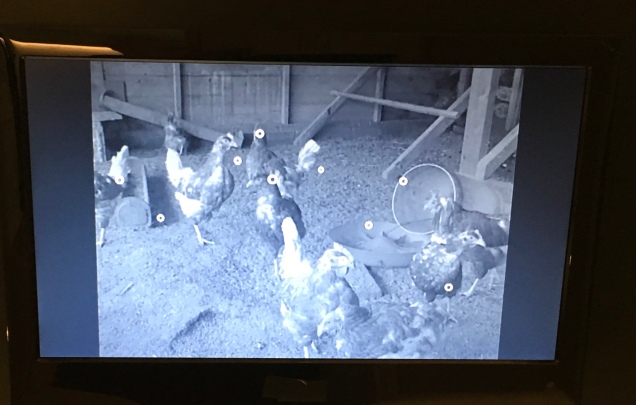
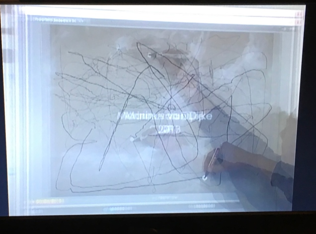
Marinus van Dijke’s work draws your eye and ear first. Chickens clucking and strutting onscreen, superimposed small white circles the size of a chicken’s eye jerking and gliding across the screen, a sheet of paper being laid over the screen (ah, it’s a screen within a screen), and then a hand with pen enters the frame, picks a circle and, trying to track it, leaves a scrawl on the paper.

Eye (2013)
Marinus van Dijke

Van Dijke’s work echoes Jan Dibbets’ Robin Redbreast’s Territory: Sculpture 1969, April — June, which Germano Celant included in his Book as Artwork show in 1973. Like the deliberate echo of Morris/Ruscha, this chance echo of Van Dijke/Dibbets recalls the grounding of  contemporary textual and book art in the conceptualism of the 1960s/70s.

Robin Redbreast’s Territory: Sculpture 1969, April — June (1970)
Jan Dibbets

Dibbets documented the flight patterns of this highly territorial bird and presented that in a book as a conceptualization of an “as if” sculpture drawn in space.

Robin Redbreast’s Territory: Sculpture 1969, April — June (1970)
Jan Dibbets

There was admittedly some “artistic license” in Dibbets’ documentation — somewhat the same as when Van Dijke’s tracing pen cannot keep up with the peripatetic circles, which are projections of the chickens’ eye movements as they hunt for food.

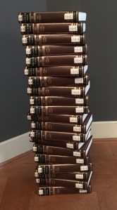
“Reading is Reacting” is the last room. Here it seems that printed text comes out on top. Over in one corner is a Dutch encyclopedia, stacked vertically four feet high.

In the opposite corner, on shelves from floor to ceiling, is the Dutch version of Michael Mandiberg’s Print Wikipedia. The paperbacks scattered on the display table began their textual lives online. 

Print Wikipedia (Dutch edition, 2016)
Michael Mandiberg
Jack
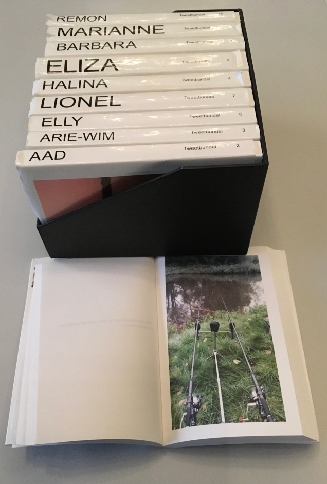
Tweetbundel (2015)
Jan Dirk van der Burg
Unsolicited autobiography created from the subject’s Twitter feed.

Although printed text seems to be having the last word, attend to the curators’ last words on your way out:

Reading and writing have become increasingly open arenas: there are more readers than ever before, there are more books and publication outlets, which can reach vast readerships thanks to the internet. Readers feel more empowered and are able to combine or alter texts found online. Readers become writers. Online texts have therefore come to resemble oral literature, in that they are constantly changing and being passed on from one person to another, retold — sometimes differently. They are unstable and at the same time highly accessible.

Text in books appear to be fixed, but annotations and deletions change the printed text, just as editorial changes alter a page on the internet…. Even so, printed texts are in principle less changeable than those posted online. This makes them appear inviolable and irrefutable. Some people fear that young people believe everything they read on the internet. That is nothing new. Philosophers from Socrates to Locke thought that written or printed texts would be accepted as the absolute truth.

Where do we stand today? … How reading will develop in the future is unclear, but one thing is sure: connection and interaction will be key to that development.

Leaving The Art of Reading and thinking again about a post-text future, you can be sure of one other thing: the art of living will still depend on the art of reading.