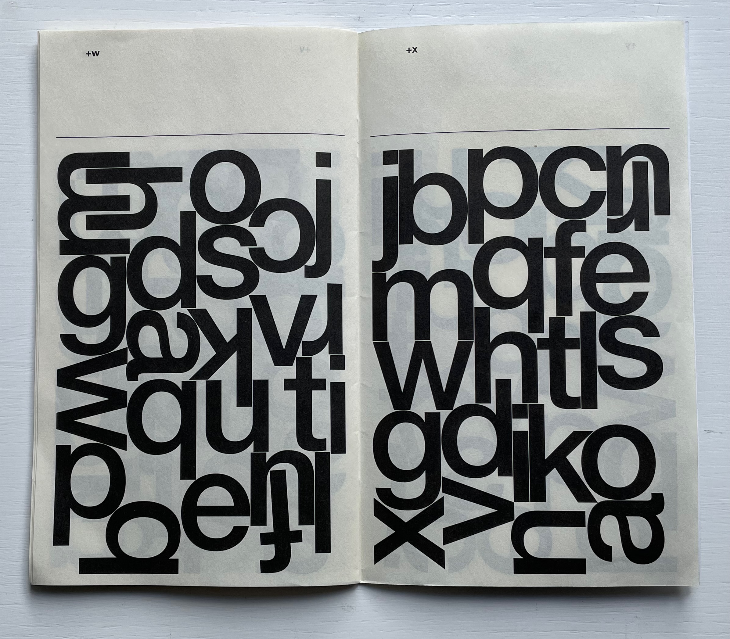
Automatically Arranged Alphabets (2015) Experimental Jetset Staple-stitched “zine” with screenprinted silver cover. H180 x W160 mm. 24 pages. Acquired from the Newbridge Project, 18 September 2022. Photos: Books On Books Collection.
On their website, the studio posted an automated gif of this typographic experiment involving software-generated compositions (archived here).
Beautiful typography meets beautiful calligraphy at the other end of the spectrum of technique in the Books On Books Collection with Francesca Lohmann’s later calligraphic work An Accumulated Alphabet (2017).
Experimental Jetset (a phrase excerpted from the title of a 1994 Sonic Youth album) is an Amsterdam-based design collective founded by Danny van den Dungen, Marieke Stolk and Erwin Brinker in 1997. New York’s MoMA, clearly a fan of the studio’s work, holds a significant collection of their work. From the studio’s description of it here, their participation in MoMA’s 2012 exhibition Ecstatic Alphabets/Heaps of Language clearly influenced Automatically Arranged Alphabets, whose series of automated sketches were made in 2014-15.
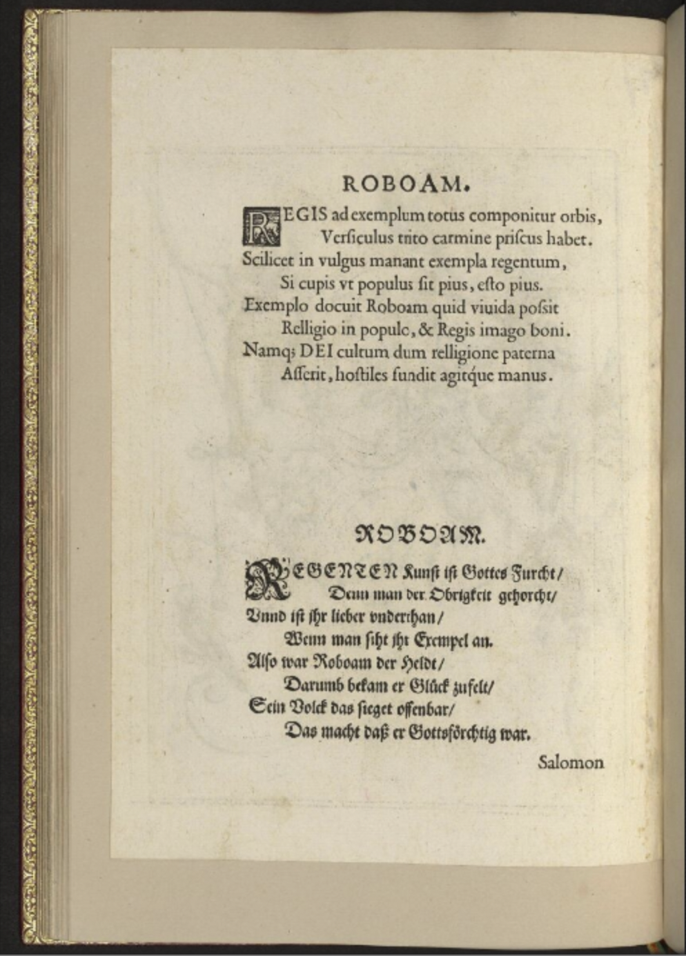
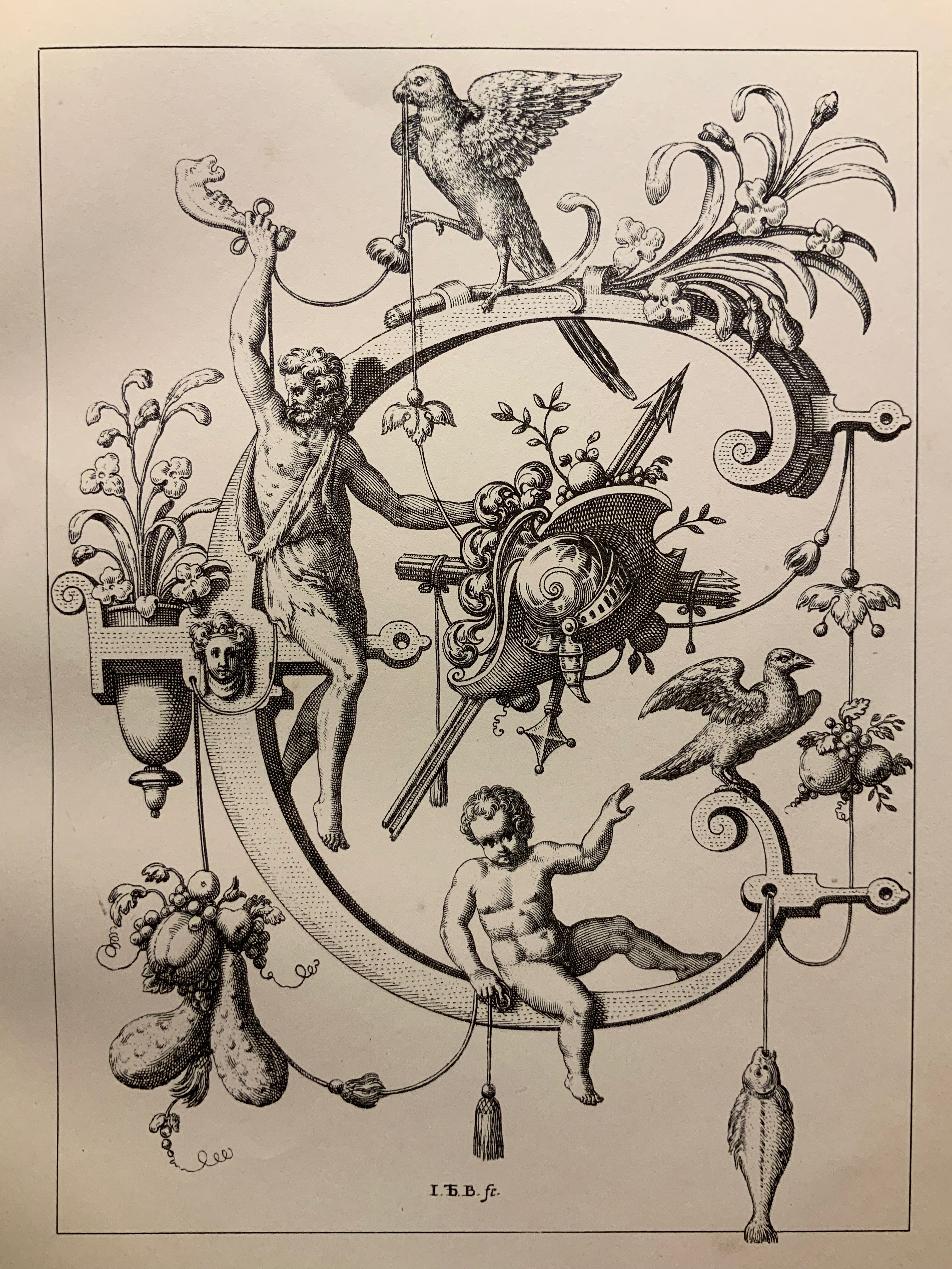
Neiw Kunstliches Alphabet (1595/1995) Johann Theodor de Bry Facsimile edition created by Joseph Kiermeier-Debre and Fritz Franz Vogel as part of the boxed set Alphabets Buchstaben Calligraphy, published by Ravensburger Buchverlag (1998). H275 x W255 mm, 80 pages. Acquired from Antiquariat Terrahe & Oswald, 14 March 2021. Photos: Books On Books Collection.
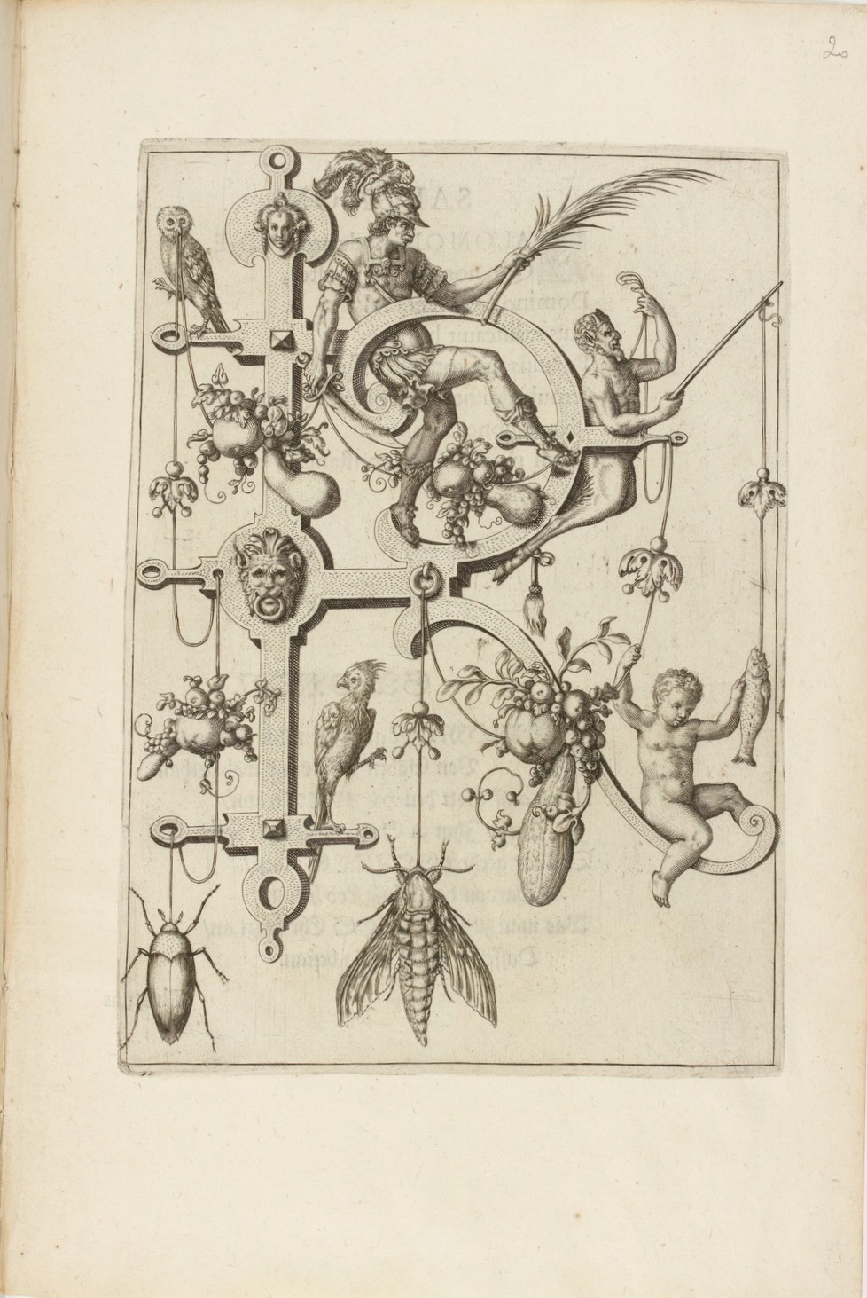
Johann Theodor de Dry and his sons were copperplate engravers, best known for their Grands and Petits Voyages (1590-1634) of 57 separate parts, containing over 500 different engravings illustrating the explorations of the world beyond the shores of 16th and 17th century Europe. While the De Brys’ place in the history of book art might be traced from their illustrations of Hans Staden’s tales of Brazilian cannibals to Oswald de Andrade’s “Manifesto Antropófago” [Cannibal Manifesto] (1928) and Moussa Kone’s Nowhere Land (2017), their equally strong, if not better, claim rests on the Neiw Kunstliches Alphabet (1595) and the Alphabeta et characteres (1596).
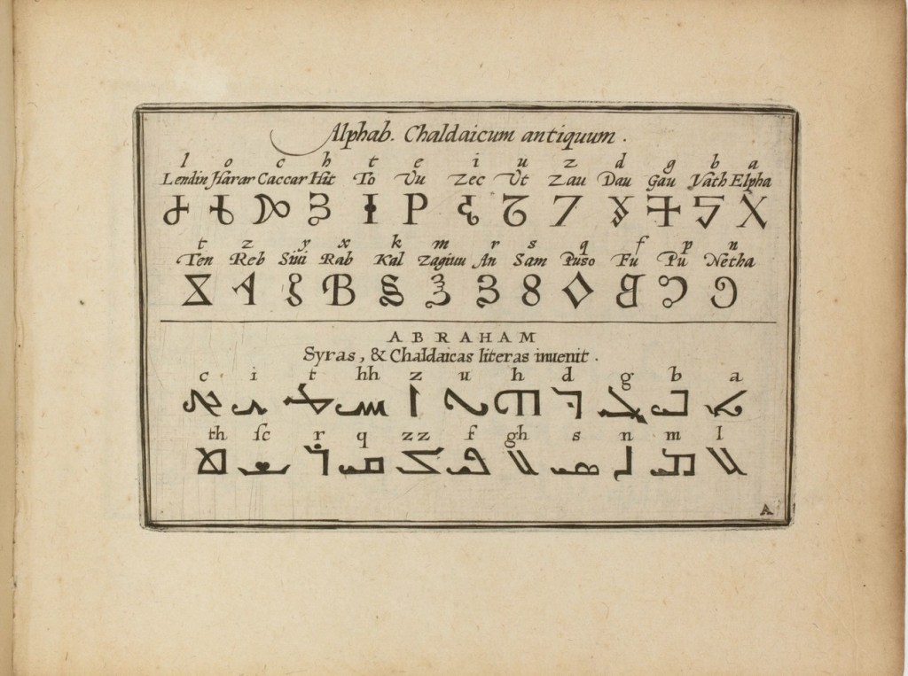
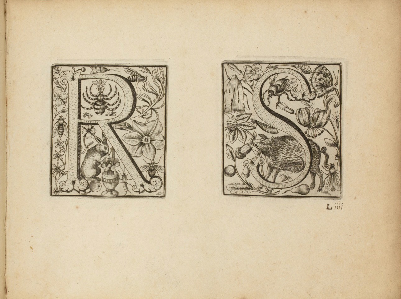
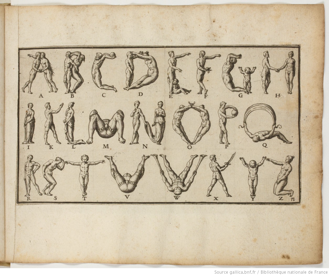
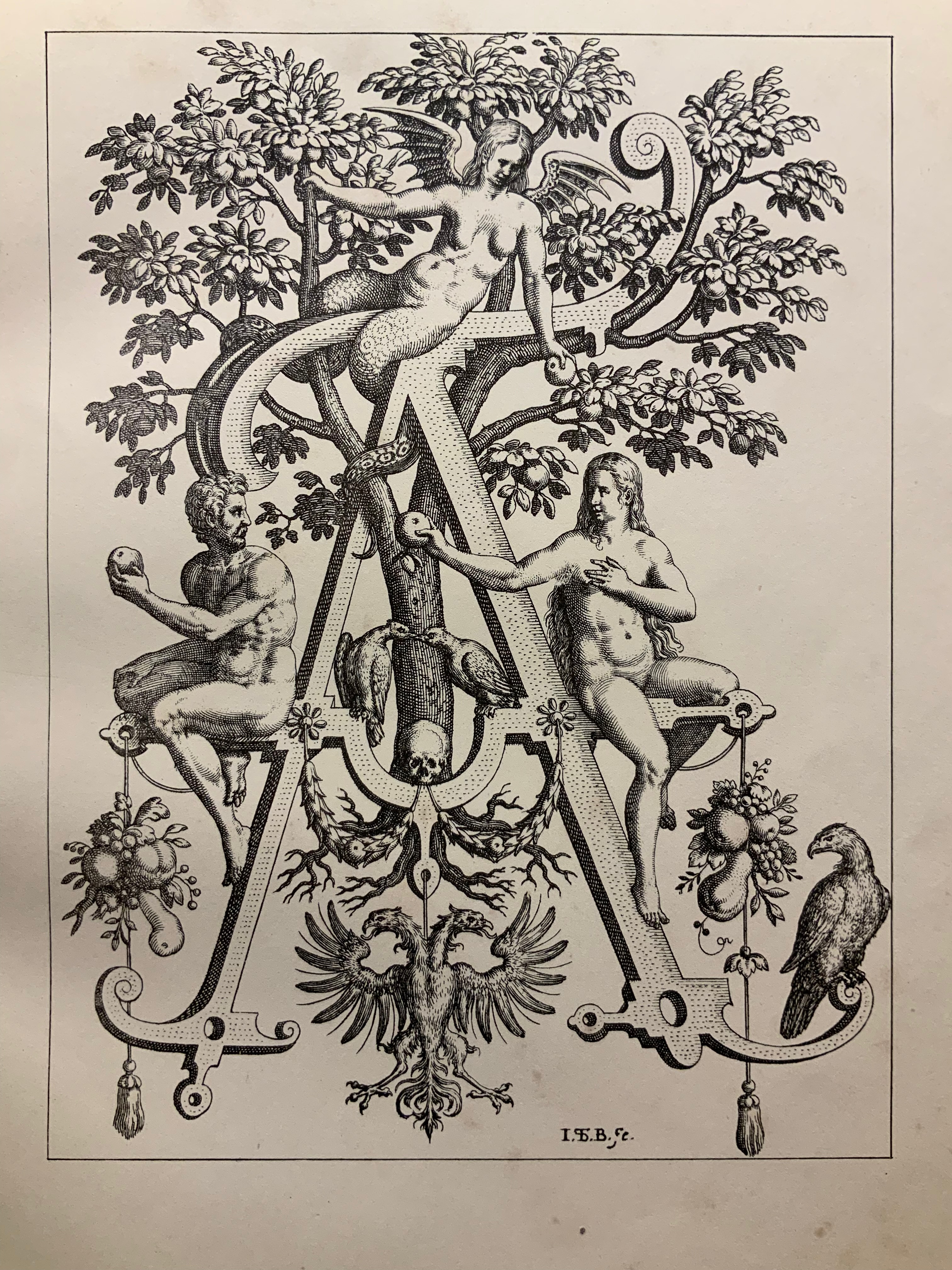
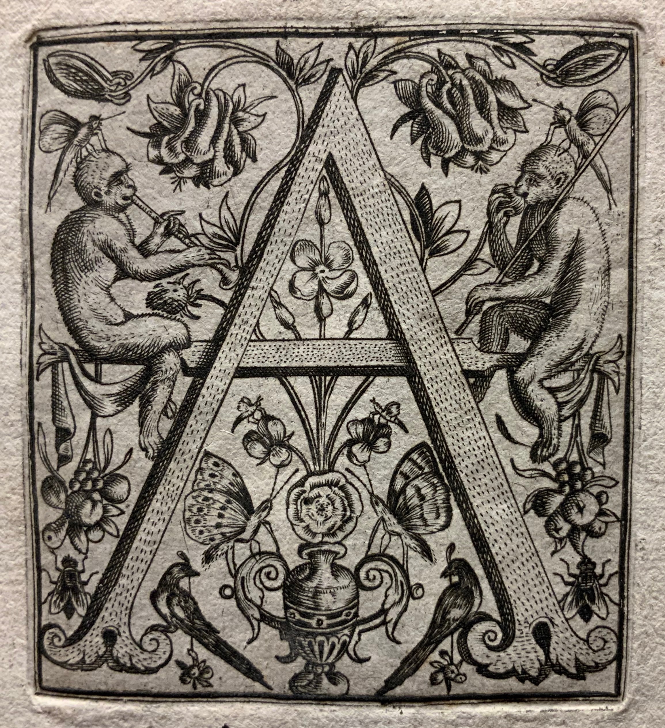
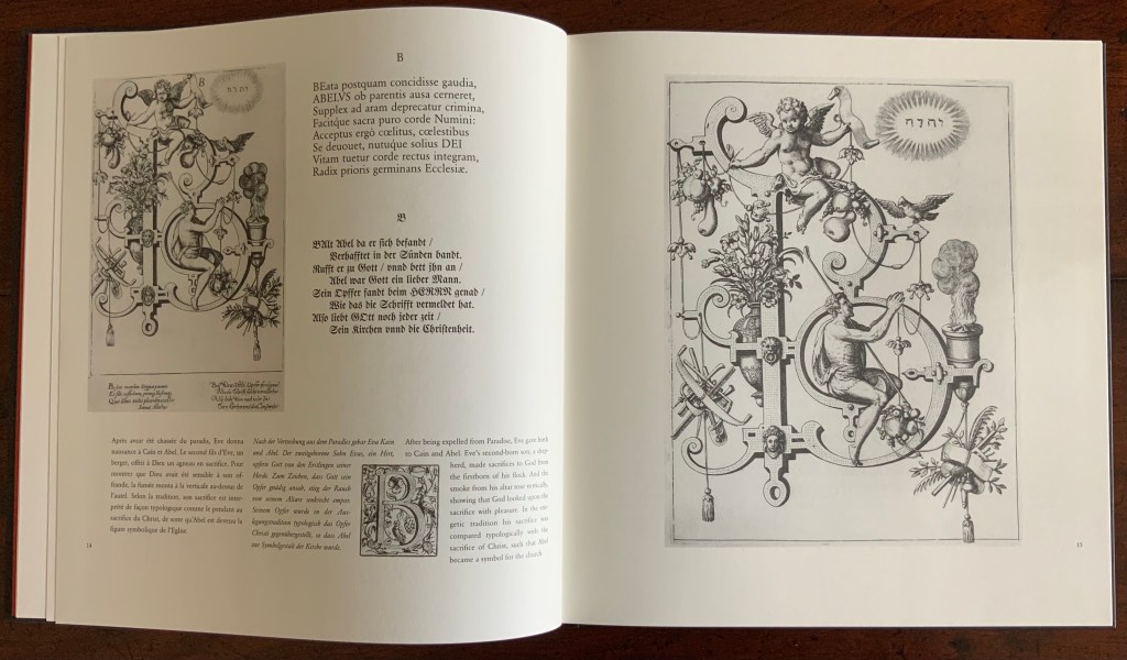
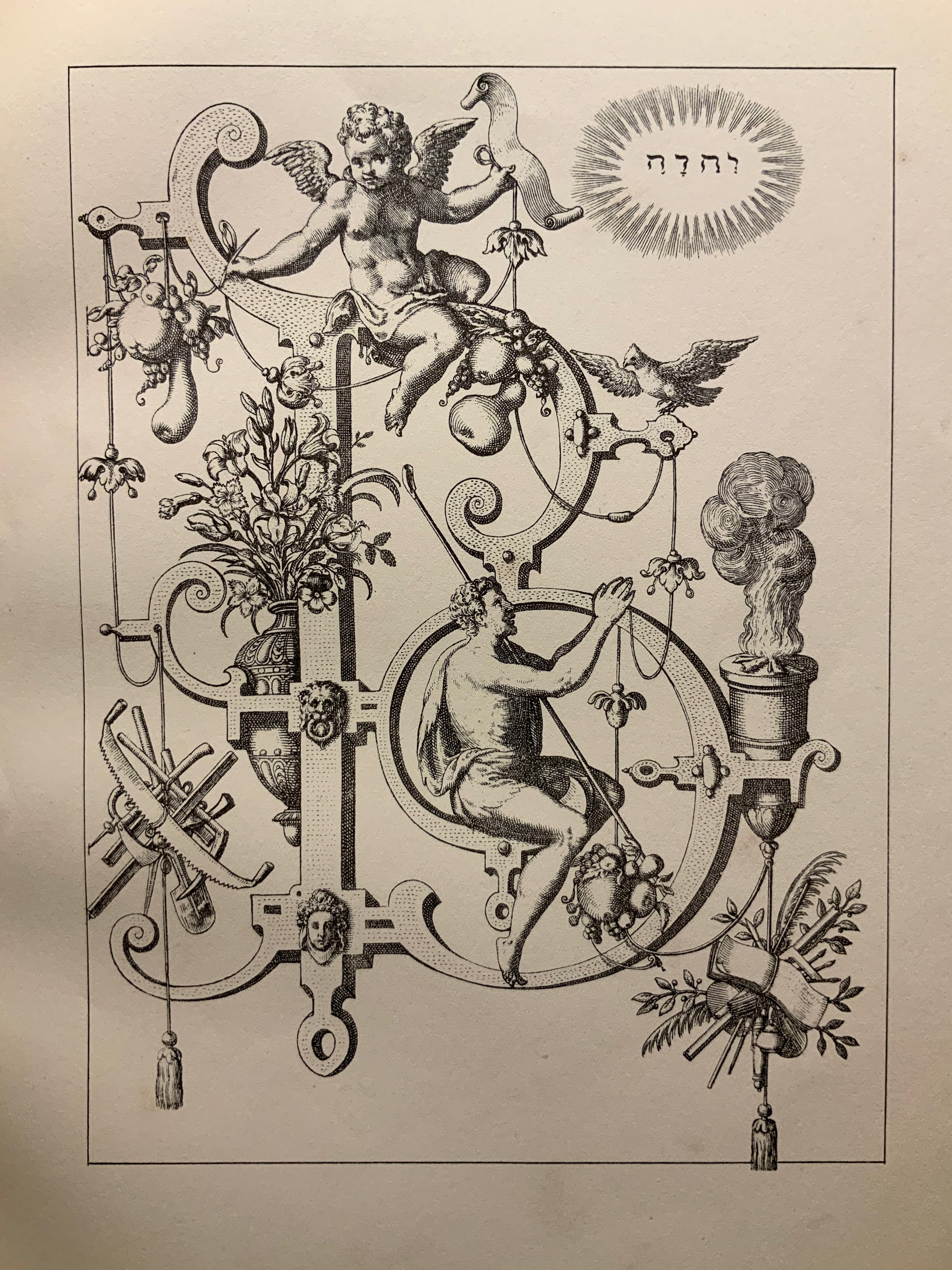
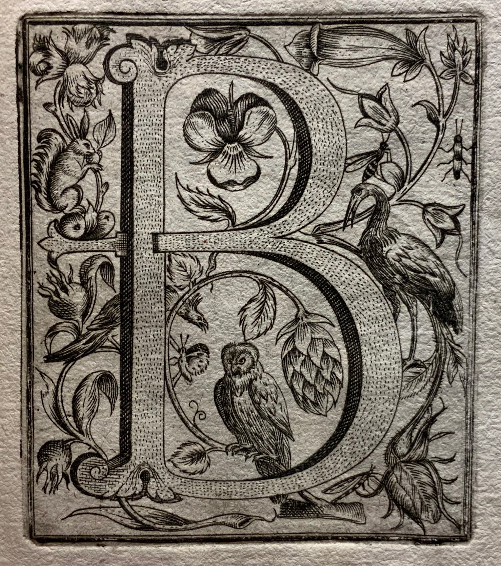
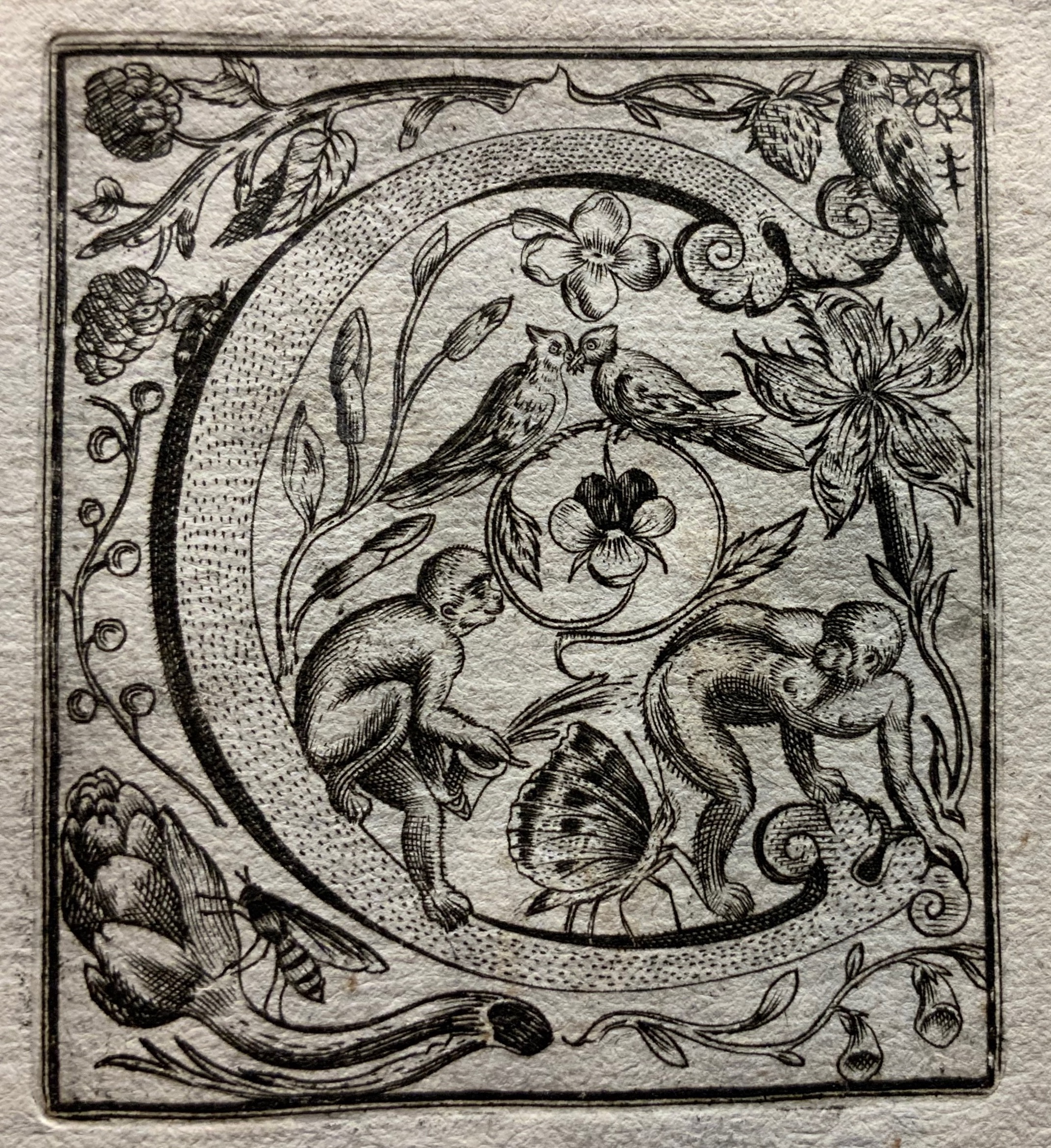
The Neiw Kunstliches Alphabet presents the letters of the alphabet adorned with Judaeo-Christian allegorical figures, vegetation, birds and animals, instruments, implements, weapons and regal emblems. An octave in Latin and one in German provide hints for identifying the allegorical and emblematic references. At the end of the De Brys’ alphabet atlas Alphabeta et characteres, iam inde a creato mundo ad nostra usq. tempora, apud omnes omnino nationes usurpat (1596) depicting dozens of alphabets — the Chaldaic, Egyptian, Hebrew, Greek, Slavonic, Hispanic, Latin and so on — another decorated alphabet and an alphabet formed of human figures make their appearance.
Letters R&S and the human alphabet from Alphabeta et characteres, iam inde a creato mundo ad nostra usq. tempora, apud omnes omnino nationes usurpat (1596). Images: Bibliothèque nationale de France.
Kiermeier-Debre and Vogel reproduce to scale the letters from the Neiw Kunstliches Alphabet and present thumb-nail versions of the alphabets as well as the decorated letters from Alphabeta et characteres. Their facsimile is not the first for these works. J.N. Stoltzenberger printed Alphabeta et characteres in translation for William Fitzer in 1628, and George Waterston & Sons published Neiw Kunstliches Alphabet as The New Artistic Alphabet in 1880 (albeit without the original’s text and verses). By juxtaposing all these originals, Kiermeier-Debre and Vogel provide a concentration of what makes the De Brys partial forerunners in the history of book art: images embracing letters (and letters embracing images).
Joseph Kiermeier-Debre and Fritz Franz Vogel facsimile (1995) of Neiw Kunstliches Alphabet (1595), pp. 12-13. Photos: Books On Books Collection.
Other abecedaries in the Books On Books Collection that strike the Baroque note or blend image and letter in ways that argue a descendancy from the De Brys include
De Bry also published Michael Maier’s Atalanta Fugiens or Emblemata Nova (1618), which is represented in the Books On Books Collection by Daniel E. Kelm’s Möbius version Neo Emblemata Nova (2005).
Further Reading
“Paulus Franck“. 22 March 2022. Books On Books Collection.
“Richard Niessen“. 23 April 2021. Books On Books Collection.
Letterpress Printing ABC (2004) David Clifford Miniature. H78 x W78 mm, 62 pages. Edition of 50 numbered copies, of which this is #48. Acquired from Bromer Booksellers, 1 August 2021. Photos of the work: Books On Books Collection. Displayed with permission of the publisher.
Among the several outstanding production features of Clifford’s miniature is its variation on Claire Van Vliet’s binding structure in The Gospel of Mary (2006). It first becomes apparent in the double-page spread below. As with most of the structures demonstrated in Woven and Interlocking Book Structures (2002), the binding structure consists of woven strips of paper to hold the folios together and attach the cover. The top-down view of Letterpress ABC shows the gathered folios and, if enlarged in a browser, also shows the paper tape running from the cover and across the gathers.
Staking his claim over Andrew Morrison as first past the post, Clifford starts his A-Z with the last symbol of the alphabet (“Ampersand”) and closes with the same Z term (“zinco”). There are other overlaps in terms, but the two efforts differ so rewardingly — Clifford’s woven binding, typeset definitions, miniature trim size and handmade paper versus Morrison’s children’s board book hinged binding, demonstrated definitions, larger trim and Somerset paper — that one cannot be chosen over the other.
An additional pleasure from Clifford’s book is its complement to two other Heavenly Monkey publications in the Books On Books Collection: Francesca Lohmann’s An Alphabetical Accumulation (2017) and Rollin Milroy’s Francesco Griffo da Bologna: Fragments and Glimpses (2020). If it were not for Rollin Milroy, the attentive reader and I would forever struggle with the puzzle of how Clifford’s 2004 binding came to be influenced by Van Vliet’s 2006 binding. Milroy writes:
Claire came to Vancouver in ’04 and gave a day-long class, which David (& his daughter Yasmine) attended. The project was already in development (probably even printed), and D showed Claire a dummy and got some pointers. I didn’t realize ABC preceded her own Gospel.
And here is the entry for Letterpress extracted from proofs for Heavenly Monkey’s checklist to be published in 2022:
An Alphabetical Accumulation (2017) Francesca Lohmann Handpress printed and calligraphed book. H157 x W117 mm, 26 leaves + title + colophon. A black and red tray case, H171 x W128 mm. Edition of 36, of which this is #16. Acquired from The Veatchs, 11 June 2021. Photos: Left, Books On Books Collection; Right, Courtesy of The Veatchs. All photos displayed with permission of the publisher.
Rollin Milroy of Heavenly Monkey, Francesca Lohmann and Claudia Cohen collaborated on this work of art. The alphabetical accumulation is the accumulation of 36 letter A’s entirely hand drawn in red, 25 calligraphed partial alphabets reproduced in black from polymer plates, and 900 pages in which the next letter in the sequence of the partial alphabet has been drawn in red. Each copy of the edition thus presents the full alphabet in original calligraphy across its pages. Printed and calligraphed only on the recto side, this is an alphabet that repays page by page attention. As each new letter arrives in red, all the previous ones and their accumulated foliage fall into black. Not every letter appears in capitals. The letters’ size, arrangement and ligatures shift as the alphabet accumulates.
The edition is also an accumulation of unusual production artistry. Those tapes exposed on the binding — a non-adhesive limp vellum, gold-tooled at the edges, with the title calligraphed in red on the spine — are strips from the old vellum manuscripts used as “paste”downs that are not pasted down. Three different papers — all printed damp at Heavenly Monkey on an Ostrander-Seymour handpress — are used: Crown & Sceptre, J. Whatman, and T.H. Saunders. Deckled leaves and trimmed leaves intermingle.
Fittingly the colophon is calligraphed and reproduced in black from a polymer plate, leaving space for the calligrapher to supply finishing strokes: the number and signature in red.