Bookmarking Book Art – “Very Like a Whale”, the Bodleian Bibliographical Press’s Exhibition

For the 200th anniversary of Herman Melville’s birth (1819), the Bodleian’s Bibliographical Press invited letterpress printers and artists to claim one of the eighty prefatory “Extracts” from Moby-Dick (1851) and create an artwork in response.

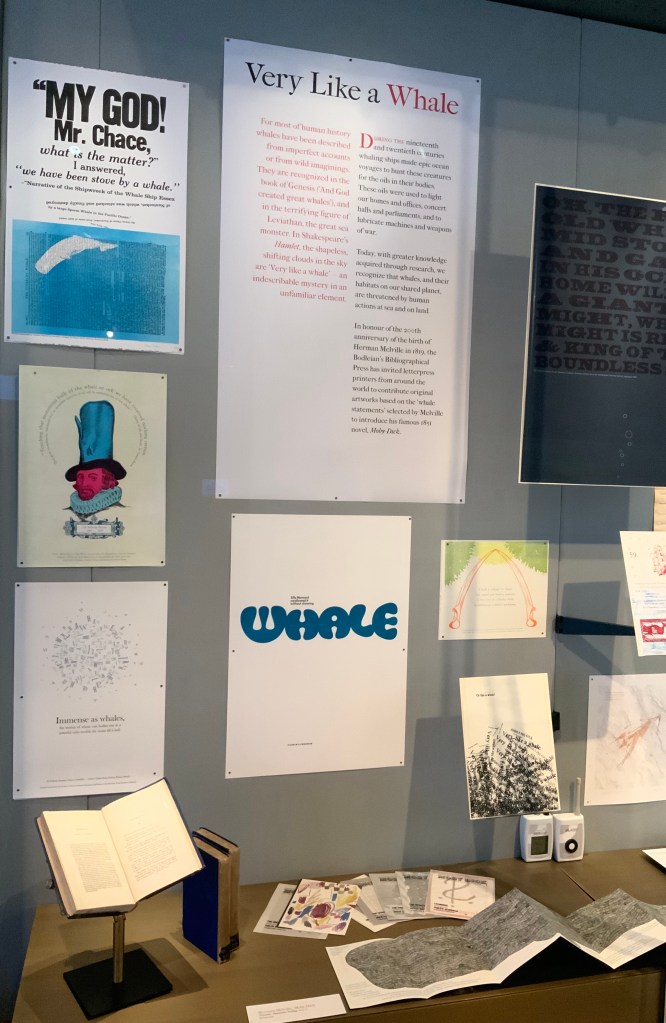
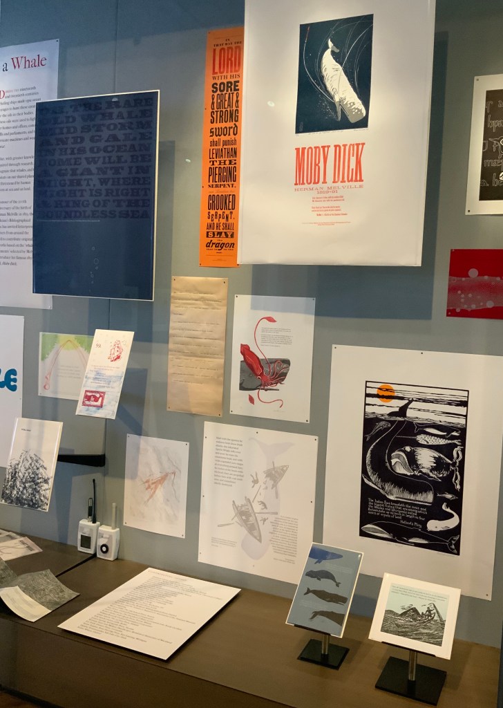
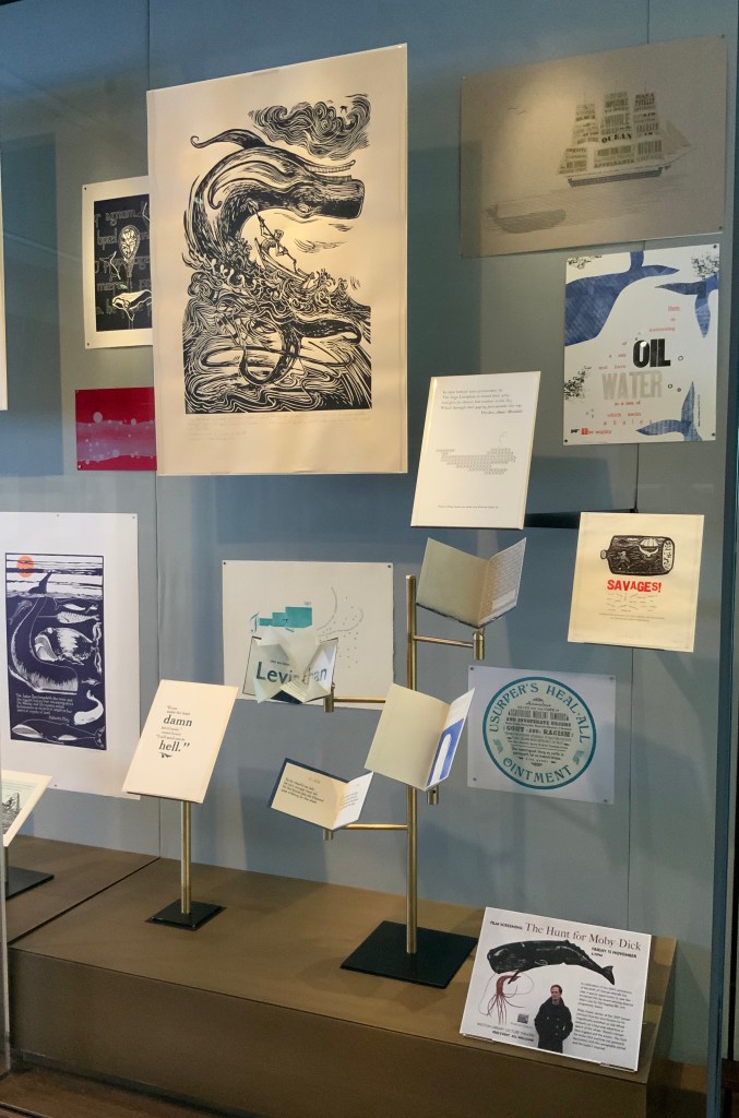
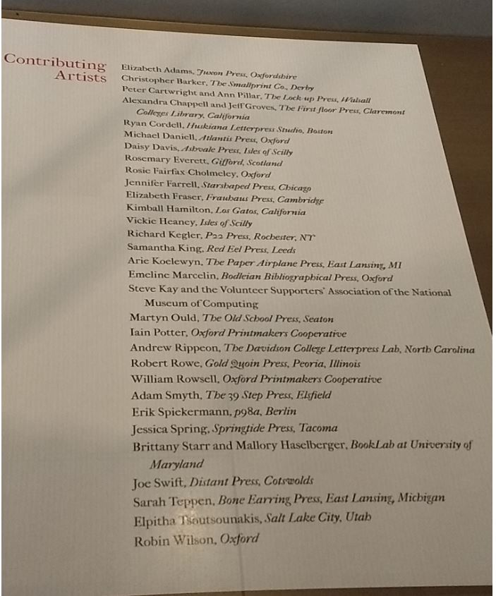
The Blackwell Hall exhibition case accommodates thirty of the eighty contributors‘ artworks, plus the rare three-volume version of the novel published by Richard Bentley in London as The Whale before Harper & Brothers issued it in November 1851 in New York as Moby-Dick; or, The Whale. Here are just four of the outstanding prints among the several artforms on display.

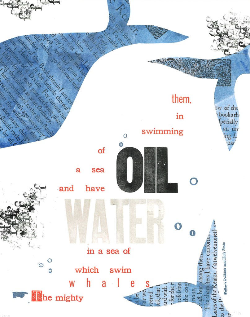
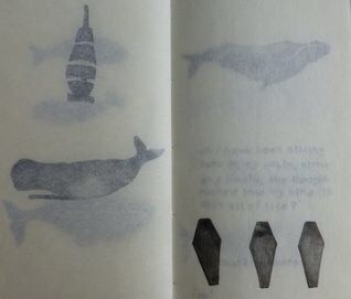
Extract 25:  ‘The mighty whales which swim in a sea of water, and have a sea of oil swimming in them.’ ─ Fuller’s Profane and Holy State
Brittany Starr and Mallory Haselberger, BookLab at University of Maryland
Mixed media (collage and letterpress). Printed on a Line-O-Scribe, Model 1411 on Strathmore printmaking paper using rubber and oil-based ink; includes Jenson, News Gothic and Bookman typefaces with Hamilton wood type.
Image courtesy of the Bibliographical Press and artists.

Notice how Starr and Haselberger integrate the verbal and visual to emphasise the seas of water/oil paradox that Melville plucked from his source. Like Melville’s hand, the artists’ manicule in the lower left points to the extract that reads/rises from the bottom to the top. Inside the shapes of whales around the extract appears the source of the extract (the verbal in the visual) against a seawater blue (another layer of the verbal in the visual). The letters “o” and “f” evoke bubbles and currents (the verbal for the visual). The words “oil” and “water” in contrasting inks but composed in the same typeface loom large at the heart of the artists’ embodiment of this paradoxical extract. (It is an insider’s paradox that the work surfaces from the BookLab, devoted to exploring the oil-and-water mix of the material and the digital.)

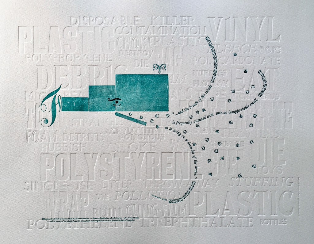
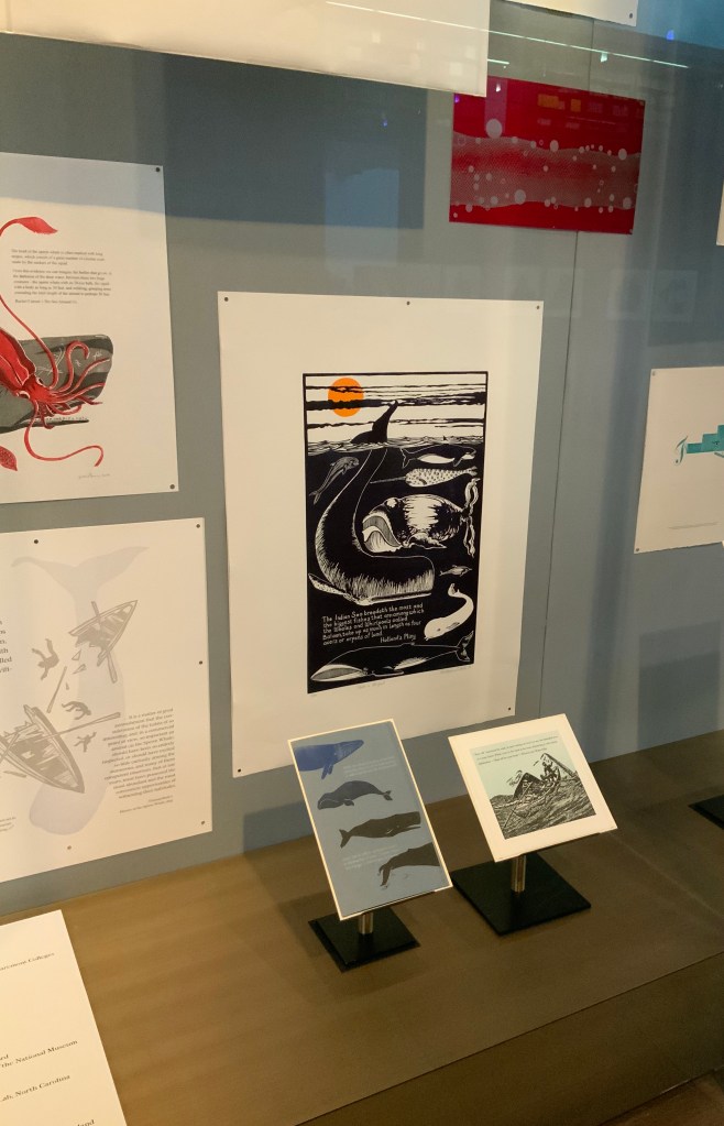
Extract 35:  ‘*  *  *  *  *  and the breath of the whale is frequently attended with such an insupportable smell, as to bring on a disorder of the brain.’ ─ Ulloa’s South America
Elizabeth Fraser, Frauhaus Press, Cambridge
Handset letterpress. Blind deboss using wood and metal type. Whale created from face and back of woodtype with ornaments for eye and spout. Text 12pt & 6pt Baskerville italic. Whale breath 12pt glint (Monotype B1309 & B1310). Printed on Somerset Velvet 300gsm soft white paper with a tabletop flatbed proofing press.

What attends the whale’s breath in Fraser’s print? The whale’s breath is the extract streaming into a sea of white blind-debossed words. That sea of human detritus is the source of the insupportable smell that attends the whale’s breath. The insupportable smell takes on “the whiteness of the whale”. The threatened whale takes on an environmental green. which Fraser creates with the non-verbal side of the woodtype. Even so, the carrier of the verbal makes up every visual aspect here, underscoring Fraser’s contemporary paradox: the insupportable smell disordering the brain has been brought on by the disordered brain of humankind.

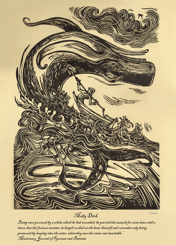
Extract 65:  ‘Being once pursued by a whale which he had wounded, he parried the assault for some time with a lance; but the furious monster at length rushed on the boat; himself and comrades only being preserved by leaping into the water when they saw the onset was inevitable.’ ─ Missionary Journal of Tyerman and Bennett
William Rowsell
Linocut on Japanese paper, printed on 1828 Albion press at the Oxford Printmakers Cooperative Workshop.
Image courtesy of the Bibliographical Press and artist. © William Rowsell

Rowsell’s linocut represents the more traditional entries in the exhibition. Capturing the furious struggle expressed in the extract, he locks whale, man, boat, sea, cloud and sky into a vigorous, swirling image on a paper and in a style that evoke the century in which Moby-Dick is set. As he pulled his prints from the 1828 Albion printing press, Rowsell might have wondered what the nine-year old Herman Melville was doing when hands were first laid on that Albion.

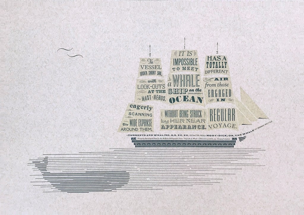
Extract 71,   ‘It is impossible to meet a whale-ship on the ocean without being struck by her near appearance. The vessel under short sail, with look-outs at the mast-heads, eagerly scanning the wide expanse around them, has a totally different air from those engaged in regular voyage.’ ─ Currents and Whaling. U.S. Ex. Ex.
Jennifer Farrell, Starshaped Press, Chicago
Letterpress: metal type + rule  linocut; Paper: Fabriano Tiziano printed on a Vandercook SP15.
Image courtesy of the Bibliographical Press and artist.

Starshaped Press is aptly named. Jennifer Farrell stars at wringing shapes from type and its surrounding furniture. The citation outlining the upper deck and bowsprit runs gracefully and appropriately under the sails on which the extract appears in that variety of display faces characteristic of nineteenth century flyposts.

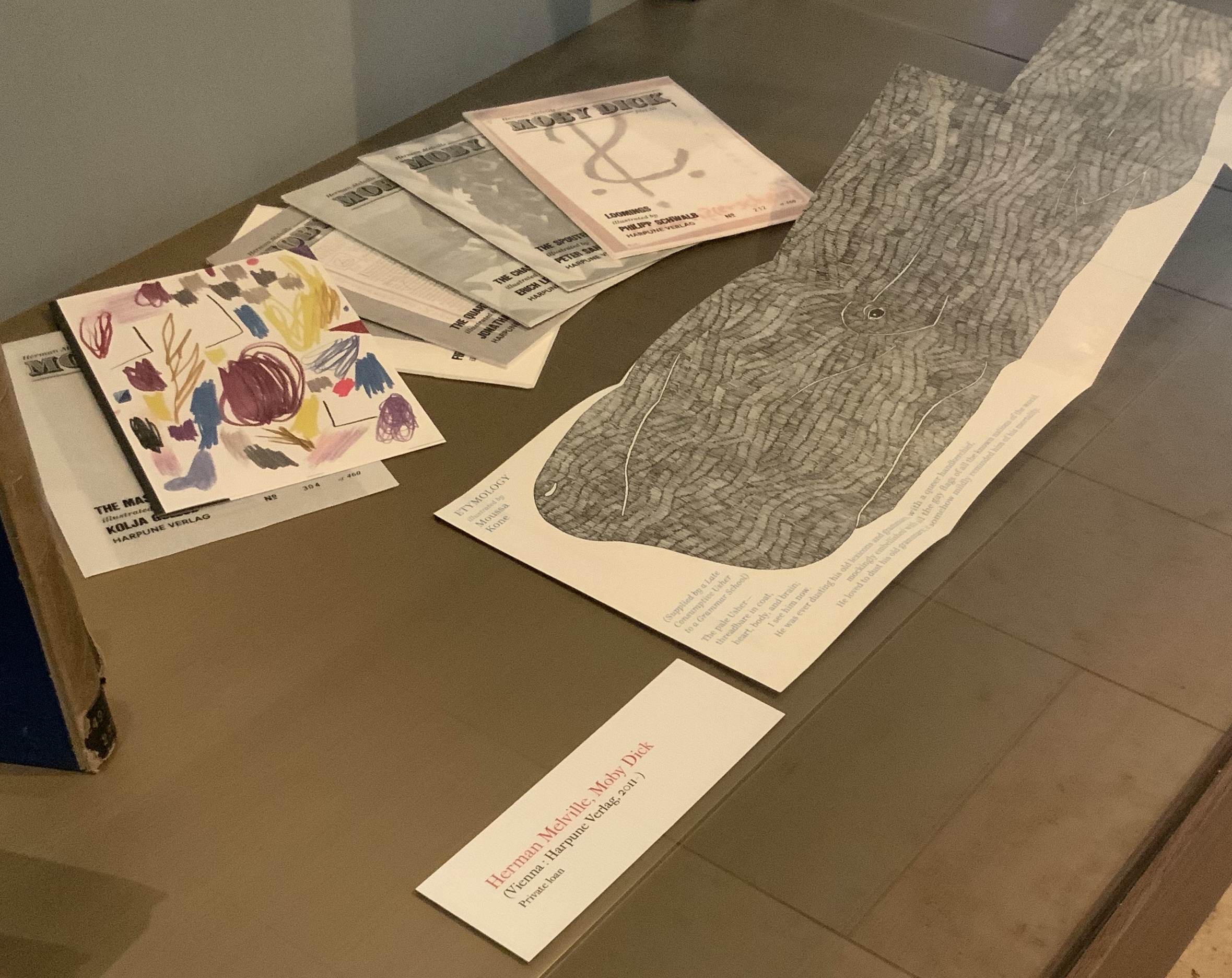
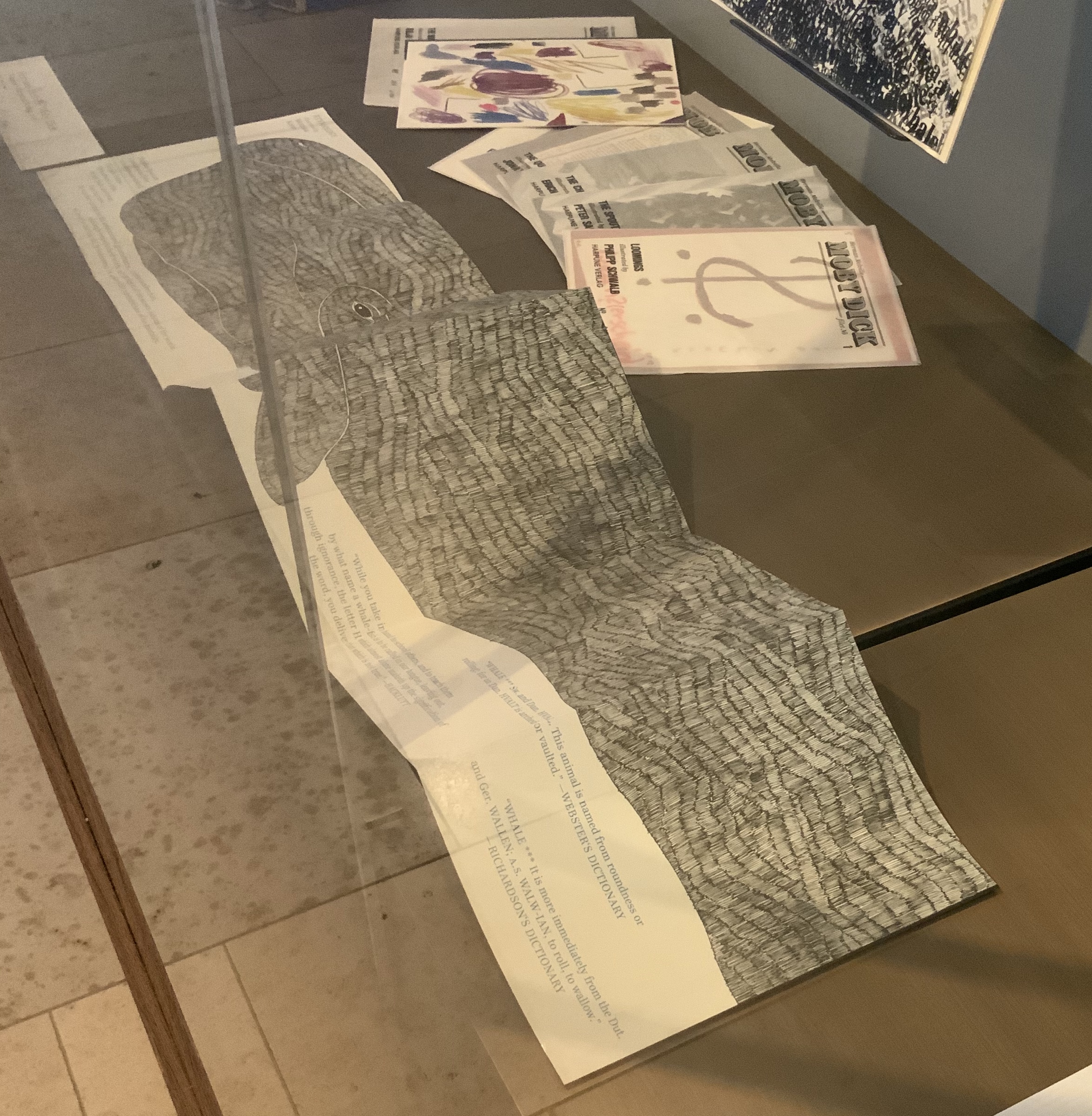
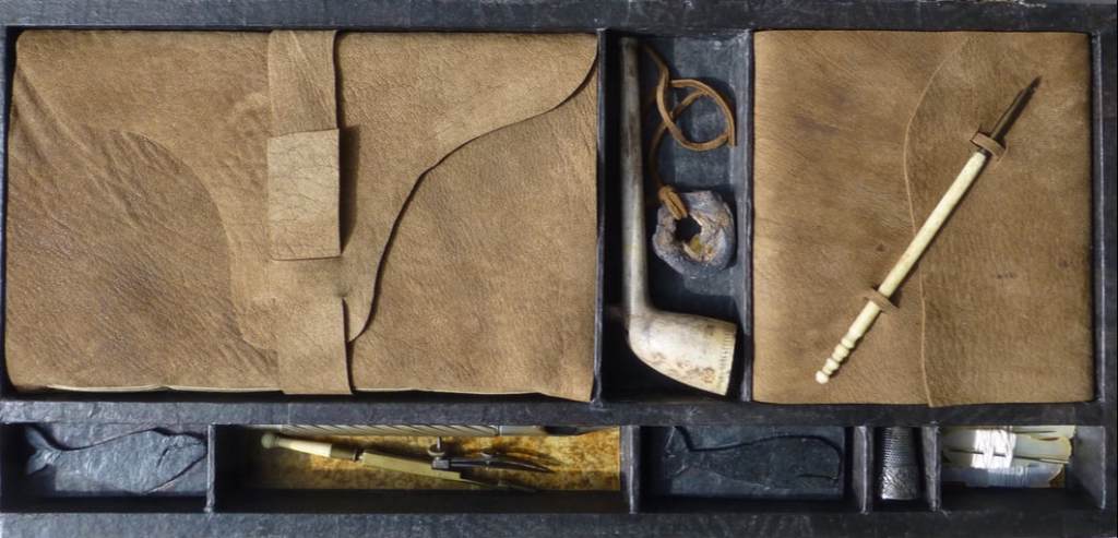
To round out the display with another multi-artist effort, the curators included Harpune Verlag’s Moby-Dick “Filets” (2011~). In 2011, Harpune Verlag Wien began publishing Melville’s masterpiece as a serialized subscription. To do justice to the book’s many voices, 136 different artists were invited, each to illustrate a chapter.

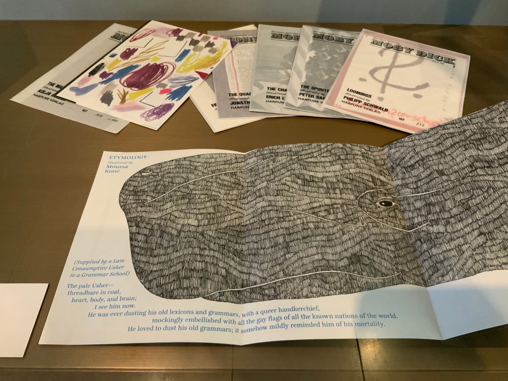
Etymology, Moby-Dick “filet” No. A (2012)
Moussa Kone
Leporello of 16 pages, 150 x 200 mm closed, 200 x 710 mm open.
Acquired from Harpune Verlag February 2019.

Published in non-chronological order at varying intervals and printed in a limited edition of 460 copies, 37 “filets” have appeared so far. At this rate, all of the filets may only be served up by the bicentennial of Moby-Dick’s publication! Fortunately for the Bibliographical Press’s display, Moussa Kone’s rendition of “Etymology”, the prefatory item preceding “Extracts”, is one of those already delivered. It makes a suitably lengthy and apropos link across cases.

If, like Ishmael with “November in [his] soul”, you were walking down the damp, drizzly streets not of New Bedford but Oxford on the 15th this month, you might have substituted the Weston Library for The Spouter Inn. Inside, second copies of the remaining fifty “Extracts” submissions were on display in Blackwell Hall for viewing and handling after a screening of Philip Hoare’s The Hunt for Moby-Dick (2011). Ten years ago, Southampton-born Hoare won the 2009 BBC Samuel Johnson Prize for non-fiction for his book Leviathan, or the Whale. Hoare himself was on hand to introduce and take questions after the film.

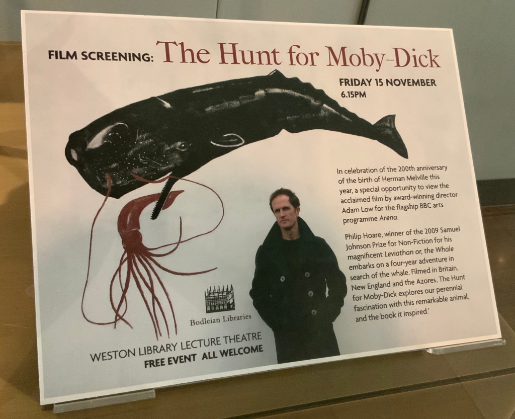
His lifelong passion for whales and Melville’s book is infectious and influential. UK book artist Chris Ruston traces her series of artist’s books Lost Voices — Whaling (2016-17) to Hoare’s Leviathan. Like Hoare’s work and many entries in “Very Like a Whale”, Ruston’s work challenges our anthropocene era. Hoare was also instrumental in organizing the Moby Dick Big Read (2012) — another multi-artist affair and effort to address the effects of the anthropocene era.

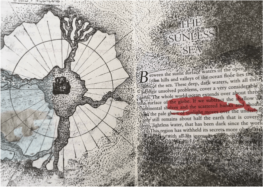
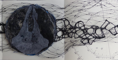
from Lost Voices — Whaling (2016-17)
Chris Ruston
Images courtesy of the artist.

Click on the screenshot to visit and listen to the Moby Dick Big Read.

The Big Read offers freely available readings of each chapter of the book. Individuals (well-known and unknown) contributed the readings, artists contributed artwork (viewable as thumbnails on the site), and the site offers an opportunity to donate to Whale and Dolphin Conservation (WDC).

Hoare participated in another Melvillean documentary: David Shaerf’s Call Us Ishmael (2019). It is a multi-artist affair like the Big Read, Moby-Dick “Filets” and “Very Like a Whale”; includes a sighting of the New Bedford Whaling Museum’s annual days-long continuous reading of Moby-Dick; and features interviews with artists and other creatives inspired by Melville’s tale. One of those artists interviewed is Frank Stella. Uncanny, but Stella also appears in this book to be found in the Bodleian: Elizabeth Schultz’s Unpainted to the Last (1995).

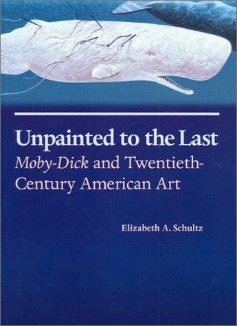
From among the artists such as Ellsworth Kelly, Robert Motherwell, Jackson Pollock and others whom Schultz discusses, Stella serves best to tie off this fisherman’s tale and return to the title of the Bibliographical Press’s exhibition. About his Moby-Dick series of prints and metal-relief paintings to which he devoted a decade, Stella writes:

The idea of the wave and its various permutations is what drives this new series. Once I started on the wave shape, I saw it began to look like a whale — a combination of waves and whales. … The idea of the whale reminded me of “Moby Dick,” so I decided to go back and read the novel and the more I got into it, the more I thought it would be great to use the chapter headings of the novel for the titles of the pieces. — “1989 Previews from 36 Creative Artists,” New York Times, 1 January 1989, Sec. 2:1. Images here.

Indeed, “Very Like a Whale”, which runs until 5 January 2020. Admission free.

PPS And there is also the celebratory Moby-Dick: A Pop-up Book from the Novel by Herman Melville (San Francisco: Chronicle Books, 2019). More to be seen here.

Bookmarking Book Art – Alicia Bailey and the Artists’ Book Cornucopia

For a decade, Alicia Bailey has played the role of Ceres to book artists and collectors, bringing them the Artists’ Book Cornucopia. And this has been in addition to creating her own bookworks, organizing other exhibitions and running Abecedarian Gallery and Raven Press. Artists’ Book Cornucopia X marks the tenth and last cornucopia but not the end of their impact.

Cornucopia implies abundance and variety, and Alicia Bailey has delivered both. A glance at the ten catalogues finds a consistently high level of participation — always at least thirty artists — and every catalogue has shown a “variety of varieties”. Consider these varieties:

Variety of structures: accordions, boxes, flag books, girdle books, pop-ups, miniatures, portfolios, scrolls, sculpted shapes, wallets, etc. The variations within each type would require a hunt through The Art of the Fold (Kyle and Warchol), Structure of the Visual Book (Smith) and Book Dynamics! (Hutchins) to identify them properly. In ABC X, all of the structures mentioned above are represented. Over the decade, the Artists’ Book Cornucopia have spilled out structural innovations such as Merike van Zanten’s A Soldier of the Second World War (ABC I), Pamela Paulsrud’s Touchstones (ABC II), Cathryn Miller’s Universe: Foundation Trilogy (ABC III), Louisa Boyd’s miniature Stardust (ABC IV), Susan Kapuscinski Gaylord’s Spirit Book #67 (ABC V), Candace Hicks’s Trees of a Feather (ABC VI), Karen Hardy’s Vellicate (ABC VII), Bryan Kring’s Shared Illusion (ABC VIII) and Josh Hockensmith’s After (ABC IX). The abundance of innovations makes a visit to the Abecedarian Gallery site for numerous second-guessings worthwhile.

The variety of material used by the artists overwhelms: beads and buttons (Ednie), cactus needles and jute (Reka), cement and glass (Bryant), ceramic and cardstock (Wolken), copper and redwood (Anstruther/Grasso), fishing line and wire (Johnston), fish-skin and mull (Klass), leather and “metal findings” (Melis), magnet and museum board (Burton), palladium and aluminum leaf (Bailey), ribbon and slide viewers (Grimm), silk and sinew (Alpers), thread and tyvek (Asato), window screen and wood (Fleming), zippers and fabric (Melhorn-Boe) and, of course, upcycled books (Anastasiou). Any appreciation of the ingenuity of materials selection and manipulation across the Artists’ Book Cornucopia requires a rewarding read of the descriptions provided in each of the catalogues.

Then there is the variety of techniques: blind deboss (Lawrence), calligraphy (Towers), chromogenic prints (Grimm), collograph (Dokudowicz), cyanotype (Biza), gelatine monoprinting (Powers-Torrey), intaglio (Larson), letterpress (Nakata), linocut (Knudson), photopolymer (Larson), risography (Powers-Torrey), silkscreen (Anastasiou) and woodcut (Lucas). Like the materials used, the techniques employed are almost too many to name, and of course, those named are used by more than the one artist mentioned.

And, of course, a riot of papers: abaca (Welch), Alabama kozo (Sico), Awagami Shin Inbe (Gorham), cotton-abaca (Lucas), Domestic Etch/Lana Laid/Masa/Niddegen (Powers-Torrey), Hahnemühle Ingres mouldmade pastel paper (Ednie), indigo flax (Johnston), Somerset (Moyer) and Thai Momi marbled paper (Towers), which of the varieties used are far too few to mention.

And varied carriers of colour: acrylic (Johnston), crayon and botanically dyed ink (Ednie), digital ink (Reka), gouache (Thrams), milk paint (Anstruther/Grasso), pencil (Fleming), pulp painting (Welch), Sumi and walnut inks (Towers), textile ink (Melhorn-Boe) and watercolour (Ednie,Thrams and Towers), again far more could be mentioned.

Likewise, the variety of shapes and direction is kaleidoscopic: zigzag, circular, globular, vertical, horizontal, square, cuboid and boustrophedon (left to right to left to right, etc.). And that is before any listing of the Platonic shapes in Sarah Bryant’s The Radiant Republic.

The wide variety of themes in ABC X echoes the same breadth across the previous nine catalogues. Here we have architecture (Bryant), botany and discovery (Gower), chronic illness (Wolken), the city (Dokudowicz), environment (Lowdermilk), industrial landscape (Burton), the literary (Bailey), pain (Reka), sexuality (Grimm), travel (Melis), wildlife (Thrams) and #MeToo (Ellis). The named representative artist is just a starting point for each theme, and the themes mentioned are only alphabetical, not exhaustive.

Perhaps the one varietal shortcoming of ABC I-X is that most of the artists participating hail from the US. When another nationality appears in one of the catalogues, it surprises. Over time, “vintners“ from the following countries have shown up: Argentina, Australia, Austria, Brazil, Canada, China, Egypt, France, Greece, Korea, Netherlands, Poland, UK and Venezuela.

The abundance and variety of Alicia Bailey’s Artists’ Book Cornucopia prove one premise and question another from Johanna Drucker’s The Century of Artists’ Books:

If all the elements or activities which contribute to artists’ books as a field are described what emerges is a space made by their intersection, one which is a zone of activity … There are many of these activities: fine printing, independent publishing, the craft tradition of book arts, conceptual art, painting and other traditional arts, politically motivated art activity and activist production, performance of both traditional and experimental varieties, concrete poetry, experimental music, computer and electronic arts, and last but not least, the tradition of the illustrated book, the livre d’artiste. The Century of the Artists’ Books (New York: Granary Books, 2004, new edition), p. 2.

ABC X and its nine sisters shout a resounding “Amen”, but the rich quality and originality of the works displayed whisper “‘the’ century?” At the close of the 21st century’s second decade, Ceres is smiling.

Further Reading, Listening and Viewing

Bailey, Alicia. “‘Narrative Threads’ uses book art to explore stories”, PostIndependent, 3 May 2018. Accessed 2 December 2019.

Bowen, Sara. “Artists, Books and Interviews #2: Alicia Bailey”, Book-Art-Object, 20 November 2011. Accessed 7 November 2019.

Dillard, Julia “Curator Alicia Bailey on the Intimacy of Artists’ Books and Everything You Didn’t Know about Book Arts”, Art Gym Denver, 23 October 2017. Accessed 7 November 2019.

Froyd, Susan. “#45: Alicia Bailey”, Westwood, 19 September 2013. Accessed 7 November 2019.

Isaacs, J. Susan. The Book: A Contemporary View (Wilmington, DE: Delaware Center for the Contemporary Arts, 2011), p. 15.

Leutz, Pamela. “This Time Is: Alicia Bailey”, The Guild of Bookworkers, 25 April 2018. Accessed 7 November 2018.

Wolfson, Zach. “Beyond the Gallery with Alicia Bailey”, Infusion5, 17 April 2014. Accessed 7 November 2019.

Books On Books Collection – Peter Malutzki

Doctor Diderot’s & Mister d’Alembert’s Adventures in Wonderland & Through the Looking Glass (2018)

Doctor Diderot’s & Mister d’Alembert’s Adventures in Wonderland & Through the Looking Glass (2018)
Peter Malutzki
Book: H368 x W120 x D80 mm; Slipcase: H374 x W124 x D140 mm
Acquired from the artist, 10 February 2019

Malutzki’s tall small work evokes memories of Max Ernst’s Une Semaine de Bonté (1934) but pushes back on them with the work’s fine book execution. The book’s startling height derives from the more startling source of the paper: original pages from the plates volumes (1762-72) of Diderot’s Encyclopédie, ou dictionnaire raisonné des sciences, des arts et des métiers (1751-72). Through antiquarian dealers, Malutzki collected loose sheets from the first Paris folio edition and some from Italian editions (Lucca or Livorno).

The original engraving-papers (printed on one side as usual) are folded and glued together on the fore-edge. The stack of folded leafs has been glued at the spine with a small strip of glue so that each double spread has just a fold in the gutter, but no stitching, which shows the complete copper engraving unharmed structurally.

The endpapers are dyed through, and the fly-leaves are glued on the fore-edges to the first and last leaf of the book-block. The dark blue material used for the end-papers and the slipcase is an industrial one (Napura Khepera marine by Winter & Company) and is used for the endpapers. The Xian scarlet cloth for the cover also comes from Winter & Company. Throughout the book’s brief narrative, the dark blue associates with Diderot, and the scarlet with d’Alembert.

While Malutzki combines Ernst-like elements of the comic book and collage, the work is more of a conversation among imagery and concepts of the 18th, 19th and 20th centuries than an exercise in surrealism. It is a narrative built with the “pictures and conversations” that Alice finds lacking in the book her sister is reading by the river as Alice‘s Adventures in Wonderland (1865) opens. Malutzki piles this 19th century Victorian fantasy atop the 18th century by substituting the Enlightenment’s Encyclopédistes Doctor Diderot and Mister d’Alembert for Alice and her sister in the opening lines from Lewis Carroll’s story. The 20th century makes its appearance with the Playboy bunny in place of the White Rabbit and a clipart-like image of a book labelled “READ ME” in place of the bottle and cake labelled “DRINK ME” and “EAT ME”. The images in the 18th century engravings underlie the 19th century text in its speech bubbles. Nearly the only change to the text from Alice‘s Adventures in Wonderland and Through the Looking Glass (1871) is the substitution of the characters Diderot and d’Alembert for those in Carroll’s world.

In further allusion to Through the Looking Glass‘s mirror-world and upside-down logic, Malutzki has set some of the banderolle text in reverse and placed pairs of mirrored images crosswise — all overprinted on those 18th century engravings. Malutzki‘s precision and extensive experience with overprinting and the transparency of oil-based ink was essential given the limited supply of paper from the 250-year old volumes.

Inevitably, the collector has to confront the print preservationist’s question: how can you countenance the destruction of these 18th century prints? There is a several-fold unease. First, a worry for the security of such historical material (even altered) in the collection. Second, perhaps ironically, a worry over its preservation. And third, the worry whether the artistic quality of the work justifies the trade-off of the lost prints.

With at least a thousand complete sets of the original Encyclopédie (including the plates volumes) safely ensconced in academic and national libraries from France to Australia and still more loose prints (and sets) available from antiquarians, the use of these loose sheets for artistic purpose is lighter in the scales than the use of something far more rare or, worse, unique.

The preservationist might argue, “why not use the plates from one of the 20th century reprints?” Response: not the same tactility, not the same authenticity, not the same challenge or risk — not the same unease that prods the mind.

More directly to the artistic quality of Doctor Diderot’s and Mister d’Alembert’s Adventures: The photos here do little justice to the work’s precision, the sound of the slipcase’s snug fit, the layering of colours on the page, the motion of the spine, and the different textures of the 21st century cloth binding, the slipcase, endpapers and leaves of engraving papers so neatly adhering to each other that they feel like a single leaf. It is refreshing to see Alice appear outside the tableaux to which so many book artists have turned when inspired by Carroll. It is genius to have merged Carroll’s fictive exploration of logic and epistemology with the Enlightenment’s attempt to encompass humankind’s knowledge of the sciences, arts and industries or crafts.

Doctor Diderot’s and Mister d‘Alembert’s Adventures falls outside the span covered by Malutzki’s autobiography buchstäblich Buch (see under Further Reading). As such, it occupies a prospect from which to view Malutzki’s decades-long musing about the visual arts, knowledge and whimsy, all evident from his work — both solo and in collaboration with Ines von Ketelhodt — in the late 20th and early 21st centuries.

Zweite Enzyklopädie von Tlön: Ein Buchkunstprojekt von Ines von Ketelhodt und Peter Malutzki, 1997-2006 (2011)

Zweite Enzyklopädie von Tlön: Ein Buchkunstprojekt von Ines von Ketelhodt und Peter Małutzki, 1997-2006 (2011)
Ines von Ketelhodt and Peter Malutzki
H302 x W220 mm
256 pages; printed linen-over-board cover with embossed spine title, thread stitched; LuxoCream 115 gsm text paper; Frutiger, typeface.

Through his fiction — especially his story ”Tlön, Uqbar, Orbis Tertius” — Jorge Luis Borges has played as inspirational a role for artists and book artists as have Lewis Carroll, Stéphane Mallarmé and Laurence Sterne. An incomplete list includes Katie Holten’s About Trees, Sean Kernan’s Secret Books, Aurélie Noury‘s “Pierre Ménard, El Ingenioso hidalgo Don Quijote de la Mancha“, Hanna Piotrowska (Dyrcz)‘s Jorge Luis Borges, The Maker, Liliana Porter’s prints, Elaine Sturtevant’s Sturtevant: Author of the Quixote and Daniel Temkin’s and Rony Maltz’s Borges: The Complete Works. For book art, though, Malutzki’s and Von Ketelhodt’s fifty-volume work must lead the list, closely followed by this descriptive catalogue, a bookwork in itself.

Eva Hanebutt-Benz (Gutenberg-Museum Mainz) introduces the catalogue by defining the various sorts of encyclopedic reference work, where the Zweite Enzyklopädie fits in, how it is organised, and the inspirational role played by Borges’ story “Tlön, Uqbar, Orbis Tertius”, which is reproduced complete in the catalogue in Spanish as well as German and English. Hanebutt-Benz’s essay, too, is given first in German, then in English, establishing the pattern for all of the essays from the other twenty-two contributors to the catalogue — librarians, artists and curators — each describing two or more volumes of the Zweite Enzyklopädie.

This multilingualism of the catalogue is characteristic across the fifty volumes and the works of Von Ketelhodt and Malutzki in general. More important, by echoing the exploration of multilingualism, language and meaning in Borges’ story, it joins the story as a unifying force in the catalogue and across the Zweite Enzyklopädie. Excerpts from the story appear in many of the volumes, as the relevant contributors note and elucidate. Another unifying force aligned with the story is the artists’ use of the primary colours in the catalogue.

Sampling several paragraphs from the opening and closing of each language version, we can see the red, blue and yellow inks that are used to signal those portions of Borges’ text that appear somewhere in the fifty volumes. In the margins, the volume’s title and specific page number are called out in the relevant colour. The double-page spread separating the contributor’s essays from the section of photos of the fifty volumes applies the primary colours and black across the names of the fifty volumes, leaving space for future volumes. This is the sort of maker’s detail linked with the larger organisational elements that contributes to the unity of a work that, in Hanebutt-Benz’s words, is an “encyclopedic collection of creative possibilities, generating a book cosmos, closed within itself, playfully and yet following strict guide lines.”

As a work in and of itself, the catalogue intensifies so many of the characteristics of the more traditional “artist’s book” that, without the monolithic presence of the fifty volumes, sight of its “book art-ness” could slip away. The artists have a dual preventative. One is to make the fifty volumes a visible presence by giving each volume its own double-page spread following the double-page spread shown above. This generates 300 colour photos.

Another is a gamble: a roll of the dice that the twenty-three contributors would deliver comments on each volume that rise to the occasion. It was a winning gamble, but there is one superlative pair of essays that rings like a tuning fork: COOKBOOK and QUIZ as explained by librarian James Henry Spohrer (University of California, Berkeley). They are at once Borgesian, Malutzkian and Von Ketelhodt-esque.

Only the discussion of COOKBOOK is offered here — an incentive to visit QUIZ. In QUIZ, Spohrer seamlessly carries on his conversation with his “colleague“ Extasio Antón in a way that proves Hanebutt-Benz’s statement true:

The world recorded in this encyclopedia is, in the end, an actual encyclopedic collection of creative possibilities, generating a book cosmos, closed within itself, playfully and yet following strict guide lines.

Further Reading

Ken Botnick“. 16 June 2022. Books On Books Collection. For another homage to Diderot.

Lizzie Brewer“. 4 July 2023. Books On Books Collection. For another homage to Borges.

Ines von Ketelhodt”, Books On Books Collection, 1 February 2021.

Aurélie Noury“. 9 November 2020. Books On Books Collection. For another homage to Borges.

Hanna Piotrowska (Dyrcz)“. 13 December 2019. Books On Books Collection. For another homage to Borges.

Benjamin Shaykin“. 3 December 2022. Books On Books Collection. For another homage to Borges.

Rachel Smith“. In progress. Books On Books Collection. For another homage to Borges.

Basile, Jonathan. 2015~. The Library of Babel. Website. Accessed 3 July 2023.

Hale, Julie and Beth Sweet. Masters: Book Arts – Major works by leading artists (New York: Lark Books, 2011).

Long, Elisabeth. “Even More Books from the Hybrid Book Fair”, The Sign of the Owl, 6 July 2009. Accessed 23 October 2019.

Long, Elisabeth. “Second Encyclopedia of Tlön”, The Sign of the Owl, 23 July 2009. Accessed 23 October 2019.

Mellby, Julie. “Zweite Enzyklopädie von Tlön”, Graphic Arts, Princeton University Library, 17 June 2010. Accessed 24 October 2019.

Soltek, Stefan. “Epilog” in buchstäblich Buch: eine Autobiographie by Peter Malutzki (Florsheim/Offenbach, Germany: Peter Małutzki/Klingspor Museum, 2017).

Bookmarking Book Art – The British Library’s “Artists’ Books Now” series

Recent exhibition of art from Oliver Jeffers’ and Sam Winston’s A Child of Books. The British Library.

Richard Price and his team at The British Library just concluded their fifth event in this series of “show and tell” talks by book artists. Most of the events have staked a claim to some relationship with a British Library event or exhibition current at the time — World Book Night, Writing: Making your Mark, and Buddhism — but the title of this fifth event punningly encapsulates the real point of the entire series: “Contemplating: Artist’s Books Now”.

When picturing an artist’s book what do you imagine?  Intricate design, ornate bindings, blank space, fold outs and pop-up rinsed through with vibrancy of text and colour. Is it something more unearthly and harder to describe? An air of peace in the topsy-turvy hullabaloo of our modern world.  A pause of contemplation as a work speaks to you? Or, on the contrary, is it a space of immense energy, of ‘thought-provocation’, where contemplation is something you feel compelled to do to make sense of the sensations and ideas the book stimulates? Contemplating: Artists’ Books Now

Whether the organizing theme has been “here and now” “place”, “Latin America“, “writing” or “contemplation”, the evening inevitably turns to reflecting on the nature of book art, bookworks, the artist’s book, the book arts, bookness and even art itself. Even with 50-60 in the audience and four to six presentations, Price and team have arranged the agenda to allow for hands-on “viewing” of the works, conversations with the artists and question time that evolves into a room-wide conversation, not just Q&A.

So far, the team — consisting of book artists and researchers Egidija Čiricaitė and Sophie Loss and the librarians Jeremy Jenkins and Richard Price — has attracted a consistently eclectic, talented and insightful set of artists, collectors, curators, librarians, academics and moderators for each event. To name but a few: Danny Aldred, Lucy Bell, Tracey Bush, Nancy Campbell, Maria Fusco, John McDowall, Gill Partington, Caroline Penn, Clive Phillpot, Francisca Prieto, Chris Taylor, Michael Wellen, Maria White and Sam Winston.

One wishes for Artists’ Books Now once a month! Not to detract from the efforts and energy of the team, but how hard and wonderful would it be to coordinate a future series of Artists’ Books Now to coincide the weeks before or after Bristol’s Book Artists Event, Edinburgh’s Artists’ BookMarket, Liverpool’s Artists’ Book Fair, Leeds‘ International Contemporary Artists’ Book Fair, Norwich’s Turn the Page and Sheffield’s revived Artists’ Book Fair?

Books On Books Collection – Ian Hamilton Finlay

The Errata of Ovid (1983)

The Errata of Ovid (1983/4)
Ian Hamilton Finlay, Gary Hincks
Miniature portfolio. H76 x W80 mm
Offset printed in red and black, eight loose cards enclosed in a flap folder. Typeset in Bruce Old Style(?); illustrations by Gary Hincks; card stock unknown.
Acquired from Woburn Books, 31 October 2019.
Photos: Books On Books Collection

Consisting of eight cards or leaves held together by a folder, this small work falls within the defined limits of the miniature book, according to the Miniature Book Society (US). It seems to fit better the looser mould of conceptual art. After the first or second leaf, the joke — “For ‘this character’s name‘ use ‘the name of the thing into which the character is turned‘” — is clear: metamorphosis = erratum. But the tongue-in-cheekiness goes beyond the title and text wordplay.

“Errata” is an anatomical part of the book, but this work is larger than the usual book part — an errata slip — and while smaller than a book, it lays claim to be a book. What seems to be one thing is also another. Its binding is a folder, the “cover” illustration (upper left) is a broken pillar, an erratum of sorts, and each erratum appears on a “loose leaf” — much like a portfolio of prints. The roots of “portfolio” are portāre (to carry) and folium (leaf), but given that the Latin for “door” is foris, isn’t it a near homonymic pun that the “title page” (upper right) shows a forum-like portal, a door opening on the leaves that follow? What seems to be one thing could be another.

With two pages taken up by the title page and colophon, there are only six errata (for Atys, Cyane, Daphne, Echo, Narcissus and Philomela). Why only six? Is Finlay, like many conceptual artists, leaving it to the viewer to complete the work? What if the curious and obsessed return to the Metamorphoses to come up with the other “errata” in the tales (Cyparissus, Myrrha, Perdix, Syrinx and all the rest)? But hang on: if the curious and obsessed carry on and mentally correct all of the errata, won’t Ovid’s Metamorphoses be “corrected“, or metamorphosed, out of existence? And when there are no more errata, how could there be a work called The Errata of Ovid?

A few years after the publication of The Errata of Ovid, Finlay drew up ”Six Proposals for the Improvement of Stockwood Park Nurseries in the Borough of Luton”, which included a caprice with a wall and plaques. The wall in Stockwood Park stands today, presenting the text of The Errata of Ovid engraved in eight stone plaques (minus the colophon but with the addition of “For ‘Adonis’ read ’Anemone’”). Did Finlay imagine the park’s visitors standing before the wall like stone sculptures themselves smiling or frowning at the concrete poet’s wit?

Hincks’ India-ink-drawn illustrations — especially those for Cyane and Narcissus — are delicate and rough at the same time. The two for Cyane and Narcissus in particular warrant a close look for their representation of reflections in water, perhaps the most metamorphic element, Nature’s closest instance of metaphor and metamorphosis.

Further Reading

Books On Books Collection – Jacqueline Rush Lee”, 8 October 2019.

Duncan, Dennis; Smyth, Adam, eds. Book Parts (Oxford: Oxford University Press, 2019), pp. 258-59.

Eyres, Patrick. ”A people’s Arcadia: the public gardens of Ian Hamilton Finlay in relation to Little Sparta”, Studies in the History of Gardens & Designed Landscapes, 29:1, 2009, pp. 115-32. DOI:10.1080/14601170701807088.

Finlay, Alec, ed. Ian Hamilton Finlay: Selections (Berkeley, CA: University of California Press, 2012), p. 190.