Books On Books Collection – Gennady Spirin

A Apple Pie (2005)

A Apple Pie (2005)
Gennady Spirin
Casebound, laminated paper over boards, pastedown with matching endpapers, sewn. 275 x 275 mm. 32 pages. Acquired from Bud Plant & Hutchison Books, 13 March 2023.
Photos: Books On Books Collection. Displayed with permission of the artist.

“Never judge a book by its cover” does not mean “ignore the clues and promises there”. A laminated cover and lay-flat binding are not uncommon among children’s books. Nor is the spreading of an illustration across the back and front covers. What is unusual about Gennady Spirin’s A Apple Pie is how it uses them to offer clues and promises of the lesson this book offers beyond the lesson of the alphabet. It promises a lesson about perspective and the canvas of the book.

Look at how the back and front covers play with landscape perspective and the notion of the book as frame and canvas. The head of the spine interrupts the landscape to join the narrow orange frame that demarcates the edges of the landscape. All the same, the landscape’s hill of apples in the foreground overlaps the spine to descend into the landscape’s midground on the back cover, which deepens into a background of at least five levels like a medieval or Renaissance painting.

Another technique of perspective from those traditions is to place in the background things we know are large and in the foreground what we know is smaller. A temple or mansion behind, a mother and child or pie up front. These objects and figures often perform temporal double duty as in The Flight into Egypt, where the tiny workers misdirect the mass of Herod’s soldiers in the background while the Holy family looms large resting in the foreground. In Spirin’s illustration, the past apple-picking appears in the distance, and the resulting pie is near.
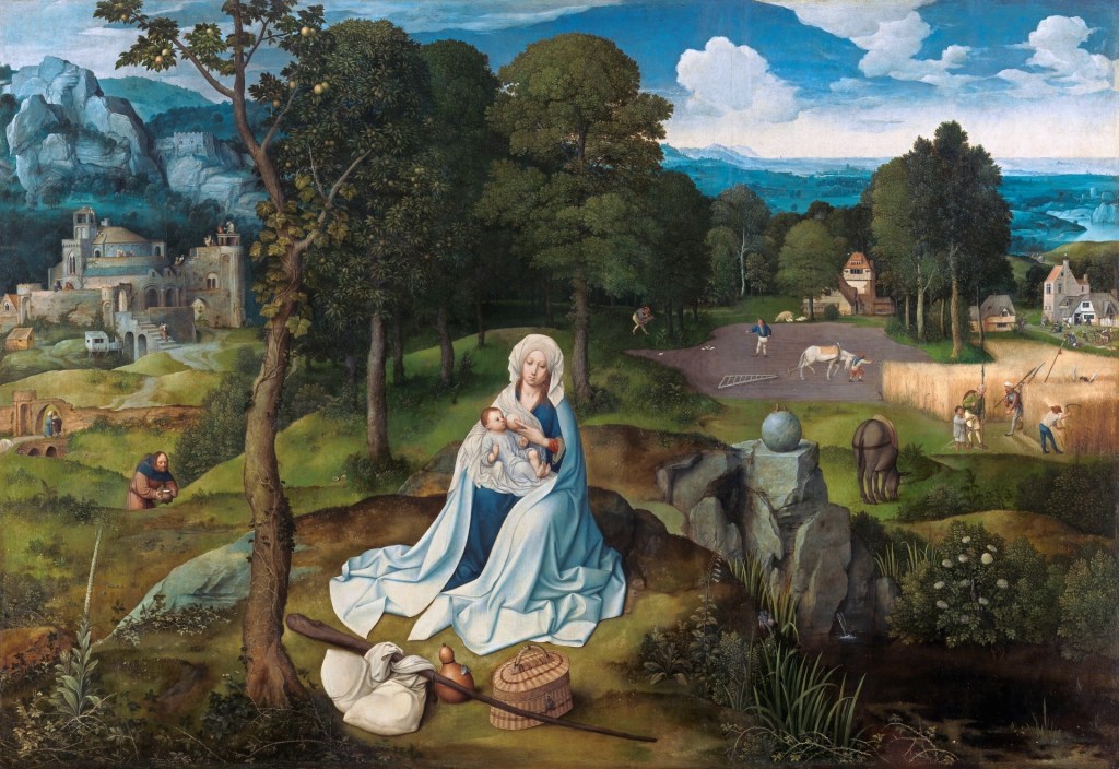
Rest on the Flight into Egypt (1518-20)
Joachim Patinir
Copyright ©Museo Nacional del Prado

Spirin slyly multiplies this trick with his apple pie in the foreground with its tiny characters dancing around it. Yes, this book is going to replay the traditional celebration of the apple pie alphabet, but pay attention to relative sizes. The pie is monumental, larger even than the three-dimensional letter A that sits atop and casts its shadow over the banner of calligraphy, so watch for how the trick of shadows draws attention to perspective, to the roman vs calligraphic letters and to the surfaces on which the letters and tricks of perspective play out.

The very first double-page spread delivers on the cover’s clues and promises.

The oversized carved A serves as an arch to provide an example of a word beginning with A and casts its shadow over the oversized pie and cutting board that a team of elf-sized bakers has borne under it to the applause of mother and children who are mid-sized between the pie and bakers. The A is so oversized that its apex disappears from the image area. Bringing further attention to the image area and deepening its dimensionality, Spirin “cuts” the surface on which it is drawn and curls the cut section against the arm of the A.

In the world of letters, size matters — in the form of the upper and lower cases.

Further drawing attention to the art of illustrating the alphabet, not only does Spirin hand-draw examples of their forms in print and calligraphy, he leaves the guidelines for the base and x-height in place, eliminating them after (or before?) using them as the measure for the base and crust of a miniature pie in the margin. In a sense, the process of lettering has also become the canvas for A Apple Pie.

This process is displayed for every letter. Most also have a small apple vignette in the lower left or lower right corner.
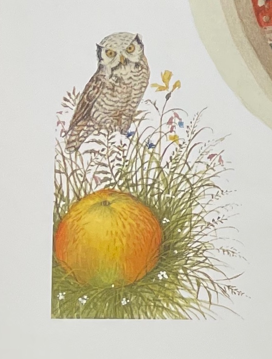
As with the ants surrounding the apple, most of these vignettes serve up images that begin with the letters of their pages (for example, O for owl and P for pig) and are trimmed to re-emphasize the pages’ image space with which Spirin plays.

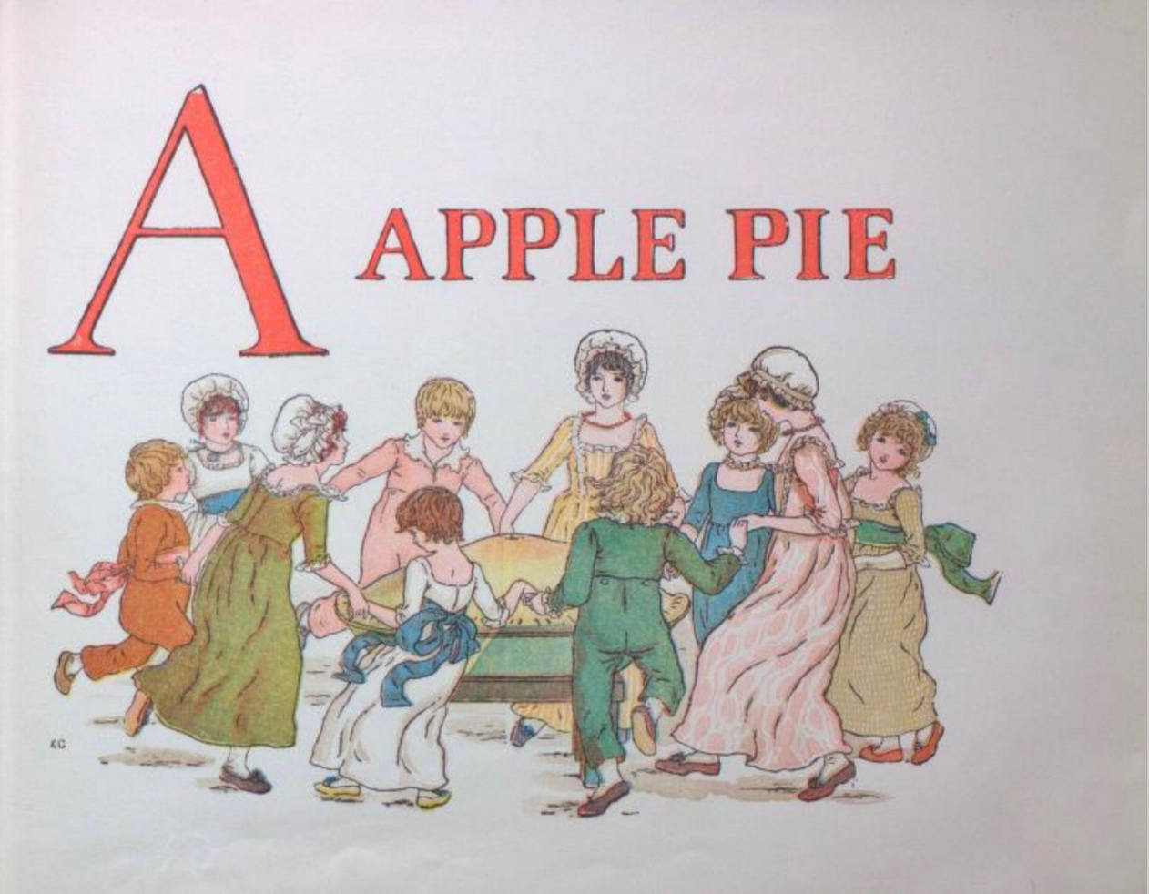
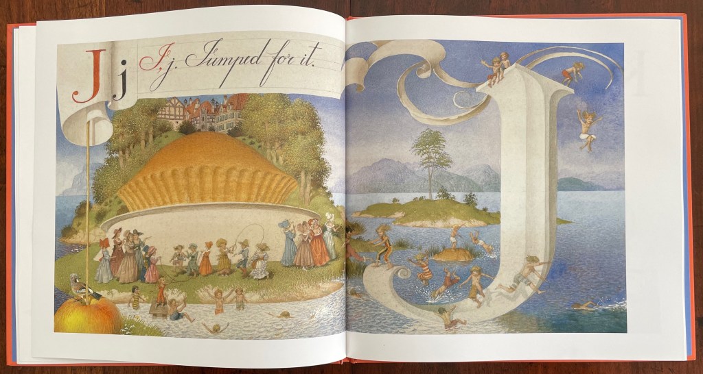
Letters other than A have images that cross the divide of pages. When they do, Spirin’s historical influences ranging from the medieval to the Renaissance to the Victorians stand out even more. His play with figures, color, perspective and shadow in the letter J pages recall Brueghel, Bosch, Patinir and, of course, Kate Greenaway.
Detail from Children’s Games (1560), Jan Brueghel, Kunsthistoriches Museum Wien
Detail from Garden of Earthly Delights (1490-1500), Hieronymus Bosch, Museo del Prado
A Apple Pie (c. 1886), Kate Greenaway, Internet Archive

The tradition of the “apple pie” mnemonic reaches almost as far back as the artistic ones. As noted on Spirin’s copyright page and confirmed in Peter Hunt’s International Companion, alphabet primers based on the mnemonic must have been well known prior to 1671 when the English cleric John Eachard  referred to it. Compiled from the Bodleian Libraries’ record of “apple pie” items in the Opie Collection and from preparation for the exhibition Alphabets Alive!, here is a starting list for the industrious apple-picking artist interested in confecting an extension to the tradition. (Suggested additions to the menu are welcome in the Comments.) Scholarly baker’s apprentices should also start with the dissertation of the appropriately named A. Robin Hoffman (now at the Art Institute of Chicago); see Further Reading below.

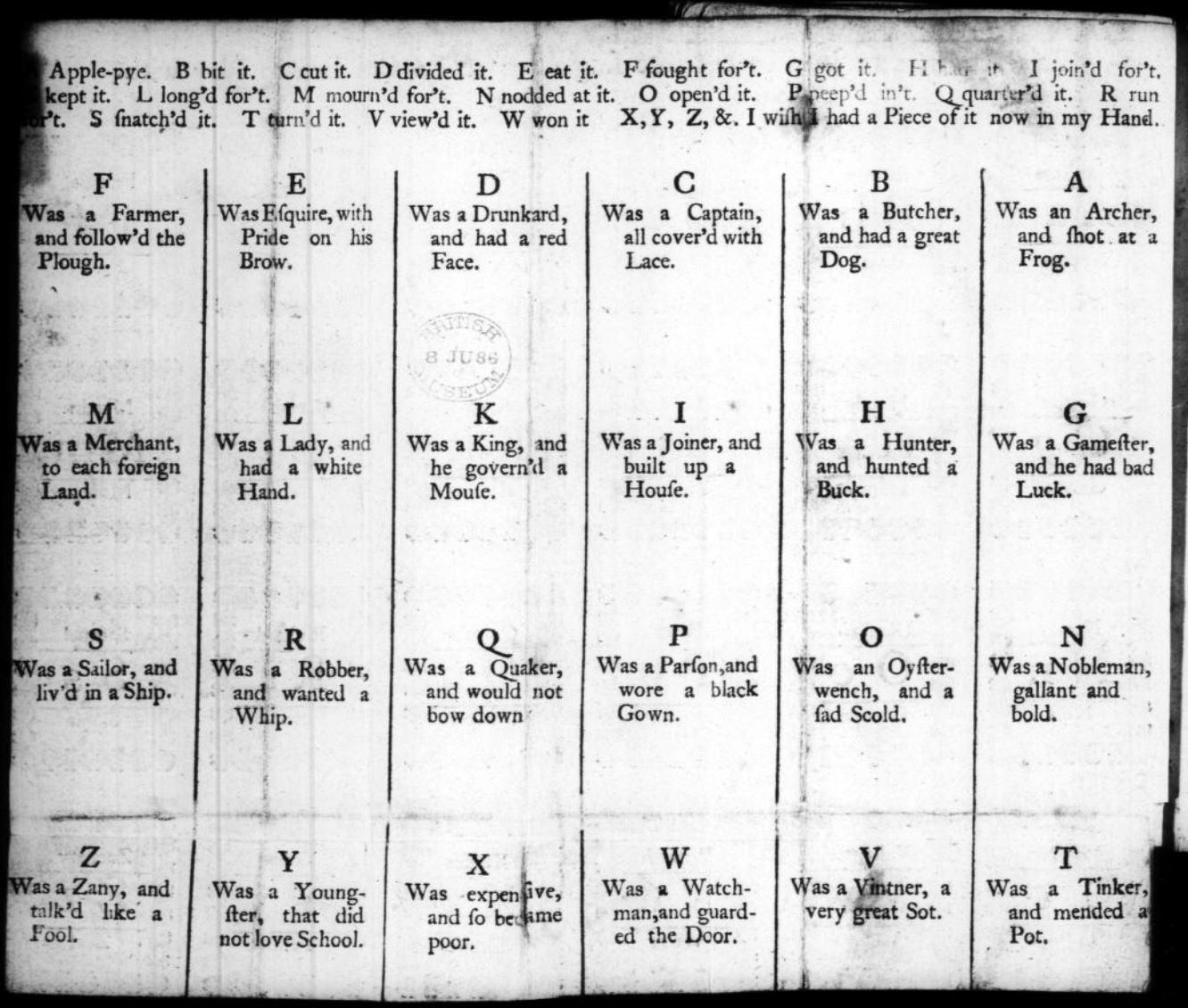
1743. The child’s new play-thing : being a spelling-book intended to make the learning to read, a diversion instead of a task. consisting of scripture-histories, fables, stories, moral and religious precepts, proverbs, songs, riddles, dialogues, &c. the whole adapted to the capacities of children, … or for children before they go to school. London: Mary Cooper.

British Library (formerly British Museum)

1764. Tom thumb’s play-book : to teach children their letters as soon as they can speak. London. Contains “A Apple Pie” as well as “A was an Archer“.

1791. The tragical death of a apple-pye : who was cut in pieces and eat by twenty five gentlemen : with whom all little people ought to be very well acquainted. London: J. Evans. Internet Archive.

1800-12. The Tragical Death of a Apple-Pye, Who Was Cut in Pieces and Eat by Twenty Five Gentlemen with
Whom All Little People Ought to Be Well Acquainted
.
London: Printed for John Evans, 42, Long-lane, West-Smithfield. Folded sheet, as issued. 9.5 x 5.9 cm. Opie N 589.

1808. The History of the Apple Pie. Written by Z. London: John Harris and Son. Opie C 1152. Also viewable here.

1815. The History of Master Watkins : To Which Is Added, The Tragical Death of an Apple-Pie. Chelmsford: Marsden, printer. Opie N 887.

1820. Hone, W. & Cruikshank, G. The Political “A Apple Pie” … by the Author of “The House that Jack Built”. Sixth ed. London: Printed for the Author; sold by J. Johnston. Johnson e.1111.

1820, ca. The History of an Apple-Pie. Written by Z. London: Harris and Son. 17.3 x 10.5 cm. Opie N 582.

1827. The History of A Apple Pie. Written by Z. London: Orlando Hodgson.

1835-57. Marks’ History of an Apple Pie. King Pippin’s Alphabet for Good Children. London: J. Marks.
17 x 10.2 cm. Opie N 588. Also view here.

1836. Bouncing B. The History of an Apple Pie. William Darton and Son.

1837-45. The History of an Apple Pie. London: Darton & Clark. 16 x 10.5 cm. Opie N 583.

1841. The tragical death of an apple pie : who was cut to pieces and eaten by twenty-five gentlemen with whom all little people ought to be acquainted. Printed by J. Paul & Co. London: 2 & 3 Monmouth-court. View here.

1843-49. The History of an Apple Pie; with Ditties for the Nursery, by Dame Dearlove’s Ditties. London: Grant and Griffith. 17.9 x 10.8 cm. Colophon of S & J. Bentley, Wilson, and Fley, Bangor House, Shoe Lane. Opie N 584.

1851-74. The Apple-Pie Alphabet. London: John and Charles Mozley, 6 Paternoster Row. 13.1 x 8.2 cm. Colophon of Henry Mozley and Sons, Derby. This title number 26 in the publisher’s series of penny chapbooks. Opie N 580. See also Opie N 581.

1856-65. The History of an Apple Pie. Written by Z. London: Griffith and Farran. 17.6 x 11.5 cm. Reissue as a rag book of the 1820 edition published by J. Harris. Wrappers have the colophon of H.W. Hutchings, 63, Snow Hill, London. Opie N 585. See also Opie N 586 for larger version (18 x 19.8 cm). From the library of Roland Knaster.

1860, ca. The History of an Apple Pie. London: J. Bysh, 157 & 158 Albany Road, Old Kent Road. 13.6 x 10.7 cm. Opie N 587.

1860, not after. The Apple Pie. London: Darton & Co., 58 Holborn Hill. 25 x 17 cm. Darton’s Indestructible Elementary Children’s Books. Inscription dated 8 February 1860. Opie N 2. Also view here.

1861, not before. The History of A, Apple Pie. London: Dean & Son, Printers, Lithographers, and Book and Print
Publishers, 11, Ludgate Hill. 25 x 16.5 cm. (Dean’s Untearable Cloth Children’s Coloured Toy Books). Opie N 4.

1865, ca. A. Apple Pie. London: Frederick Warne & Co. 26.8 x 22.6 cm. Aunt Louisa’s London Toy Books. Colophon of Kronheim & Co. Opie N 1.

1865-89. The History of A Apple Pie. London: George Routledge & Sons. 31 x 25.2 cm. Rear wrapper has colophon of the lithographer L. van Leer & Co, Holland and 62 Ludgate Hill Opie N 5. Also see Pussy’s Picture Book. Opie N 1017.

1874. Routledge’s nursery album for children. London: George Routledge and Sons. A.

1886, ca. Kate Greenaway. A Apple Pie. London: George Routledge and Sons. Opie N 18. Also view here and here.

1890, ca. E.A. Cooke. The Story of A Apple Pie. London: R. E. King & Co.

1899. A.B.C. of the Apple Pie. Printed on linen. New York: McLouglin Bros. Viewable here.

19__, ca. A Apple Pie. An Alphabet from Modelled Designs by Mrs. Wm. Harbutt. Pen and Ink Drawings by Noel C. Harbutt A.R.C.A. London: Dean & Son, Ltd; Bathampton: W. Harbutt. Plasticine Works & Studio. 25.4 x 18.8 cm. Opie N 3.

1966. The Tragical Death of A. Apple Pie Who Was Cut in Pieces, and Eaten by Twenty-Six Little Villains.
[Whitstable, Kent: Ben Sands at his Shoestring Press]. Leporello. 11.5 x 13.4 cm. #185/225 copies. Gift of Roland Knaster. Opie N 590.

From the Bodleian Librairies’ copy of The Tragical Death … (1966)
Ben Sands
Photo: Books On Books.

1974. William Stobbs. A is an Apple Pie. London: The Bodley Head.

1986. Tracey Campbell Pearson. A Was an Apple Pie. London: Bodley Head.

1987. Gavin Bishop. A Apple Pie. Oxford University Press.

2011. Alison Murray. Apple Pie ABC. London: Orchard Books.

Further Reading

Alphabets Alive!“. 19 July 2023. Books On Books.

Hoffman, A. Robin. 2012. “‘Doubtful Characters’: Alphabet Books and Battles over Literacy in Nineteenth-Century British Print Culture“. Diss. University of Pittsburgh.

Hunt, Peter. 2004. International Companion Encyclopedia of Children’s Literature. 2nd ed. London: Routledge, p. 179.

Webb, Poul. 2017~ . “Alphabet Books — Parts 1-8” on Art & Artists. Google has designated this site “A Blog of Note”, well deserved for its historical breadth in examples, clarity of images and insight.
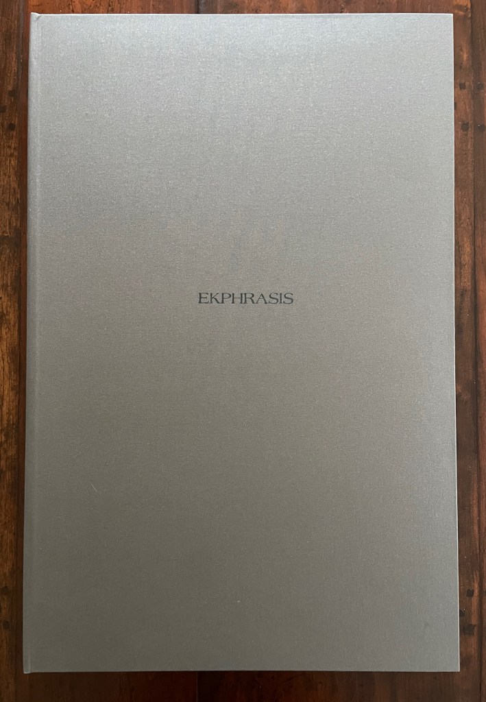
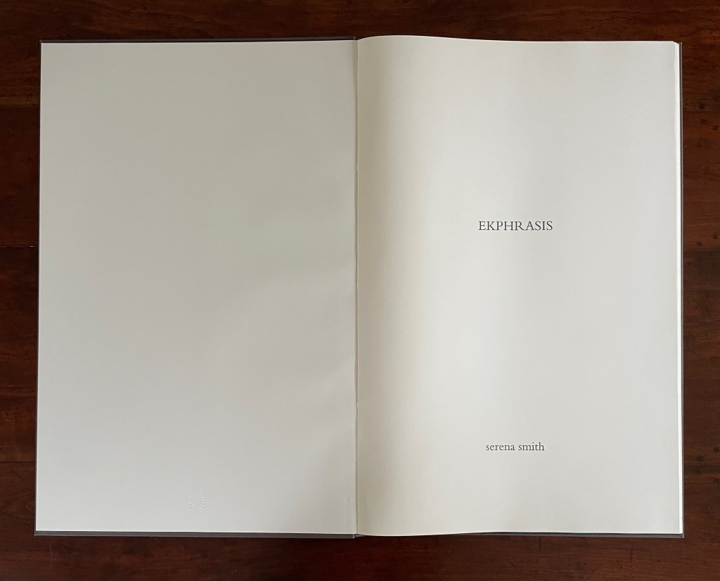
Books On Books Collection – Serena Smith

Ekphrasis (2020)

Ekphrasis (2020)
Serena Smith
Case bound with letterpress printed cloth cover H700 x W460 x D20 mm. 23 folios: 2 end leaves, 1 title, 10 hand-colored images printed on to 225gsm Simili Japon, 10 bronzed text printed onto translucent paper. Edition of 5, of which this is #5. Acquired from the artist, 5 January 2023.
Photos: Books On Books Collection. Photos and videos: Courtesy of the artist. Displayed with permission of the artist.

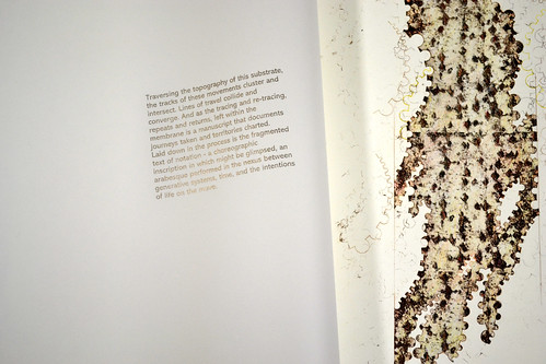
The word ekphrasis refers to the literary practice of verbally representing a visual representation. Think of the poets Keats, Auden and Jarrell using words to “recreate”, re-present, evoke or respond to works of art — an antique urn, a painting by Brueghel, or Donatello’s sculpture of David. Novelists, too. Think of Henry James’ The Ambassadors in which the narrator Lambert Strether describes an imagined stroll through a landscape painting he’s viewing.

Serena Smith has a different point of departure for Ekphrasis. Her dwelling and studio back onto a Leicestershire country park — “part arboretum and part community”. Highlighted with maple, Tibetan cherry and Himalayan birch, the planted woodland of ash and beech with its defined paths offers up “artefact of living trees” as much a constructed work of visual art as any urn, painting or sculpture.

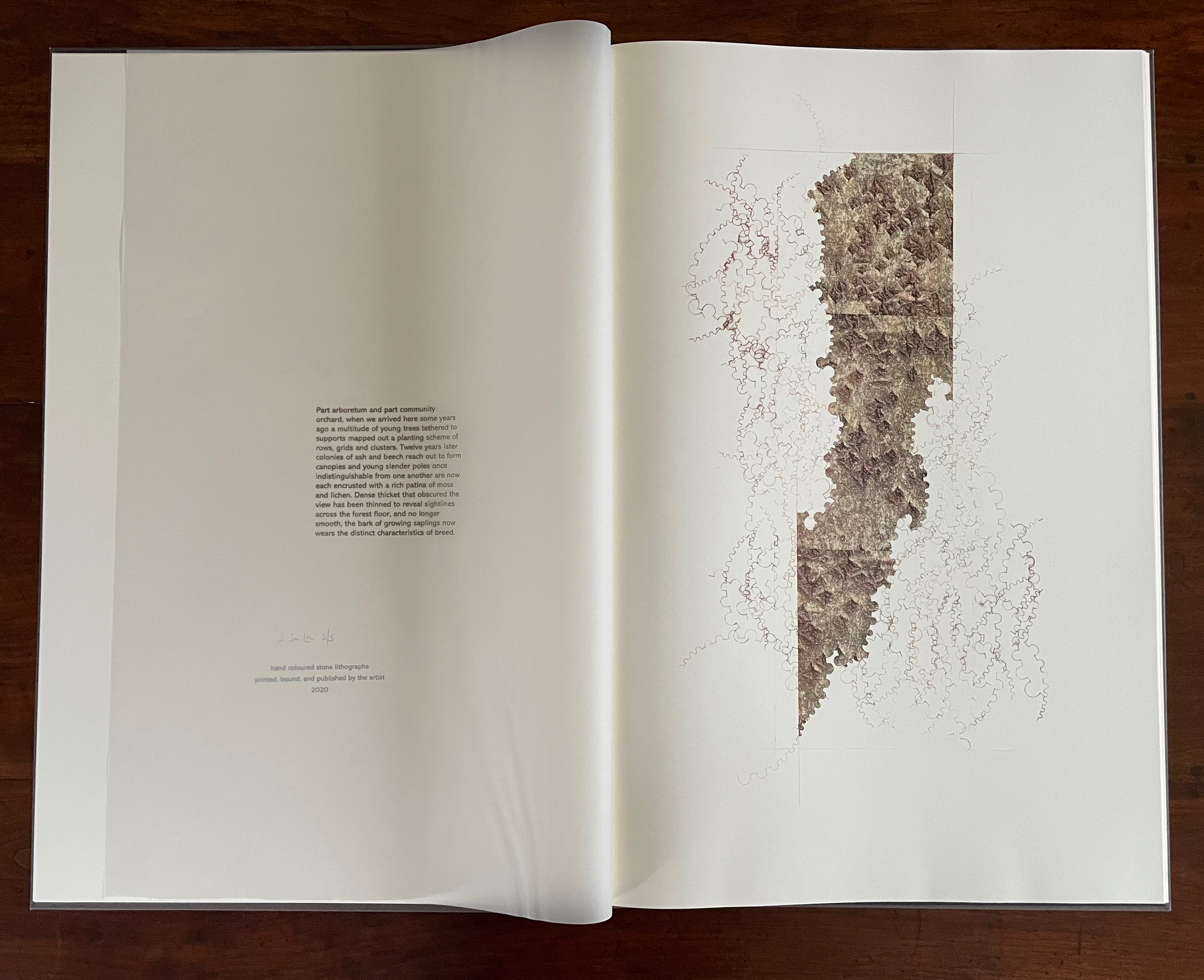
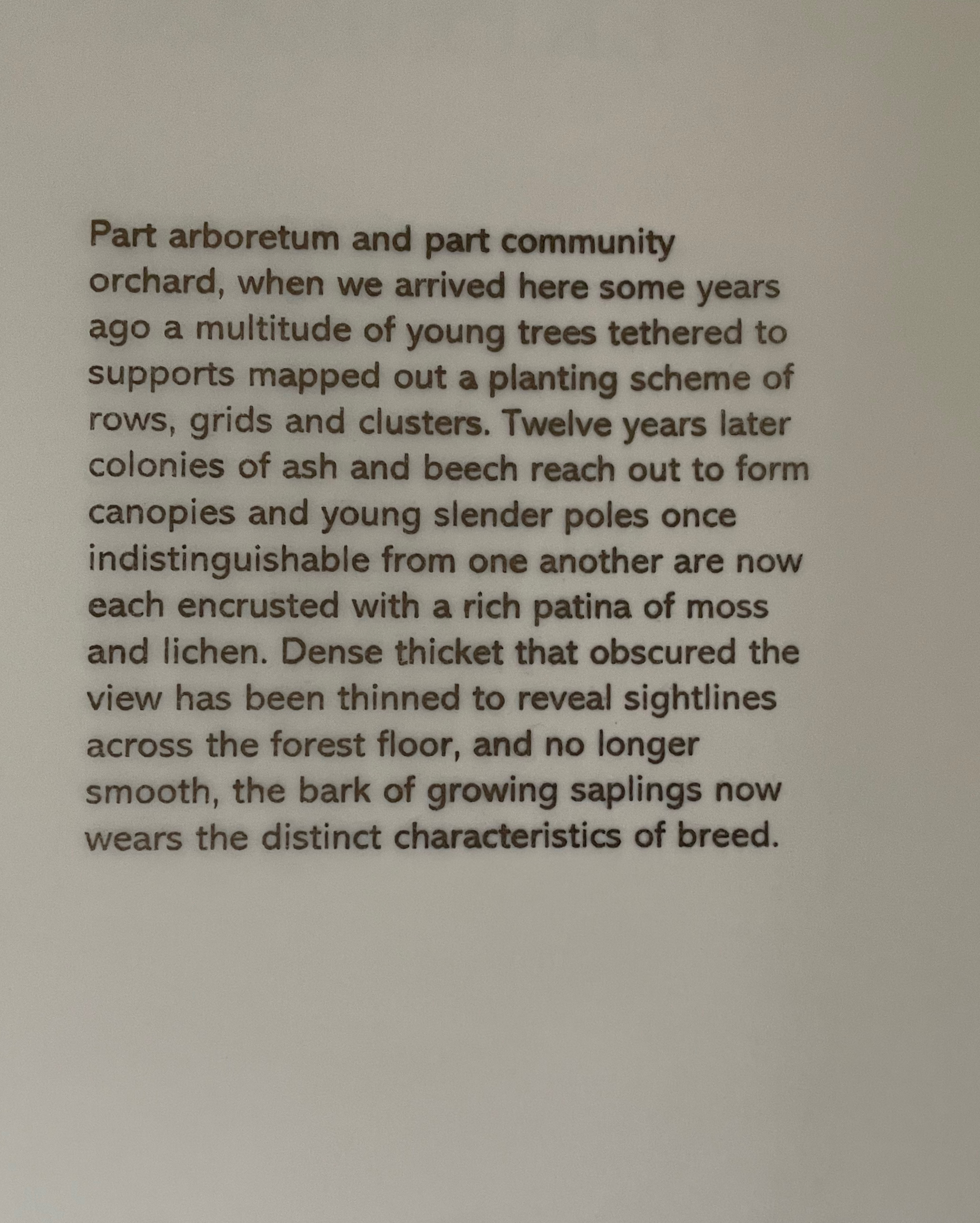
In this bookwork, ten pages of text printed on translucent paper overlay ten images printed from stone. The text reflects on the “wandering, watching and thinking that happens in the parkland”, but then it turns internally to the studio, the ephemera collected from the woodland, and the stage before the images come into being. The process of making becomes an object of the ekphrastic text: smoothing the stone, using a tool to guide the pencil, sharpening the pencil. And gradually the work reveals itself as a self-reflexive meditation on natural and artificial creation, on word and image, and on trace lines of growth and decay.

The translucent pages of text create a palimpsest-like effect over the folios of images. Until the translucent folio turns, the text is indecipherable. As the pages turn, the textual and pictorial play off one another.

Close-up of text

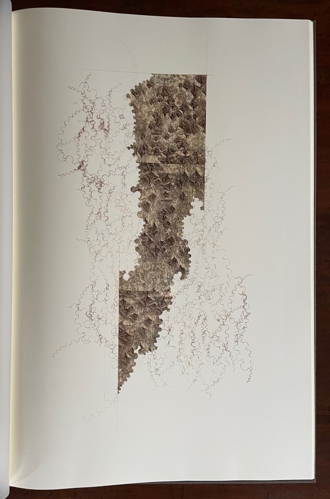
Single-page view of first lithograph

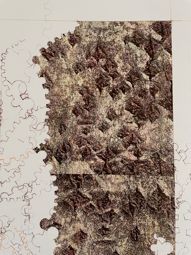
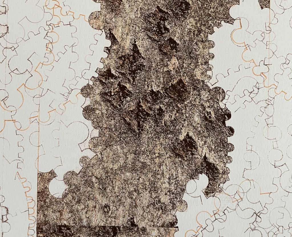
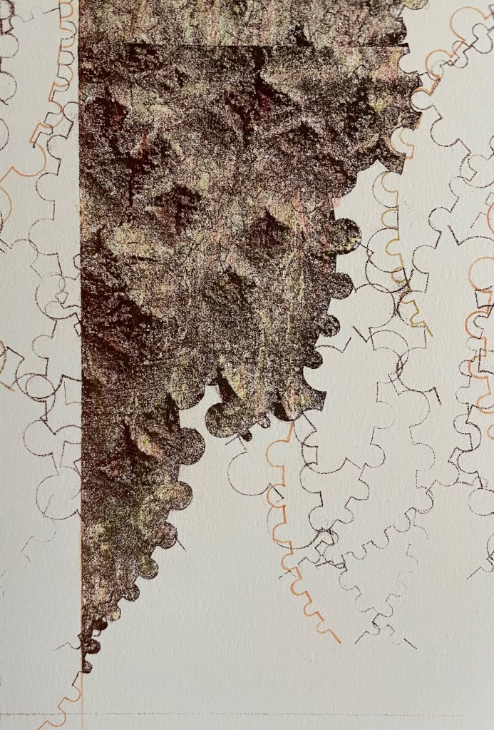
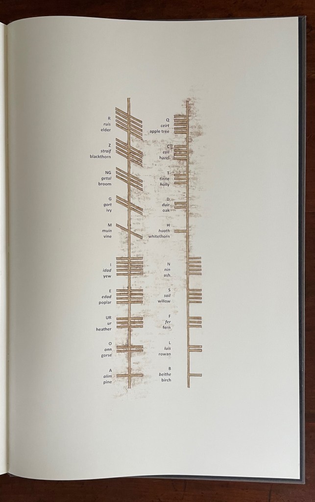
The lithographic image divides into three parts. The jigsaw-like lines around the image of bark come from a stencil tool, and the result chimes with planning lines of landscape architecture, feeding insects’ tracks in the bast, the shape of lichen and ultimately the Ogham runes mentioned in the text and depicted at the end.

First of three-part close-up of the first lithograph

Second of three-part close-up of the first lithograph

Third of three-part close-up of the first lithograph

Glossary

The following ekphrastic words bring the lithographic process to life. Taken together, the glossary, Smith’s descriptive text, and its ekphrastic focus on the lithographic process transform her stone into a kind of Ogham stone itself.

As the drawing progresses I wonder if the hands of Celtic scribes also tired, whilst scoring the lines of Ogham script into fragments of wood. Cutting short repeated grooves against the grain an effort would have been felt, different to that which allowed the tool to willingly travel along the pathways of growth. Perhaps they too made use of a device to control the errant gesture, and aid inscription of measured lines of written text. This can only be speculated.

What the remaining Ogham stones do tacitly share are ciphered incisions that scale their lichen clad faces with a purposeful regularity that resists embellishment. Contouring the edges, the cut lines navigate uneven corners without detour, and prompt me to ask if these scribes, flesh pressed into stone, also briefly held their breath while negotiating the changes in direction prescribed by the matrix.

A version of the text and all of the images can be found in Smith’s brief essay published by IMPACT Printmaking Journal (Spring 2020) and in the following slide show (courtesy of the artist).

Ekphrasis pp. 34,35 detail

Further Reading

Abecedaries I (in progress)“. Books On Books Collection.

Brynja Baldursdottír“. 10 March 2023. Books On Books Collection.

Notes on “Inverse Ekphrasis” as a way into book art“. 16 June 2022. Bookmarking Book Art.

Ager, Simon. “Ogham“. Omniglot: The Online Encyclopedia of Writing Systems and Languages. Accessed 10 February 2023.

Tompkins, Willis W. 1960. Ogham : A Brief Account of the Language and Its Alphabets, Usages by the Druids, and Some Applications in Cryptology ; the Whole Compiled from Various Sources, Edited, Arranged and Furnished with Examples of Alphabets Engraved on Wood. New York: Ogham.

Graves, Robert, and Eileen Hogan. 1978. Ogham : Each Letter of the Alphabet Is Presented with a Colour and Bird All Three Beginning with the Same Initial ; the Whole Alphabet Forms a Calendar of Seasonal Bardic Lore Based on an Interpretation by Robert Graves of the Cyphers Used in the Book of Ballymote. London: Burnt Wood Press.

Books On Books Collection – Honorine Tepfer

UN COUP DE DÉS JAMAIS N’ABOLIRA LE HASARD: POÈME (1989)

UN COUP DE DÉS JAMAIS N’ABOLIRA LE HASARD: POÈME (1989)
Stéphane Mallarmé (text); Honorine Tepfer (art & design)
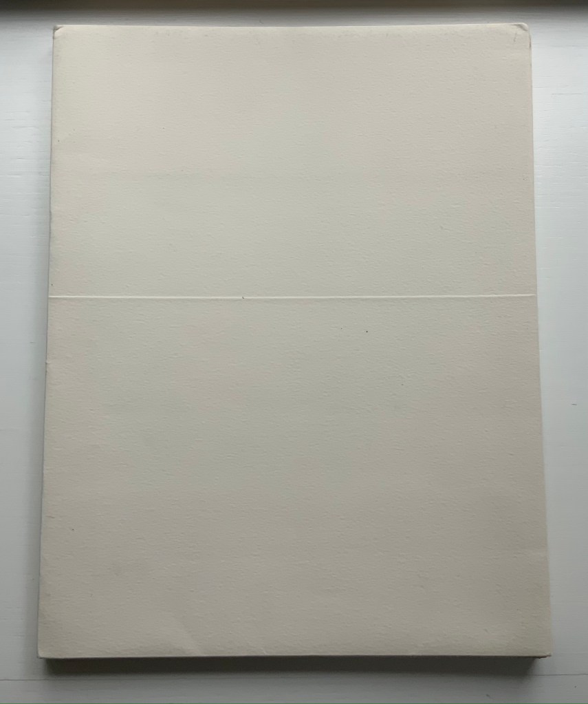
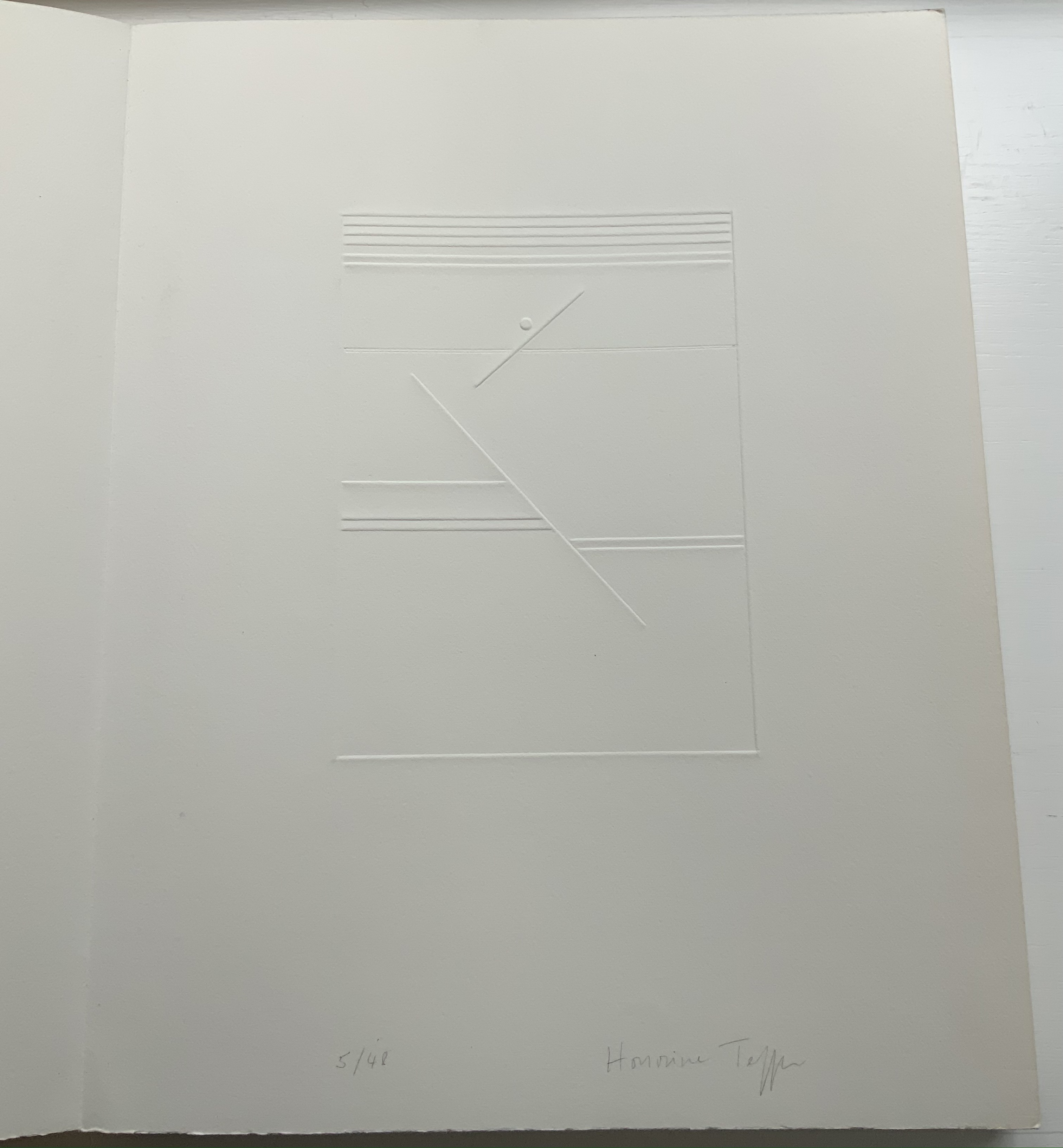
Accordion fold with embossed paper cover. Cover – H325 x W255 mm; Book – H320 x W250 mm, 34 pages. Edition of 48, of which this is #5. Acquired from Studio Montespecchio, 2 February 2022.
Photos: Books On Books Collection. Displayed with permission of the artist.

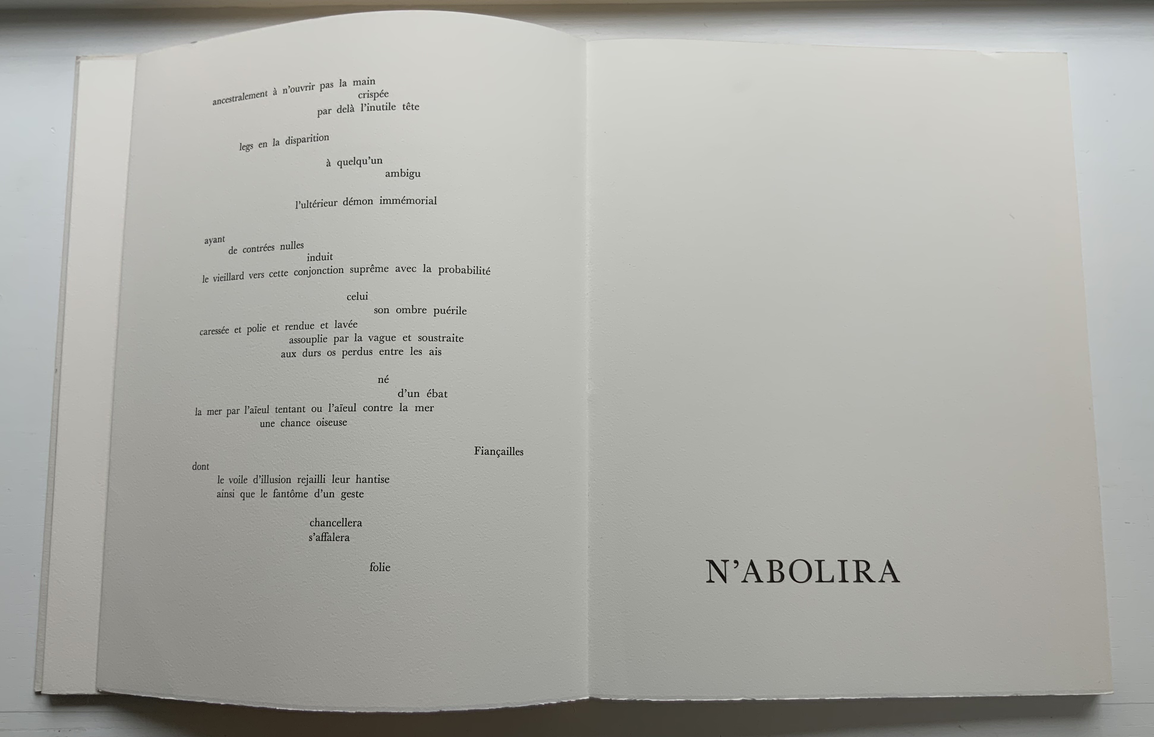
Before his sudden death in 1898, Stéphane Mallarmé was planning a deluxe edition of Un Coup de Dés Jamais N’Abolira le Hasard with Ambroise Vollard, an entrepreneur and publisher. A single-volume version of the poem did not appear until 1914. Issued under the direction of Mallarmé’s son-in-law Dr. Edmond Bonniot through the Nouvelle Revue de France (NRF), it omitted intended prints by Odilon Redon, used the typeface Elzevir rather than the Didot that Mallarmé preferred, and did not precisely follow his layout. We know all this because of correspondence between the poet, Redon and Vollard and because the Sorbonne’s Bibliothèque littéraire Jacques Doucet and Harvard’s Houghton Library hold proofs of the deluxe edition with Mallarmé’s handwritten corrections and instructions.

Mallarmé’s placement of words and lines was intentional and precise. Even before the planning for the deluxe edition, he wrote of what could be achieved with type size and layout:

Pourquoi — un jet de grandeur, de pensée ou d’émoi, considérable, phrase poursuivie, en gros caractère, une ligne par page à emplacement gradué, ne maintiendrait-il le lecteur en haleine, la durée du livre, avec appel à sa puissance d’enthousiasme: autour, menus, des groupes, secondairement d’après leur importance, explicatifs ou dérivés — un semis de fioritures. [Oeuvres Complètes, 2 227]

“Why — couldn’t a considerable burst of greatness of thought or emotion, carried in a sentence in large typeface, gradually placed with one line per page, hold the reader’s bated breath throughout the entire book by appealing to his or her power of enthusiasm: around this [burst], smaller groups of secondary importance, explicating or deriving from the primary phrase — a scattering of flourishes.” [Arnar, 234]

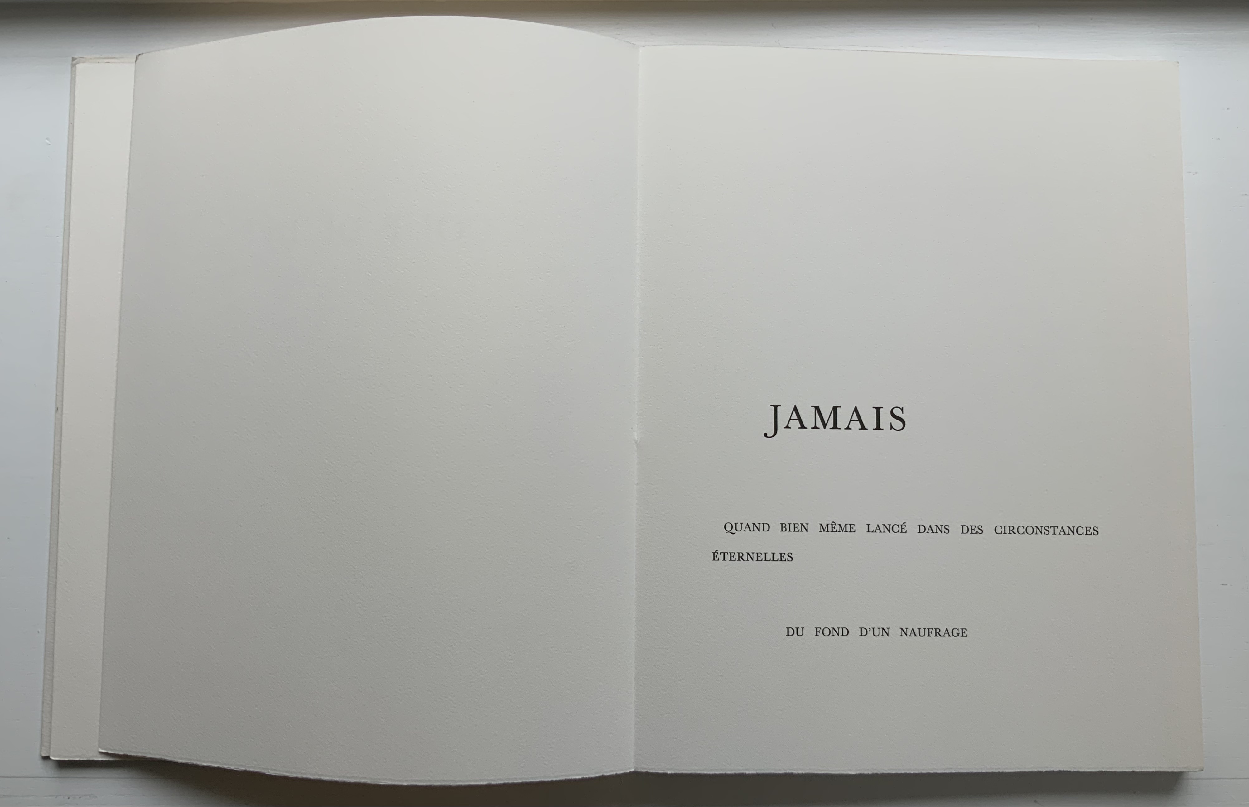
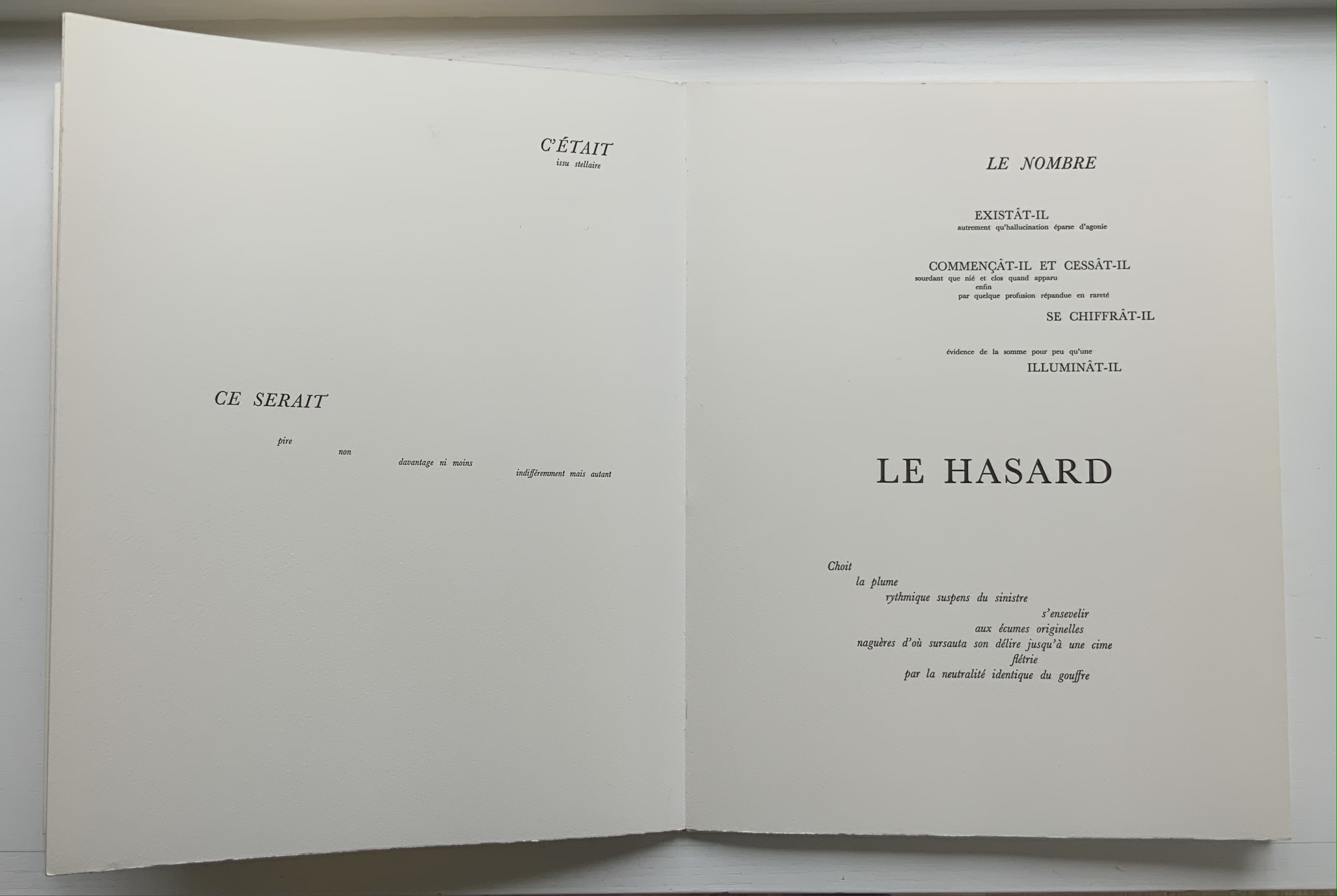
The NRF edition 1914 edition makes quite a few sad missteps as Robert Cohn pointed out in 1967. Tepfer’s inspiration to restore the intended layout follows in the footsteps of Mitsou Ronat & Tibor Papp (1980) and Neil Crawford (1985). She visited the Doucet library to examine the proofs and layout. Following the layout was not difficult, but with the scarcity of Didot, Tepfer needed to select another typeface. She chose Baskerville. Given that Firmin Didot was inspired by John Baskerville’s experimentation with thick and thin strokes, the choice adds historical interest, although Bodoni might have been nearer the mark. Below are Tepfer’s double-page spreads across which Mallarmé’s burst of thought appears one line per page among the “scattering of flourishes”.

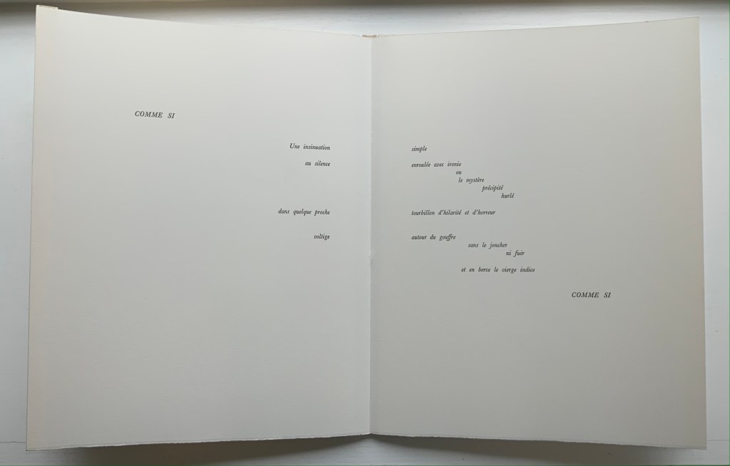
The book’s central double-page spread, beginning with COMME SI / “AS IF”) in the upper left and ending with COMME SI / “AS IF” in the lower right, mimics the throw and fall of the dice and provides another example of the semantic and typographic play that Mallarmé describes above.

Like the artists before her — Redon (1897), André Masson (1961), Mario Diacono (1968), Marcel Broodthaers (1969), Jean Lecoultre (1975), Ian Wallace (1979) and Ian Tyson (1985) — Tepfer had to solve the puzzle of relating image to text. This is the difficult path of inverse ekphrasis: what and how the visual, tactile and conceptual works of art that come after Mallarmé’s text can be. We are more used to ekphrasis where the object, painting or sculpture comes before the text — like Achilles’ shield before Homer’s description, or the Grecian urn before Keats’ ode, or Brueghel’s Fall of Icarus before Auden’s Musée des Beaux Arts. Homer, Keats and Auden vie with the art of the crafted object to put that object (and more) in front of us with words. With the inverse, the crafted objects vie without the words to put Mallarmé’s poem (and more — and sometimes less!) in front of us. Tepfer’s solution?

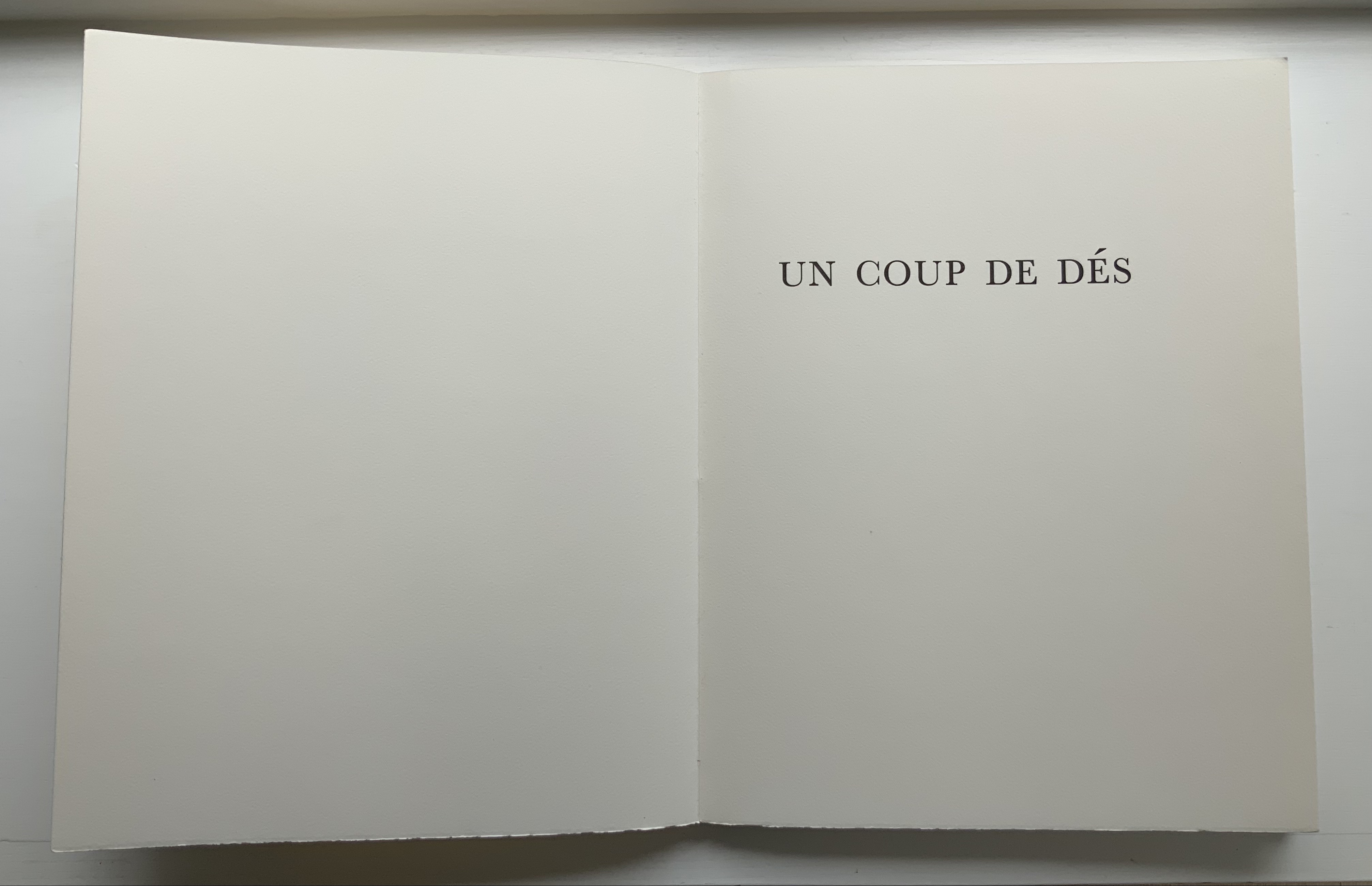
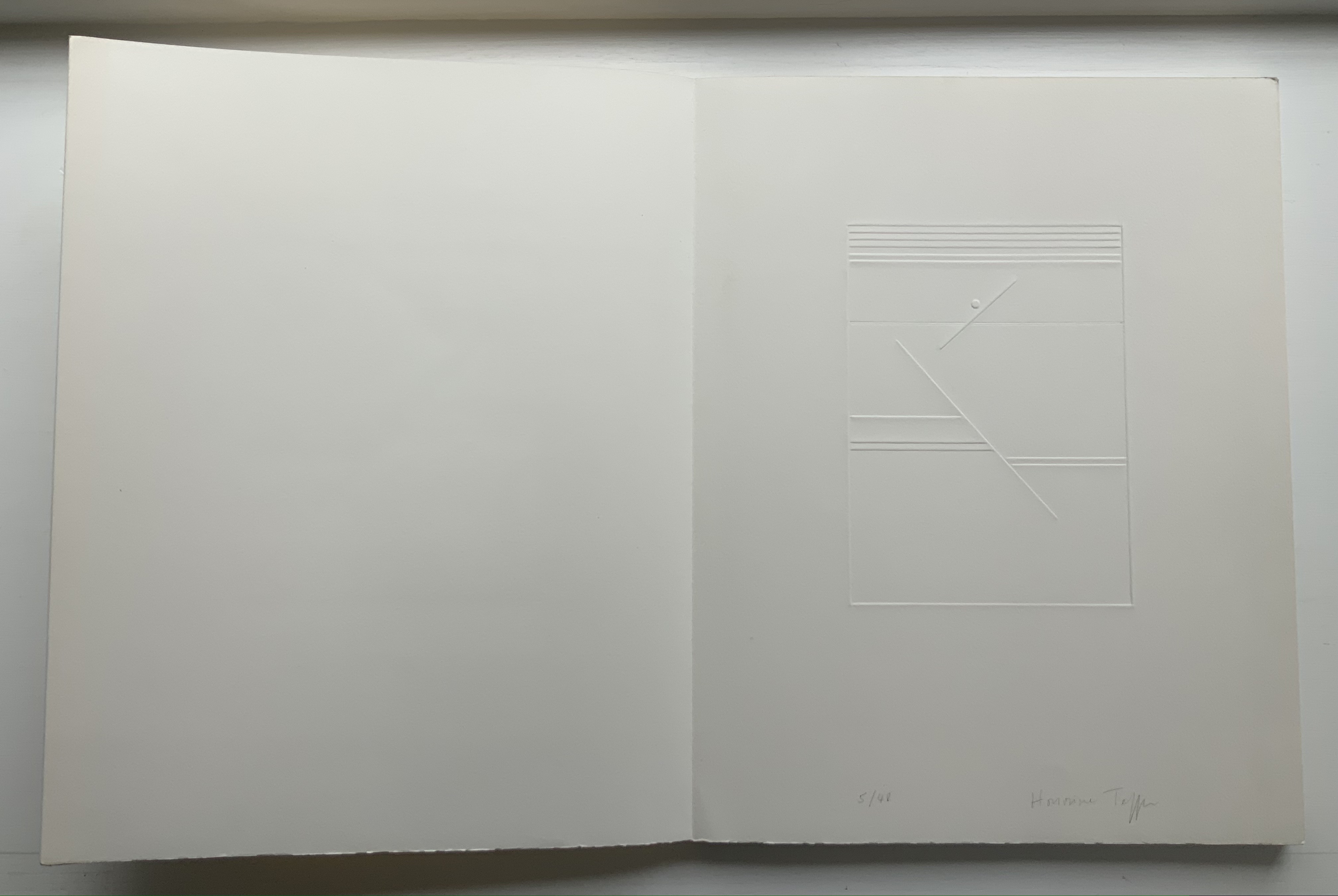
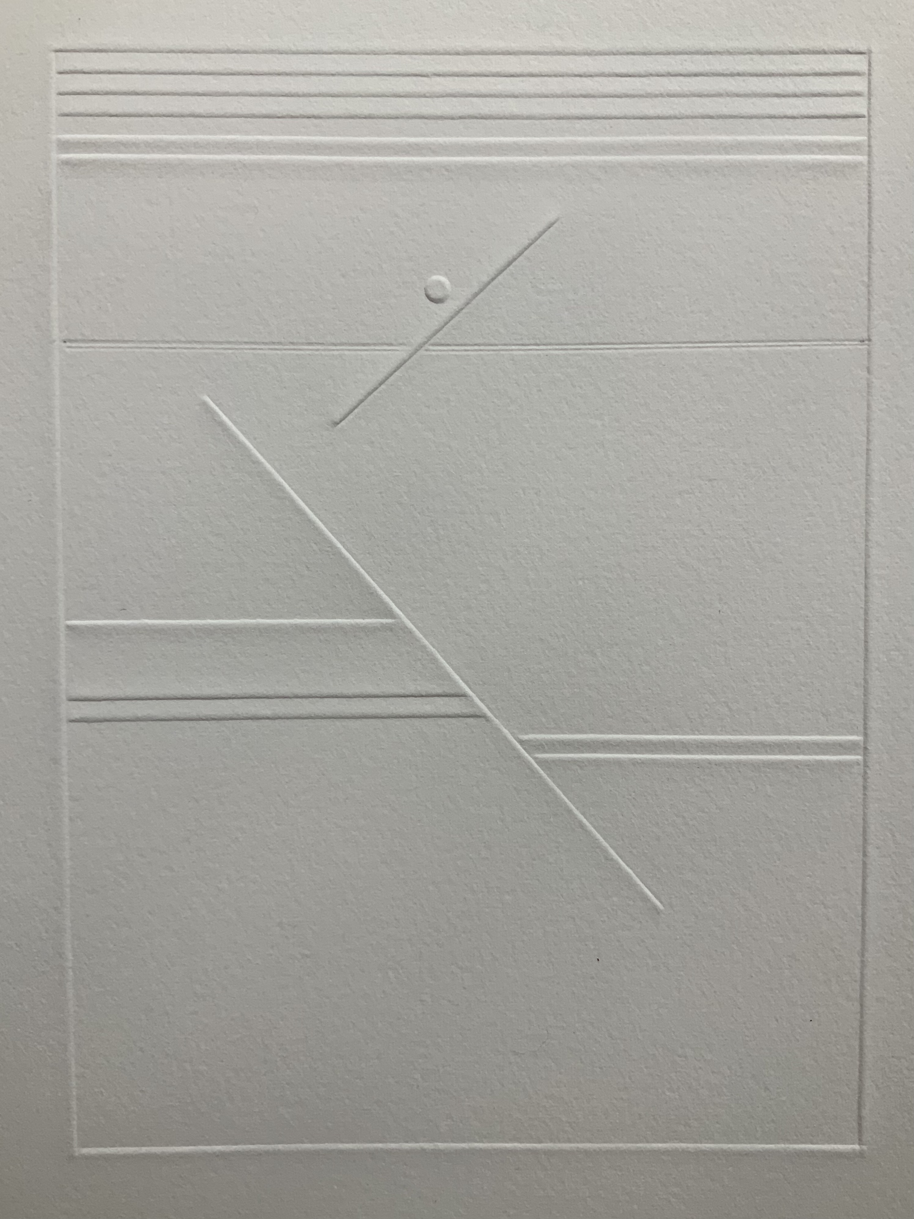
A simple line runs across the debossed front and back covers. As Tepfer wrote in June 1990 about her journey into Un Coup de Dés: La ligne d’horizon était un sujet de ma hantise / “The horizon line was my obsession”. As the folded paper cover opens, a single geometric, abstract image appears — debossed and embossed on blank paper. Except for a single round dot, everything is linear. Two separate lines angle across the space. One cuts through the debossed horizon line that lies beneath a series of closely spaced horizontal lines — suggesting clouds? The other, longer one cuts at a different angle, creating a foreground from two sets of parallel lines that have slipped or shifted like tectonic plates. Could the round dot be the single-dot side of a die rolling down a slanted deck or broken mast? Could the longer slanted line be a broken mast? Could the shifted parallel lines be a broken handrail?

Rather than trying to track back to verbal images in the poem, though, perhaps we should recognize Tepfer’s prefatory image as a kind of substitute for Mallarmé’s preface in 1897 — the one he preferred we not read. He wanted us to look. To see les blancs. To hold thought and emotion like our breath across the space of the book. With her simple rectangle of blank paper, with the absence of ink, with the geometric solidity of the horizontal and slanting lines, and with the velvet softness of the velin d’Arches across her version’s accordion folds, Tepfer encourages us to look, see, hold meaning in abeyance and sense it.

Further Reading

“Mitsou Ronat & Tibor Papp“. 16 November 2020. Books On Books Collection.

Ian Tyson & Neil Crawford“. 7 February 2022. Books On Books Collection.

Arnar, Anna Sigrídur. 2011. The book as instrument: Stéphane Mallarmé, the artist’s book, and the transformation of print culture. Chicago: The University of Chicago Press. Pp. 231-35, 348n.

Cohn, Robert Greer. 1967. Mallarme’s masterwork: new findings. The Hague: Mouton.

Mosley, James M. 7 November 2011. “Elzevir Letter“. Typefoundry: Documents for the History of Type and Letterforms. Accessed 28 March 2022.

Tepfer, Honorine. June 1990. “Toute realité se dissout”. La Part du Livre, No. 2. Paris: Ed. Le Temps qu’il fait.

Books On Books Collection – Michalis Pichler

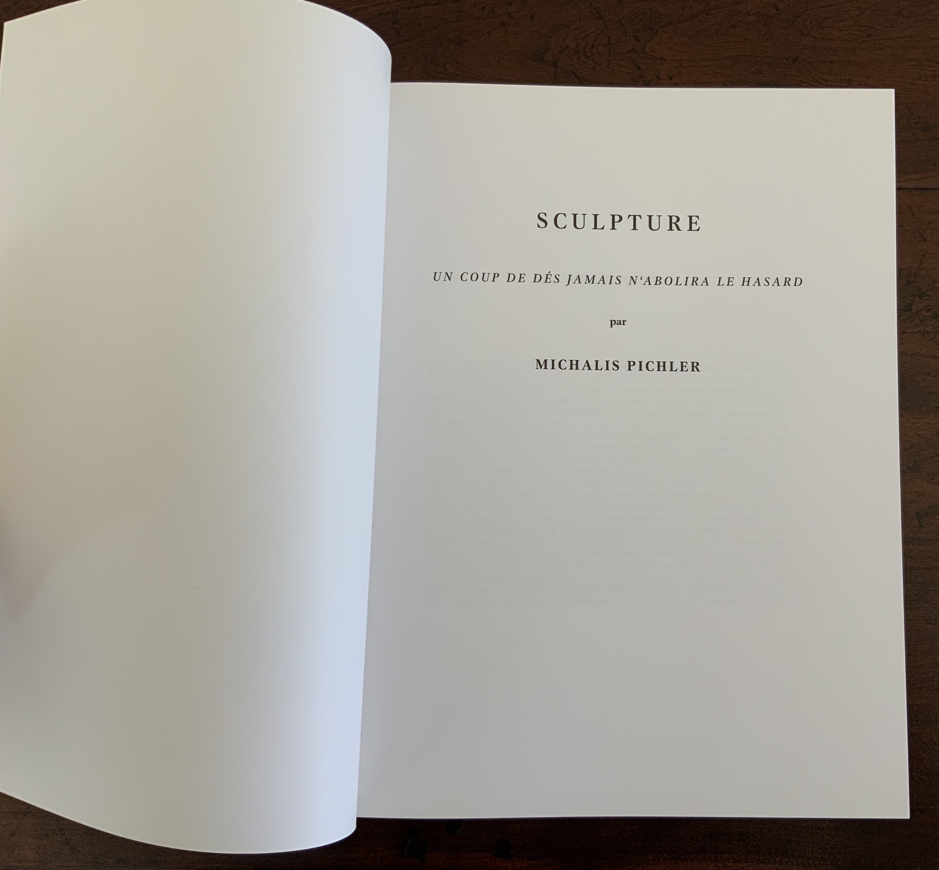
Un Coup de Dés Jamais N’Abolira le Hasard: Sculpture (2008)

Un Coup de Dés Jamais N’Abolira le Hasard (Sculpture) (2008)
Michalis Pichler
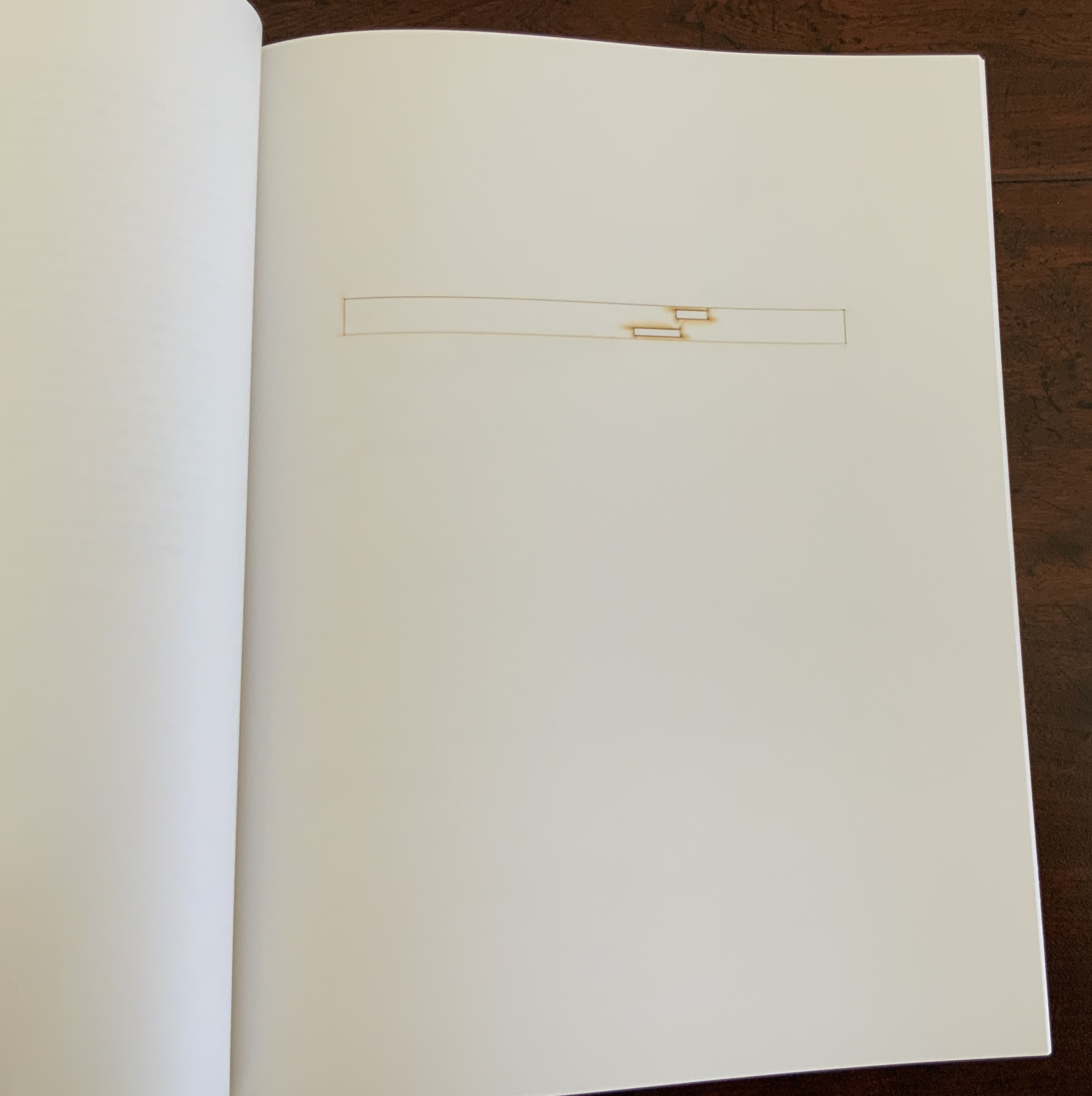
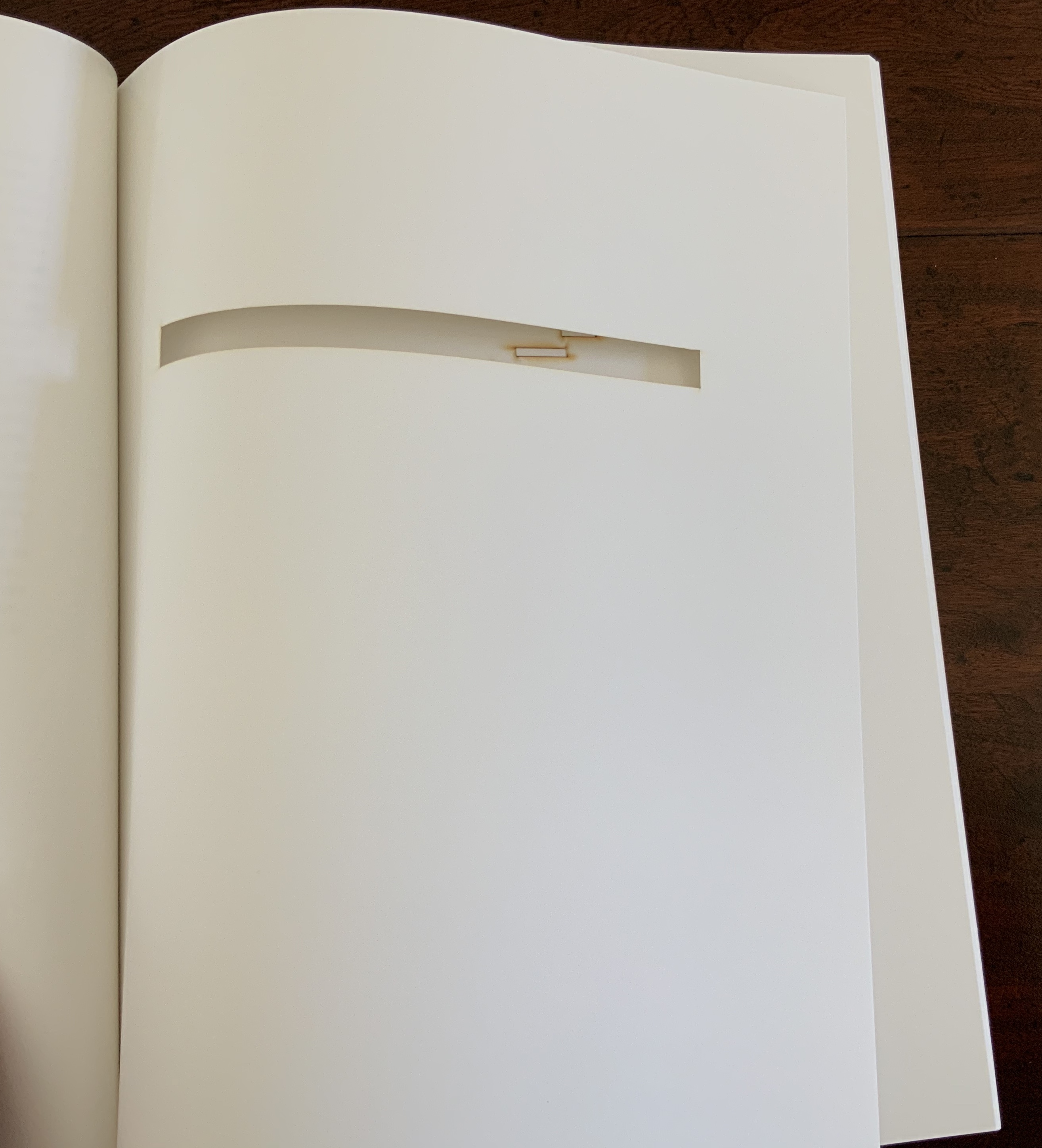
Offset and laser gravure, perfect binding. H325 x W250 mm, 32 pages. Acquired from Printed Matter, 10 April 2020.
Photos: Books On Books Collection.

Appropriated and sculpted bookwork was taking off in numerous forms even before 1964 when Marcel Broodthaers half-embedded the last fifty copies of his poetry book Pense-Bête in plaster. Bruno Munari had introduced libri illeggibili (“unreadable books”) in 1949. John Latham had already encased books with plaster in Shelf Number 2 (1961) and much else in his various skoob works. Tom Phillips’ line-by-line, found-book alteration A Humument was underway, first appearing in 1970, as was Dieter Roth’s string of sausage books Literaturwurst (1961-74). So Broodthaers could have taken any of several directions before deciding to replace Mallarmé’s lines of verse in Un Coup de Dés N’Abolira le Hasard: Poéme (1914) with printed and engraved placeholders in paper and anodized aluminum, respectively, to create Un Coup de Dés N’Abolira le Hasard: Image (1969).

Le Vite dei Libri 26 directed by Giulio Maffei, 12 January 2016. Accessed 14 August 2020.

Son of Giorgio Maffei (bookseller, curator, scholar and book artist in his own right), Giulio Maffei has made video catalogues for Studio Bibliografico Giorgio Maffei since 2015. Each catalogue is a work of video. In this twenty-sixth outing, Maffei has created a video from the 1914 edition and Broodthaers’ 1969 Image version of Un Coup de Dés.

By 2008, Michalis Pichler had an even greater wealth of forms from which to choose for his double appropriation/homage to Mallarmé’s Poème and Broodthaers’ Image. Since the ’80s scores of book artists had been introduced to ingenious structures by Hedi Kyle and Keith A. Smith, among others, so why not an Aunt Sally’s shipwreck of string, canvas and torn paper? Long-Bin Chen had been sanding books and phone directories into busts since the ’90s, so why not a bust of Mallarmé from old editions of Un Coup de Dés and a bust of Broodthaers from catalogues of his works (a variation on Buzz Spector’s treatment)?

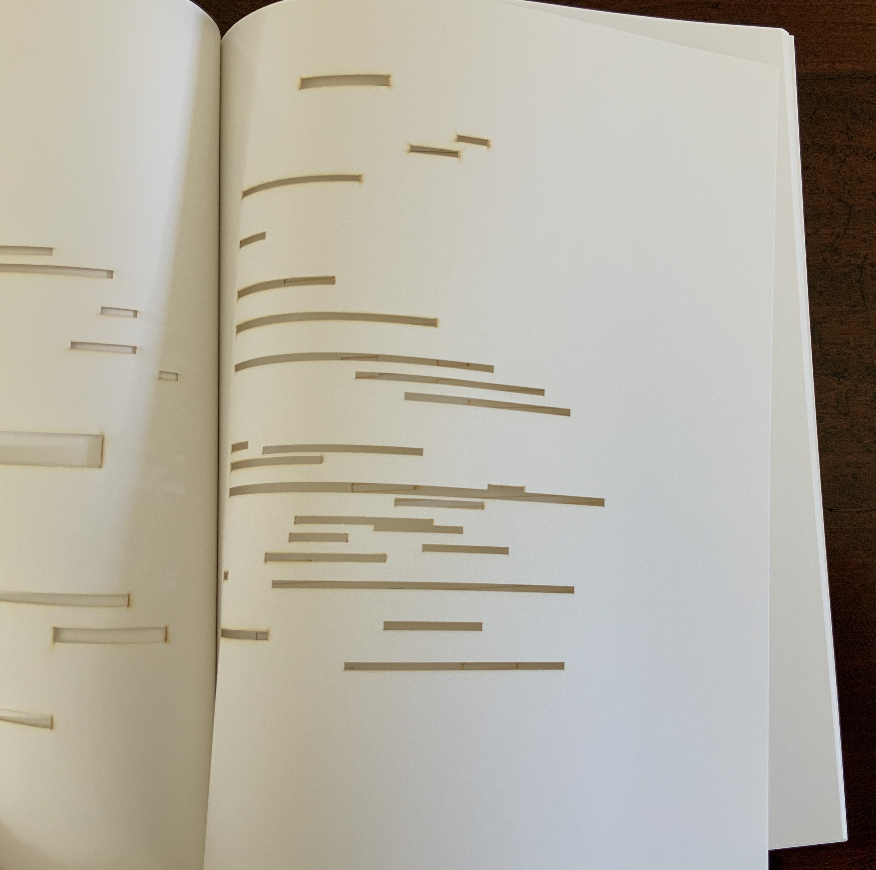
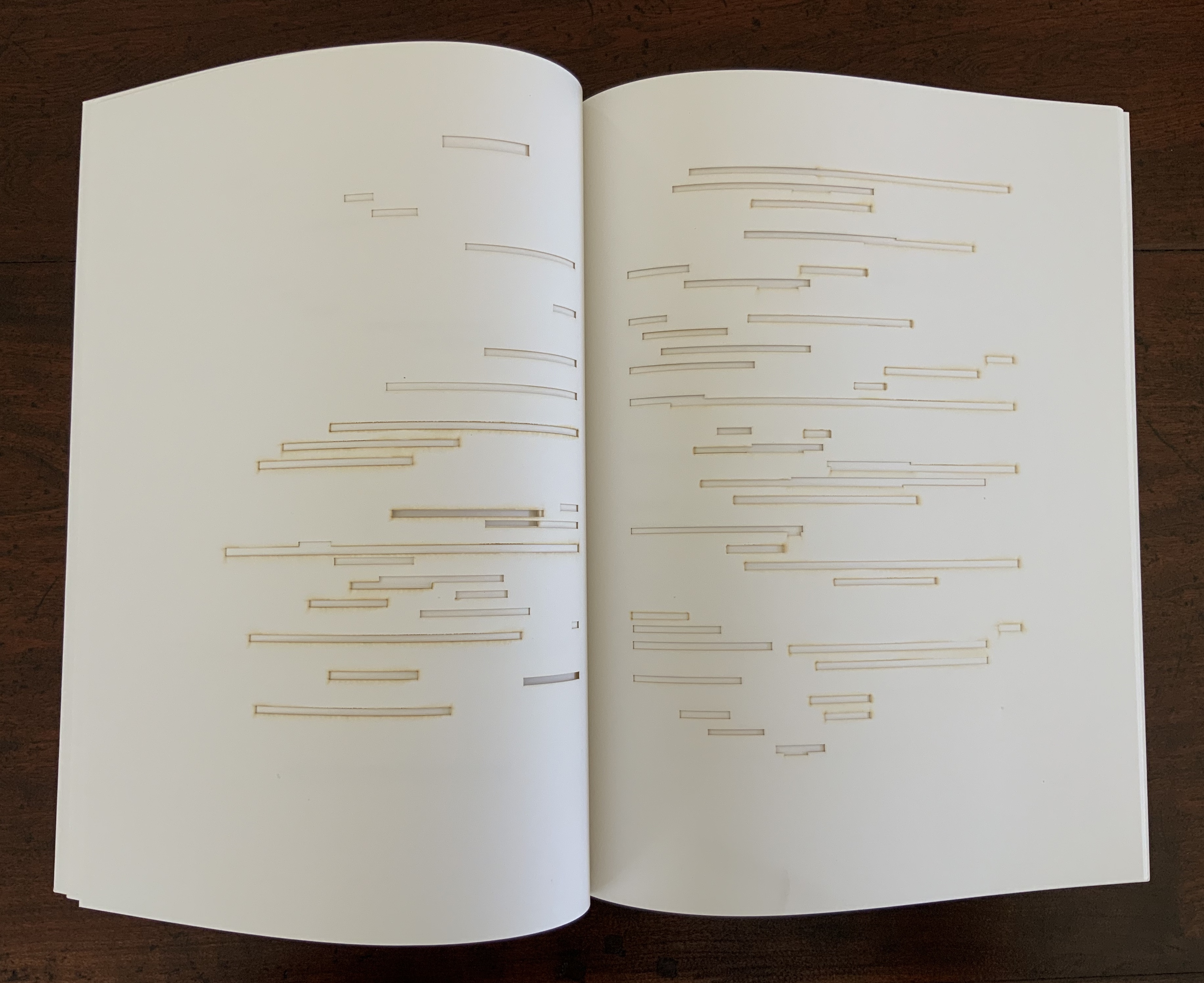
Instead Pichler appropriates Mallarmé through Broodthaers’ design and production: an efficient and direct double appropriation. He follows the trim size and layout of the 1914 and 1969 works. Further underscoring the double appropriation, he reprints verbatim Broodthaers’ preface (the full text of Mallarmé’s poem set in small type as a single paragraph with obliques separating the lines of verse). Like Broodthaers, he produced limited editions of three versions: 10 copies in plexiglas (rather than Broodthaers’ 10 in anodized aluminum), 90 copies in translucent paper (just as Broodthaers had done) and 500 copies in paper (rather than Broodthaers’ 300). Where Broodthaers had solid black stripes, though, Pichler substitutes laser cuts in the translucent and paper editions and engraving or abrasion in the plexiglas edition. Hence Sculpture (2008), rather than Image (1969) or Poème (1914).

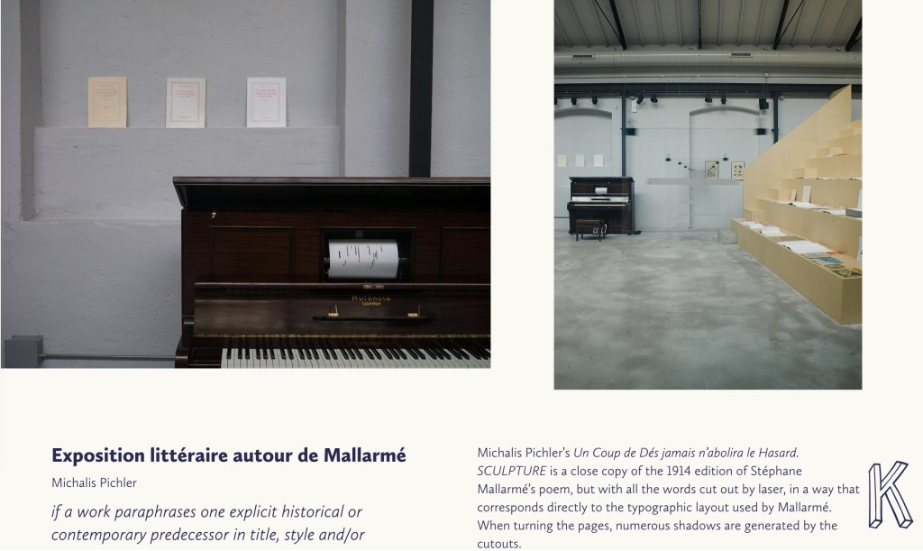
Not until 2016, though, was Pichler able to cap his double appropriation. Just as Broodthaers had held an exhibition entitled “Broodthaers: Exposition littéraire autour de Mallarmé” (Antwerp, December 1969), Pichler held one entitled “Pichler: Exposition Littéraire autour de Mallarmé” (Milan, December 2016). Like the Broodthaers exhibition, Pichler’s was an opportunity to showcase his own work: it was his first solo exhibition in Italy. Like Broodthaers, he included the Nrf 1914 edition, but also included numerous other editions and translations that had occurred since. Also, key to Pichler’s artistic intent, he included a host of other artists who by appropriation had made homage to Un Coup de Dés … Poème and, in some cases, Broodthaers’ … Image.

Book art is so self-referential in its instances (think of Real Fiction: An Inquiry into the Bookeresque by Helen Douglas and Telfer Stokes) and as a genre (think Burning Small Fires by Bruce Nauman) that appropriation offers a natural next step. In Pichler’s case, the subtlety of that step comes in how he reaches through Broodthaers’ Image all the way back to elements of Mallarmé’s Poème to achieve his aims.

When Broodthaers first appropriated Mallarmé’s layout, type sizes and roman/italic styles, he was engaged in a kind of reverse ekphrasis. Usually ekphrasis runs from the work of art (say, a Grecian urn) to the text in response (“Ode on a Grecian Urn”). Here, the poem and its shape come first, then the work of art — the Image of the poem. By calling his exhibition an exposition littéraire, Broodthaers underscored this. By calling out the shapes on the page, he elevated the original’s semblances of waves, an abyss, a foundering ship and a constellation and, in exposing them, performed a kind of literary study as well as artistic work.

Count it down from Pichler’s appropriation of Broodthaers’ exposition littéraire, from the inclusion/appropriation of other artists’ appropriations of Poème and/or Image, from his own work of book art Sculpture, from his own other works: Pichler’s appropriative ekphrasis is squared, cubed or perhaps raised to the fourth power. Clearly, book art and appropriation are Pichler’s chief palettes — or rather his twin decks from which, as DJ, he mixes what he calls “Greatest Hits”. The phrase simultaneously names Pichler’s imprint on Sculpture‘s cover and the series on his website. The series includes other appropriations such as Every Building on the Ginza Strip (2018) from Ed Ruscha and Some More Sonnet(s) aka Poem(s) (2011) from Ulises Carríon. “Greatest Hits”, however, suggests another subtlety in Sculpture, albeit one best appreciated in the context of all the exhibitions.

The first instance of Broodthaers’ exhibition in Antwerp included a continuous playing of the artist’s tape-recorded reading of the poem. In Cologne for its second instance, Broodthaers renamed it Exposition littéraire et musicale autour de Mallarmé. Broodthaers was simply taking Mallarmé’s musical cue in Un Coup de Dés’s preface, which advises reading the poem as if it were a “score” for music to be heard at a concert and its blank spaces as “silences”.

Taking Mallarmé’s and Broodthaers’ musical cues and that of his piano-roll-like slots in Sculpture, Pichler created for his exhibition Un Coup de Dés Jamais N’Abolira le Hasard: Musique, a piano-roll version of the poem to be played by any visitor who cared to sit and pedal the pianola on which it was installed. So in further appropriation of Mallarmé through Broodthaers, Pichler’s piano roll turns the empty spaces, where the words and black strips would be, into music while the blanks around them become what Magnus Wieland calls “white noise”.

Un Coup de Dés Jamais N’Abolira le Hasard: Musique (2009) Michalis Pichler

In traditional literary ekphrasis, the referring text can stand on its own. Homer’s description of Achilles’ shield does not require a side-by-side engraving or painting of what Hephaestus forged. Nor does Auden’s exposition of Breughel’s Landscape with the Fall of Icarus (c. 1560) need an art history book to hand.

But without the context of the exhibition, the presence of other appropriations, or even Pichler’s translucent and plexiglas editions, what to make of Pichler’s paper edition on its own? The traditional Nrf cover design suggests no surprise to come, although the trim size looks non-traditional in today’s market. The book’s slimness, subtitle and preliminaries also warrant a raised eyebrow: how can this be a sculpture? Turning the pages, the reader/viewer comes to the cuts and sees through to the pages beneath. Shadows move through the leaves. The laser cut technique hints at something that a die cut does not. Do the burnt edges where the laser has cut suggest a more surgical approach to book burning, an allusion to burning decks, or a 19th century and 20th century legacy to the white spaces?

Both Mallarmé and Broodthaers noted the intent to draw attention to the white space of the page. Pichler appropriates both the poet’s and artist’s form and intent. He sculpts a conceptual double-palimpsest not by overwriting the first level of overwriting but by removing it and the original layer altogether. The core subtlety of Pichler’s paper edition of Un Coup de Dés lies in those empty spaces defined at their burnt edges and by the blankness around them. For Sartre, Mallarmé was the poet of nothingness. Broodthaers appropriated the nothingness with black ink. Pichler has appropriated both. The paradox is a work that stands on its own by invoking and eliminating what it appropriates.

Further Reading

Durgin, Patrick. “Witness Marcel Broodthaers: The docile aphorism“, Jacket2, 24 October 2014. Accessed 6 August 2020.

Gilbert, Annette, and Clemens Krümmel. Thirteen Years: The Materialization of Ideas from 2002 to 2015 (Leipzig: Spector Books, 2015).

Sartre, Jean-Paul; Ernest Sturm, trans. Mallarmé, or the Poet of Nothingness (University Park: Penn State University Press, 2004).

Sowden, Tom. “Exploring Appropriation as a Creative Practice,” MDPI Arts / Issue 8 / Volume 4 (2019). Accessed 6 August 2020.

Wieland, Magnus. “Sculpture Lecture Reading Un coup de dés“. Accessed 6 August 2020.

Among the other artists in Pichler’s Exposition littéraire autour de Mallarmé were these whose works are also represented in the Books On Books Collection: Jérémie Bennequin, Jim Clinefelter, Sammy Engramer, Cerith Wyn Evans, Rodney Graham, Brian Larosche, Michael Maranda, Guido Molinari and Eric Zboya.