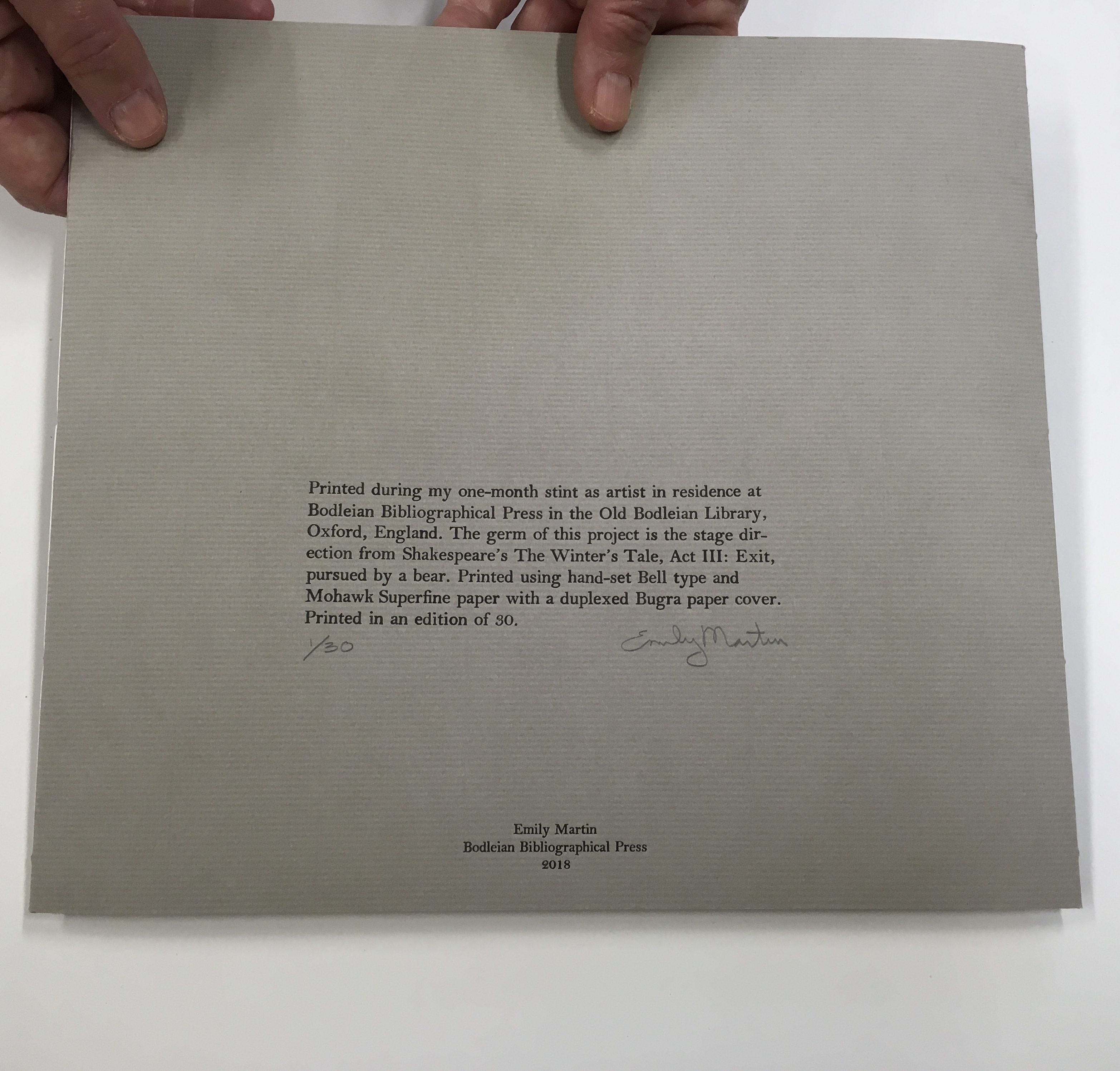
Bookmarking Book Art – Emily Martin

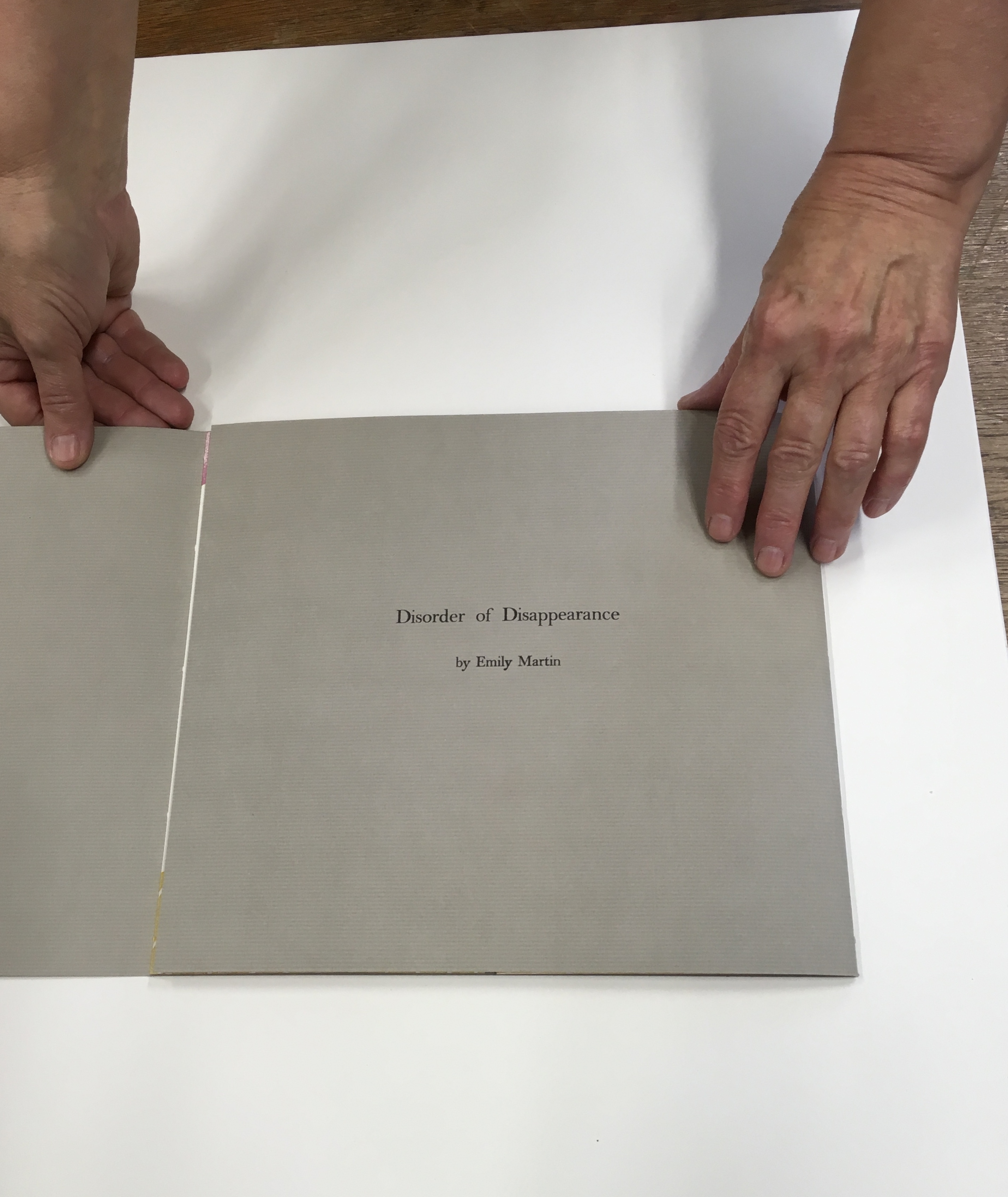
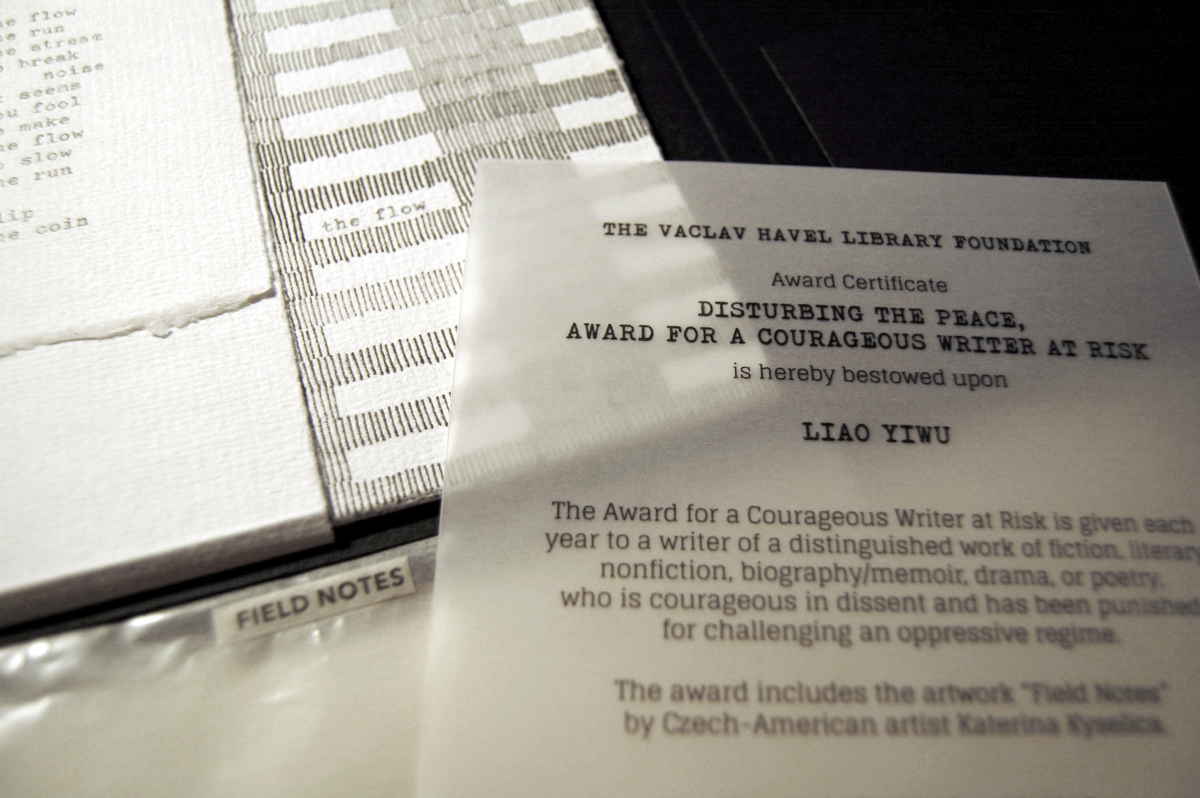
Emily Martin likes to leave the order of reading or viewing her new book up to chance and the reader. She sees it as part of her creative process. Call it “designing chance”. Order of Appearance: Disorder of Disappearance, the book at the culmination of her talk and time as the 2018 Printer-in-Residence at the Bodleian, illustrates the paradox perfectly. This work is one of several springing from Shakespeare’s plays — in this case, the springboard being the famous stage direction “Exit, pursued by a bear.”

030A3B5D-777F-4356-BE9D-0485B1B36D8B
Emily Martin wrapping up her stay as Printer-in-Residence at the Bodleian Library
0DBE3AA4-9AD2-44F1-A2D8-A17BBDAD3A83

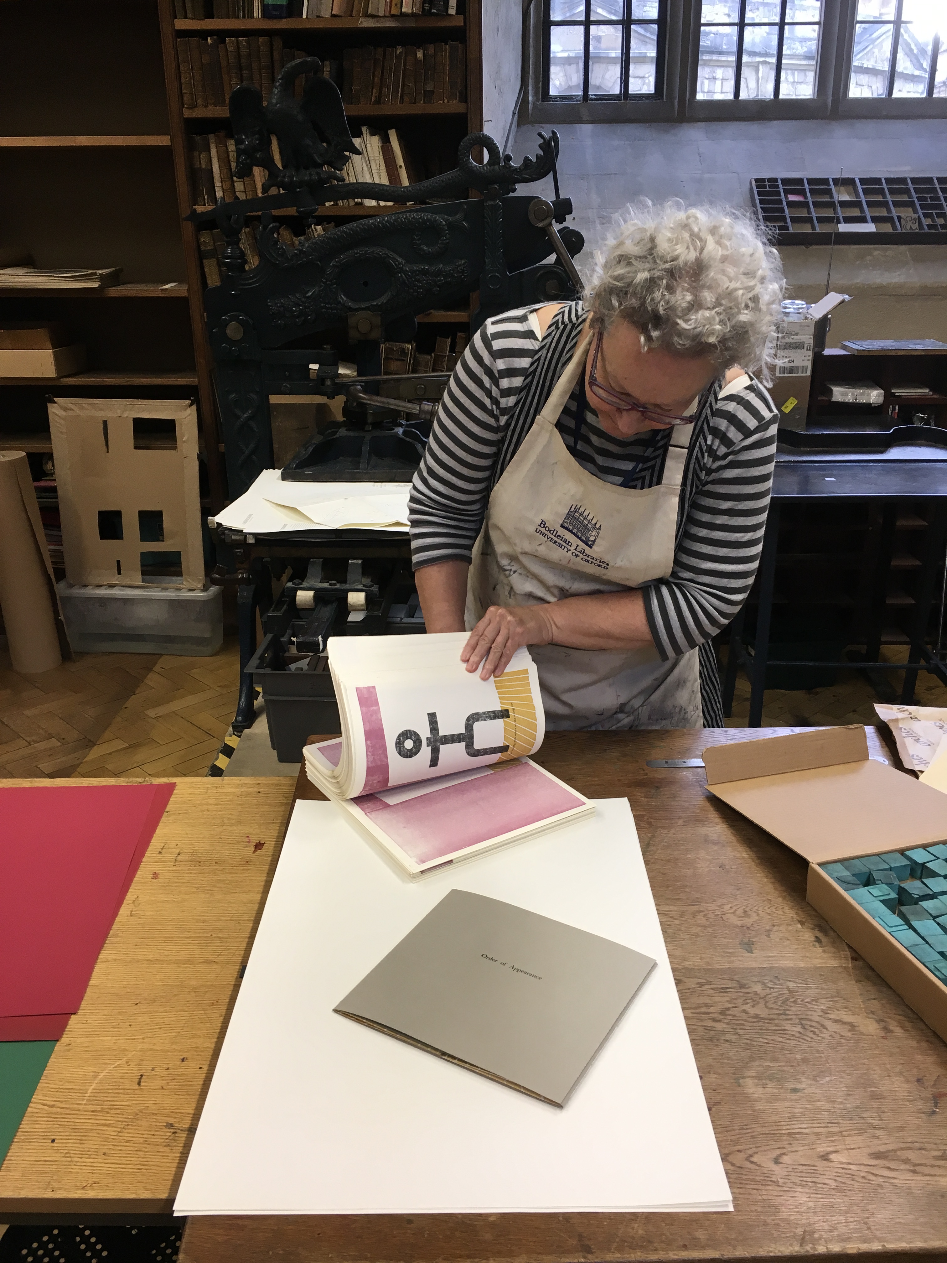
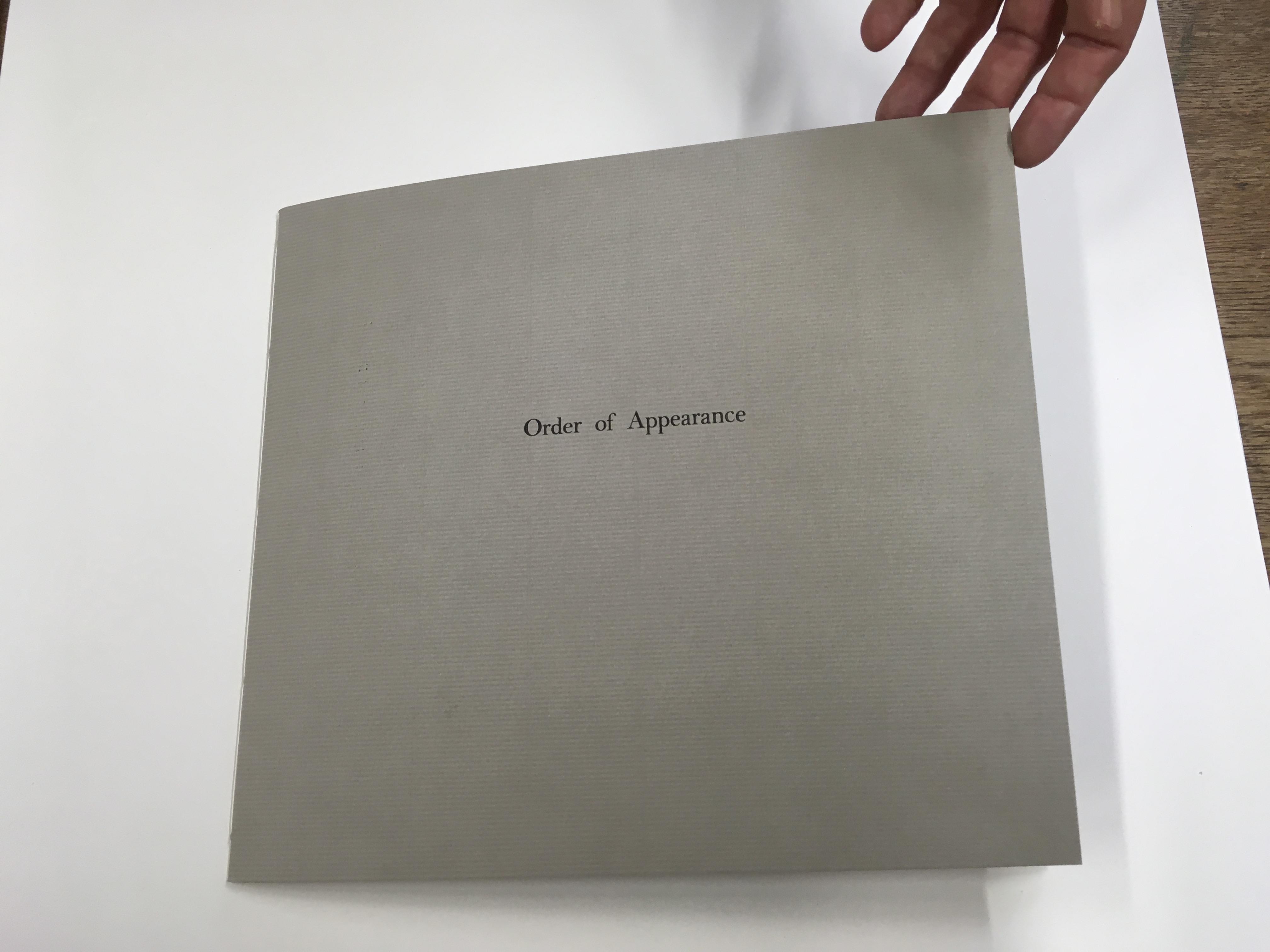
The gatefold cover opens left then right to reveal a set of signatures (folded and gathered pages) sewn to the lefthand crease and a set sewn to the righthand crease. The lefthand signature presents an empty stage; the righthand signature, a stylized stick figure of the leading lady, who is exiting to wild applause. Other characters in Martin’s Order/Disorder or Appearance/Disappearance include the leading man, the clown, a mime, an improv artist, a ballet dancer and, of course, the bear. They can enter and exit one by one or in pairs and in any order and sequence the reader chooses.          

“The ballet dancer enters furious with the choreographer.”

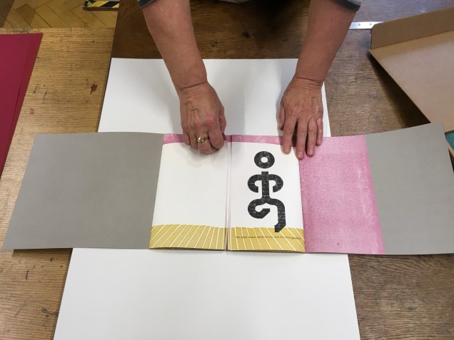
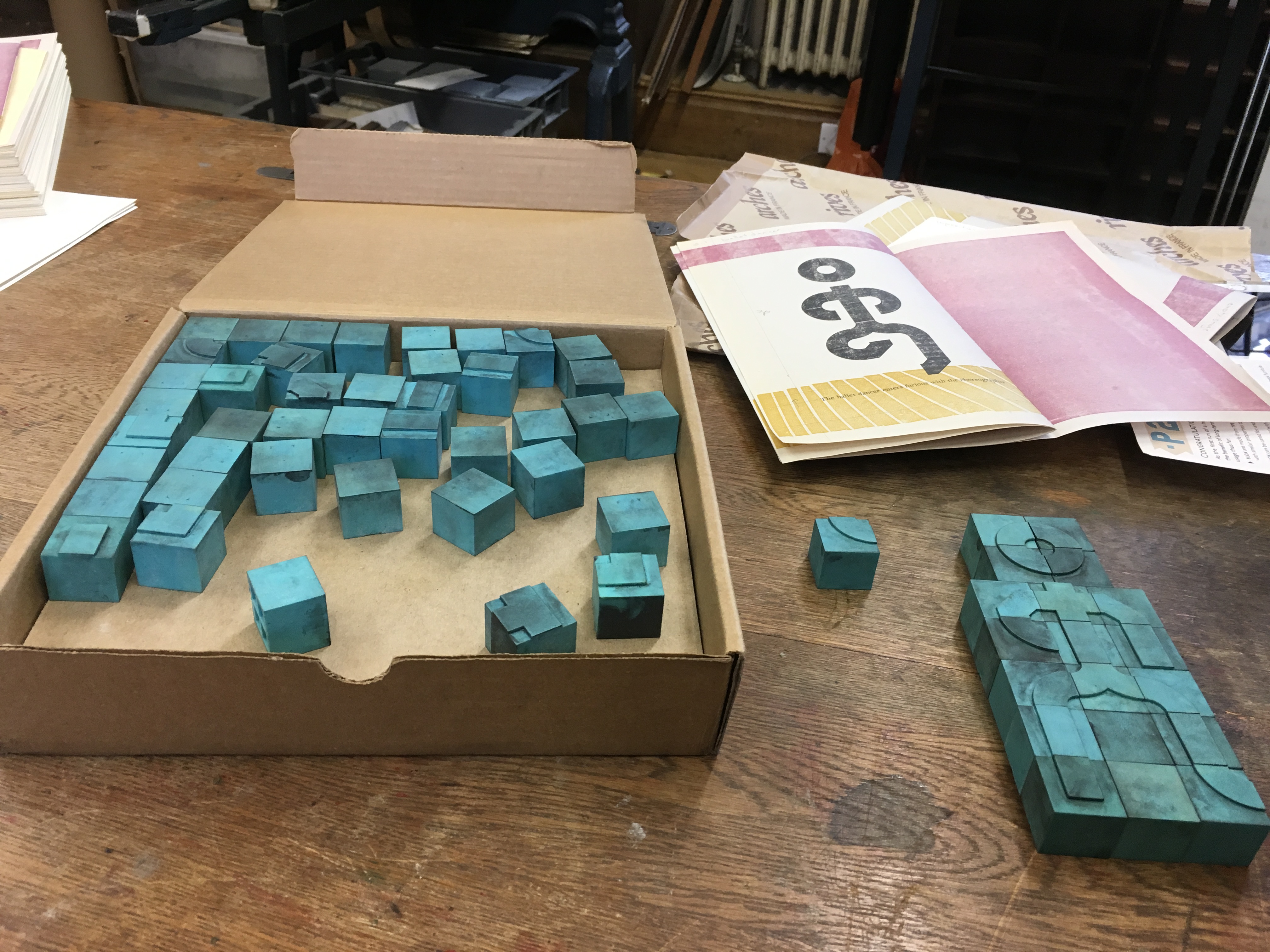
Martin forms the characters’ figures from P22 Blox, a set of modular shapes that she uses to great effect conveying expression and attitude with changes in posture and gesture. The characters are not without their subtleties. The clown’s feet are larger than any other figure’s. The close observer will note that, side by side, the leading lady is slightly shorter than the leading man and has one other subtle biologically distinguishing feature. 

The P22 Blox and member of the “repertory group”
The bear’s entrance and exit

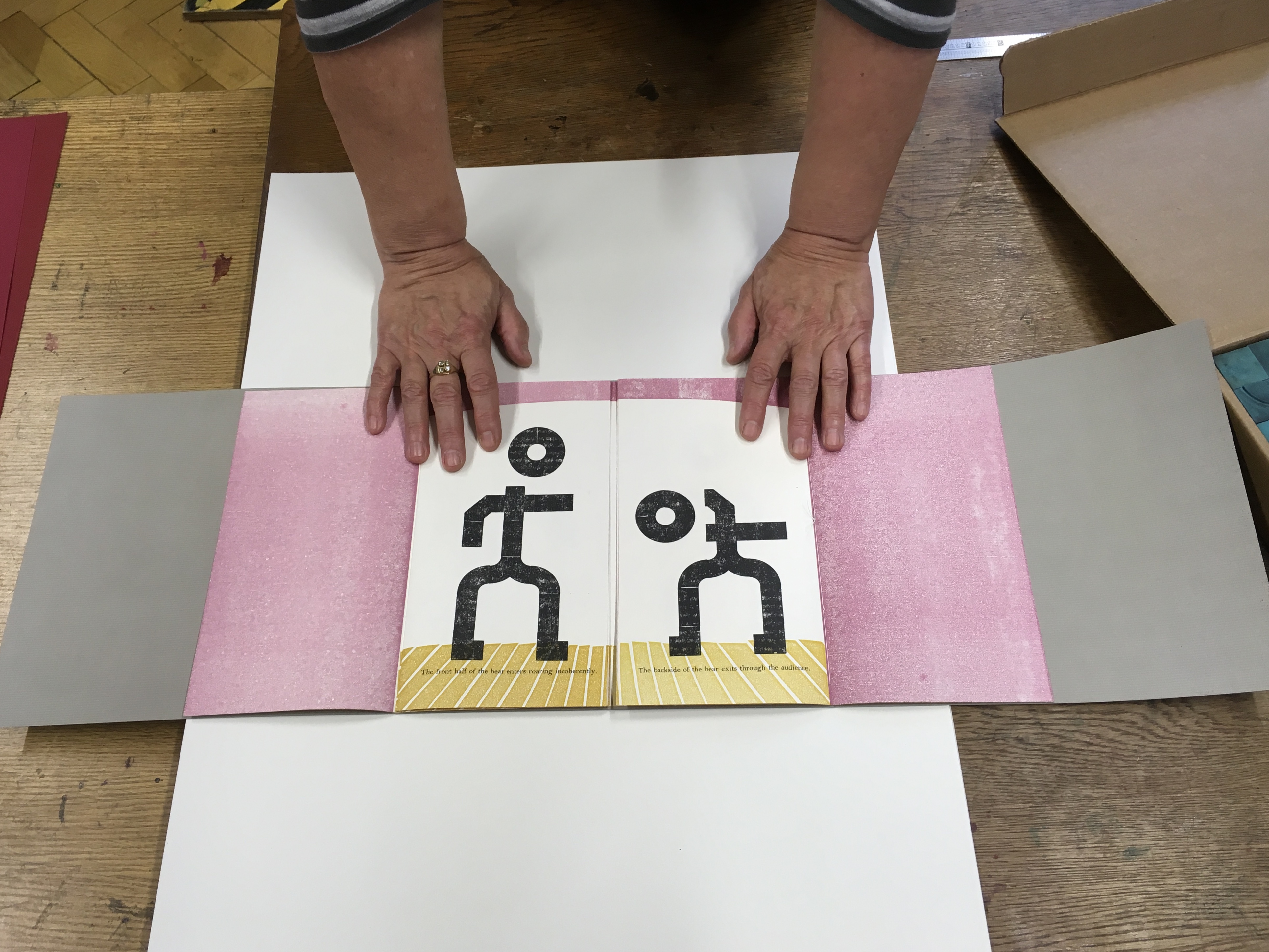
The bear’s scene above — like any scene or sequence of ordered/disordered entrances/exits — however chosen or varied by the reader — is very short. On the left, “The front half of the bear enters roaring incoherently”; on the right, “The backside of the bear exits through the audience”.  

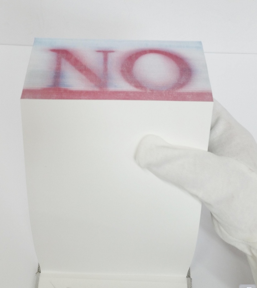
Slapstick and whimsy play an important part in Martin’s books, not without bite. By “designing chance” into her works, she implicates us the readers and viewers in the biting. The “P22 Blox repertory performers” made an earlier appearance in Martin’s  Funny Ha Ha Funny Peculiar or Funny Peculiar Funny Ha Ha (2017), which has plenty of bite.  Funny Ha Ha is a dos-à-dos book (two books sharing the same back cover) — what else could it be for her conflicted response to Shakespeare’s comedies, individually enjoyable yet easily mixed up in her head due to a certain sameness of plot and

… So much mistaken identity, gender confusion and various other contrivances while romping their way to a fifth act wedding or two. Even more problematic are the decidedly unfunny themes that are common in many of these same comedies such as hypocrisy, sexual harassment, intolerance, sexism, misogyny, and anti-Semitism.

Funny Ha Ha also uses the slice book technique, which, as with the flexible order/disorder of Order of Appearance, inveigles the reader — enjoyably and uncomfortably, back to back in the former’s case — in creating new readings and meanings as the top and bottom halves of the pages turn independently of one another.

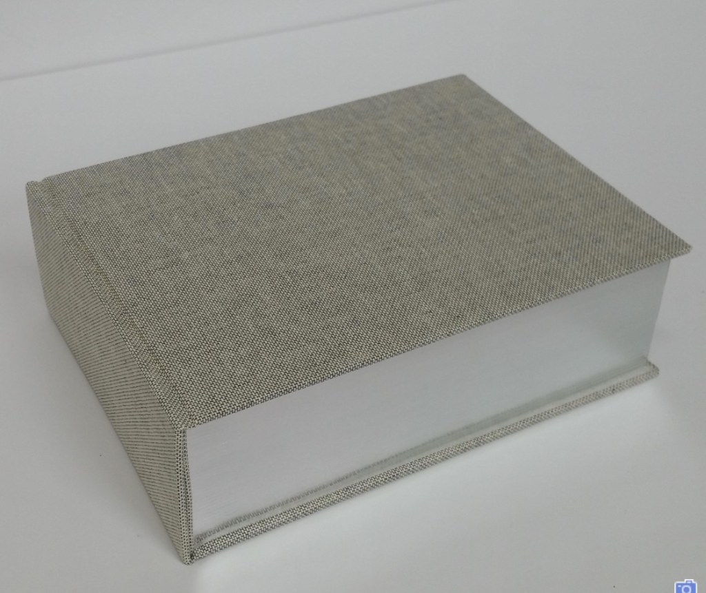
Martin’s earlier forays with Shakespeare left less to chance for the reader/viewer. For Desdemona, In her Own Words (2016), we have Martin’s collection and reordering of the few words given to the character in a strongly affecting stop motion animation, which appeared in 2015 as a boxed book. Martin’s The Tragedy of Romeo & Juliet (2012), awarded a silver medal at the Designer Bookbinders’ International Competition in 2013, is her book art’s earliest engagement with Shakespeare. There she uses the carousel book structure to set several scenes in the round, each with a repetition of the play’s Prologue chorus slightly adjusted with the insertion of modern equivalents for the setting of Verona. Think Rwanda or Serbia, and why not? All the world’s a globe, as the carousel implies.  Forthcoming in the Shakespearean suite may be the best yet — which is a high bar — a spiralling interpretation of King Lear’s descent into madness.

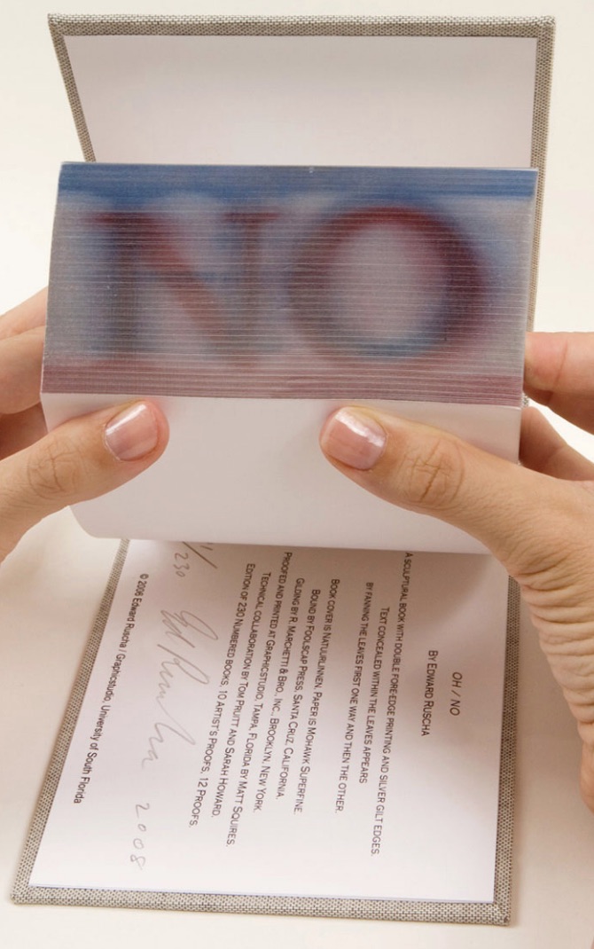
Martin’s talk is entitled “Visual Metre and Rhythm: the Function of Movable Devices”. The illustration of volvelles, lift flaps, harlequinades, tunnel books, rivet-and-tab movables and pop-ups ranged beyond the Bodleian’s sources; it was obvious that Martin had made good use of the time allocated for research during her residency. Presumably as with the talk by Russell Maret, the 2017 Printer-in-Residence, Martin’s talk will be posted on the Bodleian site. In the meantime, a visit to her site will not only provide an impressive range of movables and pop-ups but also demonstrate their function as serious artist books.

For those wanting a closer look or hands-on experience, Order of Appearance can be seen in motion here and will be available for purchase at CODEX 2019 in Richmond, CA and from her site.

Bookmarking Book Art – Katerina Kyselica

Field Notes (2018)
Katerina Kyselica
Photo credit: Katerina Kyselica

Field Notes was commissioned by the Václav Havel Library Foundation for its 2018 “Disturbing the Peace, Award for a Courageous Writer at Risk“, presented to the Chinese author, writer, musician and poet Liao Yiwu (aka Lao Wei) on 27 September 2018 at the Bohemian National Hall in New York. Across nine loose leaves, the typewritten words and lines of the poem are dispersed, arranged among fields of regimented rows of vertical strokes, drawn on handmade Losin paper. The drawings could represent anything: a field of grain, a tower block with windows, or marks on a prison wall to count the days. The loose format of the book allows readers to arrange the drawings or compose the text in an order as they see fit, although a colophon presents the full poem in its intended order. 

Kyselica’s website provides more views of Field Notes as well as views of her other artist’s books: American Colonies (2016), Code Red (Nicholas and Alexandra)(2016), News About Nothing (2015), 2×2 (2013) and untitled (2012).

What is striking about Kyselica’s works is how she combines a collage of book art techniques in each work to create a unified, unique effect.

Books On Books Collection — Ed Ruscha

I am wide awake when I see artist books. Here are people using actual ink on paper in the eventual age of total digital. For this reason I am retaining my hope and expectation of more books. — Ed Ruscha. Interview with Stephanie LaCava

Any collection of book art must recognize the presence and contribution of Ed Ruscha’s work. For Books On Books, this has been not only a financial challenge but a thematic one. Every Building on the Sunset Strip and the elusive Dutch Details certainly speak to the collection’s representation of the accordion book structure, but so do many others in the collection. Even if one of those works in pristine condition could be afforded, it would not be the most satisfactory way of recognizing Ruscha’s work in this collection. For Ruschavian reasons, OH/NO (2008) scratches that itch.

OH/NO (2008)

OH/NO (2008)
Ed Ruscha
Sculptural book with silver gilt covered printed fore-edge. H5.25 x W7.25 x D2.25 in. Acquired from Hess Fine Art, 14 November 2020. Photos: Courtesy of the gallery.

In an interview in Artforum in 1965, Ed Ruscha commented, “What I am after is … a mass-produced product … none of the nuances of the hand-made and crafted limited edition book”. Well, here is OH/NO, clearly not a hand-crafted work, but nevertheless a limited edition and signed by the artist. It is a tongue-in-cheek machine-produced, if not mass-produced, product. Production and structure draw all attention to an element peculiar to the codex – its fore-edge. It applies printing in the place of hand-crafted fore-edge painting, and the interior is blank. Here is Ruscha applying his deadpan approach to a physical aspect of the book not addressed by those more famous accordion works.

OH/NO is not Ruscha’s first foray into fore-edge printing. In 2002, there was Me and The. Neither work extends the technique per se, but unlike their historical predecessors, Ruscha’s two works, whose pages are otherwise blank, focus entirely on the fore-edge of the book form and depend on its interaction with facetious text.

OH/NO provides a distinctive “other end of the spectrum” to Ximena Pérez Grobet’s Around the Corner (2020). Other than its title, Around the Corner is textless. By progressively manipulating images across all of the book structure’s planes, Pérez Grobet makes a sculpture out of the relationship of the fore-edge to the rest of the book. With OH/NO and Around the Corner side by side, we have a useful and satisfying point of comparison and contrast for considering the breadth of artists’ books.

Around the Corner (2020)
Ximena Pérez Grobet
Japanese bound in slip case open at both ends. H200 x W175 x D70 mm. Edition of 20, of which this is # 2. Acquired from the artist, 1 December 2020. Photos: Books On Books Collection.

Another aspect of artists’ books and Ruscha’s work that OH/NO addresses is production by a third party. As he happily acknowledges, not all of his photographic works are of his own hand, and production is often handed over to a third party. In the various histories and commentary on book art, though, those early works like Every Building on the Sunset Strip are heralded for their cheap one-man-band, democratic production values. But listen to Ruscha himself in the video below about Every Building, and it is clear that the concept of his artist’s books does not lie in their production. OH/NO‘s high production values could not be further from Every Building‘s. Look instead to the interaction of the text with the structure. Given Ruscha’s sense of humor, the title and sculptural object itself might be commenting on the studio approach of high-concept artists as much as it might be on the absence of text in the pages.

Various

Even though they are not works of appropriation themselves, Every Building and Ruscha’s Various Small Fires have engendered a small industry of appropriation in book art. Various Small Fires lent itself to a Gulbenkian/Calouste exhibition’s placing it as a high-concept centerpiece “reflecting on” Bruce Naumann’s appropriation Burning Small Fires.

Display of Ed Ruscha’s Various Small Fires and Milk (1964) at “Pliure: La Part du Feu”, 2 February – 12 April 2015, Paris. Photo credit: Books On Books Collection.
Reflected in the lower left hand corner is the display of Bruce Nauman’s Burning Small Fires; in the upper right corner, the film clip of Truffaut’s 1966 Fahrenheit 451; and in the upper left, Maria Helena Vieira da Silva’s La bibliotheque en feu (1974).

There is even an entire book devoted to the appropriation of Ruscha’s works.

Various Small Books : Referencing Various Small Books by Ed Ruscha (2013) 
Edited by Jeffrey T. Brouws, Wendy Burton, and Hermann Zschiegner
Casebound, printed cloth over boards. H236 x W160 mm. 288 pages.
Photos: Books On Books Collection

Beyond this brilliant collection of examples and commentary, additional appropriative works have appeared — so many that a second edition may be required.

Various Versions (2015)
Guy Bigland
Perfect bound soft cover. H190 x W190 mm. [158] pages. Acquired from the artist, 12 October 2023.
Photos: Books On Books Collection.

Various Small Dicks (2013)
Hubert Kretschmer
Saddle stitched booklet. H149 x W105 mm. [8] pages. Acquired from the artist, 11 July 2019.
Photo: Books On Books Collection.

It is fun to place OH/NO as an expression of mock horror in response to all that.

Further Reading/Viewing

Fore-edge Printing and Painting: Book Art and the Book Arts Revealed“. 12 May 2013. Bookmarking Book Art.

Guy Bigland“. 31 August 2023. Books On Books Collection. Updated 8 November 2024.

Hubert Kretschmer“. 7 November 2024. Books On Books Collection.

Ximena Pérez Grobet“. 7 July 2021. Books On Books Collection.

Cain, Abigail. 27 September 2018. “Unpacking Ed Ruscha“, Aperture. This is Cain’s review of the Harry Ransom Center’s 2018 exhibition Ed Ruscha: Archaeology and Romance, which used 150 displayed items to focus on 16 of Ruscha’s books. It contextualizes Various Small Fires neatly. Quoting the Center’s photography curator Jessica S. Macdonald, Cain writes: “… lack of artistry is one of the hallmarks of Ruscha’s artist books. ‘The photographs of gas stations are bad photographs on purpose,’ McDonald noted. ‘He’s trying to do the opposite of what a photographer trying to make an artistic photograph would be doing.’ In a 1965 Artforum interview concerning his second book, Various Small Fires and Milk (1964), Ruscha explained that it didn’t even matter to him who took the photographs. ‘In fact, one of them was taken by someone else,’ he said. ‘I went to a stock photograph place and looked for pictures of fires, there were none.'” 

Coplans, John. February 1965. “Concerning ‘Various Small Fires’: Edward Ruscha Discusses His Perplexing Publications”. Artforum. 3:5, 25.

Hoyle, Ben. 25 February 2017. “Ed Ruscha, the pop painter with ‘the coolest gaze in American art’“. The Times. London. Ben Hoyle’s easygoing interview with Ed Ruscha introduces his work as the heart of the British Museum’s exhibition “The American Dream: pop to the present” (9 March 9 to 18 June 2017).  That is a bold assertion as the show included Claes Oldenburg, Jasper Johns, Andy Warhol, Roy Lichtenstein, Cy Twombly, Louise Bourgeois, Robert Rauschenberg and others recognizable to anyone who was briefly awake in a college art history class — even as long ago as the 70s. But, back then, not so much “Ed Ruscha”. Hoyle’s article – with its paragraphs’ casual packing in of news, telling descriptive detail and sharp observations (whether his or others’) of Ruscha’s art – makes a persuasive case.   

LaCava, Stephanie. 20 February 2017. “Artist Books/Artist’s Novels (Vol. 5): Ed Ruscha”, The Believer.

Every Building on the Sunset Strip described by Ed Ruscha, courtesy of the V&A Dundee.

Giulio Maffei, Edward Ruscha's The Sunset Strip, 1966, 2015

From his series Le Vite dei Libri (The Lives of Books), Giulio Maffei provides a clever catalog entry on the Sunset Strip.

Bookmarking Book Art – Kim Anno

From www.kimanno.com. Accessed 23 September 2018

The Albertine Workout is a collaboration between artist Kim Anno and poet Anne Carson. 

Albertine is Albertine Simonet, the central love interest in Proust’s In Search of Lost Time. The Workout explores her character in text and image.  The illustration above touches the biographical note that, according to Proust, the Albertine character was based on Alfred Agostinelli, sometime chauffeur and typist for Proust.

The images resting in the burgundy Solander box on Anno’s website are well worth a look. (Carson’s text not seen.)

Bookmarking Book Art – Reed College’s Special Collection Artists’ Books

The Reed College Artists’ Books website (design and descriptive material) is copyrighted         © 2009 by Reed College and Geraldine Ondrizek. 

The spectrum of modern and contemporary Artists’ Books in Reed College’s Special Collections and collected on this website include traditional letterpress printed books of poetry, conceptual book works, sculptural and visual works, concrete poetry, and magazine works. This unique collection, which holds significant 20th century and contemporary artists’ books, gives students and the broader population insight into the significant role artist’s books have played among the avant-garde of Eastern and Western Europe, Asia and the United States, from the turn of the last century to the present. This includes livre d’artiste works by David Hockney, avant-garde works by Sonia Delaunay, conceptualist works by Sol LeWitt, and contemporary works by Xu Bing.  

A search of the general library catalog with the term “artists’ books collection” yields over 1700 items, not all of which are in the Special Collection. This website offers visitors an organized way to browse the collection and enjoy access to individual sites for select items as shown here:

Browsing “1980 to Present

Bookmarking Book Art – Otis College of Art and Design

 
The goal of the Otis Artists’ Book Collection is not to create a comprehensive archive, but rather to provide a valuable teaching resource available to artists and students. Since the collection is available on only a limited basis, providing access to the books via an online image database is a continuing project, one that we hope will assist those with interest in researching our collection as well as the medium in general.
 
Some videos are better than others, and all benefit from viewing without the background music. Having handled both Susan E. King’s Lessons from the South and J. Meejin Moon’s Absence, I can vouch for the corresponding videos’ effectiveness.
 
The Lessons video could be closer to the experience of handling the work if the transitional zooming were replaced with a 360 circumferential shot or angled stills to reveal more of the work’s intricacies — for example, this overhead shot taken at the old Corcoran Gallery in Washington, DC:

The Absence video comes much closer to a hands-on experience, but the exchange in the Comments section highlights how inclusion of some description by voiceover or bibliographic entry would aid viewers’ appreciation.

Treages 4 years ago
so it’s a city in a book? 

REPLY

Vesper Von Lichtenstein 10 months ago
It’s a memorial to 9/11, and the cut out parts are the Two Towers going from the top down…at the end of the book you see the placement of the two towers within the context of the rest of the buildings on a city block. The music seems a bit… upbeat for such a somber book.

Critiques aside, the playlist and site warrant multiple revisits and a thanks to Otis College.

Bookmarking Book Art – Smithsonian Libraries Artists’ Books

smithsonian-artits-books-homepageAn easily searchable source.  The carousel of images in the home page‘s lower right-hand corner highlights some of the favorite artists at Books on Books:

The works in the collection are scattered across multiple sites in the DC area, so a careful online browse before traveling for a visit is advisable.

Bookmarking Book Art – Carol Burtner

Burtner’s whimsy seems irrepressible as is evident from this undated 100 Best Books, Abridged, composed of the first and last sentences from each of Random House Publishing’s “Best 100 Books of the 20th century” — and from her site’s motto – “Art for my sake”.

Bookmarking Book Art – Sowon Kwon

dongghab (20100
Sowon Kwon

From Contemporary Art Daily. A Daily Journal of International Exhibitions.  Artist: Sowon Kwon. Venue: Full Haus, Los Angeles. Date: September 2 – December 3, 2017. – Accessed November 25, 2017 8:37 AM.

Pictured above is the back cover of dongghab, a sort of self-portrait in book art in that its content derives from events occurring in 1963, the year of the artist’s birth. The back cover is not just “another conversation” with Ed Ruscha, but one with American culture, as is the book as a whole.

Books On Books Collection – Charles Agel

Why do some books of photography lodge themselves in our minds as book art or artist’s books? Ed Ruscha’s books have done that, so much so that it seems almost odd to call them photobooks, although their deadpan presentation as such is essential to their artistic status. Why do works like Sean Kernan’s The Secret Books and Abelardo Morell’s A Book of Books defy relegation to the coffee table?

Published by the Visual Studies Workshop (1998)

In juxtaposing his photos with text from John Lloyd Stephens, the 19th century explorer of Mesoamerica, Charles Agel positions Monuments to the Industrial Revolution (1998) as more than a book of photos.  Quite a different conceptualizing strategy from the typologizing pursued from the 1970s onward by Bernd and Hilla Becher, mentioned by photographer John Pfahl in his introduction to Monuments.

Seeking the differences and similarities in strategies of composing the works as well as those of composing the photos adds to the appreciation and understanding of them.