Bartleby the Scrivener: A Story of Wall Street (1995)
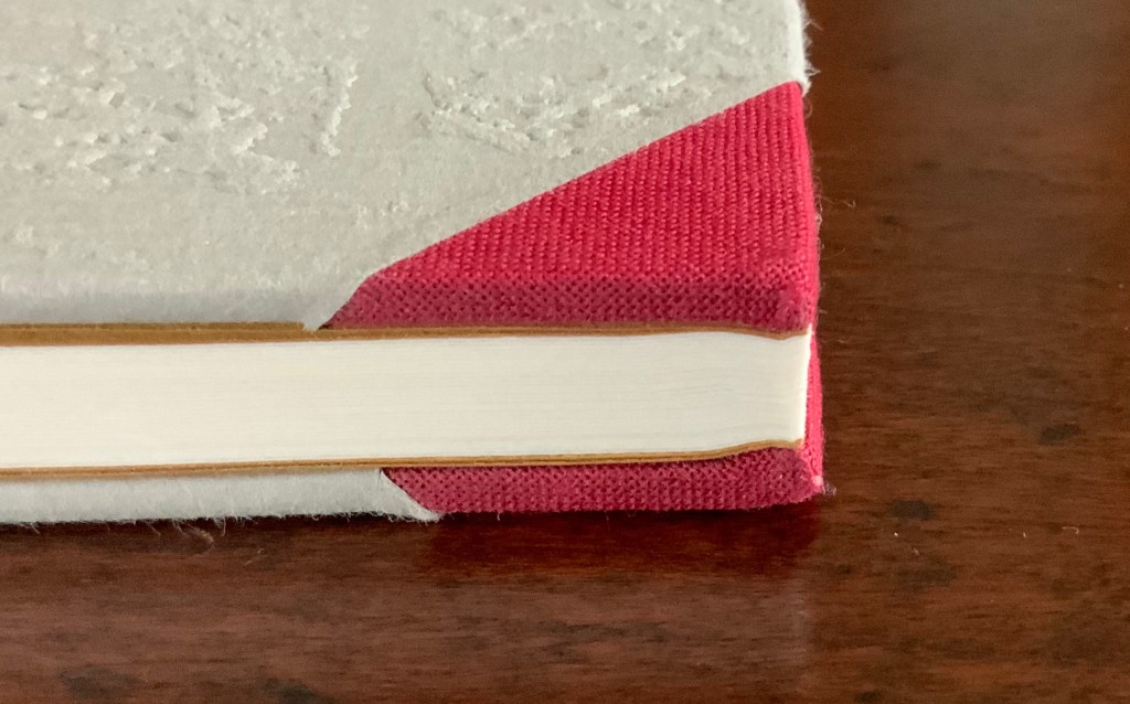
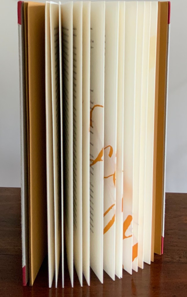
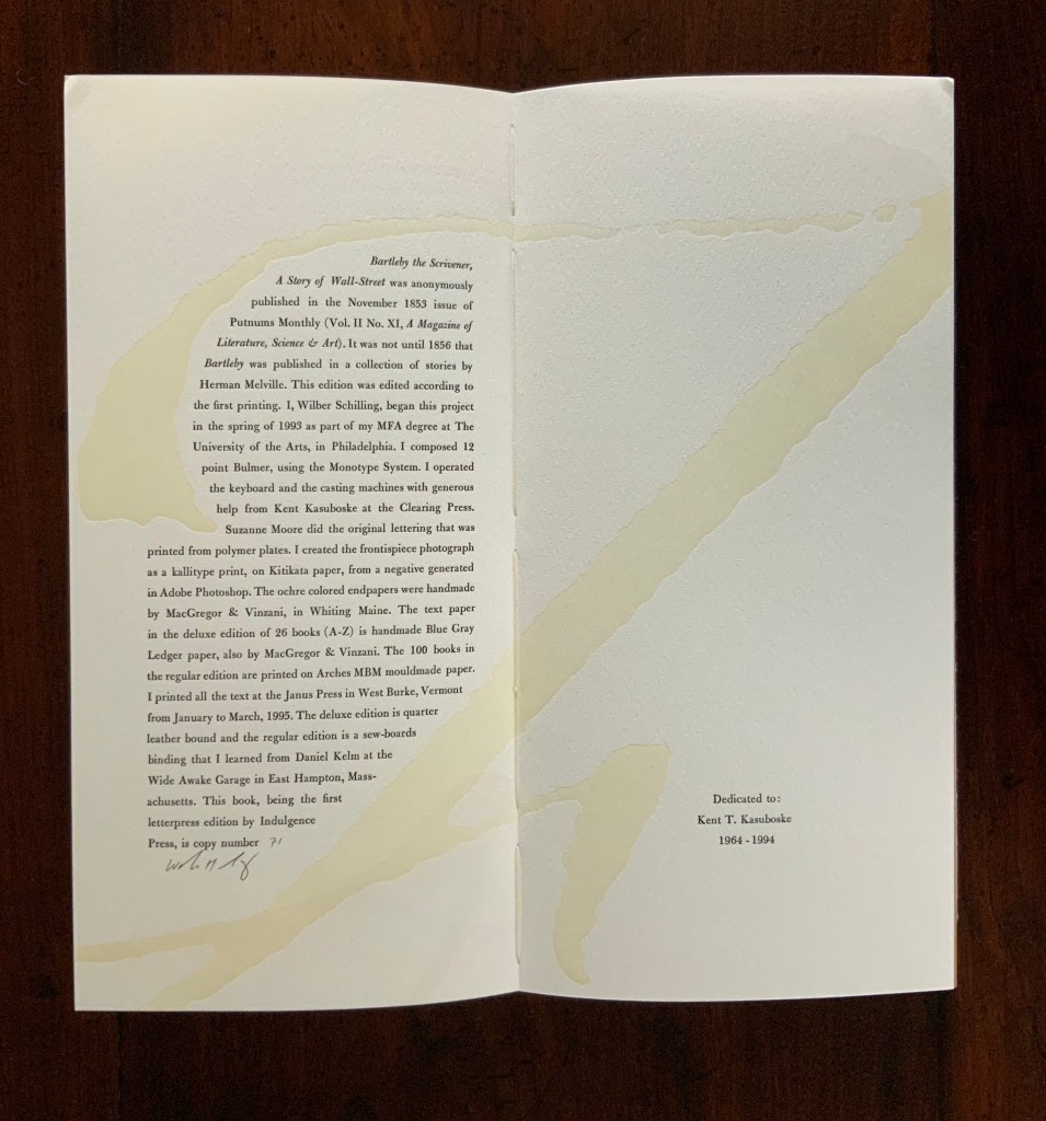
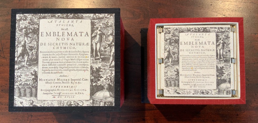
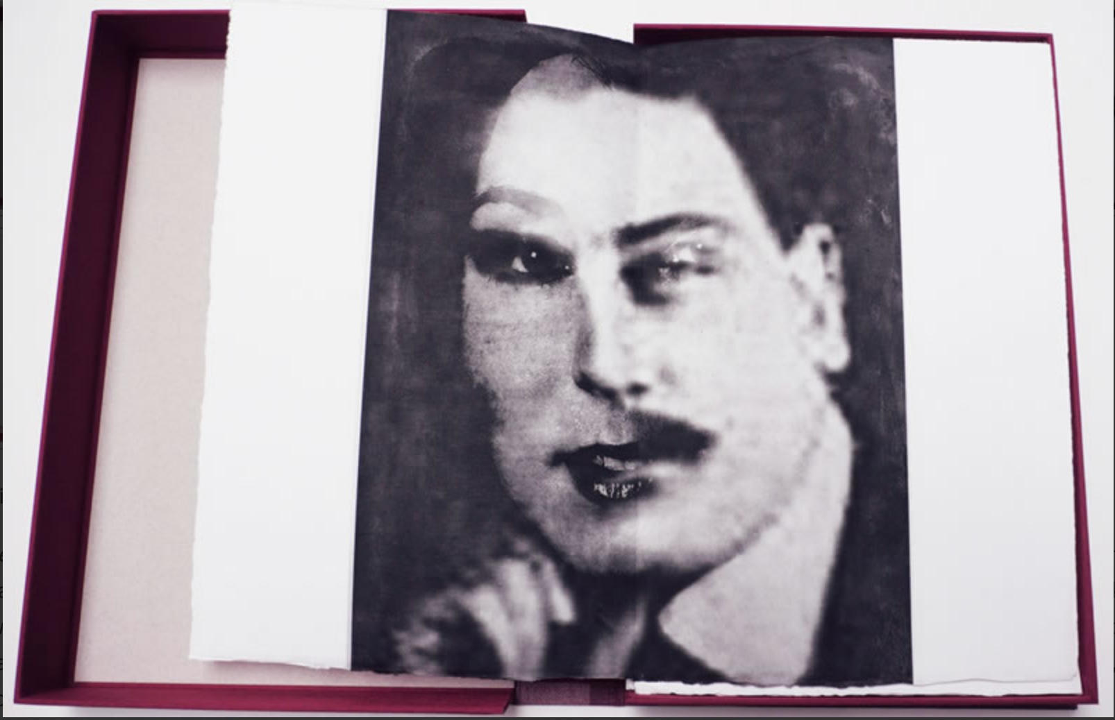
Herman Melville, Bartleby the Scrivener: A Tale of Wall Street, 1853. Indulgence Press, 1995. Type composed in 12 point Bulmer on the Monotype System and printed by Wilber Schilling on Arches MBM mould made paper at Janus Press. Calligraphy by Suzanne Moore. Ochre-coloured endpapers handmade by MacGregor & Vinzani. Wilber Schilling created the frontispiece photo as a Kallitype print from a negative generated in Adobe Photoshop. The binding, also by Schilling, is cloth over sewn boards and, over the cloth, an embossed print of details from the frontispiece photo. Edition of 100 of which this is #71. H320 x W158 x D14 mm. Acquired from Indulgence Press, 17 December 2015.
Further Reading
“Suzanne Moore“. 14 January 2020. Books On Books Collection.
Jury, David, and Peter Rutledge Koch (eds.) 2008. Book Art Object. Edited by David Jury. Berkeley, California: Codex Foundation. Pp. 198 (Where Do We Start?), 199 (Surplus Value Books #13).
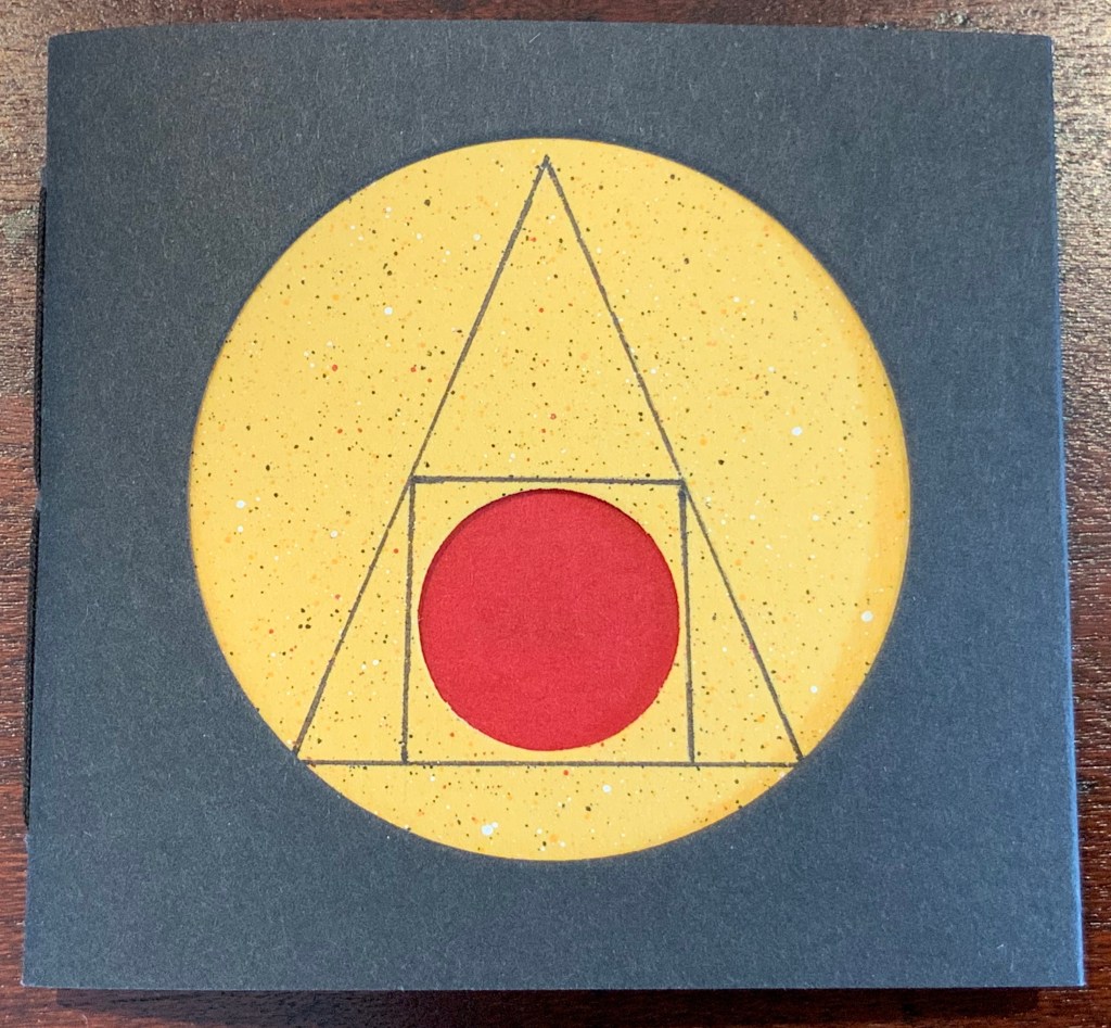
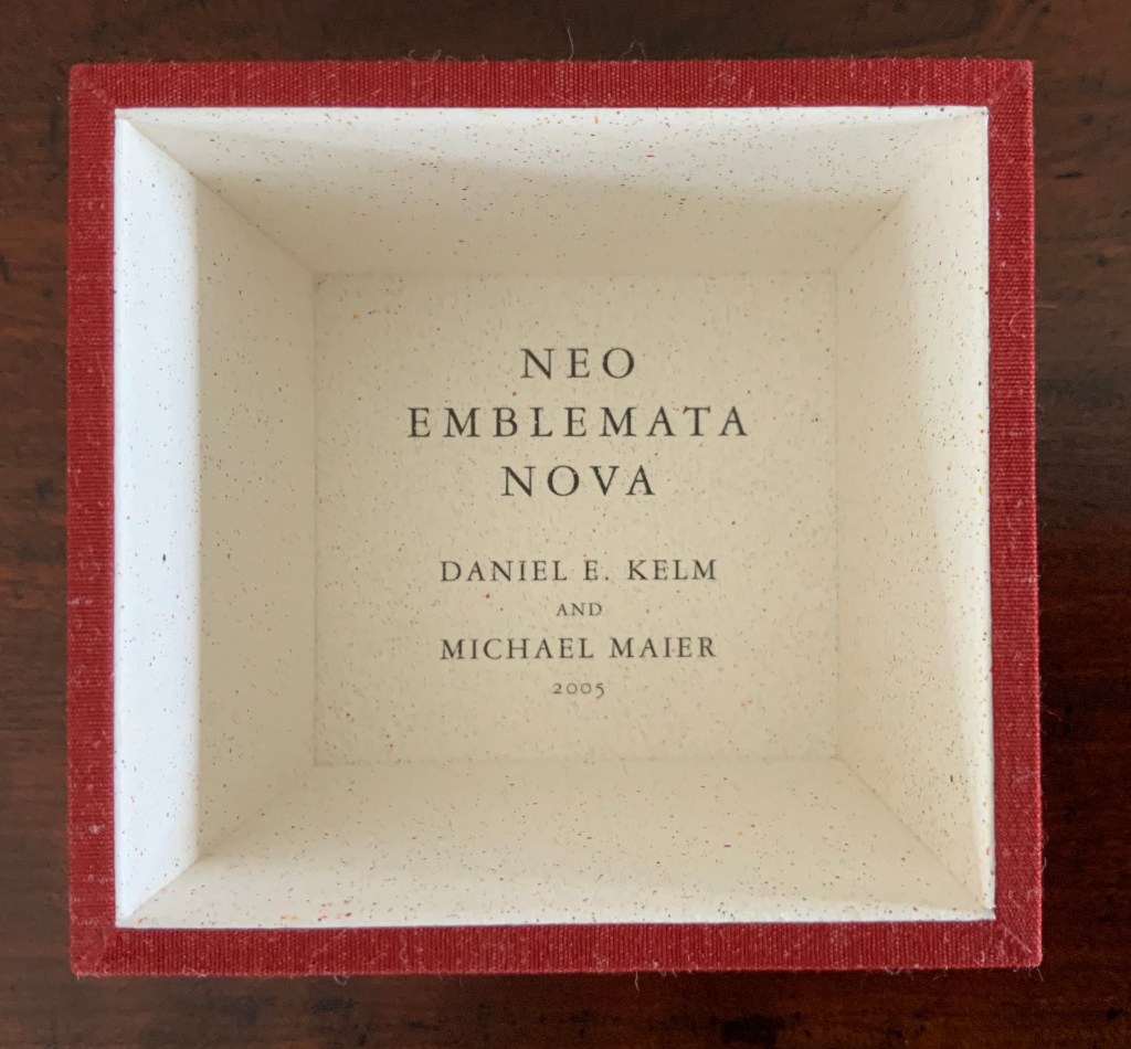
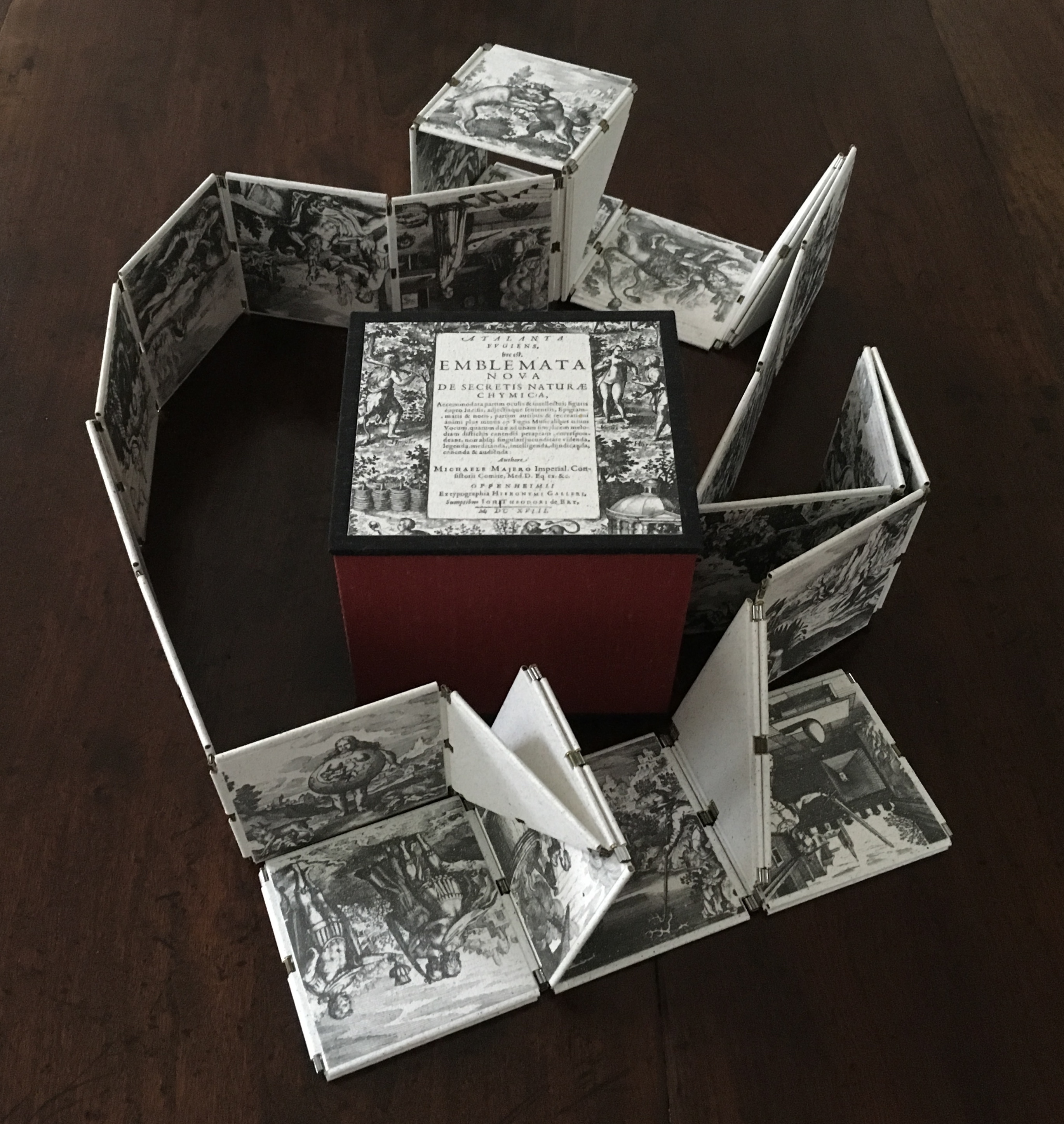
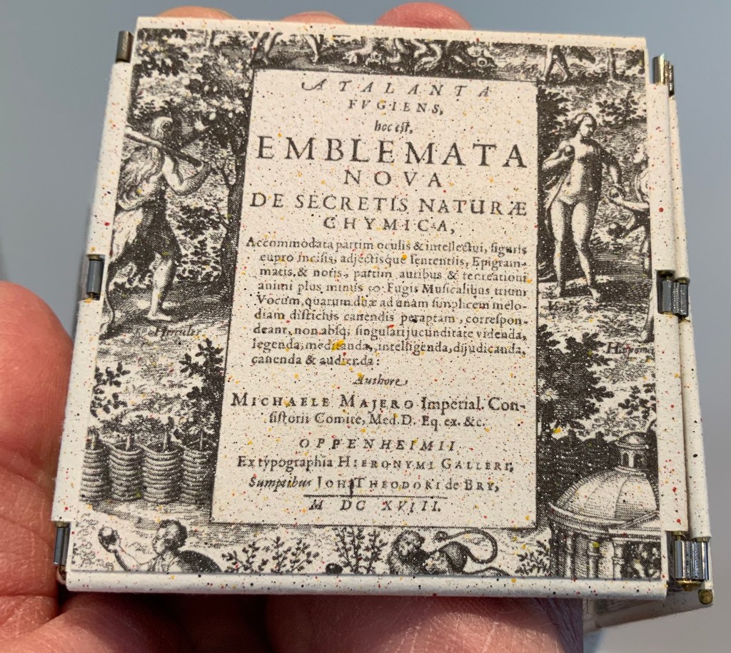
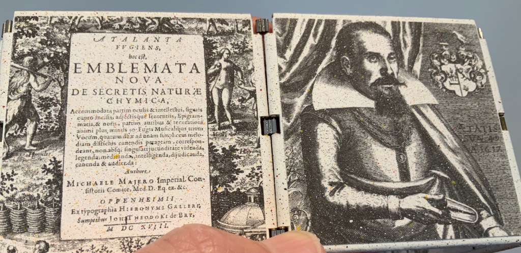
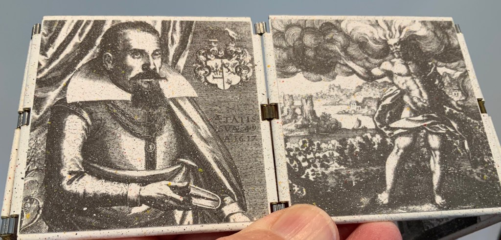
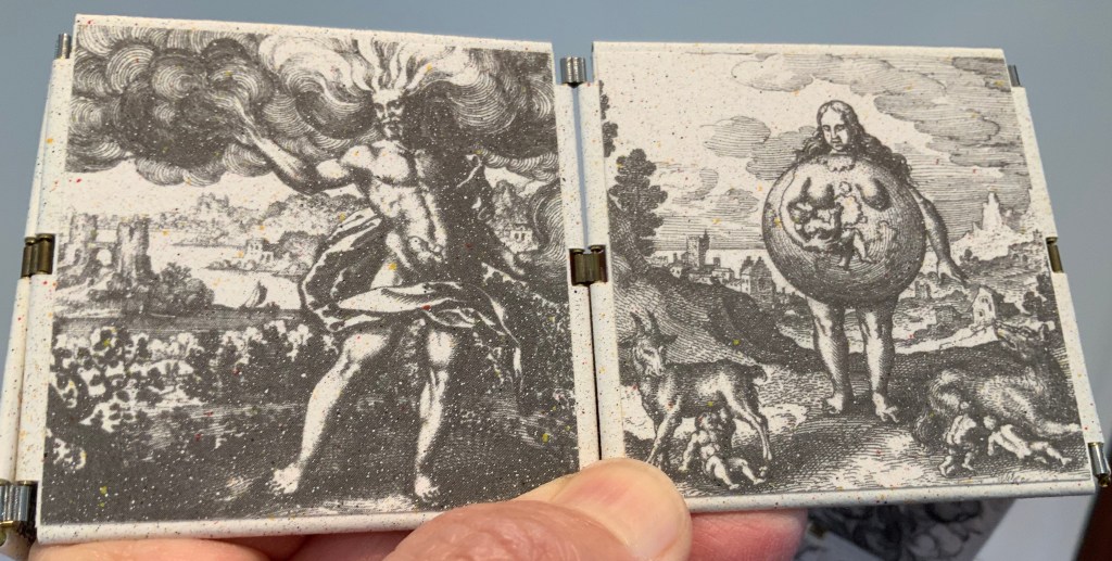
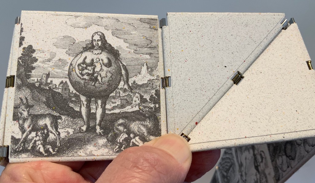
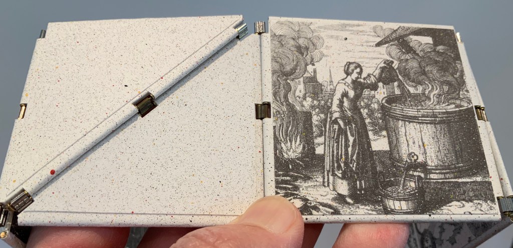
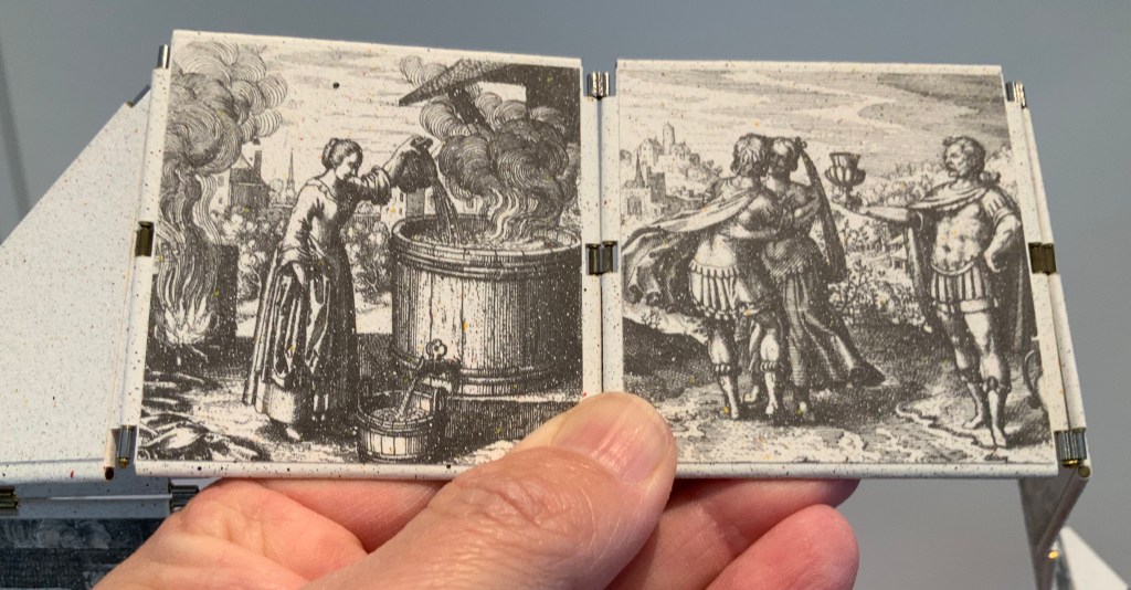
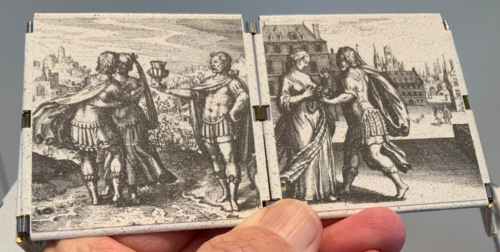
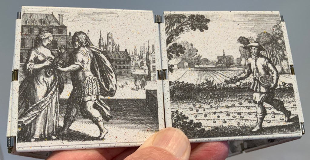
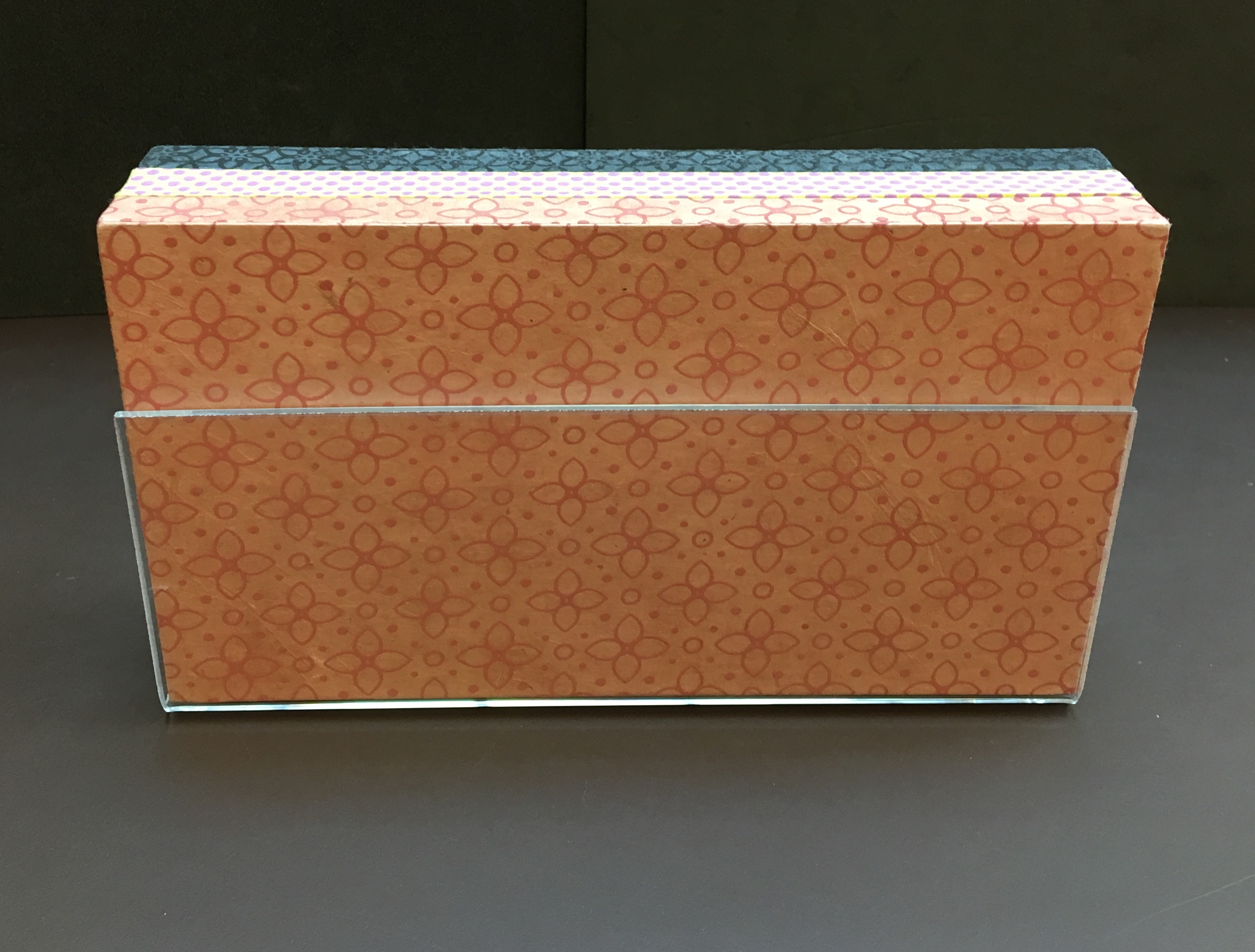
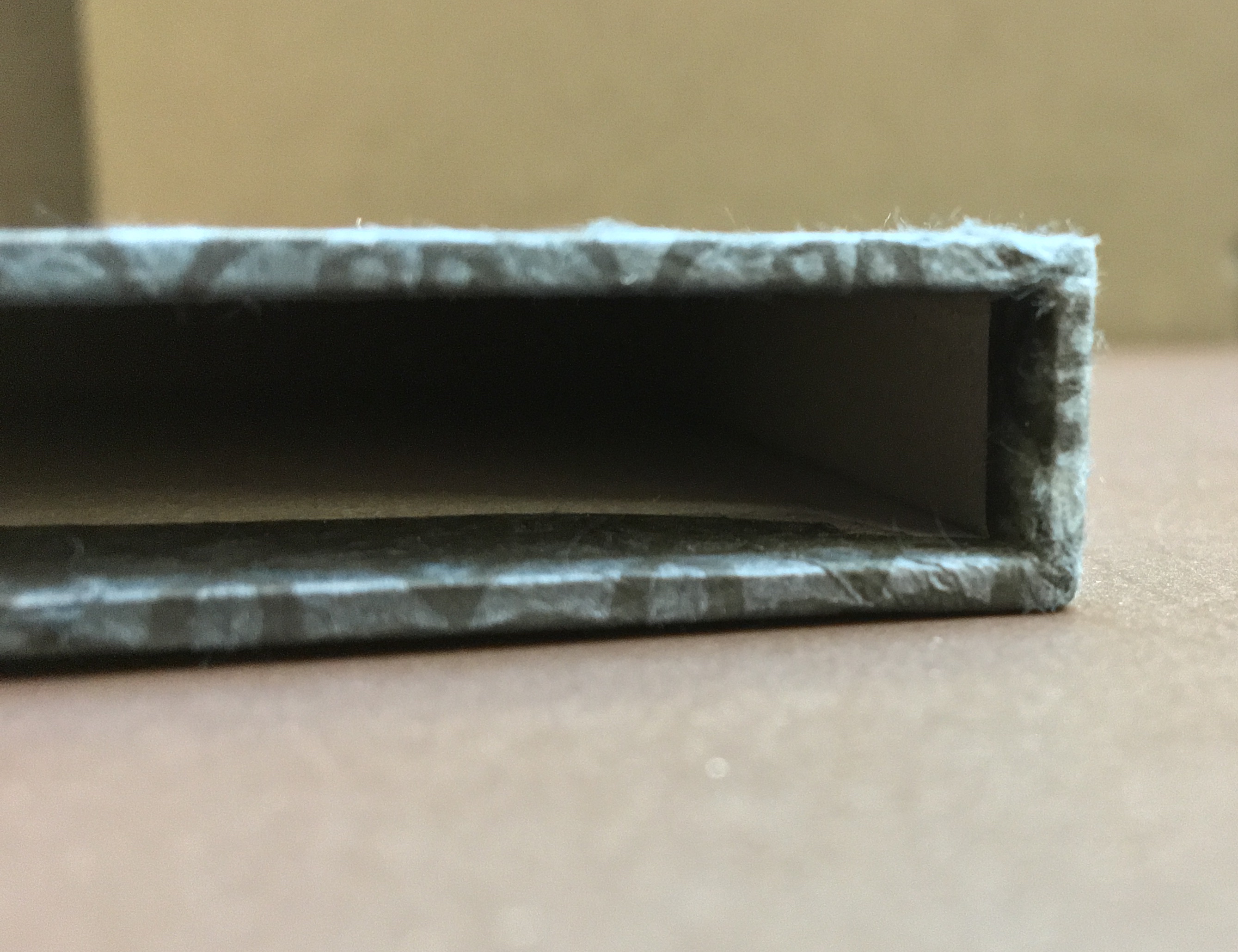
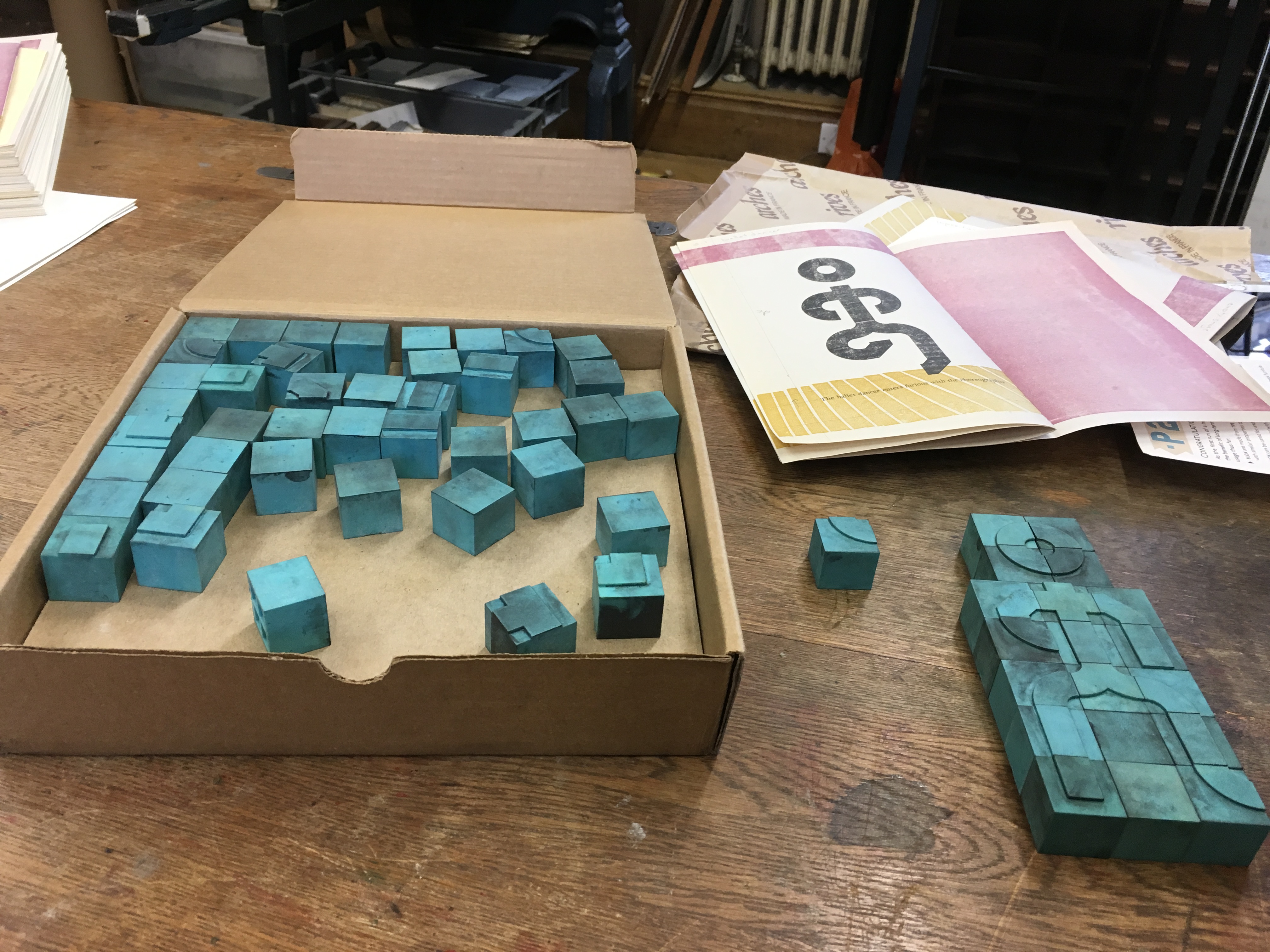
Neo Emblemata Nova (2005) Daniel E. Kelm Box: H96 x W109 x D102 mm closed. Booklet cover: H72 x W79 mm closed, H72 x W224 mm open. Booklet: H72 x W78 mm. Möbius strip: each tile is H70 x W70 mm; the strip extended is 1000 mm. Edition of twenty-one, of which this is #18. Acquired from the artist, 20 October 2018.
Opening the work.
Booklet about the work and its creation.
Inside the top of the box.
Closing and returning the Möbius strip to its box requires considerably more dexterity than reading; so much so that the booklet included provides instructions.
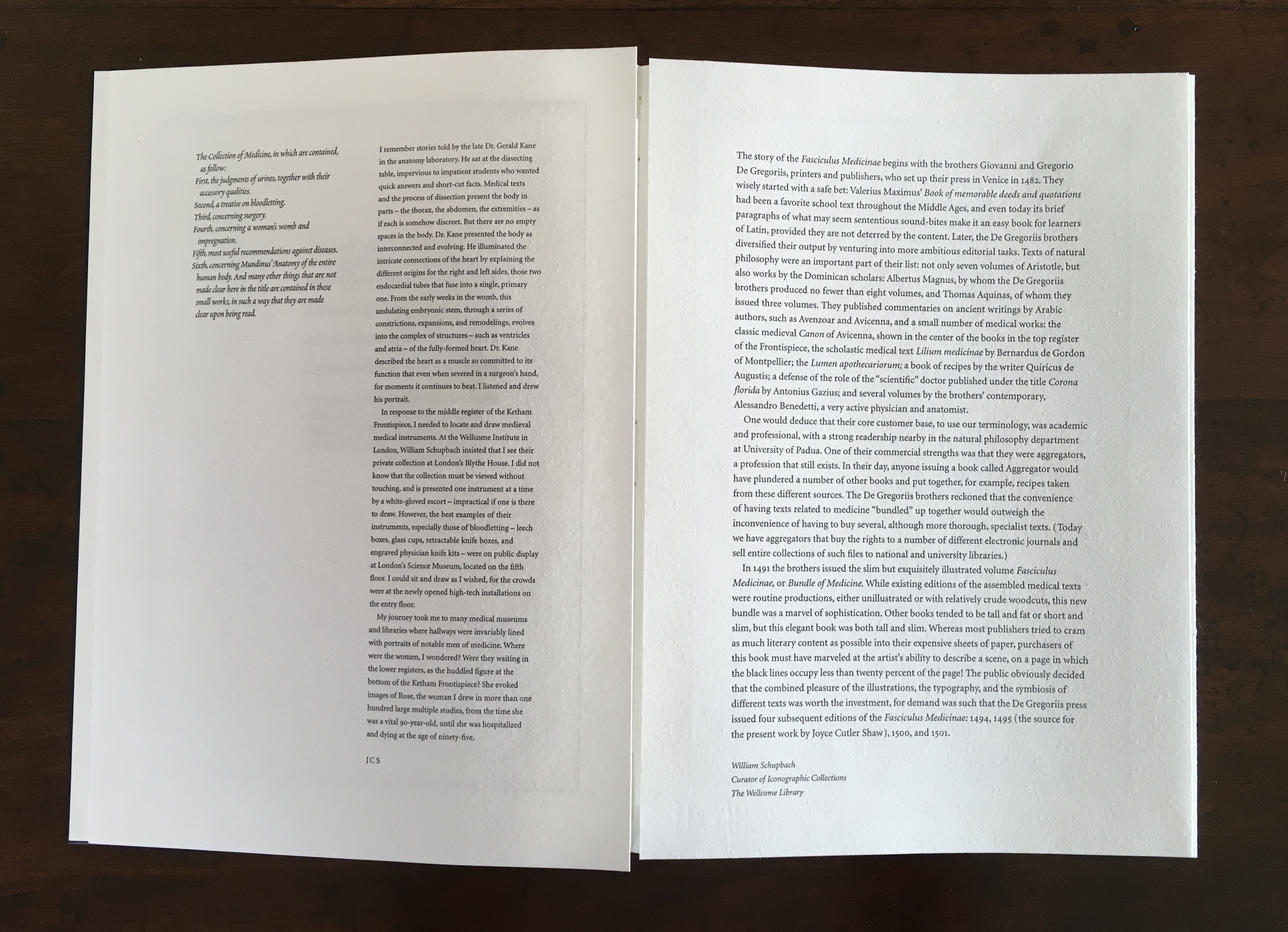
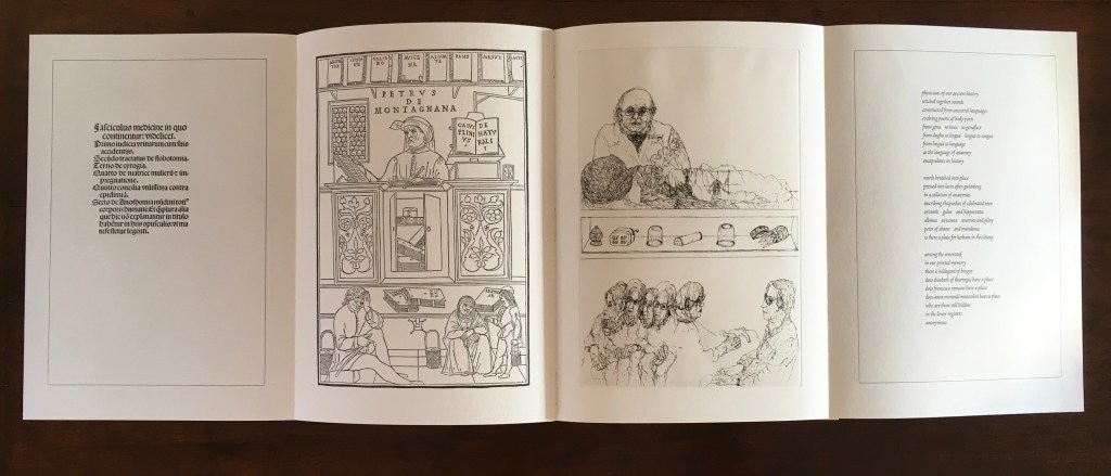
The Anatomy Lesson (2004)
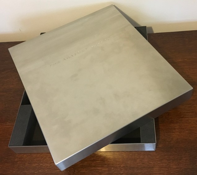
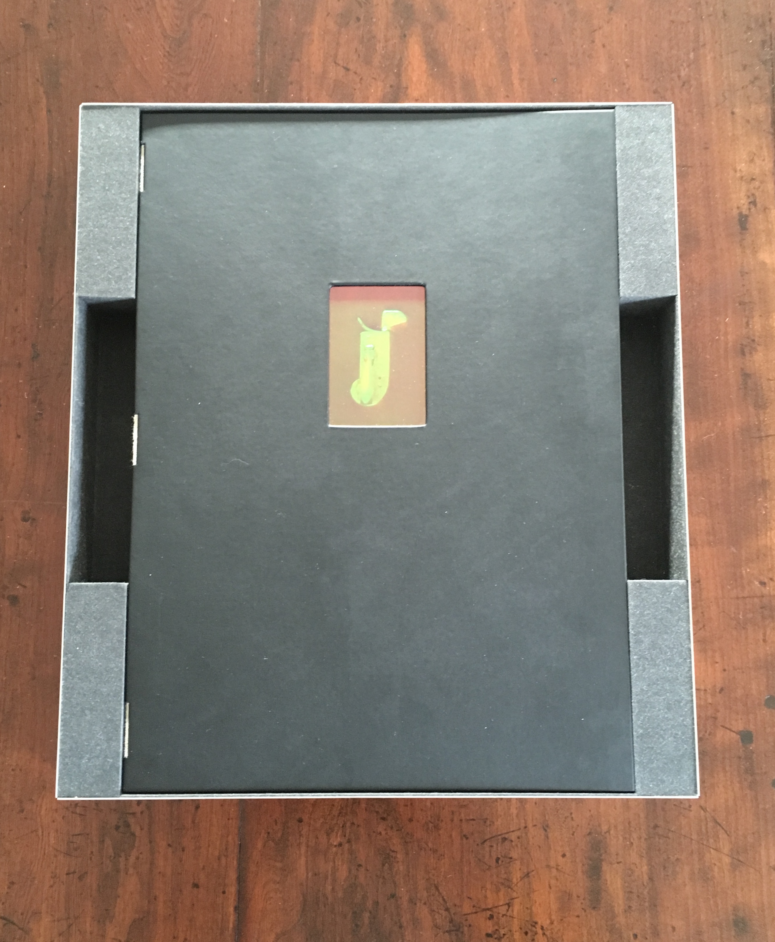
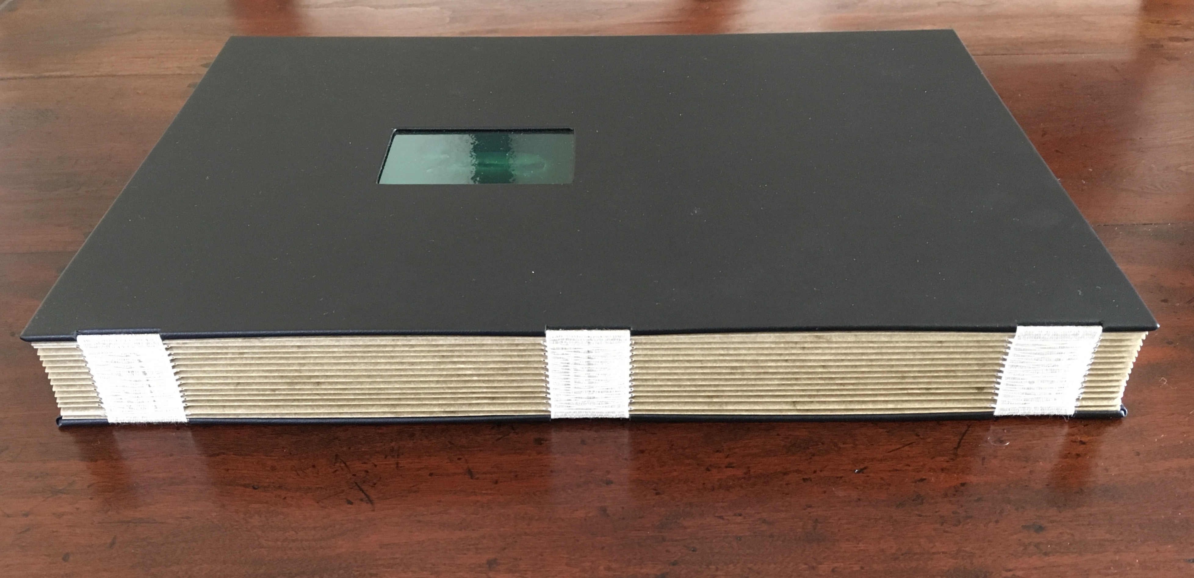
The Anatomy Lesson (2004) Joyce Cutler-Shaw Middletown, CT: Robin Price, Publisher, 2004) Limited edition of 50, of which this signed copy is the binder’s copy (Daniel E. Kelm). Acquired from the binder, 20 October 2018.
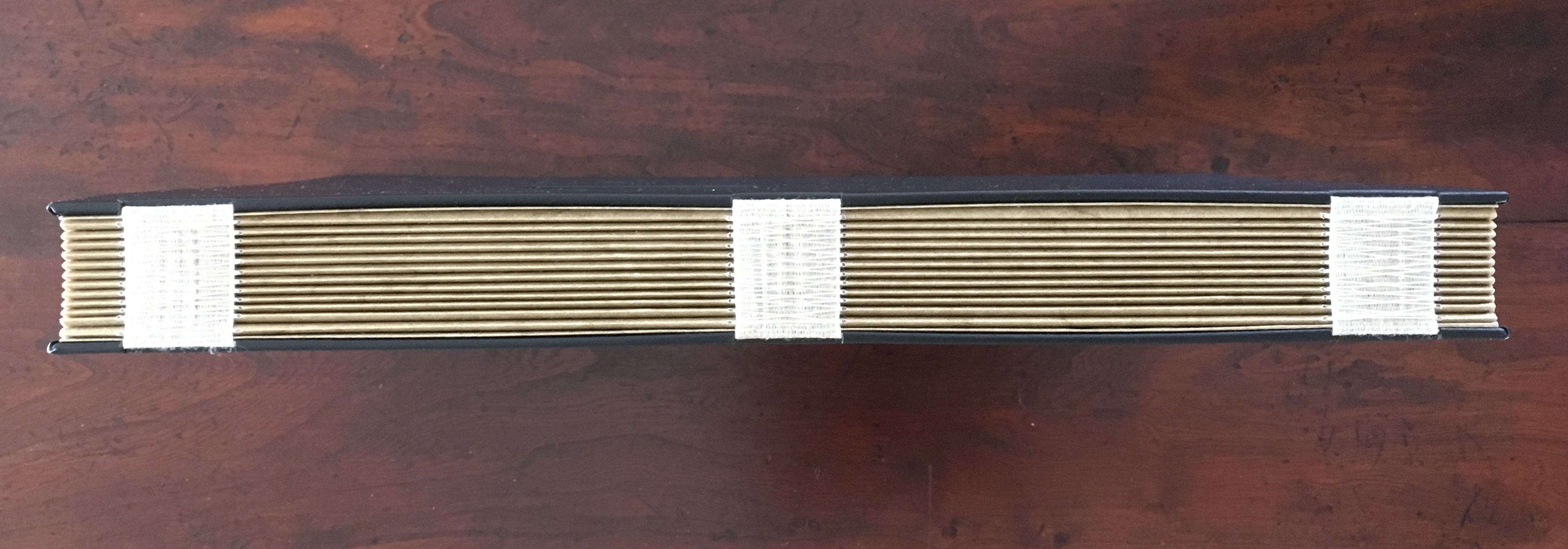
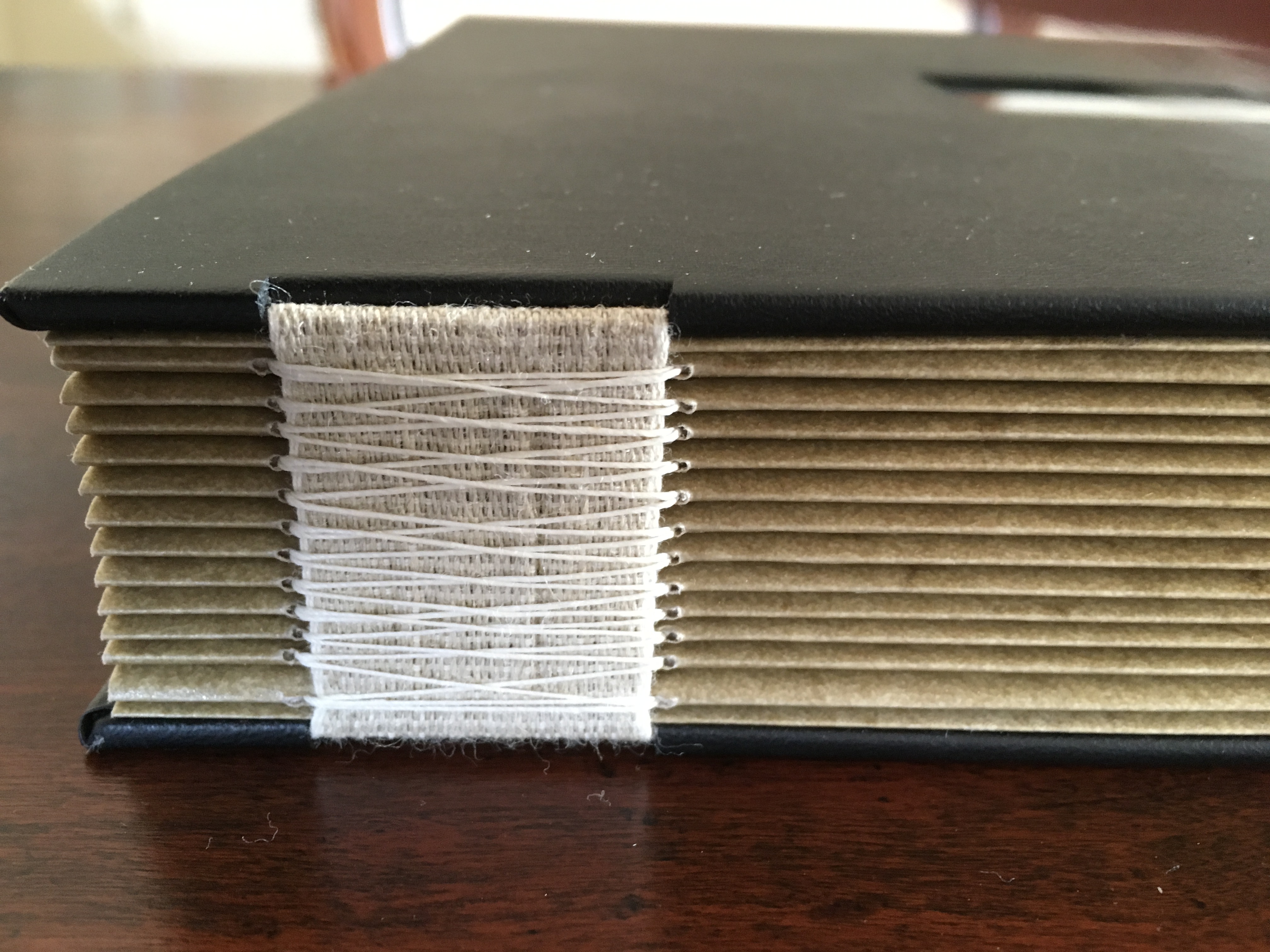
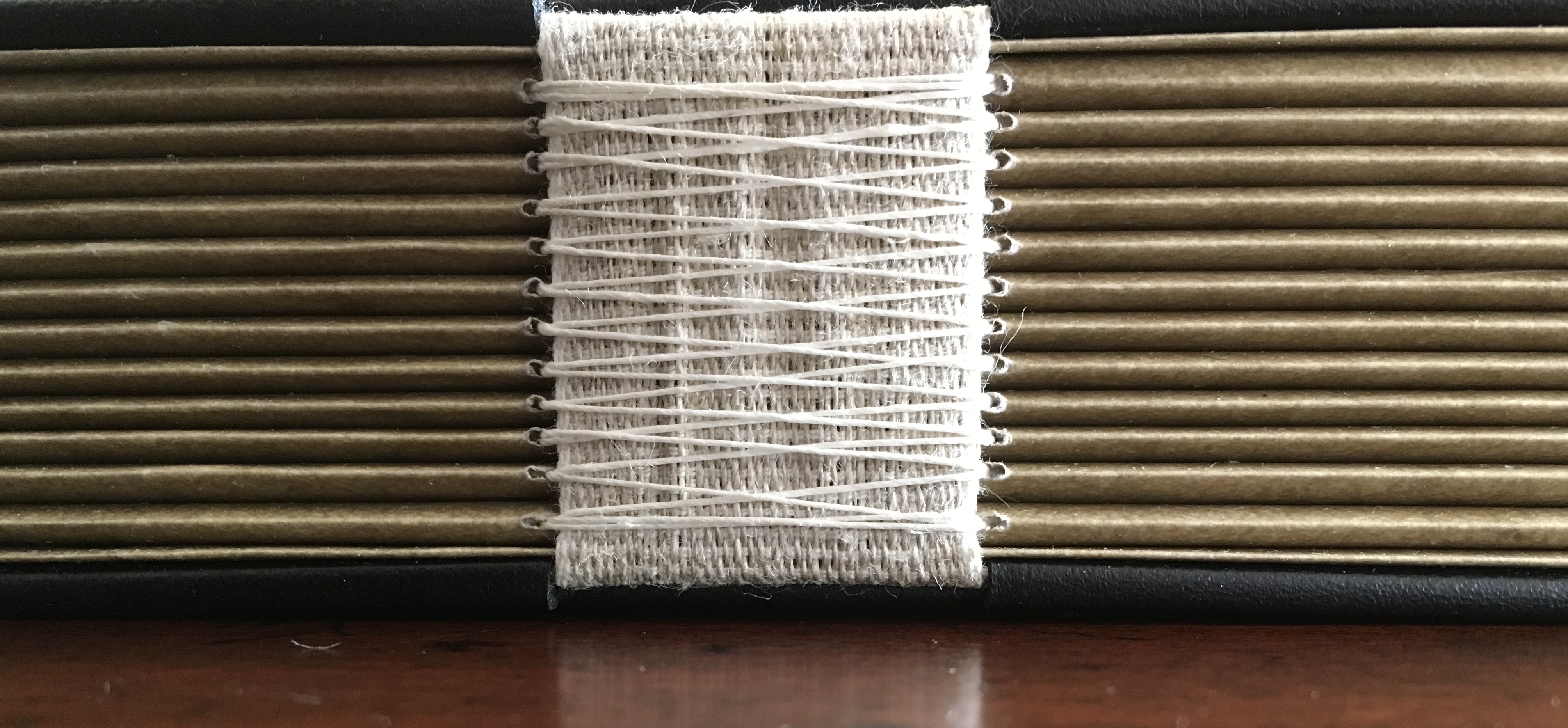
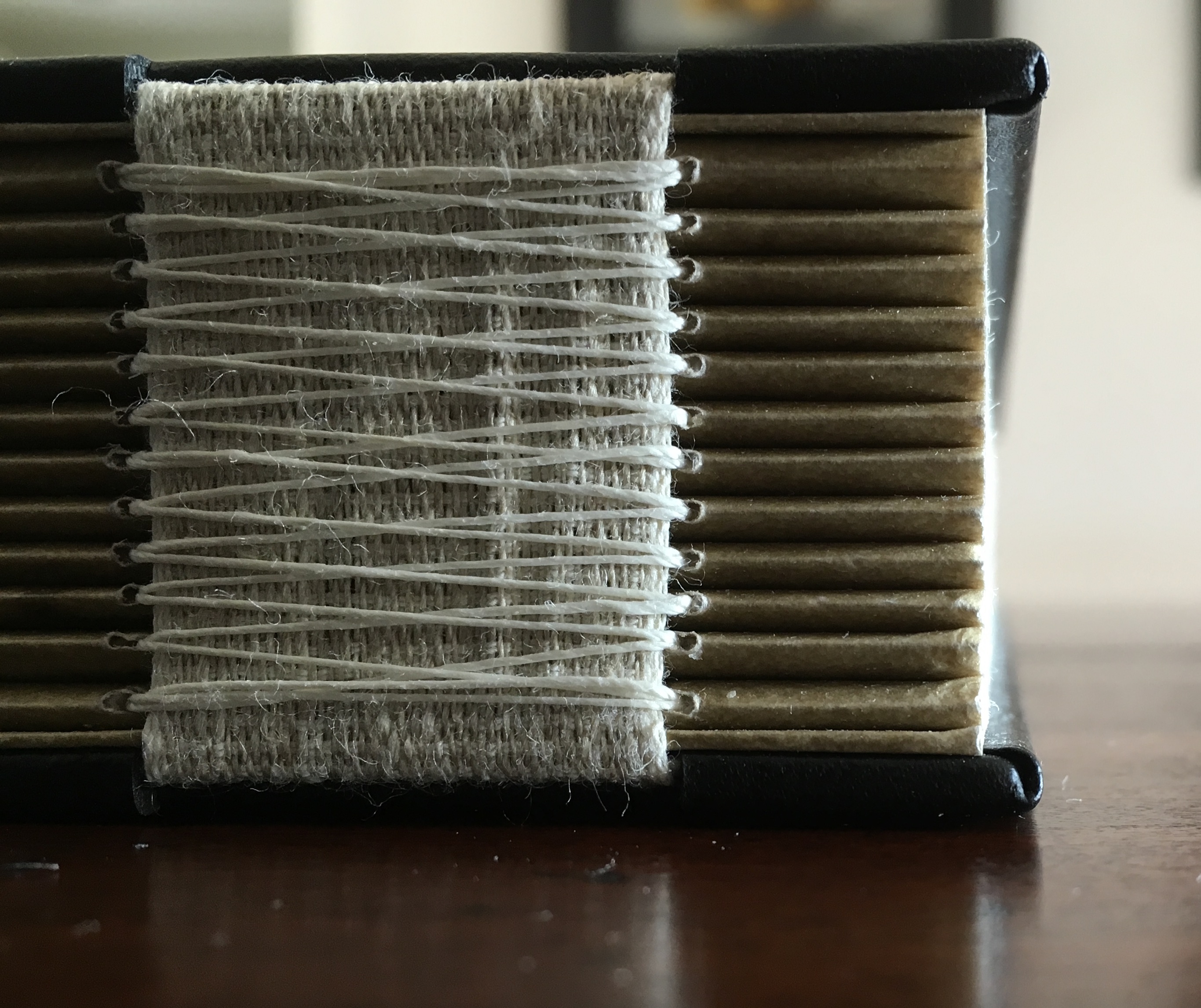
Twelve signatures of handmade cotton text paper, the central ten signatures each made up of one sheet H356 x W514 mm and one sheet H356 x W500 mm glued to the 14 mm margin of the first sheet, for a total of ninety-six pages, each measuring H356 x W253 mm. Binding of leather covered boards (a hologram embedded in front cover) with an open spine, taped and sewn into a reinforcing concertina structure: H361 X W259 mm. Contained in engraved steel box: H370 x W326 x D44 mm.
Detail of sewing and internal view of reinforcing accordion structure. For a description of this type of structure, see Hedi Kyle’s The Art of the Fold(London: Laurence King, 2018), pp. 82-85.
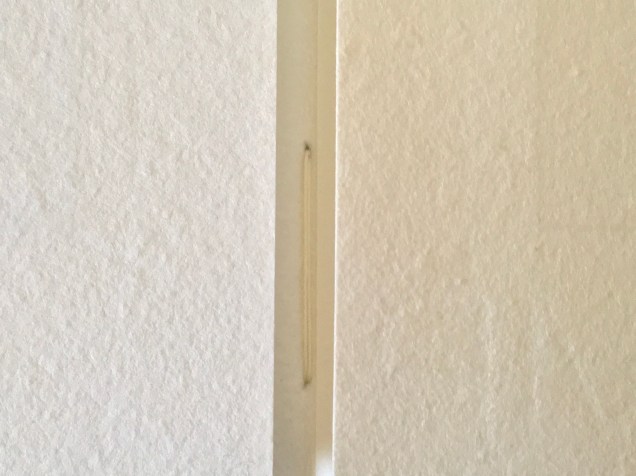
View of the doublure, which is part of the reinforcing concertina structure.
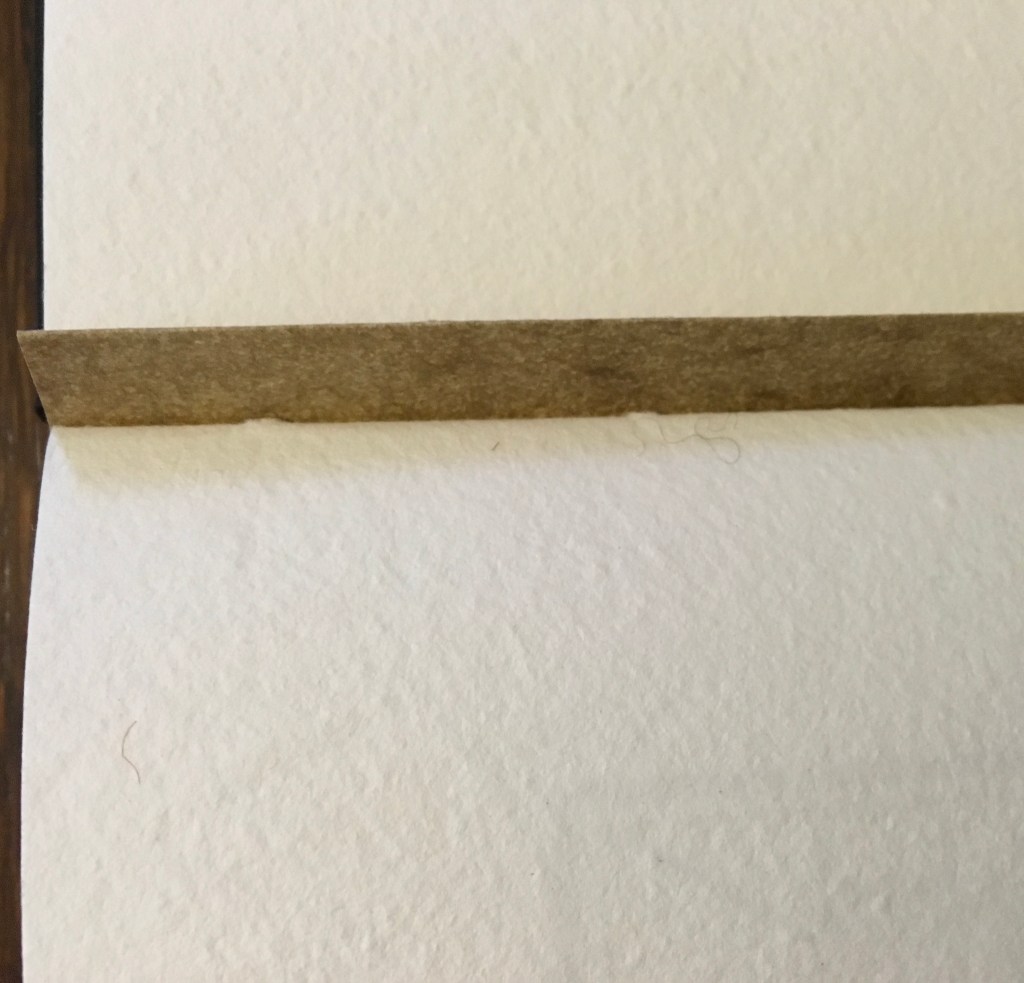
Cover page of second signature.
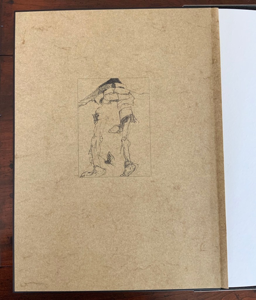
Second signature open to double-page spread.
Second signature open to four-page spread.
Further Reading
“Bieler Press”, in Book Art Object, ed. David Jury (Berkeley, CA: Codex Foundation, 2008), pp. 116-17.
Miller, Steve. “Daniel Kelm”, Book Arts Podcasts, School of Library and Information Studies, University of Alabama, 22 July 2012. Accessed 6 September 2019.
Theme and Permutation (2012) Marlene MacCallum Hand sewn pamphlet, images custom-printed in offset lithography on Mohawk Superfine, text printed in inkjet, covers inkjet printed on translucent Glama. H235 × W216 mm Edition of 100, of which this is #54. Acquired 5 October 2018.
Photos: Books On Books Collection.
Theme and Permutationis one of a series of artist’s books inspired by the experience of living in Corner Brook’s Townsite area on the west coast of the island of Newfoundland. Between 1924-34 the pulp mill built 150 homes to house the mill management and skilled labourers. Over a period of 10 years, I have photographed in several homes, all the same type-4 model as the one I live in. These homes vary in condition from close to original in design and décor to highly renovated. This project gave me the rare opportunity to record the evolution of interior aspects of these homes. It has been the context to explore the paradoxical phenomena of conformity and individualization that occurs in a company town. Having grown up in a suburban housing development, my earliest memories of home is that of living in a space that is reminiscent of my neighbors’. Each artist’s book explores a distinct facet of image memory, multiplicity, sequence and offers the viewer a visual equivalence of the uncanny. Theme and Permutation is a response to the permutations and variations of the type-4 Townsite House. Digital tools were used to translate the original film source of eight different window images from five houses. The sixteen offset lithographic plates were custom printed in twenty-nine separate press runs. Each image is the result of a different combination of plates. The structure is a sewn pamphlet with translucent covers. The viewer enters the body of the book with a tritone image of a single Townsite window. As one moves into the piece, new window images appear and layer over each other. The images become darker and more heavily layered towards the mid-point. The center spread has an inkjet layer of two text blocks printed over the offset litho images. The text speaks of the history of the homes, the architectural permutations and economic shifts within the Townsite area. The ensuing pages continue to provide new combinations of window layers, gradually lightening in tonality and allowing the individual windows to become more distinct. A third text block provides a personal narrative. The piece concludes with a tritone image of one of the Townsite windows in original condition.(From artist’s website. Accessed 1 September 2019.)
*From the artist’s description of Wall Stories (2014).
Chicago Octet (2014)
Chicago Octet (2014) Marlene MacCallum Hand bound artist’s book with folded paper structure, letterpress and inkjet printing, H166 × W78 mm closed, H443 x W293 mm open Unique. Acquired 5 October 2018.
Photos: Books On Books Collection
Chicago Octet is a work of visual poetry by eight masters of book art. If they were performing music (and you can almost hear the music of Michigan Avenue), MacCallum would be their performing conductor.
The piece I created, Chicago Octet, had several collaborative components. The letterpress printing consisted of a word selected by each participant printed on one of Scott [McCarney]’s folded structures. The images were a digital layering of every cityscape photograph that I made and then inkjet printed on top of the letterpress. The final folded structure was designed by Mary Clare Butler. The case was designed and built by Scott McCarney, the front cover embossment was by David Morrish and Clifton Meador. (From artist’s website. Accessed 31 August 2017.)
Update: With funding from the Canada Council for the Arts Digital Originals Grant and assistance of Matthew Hollett and David Morrish during the Covid pandemic, the artist created Shadows Cast and Present, a digital re-imagining of her three most recent book works. The three cantos into which the work is divided also enrich one’s appreciation of Theme and Permutation and Chicago Octet. MacCallum orchestrates the various media — text; sound from music, voice and the noise of city and nature; video — with a touch as light as paper and light.
Further Reading
Books On Books. “Architecture”. Books On Books, 12 November 2018.
MacCallum, Marlene. 2014. Wall Stories. Website. For the text cited in the epigraph for this entry, go to the last linked image in the series of thumbnails displayed.
Otis Artist Book Collection. “Conrad Gleber ‘Chicago Sky Line’”, 27 January 2014. Gleber’s work is an interesting one to compare with Chicago Octet. Chicago Sky Line (1977) is a fan book of photographs secured at a single point by the binding and, when spread clockwise, reveals the sky above Chicago and, when spread counterclockwise, shows the Chicago “skyline” below clouds and sky.
Magicienne des formes et des couleurs is how Art & Métiers du Livre (2002) describes Shirley Sharoff. The magic she makes reveals itself in a particular kind of fusion. One of structure, content as image, content as text, color, type, layout, material and craft. It is a magic best sensed when handling or really seeing her work.
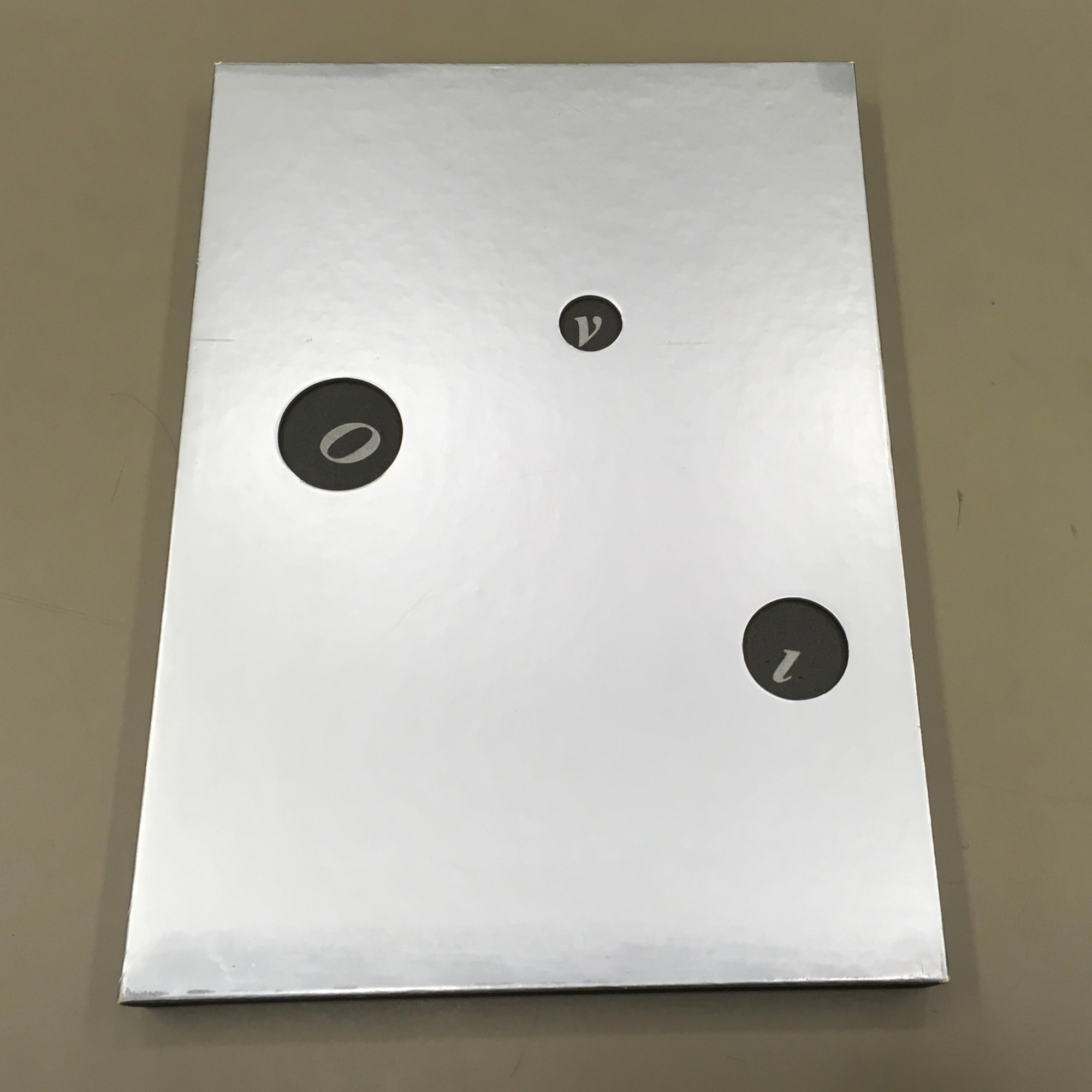
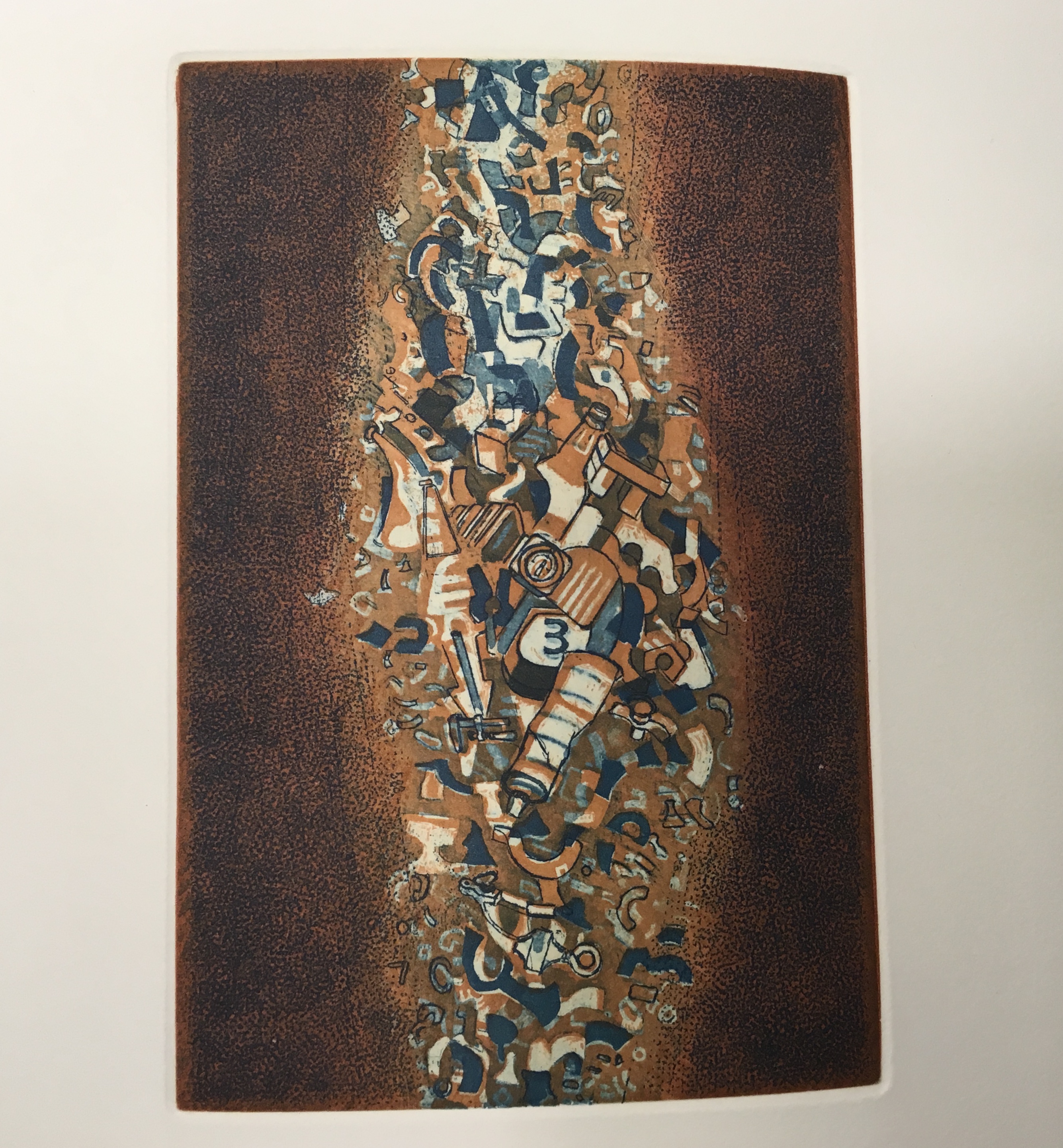
OVI: objets volants identifiés dans le ciel d’Italo Calvino (1988) Shirley Sharoff Graphic ‘big bang’ and typographic spirals with an extract from Cosmicomics by Italo Calvino, postface by Mario Fusco 4 color etchings printed by the Atelier René Tazé Edition of 74 on Vélin Rives Typography by François Da Ros in Cochin typeface In a silver-colored box of 26.5 x 37 cm Photos by Books On Books and reproduced with artist’s permisision
Brooklyn-born but resident and working in France for most of her life, Sharoff studied in Paris under Gotthard Johnny Friedlaender (1912-1992), learning his method of making color prints from two or three different plates. She came to the artist’s book in the 1980s through a friend who introduced her to a typographer with whom the friend was working: François Da Ros.
During my conversation with [Da Ros], I told him that I had an idea for a book but didn’t know how to go about it. It involved prints and an excerpt from one of Italo Calvino’s works. … that’s how my first artist book got started — and once I did that I thought “artist books” were so interesting that I just wanted to keep on doing it. — Artist’s correspondence with Books On Books, 18 December 2018
The result of that encounter was OVI (1988). The text came from Calvino’s Big Bang story “Sul far del giorno” (“At daybreak”) in his collection Le Cosmicomiche (1965) (Cosmicomics, 1968). Calvino’s story relates how the main character, Qfwfq, and his extended family, from a species we cannot identify, experience the cosmic Big Bang.
The story’s language, character and narrative deliver an astrophysical and micro-organic alchemy that falls in line with Calvino’s association with the Ouvroir de Littérature Potentielle (OuLiPo) or “Workshop for Potential Literature”. OuLiPo’s participants seek and have sought new forms and structures for literature through play with the properties of language, word games or imposing constraints through mathematical or computational principles such as Boolean algebra or recursiveness. For example, Georges Perec wrote La Disparition (1969), a “lipogrammatic” novel avoiding any words containing the letter “e”. Raymond Queneau constructed Cent mille milliards de poèmes (1961), which is actually an interactive work of book art, confronting readers with 1014 different sonnets generated by the reader’s choosing one of 10 options per line, accessed by turning each line like a page.
OVI lifts this literary playfulness into a revel of intricate puns, played out in language, image, typography and structure or form. Sharoff discovered the Calvino story in Le Monde independently of her prints already underway, but it was the conjunction of the story with them that led her to “an idea for a book”. Although, like Friedlaender, Sharoff would illustrate books, the idea diverged from a mere illustration of the story or a livre d’artiste in the traditional sense. Like many book artists, Sharoff conceived a blend of image, text and form. The Sharoff/Da Ros execution of her idea re-presents, absorbs, reacts to, embodies Calvino’s fiction in a work that stands apart from it. It is the reverse of the usual ekphrasis we see when a literary text strives to re-present, absorb, react to, embody an urn, a sculpture, painting or print. Think of Keats’ “Ode to a Grecian Urn”.
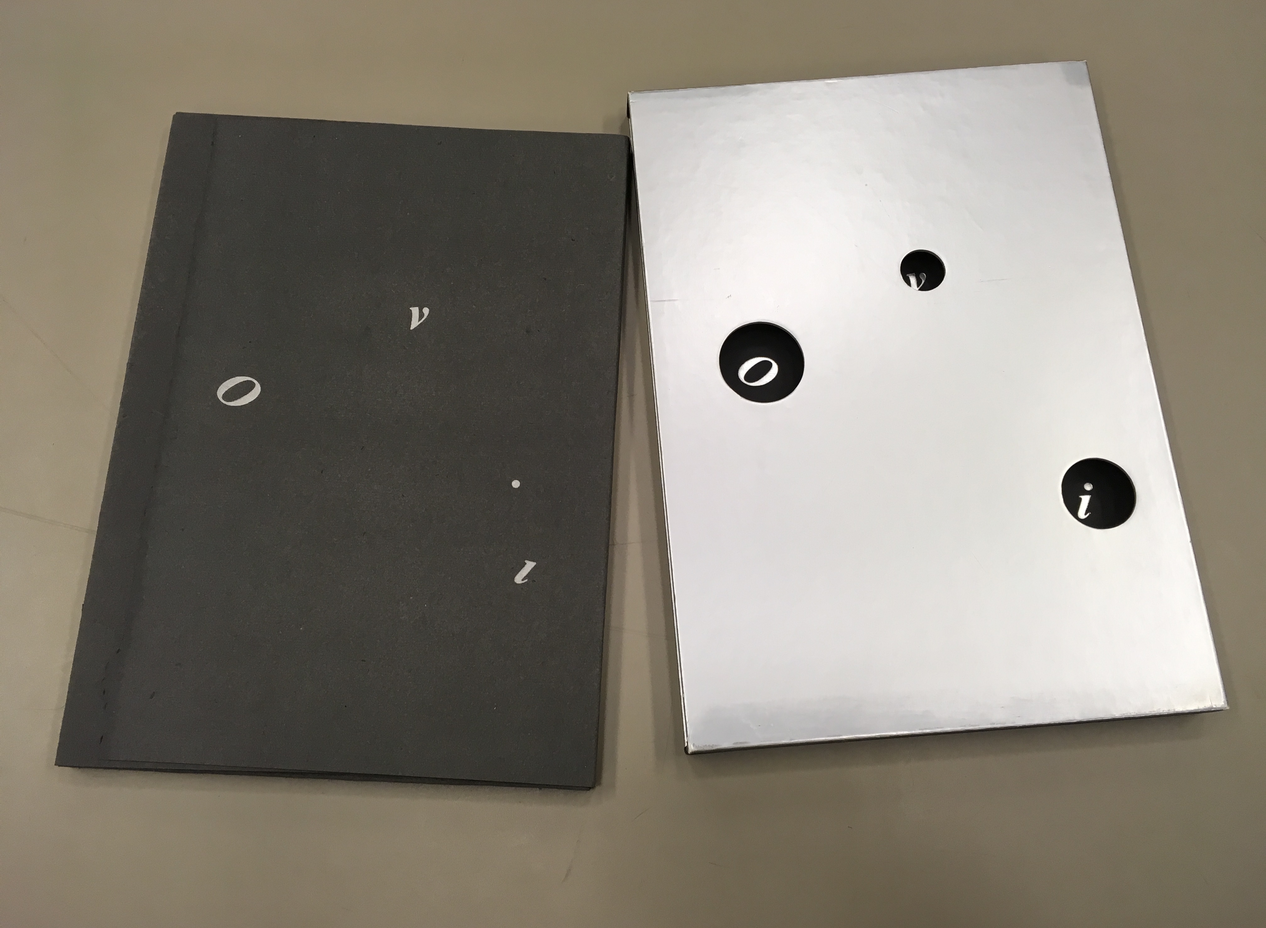
Instead of Unidentified Flying Objects (OVNI in French), the artist gives us OVI (“identified flying objects”), the first three of which are the letters “O”, “v” and “i” appearing through the “black holes” of the silver paper slipcase. As the black portfolio emerges from the slipcase, we see the i’s dot adrift as perhaps another object in the firmament. Through the holes in the slipcase, the same letters reappear printed on the inside of the slipcase but with the i’s dot no longer adrift (the “stars” aligned?). And this is just the start of the punning and play with structure, content as image, content as text, color, type, layout, material and craft.
The portfolio removed from the silver paper slipcase
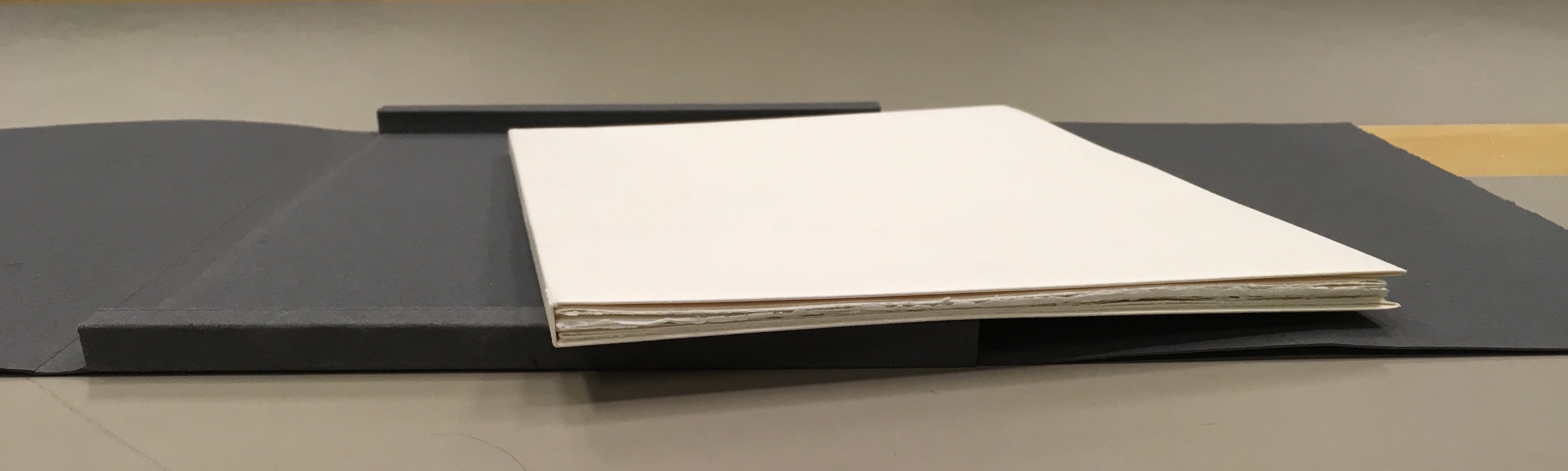
Encased in the trifold black portfolio are nine loose map-like folios.
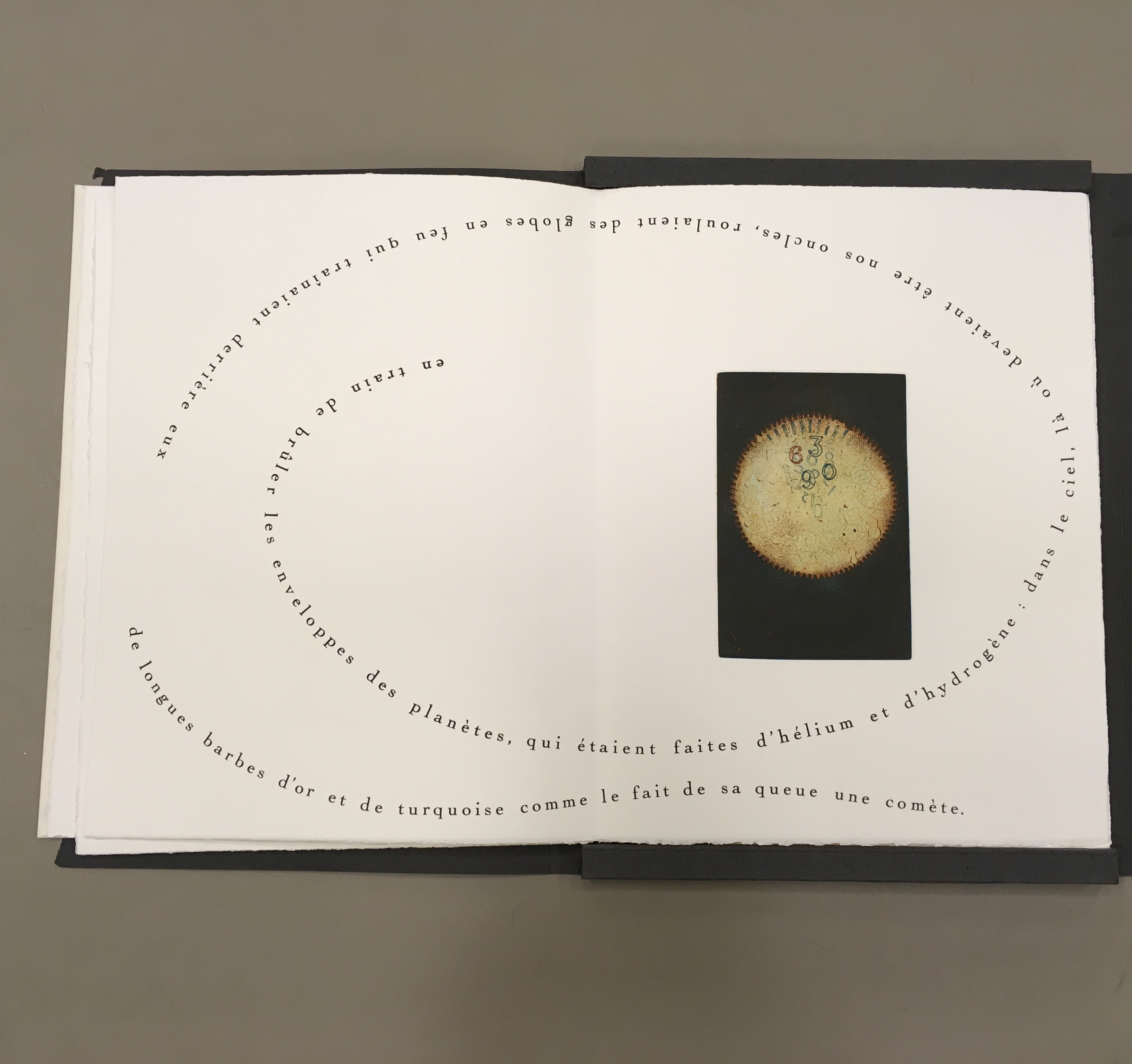
Opened, the folios display selected text from the French translation of Calvino’s short story and four Sharoff prints. In three of the prints, the text swirls, construction-poem-like, around the multicolor images. Part of the folios’ magic here is Sharoff’s fusion of image with the substance of Calvino’s words, a Friedlaender-esque palette and the typographic and form-locking skills of Da Ros.
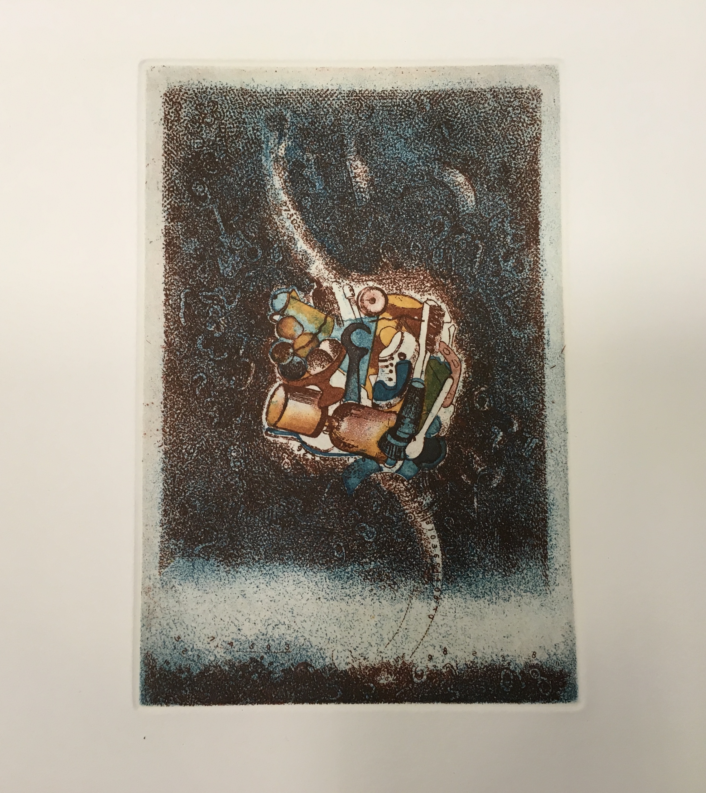
The first image looks like a macrophoto of a cell (or is it an image of the sun?) with numbers superimposed. The second image looks like a cloud nebula (or is it some multicellular life form with two flagellae?) consisting of everyday objects. The third image looks like an asteroid belt (or is it a paramecium?) made of a discarded aerosol can and other trash.
“The darkness came back. By now we were sure that everything that could possibly happen had happened, and ‘yes, this is the end,’ Grandmother said, ‘mind what us old folks say. . .’ Instead, the Earth had merely made one of its turns. It was night. Everything was just beginning.” from Italo Calvino, “Sul far del giorno” in Le Cosmicomiche (Milan: Einaudi, 1965), translated as “At Daybreak” by William Weaver in Cosmicomics (New York: Harcourt, Brace & World, 1968)Detail: the “cloud nebula”(?) image, formed of identifiable everyday objectsDetail: the “asteroid belt” (?) image, formed of everyday detritus
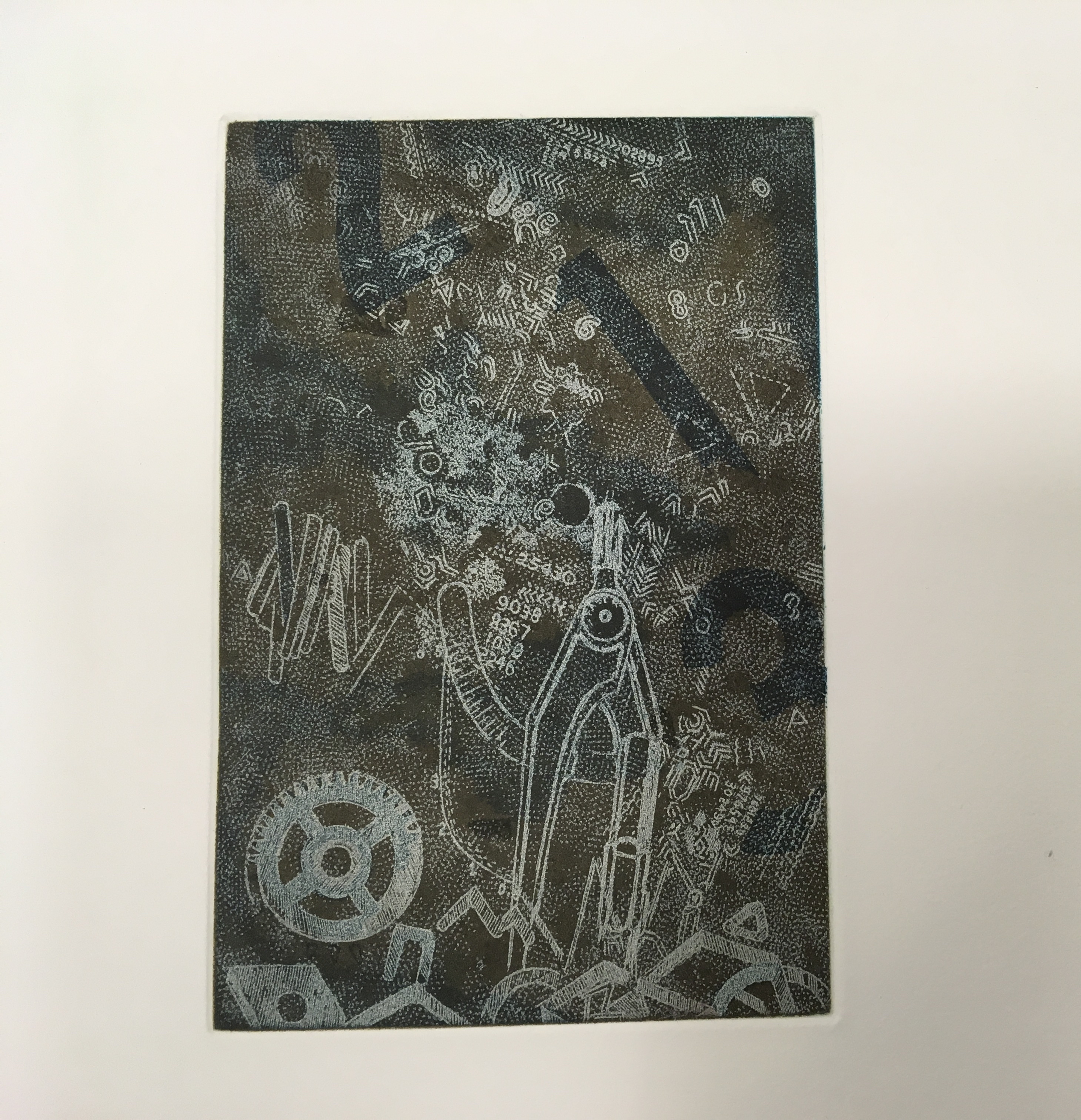
One of the four prints stands alone without text. The image is a cascade of large and small numerals, logic symbols, a gear, protractor and metallic-looking detritus landing in a heap.
Detail: the fourth print
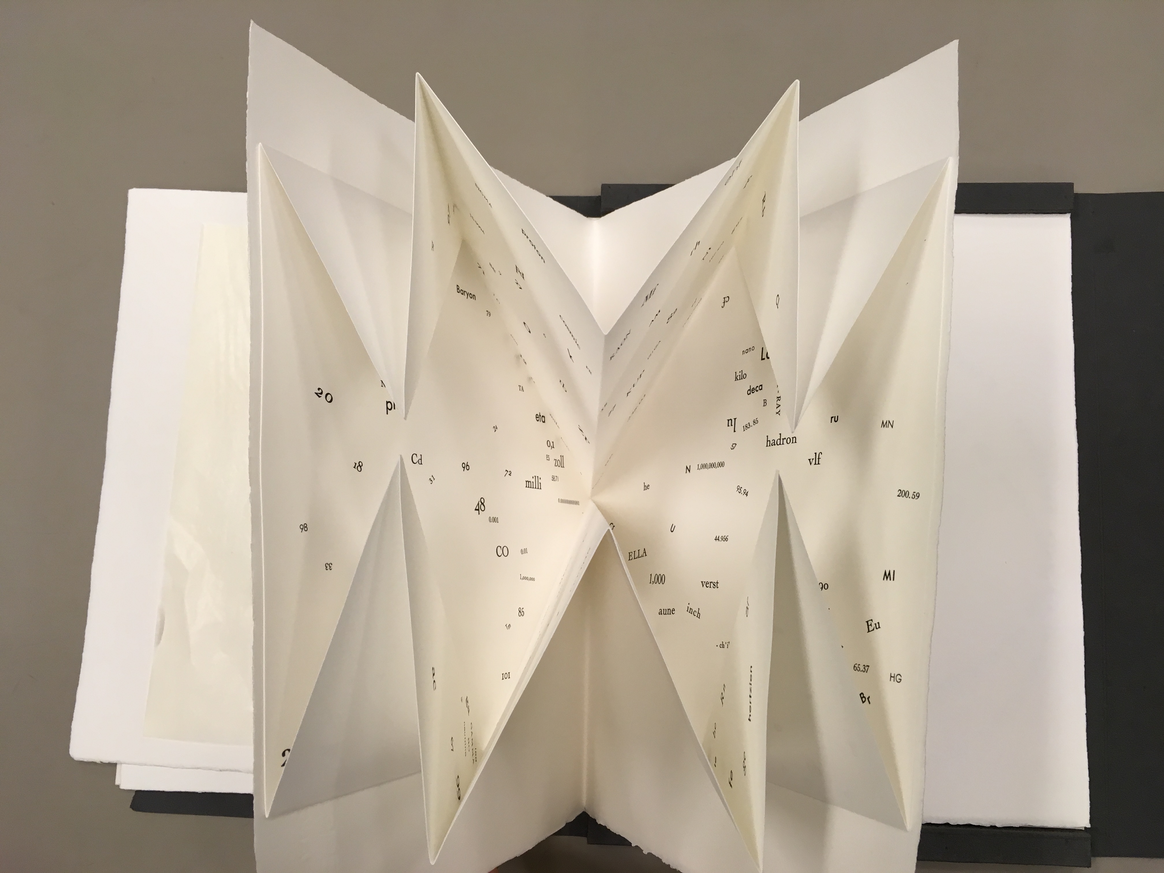
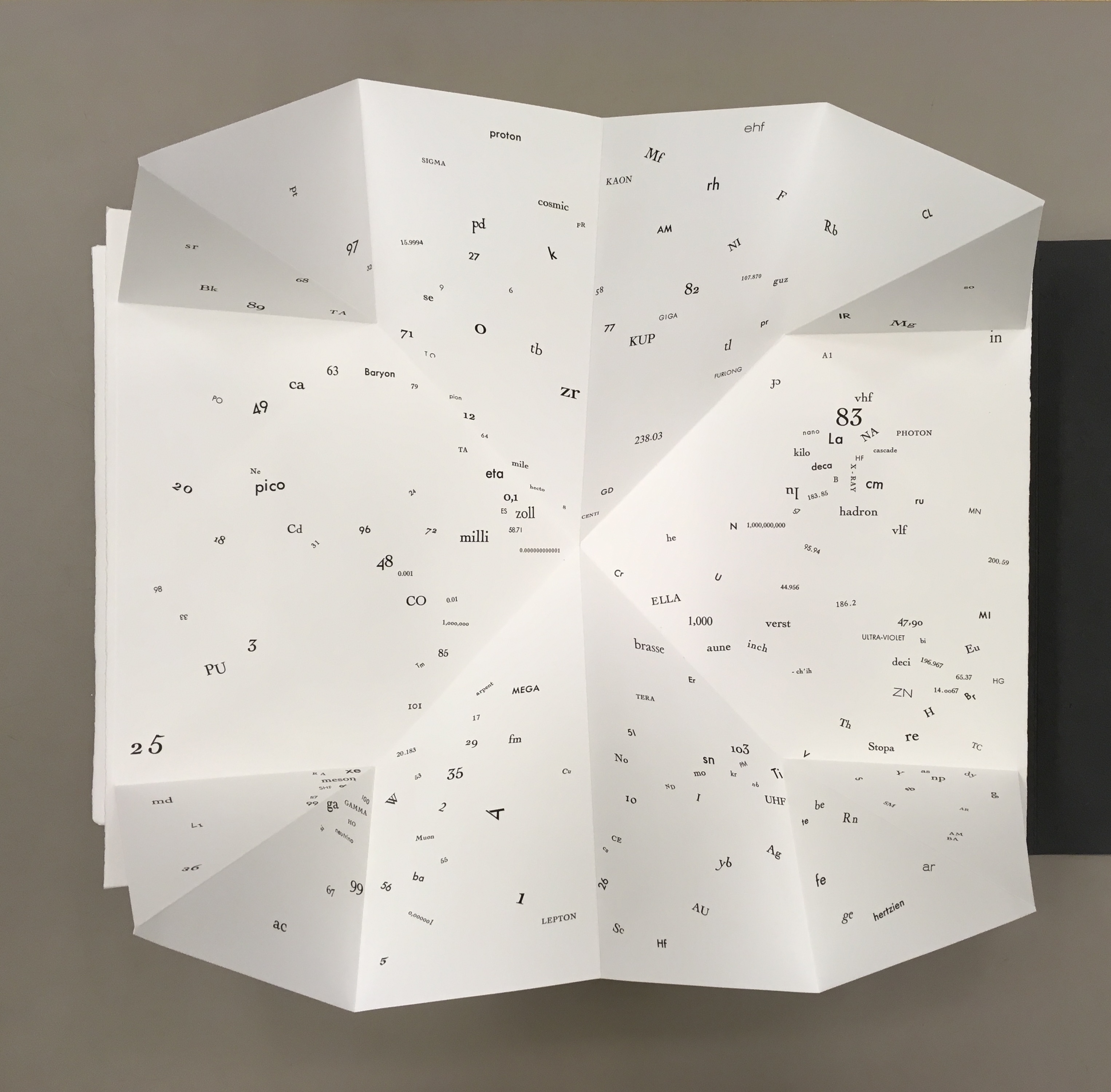
One of the leaves deploys a Turkish map fold, opening to reveal a constellation of numbers, letters from the periodic table and terms from particle physics and astrophysics — an outstanding display of skill from Da Ros and entirely evocative of Qfwfq and his family’s bizarre tale of the big bang. It’s also a prescient reminder that a crater on the planet Mercury and a main asteroid belt were named after Calvino.
The separate folios echo the abrupt jumps in Calvino’s story. In the end, Sharoff succeeds with OVI in echoing how the story — despite those jumps, the bewildering and unpronounceably named characters and the teasing references to familiar and unfamiliar domains of knowledge — hangs together. The spiraling text makes the viewer turn and turn the opened folio to read the words — much as the story’s surreal yet familiar characters and their situations make the reader puzzle through the storyline. The prints present the viewer with familiar yet unfamiliar shapes composed of everyday objects or recognizable symbols. The tactility of the paper, the solidity of the slipcase and texture of the multicolored prints play off the intellectuality of the ekphrasis and scientific images and symbols in much the same way as the familiar familial relations play off the characters’ bewildering experience of the cosmic Big Bang.
Sharoff’s next major artist’s book — again with Da Ros — would be La grande muraille/The Great Wall (1991). There is little if anything implying a Chinese or other oriental influence on printmaking or typography as practiced by Friedlaender or Da Ros, respectively. And until her visit to China in the late eighties, Sharoff’s work showed no such influence. When the influence came, it was concentrated in the one work. Sharoff was concerned not to respond to China in a typical Western artist way or to fall prey to traditions that neglected the hardship or grittiness she saw while teaching English to young Chinese bank employees. Sharoff hungered for a text that would fuse with the images coming to her in reaction to the remnants of the Great Wall, the summer palace’s maze, and post-revolutionary infrastructure.
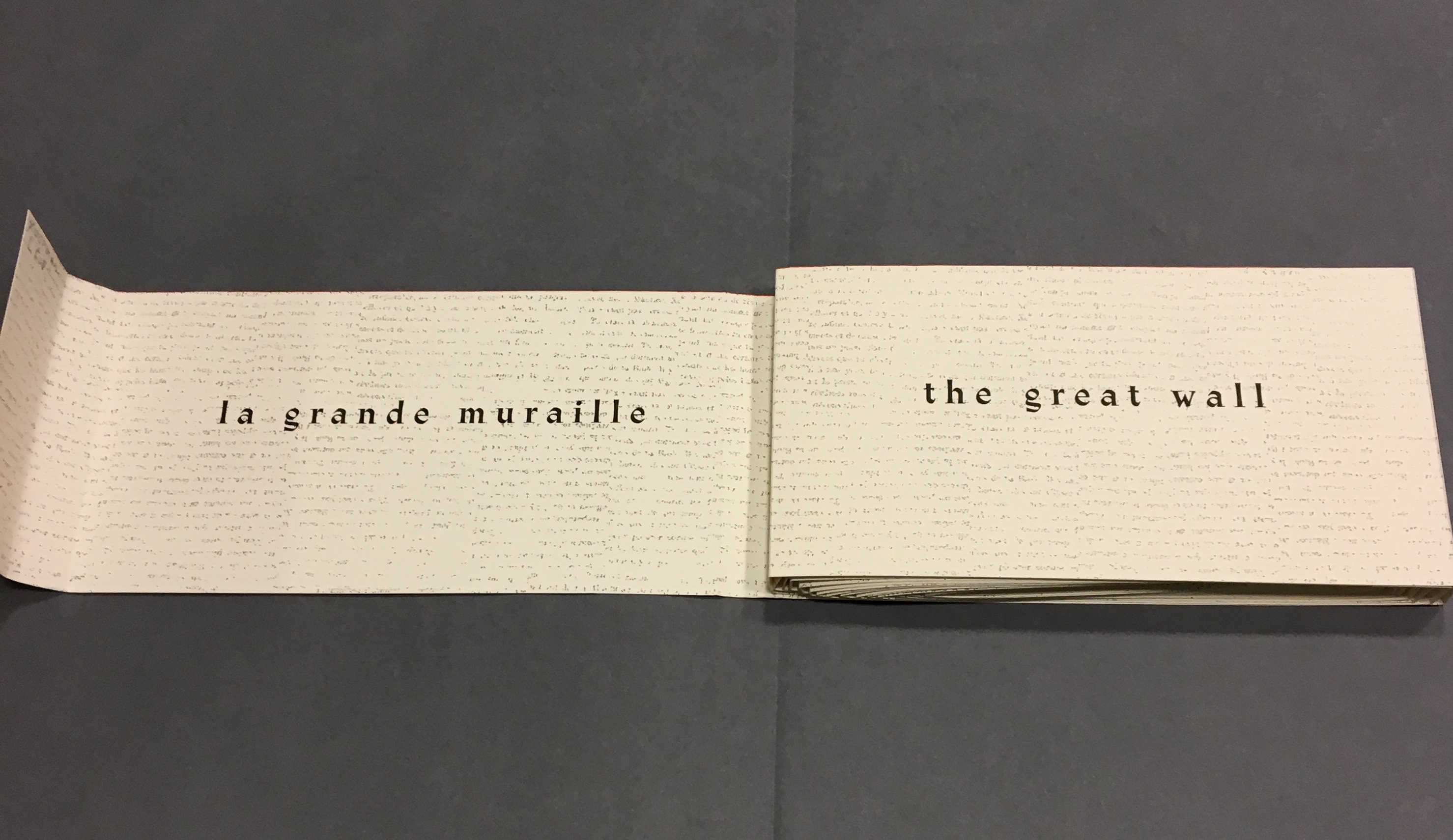
La grande muraille/The Great Wall (1991) Shirley Sharoff Taken at Koninklijke Bibliotheek, Den Haag, Nederlands. Reproduced with permission of the artist.
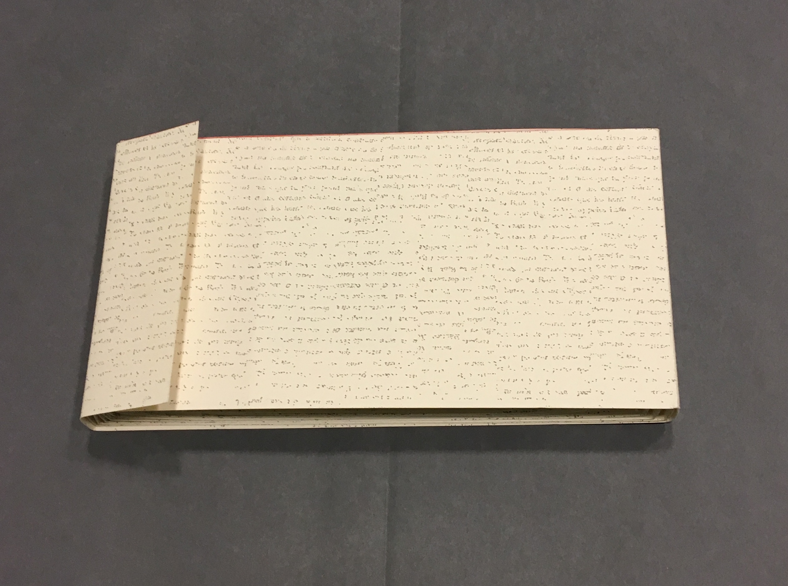
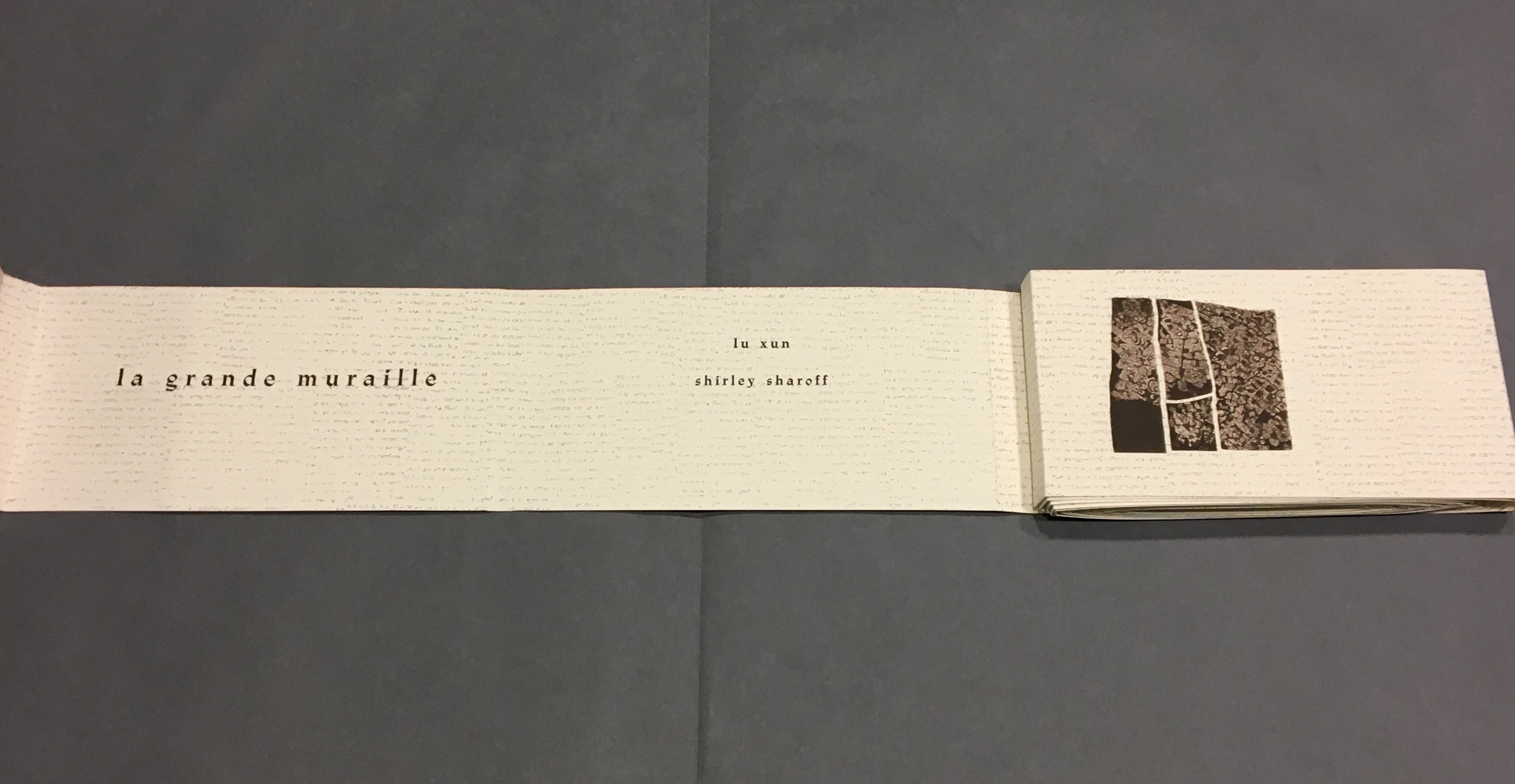
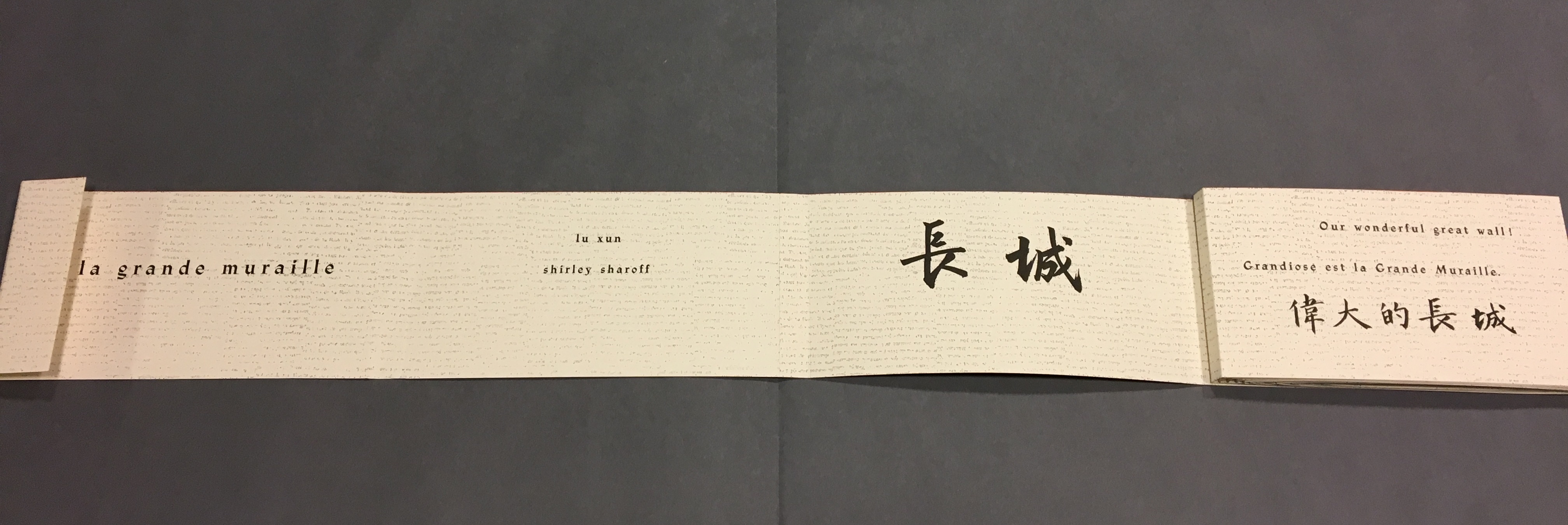
She uses the words of the 1930s writer Lu Xun and those of her 1980s English-language students to bounce echoes of strife, ambivalence and paradox from the walls of her prints and artist’s book, a double-sided accordion in forme en escargot (snail-shell form as she calls it). Lu’s poem appears in Chinese calligraphy and translated into French and English, set in bold and equal in weight to the Chinese characters. Sharoff breaks the three versions across increasingly shorter segments of paper, layering the different languages like mortar and rows of bricks. In a different, smaller typeface — like fragments of modern brick — the English text from her language students, reflecting on Western culture and their lives, is interspersed along with eight prints. The “snail-shell” structure unfolds/unrolls in a way that both “sides of the wall” end up being read. The juxtapositions and structure draw the viewer repeatedly from the flatness of paper into the multiple dimensions of the bookwork.
Bringing together barriers/bridges — languages, cultures and political eras — the bookwork breathes its own original life into Lu’s text of ambivalence and paradox. It is an effect similar but on a different scale to contemporaneous works by Xu Bing: Book from the Sky (1991) and Ghosts Pounding the Wall(1990-91). The faint markings on the Arches paper of Sharoff’s wall, markings created by printing the results of repeated photocopies of an unidentified manuscript, echo the unreadability of Xu’s faux Chinese characters printed from his 4,000 hand-cut stamps for Book from the Sky. The red edge of Sharoff’s wall and the words of Lu Xun catch the echo of Xu’s and his students’ beating their ink-soaked mallets against the rice paper hanging on the Great Wall and invoke the ghosts of those who died building the wall. The execution of the unusual “forme en escargot” equals in exquisiteness and production value any of Xu’s works.
Front cover La grande muraille/The Great Wall (1991), Shirley Sharoff
On first encounter, that snail-shell structure of this double-sided accordion book challenges the reader/viewer. Should the work be completely unfurled? Should it stand on its edge, or be laid flat then turned over? To try to read La grande muraille in those ways, however, is to overlook the multi-page spreads that Sharoff conceived with François Da Ros. The snail-shell form, its multi-page spreads and the text demand that you read La grande muraille as you unroll it or, rather, as you unfold it.
With the book laid flat, the “page spreads” are easier to recognize, the text is easier to read, and the forethought needed for the “imposition” of text and images to deliver the sequential text, easier to marvel at. As each recto page is turned to the right, two new pages appear to the right. This unfolding approach to reading the book offers several intriguing “double- and multi-page spreads” and an experience of the texts and eight prints in the sequence driven by the text. When you have finished reading in this sequence, you will have read both sides of the scroll.
“Pages 1 and 2” As “page 2” is turned to the right and the English title of the work disappears, “pages 3 and 4” come into view.
“Pages 1, 3 and 4” “Page 3” displays the authors names, and “page 4” displays the first of eight prints in the book. As “page 4” is turned to the right and disappears, “pages 5 and 6” appear.
“Pages 1, 3, 5 and 6” “Page 5” gives the title of the book in Chinese calligraphy. On “page 6”, the opening line of Lu Xun’s text appears in English, French and Chinese. Turning “page 1” to the right will cover the authors’ names on “page 3”, and turning “page 6” to the right will yield the next four-page view.
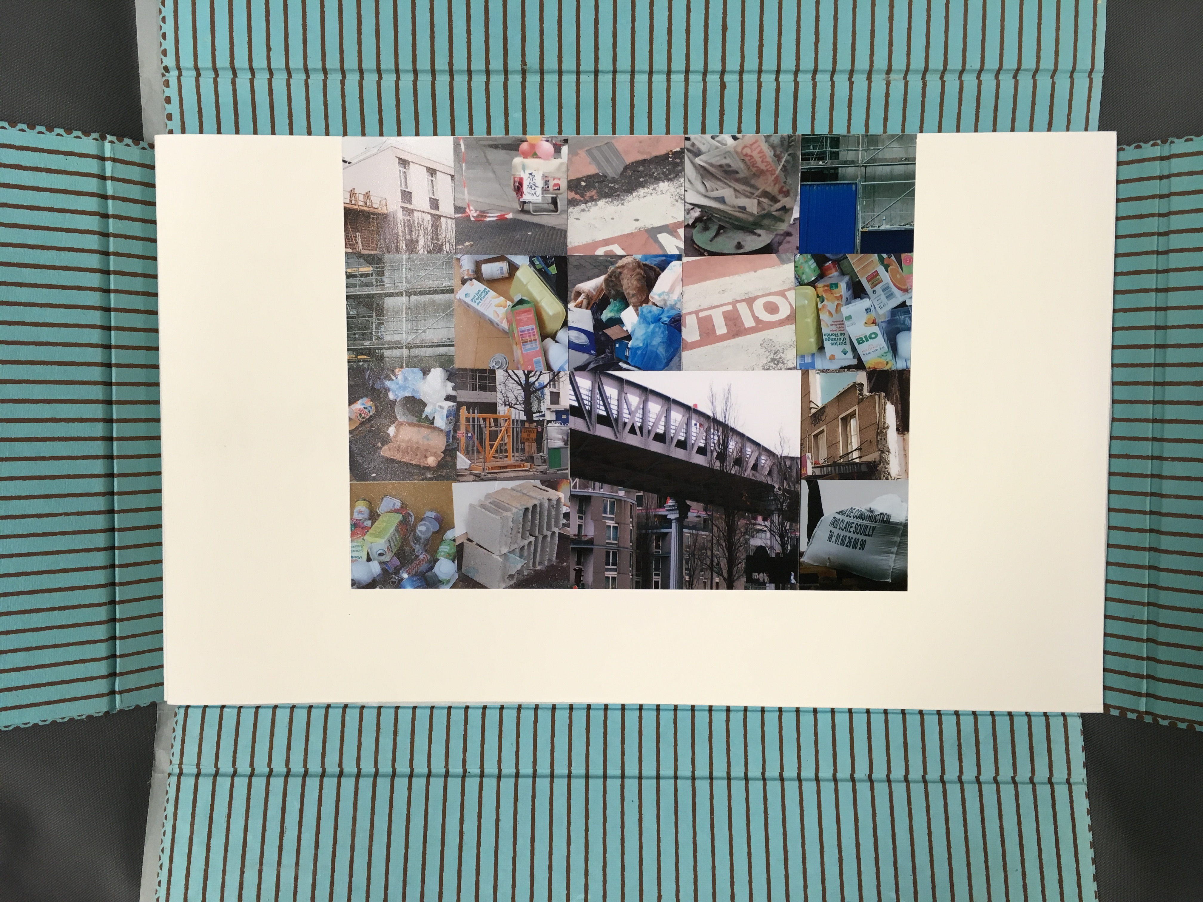
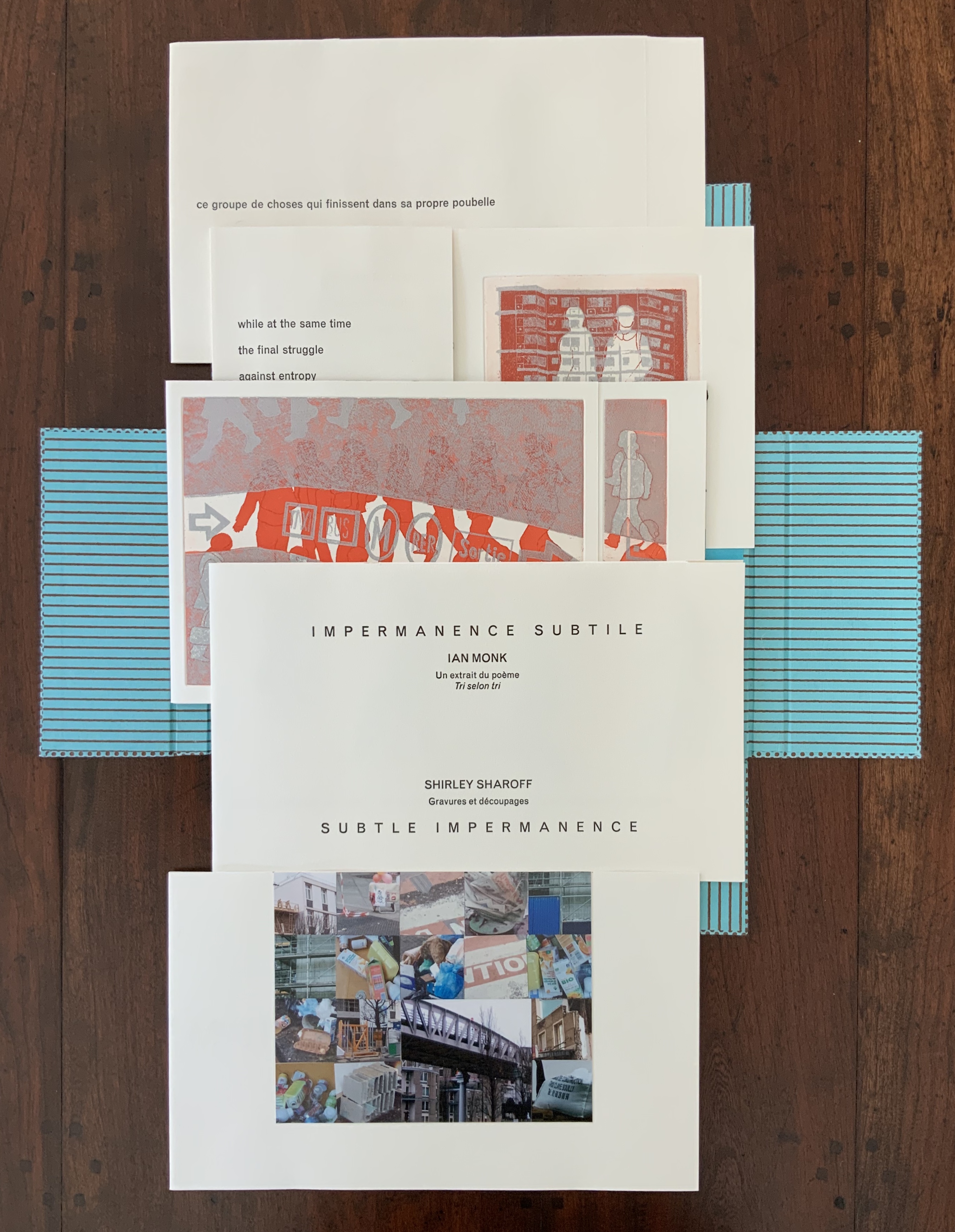
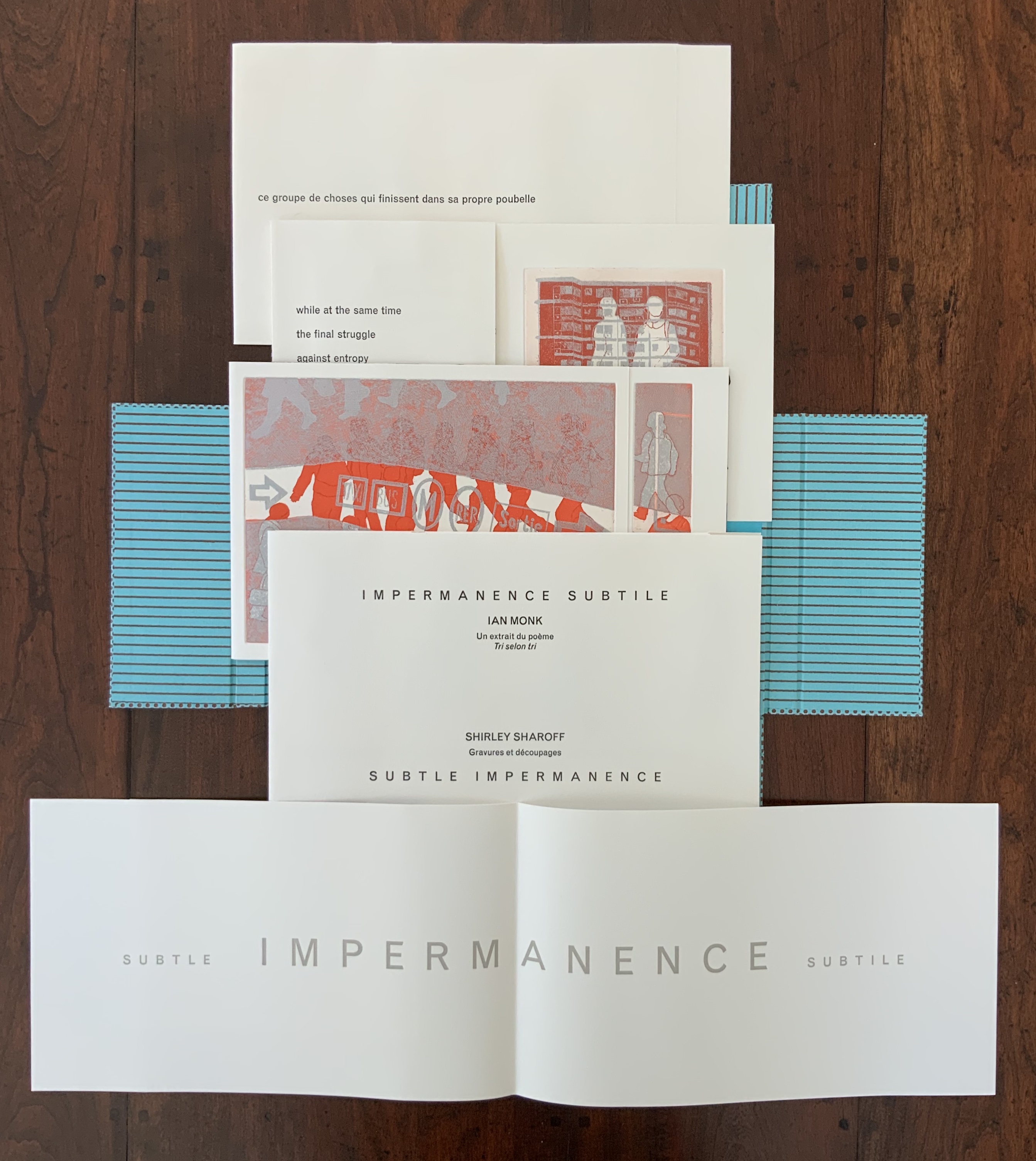
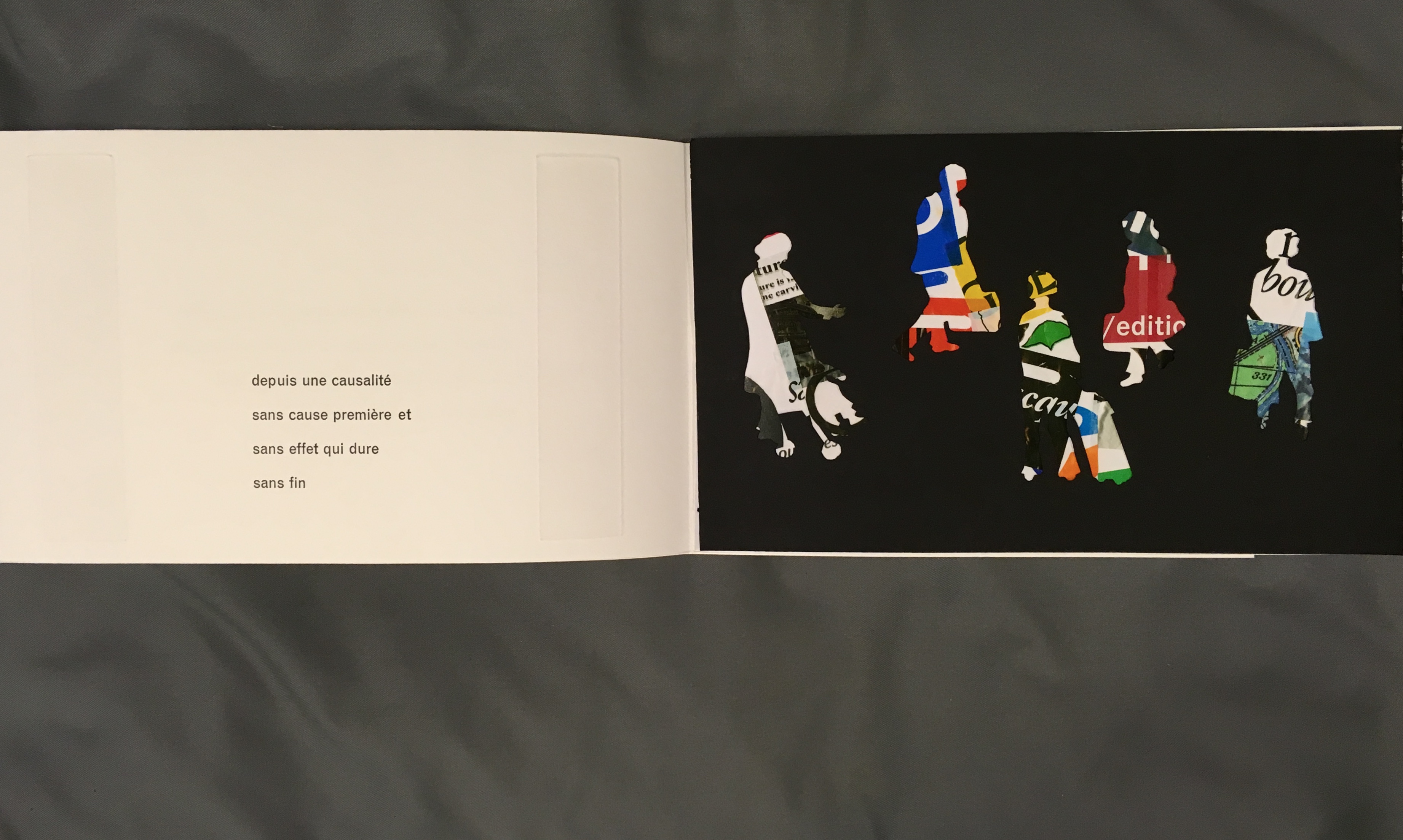
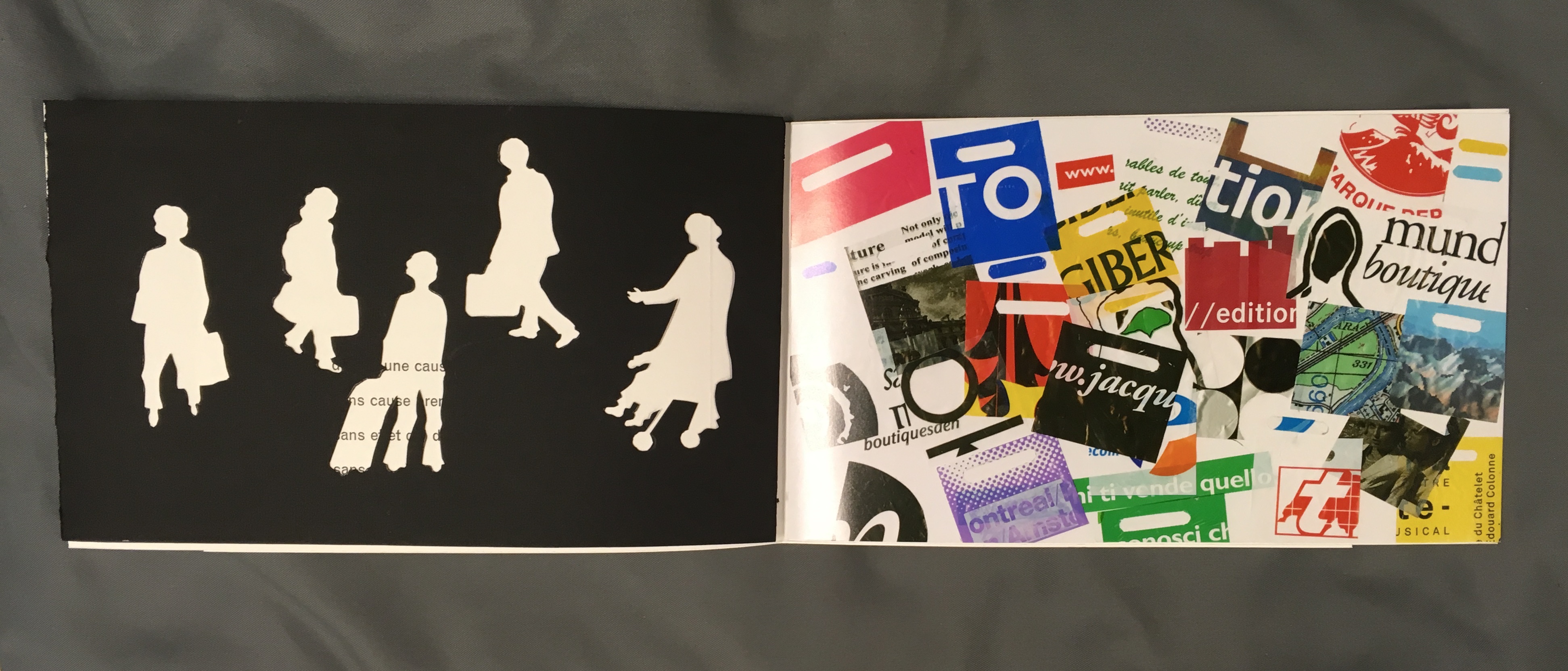
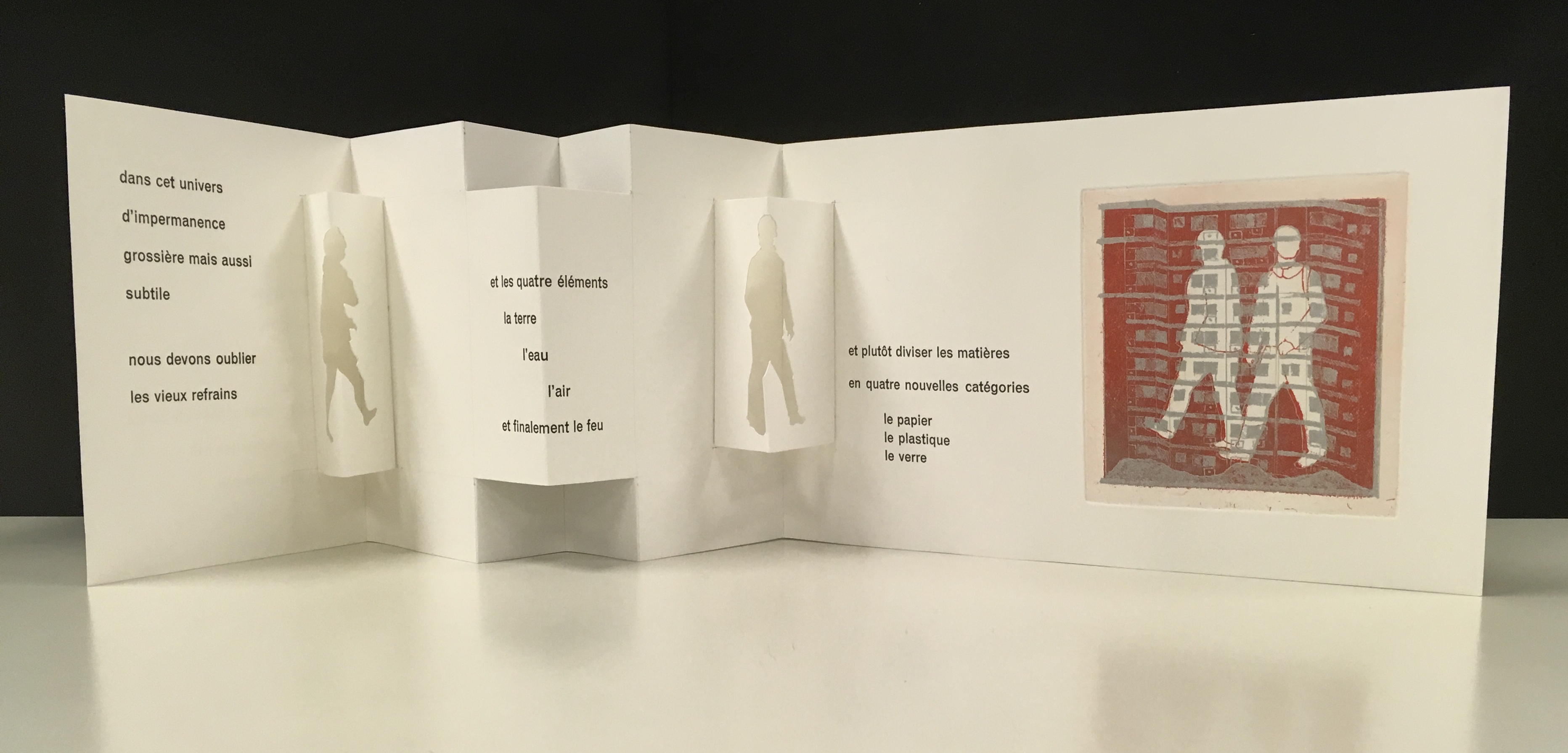
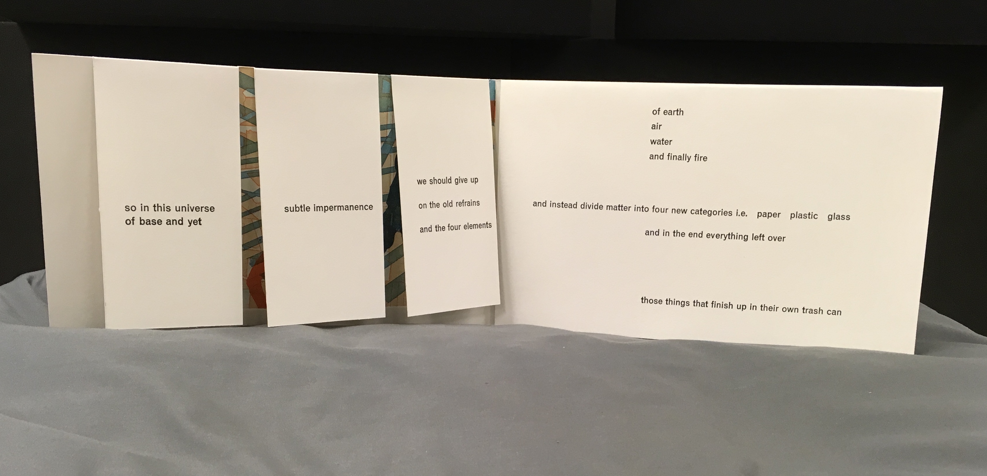
La grande muraille is a rare work, viewable at the Koninklijke Bibliotheek in The Hague and these other locations. Almost as rare but still available from the artist is Impermanence subtile/Subtle Impermanence (2013), in which Sharoff continues her experimentation with structures. She returns to the cased portfolio and folios of OVI but introduces fraction folds (two-thirds, etc.), vertical flaps and an accordion structure with mountain folds. In collage-like manner, silhouettes and cutouts of modern everywoman and everyman move through their urban working and shopping environment. And vice versa, images of the environment behind the cut-outs move through everywoman and everyman!
Sharoff’s everyman and everywoman are in strife with the environment. The portfolio opens with a “collage of garbage” whose relationship to them becomes clear in the ways Sharoff works the fragment of Ian Monk’s poem “Tri selon Tri” (displayed in French and English) in, under and through her prints and book structure.
Impermanence subtile / Subtle Impermanence (2013) Shirley Sharoff Photo: Books On Books at Koninklijke Bibliotheek, Den Haag, Nederlands
The five folios Photo: Books On Books collectionThe five folios with the first opened Note the “grammatico-textual” binding of the adjectives around the noun, mirroring the wordplay binding of the poem’s title “Tri selon tri” Photo: Books On Books collection
The third folio opened to the cutouts leaf Photo: Books On Books at Koninklijke Bibliotheek, Den Haag, Nederlands
The third folio with the cutouts leaf turned to the left Photo: Books On Books at Koninklijke Bibliotheek, Den Haag, Nederlands
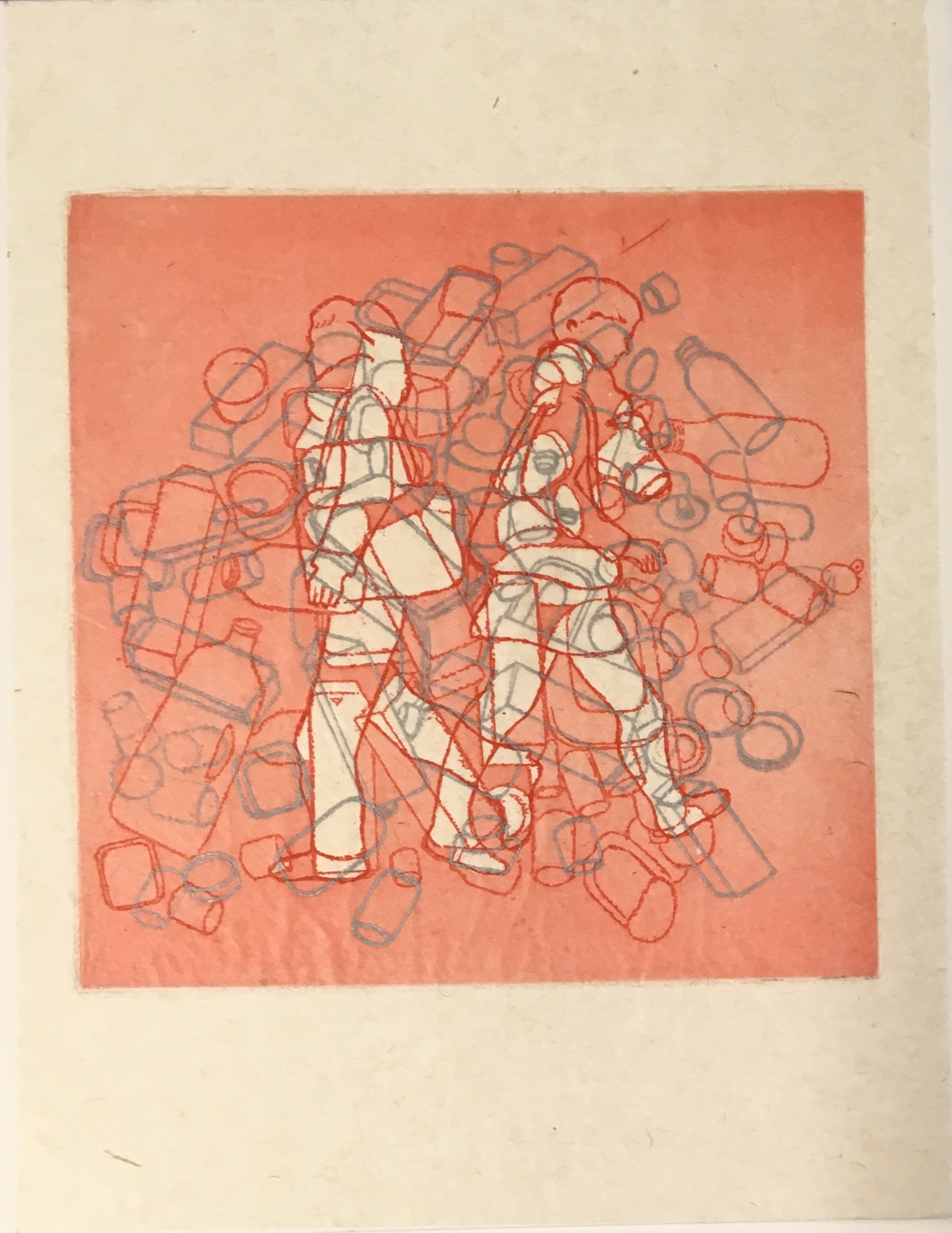
Print from the third folio, where “blocks of matter/ wind around/ each other/ fold upon fold” Photo: Books On Books collection
The fourth folio opened to reveal an accordion structure with mountain folds Photo: Books On Books at Koninklijke Bibliotheek, Den Haag, Nederlands
The fifth folio opened to a flap structure Photo: Books On Books at Koninklijke Bibliotheek, Den Haag, Nederlands
The cutouts of everywoman and everyman fill up with the photos of trash behind them. In the prints, they stroll entangled in bricks and clutter toward an outcome where “in this universe of base and yet subtle impermanence, we should give up on the old refrains and the four elements of earth, air, water and finally fire, and instead divide matter into four new categories, i.e., paper, plastic, glass and in the end everything left over — those things that finish up in their own trash can” — i.e., us!
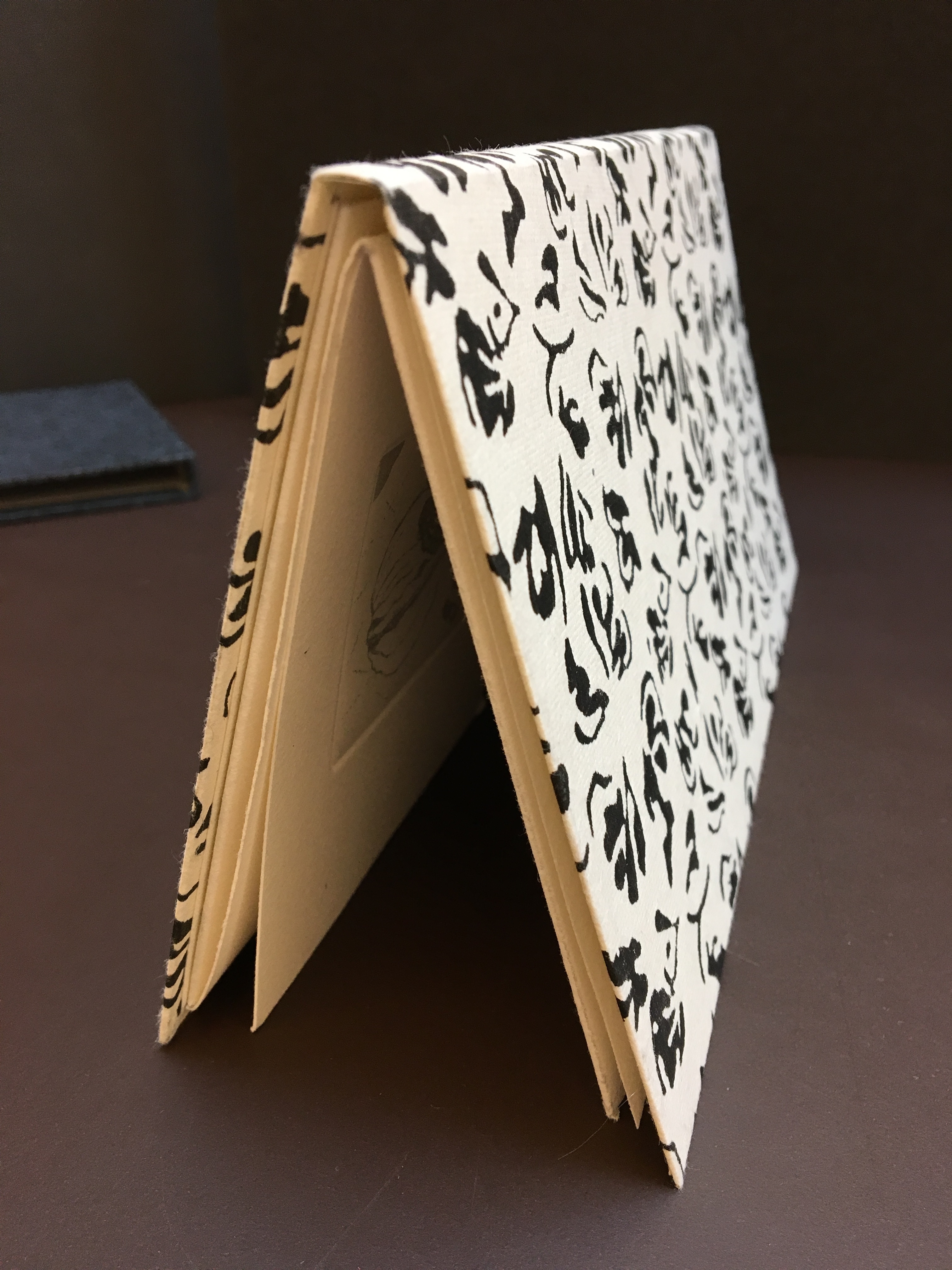
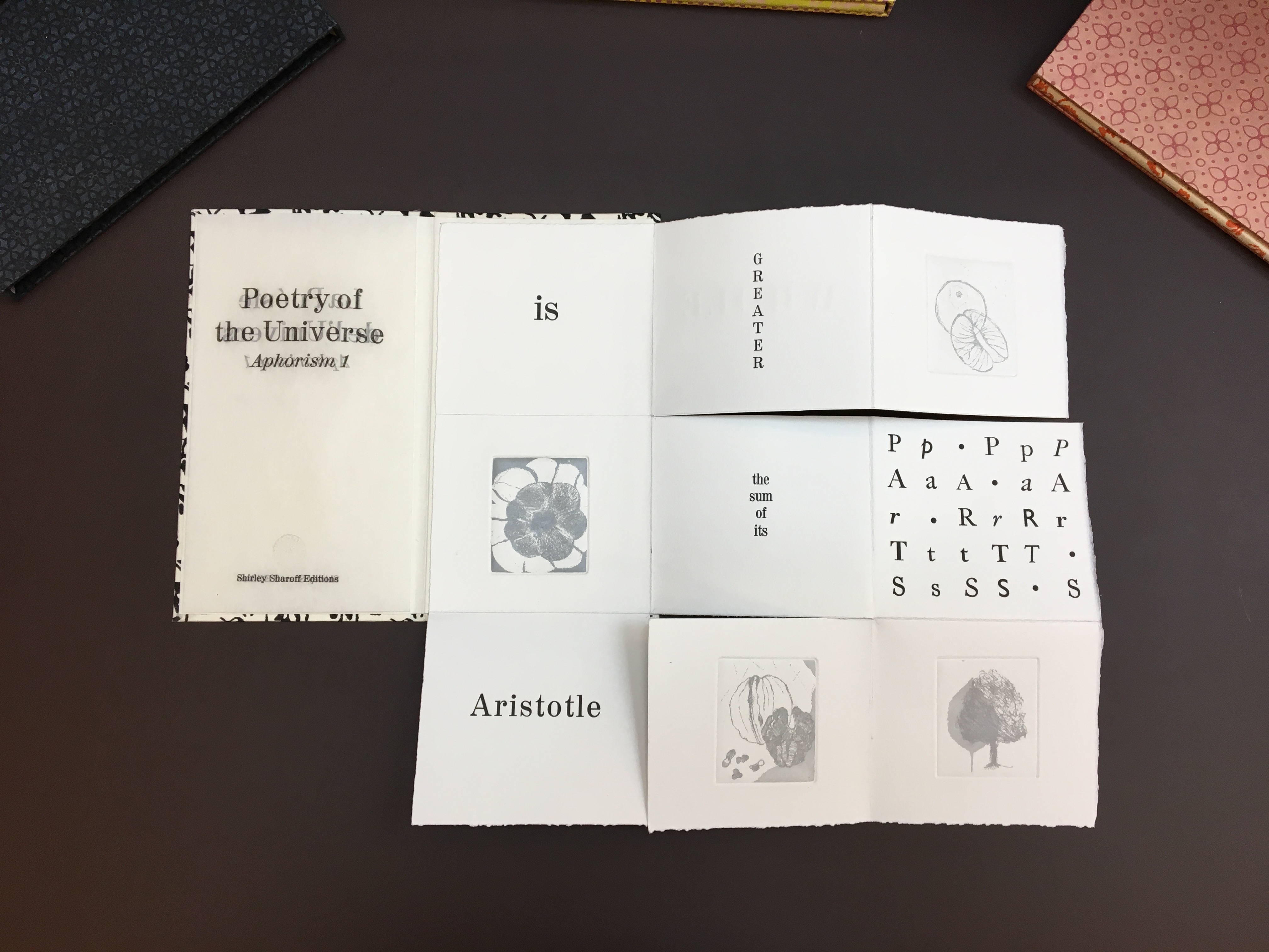
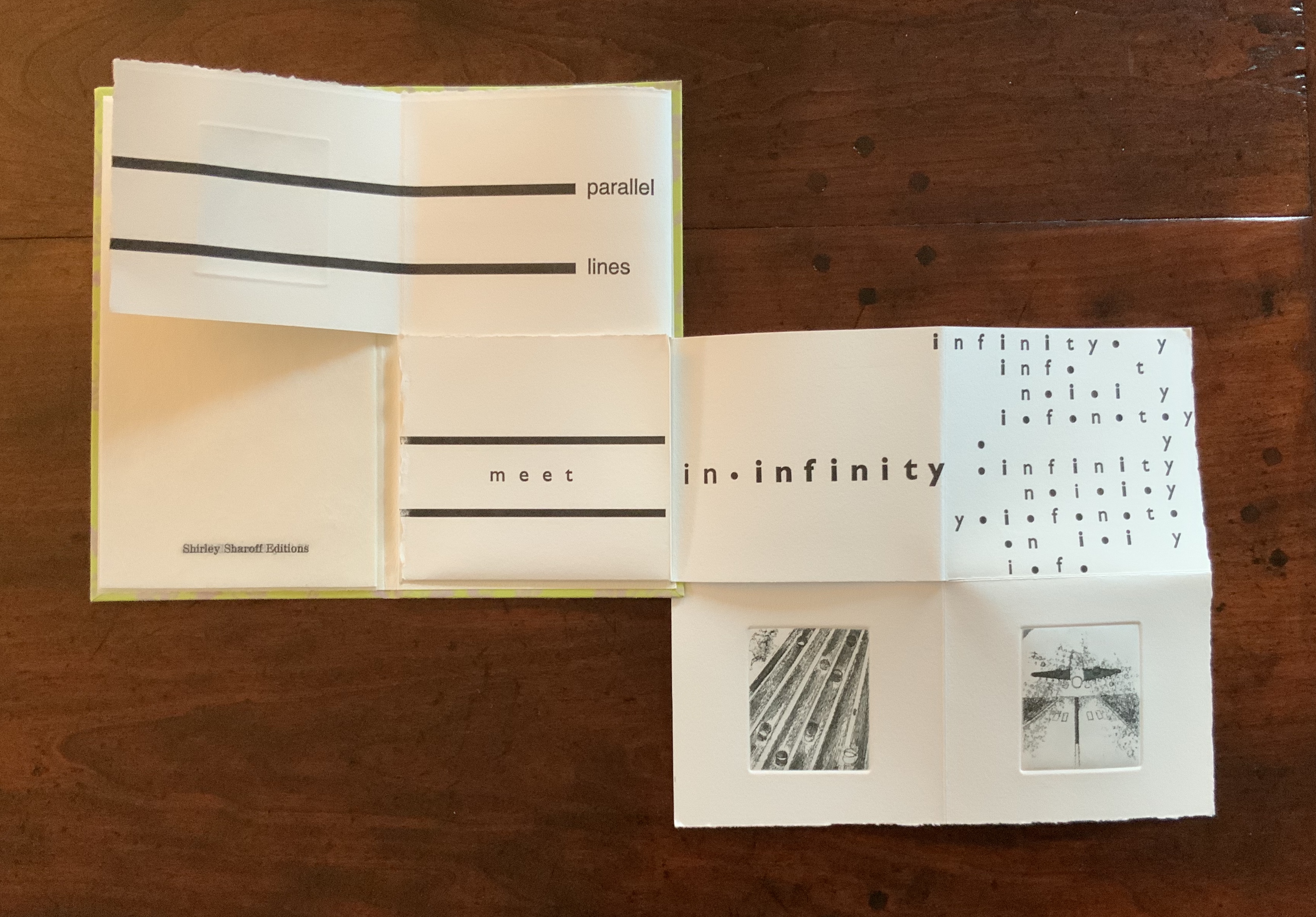
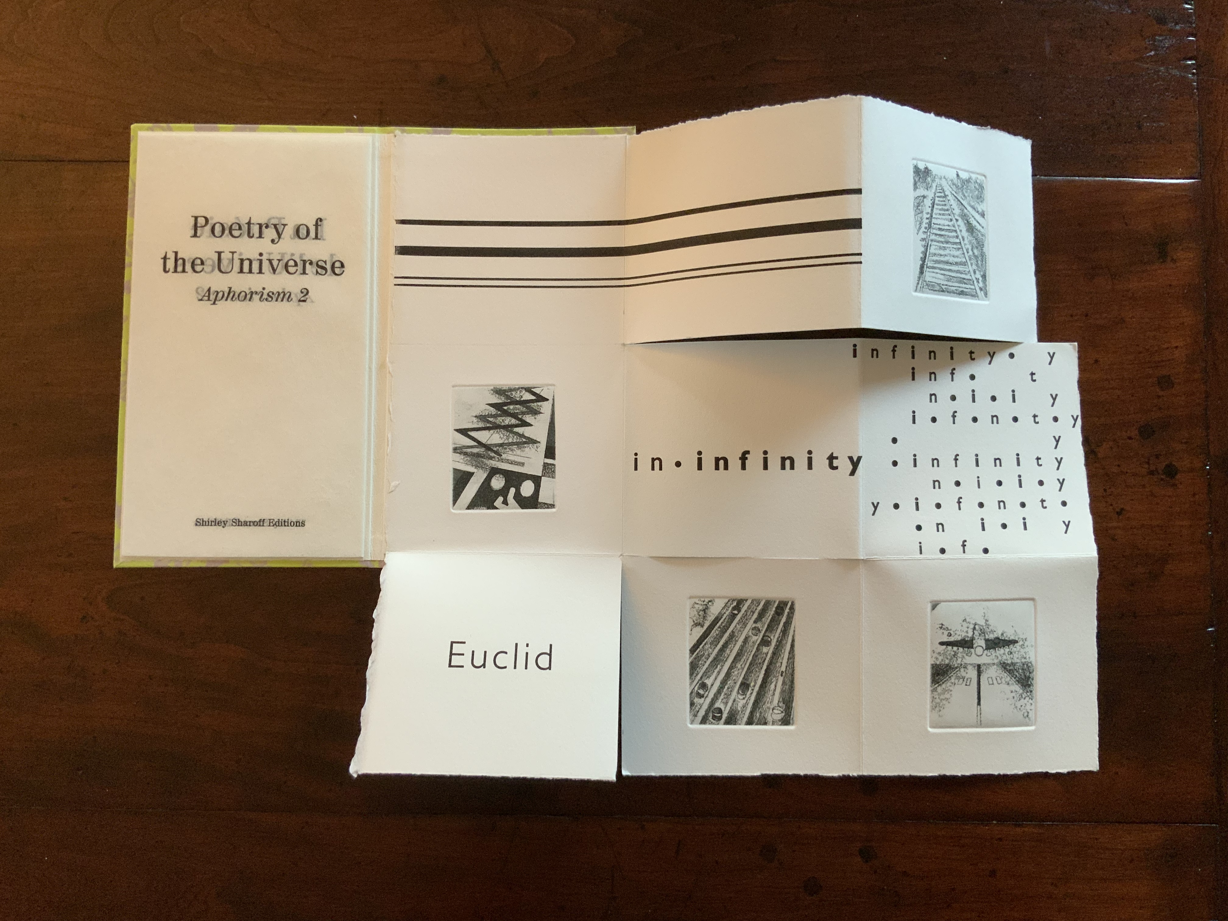
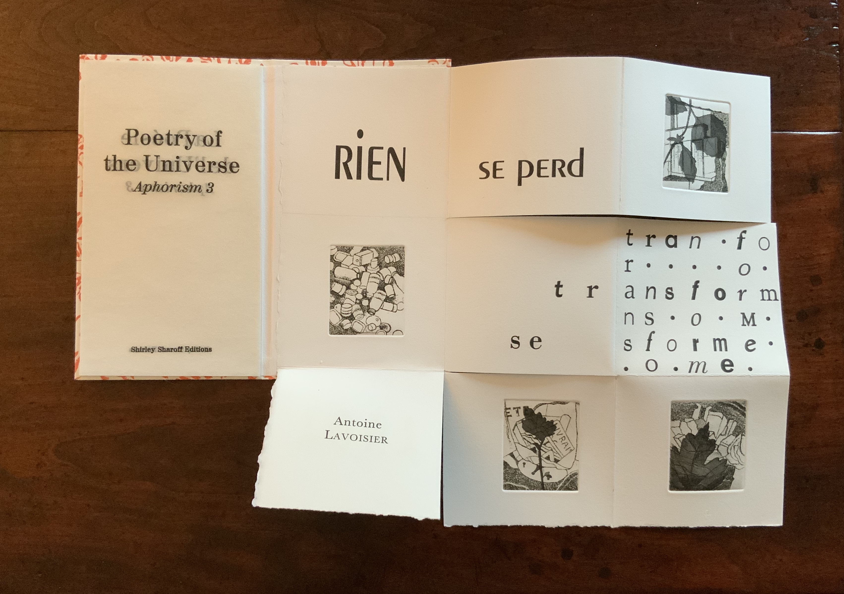
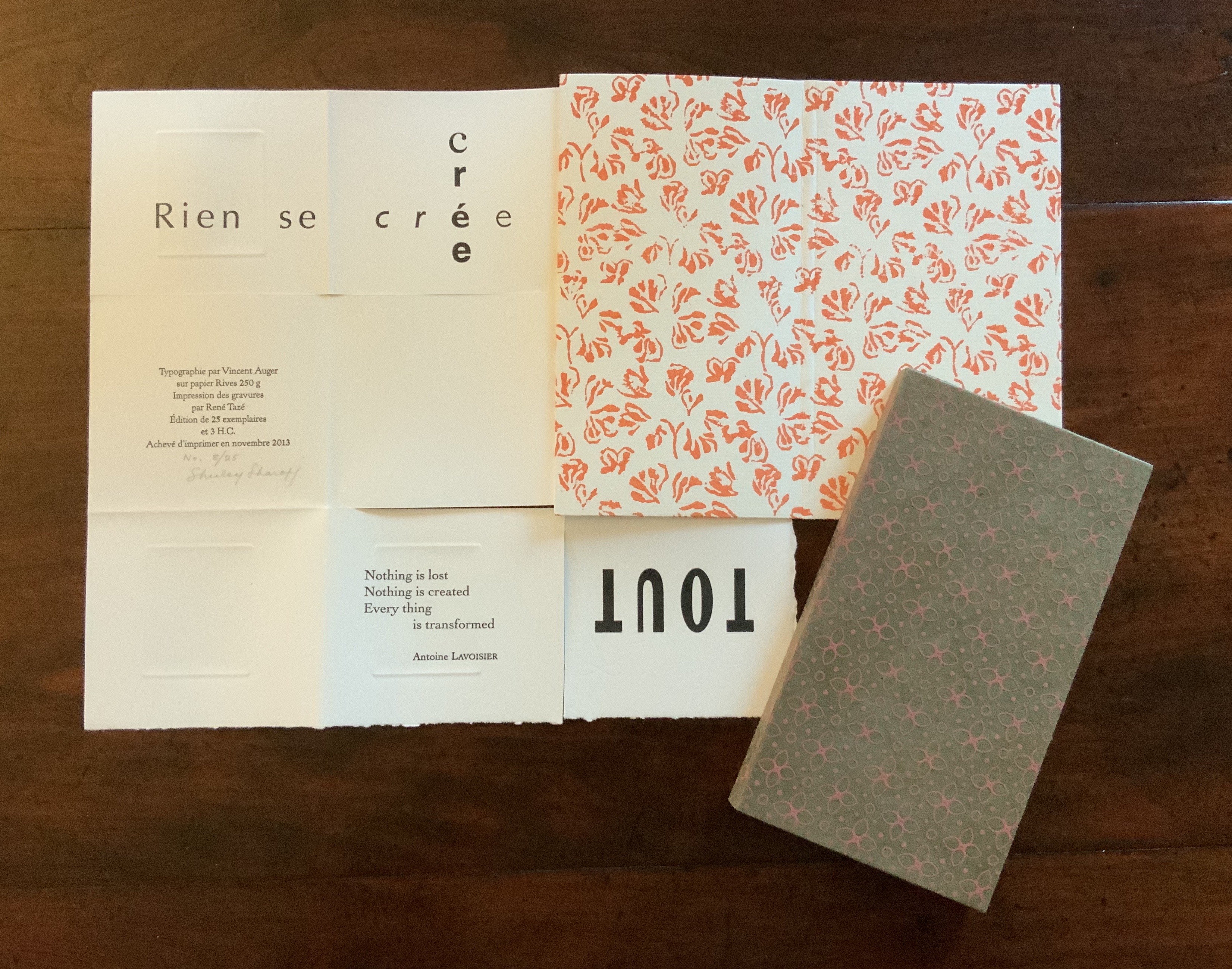
Continuing with the elemental, paradox and structural experiment, La poésie de l’univers (2012-2013) takes up the challenge of the folded single-page codex. In each of the three volumes in the set, the pattern of folds and cuts is the same, yet the pattern’s interplay with the prints and bilingual content in each seems uniquely appropriate. A hat trick of book art magic.
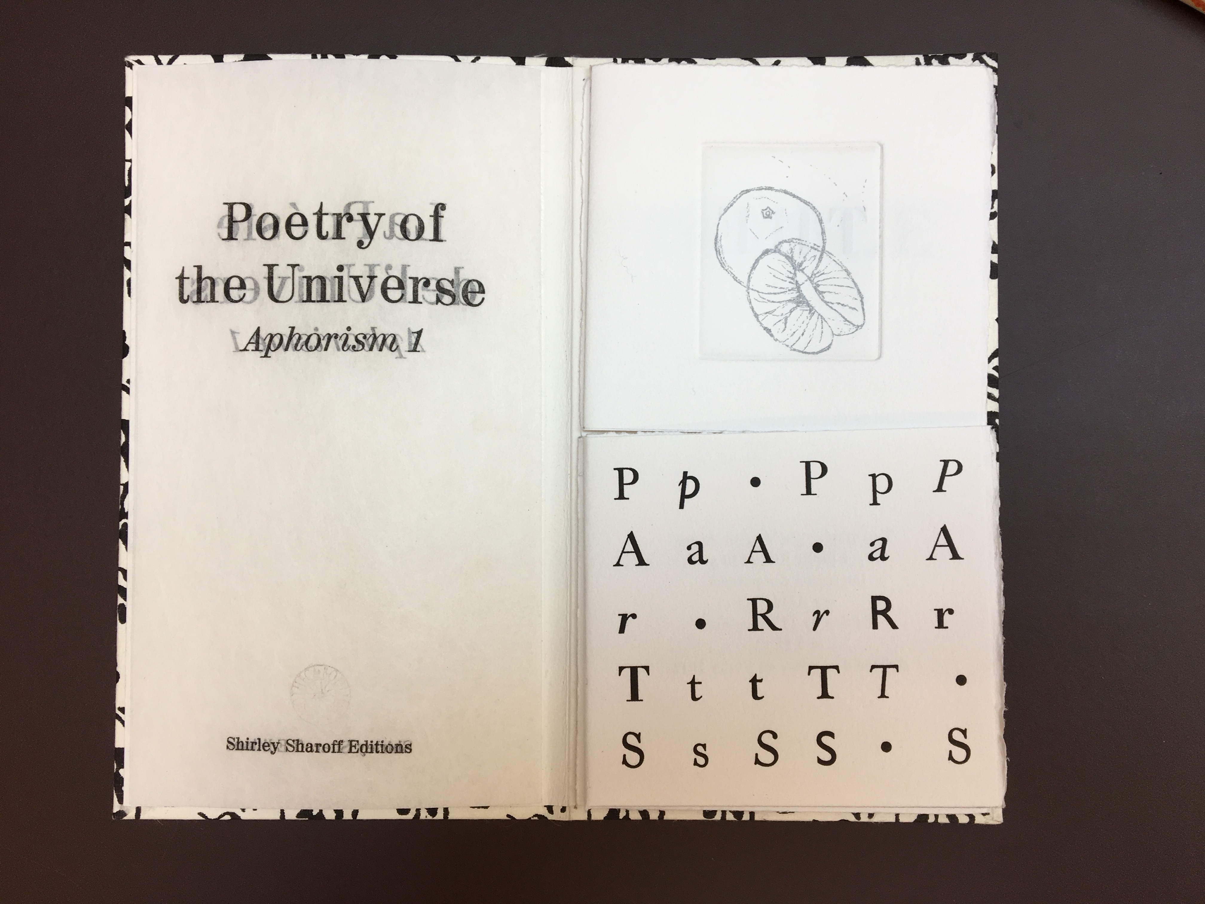
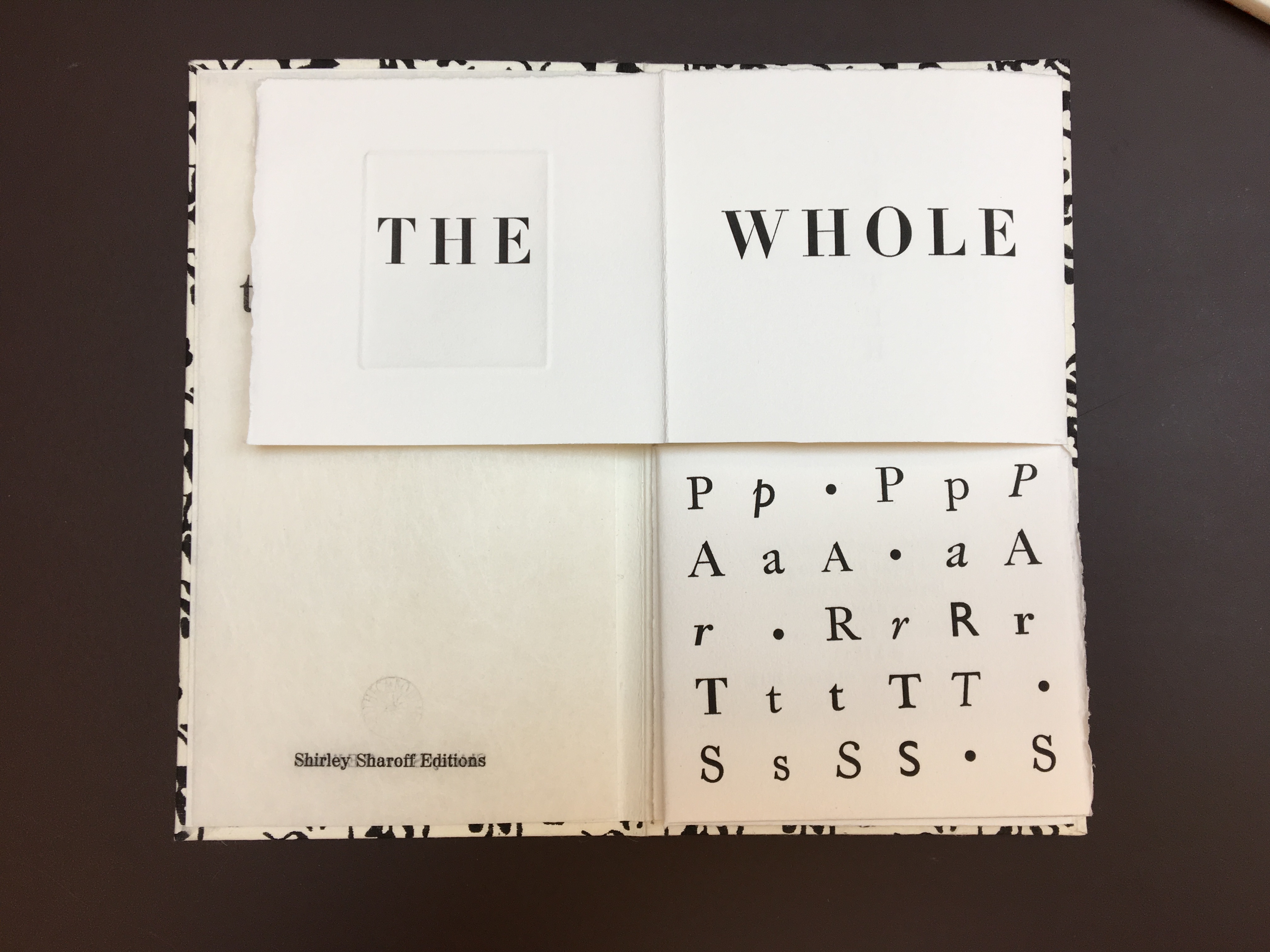
La poésie de l’univers (2012-2013) Shirley Sharoff Each volume (12 x 21.5 cm) is housed in a slipcase. The text in each is printed on one sheet of Rives 250 gsm in English and French, folding and unfolding to reveal different aspects of the text and images; 4 prints in each book. Edition of 25
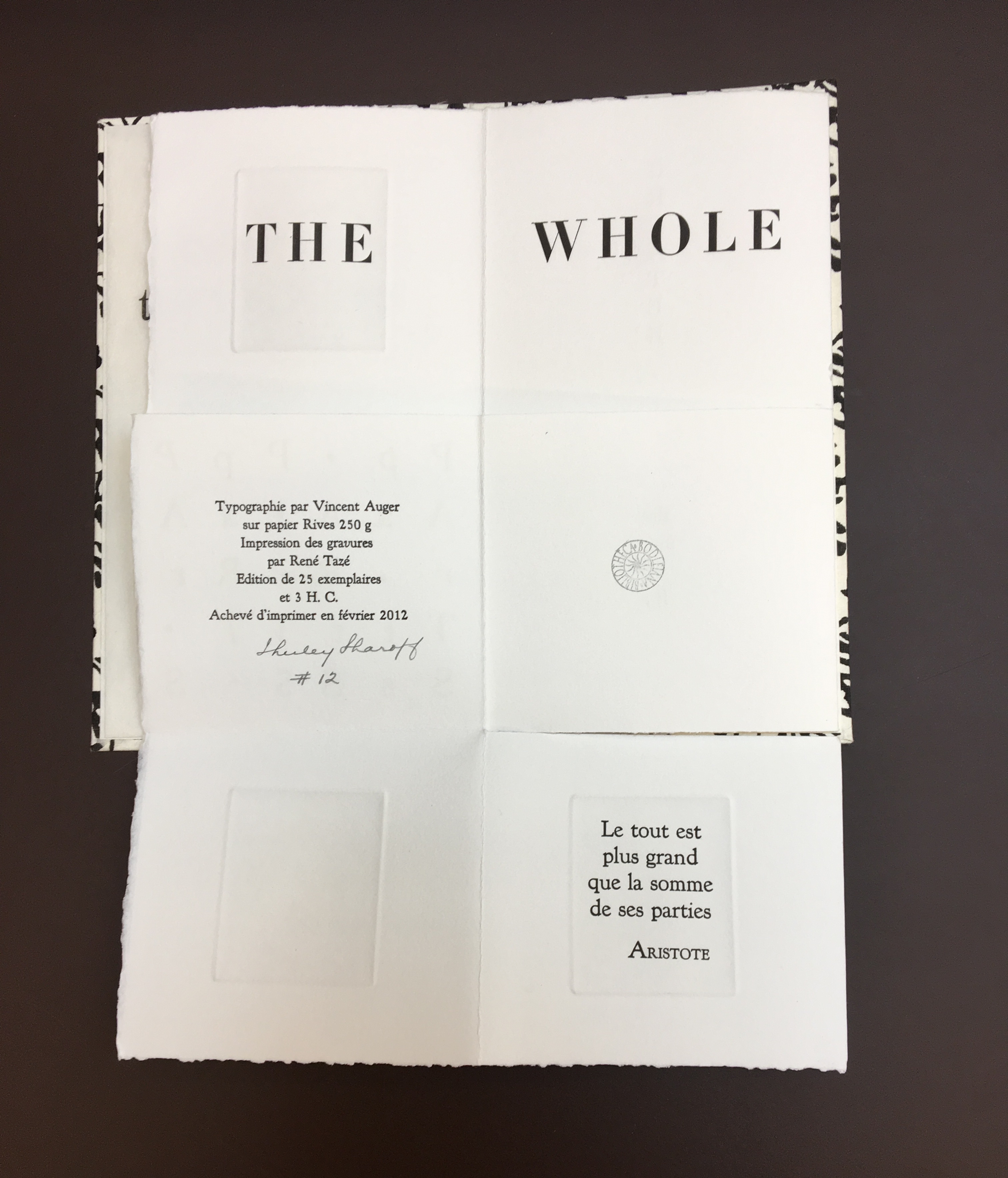
The Poetry of the Universe consists of three aphorisms: Aristotle’s “The whole is greater than the sum of its parts”; Euclid’s “Parallel lines meet in infinity”; and Lavoisier’s “Nothing is lost, nothing is created, everything is transformed”. As mentioned with La grande muraille, the execution is exquisite, and likewise, learning to read the work requires exploration.
Opening to slipcase for Aristotle volume
Lower edge of Aristotle volume
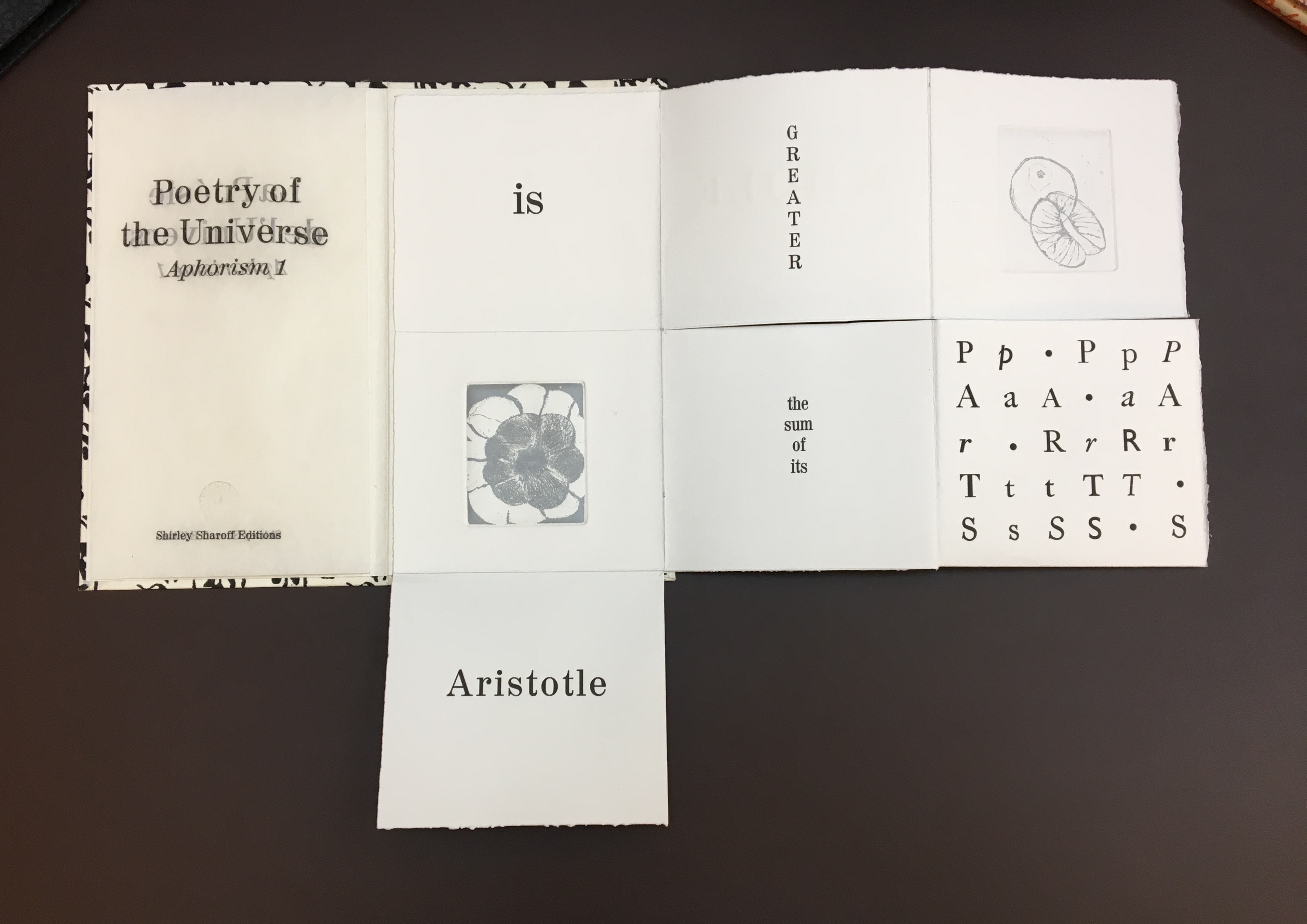
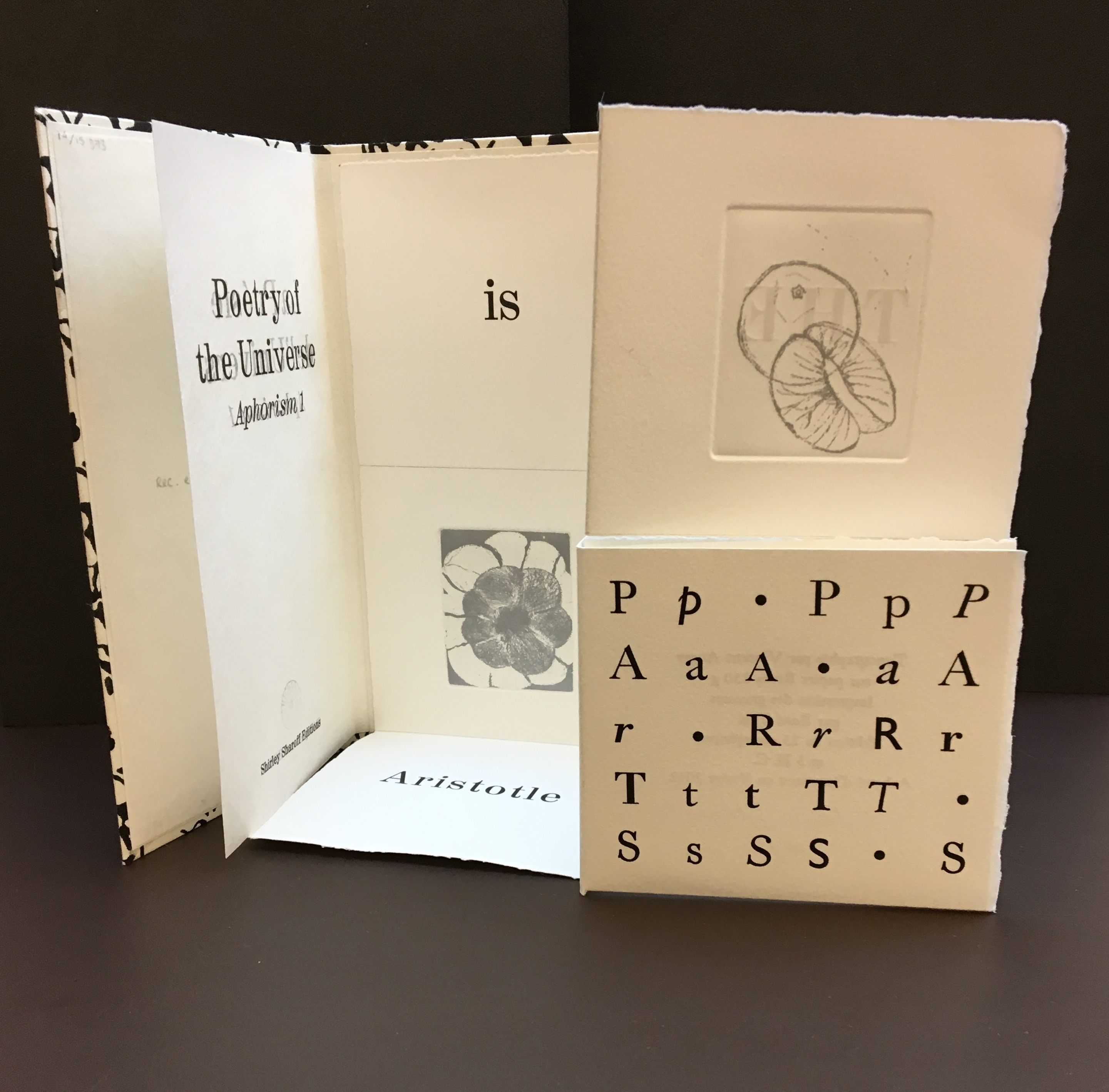
Title page and, on the right, the book’s first of four prints
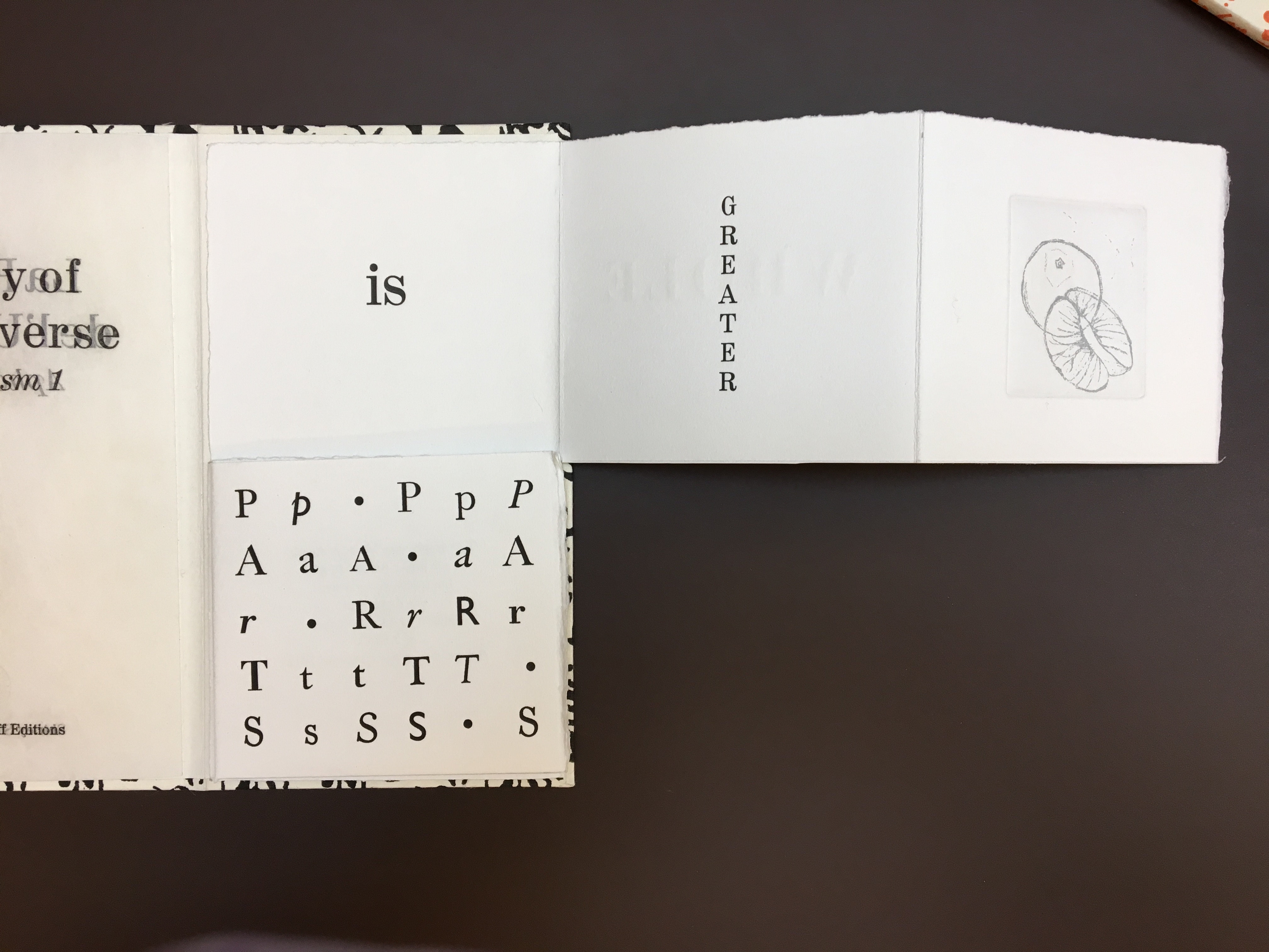
Opening the text: the first print folds to the left.
Note how the syntax requires turning “THE WHOLE” page or fold to the right, which brings the book’s first print back into view.
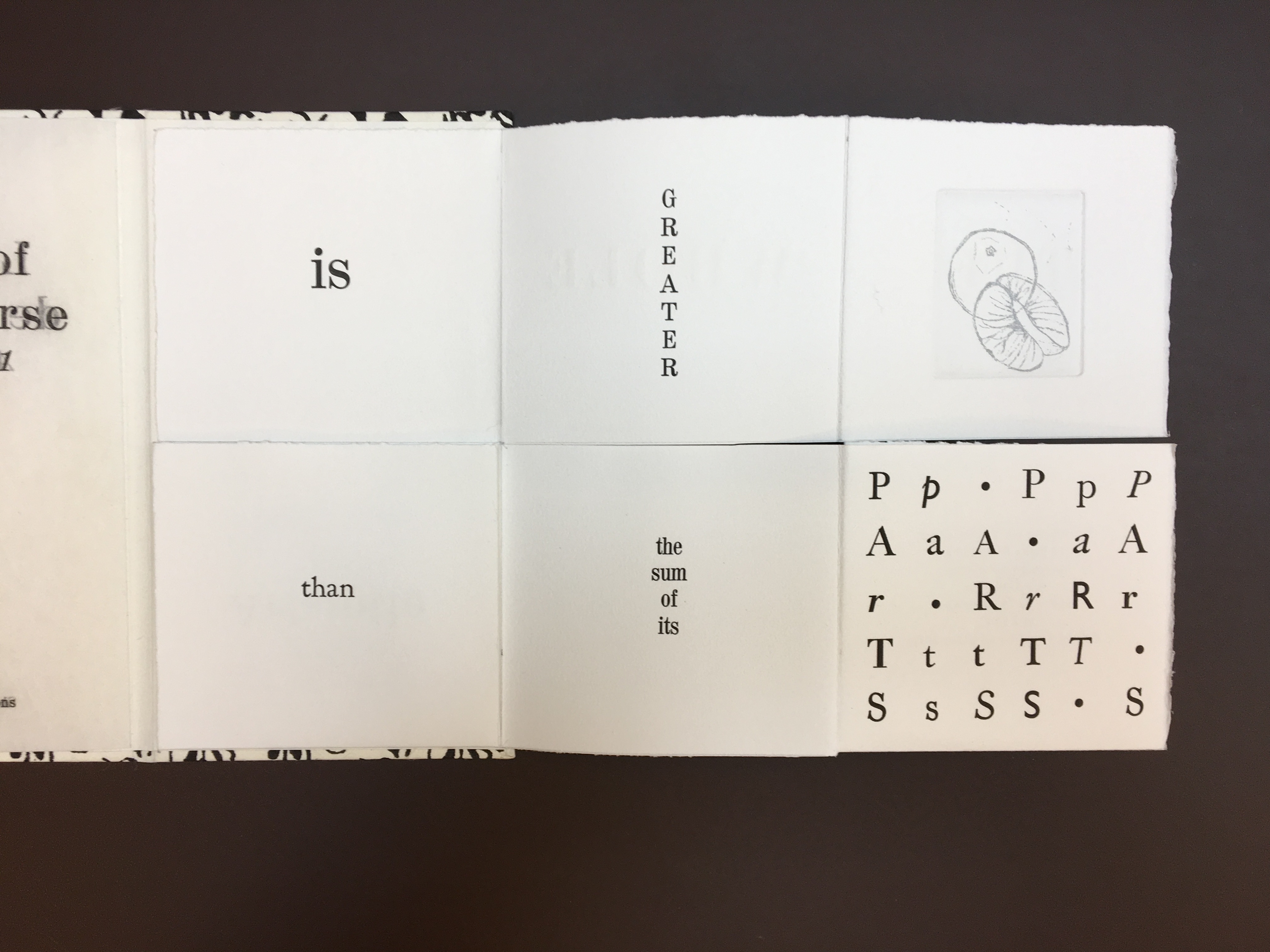
The syntax and structure call for pulling the lower page or fold to the right.
Folding down the “than” page reveals “Aristotle” and the second print in the book.
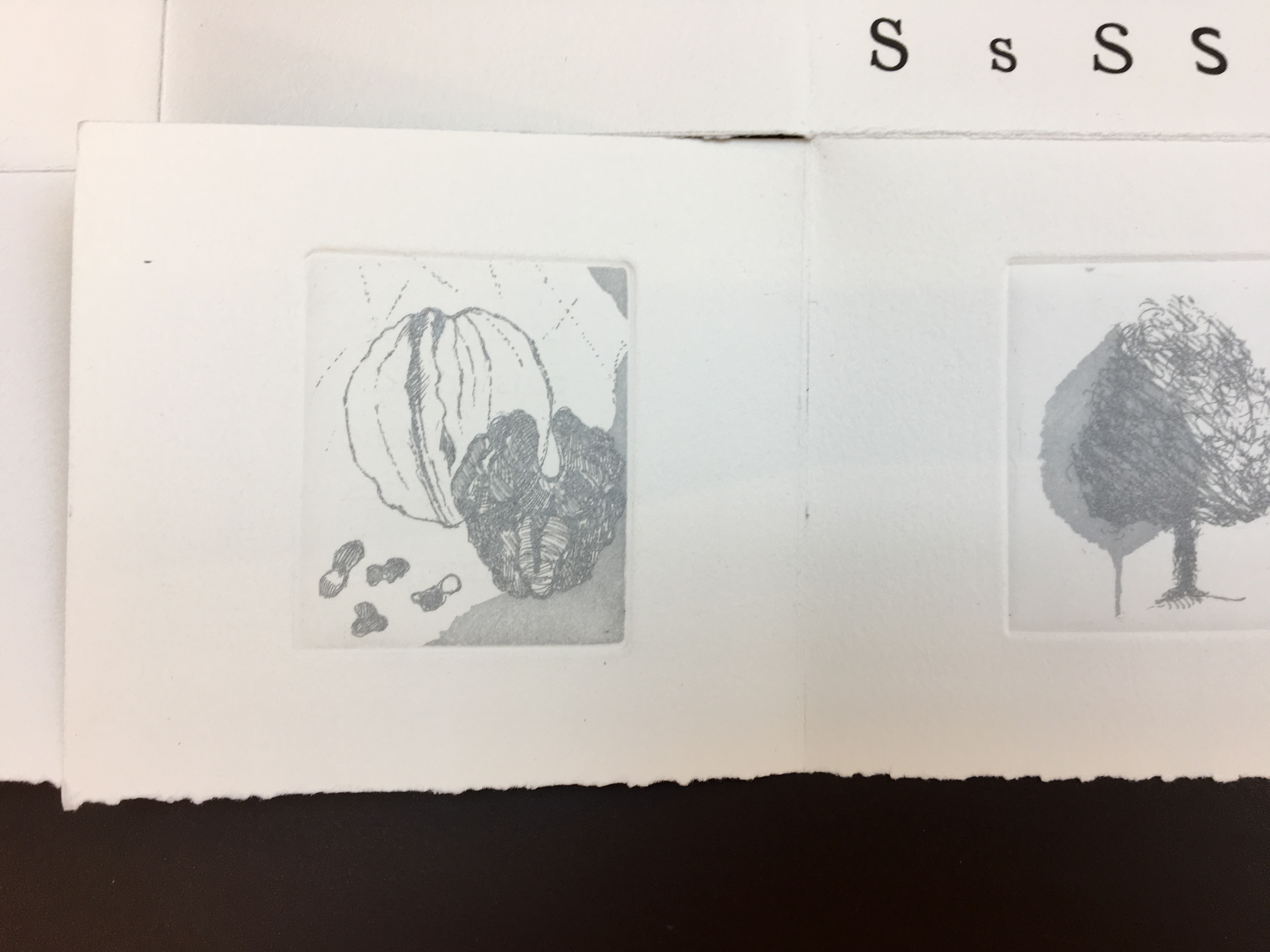
The third and fourth prints in the book unfolded downward and from under the two squares above
The colophon appears when the two righthand columns of squares in the previous view are turned to the left.
Detail of third and fourth prints
The etchings in soft grey — an orange and its segments, a blossom and its petals, a walnut and its meat, and a tree and leaf — illustrate the aphorism, much as the typographic choices and arrangements and the breaking up of the sentence complement it. Sharoff makes the second and third volumes perform similarly but differently — just as a magician weaves a routine from variations on the same vanishes and productions of a coin or other object.
Aphorism 2 — Euclid
Aphorism 3 — Lavoisier
As Comentale wrote in Art & Métiers du Livre: ”magicienne des formes”. La Poésie de l’univers is as rare as OVI and La grande muraille. It can be viewed here and here.
The most extensive essay on Sharoff’s work can be found in Paul van Capelleveen’s Artists & Others(2016). It comments on La reparation (2001), The Waves (2003), Les amazones sont parmi nous (2005), Bruits de la ville (2007), Impermanence subtile (2013), La poésie de l’univers (2012-2013). He addresses La grande muraille (1991) in Voices and Visions (2009). The special collection at the Koninklijke Bibliotheek in The Netherlands is one of the few where several of Sharoff’s works — including La grande muraille — can be seen and handled in one place.
Christophe Comentale’s essay captures the delight of exploration and discovery in the encounter with Sharoff’s art.
Shirley Sharoff, entre France et Etats-Unis, présente une pluralité d’inspiration consommée entre l’estampe et le livre devenu un média, entre unique et multiple. […] Magicienne des formes et des couleurs, Shirley Sharoff ne cesse de remettre en cause, par besoin autant que par défi personnel, tout ce qui pourrait ressembler au début d’un système de lecture, de vision, figé et donc clos. L’impossibilité de savoir -qui vaut aussi pour elle- de quoi sa prochaine oeuvre-livre-manuscrit-tableau-dépliant, ou tout cela à la fois, sera fait est assez excitant. La présence de textes sentis par affinités sensorielles, personnelles, avec des écrivains non encore classiques, autant de raisons d’apprécier de pénétrer dans cet univers où le conformisme est inexistant.
Christophe Comentale, “Shirley Sharoff, des livres a tenir debout et des estampes a voir aussi”, Art & Métiers du Livre, n°231 (Aout-Septembre 2002), p.63.
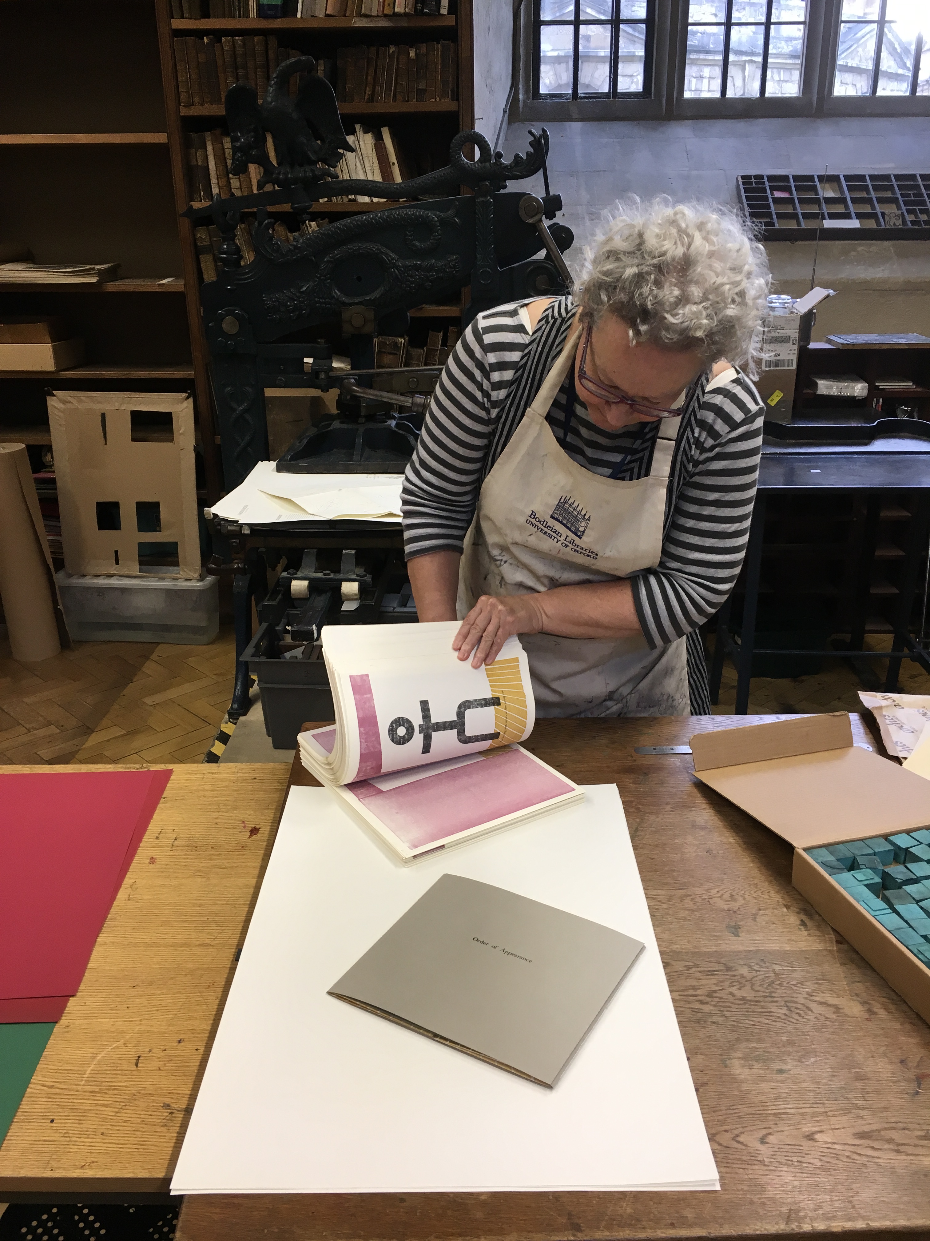
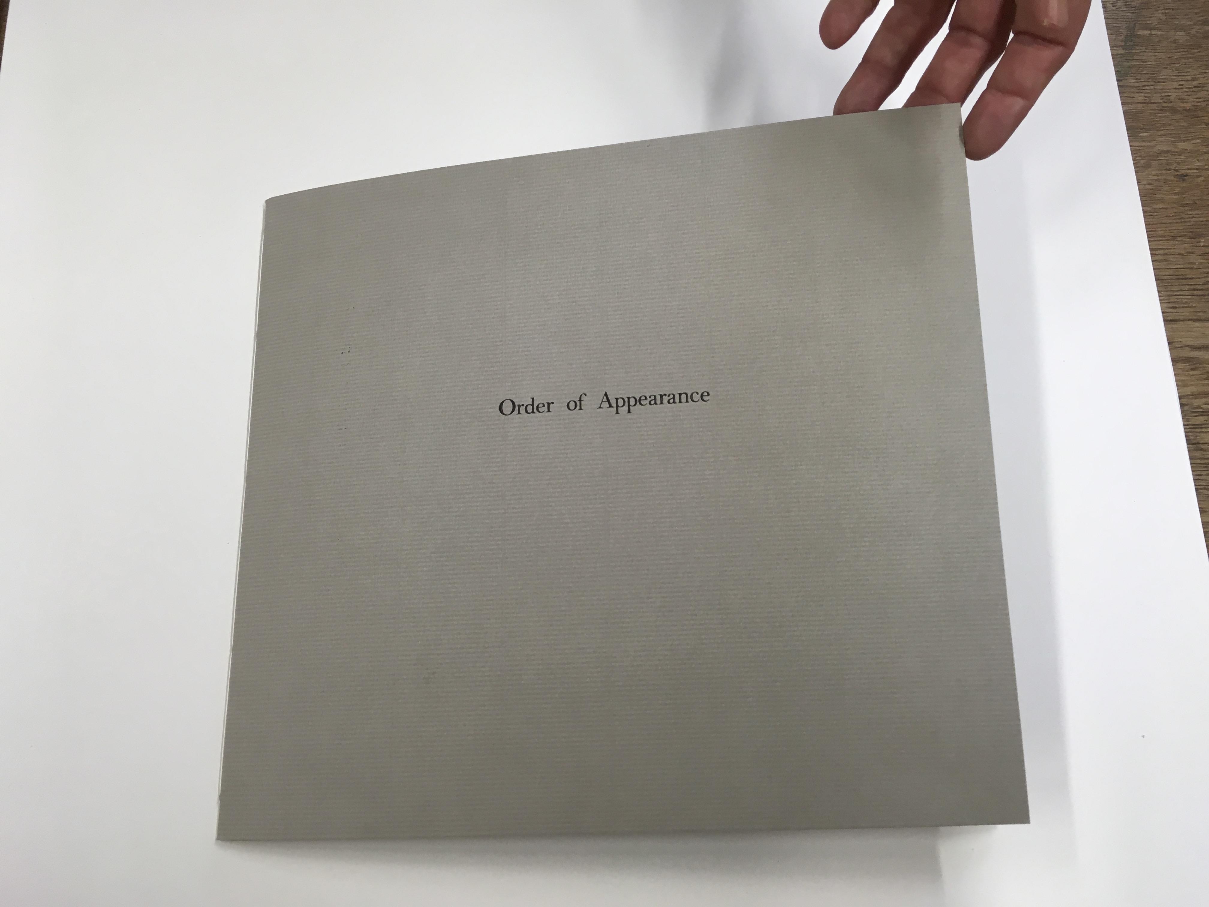
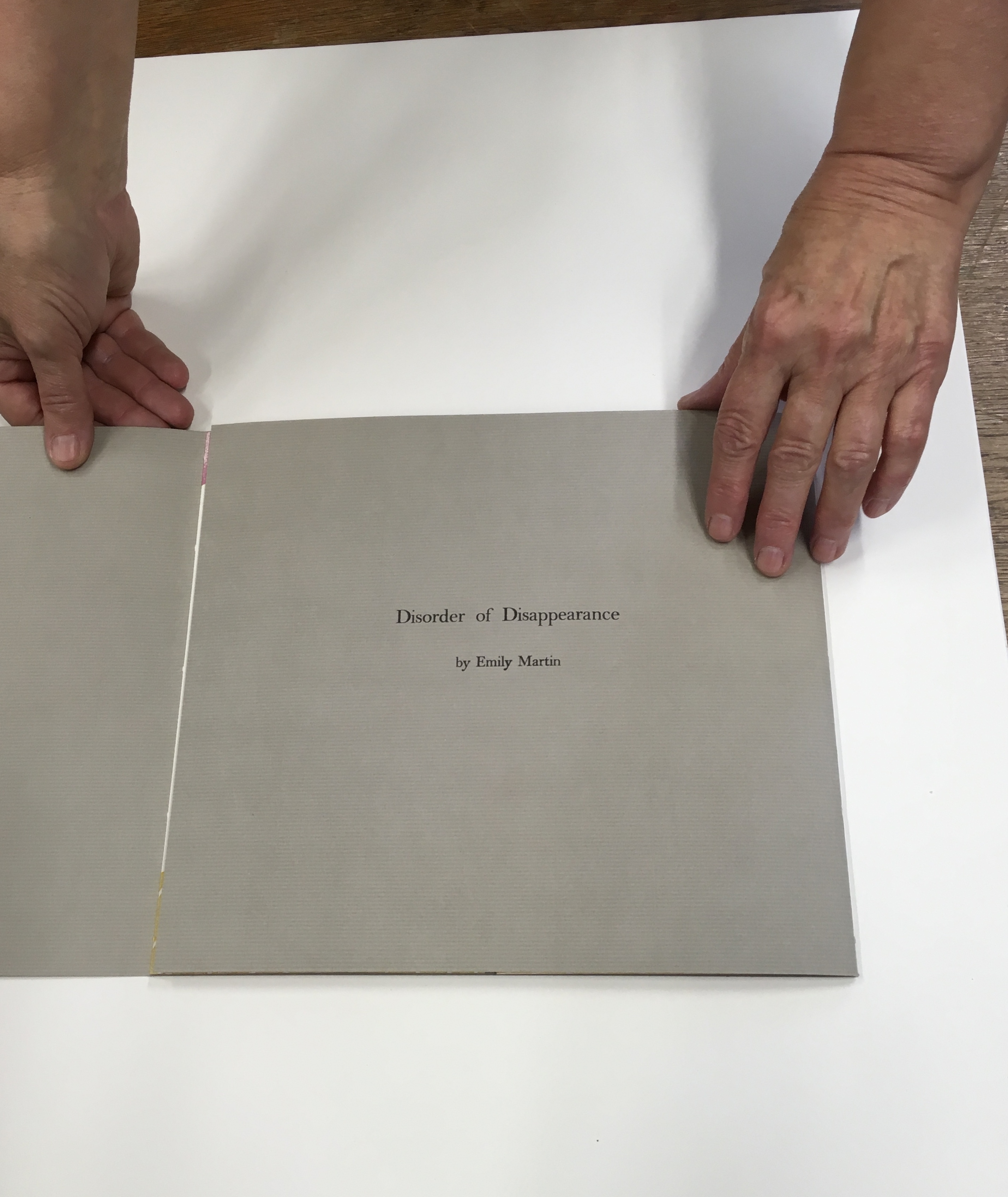
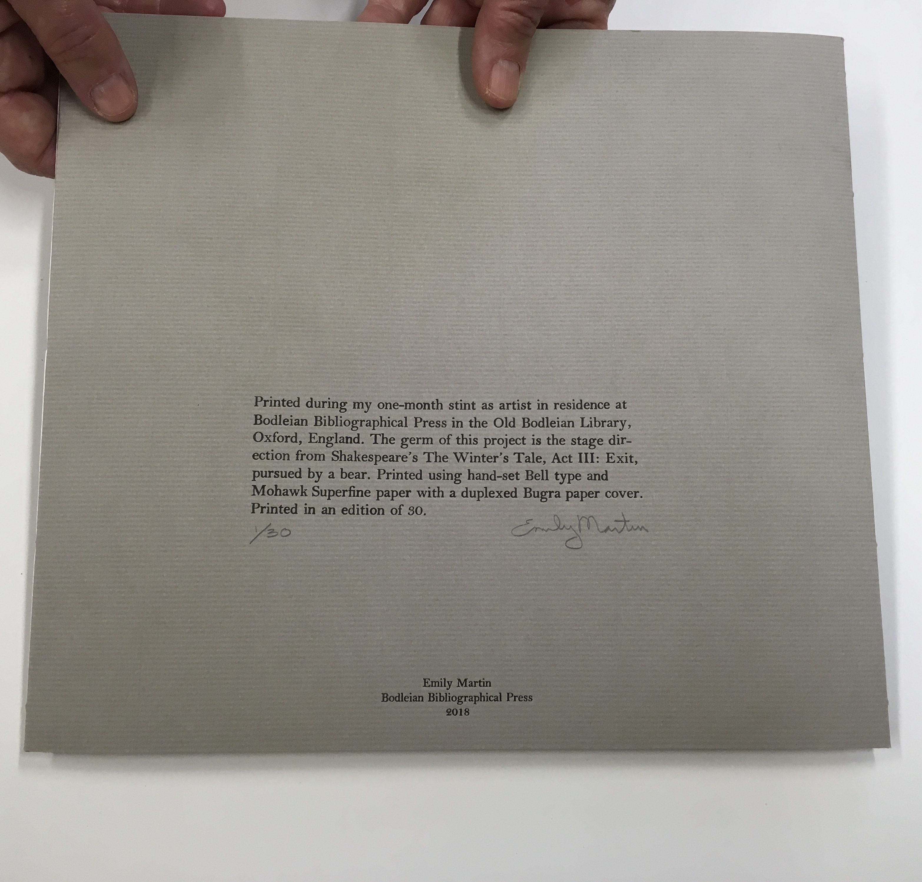
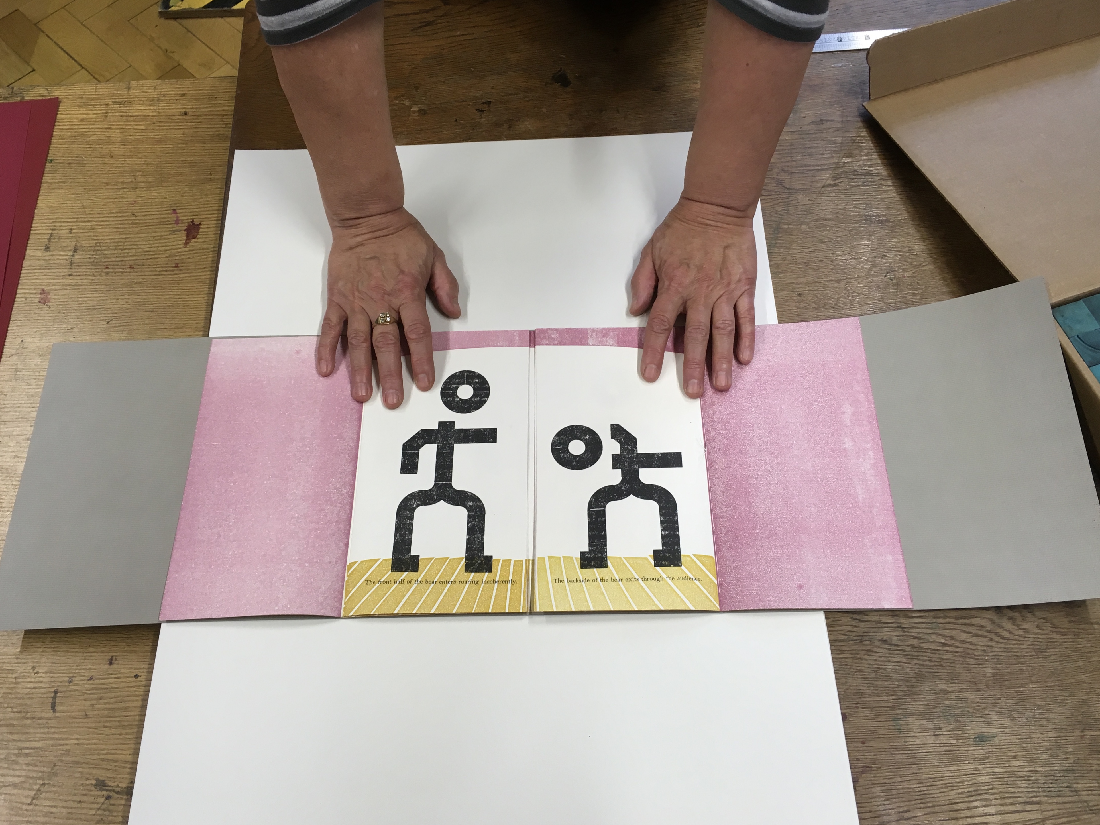
Emily Martin likes to leave the order of reading or viewing her new book up to chance and the reader. She sees it as part of her creative process. Call it “designing chance”. Order of Appearance: Disorder of Disappearance, the book at the culmination of her talk and time as the 2018 Printer-in-Residence at the Bodleian, illustrates the paradox perfectly. This work is one of several springing from Shakespeare’s plays — in this case, the springboard being the famous stage direction “Exit, pursued by a bear.”
Emily Martin wrapping up her stay as Printer-in-Residence at the Bodleian Library
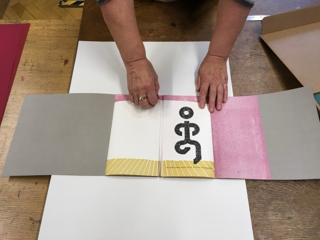
The gatefold cover opens left then right to reveal a set of signatures (folded and gathered pages) sewn to the lefthand crease and a set sewn to the righthand crease. The lefthand signature presents an empty stage; the righthand signature, a stylized stick figure of the leading lady, who is exiting to wild applause. Other characters in Martin’s Order/Disorder or Appearance/Disappearance include the leading man, the clown, a mime, an improv artist, a ballet dancer and, of course, the bear. They can enter and exit one by one or in pairs and in any order and sequence the reader chooses.
“The ballet dancer enters furious with the choreographer.”
Martin forms the characters’ figures from P22 Blox, a set of modular shapes that she uses to great effect conveying expression and attitude with changes in posture and gesture. The characters are not without their subtleties. The clown’s feet are larger than any other figure’s. The close observer will note that, side by side, the leading lady is slightly shorter than the leading man and has one other subtle biologically distinguishing feature.
The P22 Blox and member of the “repertory group”The bear’s entrance and exit
The bear’s scene above — like any scene or sequence of ordered/disordered entrances/exits — however chosen or varied by the reader — is very short. On the left, “The front half of the bear enters roaring incoherently”; on the right, “The backside of the bear exits through the audience”.
Slapstick and whimsy play an important part in Martin’s books, not without bite. By “designing chance” into her works, she implicates us the readers and viewers in the biting. The “P22 Blox repertory performers” made an earlier appearance in Martin’s Funny Ha Ha Funny Peculiar or Funny Peculiar Funny Ha Ha(2017), which has plenty of bite. Funny Ha Ha is a dos-à-dos book (two books sharing the same back cover) — what else could it be for her conflicted response to Shakespeare’s comedies, individually enjoyable yet easily mixed up in her head due to a certain sameness of plot and
… So much mistaken identity, gender confusion and various other contrivances while romping their way to a fifth act wedding or two. Even more problematic are the decidedly unfunny themes that are common in many of these same comedies such as hypocrisy, sexual harassment, intolerance, sexism, misogyny, and anti-Semitism.
Funny Ha Ha also uses the slice book technique, which, as with the flexible order/disorder of Order of Appearance, inveigles the reader — enjoyably and uncomfortably, back to back in the former’s case — in creating new readings and meanings as the top and bottom halves of the pages turn independently of one another.
Martin’s earlier forays with Shakespeare left less to chance for the reader/viewer. For Desdemona, In her Own Words (2016), we have Martin’s collection and reordering of the few words given to the character in a strongly affecting stop motion animation, which appeared in 2015 as a boxed book. Martin’s The Tragedy of Romeo & Juliet (2012), awarded a silver medal at the Designer Bookbinders’ International Competition in 2013, is her book art’s earliest engagement with Shakespeare. There she uses the carousel book structure to set several scenes in the round, each with a repetition of the play’s Prologue chorus slightly adjusted with the insertion of modern equivalents for the setting of Verona. Think Rwanda or Serbia, and why not? All the world’s a globe, as the carousel implies. Forthcoming in the Shakespearean suite may be the best yet — which is a high bar — a spiralling interpretation of King Lear’s descent into madness.
Martin’s talk is entitled “Visual Metre and Rhythm: the Function of Movable Devices”. The illustration of volvelles, lift flaps, harlequinades, tunnel books, rivet-and-tab movables and pop-ups ranged beyond the Bodleian’s sources; it was obvious that Martin had made good use of the time allocated for research during her residency. Presumably as with the talk by Russell Maret, the 2017 Printer-in-Residence, Martin’s talk will be posted on the Bodleian site. In the meantime, a visit to her site will not only provide an impressive range of movables and pop-ups but also demonstrate their function as serious artist books.
For those wanting a closer look or hands-on experience, Order of Appearance can be seen in motion here and will be available for purchase at CODEX 2019 in Richmond, CA and from her site.
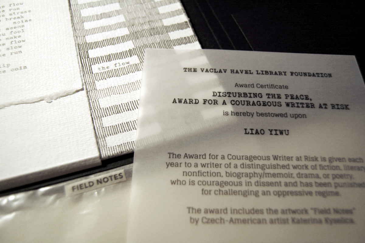
Field Notes (2018) Katerina Kyselica Photo credit: Katerina Kyselica
Field Notes was commissioned by the Václav Havel Library Foundation for its 2018 “Disturbing the Peace, Award for a Courageous Writer at Risk“, presented to the Chinese author, writer, musician and poet Liao Yiwu (aka Lao Wei) on 27 September 2018 at the Bohemian National Hall in New York. Across nine loose leaves, the typewritten words and lines of the poem are dispersed, arranged among fields of regimented rows of vertical strokes, drawn on handmade Losin paper. The drawings could represent anything: a field of grain, a tower block with windows, or marks on a prison wall to count the days. The loose format of the book allows readers to arrange the drawings or compose the text in an order as they see fit, although a colophon presents the full poem in its intended order.
Kyselica’s website provides more views of Field Notes as well as views of her other artist’s books: American Colonies (2016), Code Red (Nicholas and Alexandra)(2016), News About Nothing (2015), 2×2 (2013) and untitled (2012).
What is striking about Kyselica’s works is how she combines a collage of book art techniques in each work to create a unified, unique effect.
I am wide awake when I see artist books. Here are people using actual ink on paper in the eventual age of total digital. For this reason I am retaining my hope and expectation of more books. — Ed Ruscha. Interview with Stephanie LaCava
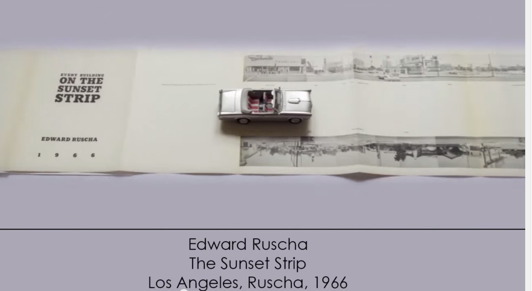
Any collection of book art must recognize the presence and contribution of Ed Ruscha’s work. For Books On Books, this has been not only a financial challenge but a thematic one. Every Building on the Sunset Strip and the elusive Dutch Details certainly speak to the collection’s representation of the accordion book structure, but so do many others in the collection. Even if one of those works in pristine condition could be afforded, it would not be the most satisfactory way of recognizing Ruscha’s work in this collection. For Ruschavian reasons, OH/NO (2008) scratches that itch.
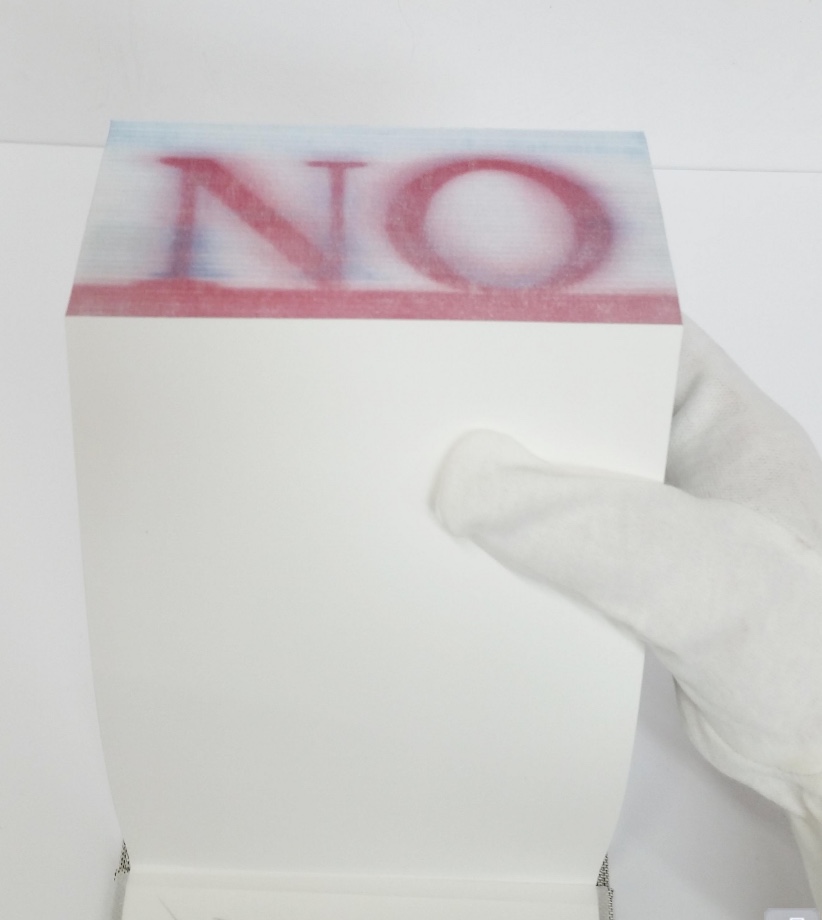
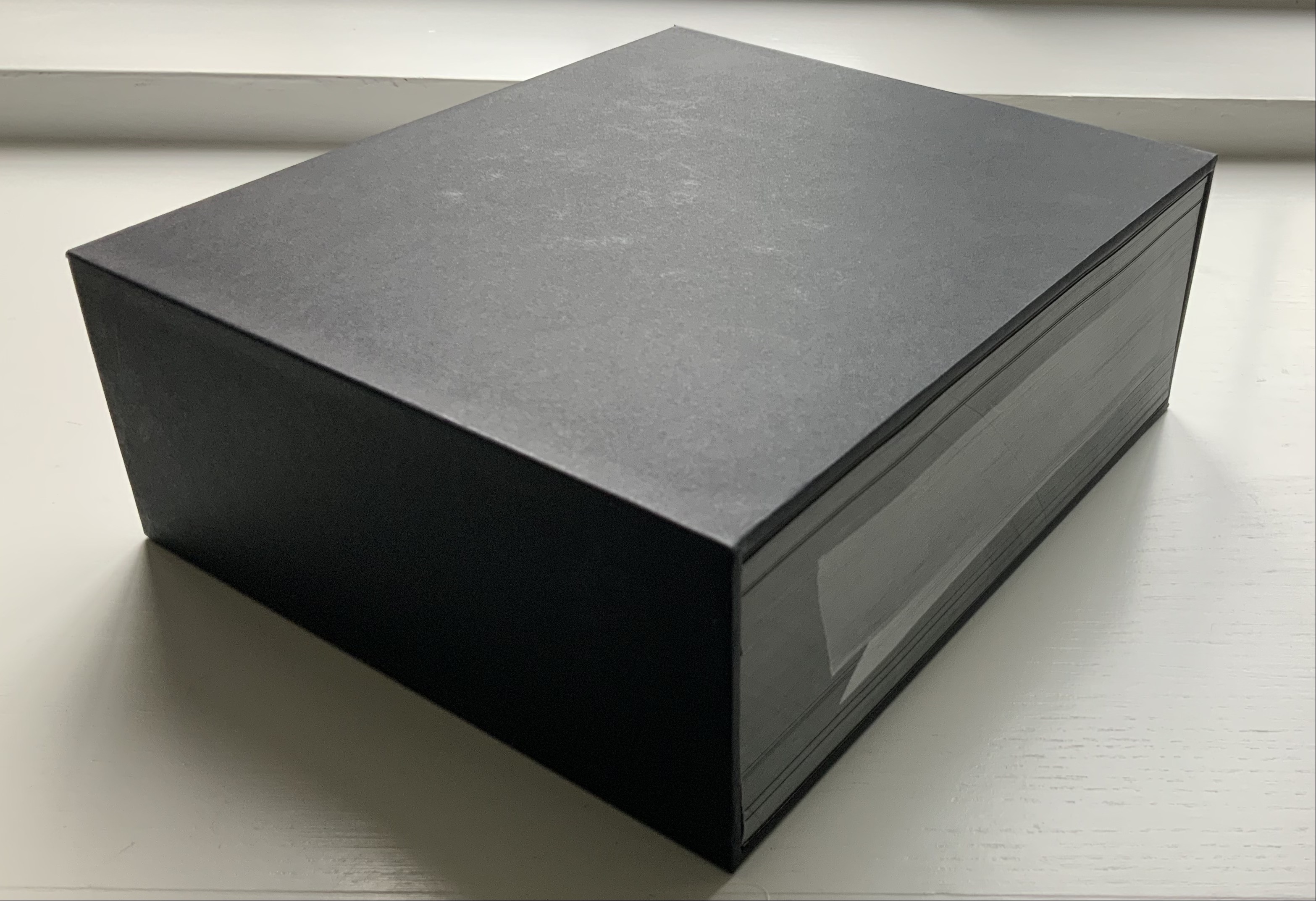
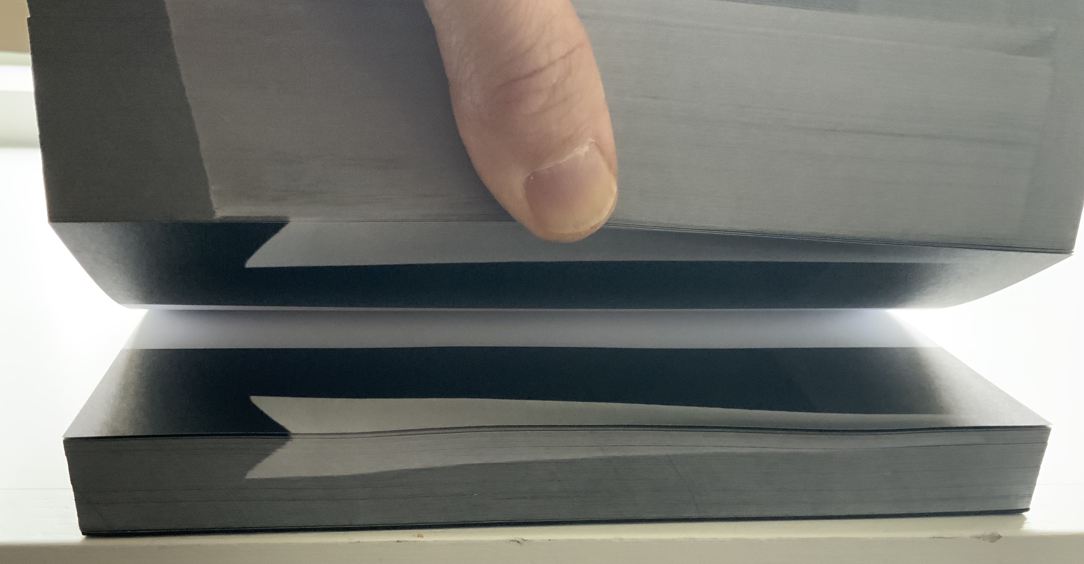
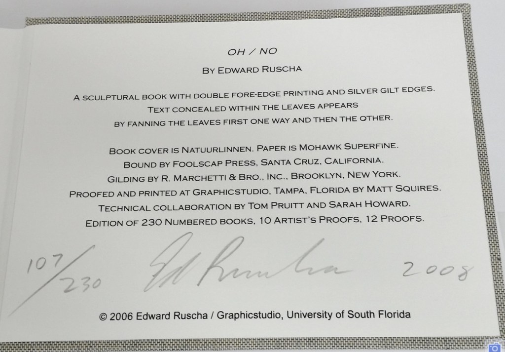
OH/NO (2008)
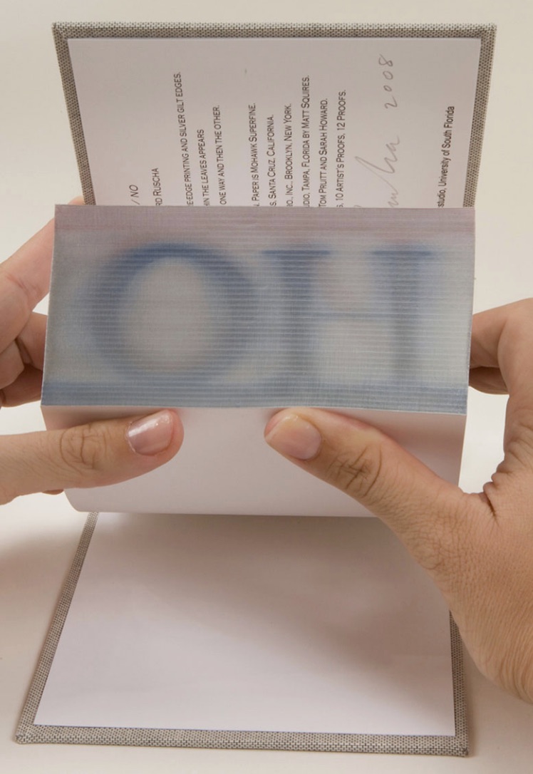
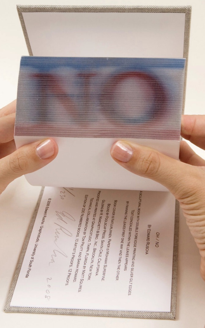
OH/NO (2008) Ed Ruscha Sculptural book with silver gilt covered printed fore-edge. H5.25 x W7.25 x D2.25 in. Acquired from Hess Fine Art, 14 November 2020. Photos: Courtesy of the gallery.
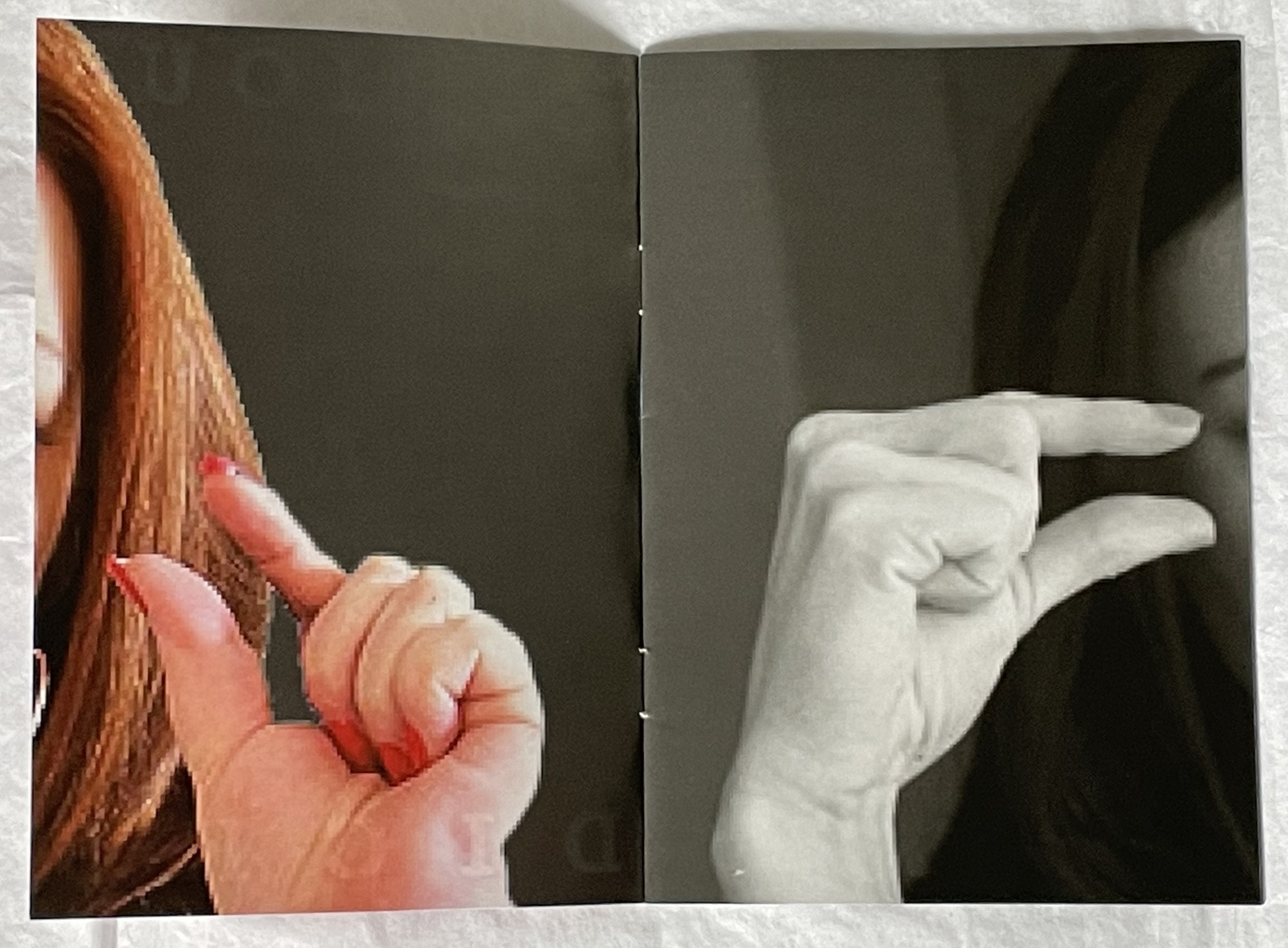
In an interview in Artforum in 1965, Ed Ruscha commented, “What I am after is … a mass-produced product … none of the nuances of the hand-made and crafted limited edition book”. Well, here is OH/NO, clearly not a hand-crafted work, but nevertheless a limited edition and signed by the artist. It is a tongue-in-cheek machine-produced, if not mass-produced, product. Production and structure draw all attention to an element peculiar to the codex – its fore-edge. It applies printing in the place of hand-crafted fore-edge painting, and the interior is blank. Here is Ruscha applying his deadpan approach to a physical aspect of the book not addressed by those more famous accordion works.
OH/NO is not Ruscha’s first foray into fore-edge printing. In 2002, there was Me and The. Neither work extends the technique per se, but unlike their historical predecessors, Ruscha’s two works, whose pages are otherwise blank, focus entirely on the fore-edge of the book form and depend on its interaction with facetious text.
OH/NO provides a distinctive “other end of the spectrum” to Ximena Pérez Grobet’s Around the Corner (2020). Other than its title, Around the Corner is textless. By progressively manipulating images across all of the book structure’s planes, Pérez Grobet makes a sculpture out of the relationship of the fore-edge to the rest of the book. With OH/NO and Around the Corner side by side, we have a useful and satisfying point of comparison and contrast for considering the breadth of artists’ books.
Around the Corner(2020) Ximena Pérez Grobet Japanese bound in slip case open at both ends. H200 x W175 x D70 mm. Edition of 20, of which this is # 2. Acquired from the artist, 1 December 2020. Photos: Books On Books Collection.
Another aspect of artists’ books and Ruscha’s work that OH/NO addresses is production by a third party. As he happily acknowledges, not all of his photographic works are of his own hand, and production is often handed over to a third party. In the various histories and commentary on book art, though, those early works like Every Building on the Sunset Strip are heralded for their cheap one-man-band, democratic production values. But listen to Ruscha himself in the video below about Every Building, and it is clear that the concept of his artist’s books does not lie in their production. OH/NO‘s high production values could not be further from Every Building‘s. Look instead to the interaction of the text with the structure. Given Ruscha’s sense of humor, the title and sculptural object itself might be commenting on the studio approach of high-concept artists as much as it might be on the absence of text in the pages.
Various
Even though they are not works of appropriation themselves, Every Building and Ruscha’s Various Small Fires have engendered a small industry of appropriation in book art. Various Small Fires lent itself to a Gulbenkian/Calouste exhibition’s placing it as a high-concept centerpiece “reflecting on” Bruce Naumann’s appropriation Burning Small Fires.
Display of Ed Ruscha’s Various Small Fires and Milk (1964) at “Pliure: La Part du Feu”, 2 February – 12 April 2015, Paris. Photo credit: Books On Books Collection. Reflected in the lower left hand corner is the display of Bruce Nauman’s Burning Small Fires; in the upper right corner, the film clip of Truffaut’s 1966 Fahrenheit 451; and in the upper left, Maria Helena Vieira da Silva’s La bibliotheque en feu (1974).
There is even an entire book devoted to the appropriation of Ruscha’s works.
Beyond this brilliant collection of examples and commentary, additional appropriative works have appeared — so many that a second edition may be required.
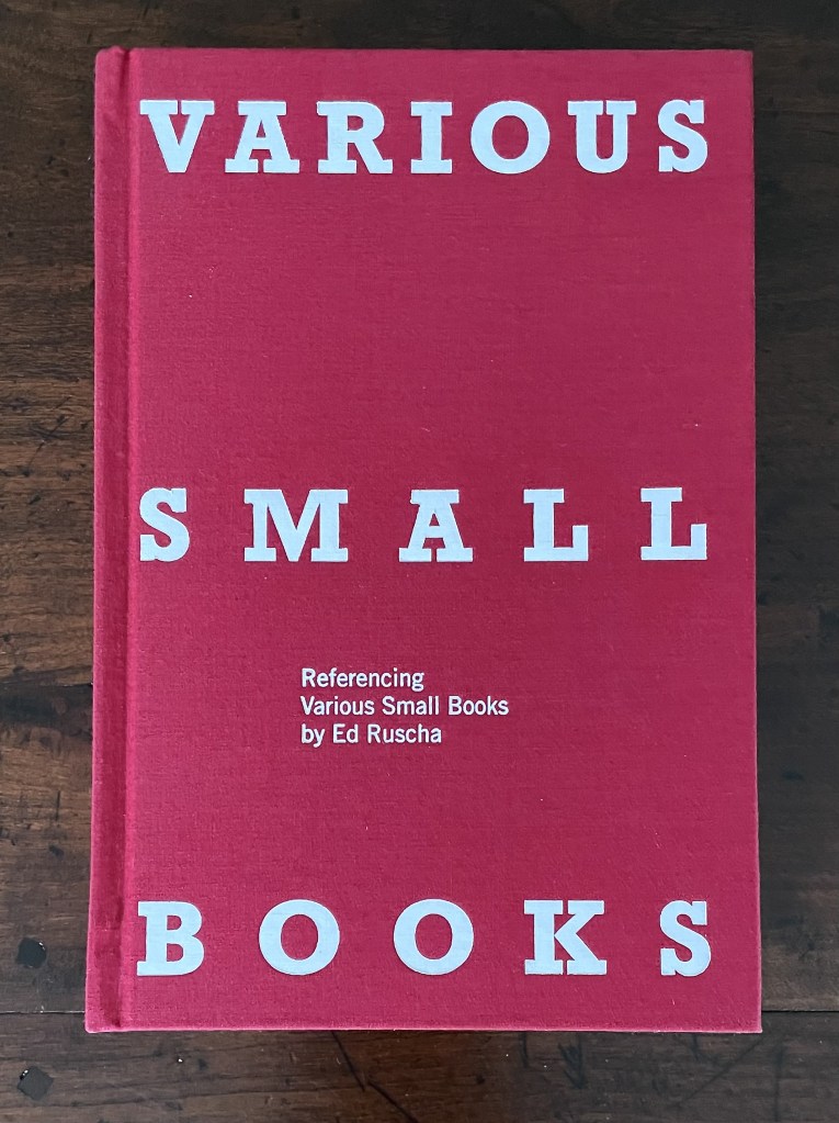
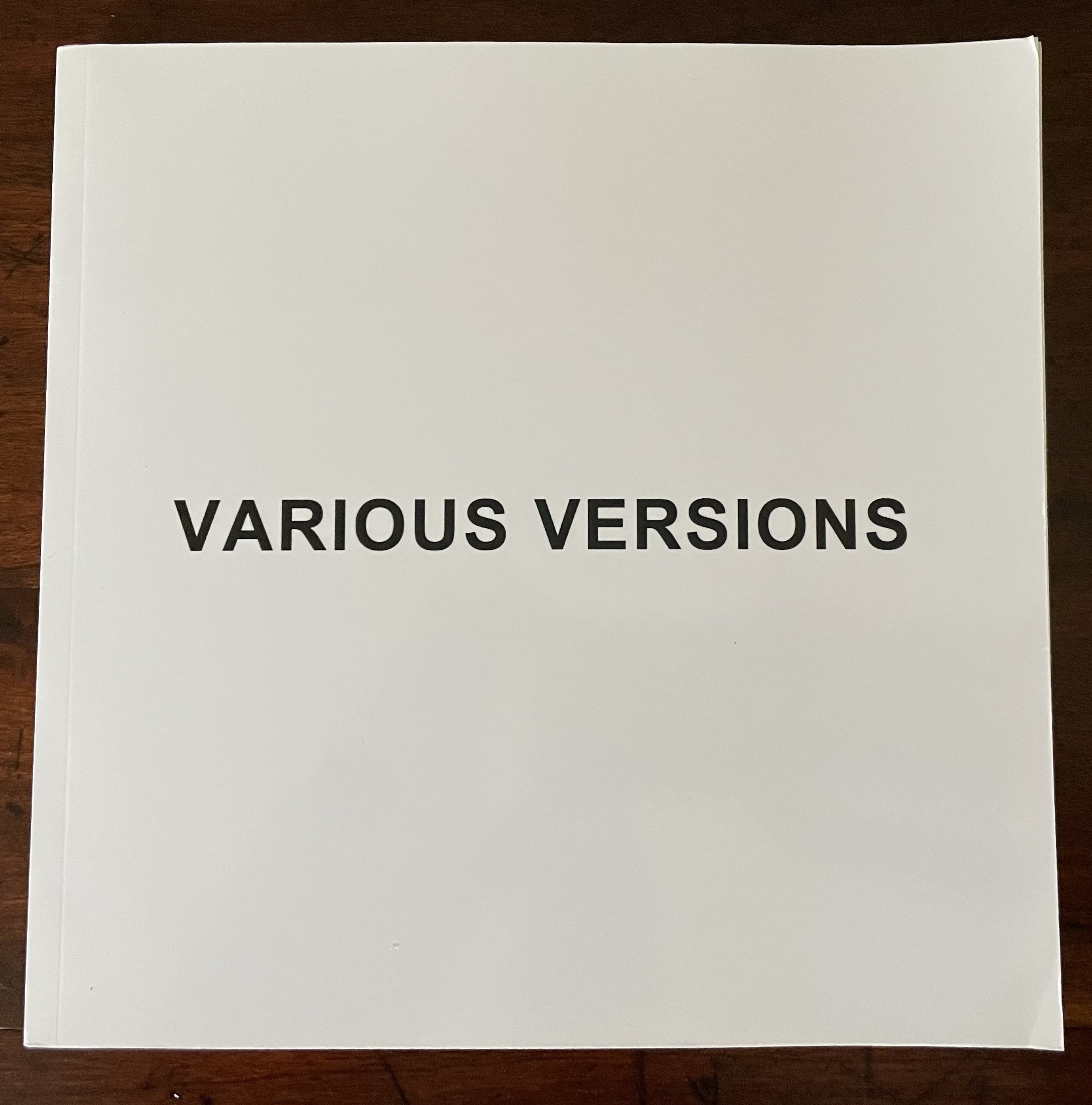
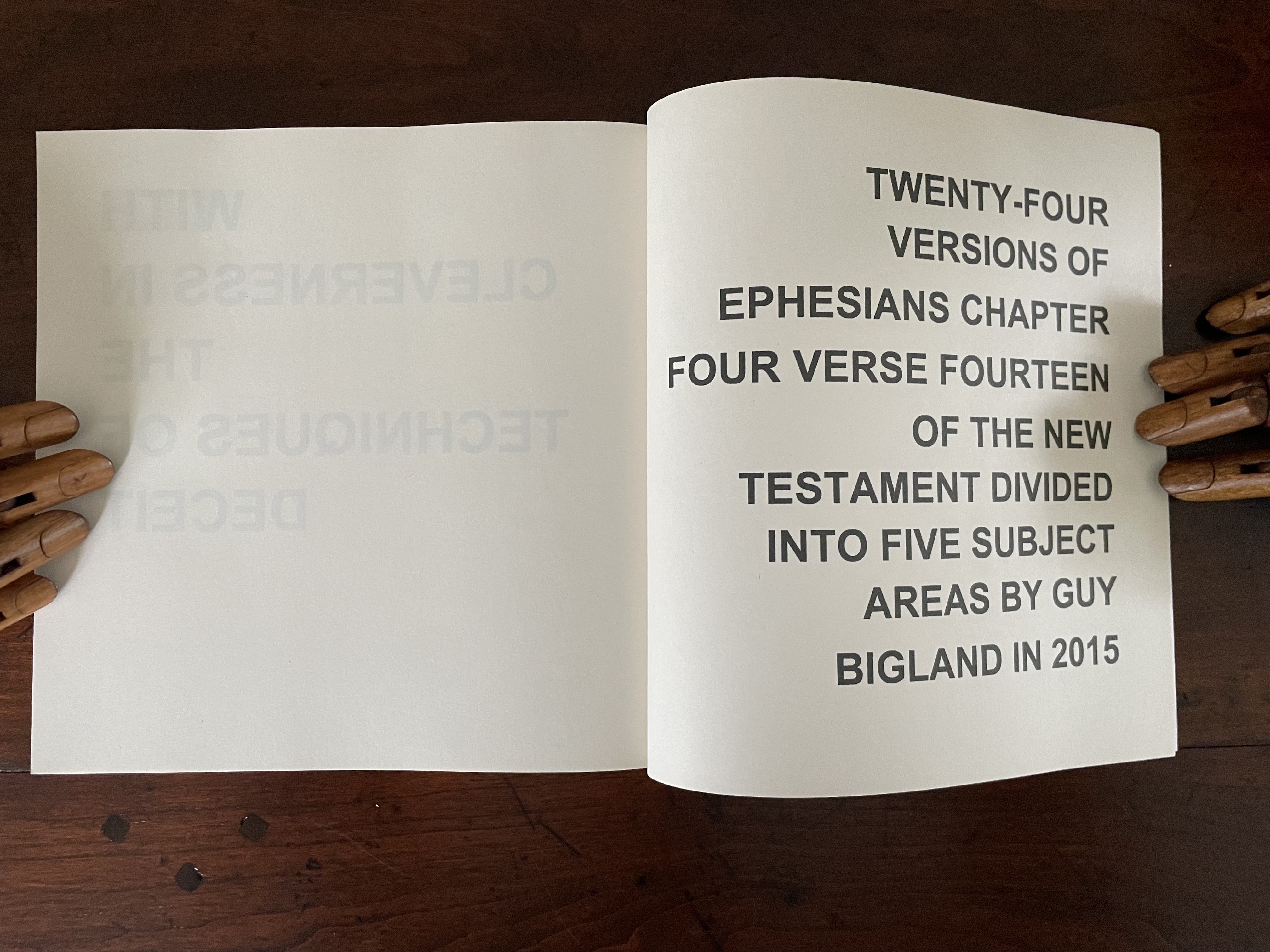
Various Versions (2015) Guy Bigland Perfect bound soft cover. H190 x W190 mm. [158] pages. Acquired from the artist, 12 October 2023. Photos: Books On Books Collection.
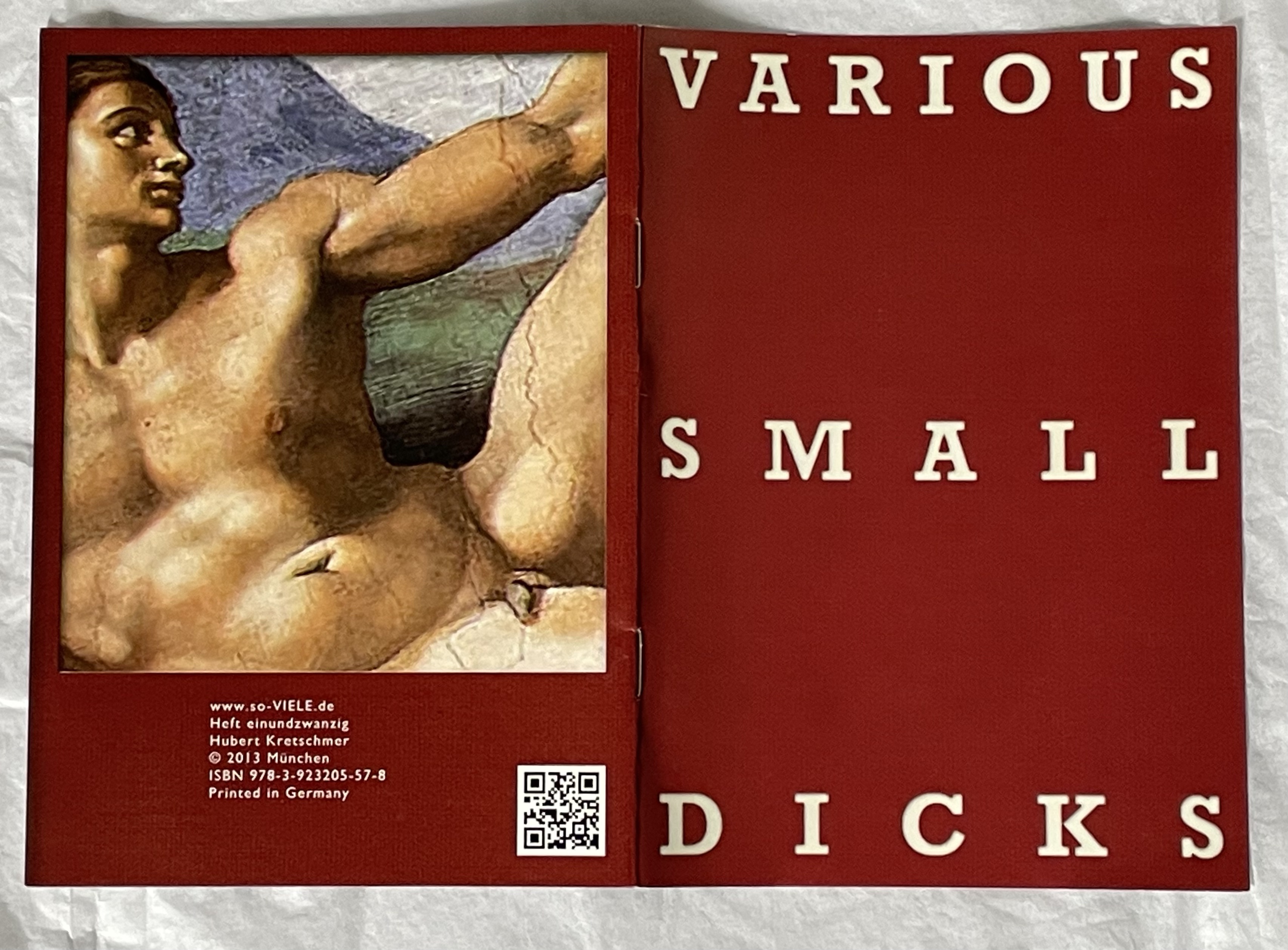
Various Small Dicks (2013) Hubert Kretschmer Saddle stitched booklet. H149 x W105 mm. [8] pages. Acquired from the artist, 11 July 2019. Photo: Books On Books Collection.
It is fun to place OH/NO as an expression of mock horror in response to all that.
Cain, Abigail. 27 September 2018. “Unpacking Ed Ruscha“, Aperture. This is Cain’s review of the Harry Ransom Center’s 2018 exhibition Ed Ruscha: Archaeology and Romance, which used 150 displayed items to focus on 16 of Ruscha’s books. It contextualizes Various Small Fires neatly. Quoting the Center’s photography curator Jessica S. Macdonald, Cain writes: “… lack of artistry is one of the hallmarks of Ruscha’s artist books. ‘The photographs of gas stations are bad photographs on purpose,’ McDonald noted. ‘He’s trying to do the opposite of what a photographer trying to make an artistic photograph would be doing.’ In a 1965 Artforum interview concerning his second book, Various Small Fires and Milk (1964), Ruscha explained that it didn’t even matter to him who took the photographs. ‘In fact, one of them was taken by someone else,’ he said. ‘I went to a stock photograph place and looked for pictures of fires, there were none.'”
Coplans, John. February 1965. “Concerning ‘Various Small Fires’: Edward Ruscha Discusses His Perplexing Publications”. Artforum. 3:5, 25.
Hoyle, Ben. 25 February 2017. “Ed Ruscha, the pop painter with ‘the coolest gaze in American art’“. TheTimes. London. Ben Hoyle’s easygoing interview with Ed Ruscha introduces his work as the heart of the British Museum’s exhibition “The American Dream: pop to the present” (9 March 9 to 18 June 2017). That is a bold assertion as the show included Claes Oldenburg, Jasper Johns, Andy Warhol, Roy Lichtenstein, Cy Twombly, Louise Bourgeois, Robert Rauschenberg and others recognizable to anyone who was briefly awake in a college art history class — even as long ago as the 70s. But, back then, not so much “Ed Ruscha”. Hoyle’s article – with its paragraphs’ casual packing in of news, telling descriptive detail and sharp observations (whether his or others’) of Ruscha’s art – makes a persuasive case.
The Albertine Workout is a collaboration between artist Kim Anno and poet Anne Carson.
Albertine is Albertine Simonet, the central love interest in Proust’s In Search of Lost Time. The Workout explores her character in text and image. The illustration above touches the biographical note that, according to Proust, the Albertine character was based on Alfred Agostinelli, sometime chauffeur and typist for Proust.
The images resting in the burgundy Solander box on Anno’s website are well worth a look. (Carson’s text not seen.)
The spectrum of modern and contemporary Artists’ Books in Reed College’s Special Collections and collected on this website include traditional letterpress printed books of poetry, conceptual book works, sculptural and visual works, concrete poetry, and magazine works. This unique collection, which holds significant 20th century and contemporary artists’ books, gives students and the broader population insight into the significant role artist’s books have played among the avant-garde of Eastern and Western Europe, Asia and the United States, from the turn of the last century to the present. This includes livre d’artiste works by David Hockney, avant-garde works by Sonia Delaunay, conceptualist works by Sol LeWitt, and contemporary works by Xu Bing.
A search of the general library catalog with the term “artists’ books collection” yields over 1700 items, not all of which are in the Special Collection. This website offers visitors an organized way to browse the collection and enjoy access to individual sites for select items as shown here:
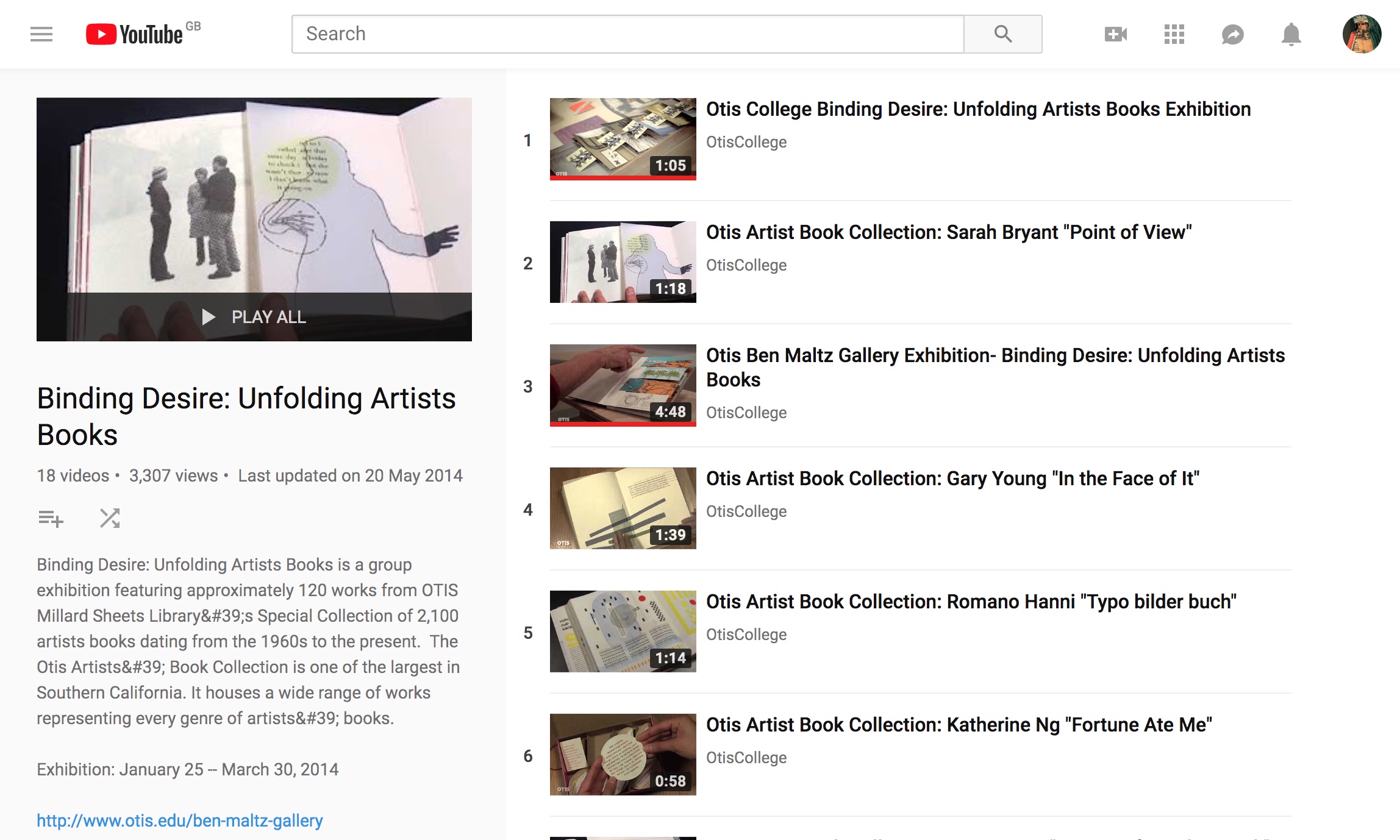
This 18-video playlist at the Otis College of Art and Design covers a 2014 exhibition highlighting around 120 works in the Artists Book Collection. The playlist contributes to the collection’s goal:
The goal of the Otis Artists’ Book Collection is not to create a comprehensive archive, but rather to provide a valuable teaching resource available to artists and students. Since the collection is available on only a limited basis, providing access to the books via an online image database is a continuing project, one that we hope will assist those with interest in researching our collection as well as the medium in general.
Some videos are better than others, and all benefit from viewing without the background music. Having handled both Susan E. King’s Lessons from the South and J. Meejin Moon’s Absence, I can vouch for the corresponding videos’ effectiveness.
The Lessons video could be closer to the experience of handling the work if the transitional zooming were replaced with a 360 circumferential shot or angled stills to reveal more of the work’s intricacies — for example, this overhead shot taken at the old Corcoran Gallery in Washington, DC:
The Absence video comes much closer to a hands-on experience, but the exchange in the Comments section highlights how inclusion of some description by voiceover or bibliographic entry would aid viewers’ appreciation.
Vesper Von Lichtenstein 10 months ago It’s a memorial to 9/11, and the cut out parts are the Two Towers going from the top down…at the end of the book you see the placement of the two towers within the context of the rest of the buildings on a city block. The music seems a bit… upbeat for such a somber book.
Critiques aside, the playlist and site warrant multiple revisits and a thanks to Otis College.