Bookmarking Book Art – in medias res … Andrew Hayes

When Andrew Hayes told me it was e.e. cummings’ 100 poems he had found in the middle of the stacks of books awaiting a bookshelf he planned to build, I winced. Cummings has always been hard for me to figure. I was hoping for a more accessible book as a pretext to kick off our interview.

If you have not encountered one of these  interviews on Books On Books, I should explain. The idea is that the book artist selects a book from the middle of the home or studio bookshelf, opens it to the middle, and tells me the author, title and page number. After tracking down the book, I send off some questions and so the interview begins.

Stalagmites of books in the home of Andrew Hayes, book artist

It turned out that cummings was hard to access for Andrew as well. He wrote:

As I took the book from its place in the middle I had to take care, as you can see this is not the most efficient way to retrieve a book. I was able to carefully remove the book with out the top half toppling down, this time…

Just like extracting the meaning from the poem that just happened to be bookmarked in the middle of the cummings volume. The poem begins:

Just like extracting the meaning from the poem that just happened to be bookmarked in the middle of the cummings volume. The poem begins:

kind) 
YM&WC 

(of sort of) 

A soursweet bedtime

and ends:

iSt 

ep 

into the not 

merely immeasurable into 
the mightily alive the 
dear beautiful eternal night

Until Andrew carefully pulled out this volume bookmarked by his partner Kreh Mellick, he had not read it. “To be honest, I do not read as much as I would like, ….” Still, I wonder if, as his eyes moved through the broken-up layers of syntax and the juxtaposition of the “soursweet bedtime” story with “the mightily alive the/ dear beautiful eternal night”, he recognized something of his own?

The title of this piece is Hade. “Hade” is a geological term, like Placer and Lode (titles of these other striking sculptures).
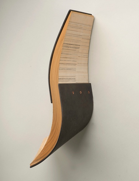
Hade, Andrew Hayes Steel, book pages, and copper 16'' x 6'' x 3'' 2013 Reproduced with permission of the artist Photo credit: Steve Mann, Black Box Photography

Hade, 2013
Steel, book pages, and copper
16” x 6” x 3”
Reproduced with permission of the artist.
Photo credit: Steve Mann, Black Box Photography

Placer, 2013 Steel, book pages, and brass 10'' x 7'' x 9'' Reproduced with permission of the artist Photo credit: Steve Mann, Black Box Photography

Placer, 2013
Steel, book pages, and brass
10” x 7” x 9”
Reproduced with permission of the artist
Photo credit: Steve Mann, Black Box Photography

Hade refers to “the angle of inclination from the vertical of a vein (geology), fault, or lode”. In Hade the yellowed pages slip between the parenthesis of steel plates like the sense lode through the fractured syntax of e.e. cummings’ poem. This is book art for the sensualist, much as most of cummings’ better poems are words for the sensualist. It exudes appreciation and care for the material of which it is made. That comes through clearly in Andrew’s response to my question “As an artist whose work has an intimate relationship to ‘the book’, could you describe the effect this has on you when you are reading books in general?”:

… as I read a book I love watching it wear and change as I pass through the pages. I’m sure this happens with everyone’s books, but I love this transformation. I find it happens best in shoes and books. I have a hard time keeping my hands clean so my books take a beating, I almost don’t need a book marker because I can just turn to the first clean page. It is funny I don’t like to dog ear pages I feel like that is almost disrespectful in a way, but I just like seeing what happens to the book as it serves its function. … for me finding a book that has been seasoned is like finding two stories. I like figuring out who read the book before and reading the notes and things I find in the books I end up using for sculpture.

An e.e. cummings poem can amuse like a Rube Goldberg or Heath Robinson contraption, but always with a sting at the end.  Andrew clearly has a love of contraptions, words and paradox as well.

Lode, 2013 Steel and book pages 16'' x 7'' x 2.5'' Reproduced with permission of the artist Photo credit: Steve Mann, Black Box Photography

Lode, 2013
Steel and book pages
16” x 7” x 2.5”
Reproduced with permission of the artist.
Photo credit: Steve Mann, Black Box Photography

… as I read a book I love watching it wear and change as I pass through the pages. I’m sure this happens with everyone’s books, but I love this transformation. I find it happens best in shoes and books. I have a hard time keeping my hands clean so my books take a beating, I almost don’t need a book marker because I can just turn to the first clean page. It is funny I don’t like to dog ear pages I feel like that is almost disrespectful in a way, but I just like seeing what happens to the book as it serves its function. … for me finding a book that has been seasoned is like finding two stories. I like figuring out who read the book before and reading the notes and things I find in the books I end up using for sculpture.

An e.e. cummings poem can amuse like a Rube Goldberg or Heath Robinson contraption, but always with a sting at the end.  Andrew clearly has a love of contraptions, words and paradox as well.

Ballistae Steel and book pages 16'' x 8'' x 3'' 2013

Balastae, 2013
Steel and book pages
16” x 8” x 3”
Reproduced with permission of the artist
Photo credit: Steve Mann, Black Box Photography

“Balastae” is an ancient variant on “ballistae”– the oversized Roman crossbow,  comparable to a catapult or trebuchet. Its kinetic energy is captured here in the potential energy of the pages of words poised to fly over the steel. The contrast and tension between the kinetic and potential, between noun/verb and tool/rest, between paper and metal, characterize many of Andrew’s titles and works, for example, Kedge and Plow. My favorite works are Shift, Waver, Swarm and Kedge. The latter, in particular, captures the paradoxes in Andrew’s works; the word is noun and verb (transitive and intransitive) all in one: a nautical term for a light anchor, also the term for the act of warping a vessel and the term for moving a vessel by pulling on the anchor. Shift and Waver capture the kinetic energy of his works and beg to be circled and viewed from every angle like any of the dynamic figures of Giambologna.

Kedge Steel, book pages, and brass 9.5'' x 18'' x 9'' 2013 Reproduced with permission of the artist. Photo credit: Steve Mann, Black Box Photography

Kedge, 2013
Steel, book pages, and brass
9.5” x 18” x 9”
Reproduced with permission of the artist.
Photo credit: Steve Mann, Black Box Photography

Shift, 2013 Steel, book pages, and brass 11'' x 5'' x 2'' Reproduced with permission of the artist Photo credit: Steve Mann, Black Box Photography

Shift, 2013
Steel, book pages, and brass 11” x 5” x 2”
Reproduced with permission of the artist.
Photo credit: Steve Mann, Black Box Photography

Waver, 2013 Steel, book pages, and brass, 16'' x 9'' x 9'' Reproduced with permission of the artist. Photo credit: Steve Mann, Black Box Photography

Waver, 2013
Steel, book pages, and brass, 16” x 9” x 9”
Reproduced with permission of the artist.
Photo credit: Steve Mann, Black Box Photography

And Swarm – ah, yes – like swarming bees, words have gathered across the splayed edges of the pages, whirling up framed by brass-riveted metal. Swarm is one of the biologically allusive pieces along with Divaricate, reflecting how Andrew’s imagination ranges over the words, objects and concepts in so many domains:

Swarm, 2013 Steel, book pages, and brass 13'' x 14'' x 3'' Reproduced with permission of the artist. Photo credit: Steve Mann, Black Box Photography

Swarm, 2013
Steel, book pages, and brass
13” x 14” x 3”
Reproduced with permission of the artist.
Photo credit: Steve Mann, Black Box Photography

the architectural (Prohedria, Mullion), nautical (Helm, Kedge), agricultural (Harrow, Plow) and military (Sentry, Citadel) as well as others ripe for verbal and visual puns. Witty as well as sensual, there is almost something of the Metaphysical poets about his work. One such work of metaphysical visual and verbal punning is Wry. Definitions of the word invariably include “twisted”, “distorted”, “lopsided” and apply it to facial features such as “a wry grin” or “wry mouth”. Now take a look at Wry:
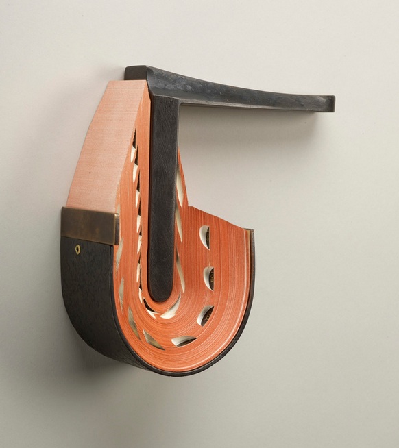
Wry, 2013 Steel, book pages, and brass 7'' x 8'' x 3'' Reproduced with permission of the artist. Photo credit: Steve Mann, Black Box Photography

Wry, 2013
Steel, book pages, and brass
7” x 8” x 3”
Reproduced with permission of the artist.
Photo credit: Steve Mann, Black Box Photography

Book art can easily fall off into mere craftwork. On the one hand, the book artist requires the freight that the book’s content and form carry, requires it somewhat analogously to the way Eric Gill required Hopton-Wood Stone for his sculpture. But the degree to which the freight weighs down the treatment, or the handling does not take the material beyond itself, that is the degree by which the work is closer to handicraft than to art. From the way that Andrew writes of his perspective on the freight that his found material carries with it, you can understand why each of his works — solid and dense as they are — translates the raw material beyond itself:

Book art can easily fall off into mere craftwork. On the one hand, the book artist requires the freight that the book’s content and form carry, requires it somewhat analogously to the way Eric Gill required Hopton-Wood Stone for his sculpture. But the degree to which the freight weighs down the treatment, or the handling does not take the material beyond itself, that is the degree by which the work is closer to handicraft than to art. From the way that Andrew writes of his perspective on the freight that his found material carries with it, you can understand why each of his works — solid and dense as they are — translates the raw material beyond itself:

When making work I take my love for the used book and search for pages that I can use in my sculpture. The book pages are a loaded found material. Other materials I use like steel that I find at the scrap yard come with built in history as well but it may not be as universal as the book pages. The books I am drawn to are usually worn or rich with color or deckled edges, but that is just the beginning. It is always a surprise when I cut the pages from their binding. This is when I try to find a way that I can compose the pages into a new shape in combination with steel.

To find a union of metal and the printed page as rich and tactile as that created by Andrew, we would have to hark back to the days of hot metal typesetting or farther still to the chained library. But, while the titles of Andrew’s works may evoke the historical or archaeological, the works themselves do not assume the printed book’s demise; they emphasize and celebrate the material of the book.

It is strange how these objects – books and scraps of metal that have their own individual logic and structural coherence, both material and semantic – become an object of art. In each – book or scrap steel – raw material has been amassed and wrought (words, paper, ink and cloth; or iron, carbon, manganese and nickel) to make a finished thing whose physicality inheres and obtrudes. The ways in which those raw materials are amassed and wrought into objects such as dictionaries or kitchen sinks create meaning and accumulate meanings by use and context. Then along comes Andrew Hayes. Drawing on his experience as a welder, his work as a student with fabricated steel and his time as a Fellow at the Penland School of Crafts in North Carolina, Andrew takes these found objects with their own logic and transforms them into this realm we call art.

Further Reading

Sara Baker, “Andrew Hayes – Artist”, American Style Magazine, November 2010, accessed 28 August 2013: http://www.americanstyle.com/2010/11/andrew-hayes/

Stacy Dacheux, “Sleek Sculpture Combines Metal with Pressed Book Pages”, Beautiful Decay, 7 August 2013, accessed 10 August 2013: http://beautifuldecay.com/2013/08/07/sleek-sculpture-combines-metal-with-pressed-book-pages/

Erin Fletcher, “Artist: Andrew Hayes”, Flash of the Hand, 20 August 2013, accessed 28 August 2013: http://www.herringbonebindery.com/blog/tag/andrew-hayes/

David Mendez, “Former Tucsonan Has a Warped Way of Using Old Books”, The Range, 9 August 2013, accessed 28 August 2013: http://www.tucsonweekly.com/TheRange/archives/2013/08/09/former-tucsonan- has-a-warped-way-of-using-old-books

Penland, “Focus on: Andrew Hayes”, The Penland Sketchbook, 15 August 2012, accessed 10 August 2013: http://www.penland.org/blog/2012/08/focus-on-andrew-hayes/#sthash.7JYFQ9sW.dpbs

Melissa Walter, “Interview #7 – Andrew Hayes”, Crafthaus, 8 October 2012, accessed 28 August 2013: http://crafthaus.ning.com/group/artist-interviews-where-are-you-going-where-have-y/forum/topics/interview-7-andrew-hayes

Matthew Wengard, “Art As Inspiration: Andrew Hayes”, A Fine Press, 16 August 2013, accessed 28 August 2013: http://afinepress.com/andrew-hayes/

L. Kent Wolgamott, “Lux exhibition ‘Strata’ turns books and metal into graceful sculpture”, Ground Zero, 17 August 2013, accessed 28 August 2013: http://journalstar.com/entertainment/visual-art/l-kent-wolgamott-%20lux-exhibition-strata-turns-books-and-metal/article_b92b4448-e298-53a3-a3f9-034db95d9d4f.html

Michael Yonan, “Toward a Fusion of Art History and Material Culture Studies”, West 86th: A Journal of Decorative Arts, Design History, and Material Culture, 20 September 2011, accessed 11 January 2014:http://www.west86th.bgc.bard.edu/articles/yonan.html#. Yonan notes the discomfort of art historians in addressing art as I have addressed Andrew Hayes’ work: ‘… fore- grounding the idea exalts art history into a philosophical endeavor, whereas emphasizing matter renders the discipline subject to what could be called “the fear of the tchotchke.” … the trinketization of art.’

Meghan Young, “Artist Andrew Hayes Manipulates Metal and Novels”, Trendhunter, 9 August 2013, accessed 10 August 2013: http://www.trendhunter.com/trends/andrew-hayes
Bookmarking Book Art – New England Guild of Book Workers

For 2014-15, the New England Guild of Book Workers have organized a traveling exhibition: Geographies: New England Book Work, its itinerary covering each of the 6 New England states.  Last year, the Rhode Island School of Design (RISD), the Wishcamper Center at the University of Southern Maine and the Bailey Howe Library at the University of Vermont hosted it. This year, the show has appeared at Williams College Library and is scheduled for Dartmouth College Library and the Creative Arts Workshop in New Haven, CT. Criss-crossing geographical boundaries as well as those of book art and the book arts, Geographies calls to mind the last line of Elizabeth Bishop’s “The Map“:

More delicate than the historians’ are the map-makers’ colors.

Or, in this case:

More delicate than the historians’ are the [book-artists’] colors. 

Although born in Nova Scotia, Elizabeth Bishop grew up as a New Englander in Massachusetts with her paternal grandparents. As a far-traveller and visual artist as well as poet, she would have enjoyed this exhibition and found it fitting if it had included a broadside of “The Map”.

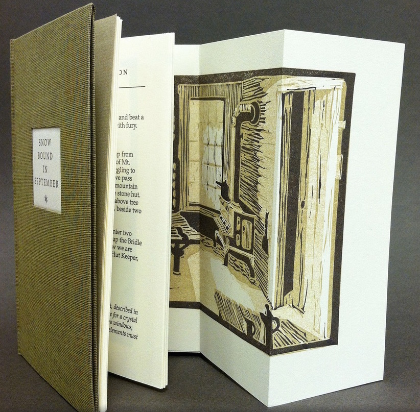
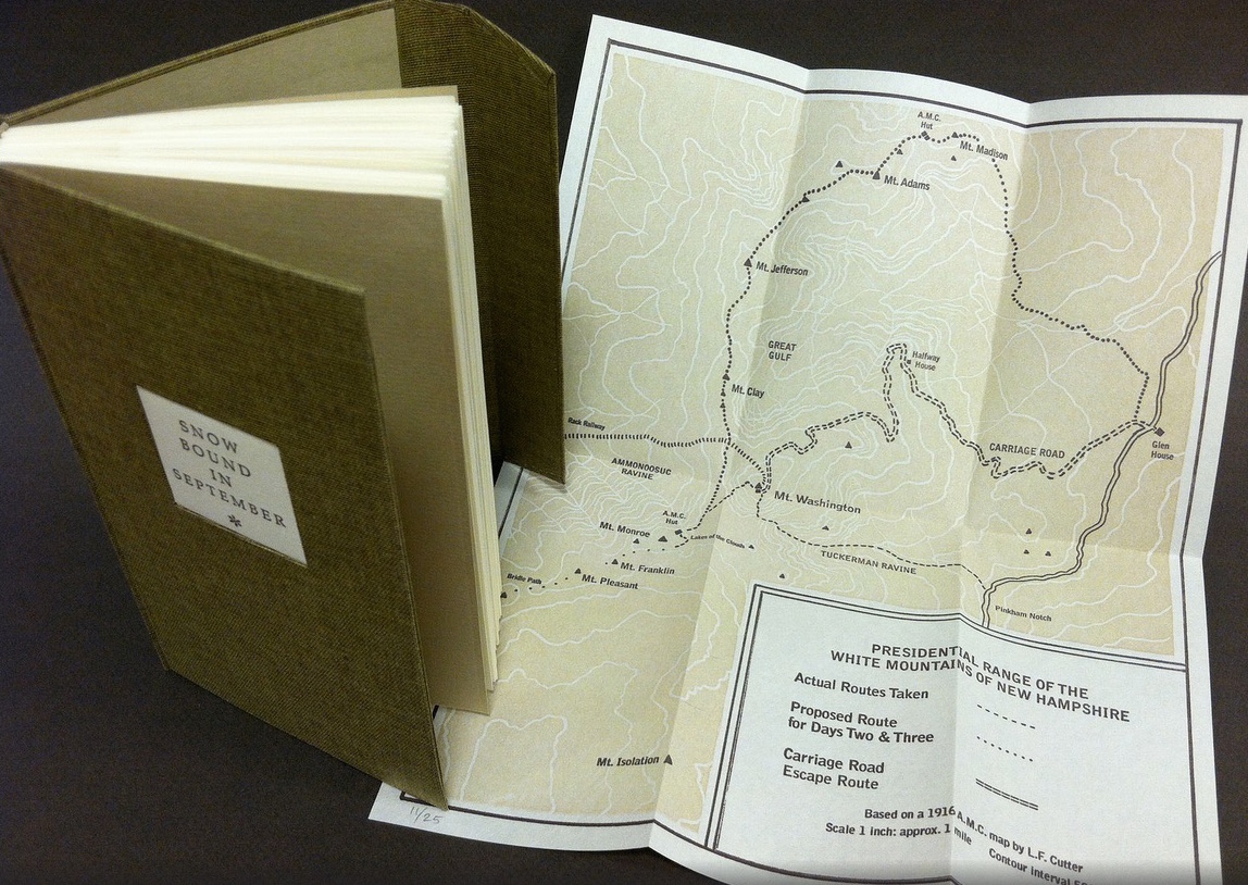
Nevertheless, what a range of “colors” from all the New England states and beyond – from historic to modern, from fine and design bindings to traditional and creative bookbinding, from artist books to calligraphic manuscripts, from masters to apprentices and from object to narrative. The latter finds a wintry exemplar in Snow Bound in September: A Re-Imagining by Laurie Whitehill Chong, retired Special Collections librarian and curator of Artists’ Books at RISD.

Snow Bound in September: A Re-Imagining © Laurie Whitehill Chong Artist Book, Text in Book Antiqua letterpress printed on Rives Lightweight paper using polymer plates, with 13 fold-out two and three-color linocut illustrations. Folded map in inside back cover pocket, letterpress printed using polymer plate and linocut; edition of 25 15.24 x 8.89 x 2.54 cm
Snow Bound in September: A Re-Imagining © Laurie Whitehill Chong Artist Book, Text in Book Antiqua letterpress printed on Rives Lightweight paper using polymer plates, with 13 fold-out two and three-color linocut illustrations. Folded map in inside back cover pocket, letterpress printed using polymer plate and linocut; edition of 25 15.24 x 8.89 x 2.54 cm Snow Bound in September: A Re-Imagining © Laurie Whitehill Chong
Cloth covered binding with flap and front pocket, smythe sewn.
Text in book Antiqua letterpress printed on Rives Lightweight paper using polymer plates, with 13 fold-out
two and three-color linocut illustrations. Folded map in inside back cover pocket, letterpress
printed using polymer plate and linocut. 
15.24 x 8.89 x 2.54 cm 
Edition of 25

The artist made this book the same size as her grandfather’s Appalachian Mountain Club hiking guide. Snow Bound is an invented ancestral narrative, in which the artist uses a surviving photograph and her grandfather’s notes about being stranded with his wife for five days on Mount Washington by a hurricane-driven snowstorm in September 1915 to re-imagine the ordeal from her grandmother’s perspective. Note the slotted front cover into which the flap extending from the back cover fits to keep the book closed, snug against the elements.

Snow Bound in September: A Re-Imagining © Laurie Whitehill Chong
Snow Bound in September: A Re-Imagining © Laurie Whitehill Chong Snow Bound in September: A Re-Imagining © Laurie Whitehill Chong

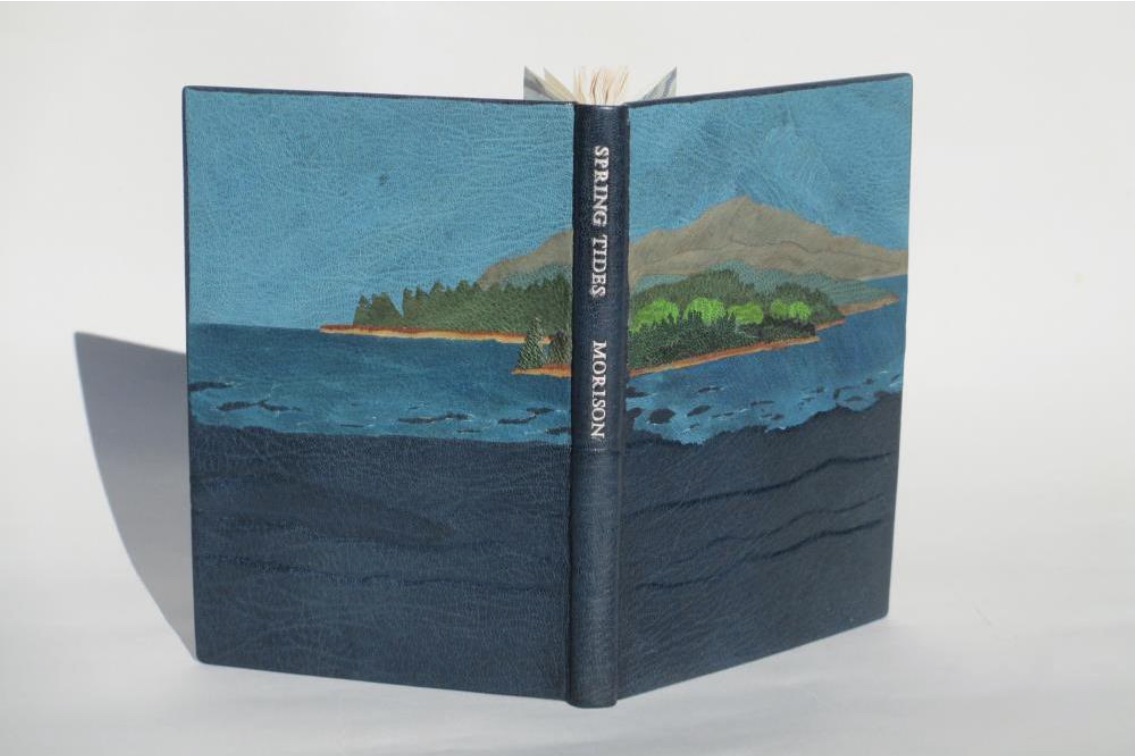
Julie B. Stackpole’s creative re-binding of Samuel Eliot Morison’s Spring Tides takes us from the New England mountains to the shore as can be seen from the layered binding.

Spring Tides by Samuel Eliot Morison Boston: Houghton-Mifflin Co., 1965. Julia B. Stackpole, Design binding  21.8 x1 5.0 x 1.6 cm  January 2014
Spring Tides by Samuel Eliot Morison Boston: Houghton-Mifflin Co., 1965. Julia B. Stackpole, Design binding  21.8 x1 5.0 x 1.6 cm  January 2014 Spring Tides
by Samuel Eliot Morison
Boston: Houghton-Mifflin Co., 1965.
Julia B. Stackpole, Design binding
21.8 x1 5.0 x 1.6 cm
January 2014

In Stackpole’s words:

The traditional tight-joint binding is covered in navy blue Niger goatskin with waves in the lower parts created by paring before covering. Cut-outs in the onlays of the lighter blue leather of the water help it transition from the dark of the navy to the sky’s azure. Onlays of other leathers create the forested landscape of the shoreline and hills. These blues were chosen because the only blue leather in a large enough piece to cover the whole binding was the dark navy, while I only had scraps of the water and sky’s blue. The endpapers are a Cockerell marbled paper over-painted with blue, with leather hinges.

Pictures of the works in the catalog (and others not) can also be found at the Williams College Flickr site (for now). I say “for now” because they will be  pushed downstream inevitably in the way of today’s digital flow.  They may even disappear; although as Matthew Kirschenbaum has explained in Mechanisms, something digitally forensic will remain. That boundary of the tangible and the digital, the haptic and the virtual, is only lightly but evocatively touched in this collection.

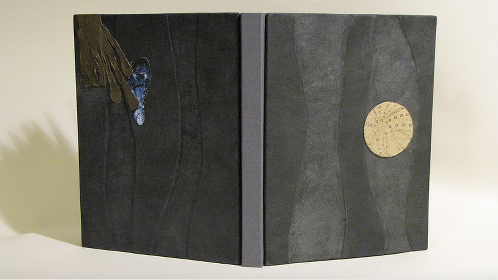
When Julia Stackpole writes in the online catalog about that Cockerell marbled paper that it “felt to me like the waves and the shoals and ledges of Maine waters”, you long to lay hands on the Spring Tide. Anne McClain’s Place includes photographs taken digitally of places on Maine’s midcoast that have been special to her her “entire life and will continue to be a constant as other things change and move on”. What is captured digitally is reproduced physically to fix those places that will “continue to be a constant”. But places do change.

Anne McClain, Place Drum Leaf Binding  19 x 15 x 1.8 cm  February 2014
Anne McClain, Place Drum Leaf Binding  19 x 15 x 1.8 cm  February 2014 Anne McClain, Place
Drum Leaf Binding
19 x 15 x 1.8 cm
February 2014

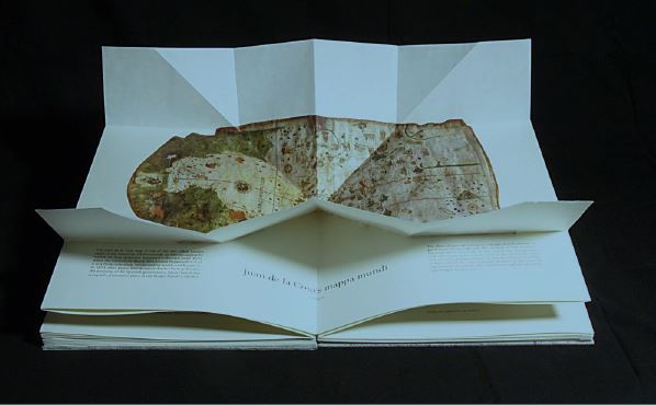
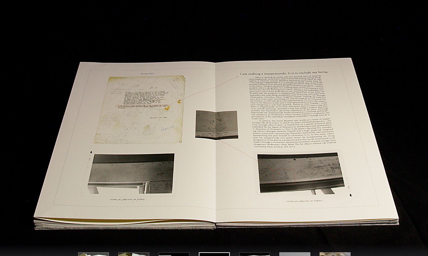
Rutherford Witthus’ contribution touches the boundary between the digital and physical most directly. His artist’s book is entitled 28 Fort Square: What Charles Olson wrote on the window casings of his apartment in Gloucester, Massachusetts, of which there are eleven copies.

Rutherford Witthus, 28 Fort Square: What Charles Olson wrote on the window casings of his apartment in Gloucester, Massachusetts, 2014
Rutherford Witthus, 28 Fort Square: What Charles Olson wrote on the window casings of his apartment in Gloucester, Massachusetts, 2014 Rutherford Witthus, 28 Fort Square: What Charles Olson wrote on the window
casings of his apartment in Gloucester, Massachusetts, 2014

In these 11 copies, Witthus digitally reconstructs the windows of Charles Olson’s apartment at 28 Fort Square where he wrote his main work, The Maximus Poems, and covered the window casings with meteorological data. The artist book “presents for the first time all of the images of the window casings”.

Rutherford Witthus 28 Fort Square: What Charles Olson wrote on the window casings of his apartment in Gloucester, Massachusetts Artist book Edition of 11 42 x 28 x 2.5 cm 2014
Rutherford Witthus 28 Fort Square: What Charles Olson wrote on the window casings of his apartment in Gloucester, Massachusetts Artist book Edition of 11 42 x 28 x 2.5 cm 2014 Rutherford Witthus
28 Fort Square: What Charles Olson wrote on the window casings of his apartment in Gloucester, Massachusetts
Artist book
42 x 28 x 2.5 cm
2014
Edition of 11

Athena Moore, chapter secretary of The New England Guild of Bookworkers, produced the catalog for this itinerant exhibition organized by Stephanie Wolff, Exhibitions Coordinator and Todd Pattison, Chapter Chair. If you have the chance to see the exhibition in its next venue, take it.

Just as Elizabeth Bishop questioned the depiction of the boundary between land and water on her map – “Shadows or are they shallows at its edges …”, you will find the juxtaposition of these works reminds you that the boundary between book art and the book arts can be shadowy or shallow indeed.

Bookmarking Book Art – Francisca Prieto (II)

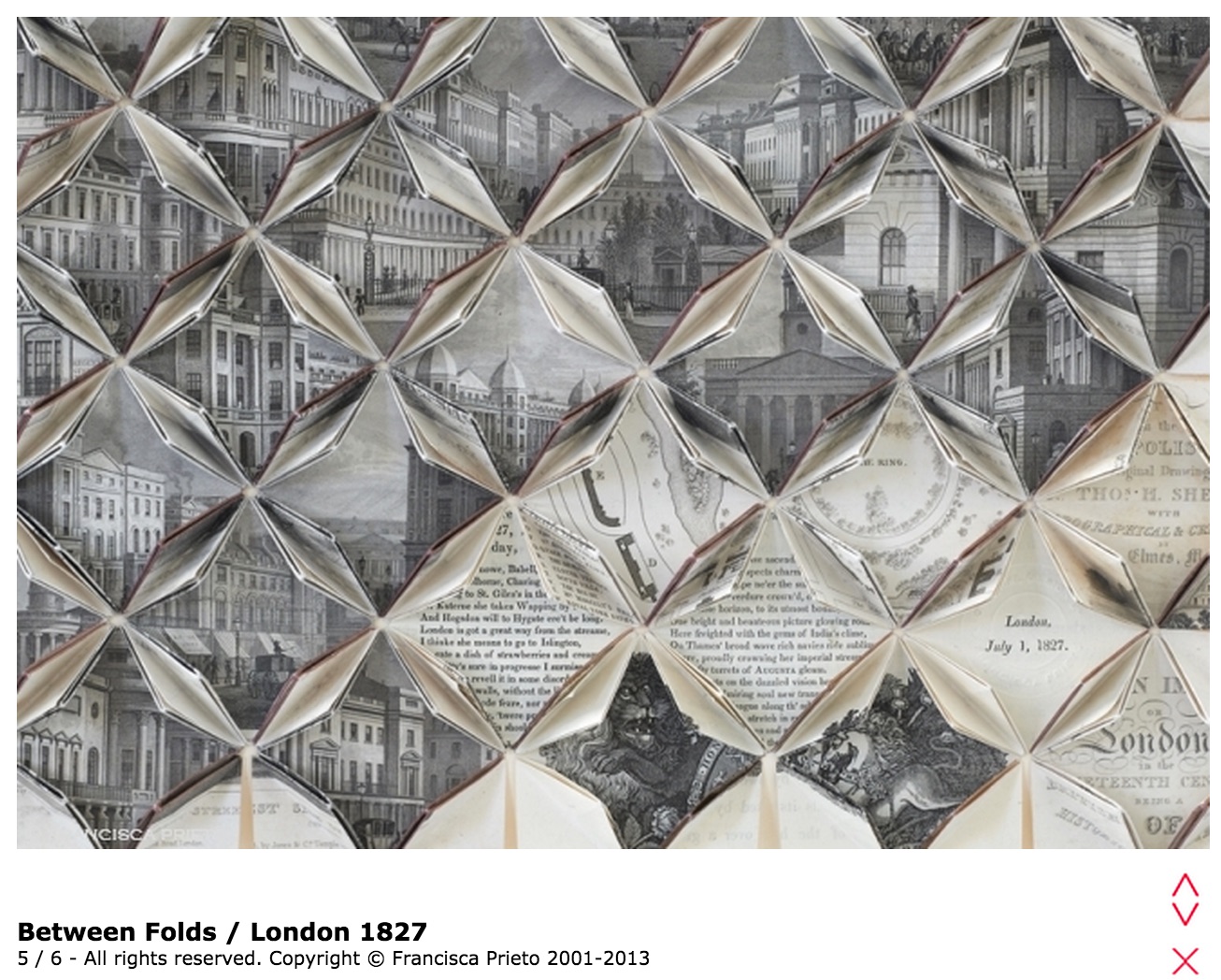
Prieto, London 1827 (i)

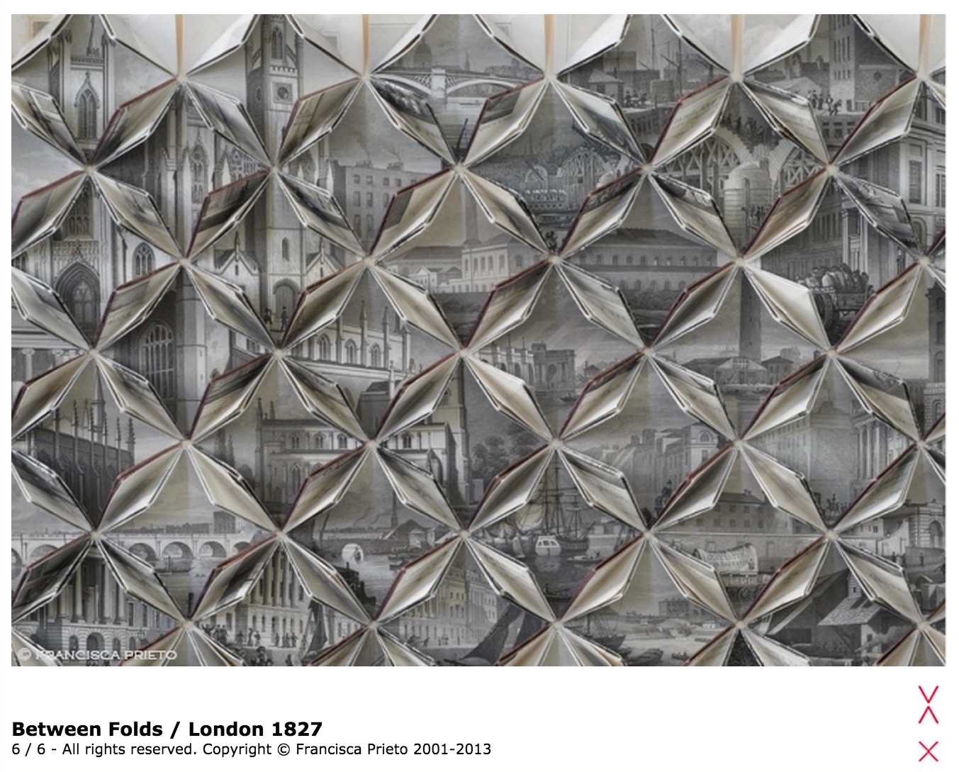
London 1827 takes us back in time, unfolding the nineteenth-century city before us. In a fluttering of pages we are cast among the grand stone of new buildings, under bridges, along the paths of Regents Park, up to a long-forgotten skyline – an elegant rising of church spires. — Francisca Prieto, Between Folds

Prieto, London 1827

In August 1827,  William Blake’s family walked along these London streets in the cool of the buildings’ shadows to the site of an unmarked grave in Bunhill Fields in the Borough of Islington. If the mind’s eye lets the spectator step into those shadows, the metallic edging of the folds in this work recalls Blake’s invention of relief etching on copper plate to enable the “Illuminated Printing” of his “Illuminated Books”.  Where the eye passes Lincoln’s Inn Fields, Blake’s apprenticeship springs to mind — for 50 guineas to an architectural prints engraver (James Basire, 1730–1802) for the tasks of polishing the plates, sharpening the gravers, preparing the surfaces for the acid, guiding the graver’s bite through the copper and, eventually, creating the sketches for the plates in Richard Gough’s Sepulchral Monuments in Great Britain. 

Prieto, London 1827 (ii)

Gradually becoming aware of Prieto’s painstaking mathematical precision and calculation to expose between the folds just the right text and illustrations from London and its Environs in the Nineteenth Century by Thomas H. Shepherd, published the month before Blake’s death, the flâneur of London 1827 might wonder whether Blake would have cast Prieto’s lot in with those of Newton, Locke and Bacon, his sterile scientific materialists.  But no, Blake praised the unity of art and science:

“What is the Life of Man but Art & Science?” (Jerusalem, plate 77)

“Art & Science cannot exist but in minutely organized Particulars, and not in generalizing Demonstrations of the Rational Power.” (Jerusalem plate 55: line 62).

Prieto’s works consist of these “minutely organized Particulars” and, being so, they bring the viewer to “Life” and assert their place in the tradition of book art.

See also Bookmarking Book Art – Francisca Prieto (I) and www.blankproject.co.uk.

Bookmarking Book Art – The Banff Centre, Paul D. Fleck Library & Archives

From Alberta, Canada

Now added to BooksOnBooks’ blogs followed.

The Paul D. Fleck Library & Archives at The Banff Centre has over 4,000 artists’ books and multiples. Inspired by Ed Ruscha’s seminalbook “Every Building on the Sunset Strip”, we will display every item in the collection in a case in the library, rotating through 15 items weekly. Here you will find a photo log documenting the items, chosen randomly for display. Click through on any photo for title and creator caption.

For more information and full catalogue records for the items pictured, visit banffcentre.ca/library/.

Kudos to book artist Jaye Fishel for setting up Every Item in the Artists’ Books Collection and to Silvio Lorusso for the interview with Fishel.

Bookmarking Book Art – Mending Pages

M4qPagG - Imgur
R6fTbxT
mpG4XVO - Imgur
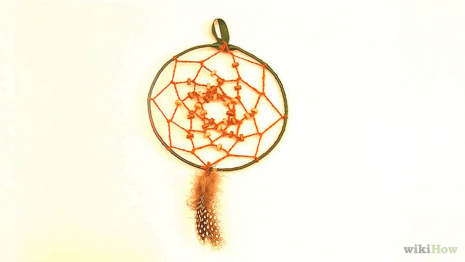
Dreamcatcher
Kintsugi

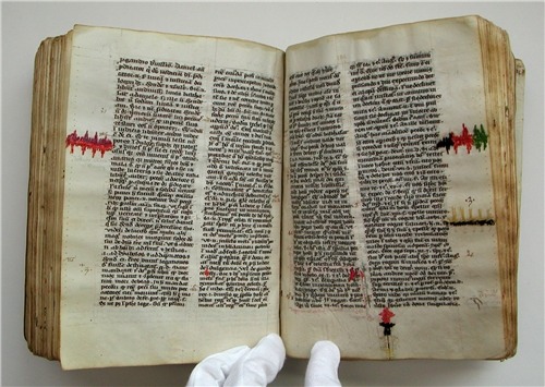
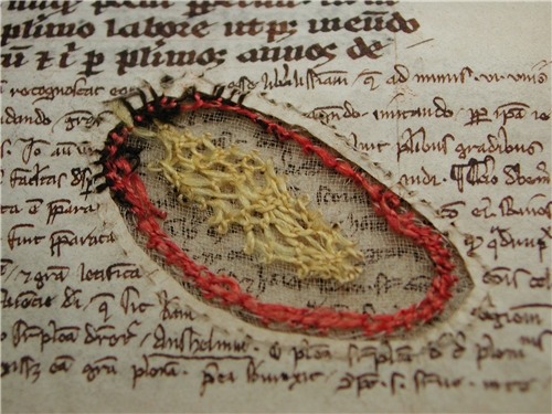
William Dean Minter, Senior Book Conservator in the Digitization and Preservation Department at Pennsylvania State University drew my attention to these images. At first, they reminded me of passages in Annie Tremmel Wilcox’s A Degree of Mastery, in which she describes mending rare books with kozo paper under the hawkeye of the late Bill Anthony. Then, dreamcatchers sprang to mind. What were the images, sounds and thoughts caught in words now missing on these pages, words slipped from the dreamcatching pages? But book artist Esther Kibby, who teaches photography, graphic design and web design at the Art Institute of Dallas in Texas, came up with the most telling association: kintsugi. 

Kintsugi (or kintsukuroi) is a Japanese method for repairing broken ceramics with a special lacquer mixed with gold, silver, or platinum. The philosophy behind the technique is to recognize the history of the object and to visibly incorporate the repair into the new piece instead of disguising it. The mastery of the book restorer is to invisibly repair the book. Our “dreamcatcher” restorer seems to have in mind the kintsugi philosophy and lets the repair draw attention to itself and creates “a new piece”.

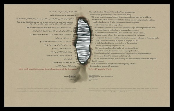
In the hands of a book artist, such a technique could generate ironic expressions of biblioclasm: the restored book that is no longer a book? Or echoes of Walter Benjamin’s presumption of and preoccupation with the modern world’s fragmentary nature? Or the pain and sorrow of Al-Mutanabbi Street?

Bettina Pauly, The Sun that Rises, 2013
Bettina Pauly, The Sun that Rises, 2013 Bettina Pauly, The Sun that Rises, 2013.  Made for An Inventory of Al-Mutanabbi Street.

Or a tongue-in-cheek answer to those horrified by the destruction of “the book”?

When the Japanese mend broken objects, they aggrandize the damage by filling the cracks with gold. They believe that when something’s suffered damage and has a history it becomes more beautiful. —Barbara Bloom

Bookmarking Book Art – Helen Douglas

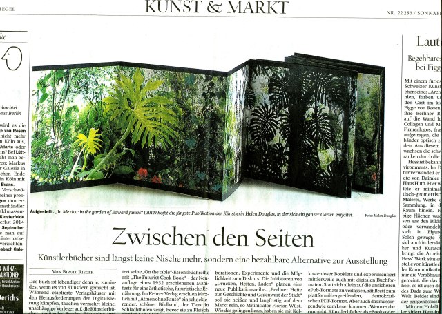
Helen Douglas, In Mexico: in the garden of Edward James (2014). Reviewed in Der Tagesspeigel

Helen Douglas has been kind enough to forward the notice above of her most recent work — In Mexico: in the garden of Edward James.  Based on her invited residency in Mexico City, this concertina book takes the viewer through Edward James’ jungle garden Las Pozas, its buildings and staircases, James’s surreal imagination and, best of all, Douglas’s own imaginative experience of them. See the interview at BookArtBookBlog that preceded the work’s unveiling at the London Art Book Fair at the Whitechapel Gallery and Berlin Art Book Fair.

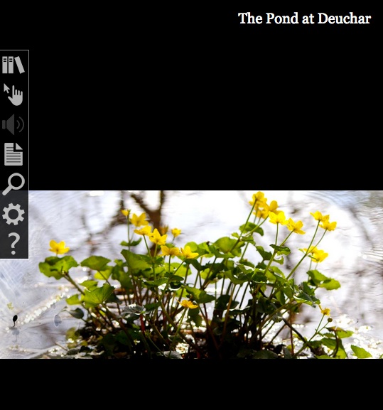
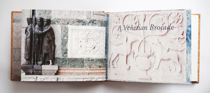
When I go to Weproductions, the website of founding partners, Telfer Stokes and Helen Douglas, it is like taking a walk in Yarrow, Scotland, or taking the measure of paper samples between forefinger and thumb, or browsing in a bookstore, or lingering in an art gallery. Two of Helen Douglas’s works in particular elicit this: The Pond at Deuchar (2013) and A Venetian Brocade (2010).

The Pond at Deuchar (2012)
“The Pond at Deuchar” E-Scroll artwork ©Helen Douglas
Application “Turning the Pages” © Armadillo Systems

Was it London Book Fair where I first saw this bookwork, appwork, scrollwork … this work of art?  What you see above leads you to the app. Clive Philpott’s postscript to this work, featured on Weproductions and published by the Tate, offers all the background and appreciation of the work you need to read. Read it, then go to The Pond at Deuchar*, lean forward and trail your fingers through its waters.

Helen Douglas and Marina Warner. A Venetian Brocade (Weproductions, 2010)

A Venetian Brocade equally makes the “act of looking” tactile and the “act of touching” insightful. The work reminds me of this passage from Joseph Brodsky’s Watermark (New York: Farrar Straus Giroux, 1992):

… bipeds go ape about shopping and dressing-up in Venice for reasons not exactly practical; they do so because the city, as it were, challenges them. We all harbor all sorts of misgivings about the flaws in our appearance, anatomy, about the imperfection of our very features. What one sees in this city at every steep, turn, perspective, and dead end worsens one’s complexes and insecurities. That’s why one—a woman especially, but a man also—hits the stores as soon as one arrives here, and with a vengeance. The surrounding beauty is such that one instantly conceives of an incoherent animal desire to match it, to be on par. This has nothing to do with vanity or with the natural surplus of mirrors here, the main one being the very water. It is simply that the city offers bipeds a notion of visual superiority absent in their natural lairs, in their habitual surroundings. That’s why furs fly here, as do suede, silk, linen, wool, and every other kind of fabric.

If you are lucky enough to buy one of the few remaining copies of A Venetian Brocade, you will see and feel how it leads to In Mexico: in the garden of Edward James. Appreciation of that double-sided leporello work’s extension of the Douglas’s concept of Visual Narrative and its kinship with James’s surrealism can only be enhanced by viewing The Secret Life of Edward James, George Melly’s documentary film from 1975.

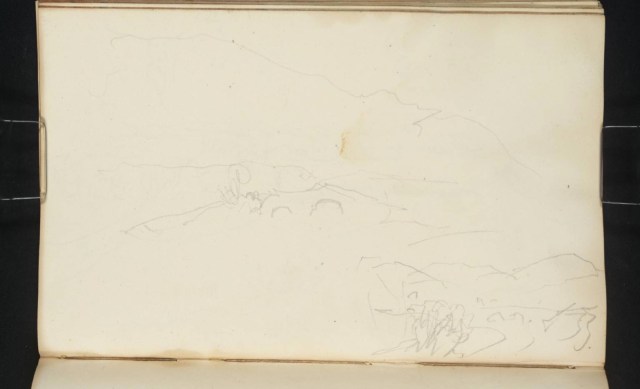
But having indulged the surreal elements, think back to the pond at Deuchar, think back to the Tate’s association with Douglas’s work, then consider this work also held at the Tate:

Joseph Mallard William Turner, “Deuchar Old Bridge, near Yarrow, Selkirkshire”, 1834, in The Edinburgh Sketchbook 1831-34, graphite on paper, 111×181 mm. Reference: D26161
Turner Bequest CCLXVIII 34 a

Here is a narrative of art across time and place to touch by looking and, by looking, to be touched by.

*Deuchar is pronounced “dew-ker”, the “k” as in “loch”.

Bookmarking Book Art — Noriko Ambe

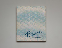
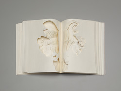
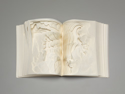
I first came across Noriko Ambe’s book art in 2013 through her site and MoMA’s Inside/Out. Two years later and preparing to attend the closing of Yale University Art Gallery’s special exhibition of Allan Chasanoff’s collection of book art, I spotted her Basic Sketch Book. The latter provided me with a way of making sense of what seemed like a slight contradiction of assertions in her artist’s statement and the MoMA interview.

Noriko Ambe, Work of Linear – Actions, Found sketchbook (2000)
27.9 x 21.6 cm (11 x 8 1/2 in.)
The Allan Chasanoff, B.A. 1961, Book Art Collection, curated with Doug Beube- See more here.

Referring to the series Work of Linear – Actions, Ambe writes, “It looks like annual rings of a tree or topographical map or wave, but it isn’t. It is absolutely the traces of actions of a person, which is me.” So here is book art as abstract self-portraiture.

Noriko Ambe, Work of Linear – Actions  (2000)
Noriko Ambe, Work of Linear – Actions, 2000

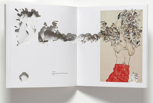
But in her interview with Hanna Exel and referring to the seriesキル –Artist Books Project, Ambe comments, “I am not trying to express myself or insert myself into the other artist’s work by cutting their catalogue …”. In that series, Ambe selected 24 artists’ books and catalogues, and, studying each carefully , excavated or rather drew by excision. Aren’t these “absolutely the traces of actions of a person” — Noriko Ambe?

Noriko Ambe, CUT: Egon Schiele, 2009 Artist’s book The Museum of Modern Art, New York. Fund for the Twenty-First Century. © 2013 Noriko Ambe
Noriko Ambe, CUT: Egon Schiele, 2009 Artist’s book The Museum of Modern Art, New York. Fund for the Twenty-First Century. © 2013 Noriko Ambe Noriko Ambe, CUT: Egon Schiele, 2009
Artist’s book
The Museum of Modern Art, New York.
Fund for the Twenty-First Century.
© 2013 Noriko Ambe
Reproduced with the artist’s permission

Here is the list of works in the series:

His heart, his life: Andy Warhol
Collected Beauties: Damien Hirst
Art Victims: Damien Hirst
Prologue: Sugimoto + Foer
Sculpture: Richard Serra
Spiritual America: Richard Prince
Crash!: Takashi Murakami
Kiru- Cut : Egon Schiele
In the Studio: Arberto Giacometti
Current – War Cut: Gerhard Richter
Current – A Private Atlas: Gerhard Richter
In the bathtub?!: Jeff Koons
Diamond Dust Shoes: Andy Warhol
Warning!: Richard Pettibone
Sailing to…: Cy Twombly
Anatomy of Love: John Currin
Listning to Tom Freidman: Tom Freidman
Thoughts on Tom Freidman: Tom Freidman
Beautiful Inside of My Head Forever: Damien Hirst
Dots on Dots and Leyers: Roy Lichtenstein
To Perfect Lovers: Felix Gonzalez-Torres
A Study of Robert Therrein: Robert Therrien
Double sides: Gilbert & George
Artists, Believe in Yourself.: Piotr Uklanski

In her series statement, Ambe elaborates:

The process of creation was divided into roughly three stages. First, I earnestly established a deep respect for the artists and verified what they expressed through their art. After assimilating that information I decided on the theme (title) that needed to be expressed. Through a filter, the filter being me, the work was made while cutting as though I was having a dialogue with each single page.

When cutting something from the back I didn’t know what kind of image would appear next. Each time I decided to cut away or to leave behind and the process continued to a point where the book was on the verge of destruction, and then following my theme I re-constructed. Finally, while I clearly remained in the work as a filter, the essence of the artist was emphasized. It became a collaboration for the first time when these two things were balanced.

She calls the results dialogues and collaborations. I see unique works of art. Literally taking tradition as her material, Ambe delivers book art with its own unmistakeable, individual style. Each interpretation through her eyes, hands and scalpel is a unique, new work and a self-portrait in an abstract sense.

There is not the slightest contradiction.

Bookmarking Book Art – Werner Pfeiffer and Anselm Kiefer

Werner Pfeiffer, Zig Zag, 2010 Laid into drop spine case: One folded sheet (20 x 20 cm.) which unfolds into a paper structure with various panels containing text printed in red and black, including instructions for use of the work. "The structure used in this book is a combination of two accordion folds. Both are first creased, then each segment is cut halfway through at the center and finally the two strips are merged together where the cuts have been made." Sheet laid into case. Limited ed. of 60 copies.
Werner Pfeiffer, Zig Zag, 2010 Laid into drop spine case: One folded sheet (20 x 20 cm.) which unfolds into a paper structure with various panels containing text printed in red and black, including instructions for use of the work. "The structure used in this book is a combination of two accordion folds. Both are first creased, then each segment is cut halfway through at the center and finally the two strips are merged together where the cuts have been made." Sheet laid into case. Limited ed. of 60 copies. Werner Pfeiffer, Zig Zag, 2010
Laid into drop spine case: One folded sheet (20 x 20 cm.) which unfolds into a paper structure with various panels containing text printed in red and black, including instructions for use of the work. “The structure used in this book is a combination of two accordion folds. Both are first creased, then each segment is cut halfway through at the center and finally the two strips are merged together where the cuts have been made.” Limited edition of 60 copies.

“The book is one of the most powerful weapons ever invented.”  — Werner Pfeiffer, Book-Objects & Artist Books, online exhibition, Cornell University Library’s Division of Rare and Manuscript Collections.

Anselm Kiefer, The Rhine 1982-2013 Collages of woodcuts on canvas with acrylic and shellac in a leporello structure

Anselm Kiefer, Der Rhein, 1982-2013
Collages of woodcuts on canvas with acrylic and shellac in a leporello structure.

“The book, the idea of a book or the image of a book, is a symbol of learning, of transmitting knowledge … I make my own books to find my way through the old stories.”   — Anselm Kiefer, publication entry for Brünhilde schläft, in Toledo Museum of Art Masterworks (Toledo, 2009).

Like Anselm Kiefer, though eight years older, Werner Pfeiffer grew up in the shadow of Nazi Germany.  The works of both artists are rooted in the book and its peculiar place in that culture. Pfeiffer’s book-objects consist of deconstructed, dismantled library discards that are reassembled with glue and coated in gesso.  “Gagged and tormented” (with nails, screws, rope and various physical distortions), the works are “symbols of pain, of torture, of suppression which are inevitably brought on by the censor’s act”, the real remnants of which Pfeiffer recalls from his earliest childhood.

Pfeiffer’s artist books on the other hand run the gamut of foldouts, scrolls, flexagons, walk-in environments and rely on traditional bookmaking craft: handset type, letterpress printing, sophisticated binding as well as original print techniques such as wood cuts or linoleum blocks and etchings on archival papers. The emotional range of Pfeiffer’s art is also wide — humorous, playful, piquant, simultaneously angry and sorrowful, concerned. The overriding concerns are straightforwardly explained in the text to the online Cornell University exhibition.

The first schoolbooks I can remember, leftovers from the previous regime, were heavily “edited.” They were books with words and sentences blackened out. Chapters were deleted; entire pages were missing. This was information declared unsuitable for a post-war generation, a generation who six months earlier had been practically obliterated by the events now deemed unfit to be read about. Part of what they had lived through, their own history, had been blocked out, hidden behind those black marks.

Measured by the perceived fears an innocently bound codex seems capable of instilling, the book is one of the most powerful weapons ever invented. And yet we find ourselves at a threshold where its power and influence seem to be waning.

… As in the past, we find at the core of our current socio-political realignment the process of communication…. The new cultural footprint is a set of digits and their application, made possible by the microchip and the speed of electricity….

My book-objects have their origin partly in this ambiguous realm, a period of change as radical as it is dramatic. Superimposed over this perceived uncertainty is my personal concern about censorship. By making books which are deliberately mute I try to raise questions. Words are lost; they are no longer important. The books take on new forms; they become provocative statements. No longer instruments for reading they become sculptures, they become Book-Objects.

As with all superior sculpture, Pfeiffer’s works make the hands twitch to touch and manipulate them. In a few exhibitions, that interaction has even been encouraged. There is something inherently haptic about his book art (for example, Zig Zag and Abracadabra) and his book-objects (for example, Drawing Blood), which can be enjoyed vicariously in these videos: Youtube 1, Youtube 2, Youtube 3 and Youtube 4.

Kiefer’s materials are more varied, more monumental than Pfeiffer’s, and his concerns are decidedly not straightforward. Considering his sprawling studio complex at Barjac, in southeastern France, and its towers and installations, to say that Kiefer’s oeuvre extends beyond book art is an understatement. But for Books on Books, his most moving works — even those in which the book’s material presence is greatly subordinate — remain tethered to book art. The ache to touch Kiefer’s art, however, is different from what you feel with Pfeiffer’s. What little playfulness there may be in some of Kiefer’s earliest pieces is overshadowed by monumental works evoking an urge and dread at the same time.

You feel it walking up the stairs in the Royal Academy, looking up and seeing the sculpture Für Fulcanelli – die Sprache der Vögel, its great wings of beaten lead spread and rising above you.  Between the wings, the body is made of a stack of elephant and double elephant folio books lying flat (or rather gathered folios made of lead like the wings). Interleaved with the closed and open books are rusted metal folding chairs with wooden seats and backs, the kind found in city parks. Thick metal wedges that appear to be wood are inserted at various points to balance out the angular, tilting pile. Separate and lying before this huge bird is a carved wooden snake, elongated and heading right to left as you view the work. The pages of the books curl and fold and roll up as if sodden or aflame. Some are rusted. The bottom-most book has lead binder boards, water stained and looking like marbled paper. Not all of them have binding boards, but all are spineless. You want to touch but know that if you do, your fingers will come away with some alchemical residue of history that will not come off and may burn the skin.

Pfeiffer’s works from a major exhibition in 2011 at Cornell remain on view online. Another major exhibition followed in 2012 at Vassar College.  A new exhibition is scheduled for February 2015 in Toledo, Ohio. More about it in The Blade.

A major retrospective of Kiefer’s art at the Royal Academy of Art concluded in December 2014, coinciding with an hour-long BBC program. An interview with the artist and several podcasts are available on the RA’s site, and the rich and extensive exhibition catalogue provides articles exploring the complex themes of Kiefer’s art.

Bookmarking Book Art – Updating the Mystery Book Artist of Edinburgh

Still anonymous and still a mystery, the MBAE has given BBC Scotland an interview by email.

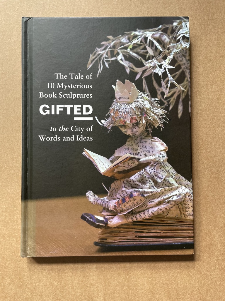
Below are past links on the Mystery Book Artist of Edinburgh, including links to ten videos on the MBAE’s first ten gifts to Edinburgh.  For those wishing for more than digital proximity to the MBAE’s work, GiftEd is the name of the book published last in 2014 about the ten gifts.

http://wp.me/p2AYQg-xz

http://wp.me/p2AYQg-ME

http://wp.me/p2AYQg-AI

http://wp.me/p2AYQg-uT

http://wp.me/p2AYQg-rR

http://wp.me/p2AYQg-p4

http://wp.me/p2AYQg-Li

http://wp.me/p2AYQg-xz

And here are the YouTube videos showing the first ten sculptures “GIFTed” to Edinburgh:

https://youtu.be/kpkEOOgdWps  Opening the first package

https://youtu.be/2nG1rTmYOyQ  Sculpture 1: Poetree

https://youtu.be/69alxg4skdk Sculpture 2: Coffin and Gramophone

https://youtu.be/WGg0CDCADu0  Sculpture 3: Cinema

https://youtu.be/vWVYC80ovQw  Sculpture 4: Dragon’s Nest

https://youtu.be/vaFiM1mnDxo  Sculpture 5: Tea, Cake and a Book

https://youtu.be/4HbqFaoRqzk  Sculpture 6:  Lost in a Good Book …

https://youtu.be/kavik9lg128  Sculpture 7:  Magnifying Glass

https://youtu.be/jlUlTA-W3pM  Sculpture 8:  Cap and Gloves

https://youtu.be/FBo0kzQ-Bxc  Sculpture 9:  Dinosaur

https://youtu.be/K7kIx7lv5CE  Sculpture 10: Street Scene