Trained at Central St Martins, Francisca Prieto is a Chilean artist living and working in London where her work has featured in collections at the Victoria and Albert Museum, the Tate Gallery and the British Library among others. From 29 May through 21 June, her solo exhibition Underlined runs at Jagged Art, off Marylebone High Street in London.
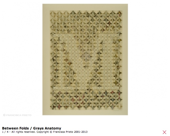
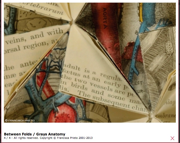
Underlined extends — or rather deepens — her series Between Folds, which according to her artist’s statement “explores pages of rare and damaged books or forgotten ephemera, emphasising the beauty and detail of print that would otherwise go unseen.” Prieto’s grounding in typographical design drives Between Folds as is obvious from the letters created from the pages of Grays Anatomy and Bartlett’s British Scenery.
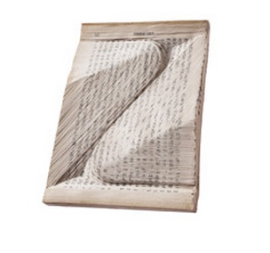
Detail of Between Folds/Anatomy
The precision of the folds in Prieto’s work becomes even more evident in the eight compositions of Underlined, which is fitting as she now delves through source material past the letterforms and down to the line. Look how the folds align and intersect with the lines of the source material in the detail below.
The source material in this case is The Wanderers Cricket Club Logbook, whose red lines strike vertically down the diagonal, the folds of the work “playing with direction and motion, as the ball of the game dictated each log of play”. Prieto’s art is not only playful but thought-provoking, the cause of a sudden intake of breath from delight or even shock — what we most seek in our experiences of art. Do you not draw in your breath as you read between the folds and past the title and shape of Composition No. 2: One Horizontal Line to see that it is the line drawn under the life from whose last will and testament Prieto has created this work?
This dialogue between the parts and the whole to which Prieto’s craft and vision continuously draw the eye, heart and mind elevate her work and its audience.
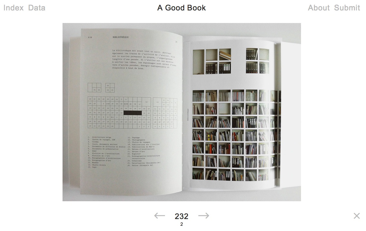
A hard question? A trick question? Yes and no. Since 2011, Bernd Kuchenbeiser, the Munich-based book designer, has been attempting an answer. He began by posting entries to a database on Twitter. With the demise of Twitter’s gallery function, Kuchenbeiser migrated the diary-like collection of photos and comments to A Good Book site with help from Simon Zirkunow. Below is a screenshot of part of the 232nd entry.
Screenshot of Méthodes, cover designed by Manuela Dechamps Otamendi, Entry #232 in A Good Book.
Until recently, the entries were Kuchenbeiser’s alone. The entries started on a daily basis, but as with many diary projects, the execution flagged. With 349 entries of his own (plus 3 from friends), he is now inviting entries from far and wide. Notice “Submit” in the upper righthand corner of the screenshot. Behind it lie the instructions and requirements for submission. Kuchenbeiser’s own entries are often brief, but his choices and comments are interesting because Kuchenbeiser and his oeuvre are interesting. See Michael Cina’s interview with him in The New Graphic(15 August 2011). For this venture to reward constant revisiting beyond that interest, however, Kuchenbeiser wisely holds potential contributors to the following standard:
Here’s what you need in order to submit a book:
– A short description of your book or the aspect that makes it ‘good’. From 140 characters to a maximum of 560, including spaces.
– The bibliographic details: author, title, year of publication, publisher, designer (if known). A questionnaire is already set up within the email that opens when you click ‘Submit now’.
– One to five photos of your book (at least 1400 pixels wide for landscape format and 1200 pixels high for portrait format).
Think of Pinterest or Flickr with serious feeling and intellectual rigor behind them. Kuchenbeiser’s design work and his own words exude that feeling:
Books have personalities. They can be our companions and friends. A good book doesn’t deserve to languish on a bookshelf; it wants to be opened, read, savoured, displayed, recommended. That’s why this website exists.
…
This site is like a message in a bottle hoping to be discovered. It will work only if it manages to generate communication.
The London Centre for Book Arts must have picked up the bottle from one of the Thames overswellings last week and placed a notice on its home page about the website. Although Kuchenbeiser does not promote it as such, if A Good Book thrives, it could generate a rich database worth semantic analysis for the book art and book arts community. All materials on A Good Book are being made available for noncommercial and educational use only.
English: Comparative Bauer Bodoni versus Bodoni Català: Comparativa Bauer Bodoni vs Bodoni (Photo credit: Wikipedia)
This year marks the 200th anniversary of the passing of a great contributor to the linked histories of the book and typography: Giambattista Bodoni (1740-1813). Bodoni among others such as Fournier and Didot established the “Modern” fonts, typefaces characterized by the extreme contrast of their thick and thin strokes, delicate and sharp serifs and a chilly sparkling engraving-like quality heightened by generous leading and made possible by improvements in 18th and 19th century typecasting and manufacture of ink and paper. Bodoni planned and formed the royal printing house for the Duke of Parma in the Palazzo della Pilotta, where the Museo Bodoniano resides today. Associated with Pope Sixtus V, Carlos III of Spain and the Duke of Parma, Bodoni became one of the most celebrated printers in Europe.
View of Palazzo della Pilotta. (Photo credit: Wikipedia)
Although Bodoni’s fame in his lifetime was of a piece with that of the Romantic figures Chopin, Liszt, Byron, Goethe and Shelley, his output was Neoclassical with editions of Homer, Catullus, Virgil, Horace and the English poets Thomas Gray and James Thomson. His two-volume Manuale Tipografico (1788, 1818) is a meticulous monument of typographic art with more than 14 sets of roman and italic typefaces, a wide selection of decorative designs and symbols and alphabets from the Greek, Hebrew, Russian, Arabic, Phoenician, Armenian, Coptic, and Tibetan languages. The 1818 two-volume edition can be viewed online at the Bibiloteca Bodoni.
Portrait of Bodoni (c. 1805-1806), by Giuseppe Lucatelli. Museo Glauco Lombardi. (Photo credit: Wikipedia)
This flowering of typography and design – reflective of the age and technical developments of book printing – prompts a thought toward the impact of today’s technology – screen display, ereaders, XML and HTML, cascading style sheets, etc. – not only on type and design but their purpose as well.
“The type and pages beg to be admired – that is looked at – which is well and good, except that looking and reading are quite different, actually contradictory, acts…. To look at things, we either disengage and let them flow by on their own or we stop them in their tracks. To look we hold our breath or (in the worst of cases) pant. To read we breathe.” So say Warren Chappell and Robert Bringhurst in their critical comments on Bodoni and the Moderns. (A Short History of the Printed Word, pp. 173-74; 1970,1999.)
Perhaps we are still in the age of e-incunabula and have not reached the point where type and design on the screen beg to be admired. The improvements delivered by Readmill and Readability have been welcome for their contribution to ease of reading. It may be perverse to wish for developments that may interfere as Chappell and Bringhurst assert the Modern faces interfere with reading. But that assumes that they are right in their hieratic statement “To read we breathe.” Might it be as legitimate to assert “To read we click. To read we link. To read we dim or brighten. To read we tilt from portrait to landscape causing the page to reflow.”?
Will High Definition play the role that improved paper surfaces played to allow those thinner strokes and delicate serifs in the 18th and 19th centuries? And if it does, what on-screen design, comparable to Bodoni’s increased leading, will perform the same heightening effect for new faces and design that beg to be admired?
Bodoni Ornaments (Photo credit: Bene*)
For more on the subject of Bodoni, see “Biblioteca Bodoni Launched on Bicentennial Anniversary of Giambattista Bodoni’s Death” by Yves Peters, The Font Feed, 11 December 2013.
rankfurt is upon us, so here is a celebration of type and the book. The initial “F” comes from Boekwetenschap en Handschriftenkunde Amsterdam, wherePaul Dijstelberge and others have posted over 30,000 photos of initials, ornaments and type in cooperation with the Special Collections, Amsterdam; the Royal Library, The Hague; and the Archive at Alkmaar.
Much has been made in recent years about the emergence of the ebook and the ‘death’ of the printed book. Such discussions are fashionable and fruitless. As long as people read, the shape or form of the book is irrelevant. In fact, the ebook may well be a blessing in disguise for those who passionately defend the printed book. Photography did not kill off portrait painting as it was once feared; neither will the ebook refer the printed text to the dustbin of history.
Photography may not have killed off portaiture, but digital photography did kill off Eastman Kodak. Which entities ebooks will see off will be debated until the event. The shape or form of extended narrative and discourse, however, is surely not irrelevant. The Fantastic Flying Books of Mr. Morris Lessmore and the walk-in book exhibition Memory Palace at the Victoria & Albert Museum are recent evidence. While more evidence may be adduced, do we need it to know that shape and form matter, or that we gather each year in Frankfurt to celebrate reading and its shape and form?
This year is the centenary of Gerard Meynell’s trade periodical The Imprint, which was the scene of Stanley Morison’s first appearance in print. How appropriate then that Morison’s book A Tally of Types tells the story of the journal’s founding and, equally important, how the historic font called Imprint Old Face came into being. The font’s importance is that “the design had been originated for mechanical composition. … the first design, not copied or stolen from the typefounders, to establish itself as a standard book-face.”(p.21) Ironically, Meynell and his colleagues intended for the font to be freely available to the trade, but eventually it came into the ownership of Monotype Imaging, where it can be obtained today under the OpenType family.
As the world of print morphs into its digital incarnation, we see the same impetus behind the new generation of typographers, the ones born digital, but we see varying degrees of adherence to the “type wants to be free” movement.
The Fine Press Book Association’s inaugural Student Type Design Competition sprang from the hope that by building bridges between printers and young type designers we might end up creating new material resources for the fine press community.
Oratorical Type A by Nerhol (Ryuta Iida and Yoshihisa Tanaka)
Oratorical Type Z by Nerhol (Ryuta Iida and Yoshihisa Tanaka)
The Japanese artists and partners Ryuta Iida and Yoshihisa Tanaka are known as NERHOL. Interviewed by Rebecca Fulleylove in the online magazine It’s Nice That, they explain the name:
We met at one of Iida’s exhibition and realised we had so much in common in regards to experience, design and taste. Gradually, we began working together. Our very first piece, Oratorical Type, used books as the theme, after sculpting them by carefully carving out certain sections of each page, it resulted in interesting dimensions. At that time, we still hadn’t decided on our name but soon came up with “NERHOL”, a mash-up of two words, “neru” to plan ideas and “holu” to sculpt and carve.
“To plan ideas” and “to sculpt and carve” those ideas in air, time, stone, wood or paper is that not a poem, a book, a building, a city — the work of art? That these two artists chose the letters of the alphabet as their first work together, that the alphabet and each of its letters came into being by collective human art and craft, marking our passage from orality to literacy, and that the alphabet, type and book are tools by which we have strived to evolve — how could they not be named Nerhol and their first work of art not be called Oratorical Type?
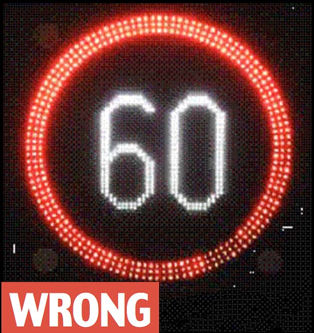
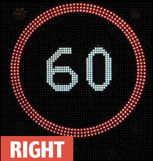
In a report possibly falling under the category “What the Font?” or simply “Sans Clue,” PoliceSpecials.com carried this story from the BBC today:
“Thousands of motorway speeding convictions could be overturned because the font used to display the numbers on some variable speed limit signs may not have complied with traffic regulations. The Crown Prosecution Service said the signs showed mph numbers taller and narrower than they should have been.”
The typefaces mandated by the Department of Transport for traffic speed limit signs are Transport Medium, Transport Heavy and Motorway Permanent. The designers were Jock Kinneir and Margaret Calvert. Simon Garfield provides an amusing chapter in Just My Type on how their design came to be adopted. But the typeface in question on which the BBC has belatedly reported (see the Daily Mail for the original scoop last December) is this:
According to roadsuk.com (well, that is the URL, although a bit of blue in the letters “u” and “k” help to disambiguate the message), the font seems to be named (imaginative this) “Variable Message Sign.” But in the Daily Mail article, neither the “wrong” nor “right” signs illustrated seems to be in the Variable Message Sign typeface. So, what the font?
Aristotle, a 4th-century-BCE philosopher, portrayed in 1493 Nuremberg Chronicle as a 15th-century-CE scholar (Photo credit: Wikipedia)
LiveInk® cleverly demonstrates how the display of writing has developed by presenting the following quotation from Aristotle’s On Interpretation in the forms in which it would have appeared in the different stages of theA Brief History of Reading.
“Spoken words are the symbols of mental experience, and written words are the symbols of spoken words.” — Aristotle, On Interpretation
For example,
In 2000 BC, the Phoenicians developed the first methods to represent spoken language – an alphabet consisting entirely of consonants:
LiveInk® must hope for a place on the timeline for its re-formatting process (Visual-Syntactic Text Formatting (VSTF), which breaks up blocks of traditionally laid out text (flush left, ragged right or justified) and presents them in a more readable form, reminiscent of 20th century free verse. The claim of increased readability is based on eye movement studies by Randall Walker, Charles Vogel, Stan Walker, Phil Schloss, Charles R. Fletcher, Youngmin Park and Mark Warschauer.
Last September, BOB picked up an article by Michael Kozlowski on the Kindle feature of synching an ebook with its counterpart audiobook and explored the question, “What can the physiology, neuropsychology and sociology of reading tell us about ourselves?” The research behind LiveInk® is worth bookmarking for the reading list (see below) concluding BOB’s September 2012 entry if only to experience the “melon twisting” that comes from trying to accommodate these disparate yet related perspectives on the act of reading.
Norma Levarie (1920-1999) was a graphic designer and author of children’s books, one a winner of a New York Herald Tribune award — Little People in a Big Country. But, in addition to her design work for the National Audubon Society, The Jewish Museum, The University of Chicago Press, Oxford University Press, Random House and Harry N. Abrams, this Virginian’s most important gift to those interested in the evolution of the book and book arts is her volume The Art & History of the Book (New York: James H. Heineman, 1968).
The quality of her research and writing measures up to the best. If only Heineman had been able to afford color reproductions, her ability to handle illustrations and her keen eye for selection of examples would have placed this book in good company with works such as Michael Olmert’s The Smithsonian Book of Books (Washington, D.C.: Smithsonian, 1992). Still, Levarie’s book merits a bookmark for its overarching message, which is cleverly embodied in the book’s organization.
Facing the stark image of the Prism of Sennacherib on the opposite page, these words of Ashburnipal launch the book on the recto page:
Prism of Sennacherib. Assyrian, VII century B.C. Oriental Institute, University of Chicago. Height 15 in. Reproduced from Levarie, The Art & History of the Book (New York, 1968).
“. . . I read the beautiful clay tablets from Sumer and the obscure Akkadian writing which is hard to master.
I had my joy in the reading of inscriptions in stone from the time before the flood. . . .”
Continuing chronologically up to the fifteenth century and “block book,” Levarie switches to a geographical approach, starting of course with Germany, ending with England and returning to a timeline overview from the seventeenth century to the twentieth, the last illustrated with pages from Spiral Press’s Ecclesiastes (New York, 1965), drawings by Ben Shahn, engraving by Stefan Martin and calligraphy by David Shoshensky, and Apollonaire’s Le Bestiare (Paris, 1911).
Guillaume Apollinaire, Le Bestiaire. Paris, 1911. Woodcuts by Dufy. Yale University Library, Graphic Arts Collection. 14 x 10 1/4 in.
This structure neatly builds to these concluding words:
“The homogenizing forces of our time have broken many barriers of national style, and sometimes it is difficult to tell at a glance the origin of a book. But local differences in production or taste still exist, and where they are manifest they bring the pleasure of variety. . . .
For the lover of fine books, nothing can replace the bite of type or plate into good paper, the play of well-cut, well-set text against illustration or decoration of deep artistic value. But an inexpensive edition can carry its own aesthetic validity through imaginative or appropriate design. These are not matters of concern only for aesthetes; if, in an era of uncertain values, we want to keep alive respect for ideas and knowledge, it is important to give books a form that encourages respect. The style and production of books, for all the centuries they have been made, still have much to offer the designer and publisher in challenge, the reader in pleasure.” (303-06)
Leaping ahead more than fifty years to the shift from print to digital, we find that many of the observations and message legitimately reassert themselves. Websites and ebooks do vary in design from region to region, but standardization and, more so, the global character of the Web and the products of the technology industries counter-assert a homogeneity in design. Sven Birkerts‘ elegies for Gutenberg are echoed across blogs devoted to the continuing pleasures of the printed book. But likewise Levarie’s stand that these are not merely matters for the elite is echoed across the debate of print vs digital in the popular press and the democratizing blogosphere.
What still must be translated from her message is how to make the leap that, if we respect ideas and knowledge, we must give online books as well as print books a form that encourages respect.


, by Giuseppe...")