Alphabets Alive! – Babel

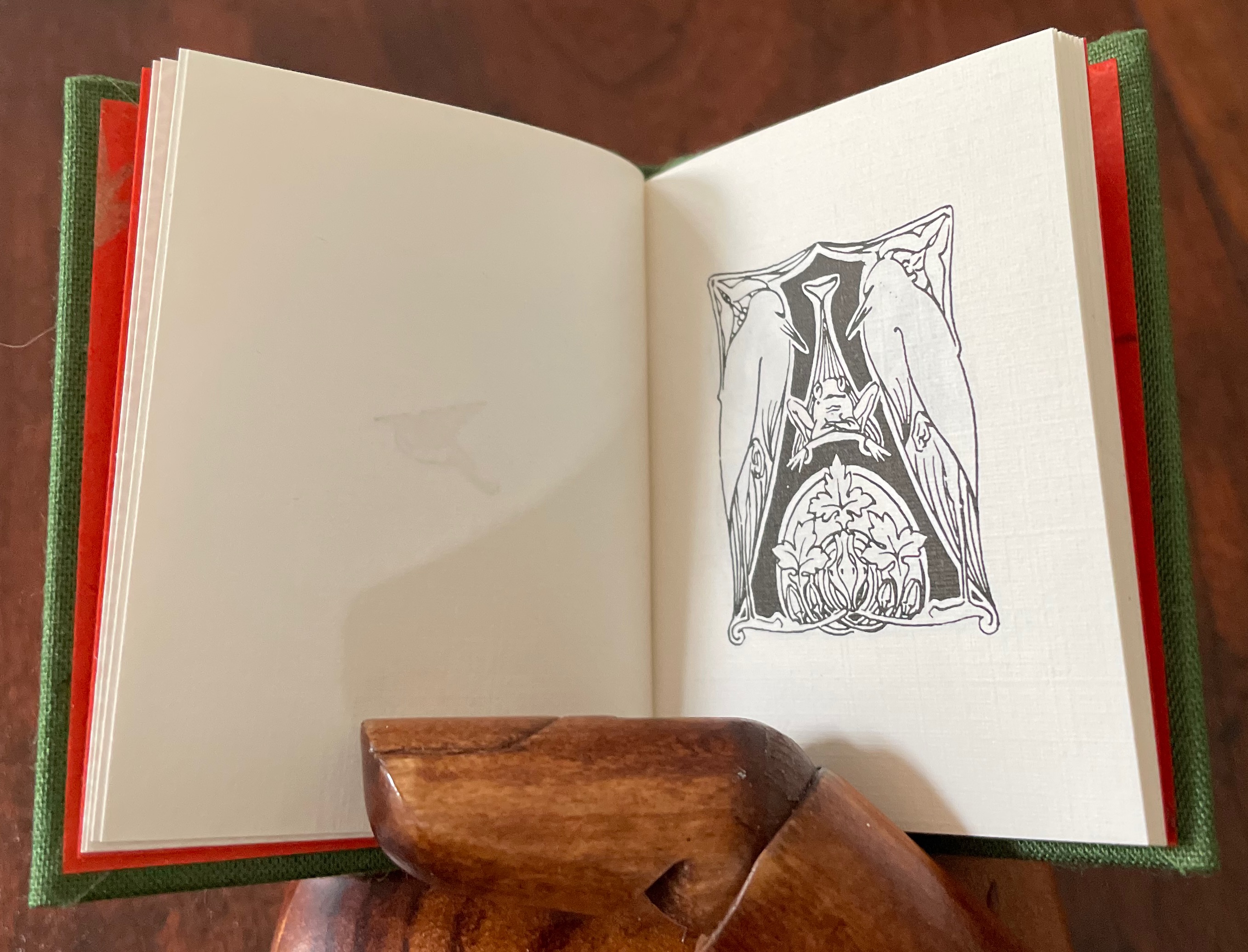
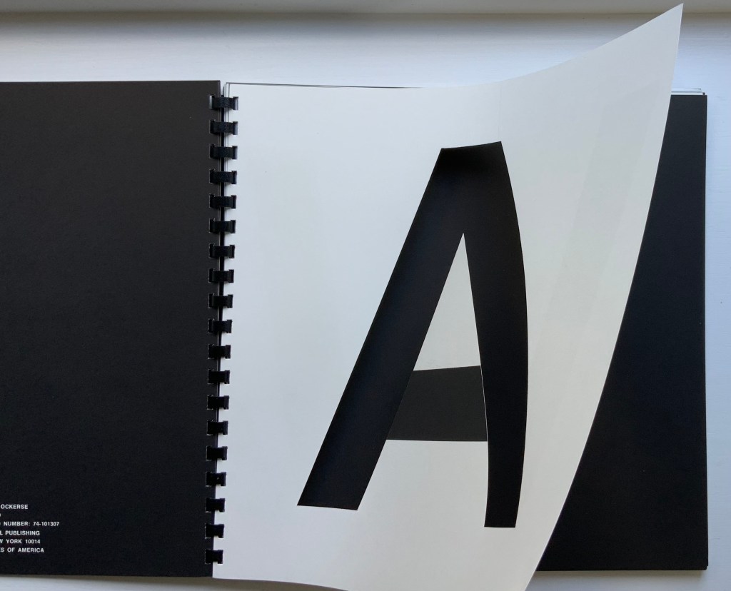
Despite today’s multilingual packaging labels, the ingeniously, confusingly folded directions for our new appliances, or the occasionally mistaken choice of subtitling for the latest episode of an imported detective TV show, we tend to forget that ours is not the only alphabet. Abecedarians and book artists alike have enjoyed playing with the many alphabets and writing systems there are, even making up new ones, posing codes, teasing us with the underlying randomness of these marks we think have inherent meaning or inviting us to the borders between image and letters, letters and image. [Links in the captions will take you to more images and details.]

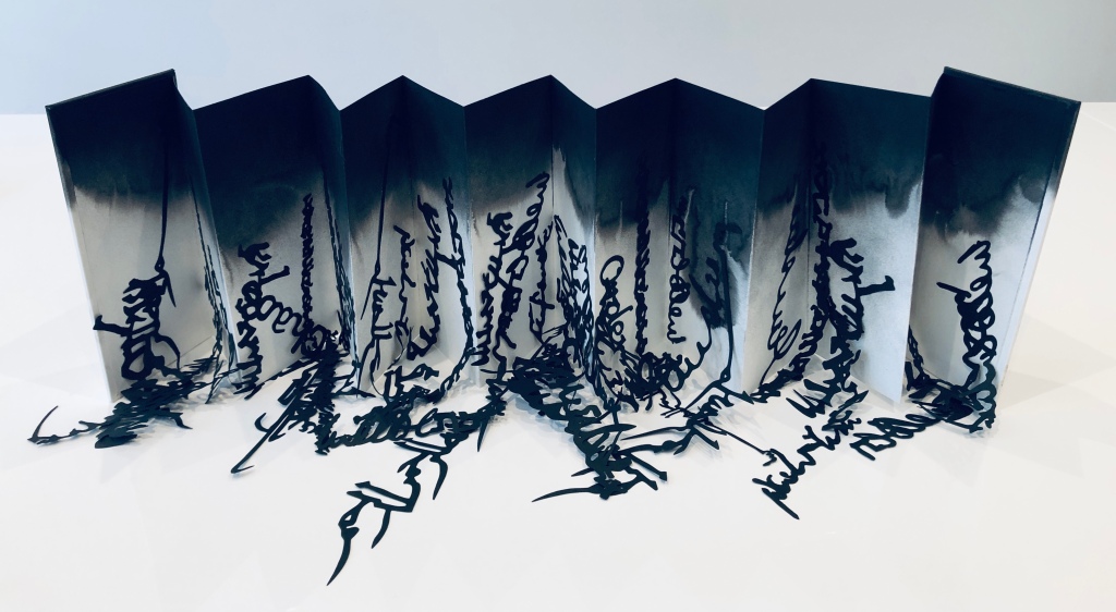
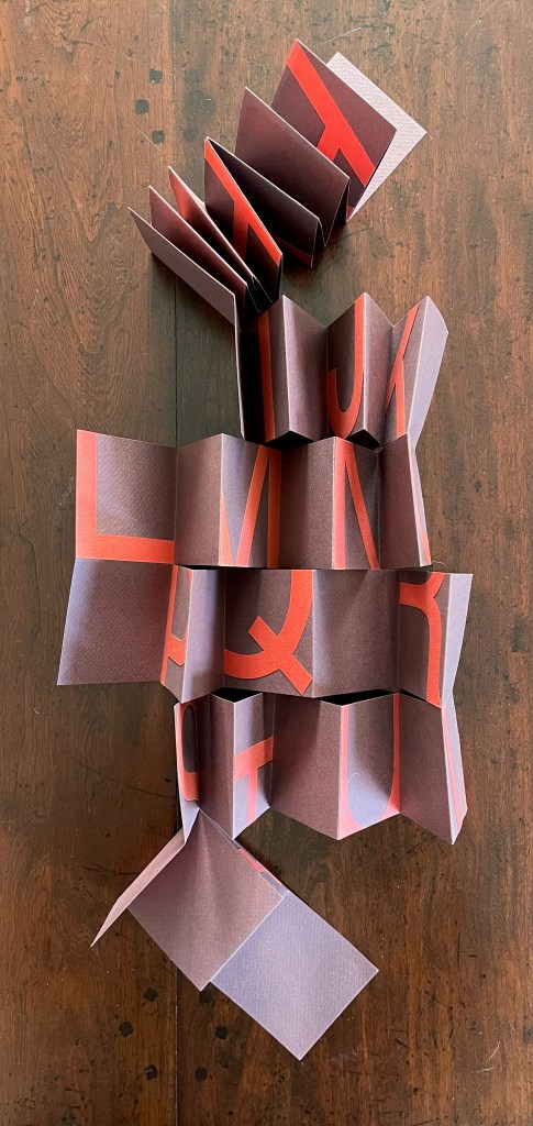
Lizzie Brewer, Babel (2019)

Inspired by a 2019 exhibition at the Scuola Internazionale di Grafica in Venice, Lizzie Brewer created Babel (2019),* a sculptural exploration of that border between image and letters. The black letters and words from Farsi, Japanese, Greek, English and more rain or drip down from the cloud of ink at the upper edge of the accordion structure implying our lack of knowledge of whatever Ur language preceded the Babylonians’ tower and also the punitive nature of the Old Testament deity.

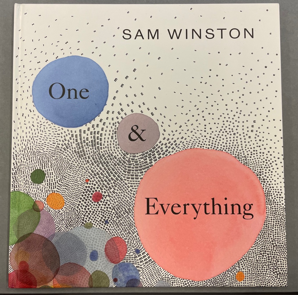
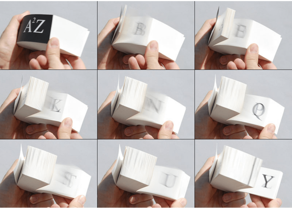
Sam Winston, One & Everything (2022)

Sam Winston is another book artist who regularly works at the border of image and text. “Once there were many stories for the world.” So begins One & Everything (2022).* Inspired by Tim Brookes’ Endangered Alphabets Project, Winston uses the striking shapes of letters and scripts from Ogham, Cherokee, Armenian, Hebrew, Tibetan and dozens more alphabets and syllabaries to create the characters in his fable about the story that decides one day that it is the “One & Everything” story. And of course, its alphabet is the “one and only” A to Z. The way One & Everything ends, perhaps Babel was more of a blessing than a curse.

This rest of this display space offers several examples of other alphabets and the book art they have inspired. You decide: curse or blessing?

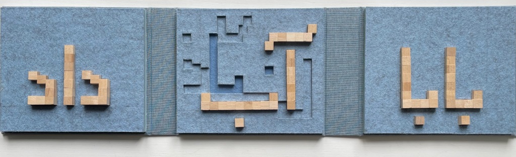
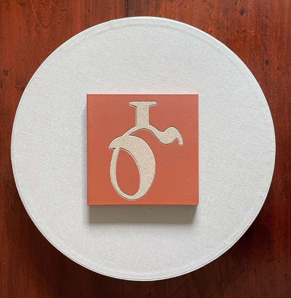
Golnar Adili, Father Gave Water/Baabaa Aab Daad (2020)

Golnar Adili’s Father Gave Water/Baabaa Aab Daad (2020)* performs a linguistic and cultural bridging. The miniaturized shape of traditional Western alphabet blocks meets a pixellated and sculpted Persian in her modular wooden cubes and recessed felt base. By leaping into the third dimension, her invented typography mostly skirts the calligraphic concerns of letter shapes that change depending on position and combination with other letters. Language becomes tactile and three-dimensional not only in this work but in almost all of the work emanating from her studio.

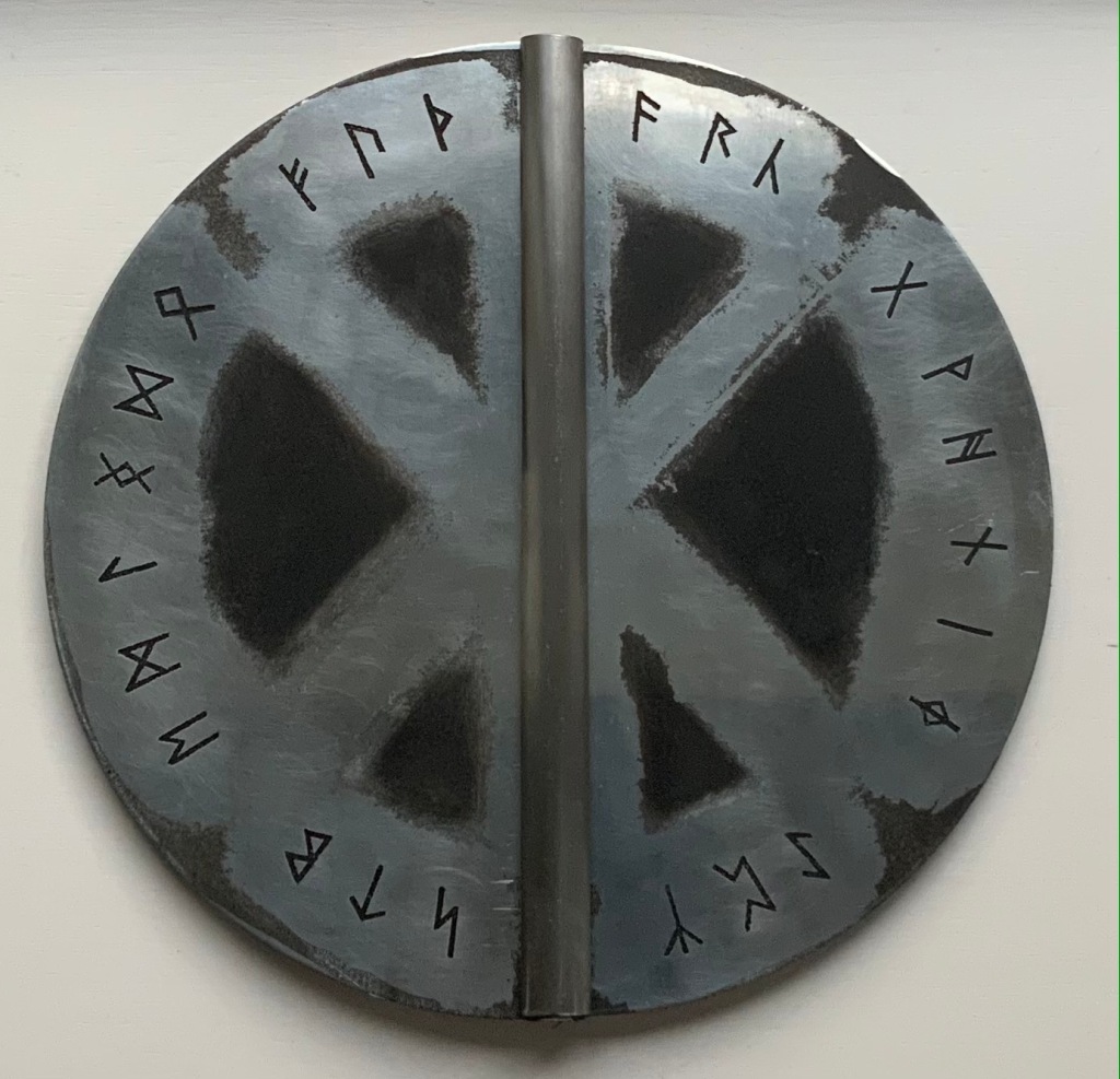
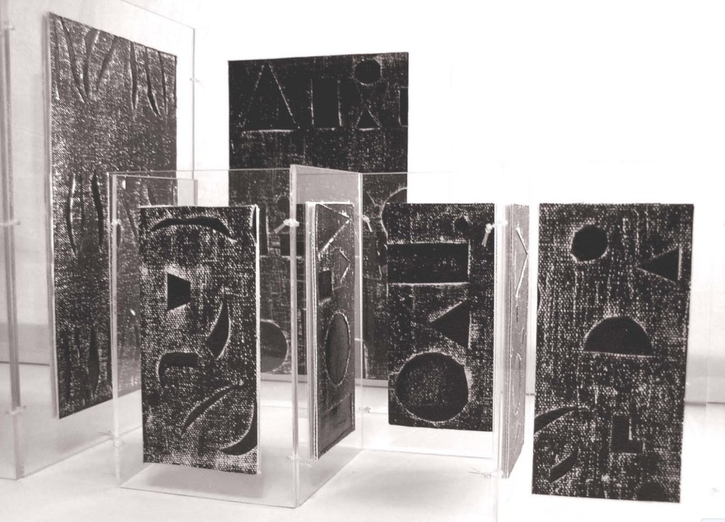
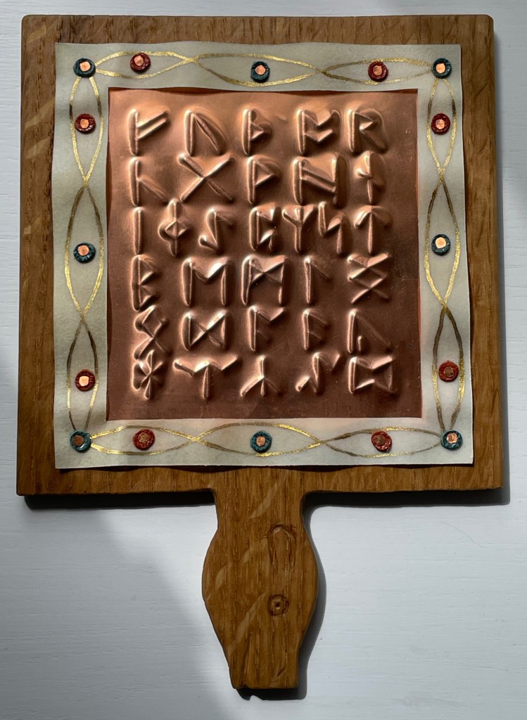
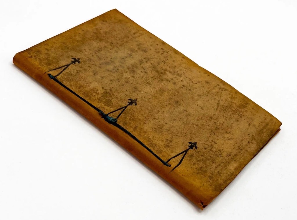
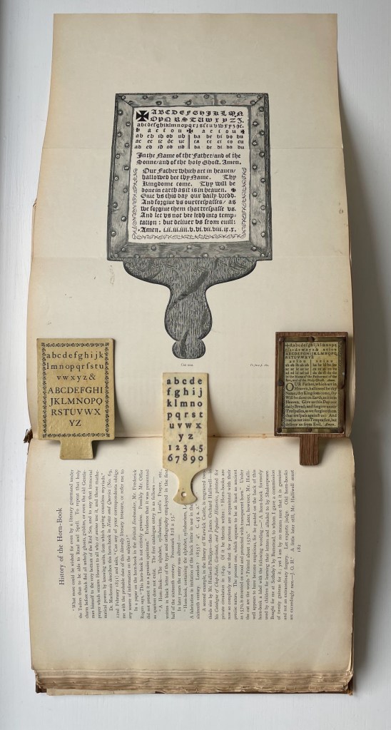
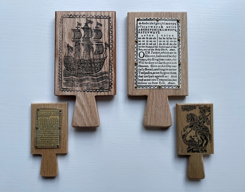
Fully open and laid face down, the shield-like covers of Brynja Baldursdottír’s Fuþorc (1992) display all twenty-four runes of the Runic alphabet — fuþorc — named for the first six runes, much as alphabet derives from the first two Greek letters alpha and beta. In the Middle Ages, books cut and bound in the shape of a heart were given as tokens of love or loyalty. Drawing on the Rune Poem, this shield-metal-covered, tree-trunk-round codex is a token to the Nordic and Anglo-Saxon tribes, whose shields, jewelry, tools and stone markers bore these angular letters of their alphabet, also used for divining fortunes (“casting the runes”).

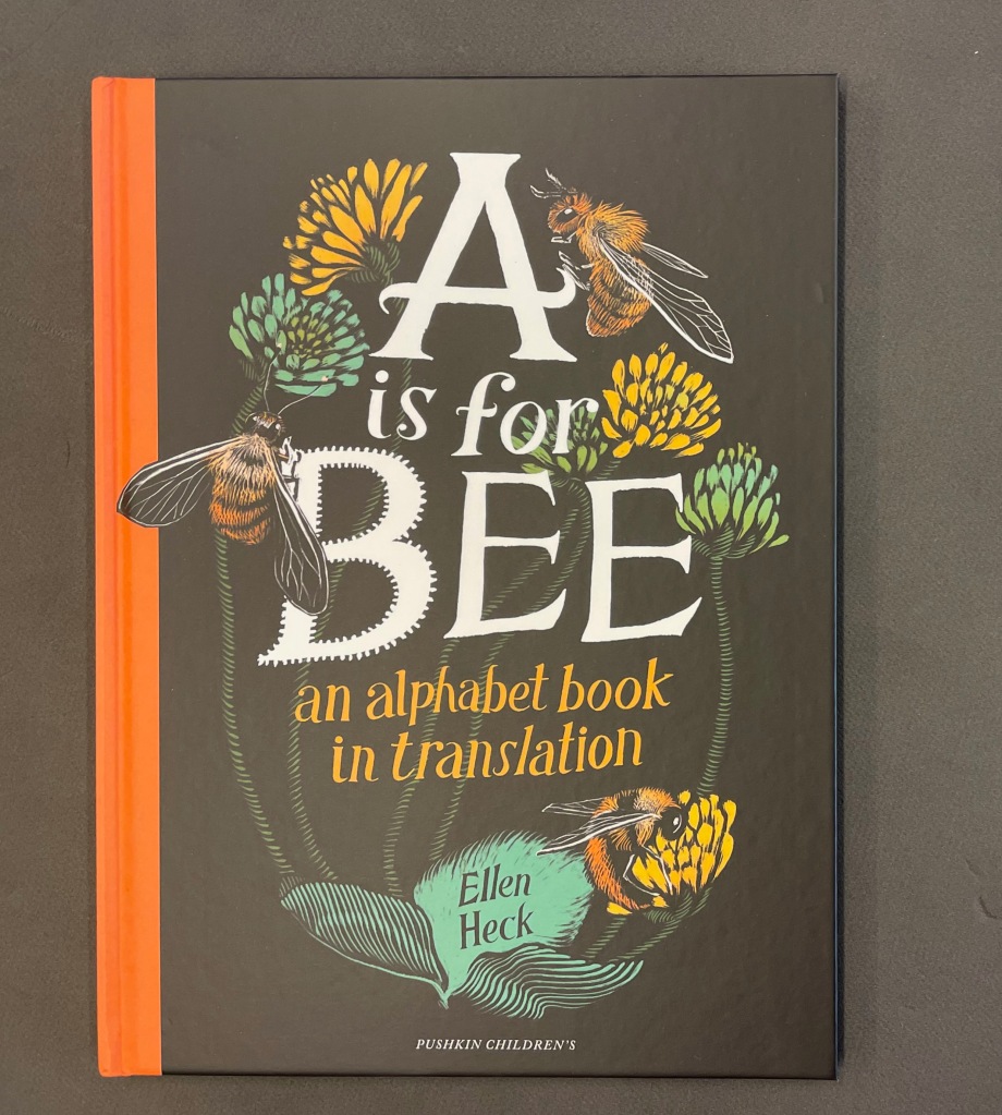
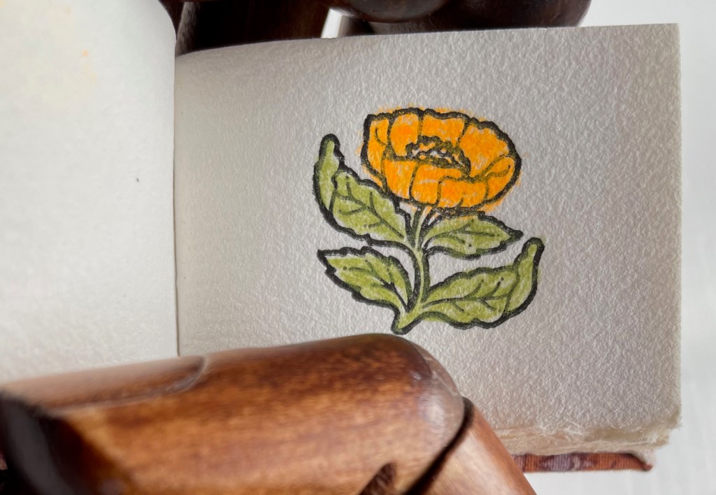
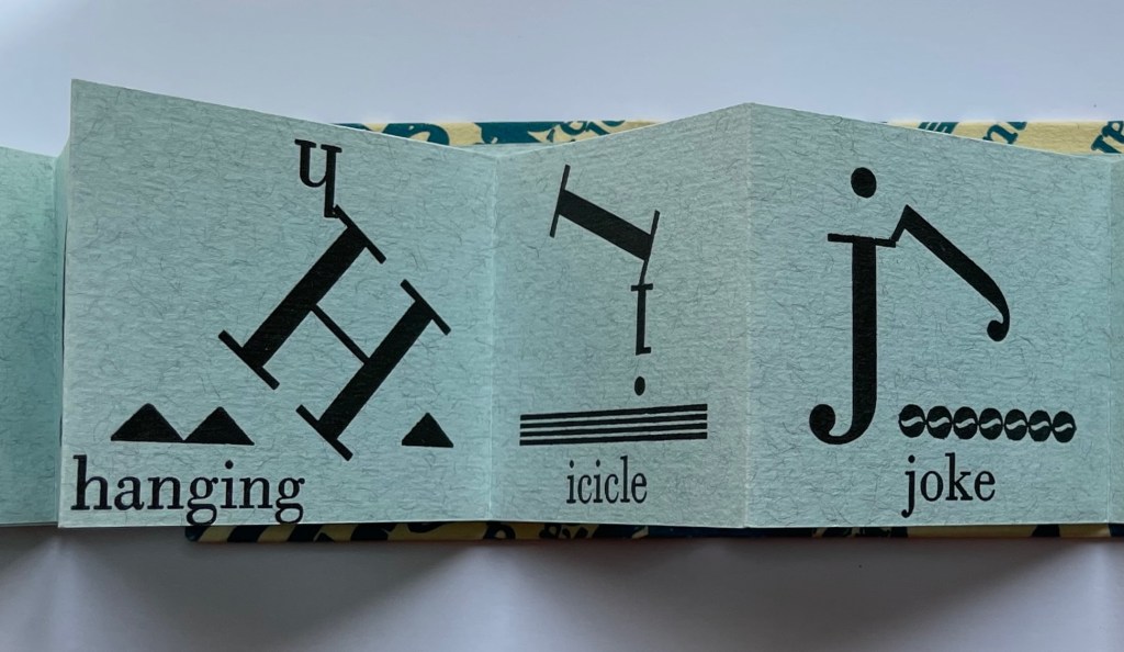
In another celebration of many alphabets and cultures, Ellen Heck’s A is for Bee (2022)

Ellen Heck, A is for Bee (2022).* Another clarion call to awareness of other languages and the consensual essence of the alphabet.

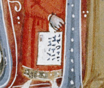
Satin’s Alphabook (Cherokee) (1998/9)* surprises the reader with four fan-shaped books in this circular portfolio. The character on the tile derives from Sequoyah’s syllabary, but the four books display the histories of multiple writing systems.

Online Exhibition Bonus!

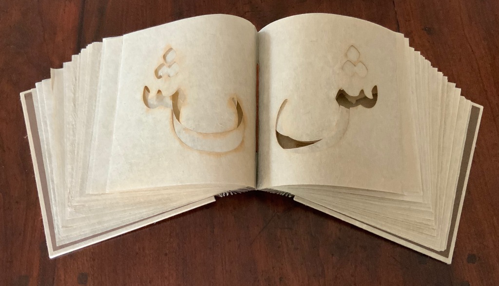
In Islam Aly’s 28 Letters (2013), the artist’s choice of paper and its color, laser-cutting and binding creates a work that conveys a feeling of Arabic’s cursiveness.

Menena Cottin, Las Letras (2008/2018)

According to Menena Cottin’s Las Letras (2008/2018), even letters themselves celebrate our differences. “People are like letters, each one is different from the other, with its own form, its own shape, its own voice and its own personality. They can be fat, skinny, simple or complicated. Some are very popular and are seen everywhere, while the shyer ones don’t like to go out much. Everyone has their own voice, some are deep, others high-pitched, and some are even mute. Alone, none of them makes sense, but just two together is enough for them to become important. And the more they get together, the more interesting the get-together.” (Translated from the Spanish)

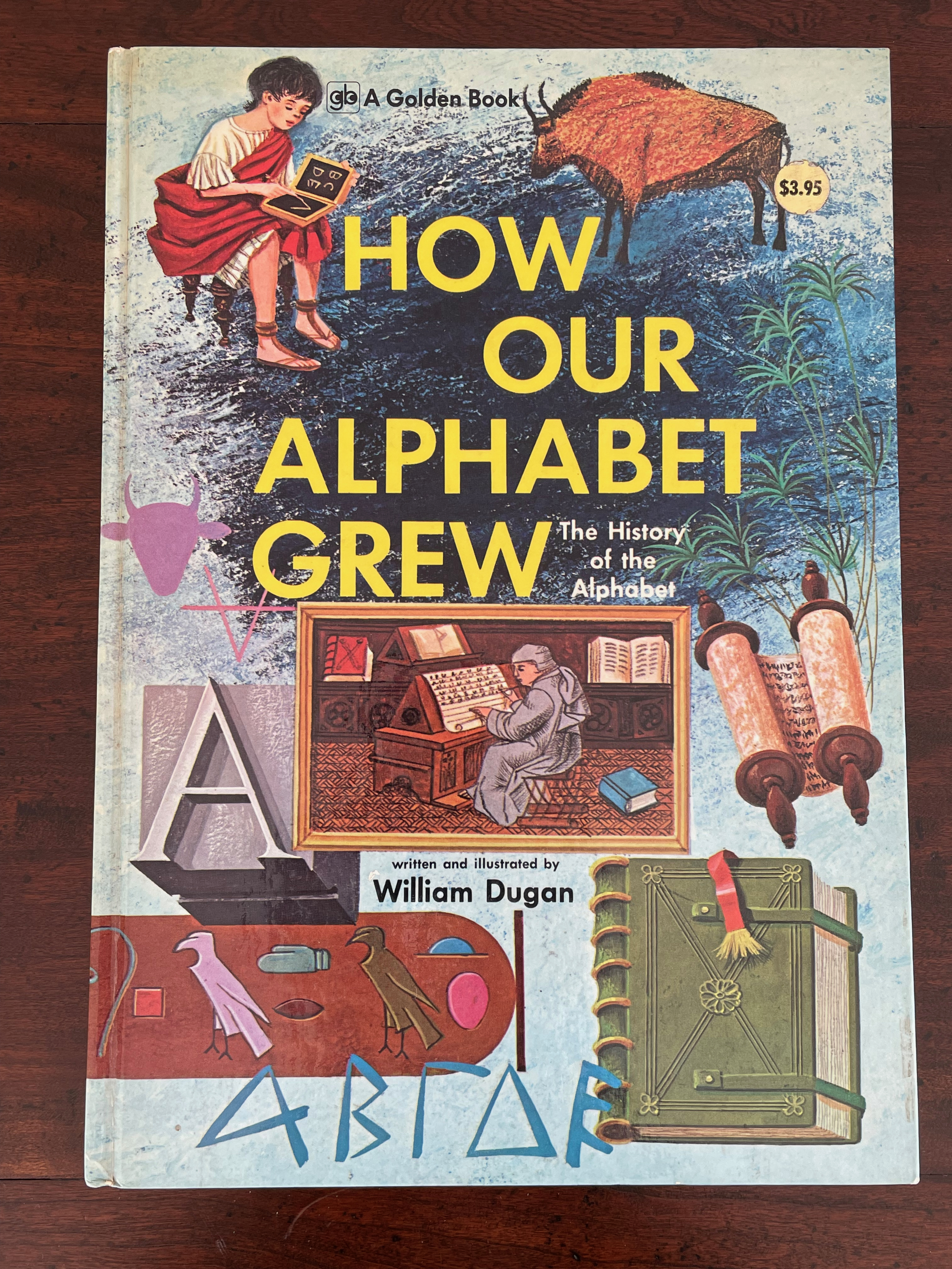
Leonard Everett Fisher, Alphabet Art: Thirteen ABCs from around the world (1978)

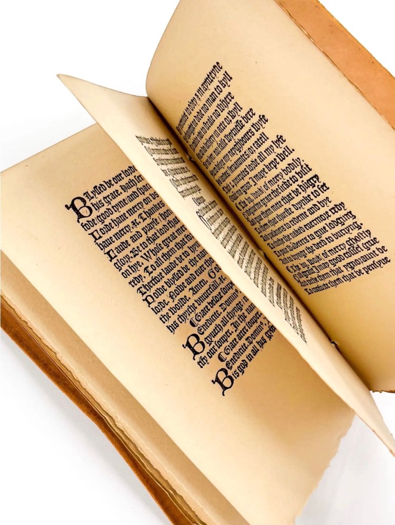
Leonard Everett Fisher’s Alphabet Art (1978) is a rare early commercial effort to interest children in non-Latin alphabets. Above is Fisher’s hand drawing of Thai consonants and vowels.

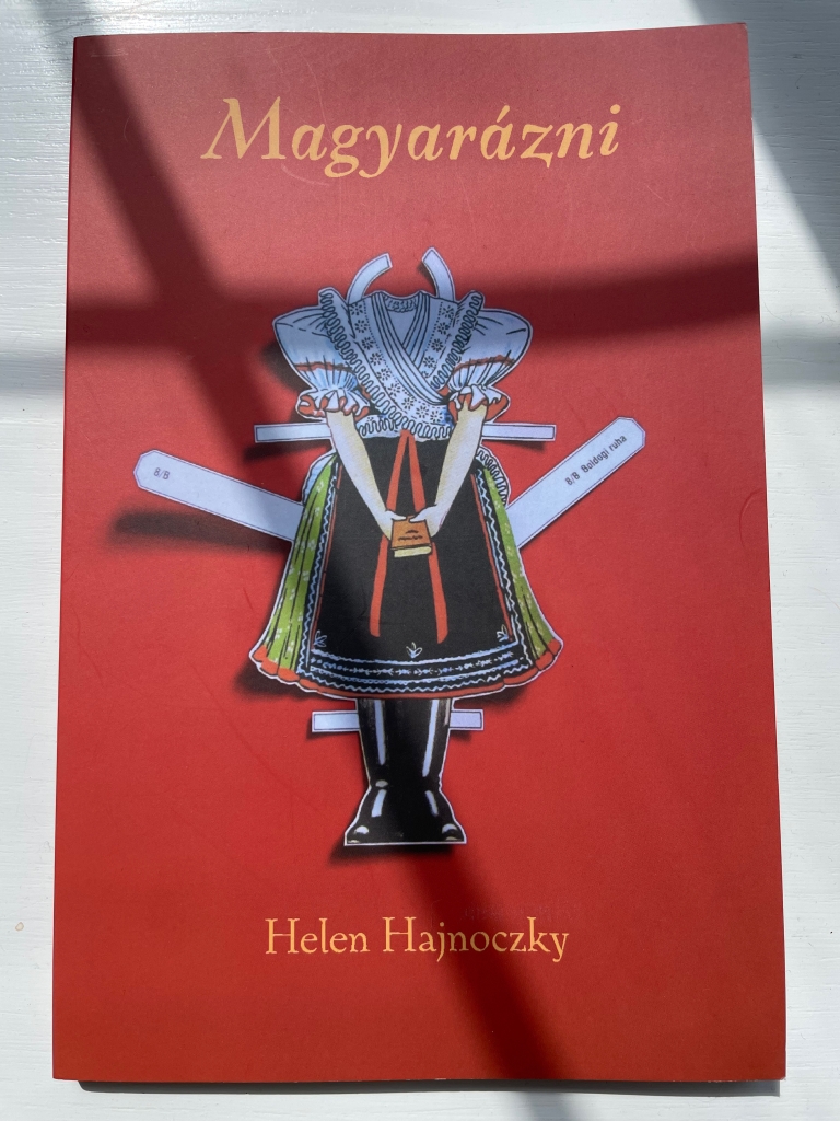
With all its diacritics and dipthongs, if there is an alphabet song in Hungarian, it must be operatic in length. It is fortunate, though, that it is as long as it is; otherwise we would have fewer poems in Helen Hajnoczky’s Magyarázni (2016). This is an abecedary that introduces monolingual English speakers to the “feel” of Hungarian and the feeling of growing up in a bilingual household.

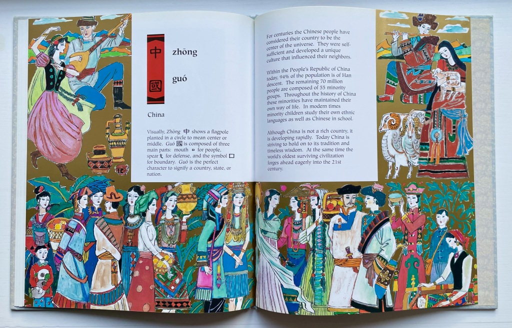
Maywan Shen Krach and Hongbin Zhang, D is for Doufu: An Alphabet Book of Chinese Culture (1997)

D is for Doufu: An Alphabet Book of Chinese Culture (1997) by Maywan Shen Krach and Hongbin Zhang is a “stand in” for an abecedary that cannot really exist since the Chinese writing system is not based on an alphabet but rather characters that are a mix of pictographs, ideographs, tonal markers and context indicators. For a different bridge between Western alphabets and Chinese characters, see the works of Xu Bing below.

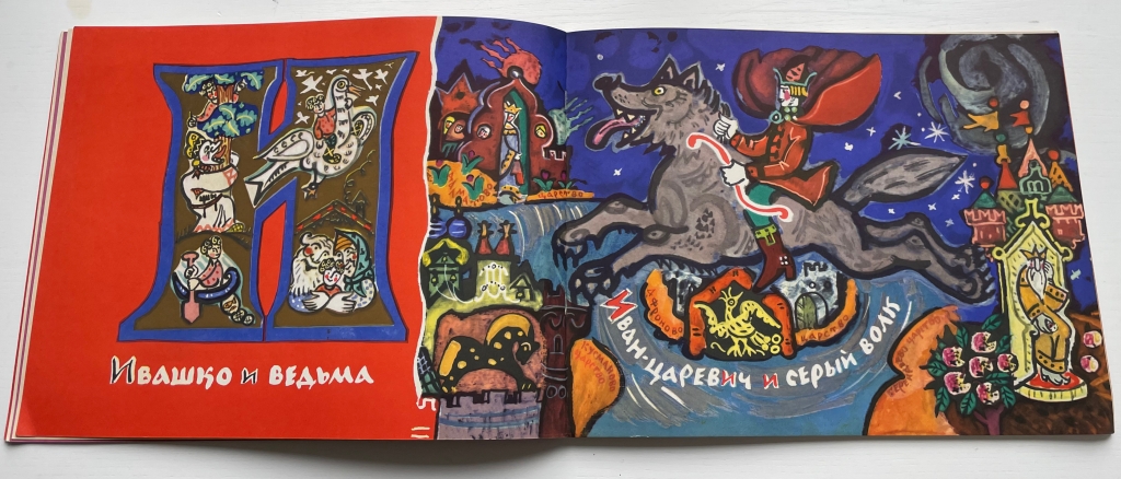
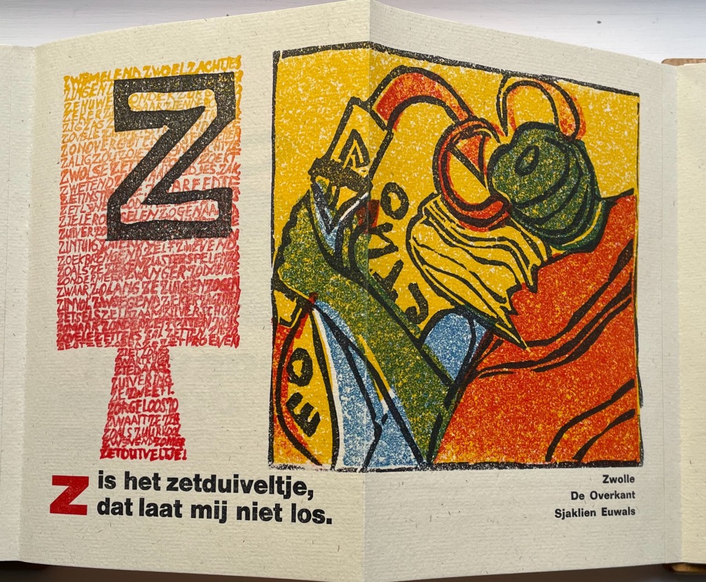
Tatyana Mavrina, Сказочная Азбука / Skazochnaia Azbuka / A Fairy Tale Alphabet (1969)

Tatyana Mavrina’s A Fairy Tale Alphabet (1969) provides this display case with its colorful example of one version of the Cyrillic alphabet.

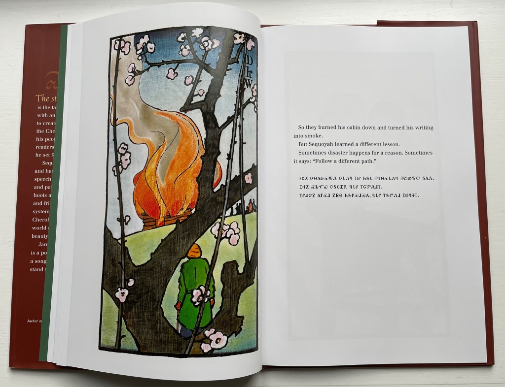
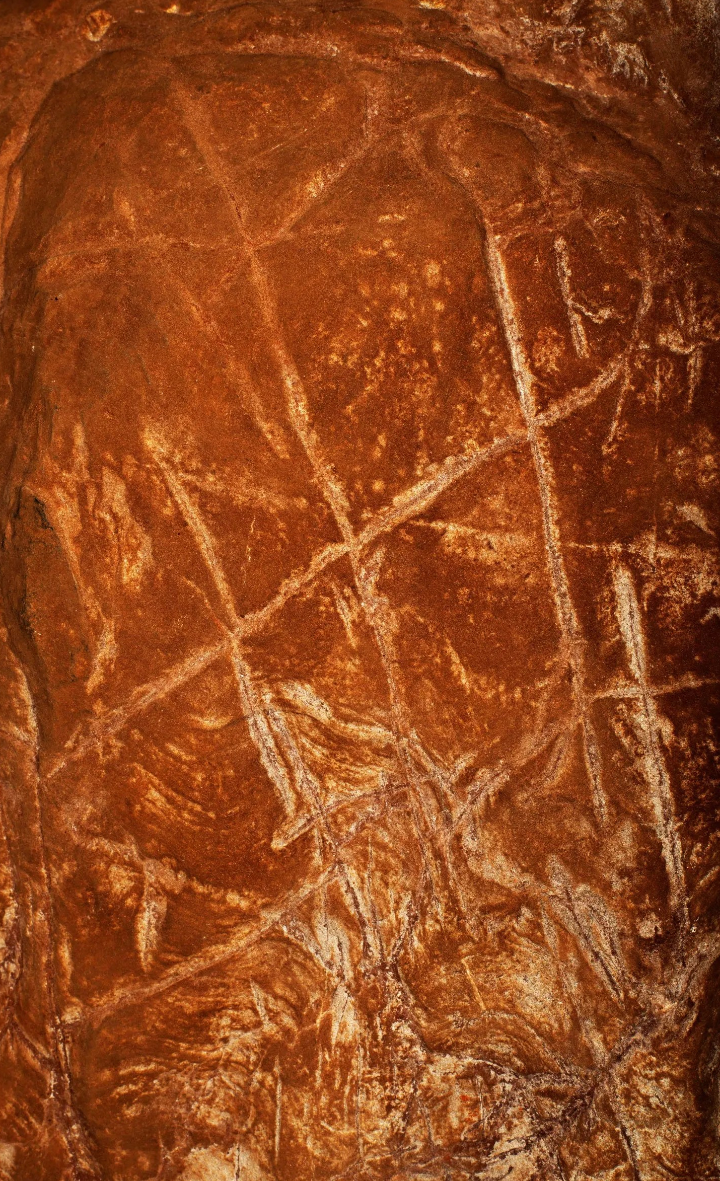
James Rumford’s Sequoyah (2004) recounts the story of the Cherokee Indian who, like Bouabré after him, invented a syllabary for his people. It was used by them on the walls of Manitou Cave in Alabama (US) in rituals and ancestral ceremonies.

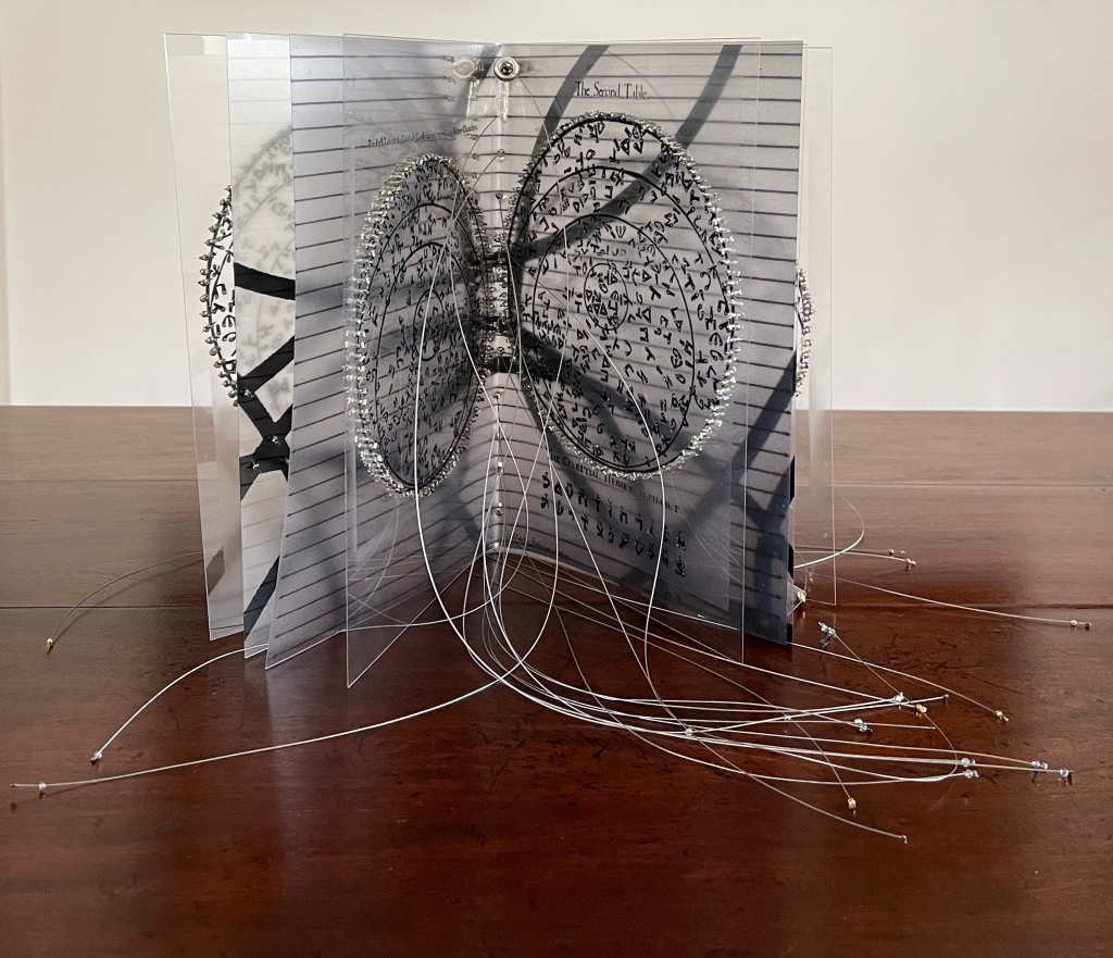
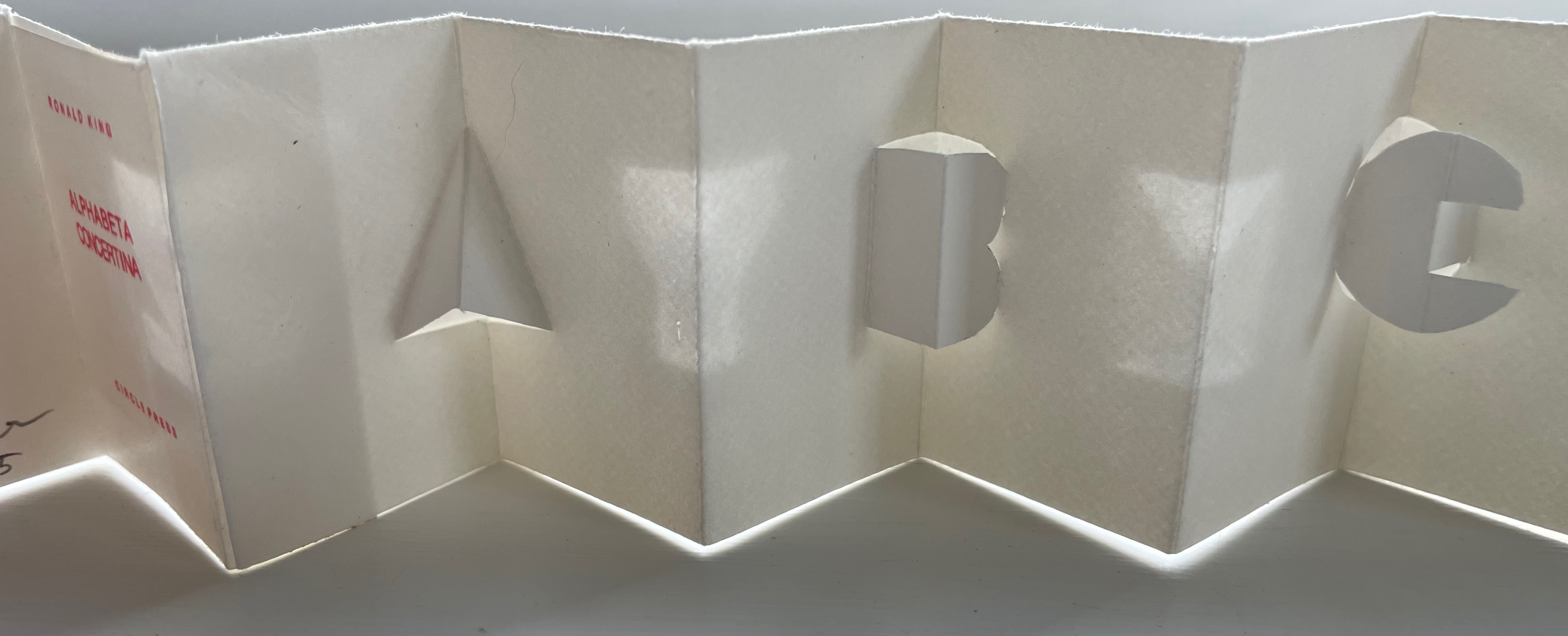
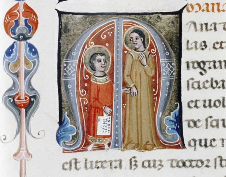
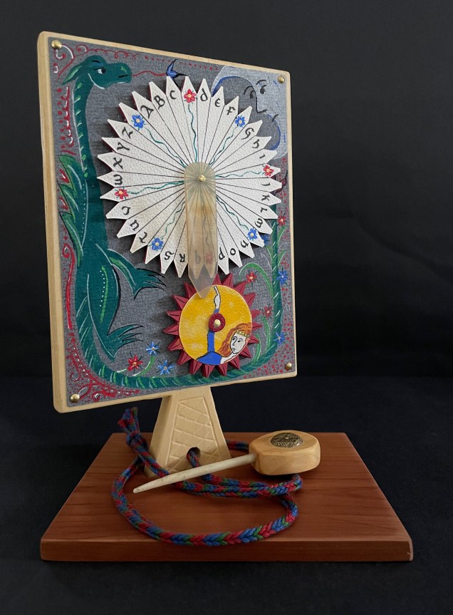
Claire Jeanine Satin, The Hebrew Alphabet Expressing the Celestial Constellations (2017)

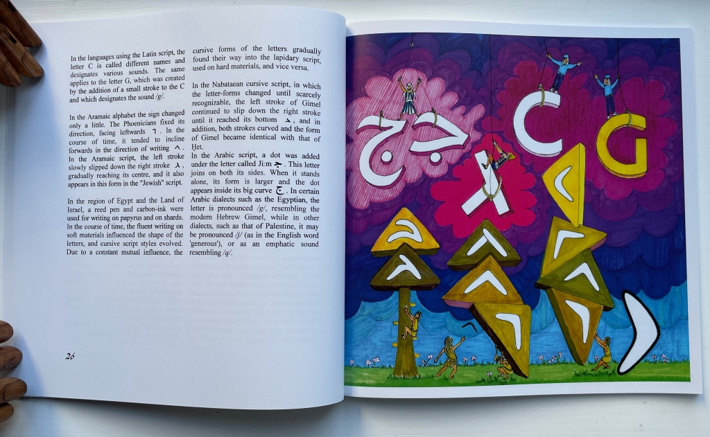
One of the alphabets in Dr. Edmund Fry’s encyclopedic Pantographia (1799) is Chaldean I, which he notes is also called Celestial, “said to have been composed by ancient astrologers”. Claire Jeanine Satin’s The Hebrew Alphabet Expressing the Celestial Constellations (2017) goes back to the same source in which Fry found his Chaldean alphabet. The tangled fish line and the gold-accented exterior and silver-accented interior echo the mystic interpretation of the divine language of the heavens.

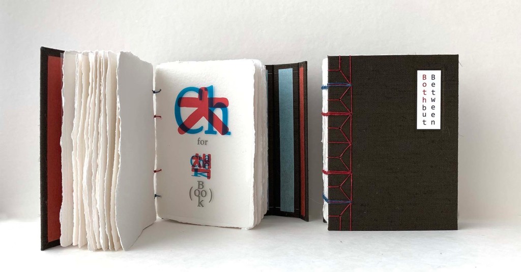
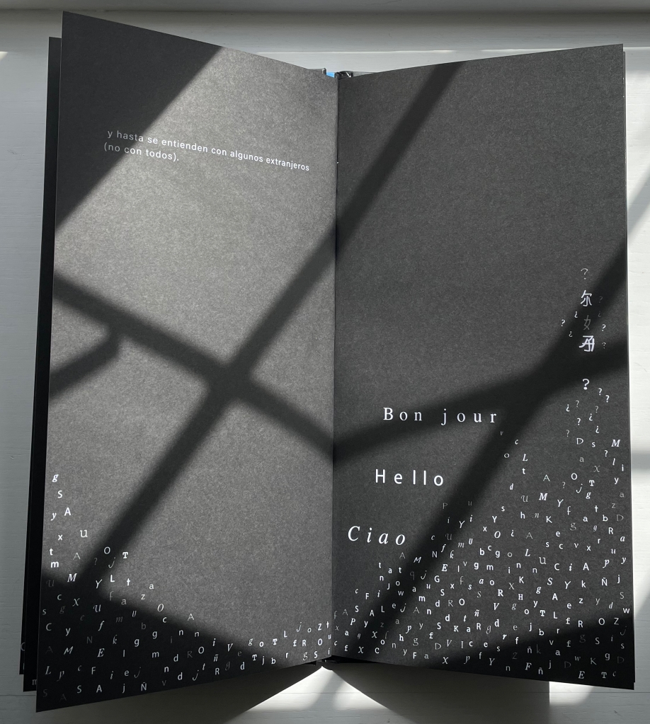
Jana Sim, Both but Between (2021)

Both but between is a bilingual abecedary. If punning in a foreign language indicates successful mastery of a non-native tongue, punning in that language and doing so materially with an artist’s book must indicate an altogether higher level and higher kind of mastery. Jana Sim demonstrates such mastery with an extraordinary use of letterpress printing and laser printing to underscore the “both but between” metaphor of her bicultural experience in this bilingual abecedary.

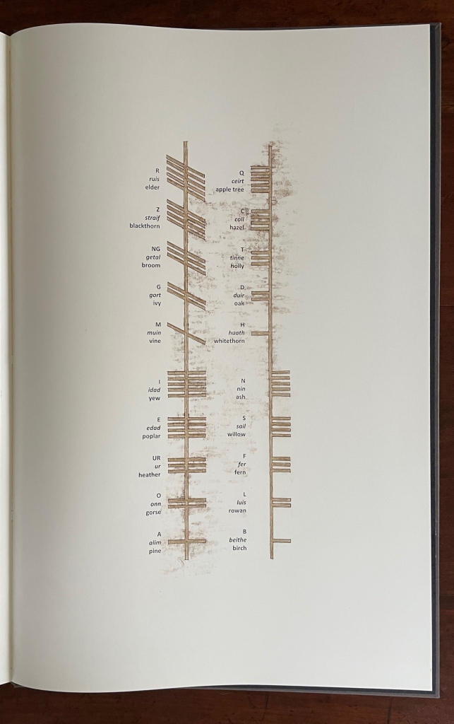
Serena Smith, Ekphrasis (2020)

The Ogham letters, appearing here at the end of Serena Smith’s Ekphrasis (2020), are collectively known as the Beith-luis-nin (a contraction of the five letters in the lower right above, like our alphabet from alpha and beta). They are associated with 4th to 6th century Irish inscriptions on stone and, according to early sagas and legends, wood. Although only some of the 20 core letter names are the names of trees, the Beith-luis-nin came to be known as the “Tree Alphabet”. Smith’s large lithographic book is not an abecedary for the Tree Alphabet. Rather it is a meditation on place (a Leicestershire country park — “part arboretum and part community”) and the art of lithography (drawing on and printing from stone) in which she wonders “if the hands of Celtic scribes also tired, whilst scoring the lines of Ogham script“.

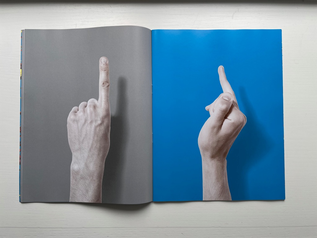
Stuart Whipps, Feeling with Fingers that See (2017)

Speculation has it that the Irish familiar with Ogham also used it for a secret sign language. No speculation is needed for the sign language shown in Stuart Whipps’ Feeling with Fingers that See (2017).* It comes from Sir Christopher Wren and can be found interleaved in the Royal Institute of British Architects’ “heirloom copy” of Parentalia, a family memoir published in 1750 by Wren’s grandson, also named Christopher. Whipps uses it in his A System For Communicating With The Ghost Of Sir Christopher Wren.

This online exhibition bonus concludes with three works by one of the most inventive and prolific artists of the 20th and 21st centuries: Xu Bing.

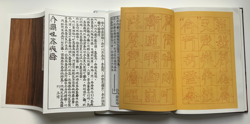
Xu Bing, Book from the Sky to Book from the Ground (2020)

This work —Book from the Sky to Book from the Ground (2020) — is perhaps the artist’s best introduction to Book from the Sky (1986-2012), Book from the Ground (2003~) and “square word calligraphy”, his writing system that bridges Chinese and English with humor and artistry.

Book from the Ground (2014) was published by MIT Press. A throwback to the pictographic origins of most alphabets and writing systems, the book recounts a day in the life of Mr. Black, an office worker, in the symbols, icons and logos of modern life. 

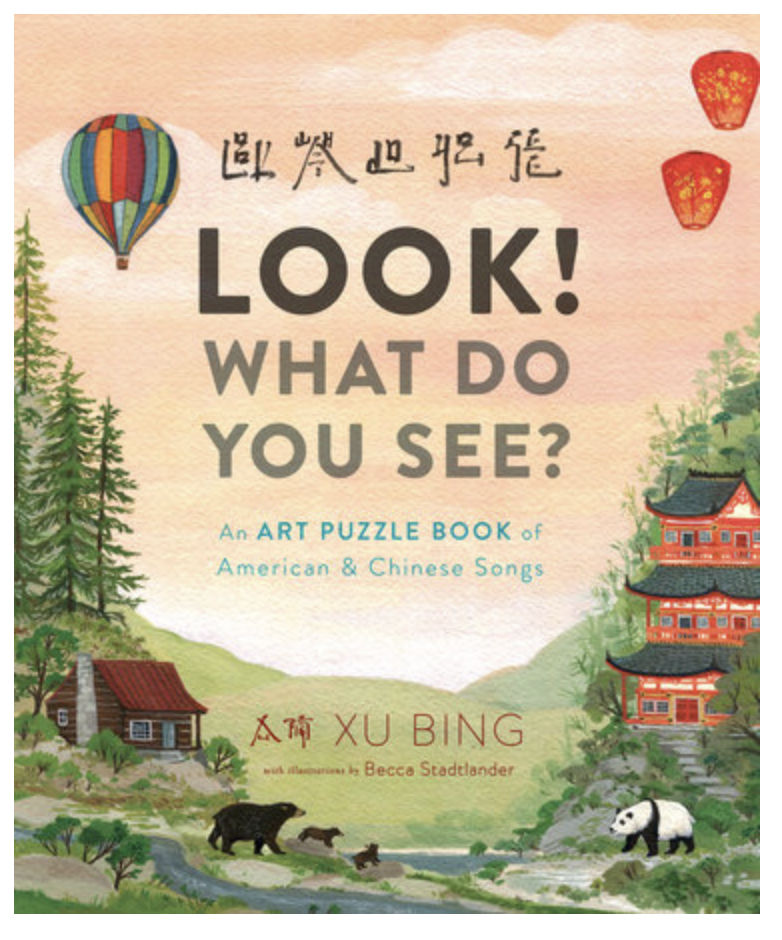
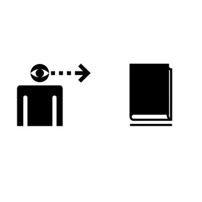
The artist’s cross-cultural humor shines in his children’s book Look! What do you see? (2017). Published by the trade publisher Viking, the lyrics to familiar US songs are printed with the sinographic letters from square word calligraphy.

Return to List of Displays in Alphabets Alive!

Books On Books Collection – Ornan Rotem

A Typographic Abecedarium (2015)

A Typographic Abecedarium (2015)
Ornan Rotem
Perfect bound in a softcover case. H174 x W176 mm. 136 pages 1 poster (64 x 48 cm, folded to 16 x 16 cm). Acquired from Devils in the Detail Ltd, 14 March 2023.
Photos of the book: Books On Books Collection. Displayed with permission of the artist.

Ornan Rotem calls his book a “photo-typographic essay … a meditation … [e]xploring the relationship between typography and the visual world around us ….” As shown in the double-page spread below, his meditation is shaped across a four dimensional views of the letterform: the four-dimensional, three-dimensional, two-dimensional and the one-dimensional. At the end of the essay, there are 26 miniature essays that will send the reader back to enjoy each letter’s four dimensional entries again.

Everywhere you look you can see an E smiling at you (just saying it induces a smile). In 1969, Georges Perec, whose own name has four Es, tried exorcising the E by writing an esoteric 300-page novel, La disparition, without ever using one. I wonder how he would have felt had he come across this E — which was shot in Paris — when he was writing the novel. ¶ If you want to endow letters with character, then I suppose E would be the lively sort, hence the printed form comes from a 1948 cover of LIFE magazine.

Much is packed into these miniature essays. Naturally for an artist’s book celebrating type, there are the necessary self-referential typographic puns in the one above: character and sort. In all, there is the evidence of the long, multi-place, multi-source contemplative gestation of the work. In the example above, the allusion to Perec’s novel leads to the 1969 photo in Paris (or was it vice versa?). The typographic puns lead to a search for an E from a LIFE cover (again, or was it vice versa?). This circular connectedness over time, text and image highlights the self-referentiality of the genre of the artist’s book.

While the dense allusiveness might suggest that this is a work limited to an adult audience, A Typographic Abecedarium does find favor with a younger audience — no doubt because it speaks to the phenomenon of seeing letters everywhere and in multiple dimensions.

Physical Poetry Alphabet (2018)

Physical Poetry Alphabet (2018)
Douglas & Françoise Kirkland and designed by Ornan Rotem
Casebound, illustrated paper over boards. Acquired from Sylph Editions, 18 March 2023. Photos: Screenshots displayed with permission of the publisher.

Physical Poetry Alphabet (2018) is a curious work. The Thames & Hudson-style production values combined with the knowledgeable essay in it by Ornan Rotem makes one think of Andrew Robinson’s  The Story of Writing, an actual Thames & Hudson book. While the acrobatics of Erika Lemay echo the longstanding tradition of modeling the letters with the human body, followed by Erté, Vítězslav Nezval, Anthon Beeke and Rowland Scherman and so ingeniously summarized by Lisa Merkin, Lemay’s elaborate costumes and the scene design echo the traditions of Hollywood, Las Vegas and the fashion industry, which is not surprising given the involvement of Douglas Kirkland, portrait photographer to the stars. A Typographic Abecedarium strikes its singular target of “photo-typographic essay”. Having too many targets, Physical Poetry Alphabet perhaps misses its several bull’s eyes, but to follow along with its mixed metaphors, it undeniably delivers a shop full of eye candy.

Further Reading

Abecedaries I (in progress)“. Books On Books Collection.

Alphabets Alive! – Body“. 19 July 2023. Books On Books Collection.

Meier, Allison. 14 January 2016. “A Visual Essays Recalls the Alphabet’s Pictorial Past“. Hyperallergic. Accessed 18 March 2023.

Books On Books Collection – Květa Pacovská

À l’infini (2007)

À l’infini (2007)
Květa Pacovská
Softcover with protective Mylar attached, exposed spine, sewn with multicolored threads. 270 x 270 x 29 mm. 128 pages. Acquired from Rakuten, 25 November 2022.
Photos: Books On Books Collection.

The Buzz Lightyear character of Toy Story and his catchphrase “To infinity and beyond” arrived in 1995. While it seems unlikely that the catchphrase influenced Květa Pacovská, the audience for Á l’infini (2007) and that for Toy Story definitely overlap. In her invitation below, Pacovská explicitly addresses the youngest of her audience: Tu peux regarder chaque lettre, toucher chaque lettre, considérer chaque lettre de façon formelle ou lire chaque lettre à haute voix. Chaque lettre a son propre son, sa propre forme et sa propre couleur. Note leurs différences quand tu les prononces, quand tu écoutes le son de ta voix. [You can look at each letter, touch each letter, consider each letter formally, or read each letter aloud. Each letter has its own sound, shape and color. Note their differences when you pronounce them, when you listen to the sound of your voice.] Above all — literally at the top of the page — she urges the reader: Dis la lettre <<A>> à haute voix jusqu’à ce qu’elle heurte les murs qui l’entourent. [Say the letter “A” out loud until it knocks down the walls surrounding it.], which is what the cut-out A plays outs.

For Pacovská, letters are “the architecture of pleasure”, and À l’infini invites us to play with them in “her city of paper”. Her invitation notes alternative approaches to the book, but the suggestion to walk through it as a paper sculpture is the best and appeal to the child in everyone.

With its collage of cut-outs, pop-ups, spot varnishes, reflective silver ink, letters and, later in the book, numbers, À l’infini is a joyful visual city. Pacovská received the Hans Christian Andersen Award in 1992 for her illustration.

Further Reading

Abecedaries I (in progress)“. Books On Books Collection.

Alphabets Alive! – ABCs in Miniature“. Books On Books Collection.

Pacovská, Květa . 1993. The Art of Kveta Pacovska. Zürich Frankfurt: Michael Neugebauer Book/North South Books.

Linhart, Eva, and Květa Pacovská. 2008. Kveta Pacovskà: Maximum Contrast. Bargteheide/Paris: Michael Neugebauer Edition GmbH/Minedition.

Alphabets Alive! – Alphabets All Around

Where do letters go when they’re not making words? Book artists know that they hide everywhere – often in plain sight – in landscapes, roadworks and signs, tree branches, rocks, flags, and even in a cup of coffee. [Links in the captions will take you to more images and details.]

Stephen T. Johnson Alphabet City (1995)

Lisa McGuirk, If Rocks Could Sing (2011)

Elliott Kaufman, Alphabet Everywhere (2012)

Ornan Rotem, A Typographic Abecedarium (2015)

Marion Bataille, Vues/Lues (2008)

Online Exhibition Bonus!

Ellen Sollod, Outdoor Types : An Urban Alphabet Source (2019)

Jan Middendorp and Clotilde Olyff , Lettered Typefaces and Alphabets by Clotilde Olyff (2000)

Return to List of Displays in Alphabets Alive!

Books On Books Collection – Carol Cunningham

Alphabet Alfresco (1985)

Alphabet Alfresco (1985)
Carol Cunningham
Casebound miniature, decorated cloth, colored doublures. H40 x W52 mm. 68 pages. Acquired from Lorson’s Books & Prints, 5 December 2022.
Photos: Books On Books Collection.

Carol Cunningham’s Sunflower Press produced many gems like this. Founder of the Miniature Book Society in 1983, Cunningham also produced numerous oil paintings and prints, some of which can be found here.

Further Reading

Abecedaries I (in progress)“. Books On Books Collection.

Alphabets Alive! – ABCs in Miniature“. 19 July 2023. Books On Books Collection.

Alphabets Alive! – ABCs in Miniature

If ever the dictum “Less is more” applied, it applies here — with miniaturized tongue in cheek, of course. [Links in the captions will take you to more images and details.]

Nancy Trottier, The Alphabet Effect (2013). Compare this example of the meander fold with Claire Van Vliet’s below and Lisa McGarry’s in The ABCs of Form & Structure.

Peter & Donna Thomas, Alphabet People (1989). Even in miniature, B is for Body.

Picture ABC (place and date of creation unknown). And C is for Color.

Rebecca Bingham, Defining the Rainbow (2018). And still more Color.

These two miniatures — Albrecht Dürer’s Directions for the Construction of the Text or Quadrate Letters (1993) and Fra Luca de Pacioli’s The Divine Alphabet (1993) — were produced by Tabula Rasa Press for a three-volume set, including Ben Shahn’s The Alphabet of Creation (1954). Although the miniature edition of Shahn remains elusive, the original edition can be seen here.

Mark Van Stone, The Evolution of the Medieval Decorated Letter (1985) In the spirit of medieval illuminators, Van Stone has imitated the hand of twenty-three of what he calls the “semi-precious jewels” of “‘minor’ illumination that usually receives little attention in the Art-History books”.

Carol DuBosch, Embossed Alphabet Gallery (2019).* This gallery structure combines elements of the flag-book and leporello to create a freestanding sculptural book to be read “in the round” — although in the Bodleian exhibition it was fixed in a wall case that allowed 180º view.

Claire Van Vliet, Tumbling Blocks for Pris and Bruce (1996).* A meander-fold book hinged to keep the cube unfolding, refolding and unfolding as it falls from hand to hand.

Carol Cunningham, Alphabet Alfresco (1985). One of several gems created by the founder of the Miniature Book Society (1983).

William Cheney, ABC for Tiny Schools ( 1975). Along with “A was an archer”, the “A was an apple pie” was among the earliest themes for secular alphabet books.

Alphabet Salmagundi (1988) and Golden Alphabet (1986) demonstrate the breadth of Rebecca Bingham’s interest in various periods and techniques of calligraphy.

Another Tabula Rasa Press production, Arthur Maquarie, The Uffizi ABC: a facsimile reproduction in miniature (1992)

Pat Sweet’s wit led her to fill the ancient Egyptians’ previously unperceived need for an alphabet book with Hieroglyphs (2009).

David Clifford and Heavenly Monkey teamed up to produce this intricately bound miniature, Letterpress Printing ABC (2004).

June Sidwell, Lady Letters (1986). Another production by Rebecca Bingham, which also led to a miniature nod to another alphabetist — Erté.

Nicolas McDowall, A Bodoni Charade (1995). Don’t let delight in the verbal/visual punnery distract you from wondering at the skill with type and letterpress needed to pull this off.

Erwin Huebner and Ron King, Alphabeta Concertina Majuscule (2015) and alphabeta concertina miniscule (2022). Miniaturist and microbiologist, Huebner obtained Ron King’s permission to reproduce King’s two signature pop-up alphabets with extraordinary results.

Juniper Von Phitzer, An Alphabet Coloring Book by Theodore Menten (1997). Lloyd L. Neilson compiled the name of his Juniper Von Phitzer Press from the names of his three cats. Theodore Menten had produced a coloring book called The Illuminated Alphabet in 1971 for Dover Publications. Obviously Juniper Von Phitzer could not fail to pounce.

Online Exhibition Bonus!

Many of the ABC books in the collection use the accordion, concertina or leporello structure, but none but Maria G. Pisano’s XYZ (2002) combine fine beaten abaca in two colors and the watermark technique to achieve their effect.

Return to List of Displays in Alphabets Alive!

Alphabets Alive! – “A is for Ox” (Origins)

Where did the alphabet come from? The ancient Egyptians claimed that Thoth brought writing to us; the Babylonians, Nebo; the Sumerians, Nabû; the Greeks, Hermes or Zeus; the Norse, Odin; the Hindus, Ganesh; the Mayans, Itzamna; in the Bible, God through Moses; and in the Qur’an, Allah. (Flanders in Bibliography)

For millennia, it was a mystery. Over the last three centuries, anthropologists, archaeologists, historians, linguists and paleographers have agreed general lines of explanation. One line starts from cuneiform (wedge-shaped marks on clay) used in the 4th millennium BCE in Sumer for accounting and administrative purposes. In the 3rd millennium BCE, some cuneiform glyphs came to represent Akkadian and Hittite language sounds. The other line starts from a Semitic consonantal script used in the 2nd millennium BCE in the Levant. In this pre-alphabet, shapes for sounds started more directly with the shapes of things, and over time, the shapes turned into symbols for the initial sounds of the thing depicted.

So, a stylized drawing of an ox’s head that was used for the word for ox turned into the Phoenician glyph 𐤀representing the initial sound of ‘aleph, the Phoenician word for ox. After the Phoenician alphabet reached Greece and beyond, the glyph tilted to become A, representing any instance of the sound /a/. The Greeks changed the glyph’s name from ‘aleph to alpha as well as the name of the glyph 𐤁 from bēt to beta, from which comes our word “alphabet”.

In the last decade, however, the earliest point of the alphabet’s symbol-making origin may have slipped back into mystery with the discovery of carvings in South African caves, possibly the work of Homo naledi, a much smaller-brained hominin species whose fossils have been dated to between 236,000 and 335,000 years ago. (Wong in Bibliography)

Left: Bolter, D.R. et al. 2020. “Immature remains and the first partial skeleton of a juvenile Homo naledi”. PLoS One 15 (4). CC BY-SA 4.0. Right: Berger, Lee R. et al. June 2023. “241,000 to 335,000 Years Old Rock Engravings Made by Homo naledi in the Rising Star Cave system, South Africa”. bioRxiv. CC BY-SA 4.0.

Such mysteries and explanations alike have been a source of inspiration for children’s books and artist’s books. [Links in the captions will take you to more images and details.]

Clockwise: Tommy Thompson’s The ABC of Our Alphabet (1952), William Dugan’s How Our Alphabet Grew (1972), Tiphaine Samoyault’s Alphabetical Order (1998)*, Don Robb and Ann Smith’s Ox, House, Stick (2007)* and Renzo Rossi’s The Revolution of the Alphabet (2009) show the staying power of illustrated reference books for older children as a vehicle for alphabet history.

Chloë Cheese, a talented artist and illustrator, further enlivens Rudyard Kipling’s tale “How the Alphabet was Made” (1983)* with a colorful interpretation of the black-and-white drawings that Kipling originally included in the manuscript for his daughter Josephine. Another version can be found below in the Online Exhibition Bonus!

Inside and out, Cari Ferraro’s The First Writing (2004)* echoes early cave paintings and challenges the administration theory of writing’s origins.


In the Bodleian exhibition but not shown here due to rights issues: Abe Kuipers’ Letters (1983).


Helen Malone’s Alphabetic Codes (2005)* consists of separate plexiglas accordion books that open into a sculptural view of the abstract markings that have emerged in the search for the alphabet’s origins.

James Rumford’s There’s a Monster in the Alphabet (2002)* retells Herodotus’ account of how the Phoenicians brought the alphabet to Greece. Rumford has also written and illustrated children’s books on the invention and process of papermaking, Gutenberg, Sequoyah (inventor of the Cherokee syllabary), Champollion (decipherer of the Rosetta Stone), Chadian arabic, Chinese explorers and much else to celebrate languages and cultures.

Letter by letter, Dave Wood’s Alphabetica (2002)* celebrates the alphabet with a multitude of calligraphic and letter-form styles. Wood integrates inscribed captions that show and comment on the development of each letter.

Online Exhibition Bonus!

The letter B derives from the Phoenician word bēt (meaning “house”). Lanore Cady’s Houses and Letters (1977) calligraphically displays every letter’s development. Inscribed verses aim to link the letters and houses depicted in Cady’s watercolors.

Slipcased, beautifully clothbound and well-designed, Lyn Davies’ A is for Ox (2006) belongs to the fine press tradition. Despite its brevity, A is for Ox conveys just as much as many lengthier books on the origins of the alphabet. See the Bibliography for additional reference works on the alphabet’s history.

William Joyce’s The Numberlys (2014) takes an inventive approach to the theory that numbers preceded letters and led to the alphabet’s invention. The five characters who are the story’s heroes (representing the five vowels?) first made their appearance online in an interactive app. Ironically, the app is no longer available. It is perilously stored on an early iPad in the Books On Books Collection and has been “backed up” by this print version.

Gerald Lange’s The Neolithic Adventures of Taffi-mai Metallu-mai (1997) reproduces Kipling’s own drawings for “How the Alphabet was Made” and includes “How the First Letter Was Written”. With the variety of Japanese papers, watercoloring of the text leaves, handsetting of type, letterpress printing and tortoise shell edge-sewn binding, this represents a special strain of artist’s book.

David Rault’s ABC of Typography (2019) traces 3,500 years of letters and type from pictographs and cuneiform through Roman lettering and Gutenberg to the Bauhaus and beyond. What distinguishes it from the works above and other illustrated reference works in the Books On Books Collection is its origin in the Franco-Belgian tradition of les bandes dessinées (BDs), which the French and Belgians call la Neuvième Art (“the Ninth Art”).

Painter Ben Shahn’s The Alphabet of Creation (1954) presents a Hebrew abecedary by recounting the story of how the twenty-two letters responded to God’s invitation to make their cases for being the first letter of the alphabet.

Renowned as an expert in Hebrew palaeography, Ada Yardeni was also known for her art, calligraphic hand and storytelling. Combining all these talents, A-dventure-Z’ (2003) crosses the boundaries of scholarly reference, children’s book and artist’s book.

Return to List of Displays in Alphabets Alive!

Alphabets Alive! – Bibliography

Bailey, Merridee L. 2013. “Hornbooks“. Journal of the History of Childhood and Youth. 6.1, pp. 3-14.

Beckett Sandra L. 2013. Crossover Picturebooks : A Genre for All Ages. London: Routledge.

Bernal, Martin. 1990. Cadmean Letters : The Transmission of the Alphabet to the Aegean and Further West Before 1400 B.C. Winona Lake IN: Eisenbrauns.

Blamires, David. 1990. Adults Alphabets : Examples of English Press Alphabet Books from the Last Hundred Years with an Alphabetical Description Copious Illustrations and a Checklist of Press Alphabet Books. Church Hanborough: Hanborough Parrot. Bodleian.

Blamires, David. 1987. Alphabet Books. Manchester: John Rylands University Library. Bodleian.

Blinder, C. (2023). “An unmade book: Walker Evans’s 1970s Polaroids of Letters”. In The photobook world. Manchester, England: Manchester University Press. Retrieved 7 June 2023. From the abstract: “When Walker Evans died in 1975 he had been in the process of completing a photo-book, a sort of literary typology based on a series of Polaroids taken by him of roadside signs, traffic markings, advertisements and other urban ephemera. The aim, according to Jeff L. Rosenheim, curator of the Evans Archives at The Met, was to create ‘an alphabet book based on individual letters’. … Evans’s Polaroids have since been published, the fragmented letters as well as portraits and landscapes in a collected format but it is worth reconsidering how his painstaking attention to the objects of everyday life might have brought together writing on the streets into a photobook of letters; a new visual language indicative of a new photographic one as well.”

Boeckeler, Erika Mary. 2017. Playful Letters : A Study in Early Modern Alphabetics. Iowa City: University of Iowa Press. Bodleian.

Bromer, Anne, and Julian I. Edison. Miniature Books : 4,000 Years of Tiny Treasures. New York: Abrams, 2007. Bodleian.

Chiera, Edward, and George G Cameron. 1938. They Wrote on Clay : The Babylonian Tablets Speak To-Day. Chicago Ill: University of Chicago Press. Bodleian.

Clodd, Edward. 1913. The Story of the Alphabet. London: Hodder and Stoughton. 1913. Bodleian. Superseded by several later works, but is freely available online with line illustrations and some black and white photos.

Cooper, Cathie Hilterbran. 1996. ABC Books and Activities : From Preschool to High School. Lanham, Md.: Scarecrow Press. Bodleian.

Cornell University. 2017. Wake the Form: Artists’ Books in Context. Website. See the sections “Abecedarium” and “Child’s Play”.

Crain, Patricia. 2002. The Story of A: The Alphabetization of America from the New England Primer to the Scarlet Letter. Stanford CA: Stanford University Press. Bodleian.

Davies, Lyn. 2006. A Is for Ox : A Short History of the Alphabet. London: Folio Society. Bodleian.

De Hamel, Christopher, and Lovett, Patricia. 2010. The Macclesfield Alphabet Book : Bl Additional Ms 88887 : A Facsimile. London: British Library. Bodleian.

De Looze, Laurence. 2016. The Letter and the Cosmos : How the Alphabet Has Shaped the Western View of the World. Toronto: University of Toronto Press. Bodleian.

Delamotte, F. 1862. The Book of Ornamental Alphabets Ancient and Medieval: From the Eighth Century with Numerals:…. Fourth ed. London: E. & F.N. Spon. Bodleian.

Diringer, David, and Regensburger, Reinhold. 1968. The alphabet: a key to the history of mankind. London: Hutchinson. Bodleian. A standard, beginning to be challenged by late 20th and early 21st century archaeological findings and palaeographical studies.

Diringer, David. 1953. Staples Alphabet Exhibition Sponsored and Arranged by Staples Press London 1953; the Alphabet Throughout the Ages and in All Lands. Staples Press: London. Bodleian.

Donaldson, Timothy J. 2008. Shapes for Sounds. 1st ed. New York City NY: Mark Batty. Bodleian.

Drucker, Johanna. 1999. The alphabetic labyrinth: the letters in history and imagination. New York, N.Y.: Thames and Hudson. Bodleian.

Drucker, Johanna. 2022. Inventing the Alphabet : The Origins of Letters from Antiquity to the Present. Chicago: University of Chicago Press. Bodleian.

Druker, Elina, and Kümmerling-Meibauer, Bettina. 2015. Children’s Literature and the Avant-Garde. Amsterdam: John Benjamins Publishing Company.

Dyer, M.A., and Hibben, Y., 2012. Developing a Book Art Genre Headings Index. Art Documentation: Bulletin of the Art Libraries Society of North America, 31(1), pp.57–66.

Ege, Otto. 1921/1998. The Story of the Alphabet, Its Evolution and Development… Embellished Typographically with Printer’s Flowers Arranged by Richard J. Hoffman. Van Nuys, CA: Richard J. Hoffman. A miniature. The type ornaments chosen by Hoffman are arranged chronologically by designer (Garamond, Granjon, Rogers) and printed in color.

Evetts, Leonard. 1979. Roman Lettering : A Study of the Letters of the Inscription at the Base of the Trajan Column with an Outline of the History of Lettering in Britain. New York: Taplinger. Bodleian.

Ferraro, Cari. 2010. “Sacred Script: Ancient Marks from Old Europe“. Cari Ferraro: Prose & Letters. Accessed 4 January 2022. Also published in Alphabet : the journal of the Friends of Calligraphy. Volume 35.3. San Francisco Friends of Calligraphy. Bodleian.

Findlay, James A. 2000. ABC Books and Related Materials: Selections from the Nyr Indictor Collection of the Alphabet. First ed. Ft. Lauderdale Fla: Bienes Center for the Literary Arts Broward County Library.

Firmage, Richard A. 2001. The Alphabet: The Story of One of Civilisation’s Greatest Inventions. London: Bloomsbury.Bodleian.

Fischer, Steven Roger. 2008. A history of writing. London: Reaktion Books. Bodleian.

Flanders, Judith. 2021. A Place for Everything : The Curious History of Alphabetical Order. London: Picador an imprint of Pan Macmillan. Bodleian.

Folmsbee, Beulah. 1965. A Little History of the Horn-Book. Third Printing with Illustrations and a Map. Boston: Horn Book. Bodleian.

Gagné, Renaud. 2013. “Dancing Letters: The Alphabetic Tragedy of Kallias”. In Choral Mediations in Greek Tragedy, ed. R. Gagné and M. Hopman, Cambridge University Press 282-307. Bodleian.

Gannon, Megan. 10 April 2019. “Cave Markings Tell of Cherokee Life in the Years Before Indian Removal“. Smithsonian Magazine. Accessed 14 July 2023.

Goetz, Sair. 11 June 2020. “Letterforms / Humanforms“. Letterform Archive News. Accessed 30 January 2022.

Goldman, David J. 1994. A is for ox: the story of the alphabet. New York: Silver Moon Press. Bodleian.

Haley, Allan. 1995. Alphabet : The History Evolution and Design of the Letters We Use Today. New York: Watson-Guptill Publications. Bodleian.

Heller, Steven, and Anderson, Gail. 2014. The Typographic Universe : Letterforms Found in Nature the Built World and Human Imagination. New York New York: Thames & Hudson. Bodleian.

Hoptman, Laura J. et al. 2012. Bulletins of the Serving Library #3: Ecstatic Alphabets / Heaps of Language. Berlin/New York: Sternberg Press/Dexter Sinister. Bodleian. Catalogue and essays tied to a group exhibition at The Museum of Modern Art, New York, from May 6 to August 27, 2012. “It brings together forty-four modern and contemporary artists and artists’ groups working in all mediums including painting, sculptutre, film , video, audio, spoken word, and design, all of whom concentrate on the material qualities of written and spoken language–visual, aural, and beyond.”(P. 181). See also Maia Conlon’s altered book version.

Hunt, Peter, and Butts, Dennis. 1995. Children’s Literature : An Illustrated History. Oxford: Oxford UP. Cites the first picture alphabet as John Hart’s 1570 A Methode or Comfortable Beginning for All Vnlearned Whereby They May Bee Taught to Read English in a Very Short Time with Pleasure: So Profitable As Straunge Put in Light by I(Ohn) H(Art). Chester Heralt. Henrie Denham: London.

Illich, Ivan, and Sanders, Barry. 1988. ABC: The Alphabetization of the Popular Mind. London: Boyars. Bodleian.

Jackson, Donald. 1997. The story of writing. Monmouth, England: Calligraphy Centre. Bodleian.

Jacquillat, Agathe, and Vollauschek, Tomi. 2011. The 3d Type Book. London: Laurence King. Bodleian. Reference.

Kottke, Jason. 2005-23. “kottke.org posts about alphabet“. Accessed 28 September 2023.

Lawson, Alexander S. 2010. Anatomy of a Typeface. 5th print ed. Boston: David R. Godine.

Little, Laura. 2015. “A Practice‐Based Exploration of the Relationship between Artists’ Books and Children’s Picturebooks“. Anglia Ruskin University. PhD thesis.

Mackey, Bonnie, and Watson, Hedy Schiller. 2017. Alphabet Books : The K-12 Educators’ Power Tool. Santa Barbara California: Libraries Unlimited. Bodleian.

Maffei, G., 2007. “Artists, books, children”. In: Dehò, Valerio. 2007. Children’s Corner : Libri D’artista Per Bambini = Artists’ Books for Children Exhibition. Merano Italy: Edizioni Corraini. pp.26–27.

McLean, Ruari. 1976. The Noah’s Ark A.b.c. and 8 Other Victorian Alphabet Books in Color. New York: Dover Publications. Bodleian.

Moziani, Eliyahu. 1984. Torah of the Alphabet or How the Art of Writing Was Taught Under the Judges of Israel (1441-1025) : -The Original Short Course in Alphabetic Writing Conceived by Israel in Sinai. Herborn: Baalschem.

Myers George. 1986. Alphabets Sublime : Contemporary Artists on Collage & Visual Literature. Washington D.C: Paycock Press. Bodleian. Includes essay by Ludwig Zeller.

Ory, Norma R. 1978. Art and the Alphabet : An Exhibition for Children May 26-September 3 1978 Masterson Junior Gallery the Museum of Fine Arts Houston. Houston, TX: Museum. Bodleian.

Ouaknin, Marc-Alain. 1996. Mysteries of the Alphabet: The Origins of Writing. New York: Abbeville Press. Bodleian. HxW mm. 384 pages. Part One provides a short history of writing and deal with the author’s view of the Latin alphabet’s origin in the proto-Sinaitic alphabet. Part Two proceeds letter by letter through the history of the alphabet’s development; each letter’s chapter concludes with a summary table: Name (in English and Hebrew); Classic Forms in Classical and Modern Hebrew; Original Meanings; Derivative Meanings; Acquired Meanings Perpetuated by the Hebrew Language; and Numeric Value. Part Three explains the author’s principle of archeography: “the analysis and interpretation of words based not only on their etymological roots but also on the original graphic form of the letters of the alphabet, as it was first encountered in proto-Sinaitic script, … and the origins and development of that first alphabet.” p. 352.

Nesticò, B. 2007. “Ó.P.L.A. The Home of Artists’ Books for Children”. In: Dehò, Valerio. 2007. Children’s Corner : Libri D’artista Per Bambini = Artists’ Books for Children Exhibition. Merano Italy: Edizioni Corraini. pp.17–19.

Nodelman, Perry. 2017. David A. Carter, Alexander Calder, and the Childlikeness of the Moveable Book: Children as “Children of All Ages”. The Free Library (June, 22). Accessed 17 September 17 2022.

Pflughaupt, Laurent. 2008. Letter by letter: an alphabetical miscellany. New York: Princeton Architectural Press. Bodleian.

Pollinger, Gina. Alphabet Gallery : An ABC of Contemporary Illustrators. London: Mammoth, 1999.

Public Domain Review. “The Human Alphabet“. 3 November 2016. The Public Domain Review. Accessed 10 February 2023.

Raptis, Sotirios. 18 February 2011. “Human Alphabets 1“. Slideshare.net. Accessed 10 February 2023.

Raptis, Sotirios. 18 February 2011. “Human Alphabets 2“. Slideshare.net. Accessed 10 February 2023.

Raptis, Sotirios. 13 August 2016. “Human Alphabets 3“. Slideshare.net. Accessed 10 February 2023.

Raptis, Sotirios. 13 August 2016. “Human Alphabets 4“. Slideshare.net. Accessed 10 February 2023.

Reinhard, S., 2010. “The Children’s Picture Book as Artist’s Book: Turning the American Children’s Picture Book Form ‘Topsy & Turvy.’International Journal of the Book, 7(4), pp. 99–126.

Robinson, Andrew. 1995. The story of writing. London: Thames and Hudson. Bodleian.

Rosen, Michael. 2013. Alphabetical: How Every Letter Tells a Story. London: John Murray. Bodleian.

Rostankowski, C. C. 1994. “A Is for Aesthetics: Alphabet Books and the Development of the Aesthetic in Children“. Journal of Aesthetic Education, 28(3), 117–127.

Rothenstein, Julian, and Gooding, Mel. 2018. A2Z: Alphabets & Signs. New York: Princeton Architectural Press. Bodleian.

Rothenstein, Julian, and Gooding, Mel. 1995. Alphabets & Other Signs Reprinted ed. London: Thames and Hudson. Bodleian.

Rothenstein, Julian, and Gooding, Mel. 2003. ABZ. San Francisco Calif: Chronicle Books. Bodleian.

Sacks, David. 2003. Language visible: unraveling the mystery of the alphabet from A to Z. New York: Broadway Books. Bodleian.

Samoyault, Tiphaine. 1996, 1998 trans. Alphabetical order: how the alphabet began. New York: Viking. Bodleian. Children’s book.

Scott, C. 2014. “Artists’ books, Altered books, and Picturebooks”. In: Kümmerling‐Meibauer, N., ed. Picturebooks: Representation and Narration. London, New York: Routledge. Scott points out the many design techniques that artists’ books and children’s alphabet books share : the arranging, folding and cutting of pages and the various ways of organizing them — “scrolls, sewn or pasted folios, accordion folds, or attached triangles or circles that open or unfold in various ways”; tunnel books, “fans, shadow boxes, windows, doors, and drawers … an assortment of Shepherd’s Purse and related folds, some of which may be drawn from the origami tradition, and which might be opened like a map, or form a pocket holding inserts. These methods of order provide a direction for the experience of the viewer/reader, a journey through the work of art that, like the picturebook, offers a form of linearity that combines graphic vision with a kind of narrative path from experience to experience. Notions of narrative perspective, the unfolding of a story and emotional involvement of the reader are as significant for artists books as they are in picturebooks. And the physical action of turning the page, so important to young children’s understanding of the way a book works, is replicated in artists’ books with their many different modes and sometimes complex methods of activation.” p.42

Shaw, Gary. 15 April 2021. “Ancient ABCs: The alphabet’s ‘missing link’ discovered in Israel“. The Art Newspaper.

Steiner Deborah. 2021. Choral Constructions in Greek Culture : The Idea of the Chorus in the Poetry Art and Social Practices of the Archaic and Early Classical Period. Cambridge: Cambridge University Press. See chapter 8 for the story on Kallias and dancing the alphabet.

Thompson, Tommy. 1952. The ABC of our alphabet. London: Studio Publications. Bodleian. Not a fine press publication, but its layout, illustrations and use of two colors bear comparison with the Davies book. It too is out of print and unfortunately more rare.

Tuer, Andrew W. 1897. History of the Horn-Book. London: Leadenhall Press. Bodleian.

Verheyen, Peter. 1998. “Definition of the Artist’s Book; What is a Book; BSO’s (Book Shaped Objects); Art vs. Craft“. The Book Arts Web. Online.

Warner, Arabella. 27 July 2023. “A is for Ox“. The Oxford Sausage. More than a review of Alphabets Alive!, this personal essay concludes with a superb online alphabet exhibition.

Webb, Poul. 2017-“Alphabet Books — Parts 1-8” on Art & Artists. Google has designated this site “A Blog of Note”, well deserved for its historical breadth in examples, clarity of images and insight.

Wise, Jennifer. 1998. Dionysus Writes : The Invention of Theatre in Ancient Greece. Ithaca,NY/London: Cornell UP. Bodleian.

Witkovski, Matthew S., and Mayerová, Milča. 2004. “Staging Language : Milča Mayerová and the Czech Book Alphabet.” The Art Bulletin Vol. 86 No. 1, March 2004:114-135. Bodleian.

Wong, Kate. 5 June 2023. “This Small-Brained Human Species May Have Buried Its Dead, Controlled Fire and Made Art”. Scientific American. Online. Accessed 5 June 2023.

Zink, Michel. 2004. Le Moyen Age à La Lettre: Un Abécédaire Médiéval. Paris: Tallandier. Bodleian.

Webliography of Abecedaria

The following links (archived in the Wayback Machine) lead to sites showing artists’ alphabet books held by the institution or an illustrated exhibition on the topic.

Abecedarium:NYC (associated with New York Public Library)

California College of the Arts

Cornell University

Guild of Book Workers, 1998-99 Exhibition

Harvard University

Louisiana State University

Museum of Modern Art, NY (Artists’ Alphabets and Ecstatic Alphabets/Heaps of Language)

Rhode Island School of Design, Fleet Library

Skidmore College (caveat: search result filtered by “artists’ books” and “alphabet books”)

Trinity College, Hartford, CT

University of Utah, J. Willard Marriott Library (“ABC: An Artists’ Book Abecedarium” – a brilliant predecessor to “Alphabets Alive!”)

Return to List of Displays in Alphabets Alive!

Alphabets Alive! – The ABCs of Form & Structure

“The shapes a bright container can contain!” (Theodore Roethke)

Artists’ books take on as many structural forms as artists can imagine. They may take them from the organizational structures of the traditional codex: page, columns, front and back matter, chapter, part, volume and binding. They may take them from ancient structures: the scroll, leaf books or the orihon (what the West calls the leporello, concertina or accordion structure). Or take the form of a simple wrapped or boxed portfolio. They may adopt more playful forms — flipbook, flagbook, tunnel book, volvelle and more — many of which have a long tradition in children’s books, especially the alphabet book.

When the letters of the alphabet are added to these structural sources of inspiration, a kaleidoscope of bright containers emerges, so let’s begin with Kathleen Amt’s Kaleidoscopic ABCs. [Links in the captions will take you to more images and details.]

Kathleen Amt, Kaleidoscopic ABC’s (1991)*. What rests inside the paper box is a flexagon, six paper pyramids bound together to create a “fidget toy” alphabet book of 24 “pages” (4 panels x 6 pyramids) to be read by turning it inside out again and again. Look for the tricky panel page at the end.

Matsumasa Anno, Anno’s Magical Alphabet (1981)*. An anamorphic alphabet requires great skill from the illustrator and a bit of effort from the reader. To read the pages of this alphabet, the reader removes a piece of mirrored paper from the envelope at the back of the book, furls it into a column and places it in the center of each page. Then the image at the bottom and the letter at the top of the page take their proper shapes in the mirror. To see the letter, though, the reader must spin the page around or go to the other side of the table. The physics of vision meets the physics of reading.

Marion Bataille, ABC3D (2008).* More than an alphabet pop-up book, this is a book of shapes, moving parts, optical illusions and visual puns. It demonstrates Bataille’s preeminence as a paper engineer and book artist.

Carol DuBosch, Rainbow Alphabet Snowflake (2013).* Magnets hidden in the front and back covers hold this star book open in its standing sculptural form.

Karen Hanmer, The Spectrum A to Z (2003). Compare this tunnel book with Amy Lapidow’s below. Such similar concepts but distinctive interpretations.

Helen Hiebert, Alpha Beta (2010).* In this lantern-structure book, each panel displays an alphabet letter cutout casting a shadow against a second layer of handmade paper. 

Ron King, Alphabeta Concertina majuscule (2007) and alphabeta concertina miniscule (2007). On one side, the uppercase of A-M (or a-m), and on the other, that for N-Z (or n-z), these works combine pop-up structure with the double-sided concertina (or leporello). It’s surprising how little of each letter we need to recognize it whether it is lowercase or uppercase.

Ron King, ABC Paperweights .* Not really “bookish”, but they display in a pure sculptural form the artist’s eye for the minimal lines and spaces in the three basic geometric shapes — triangle, square and circle.

Amy Lapidow, Spiralbet (1998).* The spectrum of colors and the sequence of A to Z are so locked in a spiral that perhaps this tunnel book should be termed a “funnel book”.

Scott McCarney, Alphabook 3 (1986).* In this two-volume leporello, the cover wrap for the first volume is cut, tabbed and slotted to suggest the letter A; that for the second, to suggest the letter Z. Like three-dimensional stencils, the letters show multiple ways in which the space inside a letter and outside that letter combine to define the letter.

Lisa McGarry, Twenty-six/Fragments (2012).* Although it folds down into a nearly miniature book, this meander fold book unfolds into a poster-sized single sheet that, like several works here, takes its artistic inspiration from how little it takes to be able to identify the letters.

Patrice Miller (Edward Gorey), The Eclectic Abecedarium (2022).* The flag-book structure, which has the reader twisting and peering from so many angles, provides an ideal form with which to celebrate Edward Gorey’s eclectic vignettes and mysterious rhyming couplets.

Jeff Morin and Steven Ferlauto, Sacred Space (2003).* This flat-pack kit of parts becomes a model of the collapsible and portable shed celebrated as the sacred space in the book that comes in the wooden box holding the flat-pack kit.

Published to commemorate the Movable Books Society’s 25th anniversary, A to Z Marvels in Paper Engineering (2018) is aptly subtitled. A video created by Christopher Helkey gives 26 brief cameos to the contributing artists in which they demonstrate those marvels.

An alphabet-related work that underscores Picasso’s calling Bruno Munari “our Leonardo” is ABC con fantasia (1973/2008). If we are to believe Fra Luca Pacioli, it was Leonardo da Vinci who inspired his “straight lines and curves” exposition for creating letters. Following in their footsteps, Munari provides the linear and curvilinear basics for the collector and offspring to join the game.

Bruno Riboulot, ABCD’Air (2005).* Codex of letters made from the “air” around and in them — formed by cut0uts, torn pages and “reveals” with different colored papers.

Merrill Shatzman, Calligrafitti #3 (2011).* While there are several leporellos on the exhibition, this one displays the letters of multiple alphabets in an intricate, handcut form.

Emmett Williams, abcdefghijklmnopqrstuvwxyz (1963).* In progress More than seven feet in length, this alphabet scroll was originally published around 1961 by Verlag Kalender, the same publisher that published the Kalender Rolle, whose form influenced this work. Intended for performance, the scroll is gradually unfurled and read aloud.

Online Exhibition Bonus!

Helen Hajnoczky, alpha seltzer (2023)*. Meant to hang from its beginning or ending loop and be read vertically to see the alpha seltzer tablets fizzing down or floating up, this double-sided structure is a blend of the double-sided leporello and palm leaf structure.

Karen Hanmer, A²Z (2013). In progress. As this flip-book shows, there is more than one way to get from A to Z. Scott McCarney’s Alphabook 13 (below) provides another.

Ron King, The White Alphabet (1984). This double-sided leporello’s larger scale offers another opportunity to explore how light, paper, folds and cuts interact to provide the simple clues we need to distinguish a letter — and, by comparing it with the smaller versions, the chance to see how King has changed those sculptures over the years.

Scott McCarney, Alphabook 13 (1991). Another flip-book (see Helen Hanmer’s above), but only the A and Z appear.

Scott McCarney, Alphabook 10 (2015) This book combines the alphabet sequence with the harlequinade (“flap-book”, “turn-up”, “metamorphosis” or “lift-the-flap”) structure invented in 17th century, in which the book’s narrative unfolds as each flap is lifted.

Patrice Miller (Edward Gorey), Figbash Acrobate (2023). In progress Likewise the tumbling Jacob’s ladder structure is perfect for reading the Figbash acrobats as they bend and twist into the shapes of the letters. See also “Alphabets Alive! B is for Bodies”.

Thomas Ockerse, The A-Z Book (1969/2014). In progress Ockerse’s spiral-bound harlequinade does not proceed from A to Z. Instead, a turn of the page demonstrates how an A can become a V, which then becomes an M, which then becomes an E. It has more in common with Munari’s ABC con fantasia than McCarney’s alphabetically sequenced Alphabook 10.

Maria Pisano, XYZ (2002). Two important features distinguishing this leporello from others are its miniature status and its being made with pulp paint.

Borje Svensson & James Diaz, Letters (1982). Tunnel block. This little diorama reveals itself inside a small cardboard box designed to look like an alphabet block. The author and illustrator teamed up to create another on the theme of A for animals.

Return to List of Displays in Alphabets Alive!

Alphabets Alive! – Criss-cross Row (Horn-books)

According to Peter Hunt, the first example of teaching the English alphabet with illustrations appears to be John Hart’s A Methode, or Comfortable Beginning for All Unlearned (1570); it is even the first instance of “A is for Apple”. John Amos Comenius’ Orbis Sensualium Pictus (1658), a later example of a pictorial Latin alphabet, was translated into English is 1659. But these are not the earliest alphabet tutorials. In History of the Horn-Book (1897), still the most authoritative book on the subject, Andrew White Tuer traces the earliest record “of a real horn-book with horn and not a mere alphabetical table” back to an equally important date in the history of printing and publishing: 1450. See the Online Exhibition Bonus below, however, for Erik Kwakkel’s challenge on this date.

The display case in Oxford for “Alphabets Alive!” included some of the Bodleian’s earliest examples of the horn-book. Here are some of the other works also shown there as well as some novelties and Tuer’s book. [Links in the captions will take you to more images and details.]

Van Hornbook tot ABC-Prentenboek (2003) Kees Baart, Dick Berendes, Henk Francino and Gerard Post van der Molen

Online Exhibition Bonus!

On his website Medievalbooks, Professor Erik Kwakkel has challenged Andrew White Tuer’s estimated date for the horn-book’s first appearance. Here is his discovery from the treasures in the Bodleian, right under the nose of the Alphabets Alive! exhibition:

Vita gloriossime virginis Mariae atque venerabilis matris filii dei vivi veri et unici (unidentified work).Italian manuscript, Venice. Oxford, Bodleian Library, Canon. Misc. 476 (14th century). Folio 047v.
Noted by Erik Kwakkel, “Book on a Stick“, Medievalbooks (Leiden), 10 April 2015 and accessed 10 November 2025.

As for the earliest ABC primer, Evelyn Shuckburgh proposed this mid-16th century candidate:

Evelyn S. Shuckburgh, ed. The ABC Both in Latyn & Englyshe (1889). A facsimile edition of a mid-16th century alphabet book and reader.

A horn-book beeswaxer, dusted with gold mica, 152 x 152 mm. The design comes from an antique Springerle cookie mould.

The Thread Gatherer

Although Tuer (below) devotes several pages to gingerbread horn-books made from cookie moulds, he does not mention any predecessors to this other home craft spin-off.

History of the Horn-Book (1897)
Andrew White Tuer

In the upper left corner of the image on the double-page spread can be seen the image of the cross from which the horn-book picked up its nickname “criss-cross row”. The three horn-books displayed atop the double-page spread were included in the limited edition of the book. The deluxe edition included five!

Facsimile horn-books. Real cow horn is used for the cover of the horn-book at the lower left.

Gene Wilson

With Mechanical Horn-book (2025), an homage to Anglo-Saxon times, Ashley Thayer has added an historical stepping stone from her Runic Alphabet above.

Return to List of Displays in Alphabets Alive!