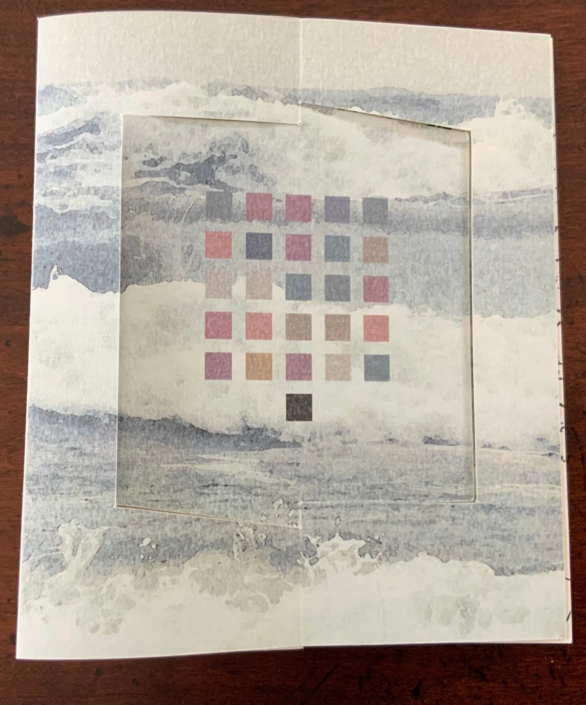
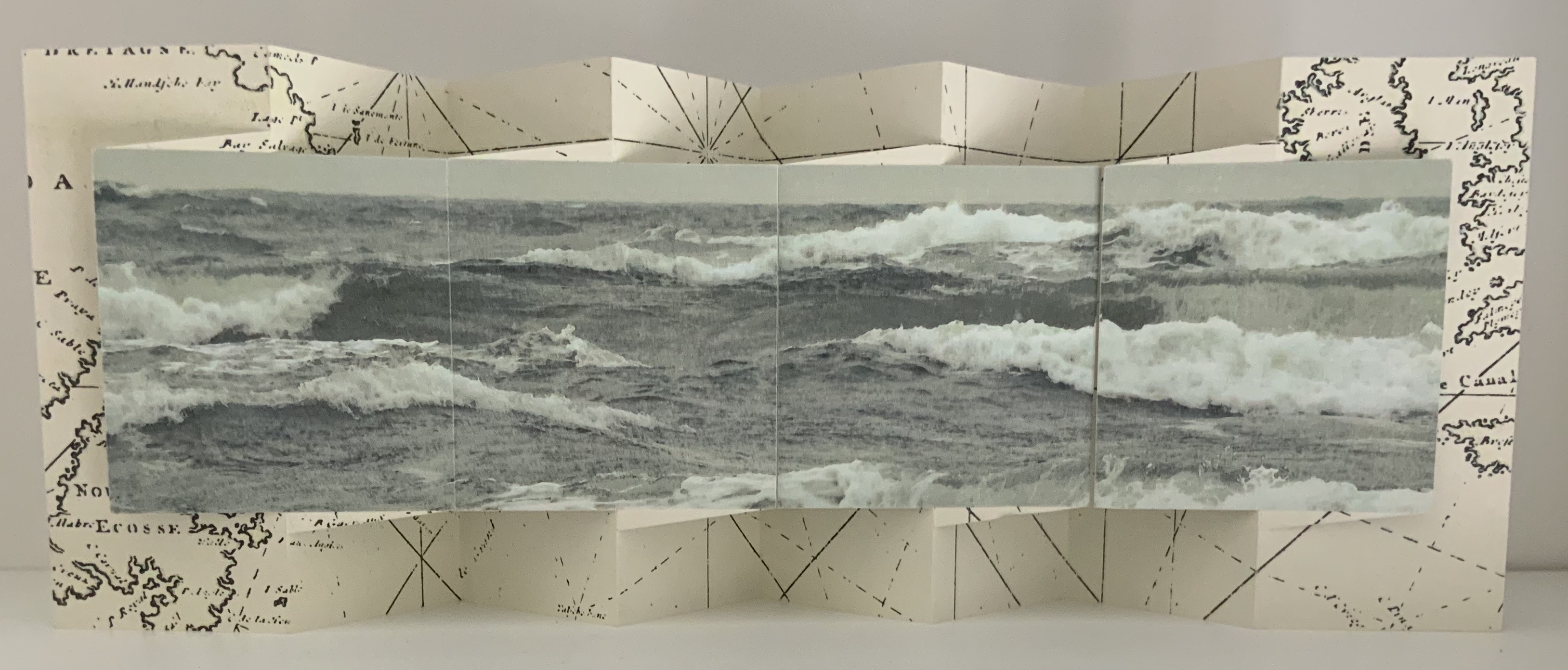
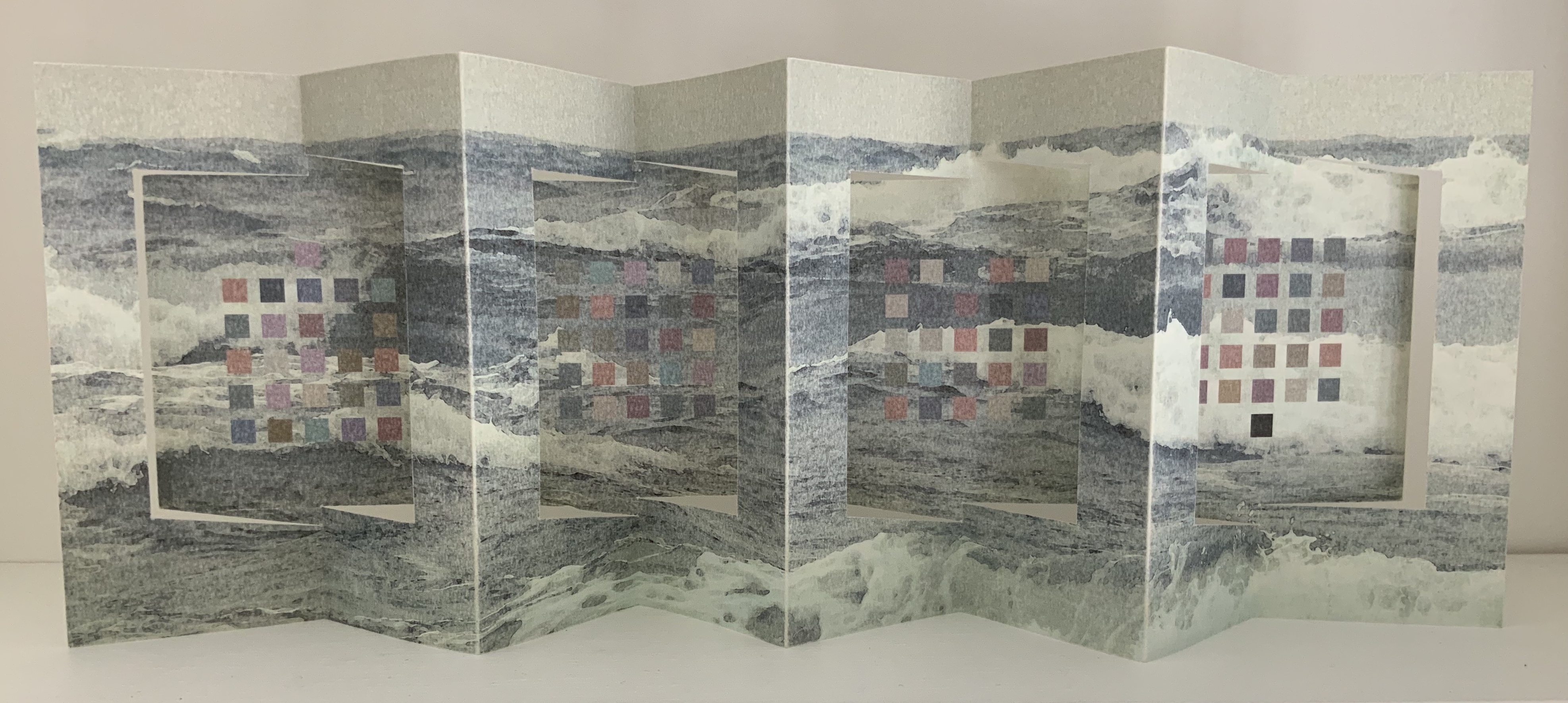
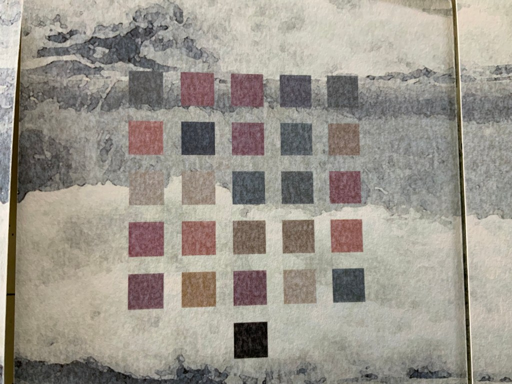
Westron Wynde (2016) Cathryn Miller Double-sided accordion with swing panel structure, 4 double-page openings, based on Hedi Kyle’s panel or panorama fold. In wrapper with slip and slot closure. Initialed and numbered by the artist. Edition of 6, of which this is #3.
Cathryn Miller, colophon: “Part of an ongoing series of works based on exploration of colour-graphemic synesthesia. This book presents the poem ‘Westron Wynde‘ in a purely visual form. Letters become colours, and are used as graphic elements. The book manifests the essence, if not the sense, of the poem.”
Westron wynde when wyll thou blow, The smalle rayne down can rayne – Cryst, yf my love wer in my armys And I yn my bed agayne!
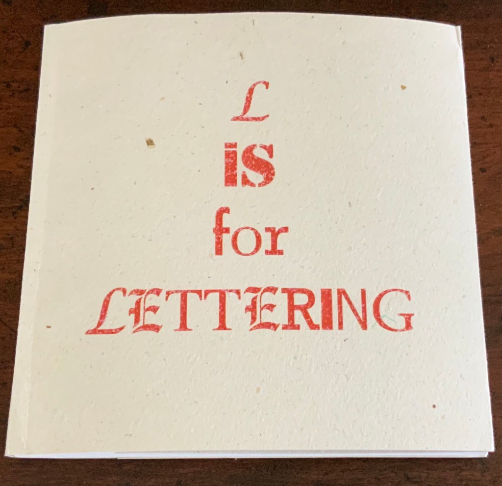
L is for Lettering (2011)
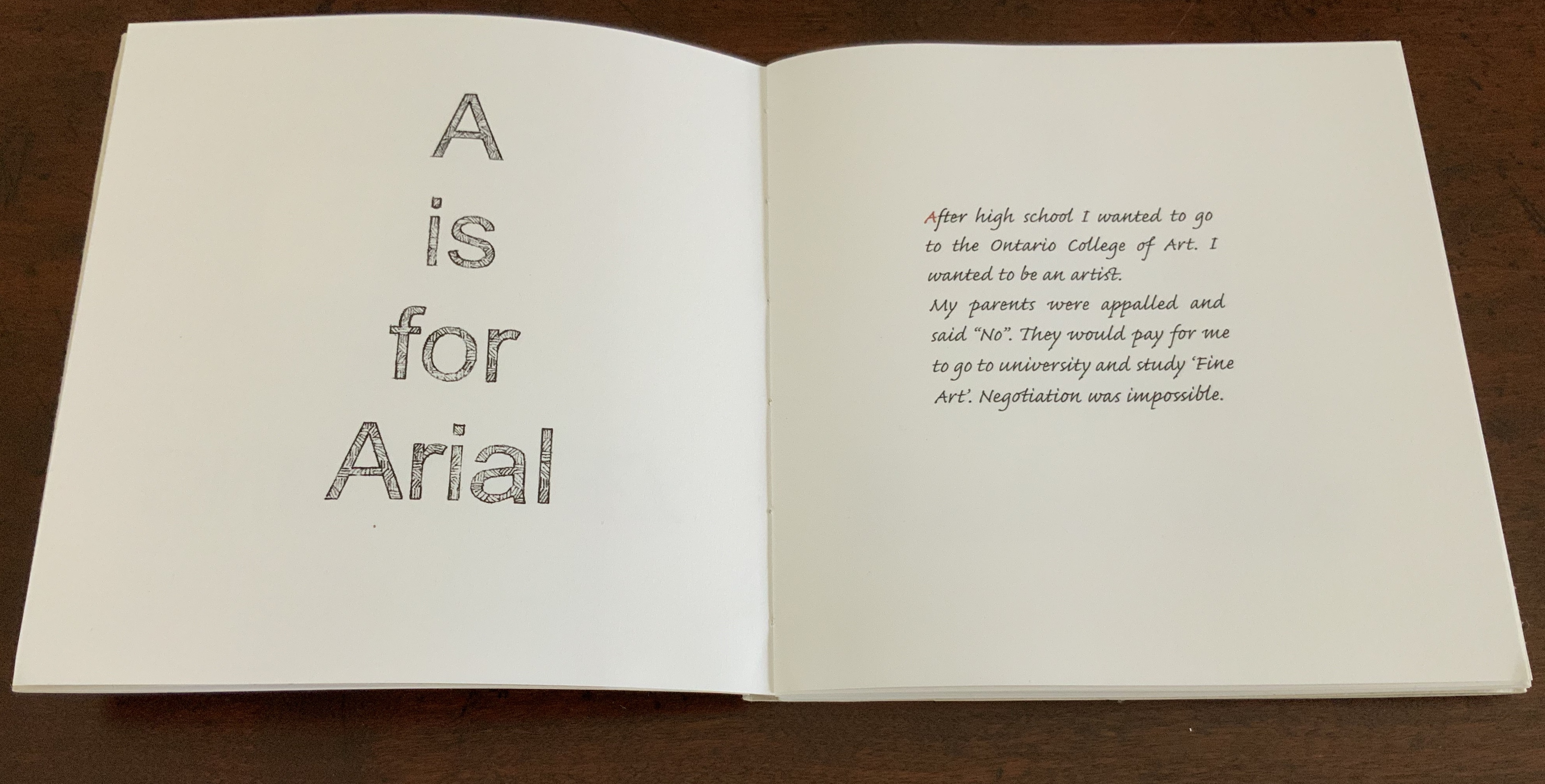
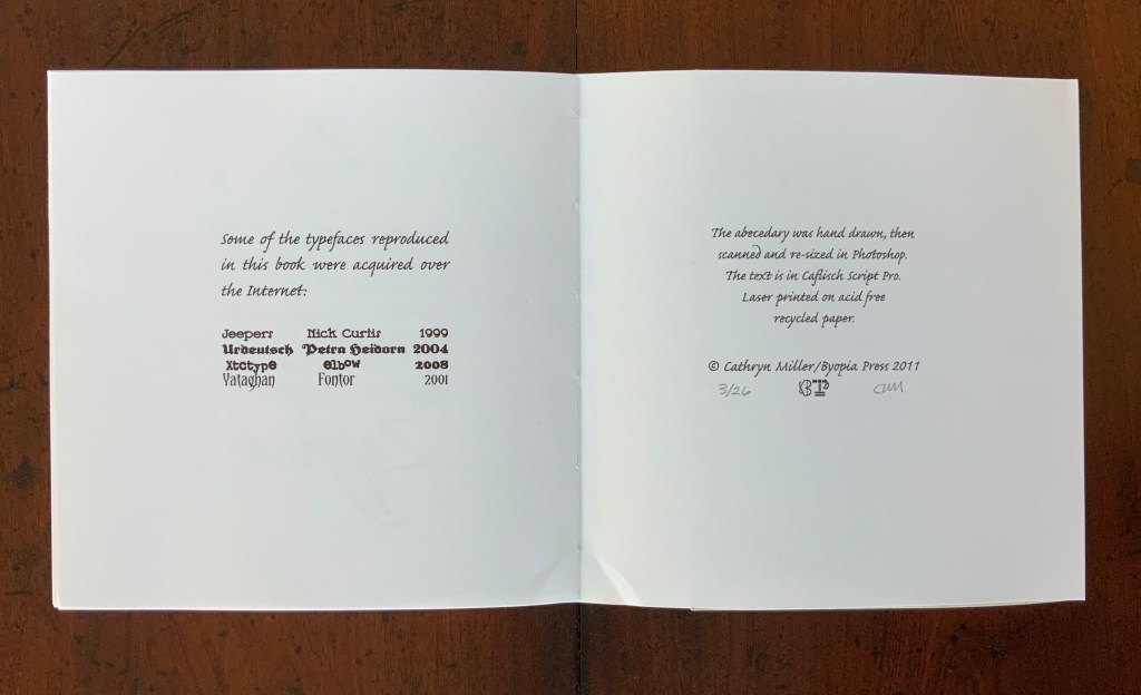
L is for Lettering (2011) Cathryn Miller Hand bound codex of 56 unnumbered pages. Laser printed on acid free recycled paper, hemp paper covers. The book was hand drawn, then scanned and resized in Photoshop. Text is Caflisch Script Pro. Hand annotated in red pencil. Edition of 26, of which this is #3. H160 x W158 mm
An alphabet book based on the artist’s personal struggle to become a practicing artist. Cathryn Miller: “The trials and tribulations of the art education process as recalled from a satisfactory distance after the author learns that everything is useful after all.”
Further Reading
“Lyn Davies“. 7 August 2022. Books On Books Collection. For Miller’s comment re Davies’ A is for Ox: “unable to resist this book when I saw it so it is part of my collection of books on letters and lettering. The use of a coloured initial letter on each page of my ‘L is for Lettering’ is a direct nod to the design of this book.”
“Ilka Van Schalwyk“. In progress. Books On Books Collection. A novel of color-graphemic synesthesia.
Chen, Julie. 2013. 500 Handmade Books. Volume 2. New York: Lark. Pp. 14 (Double Entendre), 414 (Tower of Babel).
Miller, Cathryn. 23 February 2020. “Almost There”, Byopia Press, Accessed 26 February 2020. The artist comments on L is for Lettering.
Miller, Cathryn. 22 February 2021. “Square Dance“. Video of talk and presentation for Sakatchewan Craft Council on the occasion of her solo exhibition at the SCC Gallery in Saskatoon, SK, from January 16 – March 06 2021.
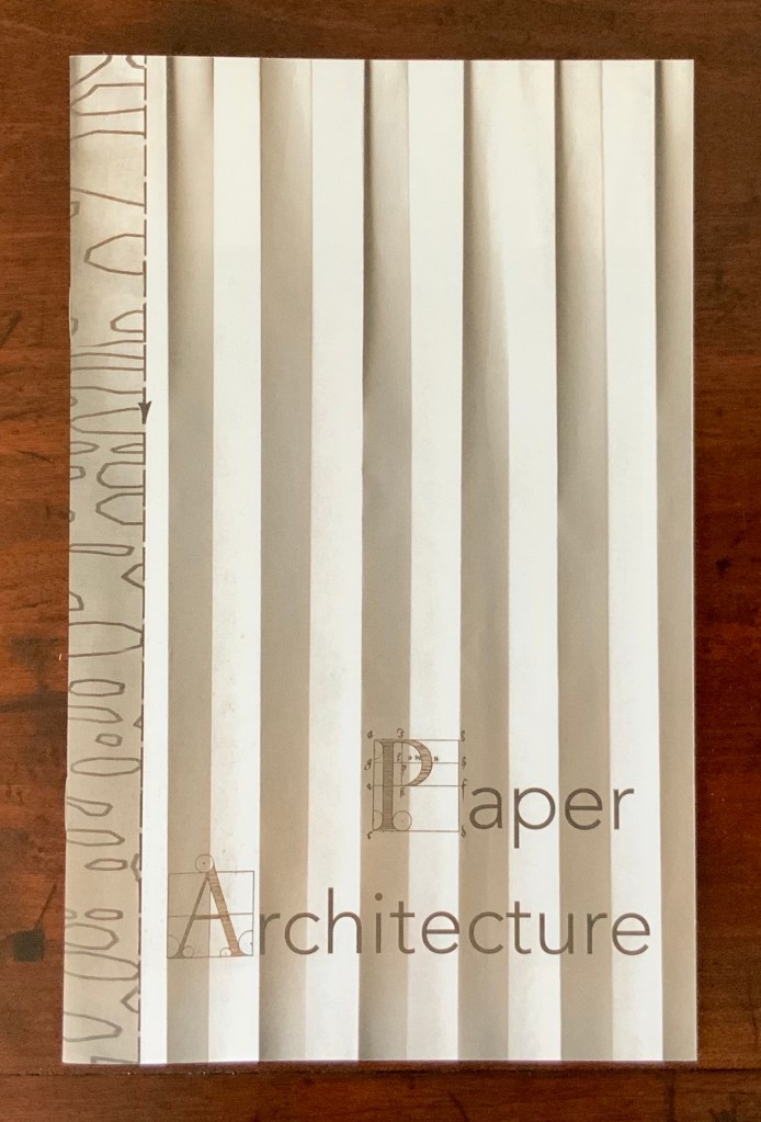
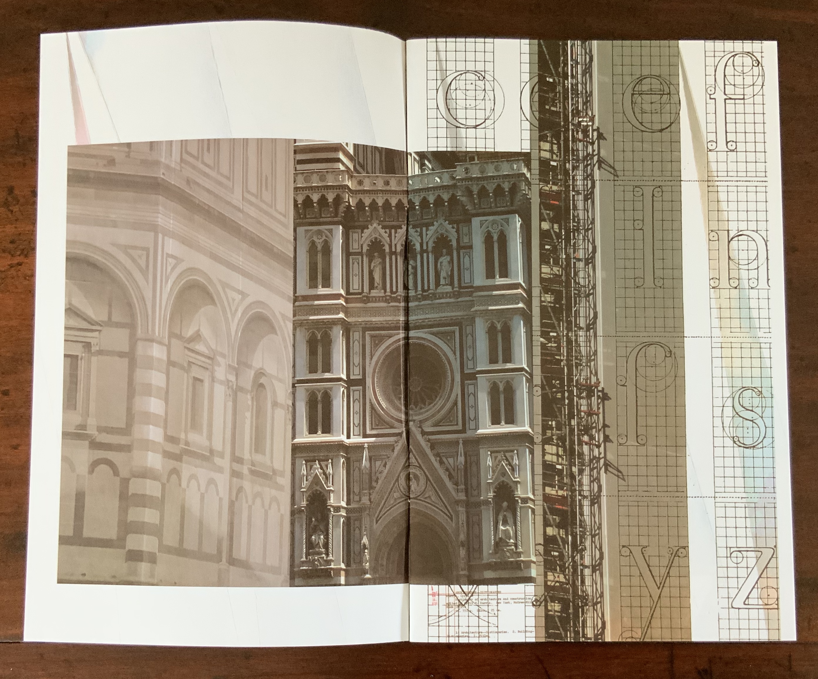
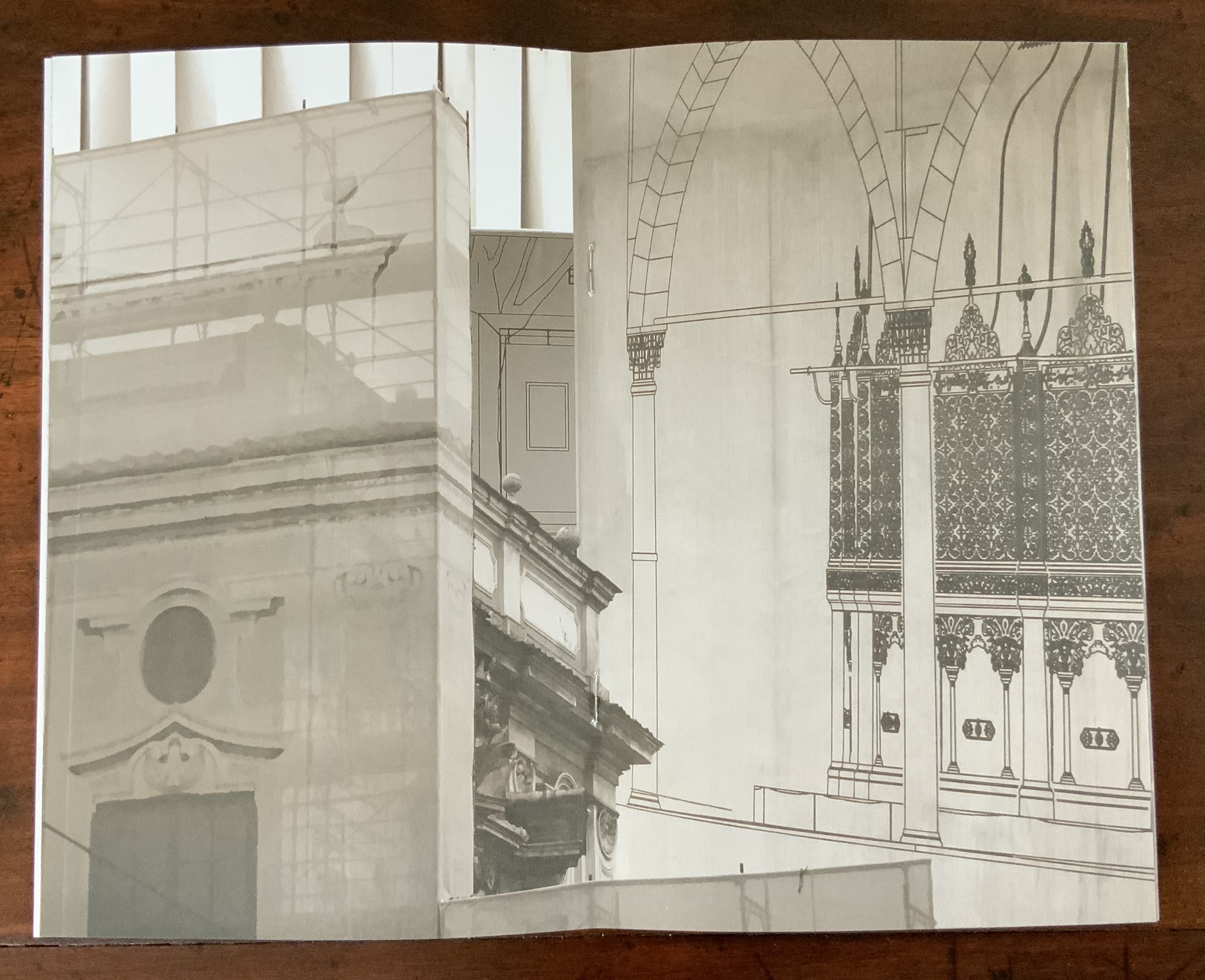
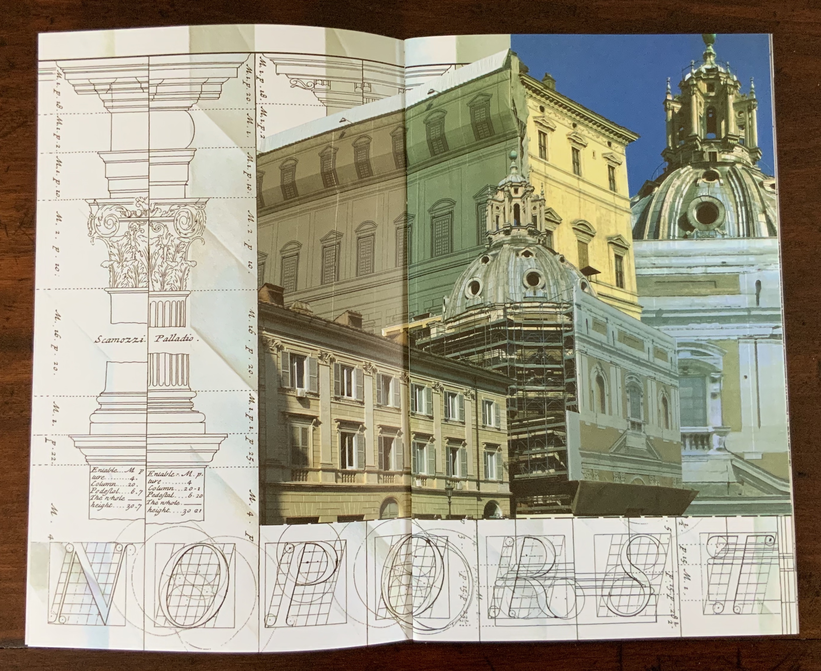
Photographic images by Karen Wirth from Ayvalik, Amsterdam, Florence, Istanbul, New York City, Rome, San Diego and Venice. The photos are collaged, and the work is based on an architectural installation at the Minnesota College for Art and Design that included a large-scale book. Photos of the book: Books On Books Collection.
Architecture has long played an inspirational role in Karen Wirth’s portfolio. In 2000, she designed the Open Book Gail See Staircase at the Minnesota Center for Book Arts and stations for the Hiawatha Light Rail, both in Minneapolis. In 2008, she produced Archidrawings, a series of collaged altered pages from the booklet, Architectural Drawings in the Bodleian Library.
More recent is Archabet: An Architectural Abecedarium (2025) on display in the Outlook Gallery, Minnesota Center for Book Arts, 12 April – 8 June 2025. A 6-foot high drum leaf bound book, its collage of digital photographs of building façades taken over 20 years of travel, showing details and structures that mimic letter forms, surrounds extracts from Johann David Steingruber’s Architectonisches Alphabet (1773). This alphabet book of cityscapes takes up the gallery’s street-level window inviting the viewer into the space of the book.
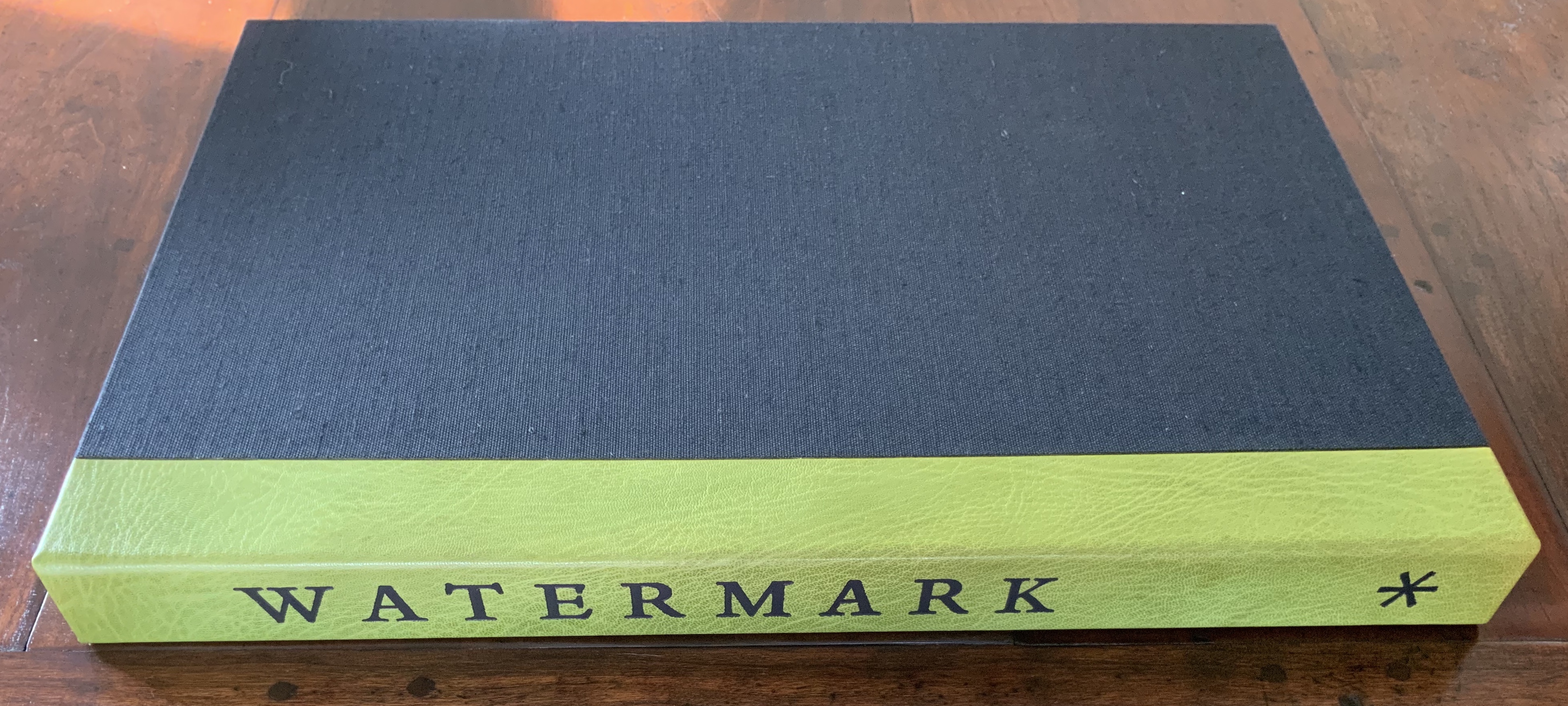
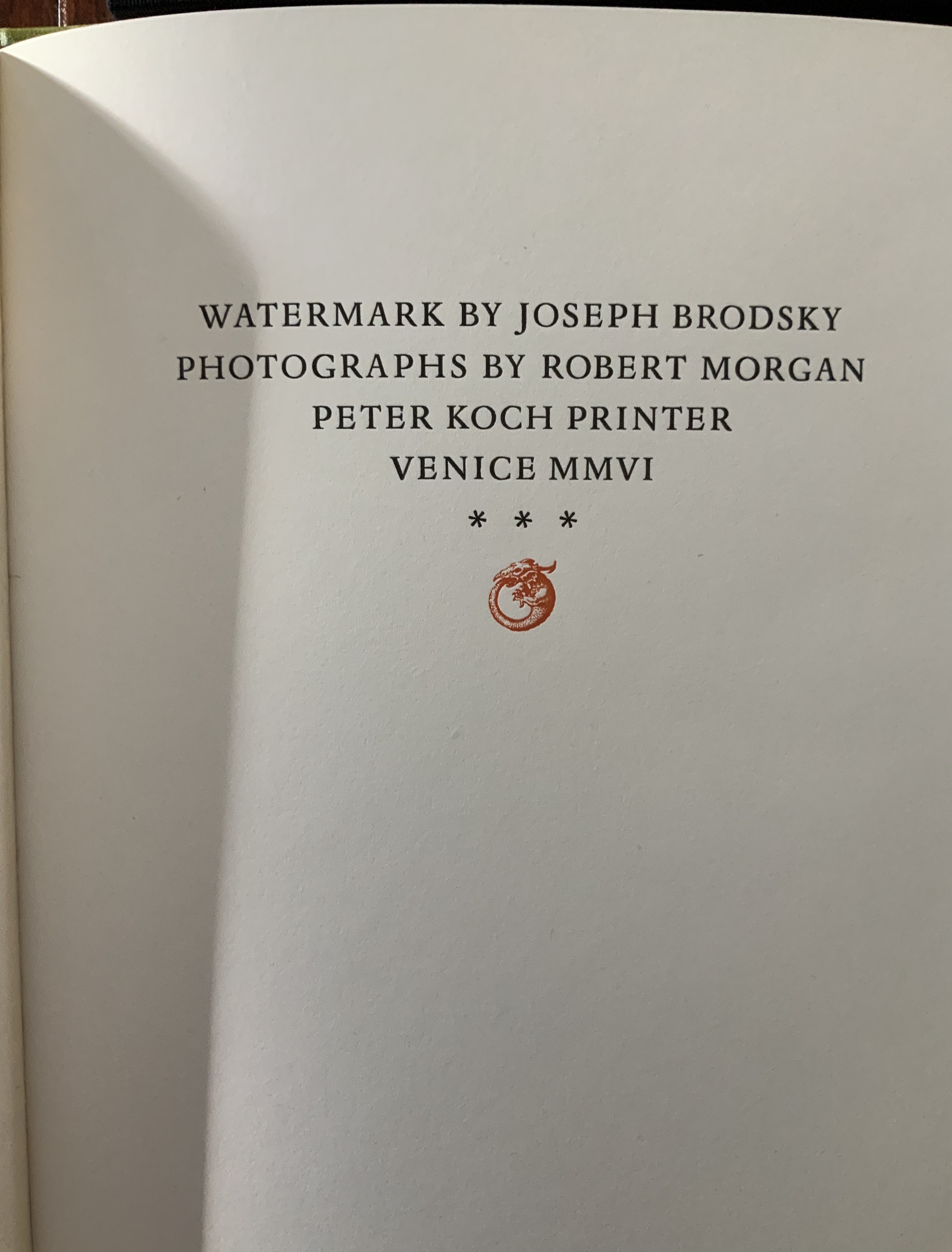
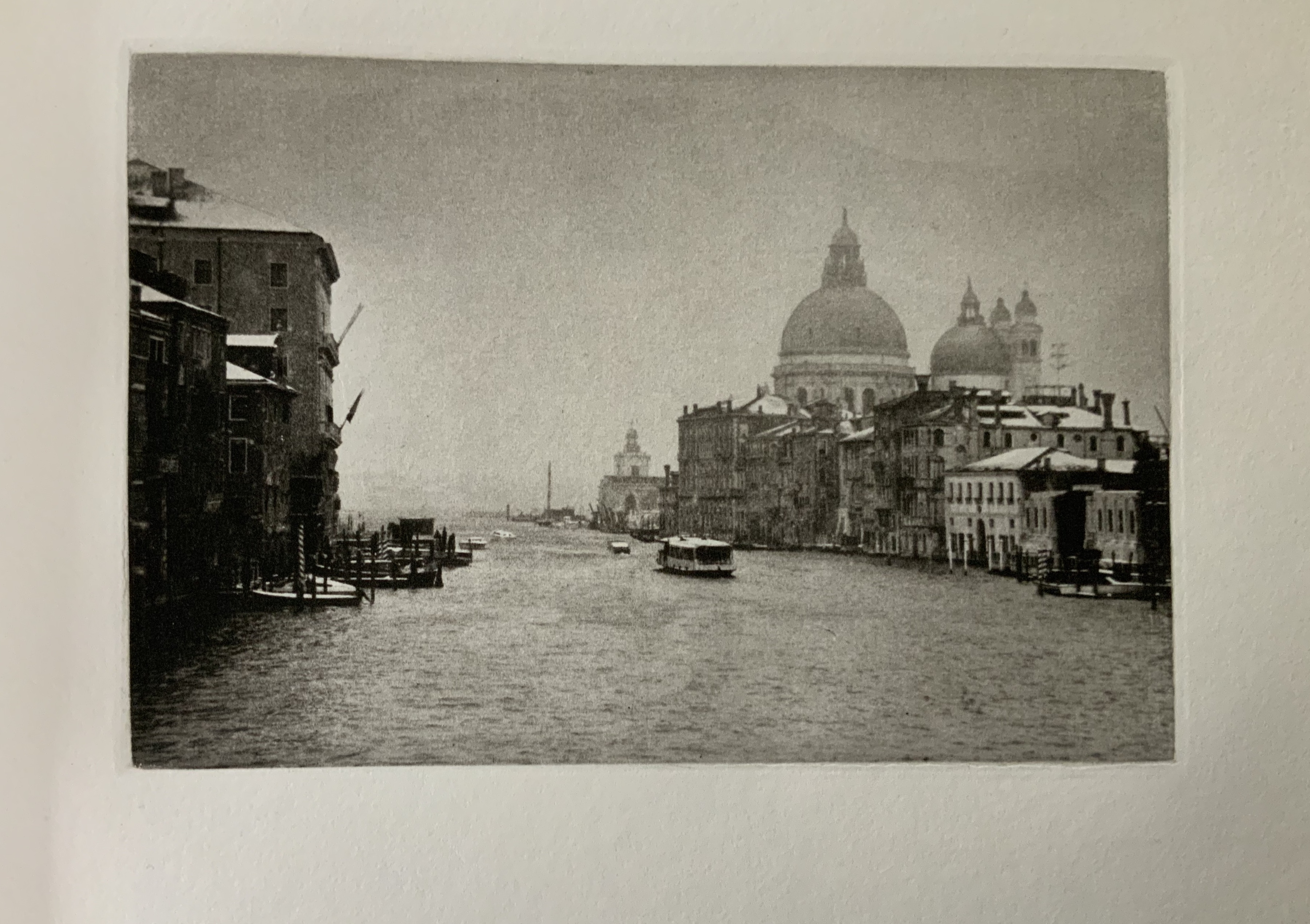
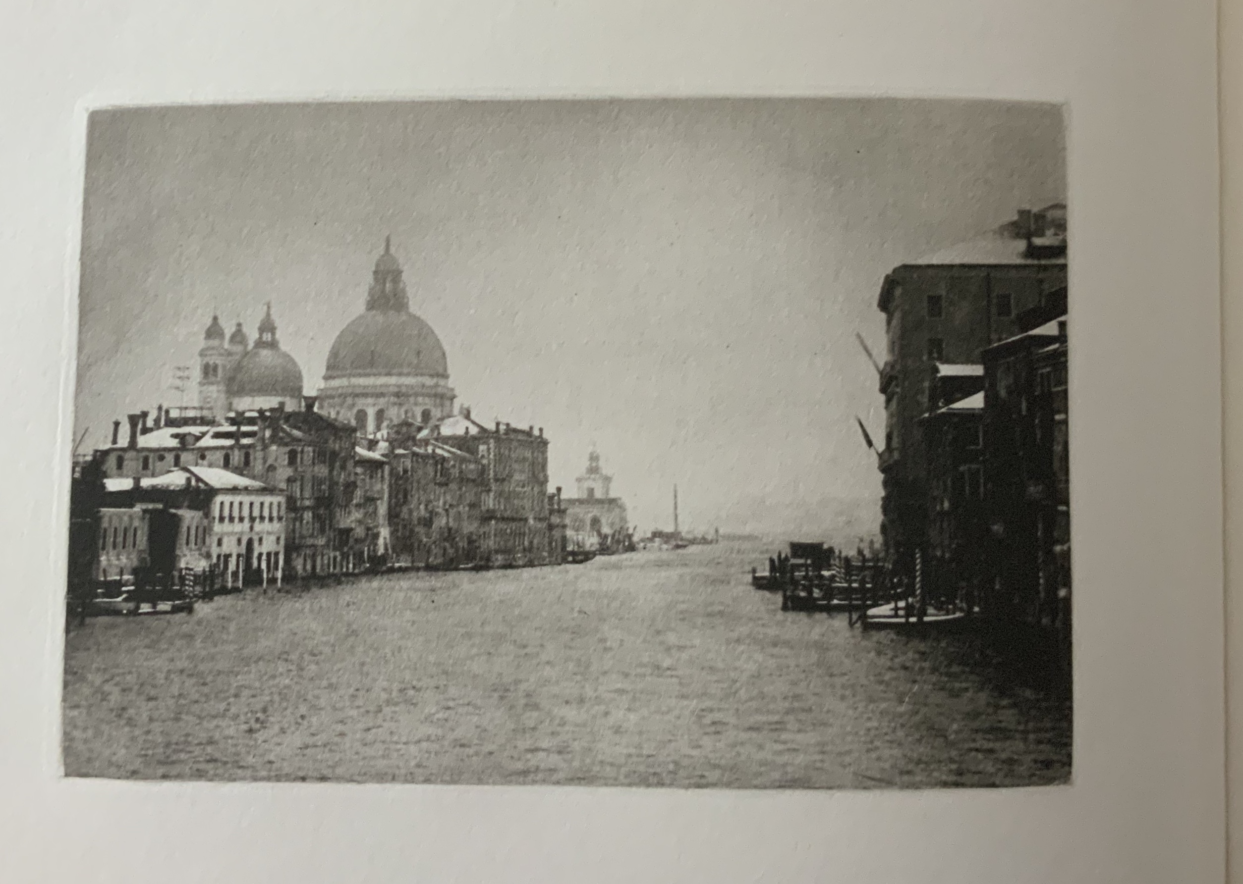
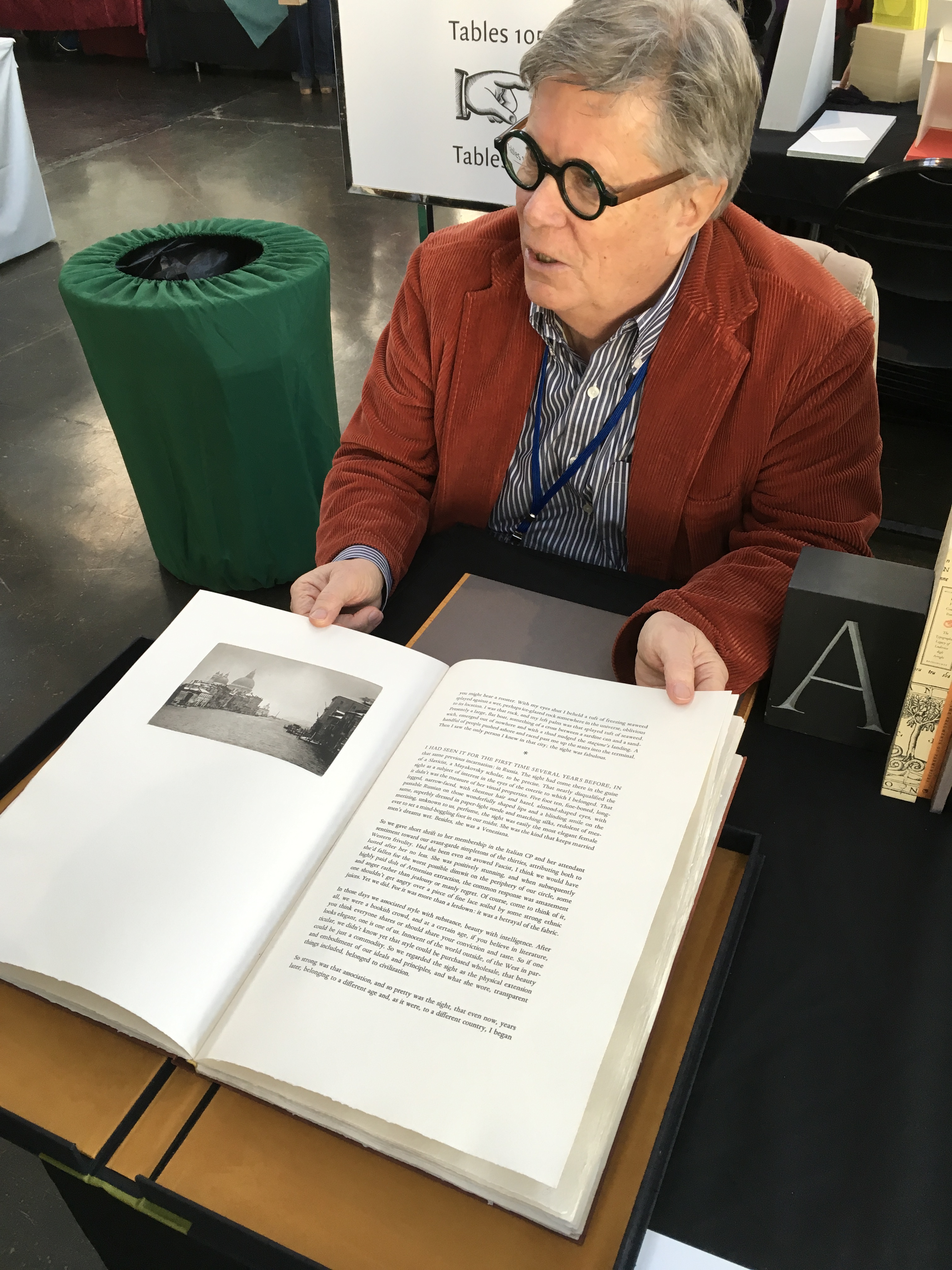
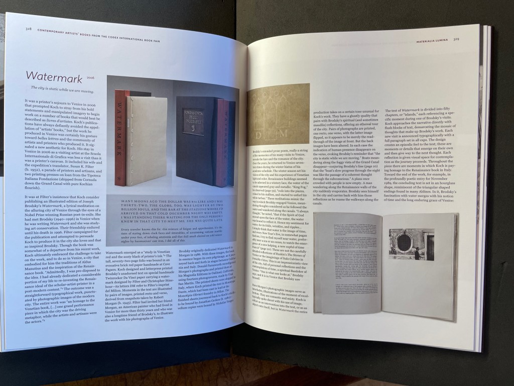
Joseph Brodsky dedicated Watermark to his friend the American painter, Robert Morgan who has lived in Venice for more than 30 years. Koch celebrates Brodsky’s evocative text with this artist’s book, illustrated with 14 photogravures made from Morgan’s original photographs.
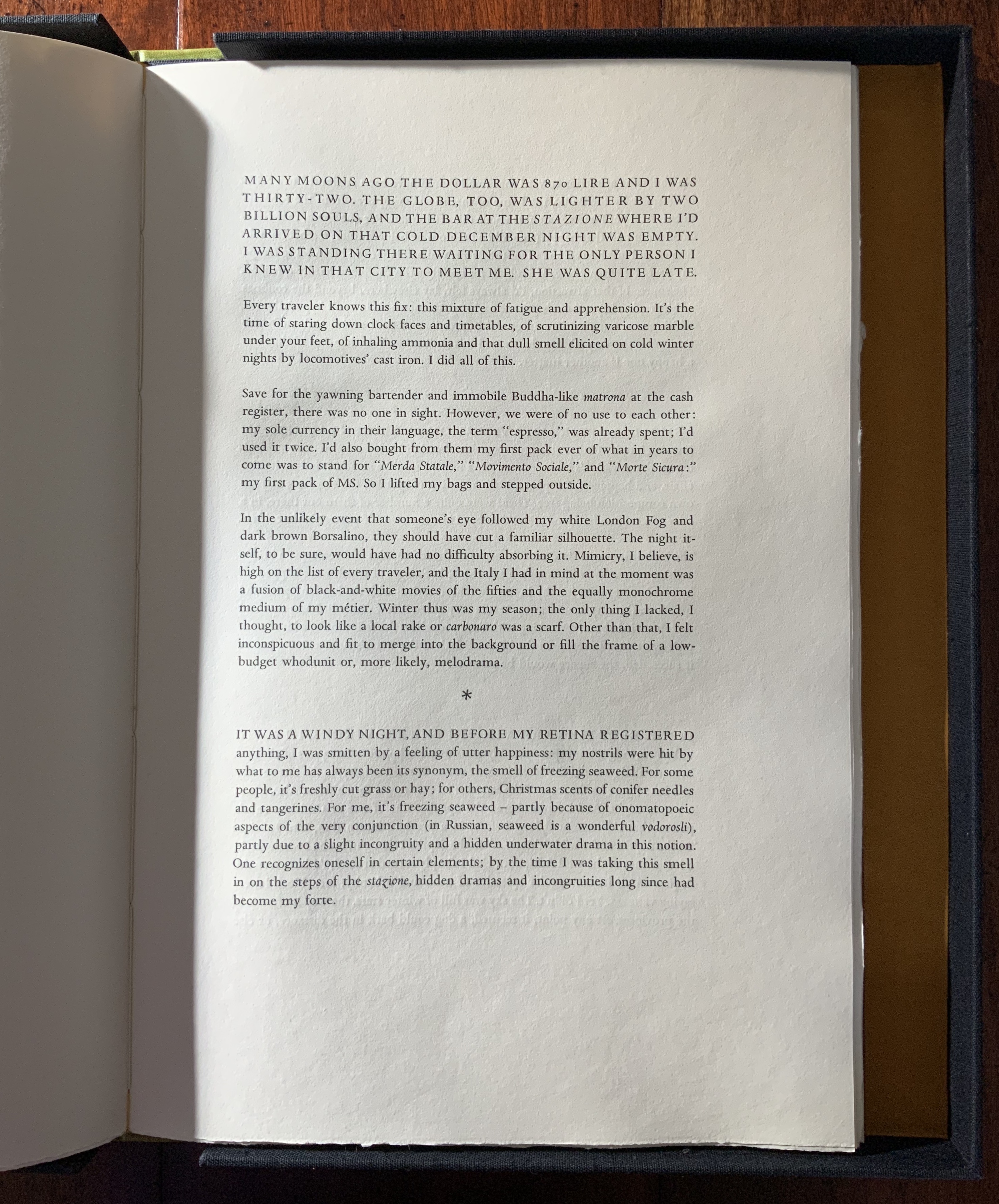
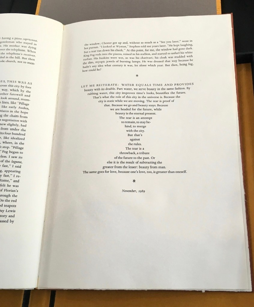
While Koch was artist-in-residence at the Scuola Internazionale di Grafica Venezia, a printing press was imported from the Tipoteca Italiana Fondazione printing museum to produce this work. The paper is Twinrocker “Da Vinci” handmade, with the Koch firm’s watermark designed by Christopher Stinehour and Susan Filter. The edition is limited to fifty copies. Copies numbered 1 to 30 are bound Venetian-red hand made papers and housed in a clamshell box. This copy was acquired 31 July 2019.
Donald Farnsworth digitally reconfigured Morgan’s photographs and printed them at his Magnolia Editions in Oakland, California from photogravure plates made by Unai San Martin. The printed sheets were then shipped to Venice.
The text was set in Monotype Dante types cast in lead at the Olivieri Typefoundry in Milano. Once the printing at the Scuola Internazionale di Grafica Venezia was completed, the sheets were shipped to Koch’s studio in Berkeley where the book was bound in richly pigmented papers made by hand at Cave Papers in Minneapolis, MN.
Dimunation, Mark. 2022. “Peter Koch“, in Materialia Lumina : Contemporary Artists’ Books from the CODEX International Book Fair. Edited by Elizabeth Fischbach and Nann Parrett. Berkeley, California: The Codex Foundation.
Koch, Peter. Talk at The Book Club of California on the occasion of his exhibition “KALOS: in search of Herakleitos and Parmenides” June 2006.
Koch, Peter Rutledge, Michael A. Keller, Roberto G. Trujillo, Mark G. Dimunation, Timothy Murray, Nina M. Schneider, Rick Newby, et al. Peter Koch printer: embodied language and the form of the book (Stanford, CA: Stanford University Libraries, 2017).
Universal Sample Edition of 4, all copies signed by Diane Stemper. The book consists of etchings and letterpress on Rives BFK paper, and monotype print (accordion / concertina spine) on Arches Cover. Universal Sampleis part of a larger series of artist books and prints inspired by Charles Darwin, science and evolution, and specifically by historic specimens found in the Huntarian Museum at the Royal College of Surgeons in London. Universal Sample presents a progression from early life forms to a final molecular disintegration. The first image shows an undefined form, teeming with nascent life. The second image features a frog dispersing a multitude of eggs. The images then move to ‘chance order’ – a slight nod to religion and the Christian notion of the Trinity – and to ‘moment decay’ depicting asplayed life form, hinting at its inevitable death. The final images, ‘vestigial,’ depict decomposition and a return to a vague molecular presence. All of the forms are placed within a universal space that is beyond the earthly space that we inhabit. Universal Samplewas printed at the Dayton Printmakers Cooperative and bound at Plat 21 Studio.
Compendium of FactSeries
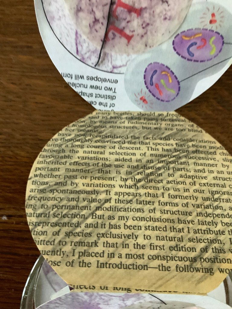
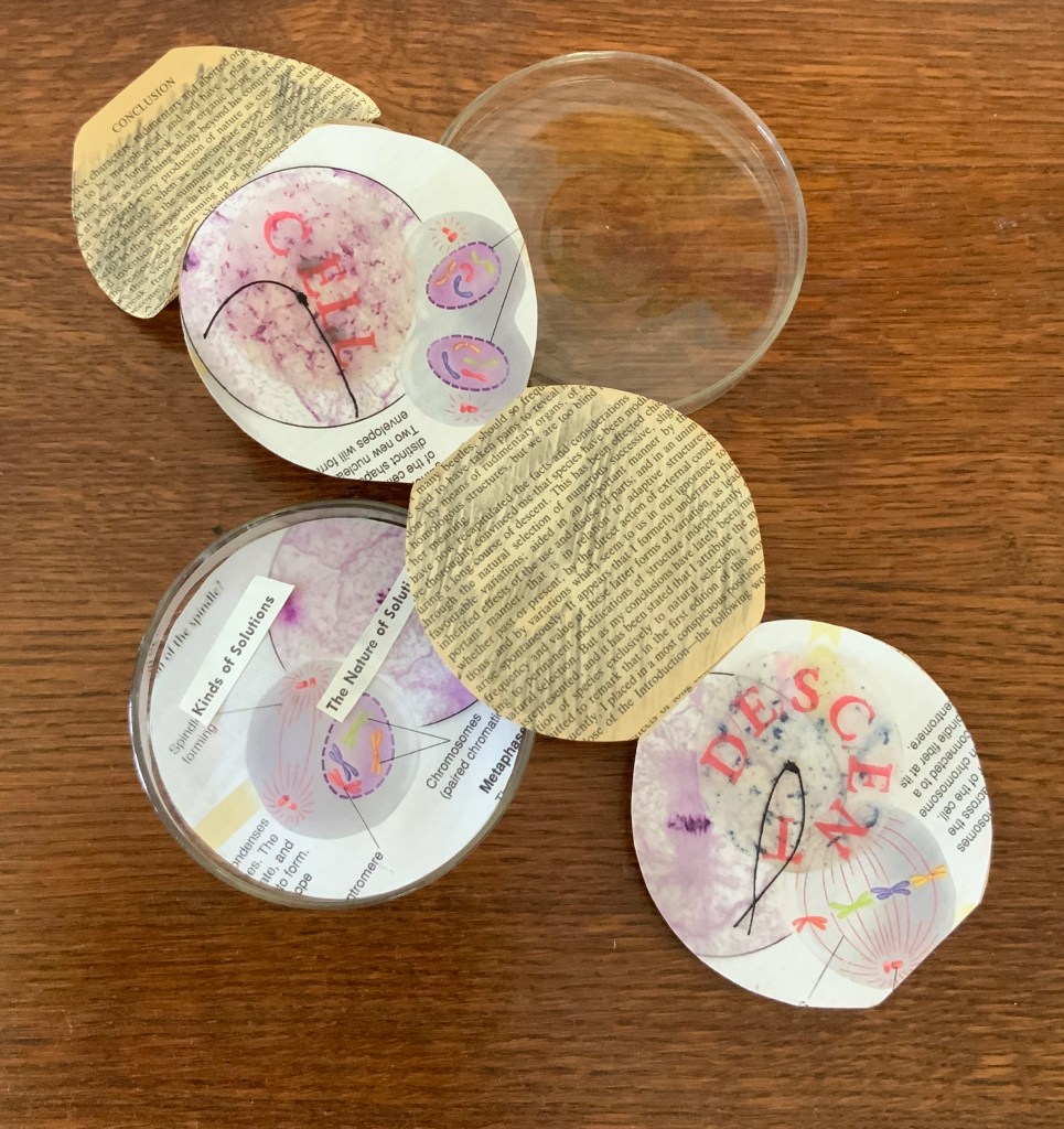
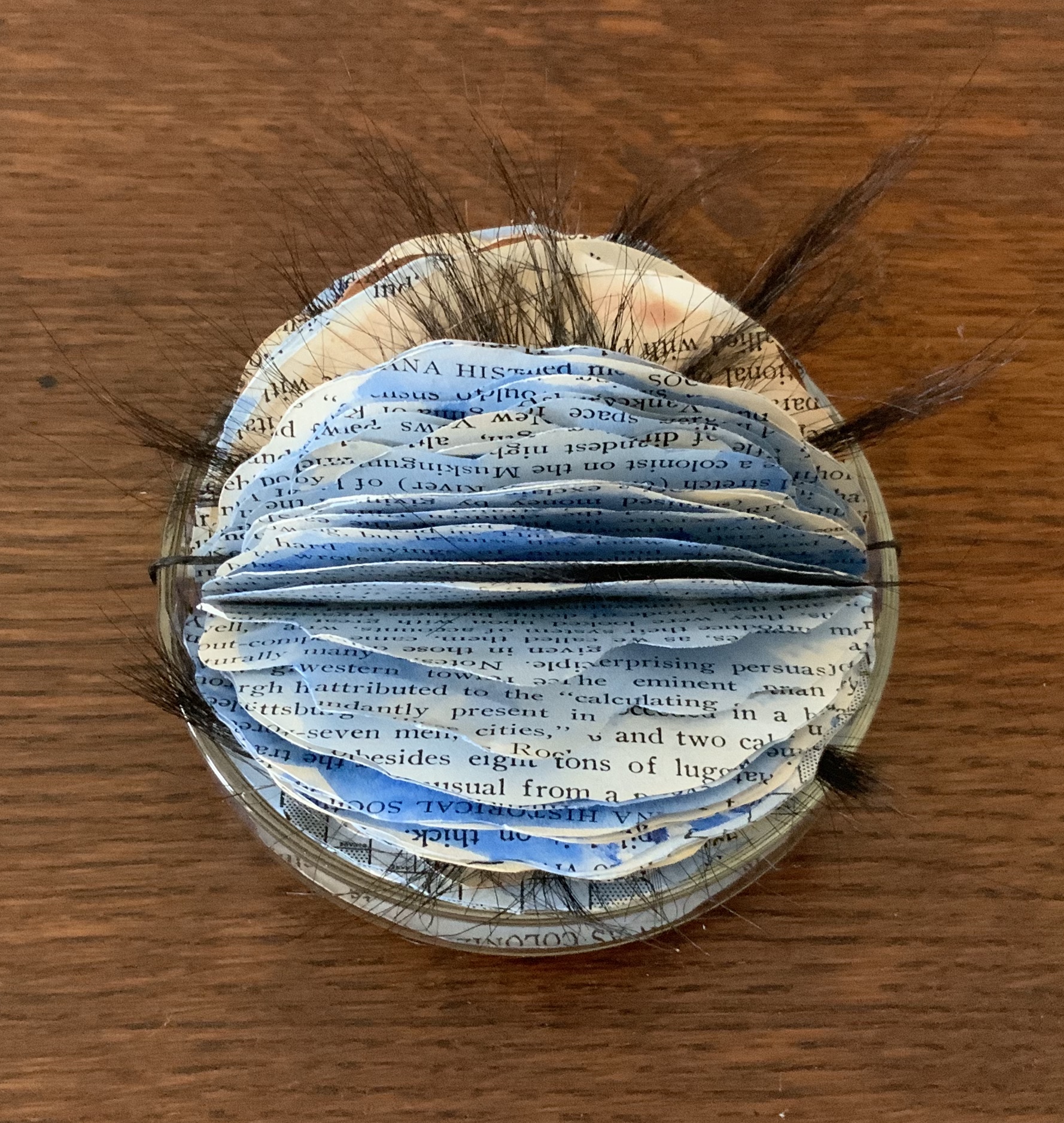
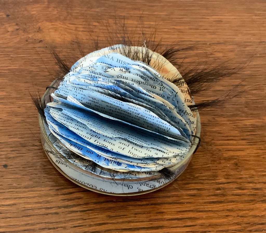
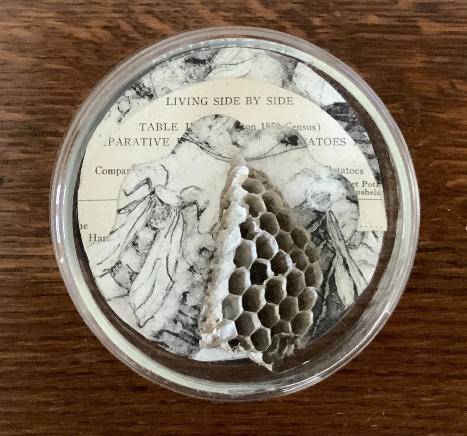
Cell, Original Cell One-of-a-kind signed by Diane Stemper. An accordion book made with found text from On the Origin of Species by Charles Darwin, and from discarded classroom science texts. Compendium of Fact: Cell, Original Cellis the first in a series of what is now (2019) approximately 100 Cell books created for Compendium of Fact. In 2009, it was part of an installation of 25 Cell books celebrating Charles Darwin’s two hundredth birthday. Cell, Original Cell comments on the notion of heredity, evolution and the structure of living things and how they came to be.Cell #40 One-of-a-kind signed by Diane Stemper. Repurposed text and pages from a paperback version of On the Origin of Species by Charles Darwin. Reshaped pages hand colored with watercolor, horse hair and housed in a petri dish. Perfect binding onto linen tapes. Signed and numbered on back. Cell #40 is part of larger series of artist books built into petri dishes entitled Compendium of Fact inspired by Charles Darwin’s 200th birthday and the cultural conversation surrounding evolution.Bee Ripe Collecting / Cell #7 One-of-a-kind signed by Diane Stemper. Discarded science text, intaglio print, portion of a dried natural wasp nest housed in a petri dish. Bee Ripe Collecting / Cell #7is part of a grouping of seven petri dish books and is part of the larger series Compendium of Fact. Bee Ripe Collecting was inspired by an old, large Linden tree located on Stemper’s property. Each June hundreds of bees visit the tree as it flowers. Stemper made Bee Ripe Collecting to honor the hard-working bee and the tree that brings bees together each summer. The wasp nest alludes to a bee’s hive and was used in the work for its hexagonal form.
The 20th century poet Ezra Pound espoused the view that the best way to understand and critique literature was by juxtaposition of works from different periods. Here is an attempt at that approach applied to the art of Jukhee Kwon and John Latham, but the critic might have better selected Kwon’s Libro Libero (2013) to make the point about “releasing … energy and celebrating freedom”. Kwon’s own thoughts about Libro Libero lead in a different direction though.
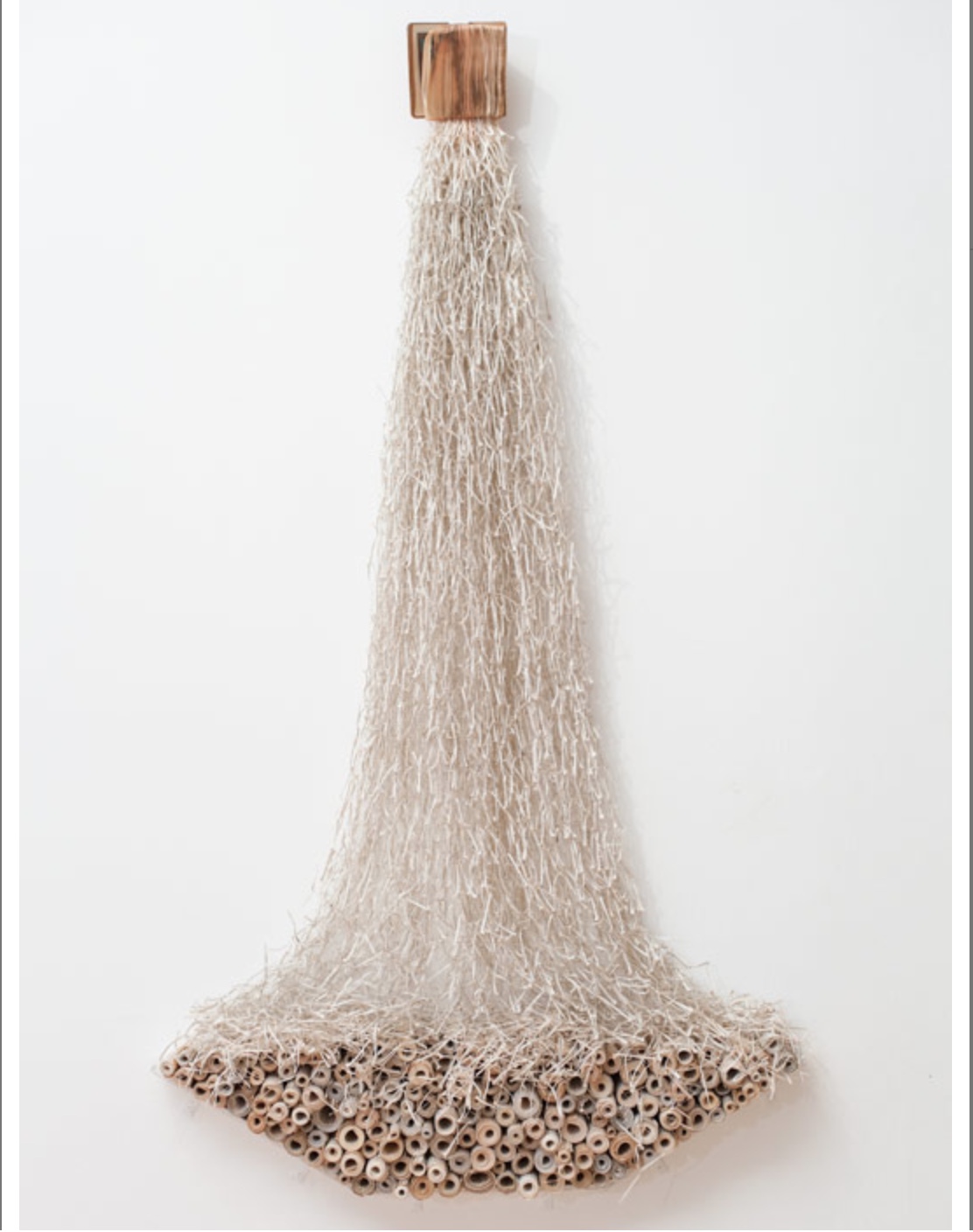
Libro Libero (2013) Jukhee Kwon Photo: Jonathan Greet
The work of Libro Libero was done with a Christian nun’s book. I am not so religious a person, but I understand that religion is about life. How we come and how we live and how we die. And every belief has a strong link with something invisible and oneself visible … (we live in the body) … you can say the connection between the soul and body.
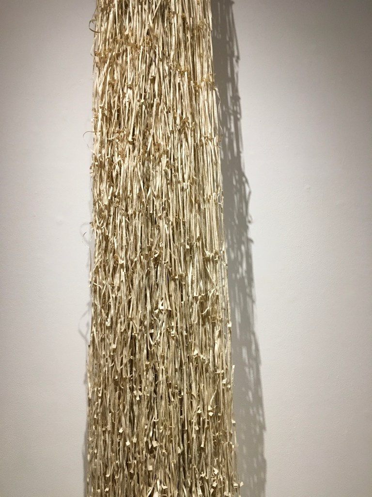
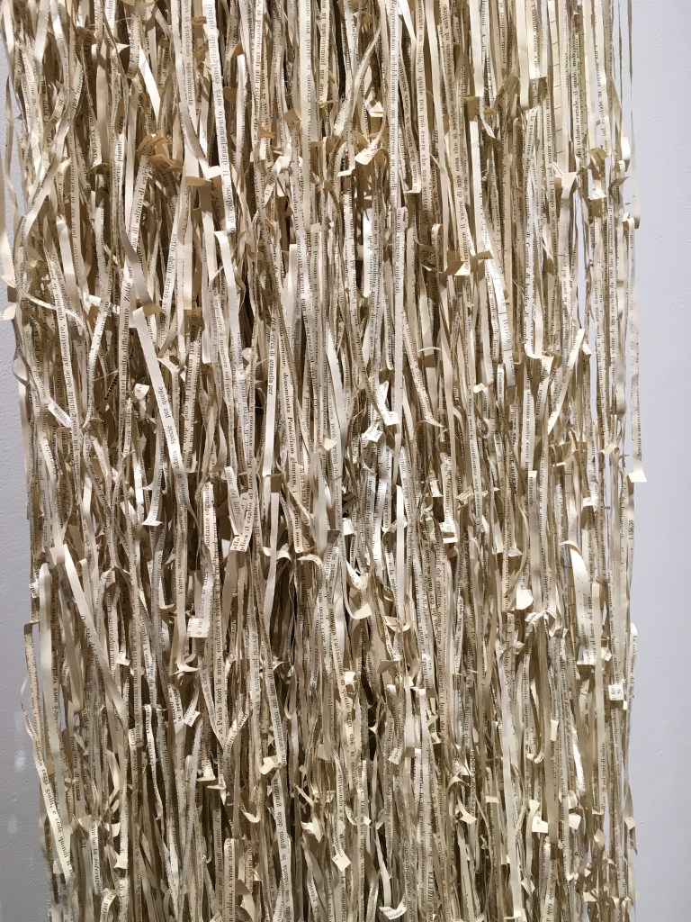
So I made the bookwork to be producer and receiver. Pages are coming out (producer) and the scrolled papers are below them (receiver). The shredded paper is falling and settling on the scrolled paper boat (it looks like a boat or if you will a bowl). The falling paper is fragile but in the boat or bowl it becomes solid and safe.
Email to author, 26 September 2018, edited for brevity.
At the October Gallery in London in January 2019, I had the chance to see a similar bookwork. The difference drives home the use of the book as material — like clay or stone for sculpture, oils or watercolour for painting. But it is freighted, manifold material.
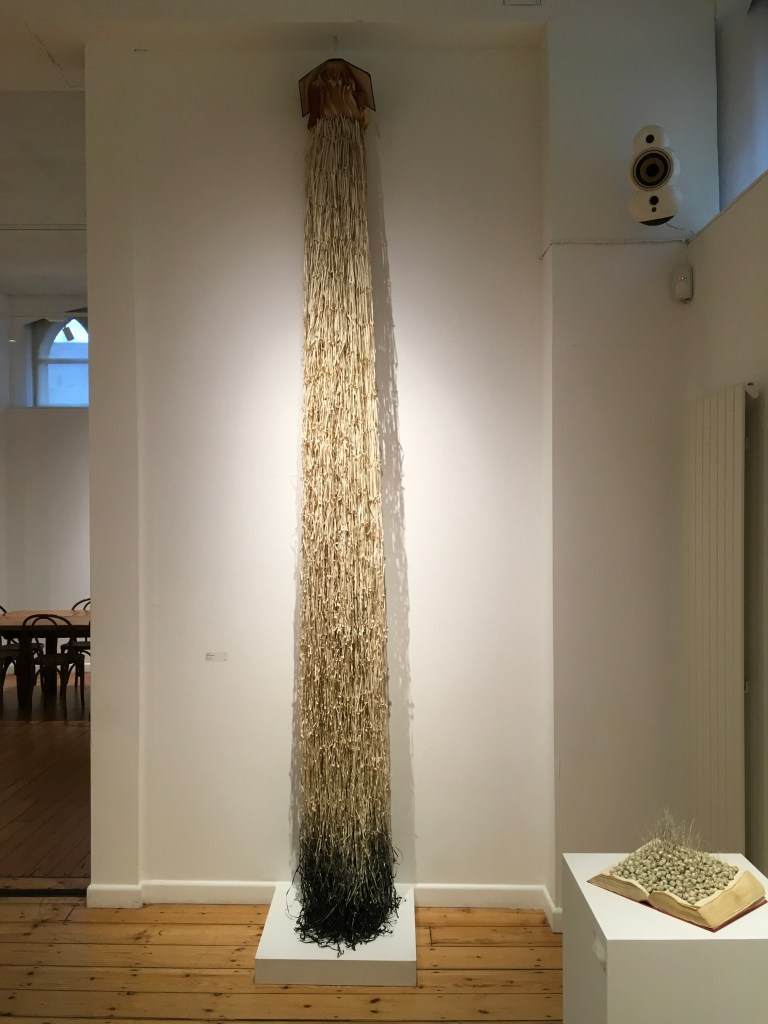
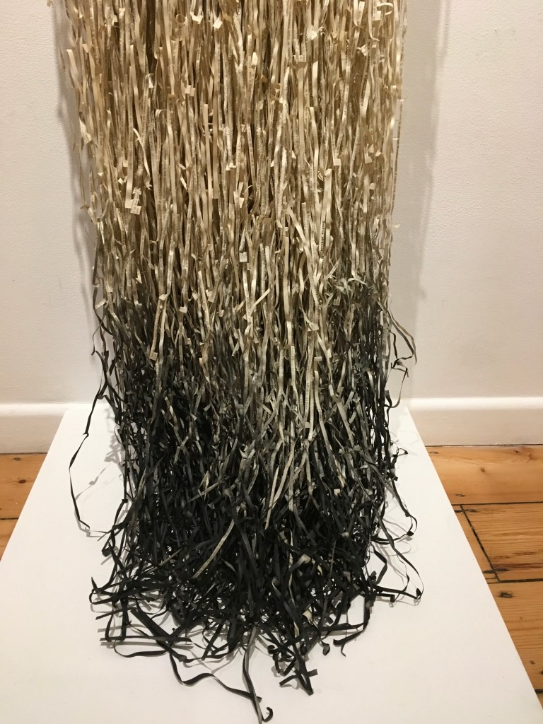
Dipping into Darkness (2013) Jukhee Kwon Photos: Books On Books
It brings paper, cloth or leather, and ink; it brings content. As in Libro Libero, Kwon turns another book into an active composite — the covers opened to spill out pages, cut and braided into ribbons, the last of which have been dipped into ink. Or, per the title, is it the covers opening, the pages unravelling and braiding, the ink of the words draining into a pool of darkness into which the ribbons are dipping? Rather than the lighter spiritual association suggested by the former’s title, shape and action, Dipping into Darkness implies a blacker interpretation. Or perhaps that is too Western a perspective. Is the breviary at the pinnacle of the work the result of the brush-like shape’s dipping into the ink of contemplation?
If the chance to view and contemplate Kwon’s art arises, take it.
Chance and necessity are the twin foundations of Darwinian evolution – the ultimate creativity. What artist doesn’t aspire to working with divine and cosmic forces – with the bedrock of evolution or creation? Things happen as they must – as the dance of the DNA dictates and as pure raw survival cements into place. You set up your experiment and the immutable laws of causality are set into motion.
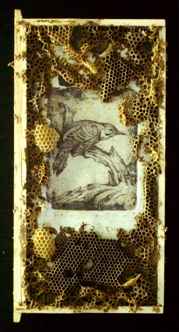
You see before you my two interests combined: The etchings are made in the usual way, but then I insert them into the hive for bees to add the next layer. Sometimes they chew up my artwork and pitch it out of the hive alongside their excrement and dead. At other times they join forces with me to co-create. If I cover my work with a thin translucent layer of melted bee’s wax, it smells familiar and they tend to accept it. If I attach some burr comb, they seem to like that even better and often initiate work right there – adding to it or recycling it and moving it around. Let them go long enough and they’ll cover it all with capped honeycomb or perhaps they’ll chew it all up. Take it out at just the right moment and the results can be an unpredictable collaboration of sublime beauty.
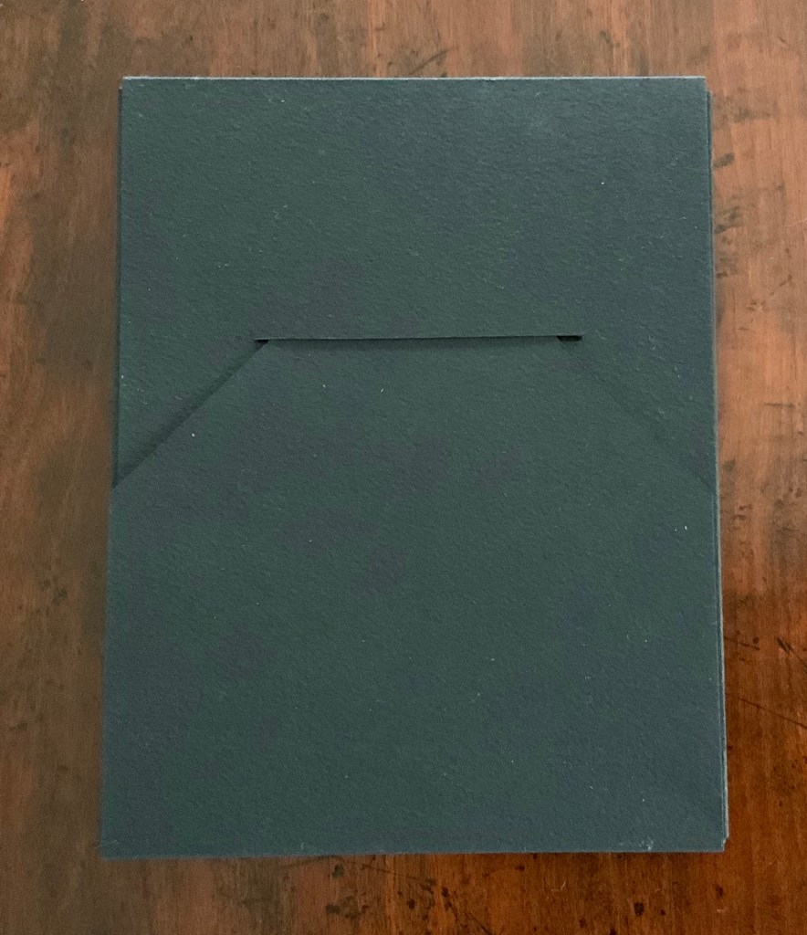
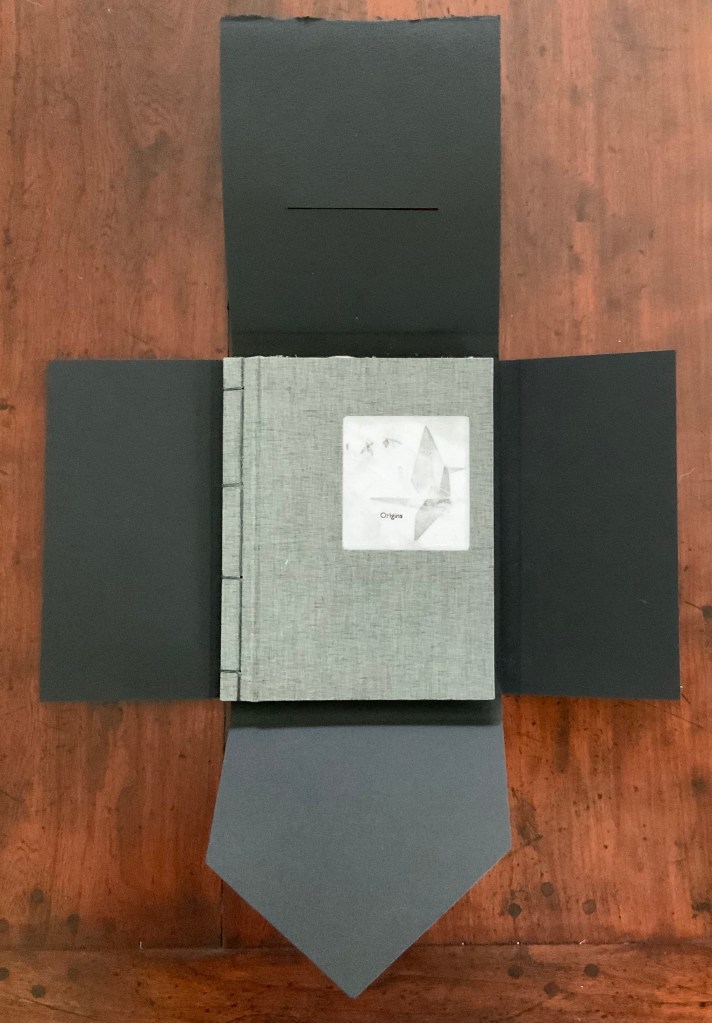
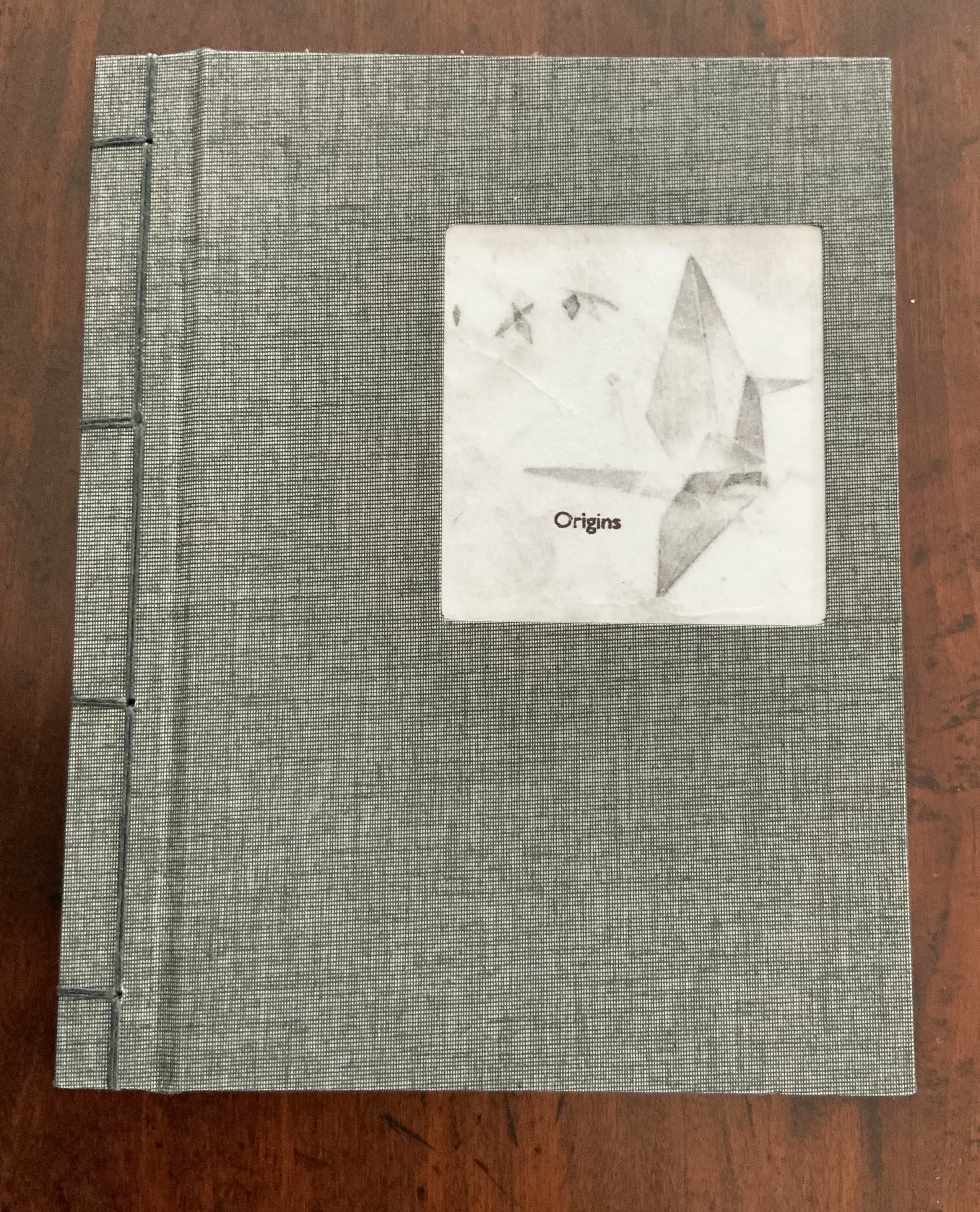
Printed and bound in an edition of 7 copies, of which this is No. 4 and signed. Carbon paper pressure prints from collograph plates, pochoir and silkscreen on Kozo. Bound in four-hole Japanese stab binding covered in black/white Duo cloth with doublures of Arches Cover Black. Encased in Arches Cover Black, two pieces glued perpendicularly, one trimmed to form a slot and tab closing. Encasement H197 x W153 mm. Book H193 x W152 mm closed and H193 x 1007 mm open.
The British Library and Maggs Bros Ltd (with Designer Bookbinders) have separately delivered a profusion of book arts and book art events for the month of May: from the BL, talks associated with the exhibition “Writing: Making Your Mark” and the series “Artists’ Books Now”; from Maggs Bros and DB, workshops and displays associated with London Craft Week (8-12 May).
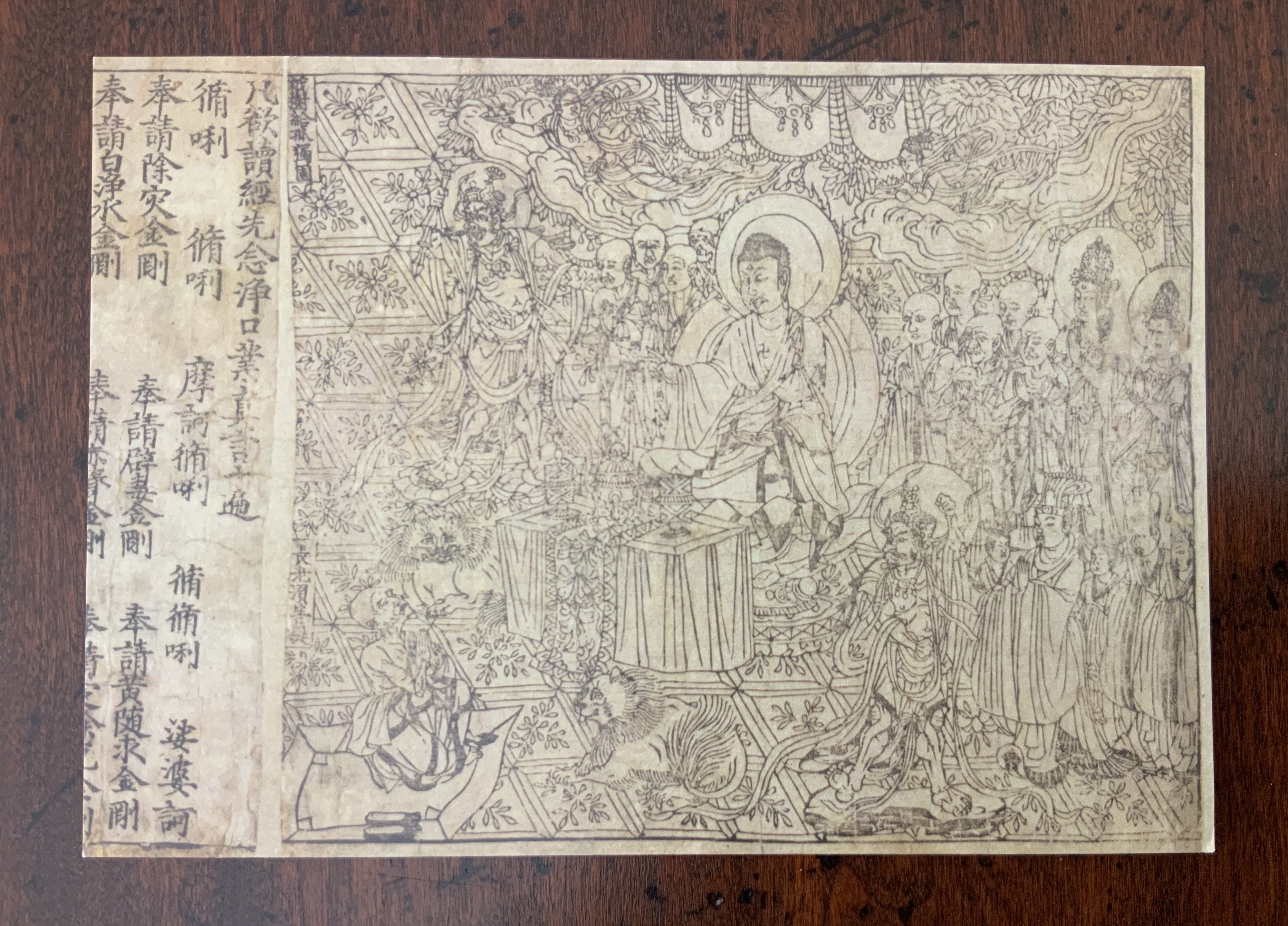
At the British Library, I peered through the glass at the Diamond Sutra (868 AD). The distinctiveness of the portraits and the density of the carving rival that of 15th century Renaissance frescoes and Durer’s prints. Even if photography had been allowed, the vitrine and lighting would not permit my camera to capture the details, and reduced in size from the original, the postcard below barely does. Alternatively, a visit to the BL’s website yields a zoomable image by which you can judge the distinctiveness and density yourself.
Postcard. The British Library. Diamond Sutra (868), 2009.
If, counting from the time of Lucy in the Olduvai Gorge, the 5000 years of writing and reading makes for only a tiny sliver of the anthropocene, the era of reading books represents so far a sliver of that sliver. Belinda Jack, a Fellow and Tutor at Christ Church, Oxford, talked for a brief hour about the history of the reading “half” of the equation. Jack’s Reading: A Very Short Introduction is built on the premise that, unlike the writing half with its artefacts of bone, rope, clay, bamboo, stone, paper and screens, this other half’s history proceeds only through indirect evidence of what we do with the written, by speculation about our reaction to it.
9 May 2019
Although she did not mention making art in, with or from books, it was impossible not to think of the “glass free and photos allowed” exhibit of bookbinding and book art at Maggs Bros Ltd, Bedford Square, only 20 minutes’ walk from the BL.
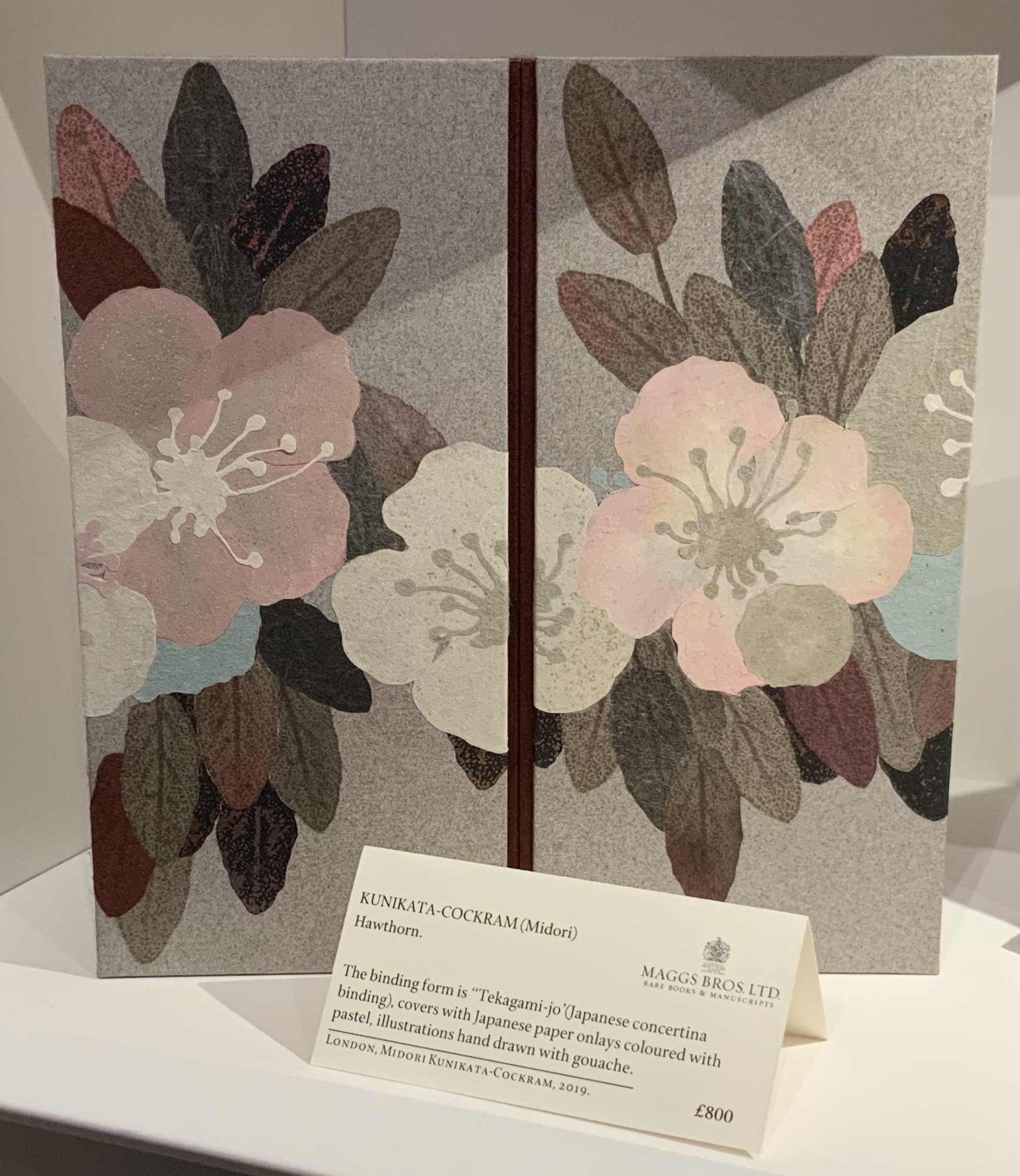
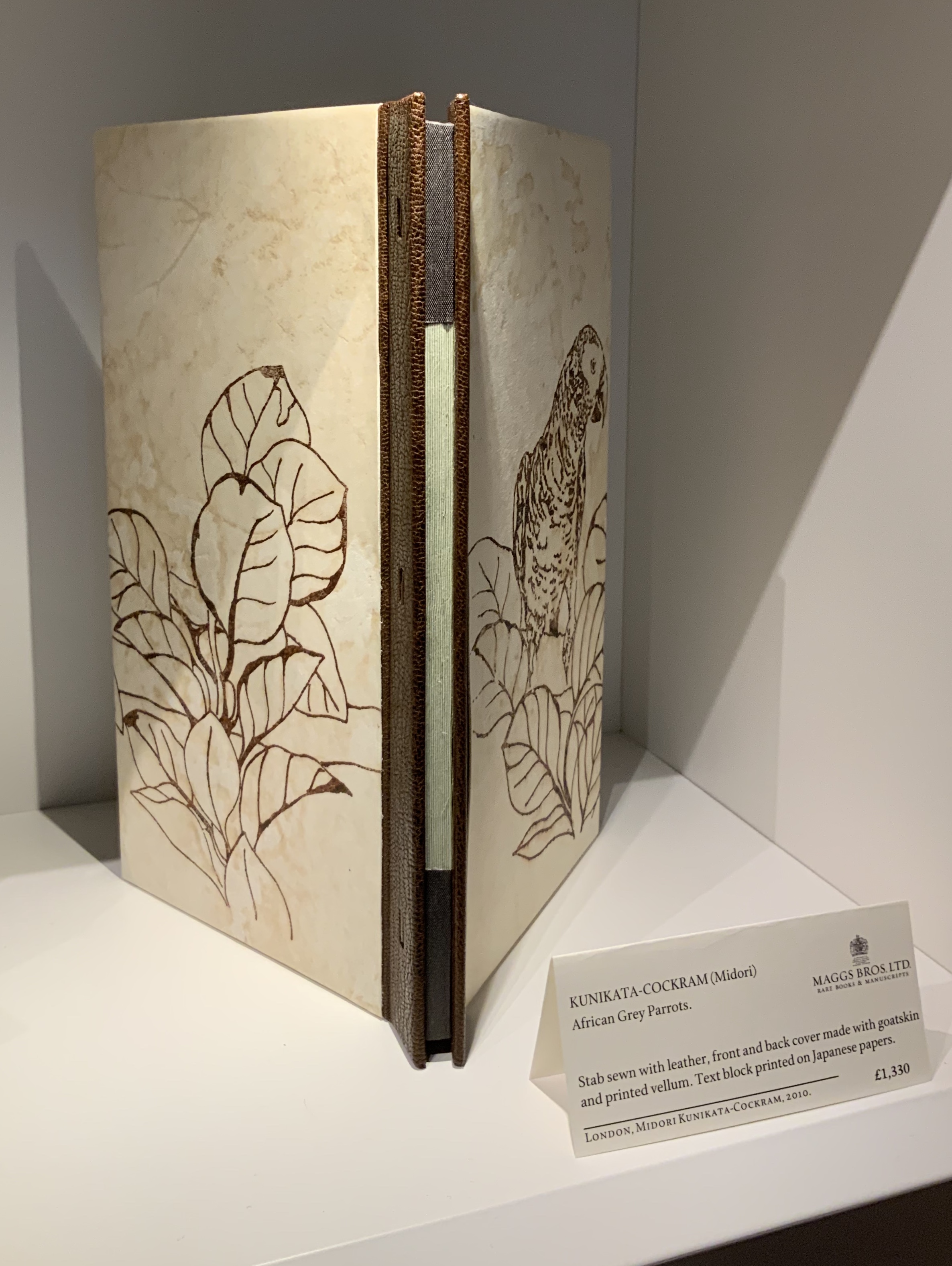
Two works by Midori Kunikata-Cockram were on display: Hawthorn (2019) and African Grey Parrots (2010). You can find other examples of her bindings in the British Library’s Database of Bookbindings. The two examples shown here, however, could be pulled from the shelf, opened, closed and examined. If you zoom in on the left-hand panel above, you might see that one of the stamens of the hawthorn blossom floats above the petal. That kind of attention to detail makes this work of otherwise muted colours a vibrant thing you can feel with your eyes.
Meeting Mark Cockram at the exhibit was welcome serendipity. Not only did he tell me about African Grey Parrots’ being Kunikata-Cockram’s response to their keeping a parrot during a friend’s vacation, he pointed out the meticulous registration within pages and across the recto to verso pages. The feel and appearance of the cover’s vellum is just as breathcatching.
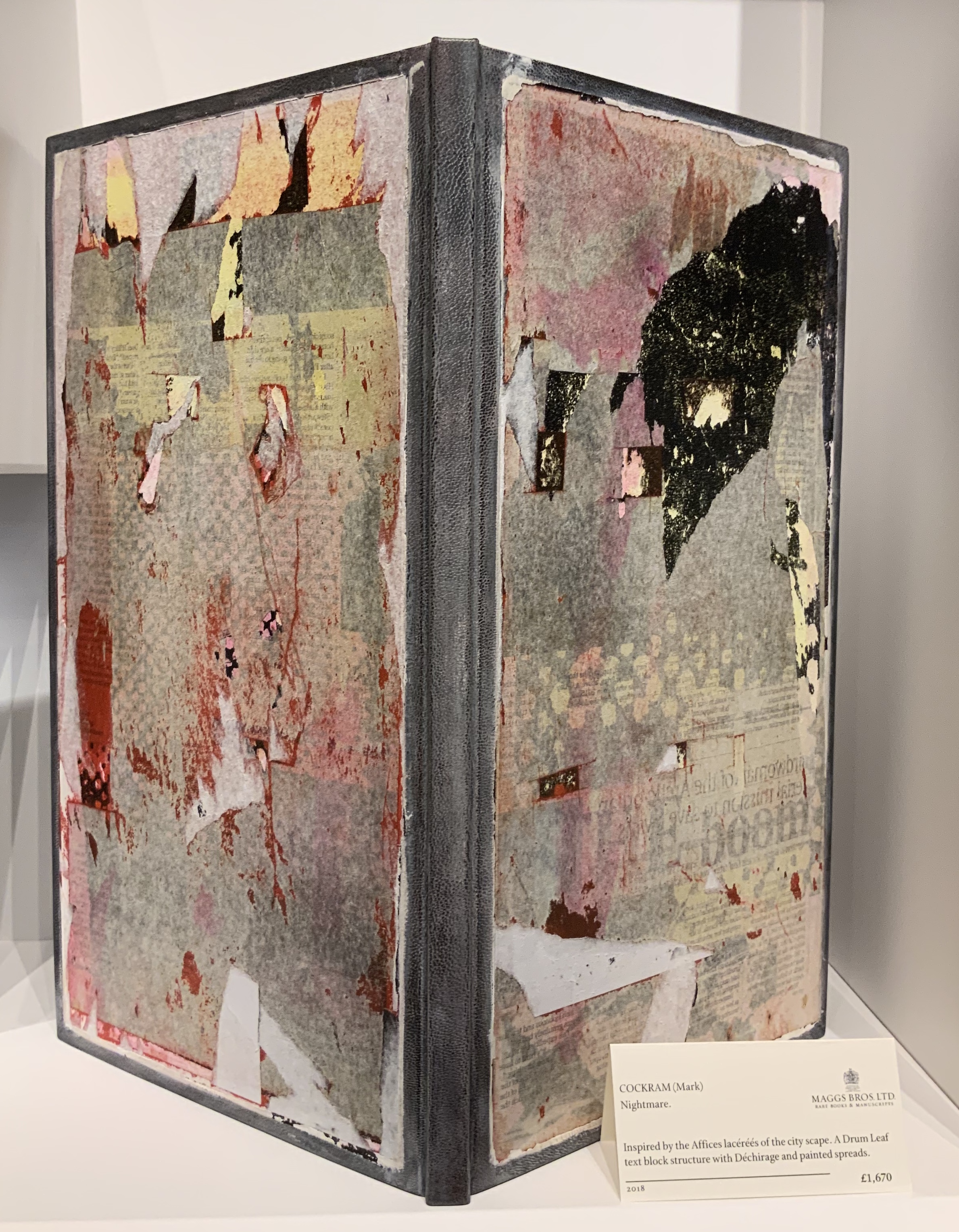
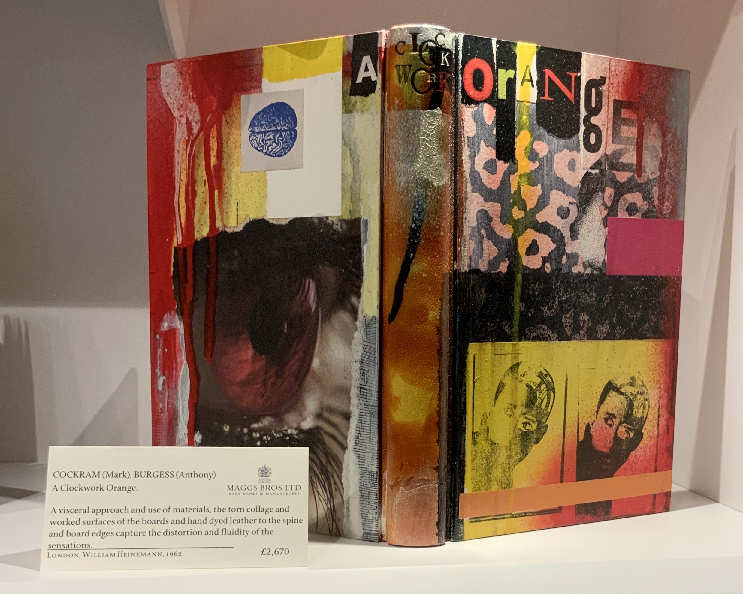
The pages of Cockram’s oversized contribution to “psycho-geography” feels like they had been pulled off hoardings to be bound in the sidewalk-grey leather. At a more textual end of the spectrum is his on-spec binding of this edition of A Clockwork Orange, signed by Anthony Burgess. The way the title spreads across the back cover, spine and front cover almost forces a handling of the book — turning it over from front to back then back to front — and, in the process, feeling the collaged textures of the boards bound to the spine.
A Clockwork Orange (1962) Anthony Burgess Binding, Mark Cockram
The weight of the garish boards holds the book open for a comfortable reading of the 1960s text block — as if they were saying, “Viddy well, little brother. Viddy well”.
The BL’s exhibition continues through 28 August. Exhibitions at Maggs Bros Ltd are shorter lived but can be spotted by following them on Instagram.
A day’s visit with one hundred exhibitors hosted at the Arnolfini in Bristol leaves me reeling like a drunken sailor — drunk on colour, texture, light, line, shapes, words and artistry. Appropriate given the Arnolfini’s location on Narrow Quay in Bristol’s floating harbour.
Colour
Lucy May Schofield talked to me about her “search for the indigo that is infinity”. The Distance of Us is only one of several pieces demonstrating how close she is coming. The Longest Day on her site is one among many by which to enjoy her progress.
The Distance of Us Lucy May Schofield Photo: Books On Books
Mick Welbourn took time to explain how his search among inks, paper and geometric shapes kept leading him from a unique work (oil-based) to multiples and back to uniques. These colours reminded me of the work of Sonia Delaunay.
Mick Welbourn Photo: Books On Books
Texture
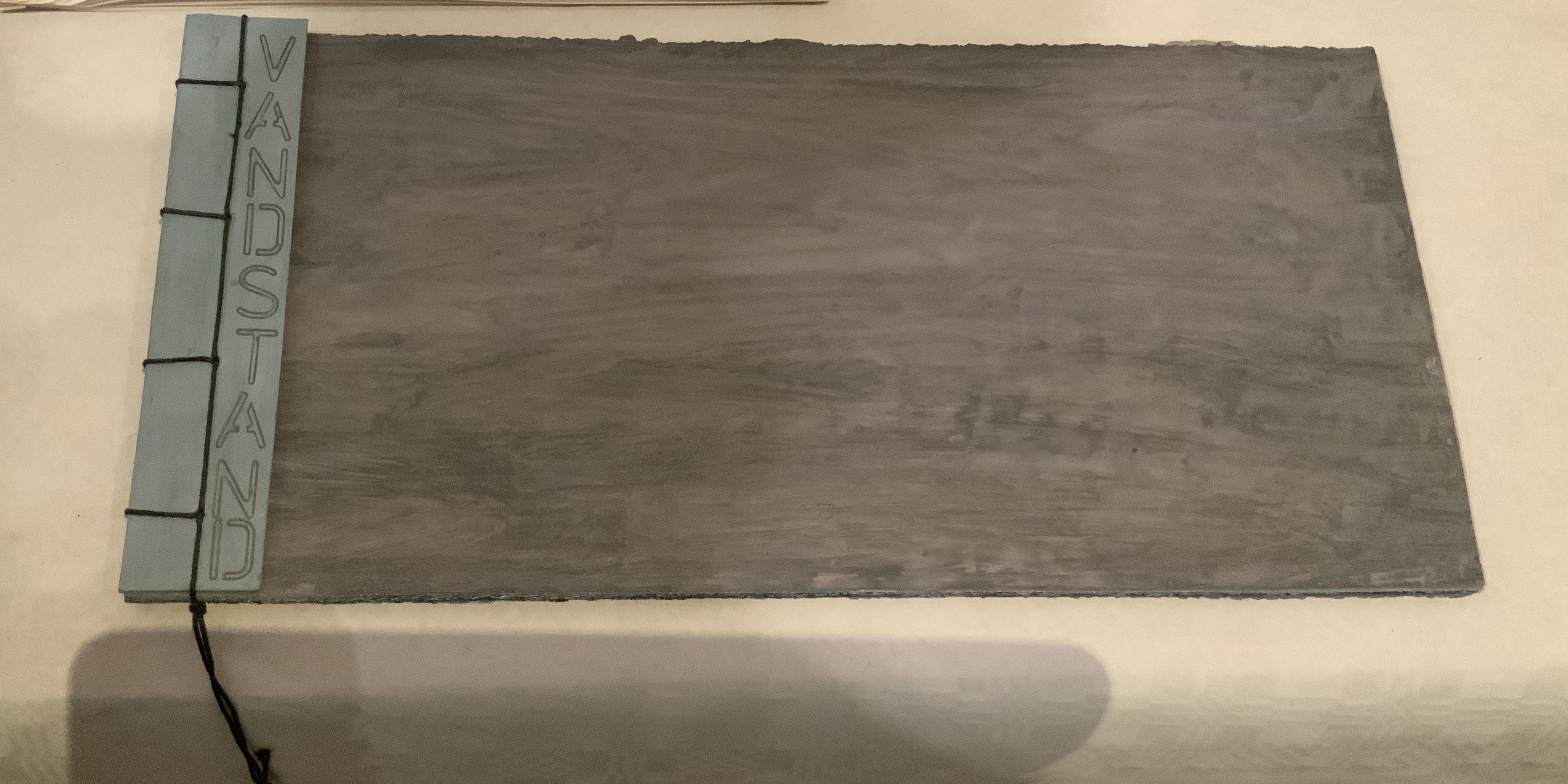
Bodil Rosenberg, a member of the Danish collective CNG (Anna Lindgren, Bertine Knudsen, Birgit Dalum, Pia Fonnesbech, Susanne Helweg), appeared delighted that I was surprised by the colour and texture of Vandstand (“water level”). Somehow after the saturation of the paper with layer upon layer of paint, each page has a supple leather- or cloth-like feel — a coolness to the touch. I think Ken Campbell would relish Vandstand.
Vandstand Bodil Rosenberg Photo: Books On Books
Vandstand Bodil Rosenberg Photo: Books On Books
Caroline Penn’s works comprised by Notes from Chesil Beach made me reach out to pick up one of the pebbles on the page. The trompe l’oeil effect of turnable pages in the photos is enhanced in one variation by inclusion of an actual small gathering of pages. The role of trompe l’oeil in book art is one worth investigating.
Notes from Chesil Beach Caroline Penn Photo: Books On Books
Light
Eileen White’s Haptic Narratives and her lumen prints for Printed Matter made a nice segue from texture to ghostly light. Printed Matter also looks forward to the “artistry” section here as book’s images are un-fixed and eventually fade away. To use the book form — the traditional form of permanent record — to present a language and reminder of material ephemerality: that is artistry.
Eileen White Photo: Books On Books
Haptic Narratives Eileen White Photo: Eileen White
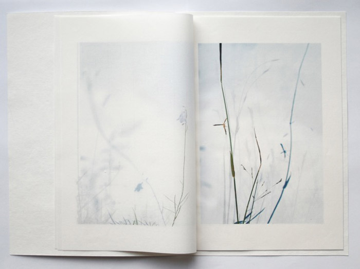
Helen Douglas (Weproductions), fresh from exhibitions at Printed Matter in New York and Fruitmarket Gallery in Edinburgh, was displaying her 2017/2018 series Field Works as well as a new book Summer Alight. The photographic effects, the visual narrative and structure achieved in Douglas’s works define artistry.
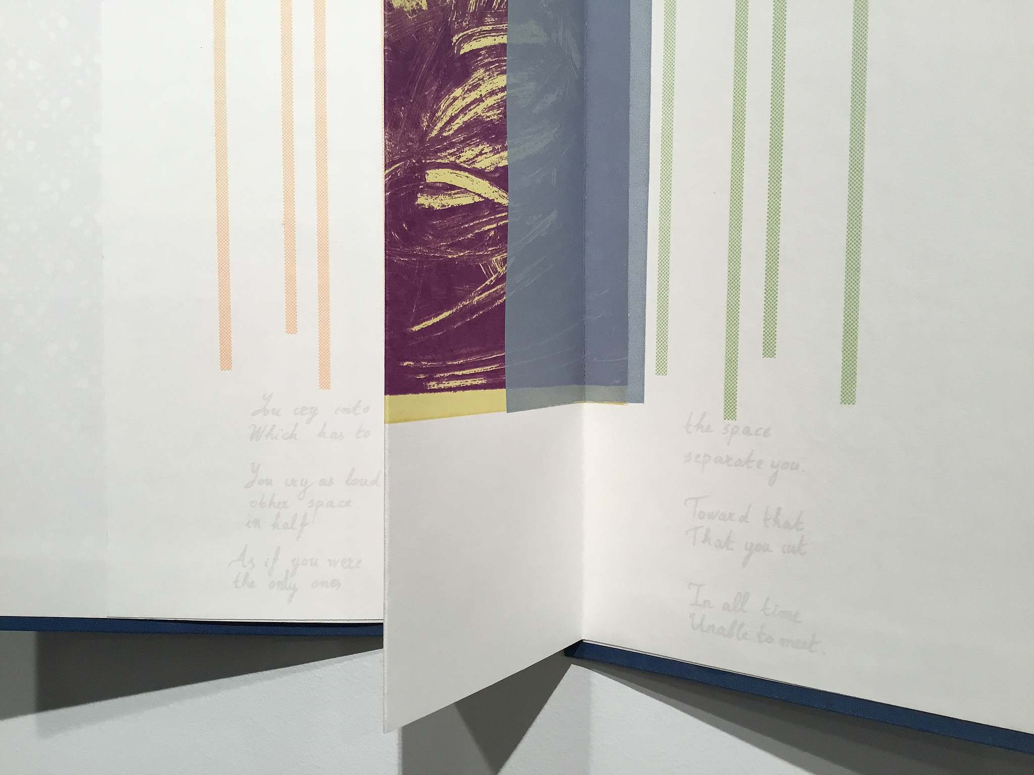
Elena Zeppou’s Parallels first caught my eye because of its size, but closer inspection yielded appreciation of line — vertical as well as horizontal — and its union with text and form. Note how the lines of poetry read across the accordion.
Parallels Elena Zeppou Photo: Books On BooksParallels Elena Zeppou Photo: Zitrone PrintmakingParallels Elena Zeppou Photo: Zitrone Printmaking
Shapes
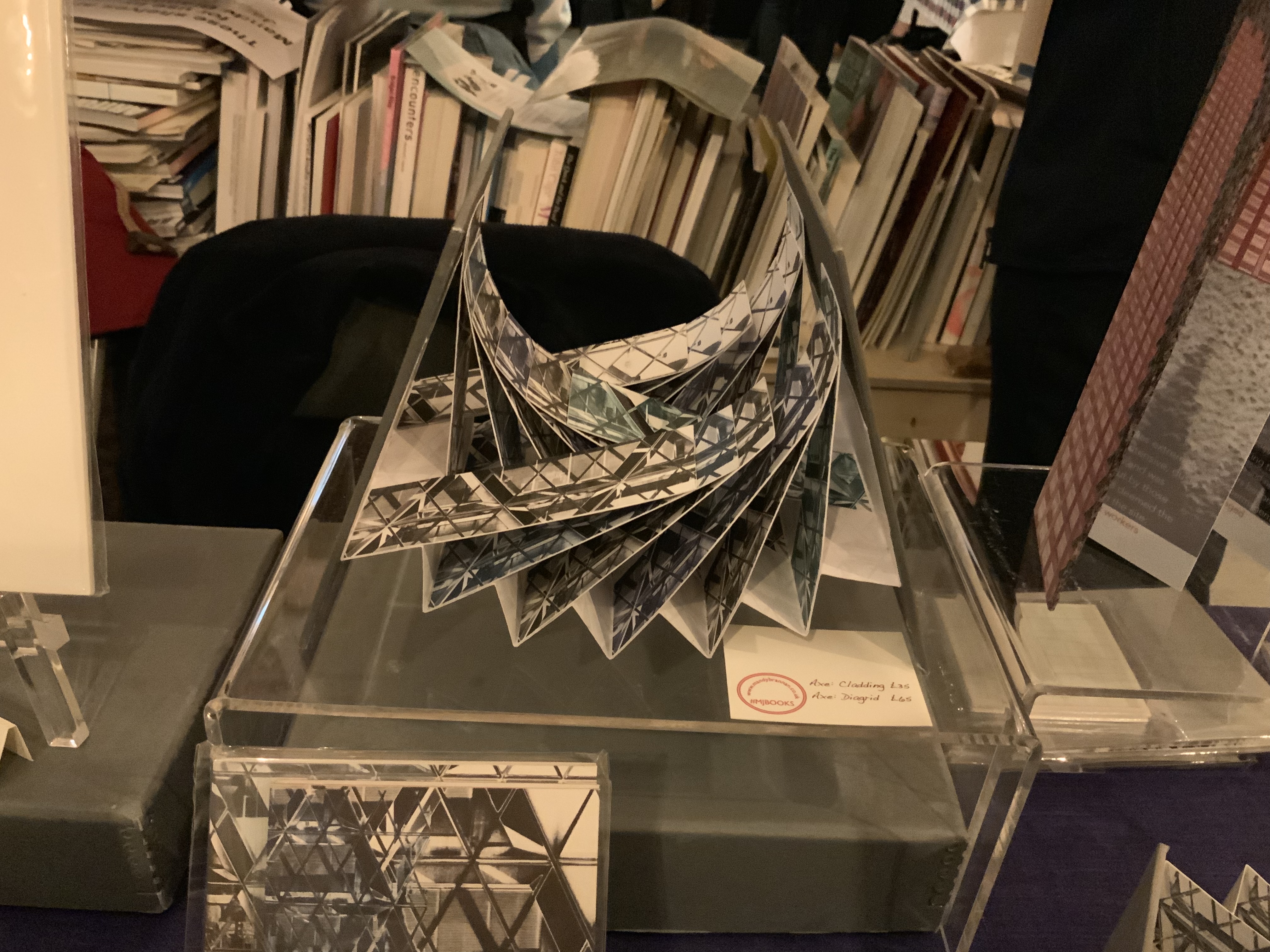
Listening to Mandy Brannan talk about custom papers, French fold books and modified flag books is almost as good as handling them. The work30 St Marys Axe (inspired by the building fondly known as the “Gherkin”) was what first drew me to her table. It has two variations — Diagrid and Cladding — which reward repeated handling as well as regarding.
30 St Marys Axe: Diagrid Mandy Brannan Photo: Books On Books
At the ArtistBooksOnline table, the shape-changer Inside/Outside by Susie Wilson kept me as busy as if it were a Rubik’s cube or paper puzzle with a medical mystery inside — or outside.
Inside/Outside Susie Wilson Photo: Books On BooksInside/Outside Susie Wilson Photo: Books On Books
Words
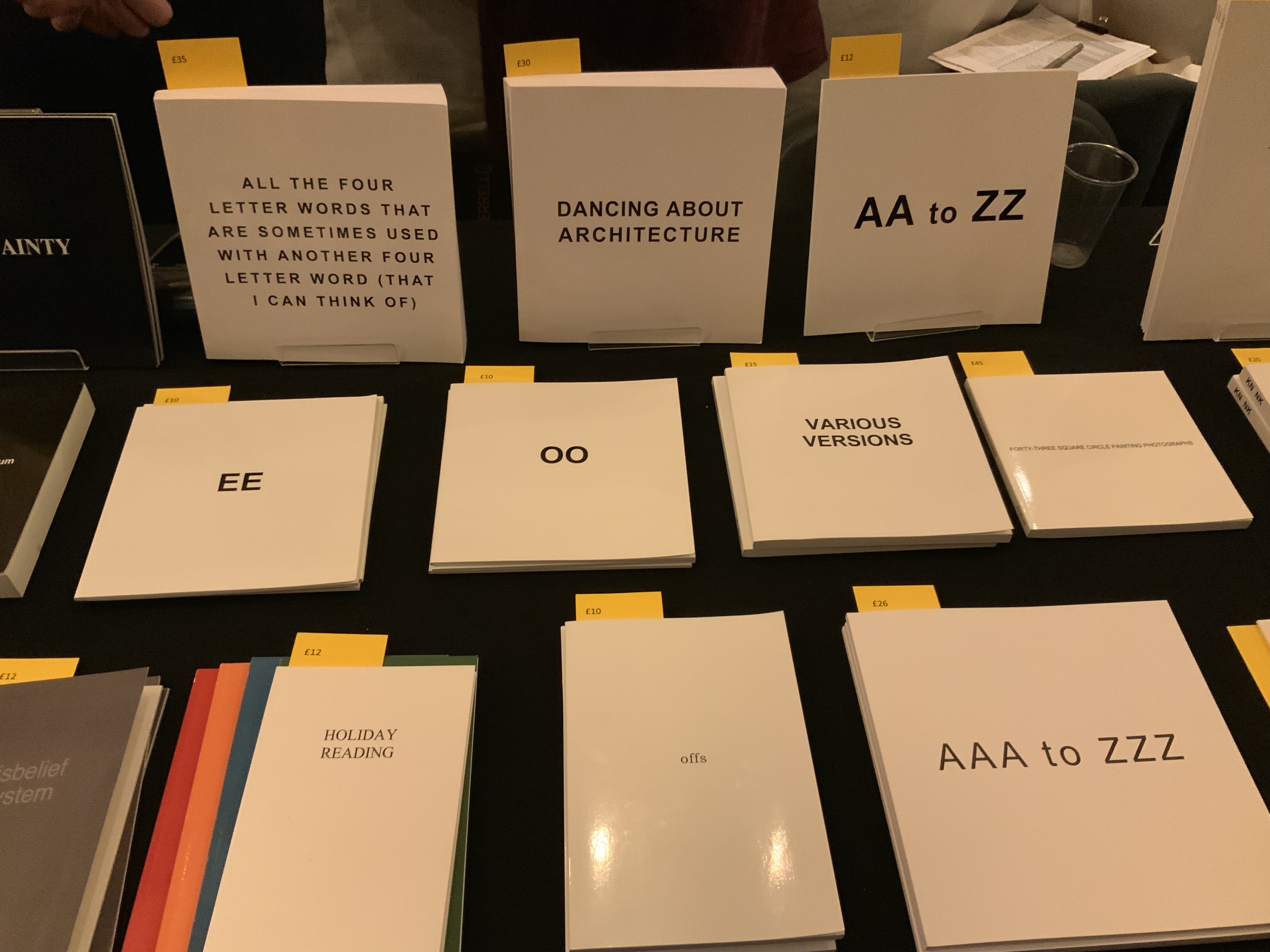
Puns, slippery words and slipperier concepts seemed to explode from Guy Bigland‘s table.
My inner metaphysician of Structuralism, Post-Structuralism, Deconstruction and Post-Deconstruction found its element(s) at the Atlas Press.
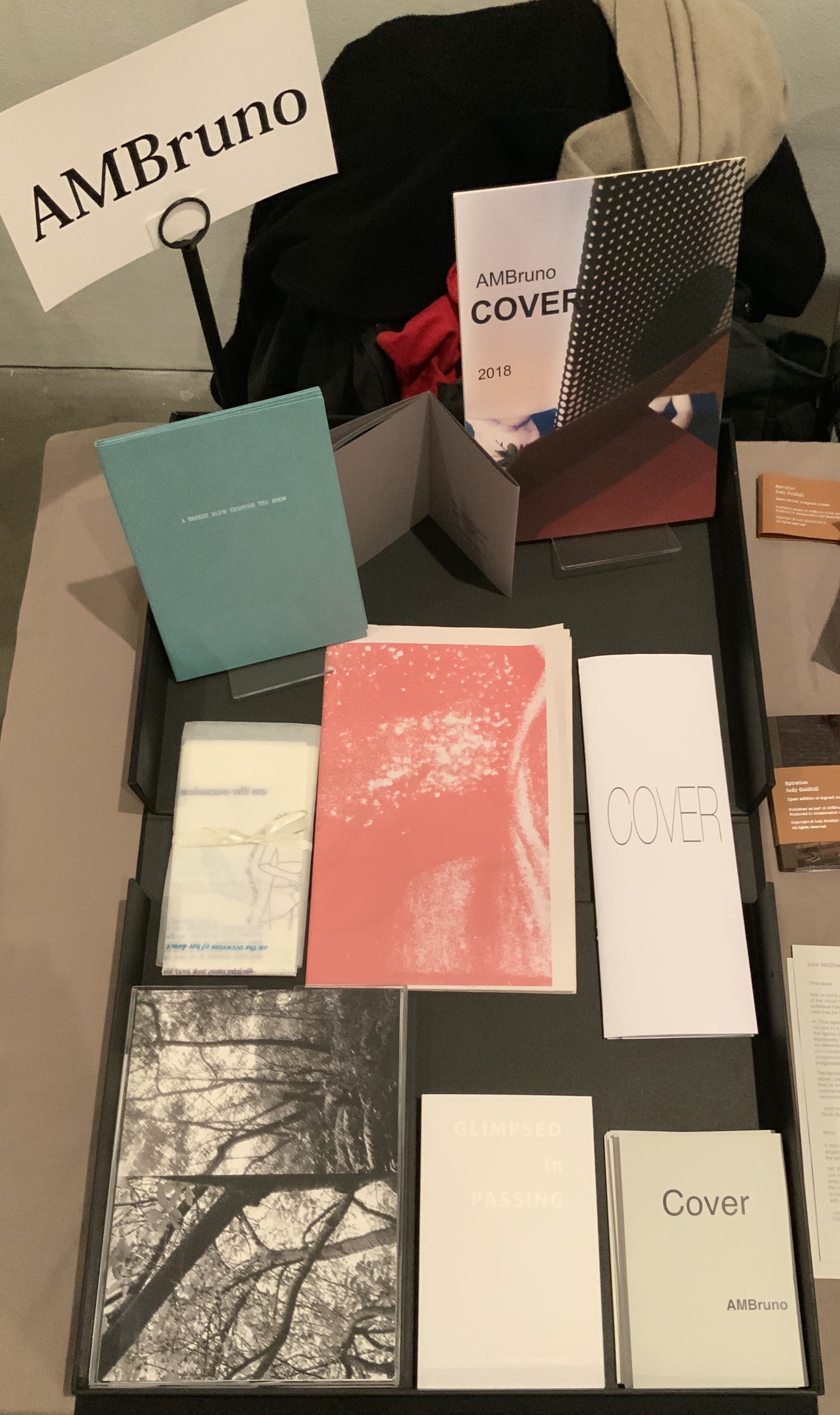
AM Bruno, run by Sophie Loss, and of which John McDowall is a founding member, is always a rich vein of artistry. The works from the 2018 theme-driven project, Cover, appear in the box below but warrant a closer inspection at the link behind the word. John McDowall had a new book on hand: Time-lapses. As I turned the brilliantly white pages, each segmented into squares like a comic-book page but only one square in each page holding an old black-and-white photo, the title began to sink home. And then came the idea that all the meaning that could possibly explain any one photo, its relation to the other squares or to other photos or to the author or to the reader/viewer — all of it — has to take place in the empty spaces between.
Janet Allsebrook displayed a Duchampian box with the Delaunay-esque title Nichoir. Although the drift of this work (“waste time making your own useless nest box”) is echoed in her other works, the echo reverberates with a deeper tone — often political or philosophical. The variety of book forms is impressive.
Nichoir Janet Allsebrook Photo: Books On Books
Next door was the artist of Zen book art — Julie Johnstone – Essence Press. In addition to extensions of her percentage tint series, she had on hand several explorations of breath, print and paper: each breath, a page; quietly breathing; five breaths; and ten breaths. Wherever they are, her books make a Zen garden.
Sarah Bodman and Arnolfini brought together a rich collection of talent and should be thanked for doing so and encouraged to repeat it in 2021. And to the artists mentioned — and those not — who took the time to share their thoughts on colour, texture, light, line, shapes, words and artistry: Encore!