A few months ago, Greg Smith, a Toronto-based artist, reviewed Claire Bishop’s “Digital Divide” (Art Forum, September 2012). The review and Bishop’s article touch on a recurrent theme in Books On Books: the materiality and immateriality of books.
But the review and Bishop’s article resonate with some more recent and popular seismic tremors in the world of ebooks. With all but Macmillan caving into the US Justice Department, we are still left wondering where and when the consumer benefits in cheaper ebooks will be handed out. The prices on e-reading devices have plummeted, but in the world of ebooks, a slight unease about the inevitability of e-readers is creeping in as tablets and mini-tablets seize the imaginations of some with the loudest digital megaphones. “Are e-reading devices doomed?” And by extension – given that tablets are far more than ebook devices — “Is the trajectory for ebooks leveling off?” While the post-Xmas sales analysis will be more assiduously examined for the “evidence” than the equally predictive gizzards of our Xmas fowls, as Greg Smith paraphrases Julian Oliver, “the New Aesthetician”: material or immaterial, “we should all just keep focused on making stuff.”
What makes his comments on comments on a comment bookmark-worthy are the comments they provoked from Gary Frost, Emeritus Conservator at the University of Iowa Libraries and the author of Future of the Book: A Way Forward(Coralville, IA: Iowa Book Works, 2012):
“The current rush of changes in print and ebook uses is dramatic evidence of our close relationship with books. A flood of digital reading devices and hybrid software and hardware designs are emerging as the print book is augmented by screen delivery and associated cloud libraries, ebook collection building, automated index and searching, and screen learning. While all screen book simulations deviate from print conventions the hybrids that emerge reference each other and often resonate with each other. This rapidly developing book production and consumption landscape is dynamic and unique in media history, or is it?
It’s pretty amazing that little attention is paid to the emerging composite of print and screen delivery of books. I mean looking directly between them and at an emergent functionality of all books. There you can now perceive the interdependence of print and screen and the likelihood that neither will flourish without the other. . . . Also involved are other forums, other than the forum of current technologies, their products and marketing. These other disciplines include academic book studies, cognitive science aspects of reading, book sustainability within libraries and many vectors of book arts.”
One might single out the infiltration of the book by “the social web” from the vector of current technologies that Frost insightfully identifies as necessary to explore this moment in the book’s/ebook’s evolution in which those who buy ebooks buy yet more print books. The ability to annotate and share print books is gradually being replicated, prodded as it were by the phenomenon of the social web.
So here you have it: a comment on comments on comments on comments on a comment.
Norma Levarie (1920-1999) was a graphic designer and author of children’s books, one a winner of a New York Herald Tribune award — Little People in a Big Country. But, in addition to her design work for the National Audubon Society, The Jewish Museum, The University of Chicago Press, Oxford University Press, Random House and Harry N. Abrams, this Virginian’s most important gift to those interested in the evolution of the book and book arts is her volume The Art & History of the Book (New York: James H. Heineman, 1968).
The quality of her research and writing measures up to the best. If only Heineman had been able to afford color reproductions, her ability to handle illustrations and her keen eye for selection of examples would have placed this book in good company with works such as Michael Olmert’s The Smithsonian Book of Books (Washington, D.C.: Smithsonian, 1992). Still, Levarie’s book merits a bookmark for its overarching message, which is cleverly embodied in the book’s organization.
Facing the stark image of the Prism of Sennacherib on the opposite page, these words of Ashburnipal launch the book on the recto page:
Prism of Sennacherib. Assyrian, VII century B.C. Oriental Institute, University of Chicago. Height 15 in. Reproduced from Levarie, The Art & History of the Book (New York, 1968).
“. . . I read the beautiful clay tablets from Sumer and the obscure Akkadian writing which is hard to master.
I had my joy in the reading of inscriptions in stone from the time before the flood. . . .”
Continuing chronologically up to the fifteenth century and “block book,” Levarie switches to a geographical approach, starting of course with Germany, ending with England and returning to a timeline overview from the seventeenth century to the twentieth, the last illustrated with pages from Spiral Press’s Ecclesiastes (New York, 1965), drawings by Ben Shahn, engraving by Stefan Martin and calligraphy by David Shoshensky, and Apollonaire’s Le Bestiare (Paris, 1911).
Guillaume Apollinaire, Le Bestiaire. Paris, 1911. Woodcuts by Dufy. Yale University Library, Graphic Arts Collection. 14 x 10 1/4 in.
This structure neatly builds to these concluding words:
“The homogenizing forces of our time have broken many barriers of national style, and sometimes it is difficult to tell at a glance the origin of a book. But local differences in production or taste still exist, and where they are manifest they bring the pleasure of variety. . . .
For the lover of fine books, nothing can replace the bite of type or plate into good paper, the play of well-cut, well-set text against illustration or decoration of deep artistic value. But an inexpensive edition can carry its own aesthetic validity through imaginative or appropriate design. These are not matters of concern only for aesthetes; if, in an era of uncertain values, we want to keep alive respect for ideas and knowledge, it is important to give books a form that encourages respect. The style and production of books, for all the centuries they have been made, still have much to offer the designer and publisher in challenge, the reader in pleasure.” (303-06)
Leaping ahead more than fifty years to the shift from print to digital, we find that many of the observations and message legitimately reassert themselves. Websites and ebooks do vary in design from region to region, but standardization and, more so, the global character of the Web and the products of the technology industries counter-assert a homogeneity in design. Sven Birkerts‘ elegies for Gutenberg are echoed across blogs devoted to the continuing pleasures of the printed book. But likewise Levarie’s stand that these are not merely matters for the elite is echoed across the debate of print vs digital in the popular press and the democratizing blogosphere.
What still must be translated from her message is how to make the leap that, if we respect ideas and knowledge, we must give online books as well as print books a form that encourages respect.
Under the blog name “Wynken de Worde,” Sarah Werner writes about books, early modern culture, and those of us who may be postmodern readers — when she is not preparing the syllabus for her course at the Folger Shakespeare Library. Wynken (not related to Blynken or Nod) was the primary assistant to William Caxton the first printer of English-language books — Malory’s Morte d’Arthur, Chaucer’s Canterbury Tales, and The Golden Legend.
If Sarah Werner channels Wynken de Worde in her classroom as well as she does through her website, her students are to be envied. She makes what she writes tangible, palpable, haptic. Three brief examples, the last of which prompts this bookmark:
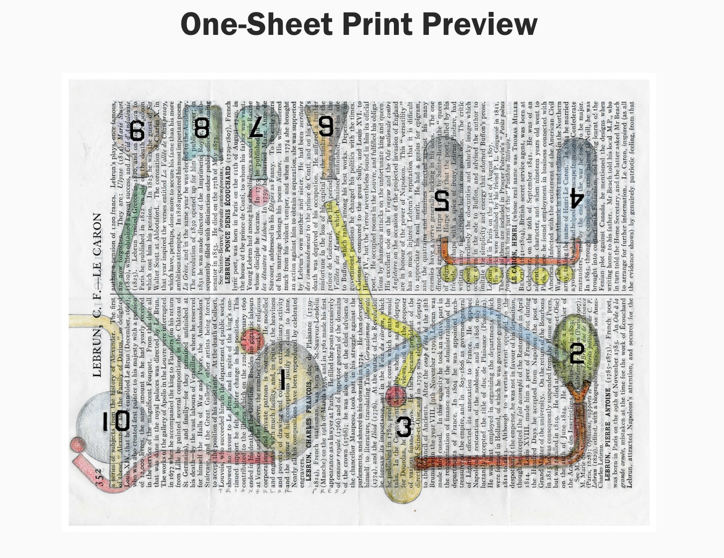
Imposition is “the arranging of pages in a chase [a steel or iron frame for holding them tightly for the letterpress] in a particular sequence . . . so that when folded the printed pages will be in consecutive order.” Glaister, Encyclopedia of the Book (2001). But the earliest books did not have page numbers, so how were old Bill and Wynk to know which to place where? Here’s Werner:
Lerner’s newsbook ready for folding.
Above is a numbered example of the same newsbook that I used as an image in my last post. The red numbers are page numbers: folded in the right way, you’d get an 8-page booklet in the order indicated. But if you look closely, you’ll see that the actual news sheet doesn’t have page numbers. Instead, there are signatures: at the bottom of the first page is a tiny, blotted “L”; at the bottom of the 5th page is a tiny “L3″ (the “L2″ has been cut off at some point when the page was trimmed). These are signature marks that count off by leaves. What’s a leaf, you ask? It’s a physical unit of paper: when you turn the page in a book, you are actually turning a leaf of paper. Early modern printers would have thought in terms of sheets and leaves, not pages, when they were figuring out how to print a work. Depending on the imposition (how the text is laid out on the sheet), you could end up with different numbers of leaves: 1, 2, 4, 8, 12, 16, 24. A quarto imposition results in a sheet of paper being turned into 4 leaves; there are 2 pages to each leaf (a recto side and a verso side), so there are 8 pages in all. The blue letters and numbers show the signatures. One thing that throws off beginners is understanding how recto and verso relate to each other. They do not mean right and left but front and back.
Providing a downloadable PDF with which to follow along, Werner walks the reader through the exercise and proves her point: “it’s a handy way to understand and demonstrate to others the general principle of early modern format: multiple pages are printed onto a single sheet in the correct order so that when folded, they appear sequentially.”
The second example of the pedagogically palpable or the palpably pedagogic comes in the same posting:
“When you’re done, you can try folding it into a tiny little pressman’s cap, following the instructions that appear in this lovely piece, “The Newspaper Man is Defunct,” from The Cape Cod today.”
That bit of fun was two years ago. The brilliance is undiminished today; if anything it’s brighter. For this year’s course, Werner is handing out her syllabus in unpaginated quarto format. To figure out the syllabus, the students have to fold the imposition correctly! Try it yourself and grasp the meaning of the “book arts.”
Ah, the books arts. Imposition. The dying arts? You need look no further than the end of your Proboscis to see that that is not true. Proboscis is a London-based non-profit studio that commissions and facilitates new works and publications, some of which can be found in the DIFFUSION library.
DIFFUSION ebooks are hybrid digital/material publications. They bring together the “tactile pleasures of tangible objects with the ease of sharing via digital media.” Shareable paper books, free to download as PDFs, print and make up, DIFFUSION eBooks “can be shared electronically or as material objects – scanned, photocopied, emailed or posted. The eBooks bridge analogue and digital media by taking the reader away from the computer screen and engaging them with the handmade.”
And just a bit further along the continuum is Francisca Prieto, also in London. Inspired by the serio-comical poet Nicanor Parra’s “antipoems,” Prieto offers up The ANTIBOOK.
The reader must fold the pages of the book (20.5 x 10.5cm) to form the icosahedron (15 x 17 x 19cm) in order to read Parra’s antipoems in order.
Whether Prieto’s ANTIBOOK or the DIFFUSION ebooks are book, art, both or neither, they and Wynken de Worde make us think with our hands as well as our minds about what can be done with the form and concept of the book. And that makes the concept of imposition worth a bookmark.
PS: “Books On Books” acknowledges David Pearson‘s Books as History (New Castle, DE: Oak Knoll, 2008 and 2011), p. 75, for the inspiration of the wording of the conclusion here.
PPS: Another opportunity to learn by doing can be found at the end of a short and witty book called A Dodo at Oxford: An Unreliable Account of a Student and His Pet Dodo. Under the guise of explaining, presenting and annotating a diary found in a charity shop, Philip Atkins and Michael Johnson deliver a history of the book. Appendix 7 provides the offer to engage in imposition.
PPPS (6 January 2021): Weeks into a third Corona virus lockdown, another contribution for learning imposition by doing has appeared. Appropriately this time in the Quarantine Public Library started by Katie Garth and Tracy Honn in May 2020. It comes from Barb Tetenbaum; check out the download and instruction video here.
Untitled Barbara Tetenbaum Chemistry stencils (Prague, 1993); colored pencils (Madison, WI, 1975); and press-on letters from the model train industry are combined with a 100-year old Encyclopedia Brittanica page.
We’re witnessing another sea change in Web publishing. From Pinterest at the beginning of this year to the launch this week of a new product from two Twitter founders, Medium, 2012 has been a year where the norms of publishing are being challenged.
So writes Richard Macmanus at ReadWriteWeb about a new platform for Web publishing. But there have been books written in Twitter. What if the same were to happen in Medium? If the stream replaces the page, if topic maps replace authors, . . .
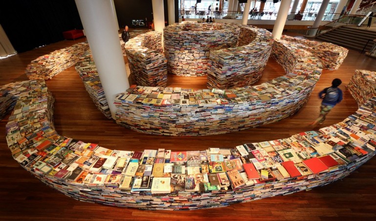
Exhibition at the Southbank Centre, London. August 2012.
This maze of 250,000 books has been installed on The Clore Ballroom in the Royal Festival Hall in London. Oxfam loaned 150,000 of them. When the exhibition is taken down, the books will be returned to Oxfam along with the other 100,000 donated by UK publishers. The books will go to Oxfam’s used books stores to raise funds for Oxfam projects. Inspired by the stories of Jorge Luis Borges, the maze was created by Brazilian artists Marcos Saboya and Gualter Pupo, in collaboration with production company HungryMan.
Hear more here. See more here. Thanks to Michael Lieberman at Book Patrol for drawing this pile of books on books to our attention.
Here’s a previously missed infographic for the evolution of the book – a bit skeletal but with the elegance of the format. And while we are at it, let’s add some bibliographic and webographic “evolution” entries:
Feel free to suggest new additions to the timeline!
Ebook Timeline Updated – 20120812
Yesterday, the 11th of August 2012 marked the twenty-fifth anniversary of Hypercard. Alerted by Matthew Lasar in Ars Technica in May, gurus lined up to comment on Bill Atkinson‘s contribution in the 80s to Apple and the basics of hyperlinking techniques we now take for granted.
David Weinberger and Roy Tennant celebrated the anniversary with engaging and personal posts linked from their names here.
With the publication of The Cluetrain Manifesto, Weinberger became one of the Web’s leading light-shedders (gurus) and provocateurs. Most important in this context, he was in the audience when Bill Atkinson presented Apple’s Hypercard to the MacWorld conference in 1987. Weinberger writes, “HyperCard was a groundbreaking, beautiful, and even thrilling app. Ahead of its time for sure. But the time it was ahead of seems to me to be not so much the Age of the Web as the Age of the App. I don’t know why there isn’t now an app development environment that gives us what HyperCard did. Apparently HyperCard is still ahead of its time.”
Tennant, too, has written several books and a monthly column on digital libraries for Library Journal for a decade and currently works at OCLC. Most important, he “was there” as an early user of the Hypercard system and HyperTalk programming language on which it is based. As Tennant puts it, “HyperCard was where I learned how to DO the Web. It was where I learned the importance of screen real estate. It was where I learned the law of 7, plus or minus 2. It was where I learned how important graphics are in creating an engaging site. It was where I cut my teeth on interactivity.”
Apps, screen real estate, Miller’s law, graphics and “cutting teeth” on interactivity — all are part of the new toolkit for making books.
Timelines are, of course, for looking further back as well as forward. Earlier this year, April 2012 marked the fifteenth anniversary of the publication of Liane Lefaivre’sLeon Battista Alberti’sHypnerotomachia Poliphili: Re-Configuring the Architectural Body in the Early Italian Renaissance (Cambridge, MA: MIT Press, 1997) and the online publication of The Electronic Hypnerotomachia, which contains the facsimile text and illustrations. The online publication of extracts from Lefaivre’s book illustrates the linking prefigured by the “card stack” approach of HyperCard. What MIT Press and TU Delft, Lefaivre’s affiliation, host on their servers are not ebooks or even e-incunabula of the sort we experience today, but they are clearly forerunners to them.
In twenty-eight more months, December 2014, we will see the 515th anniversary of the original work’s publication by Aldine Press (Venice, December 1499). The founder Aldus Manutius did not normally publish heavily illustrated books. The Hypnerotomachia Poliphili was the exception and the only commissioned work that Manutius undertook. The exception reflects favorably on the overall success of his business and supports the view that Venice had become the capital of printing and publishing very shortly after the invention of printing by moveable type.
The book unveils an inscrutable, almost comic-book-illustrated story, glittering with made-up words in Greek, Latin, Hebrew and Arabic (including proto-Greek, -Hebrew and -Arabic fonts). In addition to the page displays sculpted into shapes such as goblets, this one volume displayed the technological mastery of and improvement on the new Roman (as opposed to the heavy Gothic) typeface Bembo. According to Norma Levarie in The Art & History of Books (New York, 1968), this singular volume revolutionized typography in France in less than twenty-five years.
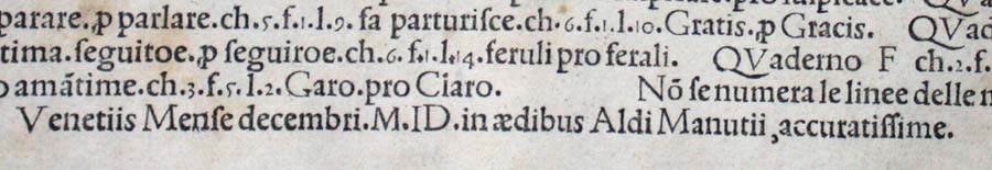
Somewhat like software releases, though, the 1499 edition came with bugs. The colophon to the Hypnerotomachia Poliphili falls at the end of a full page of errata.
“Venice Month December. 1499. in the house of Aldus Manutius, most accurately done.”
“The Book Industry Study Group (BISG), a leading U.S.-based trade association representing the entire book supply chain, announced today the publication of a new Policy Statement endorsing EPUB 3 as the accepted and preferred standard for representing, packaging, and encoding structured and semantically enhanced Web content — including XHTML, CSS, SVG, images, and other resources — for distribution in a single-file format.”
For the record and from the Library of Congress:
“The Open eBook Publication Structure or “OEB,” originally produced in 1999, was the precursor to EPUB. Version 1.0 of the Publication Structure was created in the winter, spring, and summer of 1999 by the Open eBook Authoring Group. Following the release of OEBPS 1.0, the Open eBook Forum (OeBF) was formally incorporated in January 2000. OEBPS Version 1.0.1 [OEBPS_1_0], a maintenance release, was brought out in July 2001. OEBPS Version 1.2 [OEBPS_1_2], incorporating new support for control by content providers over presentation along with other corrections and improvements, was released as a Recommended Specification in August 2002. EPUB 2 was initially standardized in 2007. EPUB 2.0.1 was approved in 2010. EPUB, Version 3, was approved as an IDPF Recommendation in October 2011. It is substantially different from EPUB, Version 2, both in using only a single form for textual content and in having support for audio, video, and scripted interactivity (through Javascript). No longer supported are the EPUB_2 formats for text content, one based on the Digital Talking Book [DTB_2005] format and a second form based on XHTML 1.1 compatible with OEBPS_1_2. A single new encoding for textual Content Documents is based on HTML5/XHTML and CSS3, despite the fact that both of these W3C standards are still works in progress. SVG is supported for graphics and it is possible to have an EPUB_3 document whose “pages” consists [sic] only of graphics, for example for a graphic novel. Several legacy features are deprecated. Some legacy structures may be included for compatibility of EPUB_3 documents with existing EPUB_2 readers. EPUB_3 readers are expected to render publications using version 2 and version 3.”
Coincidentally, Amazon UK reported today that it is now selling 114 Kindle ebooks for every 100 print books it sells.
The EPUB format is not natively readable on the Kindle device or in the Kindle application. Customers can add conversion apps easily to their devices to make EPUB readable on a Kindle, but as consumers seek the advantages of an industry standard, how will Amazon respond?
Feel free to suggest new additions to the timeline!
Added 20120806.
Ebook Timeline Updated – 20120725
As we are still in the Age of e-Incunabula, what better than a trip half way around the world to Japan to see one of the world’s largest collections of Western incunabula — and an excellent site to bookmark?
The National Diet Library’s site refers to itself as an exhibition based on the book “Inkyunabura no Sekai” (The World of Incunabula) / written by Hiroharu Orita, compiled by the Library Research Institute of the National Diet Library. Tokyo: Japan Library Association, July 2000 (in Japanese).
The exhibition provides a timeline of incunabula from the second half of the 4th century when the shift to the codex occurred to 1980 when the British Library began entering data on its collection of incunabula into the ISTC. The site provides much more than this chronology.
Images from the collection, statistics on the type fonts used, coverage of design and how the quires (sheets of paper folded, forerunner of book signatures and files in EPUB!) were arranged, and the binding process — all are covered straightforwardly and often in entertaining detail. Look on this site and consider how far we have to go with our ebooks and apps!
Added 20120725.
Ebook Timeline Updated – 20120719
Not as interactive as the Counterspace timeline for typography below, but certainly as densely informative, and it extends to typography online.
Added 20120719.
Ebook Timeline Updated – 20120717
Another timeline, this one focused on bookbinding. Is .zip the binding for an ebook?
Added 20120717.
Ebook Timeline Updated – 20120710
On the heels of the question above comes an outstanding interactive infographic on a critical element of the book and ebook: typography.
Added 20120710.
Ebook Timeline Updated – 20120706
Yet another ebook timeline, and this one is broken down into interpretive categories, “The Age of Writing” and “The Network Era,” which is thought-provoking. Are we in “The Age of the Tablet”?
Added 20120706.
Start of the Ebook Timeline
In 1936, “Chronology of Books & Printing” appeared in its revised edition, published by Macmillan in New York. In 1996, Cor Knops picked up the torch and started a Book History Timeline from Sumerian clay tablets (he could have started with the caves at Lascaux!) through to 1997 with the first issue of “Biblio Magazine” but with little acknowledgment of ebooks.
Now in 2012, looking back to 2002, we find this journalistic stab at a timeline for ebooks.
Forged together, the chronologies would have to include “As we may think” by Vannevar Bush in 1945, Ted Nelson’s coining of “hypertext” in 1963-65, the Apple Newton in 1993 (how many publishers and authors have kept track of the free downloads of their Newton ebooks?) and much more.
Another extension of the ebook timeline appears in this book by Marie Lebert, which fills in important gaps, misses others and offers more than a few overemphasized continental developments. Her timeline takes us through 2009, which means that the signal events in 2011/12 of ebook sales’ outstripping those of print in some markets are still to be added.
Even the “book arts” are having to go back to the future, sort of, to survive.
In the Renaissance, the arts and manuscripts were supported by the patronage of the rich and powerful, intent on securing fame, honor or redemption by association with lasting works.
Along comes the democratizing printing press, and eventually (a very long eventually), patronage is replaced by secured copyright and a working market. Now the democratizing Web has arrived, and content, including art, should be free, so we are told or simply shown by the taking. Is that the future of the book?
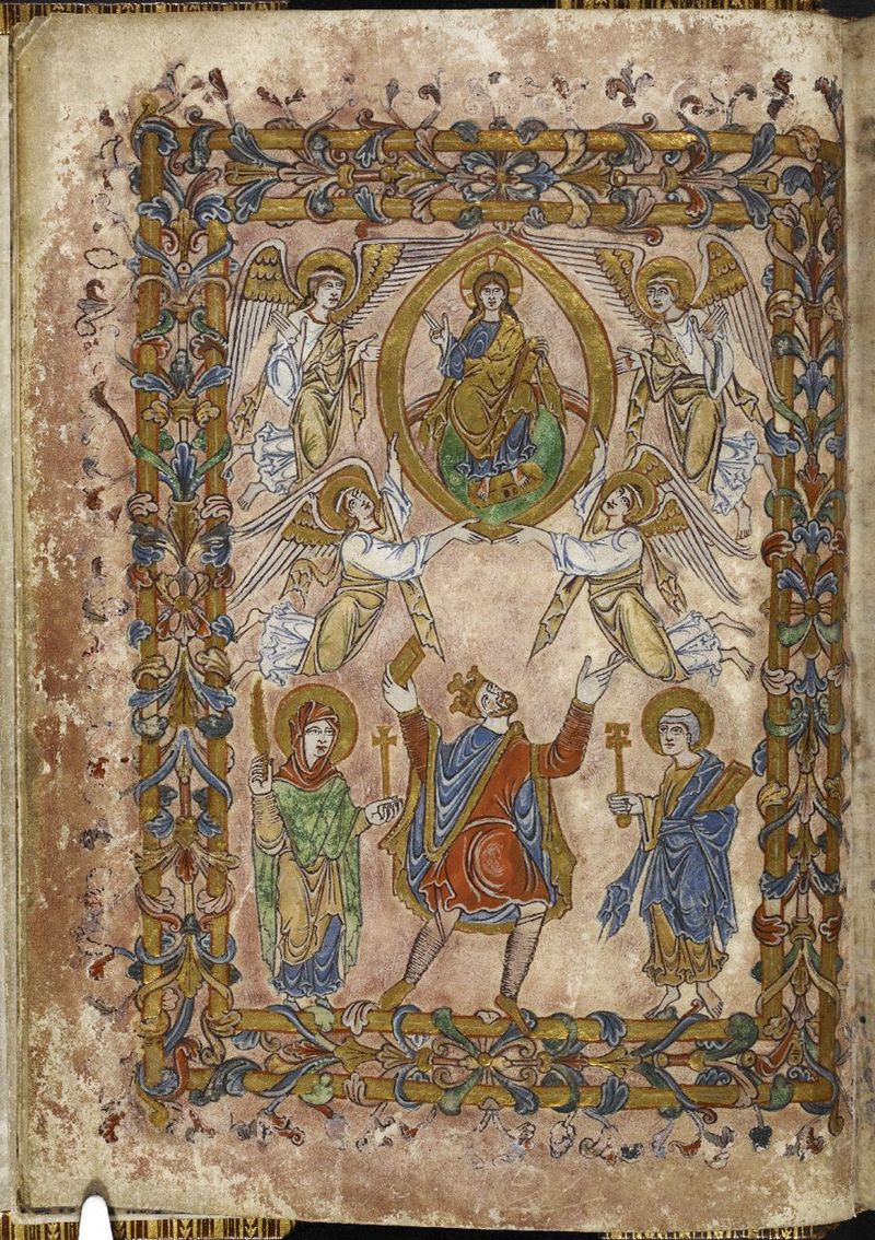
The book arts (and book art) are worth a bookmark in the evolution of the book. They hark back to the brilliant works of art like those exhibited earlier this year from the British Library’s collection of medieval and Renaissance illuminated codices collected by the kings and queens of England over 800 years.
A wedding present for Margaret of Anjou and Henry VI. The Shrewsbury Book is one of the most remarkable manuscripts in the Old Royal library. It was a gift to Margaret of Anjou from John Talbot, 1st Earl of Shrewsbury. Margaret is shown with her husband Henry VI. The Shrewsbury Book, Rouen, 1444–45. (C) British Library Board (Royal 15 E. vi, ff. 2v)
In the BL’s ‘Turning the Pages™’ system and ebook versions, we see how the affordances of the web and ebooks can enhance our experience of those works.
In a previous post, we looked at the Center for the Book and Paper Arts at Columbia College Chicago‘s offering awards of “two $10,000 commissions for new artworks for the iPad [which] will have physical counterparts that intersect, modulate, or inform the digital components of the artwork.” From print to digital in one case, from digital to print in the other. The book, its arts and its art as an object have been and will be the focal point of cultural investment.
The work of Brian Dettmer, gracing the cover of Christine Antaya’s edited volume Book Art: Iconic Sculptures and Installations Made from Books(Die Gestalten Verlag, 2011), embodies why this is so. Dettmer’s book art declares that despite or because of our crossing the digital divide, the book’s legacy as a carrier of ideas and communication remains secure in the creative realm. Take a look.
These are the kind of artists as well as masters and mistresses of the book arts that the Center for Book Arts in New York seeks to support.
Crowdsourced funding won’t provide contributors with lasting fame by association, although there are rewards in the form of invitations to openings and Artists’ Talks as well as a small letter-press printed gift. Here’s hoping that those who value the arts and books (digital and print) for their own sake will dig into their pockets.
For the past 25 years, Chip Kidd has made a name for himself as a top book designer. His designs have helped transform books into visual icons.
With the disappearance of the dustjacket’s original function — to protect the binding of the book — is it imaginable that the book cover will no longer be needed as the book evolves?
Imaginable, yes. Likely, no. As long as the imagination of Chip Kidd and his like bring their passion to publishing.
The possiblility of building up the thumbnail cover across the pages/screens of the ebook or giving it a functional role in the narrative may mean we come to judge a cover by its book!
“The Book Industry Study Group (BISG), a leading U.S.-based trade association representing the entire book supply chain, announced today the publication of a new Policy Statement endorsing EPUB 3 as the accepted and preferred standard for representing, packaging, and encoding structured and semantically enhanced Web content — including XHTML, CSS, SVG, images, and other resources — for distribution in a single-file format.”
For the record and from the Library of Congress:
“The Open eBook Publication Structure or “OEB,” originally produced in 1999, was the precursor to EPUB. Version 1.0 of the Publication Structure was created in the winter, spring, and summer of 1999 by the Open eBook Authoring Group. Following the release of OEBPS 1.0, the Open eBook Forum (OeBF) was formally incorporated in January 2000. OEBPS Version 1.0.1 [OEBPS_1_0], a maintenance release, was brought out in July 2001. OEBPS Version 1.2 [OEBPS_1_2], incorporating new support for control by content providers over presentation along with other corrections and improvements, was released as a Recommended Specification in August 2002. EPUB 2 was initially standardized in 2007. EPUB 2.0.1 was approved in 2010. EPUB, Version 3, was approved as an IDPF Recommendation in October 2011. It is substantially different from EPUB, Version 2, both in using only a single form for textual content and in having support for audio, video, and scripted interactivity (through Javascript). No longer supported are the EPUB_2 formats for text content, one based on the Digital Talking Book [DTB_2005] format and a second form based on XHTML 1.1 compatible with OEBPS_1_2. A single new encoding for textual Content Documents is based on HTML5/XHTML and CSS3, despite the fact that both of these W3C standards are still works in progress. SVG is supported for graphics and it is possible to have an EPUB_3 document whose “pages” consists [sic] only of graphics, for example for a graphic novel. Several legacy features are deprecated. Some legacy structures may be included for compatibility of EPUB_3 documents with existing EPUB_2 readers. EPUB_3 readers are expected to render publications using version 2 and version 3.”
Coincidentally, Amazon UK reported today that it is now selling 114 Kindle ebooks for every 100 print books it sells.
The EPUB format is not natively readable on the Kindle device or in the Kindle application. Customers can add conversion apps easily to their devices to make EPUB readable on a Kindle, but as consumers seek the advantages of an industry standard, how will Amazon respond?
Feel free to suggest new additions to the timeline!
Added 20120806.
Ebook Timeline Updated – 20120725
As we are still in the Age of e-Incunabula, what better than a trip half way around the world to Japan to see one of the world’s largest collections of Western incunabula — and an excellent site to bookmark?
The National Diet Library’s site refers to itself as an exhibition based on the book “Inkyunabura no Sekai” (The World of Incunabula) / written by Hiroharu Orita, compiled by the Library Research Institute of the National Diet Library. Tokyo: Japan Library Association, July 2000 (in Japanese).
The exhibition provides a timeline of incunabula from the second half of the 4th century when the shift to the codex occurred to 1980 when the British Library began entering data on its collection of incunabula into the ISTC. The site provides much more than this chronology.
Images from the collection, statistics on the type fonts used, coverage of design and how the quires (sheets of paper folded, forerunner of book signatures and files in EPUB!) were arranged, and the binding process — all are covered straightforwardly and often in entertaining detail. Look on this site and consider how far we have to go with our ebooks and apps!
Added 20120725.
Ebook Timeline Updated – 20120719
Not as interactive as the Counterspace timeline for typography below, but certainly as densely informative, and it extends to typography online.
Added 20120719.
Ebook Timeline Updated – 20120717
Another timeline, this one focused on bookbinding. Is .zip the binding for an ebook?
Added 20120717.
Ebook Timeline Updated – 20120710
On the heels of the question above comes an outstanding interactive infographic on a critical element of the book and ebook: typography.
Added 20120710.
Ebook Timeline Updated – 20120706
Yet another ebook timeline, and this one is broken down into interpretive categories, “The Age of Writing” and “The Network Era,” which is thought-provoking. Are we in “The Age of the Tablet”?
Added 20120706.
Start of the Ebook Timeline
In 1936, “Chronology of Books & Printing” appeared in its revised edition, published by Macmillan in New York. In 1996, Cor Knops picked up the torch and started a Book History Timeline from Sumerian clay tablets (he could have started with the caves at Lascaux!) through to 1997 with the first issue of “Biblio Magazine” but with little acknowledgment of ebooks.
Now in 2012, looking back to 2002, we find this journalistic stab at a timeline for ebooks.
Forged together, the chronologies would have to include “As we may think” by Vannevar Bush in 1945, Ted Nelson’s coining of “hypertext” in 1963-65, the Apple Newton in 1993 (how many publishers and authors have kept track of the free downloads of their Newton ebooks?) and much more.
Another extension of the ebook timeline appears in this book by Marie Lebert, which fills in important gaps, misses others and offers more than a few overemphasized continental developments. Her timeline takes us through 2009, which means that the signal events in 2011/12 of ebook sales’ outstripping those of print in some markets are still to be added.
 From
From