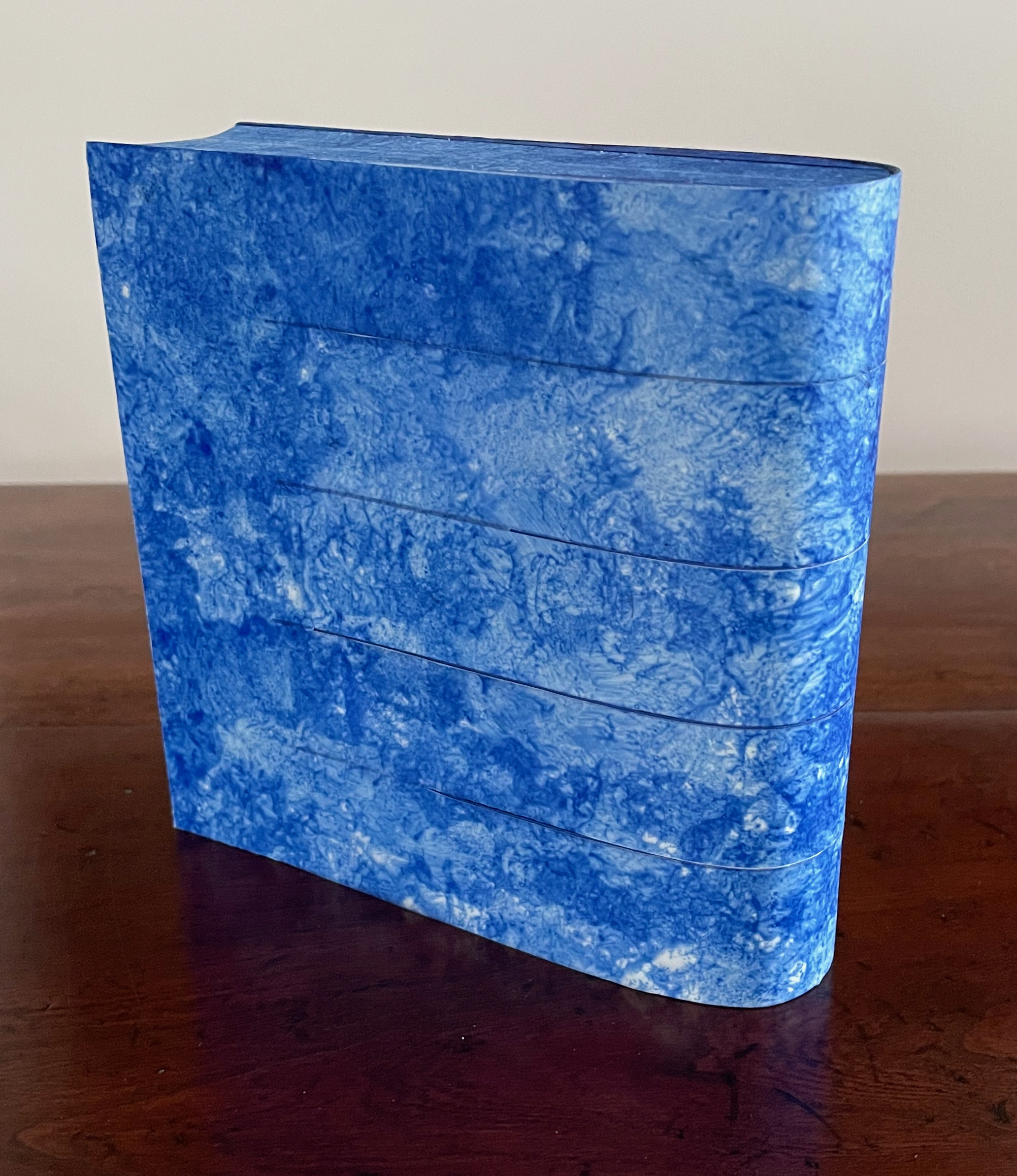
Breaking Waves (2023) Emmy van Eijk Sculptural book. 140 x 140 x 40 mm (closed). Unique work. Acquired from Papertrail Handmade Books, 22 January 2024. Photos: Books On Books Collection.
Breaking Waves spills over at least three categories of bookmaking: the bound blank book, designer bookbinding and sculpture. It would take a bold owner, however, to use the work in its first category. Fortunately that invitation quickly yields to another.
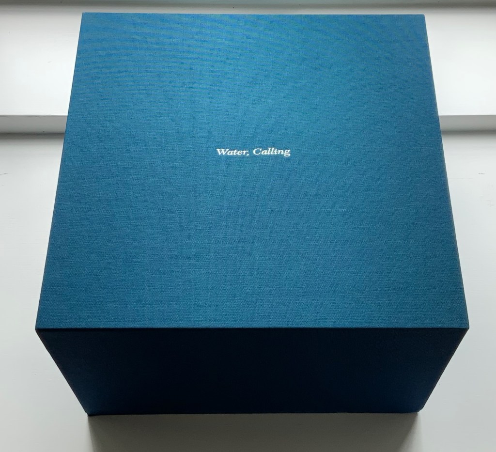
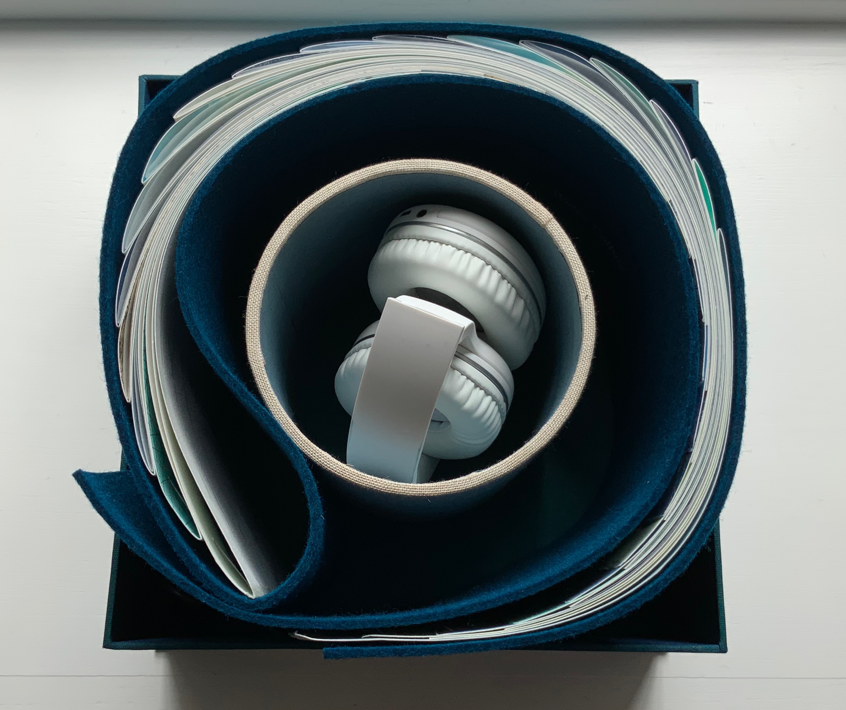
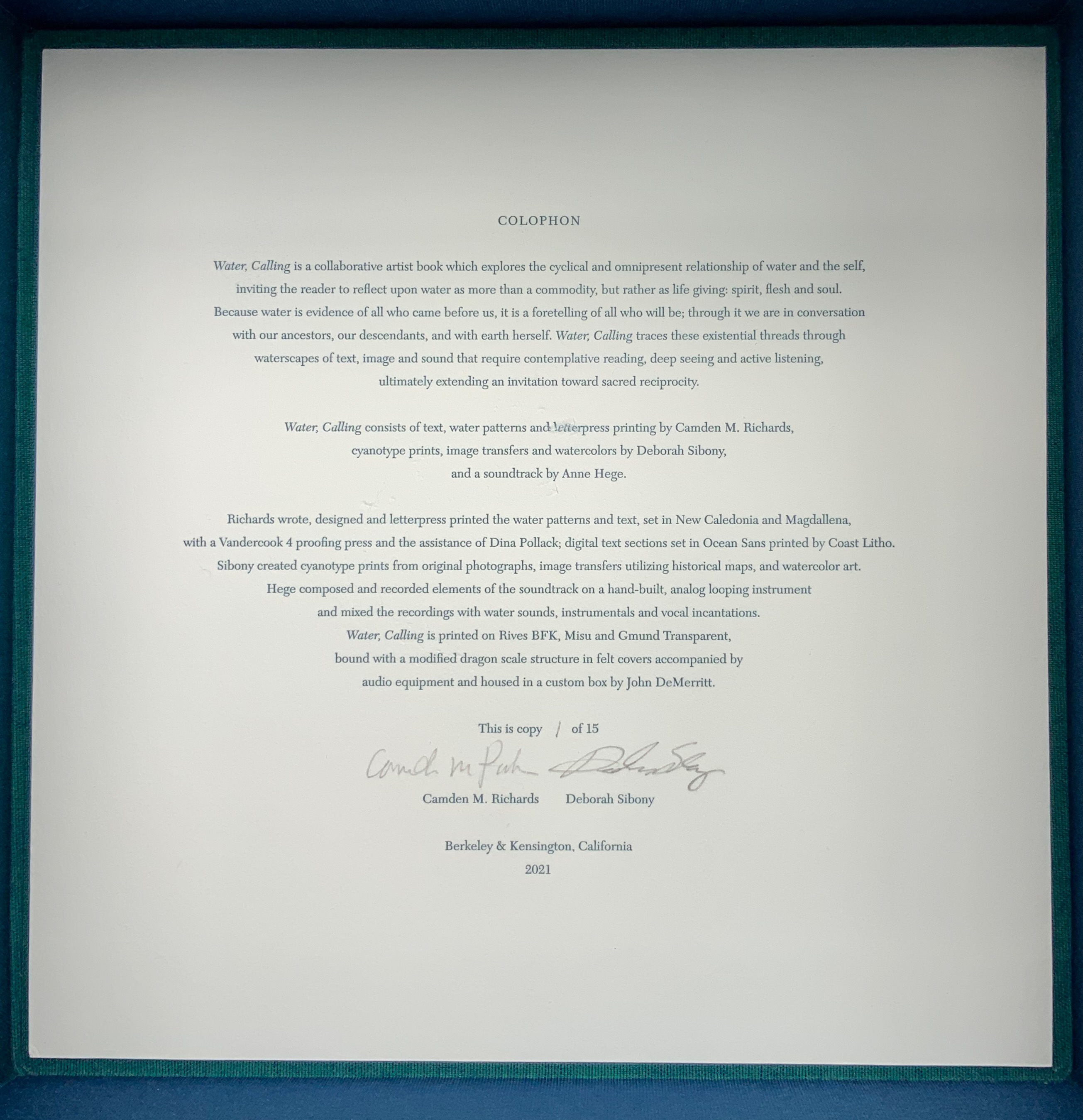
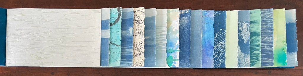
Water, Calling (2021) Camden Richards & Deborah Sibony Felt-covered, modified dragon-scale bound artists’ book, accompanied by audio equipment in custom box. Box: 262 x 262 x D170 mm. Book: H155 x W775 mm (closed). 110 pages. Edition of 15, of which this is #1. Acquired from the artists, 5 October 2022. Photos: Books On Books Collection. Displayed with artists’ permission.
Colophon “Water, Calling is a collaborative artist book which explores the cyclical and omnipresent relationship of water and the self, inviting the reader to reflect upon water as more than a commodity, but rather as life giving: spirit, flesh and soul. Because water is evidence of all who came before us, it is a foretelling of all who will be; through it we are in conversation with our ancestors, our descendants, and with earth herself. Water, Calling traces these existential threads through waterscapes of text, image and sound, extending an invitation to enter more fully into a dialogue composed of acts requiring active listening, contemplative reading and deep seeing with the hope of inspiring sacred reciprocity.”
This is the rare first edition as published by the late Jan Middendorp through his Druk Editions. It bears all the hallmarks of his eye for design — the black coated wired binding, the heavy embossed card cover, the use of color to underscore the text’s theme, the embedded booklet — all nevertheless centering and providing a platform for the art and design of Clotilde Olyff.
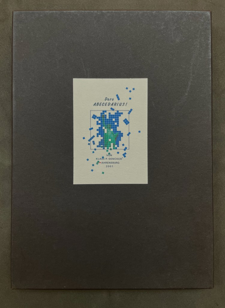
Dero Abecedarius!(2001) Klaus Peter Dencker Loose folios in heavy card box, title on card pasted on front box cover. H298 x W210 mm. 34 folios. Inkjet on BFK Rives 210 gram. Edition of 50, of which this is #30. Acquired from Red Fox Press, 3 January 2023. Photos: Books On Books Collection.
Visual poems in an ABC sequence and inspired by the Statue of Liberty. Klaus Peter Dencker belongs in the vast company of notable visual poets and “alphabet-etishists”, too many to list here, but within the Books On Books Collection, there are Jim Avignon & Anja Lutz, Jim Clinefelter, Martín Gubbins, Bernard Heidsieck, Karl Kempton and Sam Winston, all of whom offer fruitful comparisons.
Handscapes (2016) Margaret (Molly) Coy & Claire Bolton Casebound, hand sewn and bound with doublures and two ribbon bookmarks. H260 x W310 x D30. 80 folios. Edition of 12, of which this is #9. Acquired from the artists, 19 October 2023. Photos: Books On Books Collection. Displayed with artists’ permission.
Co-founder of The Alembic Press with David Bolton, Claire Bolton is an independent historian of printing and type as well as an aficionado of handmade paper. She recently donated works in shifu (a spun and woven paper textile) to the Bodleian. Although she disclaims classification as a book artist, her works in the Books On Books Collection — especially her collaboration with Molly Coy called Handscapes (2016) — argue with her persuasively.
A Little Black Book (1995)
A Little Black Book(1995) Claire Bolton Miniature, exposed-spine, stab-bound with red cotton thread to hard boards. H73 x W60 mm. 64 pages. Edition of 100, of which this is #4. Acquired from Oak Knoll Books, 11 October 2023. Photos: Books On Books Collection. Displayed with artist’s permission.
I think that the root of the wind is water (2016) Susan Lowdermilk Hardback with open spine, Asahi cloth over board, debossed front cover with fitted, pastedown artwork, around folded structure with cut-outs, pop-ups and pastedowns. H236 x W182 x D20 mm. 14 pages. Edition of 30, of which this is #24. Acquired from the Abecedarian Gallery, 5 October 2023. Photos: Books On Books Collection. Displayed with the artist’s permission.
Some book art illustrates a poem. Some converses with it. And some, like this one by Susan Lowdermilk, enact the poem.
Richard J. Hoffman (1912-1989) was a fine press printer and taught print and design at California State University, Los Angeles. His interests in typography, miniature books and the alphabet are represented by two works in the Books On Books Collection: “Don’t Nobody Care about Zeds” (1987) and Otto Ege’s The Story of the Alphabet (1988).
Both books scratch the collection’s “alphabet itch”. The first provides the added satisfaction of complementing the children’s books that champion the alphabet’s last letter: Jon Agee’s Z Goes Home (2006), Alethea Kontis & Bob Kolar’s AlphaOops: The Day Z Went First (2012), Sean Lamb & Mike Perry’s Z Goes First (2018) and Lou Kuenzler & Julia Woolf’s Not Yet Zebra! . The second adds an alphabet history to the miniature abecedaries as well as a more than usually intricate design.