Bartleby the Scrivener: A Story of Wall Street (1995)
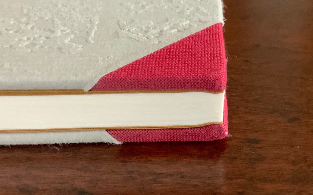
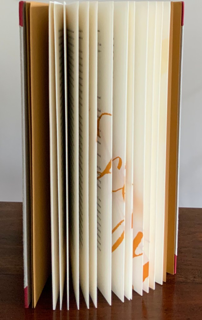
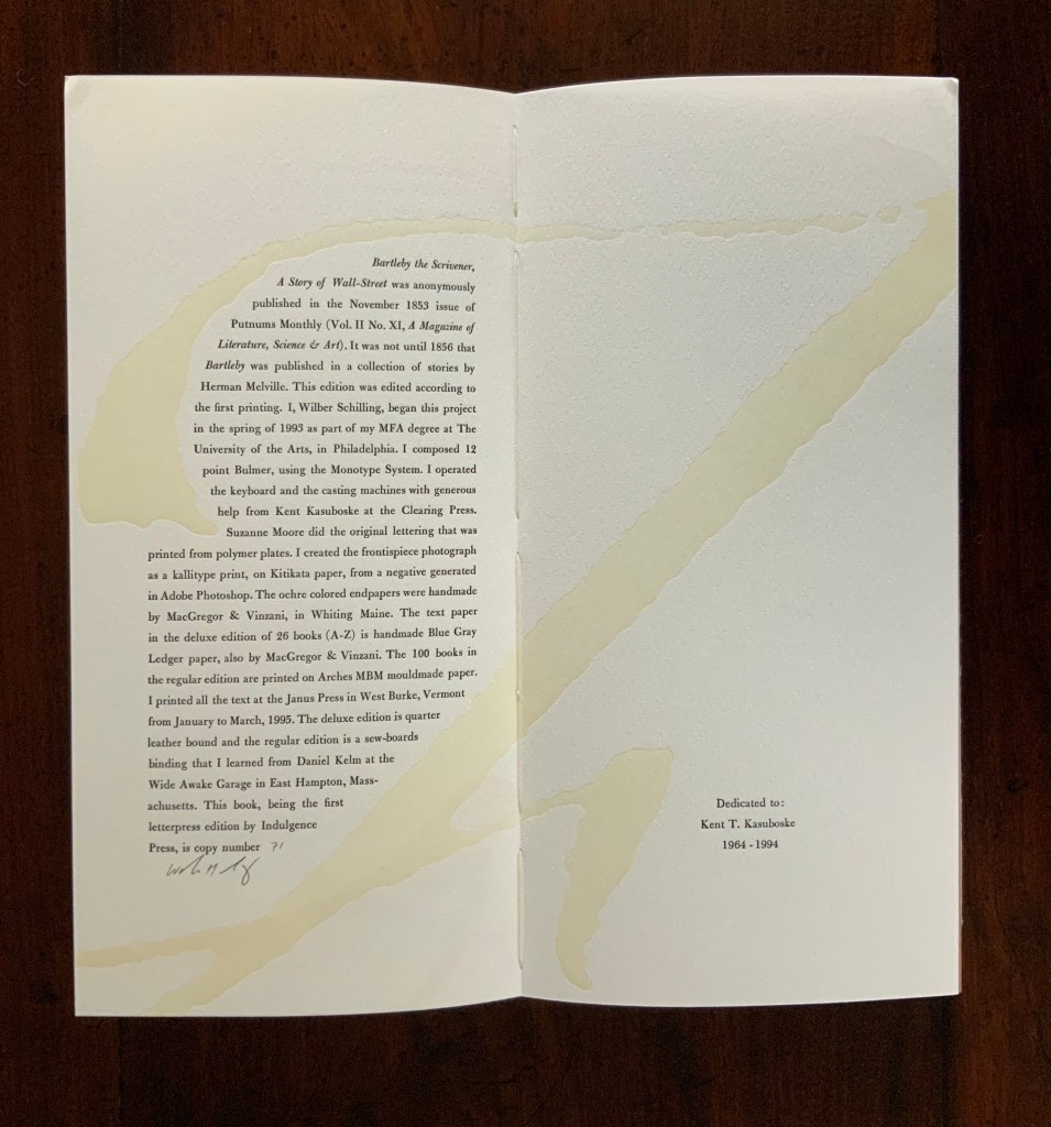
Herman Melville, Bartleby the Scrivener: A Tale of Wall Street, 1853. Indulgence Press, 1995. Type composed in 12 point Bulmer on the Monotype System and printed by Wilber Schilling on Arches MBM mould made paper at Janus Press. Calligraphy by Suzanne Moore. Ochre-coloured endpapers handmade by MacGregor & Vinzani. Wilber Schilling created the frontispiece photo as a Kallitype print from a negative generated in Adobe Photoshop. The binding, also by Schilling, is cloth over sewn boards and, over the cloth, an embossed print of details from the frontispiece photo. Edition of 100 of which this is #71. H320 x W158 x D14 mm. Acquired from Indulgence Press, 17 December 2015.
Further Reading
“Suzanne Moore“. 14 January 2020. Books On Books Collection.
Jury, David, and Peter Rutledge Koch (eds.) 2008. Book Art Object. Edited by David Jury. Berkeley, California: Codex Foundation. Pp. 198 (Where Do We Start?), 199 (Surplus Value Books #13).
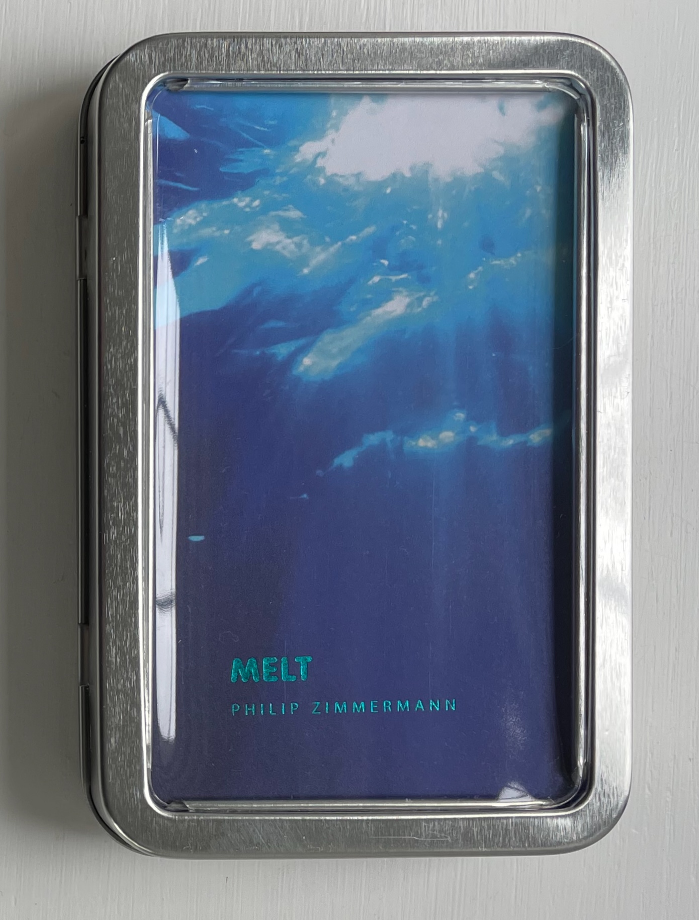
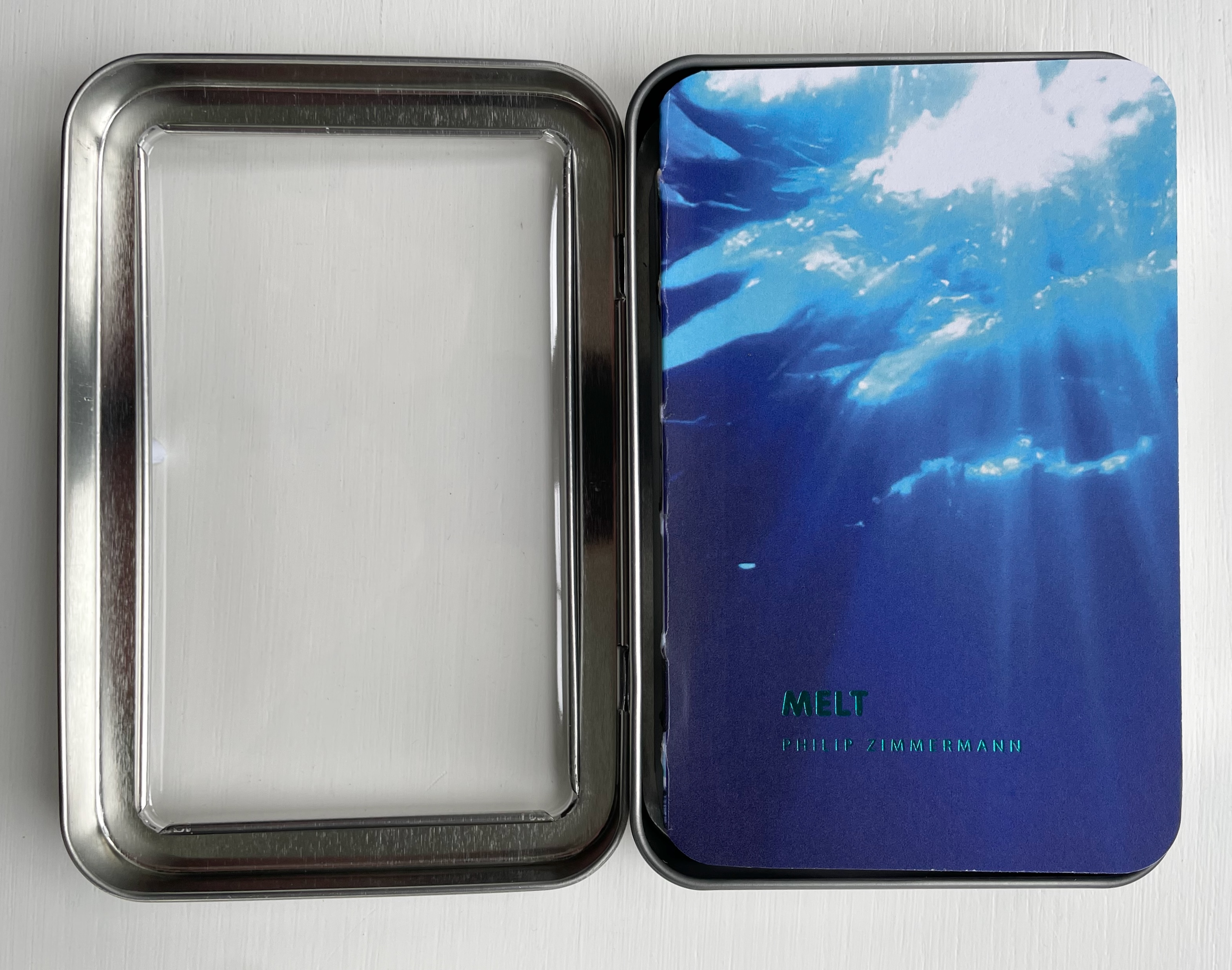
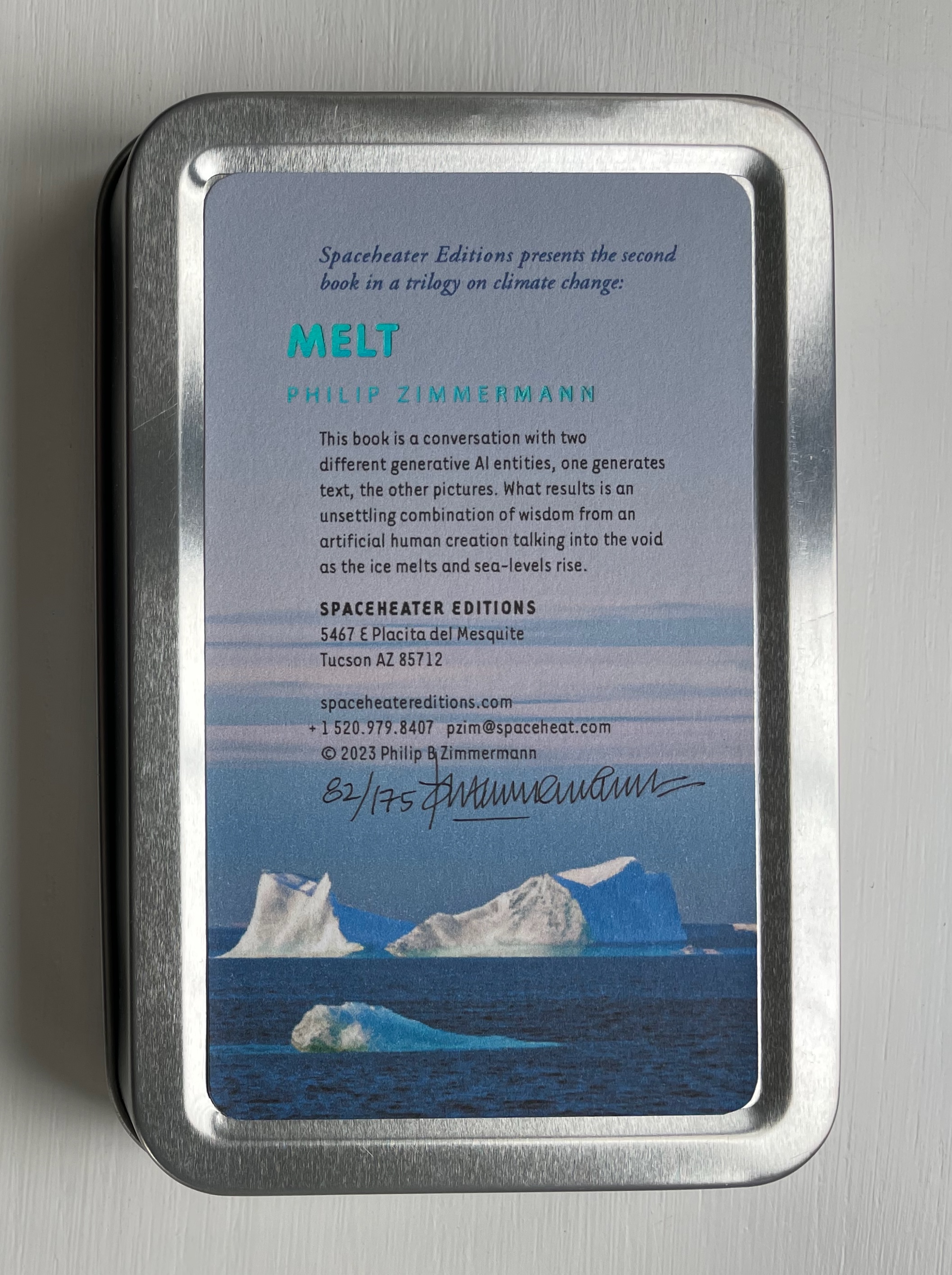
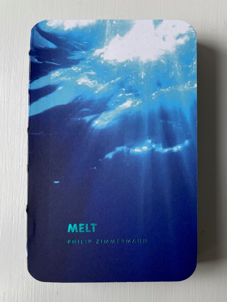
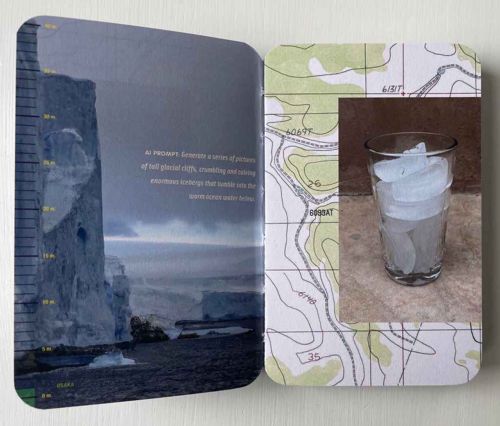
Melt(2023) Philip Zimmermann Smyth-sewn book with exposed spine, and enclosed in a small tin box with a clear window on the front. Box: H140 x W93 x D24 mm; Book: H130 x W93 x D16 mm. 200 pages. Edition of 175, of which this is #82. Acquired from Spaceheater Editions, 4 February 2024. Photos: Books On Books Collection.
Melt is the second work in a climate change trilogy, the first being Landscapes of the Late Anthropocene (2017/19), which appears below. More complex in its material, Melt may self-ironically have a larger carbon footprint than its predecessor more from its process than the material involved. As the artist describes it,
… it is also a conversation with two generative artificial intelligence entities. ChatGPT and DALL-E, both from Open AI: one generates the text, the other the pictures. What results is an unsettling combination of wisdom from an artificial human creation talking into the void as the ice melts and sea-levels rise.
And Melt is high-tech in other ways as well. It is
printed by one of the latest updated printing technologies, high-speed UV-cured inkjet. It was printed on a Komori Impremia IS29s digital press at Spectrum Printing in Tucson, Arizona. It is a new and improved version of that digital inkjet sheet-fed printing method that is not only very fast, but also light-fast, and uses stochastic imaging, which means there are no halftone dots. The finished prints rival or exceed the quality of high-quality offset lithography.
If the printing industry has in fact been reducing its CO2 emissions and since digital press printing is self-evidently more environmentally friendly than earlier processes (Kariniemi, 2010), Melt has a reduced carbon footprint on that score. The carbon footprints of ChatGPT and DALL-E, however, are not nil (Heikkilä, 2022).
So their use in Melt must increase its footprint, as must the use of traditional bookmaking technology and material: smyth sewing, glue, paper, foil, etc. There’s even the non-traditional material of the tin box and its clear plastic window. As becomes evident by the end of the book, all this is a complex irony not lost on the artist. Indeed the irony becomes self-referential in the book art tradition of self-referentiality.
Melt is a grimly playful book.
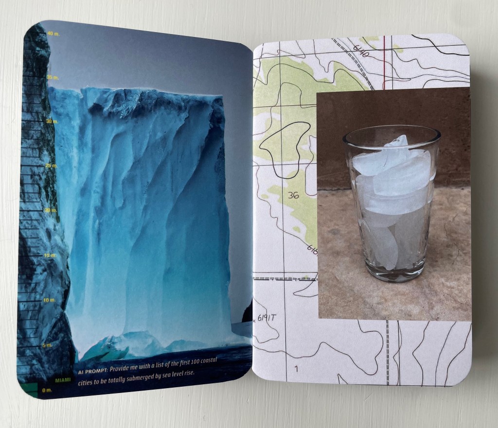
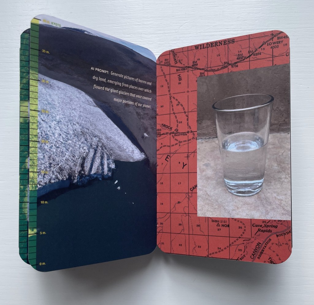
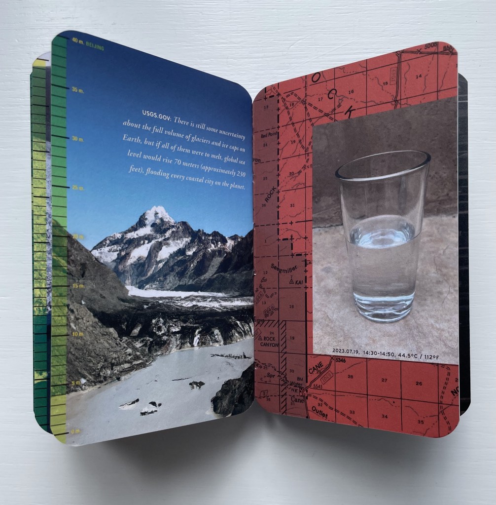
Its DALL-E dialogue of prompt and response focuses attention on the polar images generated on the lefthand page. While that’s going on, and in response to an AI prompt to list the first 100 coastal cities that will be submerged by rising tides, a scale on the lefthand edge shows the rise in sea-level and provides the answer to the prompt by pairing the sea level with the city falling beneath it — the first two being Miami and Osaka. By the end of the book, the last two cities to be submerged are Kyoto and Beijing.
While these verso page images are appearing, another set of images vies for attention on the recto pages — scans of old land maps and a superimposed time-lapse photo of a glass of melting ice. The maps show traditionally hot areas in Arizona and New Mexico, and as the book progresses, the maps redden while the ice melts, which can be appreciated by riffling the pages like a flipbook (see video of this here).
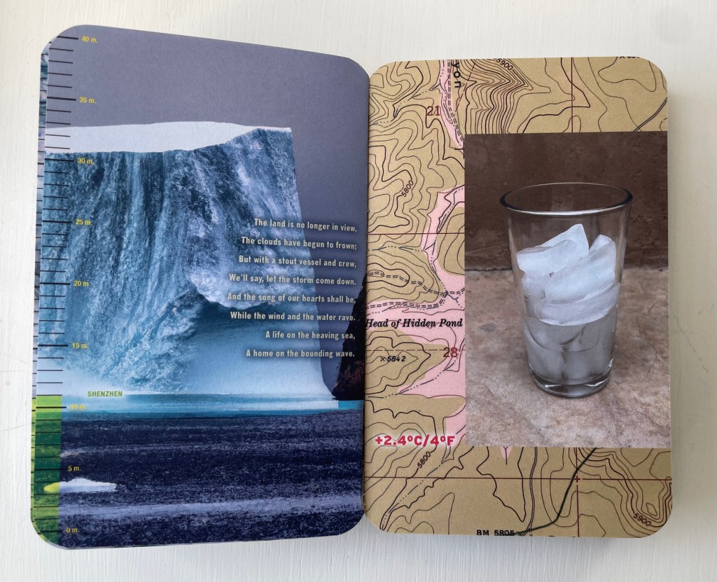
For the slower page-by-page reading, there are the instructions addressed to ChatGPT and its various textual responses to them. The human book artist is having his grim fun with this AI and with us. Part way through, over DALL-E’s images of calving glaciers, he superimposes lyrics of the 19th century song “A Life on the Ocean Wave” with obvious (for us humans, at least) irony.
Shenzhen “is no longer in view”.
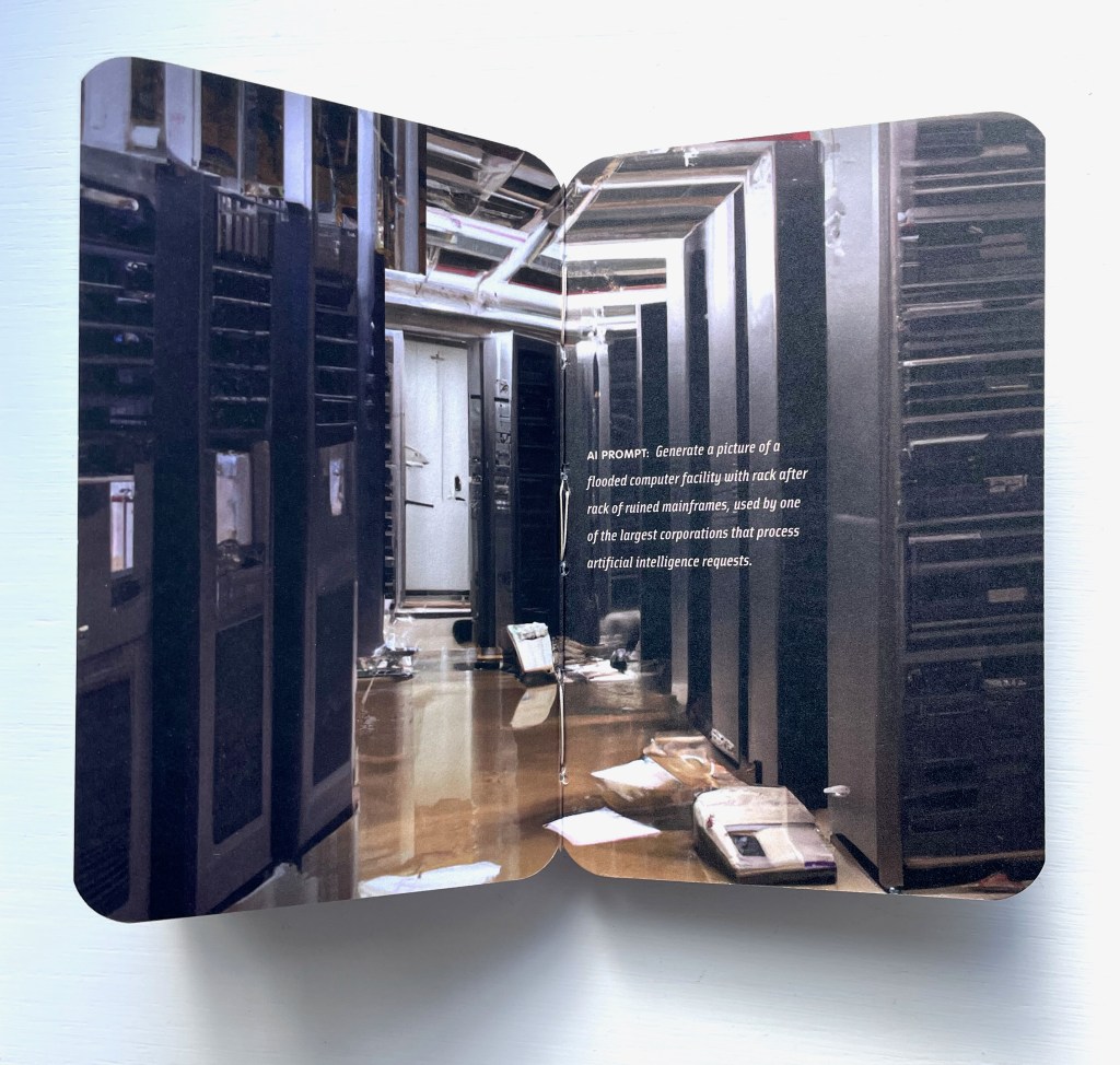
But then, just to rub it in, he prompts ChatGPT to “Write a few paragraphs on how the poem (and later song lyrics) “A Life on the Ocean Wave”, by Epes Sargent, relates to sea-level rise, metaphorically, ironically, or otherwise”. ChatGPT’s eerily human-sounding response is a joke on us climate-changing humans, perhaps matched only by the artist’s prompting DALL-E to “generate a picture of a flooded computer facility with rack after rack of ruined mainframes, used by one of the largest corporations that process artificial intelligence requests”. Below is Dall-E’s final image. One wonders what ChatGPT might write if prompted “Write a few paragraphs on what you as an AI think of the image below”.
By playing DALL-E and its images off ChatGPT and its text, Melt notches up an innovation in the tradition of image-text interplay in artist’s books. We’ve already seen the subtle calling attention to this with the flipbook mechanics vs the slow read of AI text. There’s also ChatGPT’s speculation on the relevance of Robert Frost’s poem “Fire/Ice” to climate change, which the artist juxtaposes with DALL-E’s verso polar images that face the reddening recto pages. Even more directly Zimmermann calls attention to the interplay by asking ChatGPT to come up with a list of images to illustrate climate change and generate a sense of urgency, which DALL-E seems to ignore as it carries on with its own verso-page dialogue of prompts and polar images.
As suggested at the start of this entry, perhaps the most subtle reference to book art’s traditions comes at the end of the book. Melt‘s final image can be read not only as an ironic joke on the AIs but as a joke on us and a self-referential claim by Melt. The jokes, of course, are that the AI pontificating about climate change has an impact on its own environment, and that all of the impacts are our impacts. As for Melt‘s self-referential claim, consider the Dutch artist Thijs Biersteker’s words:
… artwork and installations that uncover and visualize the environmental impact of AI and tools like ChatGPT are essential in today’s rapidly evolving world. By raising awareness, humanizing the technology, encouraging responsible behavior, providing a platform for dialogue, fostering emotional connections, and promoting environmental stewardship, art can play a pivotal role in addressing the environmental challenges posed by AI. Through creative expression, we can inspire meaningful change and ensure a sustainable future for both AI and the environment. — Woven Studio [before 7 May 2023].
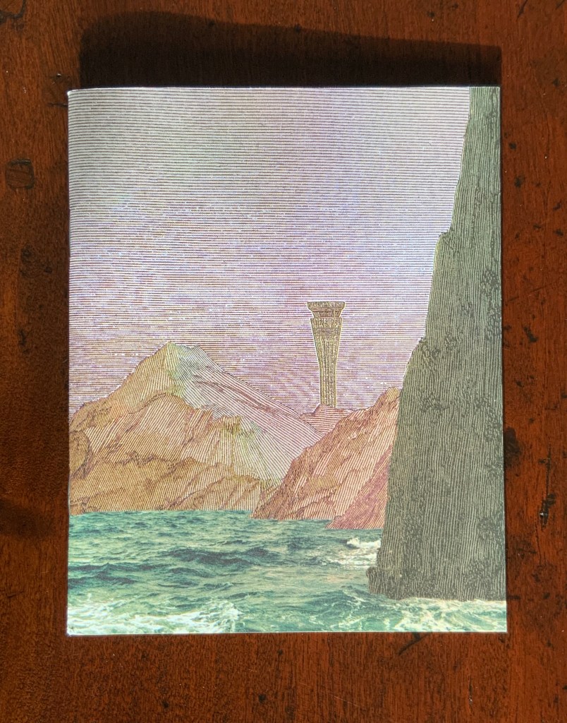
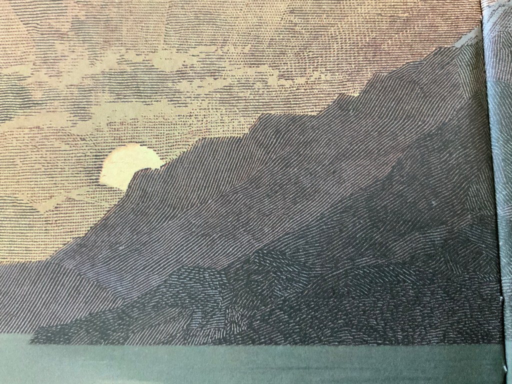
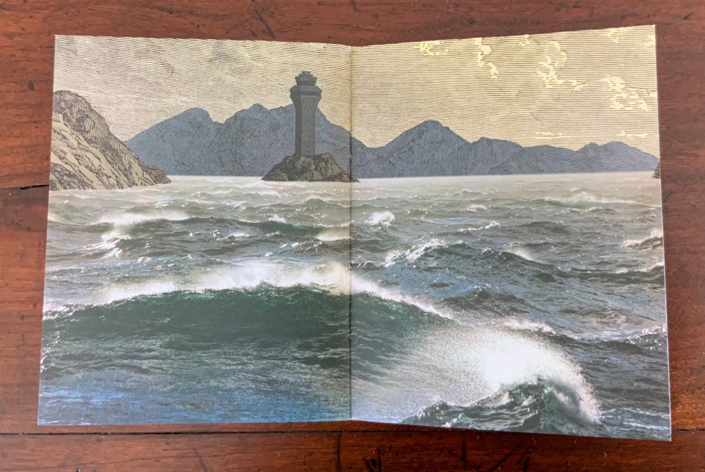
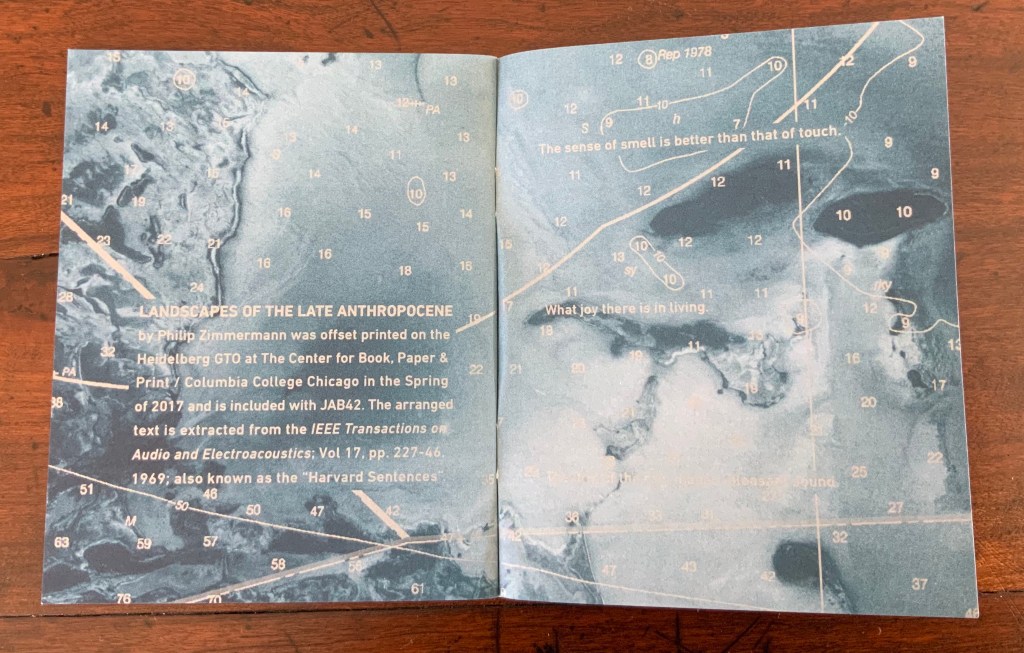
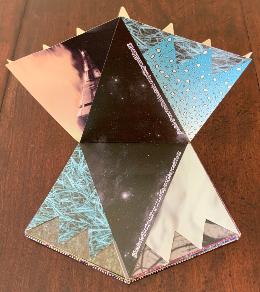
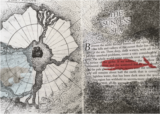
It opens with sunrise, closes with sunset. Each landscape shows water meeting land. Airport control towers appears in each landscape. Some stand on promontories, some are nearly submerged. Tinted pages of NOAA charts of the Bahamas, Florida Keys and Gulf of Mexico lay between the pages of landscapes. The sentences placed across the charts in silvery white come from the random-seeming, poetic-sounding “Harvard Sentences“, used by audio engineers and speech scientists in Harvard’s Psycho-Acoustic Laboratory from the mid-20th century to the present to test the effects of noise on comprehension.
There are 72 ten-sentence banks in the Harvard Sentences. The artist’s choice of three sentences for each chart page is like a painter’s choice of colors and strokes.
“Men think and plan and sometimes act” is the first chosen. “A pink shell was found on the sandy beach” is the last. In between come “reds” like “Let it burn, it gives us warmth and comfort”, “greens” like “Lush ferns grow on the lofty rocks” or “blacks” like “That move means the game is over”. The sentences seem to change their color or meaning as the eye moves among the landscapes. What color has “Canned pears lack full flavor”?
The only other man-made structure in the book appears halfway through: the roof of a log cabin with the water almost to the eaves.
A small work of book art with an overwhelming force.
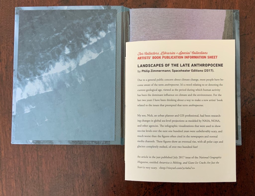
Under his Spaceheater Editions imprint, Zimmermann also produced a limited hardback edition, which includes an eight-page sewn pamphlet describing the work.
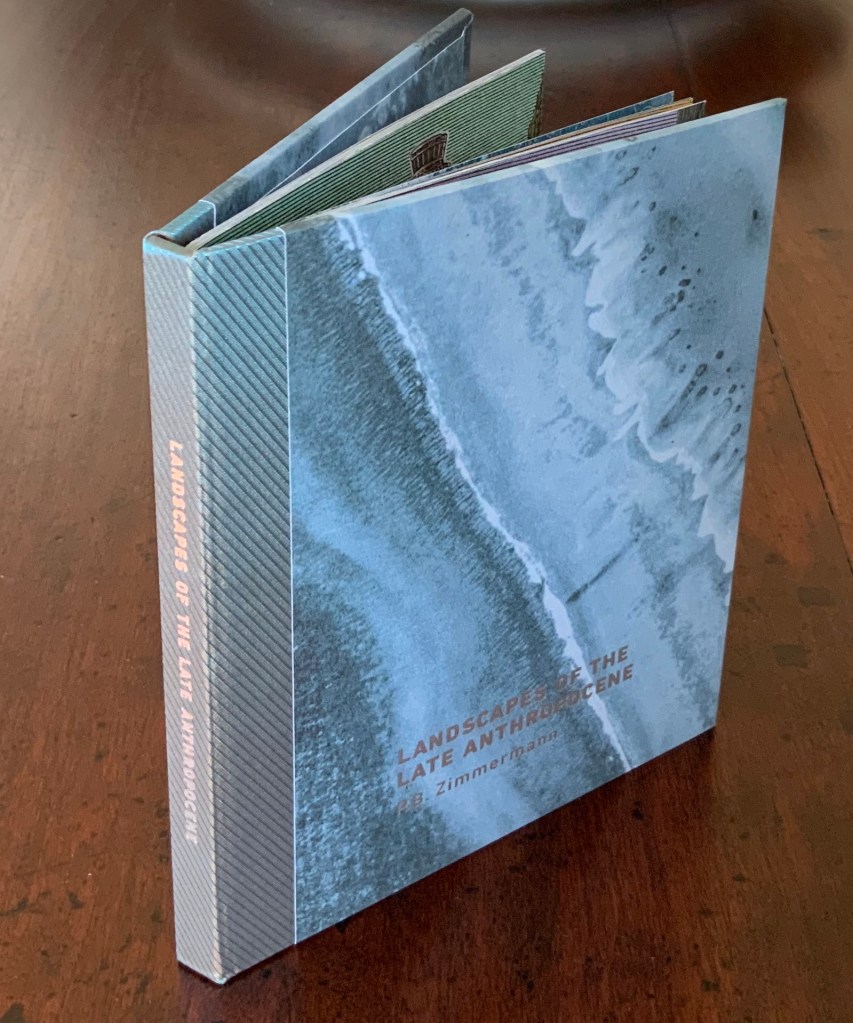
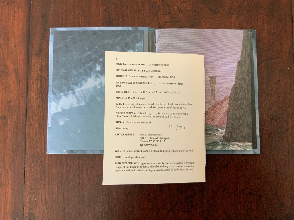
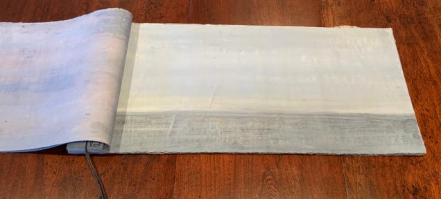
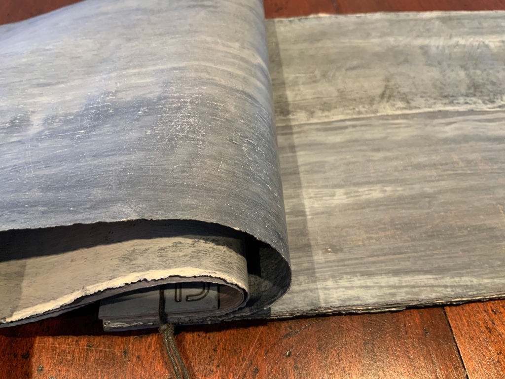
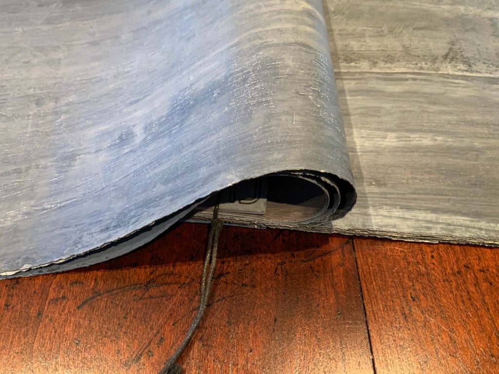
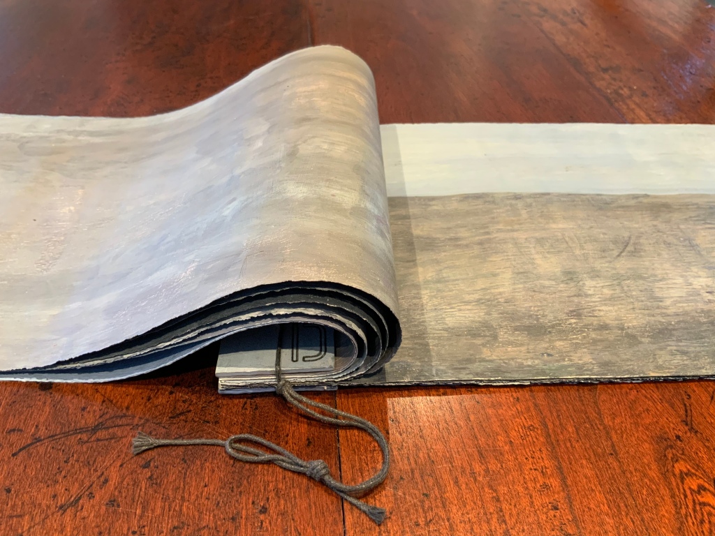
Landscapes of the Late Anthropocene (2019) Philip Zimmermann Offset lithography, 4/c and duotone plus metallic silver. Paper: Mohawk Superfine. 142 x115 x 12 mm. Acquired from the artist, 23 February 2020. Photos: Books On Books.
Incident in Deseret (2014)
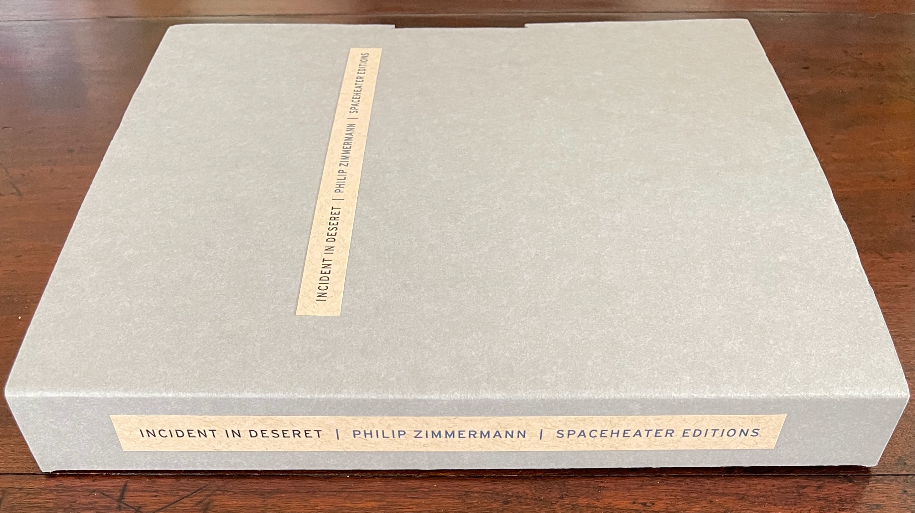
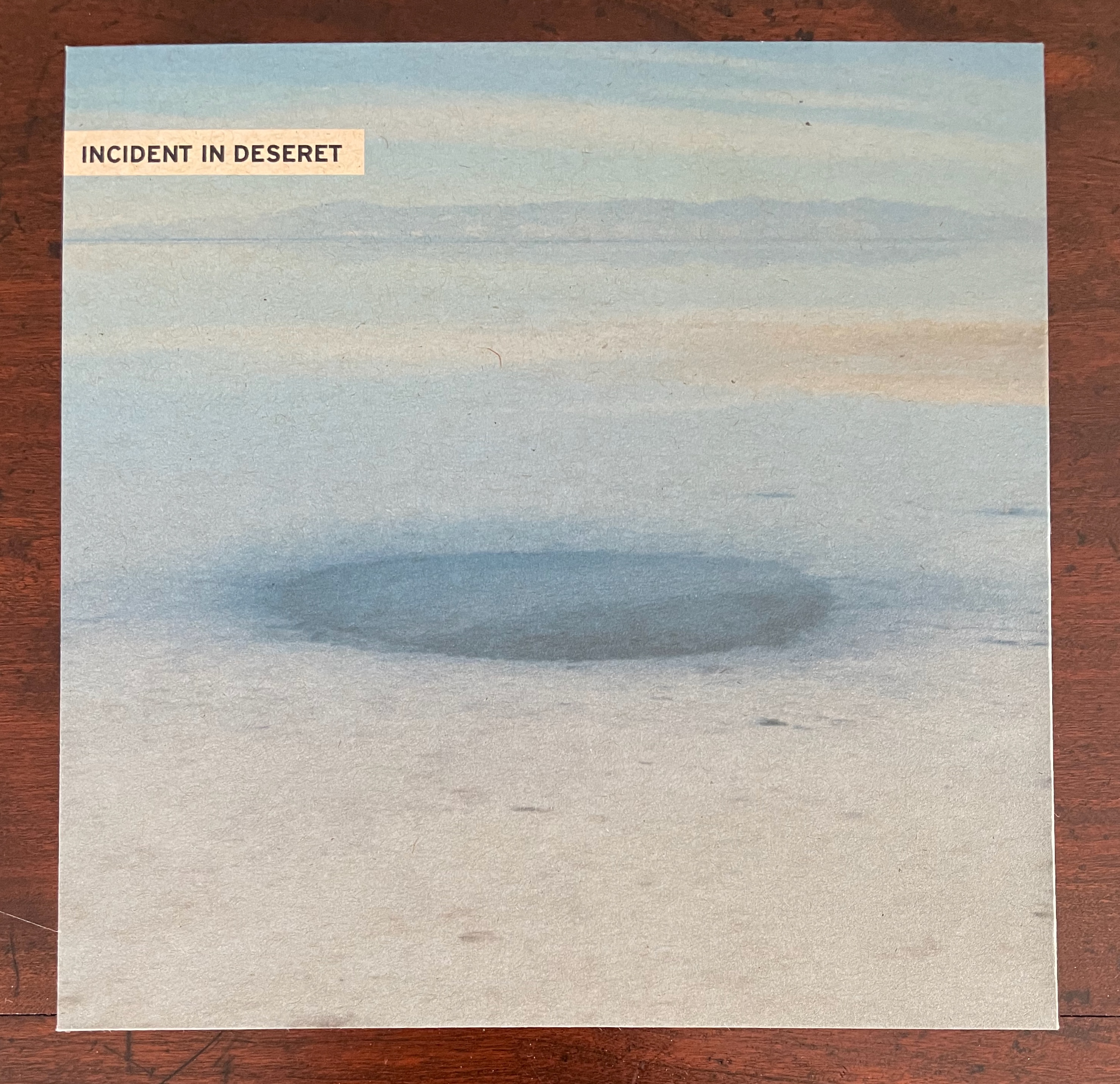
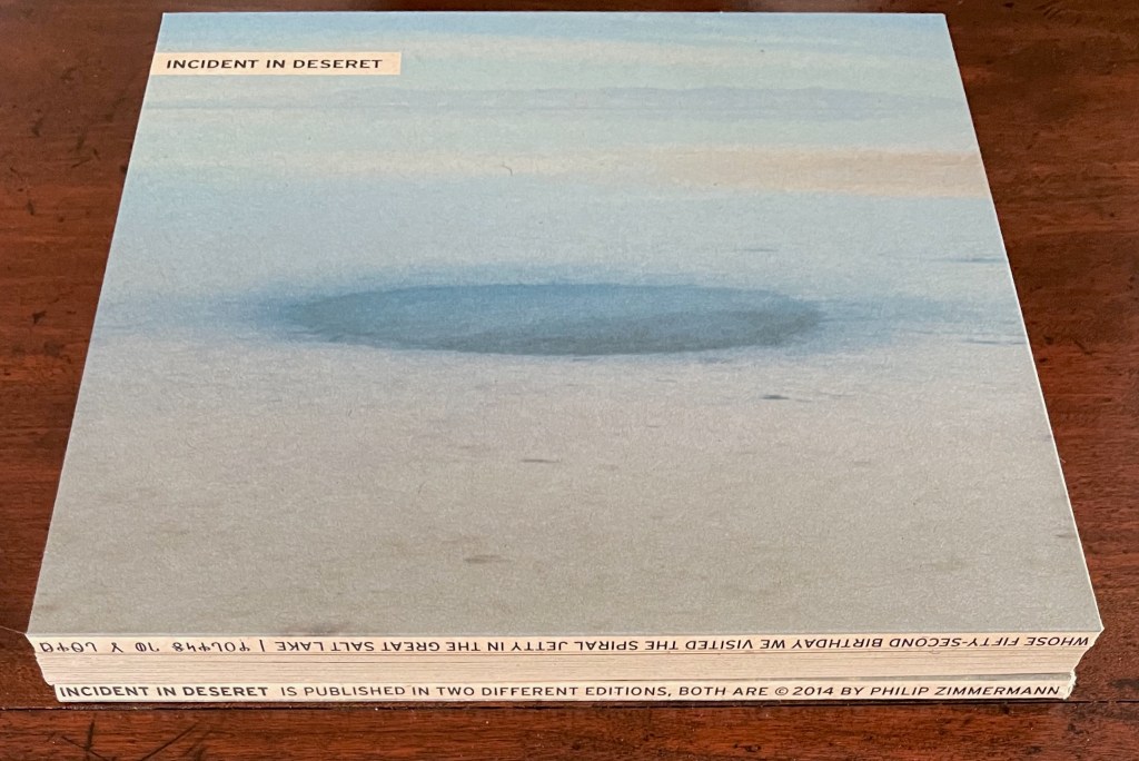
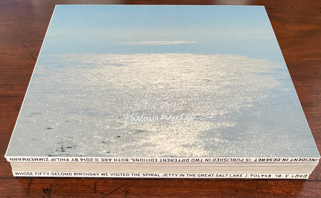
Incident in Deseret(2014) Philip Zimmermann Hard-covered board book with drum-leaf binding, enclosed in archival box with title pasted on front cover and spine. Box: H212 x W215 x D25 mm; Book: 203 x 203 x D20 mm. 30 pages. Edition of 30, of which this is #17. Acquired from Spaceheater Editions, 4 February 2024. Photos: Books On Books Collection.
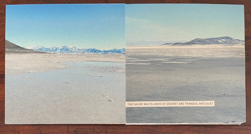
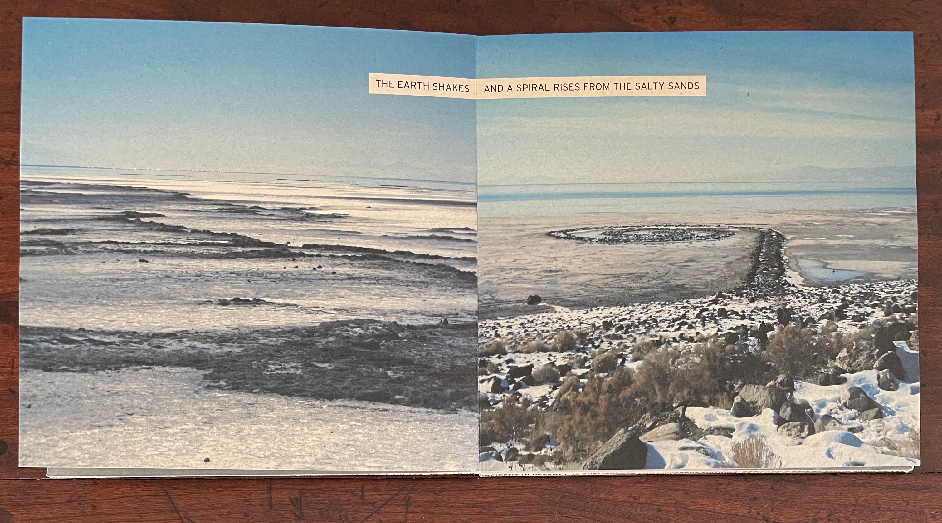
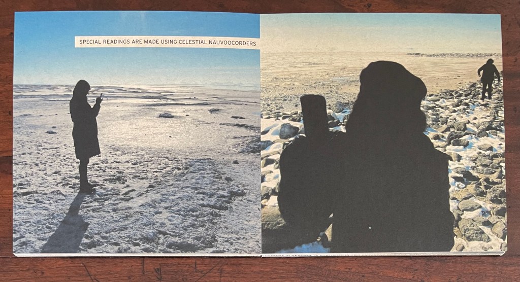
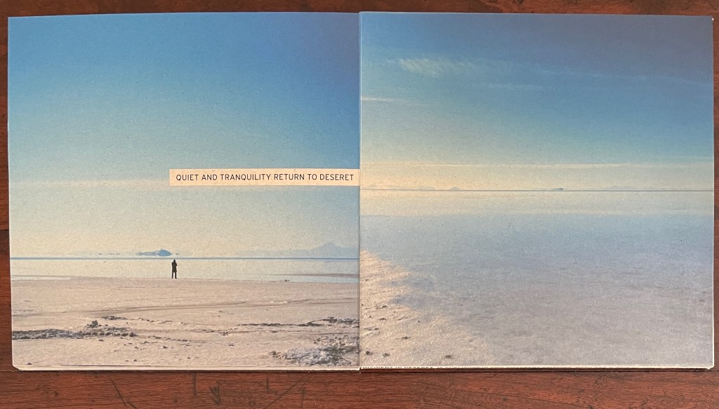
Incident in Deseret wastes no time and little space on preliminaries. The board book pulls you in straightaway — just the way a children’s board book might — with impressive edge-to-edge photos of the setting. Where you would expect to find the text of a copyright page, title page, etc., the only words you see are as much the opening to a mystery as an identification of the locale. After all, “deseret” might be a typo for “desert” unless you know that it is the name the Mormons called the provisional state from which Utah emerged. If you do, you will likely identify the wasteland as Utah’s Great Salt Lake. But given that only the edges of the book’s drumleaf binding provide the confirming details (more on this later), you can safely conclude that this preliminaries-less opening reflects a clear intention: to reserve the book’s pages for telling a story.
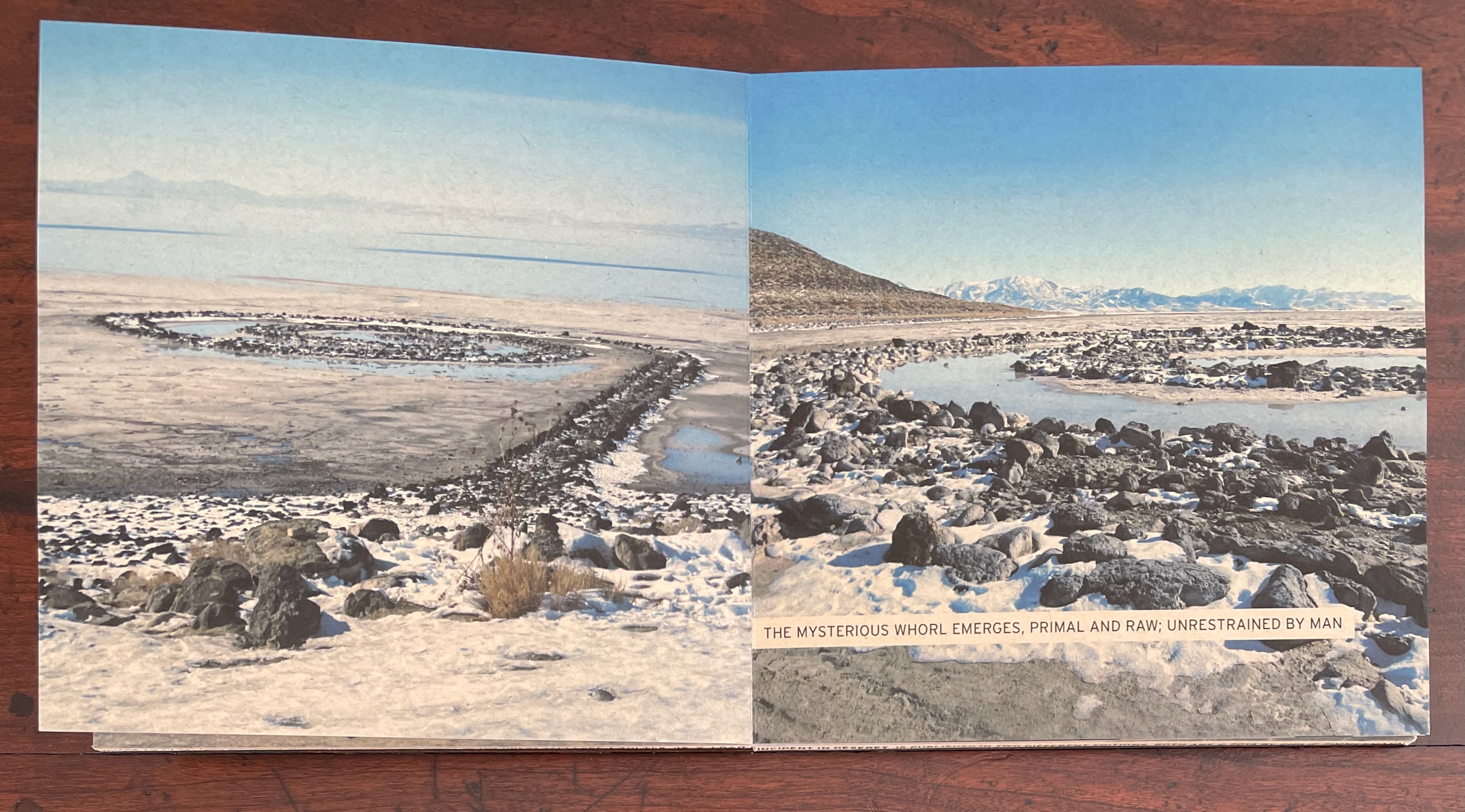
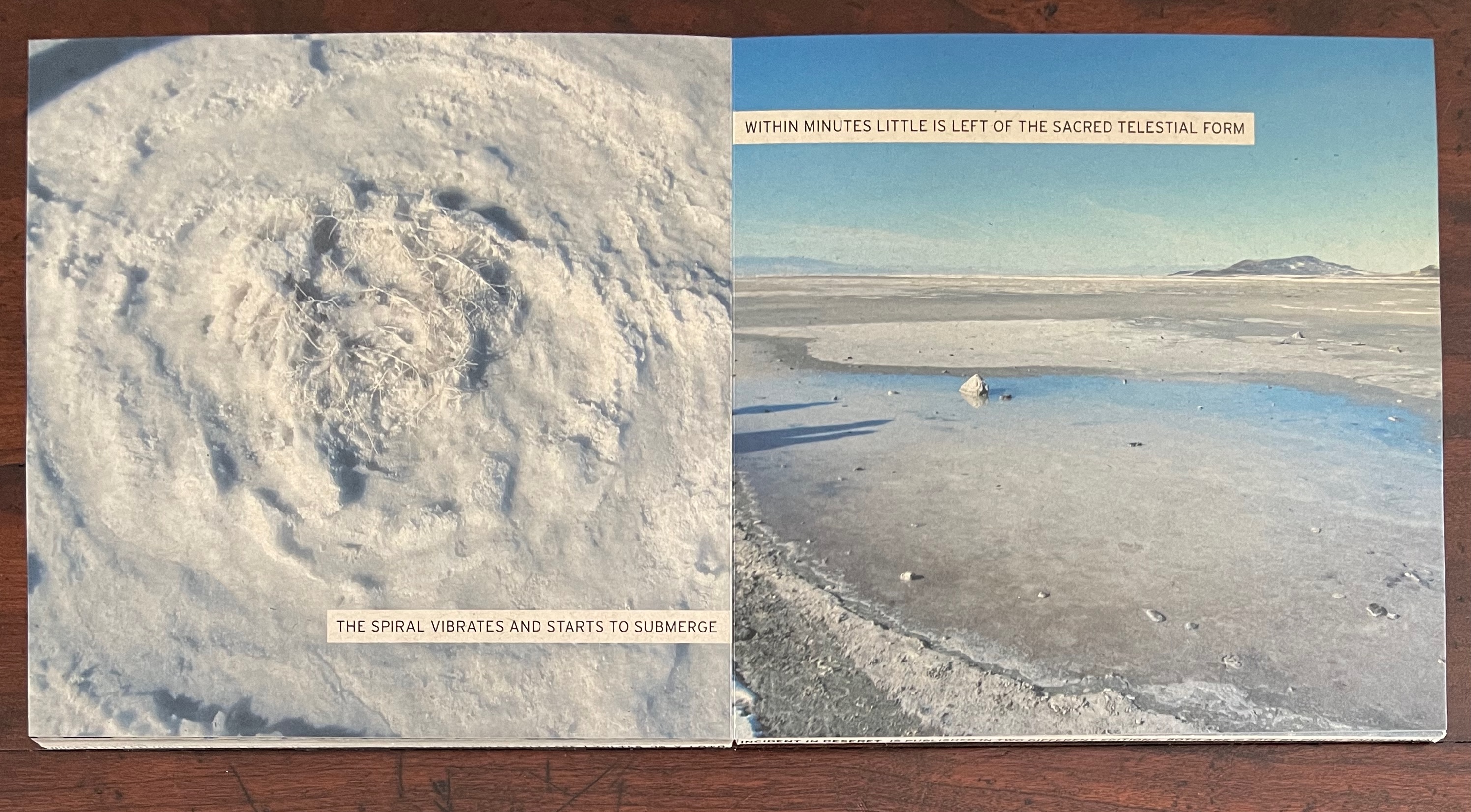
The story’s first action adds to its fictitious fiction. It is no accident that Robert Smithson’s The Spiral Jetty is not named within the book but only on the edges of the covers. The iconic artwork in a remote desert is being appropriated, tongue in cheek, as a supernatural phenomenon “unrestrained by man” despite being very much a human work of art imposed on the natural.
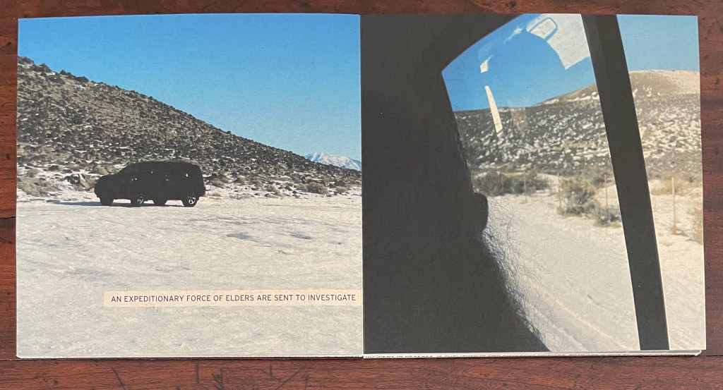
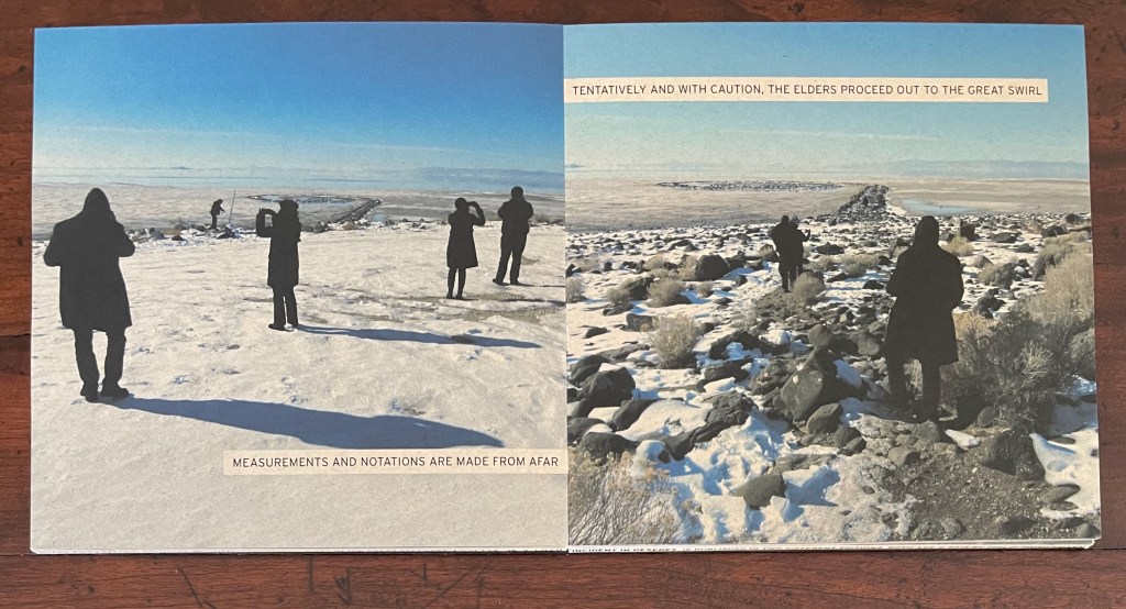
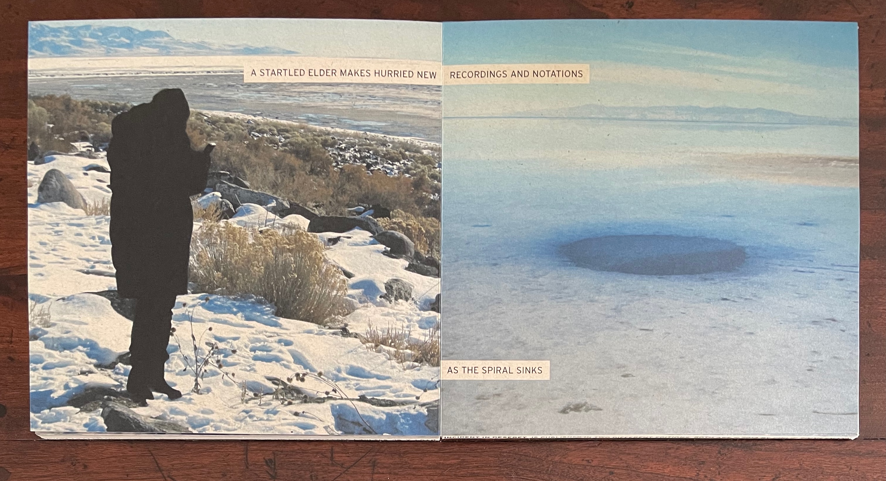
The arrival of “Elders”, all in black, heightens the religious overtones, but as with Smithson’s artwork, the religious term is being appropriated: the Elders’ activity seems more that of scientists and surveyors, which later in the book they confirm by arguing “over the cosmic reasons for the spiral”, checking and rechecking their observations, making final calculations.
On the other hand, what kind of scientists and surveyors use “celestial nauvoocorders”? Like the setting, Nauvoo is borrowed from the Mormons, a name that their founder Joseph Smith gave to Commerce, Illinois upon settling there in 1840 for six years. Although Smith wrote that the name derived from the Hebrew word meaning “beautiful”, the word “nauvoocorder” is the artist’s portmanteau for the Elders’ cameras recording the phenomenon of “celestial beauty”, and so is “nauvooite” for the chunks of salt they collect. Other borrowings from the Mormons are “Kolobian” (relating to Kolob, the heavenly body nearest to the throne of God) and “telestial” (“Of or pertaining to the lowest degree of glory“), but in the context of the story, the words could come from a tale of science fiction.
And eventually the final main activity is one of science fiction, and like much of science fiction, the conclusion to the story closes full circle.
A further word about the binding that has facilitated this uninterrupted tale.
With the unusual drumleaf binding, the artist gives himself the space for the absent preliminaries. It expands the edges of the front and back covers. Here is where the copyright page, title page and dedication appear. Printed around the front drumleaf cover’s four edges is the following:
Incident in Deseret | Philip Zimmermann | Spaceheater Editions | 𐐸𐐬𐑊𐑉𐑌𐑅 𐐻𐐭 𐑄 𐑊𐐫𐑉𐐼 𐐸𐐬𐑊𐑉𐑌𐑅 𐐻𐐭 𐑄 𐑊𐐫𐑉𐐼 | Published by Spaceheater Editions | 5467 East Placita del Mesquite, Tucson Arizona 85712 | http://www.spaceheatereditions.com | 520.979.8407 | This book is dedicated to Karen on whose fifty-second birthday we visited The Spiral Jetty in the Great Salt Lake | 𐐸𐐬𐑊𐑉𐑌𐑅 𐐻𐐭 𐑄 𐑊𐐫𐑉𐐼
And around the back drumleaf cover’s four edges:
Incident in Deseret is published in two different editions, both are 2014 by Philip Zimmermann 𐐸𐐬𐑊𐑉𐑌𐑅 𐐻𐐭 𐑄 𐑊𐐫𐑉𐐼 | This book is one of a series of seven books inspired by a group visit on 2014.01.05 to Robert Smithson’s Spiral Jetty, each book by a different artist.| 𐐸𐐬𐑊𐑉𐑌𐑅 𐐻𐐭 𐑄 𐑊𐐫𐑉𐐼 𐐸𐐬𐑊𐑉𐑌𐑅 𐐻𐐭 𐑄 𐑊𐐫𐑉𐐼 | One in a series of seven books on the theme of The Spiral Jetty
The Deseret characters along the covers’ edges come from a public domain TrueType font called Huneybee Regular, which seems to be no longer available. The font here comes from the Deseret Alphabet Translator, which first appears on 17 September 2014 in the Internet Archive. The last three words in Deseret — 𐐻𐐭 𐑄 𐑊𐐫𐑉𐐼 — are “to the Lord”, but the first — 𐐸𐐬𐑊𐑉𐑌𐑅 — does not work as the intended transliteration of “Praise”. It should be 𐐑𐐡𐐁𐐞 in all caps or 𐐑𐑉𐐩𐑆 in cap and lowercase. In all caps, the entire phrase would be 𐐑𐐡𐐁𐐞 𐐓𐐅 𐐜 𐐢𐐃𐐡𐐔, but in the story’s context, accuracy in a particular religious script is not the point. More to the point is the way the script happens to echo the shape of Smithson’s Spiral Jetty, which Zimmermann has hijacked for the mysterious appearance and disappearance for the Elders’ investigation and interpretation. In that echo, the edges are drawn into the story.
Faith fascinates Zimmermann as an artist rather than a believer. Like many book artists, he finds in religion a source of commentary on human interaction with the environment (as above) and on humans’ interaction with one another (so below).
Sanctus Sonorensis (2009)
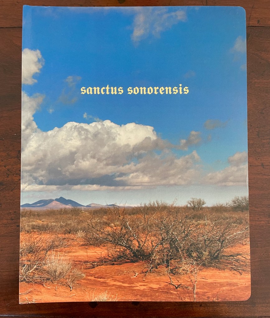
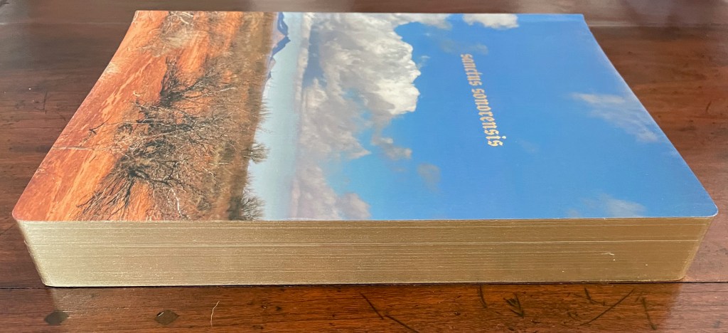
Sanctus Sonorensis (2009) Philip Zimmermann Perfect bound, self-covering board book, illustrated cover, gilt on top, bottom and fore edges. Gold-foiled title on the cover and spine. Four-color offset lithography. H273 x W208 x D35 mm. 90 pages. Edition of 1000. Acquired from Spaceheater Editions, 4 February 2024. Photos: Books On Books Collection.
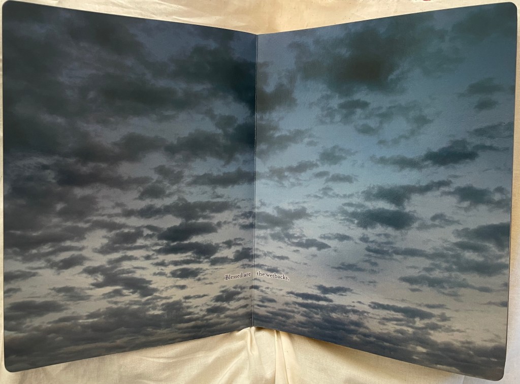
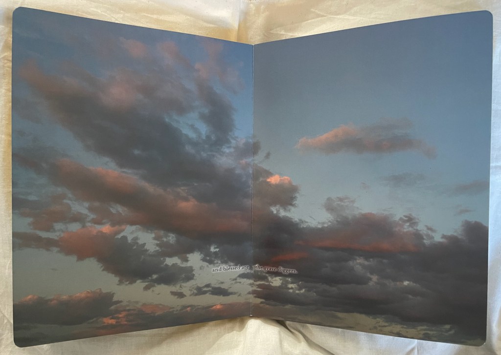
Sanctus Sonorensis begins and ends with double-page ground-level view of a patch Sonoran desert. In between, a series of spectacular double-page skyscapes takes the reader from dawn to moonrise over the desert. A litany of blessings — from “blessed are the wetbacks” to “blessed are the grave diggers” — occupies thirty-three of the double-page spreads. The roles are not exactly at odds with the Beatitudes of the New Testament, but they are insistently more numerous and particular. By the time evening is coming on in this location, the reader is safe to assume that these blessings are on illegal migrants. But who is extending the blessings? The deity, the artist, the migrants, non-migrants?
It’s complicated. There are mixed “material” signals on the journey as well. The rounded corners and gilt edges are reminiscent of religious breviaries or missals suit the text, but the board book construction is more common to children’s books, and yet the boards’ gilt edges urge more careful and slow page turning than do children’s books.
Also in contrast with the gilt rounded corners of a breviary or missal are the full-bleed double-page photos recalling a photobook or magazine. Yet the constant skywards view reinforces a prayerful, not playful or casual, perspective. That view would most likely belong to migrant eyes. Perhaps the blessings are self-blessings. For the non-migrant reader, the particularity of the roles and prayerful perspective might at least prompt an empathetic (or at least sympathetic) attitude, and perhaps that reader joins in the blessings.
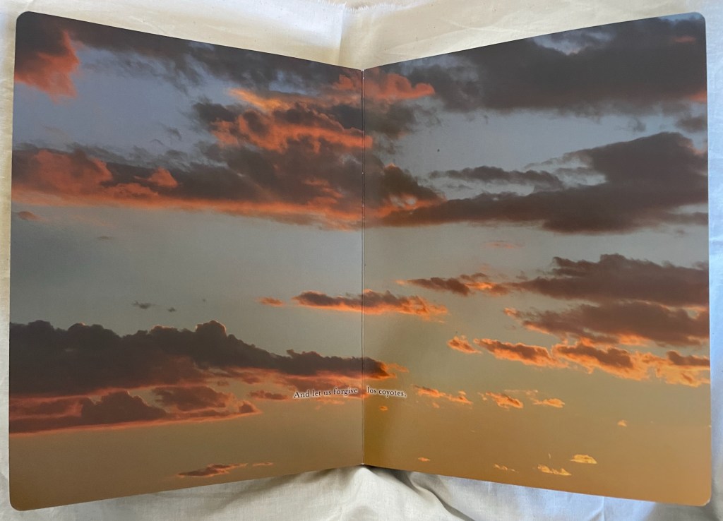
As the blessings come to an end, there is a text-less double-page spread of a sunset sky. Then as the sunset deepens in the next spread, more text appears, akin to another New Testament prayer:
As this list continues — “let us forgive the Border Patrol, let us forgive the Minutemen, let us forgive la migra” — it seems to come more from the migrant perspective. Los coyotes (above) refer to the people smugglers on the southern US border. La migra is short for inmigracíon or immigration and can be short for migrant, but it is also migrants’ slang for any immigration officials. If a non-migrant reader is uttering this invocation, it would have to be one who has signed on in all humility to the irony of William Tyndale’s version of the Lord’s Prayer in Luke 11:
And forgive us our trespasses, as we forgive those who trespass against us.
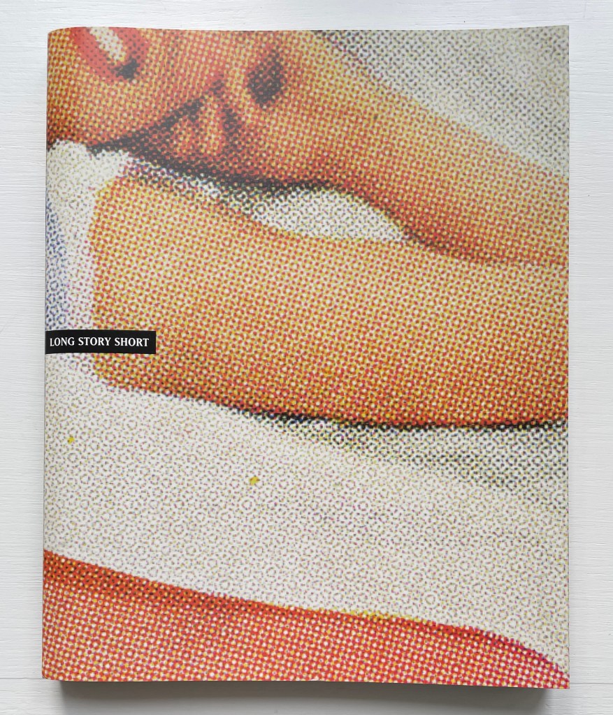
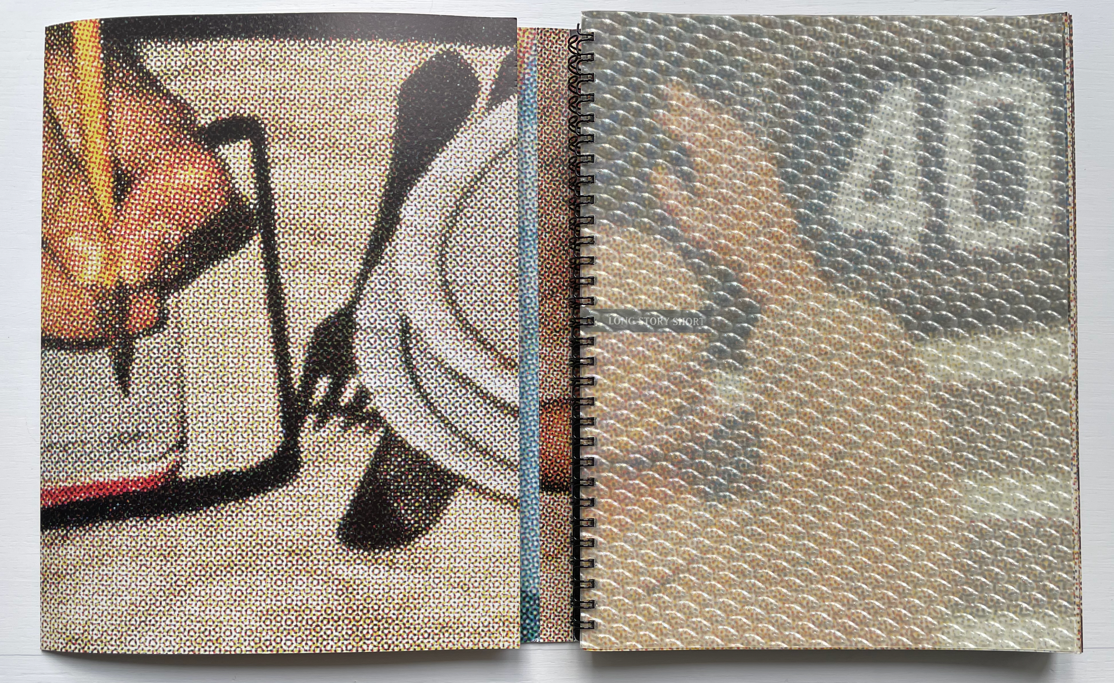
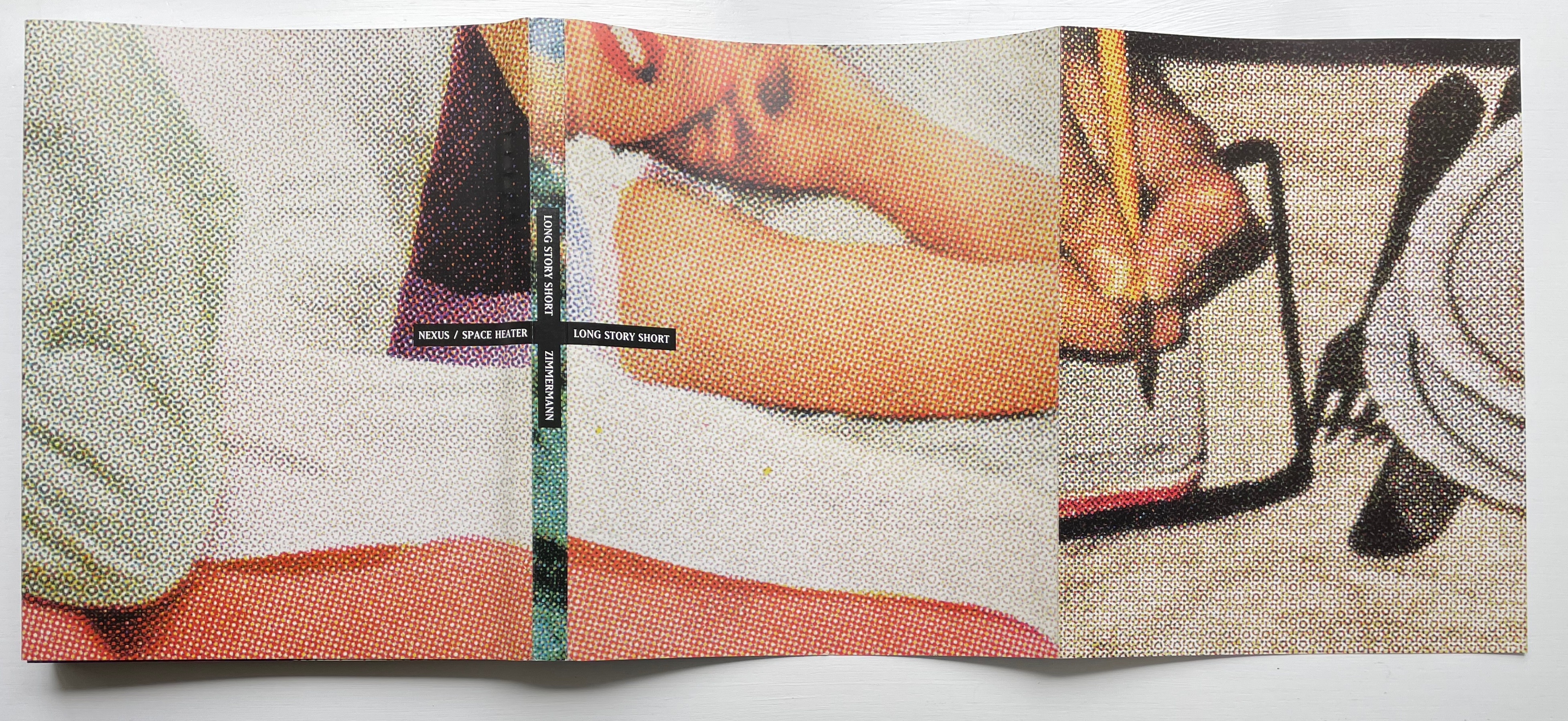
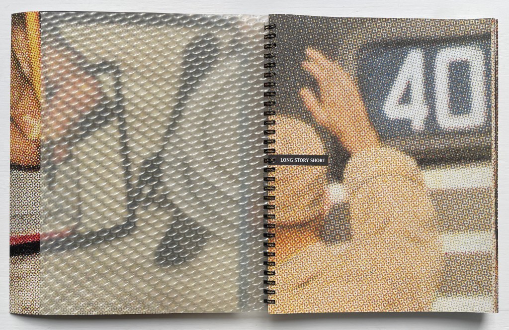
Long Story Short: Home is Where the Heart Is (1997-99) Philip Zimmermann Wire-o-binding with wrap-around softcover, optical plastic title page H267 x W212 x D15 mm. 145 pages, including cover and wrap-around cover. Edition of 750. Acquired from the artist, 4 February 2024. Photos of the work: Books On Books Collection.
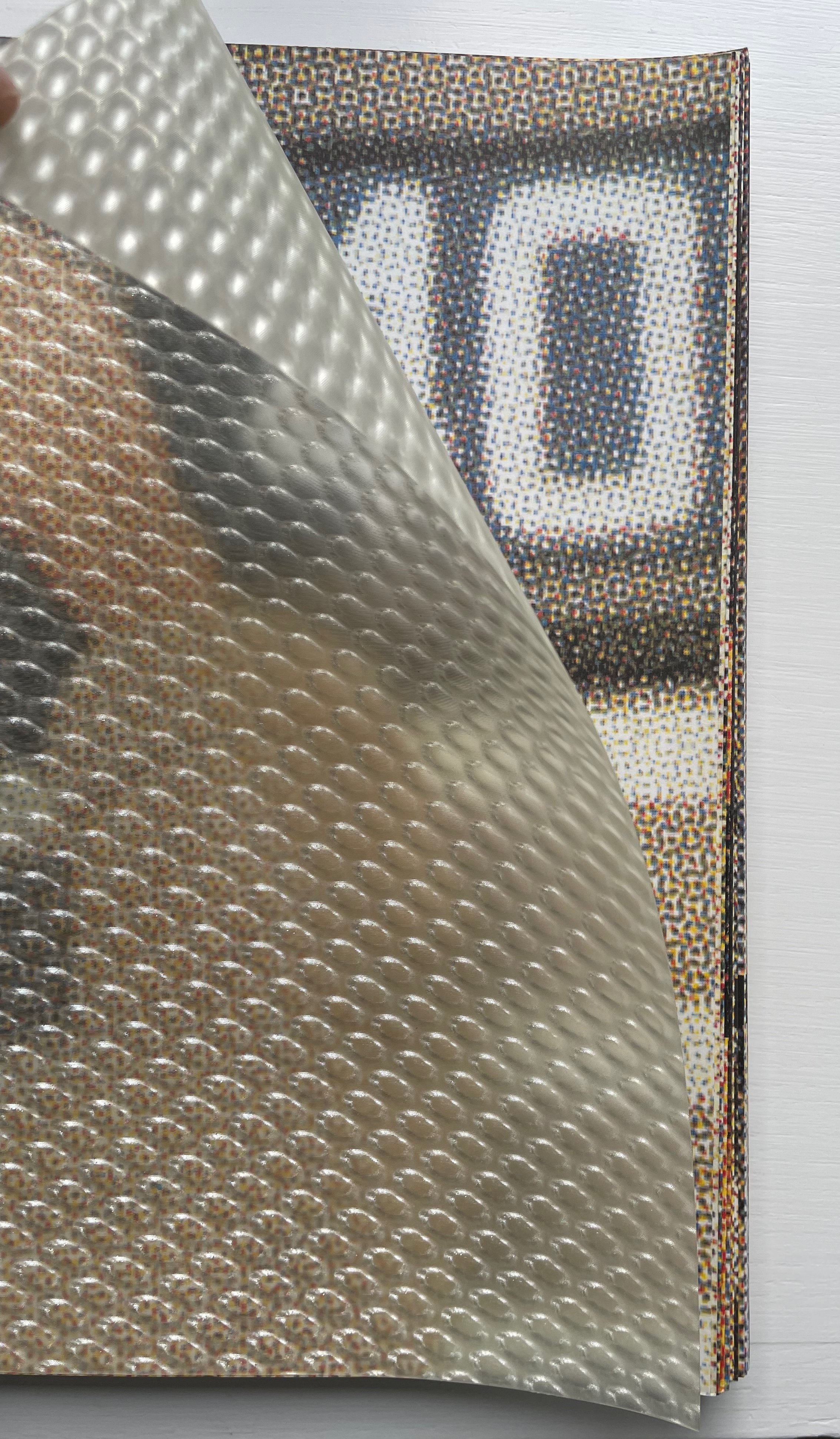
A cross between shaggy dog story, magician’s show and artist’s book, Long Story Short is anything but short. Opening the book delivers several tricks at once. First, there’s the “reveal” of the wire-o-binding hidden by the wraparound cover. At the same time, there’s the strange half-title page that seems embedded in some sort of thick piece of plastic, but this is an optical illusion that becomes apparent as you lift the thin sheet of plastic from over the half-title page underneath. But before you turn the eye-tricking plastic sheet fully to the left, you notice the cover’s folded flap.
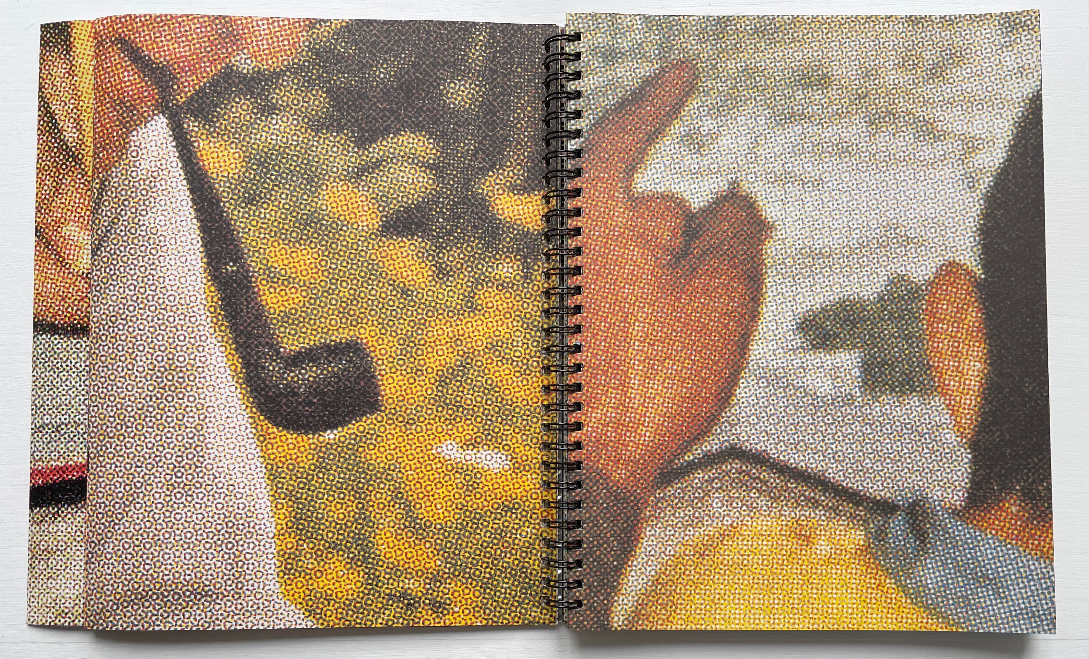
If you fold that flap out, the three-page spread probably leaves you puzzled. Other than the recurrent enlarged halftone dots and the images of hands, there’s not much in common across the spread to offer a clue to what’s going on. It’s enough to make you turn the whole thing over to see if the other side offers a clue.
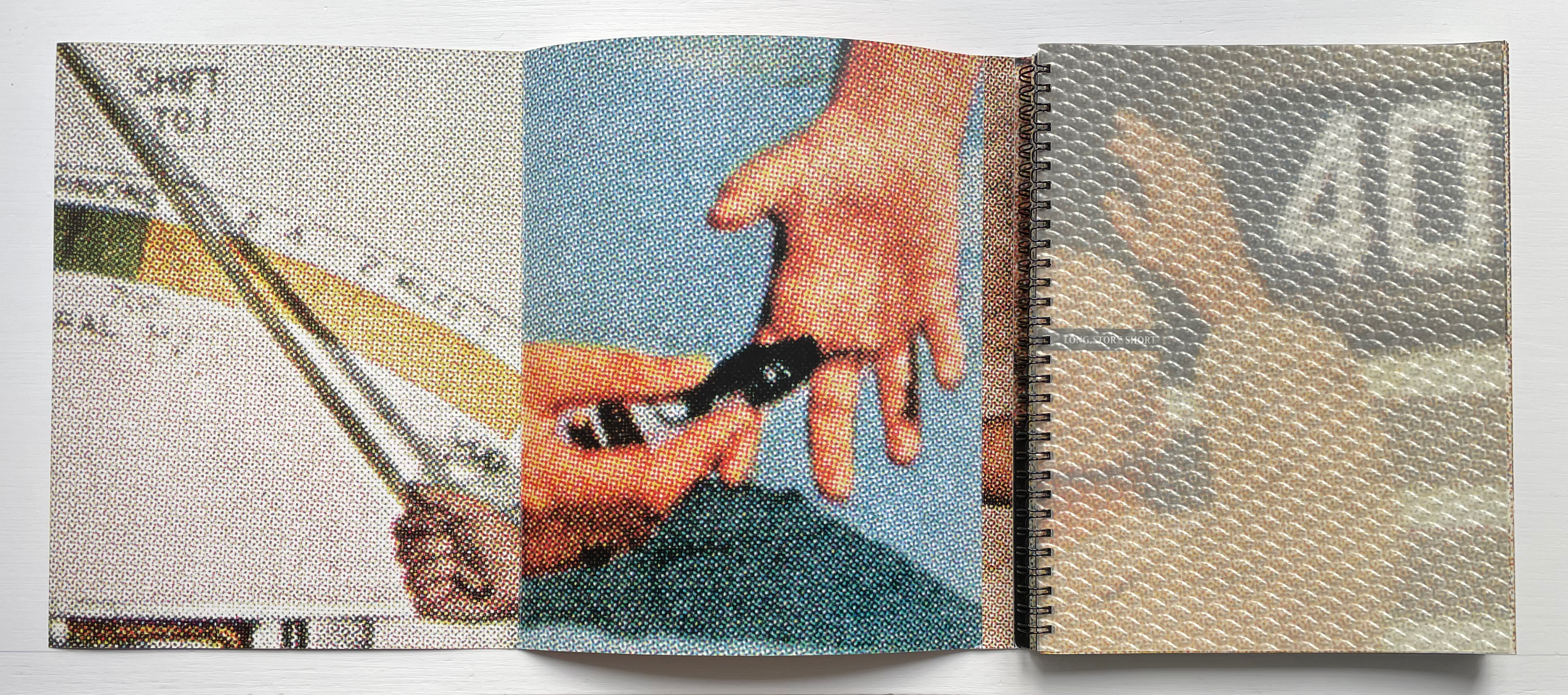
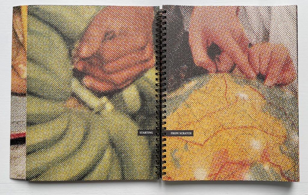
Hmm, while the outside of the wraparound cover shows a double-page spread with a joined-up image, the flap page, now on your right, does not seem to relate to it — other than with the enlarged halftone dots and the hands. Oh well, back to the beginning to turn that plastic sheet. Resting on a single sheet, the uncovered half-title page salutes the number 40 while its verso partner takes on a 3D appearance. Still a puzzle, but the next double-page spread with its magician’s show of an empty pair of hands crossed (or a mirror image of a single hand open) confirms the handsy theme and trickery afoot — or rather at hand. So turn the recto page (again, a single sheet), and the verbal-visual punning starts — from scratch, of course.
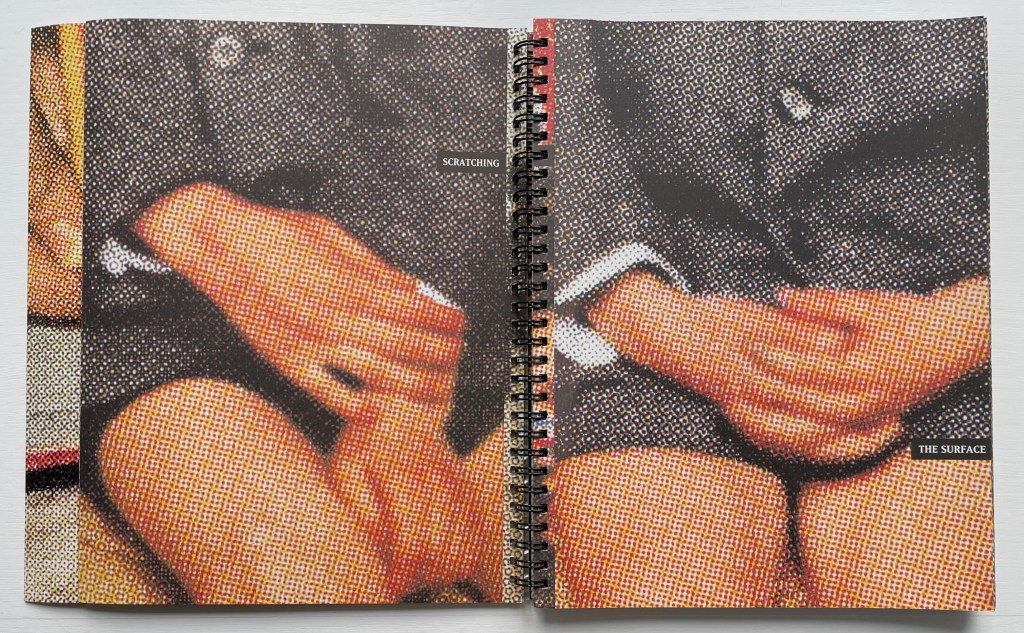
Will this be a children’s picture book about where green bananas come from? But wait, your fingertips are telling you that the recto page is on a folded sheet. Turn it, and the word game and the double-spread of two folded sheets on which it appears tell you that you are just scratching the surface. So open up the two folded sheets to find out what’s below the prim and proper.
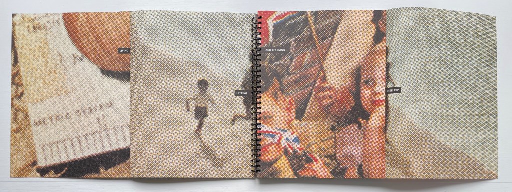
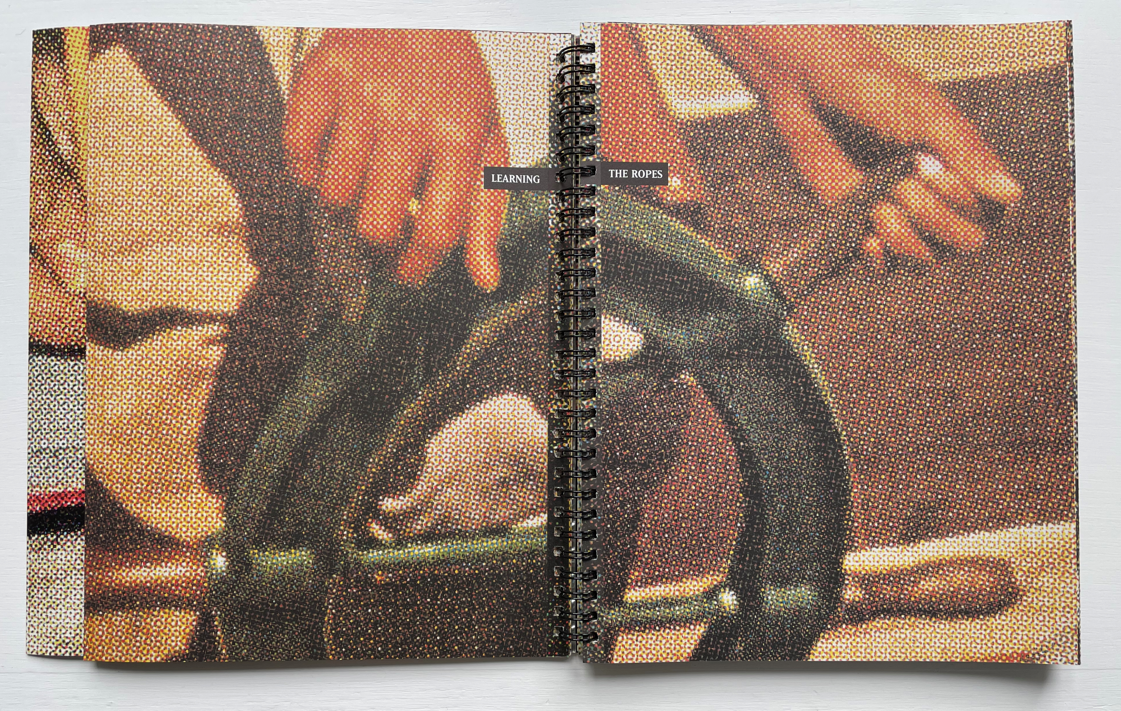
So now you know that this artist’s book is about “living and learning” and jumping over one page to another to do it. It’s about different measures (metrics) of the same thing and the borders they signal along which we have to run, “letting her rip” as in splitting a photo in two and leaping across an ocean to another country. It seems you are being whisked back in time to childhood, and if you refold the sheets and turn the page, there’s your 1950s dad looking over your shoulder, pointing something out in that long-ago country or sending you to the corner. It’s all about “learning the ropes” as the next double-spread of two folded sheets suggests.
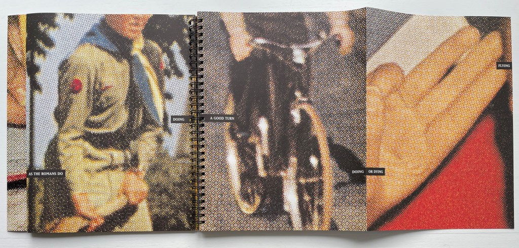
Like the splitting of phrases across pages, the book’s mix of single sheets and folded sheets slows down its reading. You have to take care to pick them apart. Another technique that makes this long story anything but short is a kind of harlequinade of aphorisms. From folded to unfolded, a spread can turn one saying into another, or on a single page, you may have to read diagonally from right to left, or you may find a phrase wrapping around the edge of the page and becoming yet another phrase and another as the sheets fold and unfold.
If you are not a Boomer, you can turn to the artist’s description to learn that all of the images come from sections of Look, Life, and other magazines from the fifties. Artists and close readers will appreciate his expansion on the technique of using large halftone dots:
I wanted all of the blown up halftone dots to be the same size, so I used a screen angle indicator to determine the line ruling of the originals and then used a calculator to determine the blown up size of the dots of the final image. I had a small rectangular mask that I would then place over the printed photo images to determine the crop. Then I scanned them in at very high resolution so that they could be blown up.
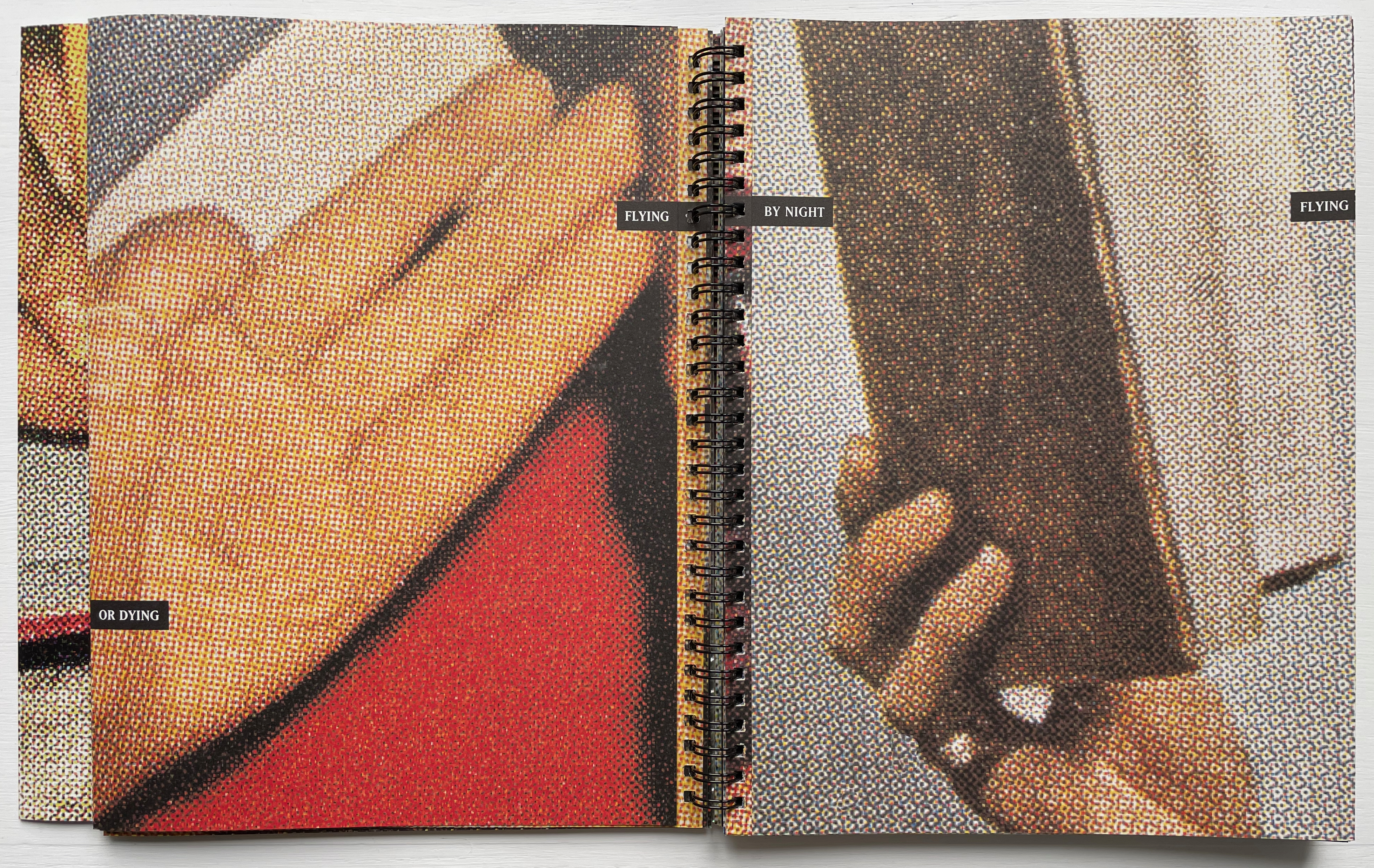
Despite its blurring or dissolving effect, the technique delivers a kind of visual unity or binding across the many crops and jumps from one image to another and across the single sheets and folded sheets. It combines with the recurrence of hand images to hold the work together. This tension between unity and fragmentation also plays out across the aphorisms breaking up and then reforming. And if in all that tension you cannot determine exactly what the long story short is, well then, “live and learn”.
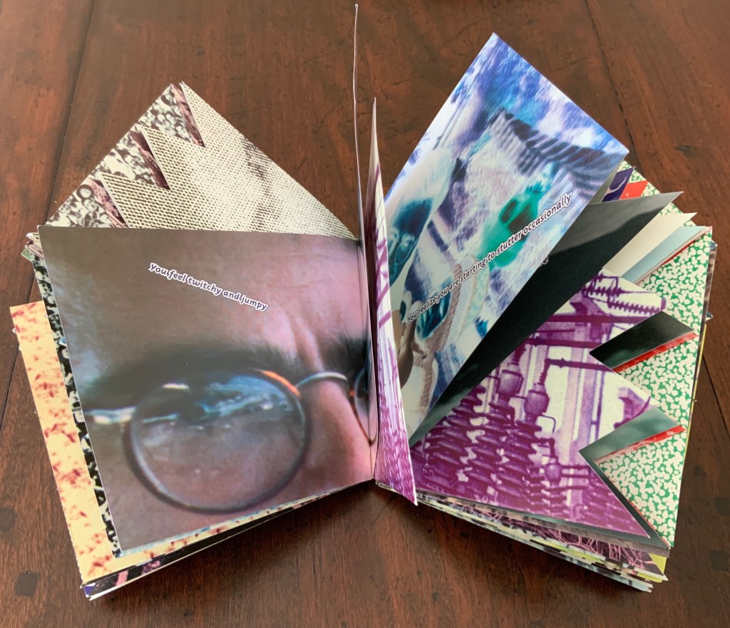
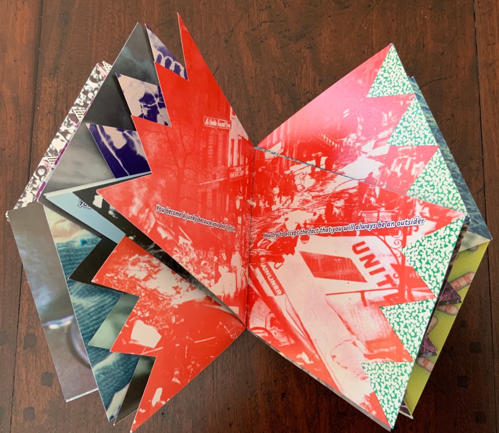
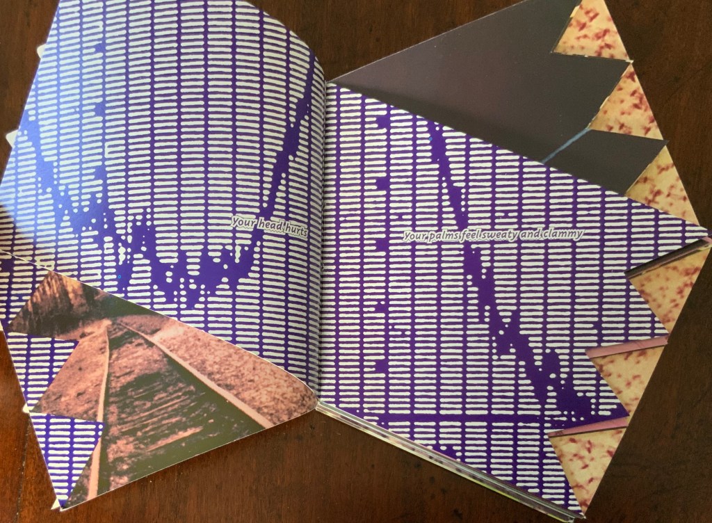
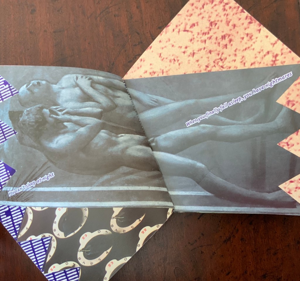
High Tension (1993)
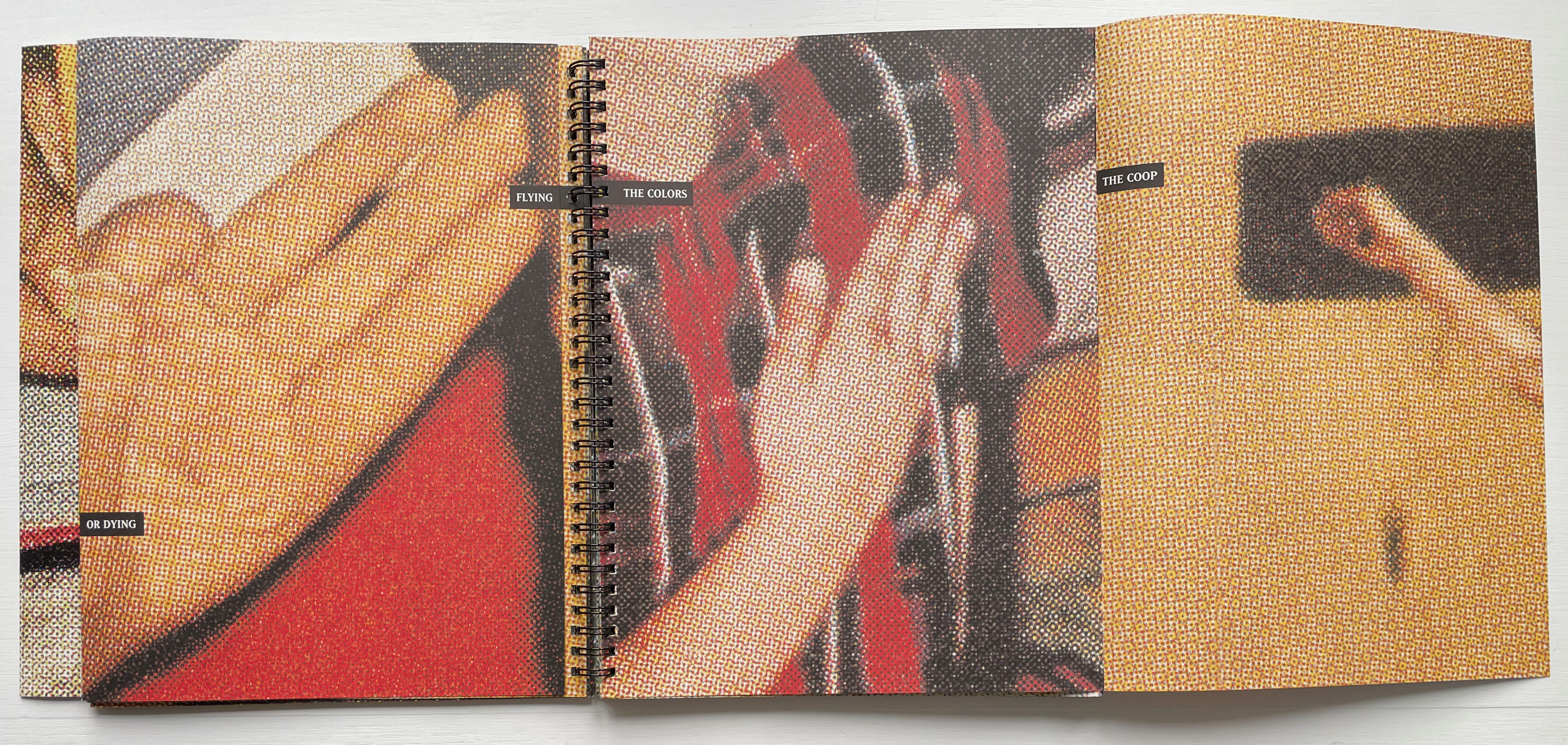
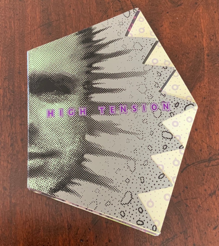
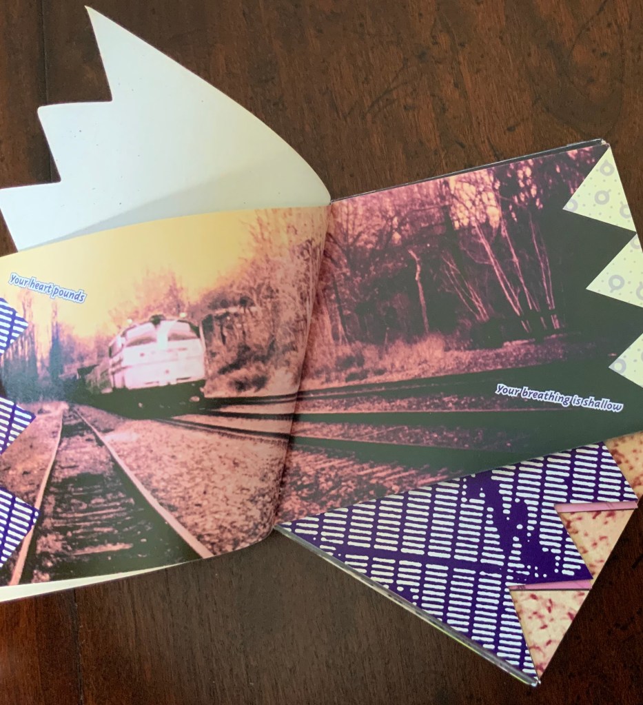
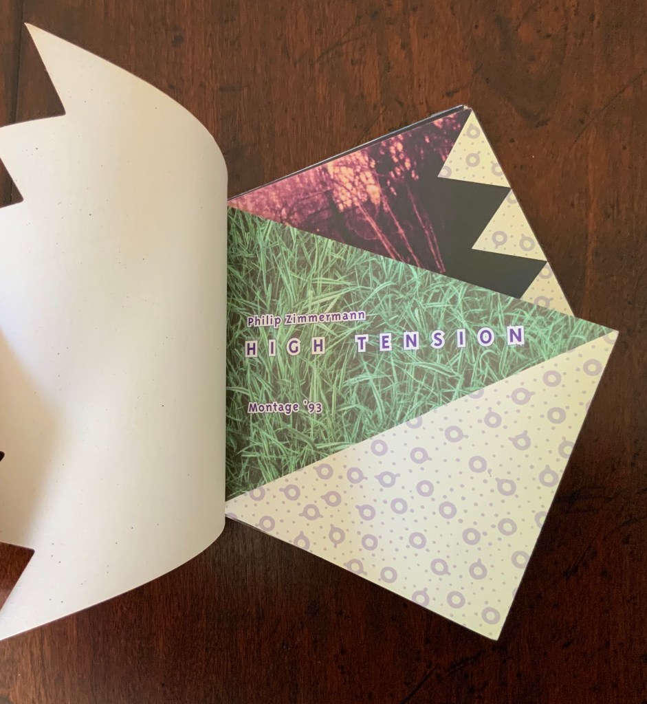
High Tension (1993) Philip Zimmermann 5.5 x 7.9″; 96 pages. Pentagon with 4″ spine and each of the other sides 4.25″. Unmatched irregularly cut pages. Offset printed. Produced and printed for for Montage ’93, International Festival of the Image, Rochester, NY, 1993.
High Tension is a porcupine of a book. As Johanna Drucker put it, “It’s about anxiety, and it pricks your fingers as you turn the pages.”
The work has been well-described in The Cutting Edge of Reading:
[High Tension] overwhelms us with a surprisingly varied profusion of images. Each of the many double pages introduces at least one radically new picture having more often than not merely a marginal relationship with those that had preceded. We must process these words somewhat gingerly in terms of our own past experiences when immediate recognition fails. It would therefore appear that unpredictability characterizes the selection and succession of the graphics. Each new image has its own motif and its own color scheme. Dealing in its own way with representation, it imposes its own focus and its own scale to which the reader must adapt. Thus, each turning of a page practically guarantees a further disruption and reduces any hope that we may have entertained of discovering either a formal or a thematic continuity. Instead, it calls forth unsuspected resources within us. Surprise follows surprise without affording a moment of relaxation. Each page relentlessly renews the shock of novelty, but in so titillating a manner that we must dwell on each image without any desire to skip. The artist has of course abandoned or deliberately misapplied expected formats. The pages may overlap, but they never coincide with one another. Deviation happens on two levels: each page slants diagonally and, when turned, symmetrically prolongs across the gutter the preceding one. Thus, two successive pages point in opposite directions while jointly providing a partially coherent and integrated image — partially, because fragments of images from other double pages show a propensity to migrate or, if we may use a medical term in describing a pictorial and psychological venture, metastasize. As we move along, we can hardly avoid twisting and turning the book around for successive viewings of the double paged pictures. Obviously, we can no longer rely on the measured progress so characteristic of reading. Moreover, the angularity of the pages greatly increases the nervous energy of their graphic and verbal content. …
Renée Riese Hubert and Judd D. Hubert, The Cutting Edge of Reading: Artists’ Books (New York: Granary Books, 1999), pp. 168-73.
There are also third and fourth deviations to add to what the Huberts observed above. Note how the orientation of the text and images varies across the double-page spreads. Text runs at different diagonals and sometimes apparently horizontally as expected (for example, in all of the spreads below). Sometimes images are vertically aligned within the double-page spread but at an angle (for example, the graph below), and sometimes horizontally (for example, the Masaccio below that).
Zimmermann himself writes at length and self-critically about the work on his website:
This was the first book that I had ever done that was completely imaged and output on a computer. I used my Macintosh to lay out the pages and then output the film at Purchase College on the AGFA image setter we had there. I did all the film assembly and made the offset plates at my studio at home in Barrytown NY and then took the finished plates up to Rochester in April of 1993 for printing. Pressman Paul Muhle did the presswork this time, on the same Heidelberg KORD press. …
I was at VSW for two weeks during the printing of High Tension, living in the artists’ apartment there at 31 Prince Street. The book was then packed up and sent out to Publisher’s Bookbindery in Long Island City for the die-cutting and foil stamping and finally the smythe-sewing. As it turned out, the book was sub-contracted to a bindery in western Massachusetts. Every aspect of the job was botched and I lost about a third of the edition of a thousand to mis-registered die cutting, torn pages, badly sewn books and many other problems. High Tension was a very difficult binding job, it is true. There are no right angles to line the signatures up by. However I think that when the bindery realized how difficult a job it was they decided to just slap it out with no care whatsoever rather than lose a lot of money on it. Because of the due date being the opening of Montage ‘93 in July of 1993 I had no choice but swallw [sic] the bad binding. If I had time, I would have forced the bindery to reprint the whole book and do the job over again. I had a very precise die-cut master sent with the job that somehow got lost and I later found out that was why the die-cutting was so poor.
The budget for the book was substantial both because of the rather large amount of production money from Montage ‘93 but also because of a Faculty Development award from Purchase. I also contributed some of my own money. Still the money was not enough to do the whole book by full color CMYK process printing. So I decided to try to output everything to three-color CMY separations, which required some special fiddling with Photoshop. That meant no black ink at all is used in the whole book, which few people realize. The entire book was done as three color “process”. This saved one set of plates and one press run for each side of every printing form, but it was much harder to print for the pressman because ink levels really had to be turned way up on the coated paper to get anything close to a black made up of just cyan, magenta and yellow. In retrospect I wish I had just found the money and printed it as normal CMYK sets because the blacks are not as good as normal and are uneven.
One additional innovative production feature of the cover was that I made a duotone foil stamp, which as far as I know is the first time that had been done other than the cover I had done for an earlier book Interference published by Nexus Press.
Philip Zimmermann, “High Tension”, Spaceheater Editions. Accessed 27 February 2020.
As with Landscapes of the Late Anthropocene, reading Zimmermann about the process and technique is an education in how to look at book art.
Kariniemi, Merja; Nors, Minna; Kujanpää, Marjukka; Pajula, Tiina; and Pihkola, Hanna (VTT Technical Research Centre of Finland, Espoo). Nov/December 2010. “Evaluating Environmental Sustainability of Digital Printing“. The IS&T Reporter. 25:6. Springfield, VA: Society for Imaging Science and Technology.
Rafferty, Colin. 12 January 2006. Interview with Colin Rafferty, Book Arts Podcasts, University of Alabama. Accessed 6 February 2014.
Van Wyk, Gary. 2018. Our Anthropocene: Eco Crises. New York: Center for Book Arts. Descriptive catalogue of an exhibition (19 January – 31 March 2018), p. 18.
Zimmermann, Philip. Artist’s statement on Landscapes of the Late Anthropocene. Spaceheater Editions. See also a Youtube video of the hard bound edition.
Zimmermann, Philip. 2013. Youtube video of Sanctus Sonorensis.
Zimmermann, Philip. 2014. Youtube video of Incident in Deseret.
Zimmermann, Philip. 2013. Youtube video of Long Story Short.
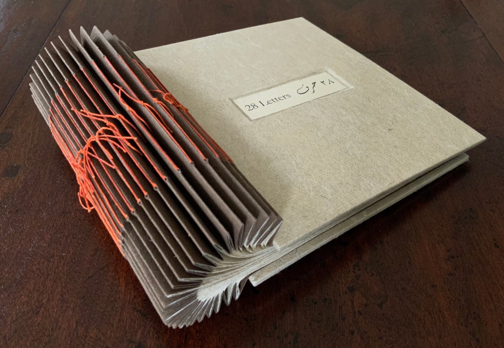
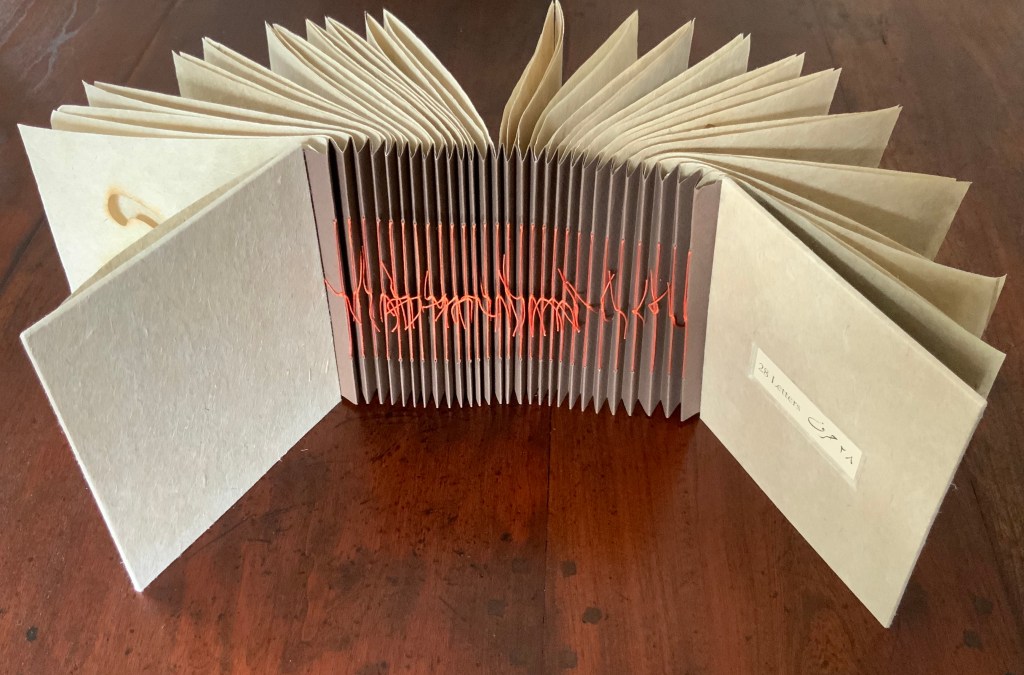
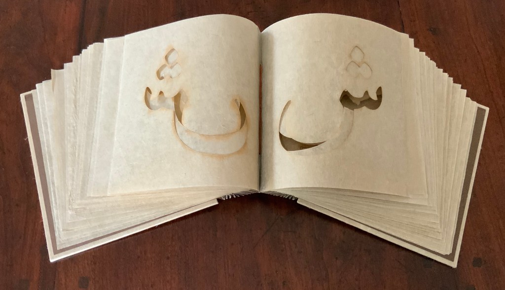
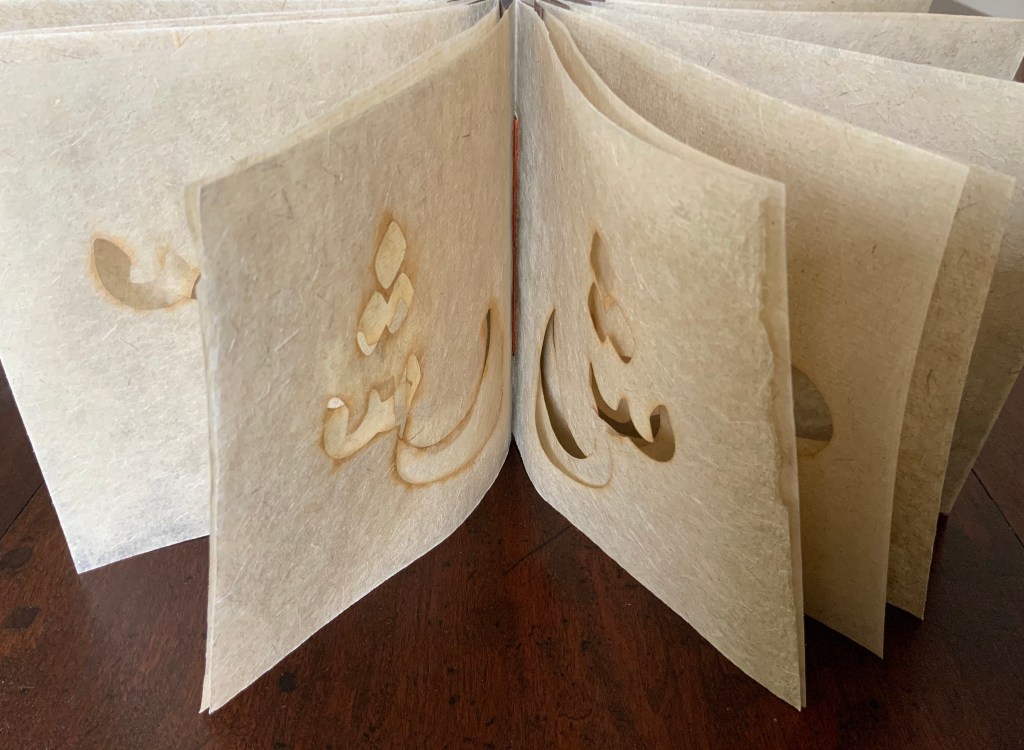
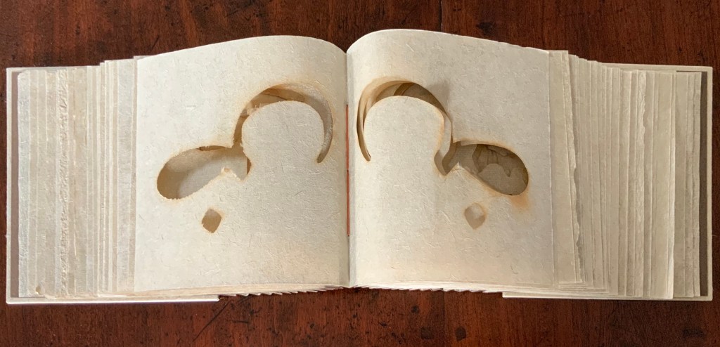
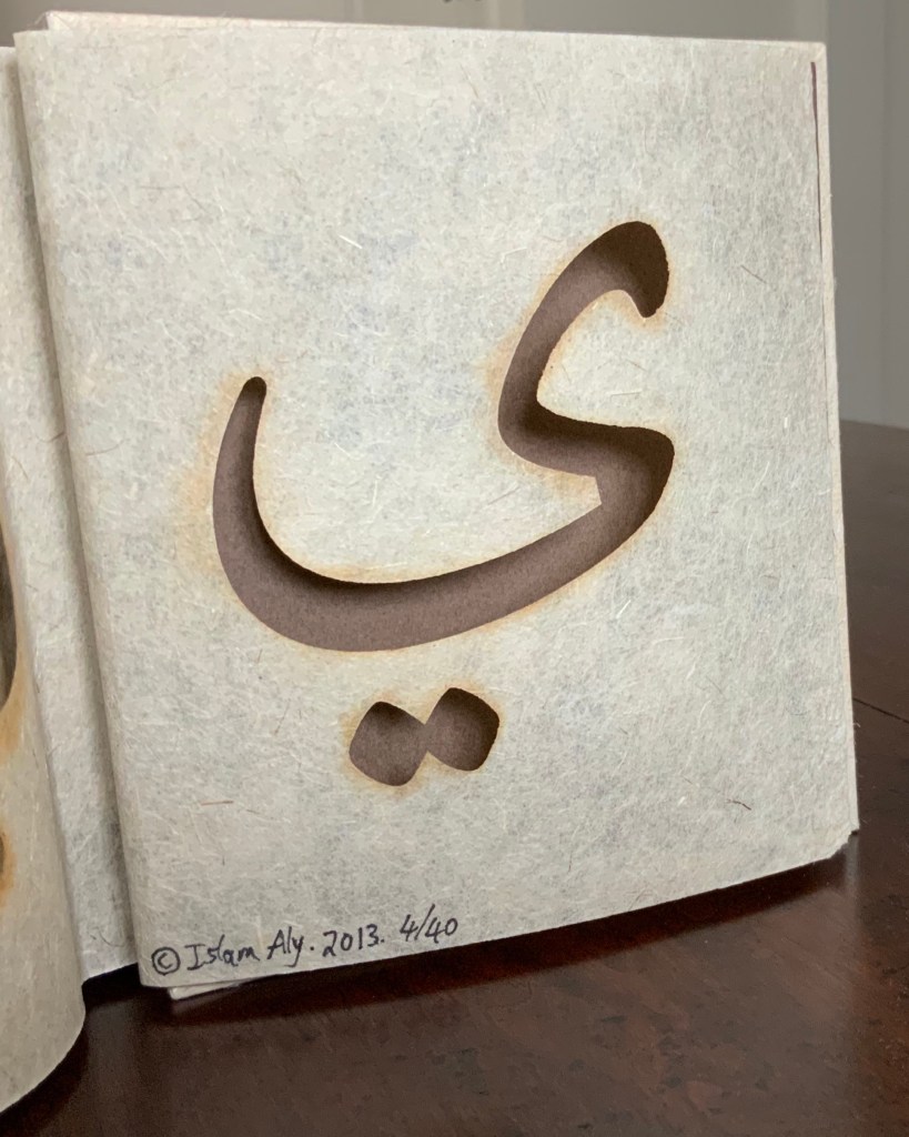
28 Letters (2013) Islam Aly Laser-cut handmade flax paper. Three hole pamphlet binding in an accordion binding. Linen thread, handmade paper covers. Closed H147 x W154 x D15 (fore-edge) D37 (spine) mm; open 845 mm. 28 folios. Edition of 40 of which this is #4. Acquired from the artist, 5 February 2019. Photos: Books On Books Collection.
Each of the 28 letters of the Arabic alphabet is laser-cut on a folio. The binding‘s flexibility allows for exploration and interaction with the letters as well as multiple forms of display.
Further Reading
Interview by Matt Kalasky for TGMR, the Galleries at Moore Radio, Moore College of Art and Design. Suzanne Seesman, Islam Aly, Abdul Karim Awad, and Yaroub Al-Obaidi discuss Friends, Peace, and Sanctuary project, Philadelphia, PA. Podcast 8 May 2019. Accessed 12 January 2020.
Interview for Sheffield Artist’s BookCentre, October 2, 2019. Accessed 12 January 2020.
Interview by Laurence Kesterson, for Friends, Peace, and Sanctuary project, Swarthmore College Library and the Lang Center for Civic and Social Responsibility 2017. Accessed 12 January 2020.
Interview by Spring 2017 Scripps College Art 137 seminar class. This interview was featured in Of Color: Race & Identity in Artists’ Books exhibit catalogue. Accessed 12 January 2020.
Chen, Julie. 2013. 500 Handmade Books. Volume 2. New York: Lark. Pp. 130 (28 Letters).
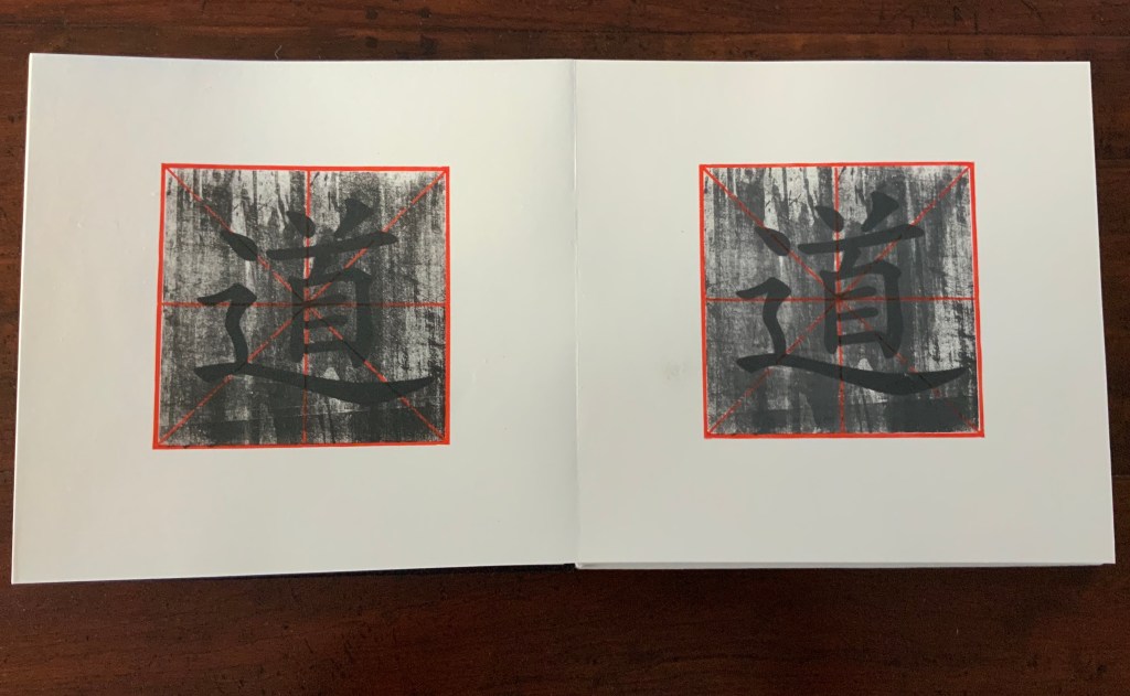
The Way (2008) Leilei Guo Concertina of 88 pages. Woodcut and silkscreen on rice paper. Bound in cloth, front board in white, back board in black. 346 x 324 mm Acquired from the artist, 2 February 2019.
Almost a decade after a first viewing at the Frankfurt Book Fair, The Way became part of the Books On Books Collection. One thing such an experience teaches is carpe diem. It has taken all those years to have the chance to learn that the book opens from left to right, that the “red figure” in the woodcut is the standard grid on which Chinese letters are brushed, that the grid and the character remain constant under the wash that darkens as the pages turn, and that the embossed character on the front and back covers is reversed on the back cover.
The other lesson, perhaps the reverse, is patience and persistence.
But, with every viewing or reading — and its calming pleasure — The Way has its own lesson to teach.
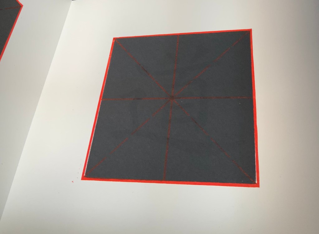
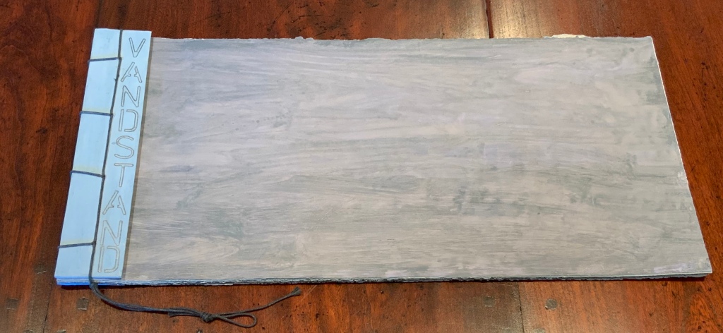
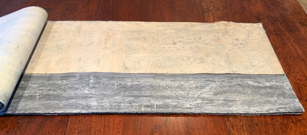
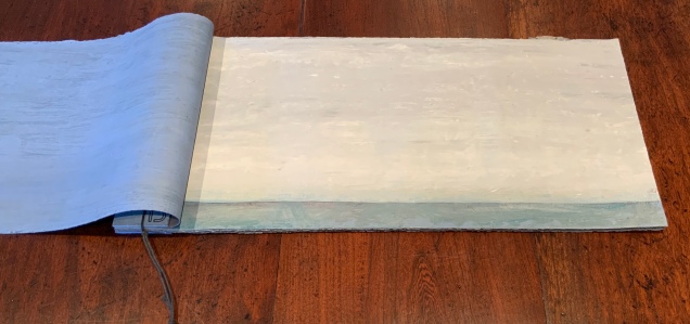
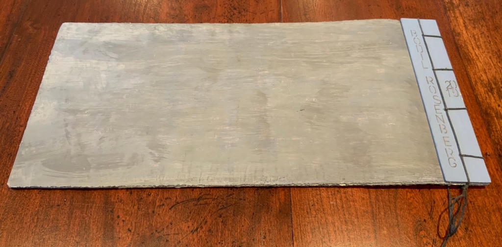
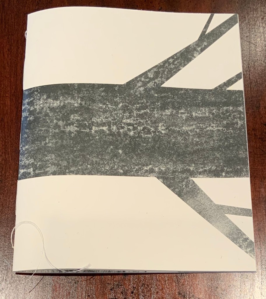
Vandstand (2019) Bodil Rosenberg Twelve sheets of newsprint overpainted on both sides multiple times with acrylic. Four-hole stab binding with waxed black cord. H200 x W425 mm. Acquired from the artist, 6 July 2019.
On several fronts, Vandstand contributes richly to this collection: its inspiration from climate change, its visual narrative, its technique leading to its unusual tactile quality and its binding and format.
Denmark claims the lowest point below sea level in the European Union: Lammefjord, which is nearly 7 meters below sea level. Not surprisingly, Rosenberg notes that the key words associated with her inspiration for Vandstand were “global warming”, “floods”, “harbour” as well as “Venice”, “Copenhagen” and “Bristol”, places she has visited and in which she has exhibited. So with those thoughts in mind, she applied layer after layer of acrylic paint to both sides of sheets of newsprint torn carefully into rectangles of 200 x 425 millimetres.
“What I wanted to accomplish I was not sure, but I knew I would recognize it when I achieved it, so I painted the sea darker, lighter, warmer or colder — I moved the horizon line a bit up or down until I was satisfied” (Correspondence with Books On Books, 5 December 2019).
The word “vandstand” means “water level”.
As the water level rises, falls, and rises, the turning pages are cold to the touch and rough at the edges and on their surfaces.
They flex like thick sheets of rubber, leather or whale skin. They drape over the hand turning them. If left open, the book’s pages take on the curved shape in which they rest, and when closed, they hold the shape, relaxing slowly back to flatness.
The effect is that of swells in a harbour.
At first glance, the book’s only text looks stencilled, but on closer inspection, it looks handwritten. It appears only on the two strips of painted binding board, which on front and back give the impression of barrier walls against the sea. Poring over Vandstand again and again, I’m reminded of a poem from another northern latitude:
“Neither Out Far Nor In Deep”
The people along the sand All turn and look one way. They turn their back on the land. They look at the sea all day.
As long as it takes to pass A ship keeps raising its hull; The wetter ground like glass Reflects a standing gull
The land may vary more; But wherever the truth may be, The water comes ashore, And the people look at the sea.
They cannot look out far. They cannot look in deep. Btu when was that ever a bar To any watch they keep?
Homonim (2015) Hanna Piotrowska Dyrcz Charcoal sketches and frottage Digital print on Woodstock Betulla (uncoated, rough paper) from Adobe Photoshop, Adobe Indesign 16 unnumbered pages including the cover, bound and sewn by hand, H250 x W200 mm
This work’s title appears only as the headword in a definition: “Homonym: words having the same pronunciation but different meanings” (translated here from the Polish). Also the only text in the booklet, it appears flush left vertically on page six as a clue to the less clever Polish-fluent reader/viewer who has not yet attached a word to the image of the tree trunk (bal) and then the same homonymic word to the image of the plank. Having had its visual/verbal fun with those two meanings, the booklet gives the image of a single tree trunk’s cross-section on page seven to set the stage for bal’s third meaning (”ball” as in a dance or masquerade). Over the following pages, the multiple cross-sections gradually turn into a top-down view of whirling dancers who seem to emerge from the bole of the wood.
The artist has filmed the handling of the booklet, but of course, that does not capture the weight and finish of the paper nor the turning back and forward of the pages in the dance on which the words and images lead the reader/viewer. Turning word play into image play in the book form’s sequential and back-and-forth “affordances” makes Homonim a solid conceptual fit in the Books On Books Collection, and the skilful handling of charcoal and its digital transformation provide pleasure with every viewing.
Twórca/The Maker (2016)
Twórca/The Maker (2016) Text: Jorge Luis Borges Design, photography, printing and binding: Hanna Piotrowska Dyrcz Pages: gray recycled paper, digital print. Cover: cardboard, soil and black paint. The book was sewn and bound by hand. H158 x W113 mm. Unique. Acquired from the artist, 4 February 2020.
El Hacedor (The Maker) is a collection of poems, short stories, essays and literary sketches by Jorge Luis Borges. The way the artist integrates her handling of the book form’s structural challenges with her understanding of Borges’ themes makes this an outstanding artist’s book. Her comments on creating this work are helpful in appreciating it more fully, but they also provide an opportunity to wonder at the creative process. Where does it begin? What leads to what?
Here are her comments in their original order:
One of the challenges was dealing with a large number of footnotes, maintaining the small format at the same time. So I came up with an idea of placing the footnotes not below the main text, but on separate narrow pages, with images on the back side.
The images: The Maker raises questions of evanescence, death, identity, natural changes and the meaning of symbol. I decided to refer to these subjects by finding symbols spontaneously formed by nature and photographing such “hasards objectifs”.All the images in the book are placed either on one or two full pages, which makes the spine set the axis of symmetry. Many of them are hidden between the footnotes’ pages, so that the reader discovers more and more concealed, sometimes disturbing images. Also, the narrow pages with footnotes and images are not included in the page numbering, so that they don’t constitute the book’s usual structure, but rather something that grew/emerged out of the it.
The cover: I wanted the cover more to hide than to inform what’s inside. For this reason, there is no title nor author’s name – just black texture, made from soil painted black. Its gravelly structure is scratchy – I tried to reflect the awkward and surreal character of Borges’ texts, by making the cover visually attractive and intriguing, but at the same time unpleasant to touch.
Borges’ questions may have primed the artist’s photographic eye, but the inventiveness of hiding the images on the reverse of the narrowed footnote pages, of using the cover to echo the images visually and tactilely and of playing with full-page images and narrow-page images and footnotes to hide and reveal the main text comes from thinking about (and feeling) the form of the book, the relationship of image to text, and how the reader’s eyes and hands and mind work and react.
Further Reading
“Lizzie Brewer“. 4 July 2023. Books On Books Collection. For another homage to Borges.
“Sean Kernan“. 23 February 2013. Books On Books Collection. For another homage to Borges.
“Ines von Ketelhodt“. 1 February 2021. Books On Books Collection. For another homage to Borges.
“Peter Malutzki“. Books On Books Collection. For another homage to Borges.
“Aurélie Noury“. 9 November 2020. Books On Books Collection. For another homage to Borges.
“Benjamin Shaykin“. 3 December 2022. Books On Books Collection. For another homage to Borges.
“Rachel Smith“. In progress. Books On Books Collection. For another homage to Borges.
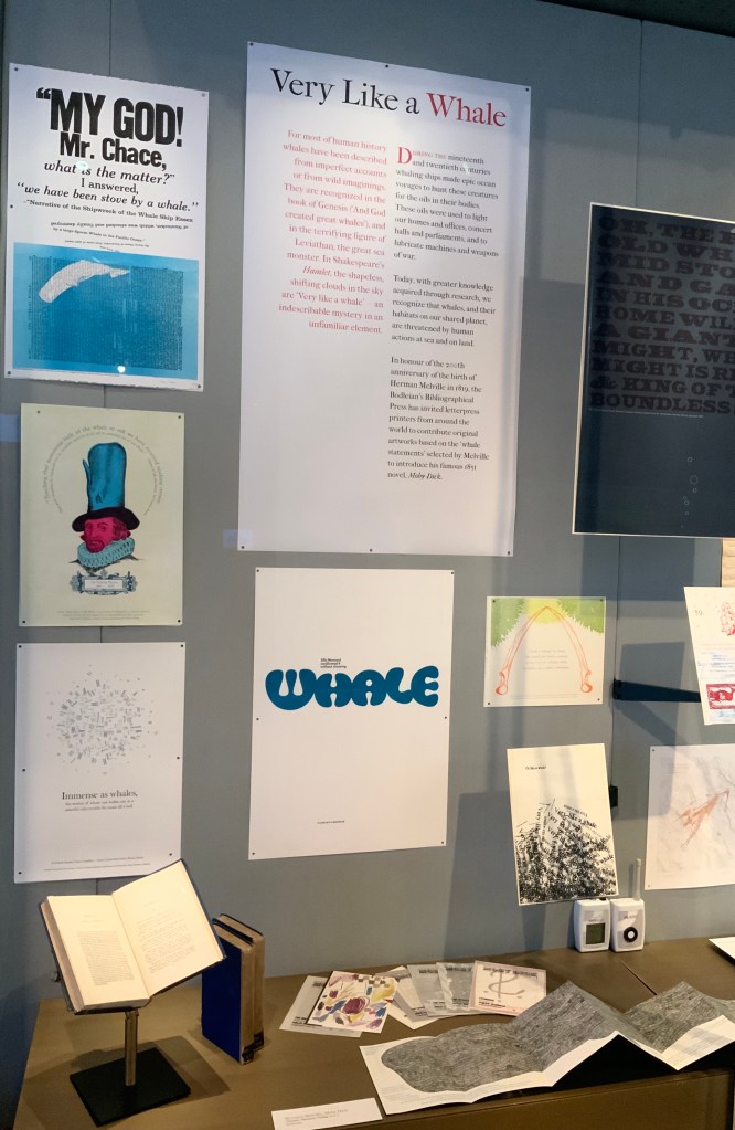
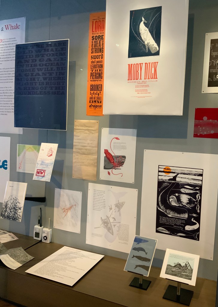
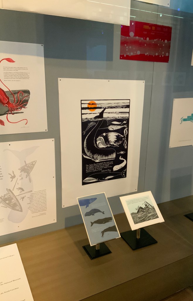
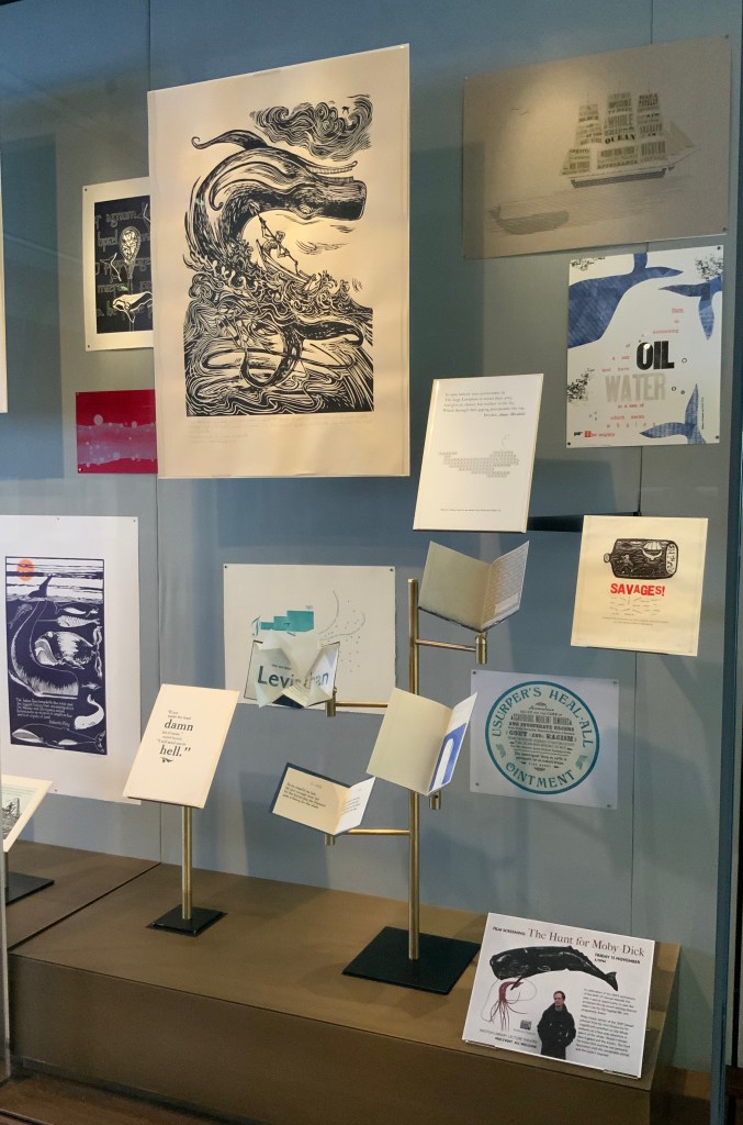
For the 200th anniversary of Herman Melville’s birth (1819), the Bodleian’s Bibliographical Press invited letterpress printers and artists to claim one of the eighty prefatory “Extracts” from Moby-Dick (1851) and create an artwork in response.
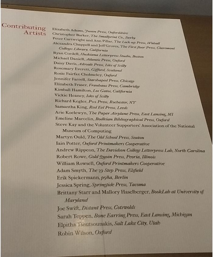
The Blackwell Hall exhibition case accommodates thirty of the eighty contributors‘ artworks, plus the rare three-volume version of the novel published by Richard Bentley in London as The Whale before Harper & Brothers issued it in November 1851 in New York as Moby-Dick; or, The Whale. Here are just four of the outstanding prints among the several artforms on display.
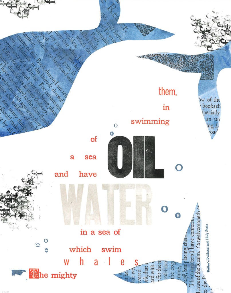
Extract 25: ‘The mighty whales which swim in a sea of water, and have a sea of oil swimming in them.’ ─ Fuller’s Profane and Holy State Brittany Starr and Mallory Haselberger, BookLab at University of Maryland Mixed media (collage and letterpress). Printed on a Line-O-Scribe, Model 1411 on Strathmore printmaking paper using rubber and oil-based ink; includes Jenson, News Gothic and Bookman typefaces with Hamilton wood type. Image courtesy of the Bibliographical Press and artists.
Notice how Starr and Haselberger integrate the verbal and visual to emphasise the seas of water/oil paradox that Melville plucked from his source. Like Melville’s hand, the artists’ manicule in the lower left points to the extract that reads/rises from the bottom to the top. Inside the shapes of whales around the extract appears the source of the extract (the verbal in the visual) against a seawater blue (another layer of the verbal in the visual). The letters “o” and “f” evoke bubbles and currents (the verbal for the visual). The words “oil” and “water” in contrasting inks but composed in the same typeface loom large at the heart of the artists’ embodiment of this paradoxical extract. (It is an insider’s paradox that the work surfaces from the BookLab, devoted to exploring the oil-and-water mix of the material and the digital.)
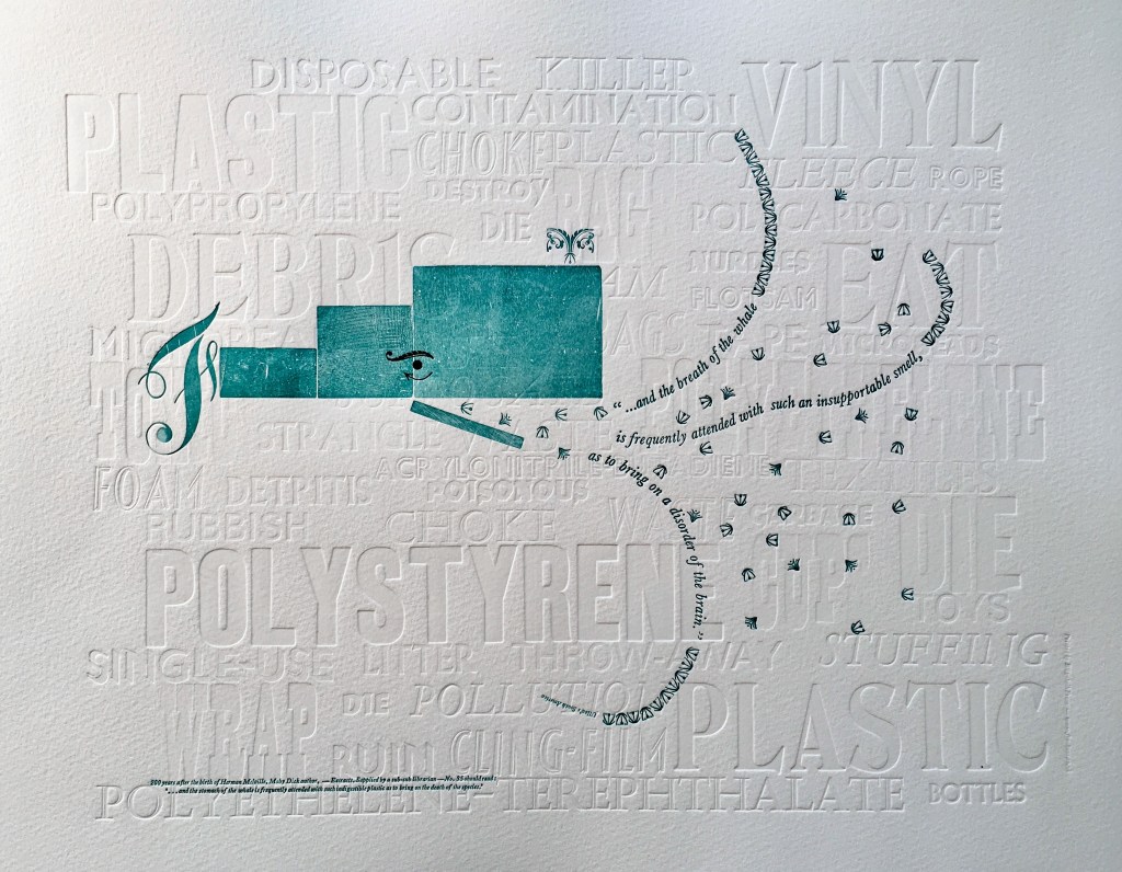
Extract 35: ‘* * * * * and the breath of the whale is frequently attended with such an insupportable smell, as to bring on a disorder of the brain.’ ─ Ulloa’s South America Elizabeth Fraser, Frauhaus Press, Cambridge Handset letterpress. Blind deboss using wood and metal type. Whale created from face and back of woodtype with ornaments for eye and spout. Text 12pt & 6pt Baskerville italic. Whale breath 12pt glint (Monotype B1309 & B1310). Printed on Somerset Velvet 300gsm soft white paper with a tabletop flatbed proofing press.
What attends the whale’s breath in Fraser’s print? The whale’s breath is the extract streaming into a sea of white blind-debossed words. That sea of human detritus is the source of the insupportable smell that attends the whale’s breath. The insupportable smell takes on “the whiteness of the whale”. The threatened whale takes on an environmental green. which Fraser creates with the non-verbal side of the woodtype. Even so, the carrier of the verbal makes up every visual aspect here, underscoring Fraser’s contemporary paradox: the insupportable smell disordering the brain has been brought on by the disordered brain of humankind.
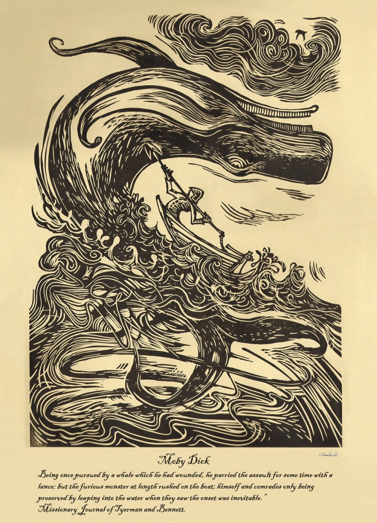
Rowsell’s linocut represents the more traditional entries in the exhibition. Capturing the furious struggle expressed in the extract, he locks whale, man, boat, sea, cloud and sky into a vigorous, swirling image on a paper and in a style that evoke the century in which Moby-Dick is set. As he pulled his prints from the 1828 Albion printing press, Rowsell might have wondered what the nine-year old Herman Melville was doing when hands were first laid on that Albion.
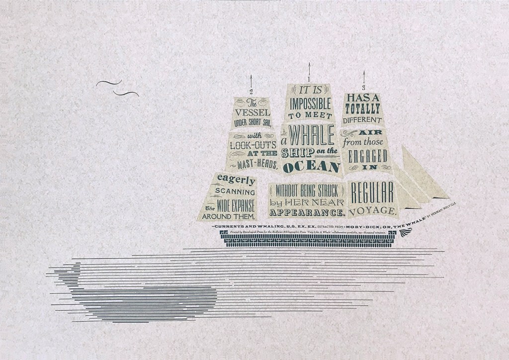
Extract 71, ‘It is impossible to meet a whale-ship on the ocean without being struck by her near appearance. The vessel under short sail, with look-outs at the mast-heads, eagerly scanning the wide expanse around them, has a totally different air from those engaged in regular voyage.’ ─ Currents and Whaling. U.S. Ex. Ex. Jennifer Farrell, Starshaped Press, Chicago Letterpress: metal type + rule linocut; Paper: Fabriano Tiziano printed on a Vandercook SP15. Image courtesy of the Bibliographical Press and artist.
Starshaped Press is aptly named. Jennifer Farrell stars at wringing shapes from type and its surrounding furniture. The citation outlining the upper deck and bowsprit runs gracefully and appropriately under the sails on which the extract appears in that variety of display faces characteristic of nineteenth century flyposts.
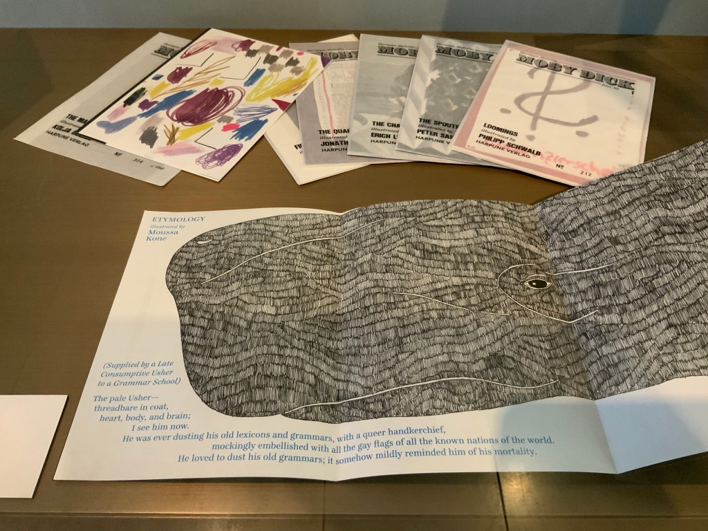
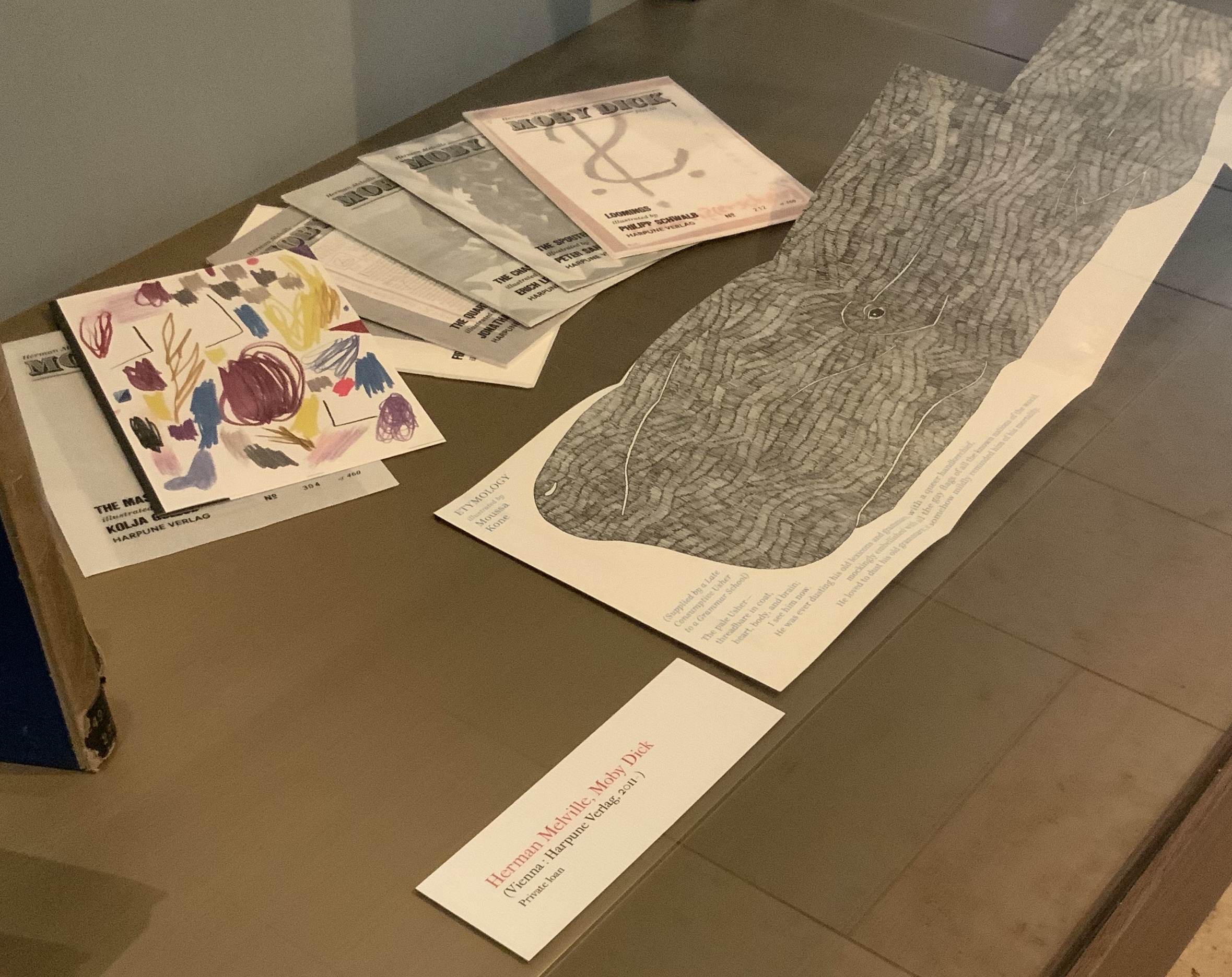
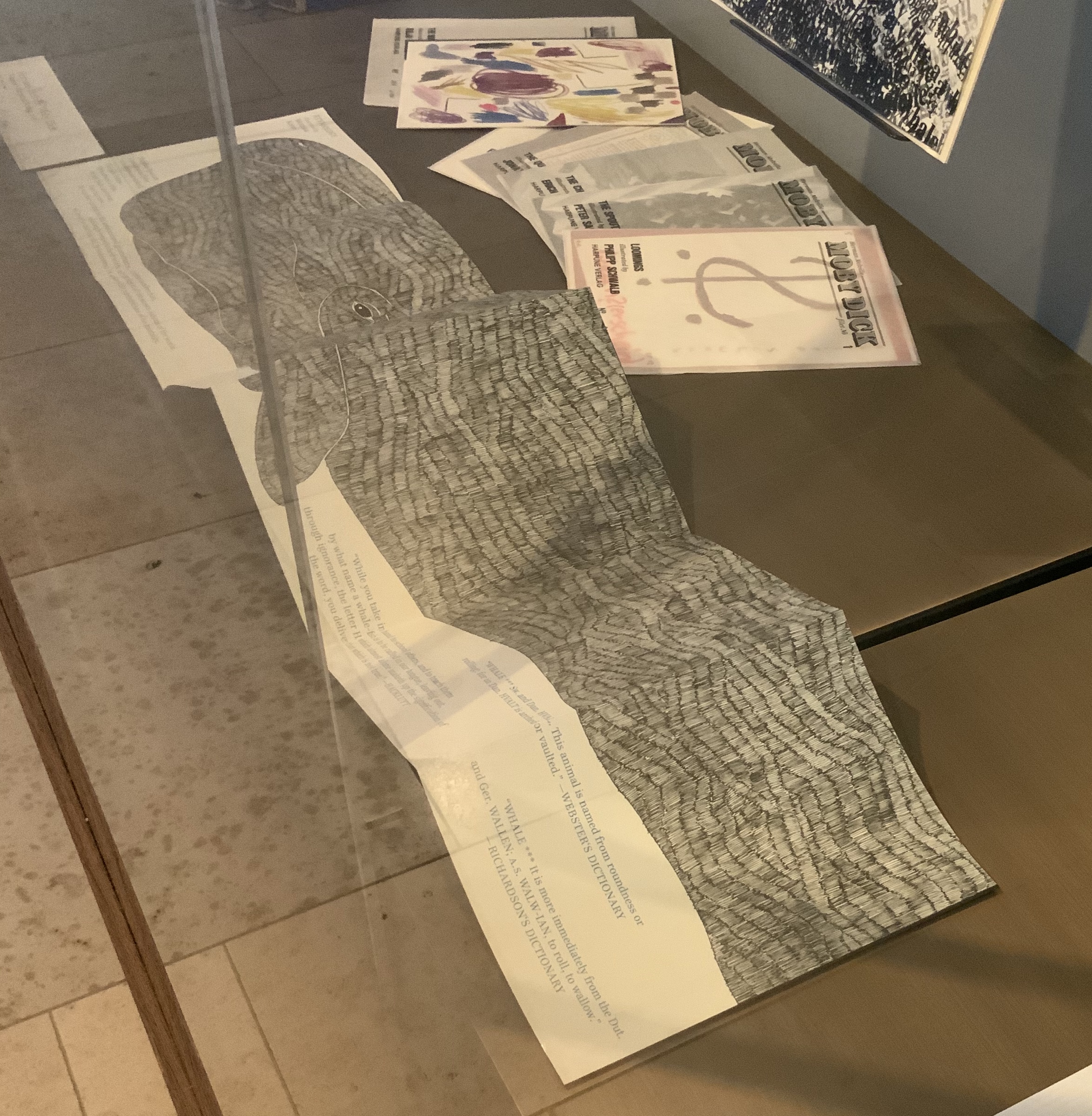
To round out the display with another multi-artist effort, the curators included Harpune Verlag’s Moby-Dick “Filets” (2011~). In 2011, Harpune Verlag Wien began publishing Melville’s masterpiece as a serialized subscription. To do justice to the book’s many voices, 136 different artists were invited, each to illustrate a chapter.
Etymology, Moby-Dick “filet” No. A (2012) Moussa Kone Leporello of 16 pages, 150 x 200 mm closed, 200 x 710 mm open. Acquired from Harpune Verlag February 2019.
Published in non-chronological order at varying intervals and printed in a limited edition of 460 copies, 37 “filets” have appeared so far. At this rate, all of the filets may only be served up by the bicentennial of Moby-Dick’s publication! Fortunately for the Bibliographical Press’s display, Moussa Kone’s rendition of “Etymology”, the prefatory item preceding “Extracts”, is one of those already delivered. It makes a suitably lengthy and apropos link across cases.
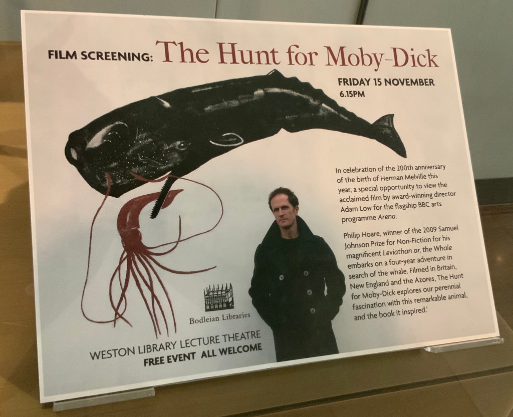
If, like Ishmael with “November in [his] soul”, you were walking down the damp, drizzly streets not of New Bedford but Oxford on the 15th this month, you might have substituted the Weston Library for The Spouter Inn. Inside, second copies of the remaining fifty “Extracts” submissions were on display in Blackwell Hall for viewing and handling after a screening of Philip Hoare’s The Hunt for Moby-Dick (2011). Ten years ago, Southampton-born Hoare won the 2009 BBC Samuel Johnson Prize for non-fiction for his book Leviathan, or the Whale. Hoare himself was on hand to introduce and take questions after the film.
His lifelong passion for whales and Melville’s book is infectious and influential. UK book artist Chris Ruston traces her series of artist’s books Lost Voices — Whaling (2016-17) to Hoare’s Leviathan. Like Hoare’s work and many entries in “Very Like a Whale”, Ruston’s work challenges our anthropocene era. Hoare was also instrumental in organizing the Moby Dick Big Read (2012) — another multi-artist affair and effort to address the effects of the anthropocene era.
Click on the screenshot to visit and listen to the Moby Dick Big Read.
The Big Read offers freely available readings of each chapter of the book. Individuals (well-known and unknown) contributed the readings, artists contributed artwork (viewable as thumbnails on the site), and the site offers an opportunity to donate to Whale and Dolphin Conservation (WDC).
Hoare participated in another Melvillean documentary: David Shaerf’s Call Us Ishmael (2019). It is a multi-artist affair like the Big Read, Moby-Dick “Filets” and “Very Like a Whale”; includes a sighting of the New Bedford Whaling Museum’s annual days-long continuous reading of Moby-Dick; and features interviews with artists and other creatives inspired by Melville’s tale. One of those artists interviewed is Frank Stella. Uncanny, but Stella also appears in this book to be found in the Bodleian: Elizabeth Schultz’s Unpainted to the Last (1995).
From among the artists such as Ellsworth Kelly, Robert Motherwell, Jackson Pollock and others whom Schultz discusses, Stella serves best to tie off this fisherman’s tale and return to the title of the Bibliographical Press’s exhibition. About his Moby-Dick series of prints and metal-relief paintings to which he devoted a decade, Stella writes:
The idea of the wave and its various permutations is what drives this new series. Once I started on the wave shape, I saw it began to look like a whale — a combination of waves and whales. … The idea of the whale reminded me of “Moby Dick,” so I decided to go back and read the novel and the more I got into it, the more I thought it would be great to use the chapter headings of the novel for the titles of the pieces. — “1989 Previews from 36 Creative Artists,” New York Times, 1 January 1989, Sec. 2:1. Images here.
Indeed, “Very Like a Whale”, which runs until 5 January 2020. Admission free.
For a decade, Alicia Bailey has played the role of Ceres to book artists and collectors, bringing them the Artists’ Book Cornucopia. And this has been in addition to creating her own bookworks, organizing other exhibitions and running Abecedarian Gallery and Raven Press. Artists’ Book Cornucopia X marks the tenth and last cornucopia but not the end of their impact.
Cornucopia implies abundance and variety, and Alicia Bailey has delivered both. A glance at the ten catalogues finds a consistently high level of participation — always at least thirty artists — and every catalogue has shown a “variety of varieties”. Consider these varieties:
Variety of structures: accordions, boxes, flag books, girdle books, pop-ups, miniatures, portfolios, scrolls, sculpted shapes, wallets, etc. The variations within each type would require a hunt through The Art of the Fold (Kyle and Warchol), Structure of the Visual Book (Smith) and Book Dynamics! (Hutchins) to identify them properly. In ABC X, all of the structures mentioned above are represented. Over the decade, the Artists’ Book Cornucopia have spilled out structural innovations such as Merike van Zanten’s A Soldier of the Second World War (ABC I), Pamela Paulsrud’s Touchstones (ABC II), Cathryn Miller’s Universe: Foundation Trilogy (ABC III), Louisa Boyd’s miniature Stardust (ABC IV), Susan Kapuscinski Gaylord’s Spirit Book #67 (ABC V), Candace Hicks’s Trees of a Feather (ABC VI), Karen Hardy’s Vellicate (ABC VII), Bryan Kring’s Shared Illusion (ABC VIII) and Josh Hockensmith’s After (ABC IX). The abundance of innovations makes a visit to the Abecedarian Gallery site for numerous second-guessings worthwhile.
The variety of material used by the artists overwhelms: beads and buttons (Ednie), cactus needles and jute (Reka), cement and glass (Bryant), ceramic and cardstock (Wolken), copper and redwood (Anstruther/Grasso), fishing line and wire (Johnston), fish-skin and mull (Klass), leather and “metal findings” (Melis), magnet and museum board (Burton), palladium and aluminum leaf (Bailey), ribbon and slide viewers (Grimm), silk and sinew (Alpers), thread and tyvek (Asato), window screen and wood (Fleming), zippers and fabric (Melhorn-Boe) and, of course, upcycled books (Anastasiou). Any appreciation of the ingenuity of materials selection and manipulation across the Artists’ Book Cornucopia requires a rewarding read of the descriptions provided in each of the catalogues.
Then there is the variety of techniques: blind deboss (Lawrence), calligraphy (Towers), chromogenic prints (Grimm), collograph (Dokudowicz), cyanotype (Biza), gelatine monoprinting (Powers-Torrey), intaglio (Larson), letterpress (Nakata), linocut (Knudson), photopolymer (Larson), risography (Powers-Torrey), silkscreen (Anastasiou) and woodcut (Lucas). Like the materials used, the techniques employed are almost too many to name, and of course, those named are used by more than the one artist mentioned.
And, of course, a riot of papers: abaca (Welch), Alabama kozo (Sico), Awagami Shin Inbe (Gorham), cotton-abaca (Lucas), Domestic Etch/Lana Laid/Masa/Niddegen (Powers-Torrey), Hahnemühle Ingres mouldmade pastel paper (Ednie), indigo flax (Johnston), Somerset (Moyer) and Thai Momi marbled paper (Towers), which of the varieties used are far too few to mention.
Likewise, the variety of shapes and direction is kaleidoscopic: zigzag, circular, globular, vertical, horizontal, square, cuboid and boustrophedon (left to right to left to right, etc.). And that is before any listing of the Platonic shapes in Sarah Bryant’s The Radiant Republic.
The wide variety of themes in ABC X echoes the same breadth across the previous nine catalogues. Here we have architecture (Bryant), botany and discovery (Gower), chronic illness (Wolken), the city (Dokudowicz), environment (Lowdermilk), industrial landscape (Burton), the literary (Bailey), pain (Reka), sexuality (Grimm), travel (Melis), wildlife (Thrams) and #MeToo (Ellis). The named representative artist is just a starting point for each theme, and the themes mentioned are only alphabetical, not exhaustive.
Perhaps the one varietal shortcoming of ABC I-X is that most of the artists participating hail from the US. When another nationality appears in one of the catalogues, it surprises. Over time, “vintners“ from the following countries have shown up: Argentina, Australia, Austria, Brazil, Canada, China, Egypt, France, Greece, Korea, Netherlands, Poland, UK and Venezuela.
The abundance and variety of Alicia Bailey’s Artists’ Book Cornucopia prove one premise and question another from Johanna Drucker’s The Century of Artists’ Books:
If all the elements or activities which contribute to artists’ books as a field are described what emerges is a space made by their intersection, one which is a zone of activity … There are many of these activities: fine printing, independent publishing, the craft tradition of book arts, conceptual art, painting and other traditional arts, politically motivated art activity and activist production, performance of both traditional and experimental varieties, concrete poetry, experimental music, computer and electronic arts, and last but not least, the tradition of the illustrated book, the livre d’artiste. The Century of the Artists’ Books (New York: Granary Books, 2004, new edition), p. 2.
ABC X and its nine sisters shout a resounding “Amen”, but the rich quality and originality of the works displayed whisper “‘the’ century?” At the close of the 21st century’s second decade, Ceres is smiling.
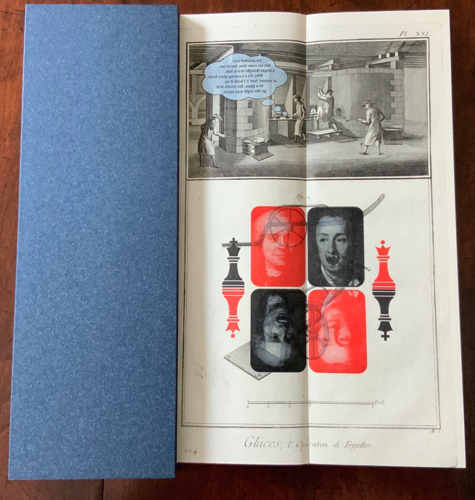
Malutzki’s tall small work evokes memories of Max Ernst’s Une Semaine de Bonté (1934) but pushes back on them with the work’s fine book execution. The book’s startling height derives from the more startling source of the paper: original pages from the plates volumes (1762-72) of Diderot’s Encyclopédie, ou dictionnaire raisonné des sciences, des arts et des métiers (1751-72). Through antiquarian dealers, Malutzki collected loose sheets from the first Paris folio edition and some from Italian editions (Lucca or Livorno).
The original engraving-papers (printed on one side as usual) are folded and glued together on the fore-edge. The stack of folded leafs has been glued at the spine with a small strip of glue so that each double spread has just a fold in the gutter, but no stitching, which shows the complete copper engraving unharmed structurally.
The endpapers are dyed through, and the fly-leaves are glued on the fore-edges to the first and last leaf of the book-block. The dark blue material used for the end-papers and the slipcase is an industrial one (Napura Khepera marine by Winter & Company) and is used for the endpapers. The Xian scarlet cloth for the cover also comes from Winter & Company. Throughout the book’s brief narrative, the dark blue associates with Diderot, and the scarlet with d’Alembert.
While Malutzki combines Ernst-like elements of the comic book and collage, the work is more of a conversation among imagery and concepts of the 18th, 19th and 20th centuries than an exercise in surrealism. It is a narrative built with the “pictures and conversations” that Alice finds lacking in the book her sister is reading by the river as Alice‘s Adventures in Wonderland (1865) opens. Malutzki piles this 19th century Victorian fantasy atop the 18th century by substituting the Enlightenment’s Encyclopédistes Doctor Diderot and Mister d’Alembert for Alice and her sister in the opening lines from Lewis Carroll’s story. The 20th century makes its appearance with the Playboy bunny in place of the White Rabbit and a clipart-like image of a book labelled “READ ME” in place of the bottle and cake labelled “DRINK ME” and “EAT ME”. The images in the 18th century engravings underlie the 19th century text in its speech bubbles. Nearly the only change to the text from Alice‘s Adventures in Wonderland and Through the Looking Glass (1871) is the substitution of the characters Diderot and d’Alembert for those in Carroll’s world.
In further allusion to Through the Looking Glass‘s mirror-world and upside-down logic, Malutzki has set some of the banderolle text in reverse and placed pairs of mirrored images crosswise — all overprinted on those 18th century engravings. Malutzki‘s precision and extensive experience with overprinting and the transparency of oil-based ink was essential given the limited supply of paper from the 250-year old volumes.
Inevitably, the collector has to confront the print preservationist’s question: how can you countenance the destruction of these 18th century prints? There is a several-fold unease. First, a worry for the security of such historical material (even altered) in the collection. Second, perhaps ironically, a worry over its preservation. And third, the worry whether the artistic quality of the work justifies the trade-off of the lost prints.
With at least a thousand complete sets of the original Encyclopédie (including the plates volumes) safely ensconced in academic and national libraries from France to Australia and still more loose prints (and sets) available from antiquarians, the use of these loose sheets for artistic purpose is lighter in the scales than the use of something far more rare or, worse, unique.
The preservationist might argue, “why not use the plates from one of the 20th century reprints?” Response: not the same tactility, not the same authenticity, not the same challenge or risk — not the same unease that prods the mind.
More directly to the artistic quality of Doctor Diderot’s and Mister d’Alembert’s Adventures: The photos here do little justice to the work’s precision, the sound of the slipcase’s snug fit, the layering of colours on the page, the motion of the spine, and the different textures of the 21st century cloth binding, the slipcase, endpapers and leaves of engraving papers so neatly adhering to each other that they feel like a single leaf. It is refreshing to see Alice appear outside the tableaux to which so many book artists have turned when inspired by Carroll. It is genius to have merged Carroll’s fictive exploration of logic and epistemology with the Enlightenment’s attempt to encompass humankind’s knowledge of the sciences, arts and industries or crafts.
Doctor Diderot’s and Mister d‘Alembert’s Adventures falls outside the span covered by Malutzki’s autobiography buchstäblich Buch (see under Further Reading). As such, it occupies a prospect from which to view Malutzki’s decades-long musing about the visual arts, knowledge and whimsy, all evident from his work — both solo and in collaboration with Ines von Ketelhodt — in the late 20th and early 21st centuries.
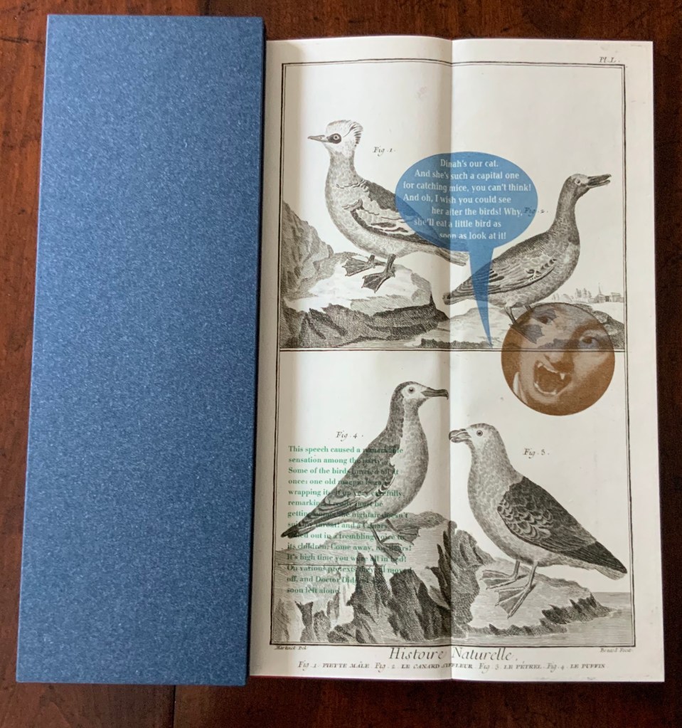
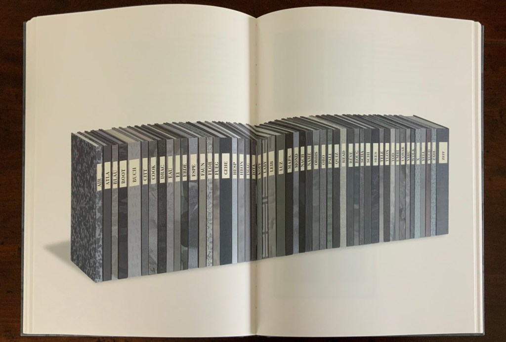
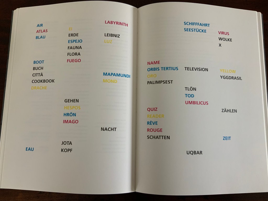
Zweite Enzyklopädie von Tlön: Ein Buchkunstprojekt von Ines von Ketelhodt und Peter Malutzki, 1997-2006 (2011)
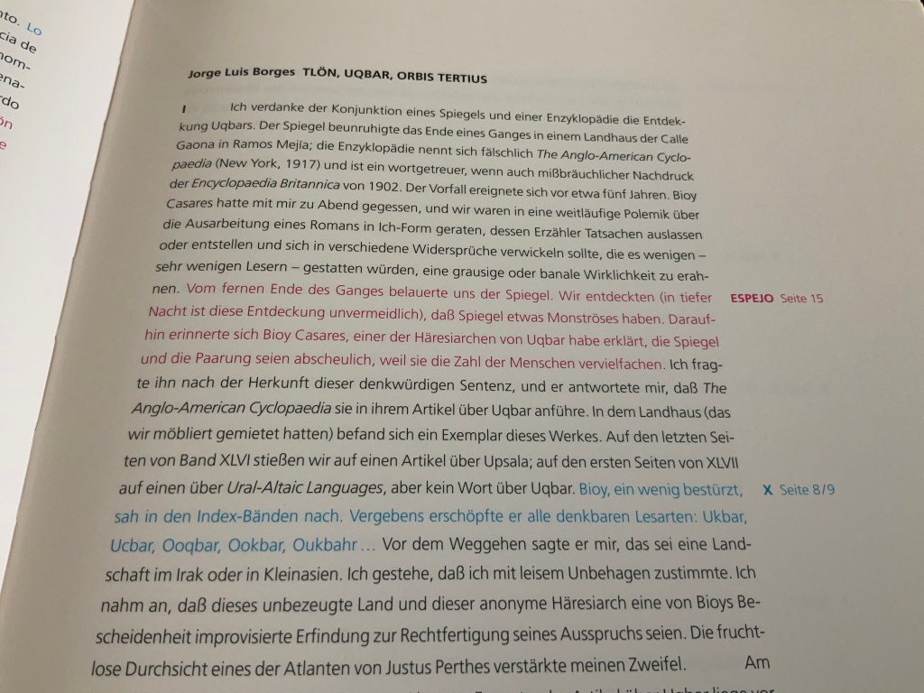
Through his fiction — especially his story ”Tlön, Uqbar, Orbis Tertius” — Jorge Luis Borges has played as inspirational a role for artists and book artists as have Lewis Carroll, Stéphane Mallarmé and Laurence Sterne. An incomplete list includes Katie Holten’s About Trees, Sean Kernan’s Secret Books, Aurélie Noury‘s “Pierre Ménard, El Ingenioso hidalgo Don Quijote de la Mancha“, Hanna Piotrowska (Dyrcz)‘s Jorge Luis Borges, The Maker, Liliana Porter’s prints, Elaine Sturtevant’s Sturtevant: Author of the Quixote and Daniel Temkin’s and Rony Maltz’s Borges: The Complete Works. For book art, though, Malutzki’s and Von Ketelhodt’s fifty-volume work must lead the list, closely followed by this descriptive catalogue, a bookwork in itself.
Eva Hanebutt-Benz (Gutenberg-Museum Mainz) introduces the catalogue by defining the various sorts of encyclopedic reference work, where the Zweite Enzyklopädie fits in, how it is organised, and the inspirational role played by Borges’ story “Tlön, Uqbar, Orbis Tertius”, which is reproduced complete in the catalogue in Spanish as well as German and English. Hanebutt-Benz’s essay, too, is given first in German, then in English, establishing the pattern for all of the essays from the other twenty-two contributors to the catalogue — librarians, artists and curators — each describing two or more volumes of the Zweite Enzyklopädie.
This multilingualism of the catalogue is characteristic across the fifty volumes and the works of Von Ketelhodt and Malutzki in general. More important, by echoing the exploration of multilingualism, language and meaning in Borges’ story, it joins the story as a unifying force in the catalogue and across the Zweite Enzyklopädie. Excerpts from the story appear in many of the volumes, as the relevant contributors note and elucidate. Another unifying force aligned with the story is the artists’ use of the primary colours in the catalogue.
Sampling several paragraphs from the opening and closing of each language version, we can see the red, blue and yellow inks that are used to signal those portions of Borges’ text that appear somewhere in the fifty volumes. In the margins, the volume’s title and specific page number are called out in the relevant colour. The double-page spread separating the contributor’s essays from the section of photos of the fifty volumes applies the primary colours and black across the names of the fifty volumes, leaving space for future volumes. This is the sort of maker’s detail linked with the larger organisational elements that contributes to the unity of a work that, in Hanebutt-Benz’s words, is an “encyclopedic collection of creative possibilities, generating a book cosmos, closed within itself, playfully and yet following strict guide lines.”
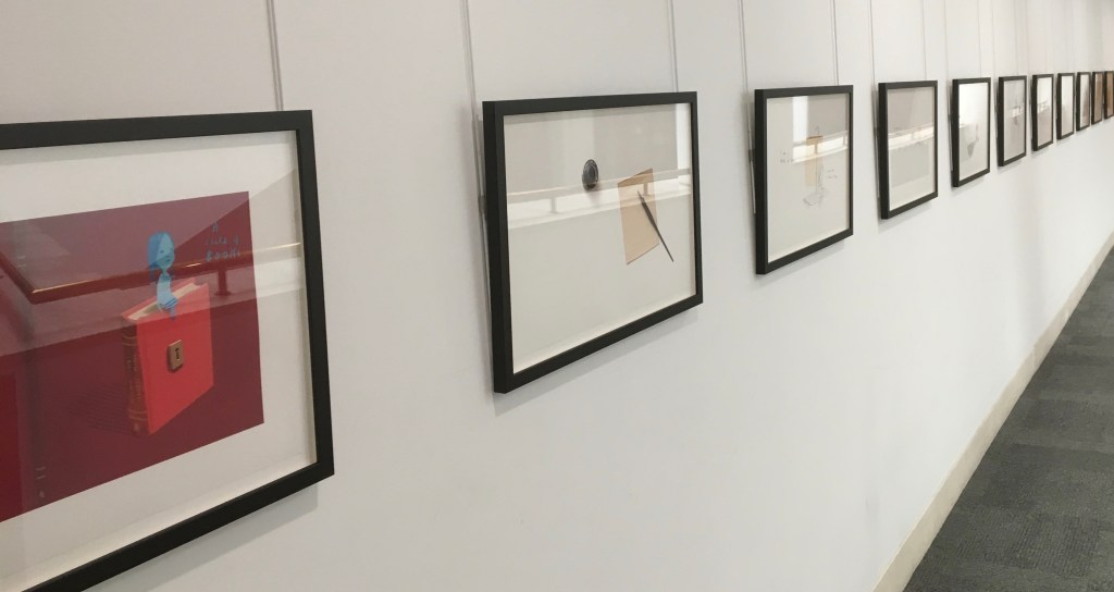
As a work in and of itself, the catalogue intensifies so many of the characteristics of the more traditional “artist’s book” that, without the monolithic presence of the fifty volumes, sight of its “book art-ness” could slip away. The artists have a dual preventative. One is to make the fifty volumes a visible presence by giving each volume its own double-page spread following the double-page spread shown above. This generates 300 colour photos.
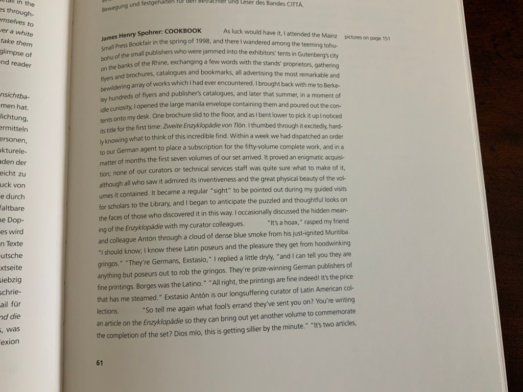
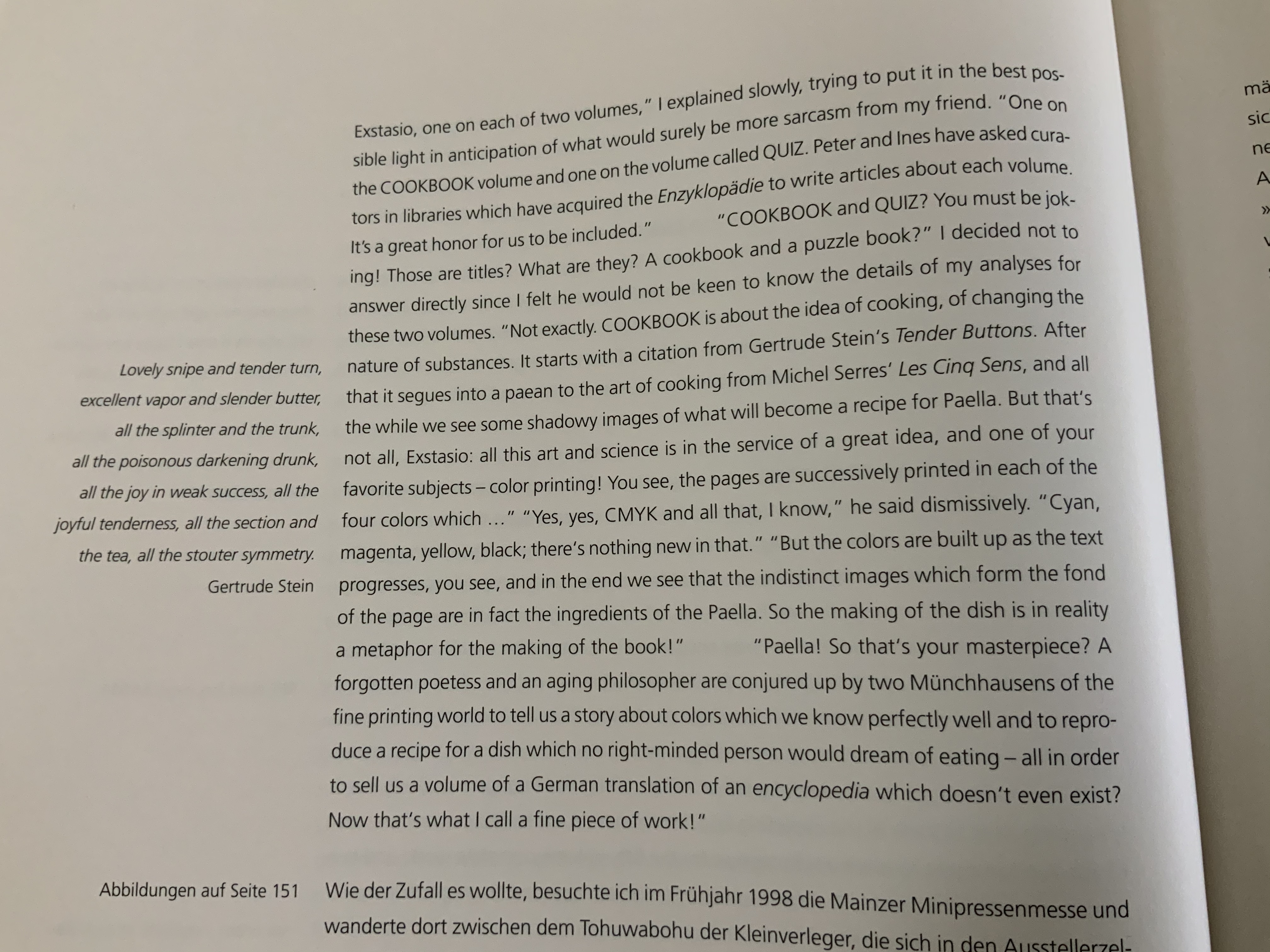
Another is a gamble: a roll of the dice that the twenty-three contributors would deliver comments on each volume that rise to the occasion. It was a winning gamble, but there is one superlative pair of essays that rings like a tuning fork: COOKBOOK and QUIZ as explained by librarian James Henry Spohrer (University of California, Berkeley). They are at once Borgesian, Malutzkian and Von Ketelhodt-esque.
Only the discussion of COOKBOOK is offered here — an incentive to visit QUIZ. In QUIZ, Spohrer seamlessly carries on his conversation with his “colleague“ Extasio Antón in a way that proves Hanebutt-Benz’s statement true:
The world recorded in this encyclopedia is, in the end, an actual encyclopedic collection of creative possibilities, generating a book cosmos, closed within itself, playfully and yet following strict guide lines.
Further Reading
“Ken Botnick“. 16 June 2022. Books On Books Collection. For another homage to Diderot.
“Lizzie Brewer“. 4 July 2023. Books On Books Collection. For another homage to Borges.
Long, Elisabeth. “Second Encyclopedia of Tlön”, The Sign of the Owl, 23 July 2009. Accessed 23 October 2019.
Mellby, Julie. “Zweite Enzyklopädie von Tlön”, Graphic Arts, Princeton University Library, 17 June 2010. Accessed 24 October 2019.
Soltek, Stefan. “Epilog” in buchstäblich Buch: eine Autobiographie by Peter Malutzki (Florsheim/Offenbach, Germany: Peter Małutzki/Klingspor Museum, 2017).
Recent exhibition of art from Oliver Jeffers’ and Sam Winston’s A Child of Books. The British Library.
Richard Price and his team at The British Library just concluded their fifth event in this series of “show and tell” talks by book artists. Most of the events have staked a claim to some relationship with a British Library event or exhibition current at the time — World Book Night, Writing: Making your Mark, and Buddhism — but the title of this fifth event punningly encapsulates the real point of the entire series: “Contemplating: Artist’s Books Now”.
When picturing an artist’s book what do you imagine? Intricate design, ornate bindings, blank space, fold outs and pop-up rinsed through with vibrancy of text and colour. Is it something more unearthly and harder to describe? An air of peace in the topsy-turvy hullabaloo of our modern world. A pause of contemplation as a work speaks to you? Or, on the contrary, is it a space of immense energy, of ‘thought-provocation’, where contemplation is something you feel compelled to do to make sense of the sensations and ideas the book stimulates? “Contemplating: Artists’ Books Now”
Whether the organizing theme has been “here and now” “place”, “Latin America“, “writing” or “contemplation”, the evening inevitably turns to reflecting on the nature of book art, bookworks, the artist’s book, the book arts, bookness and even art itself. Even with 50-60 in the audience and four to six presentations, Price and team have arranged the agenda to allow for hands-on “viewing” of the works, conversations with the artists and question time that evolves into a room-wide conversation, not just Q&A.