Within Every Room There is an Echo of the First (2018)
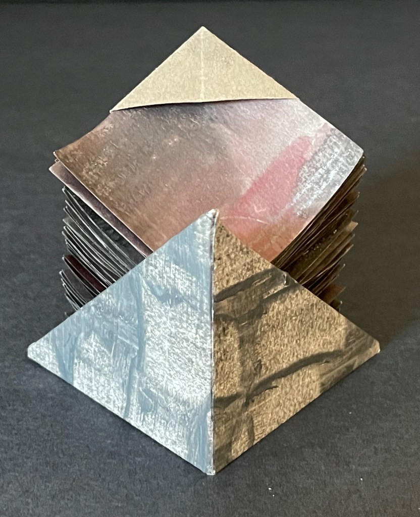
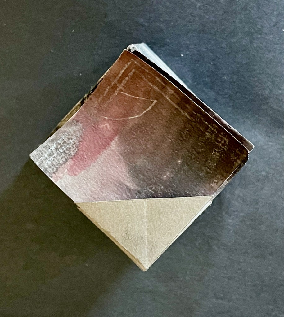
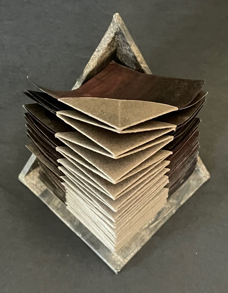
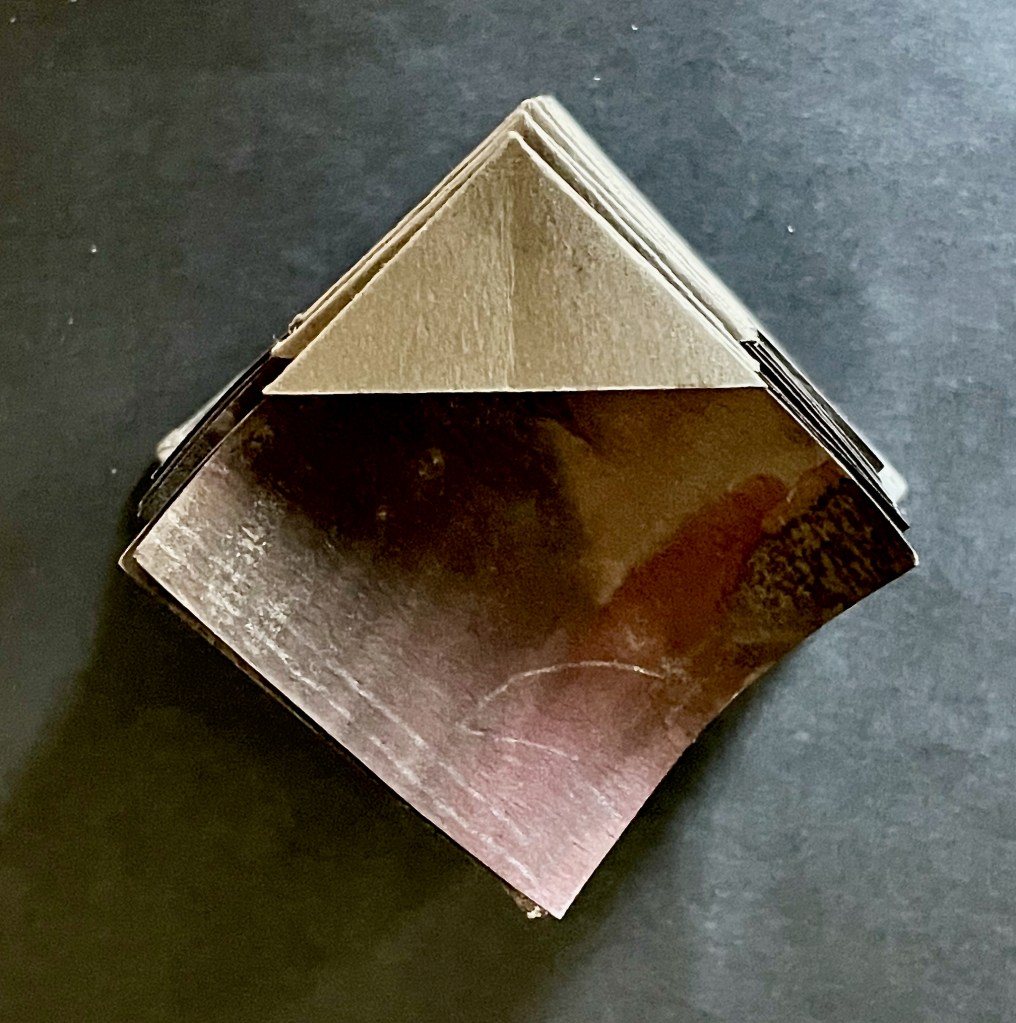
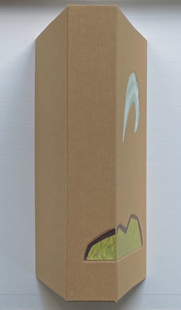
Within Every Room There is an Echo of the First (2018) Sarah Maker Diagonally halved box, painted-paper over millboard, paste paper. H65 x W65 x D65 (closed) mm, W730 (extended diagonally) mm. [45] panels Unique. Acquired from Ink and Awl, Seattle, US, 10 December 2025. Photos: Books On Books Collection. Displayed with permission of the artist.
This small sculptural artist’s book that enacts its title is an engineered accordion with architectural pencil drawings on paste paper. Every aspect is remarkable. The millboard “cover” is a diagonally halved cube that forms the “corner” of the room from which its echoes will unfold. The accordion spine consists of folded tabs into which the pages are pasted. The pages have been shaped so that as the book is opened (the top page being pulled by its tab), they curve against each other like artichoke leaves and then spread as the angled spine pleats push them outwards.
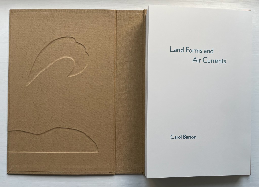
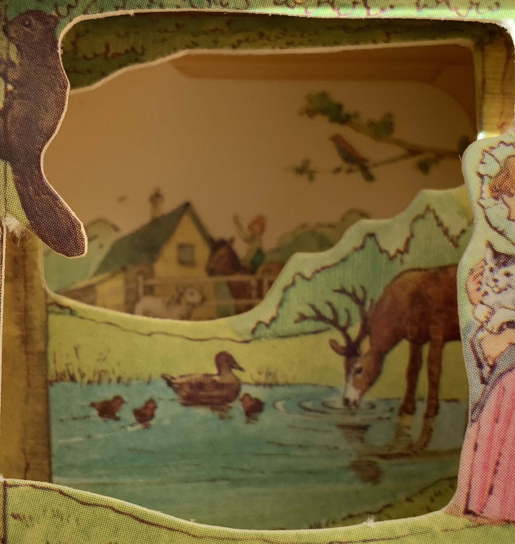
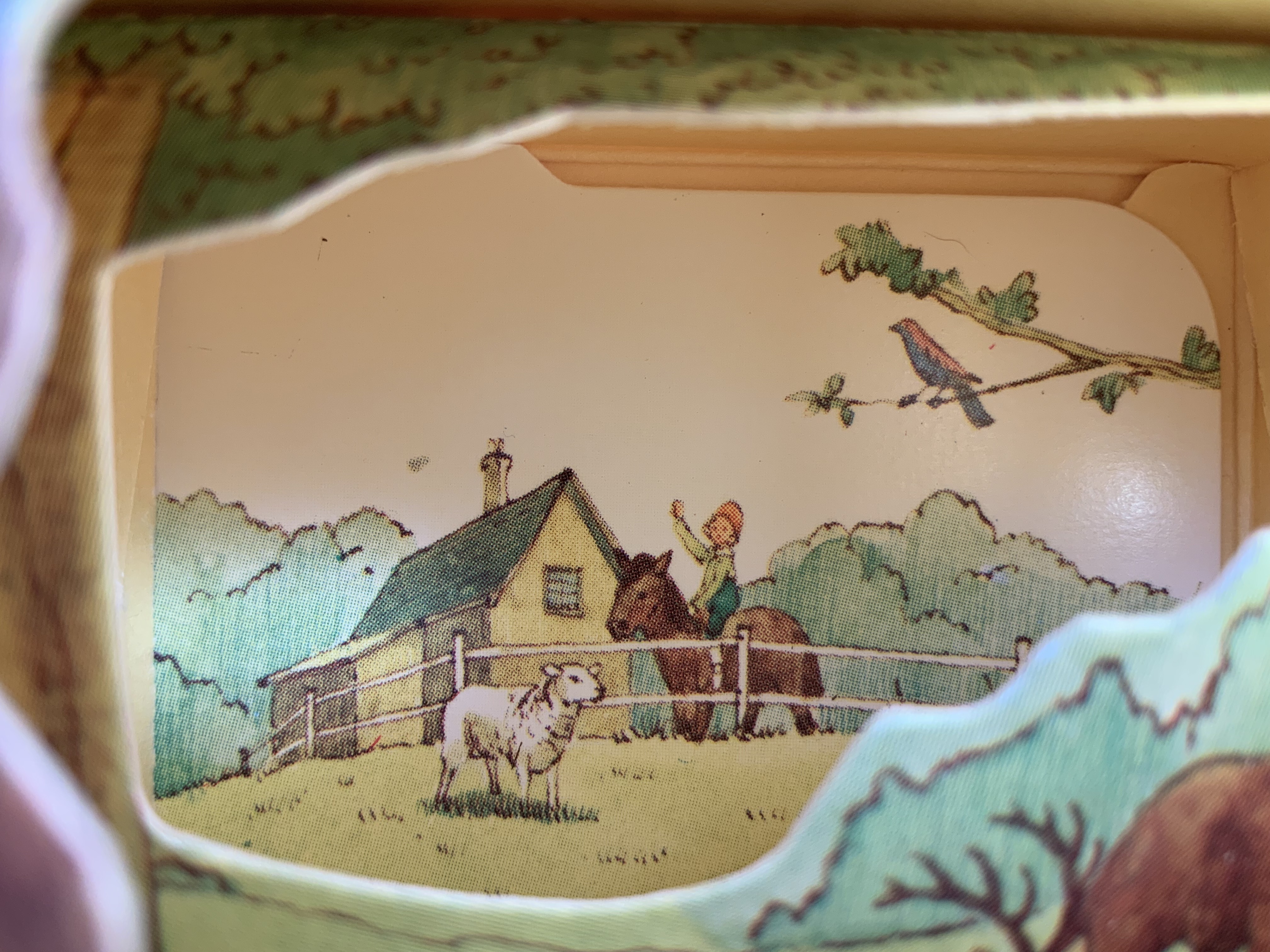
Land Forms and Air Currents (2014) Carol Barton Leporello (with 11 pop-ups) fixed to inside cover of case, cloth over board, debossed with fitted, pastedown artwork on front cover and spine. Cover: H292 x W192 x D50 mm. Leporello: H275 x W175 mm. 37 panels. Edition of 25, of which this is #21. Acquired from the artist, 27 October 2023. Photos: Books On Books Collection. Displayed with artist’s permission.
Carol Barton’s reputation for paper-engineering, supported by her well-received multi-volume The Pocket Paper Engineer, should not overshadow appreciation of her talents with watercolor and words. With its poems of free verse, scanned watercolors and pop-up structures all by the same author/artist, Land Forms and Air Currents (2014) qualifies as a champion of the Blakean tradition in artists’ books.
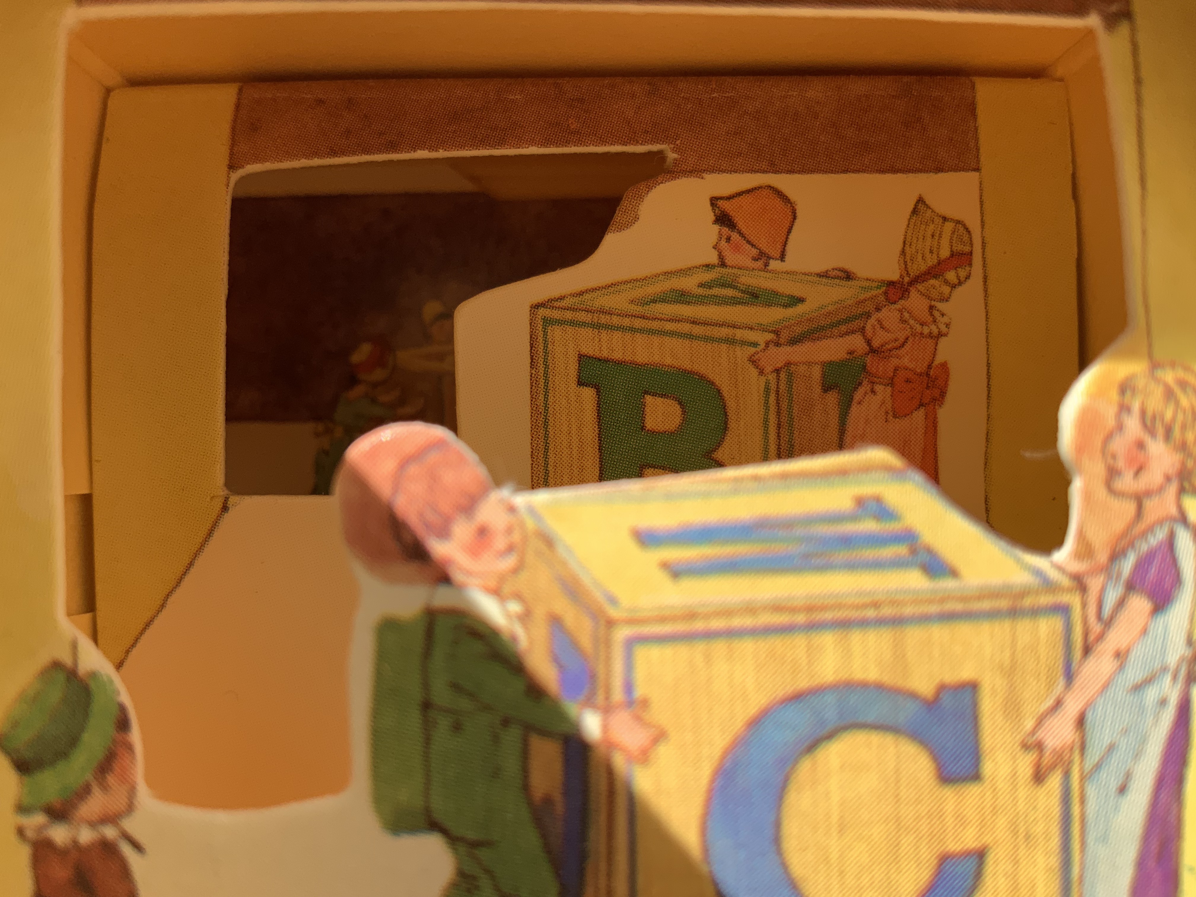
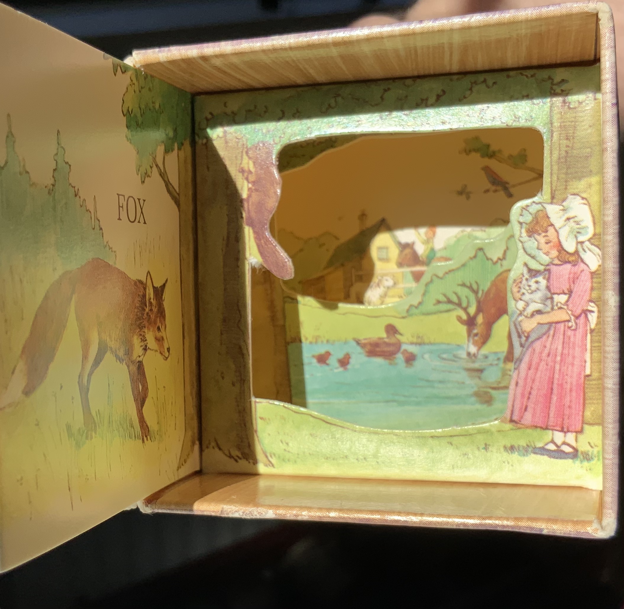
Given the effectiveness of Svensson and Diaz’s Letters alphabet book-in-a-box effort, it is surprising that they did not follow up the alphabetical theme from Animals, especially since animals have made up the most popular category of alphabet books for centuries. Another 24 or 25 books in boxes beckon. Alphabetical cubes of birds, cats, dogs and the zemmi! And what about the ampersand? And what different paper artistry might Diaz have performed if requested to fill out the series with further innovation? Consider Claire Van Vliet’s alphabetical Tumbling Blocks for Pris and Bruce (1996), Helen Hiebert’s Alpha Beta (2010) and Karen Hanmer’s The Spectrum A to Z.
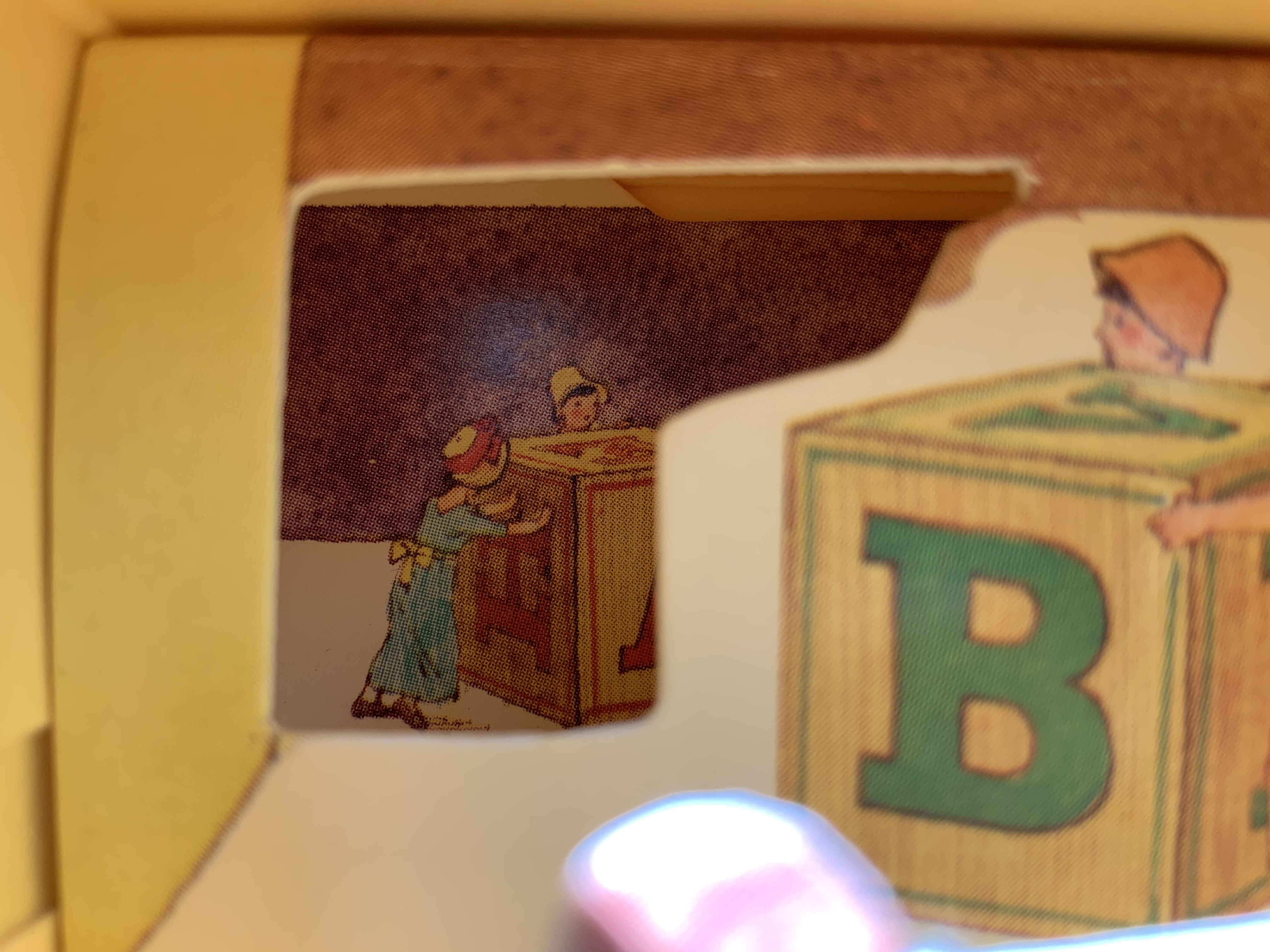
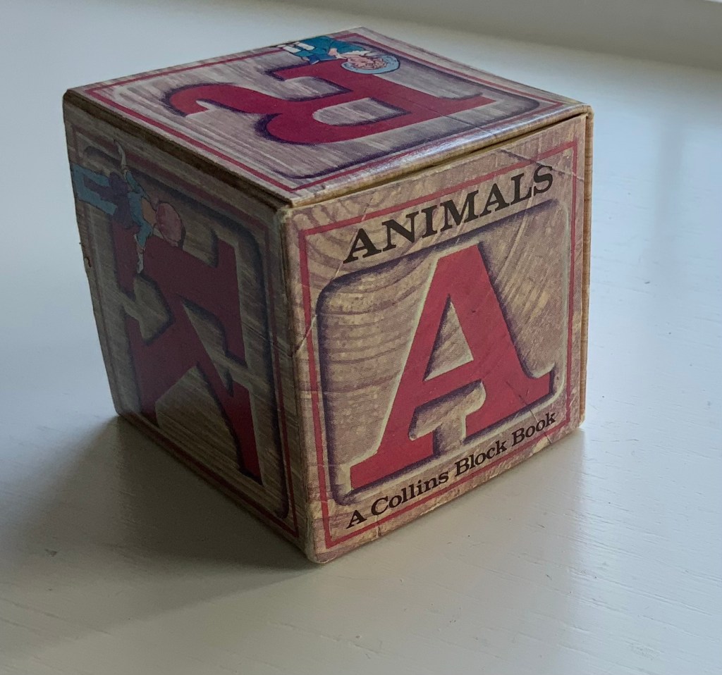
Before its acquisition by Harpers in 1985, William Collins & Sons settled on the less risky venture of four books in boxes: Animals, Letters, Numbers and Colors. First with Elgin Davis Studios, James Diaz was the paper engineer behind all four and later joined David A. Carter (see his tribute to Bruno Munari here) to produce The Elements of Pop Up: A Pop Up Book for Aspiring Paper Engineers (1999), still used as a primary textbook.
Of course, B. S. Johnson and Marc Saporta pioneered boxes containing loose pages or leaves to be read in any order, but to find contemporary books in boxes where the box is not just a storage mechanism but functionally integrated, we have to look to Ed Hutchins, Sue Johnson and Hedi Kyle among others.
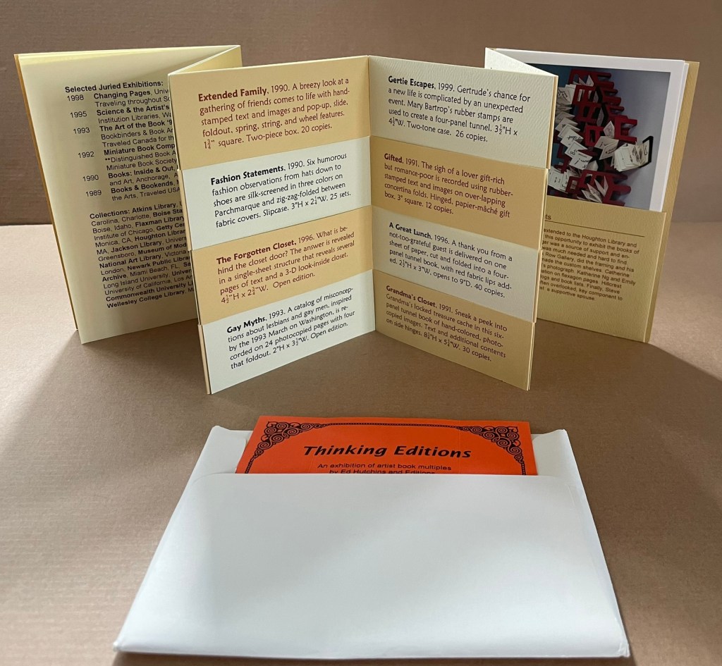
Ed’s books are a delight: witty and/or thoughtful ideas cleverly presented in unusual structures. Ed is a great believer in designing the form to suit the content, so no two books are alike. Some basic forms re-occur, but there are tweaks to the basic structures that individualize them for each version.
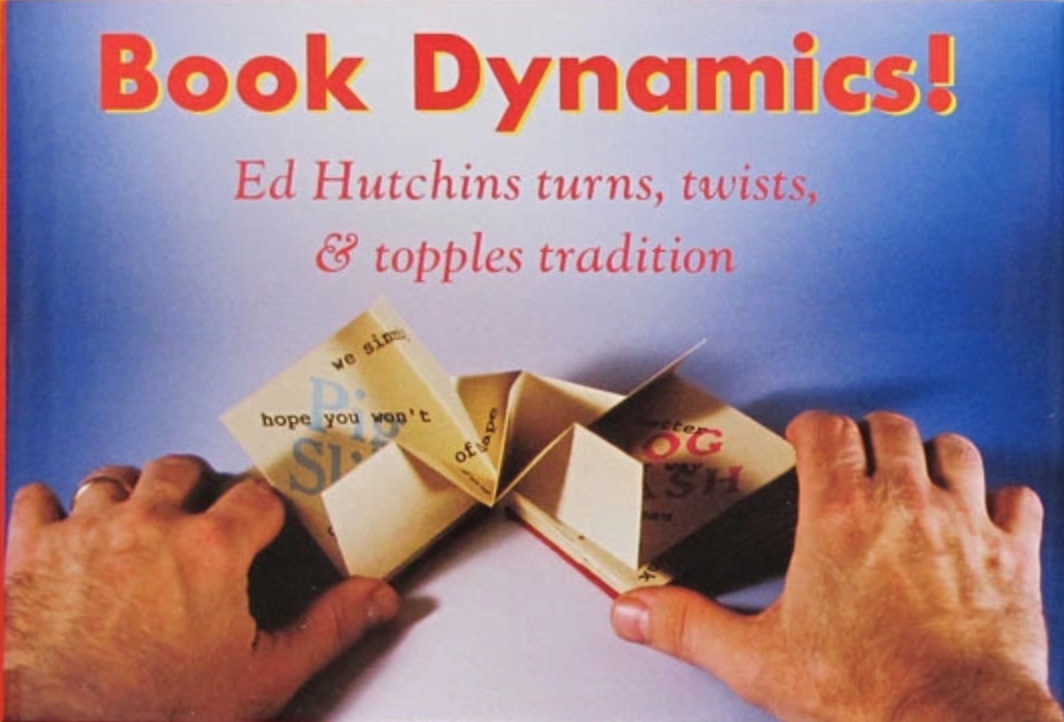
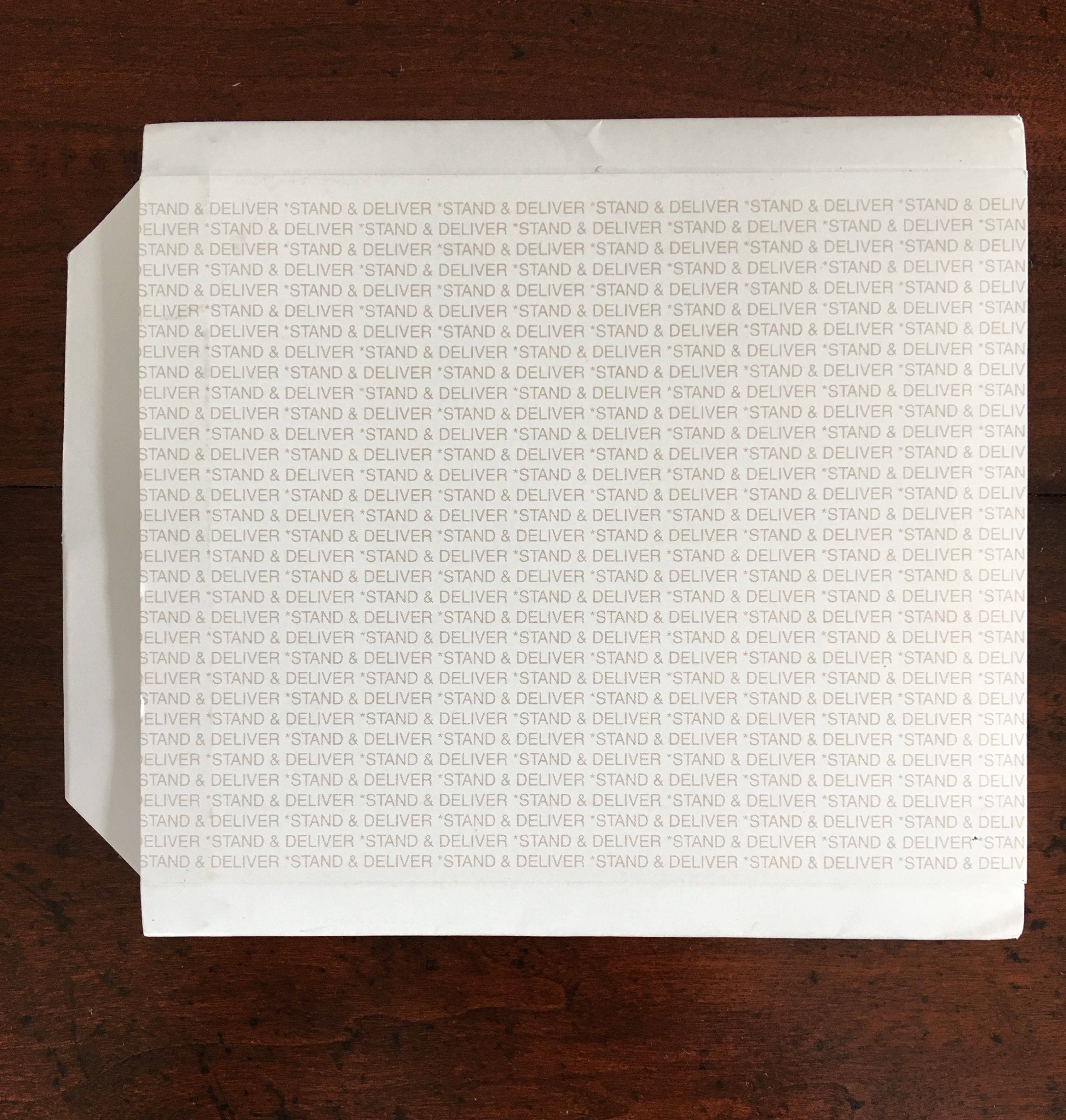
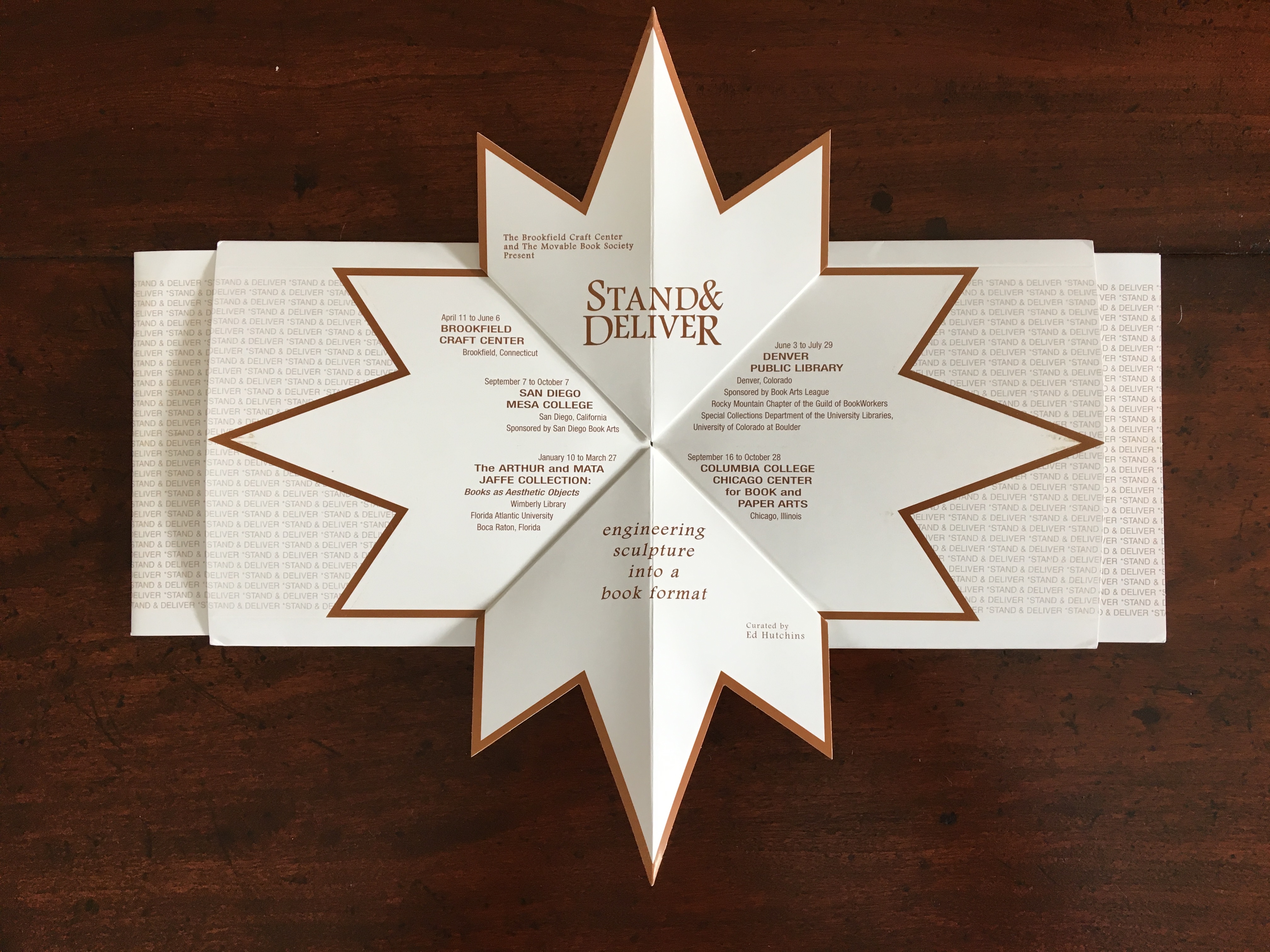
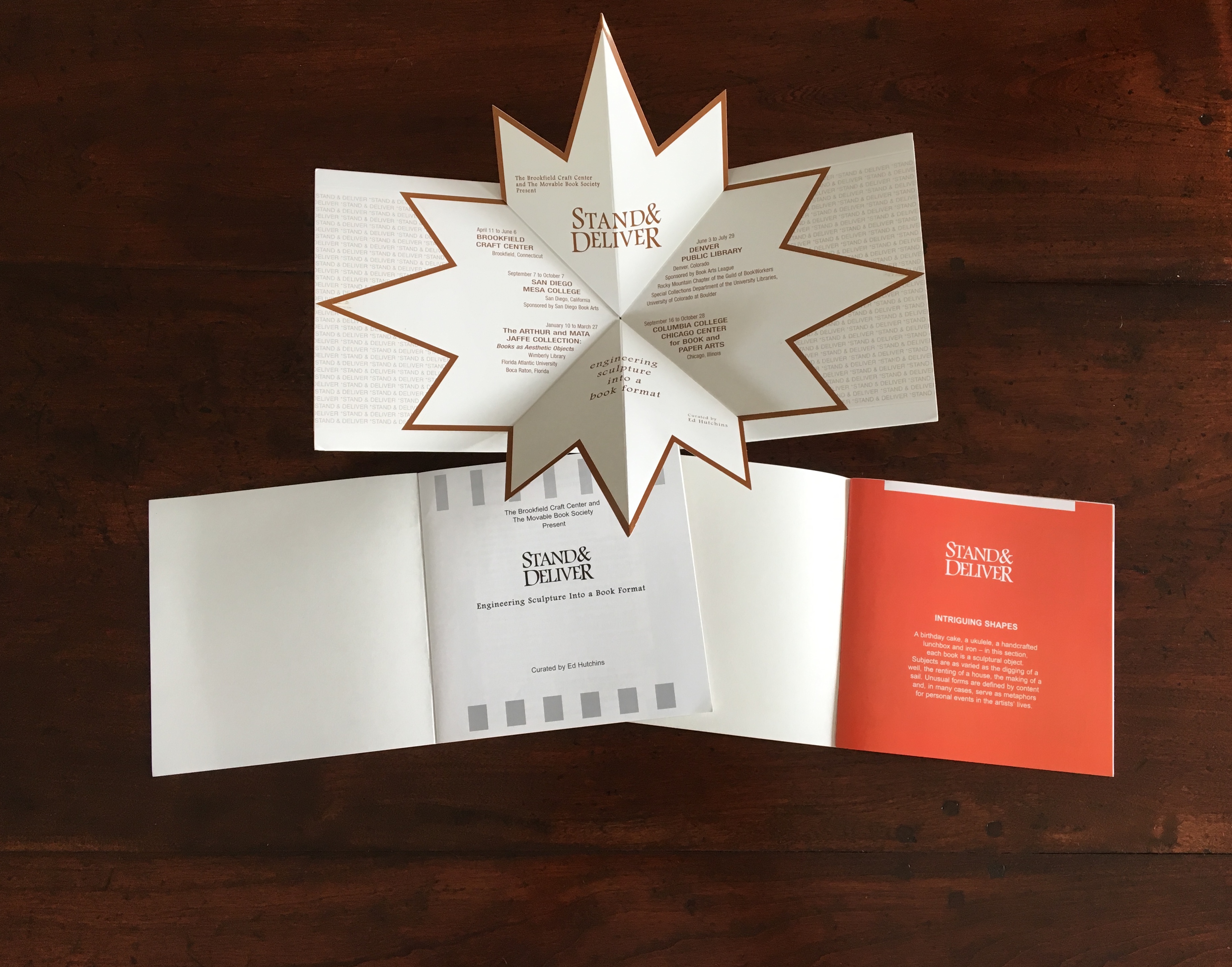
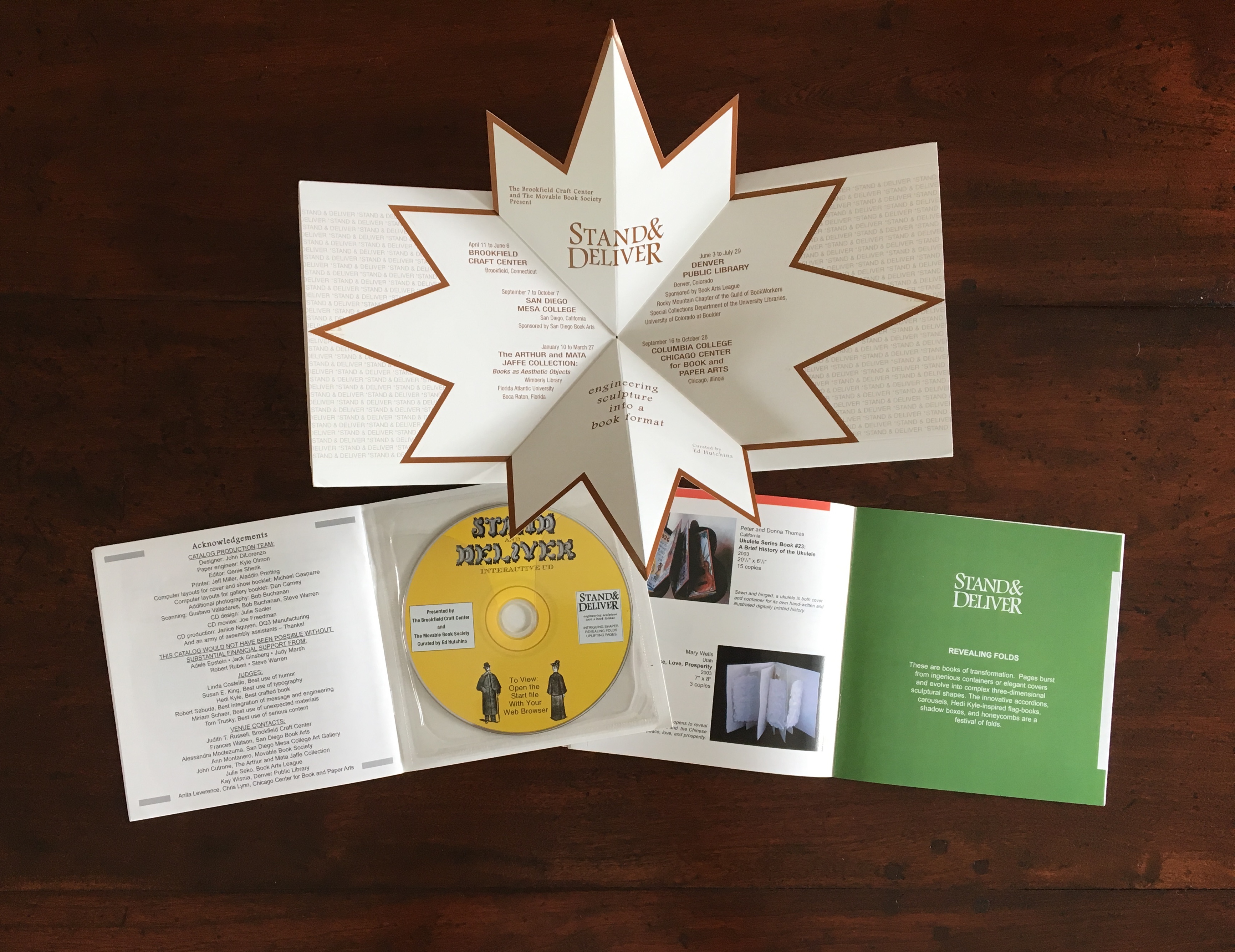
Miller’s review in Byopia Press is also a delight, providing multiple links and routes to information about Ed Hutchins as well as to other reviews of his work. Below are images of the catalog for Stand & Deliver, curated by Hutchins in 2003.
Engineered by Kyle Olmon and designed by John DiLorenzo, the catalog demonstrates great inventiveness in the pop-up structure and mechanism that nudges the two booklets from the left and right sleeves as the catalog is opened. Note also the use of colors to demarcate its sections that follow the themes Hutchins used to organize this exhibition: Intriguing Shapes, Revealing Folds, Uplifting Pages. And note the distinctive and subtle shifting placement of colors in the right-hand booklet: at the top on the orange page, a white bar that shifts to the right on the green page as an orange bar marks the end of the previous section on the facing verso page. For an exhibition that traveled to five different locations, a more appropriately and intricately mobile catalog could hardly have been devised.
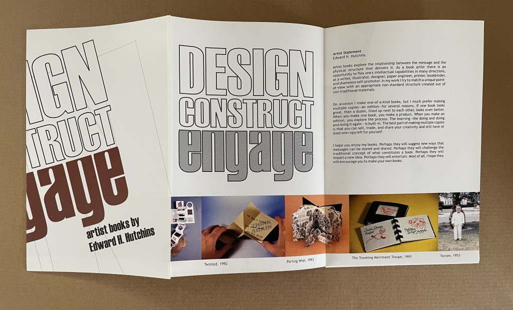
Design, Construct, Engage (2002)
Design, Construct, Engage (2002) Booklet-poster-catalogue in meander cut and fold. Closed: H220 x W140 mm. Acquired from Ed Hutchins, 26 January 2022.
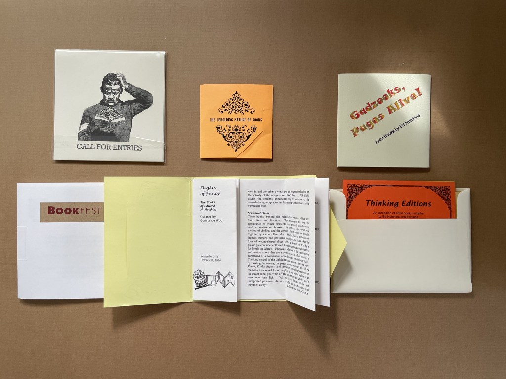
Ephemera (1996 – 2003)
Flights of Fancy (1996) Envelope with tab, trifold, center-cut single sheet forming booklet H145 x W116 mm. Acquired from Ed Hutchins, 20 May 2014.
Gadzooks, Pages Alive (2002) Velcro-fastened trifold cover glued to 18 pages, fixed spinner inside cover. 107 x107 mm. [18] pages. Acquired from Ed Hutchins, 20 May 2014.
The Unfolding Nature of Books (1993) Envelope with tab, trifold, with split Turkish map in center. Self-enclosing evelope with split Turkish map construction exhibition list in center Closed: 85 x 85 mm. Acquired from Ed Hutchins, 20 May 2014.
Thinking Editions (1999) Accordion fold booklet with 16-page gathering saddle-stitched with single staple to first fold, four panels of accordion slit to receive four cards to create 8 interleaved pages, final panel has pocket holding 3 color postcards. H155 x W110. 28 pages. Acquired from Ed Hutchins, 20 May 2014.
Thinking Editions card (1999) Four-card construction displaying 7 views. 126 x 126 mm. Acquired from Ed Hutchins, 20 May 2014.
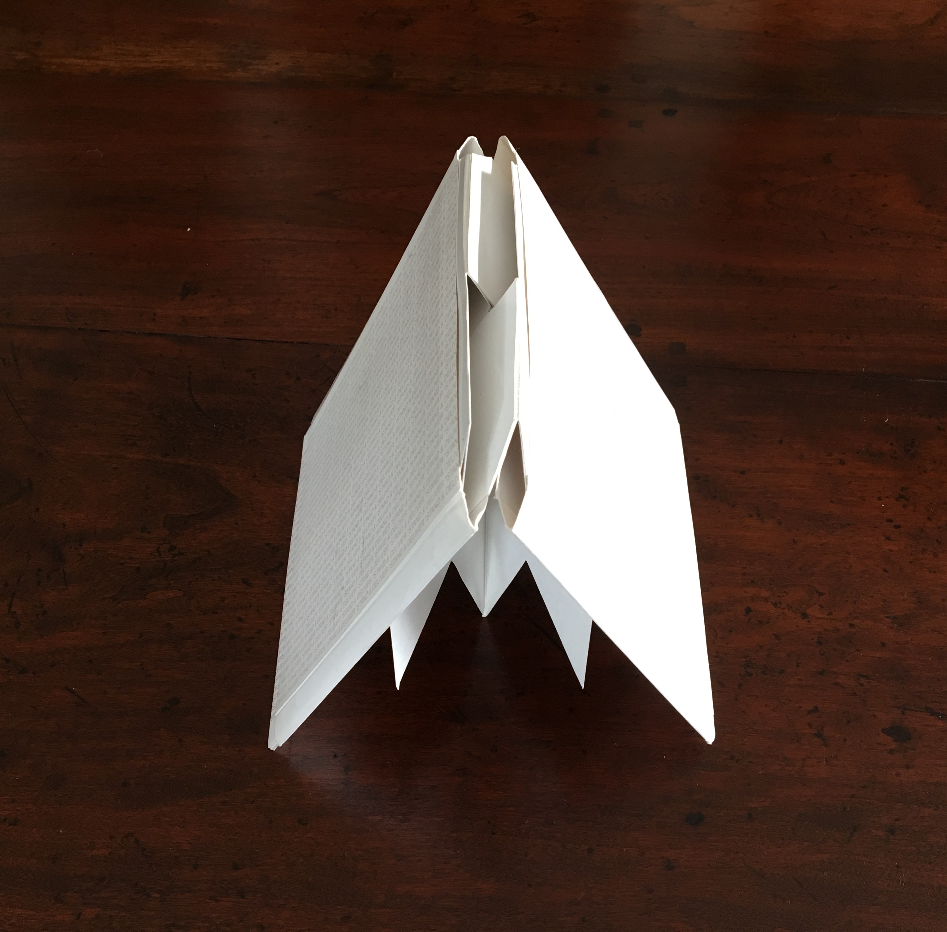
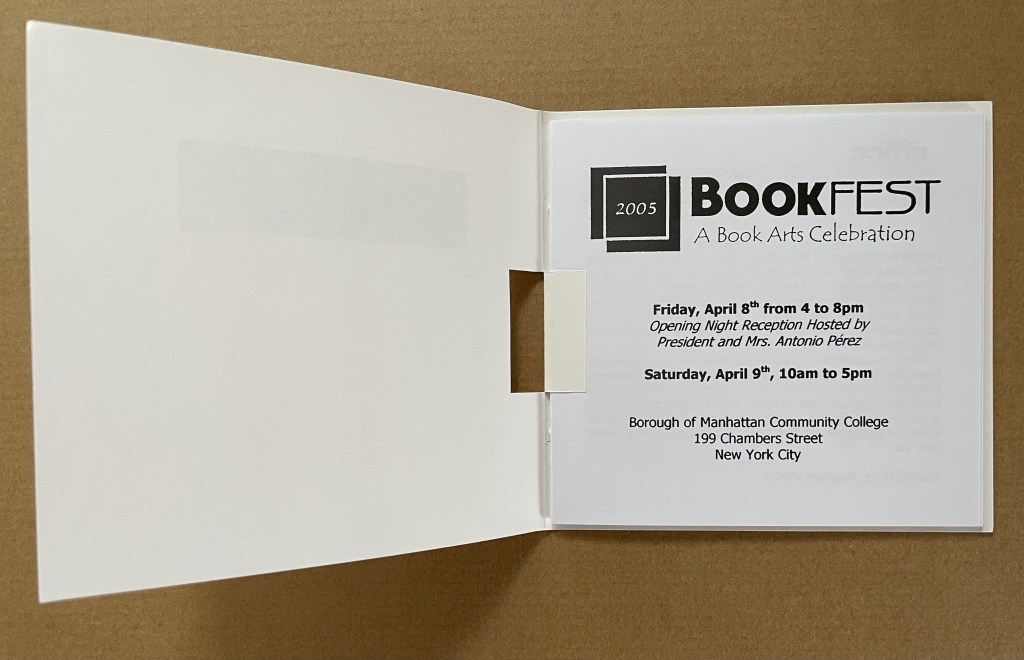
Call for Entries, Stand & Deliver (2002/3) Pop-up invitation with entry cards. Acquired from Ed Hutchins, 20 May 2014.