Books On Books Collection – Hans Witte

ABC of Advertising (2024)

Cover of the book 'ABC of Advertising' by Hans Witte, featuring vibrant collages of colors and typography, highlighting the title and the author's name.

ABC of Advertising (2024)
Hans Witte
Casebound, cloth spine and paper over boards, sewn to doublures. H150 x W105 mm. [40] pages. Acquired from Redfoxpress, 2024.
Photos: Books On Books Collection.

The ABC of Advertising is No. 205 in the RedFoxPress “c’est mon dada” series. The series name comes from the French expression meaning “it’s my thing”. Dada is also a colloquial child’s expression for “horsie” or “hobbyhorse”. So, of course, the French adopted it as the name for one of the avant garde movement of the early 20th century. Although you might think from The ABC of Advertising that wood type and letter press are Hans Witte’s “hobbyhorse”, it’s clear from his artist’s books, children’s books, and book object installations that he has a herd of them.

Continue reading

Books On Books Collection – Kitty Crowther

Va faire un tour (1995)

From the first wordless illustration onwards in Kitty Crowther’s Va faire un tour, you don’t have to know French to know that the book’s title means imperatively “take a walk” — or maybe even “take a hike” — in English. There is no mistaking the tone of Maman’s character nor the reaction of her little one stomping along, circling the globe, even under bodies of water, oblivious to characteristic scenery and inhabitants.

Continue reading

Books On Books Collection – Fortunato Depero

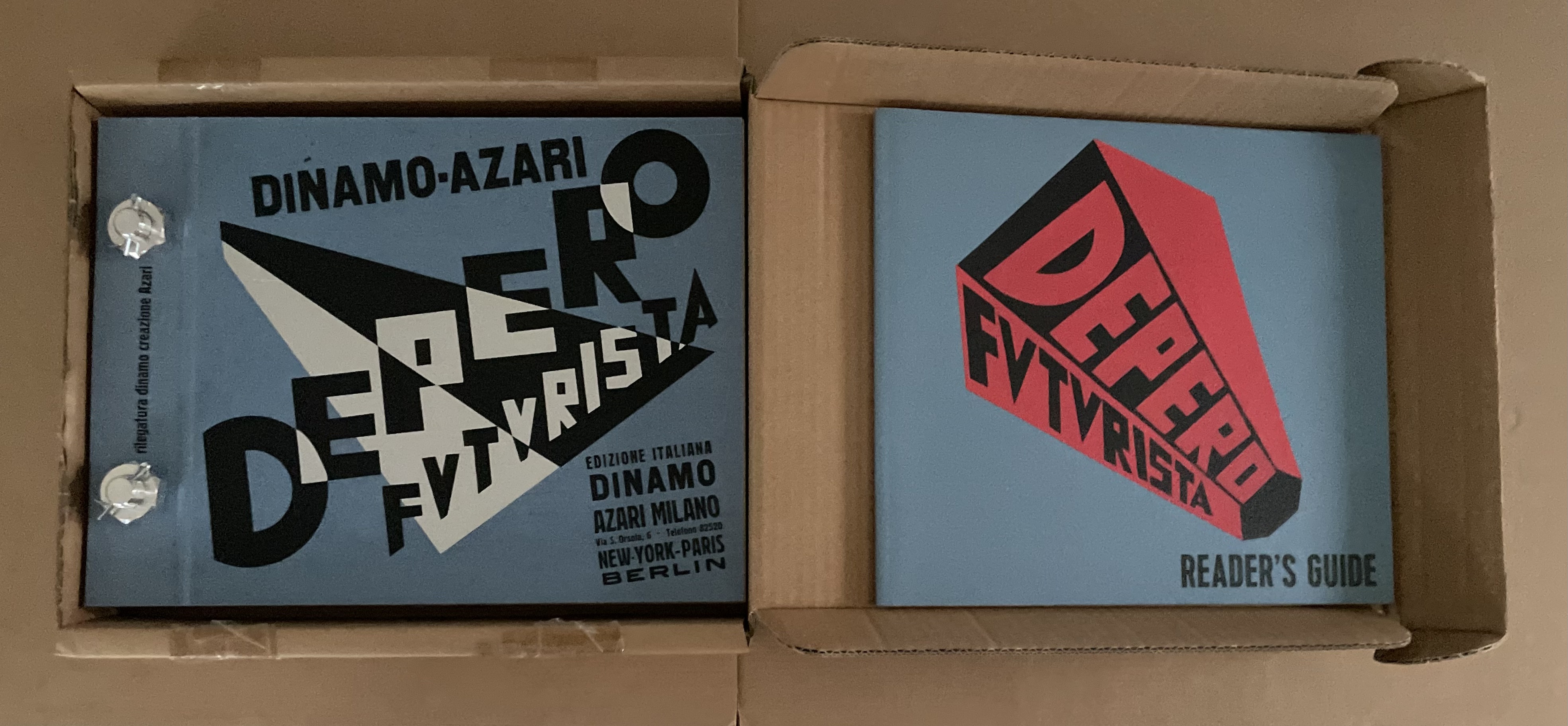
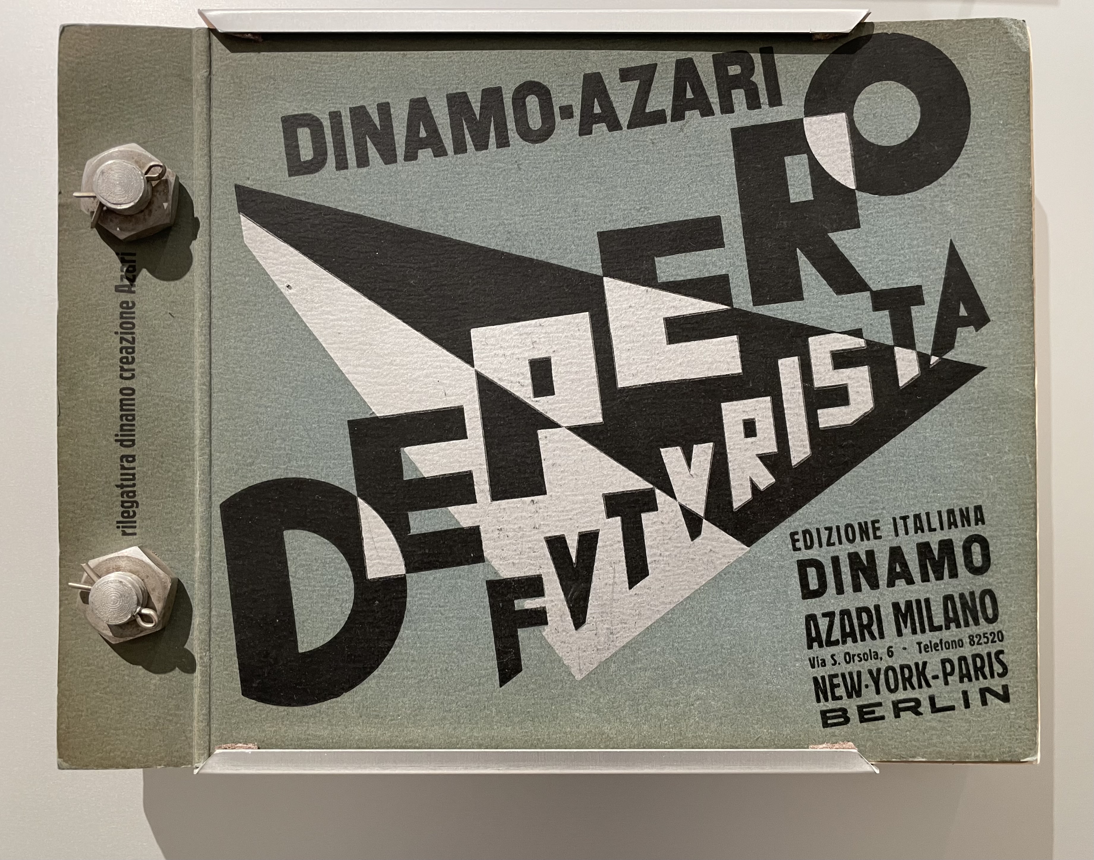
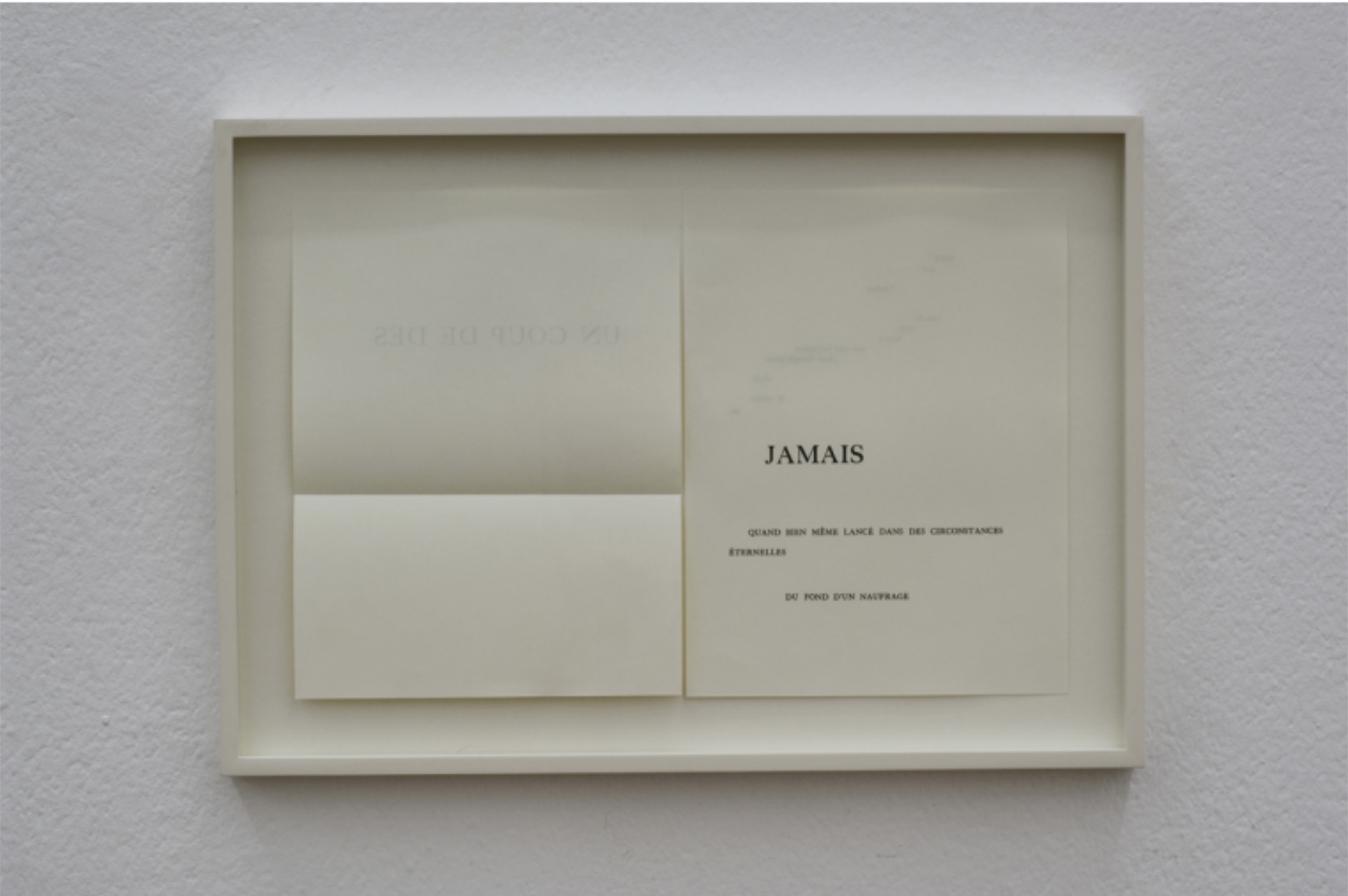
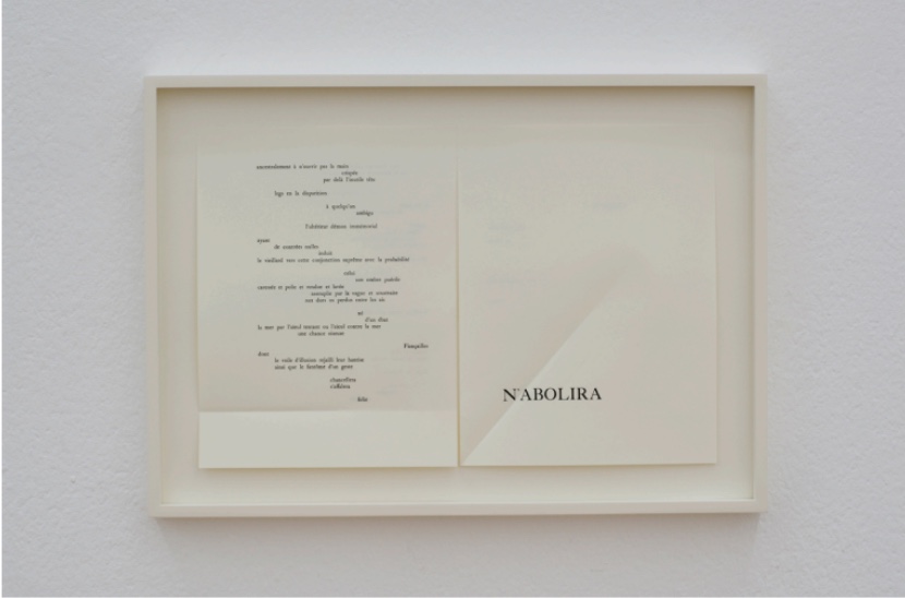
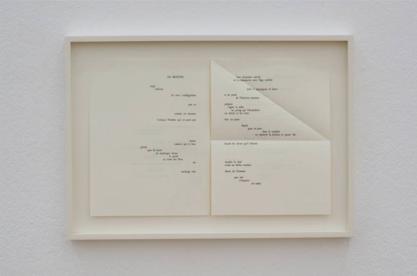
Depero Futurista: Imbullonato (the “Bolted Book”) (1927/2017)

Depero Futurista: The Bolted Book (1927/2017) and Reader’s Guide (2017)
Fortunato Depero and Designers & Books (Steve Kroeter, editor-in chief)
Bolt-bound loose folios between textured, colored card stock. H242 x W320 mm. 240 pages. Edition of 2500, of which this is #. Purchased from Designers & Books, 18 October 2016. © 2018 Artists Rights Society (ARS), New York / SIAE, Rome.
Photos: Books On Books Collection.

Fortunato Depero’s Depero Futurista: Imbullonato (the “Bolted Book”) stands at the center of an uneasy off-rhyming of history. Where Depero and the avant-garde Futurists of the early 20th century rode the waves with Benito Mussolini and fascism, this 2016/17 facsimile edition of Depero Futurista coincided with the emergence of America’s “Tangerine Mussolini” and his MAGA movement.

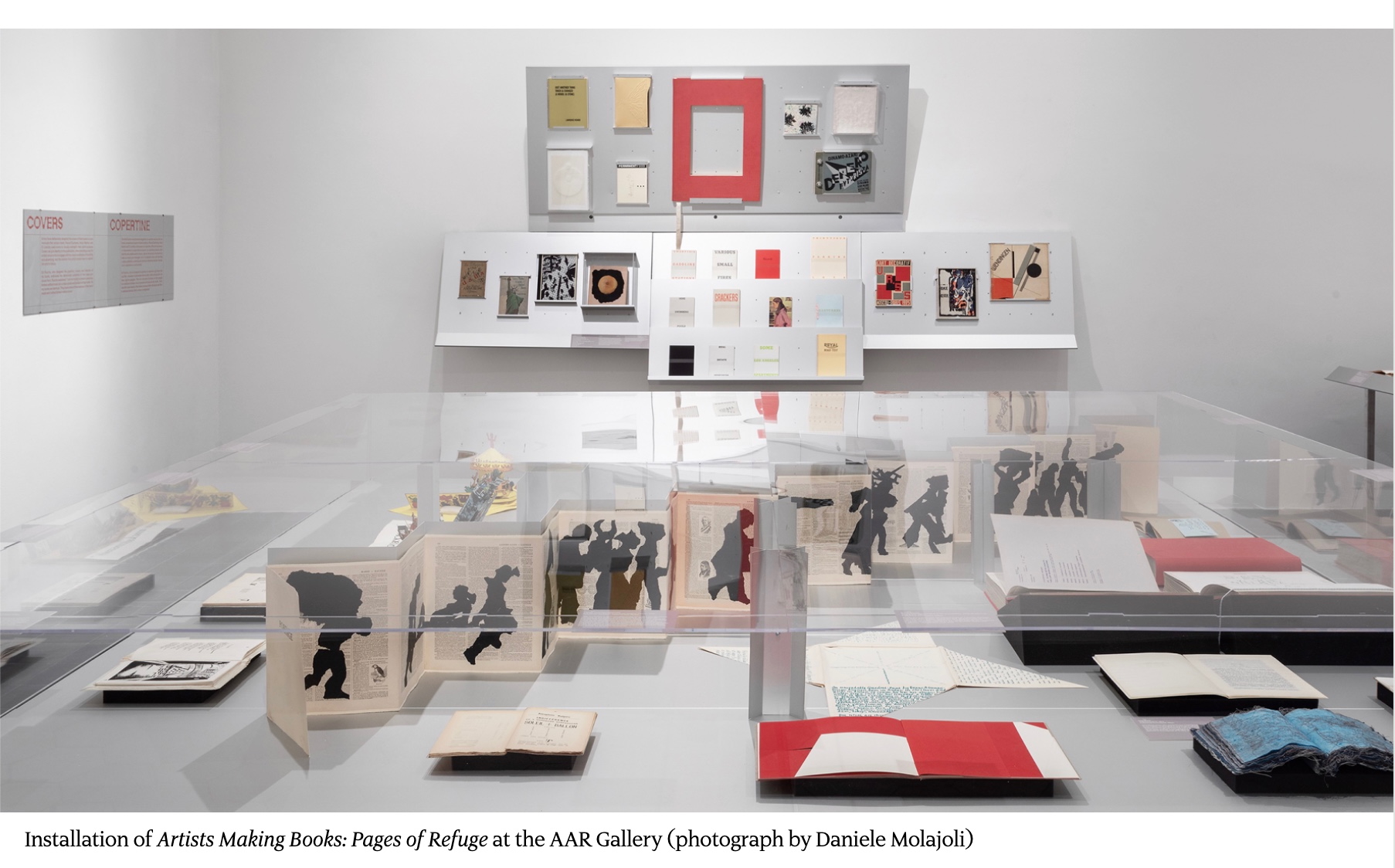
In 2024, the original and facsimile editions of Depero Futurista appeared in an exhibition at the American Academy in Rome just as Trump was elected as the first Convict-in-Chief. And five days before he was sworn in, the Estorick Collection of Modern Italian Art in London presented its copy of the original edition in an exhibition devoted to the poet Filippo Tommaso Marinetti, leader of the Futurist movement, good friend of Depero, and peripatetic pal to Mussolini.

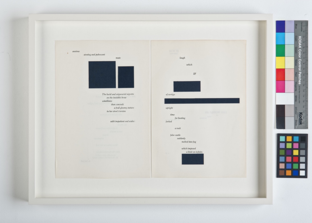
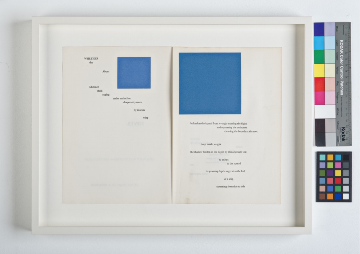
Depero Futurista’s peculiar off-rhymings in history prompt questions about the intersection of art and our social contract. How is it that fascism weighs on Depero’s art but has not suffocated it, even when the association peeps out as it does in Imbullonato? How is it that communism weighs on El Lissitzky’s About Two Squares (1922) but has not buried it?

Günter Berghaus’ Futurism and Politics provides a nuanced view of Futurism, Marinetti, Depero and their links with fascism. Fabio Belloni traces the rise, fall and rise of Depero in his essay “The Critical Fortune and Artistic Recognition of the Work of Depero“, which appeared in the journal of the now defunct Center for Italian Modern Art. Gianluca Camillini’s 2020 doctoral thesis traces the disconnects and remaining connections with fascism in Depero Futurista after the 1924 break between Futurism and Mussolini.

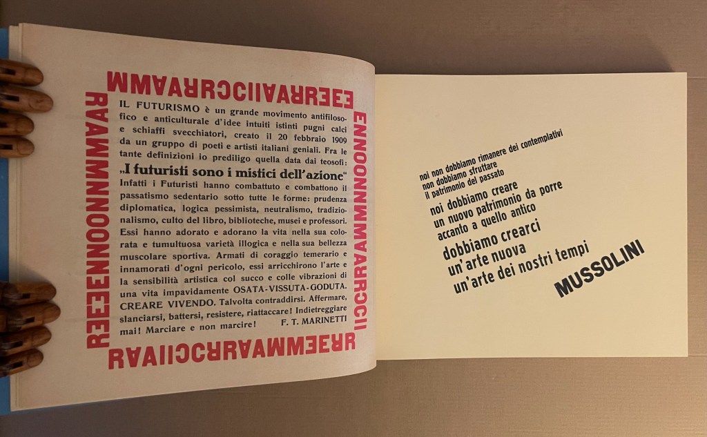
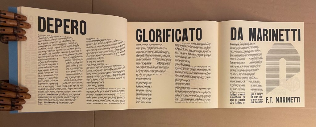
Perhaps Depero’s case contrasts helpfully with that of Ezra Pound. Like Depero, Pound was an enthusiastic supporter of Mussolini. Pound coopted Marinetti’s and Depero’s Futurism into his and Wyndham Lewis’ Vorticism. Unlike Depero Futurista, however, Pound’s poetry — especially the Cantos –foregrounds that enthusiasm. The frequency of its appearance in Pound’s poetry and its ugliness weigh more heavily than the few mentions of Mussolini in Depero Futurista. Depero’s and Marinetti’s hero-worship appears mostly in their poetry and prose but without Pound’s anti-semitism. The connection with fascism that remains in Depero Futurista, however, appears in the bellicosity and glorification of war by this “book machine”.

In the American Academy’s exhibition, Depero Futurista sits alongside the anti-racism of William Kentridge’s Portage (2000) and Kara Walker’s Five Poems Rainmaker (2002). How does (can?) art deliberately associated with fascist, statist or authoritarian movements rise above them to be celebrated and fruitfully juxtaposed with the works of today’s artists more associated with progressive causes?

For the Books On Books Collection, Depero is also an important figure in the overlap of typography and the alphabet with architecture and the artist’s book. Depero defined typographic architecture as

that special architectural form suggested by typographie types which has been used with great efficacy in advertising artistic constructions, in pavilions, kiosks and advertising plastics of national and international exhibitions of decorative art and in industrial and commercial exhibitions. The painter Depero created, in 1927, the book pavilion of the Bestetti- Tumminelli and Treves publishing house at the international exhibition of decorative art at Monza, inspiring his work to this conception of typographie architecture.(p. 18)

And he reproduced an image of it in Depero Futurista.

From Depero Futurista: “Padiglione del Libro” (1927).

The book pavilion is not bellicose. It is bombastic as is much of what is in Imbullonato. The blast of its typography has much in common with that in Kurt Schwitters’ Die Scheuche Märchen (1925) and other artists’ works not associated with fascism, authoritarianism or statism. To focus on Imbullonato‘s innovation, technique, typography or cross-fertilization with architecture and compare and contrast them with that of other artists is not to forget its entanglements. In fact, the difficulty in focusing is a reminder of how art, too, can be bolted to the shameful.

Further Reading

American Academy in Rome: Artists Making Books“. 11 December 2024. Bookmarking Book Art.

Celebrating the 250th Anniversary of Steingruber’s “Architectural Alphabet”. 1 January 2023. Bookmarking Book Art.

Kurt Schwitters“. 23 June 2024. Books On Books Collection.

Belloni, Fabio. January 2019. “The Critical Fortune and Artistic Recognition of the Work of Depero“. Italian Modern Art: Fortunato Depero. No. 1. New York: Center for Italian Modern Art.

Berghaus, Günter. 1996. Futurism and Politics: Between Anarchist Rebellion and Fascist Reaction, 1909–1944. Oxford: Berghahn Books.

Camillini, Gianluca. 2020. “Fortunato Depero and Depero futurista 1913–1927“. Dissertation thesis. Reading: University of Reading. “In the two reprints of Depero futurista 1913–1927 (1978 and 1987 by SPES Firenze), Luciano
Caruso also repeatedly writes ‘libromacchina imbullonato’ (bolted machine-book, Caruso, 1987, 36).” (p. 14).

Caruso, Luciano (ed.) and Fortunato Depero. 1987. Depero Futurista. Firenze: Studio per Edizioni Scelte Salembeni.

Caruso, Luciano (ed.) and Fortunato Depero. 1978. Fortunato Depero Futurista. Firenze: Studio per Edizioni Scelte Salembeni.

Depero, Fortunato, and Raffaella Lotteri. 1947. So I Think, so I Paint : Ideologies of an Italian Self-Made Painter. Trento [Italy]: Mutilati e Invalidi.

Lissitzky, El, and Patricia Railing. 1922. About 2 [Squares]. 1st MIT Press ed. Cambridge, Mass.: MIT Press.

Tsimourdagkas, Chrysostomos. 2014. Typotecture: Histories, Theories and Digital Futures of Typographic Elements in Architectural Design. Doctoral dissertation, Royal College of Art, London.

Books On Books Collection – Kurt Schwitters

Die Scheuche Märchen (1925/1965)

Die Scheuche Märchen (1925, 1965) [The Scare-Crow Fairy Tale]
Kurt Schwitters, Kate Steinitz and Theo van Doesberg. English translation by Robert Haas (enclosed, loose).
Miniature reprint of the 1925 edition. H123 x W154 mm. 12 pages. Acquired from Plain Tales Books, 12 July 2023.
Photos: Books On Books Collection.

The Schwitters-Steinitz Collection held at the National Gallery of Art Library identifies this work as a miniature reprint published in 1965 by Stockholm’s Gallery Samlaaren, owned by Agnes Widlund. The original, measuring H250 x W210 and also in red and blue on light brown paper, was published by Kurt Schwitters, Kate Steinitz and Theo van Doesberg under the imprint APOSS, which is a nonsense word, derived from “A for Active; P for Paradox; OS for Oppose Sentiment; and S for Sensitive” (Paley, p. 267). There have been several other editions, but this one is particularly satisfying for its inclusion of the loose typewritten translation by Robert Haas, who also translated Steinitz’s memoir/biography of Schwitters.

Continue reading

Bookmarking Book Art – Marine Hugonnier

The Bedside Book Project (2006-07)

The Bedside Book Project is a quintuple homage — Stéphane Mallarmé (1842-1898), Marcel Broodthaers (1924-1976), Odilon Redon (1840-1916), Kurt Schwitters (1887-1948) and Richard Hamilton (1922-2011) — and approaches its subjects in cinematic fashion. It begins with this anecdote:

In 1945 René Magritte gave Marcel Broodthaers a copy of Mallarmé’s poem as ‘a way of explaining his art to a young admirer without explaining it literally’. In 1969, Broodthaers modified an edition of the poem by covering all its words with black stripes that correspond directly to the typographic layout used by Mallarmé to articulate the text. In this way, Mallarmé’s poem, which Broodthaers considered had unconsciously invented modern space, is reduced to its structure. 

From here, Marine Hugonnier‘s imagination takes hold. As if in a film scene, she moves into the bedrooms of Redon, Schwitters and Hamilton, steals their copies of Un Coup de Dés from their bedside tables, alters each one by inserting images and then replaces them. The result is a series of installations in which the pages of their altered books are displayed on the gallery walls. Each has its “book title”: La forme du mystère (Odilon Redon), Altération (Kurt Schwitters) and L’espace social (Richard Hamilton). Here is Hugonnier’s description of Redon’s book and the installation performance in which it is presented:

Redon’s bedside book has been stolen and its pages have been folded to extend the space and time of the poem’s interlude bringing his dreams to a deeper sleep. ... The mise-en-scène is composed of a white space with an open window, a spider and a man dressed in a tuxedo who will change a solitary frame, containing a folded page of the poem, on the wall every hour. On the 12th hour, the room will be left empty.

The Bedside Book Project: La forme du mystère (Odilon Redon). Source: Museu d’Art Contemporani de Barcelona, displayed with permission of the artist.

Staging a performance in which the pages of Redon’s bedside book are parceled out over 12 hours is ambitious. As she introduces Schwitters and Hamilton into The Bedside Book Project, Hugonnier creates an even more ambitious immersion for the reader/viewer in different times, spaces and influence. Further temporal instability is involved as well: the pages on Redon’s 19th century bedside table come from a 2006 Gallimard edition of the poem.

Time travelling from Redon’s bedside table to that of Kurt Schwitters, Hugonnier also introduces a bit of temporal and linguistic instability: Schwitters’ bedside copy comes from the Tiber Press edition of Daisy Aldan’s translation into English, published in 1956 eight years after Schwitters’ death. Colored paper cut-outs conceal words, disrupt the gaps of the poem and alter its reading.

The Bedside Book Project: Altération (Kurt Schwitters). Source: Museu d’Art Contemporani de Barcelona, displayed with permission of the artist.

With Richard Hamilton, Hugonnier gives him the same edition as Redon — the Gallimard 2006 — and fills its interstices with images as a way to change its reading.

The Bedside Book Project: L’espace social No.2 (Richard Hamilton). Source: Museu d’Art Contemporani de Barcelona, displayed with permission of the artist.

As ghostly film director and actress in the film, Hugonnier wonders how these altered bedside books might have affected the way those three artists perceived art and practiced it in their times. As Hugonnier’s audience, we must surely wonder how she has altered the way we perceive Un Coup de Dés and its influence and very possibly how we perceive time, space and art.

Further Reading

Un Coup de Dés Jamais N’abolira le Hasard – L’Espace Social N2, 2007“. MACBA Collection. MACBA Foundation. Fundación Repsol Collection. Acquired 2009.

Books On Books Collection – Stephen T. Johnson

Alphabet City (1995)

Alphabet City (1995)
Stephen T. Johnson
Casebound, sewn and glued. H276 x W226 mm, 32 pages. Acquired from Blackwell’s, 17 August 2021.
Photos of the book: Books On Books Collection.

A Caldecott Honor Book and New York Times Best Illustrated Book in 1995, Alphabet City goes beyond the alphabet letters as found objects, a sub-genre documented by Steven Heller and Gail Anderson in The Typographic Universe (2014). Johnson transforms his found capital letters with pastels, watercolor, gouache and charcoal into photo-realistic pictures in varying but similar sizes; for example, 26.5 x 22.5 inches for the A and 25.25 x 21.5 inches for the Z. These appeared in an inaugural exhibition in 1997 at the Katonah Museum of Art in New York. Johnson’s works are held in numerous permanent collections (mostly in the US) and private ones (mainly US-based but increasingly Europe as well), but they are closely tied to his children’s books: Alphabet School (2015) and A is for Art (see below). Most impressive is how he lifts the alphabet book from ordinary trade status to artist book.

Along with Robert Cottingham, Johnson established the photo-realistic alphabet as its own sub-genre, which has been explored by other artists such as Stephen Magsig in The Urban Alphabet: Paintings from Postcards from Detroit and Simon Jennings in Outdoor Types: An Urban Alphabet (2010)

A is for Art (2008)

A is for Art: An Abstract Alphabet (2008)
Stephen T. Johnson
Perfect bound in case with doublures. H310 x 235 mm, 40 pages. Acquired from Amazon E.U., 4 September 2021.
Photos of the book: Books On Books Collection.

In his review in American Art, Philip Nel coins an apt name for Johnson’s art — “alphabet expressionism” — which, on closer examination of texture and technique, applies also to Alphabet City. Go back and look at the foreground of the letter A in Alphabet City.

A is for Art: An Abstract Alphabet has the feel of Moussorgski’s Pictures at an Exhibition. Although each movement “depicts” a different painting, the composer’s style comes through; although each letter alludes to different artists (for example, but not complete for each letter: A – François Dufrêne, Kurt Schwitters; B- Jim Dine, Willem de Kooning , C- Arman, Félix Gonzáles-Torres; D- Udomsak Krisanamis; W- Man Ray; X- Robert Rauschenberg; Y- Tom Wesselman, Robert Indiana; Z- Beatrice Mandelman, Mimmo Rotella), the artist’s vision comes through. To pull that off requires considerable versatility. Several of the images in A is for Art derive from sculptures and large-scale installations. Take a look, too, at his triptych of mosaics in the City Center Public Library of Lenexa, Kansas.

Also a New York Times Best Illustrated Book of the Year, A is for Art demonstrates two subgenres of alphabet books: the hidden and alliterative alphabet. An interesting, perhaps intentional, effect — even more so when the letters are difficult to find — is to make the viewer linger over the image longer than the museum goer’s average of less than 30 seconds per object. The ingenuity of Johnson’s alliterative sentences is almost as engaging as the images; even so, its main effect directs the eye back to the images. Here is the text for the letter A:

A a
Arrangement No. 1
Affixed across and around an angled letter A are an array of abstracted and assembled bits of advertisements, and apparent among them are apostrophes, ampersands, accents, and an asterisk.

If you spend only 13 minutes in this book (30 seconds per letter), you are missing out.

Music and numbers have also piqued Johnson’s creative curiosity, but another of his series works leads in a more intriguing, roundabout way back to A is for Art: the Kana Card series. On a trip through Japan, the artist acquired a set of Japanese flashcards for learning Katagana and Hiragana. Each 2 x 3 inch card becomes a canvas for paint and collage.

Alphabet School (2015)

Alphabet School (2015)
Stephen T. Johnson
Hardback. H286 x W236 mm, 32 pages. Acquired from Book Depository, 5 November 2021.
Photos of the book: Books On Books Collection.

Using monoprints on paper with digital enhancements, Johnson shifts technique yet again here. The photorealism yields to a graininess, but as with Alphabet City, the effect of making the reader look not just at the images but also at his or her environment remains.

Some letters are contrived (two bookends posed for the letter M). Most of the scenes, however, deliver an authentic sense of found letters (the C in the support of the globe atlas). Johnson has raised the bar on the hidden-letter theme, common in the genre of alphabet books, by several notches.

Further Reading

Abecedaries I (in progress)“. 31 March 2020. Books On Books Collection.

Robert Cottingham“. Books On Books Collection.

Paul Cox“. Books On Books Collection.

Steven Heller and Gail Anderson“. 8 May 2021. Books On Books Collection.

Mackey, Bonnie, and Hedy Schiller Watson. 2017. Alphabet books: the K-12 educators’ power tool. Santa Barbara, CA: Libraries Unlimited.

Nel, Philip. 2008. “The Fall and Rise of Children’s Literature.” American Art 22, no. 1: 23–27.

A Is for Art: Stephen T. Johnson’s Abstract Alphabet“. 31 August 2010. Nine Kinds of Pie.

Zerkin, Becca. 9 November 2008. “Alphabet City.” The New York Times Book Review. The review actually covers A is for Art.

Bookmarking Book Art – Margot Klass

Margot Klass is a book artist of the northern latitudes.  A studio in Fairbanks, Alaska; another in Corea, Maine.

One of her geographically characteristic works in the “flitch book”. A “flitch” is a cross-sectioned slab of timber. Take two flitches for the front and back of a Coptic-bound book, and you have a flitch book.

Flitch Book
Coptic binding, twig and leather clasp, ivory inlay, approx. H. 4.5″


She says that her influences are Kurt Schwitters and Japanese aesthetics. In the works she labels “altarpieces”, I see Joseph Cornell and Georgia O’Keefe as well. Paul Watson’s succinct, 2003 entry on the assemblage technique holds up Schwitters and Cornell as practitioners and makes for an interesting path into appreciating Klass’s art. 

Alaska Book of Hours: Prime – Spring,
27” x 14” x 6” (2011)


Reliquary – Open


The 2007 bulletin from the Denali National Park and Reserve, where Klass was one of several artists in residence, nicely summarizes her aesthetic:

Margo Klass is a student of aesthetic space who creatively uses light to produce sculptural boxes. She studied Northern Renaissance artists for their use of spaces receding into the distance, and she has been influenced by the interior spaces and exterior landscapes of Japanese temples. During her residence in the park she used sketching, watercolors, and photography.

In 2012, Robert Hannon echoed this in a brief notice and radio interview on the occasion of her exhibit at the Fairbanks Alaska House Gallery. In 2016, the College Book Art Association presented Klass as a “Featured CBAA Artist” and also commented on the impact of medieval art on her work. But her own article from February 2017 provides the second best path to appreciating her work.

The best path is, of course, the work itself, which is well illustrated in that article.

Further reading:

Klass, Margo. “On Home Ground: Box Constructions“, Terrain.org, 14 February 2017.