Books On Books Collection – Felipe Ehrenberg

Codex Aeroscriptus Ehrenbergensis (1990)

Cover of a book titled 'Codex AEROSCRIPTUS EHRENBERGENSIS' with a minimalist design and faded text.

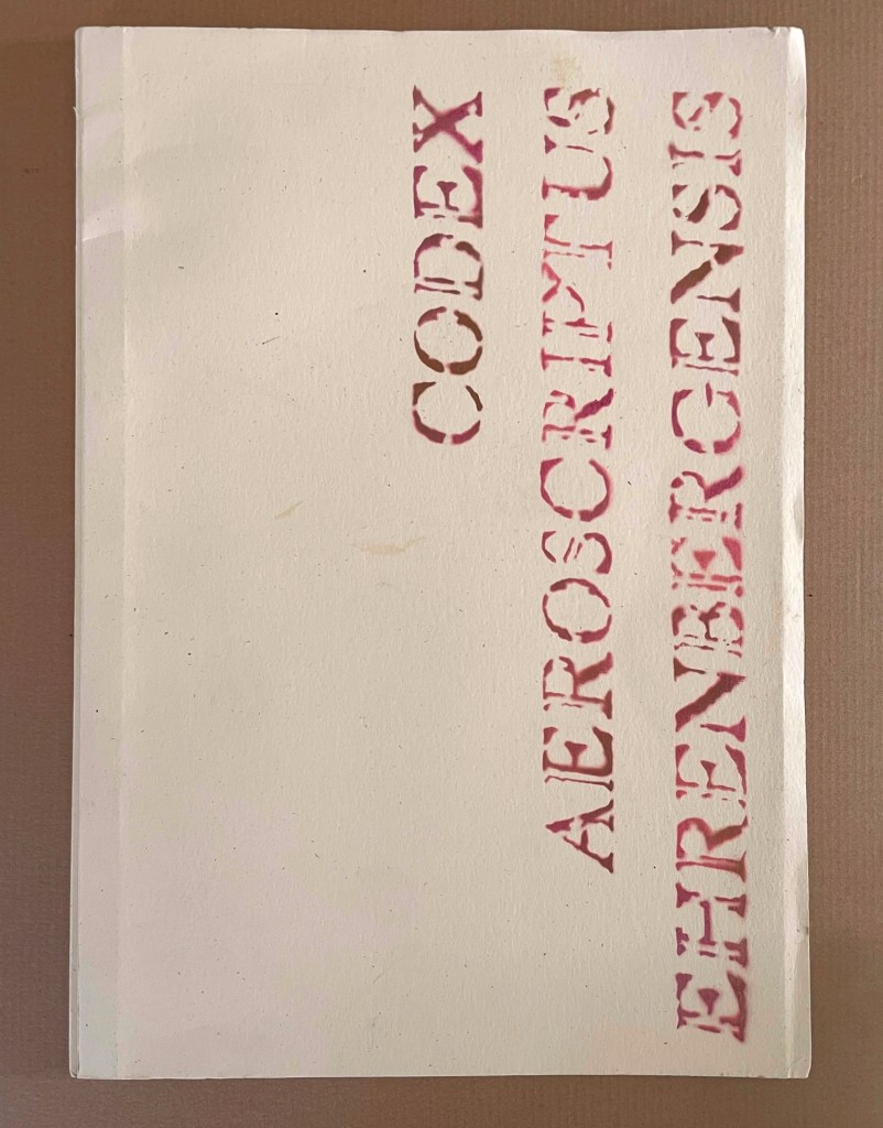
Codex Aeroscriptus Ehrenbergensis: A Visual Score of Iconotropisms (1990)
Felipe Ehrenberg
Casebound stiff cover, fly leaves around bifolios (fore-edge folded folios). H420 x W295 mm. 20 pages (10 bifolios, 9 with prints, 1 for title page and copyright page).Edition of 500. Acquired from Monograph Werks, 17 January 2024.
Photos: Books On Books Collection.

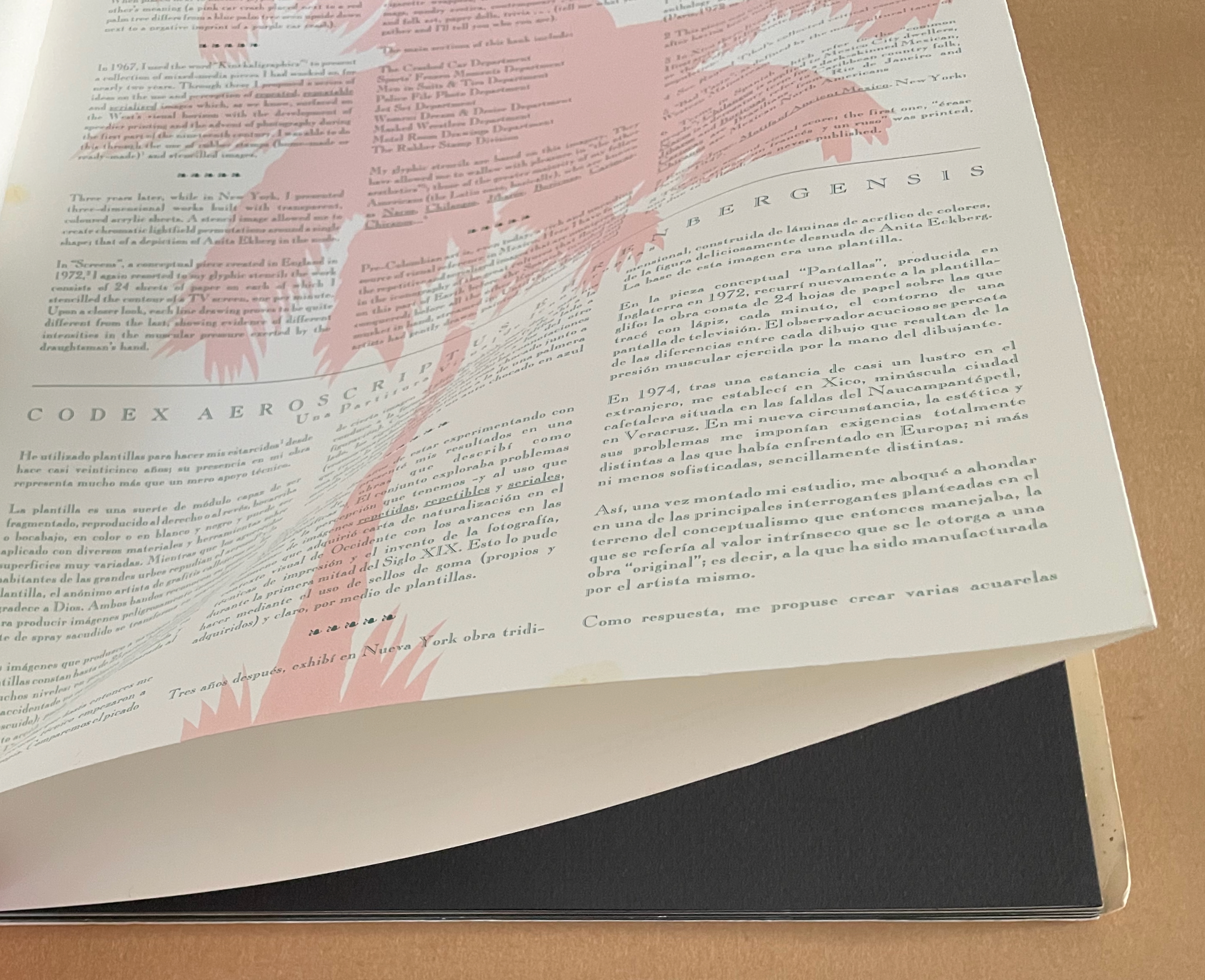
In his introduction, Felipe Ehrenberg variously recommends that we read Codex Aeroscriptus Ehrenbergensis “like a detective novel” for its “various clues that you may unravel the wondrous and dramatic events surrounding the life of this artist, another witness to the end of a century” or “as a musical score, perhaps to be composed by someone wishing to recreate the background music of our daily histories” or a “formulation of hieroglyphs”. The book’s subtitle succinctly rolls up these metaphors: “a visual score of iconotropisms”.

Stephen Perkins calls it “a mini-retrospective of his explorations in this medium” — stencils.

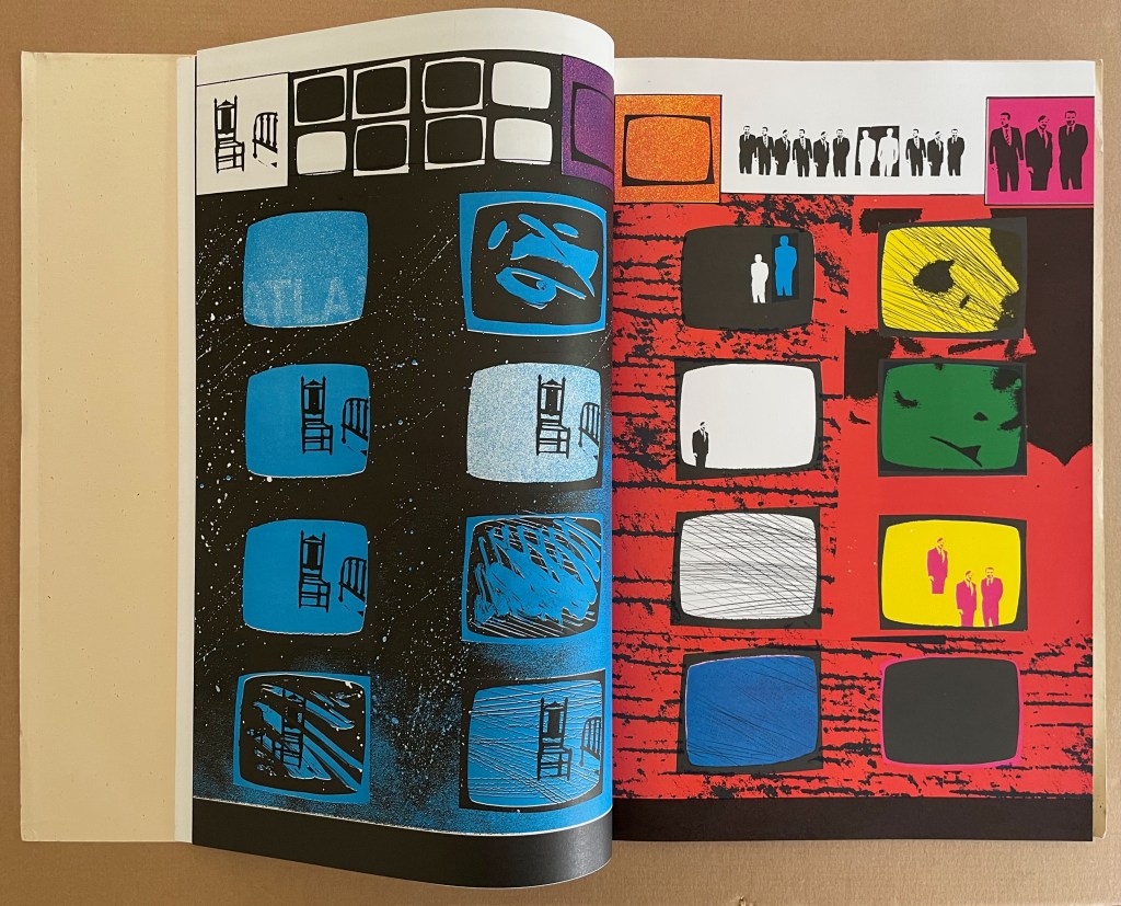
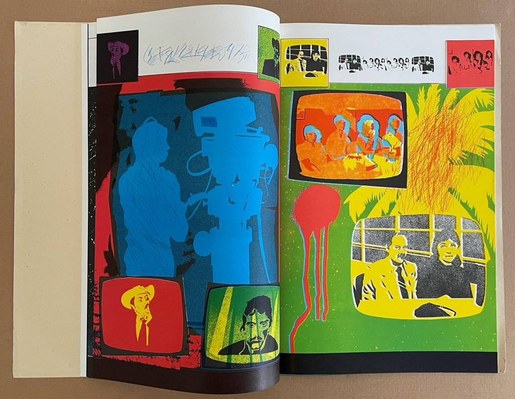
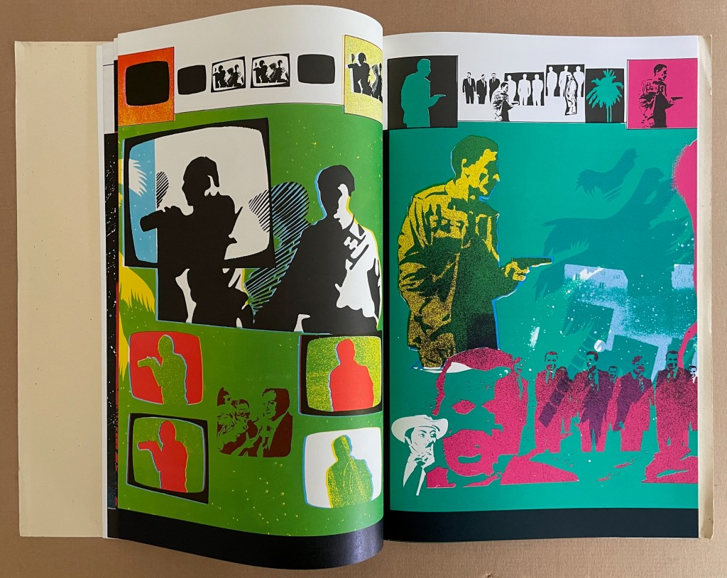
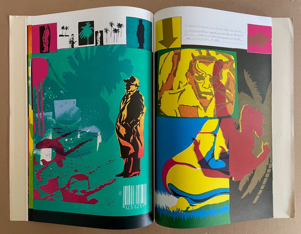
This work came out of a residency Ehrenberg completed at Atlanta’s Nexus Press. The images for the works came from what he called his Visual Information Bank which was a box with all sorts of ephemera that he would dip into for images for his stencils. In contrast to the frenetic energy of the stencils, the inside of the publication has a bucolic and calm feeling that is mirrored in the original stencil work Ehrenberg created across the front pages of each book. (Perkins, 2024)

The accordion, concertina, or leporello structure adopted by so many 20th and 21st century book artists has its Aztec analogue called a screenfold format. Ellen Baird and Cristián Roa-de-la-Carrera included Codex Aeroscriptus Ehrenbergensis in the Newberry Library’s 2006-07 exhibition “The Aztecs and the Making of Colonial Mexico”.

… Aztec heritage has become a vital component of Mexican and Mexican-American identity, influencing the work of many contemporary writers, artists, and scholars. The inherent flexibility of traditional indigenous creativity facilitates combination with contemporary artistic practices. Traditional screenfold books are layered with contemporary collage and print techniques, and indigenous images are juxtaposed with colonial scenes and pop icons. Contemporary Mexican and Mexican-American artists use traditional Aztec images and techniques to explore both contemporary life and Mexican cultural heritage. The screenfold format is an emblem of ancient Mesoamerican culture, and has become charged with historical and political meaning. Contemporary artists combine this format with humorous and provocative imagery to explore the cultural and political dynamics of preconquest identity, the colonization of Mexico and current relations between Mexico, Europe, and the United States. (Baird and Roa-de-la-Carrera, 2006)

Ehrenberg’s title is dipped in sarcasm. Most of the barely surviving screenfold Mesoamerican works reside in Anglo-European institutions under names like Codex Borbonicus at the Bibliothèque de l’Assemblée Nationale in Paris, Codex Borgianus at the Vatican, and Codex Mictlan at the Bodleian Libraries in Oxford. Ehrenberg’s modern version reflects their pictorial style and even the layout of their repetitive serialized images. But in doing so, his images speak to the continuing impact of colonialism.

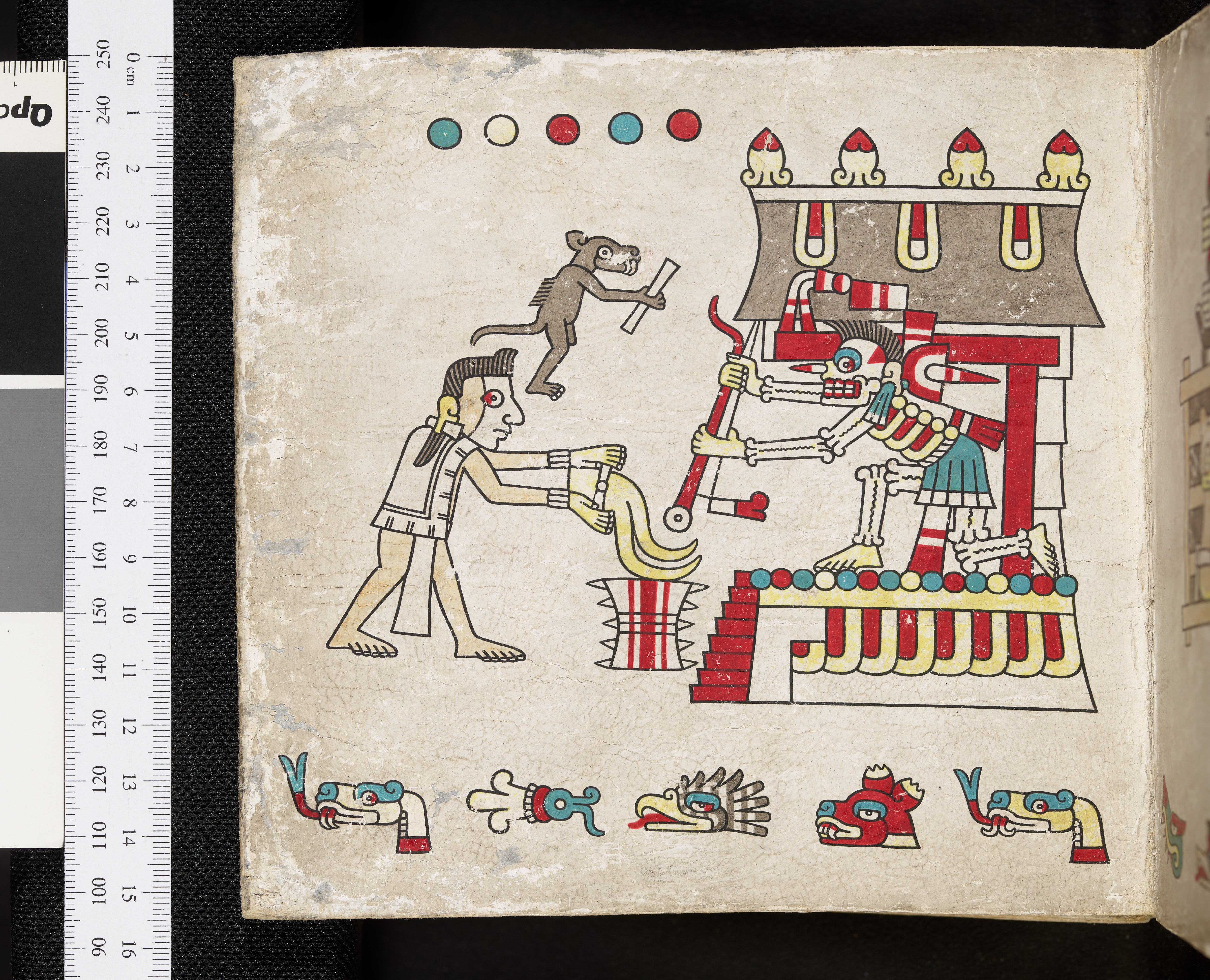
Codex Mictlan, Oxford, Bodleian Library MS. Laud Misc. 678.

An open book featuring vibrant illustrations, including colorful roosters, stylized skeletons, and various artistic elements in bold colors and graphics.
A vibrant two-page spread featuring colorful illustrations, including stylized skulls, a figure in a hat, and graphic elements like text and a helicopter. The design incorporates a mix of patterns and colors, emphasizing themes of emotion and popular culture.

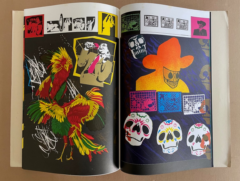
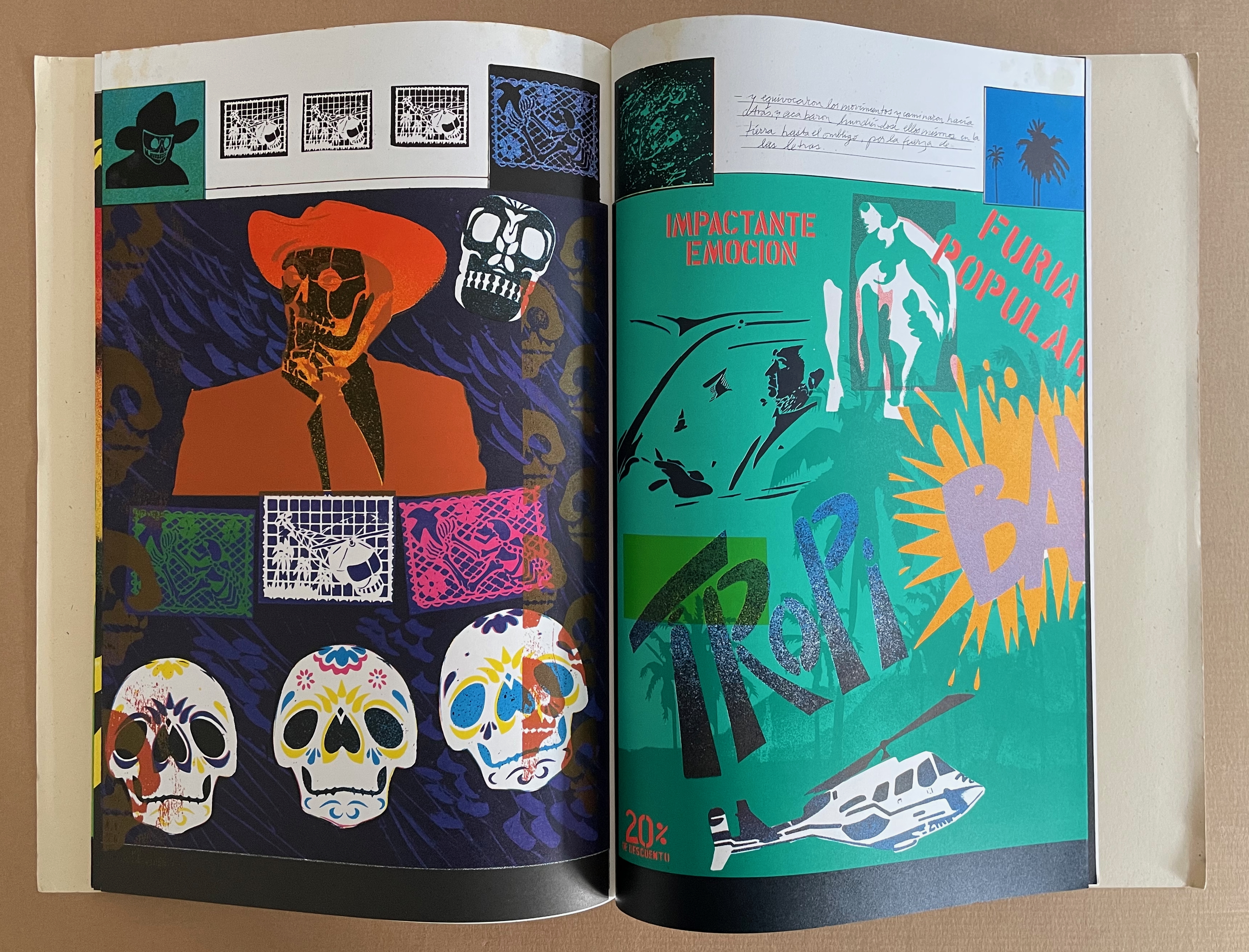
Still, Ehrenberg’s book art went beyond any reductive anti-colonial message. His “Visual Information Bank”, as he called it, held a wealth of contemporary cultural iconography. Its main sections included:

The Crashed Car Department
Sports’ Frozen Moments Department
Men in Suits & Ties Department
Police File Photo Department
Jet Set Department
Women: Dream & Desire Department
Masked Wrestlers Department
Motel Room Drawings Department
The Rubber Stamp Division

And he drew on this — especially from the televisual world — to create his glyphic stencils and rubber stamps.

The leporello edition of Codex Aeroscriptus Ehrenbergensis is rare, but fortunately the wrap-back bound edition shown in this entry is a little less so. The wrap-back format is a traditional Chinese/Japanese book format. Takako Saito, who joined Ehrenberg at Beau Geste Press in 1973, may have been an influence in this regard, but as she left in 1975, an influence from others at Nexus in Atlanta, GA, where Ehrenberg completed this work, seems more likely.

The double-sided leporello edition of Codex Aeroscriptus Ehrenbergensis is not a folded continuous sheet. Viewable on Stephen Perkins’ site, it appears to have been formed from the codex edition’s double-page spreads glued together at the fore edge. Ehrenberg’s residency at Atlanta’s Nexus Press would have overlapped with Clifton Meador’s presence, and Meador’s works frequently use the wrap-back format.

Further Reading

Baird, Ellen T., and Cristián Roa-de-la-Carrera. 28 September 2006 – 13 January 2007. “The Aztecs and the Making of Colonial Mexico“. Chicago, IL: The Newberry Library. See, in particular, “Contemporary Expressions of Nahua Culture“.

Borowitz, Maggie. 1 October 2023. “To Make Books is to Multiply’: Artists’ Books and Feminist Expression in Mexico“. ARTMargins 12 (3): 7–29.

Conwell, Donna. 2010. “Beau Geste Press“. Getty Research Journal 2: 183-92.

Fox, Catherine. 15 June 2015. “Artist’s books in ‘Endless Road: A Look at Nexus Press’ a trip down memory lane, at ACAC“. ARTS ATL.

Kam, D. Vanessa. 2003. Felipe Ehrenberg : A Neologist’s Art & Archive. [Palo Alto, Calif.]: Dept. of Special Collections, Stanford University Libraries.

Perkins, Stephen. 1 February 2024. Felipe Ehrenberg, Codex Aeroscriptus Eherenbergensis, [2 versions] Nexus Press, Atlanta, 1990, ed. 40 & 500. Accordionbooks.com.

Pujol Duran, Jèssica. December 2018. “Beau geste press: a liminal communitas across the new avant-gardes“. Kamchatka. Revista de análisis cultural 12: 291-312.

Reed, Marcia. 2022. “Codex Espangliensis: From Columbus to the Border Patrol“, in Materialia Lumina : Contemporary Artists’ Books from the CODEX International Book Fair. Edited by Elizabeth Fischbach and Nann Parrett. Berkeley, California: The Codex Foundation.

Snijders, Ludo. The Mesoamerican Codex Re-Entangled : Production, Use, and Re-Use of Precolonial Documents. Leiden University Press, 2016.

Bookmarking Book Art – Hedi Kyle’s The Art of the Fold: How to Make Innovative Books and Paper Structures (2018)

The [artists’ book] movement had its beginnings with a few individuals (conceptual artists Dieter Roth, Hansjörg Mayer, and Ed Ruscha immediately come to mind), but in the area of structural experiment and invention only one person seems to have been markedly influential (albeit seriously ignored): Hedi Kyle.

Alastair Johnston, “Visible Shivers Running Down My Spine”, Parenthesis, Fall 2013, Number 25.

While Alastair Johnston’s 2013 interview with Hedi Kyle is a rich one and welcome, it is inaccurate to say Hedi Kyle has been seriously ignored.  After all, in 2005, the Guild of Book Workers awarded her an honorary membership, and Syracuse University’s Library invited her to deliver that year’s Brodsky Series lecture. In 2008, the Philadelphia Senior Artists Initiative recorded her oral history and posted her artist’s statement along with an extensive list of prior exhibitions, honors, professional roles and board memberships stretching back to 1965.

If, however, Johnston’s assessment is accurate, subsequent events have rectified the situation. In 2015, Kyle delivered the keynote address “Four Decades under the Spell of the Book” for the Focus on Book Arts annual conference. In the same year, the 23 Sandy Gallery held a successful international juried exhibition entitled “Hello Hedi“, an echo of the 1993 exhibition organized by the New York Center for Book Arts entitled Hedi Kyle and Her Influence, 1973-1993. In 2016, the San Francisco Center for the Book held a solo exhibition for Kyle: “The World of Hedi Kyle: Codex Curios and Bibli’objets“.

And now, in 2018, Laurence King Publishers has brought out the eagerly awaited The Art of the Fold by Kyle and daughter Ulla Warchol, which is the immediate impetus for this essay. The authors aim their book at artists and craftworkers, but there is a secondary audience: anyone interested in book art or artists’ books or origami — and learning how better to appreciate them.

On picking up the book, the first thing its primary and secondary audiences should notice is the folded “dust jacket”. Why the quotation marks?  Just look:

“Dust jacket” unfolded, side 1

“Dust jacket” unfolded, side 2

This innovative, subject-appropriate cut, fold and print can set the reader on a hunt for precursors such as Peter and Pat Gentenaar-Torley’s Paper Takes Flight/Papier op de Vlucht, designed by Loes Schepens, where the multilayered dust jacket has small envelopes attached to hold paper samples from the contributing artists, or Doug Beube’s Breaking the Codex, designed by Linda Florio, where the dust jacket includes a perforated bookmark, whose removal implicates the reader in a bit of biblioclasm and challenges Western parochialism.

Paper Takes Flight/Papier op de Vlucht (2006) Peter and Pat Gentenaar-Torley Note how the book’s title is revealed on the second dust jacket from the bottom.

The five opened dust jackets displayed beneath the title page

Bottom-most dust jacket folded from the backboard to the right revealing the airmail envelope, which contains a blank sheet of airmail stationery

The Art of the Fold‘s clean, balanced design (Alexandre Coco) and excellent diagrams (authors) mesh well with the text. While this integrated clarity in the introductory section on Tools, Materials, Terminology, Symbols and Techniques will be appreciated most by artists and paper engineers, the secondary audience of library/gallery curators, aficionados and collectors will benefit from the description and comments in particular on materials, terminology and techniques. Knowing these points about an object of book art enhances appreciation of it and improves its handling, presentation and preservation.

Following this introduction, Kyle and Warchol provide 36 sets of detailed instructions across 5 sections:

  • The Accordion
  • Blizzards
  • One-Sheet Books
  • Albums
  • Enclosures

This double-page spread introducing the accordion structure shows off the the diagrams’ clarity, a feature throughout the book. Also in this spread are two important statements in the verso page’s final paragraph:

The accordion fold as an independent component is our focus point in this book…. Let us start with a brief visual display of a variety of folding styles. Hopefully they will inspire you to grab some paper and start folding. (p .28)

The focus on structure “as an independent component” is a strength and weakness. The strength is self-evident in the thoroughness and attention to detail. The weakness? More than occasionally, the authors make asides about the meaningful interaction of structure with content and, occasionally, with other components (type, color, printing technique, etc.). Some exemplars selected by the authors would have been welcome. The artist’s and reader’s challenge is to provide their own examples of how the structural component might work with different types of content, mixed media and other components that combine to deliver the artistic object.

The second statement — the exhortation “to grab some paper and start folding” —  illustrates an unalloyed strength of this book. As towering an authority and figure in the book arts and book art as Hedi Kyle is, she and her co-author go out of their way again and again to keep readers open to playing with the techniques and structures and finding their own  inventiveness and creativity. For those content to collect or curate, both statements push them to look for or revisit outstanding examples and inventive variants of the structures elucidated. After this section, a browse of Stephen Perkins’ accordion publications, a site running since 2010, would be a good start.

This double-page spread introducing the section on Blizzard structures delivers that blend of the anecdotal with essential engineering-like detail that is characteristic of the authors’ style throughout. Having explained how this family of folded structures that bind themselves got its name (a fold discovered in a daylong fold-a-thon due to a blizzard’s shutting everything down), the authors dive into the proportionality so key to getting them right. Perhaps because of its non-adhesive, origami-centric nature, the blizzard book structure generates more than its fair share of kitsch exemplars. When blizzard books do come along that rise to the level of art — integrating structure, content, printing, typography, color and other components of bookmaking in an artistically meaningful way — they stand out all the more. One such work took first place in the 23 Sandy Gallery’s juried exhibition in 2015, “Hello Hedi”:

Blizzard Book (2015)
Virginia Phelps

Next to The Accordion section, the One-Sheet Books section has the most models. It is also the section that most addresses that challenge mentioned above:

A book folded from a single sheet of paper, including covers, offers a unique opportunity to consider the content and cover as one comprehensive design exercise. We explore the coming together of printing, layout and folding. (P. 94)

Given this opportunity, some treatment of imposition would have been useful, especially for the Franklin Fold and the Booklet Fold Variations. For the Booklet Fold Variations, one could lightly pencil into the book’s clear diagrams the usual markings and enumerations as below.

Again, a few selected photographs of examples of One-Sheet Books that achieve the coming together of content, design, printing, layout and folding would have been welcome.

The double-page spread above with which the Albums section begins exemplifies the book’s quality of photography (by Paul Warchol, Ulla’s husband). Like the “dust jacket”, the crisply photographed Panorama Book structure (upper right) and the pages that explain it will send readers on a quest to make their own or hunt for outstanding examples such as these by Cathryn Miller and Cor Aerssens, a long-time friend and correspondent with Kyle.


Westron Wynde (2016)
Cathryn Miller
Author’s statement: “This book presents the poem ‘Westron Wynde’ in a purely visual form. Letters become colours, and are used as graphic elements. The book manifests the essence, if not the sense, of the poem.”
Westron wynde when wyll thou blow,
The smalle rayne down can rayne – 
Cryst, yf my love wer in my armys
And I yn my bed agayne!

Memories (2012)
Cor Aerssens

Memories (2012)
Cor Aerssens

Memories (2012)
Cor Aerssens

A cautionary, or perhaps encouraging, note though: the fact that some structures can enfold others will frustrate readers with strict classificatory minds and exhilarate the more freewheeling. The Phelps’ Blizzard Book highlighted above includes in its sections items exemplifying the Flag Book and Fishbone structures. Aerssens’ Memories is even more so an integrated variant of the Panorama Book structure, featuring as it does panels within panels, two 8-leaf booklets bound into front and back with paper hinges, and mylar folders holding pressed flora from Aerssen’s northern Dutch environs.

The Enclosures section presents fascinating structures, not all of which are suited “to fit many of the projects in the previous chapters”. For example, the second-most fascinating form — the Telescoping Ziggurat, shown in the lower left corner of the recto page above — looks incapable of enclosing any of the other 35 structures. The authors acknowledge it is “less of a book and more of a toy — a stimulating and curious object whose inherent mathematical quality mesmerizes as it spirals inward and outward”. The most fascinating form, however, is as much a book as stimulating and curious object: the Sling Fold structure.

This structure looks suited to enclosing scrolls or narrow, collapsed accordion books of diminishing height, and its mechanics invite playful integration with content and variations of color, typography or calligraphy, printing method and materials.

It would not do to conclude a review of this book without touching on the Flag Book structure, for which Kyle is so well-known. It is found in The Accordion section. The outstanding works implementing this structure are legion. Here it is below in all its glory, which is exceeded only by the Two-Sided Flag book in the pages following it. 

The Art of the Fold should become an instant classic. If readers are tempted to “grangerize” their copies with photos and clippings of favorite examples and variants, they would do well instead to create one of the authors’ album structures in which to keep them. There could be many editions of this classic to come.

Update: for more on Kyle and Warchol, see their interview with Helen Hiebert in her series Paper Talk.