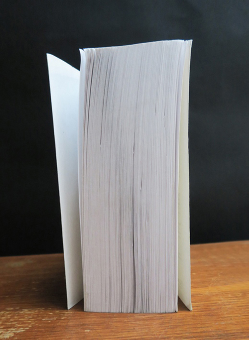
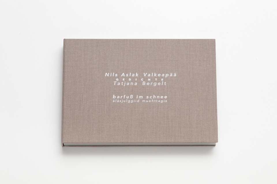
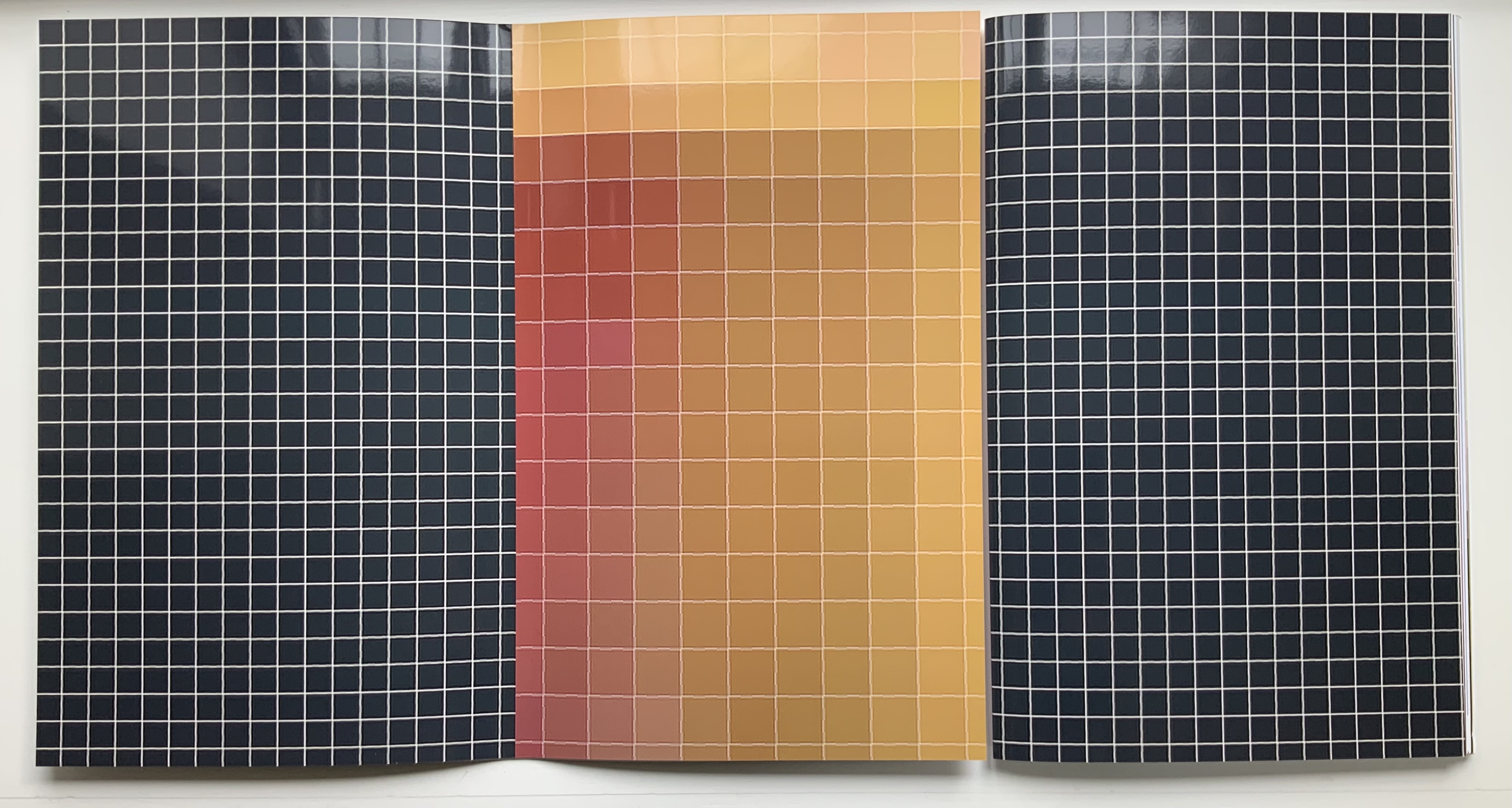
Universal Tongue (2021)
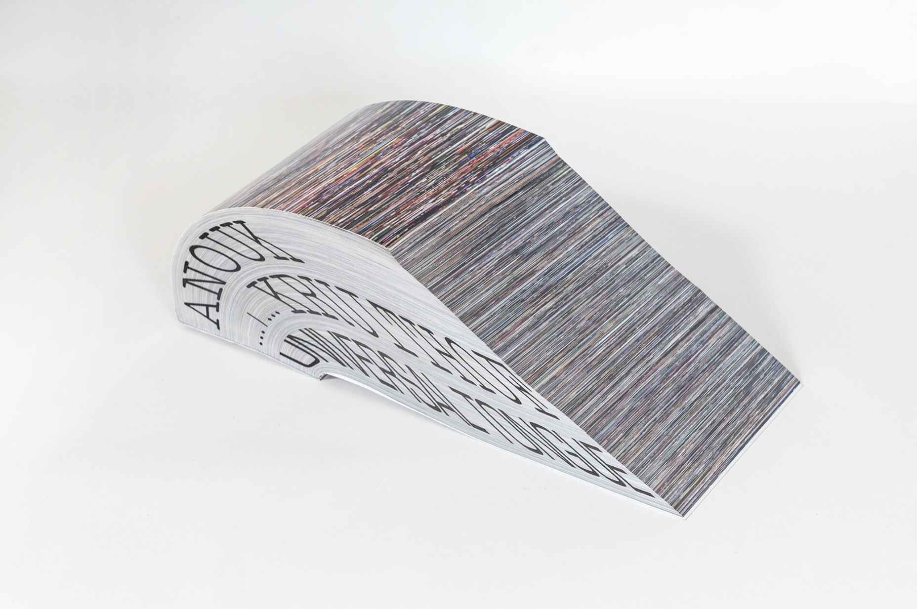
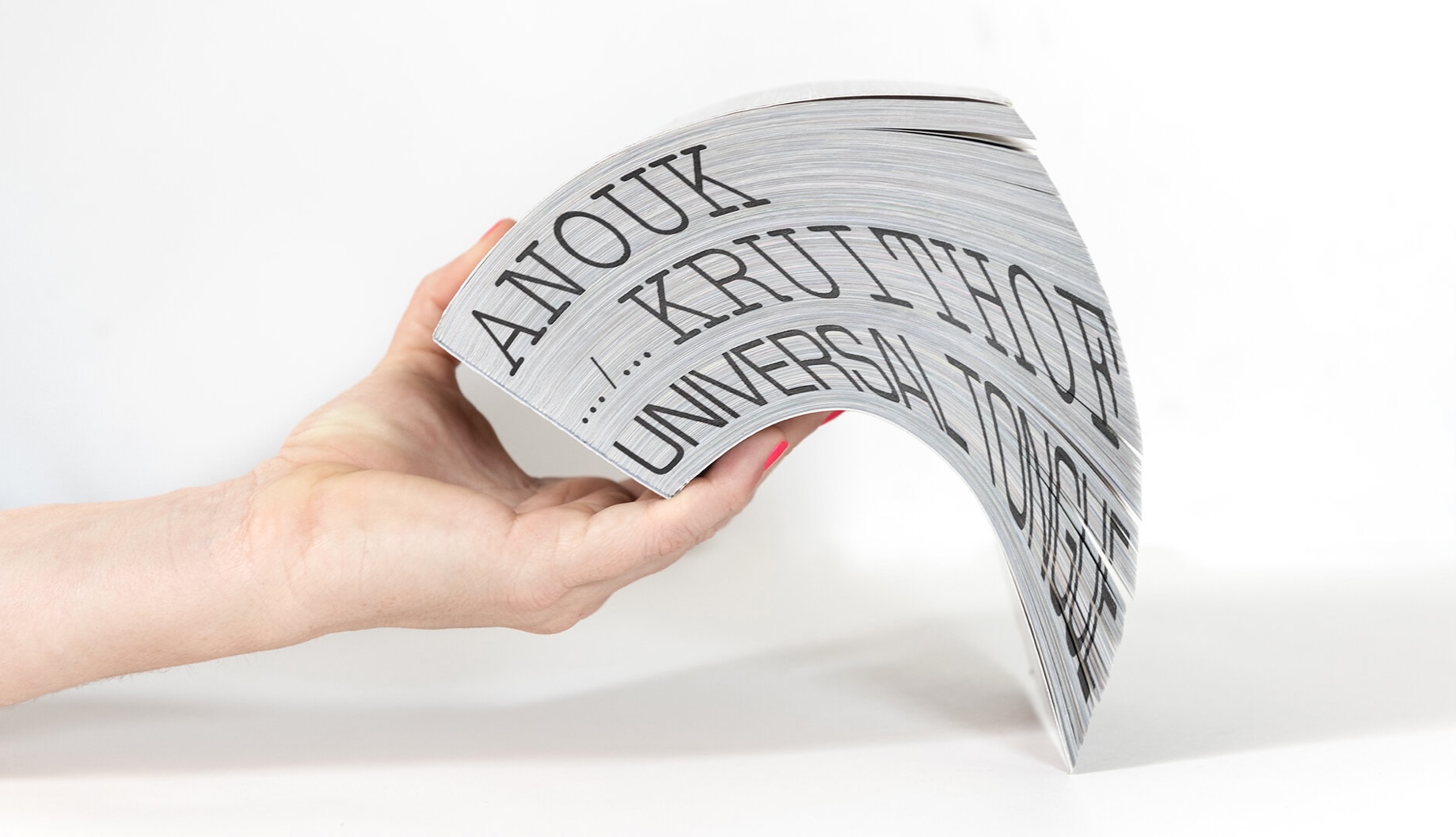
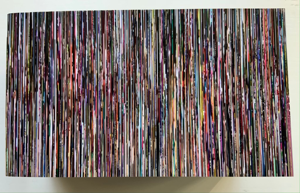
Universal Tongue (2021)
Anouk Kruithof
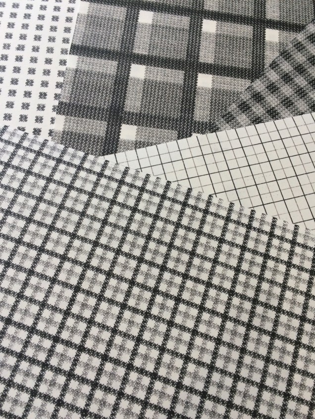
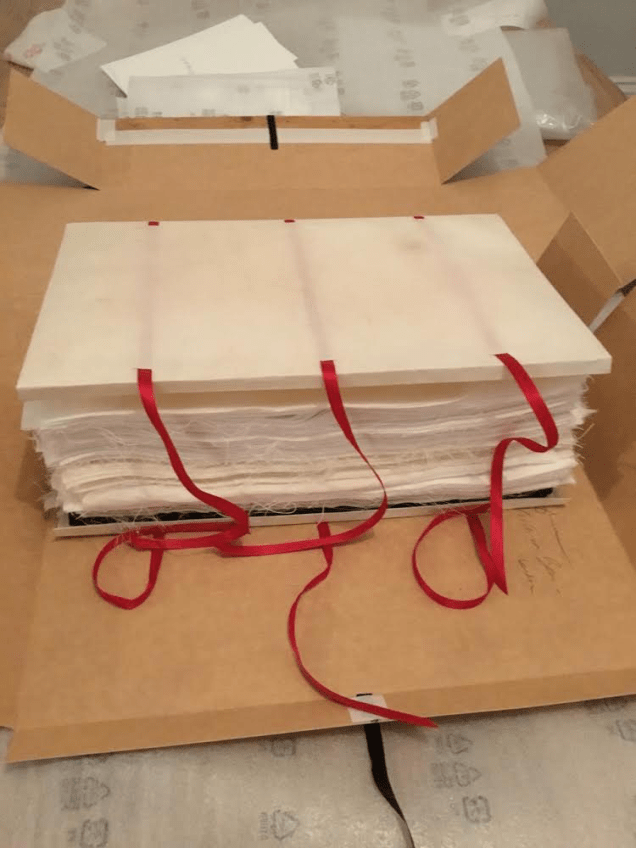
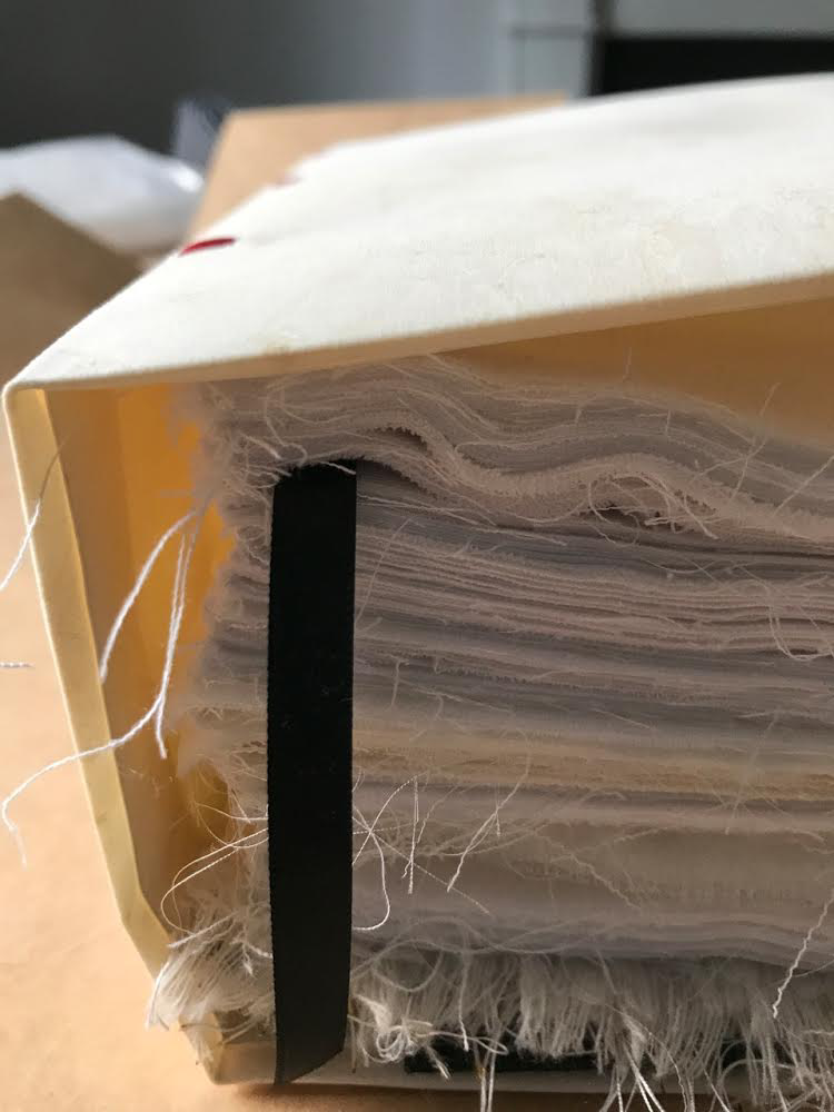
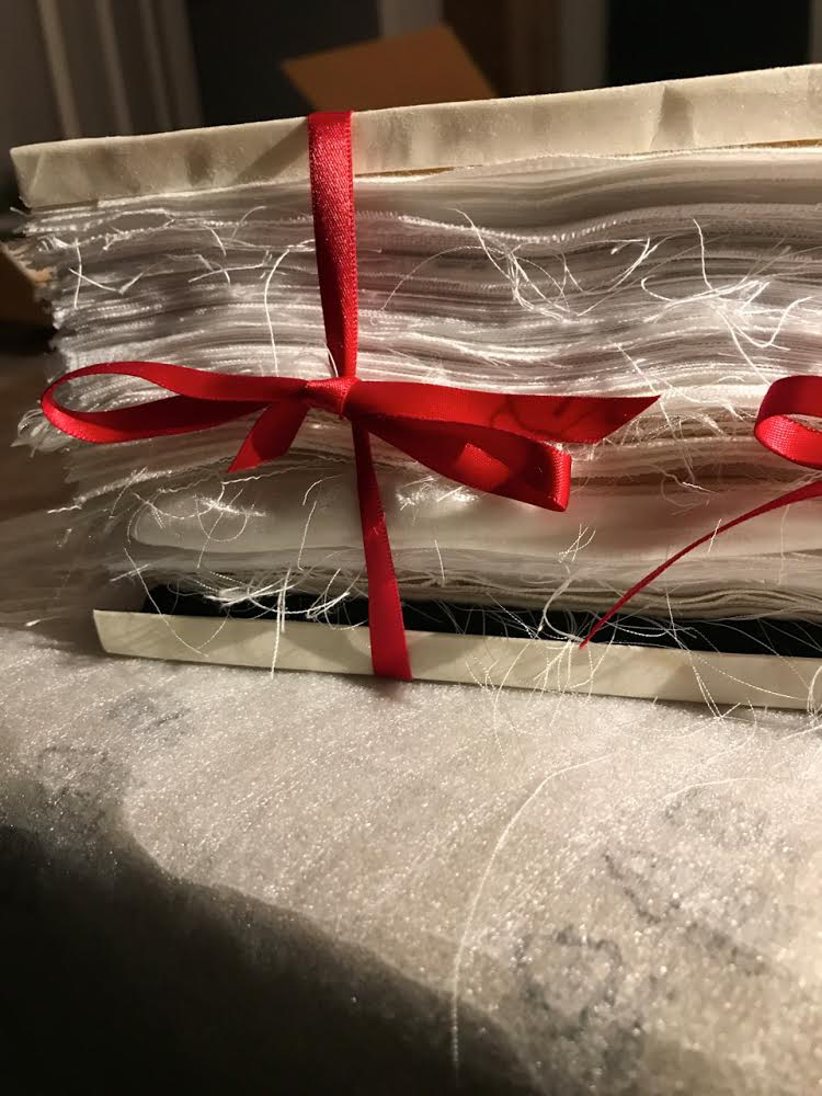
Paperback with fore-edge printing. H100 × W170 × D75 mm, 2008 pages. Edition of 500. Acquired from Art Paper Editions, 15 May 2008.
First two photos: Courtesy and permission of the artist. Third photo: Books On Books Collection. Displayed with permission of the artist.
If ever a book danced, it is this one. It is a tango between Anouk Kruithof‘s images and Jurgen Maelfeyt‘s design. It is a global line dance with a team of 50 researchers from across the globe. It is a rave, sourced from 8800 online dance videos. It is a still point in motion against Kruithof’s choreographed four-hour eight-channel video version.
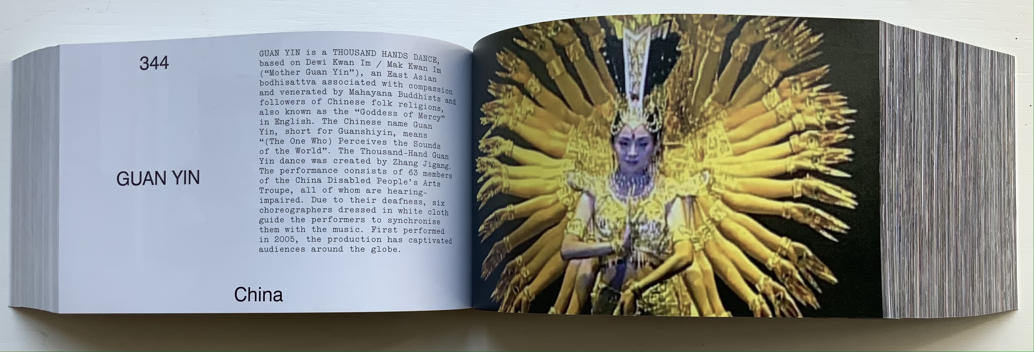
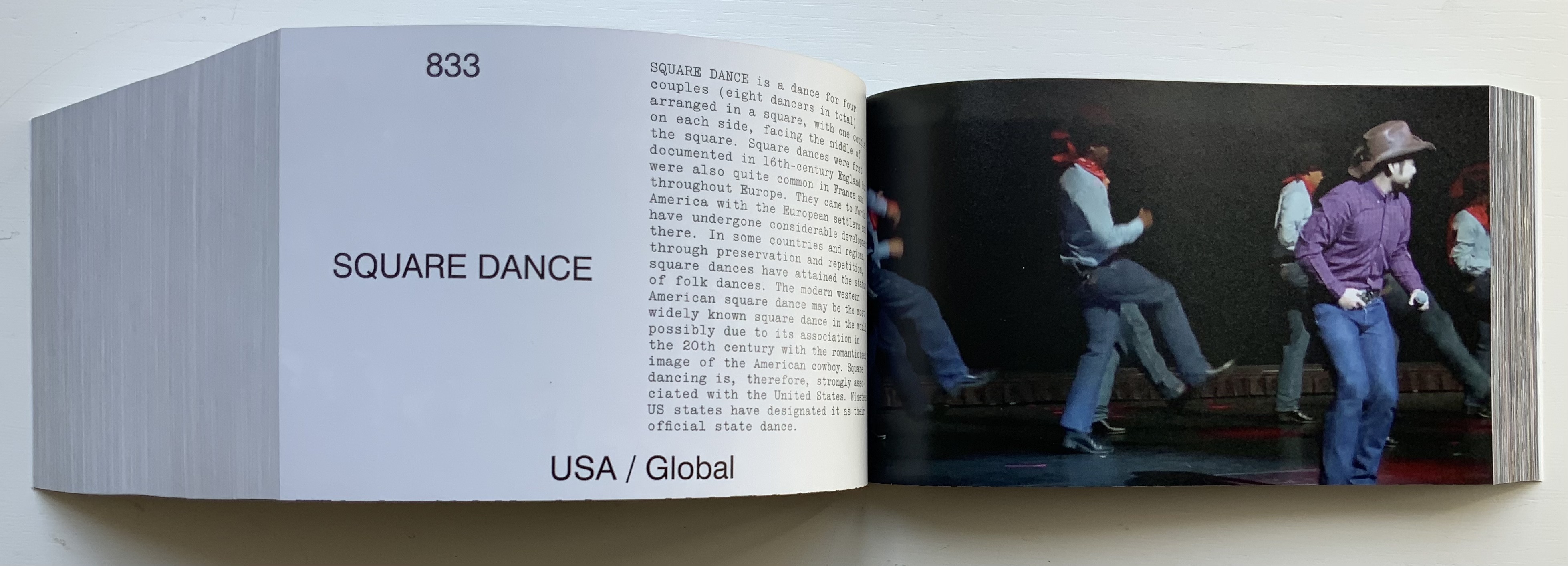
Photos: Books On Books Collection. Displayed with permission of the artist.
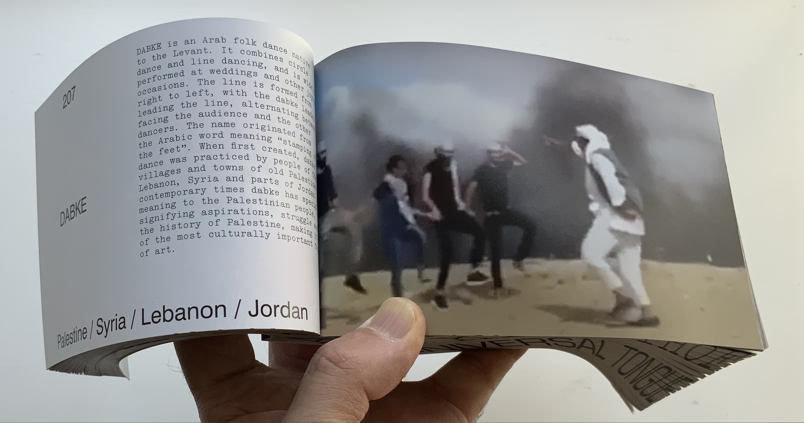
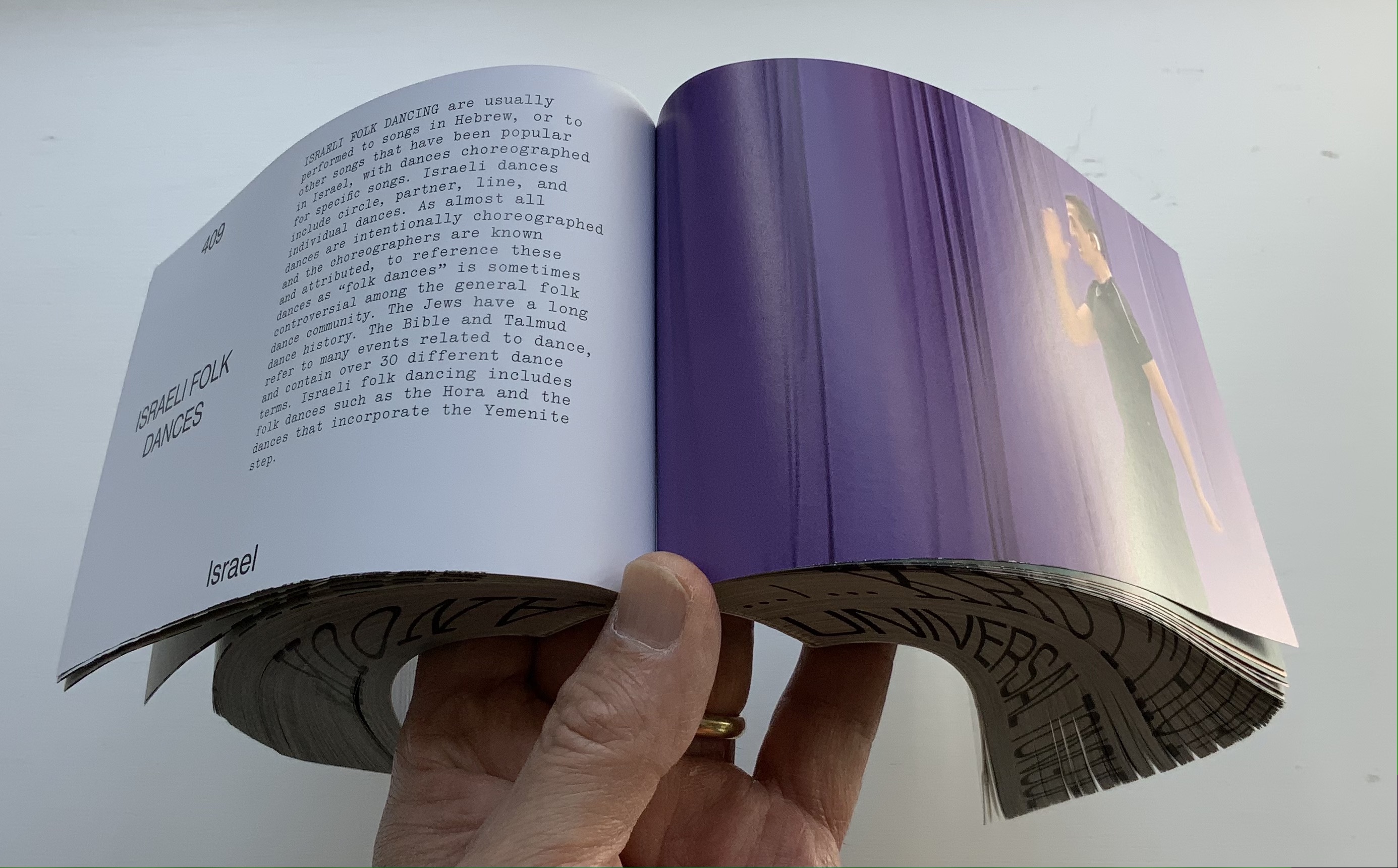
Photos: Books On Books Collection. Displayed with permission of the artist.
Video displayed with permission of the artist.
Video displayed with permission of the artist.
From the artist’s and publisher’s description: This book shows how dance can be a way of knowing about the world. It is by no means exclusive, final, or academic. It is a statement. Organized in alphabetical order by the first letter of each dance style, it confirms the horizontality of Universal Tongue, by erasing typical categories of the world order, such as country, continent, or culture. Instead, it points us towards a more inclusive world with a limitless exchange—a world where simply everyone is a dancer.
Universal Tongue also neatly uses the vertical surfaces of the codex. The bottom-edge printing of name and title calls to mind Around the Corner by Ximena Pérez Grobet. The fore-edge effect of the full-page bleeds calls to mind Irma Boom’s Strip (2003). Both techniques evoke the book form’s ability to embrace. As the physical and haptic constant alongside the digital sourcing, production and video installation, Universal Tongue as book shows that traditional dance and the book remain undiminished in cultural relevance.
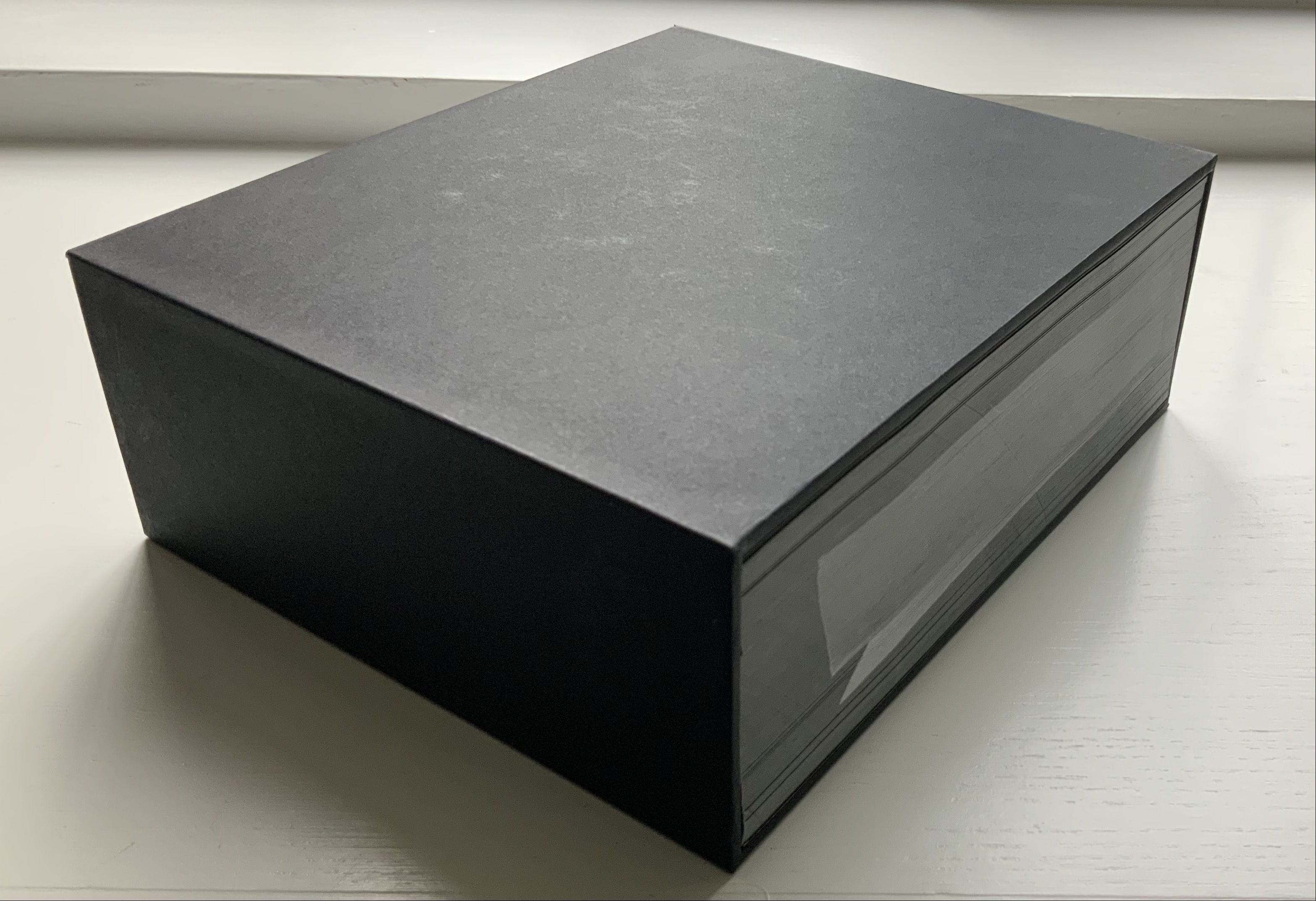
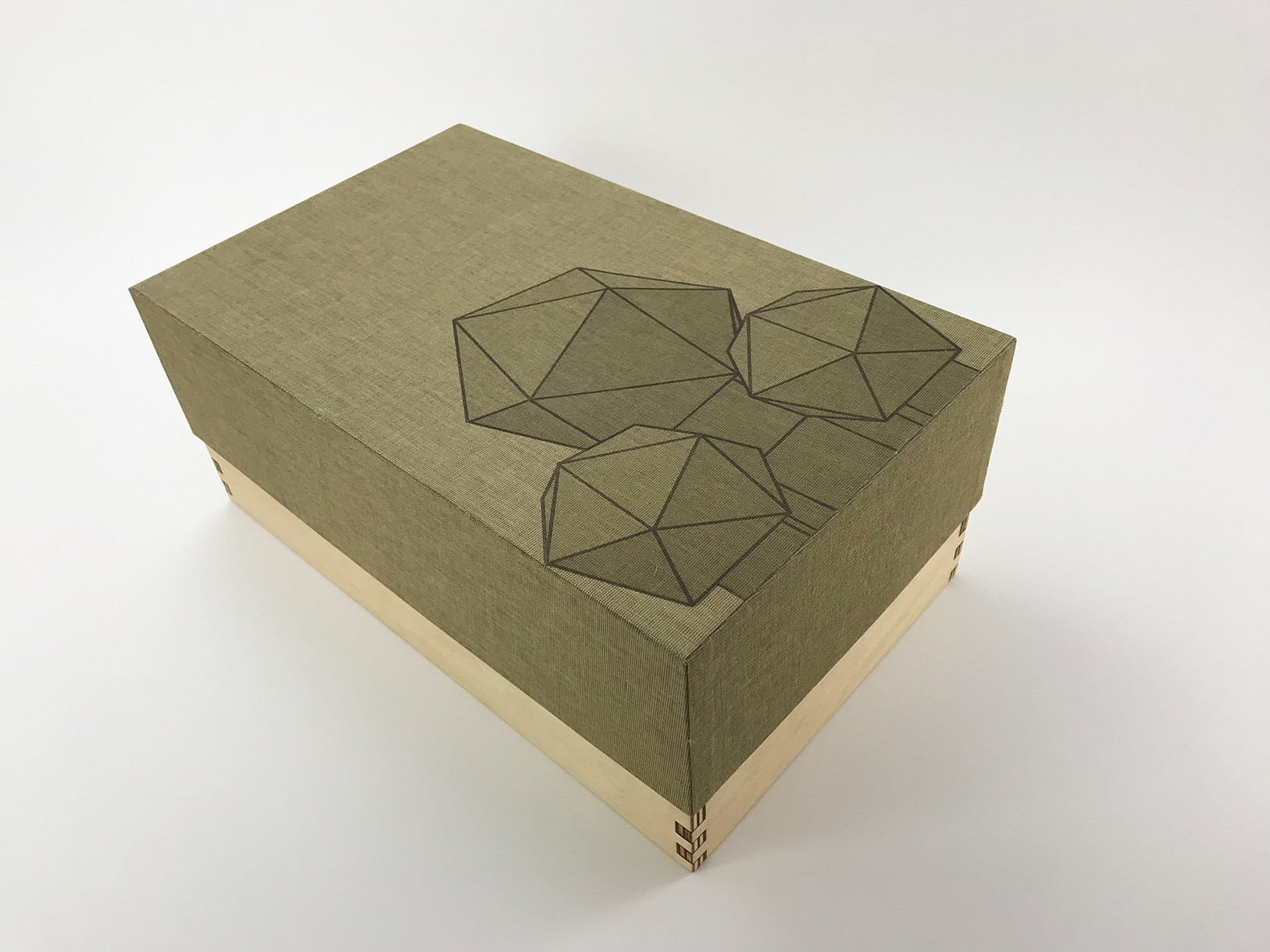
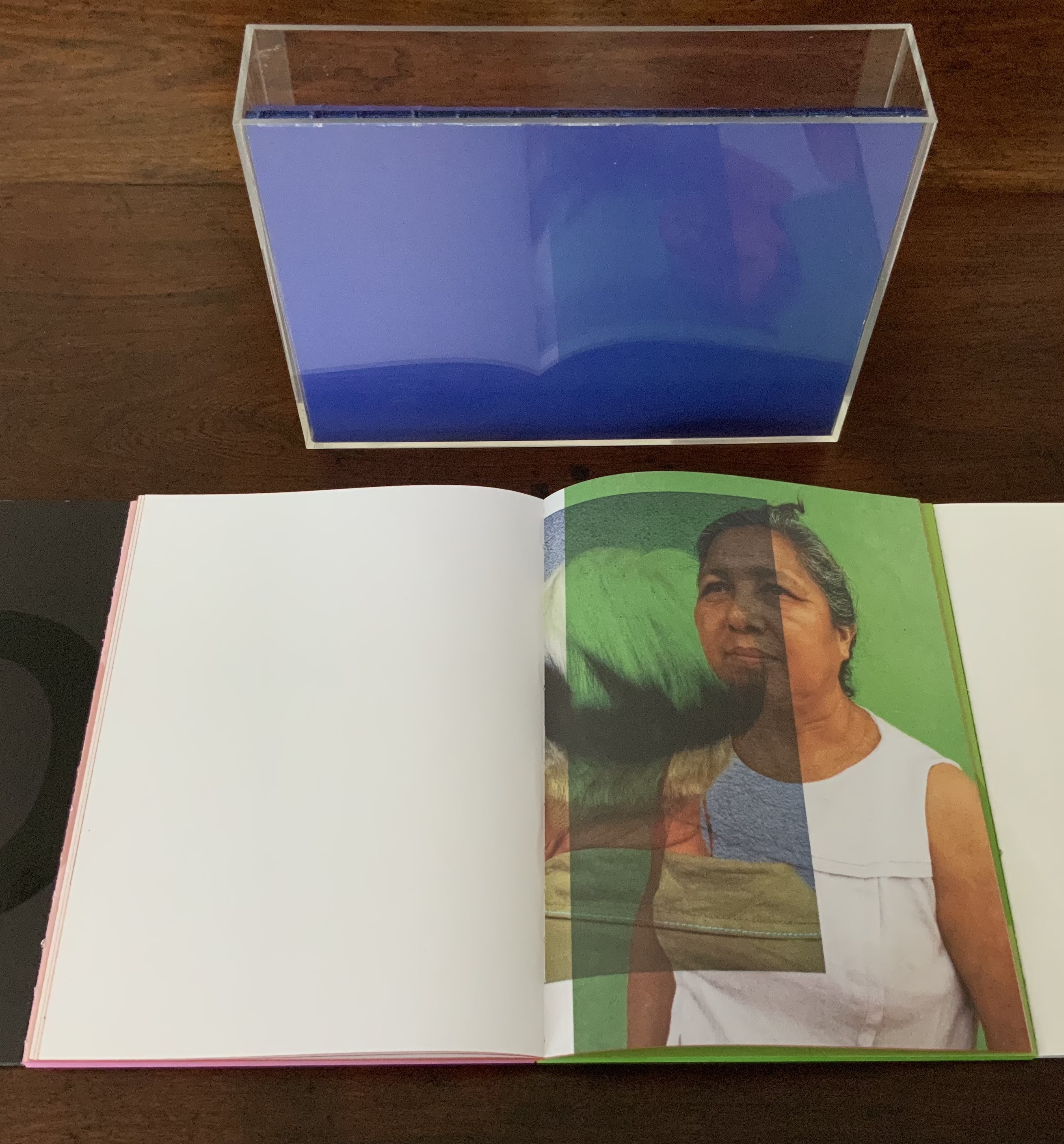
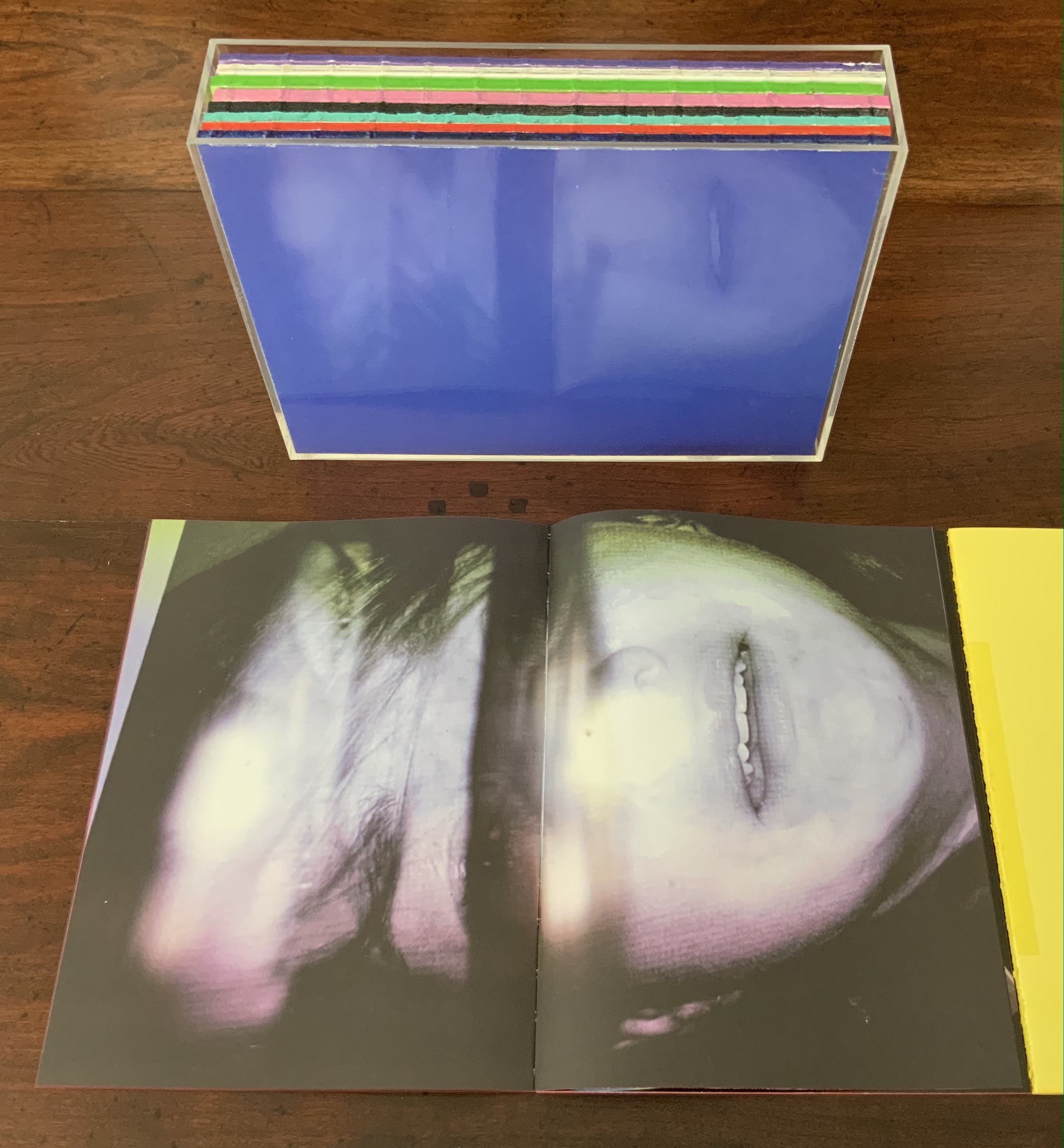
AUTOMAGIC (2016)
AUTOMAGIC (2016)
Anouk Kruithof
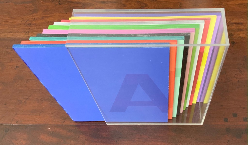
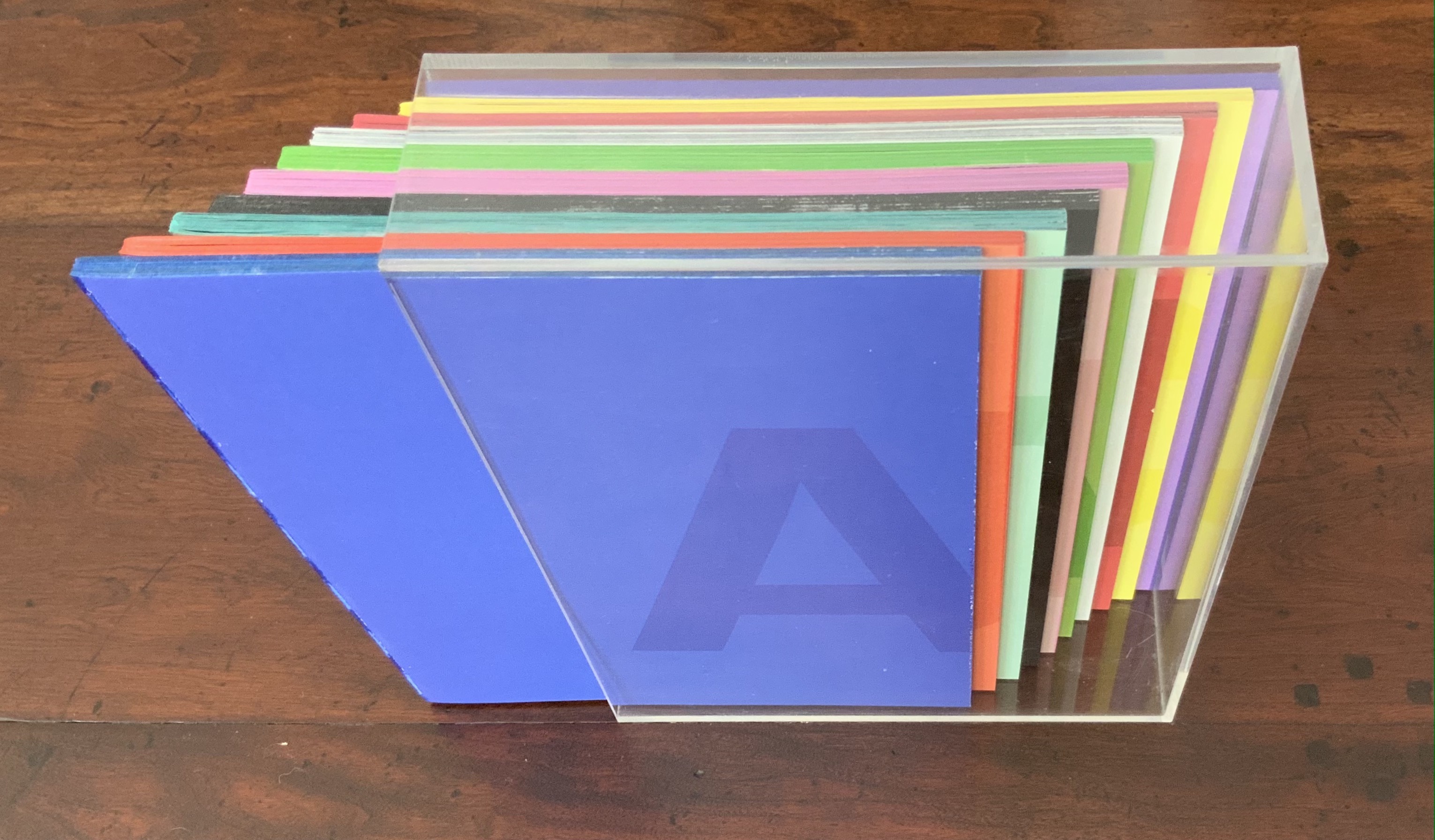
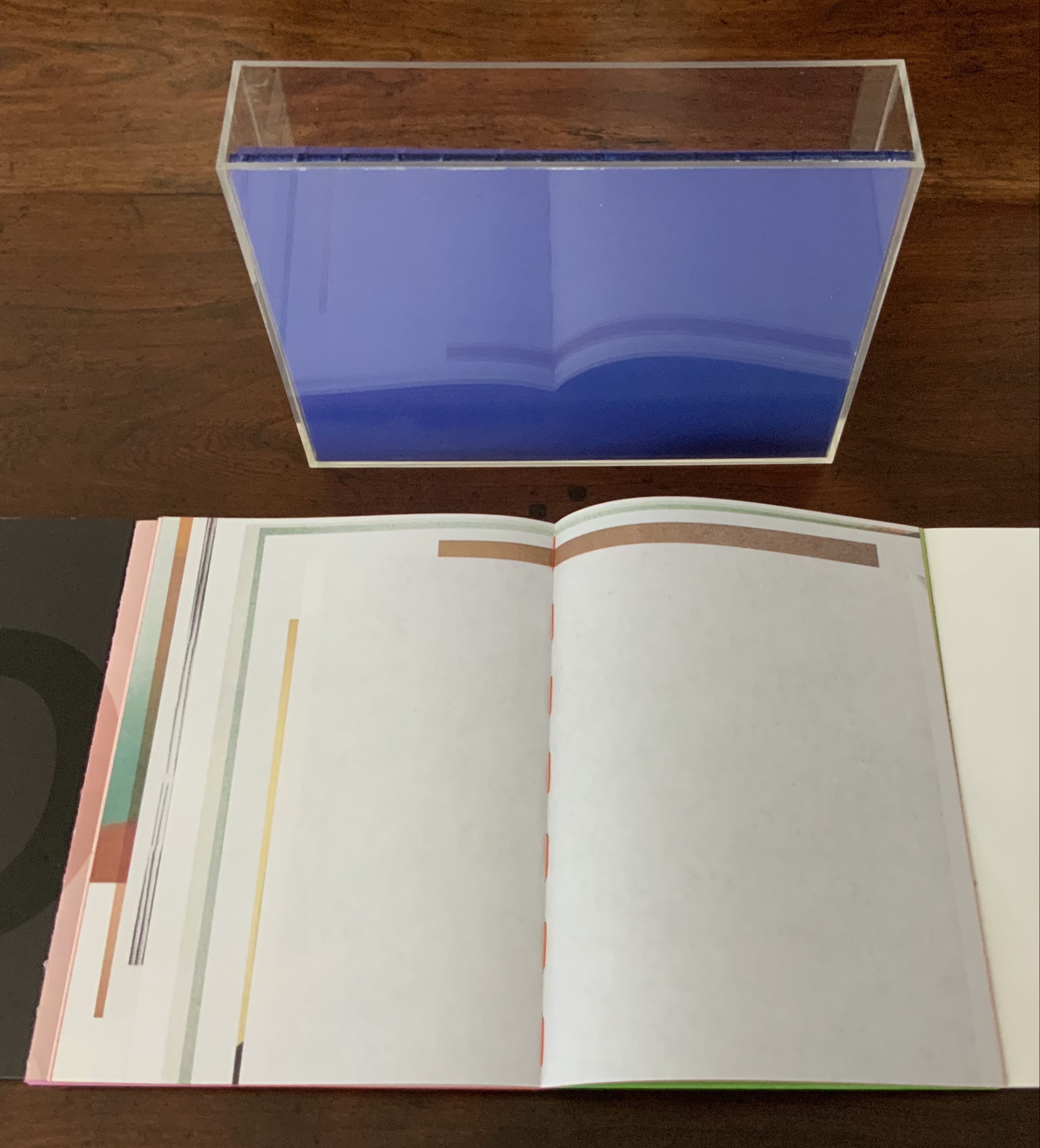
Transparent acrylic box holding 10 booklets without covers. Box: H235 x W173 x D53 mm; Booklets: H228 x W170 mm each; 768 pages. Edition of 1000. Acquired from the artist, 14 April 2017.
Photos of the work: Books On Books Collection. Displayed with permission of the artist.
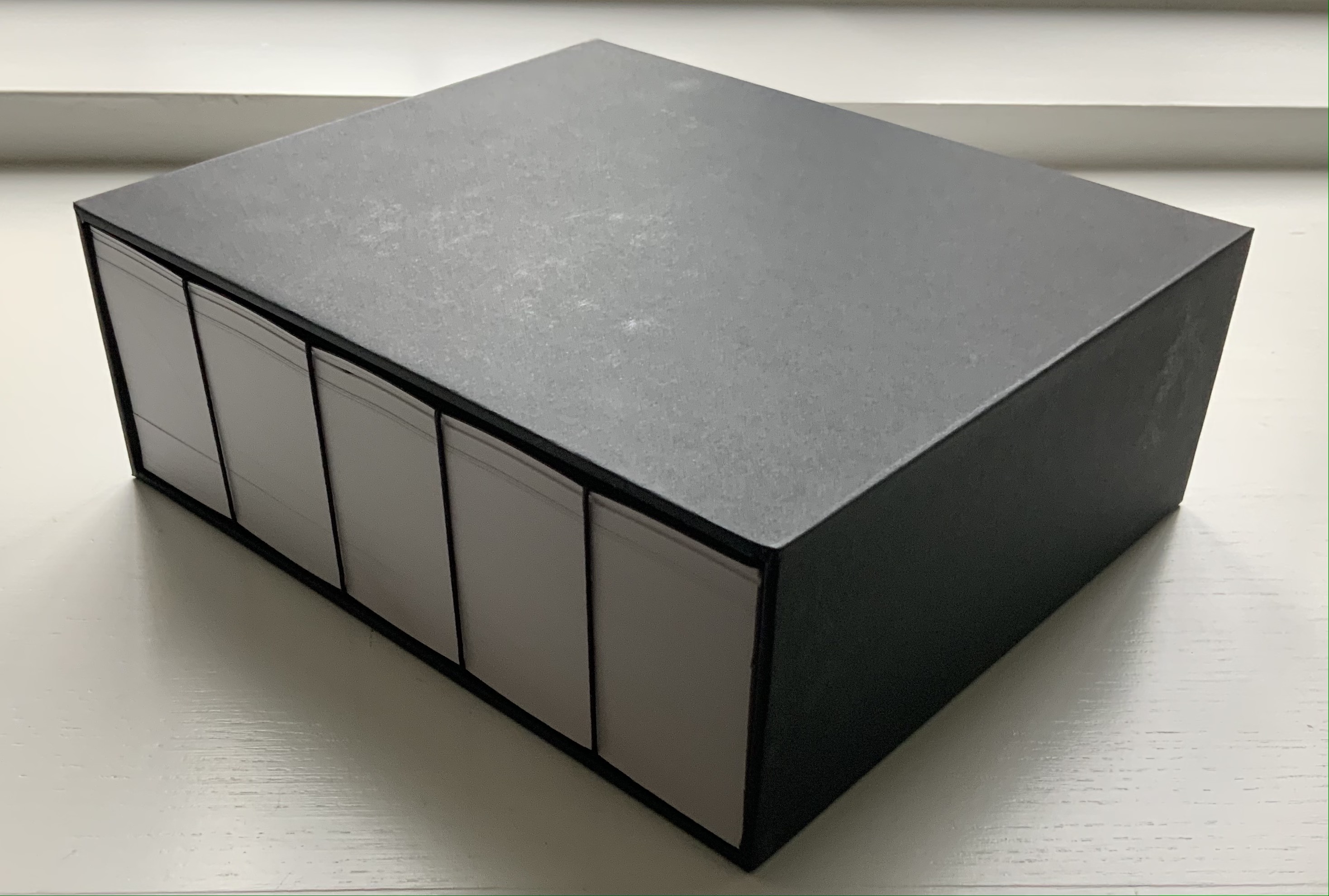
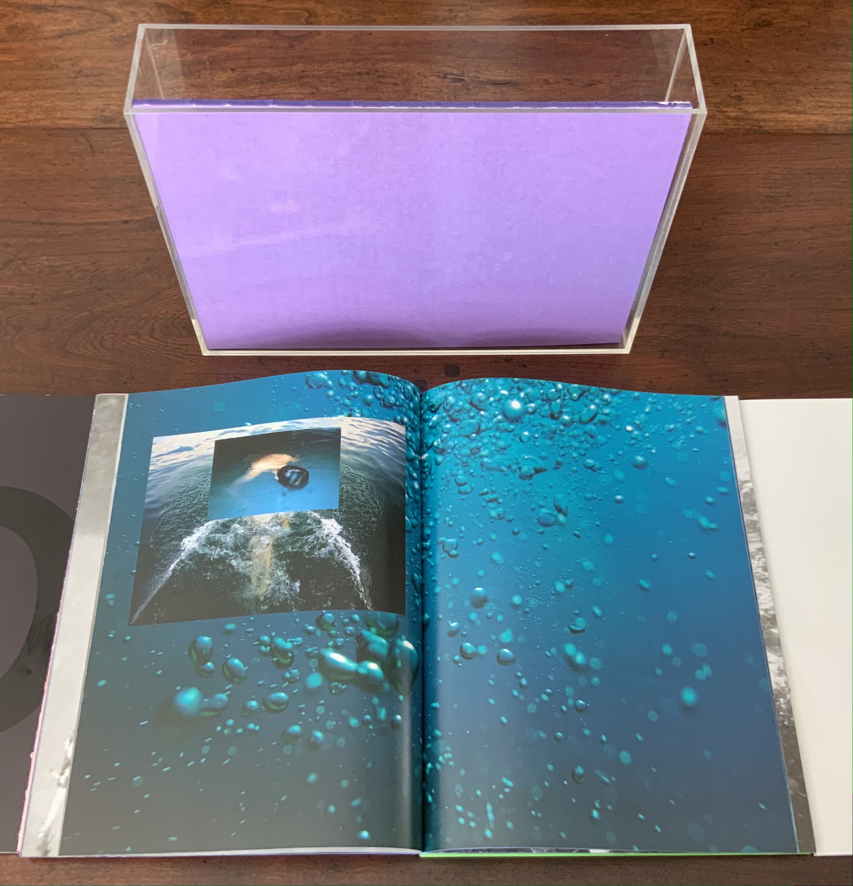
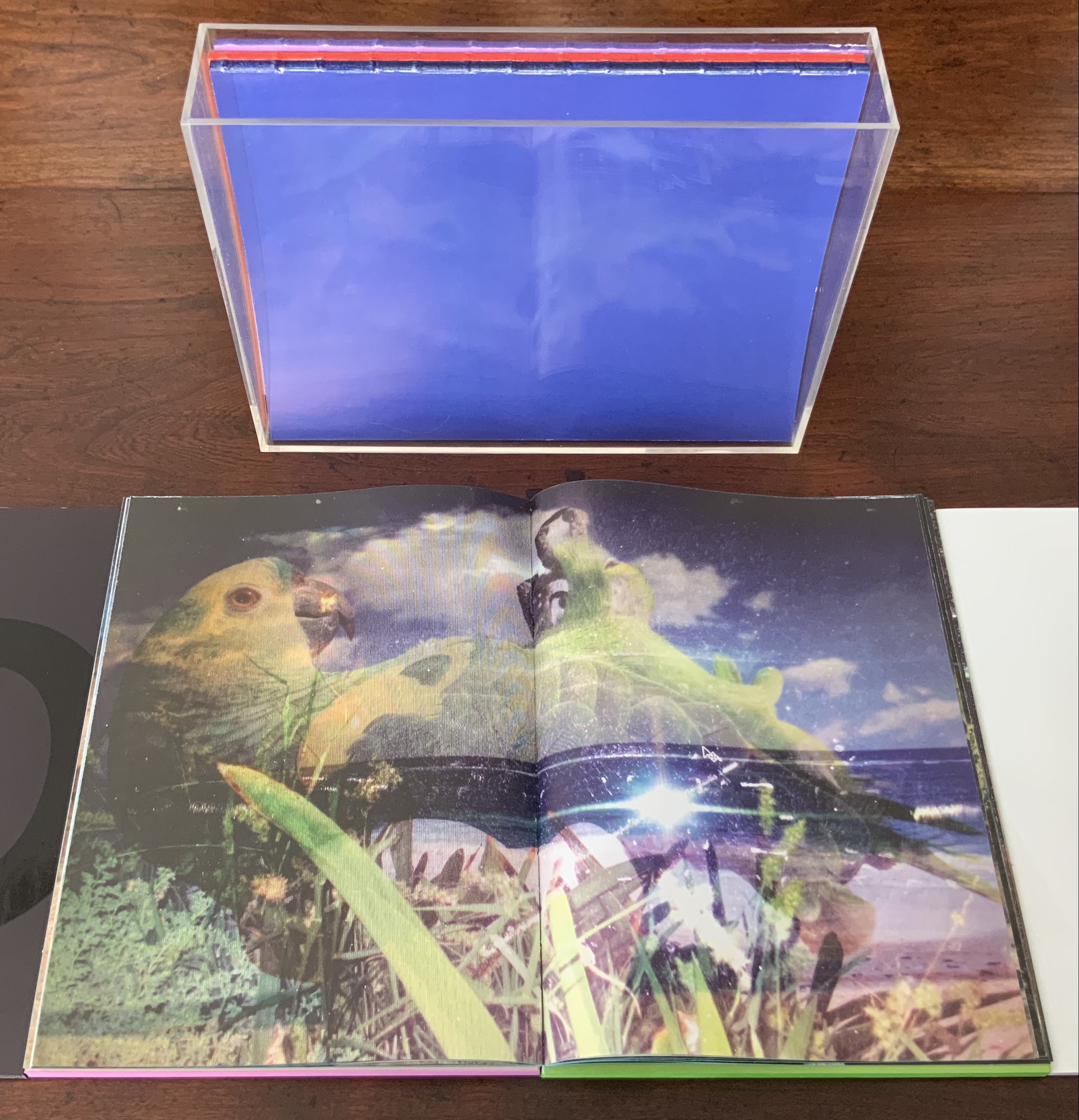
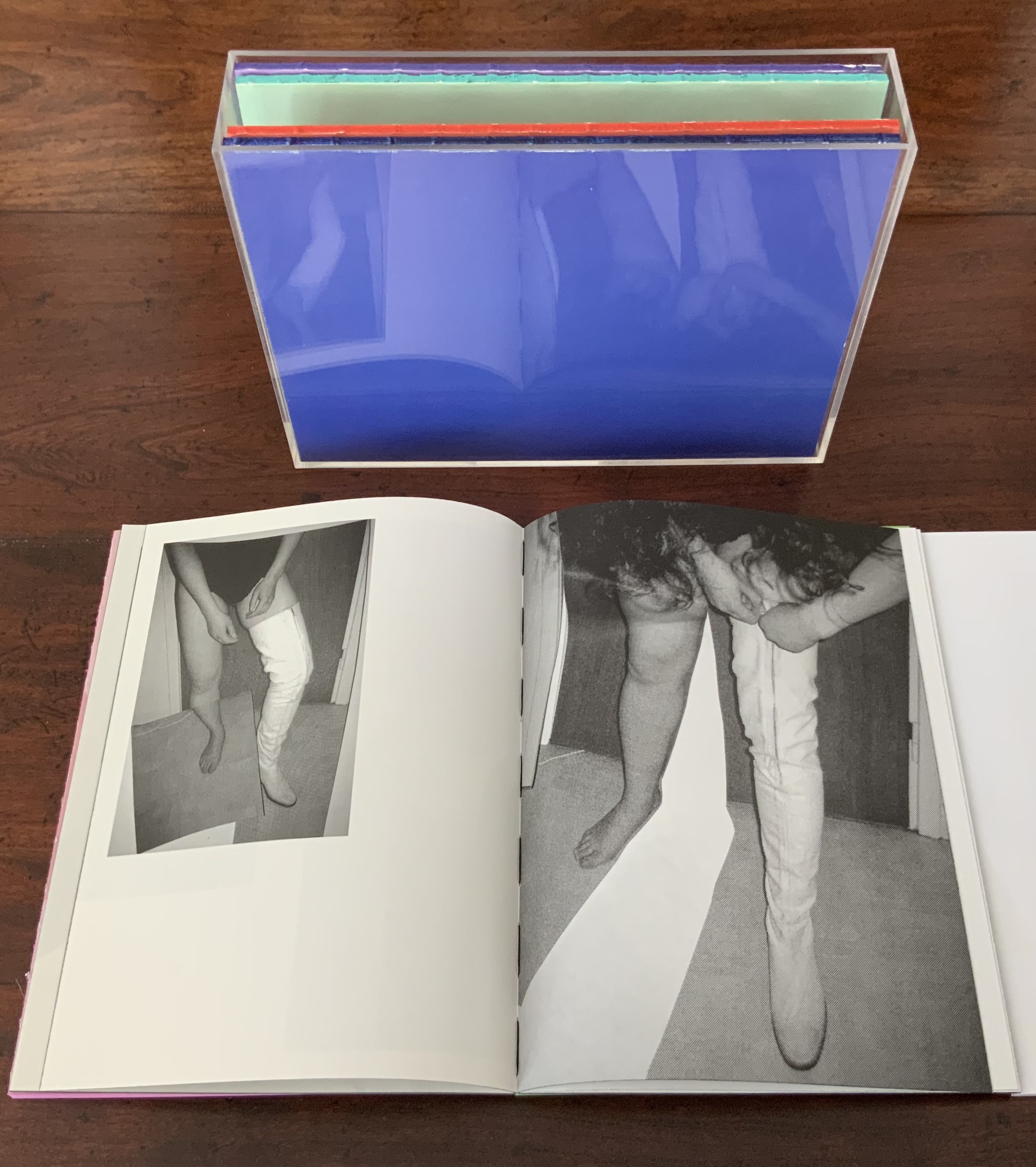
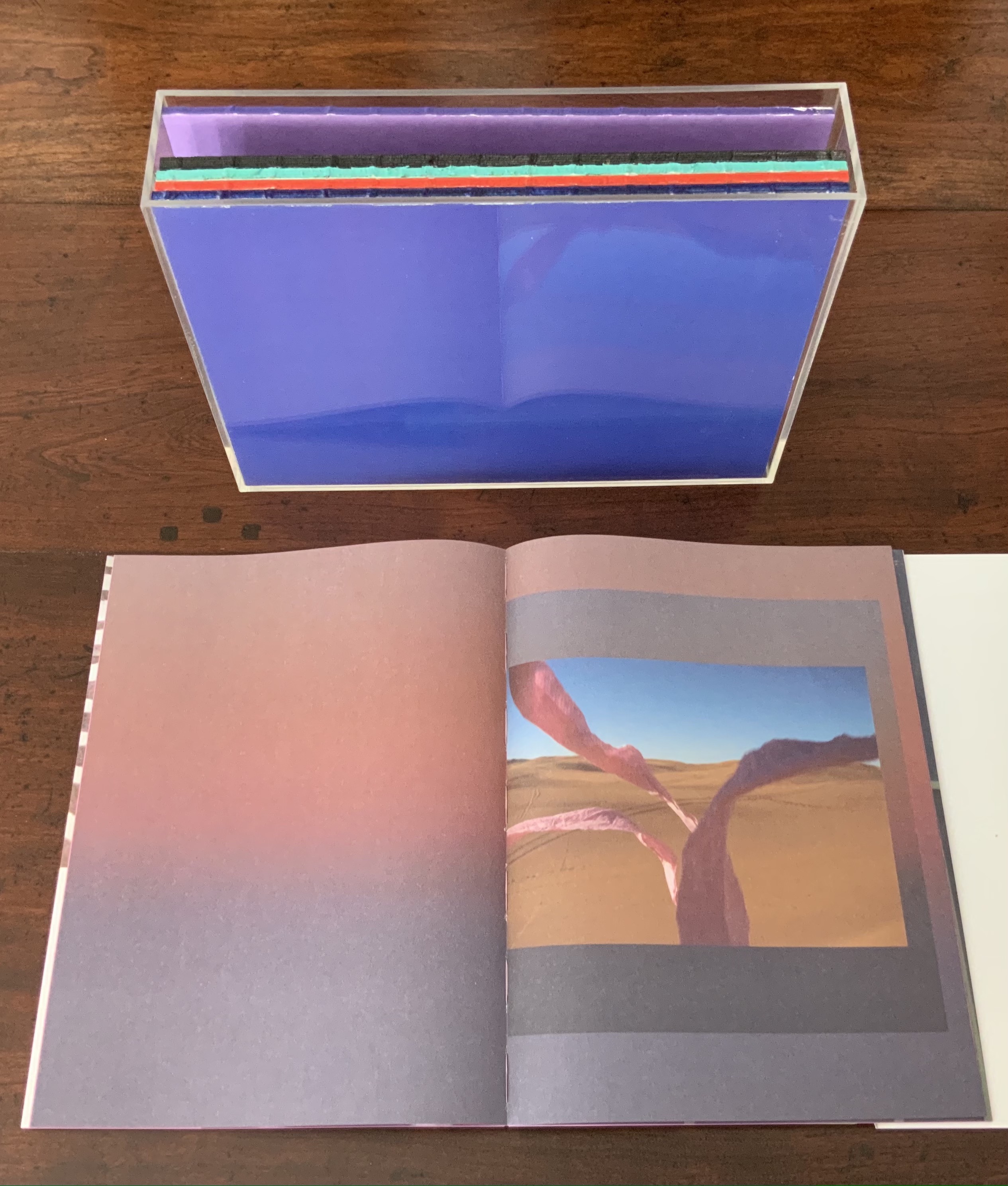
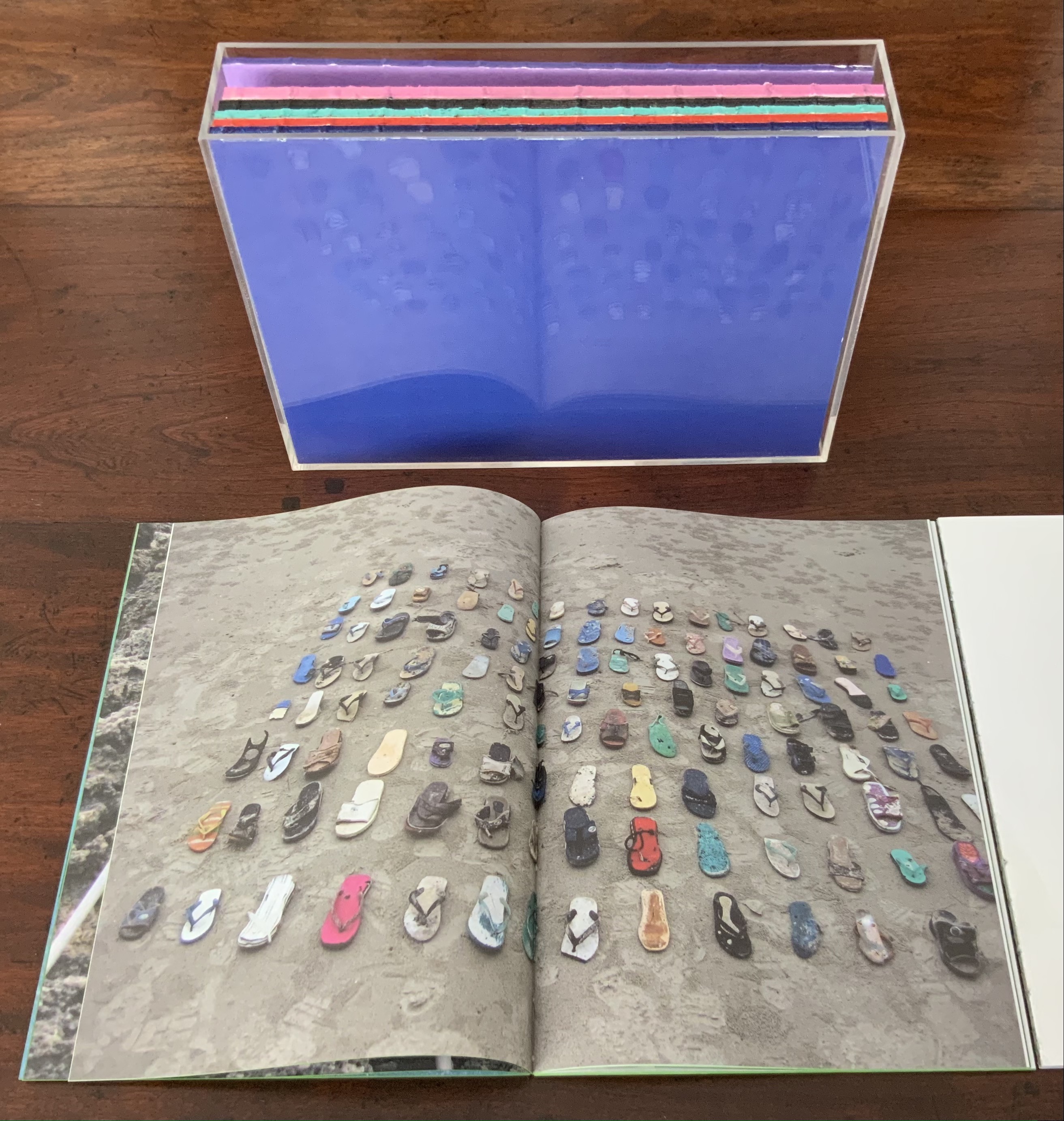
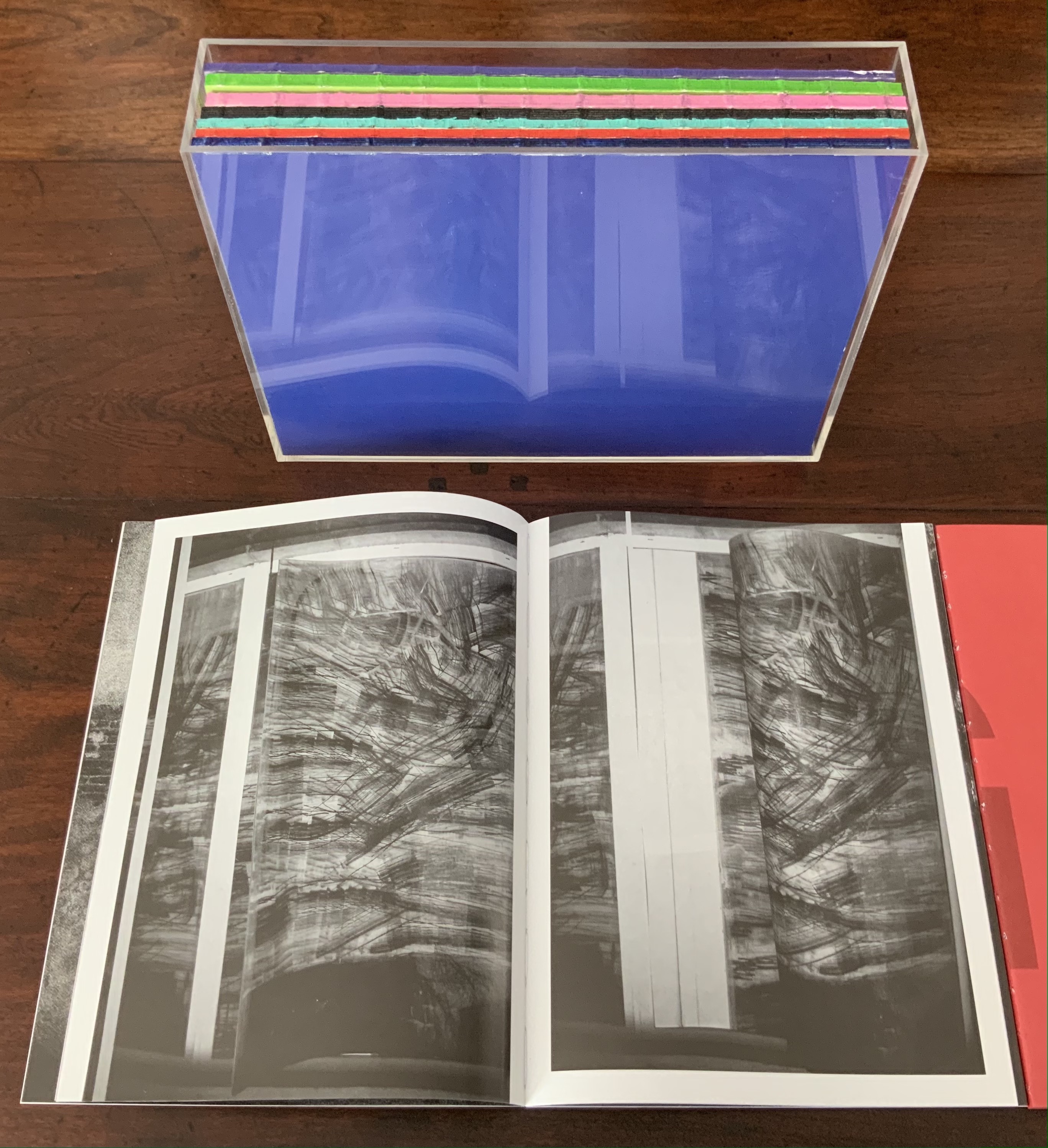
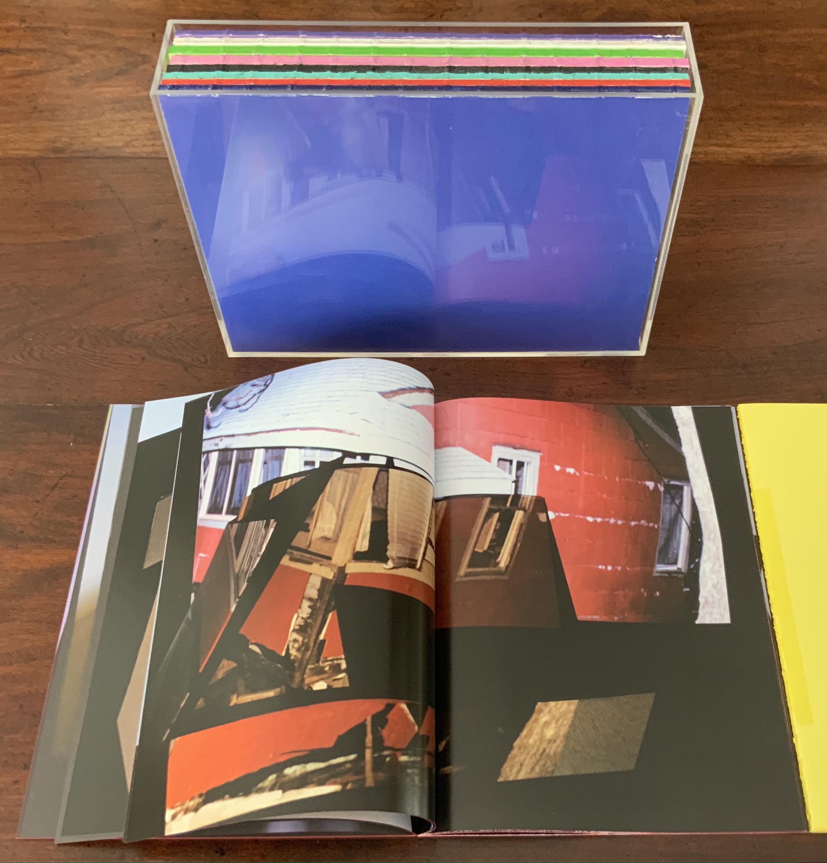
Unlike Universal Tongue, which is based on found images, AUTOMAGIC is drawn from a database of images created (and still being created) by Kruithof herself over the years. With a skill in book artistry as much as photographic artistry, she has curated, edited and montaged the images into nine differently colored booklets, bound by a transparent acrylic shell. As with Universal Tongue, the work is a collaboration, this time with Piera Wolf, the Zurich half of W-E Studio, on the design, and Iñaki Domingo, photographer and professor at the Istituto Europeo di Design, on the text. Domingo’s interview of Kruithof for the book provides the content for a tenth booklet. It is the purple one, edges color sprayed, bound with exposed purple thread and placed like a colophon looking back over the other differently colored nine “chapters” as Kruithof calls them. Laid out in order, the ten front covers spell out “AUTOMAGIC”. The way the individual letters lap over to the back edge of the next cover nods toward the unity the artist intends as well as the metaphorical unity residing in their database source and acrylic box binding.
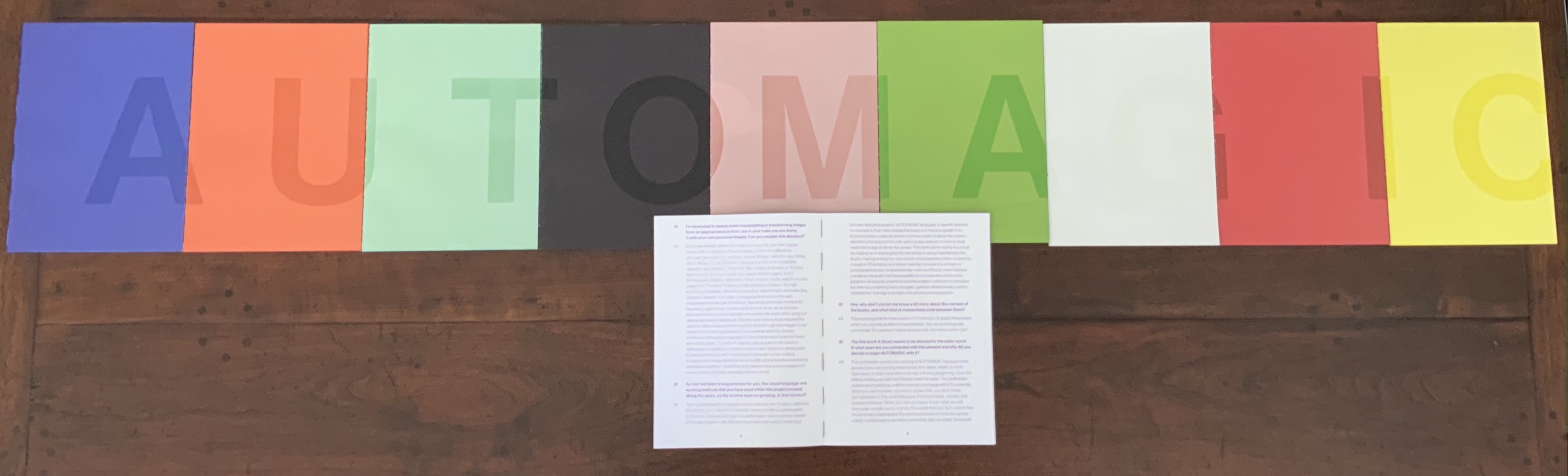
The tenth booklet lies open under the other nine spelling out the work’s title; its purple cover can be seen in last position in the acrylic box underneath.
AUTOMAGIC is the first work by Kruithof to come into the Books On Books Collection. Its color and bright materiality continually urge taking it down from the shelf and selecting one of the nine “individual chapters” of this long visual work to re-read (re-see). There is, however, a rhythm to the whole work, so they are best read in pairs or trios.
Chapter A (blue), below left, starts the nine-part work with underwater photos and Kruithof’s signature montages on glossy paper.
Chapter U (orange), below right, shifts to portraiture on plain paper, with montages created by laser-printing photos on top of photos, and interspersed with photos of the blank side of the montages with the edge of the picture frame showing. This movement between the portraits and blanks gives Chapter U an easily detectable inner rhythm, all the better appreciated in its contrast with the preceding and following chapters.
Left: from Chapter A (blue). Right: from Chapter U (orange) front and back.
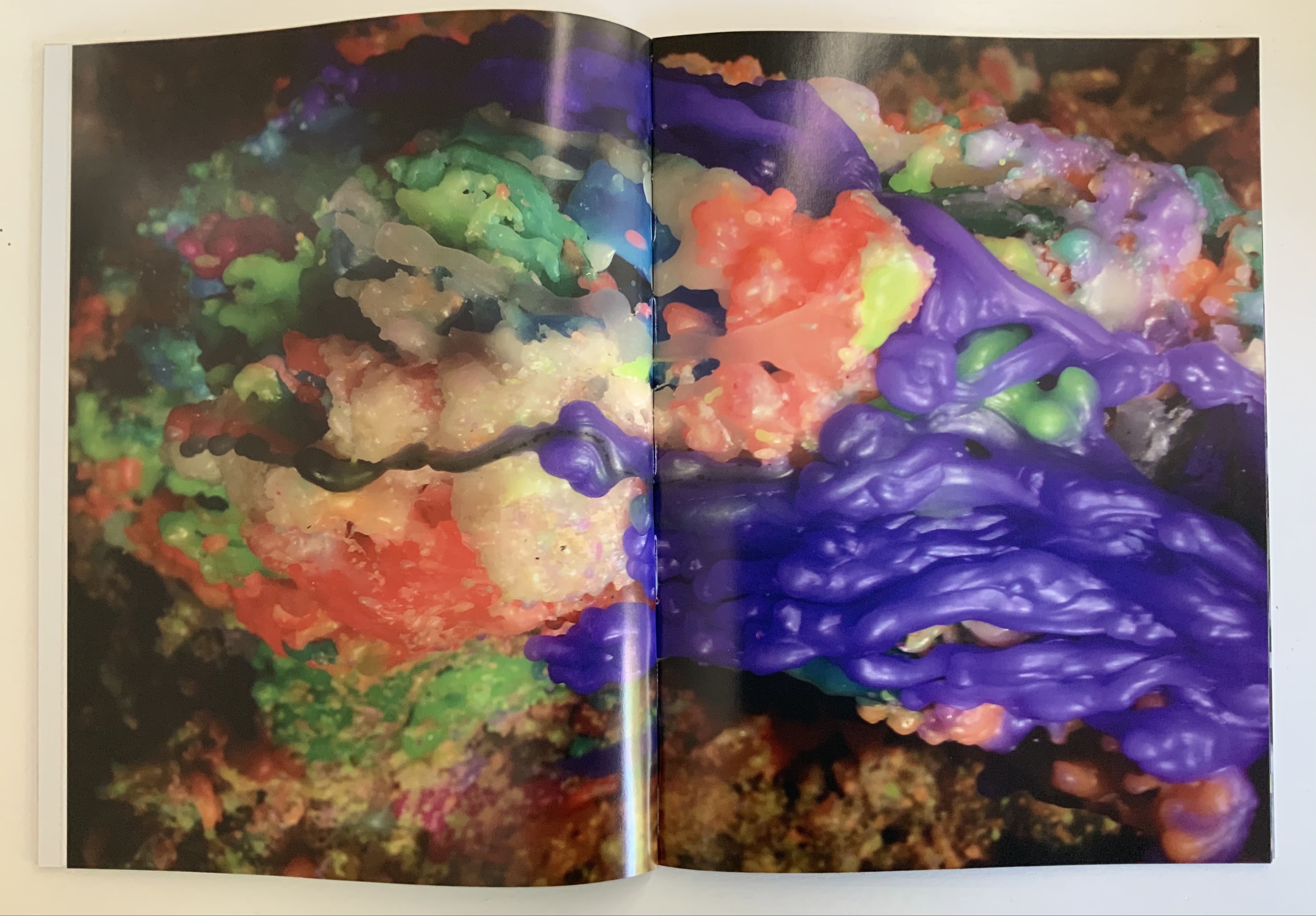
Chapter T (aqua) shifts back to nature, but a “visually psychedelic” one as Kruithof puts it, achieved with layering photos and editing in Photoshop. It also shifts back to a glossier paper like Chapter A, but the paper is thinner and so saturated with ink that the pages must be carefully separated, slowing down the reader/viewer’s movement through the booklet.
Moving into black and white, Chapter O (black) turns more to human forms and activities, depicted in a mix of straight photos, sometimes layered and some re-photographed analogue photo montages, all printed on the heavier glossy paper used for Chapter A.
Chapter T (aqua), Chapter O (black)
Chapters M (lavender) and A (green) move back into color on plain paper. They are two of the thicker booklets. Both are a blend of the human and nature, both have frequent carefully constructed arrangements of evidence of human impact on nature, with Chapter A building this theme more intensively.
Chapter M (lavender), Chapter A (green)
Chapter G (white) has a frenetic almost violent quality in its images and their manipulation. It alternates images of objects (broken windows, destroyed brick walls, melted candles, a partly erased blackboard) with those of humans contorted by awkward poses, layered photos or editing. While the chapter has shifted back to the thicker glossy paper of Chapter A (blue) and Chapter O (black) and has picked up the black and white rhythm of Chapter O, a burst of melted colored candles interrupts that BW rhythm half-way through before letting it return. This frenetic Chapter G feels like a build-up to a distraught Chapter I (red).
Chapter G (white)
Chapter I (red) juxtaposes self-portraits of distress (on matte paper) with images of a hurricane’s aftermath (on glossy paper). The even division between subjects and type of paper individualizes this chapter and drives home the alternating rhythms of the work as a whole.
Chapter I (red)
Chapter C (yellow) consists of “re-photographed analog photomontages of mausolea and images of color smoke bombs in abstract architectural settings”. If the previous eight chapters have expressed a sense of being in the world, this one expresses a sense of exiting it — a sense that is complicated by the fictive enhancement of the brightly colored Mexican mausolea and the fictive smokescreen attempt to impose a ritual and architectural structure on that exit.
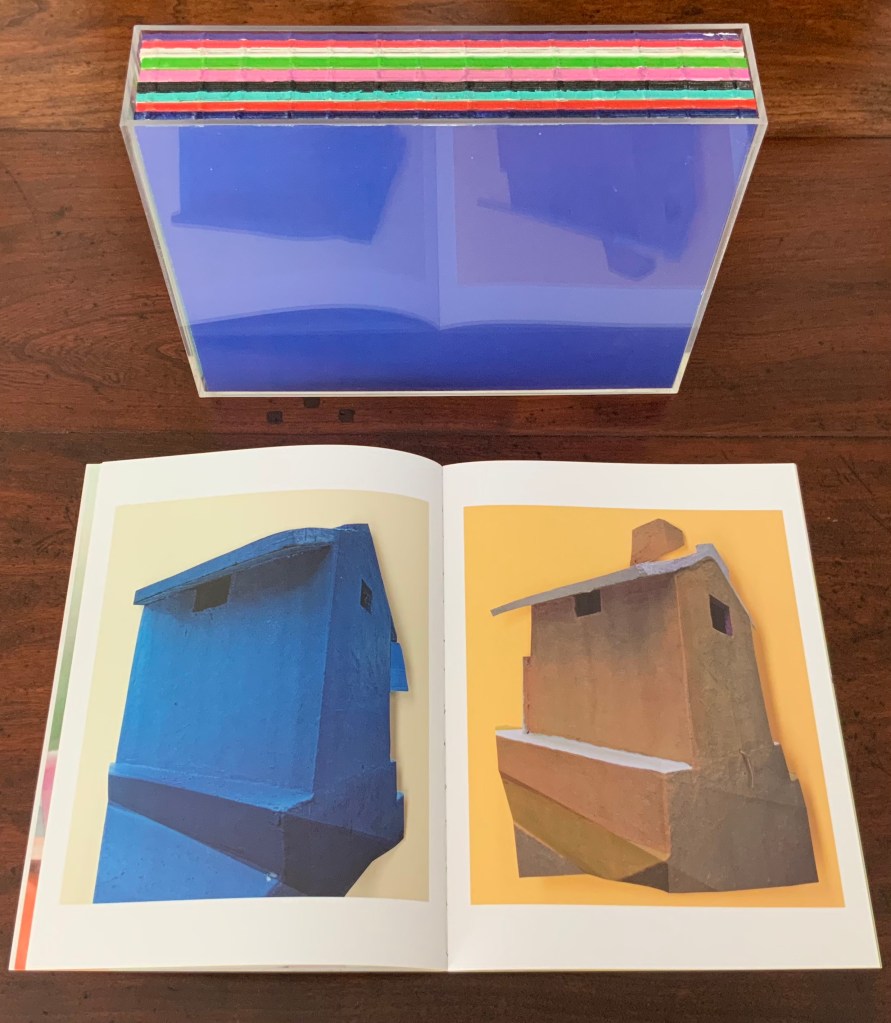
Chapter C (yellow)
Pixel Stress (2013)
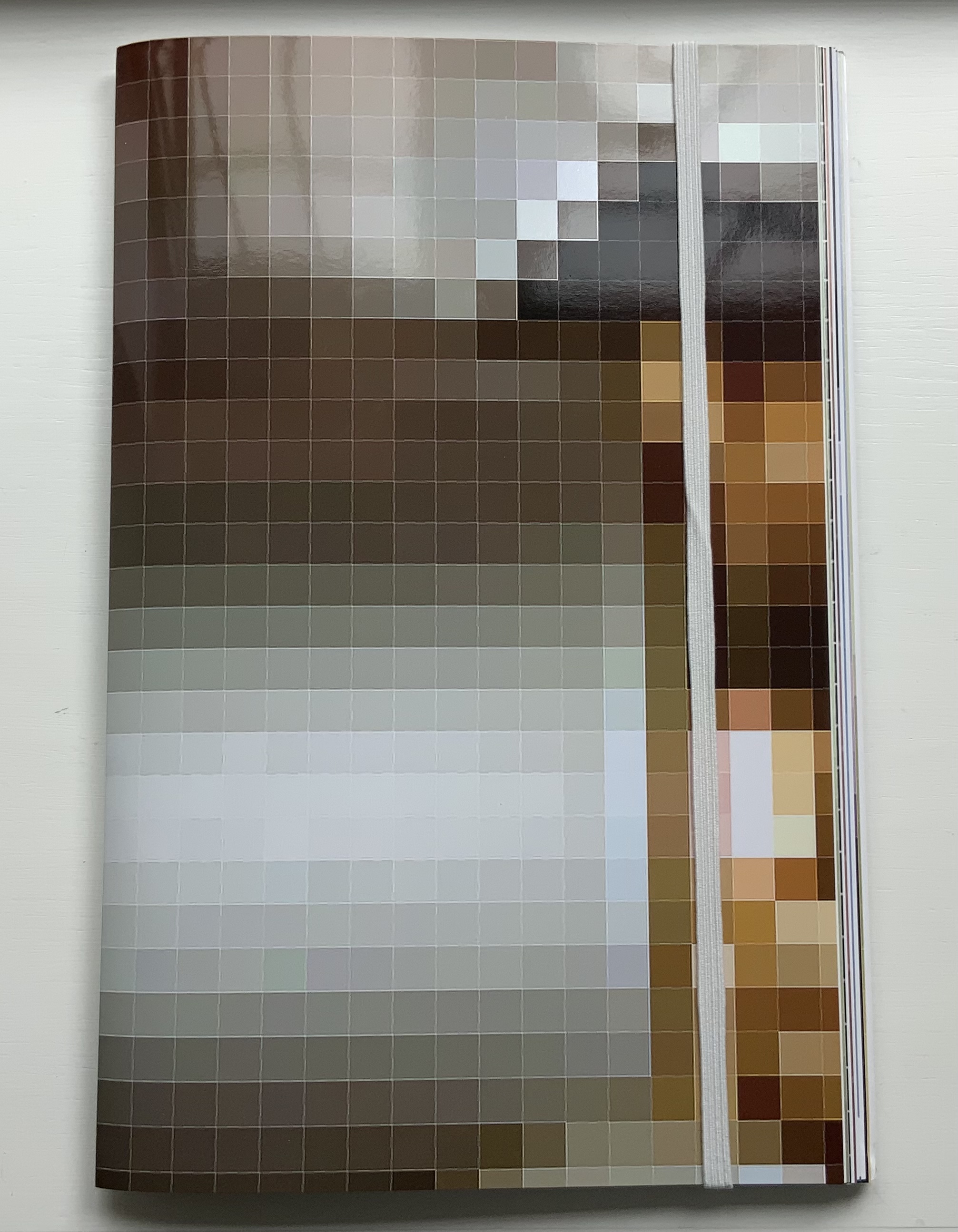
Pixel Stress (2013)
Anouk Kruithof
Softcover booklet stapled, enclosed in a set of 15 single-fold folios held together with an elastic cloth band. H320 x W200 mm, 100 pages.Edition of 1000. Acquired from RVB, 12 June 2021.
Photos of the work: Books On Books Collection. Displayed with permission of the artist.
Remove the elastic cloth band and the 15 folios of glossy prints (H320 x W407 mm) folded in half start to slip and slide. At the center of the inmost folio lies a stapled booklet. The booklet’s front cover serves as the title page, its back cover explains the event that yielded this book.
Single-fold folios slipping apart, front and back covers of the booklet enclosed by the glossy folios.
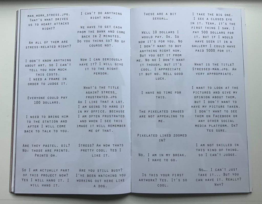
The booklet’s photos and montage pull the reader into the event — busy New Yorkers brushing by and hurrying away, or stopped in their tracks, intrigued and lingering, heads shaking, edging away or absorbed and brightening, then walking off with their prize. Selected comments on the day complete the scenario.
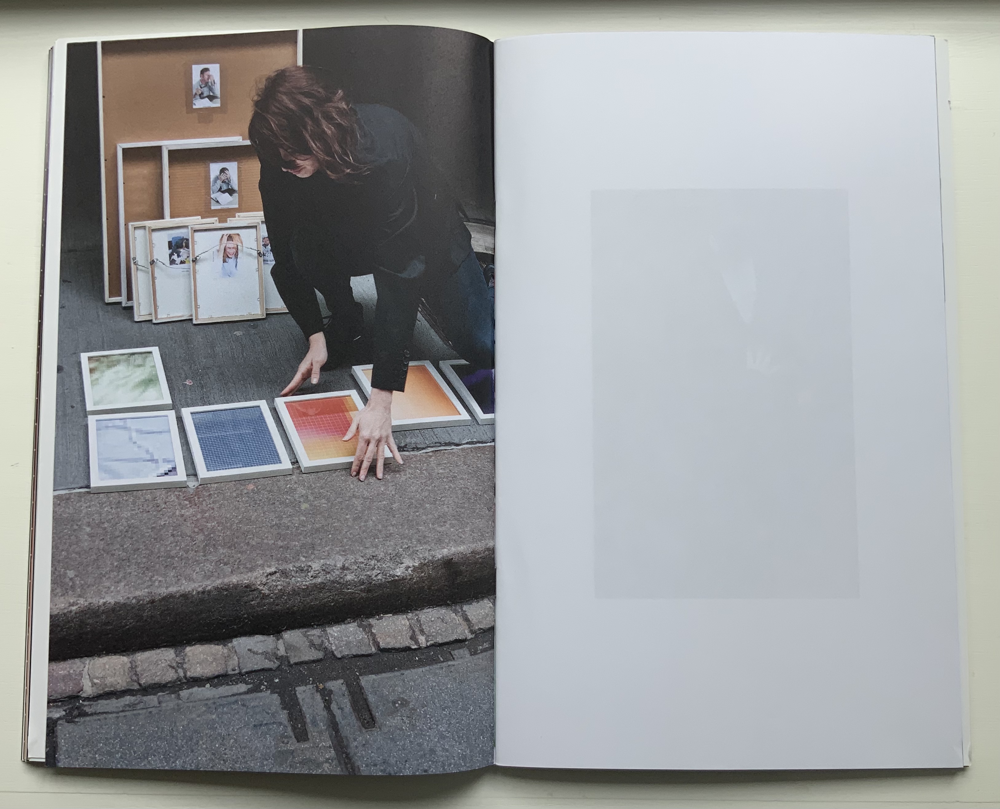
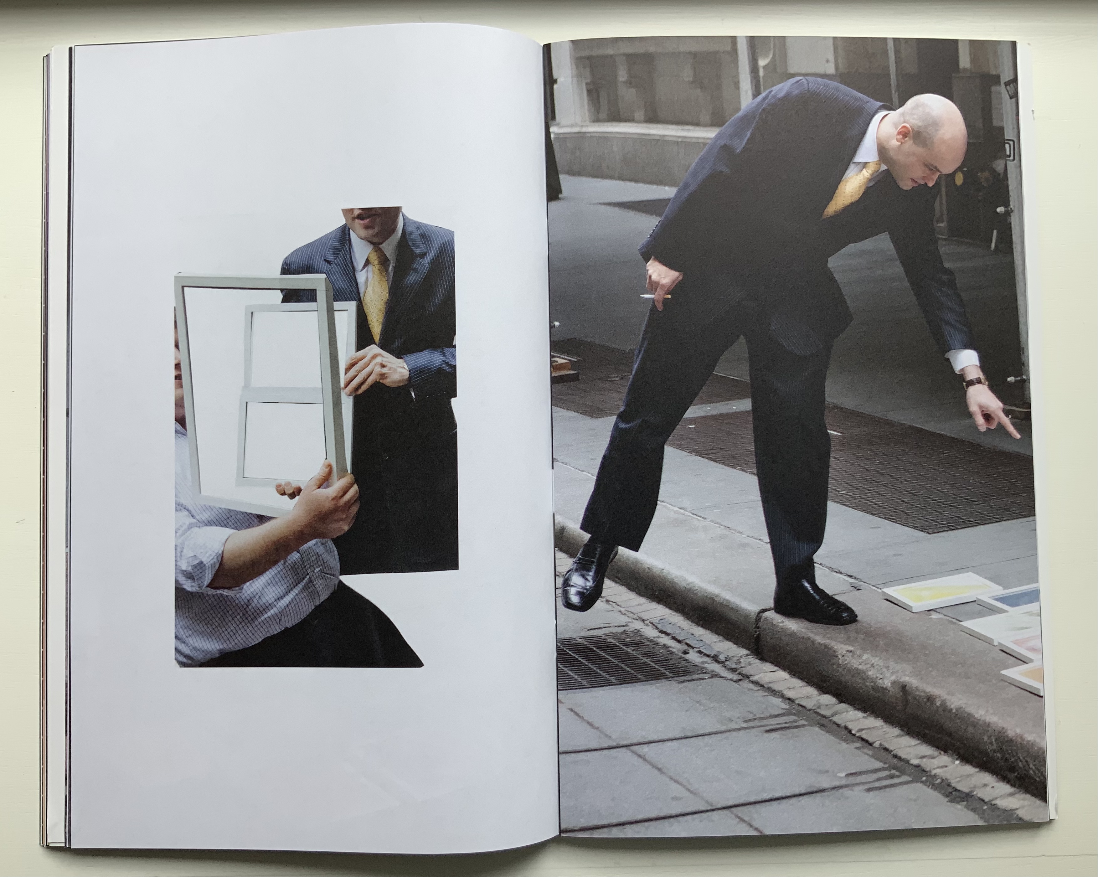
Only the folio that forms the front and back cover presents a complete version of one of the prizes that a New Yorker might have taken away. The print is a detail enlarged from the thumbnail image “WOMAN_IN_STRESS.JPG”, reproduced on the back of the print.
Clockwise: Front of the folio that is the front and back cover of the book. Back of the folio.
Upper right of the book’s “inside back cover” showing the jpeg.
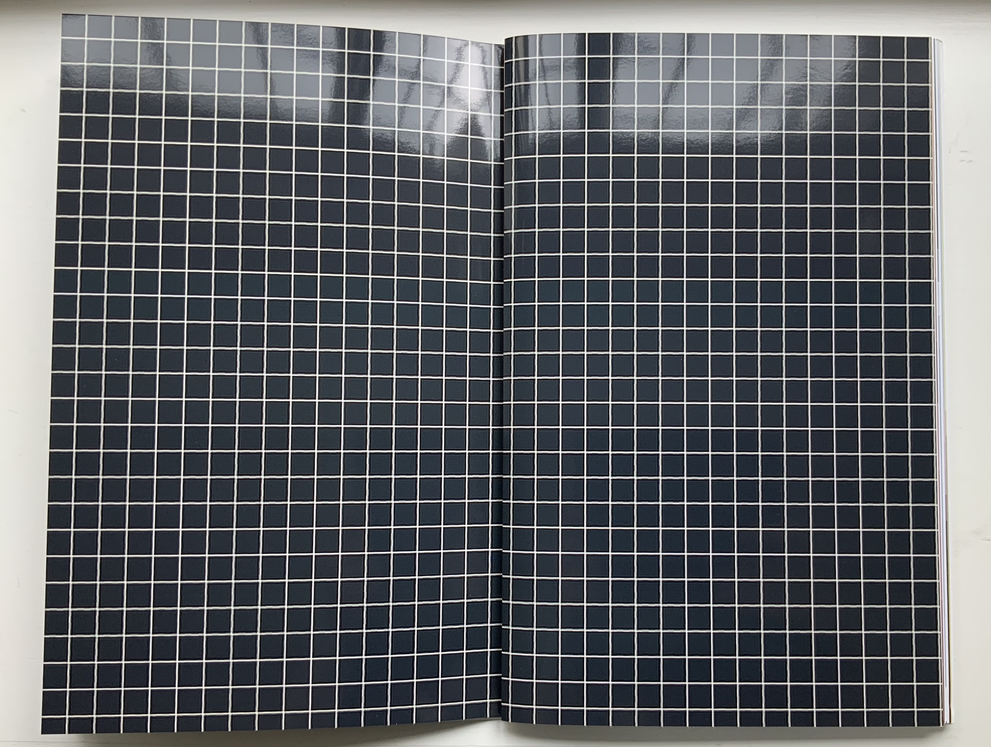
All of the other prizes are transformed in the book into beautifully aligned verso and recto pages. Thus the recto page of the glossy white-on-black grid in this double-page spread below is a bundle of single-fold, gathered folios. The least nudge shifts the bundle to the right exposing the underlying folio: half white-on-black grid, half umber-to-gold enlarged detail of the image “STRUGGLING-WITH-STRESS.JPG”, which appears on the reverse of the enlargement.
Fifty-two color photographs and photo-montages make up the content of Pixel Stress. Glorious as they are in their photographic language, it is the language of the book, spoken fluently by Kruithof and her collaborator Rémi Faucheux of RVB, that makes Pixel Stress a work of art.
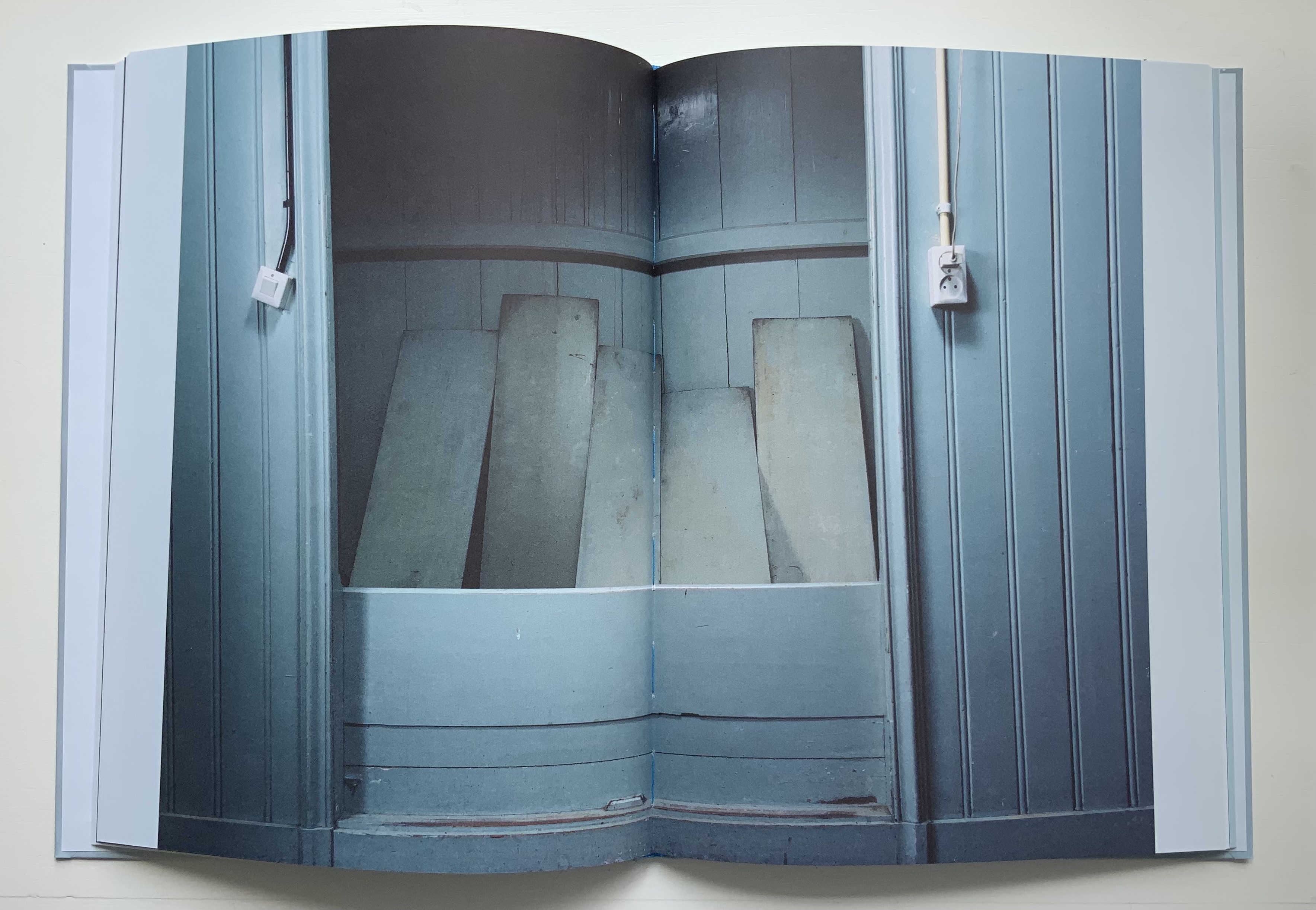
Becoming Blue (2009)
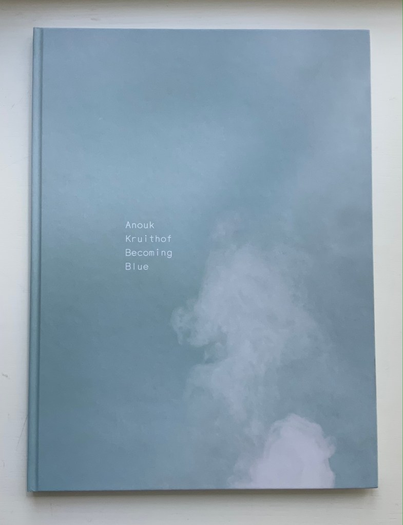
Becoming Blue (2009)
Anouk Kruithof
Paperback, sewn. H275 x W205 mm, 102 pages. Limited edition of 750. Acquired from the artist, 12 June 2021.
Photos of the work: Books On Books Collection. Displayed with permission of the artist.
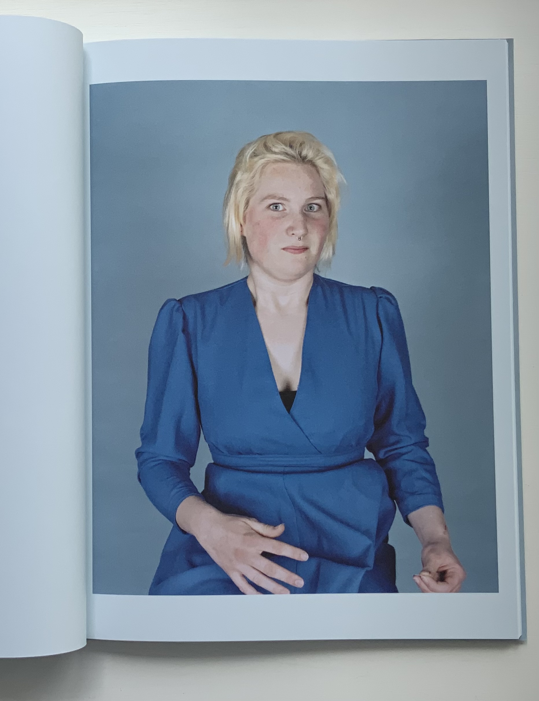
Being the product of a design house (Kummer & Herrman) and photo book publisher (Revolver Publishing), Becoming Blue seems more a showcase of photography rather than of book artistry. It nevertheless reflects Kruithof’s playful investigation of color, creative interaction with strangers (hers is the extra hand, head of hair or shape peeking out from behind the subjects) and love of the quirky and awkward.
Ephemera
Newsprint
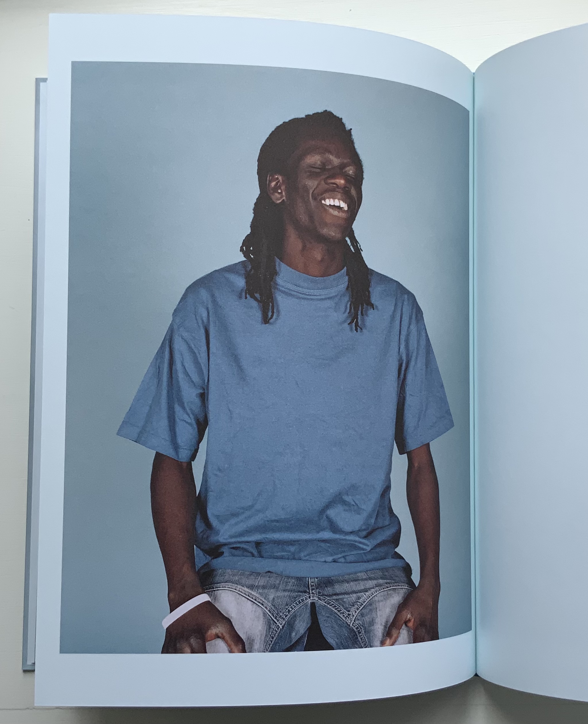
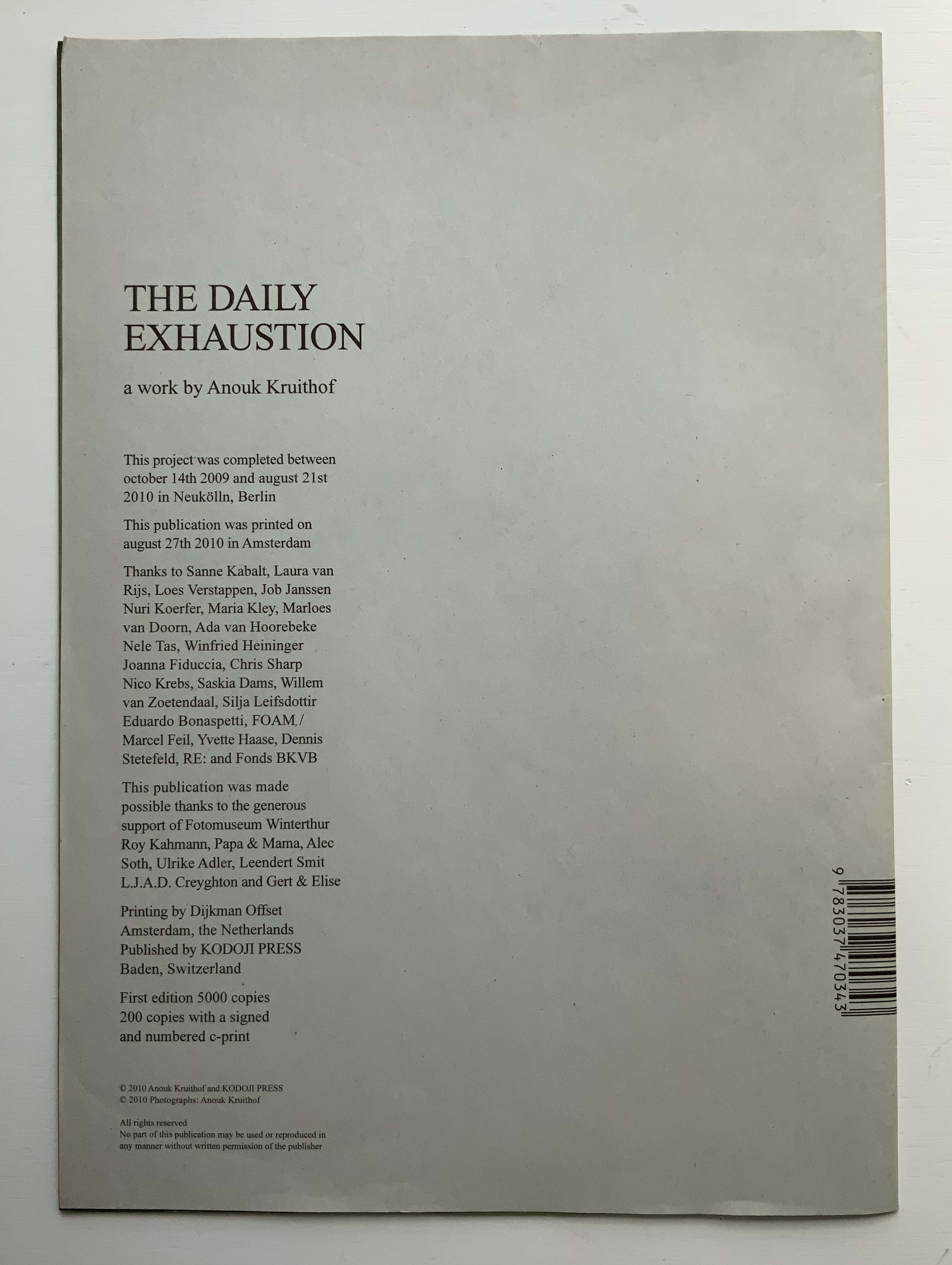
The Daily Exhaustion (2010)
Anouk Kruithof
Tabloid format newspaper. H275 x W195 mm, 48 pages. Edition of 5000. Acquired from the artist, 12 June 2021.
Photos of the work: Books On Books Collection. Displayed with permission of the artist.
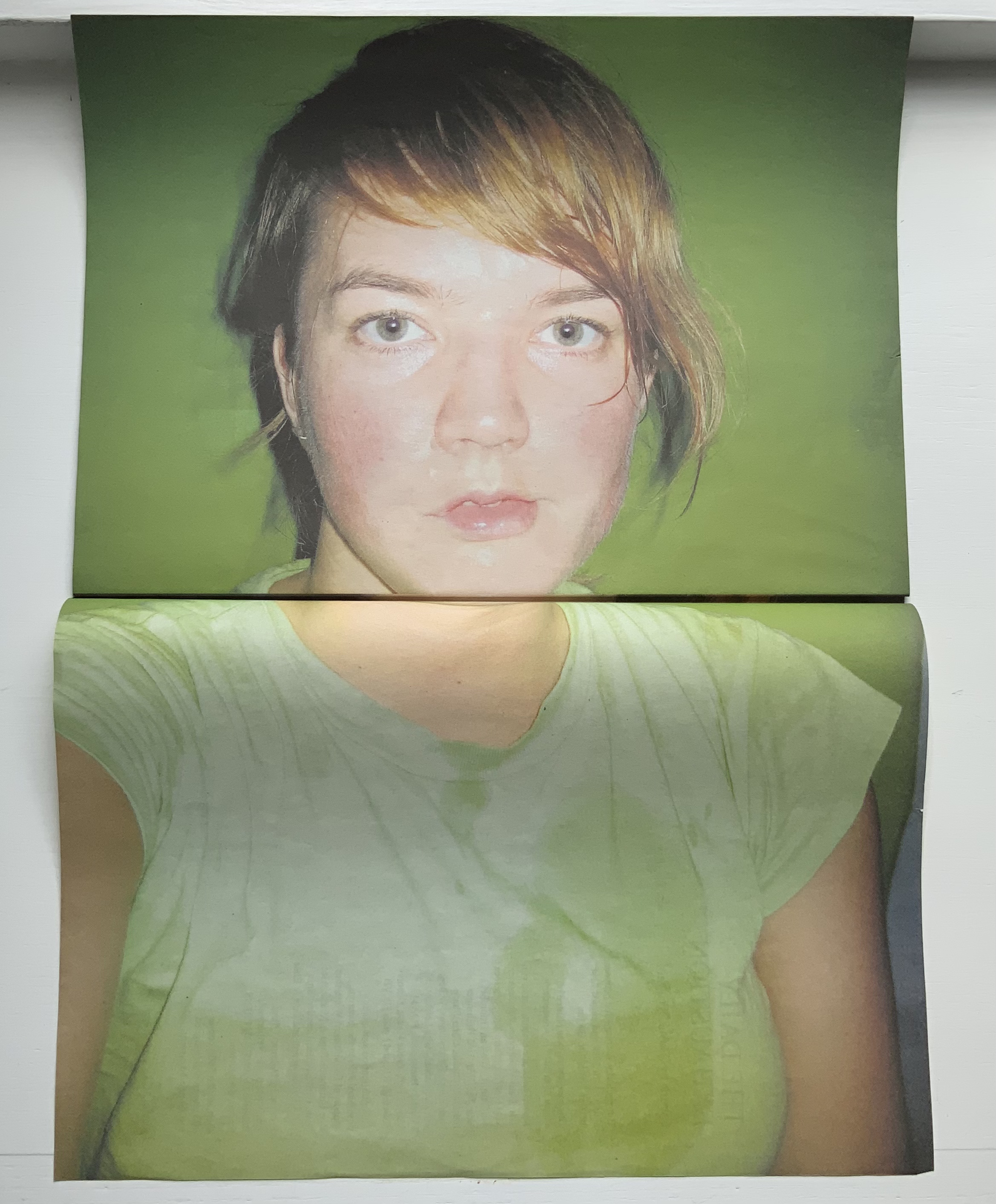
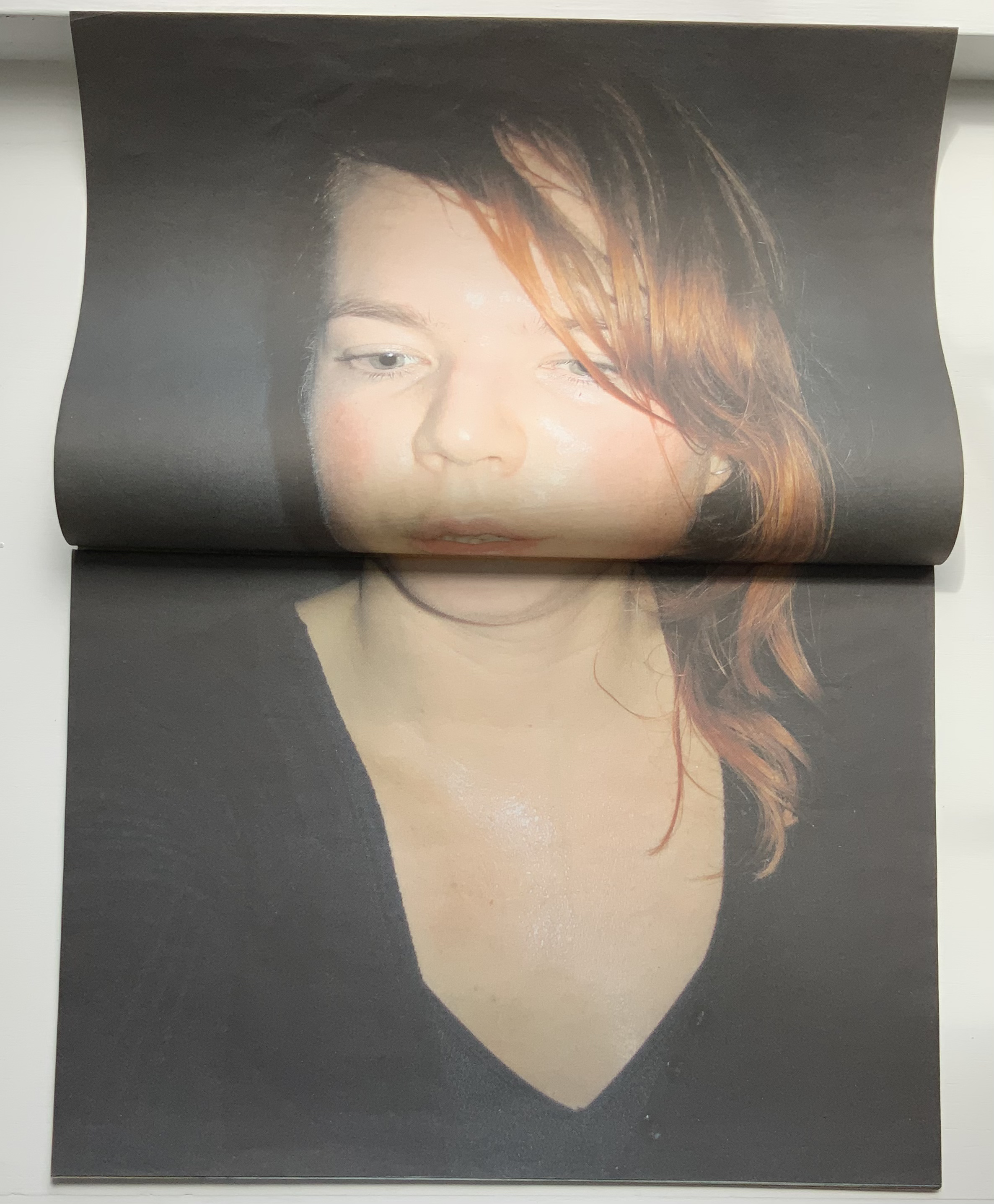
A clever contribution to the Dutch self-portrait tradition. Kruithof reworks some of these photos in AUTOMAGIC.
NYC Typext (2013)
A2 poster, bw offset print on yellow paper, folded twice to A4.
Photos of the work: Books On Books Collection. Displayed with permission of the artist.
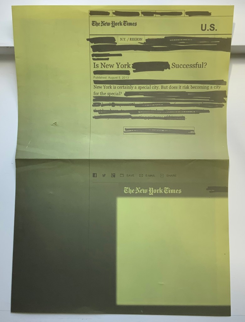
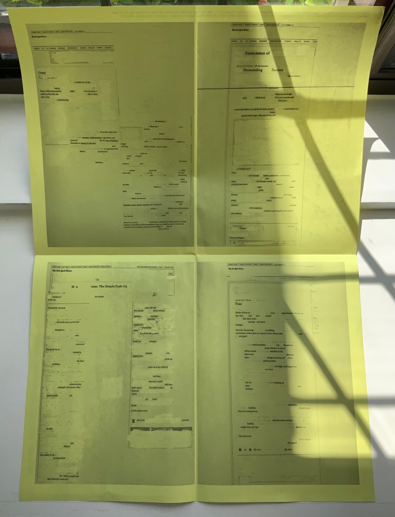
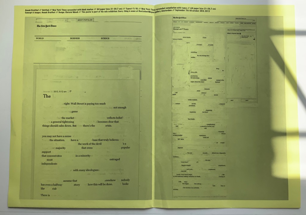
NYC Typext is associated with the solo exhibition “Every thing is wave” held in September and October 2013 at the Boetzelaer I Nispen Gallery in Amsterdam.
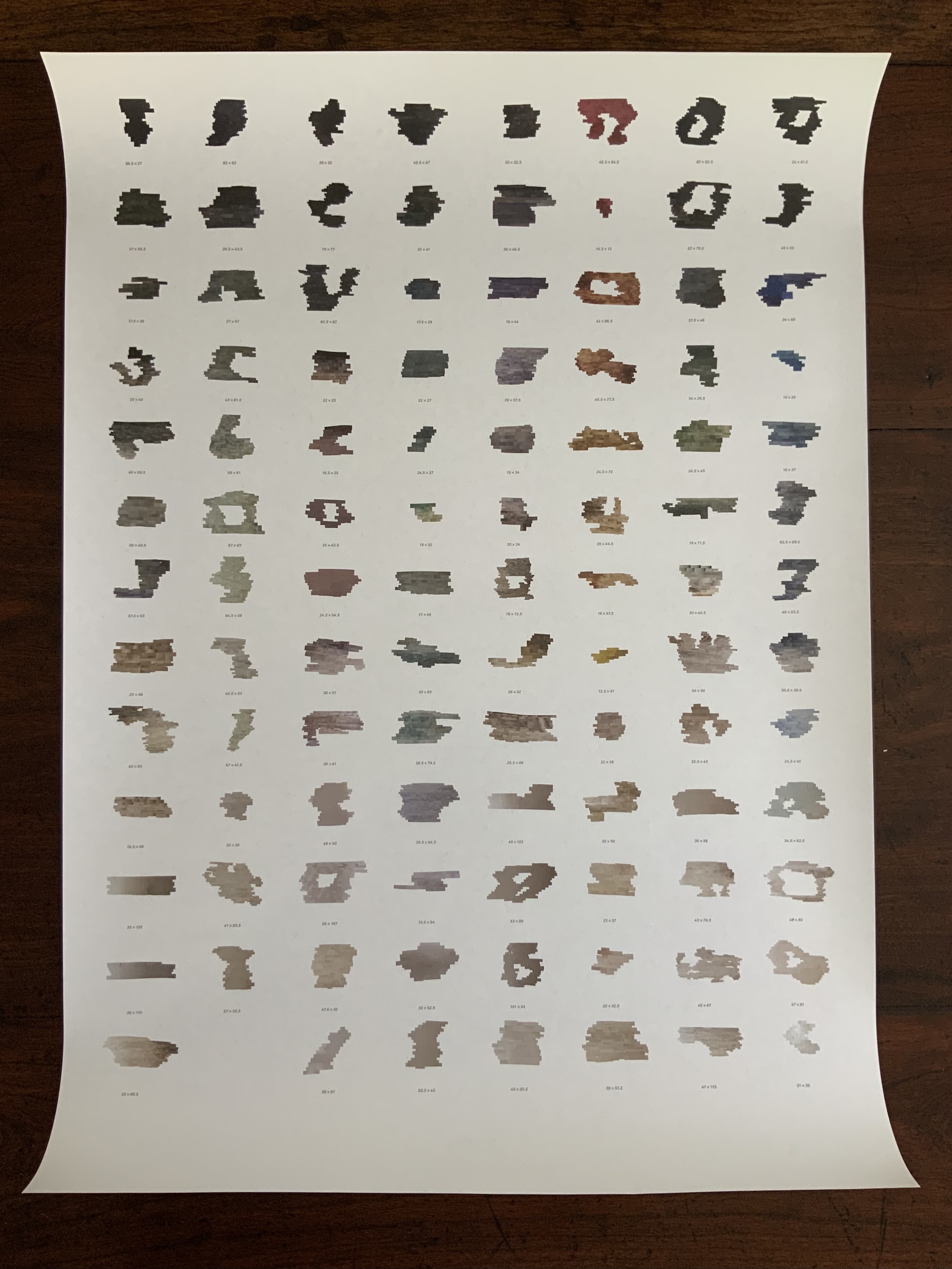
#EVIDENCE (2015)
A2 poster, full color newspaper print on recycled paper, folded twice to A4.
Photos of the work: Books On Books Collection. Displayed with permission of the artist.
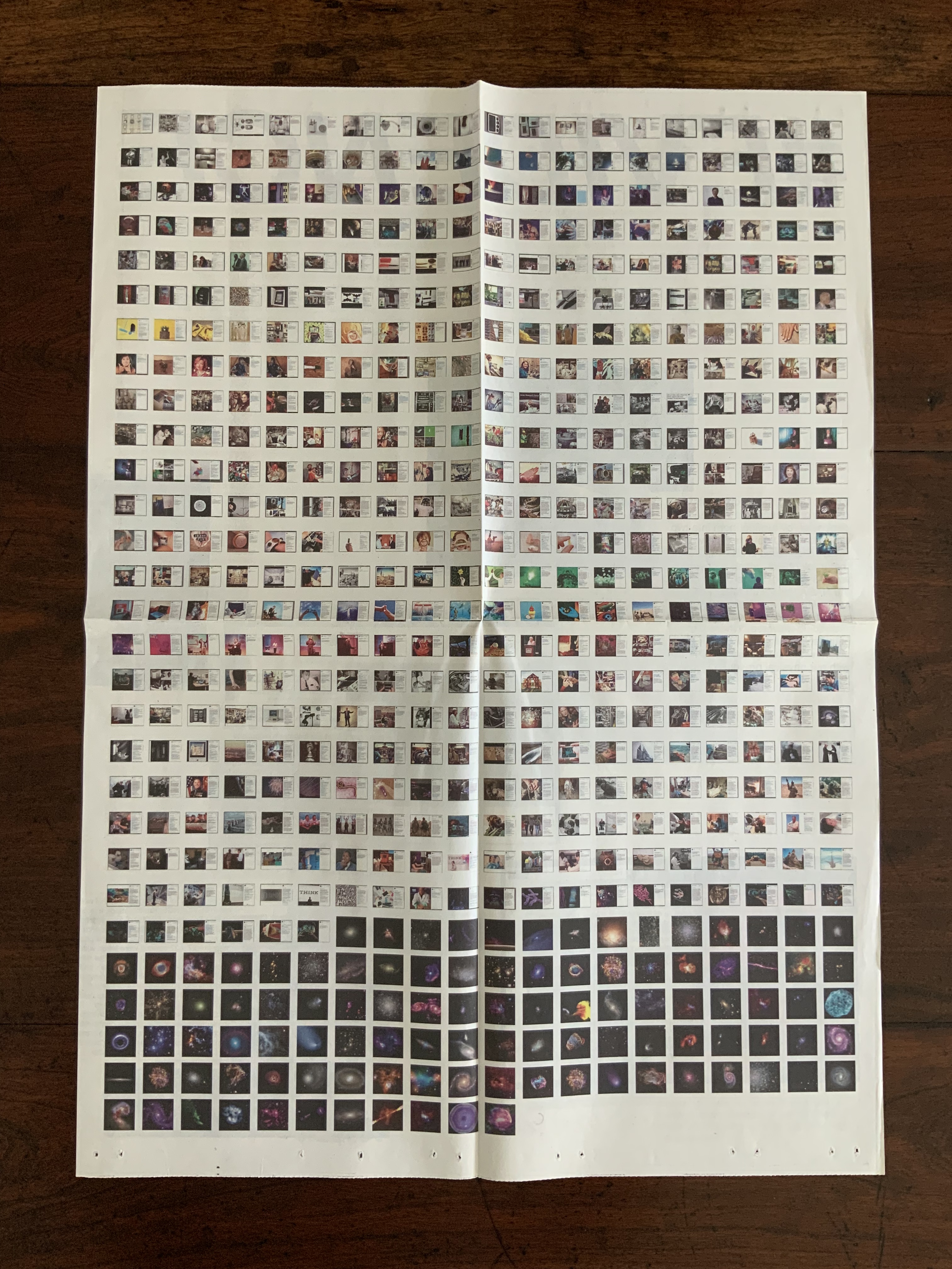
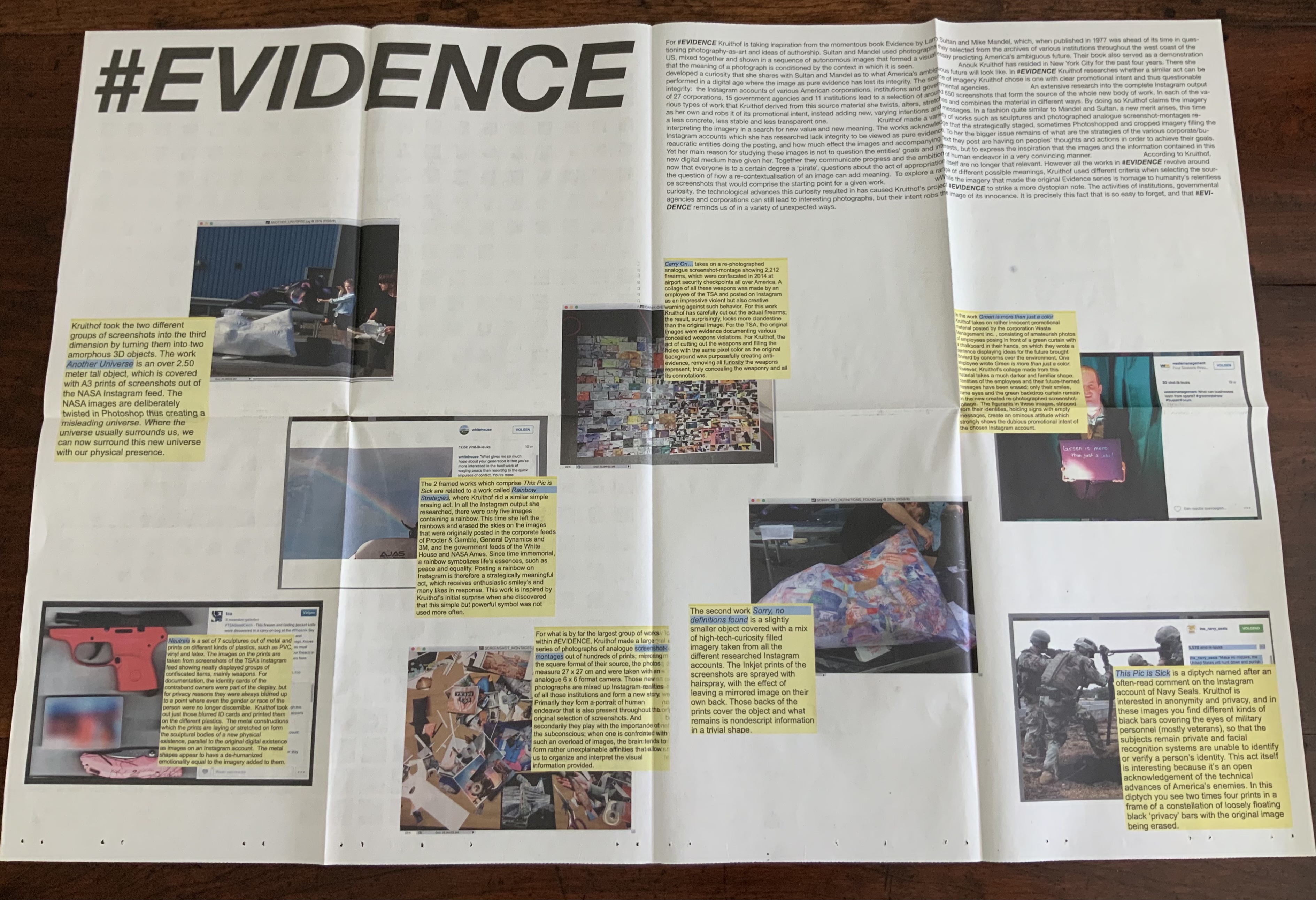
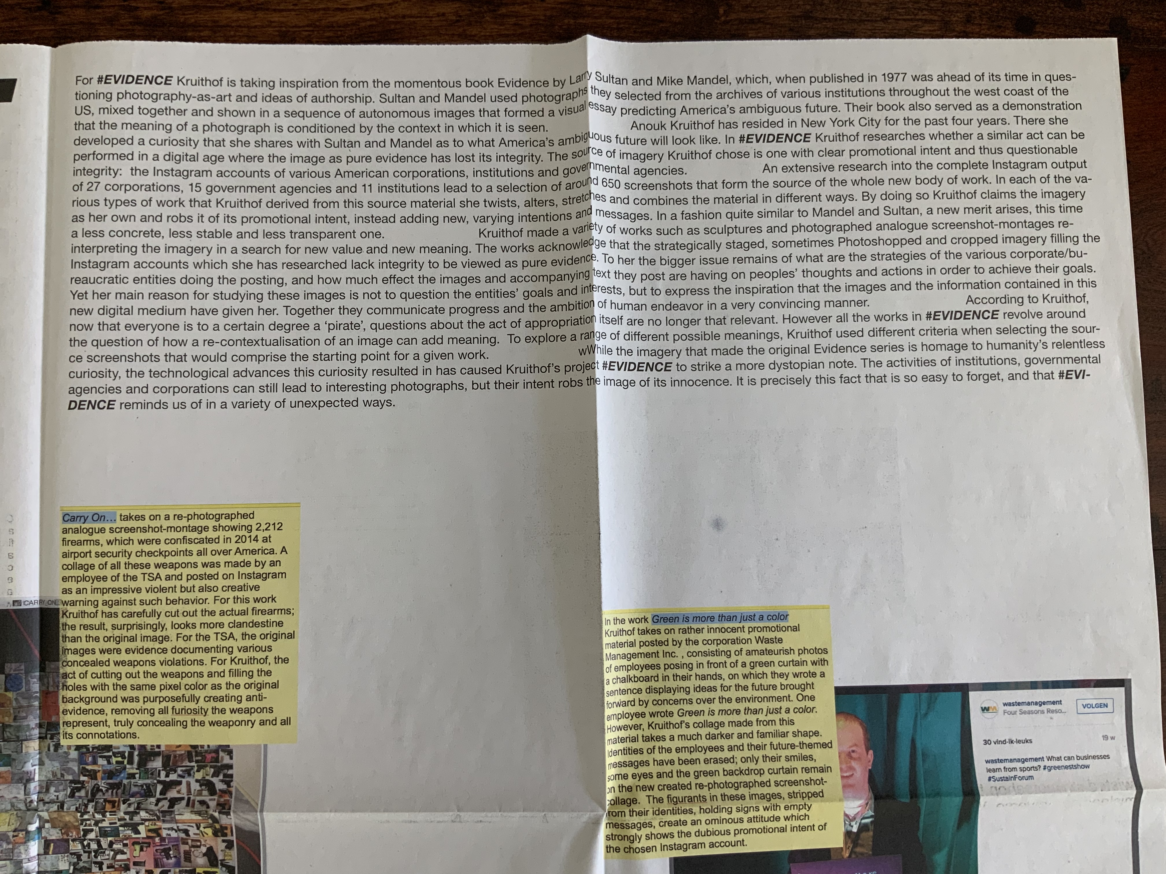
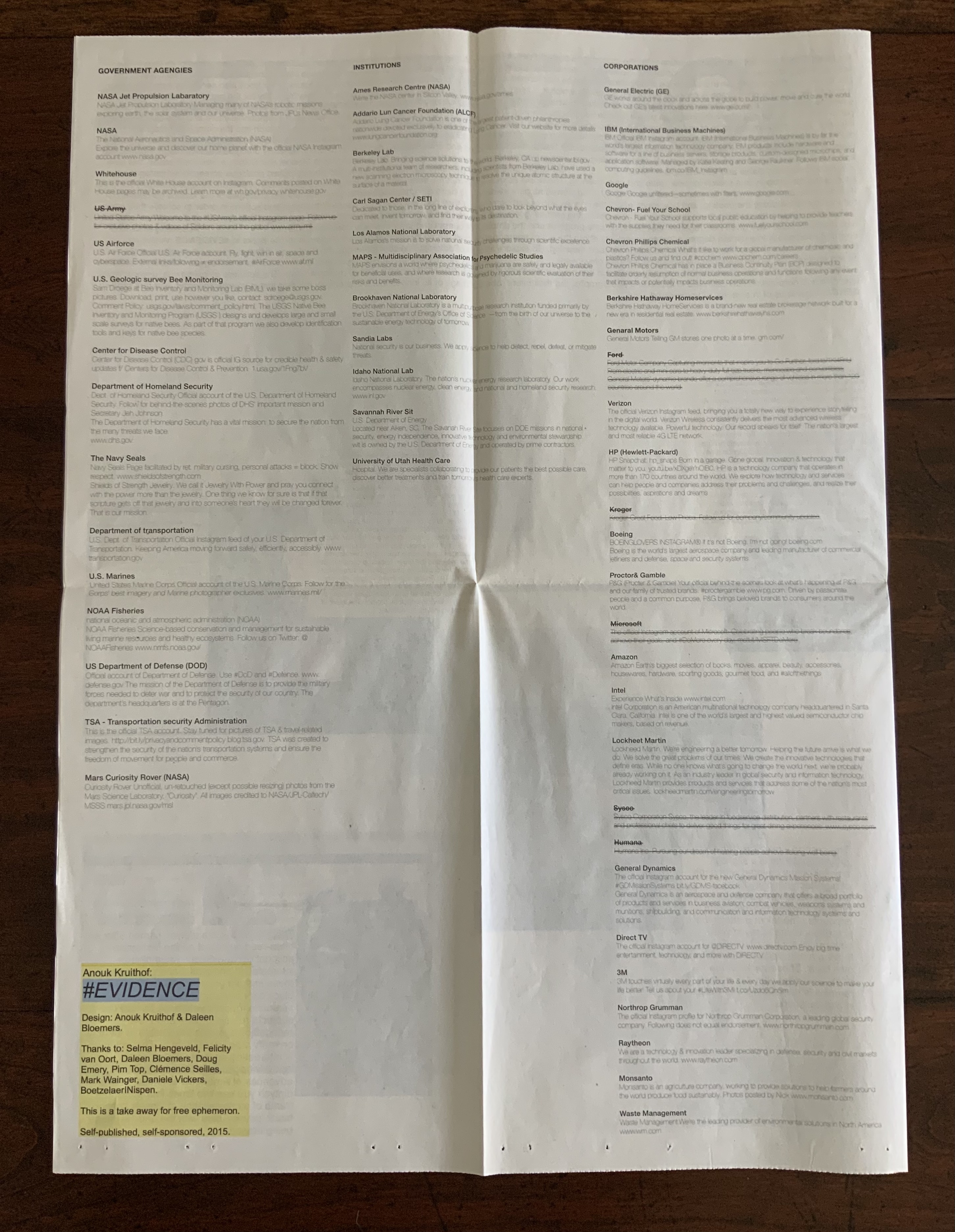
#EVIDENCE is associated with the solo exhibition of the same name held from October through November at the Boetzelaer I Nispen Gallery in Amsterdam.
Poster-Set (2008-12)
Five posters. Edition of 50. Acquired from the artist, 12 June 2021. Photos of the works: Books On Books Collection. Displayed with permission of the artist.
Fragmented Entity (2012)
Double-sided A2 associated with the solo exhibition of the same name held at the Boetzelaer I Nispen Gallery in London.
Front of poster and details from upper left and lower right.
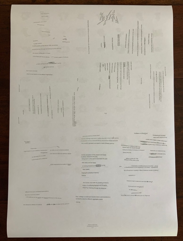
Back of poster.
Untitled (I’ve taken too many photos / I’ve never taken a photo) (2012)
Double-sided A2 poster, color, first shown at Tour le Templiers, Hyeres, France.
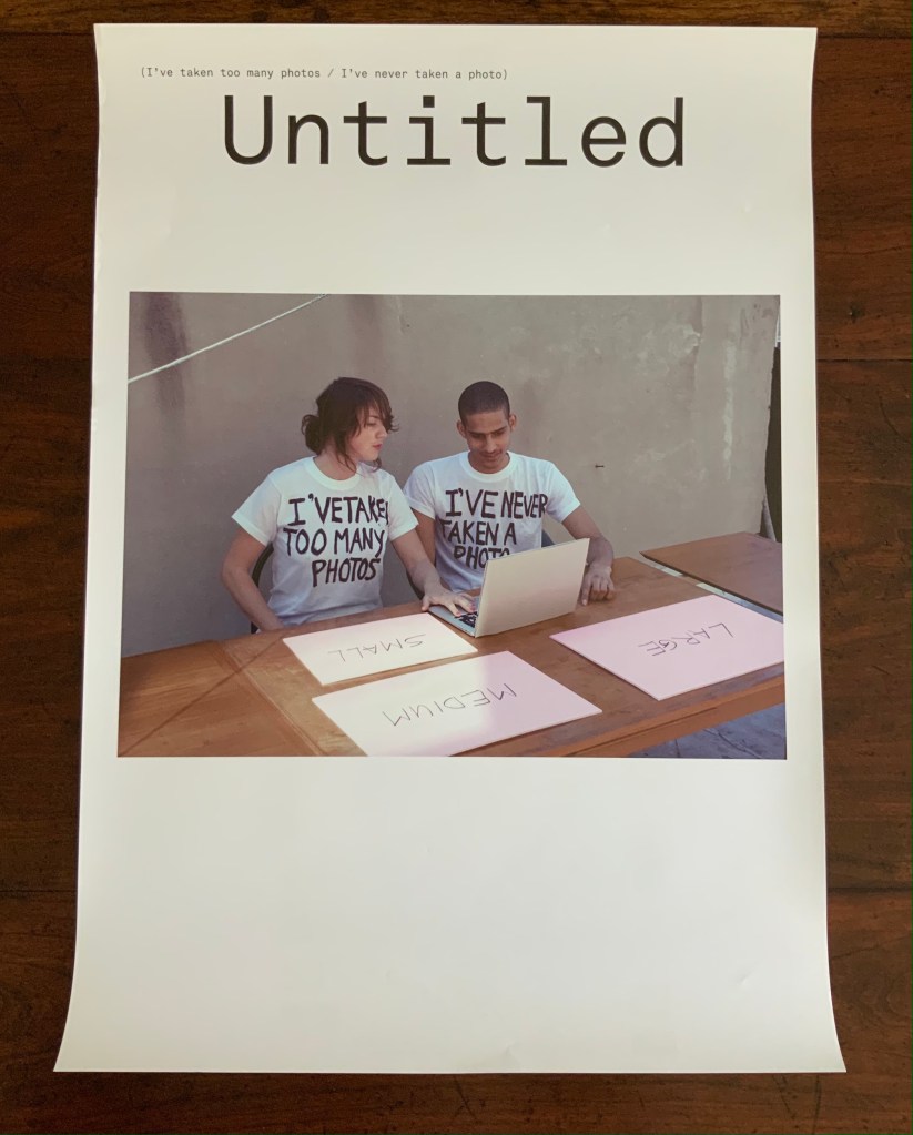
Pictured above with Kruithof is Harrison Medina, who responded to the artist’s ad that read “Did you never make a photo in your life?” Kruithof wanted to engage someone with as little experience of photography as possible to co-edit a selection of photos from her archive. The result was an installation, a book and this poster, on the back of which is printed excerpts from conversations during the editing process.
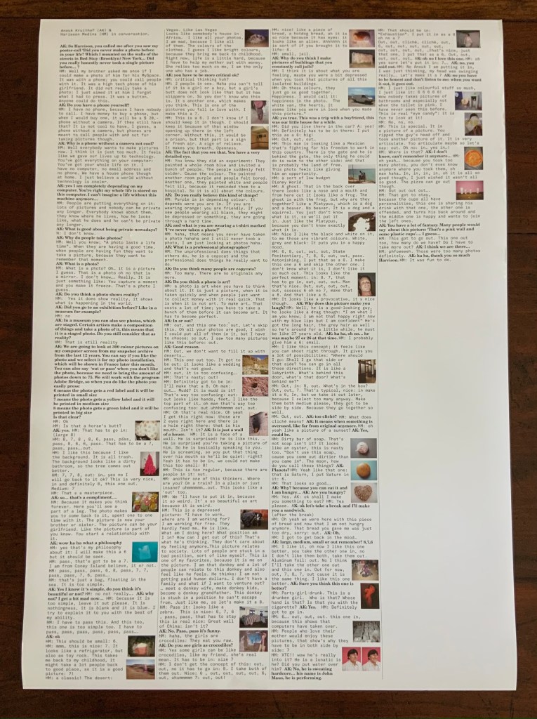
Back of poster.
Off the Wall (2011)
A3 poster associated with the publication Happy Birthday to You.
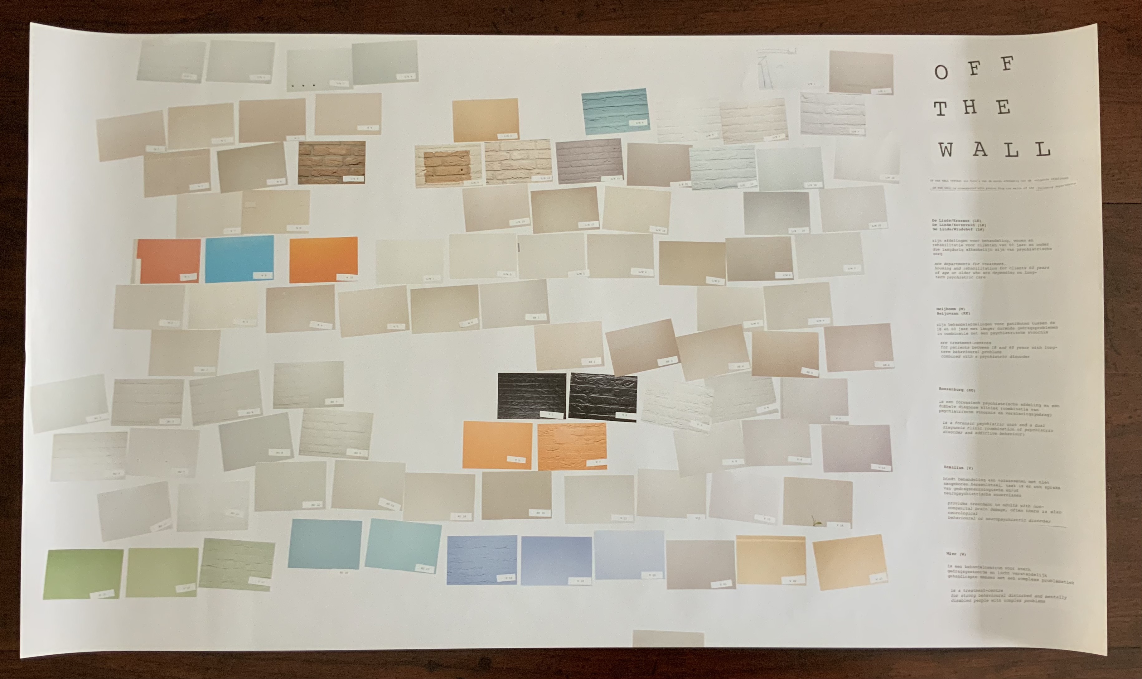
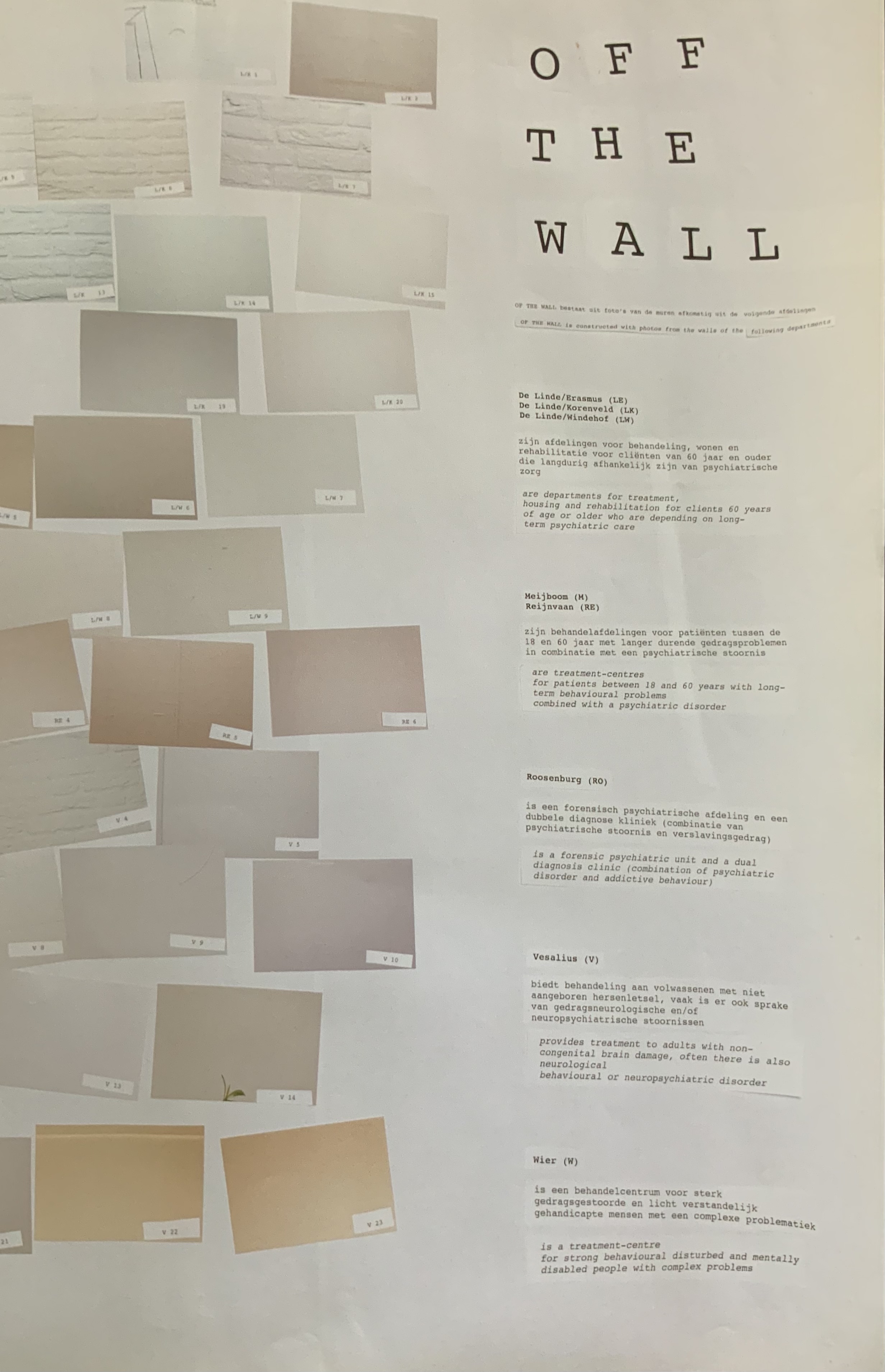
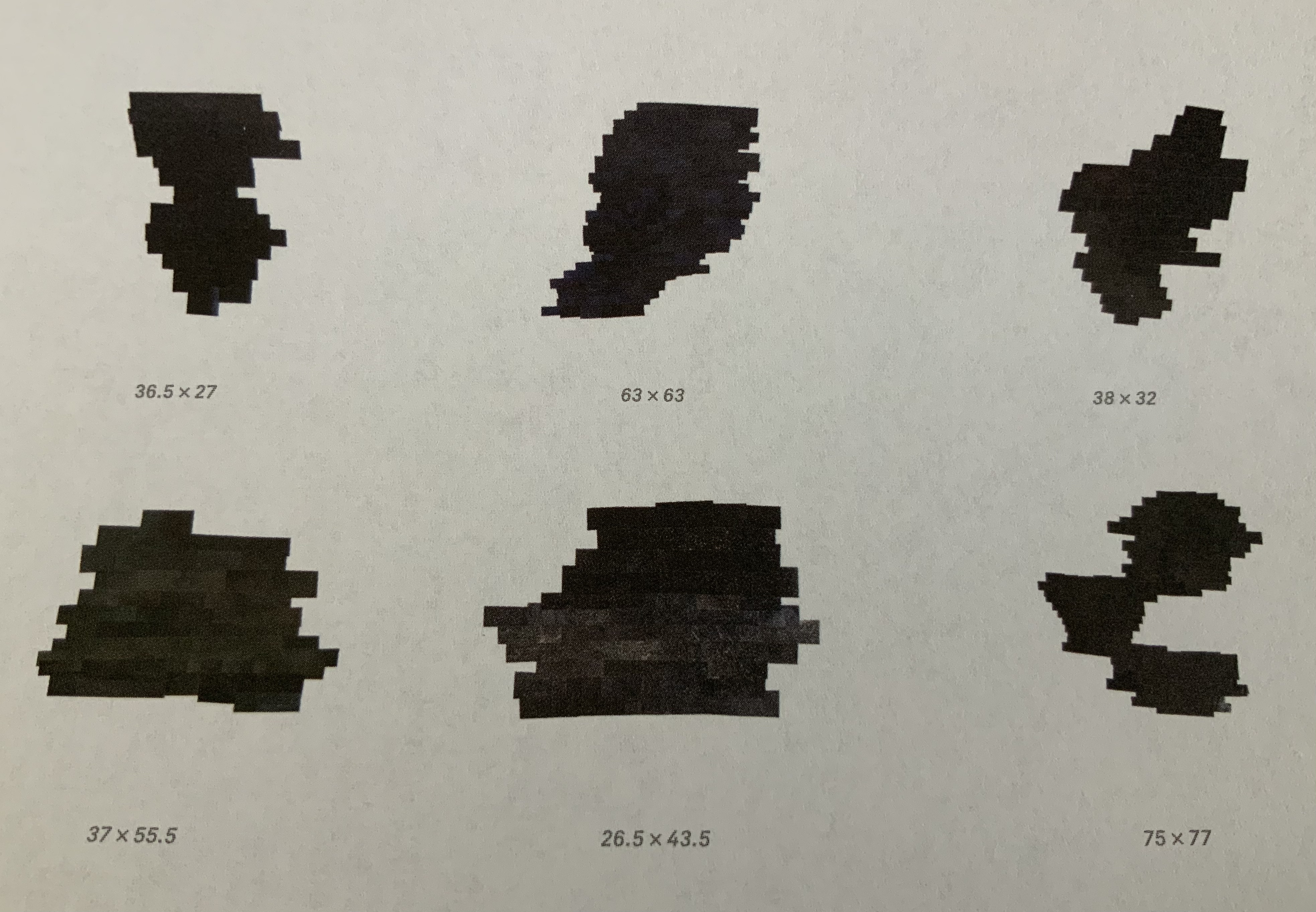
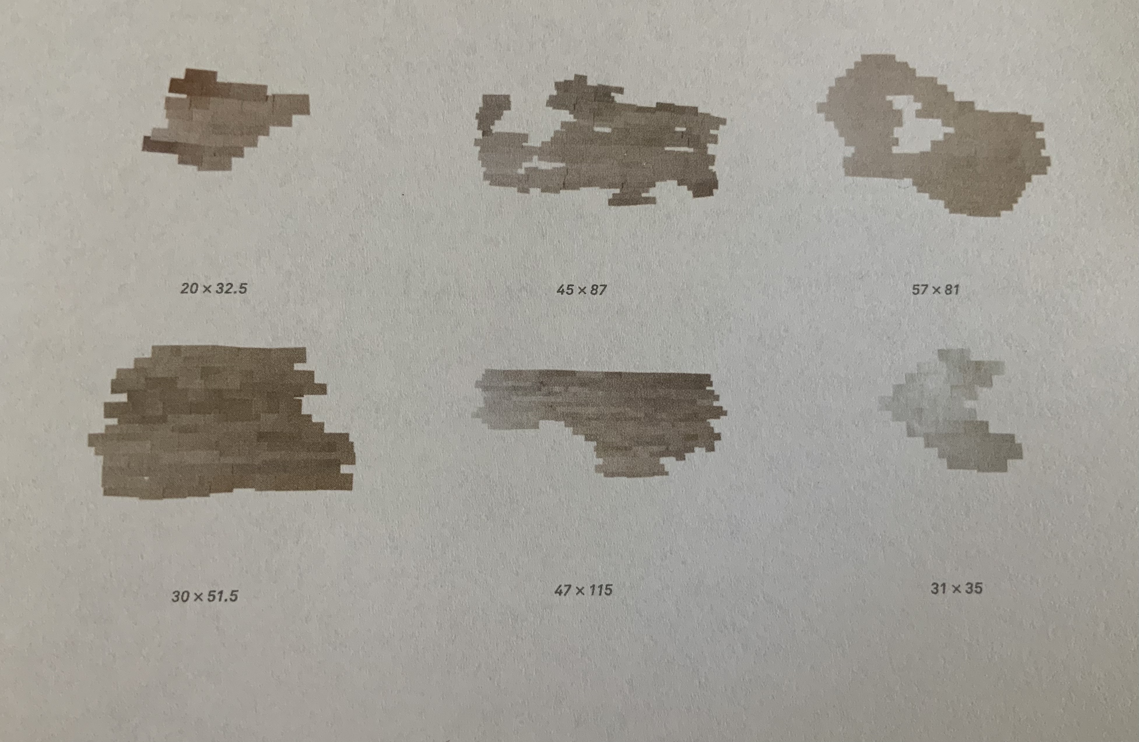
Kruithof took photos of walls in mental health institutions then reduced them to color swatches or individual bricks in an unstable wall. Two years before, she had explored another set of color-combined metaphors.
Enclosed content chatting away in the colour invisibility (2009)
One-sided A2 Poster, color, on the occasion of the solo exhibition at the Kunstlerhaus Bethanien.
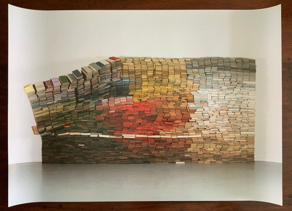
This sculpture consists of approximately 3500 used book obtained from bookshops or a recycling dump and then dyed. The constructed wall is rigged to collapse at some point during the installation, which has taken place in several venues.
Anonymous Poster (2008)
500 x 500 mm.
Photos of the work: Books On Books Collection. Displayed with permission of the artist.
This photo montage reflects Kruithof’s early mastery of this element in the language of photography. As can be seen from Universal Tongue, AUTOMAGIC and Pixel Stress in particular, her working of this language, her engagement with friends and strangers, her crossing of borders in geography, media and format, and her fusion of all that into book art are what make her work distinctive.
Further Reading (and Viewing)
“Large-Scale Book Art Installations (updated 20180307)”. 27 July 2017. Bookmarking Book Art.
“Large-Scale Installations (updated 20190909)”. 21 April 2015. Bookmarking Book Art.
Videos
¡Aguas! (FOAM, 2017-18)
Subconscious Traveling (MoMA, 2016)
Artober (Stedelijk Museum Amsterdam, 2015)
Lecture (California College of the Arts, 2014)
Charlotte Köhler Prijs (Prins Bernhard Cultuurfonds, 2014)
Ruhe Performance (Autocenter Berlin, 2012)
Enclosed Content Chatting Away in Colour Invisibility (Kruithof, 2010)