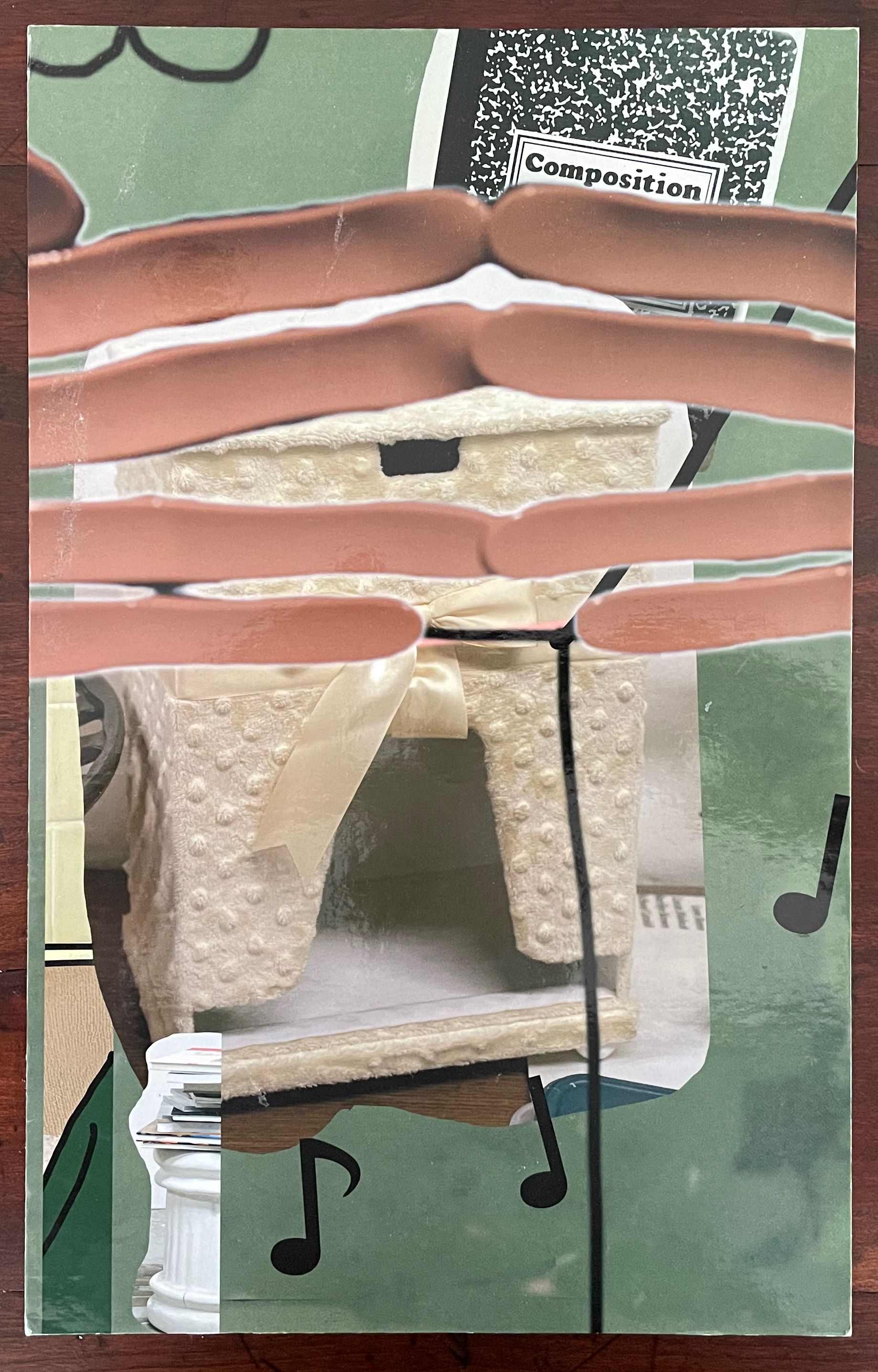
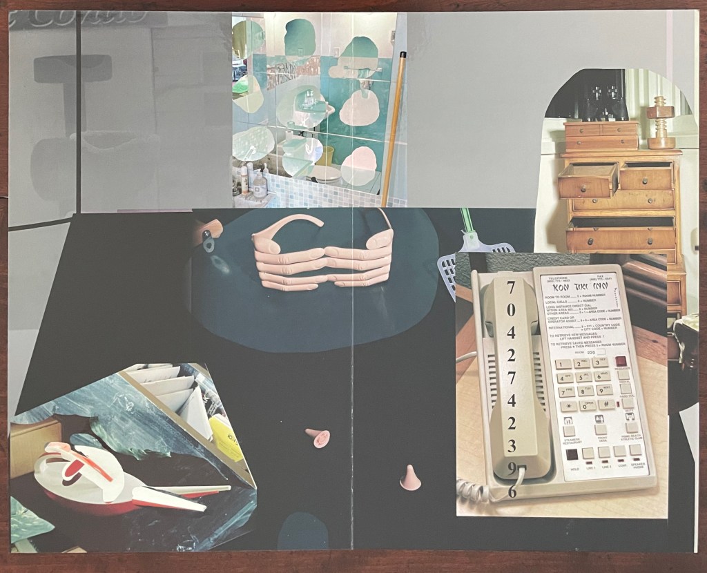
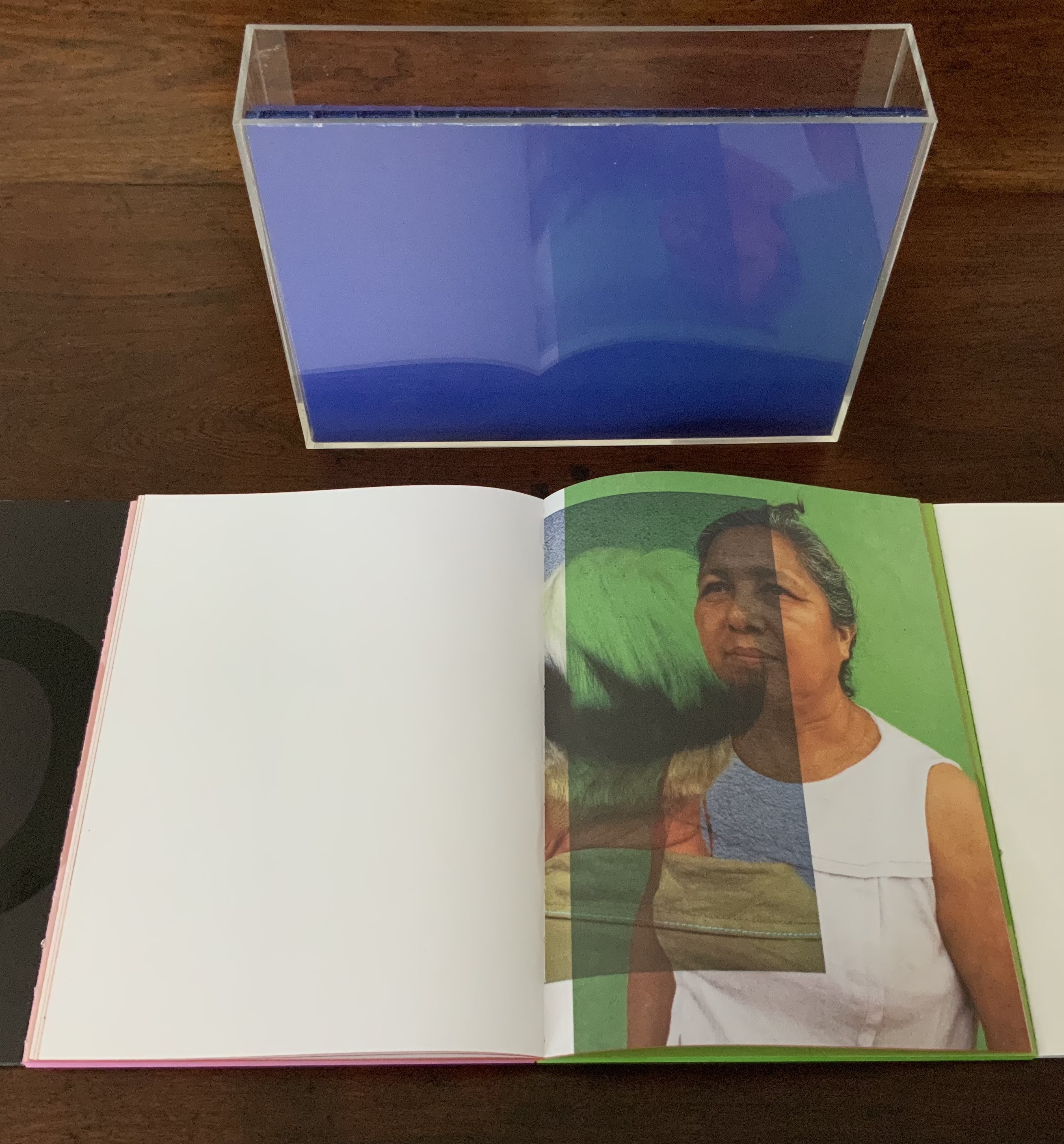
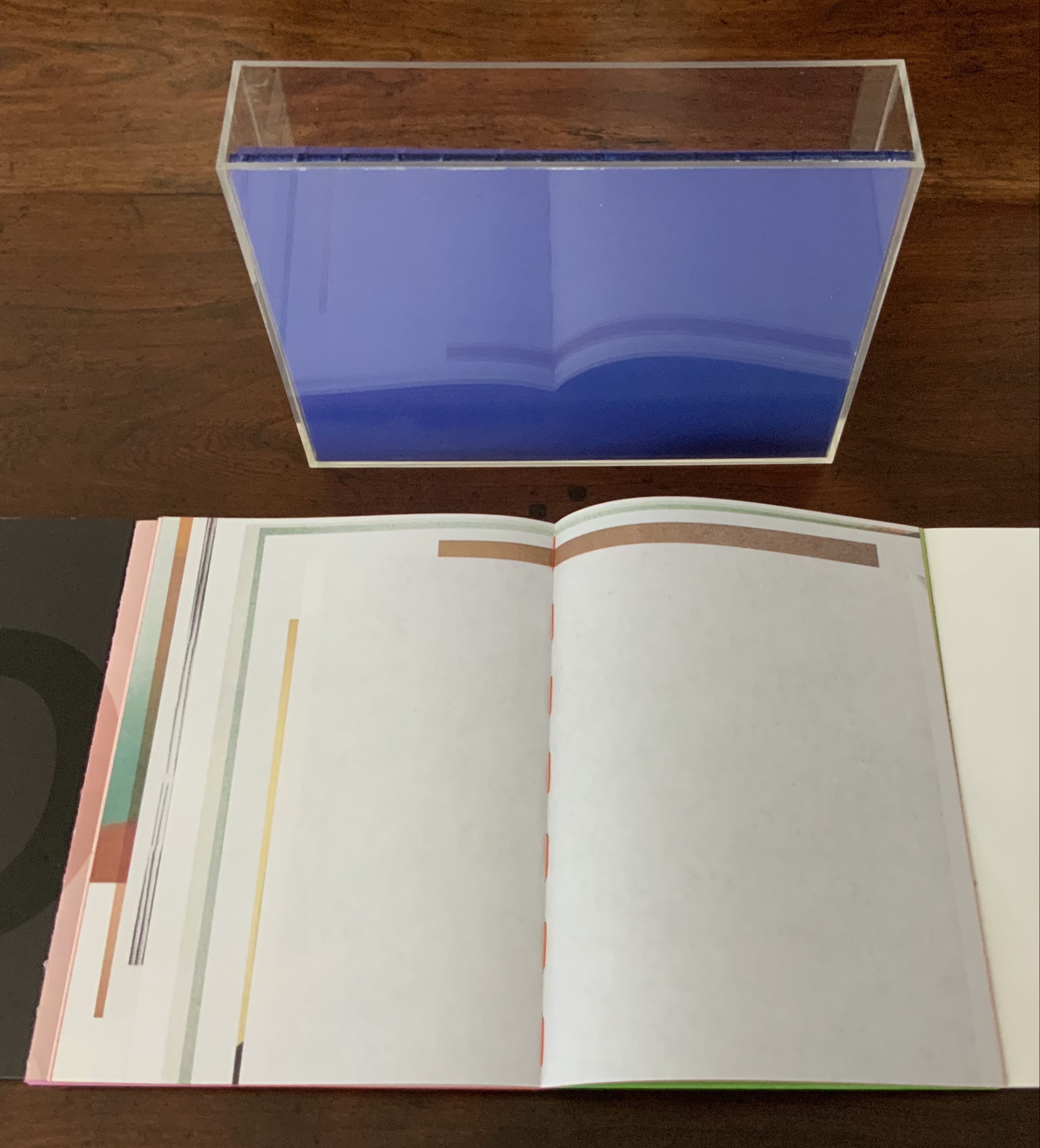
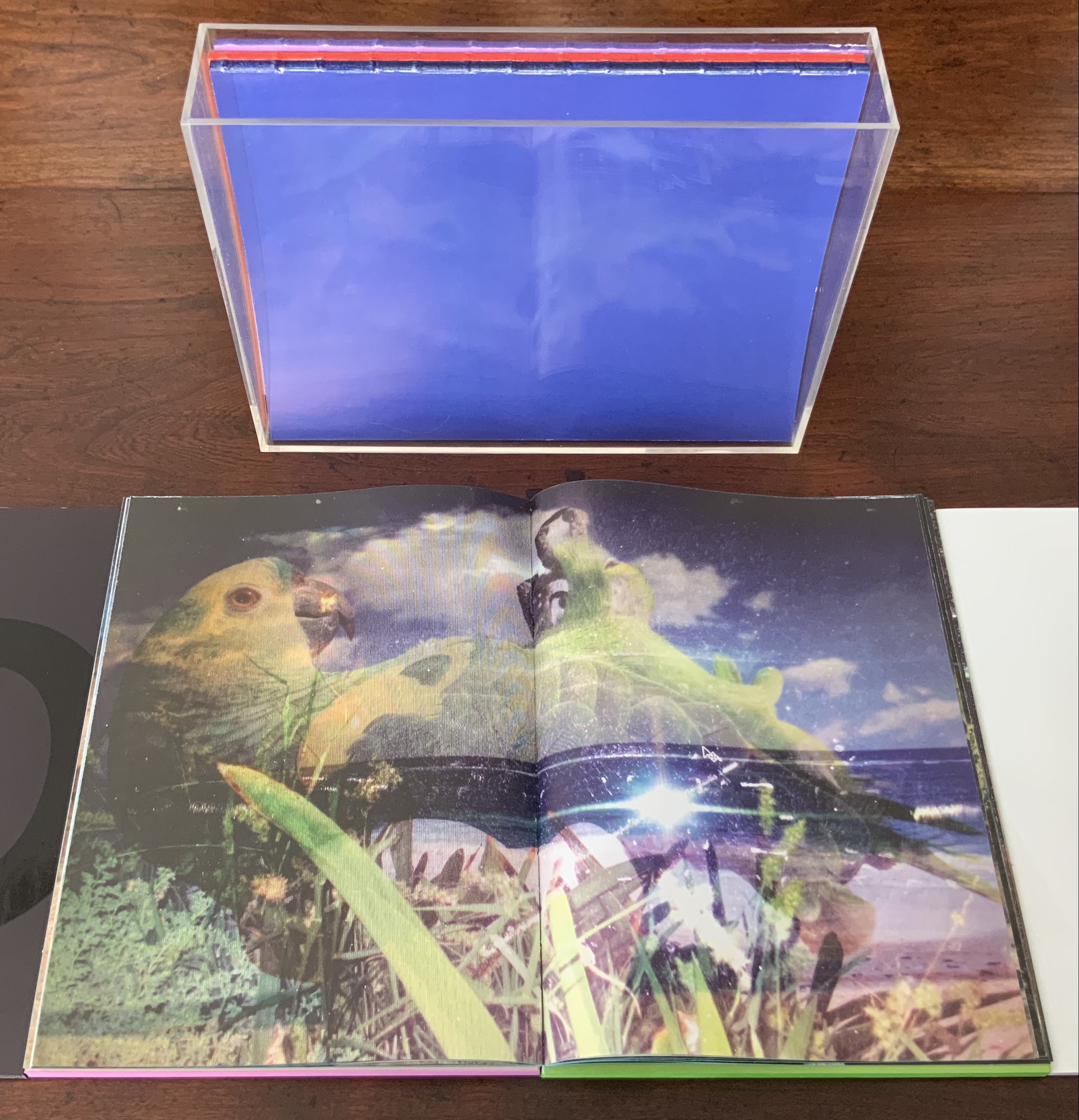
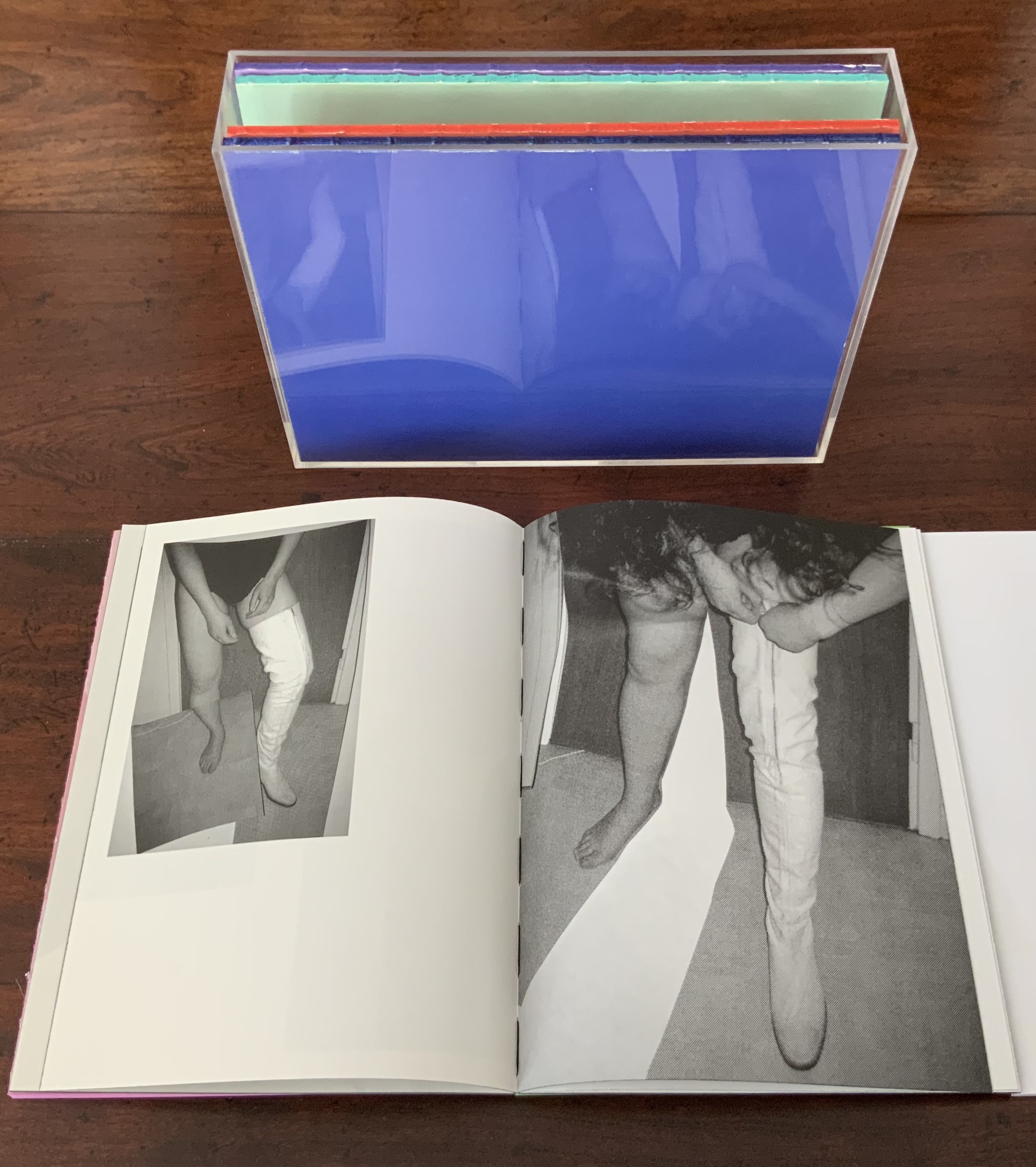
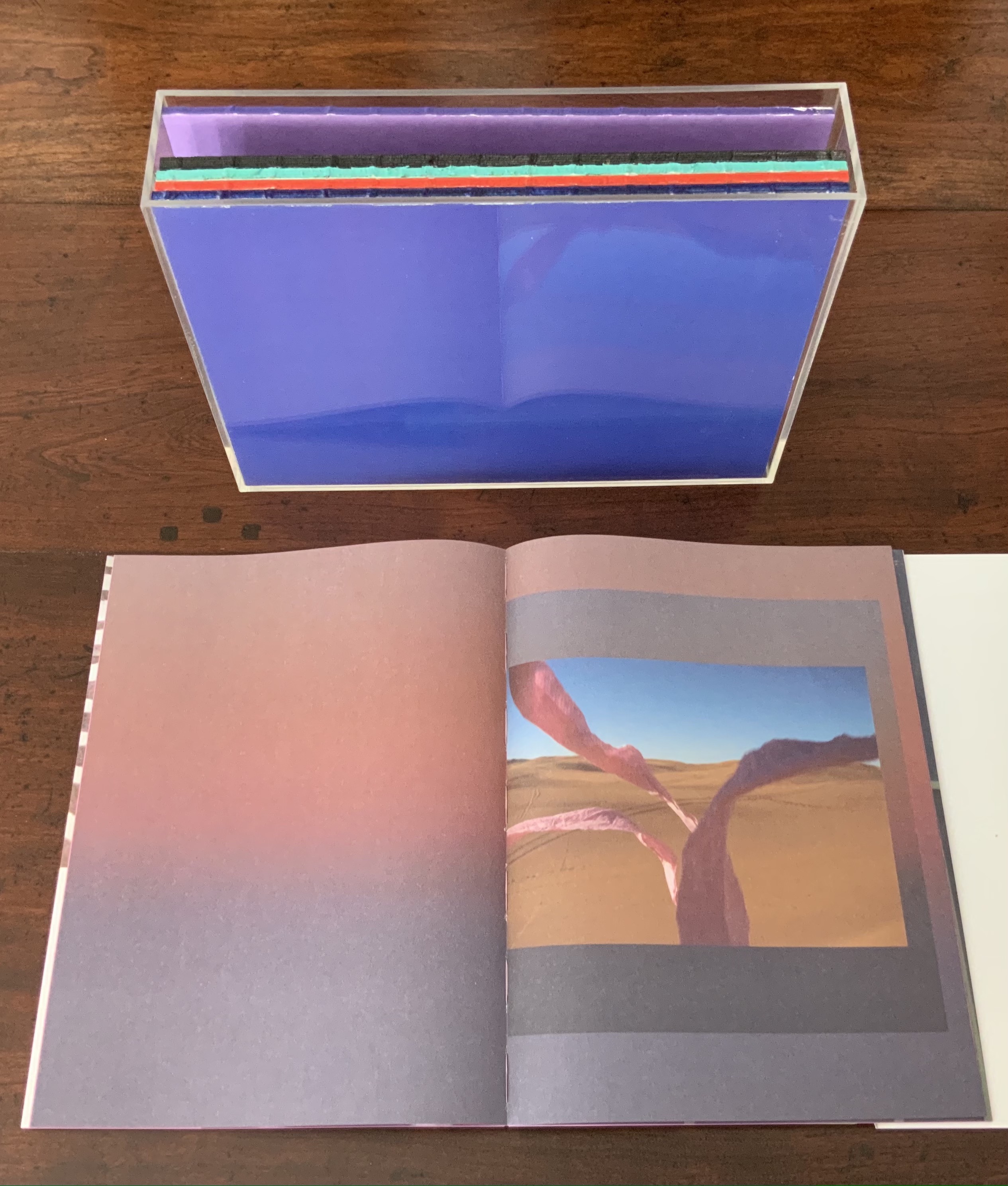
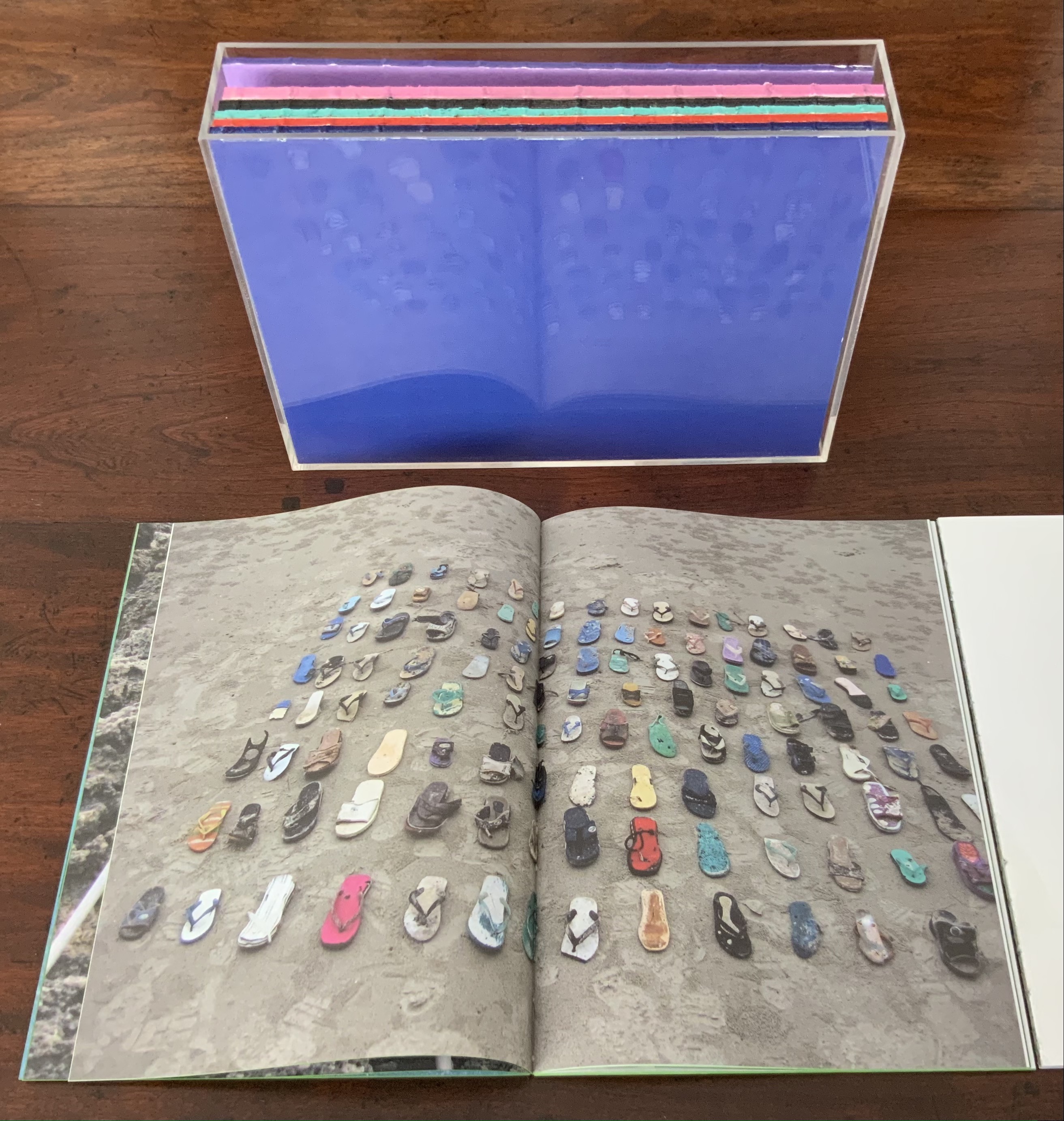
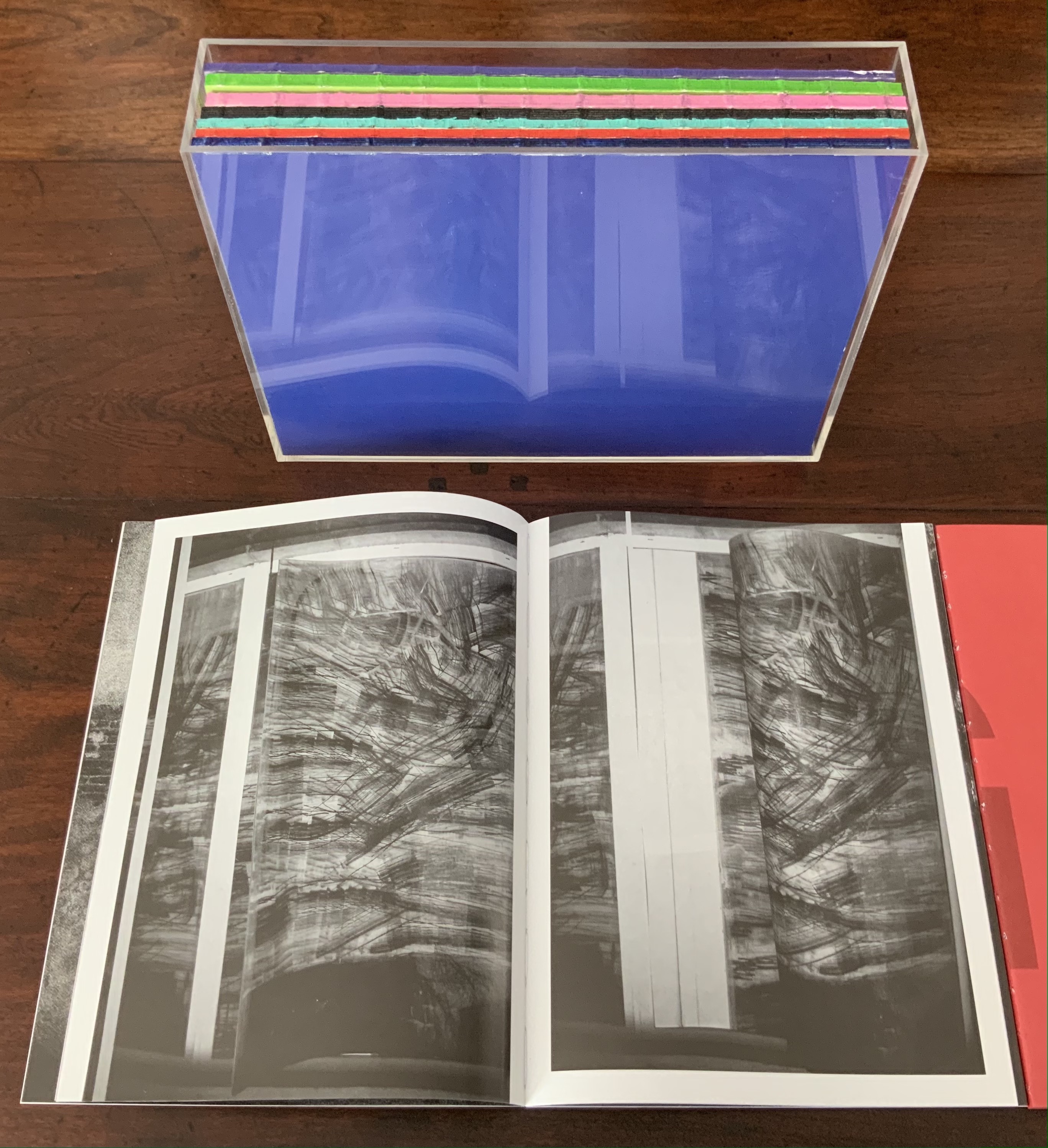
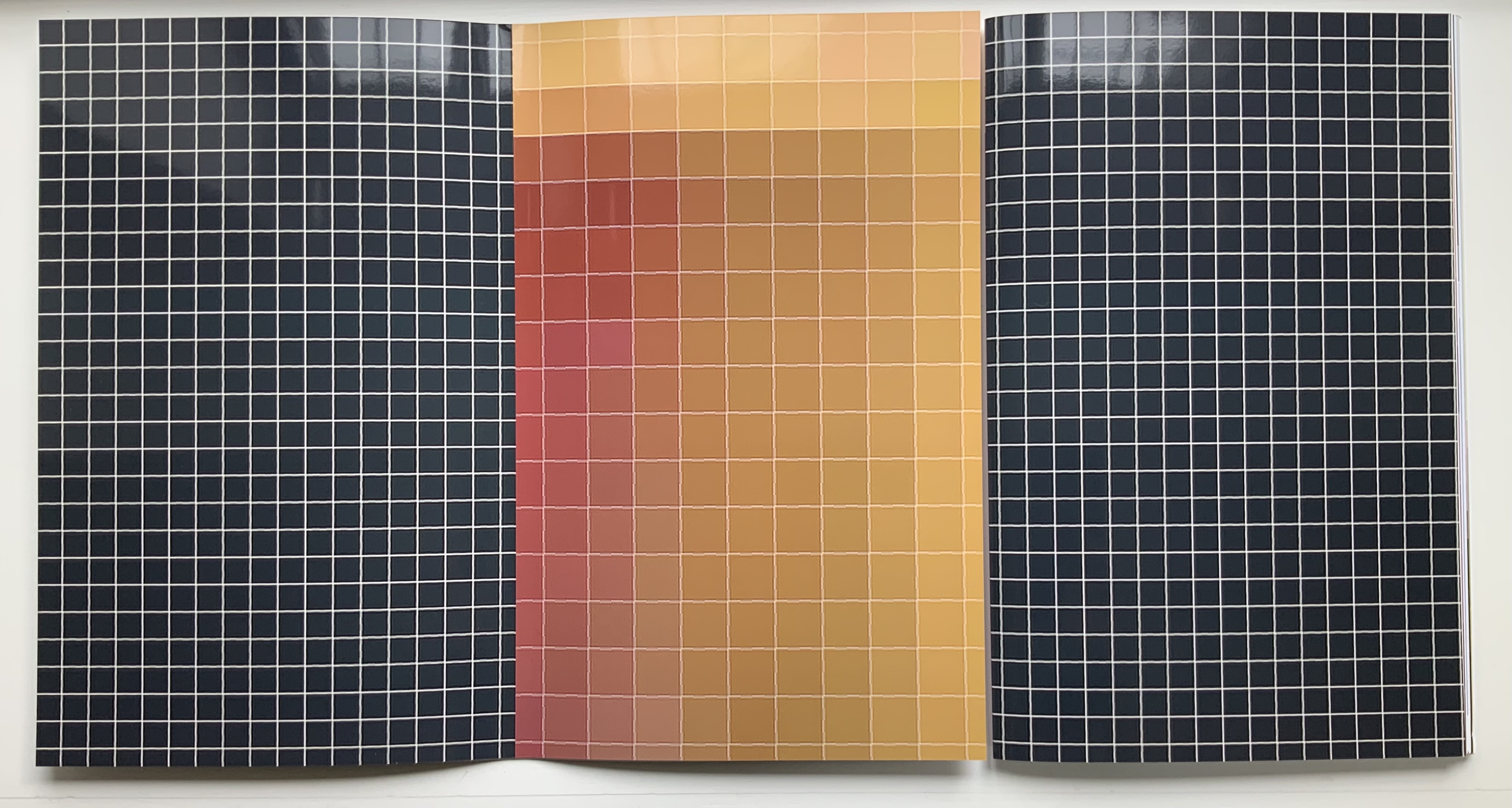
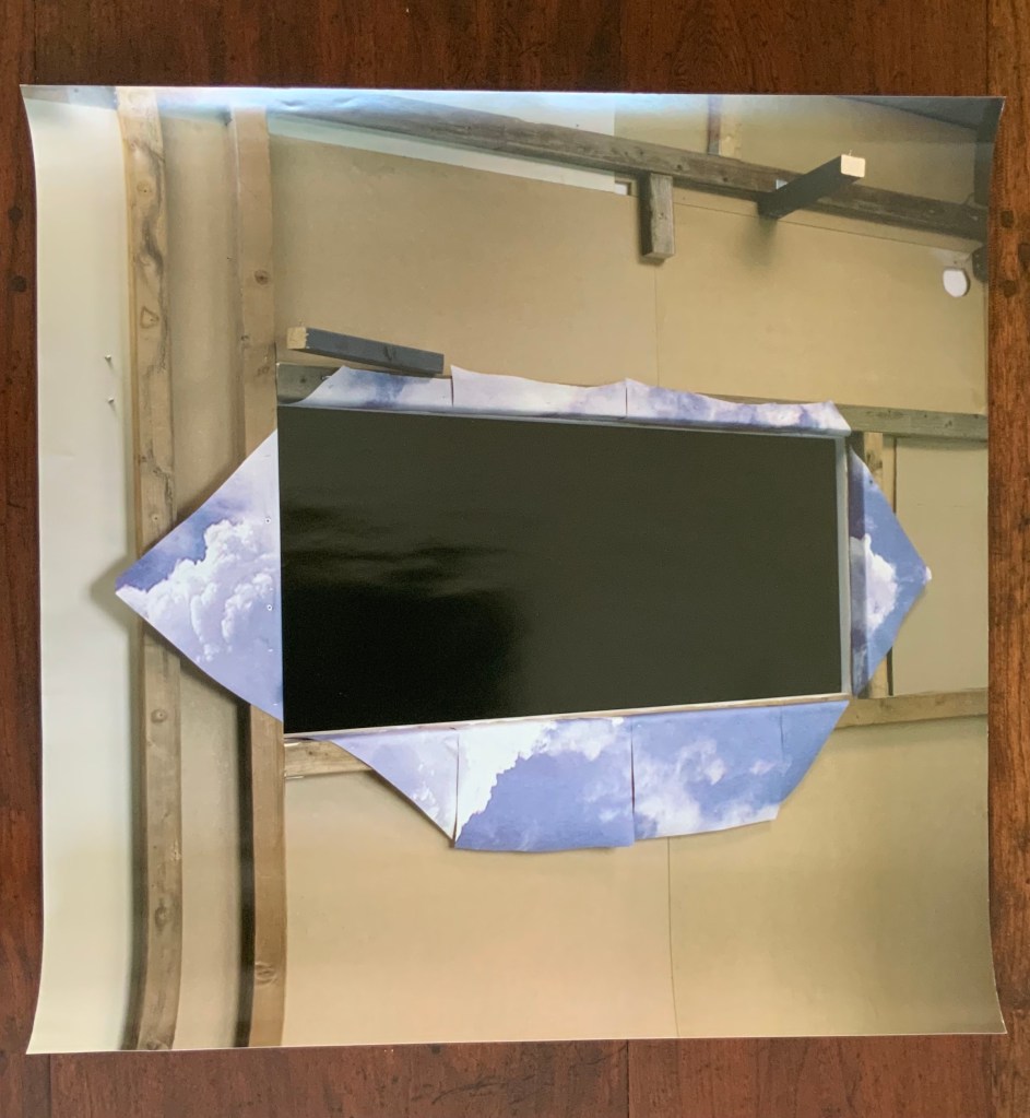
Making Memeries (2016) Lucas Blalock Board book consisting of nine 3mm thick card leaves with 8 double-page large colour photos, all of which interact with a down-loadable app. H330 x W210 x D28 mm. [18] pages. Edition of 500. Acquired from David Bunnett Books, 31 July 2023. Photos of the work: Books On Books Collection.
How do we respond to an artwork of collage or assemblage that is missing a piece — assuming that we can tell ? And if all of the elements are ephemera, does it matter to our appreciation of it? Do we keep returning in annoyance to the gap — like a tongue to a missing tooth? Do we give up on it — like the purchaser of a secondhand jigsaw puzzle missing a piece or two? Or do we sigh and suppose appreciatively that the disappearance of an element of ephemera from a collage or assemblage of ephemera proves the artwork’s point?
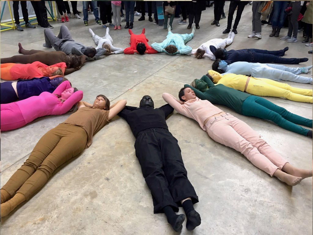
Lucas Blalock is an artist of augmented realities. With the right device and app pointed at his artwork, we should be able to see images floating and moving over its surface or seemingly in the surface among its images or transforming them. According to the back cover, we can download this app from the iTunes App Store to interact with the book’s images. The app, however, was removed from the App Store in July 2023. Using the WayBack Machine, we can find the publisher’s announcement of the Making Memeries installation with Blalock in the Tate Modern’s Turbine Hall:
The London-based curatorial project Self Publish, Be Happy presents a programme of events that explore the blurring boundaries surrounding on/offline existence and distribution of photographs. The event, titled Making Memeries, will take place at Tate Modern during this year’s Offprint London art book fair from 20-22 May.
Artist Lucas Blalock has created an installation for the middle of the Tate Modern’s Turbine Hall that functions as a staging area for workshops and performances. The installation consists of a set of eight movable panels that display a new suite of photographs by Blalock. The elements of the installation, conceived of specifically for this project, can be further activated via this app, Making Memeries.
The audience will be able to immerse themselves in, and interact with the work through the app, which uses your camera to produce a digitally augmented reality. Blalock’s work has long been interested in the cohabitation of the worldly and the virtual behind the photographic surface, and this project has allowed the artist to picture this cohabitation on both sides of that plane. Blalock has collaborated with REIFY, the augmented reality (AR) creative studio, to build an experience that blurs traditional boundaries and challenges one’s expectations of viewership.
Photos from old website of Self Publish, Be Happy. Accessed 26 October 2025.
Among the performances facilitated by the installation was Anouk Kruithof’s Connection, which also contributed to the aim of blurring the boundaries of the physical and digital.
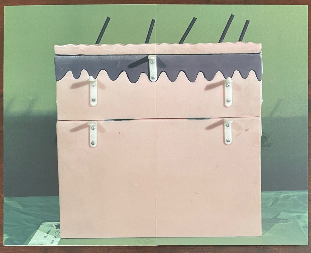
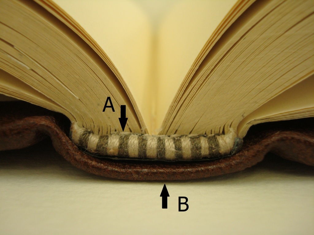
But without the app or memory of the installation, we have a gap like that missing tooth. We can bridge the gap somewhat with online links and the book’s collaged imagery of mixed media and photographs to recognize that Making Memeries is also about how we perceive surfaces and what lies beneath — and what might come between. Consider the earplugs alongside the telephone below. Then there’s the pair of spectacles in the shape of fingers that would cover the wearer’s eyes. Now look back to the cover, and we find the view from behind those finger-spectacles.
Photo of the work: Books On Books Collection.
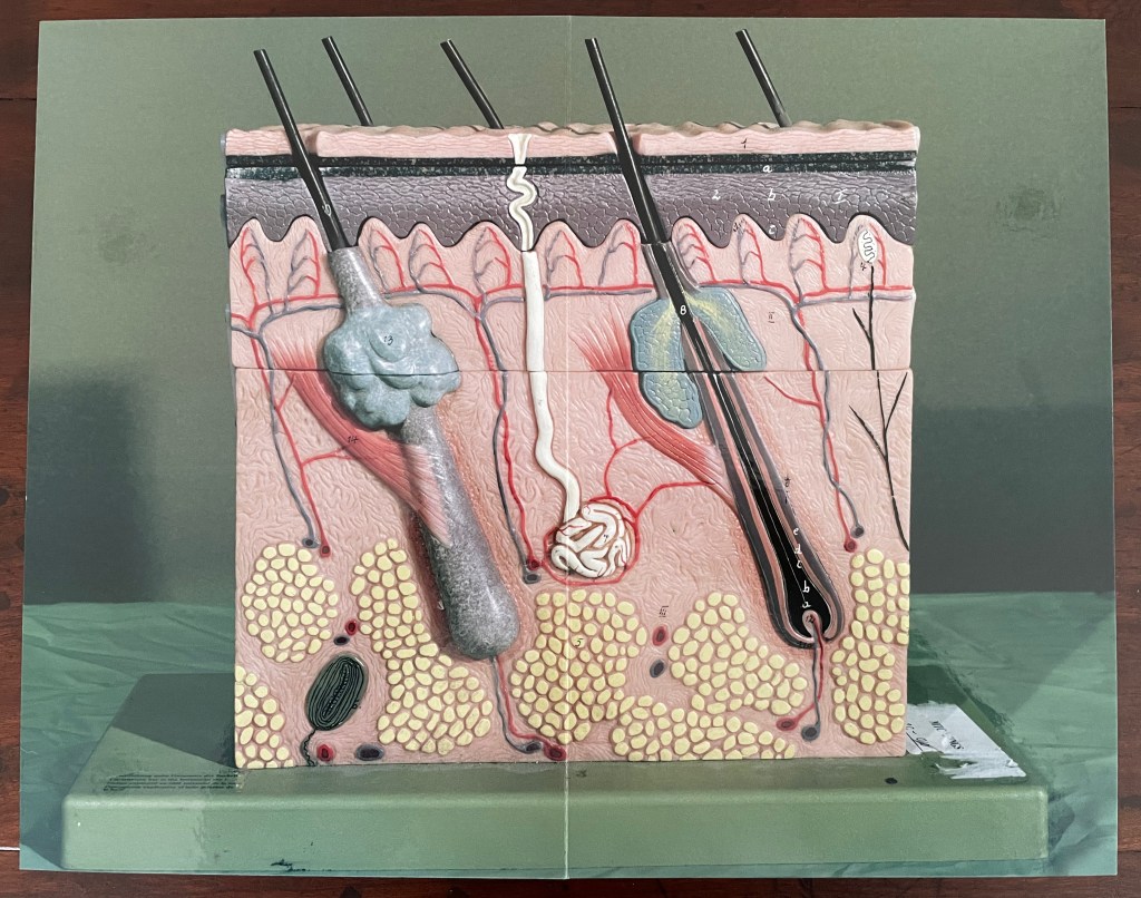
Or consider the images of the model of the epidermis with which the book opens and closes. ortunately, we have a YouTube link and Olga Yatskevich’s review to let us know that the “augmented reality radically changes the experience, making the image active rather than static – the app brings rounded depth to the model, shows blood running through the vessels, and allows us to explore the space around the object, its sides and the top”.
First and last double-page spreads. Photos: Books On Books Collection.
There’s something childlike, playful but serious conveyed in all this. Physically Making Memeries presents itself as an oversized children’s board book (or perhaps a board book for undersized adults). The use of the board book to make this cross-over can also be found in other artists’ books — Colleen (Ellis) Comerford’s ABCing and Phil Zimmermann’s Sonorensis, for example.
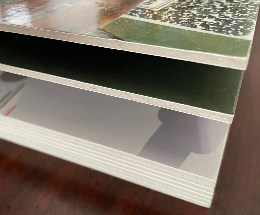
Fore edge of Making Memeries.
What the board book only partially conveys with the Connection link in hand, so to speak, is the intent expressed on the back cover and in the Tate’s announcement:
Making Memeries is set in a time when everyone has become a lifestyle photographer. It is still your life but the image production is decidedly public; and in that case temporary, verging on fleeting, because these public channels have so many content providers and, along with our attention spans, are in a perpetual state of refresh. [back cover]
Before the advent of the Internet the act of taking a photo was often intended to make memories; to store and preserve our past in still, printed images. In today’s digital age the act of taking photos can be enough for the photograph-taker. The act is exhausted by the process. This can be seen in the way a mobile phone camera offers immediate satisfaction — producing a file that may never be looked at again. Today a photo has a different claim to time, being much more in the “now” than in the “this has been” of its 19th and 20th century pre-internet forbearers. We, in turn, live in a culture of the perpetual present, in a meme-driven world where photos can effortlessly be shared, but where they most often disappear into digital oblivion. [Tate Modern announcement]
It feels ironic that Making Memeries‘s “missing tooth” is digital. The same year of Blalock’s installation at the Tate, Pokémon Go arrived, and people began wandering into traffic to capture Pokémon figures that their cameras projected onto the streets around them. Nine years later, the company owning the app has sold for $3.5 billion, and the world’s richest country is governed by meme. Is art miming life, or life miming art?
Further Reading
“Colleen Ellis“. 7 March 2024. Books On Books Collection.
“Anouk Kruithof“. 19 July 2021. Books On Books Collection.
With the permission of the author and The Book & Paper Gathering, this essay by Paula Steere is being reposted at Books On Books because Steere’s observations about bookbinding lead to a closer look at works in the Books On Books Collection. Keep Steere’s essay open in this window, then open another window for one of the entries in this baker’s dozen to start:
Compare images in the open windows. Just as Gary Frost’s conservation work shed light on book art, Steere’s descriptions and explanations can lead to a greater appreciation of these artists’ works and others.
Posted on Thursday 9th June, 2022 by thebookandpapergathering. Accessed 13 June 2022.
What stresses occur when we open a book? How do spine materials affect them? What are we really doing when we stick things on a book spine, sand them back, and then stick more things on? On what are we basing these decisions? As a book conservation student, keen to learn, I looked for spine structure information in popular conservation and bookbinding literature, but I found no satisfactory answers to my questions. So I did what I always do when I want to find out how things work: I talked to a mechanical engineer. This article is based on my MA Conservation dissertation research at Camberwell College of Arts, London. I realised early in the research process that I needed the knowledge of an engineer, and conveniently, there happened to be one in my family. Lee McIlvaine lives and works in the United States, has 30 years of mechanical engineering experience and specialises in mechanism and structural design. Five years later, we are still talking about book mechanics.
Spine lining materials are fundamental to the action of a book spine. Yet, a review of over 250 technical statements about book structure, lining materials or lining techniques from historical and contemporary conservation and bookbinding literature1 revealed that many statements are unqualified or unquantified. For example, Middleton (1998) advises that ‘when enough layers [of paper linings] have been applied, the end of the paper is trimmed off’, but he does not specify how many ‘enough’ would be. Technical information can also be contradictory between authors. For example, Szirmai (2001, p. 275) partially attributes the functional longevity of existing gothic bindings to the ‘restrained’ use of adhesive on the spine. However, Douglas Cockerell (1901, p. 152) advocates giving the spine ‘a thick coat of glue’ when lining heavy books. Diehl (1980 Vol. 1, p. 190) states that the hollow back is ‘one of the most commonest [sic] faults of construction’, but does not explain why. On the other hand, Middleton (1963) simply reports the historical use of recessed thongs with a hollow back to enable more throwup; he does not indicate whether this was a good or bad practice. Advice in the literature requires some level of experience to interpret it, and some statements in the literature reviewed are even technically incorrect2, all of which makes the advice unhelpful for learners. I felt an immediate kinship with an anonymous author who wrote in The British Bookmaker that
Vague generalities may always be used by theorists in describing a process of work, and they may suffice for those who know how to do it, and are consequently able to fill in the omissions of the unpractised and merely theoretical exponent of the craft, but for those who desire to learn, or for those who, being practised workmen, desire to extend their knowledge, vague generalities will not suffice. (1892-3, no page)
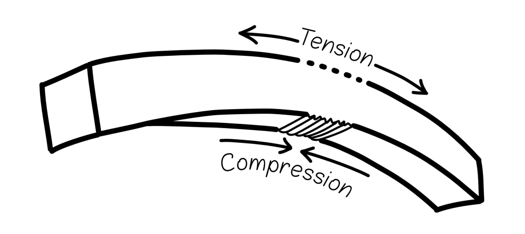
Clear and reliable information about linings is greatly needed. As Miller (2010, p. 100) rightly points out, ‘linings can sometimes be extremely damaging’. With that in mind, the starting point for my research was the well-known article by Conroy, ‘The Movement of the Book Spine’ (1987), in which he describes a fundamental engineering principle important for bindings – the tension and compression principle.
Mechanics of the book spine
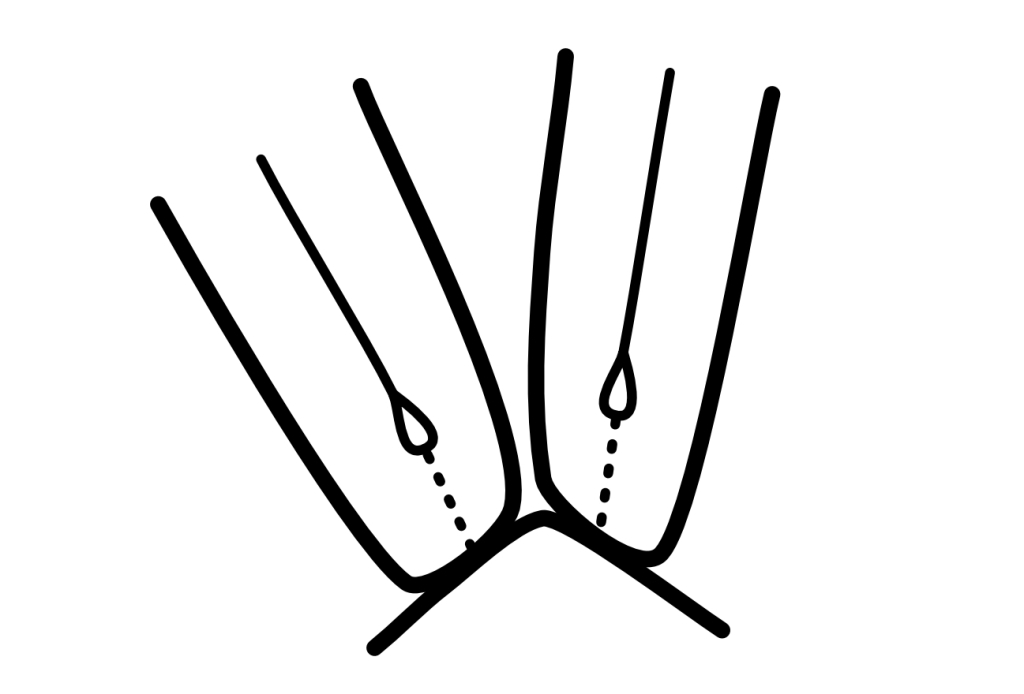
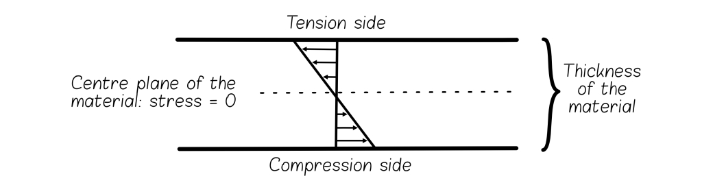
When any material bends, it has a tension side and a compression side (Fig. 1). Material in the tension layer will spread apart, while material in the compression layer will, as the name suggests, compress. This principle applies when a book is opened (Figs. 2, 3). A book spine has a tension and a compression layer. The tension layer consists of the spine folds of the text block (the folded edges of the text sections) and the material adhered directly to them. All materials placed on top of this layer are in compression.
Fig. 1 – The action of a bending object, demonstrating the tension and compression principle. Original drawing by Paula Steere; graphic rendering by The Book & Paper Gathering
Figs. 2, 3 – Tension (A) and compression (B) layers: the tension and compression principle applies to any open book, regardless of the binding type. Photography by Paula Steere
When a book is opened, the movement at the spine folds is largely imperceptible, but its importance should not be underestimated. Too much movement could contribute to poor opening and structural failure. Each of the spine folds moves with some degree of independence. This localised movement can be thought of as a series of flexible mini-bends (McIlvaine 2017a), as illustrated in Figure 4. These mini-bends have different radii and are affected by adhesives and sewing. (Sewing structure will be discussed in Part II.) They create localised strain (deformation) (Fig. 5), and it is this localised strain that causes the spine to fail.
Fig. 4 – Imperceptible movement of the spine folds in an opened book. Original drawing by Paula Steere; graphic rendering by The Book & Paper Gathering
Fig. 5 – Localised bending at each spine fold increases strain. Sewing and adhesives also create non-uniform stiffness; for example, adhesive shrinkage pulls paper down and flattens. Original drawing by Paula Steere; graphic rendering by The Book & Paper Gathering
Linings also move, and these shearing forces contribute to the deformation of the spine folds. The choice of lining materials affects the extent of the deformation. Miller (2010, p. 100) defines linings as a support that allows the spine to flex ‘without the sewn sections parting’. While in reality we cannot eliminate deformation entirely, informed choices can minimise it.
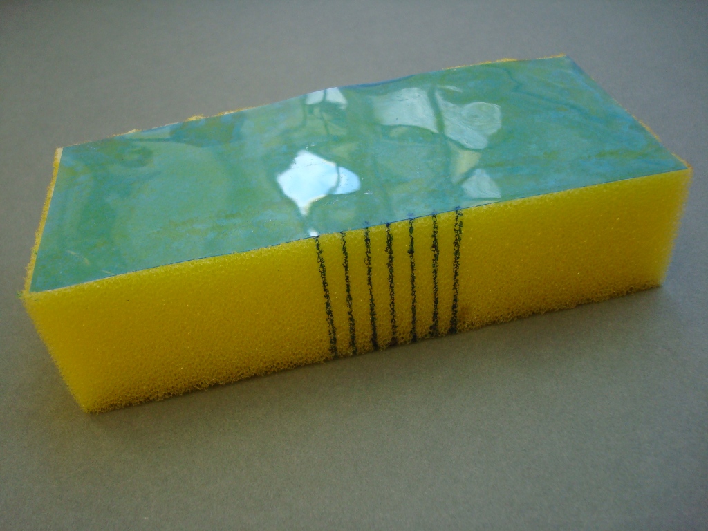
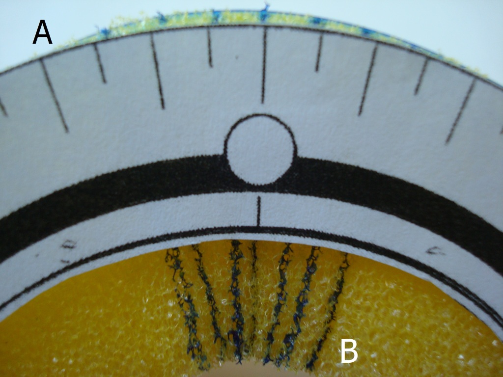
A fundamental aim of spine linings, therefore, is to minimise deformation at the interface between the text block and the first layer (the spine folds and first lining). We can achieve this by minimising the spreading apart (deformation) of the spine folds in the tension layer. Based on principles of mechanical engineering, the first step is to place a stiff and thin first lining against the text block to minimise movement. All subsequent materials, including further linings, adhesive layers and covering material, should ideally be less stiff than this first lining. This is not always an easy task. The model in Figures 6, 7 and 8 shows how adhering a stiff material to a flexible material affects the strain distribution in a composite material. Acetate, a thin and relatively stiff material, is adhered to a sponge (Fig. 6, 7). When the sponge is bent, the stiffness of the acetate minimises movement at the acetate/sponge interface (Fig. 8A). This interface is in the tension layer, and the higher stiffness of this layer drives deformation into the less stiff outer sponge (compression layer), as shown in Figure 8B. This is a simplified model of a book spine, which is also essentially a composite of several materials.
Figs. 6, 7 – A stiff material (acetate) adhered to a less stiff material (a sponge). Photography by Paula Steere
Fig. 8 – The stiffness of the acetate reduces (but does not eliminate) the spreading apart (tension) of the sponge at A. This can be a model of the spine fold – first lining interface. When the tension layer is stiffer, the deformation is driven into the compression layer at B, which represents the exterior book spine and covering material. Photography by Paula Steere
Of course, driving deformation to the outer spine layers could potentially damage the spine leather and tooling of a tight back (Franck 1941, p. 7). We also do not want to prevent movement entirely, as the spine needs to flex to some degree for the book to open well. The required degree of spine stiffness is also affected by other variables, such as the thickness of the sewing supports and type of sewing structure. Nevertheless, the tension and compression principle applies equally to all books and offers tangible criteria on which to base spine lining decisions. However, this is only the first part of the story. We must also understand the performance mechanics of the conservation spine lining materials themselves – paper, linen, cotton and adhesives.
The mechanical properties of spine lining materials determine their use
Research indicates that paper lining materials are not robust enough for book spine linings. In 1708, Zeidler wrote in his book on the philosophy of bookbinding that ‘The French do not care to glue anything on the spine. Some glue only paper strips on, putting everything slovenly over and believing they have come just as far [as putting parchment or linen cloth on neatly and exactly]’3(p. 78). Szirmai (2001, p. 196) interprets these sentiments by saying that Zeidler ‘castigates’ French bookbinders for using paper linings in gothic books.
Conroy (1987, p. 4) supports the case against placing paper on the spine. He warns that paper is prone to breaking when stretched (due to tension) and buckles easily when compressed. McIlvaine (2017a) concurs, saying that while paper is a stiff material, it is not strong enough and is susceptible to tearing. Any imperfection would propagate easily. Paper has an irregular and random structure, which determines its physical properties (Corte and Kallmes 1961, p. 14–15; see Fig. 9). Its relative weakness could be attributed in part to this formation.
Fig. 9 (left) – Paper consists of randomly arranged separate fibres. Fig. 10 (right) – Fabric consists of twisted, woven and secure threads. Drawings by The Book & Paper Gathering
Fabrics tend to have a stronger base material and structure than paper (Fig. 10). For spine linings, the important properties of fabrics are tenacity (stress at break), extensibility (degree of stretch before breaking) and modulus (resistance to stretch). Tenacity is the term used to describe fibre strength; extensibility contributes to fold endurance; and modulus contributes to stiffness. These properties are determined by the fibre structure of the raw material. Linen is made from the bast stem fibres of Linum usitatissimum. The thick-walled, tube-like cells with small lumens or canals (hollow spaces) (Landi 1998, p. 22) are arranged in bundles, as shown in Figure 11a. Cotton, meanwhile, is made from the seed hair of Gossypium herbaceum and Gossypium hirsutum. Cotton fibres are very different from linen, forming single hollow and flat cells with a large lumen (Landi 1998, p. 21; Fig. 11b).
Fig. 11 – a: A cross-section of thick-walled linen cells arranged in bundles. b: Cross-sections of thinner, flatter cotton cells. Original drawing by Paula Steere; graphic rendering by The Book & Paper Gathering
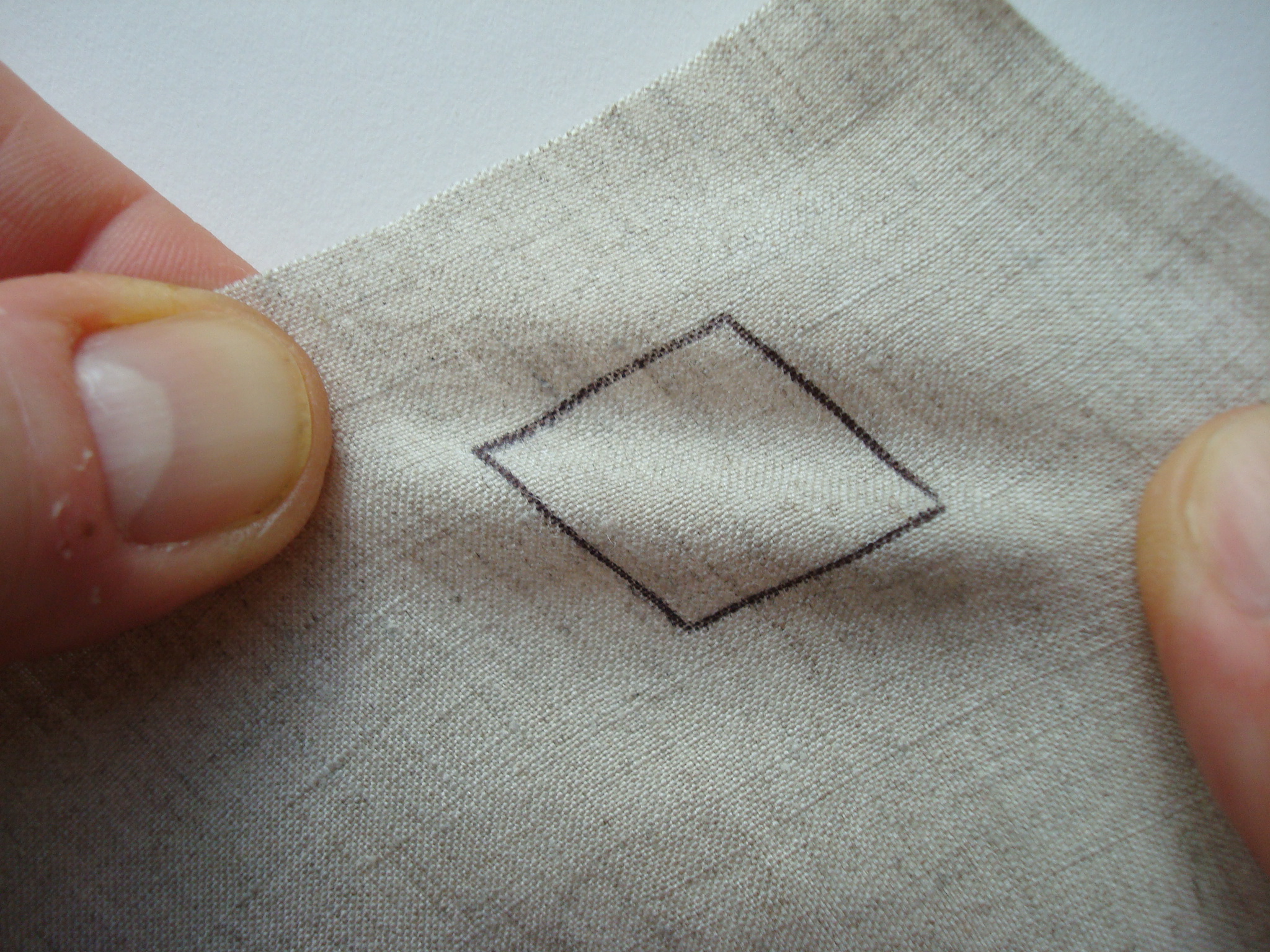
The thick walls and bundle arrangement of linen cells make linen a stiff and strong material. However, the thick cell walls lower its fold endurance and make it prone to breaking when repeatedly folded in the same place (UAL, no date), because thicker walls undergo more strain when bent. This is analogous to bending a piece of cardboard versus a piece of paper – there will be more damage (deformation) to the cardboard because of its thickness. The thicker a material, the stiffer it becomes when bent due to the neutral axis principle (McIlvaine 2017c), illustrated in Figure 12. This principle states that when a material is bent, there is no tension or compression at the centre line, but deformation increases with distance from this central plane.
Fig. 12 – Neutral axis principle: when a material is bent, the centre plane has zero tension or compression; tension and compression increase with distance from this zero axis. Original drawing by Paula Steere; graphic rendering by The Book & Paper Gathering
Linen also has less extensibility than cotton and will break more easily when stretched. Cotton has higher fold endurance than linen due to its structure: thin walls and a large lumen enable it to collapse on itself, reducing thickness locally and decreasing strain when folded (as per the neutral axis principle). These properties have been confirmed with data from fold endurance and mechanical strength tests published in the well-known books Conservation of Leather and Related Materials and The Textile Conservator’s Manual (Tables 1 and 2).
The data in Table 2 shows that linen is, on average, stronger than cotton because of its higher tenacity. Linen also has a much higher initial modulus (resistance to extension) than cotton, making it the stiffer fabric and a good candidate for a thin, stiff first lining. The less stiff cotton is a good second lining because of its higher fold endurance, and can be used to reattach boards if needed (more on that shortly).
In addition to fibre composition, the orientation of the yarns also affects the mechanical properties of fabric that are relevant to this spine lining design. Warp yarns (lengthwise grain, parallel to the selvage edge) stretch less (are stiffer) because they have a higher modulus than weft yarns (crosswise grain, perpendicular to the selvage edge). Warp yarns are more tightly twisted, and hence stronger (Hackler 2006), than weft yarns. They are tightly stretched during the weaving process (The Taunton Press, no date) to allow the more loosely wound weft yarns to be woven between them. I confirmed the higher stiffness of warp yarns by pulling the fabrics the same distance in both directions. Under tension, weft yarns stretched visibly more than warp yarns. Therefore, additional stiffness in the first lining can be gained by positioning the linen with the warp yarns across the spine width, which minimises the spreading apart of the spine folds. It is worth noting that the bias grain direction has been considered the strongest because the most fibres are available; however, in this orientation, the fabric also deforms easily, and therefore, could be susceptible to damage (Fig. 13).
The properties of adhesives should also be considered. Conroy (1987, p. 4) says that an adhesive does not need to be flexible; flexibility is required only if too much adhesive is used. McIlvaine (2017b) further reminds us of the neutral axis principle (Fig. 12) – thin layers of adhesive are desirable because thin materials strain less when bent.
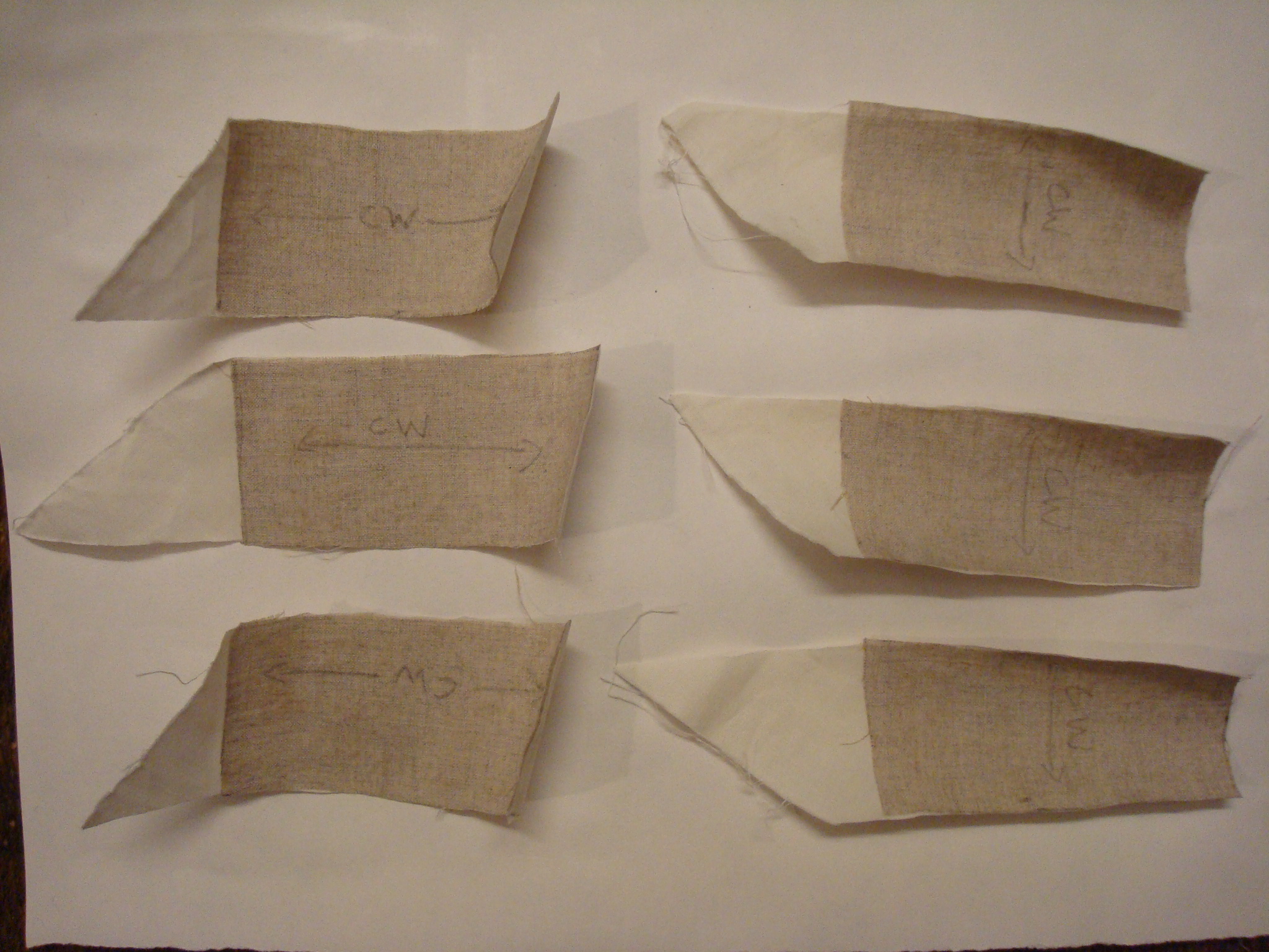
However, the adhesive must still be thick enough to be effective. I carried out adhesion tests on aero linen and aero cotton swatches to find the smallest amount of adhesive that still yielded strong adhesion between the two fabrics. A 1:1 mix of Evacon R and wheat starch paste (1:3 wheat starch to water v/v) was used for additional strength. A thin, medium and thick layer of adhesive was applied with a brush to clear acetate to serve as a quantity guide. The adhesive was then applied by brush to both cotton and linen swatches to be adhered together. The linen was positioned on the cotton swatches so that both the warp and weft orientations were tested in the direction of the shearing force. The cotton was not used in the bias direction. The fabrics were pressed with a bone folder and air-dried for a minimum of two hours (Fig. 14). There was no adhesive failure or obvious strength difference between the thin, medium and thick coats of adhesive mix when pulling them apart with my hands under maximum manual shearing force (Fig. 15). Therefore, the thinnest coat of adhesive could safely be used to minimise deformation and cumulative stiffness without compromising adhesion strength.
Fig. 13 (left) – Bias grain under tension deforms easily. Fig. 14 (right) – Lining design adhesion test swatches: linen and cotton adhered together with thin, medium and thick layers of adhesive. Pencil arrows show the weft (crosswise) direction. Photography by Paula Steere
Fig. 15 – Manual adhesive strength test: pulling fabrics to mimic shearing forces experienced by spine linings when a book is opened. Photography by Paula Steere
Putting the principles into practice: spine lining design
To review, for optimum functionality and durability, spine linings should minimise deformation at the interface between the spine folds and first lining material. We can achieve this by placing a stiff and thin first lining against the text block to minimise movement and keep the spine folds from spreading apart. All subsequent materials, including further linings, adhesives and covering material, should ideally be less stiff than this first lining.
For the spine lining design based on this research, aero linen should be used as the first lining, with the stronger, stiffer warp yarns placed across the spine width from shoulder to shoulder (Figs. 16, 17). Thinner, less stiff aero cotton, with its greater fold endurance, should be used as a second lining to reattach the boards. (If the boards are still attached, a second lining may not be necessary at all.) To minimise cumulative stiffness in the outer (compression) layer, positioning cotton in the bias direction could be a good choice, since this is the least stiff of the yarn orientations. Additionally, all subsequent linings, such as the paper used to smooth an uneven tight back spine, should be kept to an absolute minimum, with thin adhesive layers throughout. For heavy text blocks, I use WSP and ethyl vinyl acetate (EVA) mix (1:1) to adhere the linen to the spine folds, and I use wheat starch paste alone, without EVA, for materials in the compression layer (to reduce cumulative stiffness). For standard-sized books that are not very heavy, I use wheat starch paste on its own throughout the process; however, I have not tested swatches of wheat starch paste without EVA.
When adding more linings after the linen (and cotton, if reattaching boards), check opening characteristics after each lining has dried thoroughly. Paper linings can be omitted altogether in some instances; for example, if the tight back spine is even, in a case binding, or in a situation where throwup does not require additional control. Keep in mind the engineering principles discussed in this article when deciding on the number of additional linings and the choice of lining material: the compression layer (everything after the first linen lining) should ideally be less stiff than the tension layer. Thinly pared leather, discussed below, can be used instead of paper for additional linings to reduce stiffness.
Fig. 16 – Spine lining design based on the tension and compression engineering principle and the mechanical properties of spine lining materials. Original drawing by Paula Steere; graphic rendering by The Book & Paper Gathering
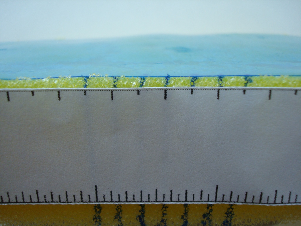
Fig. 17 – The spine of a leather reback just before reattaching the boards. On the spine is the first lining – aero linen with warp yarns running shoulder to shoulder. It has been adhered directly against the text block spine folds. The fabric above and below the spine is aero cotton and was adhered directly to the linen to reattach the boards. Photography by Paula Steere, courtesy of the College of Arms Library, London
The quarter leather tight back in Figure 18 has a heavy parchment text block, and I wanted to experiment with traditional leather linings because the mechanical properties of leather are excellent for the compression layer of my spine lining design: it is strong, but not stiff, because of the structure of its main component, the protein collagen. The linings in this image are made of thinly pared leather. I have used a graduated lining technique, which I was delighted to discover during my research, to further minimise stiffness in the compression layer. The graduated lining structure is attributed to Francis Bedford, a nineteenth-century bookbinder acclaimed for the ‘even strain’ (Anonymous author 1893, p. 58) of his bindings. The rationale for the graduated lining structure is that the stiffness needed for a book to open well at any given place varies. The centre of the spine takes the greatest strain and should be the stiffest, while less stiffness is required near the beginning and end sections of the text block (McIlvaine 2017b). Subsequent linings after the first one are ‘a little further in’ (Anonymous author 1893, p. 58), stopping a little short of the shoulders, as illustrated in Figure 18.
I also adapted the graduated lining technique to the leather covering material to reduce overall stiffness. The leather over the centre spine folds is thicker than that over the beginning and end spine folds. This was achieved through tapered paring, as shown in Figures 19 and 20. A comparison of opening characteristics before and after treatment can be seen in Figures 21 and 22.
Fig. 18 – The graduated lining structure attributed to Francis Bedford’s workshop. According to the author in The British Bookmaker, every lining after the first is ‘a little further in’, stopping short of the shoulder. The text block of this book was made from heavy parchment, and in addition to using the spine lining design described in this article, I wanted to experiment with traditional leather linings because of their strength. Photography by Paula Steere, courtesy of the College of Arms Library, London
Fig. 19 – Adapting the graduated lining technique to leather paring. Original drawing by Paula Steere; graphic rendering by The Book & Paper Gathering
Fig. 20 – Paring in progress: the thickness of the leather under the central black line will remain as is, and the leather will be pared to taper towards F and B, which indicate the width of the text block. Photography by Paula Steere
Fig. 21 – Opening characteristics of the book from Fig. 18 before treatment. Photography by Paula Steere, courtesy of the College of Arms Library, London
Fig. 22 – The same book after treatment, with improved opening characteristics. Note that some of the improvement is also due to repairs in the text block. Photography by Paula Steere, courtesy of the College of Arms Library, London
In conclusion, exploring the forces present in a book spine and the mechanical properties of familiar book conservation materials has helped me to overcome the ‘vague generalities’ found in the literature. Understanding mechanics and materials enables the conservator to take advantage of engineering concepts that offer tangible criteria on which to base spine lining decisions. I discovered several hidden gems along the way, such as Zeidler’s ire, Bedford’s famed workshop, and, of course, that anonymous kindred spirit from The British Bookmaker for whom vague generalities would not suffice.
Special thanks to my colleagues at the College of Arms, Becky Tabram and Christopher Harvey, head of conservation, who encouraged and allowed me to explore these ideas while I was a conservator there. Their experience and knowledge of books and our ongoing conversations and practical experiments in the workshop were invaluable.
Footnotes
1. I reviewed approximately 36 books and articles, spanning the years 1658 (in a 1977 translation) to 2017.
2. Technical statements in the literature were cross-referenced with a mechanical engineer, Lee McILvaine, for scientific accuracy. This research document is available upon request.
3. Translation by Isana Skeete (2017). No published English translation of this book could be found.
Bibliography
Anonymous author (1892–3) ‘Editorial’, The British Bookmaker, 6, no page number.
Anonymous author (1893) ‘On forwarding’, The British Bookmaker, 7(75), p. 58.
Cockerell, D. (1901) Bookbinding: The classic Arts and Crafts manual. New York: Dover Publications.
Conroy, T. (1987) ‘The movement of the book spine’, The Book and Paper Group Annual, 6, pp. 1–22.
Corte, H. and Kallmes, O.J. (1961) Statistical geometry of a fibrous network. New York: Regis Paper Company.
Diehl, E. (1980) Bookbinding: Its background and technique (2 vols). Rev. edn. New York: Dover Publications.
Franck, P. (1941) A lost link in the technique of bookbinding and how I found it. Gaylordsville, Connecticut: The author.
Hackler, N. (2006) Understanding fabric grain. Rev. edn. Gainesville: University of Florida.
Landi, S. (1998) The textile conservator’s manual. Butterworth-Heinemann: Oxford.
McIlvaine, L. (2017a) Email to Paula Steere, 8 April.
McIlvaine, L. (2017b) Conversation with Paula Steere, 13 April.
McIlvaine, L. (2017c) Email to Paula Steere, 26 April.
Middleton, B.C. (1963) A history of English craft bookbinding technique. Hafner Publishing: London.
Middleton, B.C. (1998) The restoration of leather bindings. Rev. Ed. Delaware, London: Oak Knoll Press, The British Library.
Miller, J. (2010) Books will speak plain – A handbook for identifying and describing historical bindings. Michigan: Legacy Press.
Silverman, R., Cains, A., Ruzika, G., Zyats, P., Reidell, S., Primanis, O., Puglia, A., Anderson, P., Etherington, D., Minter, B., Brock, D., Zimmern, F. (2006) ‘Conservation of leather bookbindings: a mosaic of contemporary techniques’, in Kite, M. and Thomson, R. Conservation of leather and related materials. Oxford: Butterworth-Heinemann, pp. 225–243.
Skeete, I. (2017) Translation of passage in Zeidler, J. (1708), 17 May.
Szirmai, J.A. (2001) The archaeology of medieval bookbinding. Burlington, Vermont: Ashgate.
Zeidler, J.G. (1708) Buchbinder-Philosophie oder Einleitung in die Buchbinder-Kunst. Hall im Magdeburgschen: in Rengerischer Buchhandlung.
Paula Steere has an education background and was head of Art and Design in a secondary school in London before retraining in book and archival conservation at Camberwell College of Arts from 2015 to 2017. She has worked at the College of Arms, the Wellcome Collection, the Senate House Library, the London College of Fashion Archive, the Victoria and Albert Museum and UCL Special Collections. Currently she is a preventive conservator, volunteer coordinator and grant writer at the Hershey History Centre, a nonprofit museum in Pennsylvania, US. She is also a book conservator in private practice.
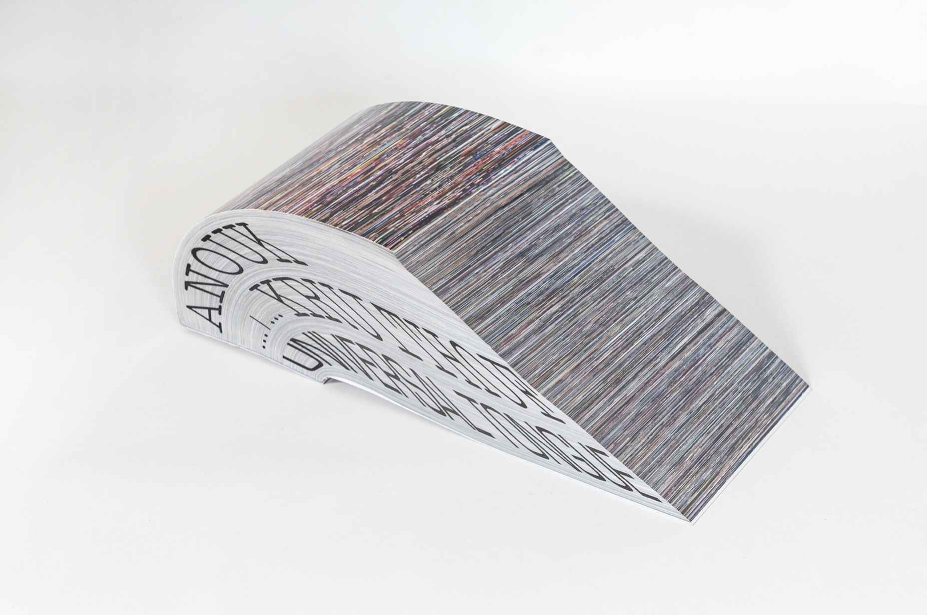
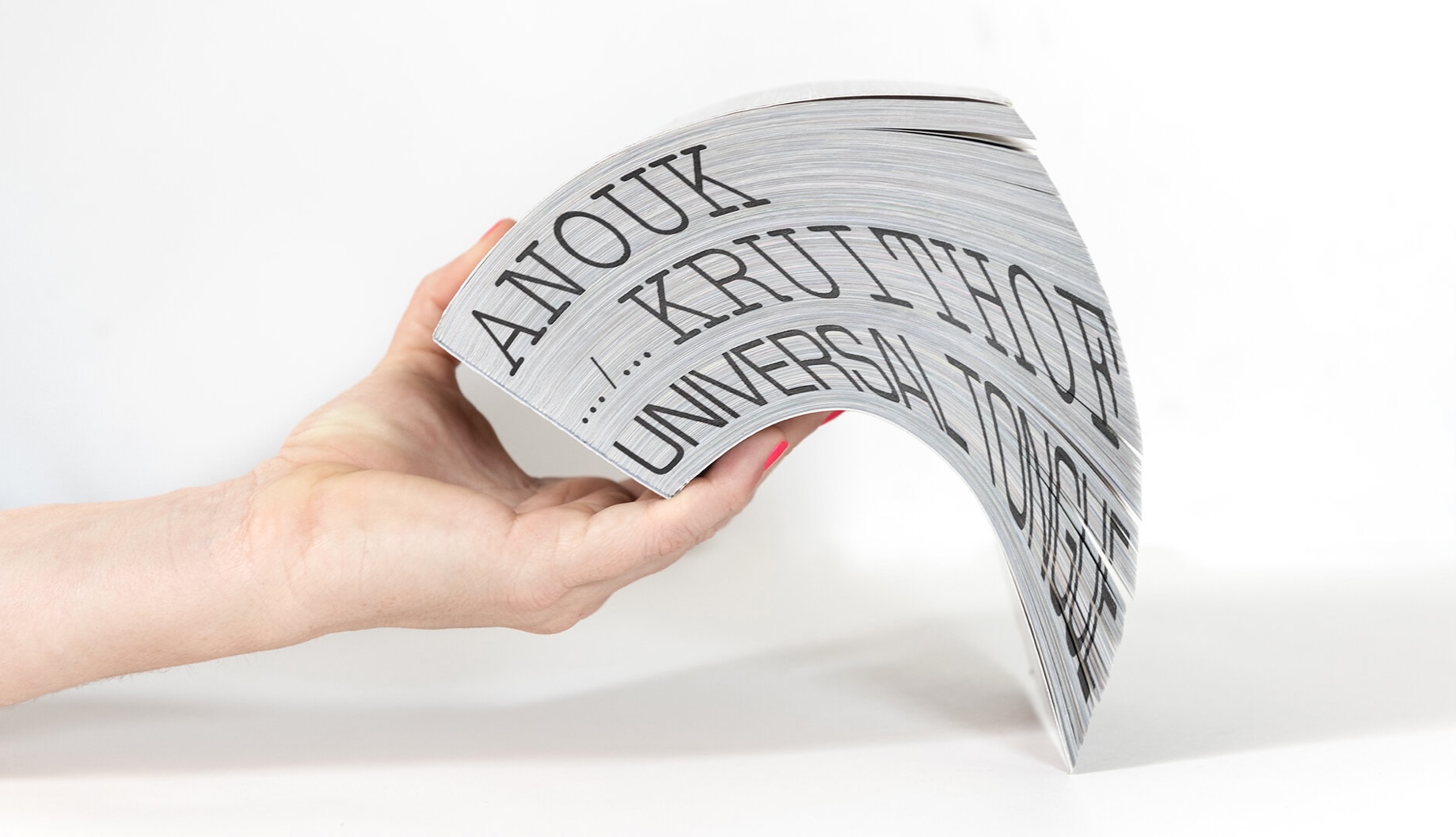
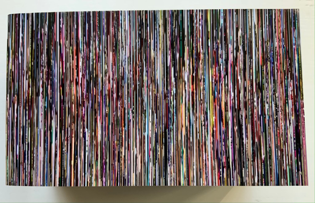
Universal Tongue(2021) Anouk Kruithof Paperback with fore-edge printing. H100 × W170 × D75 mm, 2008 pages. Edition of 500. Acquired from Art Paper Editions, 15 May 2008. First two photos: Courtesy and permission of the artist. Third photo: Books On Books Collection. Displayed with permission of the artist.
If ever a book danced, it is this one. It is a tango between Anouk Kruithof‘s images and Jurgen Maelfeyt‘s design. It is a global line dance with a team of 50 researchers from across the globe. It is a rave, sourced from 8800 online dance videos. It is a still point in motion against Kruithof’s choreographed four-hour eight-channel video version.
Photos: Books On Books Collection. Displayed with permission of the artist.
Photos: Books On Books Collection. Displayed with permission of the artist.
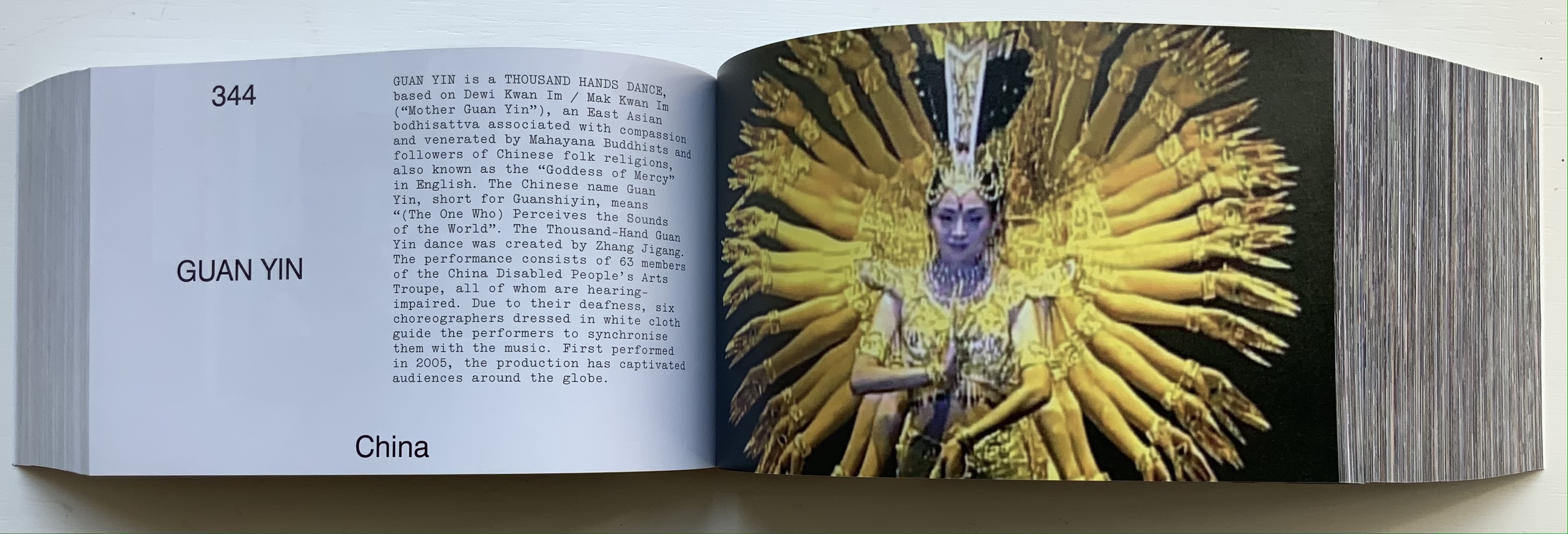
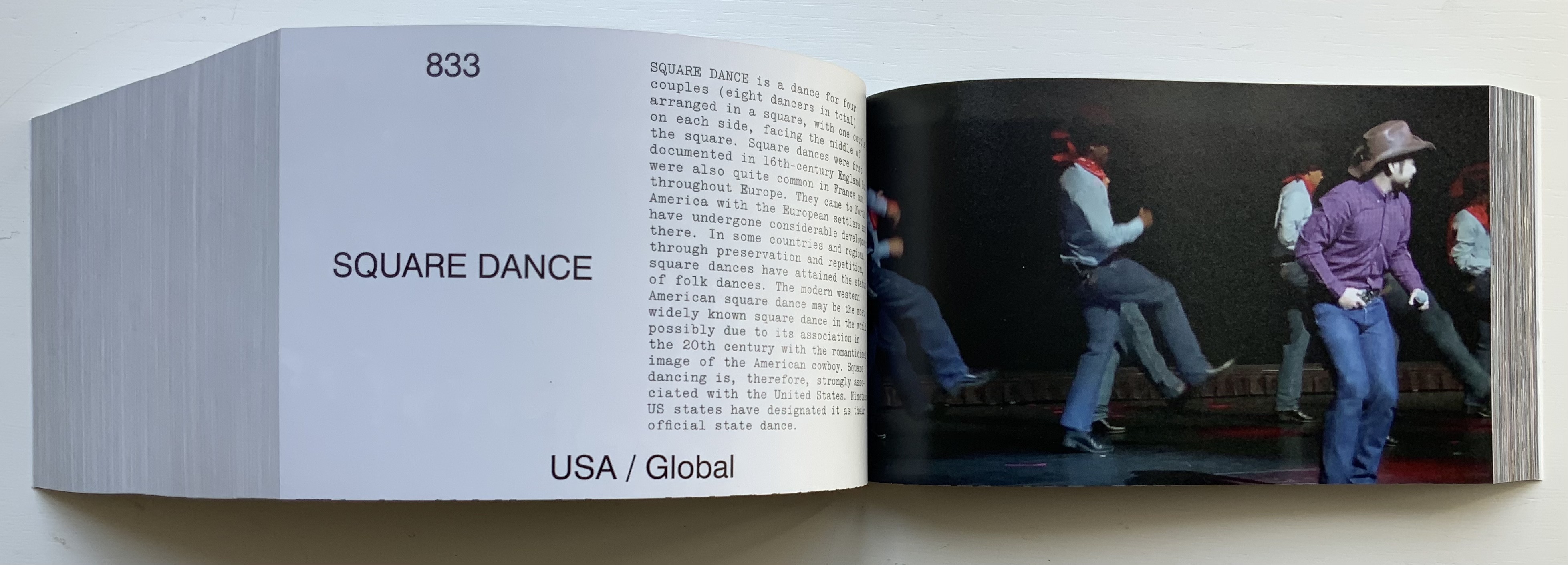
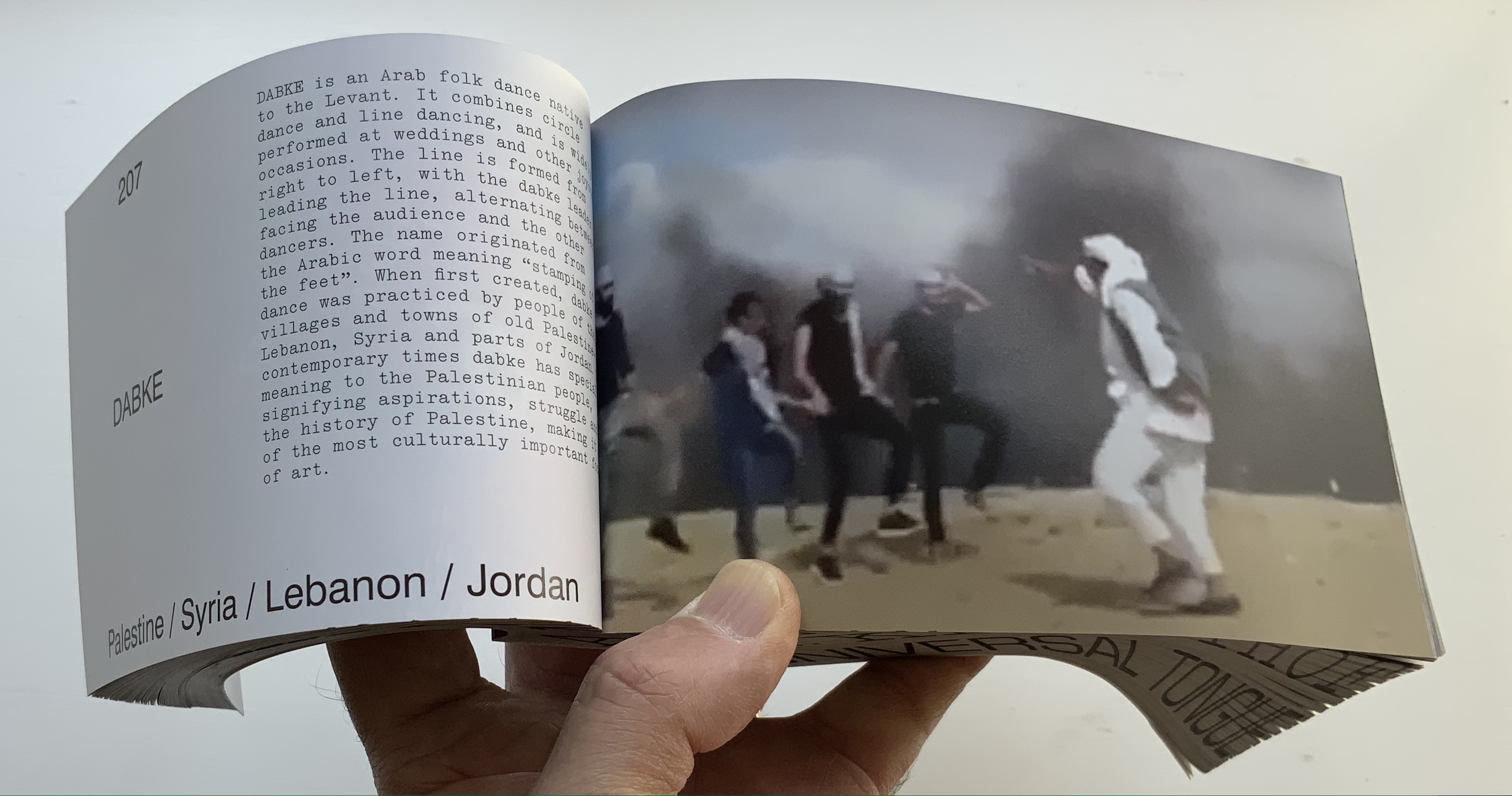
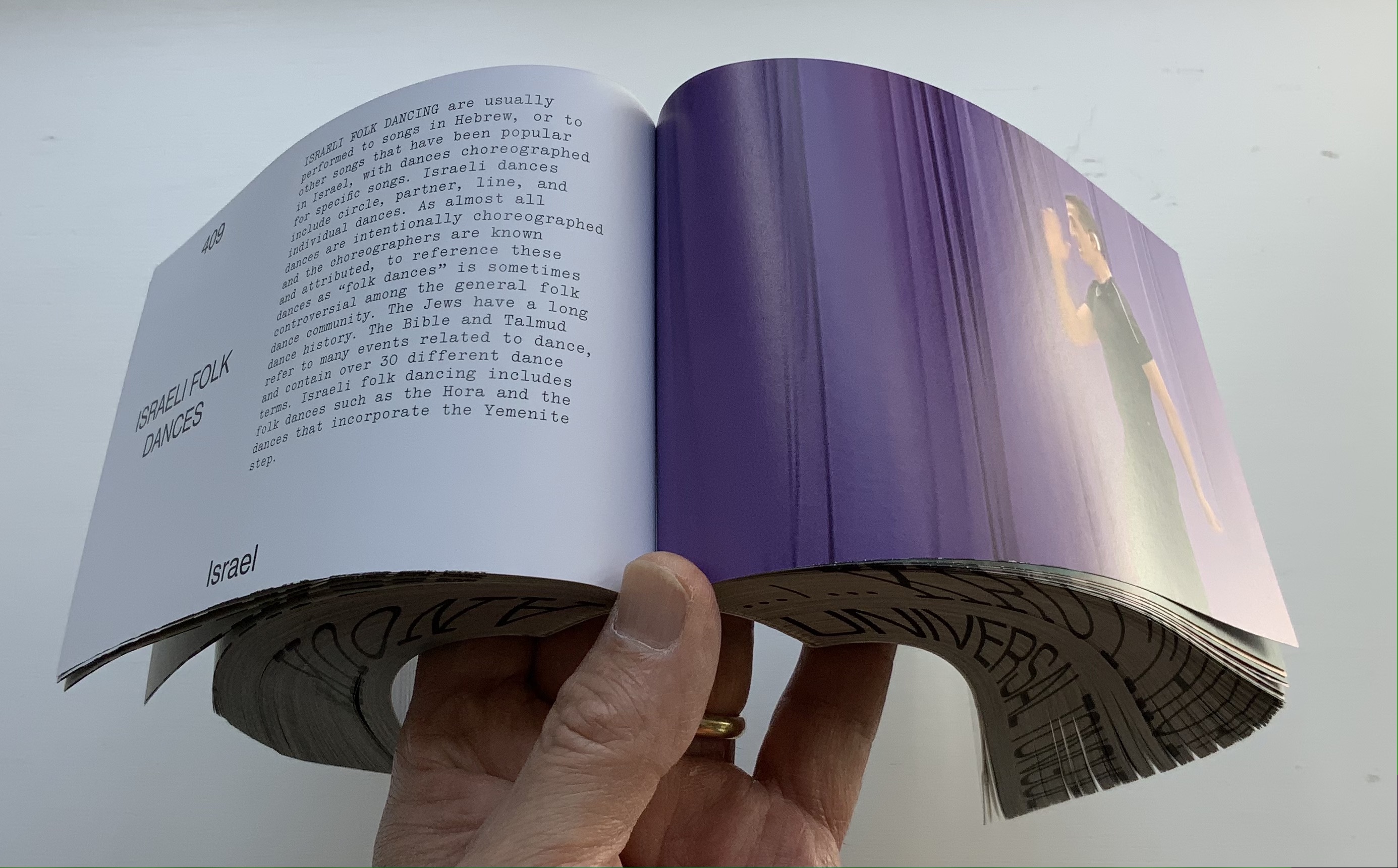
From the artist’s and publisher’s description: This book shows how dance can be a way of knowing about the world. It is by no means exclusive, final, or academic. It is a statement. Organized in alphabetical order by the first letter of each dance style, it confirms the horizontality of Universal Tongue, by erasing typical categories of the world order, such as country, continent, or culture. Instead, it points us towards a more inclusive world with a limitless exchange—a world where simply everyone is a dancer.
Universal Tongue also neatly uses the vertical surfaces of the codex. The bottom-edge printing of name and title calls to mind Around the Corner by Ximena Pérez Grobet. The fore-edge effect of the full-page bleeds calls to mind Irma Boom’s Strip (2003). Both techniques evoke the book form’s ability to embrace. As the physical and haptic constant alongside the digital sourcing, production and video installation, Universal Tongueas book shows that traditional dance and the book remain undiminished in cultural relevance.
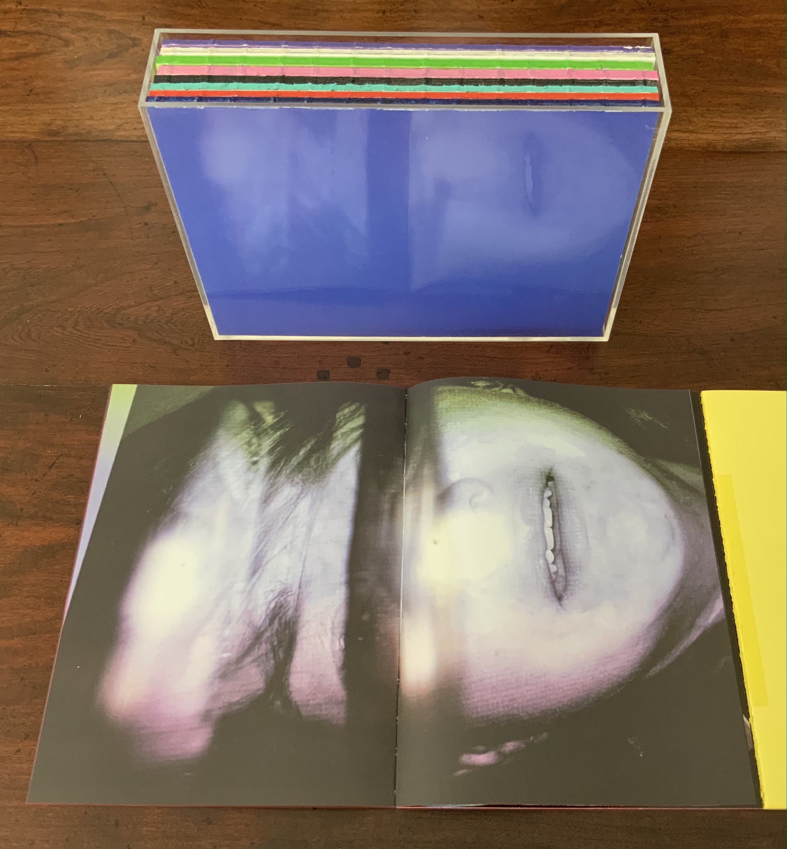
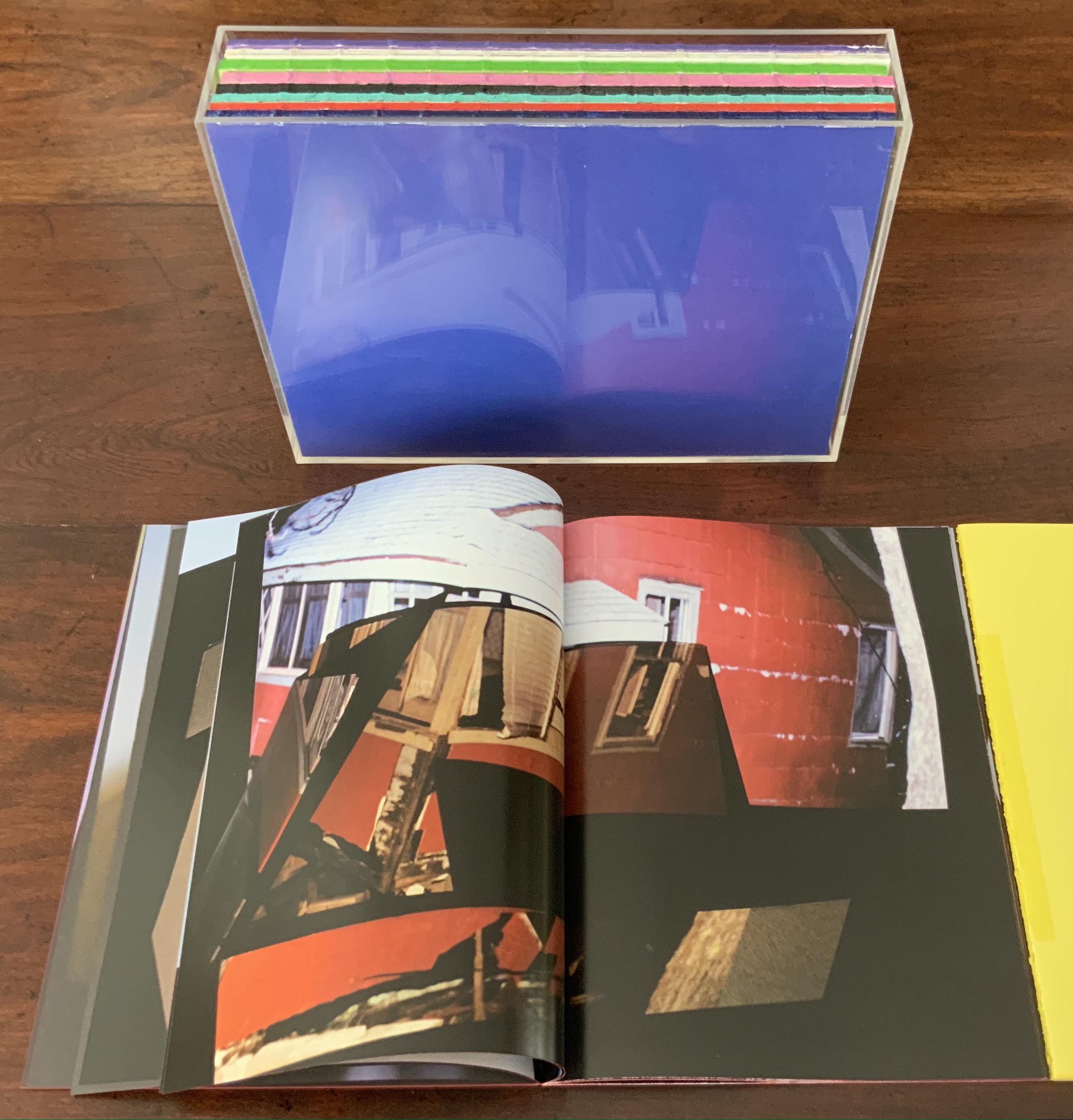
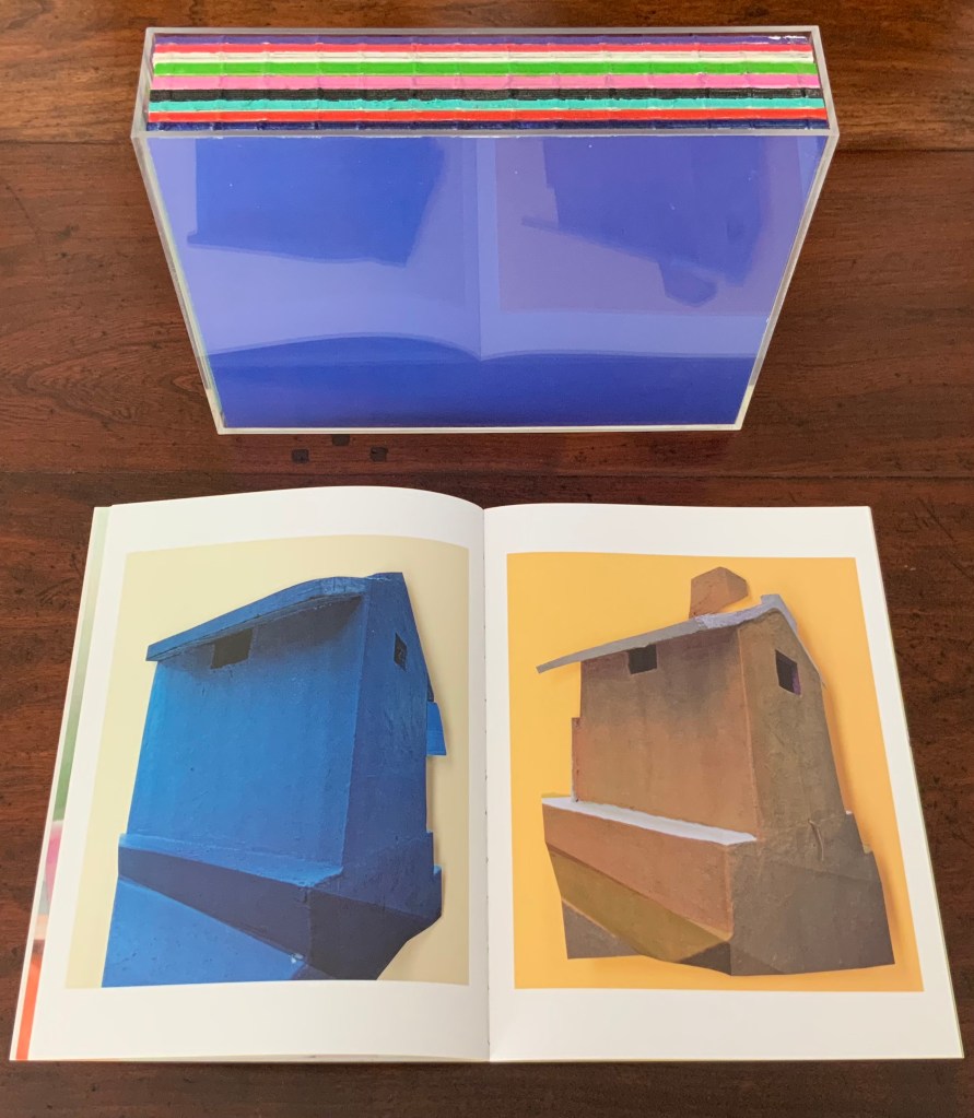
AUTOMAGIC (2016)
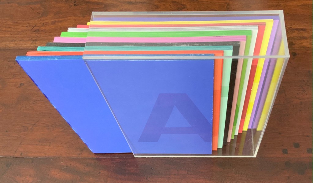
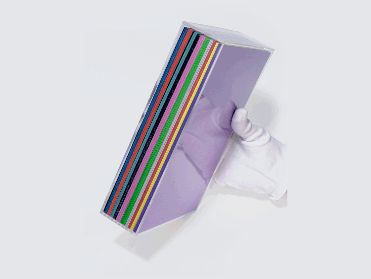
AUTOMAGIC (2016) Anouk Kruithof Transparent acrylic box holding 10 booklets without covers. Box: H235 x W173 x D53 mm; Booklets: H228 x W170 mm each; 768 pages. Edition of 1000. Acquired from the artist, 14 April 2017. Photos of the work: Books On Books Collection. Displayed with permission of the artist.
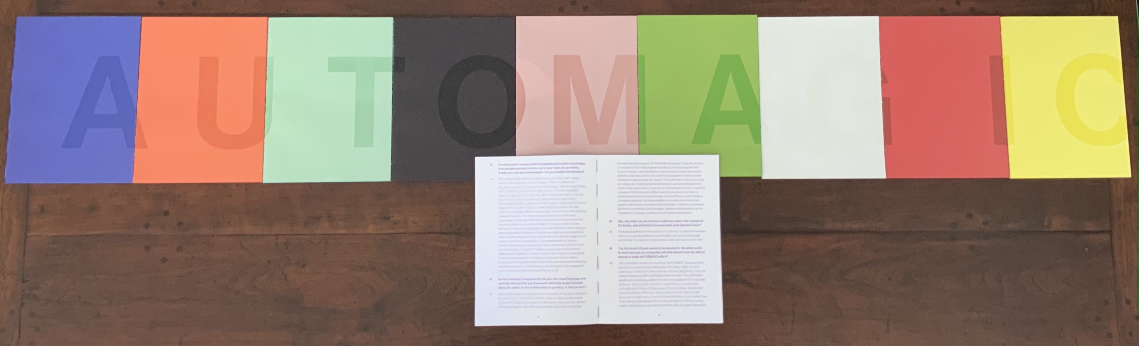
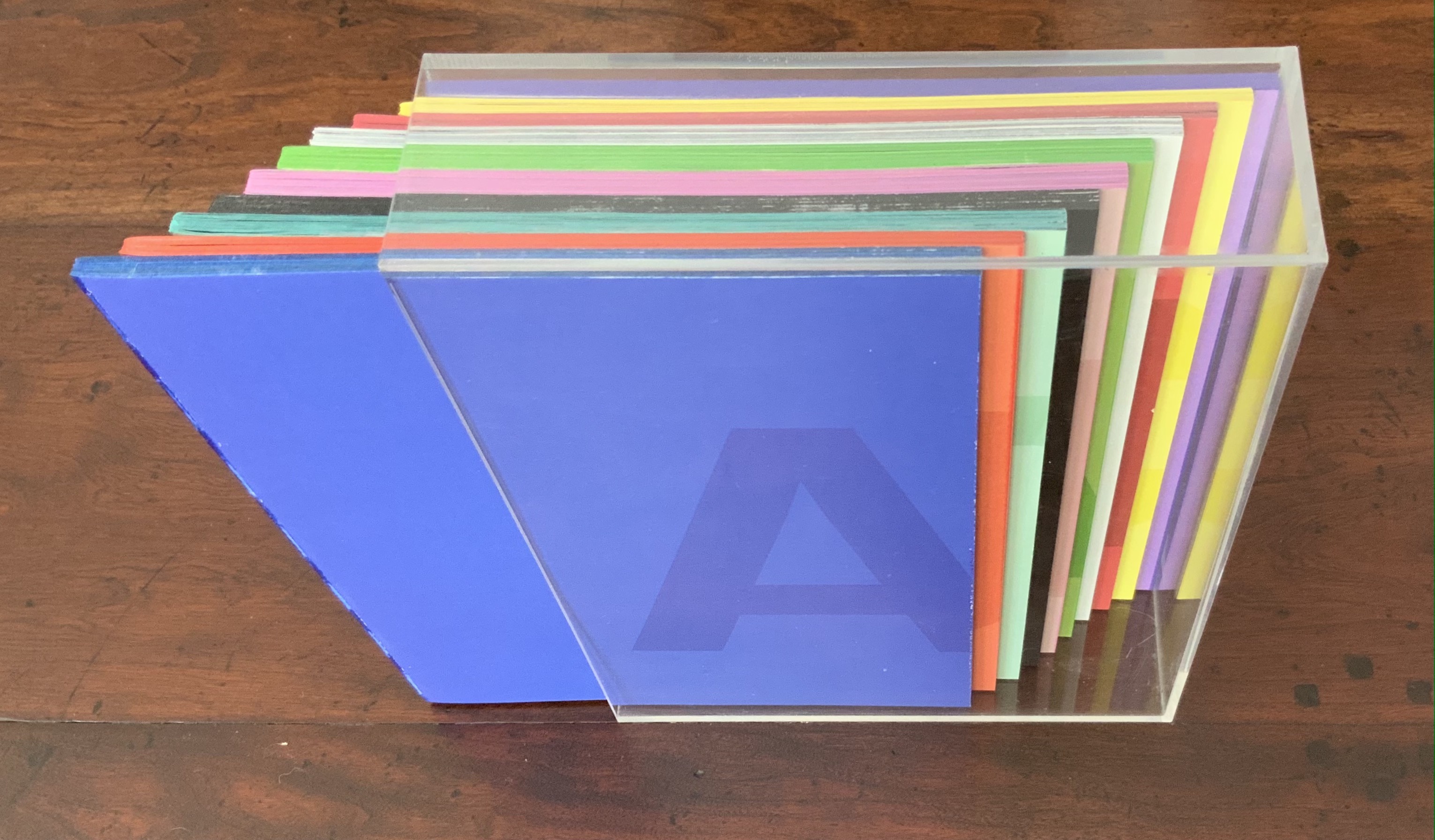
Unlike Universal Tongue, which is based on found images, AUTOMAGIC is drawn from a database of images created (and still being created) by Kruithof herself over the years. With a skill in book artistry as much as photographic artistry, she has curated, edited and montaged the images into nine differently colored booklets, bound by a transparent acrylic shell. As with Universal Tongue, the work is a collaboration, this time with Piera Wolf, the Zurich half of W-E Studio, on the design, and Iñaki Domingo, photographer and professor at the Istituto Europeo di Design, on the text. Domingo’s interview of Kruithof for the book provides the content for a tenth booklet. It is the purple one, edges color sprayed, bound with exposed purple thread and placed like a colophon looking back over the other differently colored nine “chapters” as Kruithof calls them. Laid out in order, the ten front covers spell out “AUTOMAGIC”. The way the individual letters lap over to the back edge of the next cover nods toward the unity the artist intends as well as the metaphorical unity residing in their database source and acrylic box binding.
The tenth booklet lies open under the other nine spelling out the work’s title; its purple cover can be seen in last position in the acrylic box underneath.
AUTOMAGIC is the first work by Kruithof to come into the Books On Books Collection. Its color and bright materiality continually urge taking it down from the shelf and selecting one of the nine “individual chapters” of this long visual work to re-read (re-see). There is, however, a rhythm to the whole work, so they are best read in pairs or trios.
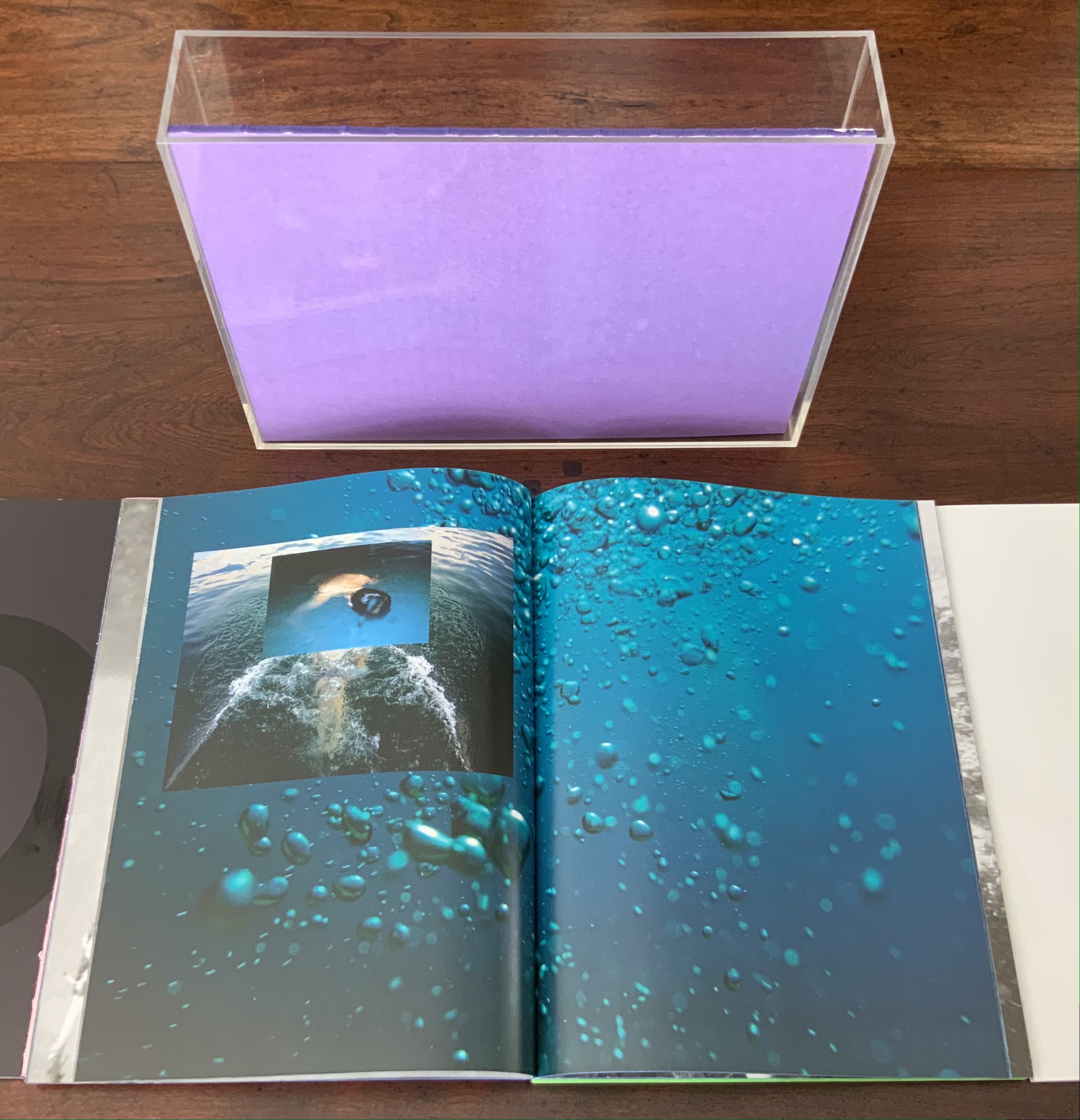
Chapter A (blue), below left, starts the nine-part work with underwater photos and Kruithof’s signature montages on glossy paper.
Chapter U (orange), below right, shifts to portraiture on plain paper, with montages created by laser-printing photos on top of photos, and interspersed with photos of the blank side of the montages with the edge of the picture frame showing. This movement between the portraits and blanks gives Chapter U an easily detectable inner rhythm, all the better appreciated in its contrast with the preceding and following chapters.
Left: from Chapter A (blue). Right: from Chapter U (orange) front and back.
Chapter T (aqua) shifts back to nature, but a “visually psychedelic” one as Kruithof puts it, achieved with layering photos and editing in Photoshop. It also shifts back to a glossier paper like Chapter A, but the paper is thinner and so saturated with ink that the pages must be carefully separated, slowing down the reader/viewer’s movement through the booklet.
Moving into black and white, Chapter O (black) turns more to human forms and activities, depicted in a mix of straight photos, sometimes layered and some re-photographed analogue photo montages, all printed on the heavier glossy paper used for Chapter A.
Chapter T (aqua), Chapter O (black)
Chapters M (lavender) and A (green) move back into color on plain paper. They are two of the thicker booklets. Both are a blend of the human and nature, both have frequent carefully constructed arrangements of evidence of human impact on nature, with Chapter A building this theme more intensively.
Chapter M (lavender), Chapter A (green)
Chapter G (white) has a frenetic almost violent quality in its images and their manipulation. It alternates images of objects (broken windows, destroyed brick walls, melted candles, a partly erased blackboard) with those of humans contorted by awkward poses, layered photos or editing. While the chapter has shifted back to the thicker glossy paper of Chapter A (blue) and Chapter O (black) and has picked up the black and white rhythm of Chapter O, a burst of melted colored candles interrupts that BW rhythm half-way through before letting it return. This frenetic Chapter G feels like a build-up to a distraught Chapter I (red).
Chapter G (white)
Chapter I (red) juxtaposes self-portraits of distress (on matte paper) with images of a hurricane’s aftermath (on glossy paper). The even division between subjects and type of paper individualizes this chapter and drives home the alternating rhythms of the work as a whole.
Chapter I (red)
Chapter C (yellow) consists of “re-photographed analog photomontages of mausolea and images of color smoke bombs in abstract architectural settings”. If the previous eight chapters have expressed a sense of being in the world, this one expresses a sense of exiting it — a sense that is complicated by the fictive enhancement of the brightly colored Mexican mausolea and the fictive smokescreen attempt to impose a ritual and architectural structure on that exit.
Chapter C (yellow)
Pixel Stress (2013)
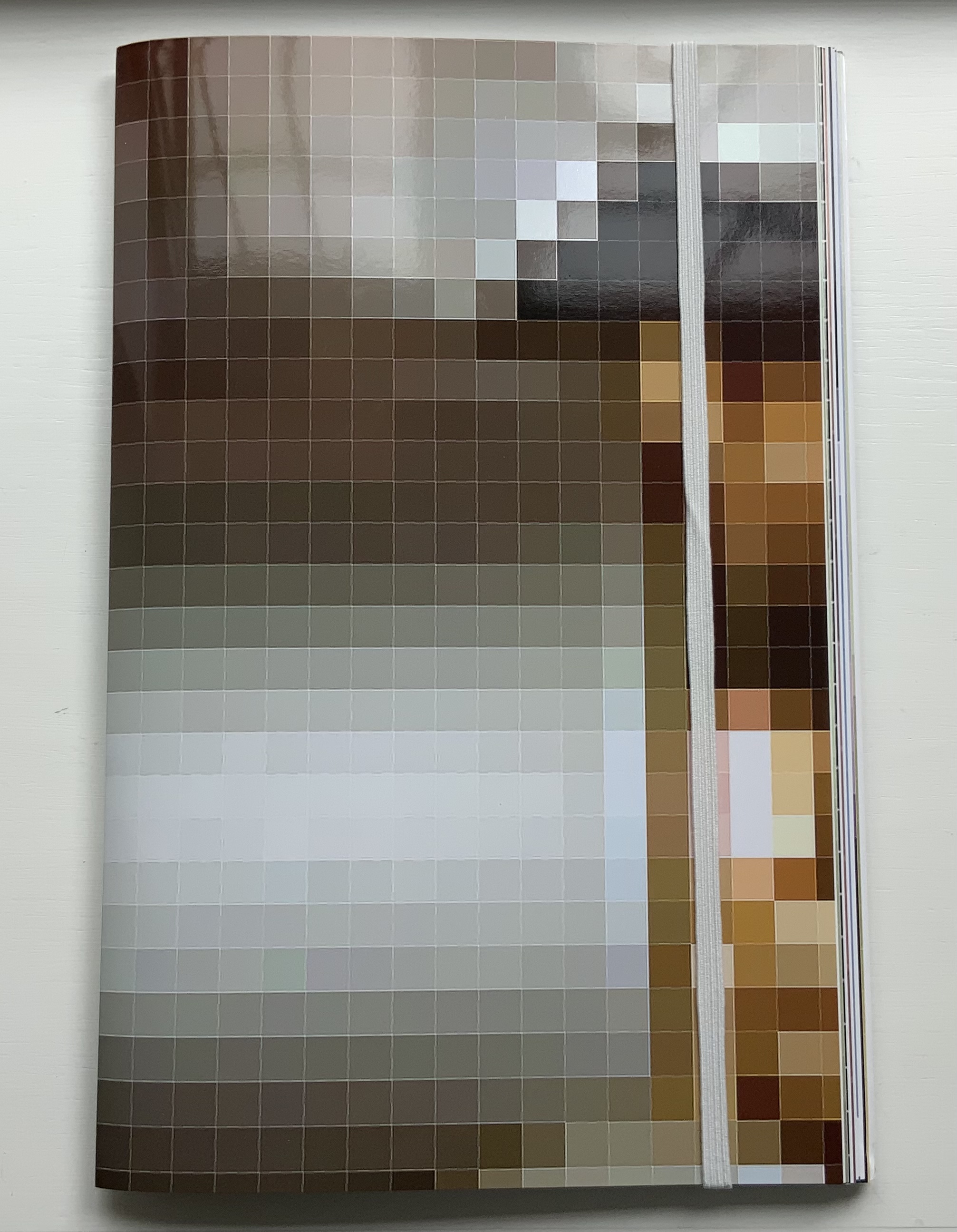
Pixel Stress (2013) Anouk Kruithof Softcover booklet stapled, enclosed in a set of 15 single-fold folios held together with an elastic cloth band. H320 x W200 mm, 100 pages.Edition of 1000. Acquired from RVB, 12 June 2021. Photos of the work: Books On Books Collection. Displayed with permission of the artist.
Remove the elastic cloth band and the 15 folios of glossy prints (H320 x W407 mm) folded in half start to slip and slide. At the center of the inmost folio lies a stapled booklet. The booklet’s front cover serves as the title page, its back cover explains the event that yielded this book.
Single-fold folios slipping apart, front and back covers of the booklet enclosed by the glossy folios.
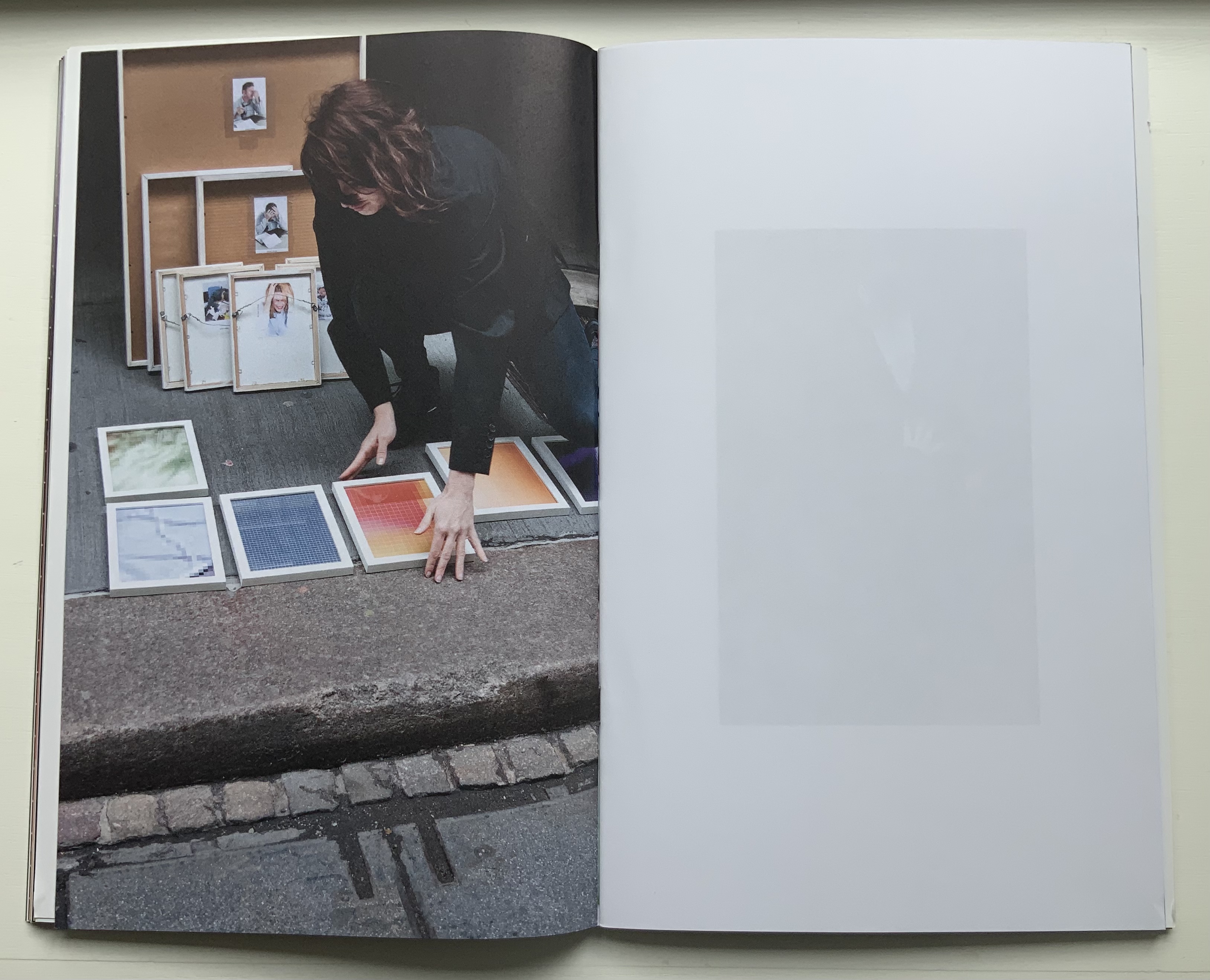
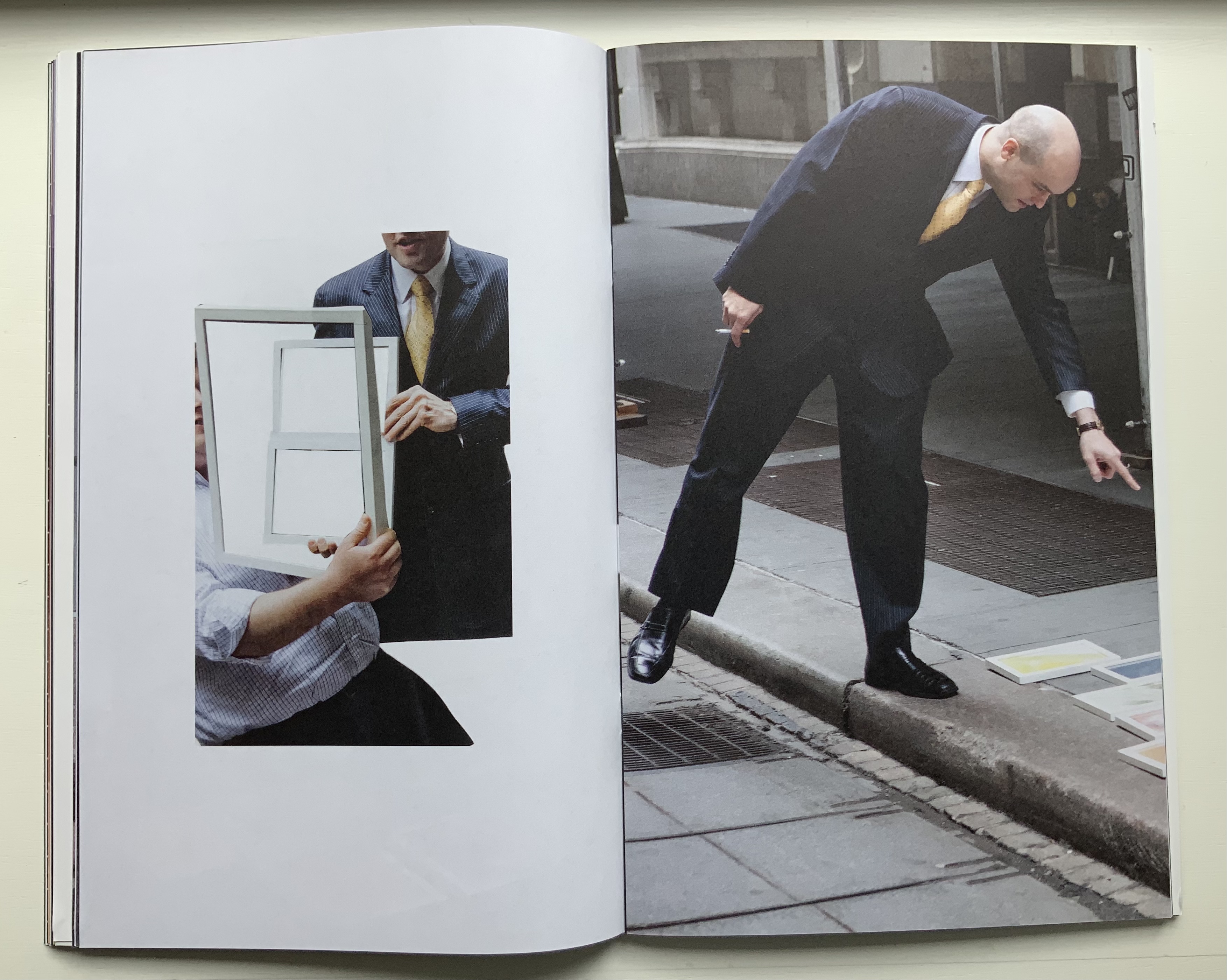
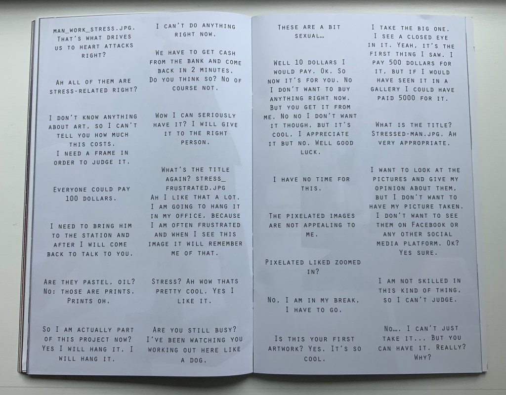
The booklet’s photos and montage pull the reader into the event — busy New Yorkers brushing by and hurrying away, or stopped in their tracks, intrigued and lingering, heads shaking, edging away or absorbed and brightening, then walking off with their prize. Selected comments on the day complete the scenario.
Only the folio that forms the front and back cover presents a complete version of one of the prizes that a New Yorker might have taken away. The print is a detail enlarged from the thumbnail image “WOMAN_IN_STRESS.JPG”, reproduced on the back of the print.
Clockwise: Front of the folio that is the front and back cover of the book. Back of the folio. Upper right of the book’s “inside back cover” showing the jpeg.
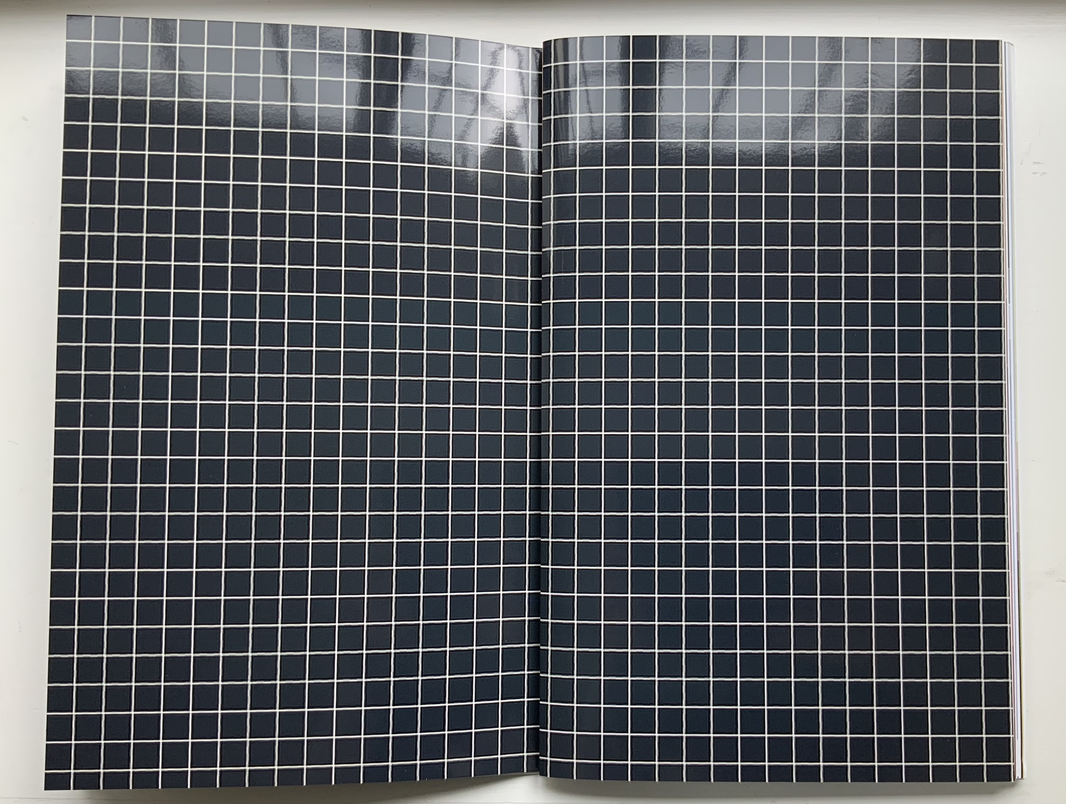
All of the other prizes are transformed in the book into beautifully aligned verso and recto pages. Thus the recto page of the glossy white-on-black grid in this double-page spread below is a bundle of single-fold, gathered folios. The least nudge shifts the bundle to the right exposing the underlying folio: half white-on-black grid, half umber-to-gold enlarged detail of the image “STRUGGLING-WITH-STRESS.JPG”, which appears on the reverse of the enlargement.
Fifty-two color photographs and photo-montages make up the content of Pixel Stress. Glorious as they are in their photographic language, it is the language of the book, spoken fluently by Kruithof and her collaborator Rémi Faucheux of RVB, that makes Pixel Stress a work of art.
Becoming Blue (2009)
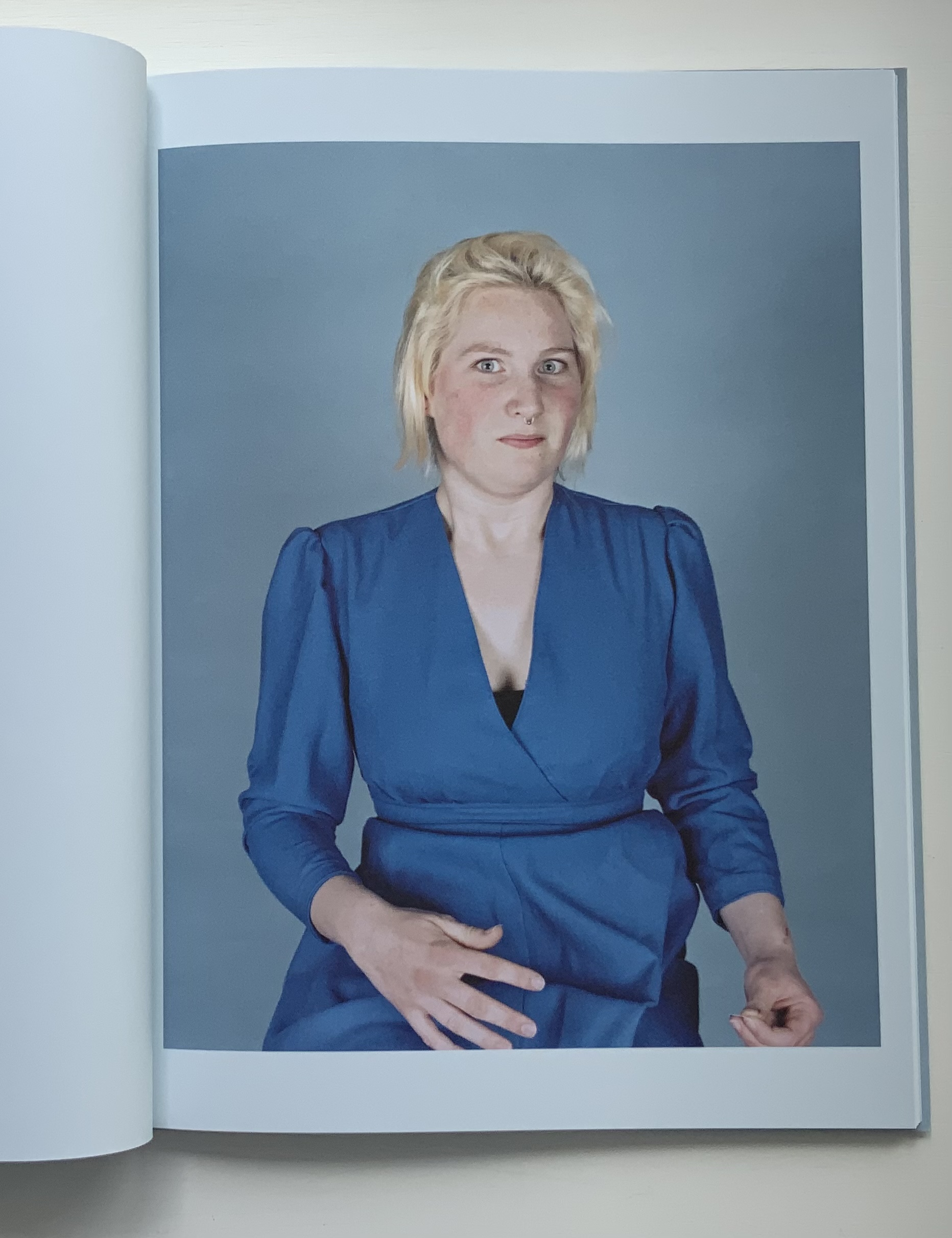
Becoming Blue (2009) Anouk Kruithof Paperback, sewn. H275 x W205 mm, 102 pages. Limited edition of 750. Acquired from the artist, 12 June 2021. Photos of the work: Books On Books Collection. Displayed with permission of the artist.
Being the product of a design house (Kummer & Herrman) and photo book publisher (Revolver Publishing), Becoming Blue seems more a showcase of photography rather than of book artistry. It nevertheless reflects Kruithof’s playful investigation of color, creative interaction with strangers (hers is the extra hand, head of hair or shape peeking out from behind the subjects) and love of the quirky and awkward.
Ephemera
Newsprint
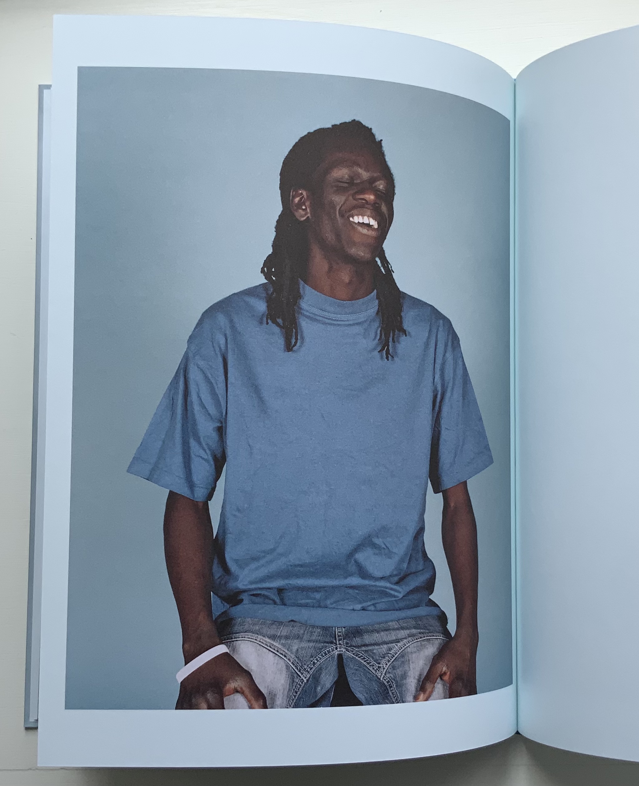
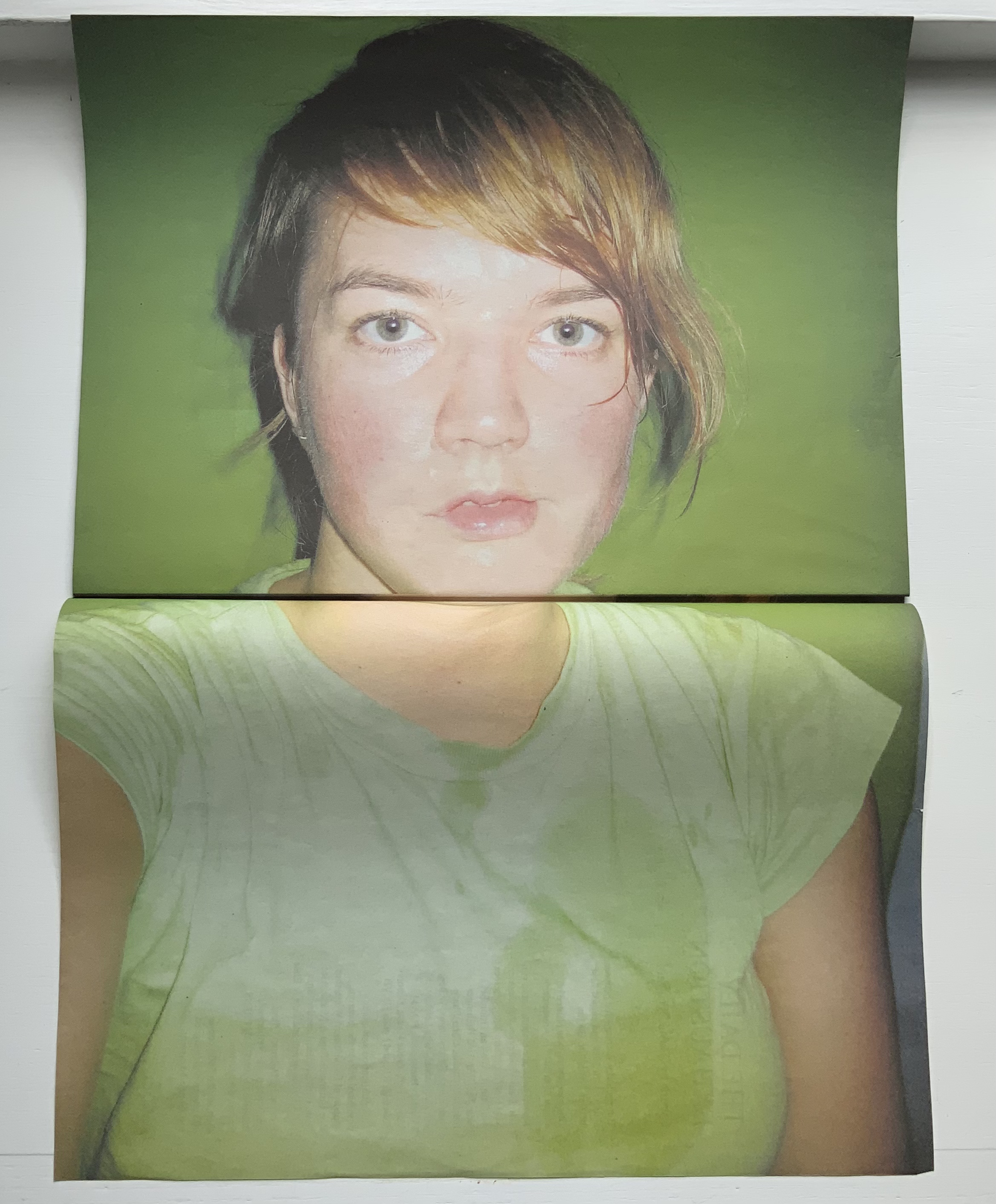
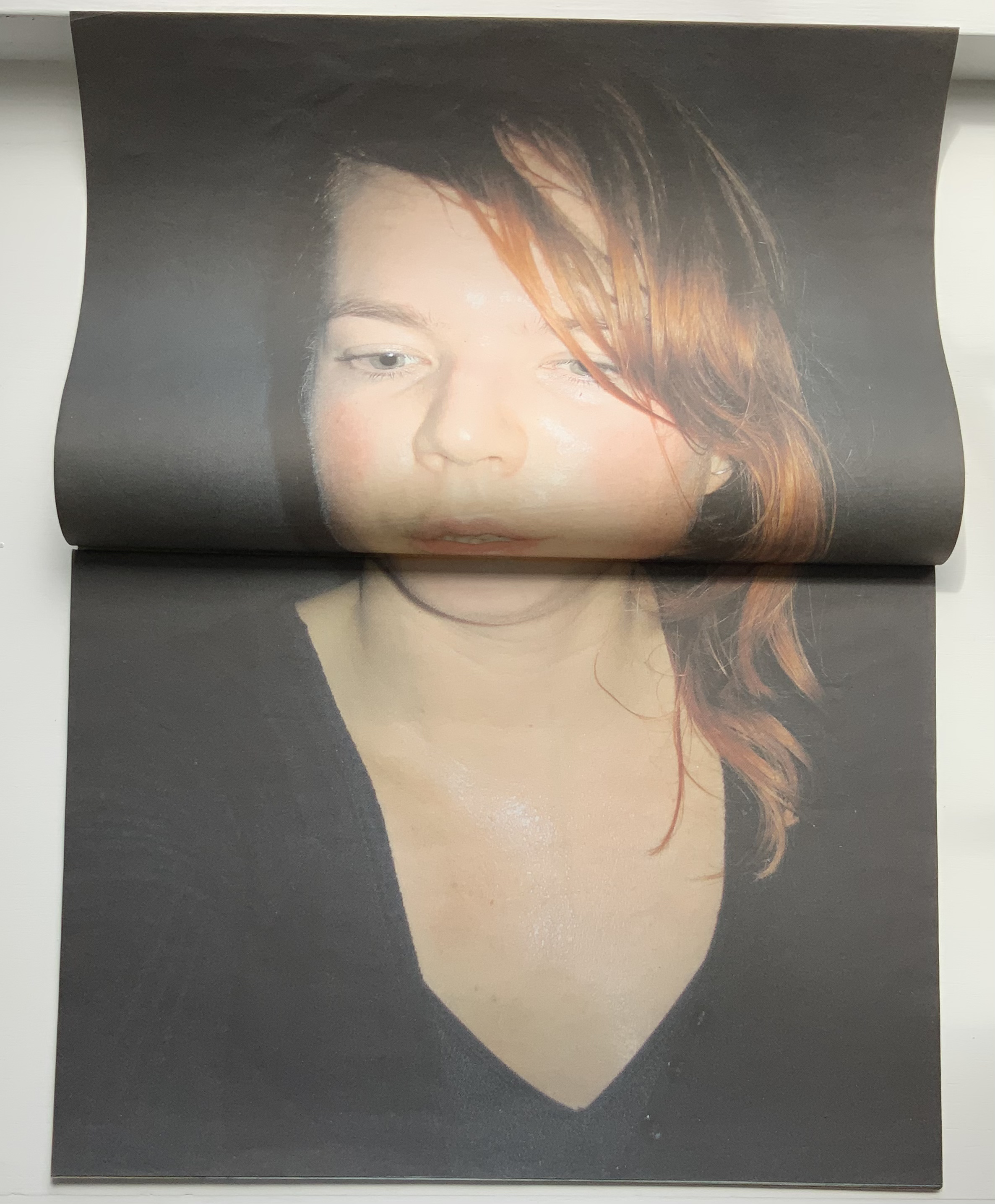
The Daily Exhaustion (2010) Anouk Kruithof Tabloid format newspaper. H275 x W195 mm, 48 pages. Edition of 5000. Acquired from the artist, 12 June 2021. Photos of the work: Books On Books Collection. Displayed with permission of the artist.
A clever contribution to the Dutch self-portrait tradition. Kruithof reworks some of these photos in AUTOMAGIC.
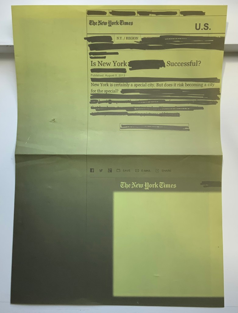
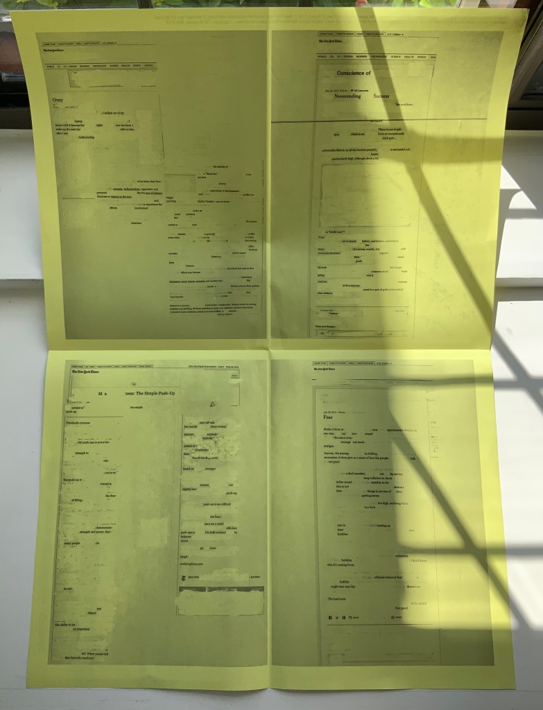
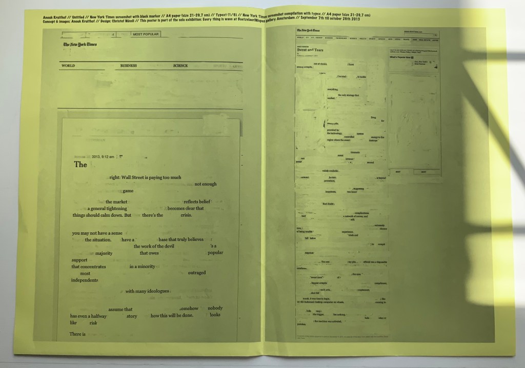
NYC Typext(2013) A2 poster, bw offset print on yellow paper, folded twice to A4. Photos of the work: Books On Books Collection. Displayed with permission of the artist.
NYC Typext is associated with the solo exhibition “Every thing is wave” held in September and October 2013 at the Boetzelaer I Nispen Gallery in Amsterdam.
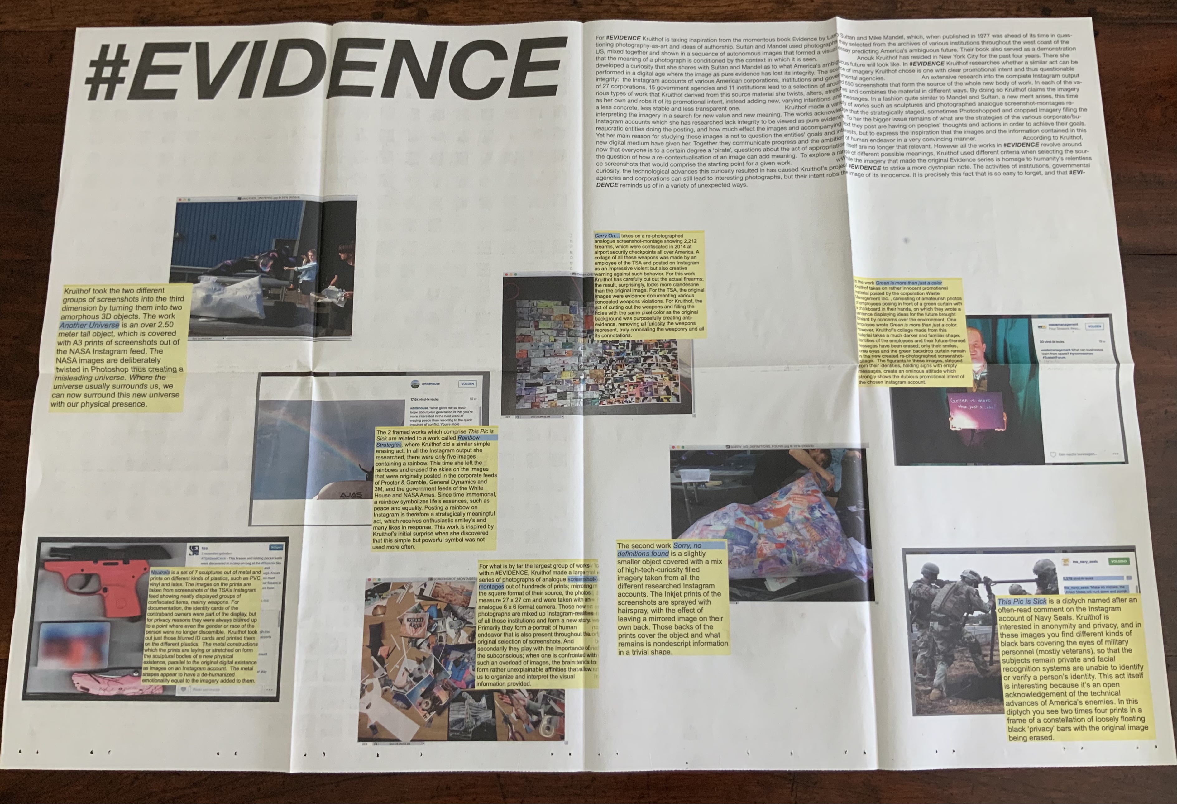
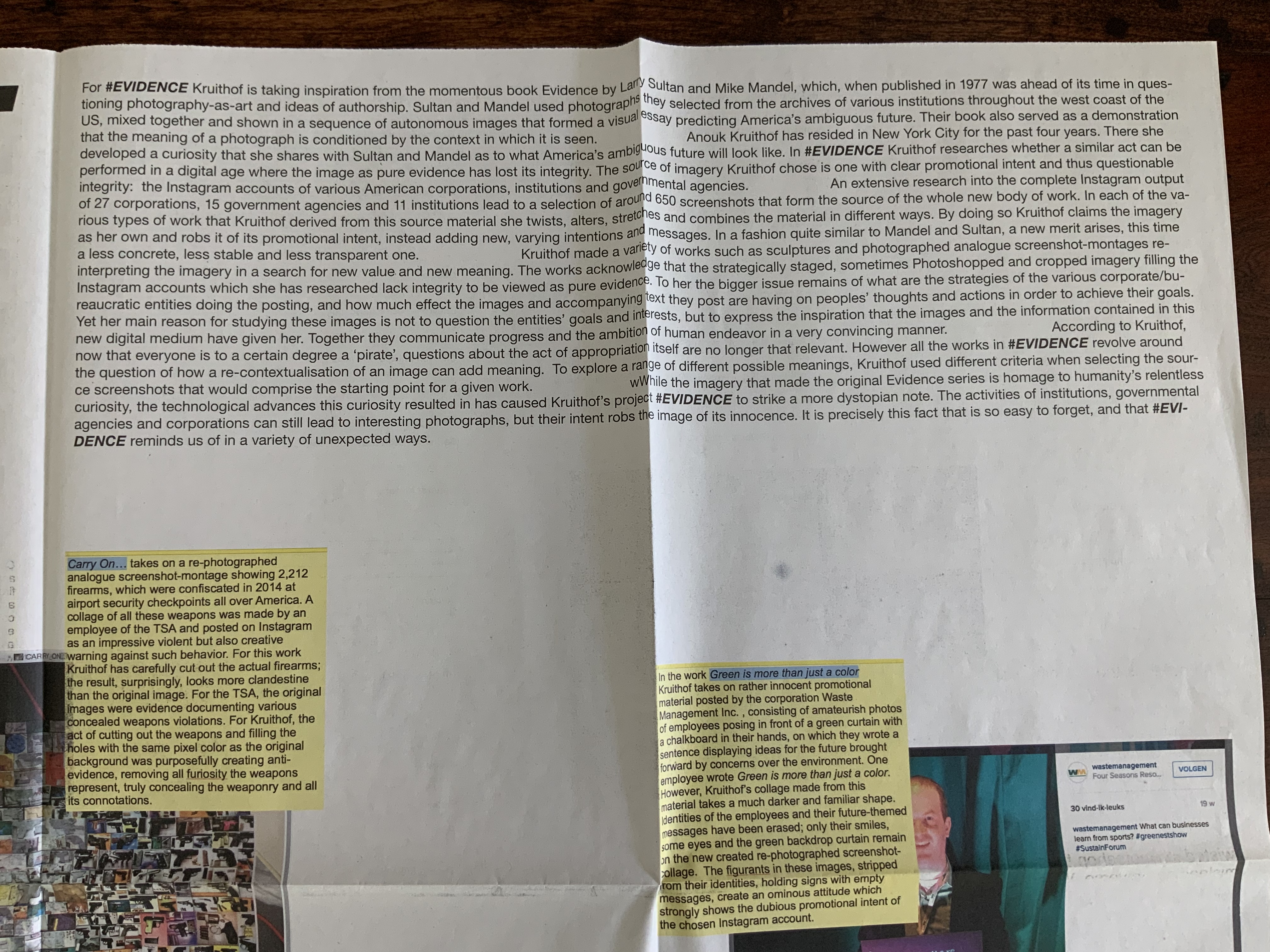
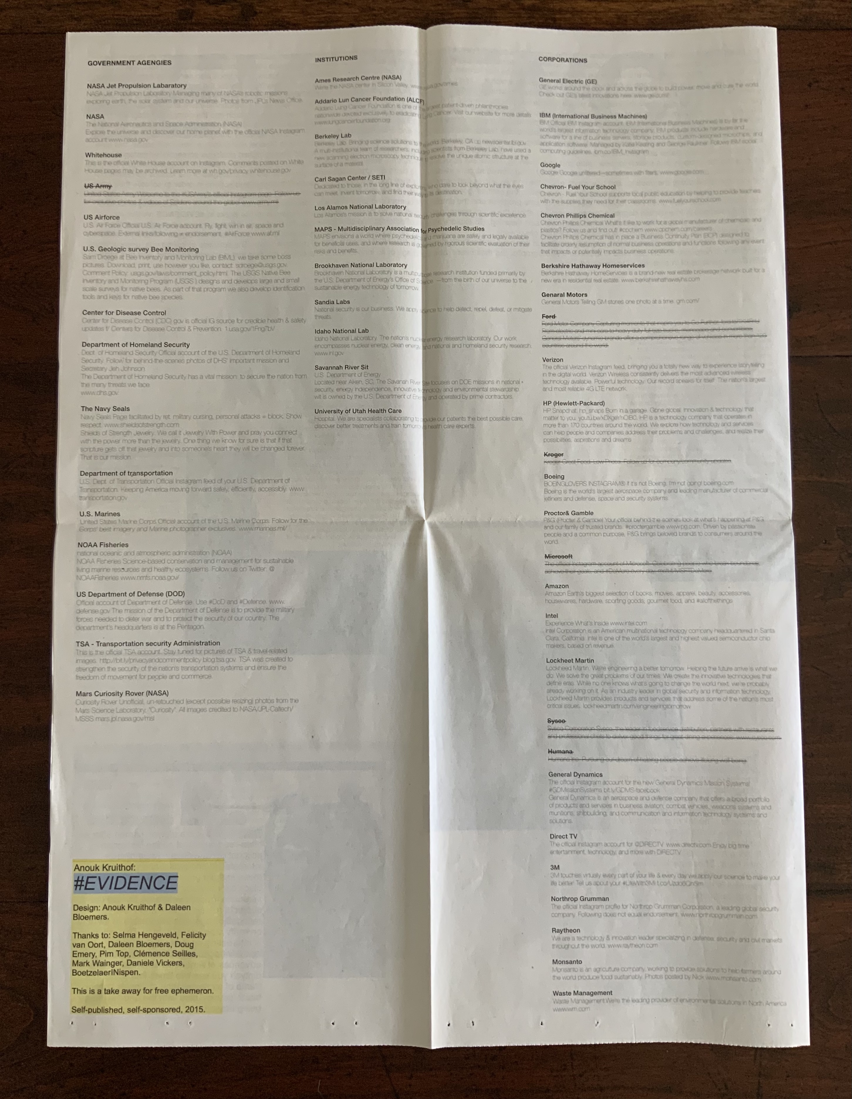
#EVIDENCE (2015) A2 poster, full color newspaper print on recycled paper, folded twice to A4. Photos of the work: Books On Books Collection. Displayed with permission of the artist.
#EVIDENCE is associated with the solo exhibition of the same name held from October through November at the Boetzelaer I Nispen Gallery in Amsterdam.
Poster-Set (2008-12)
Five posters. Edition of 50. Acquired from the artist, 12 June 2021. Photos of the works: Books On Books Collection. Displayed with permission of the artist.
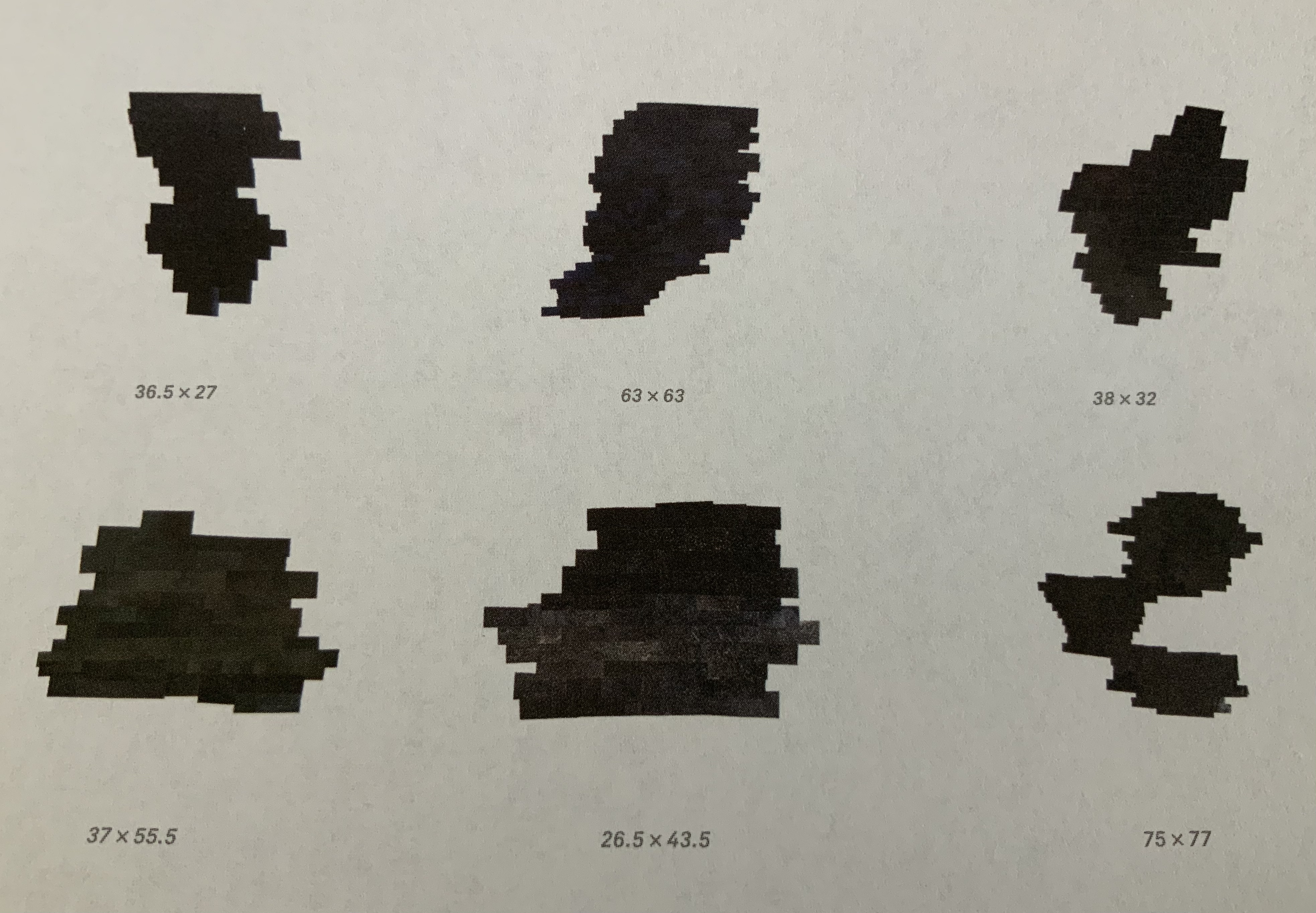
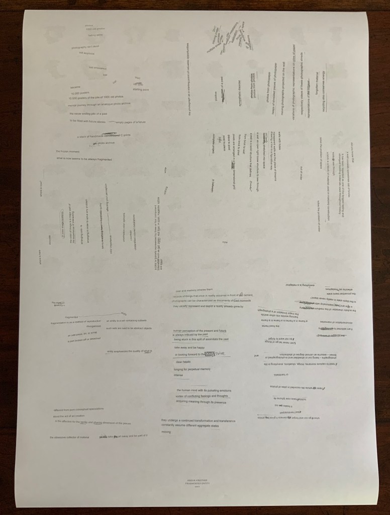
Fragmented Entity (2012) Double-sided A2 associated with the solo exhibition of the same name held at the Boetzelaer I Nispen Gallery in London.
Front of poster and details from upper left and lower right.
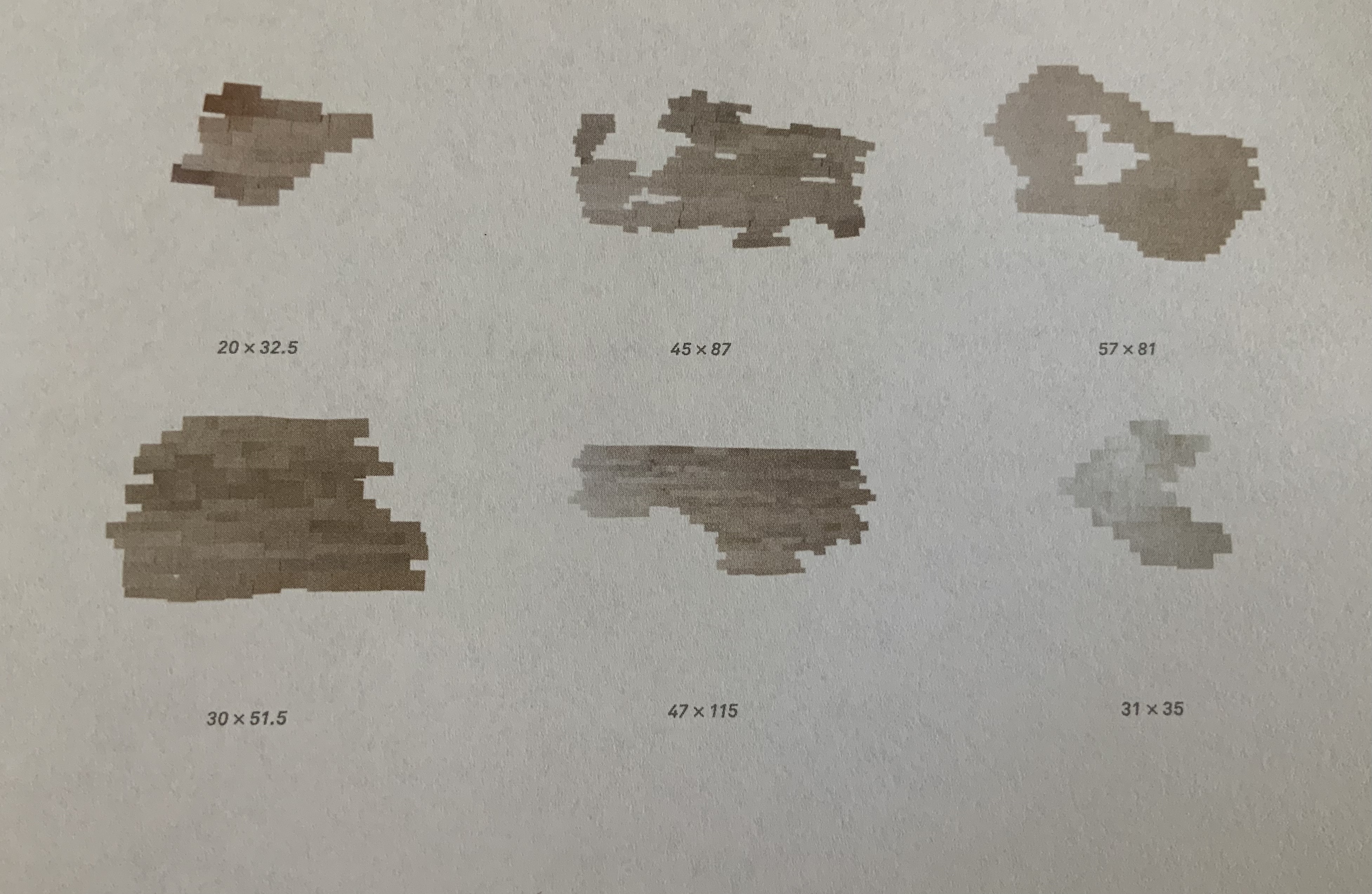
Back of poster.
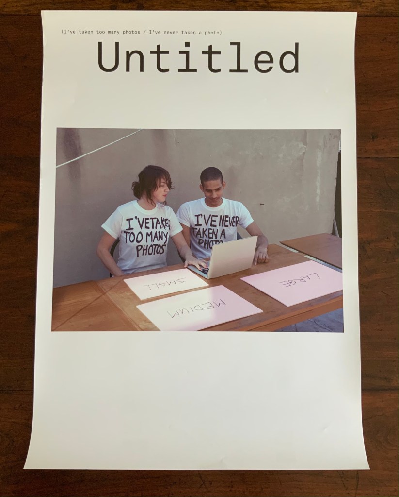
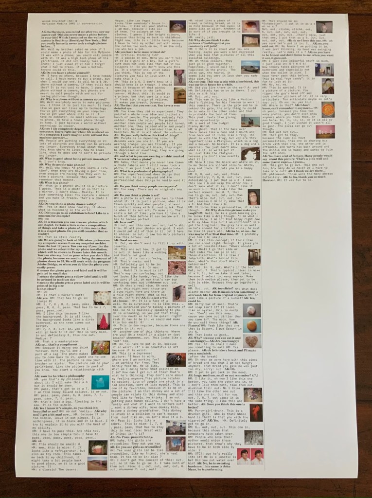
Untitled (I’ve taken too many photos / I’ve never taken a photo) (2012) Double-sided A2 poster, color, first shown at Tour le Templiers, Hyeres, France.
Pictured above with Kruithof is Harrison Medina, who responded to the artist’s ad that read “Did you never make a photo in your life?” Kruithof wanted to engage someone with as little experience of photography as possible to co-edit a selection of photos from her archive. The result was an installation, a book and this poster, on the back of which is printed excerpts from conversations during the editing process.
Back of poster.
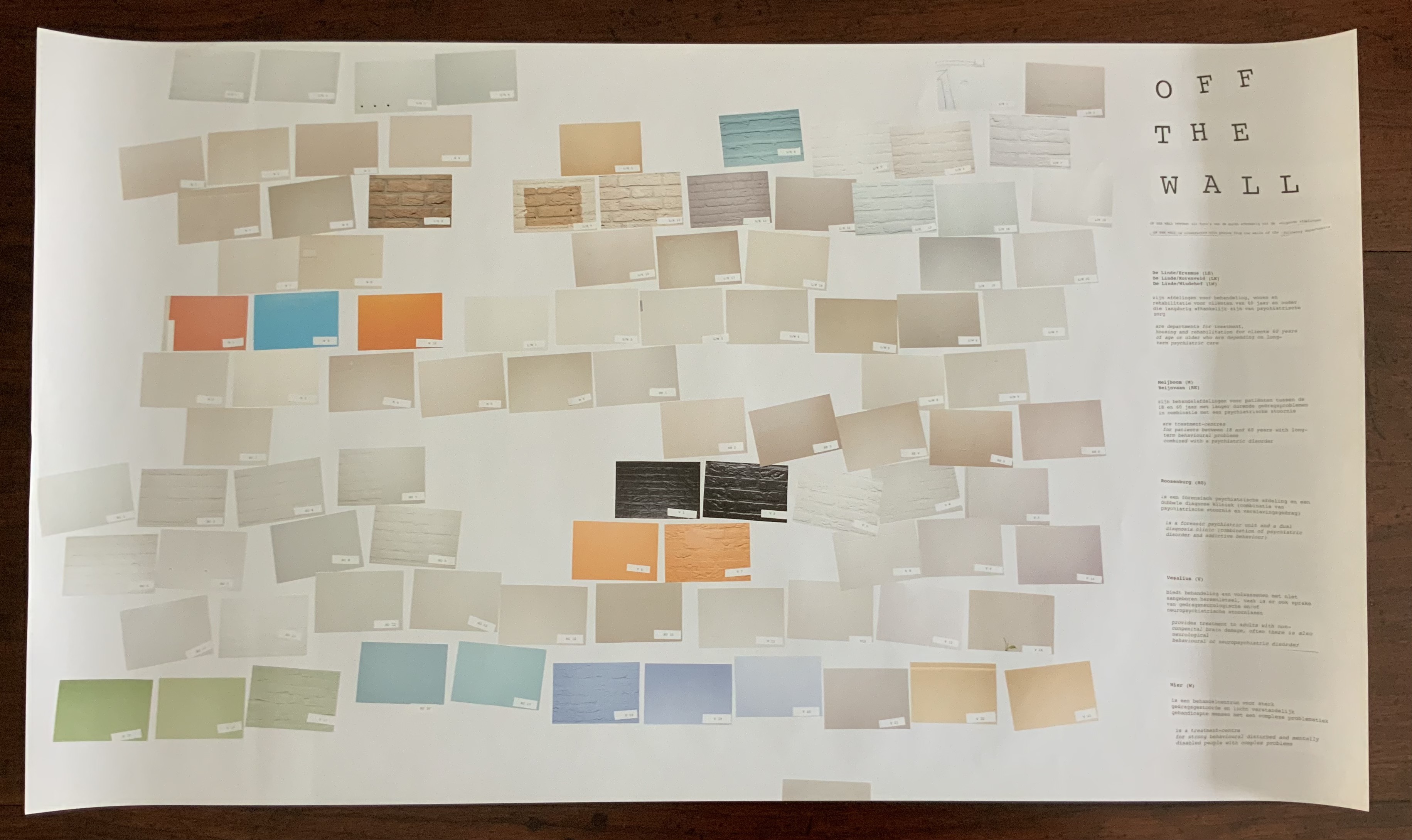
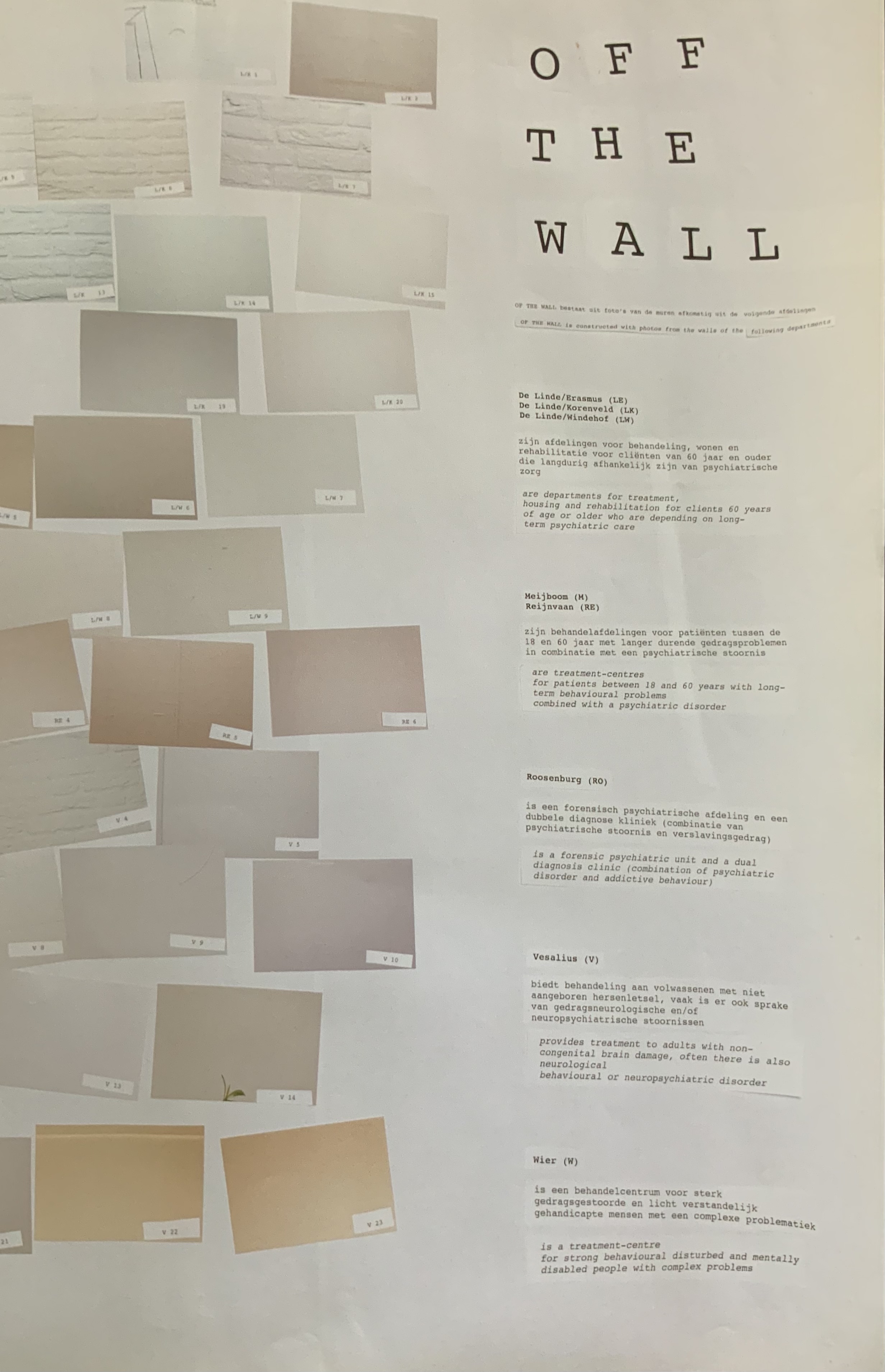
Off the Wall(2011) A3 poster associated with the publication Happy Birthday to You.
Kruithof took photos of walls in mental health institutions then reduced them to color swatches or individual bricks in an unstable wall. Two years before, she had explored another set of color-combined metaphors.
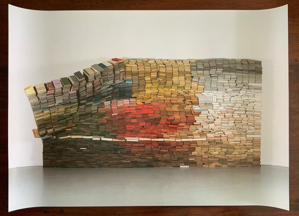
Enclosed content chatting away in the colour invisibility (2009) One-sided A2 Poster, color, on the occasion of the solo exhibition at the Kunstlerhaus Bethanien.
This sculpture consists of approximately 3500 used book obtained from bookshops or a recycling dump and then dyed. The constructed wall is rigged to collapse at some point during the installation, which has taken place in several venues.
Anonymous Poster(2008) 500 x 500 mm. Photos of the work: Books On Books Collection. Displayed with permission of the artist.
This photo montage reflects Kruithof’s early mastery of this element in the language of photography. As can be seen from Universal Tongue, AUTOMAGIC and Pixel Stress in particular, her working of this language, her engagement with friends and strangers, her crossing of borders in geography, media and format, and her fusion of all that into book art are what make her work distinctive.
With apologies to the preacher: Of making many books [on books] there is no end.
(Ecclesiastes 12:12)
With the choir of its forebearers, Amaranth Borsuk’s The Book (MIT Press, 2018) sounds an “amen” to that truth. The proliferation of degree programs in book studies covering the history of the book, the book arts and even book art ensures The Book will not be the last. What distinguishes Borsuk’s book are her perspective as an artist and the book’s breadth and depth despite its brevity.
The book has a long history of existential crises. What is a book? Is the end of the book nigh? For more than a century, those questions have returned again and again. The most recent recurrence stems from the ebook’s threat to dematerialize the book and the online world’s threat to take us into a post-text future. Even before these latest threats, book artists have long lived and worked with their own existential questions, a kind of higher existential calculus, or derivative of, the book’s crises: What is an artist’s book? What is book art? Stephen Bury, Riva Castleman, Johanna Drucker, Joan Lyons, Stefan Klima, Clive Philpott and many others in the last quarter of the 20th century dwelt on defining and categorizing book art.
Borsuk belongs to a later generation of book artists that has embraced these existential crises and recognized that the book’s existential crises are what make the book a rich medium in which and with which to create art — from bio-art miniature to the biblioclastic human-scale to large-scale installations and performances. Even to the digital.
The Origin of Species (2016) Dr. Simon Park, Guildford, Surrey “The small book shown here was grown from and made entirely from bacteria. Not only is the fabric of its pages (GXCELL) produced by bacteria, but the book is also printed and illustrated with naturally pigmented bacteria. ” Posted 27 March 2016. Photo credit: Dr. Simon F. Park
Silenda: Black Sea Book (2015) Jacqueline Rush Lee Transformed Peter Green‘s translation of Ovid’s Tristia and the Black Sea Letters H9.5″ x W12″ x D6.5.” Manipulated Text, Ink, Graphite Photo credit: Paul Kodama. In Private Collection, NL
Field (2015) Johannes Heldén Produced, and premiered, at HUMlab, Umeå University Reproduced with permission of the artist
Performance artist and academic as well, Borsuk brings that later generational and creative perspective to the existential question — What is the book? — and, with an artist’s perception of her medium of choice, displaces the old companion existential question — Is the end of the book nigh? — with an altogether more interesting one — Where next for the book?
To see where books might be going, we must think of them as objects that have experienced a long history of experimentation and play. Rather than bemoaning the death of books or creating a dichotomy between print and digital media, this guide points to continuities, positioning the book as a changing technology and highlighting the way artists in the twentieth and twenty-first centuries have pushed us to rethink and redefine the term. (pp. xiii-xiv)
In The Book, the future is not far from the physical past. Where once we had text on scrolls, now we scroll through text (albeit more vertically than horizontally). Where once human consciousness changed with the invention of the alphabet and writing, now it may be altering with our reading and writing through networked digital devices. Like the many historians before her, Borsuk starts with cuneiform (those wedge-shaped accounting marks on baked clay), hieroglyphics and the invention of the alphabet to set the scene for the advent of the book and its ongoing physicality:
its shape (scroll, accordion, codex)
its material (papyrus, vellum, paper, charcoal or mineral-based watercolor and ink)
its manufacture (scribing, printing by woodblock and movable type, design and typography, illumination and illustration, folding into pages, methods of binding)
its constituent and navigational parts (cover, book block, title page, table of contents, page numbering, index).
But Borsuk reminds us — from Sumer’s clay to Amazon’s Kindle, from Johannes Gutenberg to Project Gutenberg — the book as human artifact exists in a social, political, technological, economic and even ecological context. Who is allowed to make it, how it is transacted, how and where we use it, how we perceive and speak of it — all have affected the physicality of the book object and are reflected in it.
In the first half of The Book, Borsuk steers us through these interdependencies to a turning point. That turning point is where the pinnacle of the book arts — Beatrice Warde‘s and Jan Tschichold‘s vision of the book as a crystalline container of content — and the book’s commodification combine to cause the book’s physicality to disappear because it is so taken for granted, leaving us with “the book as idea”.
With the perception that books are ideas bestowed on readers by an authorial genius whose activity is purely intellectual, the book’s object status vanished for much of the reading public as we raised a glass to happily consume its contents…. Even though innumerable material elements come together to make the book, these features have been naturalized to such a degree that we now hardly notice them, since we have come to see content as the copyrightable, consumable, marketable aspect of the work. (pp. 106-9)
At this turning point — where “the historic relationship between materiality and text is severed” (p. 112) — the second half of The Book introduces book art. It is telling that the longest chapter in the book begins the second half, that it is called “The Book as Idea” and that it comes before any extended engagement with the digital dematerialization of the book. It is a wry pivot: the artistic genius supplants the authorial genius; what the latter takes as invisible background, the former re-makes as self-regarding foreground. As Borsuk shows and her book’s cover neatly demonstrates, works of book art are inevitably self-referential and self-aware.
As such, works of book art
have much to teach us about the changing nature of the book, in part because they highlight the “idea” by paradoxically drawing attention to the “object” we have come to take for granted. They disrupt our treatment of the book as a transparent container for literary and aesthetic “content” and engage its material form in the work’s meaning. (p. 113)
Rather than offer a chronological history of book art to explore what “artists’ books have to teach us about a path forward for the book”, Borsuk offers “flashpoints” that represent “the energies motivating artwork in book form”(p. 117). These “flashpoints” are William Blake, Stéphane Mallarmé, Ed Ruscha and Ulises Carrión. Following these flashpoints, Borsuk organizes the rest of the chapter into “key themes that recur throughout artists’ books of the twentieth century: spatiotemporal play, animation, recombinant structures, ephemerality, silence, and interactivity” (pp. 146-47).
Oddly, Blake as flashpoint does not illuminate these six particular themes. Rather Borsuk notes three other recurrent themes or “energies motivating artwork in book form” that Blake and his work represent: centering or re-centering the production processes on the author/artist; using the book as a sociopolitical and visionary platform; and redefining, developing and challenging the relationship between word and image.
Blake refers to himself as “The Author & Printer W. Blake,” making clear the union of creativity and craft in his work. (p. 121)
Blake’s engagement with the social issues of his day, and his use of book form to respond to child labor, urban squalor, and slavery, established an important trend in both artists’ books and independent publishing—the utility of the book as a means of spreading social justice. (pp. 121, 124)
Blake used his craftsmanship to develop the relationship between word and image (p. 140)
One need not look far among twentieth and twenty-first century book artists for resonance with those themes. That Blakean union of creativity and craft resurfaces in artists such as Ken Campbell (UK), Cathryn Miller (Canada), Pien Rotterdam (Netherlands), Barb Tetenbaum (US) and Xu Bing (China) — some of them even to the point of carving or setting their own type, making their own paper, pulp printing on it themselves or binding the finished work themselves. Vision and sociopolitical observation have risen up in the works of artists such as Doug Beube (Canada), Julie K. Dodd (UK), Basia Irland (US), Diane Jacobs (US), Anselm Kiefer (Germany) and Chris Ruston (UK). Blake’s redefining the relationship of word (or text) to image often reappears book artists’ abecedariesand their children’s books such as A Dictionary Storyby Sam Winston (UK).As for emulators of Blake in technical innovation, consider the analogue example of Australian Tim Mosely’s works created with his patented pulp printing process, where the “ink” is actually colored pulp, or the digital example of Borsuk’s work Between Page and Screen, where the pages contain no text—only QR codes that, when scanned with a webcam, activate the text’s appearance on the reader’s browser screen.
For her second flashpoint, Borsuk selects another visionary, Stéphane Mallarmé, who like Blake was reacting to his own perceived Satanic mills draining poetry of its spirituality. Mallarmé’s Satanic mills dispensed rigid columns of newsprint to the masses and bland expanses of poetry and fiction set by Linotype machines in the neo-classical Didot font. With his famous visionary dictum — “everything in the world exists in order to end up as a book” (p. 135) — Mallarmé nudged the book toward pure concept and opened its mystical covers to the Dadaists, Surrealists, Futurists, Vorticists, Lettrists, Conceptualists and biblioclasts. With spatiotemporal play — mixing type sizes and fonts, breaking up the line and even breaking the page — Mallarmé used text to evoke image and, in his view, remake the book as a “spiritual instrument”. His post-humous book-length poem Un coup de Dés jamais n’abolira le Hasard (A Throw of the Dice Will Never Abolish Chance), published in 1897, embodies that vision and continues to cast its flashpoint light across multiple generations of book artists’ efforts. From Marcel Broodthaers in 1969, we have his homage to Un Coup de Dés. From Jérémie Bennequin in 2014, we have his serial “omage” to Broodthaers’ homage. And, most recently, we have the 2015 new bilingual edition A Roll of the Dice by Jeff Clark and Robert Bononno, for which Borsuk provides a perceptive reading.
Where Mallarmé’s flashpoint enlisted his vision alongside the cry “épater le bourgeois” from Baudelaire and other late nineteenth-century poets, Ed Ruscha’s later flashpoint illuminates a democratic counterpoint, a Zen-like vision and a very different way of changing the relationship of text to image. Ruscha’s self-published photobooks were cheap and distributed outside the gallery-controlled channels of art. As Borsuk shows — directly with Ruscha and indirectly with the many book artists influenced by him — the text is restricted to the book’s title, which interacts with a series of deadpan photos and their layout to deliver a wry, tongue-in-cheek work of book art. Ruscha’s spatiotemporal play manifests itself across the accordion book format and out-of-sequence juxtapositions. Ironically Ruscha’s works now command thousands of dollars per copy, and one has more chance of seeing them in an exhibition than in a roadside stop’s rack of newspapers, magazines and mass-market paperbacks.
Mexico’s Ulises Carrión — polemicist, European bookshop owner, conceptual artist and Borsuk’s fourth choice of flashpoints — is a counter-flashpoint to Ruscha. Where Ruscha reveled in self-publishing commodification, Carrión sneered at the book in its traditional commercial form. Where Ruscha has resisted the label “conceptual artist”, Carrión played the role to the hilt. Where Ruscha’s work has elicited numerous homages (see Various Small Books from MIT Press in 2013) and achieved a high profile, Carrión’s work, much lower in profile, has provided a more compelling range of hooks or influences on which to hang many different manifestations of book art (or bookworks as Carrión preferred). In fact, Borsuk’s six stated key themes or “energies motivating artwork in book form” come from Carrión’s manifestos (pp. 146-47).
The first theme — “spatiotemporal play” — comes from Carrión’s initial definition of the book as a “sequence of spaces”, which Borsuk traces to tunnel books, pop-ups and even large-scale constructs, the latter illustrated by American Alison Knowles‘ inhabitable The Big Book (1968). One more possible future of the book implied by spatiotemporal play manifests itself in Borsuk’s own augmented-reality (AR) works, those of Caitlin Fisher (Canada) and Carla Gannis’ Selfie Drawings (2016), in which portraits on the hardcover book’s pages animate and change when viewed through smartphone or tablet.
Borsuk takes the second theme, that of “animation”, from Carrión’s dictum: “Each of these spaces is perceived at a different moment— a book is also a sequence of moments”. As her several examples illustrate, much book art is cinematic. Borsuk’s exposition of Canadian Michael Snow‘s Cover to Cover (1975) comes closest to reproducing the experience I enjoyed of “watching” that photo bookwork from cover to cover several times at the now closed Corcoran Art Gallery. Borsuk is quick and right to remind that the cinematic future of the book has been with us for a long time, even before the cinema. She bookends her exposition of Snow’s book and the text animation of American Emmett Williams‘ Sweethearts (1967) on one side with Victorian flip-books and on the other with American Bob Brown‘s 1930s The Readies (presumably pronounced “reedies” to follow Brown’s comparison of his scrolling one-line texts with the cinema’s “talkies”).
A forgotten modernist, Brown declared the obsolescence of the book, predicted a new form of reading and technology to enable it, an optical projector emitting text into the ether and directly into the eyeball. But what does this tell us about the future of the book? Borsuk notes Craig Saper‘s resurrection of Brown’s Roving Eye Press and how he even put together a website that emulates Brown’s reading machine. In her phrase describing the machine’s effect of “turning readers themselves into a kind of machine for making meaning” (p. 168), Borsuk hints at a future of digitally interactive books, which she takes up in the next section and more extensively in the next chapter. At this point, however, the reader could use a hint of practicality and skepticism. Linear-one-word-at-a-time reading, however accelerated, eliminates affordances of the page, ignores graphics and strains against the combination of peripheral vision and rapid eye movement we unconsciously (even atavistically?) deploy as we “read” whatever we see. Although in the next section Borsuk does bring on more likely examples of the book’s future exploitation of its cinematic affordances (manga, graphic novels and children’s books), this section’s treatment of animation misses the chance to cite actual recent successes like Moonbot Studios‘ The Fantastic Flying Books of Mr. Morris Lessmore (2012) and others.
Once into the third theme — “recombinant structure” — it is clear that Borsuk’s chosen Carriónesque themes overlap one another. Like the cinematic, the recombinant structure manifests itself in accordion books. It extends, however, to something more interactive: volvelles (or medieval apps as Erik Kwakkel calls them), interactive pop-ups, harlequinades (flap books) and more. Borsuk uses Raymond Queneau‘s harlequinade Cent mille milliards de poèmes ( One hundred thousand billion poems, 1961), Dieter Roth‘s slot books and works by Carolee Schneemann to illustrate book art’s celebration of the concept. The fact that Queneau’s book is still easily available on Amazon vouches for book art’s predictive qualities. The example of Marc Saporta’s Composition No.1 (Éditions du Seuil, 1962), “a box of 150 leaves printed on only one side that the reader is instructed to shuffle at the outset”, goes Queneau one better —ironically. In 2011, Visual Editions reissued Composition No. 1 in print and app forms. Alas, the former is out of print, and the latter is no longer available for download (although a video of it is available here).
Composition No. 1 (2011) Marc Saporta Translation by Richard Howard, Introduction by T.L. Uglow, Google Creative Lab, Diagrams by Salvador Plascencia and Designed by Universal Everything Photo credit: Books On Books
Borsuk draws her fourth theme — ephemerality — from Carrión’s dictum:
I firmly believe that every book that now exists will eventually disappear. And I see here no reason for lamentation. Like any other living organism, books will grow, multiply, change color, and, eventually, die. At the moment, bookworks represent the final phase of this irrevocable process. Libraries, museums, archives are the perfect cemeteries for books. (p. 145)
To illustrate, Borsuk begins with the physical biblioclasts — those who in Doug Beube‘s phrase are “breaking the codex“. They include Beube himself, Bruce Nauman (see above), Brian Dettmer, Cai Guo-Qiang, Marcel Duchamp, Dieter Roth and Xu Bing. While some of these artists reflect a twenty-first century surge of interest in altered books and book sculpture, “facilitated by the overarching notion that the book is an artifact not long for this world” (pp.82-84), others have taken a more generative archaeological approach — erasing or cutting away a book’s words to reveal another. Examples include Tom Phillips‘ A Humument (1966-2014) and Jonathan Safran Foer‘s Tree of Codes(2010). Phillips’ bookwork serves multiple purposes for Borsuk’s arguments. Not only does it represent the book art of “erasure”, its success across multiple editions, digital formats and presence in art galleries supports her notion of book art’s predictive qualities.
There is a variant on her theme that Borsuk does not illustrate and is worth consideration for her next edition: the self-destructing yet regenerative work of book art. Examples could include American Basia Irland‘s series ICE BOOKS: Ice receding/Books reseeding (2007-), which gives a formidably tangible and new meaning to “publishing as dissemination”; and Canadian Cathryn Miller‘s tail-chasing Recomp (2014); and Argentinian Pequeño Editor‘sMi Papa Estuvo en la Selva (2015), which after reading can be planted to grow into a jacaranda tree.
Recomp (2014) Cathryn Miller Copy of Decomp, Collis and Scott (2013) nailed to a tree. Photo credit: David G. Miller
Recomp (2015) Photo credit: David G. Miller
Recomp vandalized (2015) Photo credit: David G. Miller
The last section in this chapter expands on the fifth theme — silence — drawn from Carrión’s statement:
The most beautiful and perfect book in the world is a book with only blank pages, in the same way that the most complete language is that which lies beyond all that the words of a man can say. Every book of the new art is searching after that book of absolute whiteness in the same way that every poem searches for silence. Ulises Carrión, Second Thoughts (1980), pp. 15-16.
Among her several examples are Pamela Paulsrud‘s Touchstones (2007-10), which look like stones but are books sanded-down into stone-like shapes, and Scott McCarney‘s 1988 Never Read(Opposed to Ever Green), a sculpture composed of stacked library discards that narrows as it ascends. Paulsrud’s, McCarney’s, Irland’s and Miller’s works are what Borsuk calls “muted objects”, but they speak and signify nevertheless:
Muted books take on a totemic [metaphoric] significance…. The language of the book as a space of fixity, certainty, and order reminds us that the book has been transmuted into an idea and ideal based on the role it plays in culture…. Defining the book involves consideration for its use as much as its form. (pp. 193-95)
Never Read (Opposed to Ever Green) (1988) Scott McCarney Reproduced with permission of the artist
Never Read (Opposed to Ever Green) (1988) Scott McCarney Reproduced with permission of the artist
Never Read (Opposed to Ever Green) (1988) Scott McCarney Reproduced with permission of the artist
Borsuk is a superb stylist of the sentence and expository structure. The words above, concluding chapter three, launch the reader into Borsuk’s final theme of interactivity and her unifying metaphor: “the book as interface”. Owners of Kindles, buyers from Amazon, perusers of Facebook — we may think we know what’s coming next in The Book and for the book, but Borsuk pushes the reader to contemplate the almost real-time evolutionary change we have seen with ebook devices and apps, audiobooks, the ascension of books to the cloud via Project Gutenberg, the Internet Archive and Google Books, and their descent to Brewster Kahle‘s physical back-up warehouse (to be sited in Canada in light of recent political events) and into flattening ebook sales of late. Chapter 4 is a hard-paced narrative of the book’s digital history from the Memex in Vannevar Bush‘s 1945 classic “As we may think” to T.L. Uglow‘s 100-author blockchain collaboration in 2017, A Universe Explodes from Visual Editions’ series Editions at Play.
Borsuk reminds us:
Our current moment appears to be much like the first centuries of movable type, a cusp. Just as manuscript books persisted into the Gutenberg era, books currently exist in multiple forms simultaneously: as paperbacks, audiobooks, EPUB downloads, and, in rare cases, interactive digital experiences. (p. 244)
Borsuk weaves into this moment of the book’s future a reminder that print affordances such as tactility (or the haptic) and the paratextual (those peripheral elements like page numbers, running heads, ISBNs, etc., that Gary Frost argues “make the book a book”) have been finding fresh ways into the way we read digitally. The touchscreen enables us to read between the lines literally in the novella Pry (2014) by Samantha Gorman and Danny Cannizaro (2014). Breathe (2018) by Kate Pullinger, another work in the Editions at Play series, uses GPS to detect and insert the reader’s location, the time and weather, and when the reader tilts the device or rubs the screen, hidden messages from the story’s (the reader’s?) ghosts appear.
At this point, an earlier passage from The Book should haunt the reader:
Artists’ books continually remind us of the reader’s role in the book by forcing us to reckon with its materiality and, by extension, our own embodiment. Such experiments present a path forward for digital books, which would do well to consider the affordances of their media and the importance of the reader, rather than treating the e-reader as a Warde-ian crystal goblet for the delivery of content. (p. 147)
Borsuk convinces. Art, artifact, concept — wrought by hand and mind, hands and minds — the book is our consensual tool and toy for surviving beyond our DNA. So now what? Metaphor, hints and historical flashpoints may illuminate where we have been, how it shows up in contemporary books and book art and where we may be going with it. In ten or one hundred years though, how will a book publisher become a book publisher? Given the self-publishing capability today’s technology offers, will anyone with a file on a home computer and an internet connection consider himself or herself a book publisher? Borsuk thinks not:
The act of publication — of making public — is central to our cultural definition of the book. Publication might presume some cultural capital: some editorial body has deemed this work worthy of print. It might also presume an audience: a readership clamors for this text. But on a fundamental level, publication presumes the appendage of elements outside the text that help us recognize it as a book, even when published in digital form. (pp. 239-40)
How will future book publishers learn to master the appendage of these elements outside the text (the paratext) that make a book a book “even when published in digital form”? Borsuk’s commentary on the ISBN as one of these elements sheds oblique light on that. She points to the artist Fiona Banner’s uses of the ISBN under her imprint/pseudonym Vanity Press — tattooing one on her lower back, publishing a series Book 1/1(2009) consisting of sixty-five ISBN’d pieces of mirrored cardstock and then collecting them in a photobook entitled ISBN 978-1-907118-99-9 in order to deposit those one-offs with the British Library as required by the UK’s Legal Deposit Libraries Act. What can a future ebook publisher deduce from this?
That the use of a globally unique identifier (GUID) matters.
The backstory of the transition from ISBN10 to ISBN13 and that of ebooks, ISBNs and Digital Object Identifiers (DOIs) might provide interesting fodder. The notion that the book industry was running out of 10-digit ISBNs was a red herring used to convince industry executives to adopt the more widely used format of unique identifiers overseen by GS1. The real reason for moving to ISBN13 — reduced friction in the supply chain — was too hard to sell. About the same time, some major publishers proposed incorporating the ISBN into the DOI for an industry-standard ebook identifier. The DOI offered an existing digital, networked infrastructure already being used by most of the world’s scientific, technical and medical journals publishers. It is an offshoot of the Handle System, established by Robert Kahn. Sad to say, few book publishers adopted the DOI for their ebooks; still fewer used the DOI’s application- and network-friendliness to enable their ebooks to take advantage of the network’s digital affordances.
The DOI shares with the ISBN a feature that Borsuk points out as a limitation to more widespread use: it is not free. A significant percentage of ebooks exist without ISBNs, much less DOIs. If a digital GUID is to be used in ways that help us recognize the identified digital object as a book, future book publishers and their providers of a network ecosystem supporting ebooks, linking with the print ecosystem and reducing friction in the supply chain still have wide gaps in commerce and knowledge to close. Perhaps this particular paratextual element is unnecessary for the book’s digital future, but until those gaps are narrowed, the ecosystem for eBooks will remain balkanized by Amazon, Apple, Google, Lulu and the more digitally literate denizen of the print publishing industry. In the meantime, as Borsuk’s examples throughout her book show, there are boundless other print and digital affordances with which publishers, authors, editors, designers, typographers, developers and readers can play as they continue to shape the book.
The Book‘s publication month, June 2018, is auspicious, being the same for the Getty Center’s exhibition “Artists and Their Books/Books and Their Artists“, June 26 – October 28. The Center and MIT Press would do well to have stacks of The Book on hand. The Book will also serve as an excellent introductory textbook for courses on book art or the history of the book. And by virtue of its style and artist’s perspective, Borsuk’s book will appeal to anyone with even a passing interest in this essential technology of civilization and its growing role as a material and focus of art in the twentieth and twenty-first centuries.
In the hands and mind of Anouk Kruithof, book art is made to sound intimate notes (Automagic, 2016) and grand notes (Enclosed Content Chatting Away in the Colour Invisibility, 2009 ongoing). She has packed so much art, enterprise and life into her life that it is hard to find sufficient time and resource to keep up with her activity. In 2017 and at the turn of 2018, a flurry of commentary arrived to mark her show ¡Aguas! at Foam Fotografiemuseum in Amsterdam. A fortunate effect of social media and the Web is that current news seems to pull retrospective links in its wake.
For Max Van Steen’s perceptive review of AUTOMAGIC (pictured above), click here.
Here are some of the videos and sites featuring Kruithof, her activities and art:
Enclosed Content Chatting Away In The Colour Invisibility, Anouk Kruithof, 2009
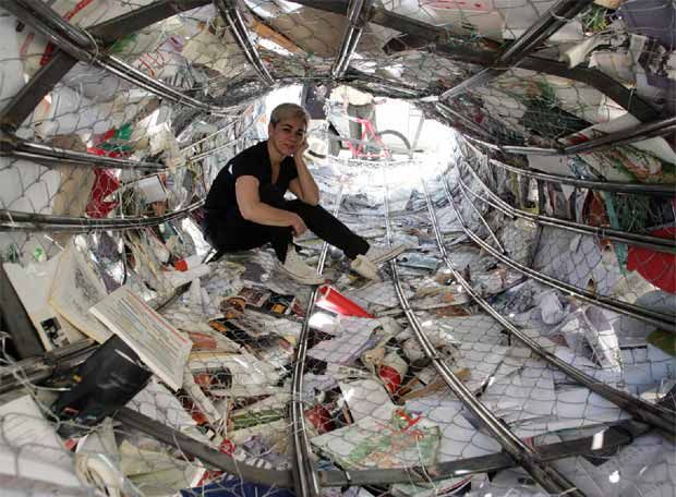
Anouk Kruithof’s massive wall of colored books echoes two leitmotivs in book art — the installation and the presumed disappearance of the book in the onslaught of digital media. Reminiscent of pixels on the computer screen, the work is entitled Enclosed Content Chatting Away In The Colour Invisibility and consists of over 3,500 books rescued from the recycling dump and whose arrangement varies with each installation. Kruithof has stated that she seeks to “invent new things out of fragments of the past.’
Biografias, Alicia Martín, 2005, site specific installation, Casa de America, Madrid
Alicia Martín’s installation, called Biografias, has appeared in Madrid, The Hague, Cordoba, Linz and Valencia. The torrent of defenestrated books is made of over 5,000 titles fixed to a wire frame.
Alicia Martin “absorbed” by her work
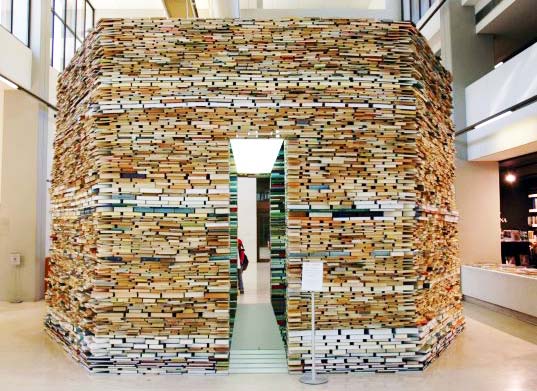
Matej Kren is another book installation artist, whose thoughtful, towering installations have been featured in Prague and numerous other cities in this hemisphere.
Book Cell, Matej Kren, 2006, Centro de Arte Moderna – Foundation Calouste Gulbenkian, Lisbon, Portugal
Although Brian Goggin does not use actual books as his material, his works in bronze, polycarbonate, steel and LED prompt reflections on books, language, the transmission of ideas, permanence and impermanence.
Speechless, Brian Goggin, 2008-2009 Bronze, site-specific installation Lafayette Library, Lafayette, California
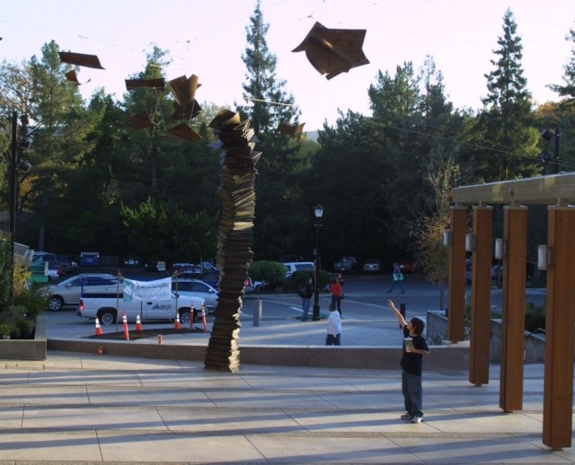
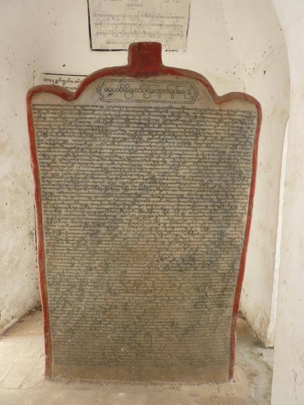
Looking back to the late 19th century, you will find that Myanmar can lay claim to the world’s largest book.
The Parthenon of Books, 1983/2017 Marta Minujín Kassel, Germany
In her note in BookRiot, Nikki Steele takes Brian Dettmer’s TED talk remark that books are created to relate to our human scale and builds on it elegantly, if all too briefly, by bringing together the installation works “Literature versus Traffic”, “Scanner”, “Book Cell”, “Singularity”, “Biographies” and “Contemporaries”. She’s not the first to provide a Pinterest– or Flickr-style burst of “ooh, look at this”, but unlike her predecessors, she makes the point worth pondering: this art that is not on a human scale evokes wonder and awe.
This challenges and expands on Dettmer’s point that people are disturbed by book art because we think of the book as a body, a living thing. As John Milton said, “As good almost kill a man as kill a good book: who kills a man kills a reasonable creature, God’s image; but he who destroys a good book kills reason itself”. That was in the context of book licensing laws that led to the confiscation and destruction of unlicensed books. Still, Milton would probably react as angrily to individual works of book art, and he might view the installations as if they were on the scale of the massacre of the Waldensians in the Piedmont.
Dettmer’s justification of book art that books “also have the potential to continue to grow and to continue to become new things”, that “books really are alive”, leaves us still squirming on the hook when Steele asks, “what happens when artists explode the scale and take books much, much larger?”. If you think cutting up or destroying a book is sacrilegious, what is your reaction to the 10,000 splayed in the streets of Melbourne by Luzinterruptus or the equal number cast by Alicia Martín into frozen defenestrations in Madrid and elsewhere in Spain or the even greater number in Marta Minujín’s The Parthenon of Books, installed for documenta in Kassel, Germany?
Miltonic eruption? Or Steele-ish delight, awe and love of the art?
Let’s raise the stakes and confusion. What if the books used in the single-volume work and installations were the Koran, the Bible or the Torah? Art and ethics are rarely happy bedfellows. Is there such a thing as “responsible art” that does not run afoul of the principle of the creative spirit or the integrity of art? Is art wholly without cultural, ethical or social contextual obligations?
This is why I like book art. It provokes just by coming into being. Its existence and appreciation are hard won.