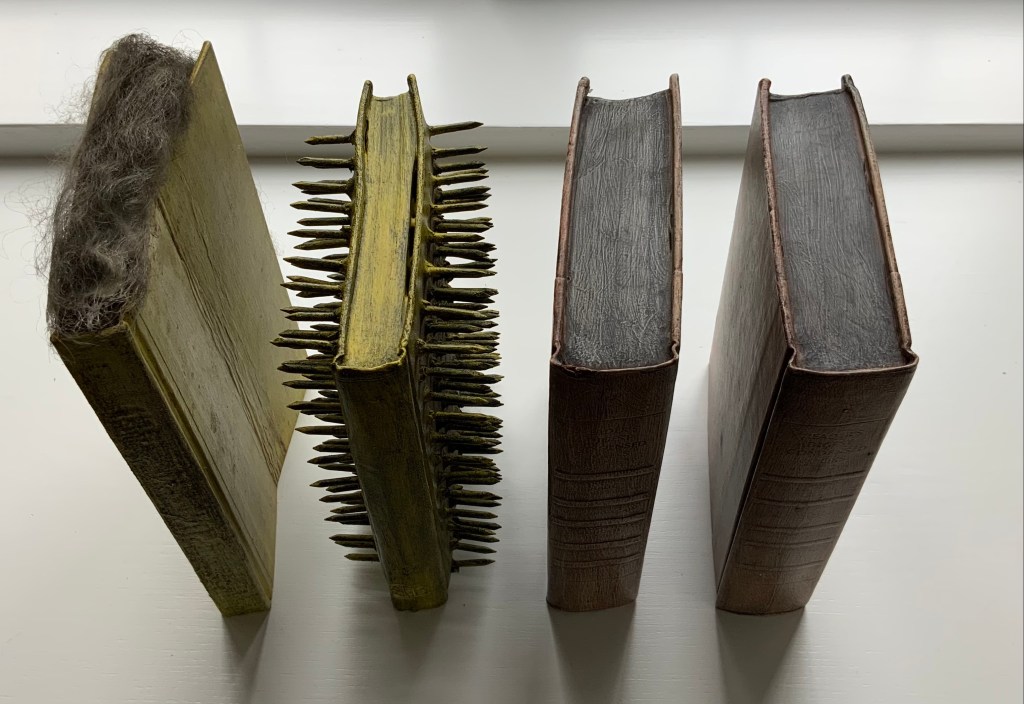
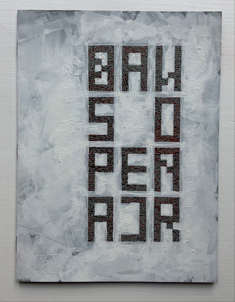
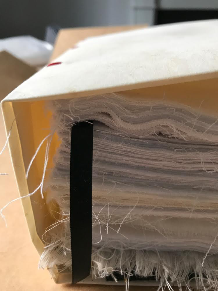
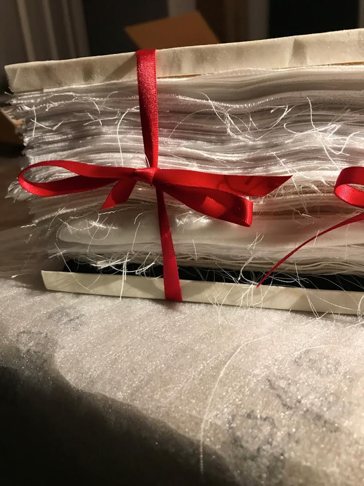
Beauty Book; The Life of Gandhi; Untitled (1973) Barton Lidice Beneš Mixed media book constructions. Acquired from Rago Arts and Auction Center, 23 March 2021; Allan Stone Gallery, New York; artist. Photos: Books On Books Collection.
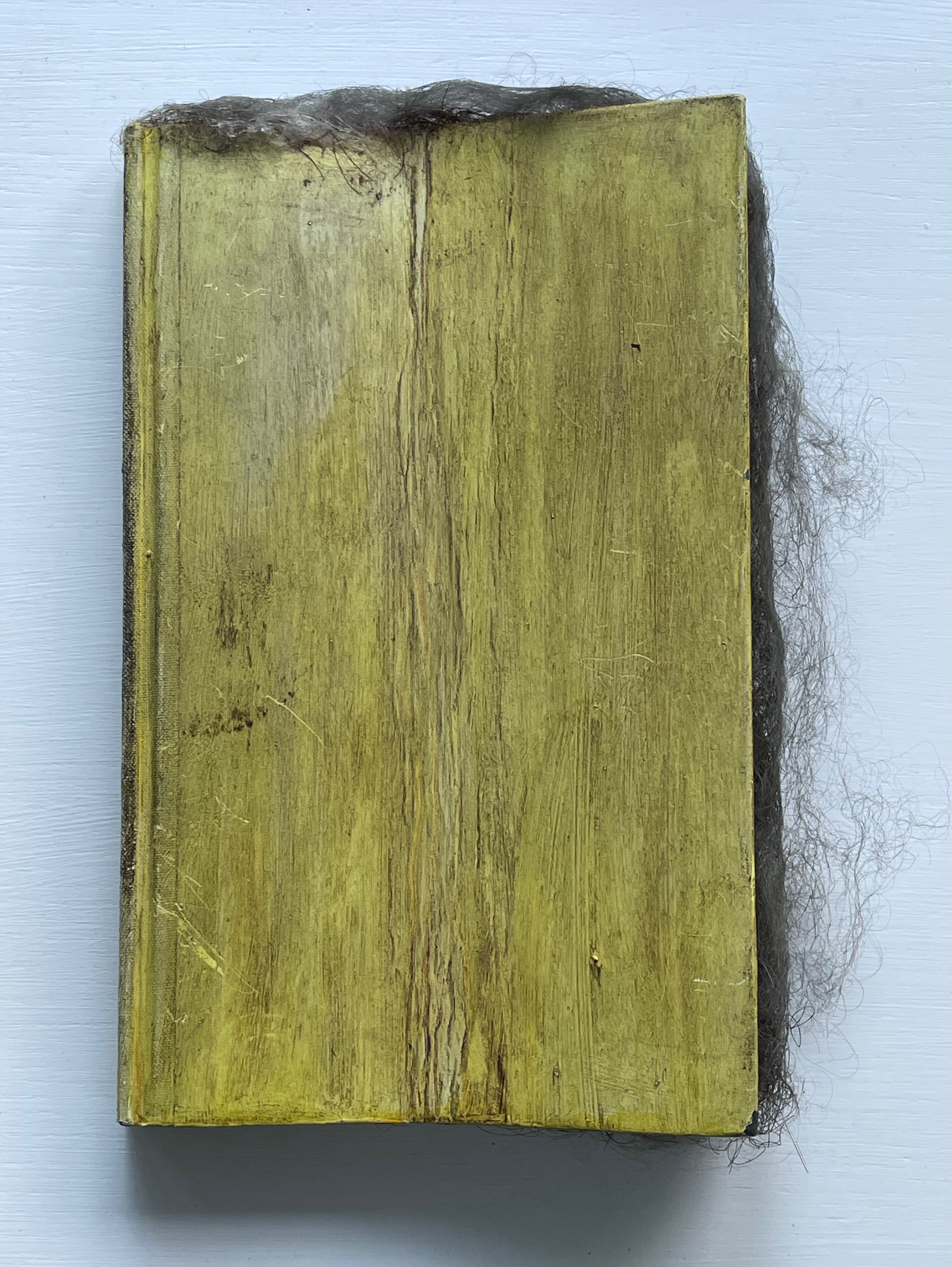
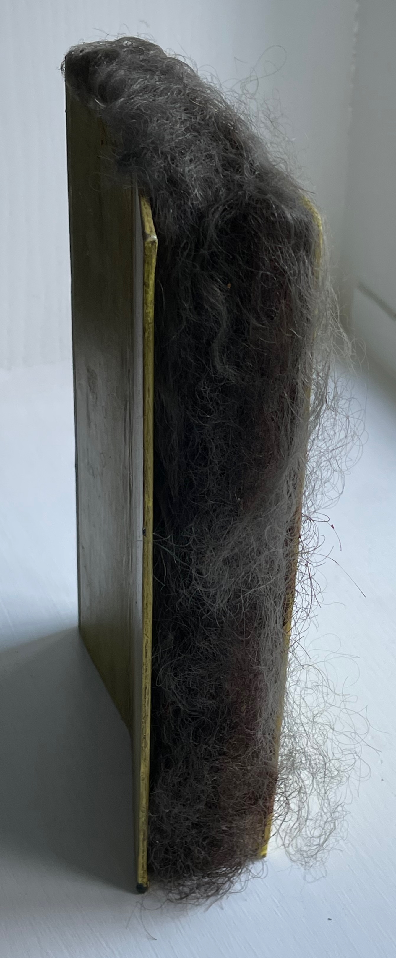
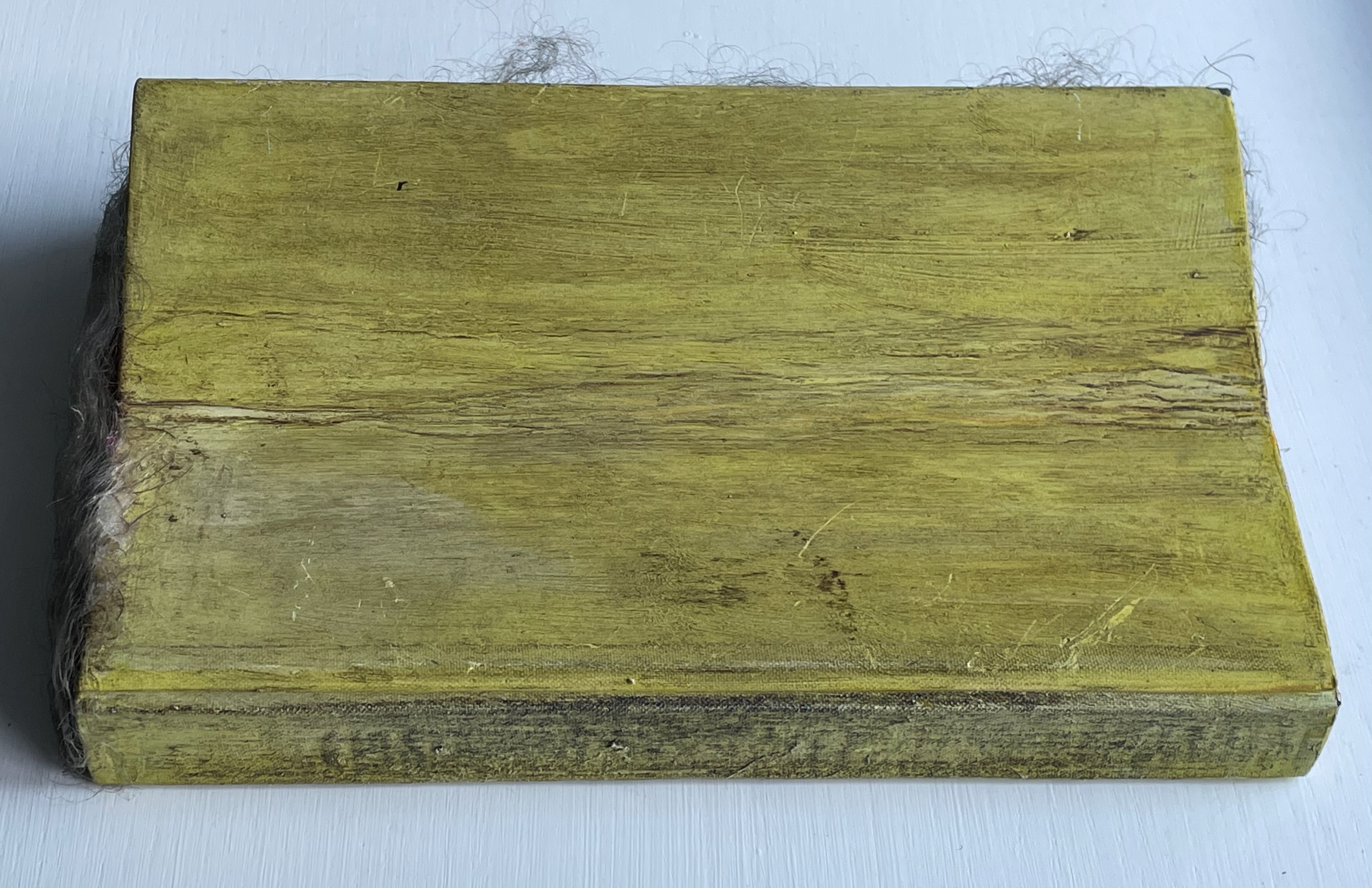
Beauty Book (1973) Barton Lidice Beneš Altered book with human hair. H220 × W140 × D50 mm. Unique. Acquired from Rago Arts and Auction Center, 23 March 2021; Allan Stone Gallery, New York; artist. Photos: Books On Books Collection.
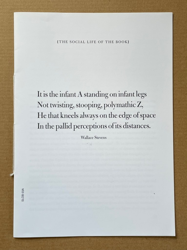
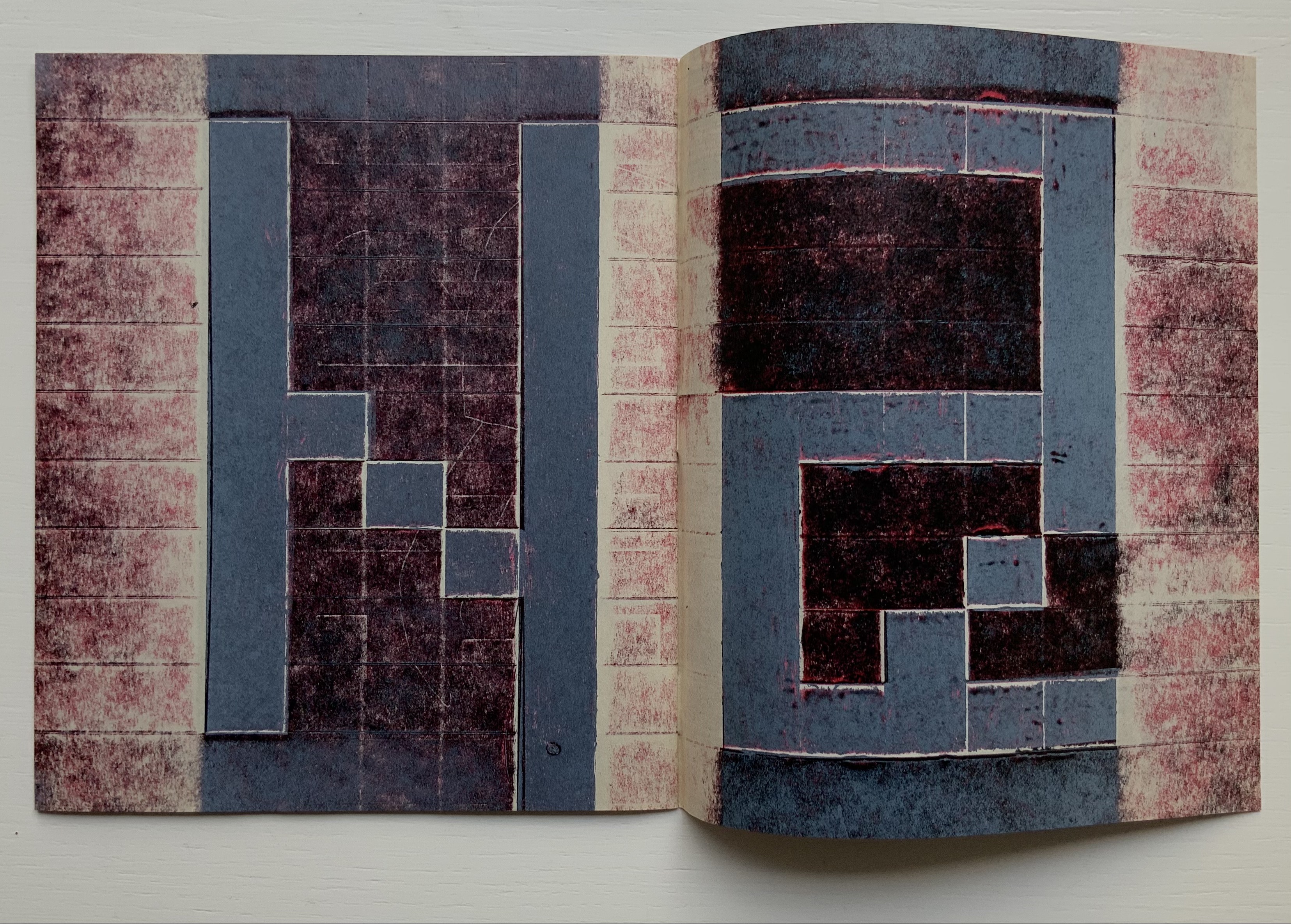
Infant A (2012) Louis Lüthi Thread-stitched signature. H225 x W160 16 pages. Edition of 1000. Acquired from Torpedo Books, 8 January 2024. Photos: Books On Books Collection
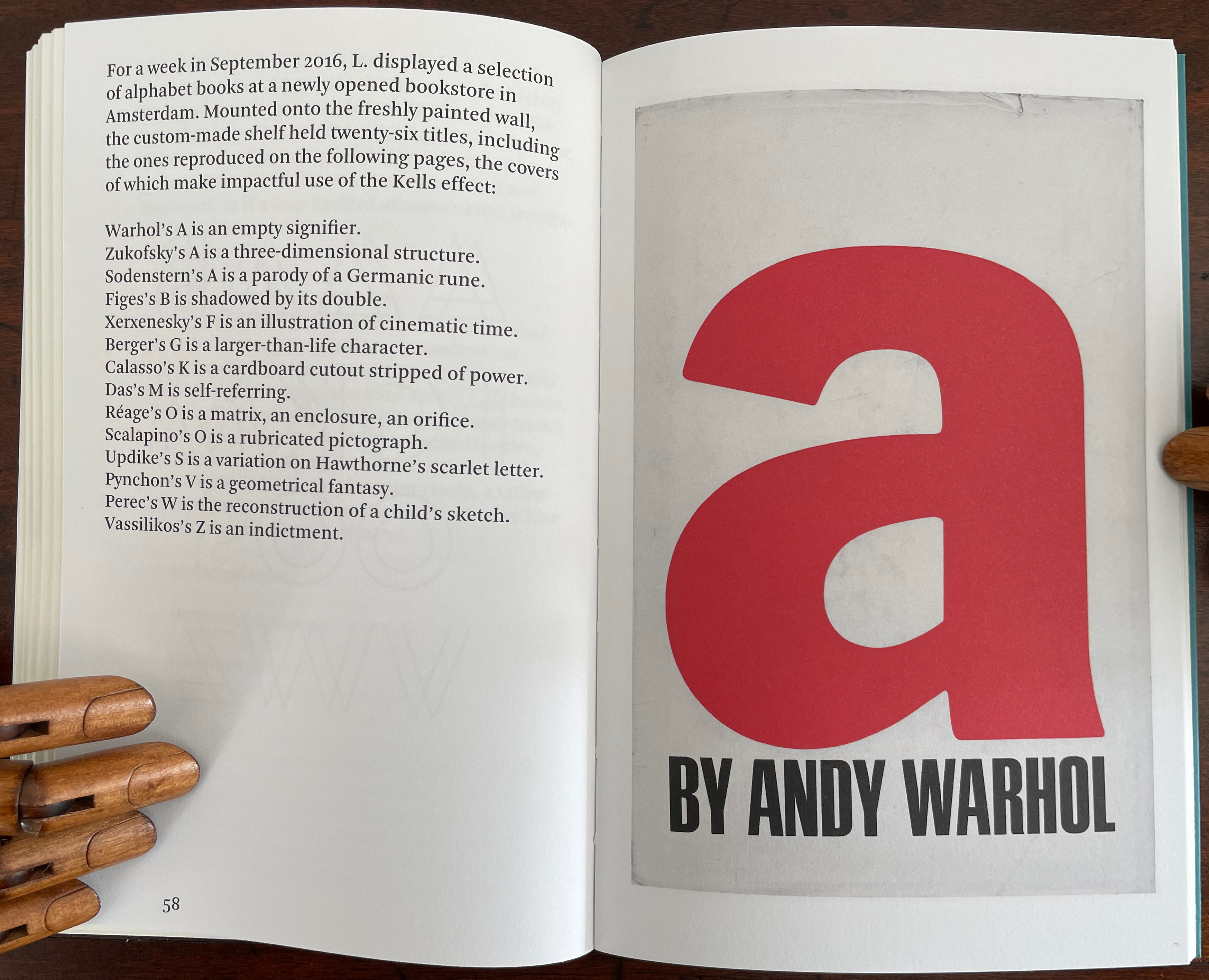
Infant A is part of a collection of essays commissioned by castillo/corrales and published by Paraguay Press under the series title The Social Life of the Book. Lüthi’s contribution fits the Books On Books Collection on several scores. First is the epigram’s invocation of the alphabet, which echoes the collection’s concentration of alphabet-related artists’ books and children’s books. See Alphabets Alive! Second is the epigram’s source: Wallace Stevens, whose poetry has inspired Ximena Pérez Grobet’s Words (2016). Would that other book artists be so inspired. Third is the narrator’s fictional conversation with Ulises Carrión in a celebration of all things A-related, in particular Andy Warhol’s novel a: a novel (1968), which finds analogues in Warren Lehrer’s A Life in Books: The Rise and Fall of Bleu Mobley (2013) and Derek Beaulieu’s a, A Novel by Andy Warhol (2017) (entry in progress). Fifth is how the dialogue reminds me of Suzanne Moore’s A Musings (2015).
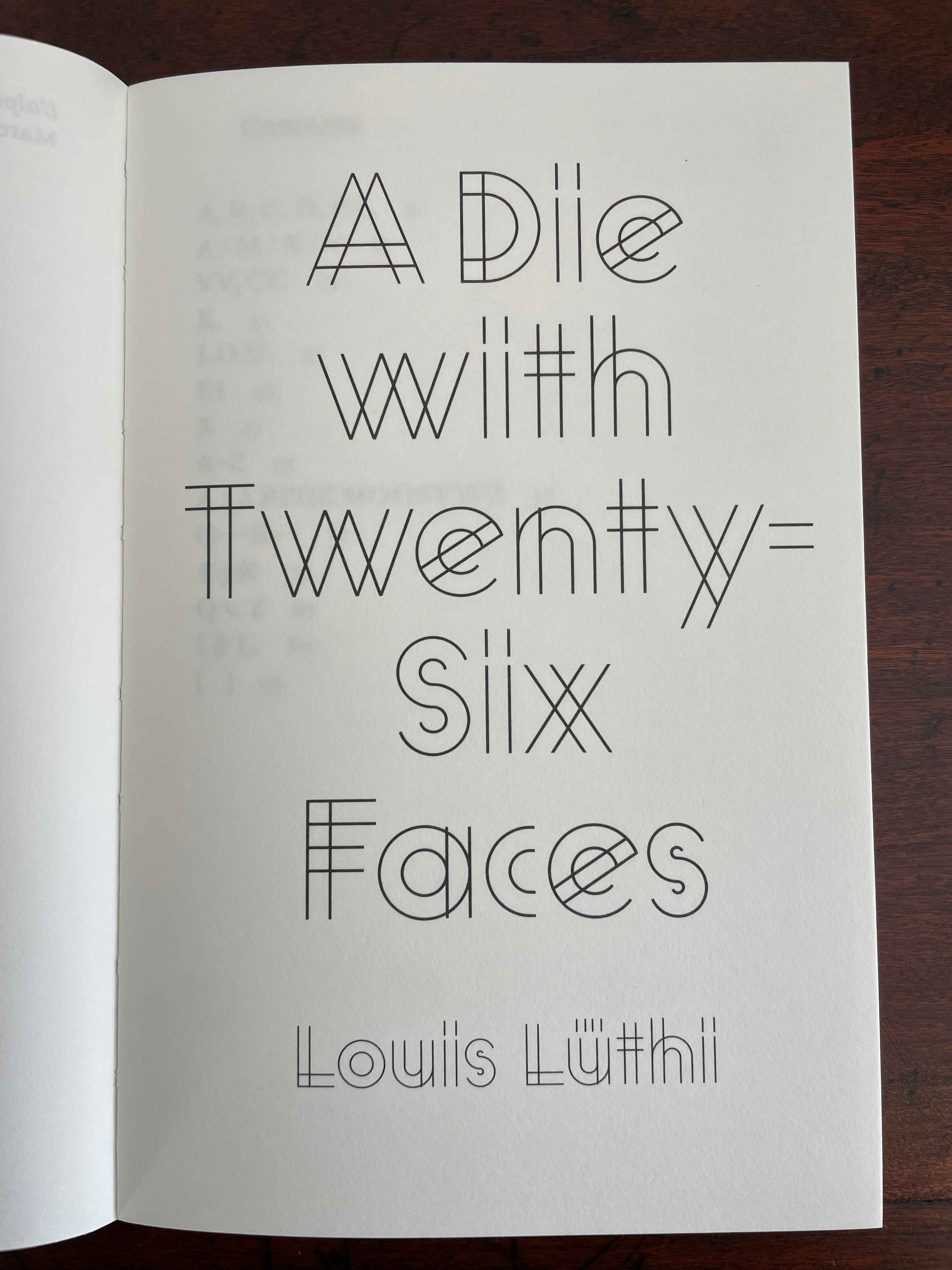
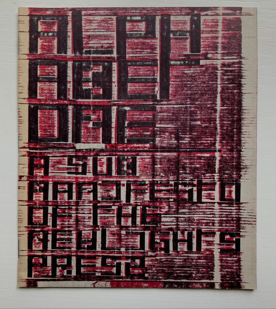
A Die With Twenty-six Faces (2019)
A Die With Twenty-six Faces(2019) Louis Lüthi Paperback. H200 x W130 mm. 104 pages. Acquired from Amazon, 18 September 2022. Photos: Books On Books Collection
Walter Benjamin’ unpacking of his library has a lot to answer for. Not only do we have Buzz Spector‘s take on it in 1995, but Jo Steffens’ Unpacking trilogy of photos of architects’, artists’ and writers’ bookshelves, Alberto Manguel’s elegiac Packing My Library (2018), and here is Louis Lüthi’s.
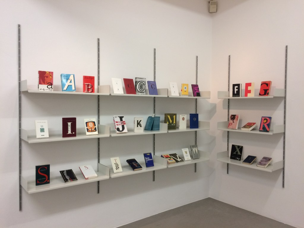
Publisher’s website: In A Die with Twenty-Six Faces, the author — let’s call him L. — guides the reader through his collection of alphabet books, that is, books with letters for titles. Some of these titles are well known: Andy Warhol’s “a,” Louis Zukofsky’s “A”, Georges Perec’s W. Others are obscure, perhaps even imaginary: Zach Sodenstern’s A, Arnold Skemer’s C and D. Tracing connections between these books, L. elaborates on what the critic Guy Davenport has called the “Kells effect”: “the symbolic content of illuminated lettering serving a larger purpose than its decoration of geometry, imps, and signs.”
The title stirs thoughts of Marcel Broodthaers’ oracular statement in 1974 “I see new horizons approaching me and the hope of another alphabet”. An alphabet that unrolls across the twenty-six faces of a die would certainly qualify as another alphabet. Broodthaers and the die also stir thoughts of Stéphane Mallarmé’s Un Coup de DésJamais N’Abolira le Hasard to which Broodthaers paid repeated homage. Throwing a twenty-six-sided die would certainly no more abolish chance than would a roll of Mallarmé’s six-sided die. Lüthi’s game, however, has little to do with chance unless we count his luck in finding the works to build his library of single-letter-entitled books. Even less to do with luck if some of the library is fictitious, a likelihood that the “publisher’s” statement suggests. Lüthi’s die is loaded!
A selection of Lüthi’s “alphabet” books on display. Courtesy of the author. Photo: Gesellschaft für Aktuelle Kunst Bremen
On the Self-Reflexive Page II (2021)
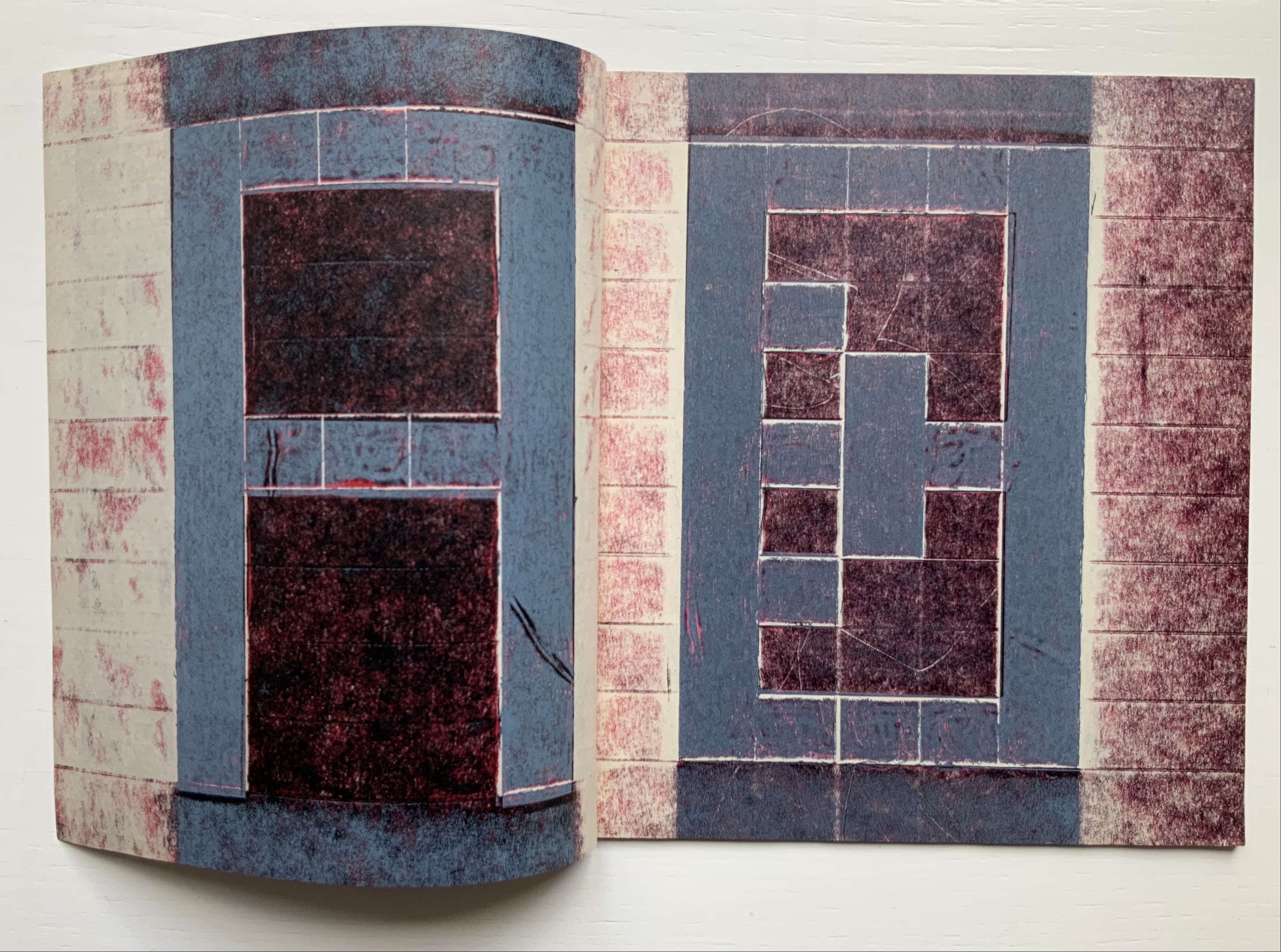
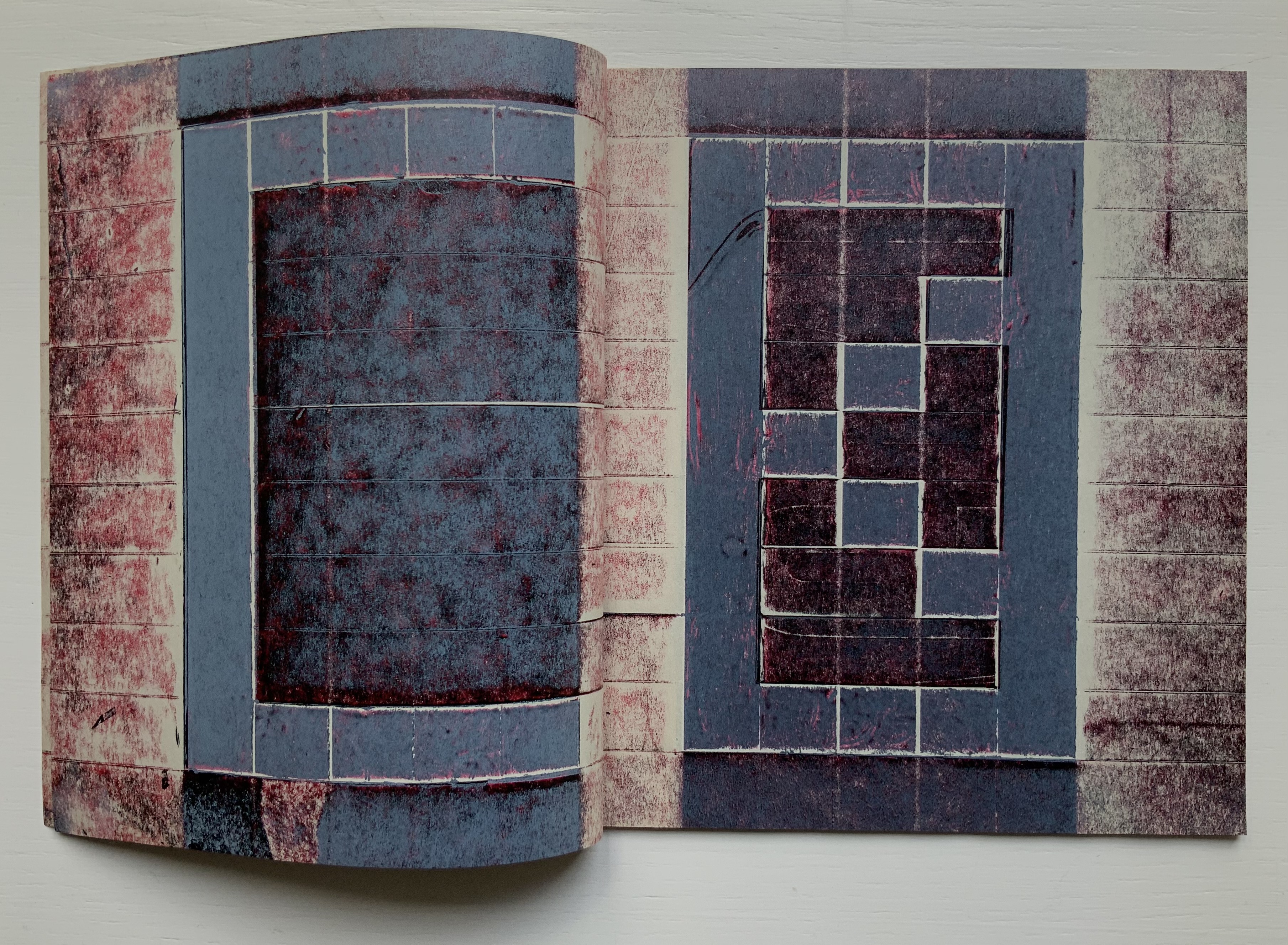
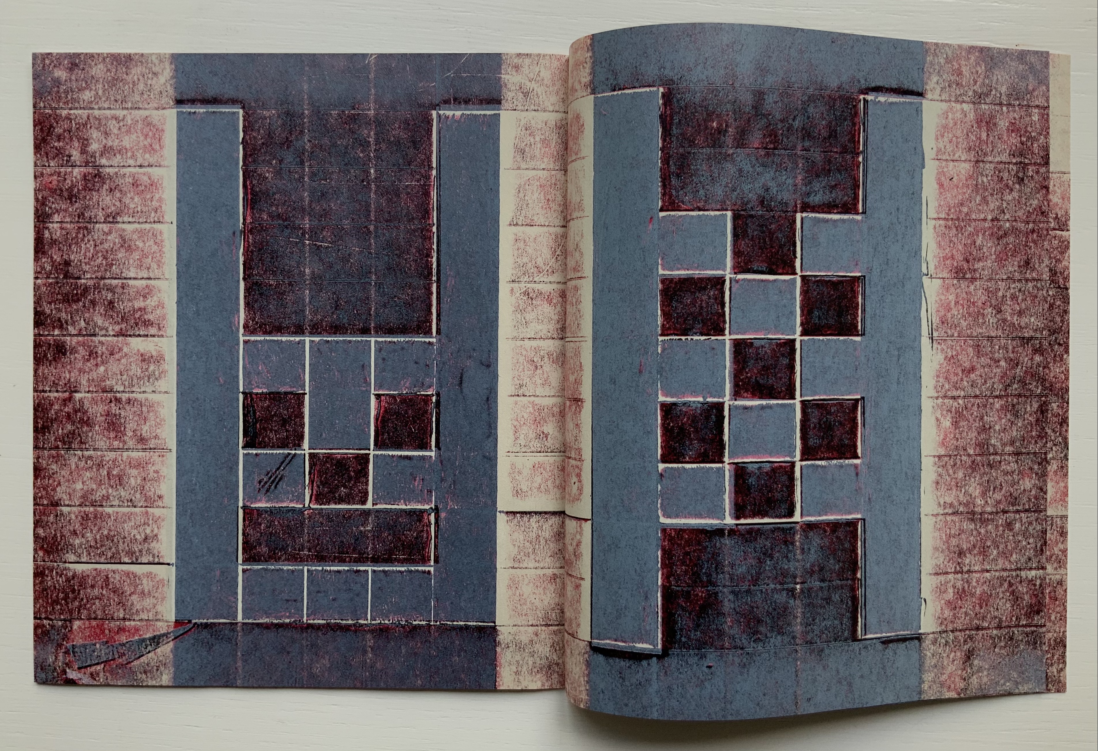
On the Self-Reflexive PageII(2021) Louis Lüthi Paperback. H200 x W130 mm. 304 pages. Acquired from Idea Books, 18 September 2022. Photos: Books On Books Collection.
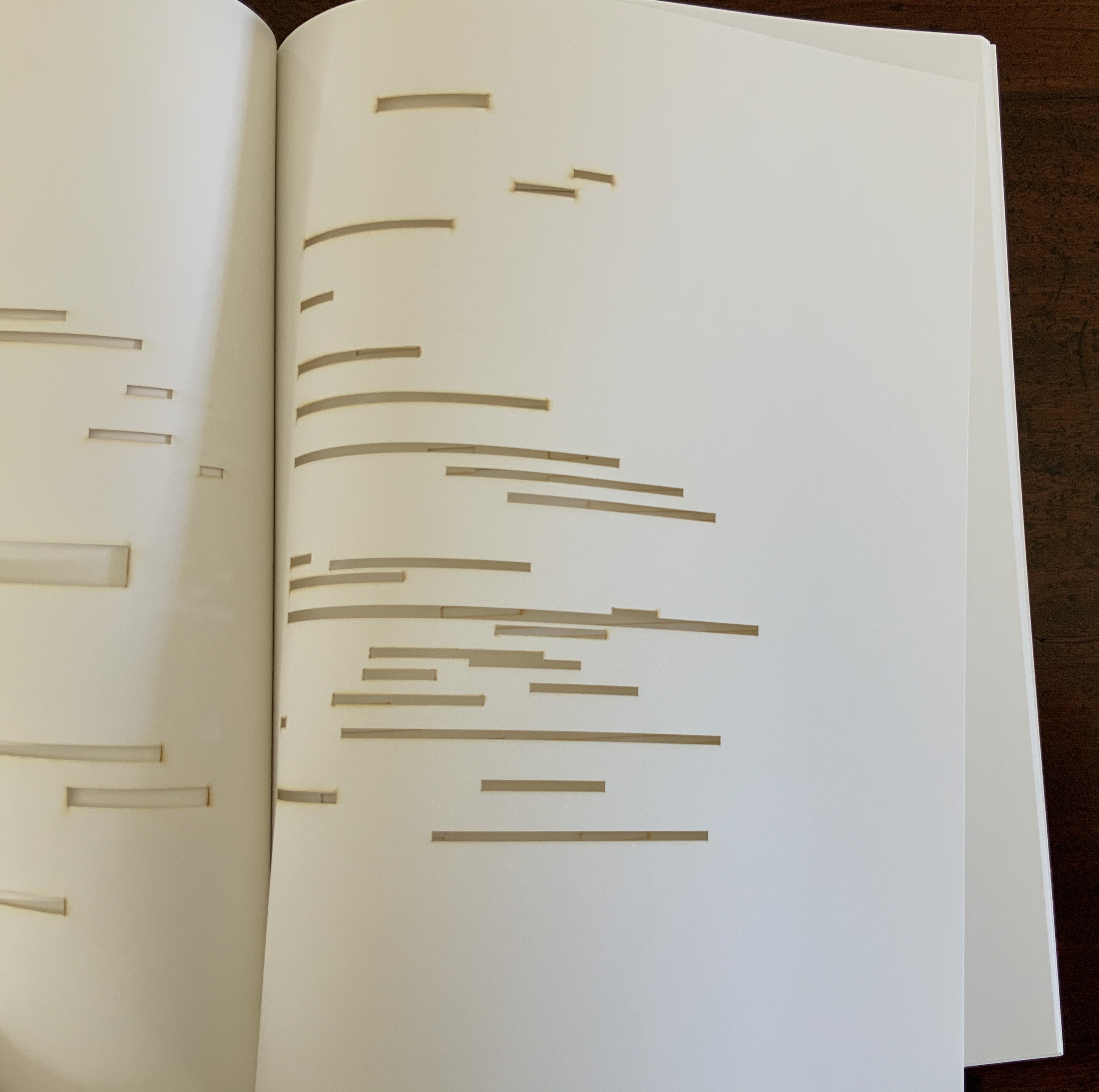
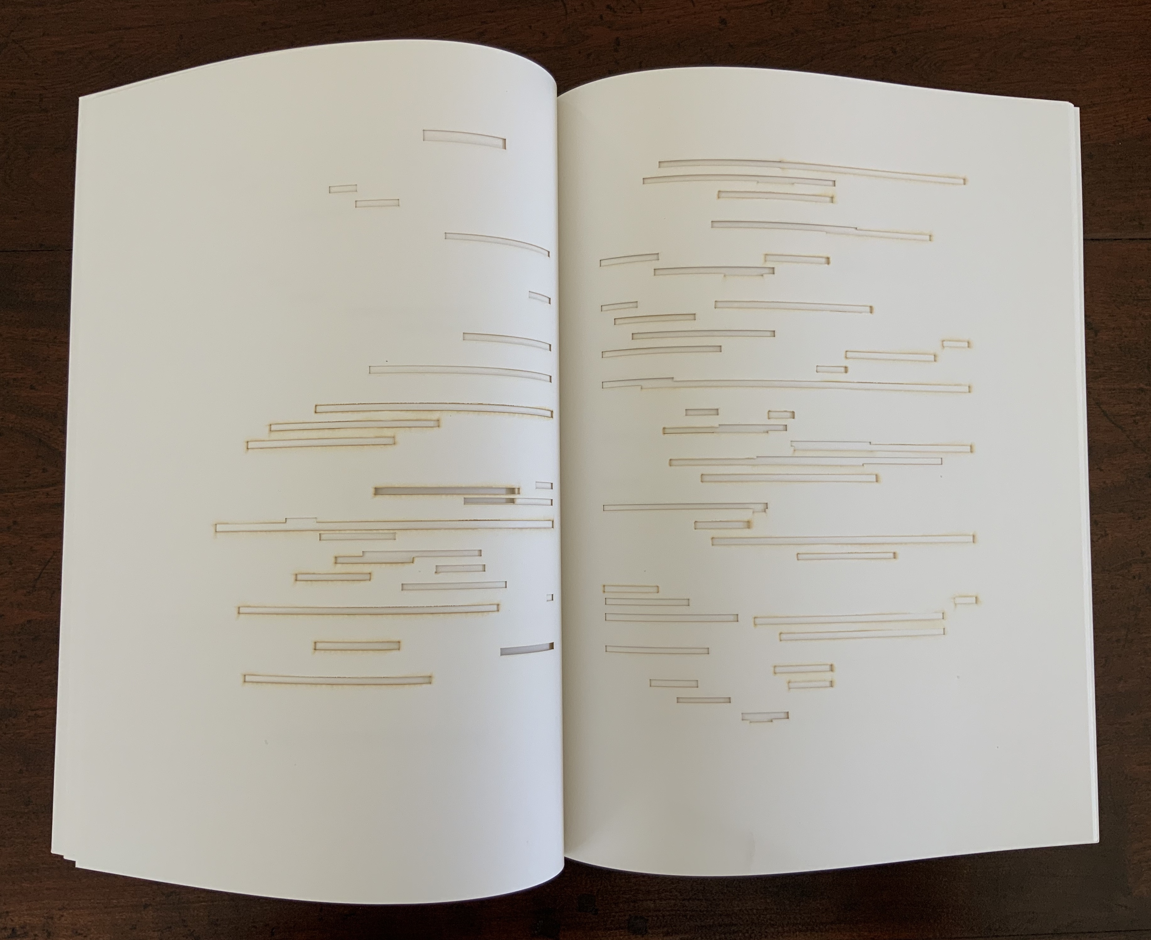
This is a peculiar book in its order and nature. After two variant half-title pages, it begins with a section entitled “Black Pages”. Only on flipping through the volume can we find the remaining front matter — just after page 208. There’s another half-title and then the Table of Contents. Reproducing the marbled page from Laurence Sterne’s The Life and Opinions of Tristram Shandy, Gentleman (1759–1767), the book’s cover gives a clue to this peculiarity. Sure enough, Lüthi spells it out later in the section entitled “On Drawing Pages”.
So much in Tristram Shandy is presented out of order: a second dedication comes not after the first but on page 27, the preface is not at the beginning of the novel but in chapter 20 of volume three, and chapters 18 and 19 of volume nine come not after chapter 17 but are inserted after chapter 25. In a similar act of transposition, we find a marbled page in volume three, even though hand marbling is customarily used to decorate covers and endpapers. As Viktor Shklovsky observed, “It is precisely the unusual order of even common, traditional elements that is characteristic of Sterne.” (p. 240)
This one paragraph confers on Lüthi’s entire book the very self-reflexivity that it explores across a range of literature and artists’ books. Reflecting the custom to which it refers, On The Self-Reflexive Page II carries Sterne’s marbled pages on its front and back covers. In the text before his marbled leaf, Sterne refers to it as the “(motly emblem of my work!)“. Lüthi has taken that exclamation to heart (and cover) as if it were advice in creating this hybrid, motley work of his own: “part artist’s book and part essay, part literary excavation and part typographical miscellany” as he calls it in his middle-of-the-book Foreword.
Lüthi’s work is just one in the Books on Books collection of several inspired by Tristram Shandy. There is Erica Van Horn’s Born in Clonmel (2011), Simon Morris’ Do or DIY (2012), Abra Ancliffe’s The Secret Astronomy of Tristram Shandy (2015), and Shandy Hall‘s The Black Page Catalogue (2010), Emblem of My Work (2013), Paint Her To Your Own Mind (2018) and The Flourish of Liberty (2019). Outside the collection, there is Brian Dettmer’s Tristram Shandy (2004), commissioned by Shandy Hall’s Laurence Sterne Trust, and also Sean Silver’s Shandean online venture called The Motley Emblem (2022~) celebrating Sterne’s marbled leaf and the analytical chemistry of marbling. The latter may become a book, even an artist’s books to add to the tally. In The Century of Artists’ Books, Johanna Drucker draws attention to Sterne’s novel twice as an example of self-reflexivity or self-interrogation, but in 1994 and 2004, Sterne did not rise to the same level of precursor to book artists as William Blake or Stéphane Mallarmé in Drucker’s view. With these later works of book art inspired by Uncle Toby’s nephew in the bag, a dozen or so more might nudge Sterne up the scale.
In the meantime, anyone interested in artists’ books could fruitfully apply to the medium Sterne’s exhortation to his own readers:
Read, read, read, read, my unlearned reader! read, — or by the knowledge of the great faint Paraleipomenon — I tell you before-hand, you had better throw down the book at once; for without much reading , by which your reverence knows, I mean much knowledge, you will no more be able to penetrate the moral of the next marbled page (motly emblem of my work!) than the world with all its sagacity has been able to unraval the many opinions, transactions and truths which still lie mystically hid under the dark veil of the black one.
Artists’ books are to be read, handled and digested, not stored away in the archives.
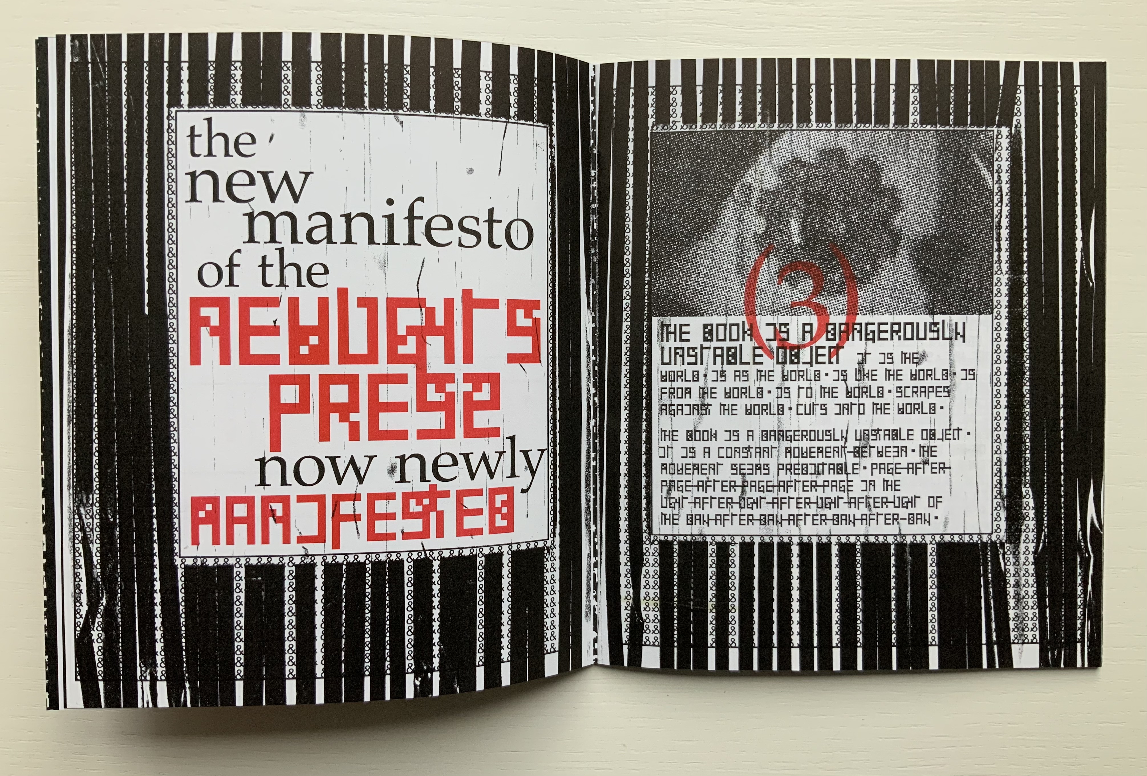
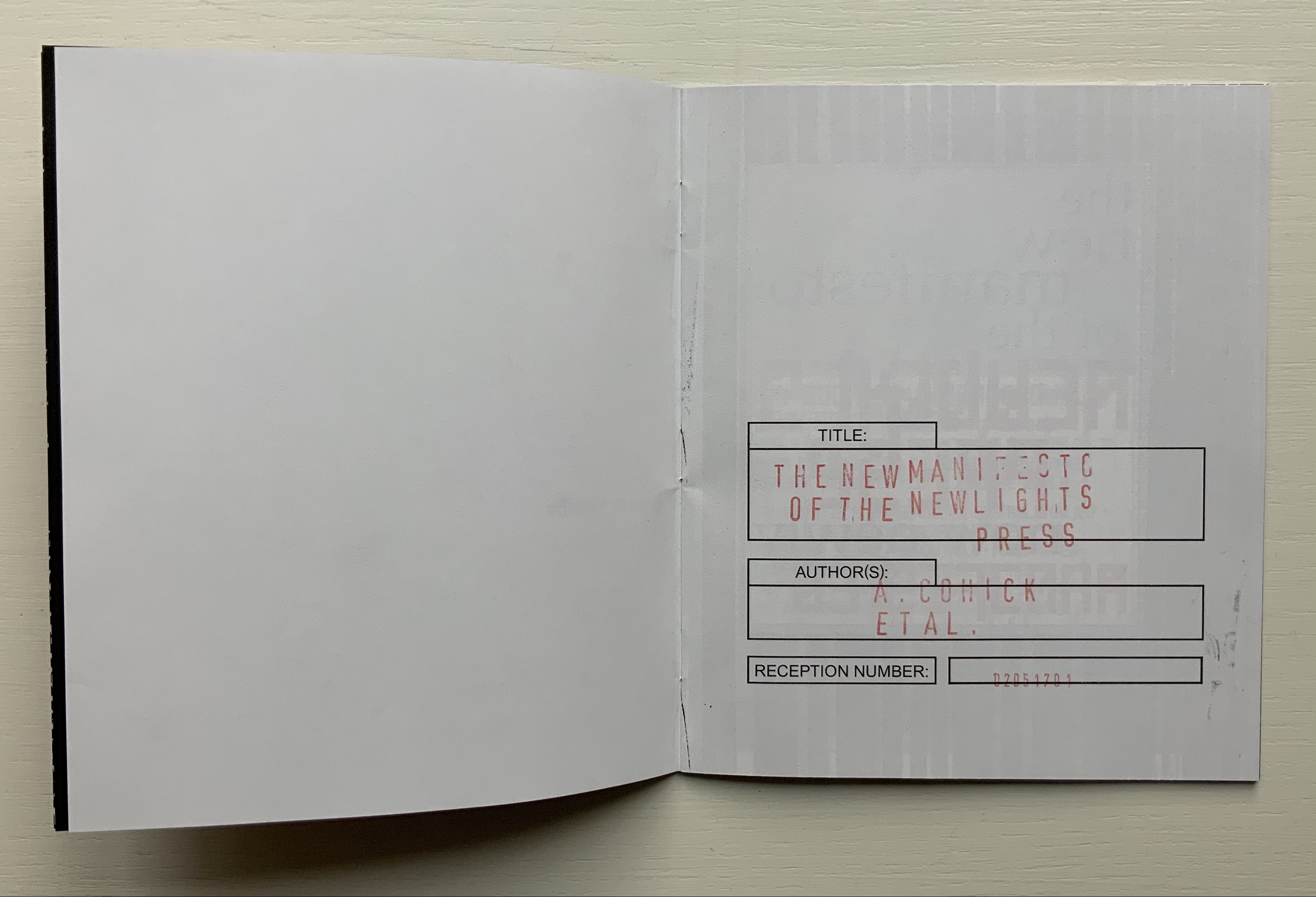
The New Manifesto of the NewLights Press (third iteration) (2017)
The New Manifesto of the NewLights Press (third iteration) (2017) Aaron Cohick Booklet, saddle-stapled, risograph, letterpress/collagraph, and hand painting. H165.1 x W139.7 mm (closed), 20 pages. #000611, unlimited, iterative edition. Acquired from New Lights Press, 11 December 2020. Photos: Books On Books Collection. Displayed with permission of the artist.
The New Manifesto of the NewLights Press (third iteration) has multiple starting points. Even in its first iteration, we have
The book is a dangerously unstable object, always between, continuously opening. It is interstitial, occupying many planes at once.
Digital technology has killed the book, finally.
The book is an impossible thing — comprised entirely of edges and full of holes. It moves. It happens in between.
Readers move through authors and books. Books move through readers and authors. Authors move through books and readers. They exist between each other’s pages. They only exist in between.
The form of the book, the history of the book, and the processes involved in its production provide a foundation for rethinking and re-evaluating the dominant discourse(s) of contemporary art.
The book … exemplifies a model that expands beyond form and content…. It is a field, whose axis points [form, content, production and reception] are always held in tension. In this model a piece or practice is a “zone of activity.”
Moreover, there are ten refinements on these starting points, touching on Julia Kristeva’s “intertextuality”, Roland Barthes’ “death of the author”, Michel Foucault’s “death of the book” and much more in the same vein. Each iteration even has diagram and footnotes, underscoring the academic nature of the starting points.
By its third iteration, The New Manifesto‘s words been further refined as a combination of announcement, exposition, lyric and prayer. It soars beyond literary theories and finds birds of a closer feather among Ulises Carrión and Michalis Pichler.
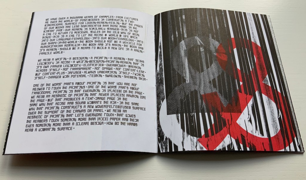
The book is a dangerously unstable object // It is a series of edges // Once clustered and knotted // Now open and spreading // Now cutting and bending // Mostly // The book betrays // Mostly // The book howls // The book falls apart in the face of our anguish // In the face of our quiet // In the silence of our slipping // Mostly // It will also always be something else // That we did not // Can not yet // See // The book is a remarkable technology // It is a shimmering substance // It is a noise of the hands and thought // The book is perhaps now a dead thing // In the hands of the dead // So be it // We never mattered much anyway // Beyond our capacity to consume // Our capacity to labor // We are fuel // So be it // We remain in the dark // With these books // The original autonomous window technology that is us looking through // At // In // Against // With care // The book returns our labor to us //
If a new edition of Publishing Manifestos is ever issued, Cohick’s hortatory words should be considered. The words, however, cannot be considered alone. Over the three iterations, The New Manifesto — the only one in the collection and, therefore, the only one tangible for the visitor — has “participated more & more in the world of visual art”. Cohick’s use of the collagraphic technique increases. It adds painterliness to the booklets as well as a sense of depth and spatial play within the page, across the gutter and from recto to verso pages. In a series of online essays for the College Book Art Association, Cohick confirms the pleasure and intent here:
Collagraph is a well-known technique and is usually taught as part of introductory letterpress courses. It has an immediacy and fidelity that is very exciting—you can stick a leaf or other flat object to a block, print it, and get a decent image of that object. Unfortunately it usually stops there. Those flat objects are hard to push beyond that initial single-color print. Linoleum, photopolymer, wood and metal type, and to some extent woodcut are all made to be “neutral” printing surfaces—flat and smooth. Trying to get collagraph to be flat and smooth begs the question: why use collagraph at all? In collagraph the material that makes the plate is not neutral—the material is exactly the point. That embrace of material and its many, varied effects and marks is what moves collagraph closer to the direct markmaking of drawing/painting. It makes all of those “unacceptable” (or abject?) marks readily available. Relief collagraph printed with letterpress equipment can be a method of painting or drawing in multiple, with control as good as—if not better than, but also different from—the hand. “You’re doing it all wrong (Part 2)“
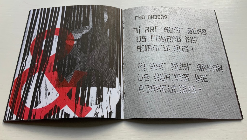
From the first iteration of the manifesto, black & white details of Jan Van Eyck’s The Arnolfini Marriage appear and are manipulated on the cover and throughout. Although they recede in the second iteration, they move strikingly to the fore in the third. Constantly alongside the Arnolfini details has been the ampersand, enlarged, reversed, in different colors, and present — almost ornamentally — within the text line. The increased visuality of the third iteration announces itself on the booklet’s cover and inside with the grainy enlarged detail of the mirror from The Arnolfini Marriage. What do the Arnolfini details signify? Although Van Eyck’s original itself is straightforwardly representational, its meanings are not always any clearer than that of its use in Cohick’s collage. With his slices of black (“a series of edges”) obscuring the image of the groom, perhaps Cohick is compounding obscurities to present “something else // That we did not // Can not yet // See”.
And what about the large overlapping ampersands in red and gray, systematically reversed and alternating in color? Are they emphasizing the “and so on and so on” of tradition in Cohick’s painterly printing technique? Are they alluding to the joining of hands in the marriage? Are they alluding to, and performing, a marriage of the book and visual art? On a verso page in the manifesto’s first iteration, he writes, “The form of the book, the history of the book, and the processes involved in its production provide a foundation for rethinking and re-evaluating the dominant discourse(s) of contemporary art.” On the facing recto page, the Arnolfini bride in reverse from the original extends her hand to a reversed ampersand.
In perhaps the most important enhancement of the third iteration’s visuality, Cohick’s full-blown typographic redesign of the alphabet occupies the visual foreground, middle ground and background. It is as if Cohick sets out to demonstrate Mallarmé’s proposition that the book is the “total expansion of the letter”. The first iteration’s completely legible Palatino, Arial and Placard Condensed typefaces used in the text line have yielded to what Cohick calls a “dislegible” font, which he often reverses, lays out as occasional “running sides” rather than “running heads”, and subjects increasingly to collagraphic layering. In his “You’re doing it all wrong” series, Cohick explains:
If “legible” and “illegible” are binary opposites, then the term “dislegible” is about looking at the space between those two poles. Dislegibility displaces, dislocates, deforms, and/or disrupts the process of reading, with the ultimate goal of making that process of reading (dis)legible to the reader. The dislegible can be read, but it resists closure or certainty. “You’re doing it all wrong (Part 1)“
Also contributing to dislegibility is the reversal of images, the ampersand and letters. More than that, the reversal reminds us of what is involved in letterpress production — the inked relief surface and its reversed image or letter to be transferred to paper. Always in tension with form, content and reception, production makes up the open field from which the artist’s book emerges. The third iteration exudes production’s physicality. A black saturated endleaf bleeds over onto a stark white sheet that faces a stamped title page, intensifying a feel of mechanical working. Letterforms behave as so much raw material — as if they were oil, acrylic, brick or mortar — to be re-seen from different angles, noted for more than one function and their text read for more than one meaning.
According to Cohick, “For art to thrive, form and content must be in a dynamic relationship… It must contain enough disruptions, ambiguities, and peculiarities to resist the deadly state of stable signification.” The iterations of The New Manifesto enact that statement.
Alphabet One: A Submanifesto of the NewLights Press (2017)
Alphabet One: A Submanifesto of the NewLights Press (2017) Aaron Cohick Booklet, center-stapled. Letterpress printed from woven collagraph blocks on newsprint. H165 x W140 mm, 28 pages. Acquired from the artist, 11 December 2020. Edition of 250, unnumbered. Photos: Books On Books Collection, displayed with permission of the artist.
Alphabet One, “companion book to the third iteration of The New Manifesto of the NewLights Press”, presents Cohick’s “complete ‘noise’ alphabet, in order, in condensed and full form”. In The New Manifesto, Cohick has described the book as “a noise of the hands and thought”. Well then, being a book, Alphabet One demonstrates that the manifesto is the alphabet, and the alphabet is the manifesto, and “woven collagraph blocks” could hardly be less “a noise of hands and thought”. Lest those inferences seem strained, continue reading the passage Cohick reproduces from The New Manifesto immediately after the reference to the “complete ‘noise’ alphabet”:
This is not a utopian program // This is not an alphabet for saving the world // Such a thing is a dangerous lie // This is one possibility // Not a tool // But a movement-between // An object-between // A growing // Changing thing // Meant to do just that // It is about attention and its revitalization // It is about structure and our being in it //
A, B, C, D. Photos: Books On Books Collection.
W, X, Y, Z. Photos: Books On Books Collection.
It cannot be an accident that the “noise” alphabet’s letterforms arise from varyingly shaded bricks: rose, gray, reddish gray and reddish black. To left and right of each letter, the rose color dominates. A reddish gray bar tops and tails each letter. The color gray forms the “strokes” of each letter. Reddish black fills the counters. Extracting the signal from the noise of the alphabet or books does not come easily. This is intentional. Just as The New Manifesto says,
With these books // The original autonomous window technology that is us looking through // At // In // Against // With care //The book returns our labor to us //
Days Open Air (2016)
Days Open Air(2016) Aaron Cohick Booklet, center-stapled, H203 x W152, 12 pages. Edition of 100, of which this is #40. Acquired from the artist, 11 December 2020. Photos: Books On Books Collection, displayed with artist’s permission.
Days Open Air is one of those books returning our labor to us that The New Manifesto announces. Cohick call it “an artists’ book/poem thing … an experiment: with our new Risograph, with the alphabet, with writing, with random numbers, and with noise.” Letterforms stretch. Words run sideways, they break in the middle across lines, even across pages.
Look-See (REAED) (2014)
Look-See (REAED) (2014) Aaron Cohick Print. H300 x W456 mm. Photos: Books On Books Collection, displayed with artist’s permission.
More evocative of barcode stripes than bricks, the letterform strokes in this poem-print-poster stretch even more than in Days Open Air. Printed on a Vandercook 219 from vinyl and gesso collagraph blocks, the letterforms challenge us to “look” and “see”. An angle at the top right, two angles midway on the right and two counters condensed to small squares suffice to define the first letter — R. The letters E and A are more efficient, requiring only the placement of two counters each. Note how the textural effect of the gesso and letterpress printed collagraph on chipboard joins The New Manifesto‘s celebration of the physicality and noise of production.
In Cohick’s world, the book and art make, and should be perceived as, a “strange” continuity. His vision and embrace of the collagraph suggest a 21st century version of William Blake. He names his nearer contemporaries as Ken Campbell, Walter Hamady, Amos P. Kennedy, Jr., Karen Kunc, Emily McVarish, Dieter Roth and Nancy Spero. In the Books On Books Collection, those far and near can also be found in Eleonora Cumer, Raffaella della Olga and Geofroy Tory.
A particularly apropos video has arrived — apropos for its content, source and circumstances.
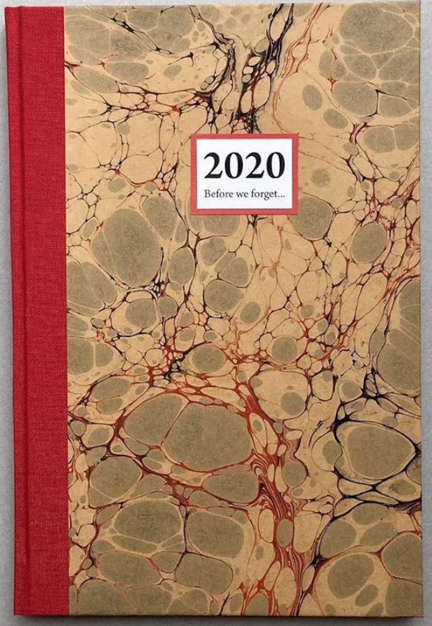
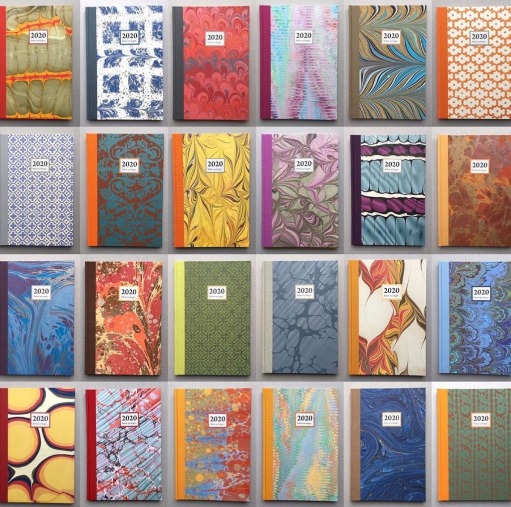
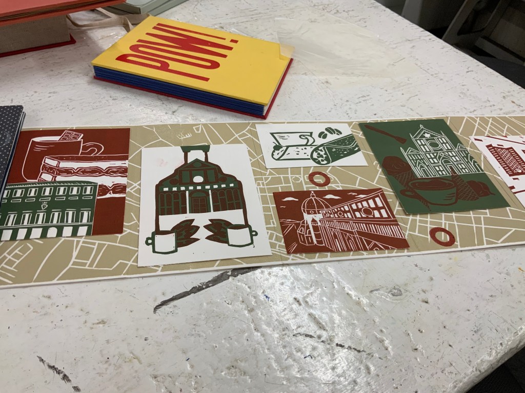
Patricia Silva, an artist working in Florence, Italy features in the Virginia Center for the Book’s Shelf Life video series. Virginia-based artist Lyall Harris interviewed Silva about Silva’s project Before We Forget 2020, a set of hand-bound artist’s journals. With each journal’s hand binding, unique cover of marbled paper, varied papers and inclusion of prompts to the owner, Silva draws on several rich traditions of book art.
Before We Forget (2020) Patricia Silva Thirty-six page journal (30 acid free writing pages + 6 specialty paper pages). Hand-crafted with hand-marbled paper and cloth covers. H215 x W145mm.
But in its technology, subject and circumstances, the video draws on an even more ancient literary tradition: Boccaccio’s Decameron. In March 2020, Italy was entering its months-long lockdown, and 4,461 miles away, the Virginia Festival of the Book was being cancelled due to the pandemic. Instead of decamping to the Blue Ridge or Tuscan hills with a handful of friends to escape the plague, Harris and Silva invited them via Zoom to their exchange.
Although a significant strain of book art falls into the conceptual and minimalist camps of art, an equally significant strain falls into the camp of the book arts and craft associated with them. Given the influence of her Italian mentor Carlo Saitta and University of the Arts professors like Hedi Kyle, it is no surprise that Before We Forget calls on the traditions of binding and paper marbling. The binding is a traditional case binding done with a link stitch on supports for sewing. The decorative papers come from several sources, almost all small artisans. Some are printed decorative papers, some are silkscreened, most are woodblock printed, of which several come from a small old-time family-run bindery in Venice that uses woodblocks dating back as far as the 1800s. Some of the paper is handmade by the artist.
The casual observer might mistake the journals of Before We Forget for the beautifully crafted blank journals that abound in outlets like Il Papiro or Paperchase. Yet there is surprise here to catch out the casual observer’s mistake and repay a bit of thought. At perhaps its most extreme, conceptual book art amounted to a set of instructions to the reader/viewer. The general interest in reader/viewer participation has several roots. One is craft-based and historical.
Recently in the context of the “other pandemic”, friendship journals and scrapbooks have drawn attention: for example, Amy Matilda Cassey’s Friendship Album (1833-56) and Alexander Gumby’s scrapbooks, including Negro in Bondage (1910-52). Older and more broadly, there are the Album Amicorum of Moyses Walens (1605-15) and Julia Chatfield’s Scrapbook (1845). Before We Forget does not present a set of completely blank pages. Each journal contains prompts to the owner to make notes, sketch, paste in, and add recollections of the days, weeks, and months of the 2020 Covid-19 pandemic.
Encouraging the owner’s intervention recalls another historical phenomenon: Grangerism or extra-illustration, where the owner embellishes a book with inserts. Richard Bull’s extra-illustrated copy of Count Anthony Hamilton’s Mémoires du comte de Gramont (1794) is a good example. Before We Forget does not present a previously printed body of text for Grangerizing, but each journal presents a unique copy to be overwritten.
In that context of the Covid-19 pandemic, this urging of reader/viewer participation evokes — perhaps callous to say — literally, not just metaphorically, Roland Barthes’ poser of the “death of the author”. Before We Forget plays to and against that metaphorical notion. Until a reader/viewer/owner acts upon an acquired copy, is there an author? Is the participating act one of authoring or mere “extra-illustration”? Barthes wrote: “the birth of the reader must be at the cost of the death of the Author” (p. 148). And if reader and author are one and the same?
Given Silva’s intentions stated in the interview, each copy acquired is meant to become a keepsake of events and time personal to its inscriber and be a memorial of the inscriber for future readers. Here is where the literalness of “death of the author” callously intrudes. Whether the owner/author falls prey to the virus or unrelated causes, the author dies.
The topic of the nature and experience of time recurs in book art sufficiently to warrant calling it a tradition. In Before We Forget, it plays out in general and in particular. On the general or theoretical side, we have Ulises Carrión and his definitions of “what a book is:
A book is a sequence of spaces. Each of these spaces is perceived at a different moment – a book is also a sequence of moments. … Written language is a sequence of signs expanding within the space; the reading of which occurs in the time. A book is a space-time sequence.
If seen as merely a blank journal, Before We Forget may seem not to warrant such “out there” statements. Or, on the contrary, those statements may seem not so “out there” when considered with Before We Forget in hand. On the particular and haptic side, we have in hand this object covered in a one-off piece of marbled paper and prodding our hands to mark it up and change the object to fix past time in it and to fix it in time to come. Theoretically or haptically, it engages the reader/viewer owner/author with the nature and experience of time.
Another tradition of book art in which Before We Forget is rooted, albeit loosely, is the found object and appropriation. In addition to its unique marbled paper cover, each journal contains six sheets of heavier or colored or patterned papers unique to the journal. In a sense, these papers are “found” as Silva has used only papers and cloth left over from older projects or collected (hoarded?) over the years. The marbled paper and specialist papers collected over time that found their way into Before We Forget are, however, only a part of the work — not the work itself as found object. Likewise, even if the owner/author fills the pages with pasted-in photos, postcards or other ephemera found or on hand, those found objects are not the work itself. It seems a stretch to deem the owned but yet-to-be-authored copy something that the owner/author has appropriated. In their collaboration Passato Prossimo (2017), Silva and Lyall Harris provide a magnificent demonstration of fusing book art with found objects and appropriation. The work is shown and discussed in the interview.
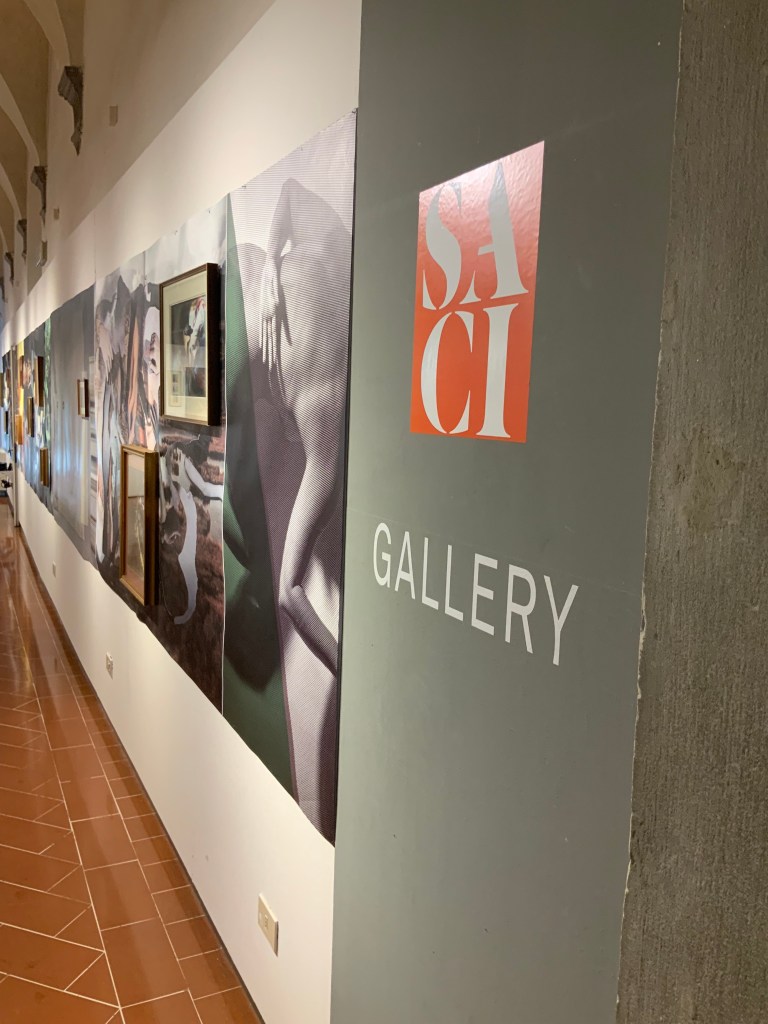
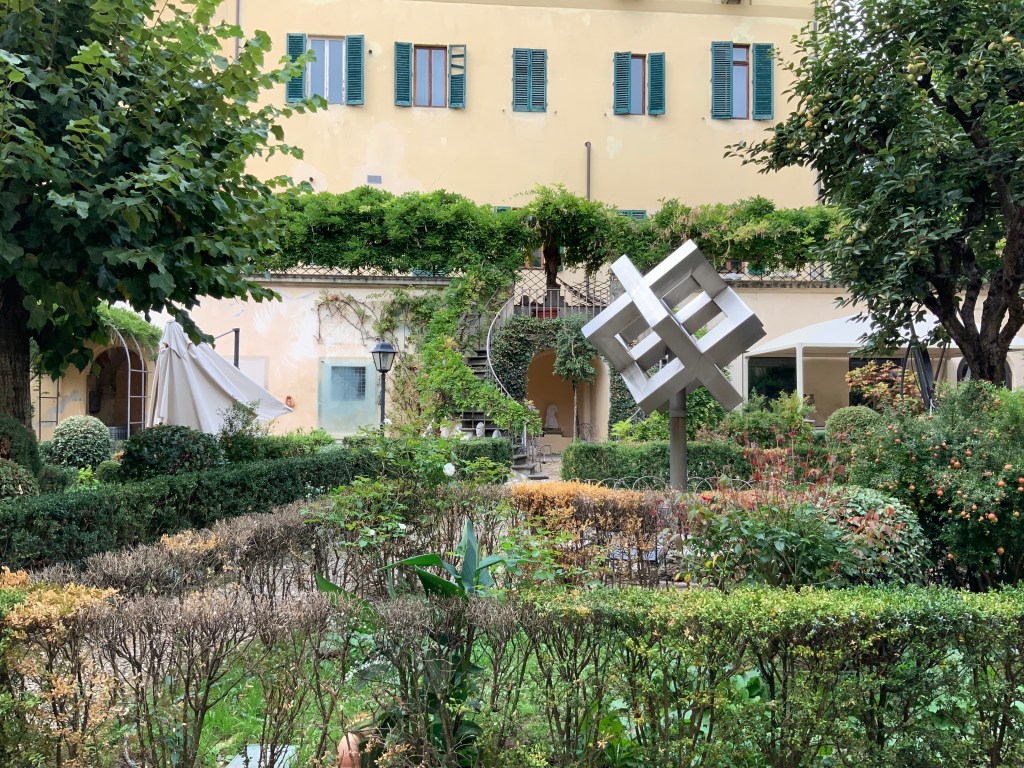
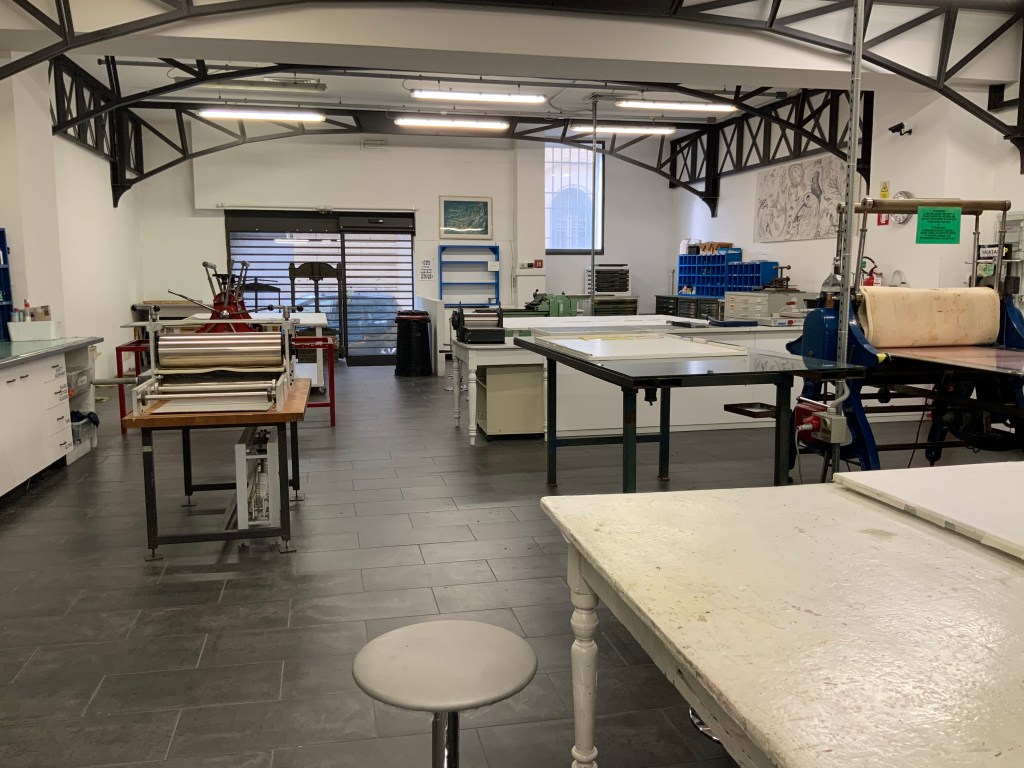
For Books On Books, the interview is a welcome reminder of another time. Patrica Silva teaches in both the Studio Arts College International (SACI) and Santa Reparata International School of Art (SRISA) and kindly arranged a visit to both in late September 2019. Florence was relatively empty at the time, and the visits to SACI and SRISA occurred at hours when there were no students around. The photos of the SACI’s gallery, library and grounds, the SRISA’s studio and equipment, and the works of Silva’s students will find their way into the Books On Books Collection’s copy of Before We Forget as strange harbingers.
By the end of September 2020, the Virginia Center for the Book had 40 episodes of Shelf Lifeon offer — well on the way to matching the Decameron‘s 100 stories. Unfortunately, with the current plague, the Center may be forced to exceed the Decameron‘s count, and Patricia Silva may face a demand for Before We Forget 2021.
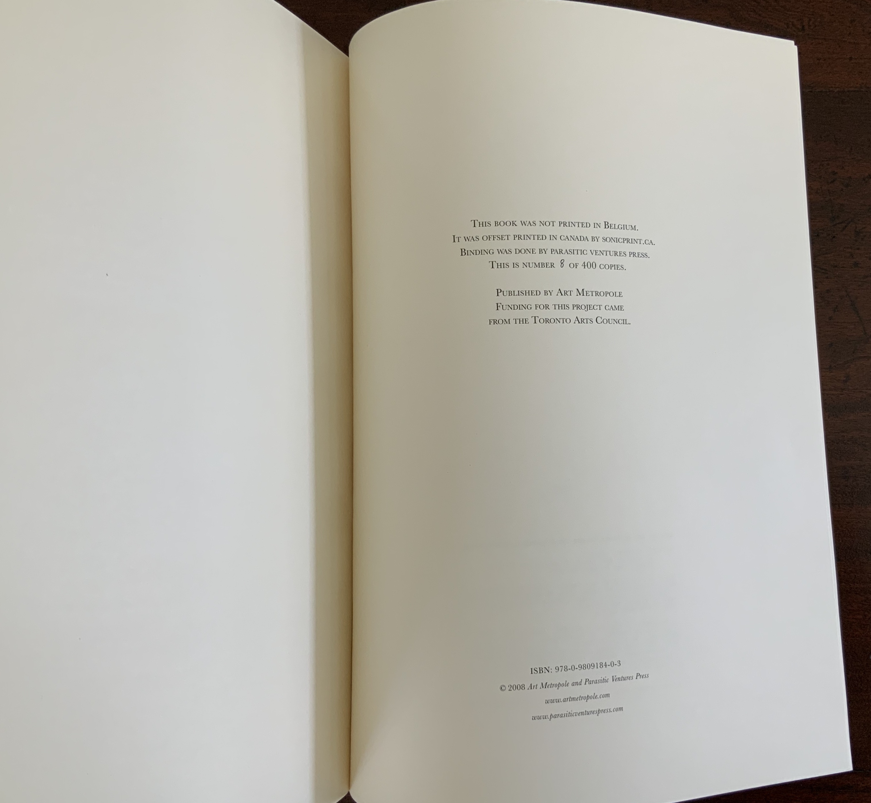
Hand bound. H325 x W250 mm, 32 pages. Edition of 400, of which this is #8. Acquired from Stefan Schuelke, 30 June 2020. Photos: Books On Books Collection.
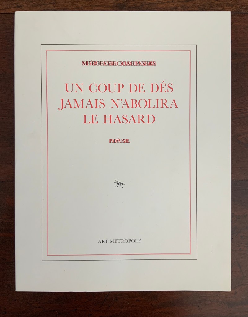
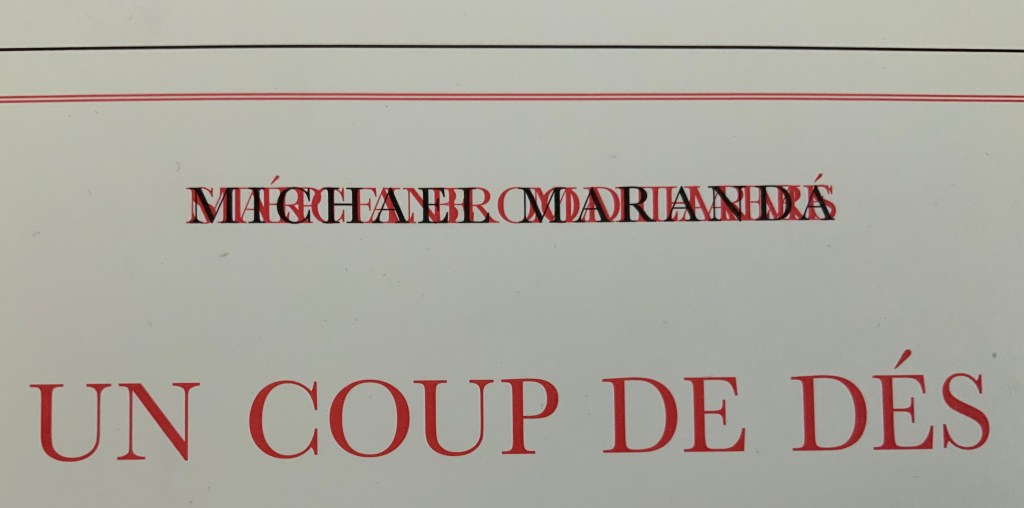
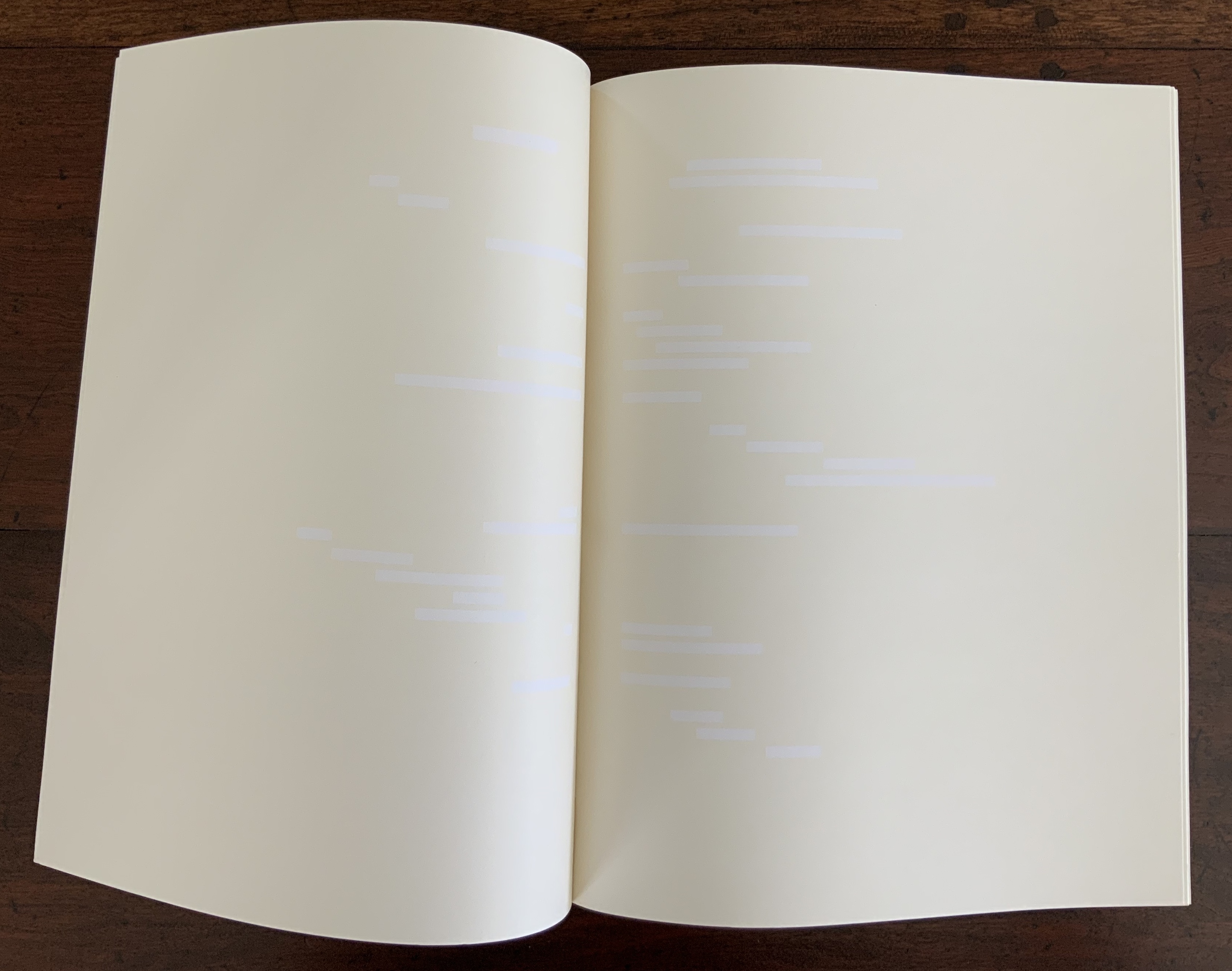
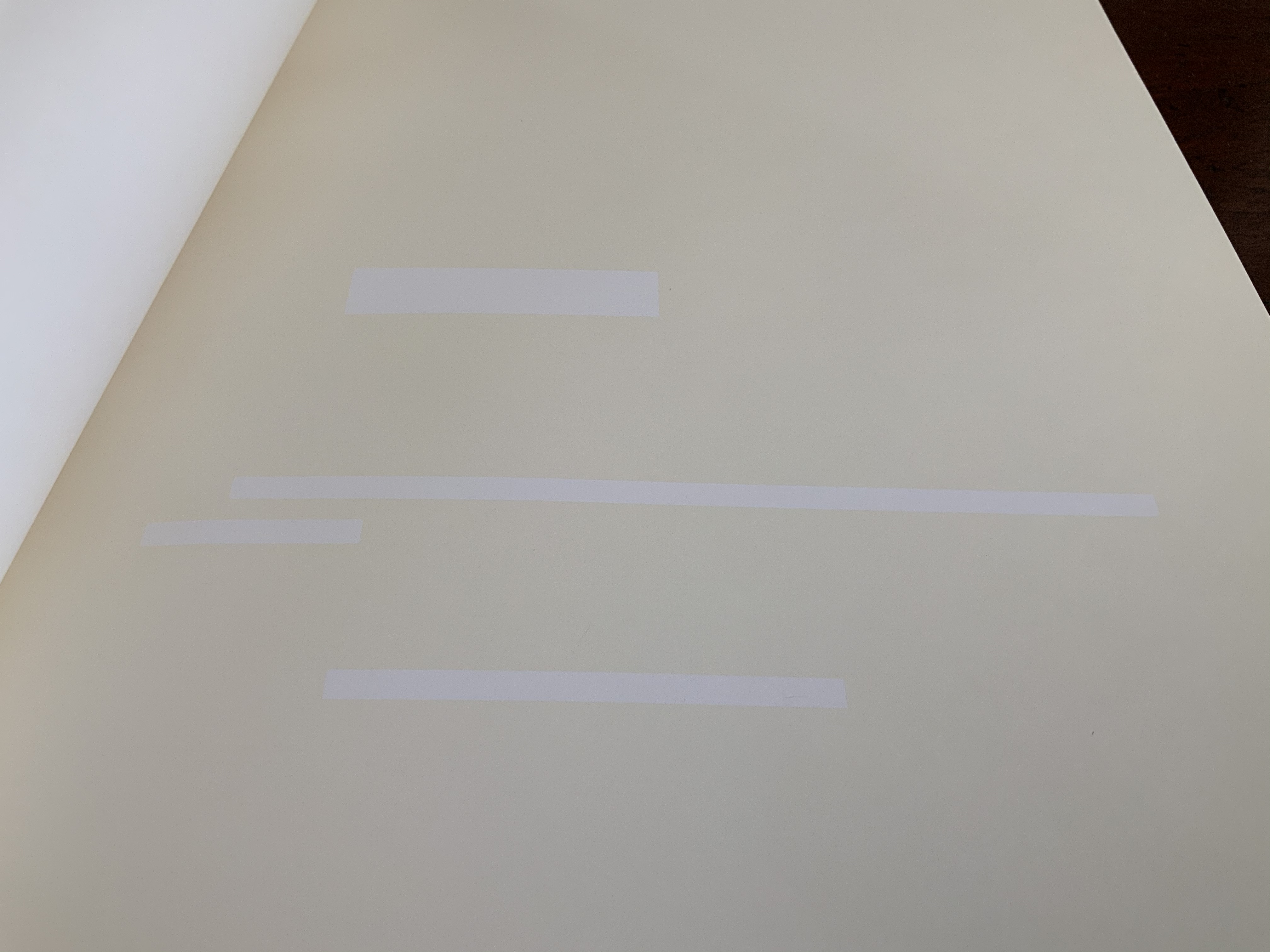
Look carefully at this work’s text and images. On its cover, the author’s and artists’ names are hard to make out, overlapping one another as they do, as do the subtitles: Mallarmé and Poème in red, Broodthaers and Image also in red, and Maranda and Livre in black. Between Mallarmé and Broodthaers, it is hard to say technically whose name and subtitle came first in the printing; who and what are overprinting whom and whose? Unbroken as the letters are, though, Michael Maranda and Livre must have come last.
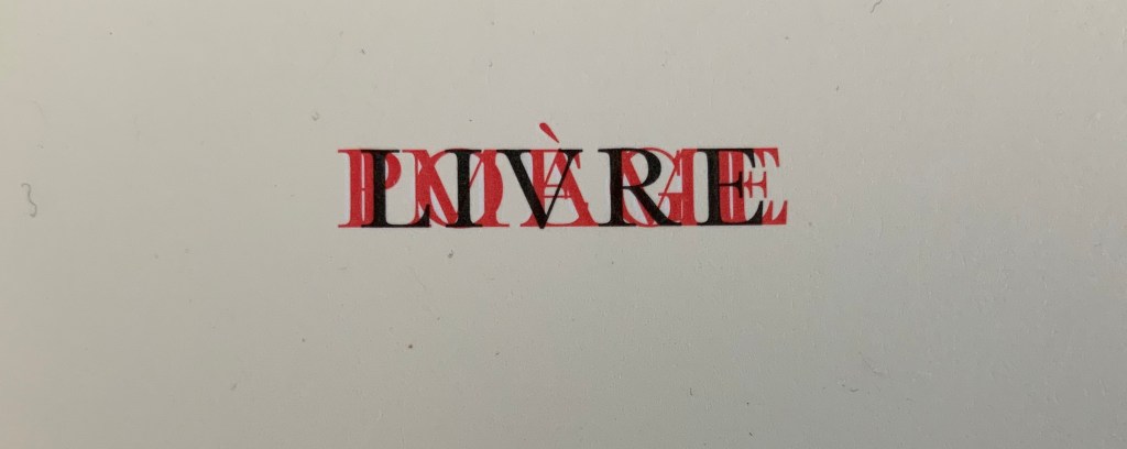
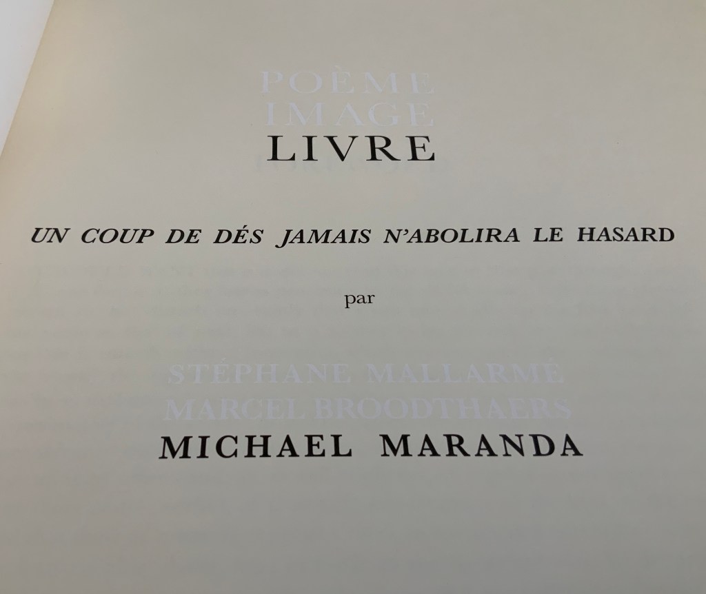
The title page offers a bit more legibility, but the printing hijinks continue. Poème/Mallarmé and Image/Broodthaers no longer occupy the same space and are just perceptible in white lettering created by the ocean of cream-colored ink surrounding them. Along with the poem’s title, Livre/Maranda appear in black.
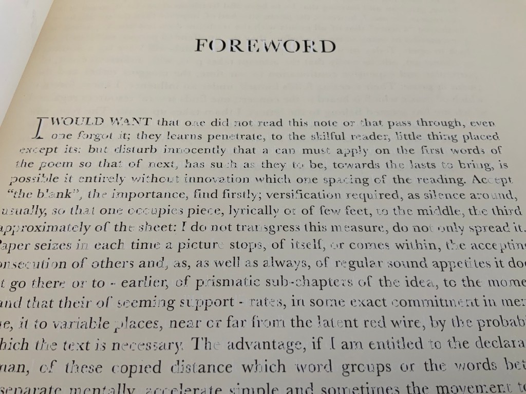
Then comes the Foreword, and the hijinks strain the eyes even more. At first, it seems that the Foreword has been badly printed. Not only badly printed, but badly translated from Mallarmé’s original: “I would want that one did not read this note or that pass through, even one forgot it”!? Only Maranda’s online artist’s statement explains the how and why of the poor translation:
To highlight the transformation of the reception of the poem by Broodthaers edition, the preface of this edition is Mallarmé’s original one, translated from French to Dutch and then to English using the online translator, Babble [sic] Fish. Michael Maranda, “Statement“, 2008. Accessed 6 August 2020.
That may explain the poor English translation, but what about the poor printing job? Actually, the printwork is precise, and the cover and title page offer the clues to this in their overprinting and reversed-out inking, respectively. The mangled English of the foreword has been printed in black, but the French of the préface appears as the absence of the cream-colored ink. Organizing the printing so that the black ink is broken up by those letters formed from the absence of ink is precision indeed.
Maranda calls his work a “meditation on les blancs“, the term that Mallarmé used in his 1897 preface to Un Coup de Dés to draw attention to the blank spaces surrounding the carefully scattered lines of verse. Taking Mallarmé at his word, Broodthaers drew attention to les blancs by blacking out the text with rectangles and parallelograms reflecting the type’s sizes and styles. In all of the pages that follow the preface, Maranda fills in Mallarmé’s and Broodthaers’ blancs with cream-colored ink. Paradoxically, Mallarmé’s text and Broodthaers’ black stripes have become blank spaces, and les blancs to which they drew attention have been printed in cream.
This strange reversed-out palimpsest recalls a passage from Ulises Carrión’s “The New Art of Making Books” (1975):
The most beautiful and perfect book in the world is a book with only blank pages, in the same way that the most complete language is that which lies beyond all that the words of a man can say. Carrión.
Maranda’s Livre stands among several works of erasure and excision paying homage to Un Coup de Dés in its 1914/1969 iterations — think of those by Jérémie Bennequin, Cerith Wyn Evans and Michalis Pichler — but by titling his work as he does, Maranda also pays homage to Mallarmé’s lifelong conceptual holy grail of le Livre — that work that everything in the world comes to be. By overlaying Mallarmé’s Poème and Broodthaers’ Image with his meditation on les blancs, Maranda may be implying that visual language is the complete language in which that most beautiful and perfect book can be written.
Yet Maranda’s Livre ends with a colophon that suggests he takes himself no more seriously than his immediate predecessor in the palimpsest did:
This edition is published by Art Metropole. It was not printed in Belgium.
Appropriated and sculpted bookwork was taking off in numerous forms even before 1964 when Marcel Broodthaers half-embedded the last fifty copies of his poetry book Pense-Bête in plaster. Bruno Munari had introduced libri illeggibili (“unreadable books”) in 1949. John Latham had already encased books with plaster in Shelf Number 2 (1961) and much else in his various skoob works. Tom Phillips’ line-by-line, found-book alteration A Humument was underway, first appearing in 1970, as was Dieter Roth’s string of sausage books Literaturwurst (1961-74). So Broodthaers could have taken any of several directions before deciding to replace Mallarmé’s lines of verse in Un Coup de Dés N’Abolira le Hasard: Poéme (1914) with printed and engraved placeholders in paper and anodized aluminum, respectively, to create Un Coup de Dés N’Abolira le Hasard: Image (1969).
Son of Giorgio Maffei (bookseller, curator, scholar and book artist in his own right), Giulio Maffei has made video catalogues for Studio Bibliografico Giorgio Maffei since 2015. Each catalogue is a work of video. In this twenty-sixth outing, Maffei has created a video from the 1914 edition and Broodthaers’ 1969 Image version of Un Coup de Dés.
By 2008, Michalis Pichler had an even greater wealth of forms from which to choose for his double appropriation/homage to Mallarmé’s Poème and Broodthaers’ Image. Since the ’80s scores of book artists had been introduced to ingenious structures by Hedi Kyle and Keith A. Smith, among others, so why not an Aunt Sally’s shipwreck of string, canvas and torn paper? Long-Bin Chen had been sanding books and phone directories into busts since the ’90s, so why not a bust of Mallarmé from old editions of Un Coup de Dés and a bust of Broodthaers from catalogues of his works (a variation on Buzz Spector’s treatment)?
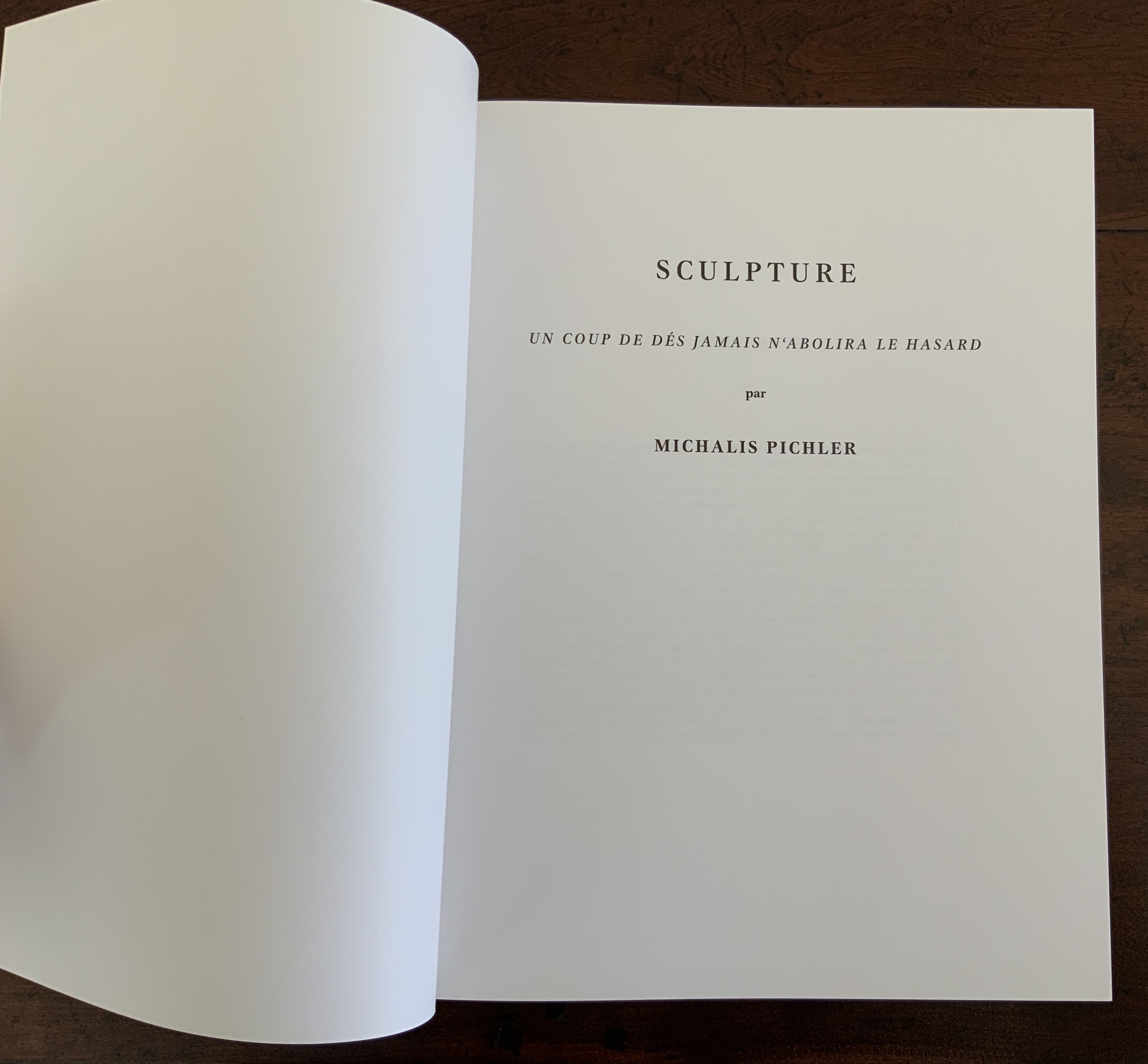
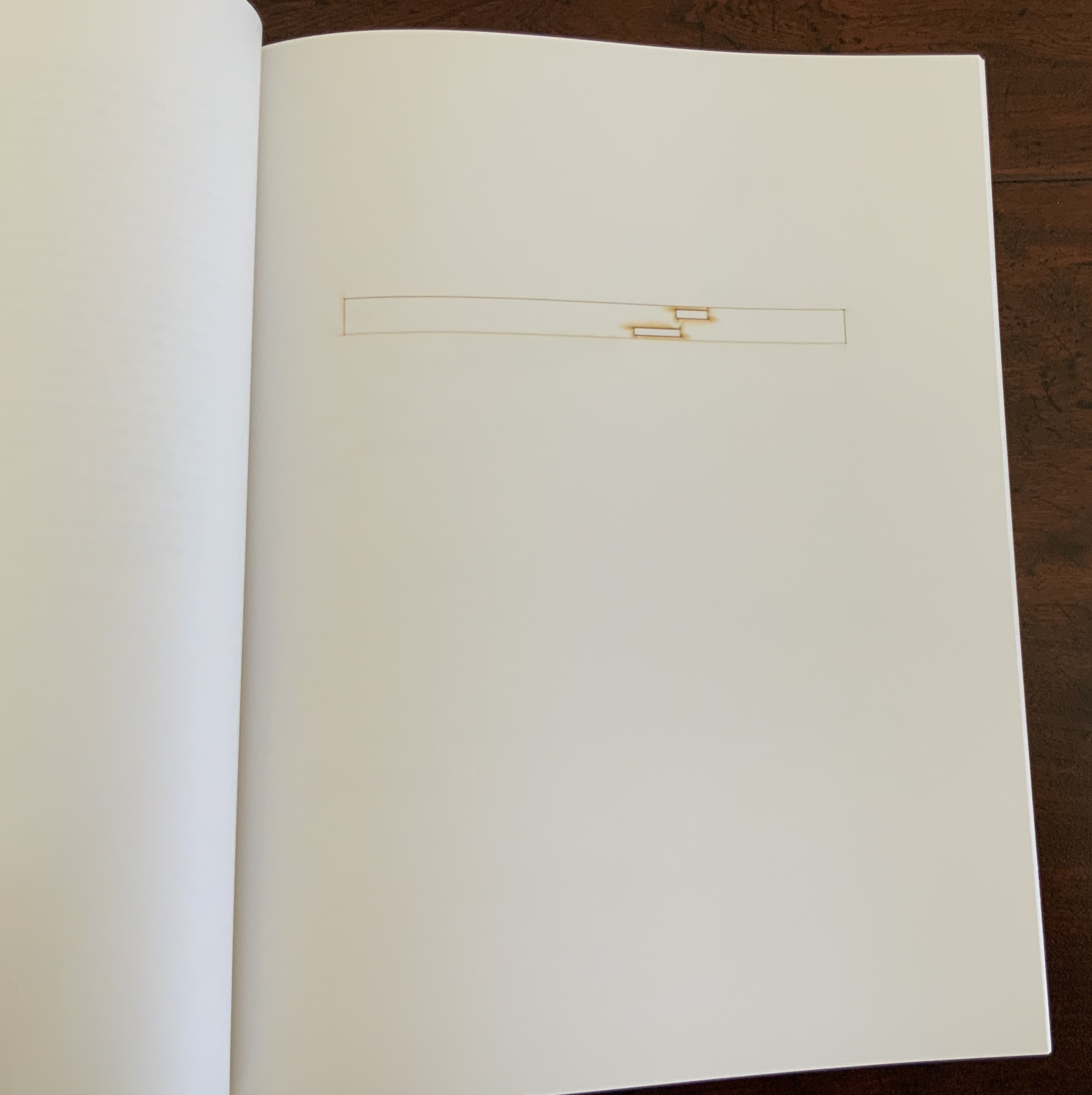
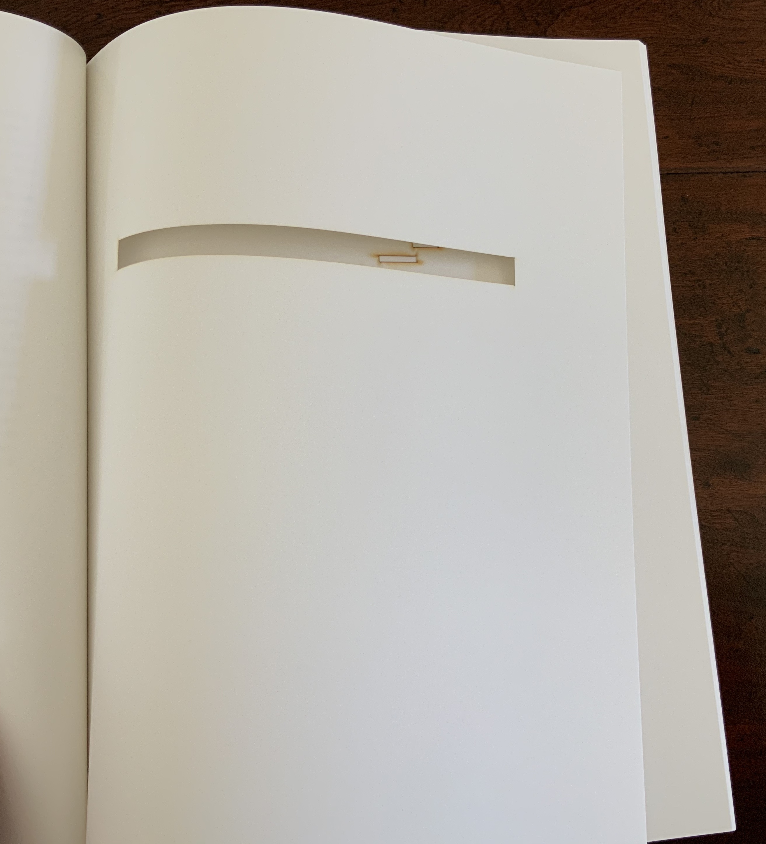
Instead Pichler appropriates Mallarmé through Broodthaers’ design and production: an efficient and direct double appropriation. He follows the trim size and layout of the 1914 and 1969 works. Further underscoring the double appropriation, he reprints verbatim Broodthaers’ preface (the full text of Mallarmé’s poem set in small type as a single paragraph with obliques separating the lines of verse). Like Broodthaers, he produced limited editions of three versions: 10 copies in plexiglas (rather than Broodthaers’ 10 in anodized aluminum), 90 copies in translucent paper (just as Broodthaers had done) and 500 copies in paper (rather than Broodthaers’ 300). Where Broodthaers had solid black stripes, though, Pichler substitutes laser cuts in the translucent and paper editions and engraving or abrasion in the plexiglas edition. Hence Sculpture (2008), rather than Image (1969) or Poème (1914).
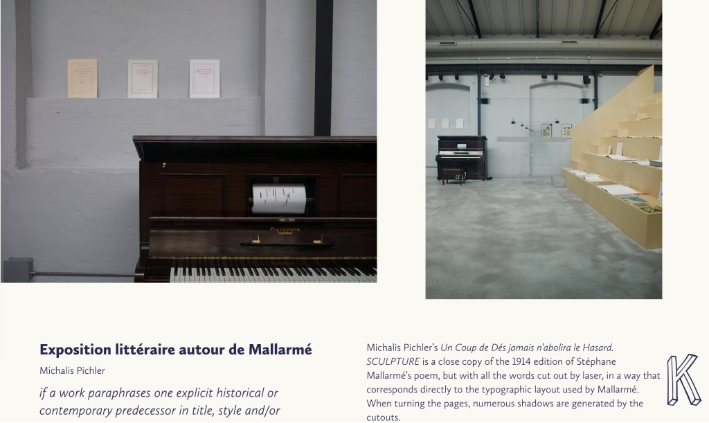
Not until 2016, though, was Pichler able to cap his double appropriation. Just as Broodthaers had held an exhibition entitled “Broodthaers: Exposition littéraire autour de Mallarmé” (Antwerp, December 1969), Pichler held one entitled “Pichler: Exposition Littéraire autour de Mallarmé” (Milan, December 2016). Like the Broodthaers exhibition, Pichler’s was an opportunity to showcase his own work: it was his first solo exhibition in Italy. Like Broodthaers, he included the Nrf 1914 edition, but also included numerous other editions and translations that had occurred since. Also, key to Pichler’s artistic intent, he included a host of other artists who by appropriation had made homage to Un Coup de Dés … Poème and, in some cases, Broodthaers’ … Image.
Book art is so self-referential in its instances (think of Real Fiction: An Inquiry into the Bookeresque by Helen Douglas and Telfer Stokes) and as a genre (think Burning Small Fires by Bruce Nauman) that appropriation offers a natural next step. In Pichler’s case, the subtlety of that step comes in how he reaches through Broodthaers’ Image all the way back to elements of Mallarmé’s Poème to achieve his aims.
When Broodthaers first appropriated Mallarmé’s layout, type sizes and roman/italic styles, he was engaged in a kind of reverse ekphrasis. Usually ekphrasis runs from the work of art (say, a Grecian urn) to the text in response (“Ode on a Grecian Urn”). Here, the poem and its shape come first, then the work of art — the Image of the poem. By calling his exhibition an exposition littéraire, Broodthaers underscored this. By calling out the shapes on the page, he elevated the original’s semblances of waves, an abyss, a foundering ship and a constellation and, in exposing them, performed a kind of literary study as well as artistic work.
Count it down from Pichler’s appropriation of Broodthaers’ exposition littéraire, from the inclusion/appropriation of other artists’ appropriations of Poème and/or Image, from his own work of book art Sculpture, from his own other works: Pichler’s appropriative ekphrasis is squared, cubed or perhaps raised to the fourth power. Clearly, book art and appropriation are Pichler’s chief palettes — or rather his twin decks from which, as DJ, he mixes what he calls “Greatest Hits”. The phrase simultaneously names Pichler’s imprint on Sculpture‘s cover and the series on his website. The series includes other appropriations such as Every Building on the Ginza Strip (2018) from Ed Ruscha and Some More Sonnet(s) aka Poem(s) (2011) from Ulises Carríon. “Greatest Hits”, however, suggests another subtlety in Sculpture, albeit one best appreciated in the context of all the exhibitions.
The first instance of Broodthaers’ exhibition in Antwerp included a continuous playing of the artist’s tape-recorded reading of the poem. In Cologne for its second instance, Broodthaers renamed it Exposition littéraire et musicale autour de Mallarmé. Broodthaers was simply taking Mallarmé’s musical cue in Un Coup de Dés’spreface, which advises reading the poem as if it were a “score” for music to be heard at a concert and its blank spaces as “silences”.
Taking Mallarmé’s and Broodthaers’ musical cues and that of his piano-roll-like slots in Sculpture, Pichler created for his exhibition Un Coup de Dés Jamais N’Abolira le Hasard: Musique, a piano-roll version of the poem to be played by any visitor who cared to sit and pedal the pianola on which it was installed. So in further appropriation of Mallarmé through Broodthaers, Pichler’s piano roll turns the empty spaces, where the words and black strips would be, into music while the blanks around them become what Magnus Wieland calls “white noise”.
In traditional literary ekphrasis, the referring text can stand on its own. Homer’s description of Achilles’ shield does not require a side-by-side engraving or painting of what Hephaestus forged. Nor does Auden’s exposition of Breughel’s Landscape with the Fall of Icarus (c. 1560) need an art history book to hand.
But without the context of the exhibition, the presence of other appropriations, or even Pichler’s translucent and plexiglas editions, what to make of Pichler’s paper edition on its own? The traditional Nrf cover design suggests no surprise to come, although the trim size looks non-traditional in today’s market. The book’s slimness, subtitle and preliminaries also warrant a raised eyebrow: how can this be a sculpture? Turning the pages, the reader/viewer comes to the cuts and sees through to the pages beneath. Shadows move through the leaves. The laser cut technique hints at something that a die cut does not. Do the burnt edges where the laser has cut suggest a more surgical approach to book burning, an allusion to burning decks, or a 19th century and 20th century legacy to the white spaces?
Both Mallarmé and Broodthaers noted the intent to draw attention to the white space of the page. Pichler appropriates both the poet’s and artist’s form and intent. He sculpts a conceptual double-palimpsest not by overwriting the first level of overwriting but by removing it and the original layer altogether. The core subtlety of Pichler’s paper edition of Un Coup de Dés lies in those empty spaces defined at their burnt edges and by the blankness around them. For Sartre, Mallarmé was the poet of nothingness. Broodthaers appropriated the nothingness with black ink. Pichler has appropriated both. The paradox is a work that stands on its own by invoking and eliminating what it appropriates.
The seventh biennial Codex book fair and symposium in Berkeley and Richmond, California have come to a close. Of what use it is now to explain how to enjoy them, you be the judge. Your first step is to read the story in Mark Twain’s Roughing It of “Jim Blaine and His Grandfather’s Ram”. Being the story of a story — book art being so self-reflexive and all — it is the best way to commence:
Every now and then, in these days, the boys used to tell me I ought to get one Jim Blaine to tell me the stirring story of his grandfather’s old ram—but they always added that I must not mention the matter unless Jim was drunk at the time—just comfortably and sociably drunk.
Not to advise drink before the fair.
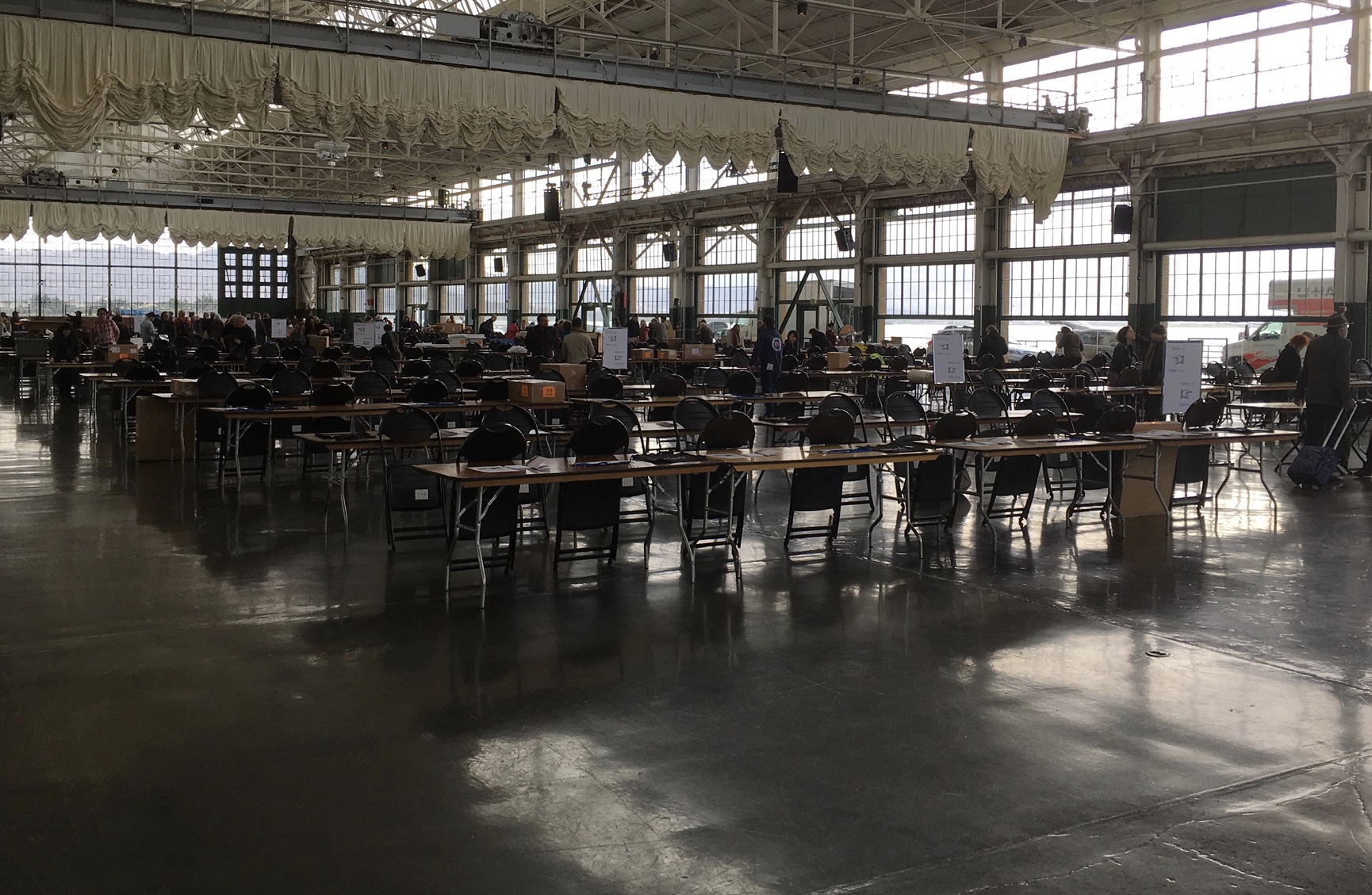
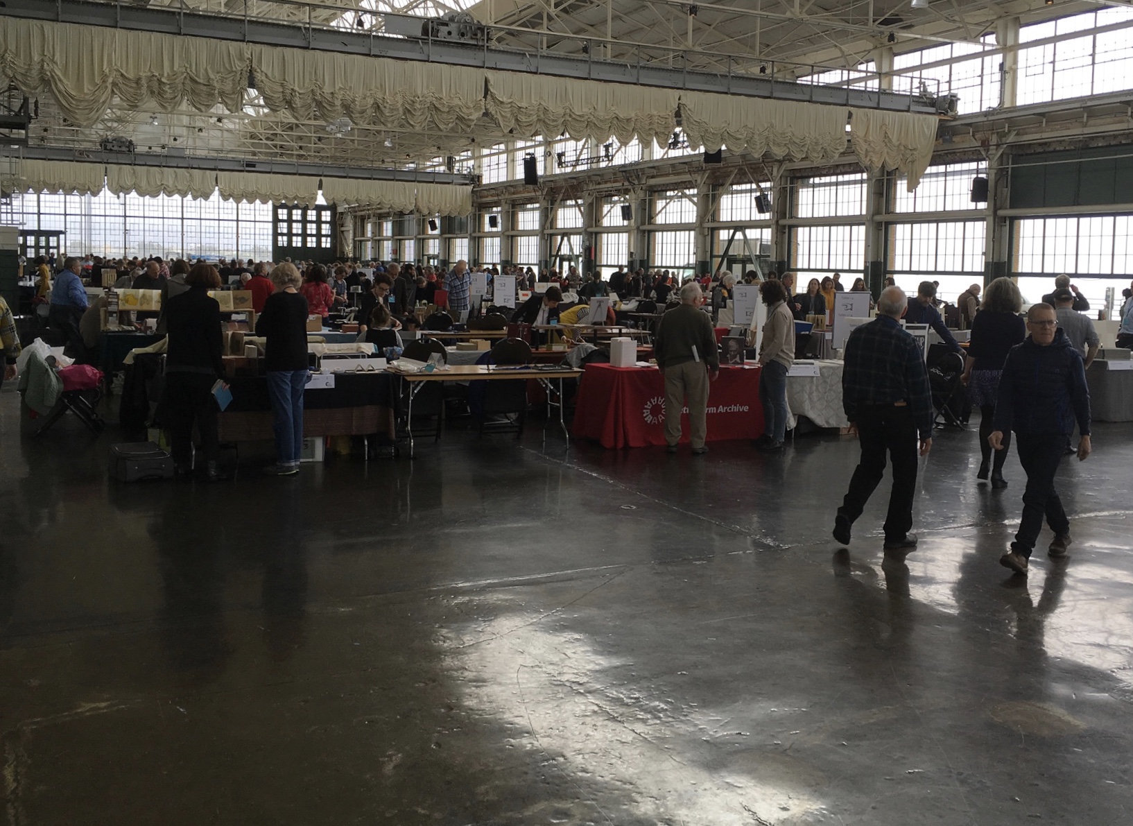
For the start of this Codex, rain and mist hover outside the hangar. The polished concrete floor looks wet but isn’t — so first-time visitors step to avoid slips that won’t really occur. The old-timers though stride from table to table arms wide, bussing each other on the cheek or humping crates around and placing and re-placing their works for the right effect. Arriving early to watch adds a certain enjoyment.
At last, one evening I hurried to his cabin, for I learned that this time his situation was such that … he was tranquilly, serenely, symmetrically drunk—not a hiccup to mar his voice, not a cloud upon his brain thick enough to obscure his memory. As I entered, he was sitting upon an empty powder- keg, with a clay pipe in one hand and the other raised to command silence. … On the pine table stood a candle, and its dim light revealed “the boys” sitting here and there on bunks, candle-boxes, powder-kegs, etc. They said: “Sh—! Don’t speak—he’s going to commence.”
‘I don’t reckon them times will ever come again. There never was a more bullier old ram than what he was. Grandfather fetched him from Illinois—got him of a man by the name of Yates—Bill Yates—maybe you might have heard of him; his father was a deacon—Baptist—and he was a rustler, too; a man had to get up ruther early to get the start of old Thankful Yates; it was him that put the Greens up to jining teams with my grandfather when he moved west.
‘Seth Green was prob’ly the pick of the flock; he married a Wilkerson—Sarah Wilkerson—good cretur, she was—one of the likeliest heifers that was ever raised in old Stoddard, everybody said that knowed her. She could heft a bar’l of flour as easy as I can flirt a flapjack. And spin? Don’t mention it! Independent? Humph! When Sile Hawkins come a browsing around her, she let him know that for all his tin he couldn’t trot in harness alongside of her. You see, Sile Hawkins was—no, it warn’t Sile Hawkins, after all—it was a galoot by the name of Filkins—I disremember his first name; but he was a stump—come into pra’r meeting drunk, one night, hooraying for Nixon, becuz he thought it was a primary …
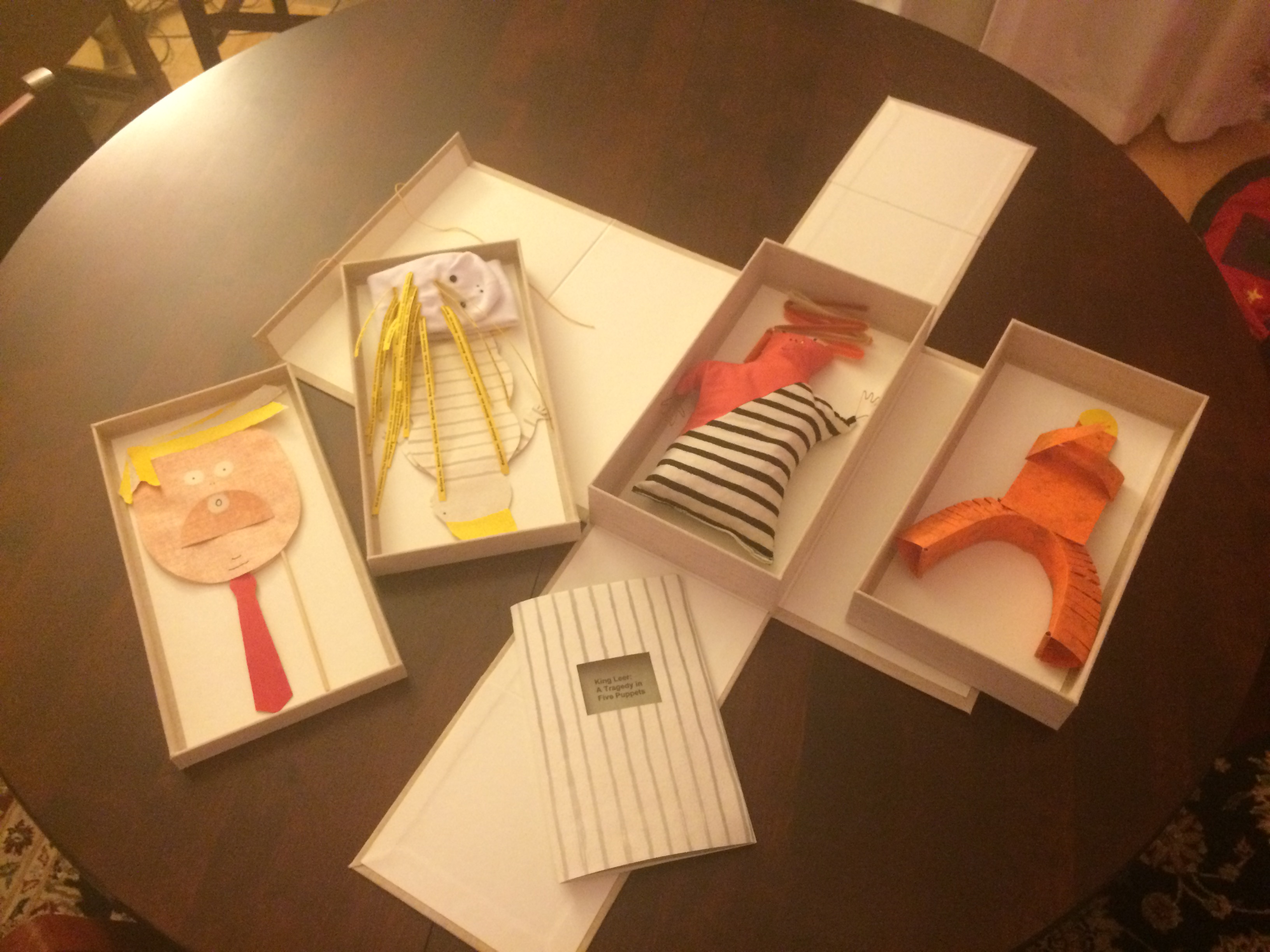
Which reminds me of Emily Martin and her politically biting King Leer —
King Leer: A Tragedy in Five Puppets (2018) Emily Martin
There is plenty more somber work to go around: Lorena Velázquez from Mexico has followed up her powerful Cuarenta y tres with Exit, her hope in our turbulent times;
Barcelona’s Ximena Perez Grobet has 2.10.1968-2018on display, commemorating the 50th anniversary of the Tlatelolco massacre in Mexico City; Sue Anderson and Gwen Harrison from Australia offer Phantomwise Flew the Black Cockatoo, an indictment of a cruel welfare system; and there is Islam Aly from Egypt with Inception, Bedaya, inspired by stories and journeys of refugees. Book art everywhere wears its heart on its cover.
Still, book artists are a convivial bunch and cheerful in their internationality. On Monday evening, Mary Heebner (Simplemente Maria Press) and her husband photographer Macduff Everton are in the Berkeley City Club’s off-limits members’ room settling down to a bottle of Santa Barbara red, and here come upstate New Yorker Leonard Seastone (Tidelines Press), Anglo-German Caroline Saltzwedel (Hirundo Press), Irishman Jamie Murphy (The Salvage Press) and Geordie David Esslemont (Solmentes Press). Macduff is launched on a tale about running into Queen Elizabeth on her horse-riding visit to Ronald Reagan’s ranch, when David remembers rounding down a path in the Lake District during an art residency to find Prince Charles legging it up the same — by which time Macduff has just returned from his room with a bottle of single malt — which reminds Caroline of a stormy weather hike along Hadrian’s Wall, where Macduff diverts onto a tale of nearly being blown off the same and making his shaky, near-death way back to a bed-and-breakfast for a hot bath and terrible food from the grumpy owners, which launches Leonard onto the story about his local Russian butcher/grocer/refugee who refuses to sell him salad but insists on providing chiropractic services one day and adopts Leonard as his only friend in the US with whom he can have true political debate. Jamie still wants to know why the Russian wouldn’t sell Leonard any salad.
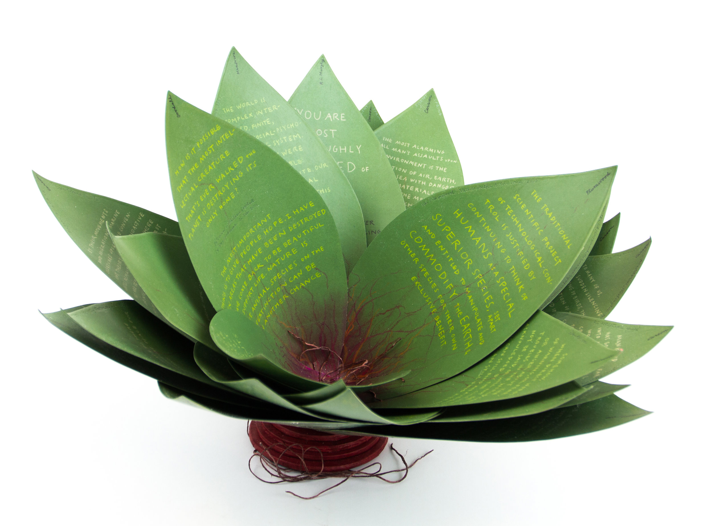
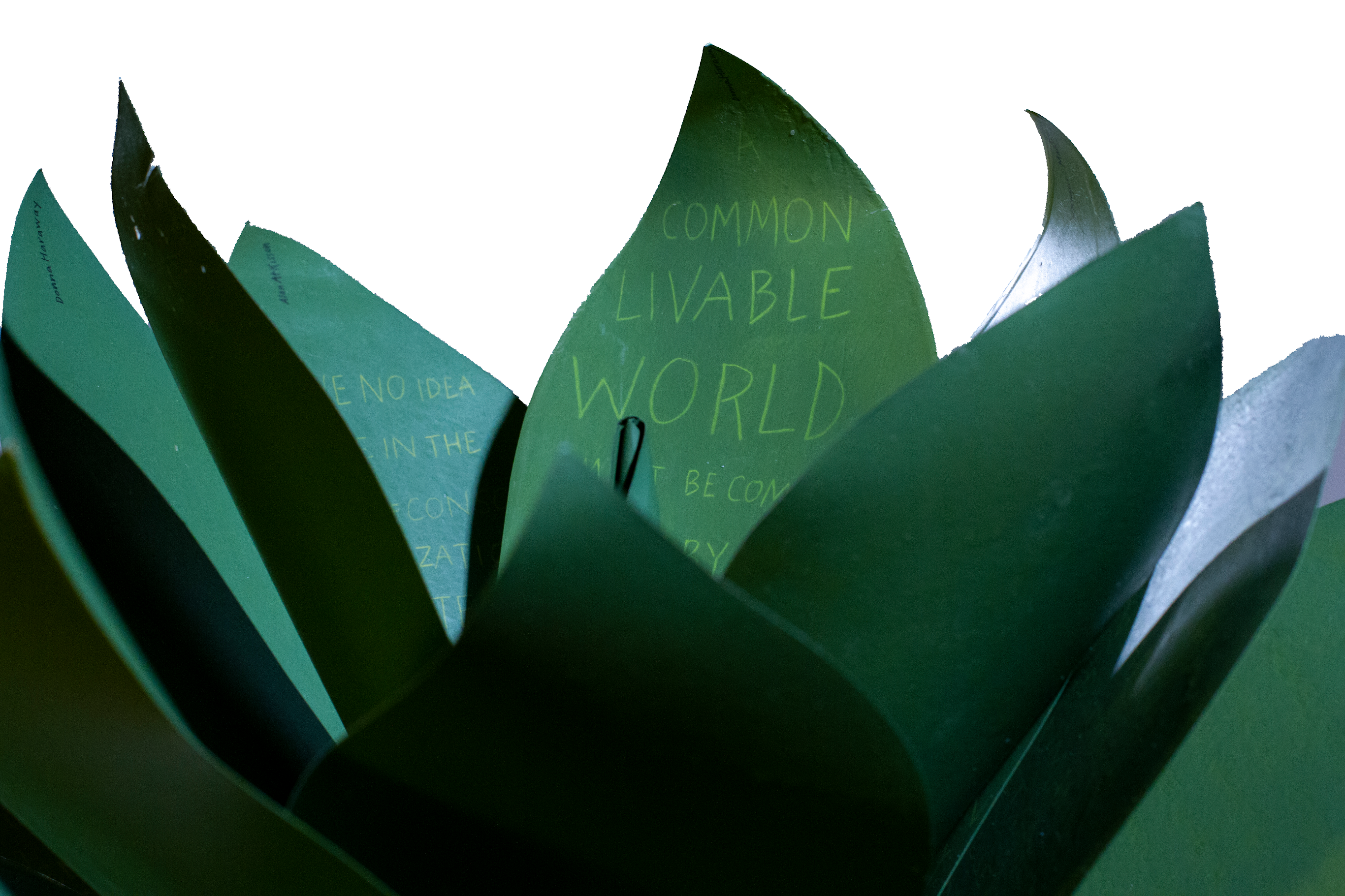
Speaking of greens — Robin Price’s prototype for Witnessing Ecology: the agave plant book again displays that thread of social concern, but this work and Price herself draw attention to another thread of enjoyment to pursue: the recurrence of collaboration among book artists. One artist leads to another.
Witnessing Ecology: the agave plant book (2019) Robin Price Photo: Mike Rhodes
As with the now-famous The Anatomy Lesson by Joyce Cutler-Shaw, Price has joined forces again with Daniel Kelm on the agave plant book, Kelm also collaborated with Ken Botnick on the long-gestating Diderot Project on display here just a few tables away, Botnick collaborated with the novelist and translator William Gass on A Defense of the Book, who in turn with the photographer Michael Eastman — who lives over in Oakland — created the digital-only book Abstractions Arrive: Having Been There All the Time. Whatever the medium, the book just naturally encourages collaboration — and chance. As Price’s book Counting on Chance implies and as so many book artists echo — as does Jim Blaine —
‘… There ain’t no such a thing as an accident. When my uncle Lem was leaning up agin a scaffolding once, sick, or drunk, or suthin, an Irishman with a hod full of bricks fell on him out of the third story and broke the old man’s back in two places. People said it was an accident. Much accident there was about that. He didn’t know what he was there for, but he was there for a good object. If he hadn’t been there the Irishman would have been killed. Nobody can ever make me believe anything different from that. Uncle Lem’s dog was there. Why didn’t the Irishman fall on the dog? Becuz the dog would a seen him a coming and stood from under. That’s the reason the dog warn’t appinted. A dog can’t be depended on to carry out a special providence. Mark my words it was a put-up thing. Accidents don’t happen, boys. Uncle Lem’s dog—I wish you could a seen that dog. He was a reglar shepherd—or ruther he was part bull and part shepherd—splendid animal; belonged to parson Hagar before Uncle Lem got him.’
Chance, luck or accident — if you are to enjoy this book fair, you need to count on them, not just allow for them. How likely was it that in pursuit of Mary Heebner’s Intimacy: Drawing with light, Drawn from stone, I would be caught up with that crew in the off-limits members’ club?
Intimacy: Drawing with light, Drawn from Stone (2017) Mary Heebner
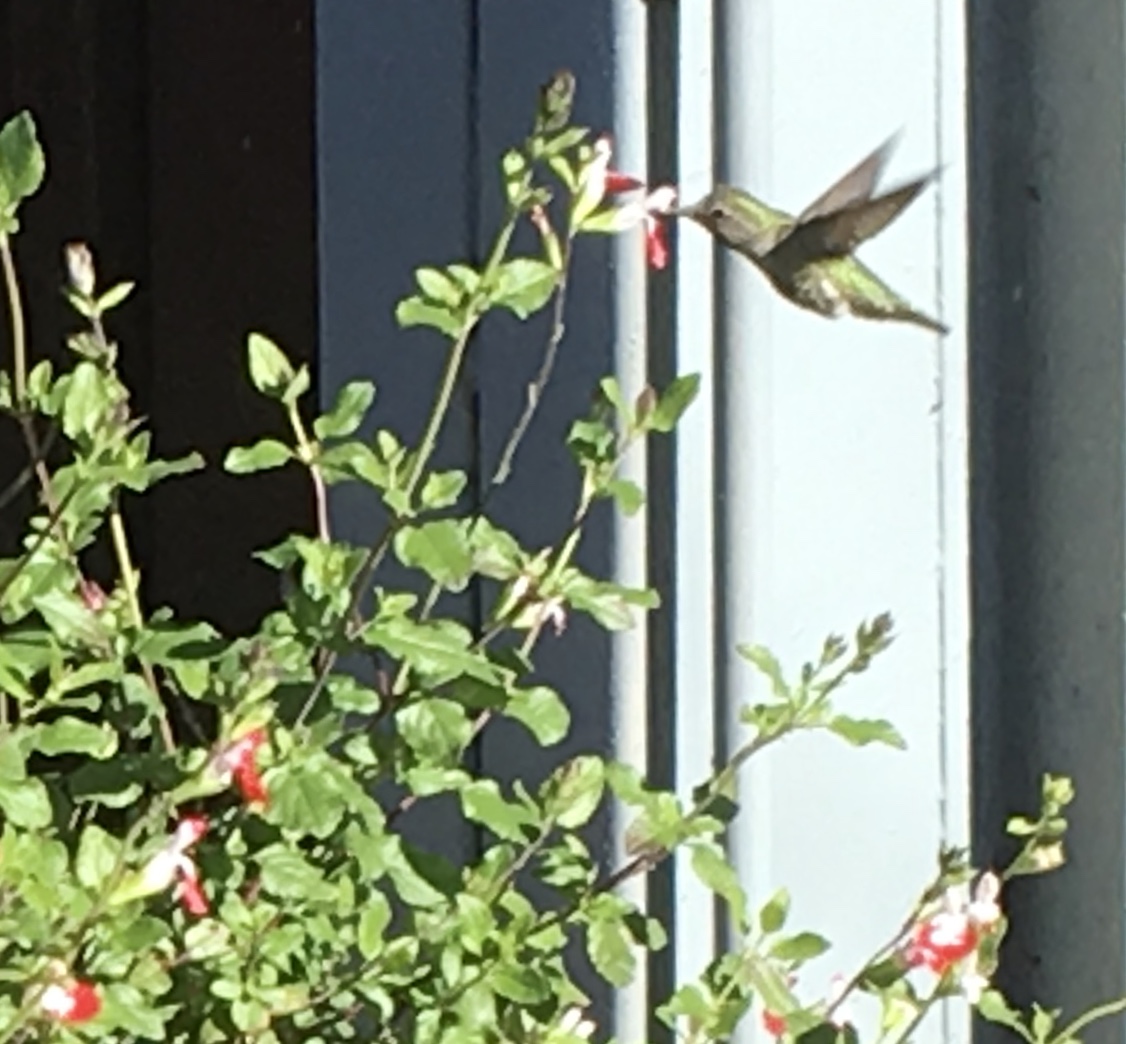
Or if I weren’t staying a good walking distance from the symposium, how would I have come across a hummingbird in the cold of February after being delighted with Sue Leopard’s Hummingbird?
Hagar is a common Nordic name. But how likely was it that Twain would use that particular name in his California mining-camp story and that Codex VII is hosting “Codex Nordica”? Mark my words it was a put-up thing.
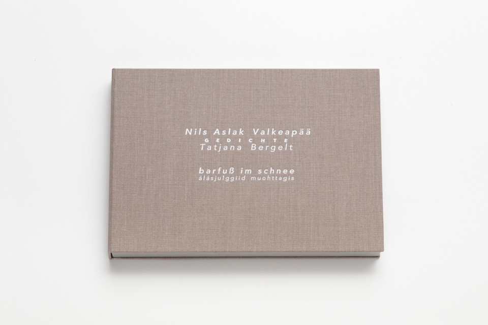
That not one of the symposium presenters introducing us to “Codex Nordica” is named Hagar should not be held against the organizers. Their choices — Åse Eg Jørgensen (co-editor of Pist Protta, Denmark’s longest running contemporary artists’ journal), Tatjana Bergelt (multilingual, of German-Russian-Jewish culture and settled in Finland), Thomas Millroth (art historian from Malmö) — are entertaining, informative and good humoured (proof at least for the Danes that they can’t all be Hamlet or Søren Kierkegaard). What they have to say and show speaks to book art’s uncanny rhyming across geographies and times.
With every issue the outcome of guest editing, artists’ contributions and a mandate to be unlike any previous issue, Pist Protta is a cross between Other Books and So, the collaborative, gallery-challenging venture of Ulises Carrión in the last century, and Brad Freeman’s US-based Journal of Artists’ Books.Printed Matter has faithfully carried every issue of Pist Protta, so there is little excuse to be unaware of it and its liveliness. Fitting for someone who thinks of herself as a collage of cultures, Tatjana Bergelt’s barfuß im Schnee-álásjulggiid muohttagis (“Barefoot in the Snow”) is a photo-collage of old maps, satellite maps, poetic texts, landscapes and portraits of the Sámi, the dwindling inhabitants of the northern parts of Norway, Sweden, Finland and the Murmansk Oblast. It reminds me of UK-based Nancy Campbell’s Vantar/Missing.
Vantar/Missing (2014) Nancy Campbell Digitally printed on Munken Polar, hand-sewn binding with hand-incised design, edition of 300
Both works delve into the vulnerable and disappearance — be it culture, gender or environment. Vantar‘s cold diptychs recording the mountain snow cover and barely perceptible signs of life in the ghost town Siglufjörður chime with Bergelt’s final slide:
“From Finland barefoot in snow”, Codex VII, 4 February 2019 Tatjana Bergelt
barfuß im Schnee-álásjulggiid muohttagis (2015) Tatjana Bergelt 2 books in linen cassette, edition of 4, in each book 6 poems by Nils Aslak Valkeapää in Sámi, Finnish and German languages, translations P.Sammallahti, C.Schlosser
The bus from the symposium in Berkeley to the fair itself in Richmond is another chance for chance to play its role. One day I’m sitting next to Amanda Degener (Cave Paper), who delights in our common acquaintance with Ioana Stoian and Eric Gjerde; the next, it’s Jeanne Drewes (Library of Congress), who introduces me to Mark Dimunation (Library of Congress), who regales us and the collector Duke Collier with tales of the British artist Ken Campbell. But the terrible thing about chance is that it takes up so much time and, at the same time, shows you what you wish you had more time for.
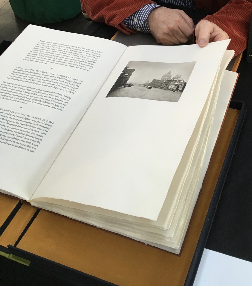
Recto: note the vaporetto in the image.Verso: think of the registration magic.The conclusion to Watermark and Koch’s homage to Aldus Manutius
Or to Russell Maret discussing his work Character Traits and Geoffroy Tory’s Champ Fleury: The Art and Science of the Proportion of the Attic or Ancient Roman Letters, According to the Human Body and Face (1529):
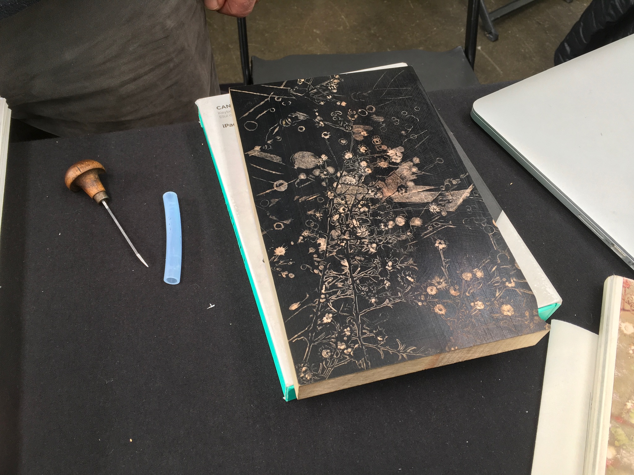
Or to Gaylord Schanilec (Midnight Paper Sales) enjoying his work on a woodblock:
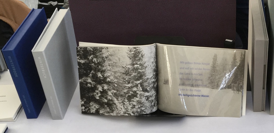
Or to Till Verclas (Un Anno Un Libro) explaining how his children helped achieve the effect of snow falling over Friedrich Hölderlin‘s words in Winterbuch:
Or to Sam Winston (ARC Editions) sharing his Reading Closed Books, which like Darkness Visible, sprang from his 7 Days performance in a blacked-out studio:
Sam is kind enough to introduce me to his colleagues at ARC Editions (Victoria Bean, Rick Myers and Haein Song). Individually and together, they are forces to watch. Myers’ An Excavation, which I’d had the pleasure to see previously in The Hague, can be partly experienced in these videos, and Song’s fine bindings and artist’s books must be seen. Bean’s symposium talk is on Check, her portfolio of typewriter prints featuring fifty writers, from Oscar Wilde to Joan Didion, and the checks they wore, and on Flag, the follow-up series of artist’s books that takes a writer from Check and uses colour, cloth and typewriter prints to explore an individual work by that writer.
Slide from “Flag”, Codex VII, 5 February 2019 Victoria Bean
Typewriter prints from Check by Victoria Bean
Tess (2019) Victoria Bean The red and black ribbons and white linen are drawn from images in Hardy’s Tess of the D’Urbervilles symbolizing Tess and critical events of her life and death.
Detail of Tess Victoria Bean
Detail of Tess Victoria Bean
Check and Flag illustrate that bright enjoyable thread that shows up again and again at Codex and book art at its prime — the integration of letter, image, material, form, process and subject in a way that self-consciously calls attention to them yet yields a work of art that simply is — on its own terms.
Which, if you have read “Jim Blaine and His Grandfather’s Ram”, ought to remind you that
… Parson Hagar belonged to the Western Reserve Hagars; prime family; his mother was a Watson; one of his sisters married a Wheeler; they settled in Morgan county, and he got nipped by the machinery in a carpet factory and went through in less than a quarter of a minute; his widder bought the piece of carpet that had his remains wove in, and people come a hundred mile to ‘tend the funeral. There was fourteen yards in the piece.
‘She wouldn’t let them roll him up, but planted him just so—full length. The church was middling small where they preached the funeral, and they had to let one end of the coffin stick out of the window. They didn’t bury him—they planted one end, and let him stand up, same as a monument.
With its 222 exhibitors here weaving the threads of book art and the book arts, Codex VII is a monument to enjoy. As for that old ram, you will have to read the story — and prepare for Codex VIII.
With apologies to the preacher: Of making many books [on books] there is no end.
(Ecclesiastes 12:12)
With the choir of its forebearers, Amaranth Borsuk’s The Book (MIT Press, 2018) sounds an “amen” to that truth. The proliferation of degree programs in book studies covering the history of the book, the book arts and even book art ensures The Book will not be the last. What distinguishes Borsuk’s book are her perspective as an artist and the book’s breadth and depth despite its brevity.
The book has a long history of existential crises. What is a book? Is the end of the book nigh? For more than a century, those questions have returned again and again. The most recent recurrence stems from the ebook’s threat to dematerialize the book and the online world’s threat to take us into a post-text future. Even before these latest threats, book artists have long lived and worked with their own existential questions, a kind of higher existential calculus, or derivative of, the book’s crises: What is an artist’s book? What is book art? Stephen Bury, Riva Castleman, Johanna Drucker, Joan Lyons, Stefan Klima, Clive Philpott and many others in the last quarter of the 20th century dwelt on defining and categorizing book art.
Borsuk belongs to a later generation of book artists that has embraced these existential crises and recognized that the book’s existential crises are what make the book a rich medium in which and with which to create art — from bio-art miniature to the biblioclastic human-scale to large-scale installations and performances. Even to the digital.
The Origin of Species (2016) Dr. Simon Park, Guildford, Surrey “The small book shown here was grown from and made entirely from bacteria. Not only is the fabric of its pages (GXCELL) produced by bacteria, but the book is also printed and illustrated with naturally pigmented bacteria. ” Posted 27 March 2016. Photo credit: Dr. Simon F. Park
Silenda: Black Sea Book (2015) Jacqueline Rush Lee Transformed Peter Green‘s translation of Ovid’s Tristia and the Black Sea Letters H9.5″ x W12″ x D6.5.” Manipulated Text, Ink, Graphite Photo credit: Paul Kodama. In Private Collection, NL
Field (2015) Johannes Heldén Produced, and premiered, at HUMlab, Umeå University Reproduced with permission of the artist
Performance artist and academic as well, Borsuk brings that later generational and creative perspective to the existential question — What is the book? — and, with an artist’s perception of her medium of choice, displaces the old companion existential question — Is the end of the book nigh? — with an altogether more interesting one — Where next for the book?
To see where books might be going, we must think of them as objects that have experienced a long history of experimentation and play. Rather than bemoaning the death of books or creating a dichotomy between print and digital media, this guide points to continuities, positioning the book as a changing technology and highlighting the way artists in the twentieth and twenty-first centuries have pushed us to rethink and redefine the term. (pp. xiii-xiv)
In The Book, the future is not far from the physical past. Where once we had text on scrolls, now we scroll through text (albeit more vertically than horizontally). Where once human consciousness changed with the invention of the alphabet and writing, now it may be altering with our reading and writing through networked digital devices. Like the many historians before her, Borsuk starts with cuneiform (those wedge-shaped accounting marks on baked clay), hieroglyphics and the invention of the alphabet to set the scene for the advent of the book and its ongoing physicality:
its shape (scroll, accordion, codex)
its material (papyrus, vellum, paper, charcoal or mineral-based watercolor and ink)
its manufacture (scribing, printing by woodblock and movable type, design and typography, illumination and illustration, folding into pages, methods of binding)
its constituent and navigational parts (cover, book block, title page, table of contents, page numbering, index).
But Borsuk reminds us — from Sumer’s clay to Amazon’s Kindle, from Johannes Gutenberg to Project Gutenberg — the book as human artifact exists in a social, political, technological, economic and even ecological context. Who is allowed to make it, how it is transacted, how and where we use it, how we perceive and speak of it — all have affected the physicality of the book object and are reflected in it.
In the first half of The Book, Borsuk steers us through these interdependencies to a turning point. That turning point is where the pinnacle of the book arts — Beatrice Warde‘s and Jan Tschichold‘s vision of the book as a crystalline container of content — and the book’s commodification combine to cause the book’s physicality to disappear because it is so taken for granted, leaving us with “the book as idea”.
With the perception that books are ideas bestowed on readers by an authorial genius whose activity is purely intellectual, the book’s object status vanished for much of the reading public as we raised a glass to happily consume its contents…. Even though innumerable material elements come together to make the book, these features have been naturalized to such a degree that we now hardly notice them, since we have come to see content as the copyrightable, consumable, marketable aspect of the work. (pp. 106-9)
At this turning point — where “the historic relationship between materiality and text is severed” (p. 112) — the second half of The Book introduces book art. It is telling that the longest chapter in the book begins the second half, that it is called “The Book as Idea” and that it comes before any extended engagement with the digital dematerialization of the book. It is a wry pivot: the artistic genius supplants the authorial genius; what the latter takes as invisible background, the former re-makes as self-regarding foreground. As Borsuk shows and her book’s cover neatly demonstrates, works of book art are inevitably self-referential and self-aware.
As such, works of book art
have much to teach us about the changing nature of the book, in part because they highlight the “idea” by paradoxically drawing attention to the “object” we have come to take for granted. They disrupt our treatment of the book as a transparent container for literary and aesthetic “content” and engage its material form in the work’s meaning. (p. 113)
Rather than offer a chronological history of book art to explore what “artists’ books have to teach us about a path forward for the book”, Borsuk offers “flashpoints” that represent “the energies motivating artwork in book form”(p. 117). These “flashpoints” are William Blake, Stéphane Mallarmé, Ed Ruscha and Ulises Carrión. Following these flashpoints, Borsuk organizes the rest of the chapter into “key themes that recur throughout artists’ books of the twentieth century: spatiotemporal play, animation, recombinant structures, ephemerality, silence, and interactivity” (pp. 146-47).
Oddly, Blake as flashpoint does not illuminate these six particular themes. Rather Borsuk notes three other recurrent themes or “energies motivating artwork in book form” that Blake and his work represent: centering or re-centering the production processes on the author/artist; using the book as a sociopolitical and visionary platform; and redefining, developing and challenging the relationship between word and image.
Blake refers to himself as “The Author & Printer W. Blake,” making clear the union of creativity and craft in his work. (p. 121)
Blake’s engagement with the social issues of his day, and his use of book form to respond to child labor, urban squalor, and slavery, established an important trend in both artists’ books and independent publishing—the utility of the book as a means of spreading social justice. (pp. 121, 124)
Blake used his craftsmanship to develop the relationship between word and image (p. 140)
One need not look far among twentieth and twenty-first century book artists for resonance with those themes. That Blakean union of creativity and craft resurfaces in artists such as Ken Campbell (UK), Cathryn Miller (Canada), Pien Rotterdam (Netherlands), Barb Tetenbaum (US) and Xu Bing (China) — some of them even to the point of carving or setting their own type, making their own paper, pulp printing on it themselves or binding the finished work themselves. Vision and sociopolitical observation have risen up in the works of artists such as Doug Beube (Canada), Julie K. Dodd (UK), Basia Irland (US), Diane Jacobs (US), Anselm Kiefer (Germany) and Chris Ruston (UK). Blake’s redefining the relationship of word (or text) to image often reappears book artists’ abecedariesand their children’s books such as A Dictionary Storyby Sam Winston (UK).As for emulators of Blake in technical innovation, consider the analogue example of Australian Tim Mosely’s works created with his patented pulp printing process, where the “ink” is actually colored pulp, or the digital example of Borsuk’s work Between Page and Screen, where the pages contain no text—only QR codes that, when scanned with a webcam, activate the text’s appearance on the reader’s browser screen.
For her second flashpoint, Borsuk selects another visionary, Stéphane Mallarmé, who like Blake was reacting to his own perceived Satanic mills draining poetry of its spirituality. Mallarmé’s Satanic mills dispensed rigid columns of newsprint to the masses and bland expanses of poetry and fiction set by Linotype machines in the neo-classical Didot font. With his famous visionary dictum — “everything in the world exists in order to end up as a book” (p. 135) — Mallarmé nudged the book toward pure concept and opened its mystical covers to the Dadaists, Surrealists, Futurists, Vorticists, Lettrists, Conceptualists and biblioclasts. With spatiotemporal play — mixing type sizes and fonts, breaking up the line and even breaking the page — Mallarmé used text to evoke image and, in his view, remake the book as a “spiritual instrument”. His post-humous book-length poem Un coup de Dés jamais n’abolira le Hasard (A Throw of the Dice Will Never Abolish Chance), published in 1897, embodies that vision and continues to cast its flashpoint light across multiple generations of book artists’ efforts. From Marcel Broodthaers in 1969, we have his homage to Un Coup de Dés. From Jérémie Bennequin in 2014, we have his serial “omage” to Broodthaers’ homage. And, most recently, we have the 2015 new bilingual edition A Roll of the Dice by Jeff Clark and Robert Bononno, for which Borsuk provides a perceptive reading.
Where Mallarmé’s flashpoint enlisted his vision alongside the cry “épater le bourgeois” from Baudelaire and other late nineteenth-century poets, Ed Ruscha’s later flashpoint illuminates a democratic counterpoint, a Zen-like vision and a very different way of changing the relationship of text to image. Ruscha’s self-published photobooks were cheap and distributed outside the gallery-controlled channels of art. As Borsuk shows — directly with Ruscha and indirectly with the many book artists influenced by him — the text is restricted to the book’s title, which interacts with a series of deadpan photos and their layout to deliver a wry, tongue-in-cheek work of book art. Ruscha’s spatiotemporal play manifests itself across the accordion book format and out-of-sequence juxtapositions. Ironically Ruscha’s works now command thousands of dollars per copy, and one has more chance of seeing them in an exhibition than in a roadside stop’s rack of newspapers, magazines and mass-market paperbacks.
Mexico’s Ulises Carrión — polemicist, European bookshop owner, conceptual artist and Borsuk’s fourth choice of flashpoints — is a counter-flashpoint to Ruscha. Where Ruscha reveled in self-publishing commodification, Carrión sneered at the book in its traditional commercial form. Where Ruscha has resisted the label “conceptual artist”, Carrión played the role to the hilt. Where Ruscha’s work has elicited numerous homages (see Various Small Books from MIT Press in 2013) and achieved a high profile, Carrión’s work, much lower in profile, has provided a more compelling range of hooks or influences on which to hang many different manifestations of book art (or bookworks as Carrión preferred). In fact, Borsuk’s six stated key themes or “energies motivating artwork in book form” come from Carrión’s manifestos (pp. 146-47).
The first theme — “spatiotemporal play” — comes from Carrión’s initial definition of the book as a “sequence of spaces”, which Borsuk traces to tunnel books, pop-ups and even large-scale constructs, the latter illustrated by American Alison Knowles‘ inhabitable The Big Book (1968). One more possible future of the book implied by spatiotemporal play manifests itself in Borsuk’s own augmented-reality (AR) works, those of Caitlin Fisher (Canada) and Carla Gannis’ Selfie Drawings (2016), in which portraits on the hardcover book’s pages animate and change when viewed through smartphone or tablet.
Borsuk takes the second theme, that of “animation”, from Carrión’s dictum: “Each of these spaces is perceived at a different moment— a book is also a sequence of moments”. As her several examples illustrate, much book art is cinematic. Borsuk’s exposition of Canadian Michael Snow‘s Cover to Cover (1975) comes closest to reproducing the experience I enjoyed of “watching” that photo bookwork from cover to cover several times at the now closed Corcoran Art Gallery. Borsuk is quick and right to remind that the cinematic future of the book has been with us for a long time, even before the cinema. She bookends her exposition of Snow’s book and the text animation of American Emmett Williams‘ Sweethearts (1967) on one side with Victorian flip-books and on the other with American Bob Brown‘s 1930s The Readies (presumably pronounced “reedies” to follow Brown’s comparison of his scrolling one-line texts with the cinema’s “talkies”).
A forgotten modernist, Brown declared the obsolescence of the book, predicted a new form of reading and technology to enable it, an optical projector emitting text into the ether and directly into the eyeball. But what does this tell us about the future of the book? Borsuk notes Craig Saper‘s resurrection of Brown’s Roving Eye Press and how he even put together a website that emulates Brown’s reading machine. In her phrase describing the machine’s effect of “turning readers themselves into a kind of machine for making meaning” (p. 168), Borsuk hints at a future of digitally interactive books, which she takes up in the next section and more extensively in the next chapter. At this point, however, the reader could use a hint of practicality and skepticism. Linear-one-word-at-a-time reading, however accelerated, eliminates affordances of the page, ignores graphics and strains against the combination of peripheral vision and rapid eye movement we unconsciously (even atavistically?) deploy as we “read” whatever we see. Although in the next section Borsuk does bring on more likely examples of the book’s future exploitation of its cinematic affordances (manga, graphic novels and children’s books), this section’s treatment of animation misses the chance to cite actual recent successes like Moonbot Studios‘ The Fantastic Flying Books of Mr. Morris Lessmore (2012) and others.
Once into the third theme — “recombinant structure” — it is clear that Borsuk’s chosen Carriónesque themes overlap one another. Like the cinematic, the recombinant structure manifests itself in accordion books. It extends, however, to something more interactive: volvelles (or medieval apps as Erik Kwakkel calls them), interactive pop-ups, harlequinades (flap books) and more. Borsuk uses Raymond Queneau‘s harlequinade Cent mille milliards de poèmes ( One hundred thousand billion poems, 1961), Dieter Roth‘s slot books and works by Carolee Schneemann to illustrate book art’s celebration of the concept. The fact that Queneau’s book is still easily available on Amazon vouches for book art’s predictive qualities. The example of Marc Saporta’s Composition No.1 (Éditions du Seuil, 1962), “a box of 150 leaves printed on only one side that the reader is instructed to shuffle at the outset”, goes Queneau one better —ironically. In 2011, Visual Editions reissued Composition No. 1 in print and app forms. Alas, the former is out of print, and the latter is no longer available for download (although a video of it is available here).
Composition No. 1 (2011) Marc Saporta Translation by Richard Howard, Introduction by T.L. Uglow, Google Creative Lab, Diagrams by Salvador Plascencia and Designed by Universal Everything Photo credit: Books On Books
Borsuk draws her fourth theme — ephemerality — from Carrión’s dictum:
I firmly believe that every book that now exists will eventually disappear. And I see here no reason for lamentation. Like any other living organism, books will grow, multiply, change color, and, eventually, die. At the moment, bookworks represent the final phase of this irrevocable process. Libraries, museums, archives are the perfect cemeteries for books. (p. 145)
To illustrate, Borsuk begins with the physical biblioclasts — those who in Doug Beube‘s phrase are “breaking the codex“. They include Beube himself, Bruce Nauman (see above), Brian Dettmer, Cai Guo-Qiang, Marcel Duchamp, Dieter Roth and Xu Bing. While some of these artists reflect a twenty-first century surge of interest in altered books and book sculpture, “facilitated by the overarching notion that the book is an artifact not long for this world” (pp.82-84), others have taken a more generative archaeological approach — erasing or cutting away a book’s words to reveal another. Examples include Tom Phillips‘ A Humument (1966-2014) and Jonathan Safran Foer‘s Tree of Codes(2010). Phillips’ bookwork serves multiple purposes for Borsuk’s arguments. Not only does it represent the book art of “erasure”, its success across multiple editions, digital formats and presence in art galleries supports her notion of book art’s predictive qualities.
There is a variant on her theme that Borsuk does not illustrate and is worth consideration for her next edition: the self-destructing yet regenerative work of book art. Examples could include American Basia Irland‘s series ICE BOOKS: Ice receding/Books reseeding (2007-), which gives a formidably tangible and new meaning to “publishing as dissemination”; and Canadian Cathryn Miller‘s tail-chasing Recomp (2014); and Argentinian Pequeño Editor‘sMi Papa Estuvo en la Selva (2015), which after reading can be planted to grow into a jacaranda tree.
Recomp (2014) Cathryn Miller Copy of Decomp, Collis and Scott (2013) nailed to a tree. Photo credit: David G. Miller
Recomp (2015) Photo credit: David G. Miller
Recomp vandalized (2015) Photo credit: David G. Miller
The last section in this chapter expands on the fifth theme — silence — drawn from Carrión’s statement:
The most beautiful and perfect book in the world is a book with only blank pages, in the same way that the most complete language is that which lies beyond all that the words of a man can say. Every book of the new art is searching after that book of absolute whiteness in the same way that every poem searches for silence. Ulises Carrión, Second Thoughts (1980), pp. 15-16.
Among her several examples are Pamela Paulsrud‘s Touchstones (2007-10), which look like stones but are books sanded-down into stone-like shapes, and Scott McCarney‘s 1988 Never Read(Opposed to Ever Green), a sculpture composed of stacked library discards that narrows as it ascends. Paulsrud’s, McCarney’s, Irland’s and Miller’s works are what Borsuk calls “muted objects”, but they speak and signify nevertheless:
Muted books take on a totemic [metaphoric] significance…. The language of the book as a space of fixity, certainty, and order reminds us that the book has been transmuted into an idea and ideal based on the role it plays in culture…. Defining the book involves consideration for its use as much as its form. (pp. 193-95)
Never Read (Opposed to Ever Green) (1988) Scott McCarney Reproduced with permission of the artist
Never Read (Opposed to Ever Green) (1988) Scott McCarney Reproduced with permission of the artist
Never Read (Opposed to Ever Green) (1988) Scott McCarney Reproduced with permission of the artist
Borsuk is a superb stylist of the sentence and expository structure. The words above, concluding chapter three, launch the reader into Borsuk’s final theme of interactivity and her unifying metaphor: “the book as interface”. Owners of Kindles, buyers from Amazon, perusers of Facebook — we may think we know what’s coming next in The Book and for the book, but Borsuk pushes the reader to contemplate the almost real-time evolutionary change we have seen with ebook devices and apps, audiobooks, the ascension of books to the cloud via Project Gutenberg, the Internet Archive and Google Books, and their descent to Brewster Kahle‘s physical back-up warehouse (to be sited in Canada in light of recent political events) and into flattening ebook sales of late. Chapter 4 is a hard-paced narrative of the book’s digital history from the Memex in Vannevar Bush‘s 1945 classic “As we may think” to T.L. Uglow‘s 100-author blockchain collaboration in 2017, A Universe Explodes from Visual Editions’ series Editions at Play.
Borsuk reminds us:
Our current moment appears to be much like the first centuries of movable type, a cusp. Just as manuscript books persisted into the Gutenberg era, books currently exist in multiple forms simultaneously: as paperbacks, audiobooks, EPUB downloads, and, in rare cases, interactive digital experiences. (p. 244)
Borsuk weaves into this moment of the book’s future a reminder that print affordances such as tactility (or the haptic) and the paratextual (those peripheral elements like page numbers, running heads, ISBNs, etc., that Gary Frost argues “make the book a book”) have been finding fresh ways into the way we read digitally. The touchscreen enables us to read between the lines literally in the novella Pry (2014) by Samantha Gorman and Danny Cannizaro (2014). Breathe (2018) by Kate Pullinger, another work in the Editions at Play series, uses GPS to detect and insert the reader’s location, the time and weather, and when the reader tilts the device or rubs the screen, hidden messages from the story’s (the reader’s?) ghosts appear.
At this point, an earlier passage from The Book should haunt the reader:
Artists’ books continually remind us of the reader’s role in the book by forcing us to reckon with its materiality and, by extension, our own embodiment. Such experiments present a path forward for digital books, which would do well to consider the affordances of their media and the importance of the reader, rather than treating the e-reader as a Warde-ian crystal goblet for the delivery of content. (p. 147)
Borsuk convinces. Art, artifact, concept — wrought by hand and mind, hands and minds — the book is our consensual tool and toy for surviving beyond our DNA. So now what? Metaphor, hints and historical flashpoints may illuminate where we have been, how it shows up in contemporary books and book art and where we may be going with it. In ten or one hundred years though, how will a book publisher become a book publisher? Given the self-publishing capability today’s technology offers, will anyone with a file on a home computer and an internet connection consider himself or herself a book publisher? Borsuk thinks not:
The act of publication — of making public — is central to our cultural definition of the book. Publication might presume some cultural capital: some editorial body has deemed this work worthy of print. It might also presume an audience: a readership clamors for this text. But on a fundamental level, publication presumes the appendage of elements outside the text that help us recognize it as a book, even when published in digital form. (pp. 239-40)
How will future book publishers learn to master the appendage of these elements outside the text (the paratext) that make a book a book “even when published in digital form”? Borsuk’s commentary on the ISBN as one of these elements sheds oblique light on that. She points to the artist Fiona Banner’s uses of the ISBN under her imprint/pseudonym Vanity Press — tattooing one on her lower back, publishing a series Book 1/1(2009) consisting of sixty-five ISBN’d pieces of mirrored cardstock and then collecting them in a photobook entitled ISBN 978-1-907118-99-9 in order to deposit those one-offs with the British Library as required by the UK’s Legal Deposit Libraries Act. What can a future ebook publisher deduce from this?
That the use of a globally unique identifier (GUID) matters.
The backstory of the transition from ISBN10 to ISBN13 and that of ebooks, ISBNs and Digital Object Identifiers (DOIs) might provide interesting fodder. The notion that the book industry was running out of 10-digit ISBNs was a red herring used to convince industry executives to adopt the more widely used format of unique identifiers overseen by GS1. The real reason for moving to ISBN13 — reduced friction in the supply chain — was too hard to sell. About the same time, some major publishers proposed incorporating the ISBN into the DOI for an industry-standard ebook identifier. The DOI offered an existing digital, networked infrastructure already being used by most of the world’s scientific, technical and medical journals publishers. It is an offshoot of the Handle System, established by Robert Kahn. Sad to say, few book publishers adopted the DOI for their ebooks; still fewer used the DOI’s application- and network-friendliness to enable their ebooks to take advantage of the network’s digital affordances.
The DOI shares with the ISBN a feature that Borsuk points out as a limitation to more widespread use: it is not free. A significant percentage of ebooks exist without ISBNs, much less DOIs. If a digital GUID is to be used in ways that help us recognize the identified digital object as a book, future book publishers and their providers of a network ecosystem supporting ebooks, linking with the print ecosystem and reducing friction in the supply chain still have wide gaps in commerce and knowledge to close. Perhaps this particular paratextual element is unnecessary for the book’s digital future, but until those gaps are narrowed, the ecosystem for eBooks will remain balkanized by Amazon, Apple, Google, Lulu and the more digitally literate denizen of the print publishing industry. In the meantime, as Borsuk’s examples throughout her book show, there are boundless other print and digital affordances with which publishers, authors, editors, designers, typographers, developers and readers can play as they continue to shape the book.
The Book‘s publication month, June 2018, is auspicious, being the same for the Getty Center’s exhibition “Artists and Their Books/Books and Their Artists“, June 26 – October 28. The Center and MIT Press would do well to have stacks of The Book on hand. The Book will also serve as an excellent introductory textbook for courses on book art or the history of the book. And by virtue of its style and artist’s perspective, Borsuk’s book will appeal to anyone with even a passing interest in this essential technology of civilization and its growing role as a material and focus of art in the twentieth and twenty-first centuries.