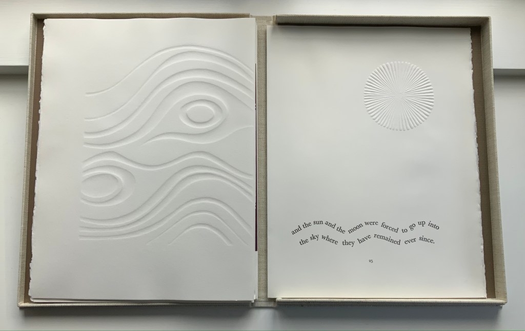
Poem: a throw of the dice will never abolish chance (1990)
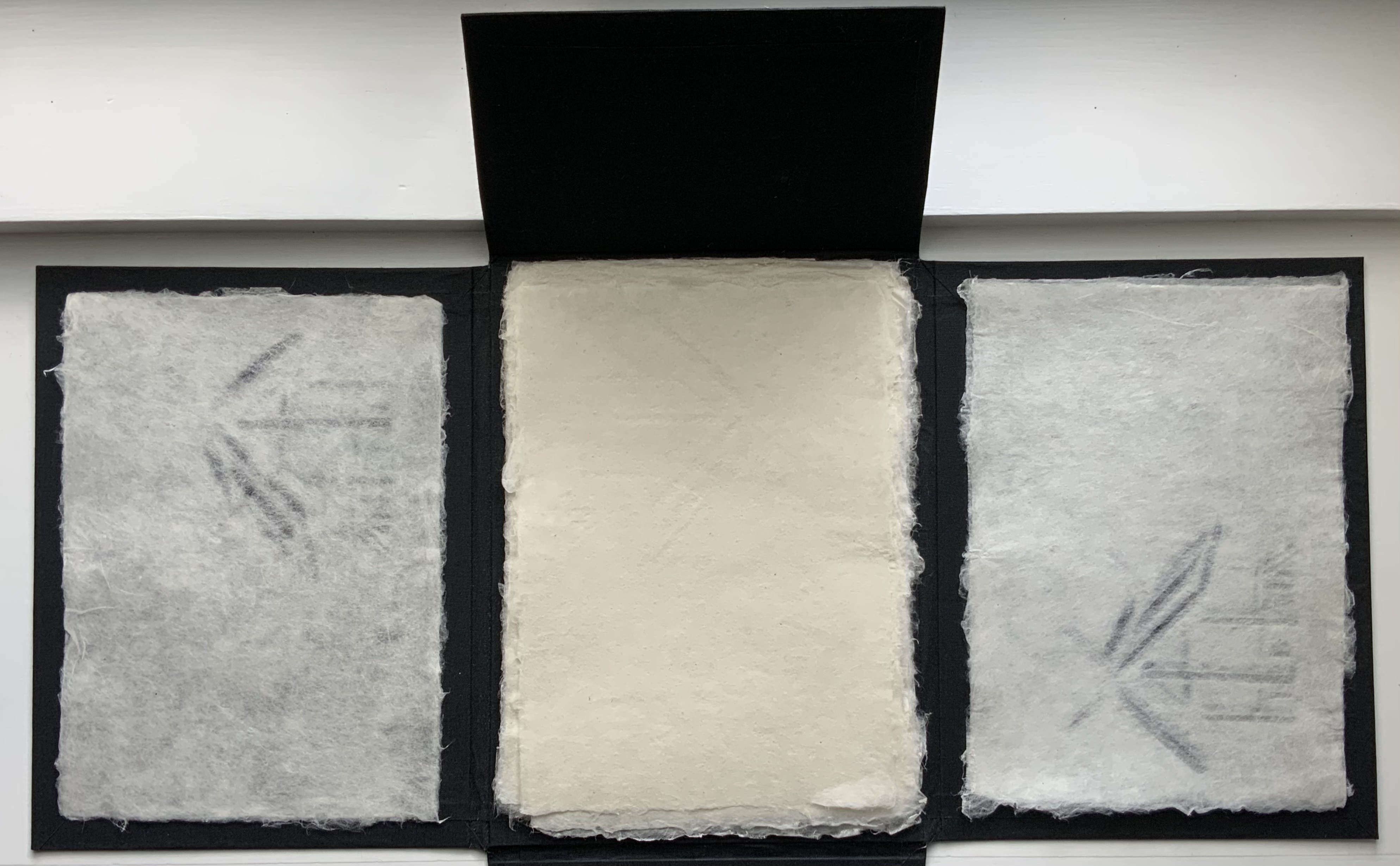
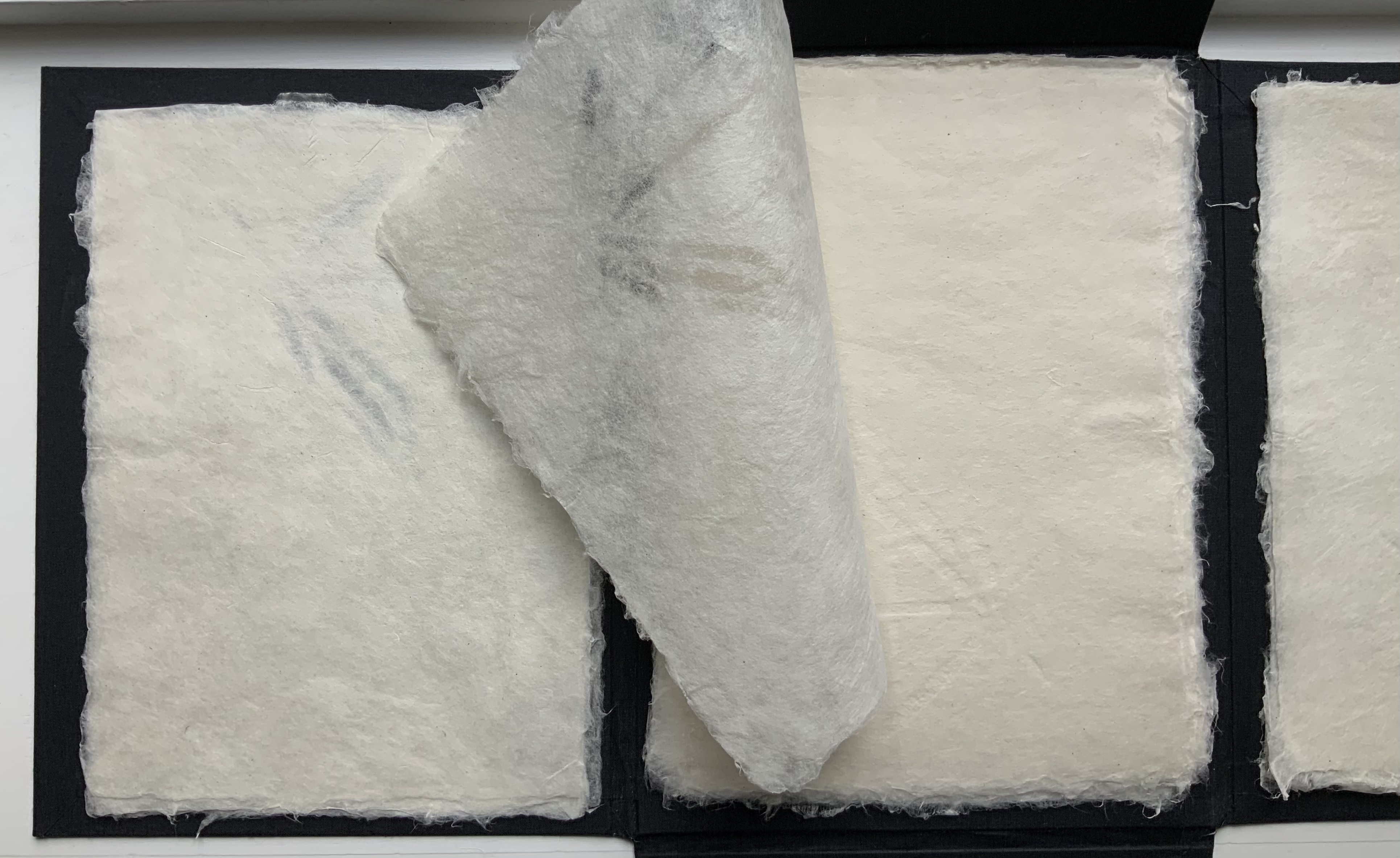
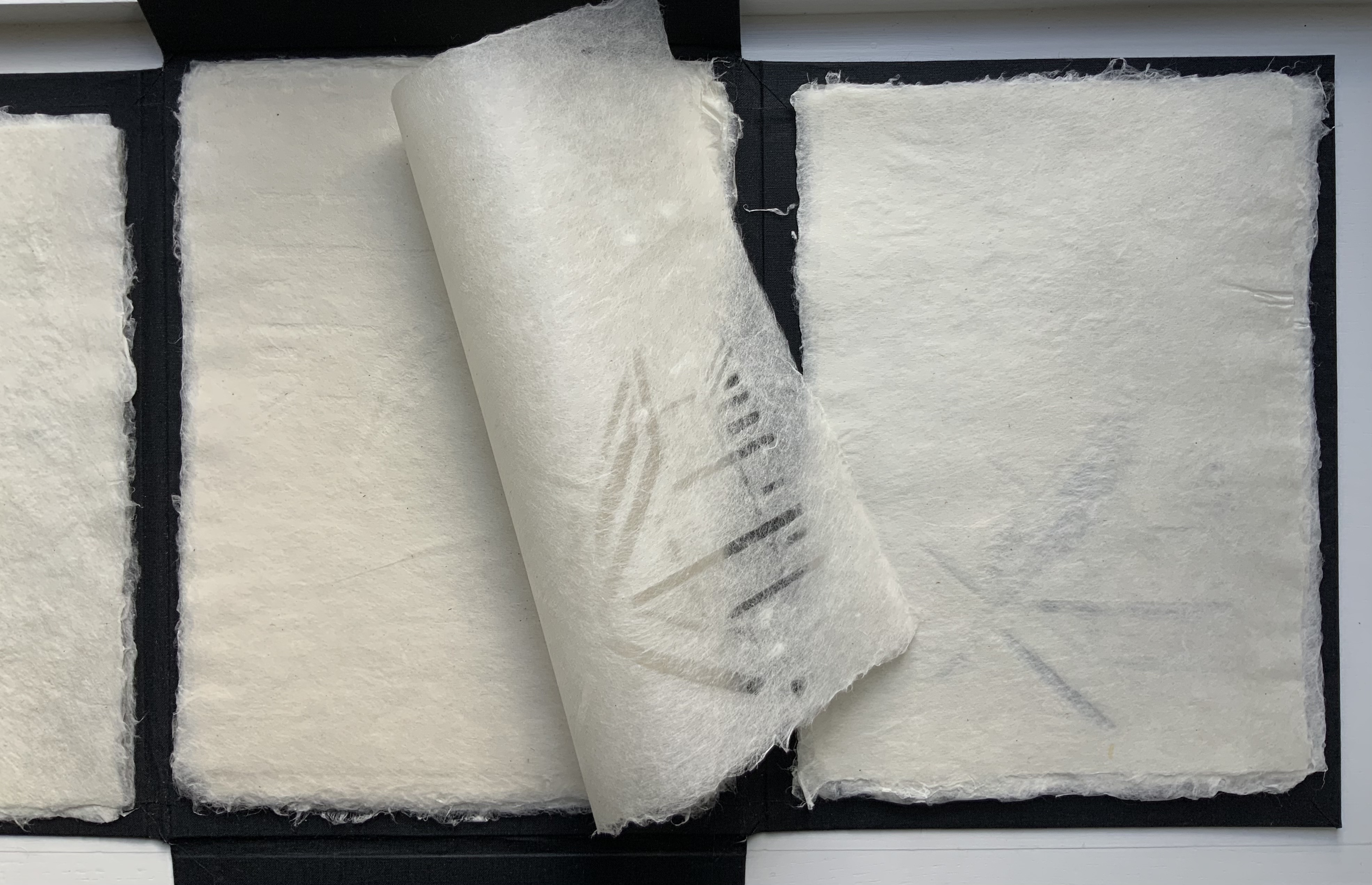
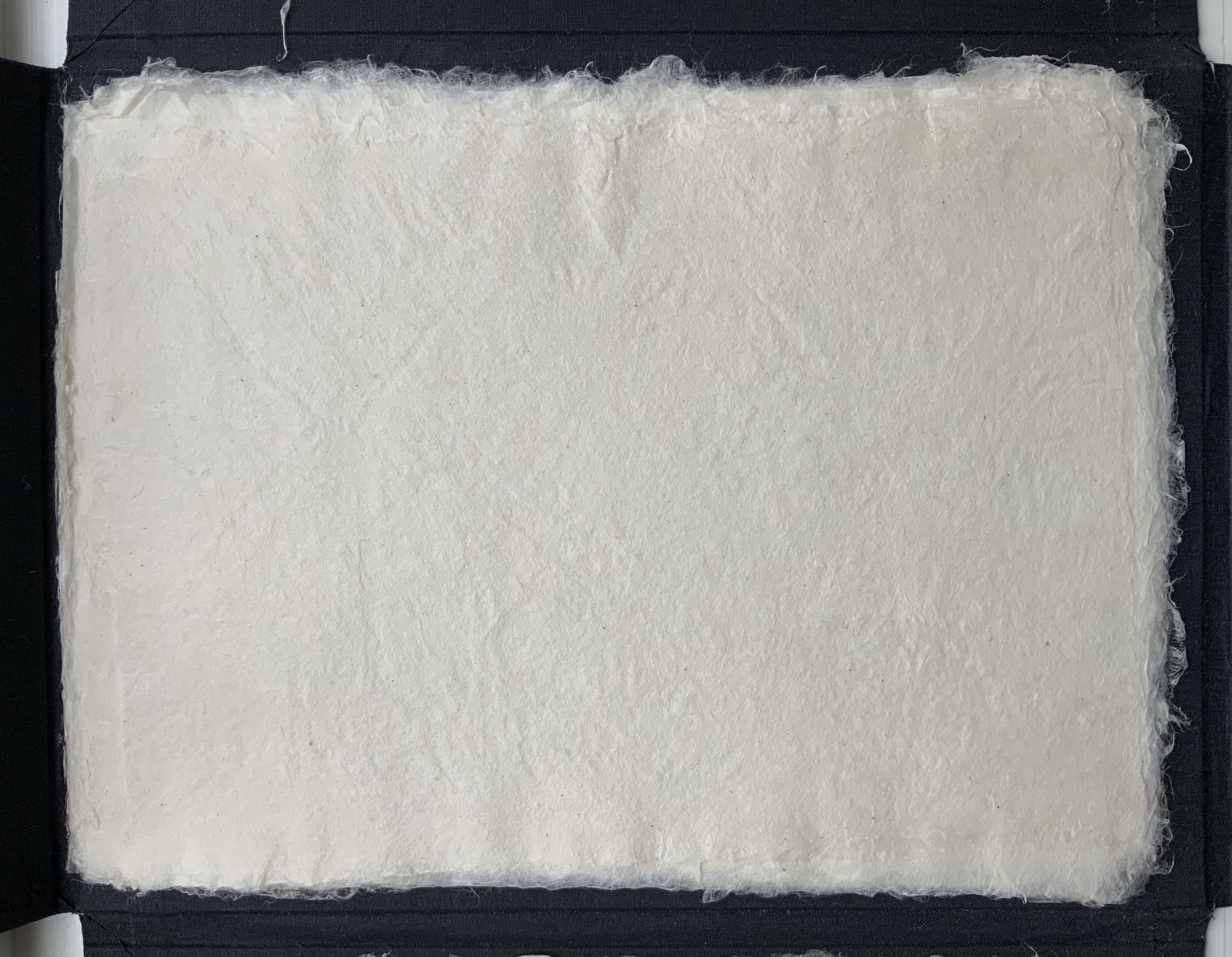
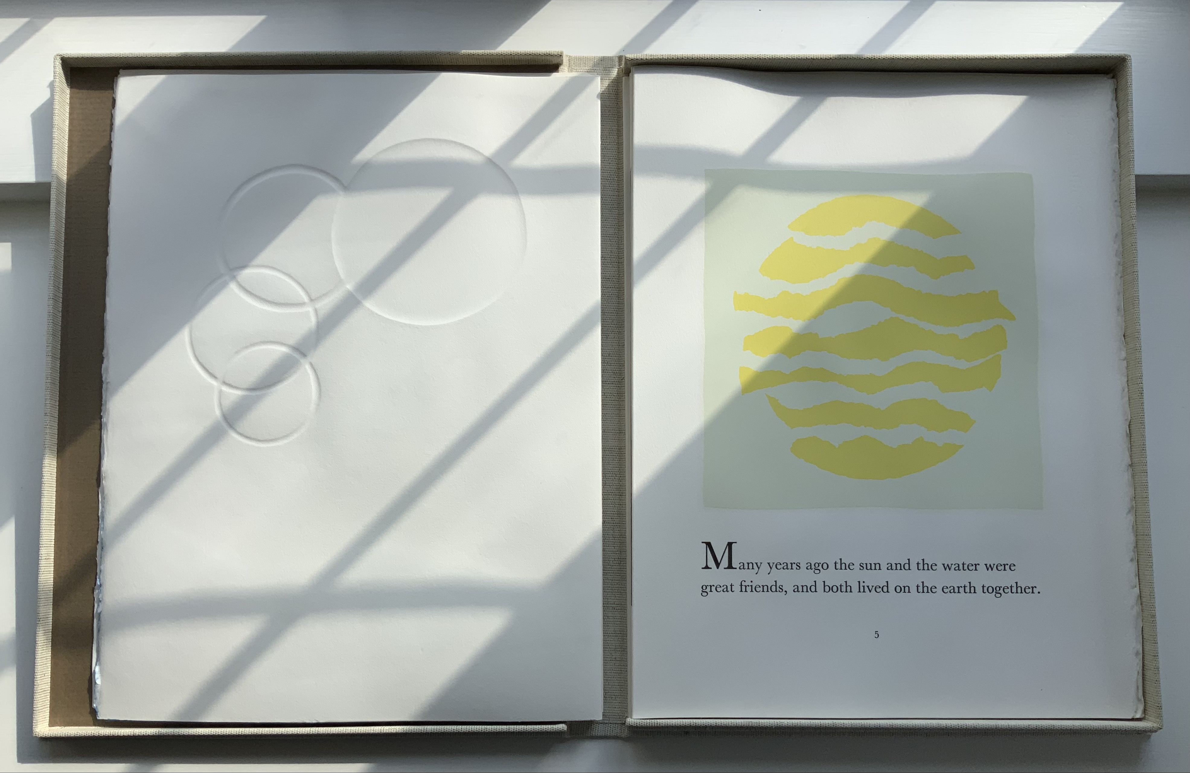
Mallarmé, Stéphane, D. J. Waldie (trans.), Gary Young, and Felicia Rice. 1990. Poem: a throw of the dice will never abolish chance. [Santa Cruz, Calif.]: Greenhouse Review Press. The binding is full goatskin leather, 15.5 x 11.375 in, 44 pages. Edition of 60. Photos: Courtesy of D. J. Waldie and Gary Young.
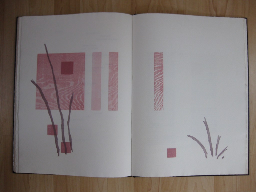
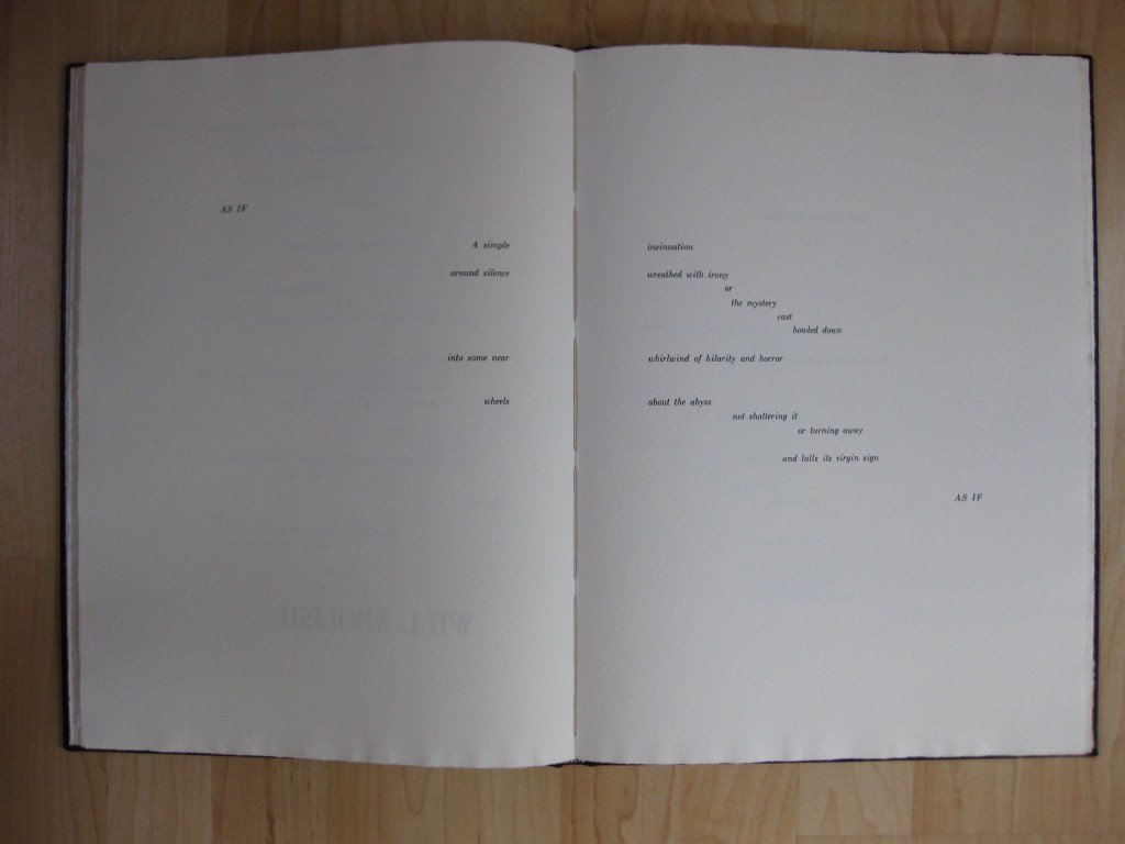
To the growing body of homage to Un Coup de Dés, D.J. Waldie and Gary Young added this fine press livre d’artiste. In keeping with Waldie’s reading of Danielle Mihram’s analysis of the proofs of the intended Mallarmé/Vollard livre d’artiste and Waldie’s own examination of the proofs at Harvard, Young’s four woodcuts are presented separately from the text and aim to honor Mallarmé’s desire for images that are “blond and pale” in relation to the white of les blancs and the sharp black of the type. The design by Young and Felicia Rice used several cuttings of Bodoni to approximate the Firmin-Didot of the original proofs.
Waldie, D.J. 2001.”The Ghost of an Obsession: Translating Mallarmé’s A Throw of the Dice will Never Abolish Chance“. Parnassus: Poetry in Review , 26.1: 180-85.
Just as Stéphane Mallarmé’s Un coup de Dés jamais n’abolira le Hasard (1897) launched a new host of visual poems in the 20th and 21st centuries, it also launched a host of homage and parodies. Perhaps the quickest off the dock was the Australian Christopher Brennan. Already a fan of Mallarmé, Brennan, who worked at the New South Wales Public Library, seized on the May 1897 issue of Cosmopolis when it arrived and found in Mallarmé’s poem just the form with which to respond to the rough ride Australian critics had given to his own XXI Poems: MDCCCXCIII-MDCCCXCVII: Towards the Source (1897).
Not until 1981, though, was his tinker’s damn published. Given the debated choices of layout, typeface and illustrations that Un coup de Dés in book form had faced since 1897 and would continue to face after 1981, the choice to publish a facsimile of Brennan’s calligraphic effort was well made — perhaps even artistically original. Book artists have blotted out the poem, excised it, collaged, illustrated, performed, recorded (and cast the sonographs in three-dimensional PVC), programmed it into computer graphics, typed it out on a modified typewriter, and more. André Masson‘s may be the only calligraphic treatment so far…
Further Reading
“Jim Clinefelter“, Books On Books Collection, 17 July 2020. An American-English mis-translation.
“Chris Edwards“, Books On Books Collection, 7 December 2020. An Australian-English mis-translation.
“Rodney Graham“, Books On Books Collection, 3 July 2020. Un coup de Dés as instructions to a tattoo artist.
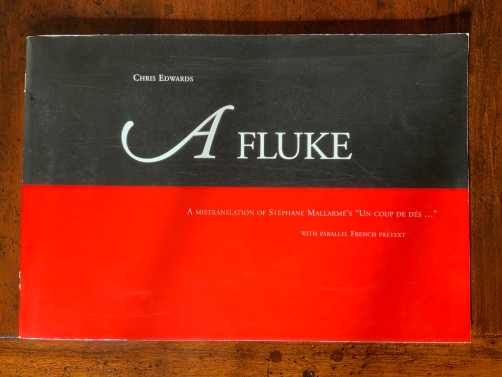
Fagan, Kate. “‘A Fluke? [N]ever!’: Reading Chris Edwards“, Journal for the Association for the Study of Australian Literature, Vol. 12, No. 1 (2012). Accessed 25 November 2020.
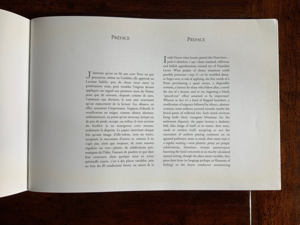
A Fluke follows in the footsteps of several parodists of Un coup de Dés and even more “homageurs”. Edwards mingles bilingual homophonic mistranslation with the monolingual variety, false cognates, mis-contextualization and more to deliver his “fluke”. Part of that “more” leads off with the subtitle and the side-by-side prefaces.
The pun in “pretext” plays out not just in the word itself but in Edwards’ squeezing into one page the French predecessor alongside its English exaggeration. The squeeze harks back to Mallarmé’s “Note” being added to the Cosmopolis issue, where it first appeared, at the insistence of the editors. Having led with the pun and clown-car layout, Edwards follows on with a fright wig (mixed metaphors, too, are part of the “more”). He turns Mallarmé’s tongue-in-cheek “I would prefer that one not read this Note or that having read it, one forgets it” into “I wish I knew what lunatic pasted this Note here– …”.
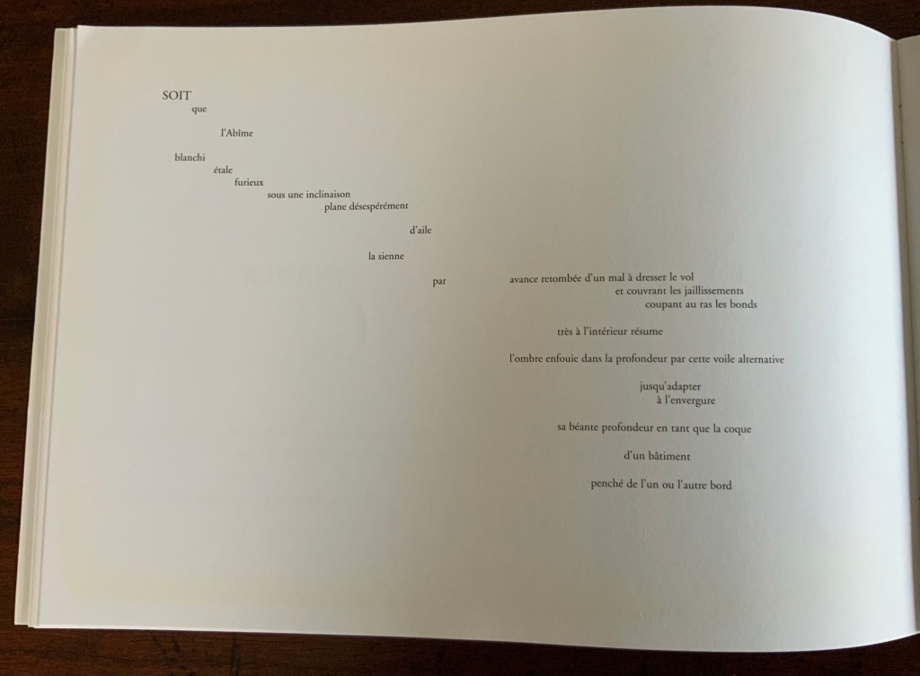
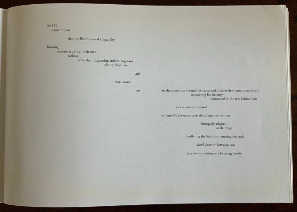
Edwards’ preface is proleptic — to use the word with which the overlording associate professor interrupted the teaching assistant’s nervous first lecture on how a poem’s opening line can encapsulate the working of the whole. (But nevermind the digression, though digression is another part of Edwards’ “more”). In transforming “Lecteur habile” [“practiced Reader”] into “Hannibal Lecter”, Edwards forecasts such transformations as “SOIT / que” [“Whether”] to “SO IT / came to pass”, “l’Abîme” [“the Abyss”] to “the Bistro” and “LE HASARD” [“CHANCE”] to “BIO-HAZARD”. After the preface, Edwards spreads his sails — so to speak. The French moves to the verso, the English to the recto. The double-page spreads of the 1914 edition of Un coup de Dés are nevertheless crammed into a single page to facilitate enjoyment of the pretext’s mistranslation.
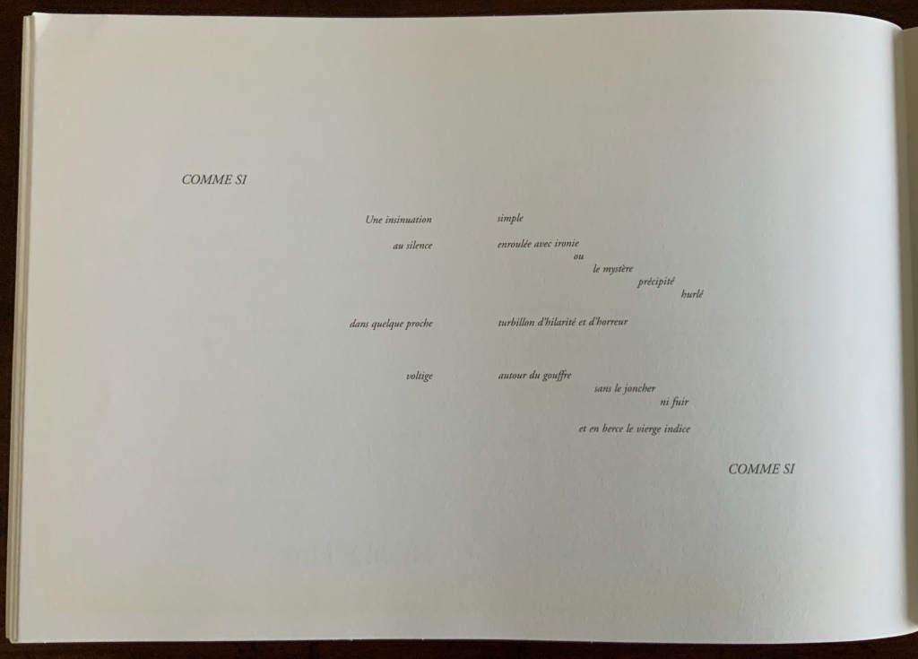
But no, “proleptic” is not le mot juste (which juste goes to prove that the professor remains mal dit, if not maudit). Nothing in the side-by-side prefaces prepares the reader (or Hannibal Lecter) for Mallarmé’s “COMME SI …. COMME SI” becoming Edwards’ exactly mapped, appropriately italicized, all caps loan phrase “COMME SI … COMME ÇA“. And so it goes — linguistic, spatial, typographic, cultural antics piled atop each other.
Edwards’ madcapping his way to A Fluke must have been part of a global warming trend in pastiche. How else to explain Jim Clinefelter’s A Throw of the Snore Will Surge the Potatoes (1998), John Tranter’s “Desmond’s Coupé” (2006) and Rodney Graham’s Poème: Au Tatoueur (2011)? The trend had its beginning distant in time but close in proximity to Edwards.
In New South Wales Public Library in 1897, when that issue of Cosmopolis arrived, a cataloger-cum-poet/scholar named Christopher Brennan seized on it. Shortly after publishing his own XXI Poems: MDCCCXCIII-MDCCCXCVII: Towards the Source (1897), Brennan received several negative reviews of his Mallarmé-influenced poetry. Turning to Un coup de Dés for solace and a format with which to tear the critics to shreds, he performed his own coup in calligraphied manuscript where it remained undelivered until 1981, when it was published in facsimile by Hale & Iremonger (see below). In length alone, its title — Prose-Verse-Poster-Algebraic-Symbolico-Riddle Musicopoematographoscope — must have had some influence on Edwards’ subtitle. Or perhaps it was just a coincidence, a fluke.
A perceptive reading of Brennan, Edwards and Tranter has become available from Toby Fitch, courtesy of the Cordite Poetry Review. It is a dynamite work itself.
Further Reading
“Jim Clinefelter“, Books On Books Collection, 17 July 2020. An American-English mis-translation.
“Rodney Graham“, Books On Books Collection, 3 July 2020. Un coup de Dés as instructions to a tattoo artist.
Edwards, Chris. People of Earth: Poems (Sydney: Vagabond Press, 2011). The mistranslation is printed without the “French pretext”. The briefest comparison provides a convincing argument for the artistic and comic genius of the 2005 version. People of the Earth itself does reveal more of Edwards’ poetic and philosophical grasp of the issues that preoccupied Mallarmé and the avant garde when it comes to language, glyphs, meaning and the technique of collage.
Fagan, Kate. “‘A Fluke? [N]ever!’: Reading Chris Edwards“, Journal for the Association for the Study of Australian Literature, Vol. 12, No. 1 (2012). Accessed 25 November 2020.
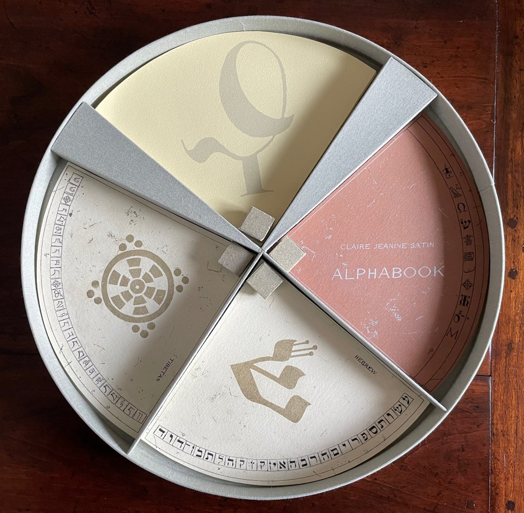
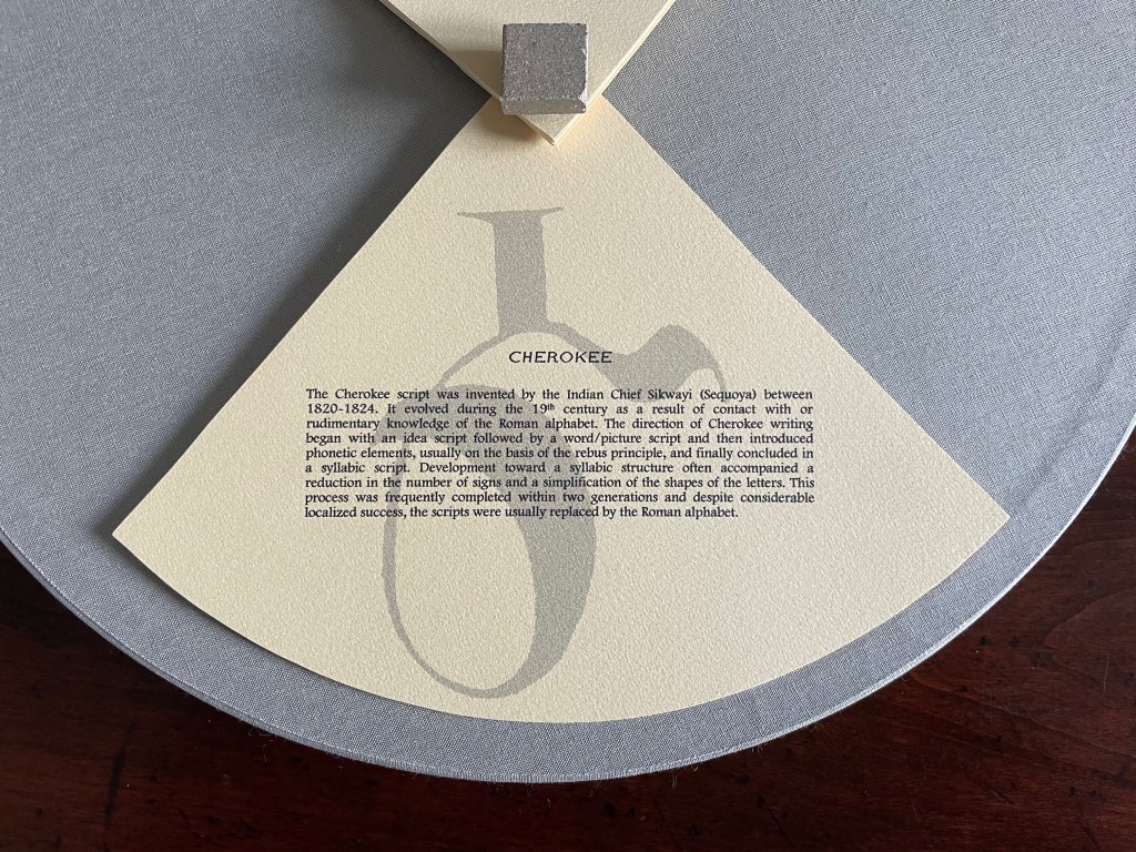
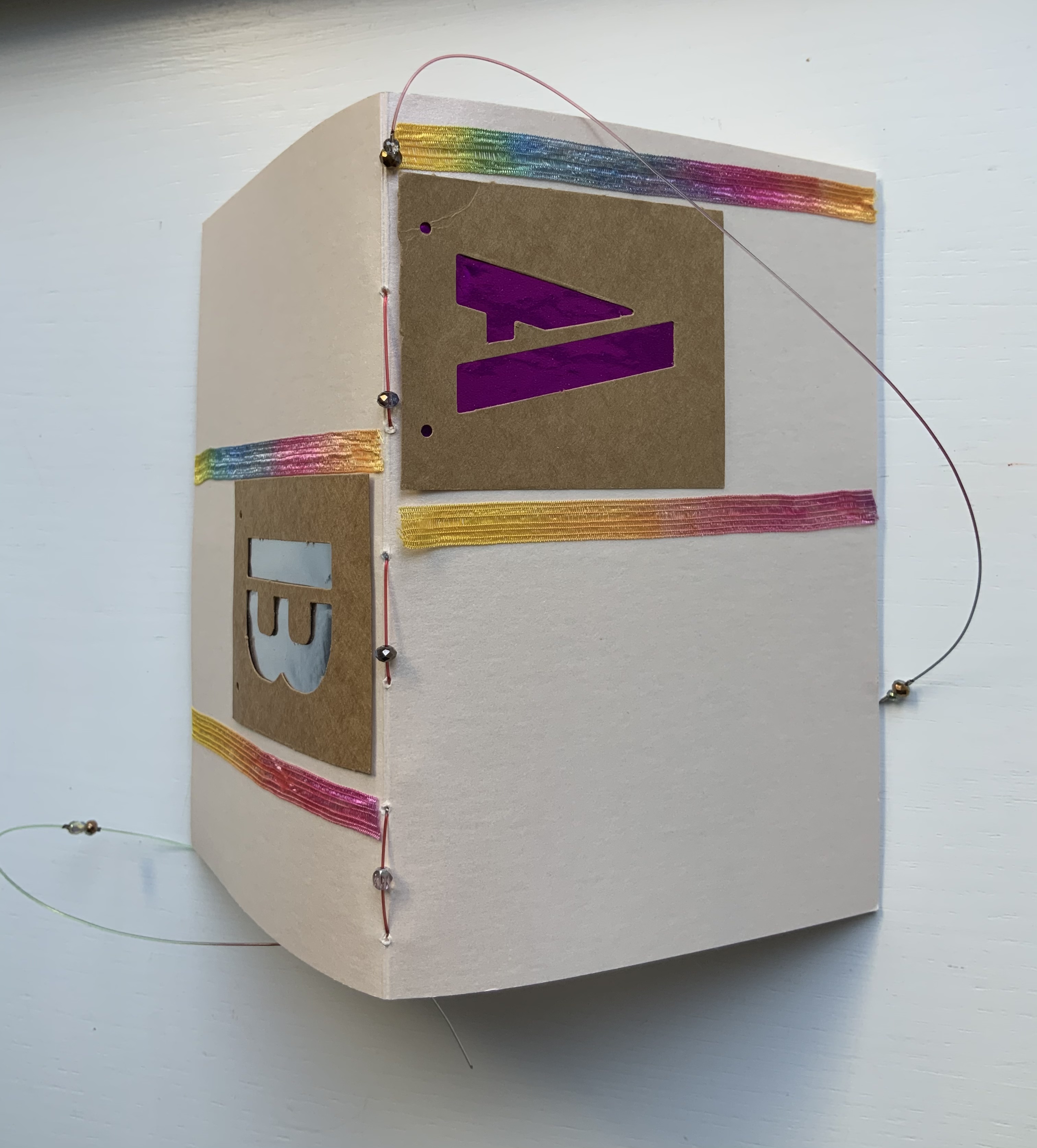
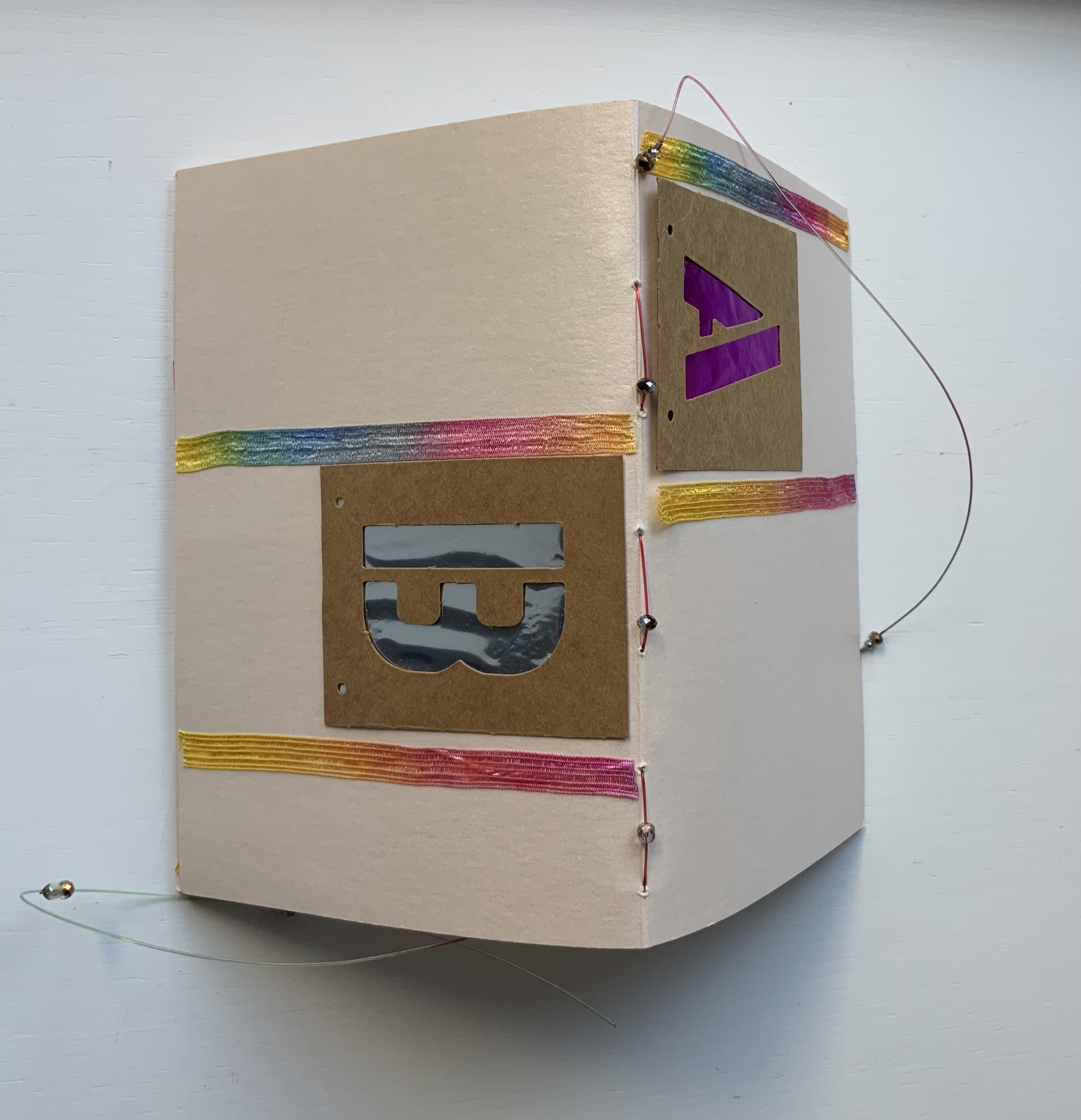
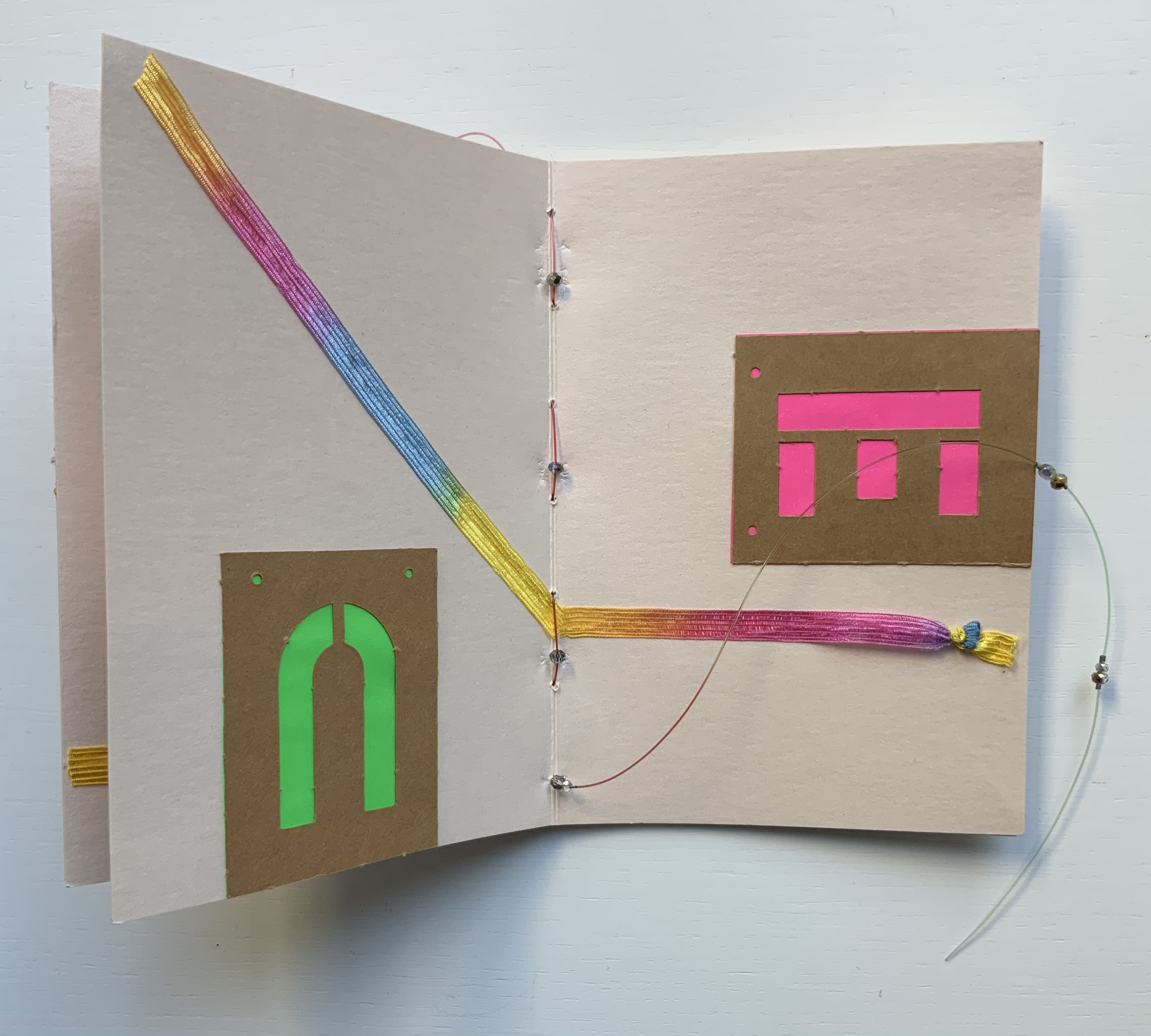
Alphabook (1998/9) Claire Jeanine Satin Circular box containing four segments of post-bound pages. Diameter 356 x D51 mm. Limited variable edition of 11, this copy with a segment on the Cherokee syllabary and a Cherokee sign tile on the cover. Acquired from the artist, 15 December 2022. Photos: Books On Books Collection. Displayed with artist’s permission.
From the artist’s description:
Alphabook is photo-etched and printed on 360 gm/m2 Fabriano Murillo with inks and metallic colors. The sets of pages are grouped in four segments. Three consist of alphabetic notations, images, phrases, and poetry. The fourth set consists of accompanying texts describing the alphabet or notations, (in this case Cherokee). The pages form circles when fully opened. A colophon page is included and signed at the end. The circular containers were constructed and bound in Italian Ciralux cloth and topped with a water-jet cut tile designed by the artist. The rim is gold stamped with the Latin phrase: VERBA VOLENT, SCRIPTA MANENT.
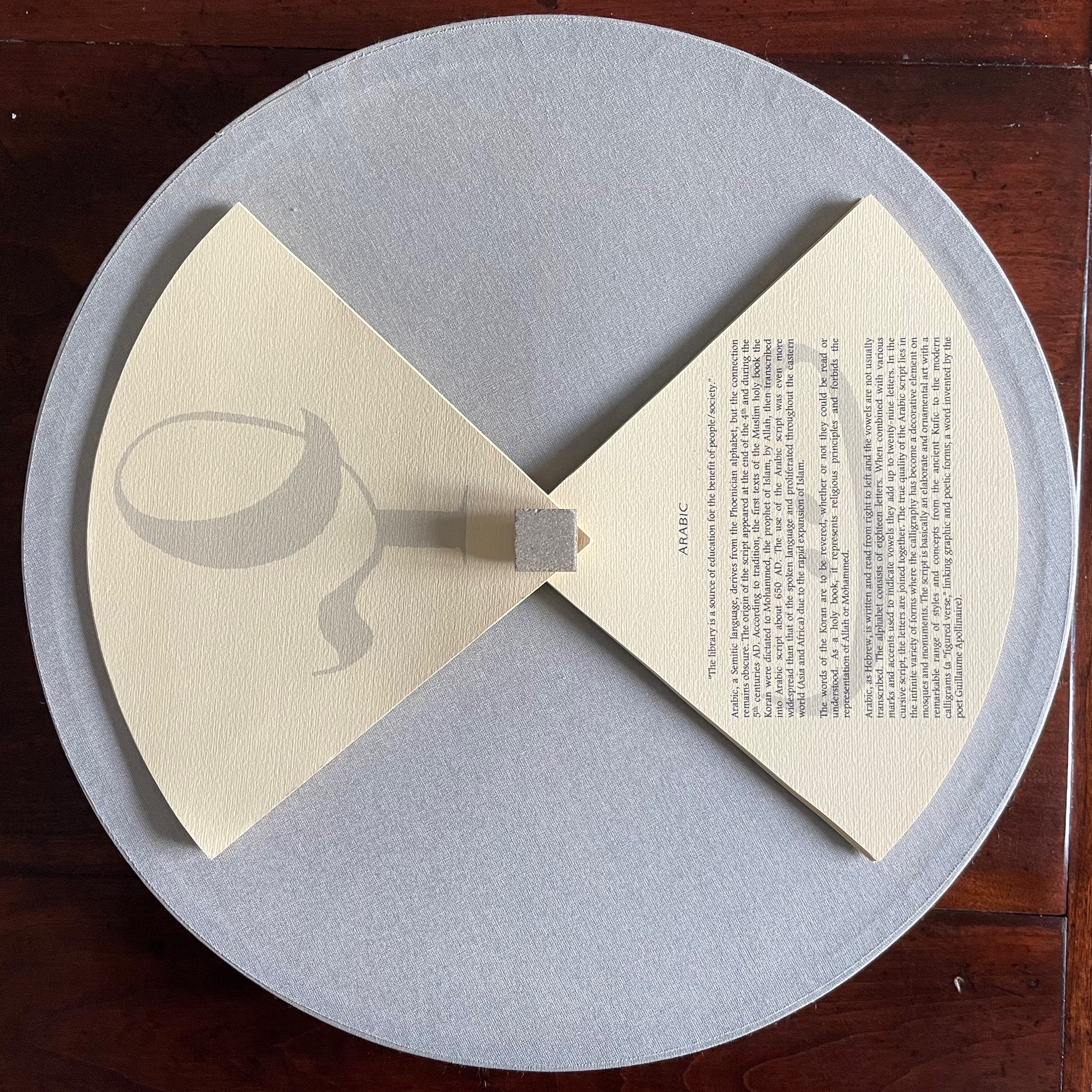
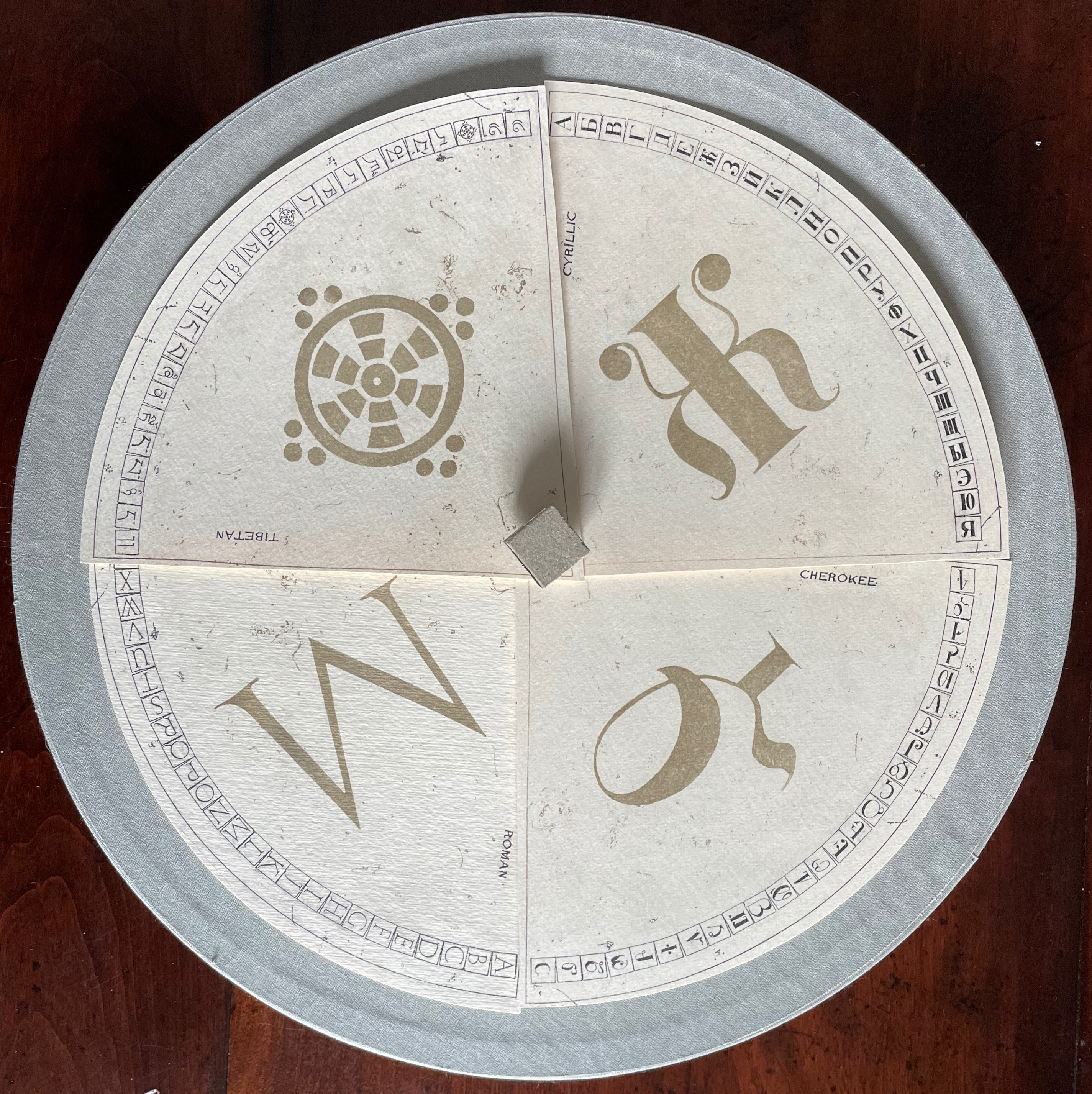
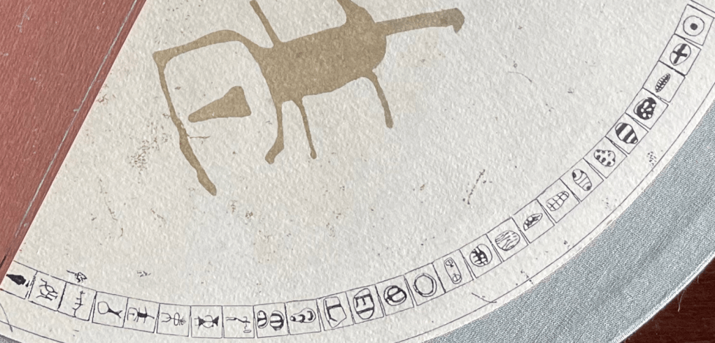
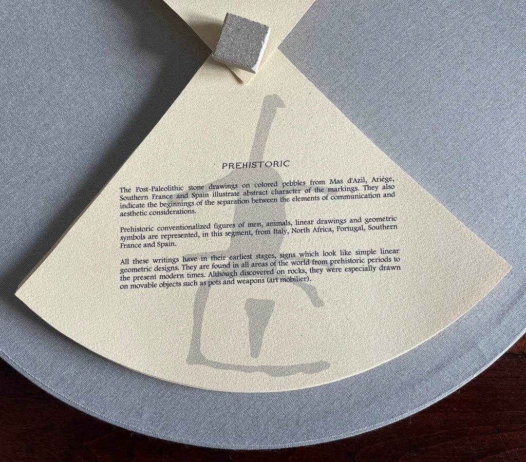
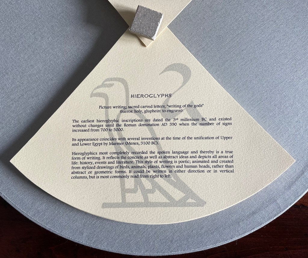
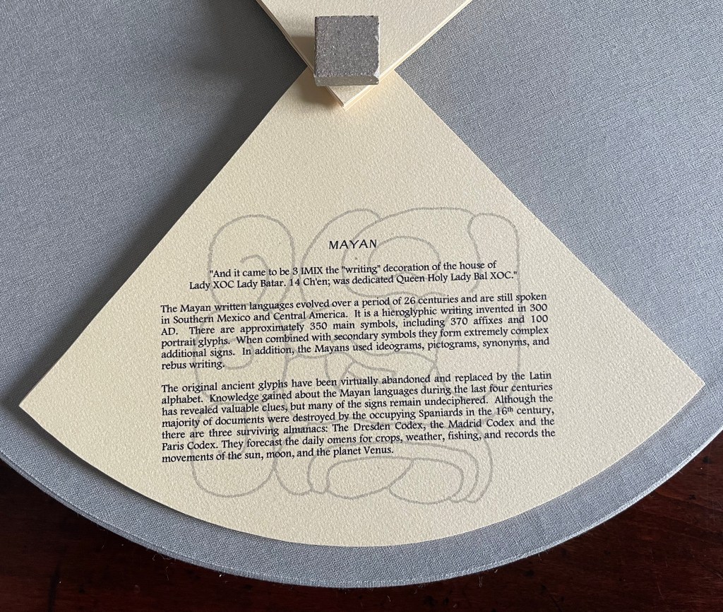
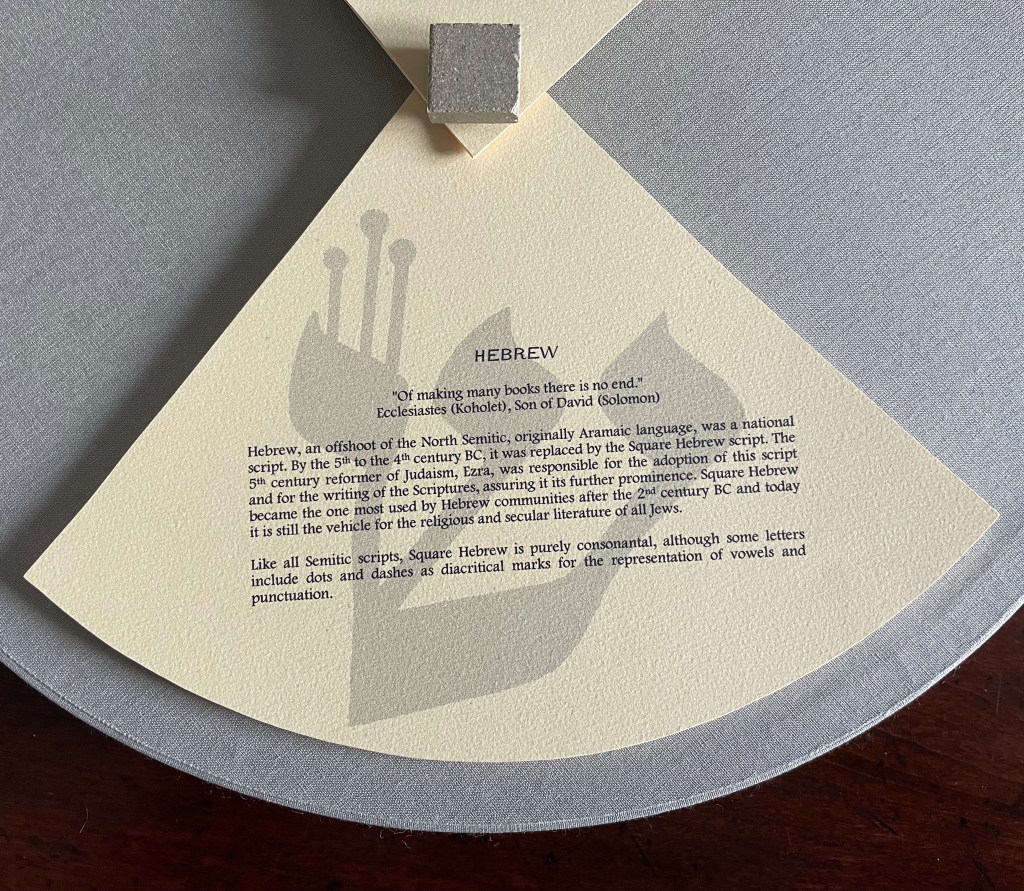
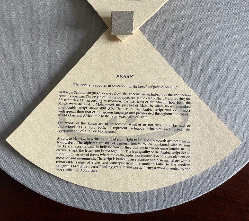
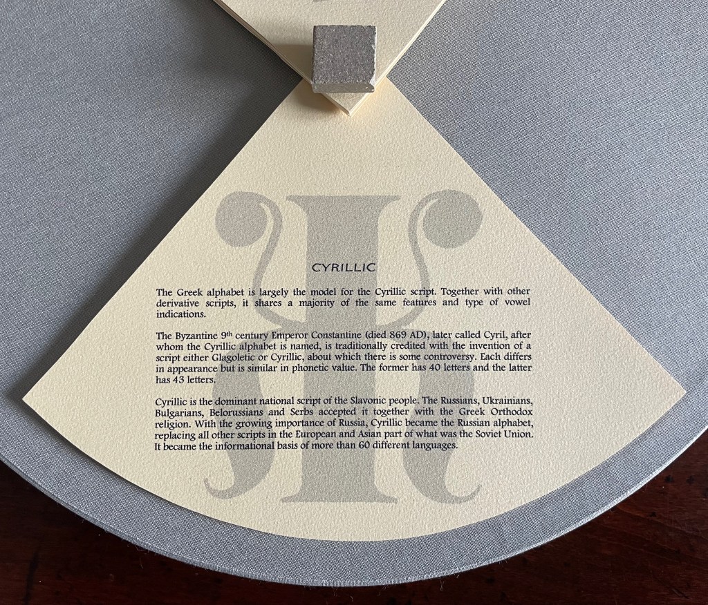
This work has no externally visible title, only the Cherokee letter Ꮉ (for the sound “ma”) on the tile and that gold-stamped Latin phrase. Traditionally the proverb runs in the indicative — Verba volant, scripta manent (“Words fly, writing remains”) — but presumably to draw yet more attention to the solidity of the written word over the iffy ephemerality of the spoken word, the subjunctive volent (“Words may fly” or “If words fly”) comes into play. As the lid lifts, the work’s title Alphabook appears, indicating that, at its heart, this work of art is a book. The container’s circular shape, its inner segmentation and the post-bound segments may challenge the traditional notion of a book, but the segments’ text just as strongly asserts a bookish purpose, highlighting eleven prewriting and writing systems: Prehistoric, Hieroglyphs, Mayan, Hebrew, Arabic, Greek, Roman, Chinese, Tibetan, Cyrillic and Cherokee.
With their pages pivoting on their central posts, the segments can sometimes display wingspans, nudging forward an interpretation of Verba volent, scripta manent that a writing system’s shapes permanently out-soar sounds on the air.
Segment open to Chinese page on the left, Arabic page on the right.
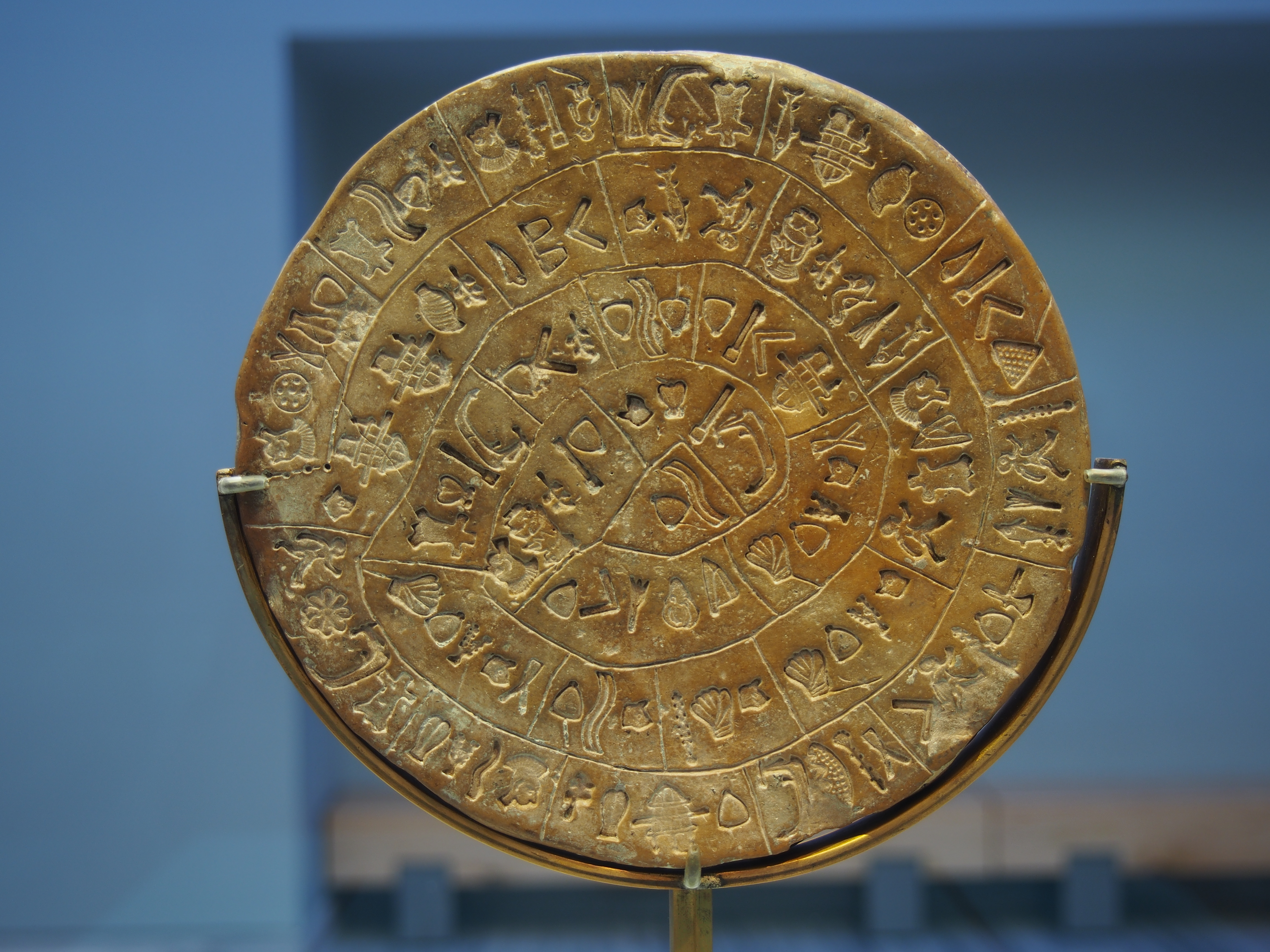
Fully opened, the segments evoke the Phaistos Disc, resident in the Archaeological Museum of Heraklion on Crete. Dating sometime between 1850 B.C. and 1600 B.C, the disc remains undeciphered, hovers indeterminately among statuses of hieroglyph, syllabary and alphabet and is still subject to speculation about its source — Linear A or Linear B.
Phaistos disc, sides A and B after the 2014 renovation. Photos by C. Messier – Own work, CC BY-SA 4.0.
Drawing on pebble and cave art images from France and Spain created as long as 36,000 years ago, Alphabook reaches back further than the Phaistos Disc. The depicted shapes along the rim of the Prehistoric segment mark the millennia-long trail to the formation of any writing system, alphabetic or non-alphabetic.
Sequoya’s Cherokee syllabary is the youngest of the eleven marking and writing systems that Alphabook covers, a distinction that made this particular version of the limited variable edition attractive. In the Books On Books Collection, works of book art such as Gerald Lange’s The Neolithic Adventures of Taffi-Mai Metallu-Mai (1997), Cari Ferraro’s The First Writing (2004) and Helen Malone’s Alphabetic Codes (2005) among others address the origin period, but besides James Rumford’s children’s book Sequoyah (2004), no others address this remarkable single-handed creation of the Cherokee script.
Opportunities for book art inspired by newly invented alphabets and syllabaries or even by endangered languages abound. There is the Odùduwà alphabet (for the Yorùbá people) and ADLaM (for the Fulani language) as well as the syllabary that “comes with” its own artist: Frederic Bruly Bouabré and his syllabary for the Bété language (Ivory Coast). The Endangered Languages Project andEndangered Alphabets Projectcan both offer inspiration. In fact, the latter sparked Sam Winston’s One and Everything (2023), now part of the collection.
The Hebrew Alphabet Expressing the Celestial Constellations (2017)
The concept of the celestial alphabet is simple: the forms of the letters are supposedly derived from observation of configurations of stars in the heavens which can be ‘read’ as a form of sacred writing. These alphabets are visually recognizable by the use of nodal points to indicate the stars at the intersection of the bars or lines in their forms, the empty spots in the ink lines signalling the bright point of light in the dark sky. — Johanna Drucker, The Alphabetic Labyrinth, p. 125.
A volume in New York’s Morgan Library by Jacques Gaffarel (1601–1681), a French scholar and astrologer, provides inspiration and material for Satin’s artist’s book The Hebrew Alphabet Expressing the Celestial Constellations (2017). More precisely, two woodcuts from the 1650 English translation of Gaffarel’s Curiositez inouyes sur la sculpture talismanique des Persans, horoscope des Patriarches et lecture des estoiles (1629) are the source.
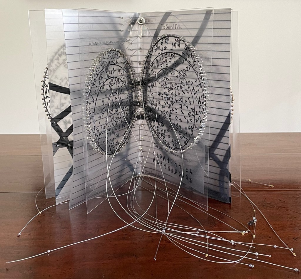
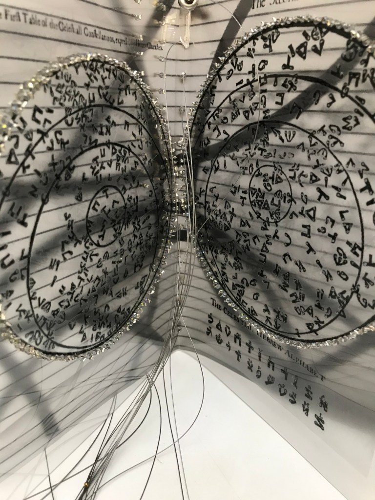
The Hebrew Alphabet Expressing the Celestial Constellations (2017) Claire Jeanine Satin Saddle stitched with fishline. Box: H277 x W225 mm. Book: H 240 x W165 x D42 mm. 16 pages. Unique edition. Acquired from the artist, 12 April 2023. Photos: Books On Books Collection. Displayed with permission of the artist.
In addition to its astrological character, Gaffarel’s work sits in the traditions of gematria, the Kabbalah and alchemy, which Satin conjures up with gold and silver beads, and crystals. Among the earlier contributors to these traditions is Heinrich Cornelius Agrippa. Like his mentor Johannes Trithemius, Agrippa was a polymath, occultist and theologian as well as physician, legal scholar and soldier. The Latinized Hebrew letters and their corresponding characters in the celestial alphabet seen below come from Agrippa’s De occulta philosophia (1533), which is more legible than Gaffarel’s above.
But there’s a much later inspirational source of esoterica at play elsewhere in the book and in the silver letter adhering to the black box that holds the book. The letter on the box is He, the fifth letter of the Hebrew alphabet, which according to Satin was chosen at random in homage to John Cage’s theory of chance and its role in music and creativity.
The rules printed on the acetate pages suggest a school composition book, an ordered contrast to Cage’s indeterminacy. Or perhaps they are recurring lines of musical staves, and the beads clamped to the fish line are meant to suggest a chaos of errant musical notation. The alphabetic order projected on the heavens in earlier centuries is belied by the disorder of chance projected in later centuries.
With the transparency of the pages, with gold on one side of them and silver on the other, and with two distinct “projections”, Satin leaves us in suspense or a suspenseful state of simultaneity.
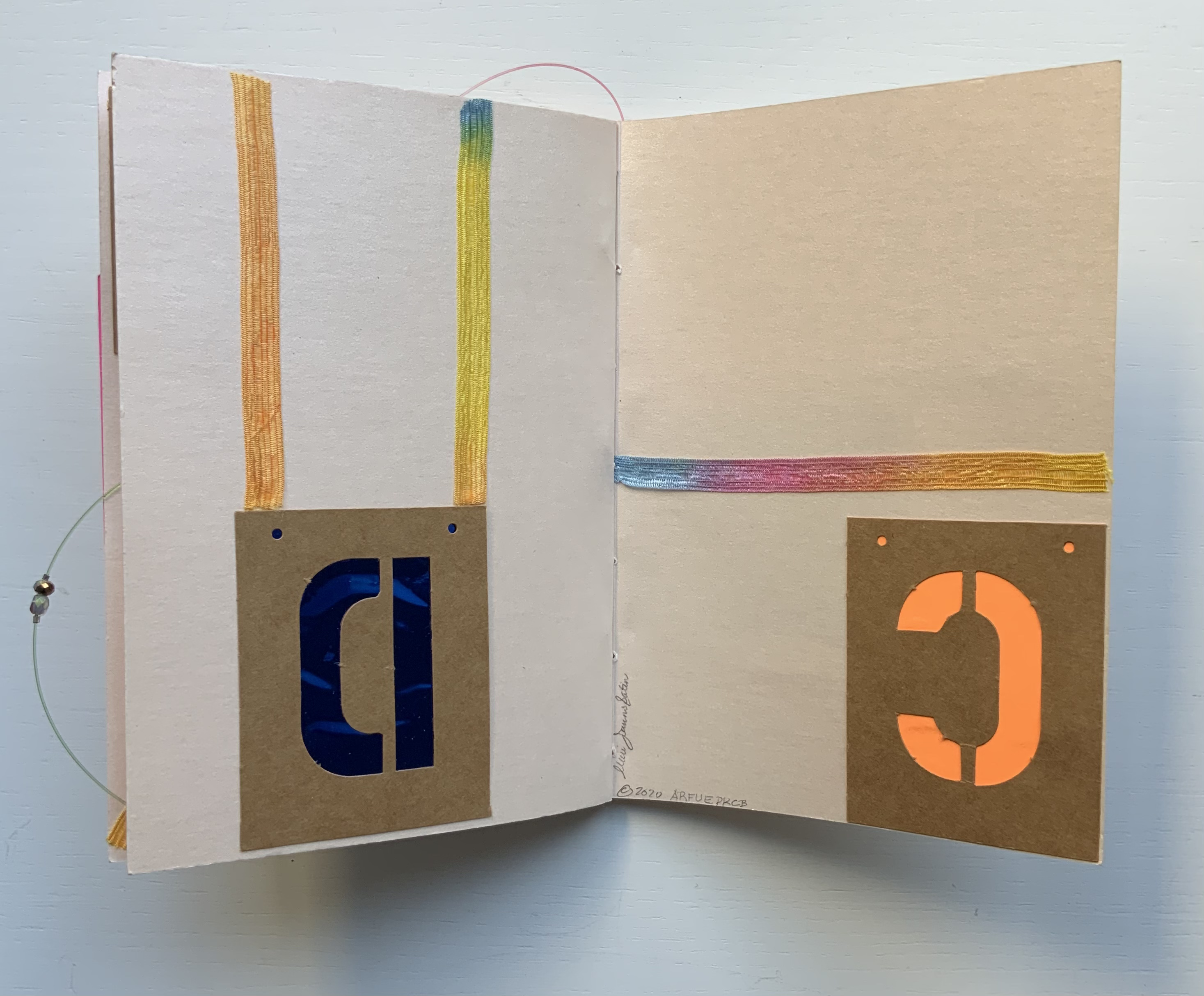
Alphabet Cordenons paper book (2020)
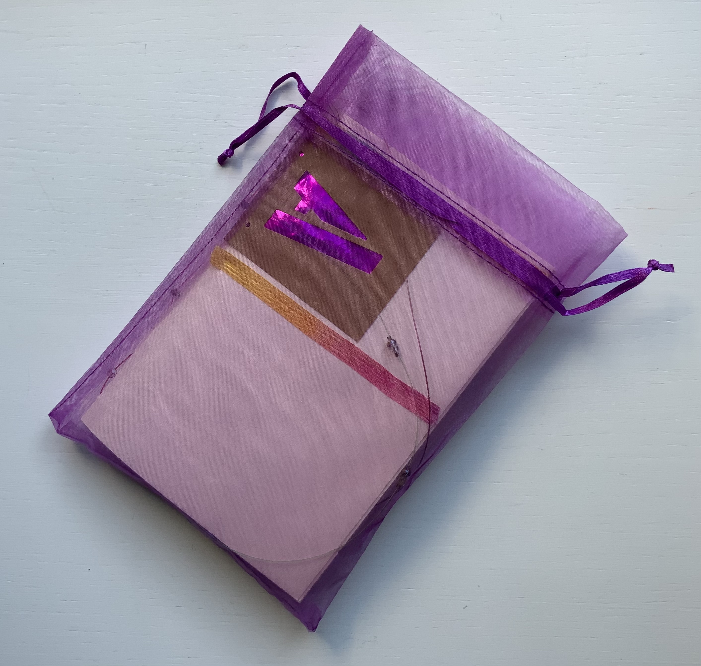
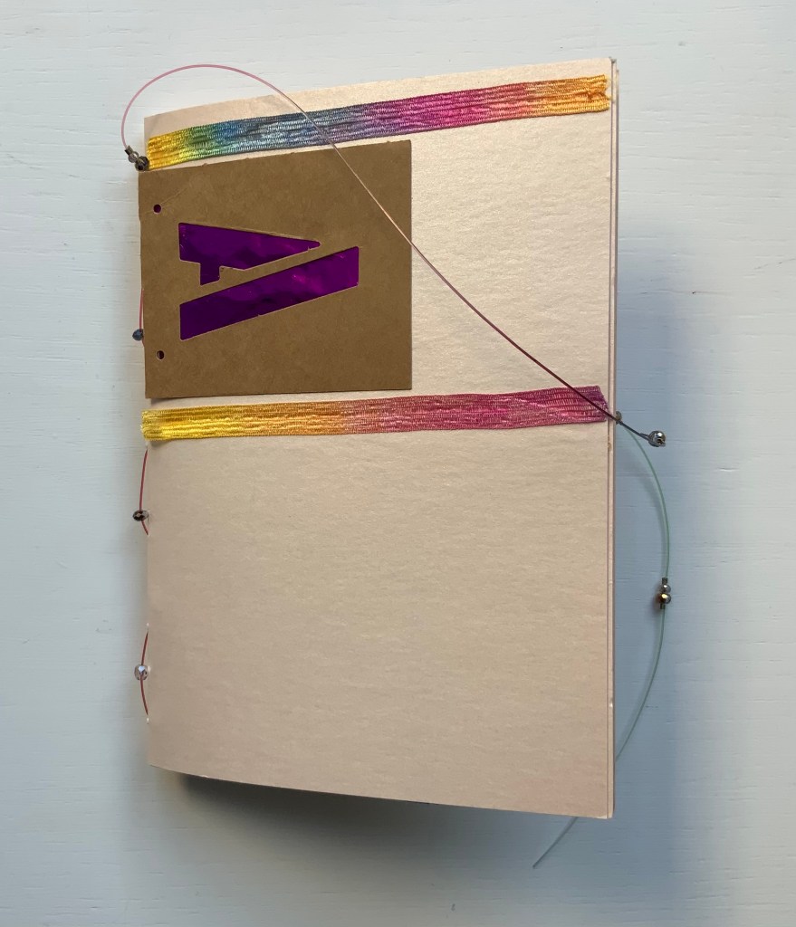
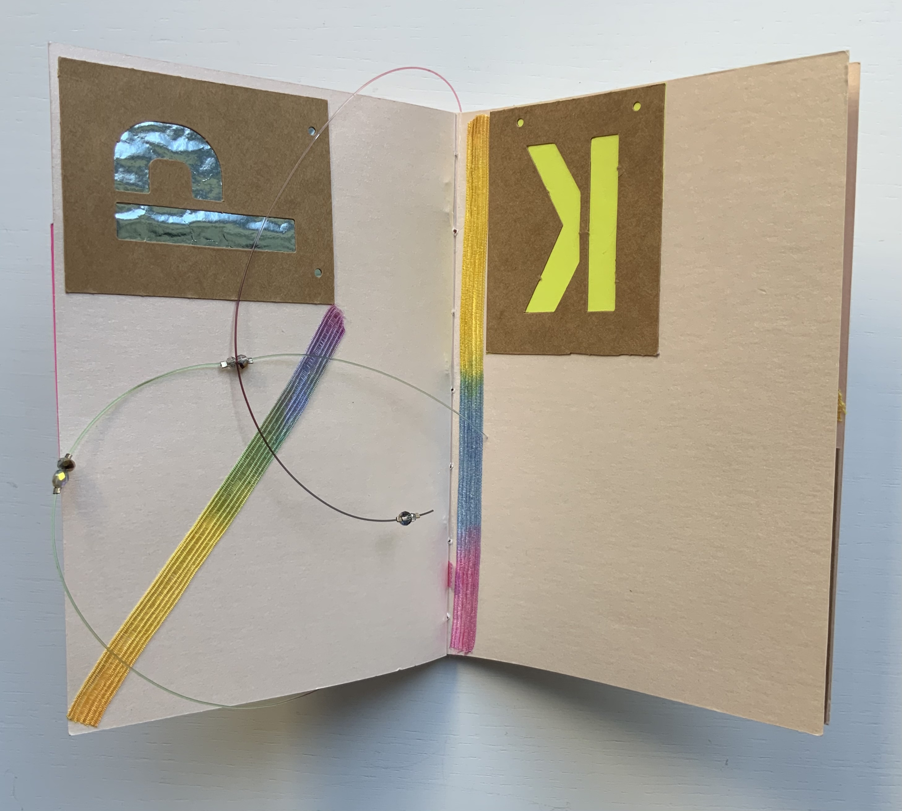
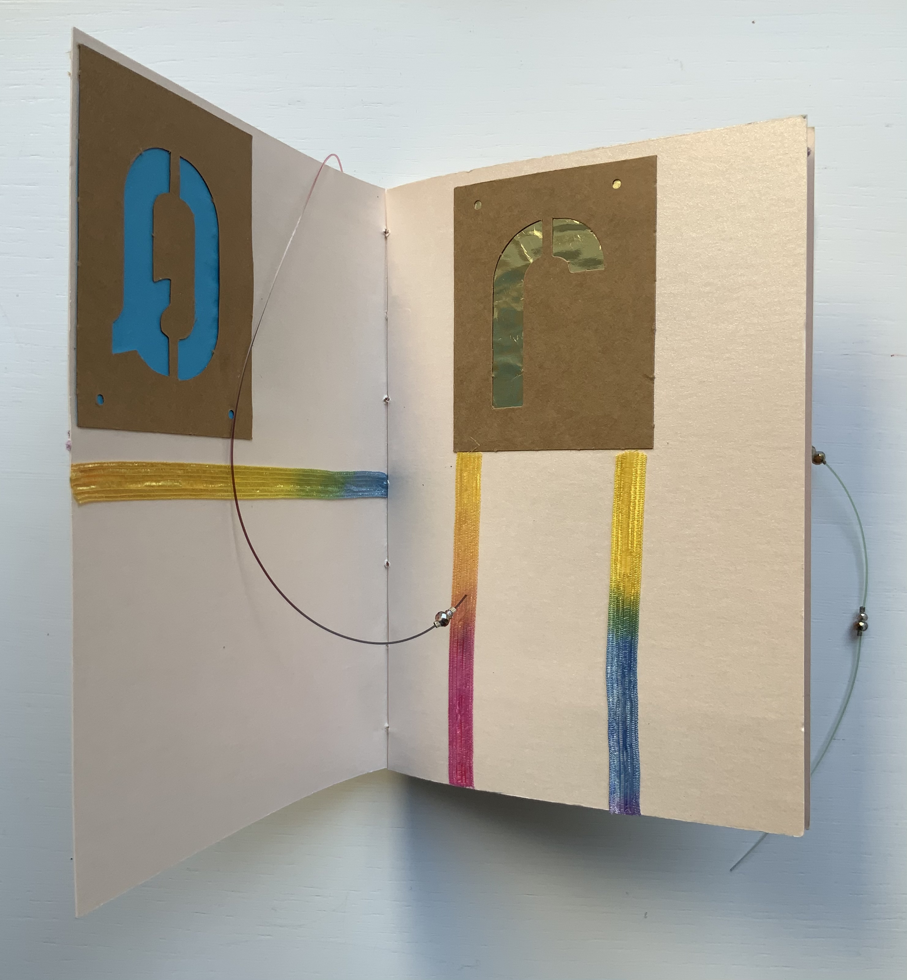
Alphabet Cordenons paper book (2020) Claire Jeanine Satin One of a series of unique works, each created with Cordenons paper, a fine paper that has been manufactured in Italy since 1630. This book uses alphabet letters, glittery strips of ribbon, sequins, crystals, and monofilament to create precise and inventive designs on the cover and each page. In a lavender cloth bag. Measures 9 x 7 inches. 10 unnumbered pages. Acquired from The Kelmscott Bookshop, 8 February 2021. Photos of the work: Books On Books Collection. Displayed with permission of the artist.
In Alphabet Cordenons, as the title suggests, the elemental meets the material. The ancient Greeks called the letters of the alphabet stoicheia (“elements”). In a sense, the elemental yields to the material. Not every letter of the alphabet appears in Alphabet Cordenons, and those that do, appear out of sequence, upside down, sideways, in varied colors and types of paper appearing through their cut stencil shapes. These aspects of materiality draw attention to the paper itself, which comes from a mill established in Corden0ns, Italy in 1630 and is still produced there.
Also drawing attention to the paper are satin ribbon with graduated shifts of color, colored foil backing that lightens and darkens, and glittering beads threaded on multi-colored fish line. Each calls attention to the encaustic-like sheen that comes from the inclusion of mica in making Cordenons Stardream (285 gms) paper.
The finish’s indeterminacy under shifting light seems to find a mirror in the random order, selection and placement of the letters as well as the changing orientation of the ribbon.
Even more indeterminate is the fish line that flips about, curls within, and slips without the turning pages. But while materiality seems to outshine the elemental at every turn, the elemental reasserts itself in the peculiar orientation of the letters and the incompleteness of the alphabet.
“Lyn Davies“. 7 August 2022. Books On Books Collection. Reference and fine print.
“Timothy Donaldson“. 1 February 2023. Books On Books Collection. Reference.
“Cari Ferraro“. 1 February 2023. Books On Books Collection. Artist’s book.
“Edmund Fry“. Books On Books Collection. (For more on the “begats” of the celestial alphabet, see this entry for the near-facsimile copy of Fry’s Pantographia.)
“David J. Goldman“. Books On Books Collection. Reference. [In progress]
Clodd, Edward. 1913. The Story of the Alphabet. London: Hodder and Stoughton. 1913. Superseded by several later works, but is freely available online with line illustrations and some black and white photos.
Diringer, David, and Reinhold Regensburger. 1968. The alphabet: a key to the history of mankind. London: Hutchinson. A standard, beginning to be challenged by late 20th and early 21st century archaeological findings and palaeographical studies.
Thompson, Tommy. 1952. The ABC of our alphabet. London: Studio Publications. Not a fine press publication, but its layout, illustrations and use of two colors bear comparison with the Davies book. It too is out of print and unfortunately more rare.
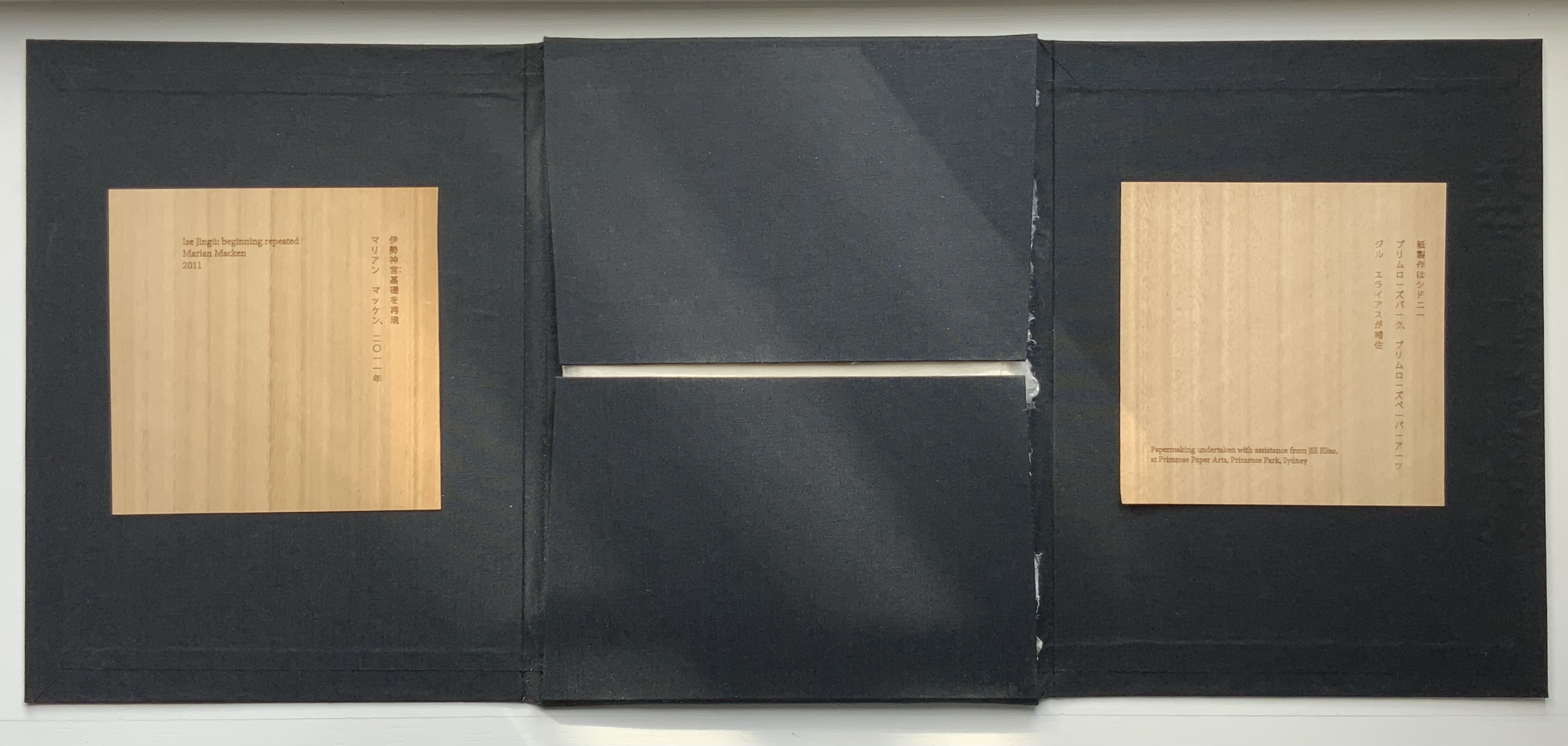
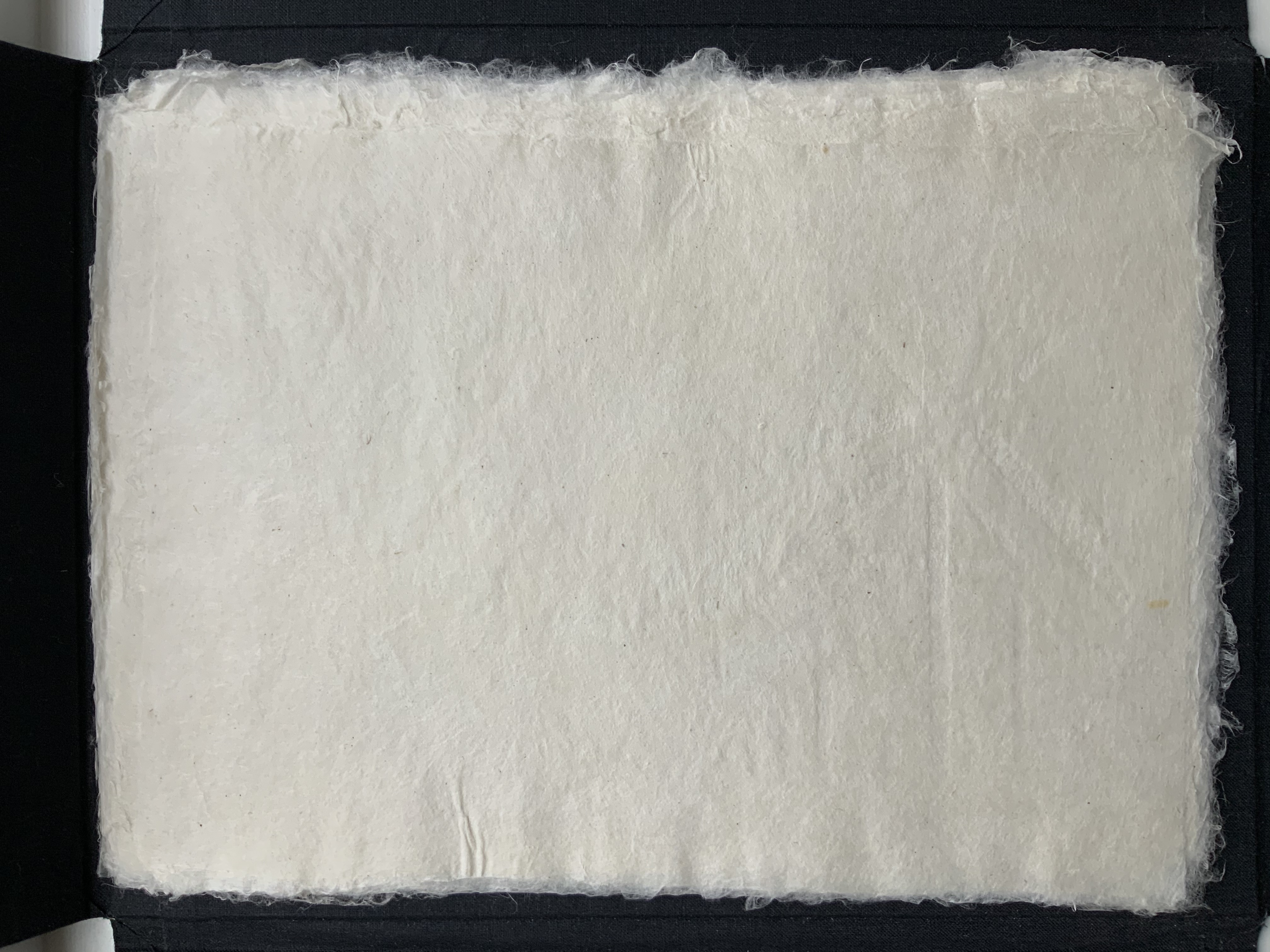
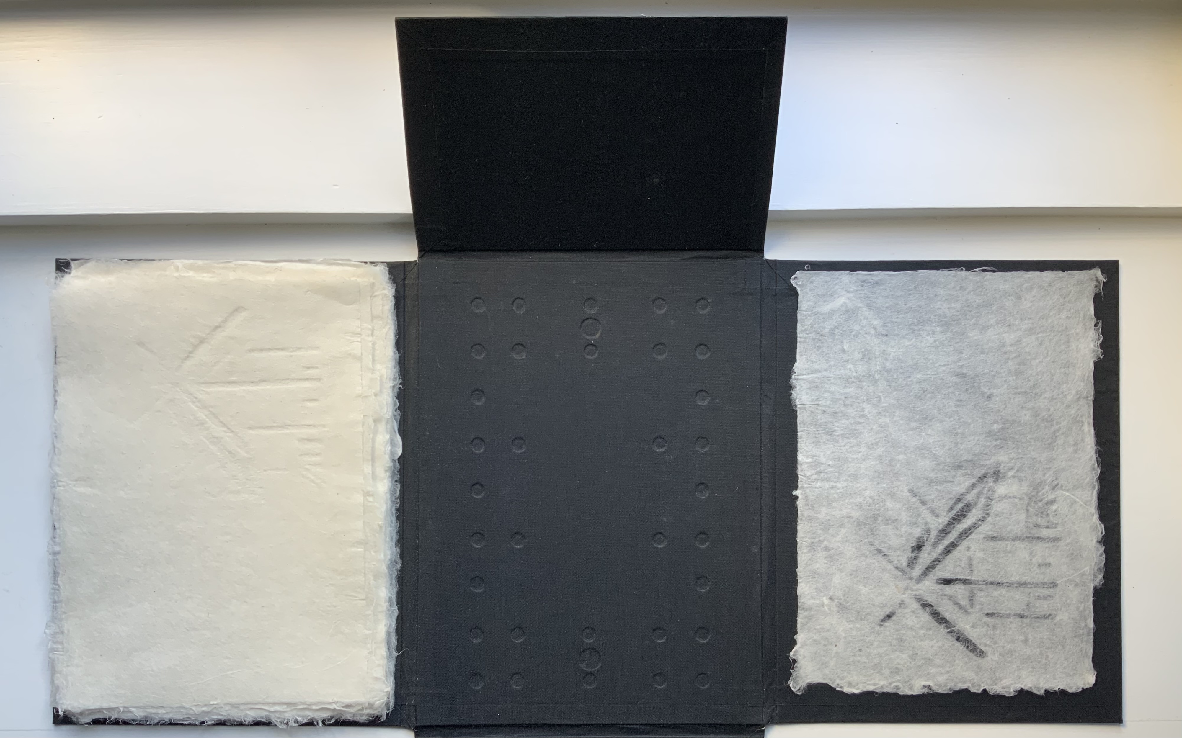
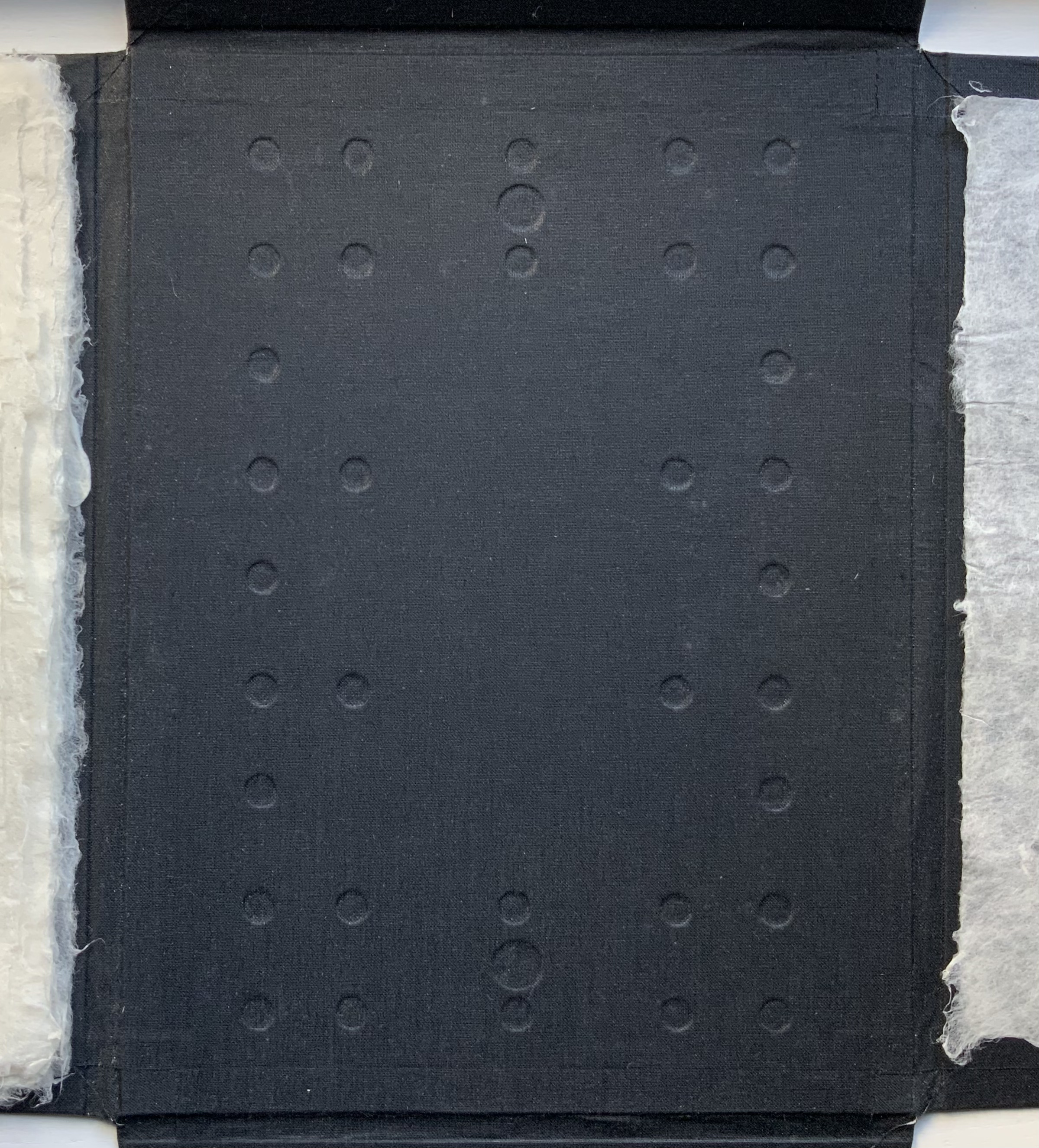
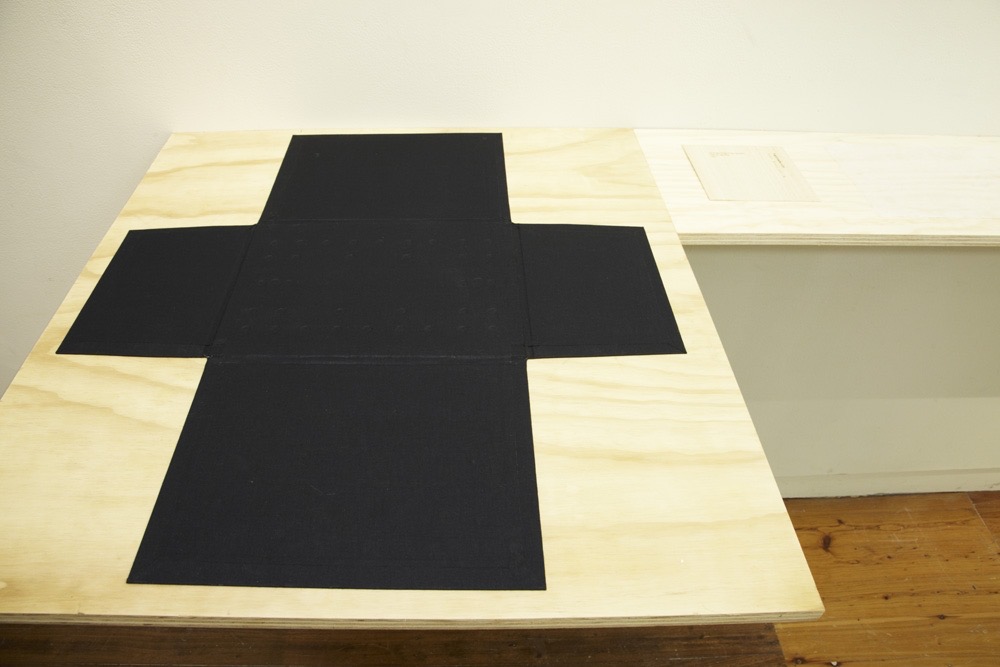
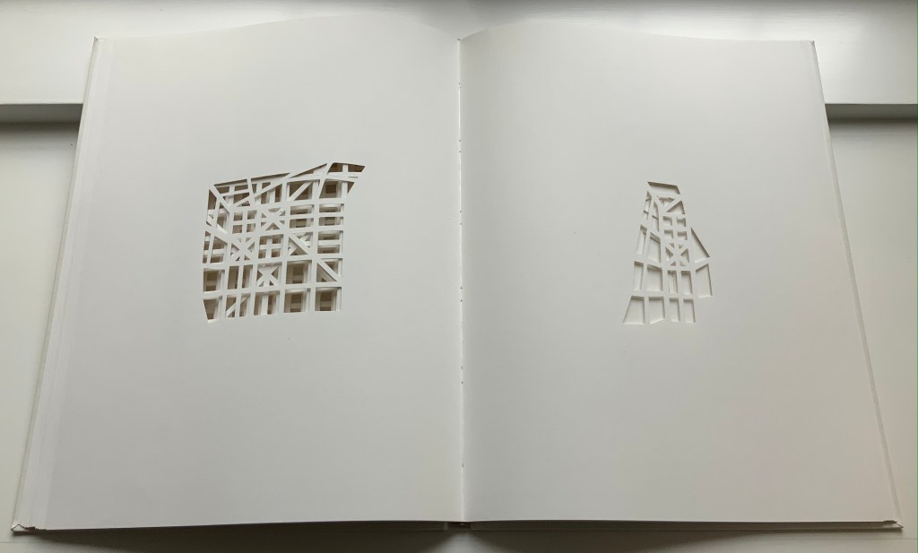
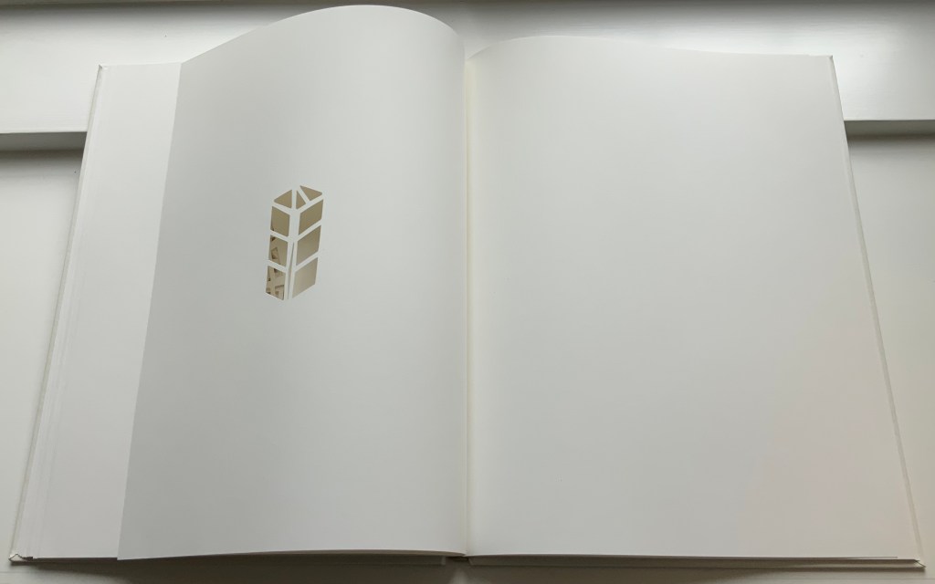
Ise Jingū: Beginning Repeated(2011) Marian Macken Black Cotona bookcloth portfolio, with embossed base; 61 sheets of handmade washi paper, made from kozo, with watermark images. H245 x W330 x D80 mm. Papermaking undertaken at Primrose Paper Arts, Sydney, with assistance from Jill Elias. Unique. Acquired from the artist, 5 February 2021. Photos of the work: Books On Books Collection. Displayed with permission of the artist.
Ise Jingū is a Shinto shrine complex in the Mie Prefecture, Japan, consisting of the Kōtai Kaijijingū, or Naikū (Inner Shrine), and the Toyouke Kaijingū, or Gekū (Outer Shrine). “Once every 20 years, since the reign of Emperor Tenmu in the seventh century, every fence and building is completely rebuilt on an identical adjoining site, a practice of transposition known as shikinen-zōkan. While empty and awaiting the next iteration of building, the unused site or kodenchi sits silently, covered with an expanse of pebbles” (Binding Space, p. 101). For Macken, this ritualistic rebuilding poses architecture as performative process rather than as inert object; it “manifests the replication of a beginning, of a process” (“Reading time”, p. 100).
What better suited phenomenon to be captured with book art?
Referring to the shikinen-zōkan process, Ise Jingū: Beginning Repeated consists of 61 loose sheets with a watermarked image within each, the number reflecting the 61 iterations of the shrine up until the making of Ise Jingū: Beginning Repeated. The watermark is a perspective image based on Yoshio Watanabe’s photograph of the East Treasure House of the Inner Shrine, taken in 1953 on the occasion of the 59th rebuilding. The contrast of the reduction of a photo to a drawing with the subtle embodiment of that image in kozo entices reflection on the phenomenon of representation.
By shifting the image’s placement on every other sheet to mirror its placement on the preceding one, Macken makes the reader’s page-turning replicate the process of shikinen-zōkan. As one sheet yields to the next, the differences between them, arising from the washi papermaking process, reflect the subtle variations within similarity arising in the shrine’s transposition from one site to the other. When the last sheet is removed from the portfolio, the position of the temple supports are revealed.
Macken’s book Binding Space: The Book as Spatial Practice offers further insight into Ise Jingū: Beginning Repeated, but more than that, it provides penetrating discussion of various forms of book art and specific works such as Olafur Eliasson’s Your House, Michael Snow’s Cover to Cover and Johann Hybschmann’s Book of Space. Although the book’s principal argument is why and how the artist book can serve as an important tool for design, documentation and critique of architecture, Macken’s perceptive descriptions show how to observe materiality and its functioning and understand how they contribute to the making of art. Reading Macken’s book will sharpen the ability of any reader or viewer to appreciate book art.
Exhibition: “The Book as Site”, Research Gallery, Sydney College of the Arts, University of Sydney, Australia, 2012. Photos: Joshua Morris. Displayed with permission of the artist.
Further Reading
“Architecture“, Bookmarking Book Art, 12 November 2018.
“Fred Siegenthaler“, Books On Books Collection, 10 January 2021. For more on “watermark art”.
Küng, Moritz, and John McDowall. 2022. “Of Artists’ Books and Architecture“. In Bodman, Sarah (ed.) 2022. Artist’s Book Yearbook. 2022-2023. Bristol: Impact Press at the Centre for Print Research, University of the West of England.
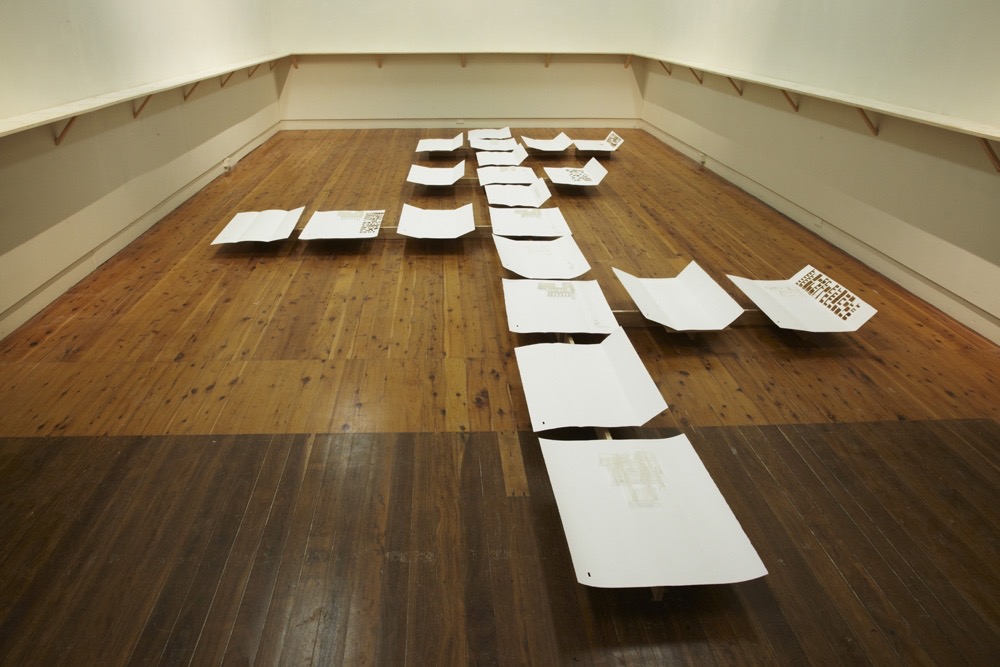
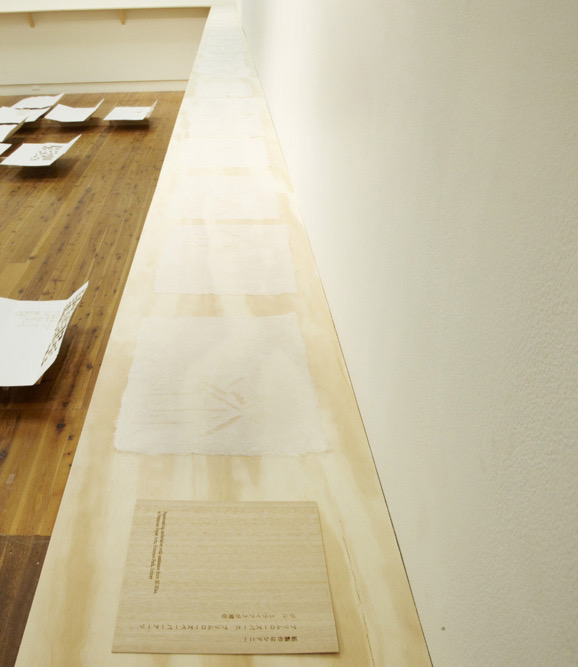
An African Folktale(1979) Willow Legge Cloth-covered case. H405 x W308 mm. Nine unbound folios. H380 x W 285 mm. Acquired from Upstate Treasures, 4 March 2022. Photos: Books On Books Collection.
The Flea (1980)
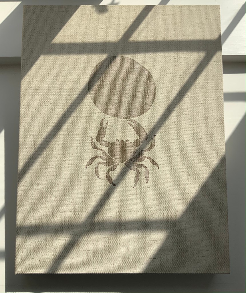
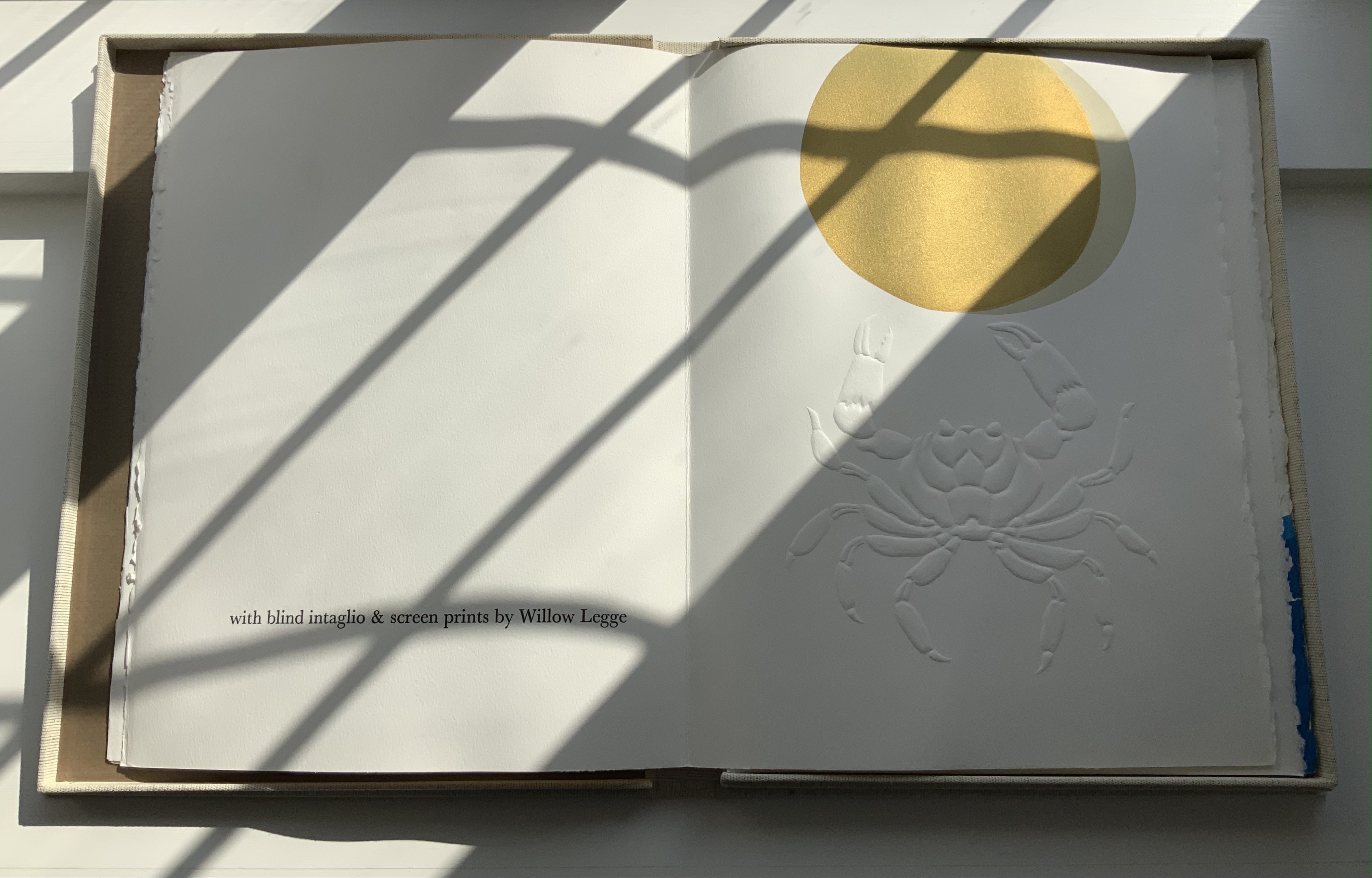
The Flea (1980, 2nd edition) Willow Legge Sewn pamphlet, J. Green mould-made paper; dark brown card cover with one-eighth fold for end leaves. H300 x W200 mm cover; H285 x W190 mm, 8 pages. Blind-embossed intaglio design printed from carved linoleum in combination with a reversed photo-engraving. Text printed letter-press in 14 pt Baskerville. Acquired from Ron King Studio, 2 February 2021.
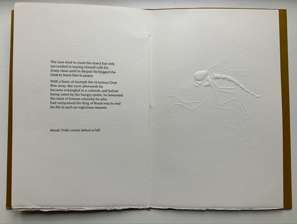
The Gnat and the Lion (1982)
The Gnat and the Lion (1982) Willow Legge Sewn pamphlet, 300 gsm Somerset rag-made paper; gold brown card with two-thirds fold for end leaves. H290 x W203 mm cover; H290 x W190 mm, 8 pages. Two blind-intaglio designs carved from lino. Printed letter-press in 14 pt Optima. Acquired from Ron King Studio, 2 February 2021. Photos: Books On Books Collection.
Further Reading
“Willow Legge“, Society of Portrait Sculptors, n.d. Accessed 4 February 2021.
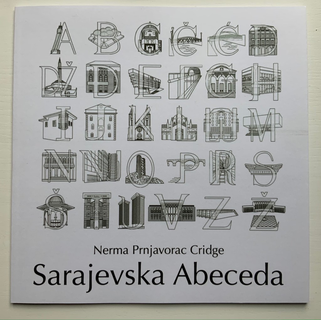
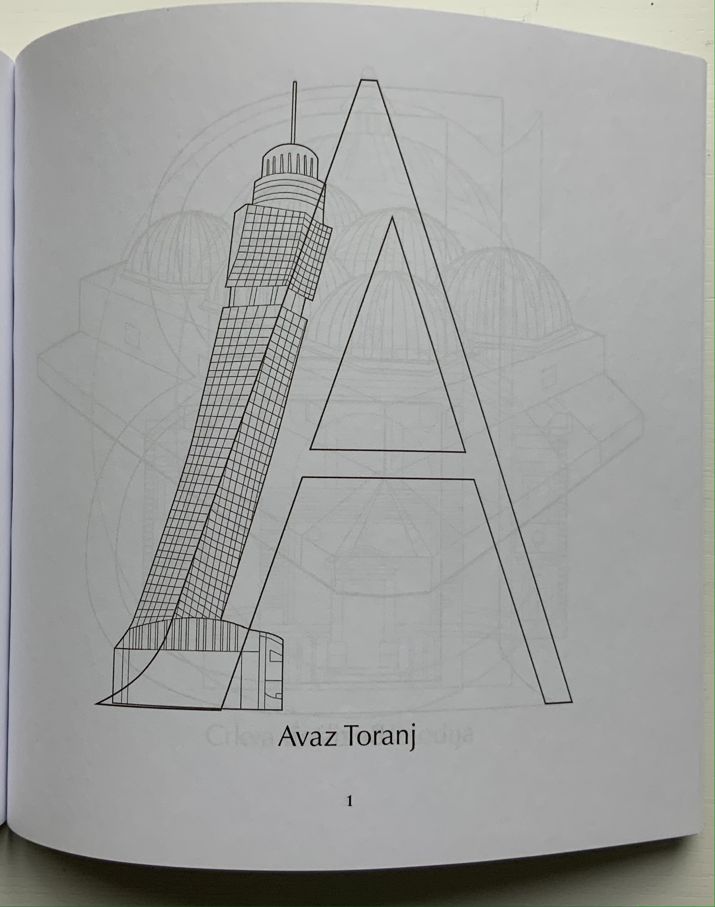
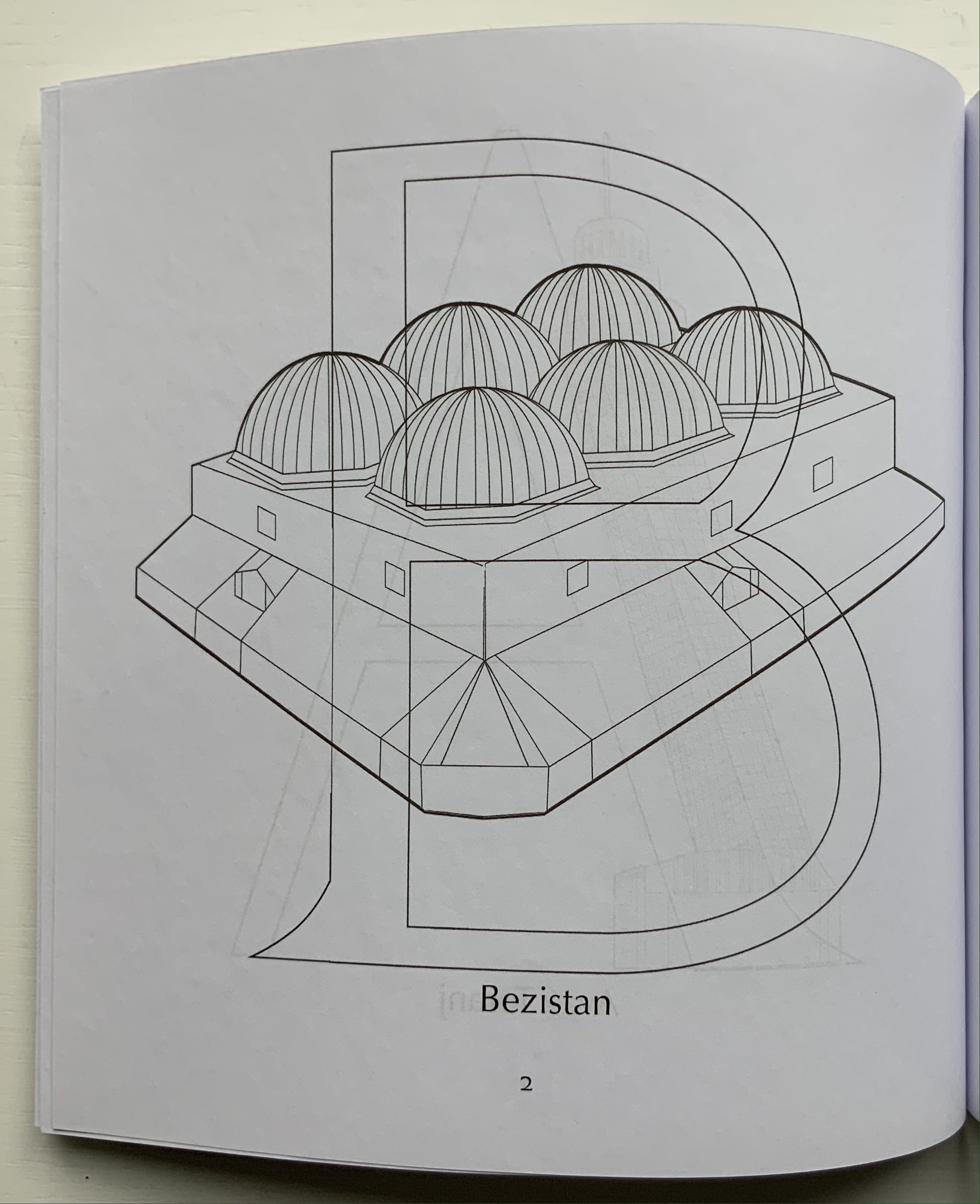
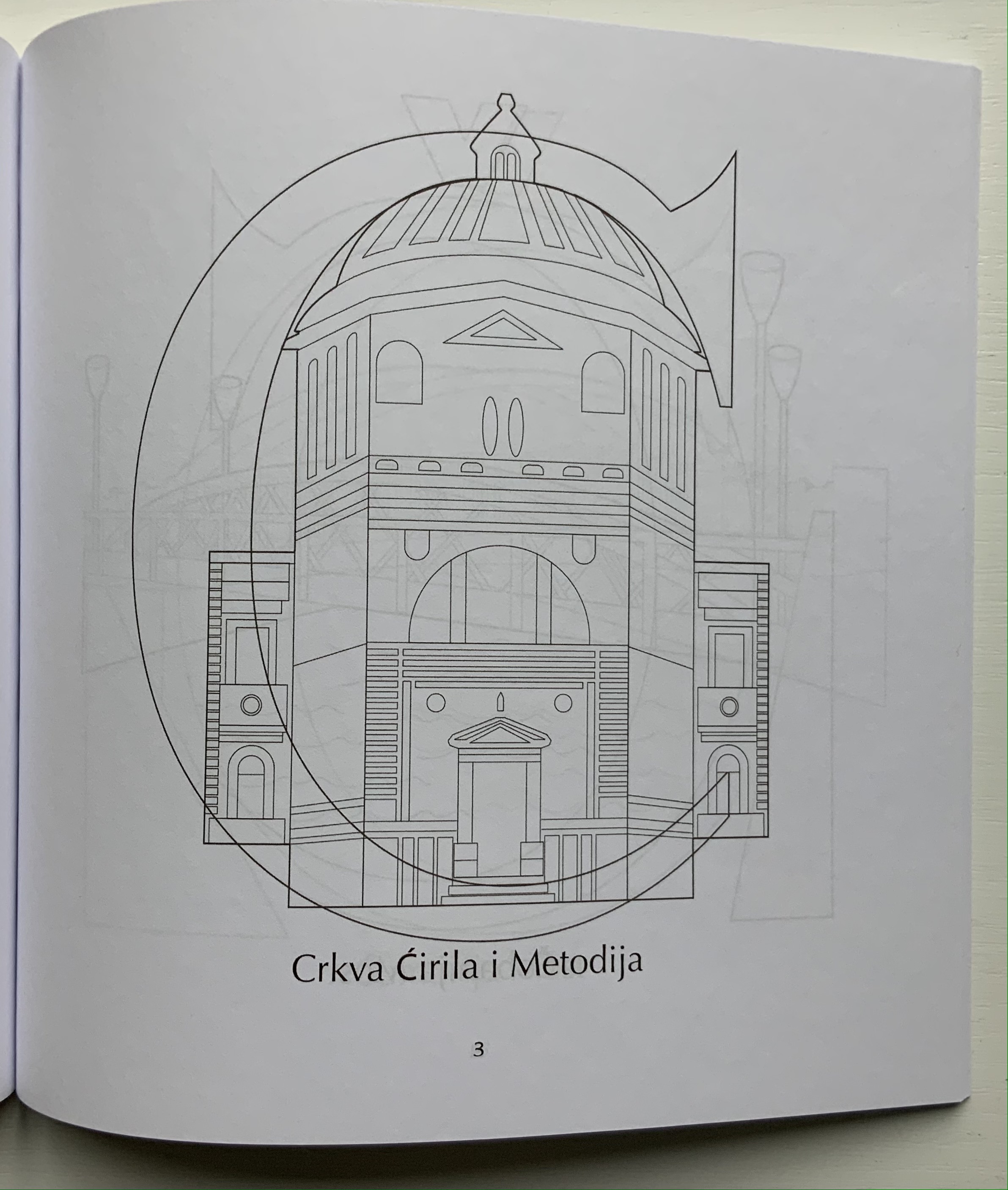
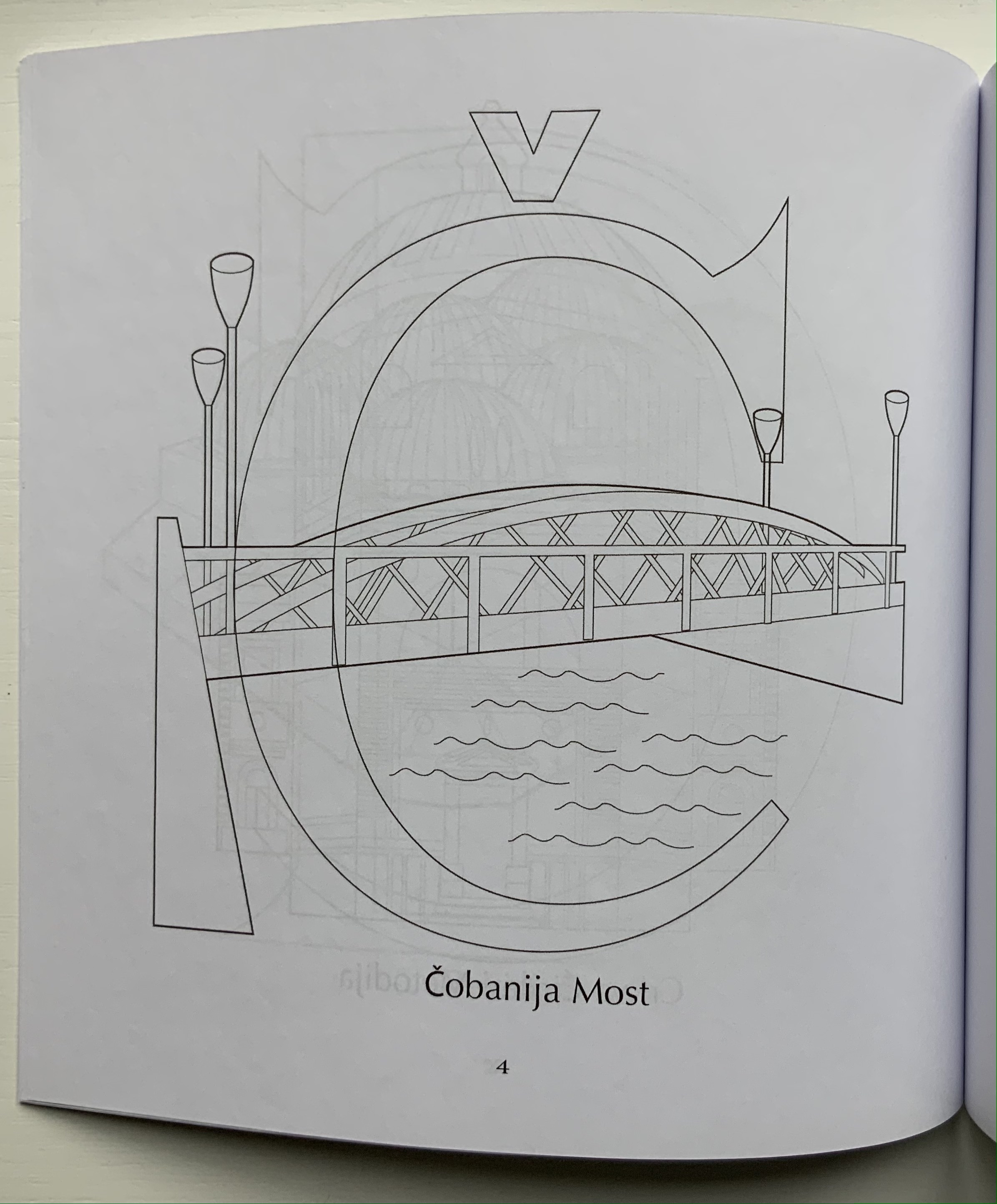
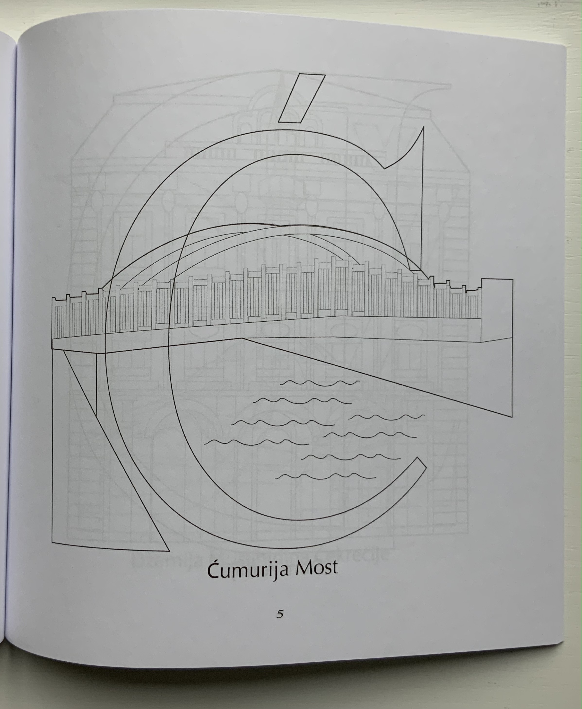
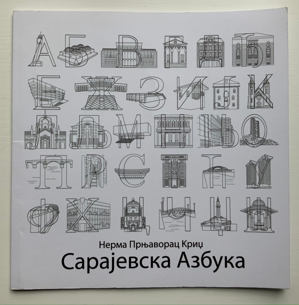
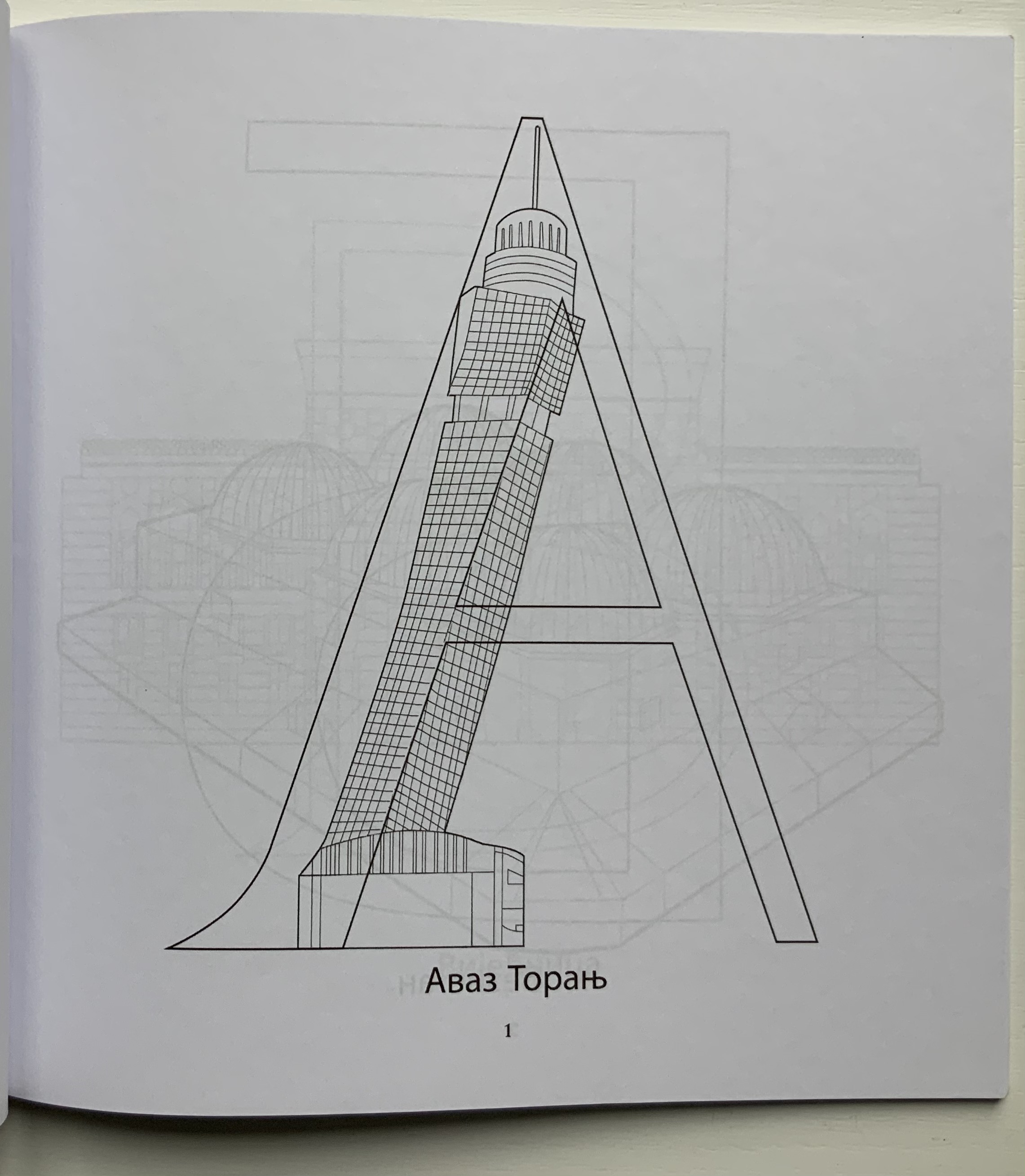
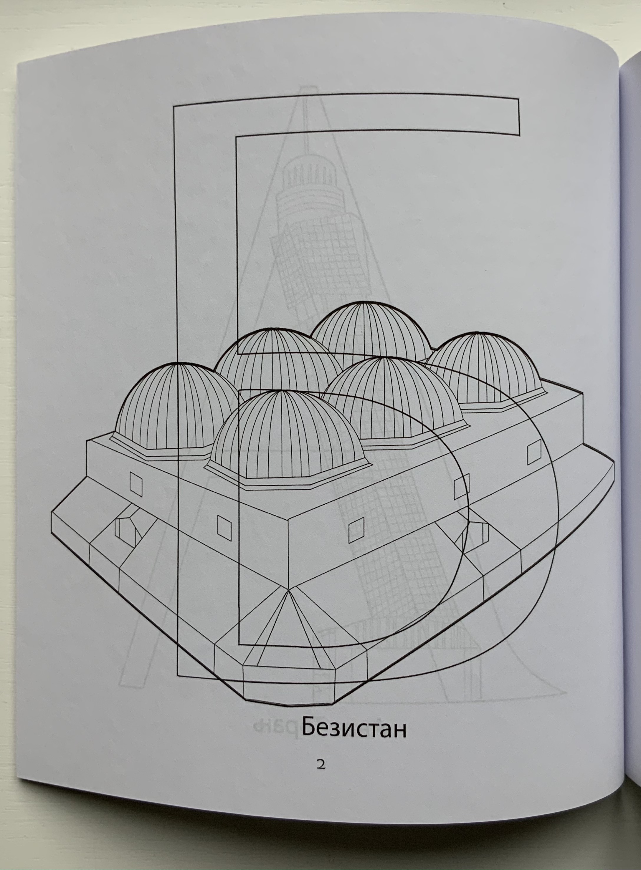
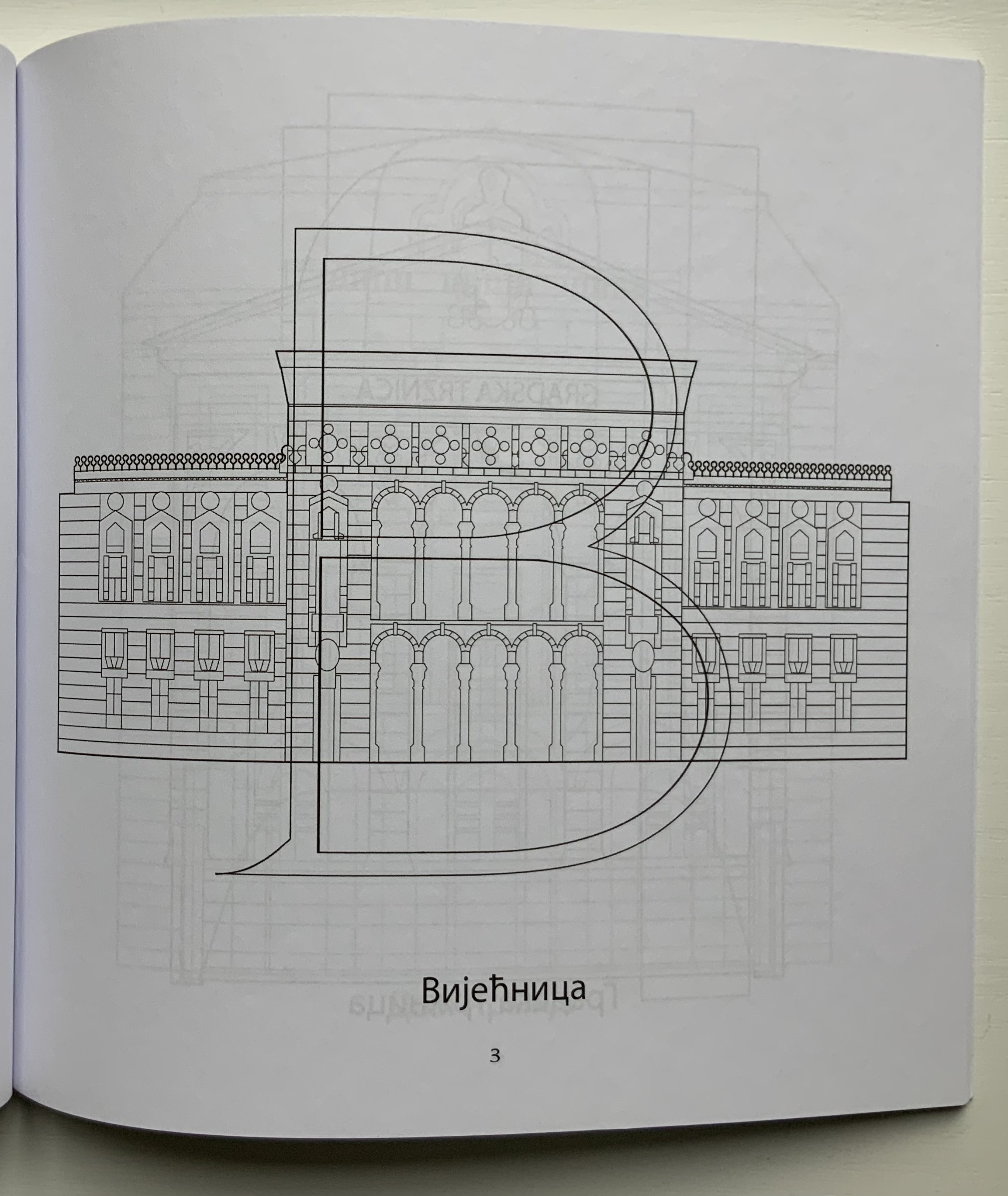
Sarajevska Abeceda (2019) Nerma Prnjavorac Cridge Paperback coloring book. H217 x W215 mm, 34 pages. Acquired from Amazon, 3 January 2021. Photos: Books On Books Collection.
Сapajeвск Aзбукa (2020)
Сapajeвск Aзбукa (2020) Нермa Прњaворaџ Криџ Paperback coloring book. H217 x W215 mm, 36 pages. Acquired from Amazon, 6 January 2021. Photos: Books On Books Collection.
These two coloring books do not integrate letters and buildings as Johann David Steingruber’s Architectural Alphabet does, but they speak to the multilingual theme recurrent in book art and the abecedaries in the Books On Books Collection (see Further Reading). In this case, the artist uses the two alphabets and the besieged city’s architecture as a memorial to her father, who was wounded in the siege.
The books also act as an entry point to Cridge’s installation art, which engages with what Ian Wallace has called “the literature of images”. Two particular installations — both curated by Cambridge’s Art Language Location (ALL) — serve to demonstrate the affinity of her art with themes in the Books On Books Collection: comm(o)nism(2018) and Antonym/Synonym(2019).
Each animal is drawn using the Roman letters of the Bembo font family, based on a letter cut by Francesco Griffo (1450-1518) for the Venetian printer for Aldus Manutius (1450-1515) and named after the prolific Renaissance scholar Pietro Bembo (1470-1547). Stanley Morison (1889-1967) revived the font while at the Monotype Corporation.
For the Books On Books Collection, Bembo’s Zoo is a light-hearted reminder of the abecedaries and typographic themes of more serious works.
“I AM SEEKING TO UNEARTH A SOLUTION BEYOND THE CONVENTIONAL SYSTEM OF LANGUAGE FOR MAKING CONNECTIONS.” Masoumeh Mohtadi
Blindness (2020)
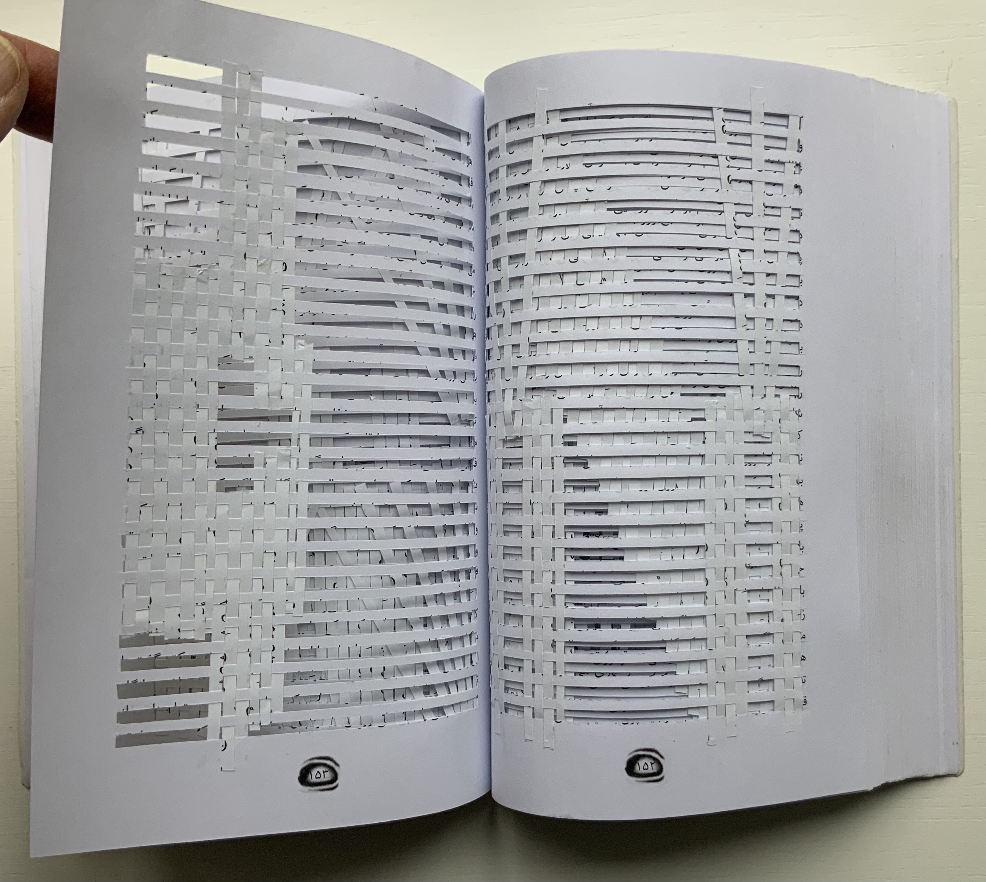
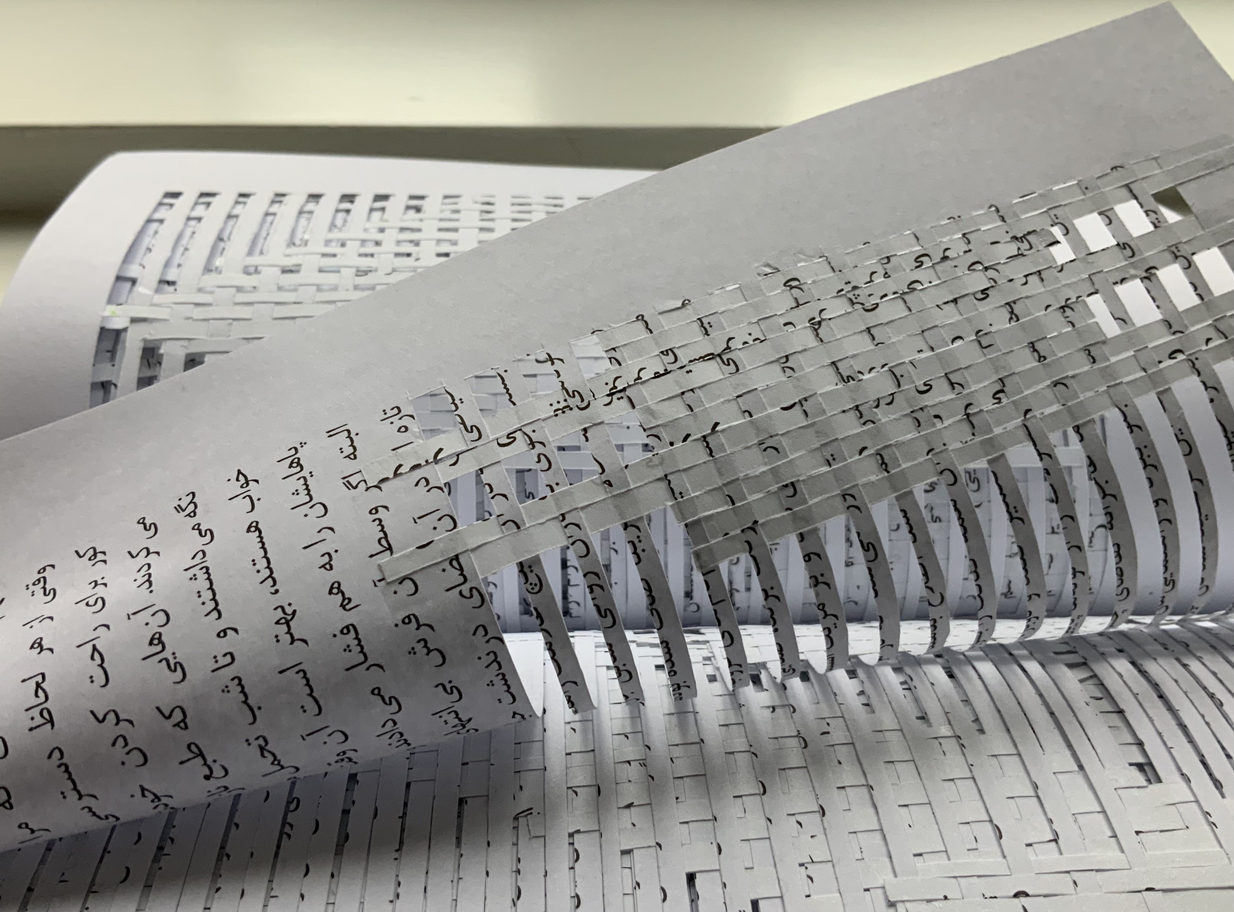
Blindness (2020) Masoumeh Mohtadi Altered paperback, Persian/Farsi translation of Blindness by José Saramago. H210 x W145 x D20 mm, ۳۱۸ (318) pages. Unique. Acquired from Bavan Gallery, 9 January 2021.
As would be expected, the binding of this Persian trade paperback is on the right, but its front cover and copyright page promise the unexpected. Excising lines of text from every page in the book, Mohtadi then physically reweaves Saramago’s gripping tale of a pandemic of sudden blindness into illegibility, varied patterns and heightened tactility.
The flimsiness of the pages slows their turning. As does their frequent catching at one another as they turn. In the slow turning, different woven patterns appear — some suddenly, some gradually. Some patterns bring to mind the streets and cityscape the novel’s characters can no longer see. Some, the hospital warrens the quarantined inhabit. Some, the tradition of carpet weaving.
The excised and woven pages inflate the book as if it had been read and re-read. Closed, it compresses in the hand, feels airy and weighty at the same time; opened, it pricks at the fingers, casts shadow and light and drags the eyes to surface and depth simultaneously.
Mohtadi’s cutting, weaving, pasting and patterning appropriates Saramago’s novel in a thoroughly integral way. And for a Western reader, the Persian translation and script introduce another layer between text and mind that challenges perception and enhances appreciation of this work of book art. She succeeds in connecting.
Blindness (2017)
Blindness (2017) Masoumeh Mohtadi Artist’s book. H400 x 300 x 36 mm. Unique. Purchased from NY Center for Book Arts, 15 March 2021. Photos: Books On Books Collection.
This larger format work conveys the artist’s reaction to Saramago’s Blindness in a completely different manner. Text is absent, replaced by tangible excisions that vary from leaf to leaf, but overlapping as they do, the excisions have a visual effect.
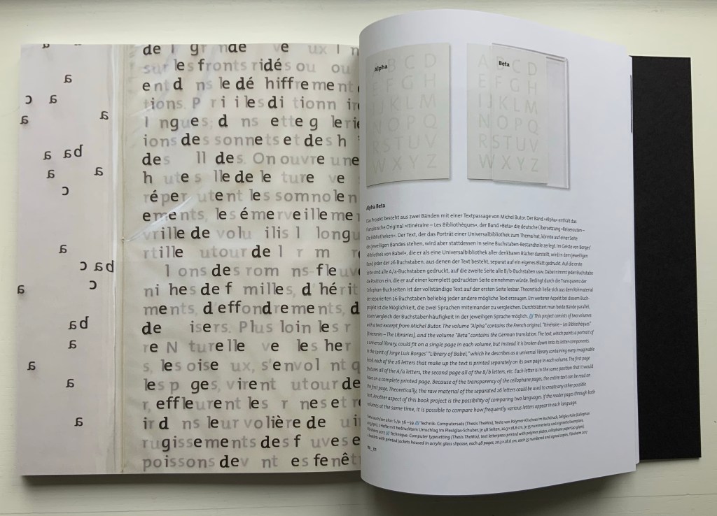
Alpha Beta (2017) Ines von Ketelhodt, text by Michel Butor Plexiglass slipcase (287 x 203 x 14 mm) containing two volumes (278 x 198 x 3 mm), 48 unnumbered pages. Edition of 35, of which this is #18. Acquired from the artist, 14 December 2020. Photos: Books On Books Collection, displayed with the artist’s permission.
Paul van Capelleveen, curator at the National Library of the Netherlands, writes in his contribution to Ines von Ketelhodt’s exhibition catalogue Bücher///Books (2019):
The artist’s book is, perhaps, more than other book forms, a stage where conventions and innovations may be brought to life. On this stage, typography is a means of text interpretation; it can be visual, decorative, or alienating. It should be noted that typography is only one of the key players in artists’ books. We have to consider the book’s materiality (paper, binding, weight, size, etc.), its images or blank spaces, and interventions such cutting, erasing, pasting, embossing, and covering. The reader is a spectator, listener, and in many cases an actor as well. (P. 18)
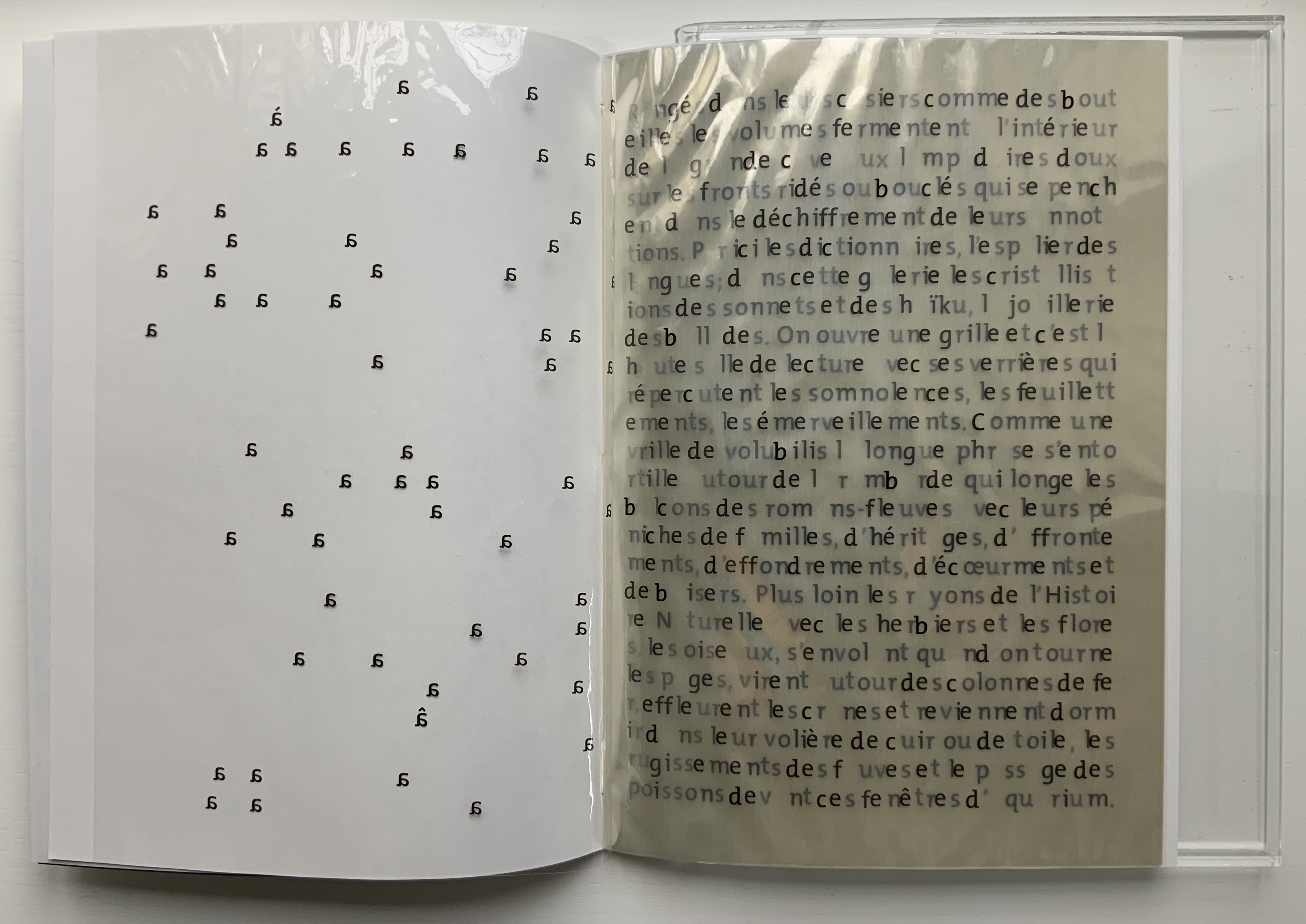
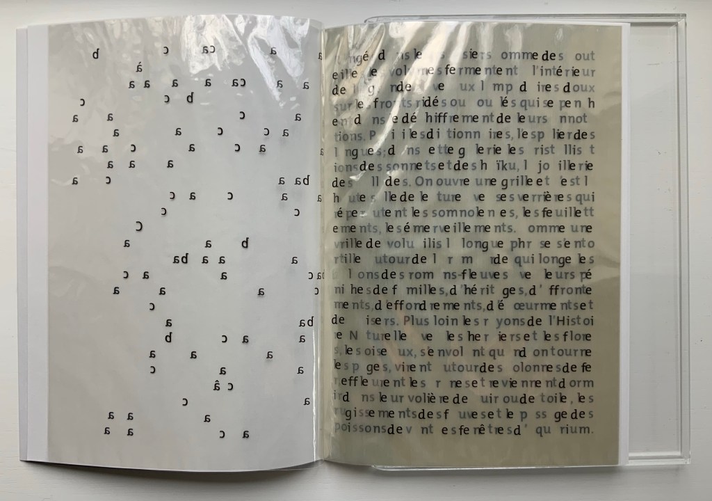
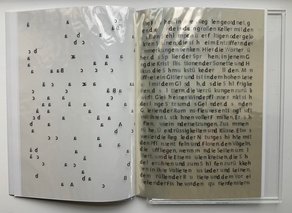
With Alpha Beta, we are reader, spectator, listener and actor. Its plexiglas slipcase must be shaken sharply to start the two thin volumes slipping out. On acetate, the first recto page presents an extract from an essay by Michel Butor describing a fantastical library. The acetate pages crinkle and mesmerize as they turn. Alphabetically, letter by letter, the transparency lifts from Butor’s text all the instances of that sans serif character into the air, falls leftward and settles onto the accumulation of clear verso pages showing the letters reversed.
Traditionally the cellophane or transparent overlay and their predecessor the “flap book” were meant to reveal the layers of the human body, a geological formation or an edifice — to show us how something is made or built up. With an alphabet and punctuation, an infinite number of words, sentences, essays and books can be made. In Alpha Beta, however, as letter by letter is removed, what was made becomes indecipherable, disintegrates. Page by page, what was there depends on memory, or the eye’s ability to decipher from what is left, or a willingness to flip back to the beginning. We know, of course, that Butor did not piece together his disintegrating text letter by letter alphabetically in the first place, but materially and typographically that is what von Ketelhodt did to present the full text to us on the first recto page. If we return to that page to fix the text in memory, we notice that not only is it justified left and right, its words break at the end of a line without hyphenation or regard for syllabification. This is not typography in transparent service to legibility but rather to its own materiality and a concept or concepts. But what is it, what are they?
Just as strange is that Alpha Beta is materially multilingual. The first volume, Alpha, presents and disintegrates Butor’s text in its original French. The second, Beta, does the same in German.
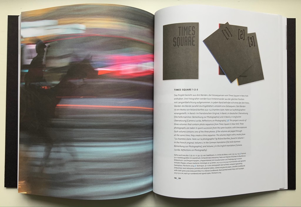
Why this multilingual materiality? Could it be the advantage of appealing to two language markets? Could it be as simple as the text’s being available in French and German? There’s no denying von Ketelhodt’s multilingual proclivity. Many of her solo works involve multiple languages, but it is how and why that count. Consider her sequential photographic work Times Square 1-2-3 (2014). In it, she uses a quotation from Roland Barthes’ Camera Lucida: Reflections on Photography in its French original for volume 1, German for volume 2, and English for volume 3. Von Ketelhodt took three photos in quick succession, with time exposure, from the same spot in Times Square. She then split the photos across the three volumes. To see the sequence, we have to look across the three volumes. By virtue of its focus on the effects of photography on the spectator and its availability in three languages, Camera Lucida was the ideal source from which to draw a quotation as inspiration and compositional material for Times Square 1-2-3.
So why this particular text from Michel Butor? A bilingual market advantage was probably decisive for Campus Verlag, publisher of Butor’s volume of essays in which von Ketelhodt found the text. If a trilingual market advantage had outweighed the additional production costs for Campus Verlag, von Ketelhodt might have created Alpha Beta Gamma instead. The essay she selected from Butor is “Les bibliothèques/Die Bibliotheken” (“The libraries”), which appears in the collection’s second part: “Itinéraires à travers l’univers de Maria-Helena Vieira da Silva/Reiserouten durch das Universum von Maria-Helena Vieira da Silva” (“Itineraries through the universe of Maria-Helena Vieira da Silva”). None of Butor’s essays are about the alphabet. So, still, why this particular text?
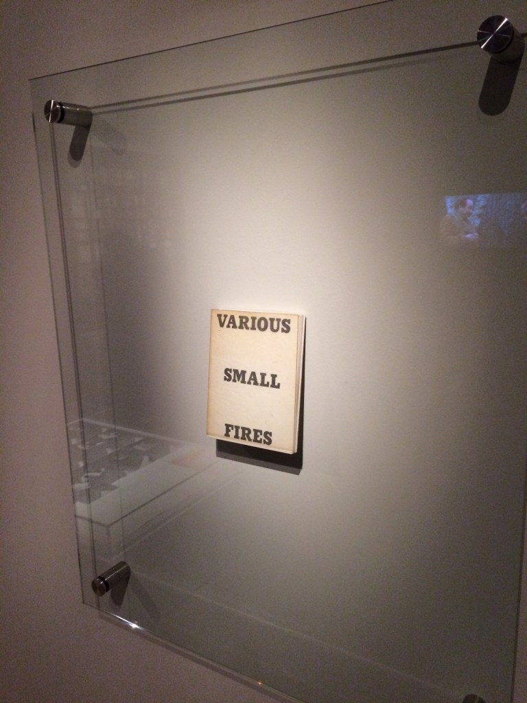
Butor wrote extensively in response to Da Silva’s works. A French-Portuguese abstract/figurative artist, she drew on cityscapes, railway stations, bridges as well as books and libraries for her source of figures. The libraries led to a series of canvases with titles such as Bibliothèque Humoristique, La Bibliothèque, and La bibliothèque en feu. The latter appears dimly reflected in the upper left-hand corner of this photograph from the Paris exhibition La Pliure (2015). A clearer image can be found on the Calouste Gulbenkian Museum’s site.
Display of Ed Ruscha’s Various Small Fires and Milk, 1964, at Pliure: La Part du Feu, 2 February – 12 April 2015, Paris. Photo: Books On Books. Reflected in the lower left hand corner is the display of Bruce Nauman’s Burning Small Fires; in the upper right corner, the film clip of Truffaut’s 1966 Fahrenheit 451; and in the upper left, Maria Helena Vieira da Silva’s La bibliothèque en feu, 1974.
In its capture of Bruce Nauman’s referencing Ed Ruscha’s Various Small Fires, the photo is serendipitously apropos to Alpha Beta and its use of Butor’s “Les bibliothèques”. Butor’s essay is ekphrastic, built on the premise of referencing a visual artwork. It does not, however, describe the details of any particular one of the paintings; it is rather a fantasia on all of them, distilling them into a universal library. Von Ketelhodt’s ABC book is built on the very premises of Butor’s extract as well as on the premise of referencing the subject of Butor’s essay. Alpha Beta does not describe Butor’s essay; rather, it physically reaches into the text, extracts and abstracts from it an ABC book letter by letter. As the letters fly up, they could be those “birds that fly upward when you turn the pages”. The light reflected from the transparent pages could be that of the “soft lamps hovering”. The transparent pages recall the libraries’ “crystalline sonnets” and their “glass ceiling that reflects back the drowsiness, the leafing”. (See full English translation under Further Reading below.)
Von Ketelhodt’s work of art is far from an illustration of Butor’s universal library just as Butor’s essay is far from a verbal attempt to describe any one of Da Silva’s paintings. If this response to Alpha Beta seems “too clever by half”, consider the multilingual, self-referencing and self-referential complexity of the next work in the collection.
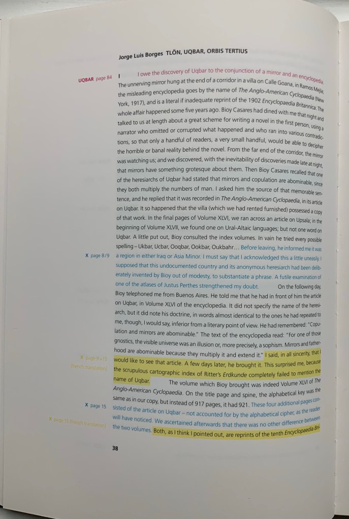
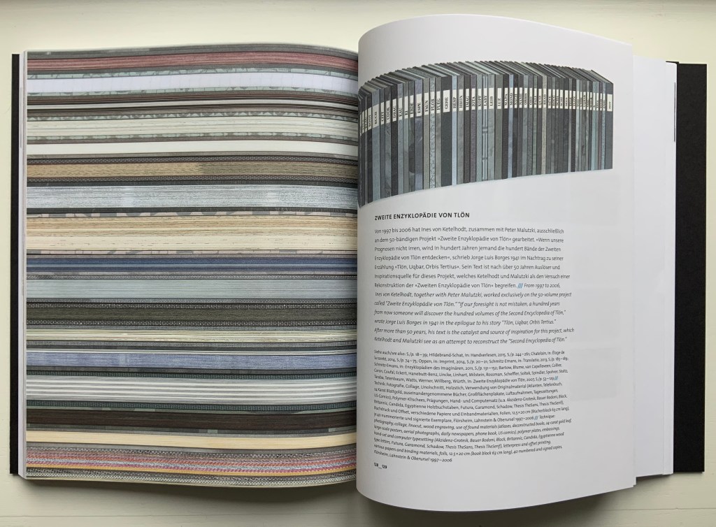
Zweite Enzyklopädie von Tlön (2007)
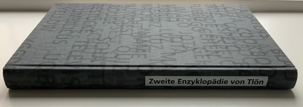
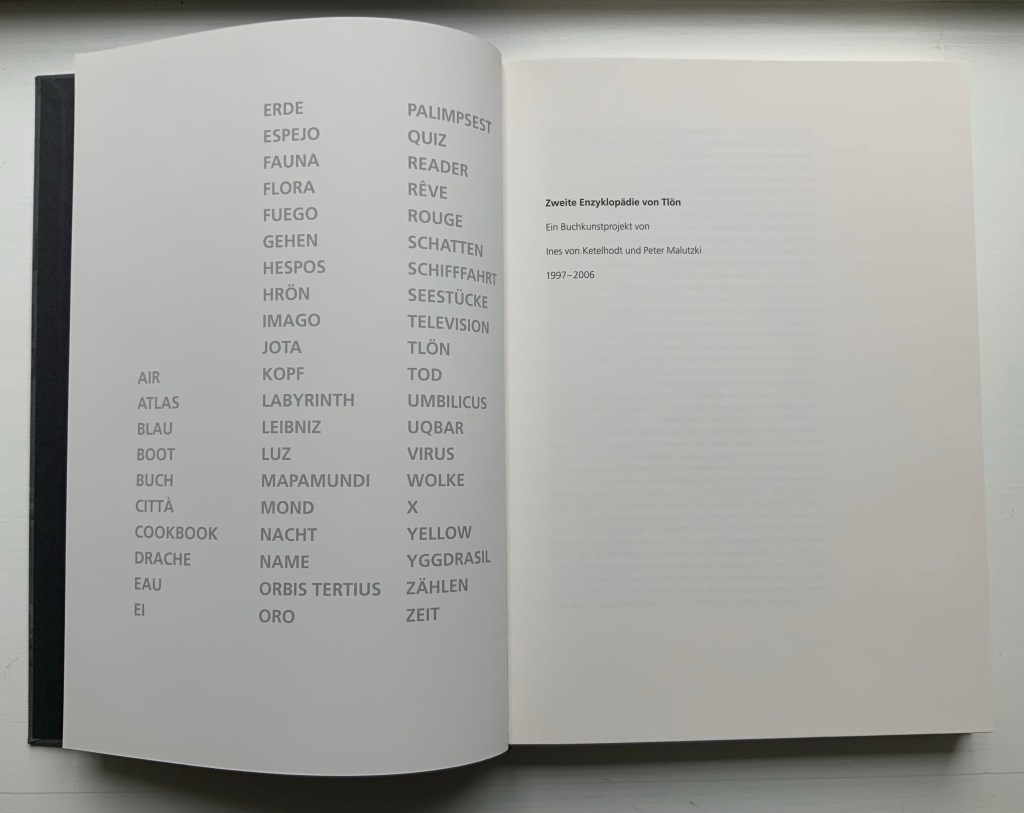
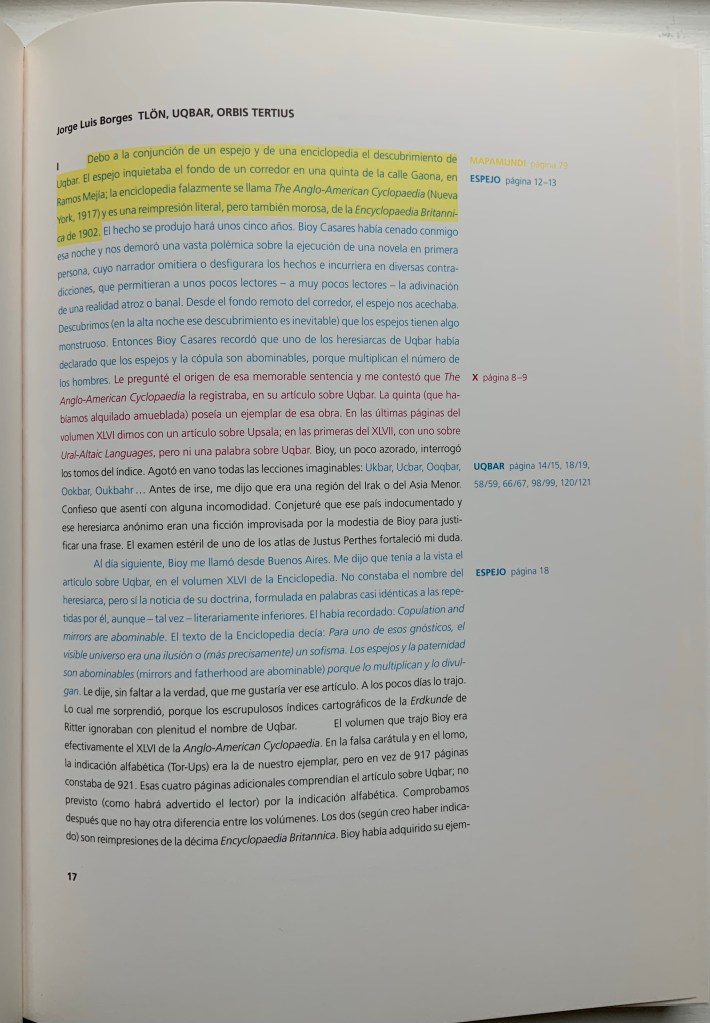
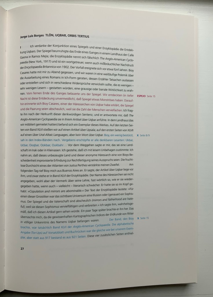
Zweite Enzyklopädie von Tlön (2007) Ines v. Ketelhodt and Peter Malutzki Catalogue casebound, thread-stitching, in printed linen-over-board cover with embossed spine title. H302 x W217 x D25 mm, 256 pages. Acquired from the artists, 21 August 2017. Photos: Books On Books Collection, displayed with permission of the artists.
Inspired by Jorge Luis Borges’ epilogue to his short story “Tlön, Uqbar, Orbis Tertius”, von Ketelhodt and Peter Malutzki embarked on their fifty-volume multilingual masterpiece Zweite Enzyklopädie von Tlön (2006), two decades before Alpha Beta (2017). Between 1997 and 2006, the fifty volumes appeared. For the catalogue, they collaborated with twenty-three authors. The site devoted to the project provides a look inside all of the volumes and its companion catalogue. The catalogue alone, however, works well as the tip “of the tip” of the book-berg as von Ketelhodt and Malutzki call it:
Now the fifty volumes lie before us, and we see they are actually only a tiny part of a huge ice-berg that is really a book-berg. Most of it we cannot see because it is below the surface, but we are aware of its existence. We see the project connected to a multitude of other books and are happy that, by the incorporation into public collections, it is now literally close to an enormous number of other books.
The fifty-volume work’s residence in libraries and collections around the world matters to the artists not only financially but conceptually. Only in that setting or frame does the artwork “converse” multilingually with simulacra of the Tlön library. The catalogue includes text in English, French, German and Spanish, and its own system of internal and external cross-referencing is enacted typographically and in color across Spanish, German and English in that order. After all, Borges’ short story was the origin of the work, and it is in Spanish.
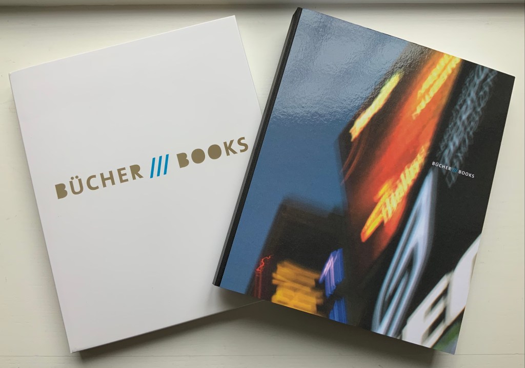
Bücher /// Books (2019)
Bücher /// Books(2019) Ines von Ketelhodt Catalogue for the exhibition at the Klingspor Museum Offenbach, 3 March to 19 May 2019. Card slipcase (H281 x W233 x 21 mm), Perfect bound, photographic-board covered book (H280 x W230 x D19 mm), 192 pages. Acquired from the artist, 22 November 2018. Photos: Books On Books Collection, displayed with permission of the artist.
Catalogue entry for Alpha Beta. Photo: Books On Books Collection, displayed with artist’s permission.
Catalogue entry for Zweite Enzyklopädie von Tlön. Photo: Books On Books Collection, displayed with artist’s permission.
Catalogue entry for Times Square 1-2-3. Photo: Books On Books Collection, displayed with permission of the artist.
Photo: Books On Books Collection, displayed with artist’s permission.
Alpha Beta is von Ketelhodt’s primary solo work in the collection. As such, it does not reflect her extraordinary talent with photos (B/W and color) in making book art. The description above of Times Square 1-2-3, its representation in this catalogue of her work, and the catalogue’s cover have to suffice as place holders for now.
Further Reading
Princeton University holds Alpha Beta in its Graphic Arts Collection and provides two (unattributed) English translations of the extract. Accessed 18 August 2020. Here is one of them:
Arranged like bottles on their shelves, the volumes age in the large cellar, soft lamps hovering over creased or ringleted foreheads lowered in their attempts to decipher the comments. Here are the dictionaries, the espaliers of languages; in that aisle over there, the crystalline sonnets and haikus, the gemlike ballads. Opening a grating, you find yourself in a lofty reading room with a glass ceiling that reflects back the drowsiness, the leafing, the ecstasies. Like a climbing plant, the long sentence twines around the railing that runs along the galleries of the Romans-fleuves [sic; means “saga novels”] with their barges full of families, inheritances, conflicts, collapses, wearinesses and kisses. A bit farther on: the natural history shelves with their plant posters and flora; the birds that fly upward when you turn the pages and circle around the iron columns, touch their skulls [sic; “bump their heads”?] and then return to their leather and linen aviaries to sleep; the beasts of prey roaring and the fish gliding by the aquarium windows.
“Lizzie Brewer“. 4 July 2023. Books On Books Collection. For another homage to Borges.
“Peter Malutzki“, Books On Books Collection, 11 November 2019.
“Aurélie Noury“. 9 November 2020. Books On Books Collection. For another homage to Borges.
“Hanna Piotrowska (Dyrcz)“. 13 December 2019. Books On Books Collection. For another homage to Borges.
“Benjamin Shaykin“. 3 December 2022. Books On Books Collection. For another homage to Borges.
“Rachel Smith“. In progress. Books On Books Collection. For another homage to Borges.