If ever the dictum “Less is more” applied, it applies here — with miniaturized tongue in cheek, of course. [Links in the captions will take you to more images and details.]
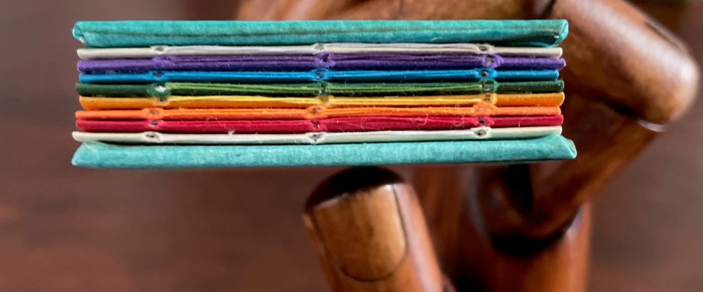
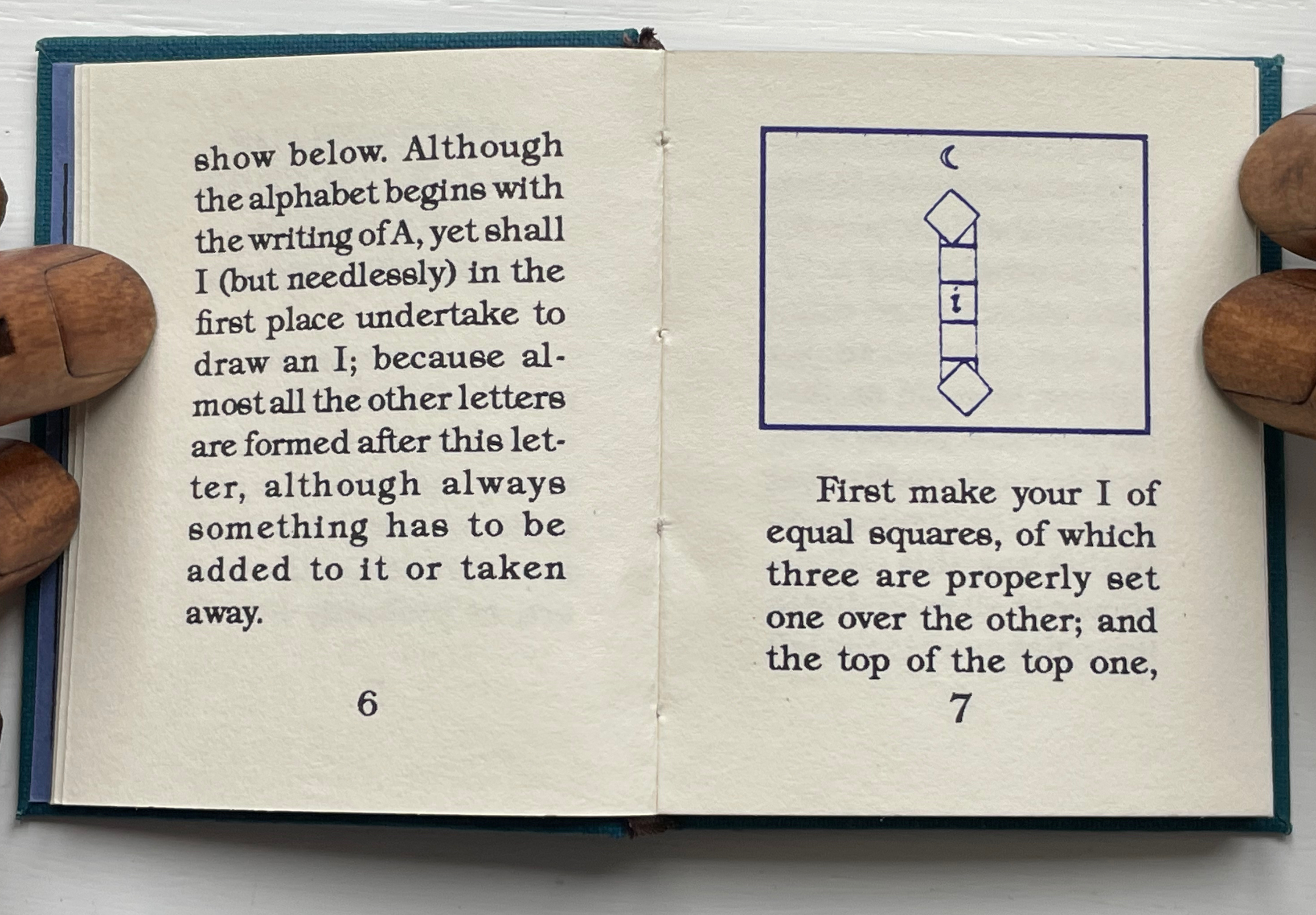
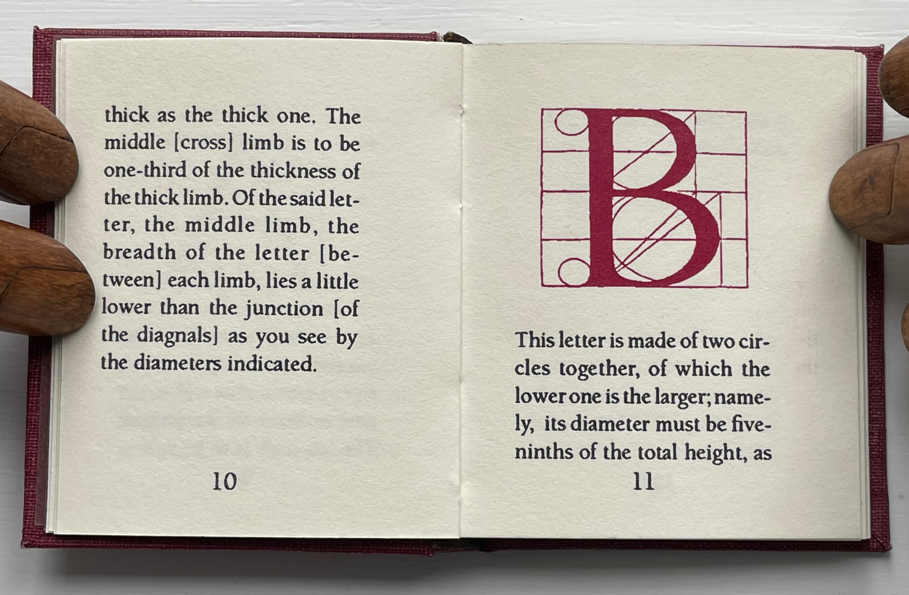
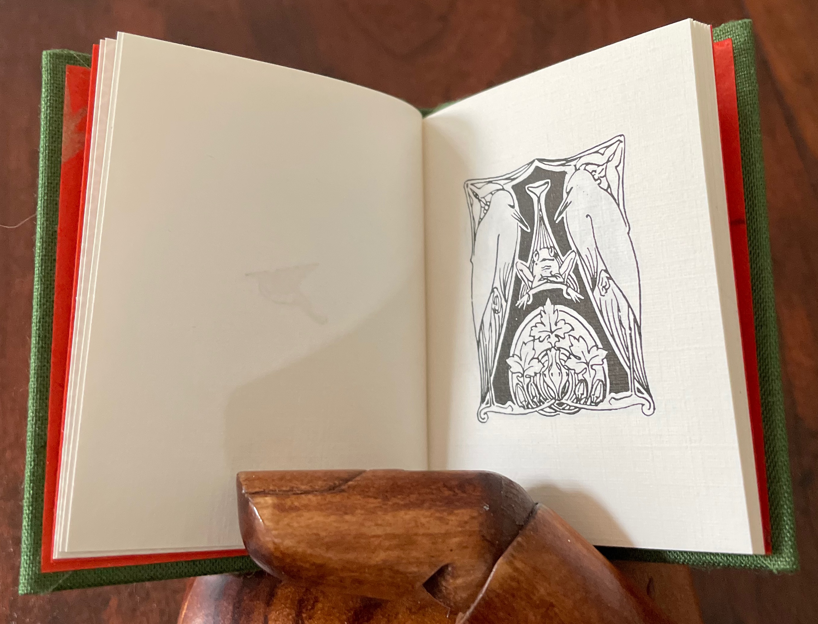
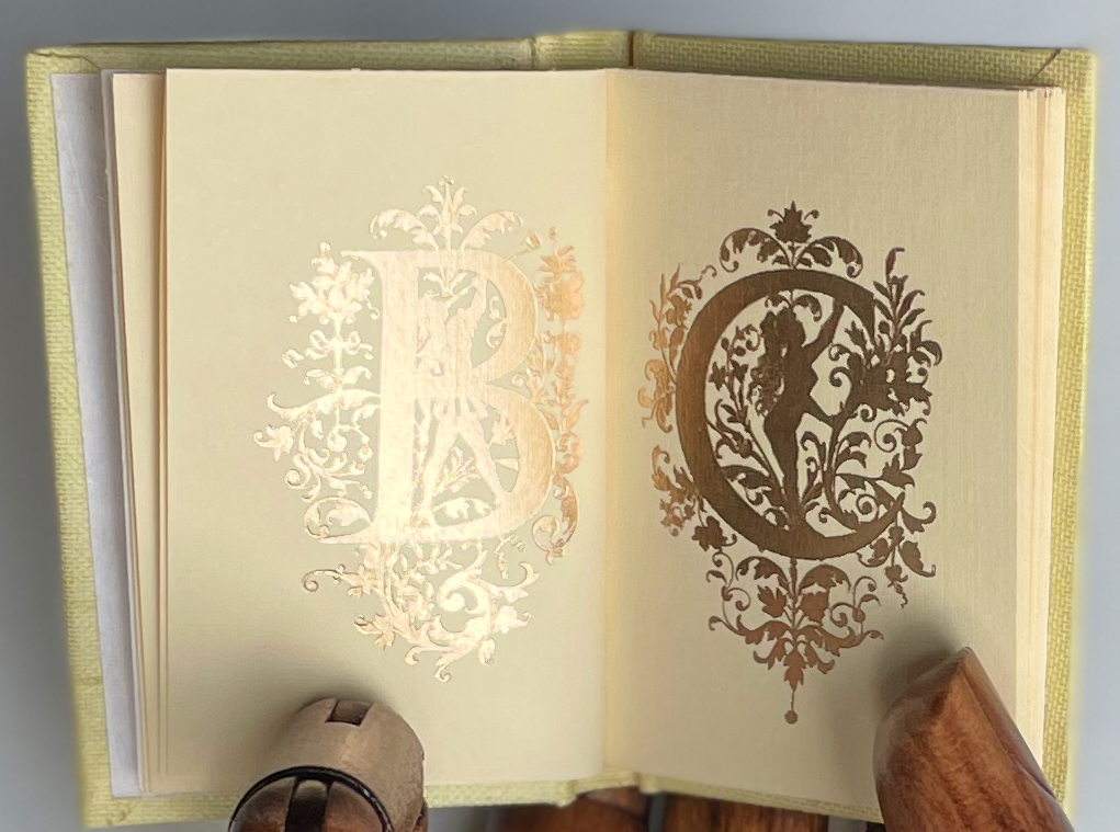
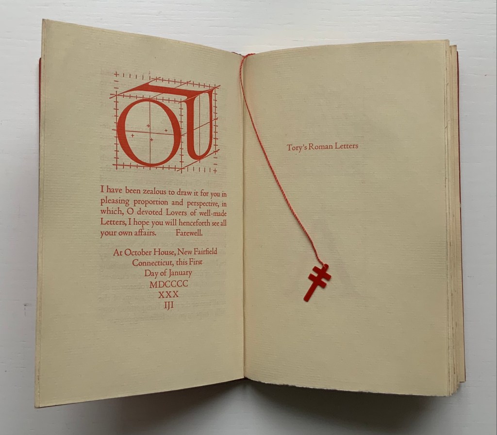
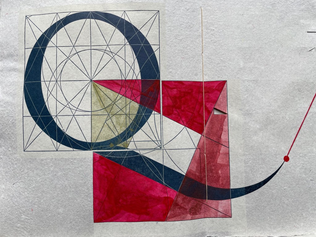
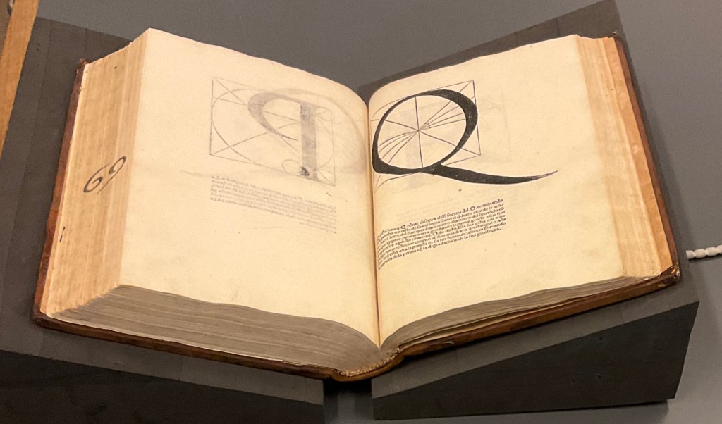
These two miniatures — Albrecht Dürer’s Directions for the Construction of the Text or Quadrate Letters (1993) and Fra Luca de Pacioli’s The Divine Alphabet (1993) — were produced by Tabula Rasa Press for a three-volume set, including Ben Shahn’s The Alphabet of Creation (1954). Although the miniature edition of Shahn remains elusive, the original edition can be seen here.
Mark Van Stone, The Evolution of the Medieval Decorated Letter(1985) In the spirit of medieval illuminators, Van Stone has imitated the hand of twenty-three of what he calls the “semi-precious jewels” of “‘minor’ illumination that usually receives little attention in the Art-History books”.
Carol DuBosch, Embossed Alphabet Gallery (2019).* This gallery structure combines elements of the flag-book and leporello to create a freestanding sculptural book to be read “in the round” — although in the Bodleian exhibition it was fixed in a wall case that allowed 180º view.
Claire Van Vliet, Tumbling Blocks for Pris and Bruce (1996).* A meander-fold book hinged to keep the cube unfolding, refolding and unfolding as it falls from hand to hand.
Carol Cunningham, Alphabet Alfresco(1985). One of several gems created by the founder of the Miniature Book Society (1983).
William Cheney, ABC for Tiny Schools ( 1975). Along with “A was an archer”, the “A was an apple pie” was among the earliest themes for secular alphabet books.
Alphabet Salmagundi(1988) and Golden Alphabet (1986) demonstrate the breadth of Rebecca Bingham’s interest in various periods and techniques of calligraphy.
Another Tabula Rasa Press production, Arthur Maquarie, The Uffizi ABC: a facsimile reproduction in miniature (1992)
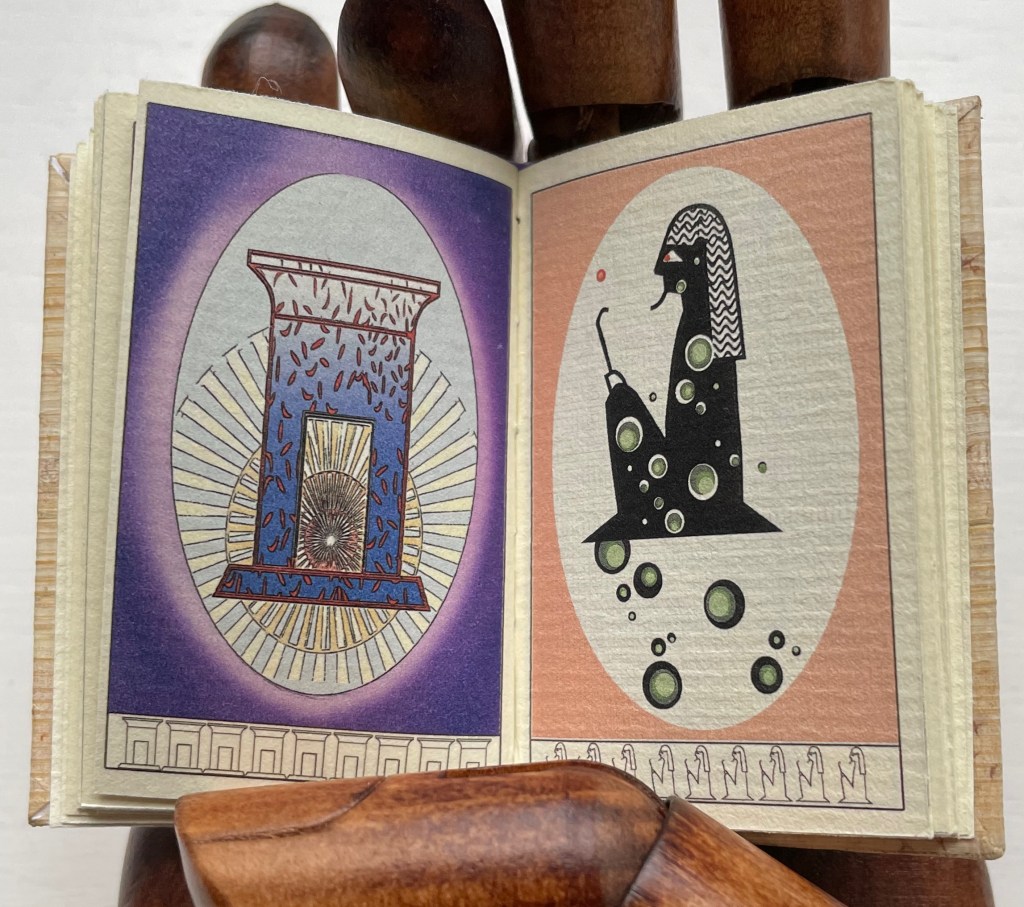
Pat Sweet’s wit led her to fill the ancient Egyptians’ previously unperceived need for an alphabet book with Hieroglyphs (2009).
June Sidwell, Lady Letters (1986). Another production by Rebecca Bingham, which also led to a miniature nod to another alphabetist — Erté.
Nicolas McDowall, A Bodoni Charade (1995). Don’t let delight in the verbal/visual punnery distract you from wondering at the skill with type and letterpress needed to pull this off.
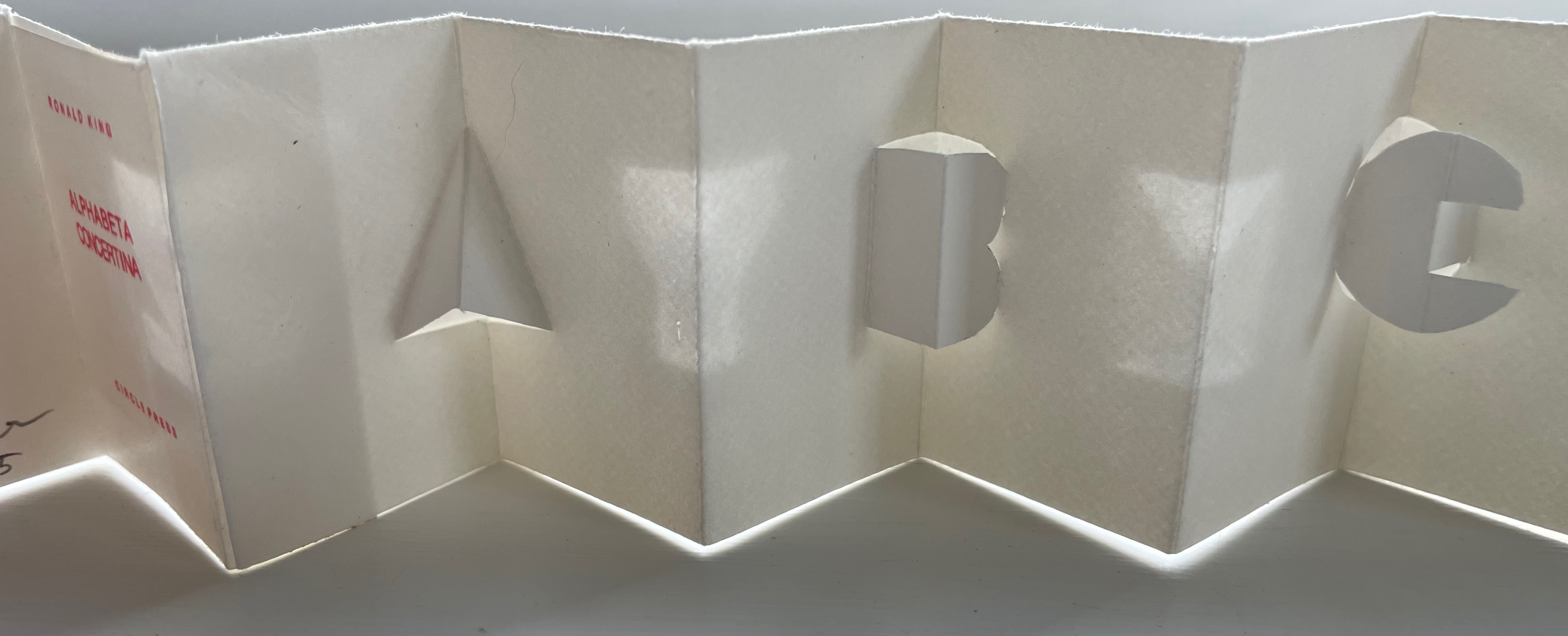
Erwin Huebner and Ron King, Alphabeta Concertina Majuscule (2015) and alphabeta concertina miniscule (2022). Miniaturist and microbiologist, Huebner obtained Ron King’s permission to reproduce King’s two signature pop-up alphabets with extraordinary results.
Juniper Von Phitzer, An Alphabet Coloring Book by Theodore Menten (1997). Lloyd L. Neilson compiled the name of his Juniper Von Phitzer Press from the names of his three cats. Theodore Menten had produced a coloring book called The Illuminated Alphabet in 1971 for Dover Publications. Obviously Juniper Von Phitzer could not fail to pounce.
Online Exhibition Bonus!
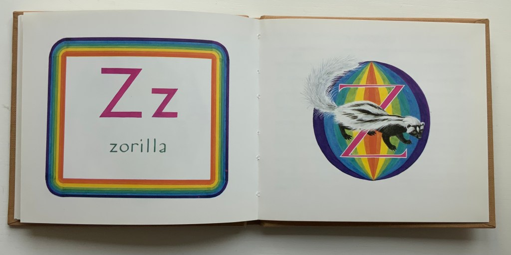
Many of the ABC books in the collection use the accordion, concertina or leporello structure, but none but Maria G. Pisano’s XYZ (2002) combine fine beaten abaca in two colors and the watermark technique to achieve their effect.
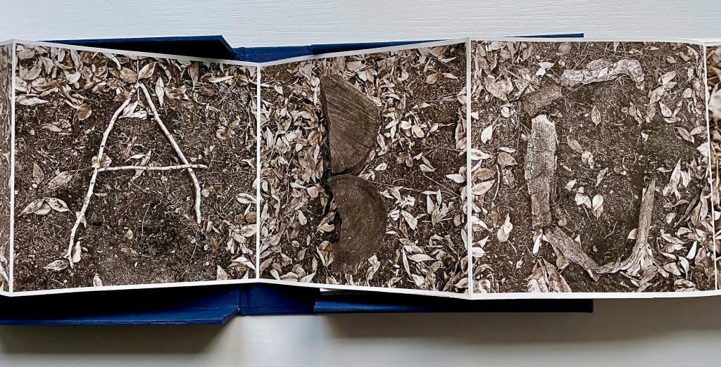
Where do letters go when they’re not making words? Book artists know that they hide everywhere – often in plain sight – in landscapes, roadworks and signs, tree branches, rocks, flags, and even in a cup of coffee. [Links in the captions will take you to more images and details.]
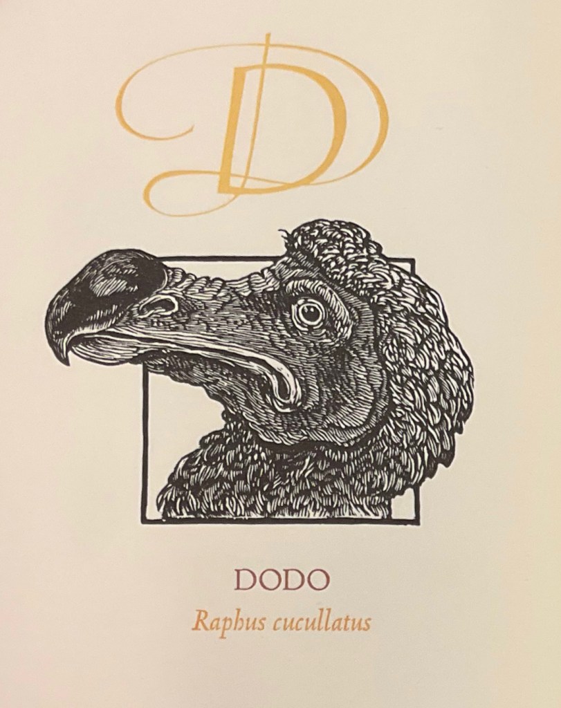
Animal alphabet books hum with imagination and wit. Animals, birds, fish, insects, even dinosaurs, decorate and transform letters, or might be created from the letters themselves. Sometimes, the animals come in disguise, or hide, only to pop out and surprise you. Perhaps the alphabet’s pictographic origin explains this animal obsession. The letter ‘A’ comes from the word ‘aleph’ meaning cow or ox, and its early letterform resembled an ox’s head and horns. [Links in the captions will take you to more images and details.]
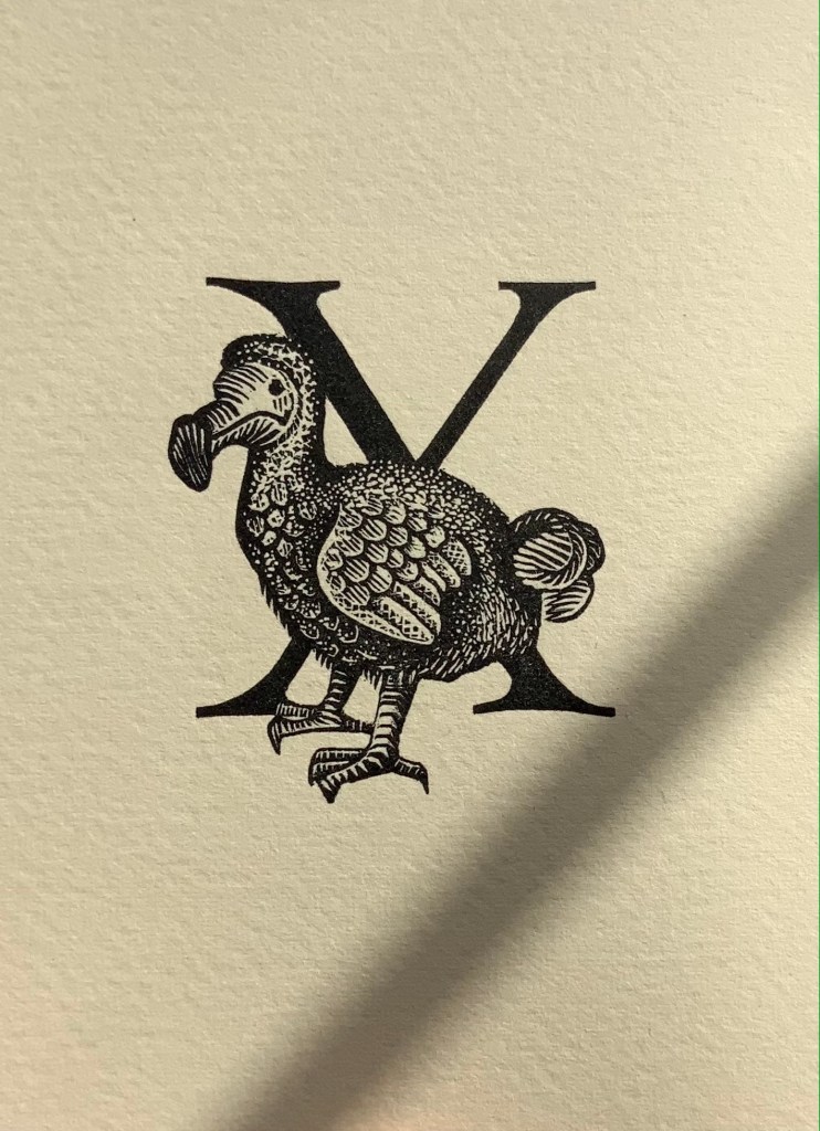
E.N. Ellis, An Alphabet (1985).* The letters Q and X always present challenges in finding suitably named animals. Ellis’s solution with X is as elegant as her engraving.
C.B. Falls, ABC Book (1923). Almost a quarter century after William Nicholson’s successful A Square Book of Animals, Falls applied his successful poster designing to this larger format.
Enid Marx,Marco’s Animal Alphabet (2000). Bringing together the talents of the engraver (Enid “Marco” Marx), “pochoir-ist” (Peter Allen) and letterpress printer (Graham Moss), this large-scale portfolio treads the boundary of fine press and artist’s book.
[Alphabet Leporello of dressed animals] (Paris, c. 1851) Opie T 407. The Books On Books Collection’s concentration on alphabet books falls primarily over the 20th and 21st centuries and extends the pre-1950s focus of the Opie Collection of children’s books. Together, the two collections offer a broad and deep source for exploring the links between artists’ books and children’s alphabet books as well as studying topics such as children’s literature and literacy.
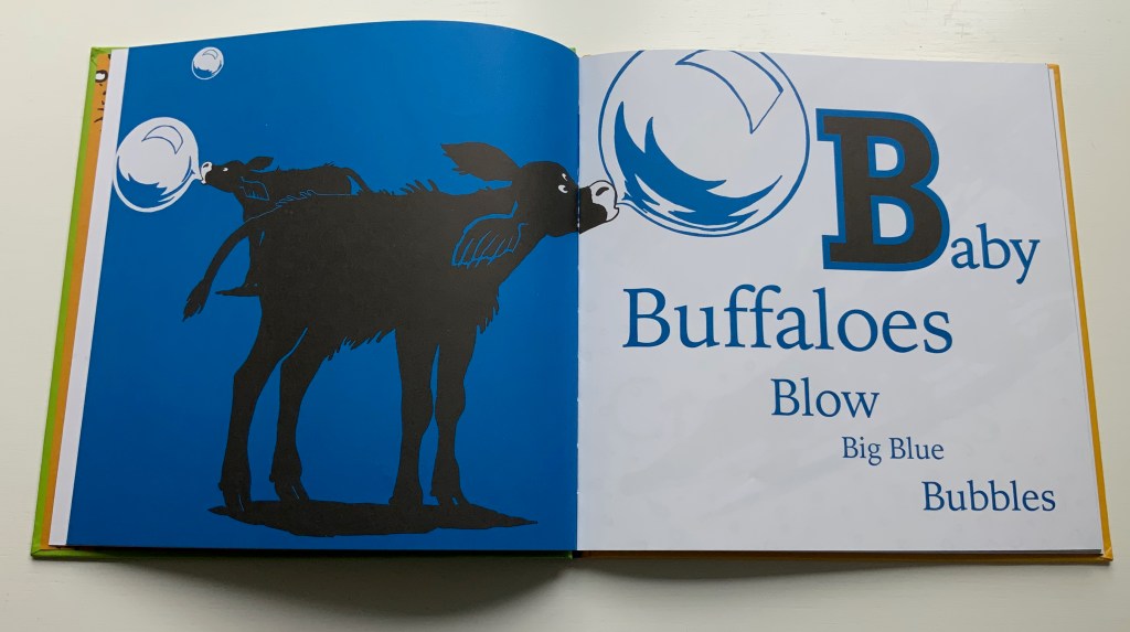
Christiane Pieper & Anushka Ravishankar, Alphabets Are Amazing Animals (2003).* Alliteration is almost as frequent a feature of alphabet books as animal association.
Alan James Robinson and Suzanne Moore, A Fowl Alphabet (1986).* A superb collaboration between an engraver (Robinson) and calligrapher (Moore).
John Norris Wood, An Alphabet of Toads & Frogs (2002).* Sometimes past art abroad catches up with present American fauna of political celebrity.
Leonard Baskin, Hosie’s Alphabet (1972). Son Hosie and father Leonard unite their rites of passage: learning the alphabet and creating an artist’s alphabet book.
Michele Durkson Clise, Animal Alphabet: Folding Screen (1992) wrongfoots the reader with animal images that do not align with the expected alphabet letter or the letters of the first words in the leporello’s rhyming couplets. If the image does at least align with a word in the couplet (e.g., “whale”), that word’s first letter does not align with the alphabet letter expected for that panel.
Brian D. Cohen & Holiday Eames, The Bird Book (2013). Cohen’s engravings are finer in detail than most.
In Abstract Alphabet: A Book of Animals(2001), Paul Cox turns the alphabet on its evolutionary head. The letter A started out with the pictogram of an ox’s head and then developed into the abstract shape we associate with the sound /a/. Here, we have to work back from 26 different abstract shapes (each assigned to a letter on a fold-out flap) to figure out the name of the animal being spelled. The reversal conjures up the challenge that letters, objects and phonics present to children, and in their resemblance to a Hans Arp painting, the shapes challenge the reader to a renewed connection with art.
Roberto de Vicq de Cumptich, Bembo’s Zoo: An Animal ABC Book (2000). Where Sharon Forss and Sarah Werner use several type faces to shape their animals, De Vicq de Cumptich restricts his to Bembo.
David L. Kulhavy & Charles D. Jones,A Forest Insect Alphabet(2013). Extraordinary woodcuts by Jones, worth comparing with Cohen, Grieshaber, Marx and Robinson.
Metropolitan Museum of Art, Animalphabet (1996). Curators’ puns and wordplay with favorites from the Met.
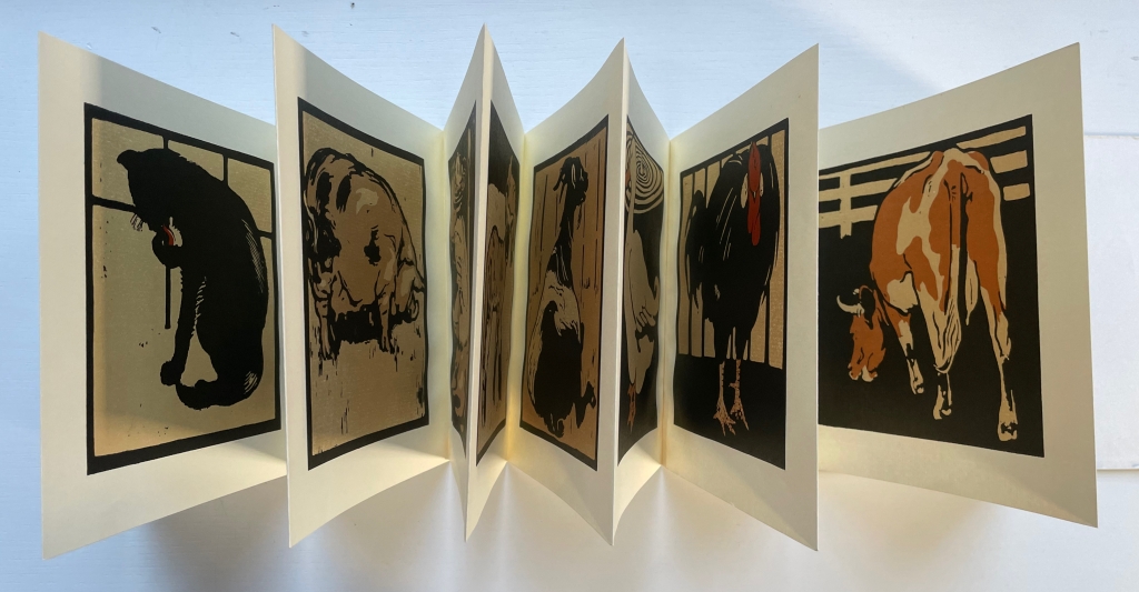
William Nicholson, A Square Book of Animals (1900). Nicholson followed his successful An Alphabet with this book, but it was Scolar Press in 1979 that redesigned and re-originated it in this well-chosen leporello format.
Carton Moore Park, An Alphabet of Animals (1899). Unusual for its grisaille technique and restriction of color to the cloth cover.
Artists use knives, thread, wood, handmade paper, wire and other tools to execute their beautiful writing. Some create their designs with straight edge and compass – or with punch, matrix, mould and molten metal – or with the computer and even artificial intelligence.
Cathryn Miller’s L is for Lettering (2011) is a brilliant example of the book artist’s rite of passage: make an alphabet book, but make it new.
Tauba Auerbach has made the alphabet her life’s work. How to Spell the Alphabet (2007) uses the title of one of her best-known works. A work of ink and pencil on paper (2005), it begins “EY BEE CEE DEE” and was featured in MoMA’s “Ecstatic Alphabet” exhibition (2012). Her artistic playfulness makes the letters of the alphabet self-referential and ecstatic (“to stand outside themselves”). Another route to this is what she calls “letter worship” as demonstrated in this homage to another artist of the letter: Paulus Franck.
Thanks to the editors Joseph Kiermeier-Debre and Fritz Franz Vogel, we have this facsimile edition of Paulus Franck’s Schatzkammer, Allerhand Versalien Lateinisch vnnd Teutsch (1601/1995), a “treasury of all manner of German and Latin ornamental letters. The editors neatly use the margins of their book to add to the historical context. On the verso page, they have the geometrically controlled design of Albrecht Durer (1525), and on the recto, the exuberance of John Seddon (1695).
Another lifelong devotee of the alphabet is Annie Cicale. Her Patterned Alphabet (2013) is an extended dance of contrasts and complements with printing, paper and patterns.
Not quite an alphabet book but clearly a children’s book and artist’s book at play with the alphabet is Kurt Schwitters’ Die Scheuche (1925/1965), which might send you flying over to the display with Roberto de Vicq de Cumptich, Bembo’s Zoo: An Animal ABC Book under Alphabets Alive! — Animals.
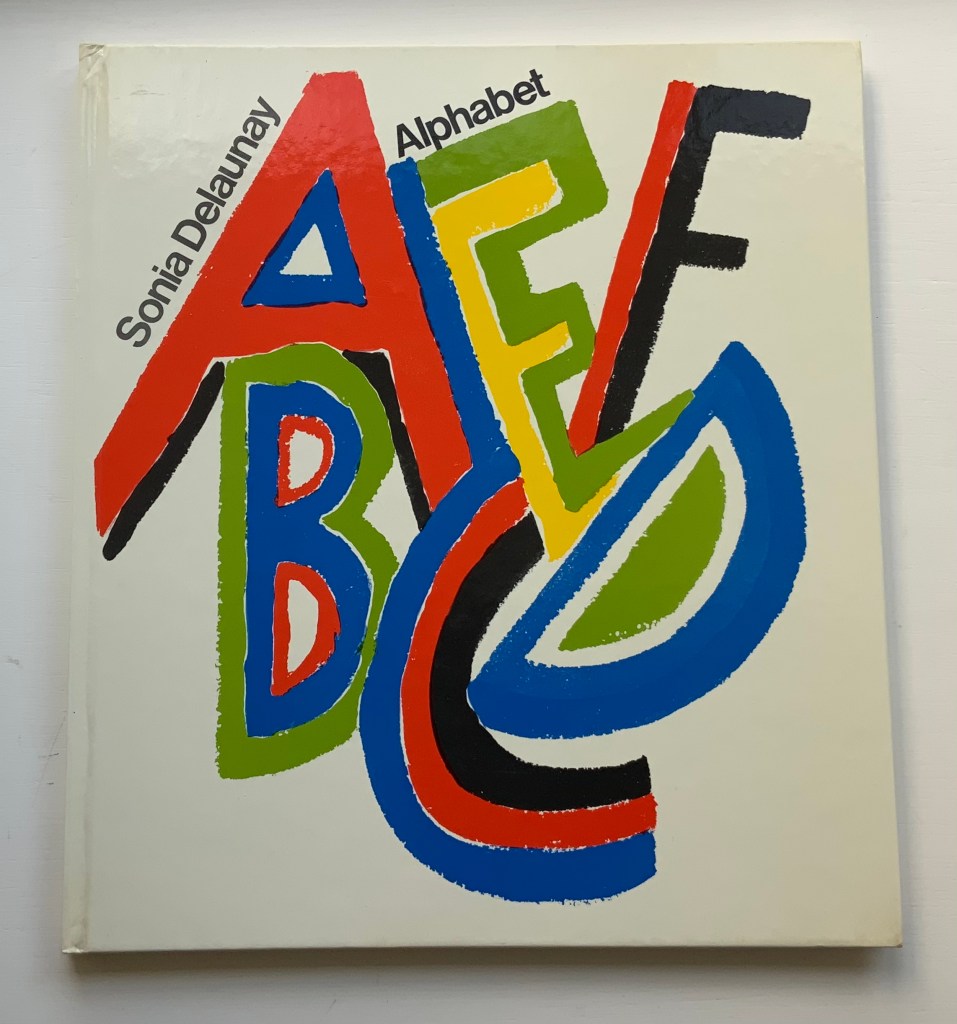
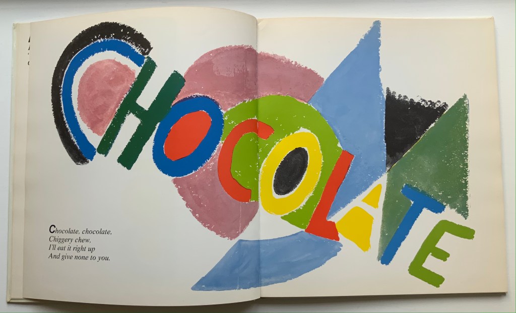
Alphabet (1972) Sonia Delaunay Casebound, illustrated paper over boards. H285 x W255 mm. 54 pages. Acquired from Argosy Bookstore, 7 August 2021. Photos: Books On Books Collection.
Building on a French scientist’s exposition of how perception of colors changes depending on the colors around them, Sonia and Robert Delaunay claimed that rhythmic, musical and spatial synesthetic elements were also at play. At least one page in Sonia Delaunay’s Alphabet suggests that this theory of simultanéisme may have extended to the sense of taste.
The lithographs that led to Alphabet appeared ten years before Delaunay’s death, so maybe it is greedy to wish for at least a fine press edition rather than this trade edition. Given the effort and inspiration needed to fuse the elements of alphabetic art with the elements of book art, it is definitely greedy to wish for an artist’s book edition.
Sonia Delaunay’s genius for merging colors, shapes, canvas, paper and fabric was celebrated in “Sonia Delaunay – A Retrospective” at the Tate Modern in 2015. Asserting a family bond with Delaunay, the artist Alla Malomane revived Maison Sonia Delaunay in 2014. In 2019, Kitty Maryatt re-created Delaunay and Blaise Cendrars’ famous work of book art, which they called le premier livre simultané — La Prose du Transsibérien et de la petite Jehanne de France. And more recently, the exhibition “Maison Sonia” appeared at the Kunstmuseen Krefeld in Germany. So perhaps Sonia Delaunay’s spirit endures, and a greedy wish may be fulfilled by some quarter. Since Maryatt’s effort, a pochoir revival certainly seems to be afoot.
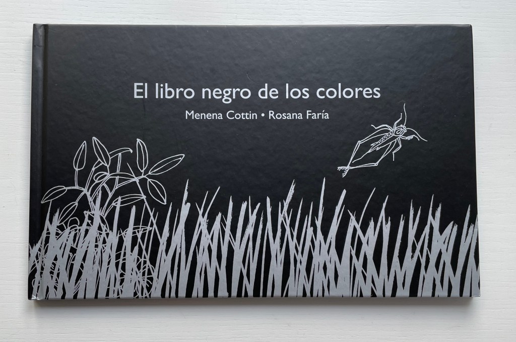
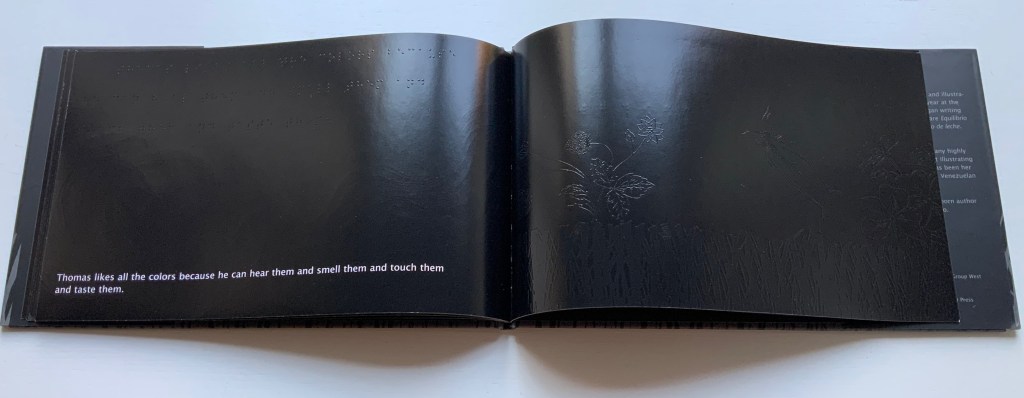
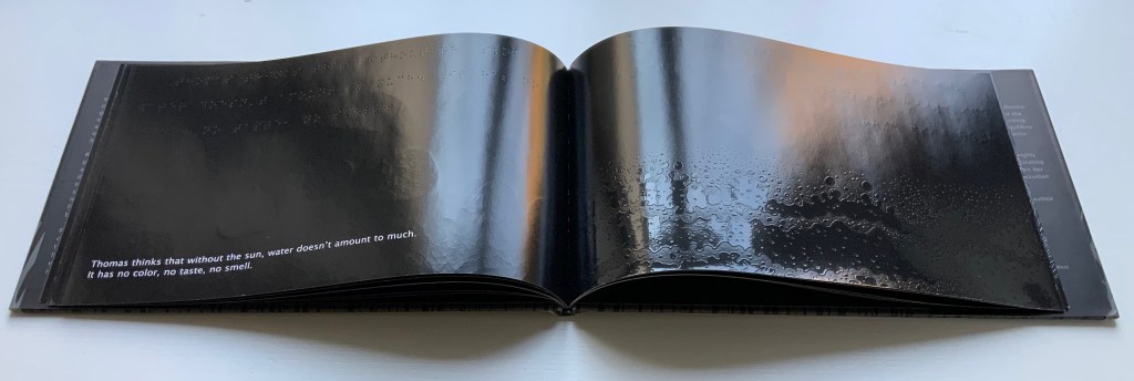
Menena Cottin refers to her works as “concept books”, and there are multiple concepts at work in The Black Book of Colors. Generically, it is a children’s book introducing the reader to colors — but by the absence of color. In white on black, it addresses sighted readers. In Braille, it addresses unsighted readers. With Thomas, who “likes all the colors because he can hear them and smell them and touch and taste them”, the book introduces to sighted and unsighted readers who are not synesthetic the concept of synesthesia and, through it, a new sense of empathy and imagination. The sighted encounter someone with a sensory anomaly, not a disadvantage. In the company of their imagined unsighted co-readers, the sighted may come to empathize with those with sensory differences. The unsighted encounter someone whose sensory anomaly is an advantage. especially as the book favors their own heightened sense of touch.
Thomas says that yellow tastes like mustard, but is as soft as a baby chick’s feathers.
Thomas likes all the colors because he can hear them and smell them and touch and taste them.
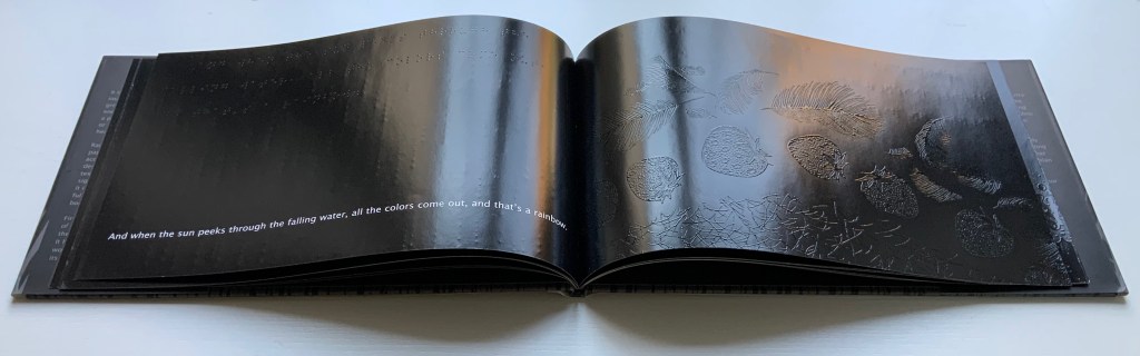
Breaking boundaries in ways similar to those employed by book artists, Cottin manipulates character and narration, also the picturebook’s genres of color recognition and letter recognition (Braille in this case) as well as some of the basic elements of the book (layout, printing in reverse-out and debossed printing). In one of the most sophisticated examples of this, double-page spreads fuse concepts by turning a rainbow into a gathering of raised images of the synaesthetic objects with which colors have already been associated in the book (chick’s feathers, strawberries, leaves).
And when the sun peeks through the falling water, all the colors come out, and that’s a rainbow.
The Black Book uses synesthesia to go beyond the color recognition genre to introduce more complex concepts: the nature of light and water’s lack of color, taste and smell. This stepping outside the genre is another example of the boundary-breaking that artists’ books often perform.
Thomas thinks that without the sun, water doesn’t amount to much. It has no color, no taste, no smell.
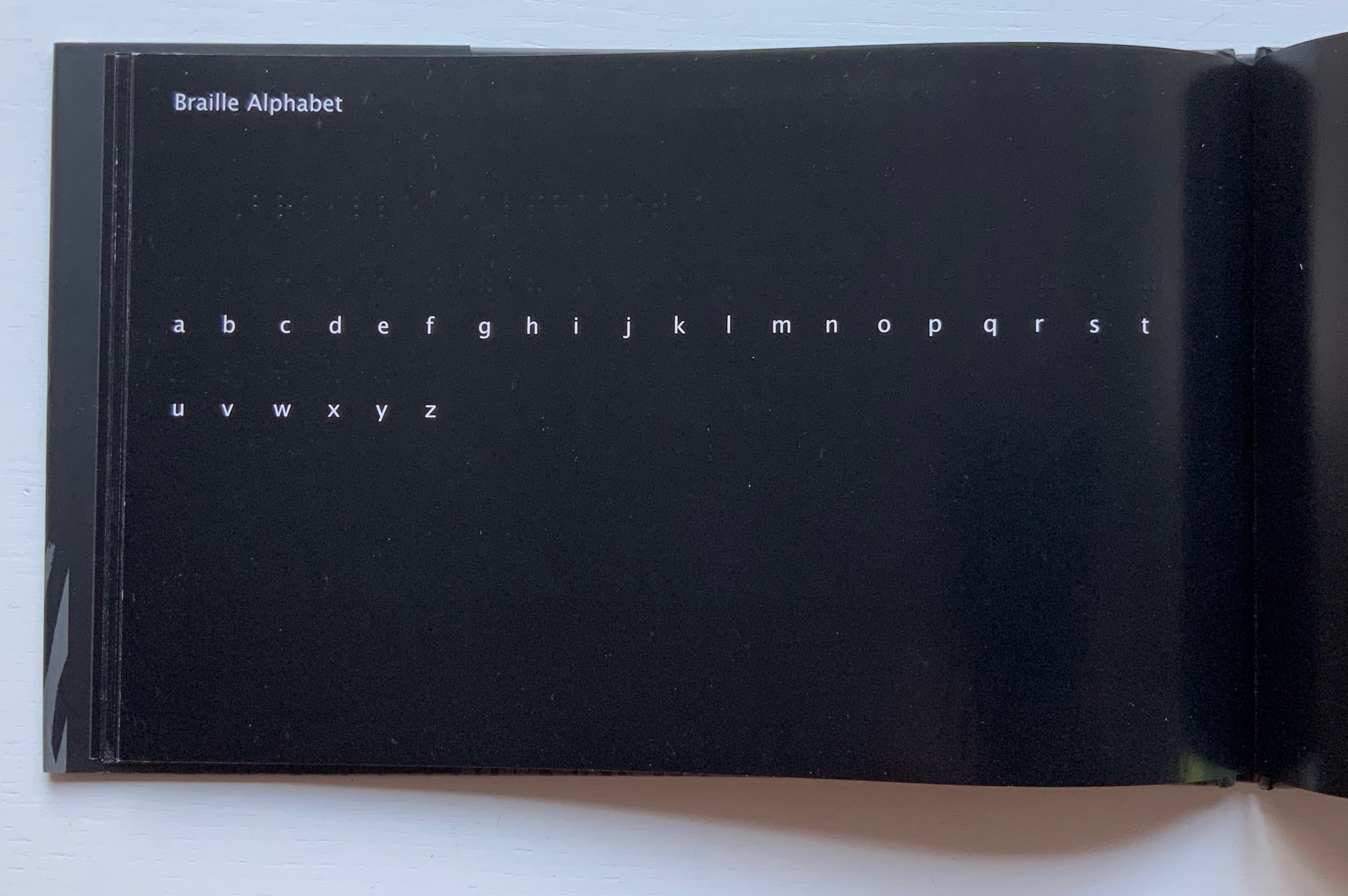
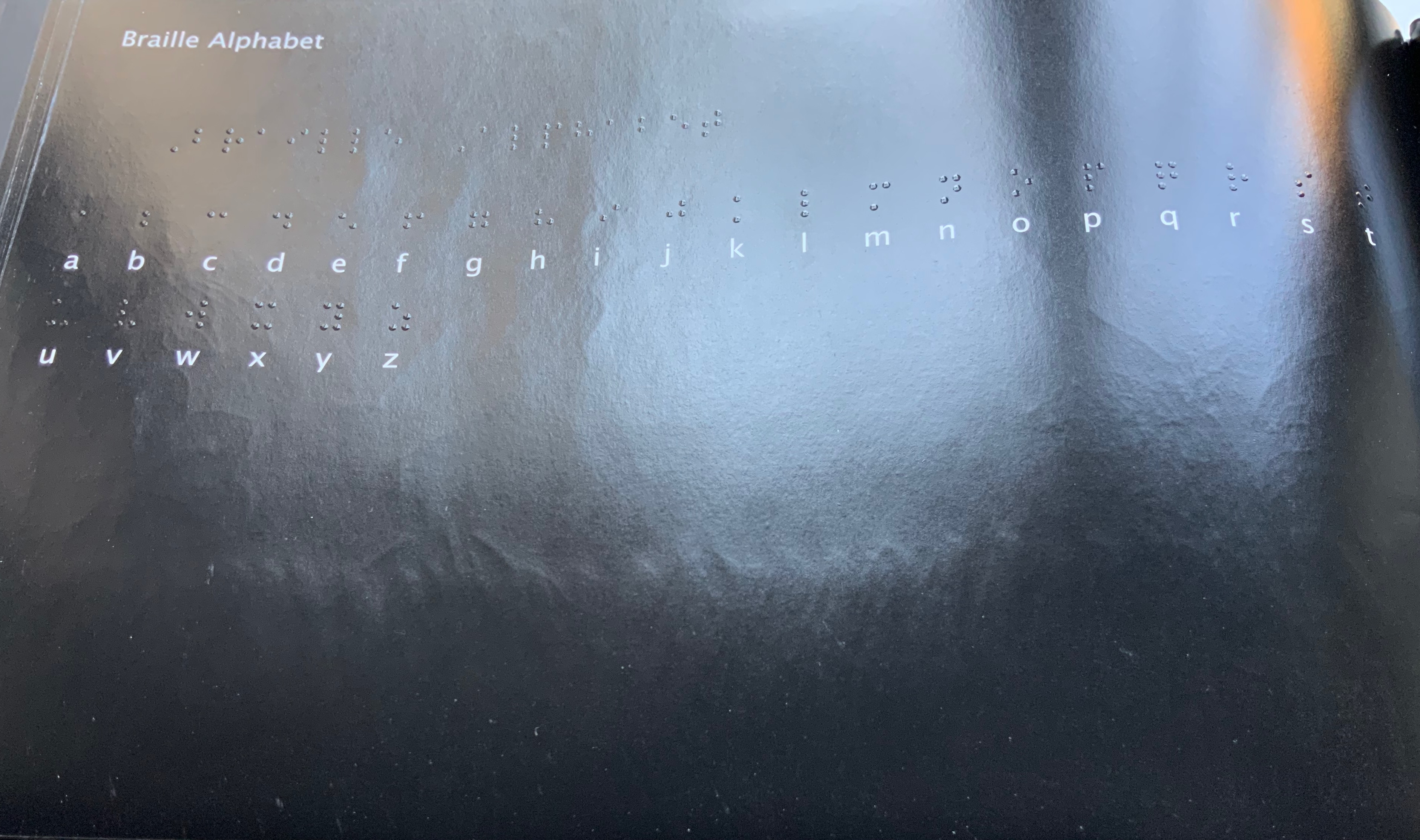
The book ends by asserting its membership in the alphabet book genre by presenting the alphabet in lowercase white on black and in Braille. Across from this verso page, there is no set of raised images on the recto page as there has been so far throughout the book. Knowing from touch that this is the end of the book and noting the absence of any image, sighted and unsighted readers might find this coda a prompt to return to the beginning and “re-read” the images with a greater reliance on touch.
Other books in the Books On Books Collection worth comparing with The Black Book of Colors are
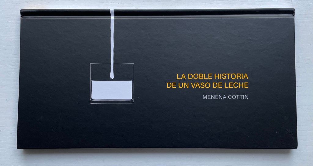
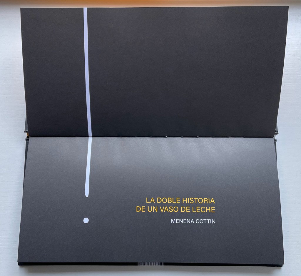
La Doble Historia de un Vaso de Leche(2019) Menena Cottin Casebound landscape, paper over boards, with orange-yellow doublures, sewn. H160 x W310 mm. 24 unnumbered pages. Acquired from the artist, 2022. Photos: Books On Books Collection.
The Double Story of a Glass of Milk opens and closes with a line that echoes the start of William Carlos Williams’ “The Red Wheelbarrow” but is at once more straightforward and just as surprising — as the visual story spills out.
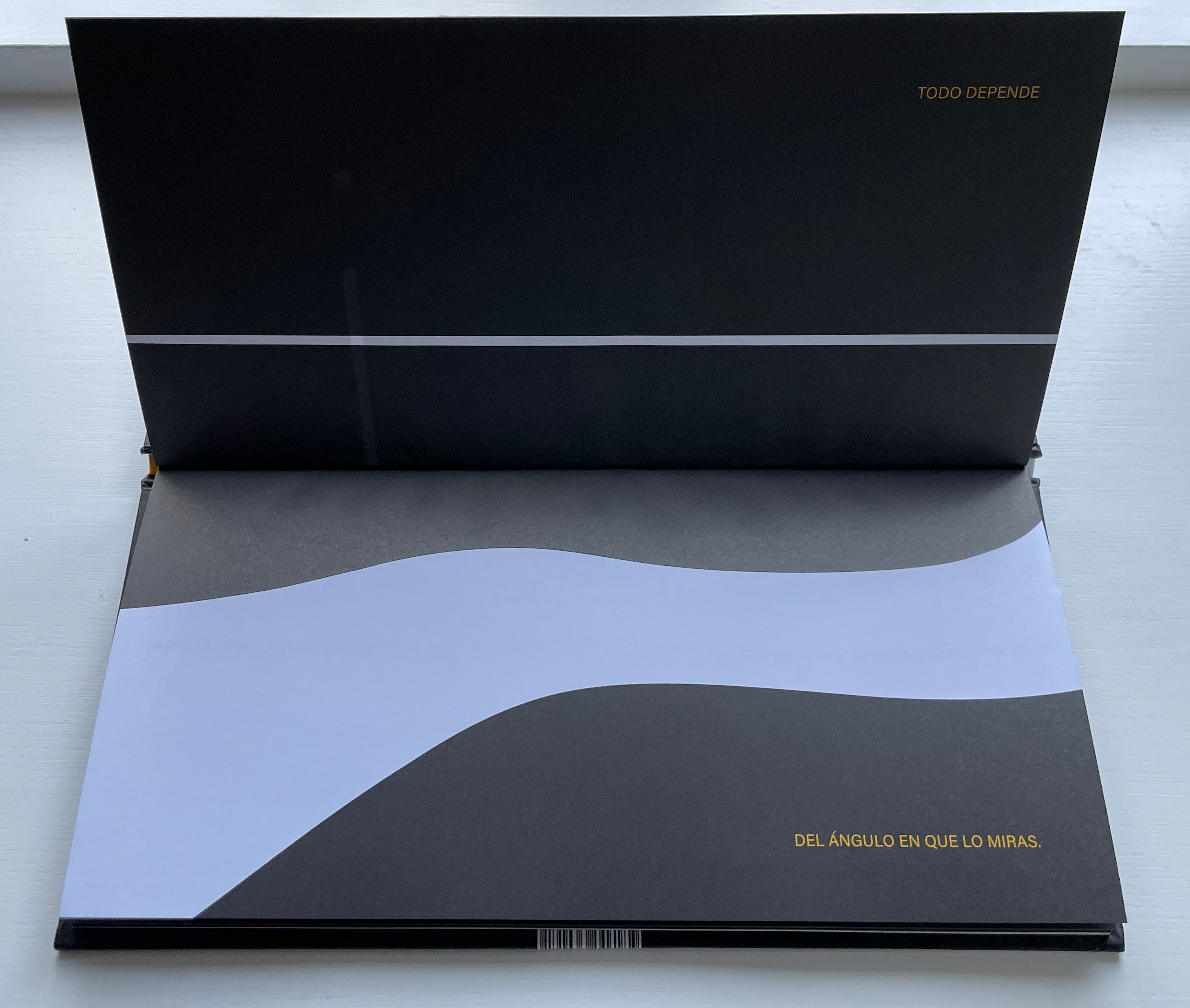
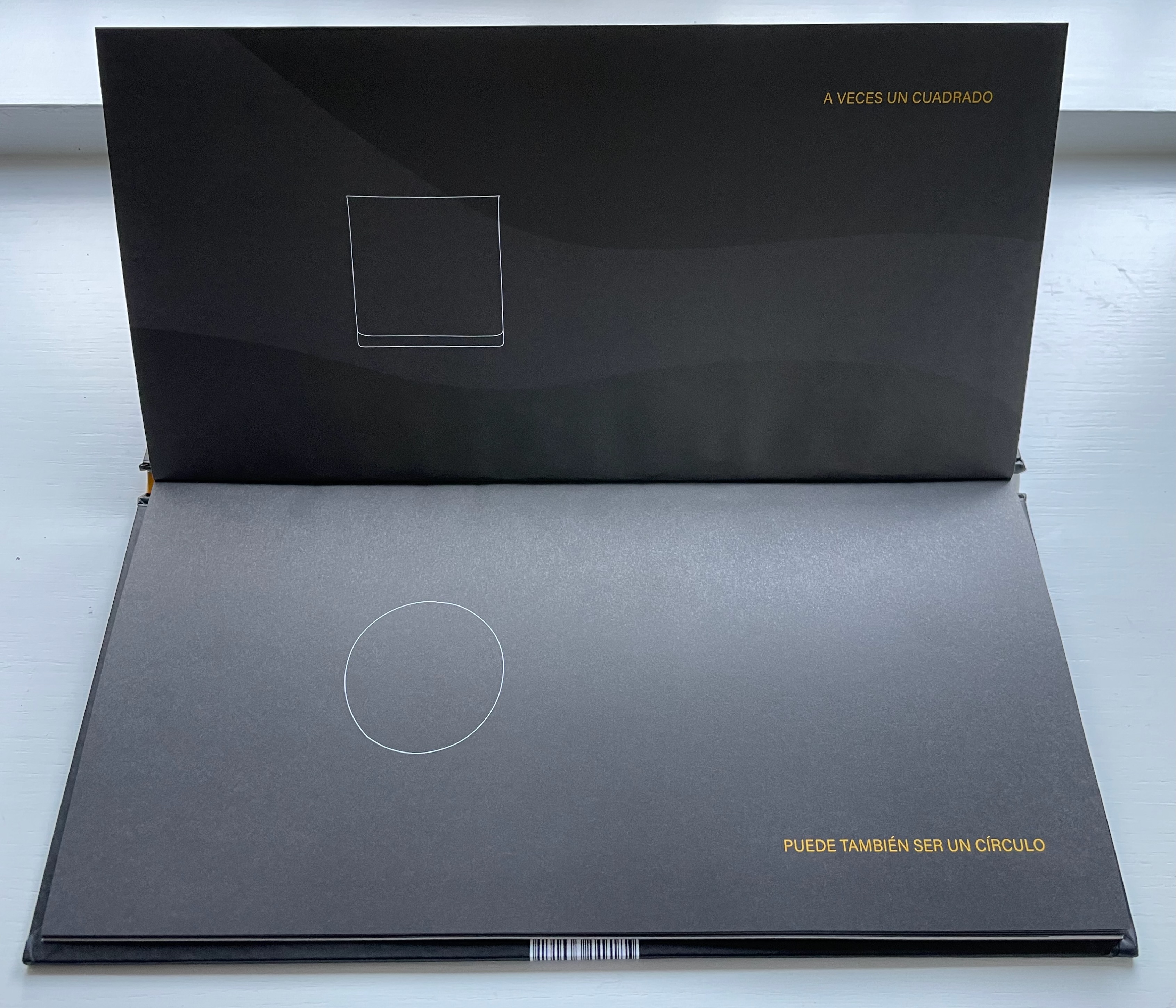
Todo depende del ángulo en que lo miras. A veces un cuadrado puede también ser un circulo y una larga linéa luce como un punto y algo que está solo a medias parece que está lleno. Un mismo cuerpo tiene diferentes caras per a veces te confunde mostrándote una misma forma. Solo si miras a su alrededor descubres que … eso que de frente parece tan discreto desde arriba luce muy escandaloso. Todo depende del ángulo en que lo miras.
“Everything depends on the angle from which you look at it. Sometimes a square can also be a circle and a long line looks like a dot and something only half full looks full. The same body has different faces but sometimes it confuses you by showing you a different shape. Only if you look you discover that … what from the side looks so innocent looks shocking from above. Everything depends on the angle from which you look at it.”
Equilibrio (2019)
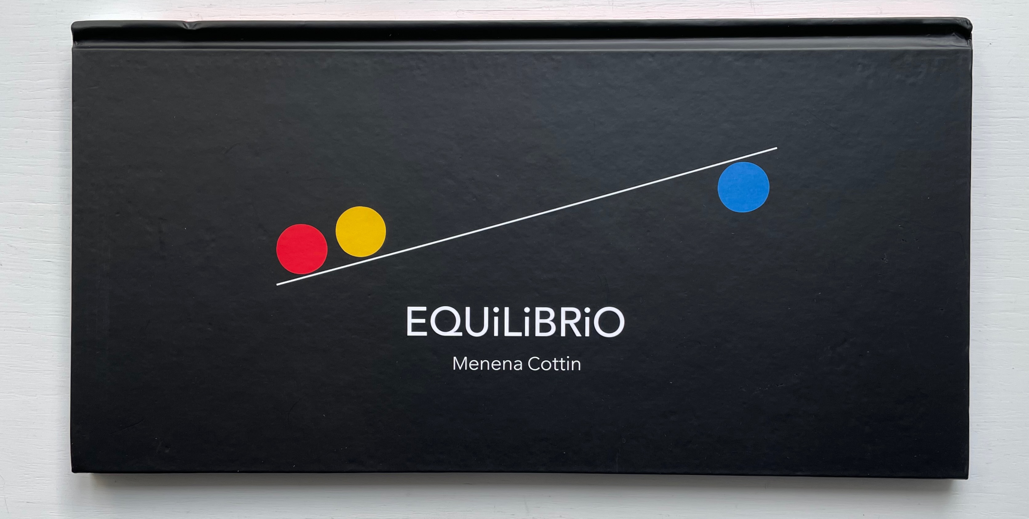
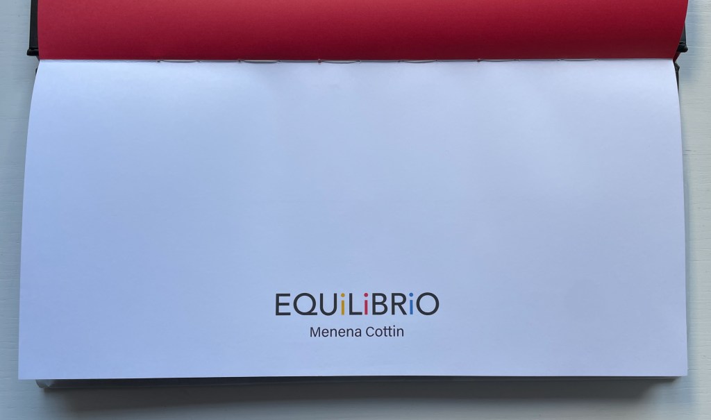
Equilibrio(2019) Menena Cottin Casebound landscape, paper over boards, with red doublures, sewn. H160 x W310 mm. 25 unnumbered pages, last page on inside of flyleaf. Acquired from the artist, 23 August 2022. Photos: Books On Books Collection. Displayed with the author’s permission.
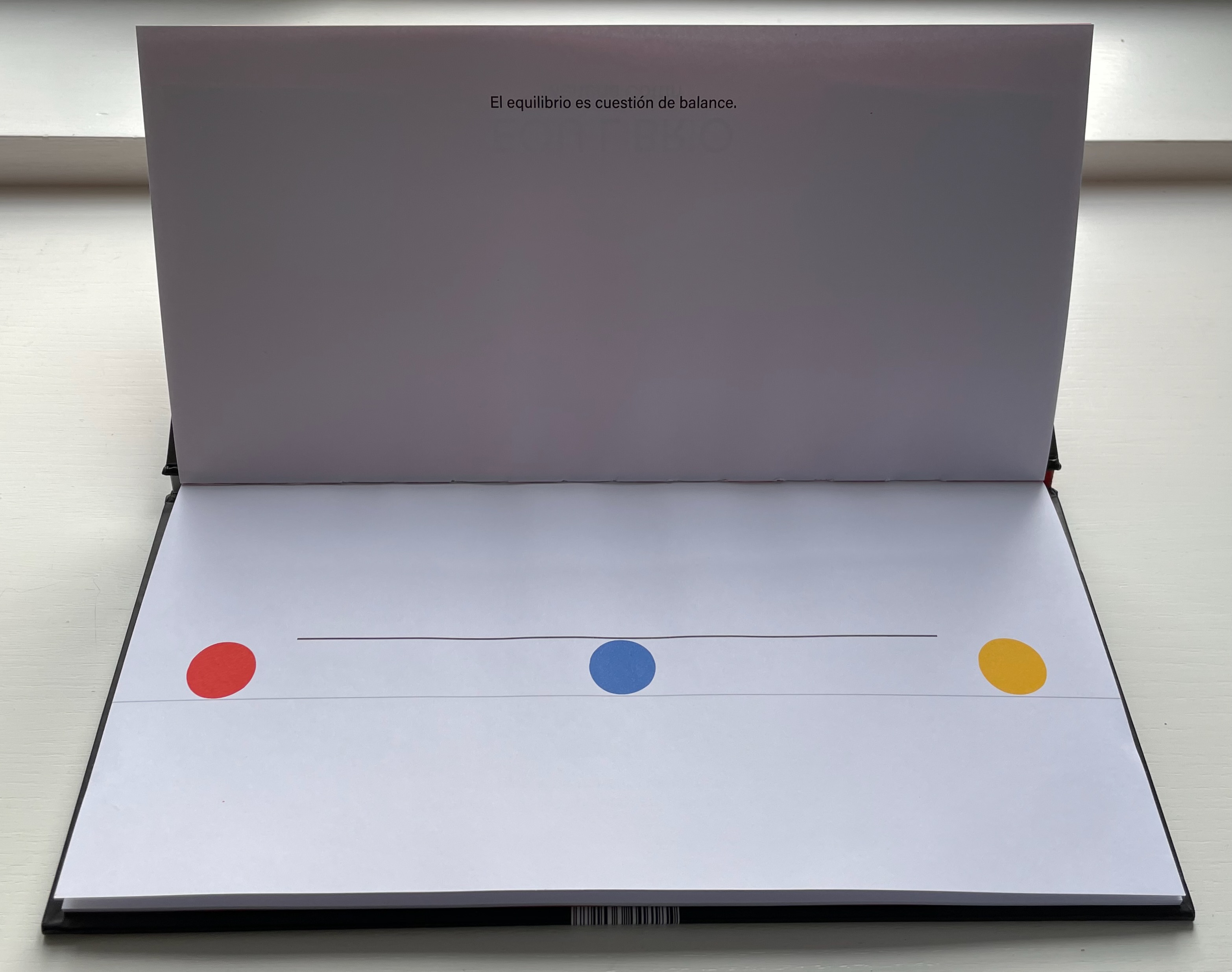
The three colored balls on the cover give their colors to the three i’s in Equilibrio on the title page, announcing the statement to come: El equilibrio es cuestión de balance (“Equilibrium is a question of balance”).
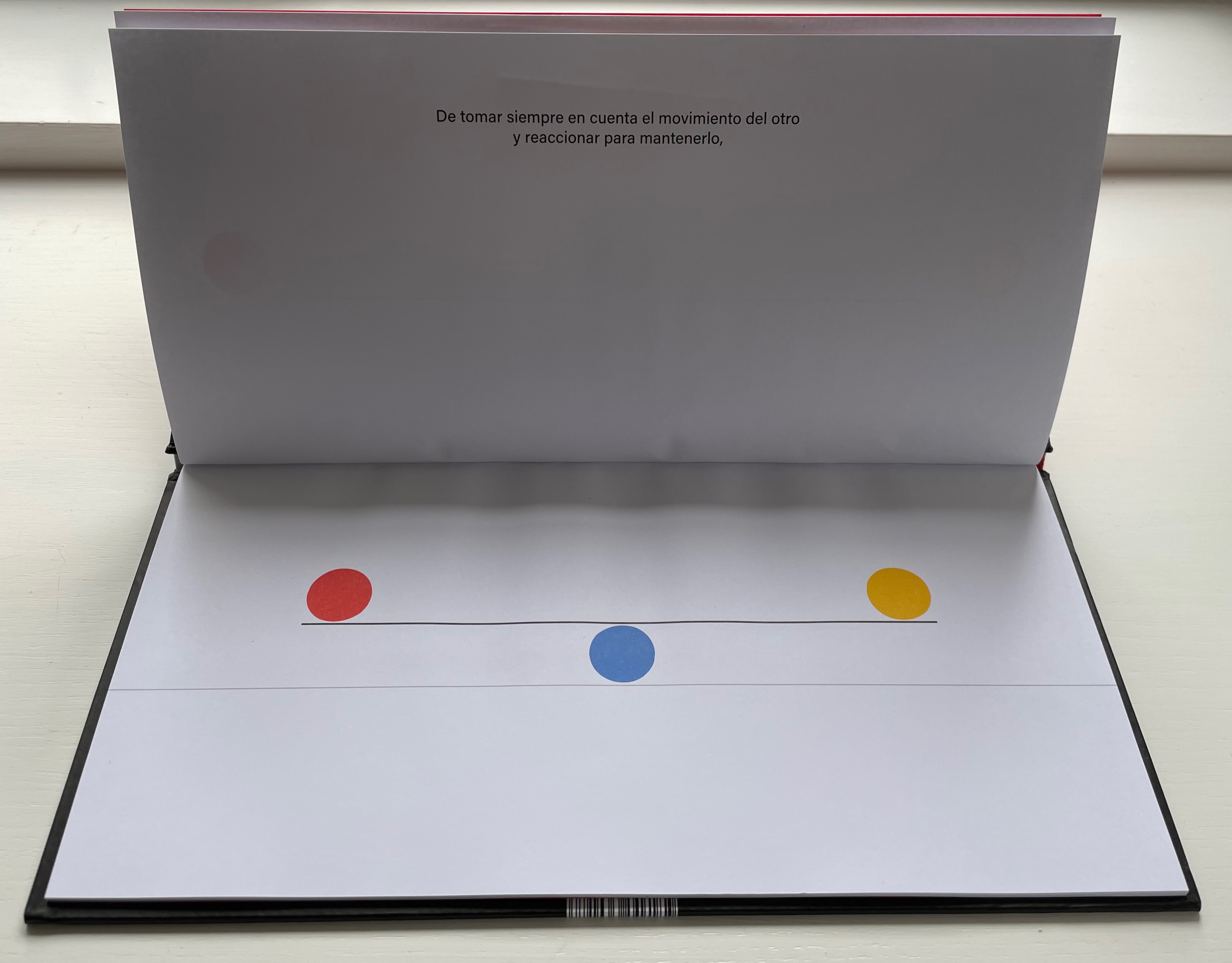
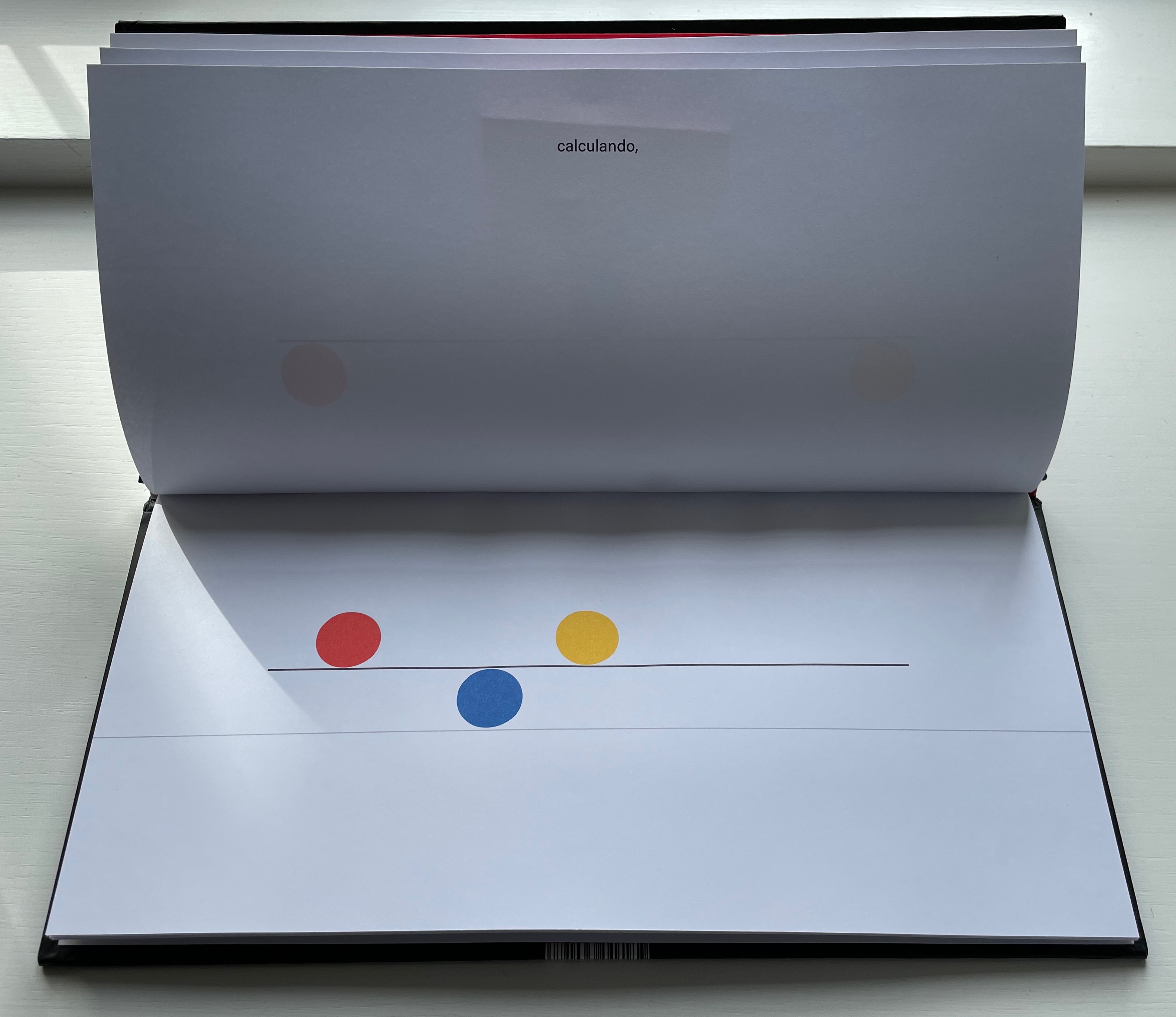
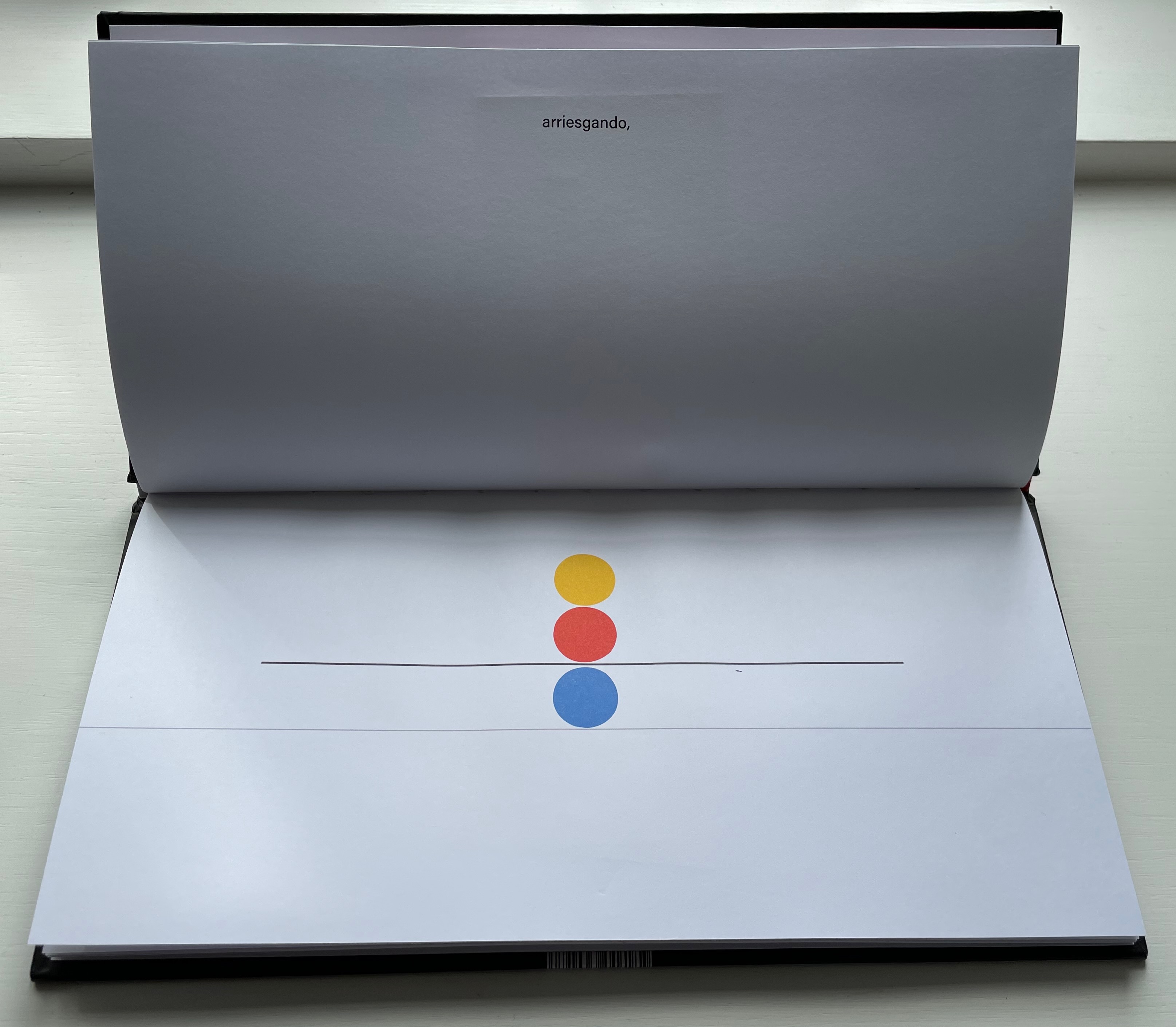
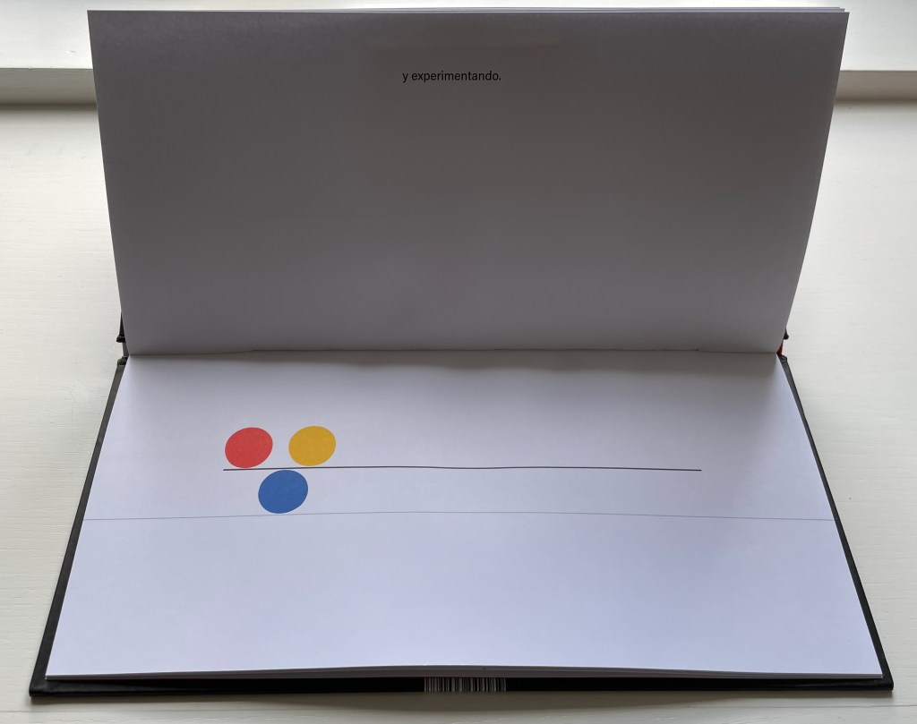
El equilibrio es cuestión de balance. De tomar siempre en cuenta el movimiento del otro y reaccionar para mantenerlo, calculando, arriesgando, y experimentado. Algunos se ponen a jugar sin pensar en las consecuencias entonces se rompe el equilibrio y cada quien hace lo que quiere … pero luego sienten deseos de regresar y cada quien busca su lugar.
“Equilbrium is a question of balance. Of always taking into account the movement of the other and reacting to maintain it, calculating, risking, and experimenting. Some people start to play without thinking about the consequences, then the balance is broken and everyone does what they want … but then they feel the desire to return and everyone looks for their place.”.
As in The Black Book of Colors, there is more than one concept at play, the lesson of equilibrium coming with lessons in community and relationships.
El Tiempo (2018)
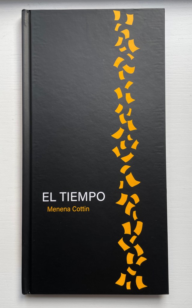
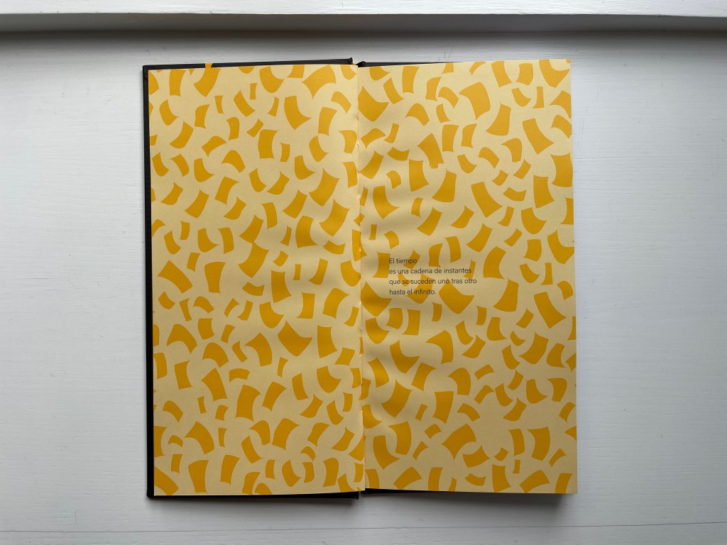
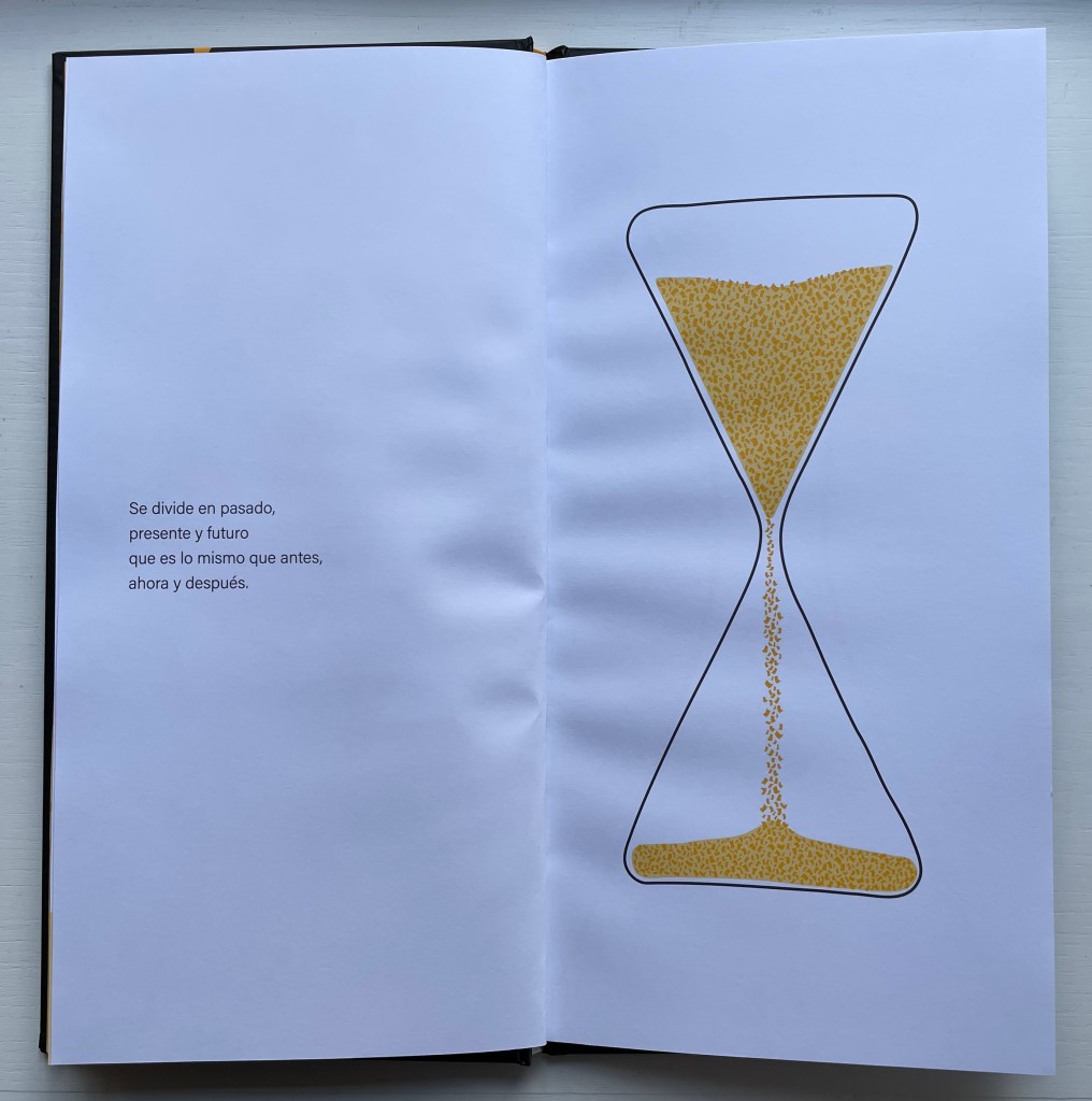
El Tiempo (2018) Menena Cottin Casebound portrait, paper over boards, with orange-yellow doublure at front, orange-yellow/black at back, sewn. H310 x W160 mm. 24 unnumbered pages. Acquired from the artist, 23 August 2022. Photos: Books On Books Collection. Displayed with author’s permission.
Cottin introduces the concept of Time with two metaphors — one verbal, one visual.
Verbally: El tiempo es una cadena de instantes que se suceden uno tras otro hasta el infinito. [Time is a chain of instants one following another until infinity.] Visually: Instants of time are like pages, pages from a diary.
Even in an hour glass, the instants of time are golden pages — Se divide en pasado, presente y futuro que es lo mismo que antes, ahora y después. — [dividing the past, present and future which is the same as before, now and after].
When the future runs out, that is of course when the pages run out, visually and tactilely.
Ana con A, Otto con O (2015)
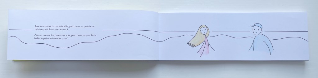
Ana con A, Otto con O (2015) [Ana with an A, Otto with an O] Menena Cottin Bradel binding with cloth spine, paper over boards, yellow doublures, leaves in Chinese fold. H85 x W260 mm. 42 unnumbered pages. Acquired from the artist, 23 August 2022. Photos: Books On Books Collection. Displayed with author’s permission.
With this little book, Menena Cottin has secured a place among the Oulipians. Where Georges Perec wrote a novel without the letter E, Cottin has written and created an artist’s book in which the characters have a somewhat opposite challenge.
Ana es una muchacha adorable, pero tiene un problema: habla español solamente con A. Otto es un muchacho encantado, pero tiene un problema: habla español solamente con O. Un domingo por la mañana, en isla de Margarita, Ana sale a caminar por la playa. Otto sale a caminar por la playa. De repente, Ana se tropieza con alguien … –Aah! –Oh!
[Ana is a lovely girl, but she has a problem: she speaks Spanish only with words that have an A. Otto is a lovely boy, but he has a problem: he speaks Spanish only with words that have an O. One Sunday morning, on Margarita Island, Ana goes for a walk on the beach. Otto goes for a walk on the beach. Suddenly, Ana bumps into someone … –Aah! –Oh!]
When they make small talk about the weather, Ana says, Clara mañana [Clear tomorrow] with which Otto agrees, Con sol [With sun]. Ana tries again with a leading Gran playa, la mar calmada … agradar andar acá. [Great beach, calm sea… it’s nice to walk here.], but Otto can only come up with ¡Como, no! [Of course!].
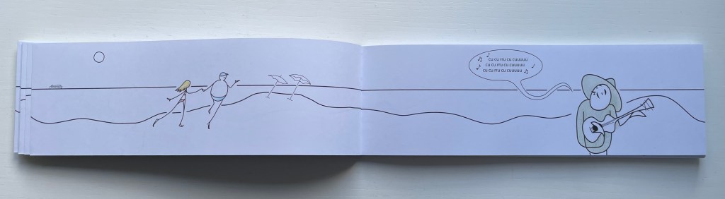
Eventually Otto catches on and proposes they go for a swim. After, as they walk along the beach being serenaded by a guitar-playing singer whose nonsense refrain is with syllables that have only U, Otto invites Ana to lunch at the beachside restaurant El Pez [The Fish]. There they meet the friendly waiter Pepe, who likewise has a problem: he speaks Spanish only with words that have an E. When their meal ends and Otto sees the bill, he grows pale, suspiciously throws himself to the ground, cries out he’s been poisoned, and then runs off with Pepe in pursuit of payment. Poor Ana wanders back down the beach, but bumps into another character, more handsomely drawn and simpatico: Allan with an A. Colorín colorado, as the Spanish say [And that’s the end of this story], but not until the last page where the character who has been lounging in a beach chair all along now stands, revealing her name on her chair — Iris — and holding a sign that reads Fin.
The rule-abiding dialogue strings the reader along as effectively as the horizon line that runs from page to page over the Chinese folded folios from the beginning to the end. It is a design feature that will be much easier to reproduce than will a translation into English or any other non-Romance language that is as delightful as — or as “consonant” with — Ana, Pepe, Iris, Otto and the singer singing
Las Letras (2008/2018)
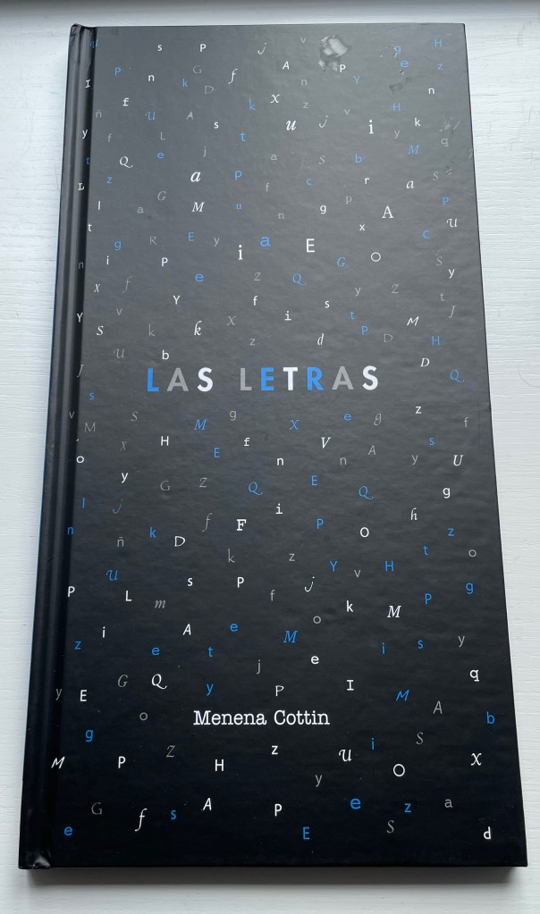
Las Letras (2018) [Letters] Menena Cottin Casebound portrait, illustrated paper over boards, endpapers. H200 x W205 mm. 24 unnumbered. Acquired from the artist, 23 August 2022. Photos: Books On Books Collection. Displayed with author’s permission.
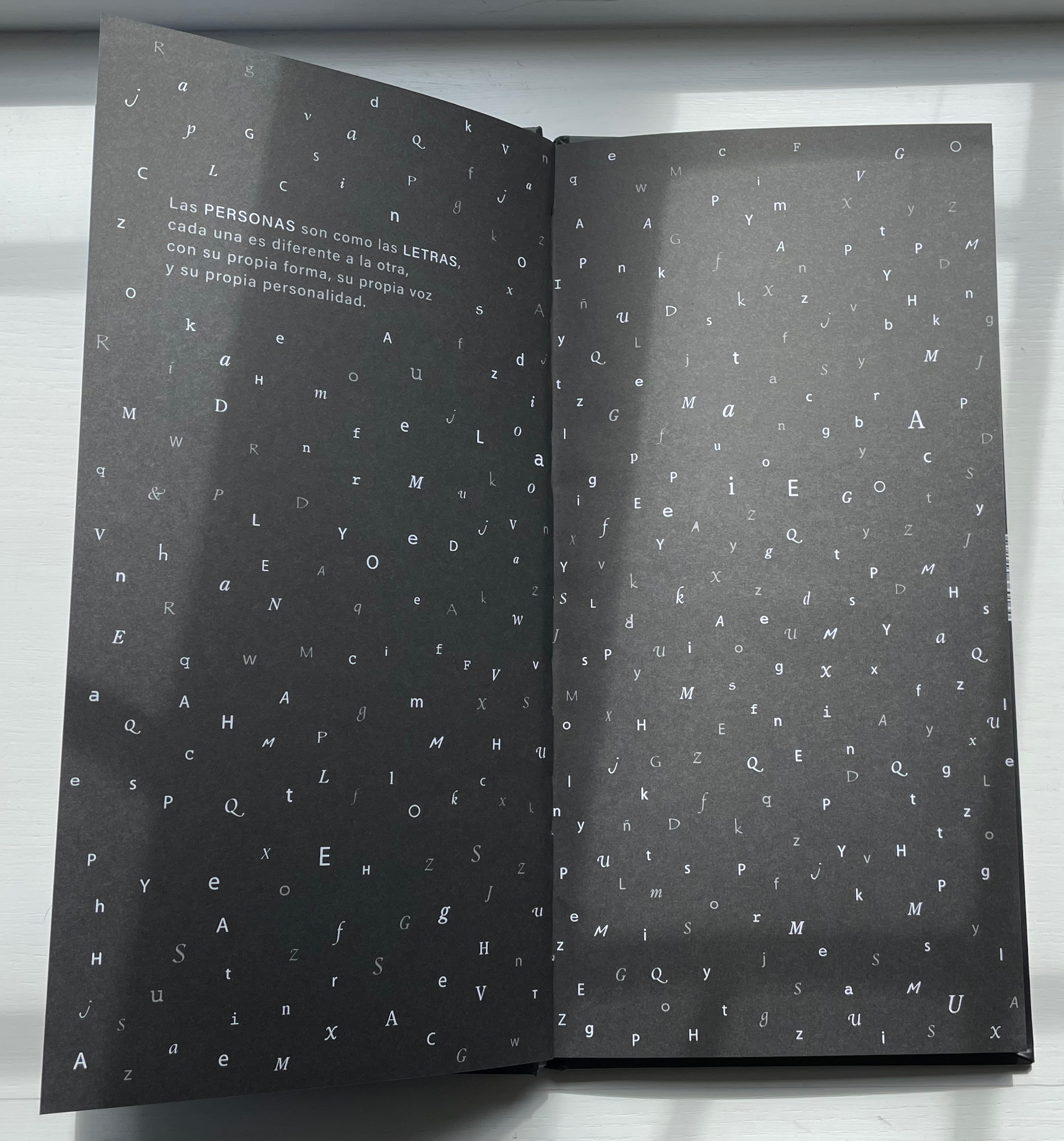
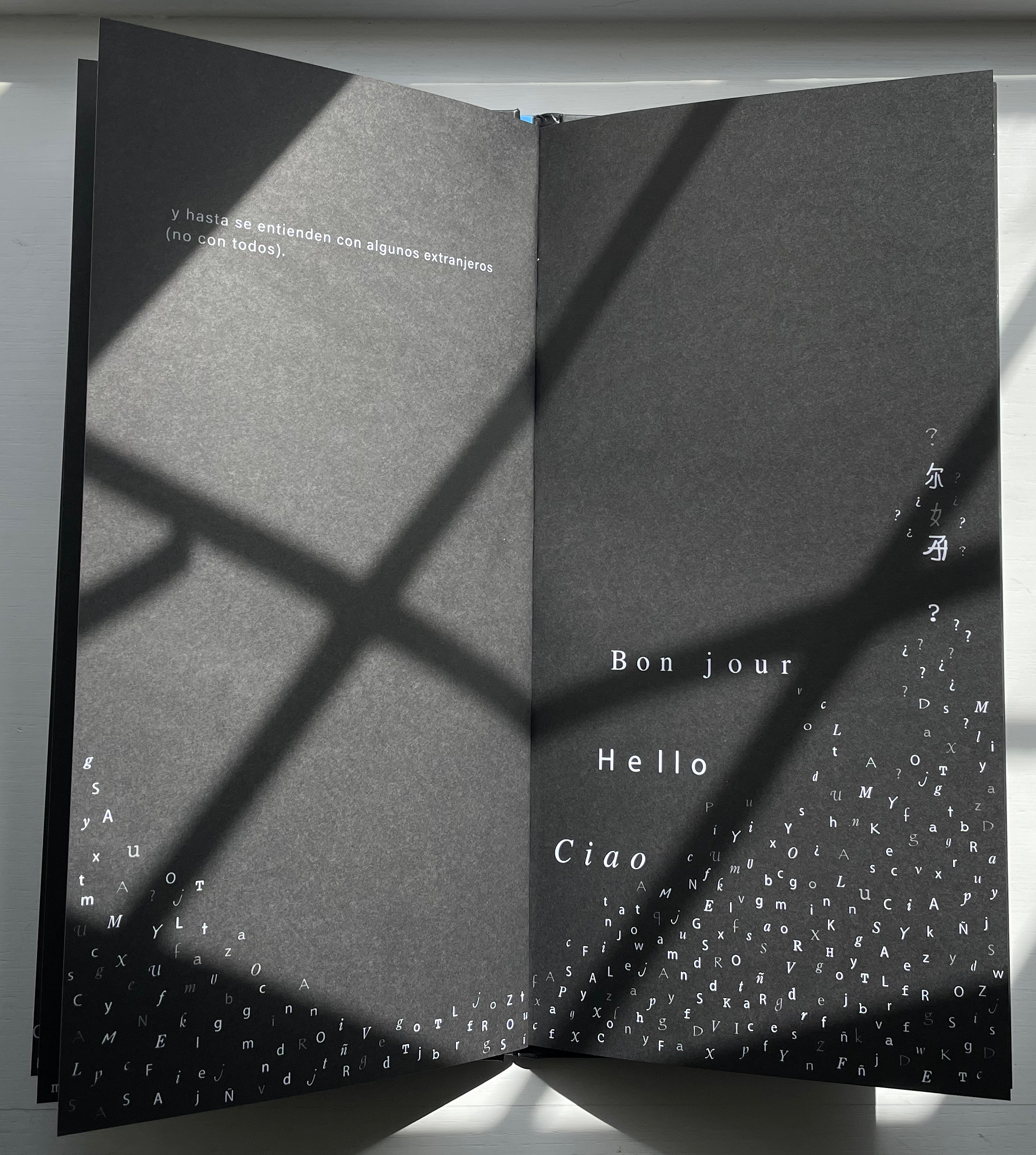
Las Letras has appeared in two editions (2008 and 2018). There are slight grammatical differences, but the meaning remains unchanged. As in Equilbrio, where Cottin finds in an abstract concept a metaphor for interdependence in human relationships, in Las Letras Cottin finds a metaphor for tolerance and communication in the alphabet. Even letters themselves celebrate our differences.
Las personas son como las letras, cada una es diferente a la otra, con su propia forma, su propia forma, su propia voz y su personalidad. Pueden ser gordas, flacas, sencillas o complicados. Algunas son muy populares y se les ve por todas partes, en cambio, a las más tímidas les gusta salir poco. …
[People are like letters, each one is different from the other, with its own form, its own shape, its own voice and its own personality. They can be fat, skinny, simple or complicated. Some are very popular and are seen everywhere, while the shyer ones don’t like to go out much. …]
Other children’s/artists’ books in the Books On Books Collection worth comparing with Las Letras are:
Nikolajeva, Maria, and Carole Scott. 2007. How picturebooks work. New York: Routledge Taylor & Francis Group.
Outlaw, Christopher. 17 April 2017. “FILBo 2017“. The Bogotá Post. Accessed 30 October 2011.
Scott, Carole. 2014. “Artists’ books, Altered books, and Picturebooks”. In: B. Kümmerling‐Meibauer, ed.,Picturebooks: Representation and Narration. London, New York: Routledge.
Animalphabet (1996) Department of Special Publications, The Museum of Metropolitan Art Hardcover, casebound sewn. H120 x W150 mm, 60 unnumbered pages. Acquired from Aardvark Books, 1 August 2021. Photos: Books On Books Collection.
Animalphabet is a reminder of the close connection between animals and alphabet books. Think of the several same-titled works, e.g., Julia Donaldson’s Animalphabet (2018) or Sharon Werner and Sharon Forss’ AlphaBeasties (2009) or Alan James Robinson and Suzanne Moore’s A Fowl Alphabet (1986). It also highlights an aspect of book art.
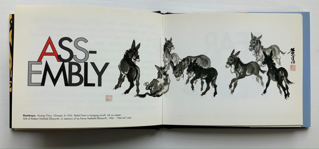
Although the museum’s little book does not rise to the level of art, its self-reflective textual/visual puns are a hallmark of much book art. In it, the museum staff selects an ink scroll depiction of donkeys by Huang Chou for “Ass-embly”, François Pompon’s Polar Bear for “Bear Minimum”, and a 10th-11th-century bookcover carving of the emblem of Luke the Evangelist for “Holy Cow”. The Met’s choice of Pompon’s Minimalist bear to pun on the art movement comes closest to the rampant punning of homages to Ed Ruscha’s “various” iconic works of book art, distilled in Various Small Books (MIT Press, 2013).
Because it is hard to think of a textual/visual/genre pun among artists’ books that is more multilevel than the Met’s final letter, the little book should have the last word.
Alphabetical Order: How the Alphabet Began (1998) Tiphaine Samoyault Casebound, illustrated glossy paper over boards, decorated doublures. H270 x W195 mm. 32 unnumbered pages. Acquired from World of Books, 15 August 2022. Photos: Books On Books Collection.
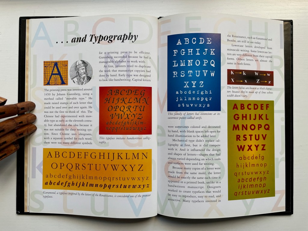
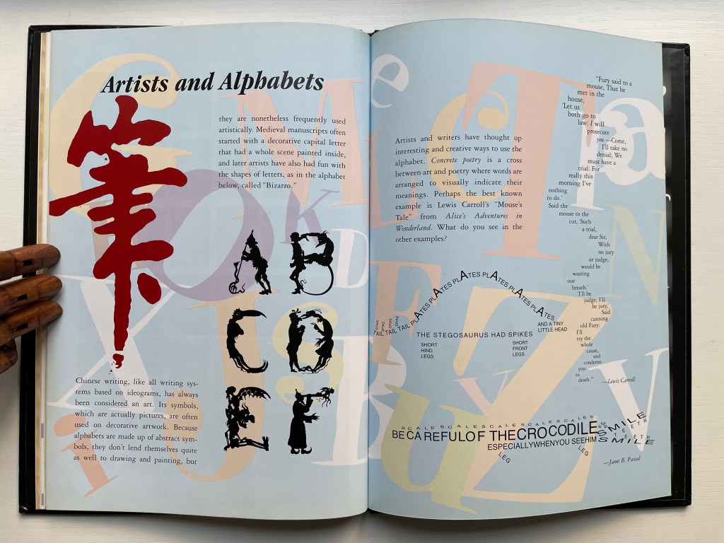
Alphabetical Order is a translation. Its original title — Le Monde des pictogrammes (Paris: Circonflexe, 1996) — better reflects the well-illustrated character of the book. The images, the hand lettering, the ghost-printed background and handling of color are constant reminders of the pictographic roots of most alphabets and writing systems. The final section — Artists and Alphabets — punctuates those reminders. In fact, the book’s endpapers act as quotation marks around the point.
Diringer, David, and Reinhold Regensburger. 1968. The alphabet: a key to the history of mankind. London: Hutchinson. A standard, beginning to be challenged by late 20th and early 21st century archaeological findings and palaeographical studies.
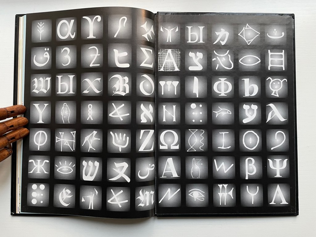
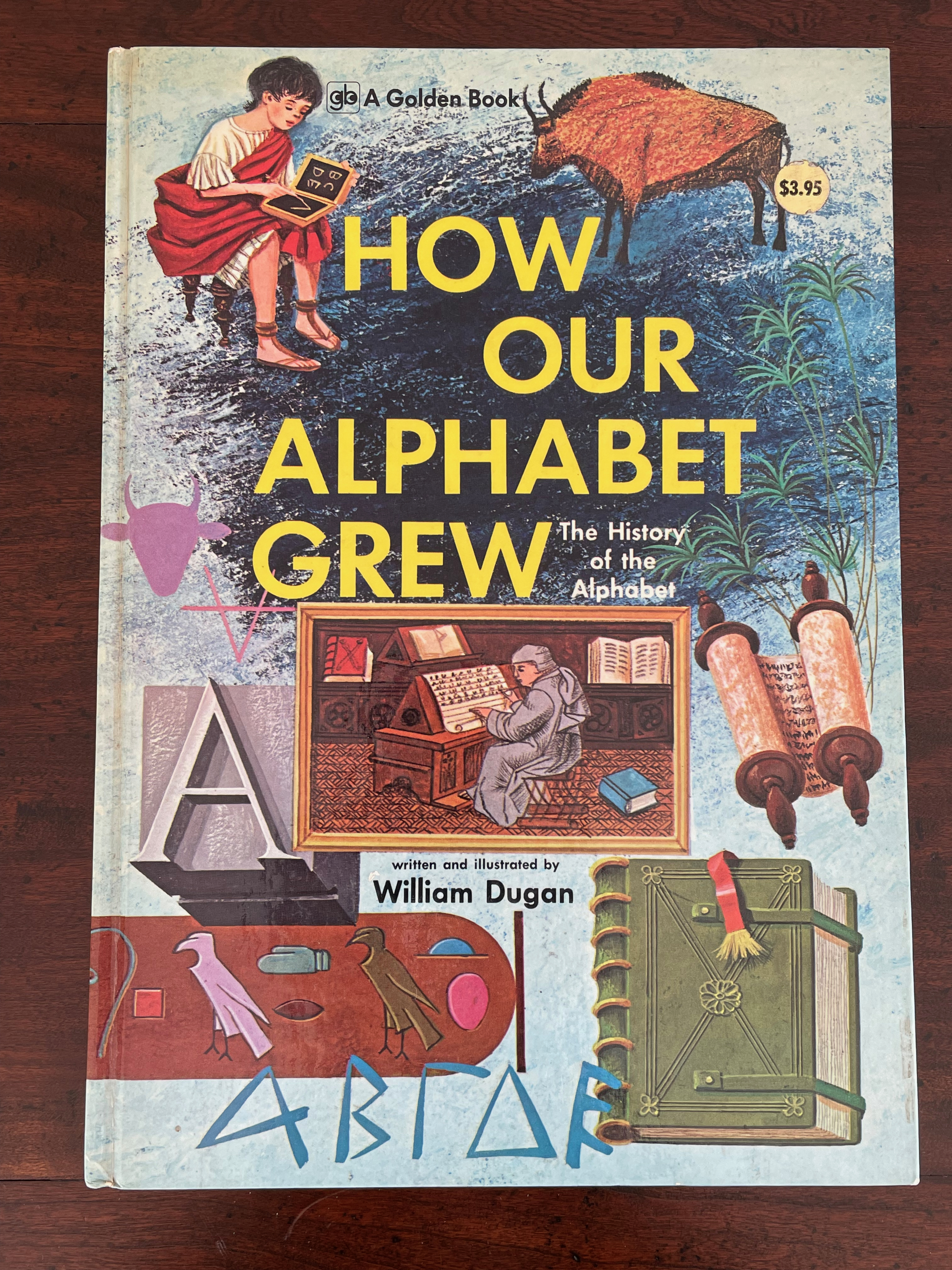
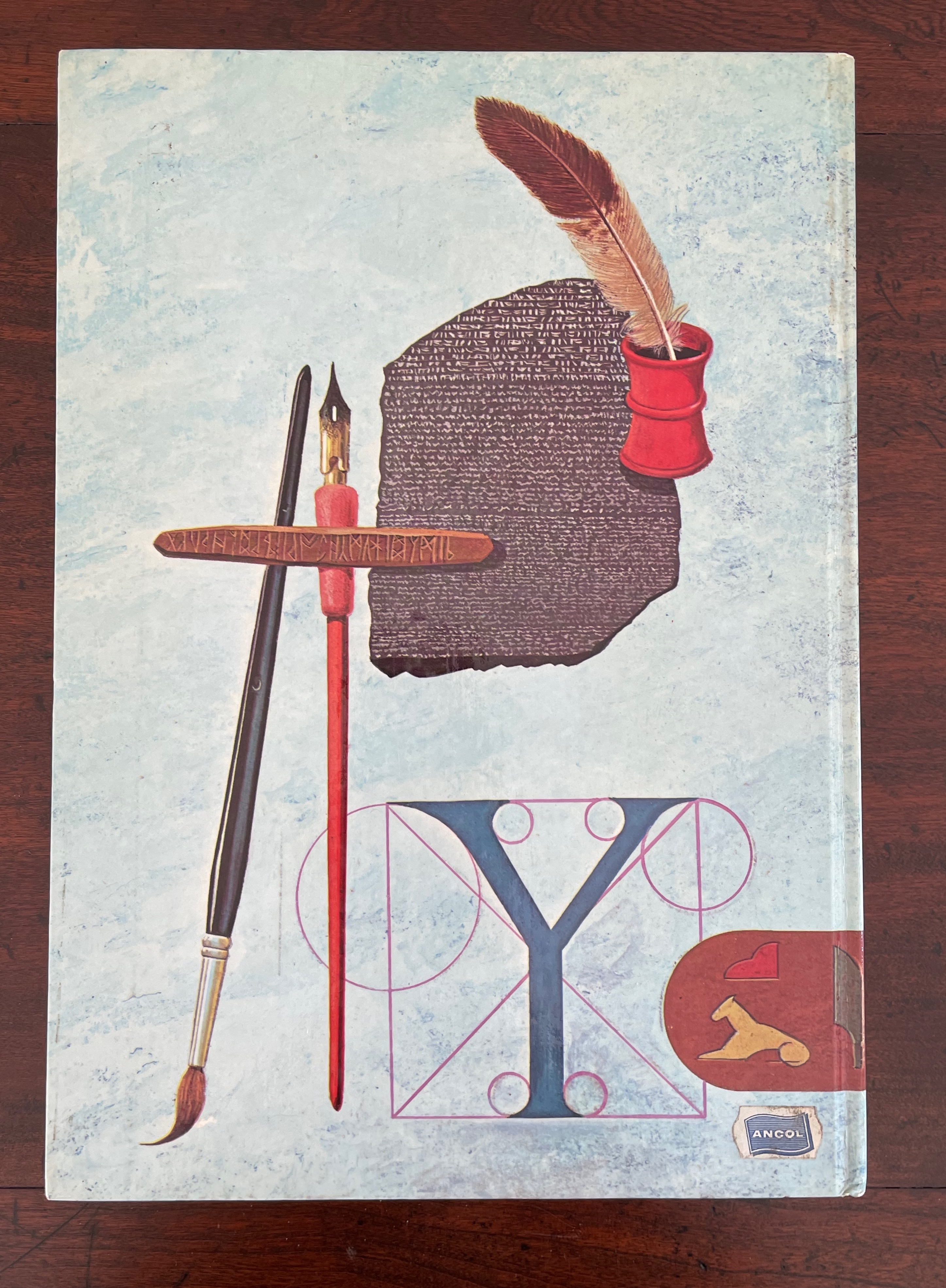
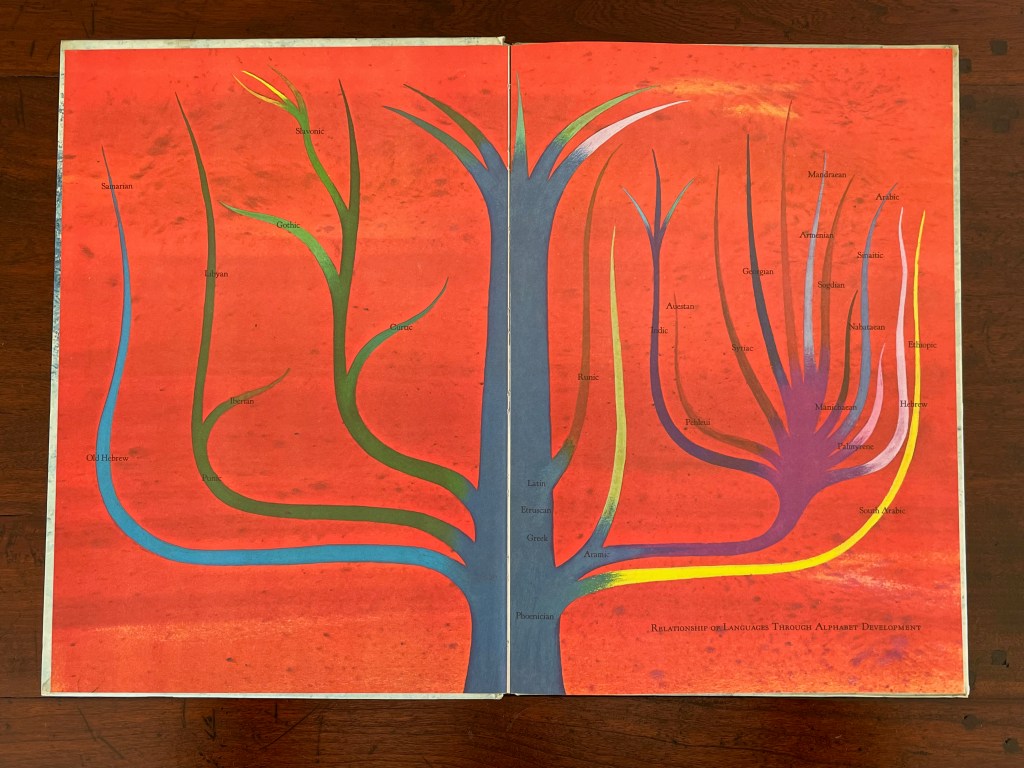
How Our Alphabet Grew: The History of the Alphabet(1972) William Dugan Casebound, illustrated paper on board, illustrated endpapers and pastedowns. H320 x W227 mm. 72 pages. Acquired 14 March 2023. Photos: Books On Books Collection.
Curiously, little information about William Dugan appears online. He was a prolific illustrator of children’s books — especially those published by Golden Press in the 1960s and 1970s. He also authored as well as illustrated several early childhood books — on insects, signs, machines and vehicles. Two of his books, however, are meant for older children — this one and All about Houses (1975), which is a forerunner to Dorling Kindersley‘s children’s reference books.
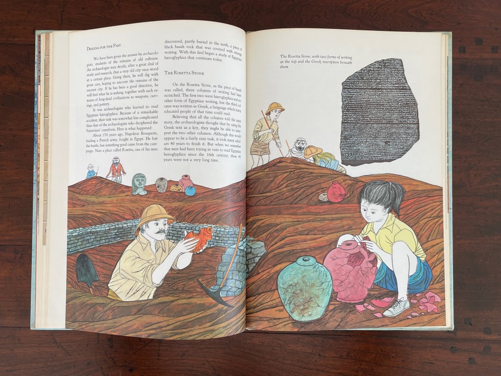
Dugan’s ability to alter his style as writer and illustrator to the ages of his audience is notable. Even more notable is the diversity and inclusiveness of his reference works for older children. Despite the date of publication, a young girl occupies the foreground of the illustration of archaeologists, a feature that would have brought a smile to Ada Yardeni and still might to Tiphaine Samoyault.
Diringer, David, and Reinhold Regensburger. 1968. The alphabet: a key to the history of mankind. London: Hutchinson. A standard, beginning to be challenged by late 20th and early 21st century archaeological findings and palaeographical studies.
The invention of writing and subsequently the alphabet is a fascinating subject. With every archaeological discovery and paleographic insight, clarity and nuance and mystery increase. Sympathies to the children’s book authors and publishers who attempt to capture and hold their readers’ attention and do them and the domain justice.
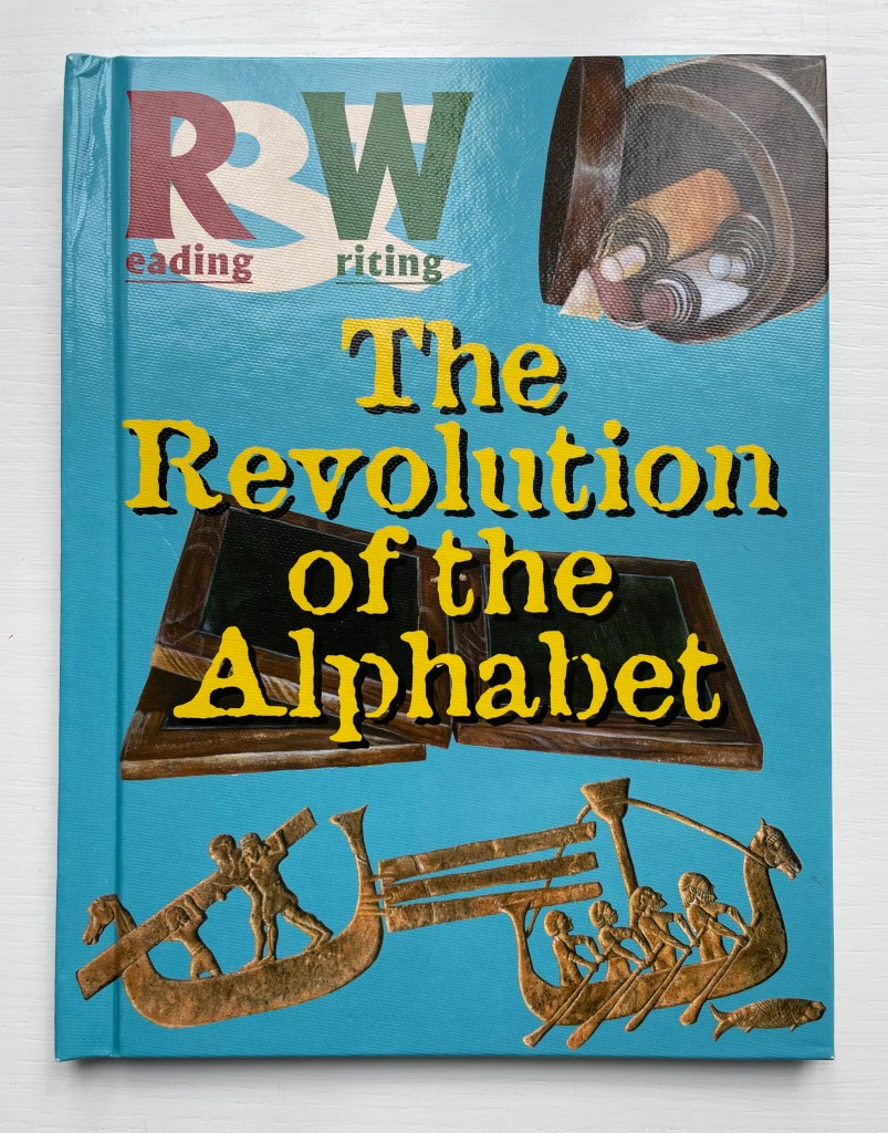
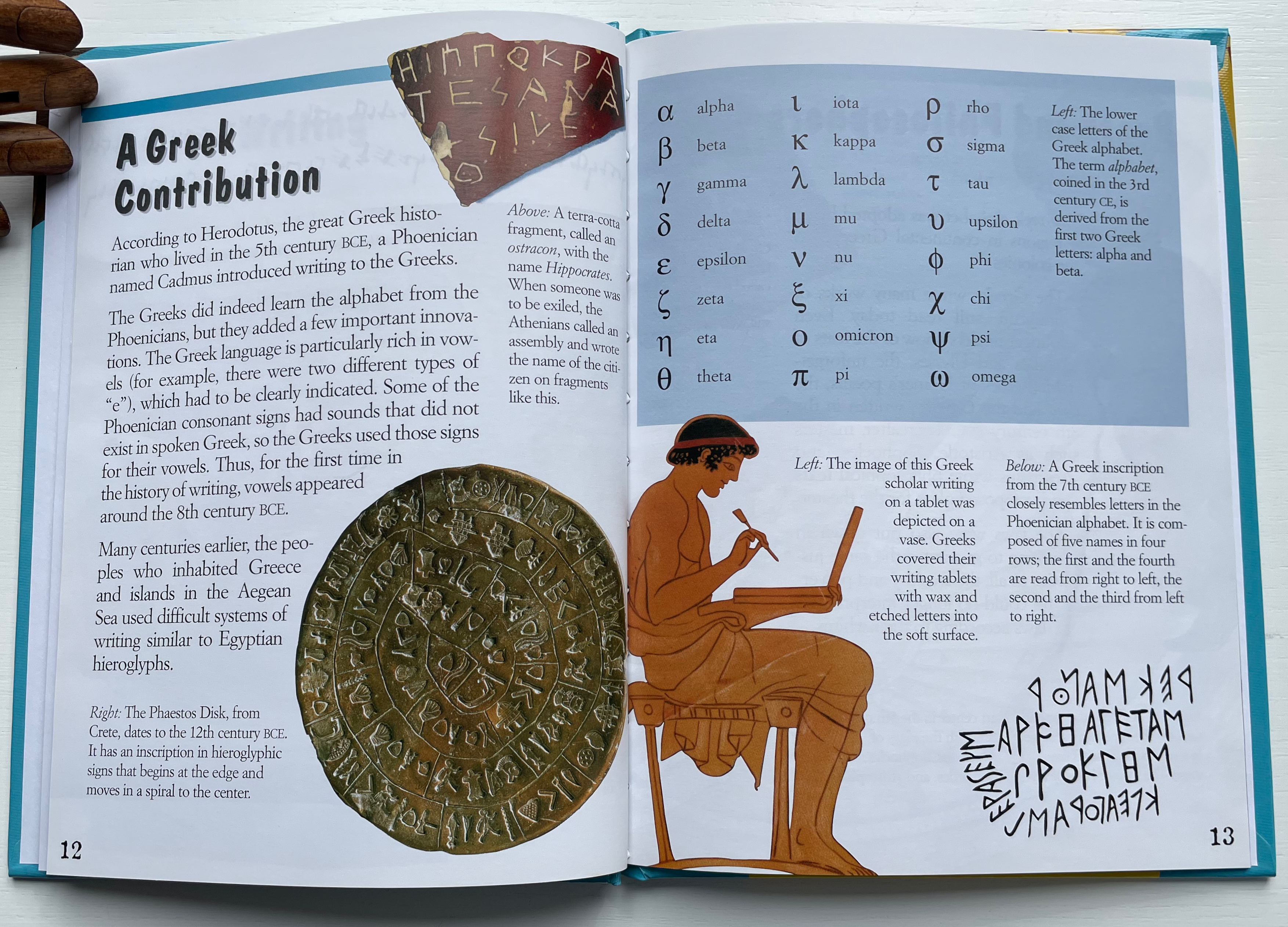
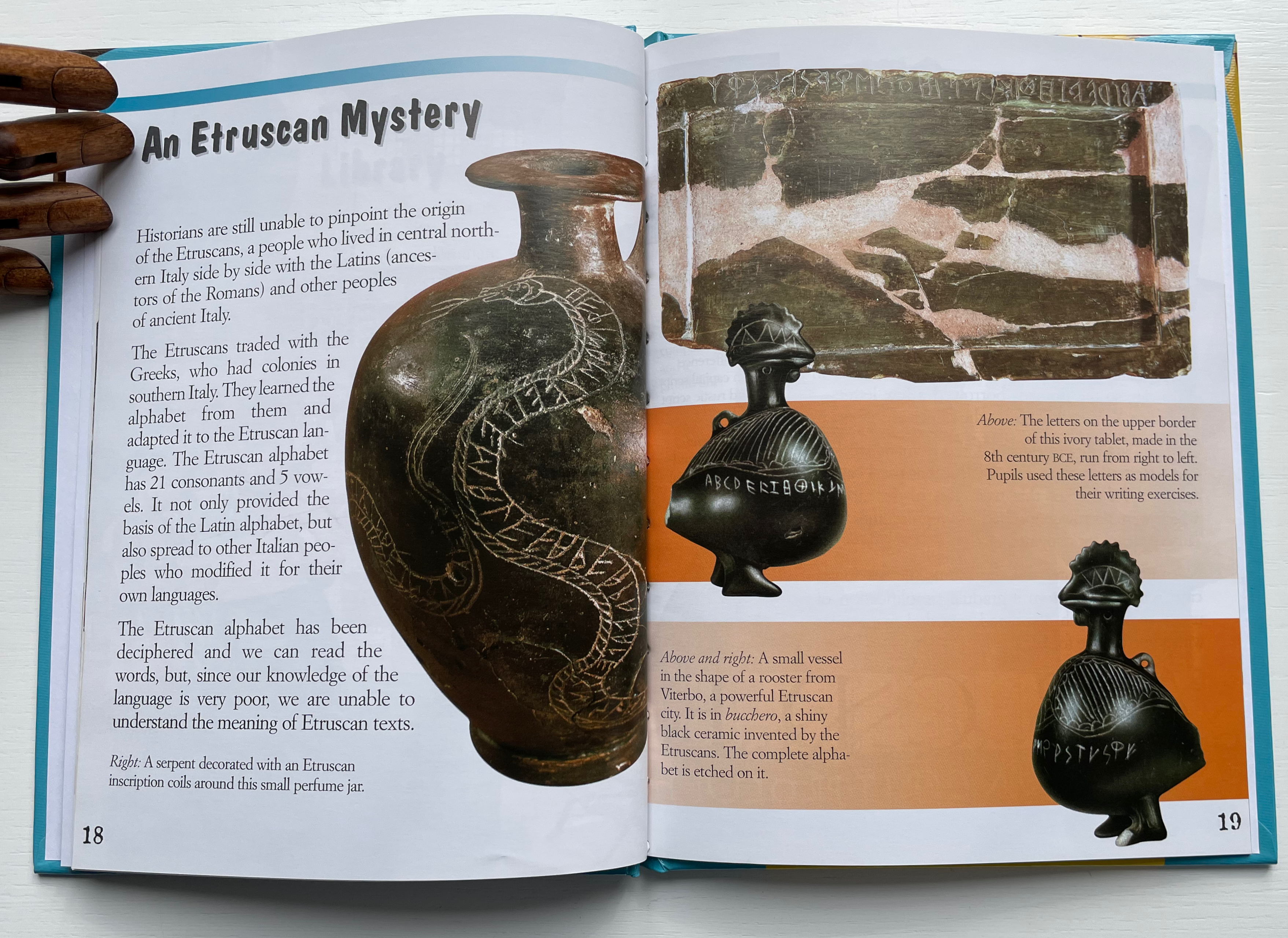
Part of a series first appearing in Italian with Andrea Dué (Florence) in 2003, The Revolution of the Alphabet is a school library book aimed at ages 8 and up. It is the sort of illustrated reference book meant for browsing and supplementary reading. The mix of pen-and-ink drawings, watercolors, bold reproductions of scripts and letters and high-res color photographs of such items as the Phaistos disk and the ceramic Viterbo rooster encourages the browsing. It also subliminally delivers a message of the deep and live connection between the alphabet and art.
As can be gathered from the table of contents and text on these pages, the constraint of 32 pages for content that isn’t scattershot and jam-packed at the same time presents a challenge.
Toward an alphabet A Phoenician language Hebrew writing A Greek contribution Poets and philosophers The greatest library An Etruscan mystery The Latin alphabet Tools for writing Letters of the prophet Fantastic forms In India
Adding the other three volumes’ 96 pages does not overcome the challenge. Taken together, the disparate stories — that writing was a gift from the gods, that writing evolved from numbers and accounting, that only some writing systems generated alphabets, that alphabets changed with the tools and materials to hand — offer an entertaining montage of snippets that could lead a curious mind to be more curious.
A secret writing How hieroglyphs work Everyday writing Papyrus The power of writing In the Far East: China Calligraphy Chinese masters of writing From China to Japan Creating a Korean alphabet In the land of the Maya All bark
The unwritten word First numbers, then words Taking count Drawing words Writing in Sumeria A better way to write One sign, many meanings The job of writing Books made of clay Writing grows up Cuneiform conquers the Near East A wedge-shaped alphabet
Books for the few Among the Slavic peoples Parchment Irish monasteries The writing of Charlemagne For the glory of God In the shadow of the cathedrals The paper revolution Printing at last But the Chinese were first Characters and printers A book for all
Diringer, David, and Reinhold Regensburger. 1968. The alphabet: a key to the history of mankind. London: Hutchinson. A standard, beginning to be challenged by late 20th and early 21st century archaeological findings and palaeographical studies.