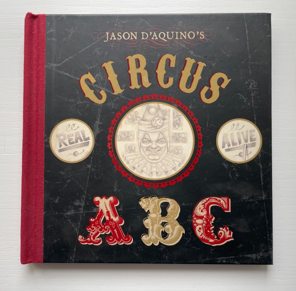
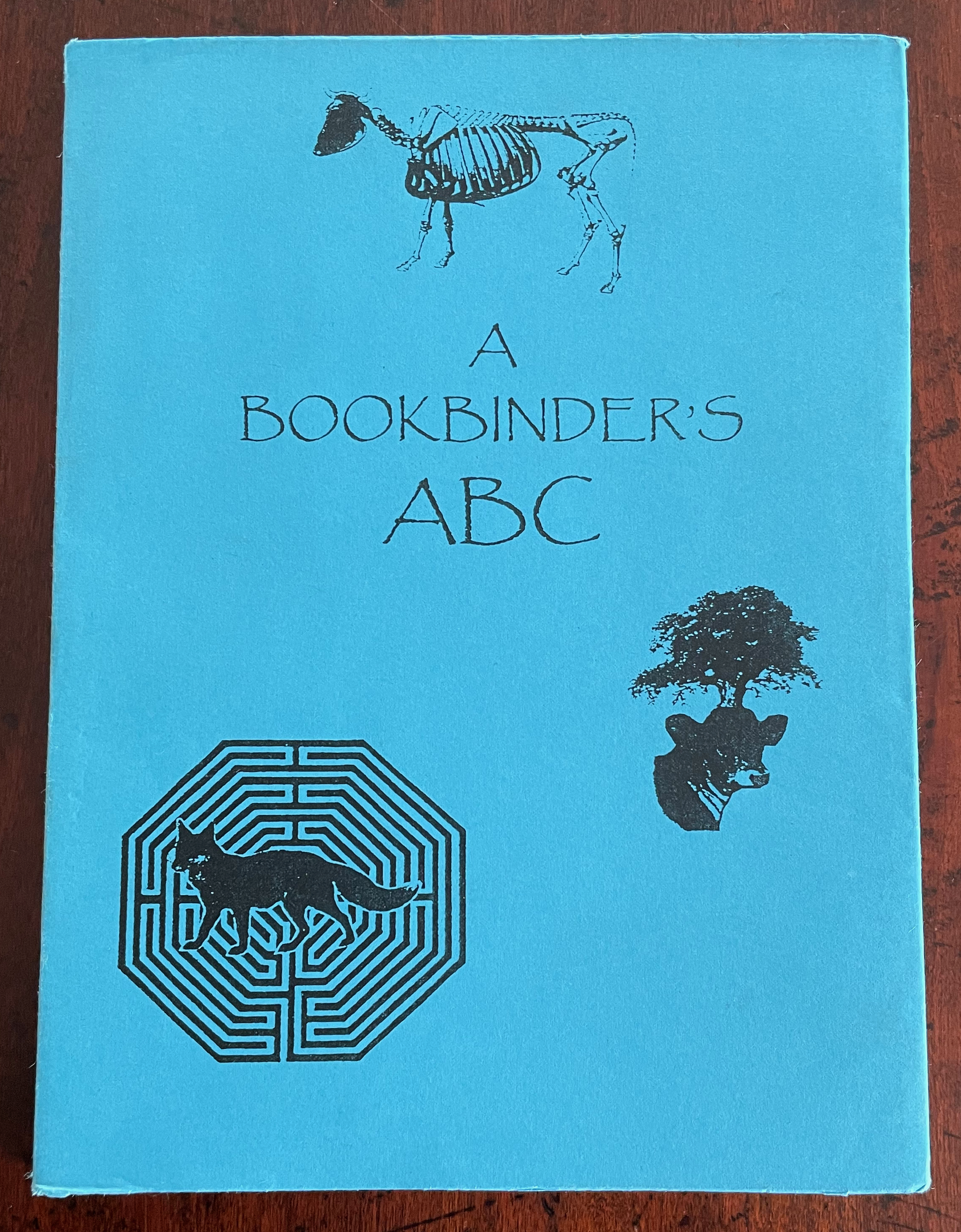
A Apple Pie (2005)

A Apple Pie (2005)
Gennady Spirin
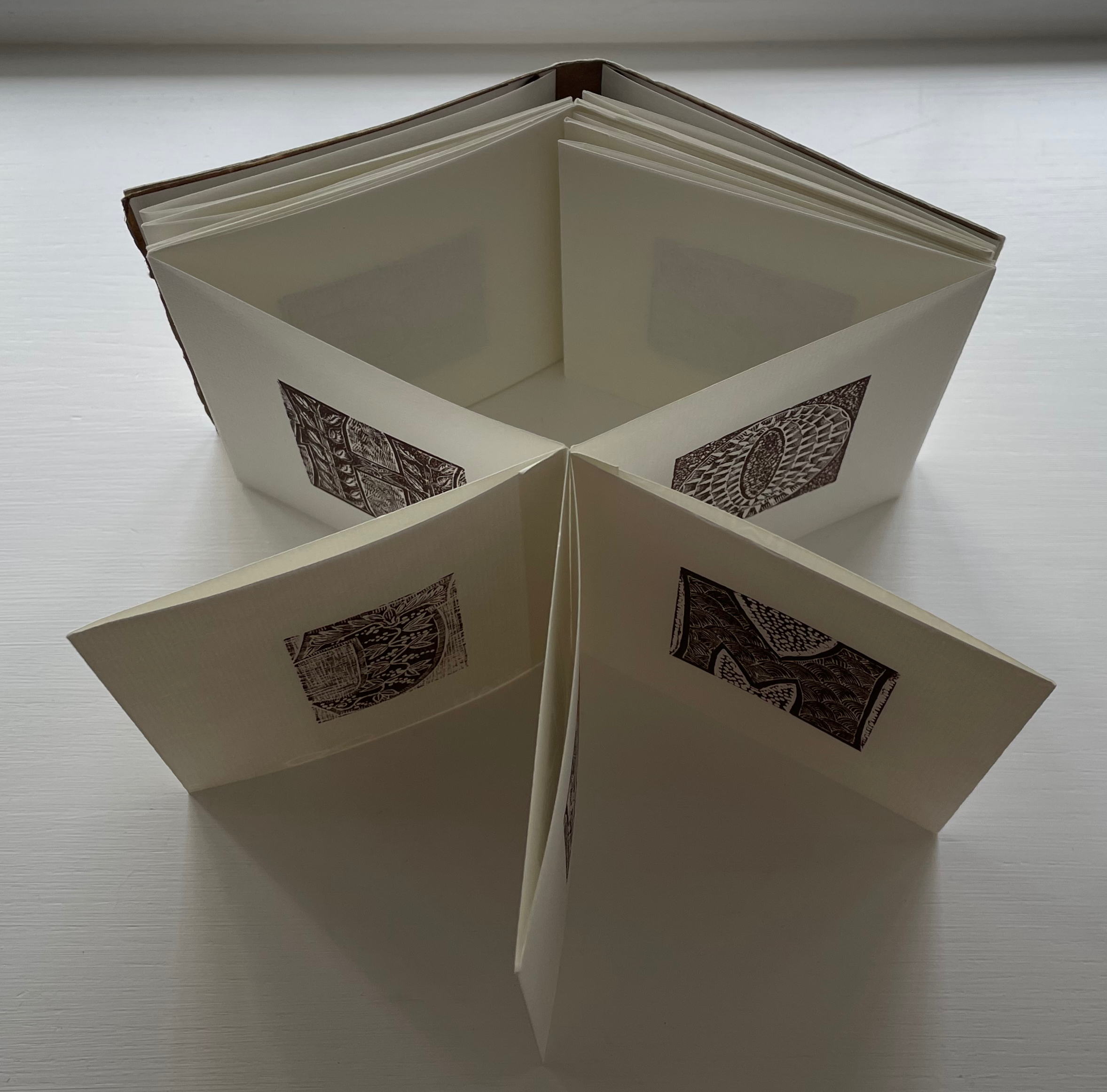
Casebound, laminated paper over boards, pastedown with matching endpapers, sewn. 275 x 275 mm. 32 pages. Acquired from Bud Plant & Hutchison Books, 13 March 2023.
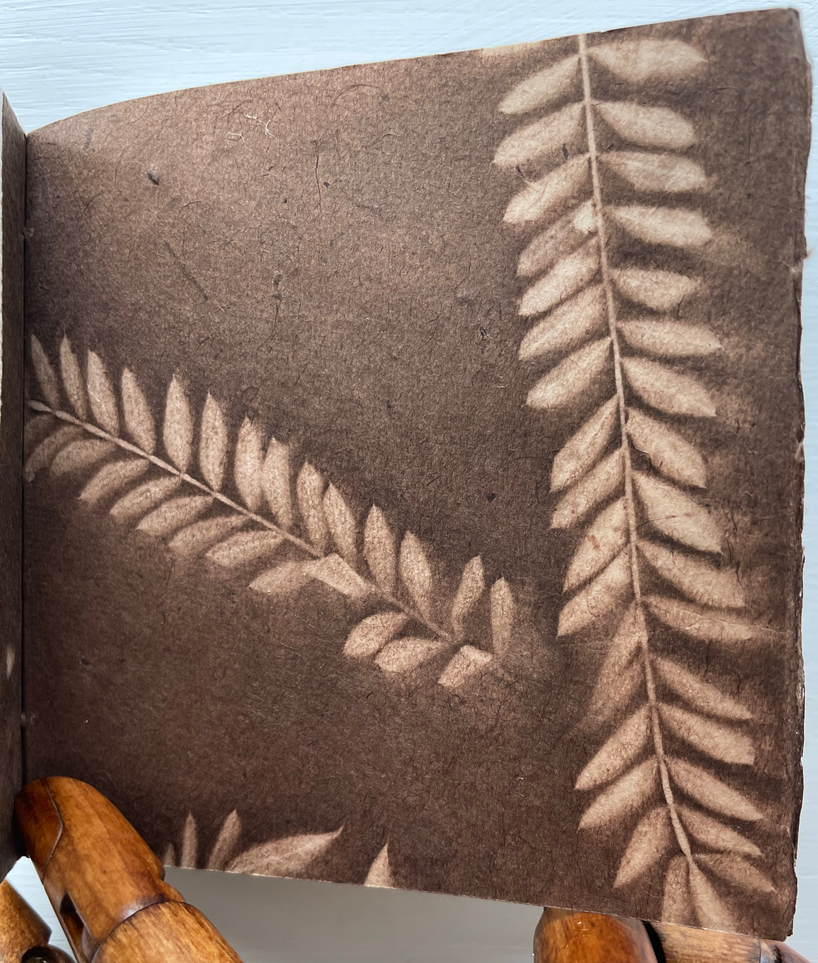
Photos: Books On Books Collection. Displayed with permission of the artist.
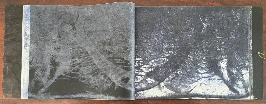
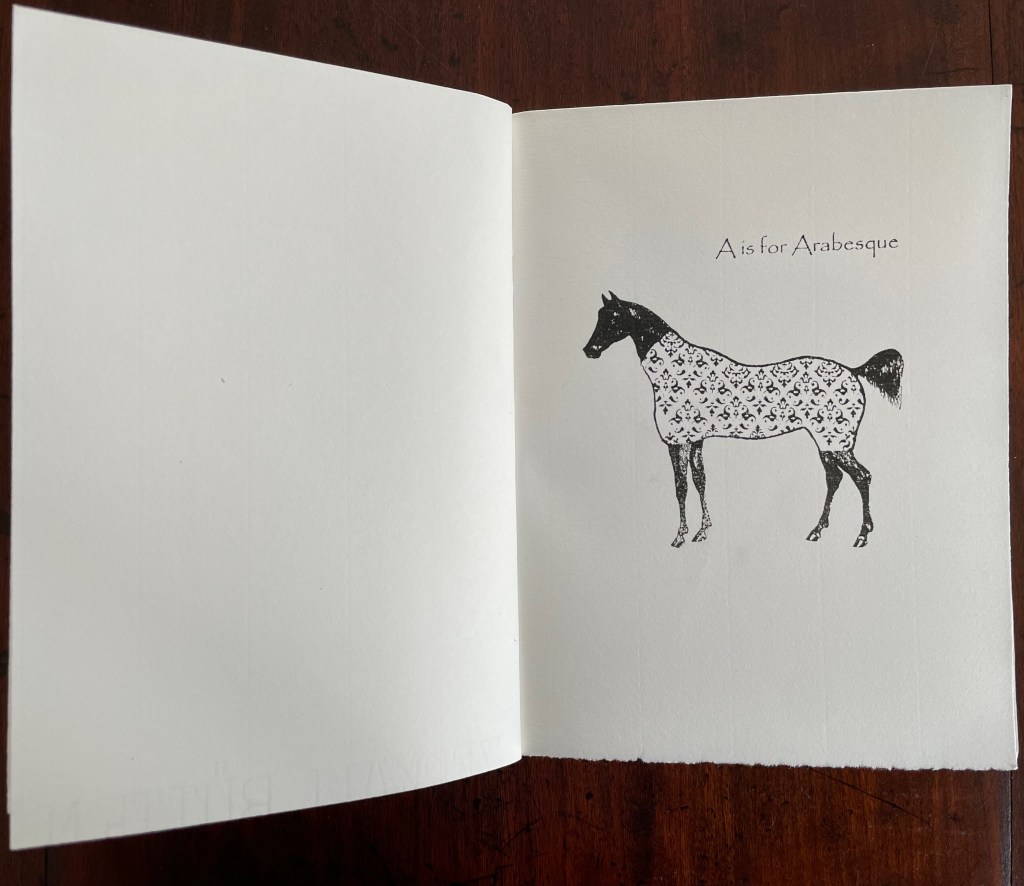
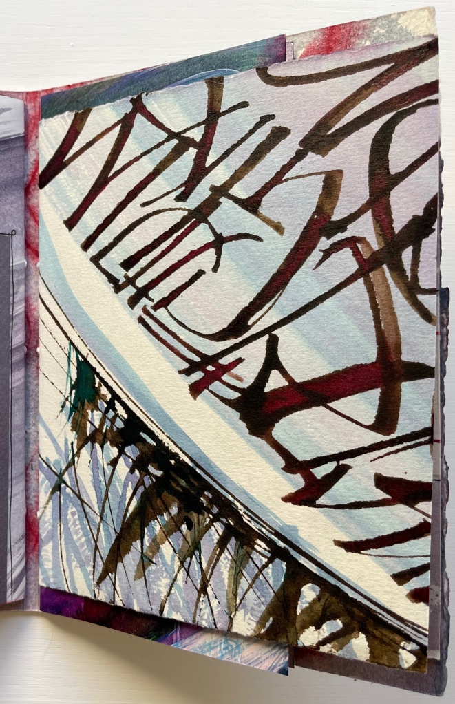
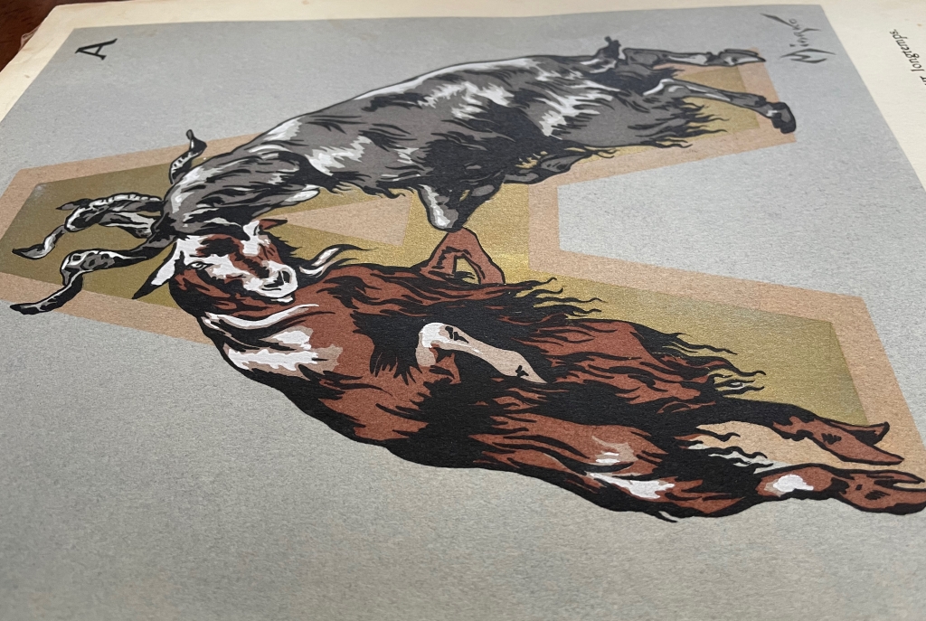
“Never judge a book by its cover” does not mean “ignore the clues and promises there”. A laminated cover and lay-flat binding are not uncommon among children’s books. Nor is the spreading of an illustration across the back and front covers. What is unusual about Gennady Spirin’s A Apple Pie is how it uses them to offer clues and promises of the lesson this book offers beyond the lesson of the alphabet. It promises a lesson about perspective and the canvas of the book.
Look at how the back and front covers play with landscape perspective and the notion of the book as frame and canvas. The head of the spine interrupts the landscape to join the narrow orange frame that demarcates the edges of the landscape. All the same, the landscape’s hill of apples in the foreground overlaps the spine to descend into the landscape’s midground on the back cover, which deepens into a background of at least five levels like a medieval or Renaissance painting.
Another technique of perspective from those traditions is to place in the background things we know are large and in the foreground what we know is smaller. A temple or mansion behind, a mother and child or pie up front. These objects and figures often perform temporal double duty as in The Flight into Egypt, where the tiny workers misdirect the mass of Herod’s soldiers in the background while the Holy family looms large resting in the foreground. In Spirin’s illustration, the past apple-picking appears in the distance, and the resulting pie is near.
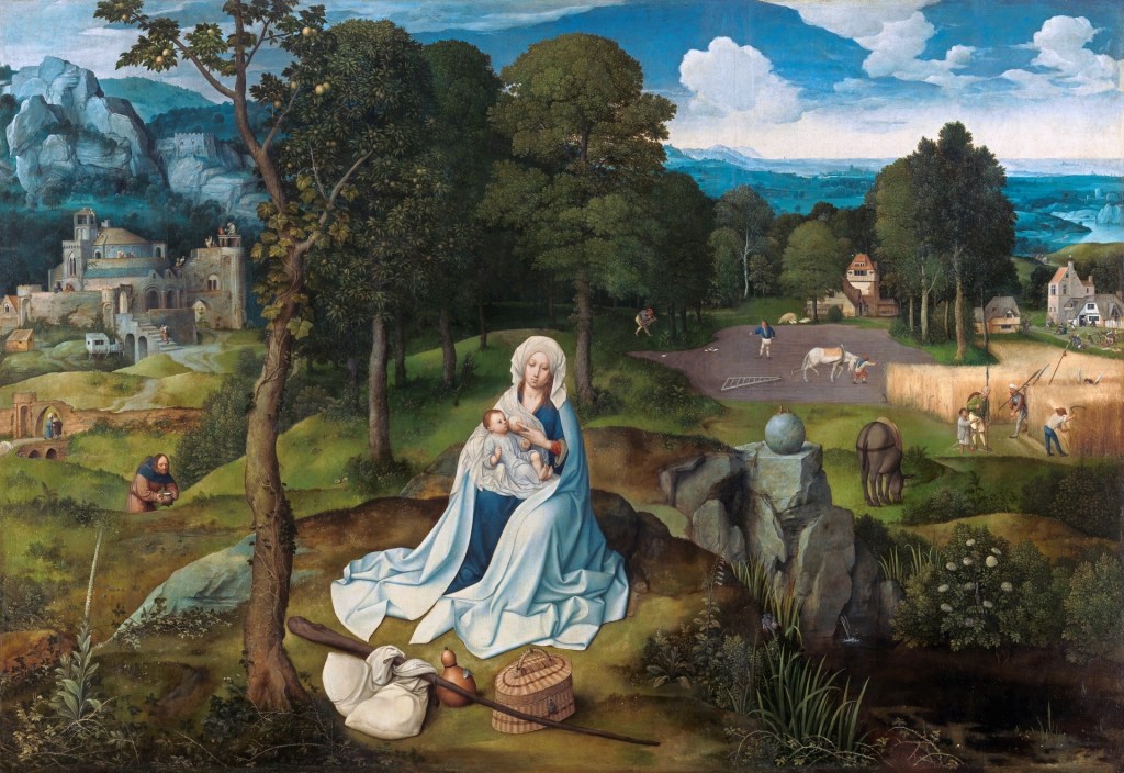
Rest on the Flight into Egypt (1518-20)
Joachim Patinir
Copyright ©Museo Nacional del Prado
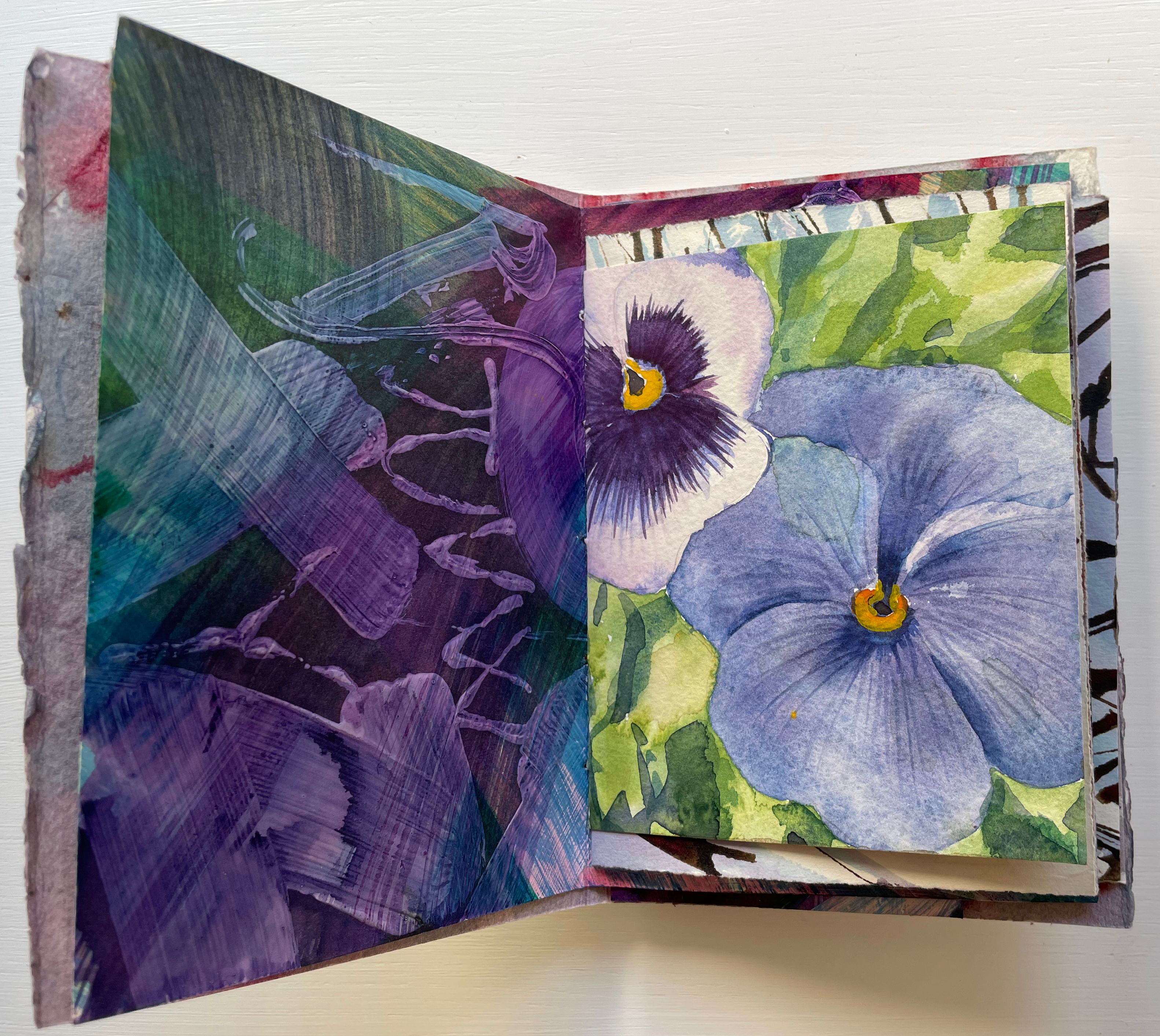
Spirin slyly multiplies this trick with his apple pie in the foreground with its tiny characters dancing around it. Yes, this book is going to replay the traditional celebration of the apple pie alphabet, but pay attention to relative sizes. The pie is monumental, larger even than the three-dimensional letter A that sits atop and casts its shadow over the banner of calligraphy, so watch for how the trick of shadows draws attention to perspective, to the roman vs calligraphic letters and to the surfaces on which the letters and tricks of perspective play out.
The very first double-page spread delivers on the cover’s clues and promises.

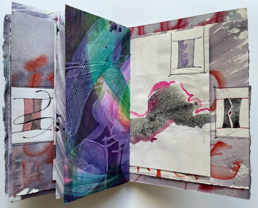
The oversized carved A serves as an arch to provide an example of a word beginning with A and casts its shadow over the oversized pie and cutting board that a team of elf-sized bakers has borne under it to the applause of mother and children who are mid-sized between the pie and bakers. The A is so oversized that its apex disappears from the image area. Bringing further attention to the image area and deepening its dimensionality, Spirin “cuts” the surface on which it is drawn and curls the cut section against the arm of the A.
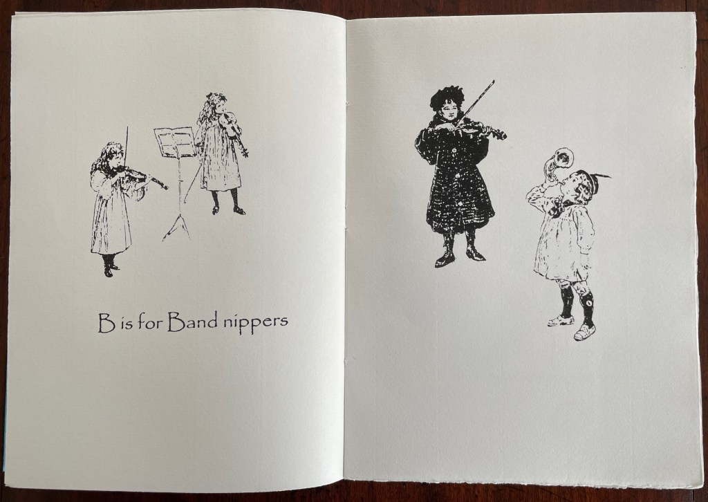
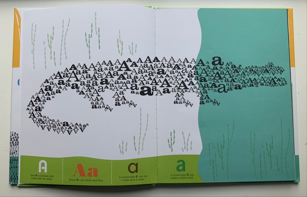
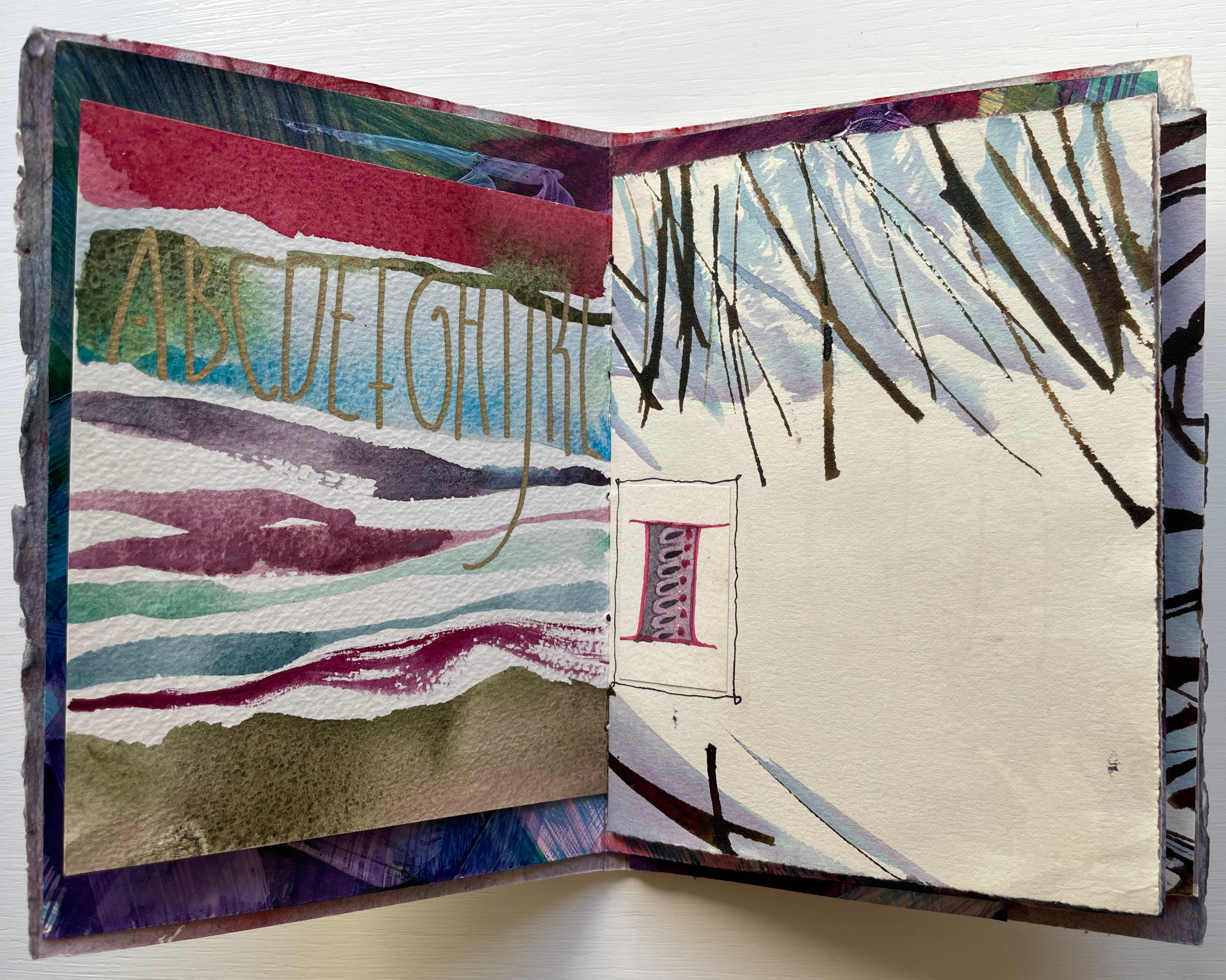
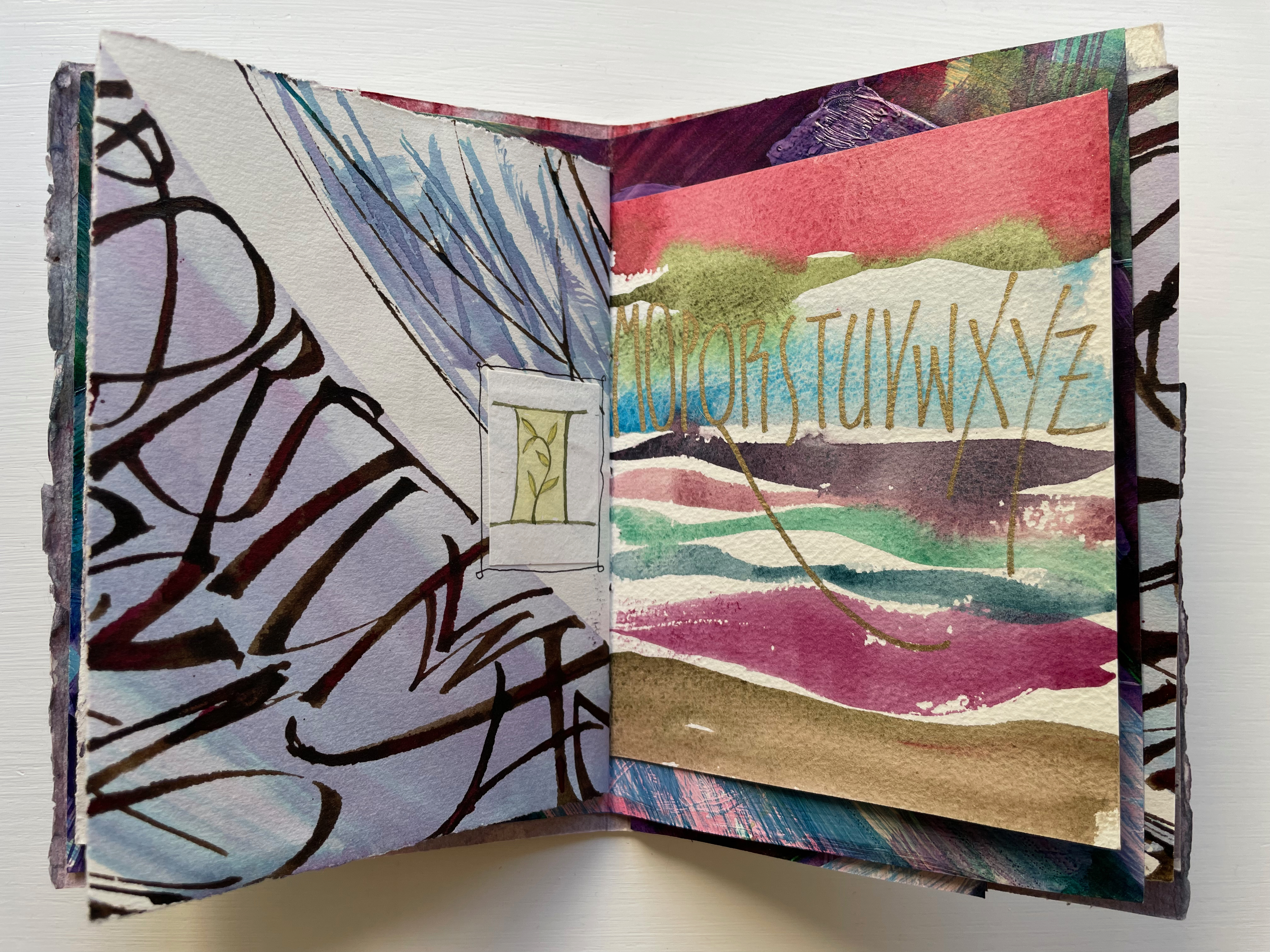
In the world of letters, size matters — in the form of the upper and lower cases.
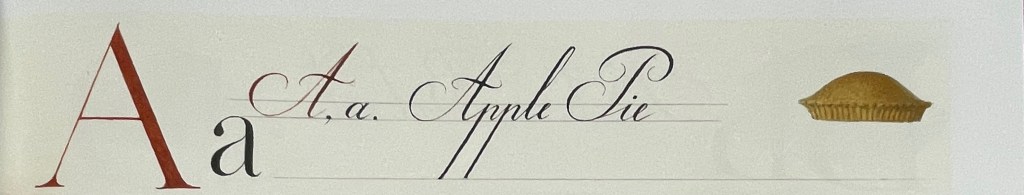
Further drawing attention to the art of illustrating the alphabet, not only does Spirin hand-draw examples of their forms in print and calligraphy, he leaves the guidelines for the base and x-height in place, eliminating them after (or before?) using them as the measure for the base and crust of a miniature pie in the margin. In a sense, the process of lettering has also become the canvas for A Apple Pie.
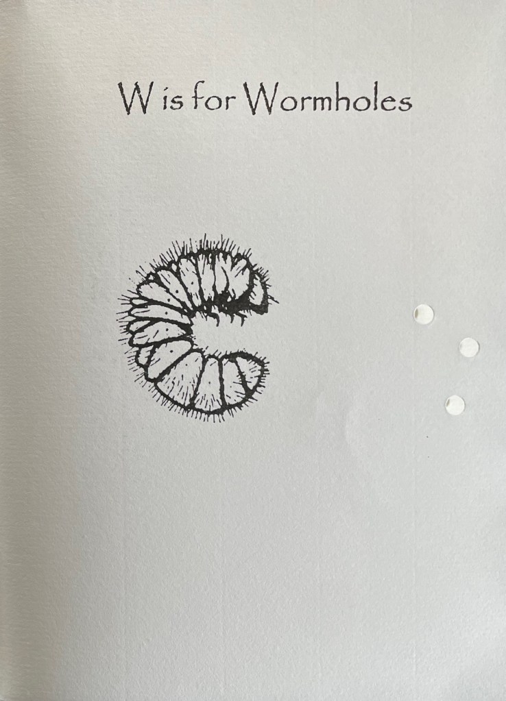
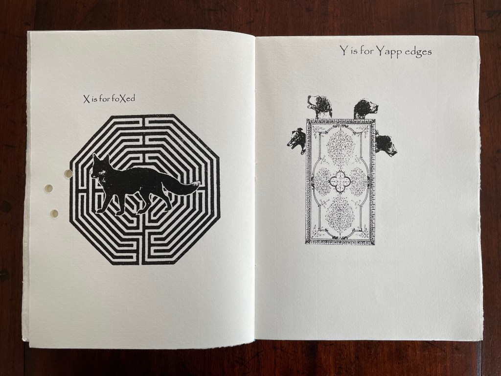
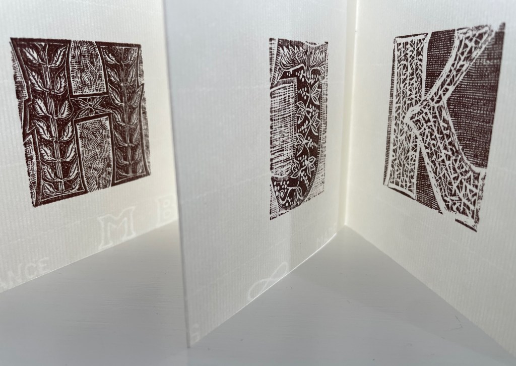
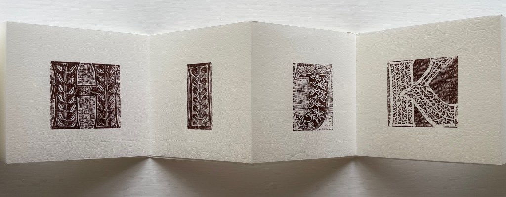
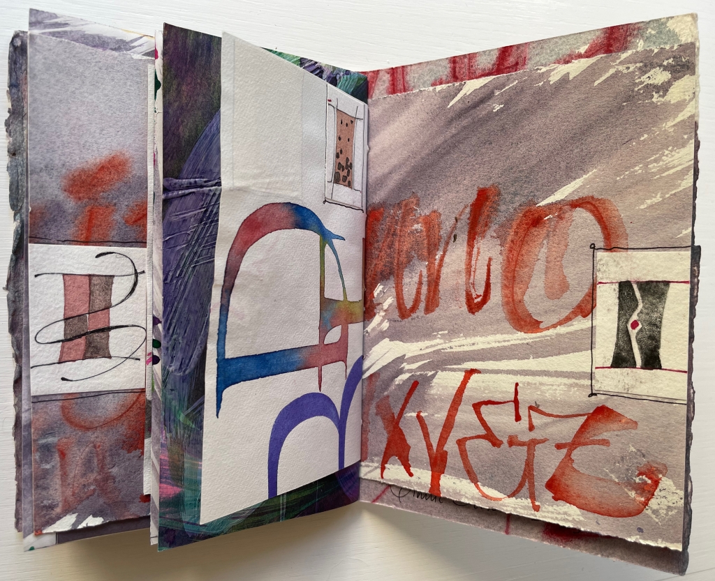
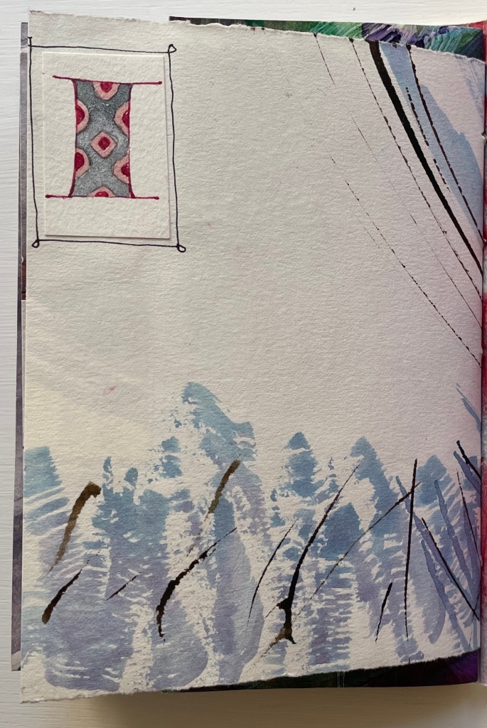
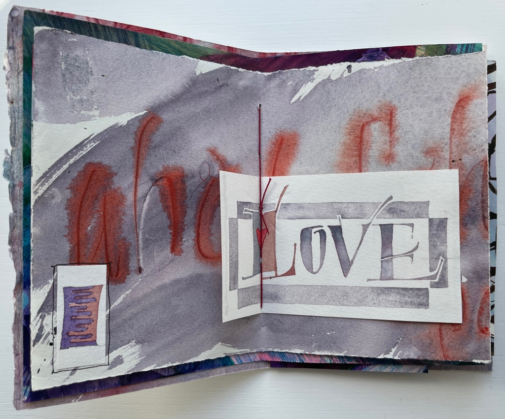
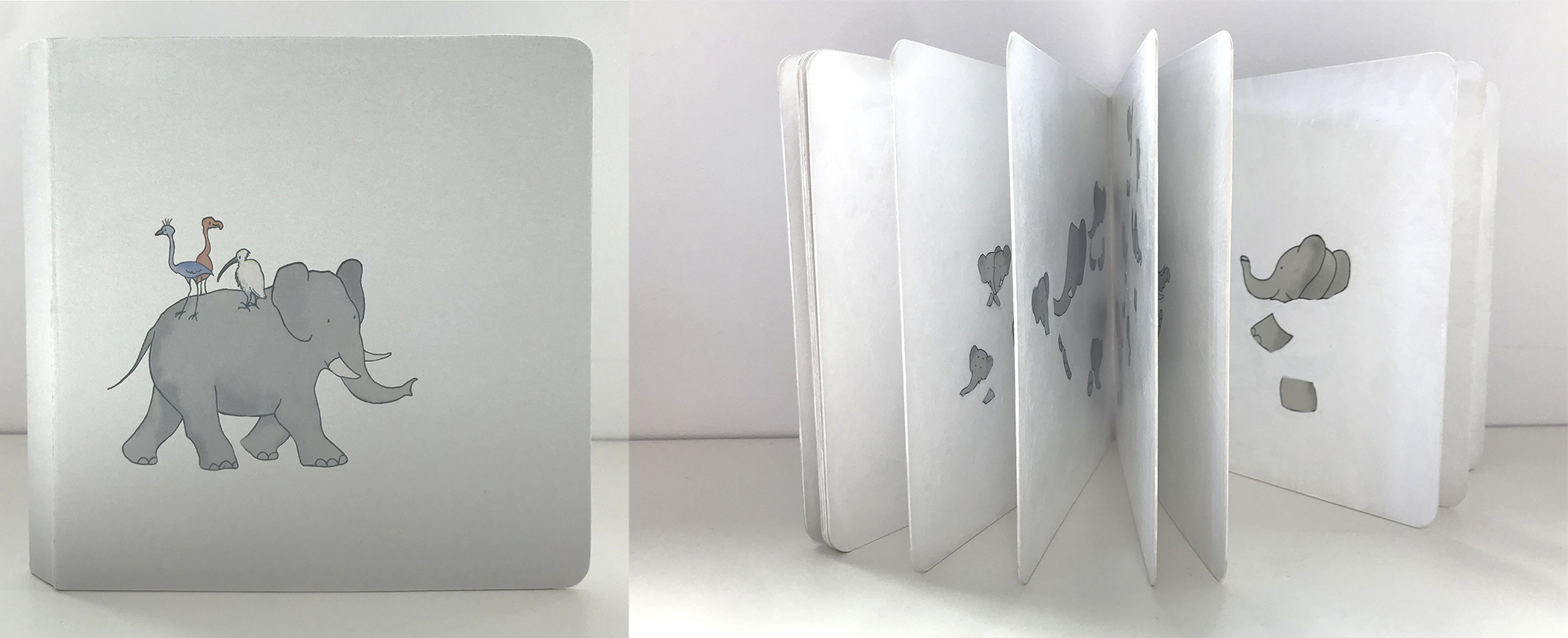
This process is displayed for every letter. Most also have a small apple vignette in the lower left or lower right corner.
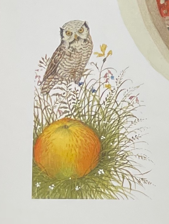

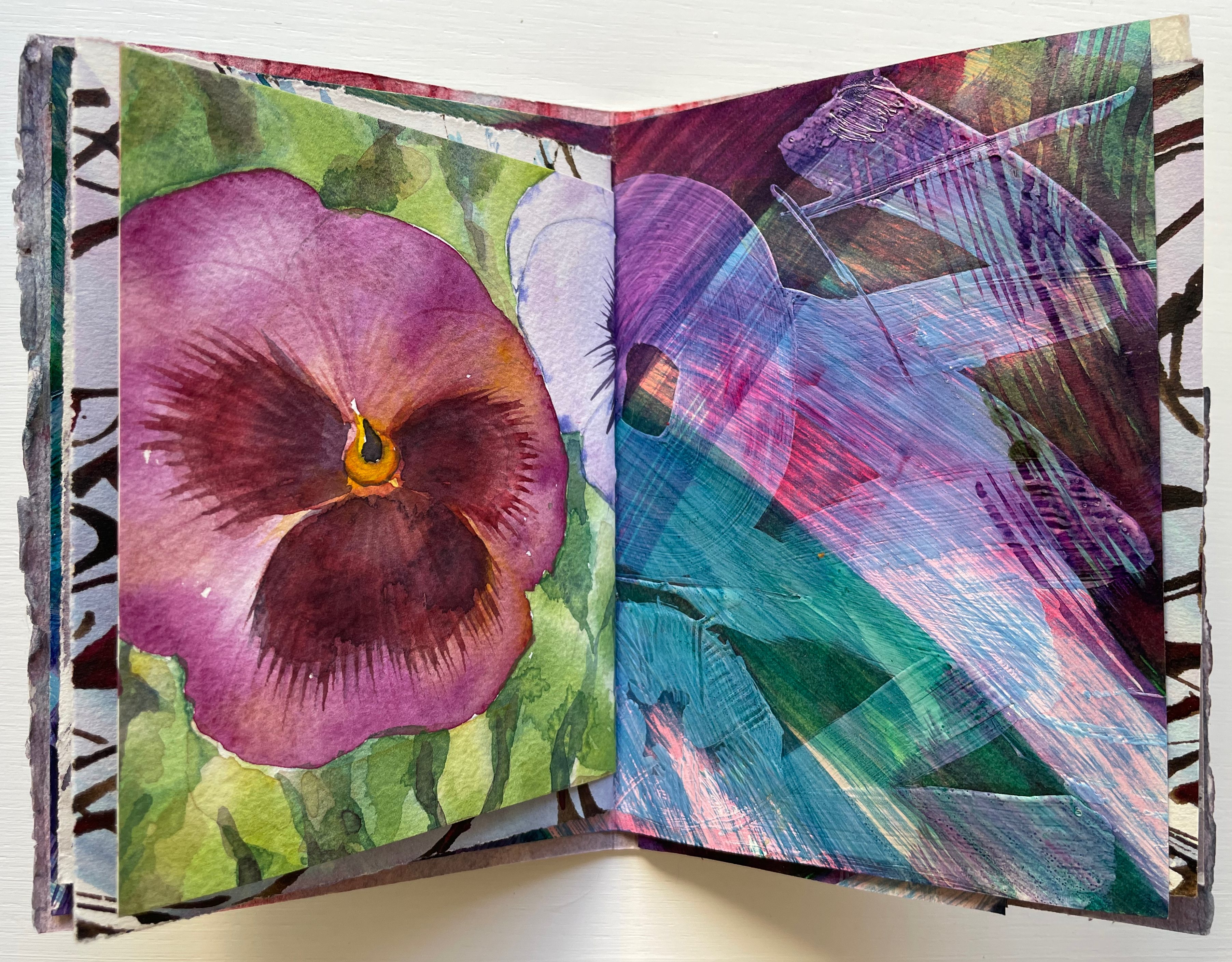
As with the ants surrounding the apple, most of these vignettes serve up images that begin with the letters of their pages (for example, O for owl and P for pig) and are trimmed to re-emphasize the pages’ image space with which Spirin plays.
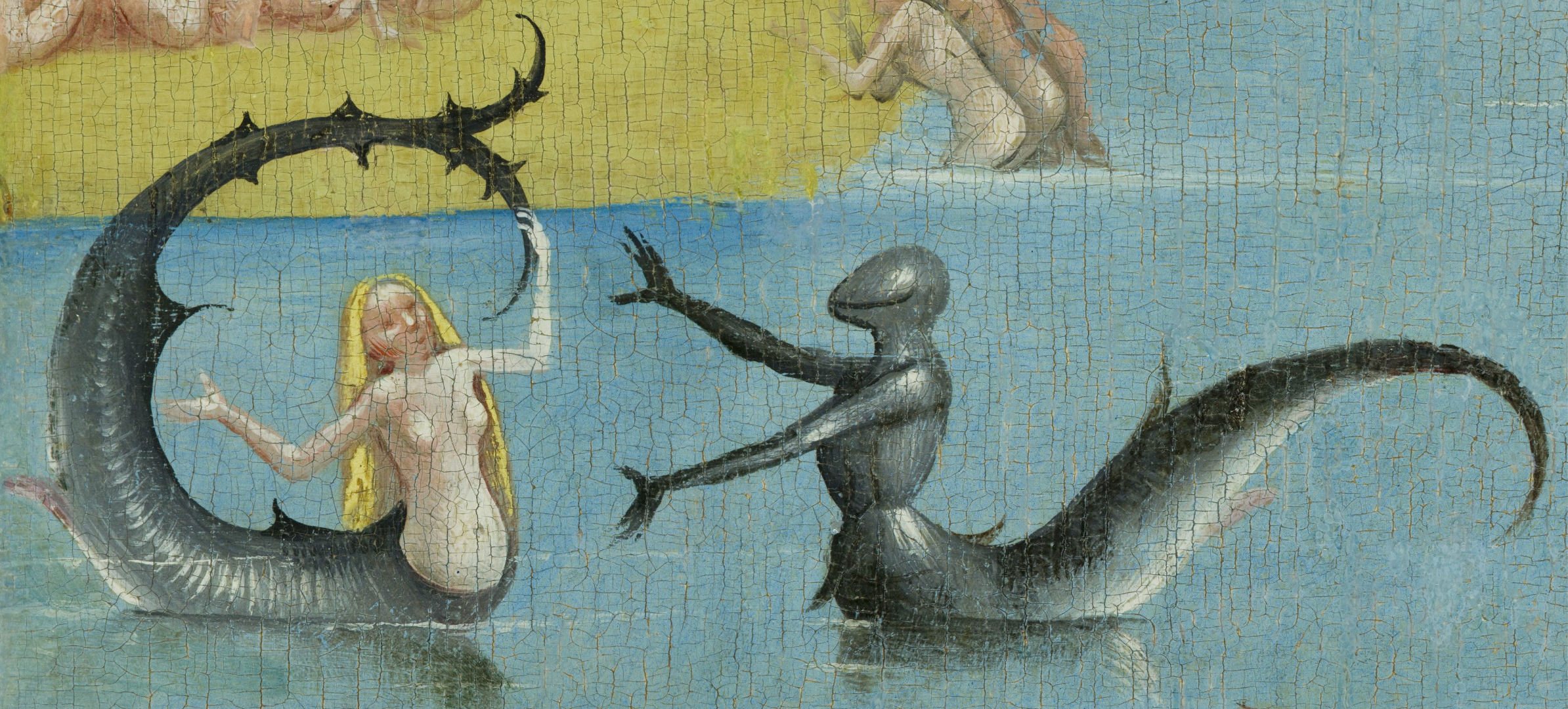
Letters other than A have images that cross the divide of pages. When they do, Spirin’s historical influences ranging from the medieval to the Renaissance to the Victorians stand out even more. His play with figures, color, perspective and shadow in the letter J pages recall Brueghel, Bosch, Patinir and, of course, Kate Greenaway.
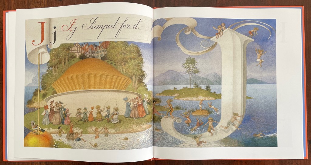


Detail from Children’s Games (1560), Jan Brueghel, Kunsthistoriches Museum Wien
Detail from Garden of Earthly Delights (1490-1500), Hieronymus Bosch, Museo del Prado
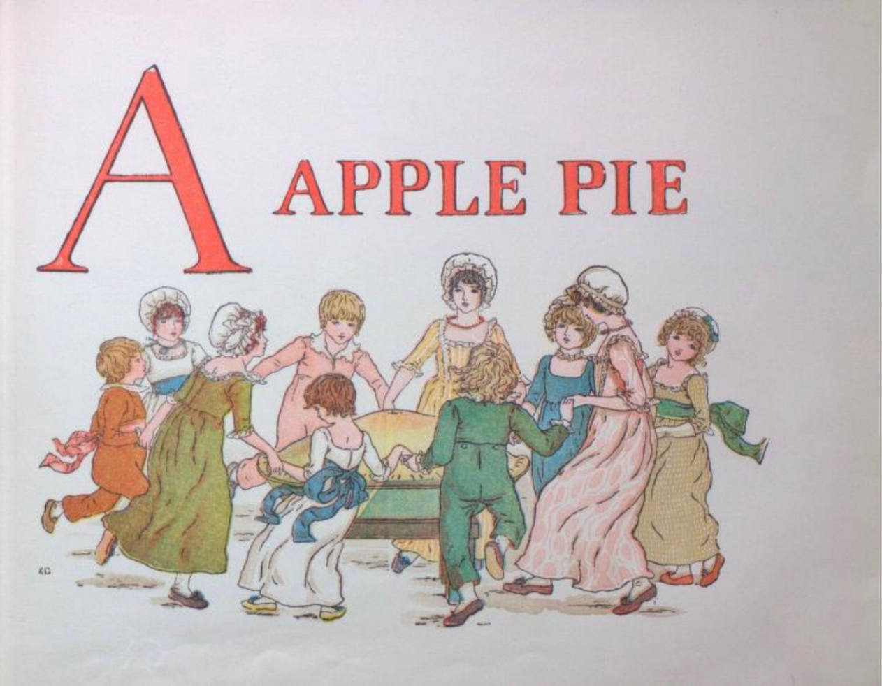
A Apple Pie (c. 1886), Kate Greenaway, Internet Archive
The tradition of the “apple pie” mnemonic reaches almost as far back as the artistic ones. As noted on Spirin’s copyright page and confirmed in Peter Hunt’s International Companion, alphabet primers based on the mnemonic must have been well known prior to 1671 when the English cleric John Eachard referred to it. Compiled from the Bodleian Libraries’ record of “apple pie” items in the Opie Collection and from preparation for the exhibition Alphabets Alive!, here is a starting list for the industrious apple-picking artist interested in confecting an extension to the tradition. (Suggested additions to the menu are welcome in the Comments.) Scholarly baker’s apprentices should also start with the dissertation of the appropriately named A. Robin Hoffman (now at the Art Institute of Chicago); see Further Reading below.

British Library (formerly British Museum)
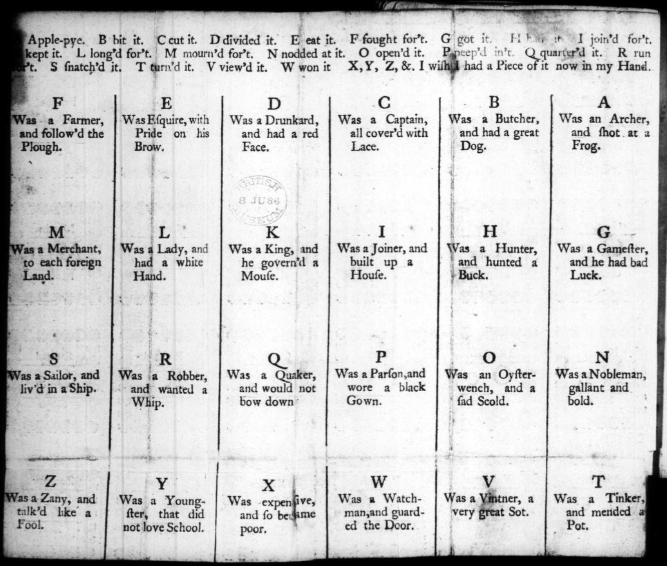
1764. Tom thumb’s play-book : to teach children their letters as soon as they can speak. London. Contains “A Apple Pie” as well as “A was an Archer“.
1791. The tragical death of a apple-pye : who was cut in pieces and eat by twenty five gentlemen : with whom all little people ought to be very well acquainted. London: J. Evans. Internet Archive.
1800-12. The Tragical Death of a Apple-Pye, Who Was Cut in Pieces and Eat by Twenty Five Gentlemen with
Whom All Little People Ought to Be Well Acquainted. London: Printed for John Evans, 42, Long-lane, West-Smithfield. Folded sheet, as issued. 9.5 x 5.9 cm. Opie N 589.
1808. The History of the Apple Pie. Written by Z. London: John Harris and Son. Opie C 1152. Also viewable here.
1815. The History of Master Watkins : To Which Is Added, The Tragical Death of an Apple-Pie. Chelmsford: Marsden, printer. Opie N 887.
1820. Hone, W. & Cruikshank, G. The Political “A Apple Pie” … by the Author of “The House that Jack Built”. Sixth ed. London: Printed for the Author; sold by J. Johnston. Johnson e.1111.
1820, ca. The History of an Apple-Pie. Written by Z. London: Harris and Son. 17.3 x 10.5 cm. Opie N 582.
1827. The History of A Apple Pie. Written by Z. London: Orlando Hodgson.
1835-57. Marks’ History of an Apple Pie. King Pippin’s Alphabet for Good Children. London: J. Marks.
17 x 10.2 cm. Opie N 588. Also view here.
1836. Bouncing B. The History of an Apple Pie. William Darton and Son.
1837-45. The History of an Apple Pie. London: Darton & Clark. 16 x 10.5 cm. Opie N 583.
1841. The tragical death of an apple pie : who was cut to pieces and eaten by twenty-five gentlemen with whom all little people ought to be acquainted. Printed by J. Paul & Co. London: 2 & 3 Monmouth-court. View here.
1843-49. The History of an Apple Pie; with Ditties for the Nursery, by Dame Dearlove’s Ditties. London: Grant and Griffith. 17.9 x 10.8 cm. Colophon of S & J. Bentley, Wilson, and Fley, Bangor House, Shoe Lane. Opie N 584.
1851-74. The Apple-Pie Alphabet. London: John and Charles Mozley, 6 Paternoster Row. 13.1 x 8.2 cm. Colophon of Henry Mozley and Sons, Derby. This title number 26 in the publisher’s series of penny chapbooks. Opie N 580. See also Opie N 581.
1856-65. The History of an Apple Pie. Written by Z. London: Griffith and Farran. 17.6 x 11.5 cm. Reissue as a rag book of the 1820 edition published by J. Harris. Wrappers have the colophon of H.W. Hutchings, 63, Snow Hill, London. Opie N 585. See also Opie N 586 for larger version (18 x 19.8 cm). From the library of Roland Knaster.
1860, ca. The History of an Apple Pie. London: J. Bysh, 157 & 158 Albany Road, Old Kent Road. 13.6 x 10.7 cm. Opie N 587.
1860, not after. The Apple Pie. London: Darton & Co., 58 Holborn Hill. 25 x 17 cm. Darton’s Indestructible Elementary Children’s Books. Inscription dated 8 February 1860. Opie N 2. Also view here.
1861, not before. The History of A, Apple Pie. London: Dean & Son, Printers, Lithographers, and Book and Print
Publishers, 11, Ludgate Hill. 25 x 16.5 cm. (Dean’s Untearable Cloth Children’s Coloured Toy Books). Opie N 4.
1865, ca. A. Apple Pie. London: Frederick Warne & Co. 26.8 x 22.6 cm. Aunt Louisa’s London Toy Books. Colophon of Kronheim & Co. Opie N 1.
1865-89. The History of A Apple Pie. London: George Routledge & Sons. 31 x 25.2 cm. Rear wrapper has colophon of the lithographer L. van Leer & Co, Holland and 62 Ludgate Hill Opie N 5. Also see Pussy’s Picture Book. Opie N 1017.
1874. Routledge’s nursery album for children. London: George Routledge and Sons. A.
1886, ca. Kate Greenaway. A Apple Pie. London: George Routledge and Sons. Opie N 18. Also view here and here.
1890, ca. E.A. Cooke. The Story of A Apple Pie. London: R. E. King & Co.
1899. A.B.C. of the Apple Pie. Printed on linen. New York: McLouglin Bros. Viewable here.
19__, ca. A Apple Pie. An Alphabet from Modelled Designs by Mrs. Wm. Harbutt. Pen and Ink Drawings by Noel C. Harbutt A.R.C.A. London: Dean & Son, Ltd; Bathampton: W. Harbutt. Plasticine Works & Studio. 25.4 x 18.8 cm. Opie N 3.
1966. The Tragical Death of A. Apple Pie Who Was Cut in Pieces, and Eaten by Twenty-Six Little Villains.
[Whitstable, Kent: Ben Sands at his Shoestring Press]. Leporello. 11.5 x 13.4 cm. #185/225 copies. Gift of Roland Knaster. Opie N 590.

From the Bodleian Librairies’ copy of The Tragical Death … (1966)
Ben Sands
Photo: Books On Books.
1974. William Stobbs. A is an Apple Pie. London: The Bodley Head.
1986. Tracey Campbell Pearson. A Was an Apple Pie. London: Bodley Head.

1987. Gavin Bishop. A Apple Pie. Oxford University Press.
2011. Alison Murray. Apple Pie ABC. London: Orchard Books.
Further Reading
“Alphabets Alive!“. 19 July 2023. Books On Books.
Hoffman, A. Robin. 2012. “‘Doubtful Characters’: Alphabet Books and Battles over Literacy in Nineteenth-Century British Print Culture“. Diss. University of Pittsburgh.
Hunt, Peter. 2004. International Companion Encyclopedia of Children’s Literature. 2nd ed. London: Routledge, p. 179.
Webb, Poul. 2017~ . “Alphabet Books — Parts 1-8” on Art & Artists. Google has designated this site “A Blog of Note”, well deserved for its historical breadth in examples, clarity of images and insight.