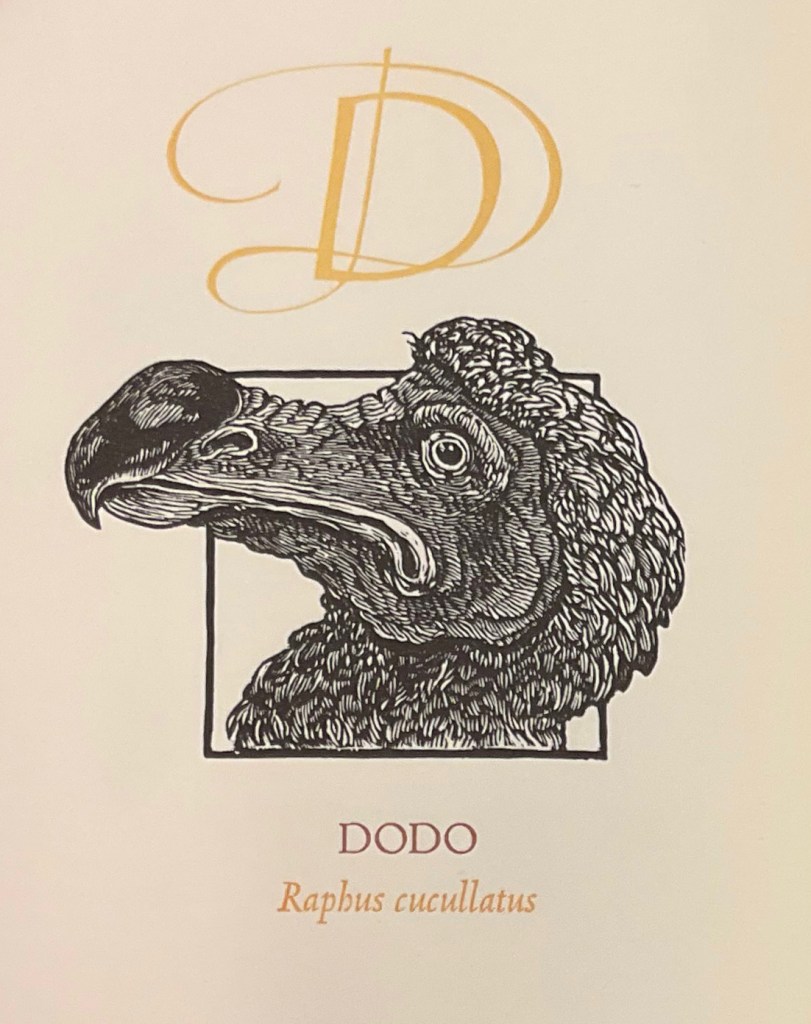
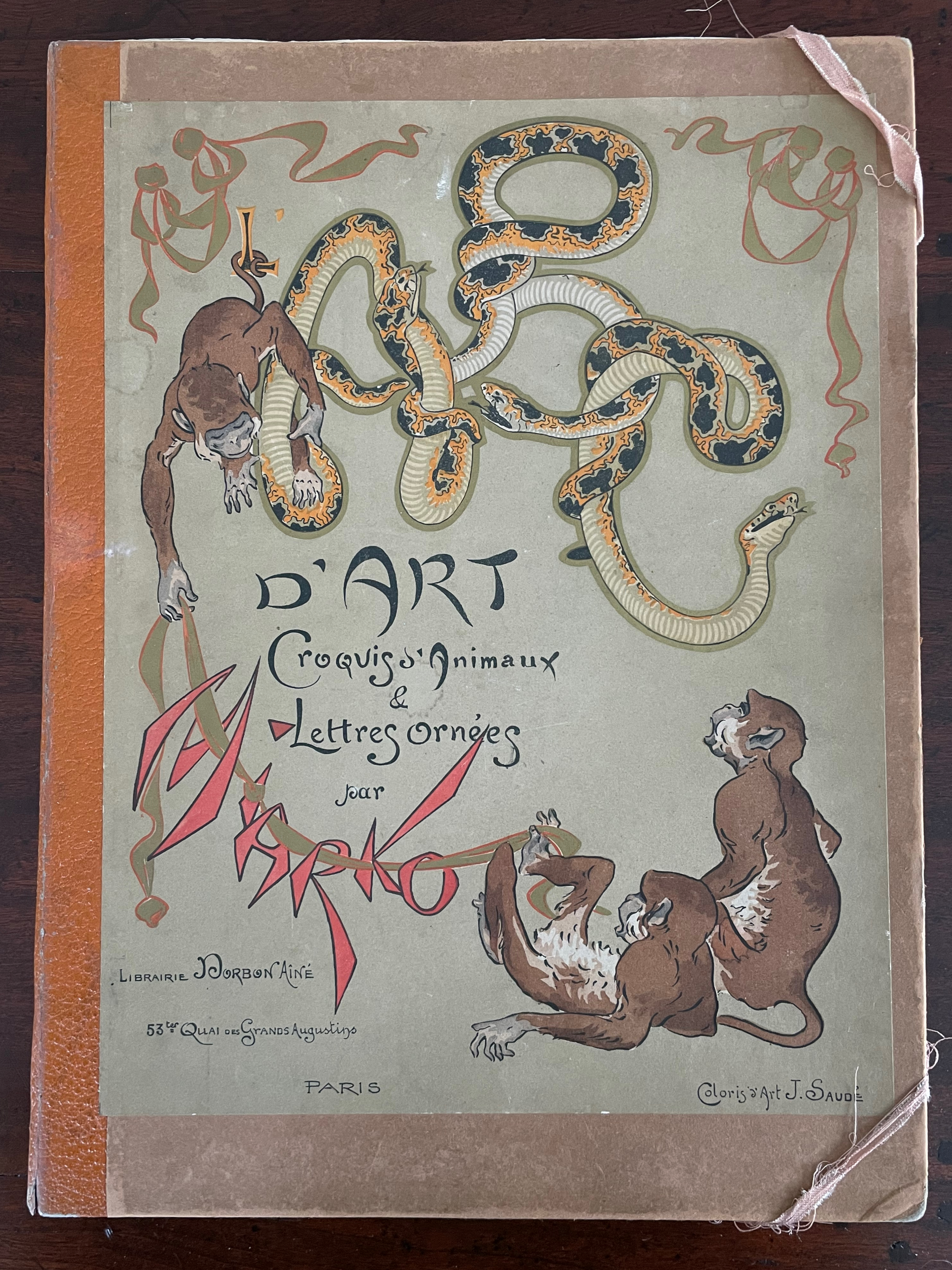
ABC d’Art (c. 1920)
ABC d’Art: Croquis d’animaux & Lettres ornées [ABC of Art: Animal Sketches & Decorated Letters] (c. 1920)
Miarko (Edmond Bouchard), Colored by Jean Saudé
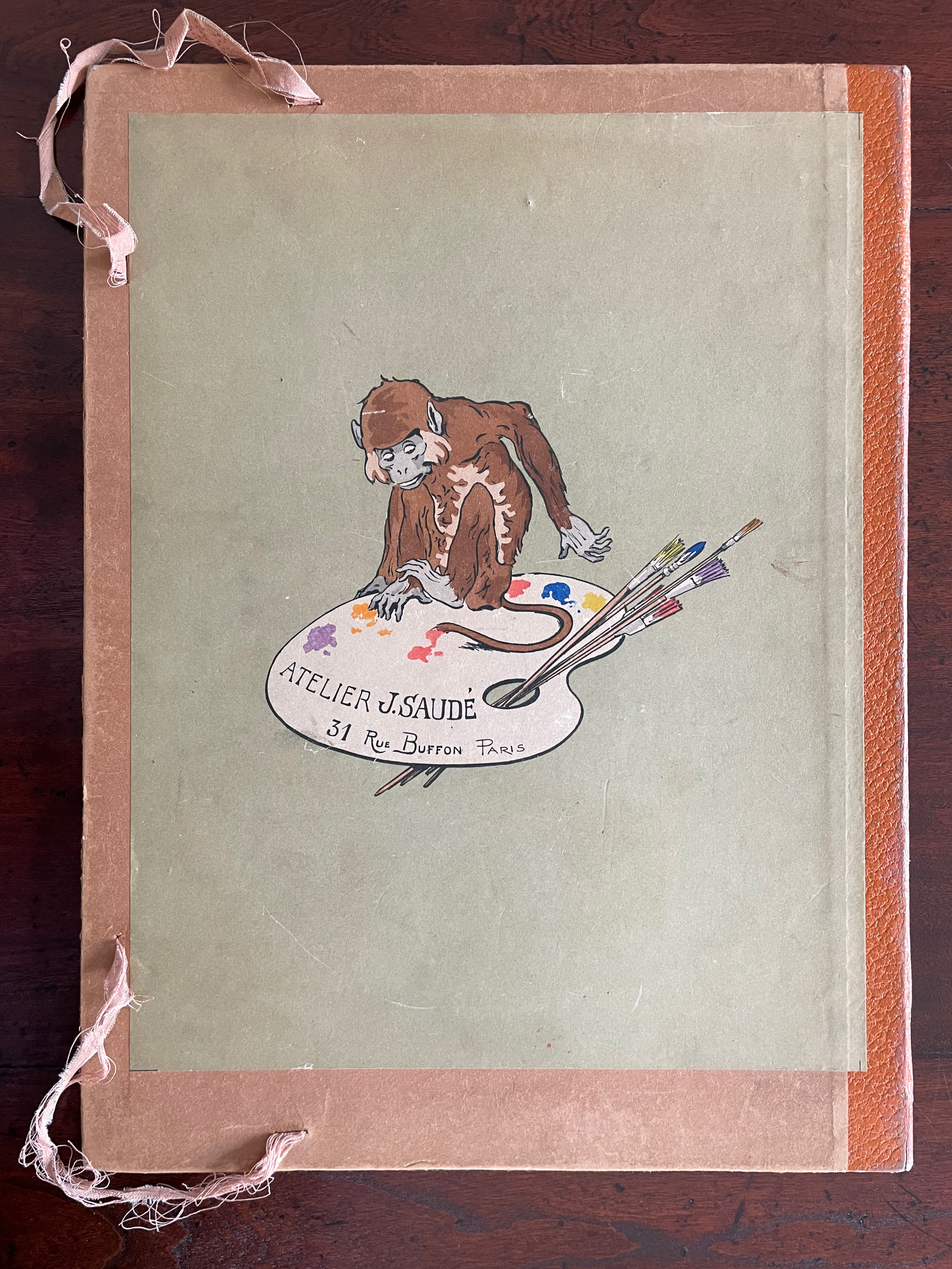
Portfolio, corner closures with ribbon, Portfolio: H385 x W285 mm. Prints: H380 x W280 mm. 27 folios. Acquired from ADER Nordmann & Dominique, 16 March 2023.
Photos: Books On Books Collection.
Miarko (born Edmond Bouchard, 1889, Kyiv) was an illustrator, caricaturist, painter and expatriate in Paris when he died in 1924. His work followed in the Art Nouveau tradition and appeared in magazines like The Magpie.

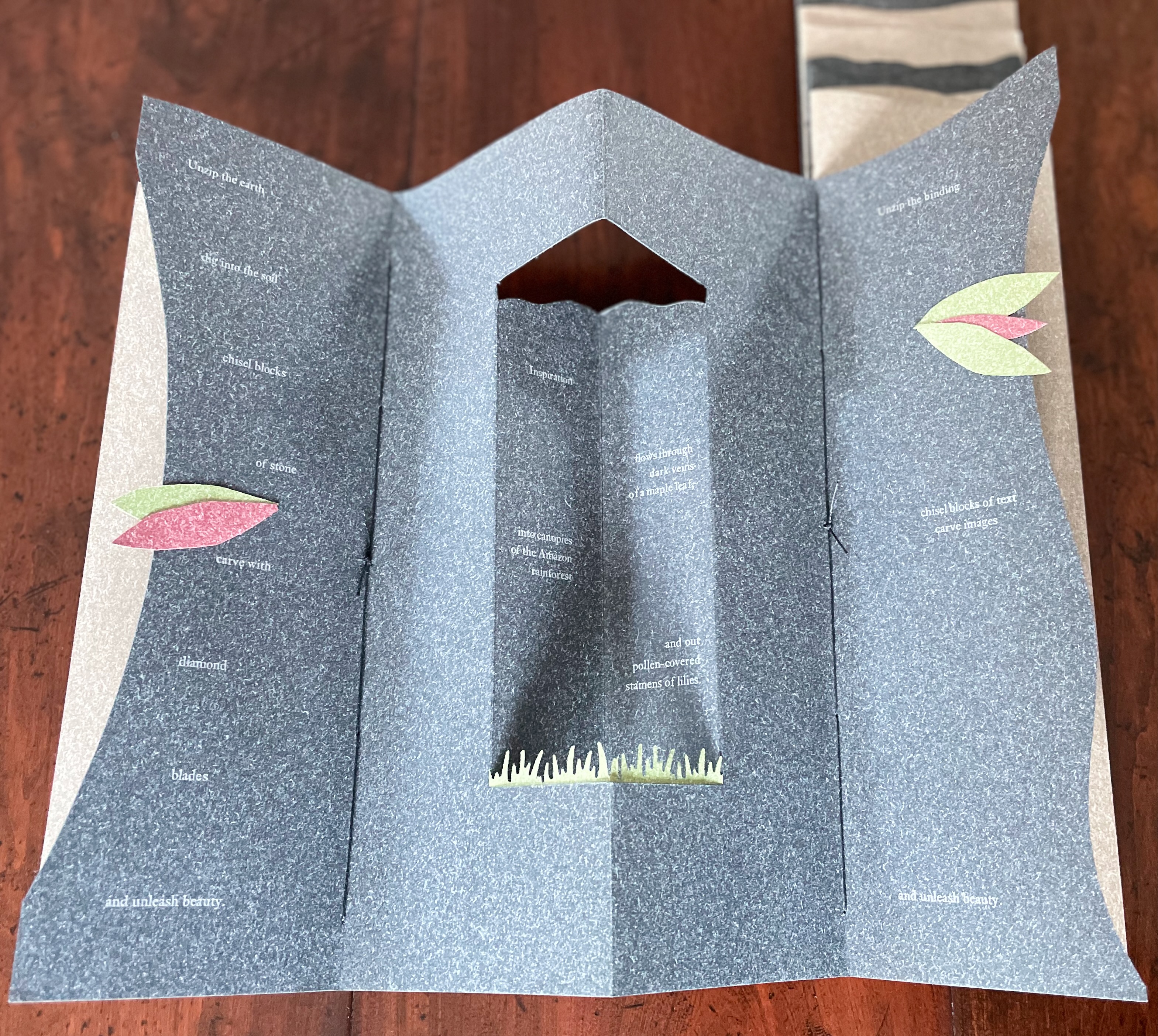
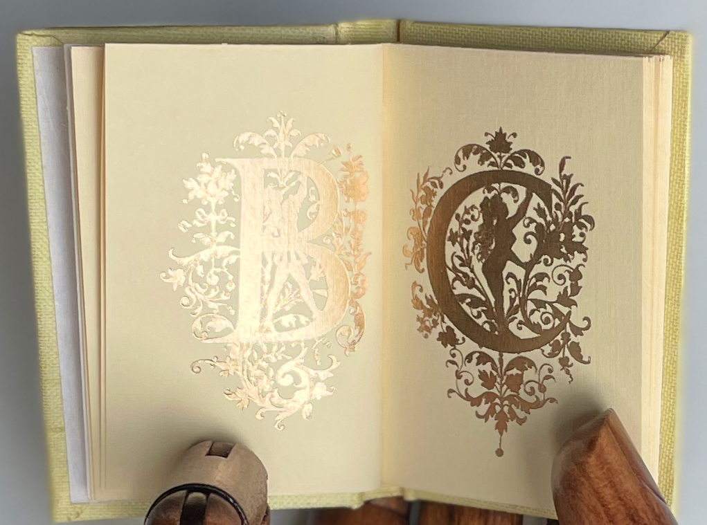
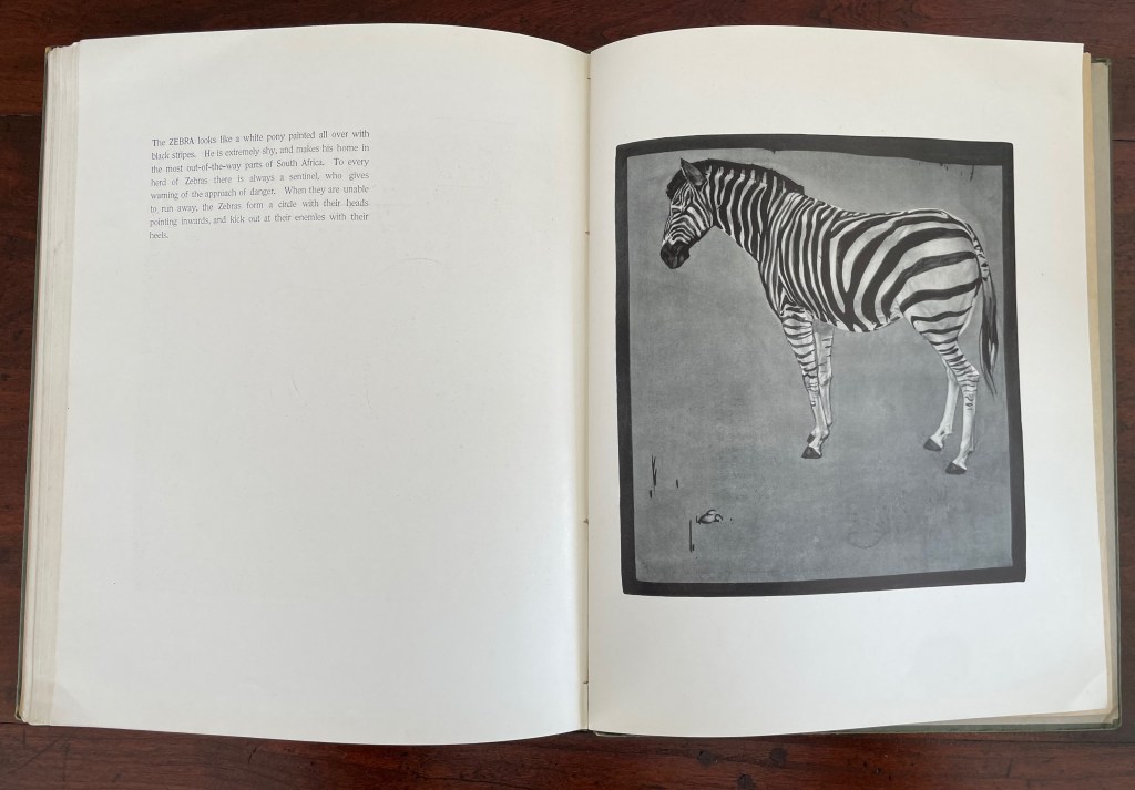
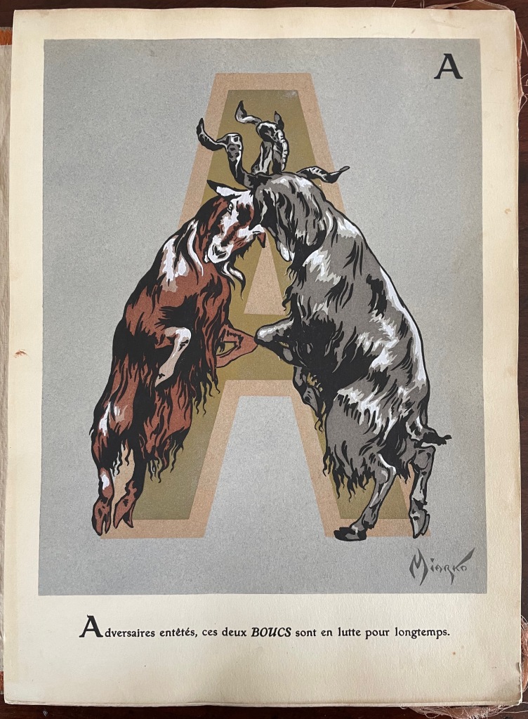
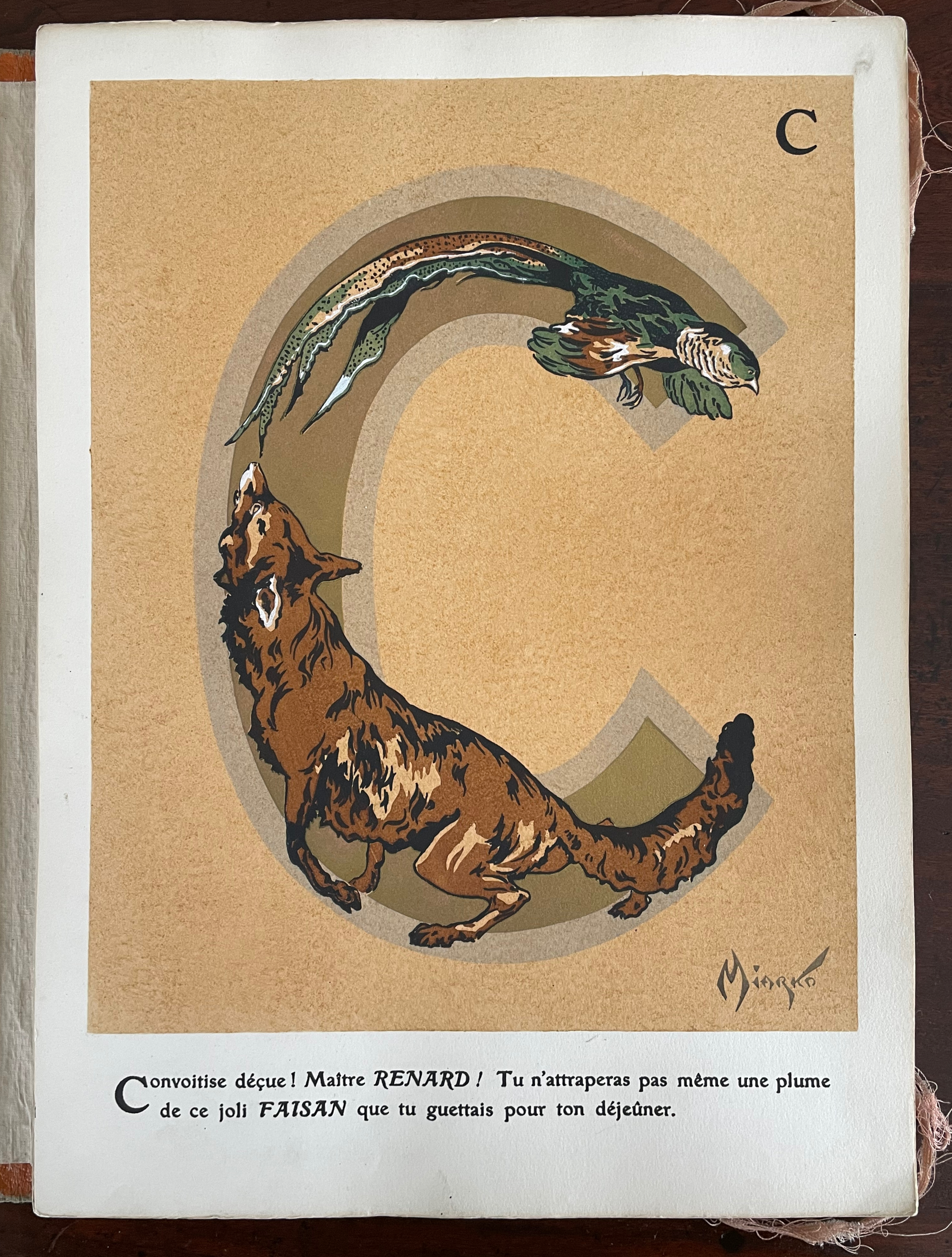
Of his limited output, ABC d’Art is probably the best known. Produced by Jean Saudé, it provides a representative link in a chain of alphabet works with which to explore distinctions and affinities among different periods of art. Although Saudé was known for his pochoir work, the varying background colors of ochre, golden yellow, blue gray, mauve, etc., and use of gold paint in Miarko’s plates speak an entirely different language from that of fellow-expatriate Sonia Delaunay’s intense pochoir colors in Alphabet (1972) or even her work in the 1920s. Although some affinity with the woodcut of the horse in C. B. Falls’ ABC Book Boo(1923) can be seen, the handling of color, again, leads in different directions. Add Jasper Johns’ painting Alphabet (1959) to this chain, and marvel at the stylistic differences that arise from the artists’ blending of stencil work and brush work.
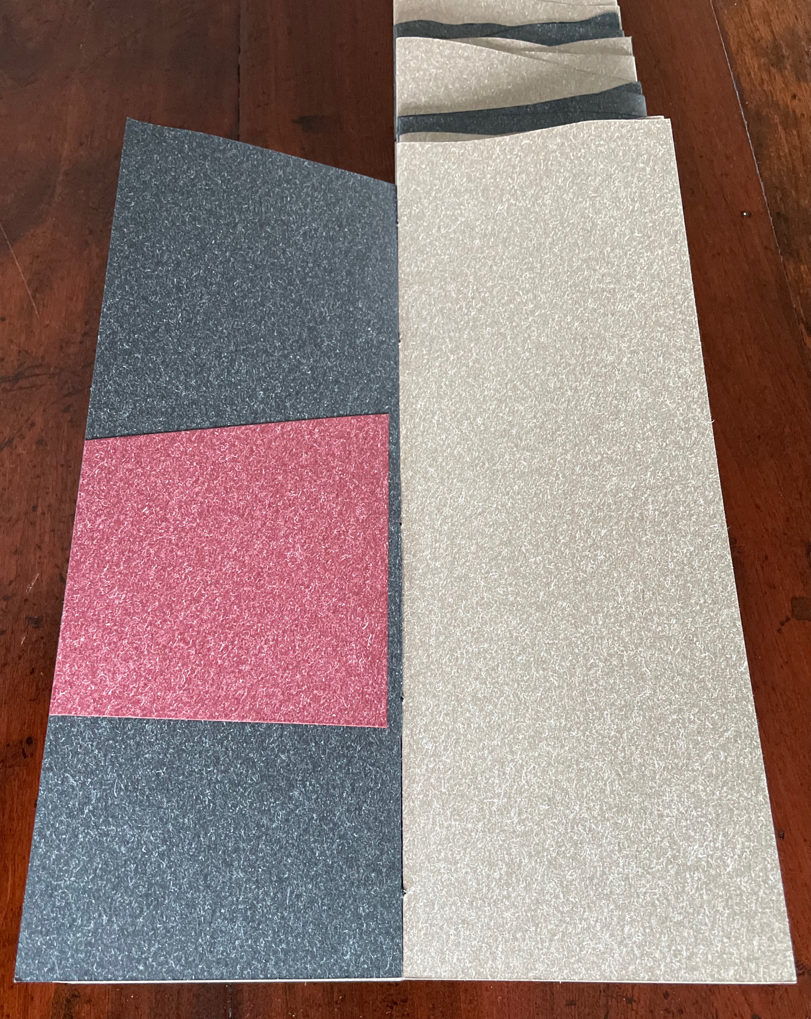
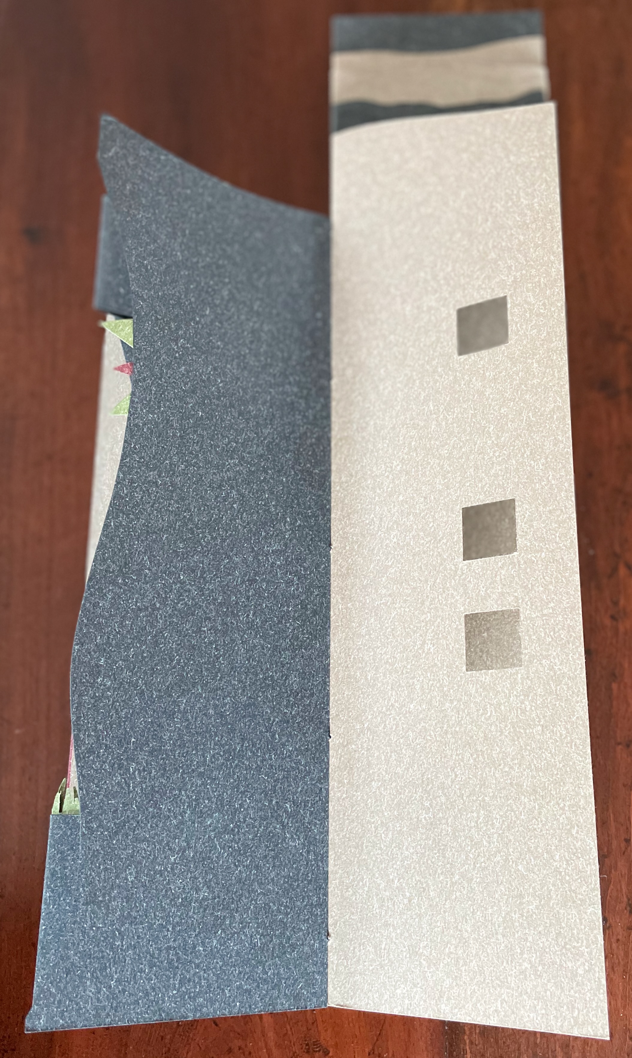
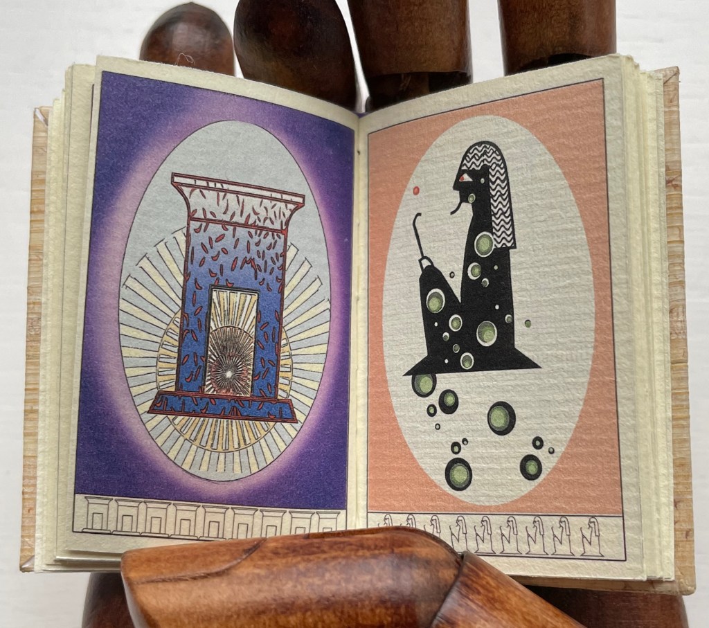
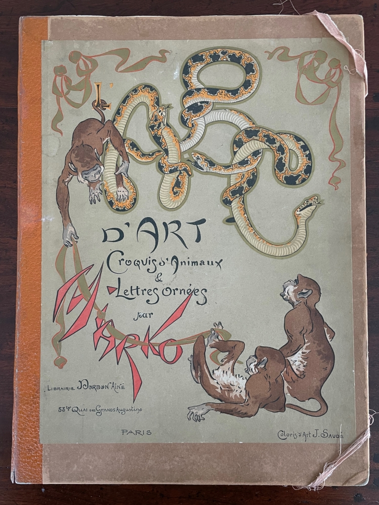
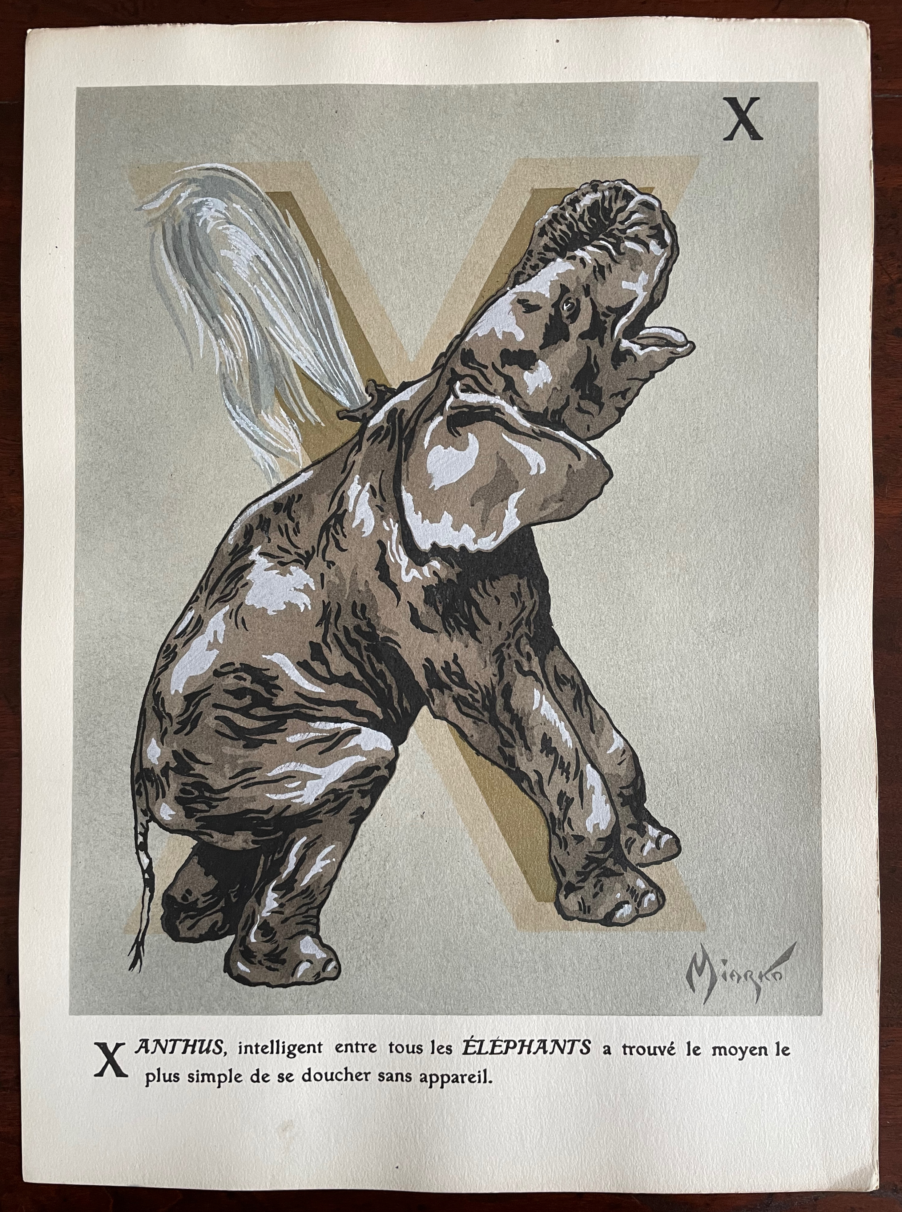
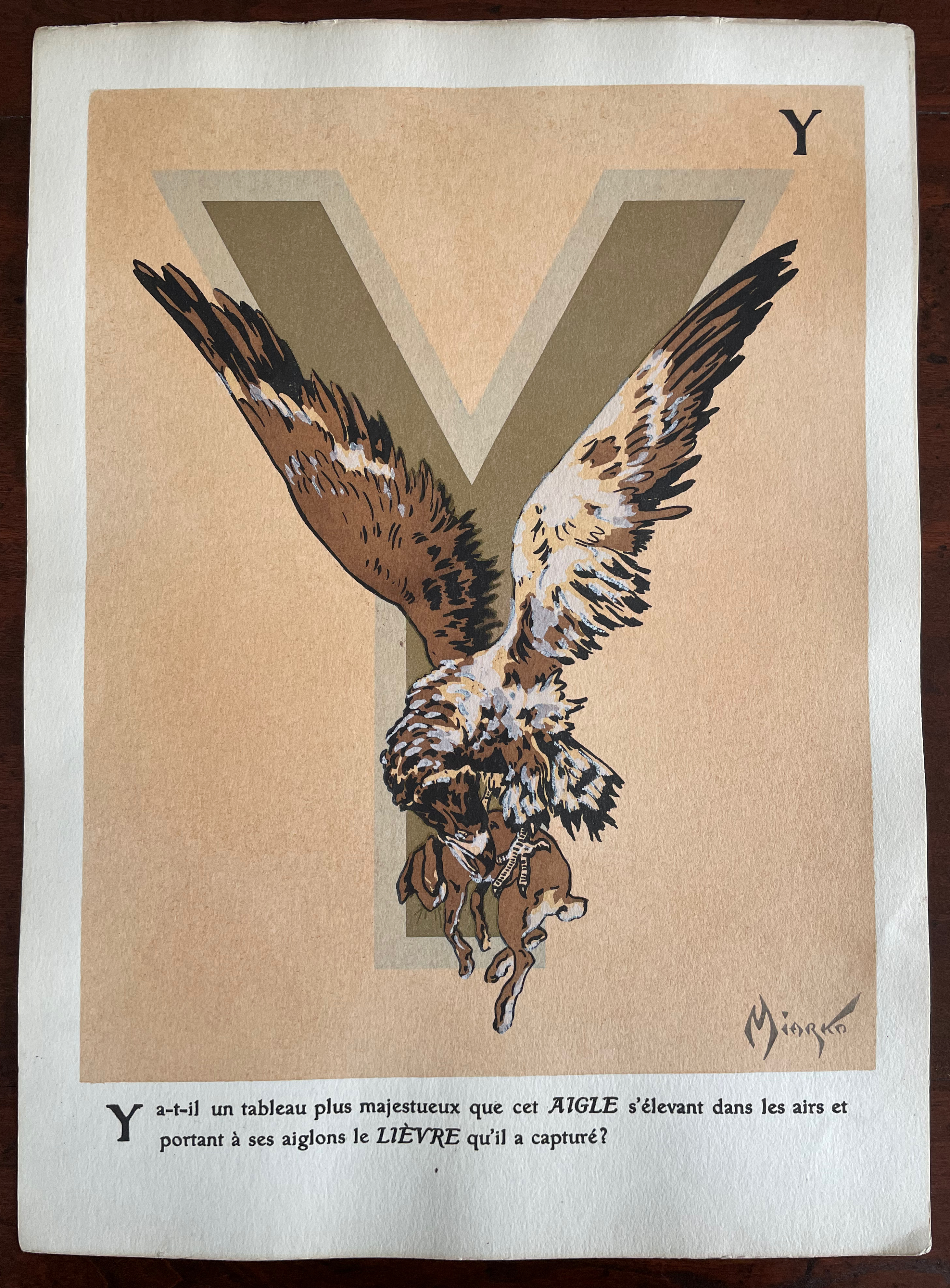
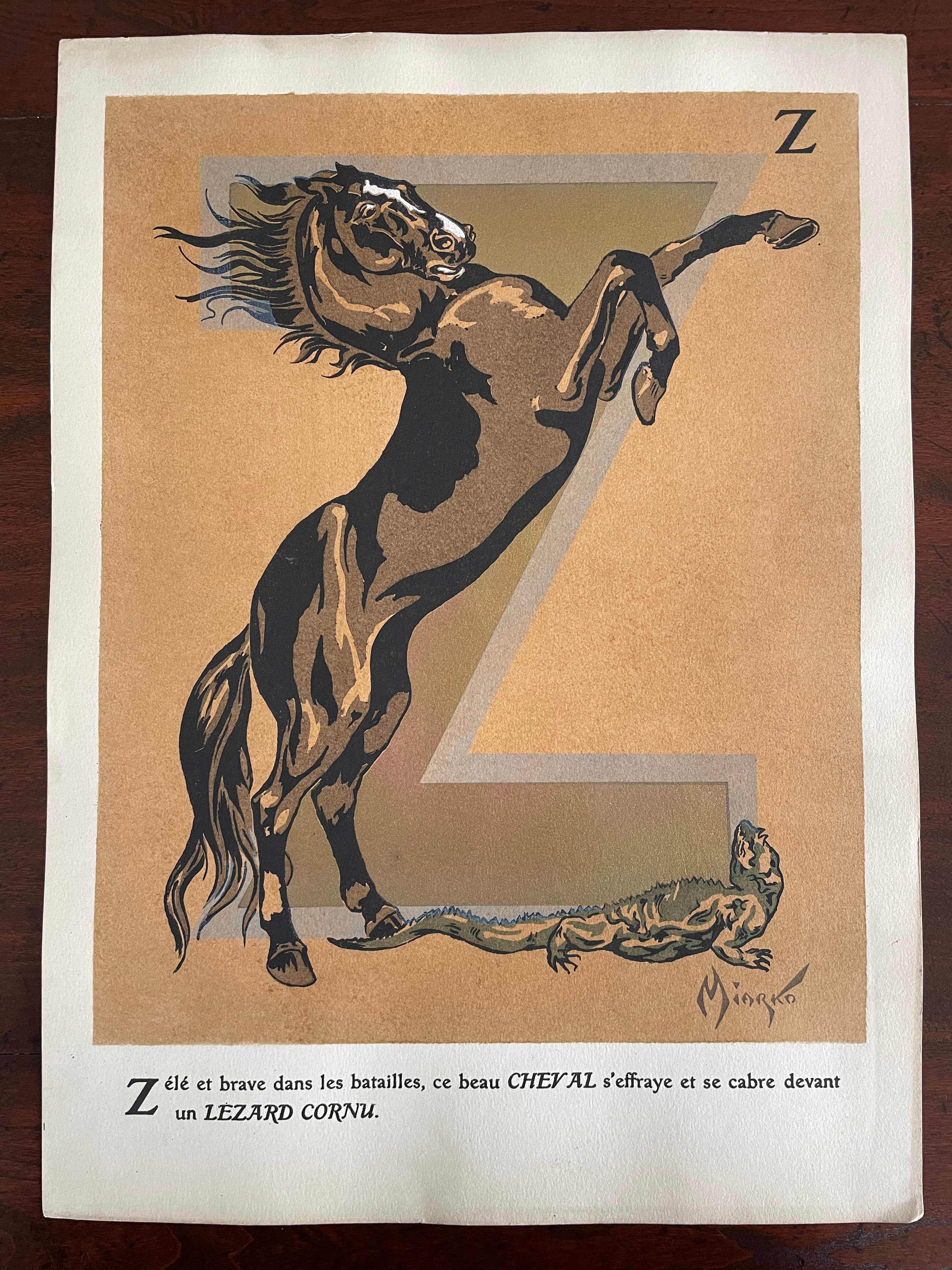
Miarko’s portfolio is a cardboard folder with an orange morocco paper spine. Its covers have lithographed illustrations in colors applied. The letters ABC formed by boas on the front cover are almost easily missed for the gamboling chimpanzees. There are twenty-seven lithographed plates in colors and gold. Each letter of the alphabet is rendered as a large initial in gold paint and outlined in another color. The twenty-seventh plate is devoted to the numerals 0-9.
Unlike most animal alphabet books, the animals do not always correspond to the initial they decorate. Rather, each initial corresponds to the first letter of the text beneath. More to the point of its difference from most animal alphabets, this one’s images and text seem to revel in nature’s tooth and claw.
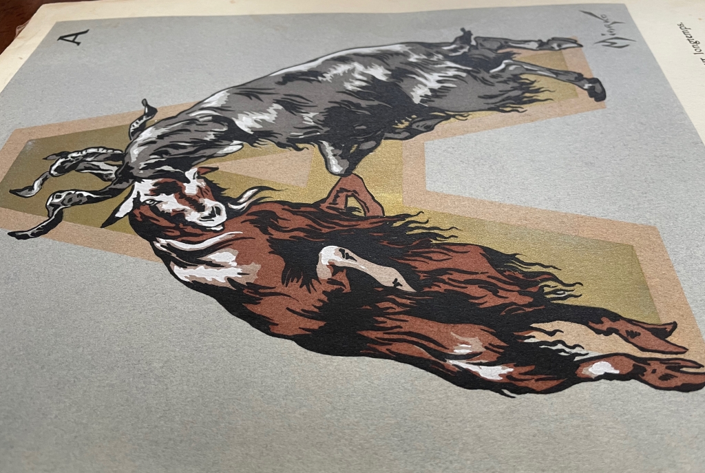
Side view with gold paint highlighted.


Side view with gold paint highlighted.
Front and back covers
Further Reading
“Abecedaries I (in progress)“. Books On Books Collection.
“Alphabets Alive! – Animals“. 19 July 2023. Books On Books. An online version of the exhibition at the Bodleian Libraries, 19 July 2023 – 24 January 2024.
“Sonia Delaunay“. 17 July 2023. Books On Books Collection.
“C. B. Falls“.14 December 2022. Books On Books Collection.
“William Nicholson“. 26 May 2023. Books On Books Collection
ADER Nordmann et Dominique. 16 March 2023. Abécédaires, Etc.: Collection Bernard Farkas. Accessed 16 March 2023. Cf. Le Bestiaire by Albert Gérard and Robert Hanesse (c. 1960), p. 78.
Art Institute Chicago. Alphabet (1959). Jasper Johns. Ref. 2015.121.