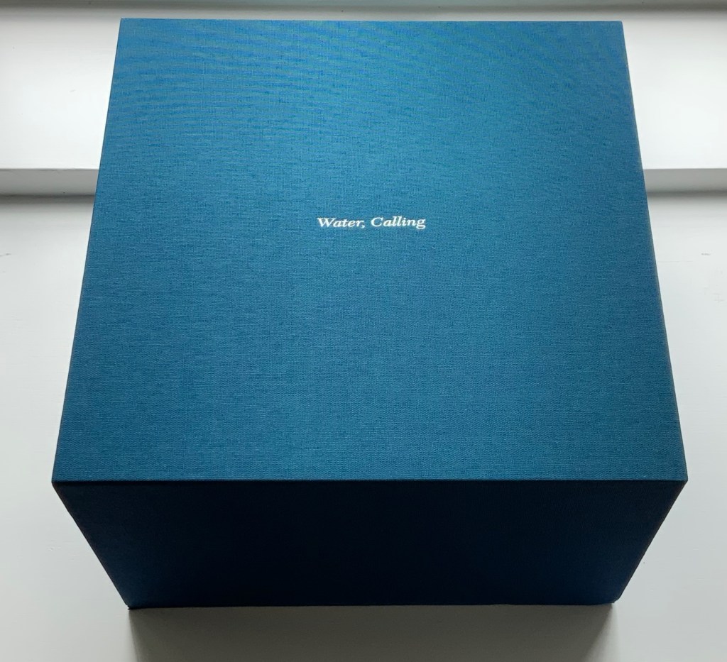
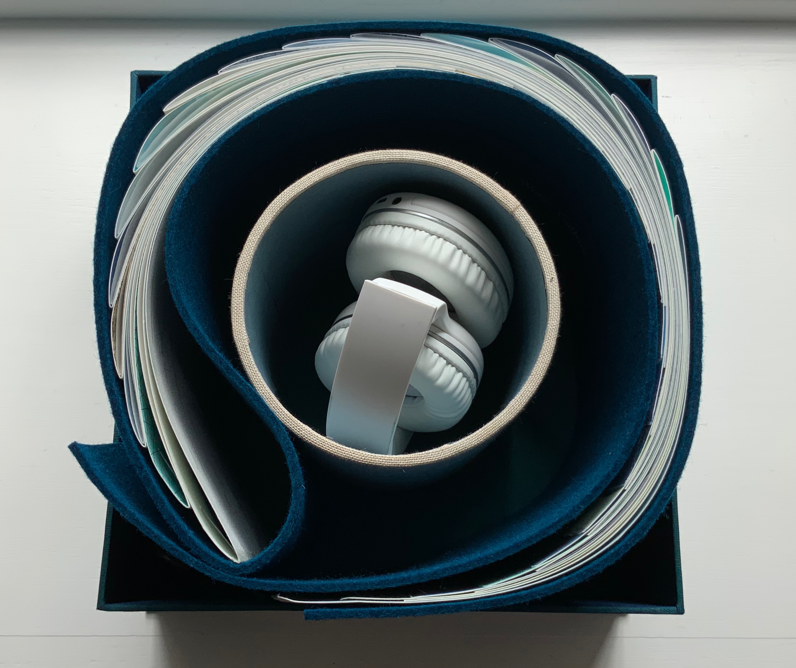
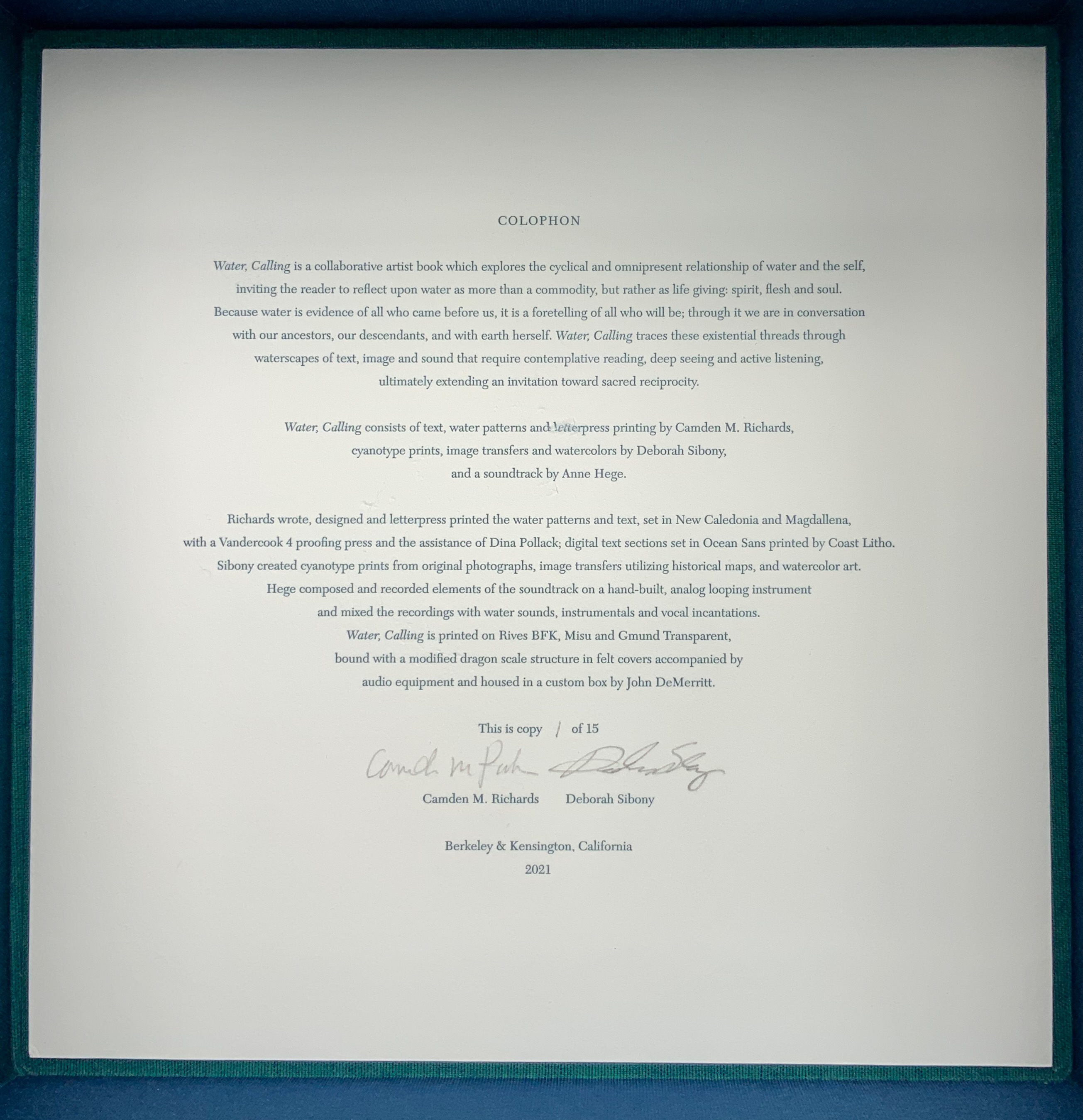
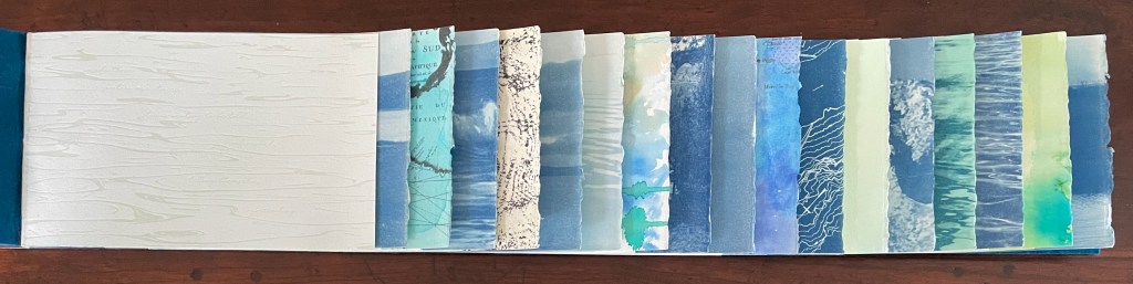
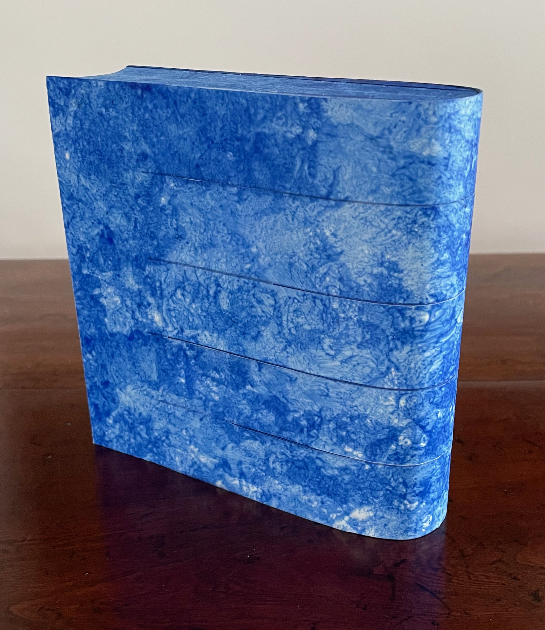
This is the rare first edition as published by the late Jan Middendorp through his Druk Editions. It bears all the hallmarks of his eye for design — the black coated wired binding, the heavy embossed card cover, the use of color to underscore the text’s theme, the embedded booklet — all nevertheless centering and providing a platform for the art and design of Clotilde Olyff.
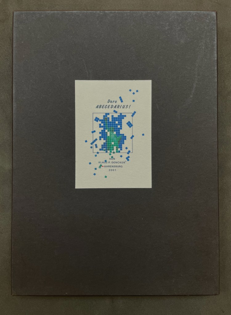
Dero Abecedarius!(2001) Klaus Peter Dencker Loose folios in heavy card box, title on card pasted on front box cover. H298 x W210 mm. 34 folios. Inkjet on BFK Rives 210 gram. Edition of 50, of which this is #30. Acquired from Red Fox Press, 3 January 2023. Photos: Books On Books Collection.
Visual poems in an ABC sequence and inspired by the Statue of Liberty. Klaus Peter Dencker belongs in the vast company of notable visual poets and “alphabet-etishists”, too many to list here, but within the Books On Books Collection, there are Jim Avignon & Anja Lutz, Jim Clinefelter, Martín Gubbins, Bernard Heidsieck, Karl Kempton and Sam Winston, all of whom offer fruitful comparisons.
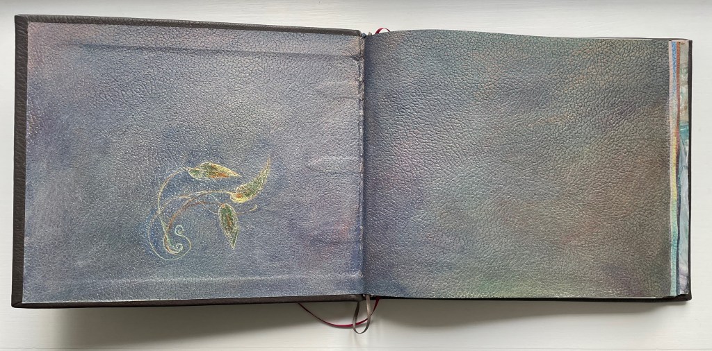
Handscapes (2016) Margaret (Molly) Coy & Claire Bolton Casebound, hand sewn and bound with doublures and two ribbon bookmarks. H260 x W310 x D30. 80 folios. Edition of 12, of which this is #9. Acquired from the artists, 19 October 2023. Photos: Books On Books Collection. Displayed with artists’ permission.
Co-founder of The Alembic Press with David Bolton, Claire Bolton is an independent historian of printing and type as well as an aficionado of handmade paper. She recently donated works in shifu (a spun and woven paper textile) to the Bodleian. Although she disclaims classification as a book artist, her works in the Books On Books Collection — especially her collaboration with Molly Coy called Handscapes (2016) — argue with her persuasively.
A Little Black Book (1995)
A Little Black Book(1995) Claire Bolton Miniature, exposed-spine, stab-bound with red cotton thread to hard boards. H73 x W60 mm. 64 pages. Edition of 100, of which this is #4. Acquired from Oak Knoll Books, 11 October 2023. Photos: Books On Books Collection. Displayed with artist’s permission.
I think that the root of the wind is water (2016) Susan Lowdermilk Hardback with open spine, Asahi cloth over board, debossed front cover with fitted, pastedown artwork, around folded structure with cut-outs, pop-ups and pastedowns. H236 x W182 x D20 mm. 14 pages. Edition of 30, of which this is #24. Acquired from the Abecedarian Gallery, 5 October 2023. Photos: Books On Books Collection. Displayed with the artist’s permission.
Some book art illustrates a poem. Some converses with it. And some, like this one by Susan Lowdermilk, enact the poem.
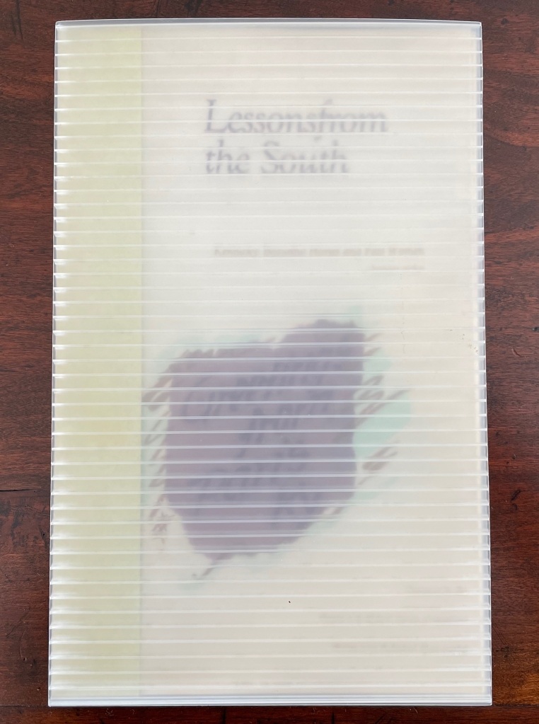
Lessons from the South(1986) Susan E. King Modified flag book. Closed: H270 x W172 mm; Open: W670 mm. 20 pages. Acquired from Rickaro Books BA PBFA, 22 September 2023. Photos: Books On Books Collection.
Lessonsfrom the South presents a masterful weaving together of material, structure, technique and image with Susan King’s reminiscences and social observations of her birth state Kentucky. For King, growing up white and female in the South in the second half of the 20th century engendered a sense of otherness and rebellion. As with some white southerners, it led to mild acts of rebellion — sitting too far back in the bus, sitting next to black students in typing class, or finally leaving for other regions of the US. With the 21st century’s rise of the “Karen”, repression of voting rights and reproductive rights, and resurgence of white supremacy, can we afford to dismiss the expression of conscience as “mild”? Any expression of conscience is something. Lessons from the South is an artful expression of fondness, humor, closeness and distance — a sense of being ill at ease with a Southern heritage we all seem unable to escape — that should be revisited not only for the sake of its art but as encouragement to conscience.
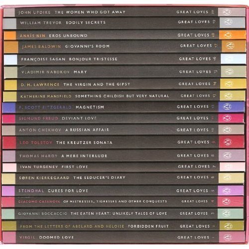
Penguin’s 2007 series “Great Loves” is a twenty-book set of short paperbacks with selections from the usual suspects (D. H. Lawrence) and the unusual (Søren Kierkegaard). The selection of eleven tales from Giovanni Boccaccio’s Decameron provides Carolyn Thompson with the opportunity to create a work of altered book art enjoyable on several levels.
The unaltered cover promises one thing. Its “under-the-cover” title page delivers another.
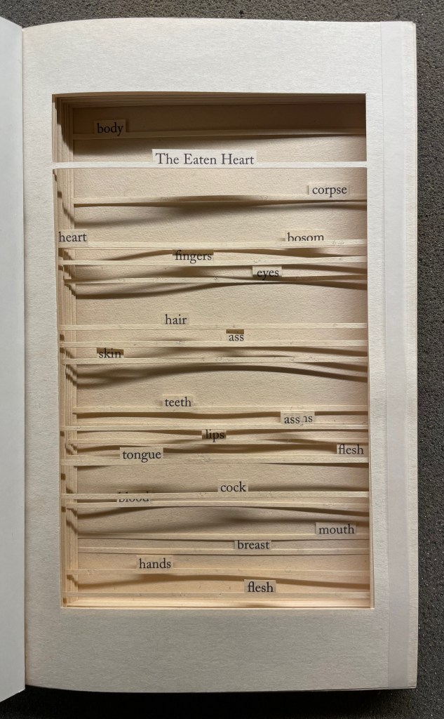
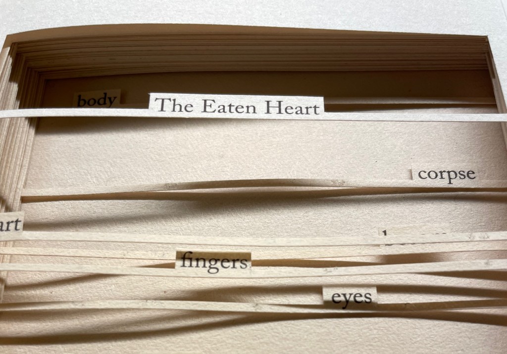
The Eaten Heart (2013)
The Eaten Heart(2013) Carolyn Thompson Altered perfect bound paperback. H180 x W111 mm. 124 pages. Edition of 3, of which this is #2. Acquired from Eagle Gallery, 7 October 2023. Photos: Books On Books Collection. Displayed with artist’s permission.
Thompson’s chosen technique of removing text with a scalpel enacts one of the paradoxical meanings of the revealed tell-tale title it presents: the scalpel has eaten away all the text on this title page except for the text chosen as the title. Boccaccio’s text is there but not there, and the “under-the-cover ” title nods toward his missing content. Leaving only words referring to the body, Thompson’s work of book art celebrates the raunchy “under the covers” innuendo in Boccaccio’s text.
The transparent tape that holds the body of cut pages together (just detectable in the image of the title page above) can be removed and the pages turned (carefully!). Below is page 11 “in motion”.
The sequence of pages 116 to 119 below shows that, while the verso pages do not play a role in the work, the movement of words on the recto side away from those that follow them, revealing the blank sheet at the end, invites musing about their possible relationship as well as marvelling at the artist’s delicate patience applied to the indelicate.
Later on, using the 50 books in the Penguin Modern Box Set (2018), Thompson created text pieces, drawings, embroideries, prints and additional altered books in the spirit of The Eaten Heart. The Laurence Sterne Trust exhibited the full set of works at Shandy Hall, York, in 2019. Eagle Gallery hosted them again in London in February 2020, and the same year, After Capote: When Truman met Marlon, her altered version of Truman Capote’s The Duke and His Domain in the series, won the Minnesota Center for Book Arts Prize People’s Book Art Award.
The more wide-ranging but more consolidating work that follows demonstrates Thompson’s indefatigable originality and insatiableness as a re-purposing artist.
The Beast in Me (2021)
The Beast in Me (2021) Carolyn Thompson Print. 130 x 130 cm. Acquired from Information as Material, October 2021. Photos: Books On Books Collection. Displayed with artist’s permission.
Although The Beast in Me has a previous iteration from 2014, this one commissioned for the second issue of Inscription: The Journal of Material Text (the “holes issue”) expands to over 500 snippets of text beginning with ‘I’ from eight different novels. Its manner of doing so makes The Beast in Me simultaneously centrifugal and centripetal in its effect — perhaps more emblematic of Inscription‘s coverage in its “holes issue” than the impressive work chosen for the covers.
Here is Thompson’s description of the commissioned work:
The statements (over five hundred of them) are presented one after another in a circular narrative with no natural beginning or ending and can therefore be read from any point. When removed from their original context, they become ham-fisted stabs at self-revelation and blurted snapshots of confession. They contradict one another, and the narrator. The piece explores the power struggle within all of us, where different aspects of our personalities vie for dominance over one another at any given moment, while others yearn for internal balance. The narrative, whilst light and frivolous in places, descends into a sinister and uncontrollable rant in others.
If we accept the print’s invitation as we would a book’s invitation to read — to engage in narrative — we find that human identity’s ever precarious balance — between inward and outward forces, its introverted and extroverted elements, the being apart and the being a part of, and integration vs disintegration — is captured sharply. A blank center, a void or hole — there but not there — defined by fragments simultaneously flying outward and pressing inward.
Winter (2019) Ianna Andréadis Softbound with a waxed thread loop. H210 x W150 mm. 48 pages. Acquired from Happy Babies, 30 July 2023. Photos: Books On Books Collection. Displayed with artist’s permission.
The language of the book is one we learn well before we learn to read. It has many rules and parts. One part is the single page, and one of its rules is to turn it. Another of its rules is that the page behind may affect the page before. Another part of book language is the double-page spread. One of its rules is that facing pages may affect one another and that the space between them might disappear. As with any native language, we absorb its rules and parts and use them without thinking about them. Ianna Andréadis’ Winter revels in the language of the book and invites us to page through a winter wood and confusing thicket to begin learning again what we absorbed so long ago.
Like our earliest children’s books, Winter‘s only word is its title. Inviting touch, its front cover reproduces the main image of the title page but with debossing, and the book paper that follows is heavy and translucent.
With a turn of the title page, the bird is behind us, and the branches and trunks obscured by the title page’s “winter fog” loom large in black with the woods beyond appearing through the fog continued with the translucent paper.
As we move further into the woods, we look down on a bush or small tree weighted with snow whose trunk and branches sink into the snow beneath. Having passed it, we find a stand of four saplings and the one furthest from us also sunk in snow.
But now look up. The tangle of black branches and the winter fog barely hide the broken limbs of the tree just behind.
Several more pages of thicket and fog come before we reach the center of the book. There the imposition imposes its mechanics. The two facing pages both bear black ink, and the viewer may wonder whether these are birchtree trunks or black trunks with footsteps and branches or clumps of tree fall in the snow-covered ground between them.
Whatever that view is, the shift in inking according to the imposition envelops us in a winter fog on the following double-page spread.
Andréadis and her imposition, however, will lead us out of the fog and thicket, and the “lightening sky” over the next several pages encourages us to look up and find another bird perched above.
After several more pages and perhaps too tired to keep looking up, our eyes turn back to the tree trunks and branches sunk in snow, until at the end, we can finally look back up, turn around and see the clear fork of a trunk behind which the wood has disappeared again in winter fog.
And if at the end, prompted by the feel of the back cover and perhaps childhood memories of first books to press the covers flat, we’ll find we have come full circle. The next-to-last page’s forking tree trunk now appears debossed on the back cover matched to its other half and the bird on the front cover. Let’s read it again!
Andréadis’ Winter is now scarce, but through the link behind the title, you might be able to locate an institution with it near you. To enjoy more of the artist’s work, several of her illustrations of others’ books are available in libraries and the used-book market. One such book is Le papillon et la lumière by Patrick Chamoiseau, which deserves publication in translation not only for its charming story but for greater access to Andréadis’ artwork.
For another means of re-experiencing the first encounter with the language of the book, try Bruno Munari’s I Prelibri, first published in 1980 and still available in a second edition from Corraini.
Further Reading
Andréadis, Ianna. 2019. Winter. Tokyo: One Stroke.
A Apple Pie(2005) Gennady Spirin Casebound, laminated paper over boards, pastedown with matching endpapers, sewn. 275 x 275 mm. 32 pages. Acquired from Bud Plant & Hutchison Books, 13 March 2023. Photos: Books On Books Collection. Displayed with permission of the artist.
“Never judge a book by its cover” does not mean “ignore the clues and promises there”. A laminated cover and lay-flat binding are not uncommon among children’s books. Nor is the spreading of an illustration across the back and front covers. What is unusual about Gennady Spirin’s A Apple Pie is how it uses them to offer clues and promises of the lesson this book offers beyond the lesson of the alphabet. It promises a lesson about perspective and the canvas of the book.
Look at how the back and front covers play with landscape perspective and the notion of the book as frame and canvas. The head of the spine interrupts the landscape to join the narrow orange frame that demarcates the edges of the landscape. All the same, the landscape’s hill of apples in the foreground overlaps the spine to descend into the landscape’s midground on the back cover, which deepens into a background of at least five levels like a medieval or Renaissance painting.
Another technique of perspective from those traditions is to place in the background things we know are large and in the foreground what we know is smaller. A temple or mansion behind, a mother and child or pie up front. These objects and figures often perform temporal double duty as in The Flight into Egypt, where the tiny workers misdirect the mass of Herod’s soldiers in the background while the Holy family looms large resting in the foreground. In Spirin’s illustration, the past apple-picking appears in the distance, and the resulting pie is near.
Spirin slyly multiplies this trick with his apple pie in the foreground with its tiny characters dancing around it. Yes, this book is going to replay the traditional celebration of the apple pie alphabet, but pay attention to relative sizes. The pie is monumental, larger even than the three-dimensional letter A that sits atop and casts its shadow over the banner of calligraphy, so watch for how the trick of shadows draws attention to perspective, to the roman vs calligraphic letters and to the surfaces on which the letters and tricks of perspective play out.
The very first double-page spread delivers on the cover’s clues and promises.
The oversized carved A serves as an arch to provide an example of a word beginning with A and casts its shadow over the oversized pie and cutting board that a team of elf-sized bakers has borne under it to the applause of mother and children who are mid-sized between the pie and bakers. The A is so oversized that its apex disappears from the image area. Bringing further attention to the image area and deepening its dimensionality, Spirin “cuts” the surface on which it is drawn and curls the cut section against the arm of the A.
In the world of letters, size matters — in the form of the upper and lower cases.
Further drawing attention to the art of illustrating the alphabet, not only does Spirin hand-draw examples of their forms in print and calligraphy, he leaves the guidelines for the base and x-height in place, eliminating them after (or before?) using them as the measure for the base and crust of a miniature pie in the margin. In a sense, the process of lettering has also become the canvas for A Apple Pie.
This process is displayed for every letter. Most also have a small apple vignette in the lower left or lower right corner.
As with the ants surrounding the apple, most of these vignettes serve up images that begin with the letters of their pages (for example, O for owl and P for pig) and are trimmed to re-emphasize the pages’ image space with which Spirin plays.
Letters other than A have images that cross the divide of pages. When they do, Spirin’s historical influences ranging from the medieval to the Renaissance to the Victorians stand out even more. His play with figures, color, perspective and shadow in the letter J pages recall Brueghel, Bosch, Patinir and, of course, Kate Greenaway.
Detail from Children’s Games (1560), Jan Brueghel, Kunsthistoriches Museum Wien Detail from Garden of Earthly Delights (1490-1500), Hieronymus Bosch, Museo del Prado A Apple Pie (c. 1886), Kate Greenaway, Internet Archive
The tradition of the “apple pie” mnemonic reaches almost as far back as the artistic ones. As noted on Spirin’s copyright page and confirmed in Peter Hunt’s International Companion, alphabet primers based on the mnemonic must have been well known prior to 1671 when the English cleric John Eachard referred to it. Compiled from the Bodleian Libraries’ record of “apple pie” items in the Opie Collection and from preparation for the exhibition Alphabets Alive!, here is a starting list for the industrious apple-picking artist interested in confecting an extension to the tradition. (Suggested additions to the menu are welcome in the Comments.) Scholarly baker’s apprentices should also start with the dissertation of the appropriately named A. Robin Hoffman (now at the Art Institute of Chicago); see Further Reading below.
1851-74. The Apple-Pie Alphabet. London: John and Charles Mozley, 6 Paternoster Row. 13.1 x 8.2 cm. Colophon of Henry Mozley and Sons, Derby. This title number 26 in the publisher’s series of penny chapbooks. Opie N 580. See also Opie N 581.
1856-65. The History of an Apple Pie. Written by Z. London: Griffith and Farran. 17.6 x 11.5 cm. Reissue as a rag book of the 1820 edition published by J. Harris. Wrappers have the colophon of H.W. Hutchings, 63, Snow Hill, London. Opie N 585. See also Opie N 586 for larger version (18 x 19.8 cm). From the library of Roland Knaster.
1860, not after. The Apple Pie. London: Darton & Co., 58 Holborn Hill. 25 x 17 cm. Darton’s Indestructible Elementary Children’s Books. Inscription dated 8 February 1860. Opie N 2. Also view here.
1861, not before. The History of A, Apple Pie. London: Dean & Son, Printers, Lithographers, and Book and Print Publishers, 11, Ludgate Hill. 25 x 16.5 cm. (Dean’s Untearable Cloth Children’s Coloured Toy Books). Opie N 4.
1865, ca. A. Apple Pie. London: Frederick Warne & Co. 26.8 x 22.6 cm. Aunt Louisa’s London Toy Books. Colophon of Kronheim & Co. Opie N 1.
1865-89. The History of A Apple Pie. London: George Routledge & Sons. 31 x 25.2 cm. Rear wrapper has colophon of the lithographer L. van Leer & Co, Holland and 62 Ludgate Hill Opie N 5. Also see Pussy’s Picture Book. Opie N 1017.
Webb, Poul. 2017~ . “Alphabet Books — Parts 1-8” on Art & Artists. Google has designated this site “A Blog of Note”, well deserved for its historical breadth in examples, clarity of images and insight.
Jason D’Aquino’s Circus ABC (2010) Jason D’Aquino Hardcover, cloth spine, printed paper over boards. H158 x W 158 mm. 56 pages. Acquired from Amazon, 24 September 2022. Photos: Books On Books Collection
At the intersection of alphabet books and artists’ books, surrealists and neo-surrealists come sailing, unicycling, swimming, stilt-walking and crossbreeding. Jason D’Aquino distinguishes his contribution with a circus theme and miniaturist’s hand, although his publisher Simply Read Books expands it to 158 mm square (6 x 6 inches).
The illustrations are more R. Crumb than Max Ernst, and the letters themselves hark back to Jean Midolle’s Écritures Ánciennes D’après Des Manuscrits & Les Meillers Ouvrages (1834). But in concept and execution, Jason D’Aquino’s Circus ABC is original. The fineness of D’Aquino’s drawings fascinates the eye.
D’Aquino’s book is also eclectic in its abecedary approach. Above, where the illustration for the letter C offers several things beginning with that letter, those for A and B do not play the “find the object” game, although they do have their jokes. The mermaid’s is an optical illusion.The barker’s joke is that he is D’Aquino’s self-portrait. And with the letter Z below, for which nothing shown begins with the letter Z, the visual puzzle lies in figuring out what the crown, martini and cigarette have to do with the anatomical swap-out between the goldfish and chimp — and why the image so strongly echoes that for letter A.
Surrealism has roots in the art of Hieronymus Bosch as well as in the fantastical alphabets of Jean Midolle and his medieval predecessors. Not surprising then that elements of D’Aquino’s world can be found in the Garden of Earthly Delights and the Kennicott Bible. Other surrealist alphabets from the Books On Books Collection are listed below.
Above: Detail from Hieronymus Bosch, The Garden of Early Delights (1490-1510). Below: Hebrew Bible (Former Prophets with Targum and various commentaries), Bodleian Library MS. Kennicott 5, 446v.
“Leslie Haines“. 4 November 2022. Books On Books Collection.
“Lynn Hatzius“. 2 December 2022. Books On Books Collection.
“Peter Hutchinson“. Books On Books Collection. In progress.
“Peter Malutzki“. Books On Books Collection. In progress.
“Clément Meriguet“. 13 November 2021. Books On Books Collection.
“Paul Noble“. 20 April 2021. Books On Books Collection.
“Judy Pelikan“. 2 June 2023. Books On Books Collection.
“Rose Sanderson“. 30 May 2023. Books On Books Collection.
“Pat Sweet“. 18 January 2023. Books On Books Collection.
“Ludwig Zeller“. 24 March 2020. Books On Books Collection.
Druker, Elina, and Kümmerling-Meibauer, Bettina. 2015. Children’s Literature and the Avant-Garde. Amsterdam: John Benjamins Publishing Company. Especially Philip Nel’s “Surrealism for Children”, pp. 267-83.