Alphabets Alive! – ABCs in Miniature

If ever the dictum “Less is more” applied, it applies here — with miniaturized tongue in cheek, of course. [Links in the captions will take you to more images and details.]

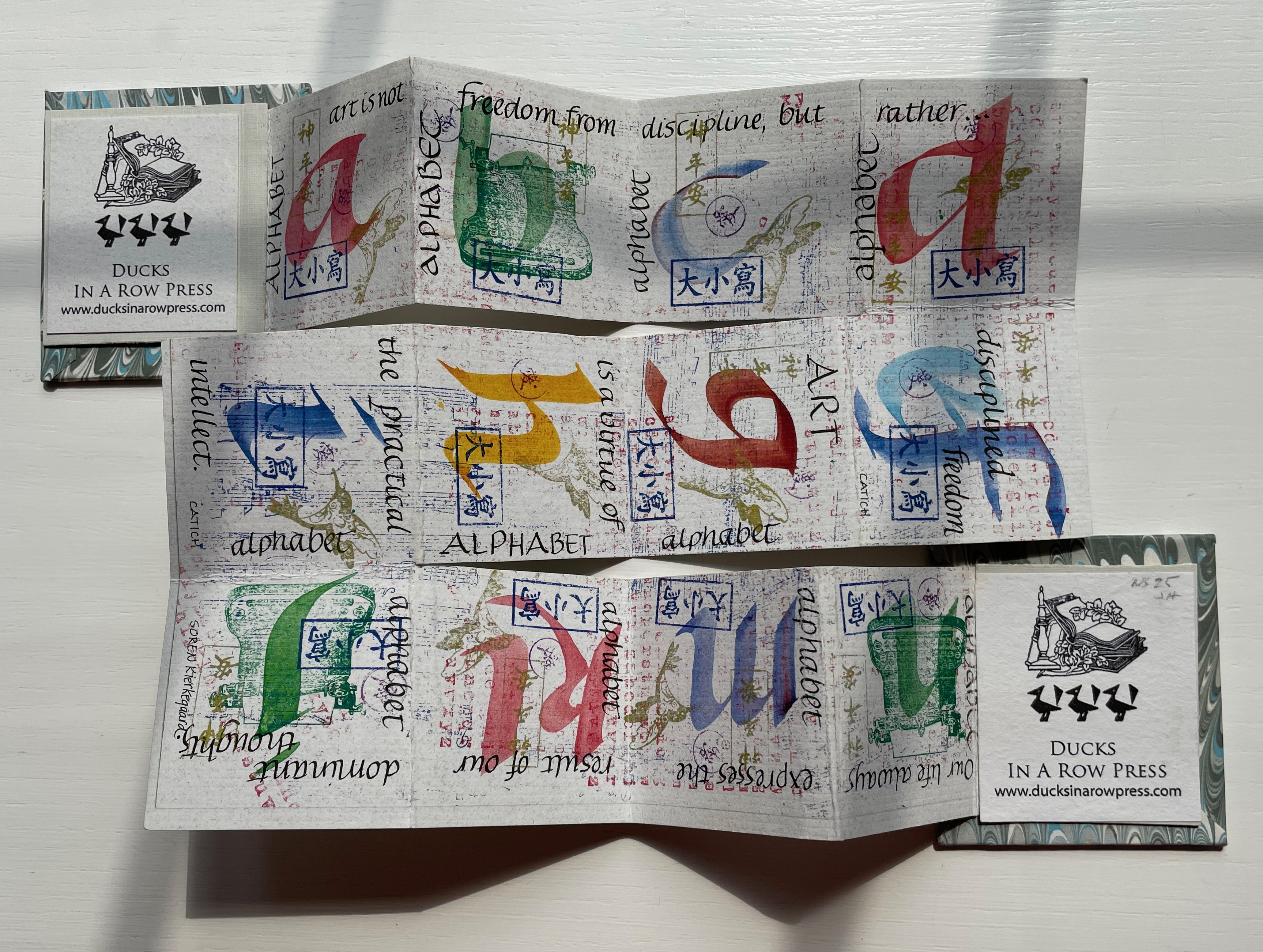
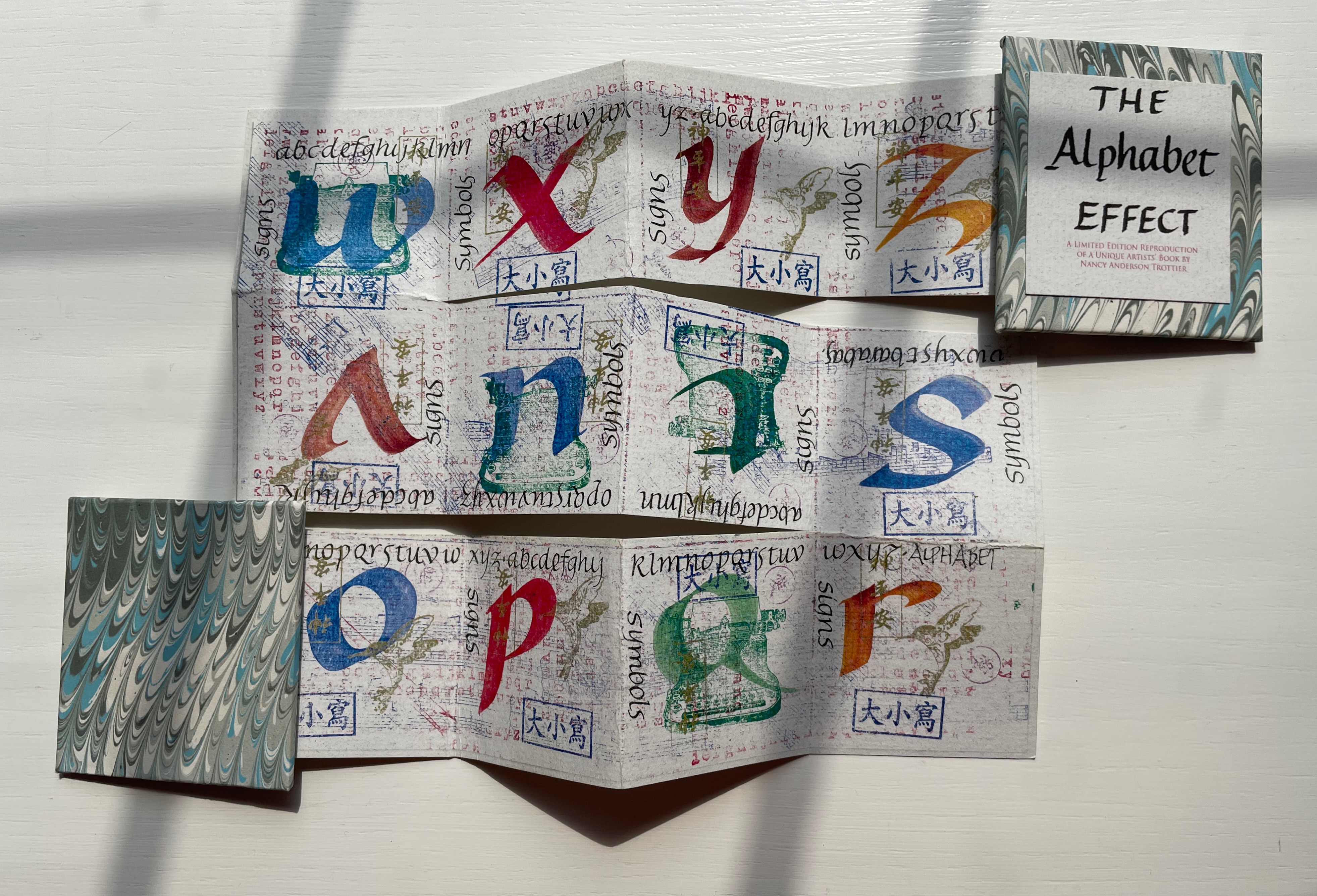
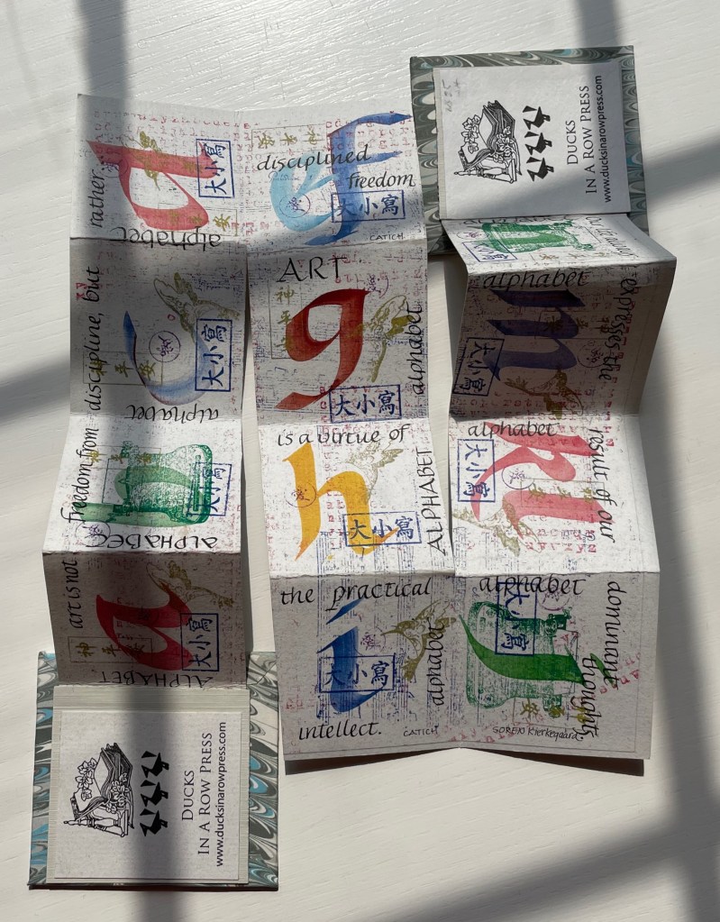
Nancy Trottier, The Alphabet Effect (2013). Compare this example of the meander fold with Claire Van Vliet’s below and Lisa McGarry’s in The ABCs of Form & Structure.

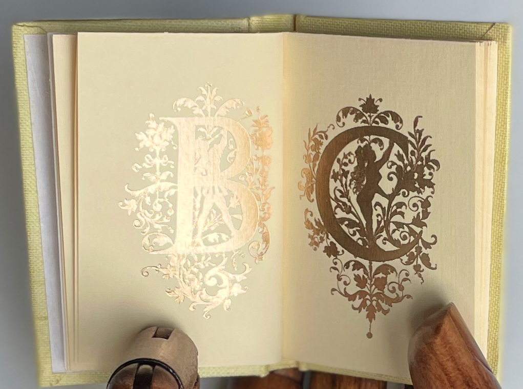
Peter & Donna Thomas, Alphabet People (1989). Even in miniature, B is for Body.

Picture ABC (place and date of creation unknown). And C is for Color.

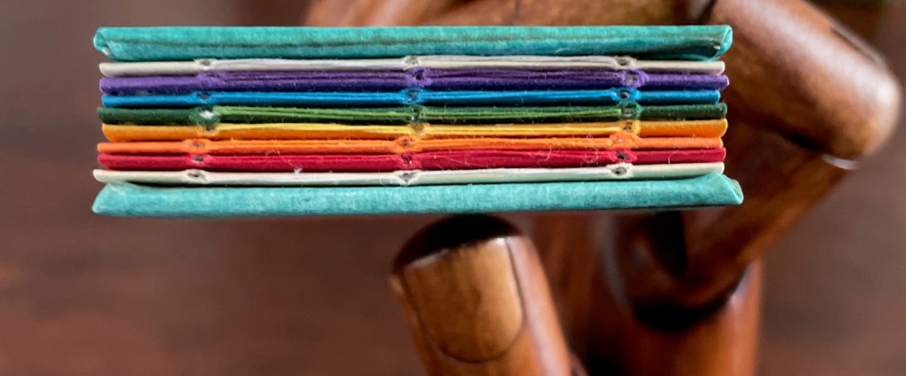
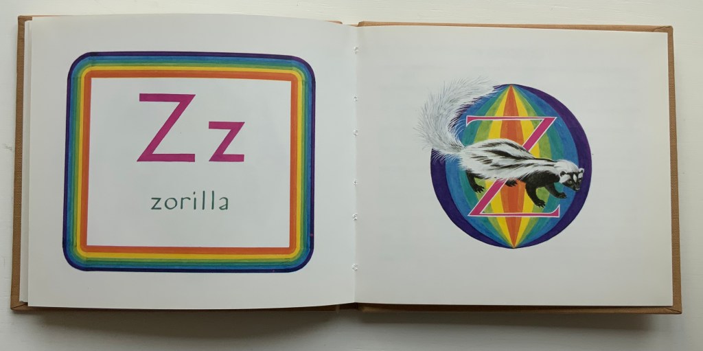
Rebecca Bingham, Defining the Rainbow (2018). And still more Color.
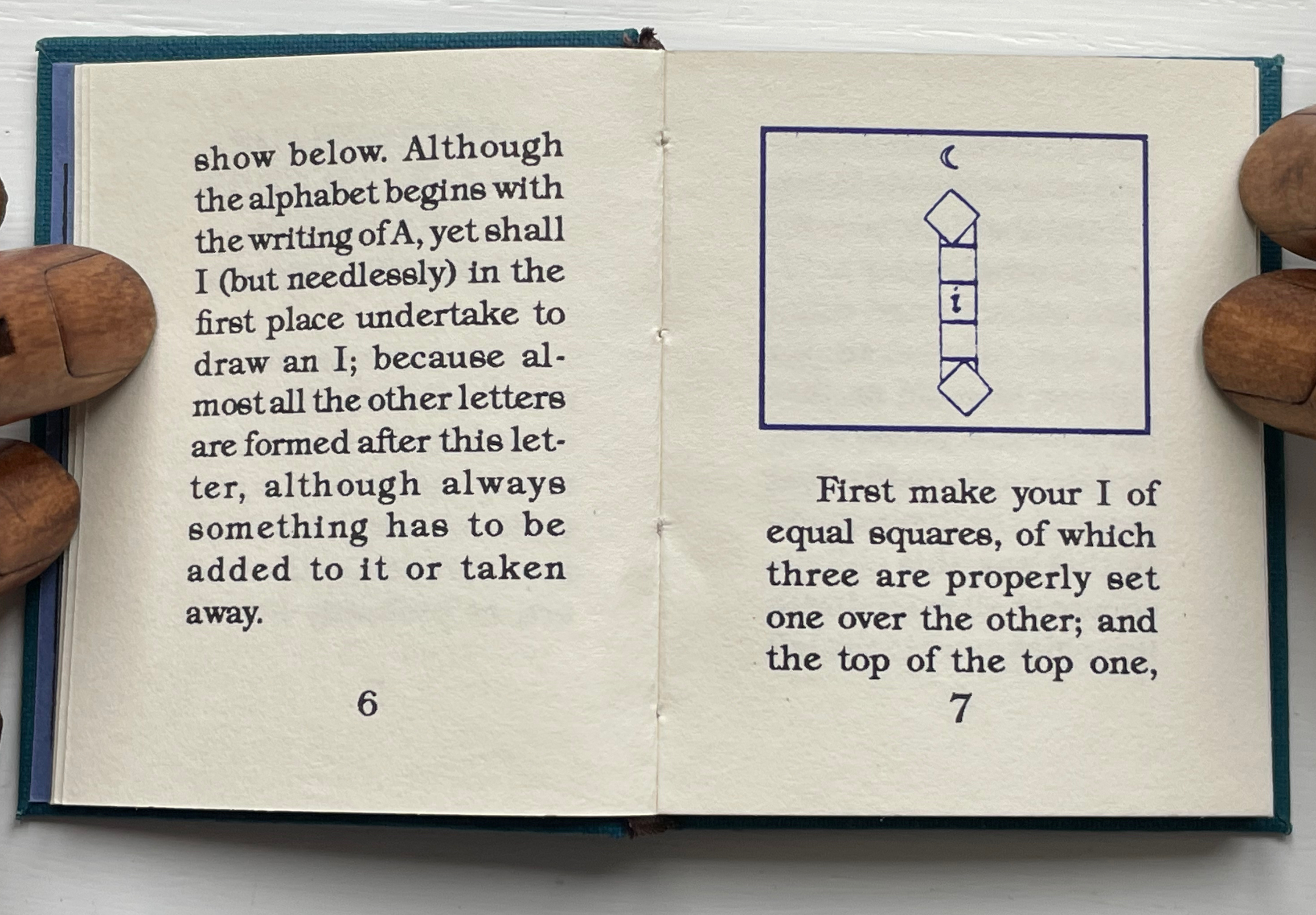
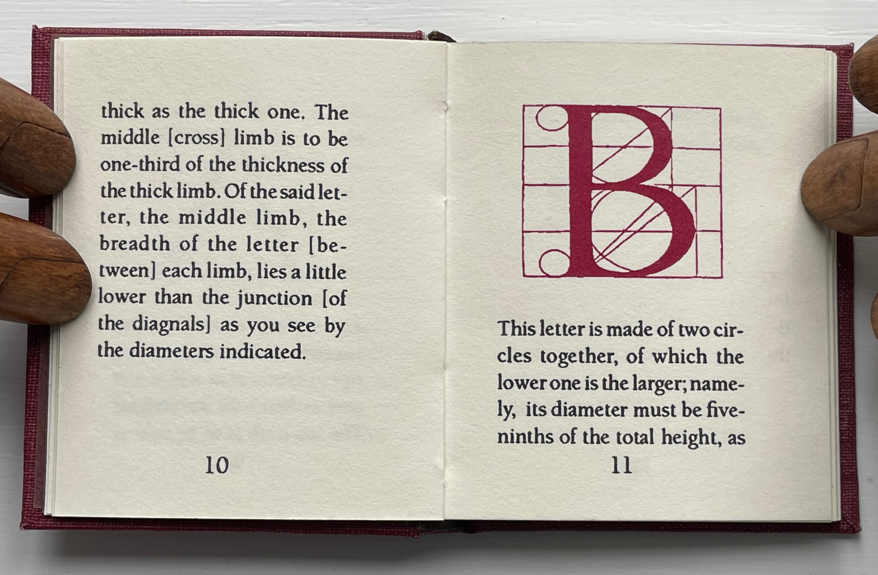
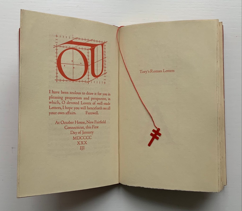
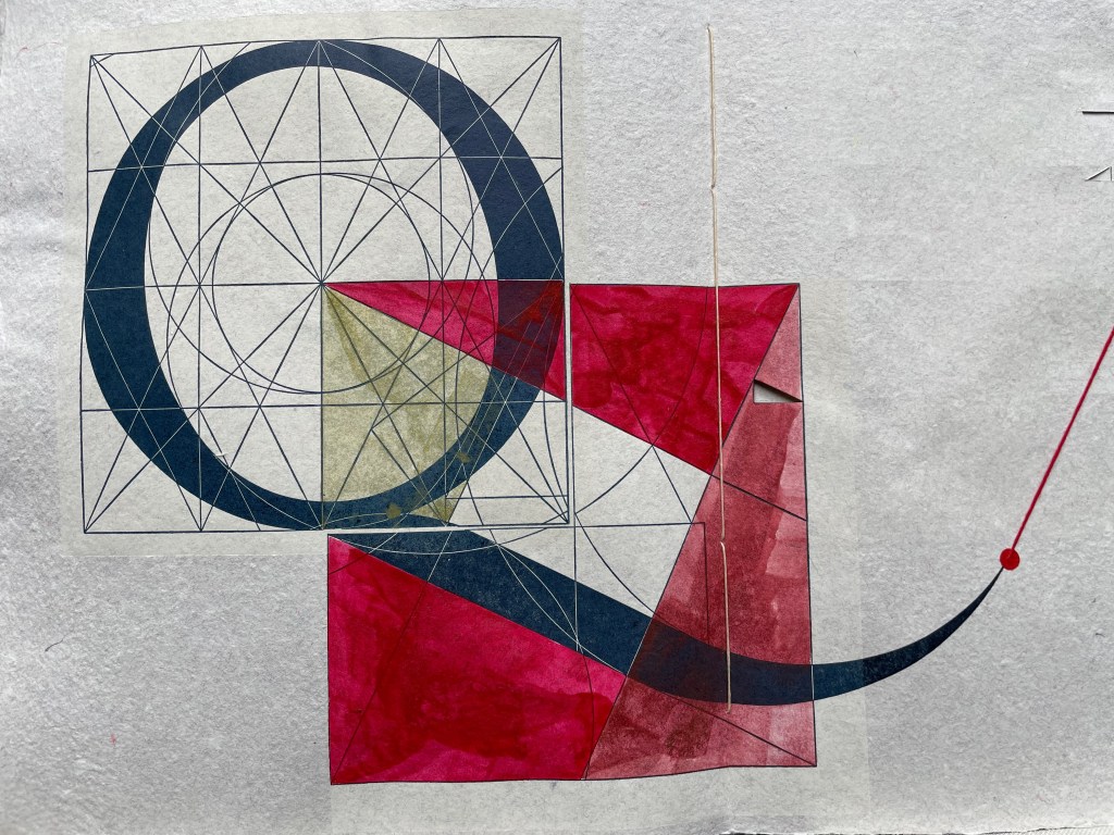
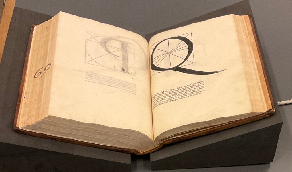
These two miniatures — Albrecht Dürer’s Directions for the Construction of the Text or Quadrate Letters (1993) and Fra Luca de Pacioli’s The Divine Alphabet (1993) — were produced by Tabula Rasa Press for a three-volume set, including Ben Shahn’s The Alphabet of Creation (1954). Although the miniature edition of Shahn remains elusive, the original edition can be seen here.

Mark Van Stone, The Evolution of the Medieval Decorated Letter (1985) In the spirit of medieval illuminators, Van Stone has imitated the hand of twenty-three of what he calls the “semi-precious jewels” of “‘minor’ illumination that usually receives little attention in the Art-History books”.

Carol DuBosch, Embossed Alphabet Gallery (2019).* This gallery structure combines elements of the flag-book and leporello to create a freestanding sculptural book to be read “in the round” — although in the Bodleian exhibition it was fixed in a wall case that allowed 180º view.

Claire Van Vliet, Tumbling Blocks for Pris and Bruce (1996).* A meander-fold book hinged to keep the cube unfolding, refolding and unfolding as it falls from hand to hand.

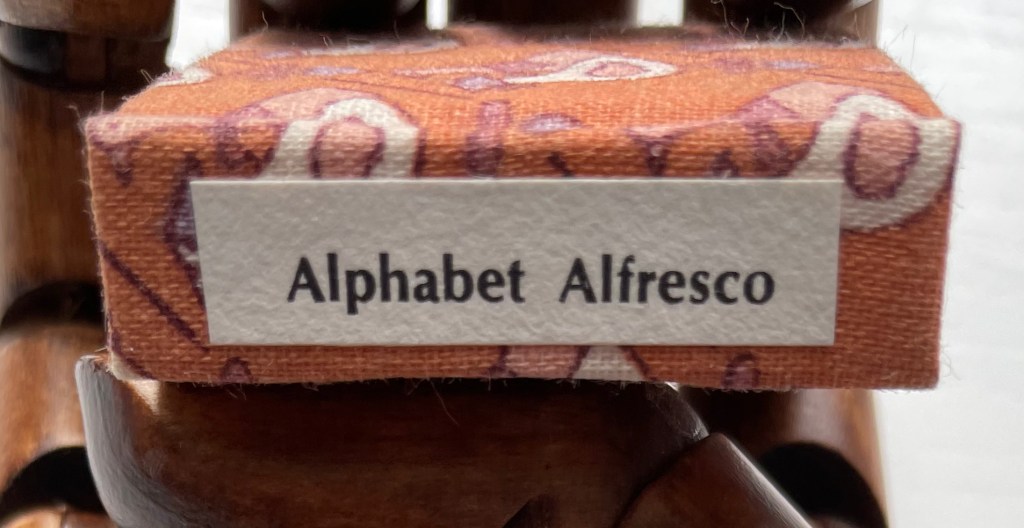
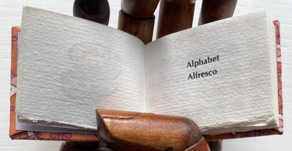
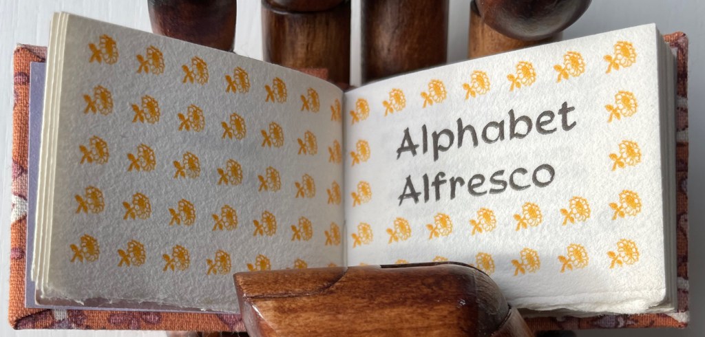
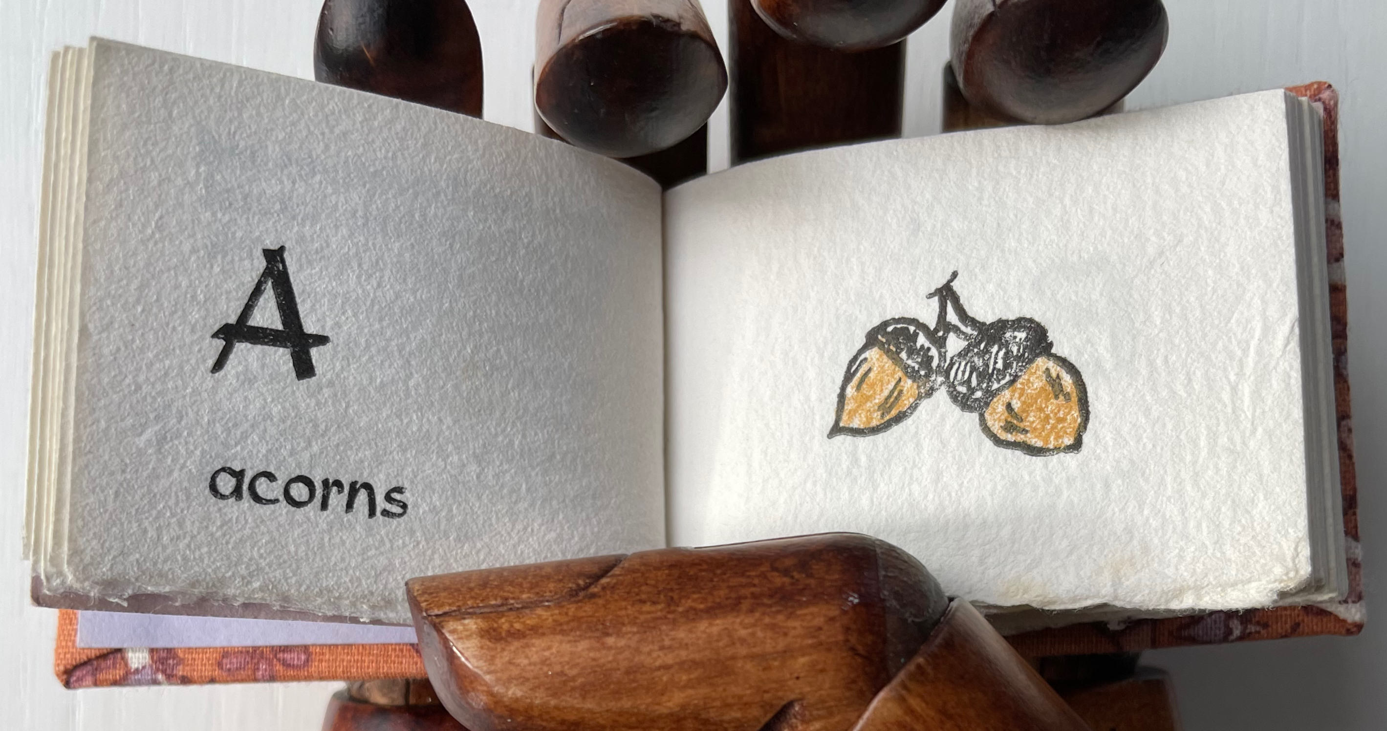
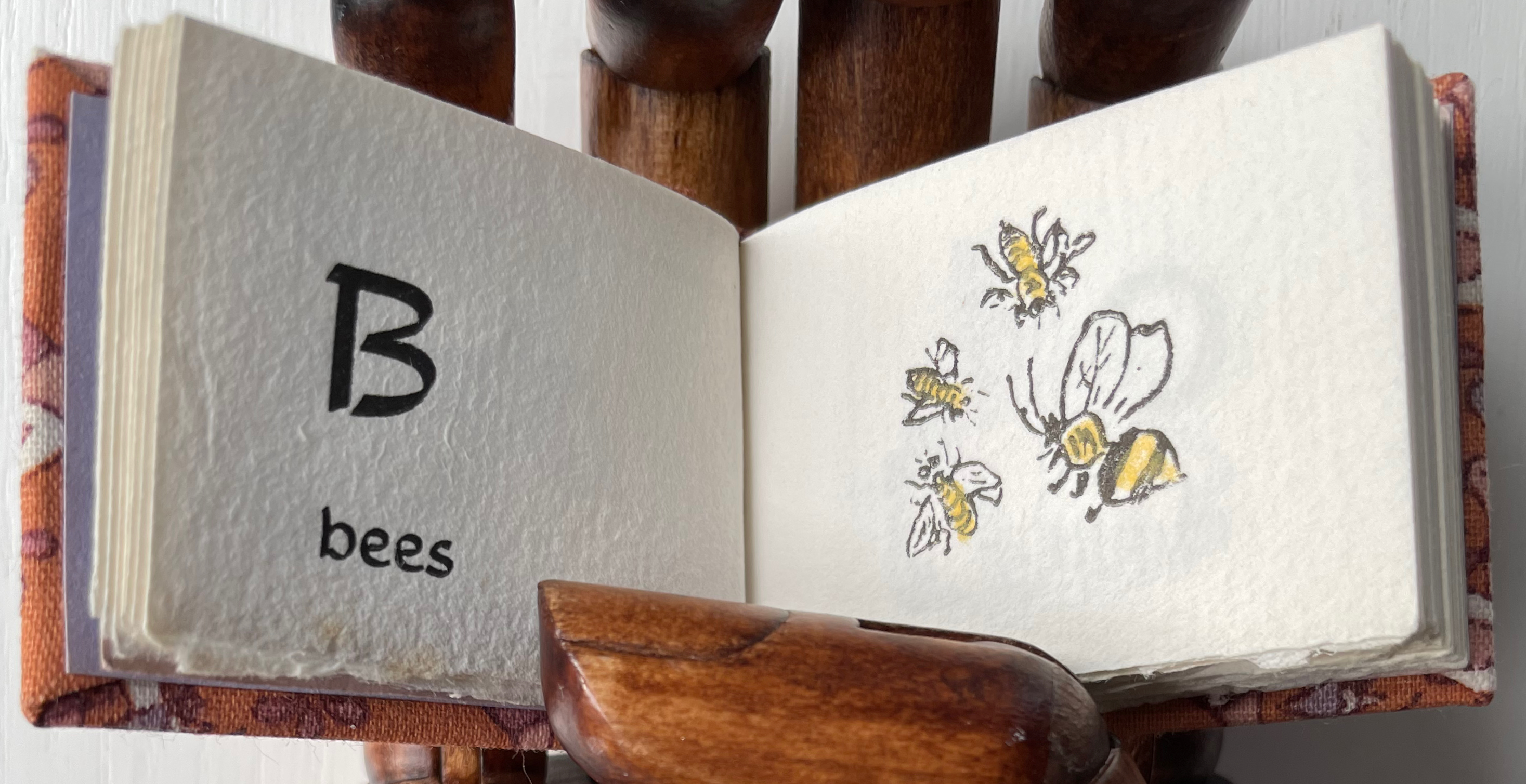
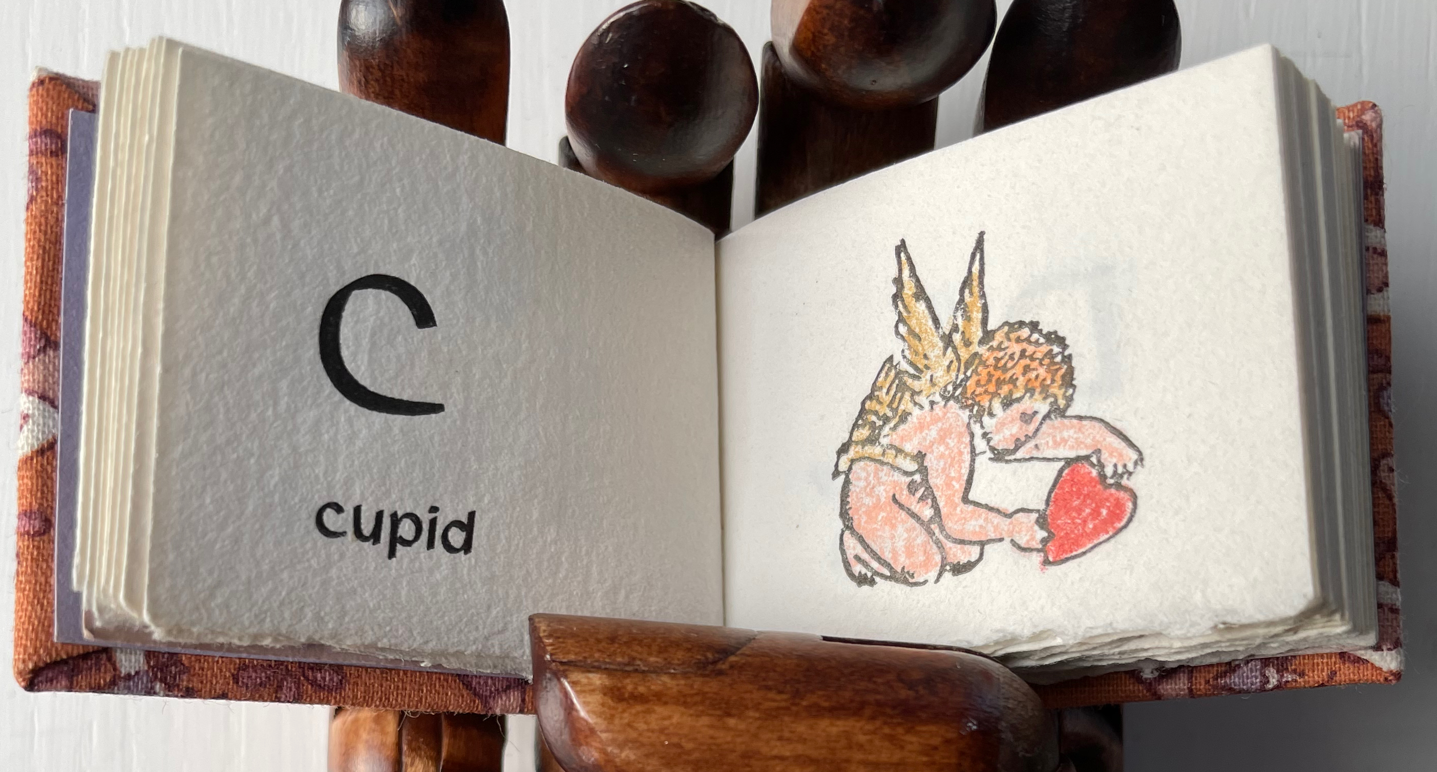
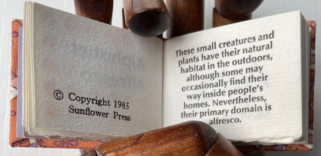
Carol Cunningham, Alphabet Alfresco (1985). One of several gems created by the founder of the Miniature Book Society (1983).

William Cheney, ABC for Tiny Schools ( 1975). Along with “A was an archer”, the “A was an apple pie” was among the earliest themes for secular alphabet books.
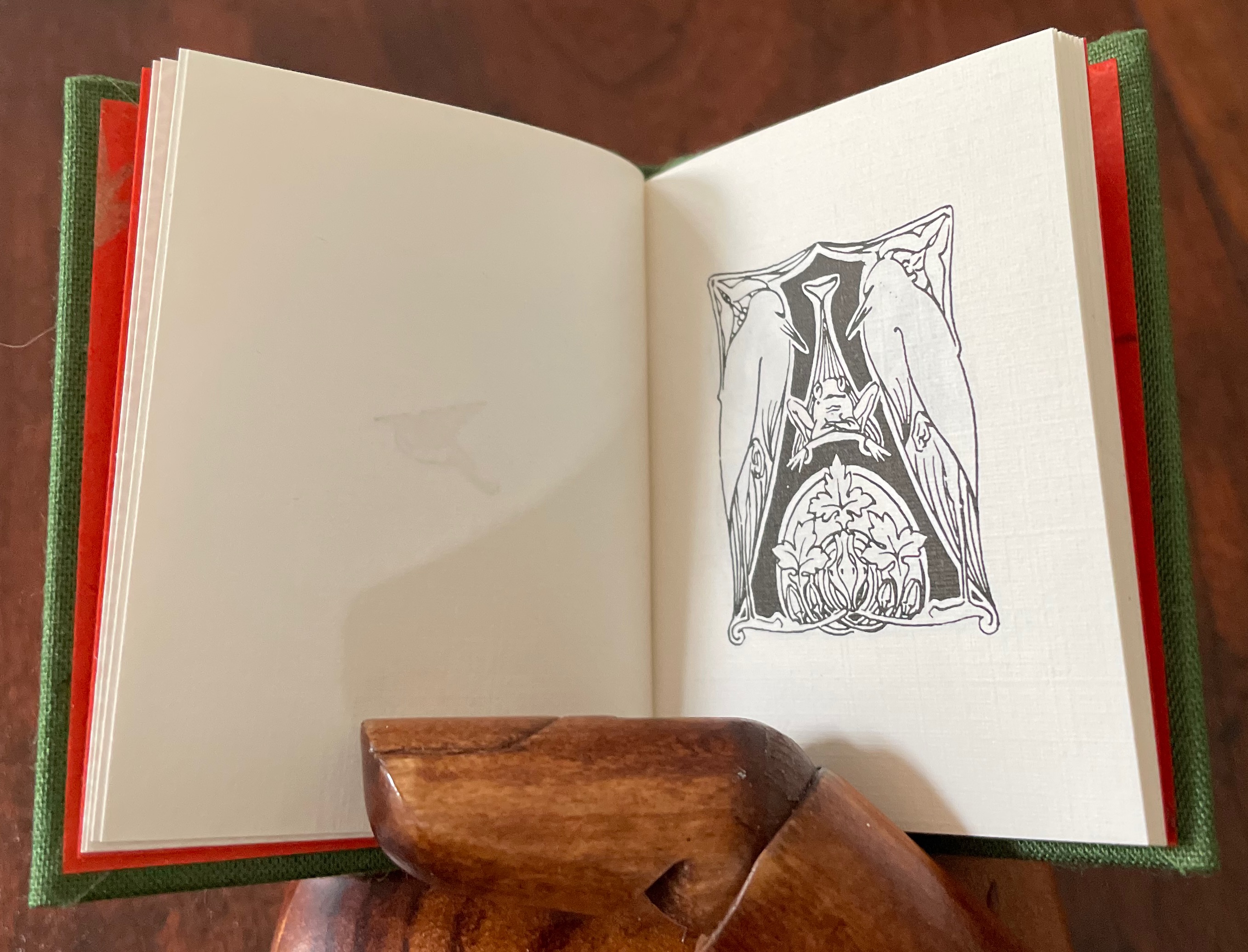
Alphabet Salmagundi (1988) and Golden Alphabet (1986) demonstrate the breadth of Rebecca Bingham’s interest in various periods and techniques of calligraphy.

Another Tabula Rasa Press production, Arthur Maquarie, The Uffizi ABC: a facsimile reproduction in miniature (1992)

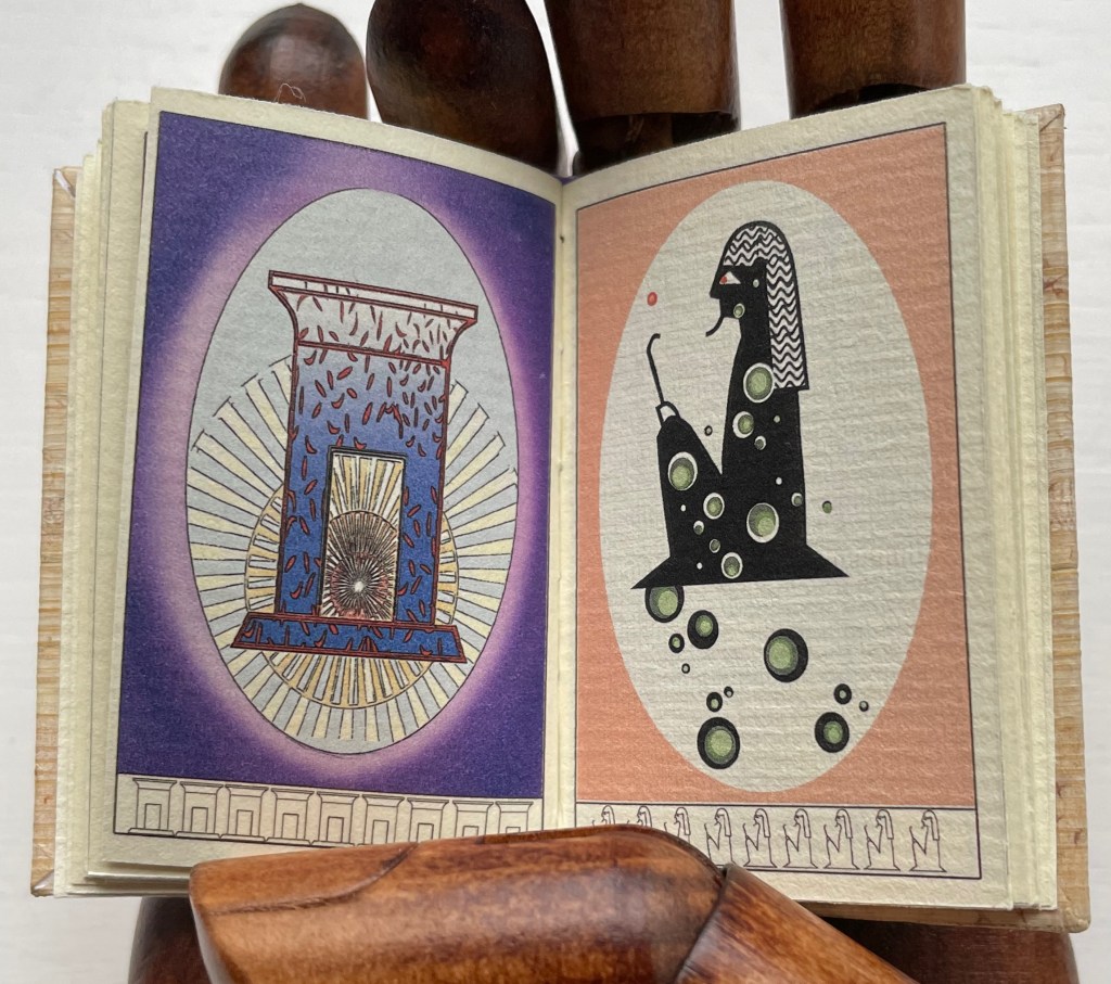
Pat Sweet’s wit led her to fill the ancient Egyptians’ previously unperceived need for an alphabet book with Hieroglyphs (2009).
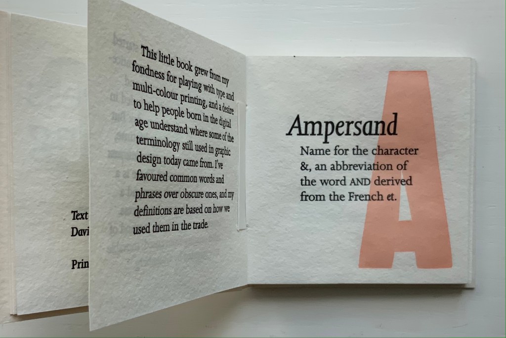
David Clifford and Heavenly Monkey teamed up to produce this intricately bound miniature, Letterpress Printing ABC (2004).

June Sidwell, Lady Letters (1986). Another production by Rebecca Bingham, which also led to a miniature nod to another alphabetist — Erté.

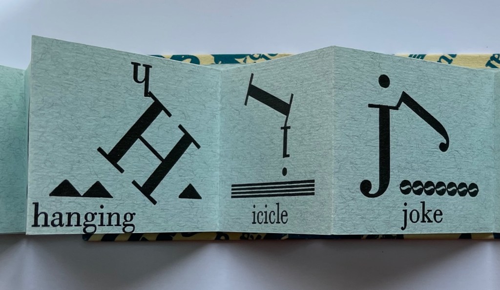
Nicolas McDowall, A Bodoni Charade (1995). Don’t let delight in the verbal/visual punnery distract you from wondering at the skill with type and letterpress needed to pull this off.
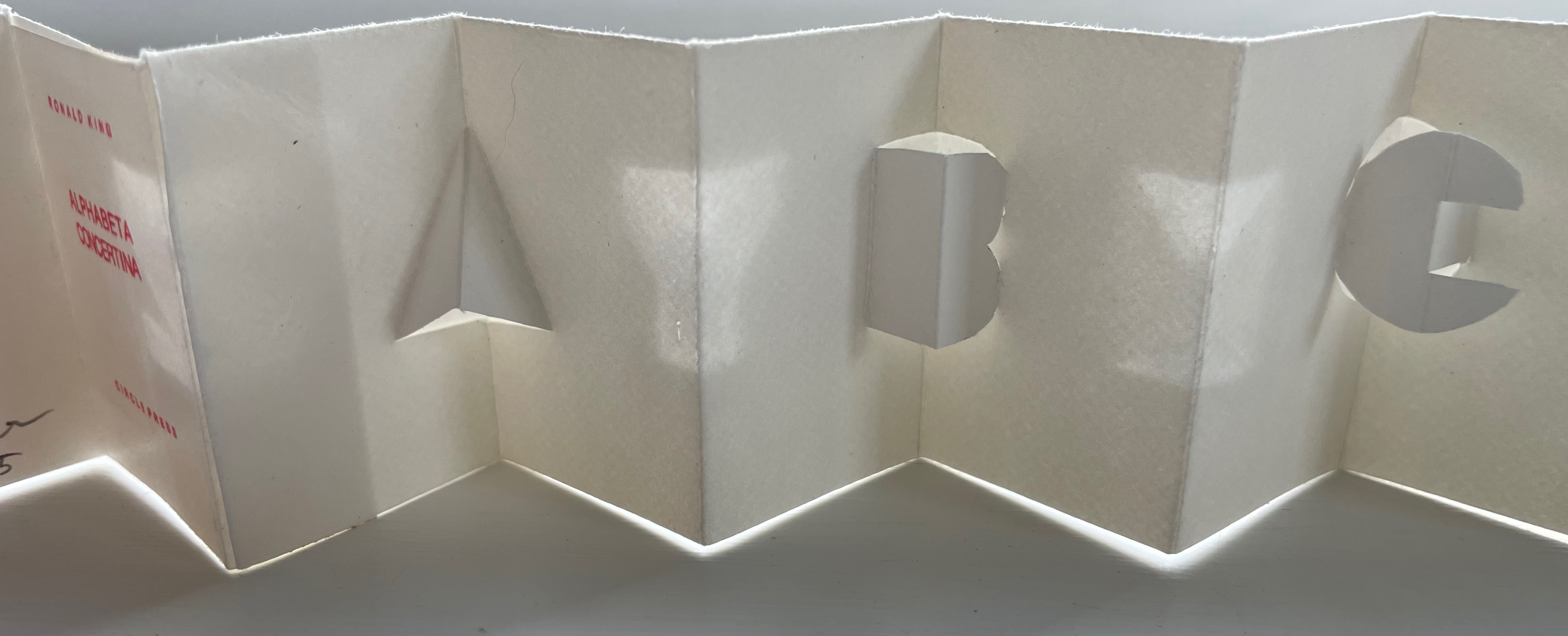
Erwin Huebner and Ron King, Alphabeta Concertina Majuscule (2015) and alphabeta concertina miniscule (2022). Miniaturist and microbiologist, Huebner obtained Ron King’s permission to reproduce King’s two signature pop-up alphabets with extraordinary results.

Juniper Von Phitzer, An Alphabet Coloring Book by Theodore Menten (1997). Lloyd L. Neilson compiled the name of his Juniper Von Phitzer Press from the names of his three cats. Theodore Menten had produced a coloring book called The Illuminated Alphabet in 1971 for Dover Publications. Obviously Juniper Von Phitzer could not fail to pounce.

Online Exhibition Bonus!

Many of the ABC books in the collection use the accordion, concertina or leporello structure, but none but Maria G. Pisano’s XYZ (2002) combine fine beaten abaca in two colors and the watermark technique to achieve their effect.
Return to List of Displays in Alphabets Alive!

Books On Books Collection – Ornan Rotem

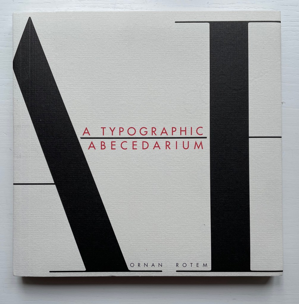
A Typographic Abecedarium (2015)

A Typographic Abecedarium (2015)
Ornan Rotem
Perfect bound in a softcover case. H174 x W176 mm. 136 pages 1 poster (64 x 48 cm, folded to 16 x 16 cm). Acquired from Devils in the Detail Ltd, 14 March 2023.
Photos of the book: Books On Books Collection. Displayed with permission of the artist.
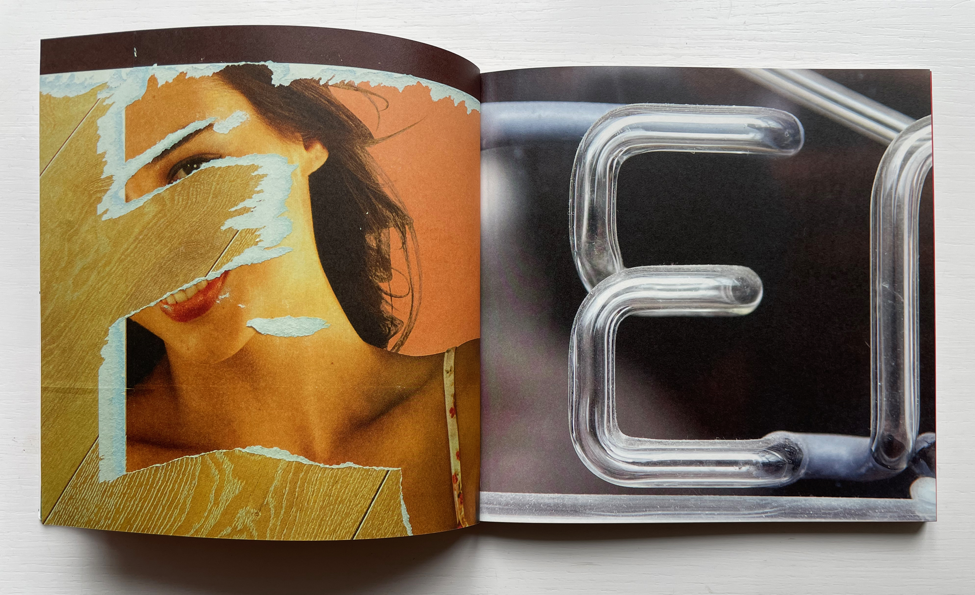
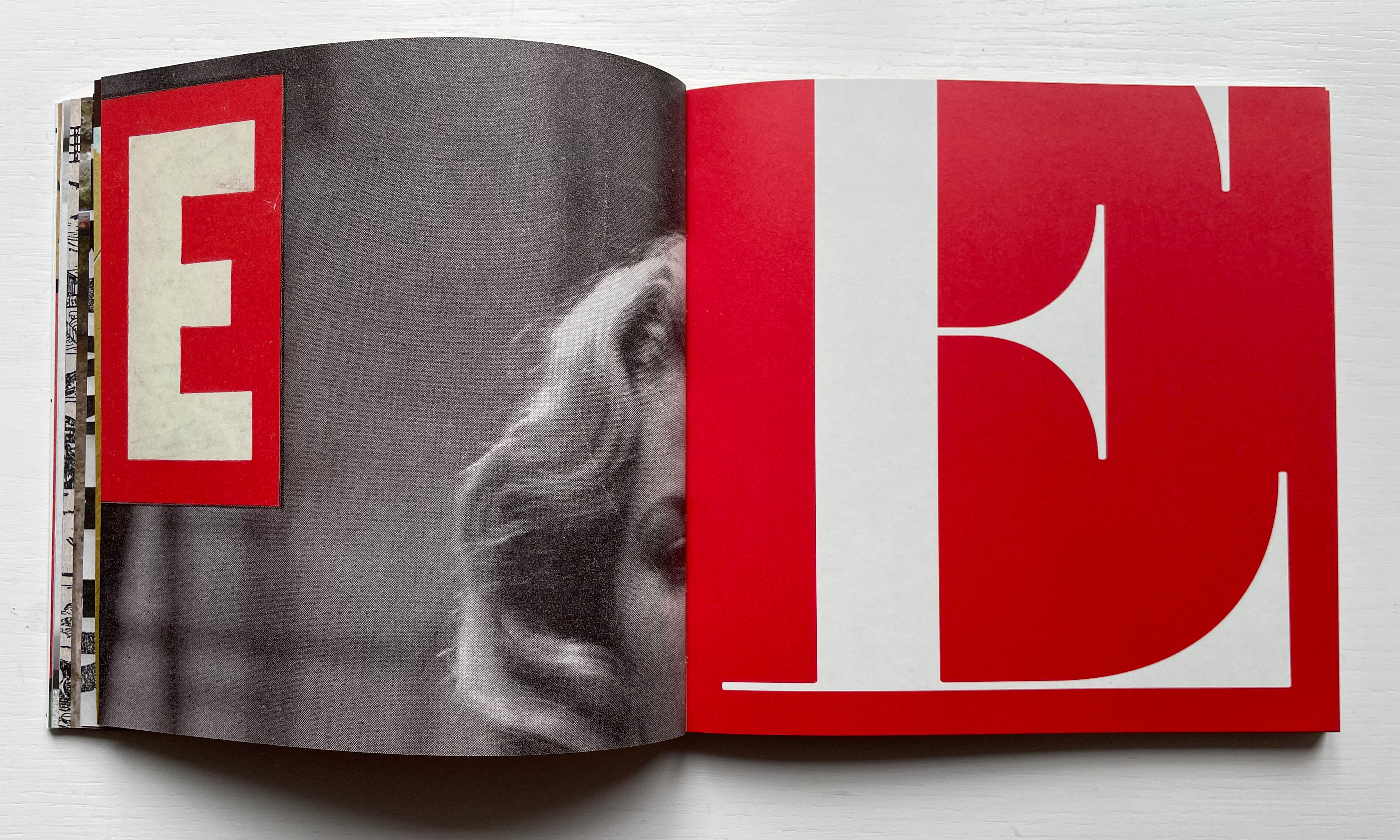
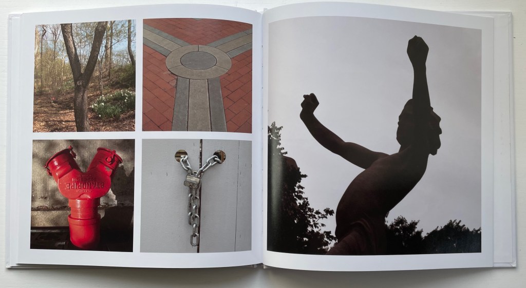
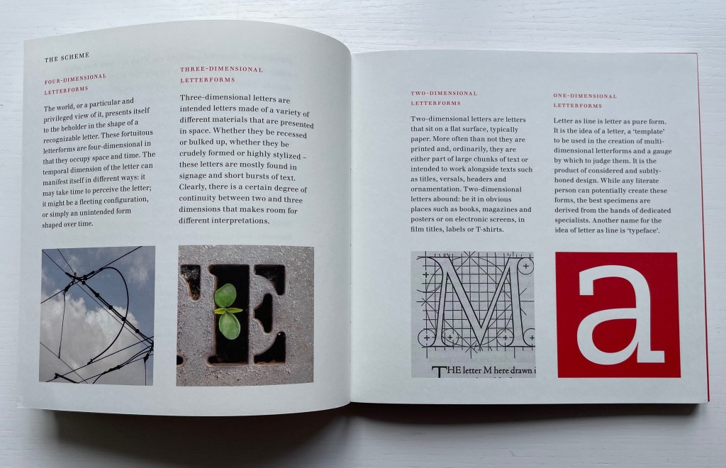
Ornan Rotem calls his book a “photo-typographic essay … a meditation … [e]xploring the relationship between typography and the visual world around us ….” As shown in the double-page spread below, his meditation is shaped across a four dimensional views of the letterform: the four-dimensional, three-dimensional, two-dimensional and the one-dimensional. At the end of the essay, there are 26 miniature essays that will send the reader back to enjoy each letter’s four dimensional entries again.

Everywhere you look you can see an E smiling at you (just saying it induces a smile). In 1969, Georges Perec, whose own name has four Es, tried exorcising the E by writing an esoteric 300-page novel, La disparition, without ever using one. I wonder how he would have felt had he come across this E — which was shot in Paris — when he was writing the novel. ¶ If you want to endow letters with character, then I suppose E would be the lively sort, hence the printed form comes from a 1948 cover of LIFE magazine.

Much is packed into these miniature essays. Naturally for an artist’s book celebrating type, there are the necessary self-referential typographic puns in the one above: character and sort. In all, there is the evidence of the long, multi-place, multi-source contemplative gestation of the work. In the example above, the allusion to Perec’s novel leads to the 1969 photo in Paris (or was it vice versa?). The typographic puns lead to a search for an E from a LIFE cover (again, or was it vice versa?). This circular connectedness over time, text and image highlights the self-referentiality of the genre of the artist’s book.

While the dense allusiveness might suggest that this is a work limited to an adult audience, A Typographic Abecedarium does find favor with a younger audience — no doubt because it speaks to the phenomenon of seeing letters everywhere and in multiple dimensions.

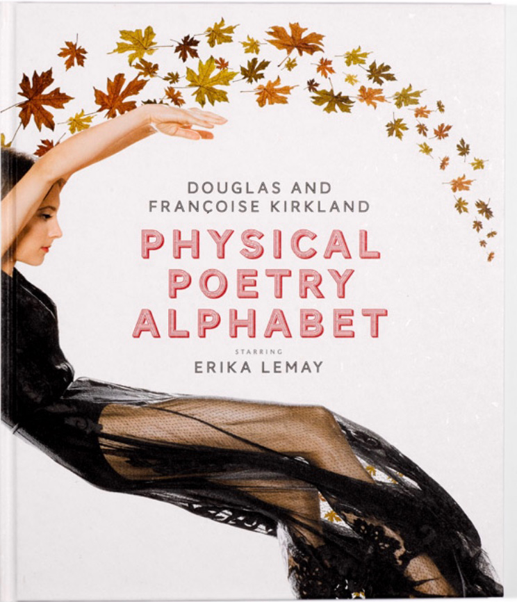
Physical Poetry Alphabet (2018)

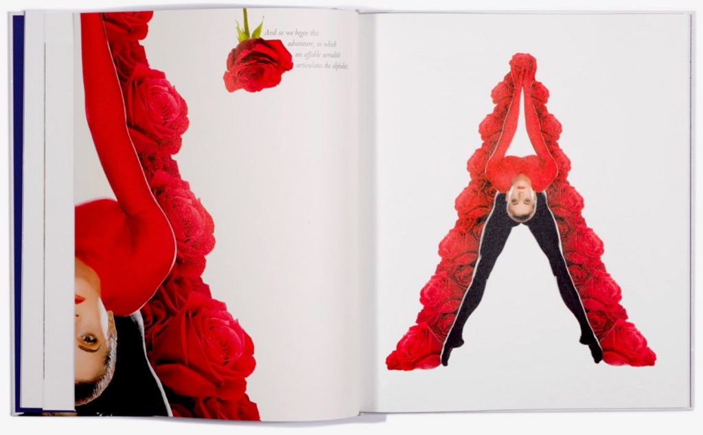
Physical Poetry Alphabet (2018)
Douglas & Françoise Kirkland and designed by Ornan Rotem
Casebound, illustrated paper over boards. Acquired from Sylph Editions, 18 March 2023. Photos: Screenshots displayed with permission of the publisher.

Physical Poetry Alphabet (2018) is a curious work. The Thames & Hudson-style production values combined with the knowledgeable essay in it by Ornan Rotem makes one think of Andrew Robinson’s  The Story of Writing, an actual Thames & Hudson book. While the acrobatics of Erika Lemay echo the longstanding tradition of modeling the letters with the human body, followed by Erté, Vítězslav Nezval, Anthon Beeke and Rowland Scherman and so ingeniously summarized by Lisa Merkin, Lemay’s elaborate costumes and the scene design echo the traditions of Hollywood, Las Vegas and the fashion industry, which is not surprising given the involvement of Douglas Kirkland, portrait photographer to the stars. A Typographic Abecedarium strikes its singular target of “photo-typographic essay”. Having too many targets, Physical Poetry Alphabet perhaps misses its several bull’s eyes, but to follow along with its mixed metaphors, it undeniably delivers a shop full of eye candy.

Further Reading

“Abecedaries I (in progress)“. Books On Books Collection.

“Alphabets Alive! – Body“. 19 July 2023. Books On Books Collection.

Meier, Allison. 14 January 2016. “A Visual Essays Recalls the Alphabet’s Pictorial Past“. Hyperallergic. Accessed 18 March 2023.

Alphabets Alive! – Animals

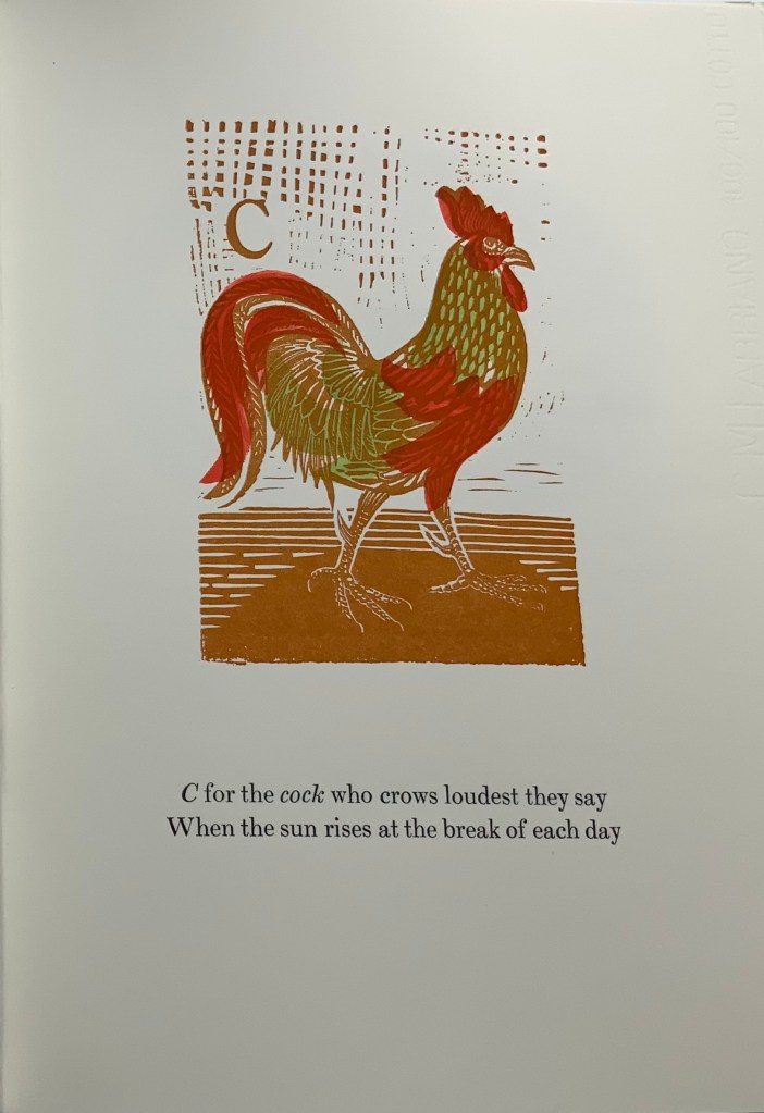
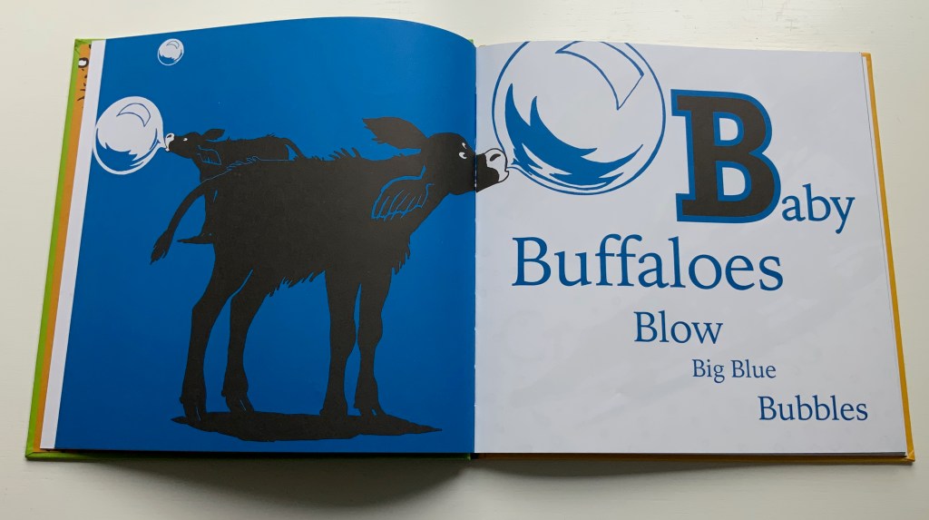
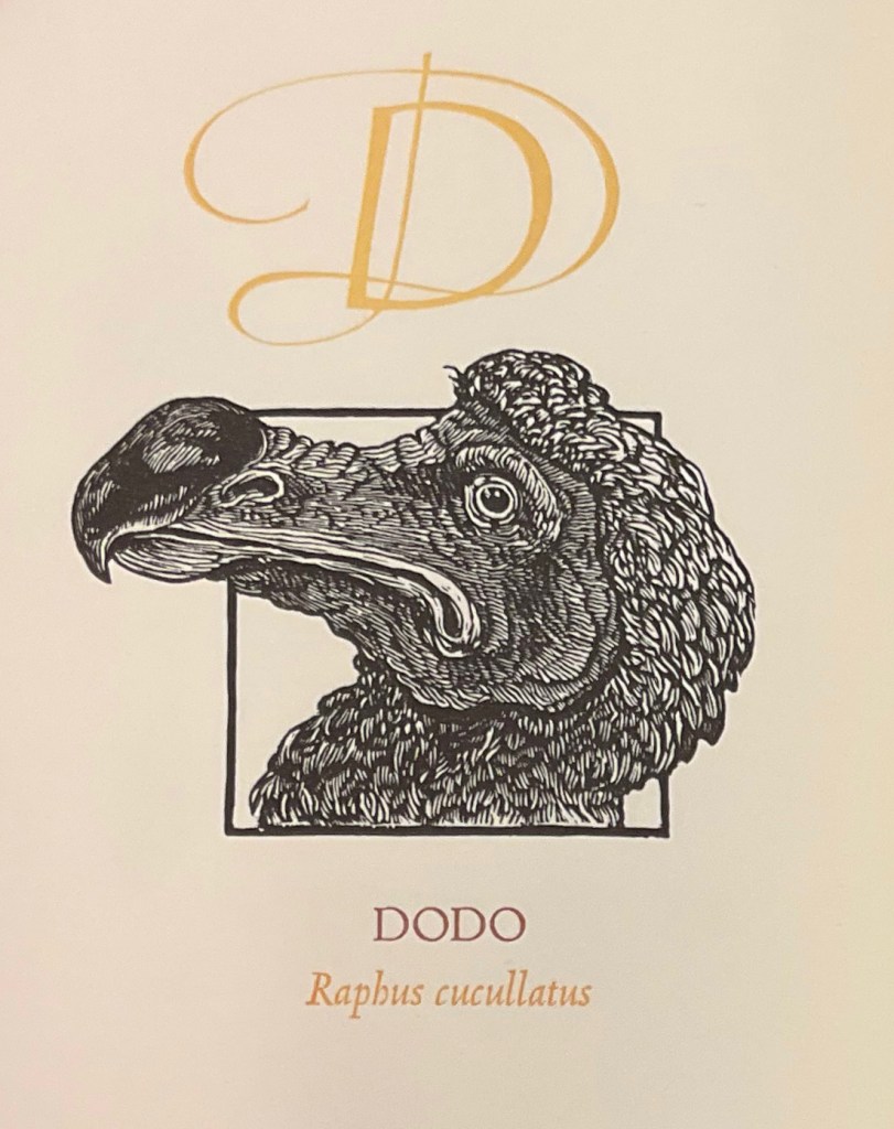
Animal alphabet books hum with imagination and wit. Animals, birds, fish, insects, even dinosaurs, decorate and transform letters, or might be created from the letters themselves. Sometimes, the animals come in disguise, or hide, only to pop out and surprise you. Perhaps the alphabet’s pictographic origin explains this animal obsession. The letter ‘A’ comes from the word ‘aleph’ meaning cow or ox, and its early letterform resembled an ox’s head and horns. [Links in the captions will take you to more images and details.]

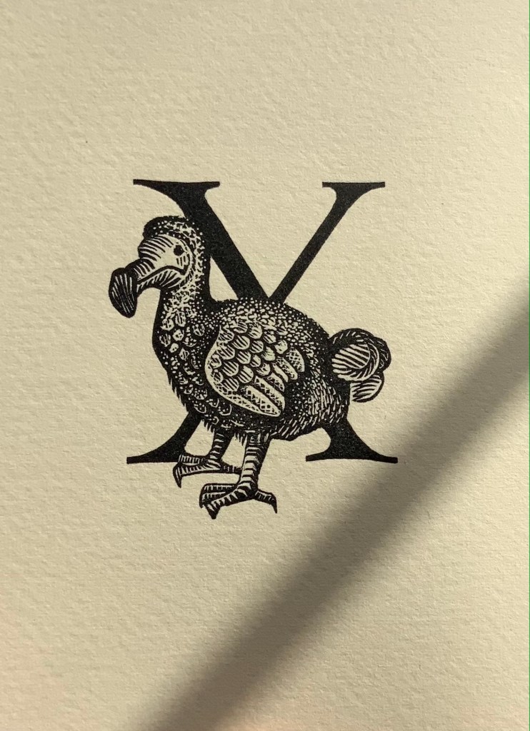
E.N. Ellis, An Alphabet (1985).* The letters Q and X always present challenges in finding suitably named animals. Ellis’s solution with X is as elegant as her engraving.

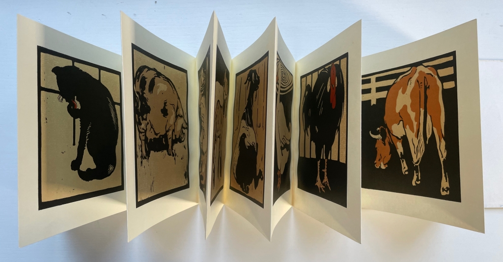
C.B. Falls, ABC Book (1923). Almost a quarter century after William Nicholson’s successful A Square Book of Animals, Falls applied his successful poster designing to this larger format.

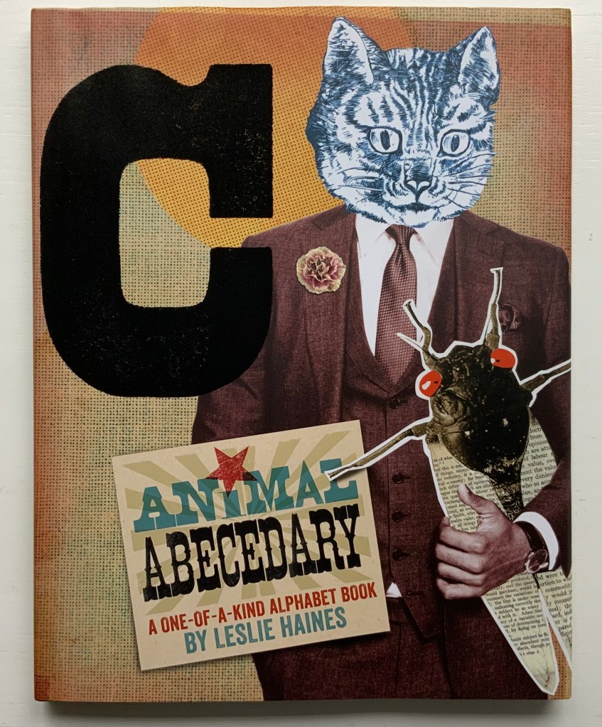
Leslie Haines, Animal Abecedary: A One-of-a-Kind Alphabet Book (2018).* A strong revival of the surrealist collage.

Enid Marx, Marco’s Animal Alphabet (2000). Bringing together the talents of the engraver (Enid “Marco” Marx), “pochoir-ist” (Peter Allen) and letterpress printer (Graham Moss), this large-scale portfolio treads the boundary of fine press and artist’s book.

[Alphabet Leporello of dressed animals] (Paris, c. 1851) Opie T 407. The Books On Books Collection’s concentration on alphabet books falls primarily over the 20th and 21st centuries and extends the pre-1950s focus of the Opie Collection of children’s books. Together, the two collections offer a broad and deep source for exploring the links between artists’ books and children’s alphabet books as well as studying topics such as children’s literature and literacy.

Christiane Pieper & Anushka Ravishankar, Alphabets Are Amazing Animals (2003).* Alliteration is almost as frequent a feature of alphabet books as animal association.

Alan James Robinson and Suzanne Moore, A Fowl Alphabet (1986).* A superb collaboration between an engraver (Robinson) and calligrapher (Moore).

John Norris Wood, An Alphabet of Toads & Frogs (2002).* Sometimes past art abroad catches up with present American fauna of political celebrity.

Online Exhibition Bonus!

Marie Angel, An Animated Alphabet (1996); Angel’s Alphabet (1986) of exotic surprises in a more traditional alphabet book; and more surprises behind tabs in a leporello. Marie Angel’s Exotic Alphabet (1992).

Leonard Baskin, Hosie’s Alphabet (1972). Son Hosie and father Leonard unite their rites of passage: learning the alphabet and creating an artist’s alphabet book.

Michele Durkson Clise, Animal Alphabet: Folding Screen (1992) wrongfoots the reader with animal images that do not align with the expected alphabet letter or the letters of the first words in the leporello’s rhyming couplets. If the image does at least align with a word in the couplet (e.g., “whale”), that word’s first letter does not align with the alphabet letter expected for that panel.

Brian D. Cohen & Holiday Eames, The Bird Book (2013). Cohen’s engravings are finer in detail than most.

In Abstract Alphabet: A Book of Animals (2001), Paul Cox turns the alphabet on its evolutionary head. The letter A started out with the pictogram of an ox’s head and then developed into the abstract shape we associate with the sound /a/. Here, we have to work back from 26 different abstract shapes (each assigned to a letter on a fold-out flap) to figure out the name of the animal being spelled. The reversal conjures up the challenge that letters, objects and phonics present to children, and in their resemblance to a Hans Arp painting, the shapes challenge the reader to a renewed connection with art.

Roberto de Vicq de Cumptich, Bembo’s Zoo: An Animal ABC Book (2000). Where Sharon Forss and Sarah Werner use several type faces to shape their animals, De Vicq de Cumptich restricts his to Bembo.

David L. Kulhavy & Charles D. Jones, A Forest Insect Alphabet (2013). Extraordinary woodcuts by Jones, worth comparing with Cohen, Grieshaber, Marx and Robinson.

Metropolitan Museum of Art, Animalphabet (1996). Curators’ puns and wordplay with favorites from the Met.

William Nicholson, A Square Book of Animals (1900). Nicholson followed his successful An Alphabet with this book, but it was Scolar Press in 1979 that redesigned and re-originated it in this well-chosen leporello format.

Carton Moore Park, An Alphabet of Animals (1899). Unusual for its grisaille technique and restriction of color to the cloth cover.

Rose Sanderson, An Unusual Animal Alphabet (2021)

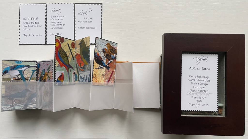
Carol Schwarztott, ABC of Birds (2020). A curious mix of traditions: Cornell box, stamp art, leporello, miniature and pocket pages.

Borje Svensson and James Diaz, Animals (1982). Alphabet block meets tunnel book.

Sharon Werner & Sharon Forss, Alphabeasties (2009). Twenty-six lessons in typography and typographic artistry.

Christopher Wormell, An Alphabet of Animals (1990). A brilliant revival and extension of the lettering and pictorial style found in Fall and Nicholson.

Return to List of Displays in Alphabets Alive!

Alphabets Alive! – Calligraphy and Design

Artists use knives, thread, wood, handmade paper, wire and other tools to execute their beautiful writing. Some create their designs with straight edge and compass – or with punch, matrix, mould and molten metal – or with the computer and even artificial intelligence.

Anne Bertier, Dessine-moi une lettre (2004)

Giovanni Francesco Cresci, Il perfetto scrittore (c. 1570) Johnson P 170

Bruce Rogers, Champ rosé (1933)

Steven Ferlauto and Jeffrey Morin, The Sacred Abecedarium (2000)

Francesca Lohmann, An Alphabetical Accumulation (2017)

Fra Luca Pacioli, De divina proportione (Venice, 1509) Arch. B d.24 (2)

Yevhen Berdnikov, Paper Cut Alphabet (2023)

Online Exhibition Bonus!

Cathryn Miller’s L is for Lettering (2011) is a brilliant example of the book artist’s rite of passage: make an alphabet book, but make it new.

Tauba Auerbach has made the alphabet her life’s work. How to Spell the Alphabet (2007) uses the title of one of her best-known works. A work of ink and pencil on paper (2005), it begins “EY BEE CEE DEE” and was featured in MoMA’s “Ecstatic Alphabet” exhibition (2012). Her artistic playfulness makes the letters of the alphabet self-referential and ecstatic (“to stand outside themselves”). Another route to this is what she calls “letter worship” as demonstrated in this homage to another artist of the letter: Paulus Franck.

Thanks to the editors Joseph Kiermeier-Debre and Fritz Franz Vogel, we have this facsimile edition of Paulus Franck’s  Schatzkammer, Allerhand Versalien Lateinisch vnnd Teutsch (1601/1995), a “treasury of all manner of German and Latin ornamental letters. The editors neatly use the margins of their book to add to the historical context. On the verso page, they have the geometrically controlled design of Albrecht Durer (1525), and on the recto, the exuberance of John Seddon (1695).

Another lifelong devotee of the alphabet is Annie Cicale. Her Patterned Alphabet (2013) is an extended dance of contrasts and complements with printing, paper and patterns.

Not quite an alphabet book but clearly a children’s book and artist’s book at play with the alphabet is Kurt Schwitters’ Die Scheuche (1925/1965), which might send you flying over to the display with Roberto de Vicq de Cumptich, Bembo’s Zoo: An Animal ABC Book under Alphabets Alive! — Animals.

Kurt Schwitters, Die Scheuche [The Scarecrow] (1925/1965)

Return to List of Displays in Alphabets Alive!

Books On Books Collection – Květa Pacovská

À l’infini (2007)

À l’infini (2007)
Květa Pacovská
Softcover with protective Mylar attached, exposed spine, sewn with multicolored threads. 270 x 270 x 29 mm. 128 pages. Acquired from Rakuten, 25 November 2022.
Photos: Books On Books Collection.

The Buzz Lightyear character of Toy Story and his catchphrase “To infinity and beyond” arrived in 1995. While it seems unlikely that the catchphrase influenced Květa Pacovská, the audience for Á l’infini (2007) and that for Toy Story definitely overlap. In her invitation below, Pacovská explicitly addresses the youngest of her audience: Tu peux regarder chaque lettre, toucher chaque lettre, considérer chaque lettre de façon formelle ou lire chaque lettre à haute voix. Chaque lettre a son propre son, sa propre forme et sa propre couleur. Note leurs différences quand tu les prononces, quand tu écoutes le son de ta voix. [You can look at each letter, touch each letter, consider each letter formally, or read each letter aloud. Each letter has its own sound, shape and color. Note their differences when you pronounce them, when you listen to the sound of your voice.] Above all — literally at the top of the page — she urges the reader: Dis la lettre <<A>> à haute voix jusqu’à ce qu’elle heurte les murs qui l’entourent. [Say the letter “A” out loud until it knocks down the walls surrounding it.], which is what the cut-out A plays outs.

For Pacovská, letters are “the architecture of pleasure”, and À l’infini invites us to play with them in “her city of paper”. Her invitation notes alternative approaches to the book, but the suggestion to walk through it as a paper sculpture is the best and appeal to the child in everyone.

With its collage of cut-outs, pop-ups, spot varnishes, reflective silver ink, letters and, later in the book, numbers, À l’infini is a joyful visual city. Pacovská received the Hans Christian Andersen Award in 1992 for her illustration.

Further Reading

“Abecedaries I (in progress)“. Books On Books Collection.

“Alphabets Alive! – ABCs in Miniature“. Books On Books Collection.

Pacovská, Květa . 1993. The Art of Kveta Pacovska. Zürich Frankfurt: Michael Neugebauer Book/North South Books.

Linhart, Eva, and Květa Pacovská. 2008. Kveta Pacovskà: Maximum Contrast. Bargteheide/Paris: Michael Neugebauer Edition GmbH/Minedition.

Alphabets Alive! – Alphabets All Around

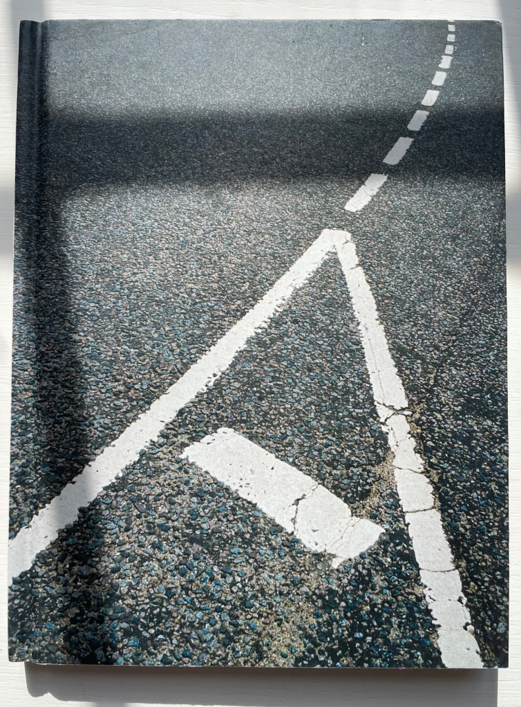
Where do letters go when they’re not making words? Book artists know that they hide everywhere – often in plain sight – in landscapes, roadworks and signs, tree branches, rocks, flags, and even in a cup of coffee. [Links in the captions will take you to more images and details.]

Stephen T. Johnson Alphabet City (1995)

Lisa McGuirk, If Rocks Could Sing (2011)

Elliott Kaufman, Alphabet Everywhere (2012)

Ornan Rotem, A Typographic Abecedarium (2015)

Marion Bataille, Vues/Lues (2008)

Online Exhibition Bonus!

Ellen Sollod, Outdoor Types : An Urban Alphabet Source (2019)

Jan Middendorp and Clotilde Olyff , Lettered Typefaces and Alphabets by Clotilde Olyff (2000)

Return to List of Displays in Alphabets Alive!

Books On Books Collection – Carol Cunningham

Alphabet Alfresco (1985)

Alphabet Alfresco (1985)
Carol Cunningham
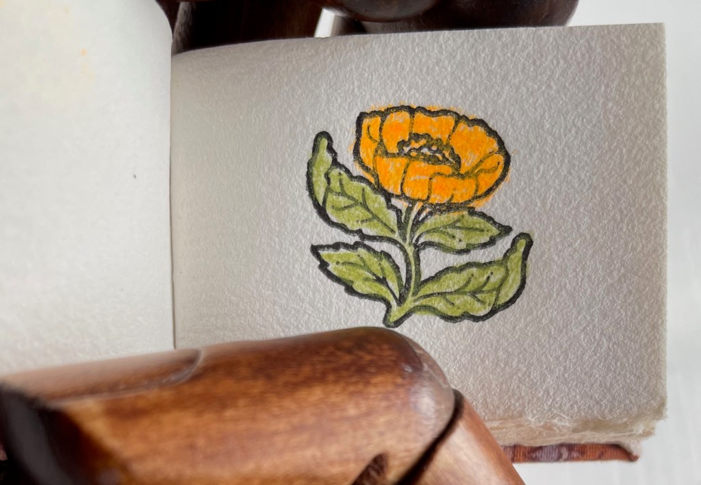
Casebound miniature, decorated cloth, colored doublures. H40 x W52 mm. 68 pages. Acquired from Lorson’s Books & Prints, 5 December 2022.
Photos: Books On Books Collection.

Carol Cunningham’s Sunflower Press produced many gems like this. Founder of the Miniature Book Society in 1983, Cunningham also produced numerous oil paintings and prints, some of which can be found here.

Further Reading

“Abecedaries I (in progress)“. Books On Books Collection.

“Alphabets Alive! – ABCs in Miniature“. 19 July 2023. Books On Books Collection.

Books On Books Collection – Nancy Anderson Trottier

The Alphabet Effect (2013)

The Alphabet Effect (2013)
Nancy Anderson Trottier
Double-sided meander fold. 630 x 630 mm. 24 panels. Edition of 15. Acquired from Bromer Booksellers, 2 August 2022.
Photos: Books On Books Collection.

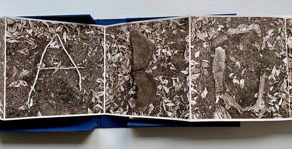
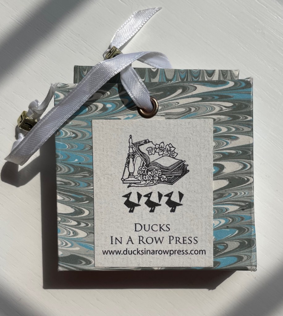
This miniature reproduces a larger unique artist’s book created by Nancy Anderson Trottier. Bound in marbled boards with ribbon ties, the small book’s text concerning art and philosophy meanders among stamped signs and symbols and calligraphed letters of the alphabet printed on both sides of a single sheet cut and following the meander fold structure. When the “pages” are unfolded and rearranged into the single sheet fully extended, the alphabet effect appears. To squeeze 26 letters into 24 panels, the letters e and f are paired on one panel, as are k and l on another.

Further Reading

“Abecedaries I (in progress)“. Books On Books Collection.

“Alphabets Alive! – ABCs in Miniature“. Books On Books Collection.

Books On Books Collection – Kevin M. Steele

The Movable Book of Letterforms (2009)

The Movable Book of Letterforms (2009)
Kevin M. Steele
Pop-up book. 210 x 210 mm. 22 pages. Edition of 3. Acquired from the artist, November 2022.
Photos: Books On Books Collection. Displayed with permission of the artist.


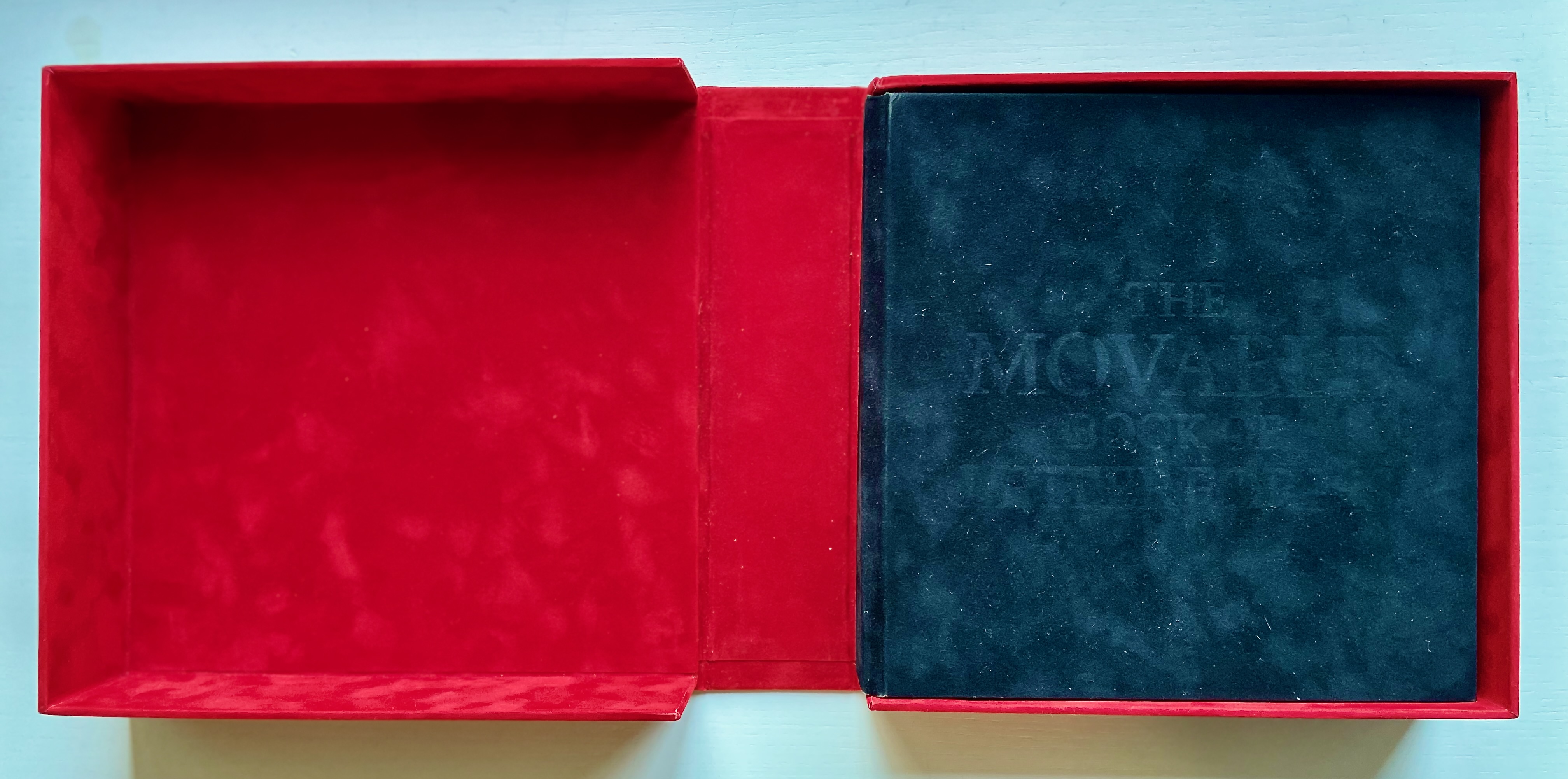
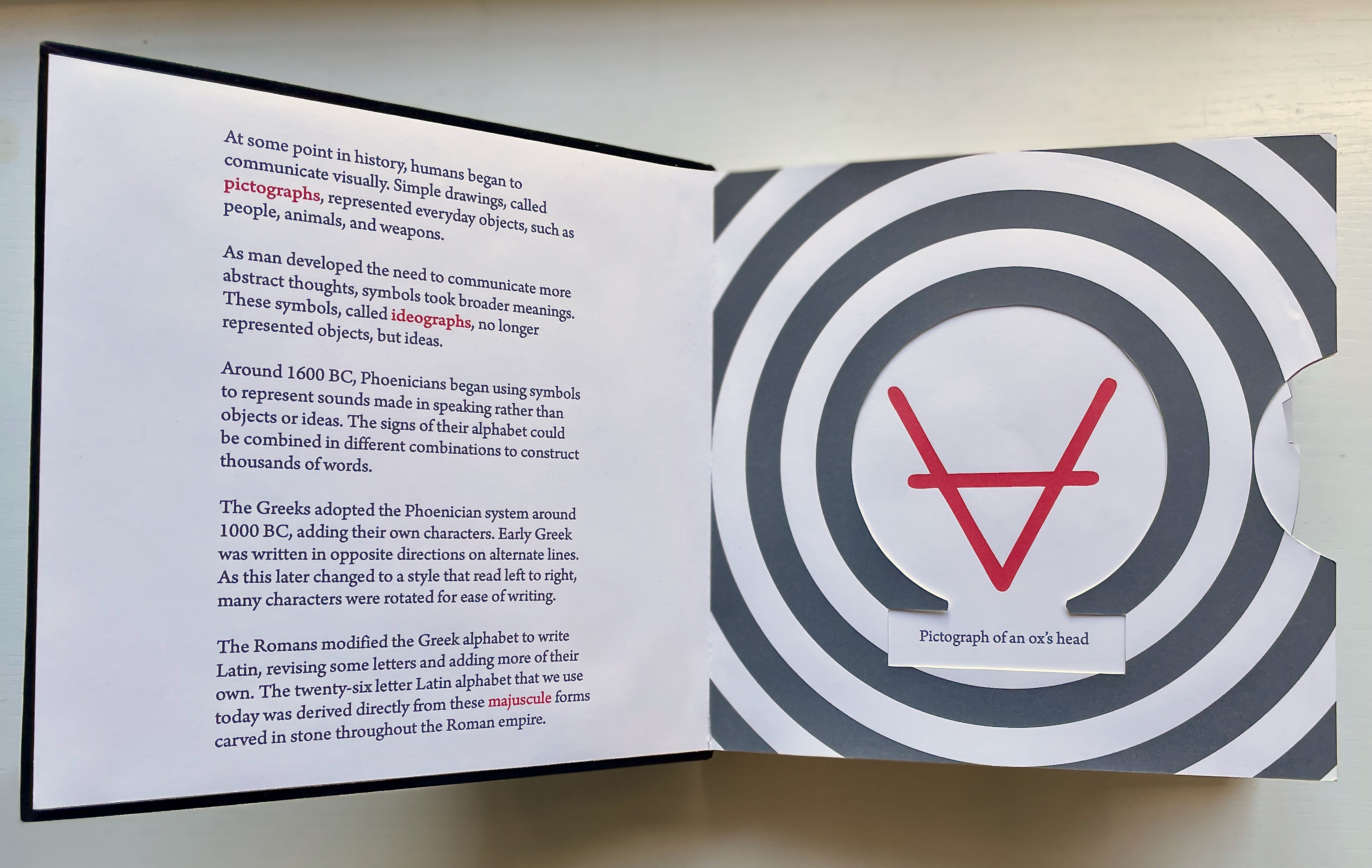
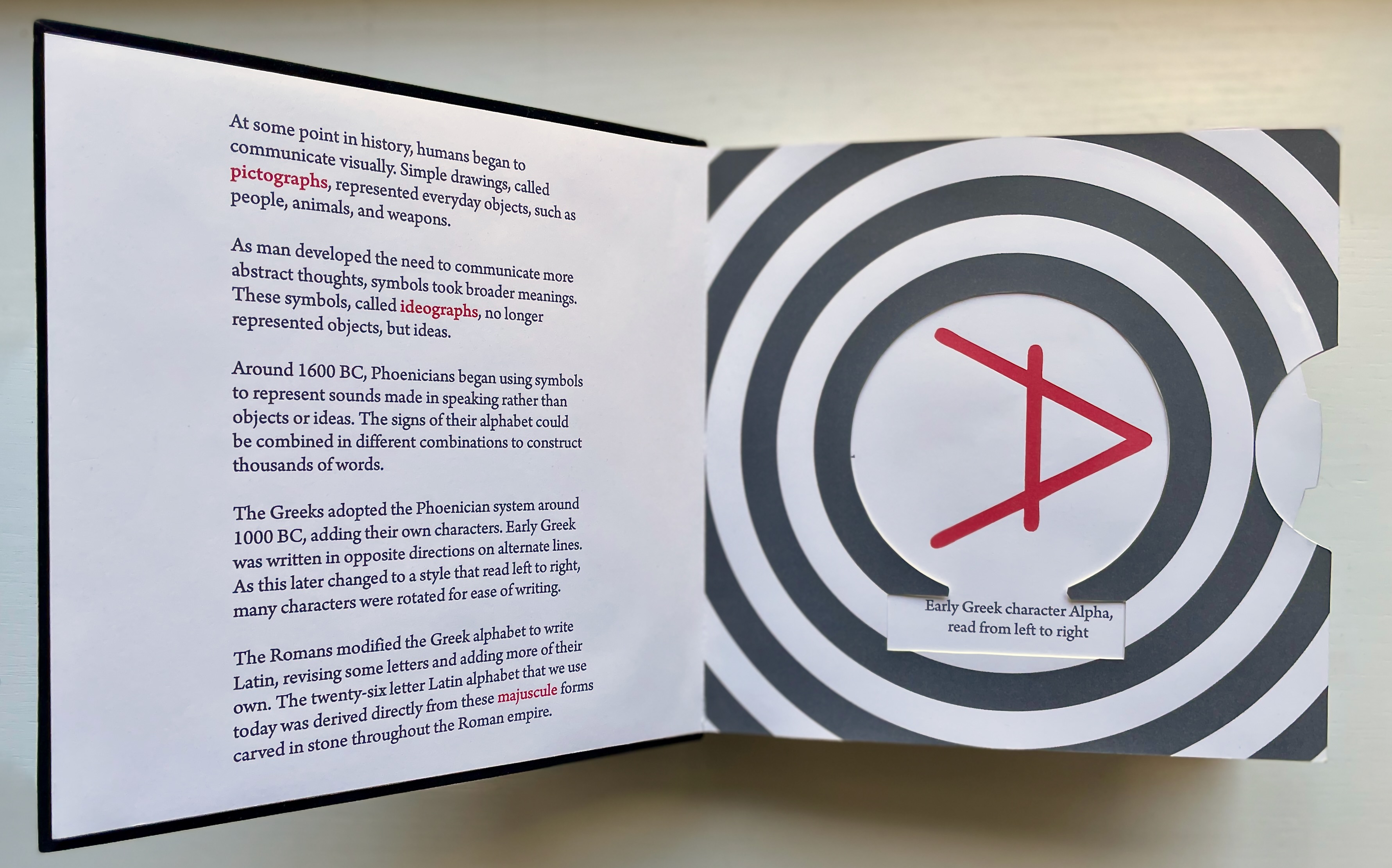
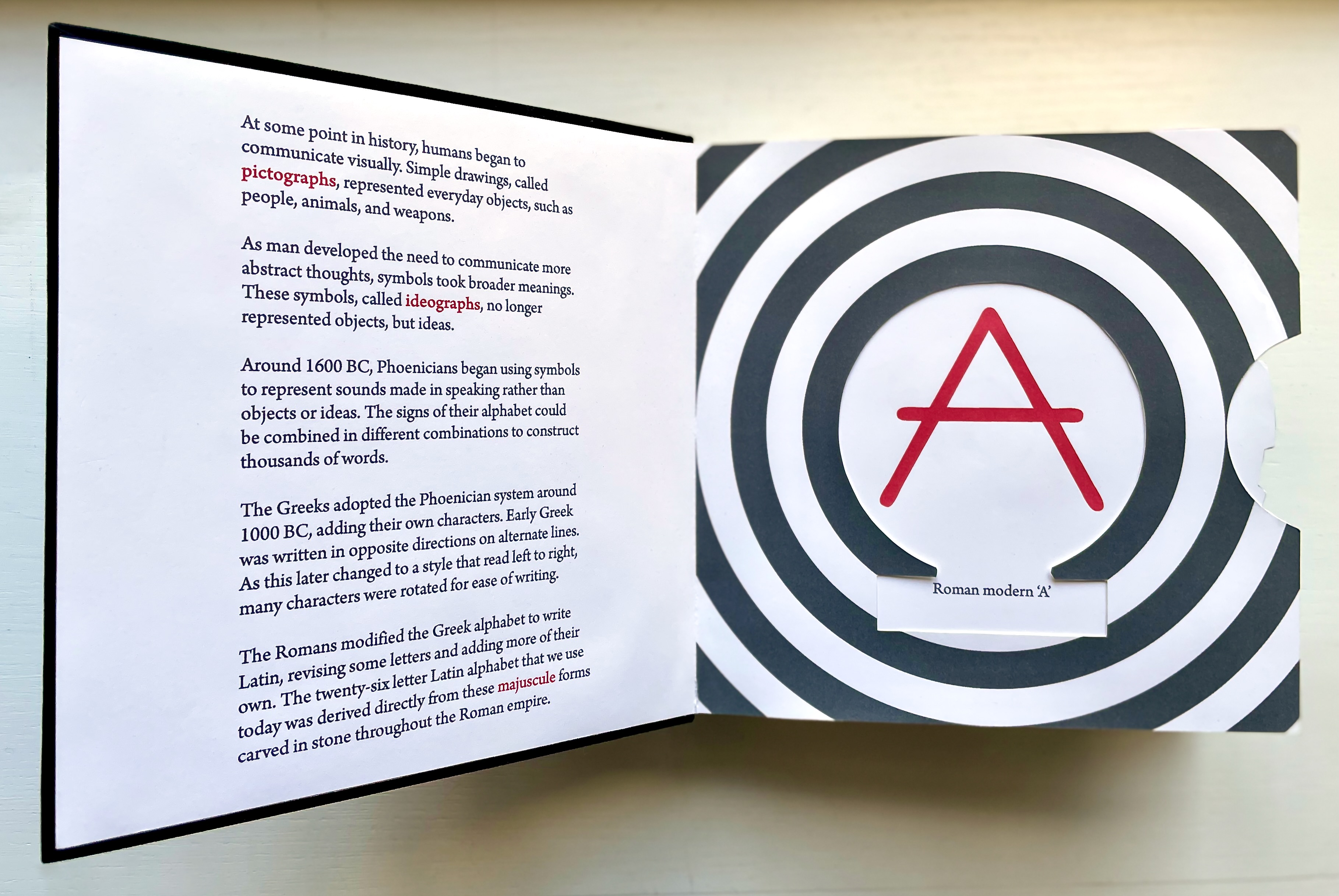
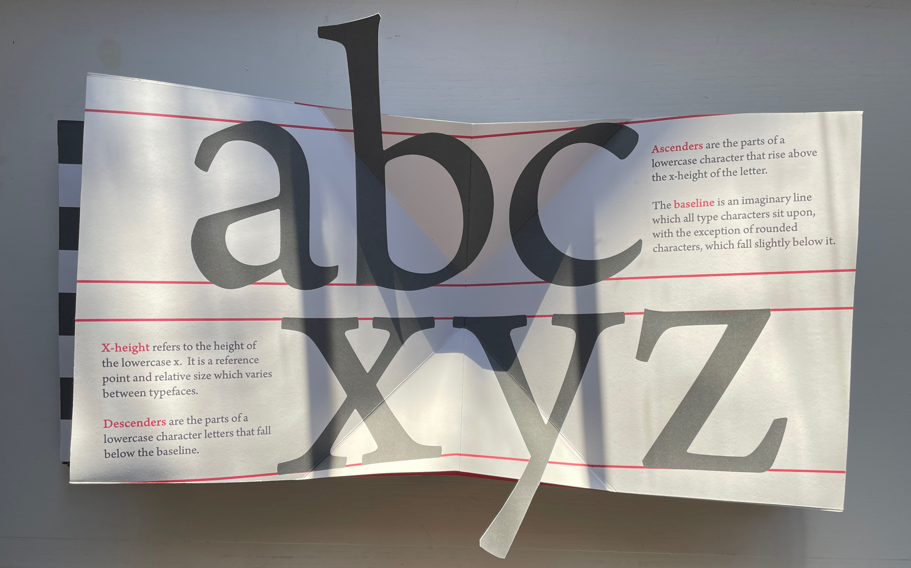
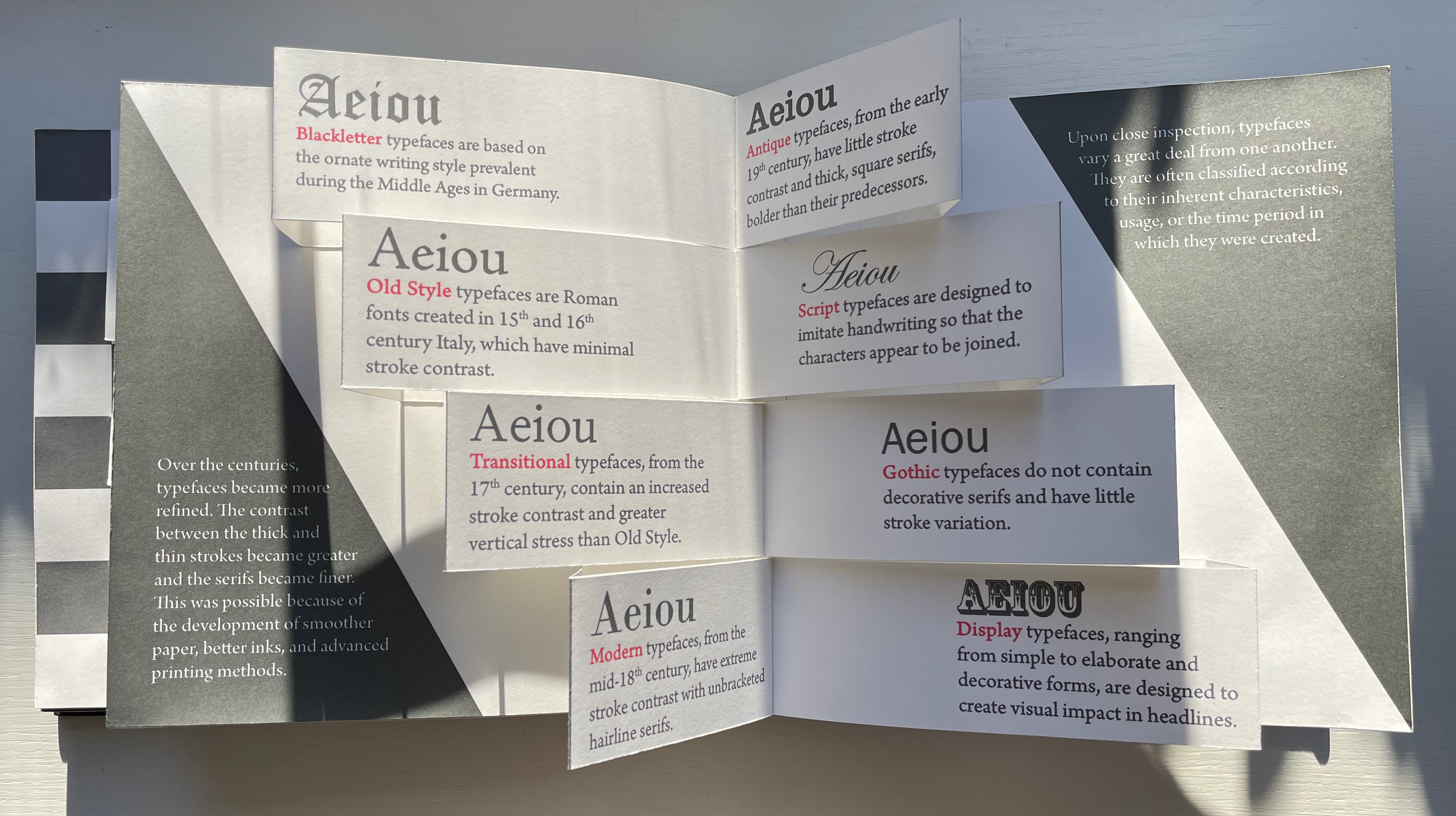
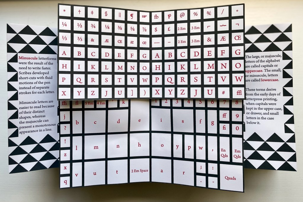
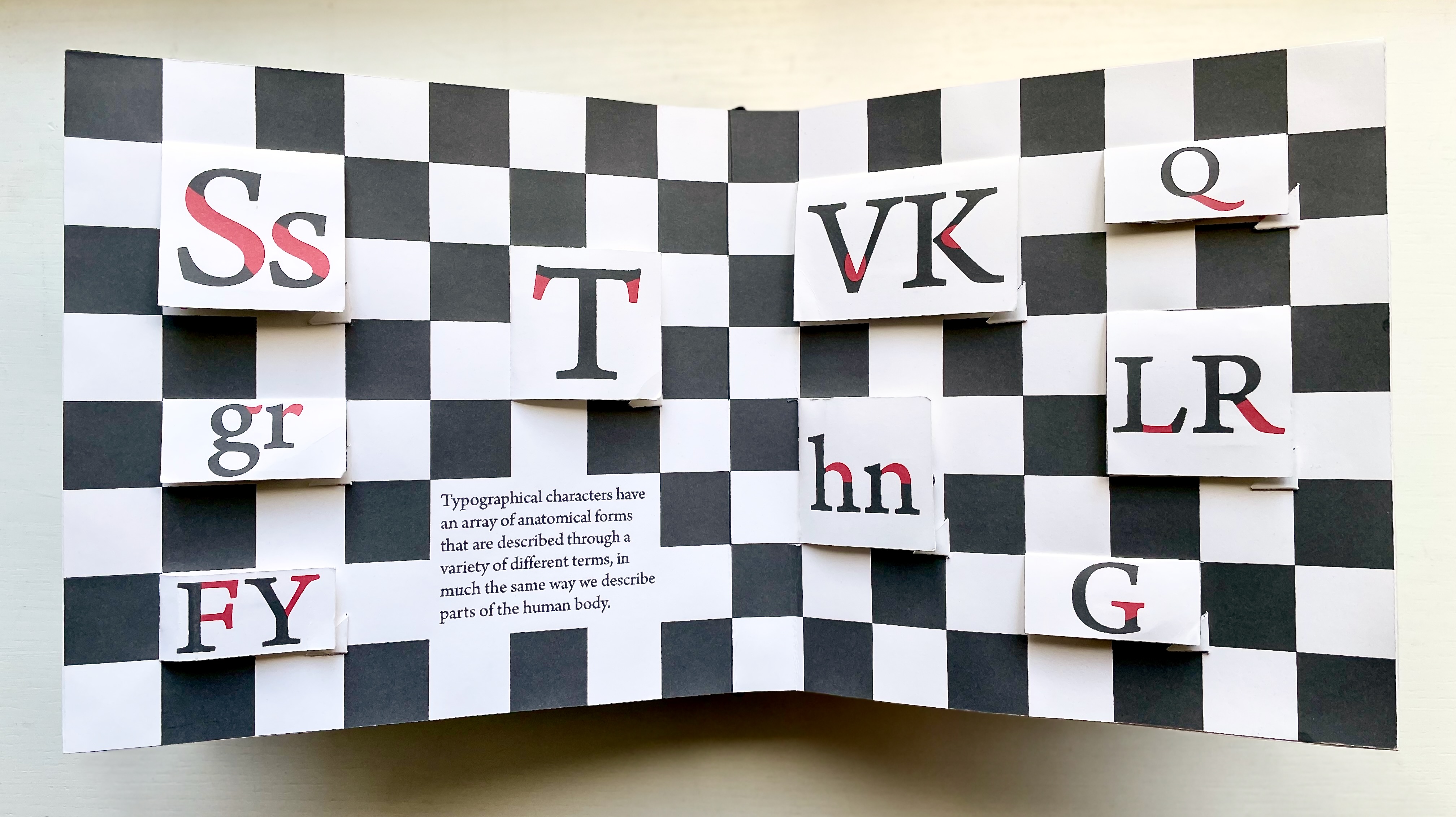
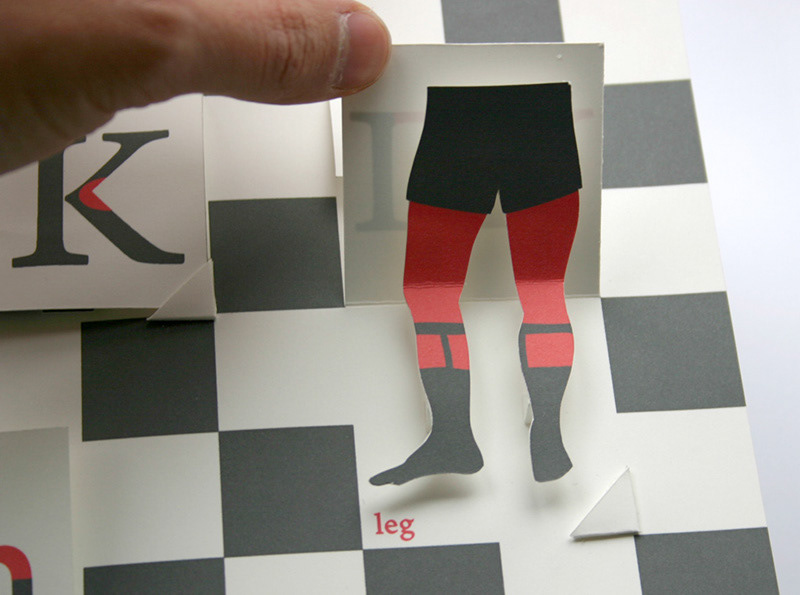
Letterforms have a tangibility that exceeds their two-dimensional representation on paper and even on screen. How better to educate the viewer to their tactility and three-dimensionality than with movable book techniques such as the volvelle, pop-ups, flaps and tab pulls?

The Movable Book of Letterforms (2009) is a work of art that does just that: it enacts a basic introduction to the origins and unique characteristics of letterforms. A limited edition of three, all of its movable parts have been cut and assembled by hand. The printing is digital on Mohawk Superfine 80lb, and the box and book are covered in Laval velour bookcloth debossed with polymer plate. The only element the artifact is missing is metal.

For a monumental display of Steele’s book and paper engineering, a visit in the UK to the National Maritime Museum in Greenwich is urged. It can also be found in the following collections:

Metropolitan Museum of Art, New York
Wits Art Museum, Johannesburg
University of Iowa, Iowa City
Indiana University, Bloomington
Western Michigan University, Kalamazoo
Michigan State University, East Lansing

Further Reading

“Abecedaries I (in progress)“. Books On Books Collection.

“BOOKNESS speaks to Kevin Steele“. 18 December 2023. Oxford: Bodleian Libraries.

Chen, Julie. 2013. 500 Handmade Books. Volume 2. New York: Lark. P. 29 (The Deep).

Lawson, Alexander S. 2010. Anatomy of a Typeface. 5th print ed. Boston: David R. Godine.

McNeil, Paul. 2017. The Visual History of Type. London: Laurence King Publishing.

Salamony, Sandra, and Peter and Donna Thomas. 2012. 1,000 Artists’ Books : Exploring the Book as Art. Minneapolis: Quarto Publishing Group USA. P. 181 (Le Meschere della Commedia dell’Arte).

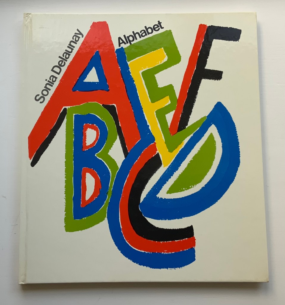
Books On Books Collection – Sonia Delaunay

Alphabet (1972)

Alphabet (1972)
Sonia Delaunay
Casebound, illustrated paper over boards. H285 x W255 mm. 54 pages. Acquired from Argosy Bookstore, 7 August 2021.
Photos: Books On Books Collection.

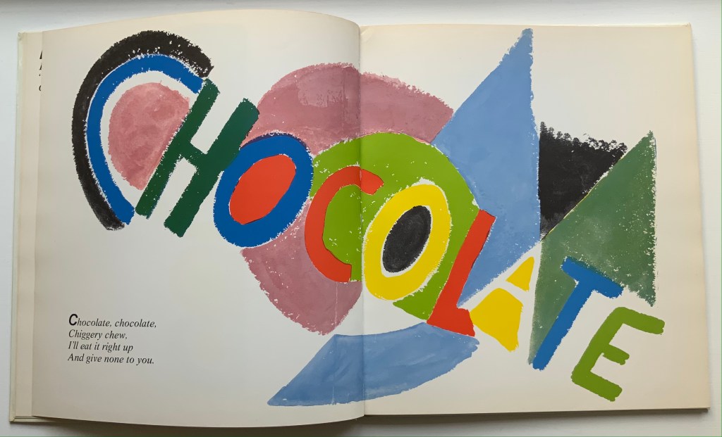
Building on a French scientist’s exposition of how perception of colors changes depending on the colors around them, Sonia and Robert Delaunay claimed that rhythmic, musical and spatial synesthetic elements were also at play.  At least one page in Sonia Delaunay’s Alphabet suggests that this theory of simultanéisme may have extended to the sense of taste.

The lithographs that led to Alphabet appeared ten years before Delaunay’s death, so maybe it is greedy to wish for at least a fine press edition rather than this trade edition. Given the effort and inspiration needed to fuse the elements of alphabetic art with the elements of book art, it is definitely greedy to wish for an artist’s book edition.

Sonia Delaunay’s genius for merging colors, shapes, canvas, paper and fabric was celebrated in “Sonia Delaunay – A Retrospective” at the Tate Modern in 2015. Asserting a family bond with Delaunay, the artist Alla Malomane revived Maison Sonia Delaunay in 2014. In 2019, Kitty Maryatt re-created Delaunay and Blaise Cendrars’ famous work of book art, which they called le premier livre simultané — La Prose du Transsibérien et de la petite Jehanne de France. And more recently, the exhibition “Maison Sonia” appeared at the Kunstmuseen Krefeld in Germany. So perhaps Sonia Delaunay’s spirit endures, and a greedy wish may be fulfilled by some quarter. Since Maryatt’s effort, a pochoir revival certainly seems to be afoot.

Further Reading

“Abecedaries I (in progress)“. Books On Books Collection.

“La Prose du Transsibérien Re-Creation” by Kitty Maryatt”. 5 October 2020. Books On Books Collection.

“Le Cadratin“. 8 February 2022. Books On Books Collection.

Cohut, Maria. 17 August 2018. “Synesthesia: Hearing colors and tasting sounds“. Medical News Today. Accessed 2 February 2022.

Campen, Crétien van. 26 July 2012. “Bibliography: Synesthesia in Art and Science“. Leonardo. Accessed 2 February 2022.

Cytowic, Richard E. 2018. Synesthesia. Cambridge, MA: MIT Press.

Delaunay, Sonia, Katia Baudin-Reneau and Waleria Dorogova. 2022. Maison Sonia Delaunay. Berlin: Hatje Cantz.