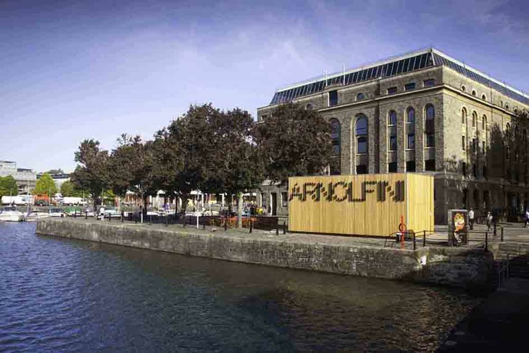
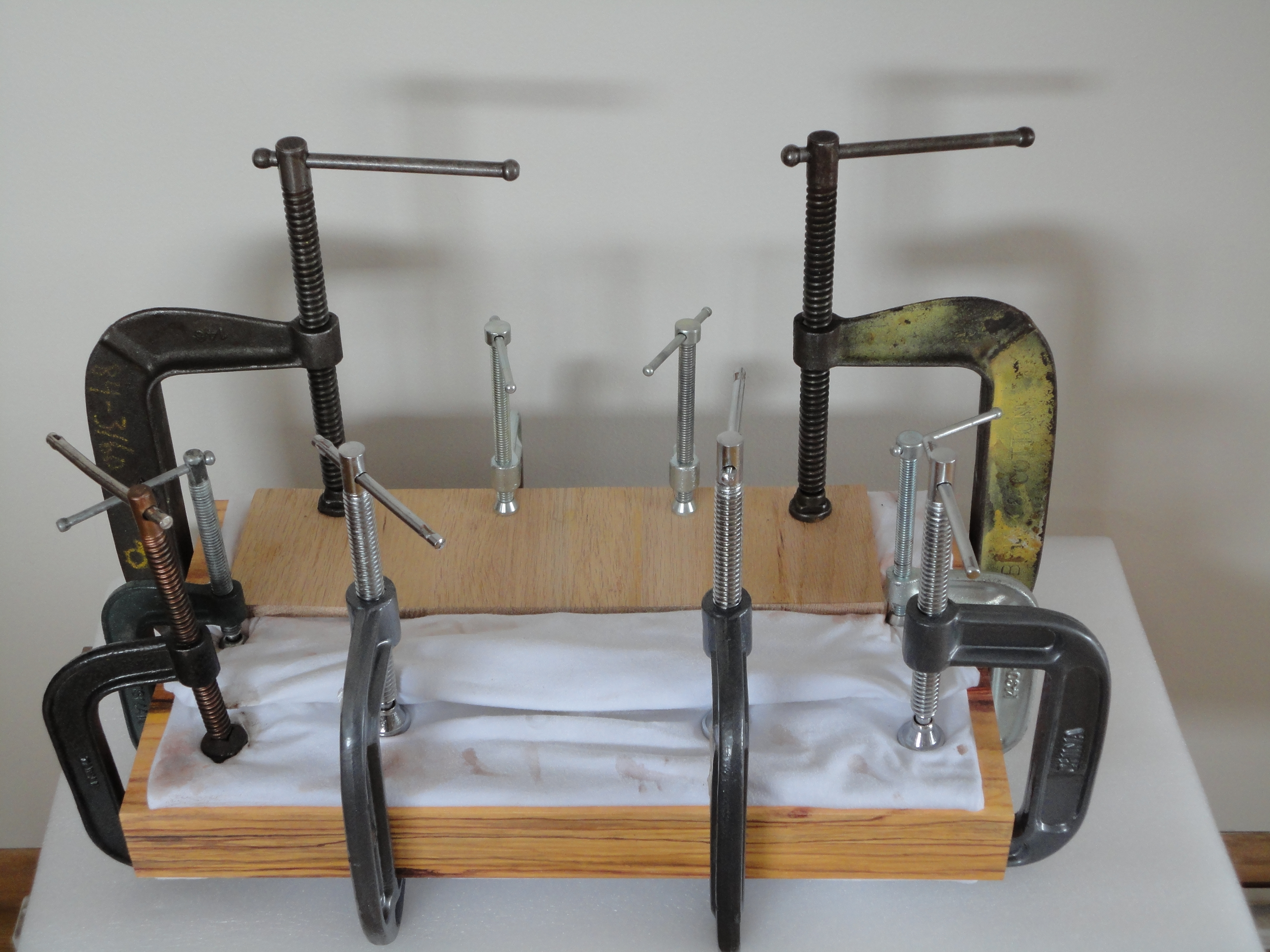
Containing over 700 items, the Arnolfini artists’ book collection is one of the largest UK collections of contemporary book art. It leans toward the 1970s and 1980s. The US-based Franklin Furnace Archive Artists Book Bibliography is representative, as are European works such as those of Vito Acconci, Marcel Broodthaers, Stanley Brouwn, Hanne Darboven, Jan Dibbetts, Helen Douglas, Dieter Roth and Telfer Stokes.
Franklin Furnace Archive Artists Book Bibliography (1977) Unbound notecards of artists’ books catalogues 3 v. ; 430 cards ; 11 x 16cm
The collection is not without later representative works such as those by SooMin Leong, Jonathan Monk and Grayson Perry, but there seem to be no works after 2012. The Arnolfini, Bristol’s center for contemporary art, also hosts the biennial Bristol Artists Book Event.
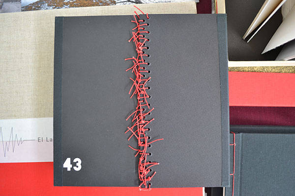
43: Cuarenta y Tres (2015) Lorena Velázquez Book 21.5 x 21.5 cm; box 30.3 X 24.2 cm; mixed technique, interventions with acrylic and serigraphy; edition: 43.
Josh Hockensmith, curator at the University of North Carolina’s Joseph C. Sloane Art Library, made it possible for me to handle this searing work memorializing the 43 students from the Raúl Isidro Burgos Rural Teachers’ School of Ayotzinapa who disappeared in September 2014 near Iguala, Mexico. The driving rain outside the windows that day compounded the work’s effect.
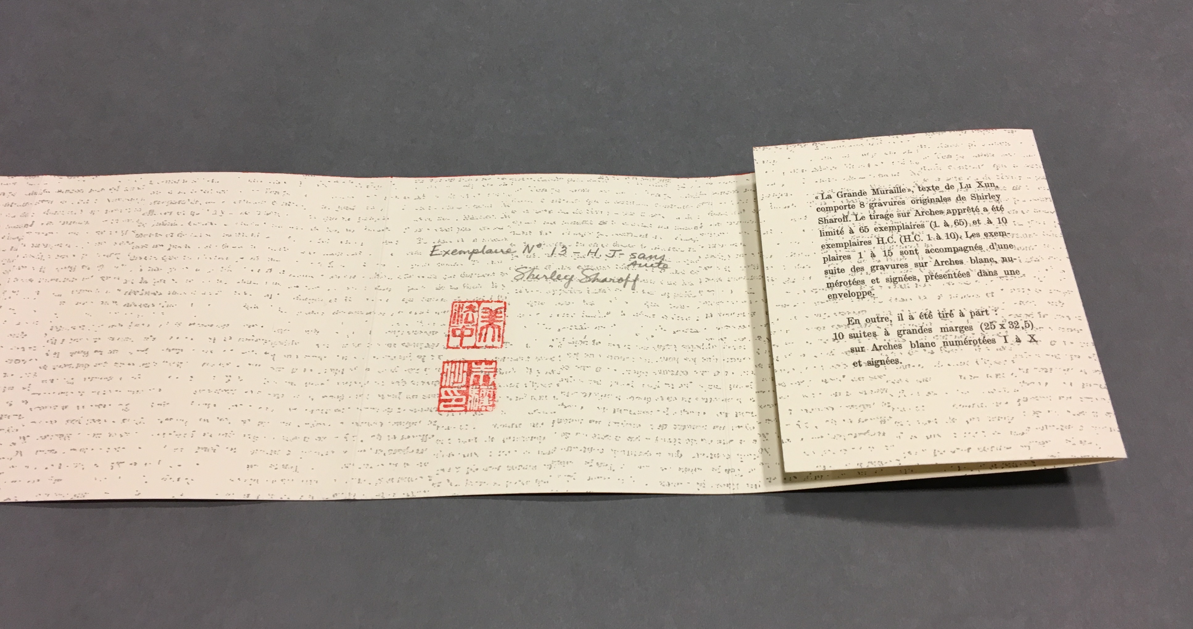
The hard work of describing Velázquez’s book has been done by Stephen Dingler, rare book cataloger at the University of Texas, Austin, Below is an excerpt of online comments on the 13th copy of the edition of 43.
The use of the number 43 is not restricted to the title in Ms. Velázquez’s work. Forty-three numbered copies of the book were made; the book, constructed in concertina (accordion) style, has 43 unnumbered pages; the numbers from one to 43 are printed across several pages; on one page the number 43 is produced in braille. There is little text but the book artist’s use of photographs showing demonstrations and rallies, as well as portrait photographs of the 43 missing, convey a sense of outrage and a demand for justice. The book’s pages are colored black, with most splashed or streaked with red paint, which further conveys a sense of horror and tragedy at what happened.
Stephen Dingler, “The Significance of Numbers”, The Top Shelf, 15 August 2016. Accessed 7 September 2018.
Even with more than 100 people arrested in relation to the case and a key suspect in custody in March 2018, the facts remained unknown. The 43 would have graduated in July 2018. Mexico’s new president Andrés Manuel López Obrador has committed to launching an independent commission on 1 December 2018 to to re-open the investigation in compliance with a federal court ruling.
One among the names of the 43 has been redacted because his remains have been identified. 43: Cuarenta y Tres (2015) Lorena Velázquez
The Spiral Lady (2013) Book 21.5 X 20.0 cm; box 56.5 X 21.5 cm; edition 20 + 2 a/p. Collaboration with Lola Argemí. WorldCat link.
El Vuelo/Flying (2012) Book 21.5 x 18.0 cm; box: 23.0 cm x 19.5 cm; mixed technique, fine art printing, interventions with chinese ink and acrylic; edition: 10 + 2 a/p. WorldCat link.
El Latido del Corazón/Heartbeat (2011) Book 24.5 x 35.5 cm; box 38.5 x 37 x 4.5 cm; mixed media, digital printing over plaques of collodion and several objects; edition: 4 + 2 a/p.
It can be hard to find the time to experiment with your art. Often you feel everything we create should be a finished artwork but it is extremely valuable to take the time to just play. It can feel like a waste of time but often from these opportunities the most fascinating results, techniques and […]
A search of Lafayette College’s Artists’ Books Collection on the genre yields 1284 entries, including works by Alicia Bailey, Julie Chen, Maureen Cummins, Steven Daiber, Karen Hanmer, Margaret Kaufman, Clifton Meador, Lois Morrison, Werner Pfeiffer, Gerhard Richter, Maryann Riker, Edward Ruscha, Buzz Spector, Barbara Tetenbaum, Erica Van Horn and Sam Winston.
Check out the archives for the Werner Pfeiffer exhibition.
Worth a visit to the Skillman Library if you’re in Easton, PA.
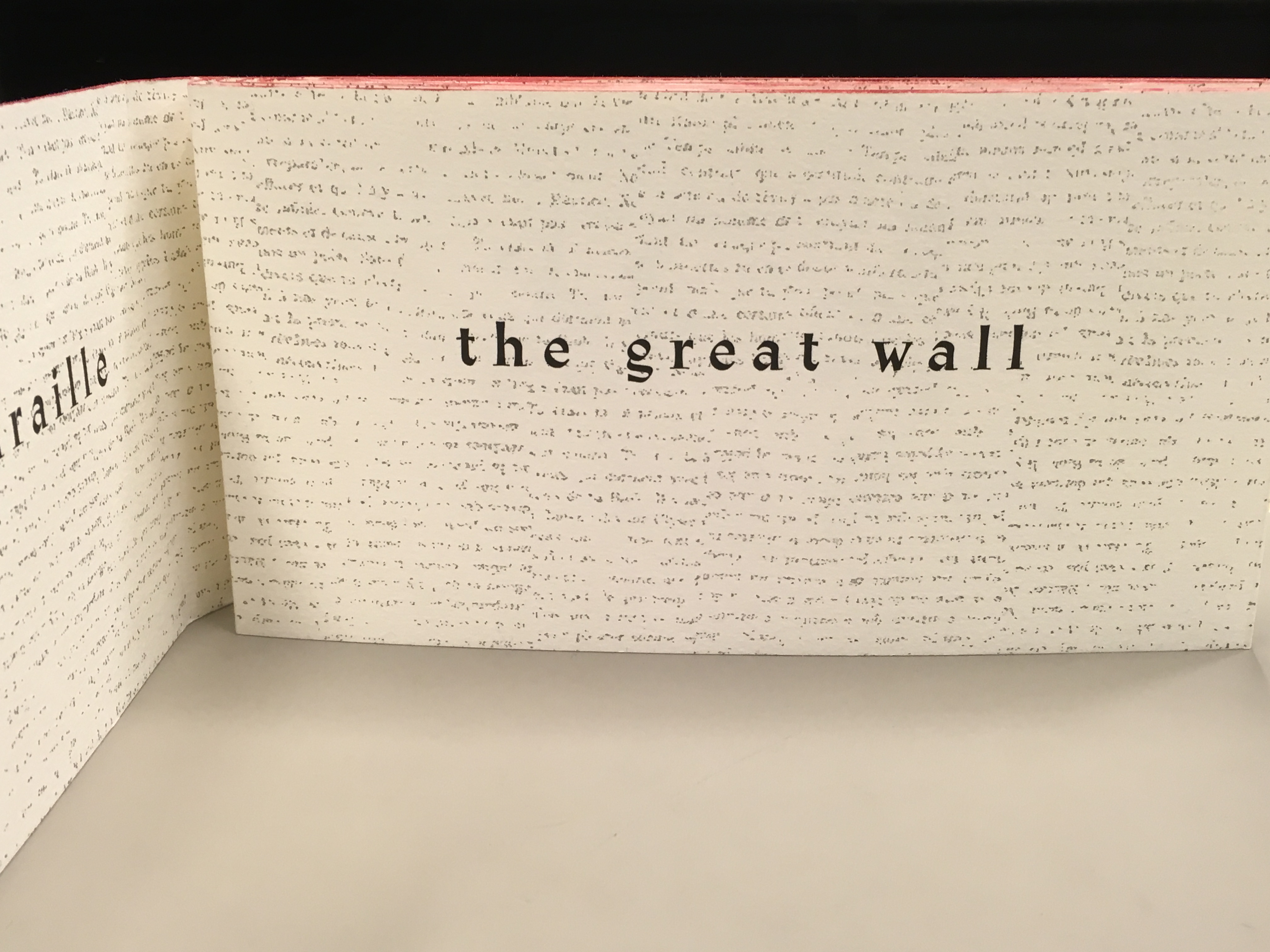
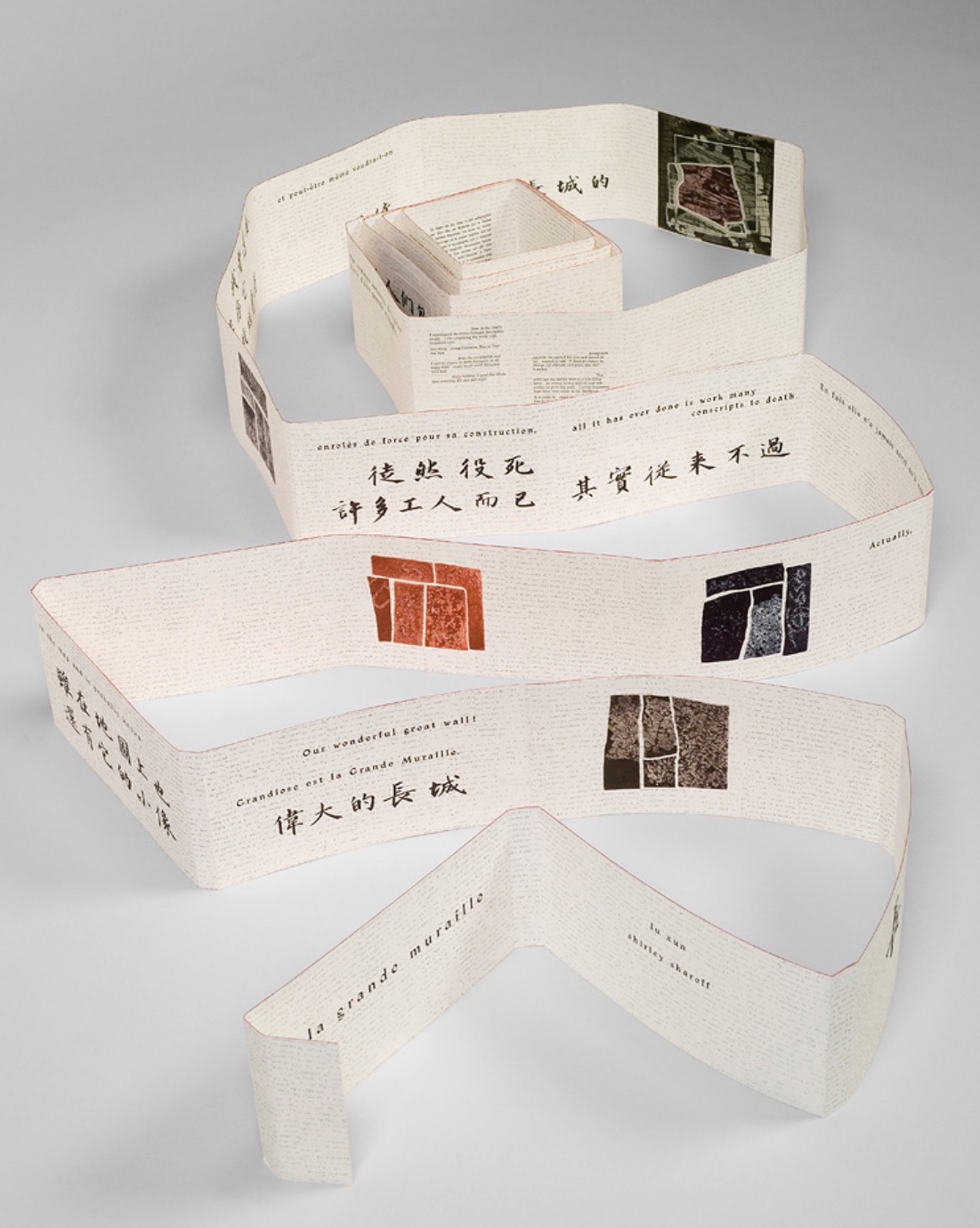
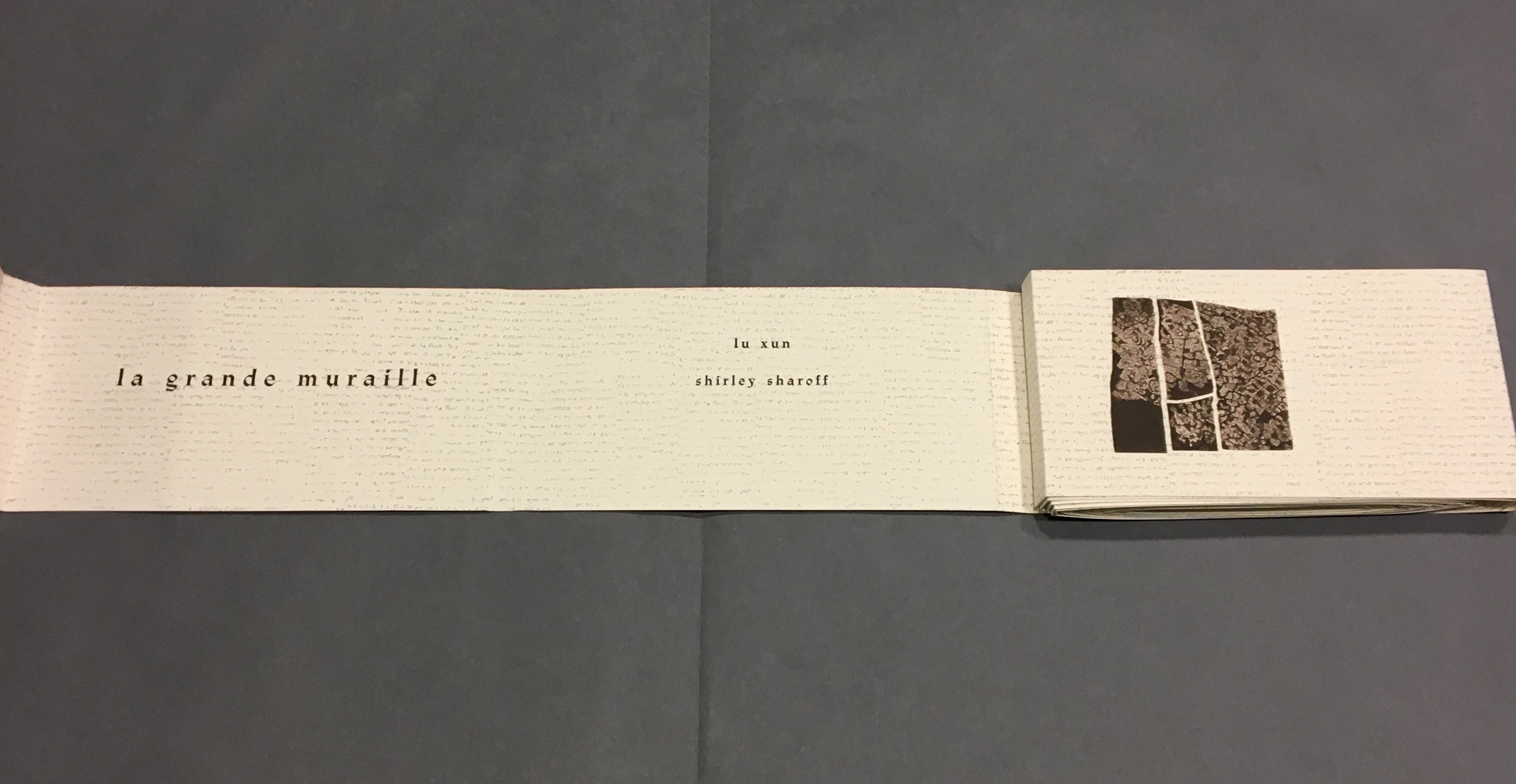
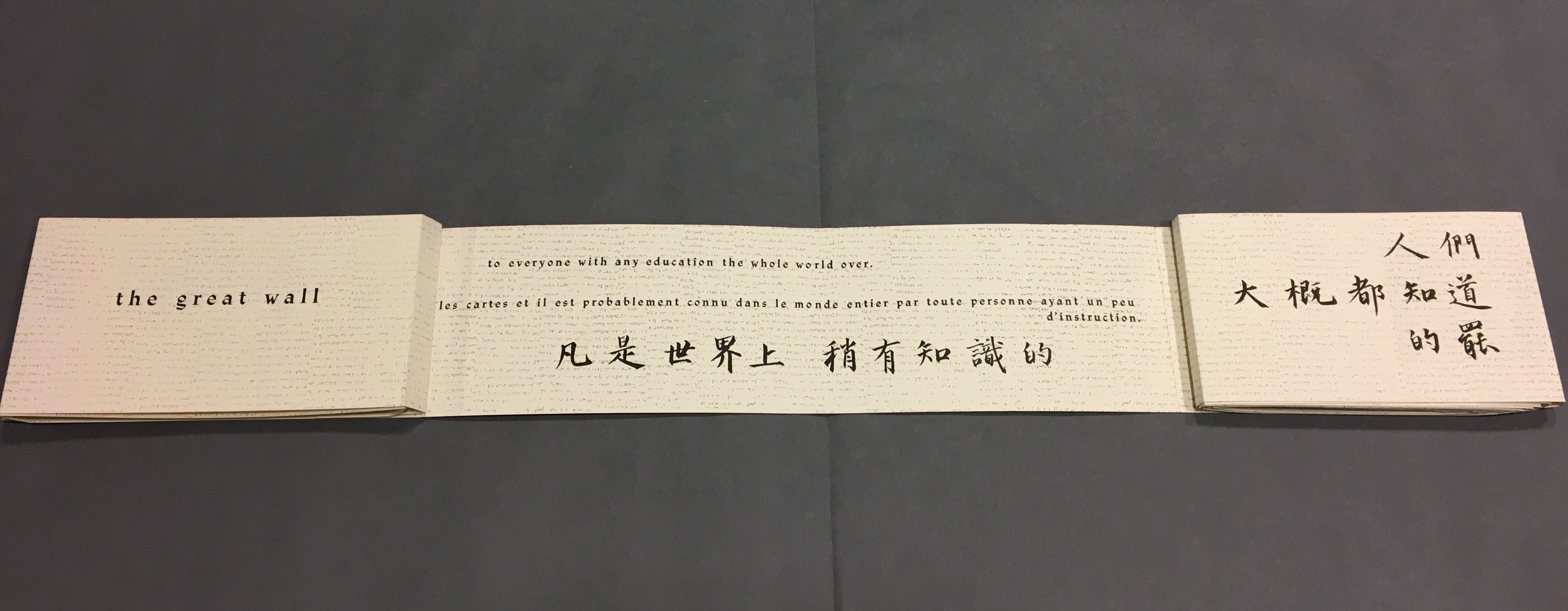
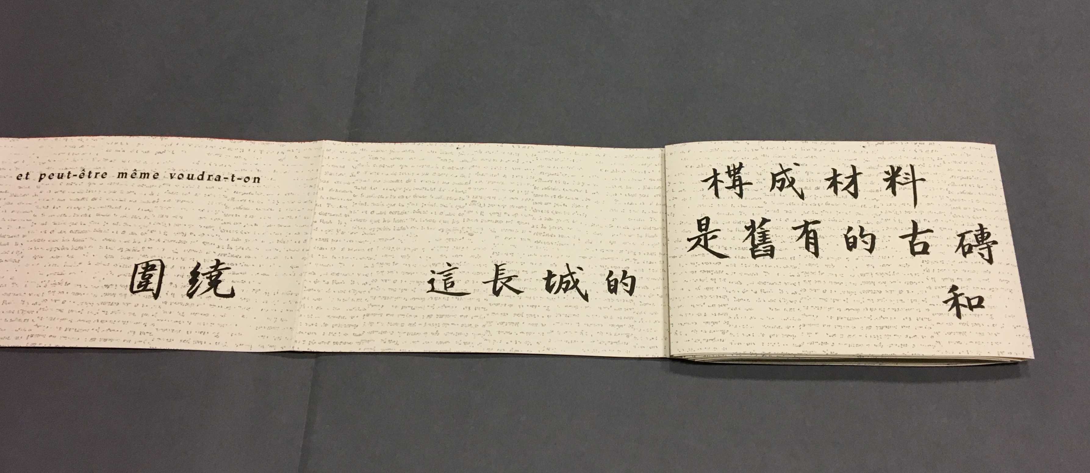
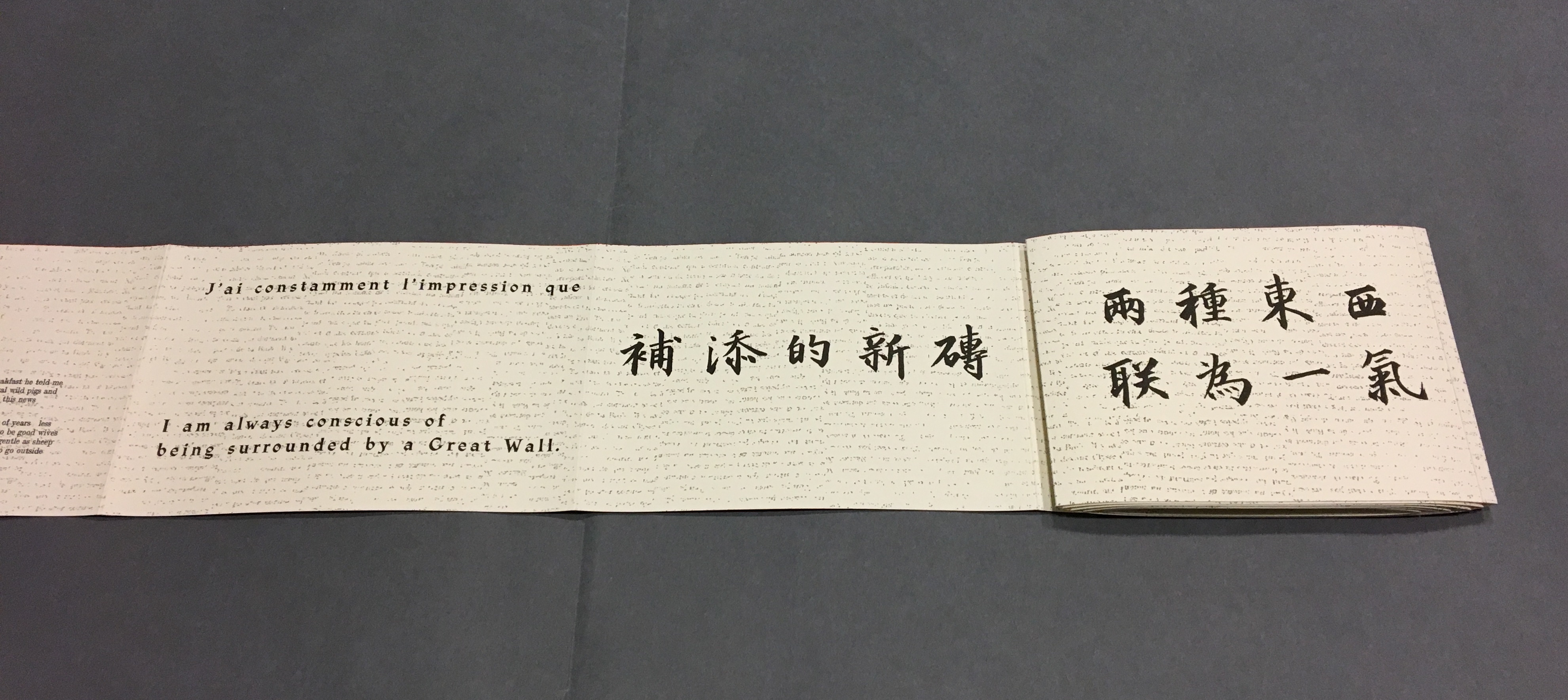
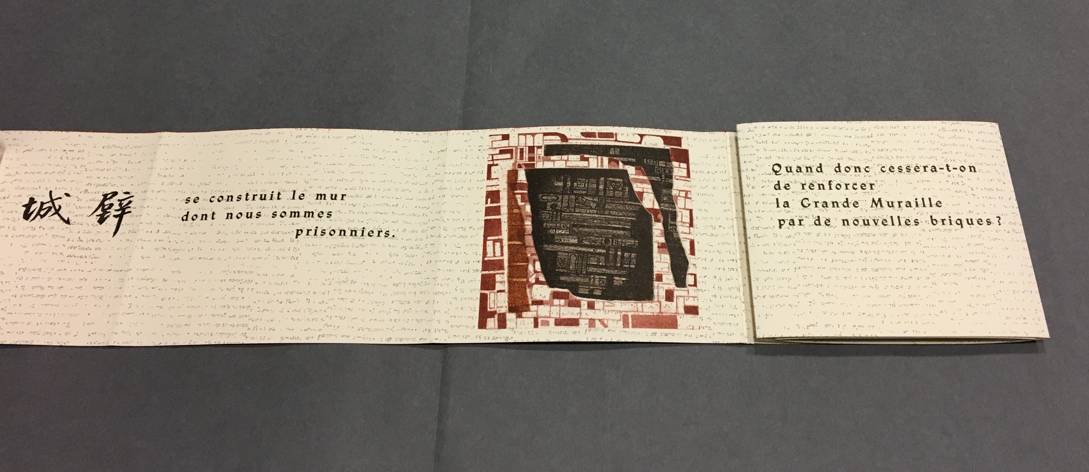
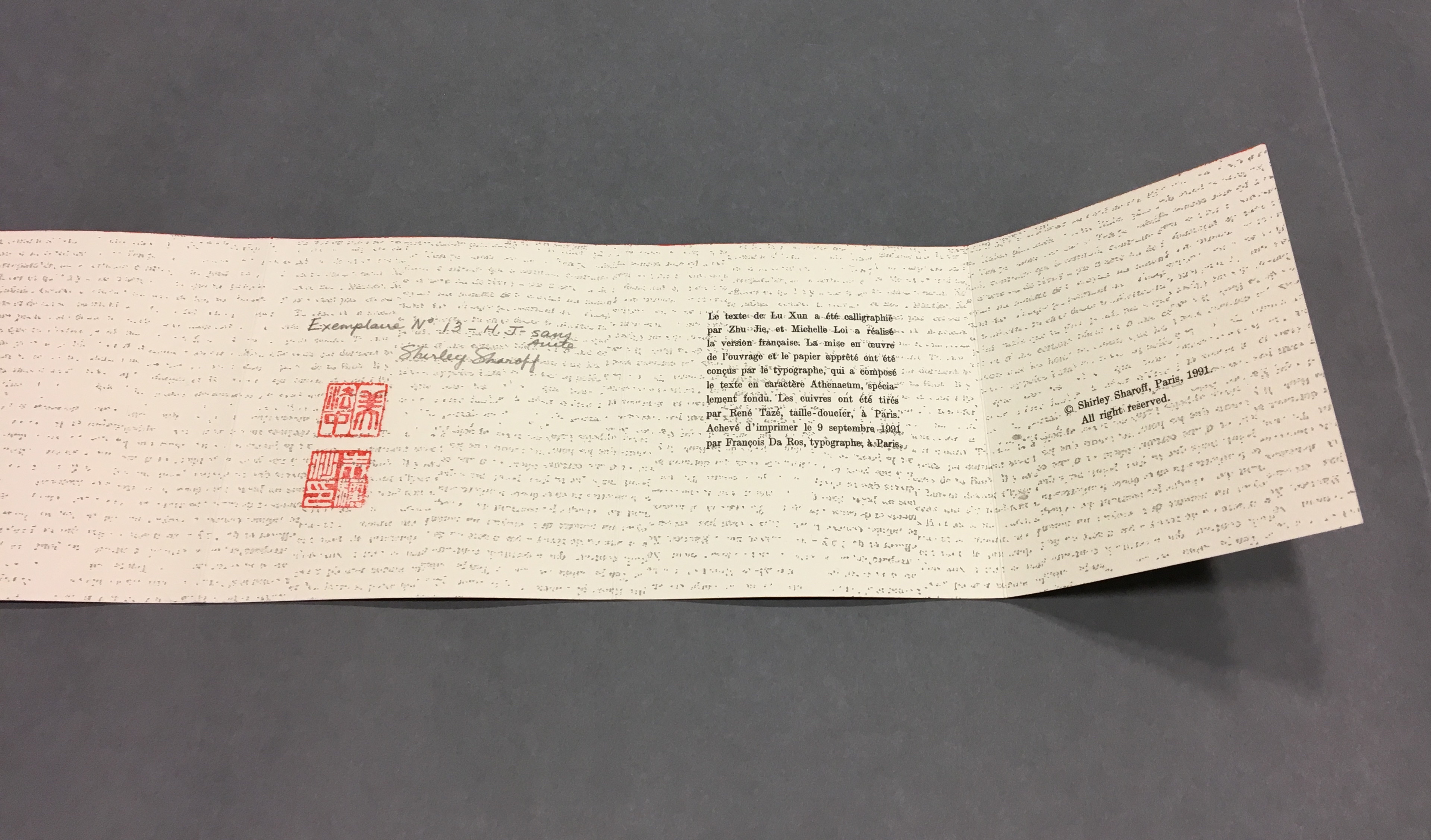
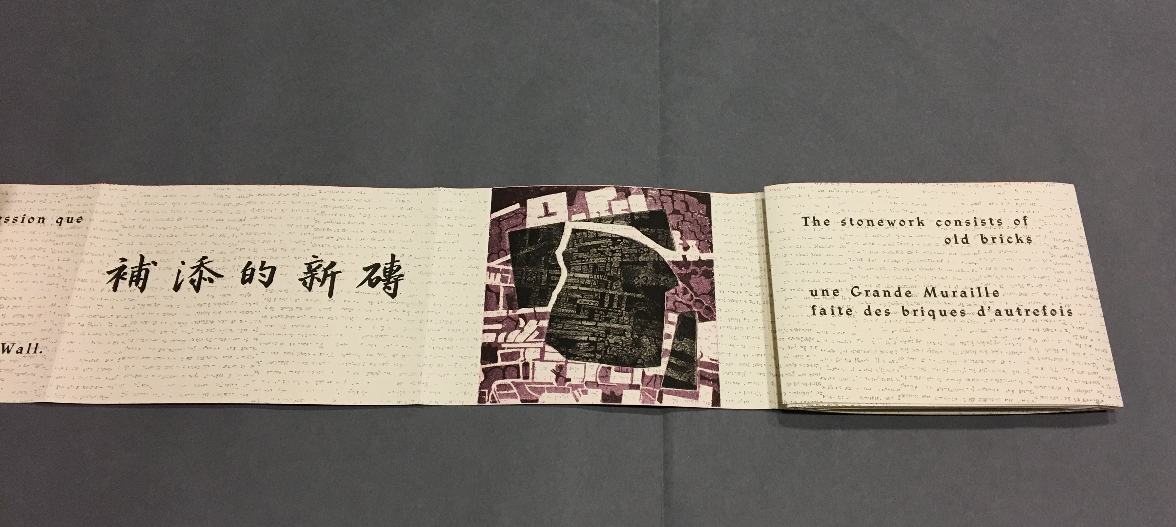
La grande muraille/The Great Wall (1991), Shirley Sharoff All Books On Books photos are reproduced here with permission of the artist.
Detail, La grande muraille/The Great Wall (1991) Typeface: Athenaeum, designed by Alessandro Butti and Aldo Novarese in 1945
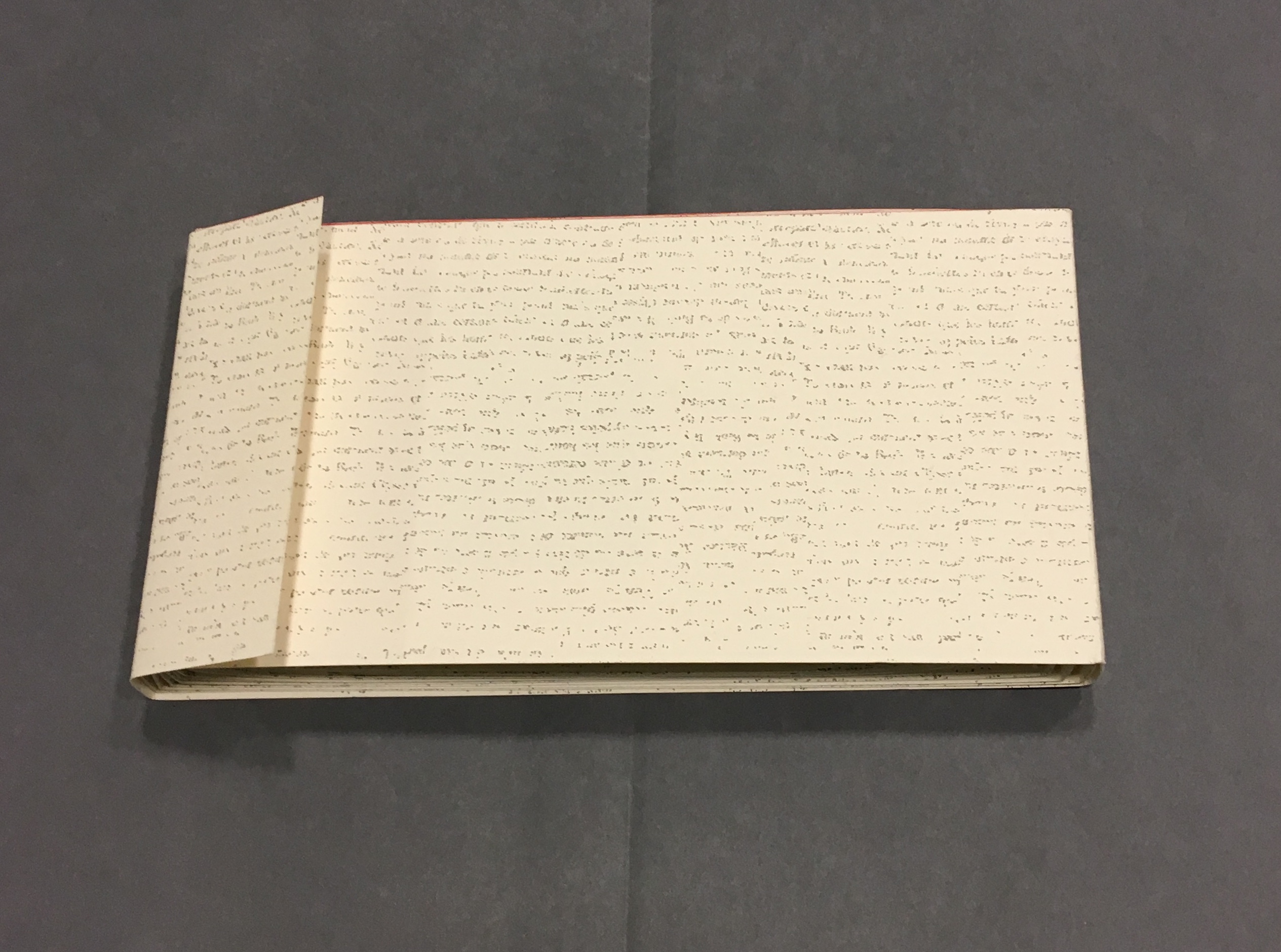
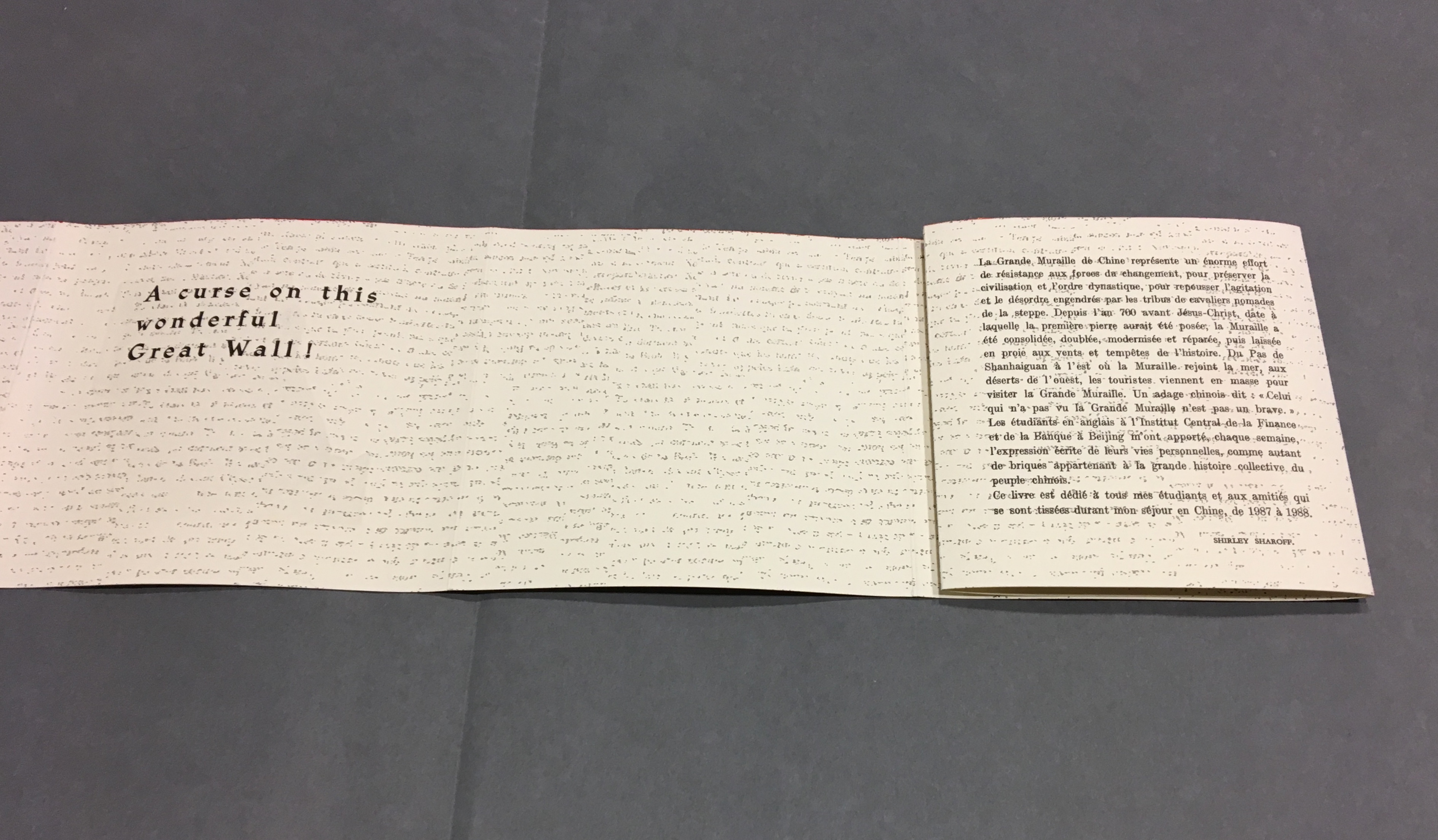
The National Library of the Netherlands advises, “for [Shirley Sharoff’s La grande muraille/The Great Wall (1991)] to be read, the book first must be rolled out”. And that is what I did, using the large table in the Special Collection’s seminar room.
Enjoyable as that was, enjoying it again with the video afterward, something seemed awry. As the Chinese poem by Lu Xun, its French and English translations and text from Sharoff’s language students unrolled, interpersed with her prints, the text seemed to have gaps, or so I thought. So I returned a second time. Perhaps if I re-shot the video. Perhaps if I took more stills and close-ups. Perhaps if I shot the rolling up as well as the unrolling.
No doubt, the second effort added to the pleasure. Looking at the videos and stills, I can again feel between my fingers the Arches paper and engravings’ impressions on it. But still I detected gaps, seeming mismatches between the French and English. I wondered to what degree they
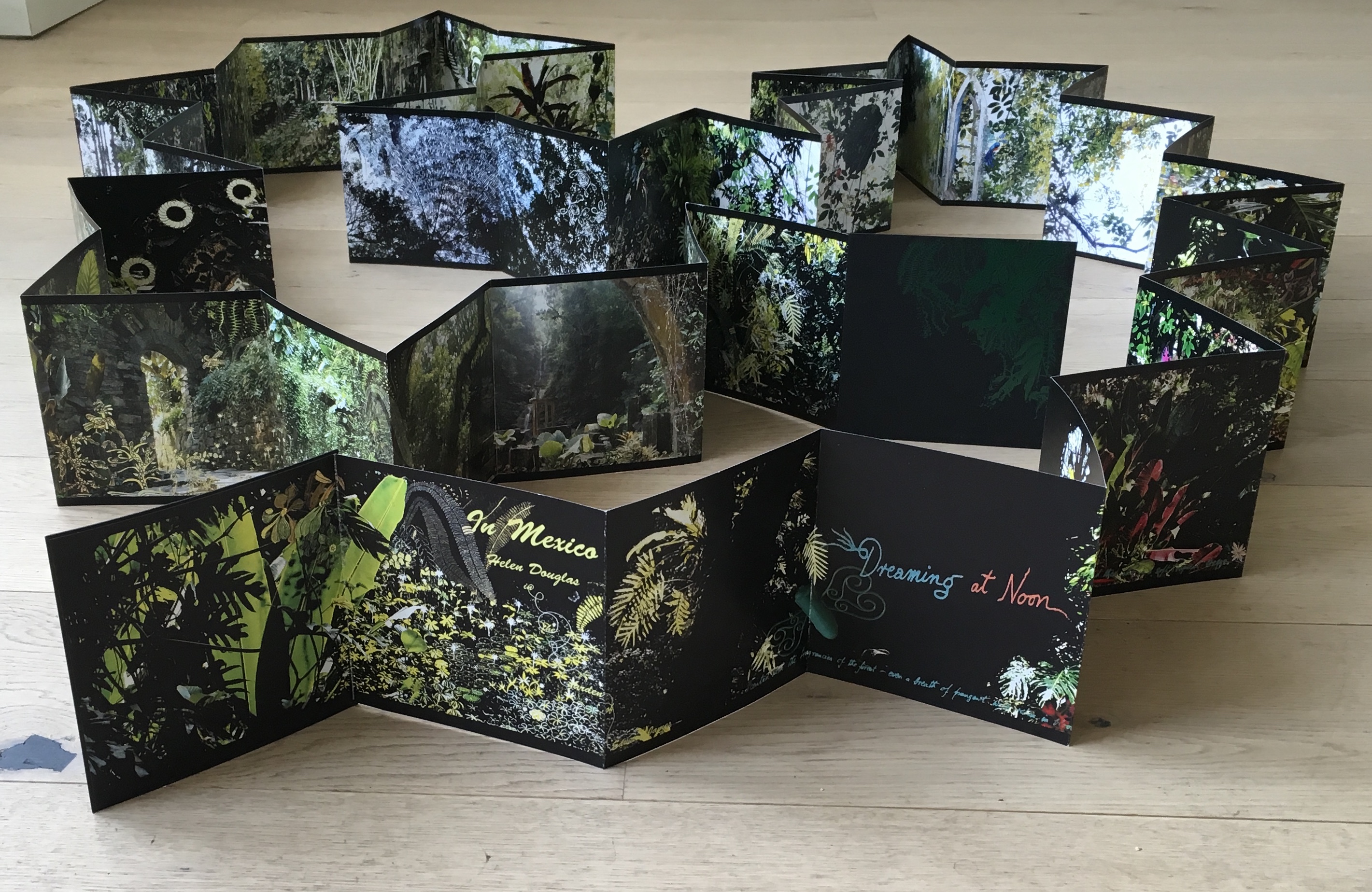
followed the Chinese text or whether some of Lu’s text had been omitted. So, I returned a third time, and then came my “ah hah” moment. Unrolled, La grande muraille looks like a double-sided leporello or accordion book like this one: In Mexico by Helen Douglas.
In Mexico: in the garden of Edward James (2014) Helen Douglas
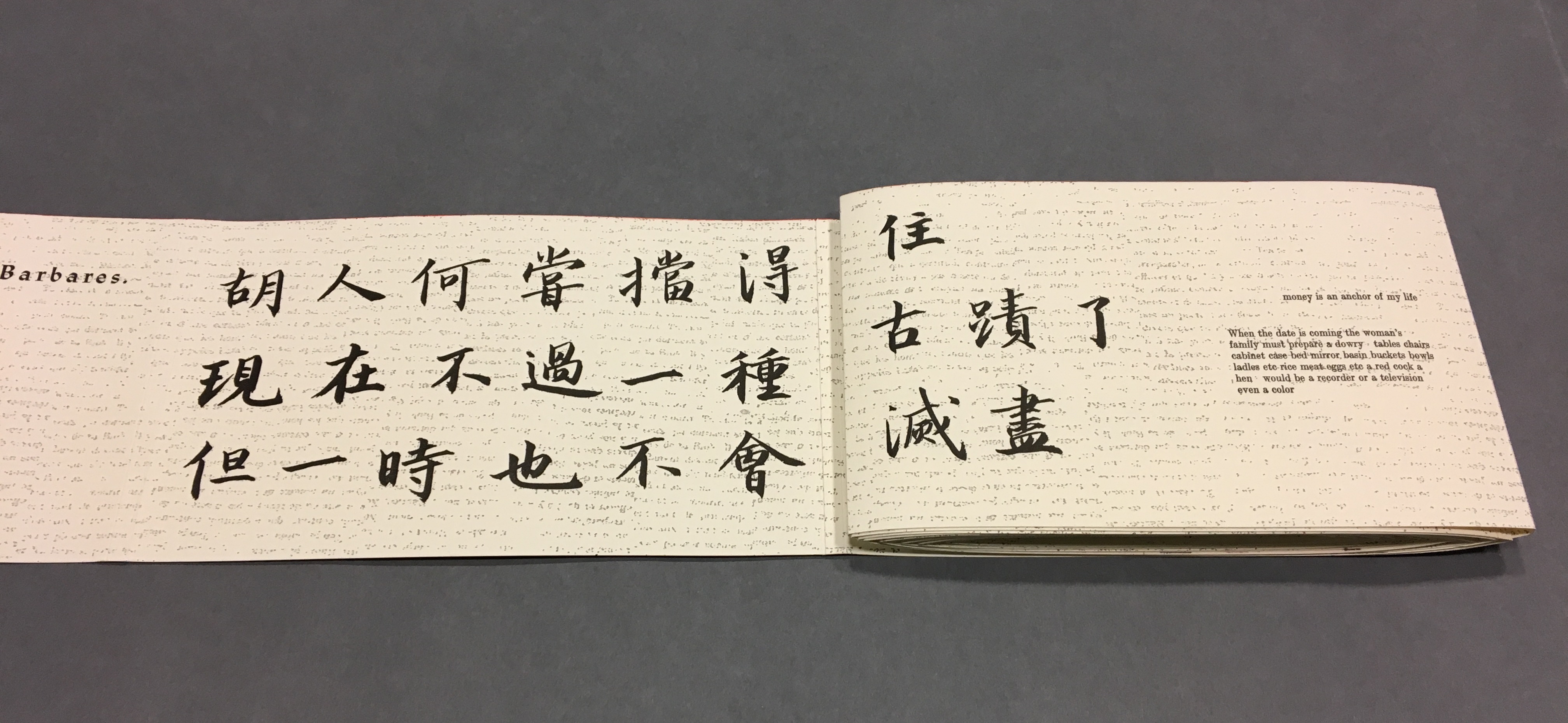
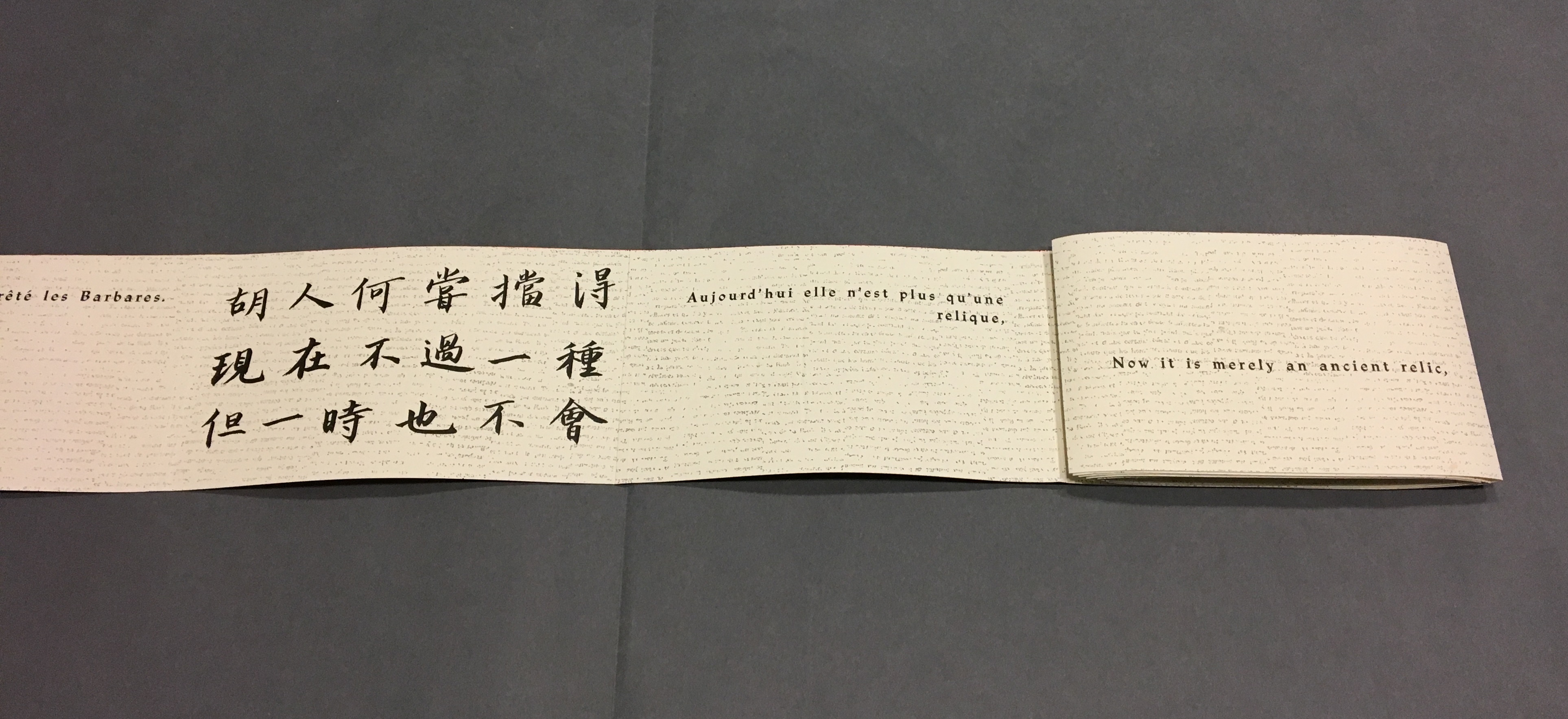
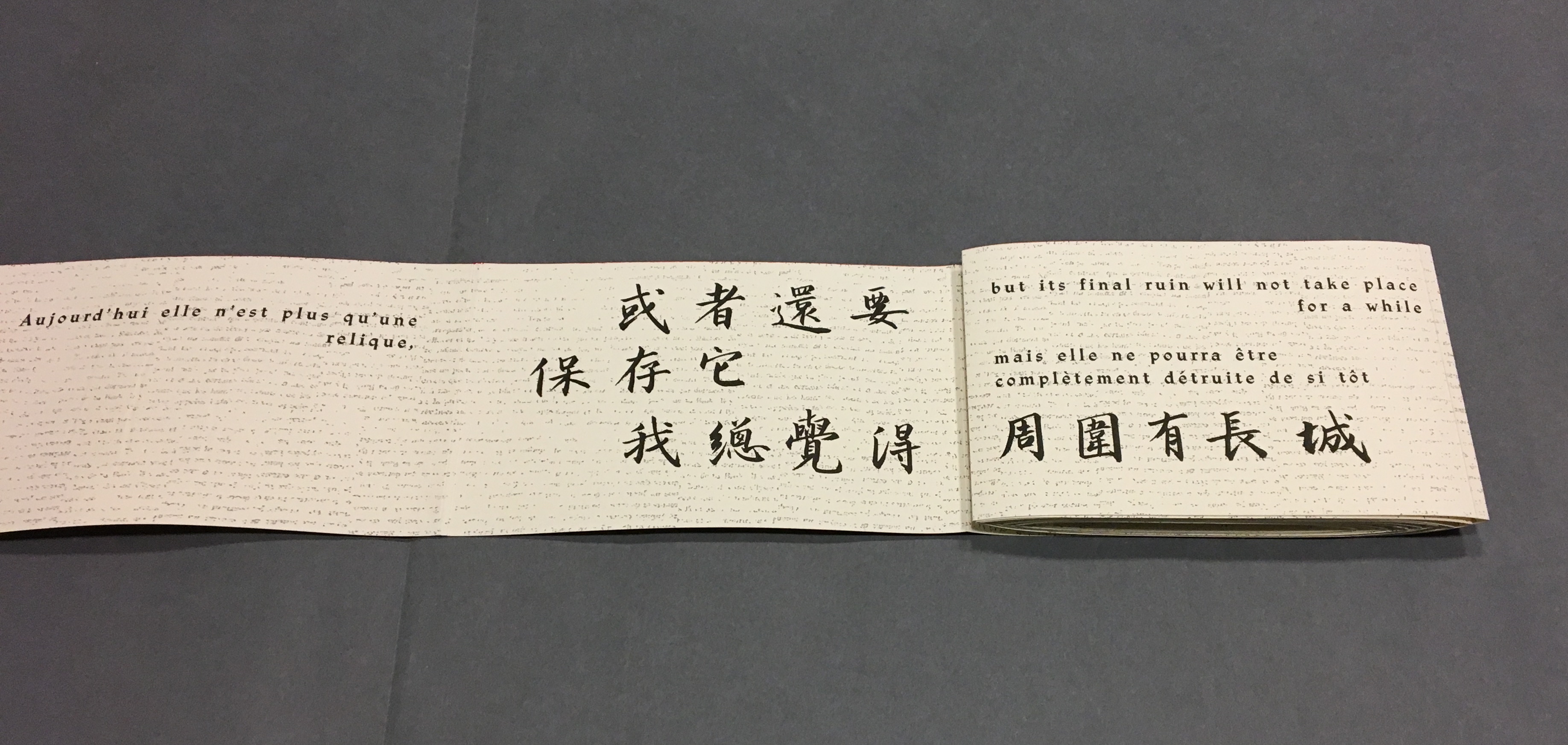
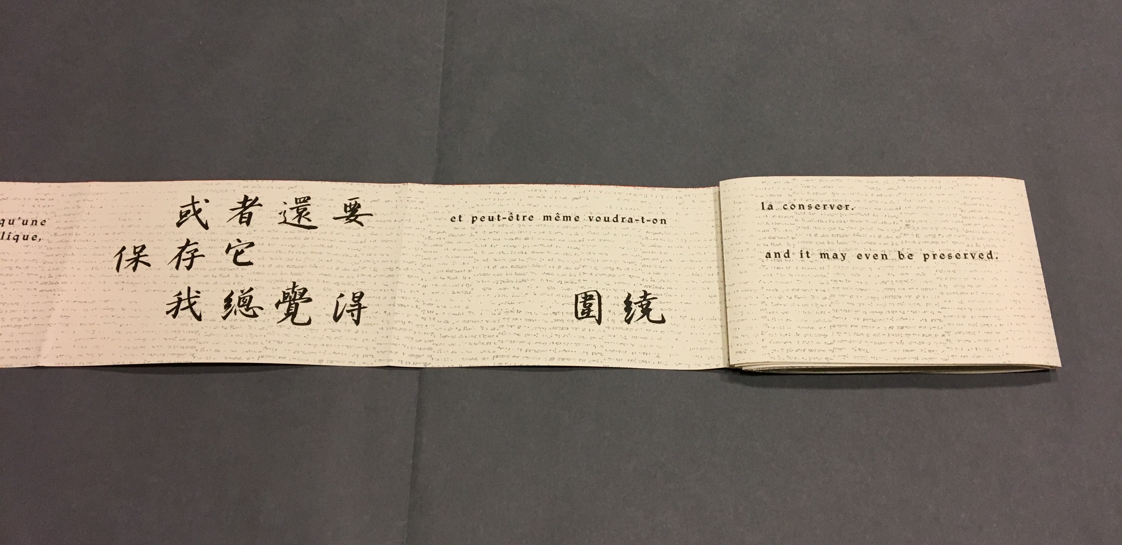
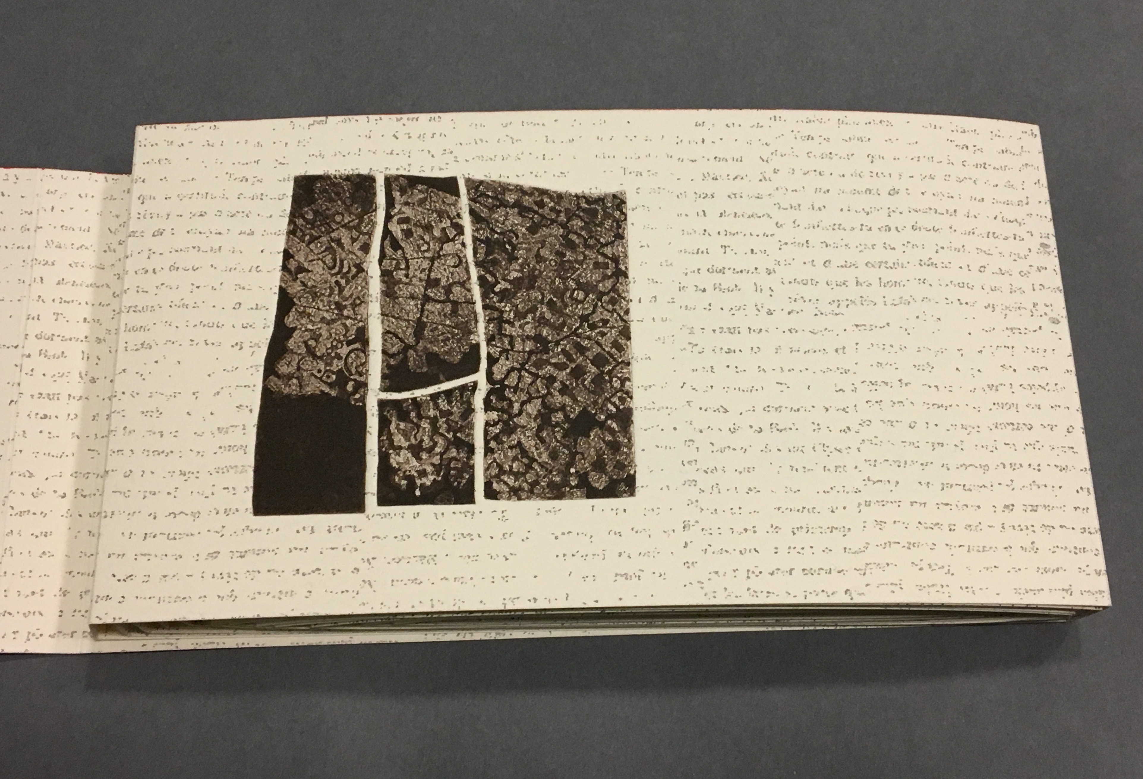
To read La grande muraille as the double-sided leporello it appears to be, however, is to overlook the multi-page spreads that Sharoff conceived with François Da Ros (her typography and print collaborator) in putting together this forme en escargot (snail-shell form as she calls it). The snail-shell form, its multi-page spreads and the text demand that you read La grande muraille as you unroll it, or rather, as you unfold it.
With the book laid flat, the “page spreads” are easier to recognize, the text is easier to read, and the forethought needed for the “imposition” of text and images to deliver the sequential text, easier to marvel at. As each recto page is turned to the right, two new pages appear to the right. This unfolding approach to reading the book offers several intriguing “double- and multi-page spreads” and an experience of the texts and eight prints in the sequence driven by the text. When you have finished reading in this sequence, you will have read both sides of the scroll.
Reading the text
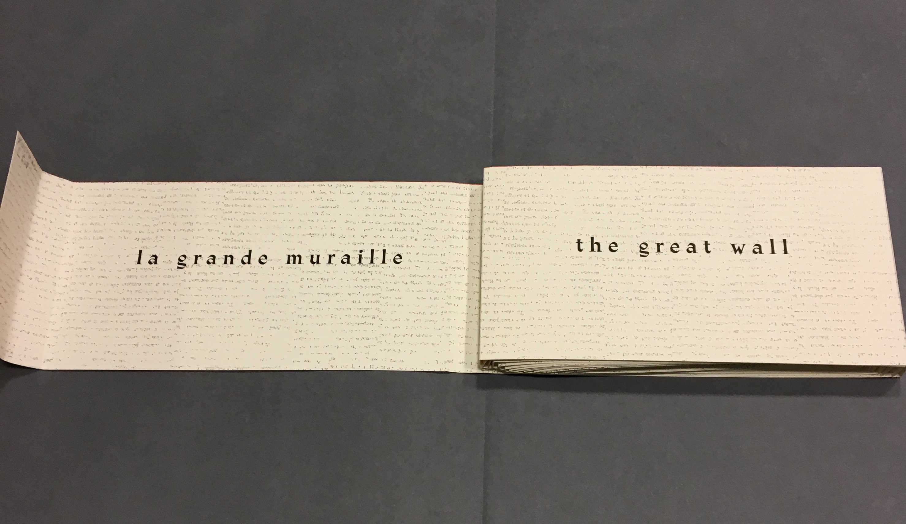
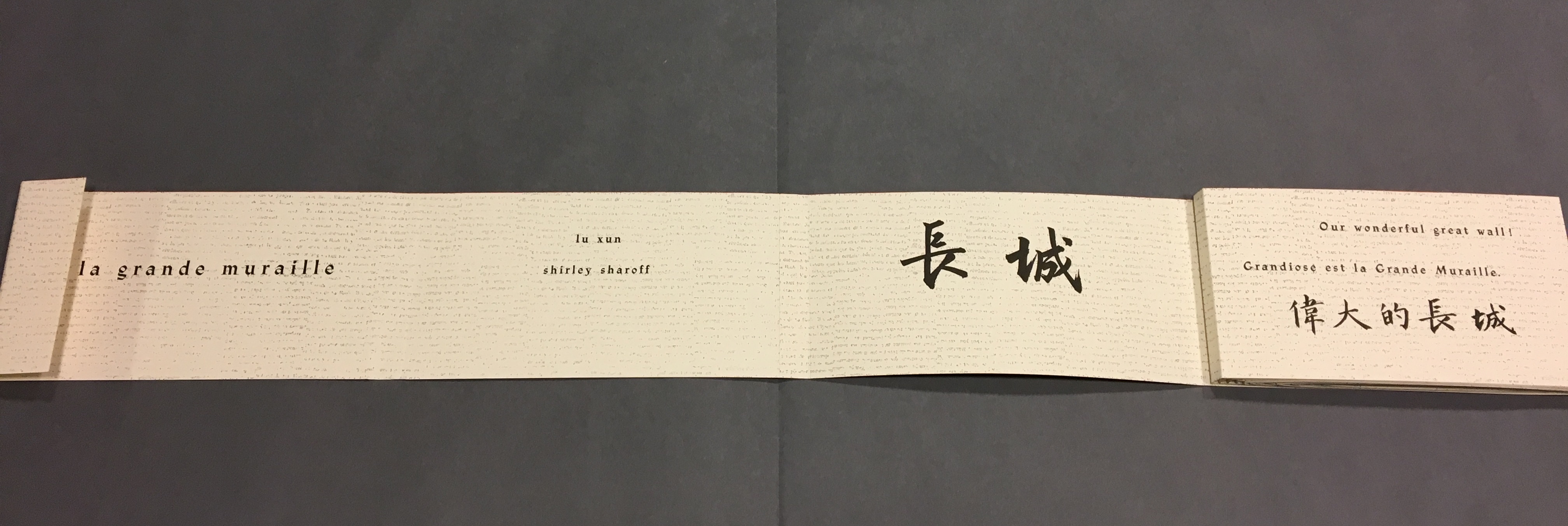
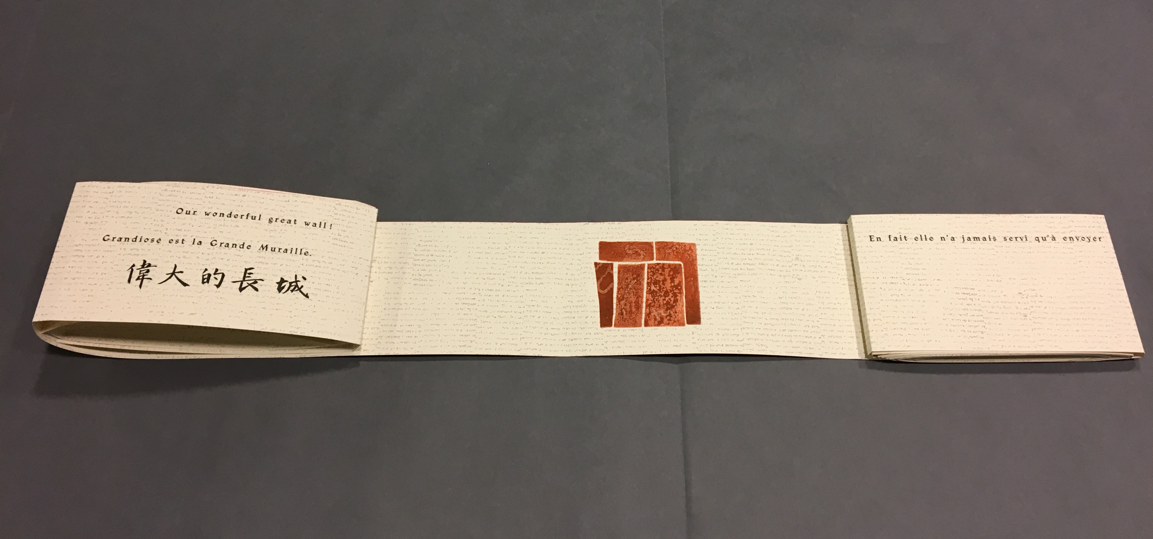
Front cover La grande muraille/The Great Wall (1991), Shirley Sharoff
“Pages 1 and 2” As “page 2” is turned to the right and the English title of the work disappears, “pages 3 and 4” come into view.
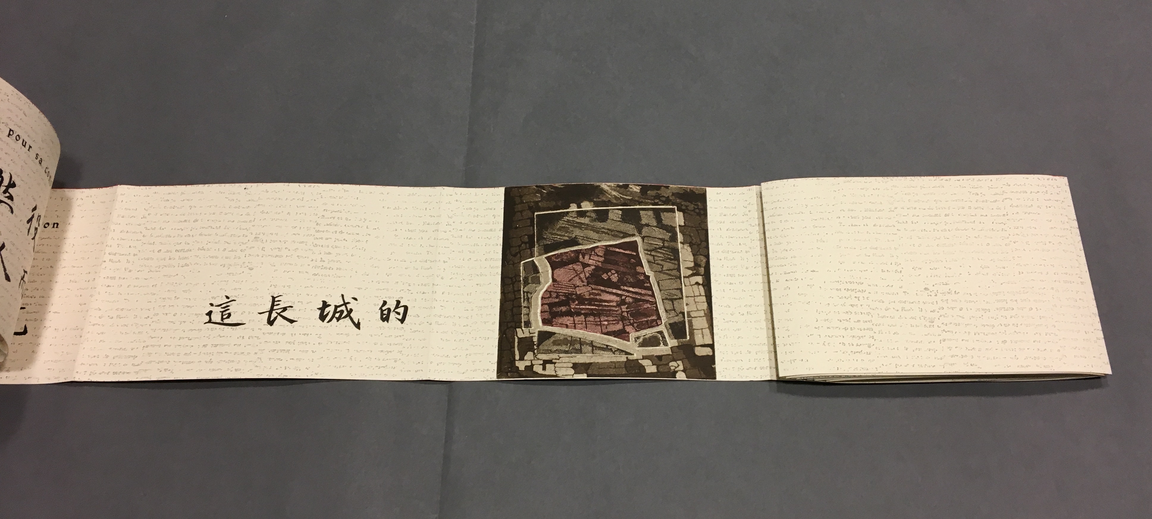
“Pages 1, 3 and 4” “Page 3” displays the authors names, and “page 4” displays the first of eight prints in the book. As “page 4” is turned to the right and disappears, “pages 5 and 6” appear.
“Pages 1, 3, 5 and 6” “Page 5” gives the title of the book in Chinese calligraphy. On “page 6”, the opening line of Lu Xun’s text appears in English, French and Chinese. Turning “page 1” to the right will cover the authors’ names on “page 3”, and turning “page 6” to the right will yield the next four-page view.
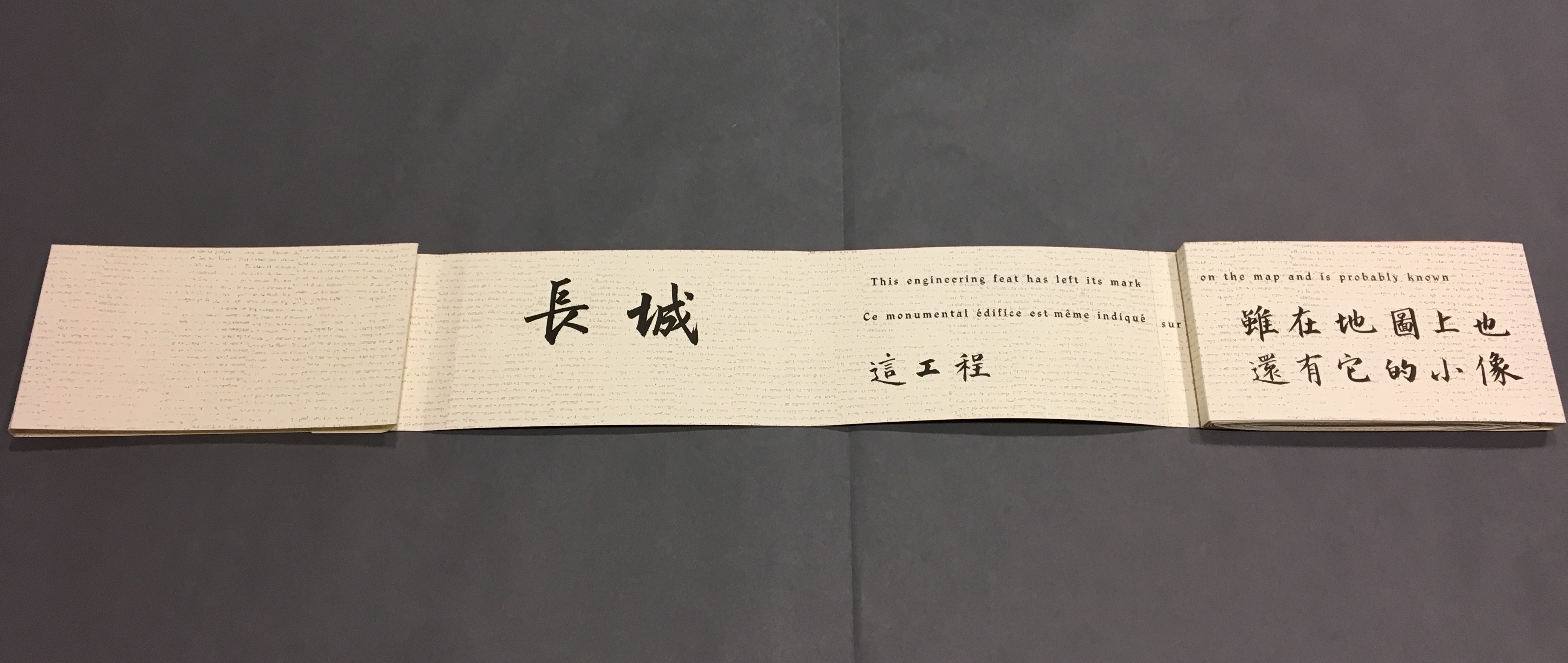
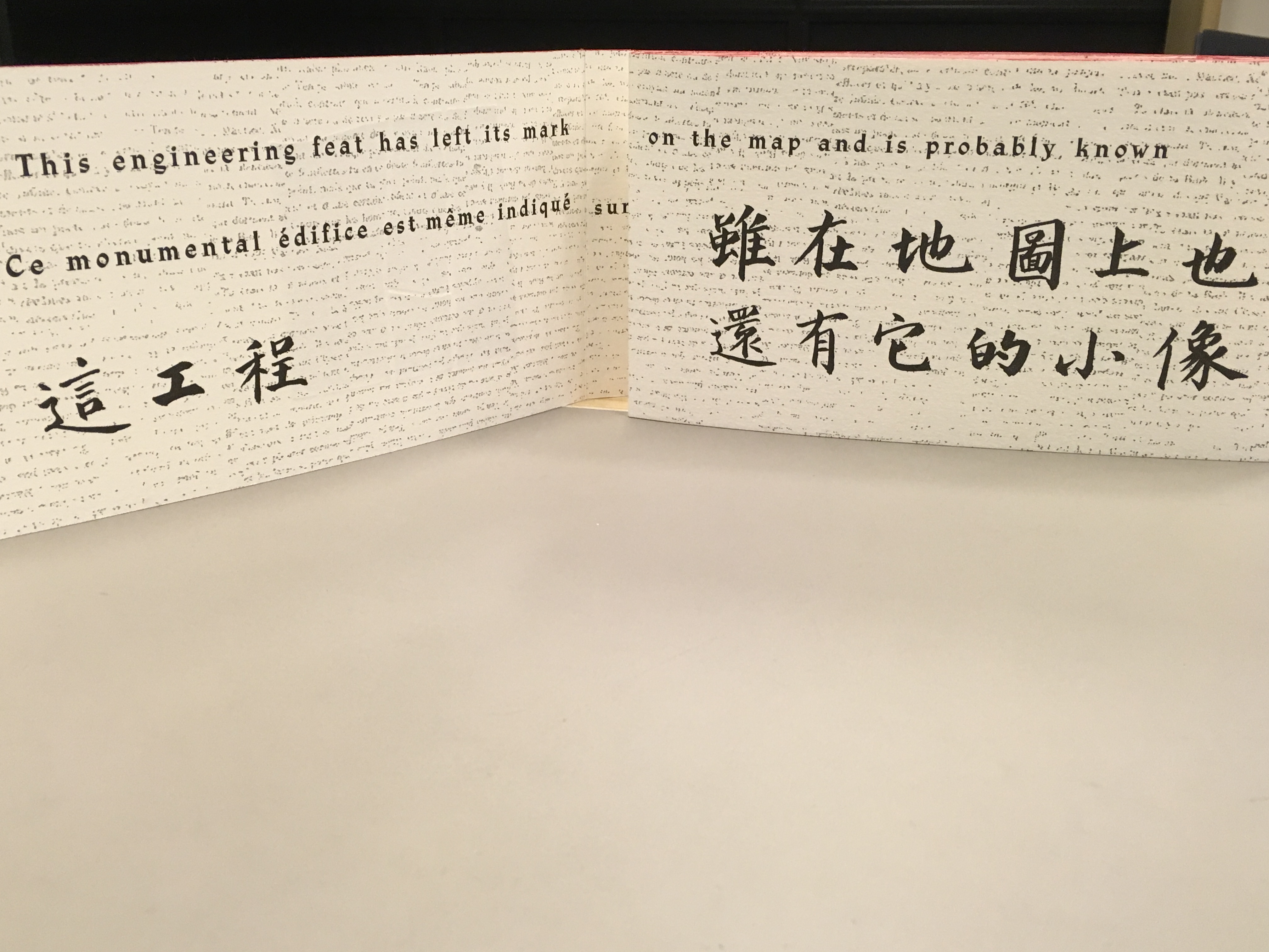
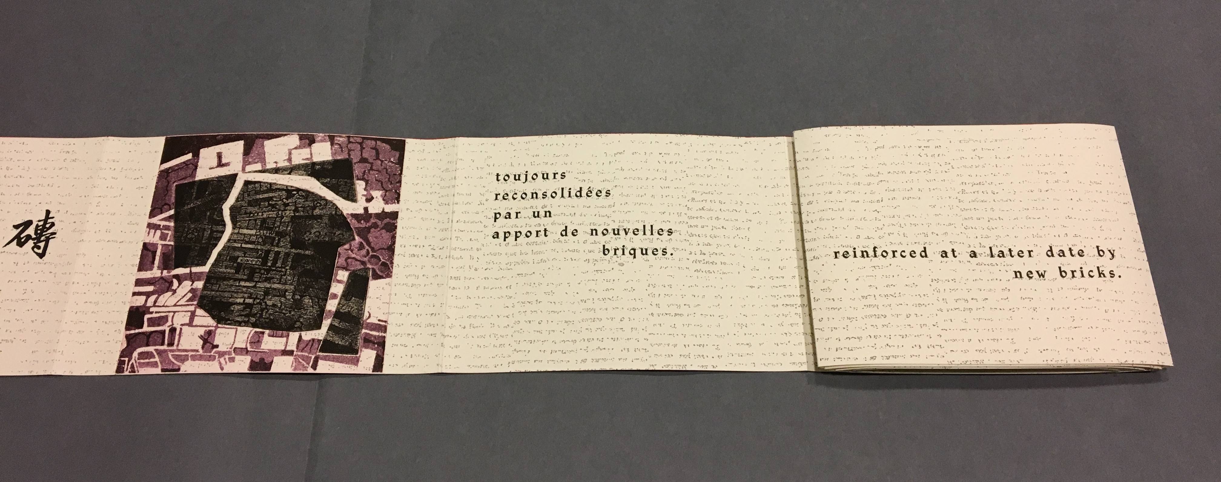
“Back cover, pages 5, 7 -8” The next lines of Lu Xun’s disquisition run in English, French and Chinese across “pages 7-8”.
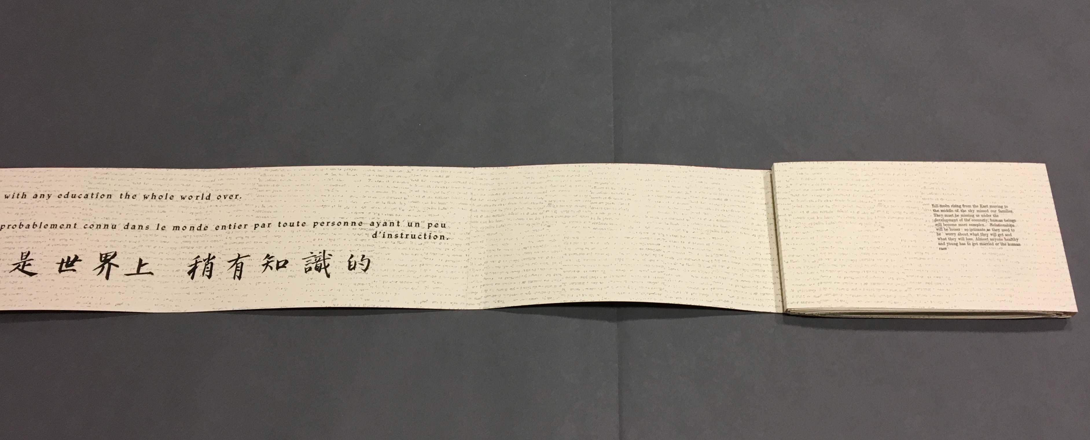
Detail, “Pages 7 and 8”. Notice how the English text on “page 7” runs across to “page 8”, but the French text disappears under “page 8”, effectively running on to what will be revealed as “page 9” in the next view.
“Pages 2, 9-11” This view results from two page turns inward on the left and two outward on the right. “Page 2” has come back into view on the left. The English text on pages 9-10 completes the sentence interrupted on “page 8”. The French text on “pages 9 and 10” completes the sentence that began on “page 7” and ran behind “page 8”.
Pages 9-10, 12-13
Pages 6, 12, 14-15
Pages 12, 14, 16-17
Pages 16, 18-19
Pages 16, 18, 20-21
Pages 20, 22-23
Pages 20, 22, 24-25
Pages 24, 26-27
Pages 24, 26, 28-29
Pages 28, 30-31
Pages 30, 32-33
Pages 32, 34-35
Pages 32, 34, 36-37
Pages 34, 38-39
Pages 38, 40-41
Pages 40, 42-43
Pages 42, 44-45
Pages 44, 46-47
Pages 44, 46, 48-49
Pages 46, 48, 50-51
Pages 48, 50, 52-53
Pages 50, 54-55
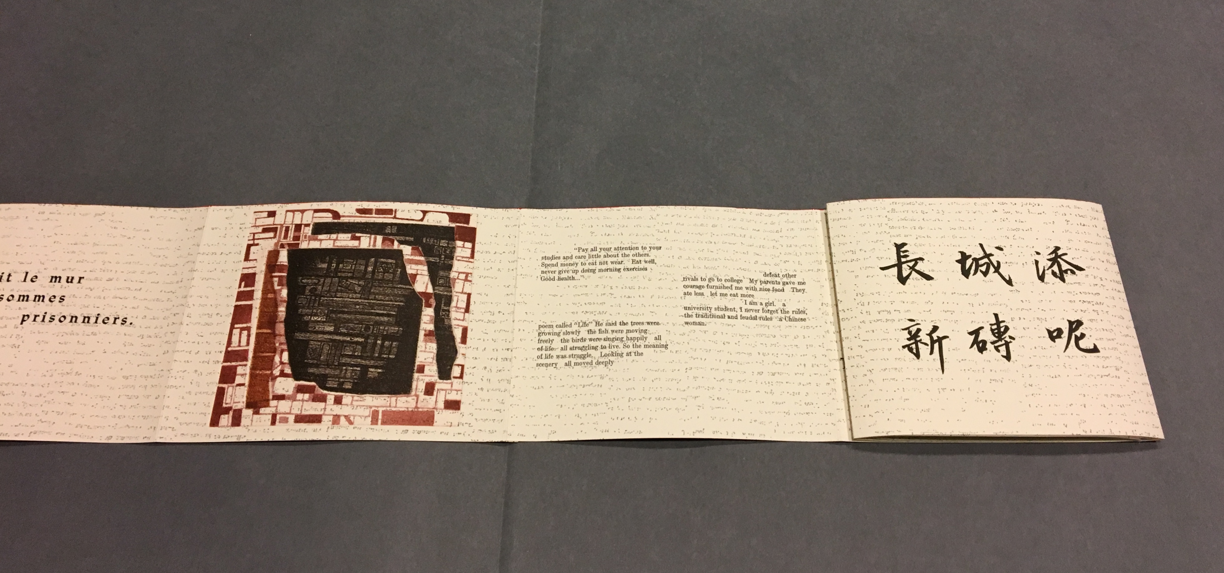
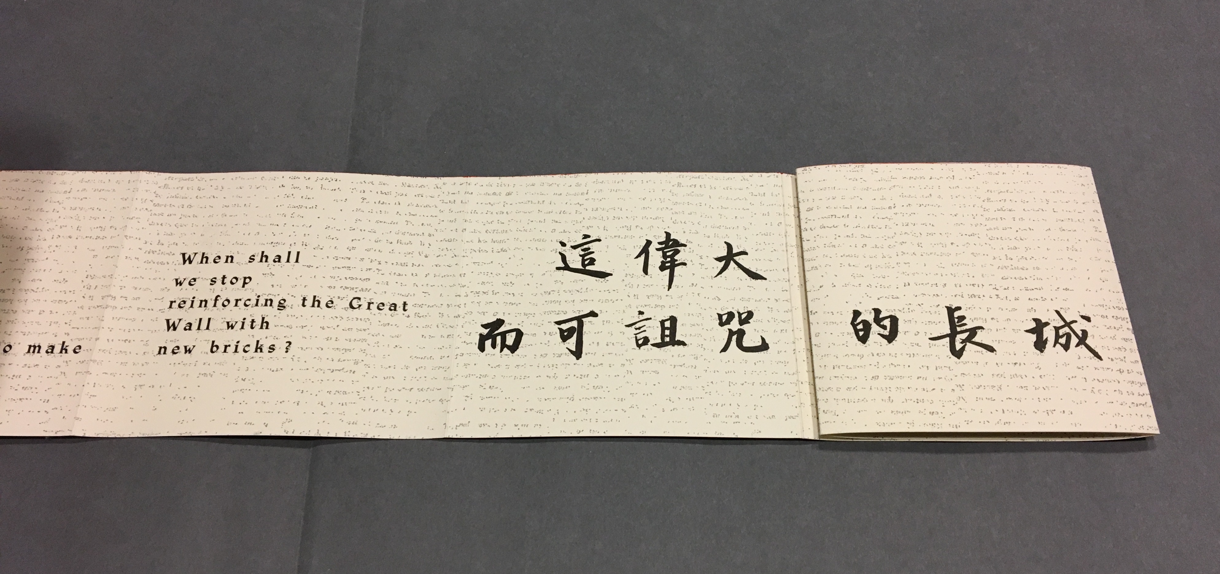
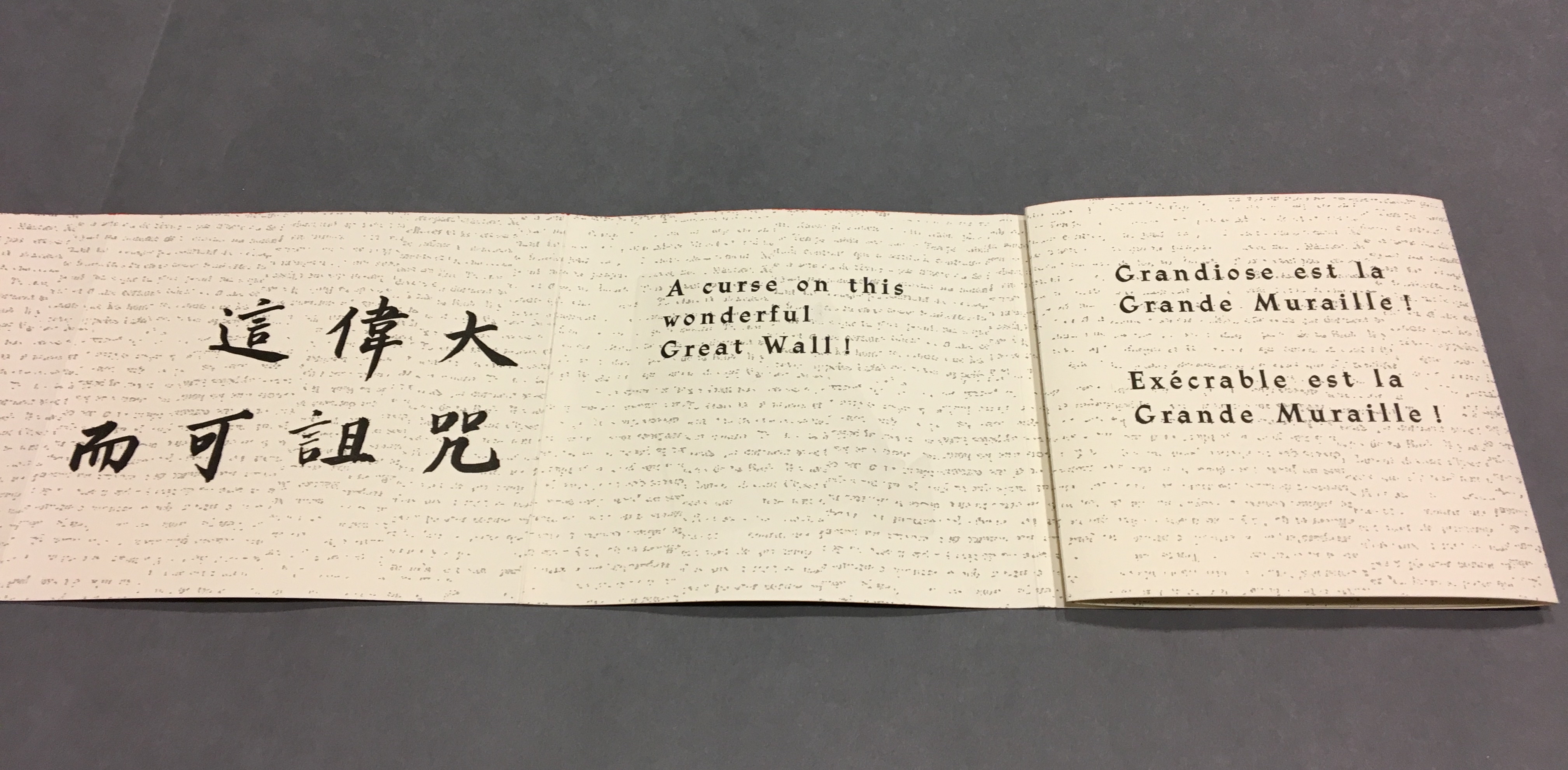
Pages 54, 56-57, the latter displaying the last ten characters of Lu Xun’s text.
這偉大而可詛咒的長城)
Pages 56, 58-59
Pages 58, 60-61
Pages 60, 62-63
Pages 62, 64-65
pages 64, 66-67
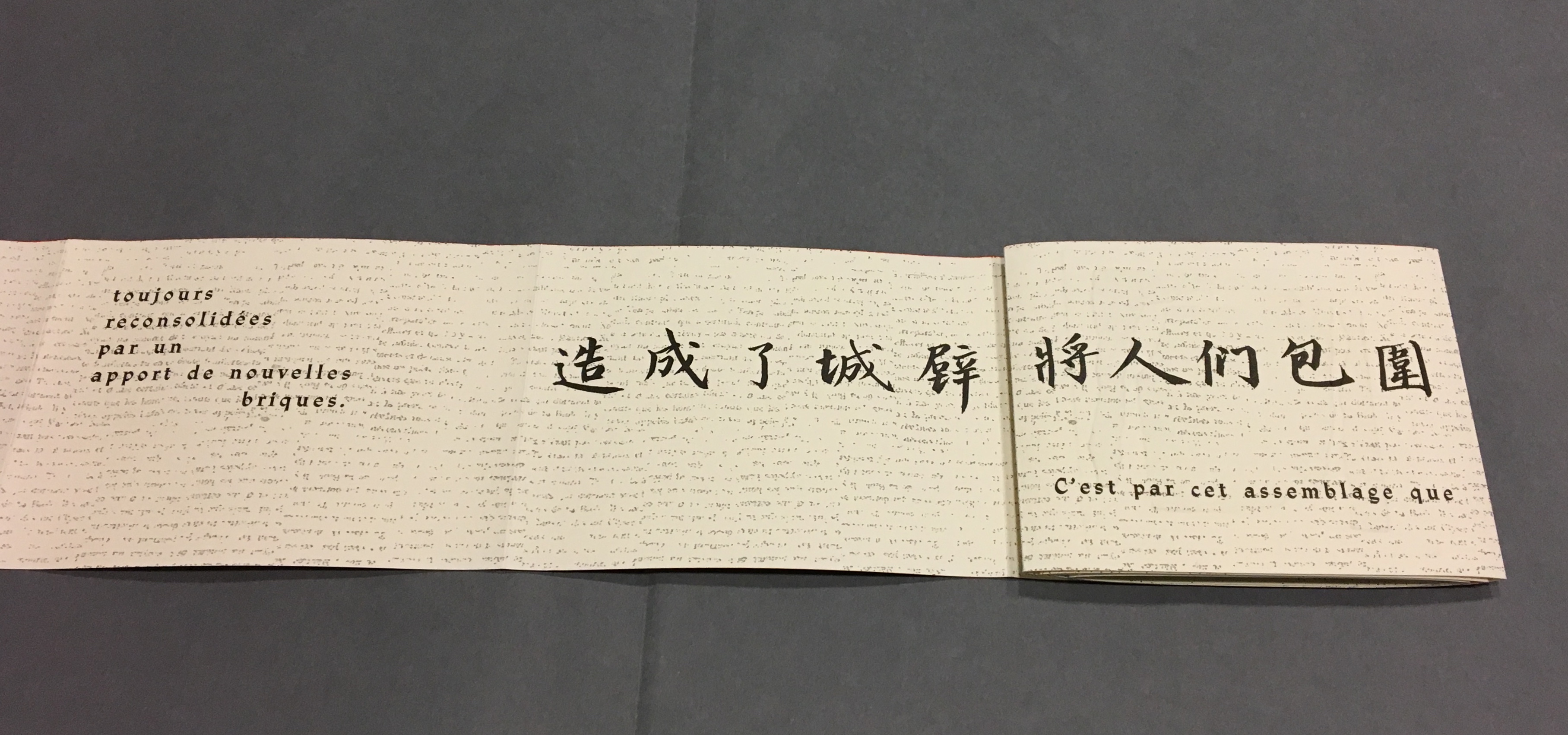
Now that the so-called gaps in the English and French texts were resolved, I wanted to understand how the English and French matched up to the Chinese text. For that, I asked help from two acquaintances in The Hague: Bee Leng Bee and Yingxian Song. They obtained a copy of Lu Xun’s text, traced it through the photos I had taken and found that the three languages run almost in parallel as the work unfolds.
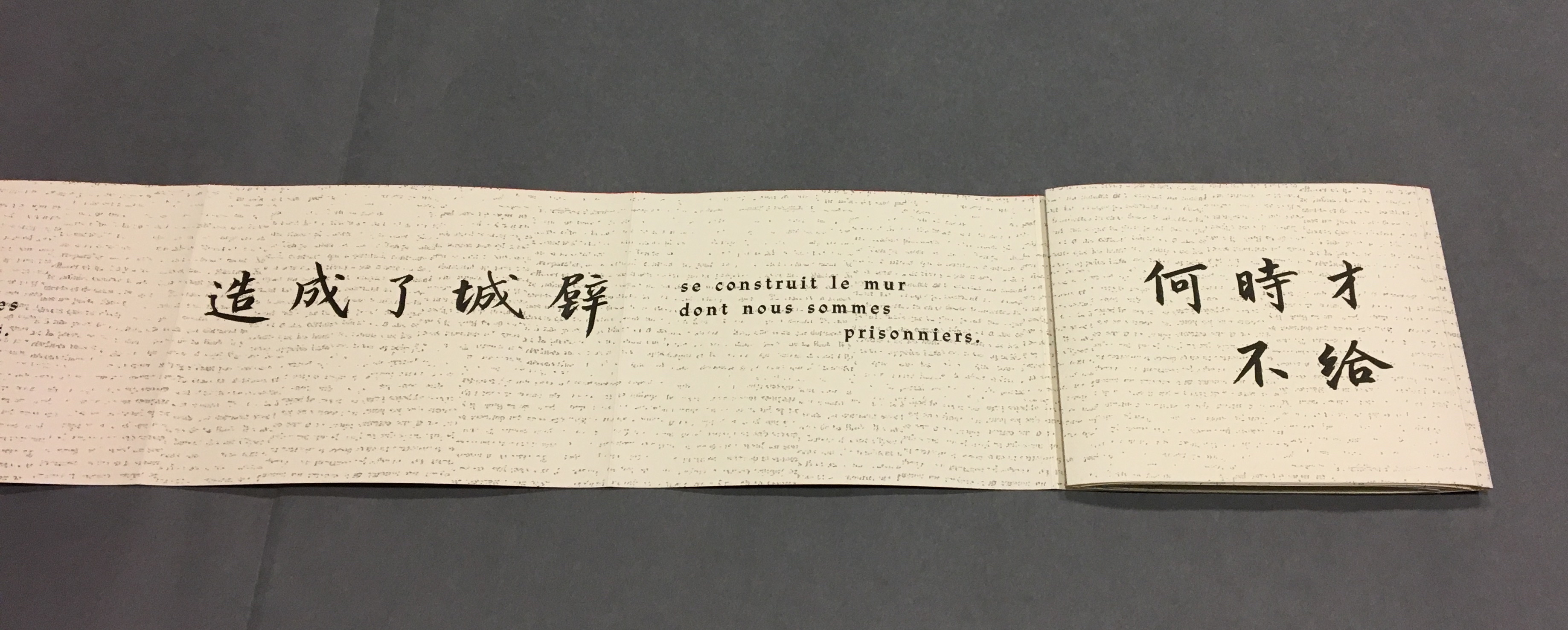
“Almost” because the order of the languages is not alway the same. On pages one and two, we see the French and English titles but must wait until page five before the Chinese title appears. Then, on page six the order changes: English first, then French, then the corresponding ten Chinese characters. On pages seven and eight, this order is maintained. Later, with the turning of page fifteen, the French comes before the English and Chinese; the first Chinese character aligning to the French and English (其) appears on page seventeen. Then, as page seventeen is turned to the right, the order changes back to French then English on page eighteen, but on page nineteen, it moves to French first then Chinese. The book’s textual conclusion on pages fifty-six through fifty-nine runs Chinese, English, then French.
The juxtaposition and weaving of the three languages often seems painterly as if intended to evoke the layering of the bricks and the intertwining vines and foliage along stretches of The Great Wall. Here is the uninterrupted Chinese text:
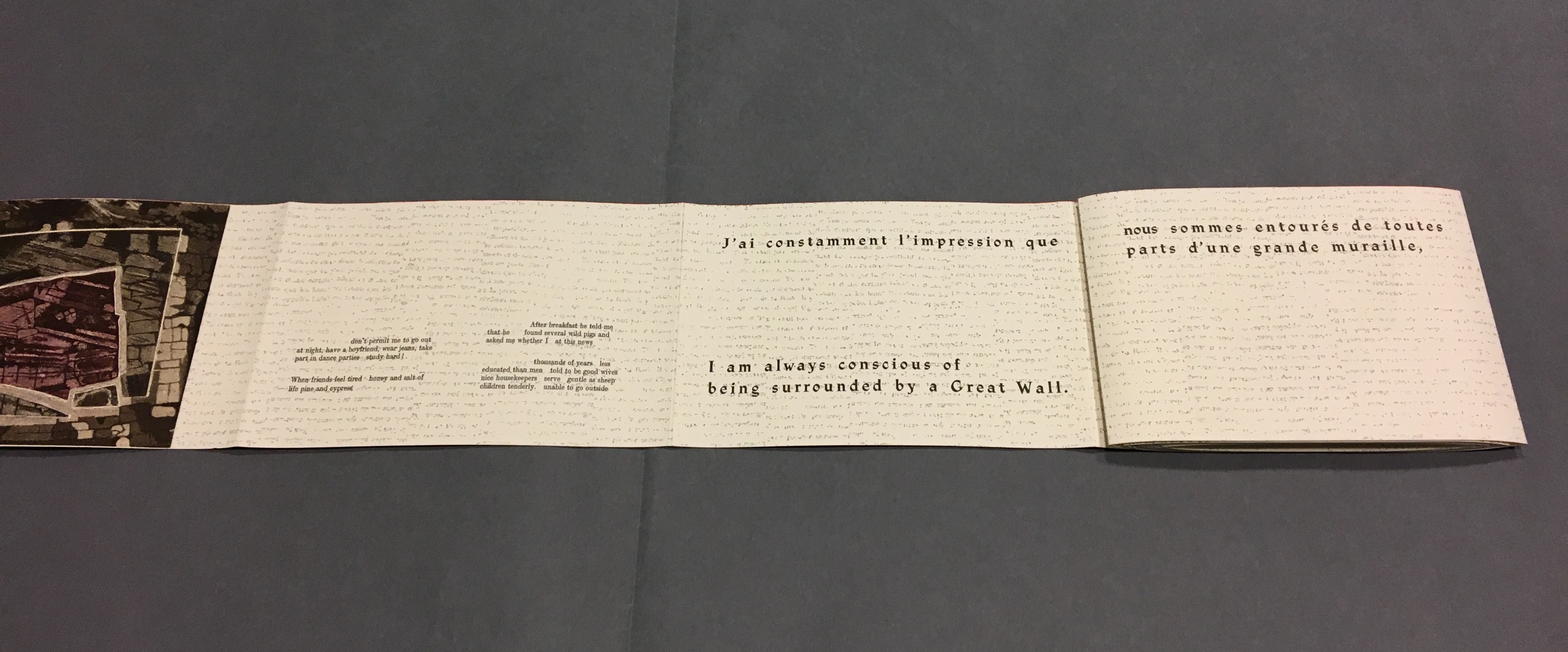
Even though following the forme en escargot results in having reading both sides of the scroll in the end, Sharoff also uses it to play with the notion of intended sequence. Completely unrolled and standing on its edge, the work echoes the Great Wall. The tint of red along the top edge recalls the blood spilled in the Great Wall’s construction. The prints echo the Great Wall’s bricks, the vegetation in its crumbling gaps, even the gates. The completely unrolled work is an intended sequence, also — an invitation to walk the wall. Coming upon each of the eight copperplate engravings in the unfolding sequence is a different experience than walking up and down the “outer wall” and then the “inner wall” to see them. Five are on the outer wall, three on the inner.
The print first to be seen as the book unfolds, but one of the three on the “inner wall” with the book unrolled.
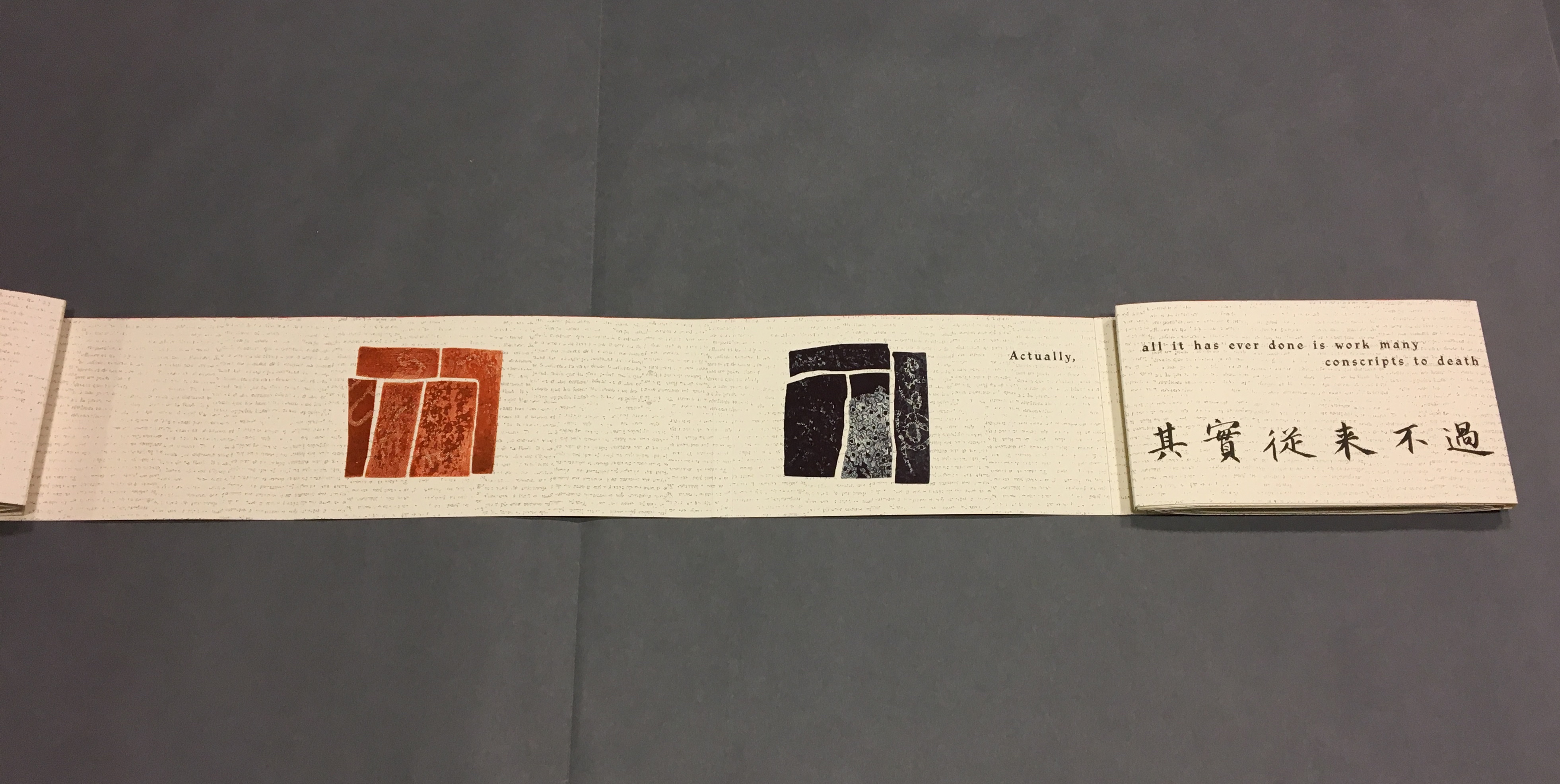
The second print comes into view on “page 14”, the second of Lu Xun’s statements begins in French on “page 15”, and with the rolling up on the left, “page 4” has reappeared.
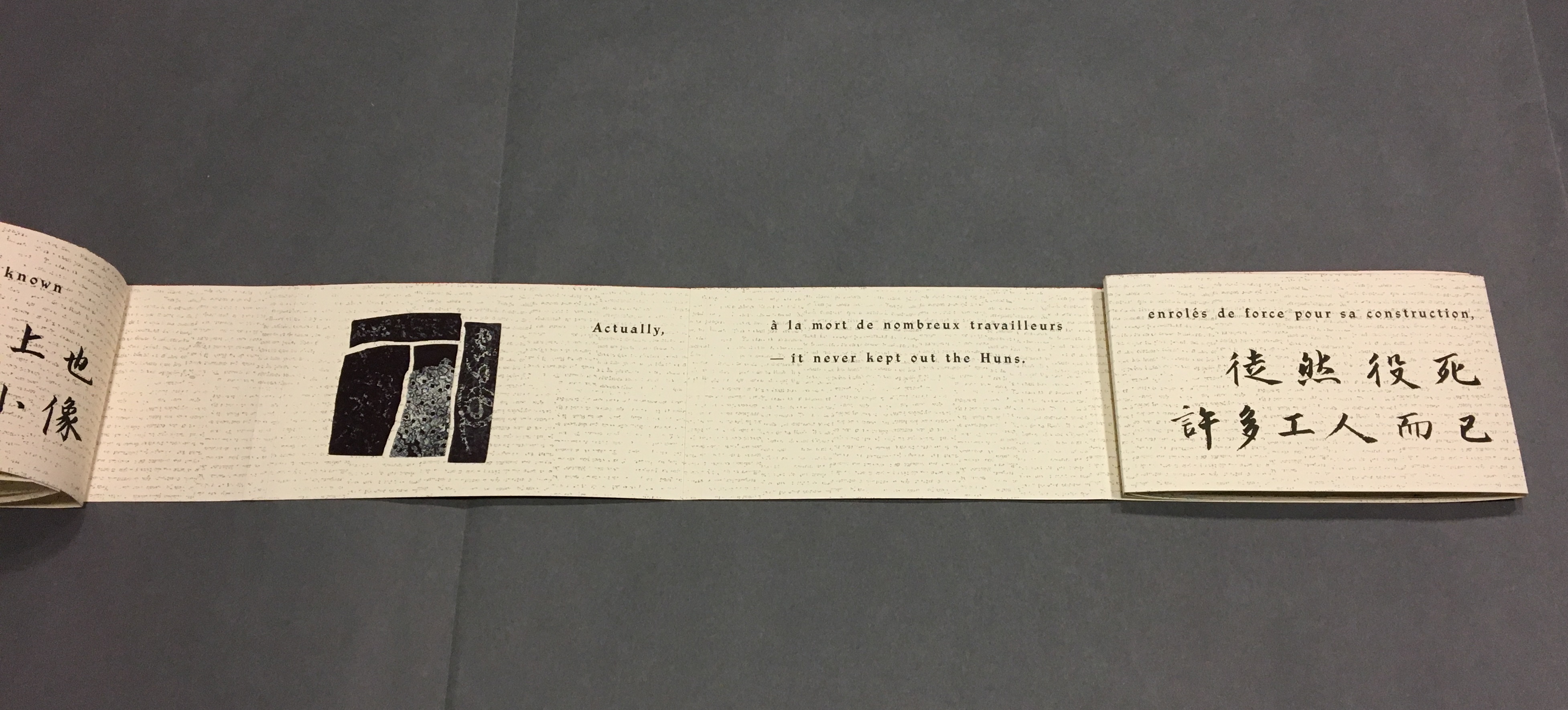
With the turning of “page 15”, the third print comes into view on “page 16”, and the sentence begun with “Actually” on “page 16” continues on “page 17” above the Chinese.
“Pages 16, 18-19” The French at the top of “pages 18-19” is continuing the sentence from “page 15”, and the English beneath on “page 18” is continuing the sentence from “page 17”.
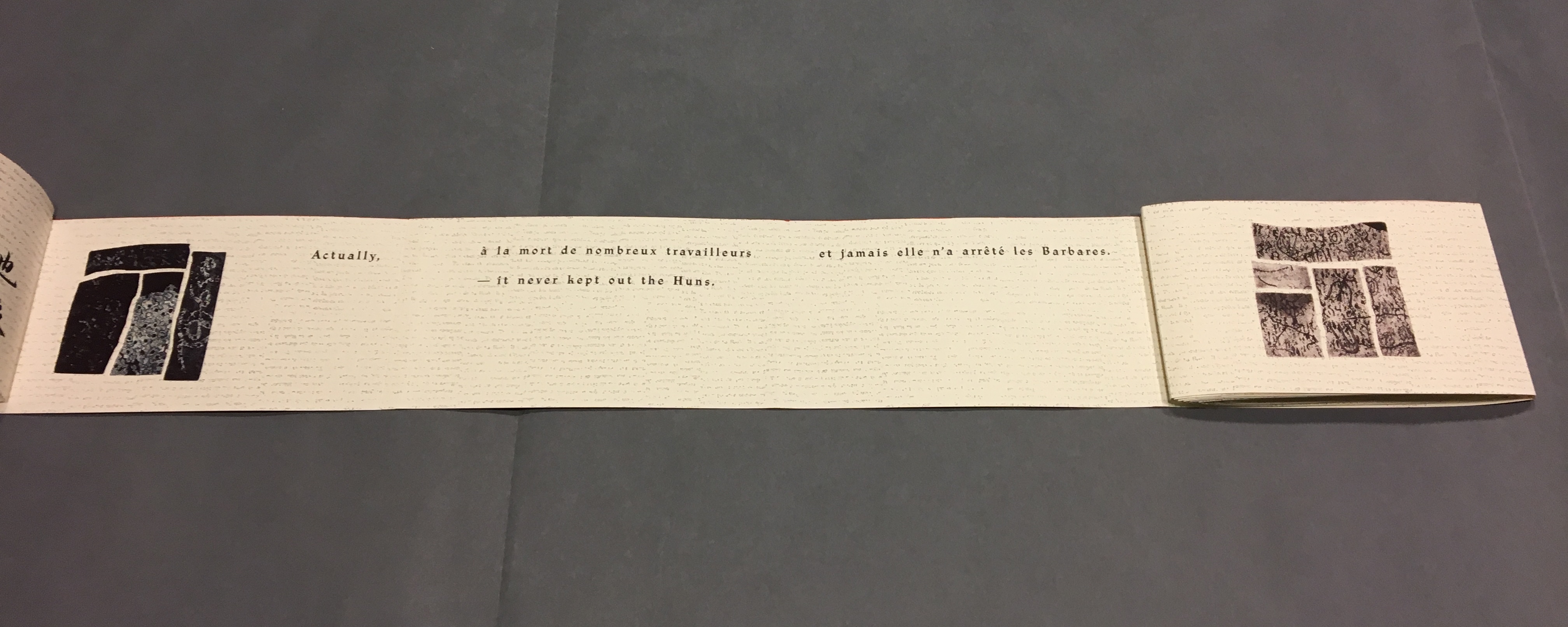
With this spread — “pages 16, 18, 20-21” — the fourth print comes into view on the right, and the French and English sentences conclude together in the middle.
“Pages 30, 32-33” and the fifth print comes into view.
“Pages 38, 40-41” and the sixth print comes into view.
“Pages 44, 46, 48-49” and the seventh print comes into view.
Pages 50, 54-55 and the eighth and final print comes into view.
Reading the form “in time”
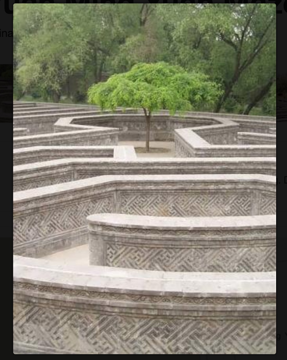
As the force of the snail-shell binding resists the unscrolling and pulls the standing pages inward, the work has another echo: the eroding maze in the Ancient Summer Palace (Yuan Ming Yuan) outside Beijing. The faint markings on the paper, created by printing the results of repeated photocopies of a manuscript, amplify the echo.
Arches paper printed with the results of multiple photocopies of a manuscript.
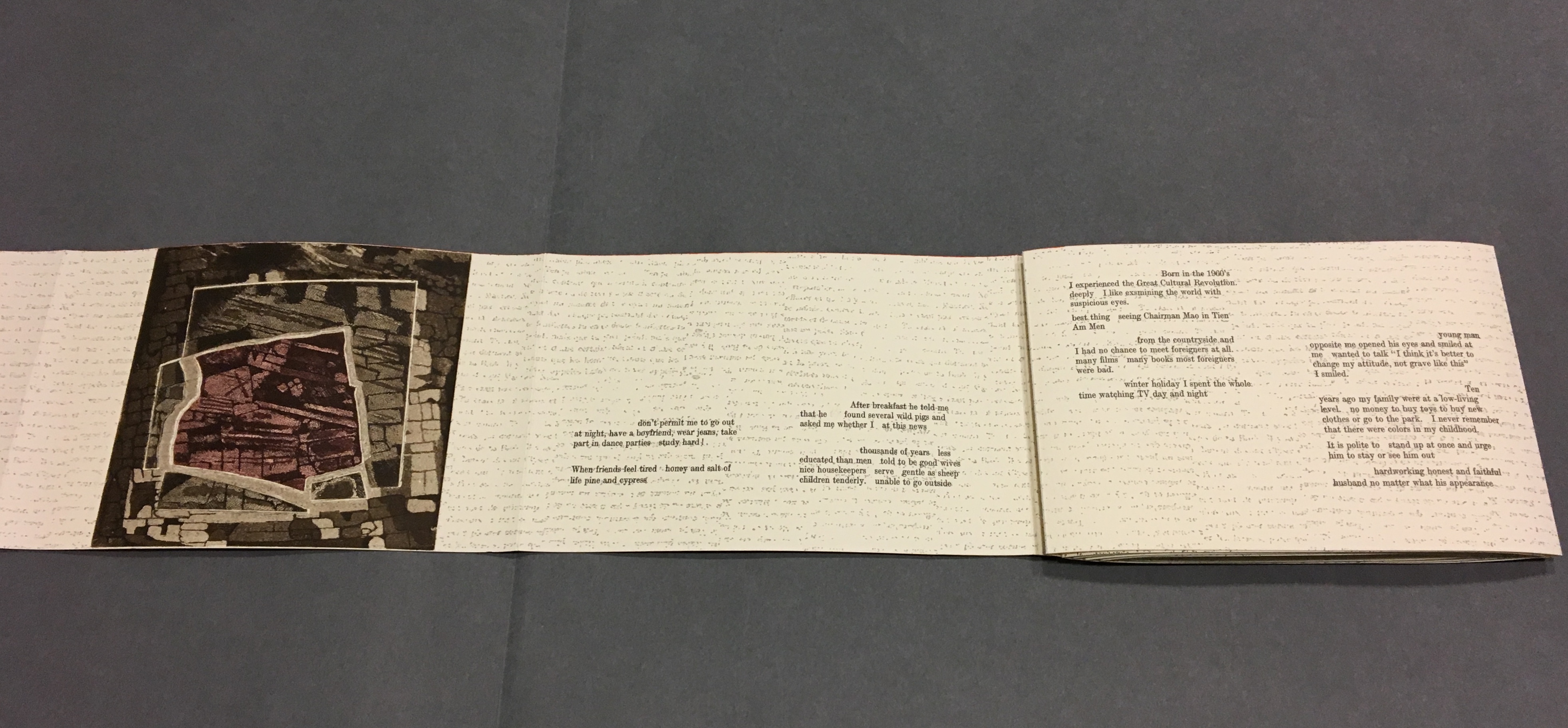
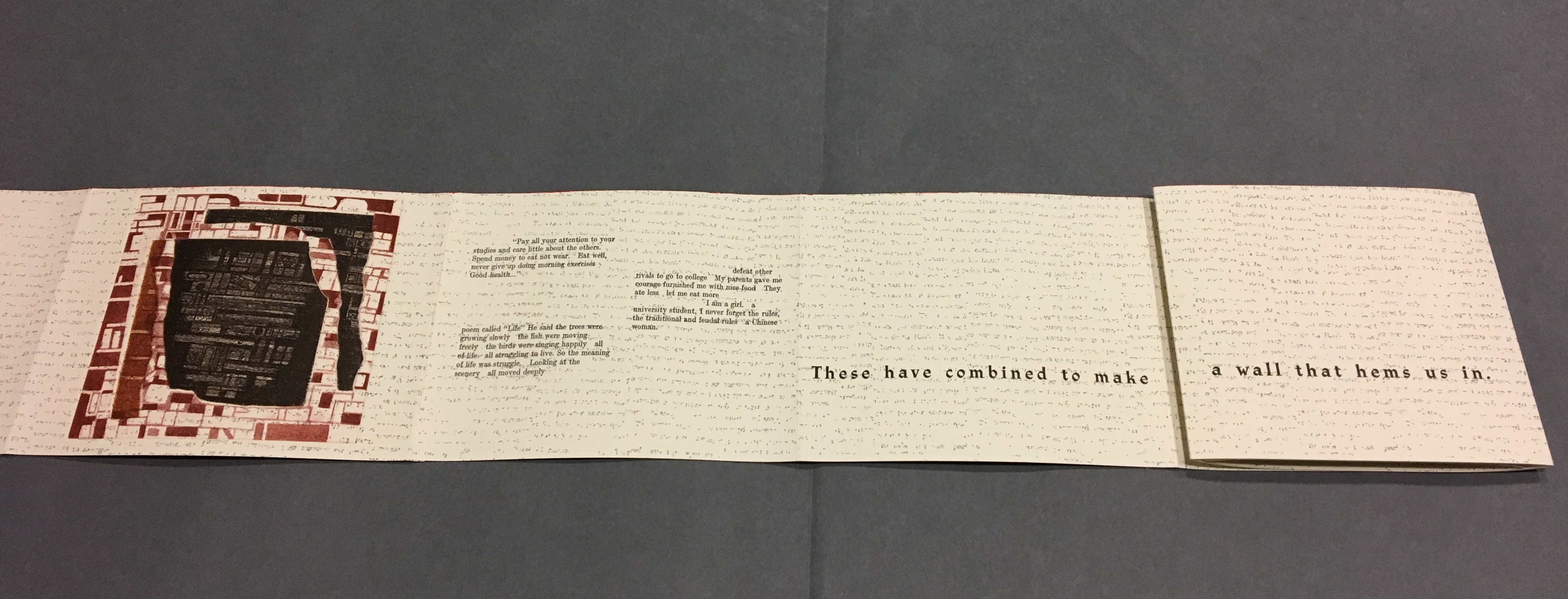
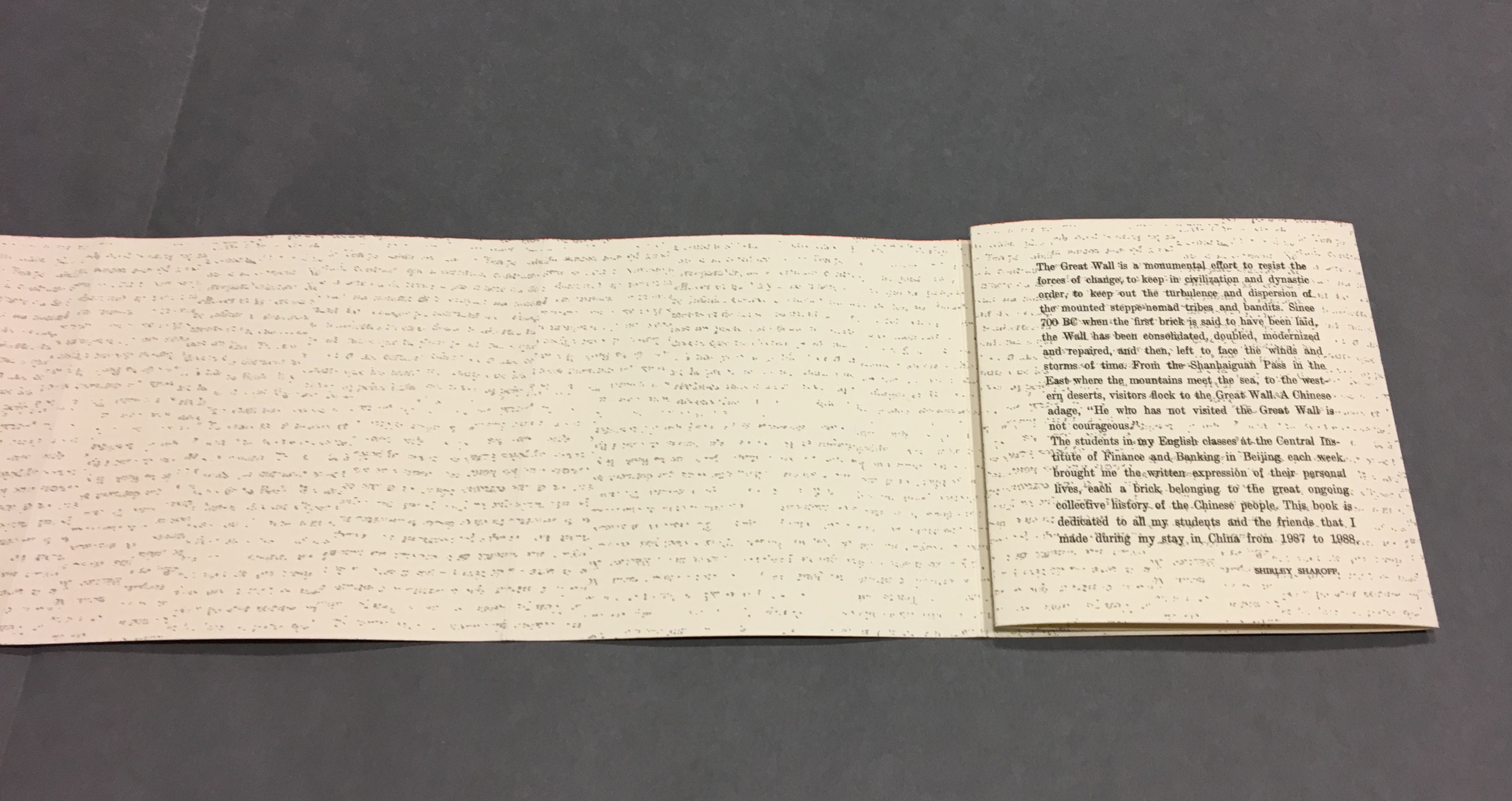
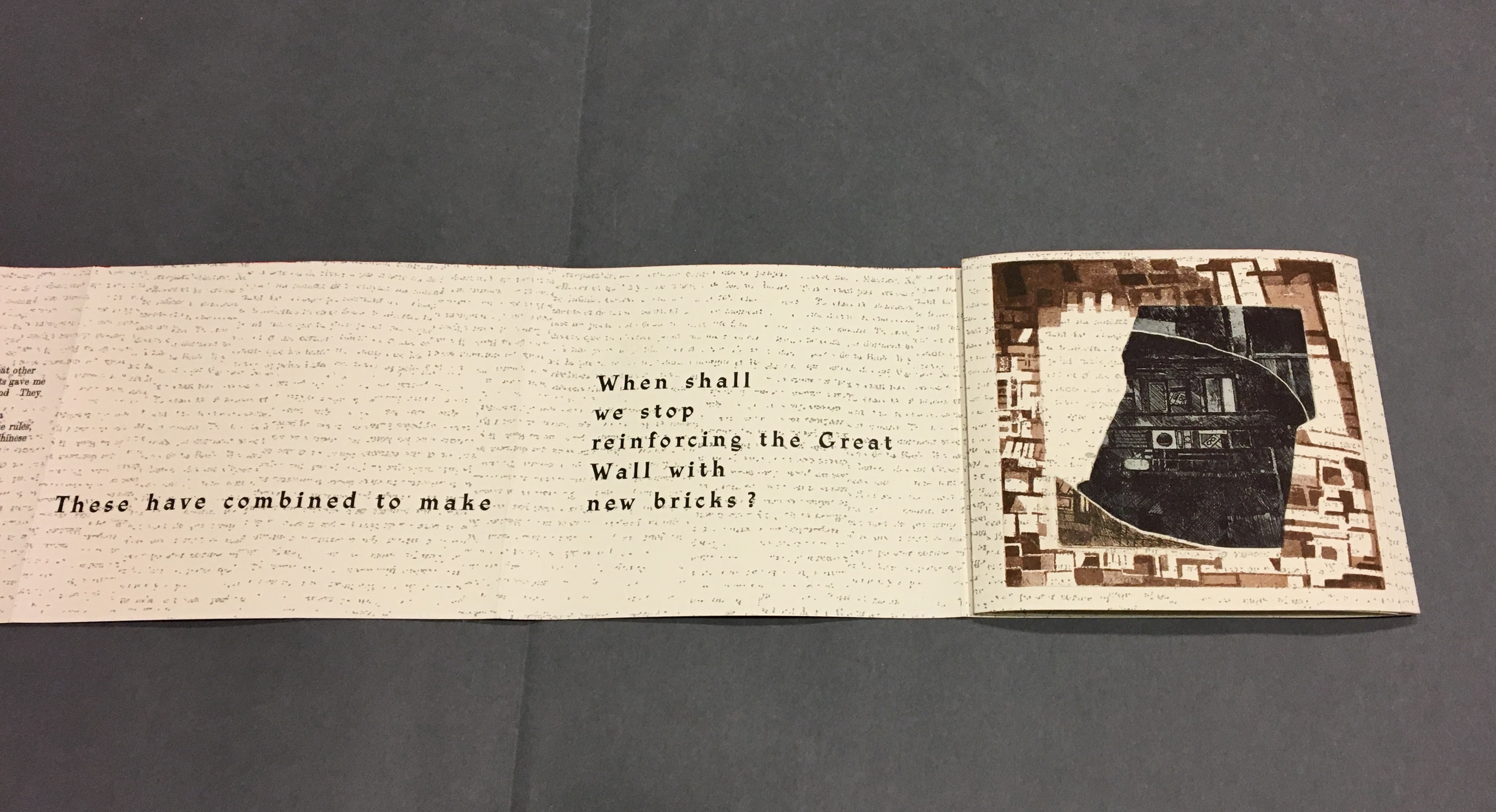
Although Lu’s text does not mention the maze, Sharoff introduces contemporary text that, alongside the interweaving Chinese, English and French of Lu’s text, evokes a maze-like, time-travelling effect. The autobiographical texts from the English-language students she taught at the Central Institute of Finance and Banking (1987-88) reflect on their childhood and adolescence in the Maoist era and their recollection of representations of foreigners in books and television. These “new bricks” in their modernness and fracturedness interrupt the flow of Lu’s prose praising and cursing the Great Wall. Yet, in their segmentation and placement, they also physically echo the prints and reinforce Lu’s expression of the paradox in the construction, fragmentation, reconstruction and erosion of the real Wall.
“Pages 32, 34-35”
Sharoff’s La grande muraille is a treasure that rewards repeated visits and contemplation: not only for itself but also as a parallel or forerunner.
La grande muraille’s physical impetus (The Great Wall), the seemingly decipherable/indecipherable characters on the Arches paper, the wry paradox of Lu Xun’s observations, the socio-political-cultural implications of the “new bricks”, the work’s innovative form and the pulling of past and present together parallels the work of Xu Bing and his play with language across East and West. His Book from the Sky first appeared in 1988.
Sharoff’s use of Lu’s contemplation on The Great Wall also foreshadows Jorge Méndez Blake‘s Capítulo XXXVIII: Un mensaje del emperador / A Message from the Emperor (2017?). The title refers to an anecdote in the story “The Great Wall of China” by Franz Kafka, a contemporary of Lu Xun. The narrator tells the reader how the emperor has dispatched from his deathbed a message to the reader, entrusted to a herald who, struggling as he might, cannot escape from the confines of the palace to deliver the message — yet which we the reader await hopelessly and with hope.
What more should we expect from art?
____________________________
*For help and permissions, thanks to Paul van Capelleveen and the staff at Koninklijke Bibliotheek, Den Haag, and Shirley Sharoff, Paris. For help with the Chinese and calligraphy, thanks to Bee Leng Bee and Yingxian Song.
Hubert, Renée Riese, and Judd David Hubert. 1999. The Cutting Edge of Reading : Artists’ Books. New York City: Granary Books. See pp. 24-27 for the Huberts’ reading La grande muraille.
Rotch Library offers a small but growing collection of contemporary artists’ books. The collection focuses on artists’ books published from the 20th century to the present and explores a range of techniques and technologies employed by the books’ creators.
Yellow Submarine? Monty Python? Heath Robinson? Rube Goldberg? Hieronymus Bosch? Albrecht Durer? Quentin Massys? Whatever the influence, David M. Moyer has created choice work under The Red Howler Press. MIT has chosen well.
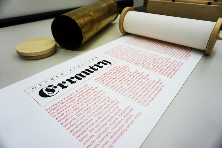
Errantry (2008) Werner Pfeiffer
Errantry, a 27-foot scroll housed in a howitzer shell casing, is inspired by Der Triumphzug Kaiser Maximilians or The Triumphal Procession of the Emperor Maximilian (1515), a series of 130 woodcuts by Hans Burgkmair the Elder (1473-1531) and others, about which Pfeiffer comments: “One of the dominant features in this document is the militant nature of many of the characters depicted, as well as their posture in parading their arms on horse, by carriage or on foot.” The text in Errantry draws from a poem of the same name in J.R.R. Tolkien’s Middle Earth mythology. The source poem, composed by Bilbo Baggins, describes one of his quest adventures in the usual self-aggrandizing yet self-pitying tone. As a model for Pfeiffer’s text, it makes the digitally printed images of war all the more horrible.
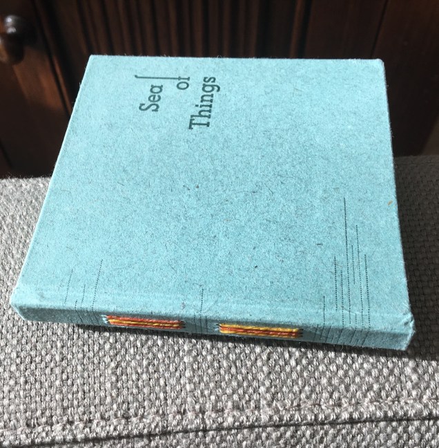
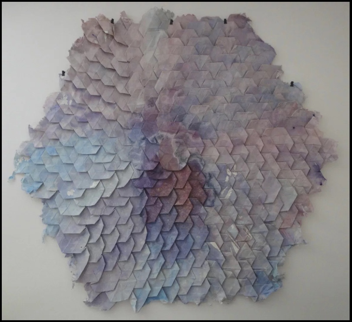
Again and again, Pien Rotterdam’s works — Sea of Things (2014) and Absences (2015) — reward reading and contemplation.
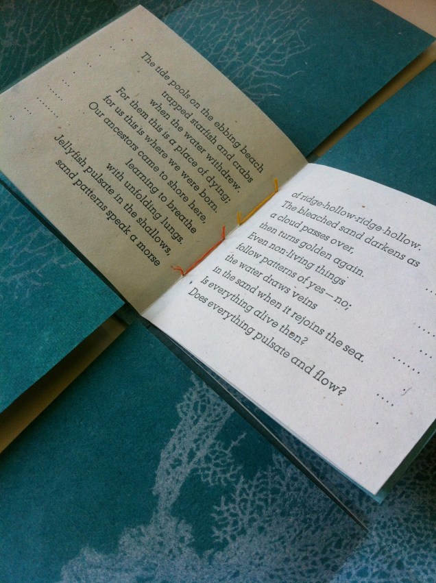
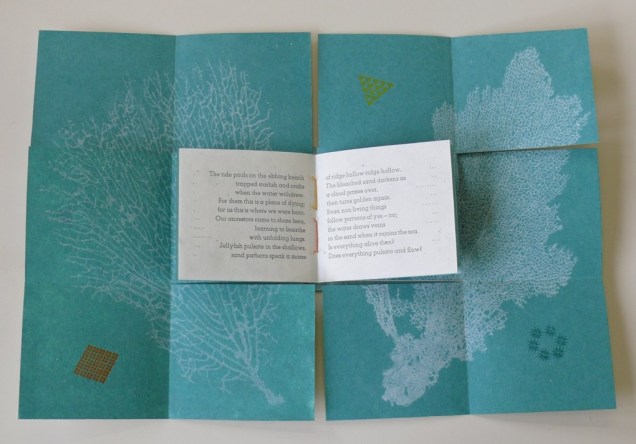
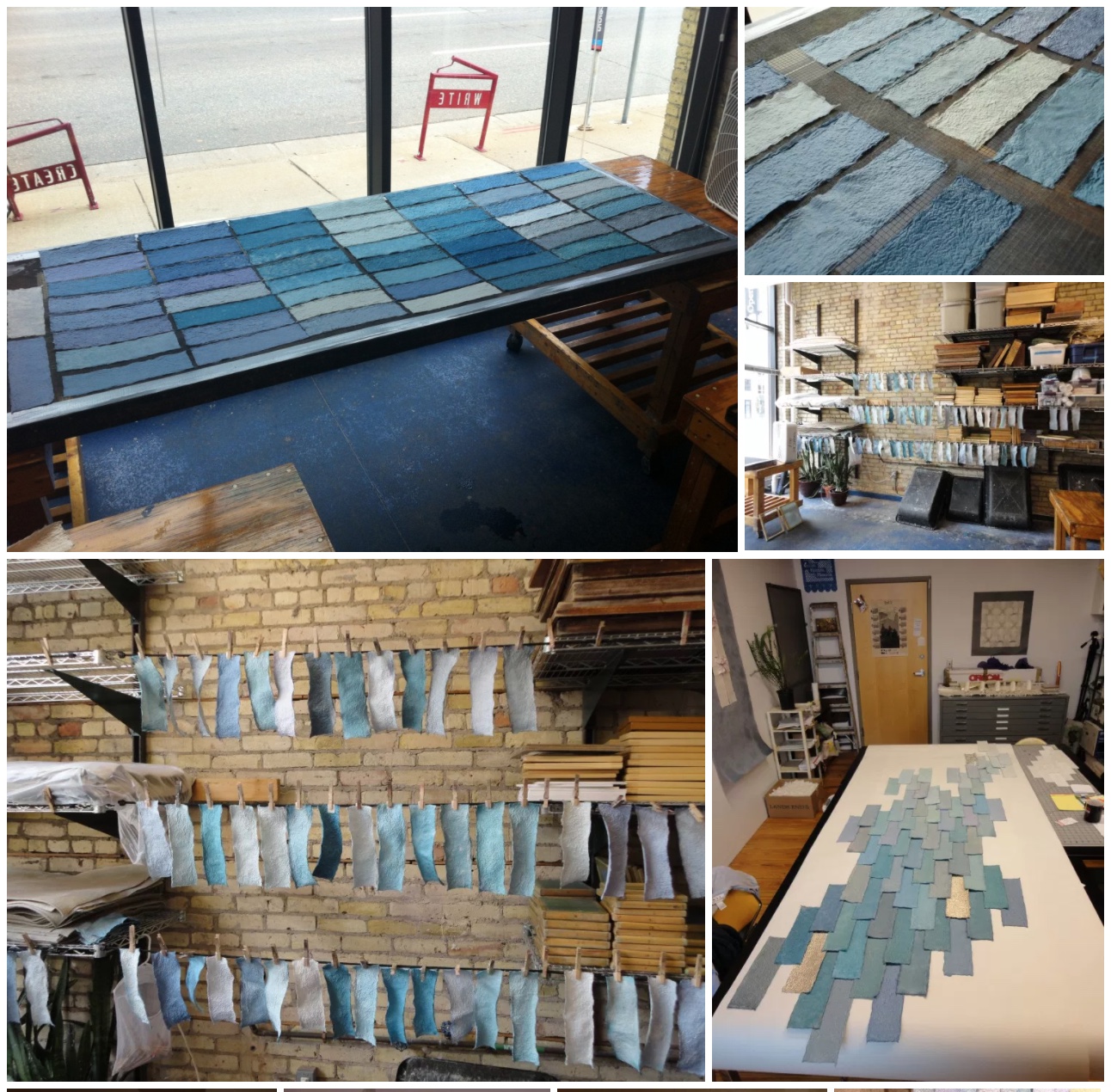
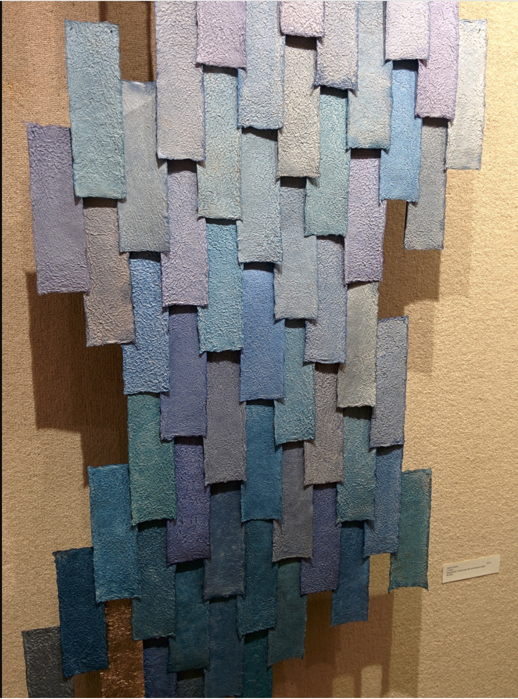
Sea of Things (2014) Pien Rotterdam Border book structure; 11 x 10.5 x 1.3 cm closed; 20 by 30 cm folded out Image printed into kozo/cotton paper with very fine paper pulp; text and cell-like patterns printed letterpress on kozo/cotton/abaca paper. Set in Atlas and Atlas Light.
Sea of Things (2014) Pien Rotterdam
Sea of Things (2014) Pien Rotterdam
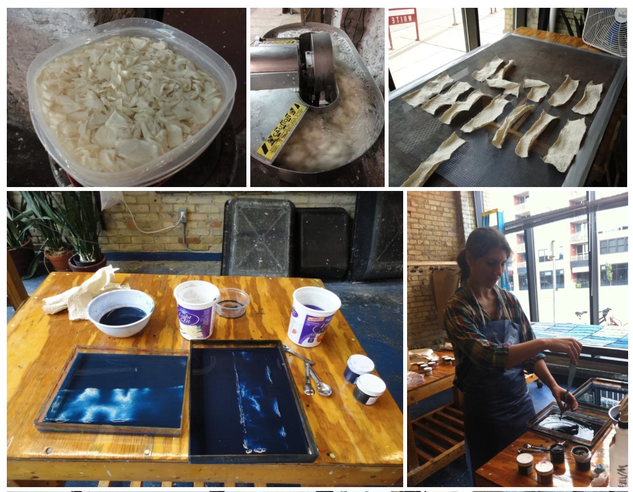
The images of the coral, square, circle and triangle are “pulp printed”, a hybrid silkscreen/papermaking technique, which Rotterdam learned from Tim Mosely. The images themselves are made of fine pulp paper, transferred to, pressed and dried together with the receiving kozo/cotton paper. Message (or image) and medium are one, a sea around the letterpress text, whose words and acts described harmonize with technique, material, color and shape. Here are “pages” 1 to 5 as a sample.
Sea of Things (2014) Set in Atlas and Atlas Light on kozo/cotton/abaca paper.
Sea of Things (2014) Pien Rotterdam
Sea of Things (2014) Pien Rotterdam
Sea of Things (2014) Pien Rotterdam
Sea of Things (2014) Pien Rotterdam
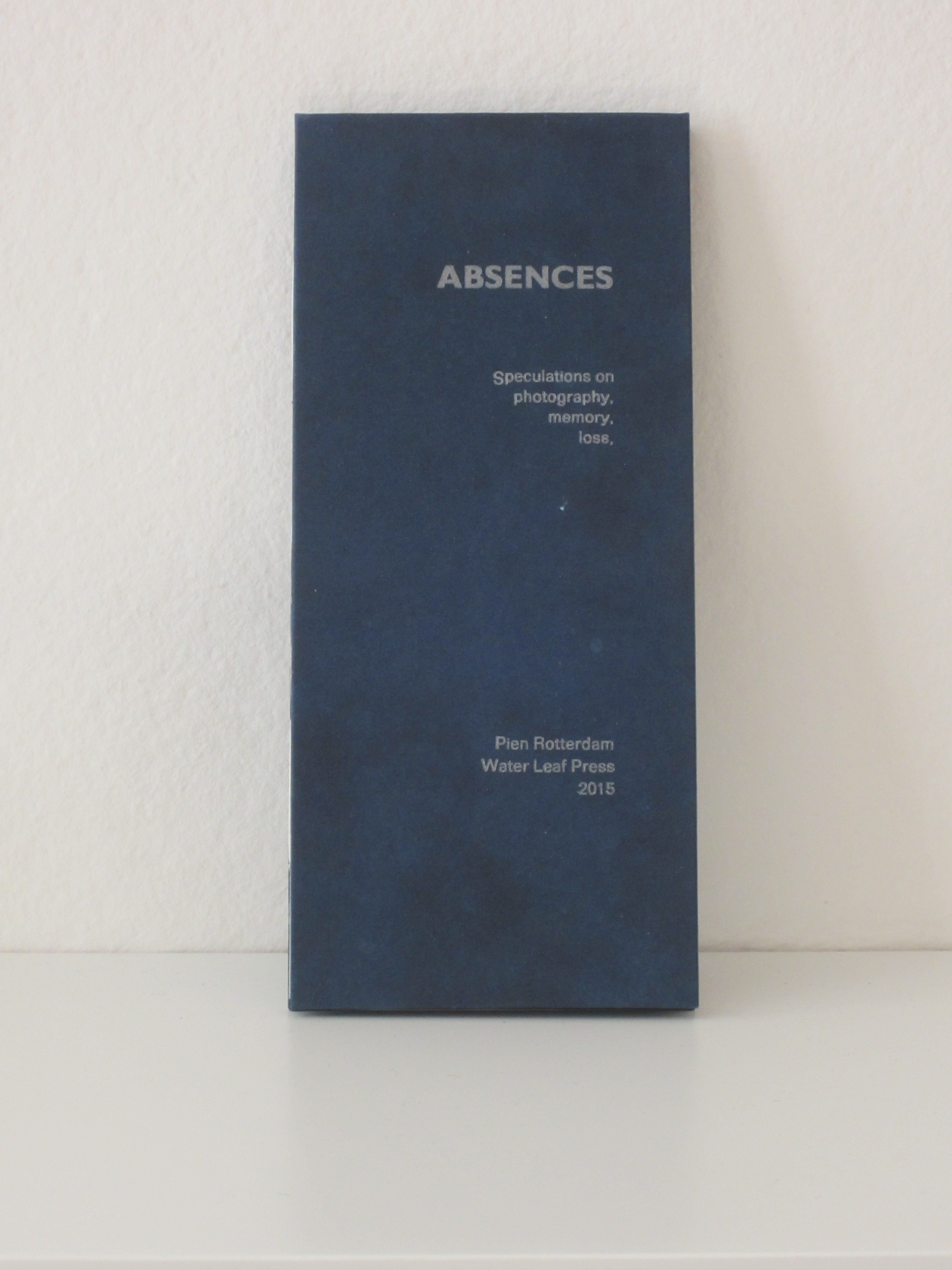
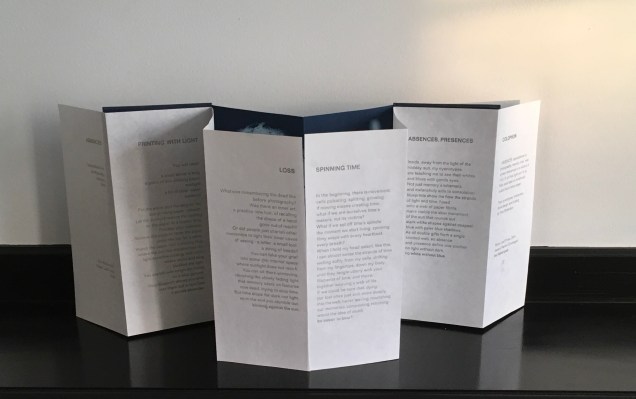
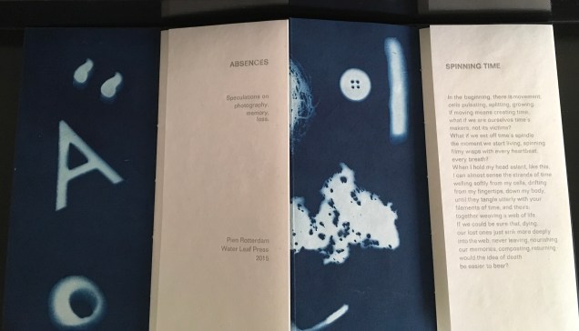
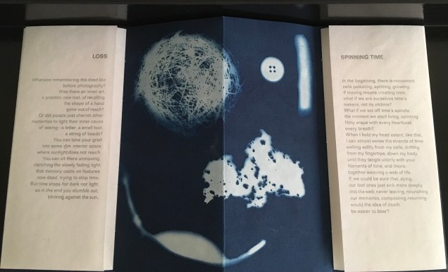
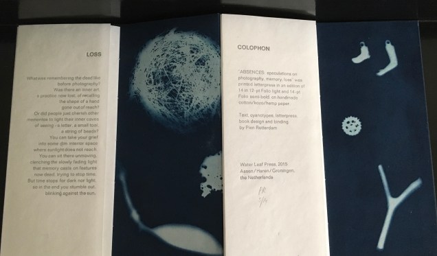
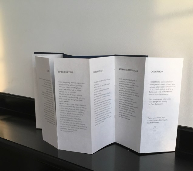
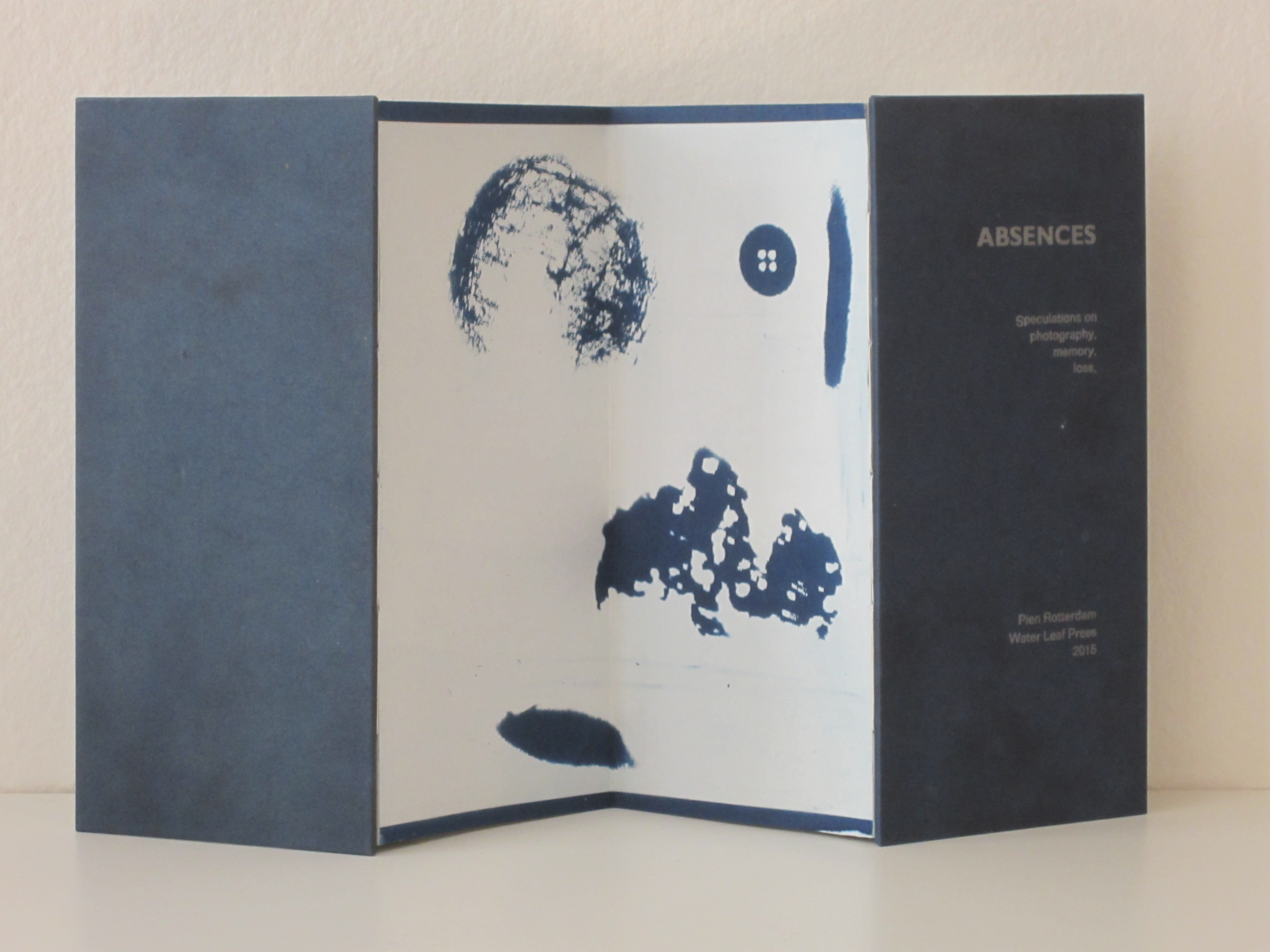
As with Sea of Things, Rotterdam achieves another singular union of technique and meaning in Absences. Where Sea of Things addresses selecting and collecting, Absences addresses loss, memory and the experience of time.
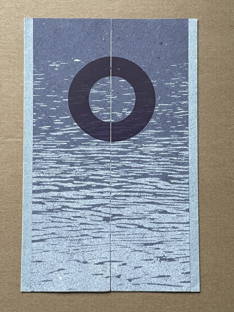
Absences (2015) Pien Rotterdam Concertina structure. Cyanotype on photogram and text paper handmade from kozo/cotton/hemp in different weights, apart from the cyanotype on the back, which is made from Japanese paper. Letterpress in Folio light (lead type) with silver-grey ink. 10.5 x 23 cm when closed, 42 x 23 cm open.
Absences (2015) Pien Rotterdam
Absences (2015) Pien Rotterdam
Absences (2015) Pien Rotterdam
Absences (2015) Pien Rotterdam
Absences (2015) Pien Rotterdam
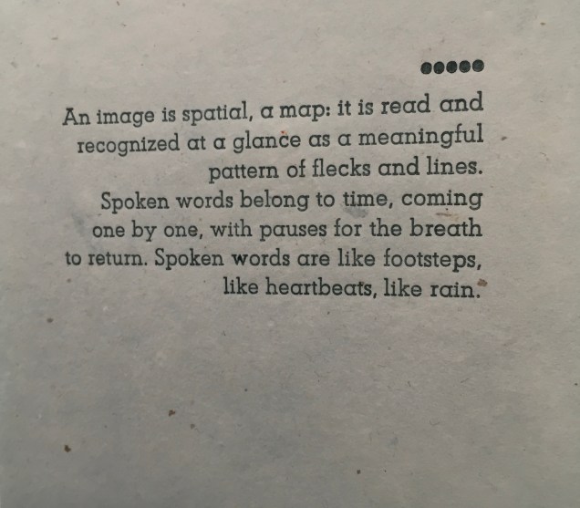
Rotterdam’s explanation of the connection between technique, material and meaning can hardly be bettered:
When I made my first cyanotype photogram ten years ago, I was immediately struck by the way in which light shapes against a deep-blue ground show, simultaneously and paradoxically, what was there when the paper was exposed but what is now no longer there: the photogram makes absences visible. This realisation has led to an exploration of the metaphorical properties of the cyanotype process and to speculation on the relationship between photography, mementos, and memory, between memory and loss, and on the nature of time, in six brief reflective texts.
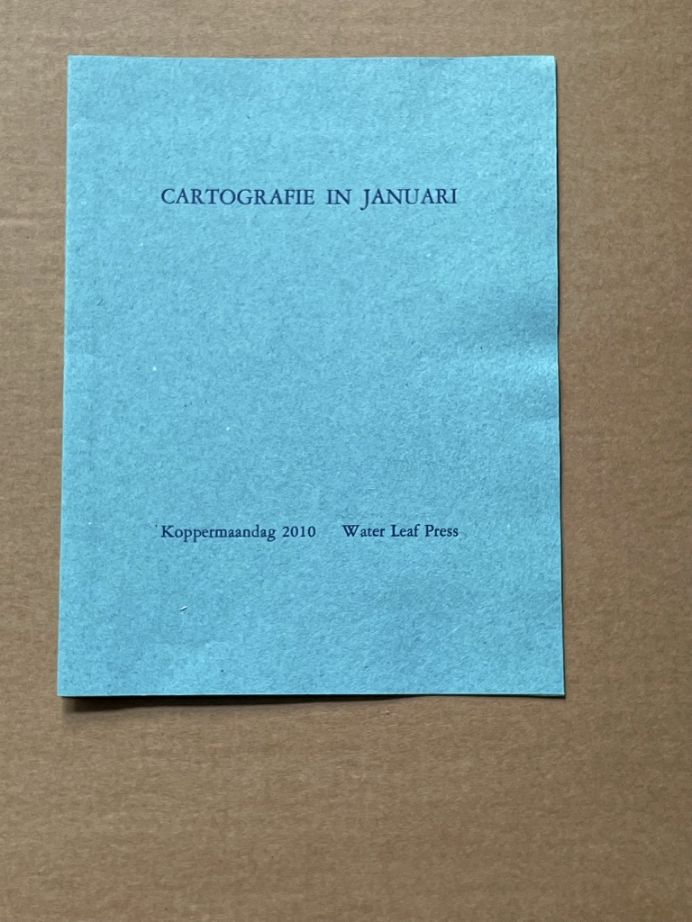
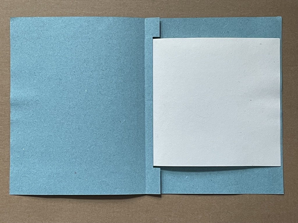
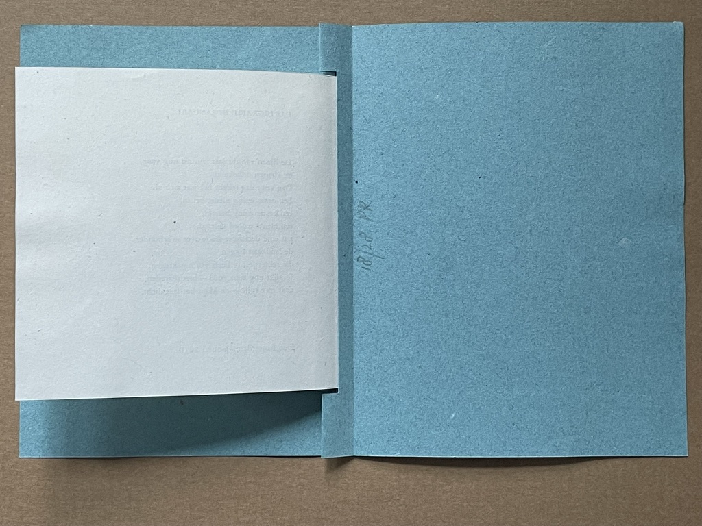
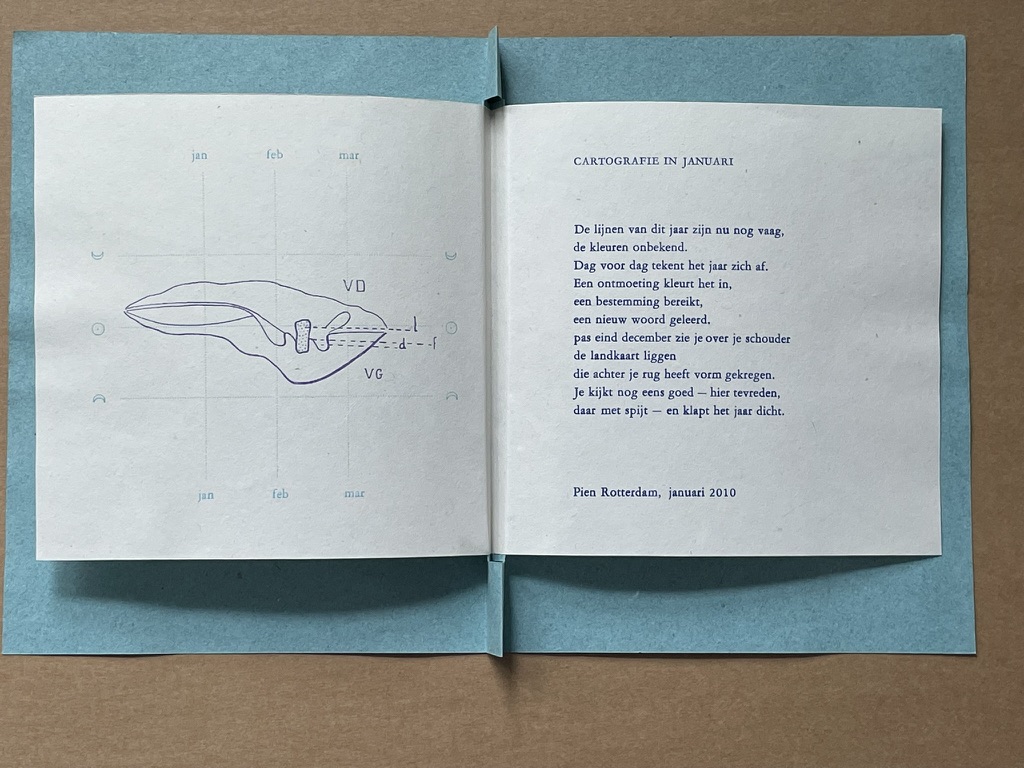
Cartographie in Januari (2010)
Cartographie in Januari (2010) Pien Rotterdam Pamphlet, modified stub binding, sewn. H160 x W130 mm. 1 folio, 2 panels. Edition of 28, of which this is #18. Acquired from the artist. Photos: Books On Books Collection.
This year’s lines are still vague, the colors unknown. Day by day, the year takes shape. An encounter colors it in, a destination reached, a new word learned. Only at the end of December do you see the map lying over your shoulder, which has taken shape behind your back. You take another good look—here with satisfaction, there with regret—and close the year.
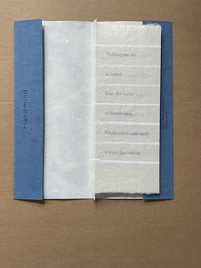
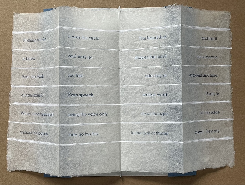
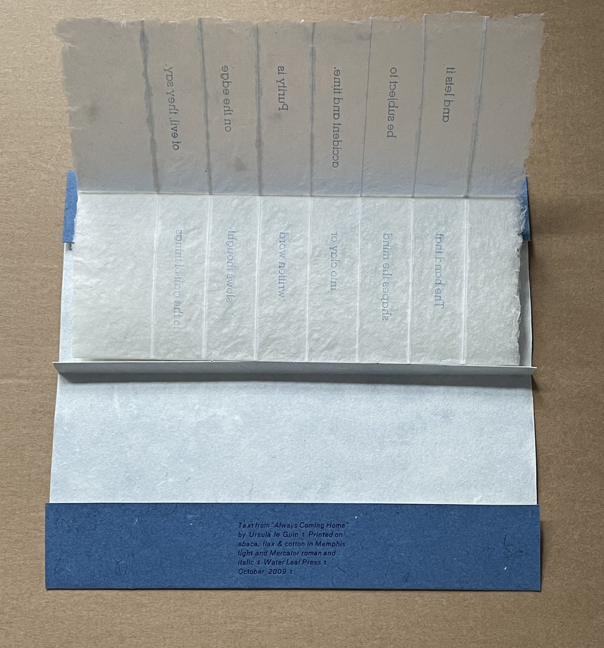
Handmind (2009)
Handmind (2009) Pien Rotterdam Pamphlet, stub binding, sewn, printed on abaca, flax & cotton. H202 x W90 mm 2 folios, 4 panels. Text from Ursula K. LeGuin “Always Coming Home”. Limited edition (unknown qty). Acquired from the artist. Photos: Books On Books Collection.
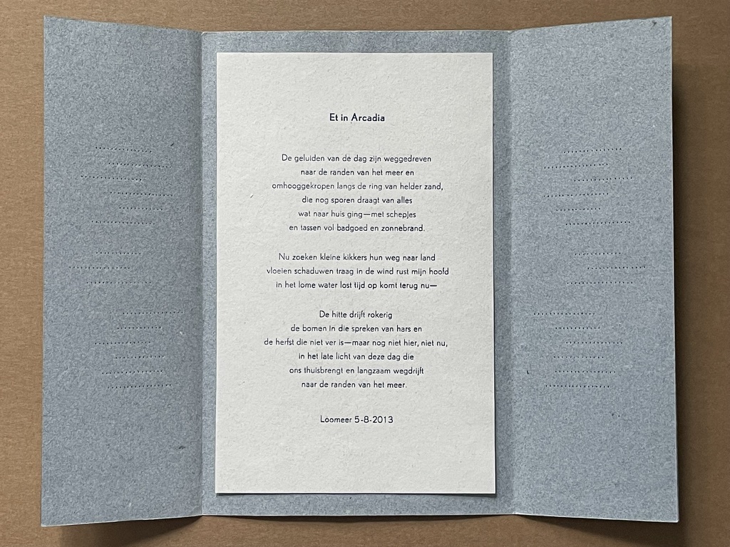
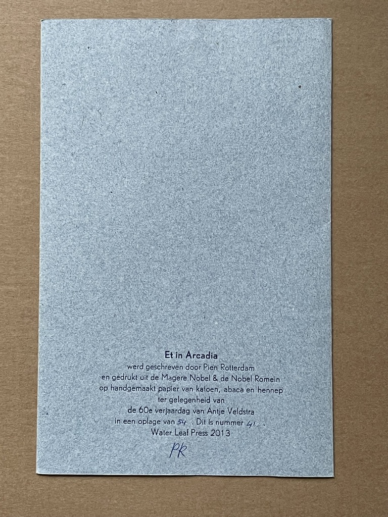
Et in Arcadia (2013)
Et in Arcadia (2013) Pien Rotterdam Pamphlet, French fold. H210 x W135 mm. 1 page. Edition of 54, of which this is #41. Acquired from the artist. Photos: Books On Books Collection.
The chatter of the day has drifted to the edges of the lake and crept up along the ring of bright sand, which still bears traces of everything that went home—with shovels and bags full of bathing gear and sunscreen. Now little frogs find their way to land, shadows flow slowly in the wind, my head rests in the languid water, time dissolves, returns now— The heat drifts smoky into the trees that speak of resin and autumn that is not far off—but not yet here, not now, in the late light of this day that brings us home and slowly drifts away to the edges of the lake.
Rotterdam’s site rewards repeated visits. It traces her development as a book artist since 2003 and demonstrates mastery and strength at each stage. Her work can be acquired through the site. Rotterdam lives and works in Groningen, The Netherlands, home to the Book Arts Network, Grid Grafisch Museum and De Ploeg, an artists collective started in the early 20th century.
Further Reading
Hirschey, Paige. 7 December 2023. “Rhapsodies in Blue: Anna Atkins’ Cyanotypes“. The Public Domain Review. Using the cyanotype process, Anna Atkins produced the world’s first photograph album.
It took a long look at the development of Ioana Stoian’s work to show me the relationship of trompe l’oeil to book art — and to appreciate how an artist can invent herself.
Stoian’s apprenticeship as an artist began with the decorative arts in 2004 in Lower Normandy, France, and has taken her to New York (MoMA), Cologne, Vienna, Salzburg, Minneapolis, Ostende (Belgium), Kadoide (Japan), Amsterdam (the Stedlijk) and, as of 2015, back to Minneapolis, where she is a Jerome Foundation fellow at the Minnesota Center for the Book Arts.
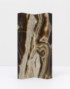
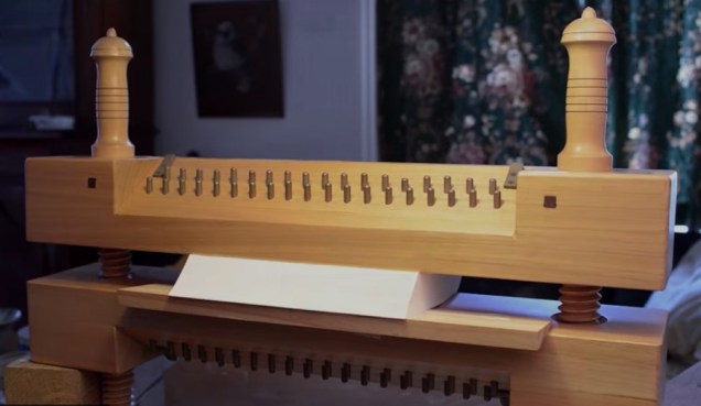
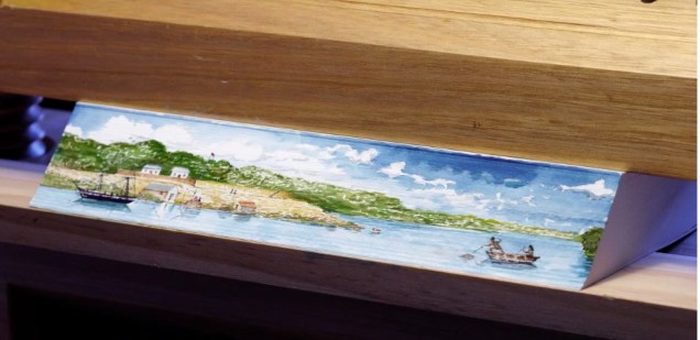
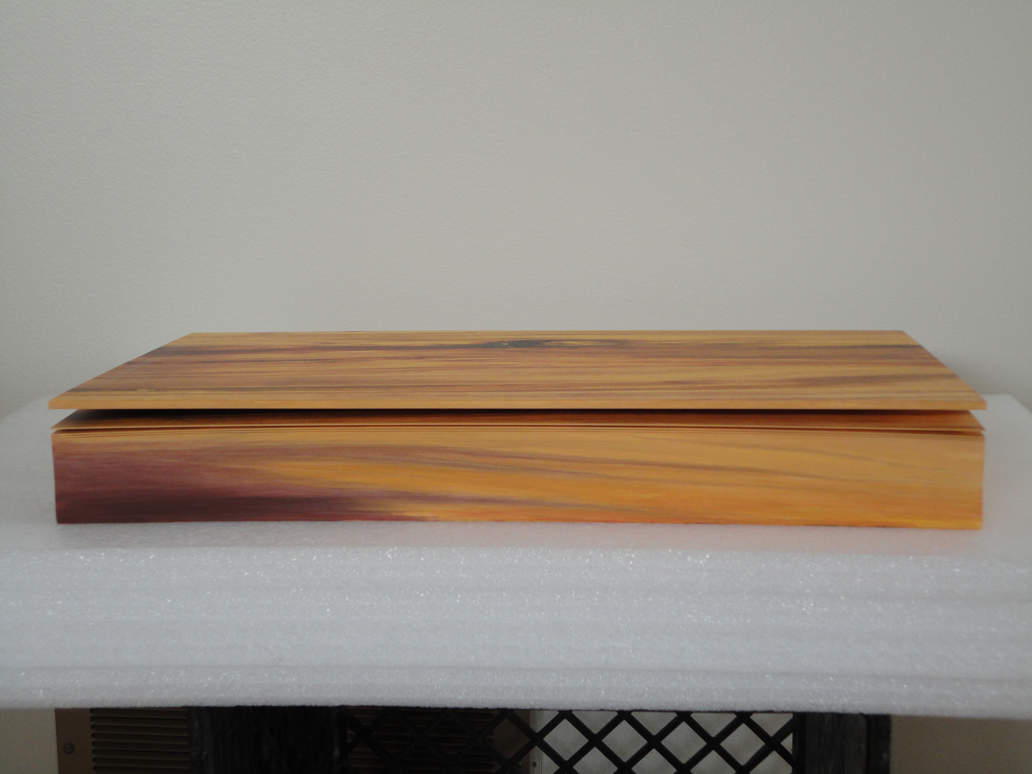
Stoian’s time as an assistant artist with the Scottish painter Lucy McKenzie, starting in 2008, honed her skills in deceiving the eye with faux woodgrain and faux marbling. For example, see McKenzie’s 2008 installation at MoMA, 2009 installation at the Ludwig (Cologne), 2011 installation at the Galerie Buchholz and 2013 installation at the Stedelijk. One may wonder whether Daniel Buchholz’s roots in antiquarian books or the Stedelijk’s in artists’ books prepared the ground for Stoian’s artistic direction toward book art and paper art, but book art and trompe l’oeil joined spectacularly in 2014 when Stoian had the chance to work with Tauba Auerbach in 2014 on the completion of Auerbach’s Wood and Bent Onyx. Stoian handpainted the fore, top and bottom edges of the book blocks in watercolor pencil and paints to match the color and grain of the prints of wood and marble digitally offset on pages of Mohawk superfine paper. As a technique, fore edge painting dates to the 16th century, and the “vanishing” variety, where the painting appears only when the pages are pressed and fanned out, dates to the 17th century. Over time, a standard type of press developed to hold the “canvas” of page edges evenly fanned to accept the painting.
Stephen Bowers’ fore-edge painting on a copy of A Narrative of a Survey of the Inter-tropical and Western Coasts of Australia by Phillip Parker King, son of the third governor of New South Wales Still from “Fantastically Fast Fore-edge Painting by Stephen Bowers“ Friends of the State Library of Australia, 18 February 2013
Despite this established history of fore-edge painting, Stoian had to fall back on a mastery and technique that come from her apprenticeship work, inventiveness and meticulousness. These books were very heavy and the pages were very thick …. There was absolutely no way to fan the pages. I went through the book, page by page, and made marks of where the wood/ marble veins were located.
Before Stoian started work on Wood
Then I clamped the book so that water wouldn’t seep in and using my ‘map’, I recreated the wood/ marble. As you can imagine, it was challenging to match the inside spreads. I had to constantly unclamp, verify that I was matching the spreads, re-clamp, paint, wait…
I used both watercolour pencils and paints. Needless to say, it’s very hard to erase watercolour without using lots of water and saturating the page. I had to be careful with every single brush stroke I made.
Finished
There is something Zen-like about trompe l’oeil in the attentiveness to detail, to material, to execution. But there is more. To mangle a Zen saying: Trompe l’oeil is more than a pointing at the moon; those who gaze only at the pointing will never see beyond — never see the beauty of the moon, never see the beauty of the pointing. With the best of trompe l’oeil, that moment in which the eye is fooled recurs again and again for the attentive viewer. In its recurrence, the work of art alternates between the self-referential (the mind drawn to the pointing) and the mimetic (the mind drawn to the pointed at).
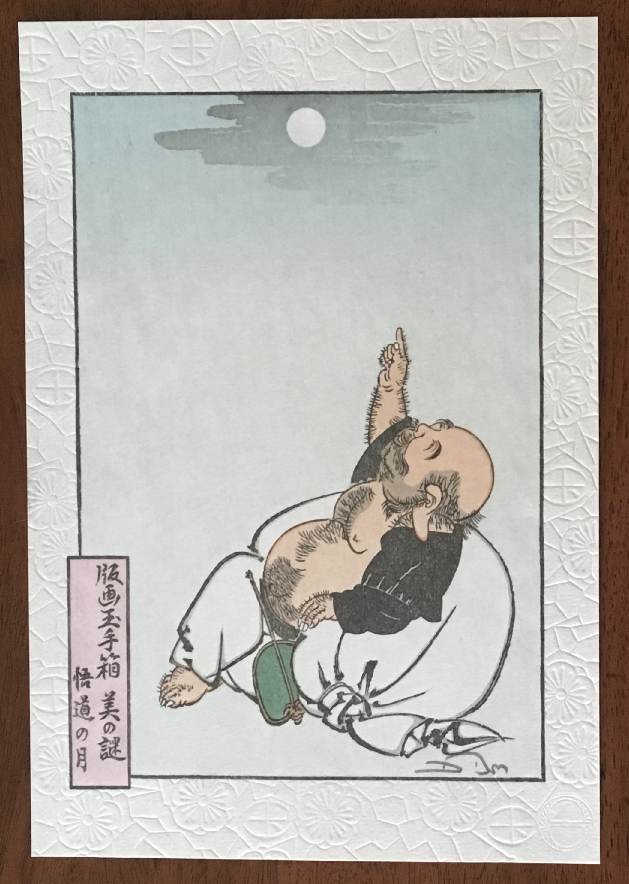
Moon of Enlightenment (2010) David Bull From a design by Tsukioka Yoshitoshi (1839-92) in his series “One Hundred Aspects of the Moon”. The Zen saying is “All instruction is but a finger pointing to the moon; and those whose gaze is fixed upon the pointer will never see beyond. Even let him catch sight of the moon, and still he cannot see its beauty.”
So it is not surprising that Stoian has “always been interested in Japanese art and culture”. As early as 2008, origami appears in her commercial decorative work. She is the author of two books: Origami for All with her partner Eric Gjerde (2013) and The Origami Garden (2016). In reviewing both books for The Fold , Jane Rosemarin commented:
… as I paged through her first book, “Origami for All,” I eventually began to understand that Stoian is an artist who has chosen origami as her medium. Her work is not hard to fold, but it has a consistency of style and a real beauty.
Recognized not only for their origami, Stoian and Gjerde were invited in 2013 to exhibit their paper art at the prestigious Salon des Artisans et Métiers d’Art, held at La Propriété Caillebotte in the village of Yerres outside Paris. While Gjerde’s folds explicitly explore the mathematical (for example, Voronoi tessellations and hyperbolic paraboloids), Stoian’s explore shapes more suggestive of the oriental: cranes and flowers as in Strelizia (2010).
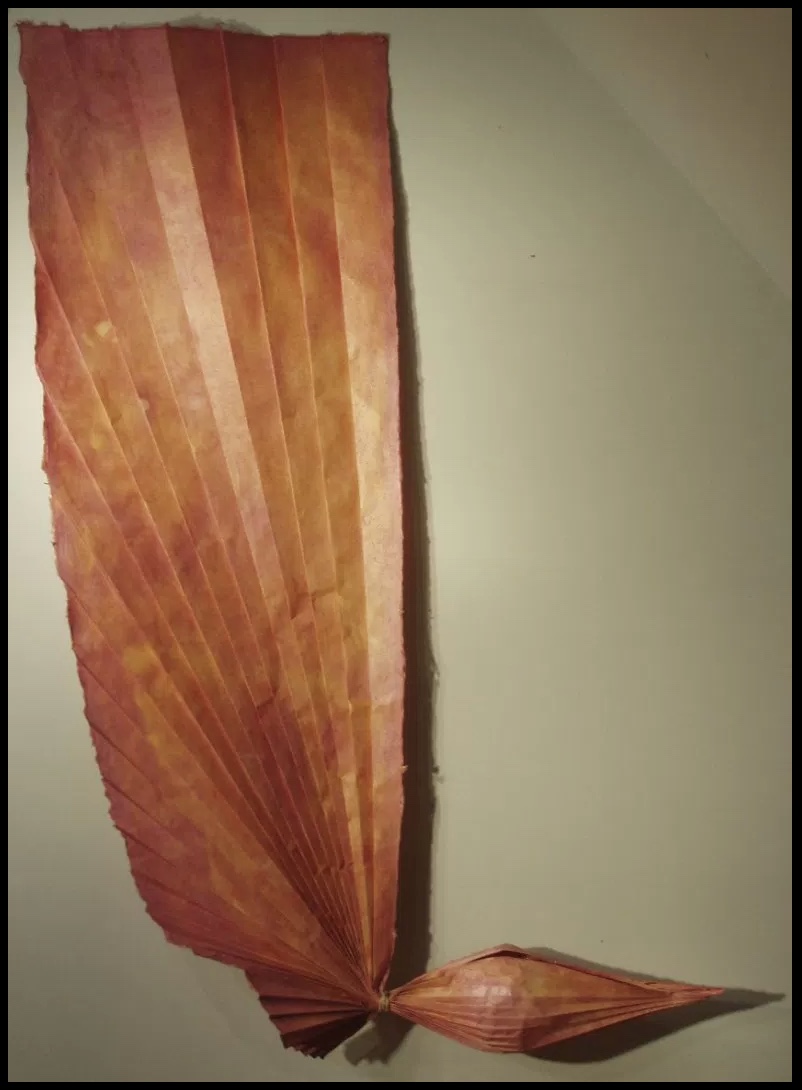
Strelizia (2010) Ioana Stoian Pigment on handmade flax and abaca paper 165cm x 59cm Strelizia (Strelitzia reginae) is a South African plant, known as the “bird of paradise” or “crane” flower.
Where Gjerde’s interest in his material has led him to bio-art (paper grown from bacterial cellulose), Stoian’s has hewed to traditional papermaking, which figures consistently in her work: for example, Hidden Within (2010). In 2012, that interest in traditional
Hidden Within (2010) Ioana Stoian Hand-made flax and abaca paper 1.3m x 1.3m
western papermaking had turned eastward:
After discovering western papermaking, I became fascinated with thin, strong sheets, which obviously led me to washi – the Japanese paper made from mulberry. I naturally had the desire to go to Japan and see how this paper was made.
It so happens that a friend of mine, Tomoko Fuse (a very talented and well-known female origami artist and perhaps the most published origami author in the world), was at a paper folding event in France. I casually mentioned that I wanted to go to Japan to learn papermaking. Next thing I know, she had very kindly organised for me to spend a month with Yasuo Kobayashi, master paper maker and owner of Kadoide Washi – an offer I could not refuse.
I spent a magical month in the mountains, during the Kozo harvest (December) and had an amazing time learning from a great master.
Yasuo Kobayashi is a fifth-generation papermaker but also a writer and philosopher, whose unique views on papermaking warranted his inclusion in the American Folklore Society’s sponsored report on apprenticeship and papermaking. Yasuo Kobayashi told the report’s author, Aimee Lee: “I wanted the kozo to tell me what kind of paper it wants to become, not to force it to be what I want. This is not typical for papermakers. I want kozo to be my teacher.” When asked to elaborate,
… Kobayashi compared bunka (culture) and bunmei (civilization). “Bunka is what you think from your heart.” In contrast, bunmei’s goal is to develop constantly, exemplified by the western desire for progress: people do not want today and tomorrow to be the same—they want things to be less difficult and more convenient. This mindset cannot translate to making real paper. His grandfather’s and father’s lives were not very different. His father’s and his lives were a little different. But his son’s and his lives are so different that it is hard to relate across that rift. He sees two roots for the future of paper: growers and makers. Real kozo goes with the heart but is inconvenient and does not follow progress. Kigami [paper] comes from the root “to be born,” and this word also relates to breathing. When born, paper is like a child: weak, but growing stronger over time until it dies. He knows that his point of view is rare, but also said people must balance bunka and bunmei, rather than to go absolutely one way or another. Today, the balance is too heavy on the professional side, so he tries to balance this by leaning towards the growing side.
Stoian’s jump at the chance to learn from him is consonant with her “journeyman’s” approach to her artistic development. Note that the visit to Kadoide Washi precedes the work on Wood and Bent Onyx for Tauba Auerbach in 2014. The methodical diligence required in making washi and the resulting appreciation of the properties of paper re-present themselves in Stoian’s mapping of the grain and perceiving what the works and the paper “wanted”. The impressive fore-edge work with Wood and Bent Onyx now seems inevitable, rising from a combination of technique and deep appreciation of color, material, form and structure in the service of illusion. In her own work, Stoian strives toward bunka, which is evident in works like Strelizia and Hidden Within, where the form and color her handmade paper takes combine to convey feeling — or “heart” as Kobayashi might put it. Her aim has become even clearer during the Jerome Foundation stage of her “journeyman’s” journey.
Stoian received the Jerome Foundation Mentorship grant for 2014/15 at the Minnesota Center for Book Arts to create an artist book — an extraordinary artist book. The mentorship program offers emerging artists the resources to create a book, fusing together newly acquired skills with aspects of their own artistic practice. The grant provided one year of 24-hour access to the Center’s facilities, a mentor, and a series of introductory workshops on paper making, letterpress printing, and book binding.
Responding to her new wintry environment, Stoian embarked on l’hiver (2014), a new work consisting of 80+ individually hand-made and dyed pieces of paper. L’hiver is reminiscent of Hidden Within (2010) in its pursuit of a harmony of color, structure, and form. The former is perhaps more open than the latter and lets each part’s snowflake-like uniqueness assert itself.
l’hiver (2104) Ioana Stoian Hand dyed, handmade flax and abaca paper 3m x 1m
The congruence and continuity of those two works do nothing to prepare the viewer for Nous Sommes (2015), the artist’s book that follows them. While Nous Sommes continues Stoian’s aim of harmony among color, structure and form, while its intensity of colors harks back to the stencil work for Lucy McKenzie’s Stedelijk exhibition in 2013, the structure and form Stoian chose marks a bold departure.
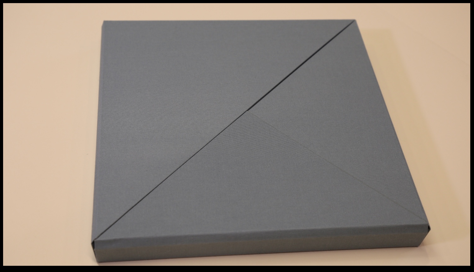
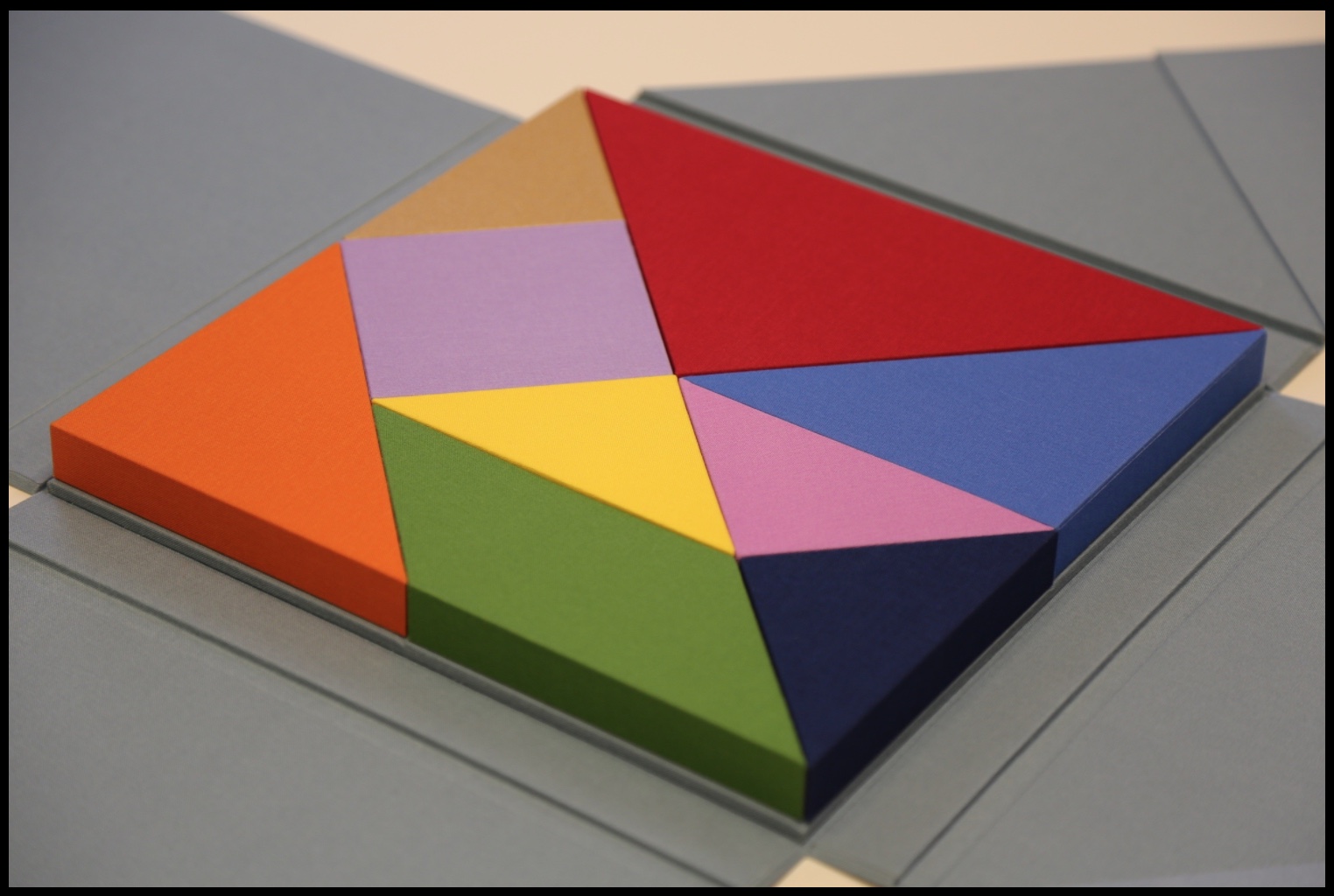
The cover and binding of Nous Sommes has the feel of a Solander box. The book opens in a particular order of lifting the triangular flaps, one of which displays the “Table of Contents” and another the colophon.
Nous Sommes (2015) Ioana Stoian
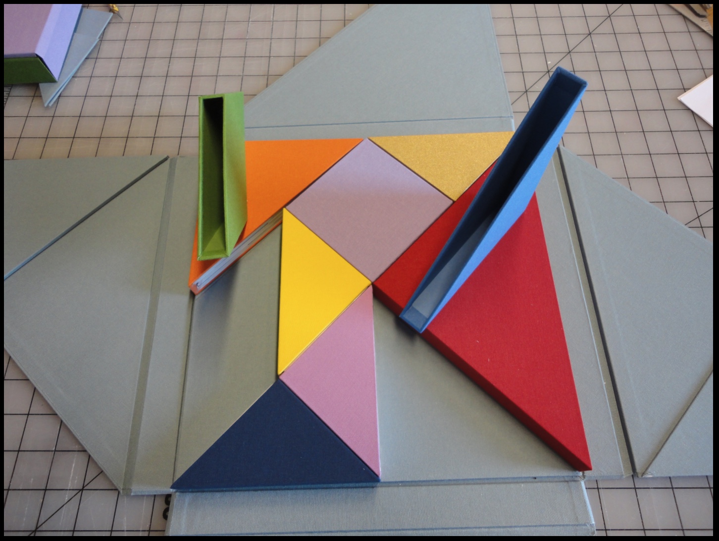
Nous Sommes has nine “chapters” or differently sized, shaped and colored slipcases whose material matches that of the cover and binding. The chapters fit precisely together (tangram-like), but the order of their reading lies with the reader’s choice of color, shape or size. The video provided by Stoian and Gjerde offers one of many readings of the work.
Nous Sommes (2015) Ioana Stoian
Empty “chapters” Nous Sommes (2015) Ioana Stoian
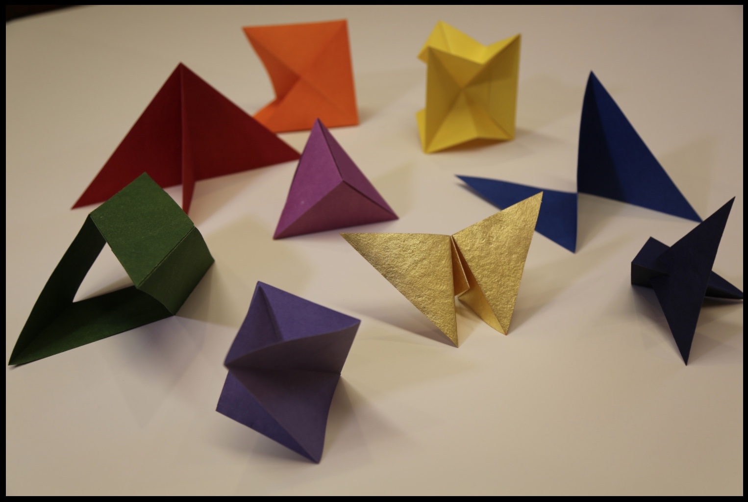
Within each chapter is a precisely fitted paper structure to be “read” by unfolding, positioning, displaying, contemplating and, in conclusion, returning it to its chapter/slipcase.
“Contents” of nine chapters/slipcases Nous Sommes (2015) Ioana Stoian
Commenting on Strelizia, shown earlier, Stoian writes,
I am interested in intuitive color experiments; this work represents the flow from mood to colour, with the final form of the paper manifesting itself from these captured emotions.
In Kandinsky’s footsteps, perhaps, this artist finds and aims to offer the spiritual in art. The title Nous Sommes suggests so. Whether the expression “we are” applies to the art object (self-referentially) or to its audience (individually or collectively), form, structure and colors assert community, inclusion and a fitting together.
We can look forward to Stoian’s next chapter as she has received a follow-on appointment from the Minnesota Center for the Book Arts: the 2017/18 Jerome Foundation Fellowship.
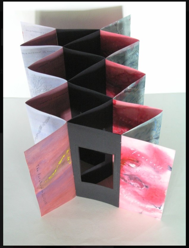
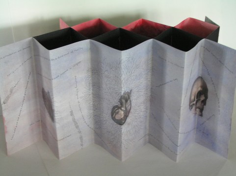
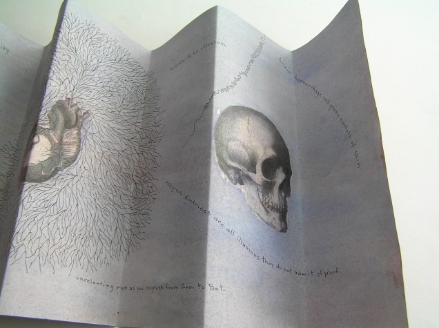
Selected for the 2017 Manly Library Artists’ Book Award exhibition in New South Wales, Australia, The Future of an Illusion by Helen Malone and Jack Oudyn demonstrates an effective collaboration in a field of art densely populated with — almost defined by — collaborative efforts:
The Future of an Illusion (2017) Helen Malone and Jack Oudyn Sculptural tunnel book structure (three joined four-fold leporellos) enclosed in a folder and protective boxin a box,. Box made with Lamali handmade paper, suede paper (lining) and Somerset Black 280 gsm; Folder: Canson black 200gsm, skull button and waxed thread; Leporellos: center leporello made of Canson black 200 gsm, linen thread adjoining two leporellos made of Arches watercolour paper 185 gsm with acrylic, soluble carbon, gouache and transfer ink jet images. Box: H275 x W313 x D34 mm; Folder: H258 x W295 x D21 mm; Book: H250 x W290 x D16 mm closed, D410 mm open. One of an unnumbered, signed edition of 4. Acquired from Helen Malone, 12 September 2017.
Edouard Manet and Stéphane Mallarmé; Bertrand Dorny and Michel Butor; Dorny and Michel Deguy; Barbara Fahrner and Kurt Schwitters; Ron King and Roy Fisher; Telfer Stokes and Helen Douglas; the Art + Language Group (Terry Atkinson, David Bainbridge, Michael Baldwin, Ian Burn, Harold Hurrell, Joseph Kosuth, Christine Kozlov and Mel Ramsden); Tom Rollins + K.O.S.; Julie Chen and Clifton Meador; and Chen and Barbara Tetenbaum.
That list is by no means comprehensive nor representative – chronologically or categorically — but it flags the strength of the tradition. One pair that is particularly apropos for Malone and Oudyn is Sonia Delaunay and Blaise Cendrars. Over a century ago and half a world away, they collaborated on La Prose du Transsibérien et de la Petite Jehanne de France, also in the leporello, accordion or concertina format. Malone writes that it “has always been very influential generally on my work.”
Cendrars as poet and publisher and Delaunay as painter were interested in achieving what they called simultaneisme, or a “simultaneous book.” They wanted to create a form of art in which painting and text could be united in expression. Delaunay painted the left column of color and abstract shapes guides us through the text, which is set in various typefaces, allowing for movement as the reader mimics the journey across the page as described in the train ride in the poem. Claire Kelly, Melville Books
The Future of an Illusion springs from two imaginations struck by two literary works: Sigmund Freud’s eponymous book on belief in an afterlife and Jim Crace’s novel Being Dead.
It delivers an emotional simultaneity that echoes the different kind of simultaneity Sonia Delaunay and Blaise Cendrars achieved. Malone and Oudyn have the advantage of their subject — death, decay and the afterlife — that provokes simultaneously conflicting emotions and states of mind. Fear, humor, sorrow, hope, despair, etc.
The choices of two texts, the double leporello and techniques — and the way they are applied — play with that emotional simultaneity beautifully. The use of Crace’s text (and the “inverse ekphrastic” influence of the whole novel, which documents the decomposition of a dead body left in nature) adds to the work’s physicality. The choice of title from Freud’s book centers the artwork’s perspective on death — the void toward which the central tunnel leads.
The Future of an Illusion appeared in exhibition at Grahame Galleries in Paddington, Brisbane, and a copy resides in the collection at the State Library of Queensland.