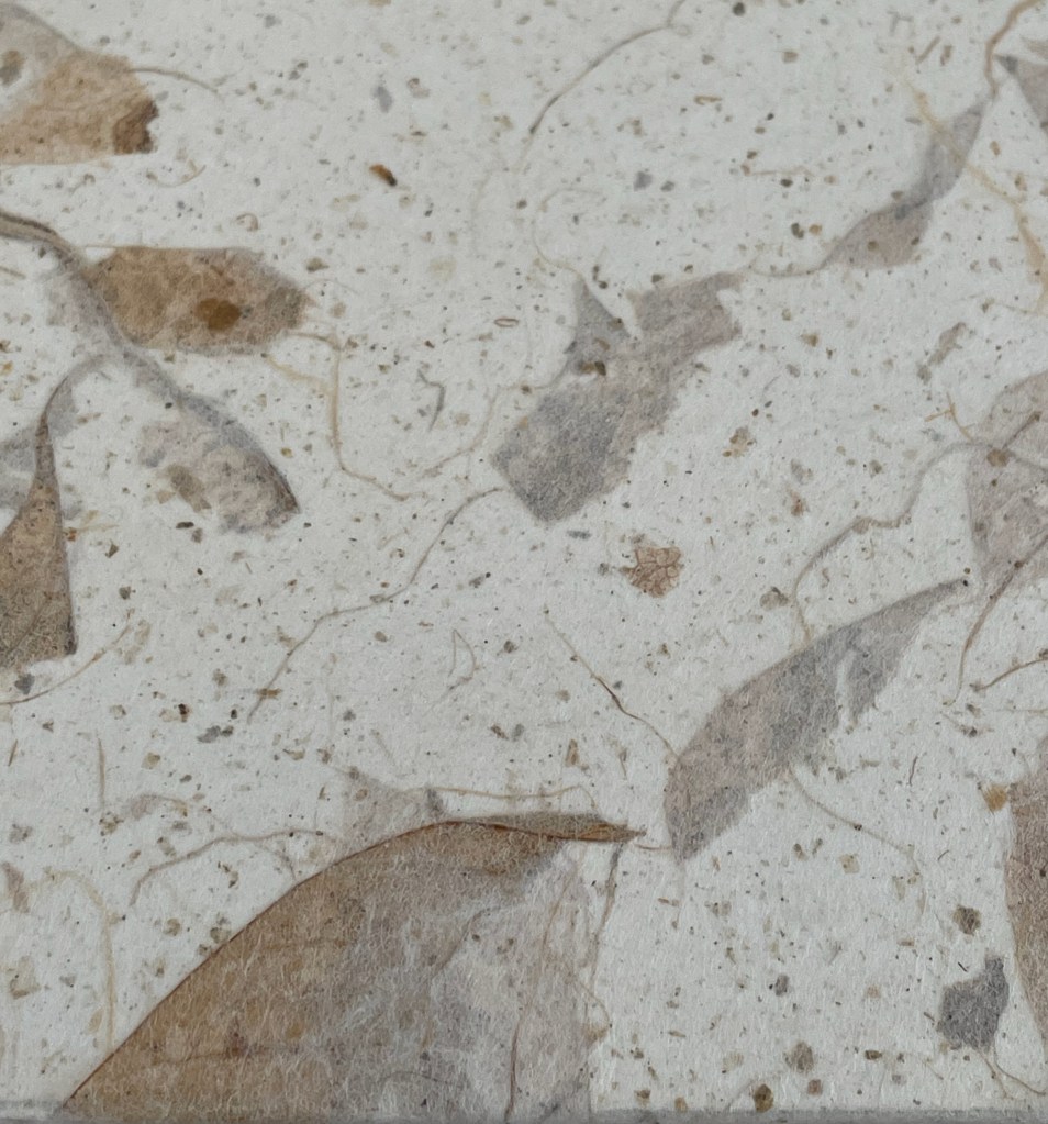
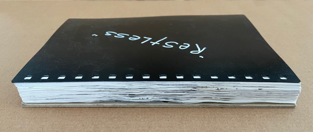
Restless (2020) Jacobus Oudyn Loose sheets from plastic comb bound notebook in a clamshell box covered in Japanese paper. Box: H240 x W170 x D40 mm. 60 pages. Unique. Acquired from the artist, 2 January 2024. Photos: Books On Books Collection. Displayed with permission of Jacobus Oudyn.
Restless consists of a continuous drawing with graphite and collage across sixty loose sheets of 120gsm cartridge paper removed from a plastic comb bound notebook. Like Oudyn’s earlier work Out of Breath (2019), meant to represent the medical conditions of mesothelioma and black lung, Restless aims to evoke chronic restless leg syndrome.
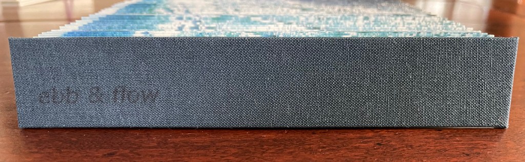
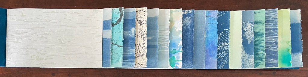
Ebb and Flow (2023) Jane Cradock-Watson Concertina book with cloth hard bound covers. H155 x W27 mm (closed), W680 mm (open). 64 panels. Edition of 20. Acquired from the artist, 21 January 2024. Photos: Books On Books Collection. Displayed with artist’s permission.
An exploration, both visually and physically, the ‘edge’ of the sea where it meets the land, with its continuous ebb and flow of the breaking waves, rhythmically rolling back and forth onto the sand. (Artist’s description)
With the binding and her photography in Ebb and Flow, Jane Cradock-Watson has sculpted and painted the sea’s edge. Four digital photographs printed on Zerkal paper have been spliced together between two cloth-covered boards. The flexibility and extent of the concertinaed paper create an undulating structure that turns seascape stills into mesmerising cinema.
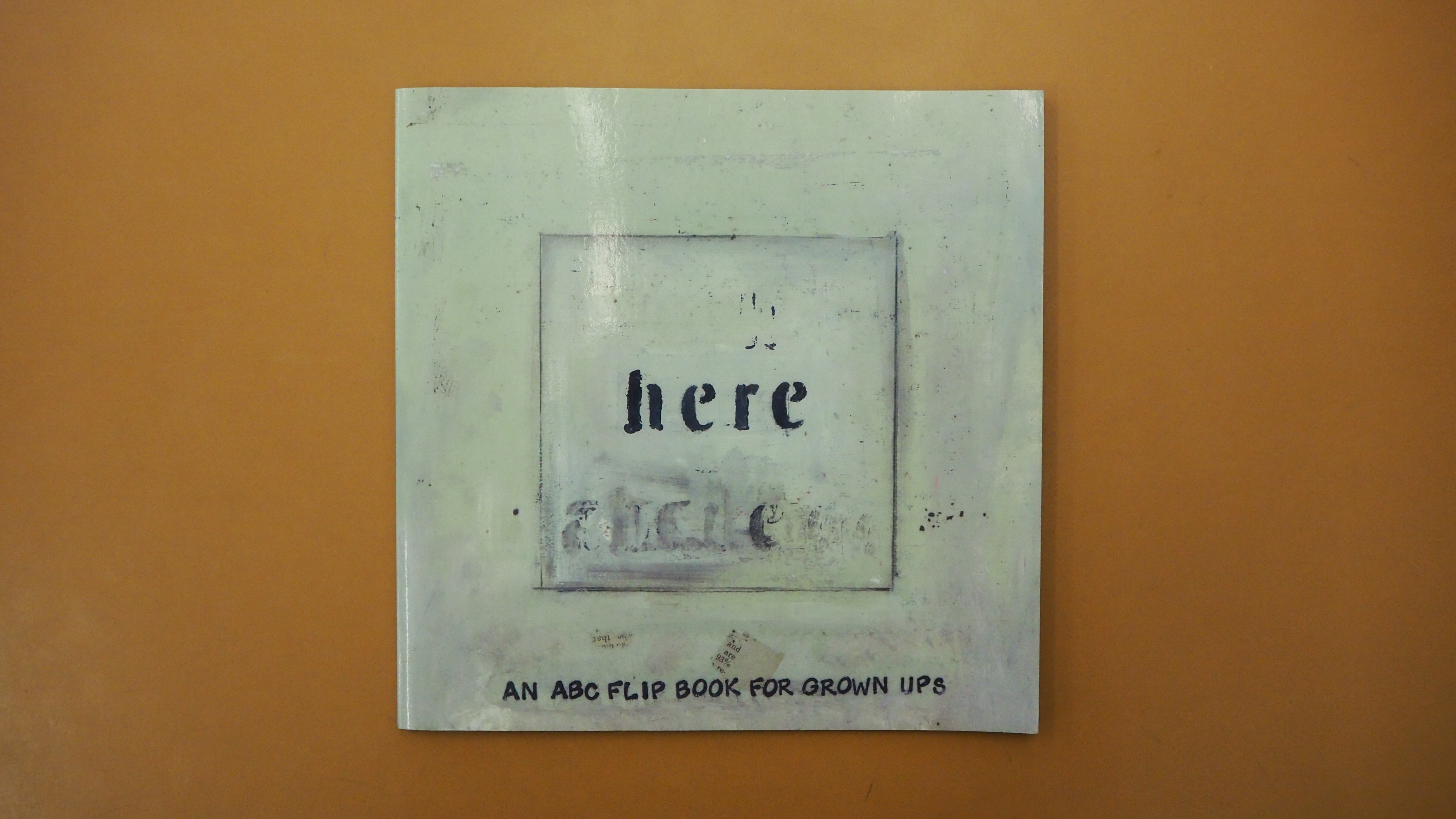
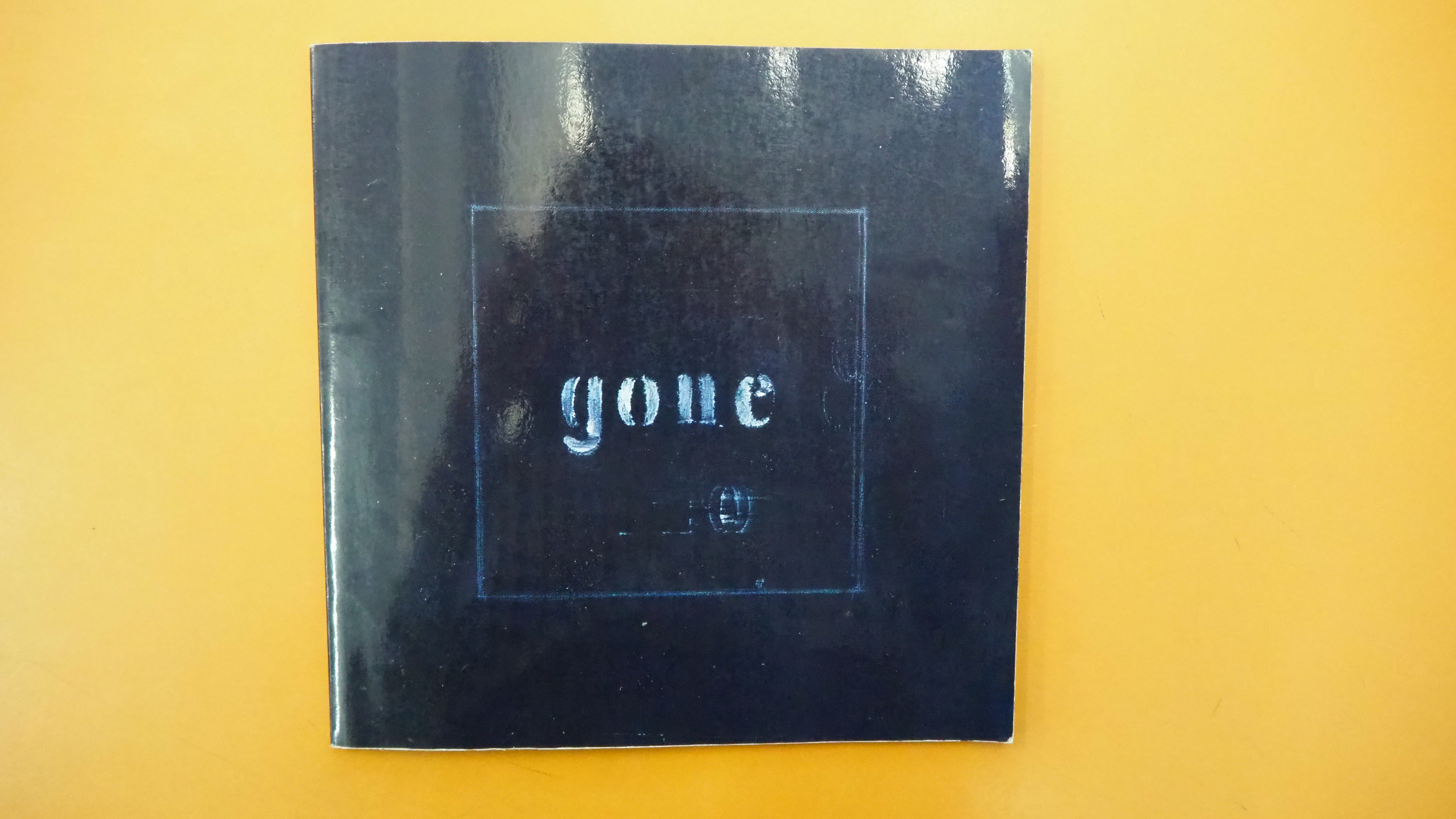
Here/Gone: An ABC Flip Book for Grown Ups (2008) Karen Green Perfect bound, invertible flipbook. 215 x 215 mm. [56] pages. Acquired from AbeBooks, 14 March 2019. Photos: Emilia Osztafi*. Displayed with the author/artist’s permission.
here/gone is a story of two parts, the arrival of love and its departure. “Zipping and unzipping the alphabet in a narrative of love and unlove” as the Spineless Books website describes it, here/gone tells its story with mixed media paintings and minimal text across the right hand pages of its invertible flip book structure, each page’s text beginning with a letter of the alphabet. The flipping pages of here enact love’s zipping together two characters, the flipping pages of gone enact “unlove’s” unzipping them apart.
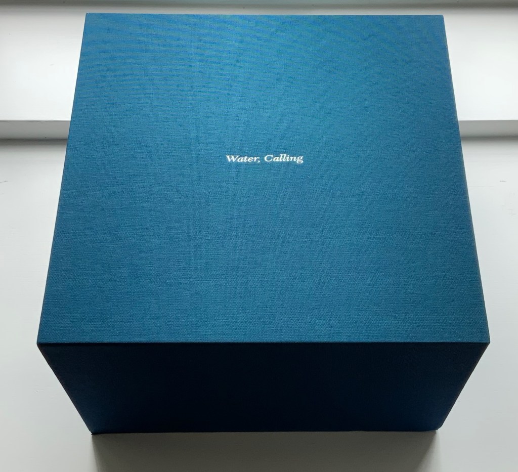
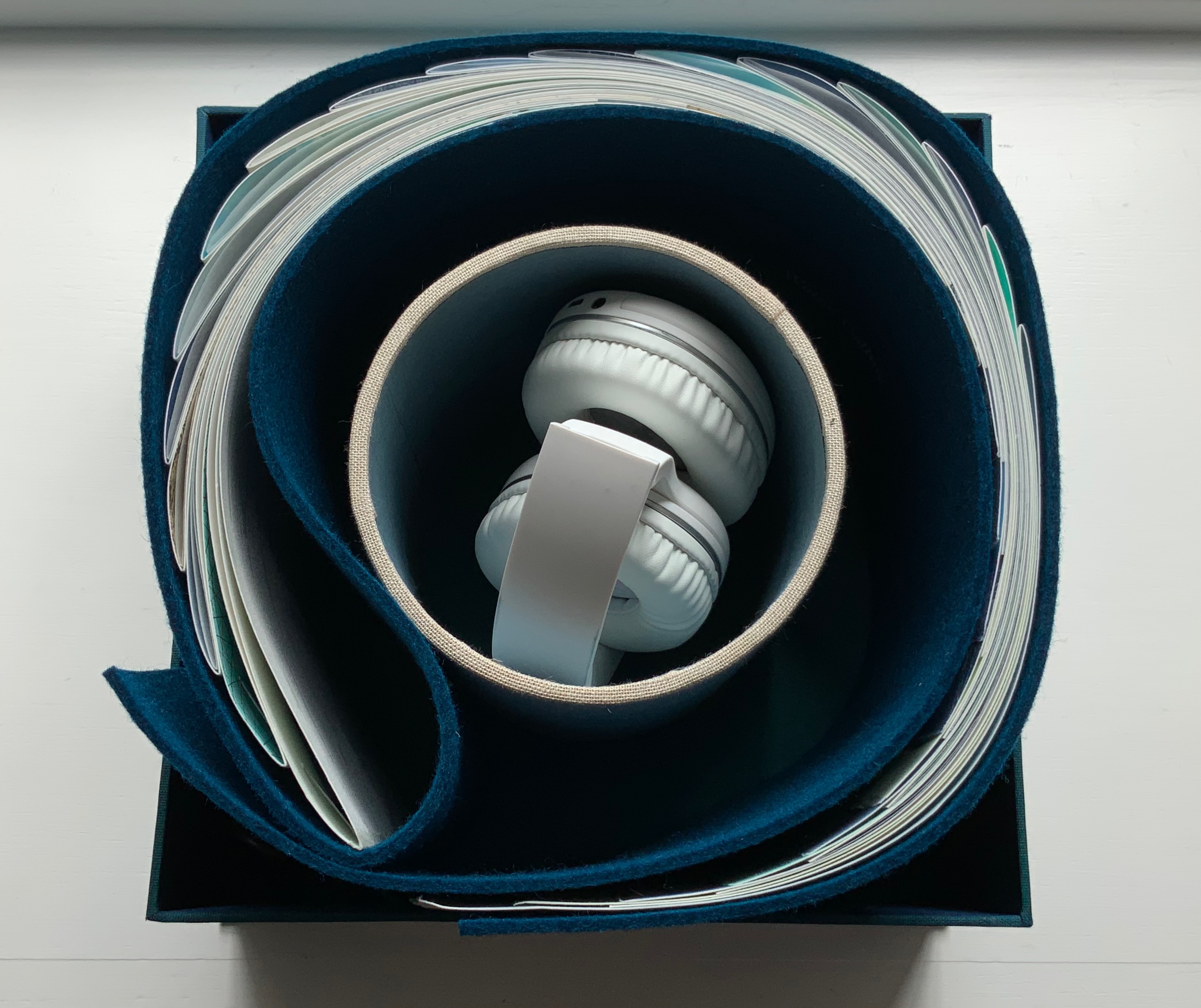
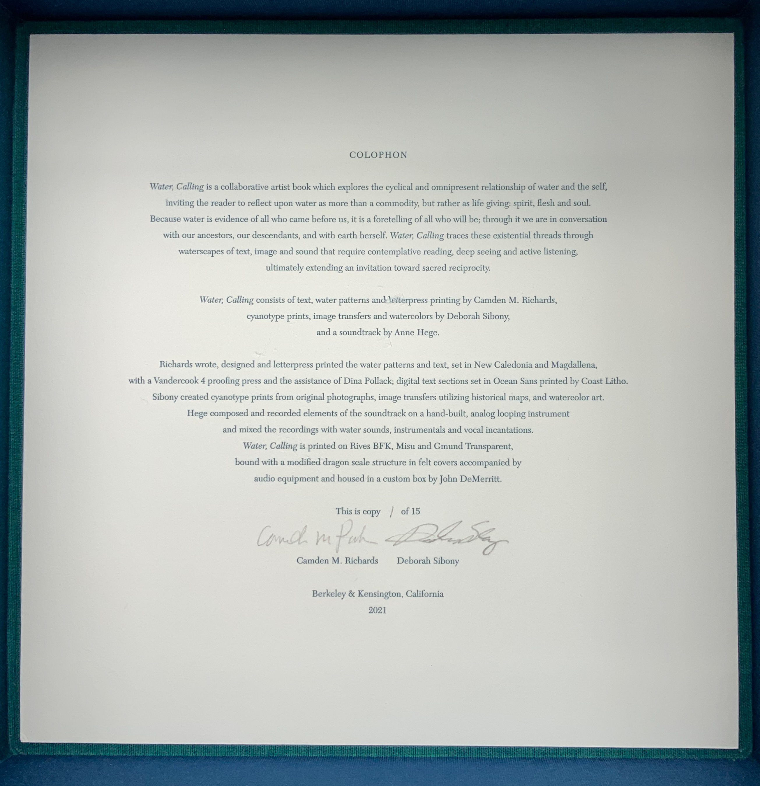
Water, Calling (2021) Camden Richards & Deborah Sibony Felt-covered, modified dragon-scale bound artists’ book, accompanied by audio equipment in custom box. Box: 262 x 262 x D170 mm. Book: H155 x W775 mm (closed). 110 pages. Edition of 15, of which this is #1. Acquired from the artists, 5 October 2022. Photos: Books On Books Collection. Displayed with artists’ permission.
Colophon “Water, Calling is a collaborative artist book which explores the cyclical and omnipresent relationship of water and the self, inviting the reader to reflect upon water as more than a commodity, but rather as life giving: spirit, flesh and soul. Because water is evidence of all who came before us, it is a foretelling of all who will be; through it we are in conversation with our ancestors, our descendants, and with earth herself. Water, Calling traces these existential threads through waterscapes of text, image and sound, extending an invitation to enter more fully into a dialogue composed of acts requiring active listening, contemplative reading and deep seeing with the hope of inspiring sacred reciprocity.”
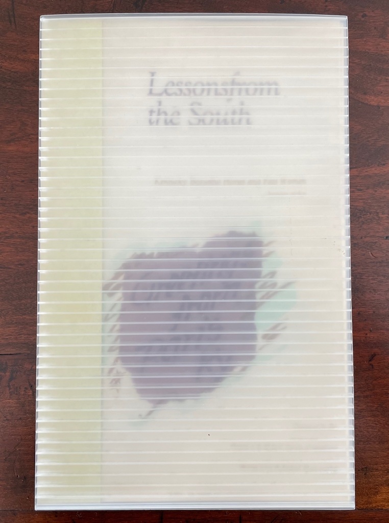
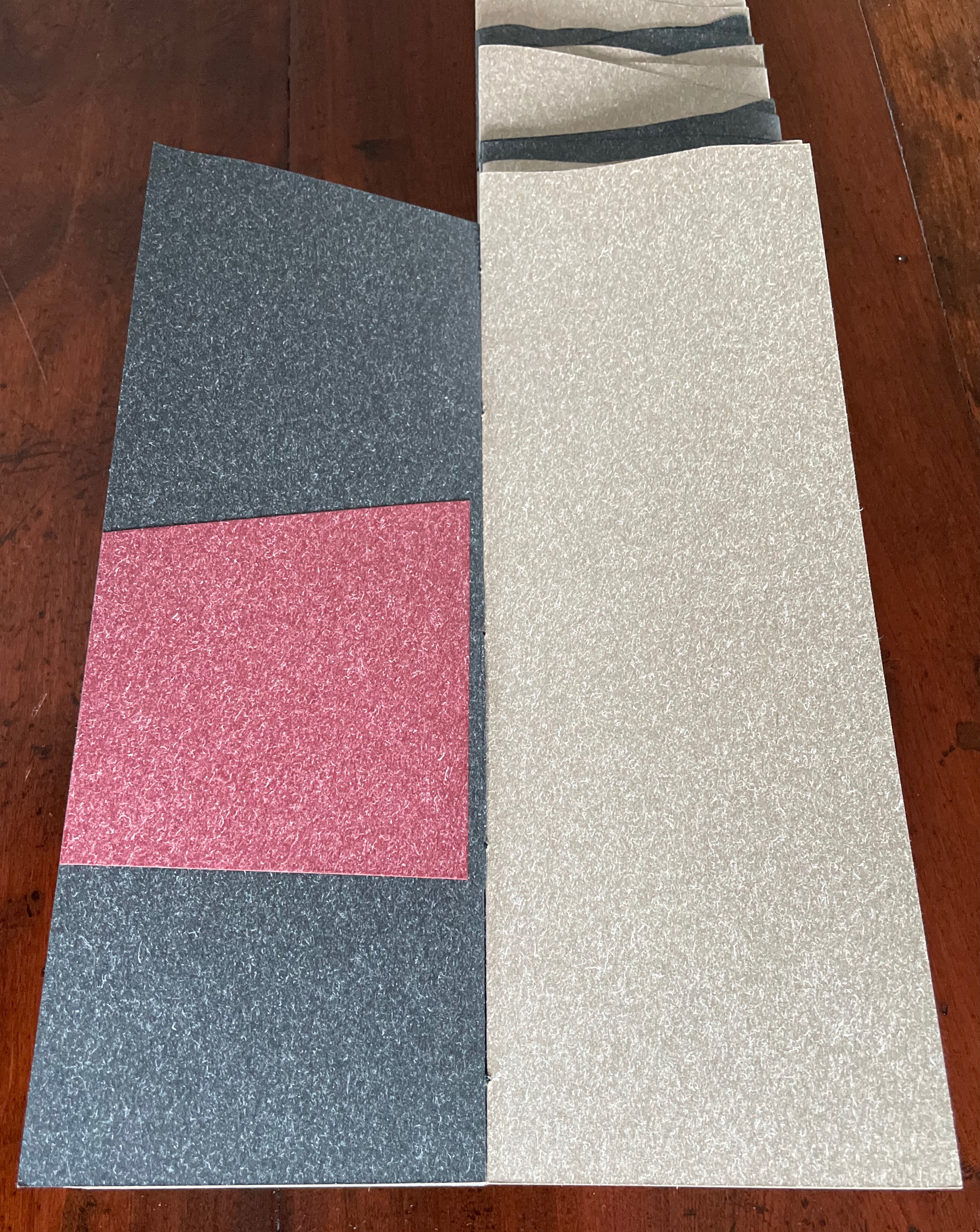
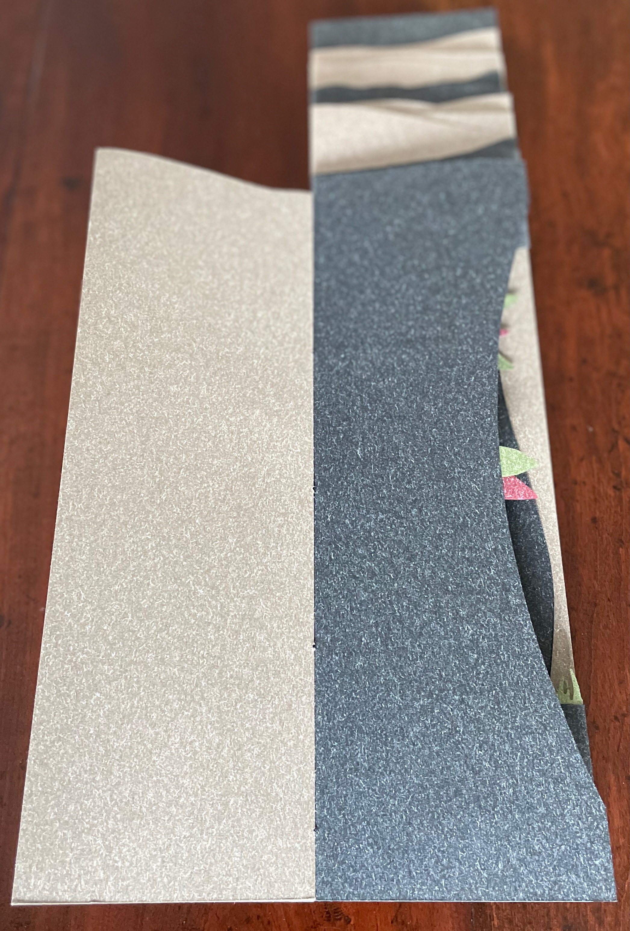
Lessons from the South(1986) Susan E. King Modified flag book. Closed: H270 x W172 mm; Open: W670 mm. 20 pages. Acquired from Rickaro Books BA PBFA, 22 September 2023. Photos: Books On Books Collection.
Lessonsfrom the South presents a masterful weaving together of material, structure, technique and image with Susan King’s reminiscences and social observations of her birth state Kentucky. For King, growing up white and female in the South in the second half of the 20th century engendered a sense of otherness and rebellion. As with some white southerners, it led to mild acts of rebellion — sitting too far back in the bus, sitting next to black students in typing class, or finally leaving for other regions of the US. With the 21st century’s rise of the “Karen”, repression of voting rights and reproductive rights, and resurgence of white supremacy, can we afford to dismiss the expression of conscience as “mild”? Any expression of conscience is something. Lessons from the South is an artful expression of fondness, humor, closeness and distance — a sense of being ill at ease with a Southern heritage we all seem unable to escape — that should be revisited not only for the sake of its art but as encouragement to conscience.
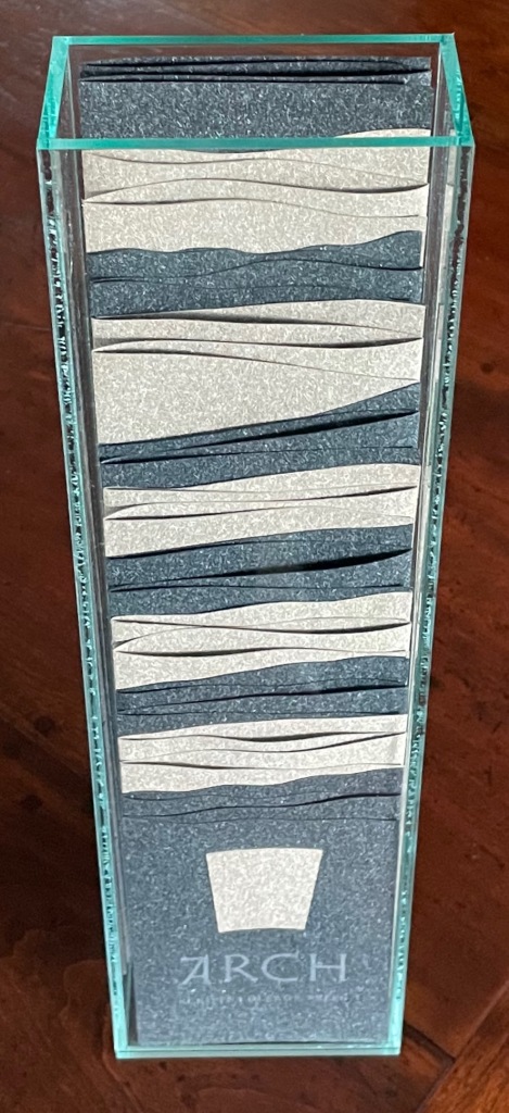
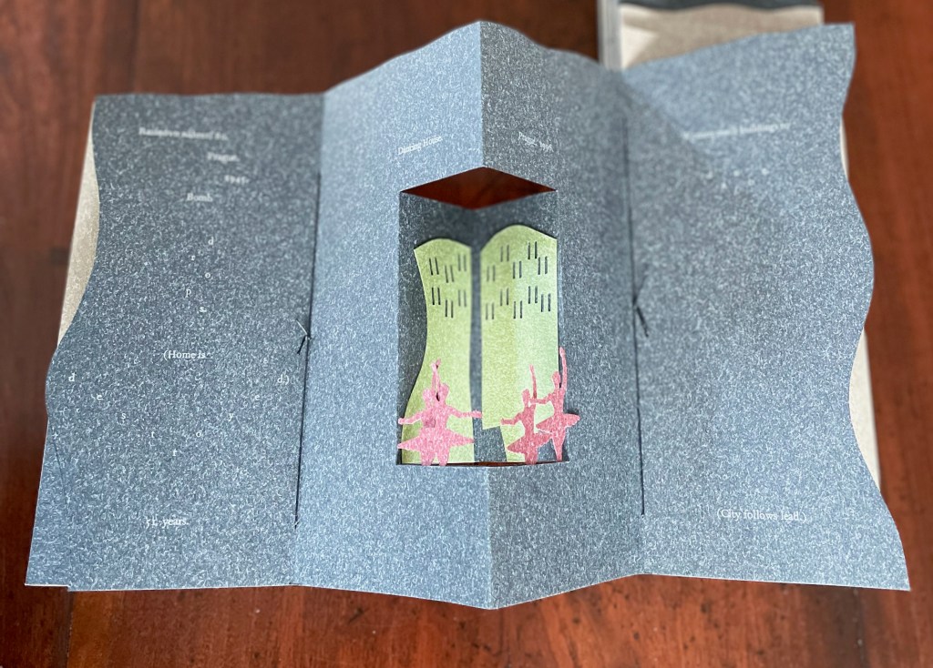
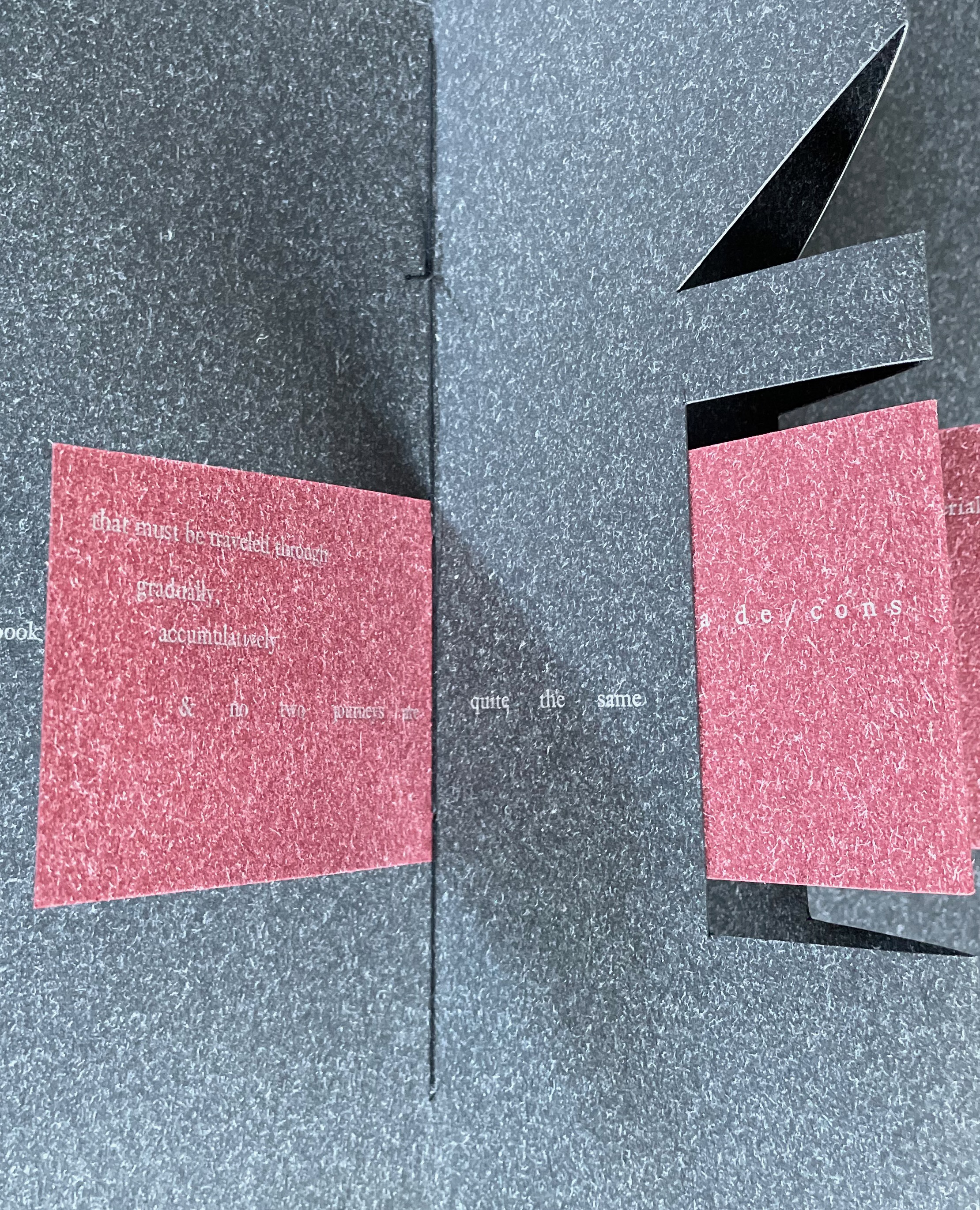
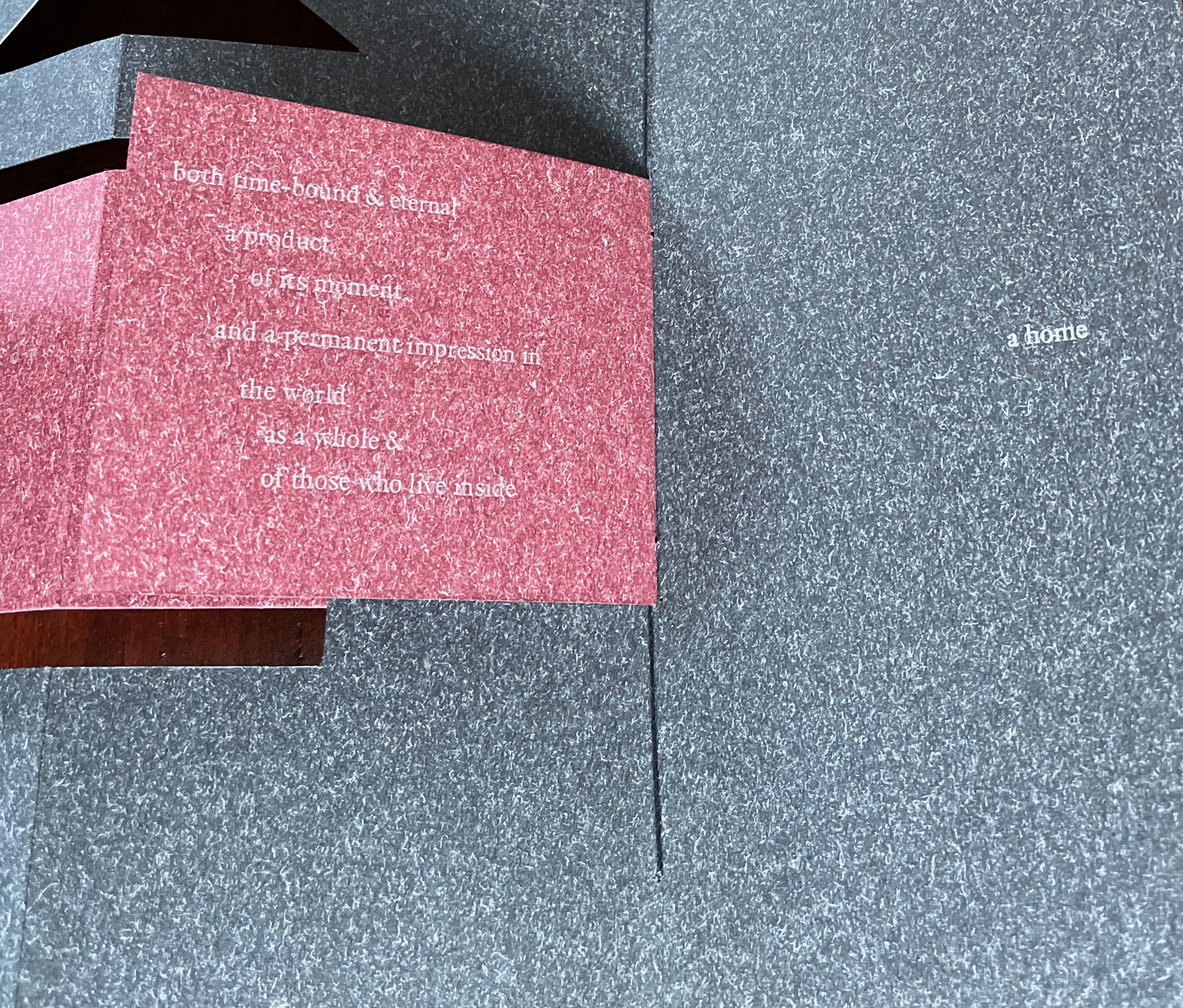
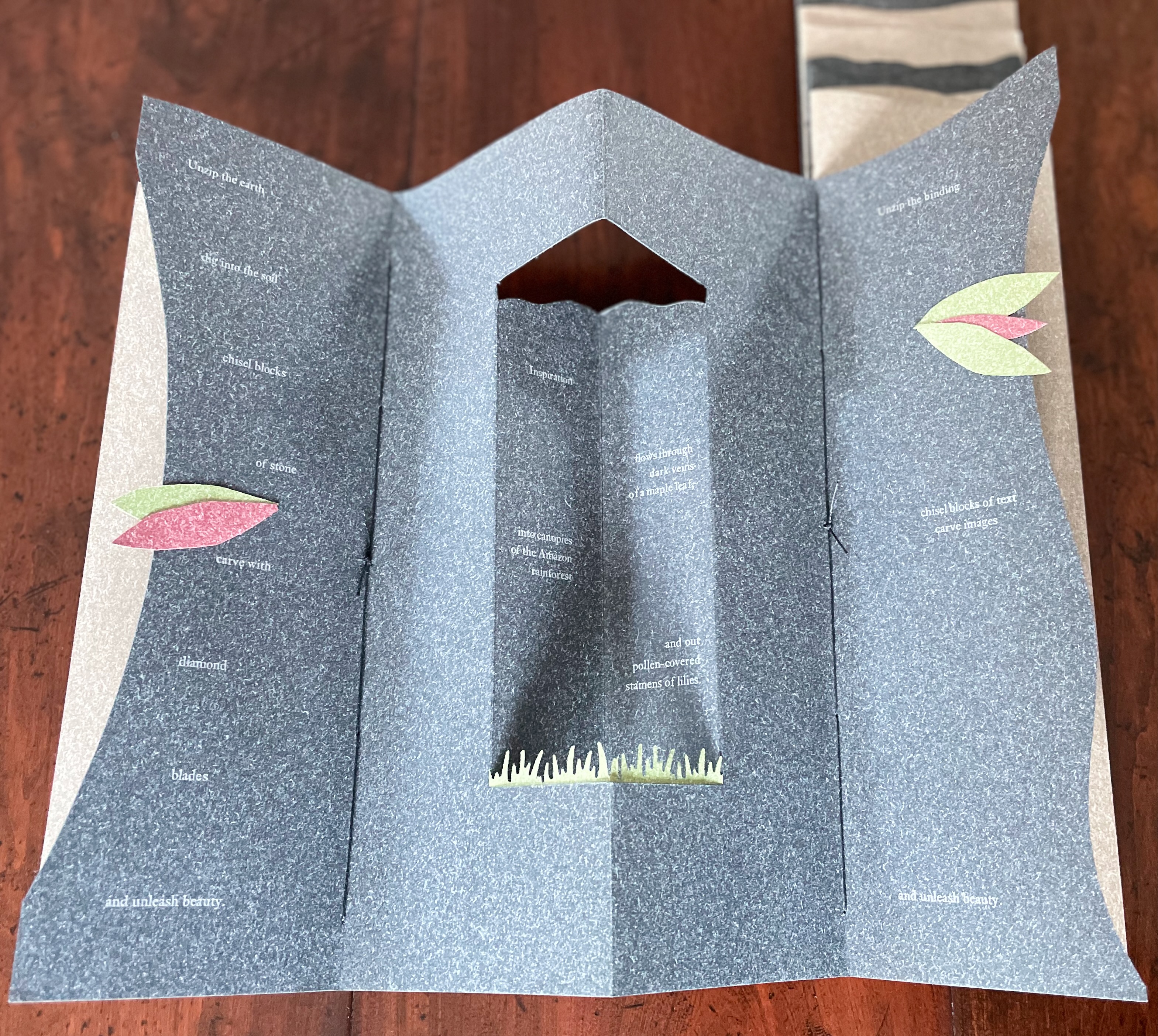
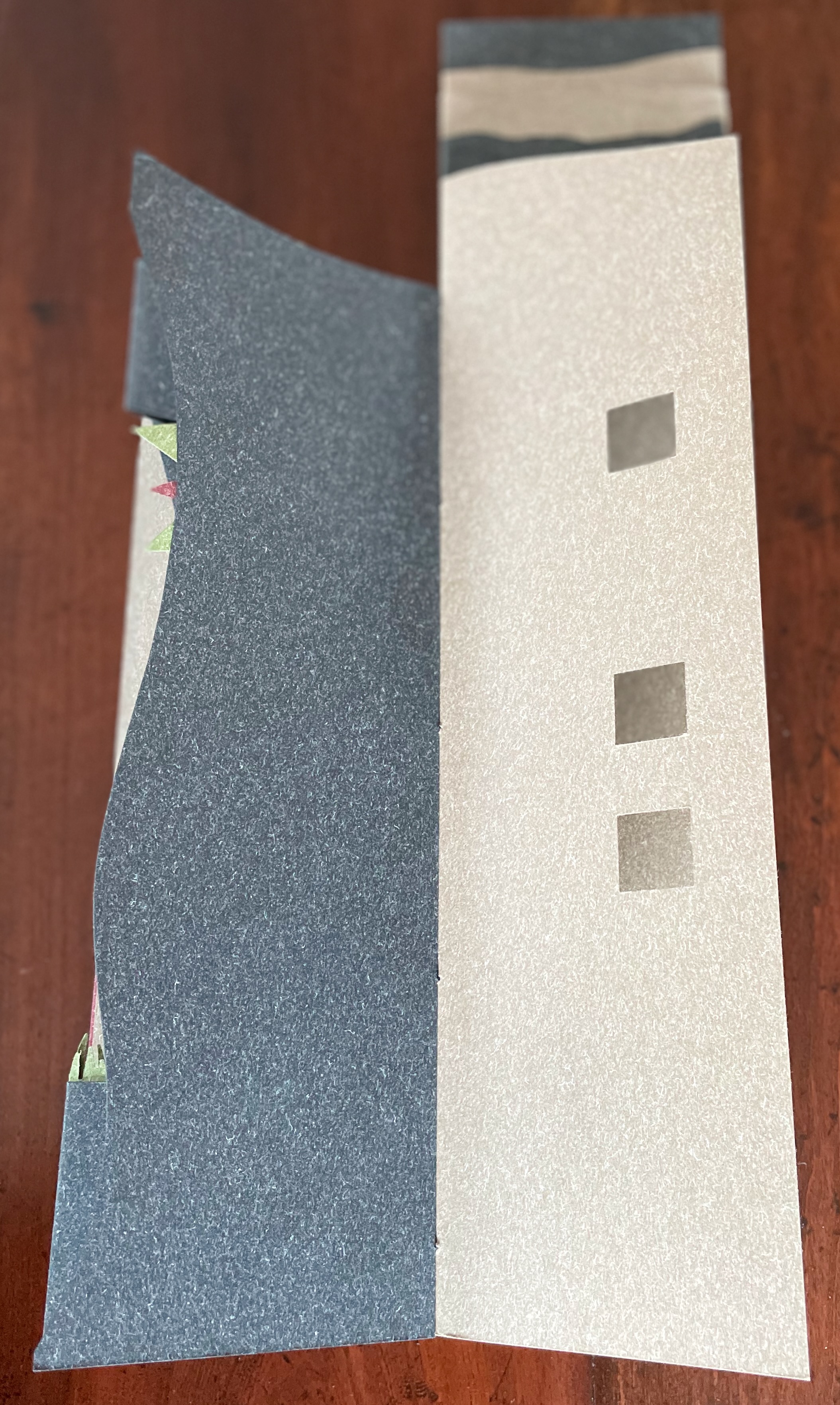
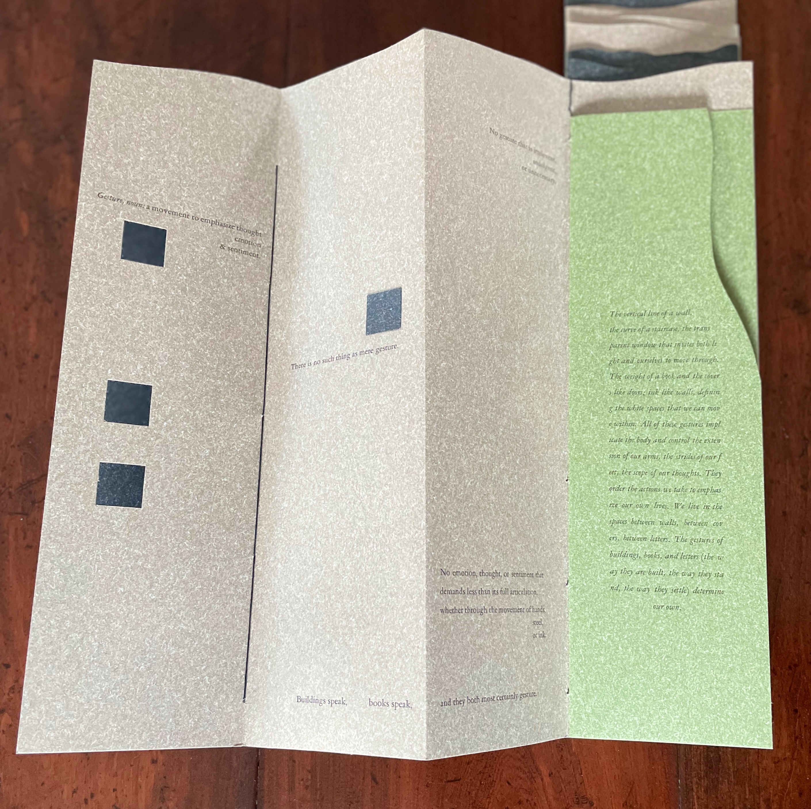
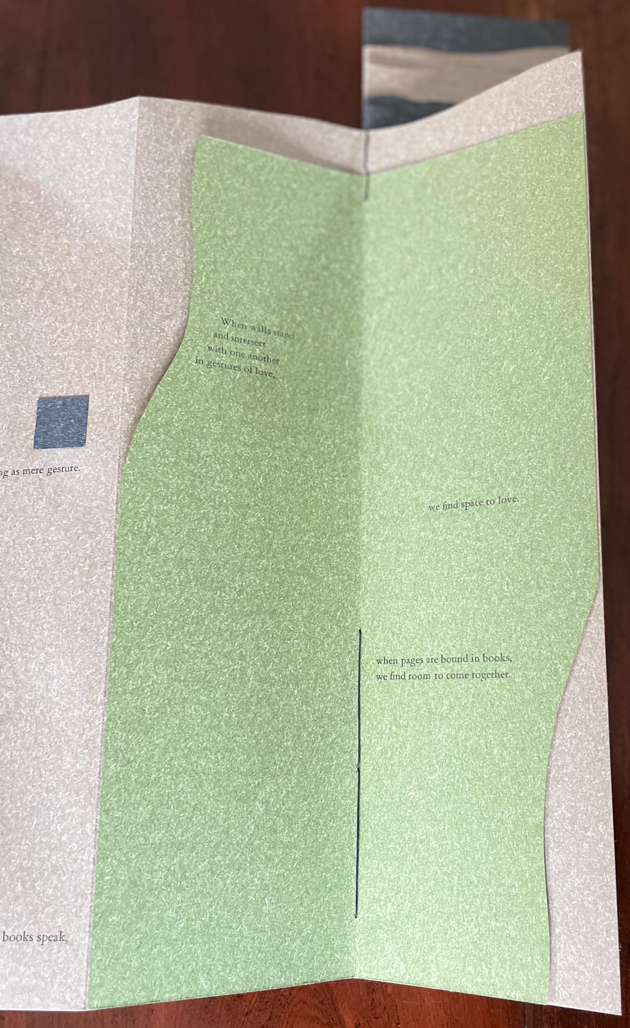
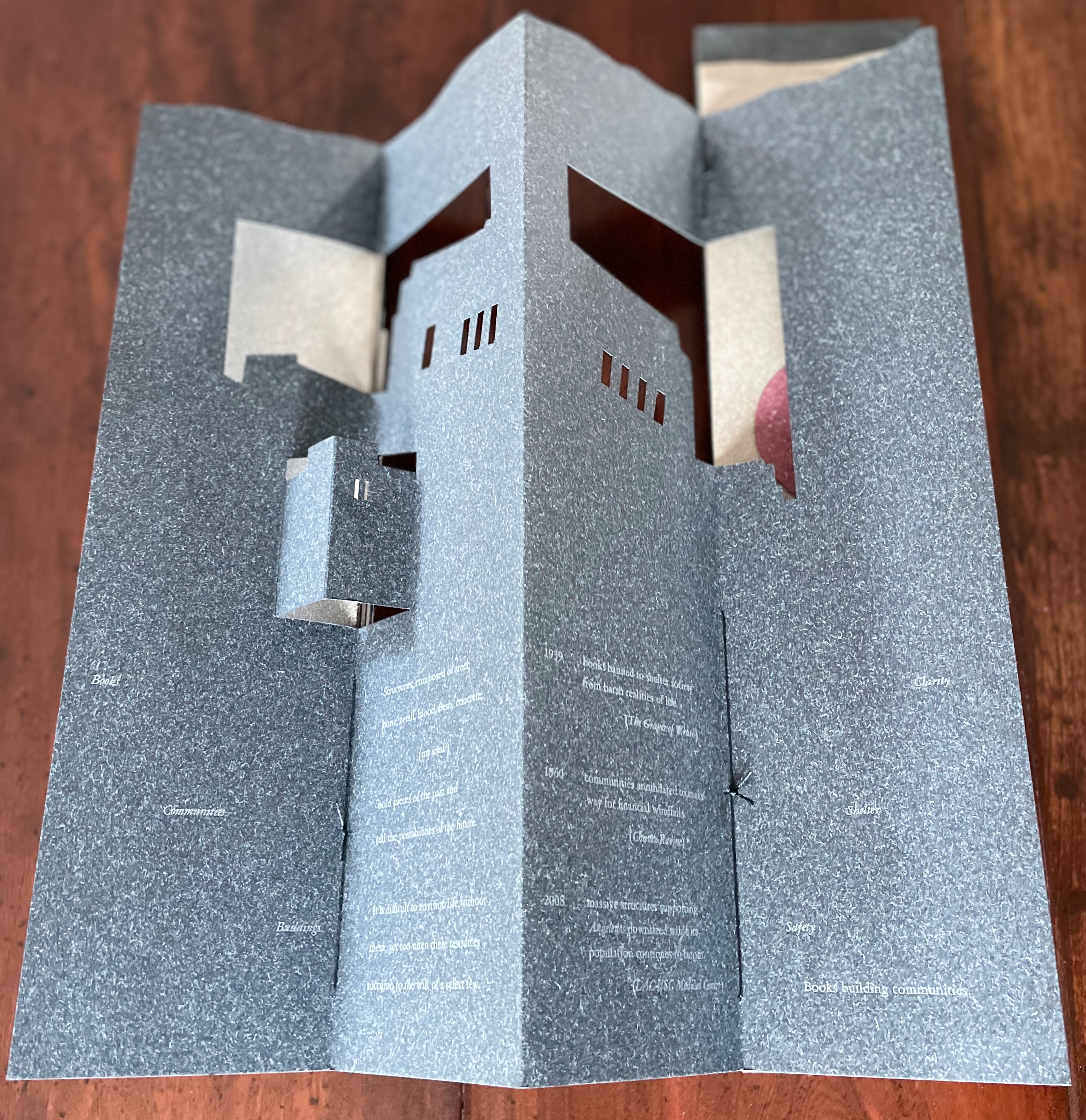
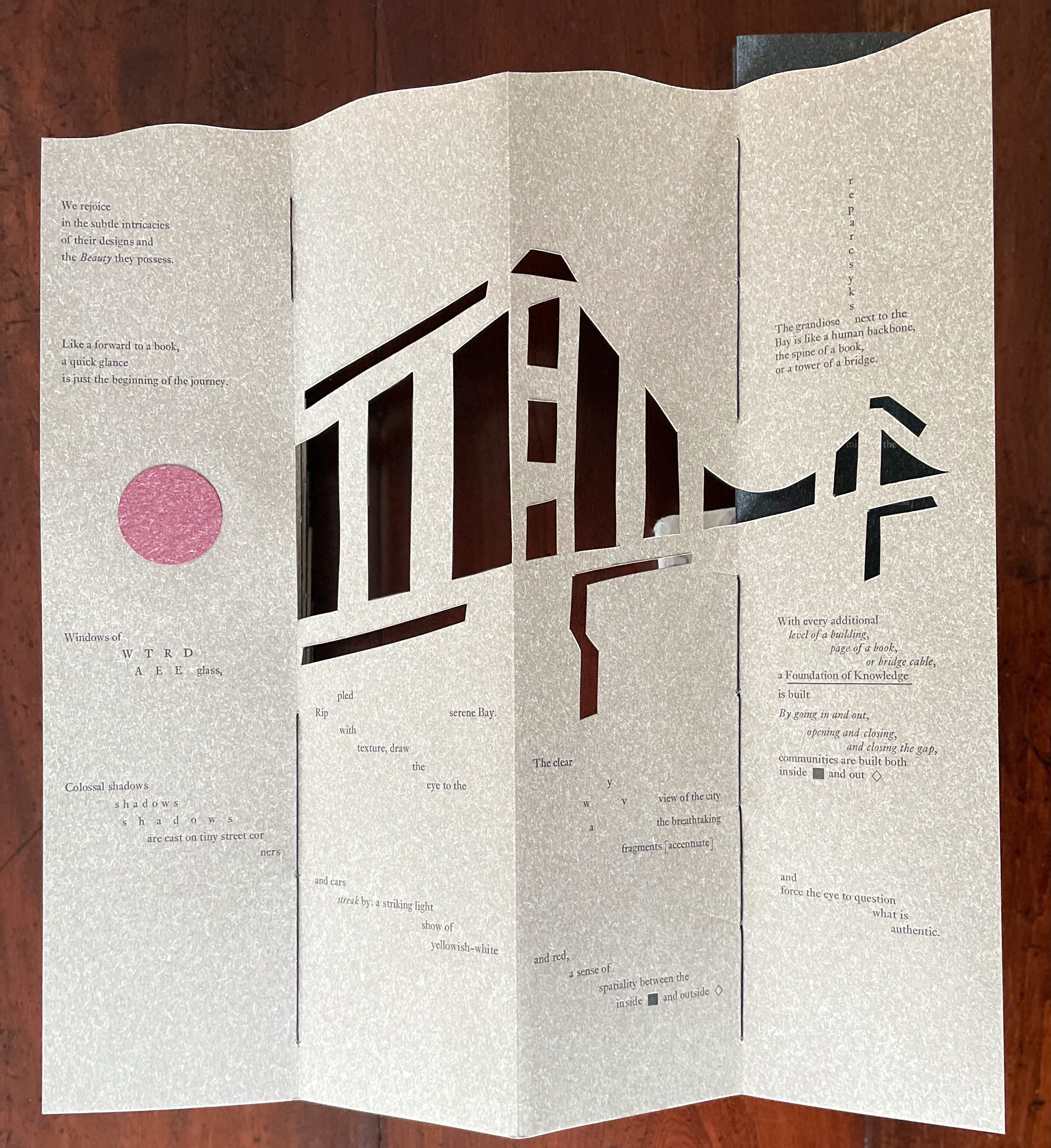
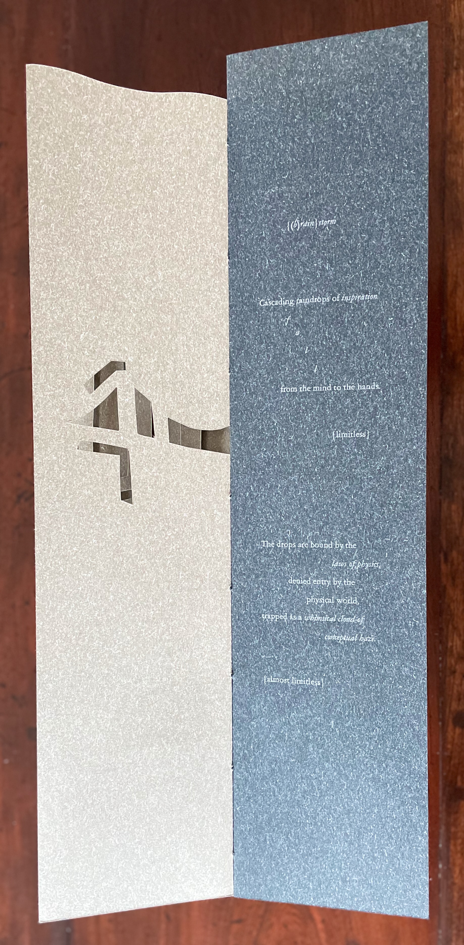
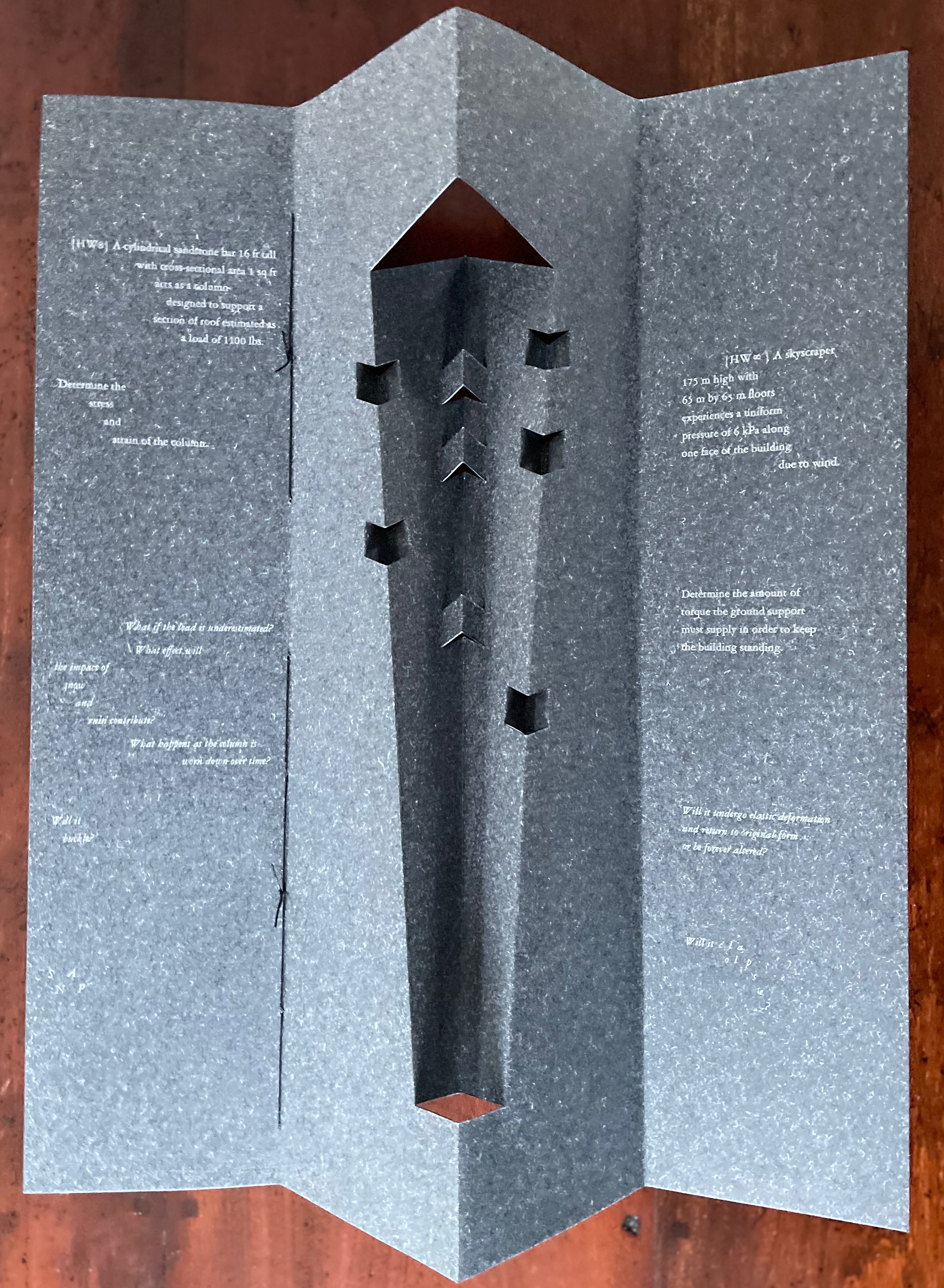
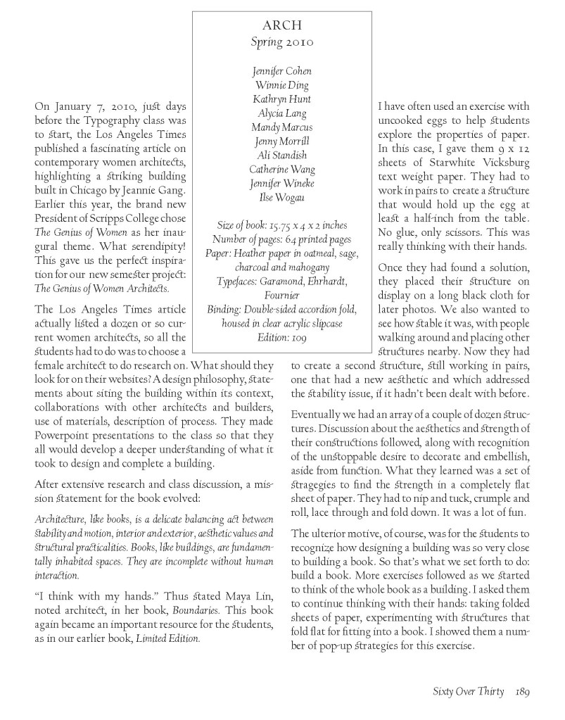
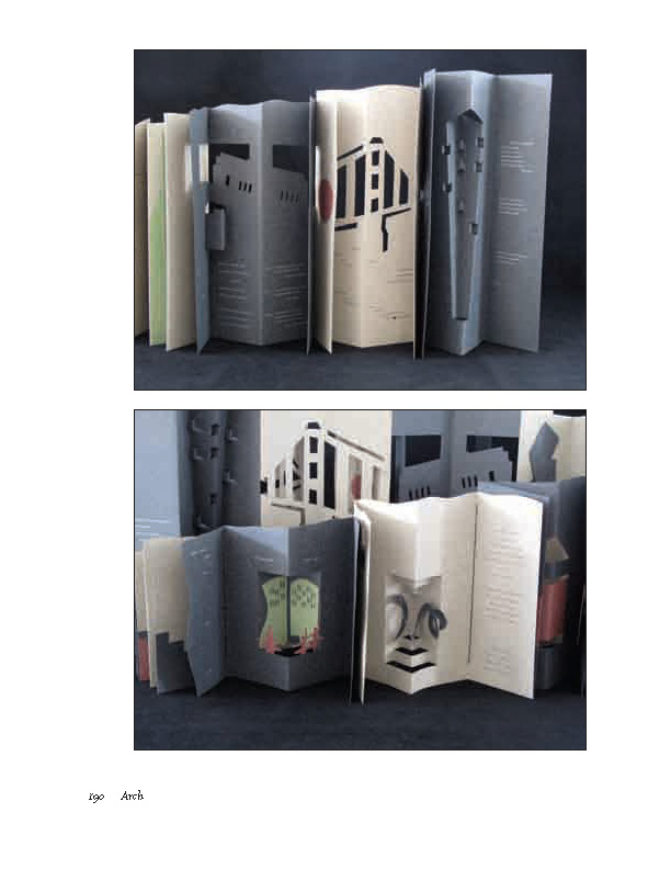
Arch (2010) Kitty Maryatt, Jenny Karin Morrill, Ali Standish, Alycia Lang, Jennifer Wineke, Mandesha Marcus, Catherine Wang, Kathryn Hunt, Ilse Wogau, Jennifer Cohen and Winnie Ding Acrylic slipcase, leporello formed of self-covering booklets sewn together. Slipcase: H410 x W110 x D50. Leporello: H400 x W 90 mm (closed). 64 pages. Unnumbered copy from edition of 109. Acquired from Bromer Booksellers, 7 December 2022. Photos: Books On Books Collection
Nôtre-Dame de Paris (1831), Archdeacon Claude Frollo points to the book in his hand and then to the cathedral and says, “This will kill that”. It is ironic that Hugo’s book (popularly known now by its English title The Hunchback of Nôtre-Dame) was written in large part to save the then-decaying cathedral (post-Revolution, it served as a warehouse), and it succeeded. It is also ironic that, while the fictional character’s metaphor has a point about the book’s permanence of replicability outlasting the building’s permanence of stone, it misses the collaborative foundations of both.
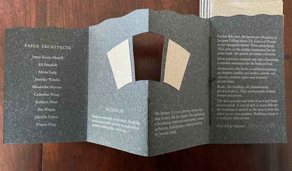
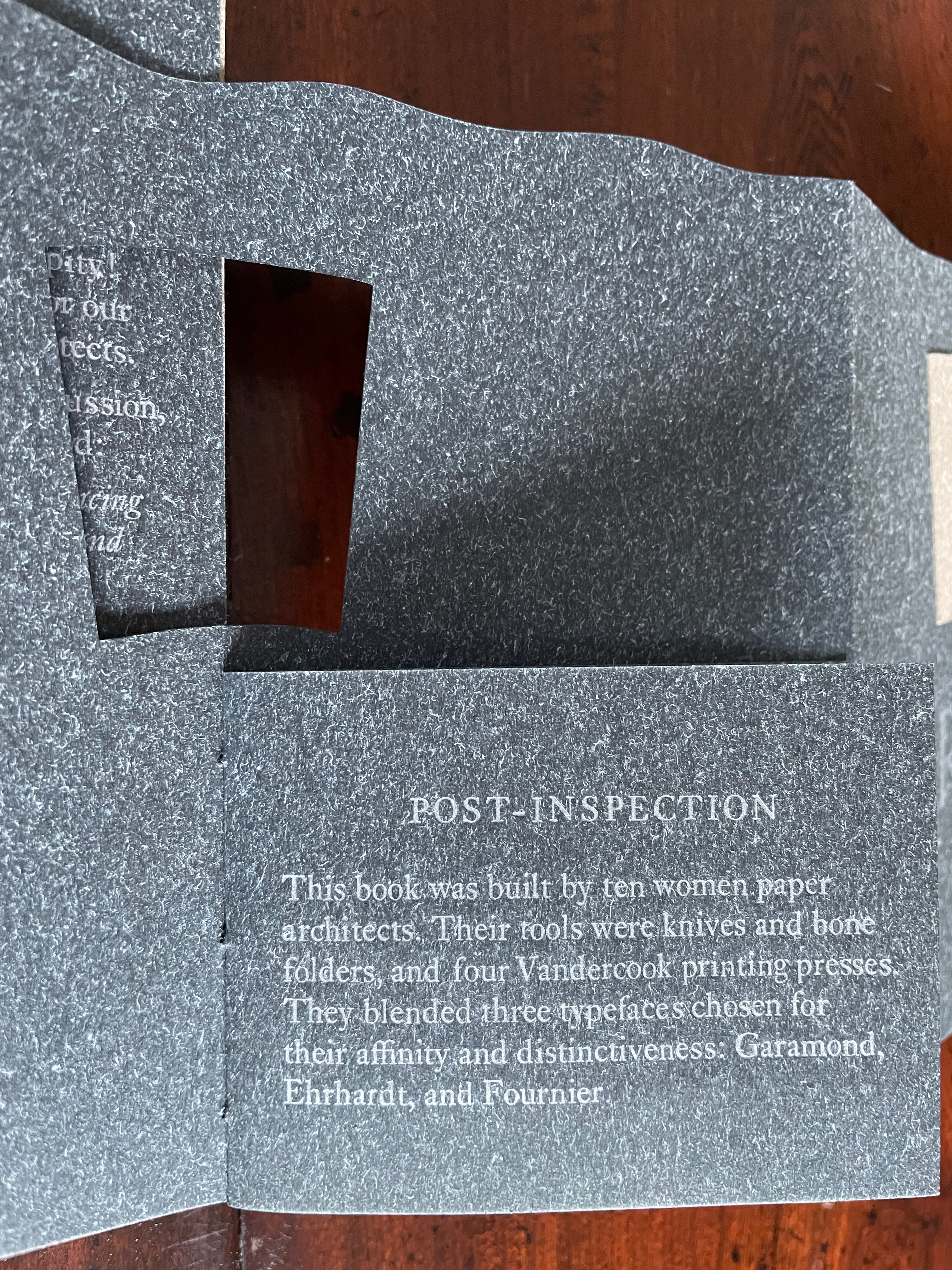
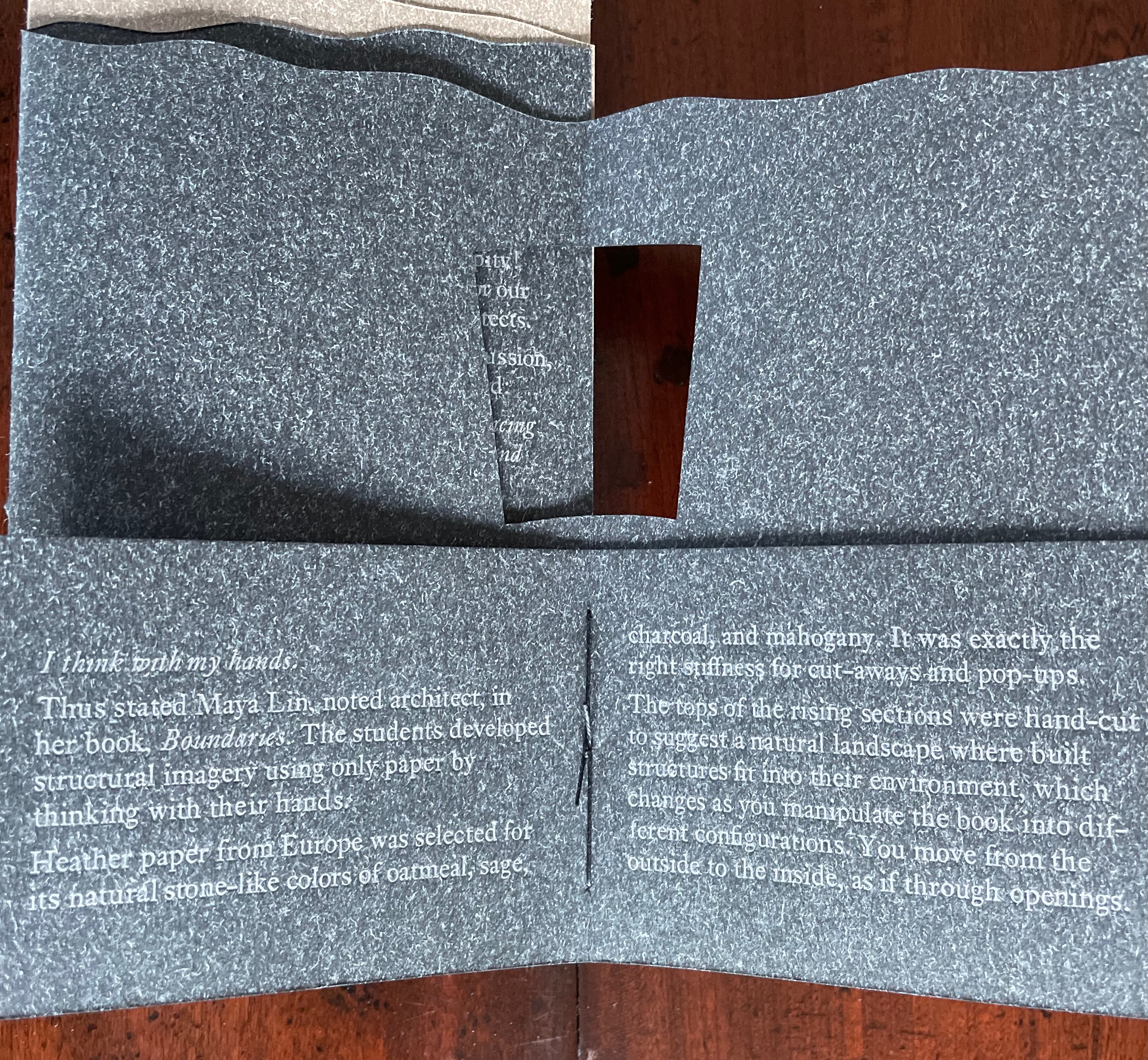
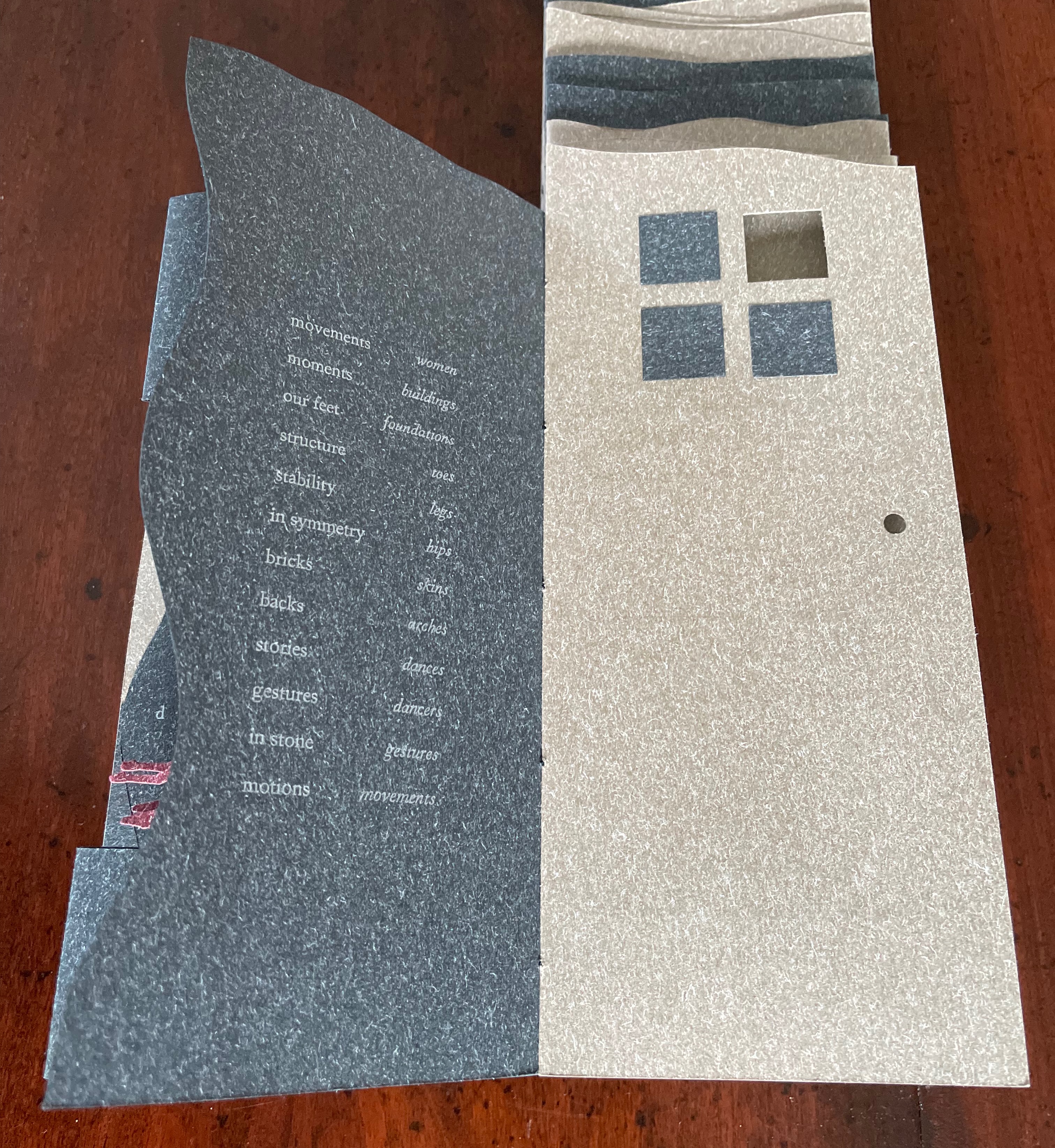
Arch (2010), created by ten students at Scripps College under the direction of Kitty Maryatt, reminds us that the creation of a book — even a work of book art — is a collaborative effort. All the students involved in the design, planning and production were women, a happenstance serendipitously blessed ahead of time by a Los Angeles Times article celebrating women architects. Drawing on that article and Maya Lin’s Boundaries (2000) as well as other research, the students agreed on a mission statement for the work: “Architecture, like books, is a deliberate balancing act between stability and motion, interior and exterior, aesthetic values and practicalities. Books, like buildings, are fundamentally inhabited spaces. They are incomplete without human interaction.”
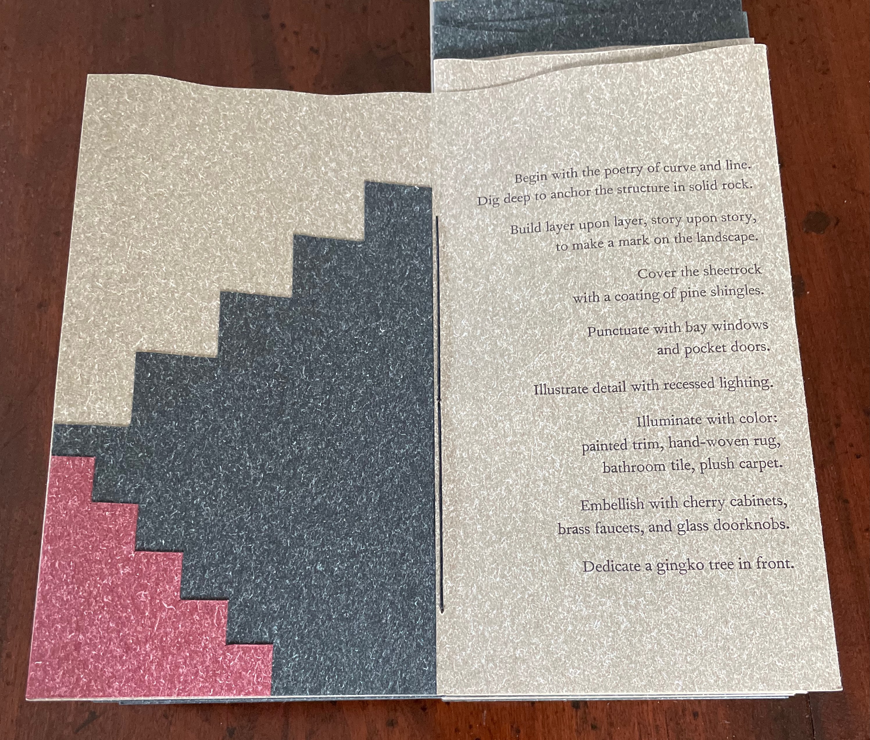
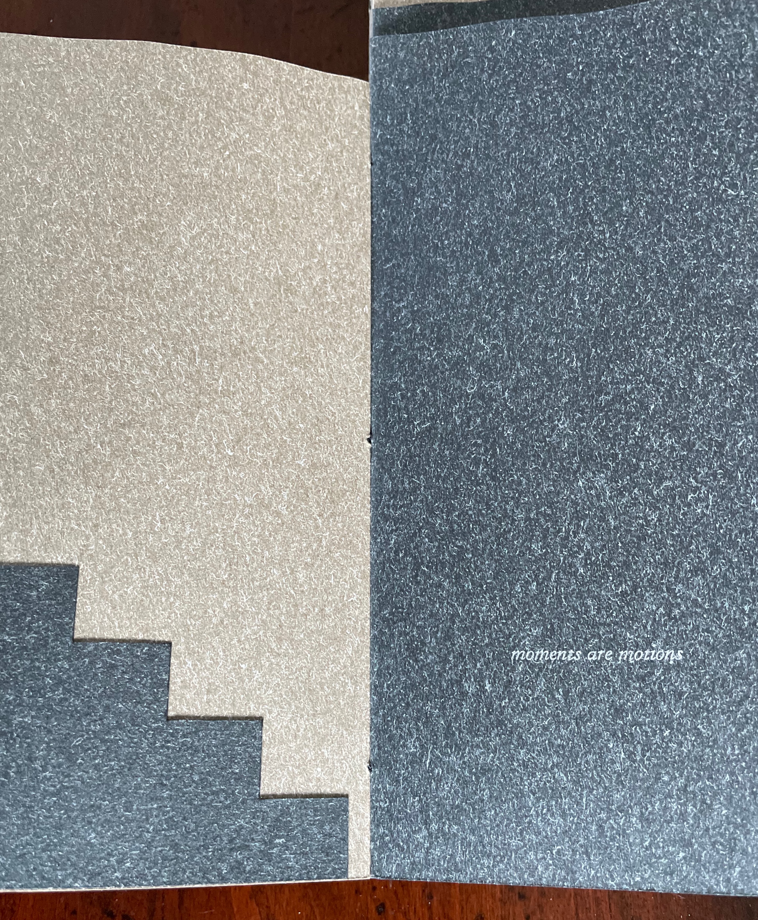
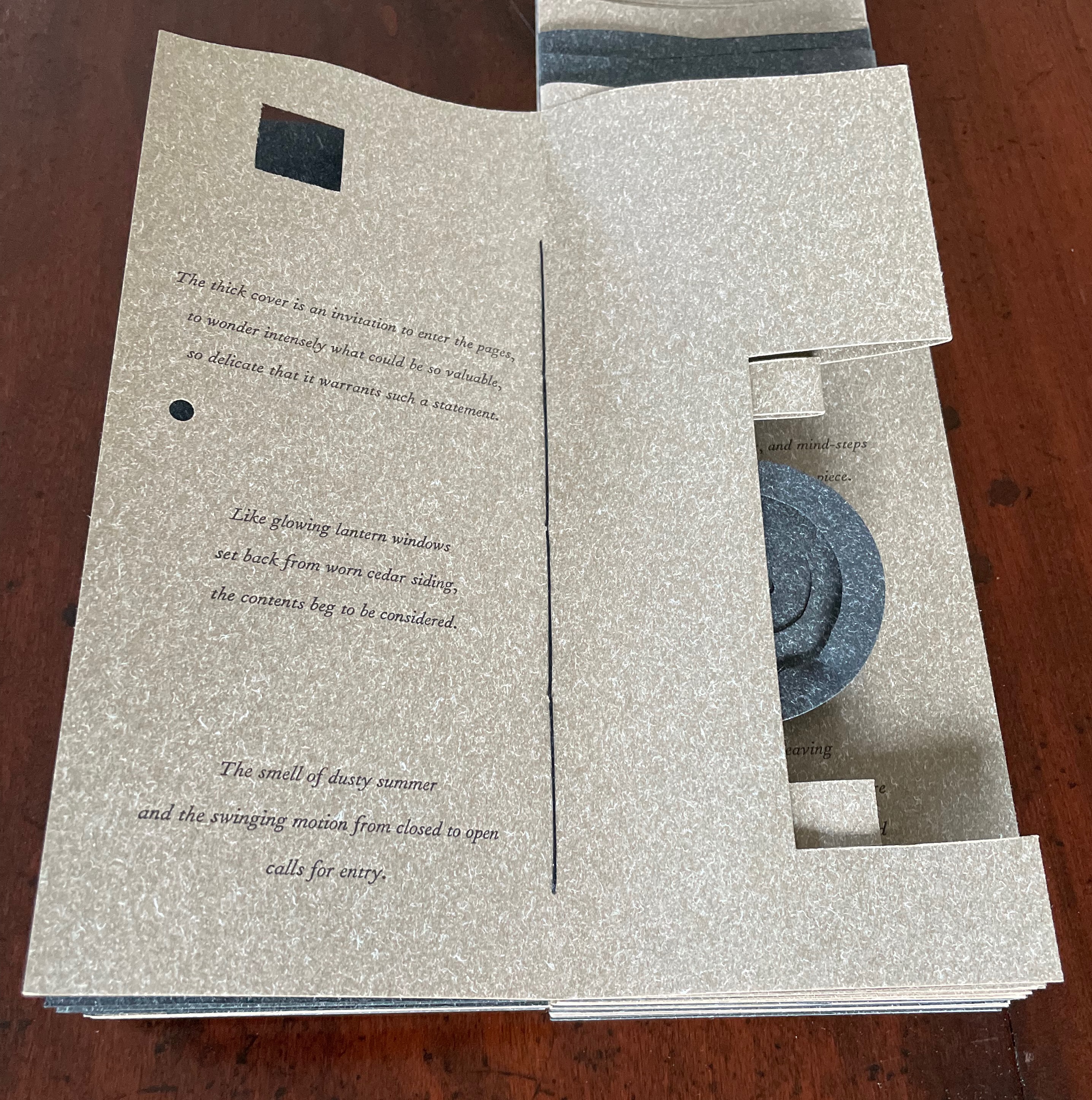
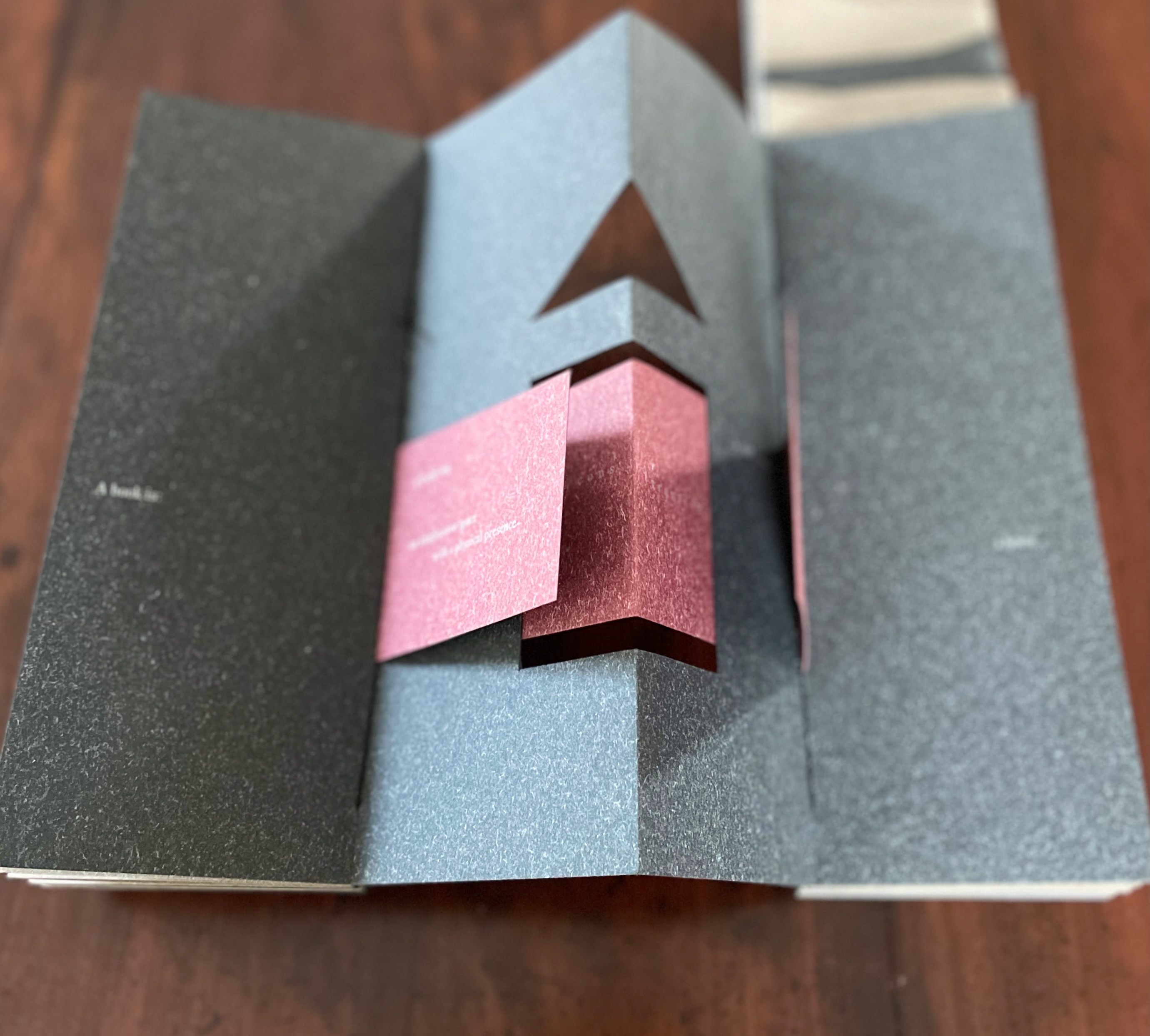
Clever structural use of paper with a stone-like appearance, paired with apt choices of text matched with equally judicious choices in typography, evoke the similarities between books and buildings. Each architect/bookmaker’s contribution is a self-covering booklet in leporello format. Of different heights, the booklets are sewn together to create a tiered tower to be housed in an acrylic slipcase.
The first booklet, open below, incorporates Maryatt’s introduction, entitled “Blueprint”, all of which appears in the work’s entry in the publication Sixty over Thirty: Bibliography of Books Printed Since 1986 at the Scripps College Press (2016). The entry is reproduced in full further below.
The next booklet lists the sources of architectural inspiration, and as the lattice door on the list’s facing page turns, two sets of stairs, cutouts in contrasting colors, ascend on the verso page to the text that begins at the top of the recto page and ends at the foot of descending stairs on the next double-panel spread. Like Maya Lin, Maryatt’s students built their works by learning to think with their hands. The reader, too, has to think with the hands to experience fully this booklet and those that follow. The whole work conjures up the titles of Juhani Pallasmaa’s books — The Thinking Hand and The Embodied Image. Readers of this online entry will have to expand the images below, enjoy the words and imagine their way through with the title of another of his books — The Eyes of the Skin.
Lynn, Greg. 2004. Folding in Architecture Rev. ed. Chichester, West Sussex: Wiley-Academy. See for references to Mario Carpo, Gilles Deleuze and Peter Eisenman.
Macken, Marian. Binding Space: The Book as Spatial Practice (London: Taylor and Francis, 2018). A trained architect and book artist, Macken articulates and illustrates the how and why of the overlap between architecture and book art.
Padberg, Susanne (curator). 7 May – 26 June 2026. “Book. Space. House. Space of Movement“. Exhibition at Galerie Druck & Buch, Vienna, Austria. Accessed 22 May 2026. “The artist’s book as a three-dimensional space: forming a house, outlining, remembering, mimicking—thinking the human being within space. Between object and narrative, books unfold as architectural structures, as inhabitable thought-spaces, as reflections of individual and collective experience. The exhibition brings together artistic positions that expand the book as a spatial body.”
Williams, Elizabeth. 1989. “Architects Books: An Investigation in Binding and Building”, The Guild of Book Workers Journal. 27, 2: 21-31. This essay not only pursues the topic of architecture-inspired book art but turns it on its head. An adjunct professor at the time, Williams set her students the task of reading Ulises Carrión’s The New Art of Making Books (Nicosia: Aegean Editions, 2001) then, after touring a bindery, “to design the studio and dwelling spaces for a hand bookbinder on an urban site in Ann Arbor, Michigan”. But before producing the design, the students were asked “to assemble the pages [of the design brief and project statement] in a way that explored or challenged the concept of binding”. In other words, they had to create bookworks and then, inspired by that, create their building designs. Williams illustrates the essay with photos of the students’ bookworks. [Special thanks to Peter Verheyen for this reference.]
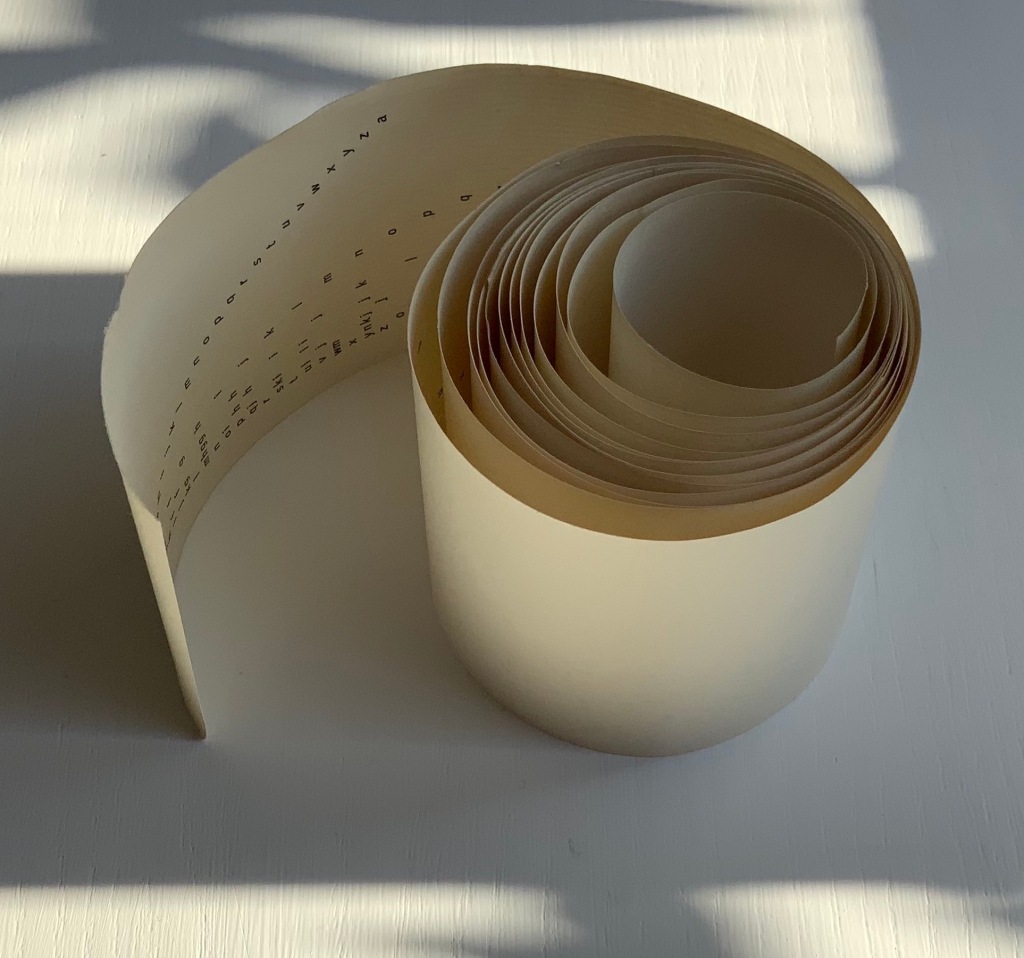
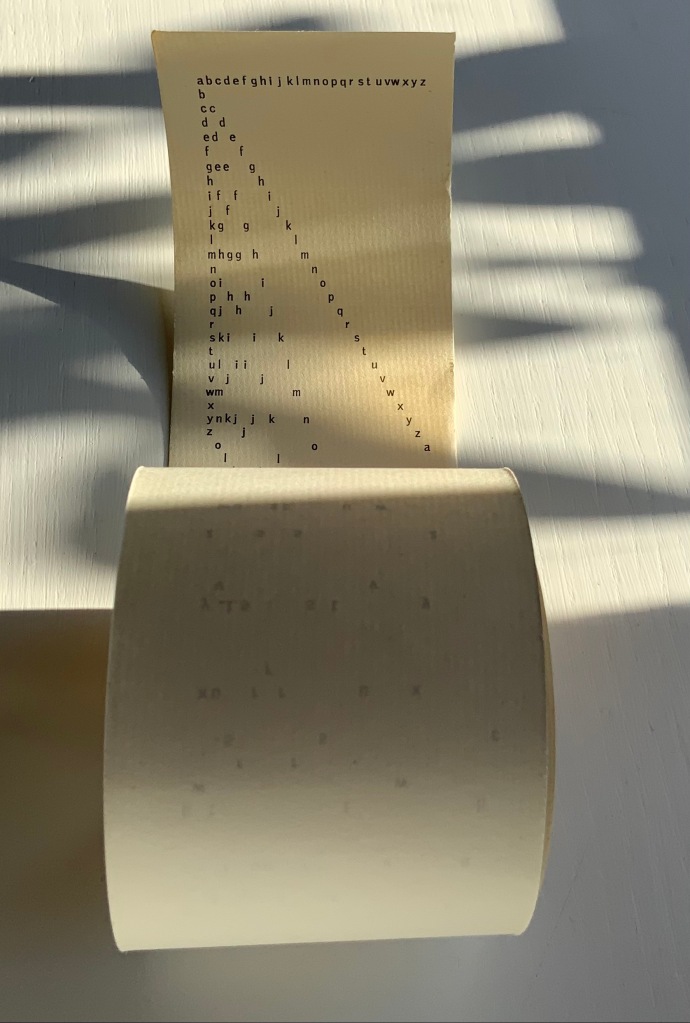
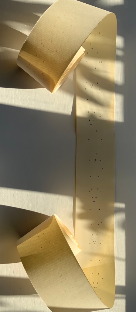
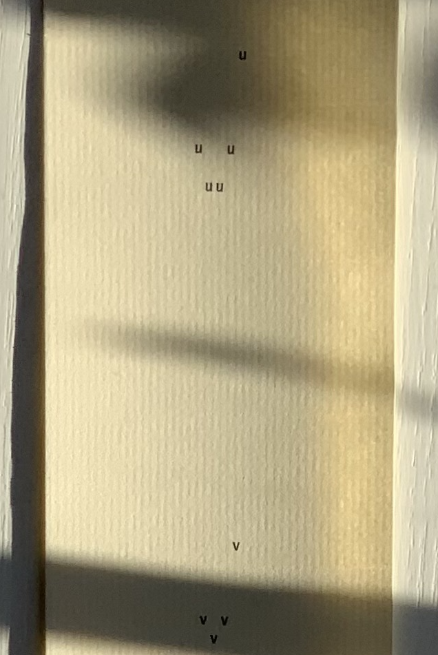
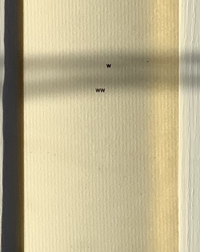
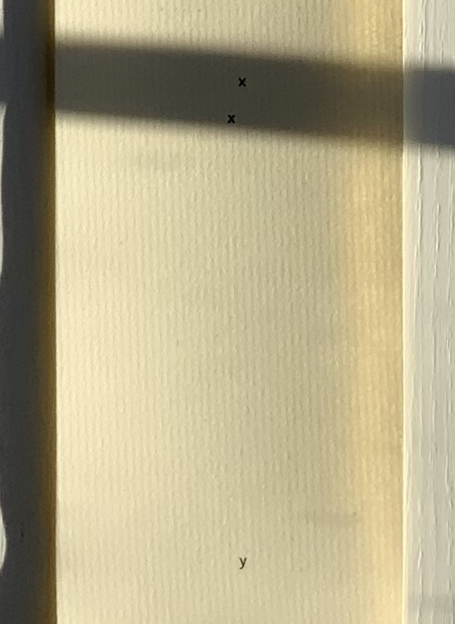
abcdefghijklmnopqrstuvwxyz(“Alphabet Poem”) (1963) Emmett Williams Scroll in three parts printed offset on laid paper. H2228 x W60 mm. Acquired from Ozanne Rare Books, 29 September 2021. Photos: Books On Books Collection. Permission to display from Ann Noël Williams.
More than seven feet in length, this alphabet scroll was originally published around 1961 by Verlag Kalender, the same publisher that published the Kalender Rolle, whose form influenced this work. Intended for performance, the scroll is gradually unfurled and read aloud. The “Alphabet Poem” was sold on its own and as a part of George Maciunas’ Fluxus 1. Other views online can be found in the Galerie Krinzinger archive, New York’s MoMA and Swarthmore College.
Exactly how the “Alphabet Poem” would be performed is unclear. Presumably read left to right line by line? How are the gaps to be handled? Should the reader pause for each letter missing in the gaps? Performance aside, the form and structure entice more of a visual engagement in the way that concrete and conceptual art and poetry most often do. The letters fall according to rule and constraints. The rule is to maintain the alphabetic sequence vertically, horizontally and in a zigzag diagonal. The constraints are the width of the paper roll, the spacing between letters in the top row and the spacing between lines. The visual patterns that result pull the eye away from the alphabetic/spatial rules, and it searches for entirely other pareidolic patterns — faces, constellations, etc. Just the way the eye discovers letters and shapes in everyday surroundings, the clouds, etc. All of which bumfuzzles our hemispherical brains — no doubt the concrete/conceptual intent?
There is no letter z!
Under Further Reading, other artists associated with Fluxus and visual (or concrete) poetry can be found in the Books On Books Collection. Beyond the collection, Hansjörg Mayer’s alphabetenquadrate (1966), in particular, should be compared and contrasted with Williams’ scroll. Like Williams’ scroll, Mayer’s leporello reads left to right and vertically. But where Williams’ alphabet seems to flutter away algorithmically and languidly into blank space at the end of the scroll, Mayer’s alphabet takes on a curving pattern that fills in a grid of 26 x 26 character spaces and finally overprints the completed grid to the point of illegibility.
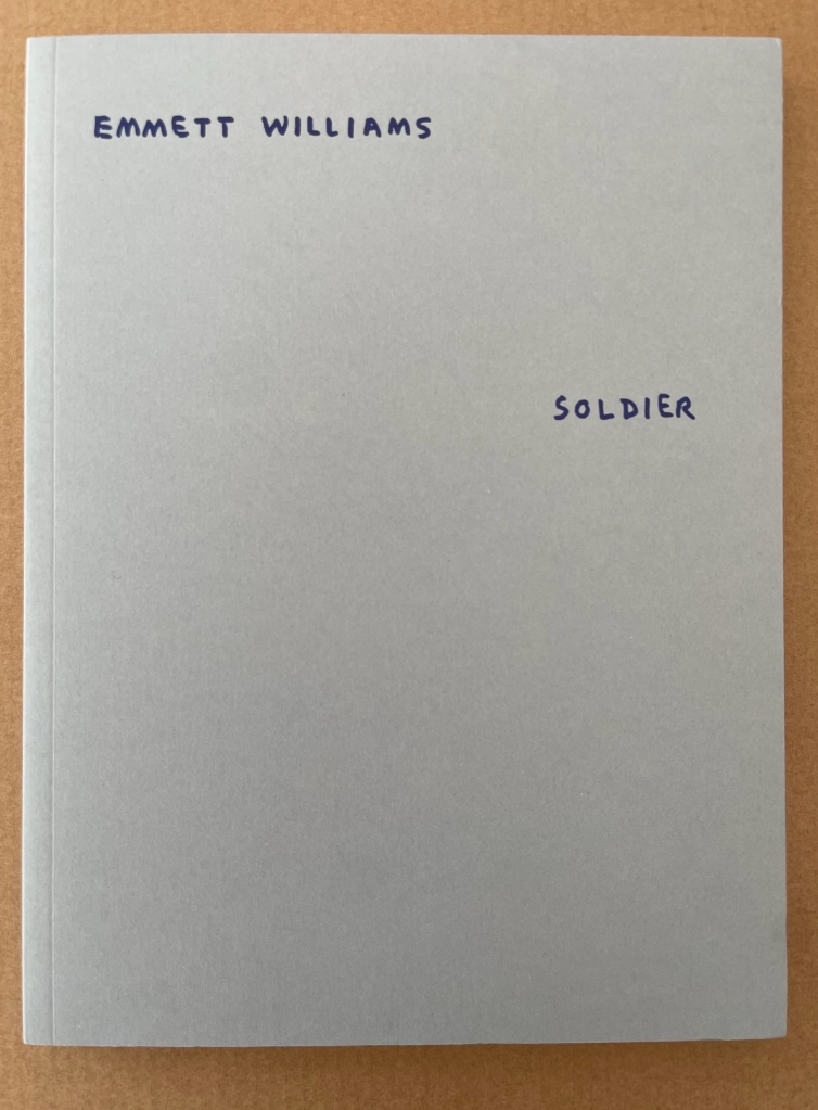
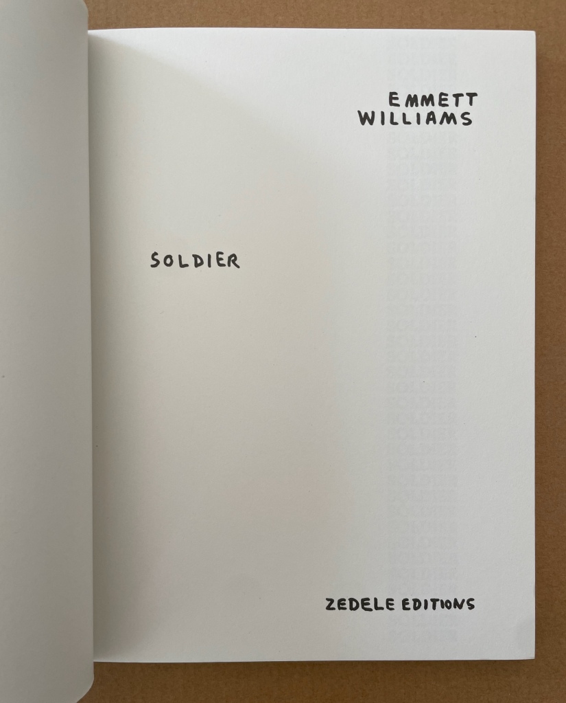
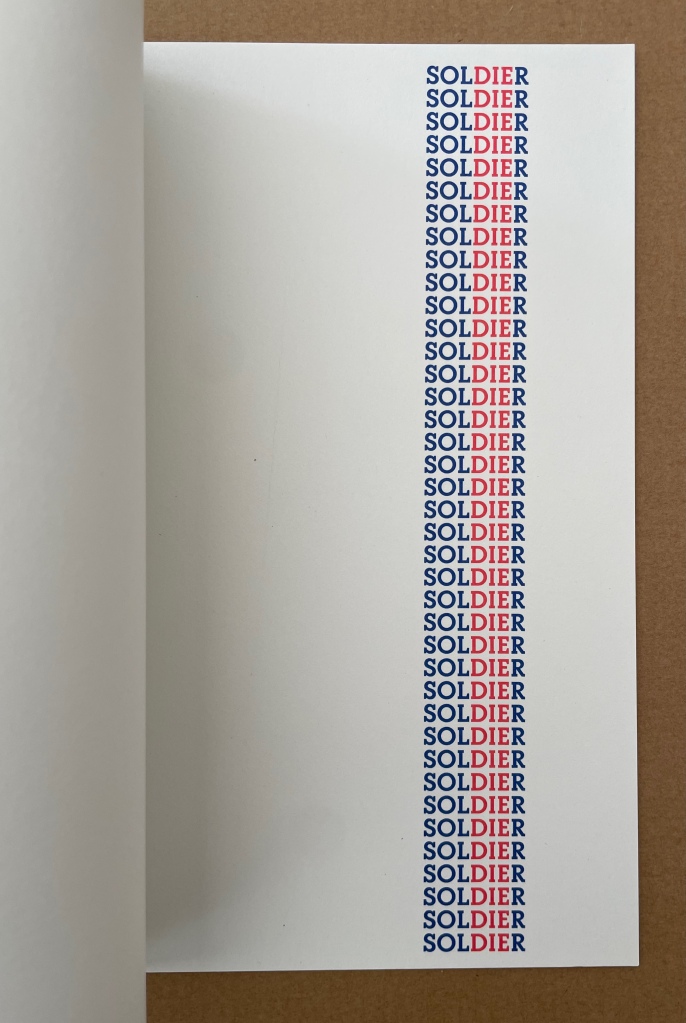
As if there weren’t enough for which to thank Clive Philpott and Moeglin-Delcroix, we have their efforts through Zédélé Editions to reprint early classics of book art, including SOLDIER by Williams, Jan Dibbetts Robin Redbreast ‘s Territory (1969) and hermann de vries’ White (1960/80) among others.
Between 1966 and 1970, Emmett Williams (1925-2007) was the editor, with Dick Higgins, of Something Else Press, which published a large number of books by artists linked with the Fluxus movement. A pioneer from the Fifties of a new form of poetry called “Concrete Poetry”, in reference to Concrete Art, in 1967 Emmett Williams assembled the first collection of works by international poets and artists, An Anthology of Concrete Poetry, simultaneously published by Hansjörg Mayer in Europe and Dick Higgins in the United States. He defined it in his introduction as “direct” poetry, “using the semantic, visual and phonetic elements of language as raw materials”. In contrast with the subjective expression of traditional poetry, this approach sought to use a minimum of resources, focusing on systematic composition processes based on repetition, permutation and mechanical development, governed by a pre-established protocol.
In 1973, again with Hansjörg Mayer and Something Else Press, Emmett Williams published four long autonomous poems, including SOLDIER, composed the previous year at the California Institute of the Arts, and collected in a single volume entitled A Valentine for Noël. The book was dedicated to his young pregnant wife, Ann Noël, whom he had met in 1968 when she was working for a year as Dick Higgins’ assistant, and who, as director of the graphics workshops at CalArts, helped the artist overcome the technical difficulties of changing over from manuscript to printed poems.
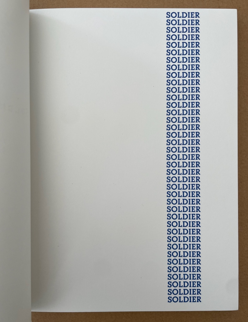
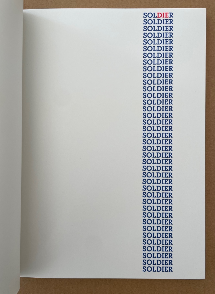
Later, Emmett Williams said: “My first ‘dying’ soldiers poem dates from 1970 during the war in Vietnam.” This first version of SOLDIER is a silkscreen print in red and blue. It is obvious that the later version — a sequence of 40 pages during which the reader sees the three red letters, DIE, gaining one line on each sheet — is visually more striking and politically more effective: by the simplest of means, it makes the inevitable advance of death in the column of soldiers typographically visible. For this re-edition, it also seemed obvious that the publication of the poem in a separate volume restored its implicit function as a flip book. The “playful” aspect present in all Emmett Williams’ works seems to have taken refuge here in the childlike form of these animated books, designed to give the impression of continuous motion. Far from undermining the tragic nature of the subject, the flip book form accentuates the protest against war as a killing machine. A flip book for adults, which remains highly topical. — Publisher’s insert.
Noël Williams, Ann. 2020. Spirale. Berlin: Argobooks. “The design for the artist’s book SPIRALE was developed to accompany the performance of the same name, performed by Ann Noël and Emmett Williams at the Sprachen der Künste festival at the Akademie der Künste on 4 February 1984. The alphabet with names of artists, Berlin squares, song fragments, streets and restaurants was created through Emmett Williams’ and Ann Noël’s habit of making alphabet lists to fall asleep at night. The artist couple prepared their word and name lists for the performance independently of each other and then challenged each other on stage.” — publisher’s description.
John Crombie formed Kickshaws in 1979 in Paris. Joined by Sheila Bourne, they published over 150 works. Apparent as the esoteric influence of visual poetry and the Oulipo movement may be, their works have the combined smell of the printer and typesetter’s workshop and artist’s studio that distinguish them from that crowd.
ABC in a maze (1987)
ABC in a maze (1987) John Crombie Spiral bound on four sides, double gate fold. H95 xW95 mm, 17 leaves. Edition of 300 (150 in English, 150 in French), of which this is Letter of 26 numbered A-Z. Acquired from Librairie Jean-Étienne Huret, 17 March 2022. Photos: Books On Books Collection.
The cover of this work hides its title, just as the proper order of the pages hides in the reiterations of the alphabet across 17 leaves of this double gatefold puzzle and book.
The French title ABC Dédale carries more freight than the English. Not only does it convey the idea of the maze by reference to its inventor Daedulus, it refers to Cadmus, the Phoenician prince who brought the alphabet to Greece while on his quest to find his sister Europa, mother by Zeus to the Minotaur — the “monster in the alphabet”. If that seems a far-fetched allusion, then consider the additional hint in the name of the chosen typeface: Hélios, the Greek god and personification of the sun, to which Daedulus’ son Icarus flew too close in their escape from Crete.
Portrait évolutif du typographe “Evolving portrait of the typographer” (1988)
If a selection of works from the Books On Books Collection were made based on the theme of “artists’ books and color”, this small work would have to make the cut. Moving from five small splashes of color in the first pass, subsequent passes build up a multi-colored cartoon image of the typographer in a head-on eyeless gaze. At the seventh pass, however, the colors begin to fade; in the ninth, the features of the portrait begin to erode, and by the twelfth, only streaks of gray and the faintest impression of the outline remain.
A close look at the title reveals that same faint impression of the portrait’s outline. Were it not for its reference to the three primary colors, the title would have to be amended to a baker’s dozen of passes in collaboration with the press.