This is the rare first edition as published by the late Jan Middendorp through his Druk Editions. It bears all the hallmarks of his eye for design — the black coated wired binding, the heavy embossed card cover, the use of color to underscore the text’s theme, the embedded booklet — all nevertheless centering and providing a platform for the art and design of Clotilde Olyff.
Co-founder of The Alembic Press with David Bolton, Claire Bolton is an independent historian of printing and type as well as an aficionado of handmade paper. She recently donated works in shifu (a spun and woven paper textile) to the Bodleian. Although she disclaims classification as a book artist, her works in the Books On Books Collection — especially her collaboration with Molly Coy called Handscapes (2016) — argue with her persuasively.
A Little Black Book (1995)
A Little Black Book(1995) Claire Bolton Miniature, exposed-spine, stab-bound with red cotton thread to hard boards. H73 x W60 mm. 64 pages. Edition of 100, of which this is #4. Acquired from Oak Knoll Books, 11 October 2023. Photos: Books On Books Collection. Displayed with artist’s permission.
Richard J. Hoffman (1912-1989) was a fine press printer and taught print and design at California State University, Los Angeles. His interests in typography, miniature books and the alphabet are represented by two works in the Books On Books Collection: “Don’t Nobody Care about Zeds” (1987) and Otto Ege’s The Story of the Alphabet (1988).
Both books scratch the collection’s “alphabet itch”. The first provides the added satisfaction of complementing the children’s books that champion the alphabet’s last letter: Jon Agee’s Z Goes Home (2006), Alethea Kontis & Bob Kolar’s AlphaOops: The Day Z Went First (2012), Sean Lamb & Mike Perry’s Z Goes First (2018) and Lou Kuenzler & Julia Woolf’s Not Yet Zebra! . The second adds an alphabet history to the miniature abecedaries as well as a more than usually intricate design.
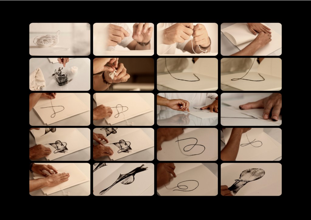
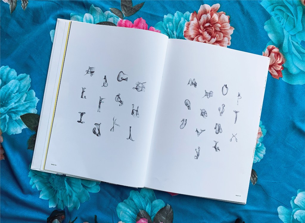
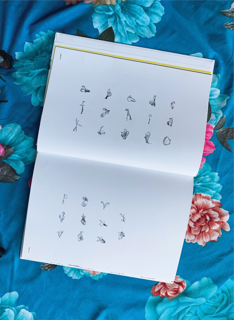
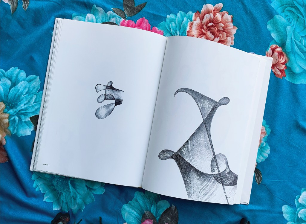
The Voice of the Yarn (2022) Pramod Chavan Casebound, glued, illustrated paper over boards, plain doublures. H325 x W235 mm. 66 pages. Acquired from the Artist, 20 May 2023. Photos: Courtesy of the artist.
The technique of painting or printing by pulling a soaked string from a folded sheet of paper will be familiar to Western kindergarten and elementary school teachers. In India, the technique has been raised to an art form. The tradition of painting with rope, string or thread had its champion in the late B.K.S. Varma. Joining that tradition to the tradition of alphabet-inspired art is a new champion: Pramod Chavan.
Chavan calls his art “thread typography”. These process photos showing his manipulation of inked thread between folds of paper suggest that “thread calligraphy” might be just as apt. Whichever term, the results achieved — without direct sight of ink, tool and surface — are astonishing. It evokes the Punch cartoon of the kingfisher sitting on a branch and calculating in its speech bubble Snell’s law for entering the water to catch the fish swimming below the surface. Pramod Chavan must have a similar speech bubble filled with calculations for Bézier curves.
Between A and Z, The Voice of the Yarn lays out both the upper- and lower-case letters individually and the alphabet entire on double-page spreads like that above and below. The role of the fold in this technique is echoed in similar but very different ways by Jim Clinefelter’s A Rohrshach Alphabet (1999) and Étienne Pressager’s Mis-en-pli (2016).
The choice of background for photographing the double-page spreads makes a nod and smile to the usual floral images that arise when the technique is introduced for school — or after-school — art projects. Chavan’s thread typography springs from simple elements and opens into complex images — very much in the spirit of the alphabet itself.
“Carol DuBosch“. 25 February 2023. Books On Books Collection. If DuBosch recapitulates her Alphabet of Calligraphic Tricks (2014), perhaps she can persuade Chavan to contribute an ampersand!
ABC of Typography (2019) David Rault Casebound, sewn, illustrated paper-over-boards cover, endbands, sewn, red doublures. H265 x W195 mm. 128 pages. London: Self Made Hero [Translated from French (Gallimard, 2018)]. Acquired from The Saint Bookstore, 29 June 2023. Photos: Books On Books Collection.
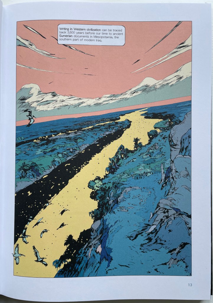
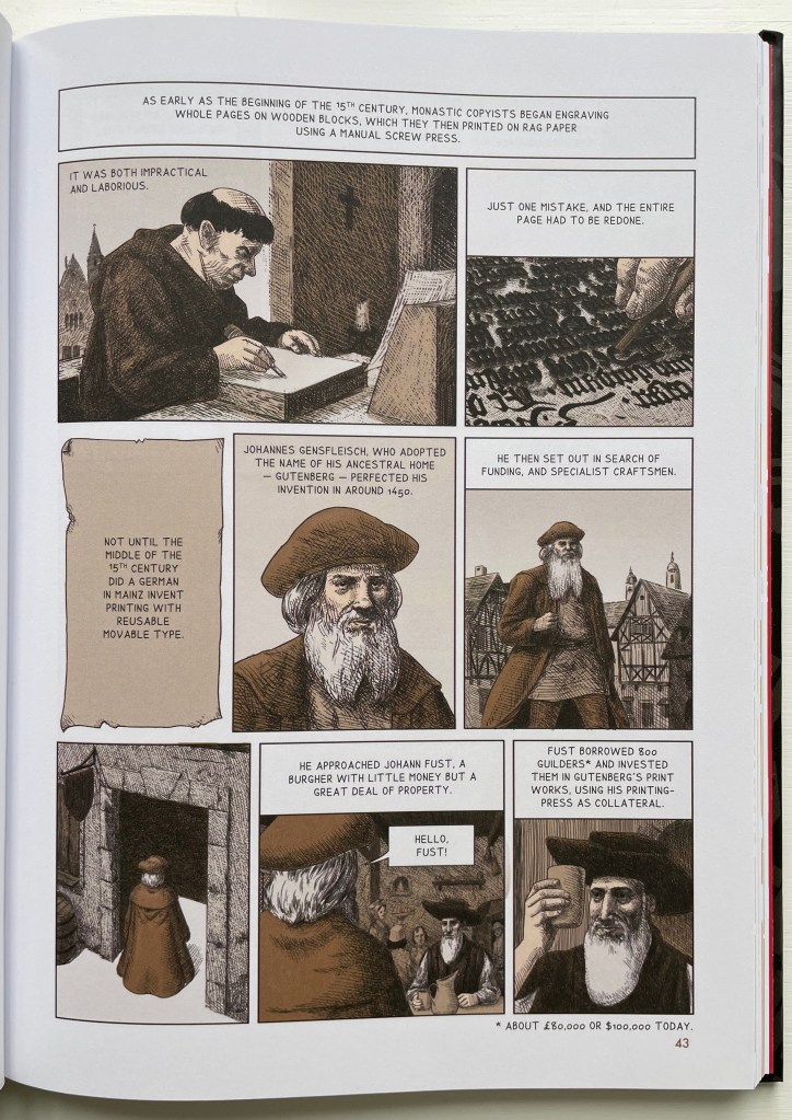
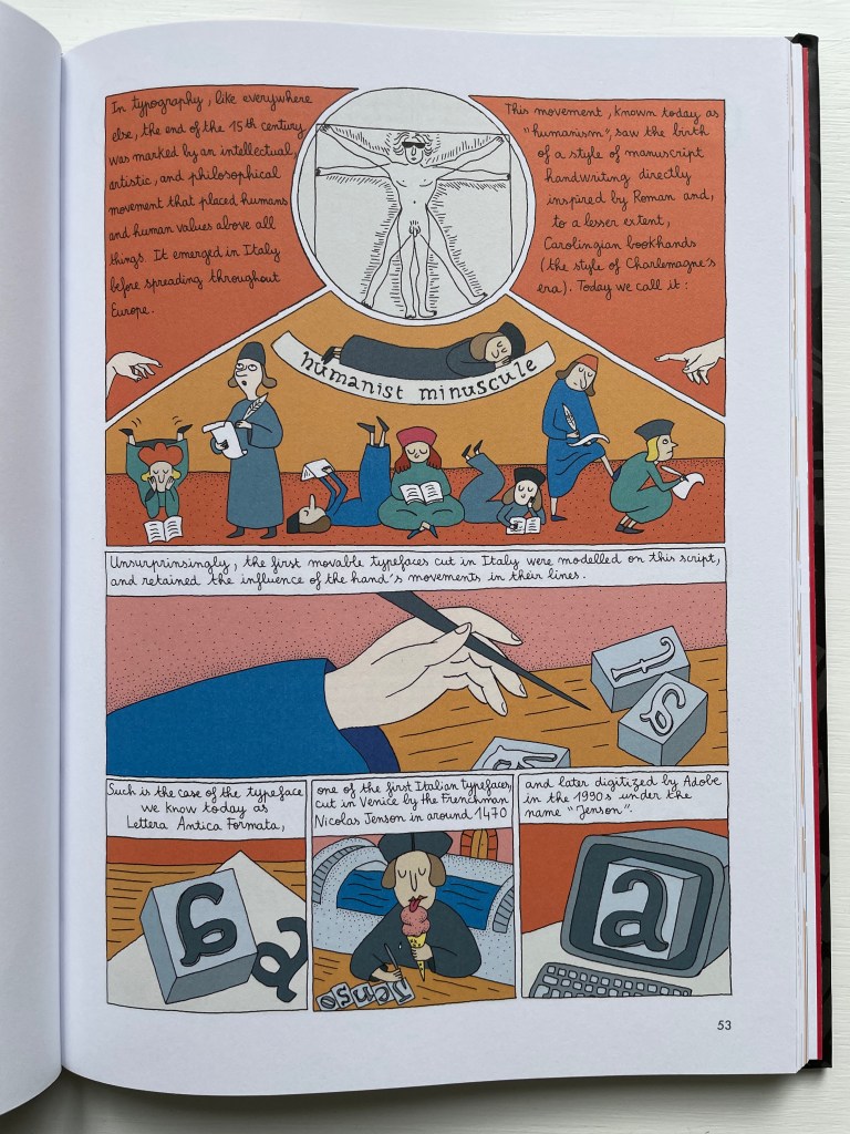
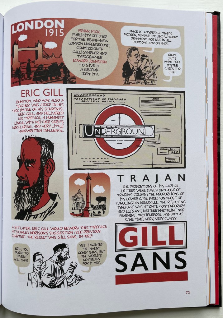
David Rault’s ABC of Typography traces 3,500 years of letters and type from pictographs and cuneiform through Roman lettering and Gutenberg to the Bauhaus and beyond. For the Books On Books Collection, it enriches the focus on the alphabet, typography and artists’ books — in particular, that subset of illustrated histories of the alphabet and type. These include Tommy Thompson’s The ABC of Our Alphabet (1952), William Dugan’s How Our Alphabet Grew (1972), Tiphaine Samoyault’s Alphabetical Order (1998), James Rumford’s There’s a Monster in the Alphabet (2002), Ada Yardeni’s A-dventure-Z’ (2003), Don Robb and Ann Smith’s Ox, House, Stick (2007) and Renzo Rossi’s The Revolution of the Alphabet (2009).
While enhancing that subset of illustrated reference works, ABC of Typography also highlights a gap in the collection. Rault and his team of invited artists hail from the Franco-Belgian tradition of lesbandes dessinées (BDs), which the French and Belgians call laNeuvième Art (“the Ninth Art”). English-language readers will likely be familiar with BDs from seeing Hergé’s Tintin or René Goscinny’s Asterix. Other than Chiavelli’s Arthur R./Un Coup de DÉS Jamais N’Abolira le HASARD (1988) and its two companion volumes, the collection has no BDs. The Rault volume does, however, deliver a mini-survey of styles among contemporary bandes dessinateurs with its assignment of chapters to eleven different artists.
The book’s overall design by Jean-Christophe Menu simultaneously embraces and sets off the individual styles of drawing and lettering. Menu’s consistent use of a slab serif font (Lubalin Graph Std?) for chapter titles alongside oversized chapter numbers that bleed off the facing page signals his intent and success.
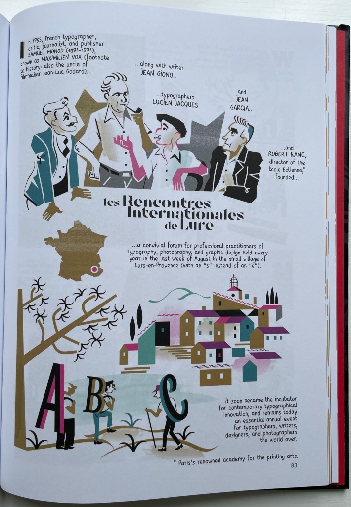
The variety of “strip” layouts pushes the boundaries of unity. Some, like Libon’s and Clérisse’s, float on the page. Others, like Singeon’s and Simon’s, are ruled off. Within the strip layouts, panels vary in shape, and the images within them tilt at different angles, all creating as much of a sense of movement as any action comic. Even where a strip is ruled off, sketches sometimes encroach across panels as well as the book’s margins or gutter to give depth and perspective as well as movement. as happens with the gulls in flight below from Aseyn’s chapter.
Note how the gulls in flight in Aseyn’s chapter appear within panels but also cross them and the gutter.
Evident from Clérisse’s recounting of “Les Rencontres internationale de Lure” (an influential annual forum in Provence), Simon’s homage to the typologist Maximilien Vox (one of the forum’s founders) and Ayroles’ positioning of the typeface DIN, the volume’s European roots are never far from the surface, which also makes ABC of Typography a useful and necessary addition to this collection or any shelf of Anglo-centric works about the alphabet, type or design. It’s interesting that, while the French have categorized BDs as the ninth among the ten officially designated arts, typography and design do not yet rate a category. Neither does the livre d’artiste for that matter, which raises a question:
Between the traditional BD and livres d’artistes by graphic artists, is there fertile ground for artists’ books that blend subject, material, form and metaphor into innovative works of book art? The above-mentioned BD by Chiavelli, paying homage to Mallarmé’s Un Coup de Dés, represents one end of that spectrum. Hervé di Rosa, part of the Figuration libre movement, associated with Keith Haring and graffiti artists, can provide the other end of the spectrum with his Un Coup de Dés jamais n’abolira le Hasard (2021), published by Virgile Legrand. For the work of book art between them, Nanette Wylde’s Babar Redacted: ABC Free (2020) might be a case in point. Likewise, Catherine Labio’s curated exhibition in 2013 — “From Bande Dessinée to Artist’s Book” — finds earlier exemplars in the works of Lars Arrhenius, Felicia Rice, Omar Olivera and Mamiko Ikeda.
Babar Redacted: ABC Free (2020) Nanette Wylde Based on an altered copy of the board book B is for Babar: An alphabet book by Laurent de Brunhoff. French link exposed spine on tapes. 9″ x 9″ x .5″ closed. Edition of 3. Photos: Courtesy of the artist.
“Richard Niessen“. 23 April 2021. Books On Books Collection.
Library of Congress. “Bande Dessinée: Comics & Graphic Novels“, in “Reading in French: A Student’s Guide to Francophone Literature & Language Learning”. Library of Congress Research Guides. Accessed 11 August 2023.
Affen und Alphabete [“Apes and Alphabets“] (1962) Helmut Andreas Paul (HAP) Grieshaber Slipcased, self-covered leporello with eighteen original woodcuts of stylized apes and sixteen typographical experiments. H450 x W335 mm. 36 unnumbered sheets. Edition of 300, of which this is #68. Acquired from Winterberg-Kunst, 22 October 2022. Photos: Books On Books Collection.
HAP Grieshaber was one of the foremost German woodcut artists of the post-WWII era. His devotion to the woodcut technique was almost matched by that to the medium of the book, which he used in several formats and sizes for series works. Apes and Alphabets is one of the larger of those series and representative of his undeviating Expressionist style and blurring of borders between letter and image, the civilized and uncivilized, the artificial and the natural. This slipcased accordion book comprises 18 original woodcuts, two of which appear on the cover (one again on the wooden slipcase).
A full page of ranks of blackletter characters echoes a full page of columns and rows of apes with musical instruments. In visual cacophony, the letters make wordless strings just as the apes make soundless music.
Only one of the book’s panels has a touch of color, but the garish orange of the slipcase and book cover shows Grieshaber’s characteristic handling of this element — printing over an undercoat that serves as background. Even when working with a single color in these prints, Grieshaber earns his description as Der Holzschneider als Maler (“the woodcutter as a painter”), to which could be added “collagist”. Although influenced by Paul Klee and Lyonel Feininger, the physical intensity of the prints, this book and the others below sets Grieshaber apart.
His use of heavy wove paper in this work and other monumental ones like Die Rauhe Alb (1968) is equally of a part with a drive toward the tactile and a reaction to the alleviation of wartime paper shortages, which comes up later in Herzauge (1969) below.
Poesia Typographica (1962)
Poesia Typographica (1962) Helmut Andreas Paul (HAP) Grieshaber Paperback, perfect bound Chinese-fold folios, black endpapers. H215 x W155 mm. 28 unnumbered pages. Edition of 1000. Acquired from Print Arkive, 22 October 2022. Photos: Books On Books Collection. Displayed with permission of the publisher Galerie der Spiegel.
The alphabet theme of Affen und Alphabete carries over in the hornbook images on the front and back covers of Poesia Typographica. More than most typographic or concrete poetry, Poesia Typographica addresses the materiality of letters, images, ink, paper and printing — even going so far as to exalt it over the alphabet.
This is particularly clear in Grieshaber’s use of white ink on a transparent sheet to record the tale of missionary Baedeker and his Analphabeten Bibel (“Illiterates’ Bible”). To the Russian peasantry to whom Baedeker distributed thousands of the booklet, he claimed that its eight pages contained “the whole Bible, the pure teaching of our Jesus Christ”. The typeset transparent sheet sits between what would otherwise be a double-page spread of solid black. That spread is followed by one of red, one of white and then one of gold.
The transparent page explains :
the peasants saw in the black of the first page the darkness of their sinful hearts, their great guilt.
in the red of the next page, they united with the divine blood of christ. they walked out the suffering steps of our lord. washed clean in the blood of his love, they won innocence:
the pasture linen of the third page, that is the purity that must be in the heart.
ready to enter into the mystery, to look into the sunshine of God’s face. to fall down in prayer, the sound of the golden trumpets of heavenly bliss in their ears.
A literate reader may smile at the missionary’s metaphorical hoodwinking of the serfs, but the longer the reader moves the transparent page back and forth, registers its interloping nature, and recognizes that “analphabet” doesn’t just mean “an illiterate” but also one who does not know letters at all, the more the materiality of the stiff black, red, white and gold pages makes itself felt and the more the viewer realizes that Grieshaber is laying down a challenge to look beyond the alphabet to the ink, paper and the printing.
Just as in Affen und Alphabete, the reader/viewer must look at letters beyond “shapes for sounds”. Letters may have their roots in the pictorial, but Grieshaber isn’t taking their “shapeness” back to pre-Gutenberg or pre-alphabet pictoriality. He takes it into an expressive post-Gutenberg, post-alphabet visual and material art.
Herzauge (1969)
Herzauge (1969) Helmut Andreas Paul (HAP) Grieshaber Board book casebound in bookcloth, with illustrated dustjacket. H294 x W240 mm. 16 unnumbered pages with 9 color plates. Edition of 800? Acquired from K.G. Kuhn Antiquariat, 14 July 2023. Photos: Books On Books Collection. Displayed with permission of artist’s family.
Hat das Herz noch ein Auge? (“Can the heart still see?”), Grieshaber asks on the last page of this artist’s book for children published by Parabel Verlag in Munich. It’s a disturbing afterword. It changes what you think these Expressionist woodcuts and the words beside them express. Grieshaber explains that, by 1937, paper for printing was scarce. From a generous doctor, he obtained filtration paper on which to print his landscape woodcuts Die Rauhe Alb, his visual ode to the Swabian Alps. Children brought him the sheets of glossy paper on which the original 20 copies of Herzauge were printed and over-drawn with a dry brush. No one wanted Die Rauhe Alb at the time, and all but one copy of Herzauge were lost. His summary phrase — Märchen in dunkler Zeit (“Fairy tales in dark times”) — offers a way into the board book and perhaps an answer to the question “Can the heart still see?”
Second double-page spread. “Ach Alm, a knight once moaned. Achalm, I live in your lap.”
Achalm is a mountain in Reutlingen, Germany. On its top are the ruins of Achalm Castle, ancestral seat of the counts of Achalm, a 13th-century Swabian noble family. The legend is that the name comes from Count Egino’s dying words to his brother. He meant to say “Ach Allmächtiger!” ( “O Almighty!”) but only uttered “Ach Allm…“, and to honor Egino, the brother named the mountain and castle Achalm. It’s a clever poem and clever woodcut. The last word Schoß — meaning bosom, arms, heart or lap — is close to the word Schloß — meaning castle. Turning the castle into a fairy tale crown, the woodcut also gives the mountain a feminine visage, a sweep of white that looks like an embracing arm and a village nestled in its lap.
This spread comes after the first in which a black woebegone bird in a brush-streaked patch of snow occupies the foreground alongside the lines “Winter is a hard man. The tree freezes.” And it precedes the third in which the viewer’s perspective must be that of standing on a dock and looking out on a harbor alongside text that reads, “Do you hear the horn hooting in the harbor? We are leaving.” Achalm is the fairy tale bookended by dark cold before and forlorness after.
The fourth spread’s text — Wer streicht am Abend allein über de Berge? Die Katze weißes.(“Who is painting alone in the mountains in the evening? The cat knows.”) — is a fairy-tale blend of gloomy forest and mysterious animal humor matched by the dark purple undercoat and background of the woodcut.
A fifth spread with colors of dark blue, burnt umber and green against a turquoise undercoat and background shows a distressed Hansel-and-Gretel-like pair on the turquoise path between blue and umber trees and beneath a large blue, umber and turquoise owl that cries “Home, home!” as Der Nacht krab kommt (“The night call comes”)
The sixth and seventh spreads introduce a different air of childhood innocence, one of lessening threat. In the sixth, a child figure with upraised arms (throwing an orange ball up in the air?) wanders down a meadow valley bordered by a knoll of trees leaning over the otherwise sunny scene with black and purple foliage that suggest the faces and hair buns of stern school mistresses. The last line of text — Ich mußzur Schule (“I must go to school”) — evokes a nursery-rhyme dawdling ten o’clock scholar to English ears. In the seventh, Wir haben Ferien (“We have holidays”) sounds like the concluding sentence in a final school assignment and is matched by the child-like drawing of swans, roses, a green lake and a motherly figure. But mother is faceless, preparing us for the afterword’s hopeful but worried question “Can the heart still see?”
It’s good to see a renewed interest in Grieshaber — not only for his own artistry but also his medium. Another of his major works — The Easter Ride, a series of 27 colored woodcuts based on a journey through the Swabian Alb — was exhibited at the Elztalmuseum Waldkirch in early 2023.
Helmut Andreas Paul Grieshaber, better known as HAP Grieshaber, is one of the most important artists of the 20th century in the field of woodcuts. He created numerous large-format, abstract works on socio-political and religious themes. He was considered down-to-earth and idiosyncratic. His art was intended to be visible and accessible to all. … The exhibition invites visitors to engage with Grieshaber’s idiosyncratic, unmistakable visual language and to become acquainted with the technique of the woodcut.
“The Easter Ride” – HAP Grieshaber In this special exhibition, the Elztalmuseum is showing one of the artist’s major works: “The Easter Ride”. 10 March 202307 May 2023, Elztalmuseum Waldkirch
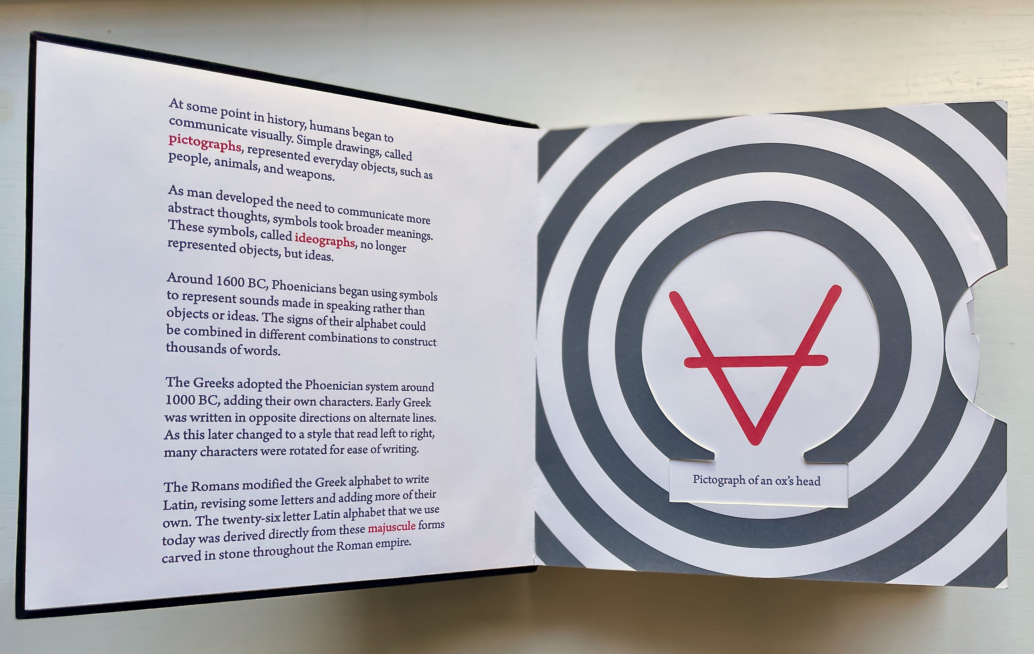
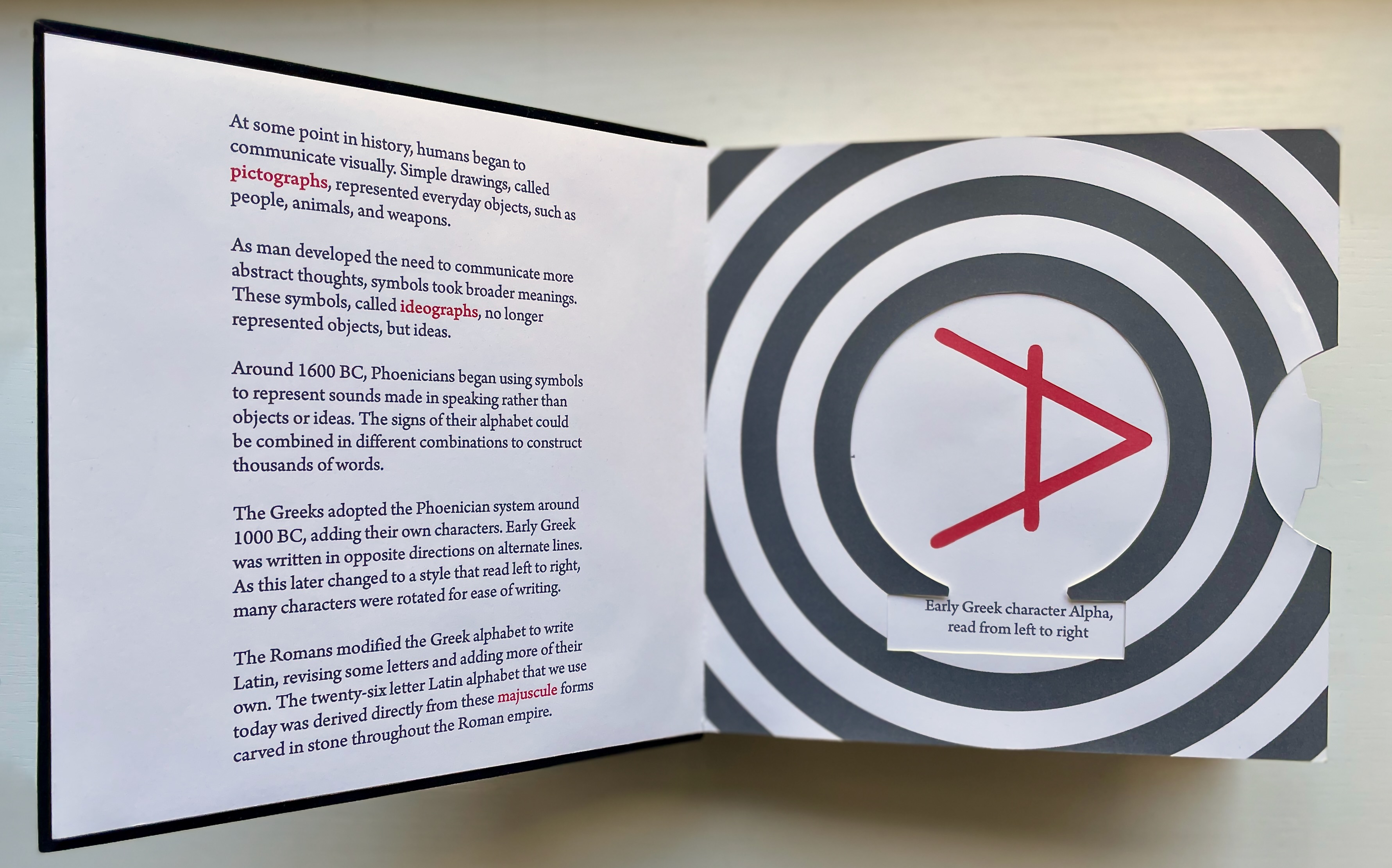
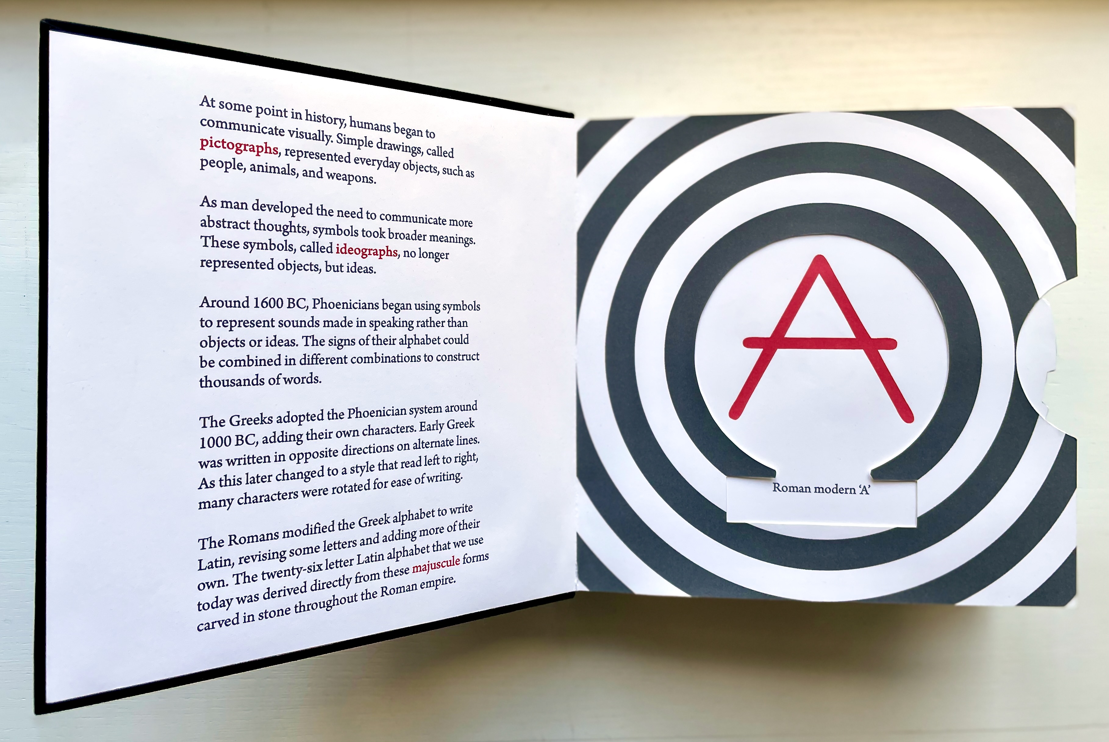
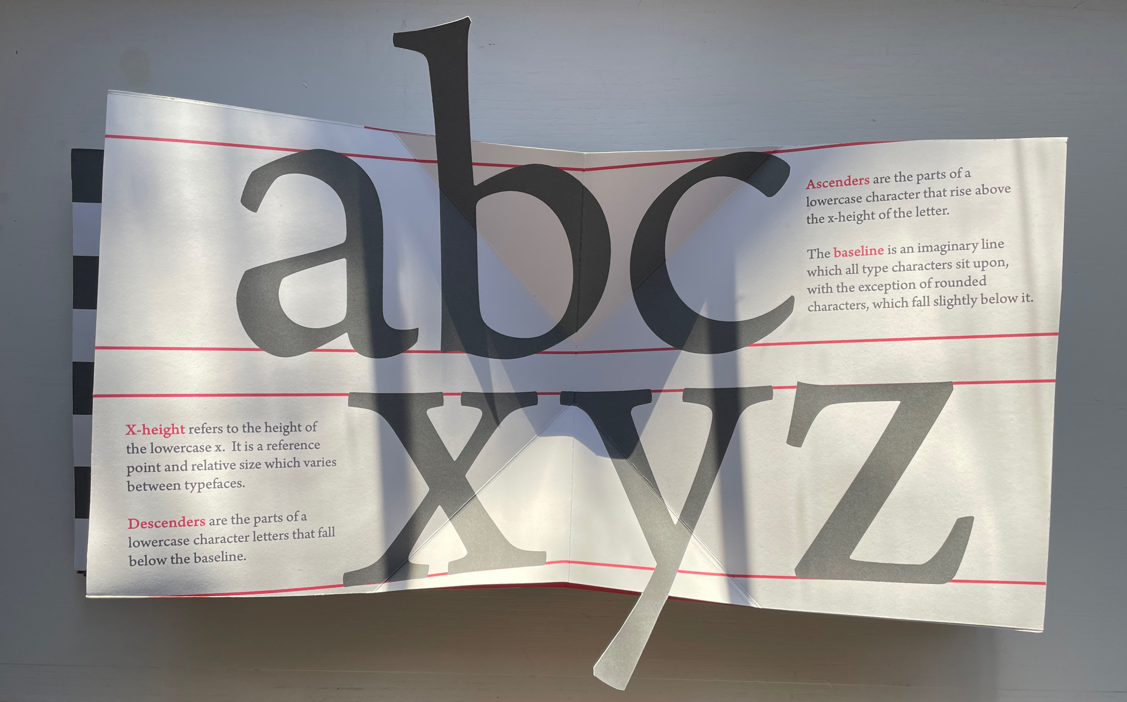
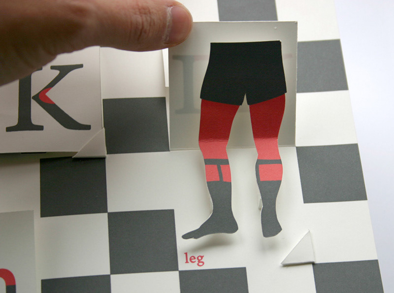
The Movable Book of Letterforms (2009) Kevin M. Steele Pop-up book. 210 x 210 mm. 22 pages. Edition of 3. Acquired from the artist, November 2022. Photos: Books On Books Collection. Displayed with permission of the artist.
Letterforms have a tangibility that exceeds their two-dimensional representation on paper and even on screen. How better to educate the viewer to their tactility and three-dimensionality than with movable book techniques such as the volvelle, pop-ups, flaps and tab pulls?
The Movable Book of Letterforms (2009) is a work of art that does just that: it enacts a basic introduction to the origins and unique characteristics of letterforms. A limited edition of three, all of its movable parts have been cut and assembled by hand. The printing is digital on Mohawk Superfine 80lb, and the box and book are covered in Laval velour bookcloth debossed with polymer plate. The only element the artifact is missing is metal.
For a monumental display of Steele’s book and paper engineering, a visit in the UK to the National Maritime Museum in Greenwich is urged. It can also be found in the following collections:
Metropolitan Museum of Art, New York Wits Art Museum, Johannesburg University of Iowa, Iowa City Indiana University, Bloomington Western Michigan University, Kalamazoo Michigan State University, East Lansing
John Crombie formed Kickshaws in 1979 in Paris. Joined by Sheila Bourne, they published over 150 works. Apparent as the esoteric influence of visual poetry and the Oulipo movement may be, their works have the combined smell of the printer and typesetter’s workshop and artist’s studio that distinguish them from that crowd.
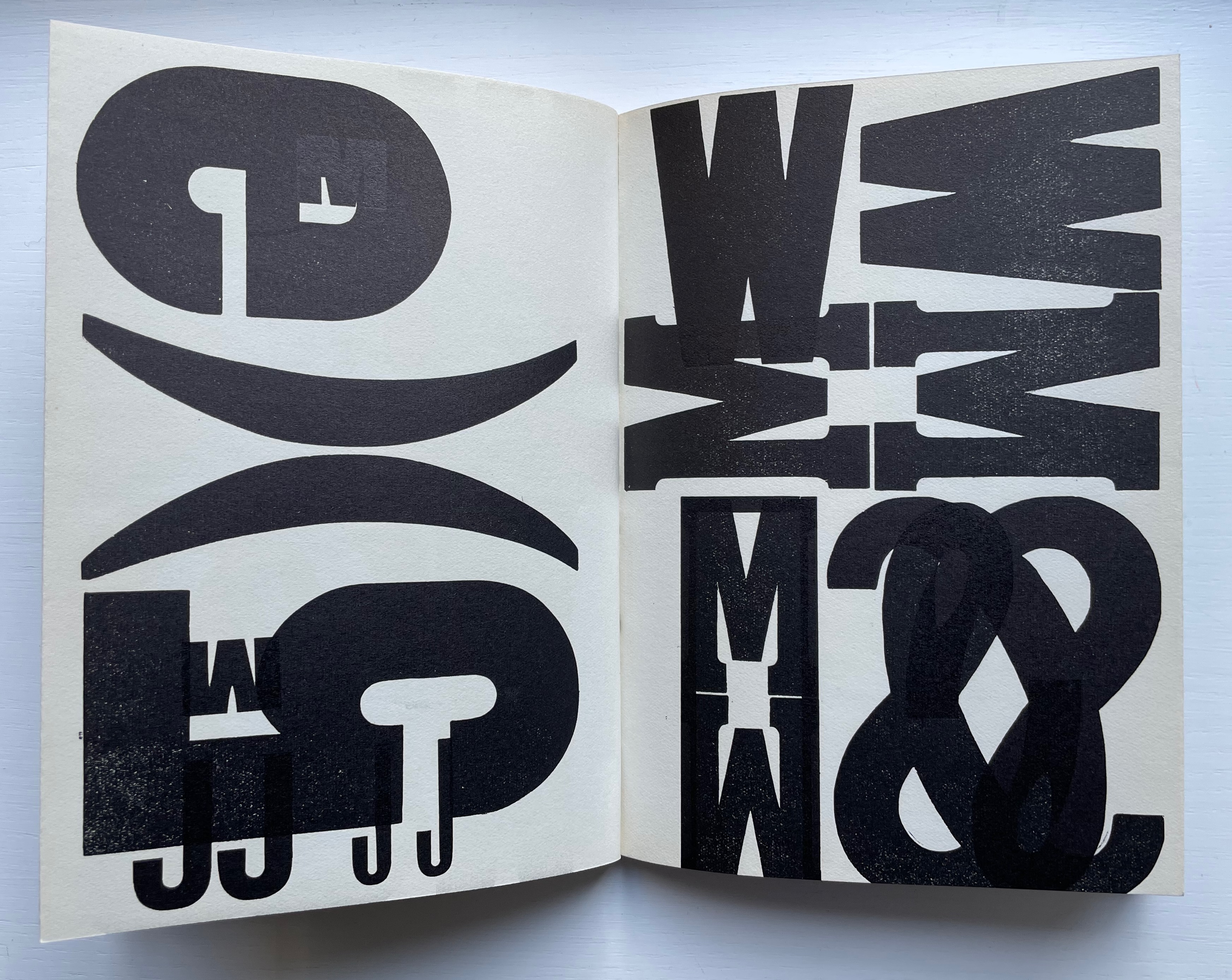
ABC in a maze (1987)
ABC in a maze (1987) John Crombie Spiral bound on four sides, double gate fold. H95 xW95 mm, 17 leaves. Edition of 300 (150 in English, 150 in French), of which this is Letter of 26 numbered A-Z. Acquired from Librairie Jean-Étienne Huret, 17 March 2022. Photos: Books On Books Collection.
The cover of this work hides its title, just as the proper order of the pages hides in the reiterations of the alphabet across 17 leaves of this double gatefold puzzle and book.
The French title ABC Dédale carries more freight than the English. Not only does it convey the idea of the maze by reference to its inventor Daedulus, it refers to Cadmus, the Phoenician prince who brought the alphabet to Greece while on his quest to find his sister Europa, mother by Zeus to the Minotaur — the “monster in the alphabet”. If that seems a far-fetched allusion, then consider the additional hint in the name of the chosen typeface: Hélios, the Greek god and personification of the sun, to which Daedulus’ son Icarus flew too close in their escape from Crete.
Portrait évolutif du typographe “Evolving portrait of the typographer” (1988)
If a selection of works from the Books On Books Collection were made based on the theme of “artists’ books and color”, this small work would have to make the cut. Moving from five small splashes of color in the first pass, subsequent passes build up a multi-colored cartoon image of the typographer in a head-on eyeless gaze. At the seventh pass, however, the colors begin to fade; in the ninth, the features of the portrait begin to erode, and by the twelfth, only streaks of gray and the faintest impression of the outline remain.
A close look at the title reveals that same faint impression of the portrait’s outline. Were it not for its reference to the three primary colors, the title would have to be amended to a baker’s dozen of passes in collaboration with the press.
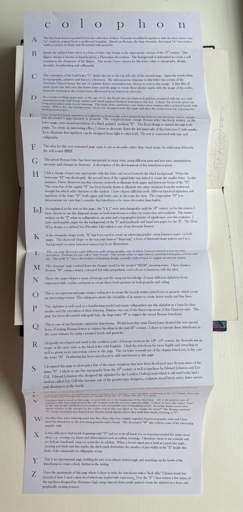
Alphabetica (2002) Dave Wood Bound in vellum; open-spine binding sewn on vellum strips. H210 x W290 x D30 mm. 54 pages. Loosely inserted colophon. Edition of 26. Acquired from the artist, 27 July 2022. Photos: Books On Books Collection. Displayed with permission of the artist.
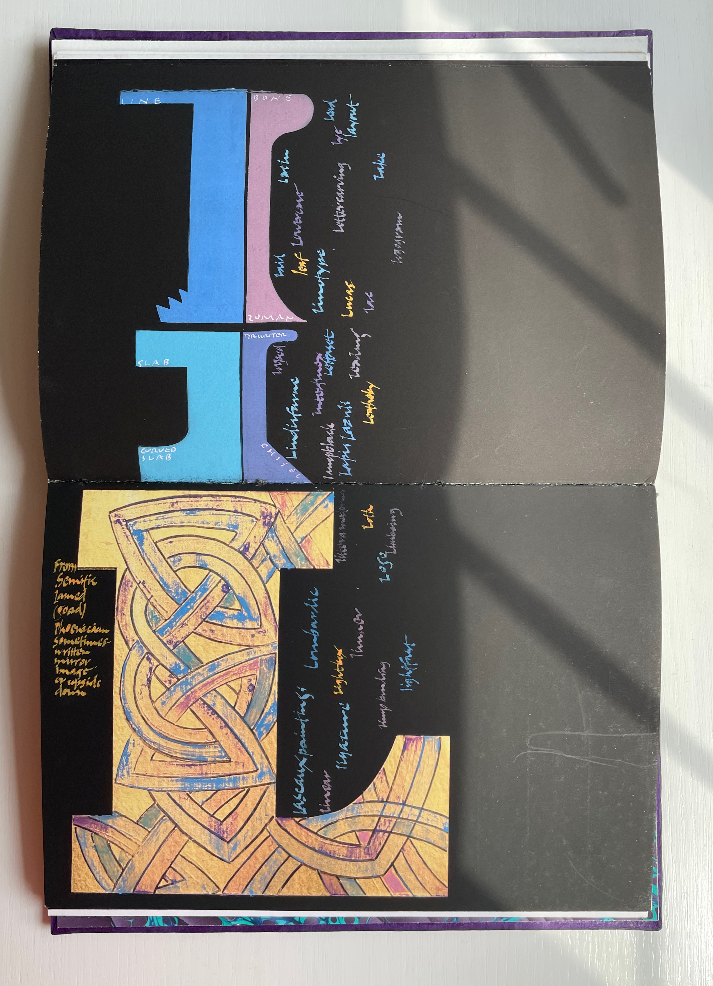
From Alphabetica‘s description as an exploration of the alphabet’s “diverse development from historic shapes to the infinite variations we see today in typefaces and calligraphic forms of the Western alphabet”, the reader might expect an academic work. The deeply embossed and debossed royal purple cover presenting the title in landscape format suggests otherwise as do the marbled endpapers and embossed gold foil title page. The cover is built up with a very strong paper made in Nepal, painted with acrylic then sprayed with semi-matte varnish. Inside, the reader finds a portfolio of twenty-five distinct “canvases” in which Wood demonstrates both historical sensitivity and artistic inspiration.
Across the twenty-six spreads, Dave Wood has captured each letter’s distinct story with multiple styles of calligraphy in Sumi ink and gouache paints as well as varying textures and techniques (Canson and Arches paper, glassine, foil, embossing, stamping, feathering and cutting), colors and layouts.
The letters’ developing shapes and periods are labeled. Starting with the letter B, Wood adds names of typefaces, structural terms for type, palaeographical terms and terms from the crafts of calligraphy, typesetting and printing — all beginning with /b/. Similar labeling occurs for the letter C but with a different layout. Across the twenty-five canvases, Wood excels at this balancing of difference and similarity. Notice, for example, how letters B and C incorporate the Renaissance style of illumination called bianchi girari (white vine stem decoration).
The ways in which uppercase-to-lowercase movements interact with the layout’s variations make for a dynamic experience. Sometime it’s subtle, sometimes vigorous. Note, for example, how the letter D de-emphasizes the gutter whereas the letter E emphasizes it.
With letters H through Q, a shift from Arches white to Canson black paper and back adds to the overall dynamic movement. Yet Wood is attentive to elements of unity; for example, his playful handling of the gutter in the transition from letter H to letters I/J echoes that from letters D to E.
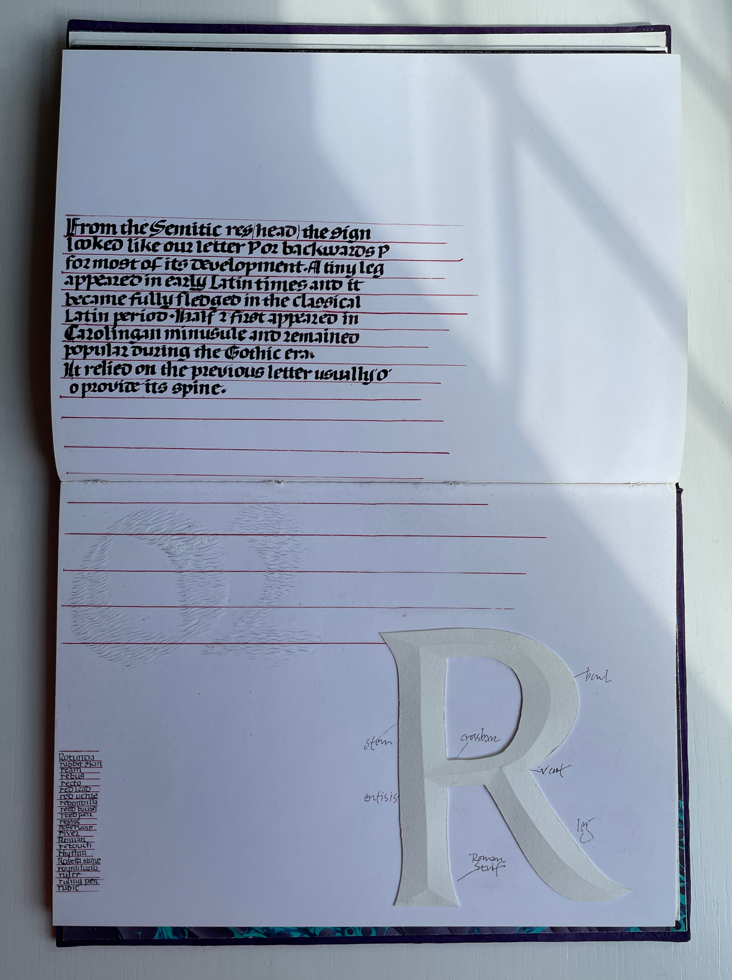
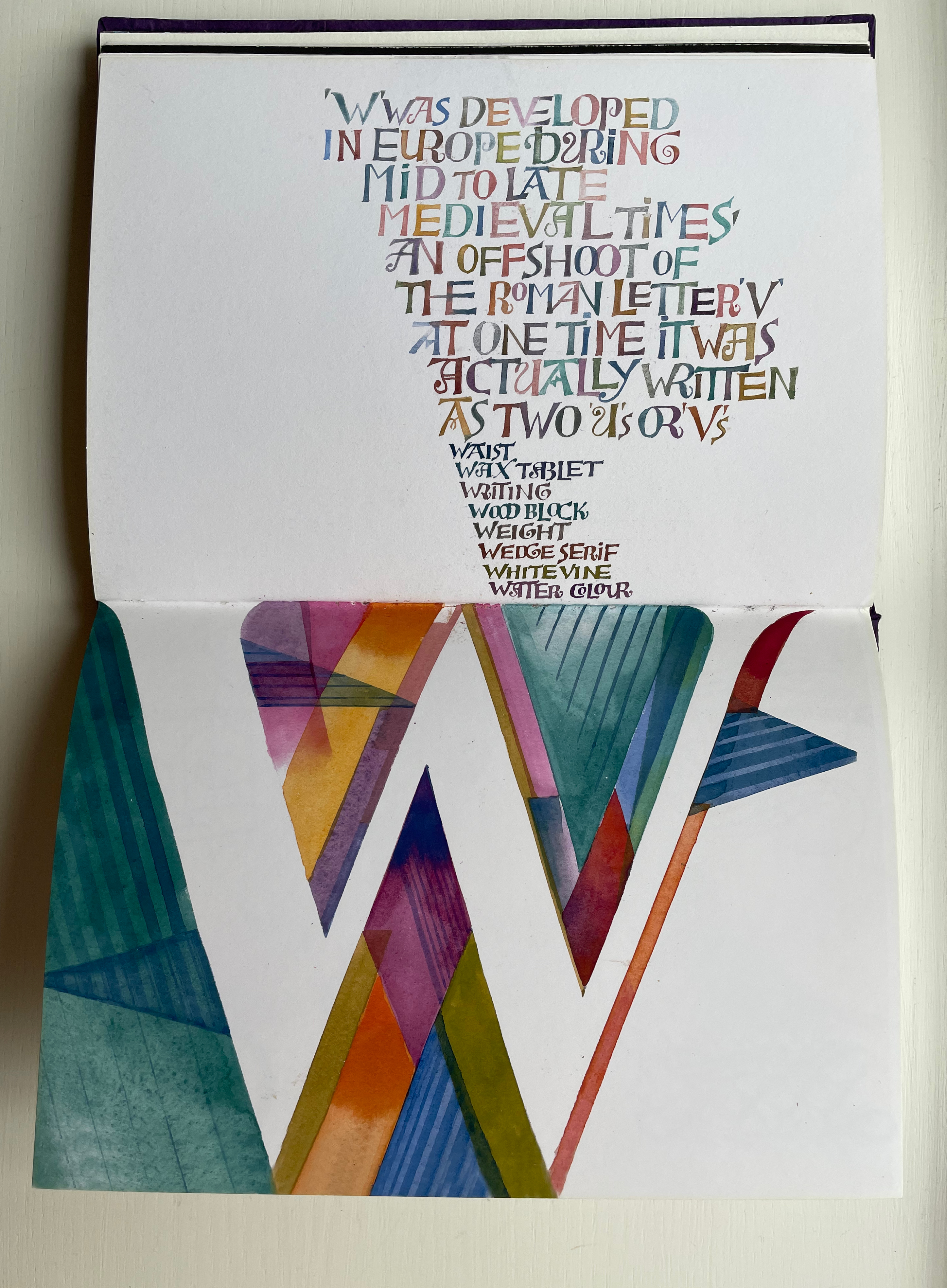
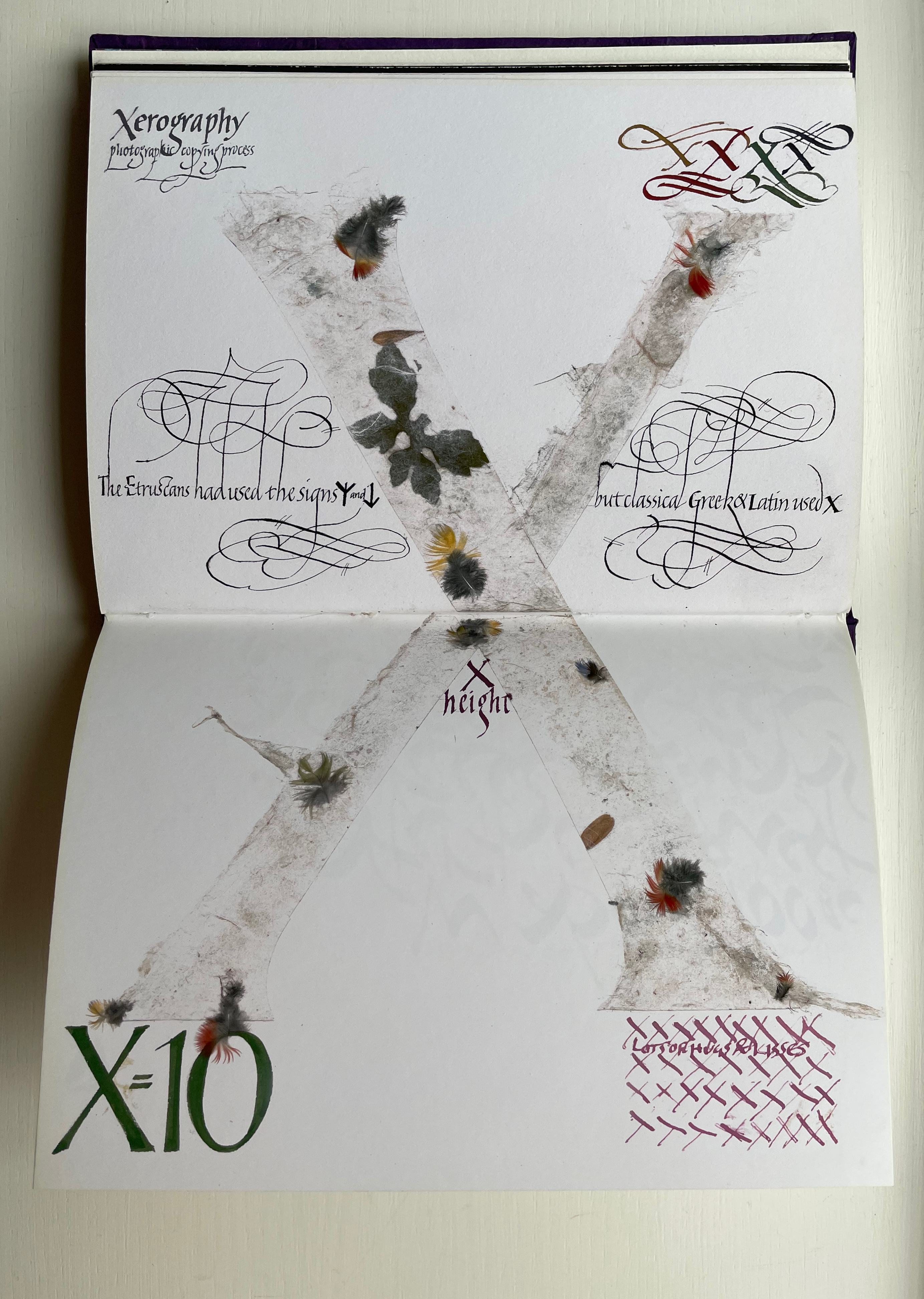
Only six letters perform the trick of extending across the gutter — lowercase H and uppercase K, M, O, U and X. While O, U and X take the similar approach of almost evenly straddling the gutter, each of the other three succeed differently. M is perhaps the most striking and interesting of them all. M derives from the Semitic word for “water” mem. As Wood points out in the loose insert colophon, the watery blue that fills the letter is intentional — as must be the precise alignment of the inner peaks of the letter with the gutter. Such attention to detail in the midst of so much activity on the page demands a similar attentiveness from the reader.
For example, the long tail of the Q does not show up until the bottom of the spread. And the reader may need to pick out the the word “or” in the text to spot the lowercase r in the textured, oversized written word “or” directly below the text.
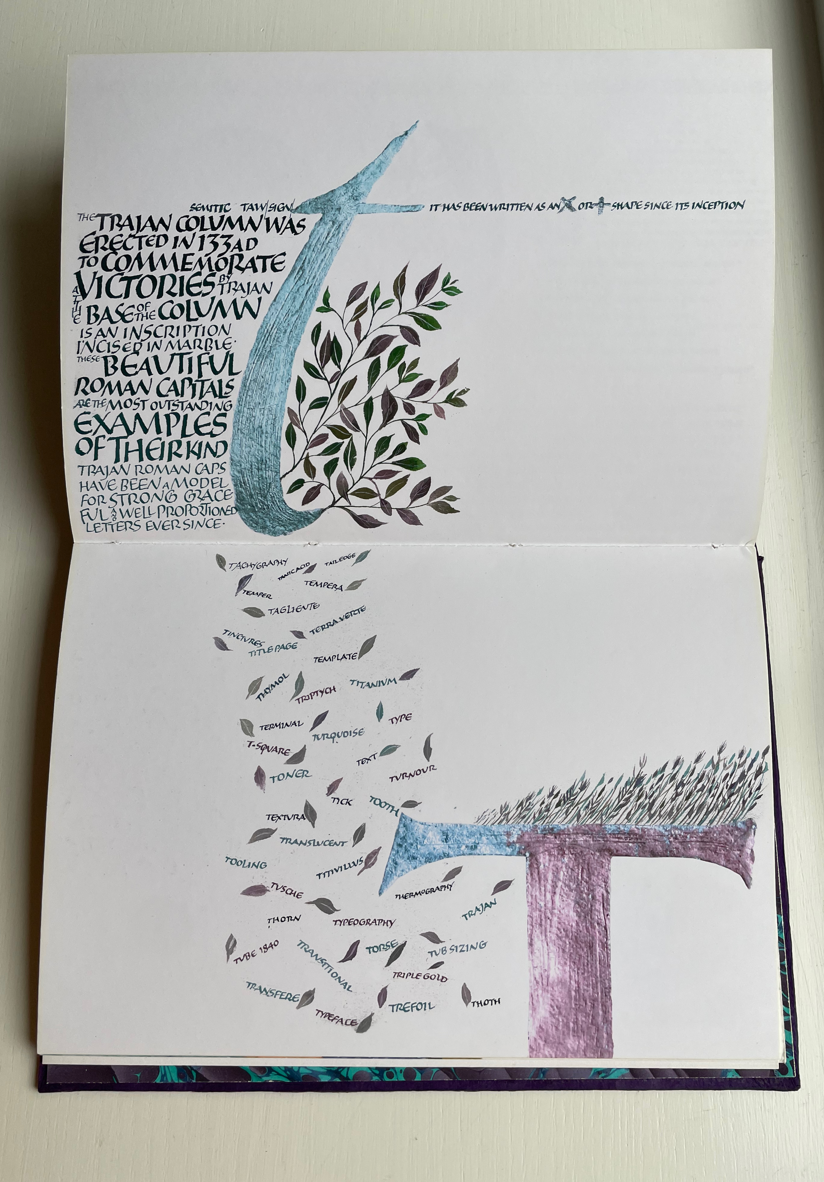
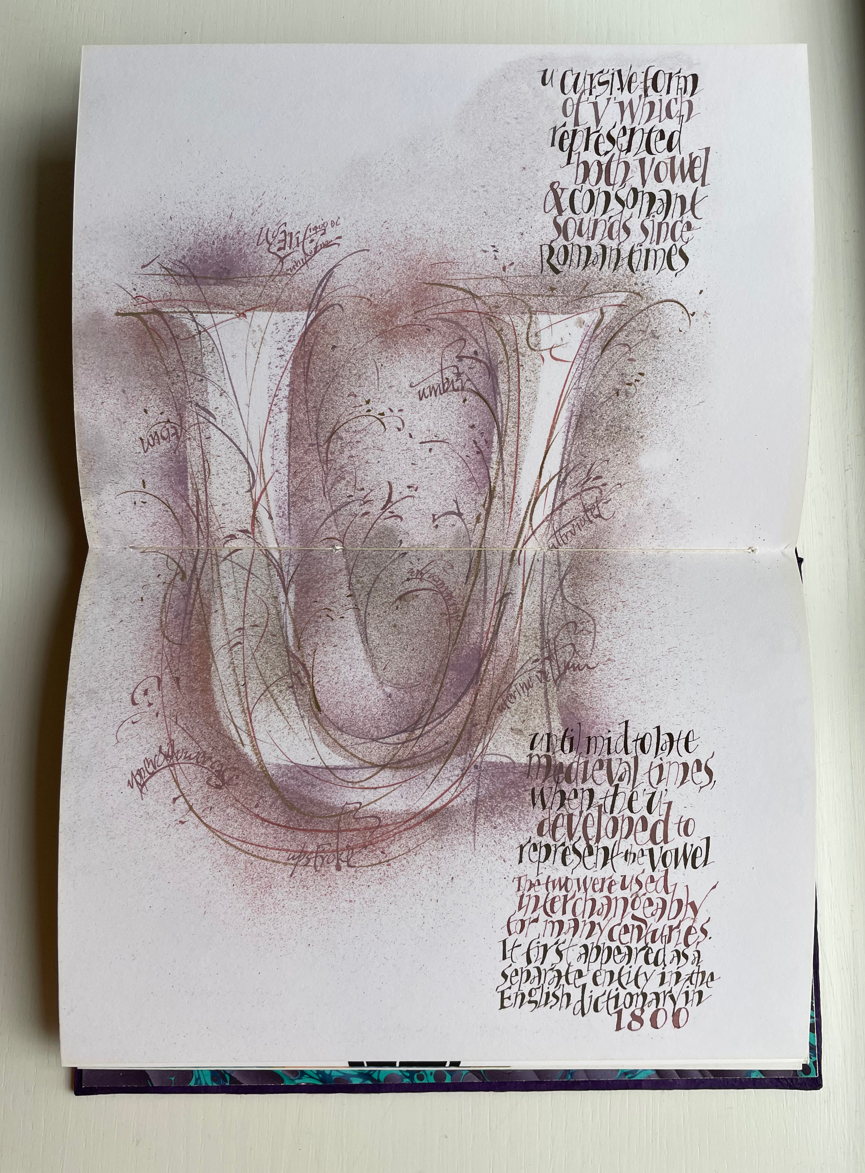
Visual puns abound. Celtic knots in a capital L (for the Lindisfarne gospels). An S formed of stones. Leaves falling from a lowercase t (for tree or tea, of course). A U growing underground.
Fortunately, the accordion-fold colophon loosely inserted in the book offers pointers to some (not all) allusions. For example, the beginning of the third line for the letter V pays homage to Titivillus, the 13th-century patron demon of scribes’ mistakes. The illustrated W is an homage to Ben Shahn’s letter design. The highly contrasting thicks and thins in the letter X allude, in calligraphic terms, to the thick mark’s determining the number of pen widths making up the x height (the body of the miniscule).
And while the colophon may be necessary to know that the typefaces written in color below were created by Hermann Zapf, any viewer can enjoy Wood’s incorporating the entire alphabet in the Sumi ink design culminating in the letter Z as a fitting self-referential conclusion to Alphabetica.
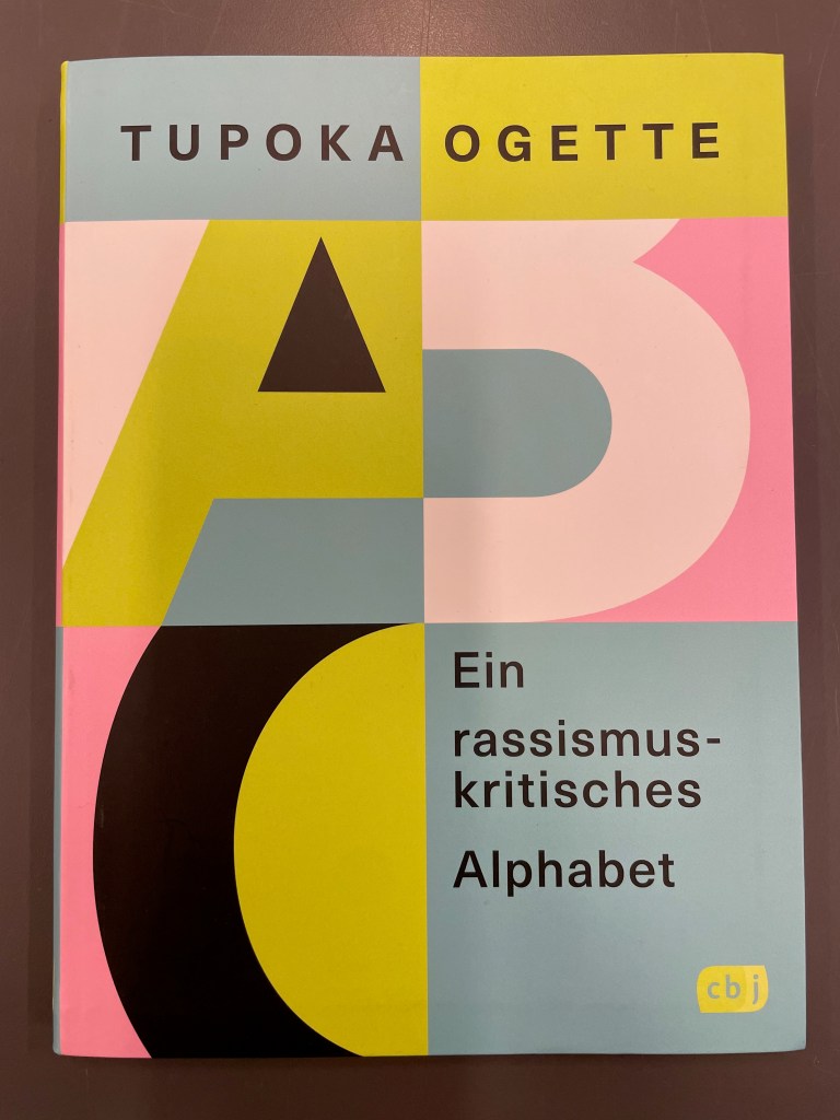
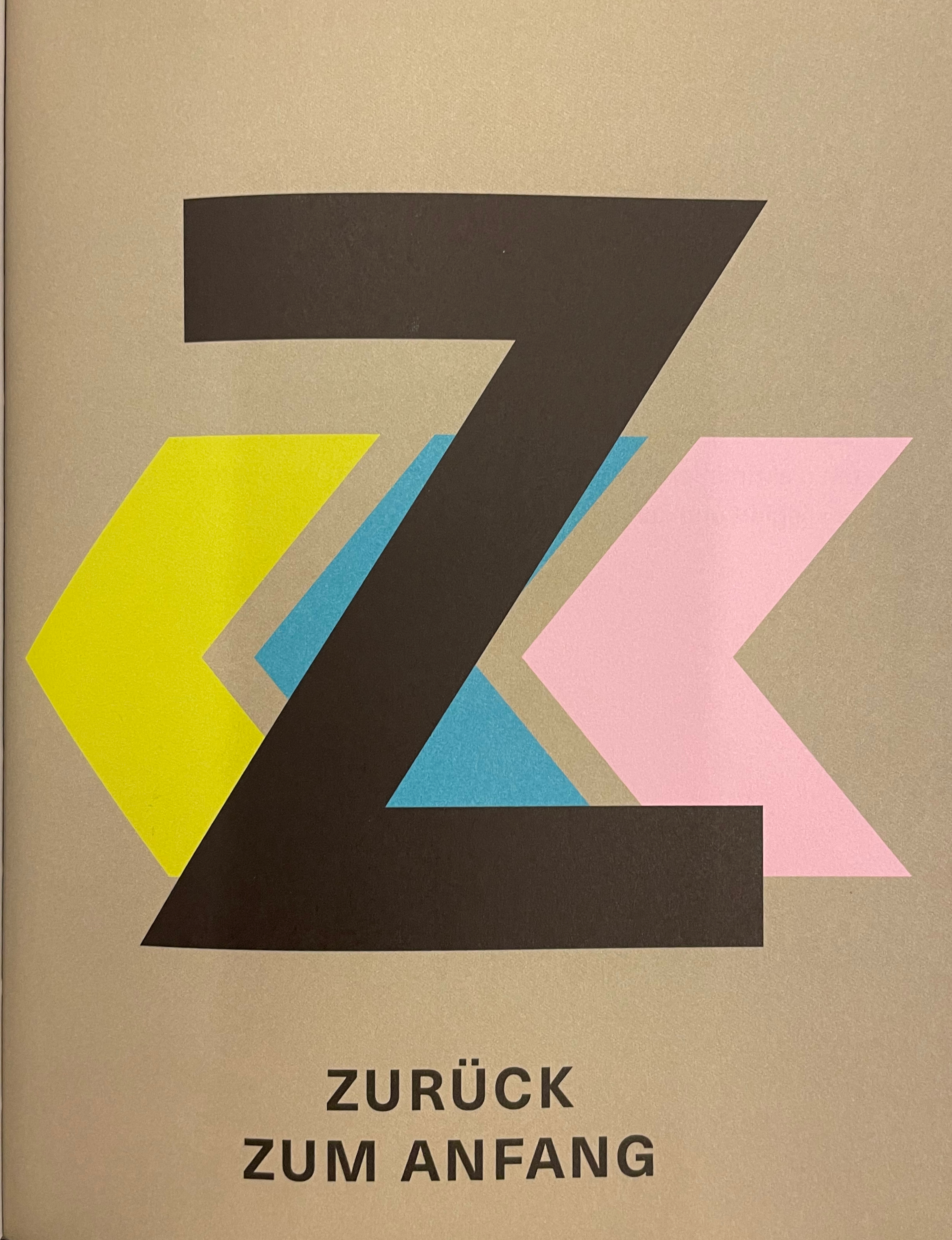
Ein rassismuskritisches Alphabet (2022) Tupoka Ogette Softcover, perfect bound with endbands. H215 x W160 mm. 124 pages. Acquired from Great Book Prices, 1 March 2023. Photos: Books On Books Collection.
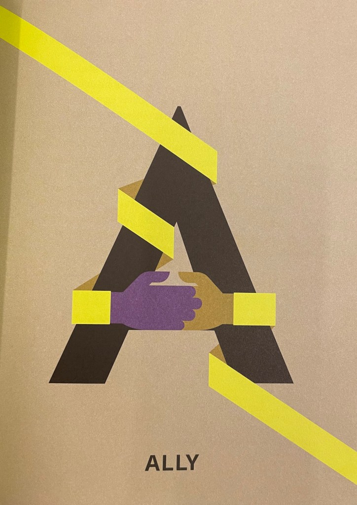
The title of Tupoka Ogette’s book translates literally as “A Racism-critical Alphabet”, but “An Anti-Racist Alphabet” seems more idiomatic. More than an alphabet book, it is a workbook arising from her consultancy for companies, organizations and associations wanting to understand how racism manifests itself and how to address it. Given the consultancy’s focus on German-speaking countries, the book relates tightly to the firm’s workshops, podcasts, etc., so it is not too surprising that it hasn’t been translated into English yet.
The depth of the problem in English-speaking countries, however, results in most of the terms’ being in the English language: terms like “Ally”, “Blackfacing”, “Colorism”, “Derailing”, “Emotional Tax”, “Gaslighting”, “Happyland”, “Jim Crow”, “Liberation”, “Othering”, “Queer”, “Race-based Traumatic Stress”, “Tokenism”, “White Gaze” and “Yellowfacing”. Add to those terms such cognates as Kolonialismus, N-wort and Xenophobie and it is almost a shock that the text is not in English.
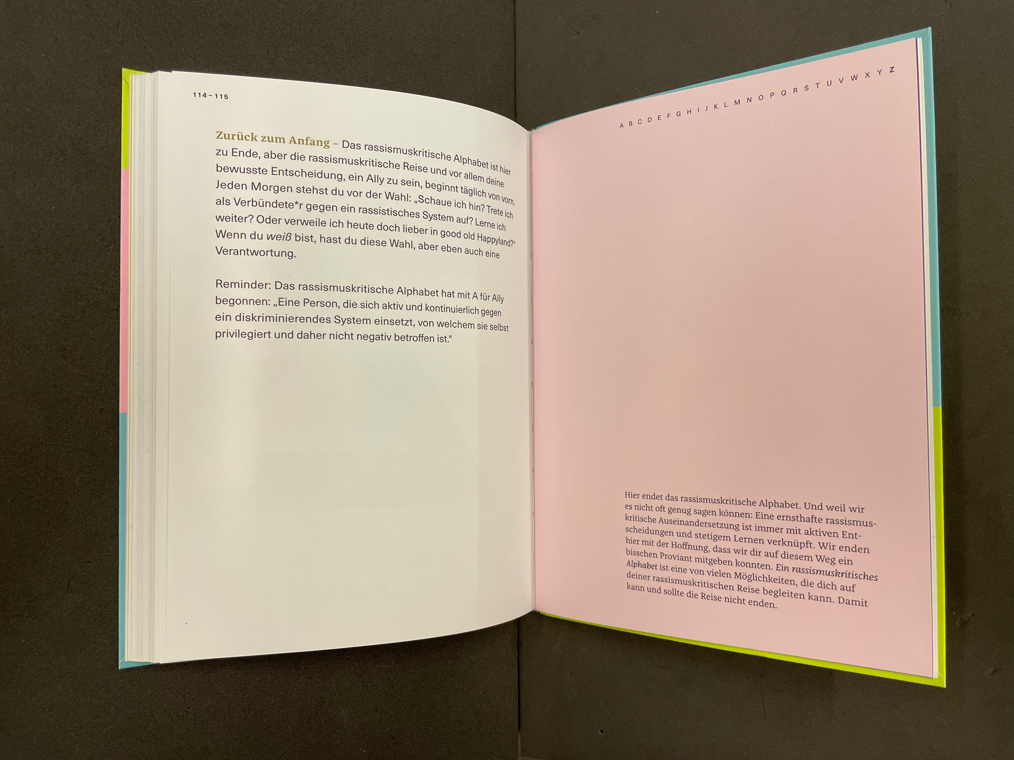
Zurück zum Anfang (“Back to the Beginning”). “The anti-racist alphabet ends here, but the anti-racist journey, and especially your conscious decision to be an Ally, begins anew every day. Every morning you face the choice: Am I looking? Do I stand up as an ally against a racist system? Do I continue to learn? Or do I stay in good old Happyland today? If you are White, you have that choice, but you also have a responsibility. Reminder: A person who actively and continuously stands up against a discriminatory system of which he himself is privileged and therefore not negatively affected.” P. 115.
The book’s interior display pages are striking and reminiscent of Ursula Hochuli-Gamma’s 26 farbige Buchstaben (1986) / “26 Colored Letters“, but the cover and text design are very much in the vein of professional trade books for the German market. Adapting the design for the English-language market might present more of a challenge than adapting the text.