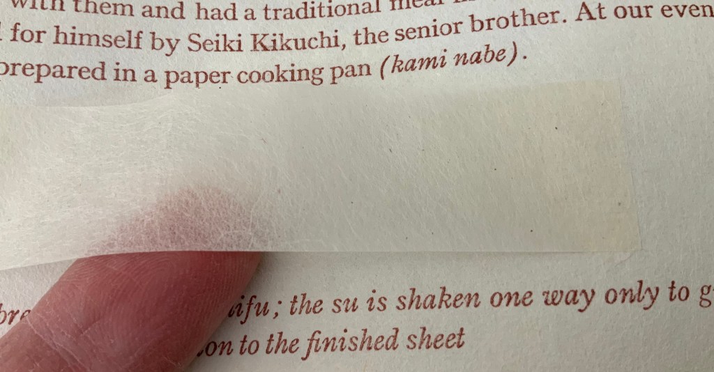
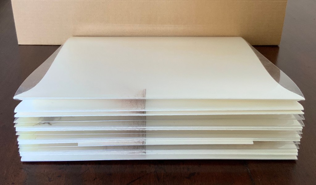
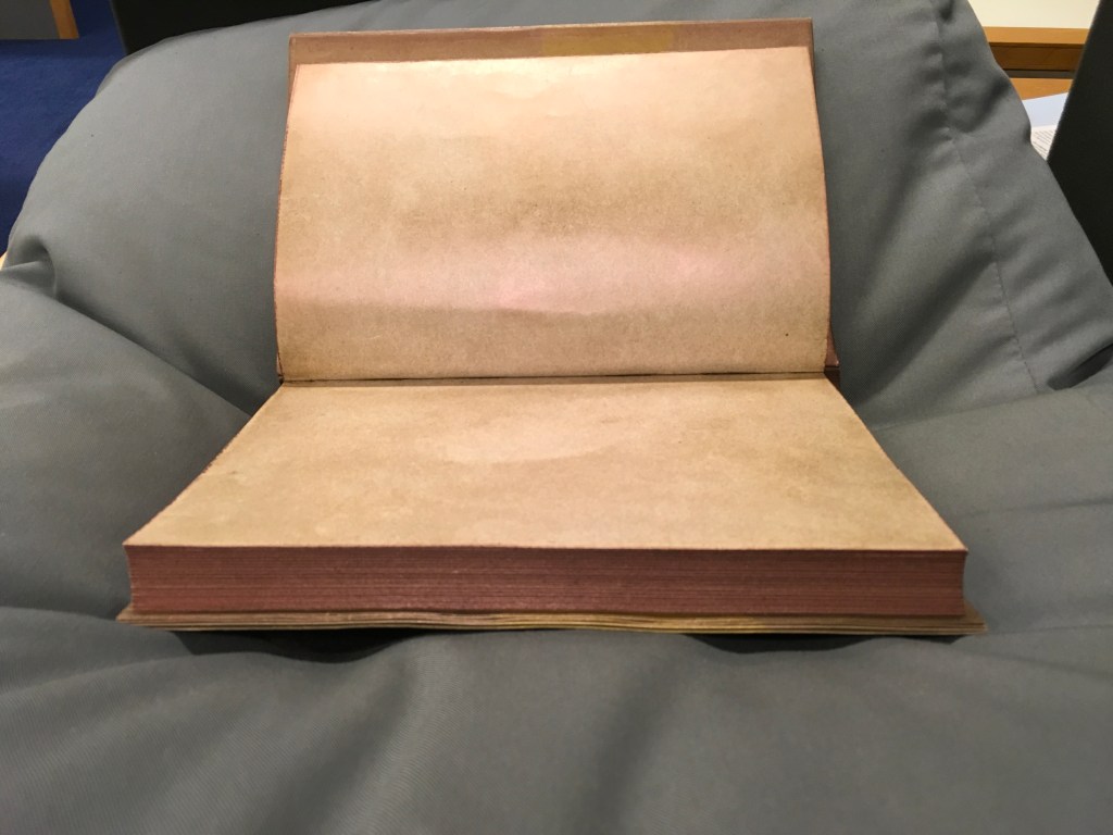
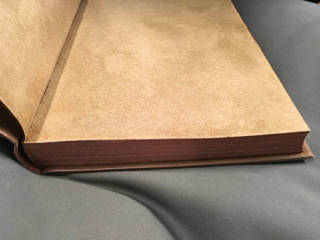
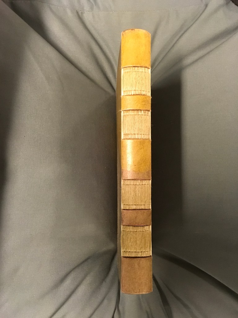
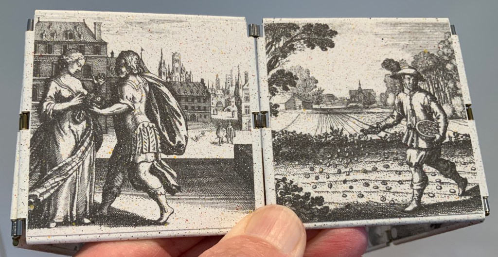
Washi Tour, Japan: October 1995 (1995) Maureen Richardson H151 x W225 mm Twenty-eight pages bound in four-hole Japanese stab binding. Cover paper produced by Mr. Seiki and Mr. Michiharu Kikuchi, visited during the tour. A limited and numbered edition of 100 copies Monotype set and printed in 12 point Old Style by Claire Bolton of The Alembic Press. Published by Richardson, Romilly, Brilley at Hay-on-Wye. Ten copies were set aside for a deluxe edition. This is number 81 of the main edition.
The cover papers supplied by two of the papermakers Richardson visited.
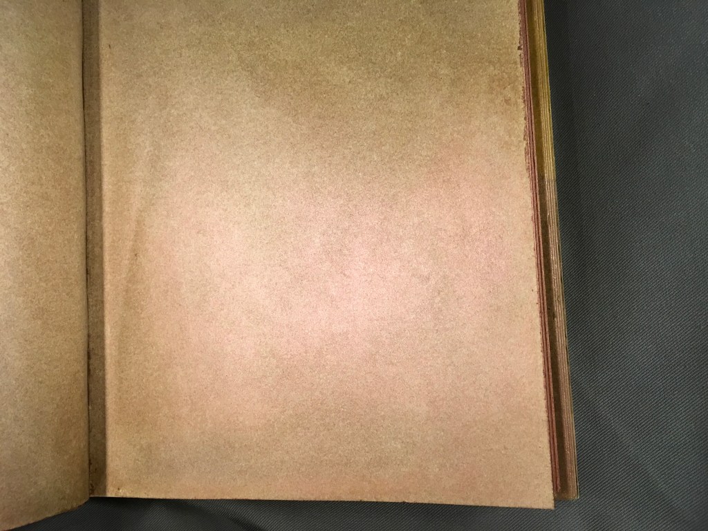
Clockwise from the top; Hon Mino-shi; Najio-Maniai-shi (the gray square is recycled accounting book paper mixed with clay); paper cloth made from kozo fibre, shaken in only one direction for strength; kozo fibre coated with hon’nyaku, crumpled and cooked in lime; mitsumata.
Added to the pleasure of the text is the ability to touch and examine the samples of washi in this exquisite little book.
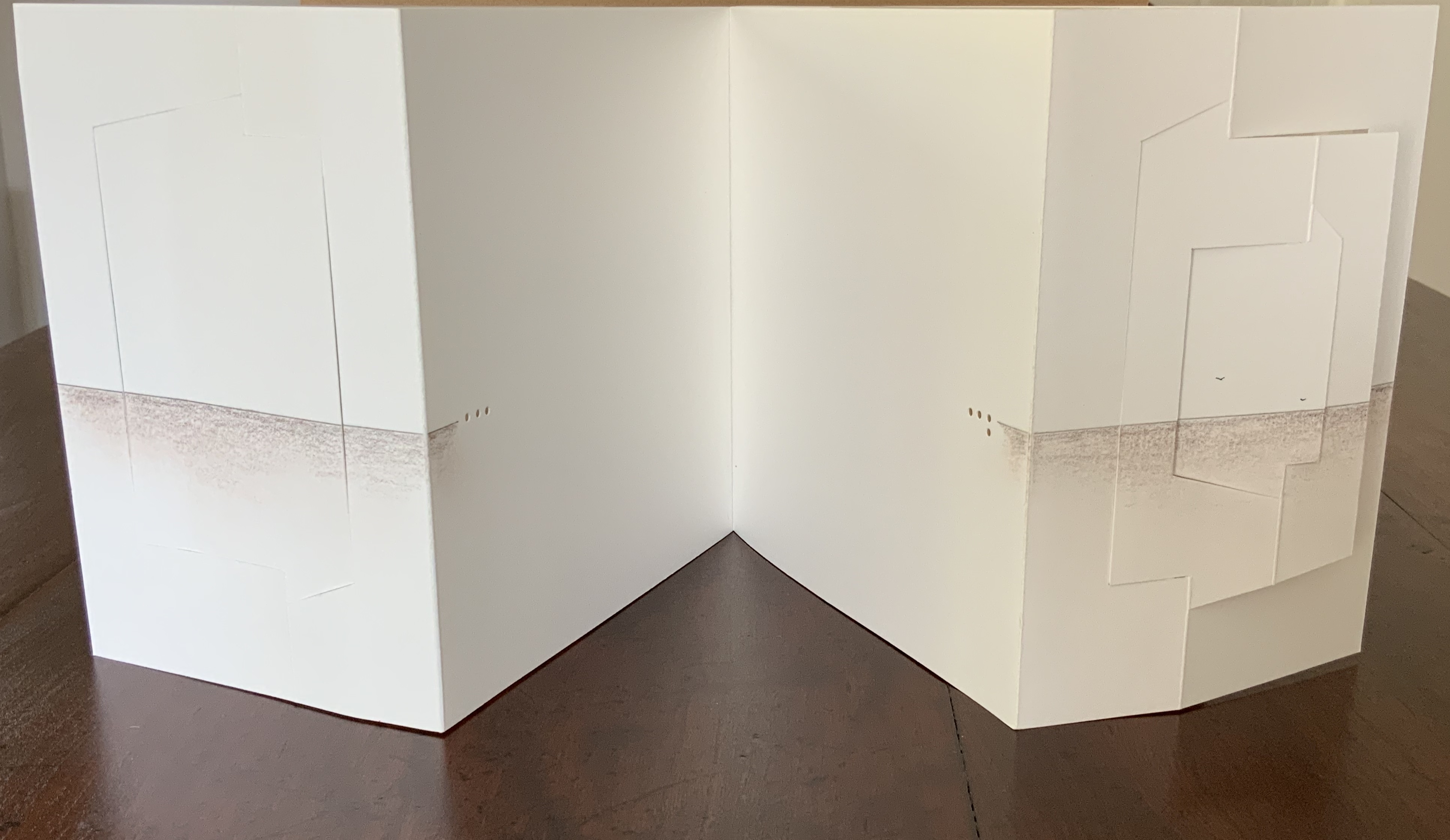
Marbled Samplebook (2017)
Marbled Samplebook (2017) Maureen Richardson H100 x W350 mm Sixty leaves of marbled papers folded into alternating squares, rectangles and triangles. Case bound in blue leather, blue headbands, papers tipped into sewn binding, marbled doublures. Unique.
It is hard to resist unfolding a sheet to enjoy a larger view of its pattern and the feel of the paper.
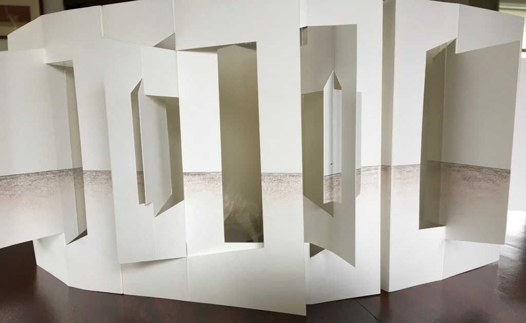
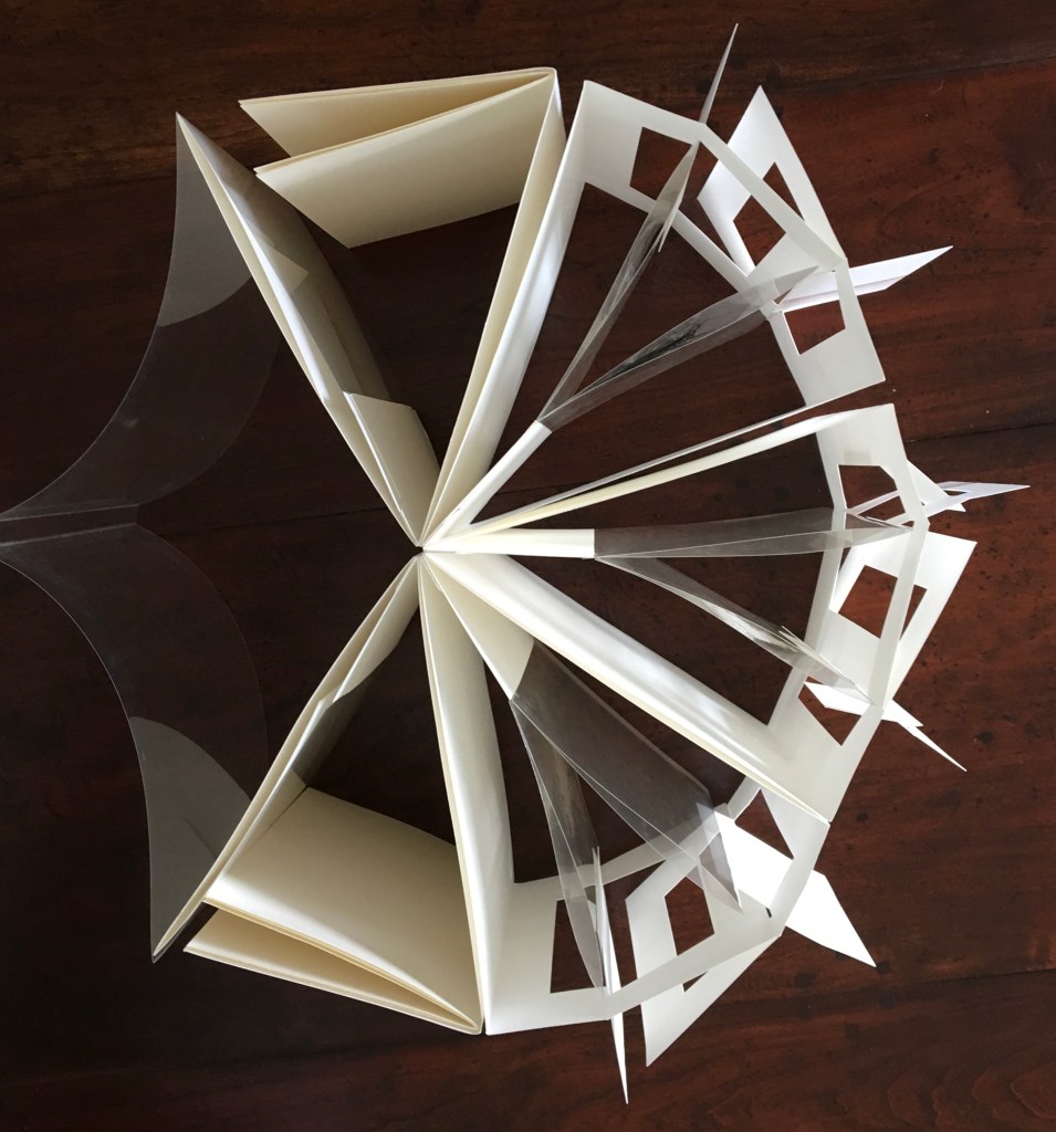
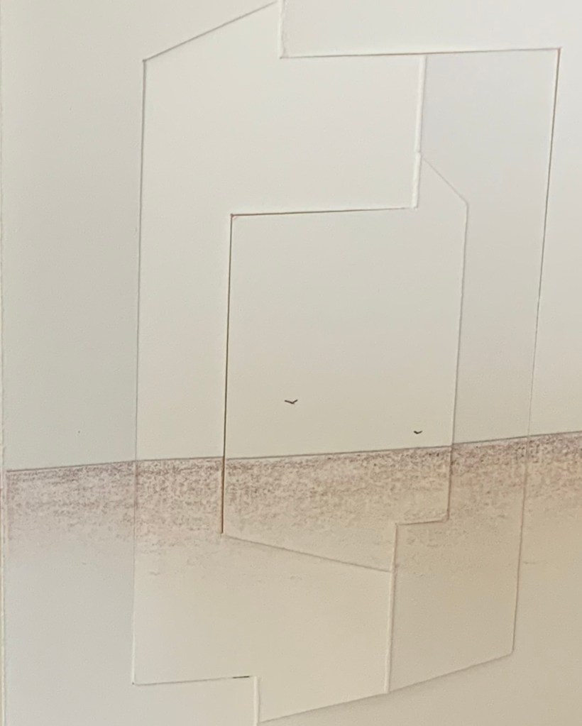
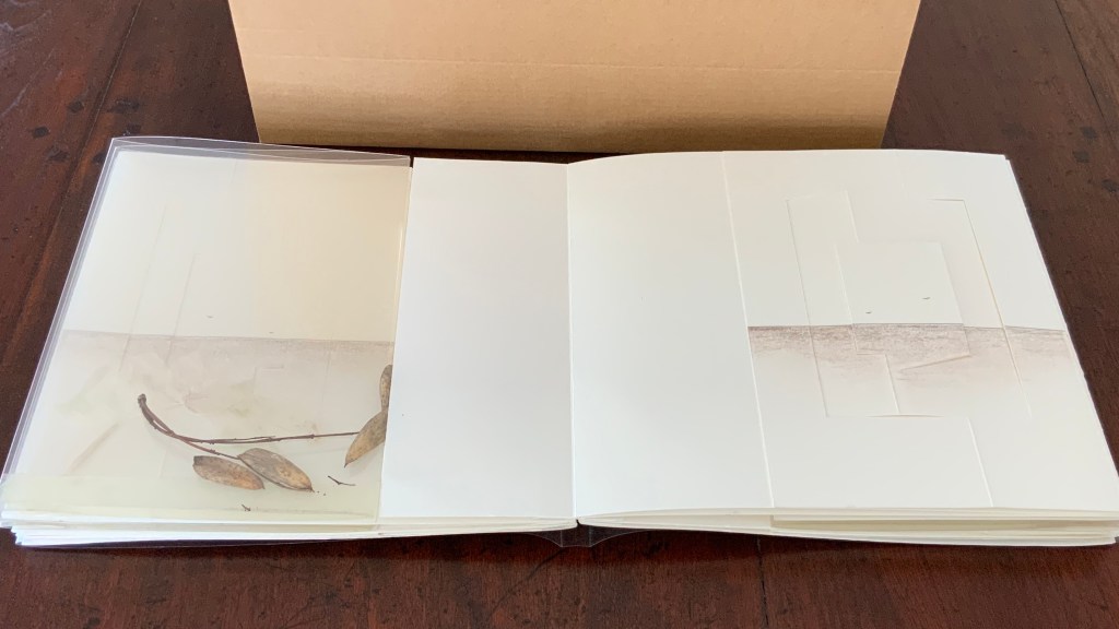
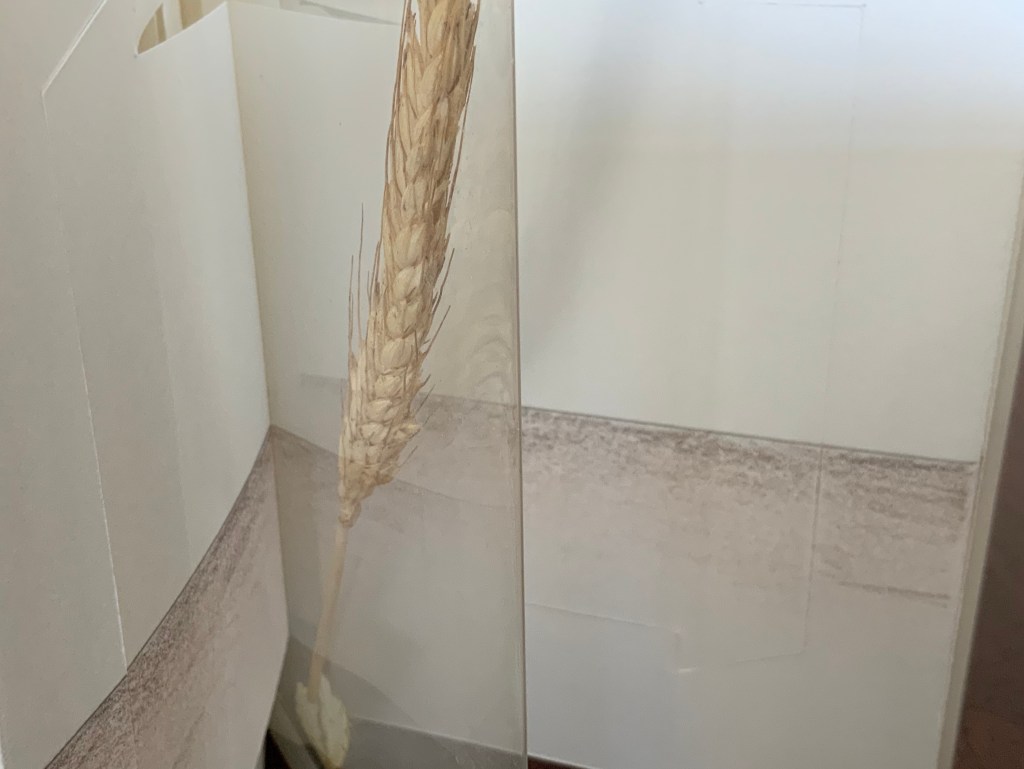
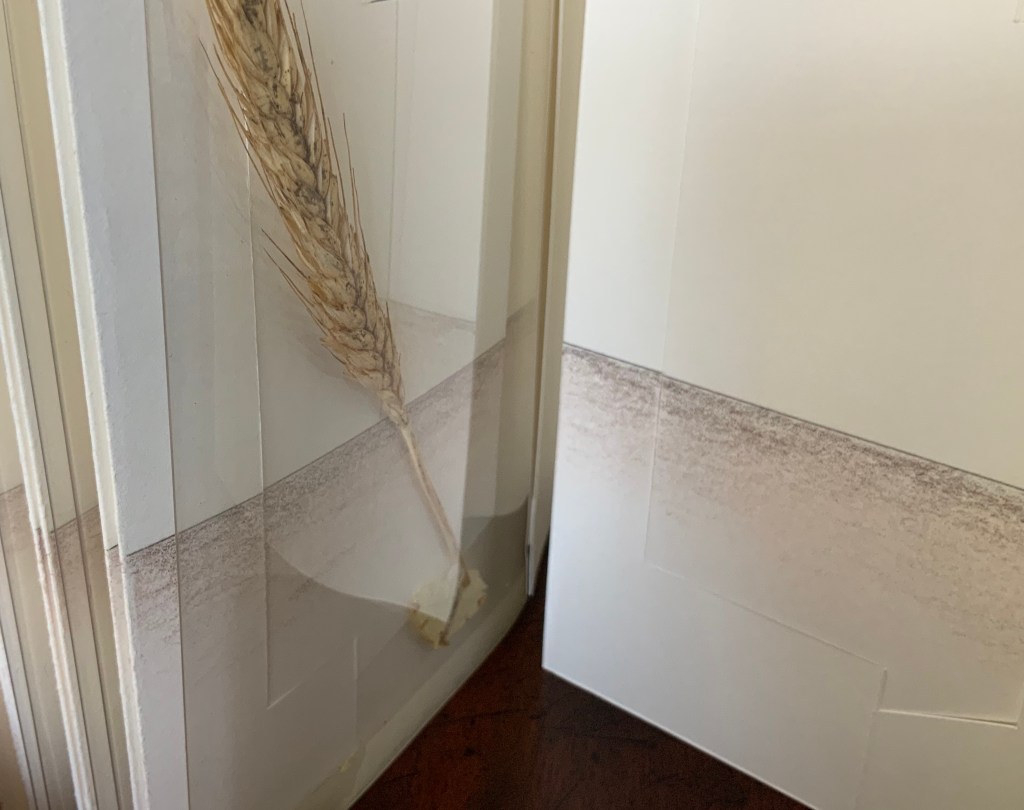
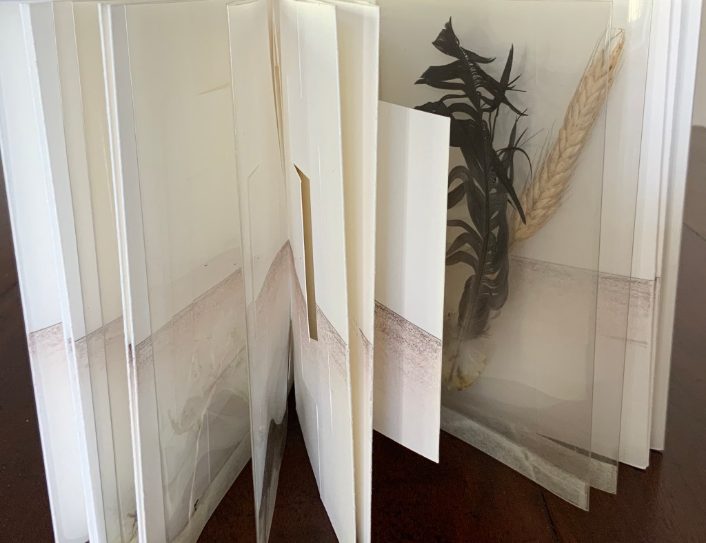
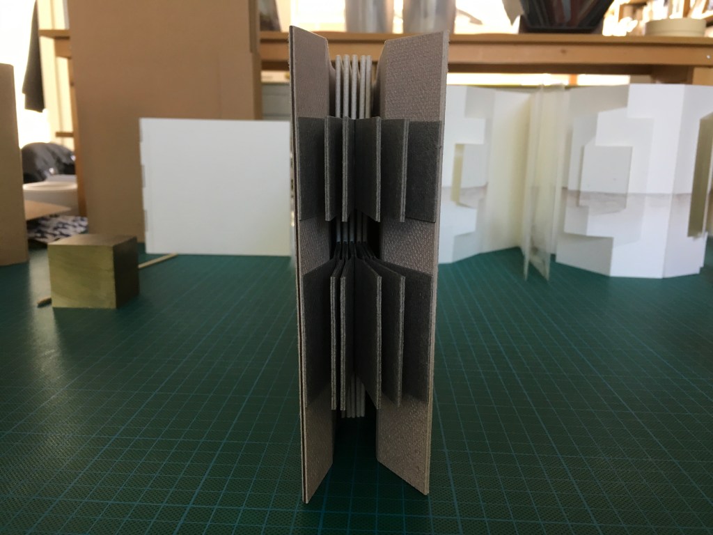
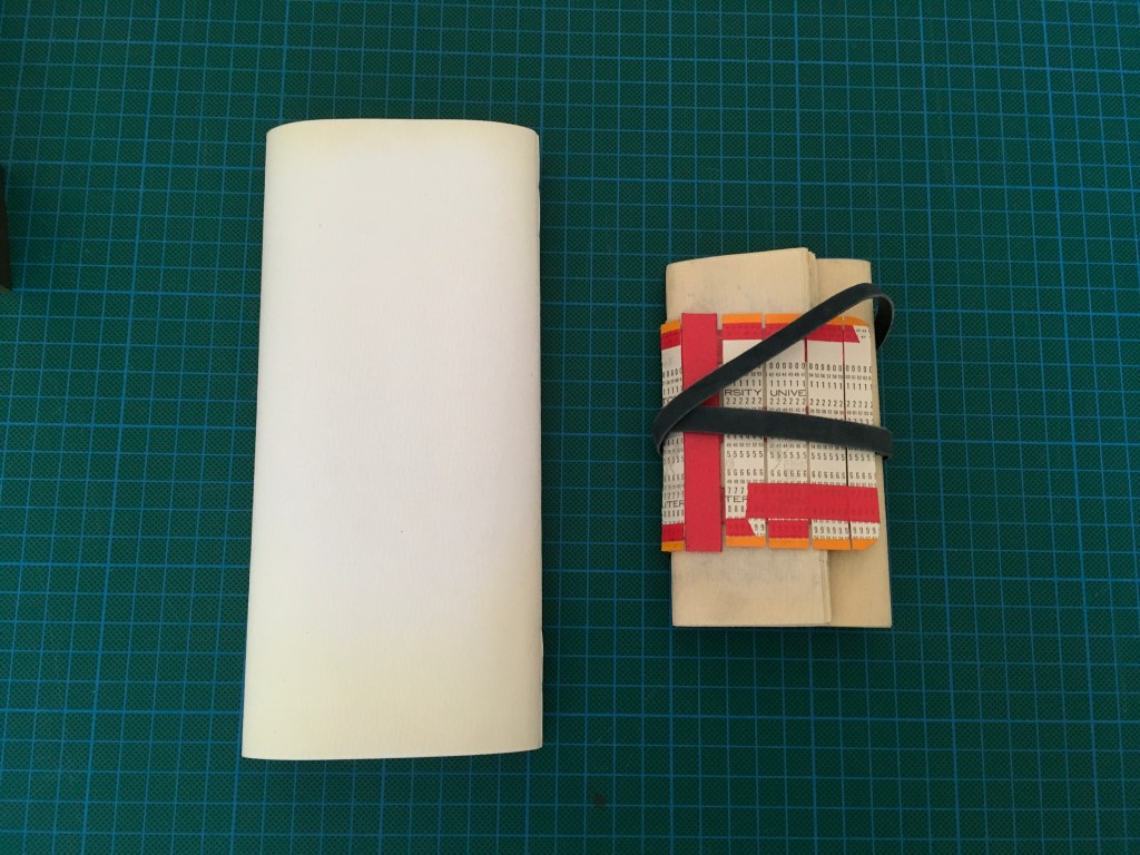
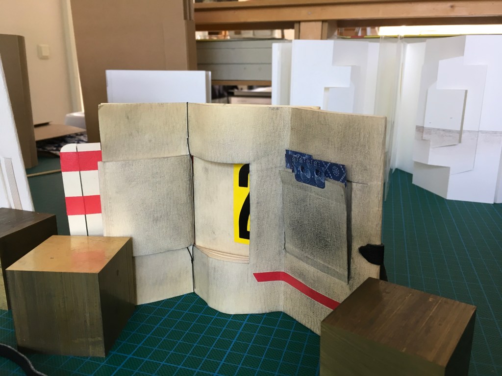
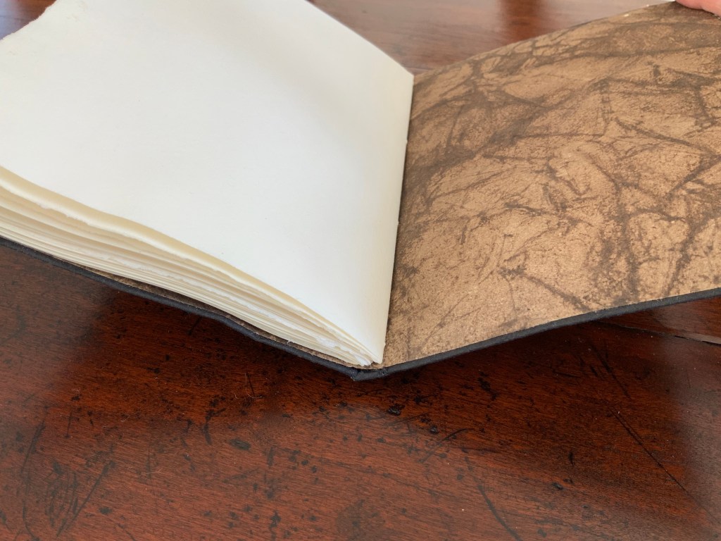
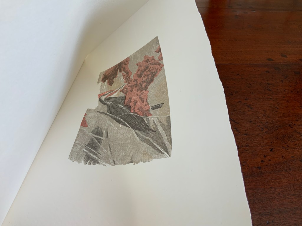
Aerssens and Hedi Kyle are long-time friends, whose correspondence has often consisted of an exchange of small models. Memories is an integrated variant of the Panorama Book structure, featuring as it does panels within panels, two 8-leaf booklets bound into front and back with paper hinges, and three pairs of mylar folders holding “found nature” items such as a feather, a grain stalk and whatever might have caught Aerssens’ eye.
Aerssen’s signature image of birds on his region’s wide, flat horizon.
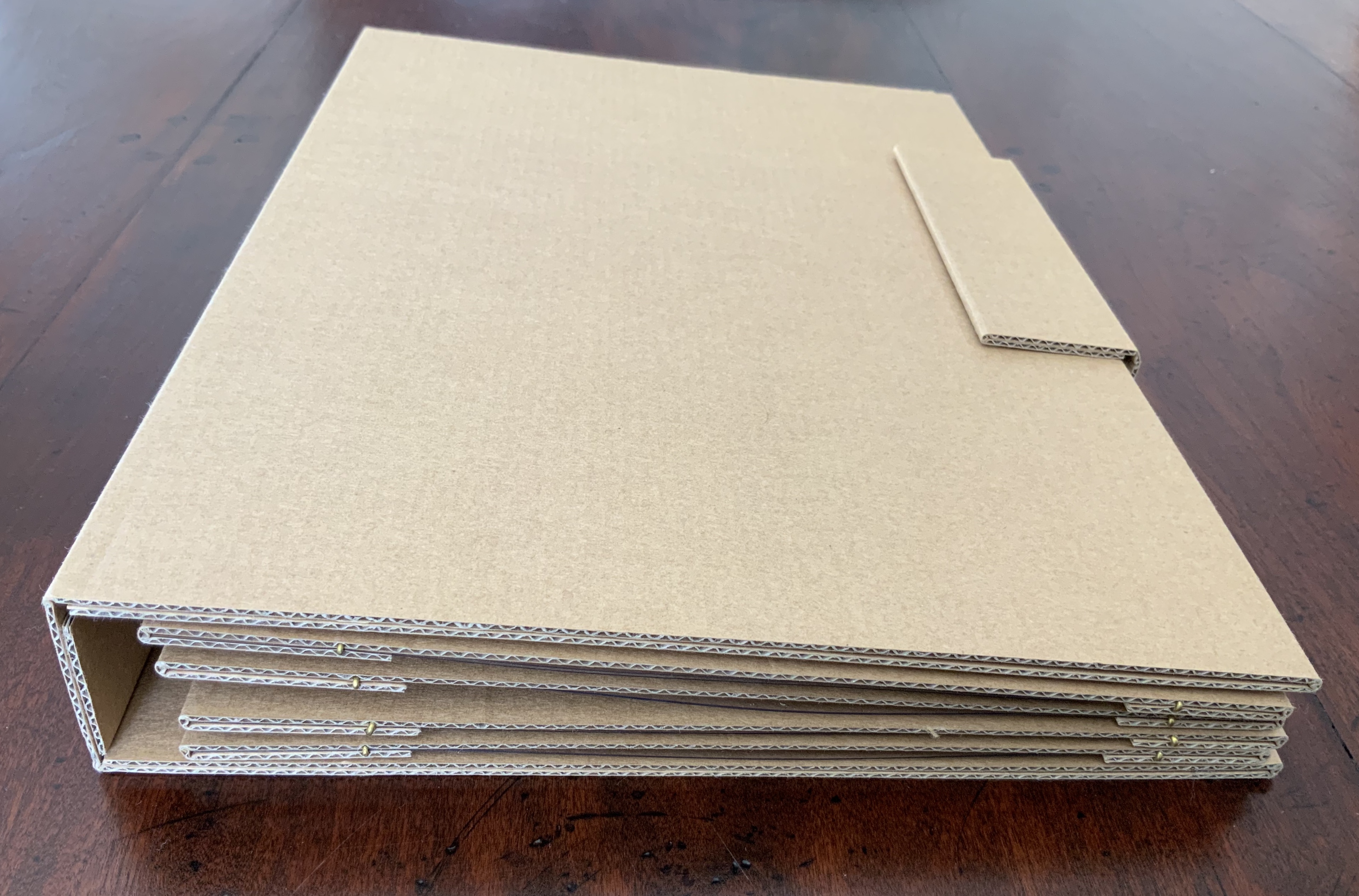
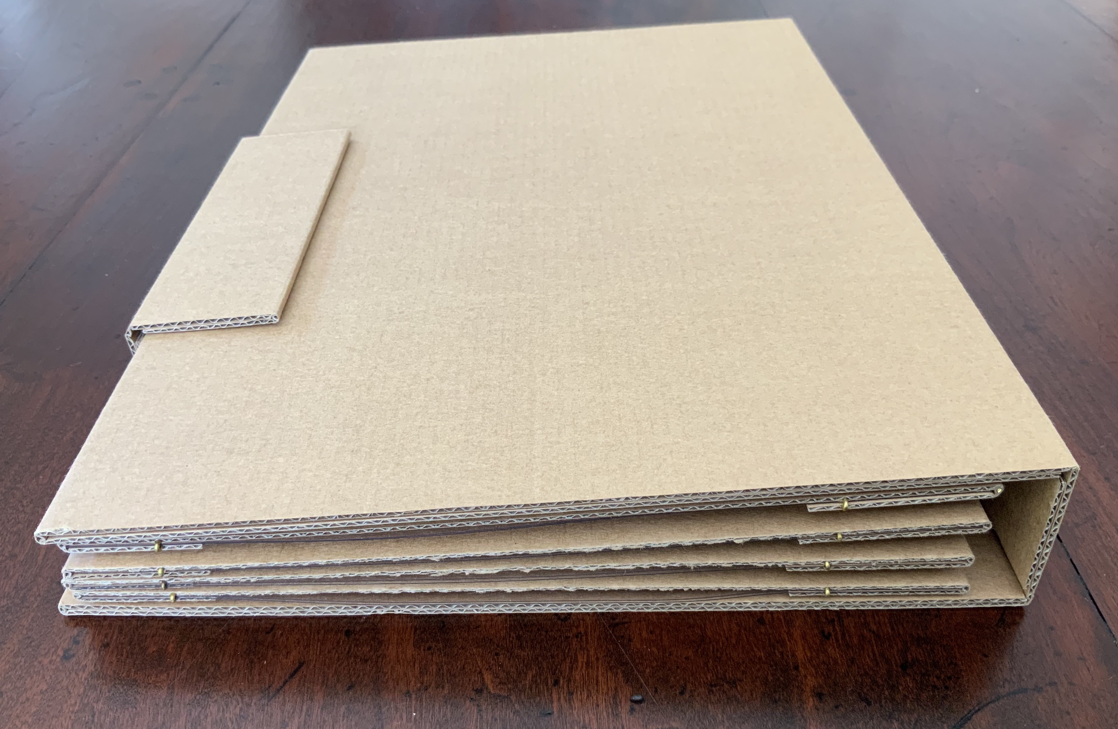
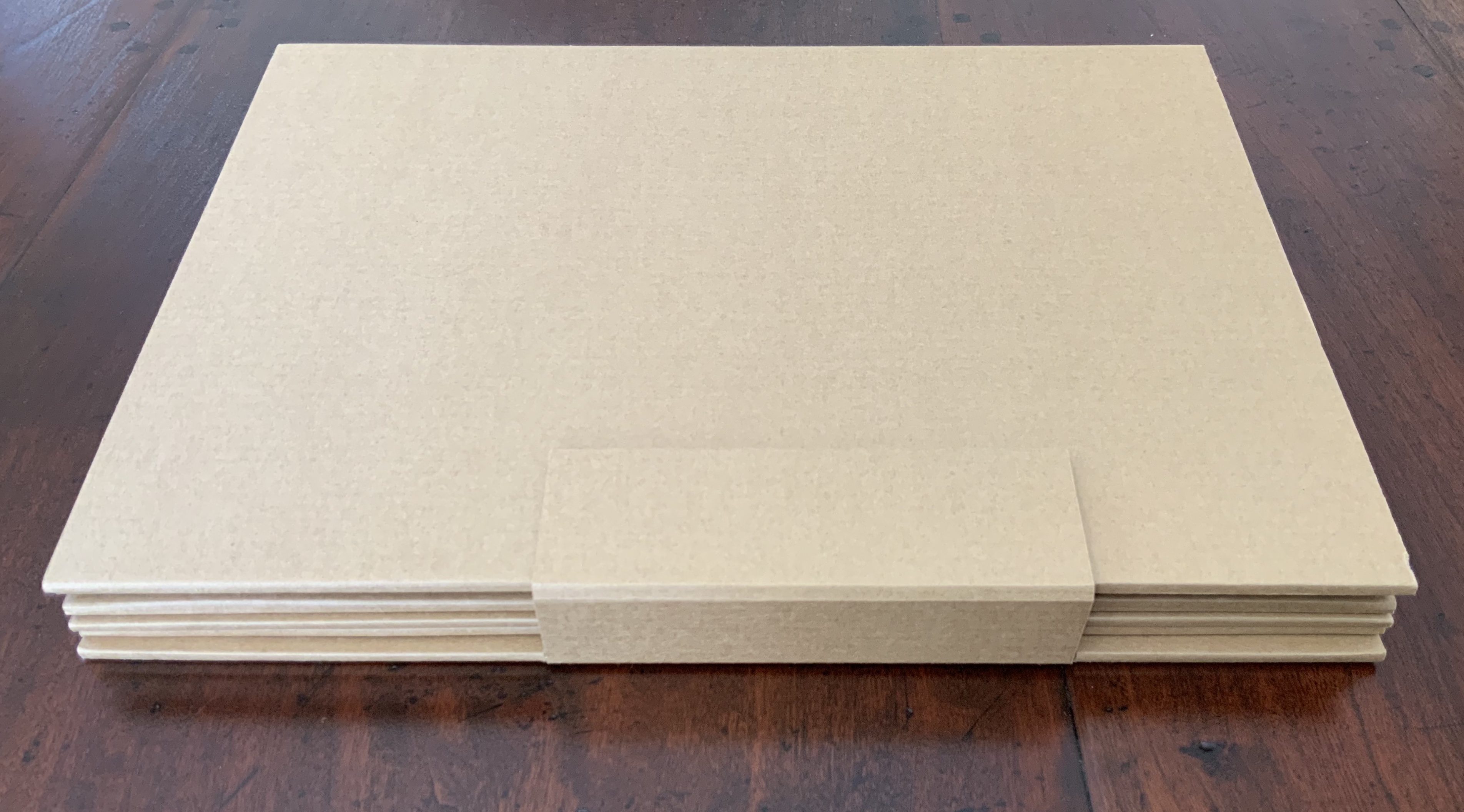
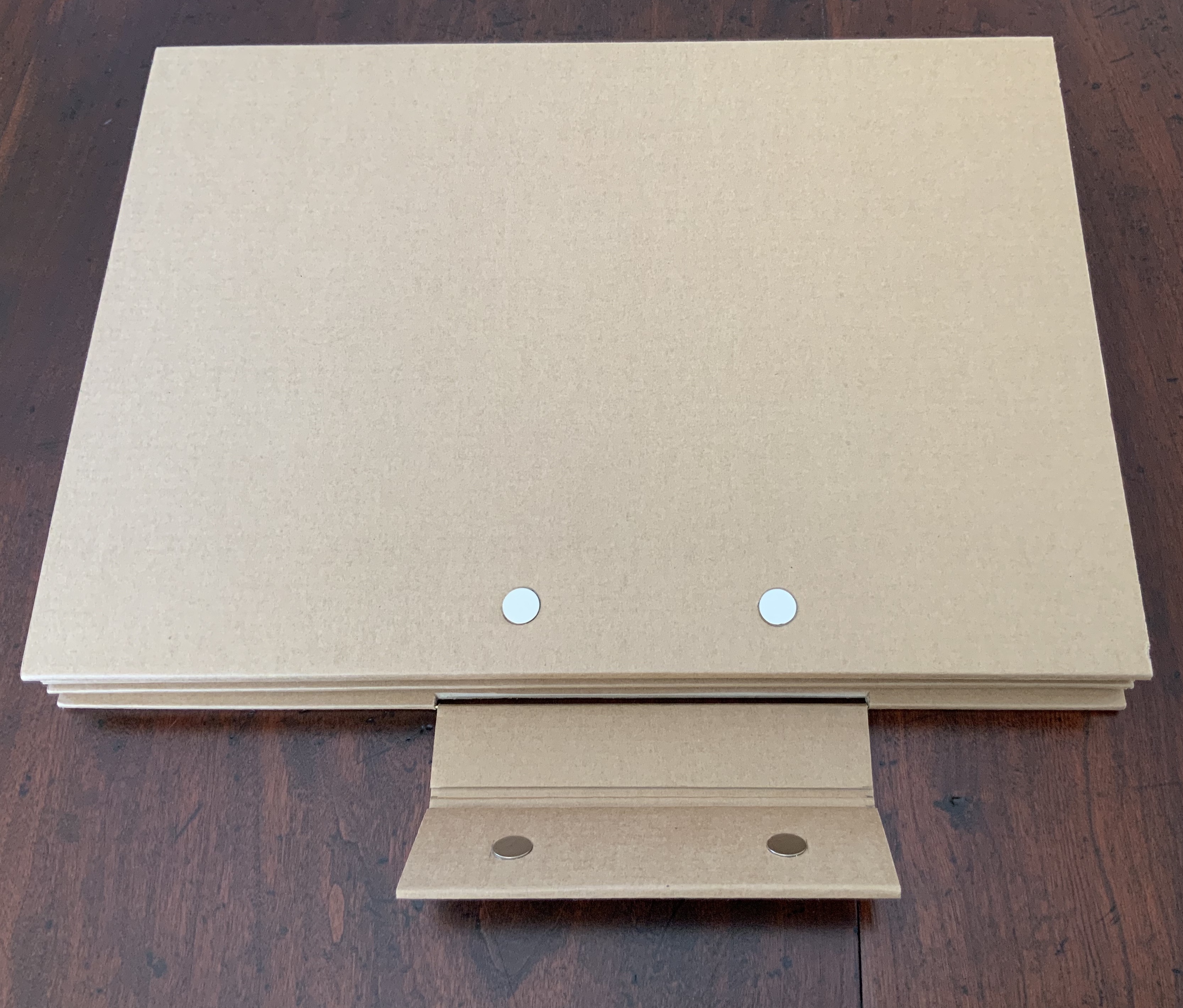
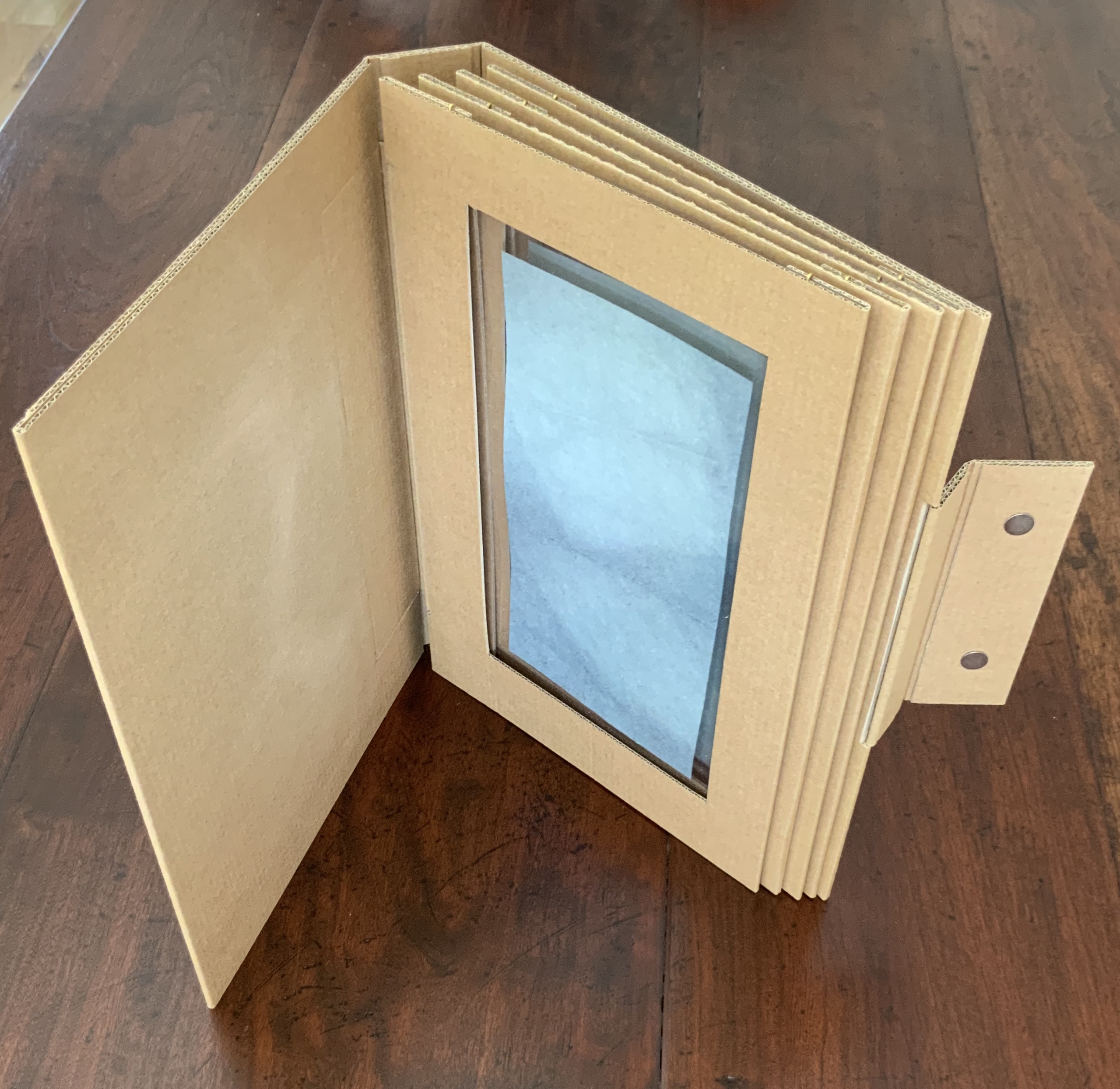
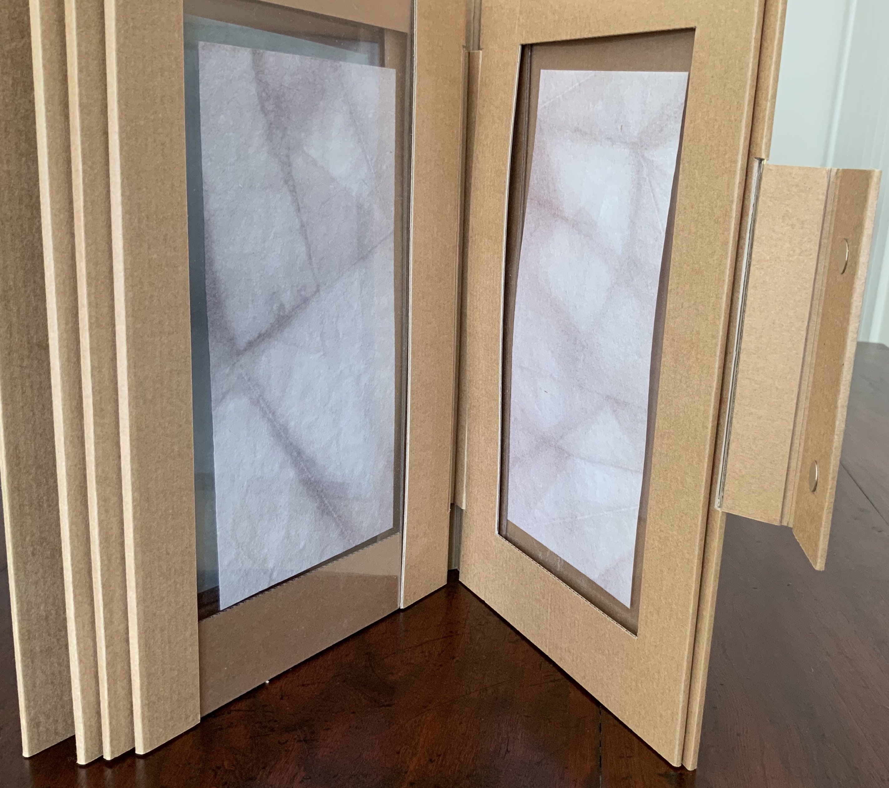
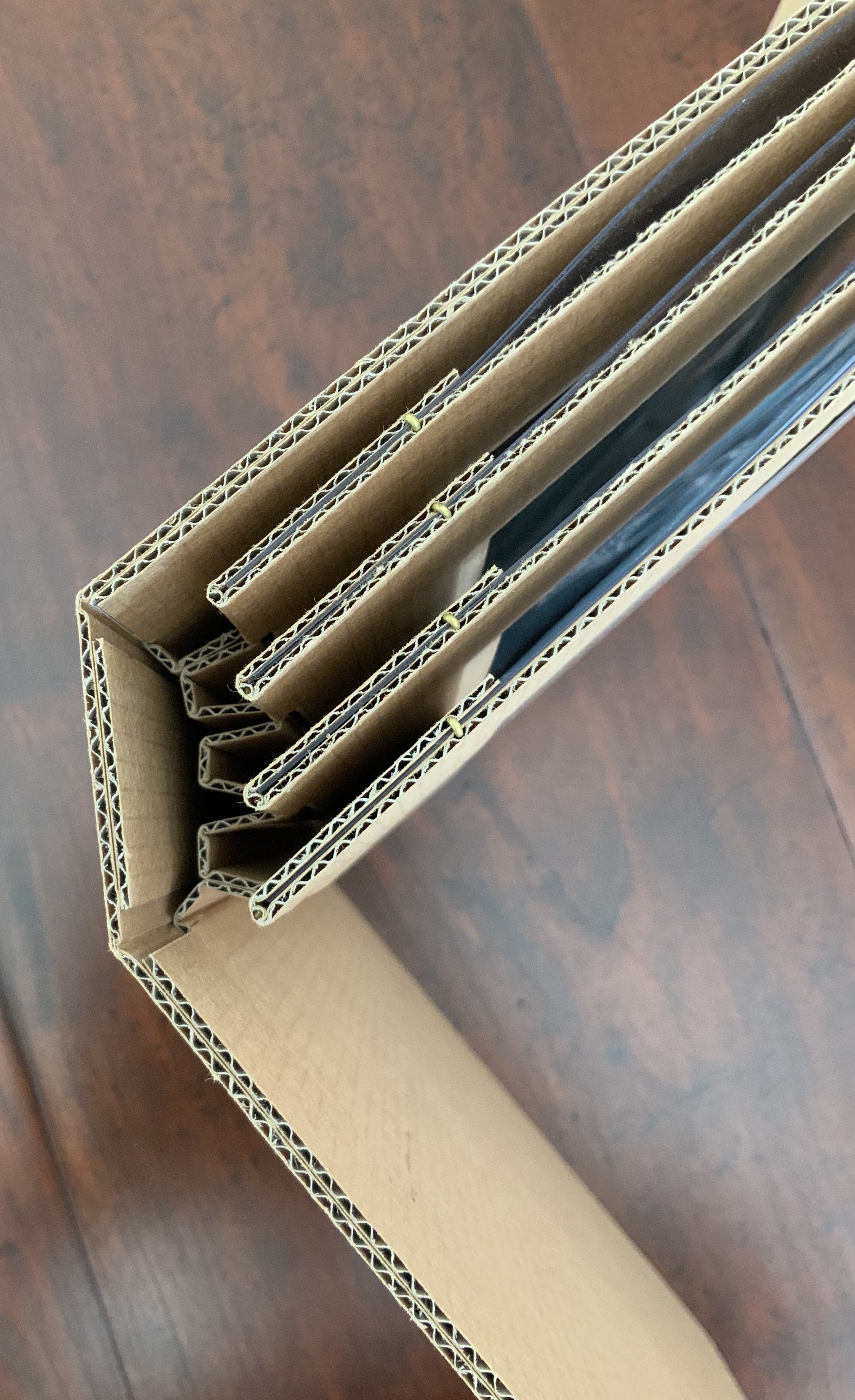
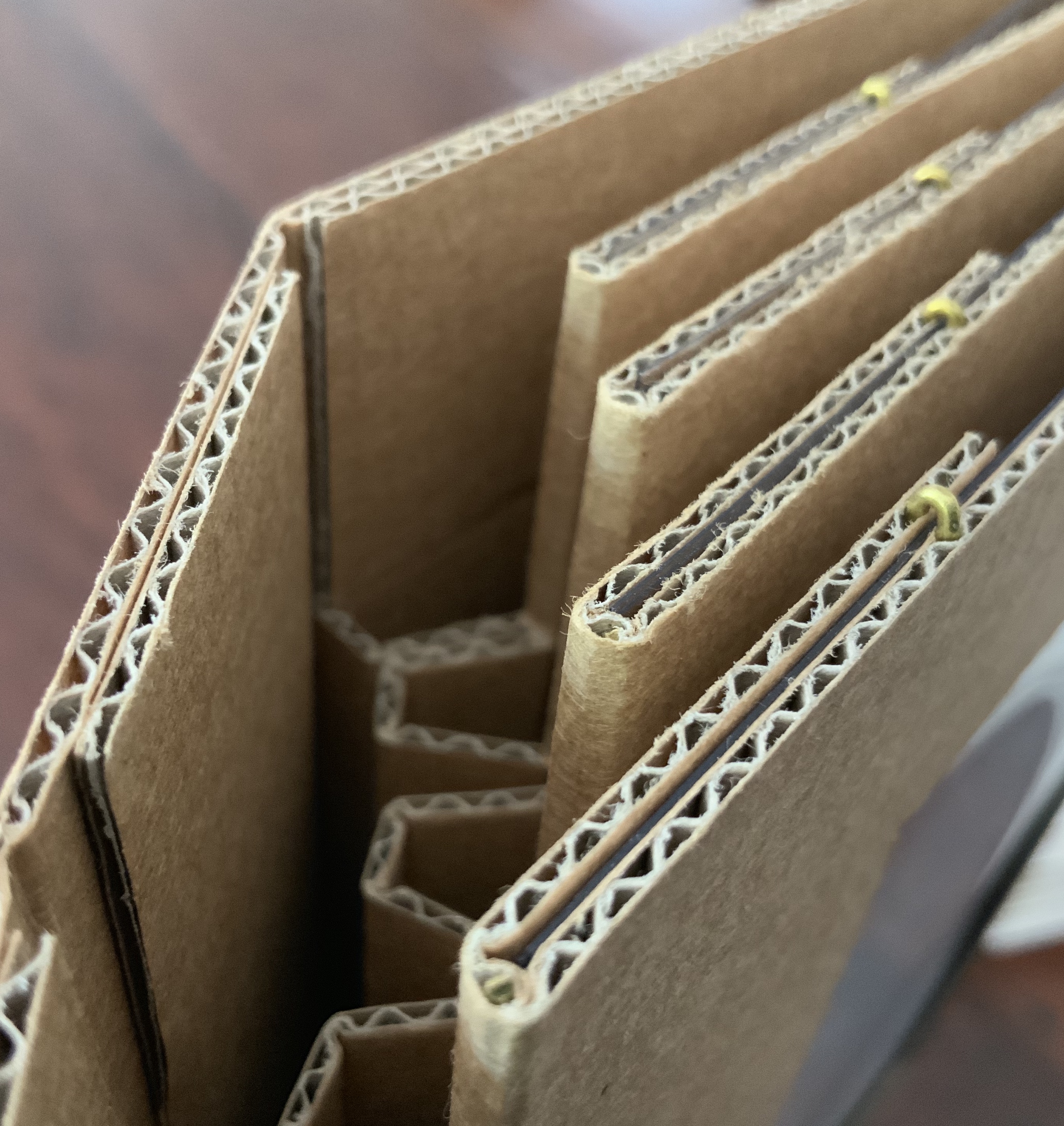
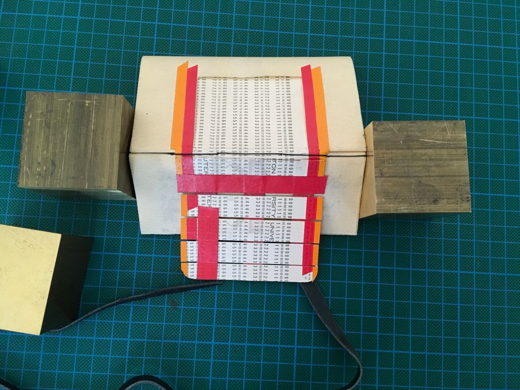
Aerssens loves cardboard as a material and created Clamp to illustrate its beauty. It illustrates, too, his constant search for elegant closures (whether with magnets, folds, pin/dowel or tabs and slots). As he put it in a conversation, “I’m a structure guy”.
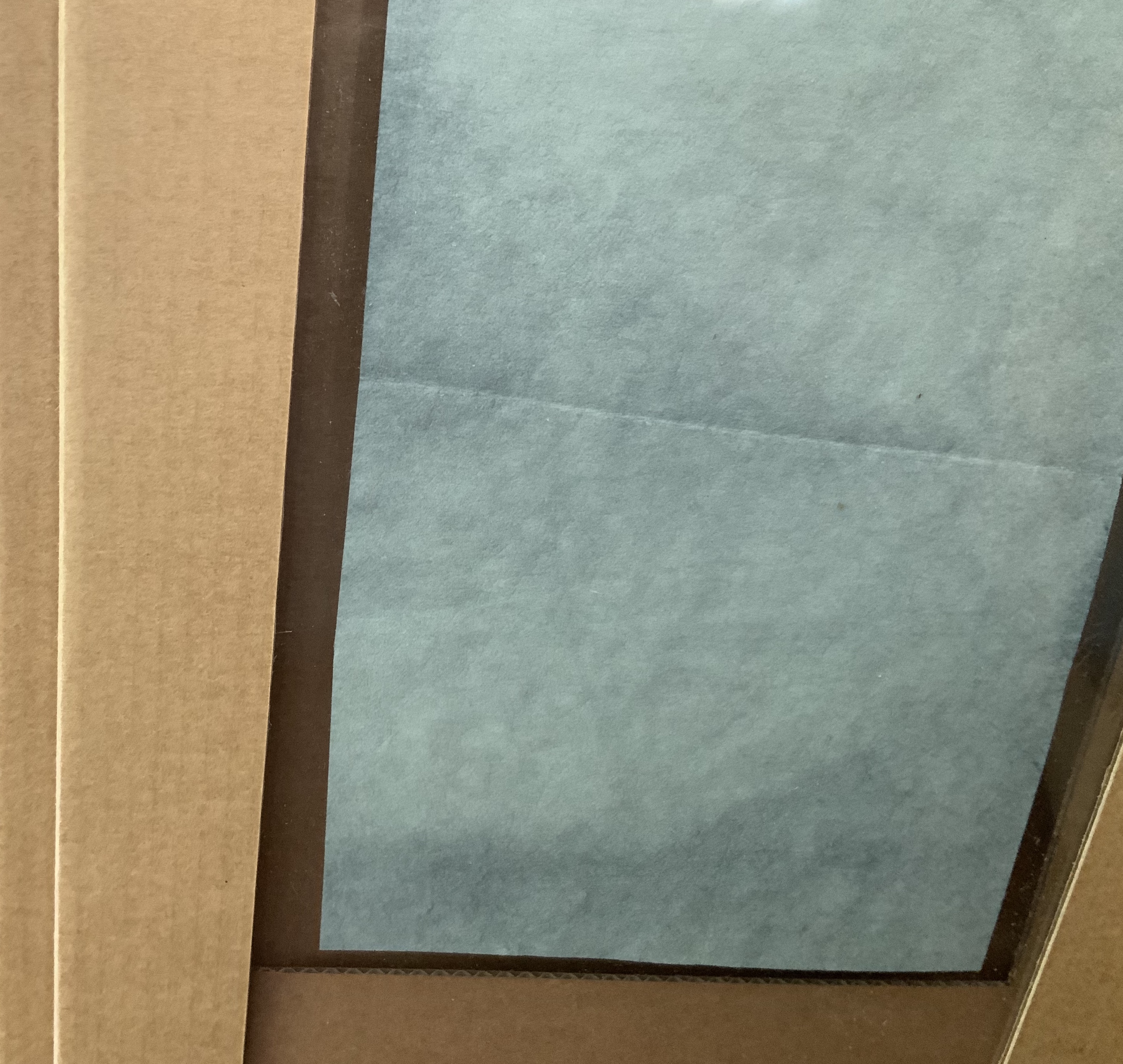
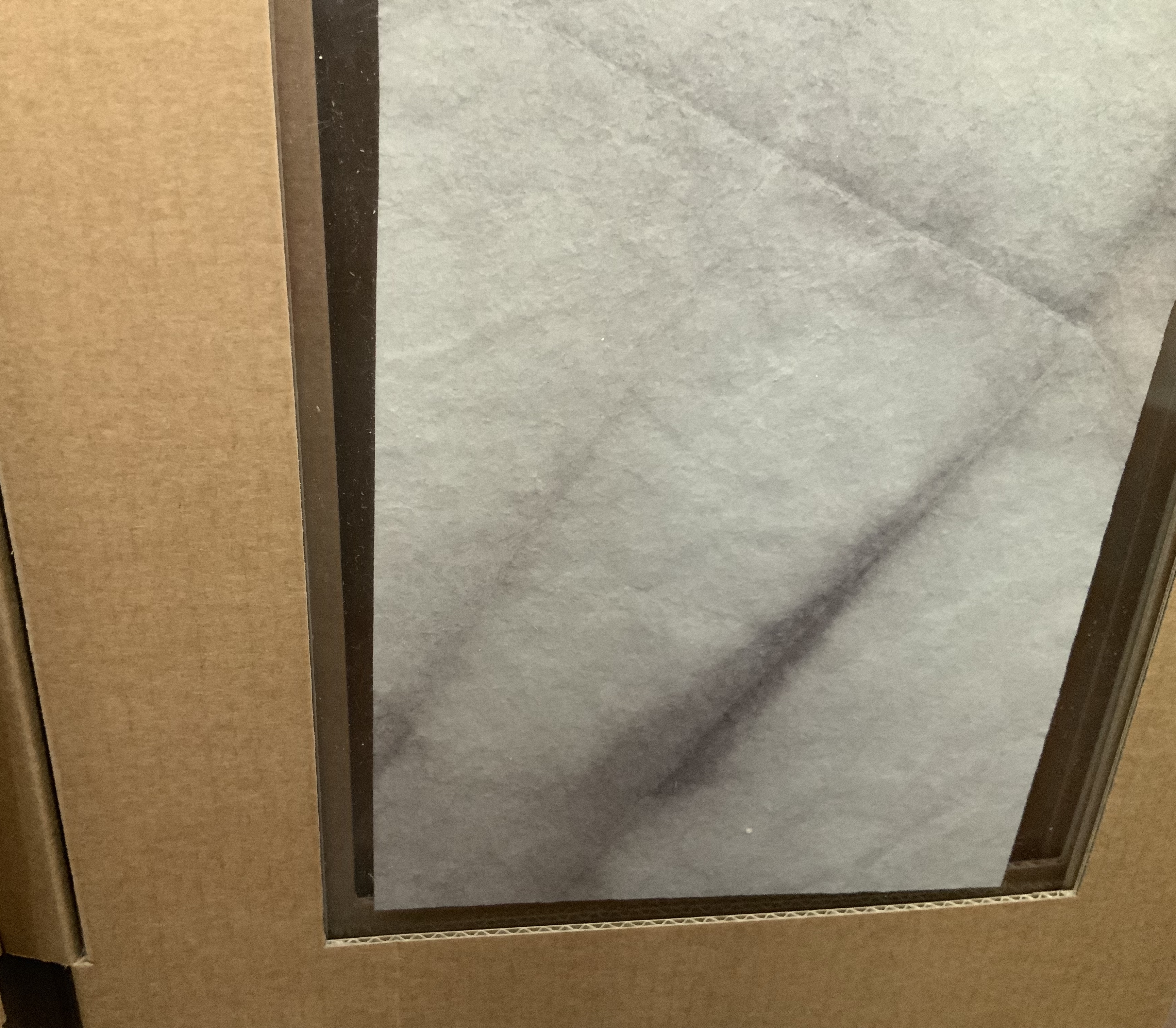
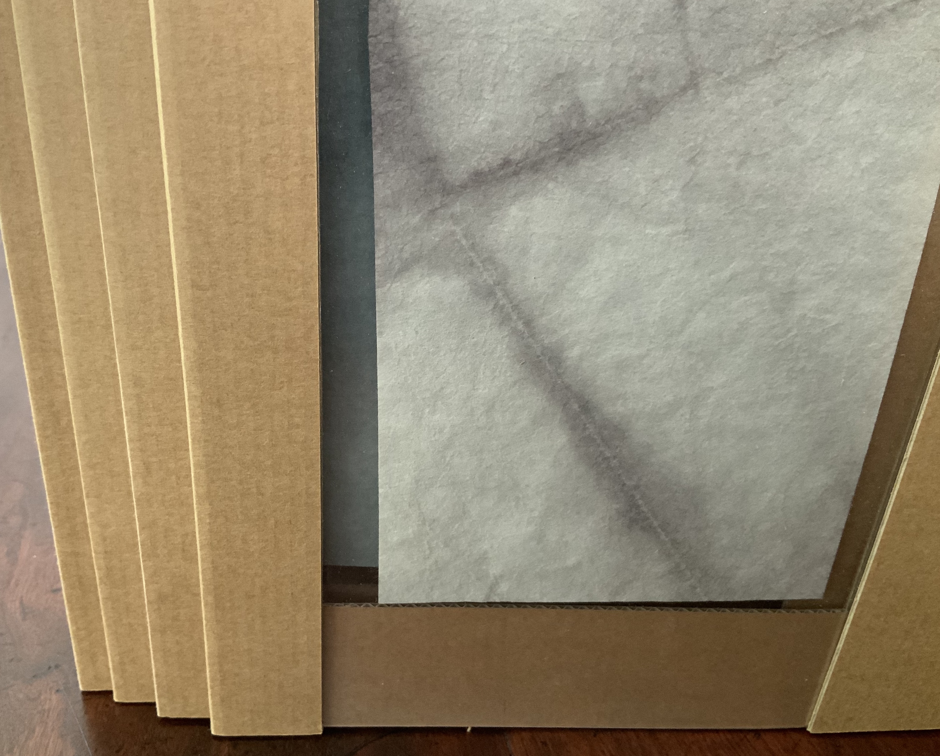
The four tinted papers that hang like small abstract paintings in the framing pages speak to another of Aerssens’ comments about his leanings: “Presentation — display — has always interested me”.
Aerssens’s first employment was in bookbinding, but early on, he turned to carpentry and its engineering side before ultimately returning to bookbinding and containers of books and other objects. The experience of careful planning and a carpenter’s approach shines out of his every work. Look especially under Further Reading at his design work for Pierre Lecuire’s Dédale. Yet his quick answer when asked what other bookbinders probably have to say about him and his work? “The anarchist of bookbinders!”
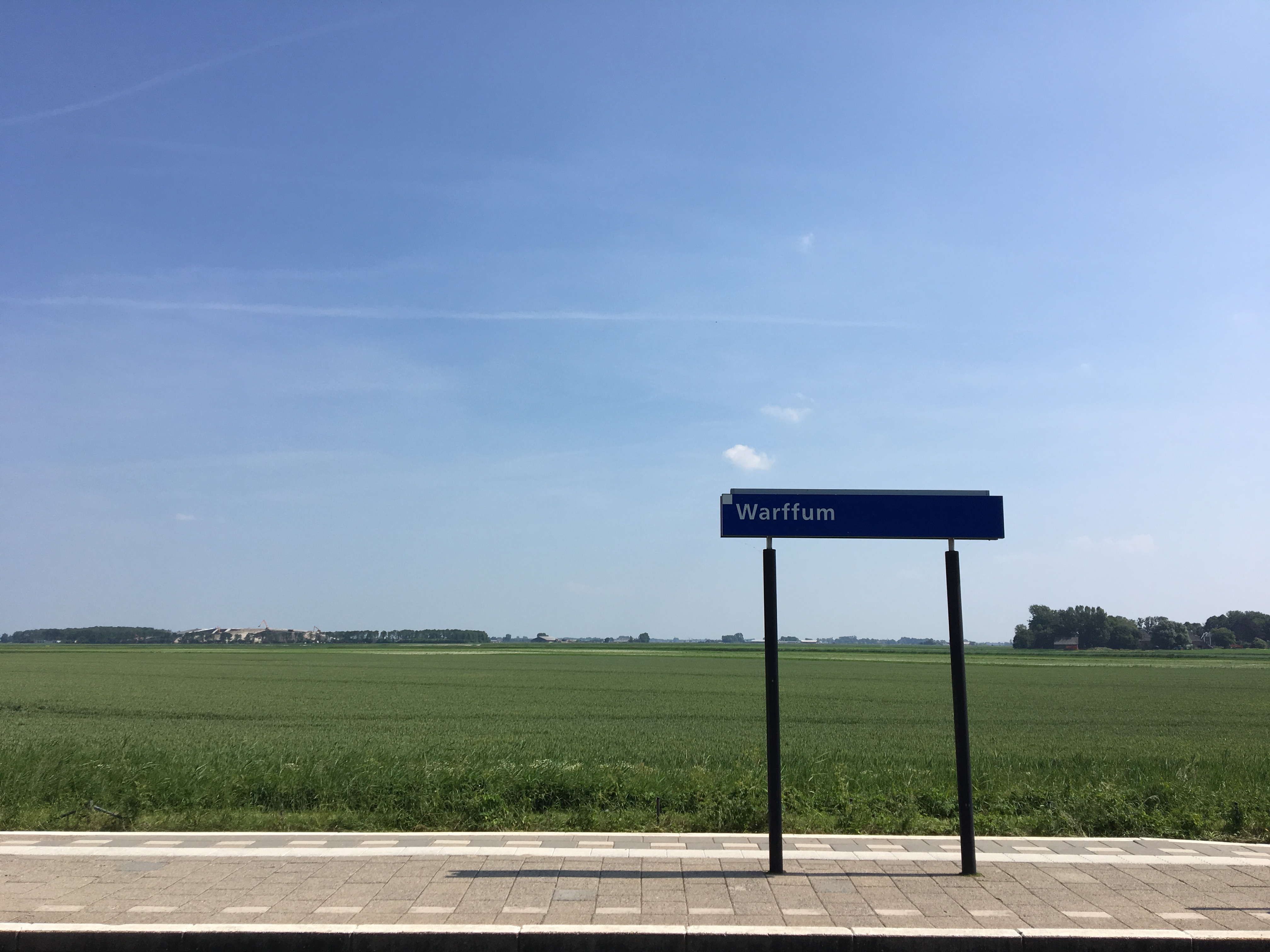
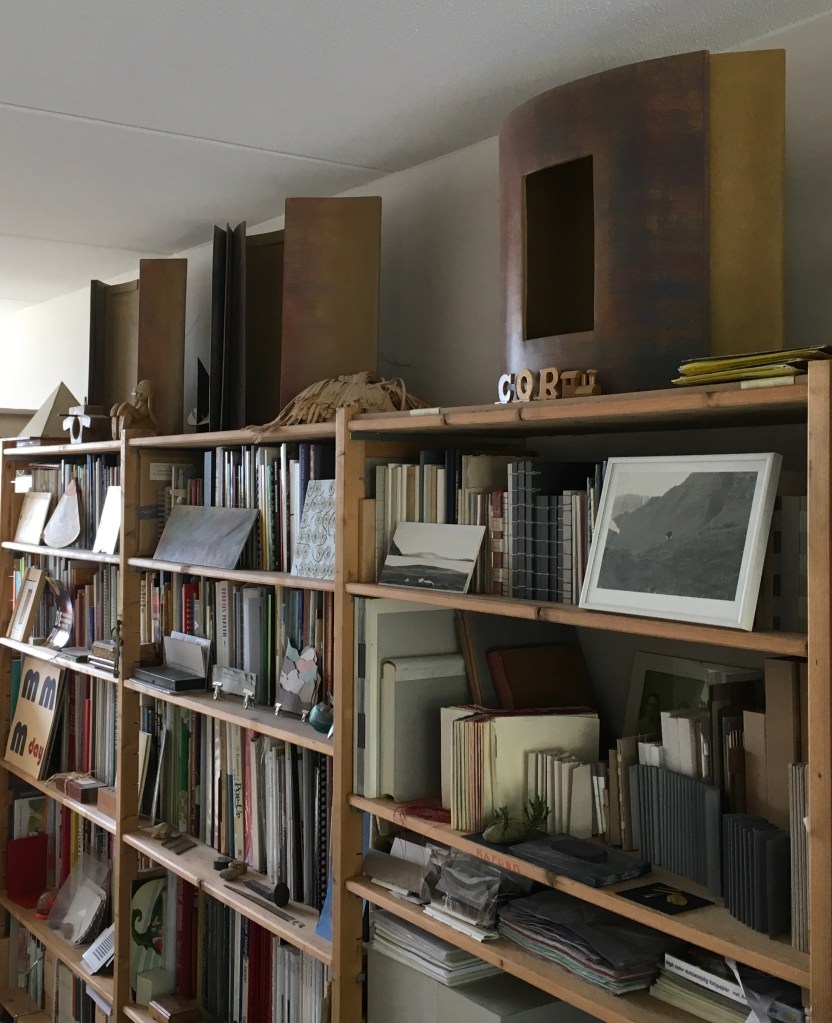
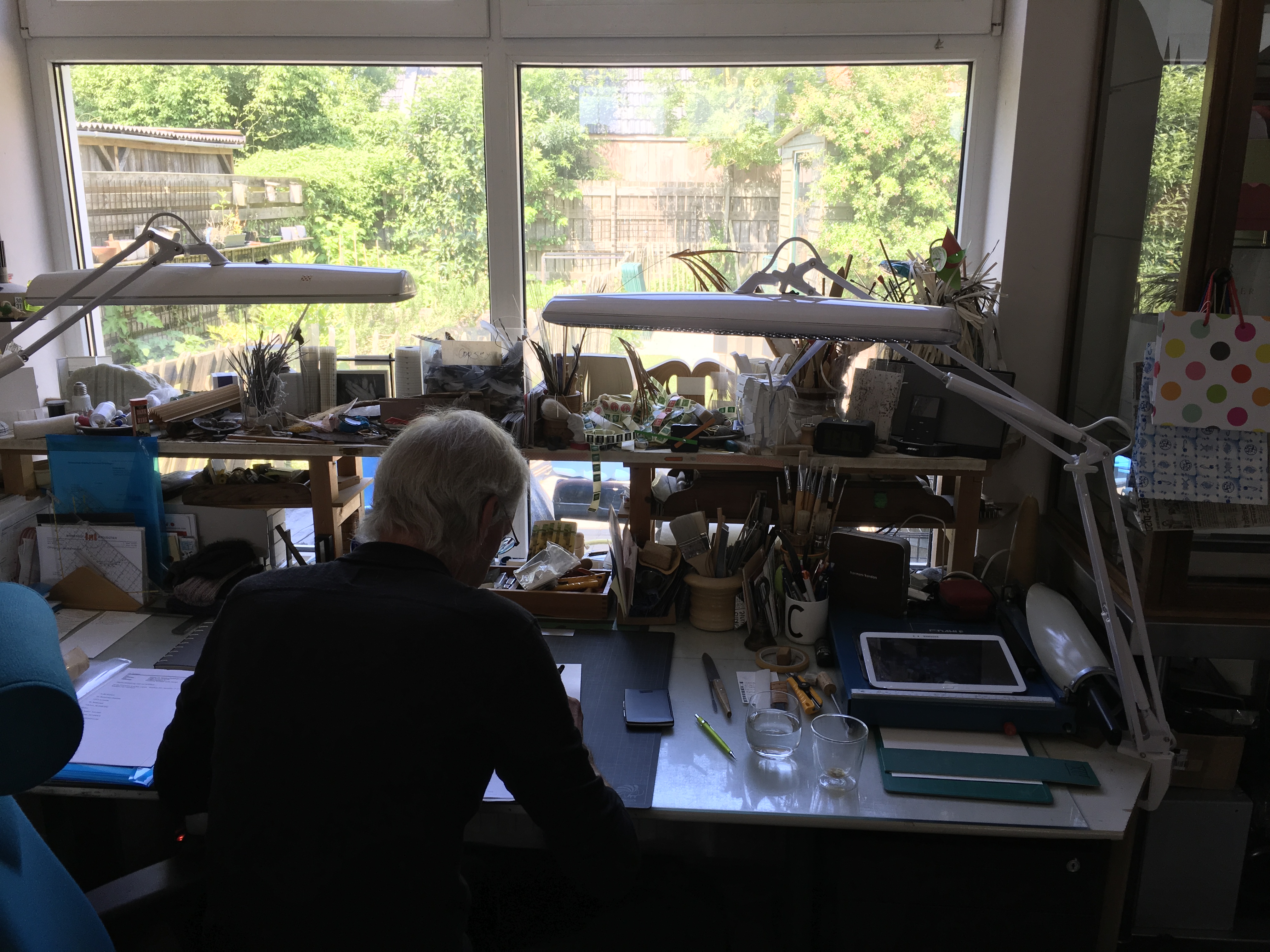
A Visit to Cor Aerssens’ Studio, Warffum, The Netherlands (7 June 2018)
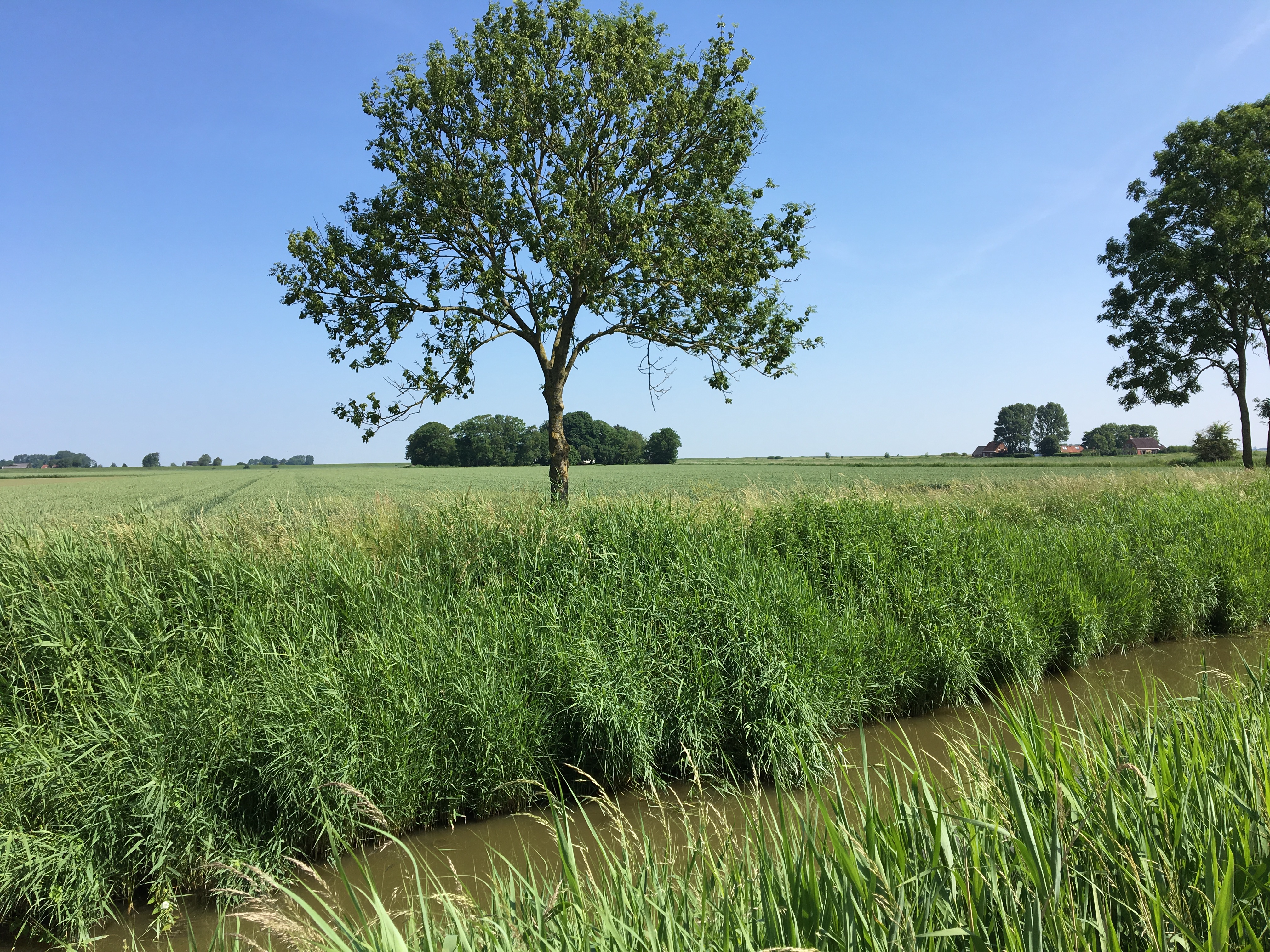
Remote as Warffum may seem from the armchair, it is easily accessible by train (Amsterdam-Groningen-Warffum). Artists from around the world book the small number of places in Aerssens’ workshops years in advance.
The large display objects and containers atop the bookshelf are finished in encaustic, another of the unusual features of Aerssens work.
Good luck spotting on his desk the Corfolder (a bonefolder for boxes). Sweden’s Monica Langwe can provide a Teflon one made to Aerssens’ design if you like.
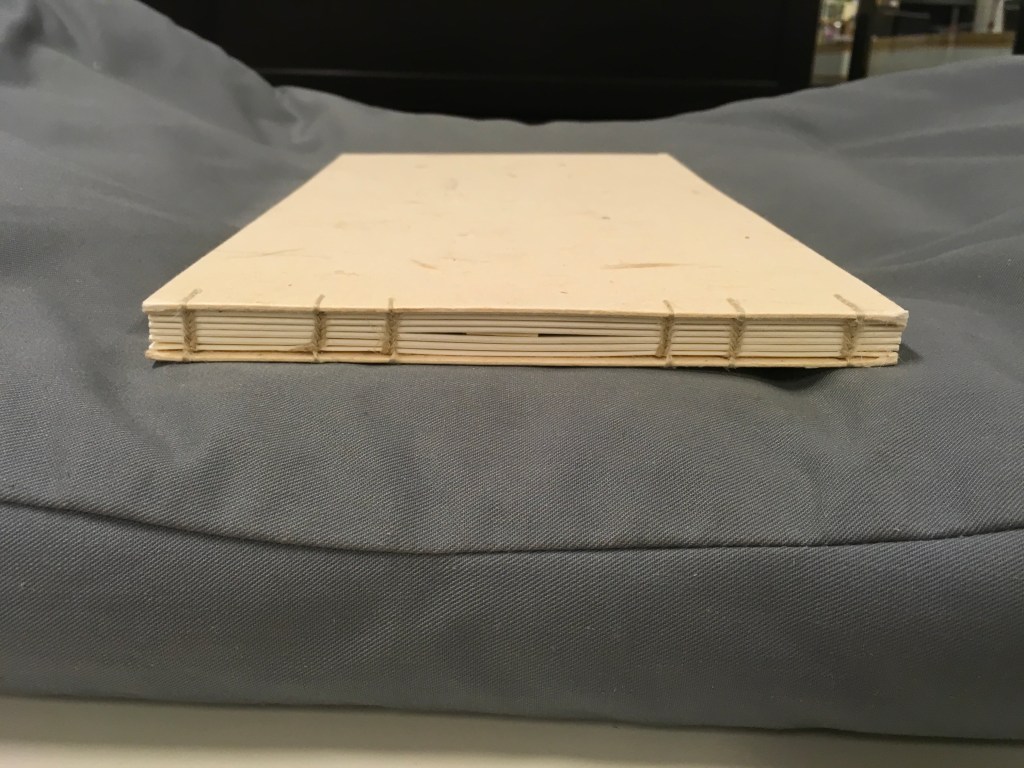
Every work opens to reveal some element of ingenuity such as layered reveal-flaps, framed sheets of mica or double-hinged spines. One of Aerssens several innovations is the Groninger binding, which is generally a fully cardboard binding. Books with this binding open and lay perfectly flat.
A part of the book block is sewn with and integrated in the boards as is the spine, which obviates any need for endpapers or covering on the boards to keep book block and boards together. Other material can be used for a Groninger binding, such as kozo in the example below.
“Judy Goldhill“, Books On Books Collection, 29 June 2020.
Aerssens, Cor. Het dozen : activiteiten rond het begrip ‘dozen’ (Groningen: Cor Aerssens, 1998). Consists of two workbooks on creating boxes: part I ‘construction and covering of functional boxes’ and part II ‘step-by-step plan and objective boxes’.
Aerssens, Cor. “‘Box’: A Monument to the Last Period of a Friendship.” New Bookbinder, vol. 32, July 2012, p. 23.
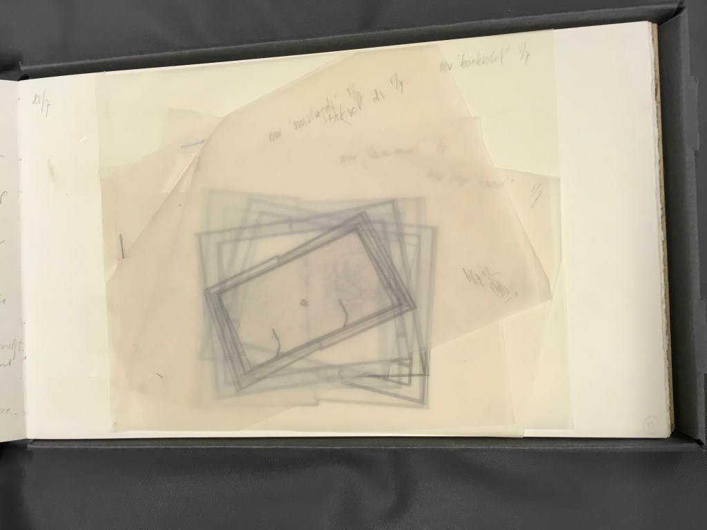
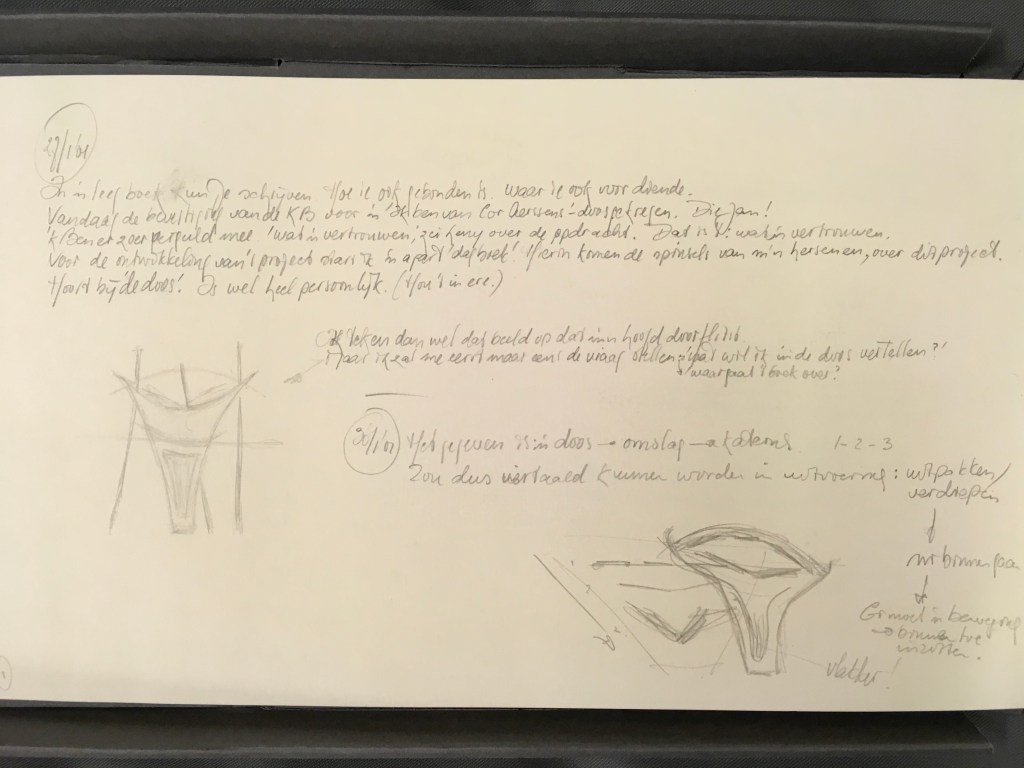
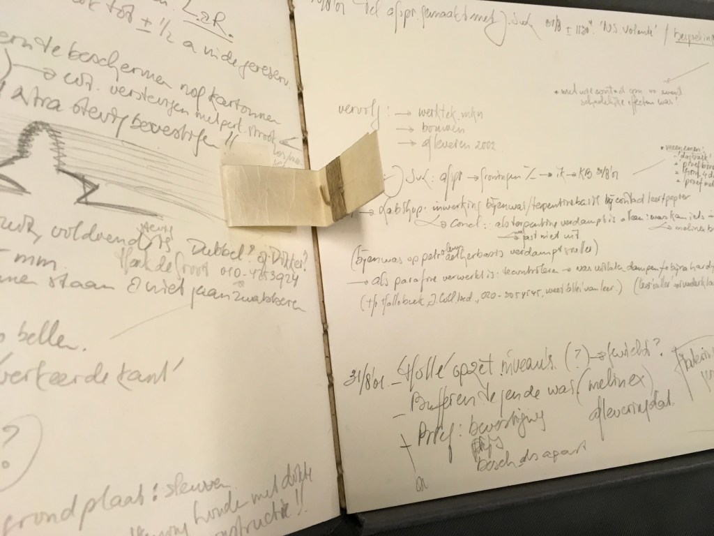
Aerssens, Cor. Ontwerp van Cor Aerssens voor Dédale van Pierre Lecuire. Met aantekeningen en schetsen (Warffum, 2003). The Koninklijke Bibliotheek commissioned Aerssens to create a display/binding for Lecuire’s artist’s book with André Lanskoy Dédale. In addition to the five boxes stacked in a pyramid (not pictured here), Aerssens delivered his detailed design notes and sketches (shown below), which demonstrate his carpentry background.
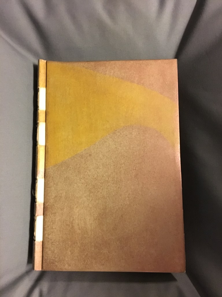
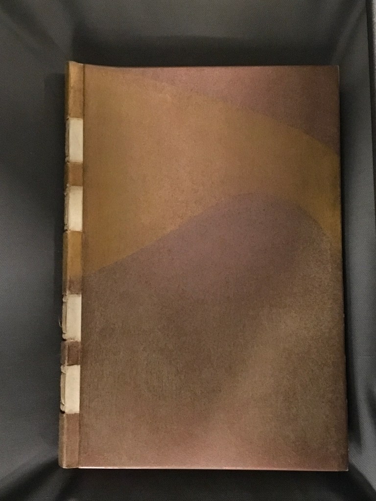
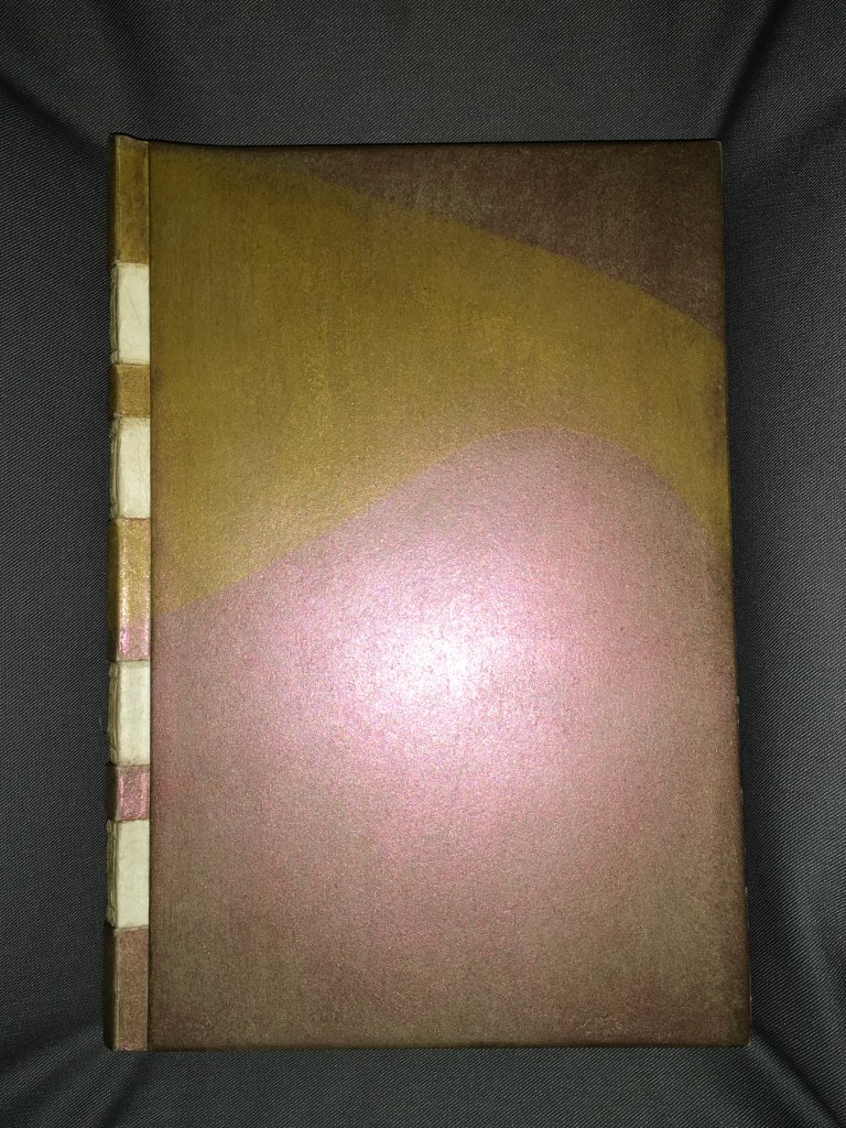
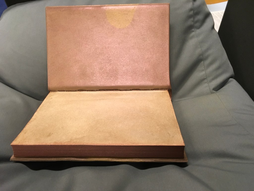
Goddijn, Peter. Westerse boekbindtechnieken van Middeleuwen tot heden: een handleiding voor het maken van boekmodellen (Amsterdam: De Buitenkant, 2001). Boekband. Met was behandeld bord in tinten goudbruin, en goudgeel (Warffum, 2002). The KB also commissioned this binding of Goddijn’s guidebook to making book models, based on his study of bookbinding techniques from the Middle Ages to the present. Note the encaustic finish of the cover and end papers. As the cover moves, the finish shimmers and changes colours across that spectrum of yellow-brown to yellow-gold in a way that the photos are hard-pressed to capture. In the preceding section, other works with an encaustic finish can been seen on the top shelf in the workshop photo. The binding itself takes a cue from the book’s content (see below), but it is in fact a Groninger binding (see section above).
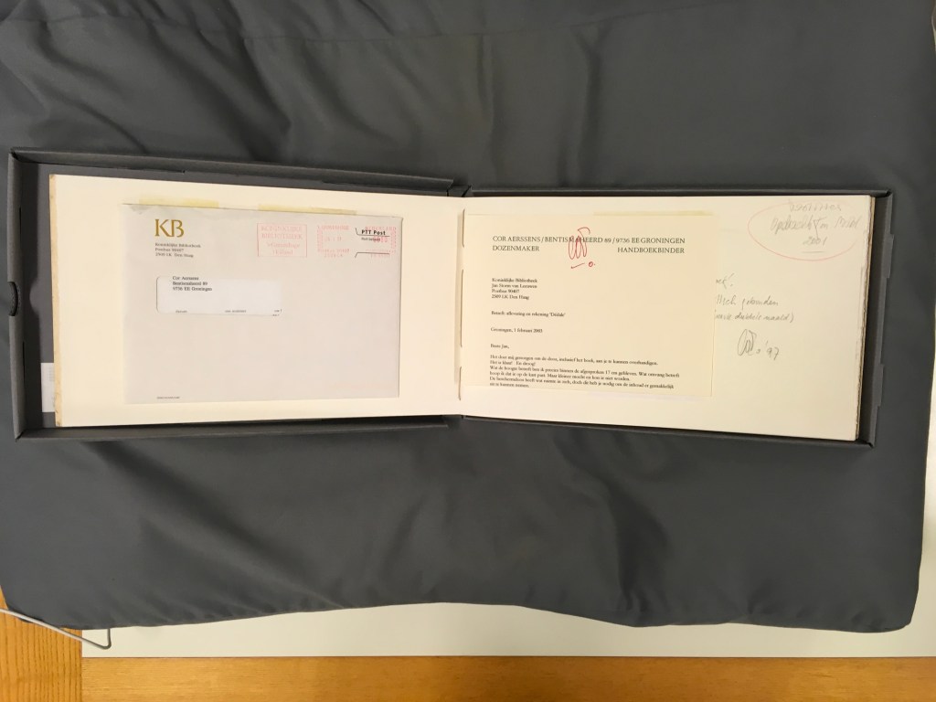
My thanks to Paul van Capelleveen and the staff at the Dutch National Library in The Hague for their kind assistance.
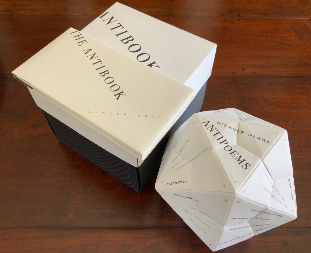
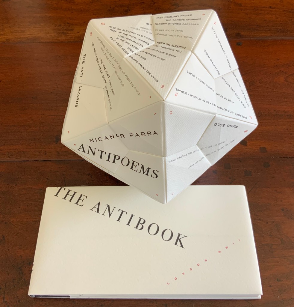
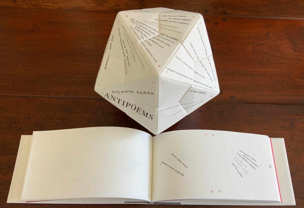
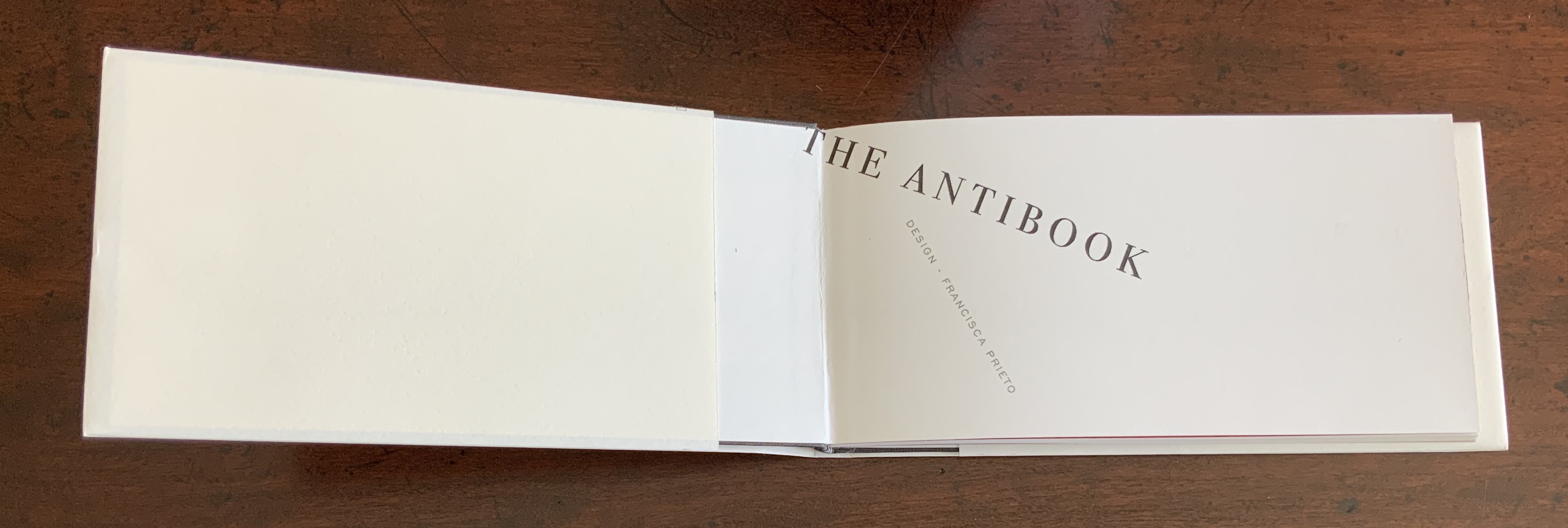
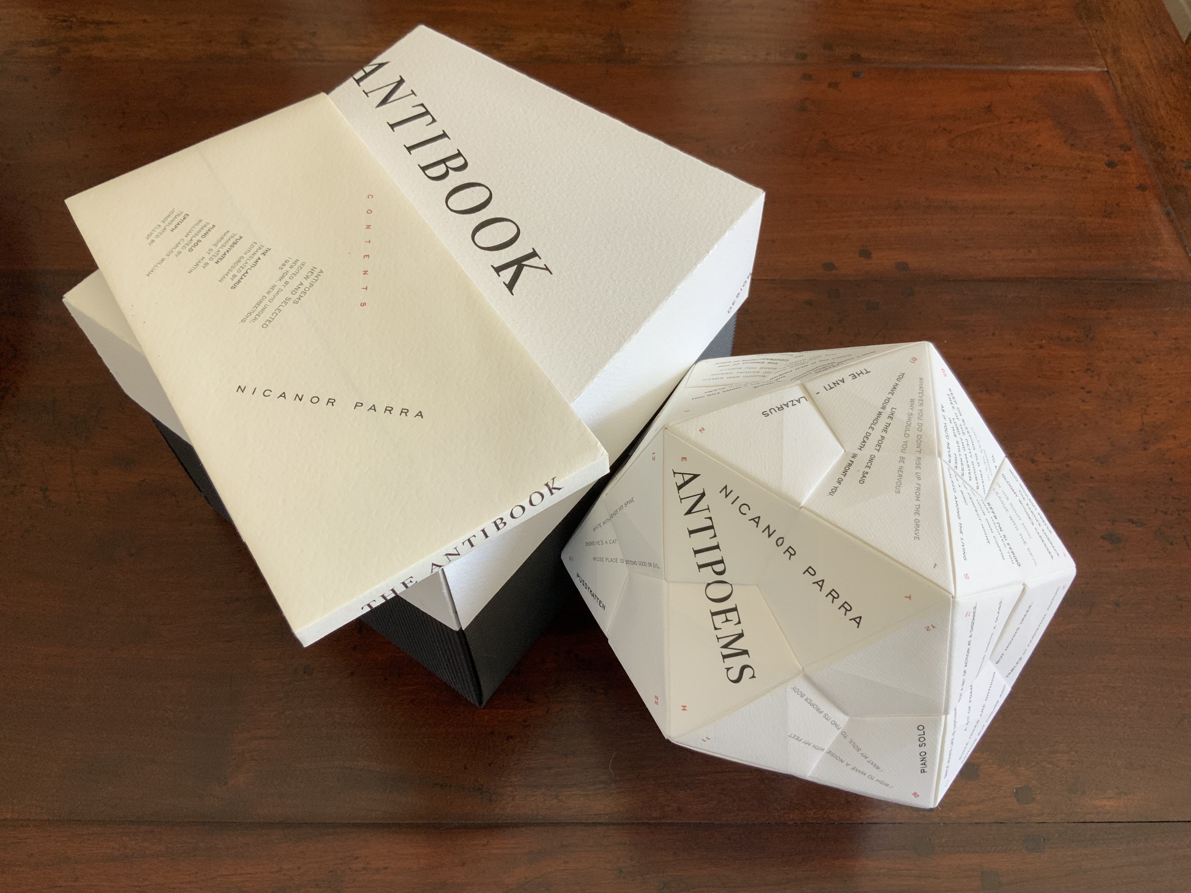
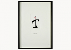
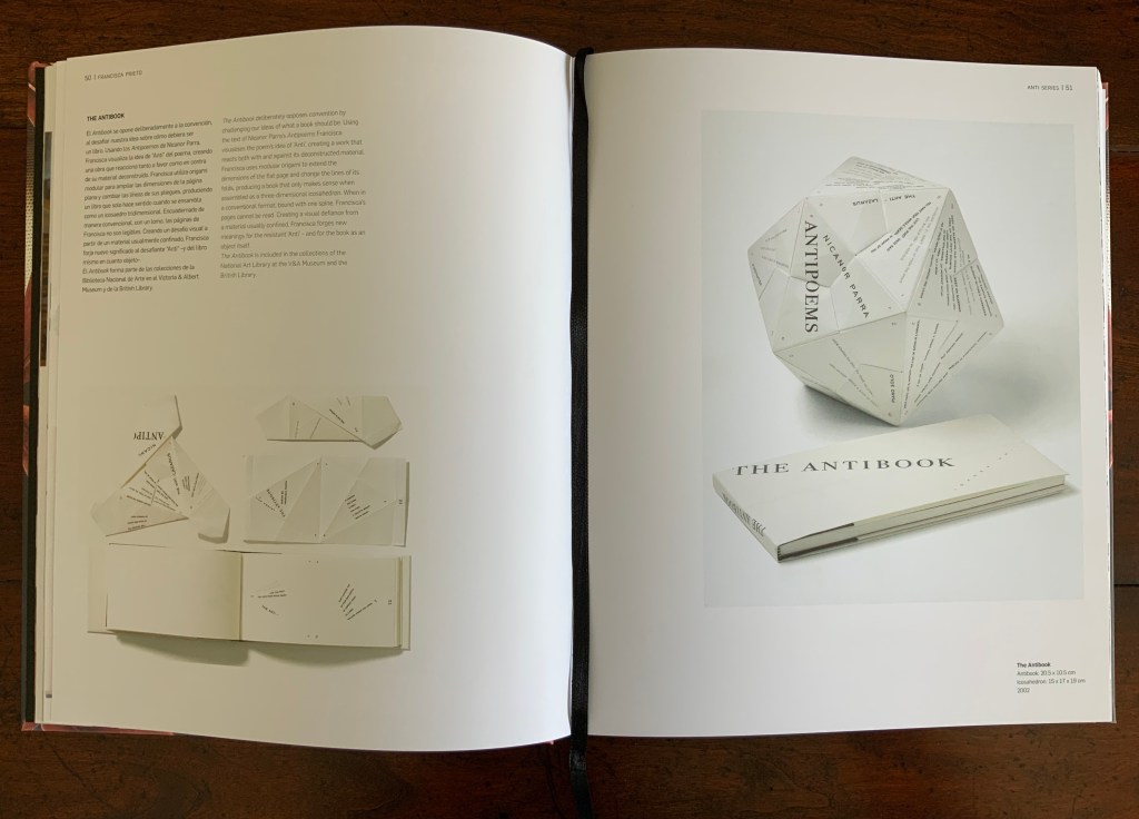
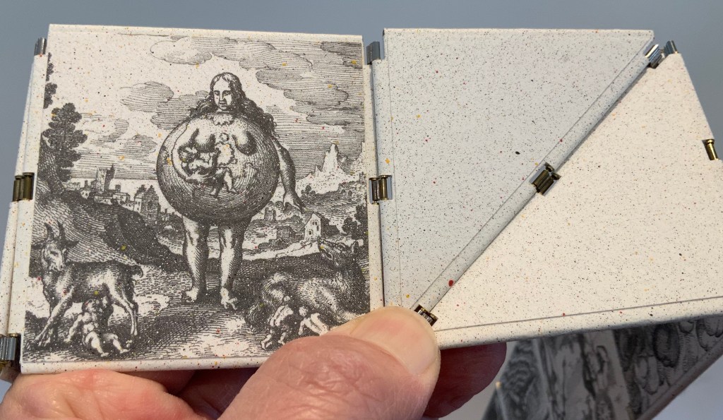
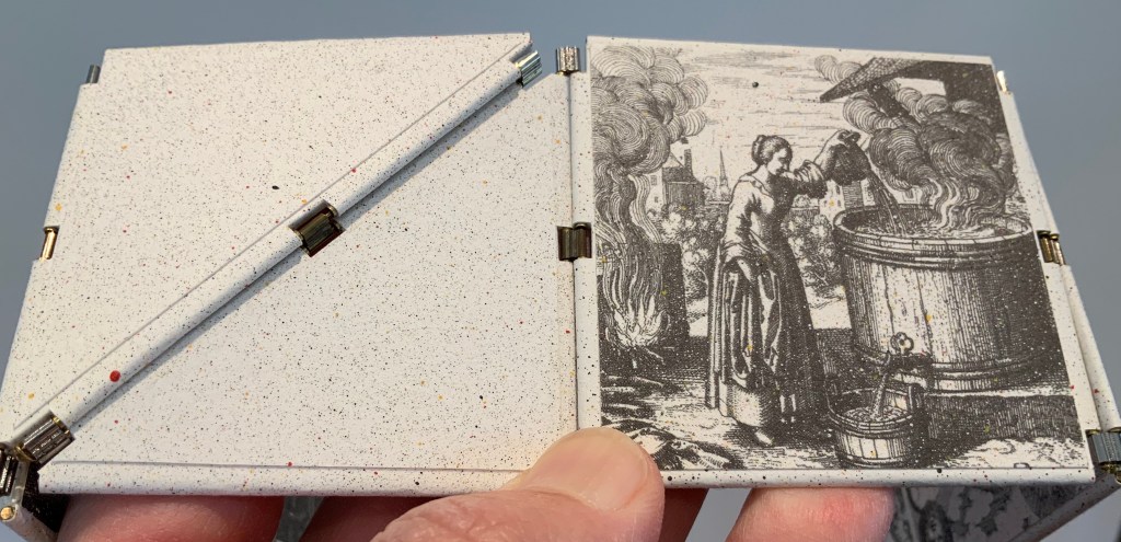
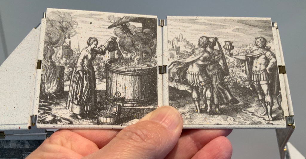
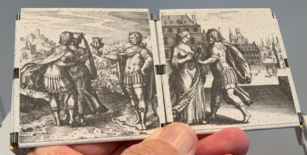
The Antibook (2002) Francisca Prieto Book: 205 x 105 mm Icosahedron: 15 x 17 x 19 cm
The Antibook deliberately opposes convention by challenging our ideas of what a book should be. Using the text of Nicanor Parra’s AntiPoems Francisca visualises the poem’s idea of ‘Anti’, creating a work that reacts both with and against its deconstructed material.
Francisca uses modular origami to extend the dimensions of the flat page and change the lines of its folds, producing a book that only makes sense when assembled as a three-dimensional icosahedron. When in a conventional format, bound with one spine, Francisca’s pages cannot be read. Creating a visual defiance from a material usually confined,
Francisca forges new meanings for the resistant ‘Anti’ – and for the book as an object itself.
To hold and turn The Antibook in your hands to read Parra’s poems makes the book of poems strangely more palpable than the conventionally bound version. The work as a whole has its maximum effect when the reader/viewer engages with both the icosahedron and bound book, weighing the experience of each against the other.
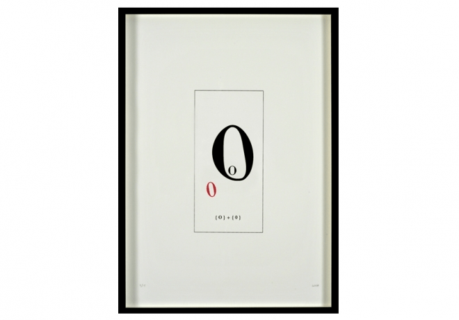
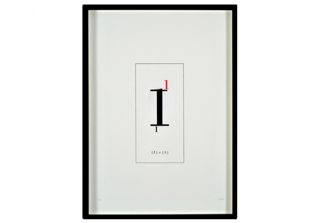
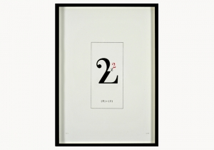
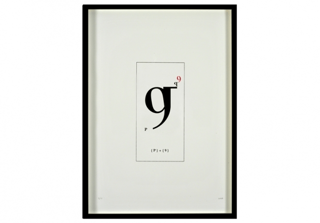
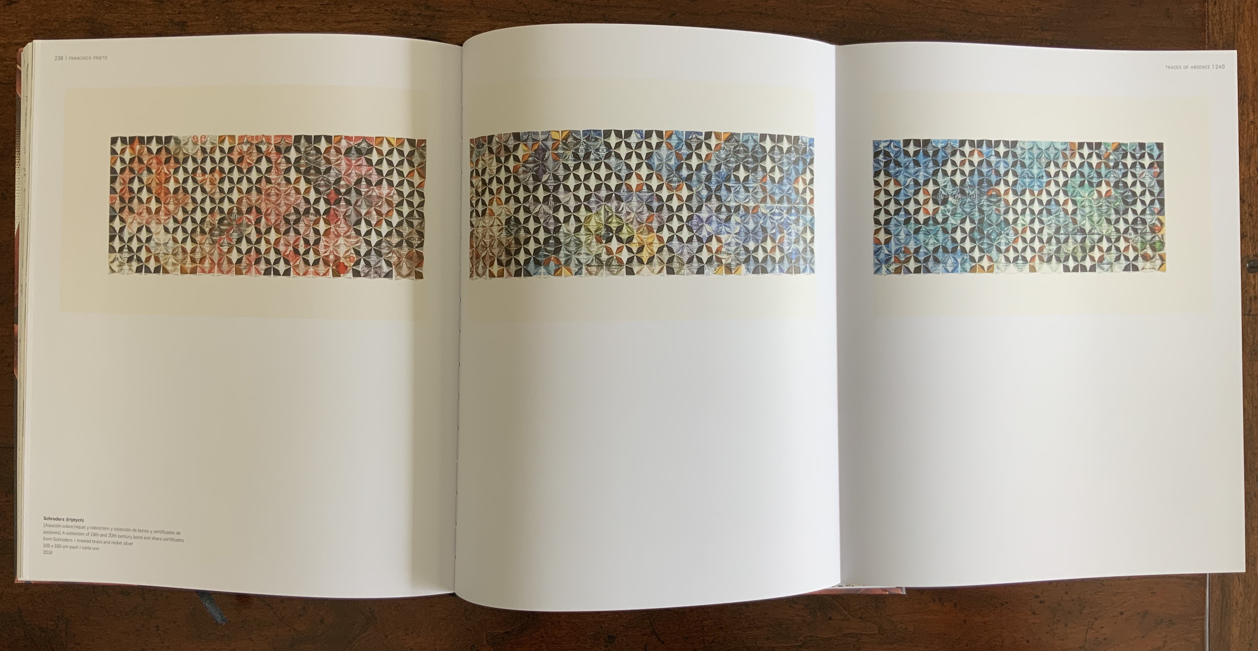
By investigating the nature of print, numerical and alphabetic characters, the Printed Matter Series alludes to, or poses, a partial origin story for the alphabet. Archaeological finds suggest that numbers preceded letters, and the Hebrew alphabet includes numbers with its letters.
Graphic artists and, especially book artists, seem to place the characters we use to express any word or message right alongside ink, paint, paper as just one more raw material for making art. As Prieto writes on her site,
Breaking down the lines of typographical characters, meaning is celebrated for its form, abstracting the shapes of these figures curious yet perfunctory flicks, curves and flourishes. Type’s personality is felt through its familiarity, so when these recognisable symbols are split, adjoined and turned on their head, the results are playful and stylised – questioning our own oblivious acceptance of the way things ought to be or read.
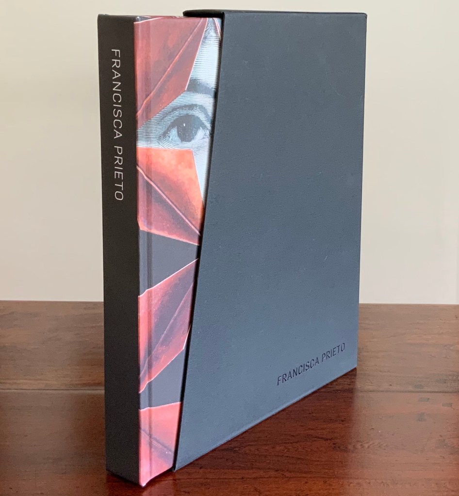
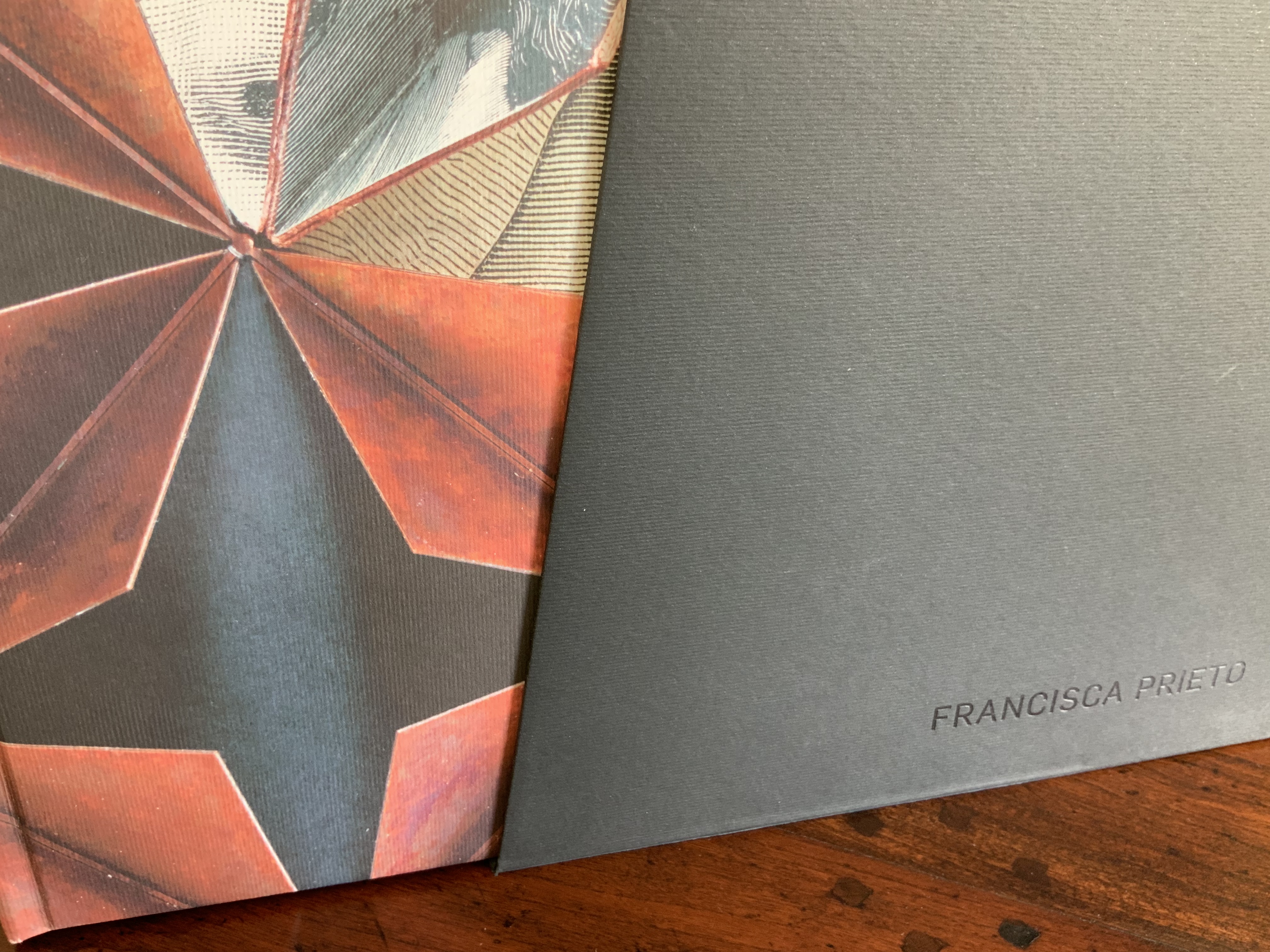
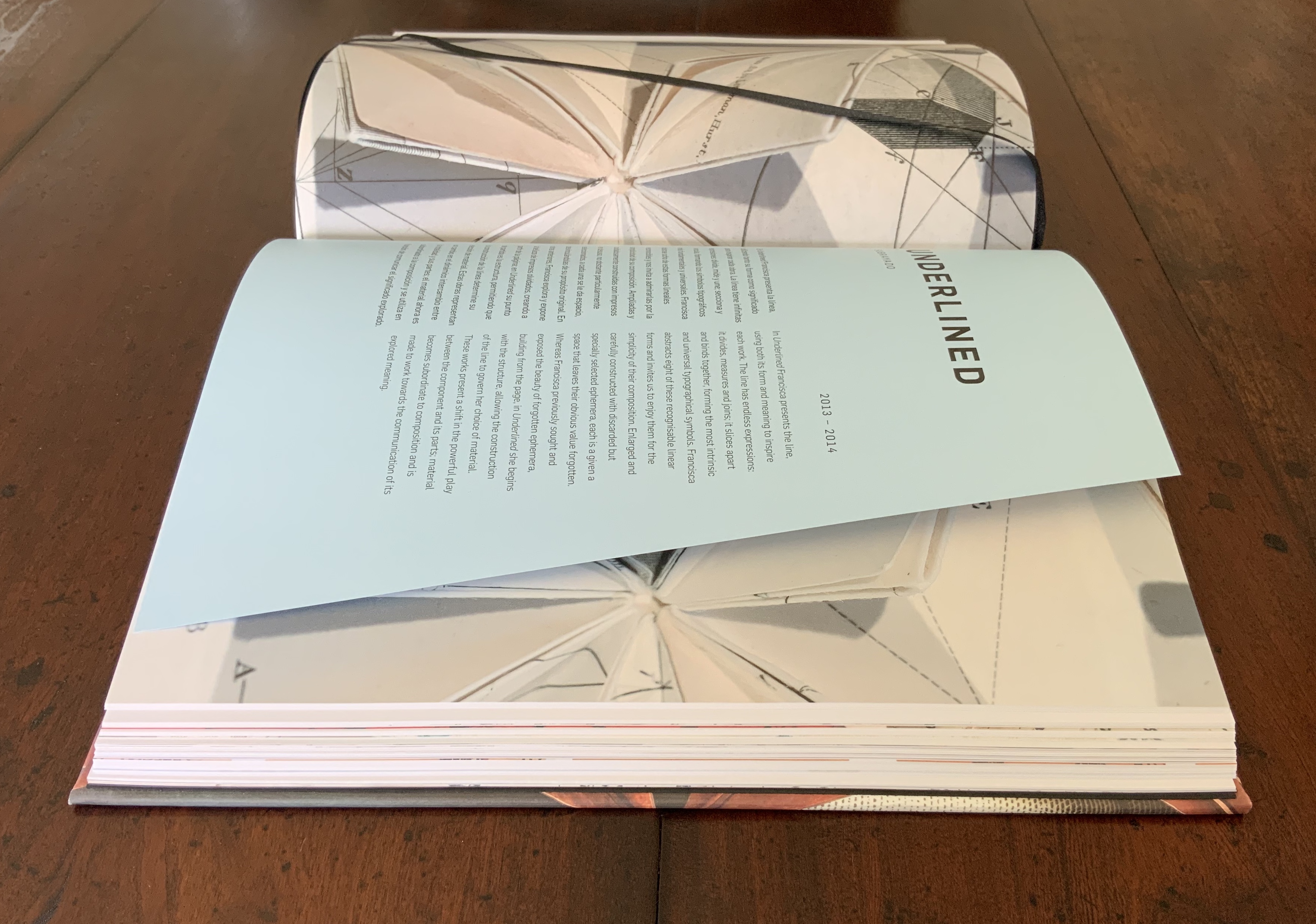
Francisca Prieto (2018)
Hill, Sophie. Francisca Prieto (Santiago, Chile: Fundación Lustro, 2018). Hardback – slipcased, 300 pages, 250+ Ills Bilingual: English and Spanish Limited edition of 2200 230 x 280 x 35 mm
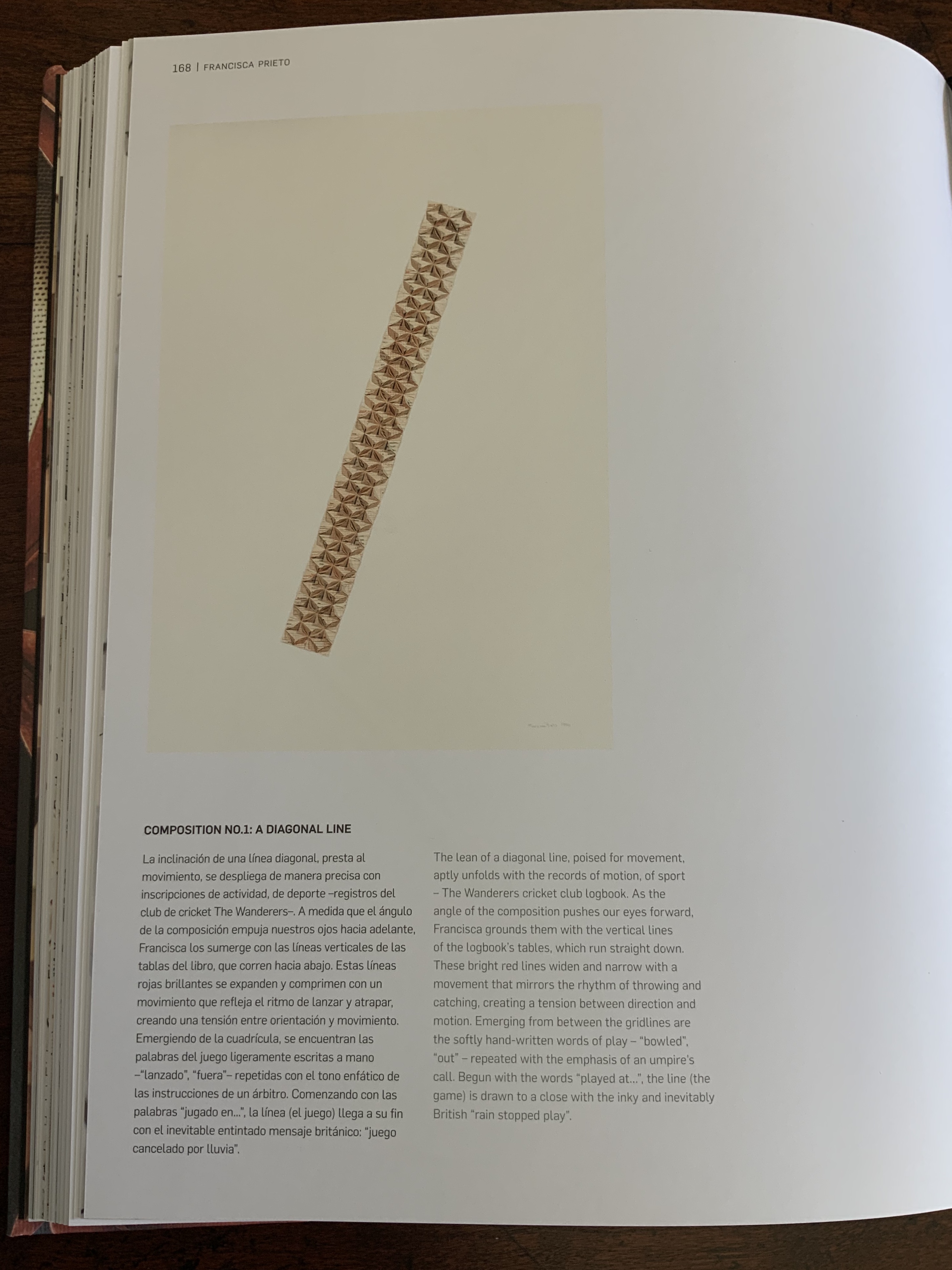
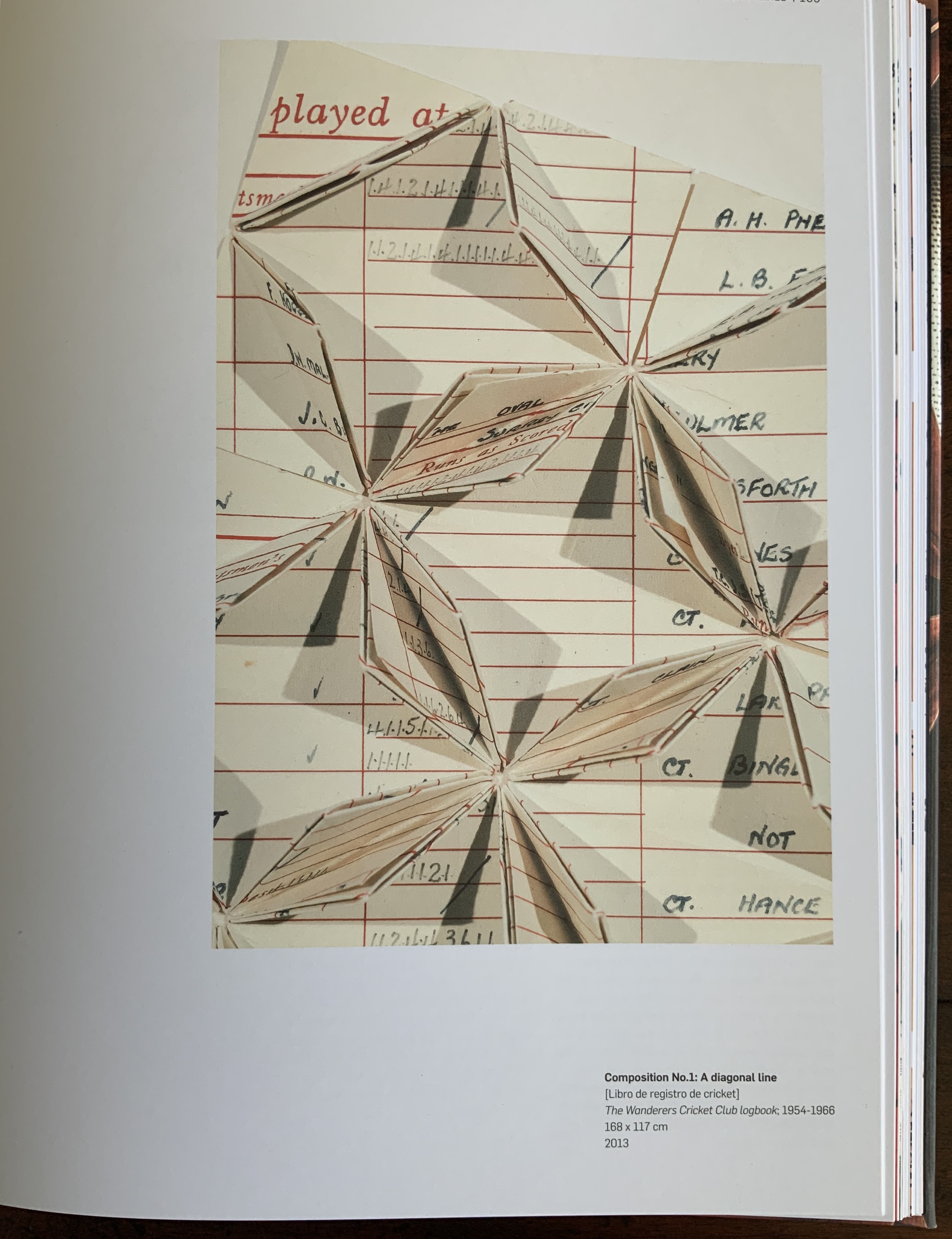
Having seen Composition No. 1, I can attest to the precision of its folds. Like The Antibook and all of Prieto’s works I have seen, it is nearly impossible to resist touching it. By using this old cricket club record book and placing it on a diagonal like a falling wicket stump, the artist adds paper-dry humour to a beautiful work of book art.
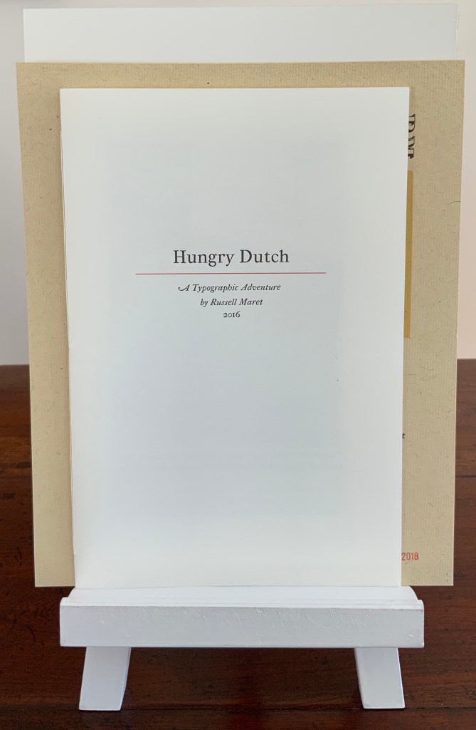
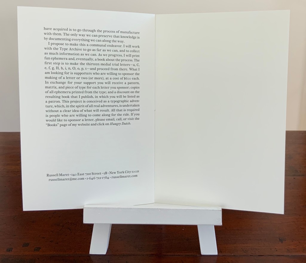
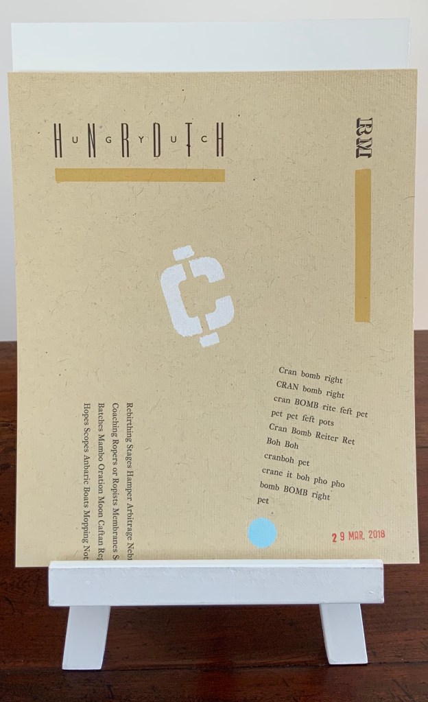
Hungry Dutch: A Typographic Adventure (2016-2020 ) Russell Maret Acquired from the artist, 22 August 2019 – 17 March 2020
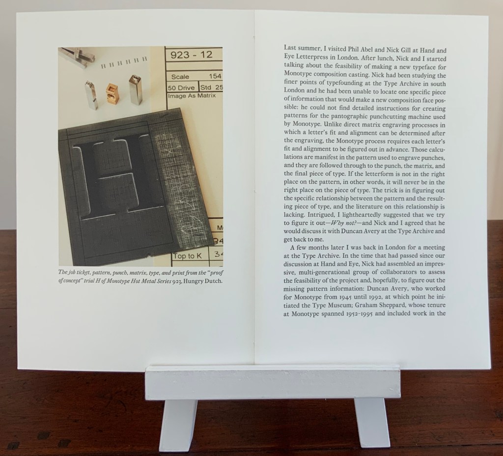
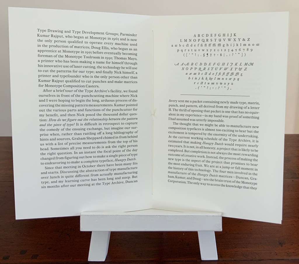
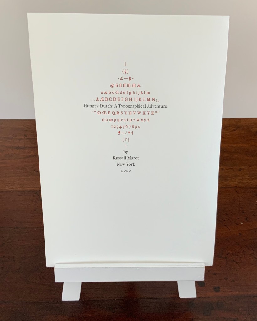
Above is the front cover of the Hungry Dutch prospectus (2016). Below, the contents of the prospectus and front cover of the final 2020 version. The contents describe the history of the design and the start of its manufacture by the Type Archive of London according to Monotype Corporation’s in-house procedures.
The final prospectus (2020)
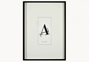
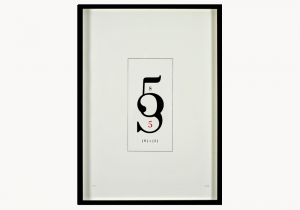
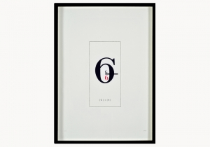
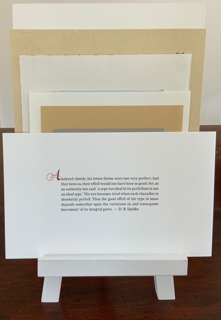
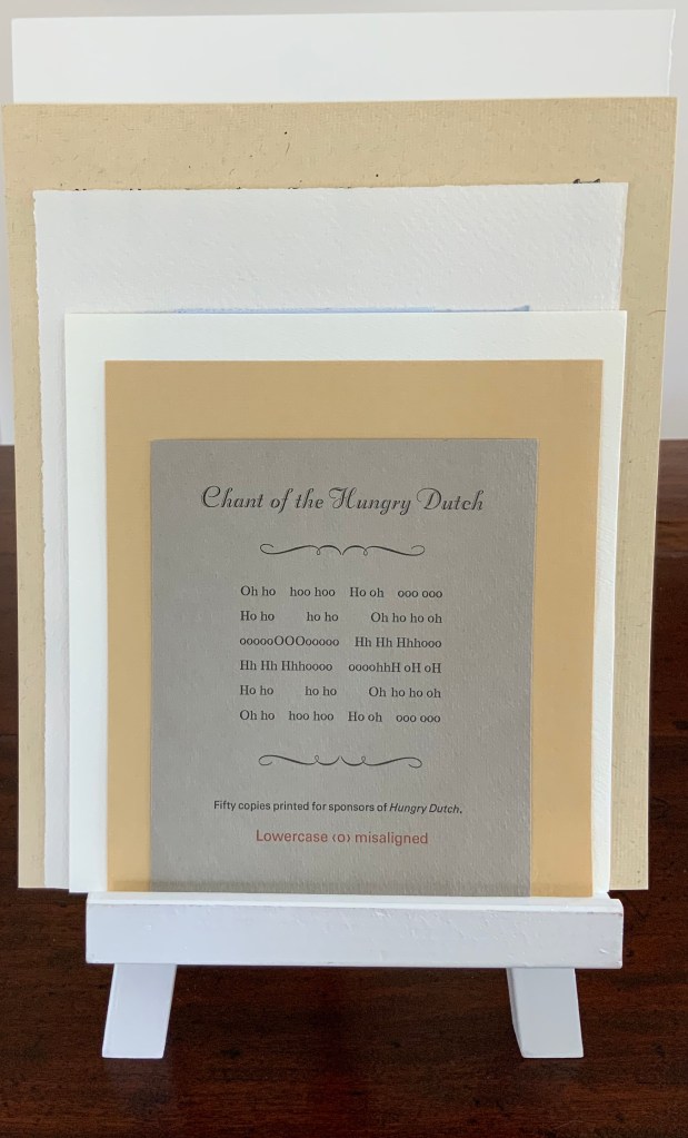
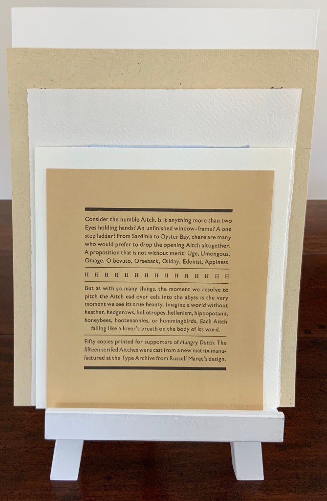
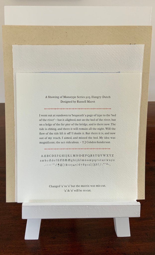
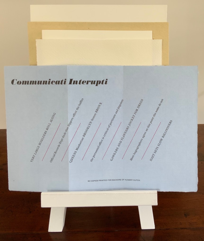
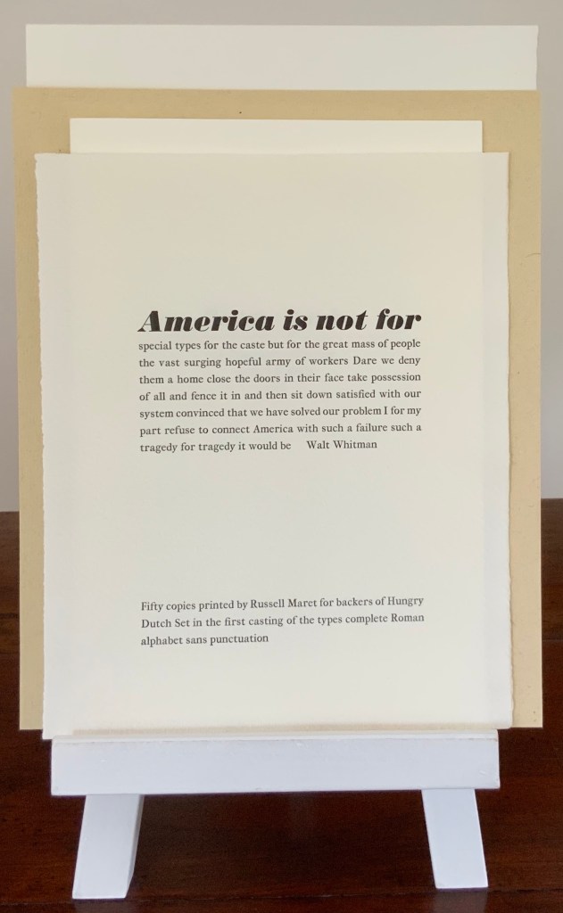
Shown below in order of height are samples provided to sponsors as the design of the typeface progressed.
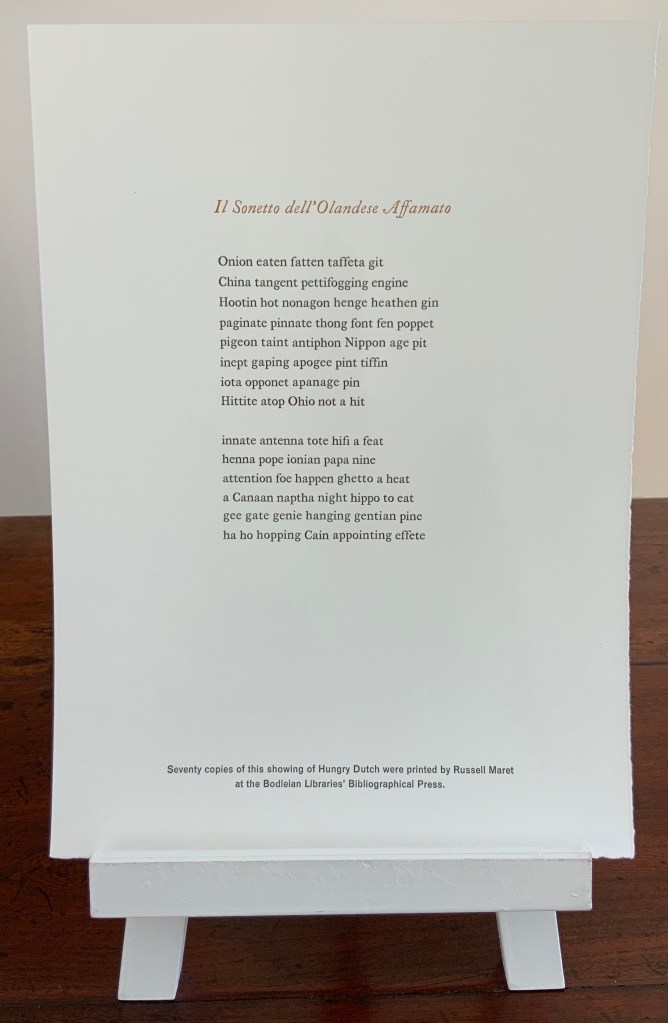
50 copies printed by Russell Maret from his Hungry Dutch typeface with an initial by Joachim Romann.
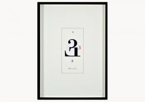
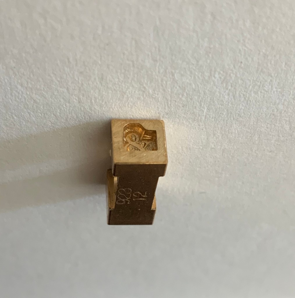
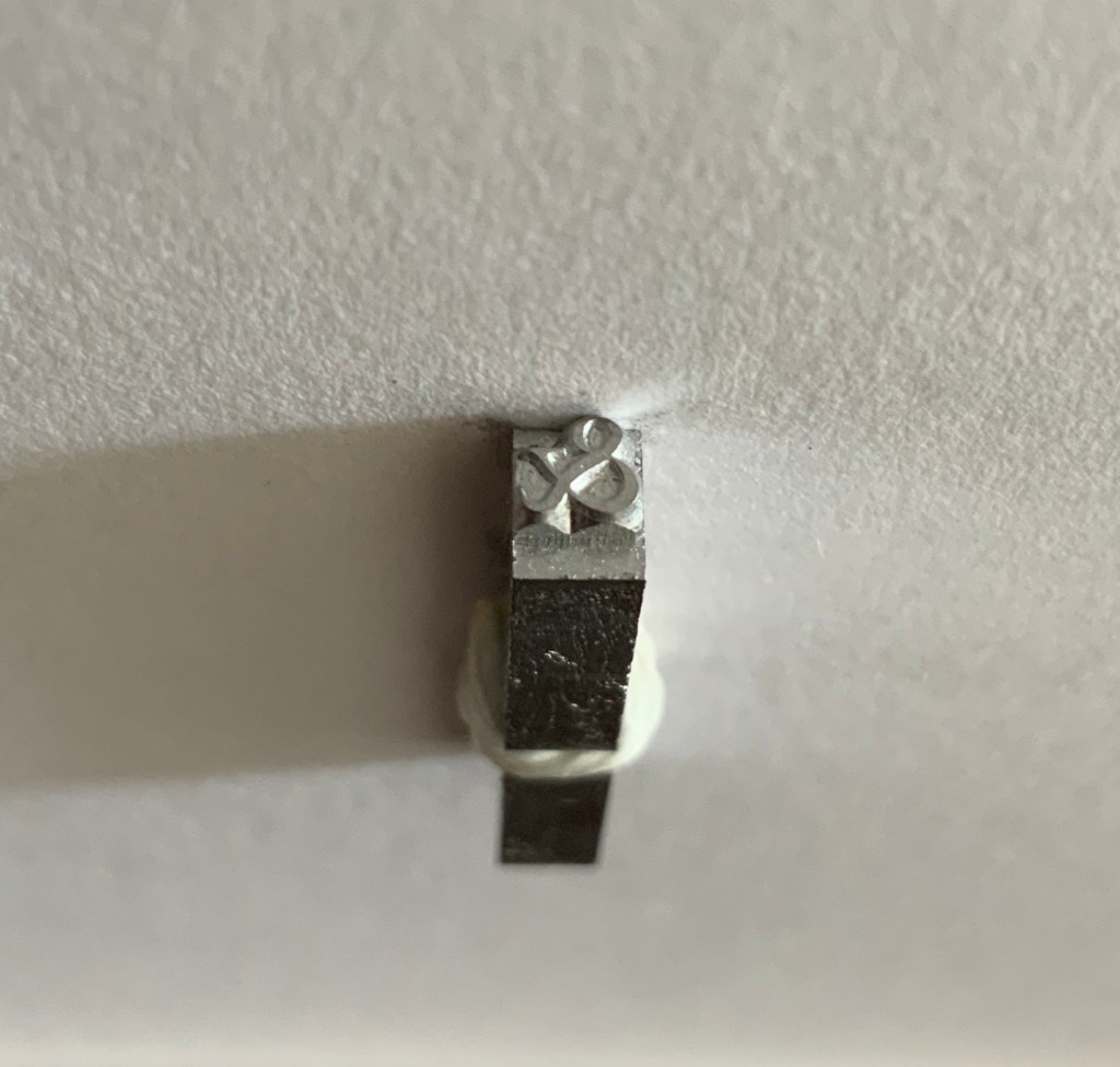
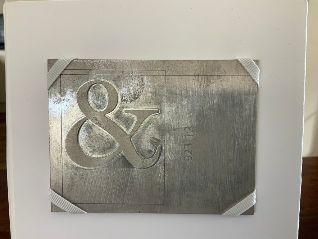
Sponsors of the typeface were offered the choice of a letter. Books On Books selected the ampersand, and the last delivery from the artist included the matrix, the sort and pattern of the ampersand.
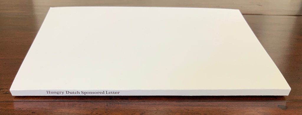
Hungry Dutch Sponsored Letter (2016-20) Russell Maret Sponsored by Books On Books
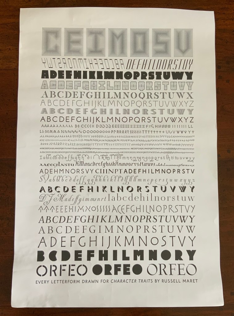
Every Letterform Drawn by Russell Maret for Character Traits (2019)
Character Traits is an artist’s book produced by Maret, with binding design by Amy Borezo. Details under Further Reading.
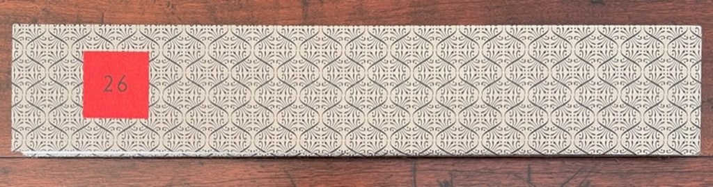
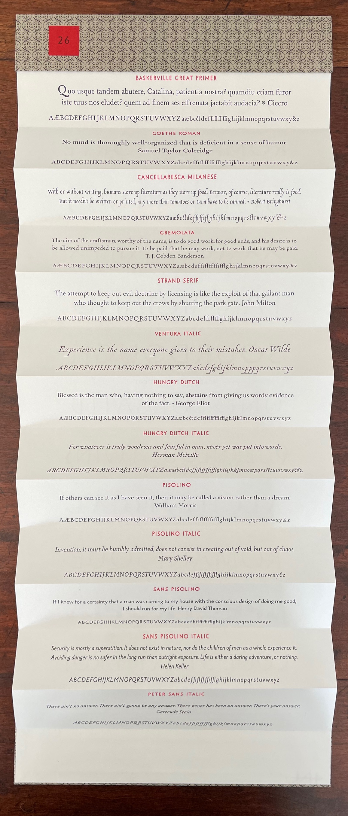
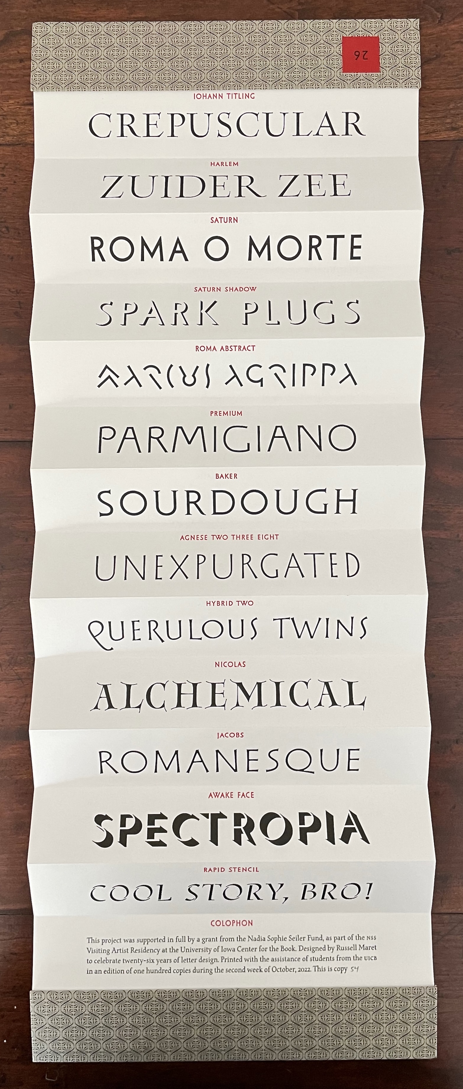
26 (2022)
26 (2022) Russell Maret Double-sided leporello, patterned paper-over-board cover. Closed: H48 x W256 mm; Open: H670 mm. Edition of 100, of which this is #54. Acquired from Russell Maret, 12 November 2022. Photos: Books On Books Collection.
Further Reading
“ABCs”, Books On Books, 29 November 2015, updated 16 September 2019.
Miller, Steve. “Interview with Russell Maret”, School of Library and Information Studies, University of Alabama, 28 March 2011. Accessed 12 September 2019.
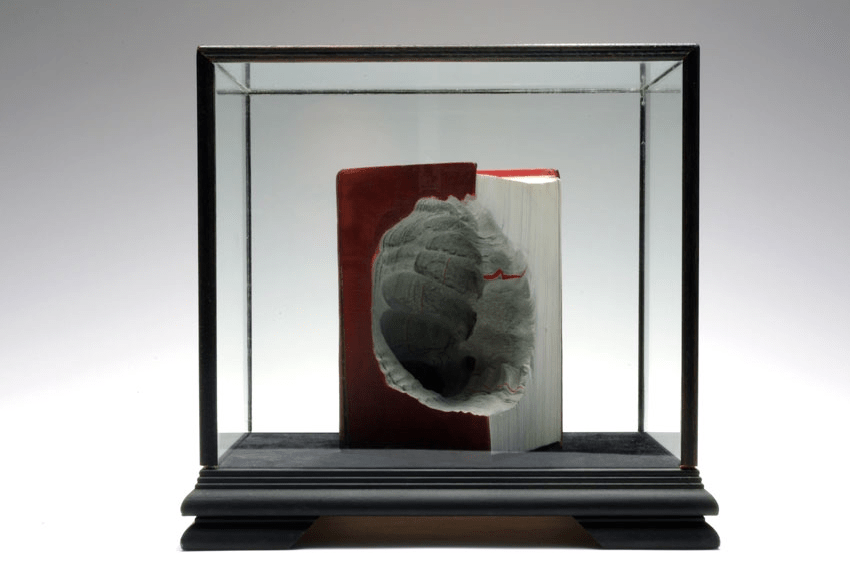
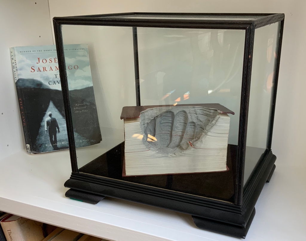
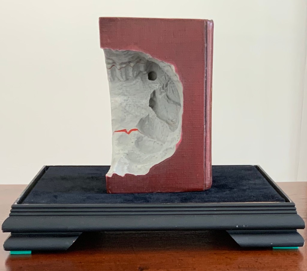
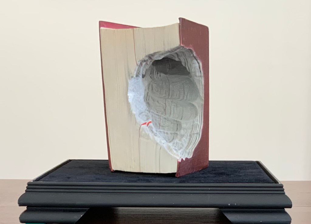
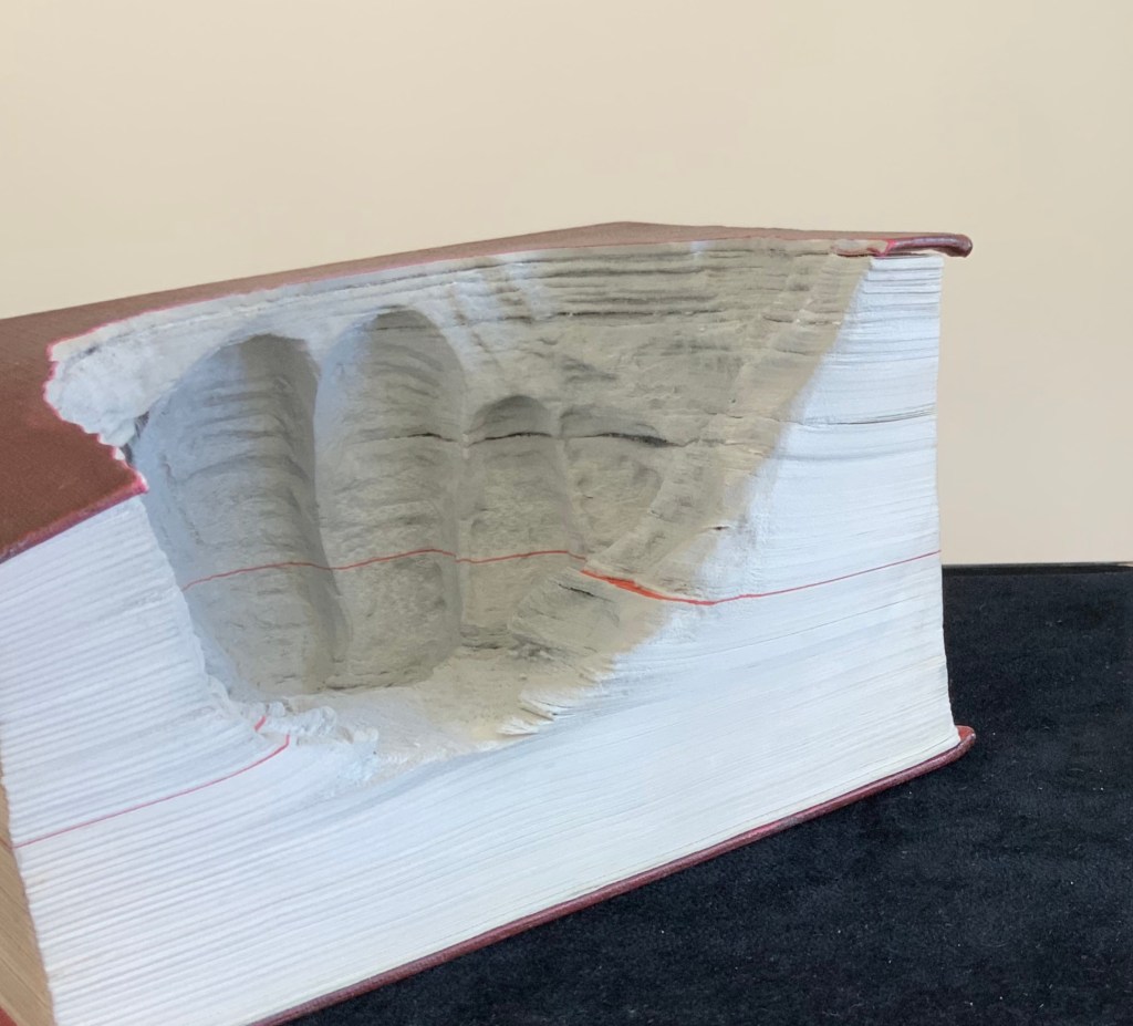
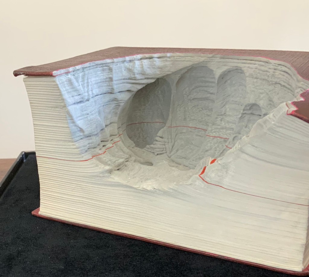
A Caverna (2012) Guy Laramée Portuguese-Spanish dictionary carved. Wood and velvet plinth, wood-framed glass cover. H260 x W276 x D226 mm Acquired from William Baczek Fine Arts, 12 September 2017.
H160 x W105 x D80 mm
Inspired by Nobel Prize winner José Saramago’s novel of the same name, A Caverna treats the pages of words as so much clay to be gouged from the dictionary. But a dig into this novel about a rural potter struggling to live and love in a conglomerate capitalist dystopia — and into Laramée’s artist’s statement — suggests that there is more to the work.
The central character of the novel is the potter Cipriano Algor. He lives with his daughter Marta, son-in-law Marcal, the dog (Found) and ultimately the widow Isaura Estudioso. Succumbing to Marta’s and Marcal’s plea that he move to the Centre with them since the conglomerate Centre will no longer purchase his wares, Cipriano stumbles one night onto the Centre’s subterranean secret: a nightmare Plato’s cave. In her review of the novel, Amanda Hopkinson shares this comment from her interview with Saramago: “Western civilisation has never been as close to living in Plato’s cave as we are now… We no longer simply live through images: we live through images that don’t even exist.”
In his artist’s statement, Laramée writes: “The erosion of cultures – and of “culture” as a whole – is the theme that runs through the last 25 years of my artistic practice. Cultures emerge, become obsolete, and are replaced by new ones. With the vanishing of cultures, some people are displaced and destroyed. We are currently told that the paper book is bound to die. The library, as a place, is finished. One might ask so what? Do we really believe that “new technologies” will change anything concerning our existential dilemma, our human condition? And even if we could change the content of all the books on earth, would this change anything in relation to the domination of analytical knowledge over intuitive knowledge? What is it in ourselves that insists on grabbing, on casting the flow of experience into concepts?”
Yet Cipriano endured. Saramago continued to write. Laramée continues to create art. Both the novel and the sculpture urge us to reflect and contemplate what the poet Stevens called the “Nothing that is not there and the nothing that is”.
Tever, Abdulkerim. “Guy Laramée: ‘Colors’ episode 1“, TRT2, 5 March 2020. Accessed from JHB Gallery, 19 March 2020. “The six-minute spot, which will air on TRT2, the cultural and educational channel of Turkey’s national broadcaster, follows Laramée as he works in his studio and traverses his native Montreal. The artist shares his thoughts on his work, the studio as a place of refuge, and on the daily processes of art-making as a unique form of knowledge—one that offers a radical alternative in our increasingly outcome-driven world. Directed by Abdulkerim Tever, the film includes some stunning close-up photography of Laramée’s unique book-landscapes—as they are being created, as well as in their finished form.”
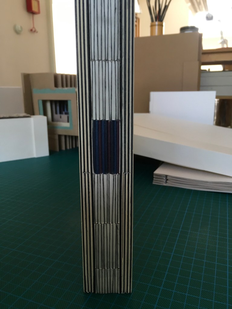
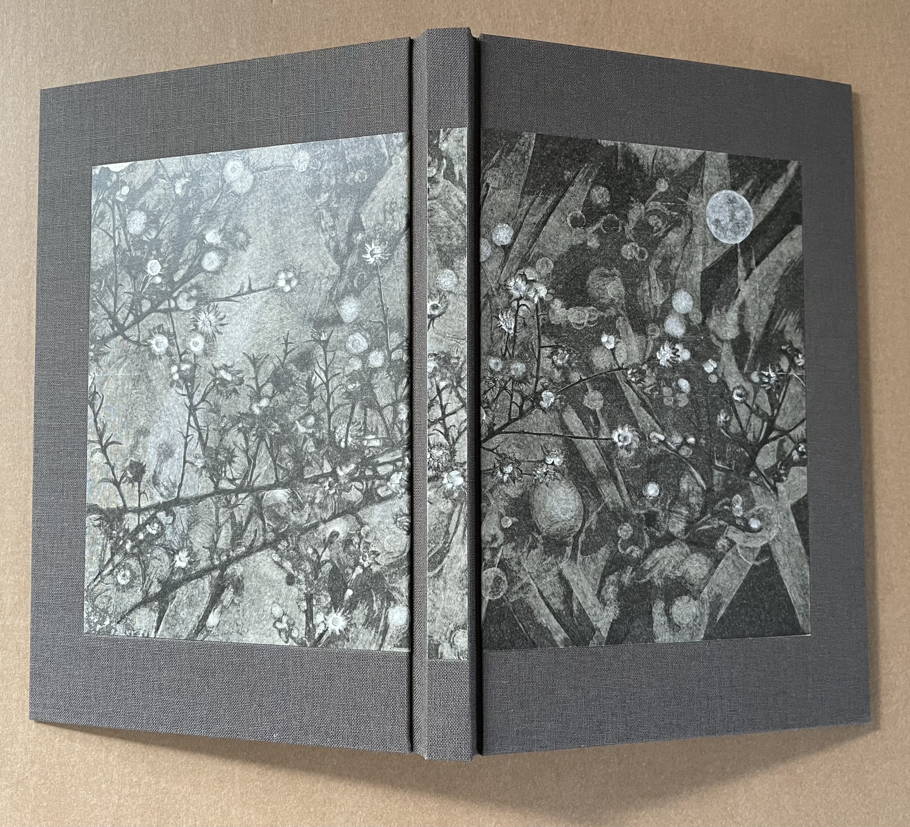
A Little Book of Birds (2017) Book of 48 pages (uncut), 9 engravings by Gaylord Schanilec and a wood engraving by Thomas Bewick, all printed from the original blocks. Signed by Schanilec, with a poem by him hand-set in Bodoni metal type. Hand-sewn to O’Malley Crackling doublures, pasted to Degener Black from Cave Papers. H213 x W146 mm Edition of 100. Acquired from the artist, 7 September 2019.
”As it turned out my mid-life vessel the “Hungry Mind” (Lac Des Pleurs, 2015) didn’t get me to the other side, and A Little Book of Birds led to yet more water. The idea of birds captive within unopened pages was originally intended as a challenge for book collectors—to open the unopened pages—or not. As years passed the birds slowly emerged and their captivity began to mean something else. I thought this book might free the birds. It did not. —GS” from slip insert.
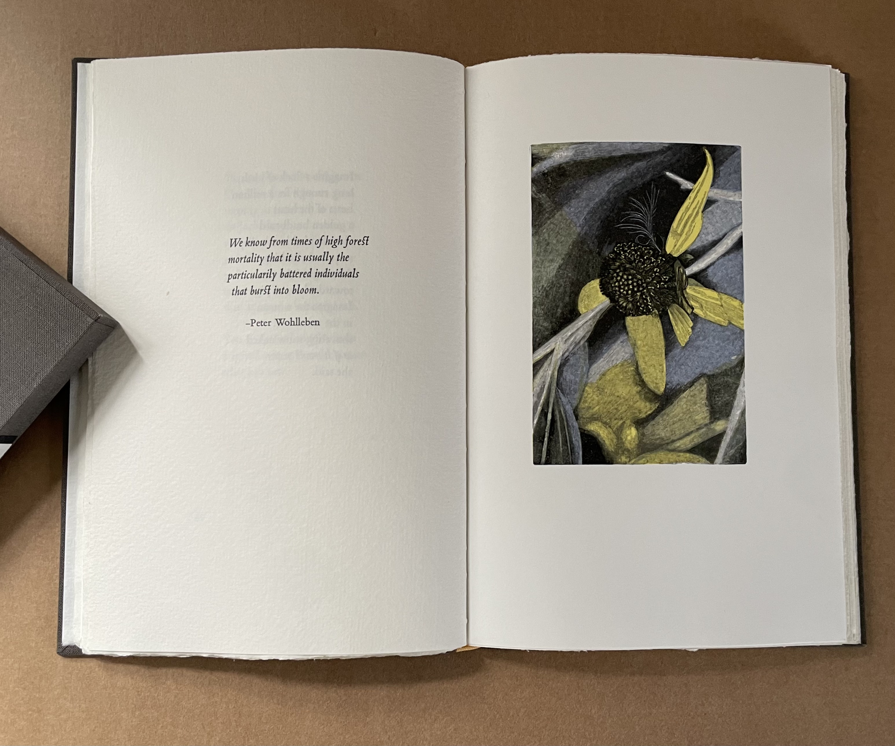
Bokeh (2020)
Bokeh(2020) Gaylord Schanilec Slipcase, casebound hardback with pastedown prints on covers and spine. H210 x W140 mm. 68 pages. Eight multiple color wood engravings with poems handset in Polipholis, Bembo and Blado types. Bound at Booklab 2 by Marc Hammond, Keri Schroeder and Craig Jensen in two editions (a standard edition of 94 numbered copies and a deluxe edition of 26 lettered), of which this is #37. Purchased from artist, 15 May 2020.. Photos: Books On Books Collection.
Schanilec’s poetry is reminiscent of James Wright’s, who like Robert Bly was also influenced by Federico Garcia Lorca, quoted by Schanilec in this book. Unlike all of them, though, Schanilec is a poet of the page, printing press and book. Notice how he draws attention to two lines with a lighter ink, centers them across the double-page spread placed in a folio to be folded and sewn at just that point. The lines and their placement enact the reference to bridges from the poetry above and to the left, and they make the two poems above enact their reference to the tower and canyon wall. Beneath the images and noise of the tower and canyon walls, the two lines draw our eyes down to the flowers the artist/poet is photographing for etching later. That is “unusual”, to say the least, and “beautiful” does not to say the most it deserves.
The title “Bokeh” refers to the aesthetic blurring in photography produced in the out-of-focus parts. Based on photos taken by Schanilec with a 100 mm f/2.8 macro lens, the engravings in this book were produced with a multi-line tool previously used at the Sander Wood Engraving Company of Chicago early in the 20th century. The tool cuts ten very fine lines at once, which could be used to capture the “bokeh” for this bouquet of flowers.
The Forgotten Dialect of the Heart (2018)
The Forgotten Dialect of the Heart (2018) Gaylord Schanilec (engraving) Jack Gilbert (text) Artist’s booklet. H320 x W235 mm. 2 folios, 4 pages. Acquired from Gaylord Schanilec, 2018. Photos: Books On Books Collection.
Wandering Stars (2019) Sara Langworthy Hand-sewn booklet of twenty pages. Multi-layered collagraph prints. Hand-set Univers text. Cover paper Kyoseishi. H(varying to a maximum of)177 x W105 mm. Cover: H181 x W 113 mm. 20 pages. Edition of 33 numbered and signed, of which this is #3.
Title page and center.
Note the varying height of the pages. According to the artist, the “pages are an assortment of hand-made and machine-made Japanese papers. Possible papers are Okawara, Sekishu, Kaji, Mulberry, and possibly Akatosashi (this last one is sort of orange-colored)….The little white dots in the color fields were made by combining various pressure print templates with the layered collagraph blocks.” Correspondence with the artist, 9 September 2019.
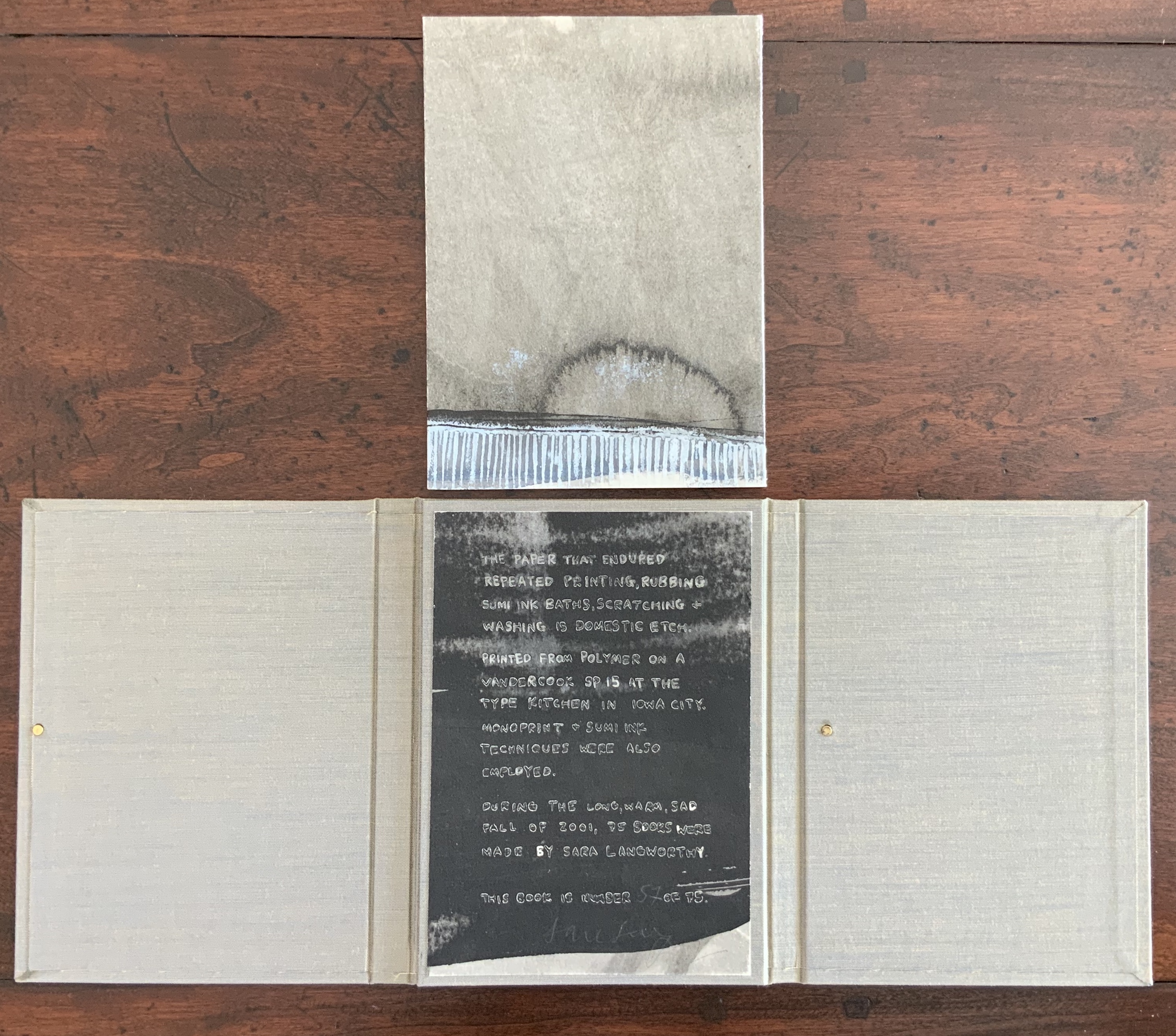
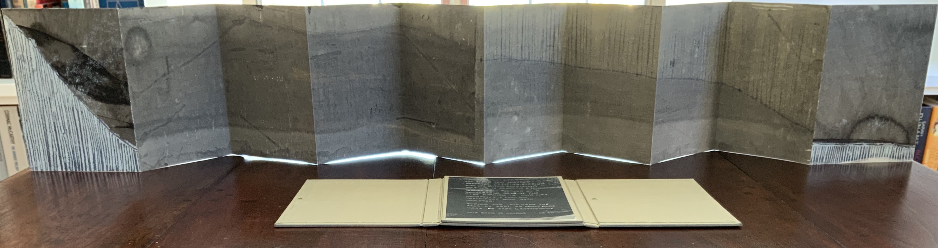
Without Question (2001)
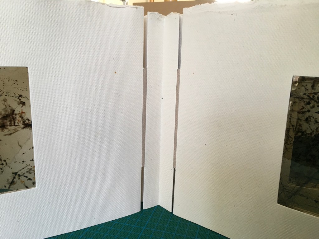
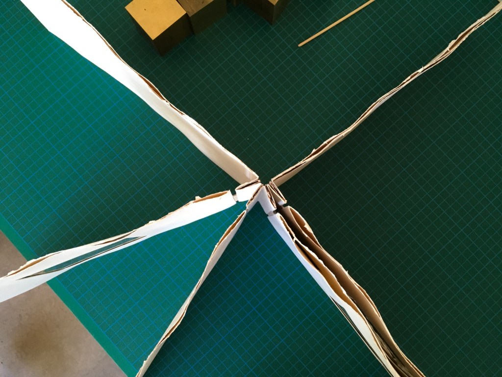
Without Question (2001) Sara Langworthy The book is housed in a 3-flap portfolio. Photopolymer, sumi ink wash, accordion binding. The paper is Domestic Etch that has undergone repeated printing, rubbing, sumi ink baths, scratching and washing. Edition of 75 numbered and signed, of which this is number #57. Acquired from the artist, 5 February 2019.
Opening the work.
View opening from left to right.
View of the reverse.
Further Reading
“Sara Langworthy”, WorldCat Identities. Accessed 17 August 2019.
Langworthy, Sara. “On Physical Lines”. The MCBA Prize Finalists 2015. Accessed 17 August 2019.
Langworthy, Sara. 17 September 2020. “Sidereal“. The MCBA Prize Winner 2020. Accessed 12 April 2022.
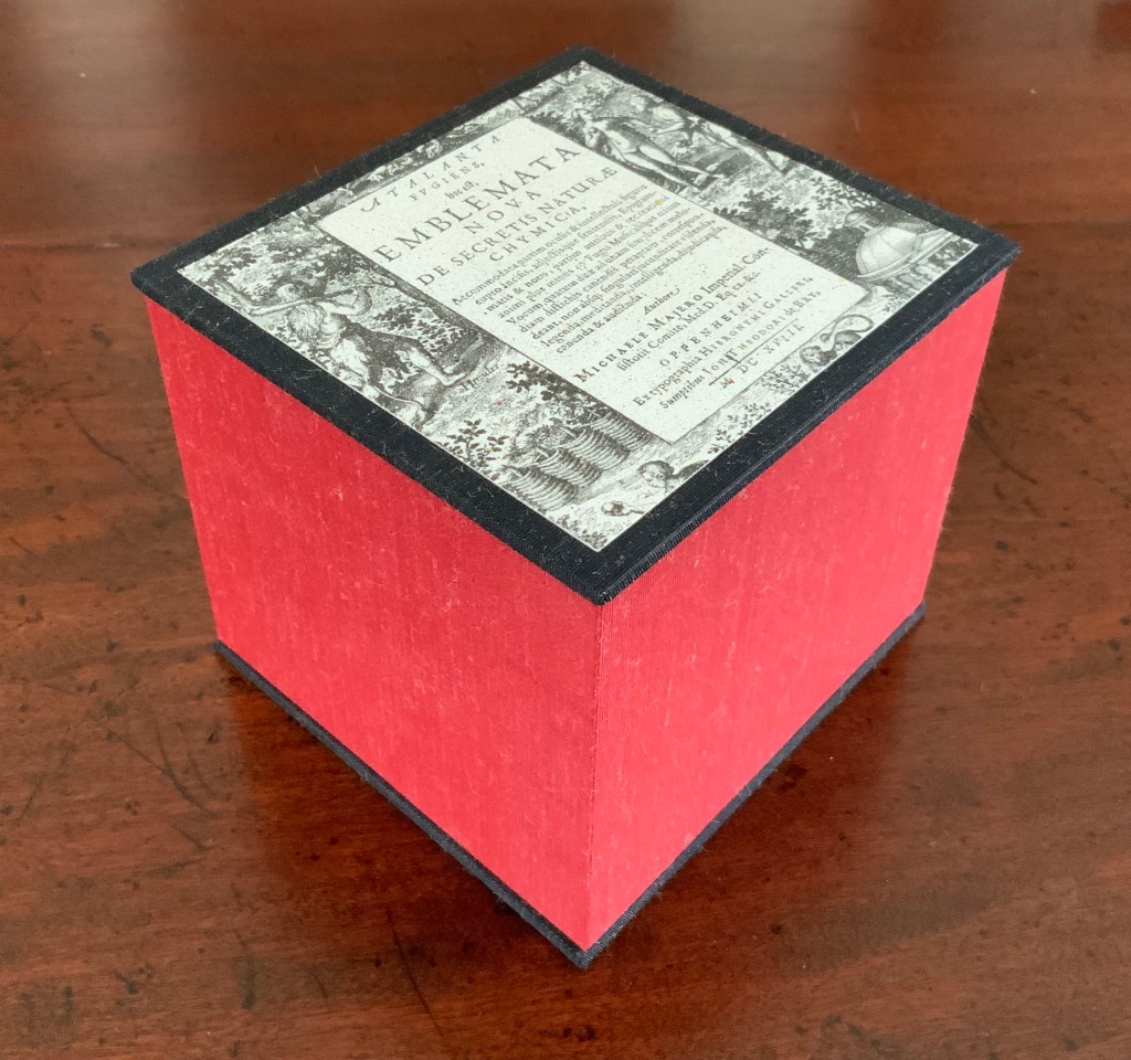
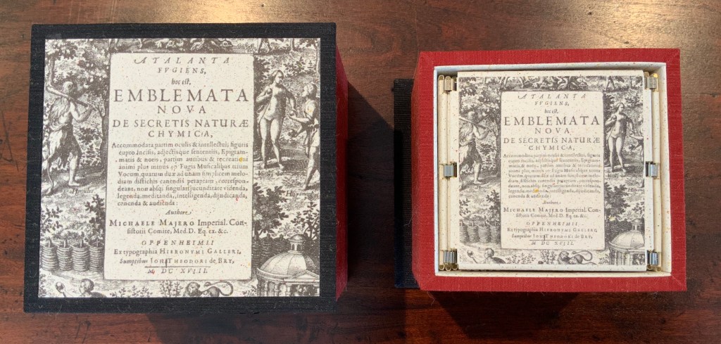
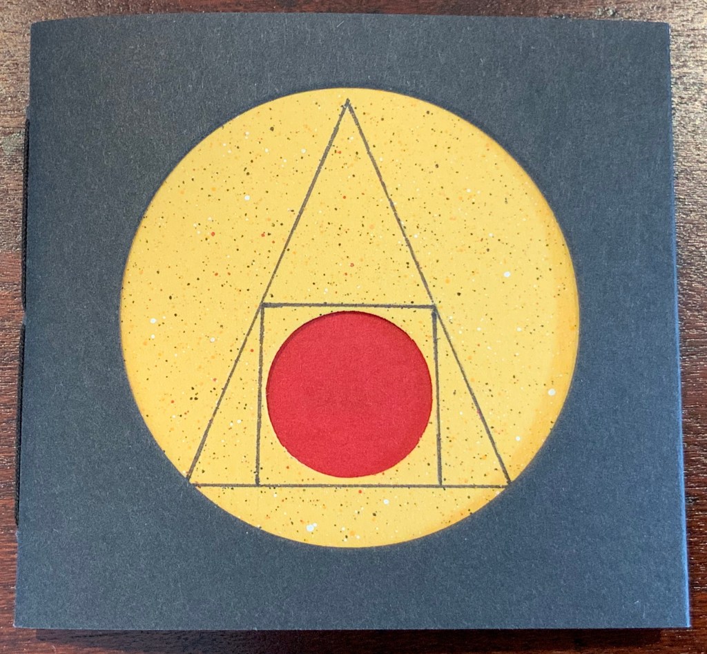
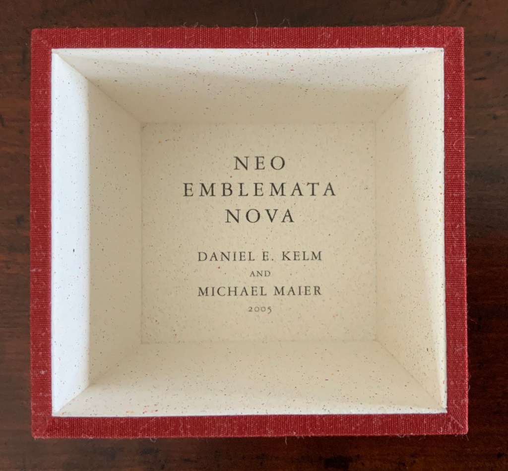
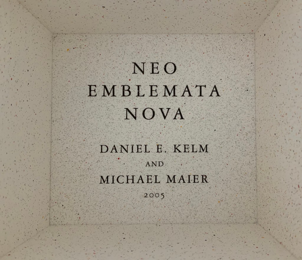
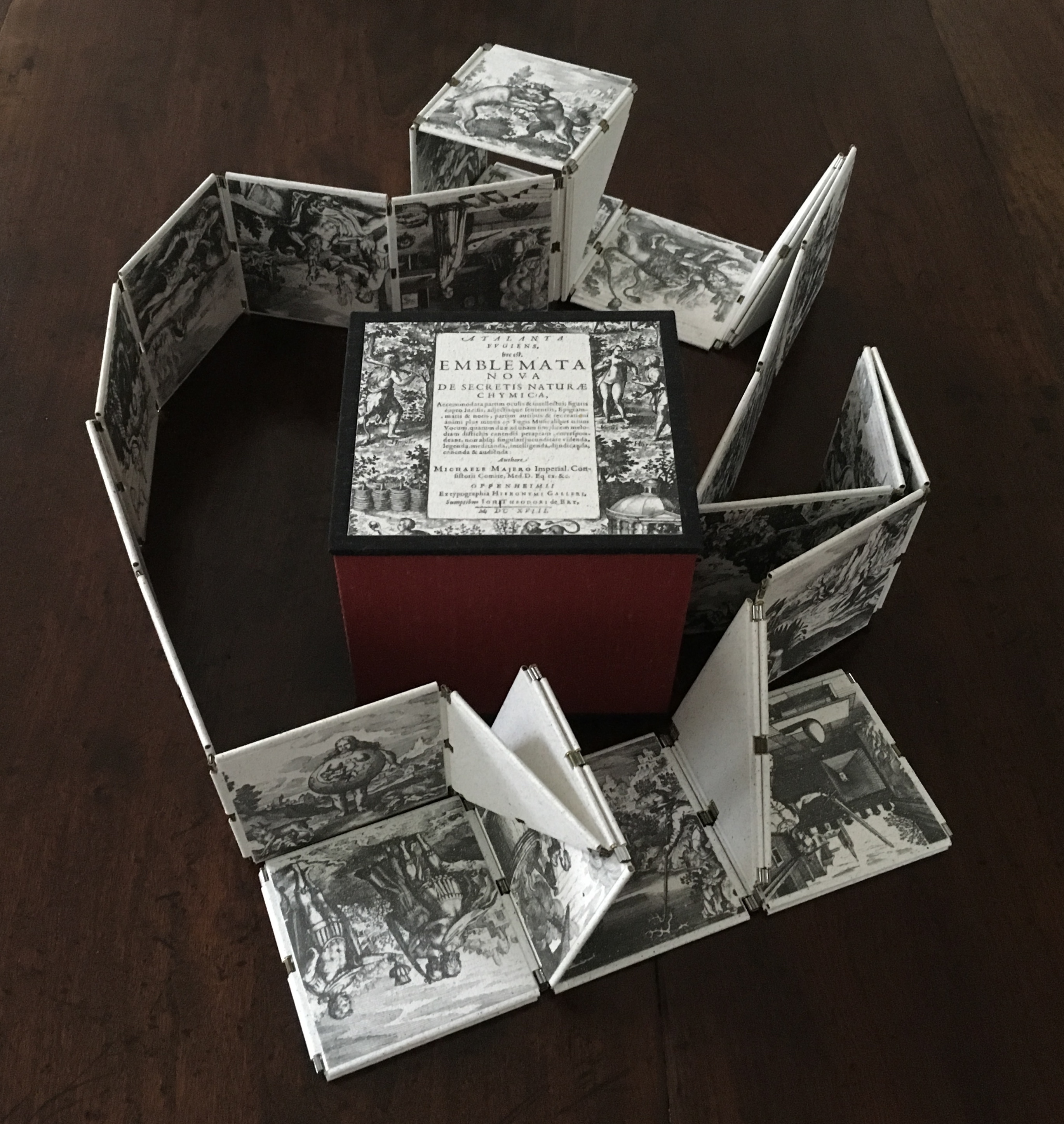
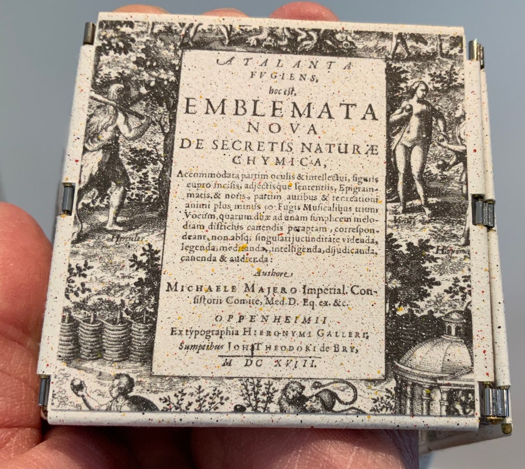
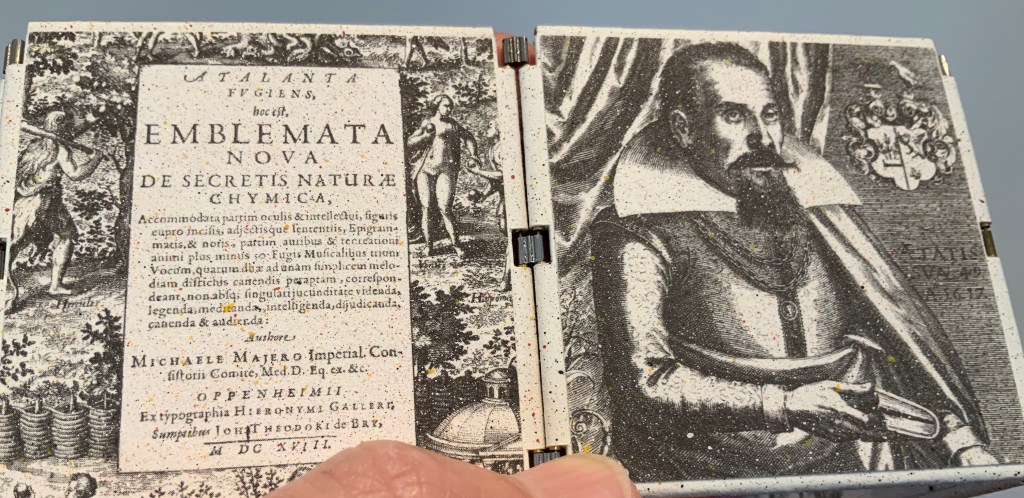
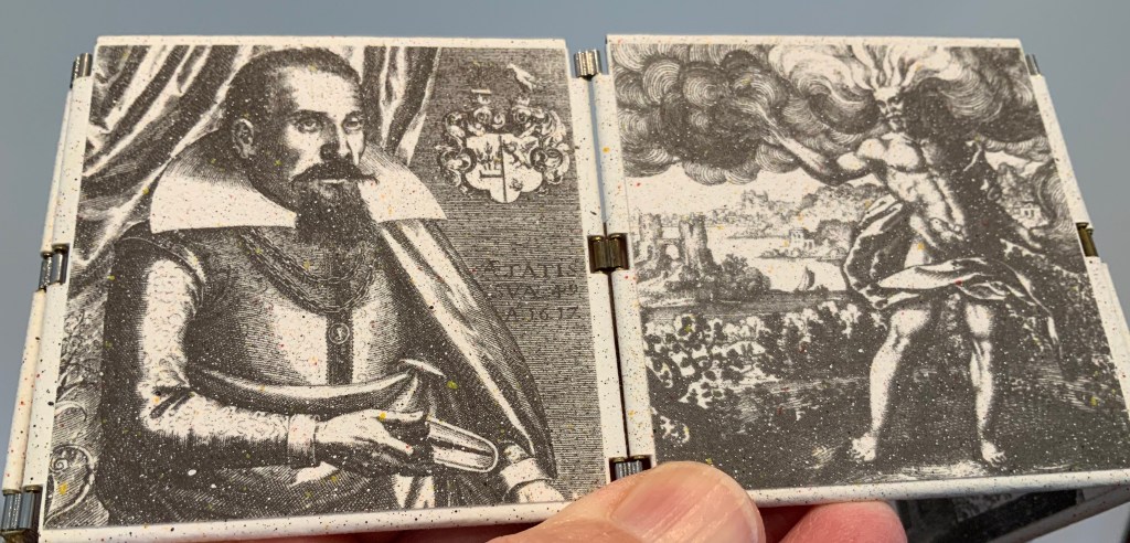
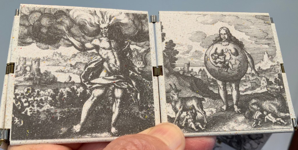
Neo Emblemata Nova (2005) Daniel E. Kelm Box: H96 x W109 x D102 mm closed. Booklet cover: H72 x W79 mm closed, H72 x W224 mm open. Booklet: H72 x W78 mm. Möbius strip: each tile is H70 x W70 mm; the strip extended is 1000 mm. Edition of twenty-one, of which this is #18. Acquired from the artist, 20 October 2018.
Opening the work.
Booklet about the work and its creation.
Inside the top of the box.
Closing and returning the Möbius strip to its box requires considerably more dexterity than reading; so much so that the booklet included provides instructions.
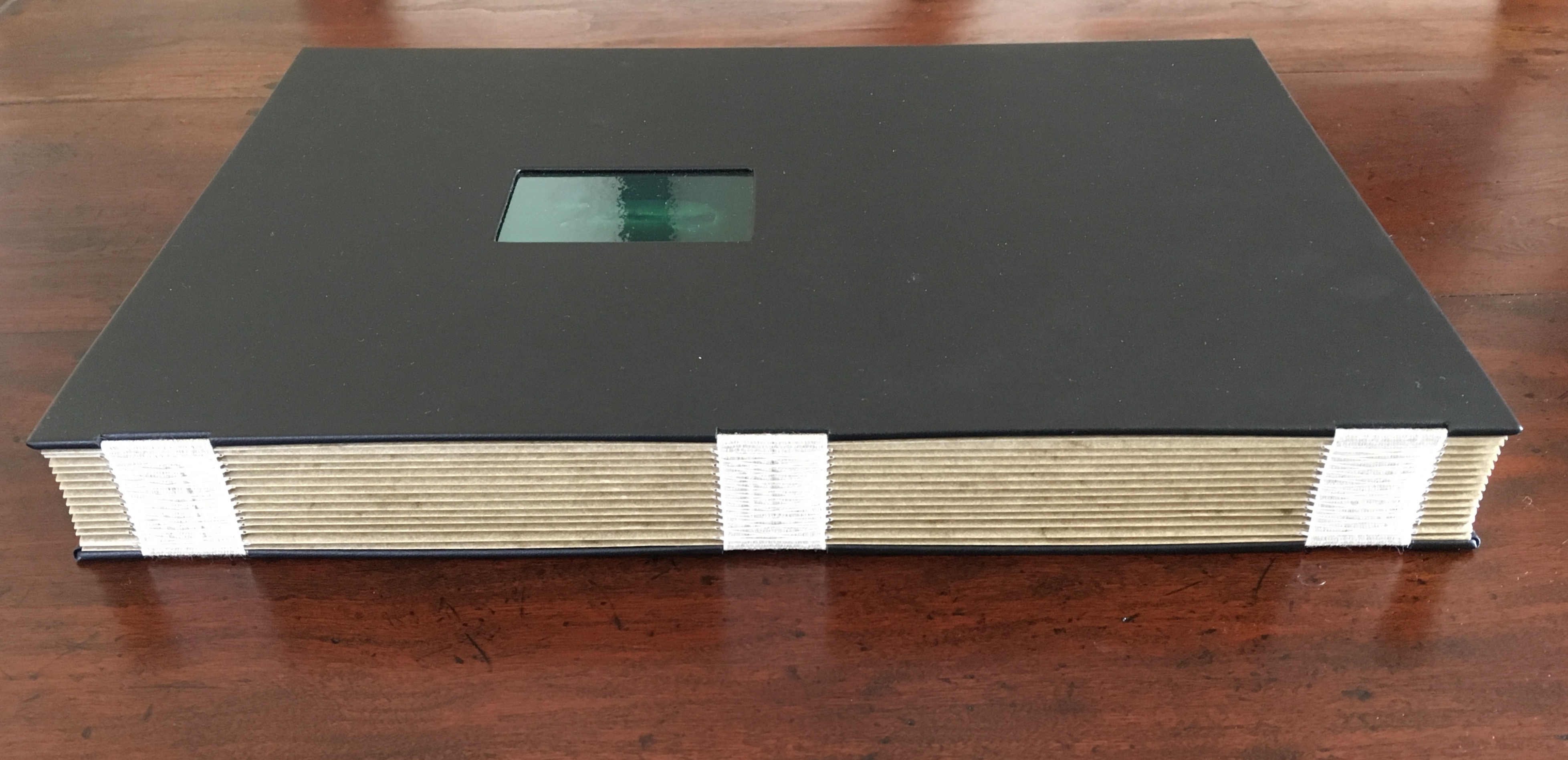
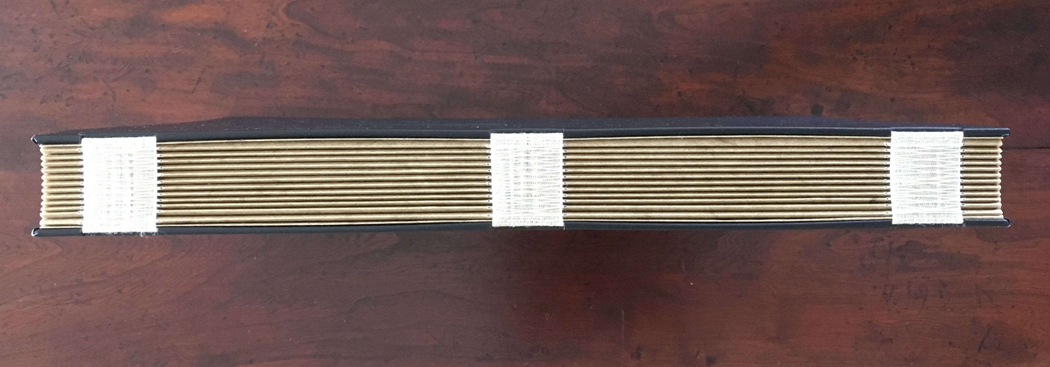
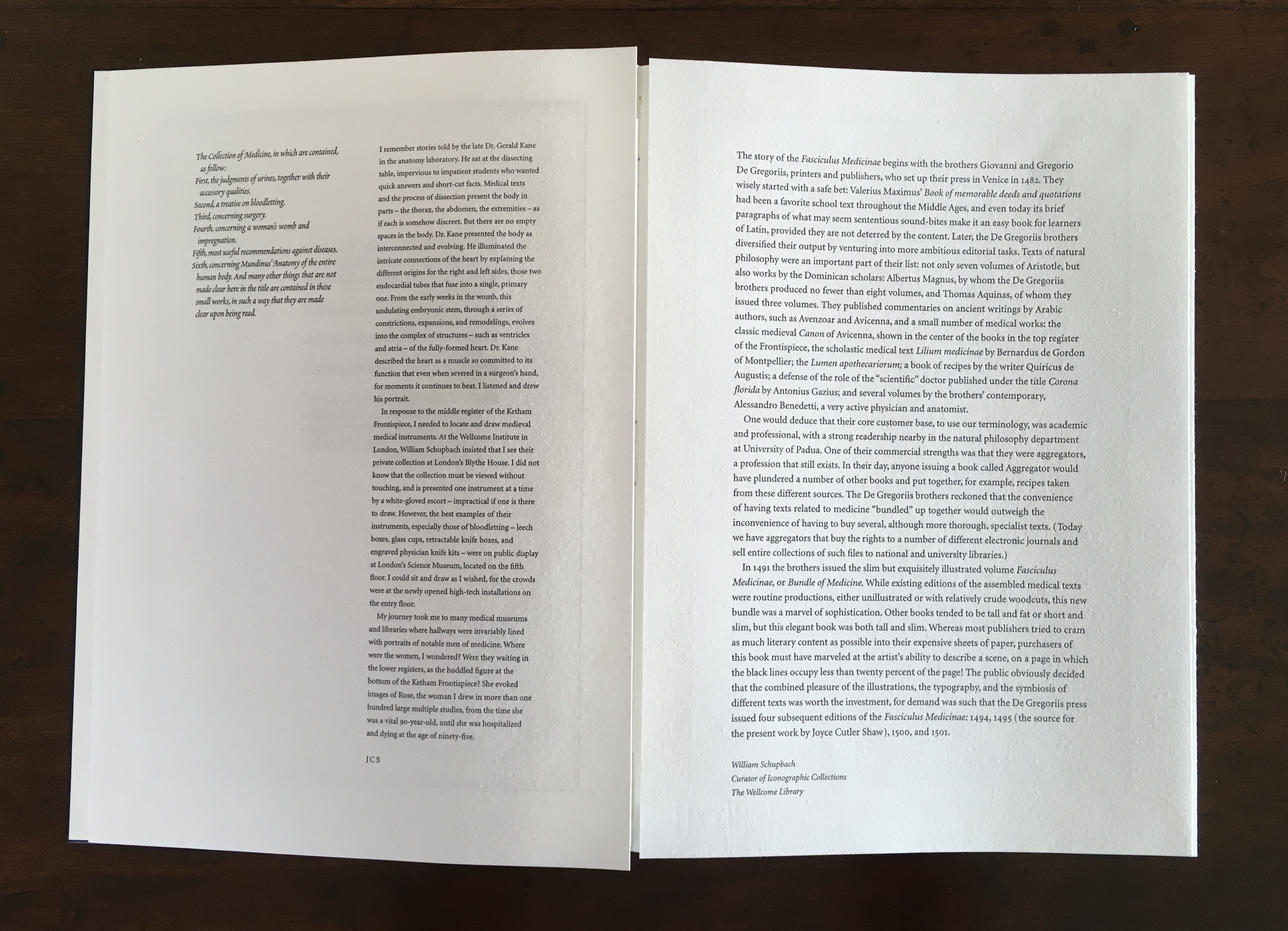
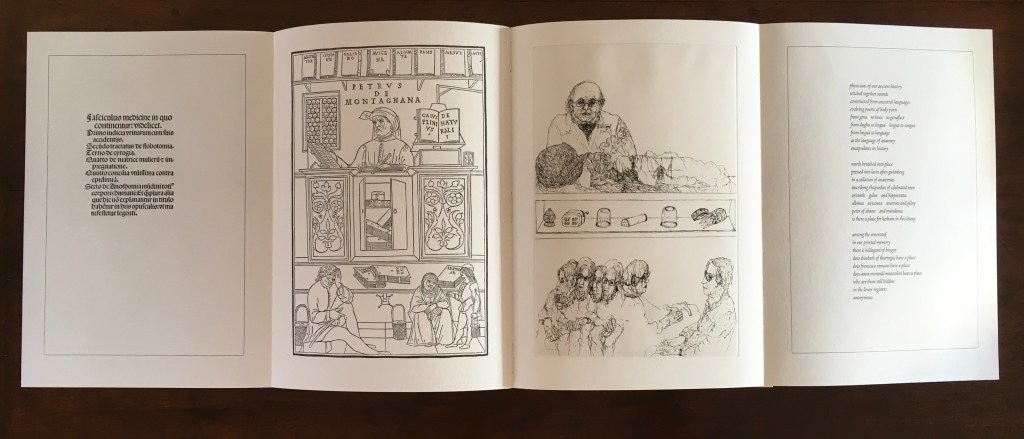
The Anatomy Lesson (2004)
The Anatomy Lesson (2004) Joyce Cutler-Shaw Middletown, CT: Robin Price, Publisher, 2004) Limited edition of 50, of which this signed copy is the binder’s copy (Daniel E. Kelm). Acquired from the binder, 20 October 2018.
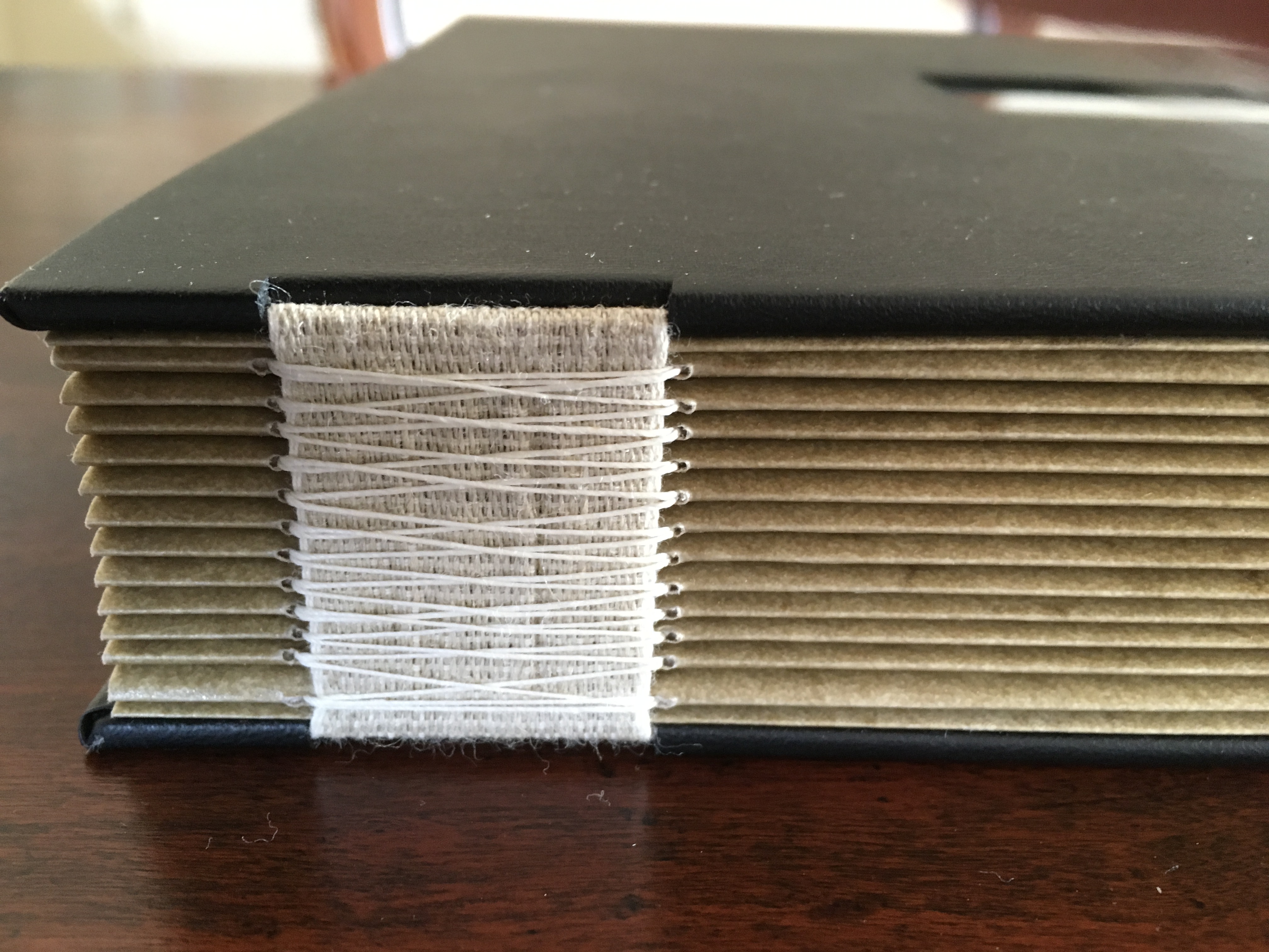
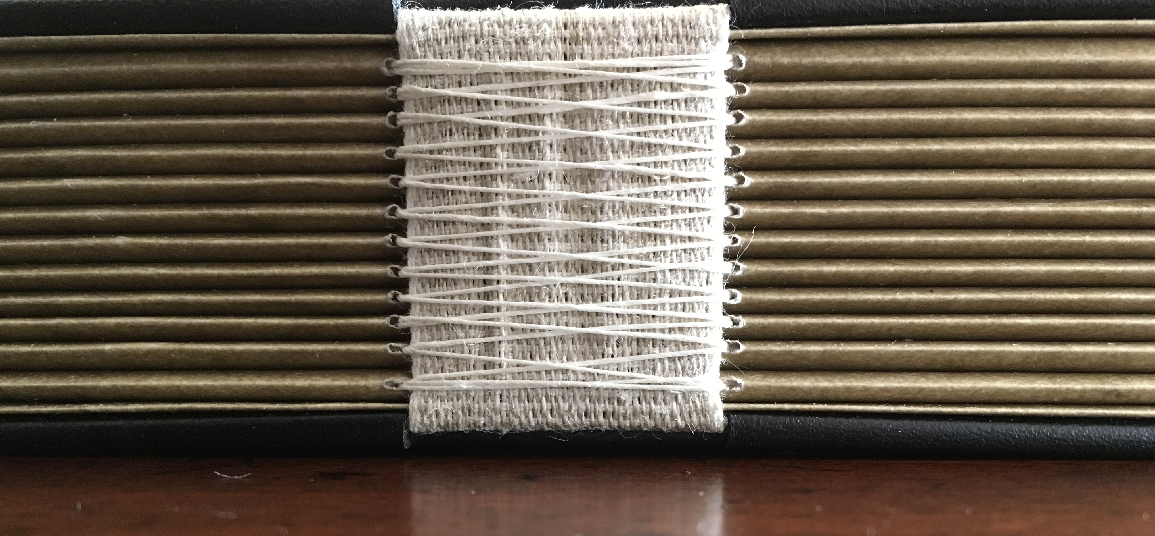
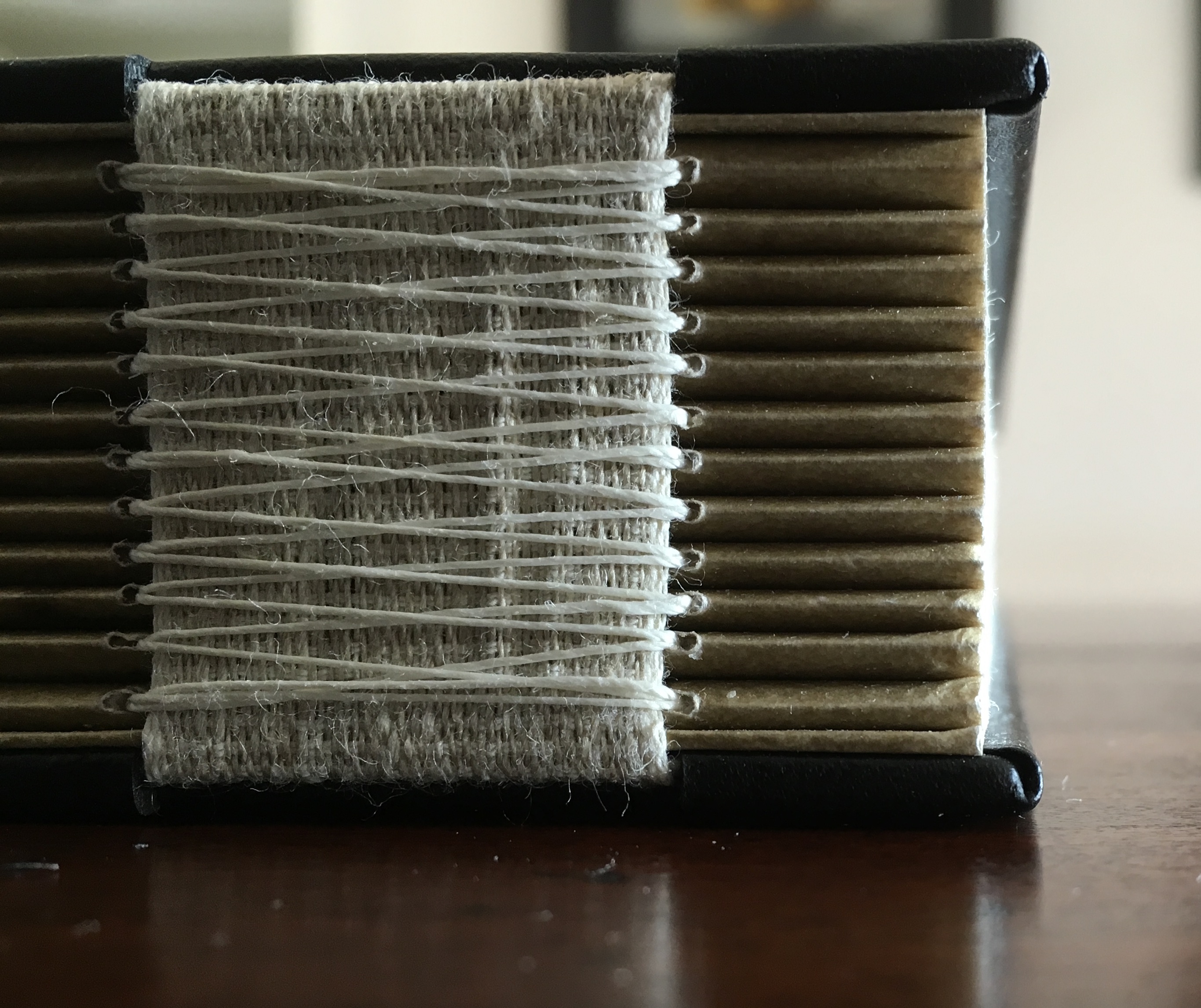
Twelve signatures of handmade cotton text paper, the central ten signatures each made up of one sheet H356 x W514 mm and one sheet H356 x W500 mm glued to the 14 mm margin of the first sheet, for a total of ninety-six pages, each measuring H356 x W253 mm. Binding of leather covered boards (a hologram embedded in front cover) with an open spine, taped and sewn into a reinforcing concertina structure: H361 X W259 mm. Contained in engraved steel box: H370 x W326 x D44 mm.
Detail of sewing and internal view of reinforcing accordion structure. For a description of this type of structure, see Hedi Kyle’s The Art of the Fold(London: Laurence King, 2018), pp. 82-85.
View of the doublure, which is part of the reinforcing concertina structure.
Cover page of second signature.
Second signature open to double-page spread.
Second signature open to four-page spread.
Further Reading
“Bieler Press”, in Book Art Object, ed. David Jury (Berkeley, CA: Codex Foundation, 2008), pp. 116-17.
Miller, Steve. “Daniel Kelm”, Book Arts Podcasts, School of Library and Information Studies, University of Alabama, 22 July 2012. Accessed 6 September 2019.
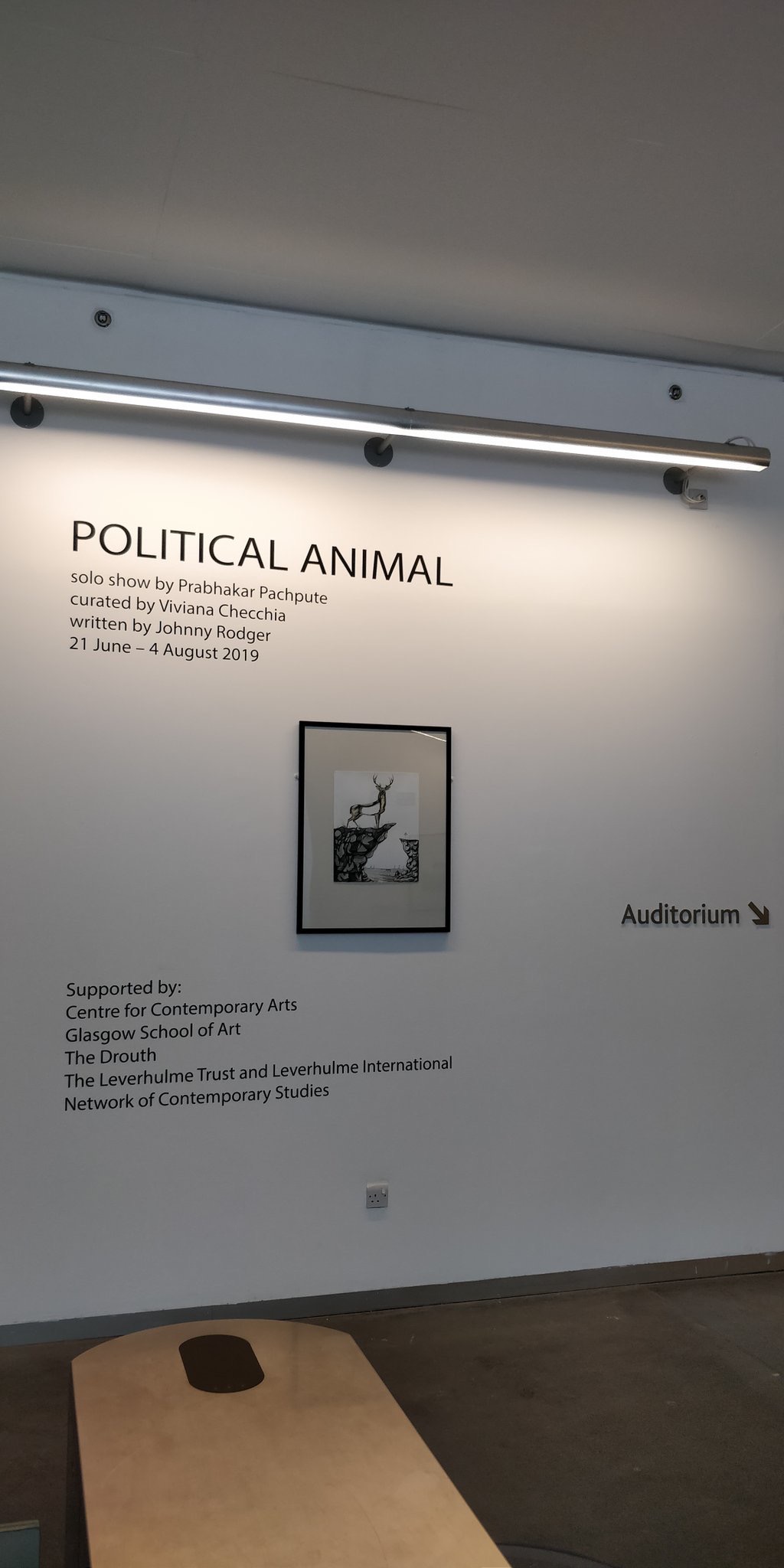
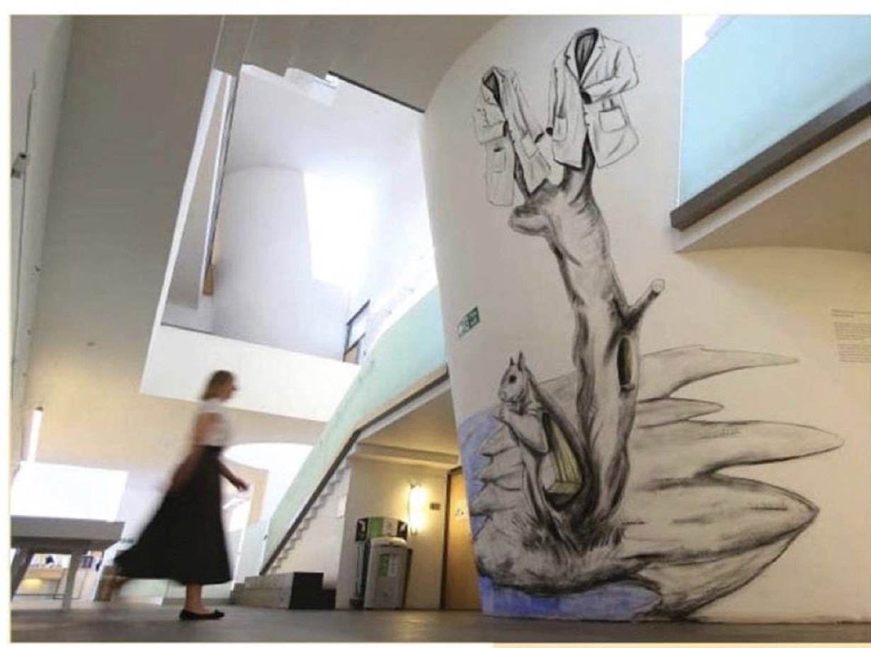
From 21 June to 4 August 2019, the Glasgow School of Art hosted an exhibition curated by Vivianna Checchia based on and named after the artist’s book Political Animal by Johnny Rodger (text) and Prabhakar Pachpute (drawings). The event is particularly noteworthy as an addition to this list of large-scale works of book art.
With Pachpute’s involvement, Checchia transformed the gallery at 167 Renfrew Street in Glasgow into “a book”, its pages consisting of Pachpute’s A3 framed drawings, drawings directly on the gallery’s walls as well as 3D objects, and the curator’s notes/bibliography delivered as displayed copies of the works referenced. Walking and looking become “reading”.
Earlier “walk-through books” include Alison Knowle’s The Big Book (1968) and Anselm Kiefer’s The Rhine (1982-2013), but Political Animal, the exhibition, takes large-scale book art and what we mean by the book just that “little” bit further.
Further Reading
Borsuk, Amaranth. The Book (Cambridge, MA: MIT Press, 2018). Reviewed here.
Malaya, Vinutha. “Art of the Book”, Pune Mirror, 18 July 2019. Accessed 9 September 2019.