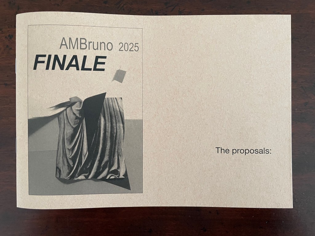
Bookmarking Book Art – AMBruno “Finale”

A promotional booklet cover featuring the text 'AMBruno 2025 FINALE' and an abstract image of draped fabric with a geometric shape, along with the phrase 'The proposals:'.

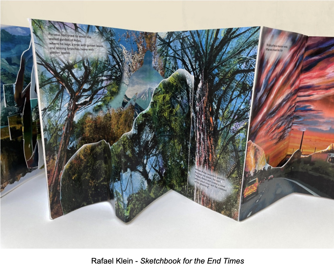
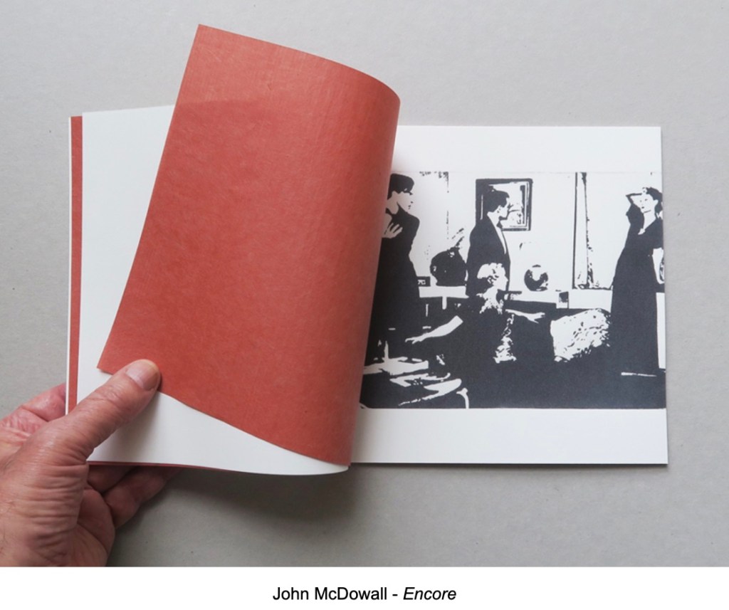
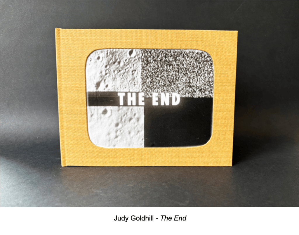
AMBruno’s last project Finale proved to be a fertile prompt for 19 artists and their 18 works. I thank Sophie Loss and John MacDowall for the fun and honor of reviewing the entries.

When I consider an artist’s book for acquisition or inclusion in an exhibit, I want it to make me read with my eyes, hands, and mind. Following the text is not enough. It should demand that I see the shapes of letters, words, images, pages, and the entire work itself. Turning a page is not enough. It should demand that I handle, unfold, rotate, manipulate – feel it. Mentally deciphering the work’s signs is not enough. I want it to make me think – about how the shape, material, and making work together – about how artists’ books before this one may be present – about how other literary, visual, sculptural, architectural, performative, or even digital art may be present.

So, you can appreciate what a challenge it was to select works on the basis of a few sentences or paragraphs describing what the artists planned to submit.
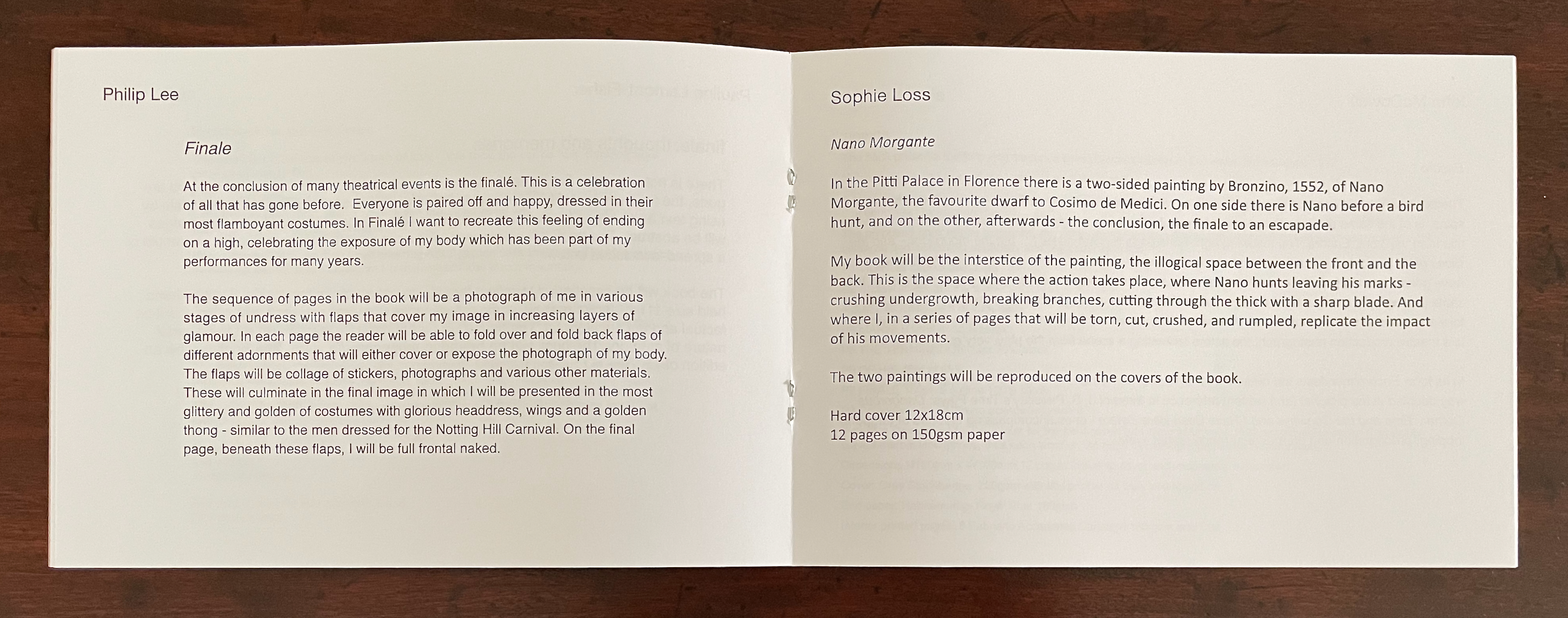
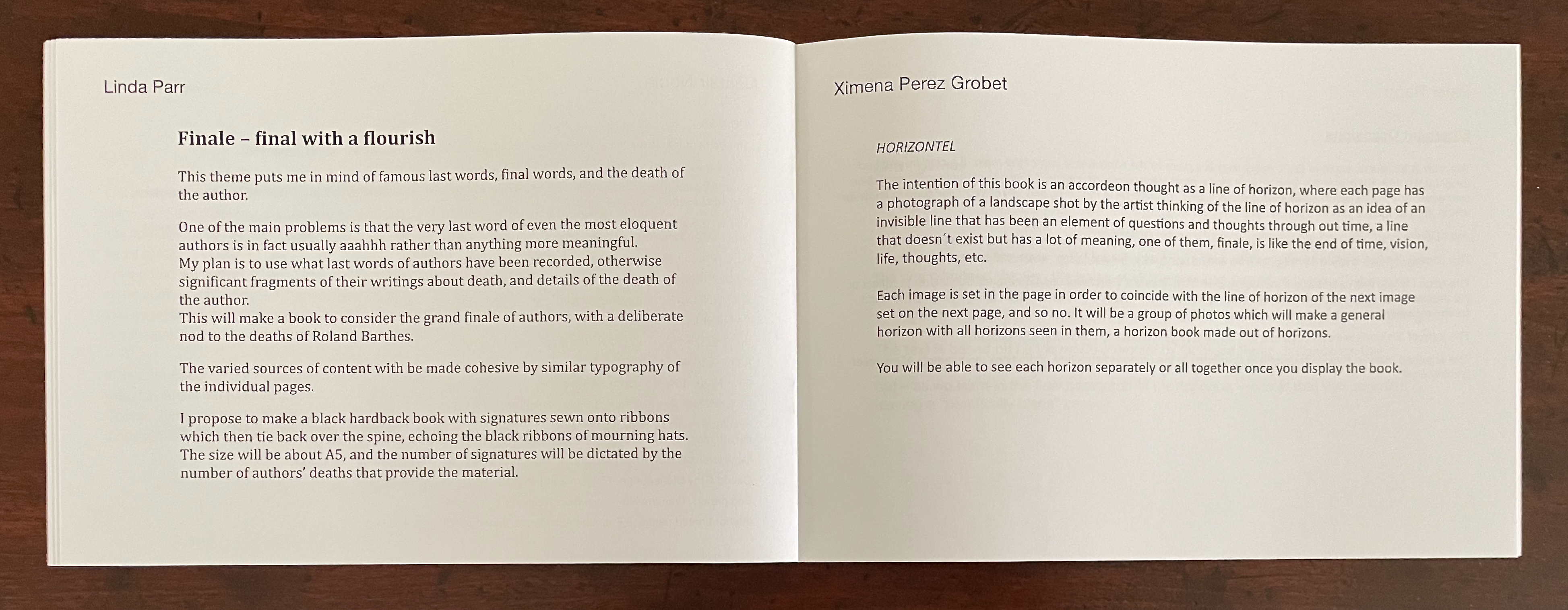
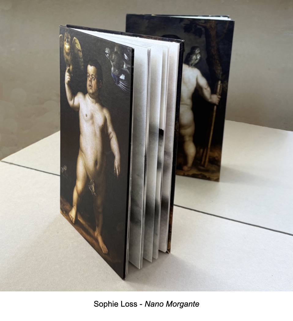
Now add that the proposals’ ranged from simple pamphlet fold to intricate concertina pop-up and to piano-hinged sculpture, from relief prints to photographic prints, from a Renaissance nude to a carnivalesque Full Monte, from entirely text to entirely blank, and from celebration to lamentation and back.
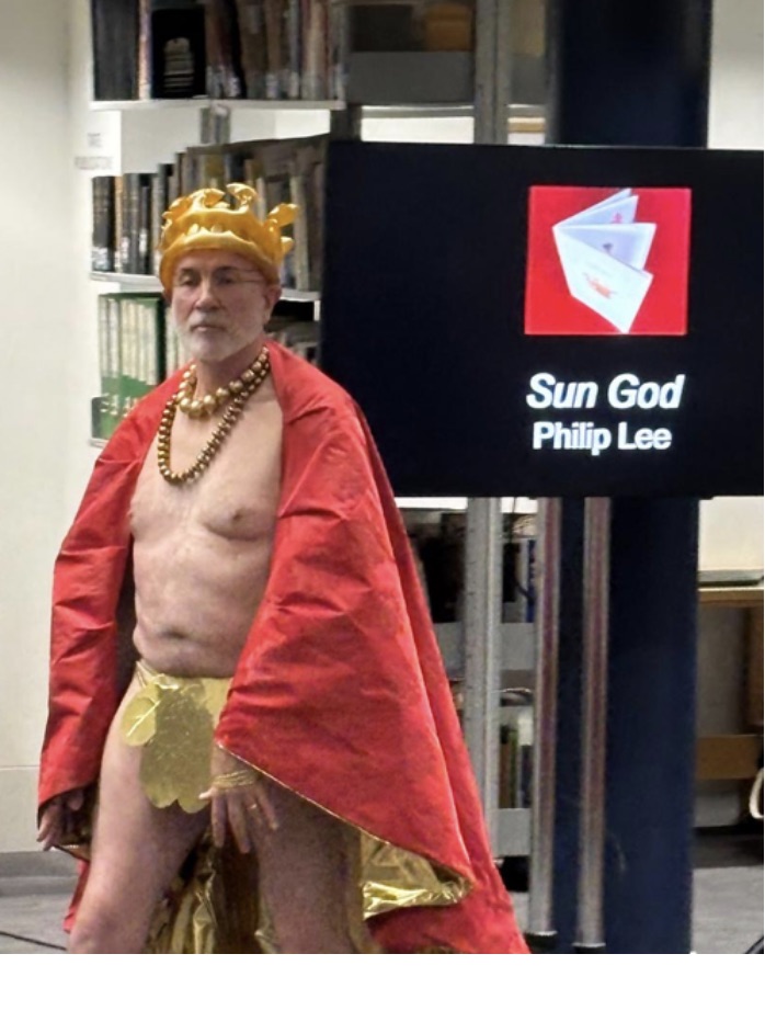
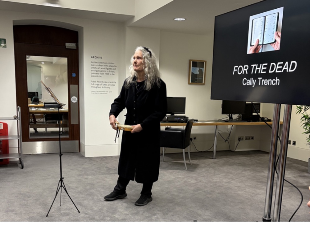
Now add their settings from fireworks displays, theatrical productions, the Book of Common Prayer’s Order for the Burial of the Dead, book burnings, a mythic road trip, and a televised lunar crash.
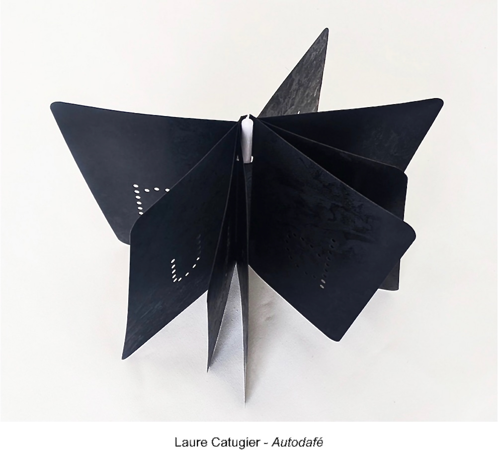
And then add the range of literary and other media influences – from the Greek myths, Bronzino, John Donne, James Joyce, Heinrich Heine, Georges Perec, J.B. Priestley, to the evening television news.
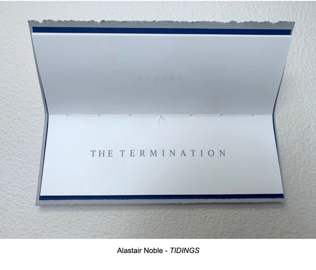
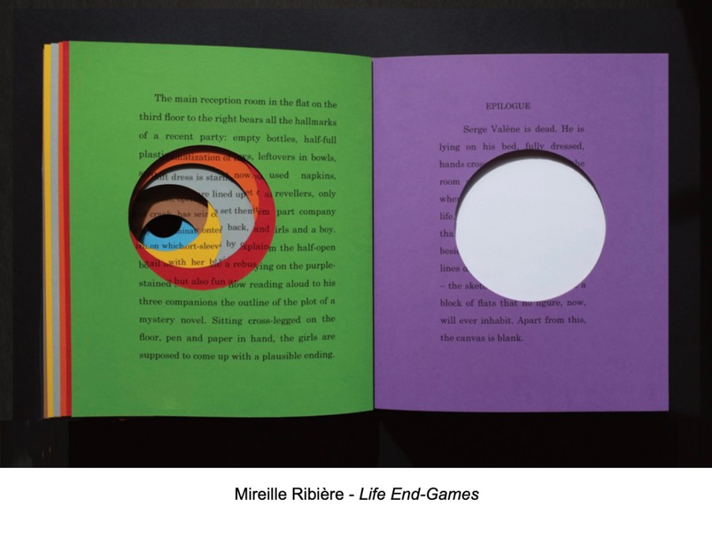
As I mentioned, it was an honor to be tortured with the challenge of imagining what the artists intended. On seeing the final results with Sophie and John via Zoom, my imagination was much relieved and delighted.

As I watched the artists present their works and the audience inspect the Finale selections, look hard and long, touch them, and think slowly, I was convinced of their delight as well.

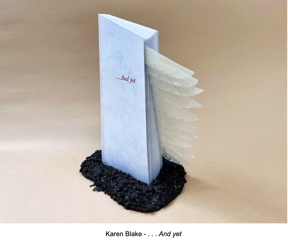
As a group, the entries represented almost every variety of artist’s book I have encountered. One form missing though was the un-openable book. I feared that someone might propose a tombstone carved in the shape of a book which would weigh like a lump on the proceedings. There was, however, a book that took on the shape of a tombstone but seemed to take flight when opened. And although among the entries there were mourners for the final AMBruno project, there were celebratory memorializers as well. In fact, as Sophie and John reviewed the arrivals alphabetically for me by Zoom, I laughed that chance ended our session with Roy Willingham’s Touch Paper, a wonderfully structured diamond-shaped concertina whose folios each burst open to name a traditional English firework and combine to make a larger diamond.
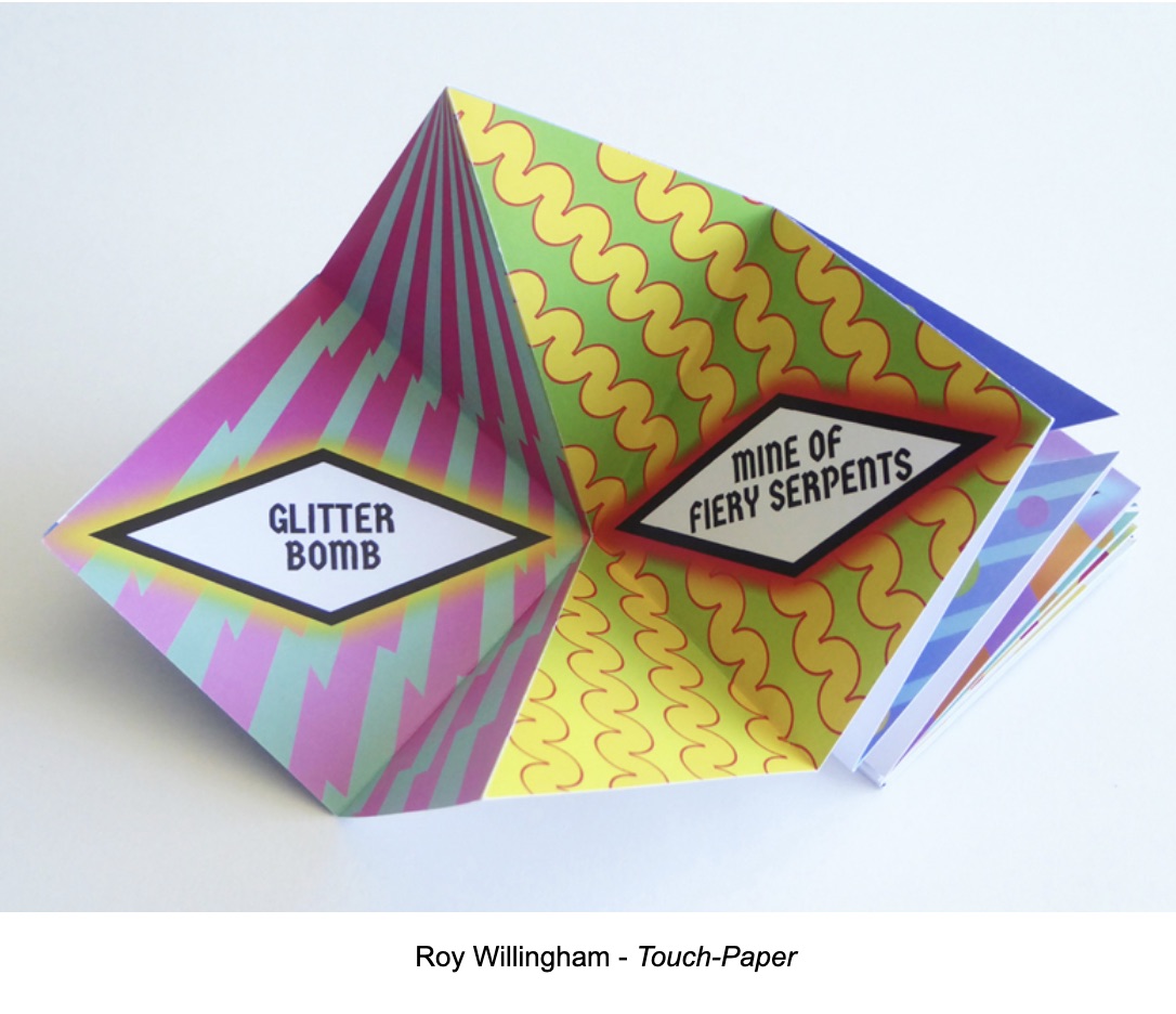
How fitting that the finale of AMBruno’s Finale turns out to be a firework display that should prompt not only oohs and aahs but also a round of applause for Sophie Loss and friends for the 16 AMBruno projects over the past 14 years.
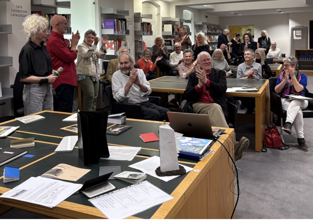
A group of people applauding in a library setting, with several tables displaying books and materials. The audience shows diverse reactions, and a few individuals are standing while others are seated.

The nineteen Finale artists were: Karen Blake, Laure Catugier, Claudia de la Torre, Judy Goldhill, Susan Johanknecht & Katharine Meynell, Rafael Klein, Pauline Lamont-Fisher, Philip Lee, Sophie Loss, John McDowall, Alastair Noble, Linda Parr, Ximena Pérez Grobet, Peter Rapp, Mireille Ribière, Cally Trench, Maria White, and Roy Willingham. Visit the AMBruno site and shop for additional views of the works.

Photography: Books On Books Collection, Sophie Loss, Judy Goldhill, Philip Lee, DDK, Julie Jones, Julia Davy-Brown, and Steve Davy-Brown.
Books On Books Collection – Caroline Penn

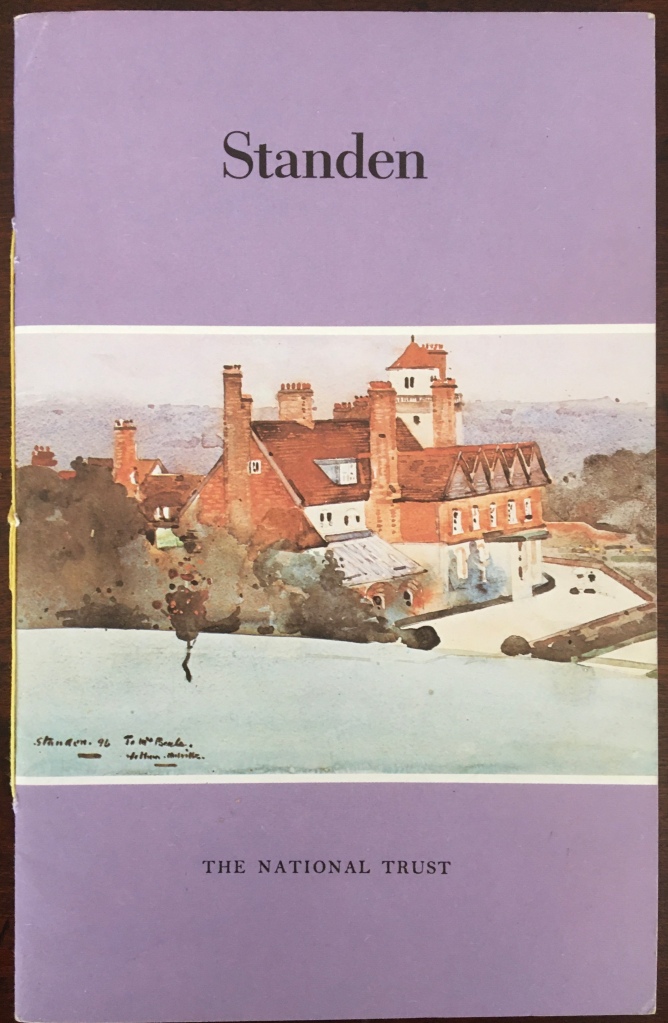
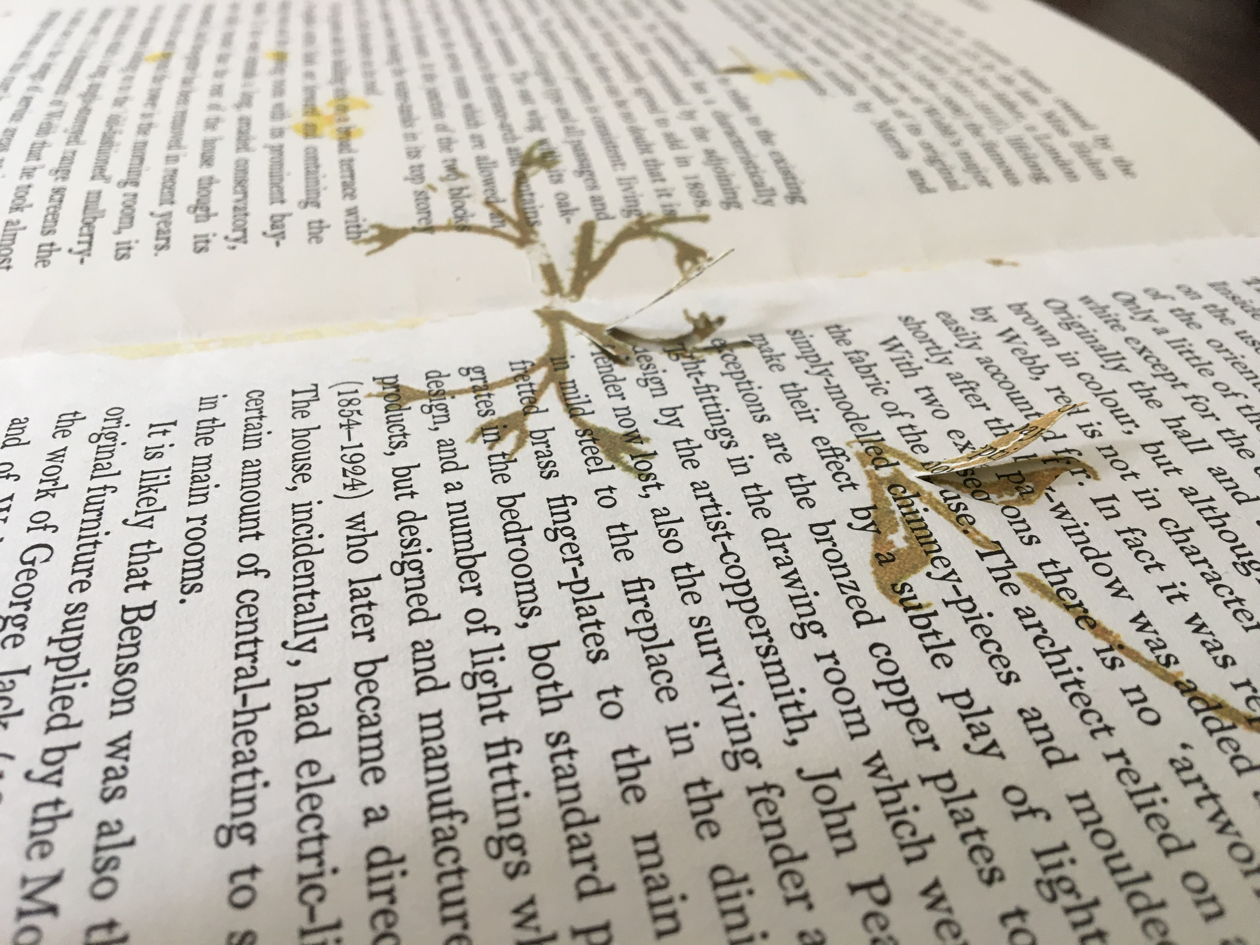
Standen (2014)

Standen (2014)
Caroline Penn
Altered book, overprinted digitally, cut with a scalpel and rebound with thread. H210 x W140. Acquired from the artist, 9 June 2020. Photos: Books On Books Collection.

The William Morris wallpapers in Standen House, an Arts & Crafts home in Sussex, and the memory of Charlotte Perkins Gilman’s story “The Yellow Wallpaper” inspired the creation of this altered book. The work altered is a 1979 National Trust publication on Standen House. In Gilman’s story, the main character, who has a mental breakdown from being forced into domestic seclusion, gradually claws away the yellow wallpaper in the room where she is locked away. In correspondence, Penn writes that she unbound the original booklet, ran the pages through a digital printer, performed the cutting and then rebound it. In a clever reversal, by the end, the wallpaper print and its excision have taken over the walls of the book of Standen House.

Photo: Courtesy of the artist.

By coincidence, American book artist Harriet Bart co-curated an intriguing exhibition called “Wallpaper“. Bart’s entry, too, was inspired by the Gilman story.

fieldwork (2017)

fieldwork (2017)
Caroline Penn
Digitally printed concertina.
Cover: H126 x W90 mm; pages, H125 x W88 mm.
Edition of 20, of which this is #8.
Acquired from the artist, 6 February 2020. Photos: Books On Books Collection.

A book within a book, fieldwork offers an entrancing visual narrative. A small white book unfolds from nothing to small pebbles, larger pebbles, more pebbles to fewer, and finally to one pebble in the center. Is it the reverse of the process of erosion? Is it categorization by the human eye and hand striving with nature’s agglomeration?

The artist has embedded the visual narrative here in an innovation on the framing device to be found in Helen Douglas’s Wild Wood and A Venetian Brocade. As with the latter works, fieldwork encourages us to touch with our eyes. It is a stunning piece of trompe l’oeil. On glimpsing any double-page spread, the reader/viewer is tempted to pick up one of the pebbles apparently resting on that white piece of paper open on a photo of a shingle beach. Visitors to Kettle’s Yard will recognise the temptation.

Project C: Destination Unknown (2020)

Organised by Pauline Lamont-Fisher, Project C is the result of a collaborative effort among 14 artists:

This project is about intersemiotic translation between images to words and from words to images and the paths that form between them. Roman Jakobson in Linguistic Aspects of Translation suggests the idea of intersemiotic translation as the translation from one sign system to another: i.e. interpretation of verbal signs by means of signs of non-verbal sign systems. So every novel adaptation into film, constitutes a translation. The illustrations in a book act as translations of text into images. Every time you watch Tchaikovsky’s Nutcracker, you watch an intersemiotic translation from narrated story into ballet.

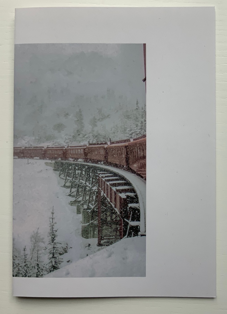
The artists were given a set of anonymised covers of Italy Calvino’s If on a winter’s night a traveler and asked to choose one and, keeping in mind Jakobson’s notions of intersemiotic translation, produce a folio or pamphlet in response. Caroline Penn’s contribution uses text, typography, structure, choice of paper, density of ink and a pattern of hole punches to translate or evoke not only the image below but the substance of Calvino’s novella — or at least a key element of the substance susceptible to translation to an artist’s book of translucent Bible paper and pergamenata.

Project C: Destination Unknown (2019)
Caroline Penn
Digitally printed on Offenbach bible paper stitched to pergamenata. Concertina, H186 x W130 mm. Edition of 30. Acquired from whnicPRESS, 7 March 2020. Photos: Books On Books Collection.

The contrasting whites of the Bible paper and the translucent paper that comes uncannily close to animal parchment mirror the different colors of snow in the cover.

The dispersed positioning of the letters of the word “vapour” mimic the falling snow. The series of darker inked phrases set below, separated from each other by hyphens and staggered downwards across the panels echoes the rail track and cars in the cover.

The body of light gray likewise sloping down from left to right recalls the declining mountain gap crossed by those train tracks.

Across the foot of the page, the holes punched in a lowercase letter “o” and separated by two unpunched uppercase “O’s” also evoke the rail tracks and cars. In a nod to the Oulipo pattern-driven nature of Calvino’s work, the noughts of the “O’s” are answered in the crosses of the “X’s” supporting the text that crawls across the panels, finally turns the corner of the last panel and fades into the gray word “invisibility” on the reverse of the last panel.

A tour de force of book art — making text, image, ink, papers, layout, structure and impression work, mean and become a thing independent of the inspiring constraint.