The entry on Transforming Hate by Clarissa Sligh, her first work acquired for the Books On Books Collection, was posted in September 2020, just over a month from an election that offered a step away from hate, prejudice, and bigotry. Unfortunately insurrection brushed the offer aside. Four years later, another election, and reactionism and revanchism seem to have the upper hand. In such times, Clarissa Sligh’s book art, photographs, and recorded lectures provide a tonic of bittersweet hope. You cannot help but be struck by the persistent but wary humanity of the art and the artist.
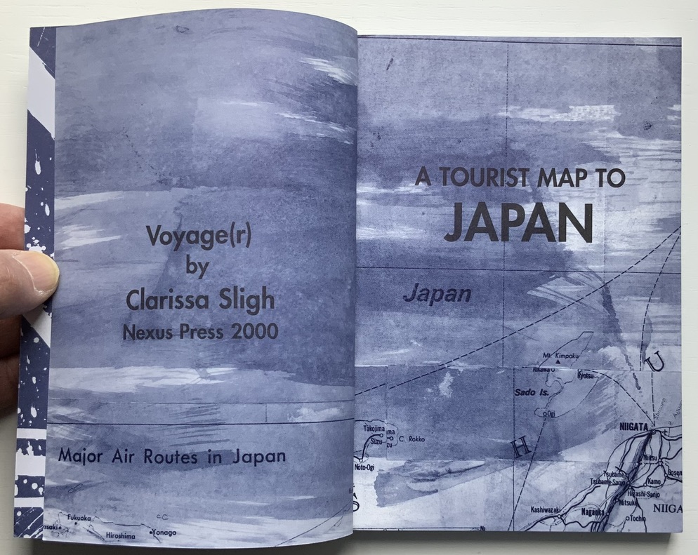
Voyage(r) (2000)
Voyage(r): A Tourist Map to Japan (2000) Clarissa Sligh Perfectbound paperback. H184 x W127 mm. [144] pages. Edition of 1000. Acquired from Hudson River Books, 11 February 2021. Photos: Books On Books Collection.
Artist’s description: “In this diary-like artist’s book, Sligh recounts a trip to Japan through a thoughtfully constructed montage of photography, texts, and abstract gestural paintings. In personal and poetic musings, the author ponders her relationship to Japanese culture, both as a first time visitor and as an African American woman. Beautifully printed in blue and black duotones, the book comes in a cloth bag.”
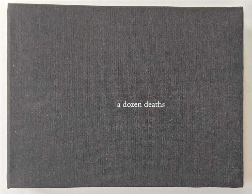
a dozen deaths(2015) Nia Easley Case bound, cloth-covered book board, modified accordion structure. H7 x W9 x D1 inches, 24 pages. Text laser-printed on 90lb Neenah paper; interior images stencil-printed in acrylic, exterior pattern inkjet-printed on bamboo paper. Edition of 5. Photo: Courtesy and permission of the artist.
Nia Easley’s birthday in 2012 felt very different. The day before, George Zimmerman had killed Trayvon Martin. Over the days, weeks and months after, the outpouring in the mainstream and social media in reaction to the event and the jury trial that followed only intensified and complicated the emotions and memories evoked on the day.
Turning to art, Easley asked twelve individuals to recount Trayvon Martin’s last moments based on their memories of the reported event. An implicit rule in Easley’s request led to the stories being told from the first person. Her only explicit rule for the retelling was that the imagined teller must die at the end. She recorded each retelling and, with the participant’s collaboration, polished it into a transcript.
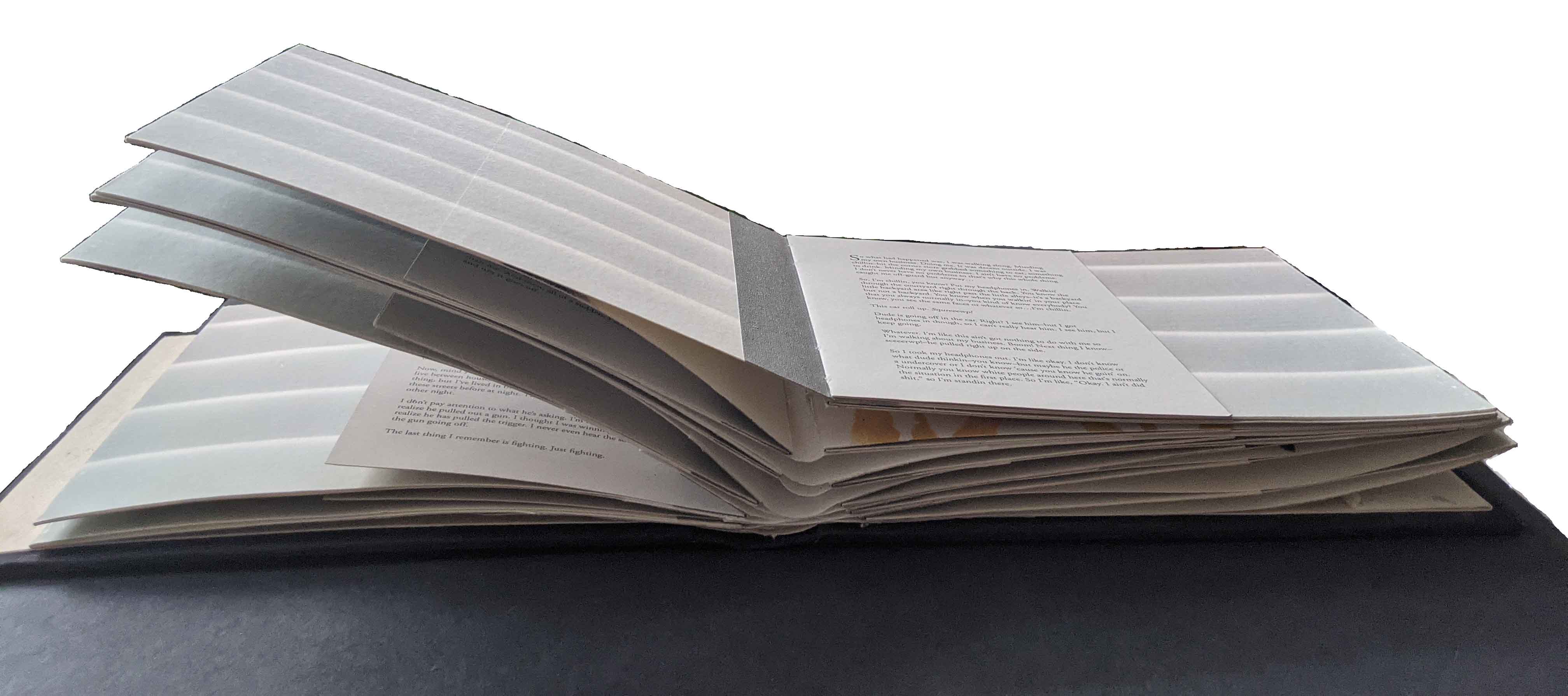
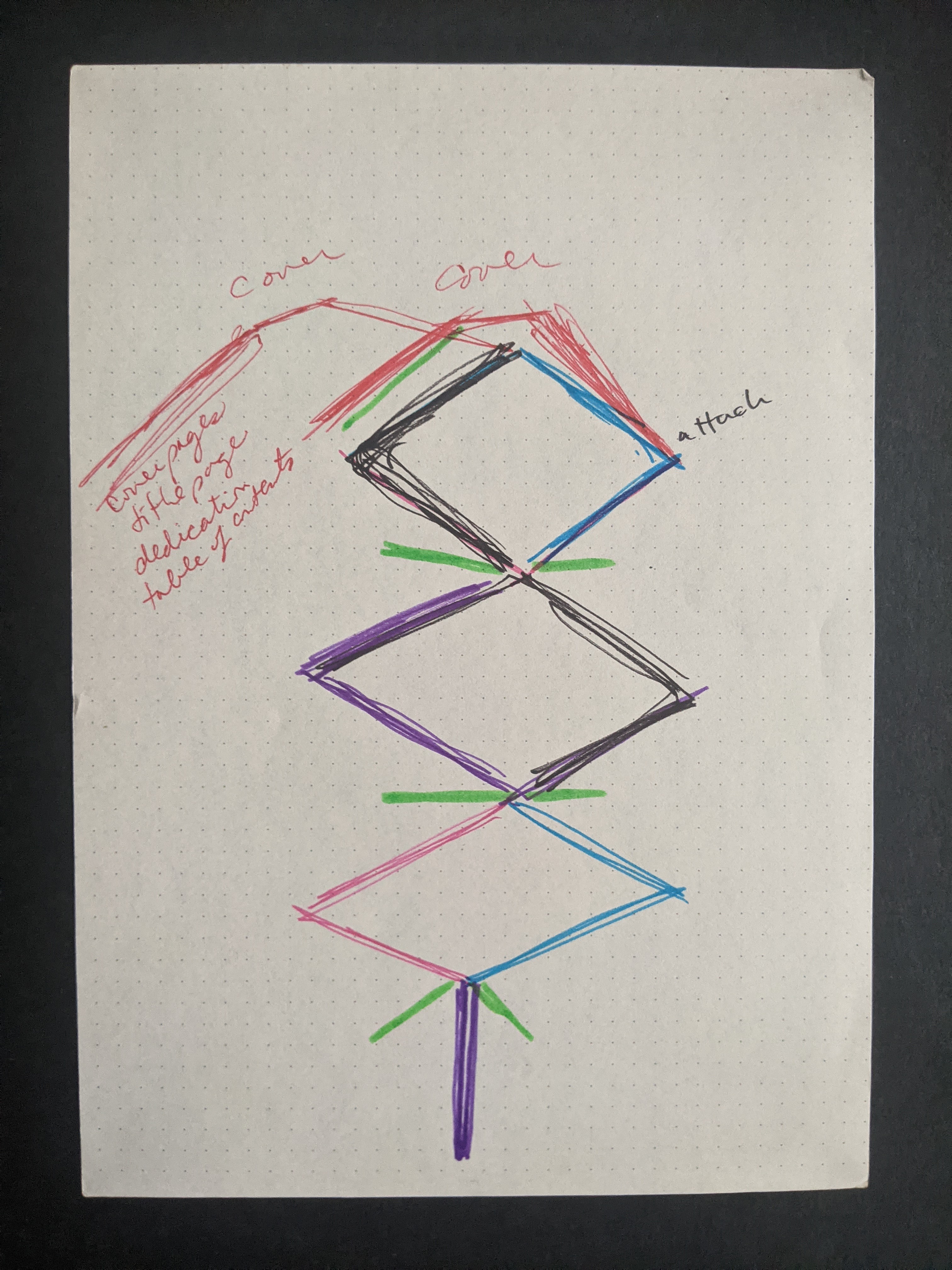
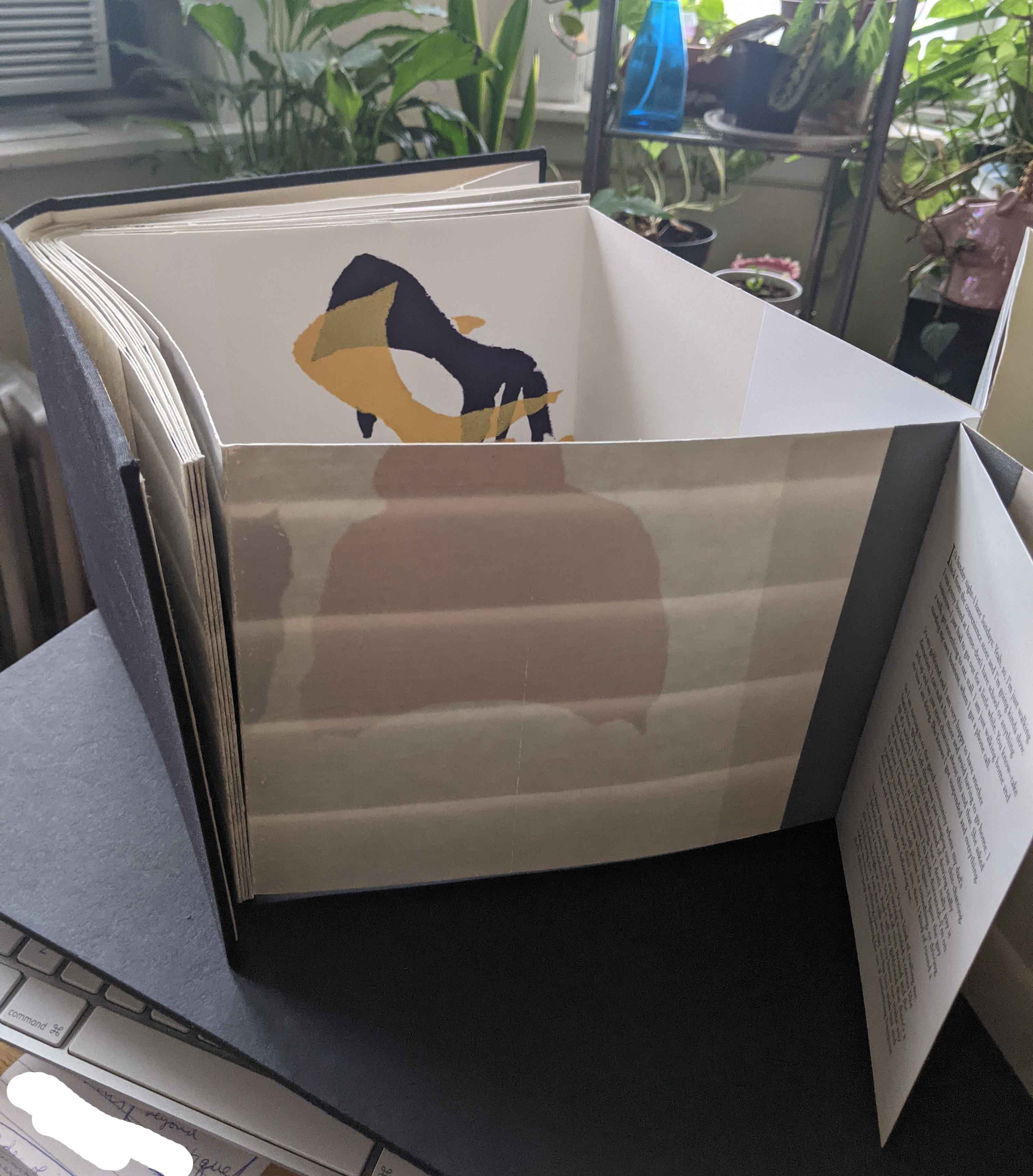
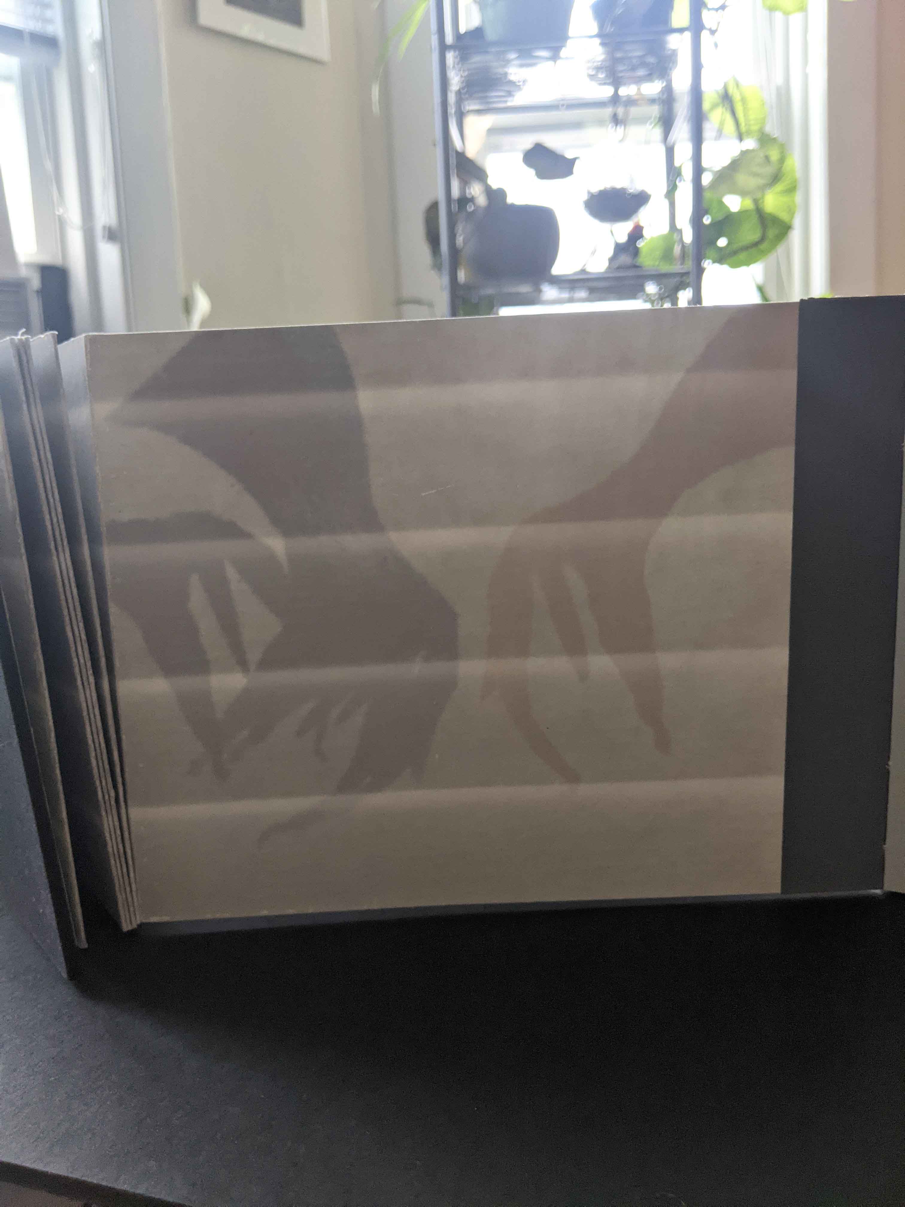
Two double-sided bamboo-paper accordions are joined together, a structure influenced by The Diary of a Sparrow by Kazuko Watanabe. On their exterior is a horizontal gray-white pattern, ink-jet printed, that seems to shift between an image of house siding panels and that of backlit drawn venetian blinds. In the exterior valley folds of the accordions, gatherings of the twelve retellings, laserjet-printed, are sewn to book tape used to join the accordions together. With the twelve narrators, we are on the outside. For this white reader, here begins an uneasiness that will not ease.
The structural plan shows how the double-sided accordions attach to the cover and, in green, where the narratives attach. Photos: Courtesy and permission of the artist.
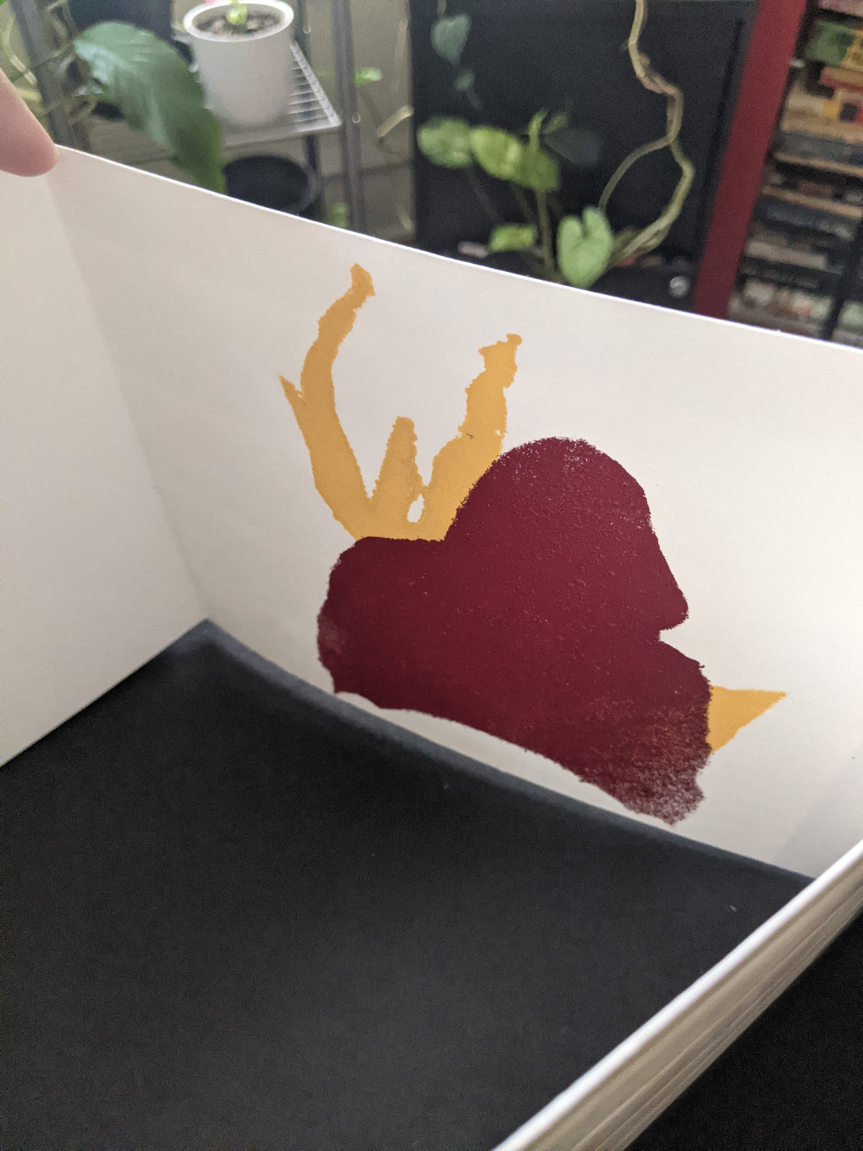
On the inner side appear stencil-printed images in naples yellow, maroon, deep blue-violet, cobalt blue, moss green, neon orange and sienna brown; however, each copy in the edition differs in colors and orientation of the images made from two stencils of hoodie-wearing figures taken from neighborhood-watch signs. More uneasiness as the images’ shifting orientation creates a threatening abstraction, a suggestion of claws. Are they clawing to get in or out? Are the hooded figures real monsters whose shadows we see cast against the venetian blinds? Are they imagined from inside the house, projected on the venetian blinds?
Views of the stencil prints. Photos: Courtesy and permission of the artist.
The modified accordion structure lets the reader move through the work codex-fashion or extend it to its 4-foot length as a sculpture to be read/viewed in the round. When read the former way, the hooded images peek out from the edges of the interior; when viewed the latter way, the work takes on a sort of mise-en-scène of the event — or of Easley’s twelve gathered around a jurors’ table even though they are each taking on the role of the deceased Martin as witness to his own death.
Just as each copy of the edition differs in its colors and orientation of images, each of the twelve retellings differs. In selecting the twelve from her circle of acquaintances, Easley aimed for a representative diversity of members. Only at the end and then only their first names — Allison, Damien, Deandre, Derek, Doc, Jae, Molly#1, Molly#2, Natasha, Ronnie, Tanuja and Werner –are given and not in the order in which their retellings appear. As each of the twelve takes over Martin’s voice, we cannot tell whether it is actor, actress, young or old, or what race. The ground of identity and perspective under the reader/viewer’s feet keeps shifting.
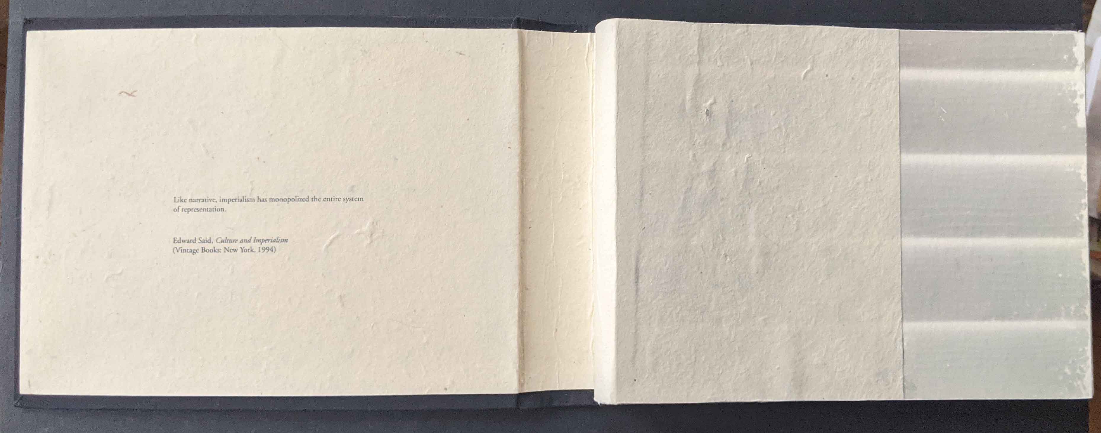
Easley suggests, “the narratives are a meditation of sorts, into the kind of people we are together and how we see others.” The artwork’s epigraph — “Like narrative, imperialism has monopolized the entire system of representation” (Edward Said,Culture and Imperialism, 1993) — frames that meditation. By “destabilizing” narrative and perspective, a dozen deaths makes us uneasy. In that uneasy meditation, we may indeed recognize the kind of people we are together, how we see each other, and find a way to change the narrative.
Four copies of the work reside at Depaul University Library, Northwestern University, University of Iowa Libraries and the Joan Flasch Artists’ Books Collection, Art Institute of Chicago.
Easley’s other work includes For Safety’s Sake (2015),It’s Just OK (2019), And you hold power(2020-21) and Annotated Graphic Design Timeline, an ongoing Instagram project addressed to the book Graphic Design Timeline (2000) by Steve Heller and Elinor Pettit. At the School of the Art Institute of Chicago, where she works as an Administrative Coordinator, she also teaches the graduate seminar “History as Material” and the course “Drawn to Print”.
Further Reading
“Tia Blassingame“, Books On Books Collection. 17 August 2020.
“Clarissa Sligh“, Books On Books Collection. 2 September 2020.
Gleek, Charlie. “Centuries of Black Artists’ Books“, presented at “Black Bibliographia: Print/Culture/Art” conference at the Center for Material Culture Studies, University of Delaware, 27 April 2019, pp. 7-8. Accessed 20 July 2020.
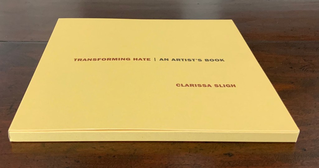
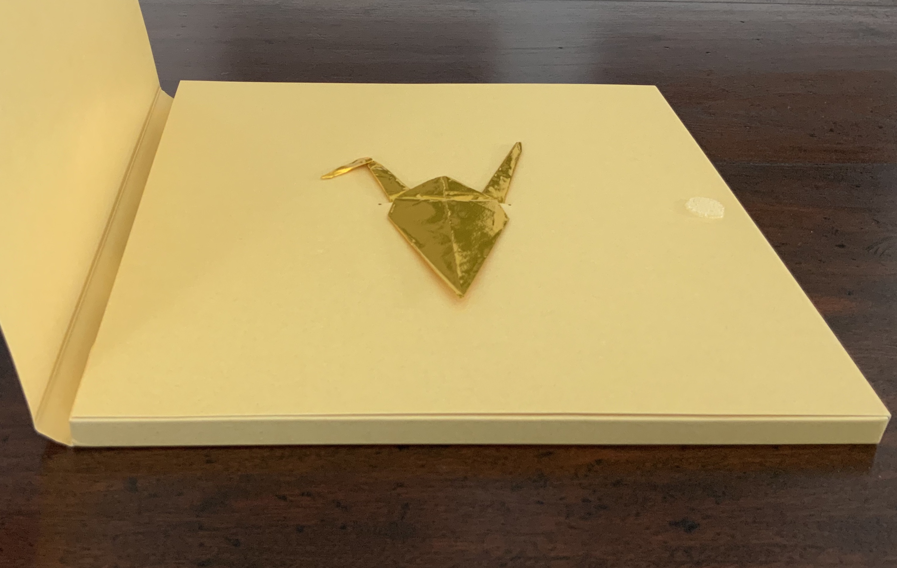
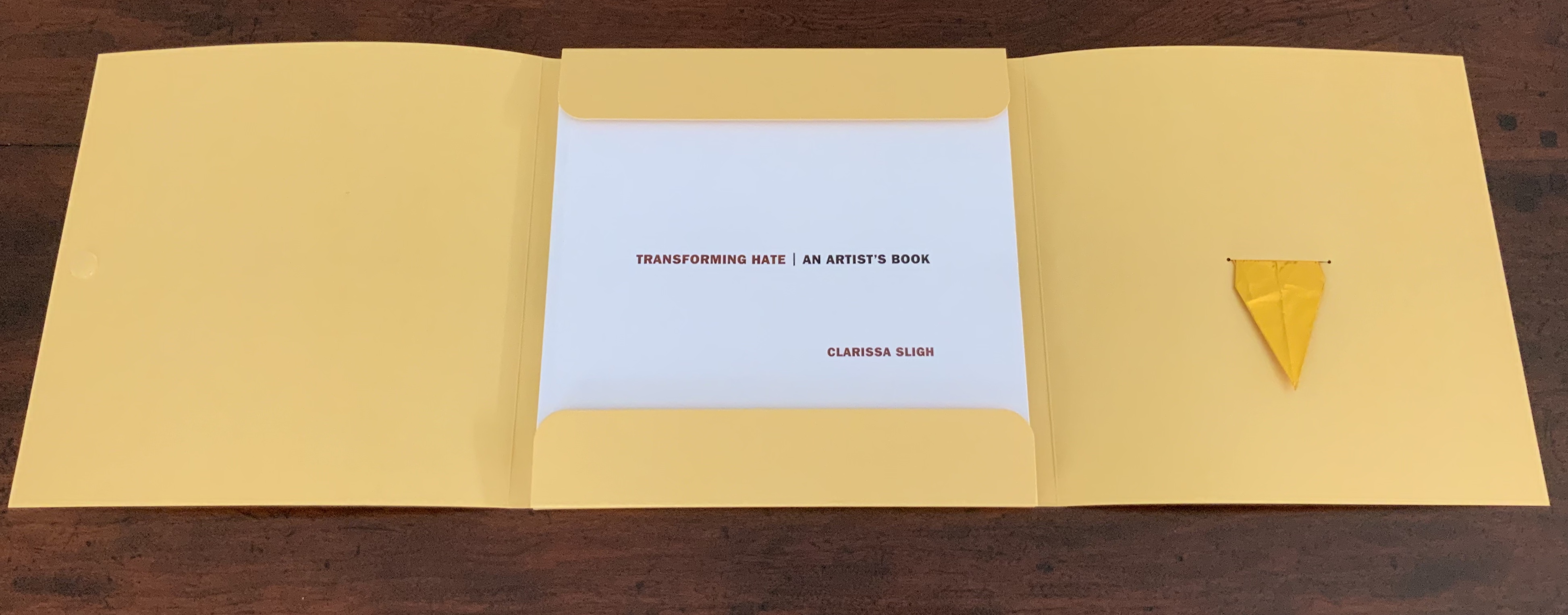
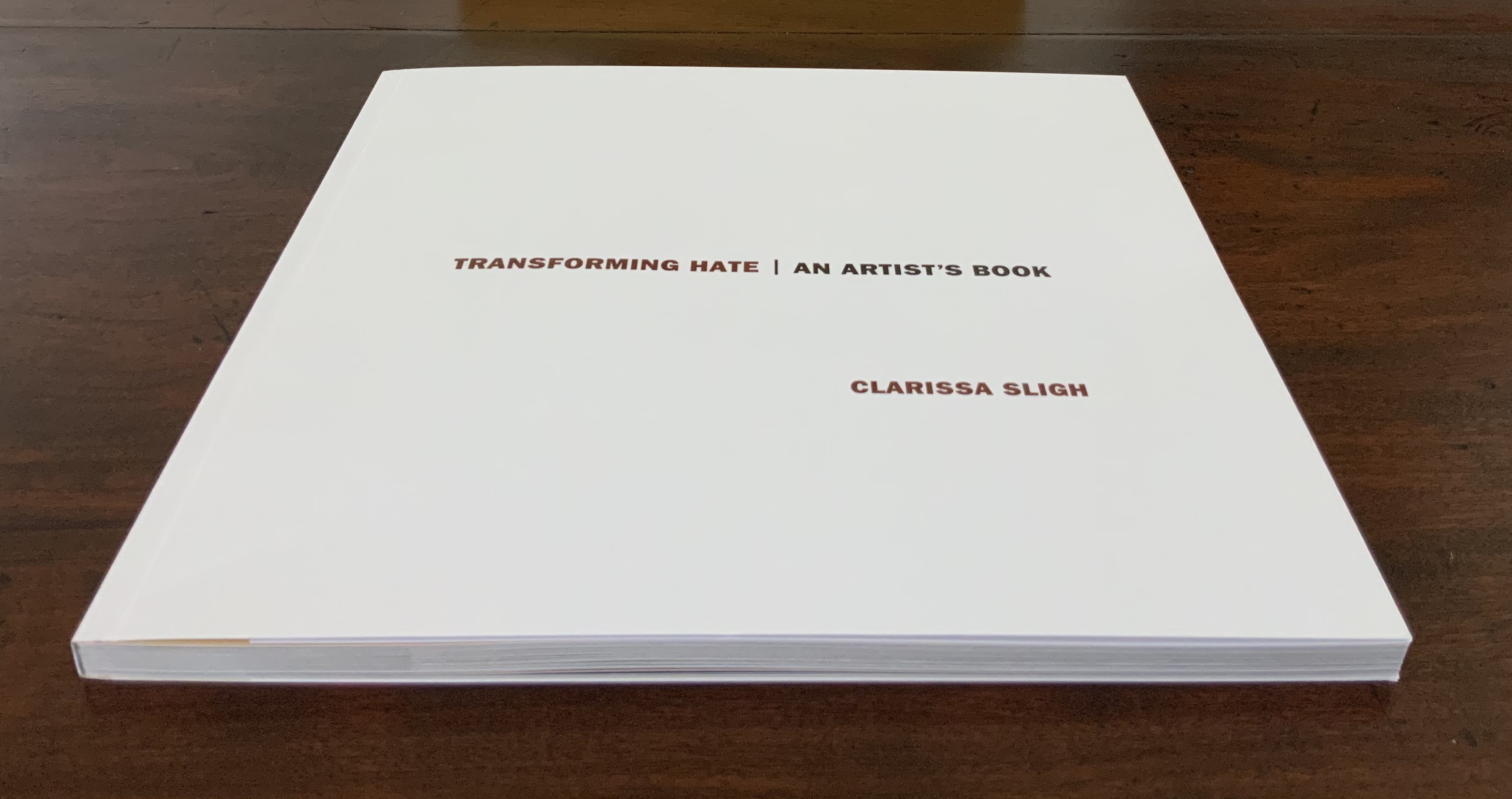
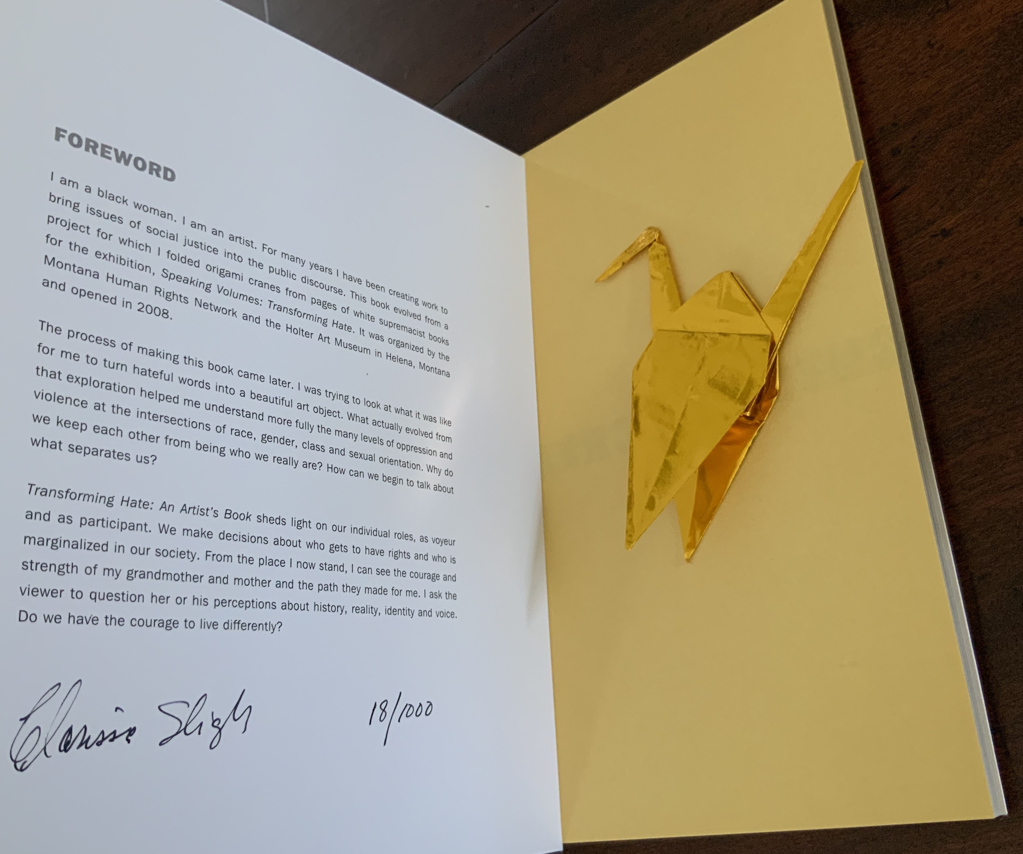
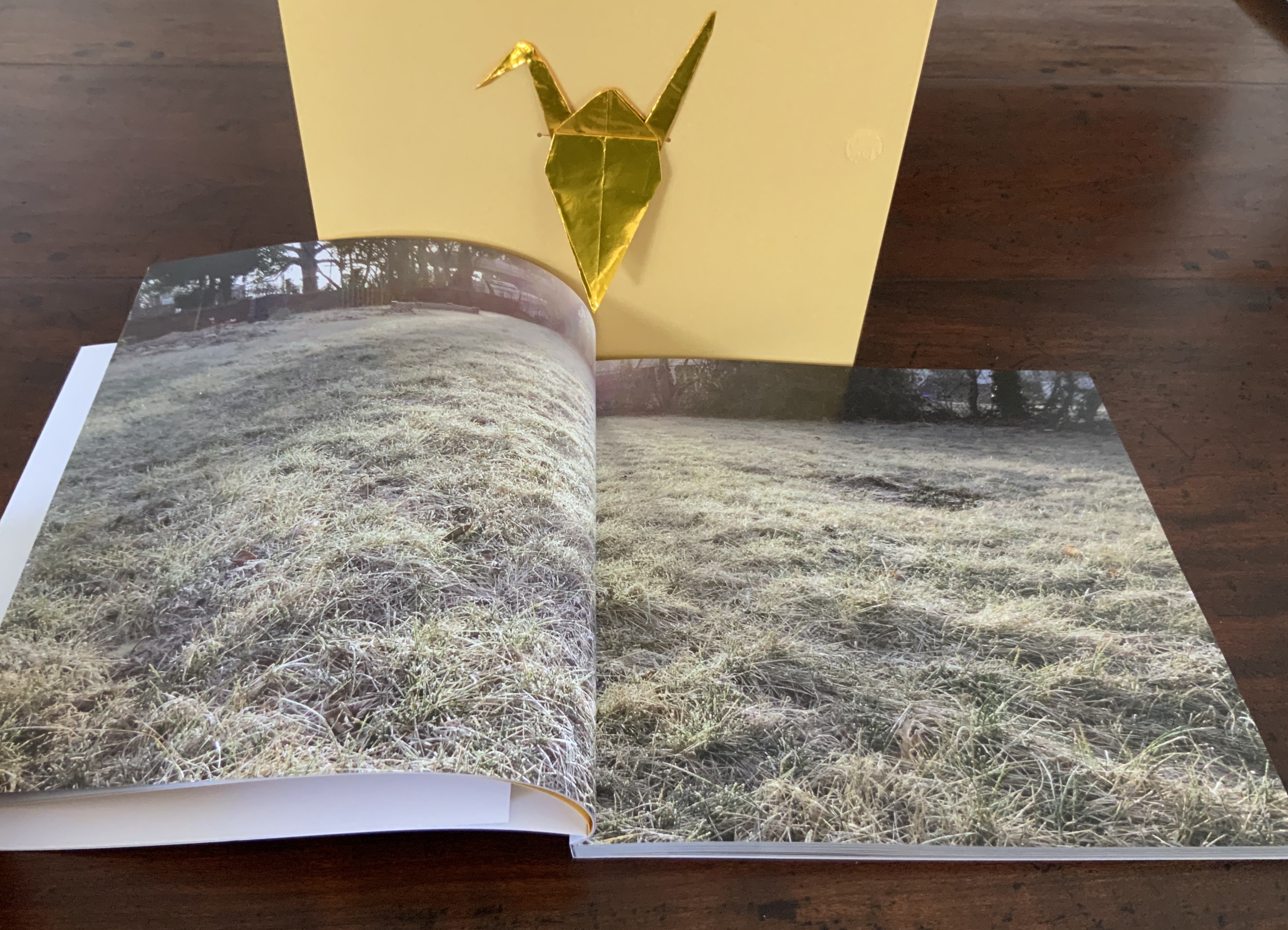
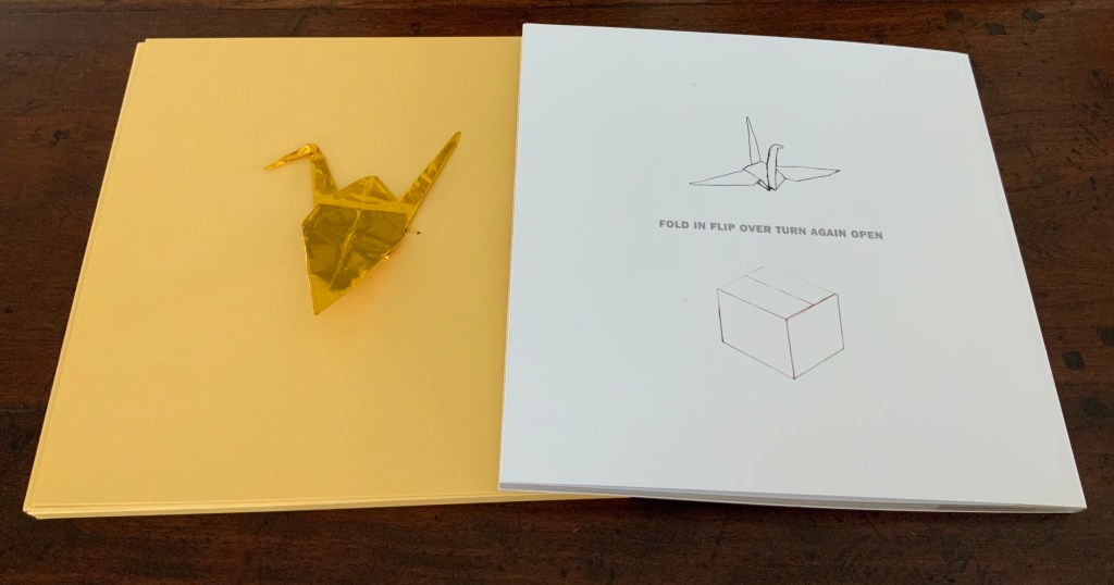
Perfect bound softcover. Four-color offset lithography. Illustrated paper wrappers with flaps. Housed in foldout die-cut box with gold foil origami crane inserted into cover slot. H203 x W204 mm, 104 unnumbered pages including inserts. Edition of 1000 numbered and signed, of which this is #18. Acquired from Vamp & Tramp, 13 August 2020. Photos: Books on Books Collection with the permission of the artist.
A forthright Franklin Gothic typeface announces the title, descriptive subtitle and author’s name in brown, black, and brown on the warm golden yellow of the die-cut box. As it opens from its velcro fastener, it reveals a gold foil origami crane, inserted in the box’s internal flap. As the flap turns, the straightforward Franklin Gothic re-announces the title, subtitle and author’s name, this time on the book’s white cover. So far, the work gives a sense of simplicity, elegance and warmth. Only the title hints at something uncomfortable to come. Finding a book’s foreword on its cover flap is unusual, but that Franklin Gothic now matched with plain-spoken prose — “I am a black woman. I am an artist.” — reassures. By the foreword’s last line though — “Do we have the courage to live differently?” — the reader/viewer may sense a need to keep the gold foil origami crane close like a guardian angel.
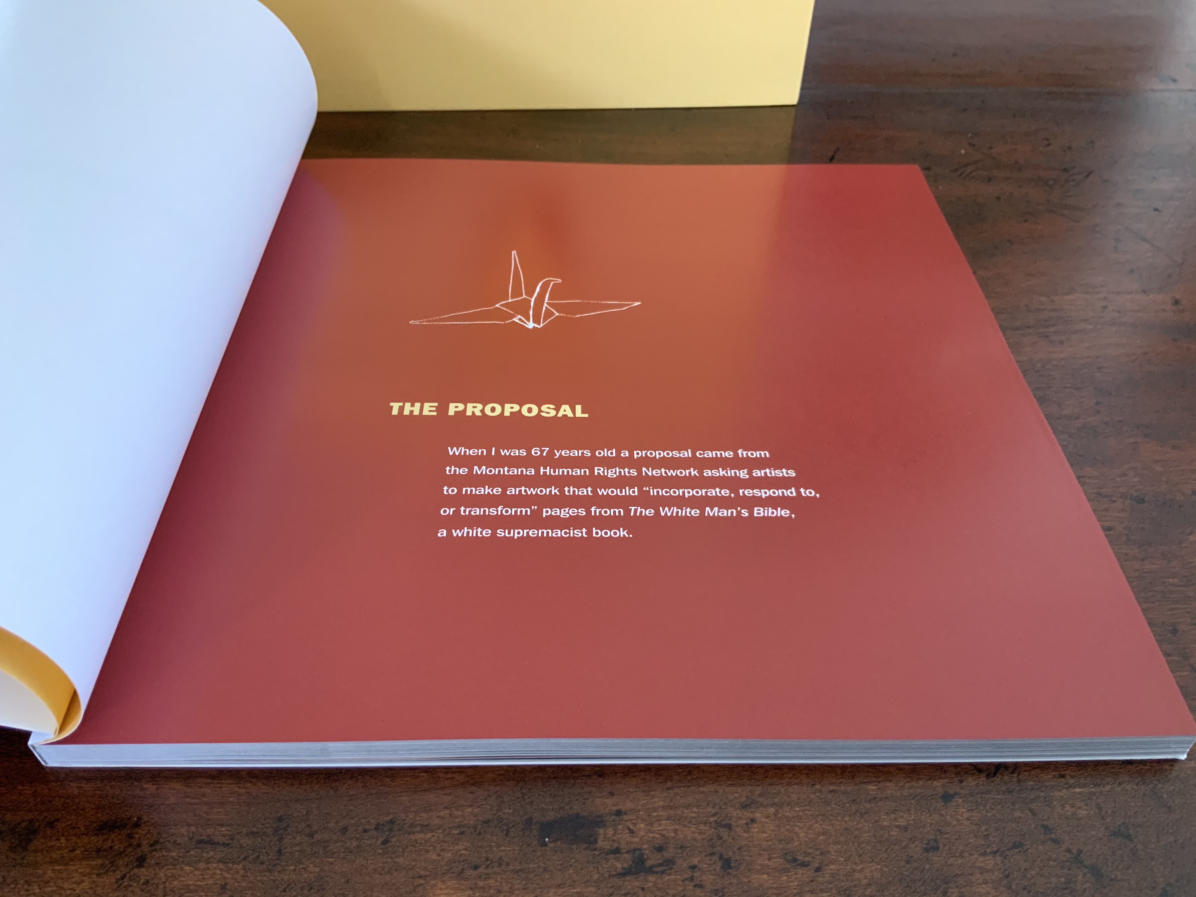
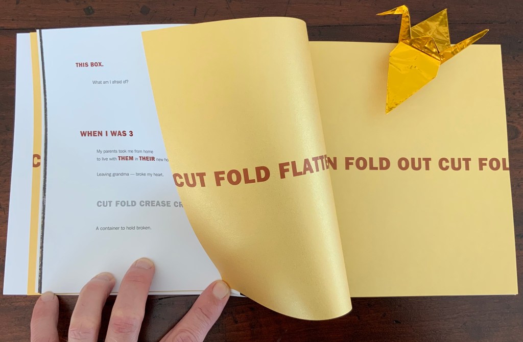
The crane also provides an organizing or, more accurately, guiding principle. Across the double-page spread of near-translucent golden endpapers just before the half-title, the truncated instructions — “cut fold crease flatten turn over cut fold creas” — start to articulate how to alter another book’s pages into origami cranes. On a startling full-page bleed of reddish brown ink, “The Proposal” in yellow and its text in white names the book to be altered: The White Man’s Bible, a white supremacist screed. Wings extended against the reddish brown, the crane hovers over the text.
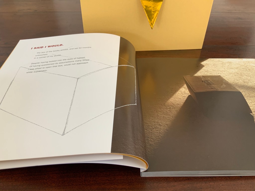
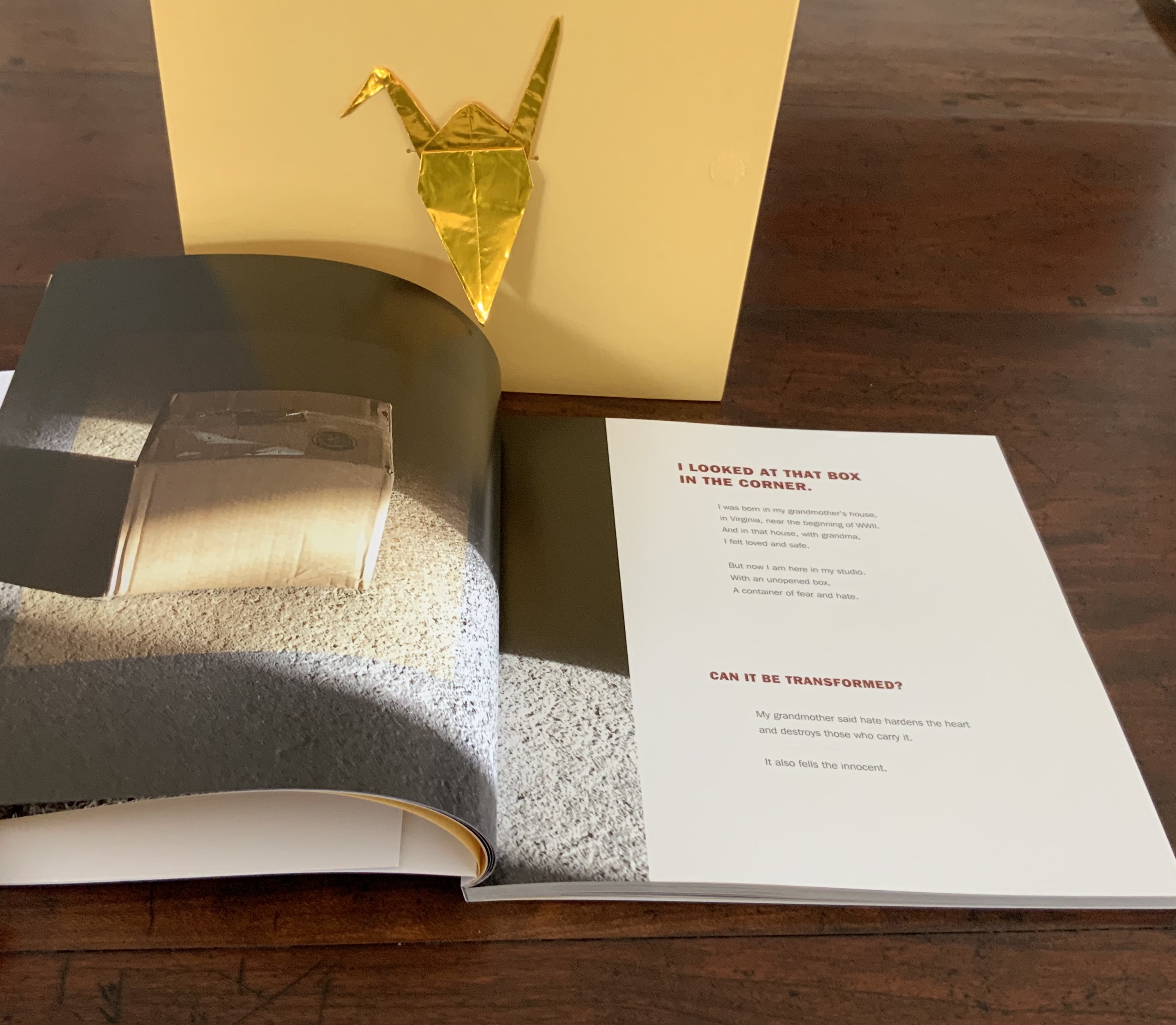
More startling is the following double-page spread with the artist’s acceptance of the challenge, yet doubt, on the left and a photo of the unopened box full of hate casting a shadow from light falling from the right. The photo on the right spills leftward over the gutter, encroaching on the artist, her acceptance and doubt. And yet, her diagram of a box pushes back, rightward against and into the encroaching shadow.
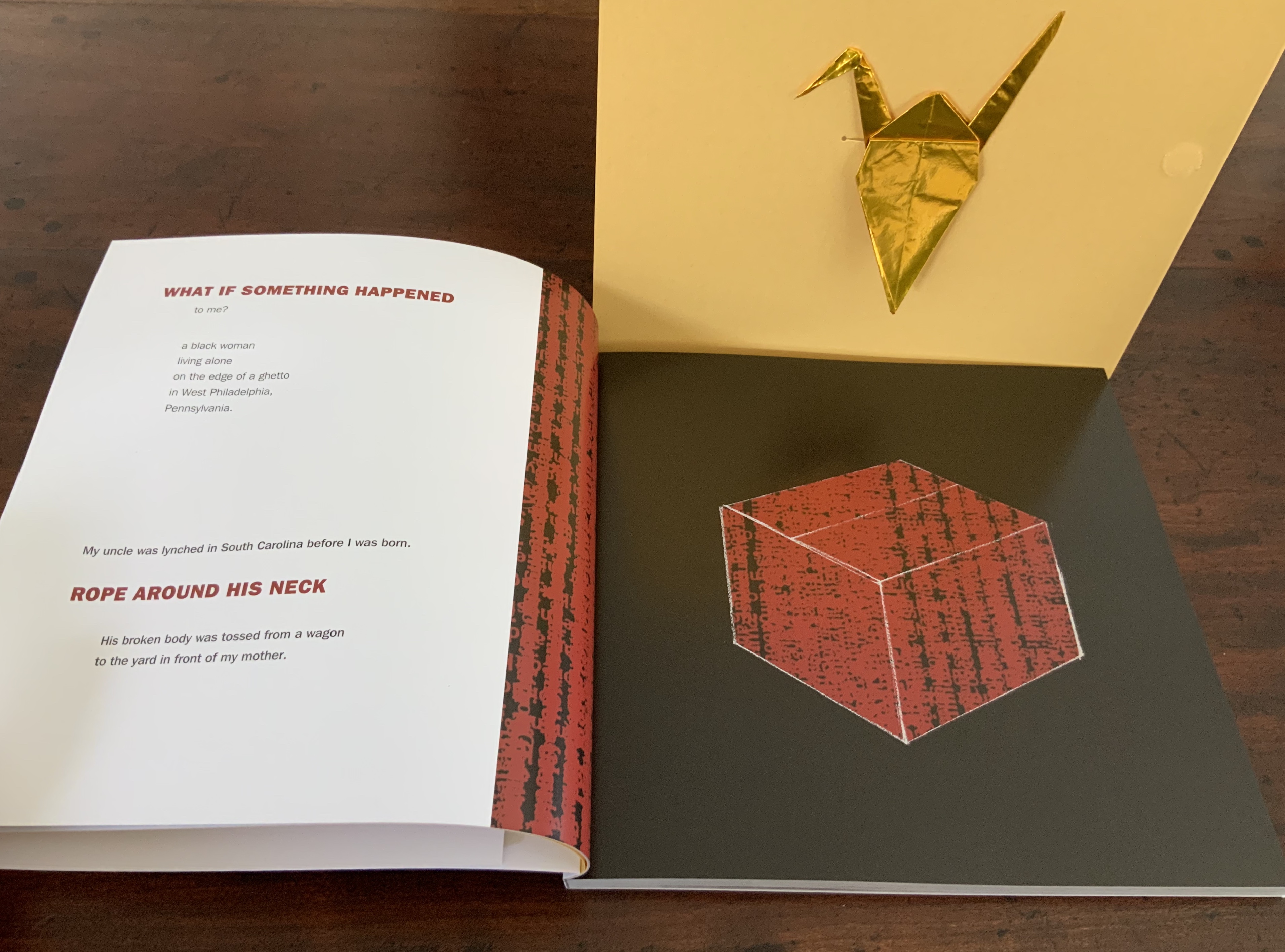
The guardian angel becomes a necessary angel over the next two double-page spreads. From the left page of the first spread —
My uncle was lynched in South Carolina before I was born. Rope around his neck, his broken body was tossed from a wagon to the yard in front of my mother.
— the text faces on the right a full-page bleed of black ink in which the transparent box diagram sits full of hate-red words. Turn the page.
What the double-page photo of hummocks of grass in the foreground and, in the far background, some fencing, a sandbox, houses behind a stand of brush and trees conveys, with its contrast to the preceding spread of text and image, sticks in the chest and throat.
In the next double-page spread, the box sits, still closed, now on the left in a reversal of its first appearance. The light that casts the box’s shadow shines across the gutter from the artist’s question on the right hand page — “Can it be transformed?” The artist seems to be drawing a deep, preparing breath, one that the next double-page spread implies is calming.
At the next turn, an organizing principle only implicit so far but now explicit in the words “When I was 3” joins the principle of the folding instructions “cut fold crease craft”. These instructions appear again on the same paper used for the endpapers, used here to mark the end of the book’s first section. The first section’s final words “A container to hold broken” fall between the instructions, leaving a warranted sense of foreboding. As the work proceeds akin to a growth chart — “when I was 5”, “when I was 11” and so on — can the necessary angel suffice?
In the four sections that follow, the artist’s life, fears and hopes intersect personally with painful local, national and international history. As she communicates her sense of living this history, she also charts her engagement with others’ history of subjection to hate. If any reader thinks that this somehow gives in to an “all lives matter” chorus, one corrective course is to lay hands and eyes on a copy of this artist’s book. If somehow that does not make plain the power of this artist’s voice, then a further corrective course is to listen to her read the text here. If that does not work, then follow the instructions on the back cover.
Inside flap of the die-cut box; back cover of the book.
I am a white man. I write about book art. Encountering this work of art is to stumble, fall, get up — cut fold crease flatten fold out cut fold in flip over turn again open — and begin to do the work toward acknowledging and accepting this necessary angel. Reminder to self: “again open”.
Gabor, Nora. 18 February 2021. “Black History and Experiences through Book Arts“. The Full Text: News about library resources and services. Chicago, IL: DePaul University. Accessed 22 January 2024.
Gleek, Charlie. “Centuries of Black Artists’ Books“, presented at “Black Bibliographia: Print/Culture/Art” conference at the Center for Material Culture Studies, University of Delaware, 27 April 2019, pp. 7-8. Accessed 20 July 2020.
Renée Riese Hubert and Judd D. Hubert’s The Cutting Edge of Reading: Artists’ Books (Granary Books, 1999) is a signal work of appreciation and analysis of book art. Nearly twenty years on, it can be read and appreciated itself more vibrantly with a web browser open alongside it.
To facilitate that for others, here follows a linked version of the bibliography in The Cutting Edge of Reading — a “webliography”. Because web links do break, multiple, alternative links per entry and permanent links from libraries, repositories and collections have been used wherever possible. These appear in the captions as well as the text entries. Also included are links to videos relating to the works or the artists. At the end of the webliography, links for finding copies of The Cutting Edge (now out of print) are provided.