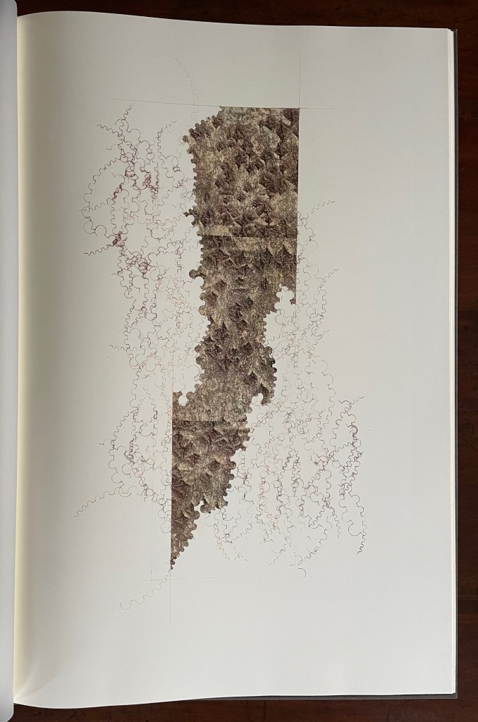
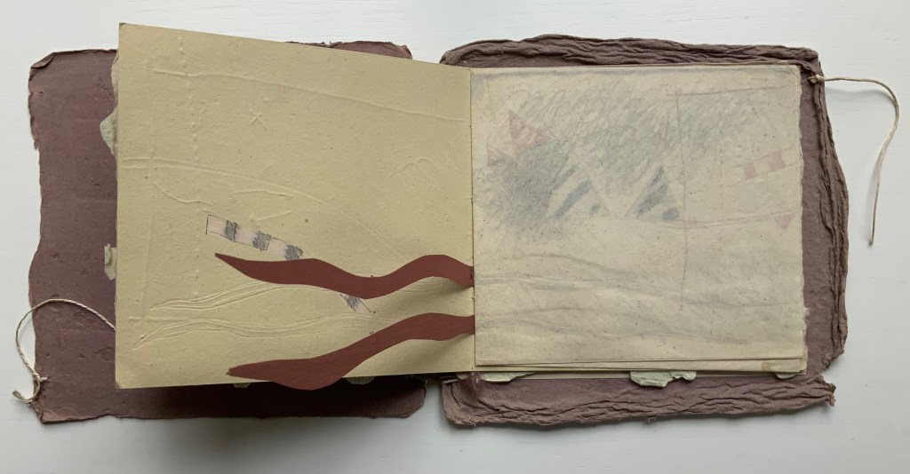
Ekphrasis (2020) Serena Smith Case bound with letterpress printed cloth cover H700 x W460 x D20 mm. 23 folios: 2 end leaves, 1 title, 10 hand-colored images printed on to 225gsm Simili Japon, 10 bronzed text printed onto translucent paper. Edition of 5, of which this is #5. Acquired from the artist, 5 January 2023. Photos: Books On Books Collection. Photos and videos: Courtesy of the artist. Displayed with permission of the artist.
The word ekphrasis refers to the literary practice of verbally representing a visual representation. Think of the poets Keats, Auden and Jarrell using words to “recreate”, re-present, evoke or respond to works of art — an antique urn, a painting by Brueghel, or Donatello’s sculpture of David. Novelists, too. Think of Henry James’ The Ambassadors in which the narrator Lambert Strether describes an imagined stroll through a landscape painting he’s viewing.
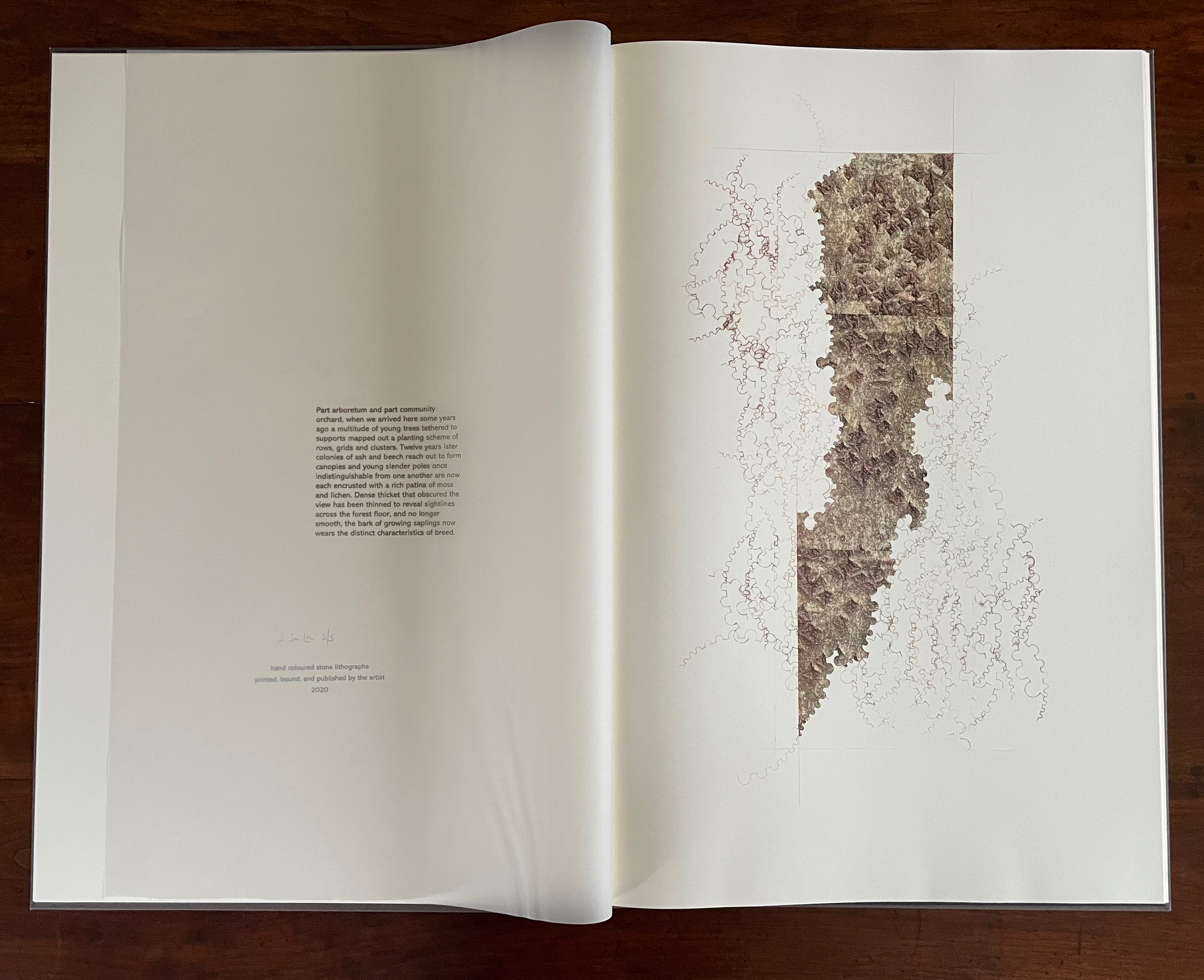
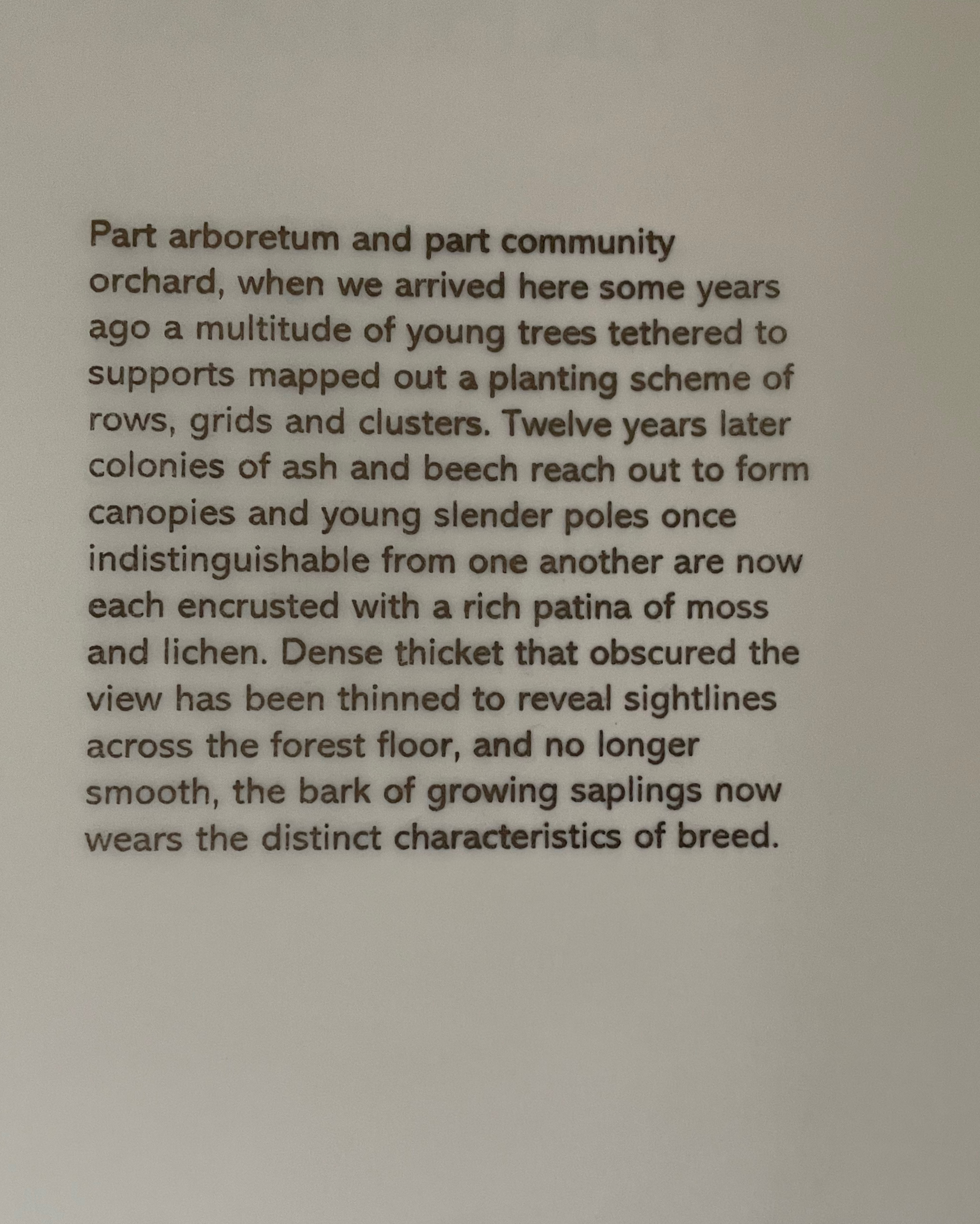
Serena Smith has a different point of departure for Ekphrasis. Her dwelling and studio back onto a Leicestershire country park — “part arboretum and part community”. Highlighted with maple, Tibetan cherry and Himalayan birch, the planted woodland of ash and beech with its defined paths offers up “artefact of living trees” as much a constructed work of visual art as any urn, painting or sculpture.
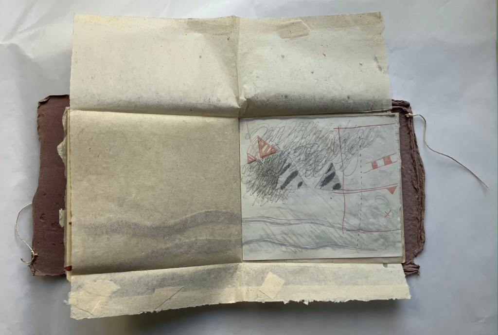
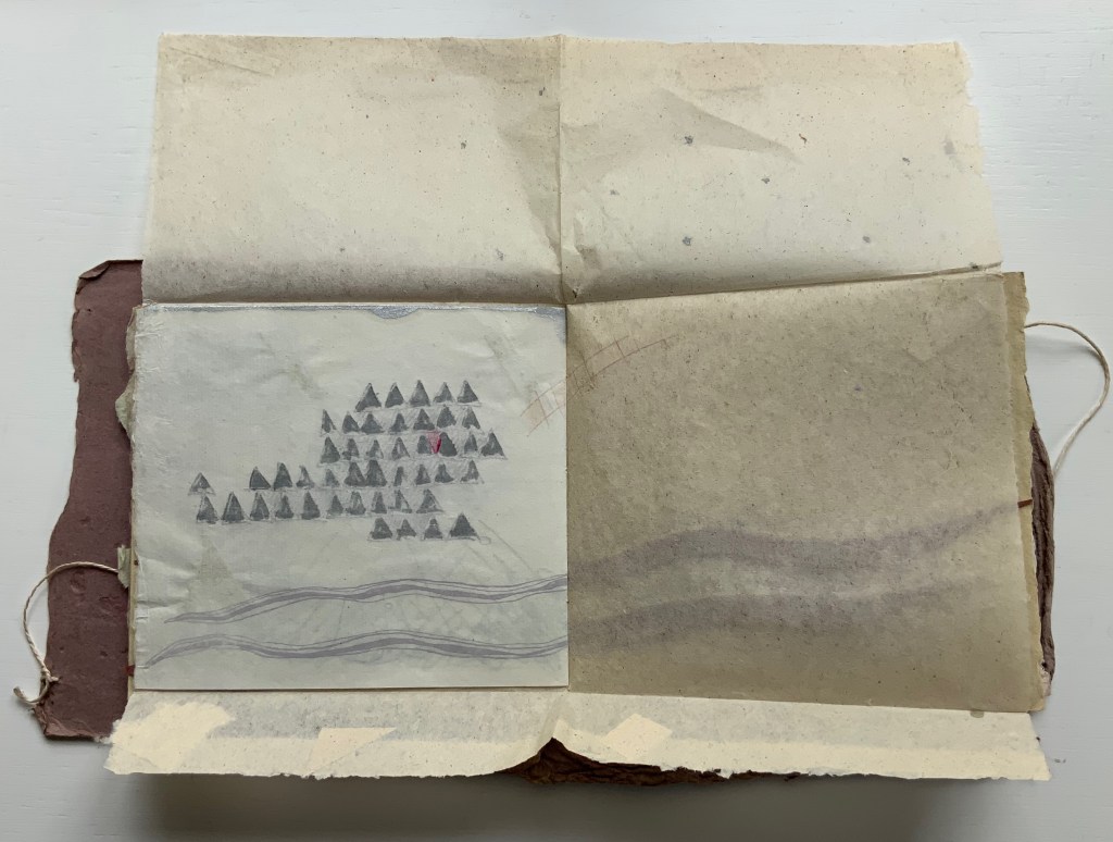
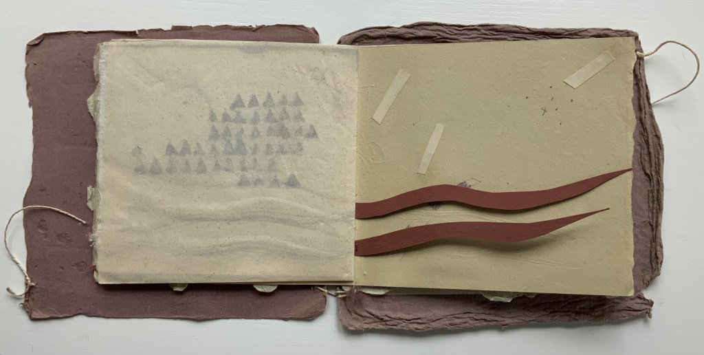
In this bookwork, ten pages of text printed on translucent paper overlay ten images printed from stone. The text reflects on the “wandering, watching and thinking that happens in the parkland”, but then it turns internally to the studio, the ephemera collected from the woodland, and the stage before the images come into being. The process of making becomes an object of the ekphrastic text: smoothing the stone, using a tool to guide the pencil, sharpening the pencil. And gradually the work reveals itself as a self-reflexive meditation on natural and artificial creation, on word and image, and on trace lines of growth and decay.
The translucent pages of text create a palimpsest-like effect over the folios of images. Until the translucent folio turns, the text is indecipherable. As the pages turn, the textual and pictorial play off one another.
Close-up of text
Single-page view of first lithograph
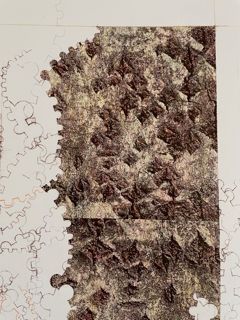
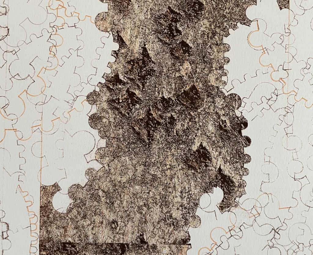
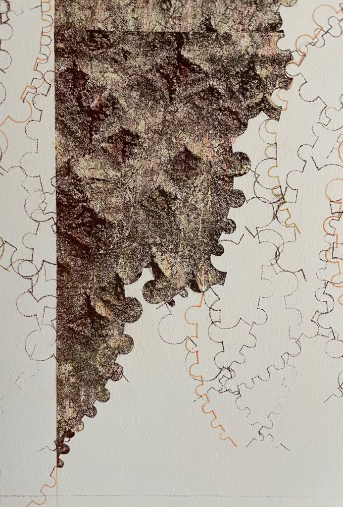
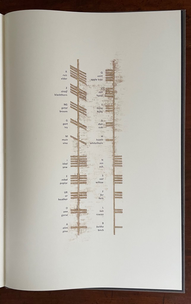
The lithographic image divides into three parts. The jigsaw-like lines around the image of bark come from a stencil tool, and the result chimes with planning lines of landscape architecture, feeding insects’ tracks in the bast, the shape of lichen and ultimately the Ogham runes mentioned in the text and depicted at the end.
First of three-part close-up of the first lithograph
Second of three-part close-up of the first lithograph
Third of three-part close-up of the first lithograph
Glossary
The following ekphrastic words bring the lithographic process to life. Taken together, the glossary, Smith’s descriptive text, and its ekphrastic focus on the lithographic process transform her stone into a kind of Ogham stone itself.
As the drawing progresses I wonder if the hands of Celtic scribes also tired, whilst scoring the lines of Ogham script into fragments of wood. Cutting short repeated grooves against the grain an effort would have been felt, different to that which allowed the tool to willingly travel along the pathways of growth. Perhaps they too made use of a device to control the errant gesture, and aid inscription of measured lines of written text. This can only be speculated.
What the remaining Ogham stones do tacitly share are ciphered incisions that scale their lichen clad faces with a purposeful regularity that resists embellishment. Contouring the edges, the cut lines navigate uneven corners without detour, and prompt me to ask if these scribes, flesh pressed into stone, also briefly held their breath while negotiating the changes in direction prescribed by the matrix.
A version of the text and all of the images can be found in Smith’s brief essay published by IMPACT Printmaking Journal (Spring 2020) and in the following slide show (courtesy of the artist).
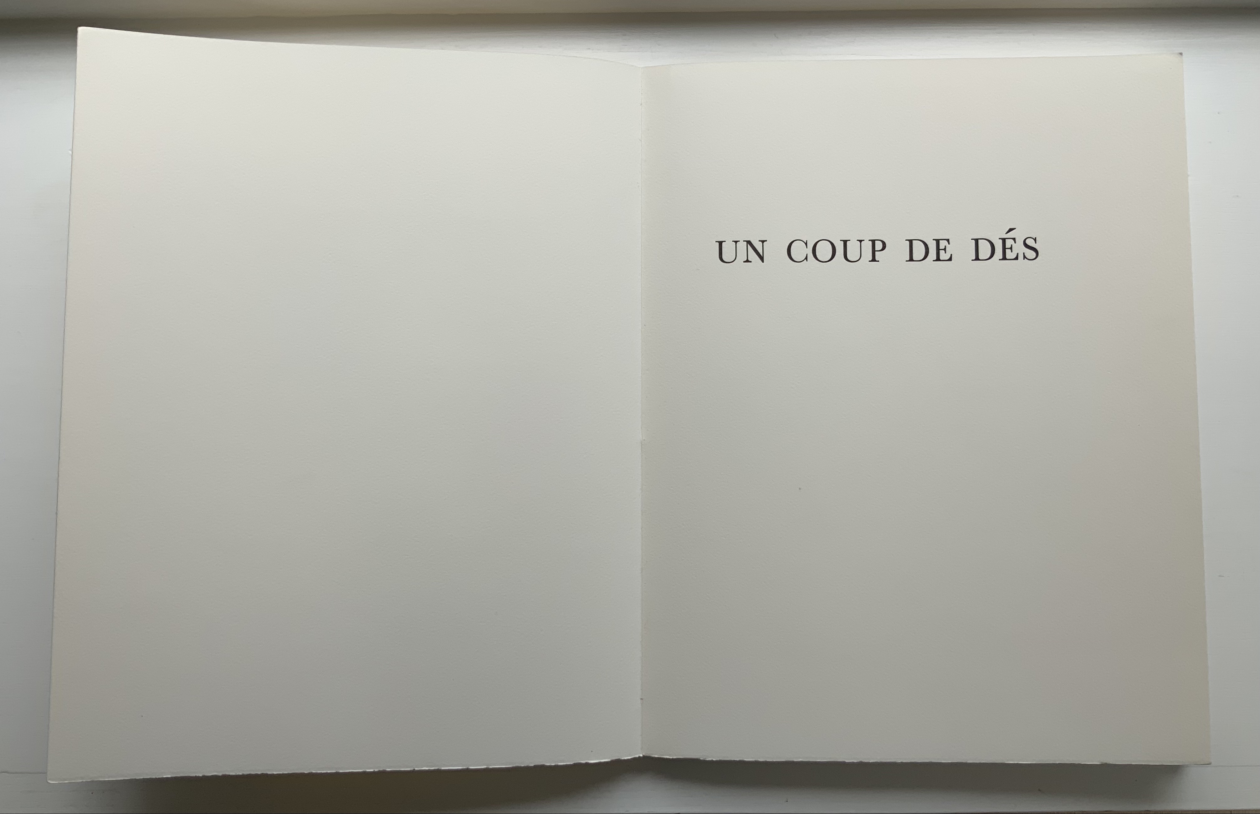
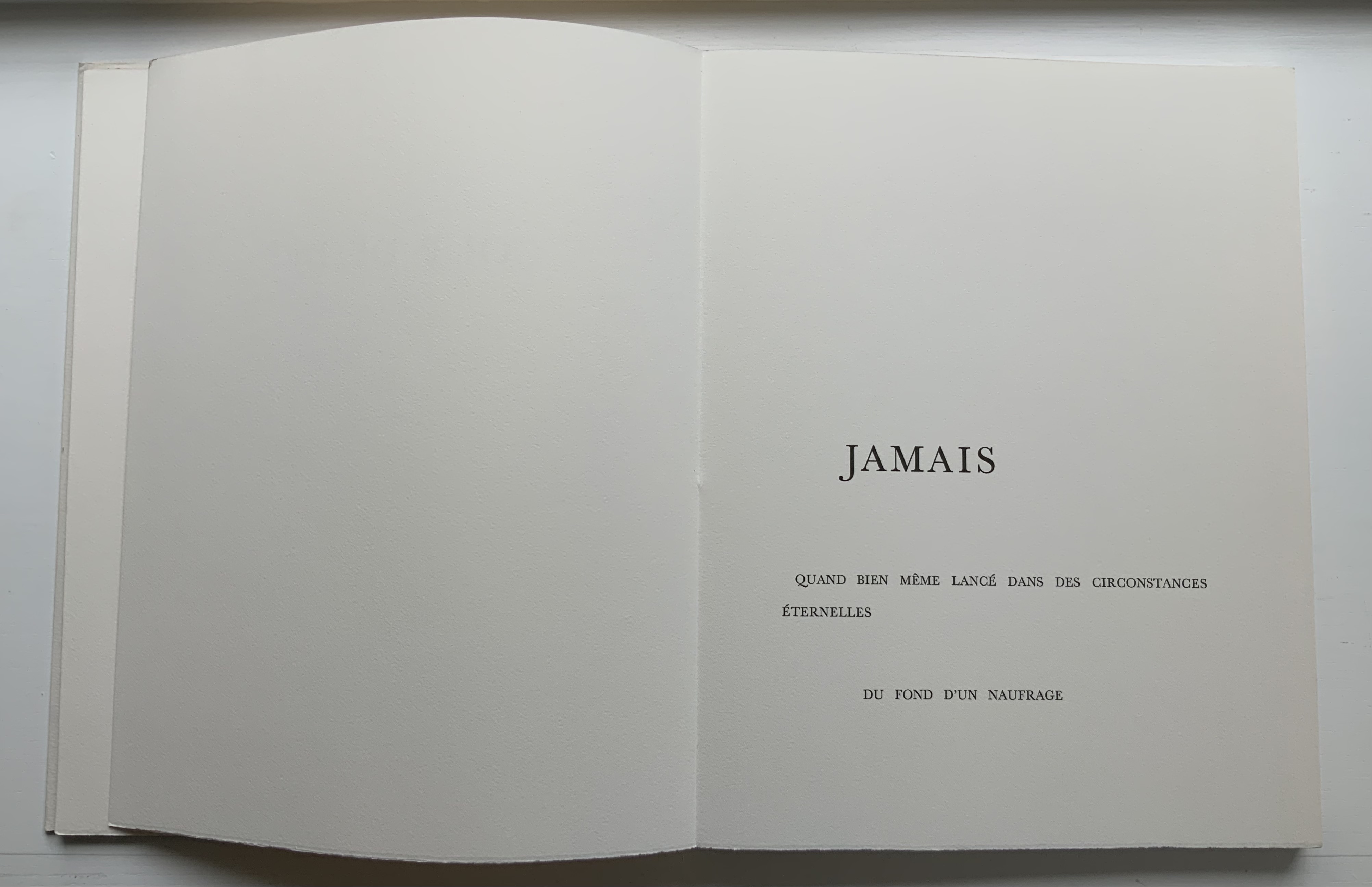
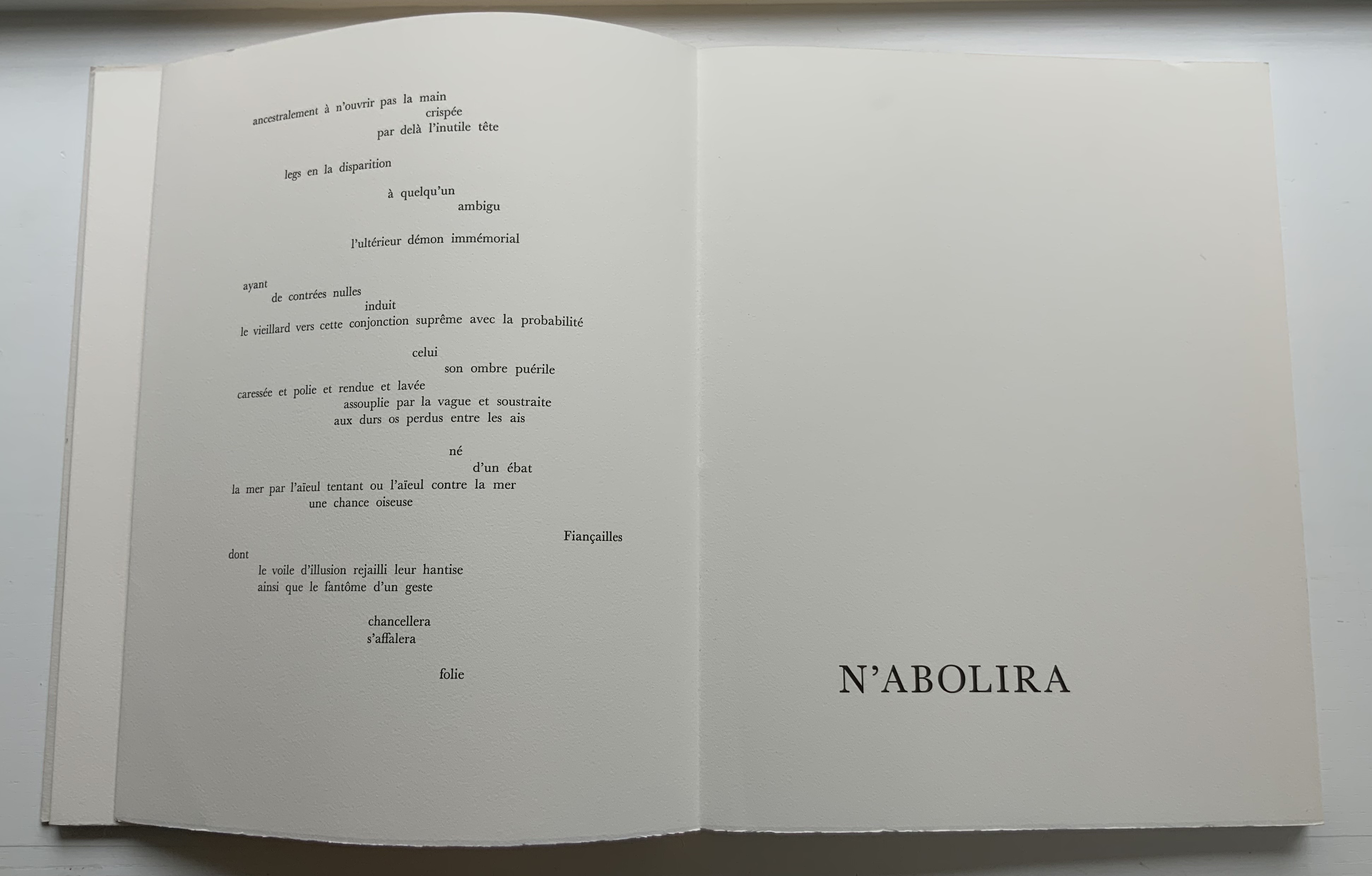
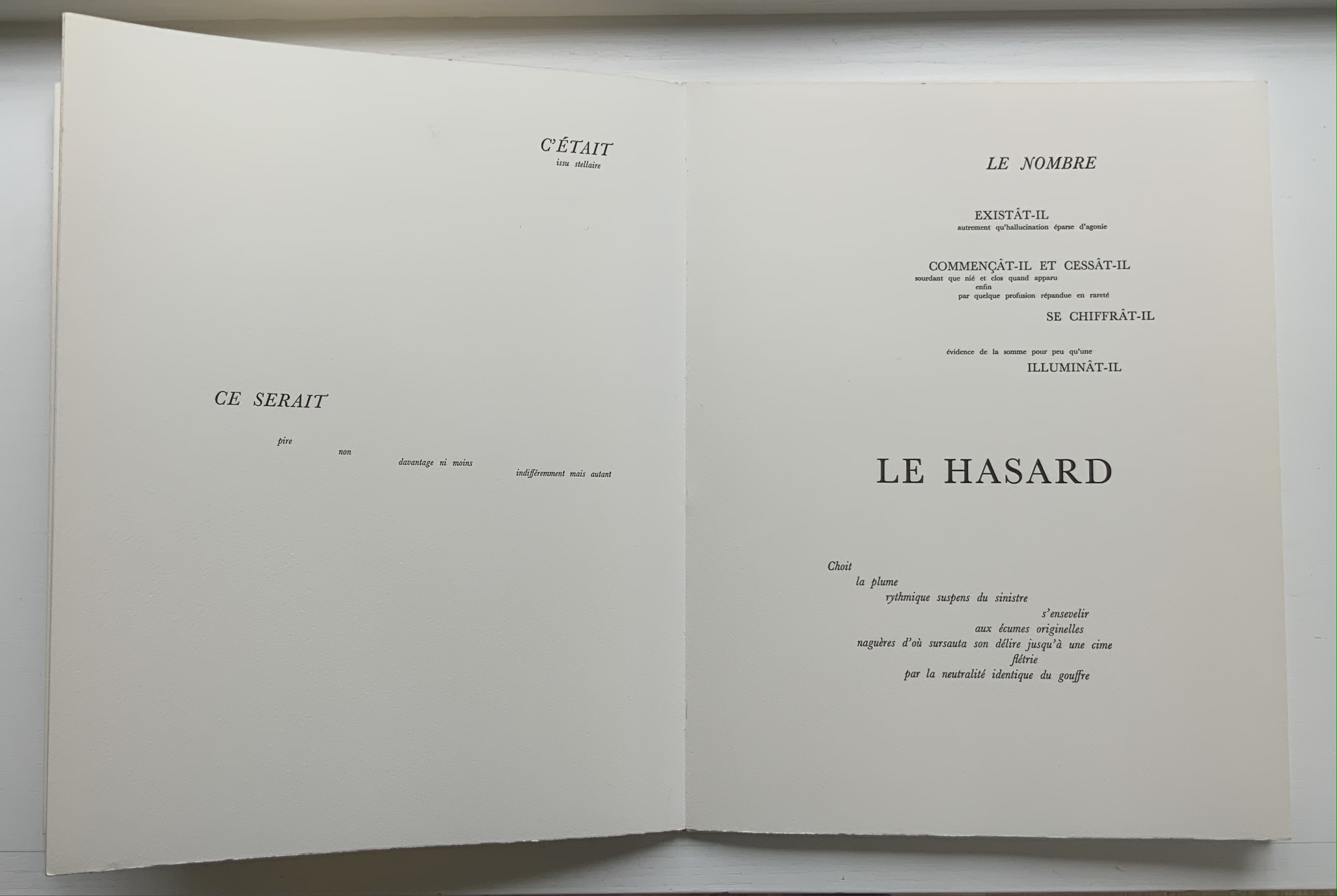
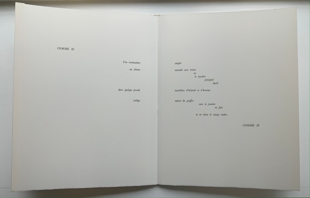
UN COUP DE DÉS JAMAIS N’ABOLIRA LE HASARD: POÈME (1989)
UN COUP DE DÉS JAMAIS N’ABOLIRA LE HASARD: POÈME(1989) Stéphane Mallarmé (text); Honorine Tepfer (art & design) Accordion fold with embossed paper cover. Cover – H325 x W255 mm; Book – H320 x W250 mm, 34 pages. Edition of 48, of which this is #5. Acquired from Studio Montespecchio, 2 February 2022. Photos: Books On Books Collection. Displayed with permission of the artist.
Before his sudden death in 1898, Stéphane Mallarmé was planning a deluxe edition of Un Coup de Dés Jamais N’Abolira le Hasard with Ambroise Vollard, an entrepreneur and publisher. A single-volume version of the poem did not appear until 1914. Issued under the direction of Mallarmé’s son-in-law Dr. Edmond Bonniot through the Nouvelle Revue de France (NRF), it omitted intended prints by Odilon Redon, used the typeface Elzevir rather than the Didot that Mallarmé preferred, and did not precisely follow his layout. We know all this because of correspondence between the poet, Redon and Vollard and because the Sorbonne’s Bibliothèque littéraire Jacques Doucet and Harvard’s Houghton Library hold proofs of the deluxe edition with Mallarmé’s handwritten corrections and instructions.
Mallarmé’s placement of words and lines was intentional and precise. Even before the planning for the deluxe edition, he wrote of what could be achieved with type size and layout:
Pourquoi — un jet de grandeur, de pensée ou d’émoi, considérable, phrase poursuivie, en gros caractère, une ligne par page à emplacement gradué, ne maintiendrait-il le lecteur en haleine, la durée du livre, avec appel à sa puissance d’enthousiasme: autour, menus, des groupes, secondairement d’après leur importance, explicatifs ou dérivés — un semis de fioritures. [Oeuvres Complètes, 2 227]
“Why — couldn’t a considerable burst of greatness of thought or emotion, carried in a sentence in large typeface, gradually placed with one line per page, hold the reader’s bated breath throughout the entire book by appealing to his or her power of enthusiasm: around this [burst], smaller groups of secondary importance, explicating or deriving from the primary phrase — a scattering of flourishes.” [Arnar, 234]
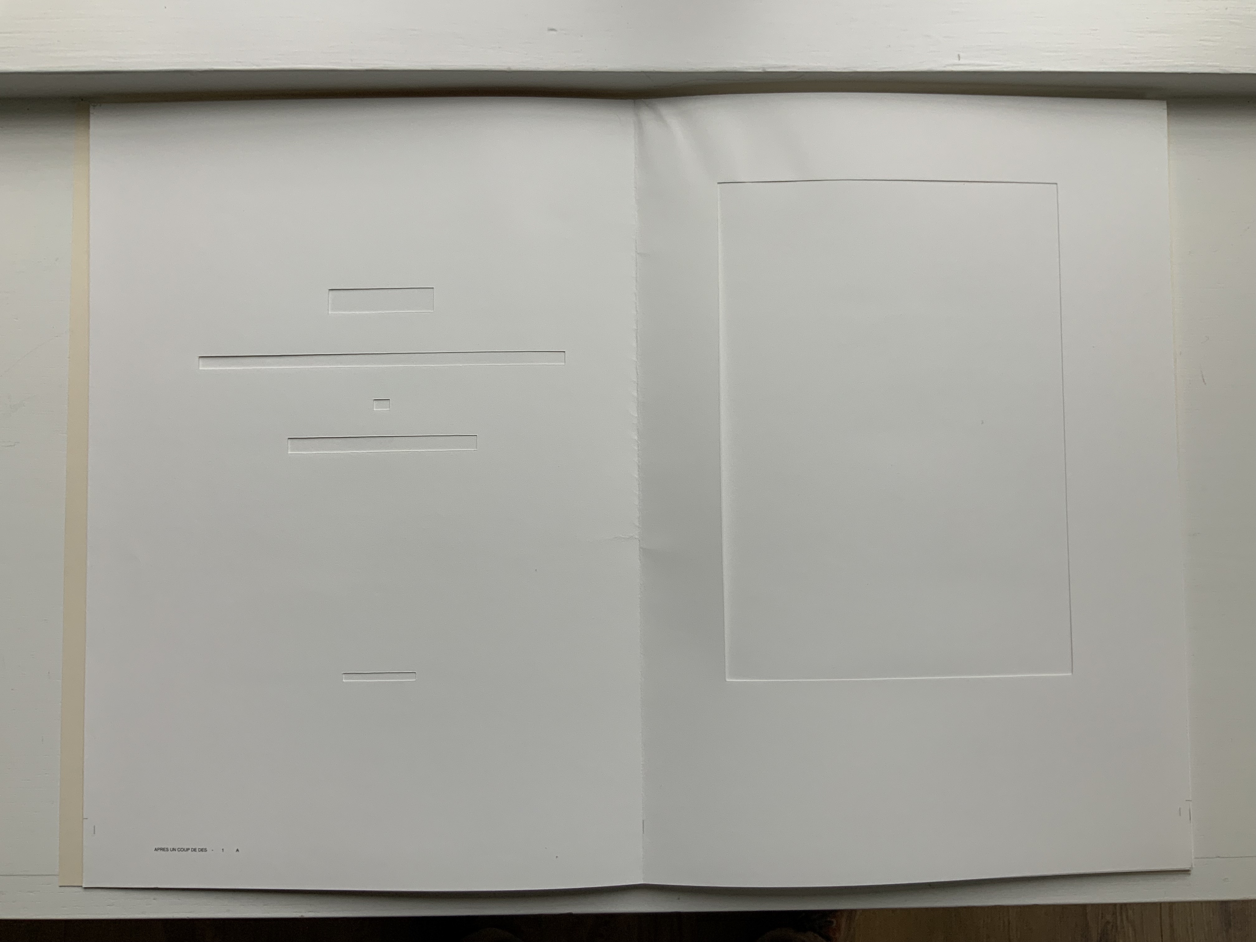
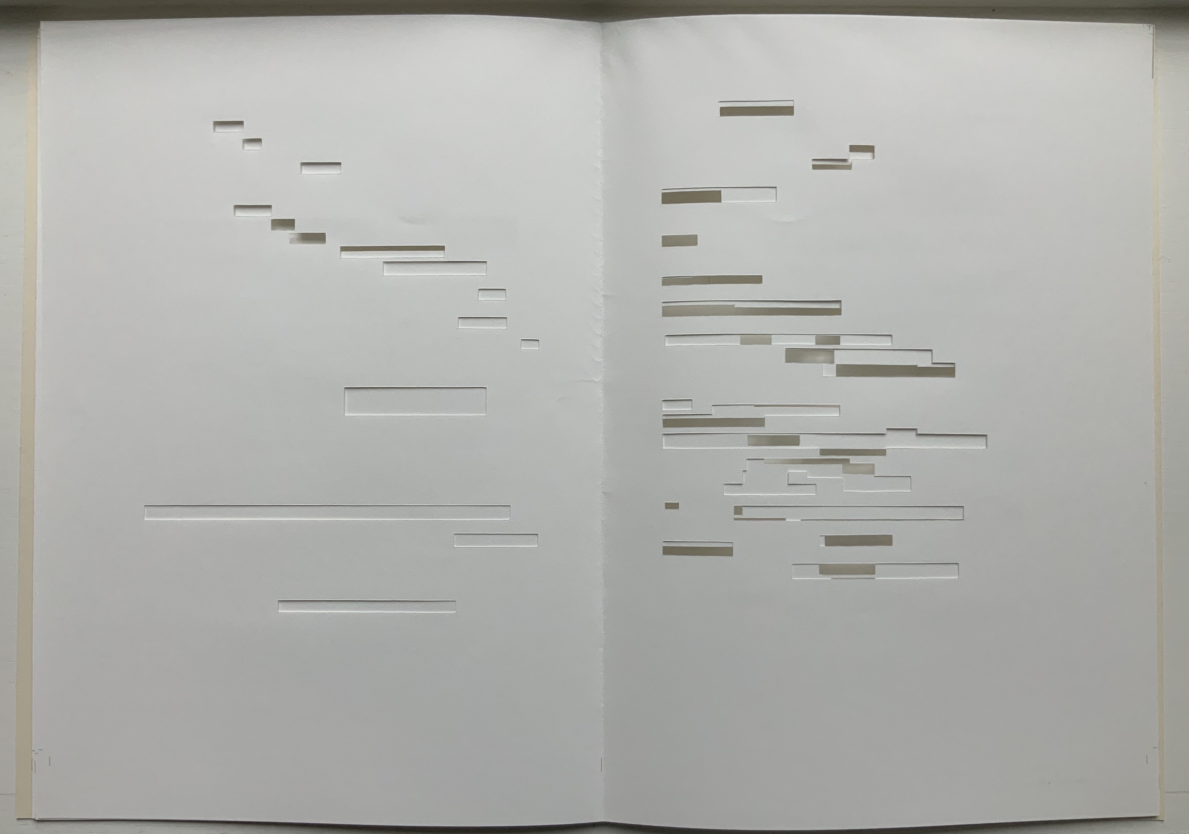
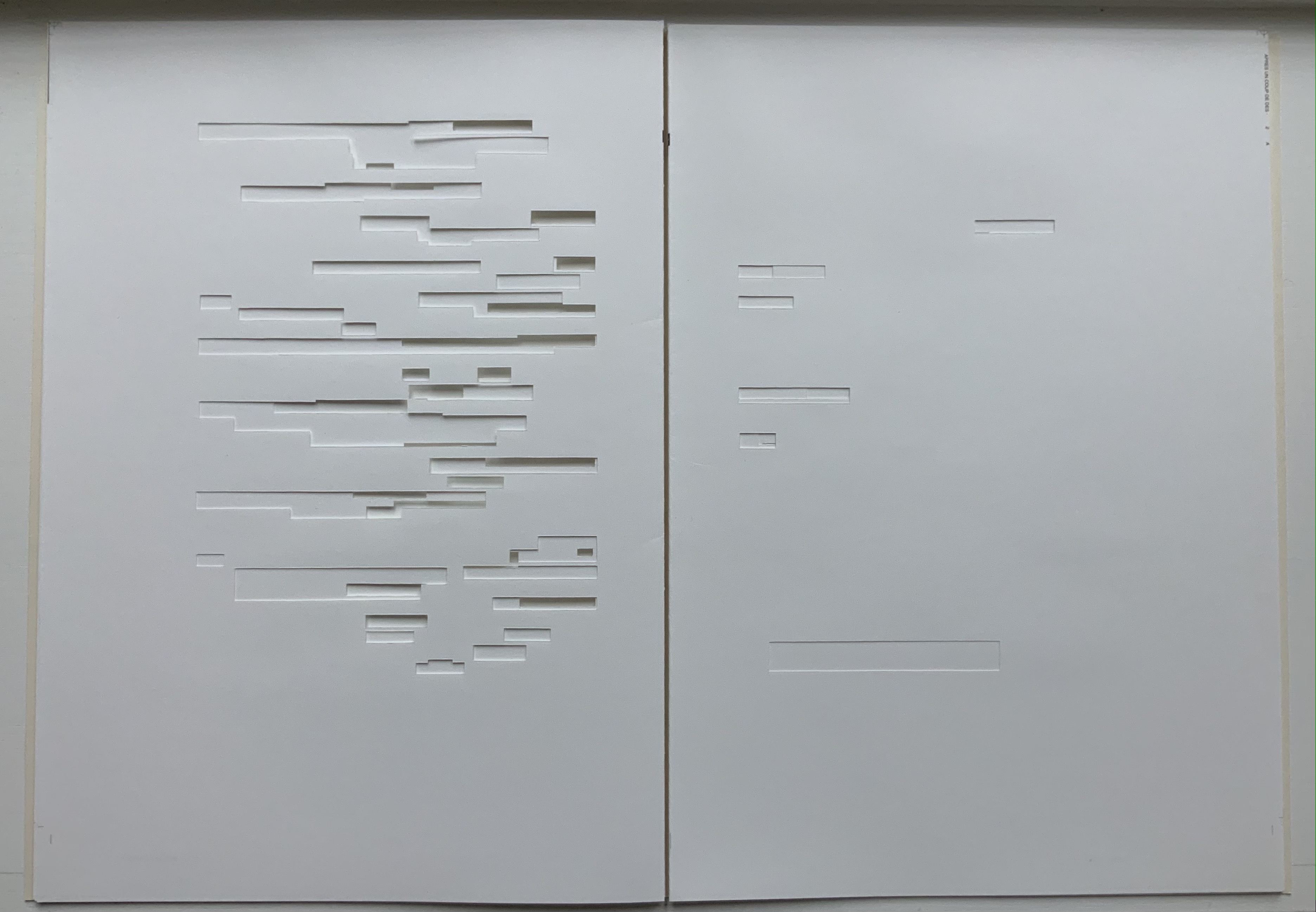
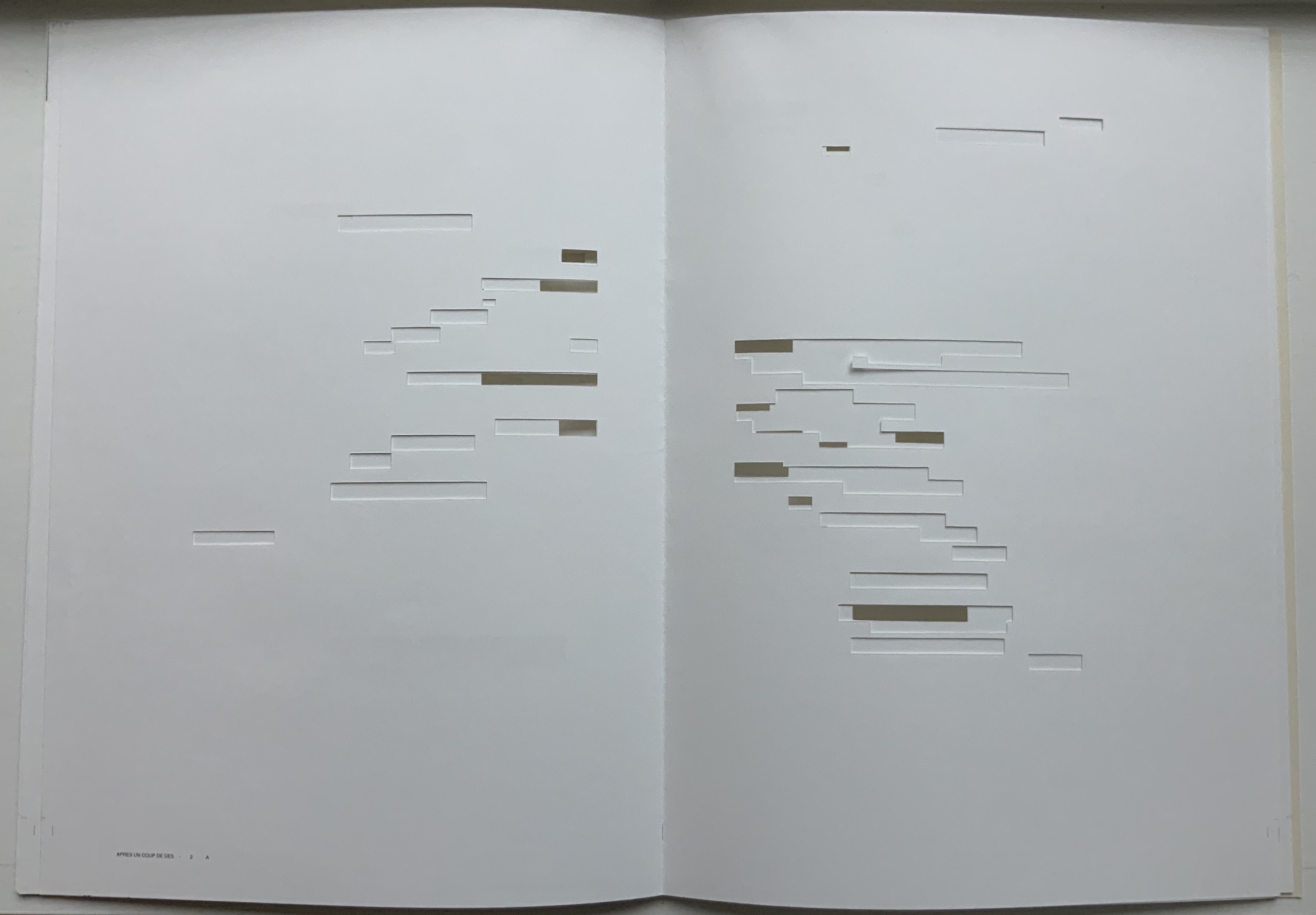
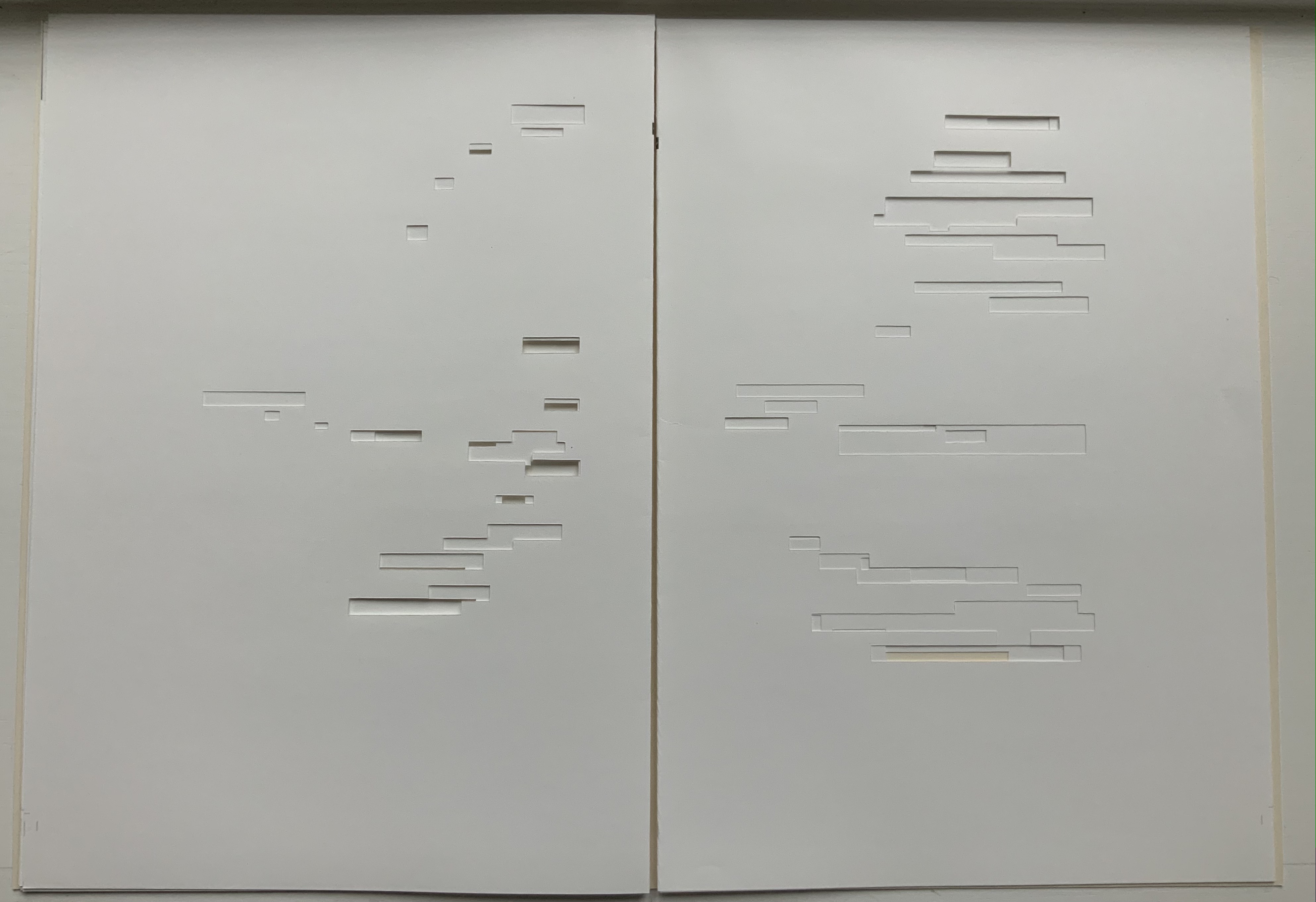
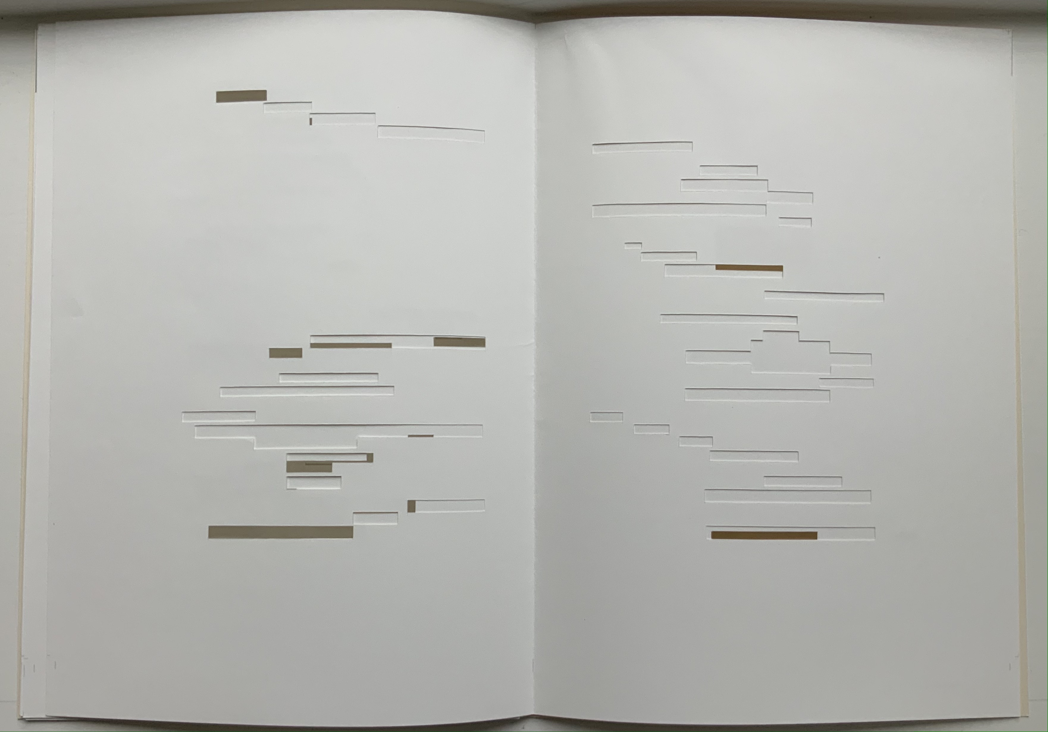
The NRF edition 1914 edition makes quite a few sad missteps as Robert Cohn pointed out in 1967. Tepfer’s inspiration to restore the intended layout follows in the footsteps of Mitsou Ronat & Tibor Papp (1980) and Neil Crawford (1985). She visited the Doucet library to examine the proofs and layout. Following the layout was not difficult, but with the scarcity of Didot, Tepfer needed to select another typeface. She chose Baskerville. Given that Firmin Didot was inspired by John Baskerville’s experimentation with thick and thin strokes, the choice adds historical interest, although Bodoni might have been nearer the mark. Below are Tepfer’s double-page spreads across which Mallarmé’s burst of thought appears one line per page among the “scattering of flourishes”.
The book’s central double-page spread, beginning with COMME SI / “AS IF”) in the upper left and ending with COMME SI / “AS IF” in the lower right, mimics the throw and fall of the dice and provides another example of the semantic and typographic play that Mallarmé describes above.
Like the artists before her — Redon (1897), André Masson (1961), Mario Diacono (1968), Marcel Broodthaers (1969), Jean Lecoultre (1975), Ian Wallace (1979) and Ian Tyson (1985) — Tepfer had to solve the puzzle of relating image to text. This is the difficult path of inverse ekphrasis: what and how the visual, tactile and conceptual works of art that come after Mallarmé’s text can be. We are more used to ekphrasis where the object, painting or sculpture comes before the text — like Achilles’ shield before Homer’s description, or the Grecian urn before Keats’ ode, or Brueghel’s Fall of Icarus before Auden’s Musée des Beaux Arts. Homer, Keats and Auden vie with the art of the crafted object to put that object (and more) in front of us with words. With the inverse, the crafted objects vie without the words to put Mallarmé’s poem (and more — and sometimes less!) in front of us. Tepfer’s solution?
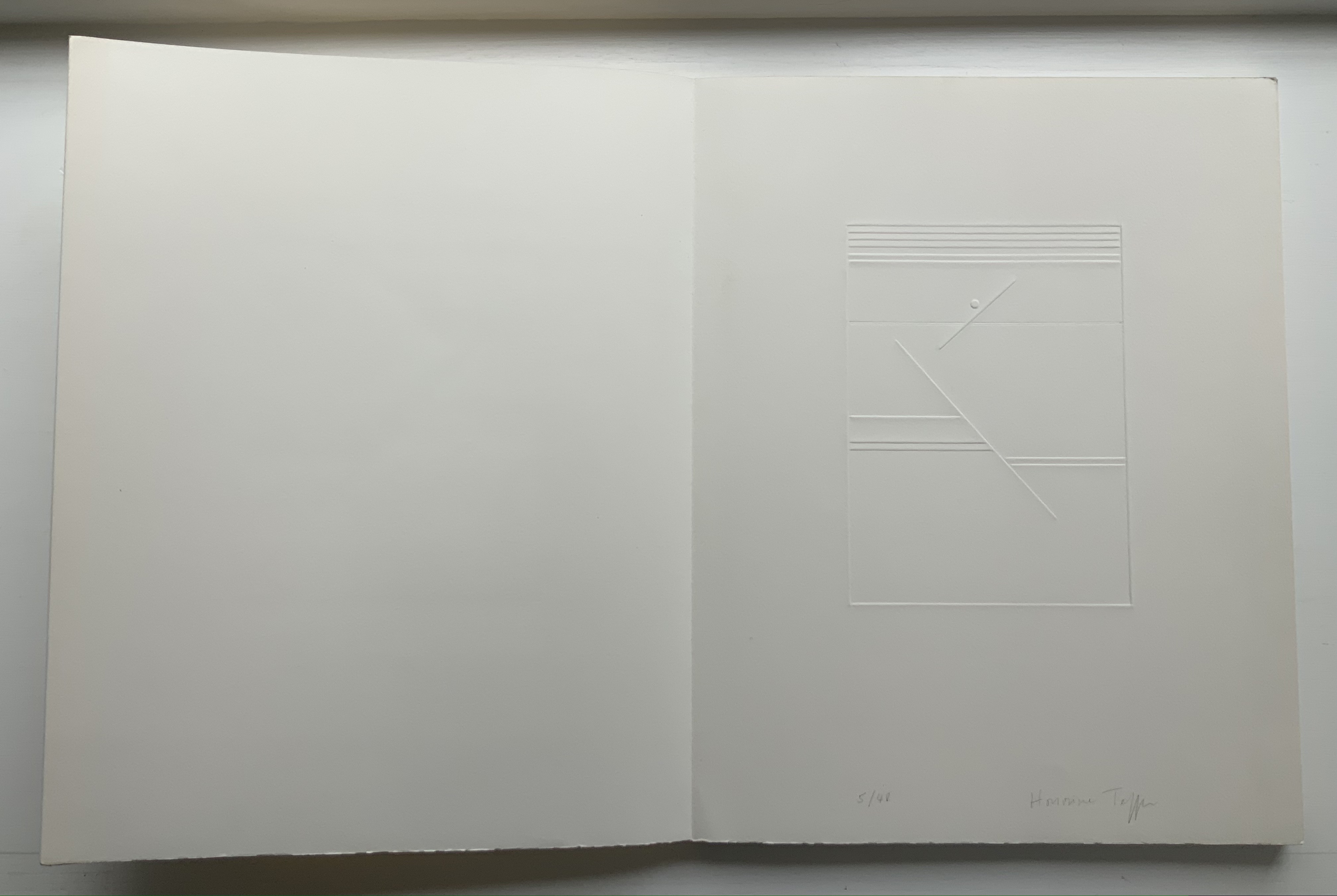
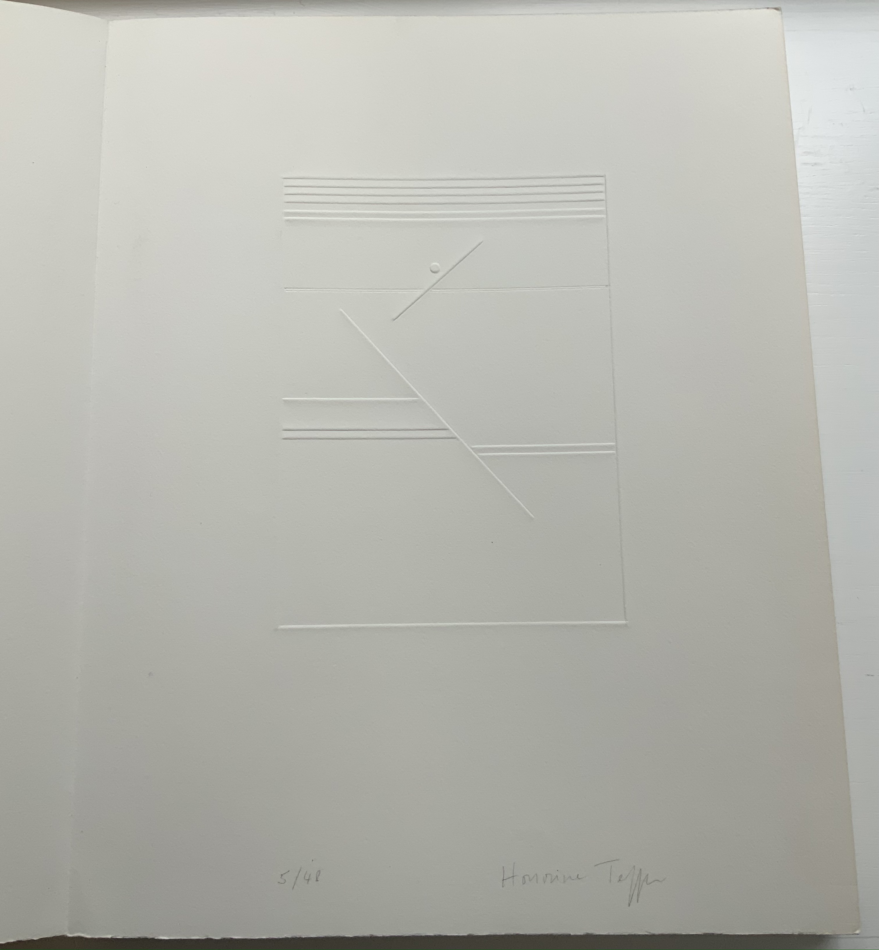
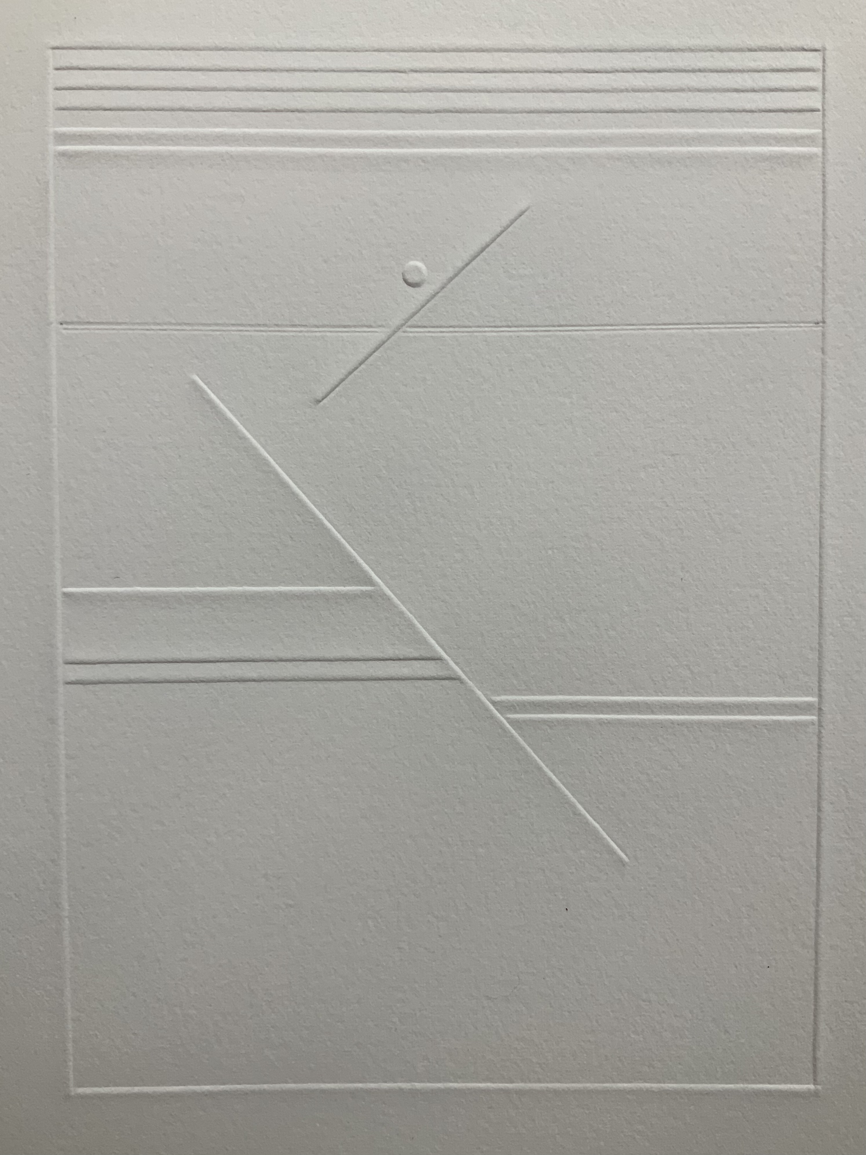
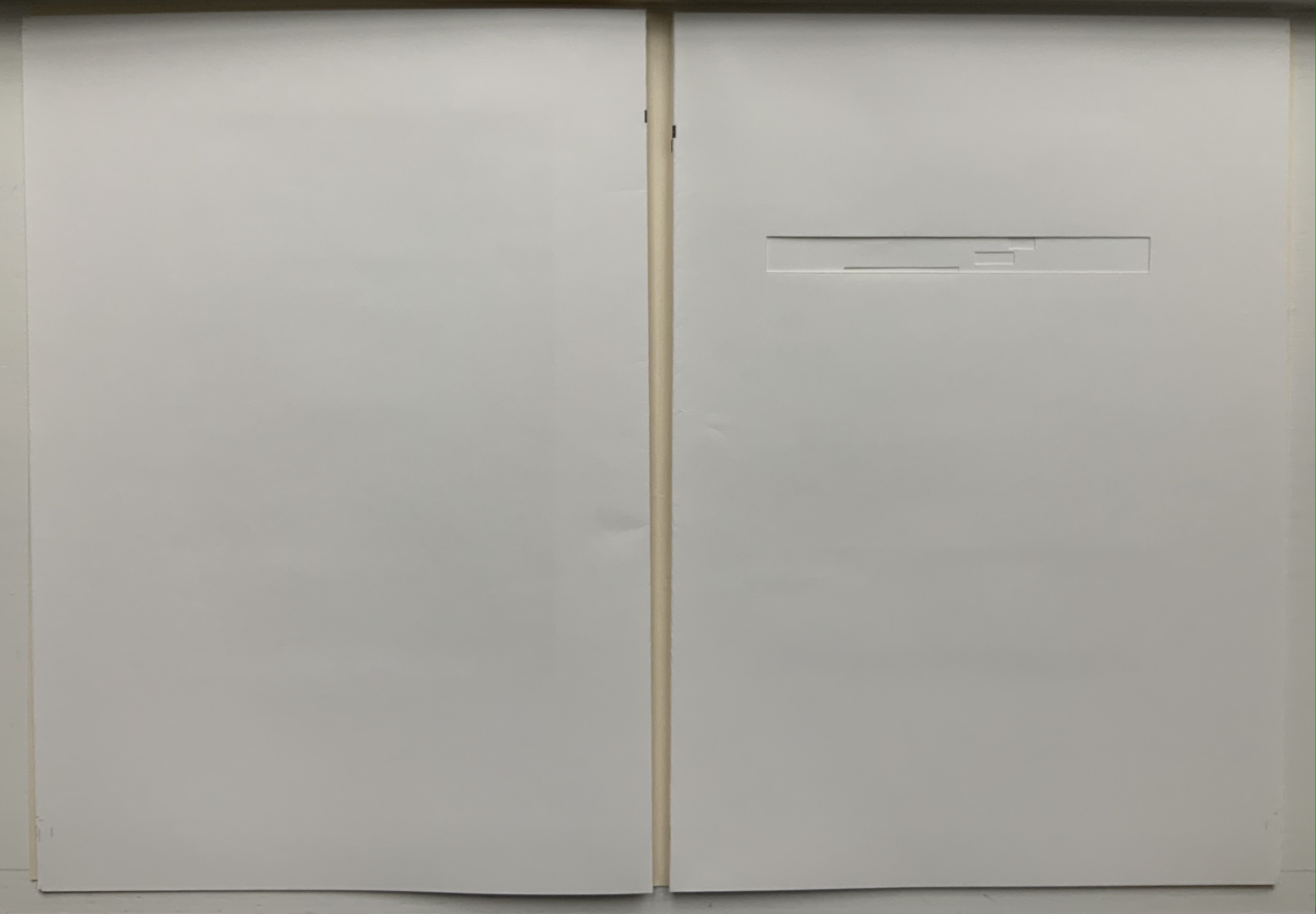
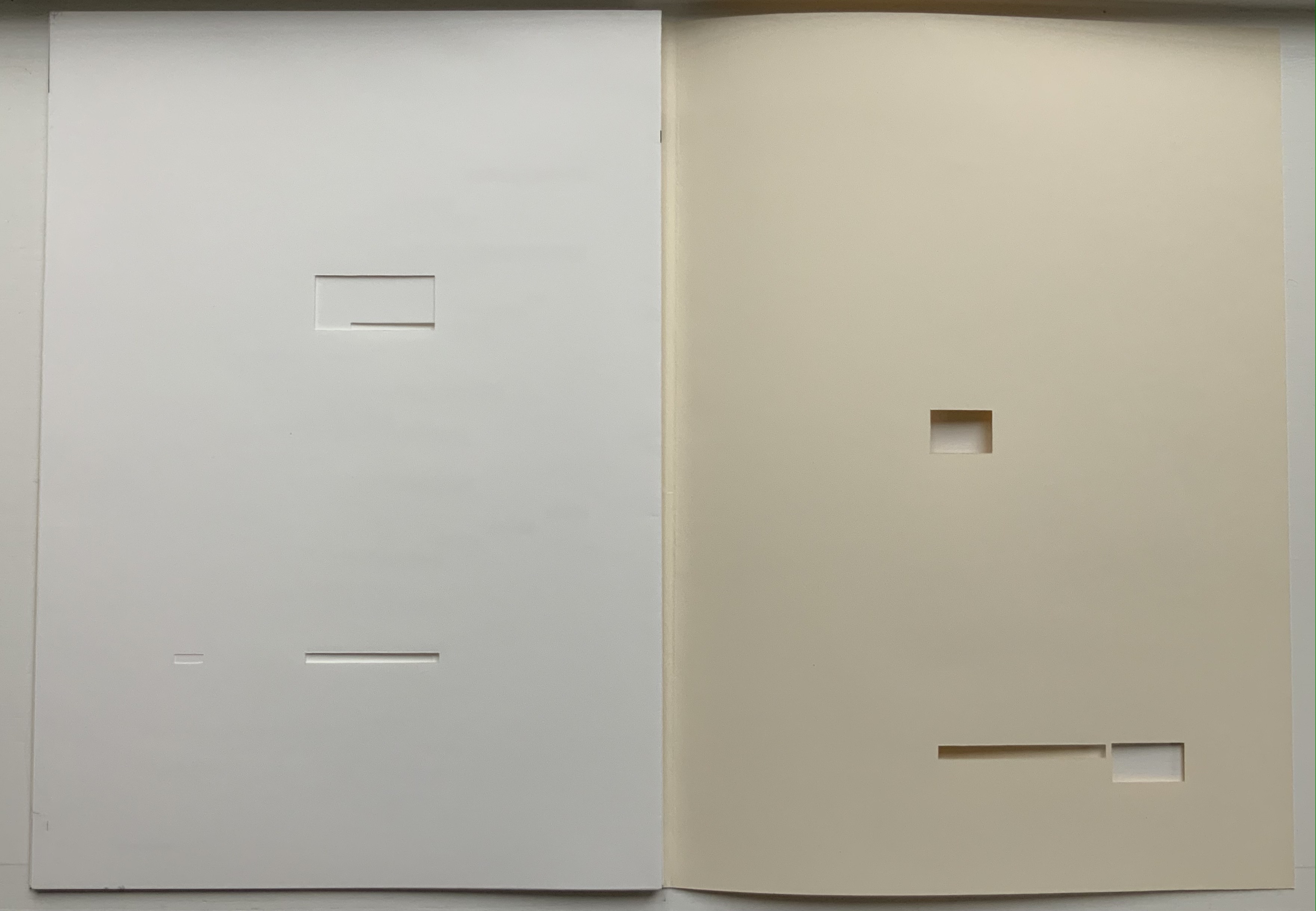
A simple line runs across the debossed front and back covers. As Tepfer wrote in June 1990 about her journey into Un Coup de Dés: La ligne d’horizon était un sujet de ma hantise / “The horizon line was my obsession”. As the folded paper cover opens, a single geometric, abstract image appears — debossed and embossed on blank paper. Except for a single round dot, everything is linear. Two separate lines angle across the space. One cuts through the debossed horizon line that lies beneath a series of closely spaced horizontal lines — suggesting clouds? The other, longer one cuts at a different angle, creating a foreground from two sets of parallel lines that have slipped or shifted like tectonic plates. Could the round dot be the single-dot side of a die rolling down a slanted deck or broken mast? Could the longer slanted line be a broken mast? Could the shifted parallel lines be a broken handrail?
Rather than trying to track back to verbal images in the poem, though, perhaps we should recognize Tepfer’s prefatory image as a kind of substitute for Mallarmé’s preface in 1897 — the one he preferred we not read. He wanted us to look. To see les blancs. To hold thought and emotion like our breath across the space of the book. With her simple rectangle of blank paper, with the absence of ink, with the geometric solidity of the horizontal and slanting lines, and with the velvet softness of the velin d’Arches across her version’s accordion folds, Tepfer encourages us to look, see, hold meaning in abeyance and sense it.
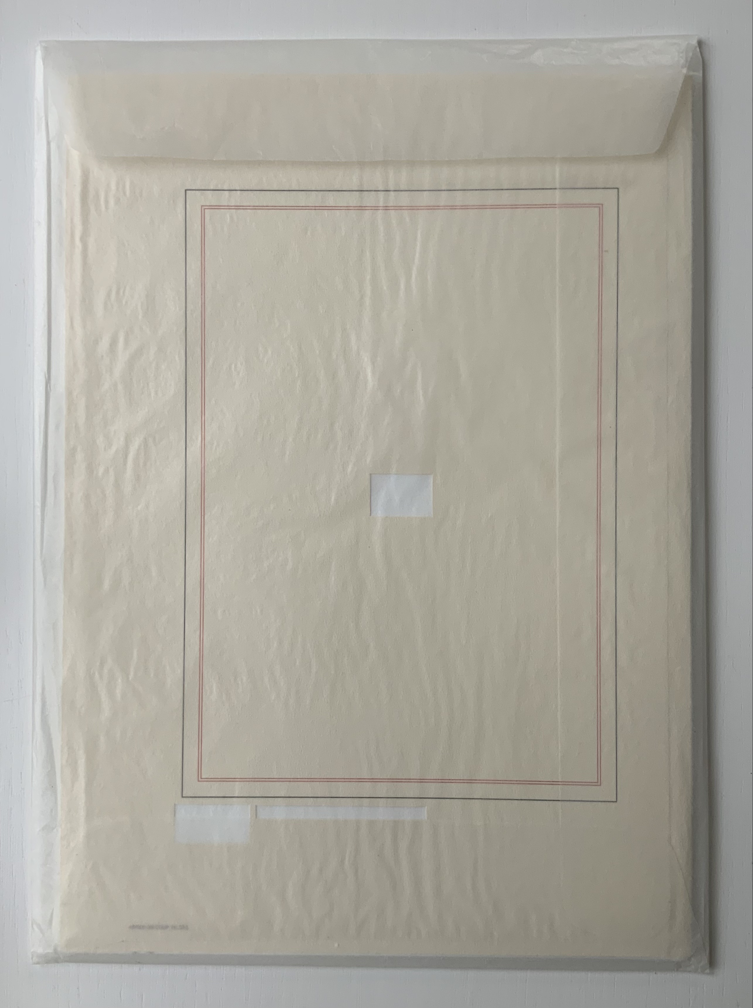
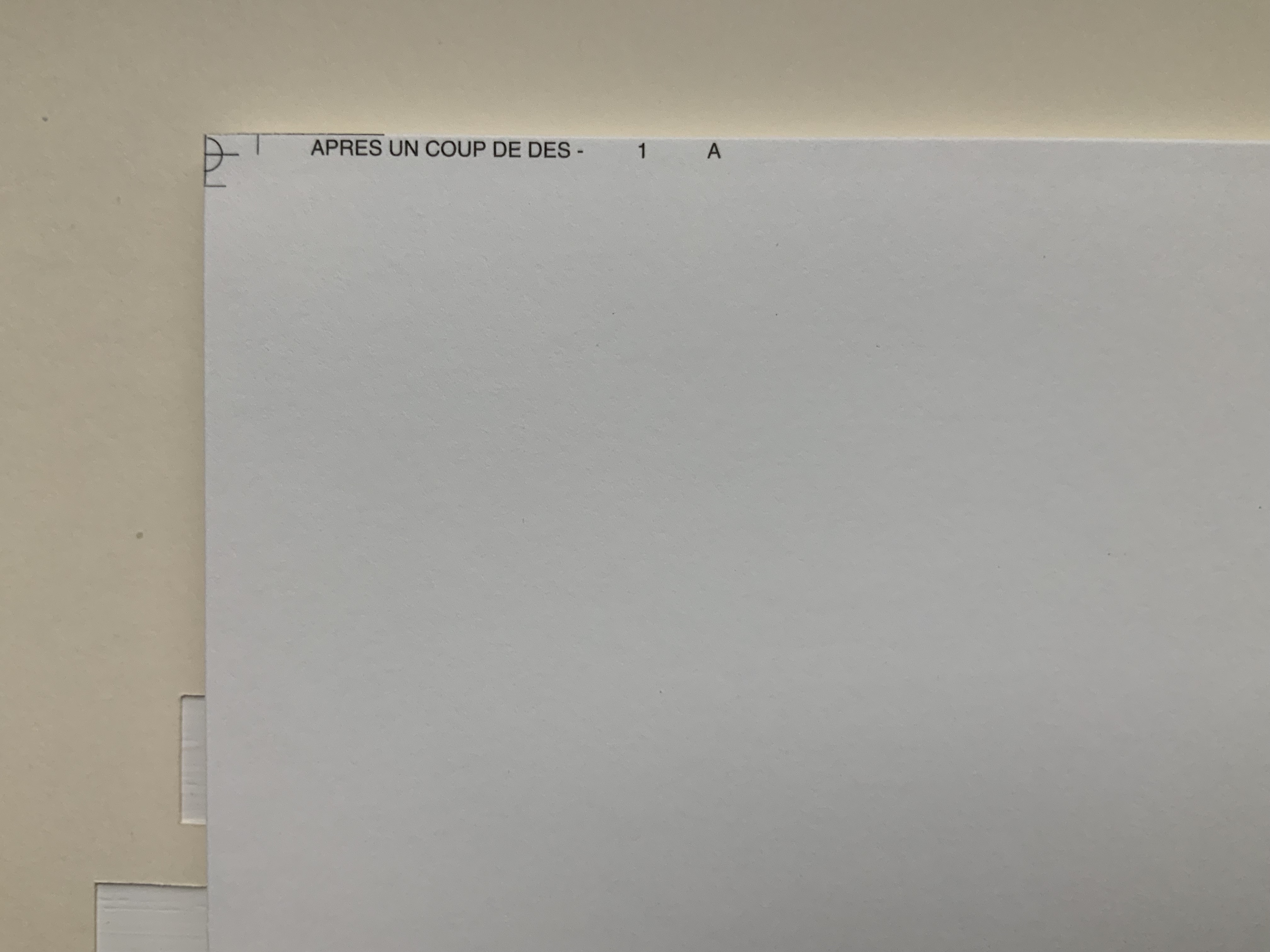
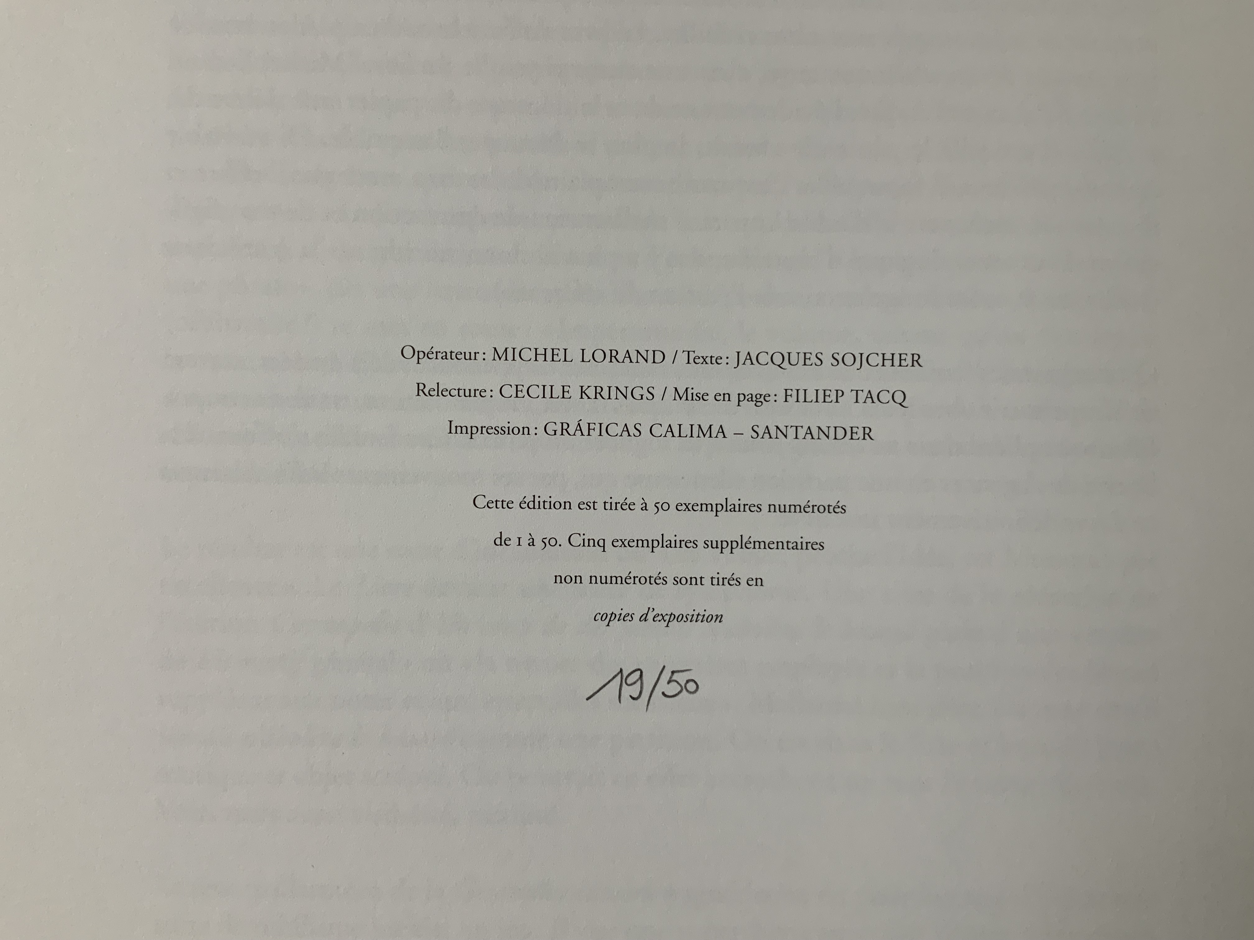
Après Un Coup de Dés (2015) Michel Lorand Cover and gatherings, untrimmed and unbound, in glassine envelope. Cover: H362 x W260; gatherings: H362 x W256 mm; 32 unnumbered pages. Edition of 50, of which this is #19. Acquired from the artist, 22 October 2021. Photos: Books On Books Collection. Displayed with the artist’s permission.
Since the 1960s when Ernest Fraenkel, Mario Diacono and Marcel Broodthaers blotted out the text of Mallarmé’s poem Un Coup de Dés Jamais N’Abolira le Hasard (1897) to create their works of homage, numerous others have expanded on the technique: substituting images of sonograms (Sammy Engramer, 2009) or algorithmically generated abstractions (Eric Zboya, 2018, and Benjamin Lord, 2019), or excising the text (Michalis Pichler, 2008, and Cerith Wyn Evans, 2008) or algorithmically erasing it (Jérémie Bennequin, 2009) — just to name a few.
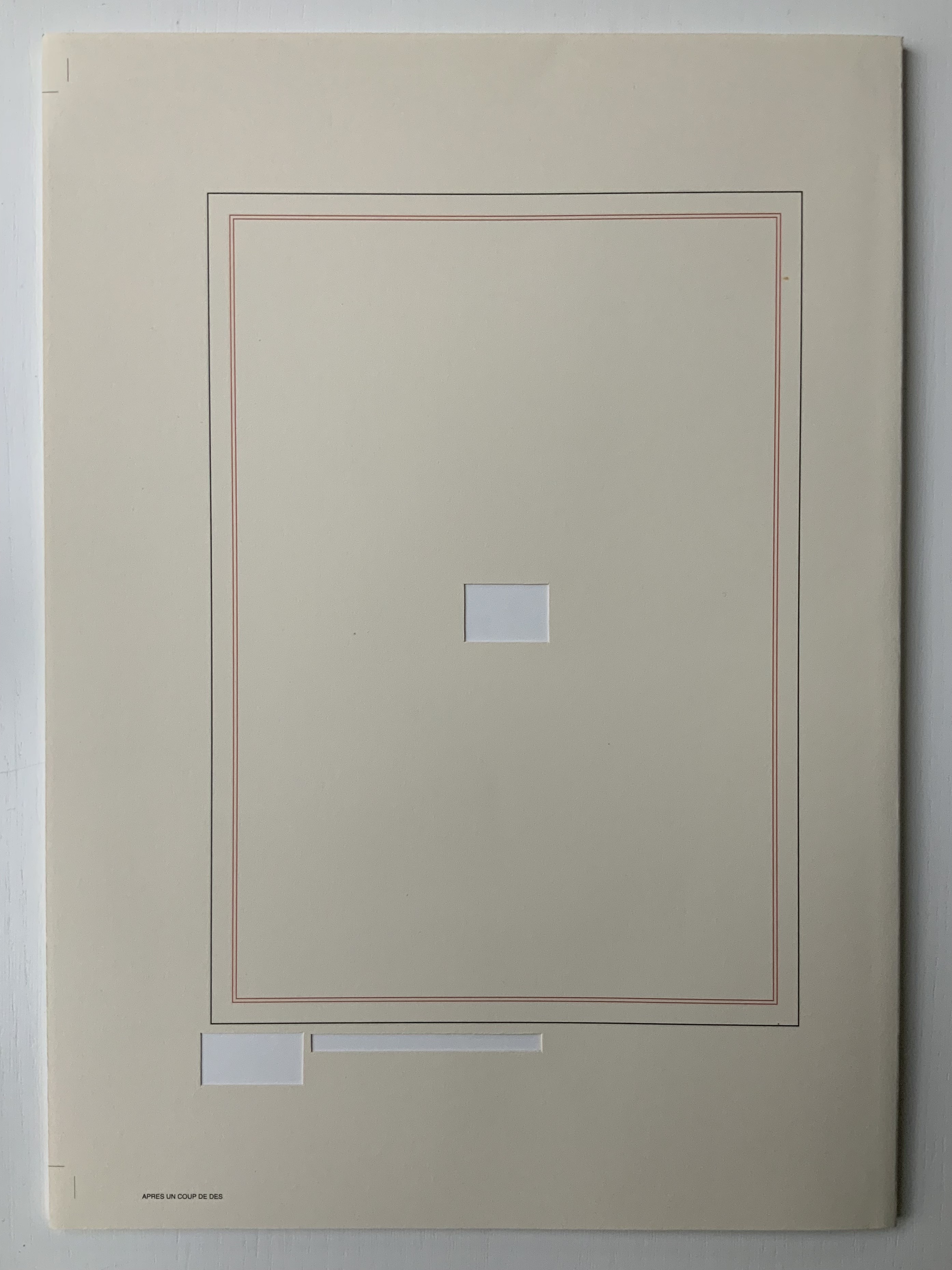
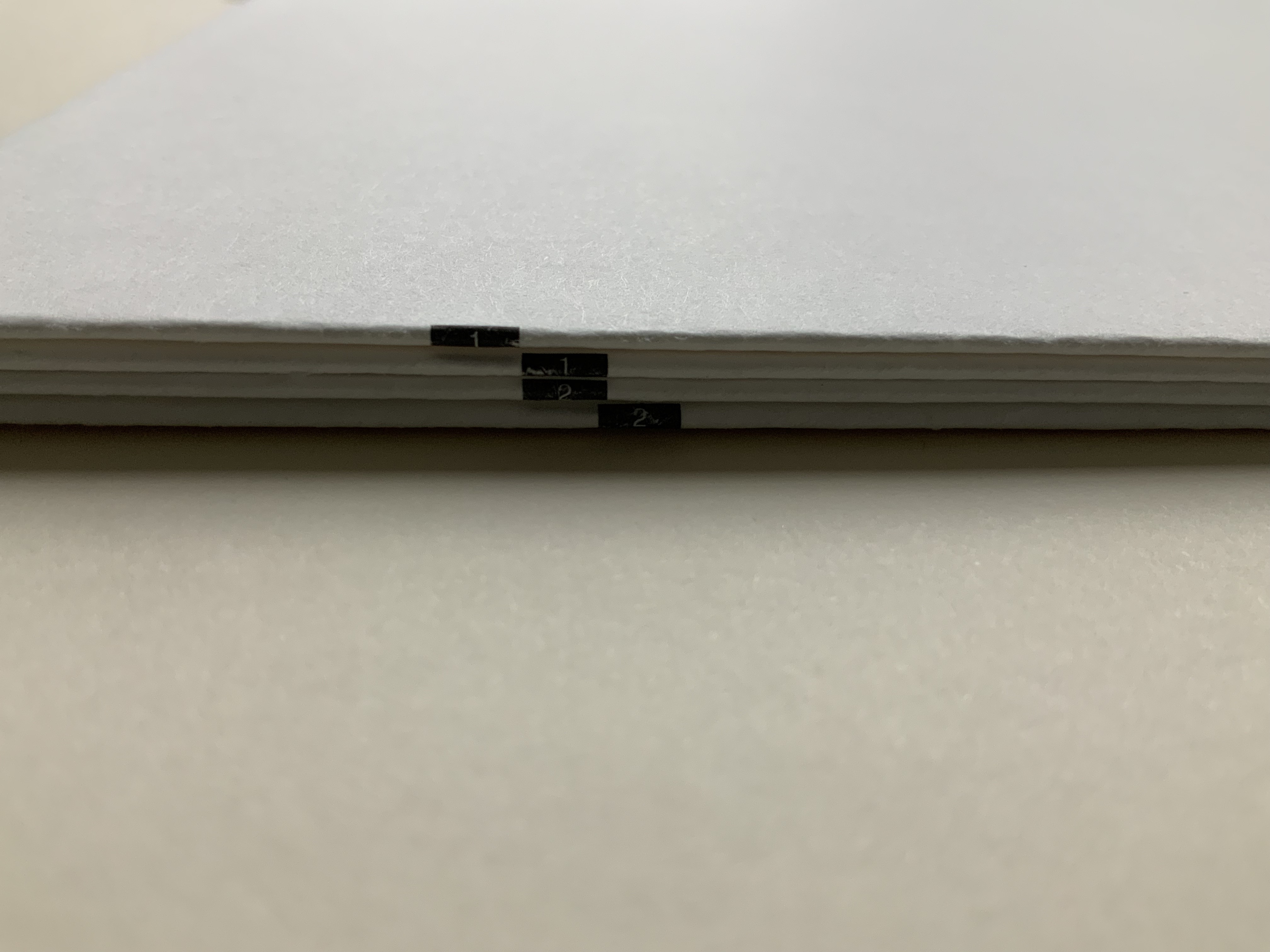
In Après Un Coup de Dés (2015), the only printed marks are the cover’s traditional black and red borders and the printer’s registration and gathering marks on the sheets. Wherever else Mallarmé’s text would have been printed has been excised. In reply to a question about the process involved, Lorand explains that he had asked the designer Filiep Tacq to create a layout that would cover in black exactly the blocks of text as it appears in the current Gallimard book edition of Mallarmé’s poem, including the front and back covers (correspondence with the artist, 1 November 2021). Lorand took a scalpel to the offset printed sheets, removed the blackened blocks, folded the sheets by hand into the four gatherings, assembled them in the correct order and laid them untrimmed and loose inside the cover. Each of fifty copies was placed inside its own handmade glassine envelope along with a flyer including introductory text by Jacques Sojcher (emeritus professor, University of Brussels) and the colophon for the work. It is a book that is not-yet a book.
Lorand’s and all of these other works of homage give us inverse ekphrasis. They are the visual, tactile and conceptual works of art that come after Mallarmé’s text. We are more used to ekphrasis where the object, painting or sculpture comes before the text — like Achilles’ shield before Homer’s description, or the Grecian urn before Keats’ ode, or Brueghel’s Fall of Icarus before Auden’s Musée des Beaux Arts. Homer, Keats and Auden vie with the art of the crafted object to put that object (and more) in front of us with words. With the inverse, the crafted objects vie without the words to put Mallarmé’s poem (and more — and sometimes less!) in front of us.
Many of the hommageurs hint at the “and more” with a subtitle to Un Coup de Dés Jamais N’Abolira le Hasard. With Broodthaers, it is Image; with Pichler, Sculpture; with Engramer, Onde (Wave as in soundwave); and with Bennequin, Omage (as in hommage with the “h” and “m” missing). With Lorand, there is no subtitle. Instead, we have the word après prefacing the truncated title of the poem. But, “after” Mallarmé’s poem, what is Lorand proposing? An homage in the form of something that restates, reproduces the poem but without the words? An homage in the form of something else presented in the manner of Un Coup de Dés but without the words? Or something else that simply occurs after the poem’s roll of the dice? As it turns out, all that and more.
Paul Valèry was probably the first of Mallarmé’s circle to see and hear Un Coup de Dés. His reaction picks out one of the themes that make up Lorand’s “and more”:
It seemed to me that I was looking at the form and pattern of a thought, placed for the first time in a finite space. Here space itself truly spoke, dreamed, and gave birth to temporal forms. Expectancy, doubt, concentration, all were visible things. With my own eye I could see silences that had assumed bodily shapes. Inappreciable instants became clearly visible: the fraction of a second during which an idea flashes into being and dies away; atoms of time that serve as the germs of infinite consequences lasting through psychological centuries — at last these appeared as beings, each surrounded with a palpable emptiness…. there in the same void with them, like some new form of matter arranged in systems or masses or trailing lines, coexisted the Word! — Paul Valéry, Collected Works of Paul Valery, Volume 8: Leonardo, Poe, Mallarmé (1972).
Lorand writes:
My <<Après un Coup de Dés>> introduces a corpus of approaches to what might be “the movement” that constitutes speech: “A language that speaks” as Martin Heidegger calls it (Unterwegs zur Sprache, Verlag Günther Jeske, Pfullingen, FRG, 1959).
How can we think, how can we imagine this movement within language itself? What path to take to allow us to experience this movement, the one that constitutes the word itself. This word is sound. The object of all my work is the identification of what could be the image of this movement, of this word. This exploration attempts to approach the nature of this movement: a word beyond language when the latter is silent. (Correspondence with the artist, 1 November 2021.)
Like his others, Heidegger’s On the Way to Language is a dense book; more than the others, it is poetical, an invitation to experience language. In it is a series of lectures entitled “The Nature of Language” in which Heidegger uses two poems, one by Stefan George and one by Gottfried Benn, to question language about its nature. Although George’s poem is the one that Heidegger deeply explicates, Benn’s is the one that, echoing Valèry, sheds the most light on Lorand’s Après Un Coup de Dés — especially with its last two lines.
A Word
A word, a phrase –: from cyphers rise Life recognized, a sudden sense, The sun stands still, mute are the skies, And compacts it, stark and dense.
A word — a gleam, a light, a spark, A thrust of flames, a stellar trace — And then again — immense — the dark Round world and I in empty space.
Après Un Coup de Dés seems to be a wordless invitation to experience language. But in a sense, Mallarmé’s words have not disappeared, not entirely. Their shapes — embodied in the voids — move silently and rhythmically across the unfolded sheets; in the gatherings, they cascade over one another much as they do syntactically and typographically in print. And even though the text is not before (in front of) us, Lorand’s artwork delivers a wordless experience of a key paradox of language with which Mallarmé sought to imbue his poem: the language of the void or abyss — the void or abyss of language. One of the ways in which the poem presents this self-enveloping paradox is that it begins and ends with the words un coup de dés, the act that can never abolish chance and the act that all thought emits. Similarly, Après un Coup de Dés displays the presence of language by displaying the absence of language, or les blancs defined by and defining empty space.
Mallarmé’s invitation in Un Coup de Dés, however, beckons us to a slightly different concept of language than that articulated by Heidegger. For Mallarmé, chance plays a prominent role in what Heidegger would call the “neighborhood of poetry and thought”. But chance, hazard or a roll of the dice plays a much less prominent role for Heidegger, and in Lorand’s work of art, with its registration and gathering marks and glassine enclosure, there seems little allusion to it — perhaps naturally so since Lorand’s work comes after the dice have been rolled.
Even though it comes after Mallarmé’s completed poem and after the Gallimard book edition, Après presents as an unfinished work, a book not yet trimmed and bound, which reflects not only Mallarmé’s unfinished realization of the poem as a book but also his unfinished life’s pursuit: le Livre, the thing in which everything in the world would end up — the thing that, by virtue of a spacious mobility of typographic layout and the interplay of its elements, would be “the total expansion of the letter”. Lorand’s attention and manual precision in excising the blackened blocks where the text would otherwise appear evoke Mallarmé’s attention to the minute details of typeface, size and font shown in his handwritten mark-up of the proofs for the book edition he was planning before he died.
Après also comes after the efforts of Broodthaers and Pichler, both of whom organized exhibitions for their works of homage. In fact, Pichler paid homage to Broodthaers by naming his exhibition “Pichler: Exposition Littéraire autour de Mallarmé” (Milan, December 2016) after “Broodthaers: Exposition littéraire autour de Mallarmé” (Antwerp, December 1969). Pichler’s exhibition was also daring in its exposure of the works to the visitors.
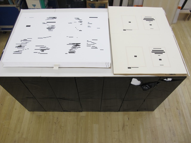
In the 2018 display of Après Un Coup de Dés, the previously gathered but now unfolded sheets and cover lie side by side under glass. Often this is cause for complaint about the distanced display of artist books. In the case of Après Un Coup de Dés, the distance effectively draws point-blank attention to what the privileged reader gradually discovers in handling the work. The unprivileged reader may have to imagine the making, unmaking and remaking of the book but, confronted with the gestalt of the undone gatherings and their registration marks, that reader immediately sees/witnesses the void defined by a void.
Après Un Coup de Dés in the group exhibition Reading Hand Writing Bodies at Les Abattoirs de Bomel, Centre d’art de Namur, Belgium, 8 February – 11 March 2018. Photo: Courtesy of the artist.
In relation to Broodthaer’s Image and Pichler’s Sculpture, Après comes both before and after. The positioning of the words après, image and sculpture vis à vis the poem’s title has been noted already. Of all three visual, tactile and conceptual works, Lorand’s stands as the chronologically “after” yet unfinished “before” to Broodthaers’ and Pichler’s finished works. In yet another “afterness” to Mallarmé’s poem, Lorand likens Après to a silent score of music or a piano roll (correspondence with the artist, 1 November 2021). This echoes — if that is not too perverse a verb — Mallarmé’s reference to “score” in his preface to Un Coup de Dés. In premonitory, if not coincidental, irony, Lorand’s piano-roll-like 2015 work precedes a work that Michalis Pichler created for his 2016 Milan exhibition: a piano roll playable on a foot-pumped pianola and entitled Un Coup de Dés Jamais N’Abolira le Hasard: Musique (see video above).
The interplay of its philosophical roots with its mechanically produced print and its manual cuts makes Lorand’s AprèsUn Coup de Dés one of the more challenging works of homage to Mallarmé’s poem. To “hear” it side by side with the others in the Books On Books Collection (see below) is rewarding.
Further Reading
“Derek Beaulieu“. Books On Books Collection. 19 June 2020.
“Eric Zboya“. Books On Books Collection. 01 June 2020.
Heidegger, Martin, and Peter D. Hertz, trans. 1959/2009. On the Way to Language. San Francisco: HarperOne. Reprint. “No matter how we put our questions to language about its nature, first of all it is needful that language vouchsafe itself to us. If it does, the nature of language becomes the grant of its essential being, that is, the being of language becomes the language of being” (p. 72).
With the exception of Unpacking my Library and Between the Sheets, Spector’s works in the Books On Books Collection fall into the category of ephemera. More than most book artists’ ephemera such as invitations, broadsides and the like, however, Buzz Spector’s ephemera have that self-reflexiveness so characteristic of book art.
Artist, curator and historian Jeffrey Abt wrote that the “irresistible” idea of placing an exhibition of artists’ books alongside the University of Chicago Library’s collection “broadly representative of the history of the book” started with a visit to famed art dealer Tony Zwicker‘s studio. It was also, however, almost as if he were taking a cue from this statement by artist-printers Betsy Davids and Jim Petrillo just the year before:
A representative collection of artists’ books often does not seem visually remarkable in a gallery, where a wide range of visual experience is the norm. The same collection, installed in a library or bookstore, can seem visually startling almost beyond the limits of decorum. — “The Artist as Book Printer: Four Short Courses”).
While Abt’s introductory essay rings the historical changes on the roots of book art — once there was Mallarmé’s Un Coup de Dés Jamais N’Abolira Le Hasard, but before Mallarmé, there was William Blake — the works included and the catalogue’s design ring some chimes of their own about book art. One way or another, all book art self-consciously draws attention to some particularly bookish element. For the most part, the 49 works listed in this catalogue ring true. The catalogue’s design itself, however, not only chimes to that notion of self-reflexiveness but also to wider notions about the nature of book art within contemporary art.
Not long after this exhibition, Spector wrote of “the language of the book” and all its parts — pages, signatures, cover, letter forms and their placement on the page, etc. — as having a syntax (“Going Over the Books”). With its pencil-circled numbers, alignment guides, pastedowns and other designer’s marks appearing throughout — as if a printer’s devil had run amok and let the marked-up proofs go to press unchanged — the catalogue draws attention to that syntax, the underlying processes of bookmaking and, therefore, this object’s “bookness”. The colophon’s note initialed by Jeffrey Abt to Buzz Spector and “pasted” on the last page jokingly rings the self-reflexive chime of the markings throughout the catalogue.
The second chime comes in the catalogue’s verbal and visual punning. Like book art, punning is self-reflexive, words playing on words. The title ”the book made art” can be read with different meanings: “the book made into art”, “art that is bookish” and so on. The catalogue’s trim and two-dimensional representation of three-dimensions create the visual pun of a glass or white cube. The verbal and visual puns also play with Abt’s “irresistible” context. Here in the Joseph Regenstein Library was an exhibition catalogue, teasing the viewer with a reminder that vitrines separated them from the bookworks. Reviewing two other exhibitions of book art, Spector elaborated explicitly on his visual tongue-in-cheek irony:
The dilemma in staging exhibitions of books as art objects is the denial of access to the work that conservation necessarily demands. … and it is a morethan passing irony that implications of hermeticism and elitism should surround books shown to a public using the library as a means of gaining access to texts. — “Art Readings”.
The catalogue also teases with its title and design by suggesting that once books have been placed on display like this, the setting is no longer a library but a “white cube gallery“. As the catalogue progresses, black-and-white photos of items from the exhibition appear on the verso page in frames that appear to be hanging on the trompe l’oeil cube’s rear wall.
Poster distributed on the University of Chicago campus. The image combines Michael Kostiuk’s Airplane Shadow Book (1981/82) with a variation of the catalogue cover. Photo: Courtesy of the artist.
But a viewer standing in the “brutalist” construct of the Regenstein Library and holding the finished catalogue might have asked, “What makes these objects I cannot touch — or, in some cases even if I could, cannot read — art?” There is the catalogue’s third chime. From the start, book art has faced a constant definitional or identity crisis and even the challenge “but is it art?” The catalogue’s title echoes Lucy Lippard’s Duchampian proposition: “It’s an artist book if an artist made it, or if an artist says it is”. The catalogue’s design says, “This is the gallery, these are the objects on display in it, they are art”.
The “white cube gallery” brings on a fourth and final ironic chime. In the 1970s and early ‘80s, artists’ books were pitched as a “democratic” medium and means by which art could escape the clutches of the gallery and reach a wider public. In another catalogue — the one for the 1973 Moore College exhibition, nominated as the first of book art — John Perreault writes:
Books as art, from the artist’s point of view and the viewer’s point of view, are practical and democratic. They do not cost as much as prints. They are portable, personal, and, if need be, disposable. Because books are easily mailed, books as art are aiding in the decentralisation of the art system. — “Some Thoughts on Books as Art”.
By the mid-80s, lo and behold, The Book Made Art’s catalogue-cum-gallery jokingly recaptures “books as art”. And in a further irony, by the mid-80s and since, the increased rareness and price of such bookworks have made them into galleries‘ and museums’ expensive objects of desire. Including this catalogue.
The Library of Babel (1991)
The Library of Babel Curated and edited by Todd Alden; catalogue designed by Buzz Spector. Dos-à-dos binding, offset. H241 x 177 mm Buffalo, NY: Hallwalls Contemporary Art Center, Hallwalls Inc., 1991. Photo of the work: Books On Books Collection.
As with The Book Made Art, Spector uses the cover (this time with a photograph of The Library of Babel) to introduce the self-reflexivity so characteristic of book art, but he does not stop there. Pagination and the back-to-back binding structure work together to evoke a mirror’s reflection; the last page of the first half “faces” the last page of the second half.
Photo of the work: Books On Books Collection.
The first half contains Todd Alden’s essay “The Library of Babel: Books to Infinity”, Paul Holdengräber’s “Unpacking Benjamin’s Library: Bibliomania in Dark Times”, and a checklist of the 34 works by their 10 artists.
Photo of the work: Books On Books Collection.
The second half contains half-tones of selected works and brief CVs of the artists. Among the half-tones are also photographs of works referenced by Alden (one by Jasper Johns, two by Marcel Broodthaers). Notice how the rules change position in the footers of the two halves, again evoking the back-to-front theme of the dos-à-dos binding.
Photo of the work: Books On Books Collection.
As in The Book Made Art, Spector had an entry in “The Library of Babel“ exhibition. With its torn pages, North Sea (for M.B.) (1990) echoes Altered LeWitt (1985), further below, but it is instead a work 10 feet long and presented on a table appropriately jutting out from the wall like a pier. “M.B.” is Marcel Broodthaers, to whose works there are multiple and layered references. The eleven “waves” of torn pages placed in a row on top of the steel shelf come from eleven copies of the Walker Art Center’s 1987 catalogue to Broodthaers’s first U.S. retrospective. Spector had all the pages in each copy painted with white gesso before tearing out the pages.
Marcel Broodthaers (1990) Buzz Spector An altered copy of: Marcel Broodthaers (Minneapolis/New York: Walker Art Center/Rizzoli, 1989). Photos: Courtesy of Buzz Spector.
He saved the excised “wedges” and bound them at the fore edges. Because the gesso does not completely obscure the text and images from the catalogues, viewers who come close to the work can see slivers of some of Broodthaers’ works along with the word fragments typical of Spector’s altered books.
North Sea (for M.B.) (1990) Buzz Spector Books, steel, gesso, 25 x 96 x 10 inches Collection Orange County Museum of Art,CA; Museum purchase with additional funds provided by Peter and Eileen Norton and the National Endowment for the Arts, a federal agency. Photo: Courtesy Orange County Museum of Art.
Spector’s library contains a copy of Broodthaers’ 1974 artist book, A Voyage on the North Sea. These layered references and self-references — direct references to Broodthaers’ A Voyage, indirect references through the self-reference to Spector’s Marcel Broodthaers (1990) — bring into sparkling focus two features of book art and, in particular, late 20th century book art: reverse ekphrasis and bookworks in conversation with one another.
When a visual work of art inspires poetry or prose, the literary result is called ekphrastic: “the verbal representation of visual representation”. But where the poets Keats, Auden and Jarrell, for example, use words to “recreate”, re-present, evoke or respond to works of art — an antique urn, a painting by Brueghel and Donatello’s sculpture of “David” — book artists have in turn used the letter, words, actual books, the physical materials of the book or even the shape of books, their functions or processes of making them to create works of art. A kind of ekphrasis in reverse.
Not only does Spector perform this reverse ekphrasis with exhibition catalogues in North Sea (M.B.), he does it in conversation with a multimedia work by Broodthaers. Works in conversation with one another is also a common occurrence in poetry. An entire anthology showcases these poems that talk to other poems. The later work not only evokes the earlier work, it illuminates and adds to it. In book art, other instances include Bruce Nauman’s Burning Small Fires (1968), a one-sheet folded book of photos of Ed Ruscha’s Various Small Fires and Milk (1964) being set on fire and burning to ash, and Dennis Oppenheim’s Flower Arrangement for Bruce Nauman (1970), a leporello which refers to Nauman’s Flour Arrangements (1967), a video in which the artist pours over 50 pounds of flour on a mock talk-show studio floor and then sculpts it into ephemeral shapes. Nauman’s shift to an ingenious folded single-sheet structure and Oppenheim’s shift (and pun) to an accordion view of flowers are part of the addition to their conversations with their very structurally different counterparts. Spector’s shift to the sculptural is part of the addition to his conversation with Broodthaers’ book and video. Consider not only Spector’s gessoed sea of pages and the pier, but also those two 19th century black bronze sailing ship bookends evoking the 19th century nautical painting that Broodthaers appropriated in A Voyage on the North Sea.
North Sea (for M.B.) (1990) Buzz Spector Books, steel, gesso, 25 x 96 x 10 inches Collection Orange County Museum of Art,CA; Museum purchase with additional funds provided by Peter and Eileen Norton and the National Endowment for the Arts, a federal agency. Photo: Courtesy Orange County Museum of Art.
Unpacking my Library (1994-95) Buzz Spector Leporello full-colour offset printed; folded H100 x W155 mm, unfolded W3600 mm; Cleveland Center for Contemporary Art. Installation exhibited at the San Diego State University Art Gallery, 1-31 October 1994. Photo of the work: Books On Books Collection.
Clearly from his entry in The Library of Babel, Spector’s artistic output extends beyond altered books and catalogue design to larger scale installations. One of the more well-known, Unpacking my Library imposes multiple orders on what Walter Benjamin called “the chaos of memories”. How “multiple orders”? First, because of its subtleties; second, because of its several forms.
From the start at the San Diego State University Art Gallery, 1-31 October 1994, the installation imposed the order of “descending height” on Spector’s library, unpacked and displayed across one shelf attached along the white walls of a room in the gallery. The single shelf ran 188 feet.
Although Spector is rejecting the library’s traditional method of making sense of a collection of books — ordering by academic category — in favor of a physical criterion, the title imposes another method of making sense — allusion. The installation makes “more” sense if you have read Walter Benjamin’s essay “Unpacking My Library — A Talk on Collecting” (1931). If you haven’t, then, on the reverse of the leporello produced with the Cleveland Center for Contemporary Art, are these two sentences from the essay:
This or any other procedure is merely a dam against the spring tide of memories which surges toward any collector as he contemplates his possessions. Every passion borders on the chaotic, but the collector’s passion borders on the chaos of memories.
So what has ordering by height to do with the chaos of memories? Well, if the order of the personal library had been chronological by acquisition, that would be an assertion against chaos, a kind of aide- mèmoire. If the order had been by the library’s traditional method, again that would be an assertion against chaos. Benjamin and Spector embrace the chaos. Spector’s at-first amusing and puzzling organization of his library prods the viewer into the chance to do somewhat the same — to wander along the shelf with that phrase of process hovering in the mind and be reminded of books once read (when? where?), familiar and almost-familiar names and places (from when or where?) and subjects studied (what did that cover?). But the viewer also experiences a surge of unknown names, places and subjects, and spines that mystify.
The allusion to Benjamin’s essay offers another way of making sense of this experience into which the viewer is prodded. If a personal library is a kind of self portrait you can detect from the clues that its usual groupings into fiction, biographies, history, science, etc., give us about the owner, then here the order by height washes them and the portrait away. And if the viewer knows the essay, Benjamin’s last sentence may come to mind:
So I have erected one of [the real collector’s] dwellings, with books as the building stones, before you, and now he going to disappear inside, as is fitting. — Walter Benjamin, “Unpacking My Library”
Spector mentions this disappearance in a video record of the making and showing of the installation. Whether or not the installation’s spectator knows Benjamin’s essay, the installation’s title is a clue to the imposition of a fictional order. “Unpacking my library” is a phrase implying an activity that is just getting going. For his essay, Benjamin created the fiction of the reader’s being present as the library is being unpacked. Likewise for Spector’s installation, any spectator walking into it has entered a fiction. Spector’s library has already been unpacked, sorted on the floor and placed on the single shelf running around the room.
Of course, however, the owner of the leporello form of Unpacking my Library does not experience this fiction as directly. The opening and arranging of the leporello is a hands-on activity; the unpacking of Spector’s library occurs panel by panel in the reader’s hands. The library’s arrangement by height appears more gradually than in the gallery. Once the bookwork is fully extended, the installation’s fiction then becomes more readily available to the leporello’ s reader/viewer.
Photo of the work: Books On Books Collection.
As fictions, Benjamin’s essay and Spector’s installation need an ending. Benjamin’s technique is to disappear into his collection. Spector chooses a different technique. In correspondence with Books On Books, he writes:
The length of all the publications in my library was 165 feet; the single shelf, at the UCSD Art Gallery, on which they were placed ran 188 feet. That additional space implied a future, and life-affirming, growth of my collection. — Buzz Spector, 26 March 2020.
Photo of the work: Books On Books Collection.
Whether it is leporello or installation, the reader/viewer of Unpacking my Library is launching and launched on this open-ended ending.
The Book Maker’s Desire (1995)
The Book Maker’s Desire: Writings on the Art of the Book Buzz Spector Pasadena, CA: Umbrella Editions, 1995. 2nd printing. Cover design by Buzz Spector. Image: History of Europe (1983) by Buzz Spector; plaster over found book, 10.5 x 12 x 15 inches. Photo of the work: Books On Books Collection.
Spector’s essays are tonic. His comments on Margaret Wharton’s bookworks could refresh any reader and viewer lucky enough to see her works (Union League Club-Chicago or Yale) or remind the viewer of them when looking at works by later artists such as Thomas Wightman or the “Mystery Book Artist of Edinburgh”. In the past few months, Walter Hamady and John Baldessari have died, and Spector’s essays on them bring them both and particular works of theirs to present life. His essay and letter on Broodthaers would enhance any reading of the artists who have stood on Broodthaers’ shoulders to address Mallarmé’s Un Coup de Dés: Bennequin, Mutel, Pichler, Wyn Evans, Zboya. The essay “Going Over the Books” may have inspired Alden’s curation of ‘The Library of Babel” exhibition.
The essays are not entirely the point of having The Book Maker’s Desire in the Books On Books Collection. What completes the point is the cover design. The object on the book’s front cover is Spector’s own work History of Europe (1983), which pays homage to Broodthaers’ Pense-Bête (1964). But look closer. The cover stock has elements of text and colour seeping through, almost as if it were made of shredded books. The aptness and artistry of the cover design make The Book Maker’s Desire an object of desire in and of itself.
Detail of cover: Books On Books Collection.
Along with Unpacking my Library, Between the Sheets (2003) is the only other of Spector’s limited edition artist’s books in the Books On Books Collection. It is the solo exhibition to the joint exhibition of The Book Made Art (1986), described at the outset of this entry. In Between the Sheets, Spector again shows the self-reflexiveness of book art but also demonstrates how originality can spring from it.
Between the Sheets (2003)
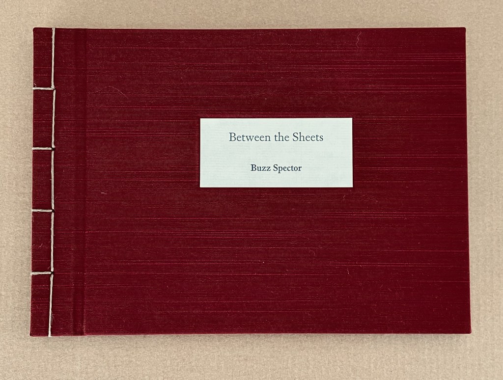
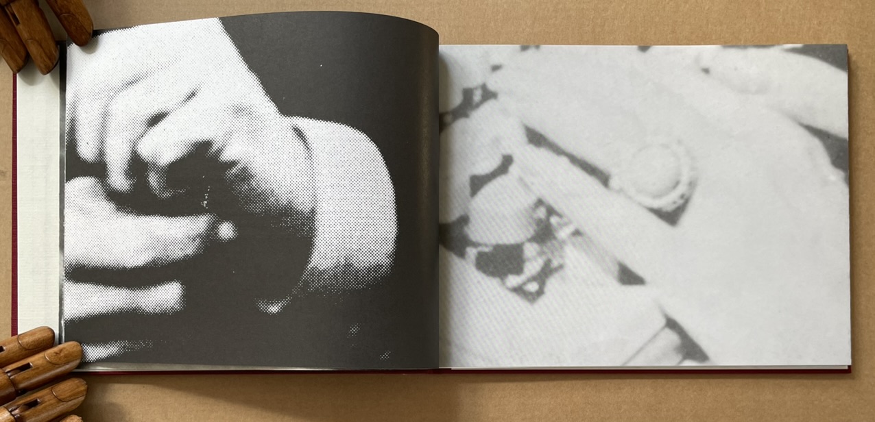
Between the Sheets (2003) Buzz Spector Cloth over boards, Japanese stab binding, 15 folded sheets, outer sides offset printed with enlarged “authors’ photos” clipped from dust jackets of art books repurposed by Spector for his bookworks, inner side printed (recto only) with text by and selected by Spector. H157.5 x W216 x D12.7 mm. Edition of 40, of which this is #40. Acquired from Olive Branch Press, 26 June 2020. Photos of the work: Books On Books Collection.
Unlike Altered Lewitt (1985) and North Sea (for M.B.) (1990), which appropriate and alter named works, Between the Sheets is made at two or three removes from its source material. In the first instance, Spector clipped authors’ photos from the dust jackets of their books (unnamed), then rephotographed and printed them at enlarged scale in offset editions. These prints were then bound together to make books. As with Altered Lewitt and other works, Spector then tore strips in a sequence of decreasing increments from the spreads so as to form a wedge-shaped cross section of the image block. In the next remove, this process left a pile of torn strips, and from these torn strips, Spector has proceeded to create Between the Sheets. With images on one side and text imposed on the reverse, these folios are folded and bound at their open ends with Japanese stab binding.
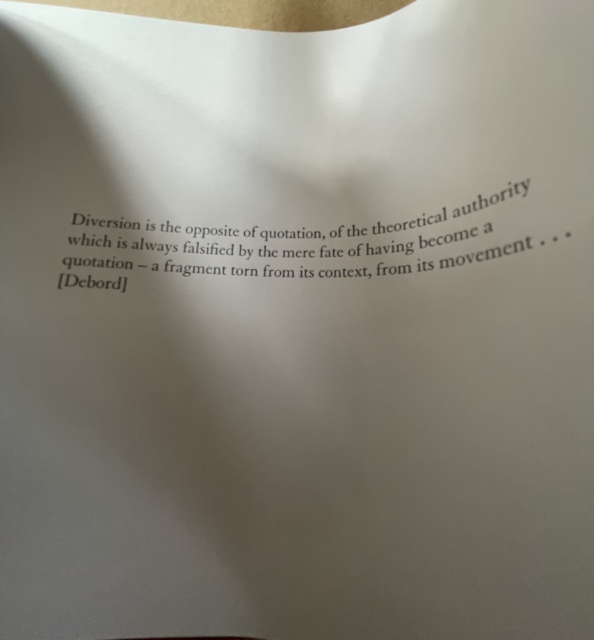
The work’s main thrust is philosophically, artistically and self-reflexively aesthetic. It quotes from the French philosopher Guy Debord, the Belgian artist Marcel Broodthaers and Spector himself. The quotation from Debord comes early on, the first after the title page and two of prefatory explanation, and very much sets the tone.
Diversion is the opposite of quotation, of the theoretical authority which is always falsified by the mere fate of having become a quotation — a fragment torn from its context, from its movement … [Debord]
With Between the Sheets, we have on our hands a decidedly multi-layered diversion. At one layer, it diverts by questioning Debord’s own words, consigning their “theoretical authority” to a fate of falsification by “having become a quotation — a fragment torn from its context”. Like a fun-house mirror, the page bows to give this distorted reflection of Debord’s words.
But is it a diversion? After all, the “truth” of Between the Sheets rests at least in part in its composition from fragments. At this other layer, Between the Sheets “quotes” the fragments torn from the context of another of Spector’s artwork. In turn, that other artwork was composed of prints of photographic “quotations”, the fragments torn from authors’ images on dust jackets (the coverlets for the source books and their sheets). It is no accident that, when the sheets of Between the Sheets are bowed to permit a look inside, the images bracket the text pages like single quotation marks.
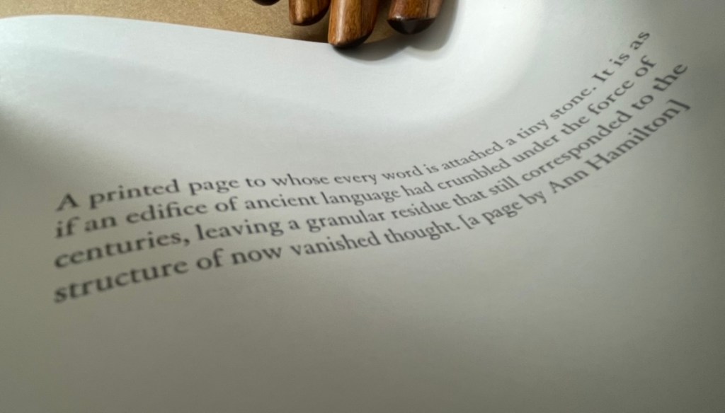
Another quotation resting between the sheets comes from Spector’s own essay on Ann Hamilton in The Book Maker’s Desire (p.63):
A printed page to whose every word is attached a tiny stone. It is as if an edifice of ancient language had crumbled under the force of centuries, leaving a granular residue that still corresponded to the structure of now vanished thought. [a page by Ann Hamilton]
Spector runs the risk of “Debord-ing” himself here with his self-quotation, but he only succeeds in diverting this reader back to the essay on Hamilton’s work and specifically the four works commissioned to benefit The New Museum of Contemporary Art in New York:
The artist chose a total of fifty four volumes (40 in the edition, plus 14 artist’ proofs) for the untitled project. These found books, mostly old novels or poetry, were selected for a variety of physical characteristics –size, wear, and paper quality — and for their typographic layout. Each book was opened to its middle, where six or eight pages were cut from the text block and reattached, edge-to-edge, to the right-hand side of the opened page spread, making an accordian-fold [sic] extension from the book. The eight pages thus displayed were meticulously rendered unreadable by Hamilton and several attendants who glued tiny stones over every word on the visible side. (p. 63)
Is it a coincidence that Between the Sheets also consists of 40 in the edition just like Hamilton’s commission? Spector quotes not only images and words from others’ works and his own, he quotes the details of their production and form. It is certainly no coincidence that Between the Sheets quotes the stab bound structure of Marcel Broodthaers’ A Voyage on the North Sea. After all, in his hidden prefatory explanation, Spector makes no bones about the fact that Between the Sheets arose in part from his astonishment at finding the page numbers hidden within the bound edge of A Voyage. But how did he find them? In the process of creating his own North Sea (for M.B.) (1990). So yet another self-quotation of production process.
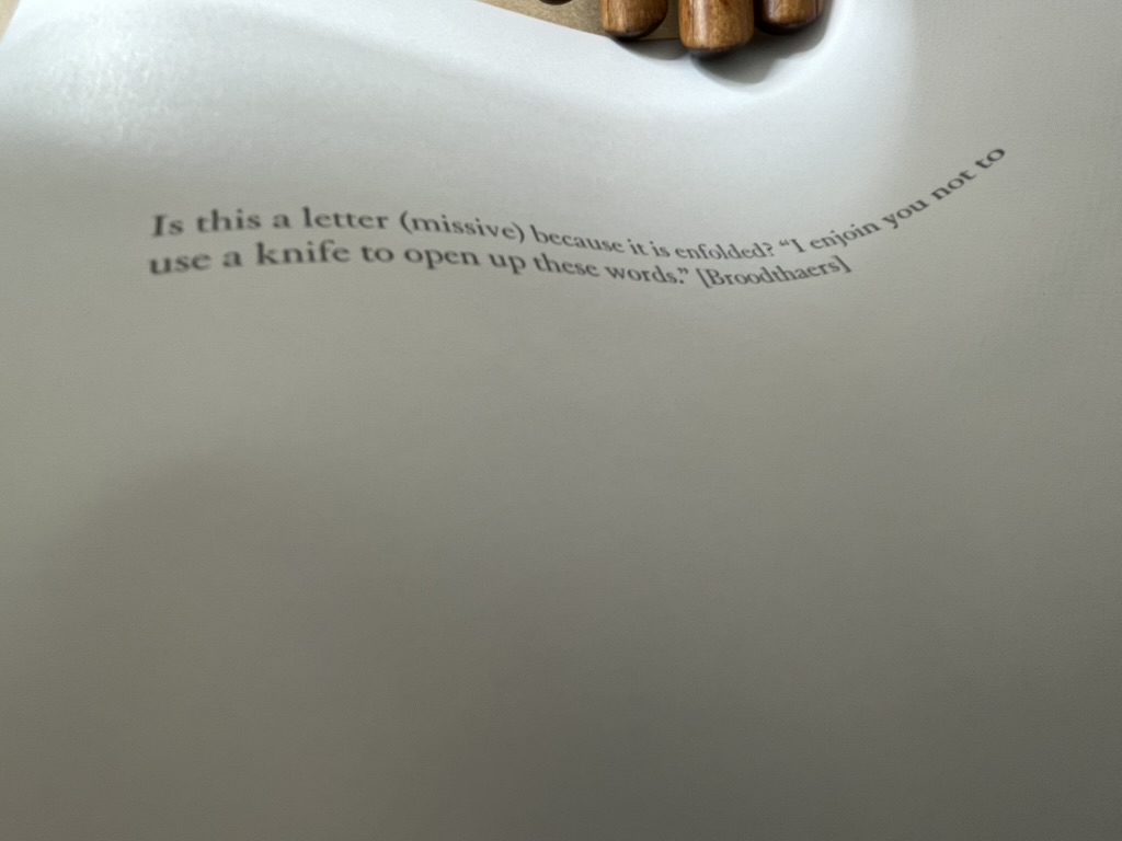
Spector’s forthright quotations are divertingly sly. When he cites Broodthaers between these sheets,
he is also echoing Broodthaers’ injunctions in A Voyage on the North Sea:
Before cutting the pages the reader had better beware of the knife he will be wielding for the purpose. Sooner than make such a gesture, I would prefer him to hold back that weapon, dagger, piece of office equipment which, swift as lightning, might turn into an indefinite sky. … These pages must not be cut.
Of course, Spector did not cut the pages; he tore them.
Another sly diversion is sex. By using photos of male and female authors and by interposing suggestive phrases inside the folds (“a movement of bodies together as one body” and “peek between the sheets”), Spector spices up the obvious diversion of sex in his work’s title. But the slyness re-diverts via Broodthaers to Mallarmé, whose poem Un Coup de Dés Jamais N’Abolira le Hasard (1897) Broodthaers “knifed up” at the very level of the words and whose contemplations of the letter, the page and the fold have taken on an erotic tone that Spector embraces in A Book Maker’s Desire:
When Stéphane Mallarmé described the folded and uncut signatures of books as “virginal,” awaiting the penetration of the “paper knife,” he identified an erotics of reading. (p.15)
The topography of an open book is explicit in its erotic associations: sumptuous twin paper curves that meet in a recessed seam. Page turning is a series of gentle, sweeping gestures, like the brush of fingers on a naked back. Indeed, the behavior of readers has more in common with the play of intimacy than with the public decorum of art viewing or music listening. Most of us read lying down or seated and most of us read at least partially unclothed. We dress up to go out and look at art; undressed, in bed, we read. We seek greater comfort while reading than the furnishings of museums or concert halls will ever grant us. When we read — the conventional distance between eye and page is around fourteen inches — we often become the lectern that receives the book: chest, arms, lap, or thighs. This proximity is the territory of embrace, of possession; not to be entered without permission. (p.17)
There is much more between the sheets of Between the Sheets. I wish that the 40 copies could find many more readers/lovers to embrace its diversions.
Buzz Spector: Alterations (2020)
Buzz Spector: Alterations (2020) Buzz Spector Gretchen L. Wagner; Elizabeth Wyckoff; Andrea Ferber Brochure. H254 x W256 mm, 4 unnumbered pages. Acquired from the artist, 23 June 2020. Photos of the work: Books On Books Collection.
Three items of ephemera conclude this entry. The first is a pristine copy of the announcement for Spector’s retrospective at the Saint Louis Art Museum, held 20 November 2020 through 31 May 31 2021, along with a copy of it with the front cover hand torn by the artist. The second is the catalogue from his show in 2021 Between the Lines. With both, Spector makes an ephemeral piece echo the works in the exhibition. The third item is a hand torn postcard reproducing his drawing Torn Flag (2022).
Between the Lines (2021)
Between the Lines (2021) Buzz Spector Elizabeth Wyckoff, Gretchen L. Wagner, Meredith Malone, Michael Garzel, Jane E. Neidhardt Perfect bound paperback. H268 x W 230 mm, 81 pages. Acquired from the artist, 10 March 2021. Photo of the work: Books On Books Collection.
The Zolla/Lieberman Gallery, which has supported Spector’s work since 1995, sponsored this monograph following 2020/21 retrospective held at the Saint Louis Art Museum. As a slightly less ephemeral item, it neatly rounds off this entry. Its cover image shows one of Spector’s well-known alterations: Altered LeWitt (1985), one of five of the found and hand-torn catalogue: Sol LeWitt, Drawing Series I, II, III, IIII A & B (Turin, Italy, at the Galleria Sperone, 1974). Compare it with North Sea (for M.B), above, which Spector created five years after Altered LeWitt. Spector extends the technique and concept across the two works in distinctive ways to echo two distinctive artists and yet also speak to commonalities and originality among the three artists.
Photo of Between the Lines (pp. 12-13): Books On Books Collection.
Between the Lines‘ presentation of the works is spectacular. Recalling the effect in The Book Made Art (above), they seem to float three dimensionally on the page. The detail photo of Unpacking my Library across a double-page spread offers a good example, especially when compared with the images above.
Photo of Between the Lines (pp.16-17): Books On Books Collection.
Between the Lines also provides the opportunity to end this entry with an image of the work incorporating an image of the author and his generosity toward his fellow bookworkers. Note in particular the reference to Michael Garzel, the monograph’s designer and creator of the typeface used so strikingly on the cover, for chapter titles and here in the heading “Acknowledgments”.
Photo of Between the Lines (pp. 4-5): Books On Books Collection.
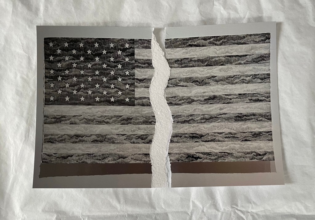
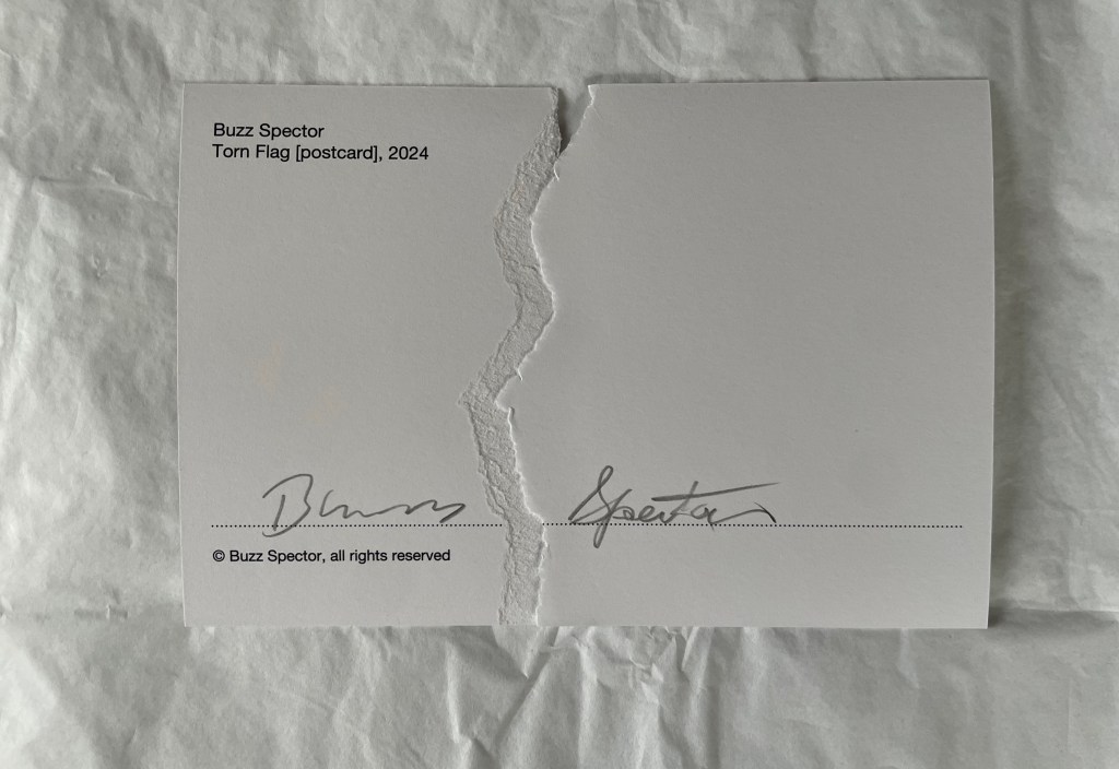
Torn Flag (2024)
Torn Flag(2024) Buzz Spector Postcard. Acquired from the artist, 26 February 2024. Photos: Books On Books Collection.
Revisiting Spector’s works this time was prompted by an invitation from the Center for Book Arts to “BookTalk: Full Dress or Half Dress, Not Casual with Buzz Spector” on 8 October 2024. The postcard reproduces the drawing Torn Flag (2022), a 565 × 1118 mm drawing (graphite on paper) that appeared in the Zolla/Lieberman Gallery. Spector describes the postcard as an “(informal) edition … Elegy to the Divided States”. Ephemeral though the postcard may be, its tearing makes a self-reflexive artistic gesture. But it also serves as an injunction: Vote. Always.
Revised entry: 7 October 2024; 24 September 2021; original entry, 31 March 2020.
Further Reading
“Buzz Spector“, Bookmarking Book Art, 12 March 2016.
Davids, Betsy, and Jim Petrillo. “The Artist as Book Printer: Four Short Courses” in Artists’ Books: A Critical Anthology and Sourcebook, edited by Joan Lyons (Rochester, NY: Visual Studies Workshop Press, 1985), p. 160.
Drucker, Johanna. 2004. The Century of Artists’ Books [Second edition] ed. New York City: Granary Books. See pages 118-19 for perceptive comments on Spector’s A Passage (1994) and his method of torn pages.
Lippard, Lucy. “New Artist’s Books” in Artists’ Books. A Critical Anthology and Sourcebook, edited by Joan Lyons (Rochester, NY: Visual Studies Workshop Press,1985), p. 53.
Mathews, Emily, and Sylvia Page. “Off the Shelf and Into the Gallery: Librarians on Spector”, Buzz Spector: Off the Shelf, Grunwald Gallery of Art, October 19 — November 16, 2012 (Bloomington, IN: Grunwald Gallery of Art, Indiana University, 2012), pp. 9-15.
Otten, Liam. “A sea of torn pages“, The Source, Washington University in St. Louis, 26 February 2010. Accessed 26 March 2020.
Perloff, Nancy. 2016. Explodity : Sound, Image, and Word in Russian Futurist Book Art. Los Angeles, California: Getty Research Institute. See pages 179-81 for perceptive comments on Spector’s A Passage (1994), a variant on biblioclasm and example of what Spector calls “a ‘conceptual purity’ because it engages completely with the book as a book.” (p.180)
Perrault, John. “Some Thoughts on Books as Art” in Artists Books, Moore College of Art, 23 March – 20 April 1973, curated by Dianne Perry Vanderlip (Philadelphia, PA: Moore College of Art, 1973), p. 21.
Schlesinger, Kyle. “The Missing Book”, Buzz Spector: Off the Shelf, Grunwald Gallery of Art, October 19 — November 16, 2012 (Bloomington, IN: Grunwald Gallery of Art, Indiana University, 2012), pp. 17-25.
Spector, Buzz. “Going Over the Books” in The Book Maker’s Desire (Pasadena, CA: Umbrella Editions, 1995), p. 8.
Spector, Buzz. “Art Readings” in The Book Maker’s Desire (Pasadena, CA: Umbrella Editions, 1995), p. 13.
Spector, Buzz. “I stack things. I tear stuff up”, Buzz Spector: Shelf Life: selected works, Bruno David Gallery, January 22 — March 6, 2010 (Saint Louis, MO: Bruno David Gallery, 2010).
Spector, Buzz. 25 March 2021. “Art Speaks“. Saint Louis Art Museum. Video series of artists’ talks. Accessed 23 August 2021.
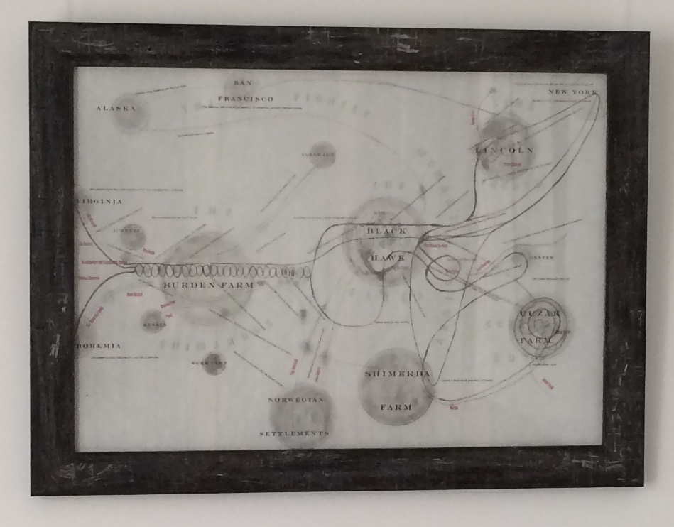
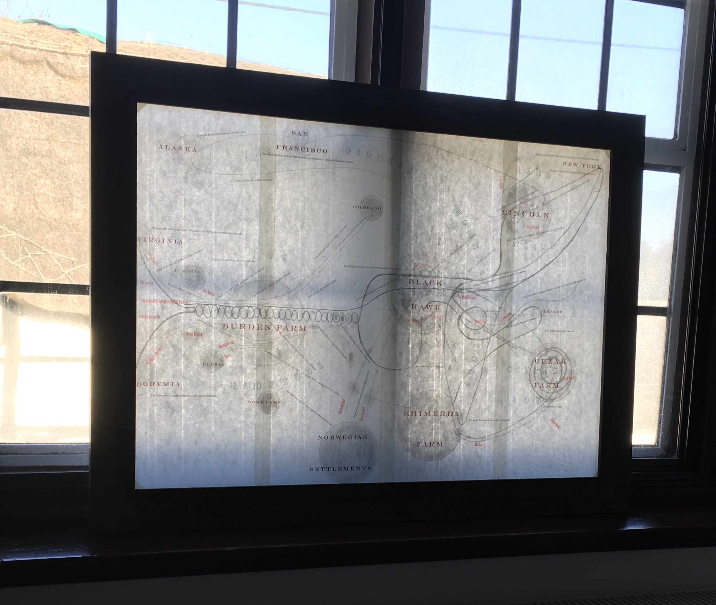
Image of map of My Ántonia reproduced in A Close Read: The Cather Projects (2012) Barbara Tetenbaum and Jennifer Viviano Photos: Books On Books Collection, displayed with permission of the artist.
For the Books On Books Collection, Barbara Tetenbaum’s works have offered a map for exploring the different ways that text, image, structure and material bring about enjoyment and meaning in book art and bookmaking. Broadsides, chapbooks, a codex, a sculpture and, yes, a map have joined the collection over time.
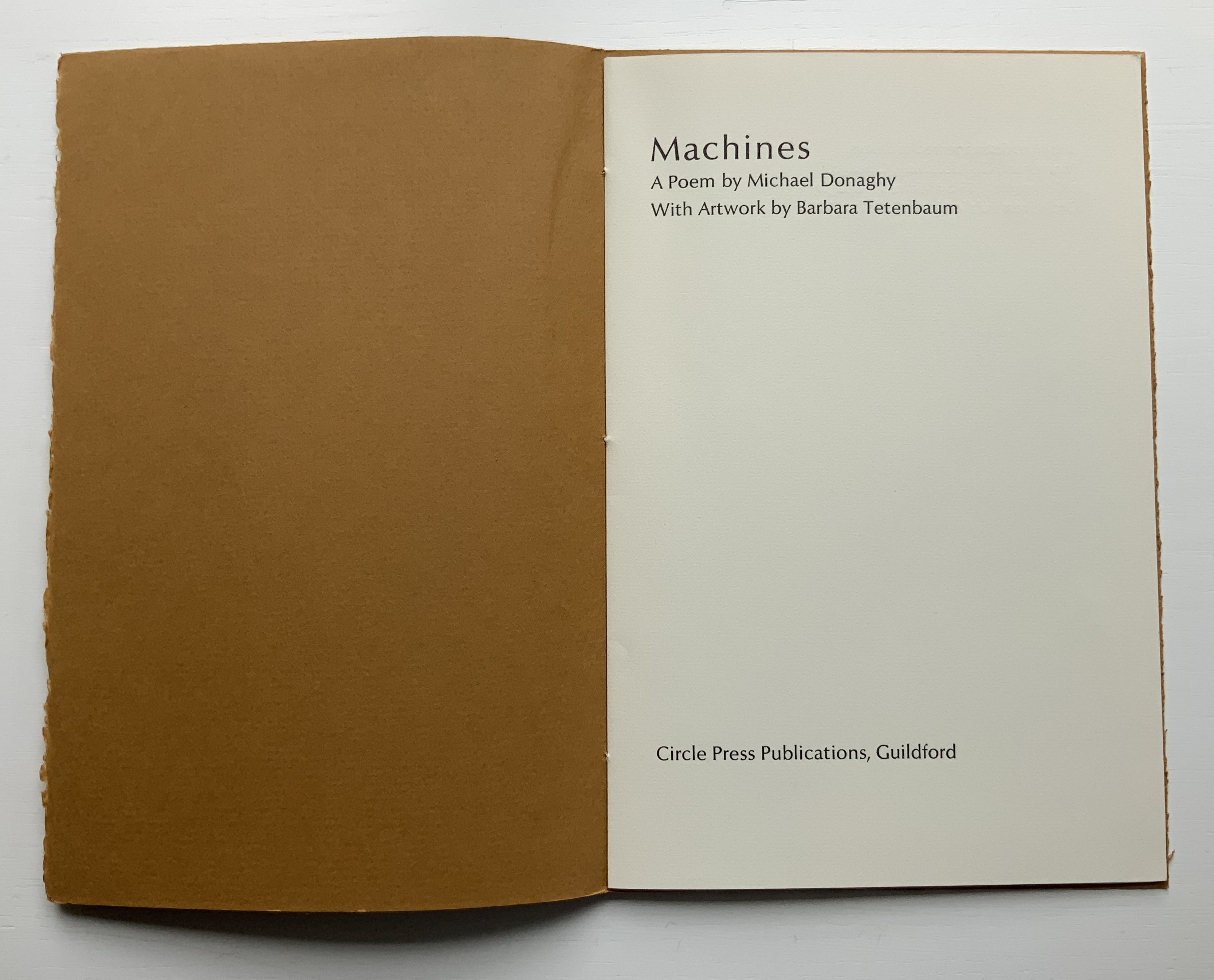
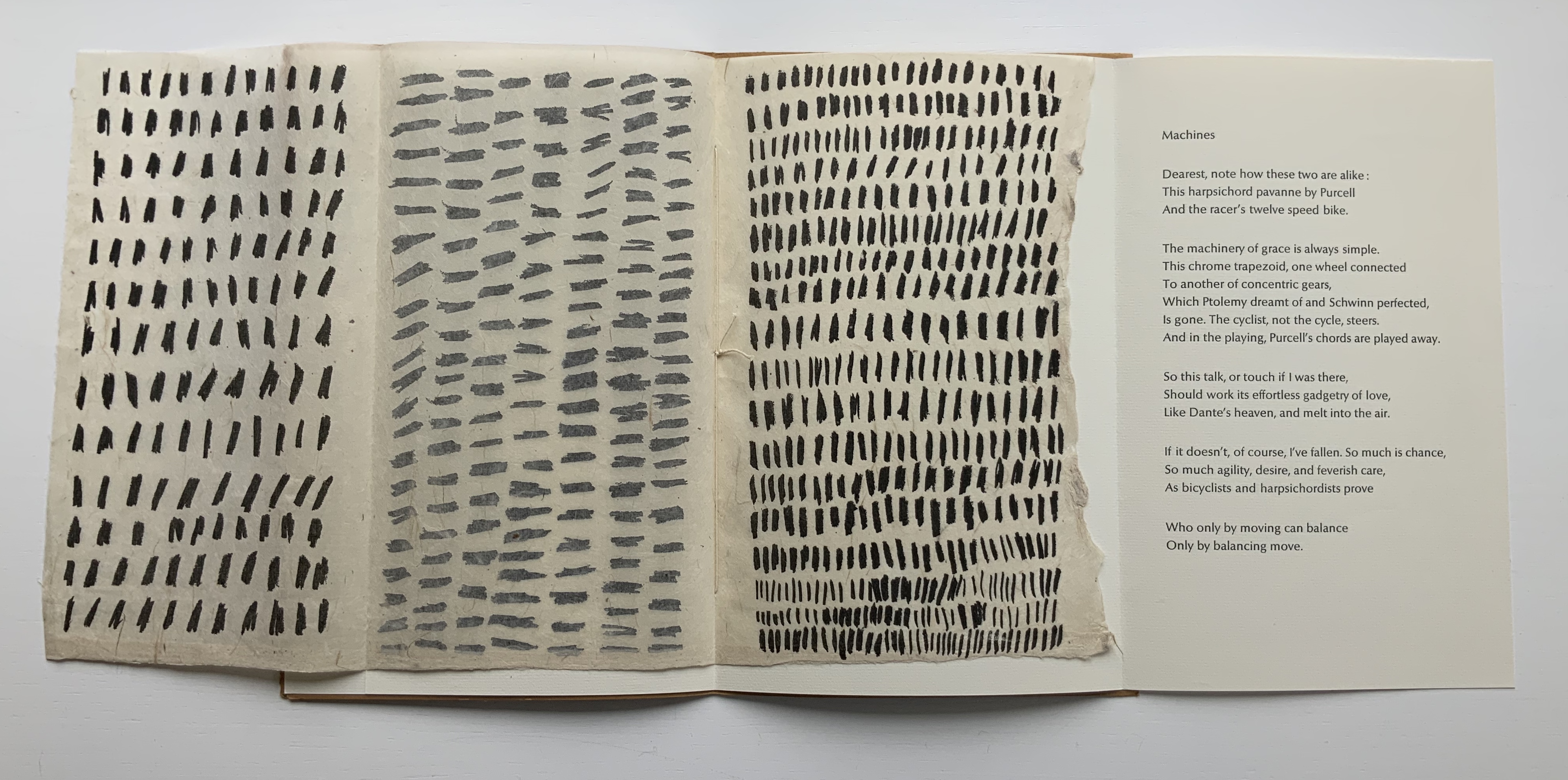
The broadside and chapbook forms seem to be both a rite of passage and a pastime of pleasure for book artists. For Tetenbaum, it has been both of these and a rite of remembrance of friendship. During Tetenbaum’s time at Circle Press, founded and run by UK artist Ron King, she reconnected with Chicago friends poet Michael Donaghy and his wife Maddy Paxman, who had moved earlier to London. Understandably taken with his poetry, she chose his “Machines” when King offered her the chance to set and print anything she liked while King and his wife were away on vacation.
The earliest of Tetenbaum’s work in this collection, the chapbook Machines (1986) pairs Donaghy’s neo-metaphysical poem with the asemic markings that Tetenbaum had begun to pursue as a technique in 1985. Taken on their own, the markings do not call to mind any particular image or metaphor in the poem. Considered more closely as a physical response to the poem, though, they do share in the poem’s building rhythm and density (see further commentary here).
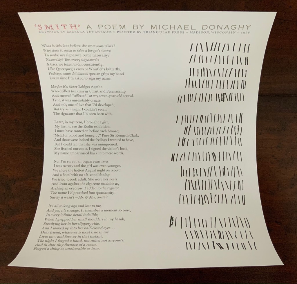
Back in the US, the artist continued with the marks and Donaghy’s words. The broadside below was the result. This time, technique, form and subject cannot avoid similarity — like a reflection in a mirror. ‘Smith’ has a regularity but looseness often found in Donaghy’s poems, something essential to their charm. The iambic pentameter is not always iambic or ten-syllabled, and the length of stanzas vary. Flush right to Donaghy’s flush left, Tetenbaum’s lines of marking mirror the poem’s ragged right and variable counts — but not precisely.
A love poem that takes off from the act of trying to remember forging a name in a hotel register for an assignation that forged something true and lasting, ‘Smith’ is about making one’s mark as artist and responding, intimately, one human to another. To transfer her marks made in response to the poem, Tetenbaum used
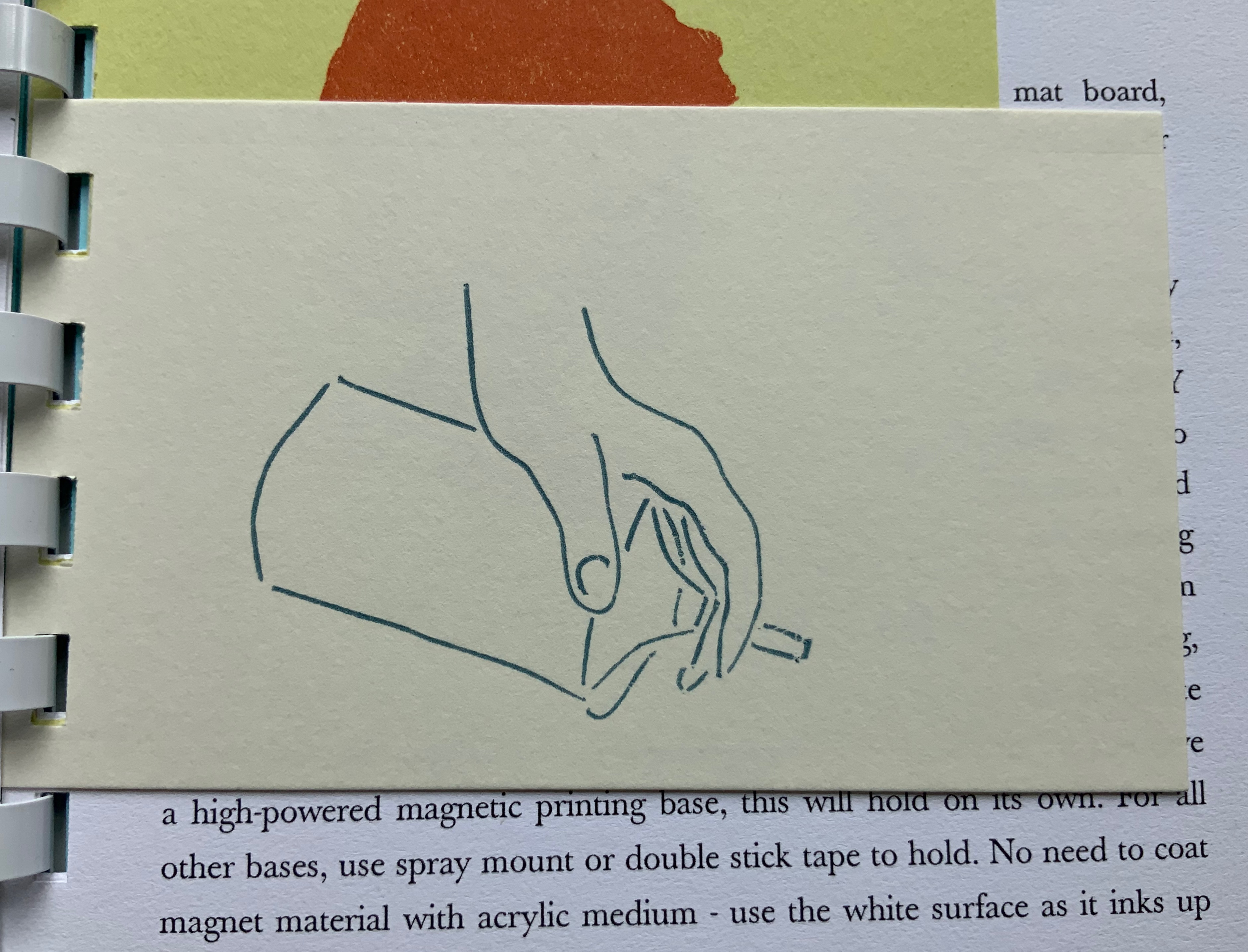
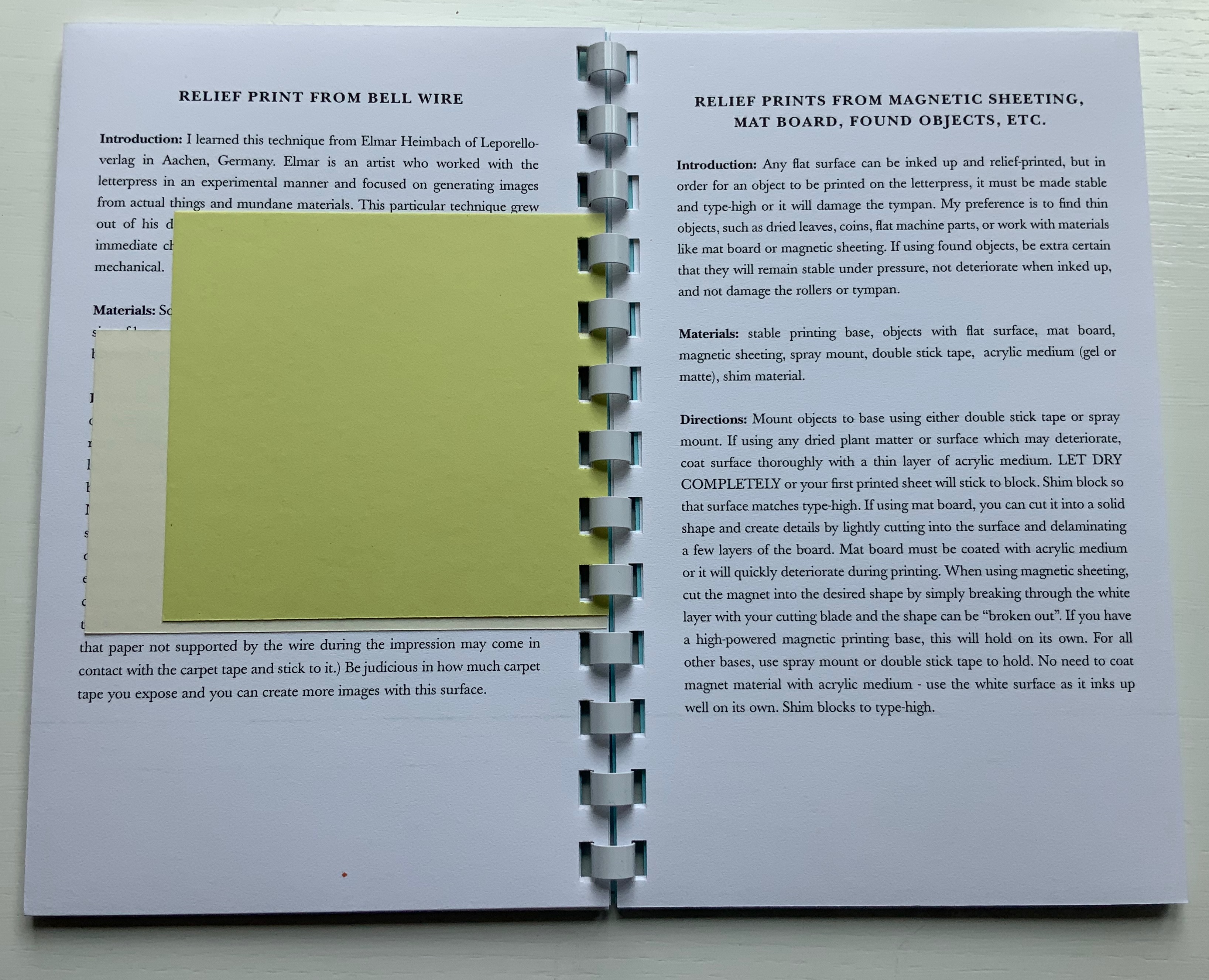
coated wire (bell wire) brought to type high on a piece of MDF covered in carpet tape to hold them in place. This is a technique I learned from Elmar Heimbach and used in a bit of the illustration in O’Ryan’s Belt. (Correspondence with artist, 21 November 2020. Link added.)
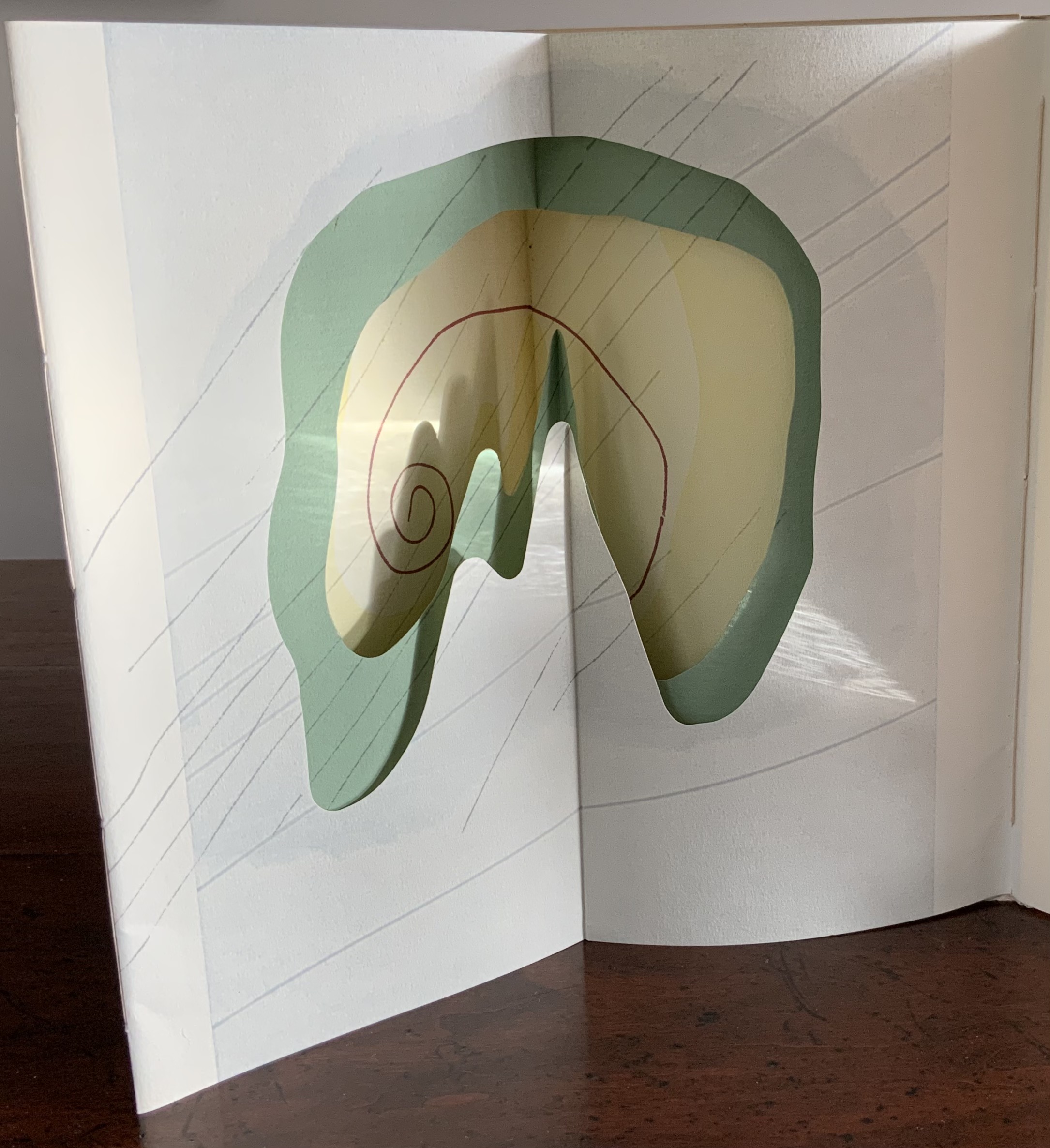
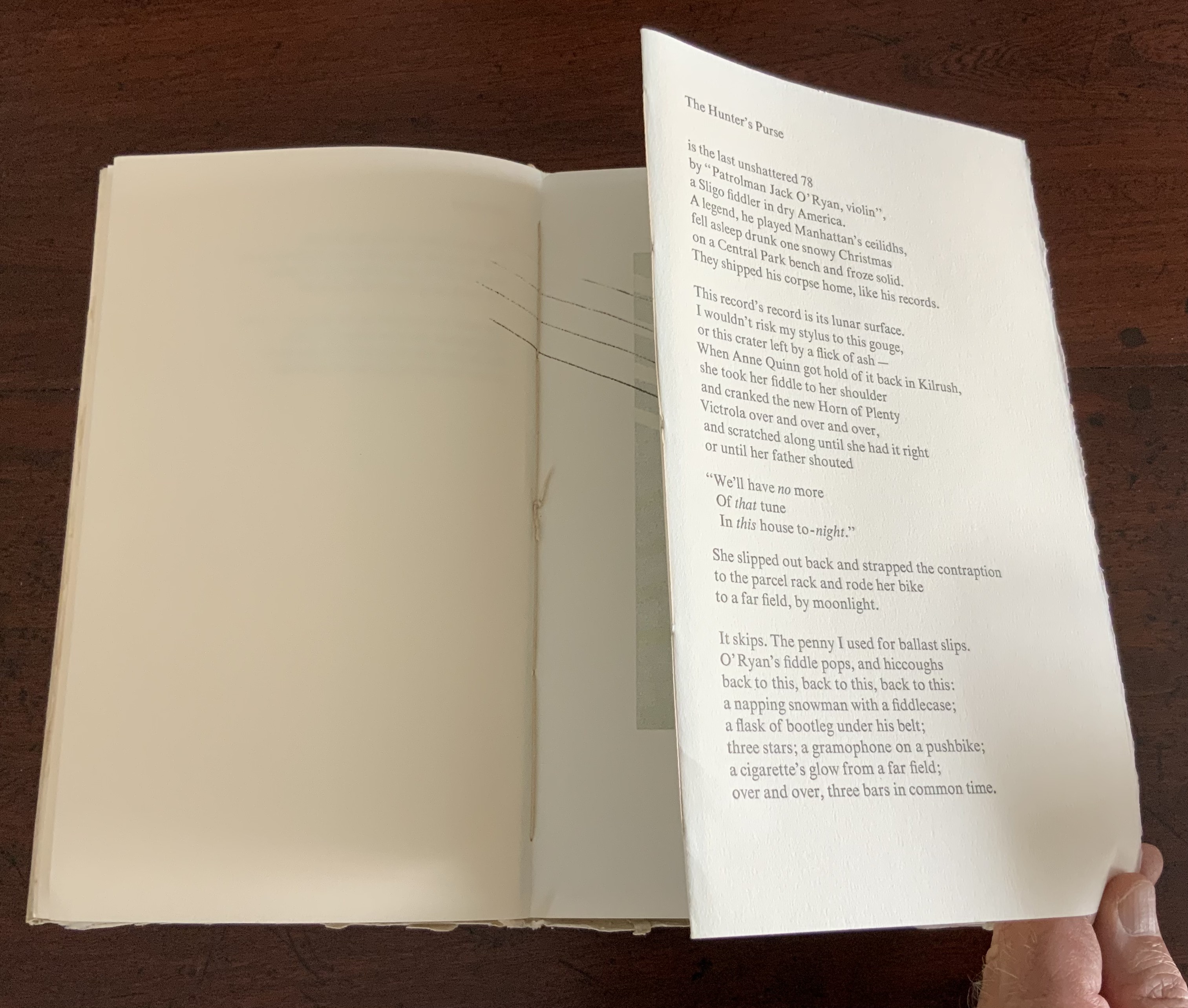
Another of Tetenbaum’s earliest chapbooks, Donaghy’s O’Ryan’s Belt (1991) foreshadows her move toward work that responds with a growing independent relationship to the text.
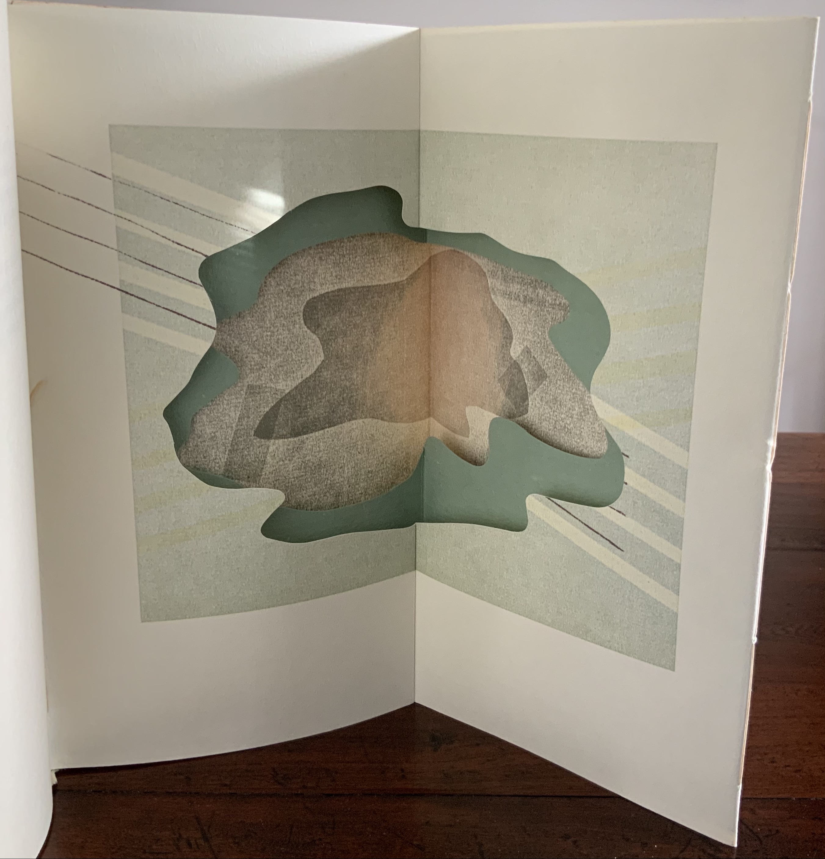
The spine of O’Ryan’s Belt consists of a small fold. Inside, on either side of it, is a gathering of folios. The two sets of folios are sewn (belted?) together through the small fold. Each set includes a tunnel-book-like artwork of three layers. The first sits adjacent to the poem “A Spectacle”, and the second, to “The Hunter’s Purse”, a line from which the chapbook takes its name.
View of the “internal spine”, an inward fold of the cover creating a tab to which signatures on either side are sewn.
View of the tunnel-book image adjacent to “A Spectacle”
The colophon explains that stencils, string and other found objects were used to print the illustrations. Note how the artworks’ lines cross the pages but not into the space of their adjacent poems. It’s as if the artwork is asserting a claim — this is a part of, but apart from; or this is apart from, but a part of. The images created by the artwork seem more related to “A Spectacle” than “The Hunter’s Purse”. Both artworks capture the idea of the image started by the lines “The shape of man, a shadow on the ground,/ Returns a mirror image from pondwater.” As the poem proceeds, we see through the shadow/mirror image to the objects and gravel at the bottom of the pool. Hinting at stalactites or stalagmites as well as the layers reflected on and beneath the water, the first paper sculpture makes sure we recognize the poet’s shadow boxing here with Plato’s cave.
So snugly fitted to the structure, the artwork seems to be waiting to surprise the reader.
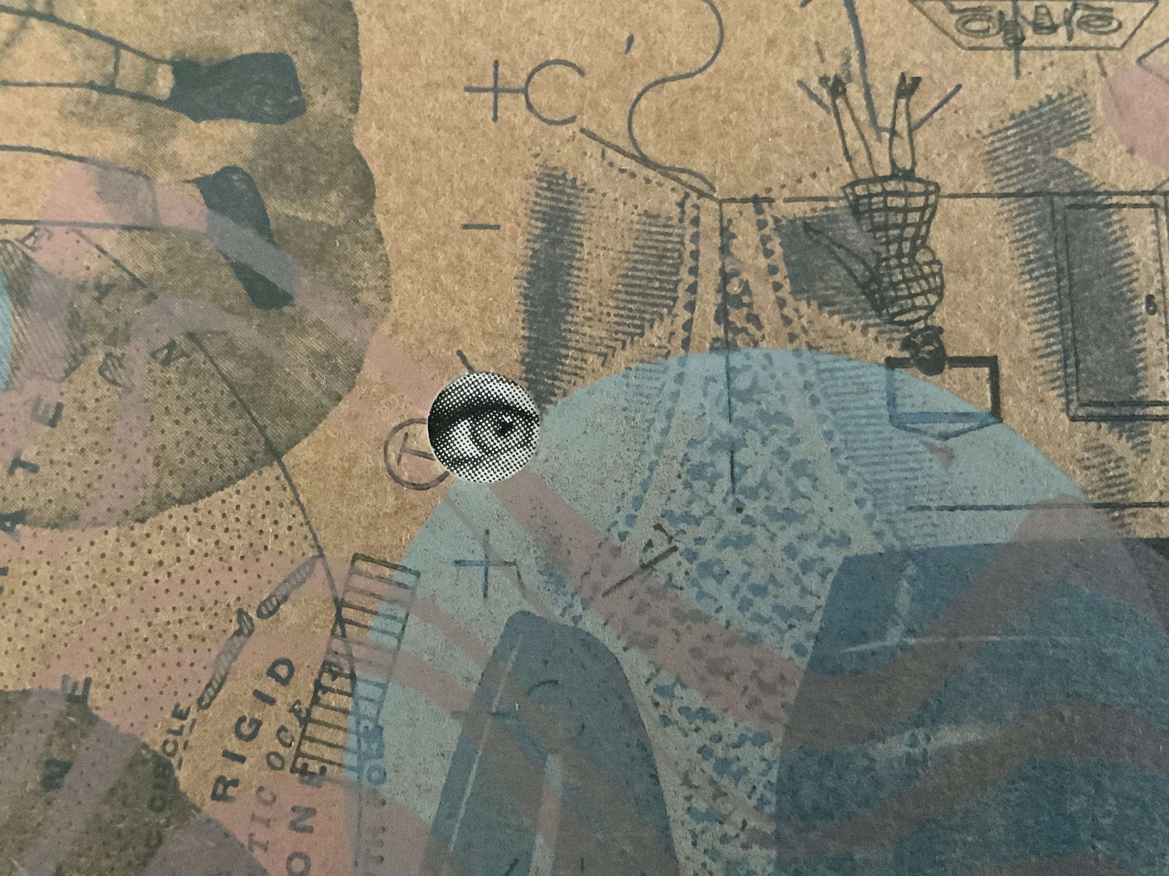
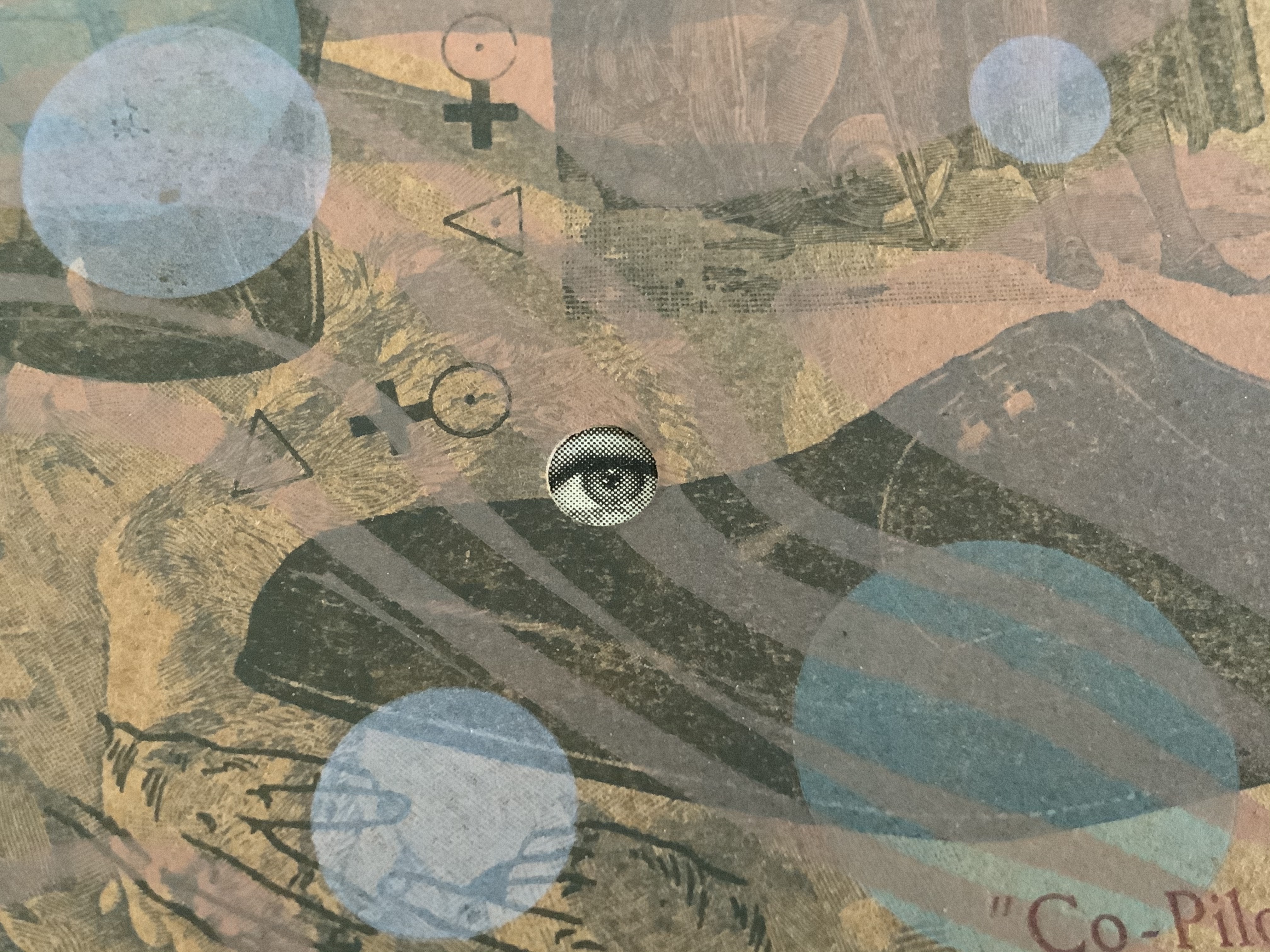
The broadside Co-Pilot extends this structurally interpretive technique. The poem “Co Pilot” (no hyphen in the original) hilariously turns the speaker’s conscience into a parrot on his shoulder, “a tiny Charlton Heston” squawking the Ten Commandments. But there is no parrot, no Charlton Heston, no Ten Commandments in the broadside’s artwork beneath the typeset poem.
There is, however, an eye peeking from four holes scattered among bubble-like transparent circles printed over a collage of images and texts from newspapers, health and housekeeping guides (from the Fifties?), history books, clothing ads and prayer cards. Are the eyes the conscience in bubbles beneath the surface of a clear punch bowl? Are those images the compromised and socially mundane background noise of the party?
The collage comes from a large photoengraved block, originally made for a tiny book, Collage Book #3 (see below). This may explain the viewer’s urge to turn the broadside upside down to examine the image: it’s an imposition of the unfolded, uncut pages of that book (correspondence with the artist, 21 November 2020).
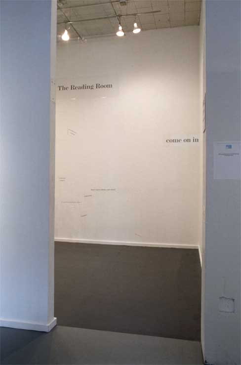
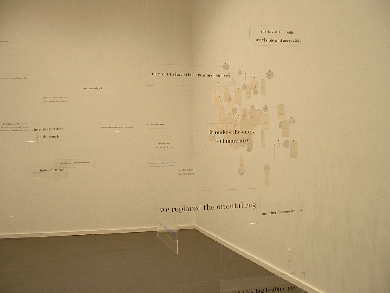
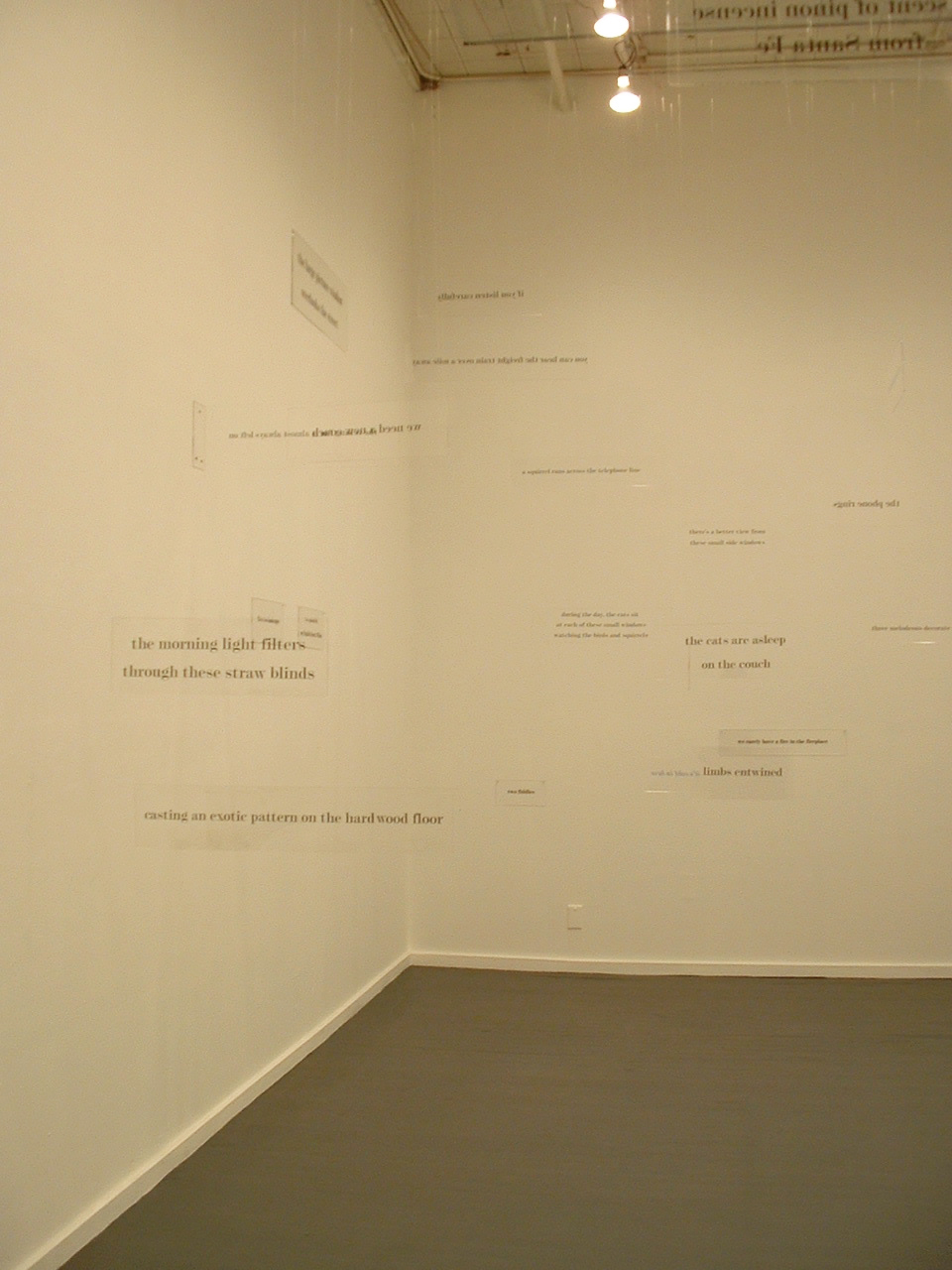
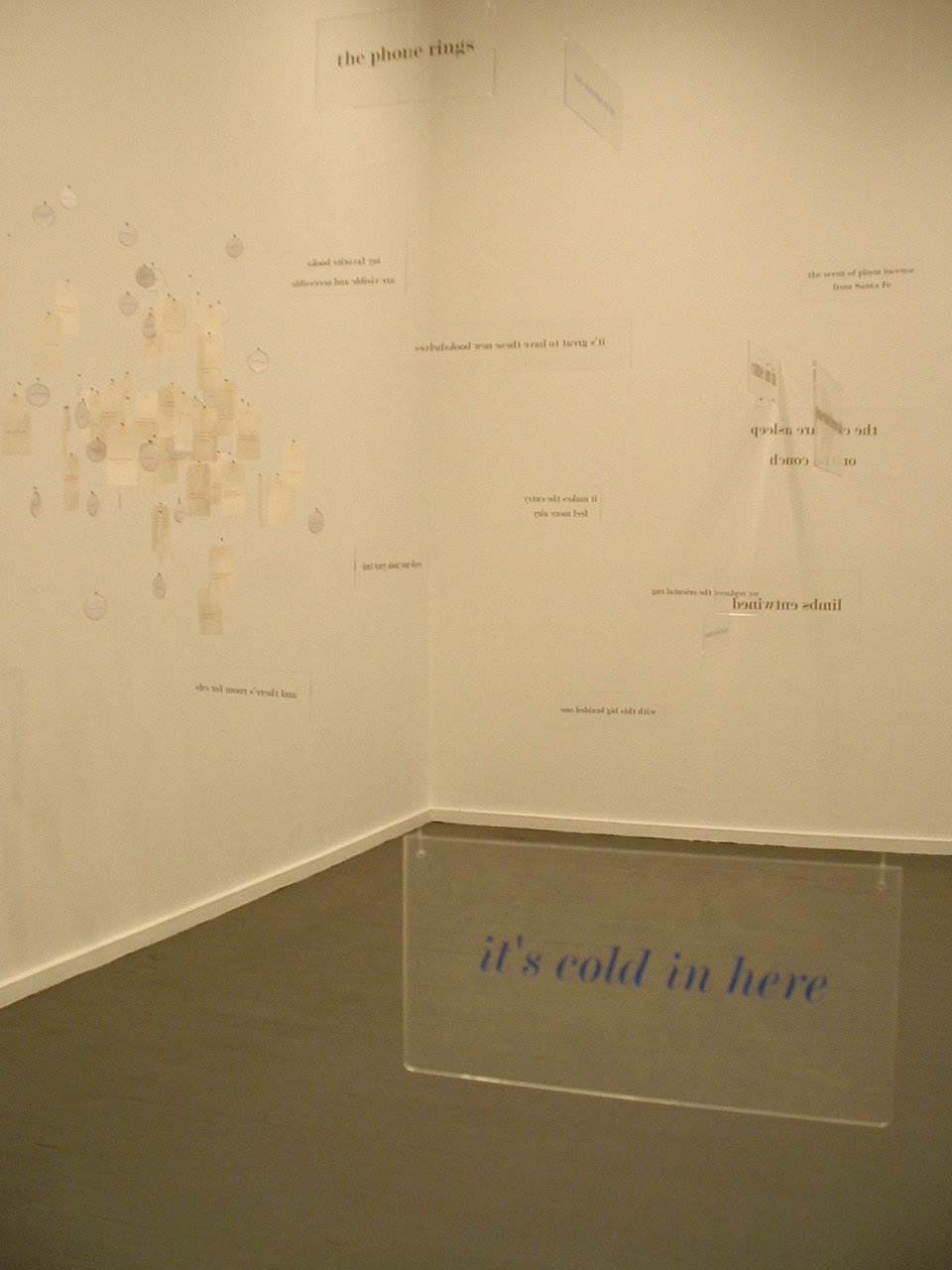
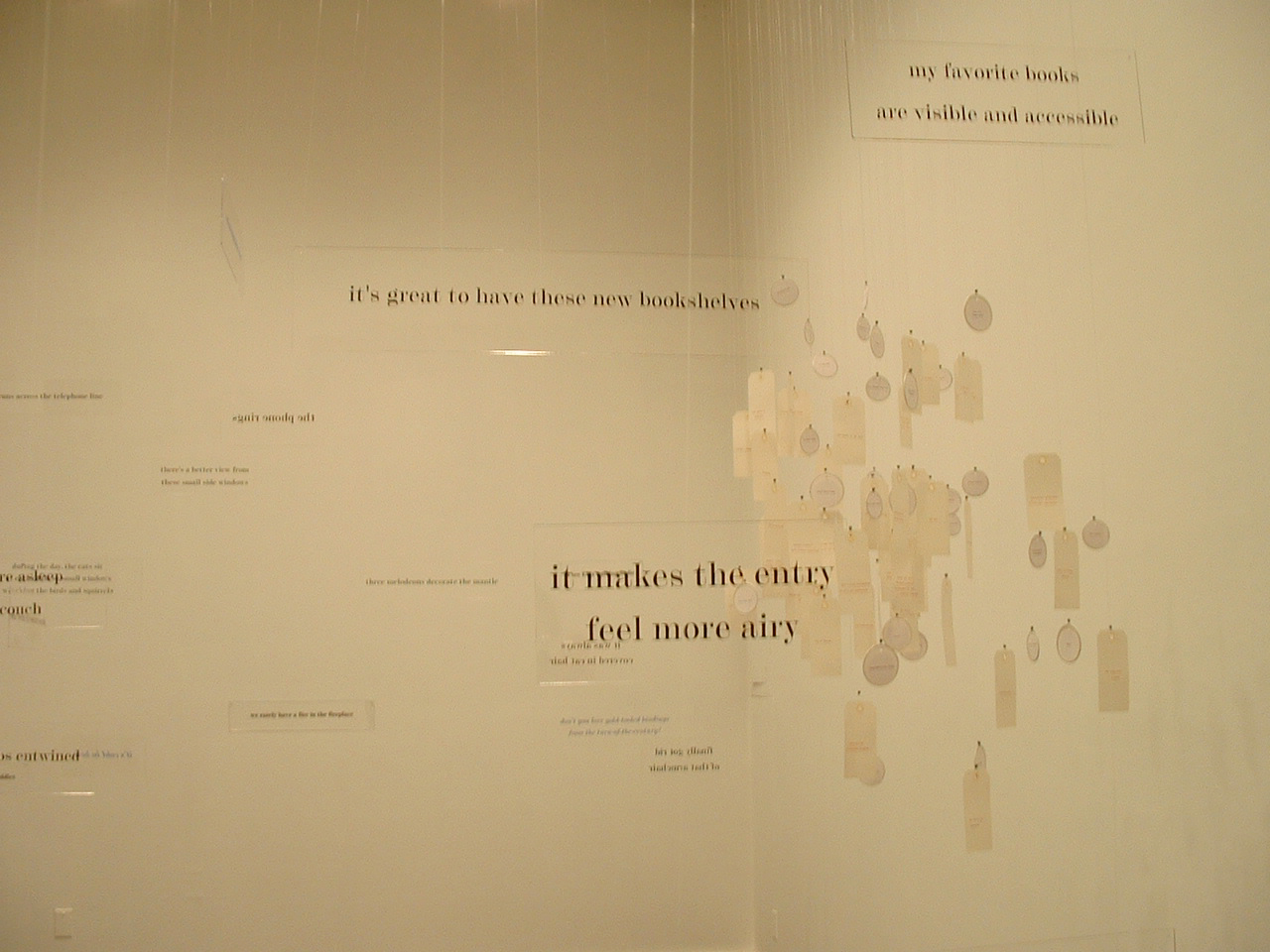
Not strictly a work in the collection, the installation The Reading Room (2002) should be mentioned here — not merely because it occurred the same year as Co-Pilot but also because it is a reminder of a constant theme and a harbinger of other installations to come. Thin slabs of plexiglas bearing text in black serif type hang at angles to one another from clear fishing line. The words, phrases and sentences suspended in air are drawn from a short story composed by Tetenbaum; they are what make The Reading Room a room for reading. That’s almost all there is to do in it. If, as Anthony Powell’s character Lindsay Bagshaw says, “Books do furnish a room”, Tetenbaum’s installation proves, “Words do furnish a room”. What reading is, can or might be is that constant theme in the artist’s works — whether evoked by asemic markings, a walk through the words of a story, a “map of reading” or a “diagram of wind”.
The Reading Room (2002) Barbara Tetenbaum Installation at Nine Gallery, Portland, OR, December 2002. Photos: Courtesy of the artist.
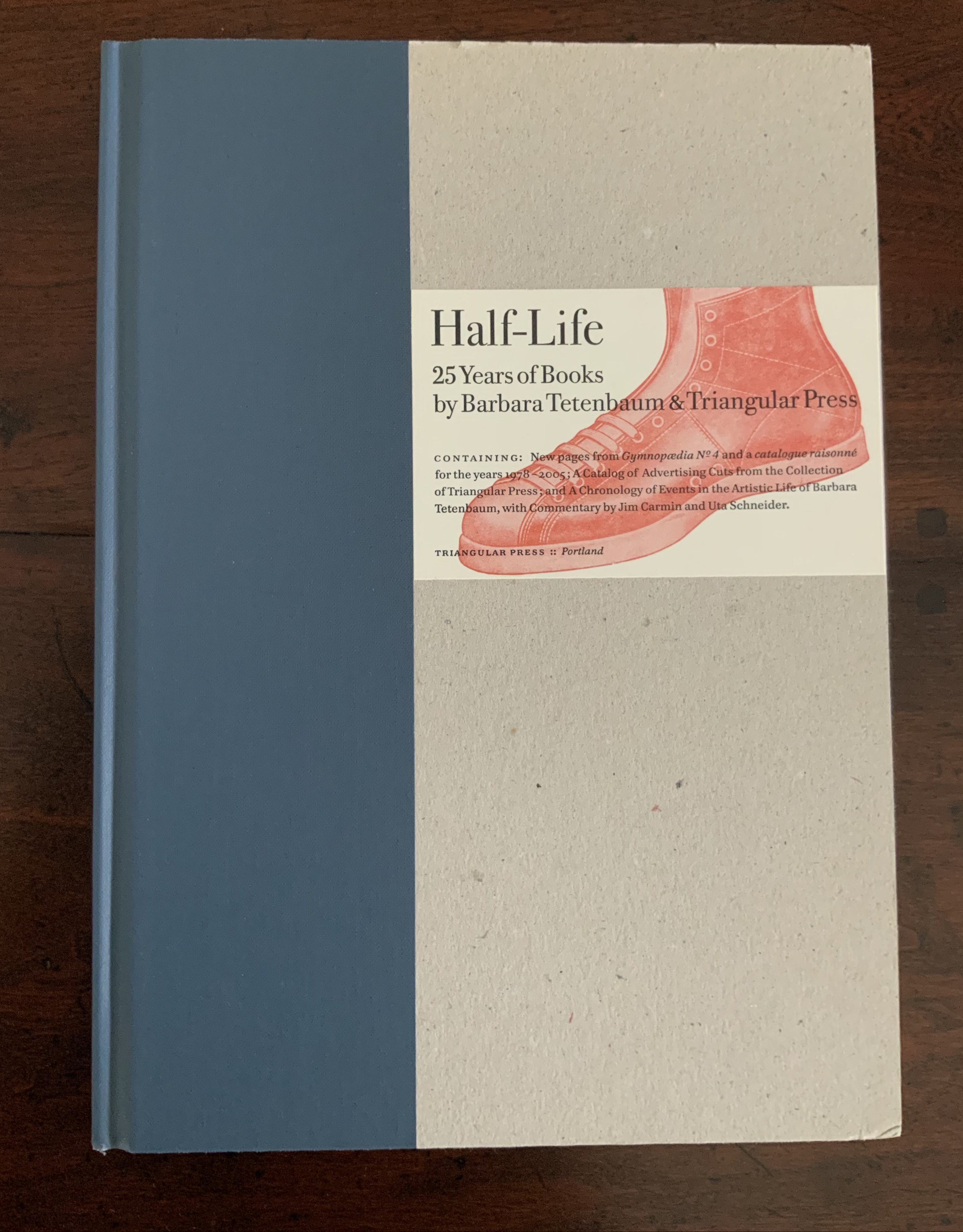
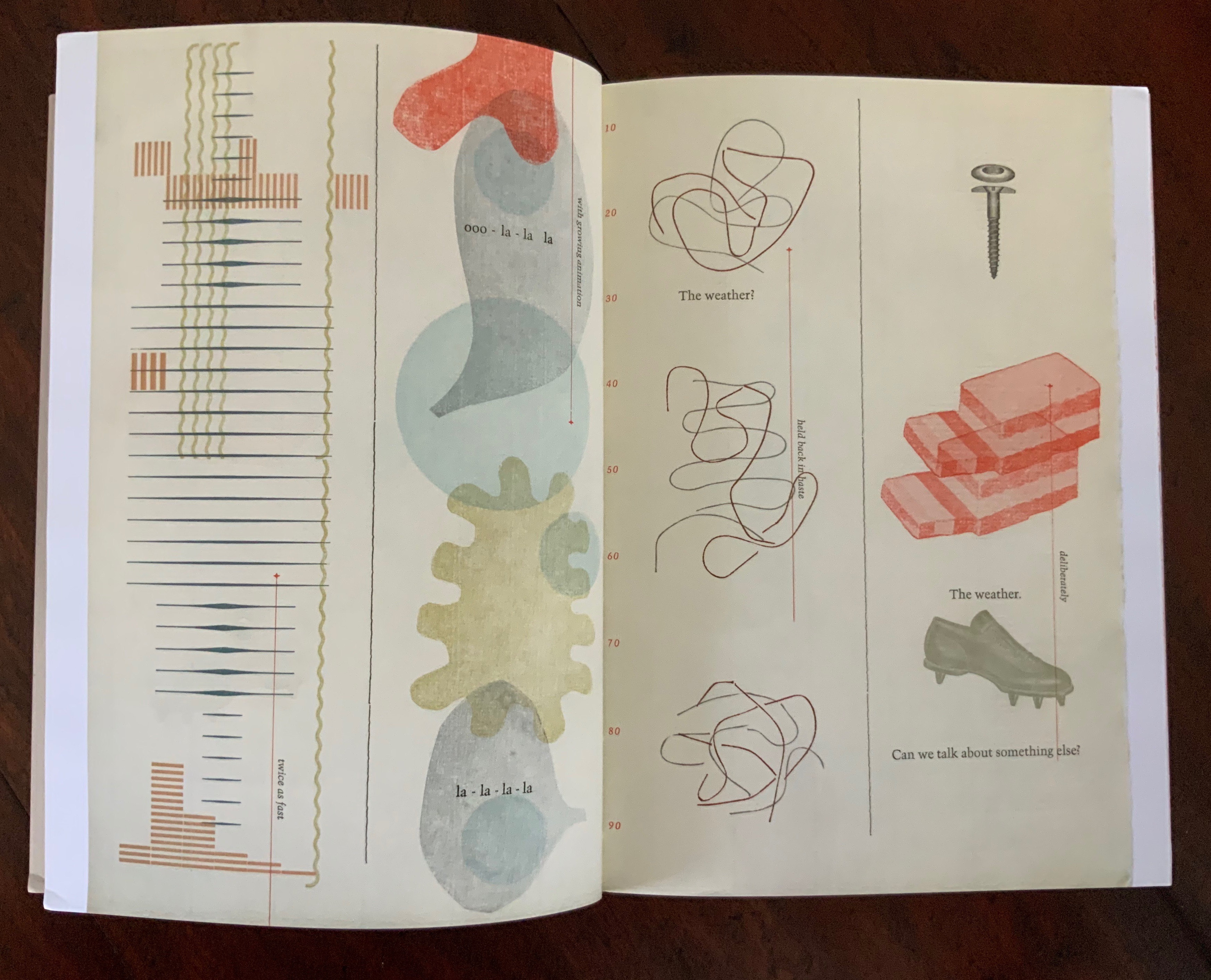
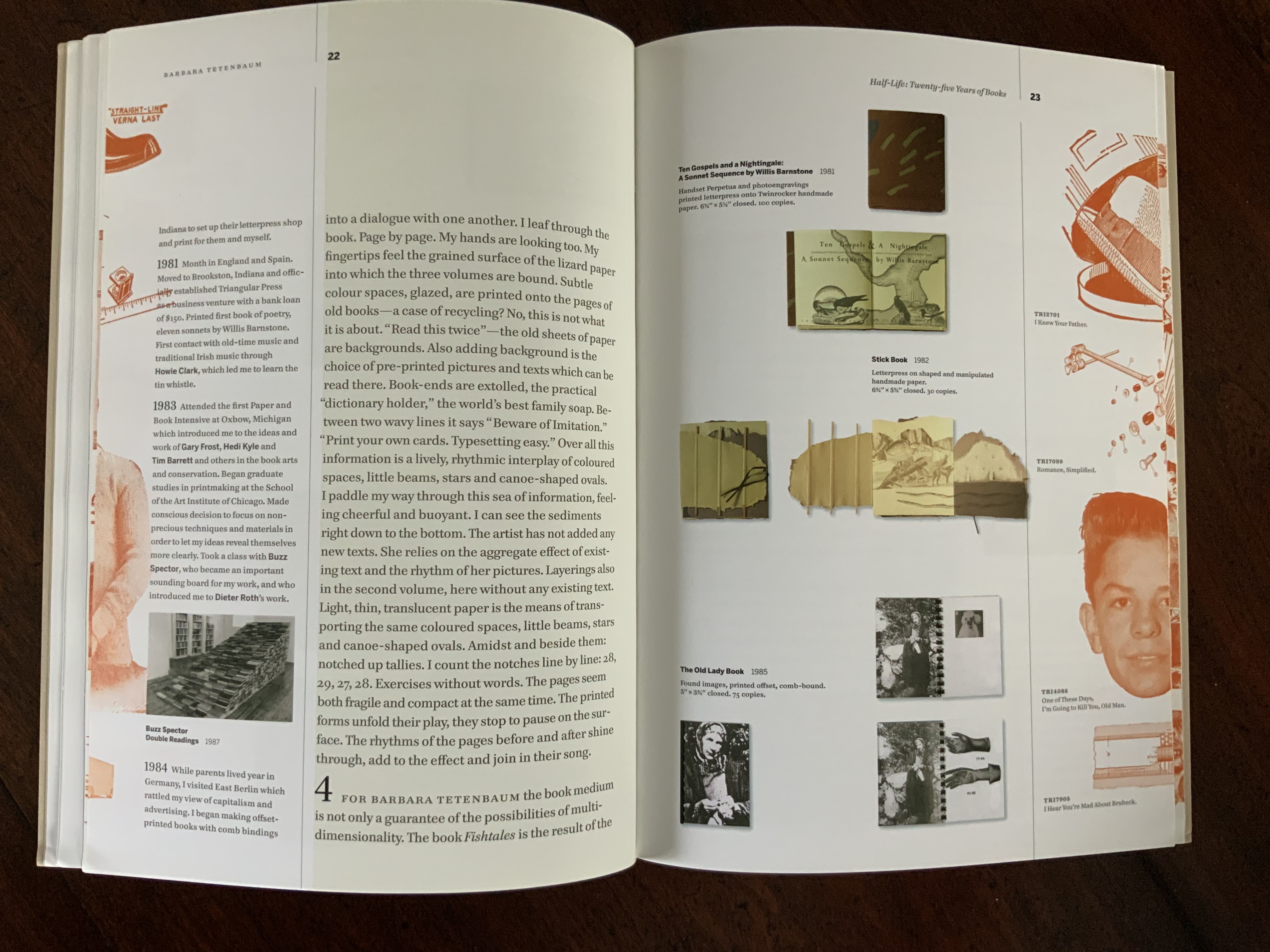
Half-Life (2005) is the collection’s representative codex by Tetenbaum. A catalogue raisonné for works between 1978 and 2005, with a chronology of the artist’s life and an appreciation of her work from Uta Schneider, the book reveals several of the influences on Tetenbaum’s development, including Ron King (as noted above) and Walter Hamady (evident particularly in the Co-Pilot broadside). Tetenbaum is generous in her collaborations and acknowledgments. Although closer to a fine press edition than anything produced by Dick Higgins, Half-Life notes in its colophon the influence of his FOEW&OMBWHNW (New York: Something Else Press, 1969).
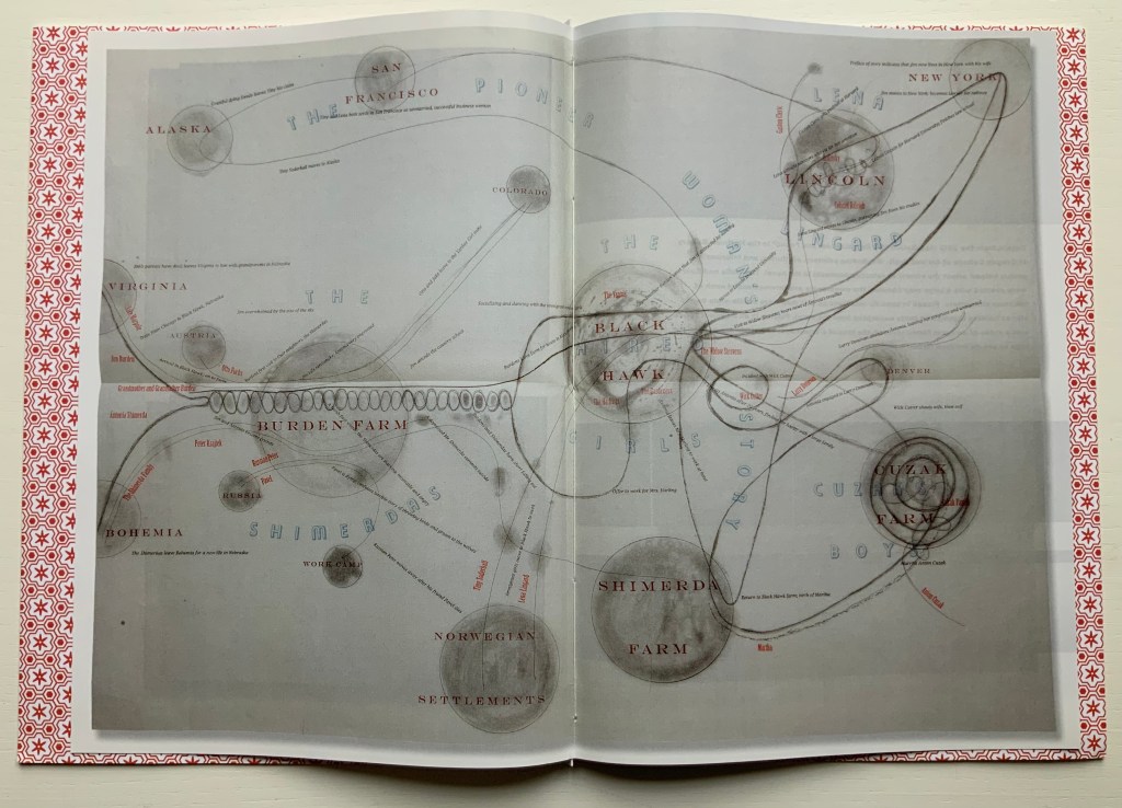
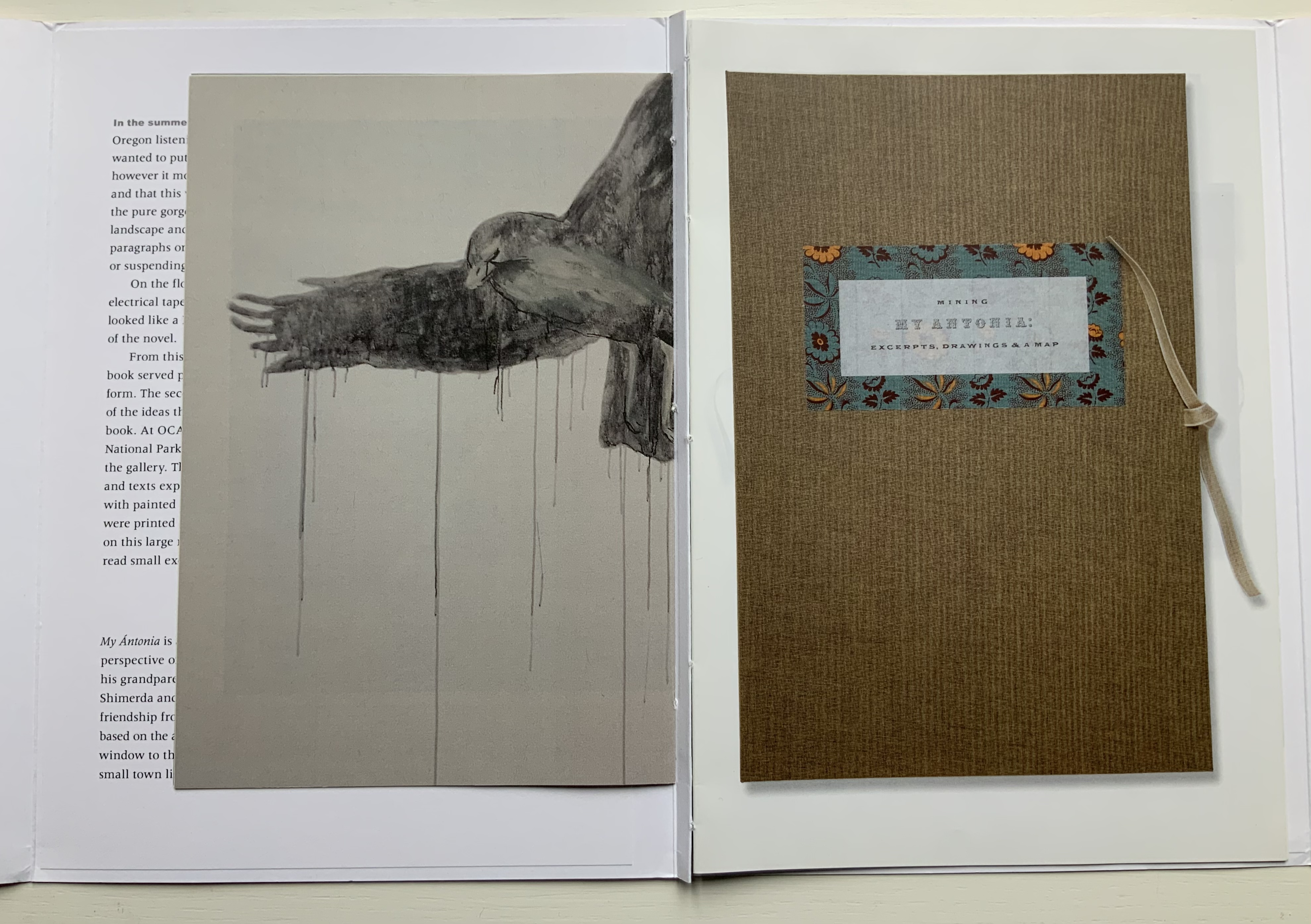
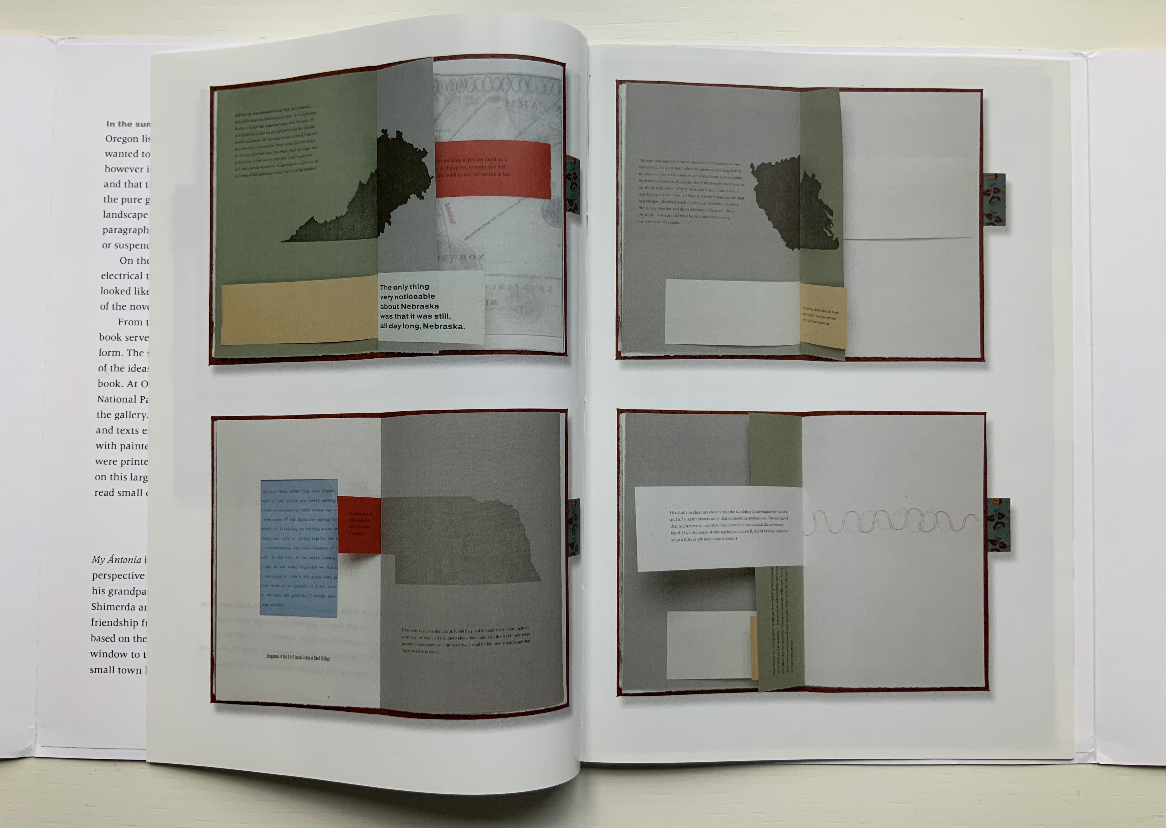
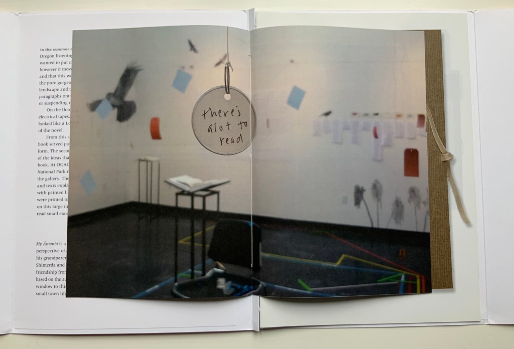
For a body of work realized after Half-Life, Tetenbaum spent a month in a gallery listening to a recording of Willa Cather’s 1918 novel, My Ántonia. The result was two installations and two publications: a catalogue called A Close Read: My Ántonia (2010) and an “artist’s book” or “bookwork” called Mining My Ántonia: Excerpts, Drawings, and a Map (2012). The collection currently includes only the map and the catalogue. Some work in this category of “response to literary material” can be primarily craftwork — as in those well-known narrative scenes sculpted from the pages of the book in question. Other responses to books — including altered books — stand as works of art yielding depths of meaning and aesthetic response on their own.
Of course, the antecedent to this in literature is called ekphrasis. W.H. Auden’s ekphrastic poem Musée des Beaux Arts stands on its own — though with — Breughel’s Landscape with the Fall of Icarus. Even more so Keats’ Ode on a Grecian Urn stands on its own; the urn described is unknown. Tetenbaum’s direction of ekphrasis is inverse to that of Auden and Keats. The artwork comes after the literary expression. Nevertheless, her inversely ekphrastic artwork Mining My Ántonia stands on its own — though with — Cather’s My Ántonia.
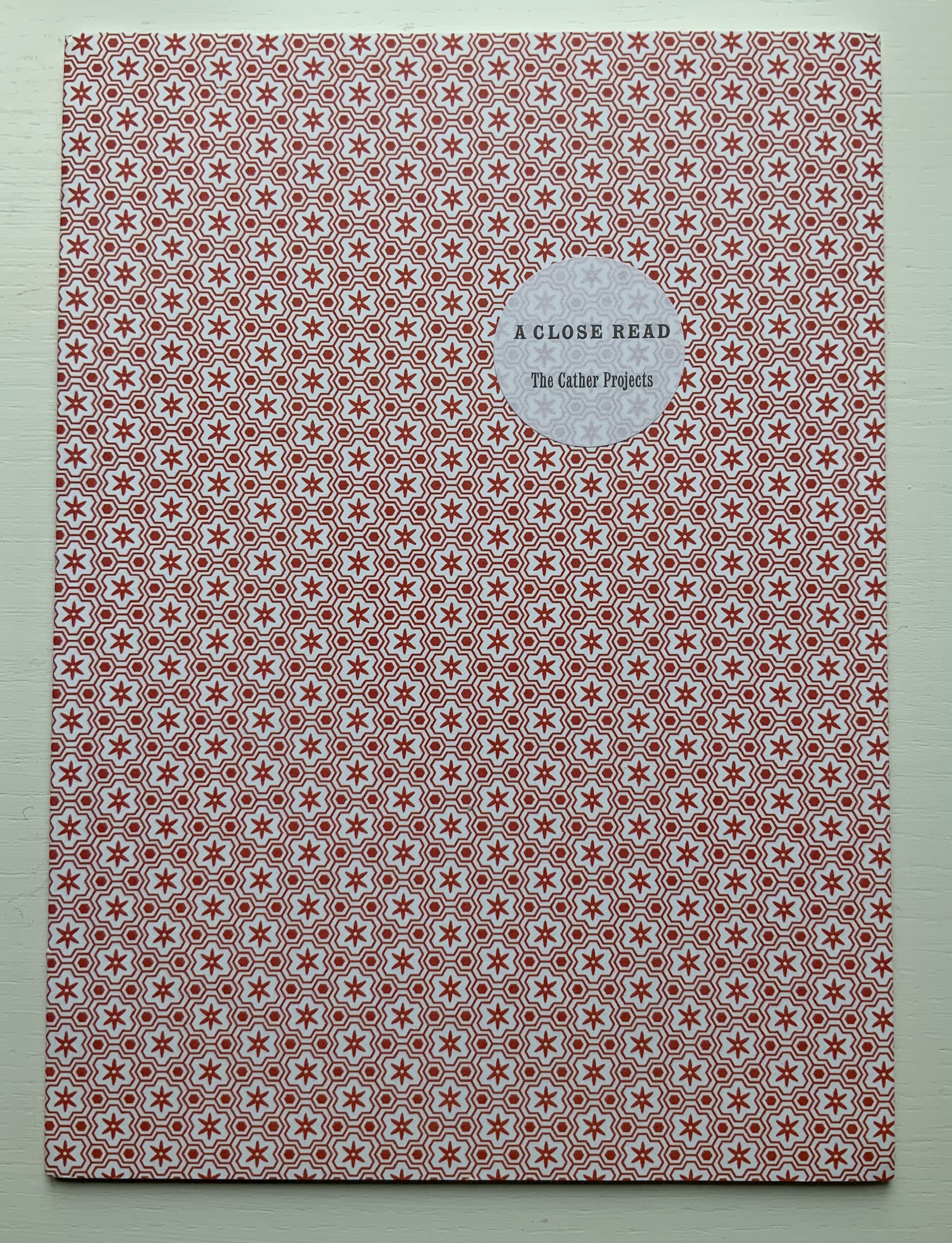
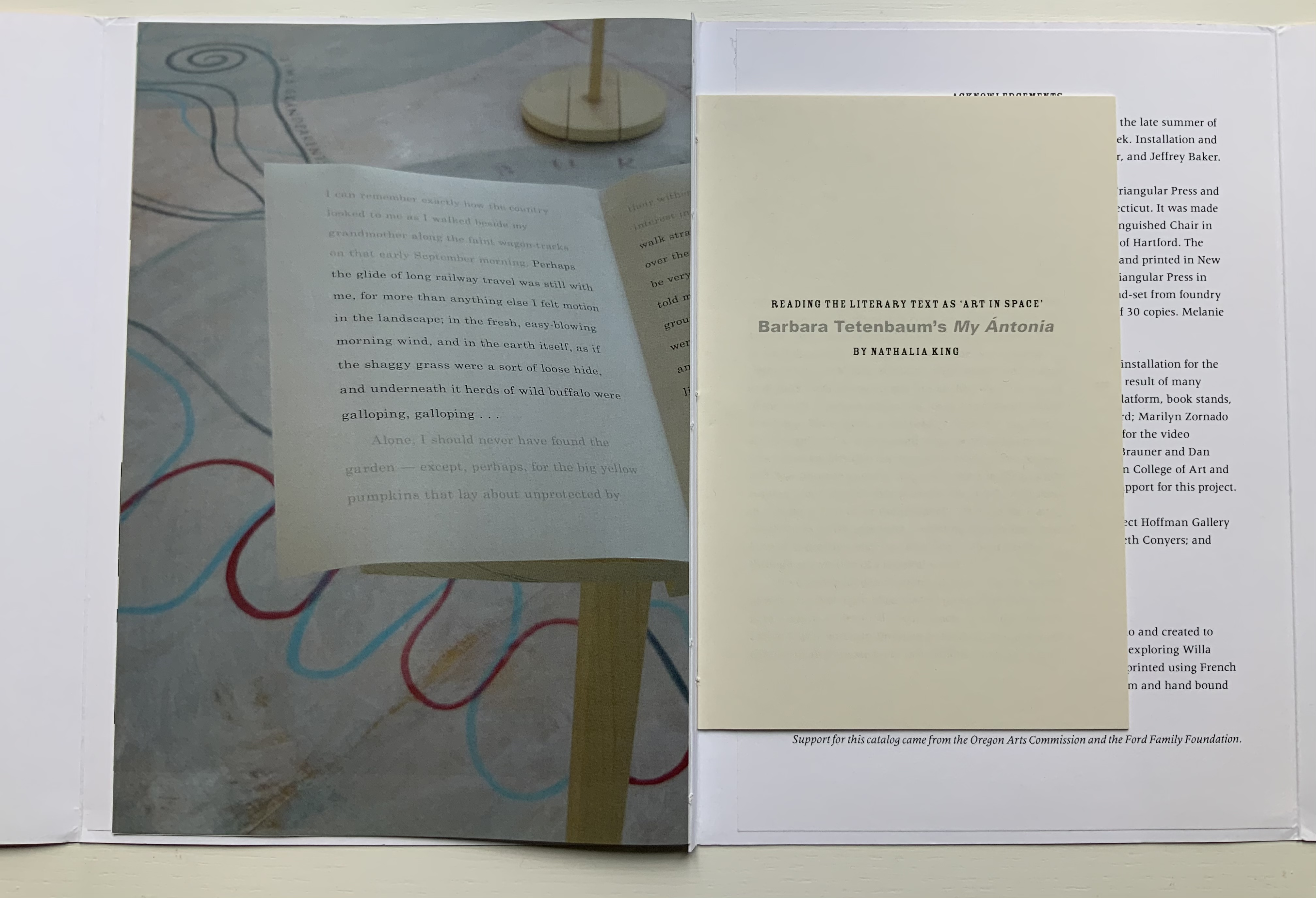
A Close Read: The Cather Projects (2012) Barbara Tetenbaum and Jennifer Viviano Catalogue with three inserts sewn to folded card, published by Oregon Arts Commission. Photos: Books On Books Collection, displayed with permission of the artist.
For the collection, the map has been framed between two sheets of glass to make enjoyment of its translucent paper a daily possibility. Each time the catalogue is opened, its binding harks back to O’Ryan’s Belt (see above). Three inserts of different trim sizes are sewn into the central inwardly folded tab.
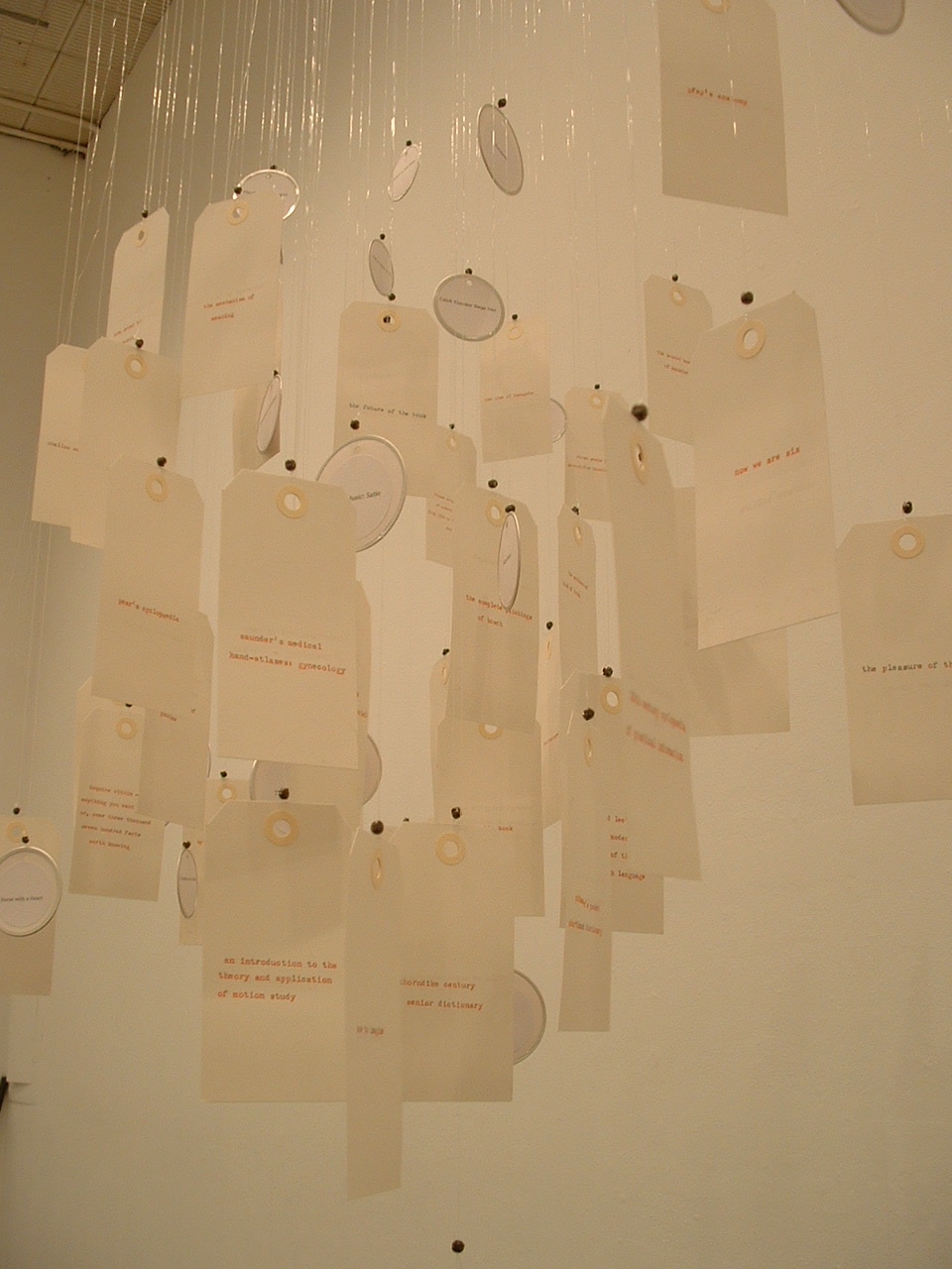
The first insert provides details from the 2010 installation; the double-page spread below recalls the dangling tags from The Reading Room (2002). The second insert shows images of the artist book Mining My Ántonia and details from the second installation in the Hoffman Gallery at Oregon College of Art and Craft (2012); an image of the map from Mining My Ántonia: Excerpts, Drawings, and a Map is shown at the start of this entry. The third insert is a 14-page pamphlet from Nathalia King, Professor of English and Humanities at Reed College where the first installation occurred.
Put aside — difficult as it may be — the play of craft and art so plainly suffusing the print, paper and binding of the catalog and artist book, what are their relation to the text that drove them? Is it like making a “movie of the book”? Are we looking at some new form of literary/artistic criticism? As Nathalia King’s essay walks us through the installation, she points out how it teaches the viewer to read My Ántonia in multiple ways. To what degree, though, can we appreciate Tetenbaum’s book art or installations without having read My Ántonia? They certainly inspire the reader/viewer to read or re-read the work. But inevitably this reader/viewer is drawn back to enjoying Tetenbaum’s “making the novel her own” (as in the pun on mining). As with all book art, the more informed we are about the “material” of which it is made, the greater the enjoyment. We want to make such a work our own — to mine it — which may send us back to multiple quarries from which the artist drew her material. Cather’s novel is not the only material of which Mining My Ántonia is made. It is made of the artist’s experience of the novel in print, the novel as read aloud and the exterior/interior space in which that occurred. It is made of various papers, tabs, reveals and media. The artist book offers a solitary way of ”material reading”, but with the catalogue, it also offers a glimpse at the ambulatory and perhaps social way of reading offered in the installations.
Willa Cather’s Prairie, Nebraska (Photo credit: Ross Griff)
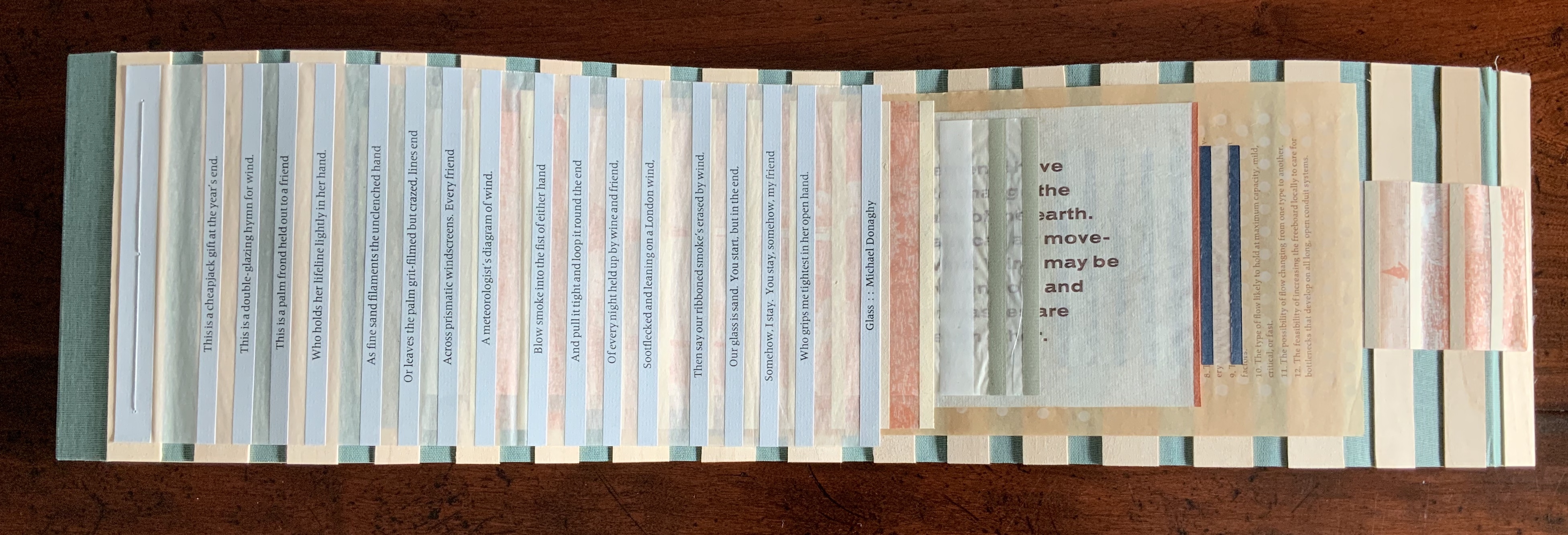
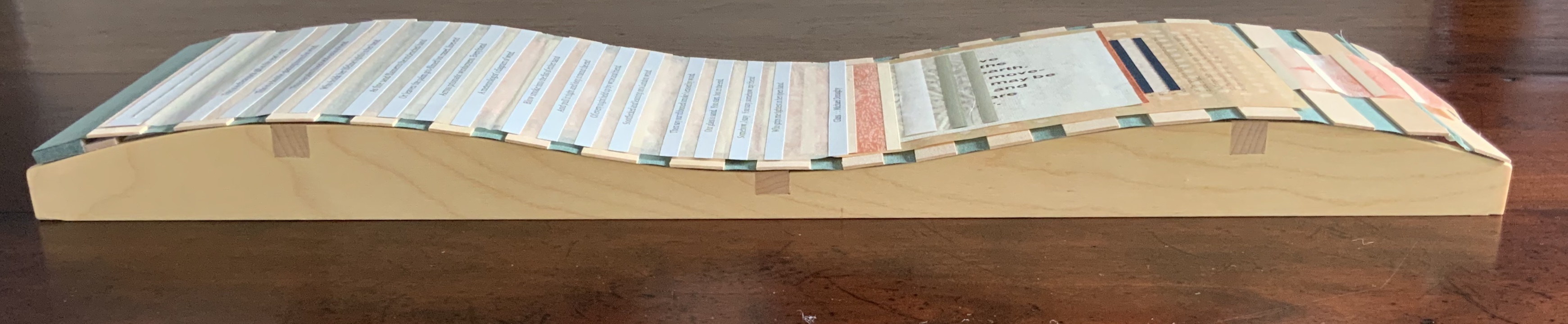
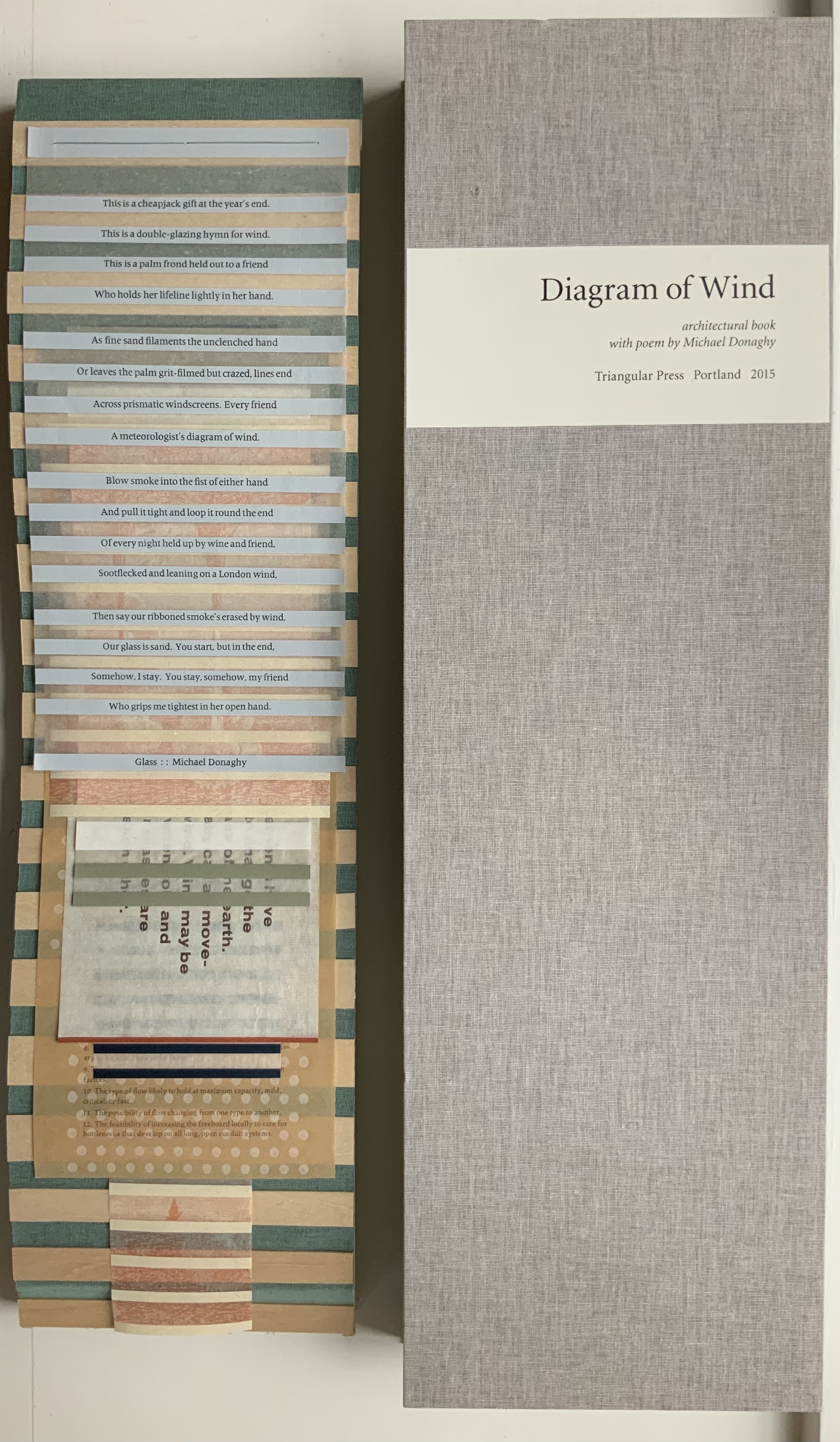
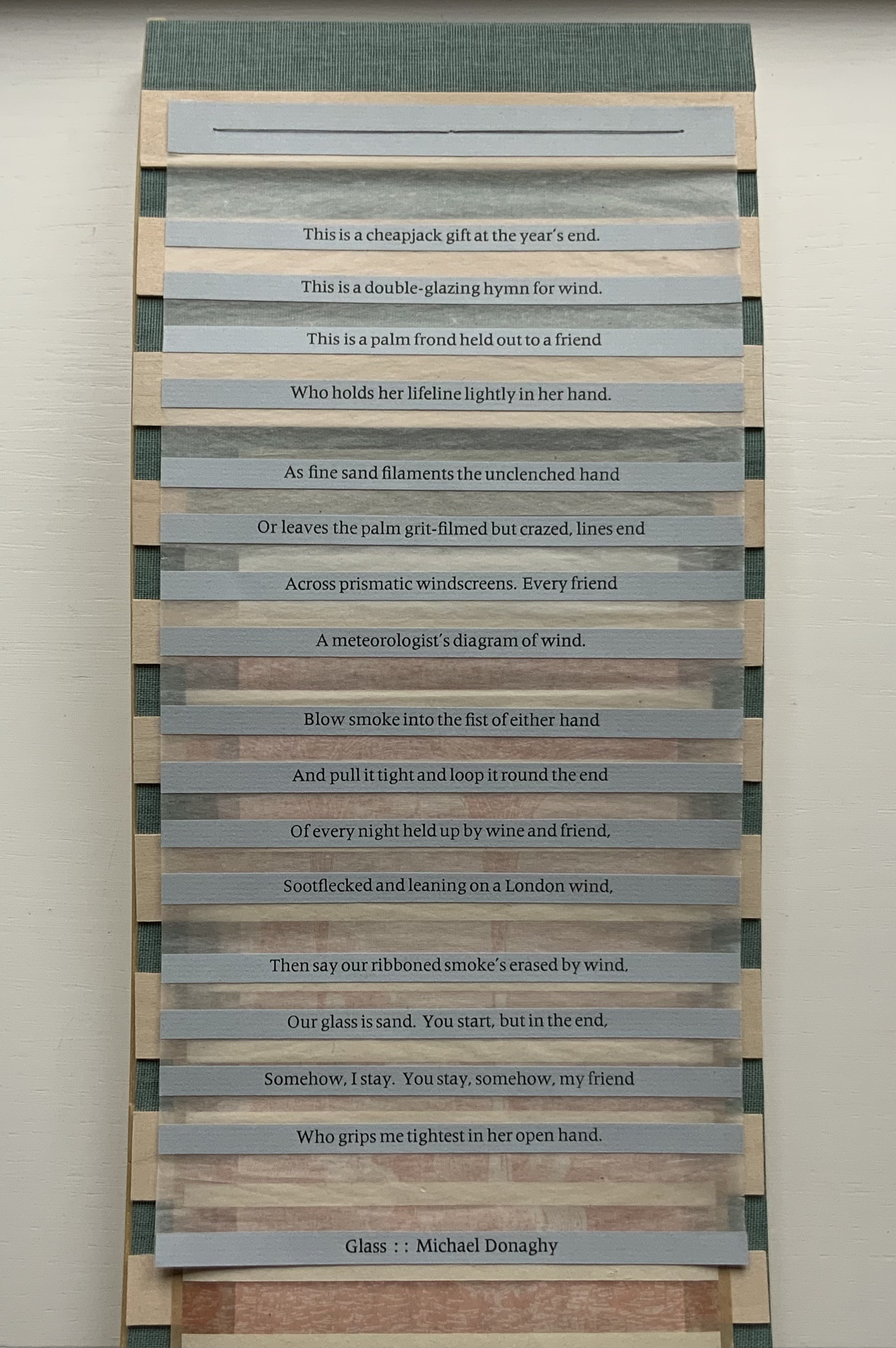
Also offering a different way of reading, Diagram of Wind (2015) pulls further away from its responding point than Mining My Ántonia. A line in Donaghy’s poem “Glass” provides the title for this sculptural work, and the work’s structure draws on the poem’s sestina form in its undulating, layering structure. Yet Diagram of Wind goes far beyond that.
There are seven “pages” to this work, each sewn to green book cloth panelled with wooden slats and backed with gampi. The first page carries Donaghy’s sestina, each line letterpress printed on a strip of paper pasted to gampi paper. Less wide than the sestina page and shorter than the third, the second page shows an etching image of waterspouts rising from a body of water with mountains in the background. Less wide than the second page and shorter than the fourth, the third page consists of narrow, evenly sized white strips of paper pasted on gampi. The fourth page, slightly wider than the preceding page but still shorter than the following, offers the school-book-like statements:
Air movements have
helped to change the
whole face of the earth.
We usually call air move-
ments wind. Wind may be
started when cold and
warm air masses are
next to each other.
Suddenly much less wide than the fourth page but still shorter than the sixth, the fifth page presents narrow dark panels or strips that narrow in themselves and narrow the space between them as they descend the page. Much wider than the preceding page, shorter than the seventh and printed with blue and white dots reminiscent of Co Pilot (above), the sixth page gives guidance on determining the amount of space to leave between the top of a flume (an engineering structure for measuring water flow) and the height of the water moving through it. The narrowest page of all and ending flush with the slatted backing, the seventh page shows a print similar to that on page two, but here between the evenly spaced paper strips, there is a small ship in the distance and the subsiding whirlpool and withdrawing upper part of a waterspout in the foreground.
The poem that inspired this work uses images of the natural world — sand, smoke, wind — to build its metaphor of love’s paradox (its holding fast with an open hand). Humanity is in the foreground, nature in the background. Tetenbaum’s Diagram of Wind reverses that. Nature with its air movements and waterspouts move into the foreground. Then humanity with its controlling and measuring flume comes into the middle ground. And finally it ends with humanity’s ship on the horizon and nature’s dissipating waterspout in the foreground. Even though by virtue of its page one position the poem is in the foreground, it has become as much “material” for the artwork as the paper, ink, wood, cloth, earthy colors and physical structure are. The artist has transformed the poem’s sestina shape, its use of nature and its paradox into “material” for Diagram of Wind. In this instance of inverse ekphrasis, Tetenbaum has created a work that stands independently of, and in dependence on, its literary inspiration.
An early guidebook and two of Tetenbaum’s non-ekphrastic works, one early and one late, are in the collection: Paper Art, the third publication under her Triangular Press imprint, and Collage Book #6.
A Guide to Experimental Letterpress Techniques (2004)
A Guide to Experimental Letterpress Techniques (2004) Barbara Tetenbaum Spiral-bound. H190 X W123 mm, 16 unnumbered pages, Chinese fold. Acquired from the artist, 11 April 2022. Photos: Books On Books Collection.
For a non-practitioner, instruction books like this encourage closer examination of artwork and an appreciation of the act of thinking with one’s hands.
Paper Art (1980)
Paper Art(1980) Barbara Tetenbaum “Sequential picture plane / book-like object”. String-bound container: 165 x 165 mm; Object: H135 x W145 mm, 16 unnumbered pages and one fold-out leaf. Edition of 42. Acquired from Versand-Antiquariat Konrad von Agris, 22 January 2022. Photos: Books On Books Collection. Permission to display from the artist.
“Sequential picture plane / book-like object” is the artist’s description of this work. The images come from cut paper and collage, relief printing, pen and ink, and washes. A narrative-like sequence develops involving two triangles and a community of triangles in a sort of landscape with a scribbled wilderness, parallel rivers or tracks, stars above, and moving to a boundaried community of triangles beneath a brownish wash and concluding with a double-page spread of the river or track images migrating to a final blank page.
Just as important are the binding, paper, folds and container. In its three-hole sewn deckle-edged cover, four more different kinds of paper make up the object and its images. The fold-out leaf, composed of the work’s most fragile paper, encloses the central four pages, which have the most intense concentration of images. The cutout paper rivers or tracks are attached with brown thread on either side of this fold-out leaf, which further cues us to be aware of parallel scenes. The range of papers from dense and thick to sheer and thin reminds us that parallels can present opposites: the couple and the collective, conflict and resolution, lost and found.
The container consists of the densest and darkest paper and, at one time, had a box-like shape held closed by string at its four corners. There is a barely perceptible hole in the upper left corner of the container’s cover.
The contrast between the sturdiness of the paper and the flimsiness of the string closure echoes the cut-out rivers or tracks, loosely attached by brown thread and embracing the central fold-out leaf enclosing the densest body of images. All of these material aspects suggest looking for the paradoxical in this “sequential picture plane / book-like object”.
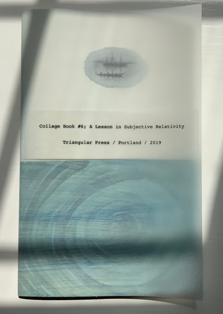
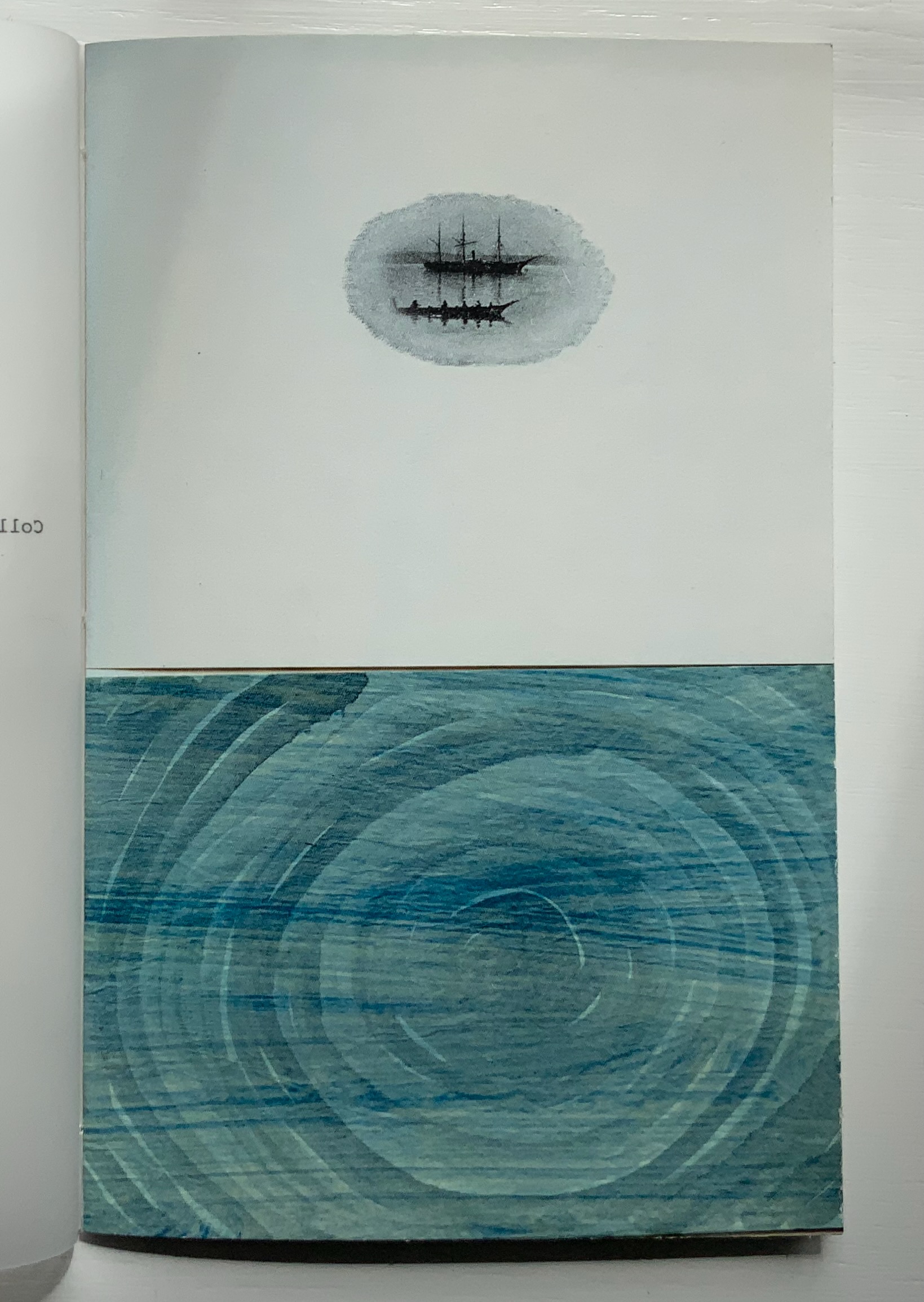
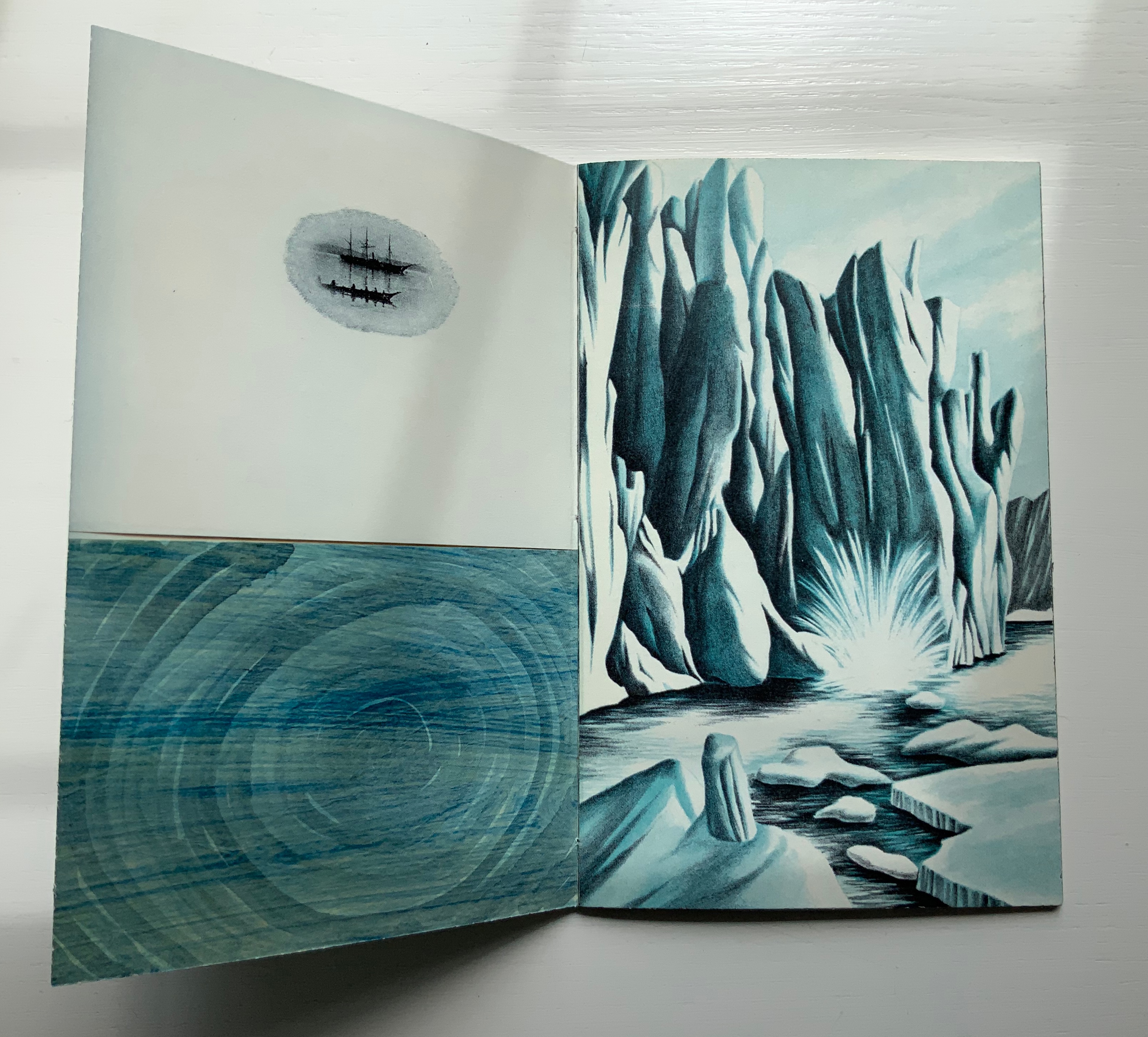
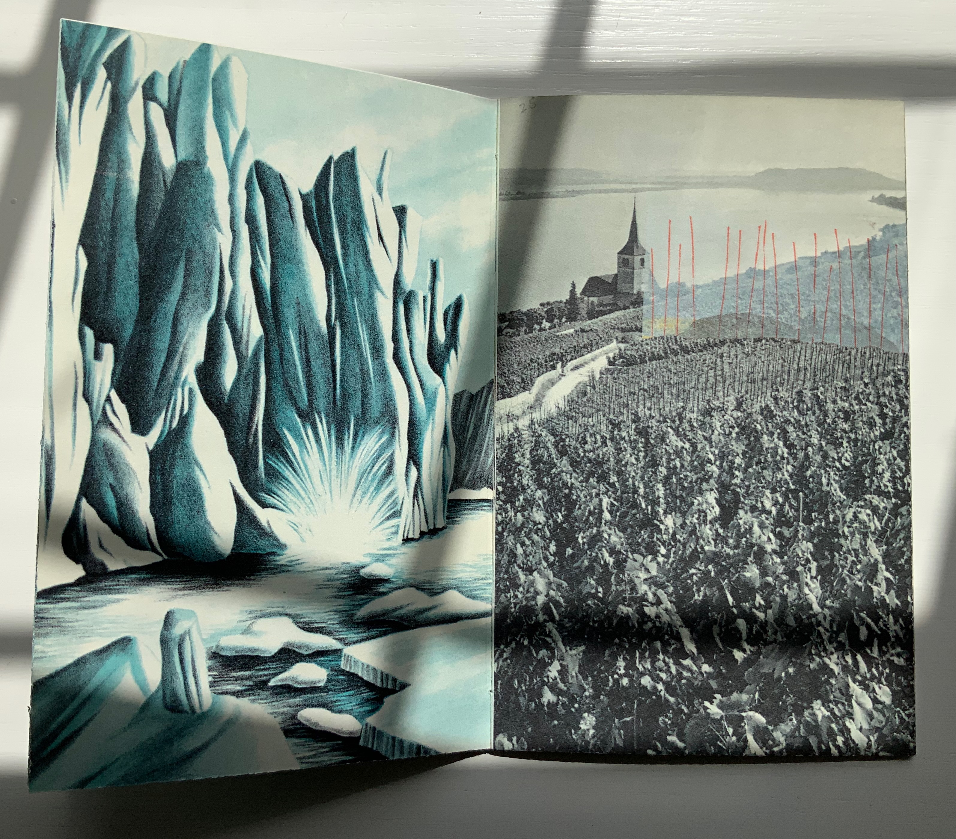
Collage Book #6: A Lesson in Subjective Relativity (2019)
Collage Book #6: A Lesson in Subjective Relativity (2019) Barbara Tetenbaum H190 x W120 mm, 32 unnumbered pages. Acquired from the artist, 11 April 2022. Photos: Books On Books Collection.
Collage Book #6 also consists of sequential picture planes, but the sequence is not narrative. Rather it is one of visual association. In an oval shape, a three-masted schooner and longboat hover over a swirling blue abyss. The image is repeated on the following verso page, which faces a full-page bleed depicting a calving iceberg or glacier in blue and white. Again, the image is repeated on the following verso page, which faces an overdrawn black-and-white image of crops along a winding road leading to a steepled building at the edge of a lake. This image, too, repeats on the verso page, and its reddish-orange overdrawn lines or stakes echo the color in the facing photo of a textbook graphic representing exports. And on it goes until the final image on the back cover echoes the initial image on the front cover (see below).
The booklet’s structure recalls that of O’Ryan’s Belt: Eleven Poems: 1990-1991 by Michael Donaghy (see above). The spine consists of inward folds of the front and back covers. Internally (see below) two sets of signatures are sewn together through the inward-folded tabs.
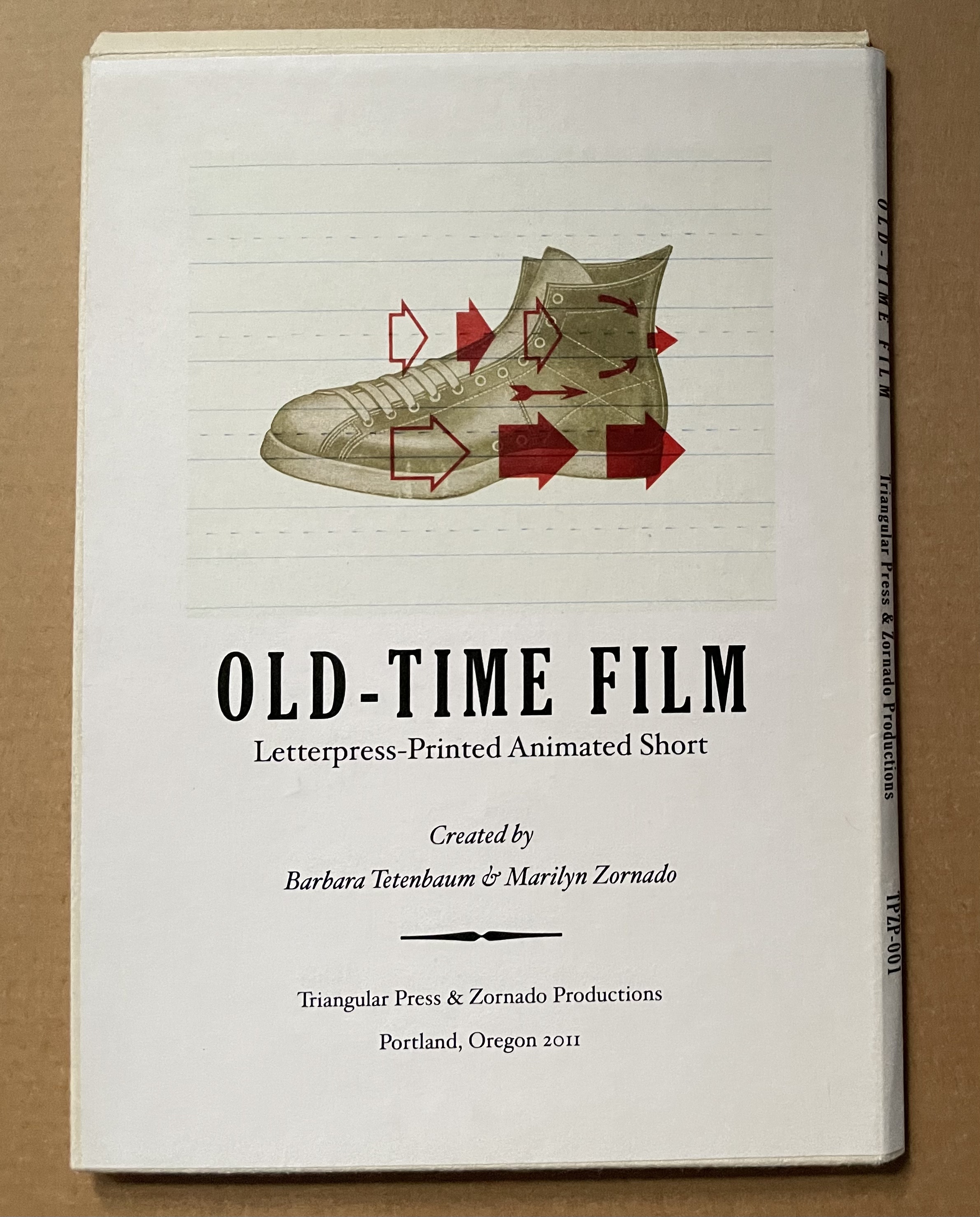
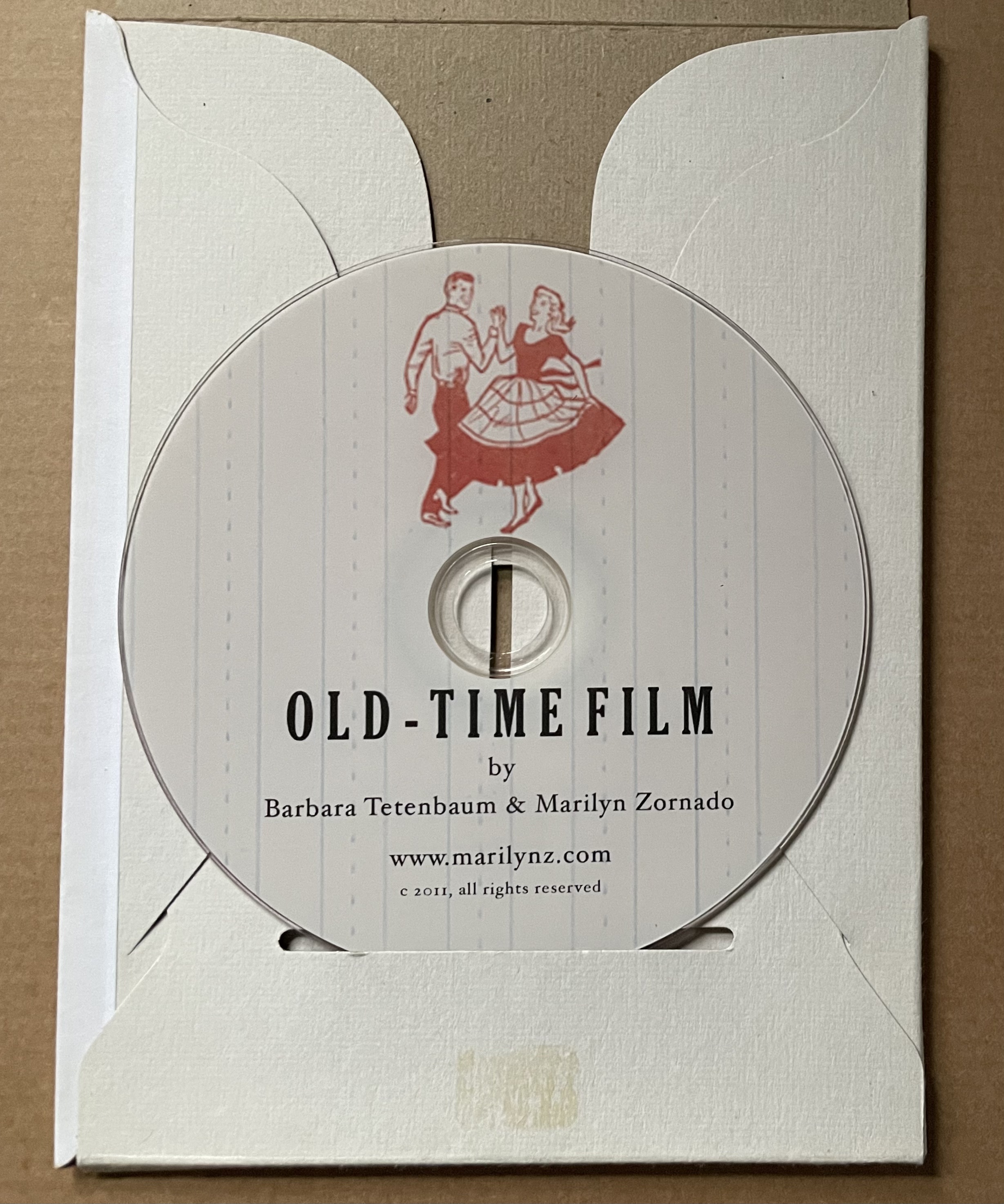
Old-Time Film (2011)
Old-Time Film: Letterpress-printed Animated Short (2011) Barbara Tetenbaum and Marilyn Zornado Slotted cardboard envelope containing DVD and print. Acquired from Barbara Tetenbaum, 12 July 2019. Photos: Books On Books Collection.
Artists’ description: DVD contents: Old-Time Film (2min, 58 sec) and “Behind-the-scenes” (2m, 48 sec). ; “Hand-set type, printer’s ornaments, and antique engravings come to life in this animated short created entirely through letterpress printing. Includes behind-the scenes showing the letterpress animation techniques on the Vandercook. Tetenbaum and Zornado have dubbed their process of combining letterpress techniques and animation ‘Vander-Mation.’ In this production using Vander-Mation shoes tap, sheep jump an ornamental enclosure, and words expand and contract in time with the music.
Postscript
Tetenbaum has provided another way to experience the Cather Projects: The Slow Read (2018). Take a wander through that site, composed of an introductory page to “a public literary and fine art project conceived and produced by Barbara Tetenbaum honoring the centenary of the publication of Willa Cather’s novel My Ántonia“, a set of seventy-four links to the daily scheduled readings, a blog section, a “concordance” that is more an unfolding of the installation and artist’s book than a listing of words and phrases against page references, and finally a portfolio of artwork by Tetenbaum.
Michaelis, Catherine Alice. 20 March 2021. “Elemental Impressions“. Artist’s Books Unshelved. Bainbridge Island Museum of Art. Accessed 22 March 2021. Video presentation and discussion of Diagram of Wind.
King, Nathalie. “Reading the Literary Text as ‘Art in Space’: Barbara Tetenbaum’s My Ántonia,” The Artist’s Yearbook, 2014-2015. Bristol: Impact Press, pp. 95-99.
Schneider, Uta. “Turning the Page”, pp. 18-28 in Tetenbaum, Barbara, James Carmin, and Uta Schneider. 2005. Half-life: 25 years of books by Barbara Tetenbaum & Triangular Press. Portland, OR: Triangular Press. Three key works not in the collection are described in Half-Life. The first would be an edition from the Gymnopaedia series, based on the artist’s response to Erik Satie’s musical compositions of the same name. The second would be Tetenbaum’s collaboration with Julie Chen that resulted in a powerfully moving work: Ode to a Grand Staircase (for Four Hands) (2001). The third key work returns to Donaghy’s poetry with the clear aim to incorporate sound in book art: Black Ice and Rain: Psalms 6.6 (2002). In the absence of the work itself, Uta Schneider’s description of it in Half-Life is as close as one can come to experiencing it.
Tetenbaum, Barbara. 14 June 2021. “My Ántonia at Six Pages a Day: The Slow ReadProject”, presentation for the panel “Willa Cather and Her Readers”, organized by the Willa Cather Foundation for the American Literature Association Virtual Panel. Accessed 19 July 2021.
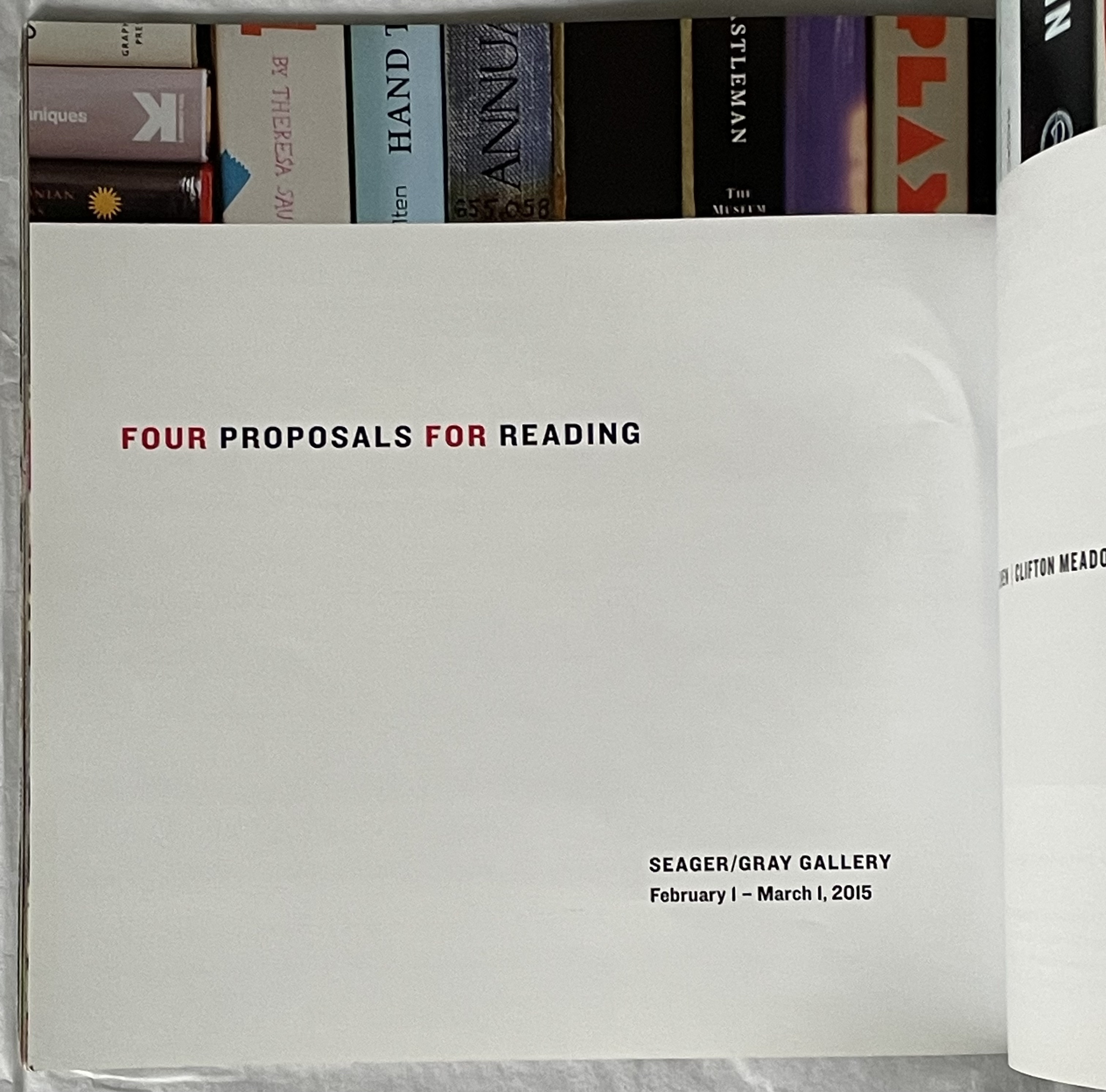
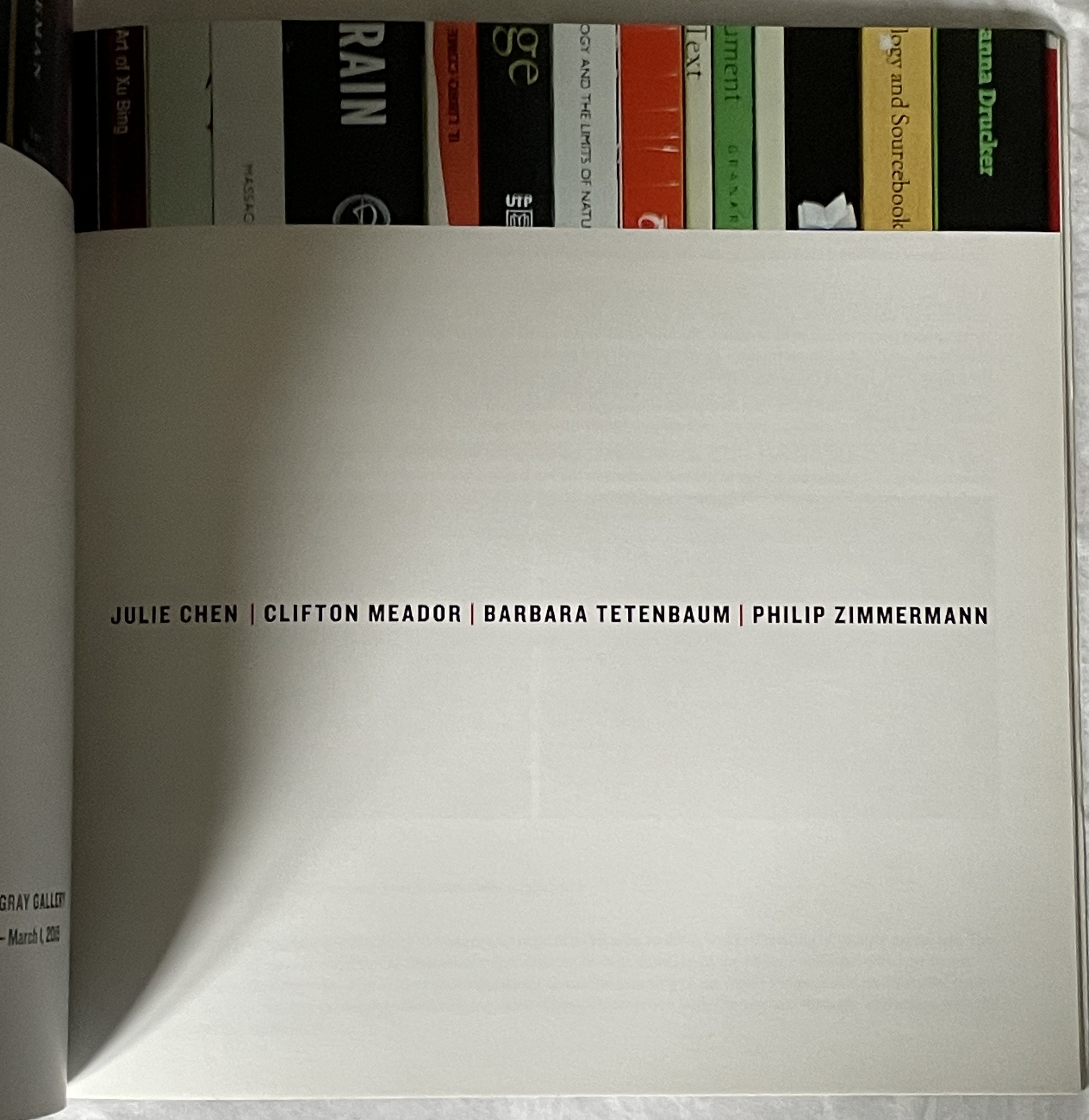
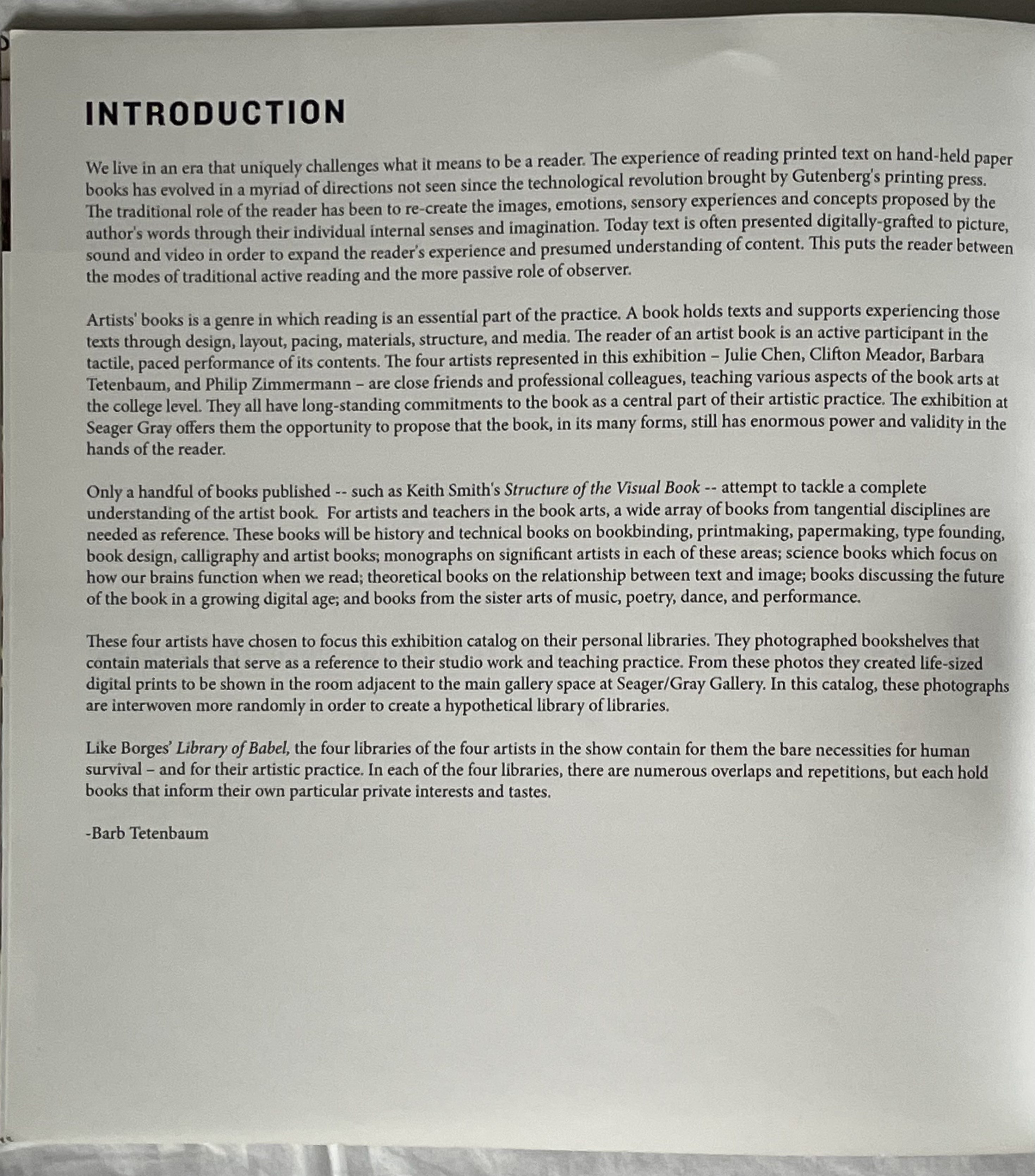
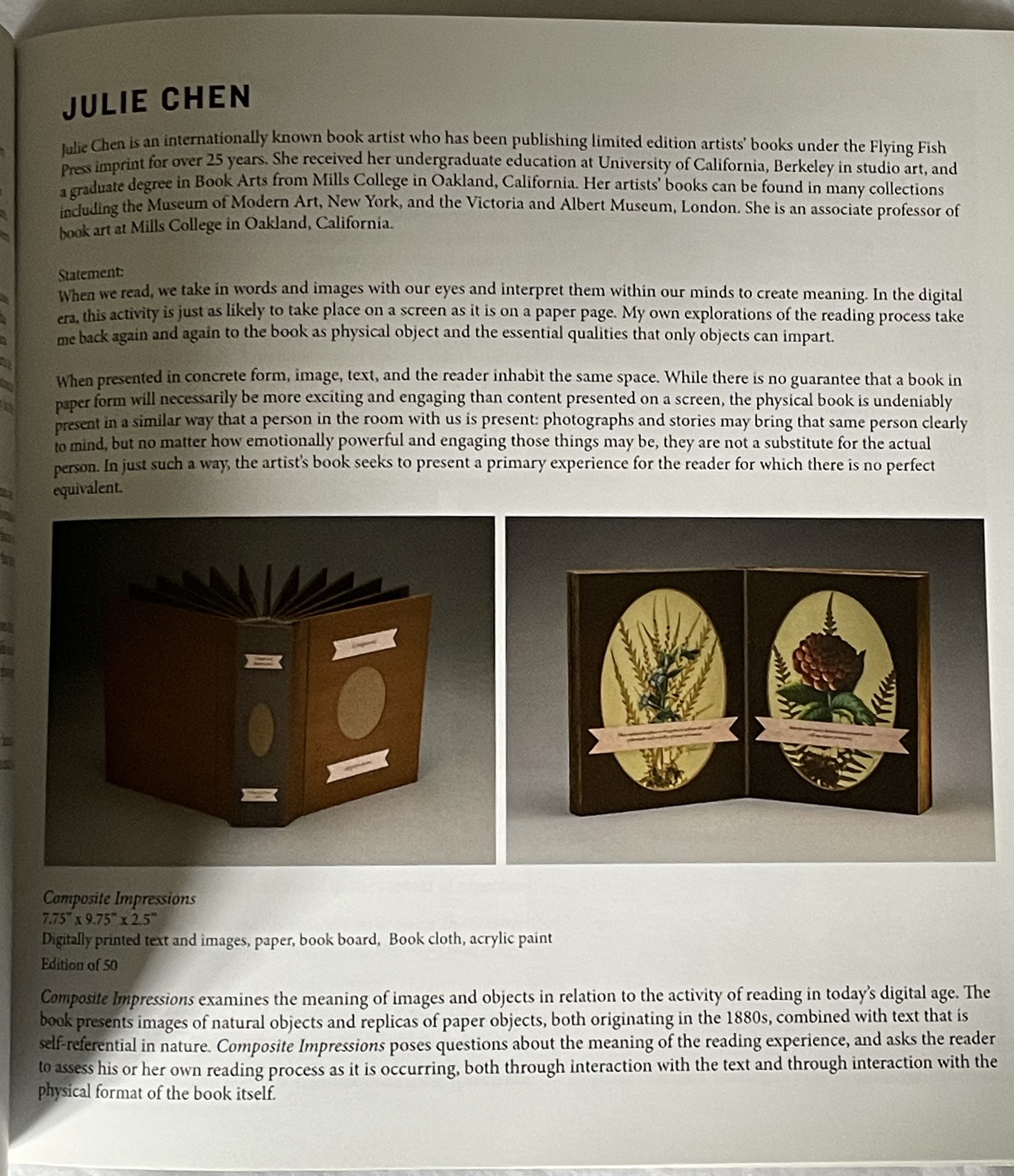
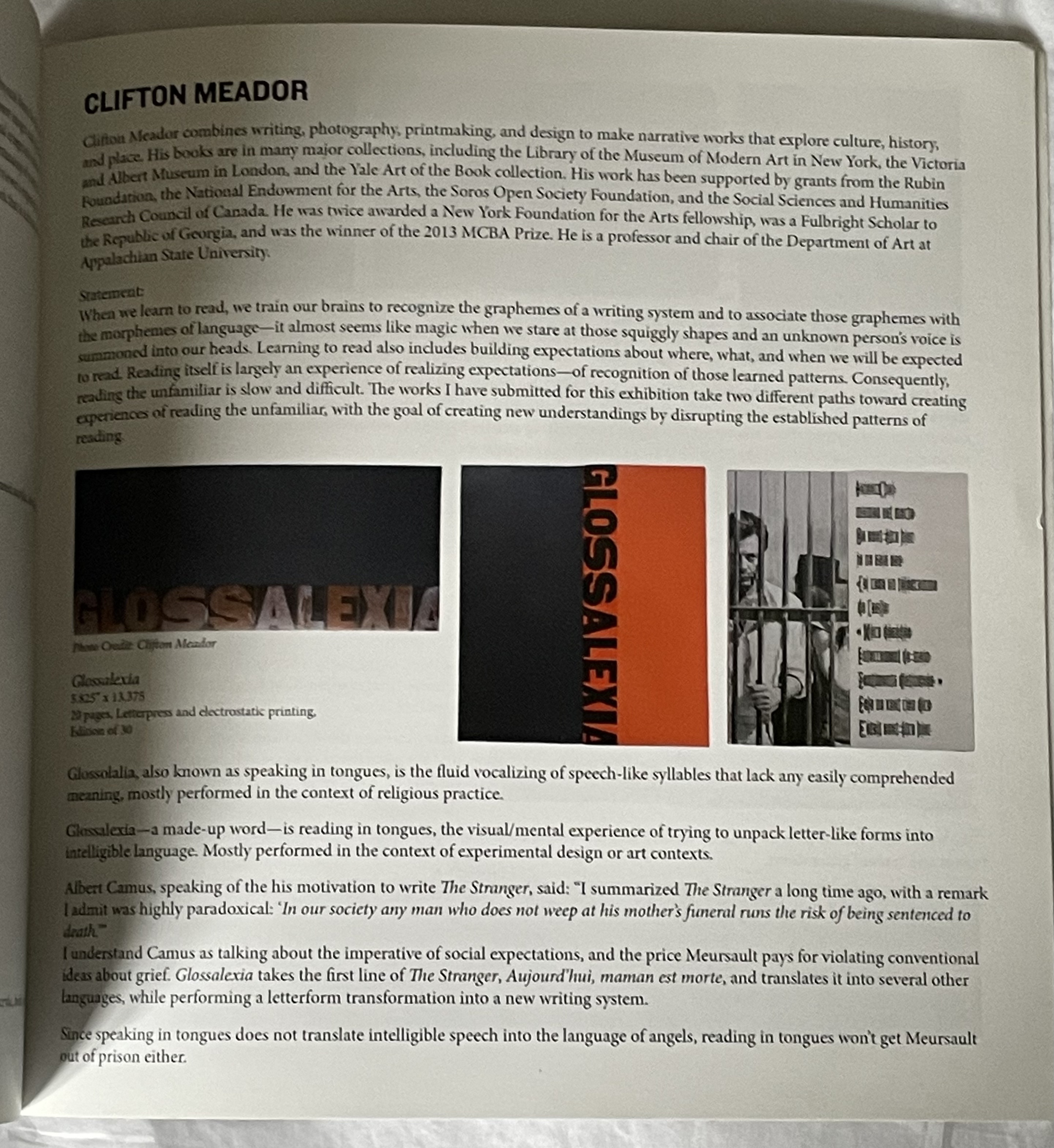
Four Proposals for Reading (2015)
Four Proposals for Reading (2015) Seager Gray Gallery and Barb Tetenbaum (ed.) Perfect bound book. 203 x 203 mm. [44] pages. Acquired from Barb Tetenbaum, 2019. Photos: Books On Books Collection.