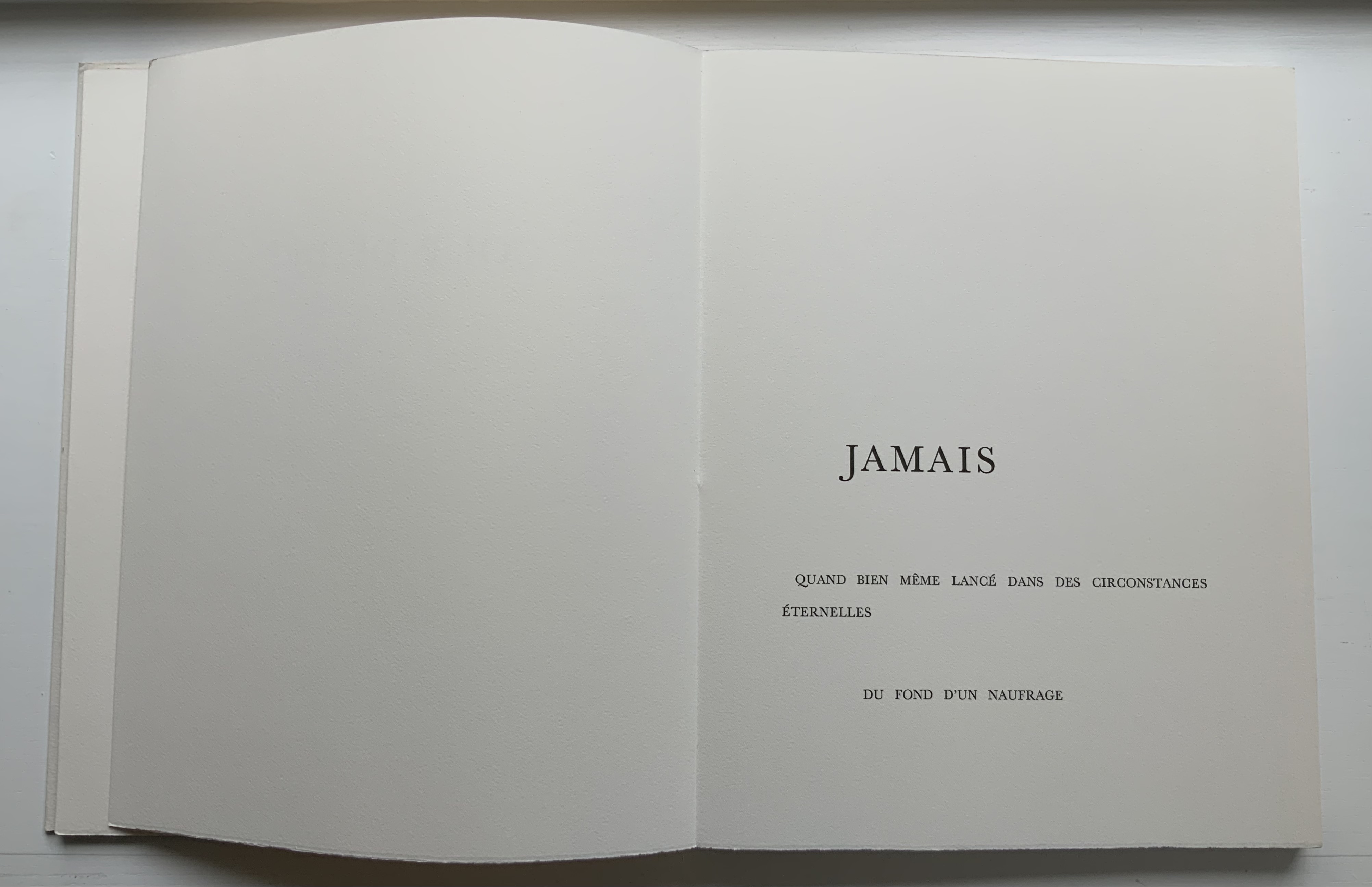
UN COUP DE DÉS JAMAIS N’ABOLIRA LE HASARD: POÈME (1989)
UN COUP DE DÉS JAMAIS N’ABOLIRA LE HASARD: POÈME (1989)
Stéphane Mallarmé (text); Honorine Tepfer (art & design)
Accordion fold with embossed paper cover. Cover – H325 x W255 mm; Book – H320 x W250 mm, 34 pages. Edition of 48, of which this is #5. Acquired from Studio Montespecchio, 2 February 2022.
Photos: Books On Books Collection. Displayed with permission of the artist.
Before his sudden death in 1898, Stéphane Mallarmé was planning a deluxe edition of Un Coup de Dés Jamais N’Abolira le Hasard with Ambroise Vollard, an entrepreneur and publisher. A single-volume version of the poem did not appear until 1914. Issued under the direction of Mallarmé’s son-in-law Dr. Edmond Bonniot through the Nouvelle Revue de France (NRF), it omitted intended prints by Odilon Redon, used the typeface Elzevir rather than the Didot that Mallarmé preferred, and did not precisely follow his layout. We know all this because of correspondence between the poet, Redon and Vollard and because the Sorbonne’s Bibliothèque littéraire Jacques Doucet and Harvard’s Houghton Library hold proofs of the deluxe edition with Mallarmé’s handwritten corrections and instructions.
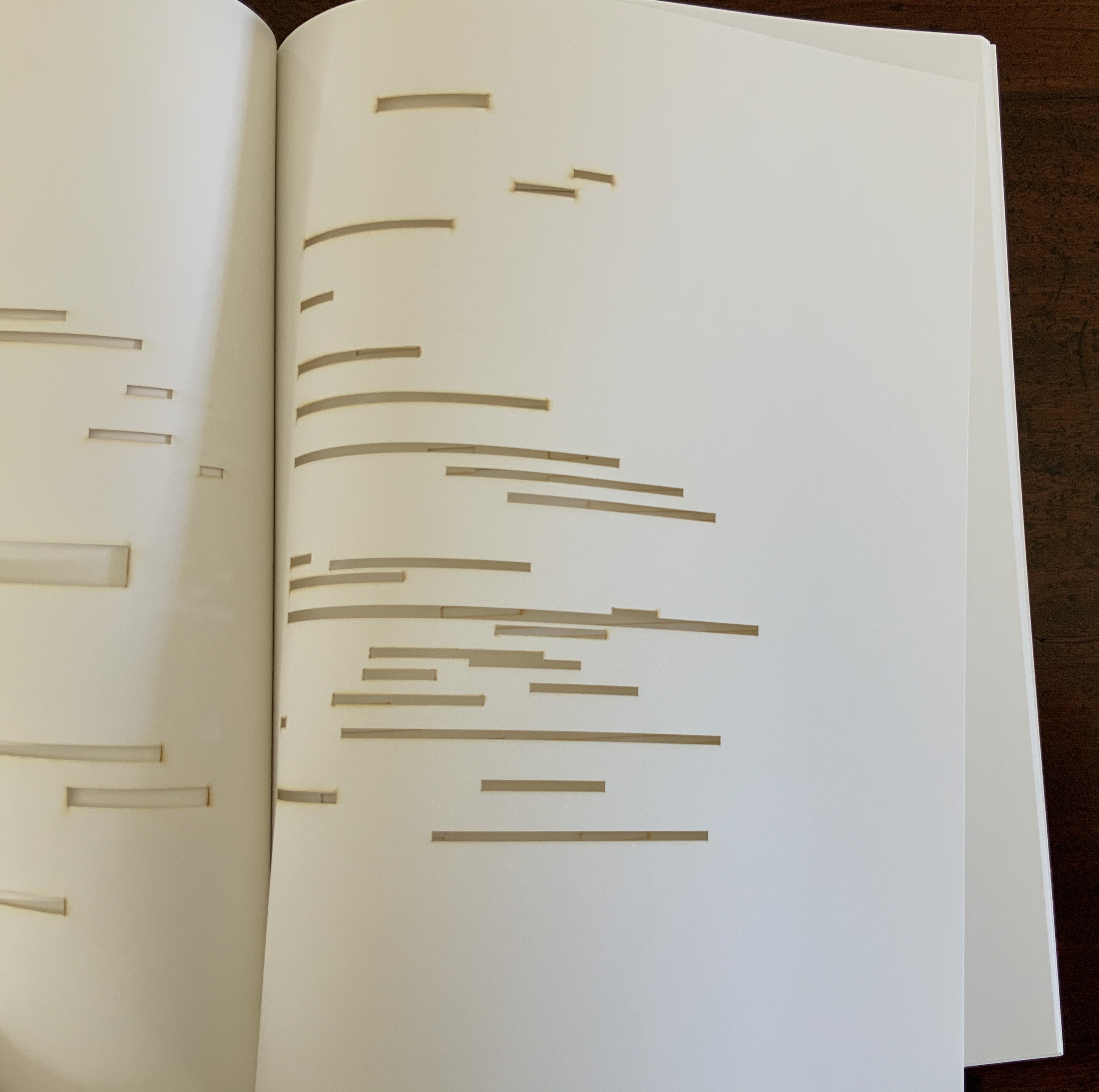
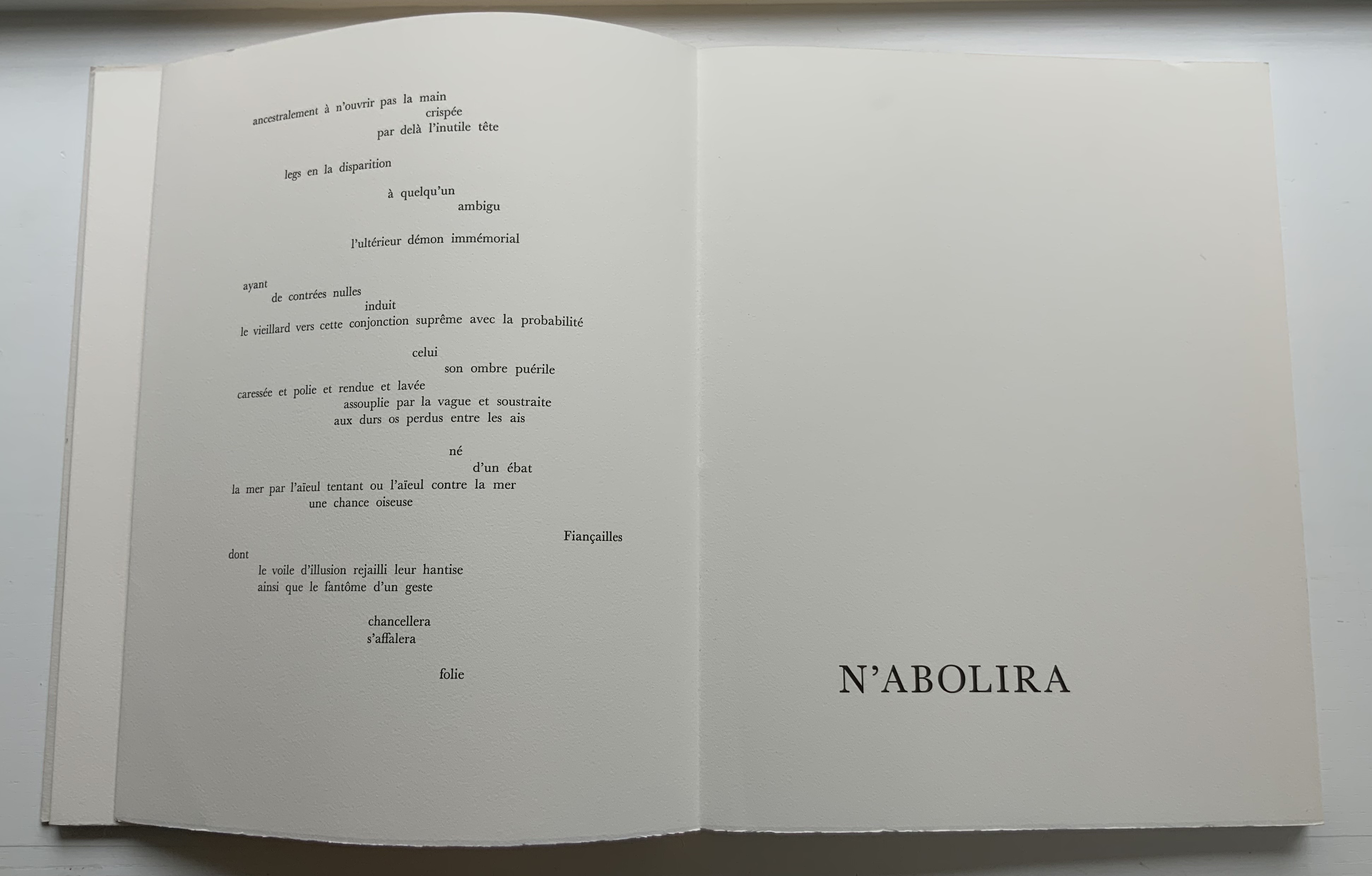
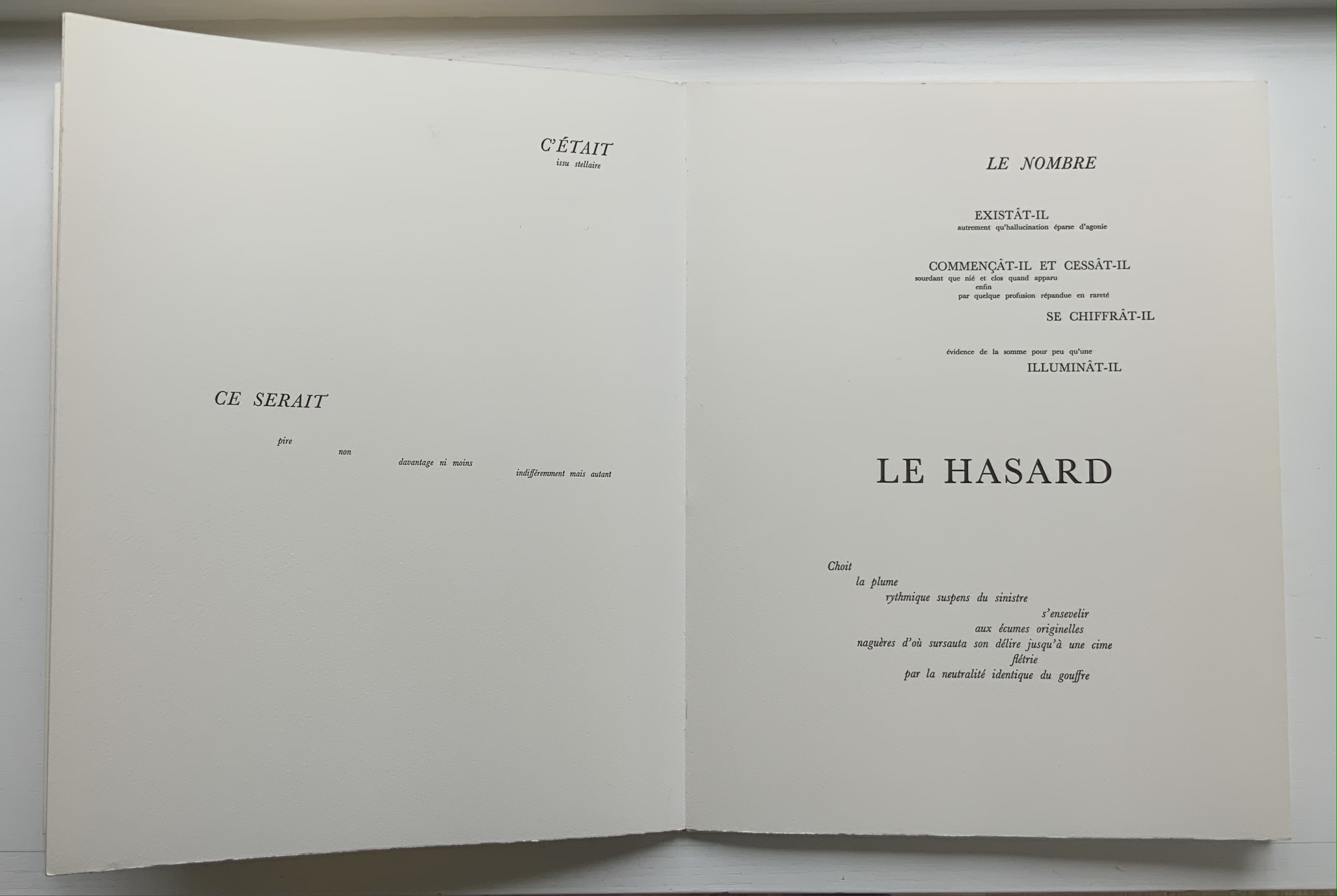
Mallarmé’s placement of words and lines was intentional and precise. Even before the planning for the deluxe edition, he wrote of what could be achieved with type size and layout:
Pourquoi — un jet de grandeur, de pensée ou d’émoi, considérable, phrase poursuivie, en gros caractère, une ligne par page à emplacement gradué, ne maintiendrait-il le lecteur en haleine, la durée du livre, avec appel à sa puissance d’enthousiasme: autour, menus, des groupes, secondairement d’après leur importance, explicatifs ou dérivés — un semis de fioritures. [Oeuvres Complètes, 2 227]
“Why — couldn’t a considerable burst of greatness of thought or emotion, carried in a sentence in large typeface, gradually placed with one line per page, hold the reader’s bated breath throughout the entire book by appealing to his or her power of enthusiasm: around this [burst], smaller groups of secondary importance, explicating or deriving from the primary phrase — a scattering of flourishes.” [Arnar, 234]
The NRF edition 1914 edition makes quite a few sad missteps as Robert Cohn pointed out in 1967. Tepfer’s inspiration to restore the intended layout follows in the footsteps of Mitsou Ronat & Tibor Papp (1980) and Neil Crawford (1985). She visited the Doucet library to examine the proofs and layout. Following the layout was not difficult, but with the scarcity of Didot, Tepfer needed to select another typeface. She chose Baskerville. Given that Firmin Didot was inspired by John Baskerville’s experimentation with thick and thin strokes, the choice adds historical interest, although Bodoni might have been nearer the mark. Below are Tepfer’s double-page spreads across which Mallarmé’s burst of thought appears one line per page among the “scattering of flourishes”.
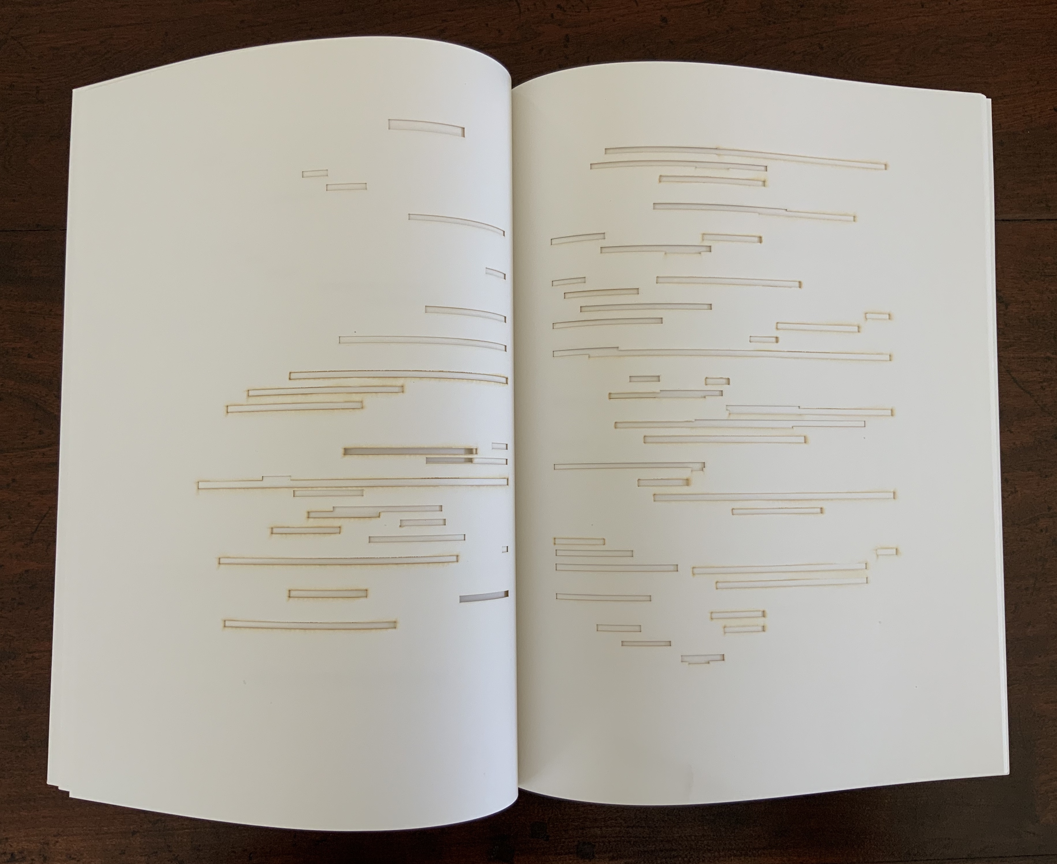
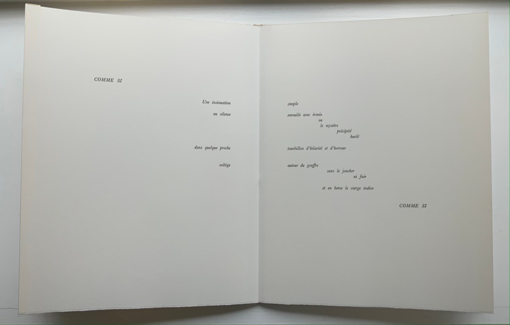
The book’s central double-page spread, beginning with COMME SI / “AS IF”) in the upper left and ending with COMME SI / “AS IF” in the lower right, mimics the throw and fall of the dice and provides another example of the semantic and typographic play that Mallarmé describes above.
Like the artists before her — Redon (1897), André Masson (1961), Mario Diacono (1968), Marcel Broodthaers (1969), Jean Lecoultre (1975), Ian Wallace (1979) and Ian Tyson (1985) — Tepfer had to solve the puzzle of relating image to text. This is the difficult path of inverse ekphrasis: what and how the visual, tactile and conceptual works of art that come after Mallarmé’s text can be. We are more used to ekphrasis where the object, painting or sculpture comes before the text — like Achilles’ shield before Homer’s description, or the Grecian urn before Keats’ ode, or Brueghel’s Fall of Icarus before Auden’s Musée des Beaux Arts. Homer, Keats and Auden vie with the art of the crafted object to put that object (and more) in front of us with words. With the inverse, the crafted objects vie without the words to put Mallarmé’s poem (and more — and sometimes less!) in front of us. Tepfer’s solution?
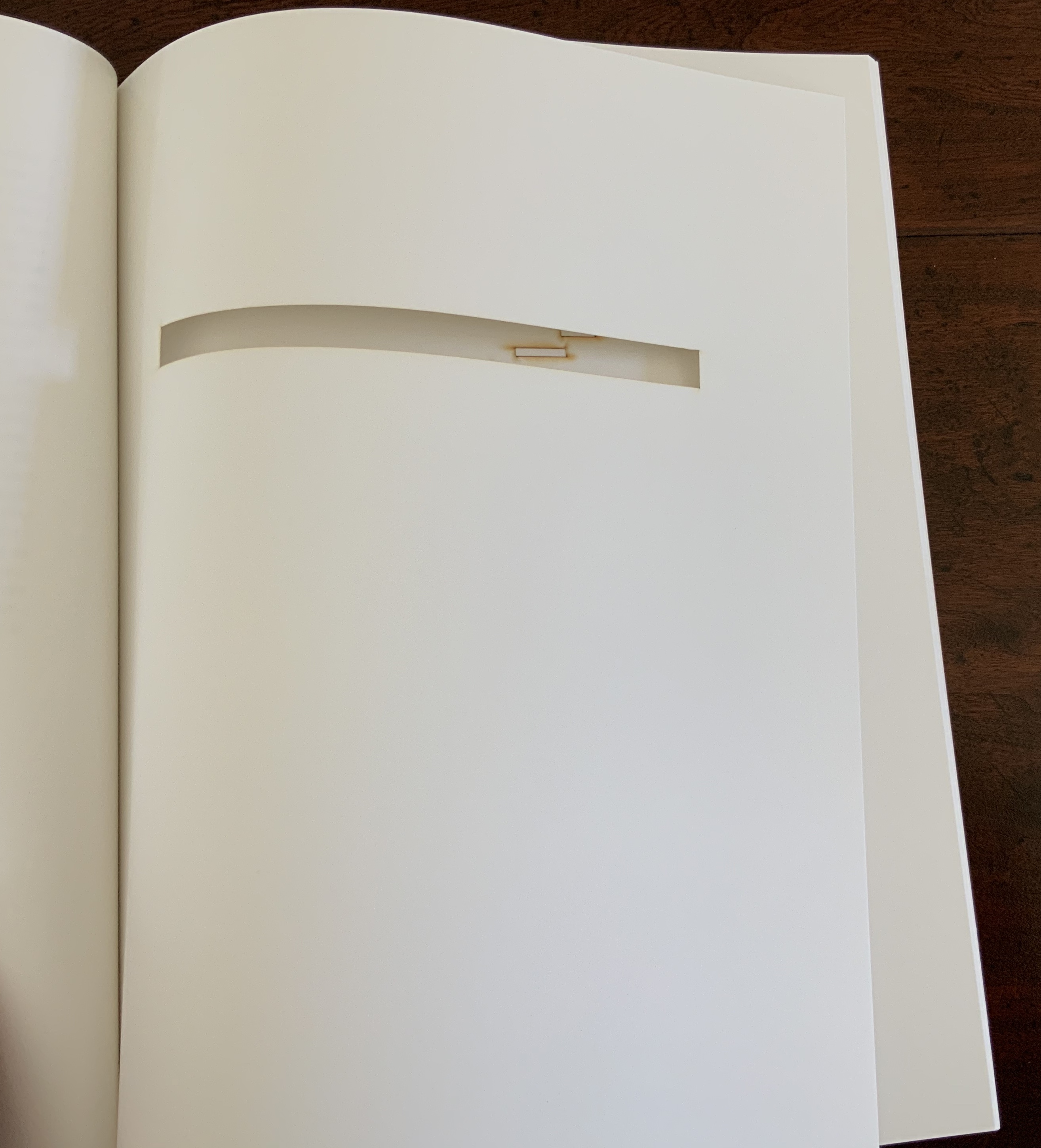
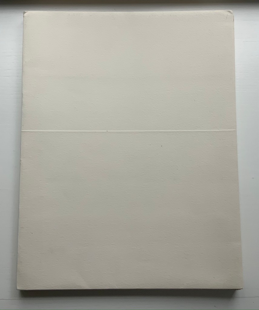
A simple line runs across the debossed front and back covers. As Tepfer wrote in June 1990 about her journey into Un Coup de Dés: La ligne d’horizon était un sujet de ma hantise / “The horizon line was my obsession”. As the folded paper cover opens, a single geometric, abstract image appears — debossed and embossed on blank paper. Except for a single round dot, everything is linear. Two separate lines angle across the space. One cuts through the debossed horizon line that lies beneath a series of closely spaced horizontal lines — suggesting clouds? The other, longer one cuts at a different angle, creating a foreground from two sets of parallel lines that have slipped or shifted like tectonic plates. Could the round dot be the single-dot side of a die rolling down a slanted deck or broken mast? Could the longer slanted line be a broken mast? Could the shifted parallel lines be a broken handrail?
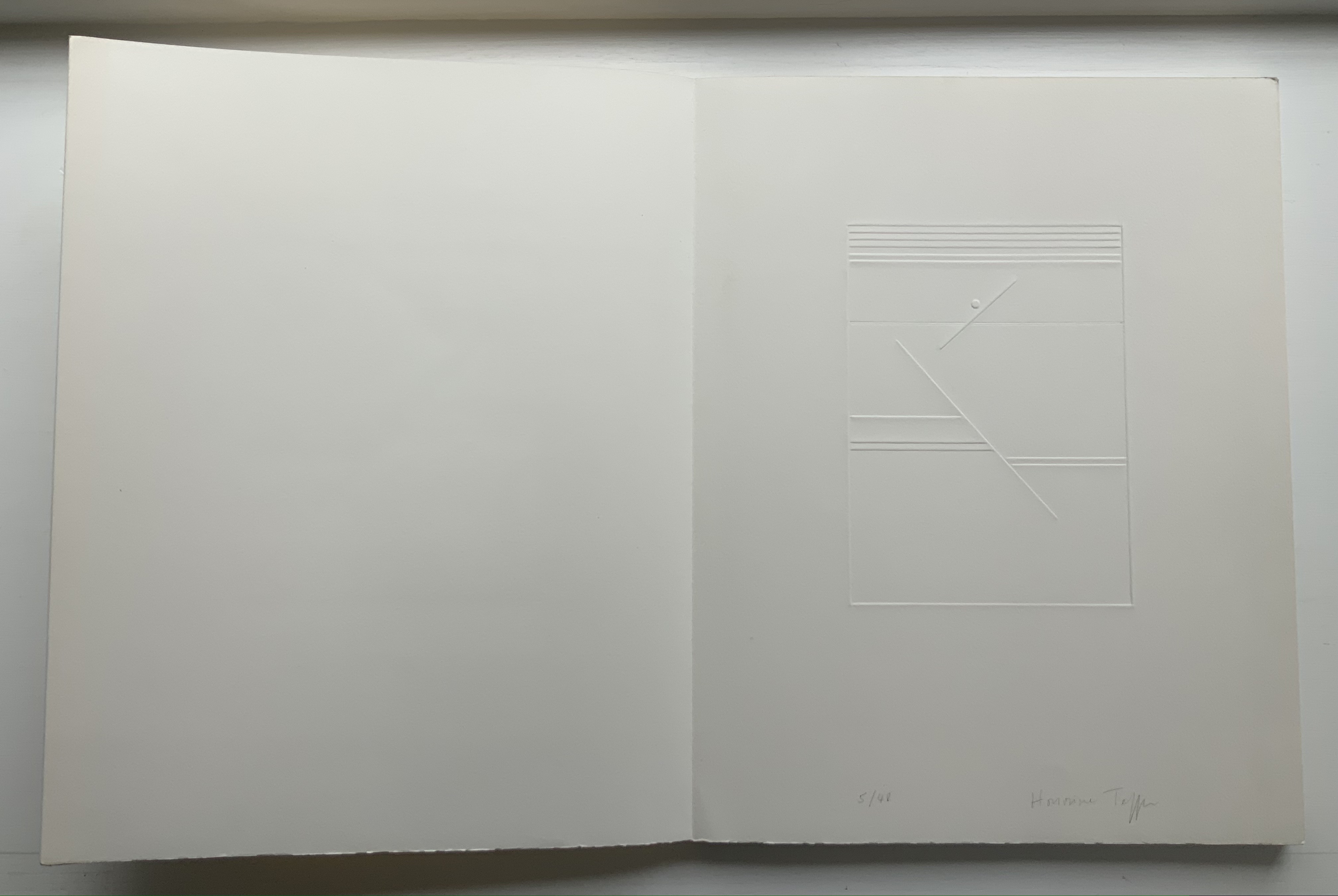
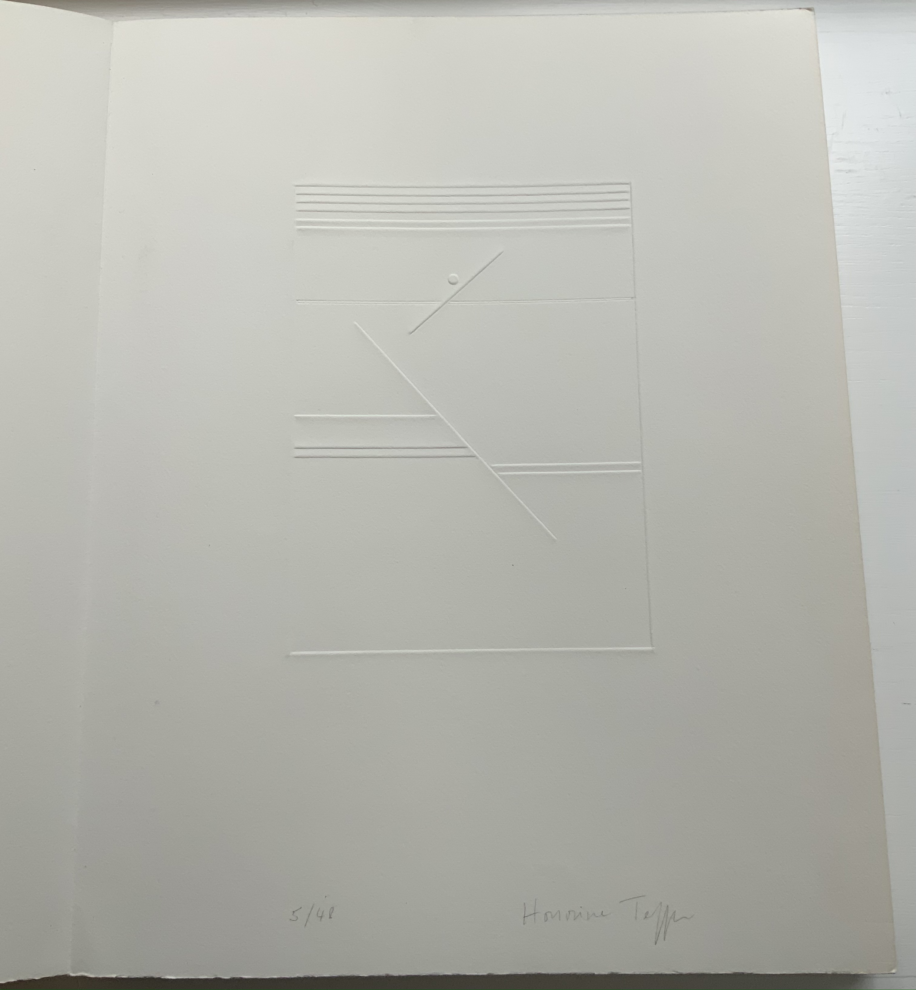
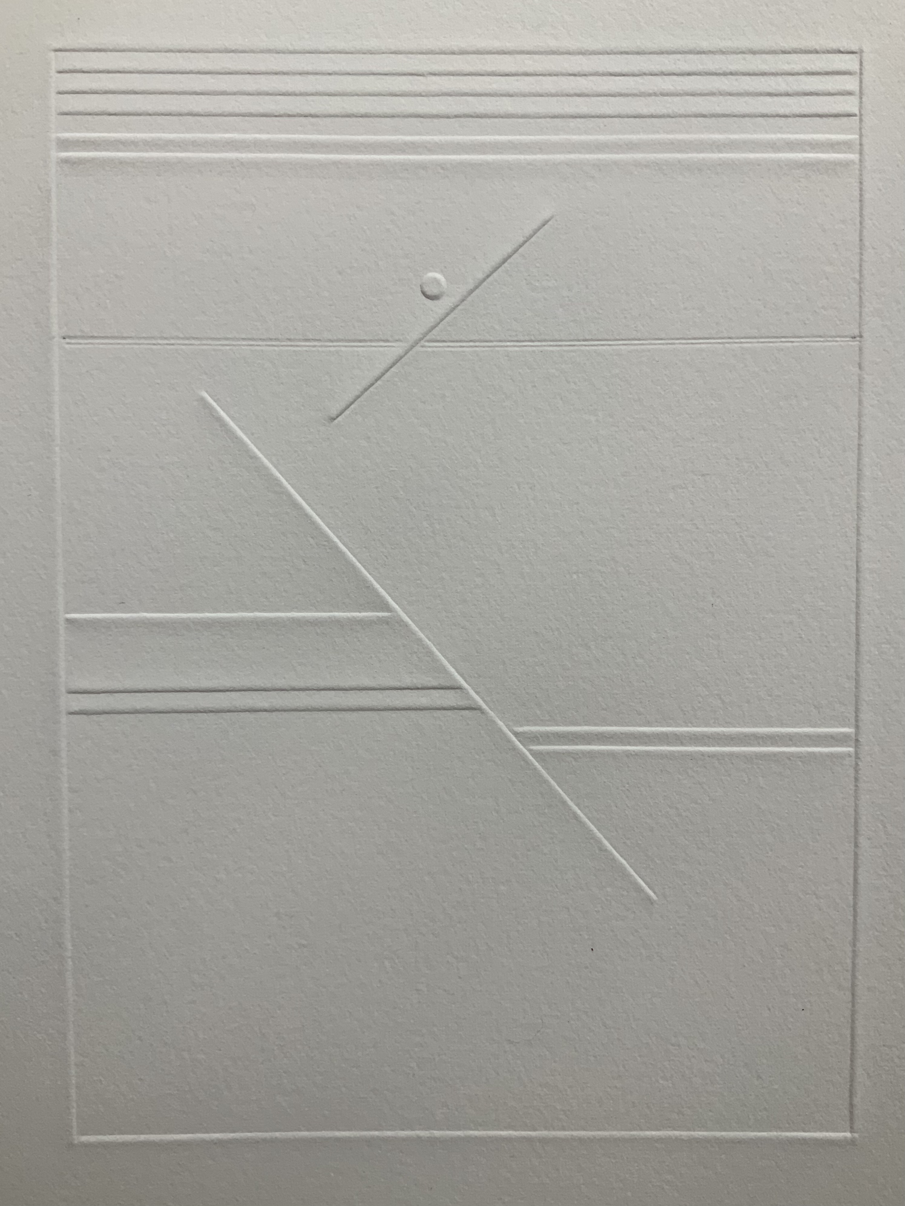
Rather than trying to track back to verbal images in the poem, though, perhaps we should recognize Tepfer’s prefatory image as a kind of substitute for Mallarmé’s preface in 1897 — the one he preferred we not read. He wanted us to look. To see les blancs. To hold thought and emotion like our breath across the space of the book. With her simple rectangle of blank paper, with the absence of ink, with the geometric solidity of the horizontal and slanting lines, and with the velvet softness of the velin d’Arches across her version’s accordion folds, Tepfer encourages us to look, see, hold meaning in abeyance and sense it.
Further Reading
“Mitsou Ronat & Tibor Papp“. 16 November 2020. Books On Books Collection.
“Ian Tyson & Neil Crawford“. 7 February 2022. Books On Books Collection.
Arnar, Anna Sigrídur. 2011. The book as instrument: Stéphane Mallarmé, the artist’s book, and the transformation of print culture. Chicago: The University of Chicago Press. Pp. 231-35, 348n.
Cohn, Robert Greer. 1967. Mallarme’s masterwork: new findings. The Hague: Mouton.
Mosley, James M. 7 November 2011. “Elzevir Letter“. Typefoundry: Documents for the History of Type and Letterforms. Accessed 28 March 2022.
Tepfer, Honorine. June 1990. “Toute realité se dissout”. La Part du Livre, No. 2. Paris: Ed. Le Temps qu’il fait.