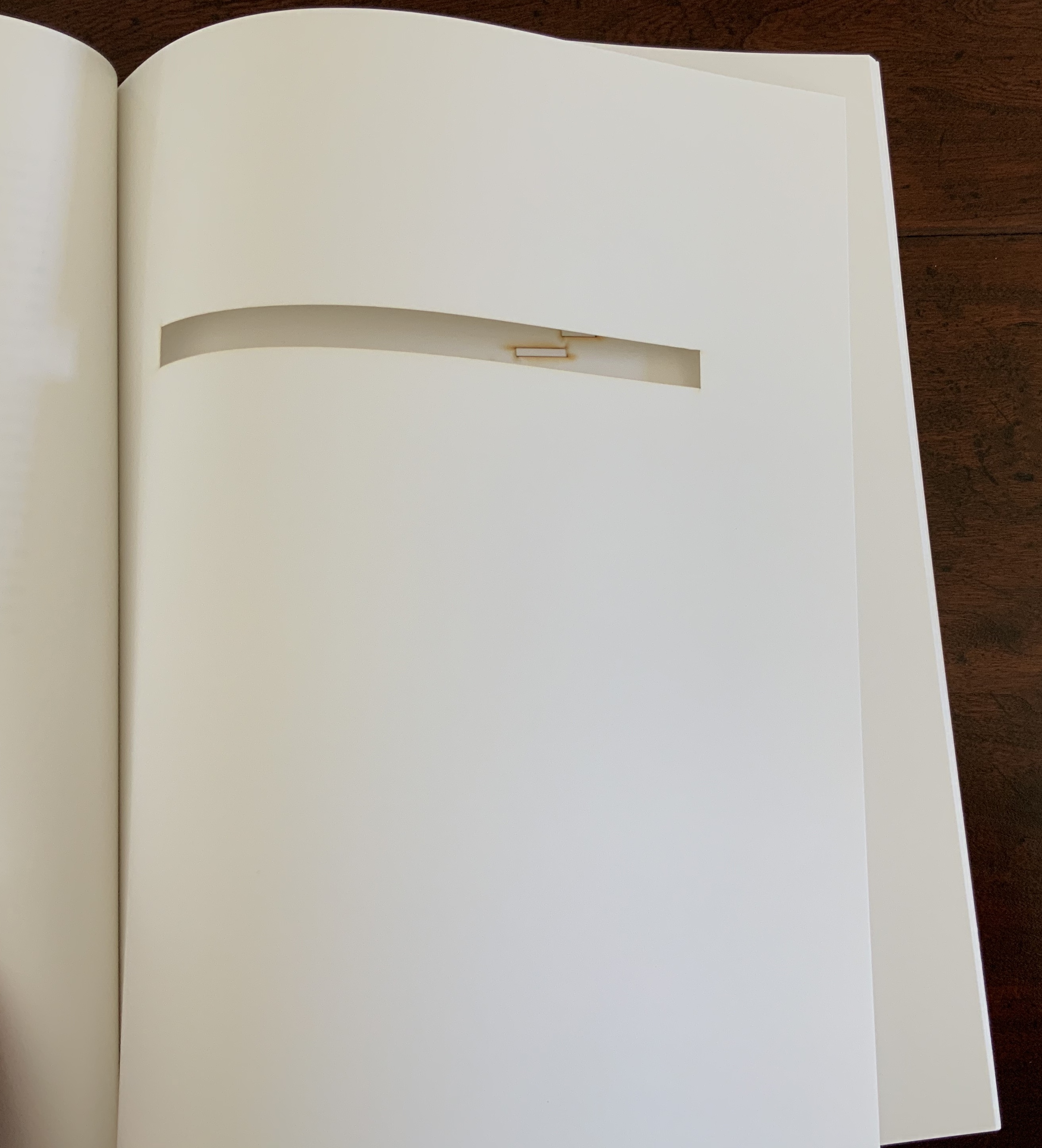
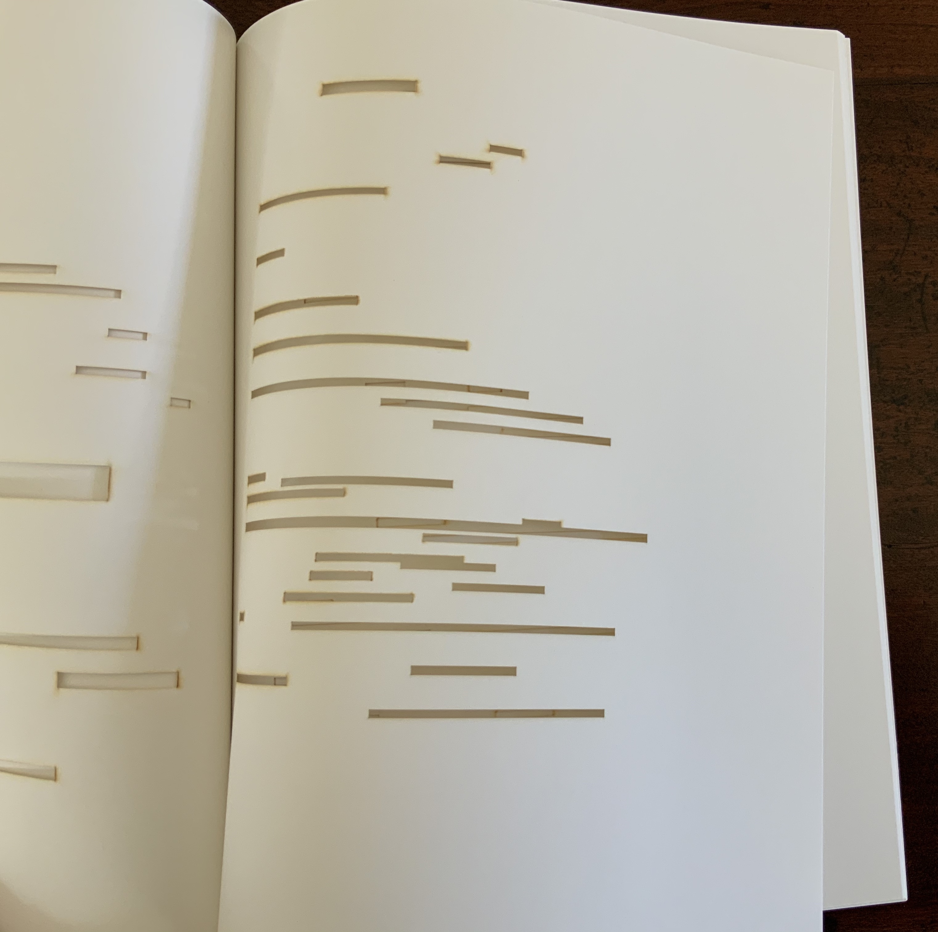
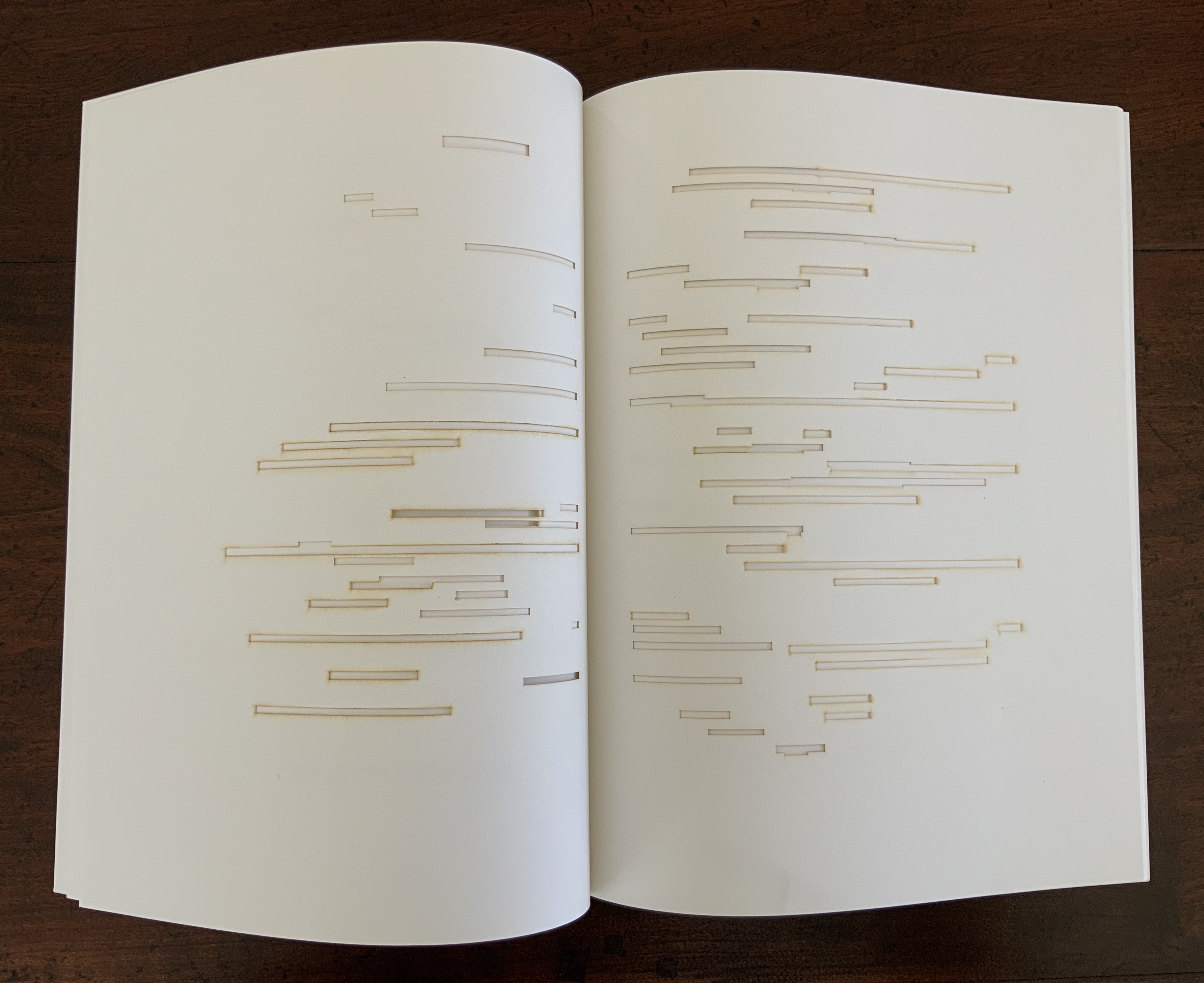
Sienkiewicza Street in Kielce (2003, 2009, repr. 2025)
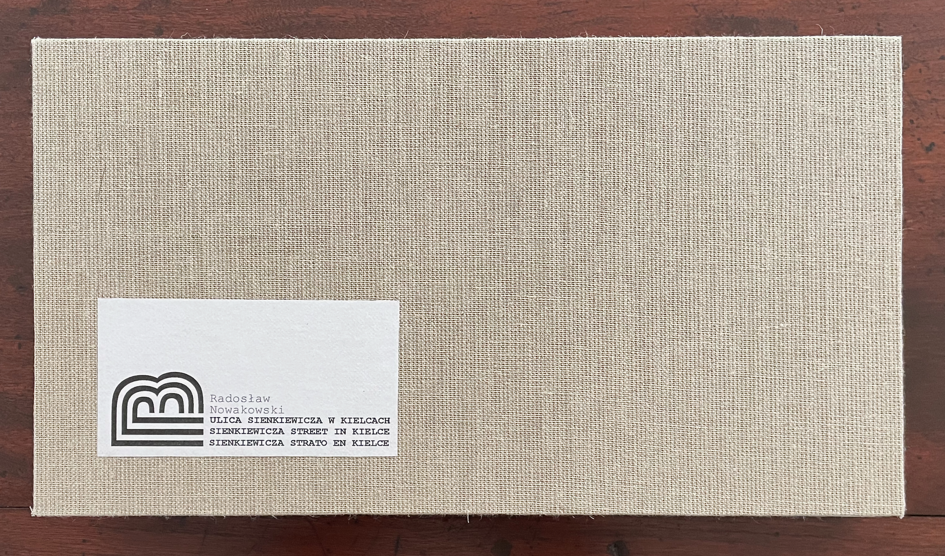
Sienkiewicza Street in Kielce (2003, 2009, repr. 2025)
Radosław Nowakowski
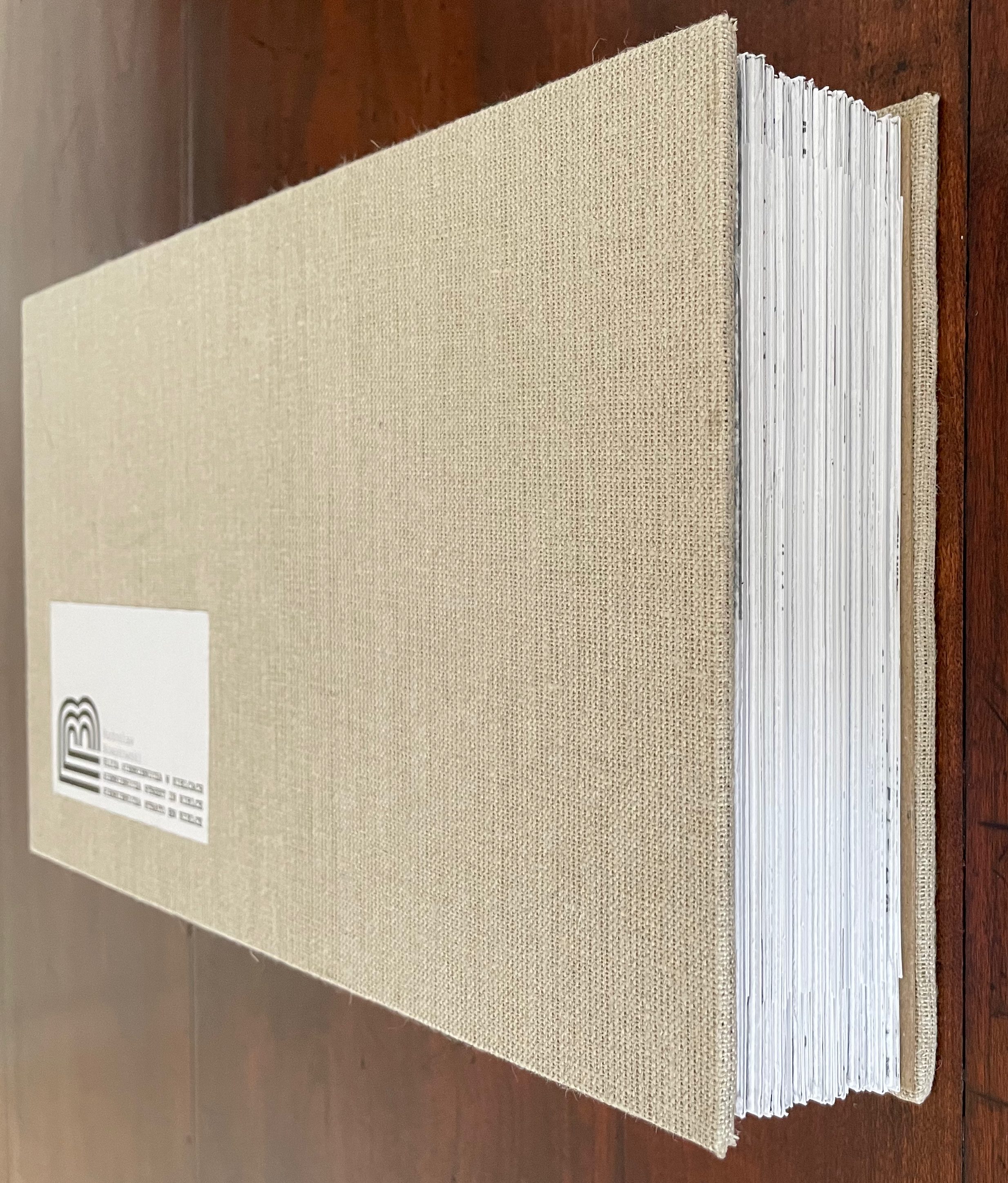
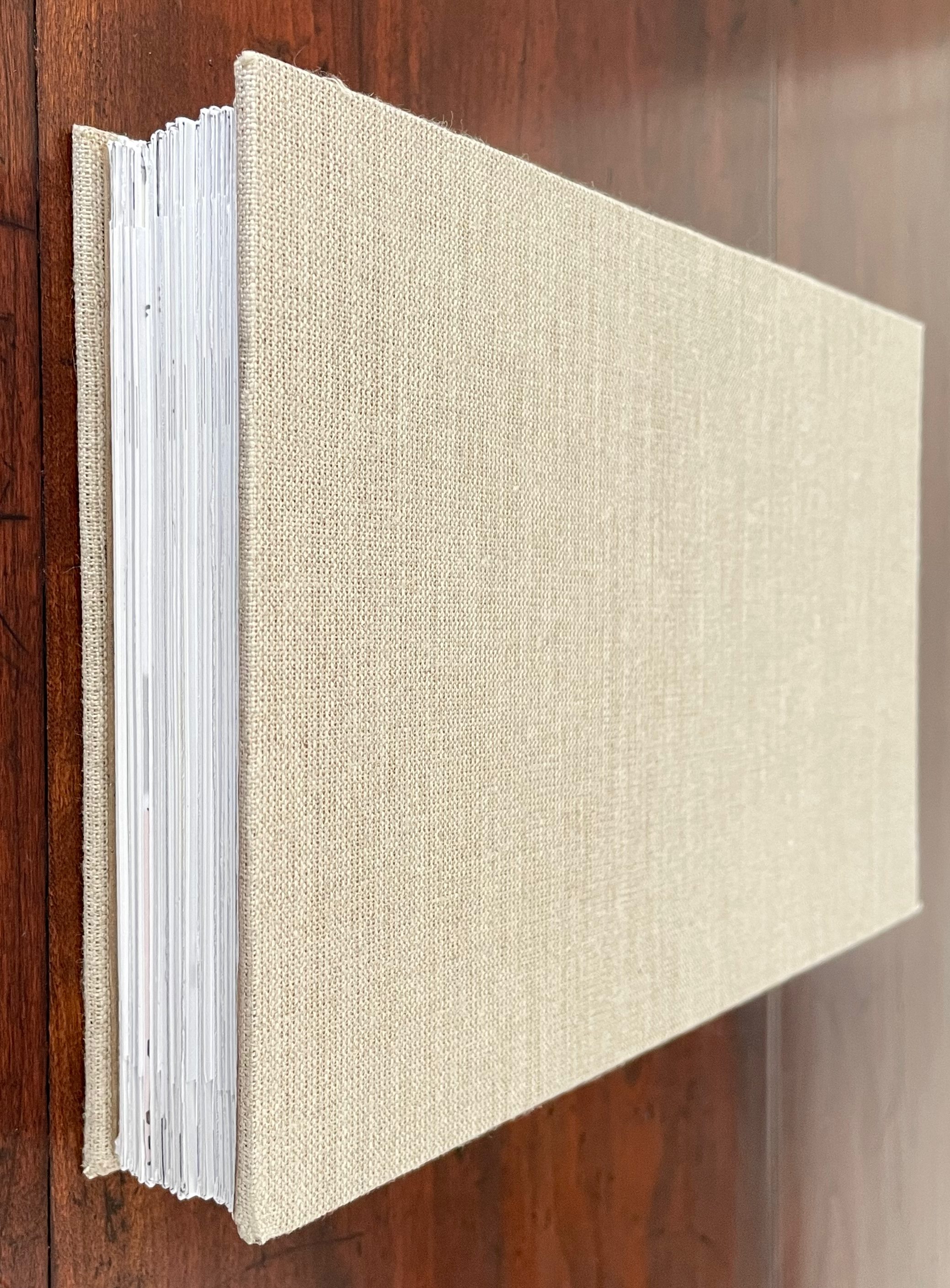
Cardboard slipcase holding leporello. H167 x W302 mm x D40 (closed), W10030 mm (open). Acquired from the artist, 13 August 2026.
Photos: Books On Books Collection. Displayed with permission of the artist.
Sienkiewicza Street is the main commercial and historic thoroughfare in the southern Polish city 0f Kielce. It runs 1.3 kilometers in length (over three-quarters 0f a mile). The label on the book’s cover signals a landscape format, but when we turn the cover to the left, the orientation of the text we first see runs in every direction.
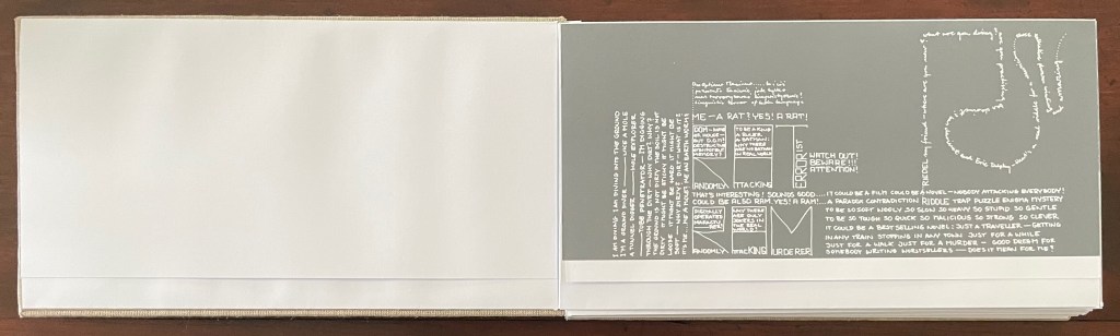
Perhaps we should have opened it in portrait rather than landscape. The leporello panels are trifolds, and when we unfold that first panel, the orientation of the title spread suggests that portrait would make some sense. Nevertheless, the text still has multiple orientations and, as well, three languages: Polish, English, and Esperanto.
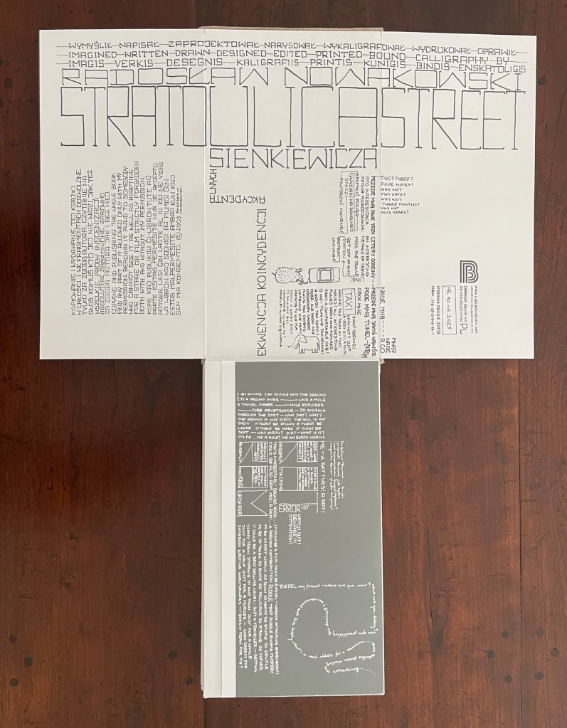
In addition, we have a narrator who throws at us another orientation in the white on gray unfolded panel: “I AM DIVING I AM DIVING INTO THE GROUND”.
As we twist and turn and wriggle to follow our burrowing narrator, he shifts identities from mole to worm to rat and enlarges the letters of his self-identification, fills their counters with more ravings, and turns them into an acronym: “RANDOMLY ATTACKING TERRORIST”. This sounds good to him, like the makings of a film or novel, but the premise of “NOBODY ATTACKING EVERYBODY!” sends him off to another acronym: RAM for “RANDOMLY ATTACKING MURDERER” with which he can indulge his apparent enjoyment of contradiction, paradox, and puzzling asides. A soft and woolly but hard and tough killer whose encounter with the word “riddle” prompts an arcane spiraling shout-out in script to musician friend Wolfgang Riedel.
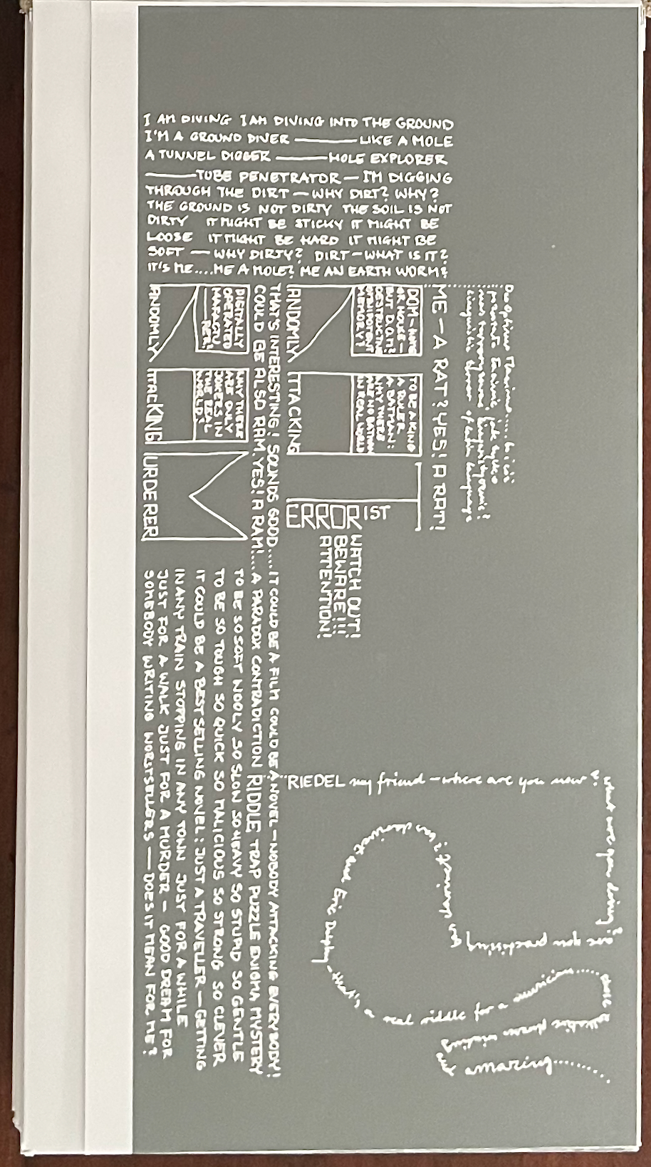
Strange? Crazy? Whimsical? Yes and we haven’t even set foot on Sienkiewicza Street yet! To get there, we have to continue extending the leporello and flipping open its folded panels — burrowing and digging upwards, turning this way and that. Our mole-worm-rat narrator has now co-opted us in this second unfolded panel below, where on the right hand side he tells us in white on lighter gray — ‘WE’RE WALKING HERE” oblivious to “THEM DRIVING CARS ABOVE US” — while on the left hand side in blue on white — they are oblivious to “US WALKING UNDER THEM”. How do we get up there?
By reading upwards, of course. Starting from the bottom center in white on dark gray, running upwards, and zigzagging back onto the first opened spread, there is the long Esperanto-Polish phrase konsekvenca sekvo de hazardoj oj! tak najbardziej przypadkowa konsekwencja koincydencj akcydentalnych [“consequence resulting from chance—oh! yes, the most random consequence of accidental coincidences”]. That long phrase ends of course at the title: SIENKIEWICZA STREET.
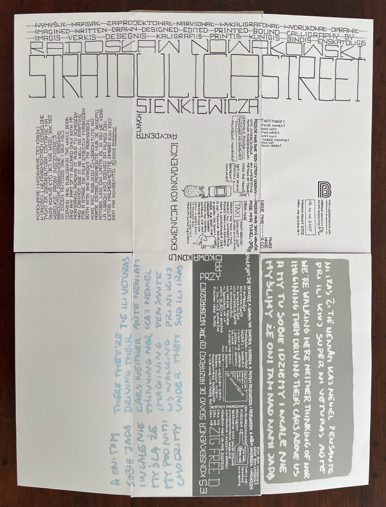
Now that we are on Sienkiewicza Street (at least textually) and maybe understanding why the narrator wants us to call him “ZIG FREED”, perhaps we should accept the invitation at the taxi stand in the first panel to go sightseeing. Perhaps this strange book is more map than book. So down we go to extend and unfold the third spread and even the fourth if the table is long enough! Here above ground, then, the tour begins from top to bottom, down the right side of the street.
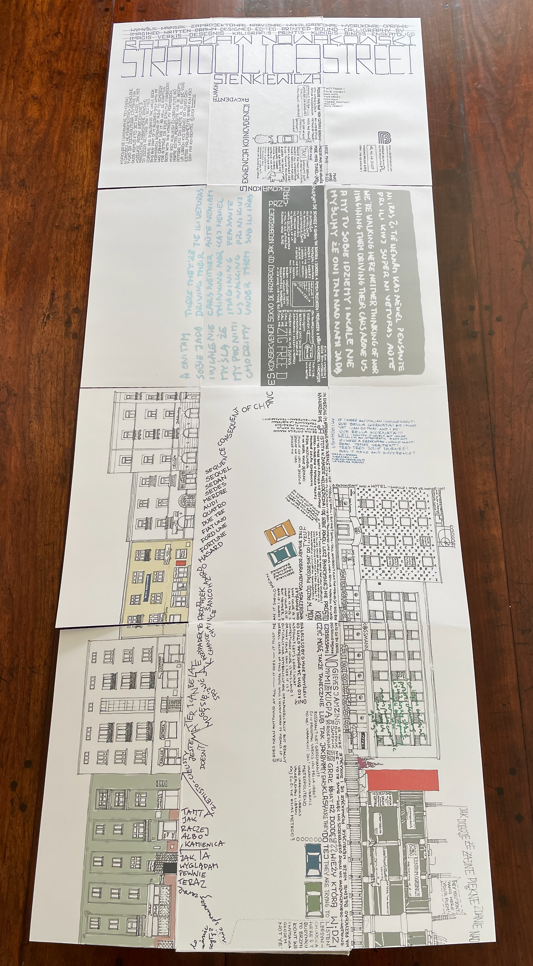
Here’s the third spread first in portrait, then in landscape. Emerging above ground with us, our narrator is overwhelmed by the beautiful day, the choices (Mobiles!), and his transformation, but he is puzzled at the general lack of color.
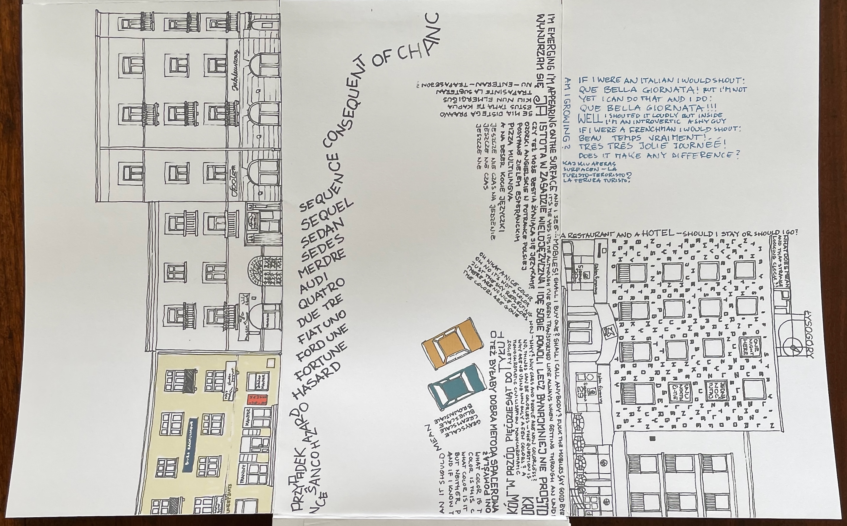
Third spread in portrait.
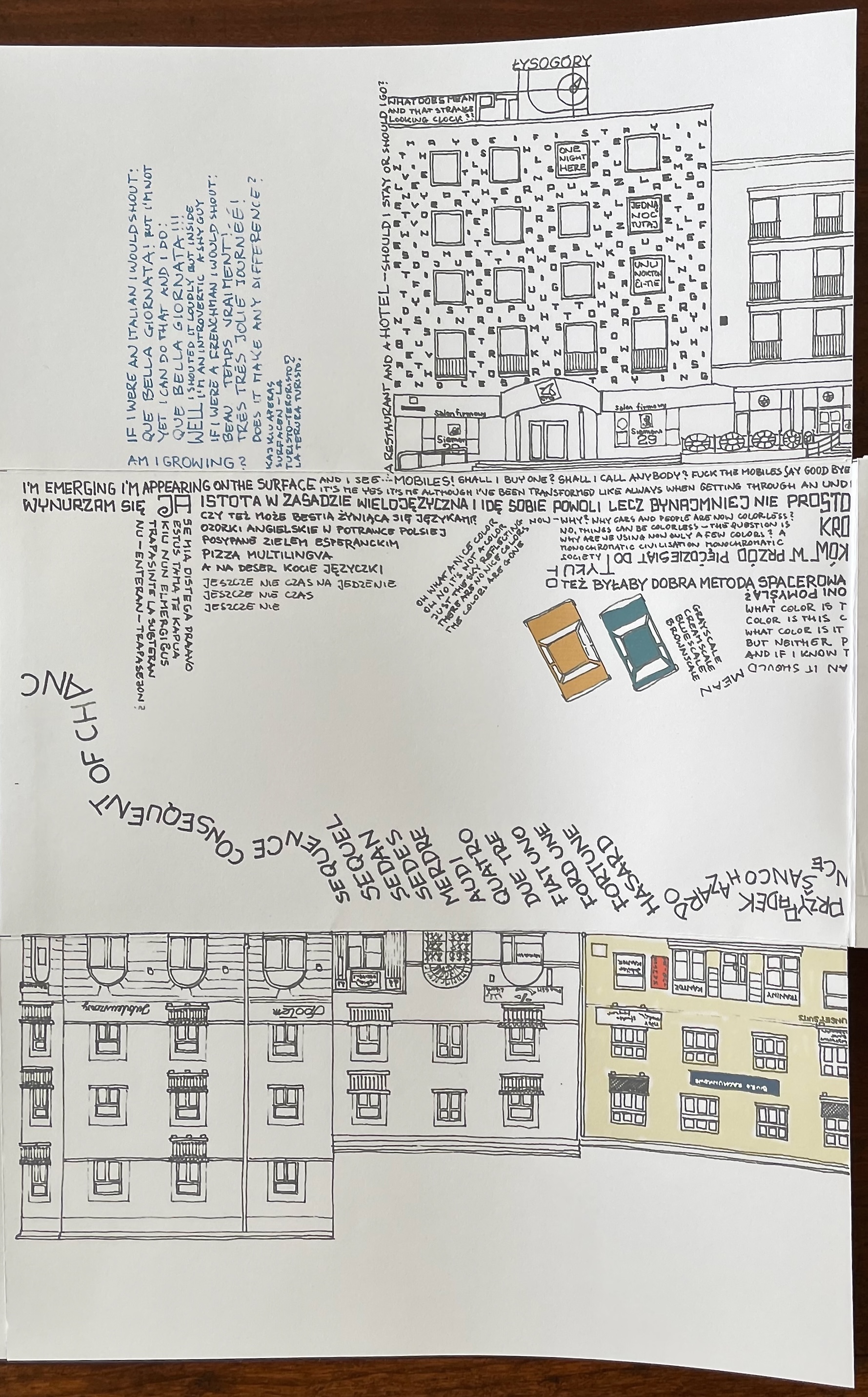
Third spread in landscape.
Moving from panel to panel and within a panel, we can’t be flaneûrs in a taxi. The panels, text, and images demand a closer look. Our narrator draws the left hand side of the Hotel Łysogory with his text, noting that it is a restaurant and hotel. He decorates its facade with his meandering wondering “Maybe if I stay in this hotel I will solve this puzzle and many other puzzles every town has a lot of puzzles every town is a puzzle …” and so on. It certainly takes some puzzling to make out the text.
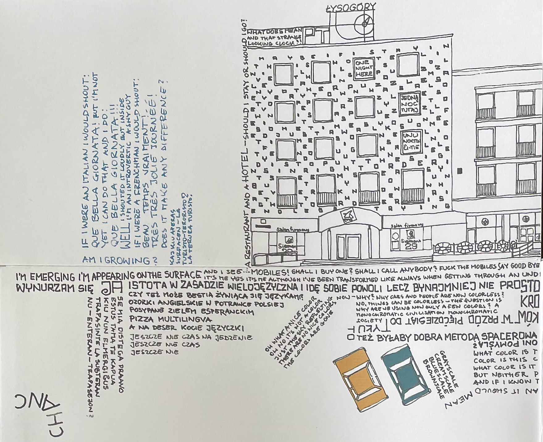
Moving into the fourth spread with our narrator, we find that the text runs not only up the sides and across the tops and facades of buildings and down the street, it turns around and heads back up the street. Over the fold between the third and fourth spreads, our narrator asks, “What color is this town? …” [not politically, symbolically, or metaphorically] “but really and if I know the real color of this town will I know what it means if this….” [and here, his words turn and head back ] “does mean anything at all — it does — it must mean it should mean grayscale creamscale bluescale brownscale” — which leaves him and us reading parallel to two parked cars. Perhaps we are getting back into our taxi.
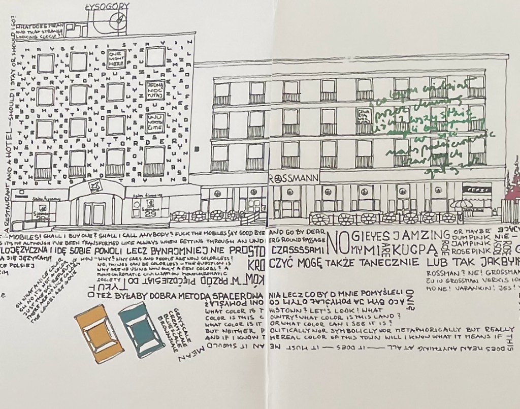
Across the fold between the third and fourth spreads in landscape.
Sienkiewicza Street is lengthy, and so is this artist’s book. Let’s cheat and jump to the end (or will it be the beginning?) When we unfold the first two spreads at the other end of the “book” or map, we find the orientation of the text along the left hand side of the street — “JUST-A-FEW-STEPS-MORE-AND- STOP” — confirms that we have been moving in the right direction — if there is a “right” direction. But are we really at the end?
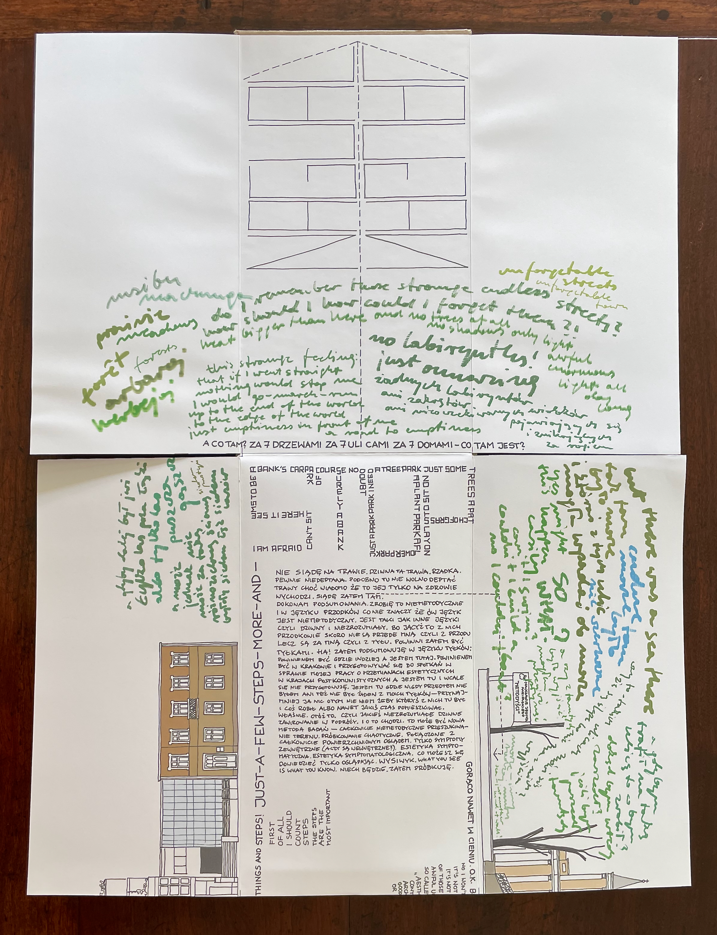
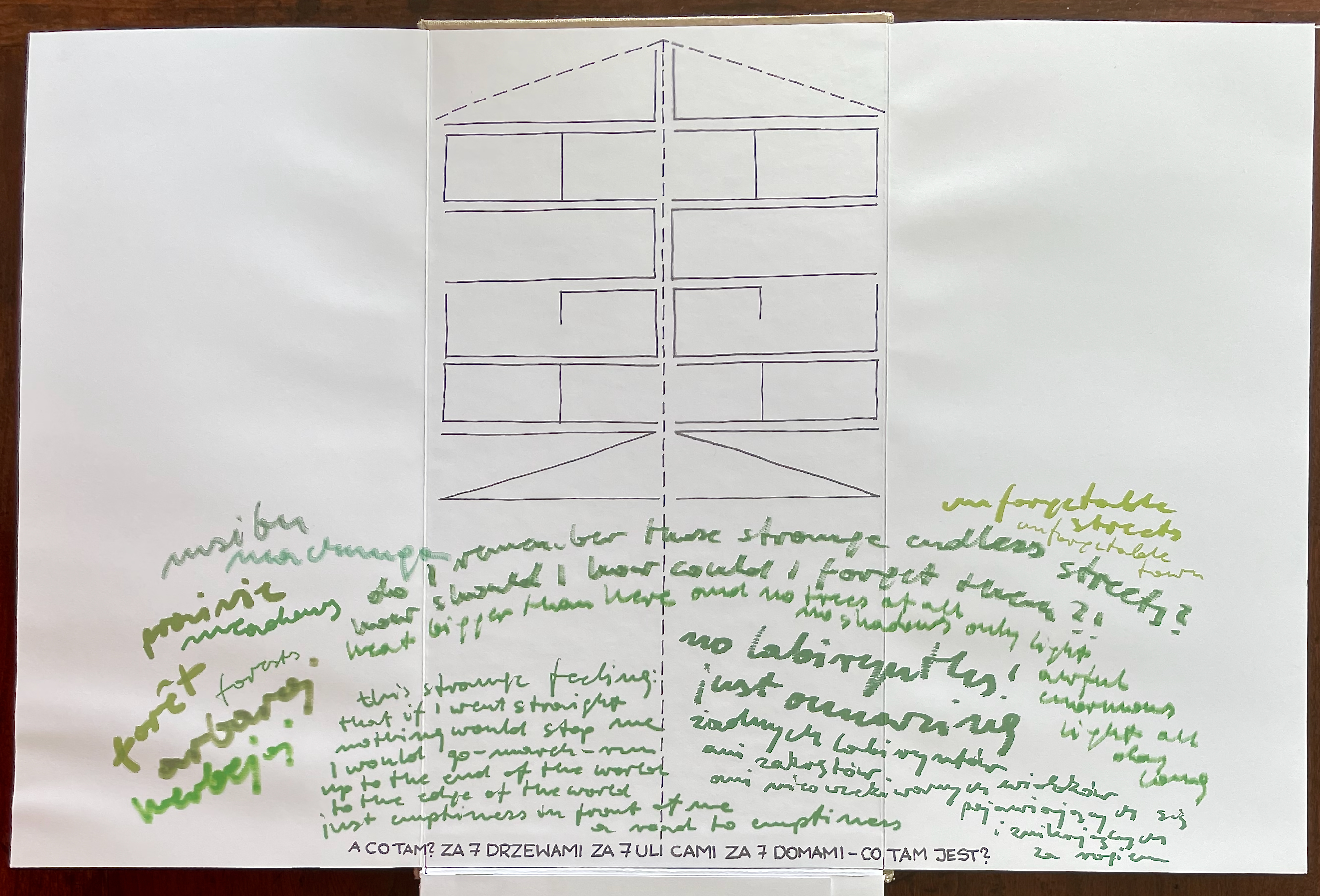
No. Although our narrator is weary, the text making up the STOP sign warns, “I am afraid can’t sit here it seems to be a bank’s carpark of course surely a bank no doubt I need a tree park a plant park a flower park just a park park just some trees a patch of grass to lay on sit on”. At first the green script above might meet the need, but deciphered, it doesn’t: “this strange feeling that if I went straight nothing would stop me I would go-march-run up to the end of the world just emptiness in front of me a road to emptiness”. The arrow shape above this green despondency seems to confirm it, pointing us off the binding’s edge. Look closely at the arrow though. It is more like a Mesoamerican glyph composed of the Nahuatl word “NAGUAL” — twice, foot to foot. The one on the right mirrors the one on the left — the one on the left reads from bottom to top.
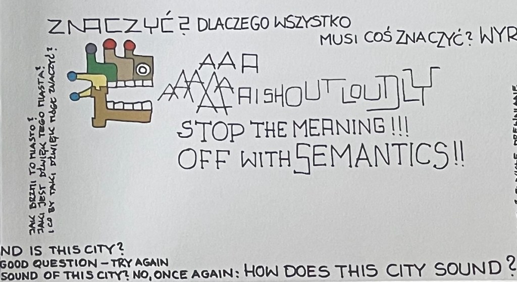
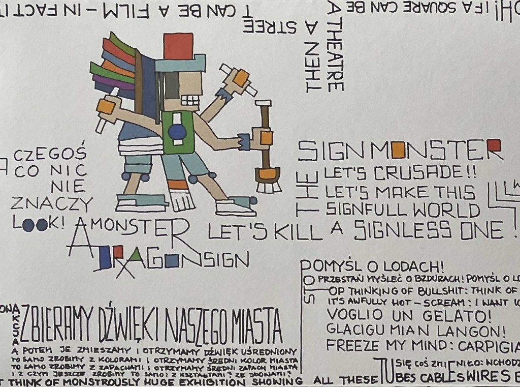
Nagual means shape shifter or trickster, which certainly accords with the shape-shifting letters and the perspective-shifting layout of the language-shifting text we have seen so far. As totem or avatar, nagual also makes a bit of sense of the Mesoamerican-like images that pop up in the middle of Sienkiewicza Street. It makes a bit of sense of our mole-worm-rat-ram-narrator. But as we can see in the rants surrounding those colorful images, our shape-shifting narrator would bridle at being reduced to any sign, much less a “STOP” sign.
If we unfold the next spread below the STOP spread, the text running upwards on the left reconfirms the direction of reading, even if its orientation twists our necks: “I can count on my way back back also those things/ things and steps!”. Just below the start of that sentence, we can tell that is not the only joke the narrator is playing on us: he writes, “I can also read names inscriptions and ads inversely”. He rubs our noses in the fun with an aside written in inverse lettering to explain the word “inversely”: “It means from the end”. So it’s a double or triple joke. We ARE at the end of the book or map or ride or walk or whatever this is, but it is now the point from which we must go back with the narrator to read what things and steps we missed.
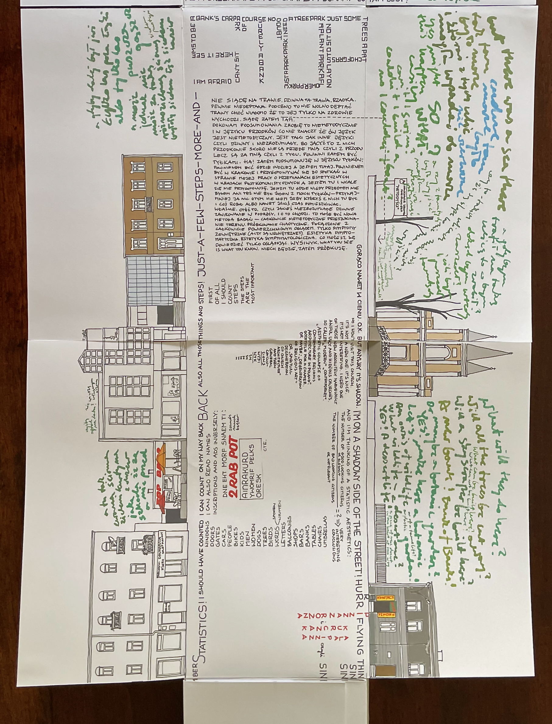
In any event, despite the “green shade” of the NAGUAL spread, Zig FreeD does not take us off into emptiness. He is a shape shifter, a jaywalker across Sienkiewicza Street (even though, or especially as, it is pedestrianized). A jaywalker across languages and cultures. A jaywalker across media (book, map, film, novel, music, architecture). Across typography and layout. Across signs and semantics. Across genres (detective, horror, jazz). Across transport (car, foot, flight). Even across the front and back of panels like these two:
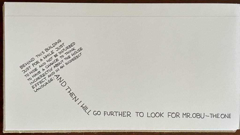
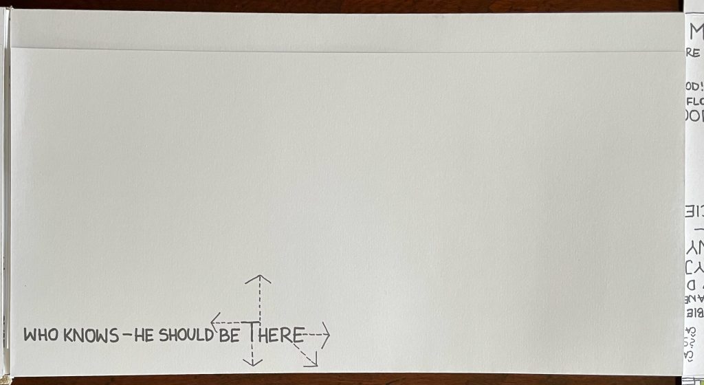
Who is Mr. Obu, Zig FreeD? If we open these folds, will we even find out?
If the Kielce’s website view of Sienkiewicza Streeet persuades you to visit Kielce, you will need a different map than this one. As cities and streets do, Kielce has changed. With the next two works, our narrator has attempted to keep up.
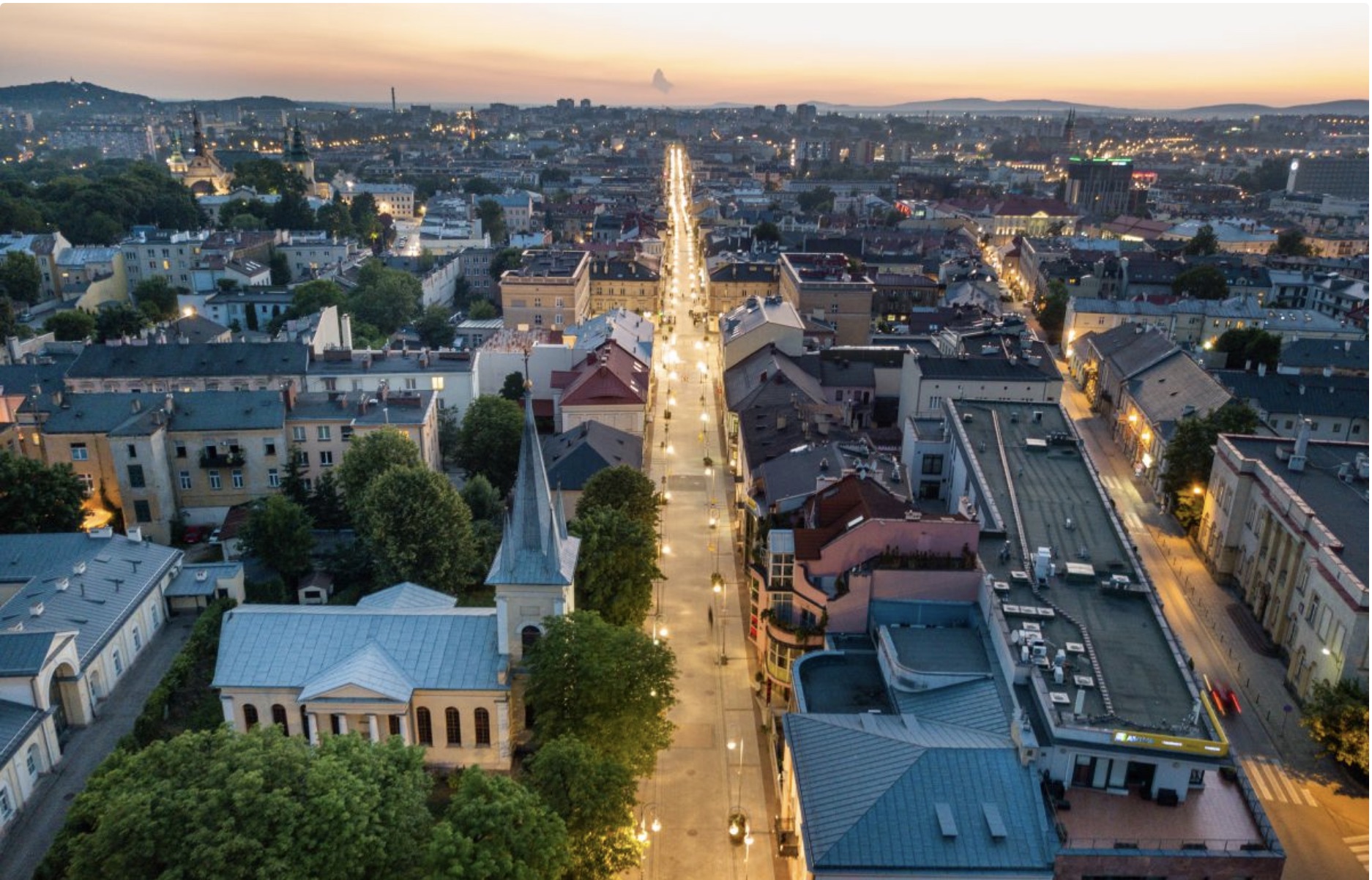
“Sienkiewicza Street in Kielce – The main Promenade“. Photo: Świętokrzyskie Tourist Routes.
Sienkiewicza Street in Kielce Twenty Years After or in Search of the Other Side (2023, repr. 2025)
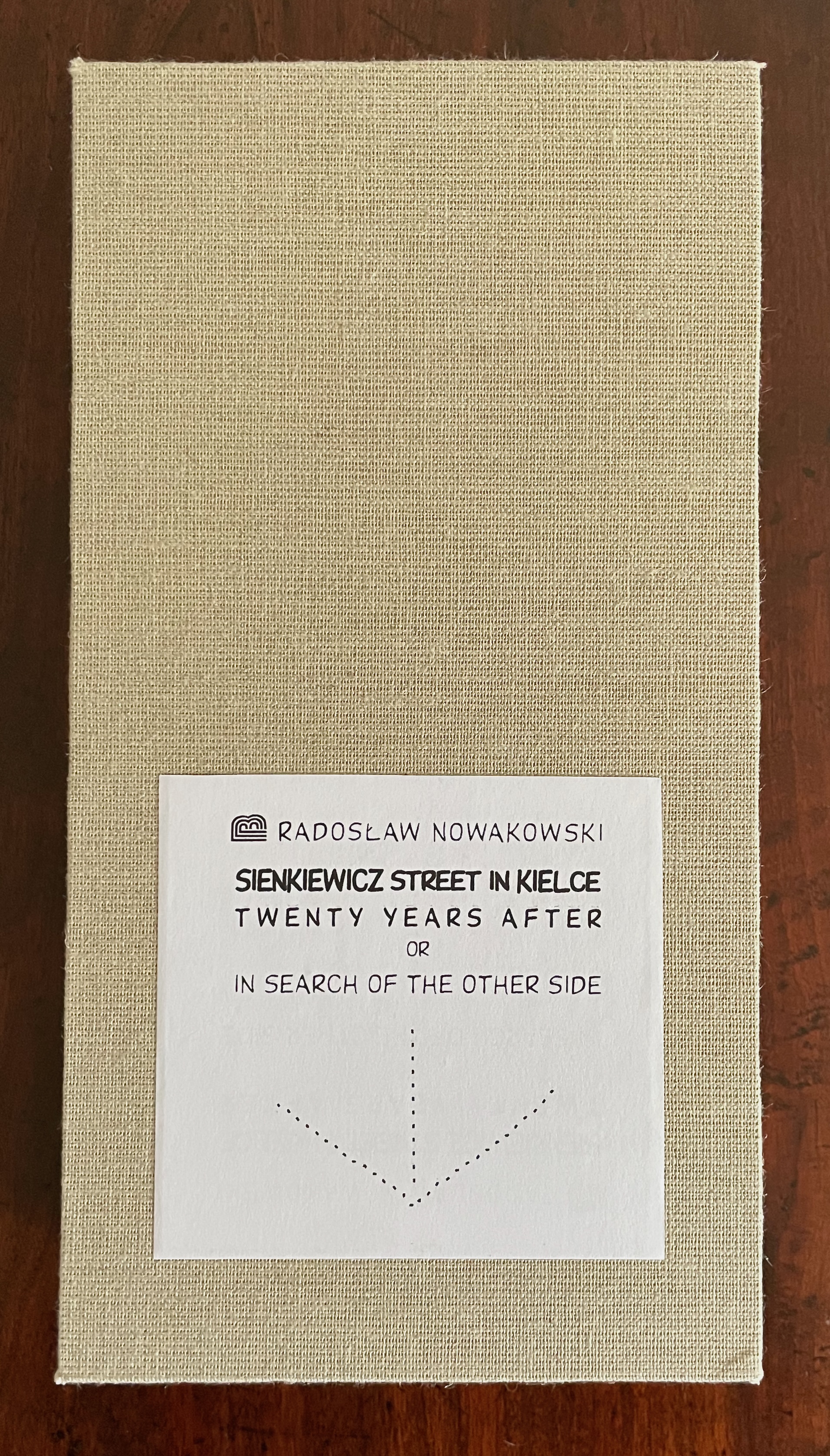
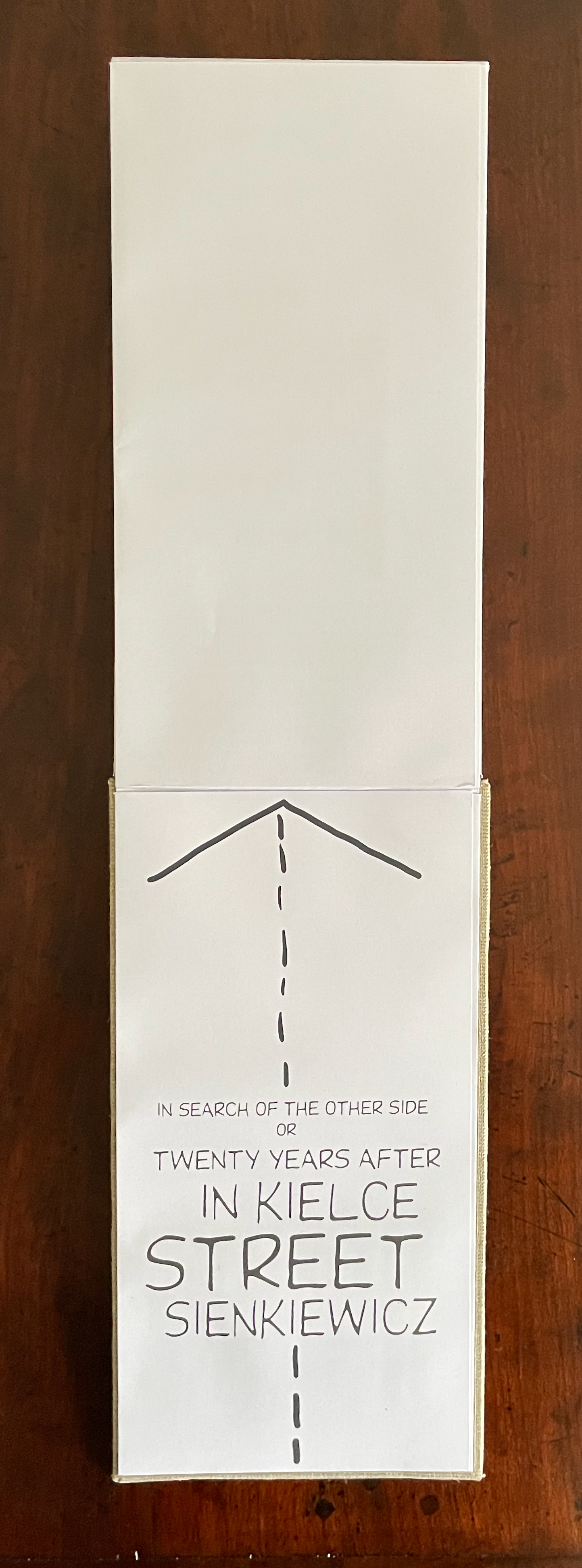
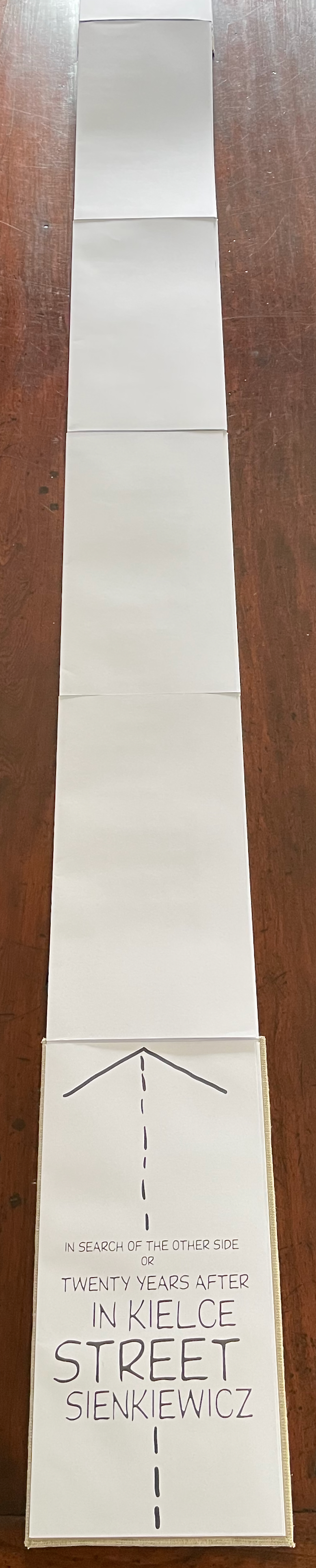
Sienkiewicza Street in Kielce Twenty Years After or in Search of the Other Side (2023, repr. 2025)
Radosław Nowakowski
Cardboard slipcase. Partially double-sided vertically opening leporello, cloth over end boards. H176 x W146 x D40 mm (closed), W5440 mm (open). [134] panels. Acquired from the artist, 13 August 2026.
Photos: Books On Books Collection. Displayed with permission of the artist.
There is no doubt about the orientation of Sienkiewicza Street in Kielce Twenty Years After or in Search of the Other Side nor in where it starts, although our narrator is still up to his tricks even as he “explains” how to read this return to Sienkiewicza Street. Although his instructions read from top to bottom, we will be walking backwards from the bottom to the top.
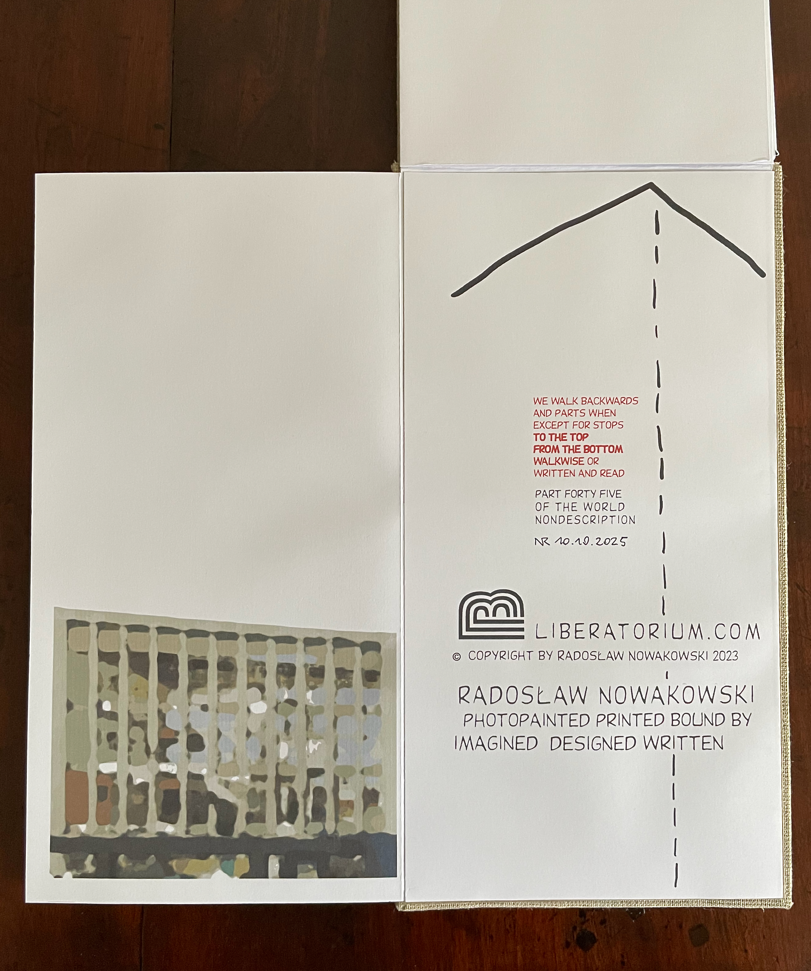
These instructions become a bit clearer when we turn the panel of instructions to the right: SURPRISE! We are not yet reading completely from the bottom up. Our narrator carries us downwards as he reports his surprise that the old train station is a non-existing station, one under “condestruction” and emerging from a huge hole. As he continues downwards and moves to the right panel, now we are reading from the bottom up, and the narrator fills us in on his state of mind and where he is going, turning left with his text and going up the stairs. Twenty years ago, our narrator dove into the ground like a mole, where then as now “Nothing is known about those above and under”. By inventive free association spurred by written and visual puns, his impressions of the surroundings, and his reflection on his actions, our narrator conducts us up Sienkiewicza Street, making us read from the bottom up.
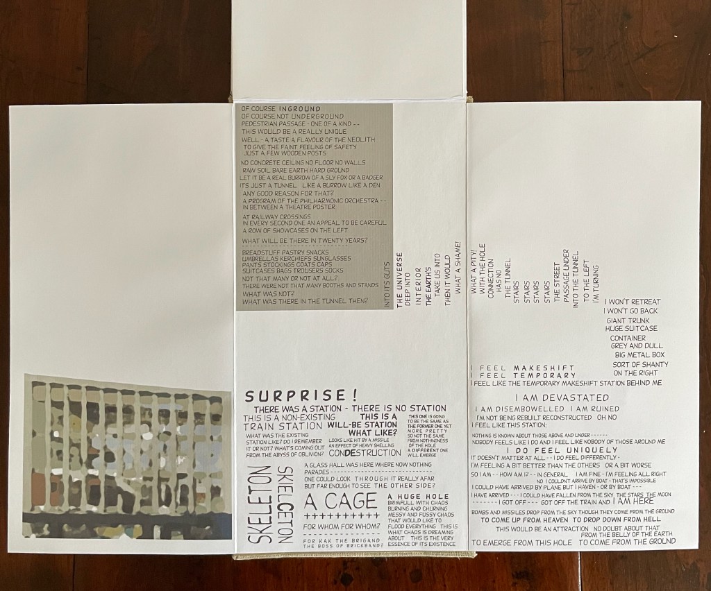
Twenty years ago, he emerged blinking in the beautiful day in front of the Hotel Łysogory. Today, it is the Grand Hotel Łysogory we are facing.
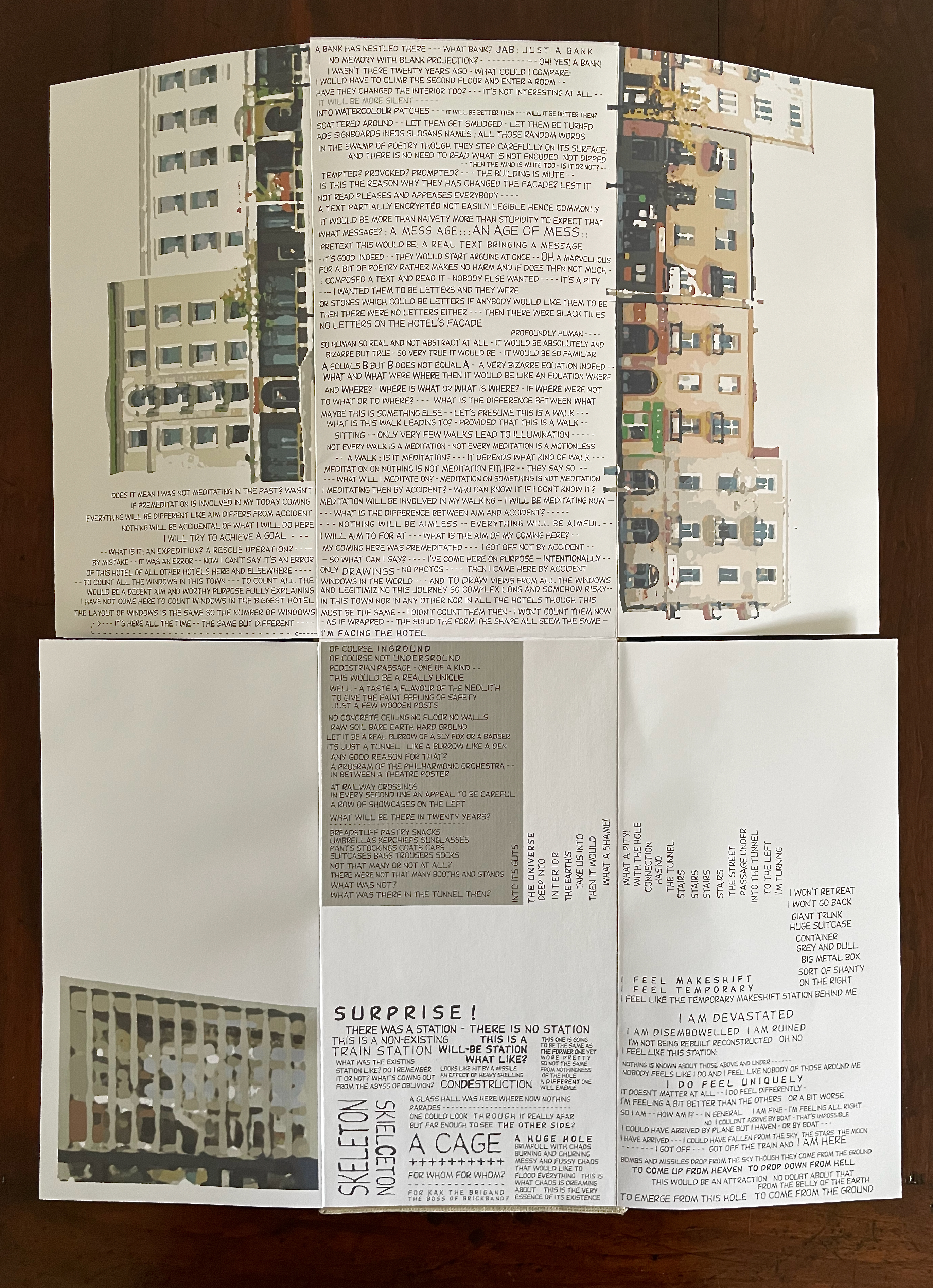
He asserts that twenty years ago he arrived by accident but now is arriving intentionally with premeditation: “I HAVE COME HERE TO LEARN WHAT IS ON THE OTHER SIDE”.
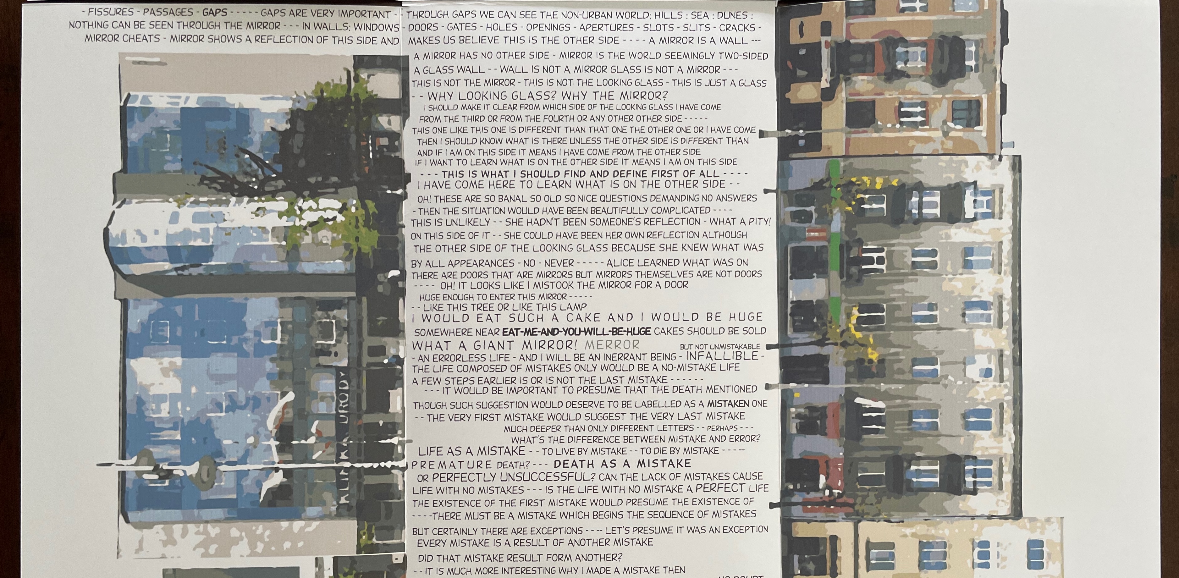
Our narrator is still self-reflexive and mindful — or rather, being in “search of the other side”, he is as before “of two minds”-ful and prone to doubt and uncertainty. Having laid out his aim a few steps ago, he questions it:
WHAT IS THE REASON TO VISIT THE SAME TOWN FOR THE SECOND TIME? TO SEE WHAT I DIDN’T SEE WHEN I CAME HERE FOR THE FIRST TIME AND WHAT I SAW BUT I SAW DIFFERENTLY FOR MY EYES WERE DIFFERENT AND EVERYTHING WAS DIFFERENT — YES — OF COURSE — BUT THERE ARE SO MANY OTHER TOWNS I HAVE NEVER VISITED WHICH I COULD AND SHOULD AND WOULD SEE IF I DIDN’T WASTE TIME VISITING THE SAME TOWNS I DON’T KNOW HOW MANY TIMES —– WHAT AM I TO READ ONCE AGAIN THE SAME BOOK BOOK FOR? TO READ OUT OF IT WHAT I DIDN’T FOR THE FIRST TIME – TO READ IT DIFFERENTLY MYSELF BEING DIFFERENT NOT THE SAME AS I WAS —
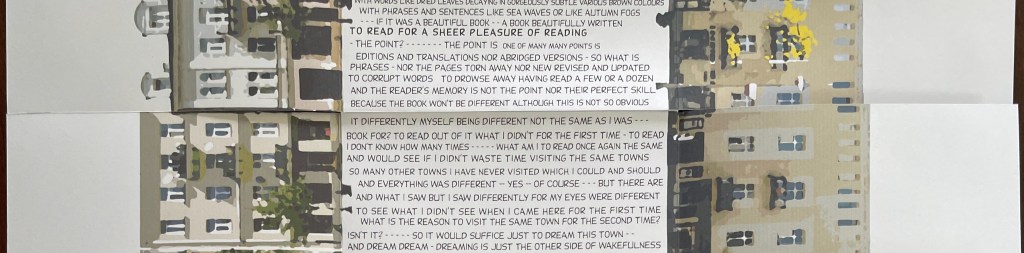
For us as readers and viewers, too, this visit is different. For one thing, there is more text. The scattered direction of reading in the first visit is replaced by a generally consistent “bottom-up” direction of reading, although there are, as before, some diversions onto the other side of the leporello. Except for the title panel, the content is no longer trilingual; only the slightly non-idiomatic English is used. The hand-drawn artwork is replaced by watercolor-painted photos. This visit ‘s book is physically more expansive:
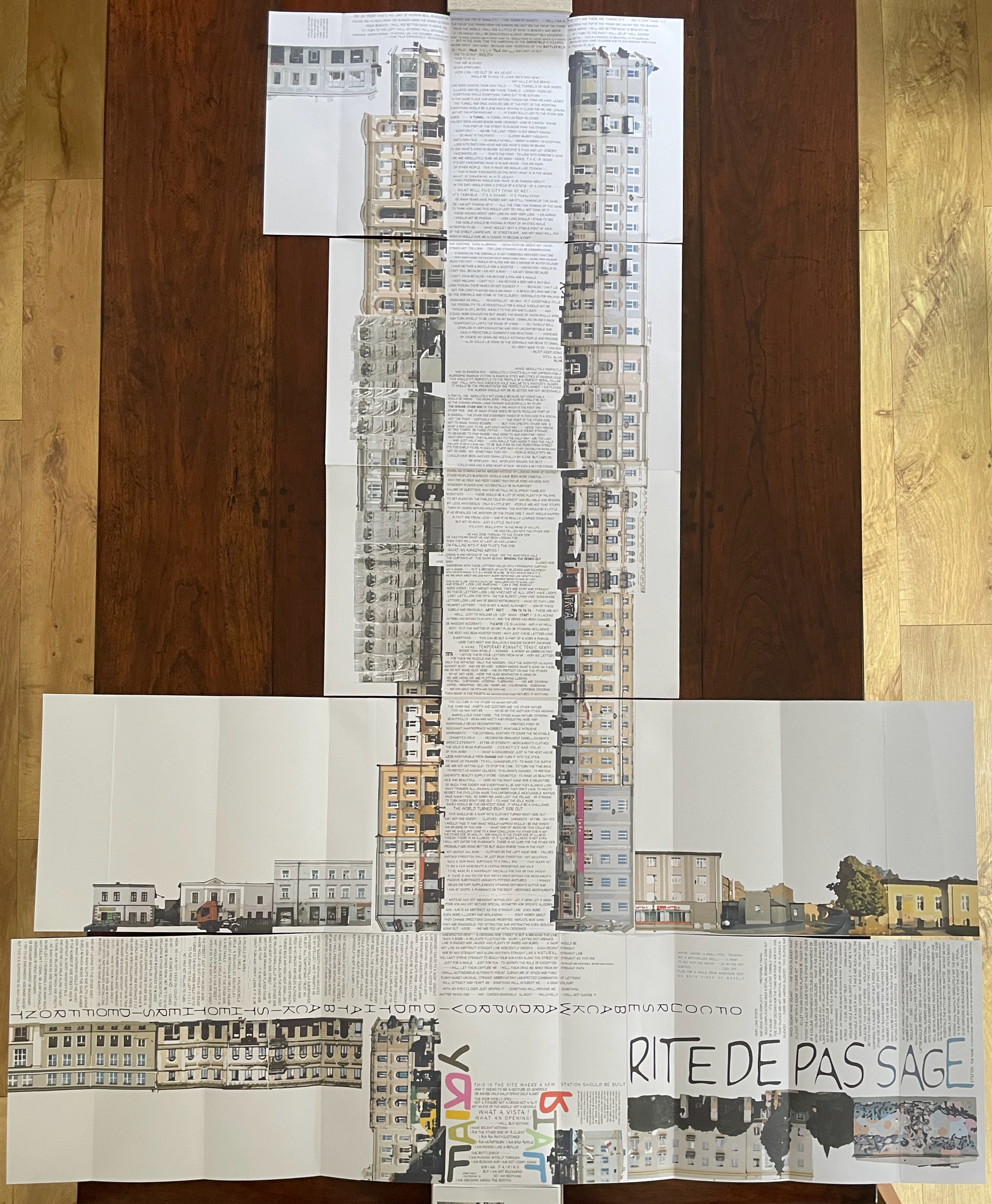
Although there is less scattered direction of reading, we do have to follow our narrator out on limbs, both left and right. The “Rite de Passage” section above provides a good example. If we zoom in, we can more easily see the narrator’s right-hand turn into the station called “RITE DE PASSAGE”, and if we follow the words to the end of the right-hand limb, …
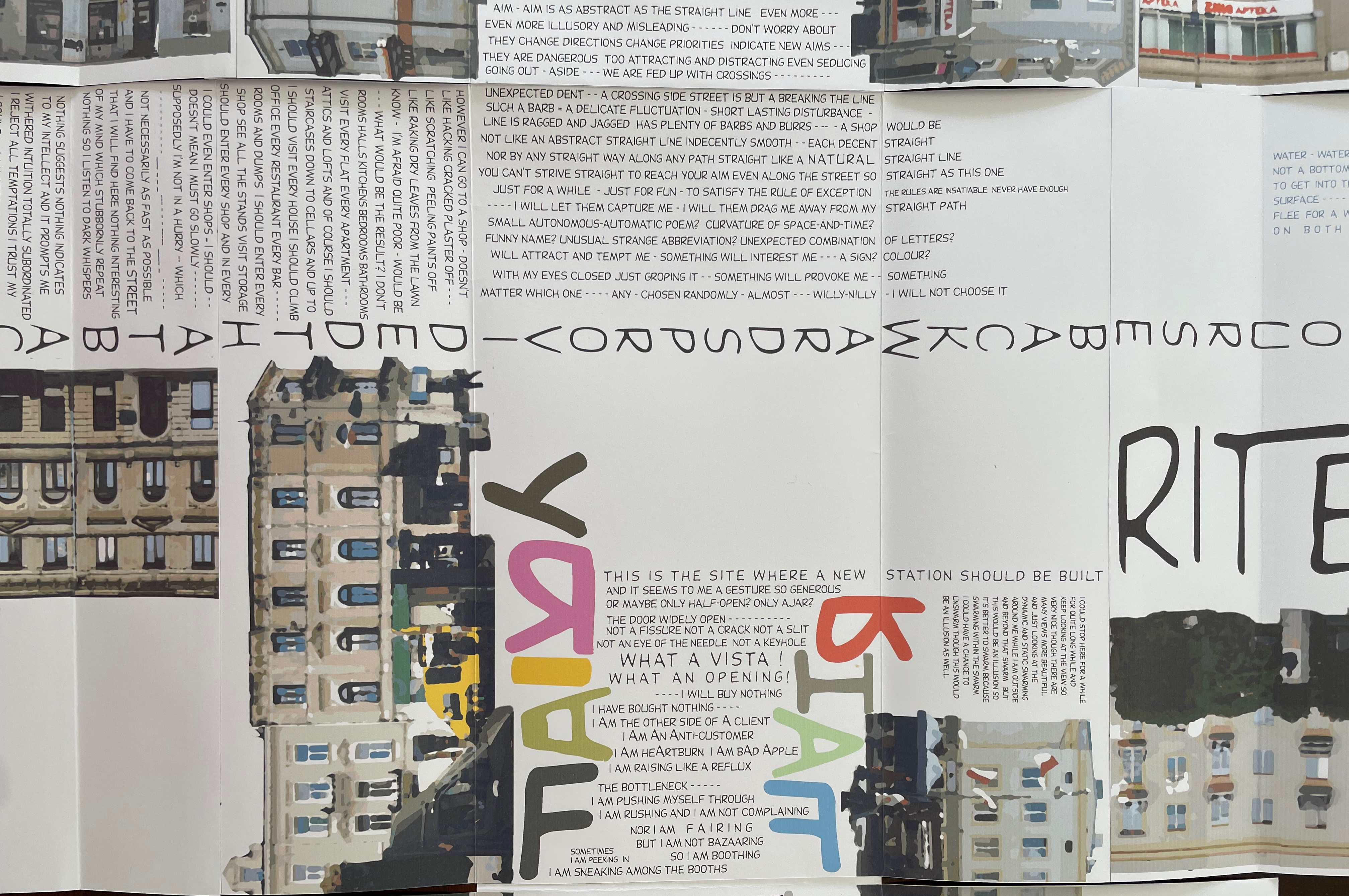
… we find ourselves still reading from the bottom up, back to the intersection, across it, and over into the left-hand limb, which we reach “preferably taking very long steps OF COURSE …
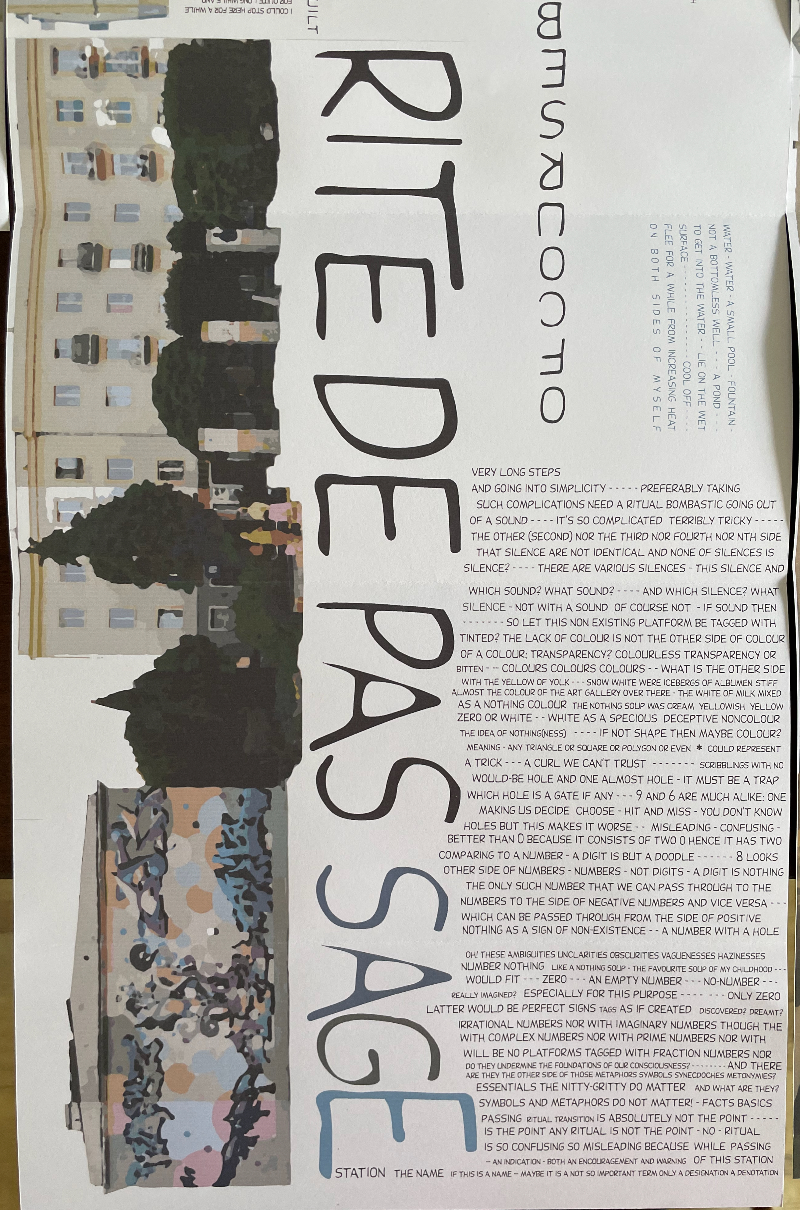
Reading the right-hand limb from the bottom up.
BACKWARDS PROVIDED THAT BACK IS THE OTHER SIDE OF FRONT”. Like twenty years before, the text has a habit of enacting its speaker’s utterance.
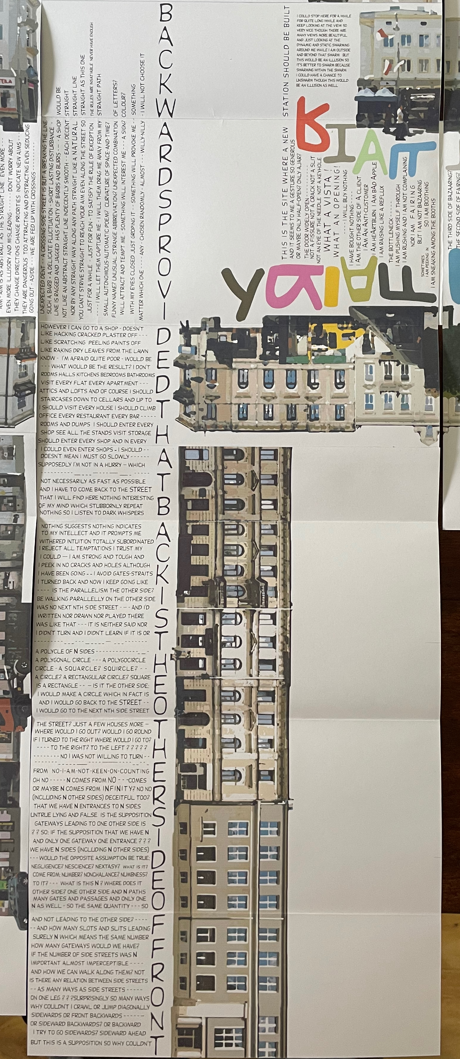
Now reading the left-hand limb from the bottom up.
Back at the intersection, our narrator takes us window shopping — a pharmacy, a tailor’s, a jeweler’s, a theater under renovation — and vista gazing from the other intersections. All the while, he continues his philosophical stream of consciousness, which is also enacted by the text.
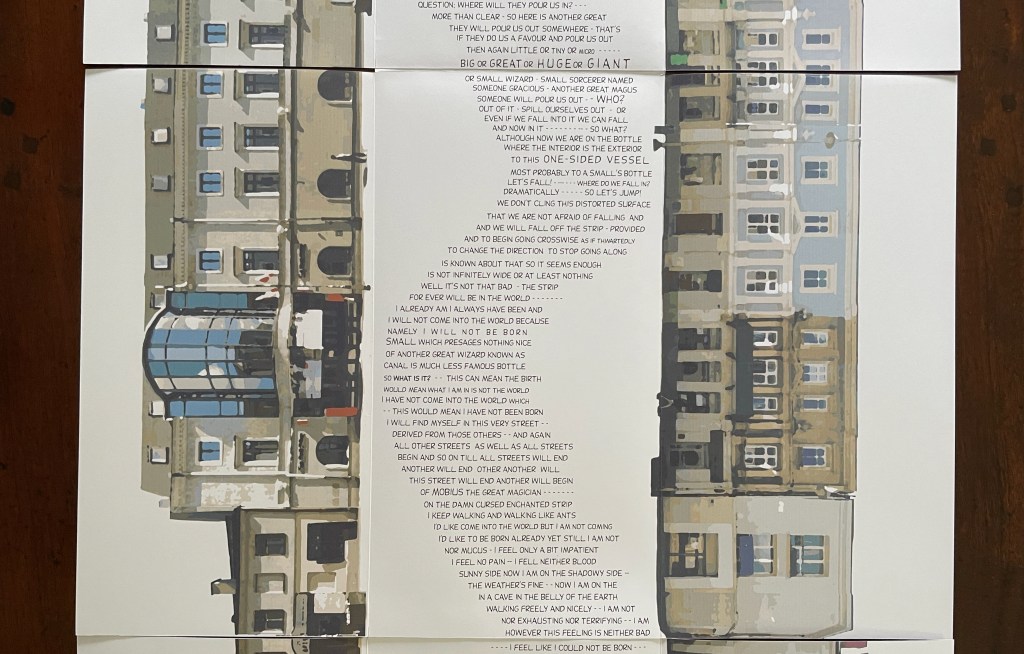
More than enacting the speaker’s actions, the text engages in the same Apollinaire-esque visual poetry that presented typographic shadows of church spires in the previous book (see above). Now we have the image of a striped balloon and gondola that delivers the metaphor for this upward-floating, “never ending sequel” from which the narrator gazes down on each crossroad as an abyss. While Nowakowski’s play with visual text makes him a direct descendant of Apollinaire, his themes of chance, appearance, reality, and nothingness underscore a closer relationship with Mallarmé. (Or perhaps with Albert Finney in Charlie Bubbles.)
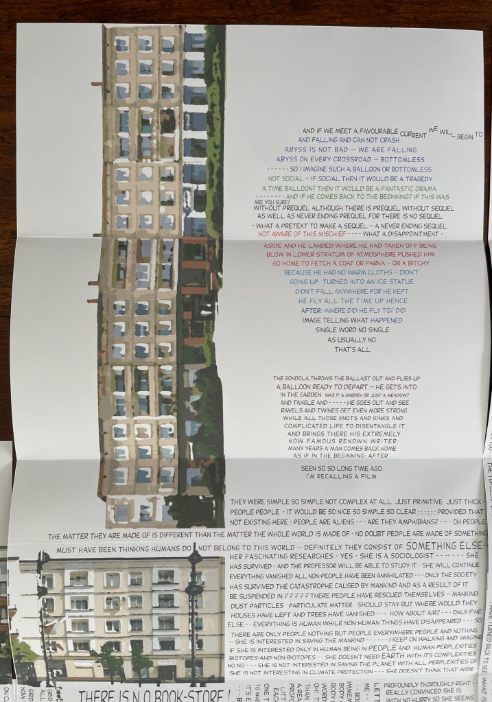
As this never ending sequel runs out of paper, large gaps appear between our narrator’s text as if he is tiring. Finally he says, “I’M GOING OUT”. Above that statement, a paragraph that reads “normally” from top to bottom but is turned on its side describes our narrator and his situation:
THIS GENTLEMAN / WAS NOT HERE / WAS NOT SITTING HERE THEN /NOW HE LOUNGES COMFORTABLY / PROBABLY WOULD BE FEEL BETTER / IF HE WERE WALKING / THEN THIS MONUMENT / WOULD BE AN EXCEPTIONAL ONE / VERY SPECIAL – A WALKING MONUMENT / A WANDERING MONUMENT BUT NOT THE MONUMENT TO A WANDERER / TODAY HERE – TOMORROW THERE SOMEWHERE ELSE / BUT IT IS NOT — HE’S TIRED – THAT’S WHY SIT DOWN / WHO KNOWS? MAYBE HE WANTED TO WALK BUT HAS BEEN SIT DOWN
That text is just as non-idiomatic in character as our narrator’s utterances have been; however, its being in the third person sets it apart from him.
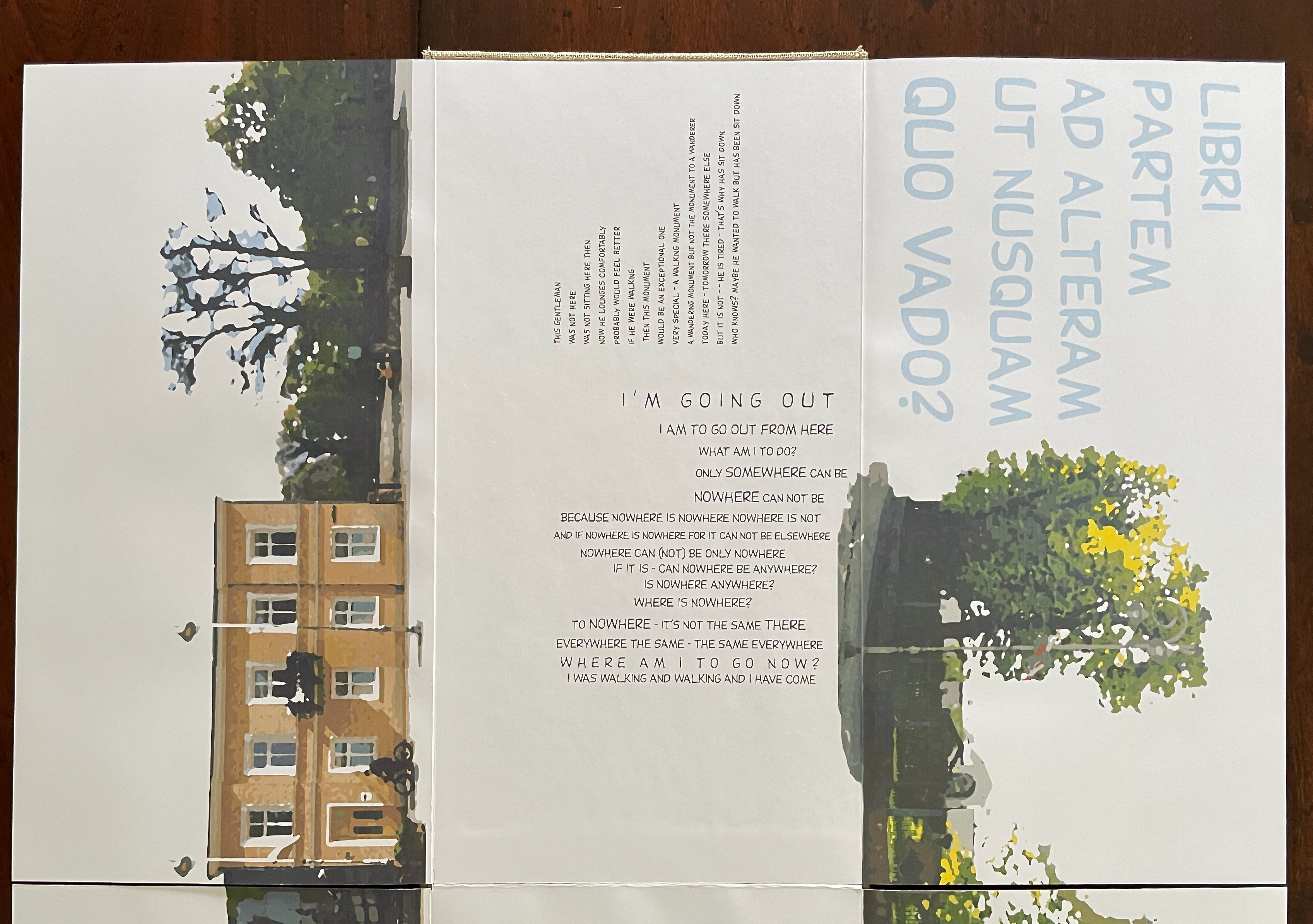
If Nowakowski’s stroll up Sienkiewicza Street is a never ending sequel, it is like Mallarmé’s throw of the dice that can never abolish chance. Similar but different. While Mallarmé leaves us with a never ending loop — a throw of the dice can never abolish chance, every thought emits a throw of the dice — our narrator and Nowakowski have left us hanging. Rejecting “nowhere” as an endpoint because “nowhere can not be / only somewhere can be”, our tired narrator insists he will go out. Nowakowski confronts us, the narrator, and himself with that painted blue Latin text on the right-hand panel. Roughly translated, it reads “toward the other part of the book as if to nowhere – where are you going?”
Sienkiewicza Street in Kielce 40 Years Above (2026)
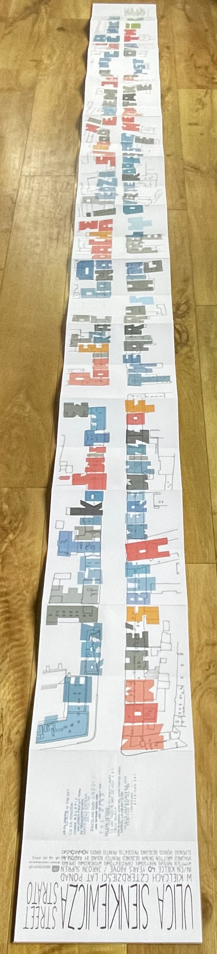
Sienkiewicza Street in Kielce 40 Years Above (2026)
Radosław Nowakowski
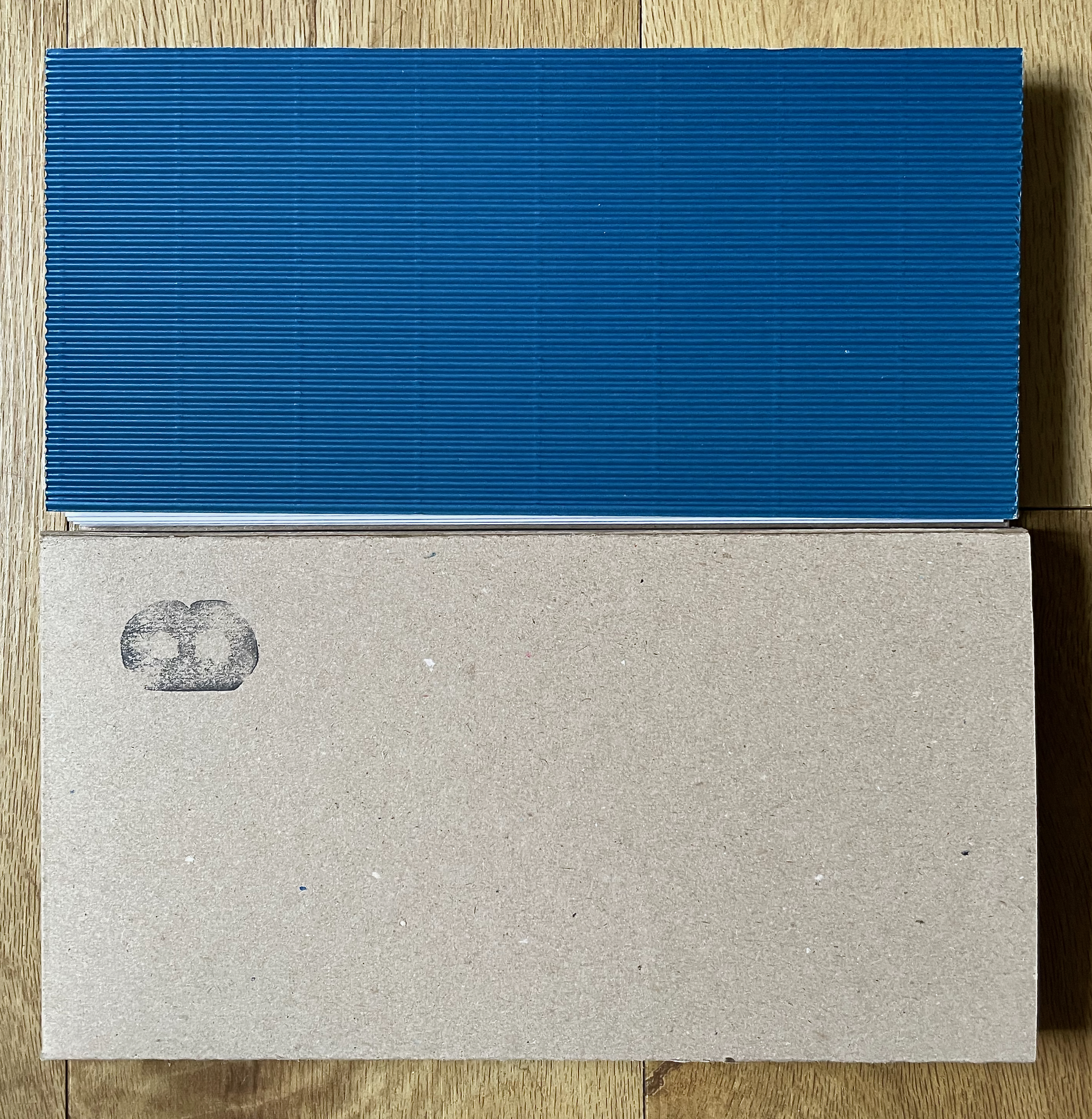
Cardboard slipcase. Single-sided leporello, corrugated blue paper over end boards. H183 x W135 mm (closed), W3452 mm (open). [26] panels. Acquired from the artist, 13 August 2026.
Photos: Books On Books Collection. Displayed with permission of the artist.
Sienkiewicza Street in Kielce 40 Years Above (2026) picks up where Sienkiewicza Street in Kielce Twenty Years After or in Search of the Other Side left off — with our narrator speaking then followed by a third-person description of his situation. It also begins as Sienkiewicza Street in Kielce started: entangled in Polish, English, and Esperanto.
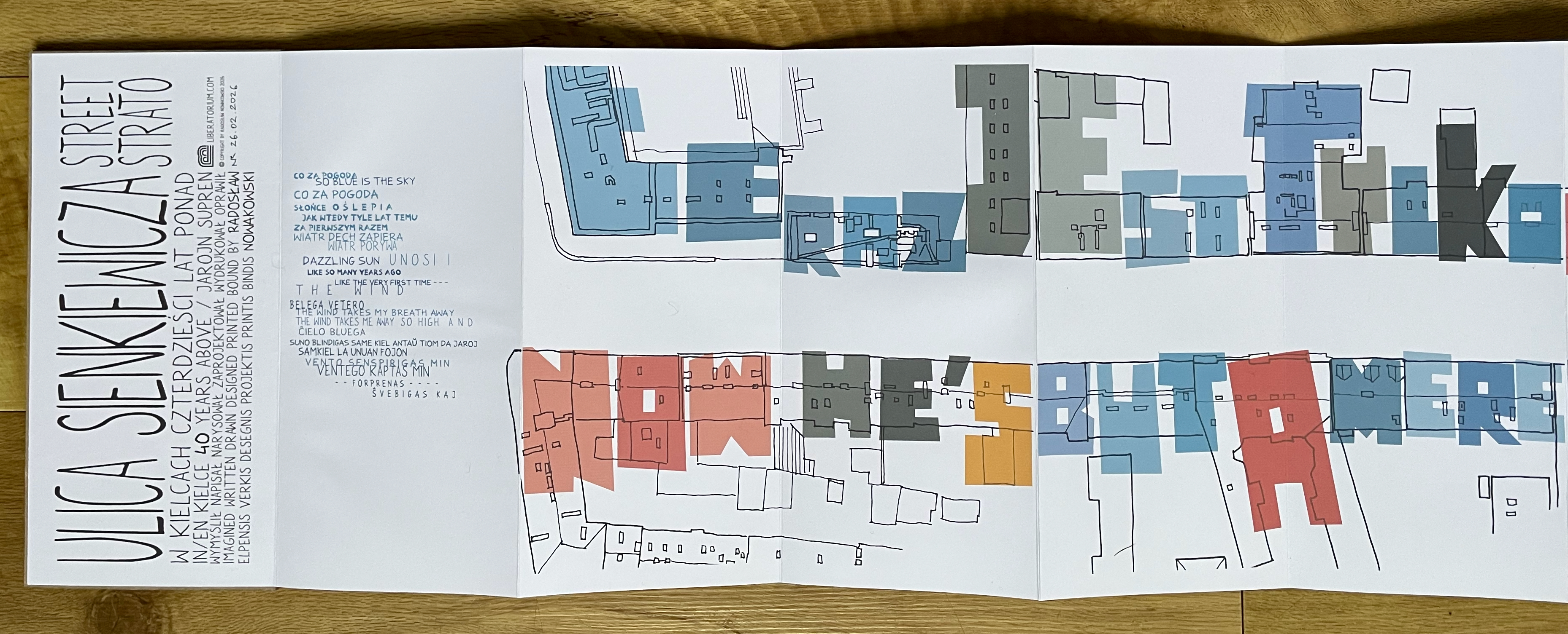
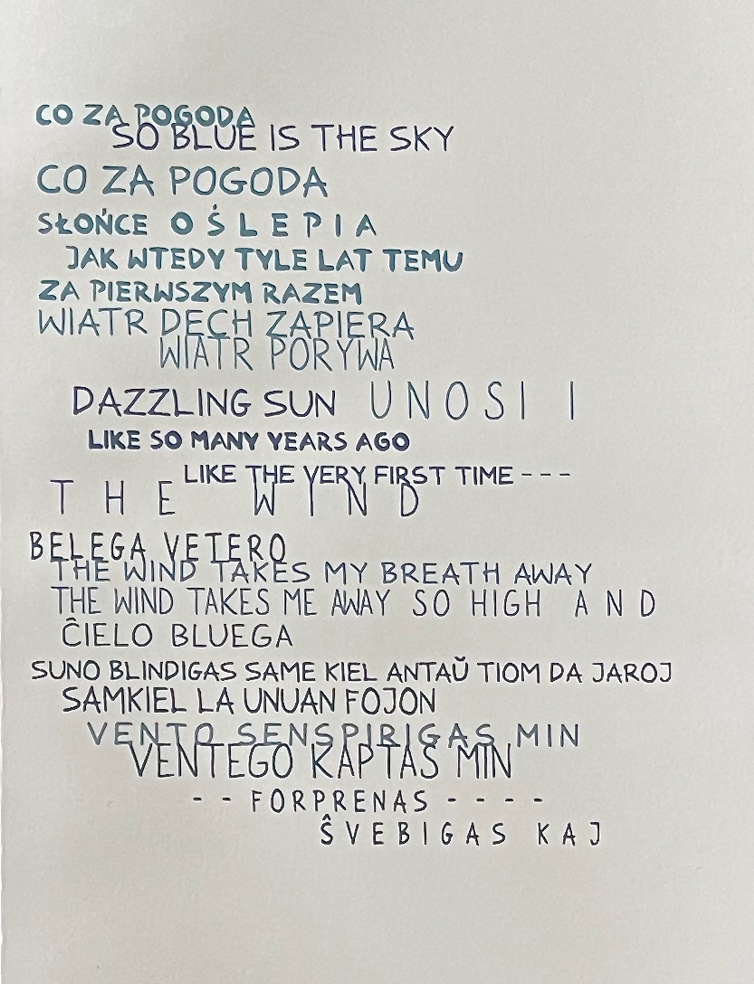
In the second panel, our narrator’s corresponding lines of Polish, English, and Esperanto do not consistently run in parallel to one another. Instead, they are staggered. In all three languages, the passage ends with an “and” — with our narrator floating in the air above Sienkiewicza Street.
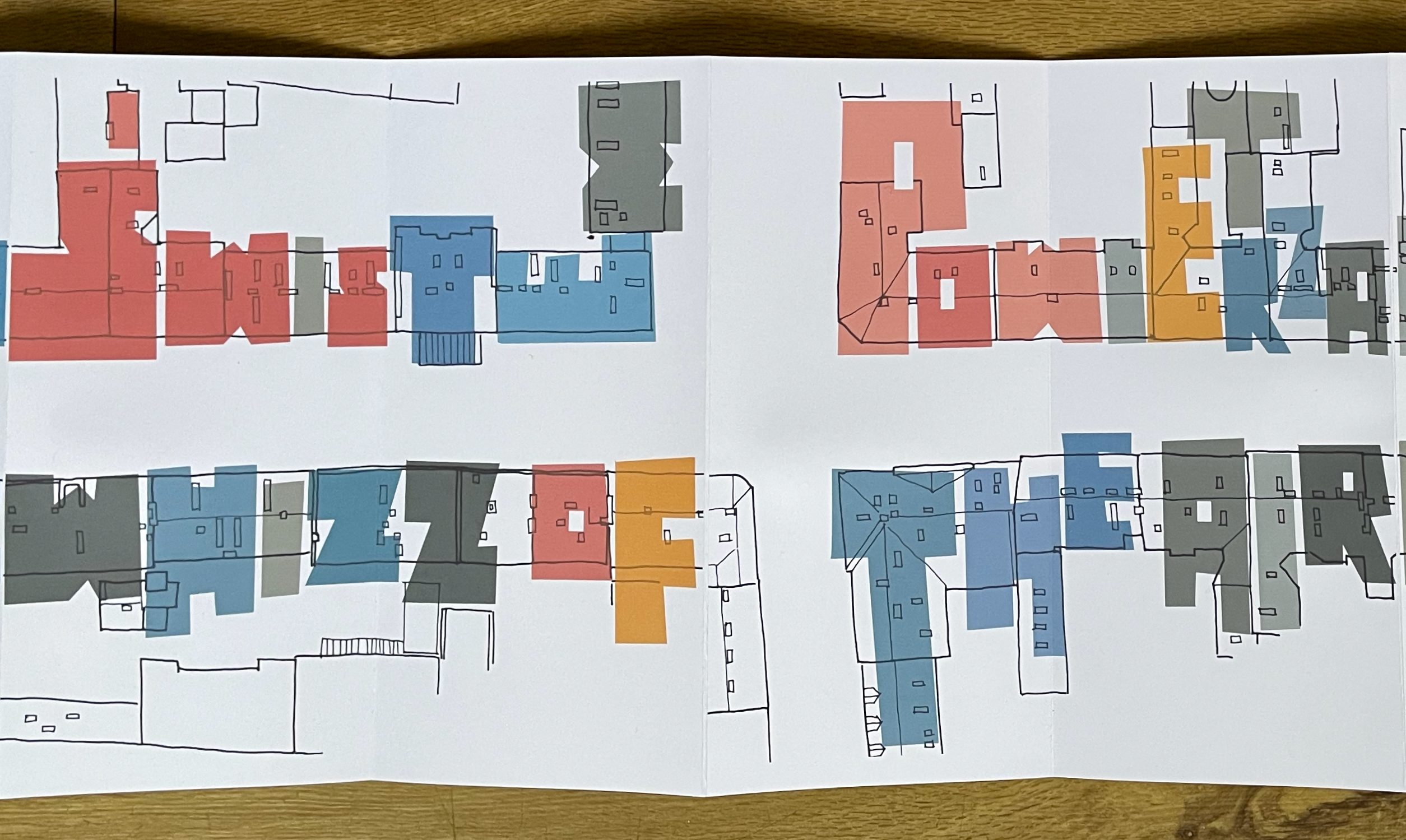
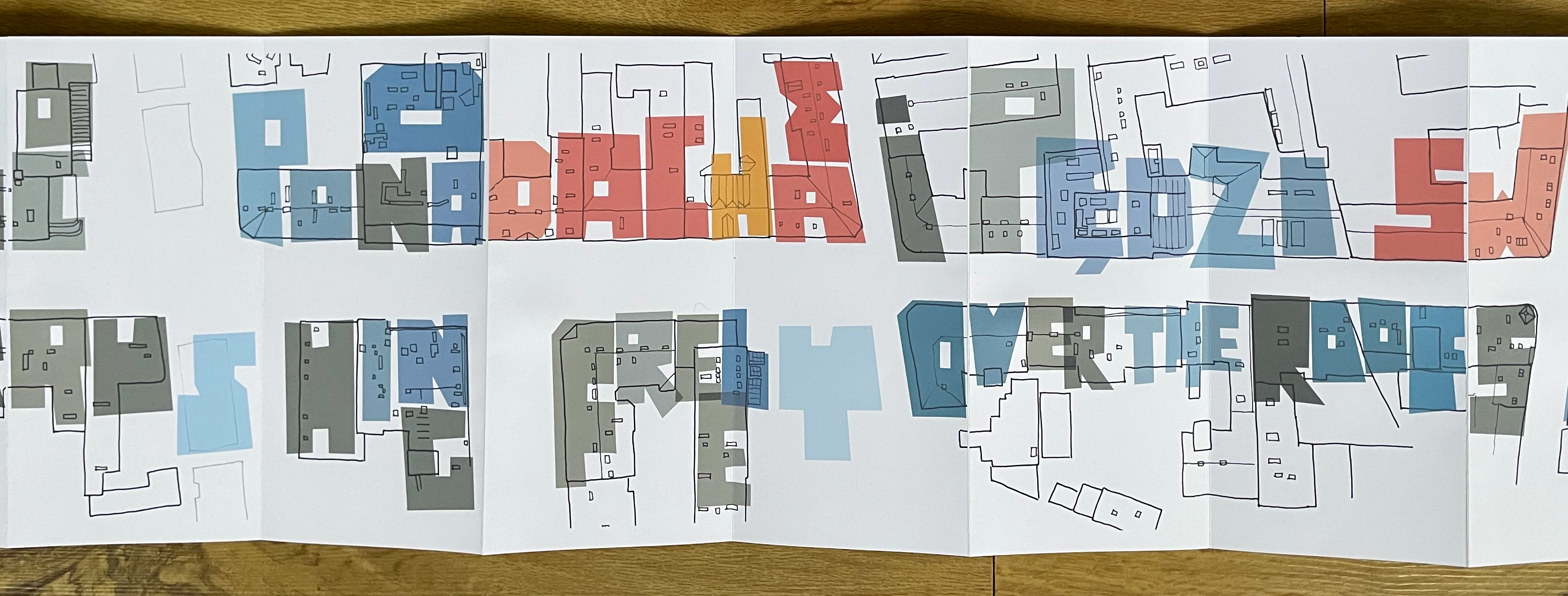
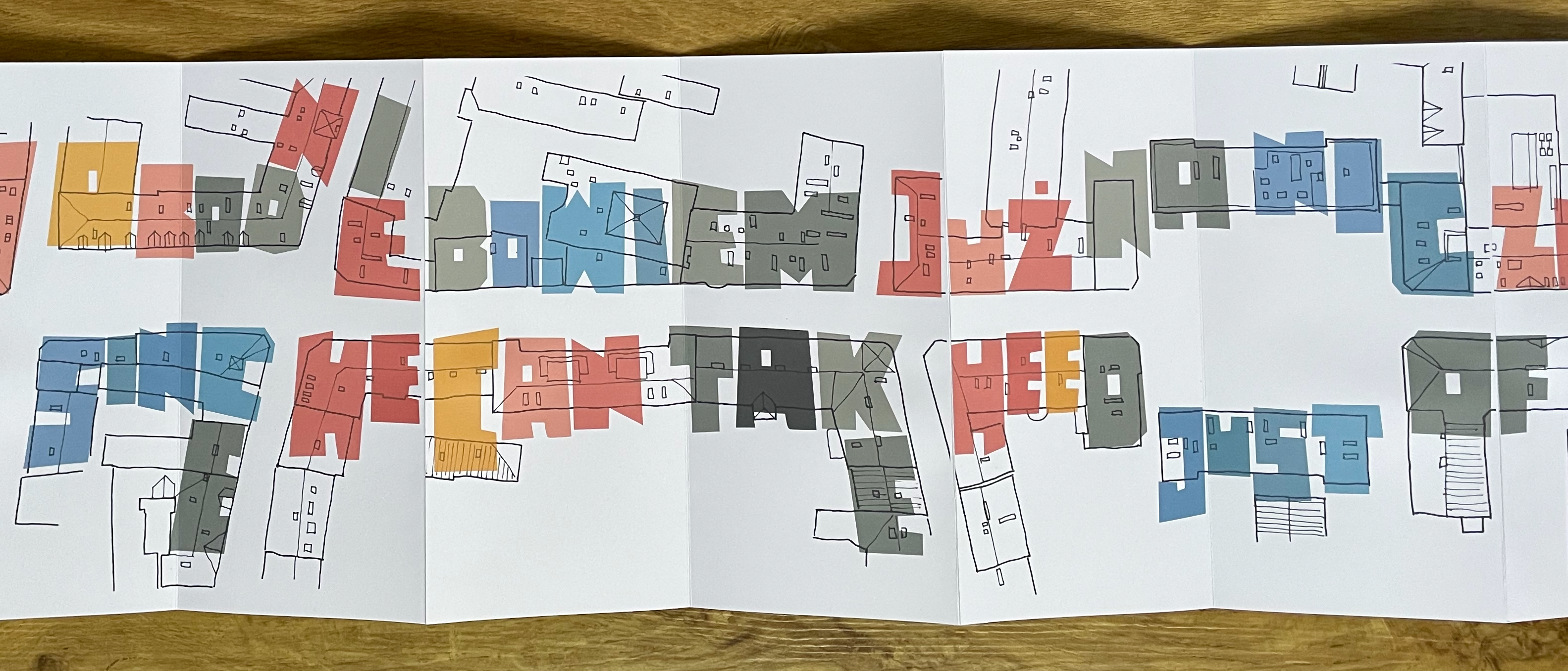
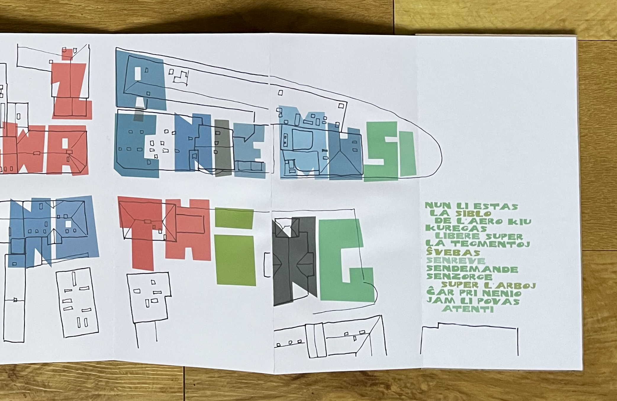
As the rest of the leporello proceeds — this time in landscape orientation — not only is the text in the third person, it shifts into large blockish letters painted over rooftop schematics and replacing the previous visits’ building elevations. The Polish text on one side of the street, its English counterpart on the other side, and the Esperanto version at the end of street are loose translations of one another. The Esperanto version, whose shades of green echo the settings in which the first two visits ended, seems more poetic than its Polish and English counterparts, even when mechanically translated:
nun li estas
  la siblo
    de l'aero kiu
kuregas
   libere super
la tegmentoJ
Ŝvebas
senreve
sendemande
senzorge
     super l'arboj
Ĉar pri nenio
jam li povas
    atenti
TERAZ JEST TYLKO ŚWISTEM POWIETRZA CO PONAD DACHAMI PĘDZI SWOBODNIE BOWIEM JUŻ NA NIC ZWAŻAĆ NIE MUSI
Now he's but a mere whizz of the air rushing freely over the roofs since he can take heed just of nothing
Here’s a mechanical translation of the Esperanto:
now he is
  the whisper
    of WIND that
rushes
   freely over
the rooftops
drifts
dreamless
questionless
carefree
     over the trees
For about nothing
can he
    care anymore
This third-person description may be right about our deep-diving, balloon-riding narrator. Bleak as the description is, though, there will still be these three visits to Sienkiewiczka Street waiting on shelves somewhere (not nowhere) for readers to discover and start the never ending sequel again.
Nowakowski has published numerous works from his establishment called The Liberatorium. All are as whimsical, serious, and inventive as these visits to Sienkiewicza Street. Entries for several will follow this entry. In the meantime, take a look at the interview with Sara Bodman and Tom Sowden and images of the artist’s studio and works.
Further Reading
Bodman, Sarah, and Tom Sowden. 24 June 2008. “Radosław Nowakowski“. Book Arts Centre, University of Western England.